5. Example analysis pathway (CLUSTER, MDS, ANOSIM)
- An analysis of biotic data
- Step 1: Transformation
- Step 2: Resemblance
- Step 3: Cluster
- Step 4: Ordination
- Step 5: ANOSIM test
- Summary of the pathway
An analysis of biotic data
Rationale
Multivariate data are very complex and can be difficult to analyse and interpret. Each variable can be considered its own dimension, with its own story to tell. Thus, when there are a lot of variables (e.g., if we have sampled occurrence, abundance, or biomass of individual species in a community, and each species is a variable), then we have a very high-dimensional system to consider. We can choose to analyse each variable individually, but this would be time-consuming if we have a lot of variables. Also, for biotic data, many species are rare, so our data will be riddled with a large number of zeros - it would be difficult to characterise anything about individual rare species on their own. Furthermore, what we are usually aiming to do is to characterise and analyse the whole community simultaneously and how it may be changing through time or space, or in response to some experimental treatments (such as human impacts or management scenarios, etc.).
When analysing multivariate biotic data (especially those having a large number of variables), a useful approach is to base the analysis on a resemblance measure (i.e., a dissimilarity or similarity measure), calculated among the sampling units (e.g., Clarke (1993) , Anderson (2001a) , McArdle & Anderson (2001) ). A resemblance measure such as Bray-Curtis captures the ecological idea of turnover in the identities and relative abundances of species beween any pair of sampling units ( Clarke et al. (2006) , Anderson et al. (2011) ). For many routines in PRIMER, the fundamental starting point is a resemblance matrix, which expresses (numerically) the (dis)similarities between every pair of samples.
Before calculating a resemblance matrix, some pre-treatment of the data (sometimes in more than one way) is usually desirable. For assemblage data, an overall transformation can be used to reduce the dominant contribution of abundant species towards Bray-Curtis similarities. For example, a fourth-root transformation will down-weight the influence of highly-abundant taxa.
From a resemblance matrix, we may readily apply the following methods (Fig. 5.1):
- Cluster analysis, to help characterise inter-sample relationships, showing potential groups of similar samples;
- Ordination, to help visualise inter-sample relationships in a small number of dimensions (usually 2 or 3); and
- Hypothesis-testing, to formally test a particular null hypothesis of interest, such as H0: 'There are no differences in community structure among different (a priori) groups of samples'.
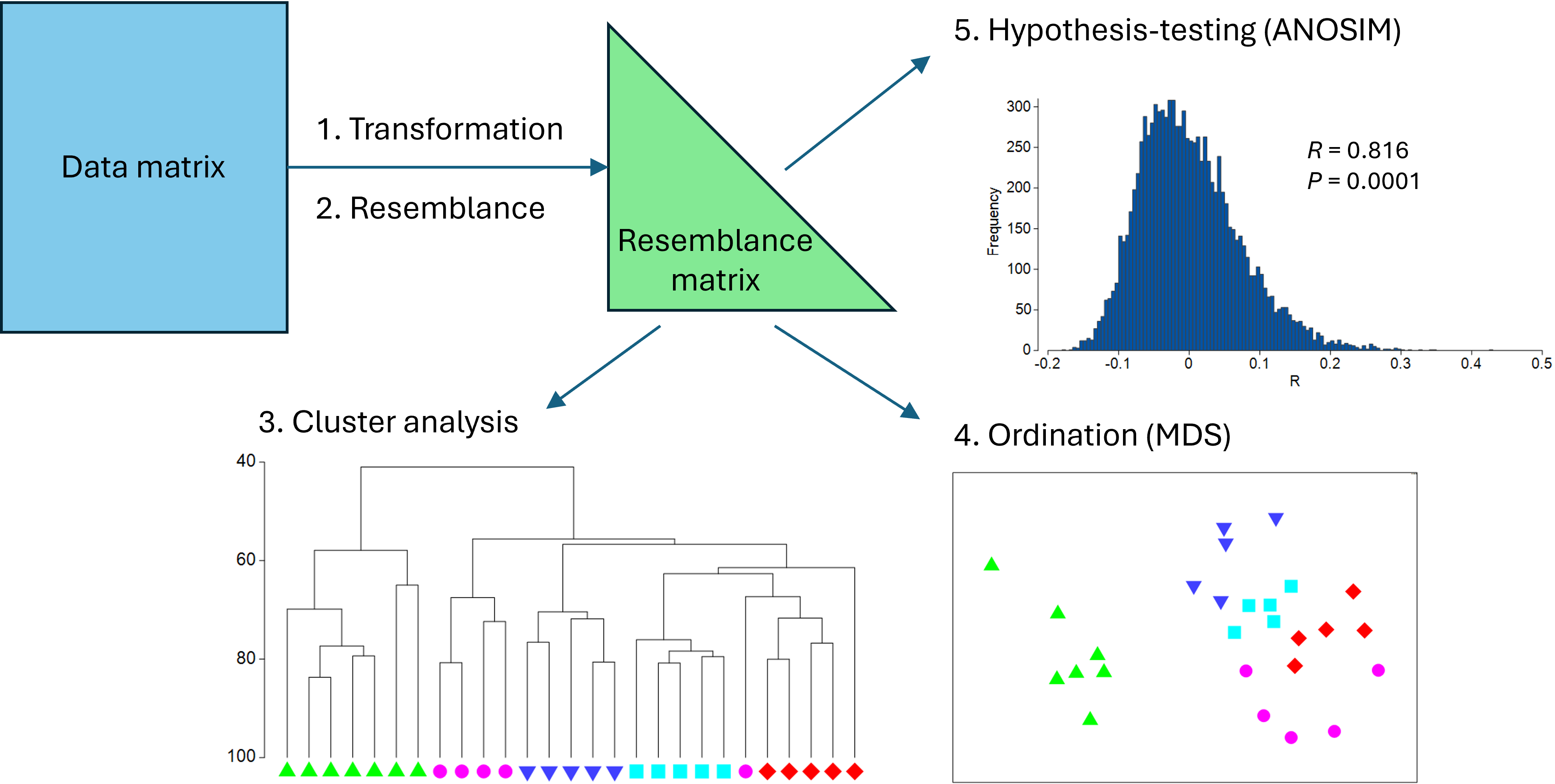
Fig. 5.1. Schematic diagram of a simple multivariate analysis pathway, including transformation, resemblance, clustering, ordination and hypothesis-testing.
Some steps for analysis
In what follows, we shall take the 'Fal nematode.pri' example dataset in PRIMER and proceed along a simple multivariate analysis pathway according to the following steps:
- Apply a fourth-root transformation to the data (all variables).
- Calculate the Bray-Curtis resemblance among all pairs of samples.
- Calculate a hierarchical group-average cluster analysis of the samples to produce a dendrogram.
- Create a non-metric multi-dimensional scaling (nMDS) ordination plot of the samples.
- Use the analysis of similarities (ANOSIM) to test the null hypothesis of no differences in community structure among the 4 creeks of the Fal estuary (with n = 5 to 7 replicates per creek).
Step 1: Transformation
Perform the transformation
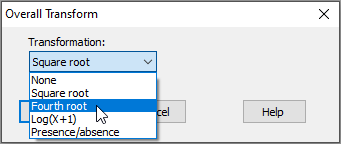
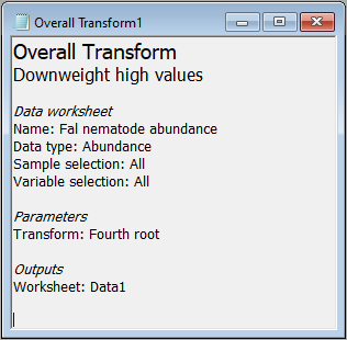
There are a range of possible transformations one might use in a pre-treatment of biotic data. For some discussion regarding appropriate pre-treatment transformations, see Chapter 9 in 'Change in Marine Communities'. In the case of the Fal data set, we may choose to downweight considerably the contribution of highly abundant taxa. Our first (pre-treatment) step will be to transform the data to fourth roots, i.e., $y' = y^{0.25}$.
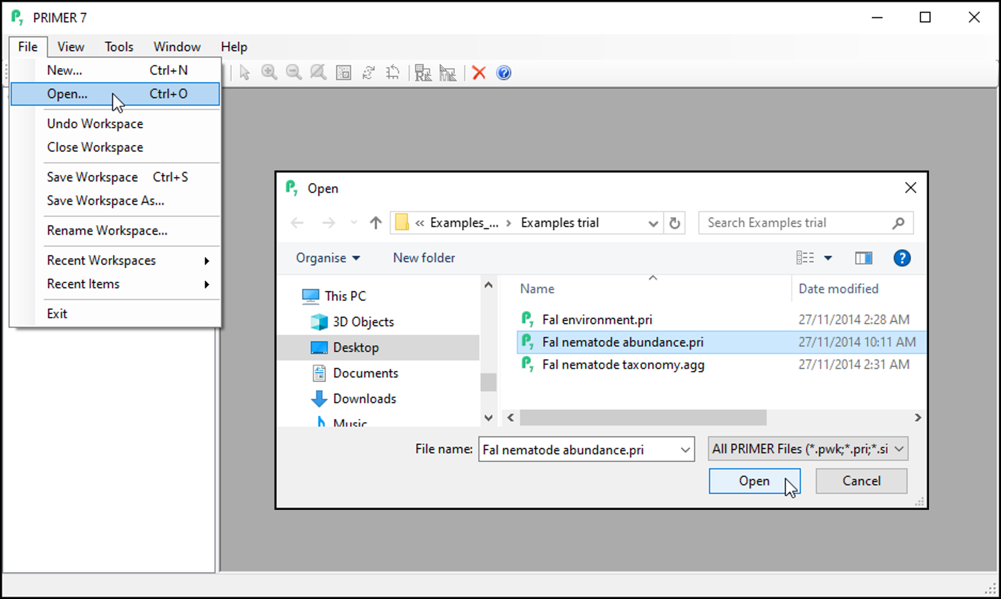
- Launch PRIMER and click on File > Open..., choose the trial data file 'Fal nematode abundance.pri' in the browser window and click Open.
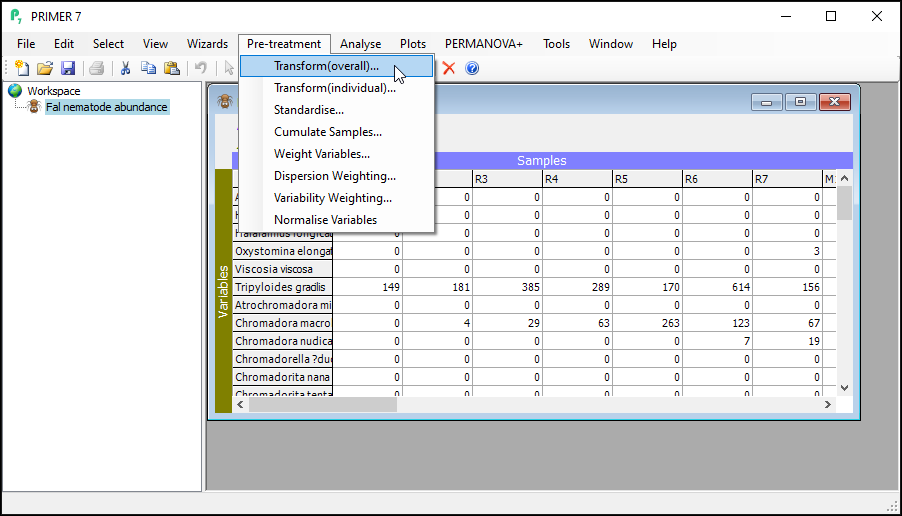
- To perform an overall transformation of the data (i.e., on all variables), click Pre-treatment > Transform(overall)....
- In the 'Overall Transform' dialog box, choose (Transformation: Fourth root), then click OK.
You should now see the transformed dataset (called 'Data1') as the 'active window' in the PRIMER workspace. Note that the transformed datasheet has inherited all of the properties, factors and indicators that were associated with the original data as well.
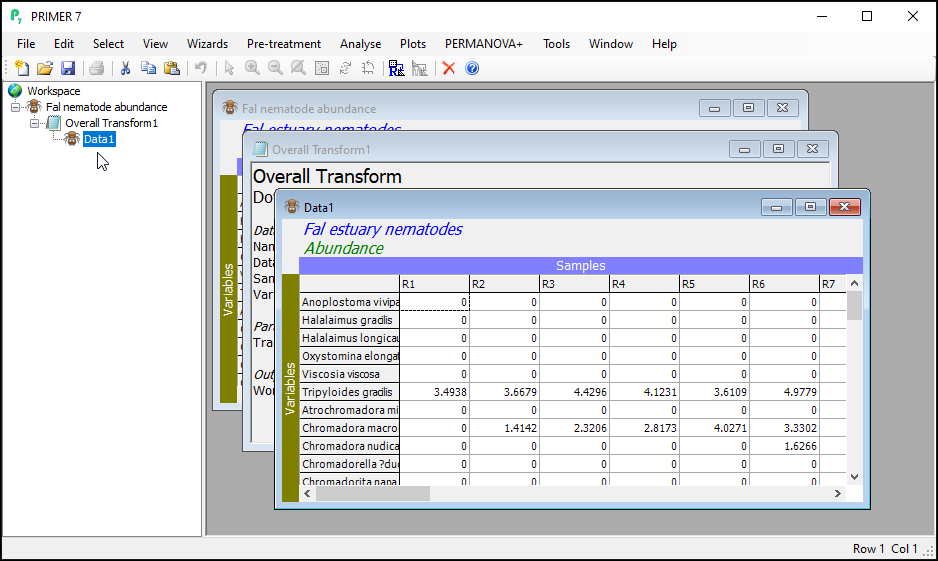
You will also see a small file (called 'Overall Transform1'), indicated by a little notepad ( ) in the Explorer tree. This shows a little more information regarding the choices you made for this particular run of the 'Transformation(overall)...' routine.
The 'active window'
The active window is identified by slightly darker shading of its border within the PRIMER workspace. Its name is also shaded in the Explorer tree. When you want to run any particular routine in PRIMER, you will need to make sure that the correct dataset (or resemblance matrix) is the active window when you launch that routine.
Notice that, although the transformed data ('Data1') is output as the active window after you do a transformation, the original datasheet is still in your workspace, and you can navigate back to it either by clicking on it's name in the Explorer tree (look right under the word 'Workspace' for 'Fal nematode abundance'), or by clicking on the window containing the datasheet itself inside the PRIMER workspace.
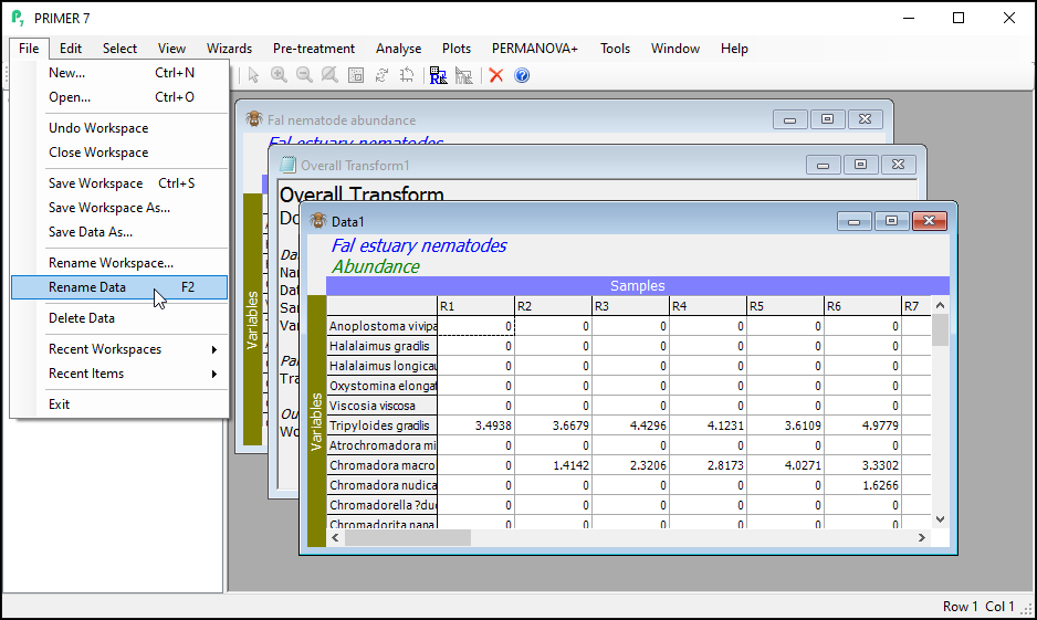
Re-name the transformed data
It is good practice to rename the datasheet corresponding to the transformed data for future reference within this workspace as you proceed with your work.
To re-name the datasheet within PRIMER, click on File > Rename Data.
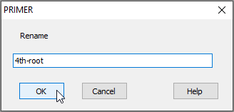
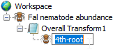
In the dialog box, type the new name you want to call it (in this example, we could re-name the sheet containing transformed data as '4th-root', as shown below), then click OK.
Alternatively, you can simply click and hover over the word 'Data1' in the Explorer tree window, and you will be able to change the name in situ right there, viz:
Before heading on to Step 2, you can optionally also now click on File > Save Workspace to save your full workspace thus far (you could use the name 'Fal_Workspace.pwk', for example).
Step 2: Resemblance
For a description of the Bray-Curtis resemblane measure and the rationale for its use with biotic data, see Clarke et al. (2006) and Chapter 2 in 'Change in Marine Communities'.
- With the data sheet named '4th-root' from the previous step as the active window, click on Analyse > Resemblance...
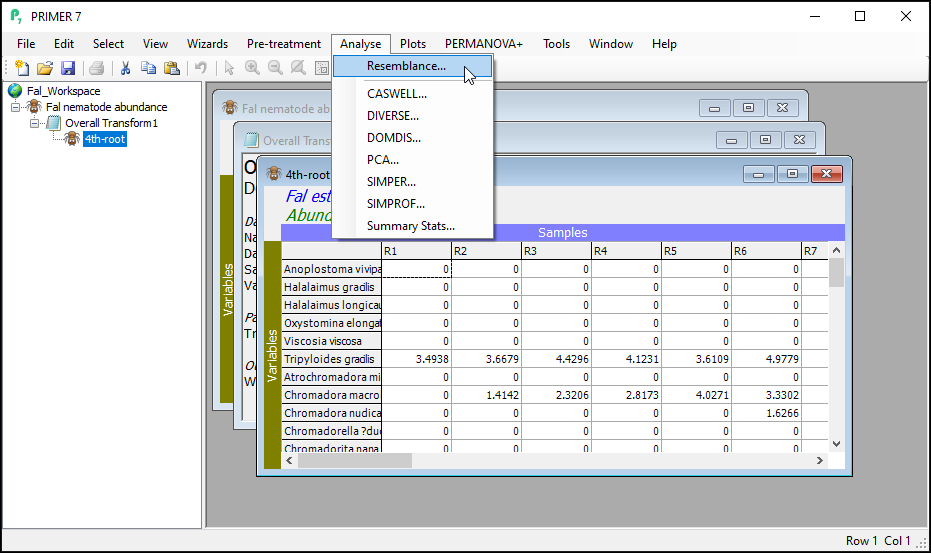
This dialog has a host of choices for you to consider, which you can uncover by clicking on the '$\bullet$Other' radio button. See Clarke et al. (2006) and chapter 7 in Legendre & Legendre (2012) for more details regarding the available choices here. For this example, however, we are going to use the Bray-Curtis resemblance measure. (This is the default for data of type 'Abundance').
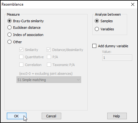
- In the 'Resemblance' dialog, under 'Measure', click on $\bullet$Bray-Curtis similarity (the default), then click OK.
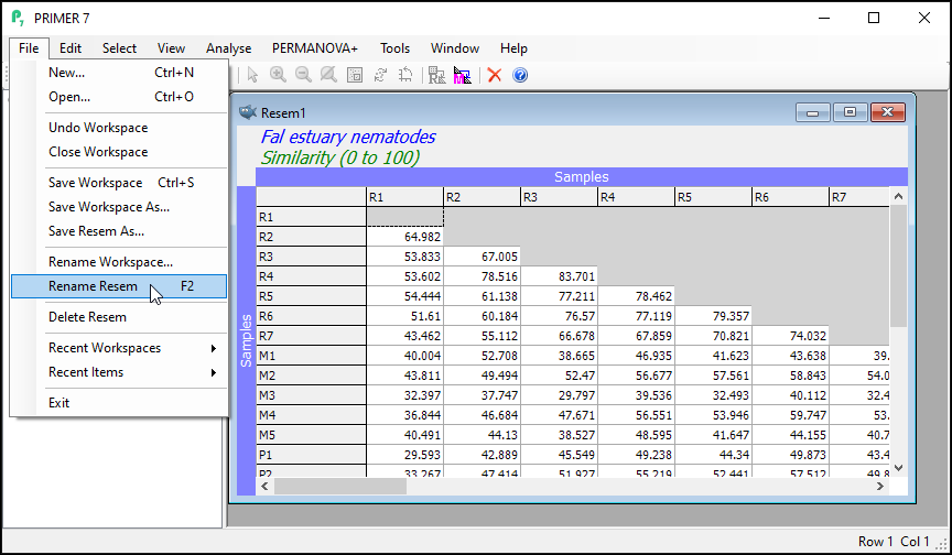
You will see the resulting (lower triangular form of the) matrix of Bray-Curtis similarities between every pair of samples (called 'Resem1').
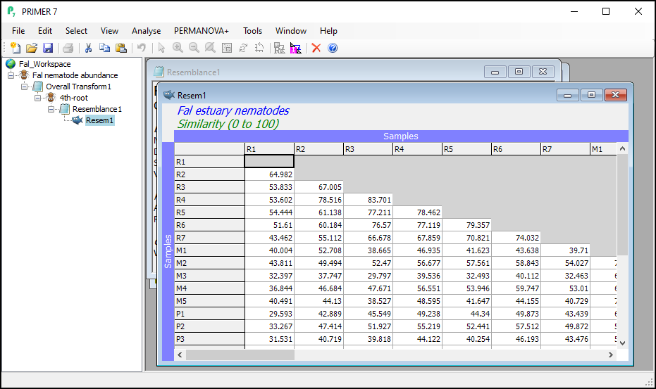
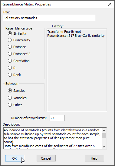
Notice that this will inherit relevant properties and also factors that were associated with the dataset from which it was generated. From the 'Resem1' matrix as the active window, click on Edit > Properties to see the properties associated with this resemblance matrix (shown below); you can also click on Edit > Factors to see the factors (which have not changed).
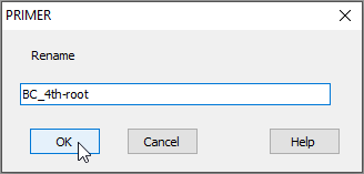
- It is (once again) good practice to re-name the sheet containing the resulting resemblance matrix (currently called 'Resem1') something that would be more useful for future reference. Click on the 'Resem1' sheet, then click on File > Rename Resem and call it 'BC_4th-root' for clarity in ensuing analyses.
Step 3: Cluster
Now that we have a resemblance matrix, we can proceed with a cluster analysis of the data. The purpose of a cluster analysis is to join together samples that are similar to one another, and also to clarify separations of groups (or clusters) of samples that may be dissimilar ( Clarke (1993) , Legendre & Legendre (2012) ). For descriptions of the clustering methods in PRIMER, see Chapter 3 in 'Change in Marine Communities'. The starting point for cluster analyses in PRIMER is always the resemblance matrix that quantifies inter-sample (or inter-variable) (dis)similarites.
Perform the cluster analysis
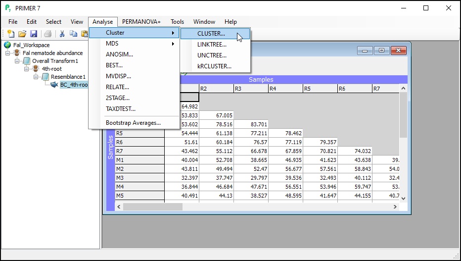
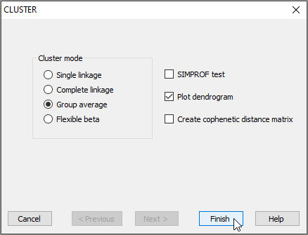
- In the PRIMER workspace file containing the Fal nematode data, click on the resemblance matrix of Bray-Curtis similarities calculated from fourth-root transformed data (called 'Resem1', or re-named to 'BC_4th-root' in the Explorer tree) to make it the active window, then click on Analyse > Cluster > CLUSTER....
- To perform hierarchical agglomerative clustering with group-average linkage (also sometimes referred to as 'unweighted pair group method with arithmetic mean' or UPGMA), retain all of the defaults in the 'CLUSTER' dialog and click Finish.
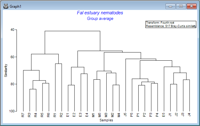
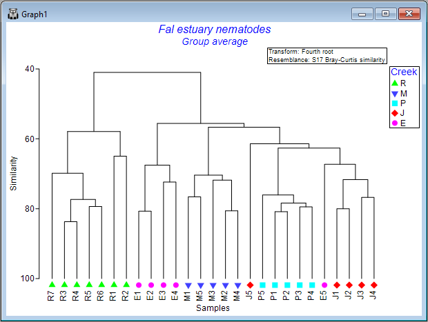
You will see an output file that provides all of the details of the clustering algorithm's pathway (shown as 'CLUSTER1' in the Explorer tree). A dendrogram will also appear as output in a new graphics window (shown as 'Graph1' in the Explorer tree), viz:
Customize the dendrogram graphic
You can do a number of customizations to the dendrogram graphic.
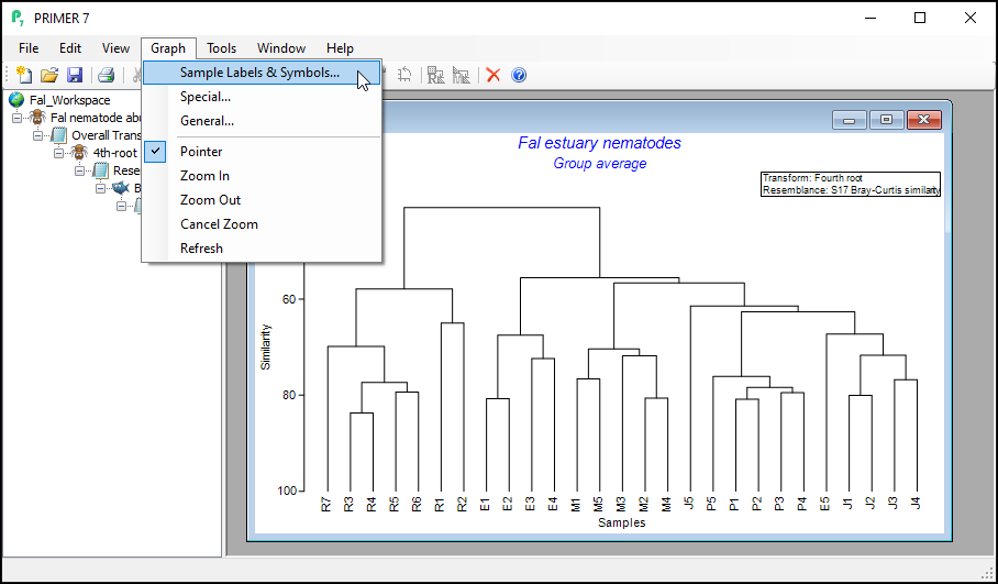
- With the dendrogram as the active window, click on Graph and you will see a range of options.
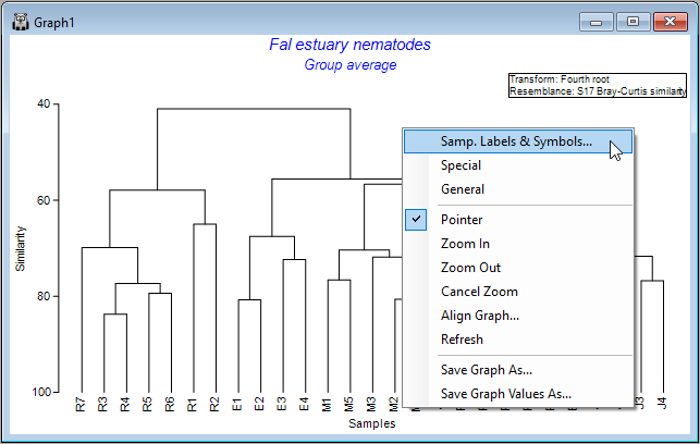
Alternatively, you can right-click anywhere inside the dendrogram's graphic window itself and a similar list pops up, along with additional options for saving the graphic (or graph values) as a separate file, etc. Note that you can also save any graph by clicking on File > Save Graph As... with the graphic you want as the active window.
The choices of Graph > Sample Labels & Symbols... and also Graph > General... will show you a set of options for changing elements that are common to all (or most) graph types in PRIMER (i.e., things like scales and labels to use for the x and y axes, titles and sub-titles, fonts, symbols, colours, etc.) In contrast, the choice of Graph > Special.. will provide a special menu of graphical options specific to that particular type of graph - in this case, a dendrogram.
Change labels and/or symbols
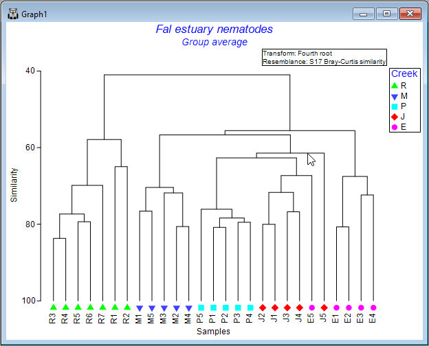
- Let's add some symbols to the plot, with the 4 creeks being represented by different symbols. Click Graph > Sample Labels & Symbols.... In the resulting 'Graph Options' dialog, under the 'Samp. labels & symbols' tab, choose (Labels $\checkmark$ Plot) & (Symbols $\checkmark$Plot & $\checkmark$By factor Creek), then click OK.
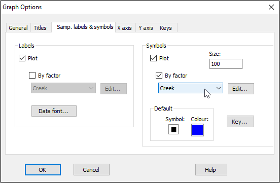
Note that the 'Samp. labels & symbols' dialog will automatically offer you the option to choose labels or symbols corresponding to any factors that are associated with your resemblance matrix. Tip: For graphing purposes, it is a good idea to use short names for samples (if you can) and (more importantly) for levels of factors, so they will be easy to display on plots.
The result is a more colourful and informative dendrogram, which clearly shows a pattern of (generally) high similarity among assemblages within each of the four creeks, (similar symbols tend to be clustered together), and some clear distinctions between assemblages in different creeks, with Restronguet Creek ('R') appearing most different from the others (only about ~40% similar to other creeks, on average).
Zoom in and out
If you have a very large dendrogram with a lot of samples, it is helpful to be able to zoom in and out in order to see details present in different portions of the dendrogram.
To Zoom in, click Graph > Zoom in (or click on the 'zoom-in' icon  in the ribbon of tools shown under the main menu items). In zoom-in mode, your cursor will change into a little 'plus' symbol
  when poised over your graphic, and with this you simply click on the dendrogram to zoom in on that area. Click multiple times to continue zooming in.
To Zoom out, click Graph > Zoom out (or click on the little icon with a minus symbol inside a magnifying glass  ). Now the cursor changes into a little 'minus' symbol
  , and clicking on the graphic zooms you back out again.
To cancel the zoom entirely (to see the entire dendrogram again), click on Graph > Cancel Zoom (or click on the cancel-zoom icon  ).
).
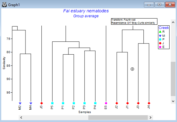
Collapse nodes to simplify
Another option, if you have a very large dendrogram, is to simplify the view by clicking on any one of the vertical branches. This will collapse all of the samples under that branch into a single entity, making it easier to see patterns in what remains. For example, click on the vertical branch that leads to all of the samples from Restronguet Creek ('R'), and the dendrogram will look like this:
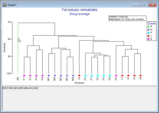
Simply click on that same vertical branch again to toggle that 'collapse' option off, and you will see all of the individual samples within that node again in the full dendrogram, as before.
Rotate leaves around the nodes
It is important to remember that the dendrogram should be thought of like a 'mobile', dangling from a ceiling. In this way, the leaves dangling from each node can be rotated around the node. Thus, the specific ordering of the samples you see in the dendrogram, while being constrained by it in some way, has a bit of flexibility: sample units can be rotated around the nodes.
To explore this flexibility visually, click on any horizontal line of the dendrogram, and you will see its leaves will 'flip', accordingly. Clearly, quite a lot of re-arrangements of the sample ordering provided in the initial output are possible, so it is often useful to experiment with this a bit to achieve an ordering that may be most useful for interpretation of relationships/clusters.
For example, one possible re-ordering looks like this:
Change the orientation
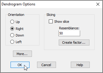
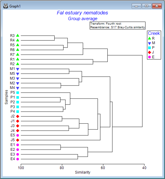
The default output orientation for a dendrogram in PRIMER is to have the hierarchical agglomeration going 'Up' (i.e., individual sampling units hang downwards); however, you can customise its orientation. For example, for the Fal estuary nematodes, click on Graph > Special..., then in the 'Dendrogram Options' dialog box, under 'Orientation', choose $\bullet$Right, and click OK.
This yields the following:
 .
.
Step 4: Ordination
The cluster analysis goes some way towards helping us to understand potential patterns of similarity among the samples. It is particularly good at showing us clusters of samples that are highly similar. To better visualise patterns of relationships among all of the samples simultaneously, we can use methods of ordination. In particular, non-metric multi-dimensional scaling (nMDS) is a wonderfully robust tool for visualising high-dimensional systems on the basis of a chosen resemblance measure ( Kruskal & Wish (1978) ; Clarke (1993) ). Non-metric MDS essentially places points into an arbitrary Euclidean space of set dimension (typically producing a 2D or 3D plot) so as to preserve, as well as possible, the rank-order of the dissimilarities between pairs of samples. For more details on multi-dimensional scaling, see Chapter 5 of 'Change in Marine Commmunities'.
Create a non-metric MDS plot
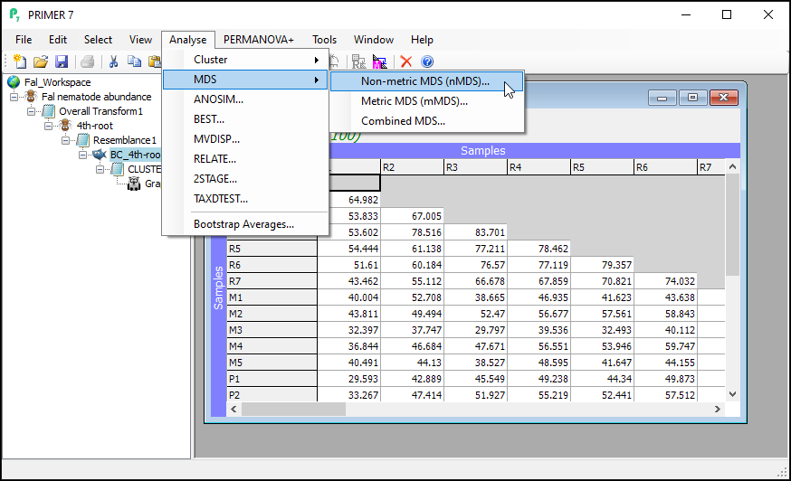
From the Bray-Curtis resemblance matrix ('BC_4th-root' in this example), click Analyse > MDS > Non-metric MDS..., then click OK to run the MDS algorithm with all of the default options.
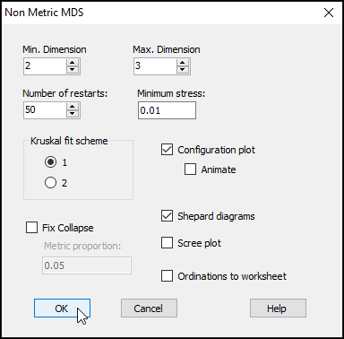
The resulting 'Multi-plot1' output graphic gives you 4 individual plots (in a 2-by-2 array), as follows:
- the best 2D solution (from 50 random starts)
- the Shepard diagram for the best 2D solution
- the best 3D solution (from 50 random starts); and
- the Shepard diagram for the best 3D solution
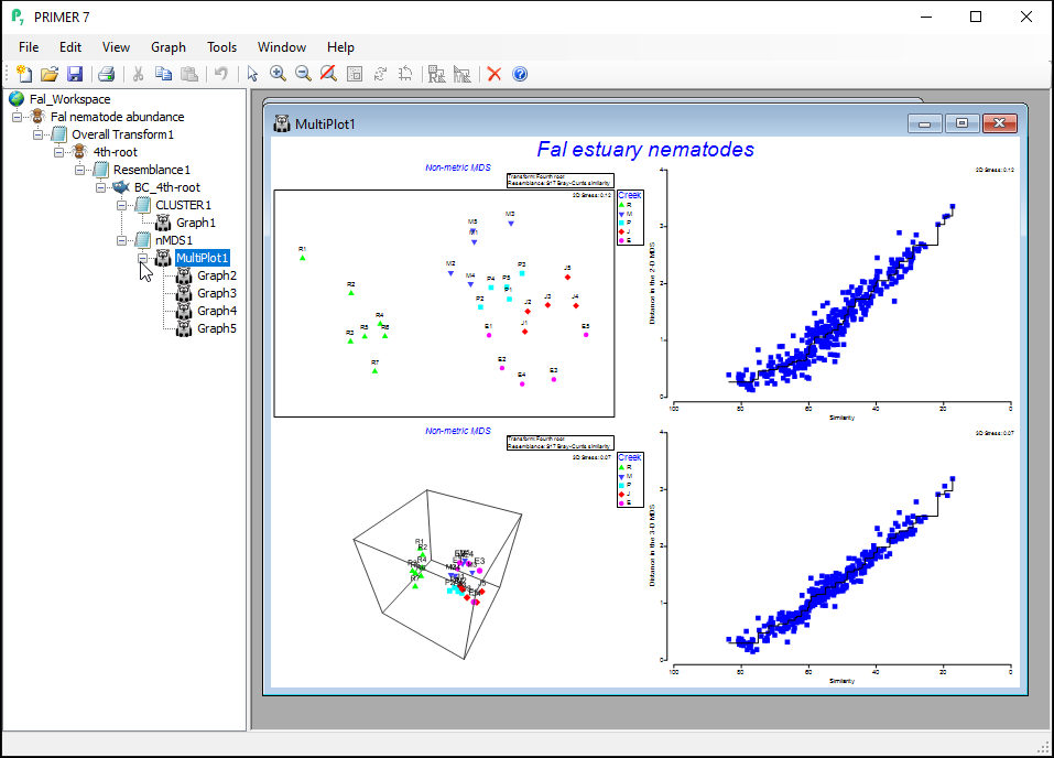
Clicking on the '+' symbol next to the word 'MultiPlot1' in the Explorer tree reveals the four graphics that comprise this multi-plot object ('Graph2', 'Graph3', 'Graph4', 'Graph5'). If you then click on 'Graph2' in the Explorer tree, or if you click in the Multi-plot itself on the plot in the upper left-hand corner, you will see a single graphic now; namely the best (lowest-stress) 2-dimensional non-metric MDS plot for the Fal estuary nematodes.
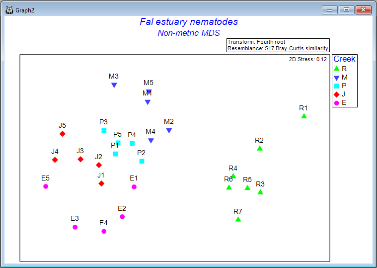
Interpretation
The plot does not have x and y axes, as the scale here is arbitrary. The non-metric MDS algorithm attempts only to preserve rank-order dissimilarities, so interpretations are restricted to relative distances among points in the plot. For example, we can make statements like: "The dissimilarity between sample R7 and M3 appears to be larger than the dissimilarity between sample M3 and M2", but we cannot tell (directly from the plot) what the specific sizes of those particular dissimilarities are.
It is clear from this output that Restronguet Creek ('R') has assemblages of nematodes that are quite dissimilar from those found in the other four creeks. That's consistent with what we saw in the cluster analysis of these data. We can, however, get quite a few more insights from the nMDS plot than were apparent in the cluster dendrogram. For example, relationships among the assemblages from the other four creeks seem to be ordered (from the bottom-left towards the top of the plot) as follows: Percuil → St. Just → Pill → Mylor. It is also apparent that the samples from Pill Creek ('P') form a tighter cluster hence are not as variable as the samples from (say) Restronguet Creek ('R'), which are more spread out. Being able to see potential gradients of change in assemblages, the degree of between-group differences, as well as the relative sizes of within-group dispersions, is all very useful.
Step 5: ANOSIM test
The ordination plot gives us a visualisation of the rank-order relationships among the samples, based on the dissimilarity measure. Next, we may wish to test the null hypothesis that there are no differences among the five creeks. We can use a non-parametric multivariate permutation test called analysis of similarities (ANOSIM, Clarke (1993) ) for this test. For more details on the ANOSIM test, see also Chapter 6 in 'Change in Marine Communities'. We will be doing a one-way ANOSIM test here (as there is a single factor in this example); for more information on multi-way designs with ordered and/or unordered factors, see Somerfield et al. (2021a) , Somerfield et al. (2021b) and Somerfield et al. (2021c) .
Perform the ANOSIM test
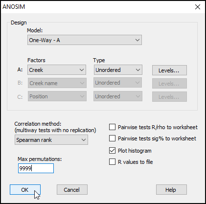
From the Bray-Curtis resemblance matrix (called 'BC_4th-root' in this example), click on Analyse > ANOSIM... and you will see the ANOSIM dialog.
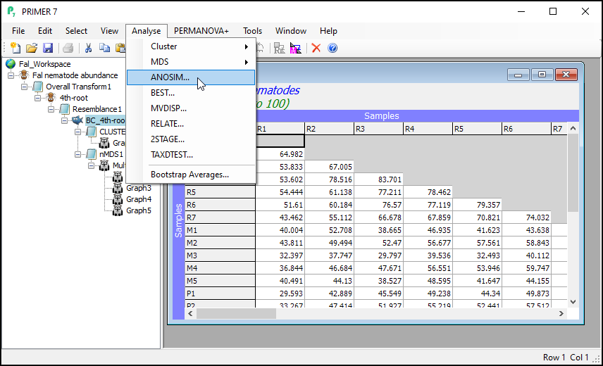
Here, we are performing a one-way ANOSIM (there is just one factor whose levels are un-ordered), so we can leave most of the defaults in the dialog as they are. We should, however, increase the permutations to a larger value, so change the 'Max permutations' from the default value of 999 to 9999, then click 'OK'.
The results, including the overall ANOSIM test for differences among all groups, as well as the ANOSIM tests of all pair-wise comparisons, are provided in the output file called 'ANOSIM1'. The overall test is clearly highly significant, with R = 0.816 and a significance level of 0.01%. This corresponds to a p-value of P = 0.0001 (the smallest possible value attainable for 9999 permutations). Note that, in PRIMER, all p-values are reported for ANOSIM tests as 'significance levels', expressed as a percentage. For example, a p-value of P = 0.0619 would be given in the output file as a significance level of 6.19%.
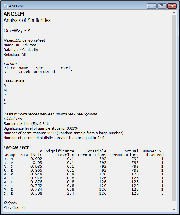
The full set of pairwise tests is performed, and the strength of the differences between any pair of groups is well captured by the relative sizes of the R statistic - larger values indicate groups that are more different (more distinct or more easily distinguishable) from one another. The comparison of assemblages from St Just Creek (J) vs Percuil Creek (E) has the lowest R statistic (R = 0.508) of any tests done in this example, although this difference is still a statistically significant one (P = 0.024). Note that no 'correction' is being made here for multiple tests. The end-user is able to consider applying such a correction if desired (or may perhaps simply consider the frequency of 'significant' results obtained, given the number of tests performed), bearing in mind that each test is done using an exact permutation algorithm in order to generate the individual significance levels produced in the output, ignoring all other tests.
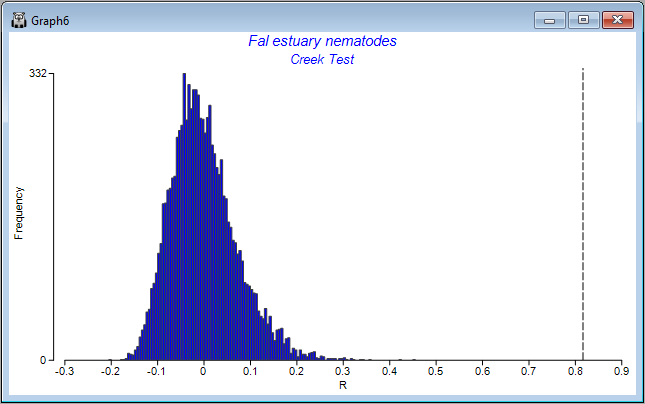
Also provided as output ('Graph6') is a histogram showing the distribution of values of the ANOSIM R statistic under permutation for the overall test. The observed value of the ANOSIM R statistic (0.816) is shown on the plot as a vertical dotted line. The purpose of the histogram is to show visually the departure of the observed value of R (or not) from the distribution of values of R expected under a true null hypothesis of 'no difference' among the groups.
Summary of the pathway
A summary of the essential routines in PRIMER that were used to produce the 5-step analysis pathway described above for the nematode (biotic) data from the Fal estuary is given in the table below:
| Step | To implement in PRIMER: |
|---|---|
| 1. Fourth-root transformation | From the original data sheet: click Pre-treatment > Transform(overall) > (Transformation: Fourth root), click OK. |
| 2. Bray-Curtis resemblance | From the transformed data sheet: click Analyse > Resemblance > (Measure $\bullet$Bray-Curtis similarity) & (Analyse between $\bullet$Samples), click OK. |
| 3. Hierarchical group-average cluster analysis | From the resemblance matrix: click Analyse > Cluster > CLUSTER... > (Cluster mode $\bullet$Group average) & ($\checkmark$Plot dendrogram), click Finish. |
| 4. Non-metric MDS ordination | From the resemblance matrix: click Analyse > MDS > Non-metric MDS (nMDS)... > (see if you are happy with the default settings), click OK. |
| 5. Analysis of similarities (ANOSIM) | From the resemblance matrix: click Analyse > ANOSIM... > Design > (Model: One-Way - A) & Factors > A: Creek) & (Max permutations: 9999) & ($\checkmark$Plot histogram), click OK. |