6. Some Wizards
Basic multivariate analysis
A useful analysis pathway (including the Example Analysis Pathway done above, with its five steps), can be accomplished in one fell swoop using the Basic multivariate analysis wizard. This will perform a suite of multivariate analyses commonly performed for either biotic or environmental data types, with options available that match the typical choices made for handling these different types of data.
Run the 'Basic multivariate analysis' wizard
Let's suppose you wanted to repeat the step-by-step analyses we did before, but this time using a different pre-treatment option. For example, you may decide you'd like to analyse the same data using presence/absence information only, so as to emphasise only the turnover in species identities (and not differences in abundance values) across sample units. It would be great to run this whole set of analyses quickly, rather than going through them again one at a time.
Click on the original 'Fal nematode abundance' datasheet in the Explorer tree and then click Wizards > Basic multivariate analysis....
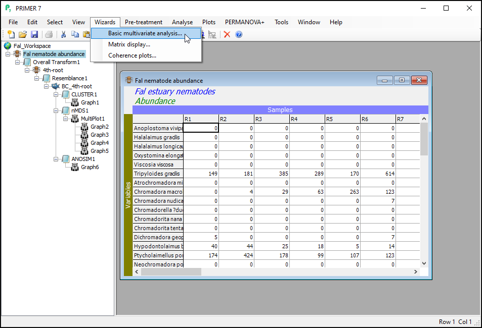
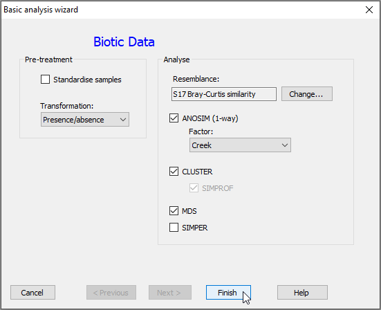
In the dialog box that follows, we can see that PRIMER is offering to perform a suite of basic multivariate analyses that are commonly performed for 'Biotic Data' (shown in bold blue font at the top). You can choose from a couple of (common) pre-treatment options, and then it will perform the analyses you choose (via the relevant checkboxes under 'Analyse'), using the default options for each routine. Note that different options would be shown for data of a different type (e.g., for environmental data). Recall that the 'type' of data is specified by you when you import the data into PRIMER. This can be changed for a given data sheet by clicking on Edit > Properties at any time.
Under 'Pre-treatment', choose 'Transformation: Presence/absence' and under 'Analyse', leave all of the default options, except you can untick the checkbox next to the 'SIMPER' routine (for now), then click Finish.
All of the requested analyses are done, and the resulting output files and graphics are shown in the Explorer tree window. Click on any of the items in the Explorer tree to see the steps that were taken, including specific data sheets, resemblance matrices, graphical outputs and results files. Although you will generally use PRIMER to perform individual analyses, one routine at a time, this wizard provides a quick way to achieve multiple analyses (provided you know a priori that you want to do them) with a single stroke.
The ANOSIM results ('ANOSIM2') and the 2D nMDS output (Graph9) obtained by this run of the wizard are shown below:
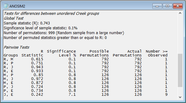
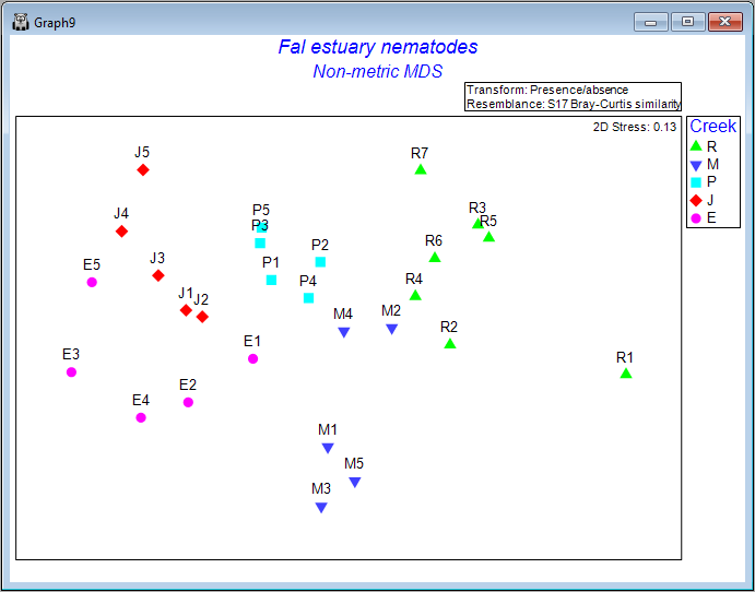
In this example, we can see that there are statistically significant differences in the identities of nematode species among the five creeks (ANOSIM R = 0.743, P = 0.001 with 999 permutations), although the pattern in the nMDS plot suggests that the difference between Restronguet Creek and the other creeks is not as great as what was observed when abundance information was included in the Bray-Curtis calculation. (Compare 'Graph9', as shown above, with 'Graph2' that we obtained earlier.)
Expanding and collapsing the Explorer tree
Note that this new set of analyses, performed using the wizard on the original imported data, will initiate its own new branch of the Explorer tree. You can always initiate a new analysis starting from a given item in the tree (e.g., from a data sheet or a resemblance matrix, etc.), and the tree will expand, generating a new branch, to accommodate these new analyses. You can use the '+' and '-' symbols in the Explorer tree to 'roll up' or 'unpack' the items in the tree belonging to a particular branch at any time.
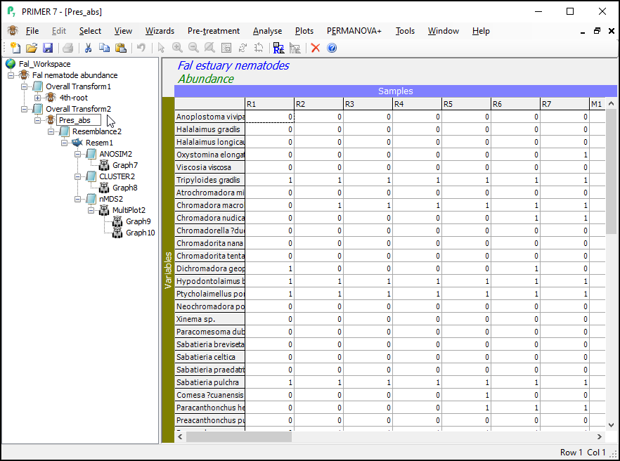
For example, clicking on the '-' symbol next to the item named '4th-root' will 'roll up' all of the items associated with our original analysis (based on a fourth-root transformation), so the analyses that were done by the Wizard (based on presence/absence) are now closer to the top of the Explorer tree window. For clarity, we might choose to rename the sheet called 'Data1' (the data sheet produced by the wizard after performing the presence/absence transformation) to 'Pres_abs'.
Matrix display
The Matrix display wizard produces a shade plot of a multivariate data matrix, with a useful ordering of its rows and columns that can help to clarify inter-sample and inter-species relationships, as well as gradients in turnover based on a resemblance matrix of choice.
Create a Matrix display
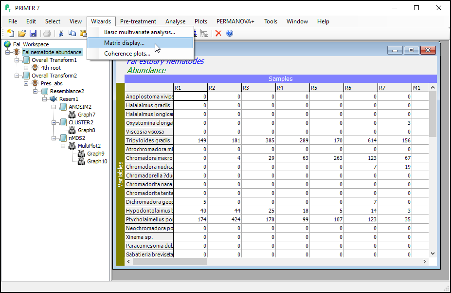
Click on the original data sheet ('Fal nematode abundance', at the top of the Explorer tree window), then click on Wizards > Matrix display....
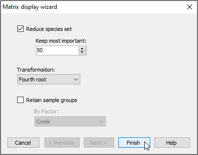
In the 'Matrix display wizard' dialog, leave the defaults, but choose (Transformation: Fourth root), then click Finish.
The default graphic ('Graph13')shows a shade plot of the 50 most important species (here, 'most important' is defined based on the percent(%) of the total abundance obtained by a species in any sample). Each value in the data matrix is represented by a shaded rectangle (from white to black, by default), where the degree of shading corresponds to the abundance values (after fourth-root transformation), as shown in the key (in this example, the transformed data values range from 0 to 8).
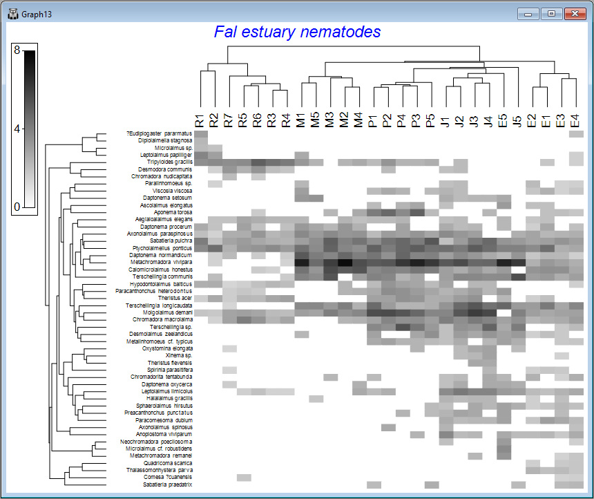
Here, samples are ordered so as to maximise their concordance with a model of 'seriation' (or turnover), defined on the basis of Bray-Curtis similarities calculated on fourth-root transformed data. They are (furthermore) constrained according to a dendrogram constructed from a hierarchical group-average cluster analysis of those similarities ('Graph12' in the Explorer tree). The species, in turn, are ordered according to a model of seriation based on an Index of Association calculated among species after first standardising the species variables by their total abundance. They are (similarly) further constrained by their own cluster dendrogram ('Graph11' in the Explorer tree).
It would perhaps be helpful to see the different creeks as different symbols on this plot. With Graph13 (the shade plot itself) as the active item in the Explorer tree, click Graph > Sample Labels & Symbols, then choose (Labels $\checkmark$Plot) & (Symbols $\checkmark$Plot > $\checkmark$By factor Creek) and click OK.
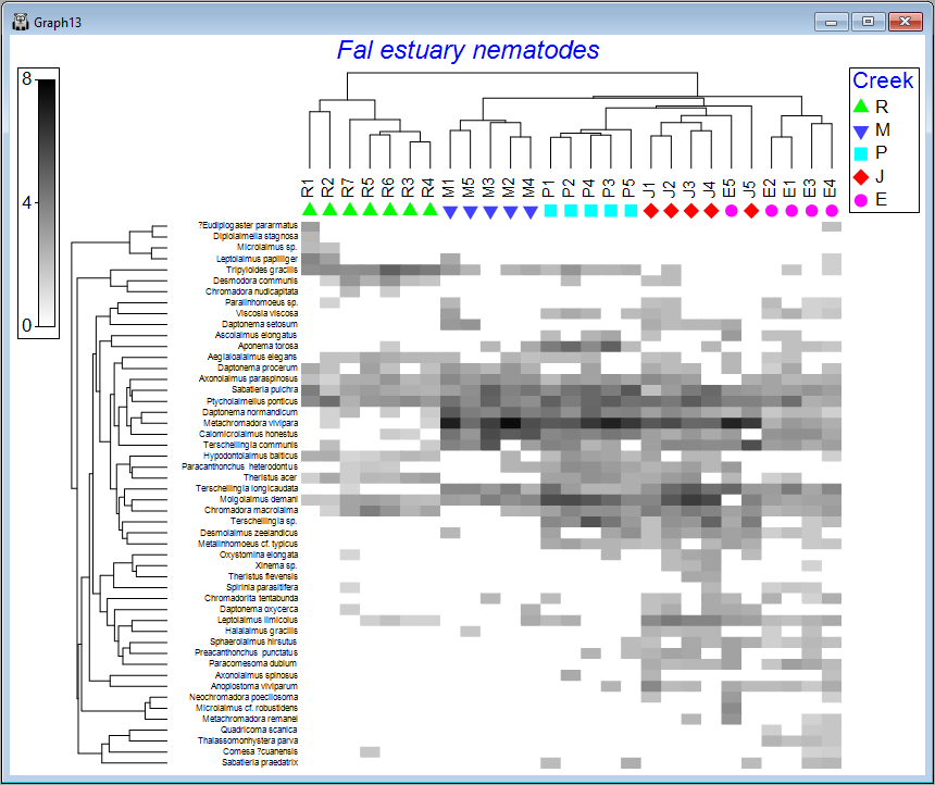
We can see from the above image that some creeks contain a rather different set of species and/or different abundances of the same species. The ordering of whole creeks shown in the shade plot (obtained using the 'seriation' model) reflects the ordering we saw in the nMDS plot for these creeks as well (see the page 'Step 4. Ordination').
From a matrix display (or shade plot), clicking on Graph > Special reveals a very large number of colours and other graphical options and parameters allowing the user to alter and enhance this graphic for their purposes. These are too numerous to describe in detail here, but they include a host of methods for sorting the rows and/or columns (i.e., by clicking on the Reorder... button in the Graph > Special dialog).