Chapter 1: A framework for studying changes in community structure
- 1.1 Introduction
- 1.2 Univariate techniques
- 1.3 Example: Frierfjord macrofauna
- 1.4 Distributional techniques
- 1.5 Example: Loch Linnhe macrofauna
- 1.6 Example: Garroch Head macrofauna
- 1.7 Multivariate techniques
- 1.8 Example: Nutrient enrichment experiment, Solbergstrand
- 1.9 Summary
1.1 Introduction
The purpose of this opening chapter is twofold:
a) to introduce some of the data sets which are used extensively, as illustrations of techniques, throughout the manual;
b) to outline a framework for the various possible stages in a community analysis¶.
Examples are given of some core elements of the recommended approaches, foreshadowing the analyses explained in detail later and referring forward to the relevant chapters. Though, at this stage, the details are likely to remain mystifying, the intention is that this opening chapter should give the reader some feel for where the various techniques are leading and how they slot together. As such, it is intended to serve both as an introduction and a summary.
Stages
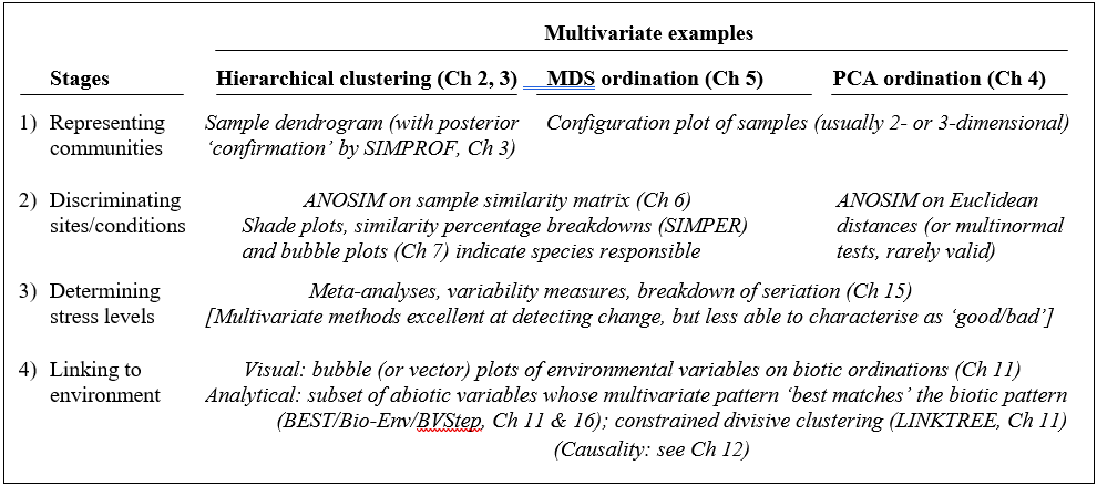
It is convenient to categorise possible analyses broadly into four main stages.
1) Representing communities by graphical description of the relationships between the biota in the various samples. This is thought of as pure description, rather than explanation or testing, and the emphasis is on reducing the complexity of the multivariate information in typical species/samples matrices, to obtain some form of low-dimensional picture of how the biological samples interrelate.
2) Discriminating sites/conditions on the basis of their biotic composition. The paradigm here is that of the hypothesis test, examining whether there are ‘proven’ community differences between groups of samples identified a priori, for example demonstrating differences between control and putatively impacted sites, establishing before/after impact differences at a single site, etc. A different type of test is required for groups identified a posteriori.
3) Determining levels of stress or disturbance, by attempting to construct biological measures from the community data which are indicative of disturbed conditions. These may be absolute measures (“this observed structural feature is indicative of pollution”) or relative criteria (‘under impact, this coefficient is expected to decrease in comparison with control levels’). Note the contrast with the previous stage, which is restricted to demonstrating differences between groups of samples, not ascribing directional change (e.g. deleterious consequence).
4) Linking to environmental variables and examining issues of causality of any changes. Having allowed the biological information to ‘tell its own story’, any associated physical or chemical variables matched to the same set of samples can be examined for their own structure and its relation to the biotic pattern (its ‘explanatory power’). The extent to which identified environmental differences are actually causal to observed community changes can only really be determined by manipulative experiments, either in the field or through laboratory /mesocosm studies.
Techniques
The spread of methods for extracting workable representations and summaries of the biological data can be grouped into three categories.
1) Univariate methods collapse the full set of species counts for a sample into a single coefficient, for example a species diversity index. This might be some measure of the numbers of different species (species richness), perhaps for a given number of individuals, or the extent to which the community counts are dominated by a small number of species (dominance/evenness index), or some combination of these. Also included are biodiversity indices that measure the degree to which species or organisms in a sample are taxonomically or phylogenetically related to each other. Clearly, the a priori selection of a single taxon as an indicator species, amenable to specific inferences about its response to a particular environmental gradient, also gives rise to a univariate analysis.
2) Distributional techniques, also termed graphical or curvilinear plots (when they are not strictly distributional), are a class of methods which summarise the set of species counts for a single sample by a curve or histogram. One example is k-dominance curves ( Lambshead, Platt & Shaw (1983) ), which rank the species in decreasing order of abundance, convert the values to percentage abundance relative to the total number of individuals in the sample, and plot the cumulated percentages against the species rank. This, and the analogous plot based on species biomass, are superimposed to define ABC (abundance-biomass comparison) curves ( Warwick (1986) ), which have proved a useful construct in investigating disturbance effects. Another example is the species abundance distribution (sometimes termed SAD curves or the distribution of individuals amongst species), in which the species are categorised into geometrically-scaled abundance classes and a histogram plotted of the number of species falling in each abundance range (e.g. Gray & Pearson (1982) ). It is then argued, again from empirical evidence, that there are certain characteristic changes in this distribution associated with community disturbance.
Such distributional techniques relax the constraint in the previous category that the summary from each sample should be a single variable; here the emphasis is more on diversity curves than single diversity indices, but note that both these categories share the property that comparisons between samples are not based on particular species identities: two samples can have exactly the same diversity or distributional structure without possessing a single species in common.
3) Multivariate methods are characterised by the fact that they base their comparisons of two (or more) samples on the extent to which these samples share particular species, at comparable levels of abundance. Either explicitly or implicitly, all multivariate techniques are founded on such similarity coefficients, calculated between every pair of samples. These then facilitate a classification or clustering§ of samples into groups which are mutually similar, or an ordination plot in which, for example, the samples are ‘mapped’ (usually in two or three dimensions) in such a way that the distances between pairs of samples reflect their relative dissimilarity of species composition.
Methods of this type in the manual include: hierarchical agglomerative clustering (see Everitt (1980) ) in which samples are successively fused into larger groups; binary divisive clustering, in which groups are successively split; and two types of ordination method, principal components analysis (PCA, e.g. Chatfield & Collins (1980) ) and non-metric/metric multi-dimensional scaling (nMDS/mMDS, the former often shortened to MDS, Kruskal & Wish (1978) ).
For each broad category of analysis, the techniques appropriate to each stage are now discussed, and pointers given to the relevant chapters.
¶ The term community is used throughout the manual, somewhat loosely, to refer to any assemblage data (samples leading to counts, biomass, % cover, etc. for a range of species); the usage does not necessarily imply internal structuring of the species composition, for example by competitive interactions.
§These terms tend to be used interchangeably by ecologists, so we will do that also, but in statistical language the methods given here are all clustering techniques, classification usually being reserved for classifying unknown new samples into known prior group structures.
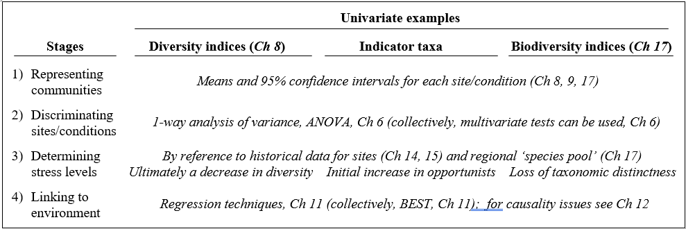
1.2 Univariate techniques
For diversity indices and other single-variable extractions from the data matrix, standard statistical methods are usually applicable and the reader is referred to one of the many excellent general statistics texts (e.g. Sokal & Rohlf (1981) ). The requisite techniques for each stage are summarised in Table 1.1. For example, when samples have the structure of a number of replicates taken at each of a number of sites (or times, or conditions), computing the means and 95% confidence intervals gives an appropriate representation of the Shannon diversity (say) at each site, with discrimination between sites being demonstrated by one-way analysis of variance (ANOVA), which is a test of the null hypothesis that there are no differences in mean diversity between sites. Linking to the environment is then also relatively straightforward, particularly if the environmental variables can be condensed into one (or a small number of) key summary statistics. Simple or multiple regression of Shannon diversity as the dependent variable, against the environmental descriptors as independent variables, is then technically feasible, though rarely very informative in practice, given the over-condensed nature of the information utilised.§
Table 1.1. Univariate techniques. Summary of analyses for the four stages.
For impact studies, much has been written about the effect of pollution or disturbance on diversity measures: whilst the response is not necessarily undirectional (under the hypothesis of Huston (1979) , diversity is expected to rise at intermediate disturbance levels before its strong decline with gross disturbance), there is a sense in which determining stress levels is possible, through relation to historical diversity patterns for particular environmental gradients. Similarly, empirical evidence may exist that particular indicator taxa (e.g. Capitellids) change in abundance along specific pollution gradients (e.g. of organic enrichment). Note though that, unlike the diversity measures constructed from abundances across species, averaged in some way¶, indicator species levels will not initially satisfy the assumptions necessary for routine statistical analysis. Log transforms of such counts will help but, for most individual species, abundance across the set of samples is likely to be a poorly-behaved variable, statistically speaking. Typically, a species will be absent from many of the samples and, when present, the counts are often highly variable, with abundance probability distribution heavily right-skewed†. Thus, for all but the most common individual species, transformation is no real help and parametric statistical analyses cannot be applied to the counts, in any form. In any case, it is not valid to ‘snoop’ in a large data matrix, of typically 100–250 taxa, for one or more ‘interesting’ species to analyse by univariate techniques (any indicator or keystone species selection must be done a priori). Such arguments lead to the tenets underlying this manual:
a) community data are usually highly multivariate (large numbers of species, each subject to high statistical noise) and need to be analysed en masse in order to elicit the important biological signal and its relation to the environment;
b) standard parametric modelling is totally invalid.
Thus, throughout, little emphasis is given to representing communities by univariate measures, though some definitions of indices can be found at the start of Chapter 8, some brief remarks on hypothesis testing (ANOVA) at the start of Chapter 6, a discussion of transformations (to approximate normality and constant variance) at the start of Chapter 9, an example given of a univariate regression between biota and environment in Chapter 11, and a more extensive discussion of sampling properties of diversity indices, and biodiversity measures based on taxonomic relatedness, makes up Chapter 17. Finally, Chapter 14 gives a series of detailed comparisons of univariate with distributional and multivariate techniques, in order to gauge their relative sensitivities and merits in a range of practical studies.
§ Though most of this chapter assumes that diversity indices will be treated independently (hence ANOVA and regression models), an underused possibility is illustrated at the end of Chapter 8, that a set of differing univariate diversity measures be treated as a multivariate data matrix, with ‘dissimilarity’ defined as normalised Euclidean distance, and input to the same tools as used for multivariate community data (thus ANOSIM and BEST analyses).
¶ And thus subject to the central limit theorem, which will tend to induce statistical normality.
1.3 Example: Frierfjord macrofauna
The first example is from the IOC/GEEP practical workshop on biological effects of pollutants ( Bayne, Clarke & Gray (1988) ), held at the University of Oslo, August 1986. This attempted to contrast a range of biochemical, cellular, physiological and community analyses, applied to field samples from potentially contaminated and control sites, in a fjordic complex (Frierfjord/Langesundfjord) linked to Oslofjord ({F}, Fig. 1.1). For the benthic macrofaunal component of this study ( Gray, Aschan, Carr et al. (1988) ), four replicate 0.1m2 Day grab samples were taken at each of six sites (A-E and G, Fig 1.1) and, for each sample, organisms retained on a 1.0 mm sieve were identified and counted. Wet weights were determined for each species in each sample, by pooling individuals within species.
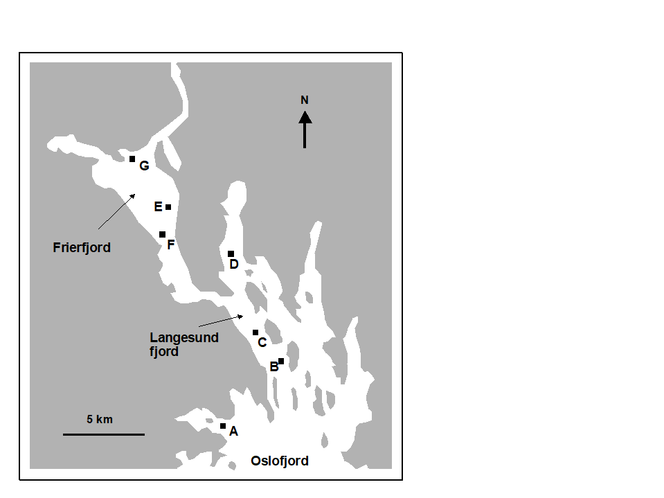 Fig. 1.1. Frierfjord, Norway {F}. Benthic community sampling sites (A-G) for the IOC/GEEP Oslo Workshop; site F omitted for macrobenthos.
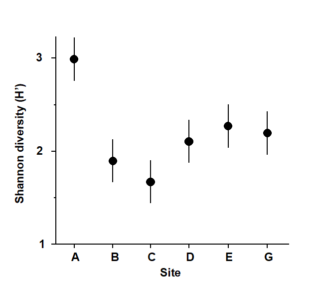
Fig. 1.2. Frierfjord macrofauna {F}. Means and 95% confidence intervals for Shannon diversity (H'), from four replicates at each of six sites (A-E, G).
Part of the resulting data matrix can be seen in Table 1.2: in total there were 110 different taxa categorised from the 24 samples. Such matrices (abundance, A, and/or biomass, B) are the starting point for the biotic analyses of this manual, and this example is typical in respect of the relatively high ratio of species to samples (always >> 1) and the prevalence of zeros. Here, as elsewhere, even an undesirable reduction to the 30 ‘most important’ species (see Chapter 2) leaves more than 50% of the matrix consisting of zeros. Standard multivariate normal analyses (e.g. Mardia, Kent & Bibby (1979) ) of these counts are clearly ruled out; they require both that the number of species (variables) be small in relation to the number of samples, and that the abundance or biomass values are transformable to approximate normality: neither is possible.
Table 1.2. Frierfjord macrofauna {F}. Abundance and biomass matrices (part only) for the 110 species in 24 samples (four replicates at each of six sites A-E, G); abundance in numbers per 0.1m2, biomass in mg per 0.1m2.
| Species | Samples |
|---|
|
A1 | A2 | A3 | A4 | B1 | B2 | B3 | B4 |
|---|---|---|---|---|---|---|---|---|
| Abundance | ||||||||
| Cerianthus lloydi | 0 | 0 | 0 | 0 | 0 | 0 | 0 | 0 |
| Halicryptus sp. | 0 | 0 | 0 | 1 | 0 | 0 | 0 | 0 |
| Onchnesoma | 0 | 0 | 0 | 0 | 0 | 0 | 0 | 0 |
| Phascolion strombi | 0 | 0 | 0 | 1 | 0 | 0 | 1 | 0 |
| Golfingia sp. | 0 | 0 | 0 | 0 | 0 | 0 | 0 | 0 |
| Holothuroidea | 0 | 0 | 0 | 0 | 0 | 0 | 0 | 0 |
| Nemertina, indet. | 12 | 6 | 8 | 6 | 40 | 6 | 19 | 7 |
| Polycaeta, indet. | 5 | 0 | 0 | 0 | 0 | 0 | 1 | 0 |
| Amaena trilobata | 1 | 1 | 1 | 0 | 0 | 0 | 0 | 0 |
| Amphicteis gunneri | 0 | 0 | 0 | 0 | 4 | 0 | 0 | 0 |
| Ampharetidae | 0 | 0 | 0 | 0 | 1 | 0 | 0 | 0 |
| Anaitides groenl. | 0 | 0 | 0 | 1 | 1 | 0 | 0 | 0 |
| Anaitides sp. | 0 | 0 | 0 | 0 | 0 | 0 | 0 | 0 |
| . . . . | ||||||||
| Biomass | ||||||||
| Cerianthus lloydi | 0 | 0 | 0 | 0 | 0 | 0 | 0 | 0 |
| Halicryptus sp. | 0 | 0 | 0 | 26 | 0 | 0 | 0 | 0 |
| Onchnesoma | 0 | 0 | 0 | 0 | 0 | 0 | 0 | 0 |
| Phascolion strombi | 0 | 0 | 0 | 6 | 0 | 0 | 2 | 0 |
| Golfingia sp. | 0 | 0 | 0 | 0 | 0 | 0 | 0 | 0 |
| Holothuroidea | 0 | 0 | 0 | 0 | 0 | 0 | 0 | 0 |
| Nemertina, indet. | 1 | 41 | 391 | 1 | 5 | 1 | 2 | 1 |
| Polycaeta, indet. | 9 | 0 | 0 | 0 | 0 | 0 | 0 | 0 |
| Amaena trilobata | 144 | 14 | 234 | 0 | 0 | 0 | 0 | 0 |
| Amphicteis gunneri | 0 | 0 | 0 | 0 | 45 | 0 | 0 | 0 |
| Ampharetidae | 0 | 0 | 0 | 0 | 0 | 0 | 0 | 0 |
| Anaitides groenl. | 0 | 0 | 0 | 7 | 11 | 0 | 0 | 0 |
| Anaitides sp. | 0 | 0 | 0 | 0 | 0 | 0 | 0 | 0 |
| . . . . |
As discussed above, one easy route to simplification of this high-dimensional (multi-species) complexity is to reduce each matrix column (sample) to a single univariate description. Fig. 1.2 shows the results of computing the Shannon diversity (H', see Chapter 8) of each sample¶, and plotting for each site the mean diversity and its 95% confidence interval, based on a pooled estimate of variance across all sites from the ANOVA table, Chapter 6. (An analysis of the type outlined in Chapter 9 shows that prior transformation of H' is not required; it already has approximately constant variance across the sites, a necessary prerequisite for standard ANOVA). The most obvious feature of Fig. 1.2 is the relatively higher diversity at the control/reference location, A.
¶ Using the PRIMER DIVERSE routine.
1.4 Distributional techniques
Table 1.3. Distributional techniques. Summary of analyses for the four stages.
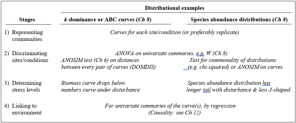
A less condensed form of diversity summary for each sample is offered by distributional/graphical methods, outlined for the four stages in Table 1.3.
Representation is by curves or histograms (Chapter 8), either plotted for each replicate sample separately or for pooled data within sites or conditions. The former permits a visual judgement of the sampling variation in the curves and, as with diversity indices, replication is required to discriminate sites, i.e. test the null hypothesis that two or more sites (/conditions etc.) have the same curvilinear structure. One approach to testing is to summarise each replicate curve by a single statistic and apply ANOVA as before: for the ABC method the W statistic (Chapter 8) measures the extent to which the biomass curve ‘dominates’ the abundance curve, or vice-versa. This is simply one more diversity index but it can be an effective supplement to the standard suite (richness, evenness etc), because it is seen to capture a ‘different axis’ of information in a multivariate treatment of multiple diversity indices (see the end of Chapter 8). For k-dominance or SAD curves, pairwise distance between replicate curves† can turn testing into exactly the same problem as that for fully multivariate data and the ANOSIM tests of Chapter 6 can then be used.
The distributional and graphical techniques have been proposed specifically as a way of determining stress levels. For the ABC method, the strongly polluted (/disturbed) state is indicated if the abundance k-dominance curve falls above the biomass curve throughout its length (e.g. Fig. 1.4): the phenomenon is linked to the loss of large-bodied ‘climax’ species and the rise of small-bodied opportunists. Note that the ABC method claims to give an absolute measure, in the way that disturbance status is indicated on the basis of samples from a single site; in practice, however, it is always wise to design collection from (matched) impacted and control sites to confirm that the control condition exhibits the undisturbed ABC pattern (biomass curve above the abundance curve, throughout).
Similarly, the species abundance distribution has features characteristic of disturbed status (e.g. see the middle plots in Fig. 1.6), namely a move to a less J-shaped distribution by a reduction in the first one or two abundance classes (loss of rarer species), combined with the gain of some higher abundance classes (very numerous opportunist species).
The distributional and graphical methods may thus have particular merits in allowing stressed conditions to be recognised, but they are limited in sensitivity to detect environmental change (Chapter 14). This is also true of linking to environmental data, which needs the curve(s) for each sample to be reduced to a summary statistic (e.g. W), single statistics then being linked to an environmental set by multiple regression.¶
† This uses the PRIMER DOMDIS routine for k-dominance plots, page 8.5, as in Clarke (1990) , with a similar idea applicable to SAD curves or other histogram or cumulative frequency data. This will be generally more valid than Kolmogorov-Smirnov or $\chi ^ 2$ type tests because of the lack of independence of species in a single sample. A valid alternative is again to calculate a univariate summary from each distribution (location or spread or skewness), and test as with any other diversity index, by ANOVA tests.
¶ As for the discussion on diversity indices (Table 1.1), if such univariate summaries from curves are added to other diversity indices then all could be entered into multivariate ANOSIM and BEST/linkage analyses, as for community data (Chapters 6, 11).
1.5 Example: Loch Linnhe macrofauna
Table 1.4. Loch Linnhe macrofauna {L}. Abundance/biomass matrix (part only); one (pooled) set of values per year (1963–1973).
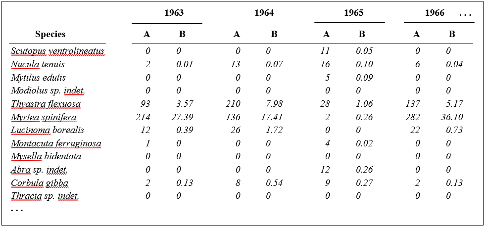
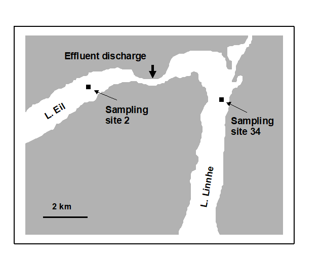
Fig. 1.3. Loch Linnhe and Loch Eil, Scotland {L}. Map of site 34 (Linnhe) and site 2 (Eil), sampled annually over 1963–1973.
Pearson (1975) describes a time series of macrobenthic community samples, taken over the period 1963–1973 inclusive, at two sites in a sea loch system on the west coast of Scotland ({L}, Fig. 1.3.) Pooling to a single sample for each of the 11 years resulted in abundance and biomass matrices of 111 rows (species) and 11 columns (samples), a small part of which is shown in Table 1.4.¶ Starting in 1966, pulp-mill effluent was discharged to the sea lochs (Fig. 1.3), with the rate increasing in 1970 and a significant reduction taking place in 1972 ( Pearson (1975) ). The top left-hand plot of Fig 1.4 shows the Shannon diversity of the macrobenthic samples over this period, and the remaining plots the ABC curves for each year.† There appears to be a consistent change of structure from one in which the biomass curve dominates the abundance curve in the early years, to the curves crossing, reversing altogether and then finally reverting to their original form.
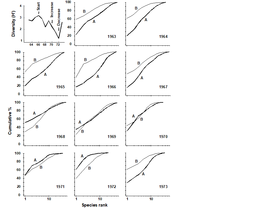 Fig. 1.4. Loch Linnhe macrofauna {L}. Top left: Shannon diversity over the 11 annual samples, also indicating timing of start of effluent discharge and a later increase and decrease in level; remaining plots show ABC curves for the separate years 1963–1973 (B = biomass, thin line; A = abundance, thick line).
¶ It is displayed in this form purely for illustration; this is not a valid file format for PRIMER, which requires the abundance and biomass information to be in separate (same-shape) arrays.
† Computed from the PRIMER Dominance Plot routine.
1.6 Example: Garroch Head macrofauna
Pearson & Blackstock (1984) describe the sampling of a transect of 12 sites across the sewage-sludge disposal ground at Garroch Head in the Firth of Clyde, SW Scotland ({G}, Fig. 1.5). The samples considered here were taken during 1983 and consisted of abundance and biomass values of 84 macrobenthic species, together with associated contaminant data on the extent of organic enrichment and the concentrations of heavy metals in the sediments. Fig. 1.6 shows the resulting species abundance distributions for the twelve sites, i.e. at site 1, twelve species were represented by a single individual, two species by 2–3 individuals, three species by 4–7 individuals, etc. ( Gray & Pearson (1982) ). For the middle sites close to the dump centre, the hypothesised loss of less-abundant species, and gain of a few species in the higher geometric classes, can clearly be seen.
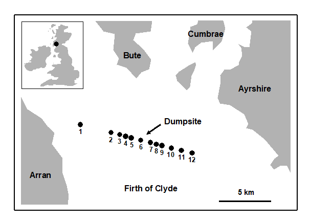
Fig. 1.5. Garroch Head, Scotland {G}. Location of sewage sludge dump ground and position of sampling sites (1–12); the dump centre is at site 6.
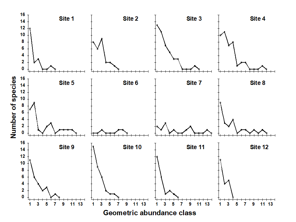
Fig. 1.6. Garroch Head macrofauna {G}, Plots of number of species against number of individuals per species in $\times$2 geometric classes, for the 12 sampling sites of Fig. 1.5.
1.7 Multivariate techniques
Table 1.5 summarises some multivariate methods for the four stages, starting with three descriptive tools: hierarchical clustering (agglomerative or divisive), multi-dimensional scaling (MDS, usually non-metric) and principal components analysis (PCA).
Table 1.5. Multivariate techniques. Summary of analyses for the four stages.
The first two of these start explicitly from a triangular matrix of similarity coefficients computed between every pair of samples (e.g. Table 1.6). The coefficient is usually some simple algebraic measure (Chapter 2) of how close the abundance levels are for each species, averaged over all species, and defined such that 100% represents total similarity and 0% complete dissimilarity. There is a range of properties that such a coefficient should possess but still some flexibility in its choice: it is important to realise that the definition of what constitutes similarity of two communities may vary, depending on the biological question under consideration. As with the earlier methods, a multivariate analysis too will attempt to reduce the complexity of the community data by taking a particular ‘view’ of the structure it exhibits. One in which the emphasis is on the pattern of occurrence of rare species will be different than a view in which the emphasis is wholly on the species that are numerically dominant. One convenient way of providing this spectrum of choice, is to restrict attention to a single coefficient†, that of Bray & Curtis (1957) , which has several desirable properties, but allow a choice of prior transformation of the data. A useful transformation continuum (see Chapter 9) ranges through: no transform, square root, fourth root, logarithmic and finally, reduction of the sample information to the recording only of presence or absence for each species.¶ At the former end of the spectrum all attention will be focused on dominant counts, at the latter end on the rarer species.
Table 1.6. Frierfjord macrofauna {F}. Bray-Curtis similarities, after $\sqrt{}\sqrt{}$-transformation of counts, for every pair of replicate samples from sites A, B, C only (four replicates per site).
| A1 | A2 | A3 | A4 | B1 | B2 | B3 | B4 | C1 | C2 | C3 | C4 | |
|---|---|---|---|---|---|---|---|---|---|---|---|---|
| A1 | – | |||||||||||
| A2 | 61 | – | ||||||||||
| A3 | 69 | 60 | – | |||||||||
| A4 | 65 | 61 | 66 | – | ||||||||
| B1 | 37 | 28 | 37 | 35 | – | |||||||
| B2 | 42 | 34 | 31 | 32 | 55 | – | ||||||
| B3 | 45 | 39 | 39 | 44 | 66 | 66 | – | |||||
| B4 | 37 | 29 | 29 | 37 | 59 | 63 | 60 | – | ||||
| C1 | 35 | 31 | 27 | 25 | 28 | 56 | 40 | 34 | – | |||
| C2 | 40 | 34 | 26 | 29 | 48 | 69 | 62 | 56 | 56 | – | ||
| C3 | 40 | 31 | 37 | 39 | 59 | 61 | 67 | 53 | 40 | 66 | – | |
| C4 | 36 | 28 | 34 | 37 | 65 | 55 | 69 | 55 | 38 | 64 | 74 | – |
For the clustering technique, representation of the communities for each sample is by a dendrogram (e.g. Fig. 1.7a), linking the samples in hierarchical groups on the basis of some definition of similarity between each cluster (Chapter 3). This is a particularly relevant representation in cases where the samples are expected to divide into well-defined groups, perhaps structured by some clear-cut environmental distinctions. Where, on the other hand, the community pattern is responding to abiotic gradients which are more continuous, then representation by an ordination is usually more appropriate. The method of non-metric MDS (Chapter 5) attempts to place the samples on a ‘map’, usually in two dimensions (e.g. see Fig. 1.7b), in such a way that the rank order of the distances between samples on the map exactly agrees with the rank order of the matching (dis)similarities, taken from the triangular similarity matrix. If successful, and success is measured by a stress coefficient which reflects lack of agreement in the two sets of ranks, the ordination gives a simple and compelling visual representation of ‘closeness’ of the species composition for any two samples.
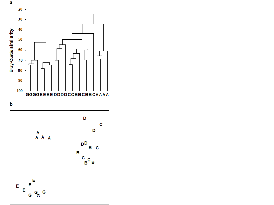
Fig. 1.7. Frierfjord macrofauna {F}. a) Dendrogram for hierarchical clustering (group-average linking); b) non-metric multi-dimensional scaling (MDS) ordination in two dimensions; both computed for the four replicates from each of the six sites (A–E, G), using the similarity matrix partially shown in Table 1.4 (2-d MDS stress = 0.08)
The PCA technique (Chapter 4) takes a different starting position, and makes rather different assumptions about the definition of (dis)similarity of two samples, but again ends up with an ordination plot, often in two or three dimensions (though it could be more), which approximates the continuum of relationships among samples (e.g. Fig. 1.8). In fact, PCA is a rather unsatisfactory procedure for most species-by-samples matrices, for at least two reasons:
a) it defines dissimilarity of samples in an inflexible way (Euclidean distance in the full-dimensional species space, Chapter 4), not well-suited to the rather special nature of species abundance data, with its predominance of zero values;
b) it uses a projection from the higher-dimensional to lower-d space which does not aim to preserve the relative values of these Euclidean distances in the low-d plot, cf MDS, which has that rationale.
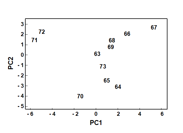
Fig. 1.8. Loch Linnhe macrofauna {L}. 2-dimensional principal components analysis (PCA) ordination of the $\sqrt{} \sqrt{}$-transformed abundances from the 11 years 1963–1973 (% of variance explained only 57%, and not an ideal technique for such data).
However, a description of the operation of PCA is included here because it is an historically important technique, the first ordination method to be devised and one which is still commonly encountered§, and because it comes into its own in the analysis of environmental samples. Abiotic variables (e.g. physical or contaminant readings) are usually relatively few in number, continuously scaled, and their distributions can be transformed so that (normalised) Euclidean distances are appropriate ways of describing the inter-relationships among samples. PCA is then a more satisfactory low-dimensional summary (albeit still a projection), and even has an advantage over MDS of providing an interpretation of the plot axes (which are linear in the abiotic variables).
Discriminating sites/conditions from a multivariate analysis requires non-classical hypothesis testing ideas, since it is totally invalid to make the standard assumptions of normality (which in this case would need to be multivariate normality of the sometimes hundreds or even thousands of different species!). Instead, Chapter 6 describes a simple permutation or randomisation test (of the type first developed by Mantel (1967) ), which makes very few assumptions about the data and is therefore widely applicable. In Fig. 1.7b for example, it is clear without further testing that site A has a different community composition across its replicates than the groups (E, G) or (B, C, D). Much less clear is whether there is any statistical evidence of a distinction between the B, C and D sites. A non-parametric test of the null hypothesis of ‘no site differences between B, C and D’ could be constructed by defining a statistic which contrasts among-site and within-site distances, which is then recomputed for all possible permutations of the 12 labels (4 Bs, 4 Cs and 4 Ds) among the 12 locations on the MDS. If these arbitrary site relabellings can generate values of the test statistic which are similar to the value for the real labelling, then there is clearly little evidence that the sites are biologically distinguishable. This idea is formalised and extended to more complex sample designs in Chapter 6. For reasons which are described there it is preferable to compute an ‘among versus within site’ summary statistic directly from the (rank) similarity matrix rather than the distances on the MDS plot. This, and the analogy with ANOVA, suggests the term ANOSIM for the test (Analysis of Similarities, Clarke & Green (1988) ; Clarke (1993) ).‡ It is possible to employ the same test in connection with PCA, using an underlying dissimilarity matrix of Euclidean distances, though when the ordination is of a relatively small number of environmental variables, which can be transformed into approximate multivariate normality, then abiotic differences between sites can use a classical test (MANOVA, e.g. Mardia, Kent & Bibby (1979) ), a generalisation of ANOVA.
Part of the process of discriminating sites, times, treatments etc., where successful, is the ability to identify the species that are principally responsible for these distinctions: it is all too easy to lose sight of the basic data matrix in a welter of sophisticated multivariate analyses of samples.⸸ Similarly, as a result of cluster analyses and associated a posteriori tests for the significance of the groups of sites/times etc obtained (SIMPROF, Chapter 3), one would want to identify the species mainly responsible for distinguishing the clusters from each other. Note the distinction here between a priori groups, identified before examination of the data, for which ANOSIM tests are appropriate (Chapter 6), and a posteriori groups with membership identified as a result of looking at the data, for which ANOSIM is definitely invalid; they need SIMPROF.
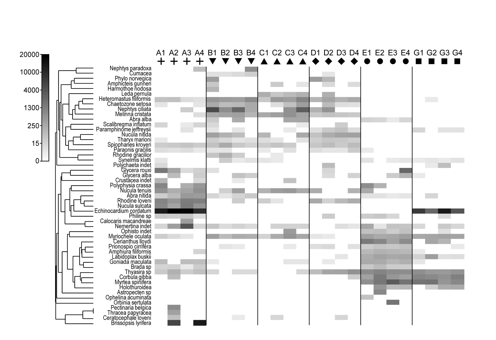
Fig. 1.9. Frierfjord macrofauna {F}. Shade plot of 4th-root transformed species (rows) $\times$ samples (columns) matrix of abundances for the 4 replicate samples at each of 6 sites (Fig. 1.1, Table 1.2). The (linear) grey scale is shown in the key with back-transformed counts.
Species analyses and displays are pursued in Chapter 7, and Fig. 1.9 gives a Shade Plot for the ‘most important’ ~50 species from the 110 recorded from the 24 samples of the Frierfjord macrobenthic abundance data of Table 1.2. (‘Most important’ is here defined as all the species which account for at least 1% of the total abundance in one or more of the samples). The shade plot is a visual representation of the data matrix, after it has been 4th-root transformed, in which white denotes absence and black the largest (transformed) abundance in the data. Importantly, the species axis has been re-ordered in line with a (displayed) cluster analysis of the species, utilising Whittaker’s Index of Association to give the among-species similarities, see Chapters 2 and 7. The pattern of differences between samples from the differing sites is clearly apparent, at least for the three main groups seen in the MDS plot of Fig. 1.7, viz. A, (B-D), (E-G). Such plots are also very useful in visualising the effects of different transformations on the data matrix, prior to similarity computation (see Clarke, Tweedley & Valesini (2014) and Chapter 9). Without transformation, the shade plot would be largely white space with only a handful of species even visible (and thus contributing).
Since ANOSIM indicates statistical significance and pairwise tests give particular site differences (Chapter 6), a ranking of species contributions to the dissimilarity between any specific pair of groups can be obtained from a similarity percentage breakdown (the SIMPER routine, Clarke (1993) ), see Chapter 7.⸙
The clustering of species in shade plots such as Fig. 1.9 can be taken one stage further, to determine statistical significance of species groupings (a Type 3 SIMPROF test, see Chapter 7). This identifies groups of species within which the species have statistically indistinguishable patterns of abundance across the set of samples, and between which the patterns do differ significantly. Fig. 1.10 shows simple line plots for the standardised abundance of 51 species (those accounting for > 1% of the total abundance in any one year) over the 11 years of the Loch Linnhe sampling of Table 1.4 and Fig. 1.8. SIMPROF tests give 7 groups of species (one omitted contains just a single species found only in 1973). The standardisation puts each species on an equal footing, with its values summing to 100% across all samples. It can be seen how some species start to disappear, and others arrive, at the initial levels of disturbance, in the mid-years – some of the latter dying out as pollution increases in the later years – with further opportunists (Capitellids etc) flourishing at that point, and then declining with the improvement in conditions in 1973.
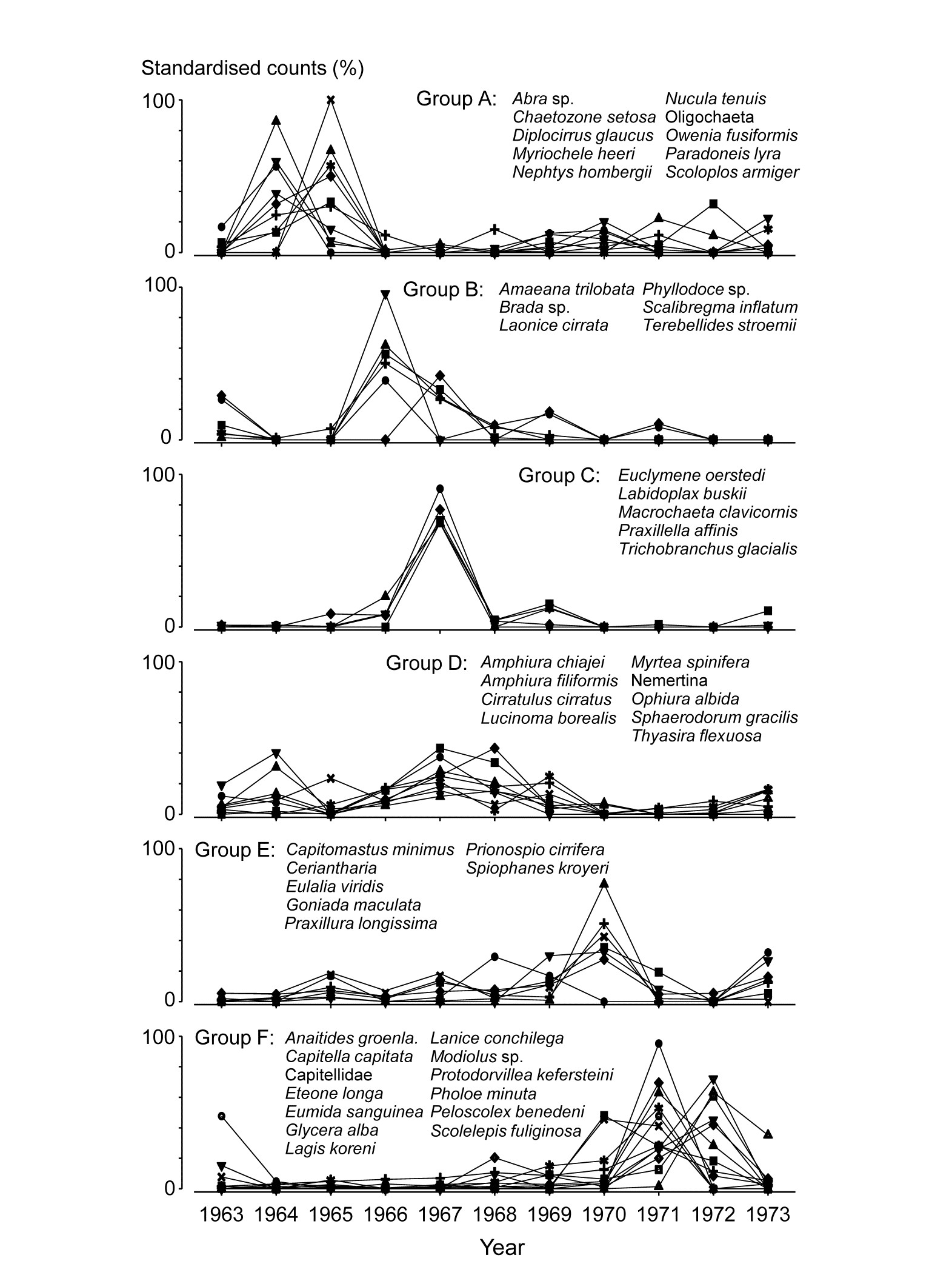
Fig. 1.10. Loch Linnhe macrofauna {L}. Line plots of the 11-year time series for the ‘most important’ 51 species (see text), with y axis the standardised counts for each species, i.e. all species add to 100% across years. The 6 species groups (A-F), and a 7th consisting of a single species found in only one year, have internally indistinguishable curves (‘coherent species’) but the sets differ significantly from each other, by SIMPROF tests.
In the determination of stress levels, whilst the multivariate techniques are sensitive (Chapter 14) and well-suited to establishing community differences associated with different sites/times/treatments etc., their species-specific basis would appear to make them unsuitable for drawing general inferences about the pollution status of an isolated group of samples. Even in comparative studies, on the face of it there is not a clear sense of directionality of change when it is established that communities at putatively impacted sites differ from those at control or reference sites in space or time (is the change ‘good’ or ‘bad’?). Nonetheless, there are a few ways in which directionality has been asserted in published studies, whilst retaining a multivariate form of analysis (Chapter 15):
a) a meta-analysis: a combined ordination of data from NE Atlantic shelf waters, at a coarse level of taxonomic discrimination (the effects of taxonomic aggregation are discussed in Chapter 10), suggests a common directional change in the balance of taxa under a variety of types of pollution or disturbance ( Warwick & Clarke (1993a) );
b) a number of studies demonstrate increased multivariate dispersion among replicates under impacted conditions, in comparison to controls ( Warwick & Clarke (1993b) );
c) another feature of disturbance, demonstrated in a spatial coral community study (but with wider applicability to other spatial and temporal patterns), is a loss of smooth seriation along transects of increasing depth, again in comparison to reference data in time and space ( Clarke, Warwick & Brown (1993) ).
Methods which link multivariate biotic patterns to environmental variables are explored in Chapter 11; these are illustrated here by the Garroch Head dump-ground study described earlier (Fig. 1.5). The MDS of the macrofaunal communities from the 12 sites is shown in Fig. 1.11a; this is based on Bray-Curtis similarities computed from (transformed) species biomass values.ꞎ
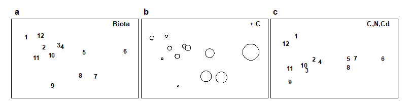
Fig. 1.11. Garroch Head macrofauna {G}. a) MDS ordination of Bray-Curtis similarities from $\sqrt{}$-transformed species biomass data for the sites shown in Fig. 1.5; b) the same MDS but with superimposed circles of increasing size, representing increasing carbon concentrations in matched sediment samples; c) ordination of (log-transformed) carbon, nitrogen and cadmium concentrations in the sediments at the 12 sites (2-d MDS stress = 0.05).
Steady change in the community is apparent as the dump centre (site 6) is approached along the western arm of the transect (sites 1 to 6), then with a mirrored structure along the eastern arm (sites 6 to 12), so that the samples from the two ends of the transect have similar species composition. That this biotic pattern correlates with the organic loading of the sediments can best be seen by superimposing the values for a single environmental variable, such as Carbon concentration, on the MDS configuration. The bubble plot of Fig. 1.11b represents C values by circles of differing diameter, placed at the corresponding site locations on the MDS, and the pattern across sites of the 11 available environmental variables (sediment concentrations of C, N, Cu, Cd, Zn, Ni, etc.) can be viewed in this way (Chapter 11). This either uses a single abiotic variable at a time or displays several at once, as vectors – usually unsatisfactorily because it assumes a linear relationship of the variable to the biotic ordination points – or (more satisfactorily) by segmented bubble plots in which each variable is only a circle segment, of different sizes but at the same position on the circle (of the type seen in Figs. 7.14-16; see also Purcell, Rushworth, Clarke et al. (2014) .Ɥ
Where bubble plots are not adequate, because the 2- or 3-d MDS is a poor approximation (high stress) to the biotic similarity matrix, an alternative technique is that of linkage trees (multivariate regression trees), which carry out constrained binary divisive clustering on the biotic similarities, each division of the samples (into ever smaller groups) being permitted only where it has an ‘explanation’ in terms of an inequality on one of the abiotic variables (Chapter 11), e.g. “group A splits into B and C because all sites in group B have salinity > 20ppt but all in group C have salinity < 20ppt” and this gives the maximal separation of site A communities into two groups. Stopping the search for new divisions uses the SIMPROF tests that were mentioned earlier, in relation to unconstrained cluster methods (for a LINKTREE example see Fig. 11.14).
A different approach is required in order to answer questions about combinations of environmental variables, for example to what extent the biotic pattern can be ‘explained’ by knowledge of the full set, or a subset, of the abiotic variables. Though there is clearly one strong underlying gradient in Fig. 1.11a (horizontal axis), corresponding to an increasing level of organic enrichment, there are nonetheless secondary community differences (e.g. on the vertical axis) which may be amenable to explanation by metal concentration differences, for example. The heuristic approach adopted here is to display the multivariate pattern of the environmental data, ask to what extent it matches the between-site relationships observed in the biota, and then maximise some matching coefficient between the two, by examining possible subsets of the abiotic variables (the BEST procedure, Chapters 11 and 16).ȸ
Fig. 1.11c is based on this optimal subset for the Garroch Head sediment variables, namely (C, N, Cd). It is an MDS plot, using Euclidean distance for its dissimilarities,Ͷ and is seen to replicate the pattern in Fig. 1.11a rather closely. In fact, the optimal match is determined by correlating the underlying dissimilarity matrices rather than the ordinations themselves, in parallel with the reasoning behind the ANOSIM tests, seen earlier.
The suggestion is therefore that the biotic pattern of the Garroch Head sites is associated not just with an organic enrichment gradient but also with a particular heavy metal. It is important, however, to realise the limitations of such an ‘explanation’. Firstly, there are usually other combinations of abiotic variables which will correlate nearly as well with the biotic pattern, particularly as here when the environmental variables are strongly inter-correlated amongst themselves. Secondly, there can be no direct implication of causality of the link between these abiotic variables and the community structure, based solely on field survey data: the real driving factors could be unmeasured but happen to correlate highly with the variables identified as producing the optimal match. This is a general feature of inference from purely observational studies and can only be avoided formally by ‘randomising out’ effects of unmeasured variables; this requires random allocation of treatments to observational units for field or laboratory-based community experiments (Chapter 12).
† Though PRIMER offers nearly 50 of the (dis)similarity/distance measures that have been proposed in the literature.
¶ The PRIMER routines automatically offer this set of transformation choices, applied to the whole data matrix, but also cater for more selective transformations of particular sets of variables, as is often appropriate to environmental rather than species data.
§ Other ordination techniques in common use include: Principal Co-ordinates Analysis, PCO; Detrended Correspondence Analysis, DCA. Chapter 5 has some brief remarks on their relation to PCA and nMDS/mMDS but this manual concentrates on PCA and MDS, found in PRIMER; PCO is available in PERMANOVA+.
‡ PRIMER now performs tests for all 1-, 2- and 3-way crossed and/or nested combinations of factors in its ANOSIM routine, also including a more indirect test, with a different form of statistic, for factors (with sufficient levels) which do not have replication within their levels. These are all robust, non-parametric (rank-based) tests and therefore do not permit the (metric) partition of overall effects into ‘main’ and ‘interaction’ components. Within a semi-parametric framework (and still by permutation testing), such partitions are achieved by the PERMANOVA routine within the PERMANOVA+ add-on to PRIMER, Anderson, Gorley & Clarke (2008) .
⸸ This has been rectified in PRIMER 7, with its greater emphasis on species analyses, such as Shade plots, SIMPROF tests for coherent species groups, segmented bubble plots etc (Chapter 7).
⸙ SIMPER in PRIMER first tabulates species contributions to the average similarity of samples within each group then of average dissimilarity between all pairs of groups. Two-way and (squared) Euclidean distance options are given, the latter for abiotic data.
ꞎ Chapter 13, and the meta-analysis section in Chapter 15, discuss the relative merits and drawbacks of using species abundance or biomass when both are available; in fact, Chapter 13 is a wider discussion of the advantages of sampling particular components of the marine biota, for a study on the effects of pollutants.
Ɥ The PRIMER ‘bubble plot’ overlay can be on any ordination type, in 2- or 3-d, and has flexible colour/scaling options, as well as some scope for using a supplied image as the overlay.
ȸ The BEST/Bio-Env option in PRIMER optimises the match by examining all combinations of abiotic variables. Where this is not computationally feasible, the BEST/BVStep option performs a stepwise search, adding (or subtracting) single abiotic variables at each step, much as in stepwise multiple regression. Avoidance of a full search permits a generalisation to pattern-matching scenarios other than abiotic-to-biotic, e.g. BVStep can select a subset of species whose multivariate structure matches, to a high degree, the pattern for the full set of species (Chapter 16), thus indicating influential species or potential surrogates for the full community.
Ͷ It is, though, virtually indistinguishable in this case from a PCA, because of the small number of variables and the implicit use of the same dissimilarity matrix for both techniques.
1.8 Example: Nutrient enrichment experiment, Solbergstrand
Table 1.7. Nutrient enrichment experiment, Solbergstrand mesocosm, Norway {N}. Meiofaunal abundances (shown for copepods only) from four replicate boxes for each of three treatments (Control, Low and High levels of added nutrients).
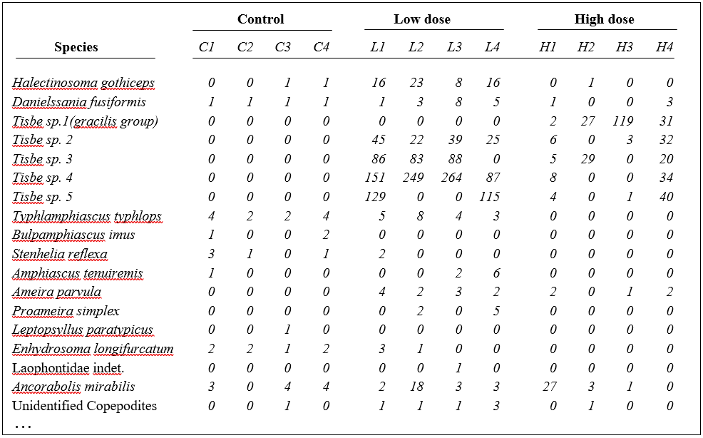
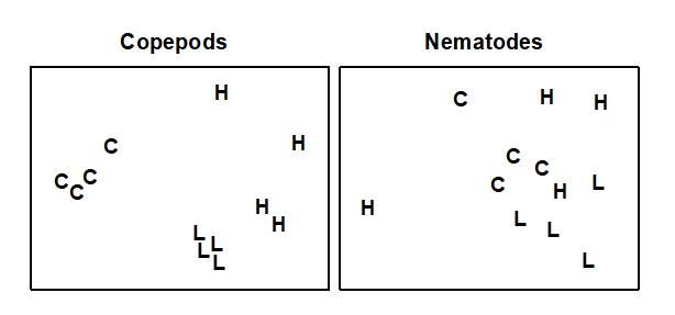
Fig. 1.12. Nutrient enrichment experiment {N}. Separate MDS ordinations of $\sqrt{} \sqrt{}$-transformed abundances for copepod and nematode species, in four replicate boxes from each of three treatments: Control, Low, High. (2-d MDS stresses: 0.09, 0.18)
An example is given in Table 1.7 of meiofaunal community data from a nutrient enrichment experiment in the Solbergstrand mesocosm, Norway {N}, in which 12 undisturbed box cores of sediment were transferred into the mesocosm basins and separately dosed with two levels of increased nutrients (low, L, and high, H), with some boxes remaining undosed (control, C). Fig. 1.12 shows the MDS plots of the four replicate boxes from each treatment, separately for the copepod and nematode components of the meiofaunal communities (see also Chapter 12). For the copepods, there is a clear imputation of a (causal) response to the treatment, though this is less apparent for the nematodes, and requires a test of the null hypothesis of ‘no treatment effect’, using the ANOSIM test of Chapter 6.
1.9 Summary
A framework has been outlined of three categories of technique (univariate, graphical/distributional and multivariate) and four analysis stages (representing communities, discriminating sites/conditions, determining levels of stress and linking to environmental variables). The most powerful tools are in the multivariate category, and those that underlie the PRIMER routines are now examined from first principles.