Chapter 11: Linking community analyses to environmental variables
- 11.1 Introduction
- 11.2 Example: Garroch Head macrofauna
- 11.3 Linking biota to univariate environmental measures (and examples)
- 11.4 Linking biota to multivariate environmental patterns
- 11.5 Further ‘BEST’ variations
- 11.6 Linkage trees (and example)
- 11.7 Concluding remarks
11.1 Introduction
Approach
In many studies, the biotic data is matched by a suite of environmental variables measured at the same set of sites. These could be natural variables describing the physical properties of the substrate (or water) from which the samples were taken, e.g. median particle diameter, depth of the water column, salinity etc, or they could be contaminant variables such as sediment concentrations of heavy metals. The requirement here is to examine the extent to which the physico-chemical data is related to (‘explains’) the biological pattern.
The approach adopted is firstly to analyse the biotic data and then ask how well the information on environmental variables, taken either singly ( Field, Clarke & Warwick (1982) ) or in combination ( Clarke & Ainsworth (1993) ), matches this community structure.¶ The motivation here, as in earlier chapters, is to retain simplicity and transparency of analysis, by letting the species and environmental data ‘tell their own stories’ (under minimal model assumptions) before judging the extent to which one provides an ‘explanation’ of the other.
Environmental data analysis
An analogous range of multivariate methods is available for display and testing of environmental samples as has been described for biotic data: species are simply replaced by physical/chemical variables. However, the matrix entries are now of a rather different type and lead to different analysis choices. No longer do zeros predominate; the readings are usually more nearly continuous and, though their distributions are often right-skewed (with variability increasing with the mean), it is often possible to transform them to approximate normality (and stabilise the variance) by a simple root or logarithmic transformation, see Chapter 9. Under these conditions, Euclidean distance is an appropriate measure of dissimilarity and PCA (Chapter 4) is an effective ordination technique, though note that this will need to be performed on the correlation rather than the covariance matrix, i.e. the variables will usually have different units of measurement and need normalising to a common scale (see the discussion on page 4.4).
In the typical case of samples from a spatial contaminant gradient, it is also usually true that the number of variables is either much smaller than for a biotic matrix or, if a large number of chemical determinations has been made (e.g. GC/MS analysis of a range of specific aromatic hydrocarbons, PCB congeners etc.) they are often highly inter-correlated, tending to preserve a fixed relation to each other in a simple dilution model. A PCA can thus be expected to do an adequate job of representing in (say) two dimensions a pattern which is inherently low-dimensional to start with.
In a case where the samples are replicates from different groups, defined a priori, the ANOSIM tests of Chapter 6 are equally available for testing environmental hypotheses, e.g. establishing differences between sites, times, conditions etc., where such tests are meaningful.§ The appropriate (rank) dissimilarity matrix would use normalised Euclidean distances.
¶ Methods such as canonical correlation (e.g. Mardia, Kent & Bibby (1979) ), and the important technique of canonical correspondence ( ter Braak (1986) ), take the rather different stance of embedding the environmental data within the biotic analysis, motivated by specific gradient models defining the species-environment relationships.
§ The ANOSIM tests in the PRIMER package are not now the only possibility; the data will have been transformed to approximate normality so classical multivariate (MANOVA) tests such as Wilks’ $\Lambda$ (e.g. Mardia, Kent & Bibby (1979) ) may be valid, but only if the number of variables is small in relation to the number of samples.
11.2 Example: Garroch Head macrofauna
For the 12 sampling stations (Fig. 8.3) across the sewage-sludge dump ground at Garroch Head {G}, the biotic information was supplemented by sediment chemical data on metal concentrations (Cu, Mn, Co, ...) and organic loading (% carbon and nitrogen); also recorded was the water depth at each station. The data matrix is shown in Table 11.1; it follows the normal convention in classical multivariate analysis of the variables appearing as columns and the samples as rows.¶
Table 11.1. Garroch Head dump ground {G}. Sediment metal concentrations (ppm), water depth at the site (m) and organic loading of the sediment (% carbon and nitrogen), for the transect of 12 stations across the sewage-sludge dump site (centre at station 6), see Fig. 8.3.
| Station |  Cu Cu |
Mn | Co | Ni | Zn | Cd | Pb | Cr | Dep | %C | %N |
|---|---|---|---|---|---|---|---|---|---|---|---|
| 1 | 26 | 2470 | 14 | 34 | 160 | 0 | 70 | 53 | 144 | 3 | 0.53 |
| 2 | 30 | 1170 | 15 | 32 | 156 | 0.2 | 59 | 15 | 152 | 3 | 0.46 |
| 3 | 37 | 394 | 12 | 38 | 182 | 0.2 | 81 | 77 | 140 | 2.9 | 0.36 |
| 4 | 74 | 349 | 12 | 41 | 227 | 0.5 | 97 | 113 | 106 | 3.7 | 0.46 |
| 5 | 115 | 317 | 10 | 37 | 329 | 2.2 | 137 | 177 | 112 | 5.6 | 0.69 |
| 6 | 344 | 221 | 10 | 37 | 652 | 5.7 | 319 | 314 | 82 | 11.2 | 1.07 |
| 7 | 194 | 257 | 11 | 34 | 425 | 3.7 | 175 | 227 | 74 | 7.1 | 0.72 |
| 8 | 127 | 246 | 10 | 33 | 292 | 2.2 | 130 | 182 | 70 | 6.8 | 0.58 |
| 9 | 36 | 194 | 6 | 16 | 89 | 0.4 | 42 | 57 | 64 | 1.9 | 0.29 |
| 10 | 30 | 326 | 11 | 26 | 108 | 0.1 | 44 | 52 | 80 | 3.2 | 0.38 |
| 11 | 24 | 439 | 12 | 34 | 119 | 0.1 | 58 | 36 | 83 | 2.1 | 0.35 |
| 12 | 22 | 801 | 12 | 33 | 118 | 0 | 52 | 51 | 83 | 2.3 | 0.45 |
No replication is available for the 12 stations so the variance-to-mean plots suggested in Chapter 9 are not possible, but simple scatter plots of all pairwise combinations of variables (draftsman plots, see the later Fig. 11.9) suggest that log transformations are appropriate for the concentration variables, though not for water depth. The criteria here are that variables should not show marked skewness across the samples, enabling meaningful normalisation, and that the relationships between them should be approximately linear; the standard product-moment correlations between variables and Euclidean distances between samples are then satisfactory summaries. In pursuit of this, note that whilst each variable could in theory be subjected to a different transformation it is more logical to apply the same transformation to all variables of the same type. Thus the decision to log all the metal data stems not just from the draftsman plots but also from previous experience that such concentration variables often have standard deviations proportional to their means; i.e. a roughly constant percentage variation is log transformed to a stable absolute variance.
Fig. 11.1 displays the first two axes (PC1 and PC2) of a PCA ordination on the transformed data of Table 11.1. In fact, the first component accounts for much of the variability (61%) in the full matrix, and the second a further 27%, so the first two components account for 88% and the 2-d plot provides an accurate summary of the relationships. The axes are defined as
$$ PC1 = 0.38 Cu ^ \prime – 0.22 Mn ^ \prime – 0.08 Co ^ \prime + 0.15 Ni ^ \prime + 0.37 Zn ^ \prime + 0.33 Cd ^ \prime + 0.37 Pb ^ \prime + 0.35 Cr ^ \prime $$ $$ – 0.12 Dep ^ \prime + 0.37 C ^ \prime + 0.33 N ^ \prime \tag{11.1} $$ $$ PC2 = -0.04 Cu ^ \prime + 0.42 Mn ^ \prime +0.54 Co ^ \prime + 0.47 Ni ^ \prime + 0.16 Zn ^ \prime -0.11 Cd ^ \prime + 0.13 Pb ^ \prime - 0.09 Cr ^ \prime $$ $$ +0.46 Dep ^ \prime + 0.09 C ^ \prime + 0.19 N ^ \prime $$
Broadly, PC1 represents an axis of increasing contaminant load since the sizeable coefficients are all positive. (The dash denotes that variables have been log transformed, excepting Dep, and normalised to zero mean and unit standard deviation). PC2 needs to be orthogonal to PC1 (coefficients cross-multiplying to zero) and it does this simply here by, e.g., the large PC1 coefficients being small in PC2 and vice-versa.

Fig. 11.1. Garroch Head dump ground {G}. Two-dimensional PCA ordination of the 11 environmental variables of Table 11.1 (transformed and normalised), for the stations (1–12) across the sewage-sludge dump site centred at station 6 (% variance explained = 88%). Selected vectors are shown; they represent direction and relative strength of linear increase of normalised variables in this 2-d plane (‘base variables’ option). Only the directions of vectors should be interpreted; their location is arbitrary.
Fig. 11.1 shows a strong pattern of change on moving from the ends of the transect to the dump site centre, which (unsurprisingly) has the greatest levels of organic enrichment and metal concentrations (exceptions are Mn$^ \prime$, Co$^ \prime$ and Ni$^ \prime$). The superimposed vectors are in this case entirely accurate (see the footnote on p7-19), since equation (11.1) shows that the axes are linear in the variables. For example, the Cu$^ \prime$ vector is pointing along the x axis (to the right) because it has a sizeable positive coefficient of 0.38 on PC1, and only slightly downwards because of its small negative coefficient (-0.04) on the PC2 axis, whereas Mn$^ \prime$ and Ni$^ \prime$ increase strongly up the y axis (i.e. one would expect Ni$^ \prime$ to be at its lowest for site 9), with Mn$^ \prime$ pointing left and Ni$^ \prime$ right because of their (smaller) negative and positive PC1 terms. %C and Pb vectors are coincident, at least on these 2 axes, from their near identical coefficients.
¶ This is in contrast with abundance matrices which, because of their often larger number of variables (species) are usually transposed, i.e. the samples are displayed as columns. The PRIMER software package handles data entered either way round, of course, though it is important to specify in the entry dialog whether the rows or the columns should be taken as samples.
11.3 Linking biota to univariate environmental measures (and examples)
Univariate community measures
If the biotic data are best summarised by one, or a few, simple univariate measures (such as diversity indices), one possibility is to attempt to correlate these with a similarly small number of environmental variables, taken one at a time. The summary provided by a principal component from a PCA of environmental variables can be exploited in this way. In the case of the Garroch Head dump ground, Fig. 11.2 shows the relation between Shannon diversity of the macrofauna samples at the 12 sites and the overall contaminant load, as reflected in the first PC of the environmental data (Fig. 11.1). Here the relationship appears to be a simple linear decrease in diversity with increasing load, and the fitted linear regression line clearly has a significantly negative slope ($\beta$ = – 0.29, p < 0.1%).
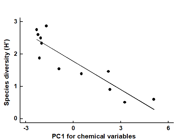
Fig. 11.2. Garroch Head macrofauna {G}. Linear regression of Shannon diversity ($H ^ \prime$), at the 12 sampling stations, against the first PC axis score from the environmental PCA of Fig. 11.1, which broadly represents an axis of increasing contaminant load (first part of equation 11.1).
Multivariate community measures
In most cases however, the biotic data is best described by a multivariate summary, such as an MDS ordination. Its relation to a univariate environmental measure can then be visualized in bubble plots¶, by representing the values of this variable as bubbles of different sizes centred on the biotic ordination points (see page 7.10). This, or the alternative plotting of coded values for the environmental variable, can be a useful means of noting consistent differences in an abiotic variable between biotic clusters, or of observing a smooth relationship with ordination gradients (
Field, Clarke & Warwick (1982)
).
Example: Bristol Channel zooplankton
A cluster analyses of zooplankton samples at 57 sites in the Bristol Channel {B} was seen in Chapter 3, and a SIMPROF analyses determined divisions into four main clusters (Fig. 3.7). The associated MDS plot of Fig. 3.10a, whilst not in conflict with those groups, shows a continuity of change. Whether this gradient in community bears some relation (causal or not) to the salinity gradient at these sites is seen by plotting salinity classes as codes or bubble sizes on the MDS.
If an arbitrary coding is used (or a continuous salinity scale for bubble size), biological considerations might suggest that simple linear coding/scaling is less than optimal here. The species turnover would be expected to be larger with a salinity differential of 1 ppt from full salinity water than for a similar change at (say) 25 ppt. This motivates application of a reverse logarithmic transformation, log (36 – s), or more precisely:
$$ s ^ \star = a - b \log _ e (36 -s ) \tag{11.2} $$
where a = 8.33, b = 3 are simple constants chosen for this data to constrain the transformed variable $ s ^ \star$ to lie, when rounded to the nearest integer, in the range 1 (low) to 9 (high salinity).† The resulting MDS plots, Figs. 11.3 and 11.4, show the strong relation to the salinity gradient§ and might also help to direct attention to sites which appear slightly anomalous in respect of this gradient, and raise questions of whether there are secondary environmental variables which could explain the biological differentiation of samples at similar salinities.
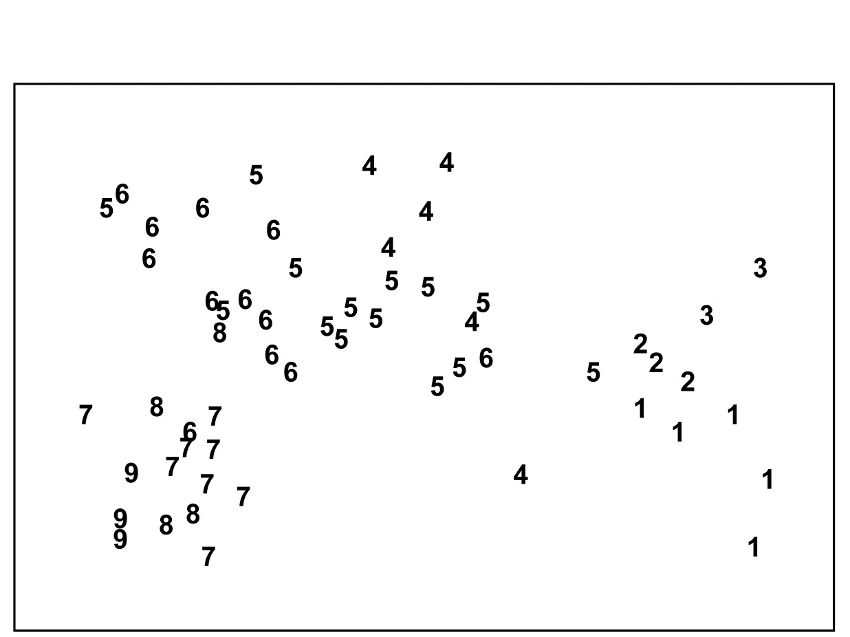
Fig. 11.3. Bristol Channel zooplankton {B}. Biotic MDS for the 57 sampling sites, as in Fig. 3.10 (based on Bray-Curtis similarities on $\sqrt{}\sqrt{}$-transformed abundances), stress = 0.11. Numbers are the 9 salinity codes for sites, 1: <26.3, 2: (26.3, 29.0), 3: (29.0, 31.0), ..., 8: (34.7, 35.1), 9: >35.1 ppt..
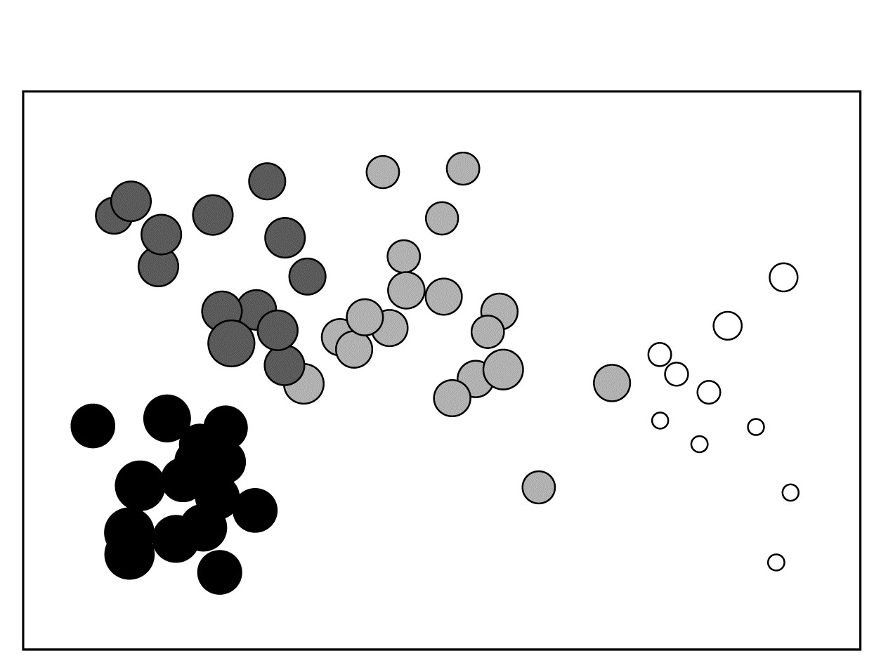
Fig. 11.4. Bristol Channel zooplankton {B}. Biotic MDS as in Fig. 11.3, with superimposed ‘bubbles’ whose sizes represent the same salinity scale as above, i.e. the transformed values given by equation (11.2). The four community groups identified from agglomerative clustering and SIMPROF tests (as in Fig. 3.10a) are shown by different shading.
Example: Garroch Head macrofauna
The macrofauna samples from the 12 stations on the Garroch Head transect {G} lead to the MDS plot of Fig. 11.5a. For a change, this is based not on abundance but biomass values (root-transformed).‡ Earlier in the chapter, it was seen that the contaminant gradient induced a marked response in species diversity (Fig. 11.2), and there is an even more graphic representation of steady community change in the multivariate plot as the dump centre is approached (stations 1 through to 6), with gradual reversion to the original community structure on moving away from the centre (stations 6 through to 12).⸙
The correlation of the biotic pattern with some of the contaminant variables is well illustrated by the bubble plots of Figs. 11.5b-d. In fact, the inter-correlation of many of the contaminants is clear from the later Fig. 11.9, so several other bubble plots will look similar to that for %C and Pb, which are virtually identical. It is clear that, when two environmental variables are so strongly related (collinear), separate putative effects on the biotic structure could never be disentangled (effects are said to be confounded).
A decision needs to be made about whether the scale for the contaminant circles (genuine ‘bubbles’ if a 3-d MDS plot is used) is that for the original data or its transformed form. Either may be useful in particular contexts but, whichever is chosen, the plots are likely to need rescaling ȹ such that minimum and maximum values are represented by vanishingly small circles up to a fixed maximum circle size, respectively, as is the case in Fig. 11.5, based on the log-transformed data. Note the distinction here with the previous use (Figs. 7.13-7.16) of bubble size to represent species counts, usually on a common scale over species (though also often transformed); the natural interpretation there of absence as a vanishingly small bubble rarely has a counterpart with bubble plots of abiotic variables.
As with the earlier Fig. 11.1, a selection of vectors is shown in Fig. 11.5a but these are no longer the coefficients in the definition of the axis; the environmental variables are an independent data set from the biotic variables producing these axes. Instead, they reflect the (individual) multiple correlations of each abiotic variable to the ordination axes, derived from multiple linear regression (Pearson option, page 7.10). There is no longer any guarantee that the relationship of an environmental variable to the biotic ordination axes is now linear, and vectors only represent linear relationships (see the strictures on this point on page 7.10). Here the full set of bubble plots gives no undue cause for concern that the vector plot is misleading, but this will not always be the case (see Fig. 11.6c below) and it is wise to check bubble plots before summarising the relationships solely by vectors.
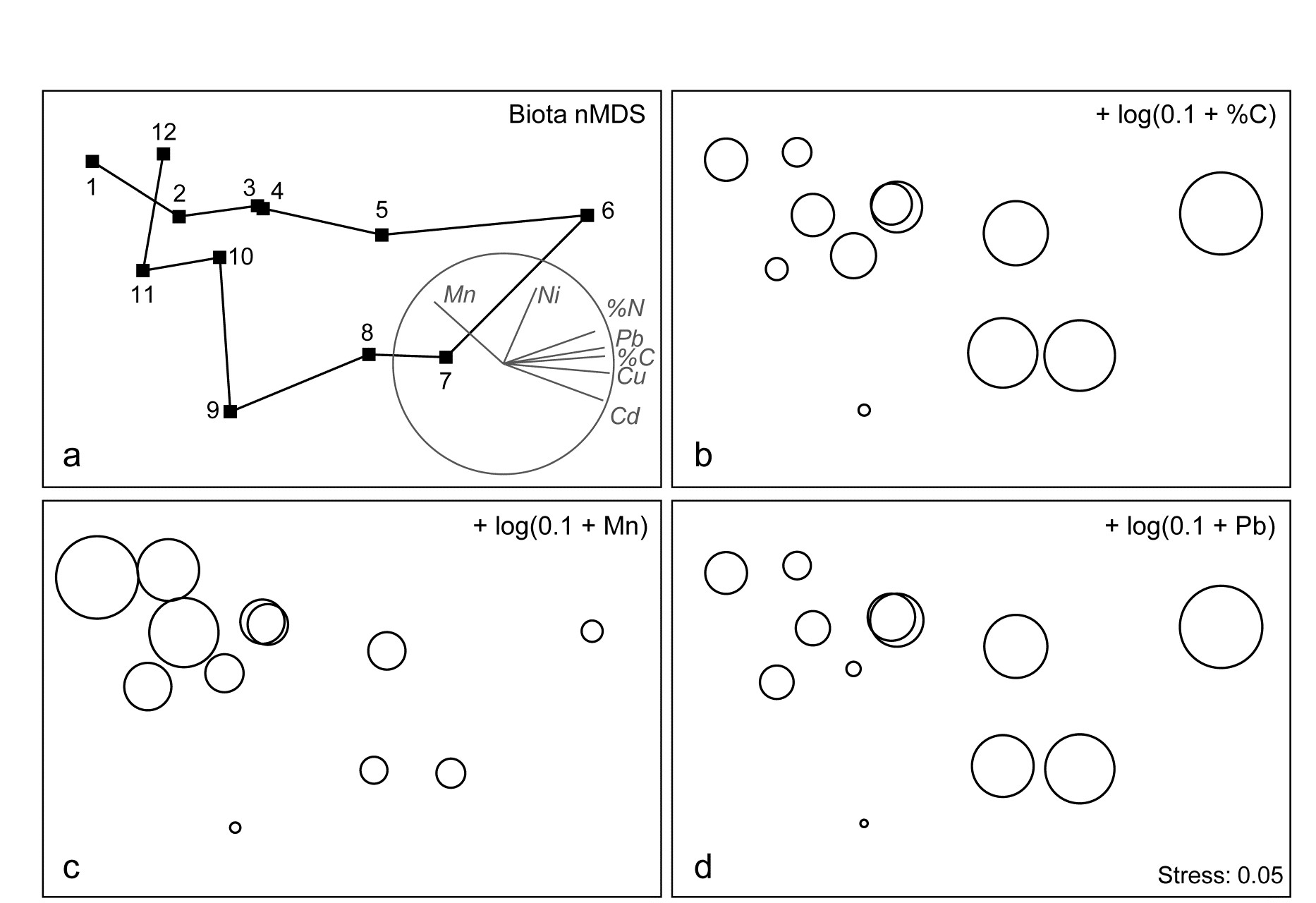
Fig. 11.5. Garroch Head macrofauna {G}. a) nMDS of Bray-Curtis similarities from $\sqrt{}$-transformed species biomass data at the 12 sites (Fig. 8.3) on the E-W transect, stress=0.05. Vector plot (right) shows the direction of linear increase of sediment concentrations for selected contaminants, and the multiple correlation of each (transformed) variable on the 2-d ordination points (circle is correlation of 1). b)-d) bubble plots, i.e. same MDS plot but with circles of increasing size representing sediment concentrations at those sites, of %C, Mn and Pb, from $\log _ e (0.1+x)$ transformation of Table 11.1 data.
Example: Exe estuary nematodes
The Garroch Head data is an example of a smooth gradation in faunal structure reflected in a matching gradation in several contaminant variables. In contrast, the Exe estuary nematode communities {X}, discussed in Chapter 5, separate into five well-defined clusters of samples (Fig. 11.6a). For each of the 19 intertidal sites, six environmental variables were also recorded: the median particle diameter of the sediment (MPD), its percentage organic content (% Org), the depth of the water table (WT) and of the blackened hydrogen sulphide layer (H$_ 2$S), the interstitial salinity (Sal) and the height of the sample on the shore, in relation to the inter-tidal range (Ht).
When each of these is superimposed in turn on the biotic ordination, as bubble plots, some instructive patterns emerge. MPD (Fig. 11.6b) appears to increase monotonically along the main MDS axis but cannot be responsible for the division, for example, between sites 1-4 and 7-9. On the other hand, the relation of salinity to the MDS configuration is non-monotonic (Fig. 11.6c), with larger values for the ‘middle’ groups, but now providing a contrast between the 1-4 and 7-9 clusters. Some other variables, such as the height up the shore (Fig. 11.6d), appear to bear little relation to the overall biotic structure, in that samples within the same faunal groups are frequently at opposite extremes of the intertidal range.
These patterns have some important implications for vector plots. Previously, in the Garroch Head data of Fig. 11.5, it was suggested that viewing the relations between environmental variables and the ordination via a vector plot was unlikely to mislead, because perusal of bubble plots for each variable in that case suggested that changes were, if not truly linear, at least monotonically increasing or decreasing across the plot. However, that this will not always be true and, here, the salinity bubble plot clearly shows the difficulty. In which direction does salinity increase? A linear regression of, say, a quadratic function may well have a zero slope (small vector, in no particular direction) thus making it impossible to distinguish between a vector for an obvious, but non-monotonic relationship and that for a situation in which there is apparently little relationship at all, such as for the Ht variable in Fig. 11.6d.
These plots, however, make clear the limitations in relating the community structure to a single environmental variable at a time: there is no basis for answering questions such as “how well does the full set of abiotic data jointly explain the observed biotic pattern?” and “is there a subset of the environmental variables that explains the pattern equally well, or better?” These questions are answered in classical multivariate statistics by techniques such as canonical correlation (e.g. Mardia, Kent & Bibby (1979) ) but, as discussed in earlier chapters, this requires assumptions which are unrealistic for species abundance or biomass data (correlation and Euclidean distance as measures of similarity for biotic data, linear relationships between abundance and environmental gradients etc).
Instead, the need is to relate community structure to multivariate descriptions of the abiotic variables, using the type of non-parametric, similarity-based methods of previous chapters.
Fig. 11.6. Exe estuary nematodes {X}. a) MDS of species abundances at the 19 sites, as in Fig. 5.1; b)-d) the same MDS but with superimposed circles representing, respectively, median particle diameter of the sediment, its interstitial salinity and height up the shore of the sampling locations. (Stress = 0.05).
¶ Bubble plots can also be useful in a wider context: Field, Clarke & Warwick (1982) superimpose morphological characteristics of each species onto a species MDS, and Chapter 7 gives a number of examples of how single and segmented bubble plots can show relationships between ordinations and some of the biotic variables used in their construction. Segmented bubble plots can similarly be used with abiotic variables, if carefully enough scaled ( Purcell, Rushworth, Clarke et al. (2014) ).
† In the PRIMER ‘Transform (individual)’ routine the expression for the salinity variable is thus: INT(0.5 + 8.33 – 3*log(36–V)), and these bubble values can then be used to label the MDS plot.
§ Note the horseshoe effect (more properly termed the arch effect), which is a common feature of the ordination from single, strong environmental gradients. Both theoretically and empirically, non-metric MDS would seem to be less susceptible to this than metric ordination methods. But without the drastic (and somewhat arbitrary) intervention in the plot that a technique like detrended correspondence analysis uses (specifically to ‘cut and paste’ such ordinations to a straight line), some degree of curvature is unavoidable and natural. Where samples towards opposite ends of the environmental gradient have few species in common (thus giving dissimilarities near 100%), samples which are even further apart on the gradient have little scope to increase their dissimilarity further. To some extent, non-metric MDS can compensate for this by the flexibility of its monotonic regression of distance on dissimilarity (Chapter 5), but arching of the tails of the plot is clearly likely when dissimilarities near 100% are reached.
‡ Chapter 14 argues that, where it is available, biomass can sometimes be more biologically relevant than abundance, though in practice MDS plots from both will be broadly similar, especially under heavy transformation, as the data tends towards presence/ absence (Chapter 9).
⸙ This can be seen also in the MDS plots of Figs. 7.9c & d, though the known ordering of sites was not used for the purposes of that example. The minor difference in the MDS configuration from Fig. 11.5 is not due to any difference in transformation or similarity but the fact that the analysis here uses all 65 species with recorded biomass whereas, for illustrative purposes, the previous shade plot used only the 35 accounting for at least 1% of the biomass in one or more samples.
ȹ This is best accomplished within PRIMER by using output from the Summary Stats routine (for variables) on the Analyse menu.
11.4 Linking biota to multivariate environmental patterns
The intuitive premise adopted here is that if the suite of environmental variables responsible for structuring the community were known¶, then samples having rather similar values for these variables would be expected to have rather similar species composition, and an ordination based on this abiotic information would group sites in the same way as for the biotic plot. If key environmental variables are omitted, the match between the two plots will deteriorate. By the same token, the match will also worsen if abiotic data which are irrelevant to the community structure are included.†
The Exe estuary nematode data {X} again provides an appropriate example. Fig. 11.7a repeats the species MDS for the 19 sites seen in Fig. 11.6a. The remaining plots in Fig. 11.7 are of specific combinations of the six sediment variables:
H$_2$S, Sal, MPD, %Org, WT and Ht, as defined above. For consistency of presentation, these plots are also MDS ordinations but based on an appropriate dissimilarity matrix (Euclidean distance on the normalised abiotic variables). In practice, since the number of variables is small, and the distance measures the same, the MDS plots will be largely indistinguishable from PCA configurations (note that Fig. 11.7b is effectively just a scatter plot, since it involves only two variables).
The point to notice here is the remarkable degree of concordance between biotic and abiotic plots, especially Figs. 11.7a and c; both group the samples in very similar fashion. Leaving out MPD (Fig. 11.7b), the (7–9) group is less clearly distinguished from (6, 11) and one also loses some matching structure in the (12–19) group. Adding variables such as depth of the water table and height up the shore (Fig. 11.7d), the (1–4) group becomes more widely spaced than is in keeping with the biotic plot, sample 9 is separated from 7 and 8, sample 14 split from 12 and 13 etc, and the fit again deteriorates. In fact, Fig. 11.7c represents the best fitting environmental combination, in the sense defined below, and therefore best ‘explains’ the community pattern.

Fig. 11.7. Exe estuary nematodes {X}. MDS ordinations of the 19 sites, based on: a) species abundances, as in Fig. 5.1; b) two sediment variables, depth of the $H _ 2S$ layer and interstitial salinity; c) the environmental combination ‘best matching’ the biotic pattern: $H _ 2 S$, salinity and median particle diameter; d) all six abiotic variables. (Stress = 0.05, 0, 0.04, 0.06).
Measuring agreement in pattern
Quantifying the match between any two plots could be accomplished by a Procrustes analysis ( Gower (1971) ), in which one plot is rotated, scaled or reflected to fit the other, in such a way as to minimize a sum of squared distances between the superimposed configurations. This is not wholly consistent, however, with the approach in earlier chapters; for exactly the same reasons as advanced in deriving the ANOSIM statistic in Chapter 6, the ‘best match’ should not be dependent on the dimensionality one happens to choose to view the two patterns. The more fundamental constructs are, as usual, the similarity matrices underlying both biotic and abiotic ordinations.§ These are chosen differently to match the respective form of the data (i.e. Bray-Curtis for biota, Euclidean distance for environmental variables) and will not be scaled in the same way. Their ranks, however, can be compared through a rank correlation coefficient, a very natural measure to adopt bearing in mind that a successful MDS is a function only of the similarity ranks.
The procedure is summarised schematically in Fig. 11.8, and Clarke & Ainsworth (1993) describe the approach in detail. Three possible matching coefficients are defined between the (unravelled) elements of the respective rank similarity matrices {$r_i$; i = 1, ..., N} and {$s_ i $; i = 1, ..., N}, where N = n(n–1)/2 and n is the number of samples. The simplest is the Spearman coefficient (e.g. Kendall (1970) )‡:
$$ \rho_s = 1 - \frac{6} {N \left( N ^ 2 - 1 \right) } \sum _ {i=1} ^ N \left( r_i - s_i \right) ^2 \tag{11.3} $$
A standard alternative is Kendall’s $\tau$ ( Kendall (1970) ) which, in practice, tends to give rather similar results to $\rho _ s$. The third possibility is a modified form of Spearman, the weighted Spearman (or harmonic⸙) rank correlation:
$$ \rho_w = 1 - \frac{6} {N \left( N - 1 \right) } \sum _ {i=1} ^ N \frac{ \left( r_i - s_i \right) ^2 } { r_i + s_i} \tag{11.4} $$
The constant terms are defined such that, in both (11.3) and (11.4), $\rho$ lies in the range (–1, 1), with the extremes of $\rho$ = –1 and +1 corresponding to the cases where the two sets of ranks are in complete opposition or complete agreement, though the former is unlikely to be attainable in practice because of the constraints inherent in a similarity matrix. Values of $\rho$ around zero correspond to the absence of any match between the two patterns, but typically $\rho$ will be positive. It is tempting, but wholly wrong, to refer $\rho _ s$ to standard statistical tables of Spearman’s rank correlation, to assess whether two patterns are significantly matched ($\rho > 0$). This is invalid because the ranks {$r _ i$} (or {$s _ i$}) are not mutually independent variables, since they are based on a large number (N) of strongly interdependent similarity calculations.
In itself, this does not compromise the use of $\rho _ s$ as an index of agreement of the two triangular matrices. However, it could be less than ideal because few of the equally-weighted difference terms in equation (11.3) involve ‘nearby’ samples. In contrast, the premise at the beginning of this section makes it clear that we are seeking a combination of environmental variables which attains a good match of the high similarities (low ranks) in the biotic and abiotic matrices. The value of $\rho _ s$ , when computed from triangular similarity matrices, will tend to be swamped by the larger number of terms involving distant pairs of samples, contributing large squared differences in (11.3). This motivates the down-weighting denominator term in (11.4). However, experience suggests that, typically, this modification affects the outcome only marginally and, in the interests of simplicity of explanation, the well-known Spearman coefficient may be preferred.
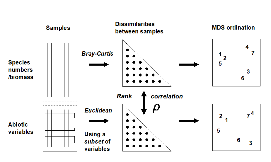
Fig. 11.8. Schematic diagram of the BEST procedure (Bio-Env): selection of the abiotic variable subset maximising rank correlation ($\rho$) between biotic and abiotic (dis)similarity matrices, by checking all combinations of variables.
The BEST (Bio-Env) procedure
The matching of biotic to environmental patterns can now take place ȹ, as outlined schematically in Fig. 11.8. Combinations of the environmental variables are considered at steadily increasing levels of complexity, i.e. k variables at a time (k = 1, 2, 3, ..., v). Table 11.2 displays the outcome for the Exe estuary nematodes.
Table 11.2. Exe estuary nematodes {X}. Combinations of the 6 environmental variables, taken k at a time, yielding the best matches of biotic and abiotic similarity matrices for each k, as measured by weighted Spearman rank correlation $\rho _ s$; bold type indicates overall optimum. See earlier text for variable abbreviations.
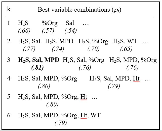
The single abiotic variable which best groups the sites, in a manner consistent with the faunal patterns, is the depth of the $H _ 2 S$ layer ($\rho _ s = 0.66$); next best is the organic content ($\rho _ s = 0.57$), etc. Naturally, since the faunal ordination is not one-dimensional (Fig. 11.7a), it would not be expected that a single abiotic variable would provide a very successful match, though knowledge of the H$_ 2$S variable alone does distinguish points to the left and right of Fig. 11.7a (samples 1 to 4 and 6 to 9 have lower values than for samples 5, 10 and 12 to 19, with sample 11 between).
The best 2-variable combination also involves depth of the $H _ 2 S$ layer but adds the interstitial salinity. The correlation ($\rho _ s = 0.77$) is markedly better than for the single variables, and this is the combination shown in Fig. 11.7b. The best 3-variable combination retains these two but adds the median particle diameter, and gives the overall optimum value for $\rho _ s$ of 0.81 (Fig. 11.7c); $\rho _ s$ drops slightly to 0.80 for the best 4- and higher-way combinations. The results in Table 11.2 do therefore seem to accord with the visual impressions in Fig. 11.7.Ɥ In this case, the first column of Table 11.2 has a hierarchical structure: the best combination at one level is always a subset of the best combination on the line below. This is not guaranteed since all combinations have been evaluated and simply ranked, though it will tend to happen when the explanatory variables are only weakly related to each other, if at all.
An exhaustive search over v variables involves
$$ \sum _ {k =1} ^ {v} = \frac{ v ! } { k ! \left( v - k \right) ! } = 2 ^ v - 1 \tag{11.5} $$
combinations, i.e. 63 for the Exe estuary study, though this number quickly becomes prohibitive when v is larger than about 15. Above that level, one could consider stepwise procedures which search in a more hierarchical fashion, adding and deleting variables one at a time (see the BEST BVStep option, Chapter 16). In practice though, it may be desirable to limit the scale of the search initially, for a number of reasons, e.g. always to include a variable known from previous experience or external information to be potentially causal. Alternatively, scatter plots of the environmental variables may demonstrate that some are highly inter-correlated and nothing in the way of improved ‘explanation’ could be achieved by entering them all into the analysis.
An example is given by the Garroch Head macrofauna study {G}, for which the 11 abiotic variables of Table 11.1 are first transformed, to validate the use of Euclidean distances and standard product-moment correlations (page 11.2). As indicated earlier, choice of transformations is aided by a draftsman plot, i.e. scatter plots of all pairwise combinations of variables, Fig. 11.9. Here, this is after all the concentration variables, but not water depth, have been log transformed℈, in line with the recommendations on page 11.2
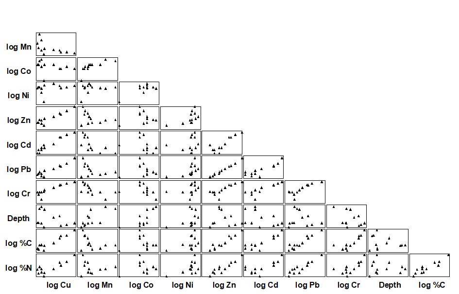
Fig. 11.9. Garroch Head macrofauna {G}. Draftsman plot (all possible pairwise scatter plots) for the 11 abiotic variables recorded at 12 sampling stations across the sewage sludge dumpsite. All variables except water depth have been log transformed.
The draftsman plot, and the associated correlation matrix between all pairs of variables, can then be examined for evidence of collinearity (page 11.3), indicated by straight-line relationships, with little scatter, in Fig. 11.9. A further rule-of-thumb would be to reduce all subsets of (transformed) variables which have mutual correlations averaging more than about 0.95 to a single representative. This suggests that %C, Cu, Zn and Pb are so highly inter-correlated that it would serve no useful purpose to leave them all in the BEST analysis. For every good match that included %C, there would be equally good matches including Cu, Zn or Pb, leading to a plethora of effectively identical solutions. Here, the organic carbon load (%C) is retained and the other three excluded, leaving 8 abiotic variables in the full Bio-Env search. This results in an optimal match of the biotic pattern with %C, %N and Cd ($\rho _ s = 0.86$). The corresponding ordination plots are seen in Fig. 11.10. The biotic MDS of Fig. 11.10a, though structured mainly by a single strong gradient towards the dump centre (e.g. the organic enrichment gradient seen in Fig. 11.10b), is not wholly 1-dimensional. Additional information, on a heavy metal, appears to improve the ‘explanation’.
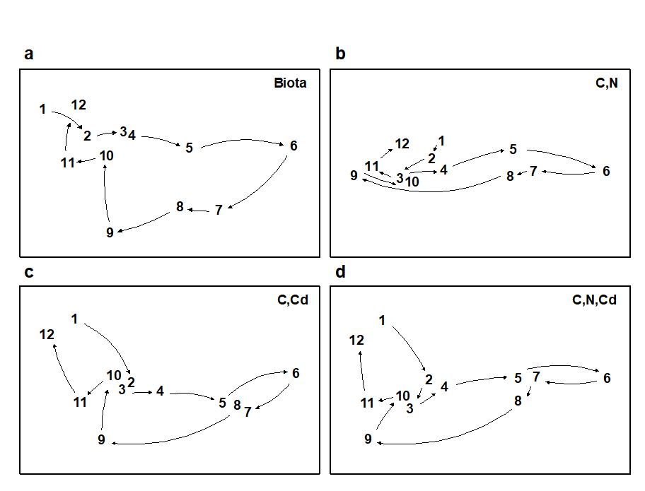
Fig 11.10. Garroch Head macrofauna {G}. MDS plots for the 12 sampling stations across the sewage-sludge dump site (Fig. 8.3), based on: a) species biomass, as in Fig. 11.5a; b)-d) three combinations of carbon, nitrogen and cadmium concentrations (log transformed) in the sediments, the best match with the biota over all combinations of the 8 variables being for %C, %N and Cd ($\rho_s$ = 0.86). (Stress = 0.05, 0, 0.01, 0.01).
Further examples of the Bio-Env procedure are given in
Clarke & Ainsworth (1993)
,
Clarke (1993)
,
Somerfield, Gee & Warwick (1994a)
,
Somerfield, Gee & Warwick (1994b)
and many subsequent applications. For a series of data sets on impacts on benthic macrofauna around N Sea oil rigs,
Olsgard, Somerfield & Carr (1997)
and
Olsgard, Somerfield & Carr (1998)
use the Bio-Env procedure in a particularly interesting way. They examine which transformations (Chapter 9) and what level of taxonomic aggregation (Chapter 10) tend to maximise the Bio-Env correlation, $\rho$. The hypotheses examined are that certain parts of the community, on the spectrum of rare to common species, may delineate the underlying impact gradient more clearly (see page 9.4), as may some taxonomic levels, higher than species (see page 10.1).
Global BEST test
Another question which naturally arises is the extent to which the conclusions from a BEST run can be supported by significance tests. This is problematic given the lack of model assumptions underlying this procedure, which can be seen as both a strength (i.e. generality, ease of understanding, simplicity of interpretation) and a weakness (lack of a structure for formal statistical inference). A simple RELATE test is available (see page 6.10 and later) of the hypothesis that there is no relationship between the biotic information and that from a specified set of abiotic variables, i.e. that $\rho$ is effectively zero. This can be examined by a permutation or randomisation test, of a type met previously on pages 6.8 & 6.10, in which $\rho$ is recomputed for all (or a large random subset of) permutations of the sample labels in one of the two underlying similarity matrices. As usual, if the observed value of $\rho$ exceeds that found in 95% of the simulations, which by definition correspond to unrelated ordinations, then the null hypothesis can be rejected at the 5% level.
Note however that this is not a valid procedure if the abiotic set being tested against the biotic pattern is the result of optimal selection by the BEST procedure, on the same data. For v variables, this is implicitly the same as carrying out $2 ^ v –1$ null hypothesis tests, each of which potentially runs a 5% risk of Type 1 error (rejecting the null hypothesis when it is really true). This rapidly becomes a very large number of tests as v increases, and a naïve RELATE test on the optimal combination is almost certain to indicate a significant biotic-abiotic relation, even with entirely random data sets!
What is needed here is a randomisation test which incorporates the fitting stage and thus allows for the selection bias in the optimal solution. This can be readily achieved, though requires quite a heavy computational load. The requirement is to generate the (null) distribution of the maximum $\rho$ that can be obtained, by an exhaustive search over all subsets of environmental variables (see Fig. 11.8), when there really is no matching structure between biotic and abiotic data. The null situation is again produced by randomly permuting the columns (samples) of one of the data matrices on the left hand side of Fig. 11.8, in relation to the other. The two matrices are then treated as if their samples do have matching labels and the full Bio-Env procedure is applied, to find the subset of environmental variables which gives the ‘best’ match. Of course, this $\rho$ would not be expected to be large, since any real match has been destroyed by the permutation, but $\rho$ will clearly be greater than zero since the largest of all the $2 ^ v –1$ calculated correlations has been selected.
So far, then, we have produced a single value from the null distribution of (max) $\rho$, when there is no biotic-environmental link. This whole procedure is now repeated a total of (say) 999 times, each time randomly reshuffling the columns of the abiotic matrix and running through the entire Bio-Env procedure, to obtain an optimum $\rho$. A histogram of these values is the null distribution, namely, the expected range of BEST Bio-Env $\rho$ values that it is possible to obtain by chance when there is no biotic to abiotic link. As usual, comparison with the observed value of $\rho$ shows the statistical significance, or otherwise, of this observed $\rho$.
Fig 11.11 shows the resulting histograms for the two examples used in this chapter to illustrate the BEST (Bio-Env) procedure. For both the Exe nematodes {X} and the Garroch Head macrofauna {G}, we can be confident in interpreting the biota to environment links because the observed best matches of $\rho _ s$ = 0.81 and 0.86 are larger than could have been obtained by chance: they are greater than any of their 999 simulated $\rho _ s$ values (p<0.1%). Note, however, how far the null distributions are from being centred at $\rho = 0$, particularly for the Garroch Head data, which has a mode at about 0.25 and right-tail values up to about 0.7. This reflects both the small number of sites that are being matched and the simplicity of the strong linear gradient in the sample structure. With 8 abiotic variables (and thus a choice of 255 possible subsets) it is clearly not that difficult to find an environmental combination, by chance, that gives some degree of match to any rank order of the samples along a line.
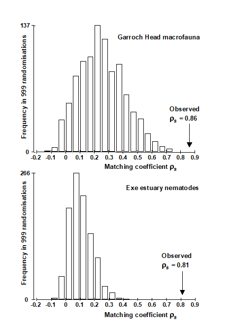
Fig. 11.11. Garroch Head macrofauna {G} and Exe estuary nematodes {X}. Global BEST (Bio-Env) test for a significant relationship between community and environmental samples. The histograms are the null permutation distributions of possible values for the best Bio-Env match (Spearman $\rho_s$), in the absence of a biota-environment relationship.
The same idea can be used to derive a permutation test for the BVStep context, in which only a stepwise-selected set of optimal variables are generated. The simulations of the null condition simply require an equivalent stepwise search on the randomly permuted (and thus non-matching) matrices for the maximum $\rho$, repeated many times to obtain the null distribution for $\rho$. This is the principle of permutation tests: permute the data appropriately to reflect the null condition, then repeat exactly the same steps (however complicated) in calculating the test statistic as were carried out on the data in its original form, and compare the true statistic to the values under permutation.
These tests for Bio-Env and BVStep procedures are together referred to as global BEST tests, and as with the global ANOSIM test of Chaper 6, this becomes an important initial ‘traffic light’. The null hypothesis, of no biotic to abiotic link, must be decisively rejected before any attempt is made to interpret the environmental variables that BEST selects. This is always helped by increasing the number of sites, conditions, times etc that are being matched. For the Exe data, there were 19 sites (compared with 12 for Garroch Head) and only 6 environmental variables, and the null distribution of $\rho _ s$ in Fig. 11.11 now has mode less than 0.1, with right tail values stretching to no higher than about 0.4. Any reasonably large observed $\rho _ s$ is therefore likely to be interpretable.
¶ These might sometimes include biotic as well as abiotic data, e.g. when assessing how coral reef fish communities might be structured by area cover of specific, dominant species of coral.
† Additional reasons for a poor match include: cases where the observed biotic patterns are largely a function of internal stochastic forces, e.g. competitive interactions within the assemblage, rather than external forcing variables; abiotic variables are measured over the wrong spatio-temporal scales in terms of their impact on community structure; there is a large element of random variation from sample to sample, under the same environmental conditions, e.g. the unit sample size is inadequate to characterise the assemblage; and a more technical reason (addressed later) concerning non-additive effects of structuring variables. In all these cases, the procedure may fail to ‘explain’ the community structure well, in terms of the provided set of environmental variables.
§ For example, in spite of the very low stress in Fig. 11.7, a 2-d Procrustes fit of 11.7a with 11.7c will be rather poor, since the (5, 10) and (12–19) groups are interchanged between the plots. Yet, the interpretation of the two analyses is fundamentally the same (five clusters, with the (5, 10) group out on a limb etc). This match will probably be better in 3-d but will be fully expressed, without arbitrary dimensionality constraints, in the underlying similarity matrices.
‡ This matrix correlation statistic has already been met, e.g. on pages 6.8, 6.10, 7.5, and will be used extensively again later.
⸙ This is so defined by Clarke & Ainsworth (1993) because it is algebraically related to the average of the harmonic mean of each ($r _ i $, $s _ i$) pair. The denominator term, $r _ i + s _ i$, down-weights the contribution of large ranks; these are the low similarities, the highest similarity corresponding to the lowest value of rank similarity (1), as usual. Note that $\rho _w$ and $\tau$ tend to give consistently lower values than $\rho _s$ for the same match; nothing should therefore be inferred from a comparison of absolute values of $\rho _s$, $\tau$ and $\rho _w$.
ȹ This is implemented in the PRIMER BEST routine, which includes both a full search (the Bio-Env option) and a sequential, stepwise, form of this (BVStep), when there are too many variables to permit an exhaustive search.
Ɥ This will not always be the case if the 2-d faunal ordination has non-negligible stress. It is the matching of the similarity matrices which is definitive, although it would usually be a good idea to plot the abiotic ordination for the best combination at each value of k, in order to gauge the effect of a small change in $\rho$ on the interpretation. Experience suggests that combinations giving the same value of $\rho$ to two decimal places do not give rise to ordinations which are distinguishable in any practically important way, thus it is recommended that $\rho$ is quoted only to this accuracy, as in Table 11.2.
℈ This actually uses a log(c+x) transformation where c is a constant such as 1 or 0.1. The necessity for this, rather than a simple log(x) transform, comes from the zero values for the Cd concentrations in Table 11.1, log(0) being undefined. A useful rule-of-thumb here is to set the constant c to the lowest non-zero measurement, or the concentration detection limit.
11.5 Further ‘BEST’ variations
Entering variables in groups
In some contexts, it makes good sense to utilise an a priori group structure for the explanatory variables and enter or drop all variables within a single group simultaneously, e.g. if locations of sites expressed in latitude and longitude are two of the variables, it does not make sense to enter one into the ‘explanation’ and leave out the other.
Valesini, Tweedley, Clarke et al. (2014)
{e} give a more major example of an estuarine fish study, where abiotic variables potentially driving the assemblages over different spatial scales were divided into those measuring wave exposure, substrate/vegetation type, extent of marine water intrusion, and more dynamic water quality parameters – with multiple variables in each group – all within a categorical structure, e.g. of different microtidal estuaries in Western Australia. Groups were entered into the BEST Bio-Env routine as indivisible units, to determine which variable type, or types, best explained the fish communities (at sites aggregated by SIMPROF into homogeneous clusters of their fish communities). Both BEST and the global BEST test need thus to be run on these (aggregated) samples by searching all combinations of groups of explanatory variables, which involves a much smaller number of combinations – and consequently lower selection bias to allow for in the permutation test – than if all variables had been separately entered.¶
Constrained (‘two-way’) BEST analyses
A further BEST modification parallels the two-way ANOSIM test of Chapter 6 and two-way SIMPER breakdown of Chapter 7. A strong categorical factor, clearly dominating the main differences observed in community structure among samples in an ordination, may sometimes not be comfortably incorporated into a set of quantitative explanatory variables to enter into BEST, e.g. if the factor has several levels which are in no sense ordered. An example could again be found in the Valesini, Tweedley, Clarke et al. (2014) study in which the suite of c. 15 quantitative environmental variables are measured at a wide range of sites within each of a number of different estuaries. Rather than attempt to convert the estuary factor into a quantitative form†, or simply ignore it on the grounds (say) that the major differences noted between estuaries should be identified by one of the measurement variables, in some circumstances it may be appropriate to accept that the differing locations will have differing assemblages and remove this categorical estuarine factor. For each considered combination of explanatory variables (or groups of variables perhaps, in the previous section), the matching statistic $\rho$ is calculated separately within each of the levels (each estuary) and its values then averaged over those levels. The variable combination giving the largest average $\rho$ is the constrained BEST match, and it can be tested for departure from the null hypothesis of ‘no genuine match’ by the same style of global BEST test as previously, but with constrained permutation of sample labels only within each level, then recalculating the largest average $\rho$, etc. The 2-way crossed ANOSIM analogy is very clear.
¶ The option to group variables, using a pre-defined indicator, is implemented in the PRIMER BEST routine and its associated test, as is the conditional BEST analysis which follows.
† Clearly it would usually be inappropriate to number estuaries 1, 2, 3, 4, and then treat this as a quantitative variable, since it forces estuaries 1 and 4 to be ‘further apart’ environmentally than 1 and 3, which may be arbitrary. Instead, the trick is usually to replace this single factor by four new binary factors. (Is the sample in estuary 1? If so score 1, otherwise 0. Is it in estuary 2? … etc). Such binary variables are quantitative and now ordered.
11.6 Linkage trees (and example)
The idea of linkage trees¶ is most easily understood in the context of a particular example, so Fig. 11.12 redisplays some of the nMDS bubble plots for the 17 Exe estuary sites used to illustrate the BEST/Bio-Env procedure, earlier in this chapter. Bio-Env shows that three variables, MPD, Sal% and H$_2$S, can ‘explain’ a large (and significant, Fig. 11.11) component of the multivariate biotic structure but this does not tell us how they explain the structure, e.g. for the five main clusters seen in Fig. 5.4, which abiotic variables are distinguishing which clusters? The answer is readily seen in this case from a few simple bubble plots, but this is only possible because the 2-d MDS stress is low (0.05) and thus the plot is reliable. In general it would be useful to have some means of describing how particular abiotic variables ‘explain’ particular divisions of samples in the full, high-d biotic space: the PRIMER LINKTREE routine can be helpful here.
Binary divisive clustering was introduced on page 3.6. The unconstrained clustering technique described there (UNCTREE) divides each sample set into two subsets, successively, each binary division being chosen in some optimum way, until a stopping rule is triggered, which is typically a SIMPROF test failing to demonstrate community differences among the remaining samples in a group. LINKTREE, in contrast, is a constrained binary divisive clustering, in which the only subdivisions allowed are those for which an ‘explanation’ exists in terms of a threshold on one of the environmental variables in a separately supplied abiotic matrix for a matching set of samples. For the Exe nematode data, the first stage is shown in Fig. 11.12: MPD, Sal% and H$_2$S are considered one at a time. For Median Particle Diameter, the ‘best’ split of the full set of samples into two groups is shown on the biotic MDS for all 19 sites (seen previously at Fig 11.6), corresponding to the threshold MPD<0.18 for sites 1-4, 7-9 (sites to the left of the dotted line) and MPD>0.21 for the remaining sites (to the right), Fig. 11.12a. The ‘best’ split is defined here as that which maximises the ANOSIM R statistic between the two groups formed†, as was the case for the unconstrained (UNCTREE) procedure, and it does not use the MDS plot in any way – thus ensuring that the procedure works in the true high-d space of the biota data.
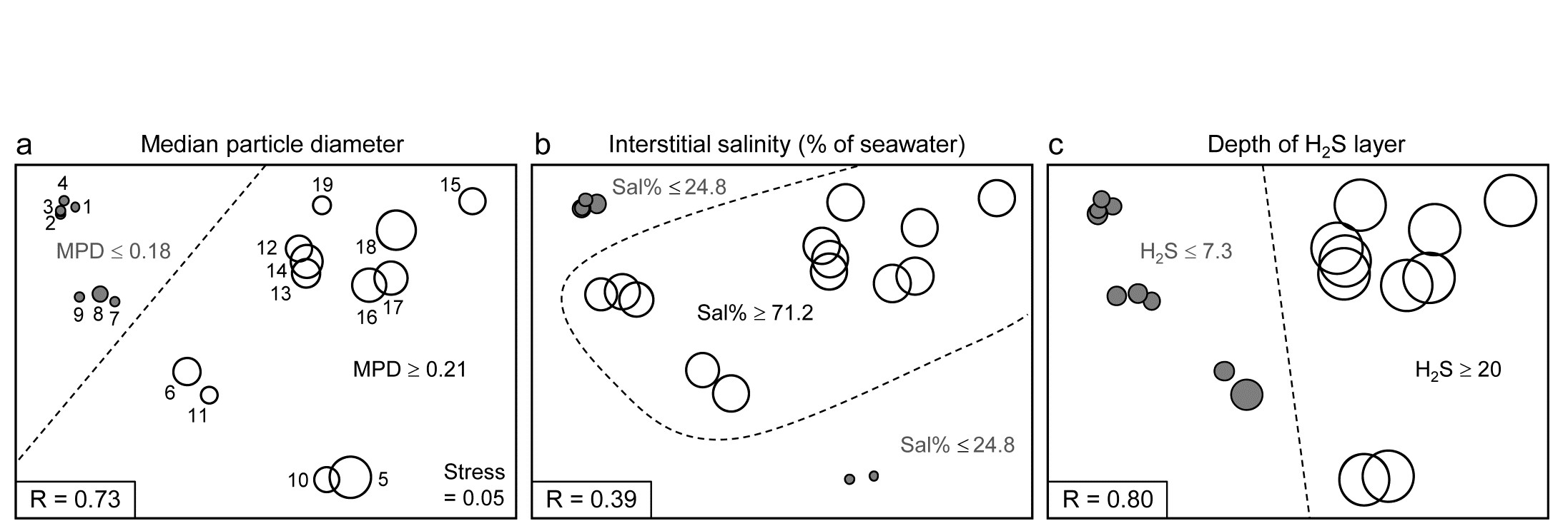
Fig. 11.12. Exe estuary nematodes {X}. First step in LINKTREE illustrated by a biotic nMDS of the 19 sites, as Fig. 11.6, with bubble plots for: a-c) median particle diameter, interstitial salinity (as % of 36ppt) and depth of the anoxic layer (cm). Dotted line indicates the optimal split of the communities at the 19 sites into two groups (open and closed circles), based on maximising the ANOSIM R statistic between them, subject to the constraint that the figured abiotic variable takes consistently lower values in one group than the other.
For LINKTREE (unlike UNCTREE), not all $2 ^ {18}$ ways of dividing 19 samples into two groups are permitted, because most of them will not correspond to a precise threshold on the median particle diameter. In fact, by ranking the sites in increasing MPD order, it is clear that we only need to consider 18 possible divisions in the constrained case (the site with smallest MPD vs. the rest, the two smallest vs. the rest, and so on). Fig. 11.2a shows the best of these 18 splits gives R=0.73.
Now the other two abiotic variables are considered in turn. Sal%, though important (as will be seen later), does not do a good job of an initial binary split, the best division giving only R=0.39 (Fig. 11.12b) – it is clear that sites are either of greatly reduced interstitial salinity (<24.8% of seawater) or are reasonably saline (>71.2%), with no sites in between. However, depth of the blackened H$_ 2$S layer separates the 19 sites into two groups best of all here, with R=0.80 (Fig 11.12c), so this becomes the first division (labelled A) in the dendrogram of Fig. 11.13a.
Each subset is now subject to further binary division, exploring thresholds on all three abiotic variables. It is clear from Fig. 11.12b, for example, that Sal% will provide the best explanation for the natural separation of sites (5,10) from (12-19), those for which H$_ 2$S>20 in the first split. This gives R=1, split G on Fig. 11.13a, and the remaining divisions proceed in the same way. The figure legend gives some detail on layout of the full divisive dendrogram of Fig. 11.3a. One point to note is that inequalities can be in either direction, e.g. the division at J has sites to the left with Sal%>89.4 and to the right with Sal%<89, and these will reverse if the dendrogram branches are arbitrarily rotated (in the same way as for any other dendrogram). Further, though all splits are shown§, it would be incorrect to interpret some, since they ‘fail’ the SIMPROF test, i.e. if there is no evidence of biological heterogeneity of samples in a current group, then there can be no justification for seeking an environmental explanation for further dividing that group – thus these parts of the dendrogram are ‘greyed out’.
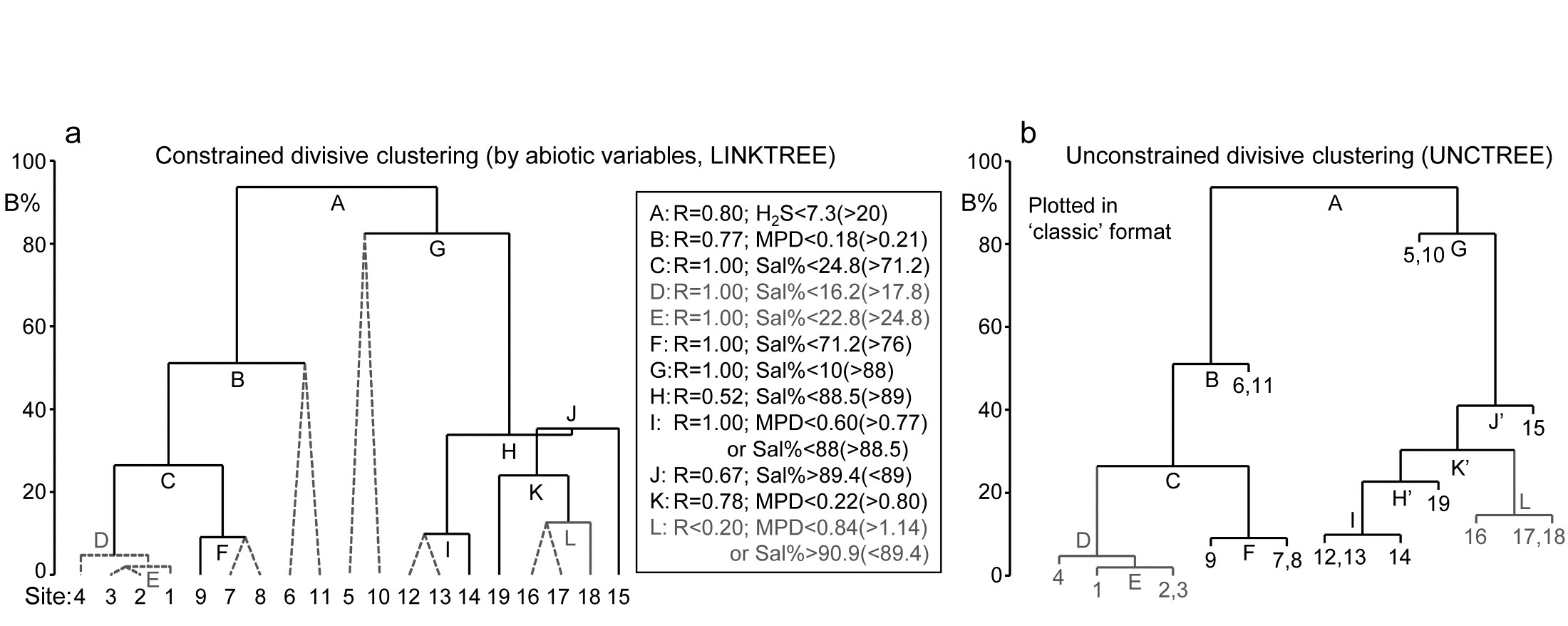
Fig. 11.13. Exe estuary nematodes {X}. a) Binary divisive clustering (LINKTREE) of the communities at 19 sites, for which step A was illustrated in Fig. 11.12, i.e. each split constrained by a threshold on one of the three abiotic variables: MPD, Sal%, H$_ 2$S. The first in-equality (e.g. for split A, H$_2$S<7.3) always indicates sites to the left side of the split, the second (in brackets, e.g. >20) sites to the right. The same splits will be obtained whether abiotic data is transformed or not (the process is truly non-parametric!) so the inequalities should always quote untransformed values, for greater clarity. Dotted or grey lines or text denote splits not to be interpreted because they are below the stopping rules; here the latter use SIMPROF tests before each split and also require that R>0.2 (e.g. the split at L would be allowed by SIMPROF but has R<0.2). The y axis scale (B%) is the average of the between-group rank dissimilarities, using the original ranks from the biotic resemblance matrix, scaled to take the value 100% if the first split is a perfect division (i.e. R=1).
b) Unconstrained binary divisive clustering (UNCTREE) of the same data, plotted in ‘classic’ style (e.g. as for LINKTREE in PRIMER v6; v7 allows both formats for either analysis). UNCTREE is based only on the biotic resemblances, with grey lines/letters again denoting divisions with R<0.2 or not supported by SIMPROF tests.
The scale on the y axis can be chosen (the A% scale) to make the divisions equi-step, arbitrarily, down the dendrogram (this is the option used in most standard CART programs) but here we display divisions at a y axis level (B%) which reflects the magnitude of differences between the subsets of samples formed at each division, in relation to the community structural differences across all samples. Such an absolute scale cannot be created from the ANOSIM R values used to make each split, since they continually ‘relativise’, by re-ranking the dissimilarities within each current set. Clarke, Somerfield & Gorley (2008) show that an appropriate scale can be based only on between-group average rank dissimilarity, using the original ranks from the full matrix. This is scaled by dividing by its value for the case of maximum possible separation of the first two groups produced by the initial division (the case R=1) and multiplying by 100, to give the B% scale. The Fig. 11.13a dendrogram does not quite start at B = 100 therefore, since the split seen in Fig. 11.12c gives R = 0.80 (clearly a few between group dissimilarities are smaller than some within group values) but the split at G is seen to be between very different groups (B = 82%), whilst that at, for example, D (the division of site 4 from 1 to 3), is inconsequential in comparison (B = 5%); that pattern is clear from the MDS plot.
An interesting but subtle point arises for split J, with its B = 35% value just exceeding that for H, a prior division (B = 34%). This reversal in the dendrogram is here an indication that the split of site 15 from (12-14, 16-19) would have been a more natural first step than the LINKTREE division of sites 12-14 from 15-19. In fact this is exactly what unconstrained (UNCTREE) clustering does, as seen in Fig. 11.13b (split J’). The point to note here is that LINKTREE is not able to make this more natural division because none of the three variables gives a threshold value which can separate site 15 from the set (12-14, 16-19). It is only after the group 12-14 has been removed that the separation of site 15 (now only from 16-19) has an ‘explanation’. So the presence of such reversals in a dendrogram could be an indication that an abiotic variable capable of ‘explaining’ a natural pattern has not been measured. Here, site 15 is discriminated by Ht (height up the shore) and, had that variable been included, the dendrogram would have separated 15 before others in that group. However, a reversal could equally well reflect large sampling variability in the biotic community or the measured abiotic variables – it is clear that LINKTREE is a technique suited only to robust data, with well-established detailed patterns in SIMPROF tests, and it is relevant that this successful example of a LINKTREE run is a case where both biotic and abiotic data have been (time-)averaged to reduce the variability‡.
One unwelcome result, however, of introducing more explanatory variables is that there are certain to be multiple explanations for each split, whereas this is only seen in a limited way in Fig. 11.13a, e.g. at split I, where a threshold on MPD or on Sal% will give the same division of sites (12,13) from 14. Had we used all 6 abiotic variables, nearly every division would have had multiple explanations, e.g. the first split A would have resulted from %Org>0.37(<0.24) as well as H$_ 2$S<7.3(>20). The routine can have no basis for choosing between ‘explanations’ which give the same split – neither may be causal, of course! So there is a strong incentive in LINKTREE to be disciplined and use few abiotic variables, chosen for their potential causality and likely independence, as now seen.
Example: Fal estuary nematodes
Fig. 11.14 shows the divisive LINKTREE clustering of 27 sites in 5 creeks of the Fal estuary, UK, based on nematode assemblages (creek map at Fig. 9.3, {f}). The creeks have varying levels of metal pollution by historic mining, here represented by sediment Cu concentrations (other metals being highly correlated with Cu), and a single grain size variable, %Silt/Clay.
Though the creek distinctions are not utilised at all, the resulting divisive clustering and SIMPROF tests largely divides the sites into their creeks (with a few sub-divisions), Fig. 11.14a. In spite of the non-trivial stress in this case (0.12), making the MDS (11.14b) only an approximation to the biotic relationships, it can be still be useful to indicate the sub-groupings, by increasingly fainter dividing lines, and the thresholds from the LINKTREE run, manually on the ordination.
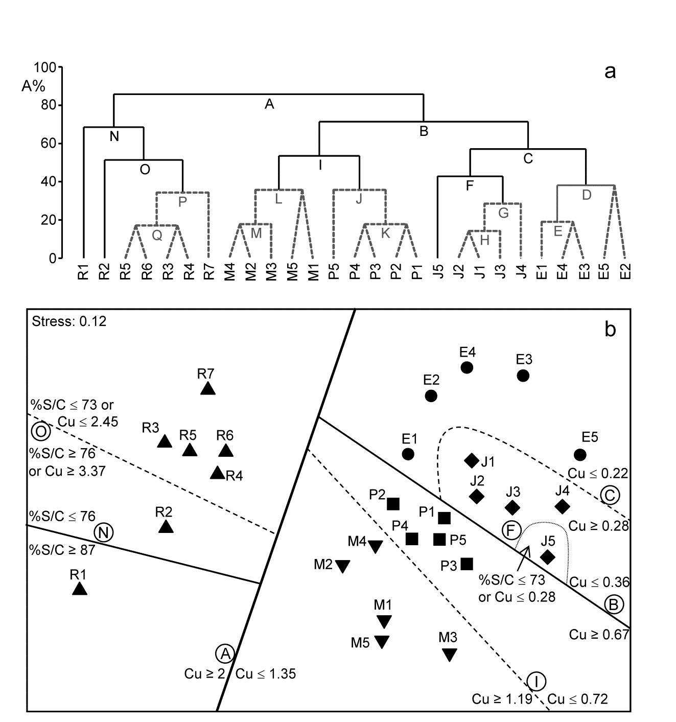
Fig. 11.14. Fal estuary nematodes {f}. a) Constrained divisive clustering (LINKTREE, using y axis scale A%, of arbitrary equi-steps), and b) nMDS of the 27 sites (in 5 creeks, see map in Fig. 9.3: Restronguet, Mylor, Pill, St Just, Percuil), based on fourth-root transformed counts and Bray-Curtis similarities. Divisions subject to thresholds on two environmental variables: sediment Cu concentration and %Silt/Clay ratio. Dashed lines and grey letters on the dendrogram denote groupings not supported by SIMPROF. Supported divisions identified by the same letters on the MDS, together with the inequalities ‘explaining’ them.
¶ De'Ath (2002) introduced this idea into ecology as ‘multivariate regression trees’, extending the ‘classification and regression trees’ (CART) routines found in major statistics packages such as S-Plus. Clarke, Somerfield & Gorley (2008) adapt this technique to be consistent with PRIMER’s non-parametric approach, and therefore use binary clustering divisions based on optimising the rank-based ANOSIM R statistic rather than, for example, maximising among- group sums of squares. They use the terminology ‘linkage trees’ since the method has little to do with model-based ‘regression’ as such (a historical term arising from the ‘regression to the mean’ seen when the slope of a linear relationship declines as the residual variance increases).
† As explained on page 3.6 we are not using ANOSIM as a test here, merely exploiting its very useful role as a measure of separation between groups of samples in multivariate space. Note therefore that the resemblance matrix among samples for each new set is re-ranked in order to calculate the R values for all the possible subsets from the next division. There are no constraints that subsets should be of comparable size. PRIMER does allow the user to debar groups of fewer than n samples (n specified) but there seems no good reason to rule out e.g. singleton groups, or not to split a group of less than n samples, if a SIMPROF test would allow it. (Note, however, that SIMPROF will never split a group of two samples, page 3.5). PRIMER can also allow a split not to be made if R does not exceed a threshold value – see later.
§ This is to make it possible to display labels or factor levels and symbols for the samples, rather than the previous LINKTREE format in PRIMER v6 (the ‘classic’ style of Fig. 11.13b) which was restricted to using sample numbers. In the new form, it can be incorporated into shade plots, see the sample axis in Fig. 7.8.
‡ LINKTREE can also sometimes succeed because of its total lack of assumptions and thus great flexibility. An (over)simple characterisation is that DISTLM (multivariate multiple linear regression in PERMANOVA+) assumes linearity and additivity of the abiotic variables on the high-d community response, whereas Bio-Env caters for non-linearity but still makes the additivity assumption, i.e. both are holistic methods applying across the full set of sites. For example, Ht (shore height) did not feature in Bio-Env results (Table 11.2) and would not do so in DISTLM, because its ‘effect’ is inconsistent across the sites: 1-4 have a wide range of shore heights yet identical communities (largely true of sites 7-9 also), whereas the assemblage at site 15 appears to be separated from all those at 12-19 by the greater shore height (the only variable that makes this split). If, as here, Ht only appears to be important to the community when the sediment is coarser (MPD>0.21), but does not matter at all when it is finer (MPD<0.18), Fig. 11.12a, this is exactly the definition of interaction (non-additivity) of the two abiotic variables in their effect on the biota. By the intuitive premise for Bio-Env (first paragraph on page 11.4 it is clear that the procedure will be ambivalent about including Ht in its explanation. Similarly, in modelled multiple regression, whilst DISTLM could theoretically be extended to include all interaction effects (in addition to all quadratic terms, to try to allow for the non-linear response) this is usually impossible because of the large number of model parameters that would then need fitting. LINKTREE is designed to cater for strong non-linearity through its use of thresholds, and interaction through its compartmentalisation – explanations are only local to a few sites not global. But it has major drawbacks: no allowance for sampling variability and an inability to cater sensibly for more than a few variables.
11.7 Concluding remarks
For this chapter as a whole, two final points need to be made. The topic of experimental and field survey design for ecologists is a large one, addressed to some extent in the accompanying PERMANOVA+ manual ( Anderson, Gorley & Clarke (2008) )¶, but this is a problematic area for all multivariate techniques because of the difficulty of specifying an explicit alternative hypothesis to the null hypothesis of, for example, no link of an assemblage to abiotic variables. A specified alternative is required to define power of statistical procedures but there are a myriad of ways in which individual species can react, even to a single environmental variable (some increase along an abiotic gradient, some decrease, some increase then decrease, others change little etc), any combination of which, for each of the variables, will be inferred as a biotic-abiotic link. Formal power calculations, analogous to those for simple univariate regression (e.g. Bayne, Clarke & Moore (1981) ), are a non-starter, and simulation from observed alternatives to the null conditions are the only possible approach (see, for example, Somerfield, Clarke & Olsgard (2002) ). However, in the context of linking biotic and abiotic patterns, it is intuitively clear that this has the greatest prospect of success if there are a moderately large number of sample conditions, and the closest possible matching of environmental with biological data. In the case of a number of replicates from each of a number of sites, this could imply that the biotic replicates would each have a closely-matched environmental replicate. Without matching of biotic and abiotic samples none of the methods of this chapter could be used, so data from the two sources will always need averaging up to the lowest common denominator, giving a one-to-one match of ‘response’ and ‘explanatory’ samples.
Another lesson of the Fal estuary nematode study and the Garroch Head example of Fig 11.9 is the difficulty of drawing conclusions about causal variables from any observational study. In the Garroch Head case, four of the abiotic variables were so highly correlated with each other that it was desirable to omit all but one of them from the computations. There may sometimes be good external reasons for retaining a particular member of the set but, in general, one of them is chosen arbitrarily as a proxy for the rest (e.g. in the Garroch Head data, %C was a proxy for the highly inter-correlated set %C, Cu, Zn, Pb). If that variable does appear to be linked to the biotic pattern then any member of the subset could be implicated, of course. More importantly, there cannot be a definitive causal implication here, since each retained variable is also a proxy for any potentially causal variable which correlates highly with it, but remains unmeasured. Clearly, in an environmental impact study, a design in which the main pollution gradient (e.g. chemical) is highly correlated with variations in some natural environmental measures (e.g. salinity, sediment structure), cannot be very informative, whether the latter variables are measured or not. A desirable strategy, particularly for the non-parametric multivariate analyses considered here, is to limit the influence of important natural variables by attempting to select sites which have the same environmental conditions but a range of contaminant impacts (including control sites† of course). Even then§, in a purely observational study one can never entirely escape the stricture that any apparent change in community, with changing pollution impact, could be the result of an unmeasured and unconsidered natural variable with which the contaminant levels happen to correlate. Such issues of causality motivate the following chapter on experimental approaches.
¶ Green (1979) also provides some useful guidelines, mainly on field observational studies, and Underwood (1997) concentrates on design of field manipulative experiments; both books are largely concerned with univariate data but many of the core issues are common to all analyses.
† Note the plurality; Underwood (1992) argues persuasively that impact is best established against a baseline of site-to-site variability in control conditions.
§ And in spite of impressive modern work on causal models that bring a much-needed sense of discipline to the selection of abiotic variables and prior modelling of causal links among variables and responses, see Paul & Anderson (2013) .