Chapter 16: Further multivariate comparisons and resemblance measures
- 16.1 Introduction
- 16.2 Matching of ordinations
- 16.3 Example: Amoco-Cadiz oil spill
- 16.4 Further extensions
- 16.5 Second-stage MDS
- 16.6 Comparison of resemblance measures
- 16.7 Second-stage interaction plots
- 16.8 Example: Algal recolonisation, Calafuria
16.1 Introduction
To motivate the first method of this chapter look again at the analysis of macrobenthic samples from the Bay of Morlaix {A}, before and after the Amoco-Cadiz oil spill. The MDS of Fig. 16.1 shows a clear signal of community change through time, a combination of cyclical seasonal fluctuations (the samples are approximately quarterly) with the major perturbation of the oil spill after approximately a year, and a partial recovery over the next four years. The intricate and informative picture is based on a matrix of 257 species but the question naturally arises as to whether all these species are influential in forming the temporal pattern. This cannot be the case, of course, because many species are very uncommon. The later Fig. 16.3a shows an identical MDS plot based on only 125 species, the omitted ‘least important’ 132 species accounting for only 0.2% of the total abundance and, on average, being absent from all 5 replicate samples on 90% of the 21 sampling times. However, the question still remains: do all the 125 species contribute to the MDS or is the pattern largely determined by a small number of highly influential species? If the latter, an MDS of that small species subset should generate an ordination that looks very like Fig. 16.1, and this suggests the following approach ( Clarke & Warwick (1998a) ).
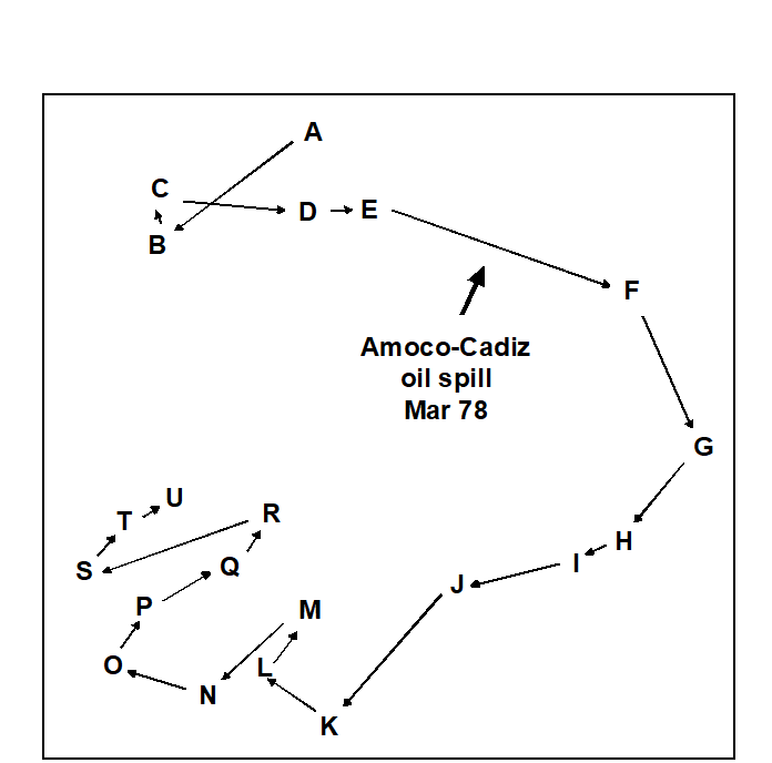
Fig. 16.1. Amoco-Cadiz oil spill {A}. MDS for 257 macrobenthic species in the Bay of Morlaix, for 21 sampling times (A, B, C, …, U; see legend to Fig. 10.4 for precise dates). The ordination is based on Bray-Curtis similarities from fourth root-transformed abundances and the samples were taken at approximately quarterly intervals over 5 years, reflecting normal seasonal cycles and the perturbation of the oil spill (stress = 0.09).
16.2 Matching of ordinations
The BEST (Bio-Env) technique of Chapter 11 can be generalised in a natural way, to the selection of species rather than abiotic variables. The procedure is shown schematically in Fig. 16.2. Here the two starting data sets are not: 1) biotic, and 2) abiotic descriptions of the same set of samples, but: 1) the faunal matrix, and 2) a copy of that same faunal matrix. Variable sets (species) are selected from the second matrix such that their sample ordination matches, ‘as near as makes no difference’, the ordination of samples from the first matrix, the full species set. This matching process, as seen in Chapter 11, best takes place by optimising the correlation between the elements of the underlying similarity matrices, rather than matching the respective ordinations, because of the approximation inherent in viewing inter-sample relationships in only 2-dimensions, say. The appropriate correlation coefficient could be Spearman or Kendall, or some weighted form of Spearman, but there is little to be gained in this context from using anything other than the simplest form, the standard Spearman coefficient ($\rho$).
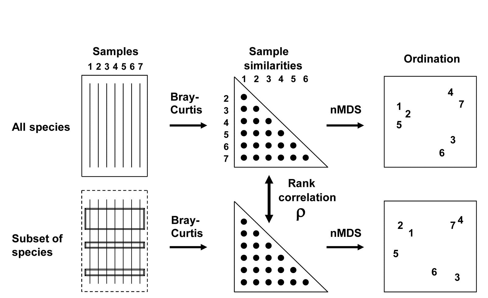
Fig. 16.2. Schematic diagram of selection of a subset of species whose multivariate sample pattern matches that for the full set of species (BEST routine). The search is either over all subsets of the species (Bio-Env option) or, more practically, a stepwise selection of species (BVStep option), aiming to find the smallest subset of species giving rank correlation between the similarity matrices of $\rho \ge 0.95$.
A definition of a ‘near-perfect’ match is needed, and this is (somewhat arbitrarily) deemed to be when $\rho$ exceeds 0.95. Certainly two ordinations from similarity matrices that are correlated at this level will be virtually indistinguishable and could not lead to different interpretation of the patterns. The requirement is therefore to find the smallest possible species subset whose Bray-Curtis similarity matrix correlates at least at $\rho = 0.95$ with the (fixed) similarity matrix for the full set of species.
There is a major snag, however, to carrying over the Bio-Env approach to this context. A search through all possible subsets of 125 species involves: 125 possibilities for a single species, $ _ {125} C _ 2 ( = 125 \times 124 / 2 ) $ pairs of species, $_{125}C _ 3 ( = 125 \times 124 \times 123 / 6) $ triples, etc., and this number clearly gets rapidly out of control. In fact a full search would need to look at $2 ^ {125} – 1$ possible combinations, an exceedingly large number!
Stepwise procedure
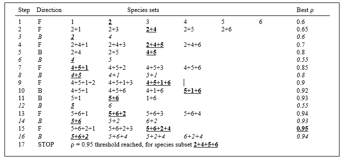
One way round the problem is to search not over every possible combination but some more limited space, and the natural choice here is a stepwise algorithm which operates sequentially and involves both forward and backward-stepping phases.¶ At each stage, a selection is made of the best single species to add to or drop from the existing selected set. Typically, the procedure will start with a null set, picking the best single variable (maximising $\rho$), then adding a second variable which gives the best combination with the first, then adding a third to the existing pair. The backward elimination phase then intervenes, to check whether the first selected variable can now be dropped, the combination of second and third selections alone not having been considered before. The forward selection phase returns and the algorithm proceeds in this fashion until no further improvement is possible by the addition of a single variable to the existing set or, more likely here, the stopping criterion is met ($\rho$ exceeds 0.95). In order fully to clarify the alternation of forward and backward stepping phases, Table 16.1 describes a purely hypothetical (and unrealistically convoluted) search over 6 variables. Analogously to the MDS algorithm of Chapter 6, it is quite possible that such an iterative search procedure will get trapped in a local optimum and miss the true best solution; only a minute fraction of the vast search space is ever examined. Thus, it may be helpful to begin the search at several, different, random starting points, i.e. to start sequential addition or deletion from an existing, randomly selected set of half a dozen (say) of the species.†
Table 16.1. Hypothetical illustration of stages in a stepwise algorithm (F: forward selection, B: backward elimination steps) to select a subset of species which match the multivariate sample pattern for a full set (here, 6 species). Bold underlined type indicates the subset with the highest $\rho$ at each stage, and italics denote a backward elimination step that decreases $\rho$ and is therefore ignored. The procedure ends when $\rho$ attains a certain threshold ($\rho \ge 0.95$), or when forward selection does not increase $\rho$.
¶ This concept may be familiar from stepwise multiple regression in univariate statistics, which tackles a similar problem of selecting a subset of explanatory variables which account for as much as possible of the variance in a single response variable.
† The PRIMER BEST routine (BVStep option) carries out this stepwise approach on an active sheet which is the similarity matrix from all species (Bray-Curtis here), supplying a secondary sheet which is the (transformed) data matrix itself. There are options always to exclude, or always to include, certain variables (species) in the selection, to start the algorithm either with none, all or a random set of species in the initial selection, and to output results of the iteration at various levels of detail (full detail recommended).
16.3 Example: Amoco-Cadiz oil spill
Applying this (BVStep) procedure to the 125-species set from the Bay of Morlaix, a smallest subset of only 9 species can be found, whose similarity matrix across the 21 samples correlates with that for the full species set, at $\rho \ge 0.95$. The MDS plot for the 21 samples based only on these 9 species is shown in Fig.16.3b and is seen to be largely indistinguishable from 16.3a. The make-up of this influential species set is discussed later but it is important to realise, as often with stepwise procedures, that this may be far from a unique solution. There are likely to be other sets of species, a little larger in number or giving a slightly lower $\rho$ value, that would do a (nearly) equally good job of ‘explaining’ the full pattern.
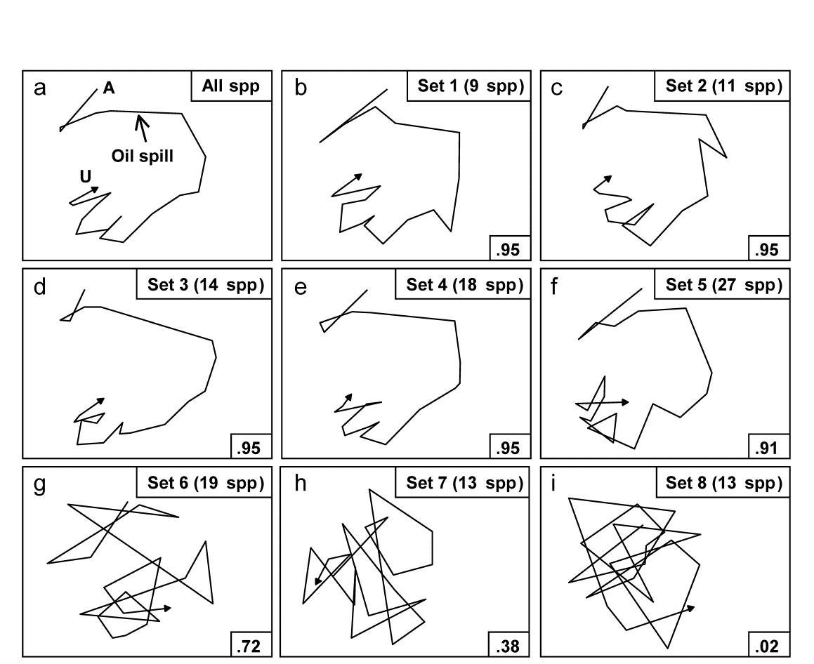
Fig. 16.3. Amoco-Cadiz oil spill {A}. MDS plots from 21 samples (approximately quarterly) of macrobenthos in the Bay of Morlaix (Bray-Curtis on 4th-root transformed abundances). a) As Fig. 16.1 but discarding the rare species, leaving 125; b)–f) based on a succession of five, small, mutually exclusive subsets of species, generated by the BEST/BVStep option, showing the high level of matching with the full data ($\rho$ values in bottom right of plots, and number of species in top right); g)–i) after successive removal of the species in previous plots, the ability to match the original pattern by selecting from the remaining species rapidly degrades (stress = 0.09, 0.08, 0.08, 0.08, 0.12, 0.12, 0.21, 0.24, 0.24 respectively).
One interesting way of seeing this is to discard the initial selection of 9 species, and search again for a further subset that produces a near-perfect match ($\rho \ge 0.95$) to the pattern for the full set of 125 species. Fig. 16.3c shows that a second such set can be found, this time of 11 species. If the two sets are discarded, a third (of 14 species), then a fourth (of 18 species) can also be identified, and Fig. 16.3d and e again show the high level of concordance with the full set, Fig. 16.3a. There are now 73 species left and a fifth set can just about be pulled out of them (Fig. 16.3f), though now the algorithm terminates at a genuine maximum of $\rho$; a match better than $\rho = 0.91$ cannot be found by the stepwise procedure, even after several attempts with different random starting positions. If these (27) species are also discarded, the ability of the remaining 46 species to reconstruct the initial pattern degrades slowly (Fig. 16.3g) then rapidly (Fig. 16.3h and i), i.e. little of the original ‘signal’ remains.
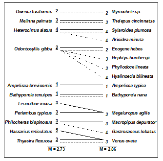
Clarke & Warwick (1998a) discuss the implication of these plots for concepts of structural redundancy in assemblages (and, arguably, for functional redundancy, or at least compensation capacity). They investigate whether the various sets of species ‘peeled’ out from the matrix have a similar taxonomic structure. For example, Table 16.2 displays the first and second ‘peeled’ species lists and defines a taxonomic mapping coefficient, used to measure the degree to which the first set has taxonomically closely-related counterparts in the second set, and vice-versa. (Note that taxonomic relatedness concepts are the basis of several indices used in Chapter 17, this specific coefficient being the $\Theta ^ +$ of eqn. 17.8) A permutation test can be constructed that leads to the conclusion that the peeled subsets are more taxonomically similar (i.e. have greater taxonomic coherence) than would be expected by chance. The number of such coherent subsets which can be ‘peeled out’ from the matrix is clearly some measure of redundancy of information content.
Table 16.2. Amoco-Cadiz oil spill {A}. Illustration of taxonomic mapping of the second and third ‘peeled’ species subsets (i.e. those underlying Fig. 16.3c,d), from the successive application of BVStep, highlighting the (closer than random) taxonomic parallels between the species sets which are capable of ‘explaining’ the full pattern of Fig. 16.3a. Continuous lines represent the closest relatives in the right-hand set to each species in the left-hand set (underlined values are the number of steps distant through the taxonomic tree, see Chapter 17 for examples). Dashed lines map the right-hand set to the left-hand (non-underlined values are again the taxonomic distances). The taxonomic mapping similarity coefficient, M, averages the two displayed mean taxonomic distances (denoted $\Theta ^ + $ in Chapter 17).
Viewed at a pragmatic level, the message of Fig. 16.3 is therefore clear. It is not a single, small set of species which is responsible for generating the observed sample patterns of Fig. 16.1, of disturbance and (partial) recovery superimposed on a seasonal cycle. Instead, the same temporal patterns are imprinted several times in the full species matrix. The steady increase in size of successive ‘peeled’ sets reflects the different signal-to-noise ratios for different species, or groups of species. The signal can be reproduced by only a few species initially but, as these are sequentially removed, the remaining species have increasingly higher ‘noise’ levels, requiring an ever greater number of them to generate the same strength of ‘signal’. Clarke & Warwick (1998a) give further macrobenthic examples, of time series from Northumberland subtidal sites, whose structural redundancy is at a similar level (4–5 peeled subsets), though this is by no means a universal phenomenon (M G Chapman, pers. comm., for rocky shore assemblages; Clarke & Gorley (2006 or 2015) , for zooplankton communities, both of which examples are much less species-rich in the first place).
16.4 Further extensions
Both BEST Bio-Env and BVStep routines can be generalised to accommodate possibilities other than their ‘defaults’ of selecting abiotic variables to optimise a match with fixed biotic similarities, and selecting subsets of species to link to the sample patterns of the full species set. In fact, the only distinction between the two options in BEST is simply one of whether a full search is performed (Bio-Env) or a stepwise search is adopted (BVStep), the latter being essential where there are many variables to select from (e.g. >16) so that a full search is prohibitive ($> 2 ^ {16} $ combinations).
The fixed similarity matrix can be from species (e.g. Bray-Curtis), environmental variables (e.g. Euclidean), or even a model matrix, such as the equally-spaced inter-point distances in the seriation matrix of Chapter 15. The secondary matrix, whose variables are to be selected from, can also be of biotic or abiotic form. Some possible applications involve searching for:¶
-
species within one faunal group that ‘best explain’ the pattern of a different faunal group (‘Bio–Bio’), e.g. key macrofaunal species which are structuring (or are correlated with environmental variables that are structuring) the full meiofaunal assemblages;
-
species subsets which best respond to (characterise) a given gradient of one or more observed contaminants (‘Env–Bio’);
-
species subsets which match a given spatial or temporal pattern (‘Model–Bio’), e.g. the model might be the geographic layout of samples, expressed literally as inter-sample distances, or a linear time-trend (equal-spaced steps, as with seriation), or a circular pattern appropriate to a single seasonal cycle, etc;
-
subsets of environmental variables which best characterise an a priori categorisation of samples (‘Model-Env’), e.g. selecting quantitative beach morphology variables which best delineate a given classification of beach types ( Valesini, Clarke, Eliot et al. (2003) ).
¶ All these combinations are possible in the PRIMER BEST routine with either Bio-Env (full search) or BVStep (stepwise) options. In v7, the fixed resemblance matrix (biotic, abiotic or model) is the active sheet from which the BEST routine is run, and determines the samples to be analysed. The secondary data matrix supplied to the routine, from which variables are to be selected, can be a ‘look-up table’ of a larger set of samples (e.g. from an environmental database for that region) but all sample labels in the resemblance matrix must have a matching sample label in the data matrix. (In v6, the active sheet was the data matrix and not the resemblance matrix but the v7 structure is more logical, and consistent with the analogous DISTLM routine in PERMANOVA+).
16.5 Second-stage MDS
It is not normally a viable sampling strategy, for soft-sediment benthos at least, to use BVStep to identify a subset of species as the only ones whose abundance is recorded in future, since all specimens have to be sorted and identified to species, to determine the subset. Saving of monitoring effort on identification can sometimes be made, however, by working at a higher taxonomic level than species (see Chapter 10). Where full species-based information is available, MDS plots can be generated at different levels of taxonomic aggregation (i.e. using species, genera, families, etc) and the configurations visually compared. Another axis of choice for the biologist is that of the transformation applied to the original counts (or biomass/cover etc). Chapter 9 shows that different transformations pick out different components of the assemblage, from only the dominant species (no transform), through increasing contributions from mid-abundance and less-common species ($\sqrt{}$, $\sqrt{} \sqrt{}$, log) to a weighting placing substantial attention on less-common species (presence/absence). The environmental impact, or other spatial or temporal ‘signal’, may be clearer to discern from the ‘noise’ under some transformations than it is for others.
Amoco-Cadiz oil spill
The difficulty arises that so many MDS plots can be produced by these choices that visual comparison is no longer easy, and it is always subjective, relying only on the 2-d approximation in an MDS plot, rather than the full high-dimensional information. For example, Fig. 16.4 displays the MDS plots for the Morlaix study at only two taxonomic levels: data at species and aggregated to family level, for each of the full range of transformations, but it is already difficult to form a clear summary of the relative effects of the different choices. However, part of the solution to this problem has already been met earlier in the chapter. For every pair of MDS plots – or rather the similarity matrices that underlie them – it is easy to define a measure of how closely the sample patterns match: it is the Spearman rank correlation ($\rho$) applied to the elements of the similarity matrices. Different transformations and aggregation levels will affect the absolute range of calculated Bray-Curtis similarities but, as always, it is their relative values that matter. If all statements of the form ‘sample A is closer to B than it is to C’ are identical for the two similarity matrices then the conclusions of the analyses will be identical, the MDS plots will match perfectly and $\rho$ will take the value 1.
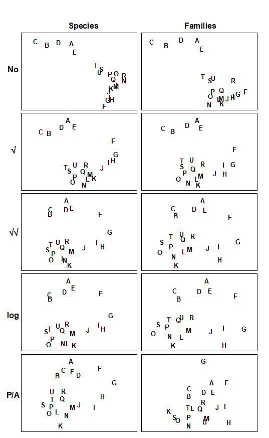
Fig. 16.4. Amoco-Cadiz oil spill {A}. MDS plots of the 21 sampling occasions (A, B, C, …) in the Bay of Morlaix, for all macrobenthic species (left) and aggregated into families (right), and for different transformations of the abundances (in top to bottom order: no transform, root, 4th-root, log(1+x), presence/absence). For precise dates see the legend to Fig. 10.4; the oil-spill occurred between E and F (stress, reading left to right: 0.06, 0.07; 0.07, 0.08; 0.09, 0.10; 0.09, 0.09; 0.14, 0.18).
Table 16.3 shows the results of calculating the rank correlations ($\rho$) between every pair of analysis options represented in Fig. 16.4. For example, the largest correlation is 0.996 for untransformed species and family-level analyses, the smallest is 0.639 between untransformed and presence/absence family-level analyses, etc. Though Table 16.3 is clearly a more quantitatively objective description of the pairwise comparisons between analyses, the plethora of coefficients still make it difficult to extract the overall message. Looking at the triangular form of the table, however, the reader can perhaps guess what the next step is! Spearman correlations are themselves a type of similarity measure: two analyses telling essentially the same story have a higher $\rho$ (high similarity) than two analyses giving very different pictures (low $\rho$, low similarity). All that needs adjustment is the similarity scale, since correlations can potentially take values in (–1, 1) rather than (0,100) say. In practice, negative correlations in this context will be rare (but if they arise they indicate even less similarity of the two pictures) but the problem is entirely solved anyway by working, as usual, with the ranks of the $\rho$ values, i.e. rank (dis)similarities. It is then natural to input these into an MDS ordination, as shown schematically in Fig. 16.5.
Table 16.3. Amoco-Cadiz oil spill {A}. Spearman correlation matrix between every pair of similarity matrices underlying the 10 plots of Fig. 16.4, measuring the extent to which they ‘tell the same story’ about the 21 Morlaix samples. These correlations (rank ordered) are treated like a similarity matrix and input to a second-stage MDS. Key: s = species-level analysis, f = family-level; 0 = no transform, 1 = root, 2 = 4th root, 3 = log(1+x), 4 = presence /absence.
| s0 | s1 | s2 | s3 | s4 | f0 | f1 | f2 | f3 | |
|---|---|---|---|---|---|---|---|---|---|
| s1 | .970 | ||||||||
| s2 | .862 | .949 | |||||||
| s3 | .852 | .942 | .995 | ||||||
| s4 | .736 | .847 | .961 | .946 | |||||
| f0 | .996 | .965 | .855 | .845 | .726 | ||||
| f1 | .949 | .993 | .961 | .958 | .865 | .947 | |||
| f2 | .791 | .893 | .972 | .974 | .953 | .785 | .924 | ||
| f3 | .760 | .869 | .962 | .971 | .946 | .753 | .904 | .993 | |
| f4 | .645 | .756 | .877 | .870 | .923 | .639 | .792 | .946 | .929 |
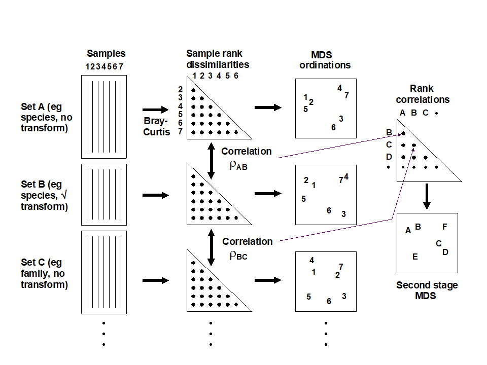
Fig. 16.5. Schematic diagram of the stages in quantifying and displaying agreement, by second-stage MDS, of different multivariate analyses of a corresponding set of samples.
The resulting picture is termed a second-stage MDS and is displayed in Fig. 16.6 for the Morlaix analyses of Fig. 16.4. The relationship between the various analysis options is now summarised in a clear and straightforward fashion (with near-zero stress). The different transformations form the main (left to right) axis, in steady progression through: no transform, $\sqrt{}$, $\sqrt{}\sqrt{}$ and log(1+x), to pres/abs. The difference between species and family level analyses largely forms the other (bottom to top) axis. Three important points are immediately clear:
-
Log and $\sqrt{}\sqrt{}$ transforms are virtually identical in their effect on the data, with differences between these transformations being much smaller than that between species and family-level analyses in that case.
-
With the exception of these two, the transformations generally have a much more marked effect on the outcome than the aggregation level (the relative distance apart on the MDS of the points representing different transformations, but the same taxonomic level, is much greater than the distance apart of species and family-level analyses, for the same transformation).
-
The effect of taxonomic aggregation becomes greater as the transformation becomes more severe, so that for presence/absence data the difference between species and family-level is much more important than it is for untransformed or mildly transformed counts. Whilst this is not unexpected, it does indicate the necessity to think about analysis choices in combination, when designing a study.
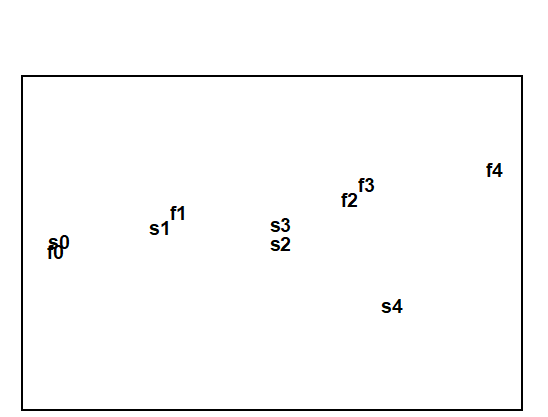
Fig. 16.6. Amoco-Cadiz oil spill {A}. Second-stage MDS of the 10 analyses of Fig. 16.4. The proximity of the points indicates the extent to which different analysis options capture the same information. s = species-level analysis, f = family-level; 0 = no transform, 1 = root, 2 = 4th root, 3 = log(1+x), 4 = presence /absence. Stress = 0.01, so the 2-d picture tells the whole story, e.g. that choice of aggregation level has less effect here than transformation. .
Other applications
The concept of a second-stage MDS used on rank correlations between similarity matrices – from different taxonomic aggregation levels (species, genus, family, trophic group) and, in the same analysis, different faunal groups (nematodes, macrofauna) recorded for the same set of sites – was introduced by Somerfield & Clarke (1995) , for studies in Liverpool Bay and the Fal estuary, UK. Olsgard, Somerfield & Carr (1997) and Olsgard, Somerfield & Carr (1998) expanded the scope to include the effects of different transformation, simultaneously with differing aggregation levels, for data from N Sea oilfield studies.¶ Other interesting applications include Kendall & Widdicombe (1999) who examined different body-size components of the fauna as well as different faunal groups, from a hierarchical spatial sampling design (spacings of 50cm, 5m, 50m, 500m) in Plymouth subtidal waters. They used a second-stage MDS to display the effects of different combinations of body-sizes, faunal groups and transformation. Olsgard & Somerfield (2000) introduced the pattern from environmental variables as an additional point on a second-stage MDS, together with biotic analyses from different faunal components (polychaetes, molluscs, crustacea, echinoderms) at another N Sea oilfield. The idea is that biotic subsets whose multivariate pattern links well to the environmental data will be represented by points on the second-stage MDS which lie close to the environmental point. The converse operation can also be envisaged, as a visual counterpart to the Bio–Env procedure. For small numbers of environmental variables, the abiotic patterns from subsets of these can be represented as points on the second-stage MDS, in which the (fixed) biotic similarity matrix is also shown. The best environmental combinations should then ‘converge’ on the (single) biotic point.
¶ They also carried out another interesting analysis, assessing Bio–Env results in the light of analysis choices. It was hypothesised earlier (pages 9.4 and 10.1), that a contaminant impact may manifest itself more clearly in the assemblage pattern for intermediate transform and aggregation choices. Olsgard, Somerfield & Carr (1997) do indeed show, for the Valhall oilfield, that the Bio–Env matching of sediment macrobenthos to the degree of disturbance from drilling muds disposal (measured by sediment THC, Ba concentrations etc), was optimised by intermediate transform ($\sqrt{}$) and aggregation level (family).
16.6 Comparison of resemblance measures
S Tikus Island coral cover
The use of second-stage MDS plots can be extended to also include the relative effects of choosing among different resemblance measures (similarities/dissimilarities or distances) in defining sample relationships. To illustrate this we will use area cover of 75 coral reef species on ten 30m line transects from S Tikus in the Thousand Islands, Indonesia, {I}, taken in each of the years 1981, 83, 84, 85, 87, 88, spanning a coral bleaching episode related to the 1982-3 El Niño, see Warwick, Clarke & Suharsono (1990) ; data met originally on page 6.4. Though by no means typical, the data gives a salutary lesson on the importance of selecting an appropriate resemblance measure with some care, since different coefficients result in widely differing descriptions.
The 1983 samples were notably denuded of live coral cover, with average % cover reducing by an order of magnitude and number of species more than halving. The sparsity of non-zero entries on the 1983 transects makes the Bray-Curtis dissimilarity rather unstable, with many 100% dissimilarities between transects in that year.
Clarke, Somerfield & Chapman (2006)
suggest that a modified form of Bray-Curtis could be useful in such cases.
Zero-adjusted Bray-Curtis
Two samples with small numbers of only one or two species can vary wildly in their dissimilarity, from 0% if they happen to consist of a single individual of the same species, to 100% if those two individuals are from different species. If the samples contain no species whatsoever, their Bray-Curtis dissimilarity is undefined, since it is a coefficient which ignores joint absences thus leaving no data on which to perform a calculation. (Both the numerator and denominator in equation 2.1 are zero, and 0/0 is undefined). This may be a reasonable conclusion in some contexts: if the sampler size is inadequate, and capable of missing all organisms in two quite different locations (or times or treatments), then nothing can be said about whether the communities might have been similar or not, had anything actually been captured. If, on the other hand, sparsity arises as a result of increasing impacts on an assemblage, to the point where samples become fully azoic, however large the sampler size, then it might be desirable to define those samples as 100% similar (0% dissimilar). Another example is of tracking over time the colonisation of a settlement plate or a rock patch which has been cleared: very sparse assemblages would be inevitable at the start, and one would want to define these early samples as highly similar.
A modified dissimilarity is thus needed, exploiting this extra information that we have from the context, that very sparse samples are to be deemed similar. A simple addition to the denominator of Bray-Curtis achieves this, giving the zero-adjusted Bray-Curtis:
$$ \delta _ {jk} = 100 \left[ \frac{ \sum _ {i=1} ^ p | y _ {ij} - y _ {ik} | }{2 + \sum _ {i=1} ^ p ( y _ {ij} + y _ {ik} ) } \right] \tag{16.1} $$
between samples j and k, where {$y _ {ij}$} is the quantity of species i in the jth sample (for i = 1, .., p species). An alternative way of viewing this coefficient is that it is ordinary Bray-Curtis calculated on a data matrix with an added dummy species consisting of one individual in each sample. This cannot change the numerator, since the dummy species adds |1 - 1| for every pair of samples but it adds 1 + 1 to the denominator for each pair, explaining the 2 on the bottom line of (16.1). A pair of samples containing no species must now be 0% dissimilar because they share the same abundance of their only species (the dummy species), and even two samples that have a single individual of different species will no longer be 100% dissimilar but only 50% dissimilar, because of their shared (dummy) species. And Clarke, Somerfield & Chapman (2006) show that if the numbers in the matrix are not vanishingly small then this zero adjustment can make no difference at all to the resulting resemblance structure. Bray-Curtis will operate as previously but it will behave in a particular (and sometimes required) way for highly denuded samples which ‘go to zero’.
The adjustment is in the same spirit as the use of log transforms on species counts: the $\log(y)$ function will behave badly as $y$ goes to zero (it tends to $- \infty$) so we use $\log(1+y)$, which makes no difference if $y$ is not small but ‘feathers in’ the behaviour as $ y \rightarrow 0$. That analogy is useful because it suggests what we should do for abundances which are not counts but biomass or area cover. Then the dummy value would be better taken not as 1 but the smallest non-zero entry in the matrix¶. In fact, here, the Tikus coral cover does have effectively a minimum value of about 1 after the root-transformation is applied, so this is used both for the quantitative data and for a presence/absence analysis.
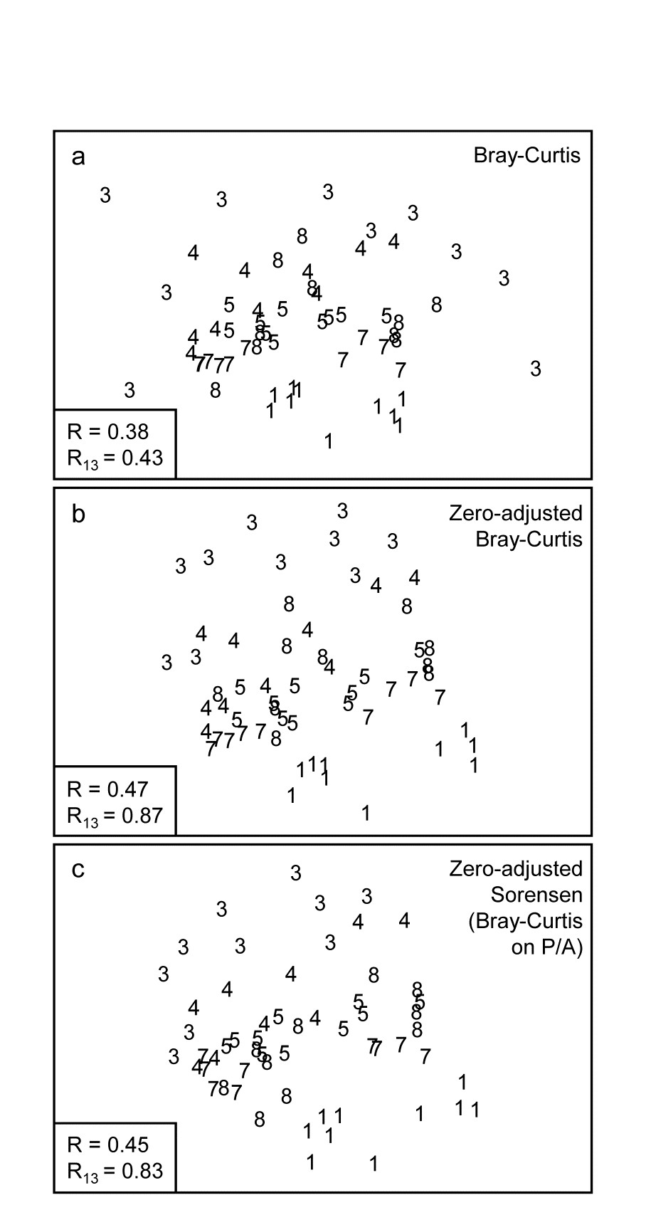
Fig. 16.7. Indonesian reef-corals, Tikus Island {I}. nMDS of 6 years (1=1981, 3=1983, 4=1984, 5=1985, 7=1987, 8=1988), with 10 transects per year. Data are %cover of 75 coral species, $\sqrt{}$-transformed, and similarities calculated as: a) standard Bray-Curtis; b) zero-adjusted Bray-Curtis; c) zero-adjusted Sorensen. The ANOSIM R statistics for the global test (R, among all years) and pairwise (R13, for years 1 and 3 only) are also shown, given that stress values in the MDS are high: a) 0.18; b) 0.21; c) 0.21.
The effect of applying this modification to the Tikus Island corals MDS can be seen in Fig. 16.7a-c, which contrasts the standard Bray-Curtis coefficient with its zero-adjusted form and zero-adjusted Sorensen (eqn. 2.7) which is simply Bray Curtis on species presence/ absence, including an always-present dummy species. The wide spread of 1983 values, which come from a large number of zero similarities within that sparse group, are tightened up substantially with the zero-adjusted coefficient, reflected in the high pairwise ANOSIM statistic $R _ {13} = 0.87$ between 1981 and 1983, cf $R _ {13} = 0.43$ for the standard Bray-Curtis. Sorensen similarly benefits from the use of the adjustment here, since five of the ten 1983 transects have $ \le 2 $ species.
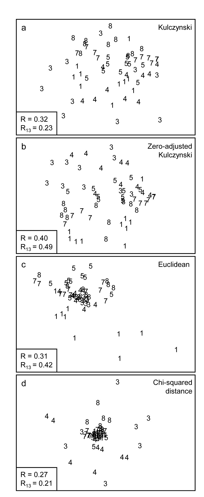
Fig. 16.8. Indonesian reef-corals, Tikus Island {I}. nMDS of 6 years, exactly as in Fig. 16.7, but based on: a) Kulczynski; b) zero-adjusted Kulczynski; c) Euclidean distance; d) $\chi ^ 2$ distance with MDS stress: a) 0.21; b) 0.24; c) 0.12; d) 0.13. Global and pairwise (81 v 83) ANOSIM R statistics again shown.
The Kulczynski similarity (equation 2.4), Fig. 16.8a, is also in the Bray-Curtis family and, whilst it would appear to perform less satisfactorily than Bray-Curtis in this case, and also generally (though see Faith, Minchin & Belbin (1987) and footnote on page 2.2), it too benefits from the dummy species adjustment, Fig. 16.8b. Even more dramatic changes are seen to these plots for a wider range of coefficients: Euclidean distance (eqn 2.13, Fig. 16.8c) reverses the within-group dispersion of 1981 and 1983 samples. All these analyses (apart from P/A measures) are on square-root transformed area cover, but even after transformation there are big differences in total cover between the samples, and Euclidean distance is primarily dominated by these, with the tight cluster of 1983 transects resulting from the strong reduction in total cover noted earlier.
The $\chi ^ 2$ distance measure, defined as:
$$ d _ {jk} = \sqrt{ \sum _ i \frac{1}{y _ {i+} / \sum _ i y _ {i+}} \left[ \frac{y _ {ij} }{ \sum _ i y _ {ij}} - \frac{y _ {ik} }{ \sum _ i y _ {ik}} \right] ^ 2} $$
$$ y _ {i+} = \sum _ j y _ {ij} \tag{16.2} $$
which is the implicit dissimilarity in Correspondence Analysis (CA) and its detrended (DCA) and canonical versions (CCA), is seen to be at the other end of the spectrum (Fig. 16.8d), increasing the spread of 1983 (and 1984) values further than standard Bray-Curtis and collapsing the 1981 transects almost to a single point. The $\chi ^ 2$ distance coefficient is always susceptible to dominance by rare species, with very small area covers, since its genesis is for data values which are real frequencies†. The problem can be seen in the (first) denominator for each term in the sum, which is the total across samples for each species, an area cover which can be very small, giving instability. (In fact three outlying 1983 replicates are omitted in Fig. 16.8d to even get this plot). Another implication of the form of this coefficient is that methods based on CA always standardise samples (the denominators inside the squared term are totals across species for each sample) hence the effects of much larger total (square-rooted) area covers in 1981, which dominate the Euclidean plot, entirely disappear for $\chi ^ 2$ distance. The Bray-Curtis family coefficients are intermediate in this spectrum: they make some use of differences in sample totals but are also influenced by the species presence/absence structure, a feature with no special role in Euclidean (and similar) distance measures.
Other quite commonly used coefficients§ (for which MDS ordinations are not shown) include Manhattan distance, equation (2.14), whose behaviour is close to that of Euclidean distance though it should be less susceptible to outliers in the data, because distances are not squared as in the Euclidean definition. Note that Manhattan does, however, share some affinity of definition with Bray-Curtis. To within a constant, Bray-Curtis will reduce to Manhattan distance when the totals of all (transformed) data values for samples, summed across species, are the same. For the data of Fig. 16.8, the Manhattan ordination is very similar to that for the Euclidean plot (Fig. 16.8c); it gives global $R = 0.28$ and pairwise $R _ {13} = 0.38$.
The normalised form of Euclidean distance, in which each species is first centred at its mean over samples (again after transformation) and, more importantly, divided by its standard deviation over samples, is about as inappropriate a measure for species data as could be envisaged! This is both because it does not honour the status of a zero entry as indicating species absence (as noted on page 2.4, the zeros are replaced by a different number for each species) and also because each species is now given exactly the same weight in the calculation, irrespective of whether it is very rare or extremely common, often a recipe for anarchy in the ensuing analysis. And indeed the MDS plot for the coral data is essentially a slightly more extreme form of the Euclidean plot of Fig. 16.8c, with even lower ANOSIM statistics of $R = 0.19$, $R _ {13} = 0.34$. It should be noted, of course, that normalised Euclidean is a perfectly sensible resemblance measure (usually the preferred choice) for data of environmental type, in which zeros play no special role and the variables are on different measurement scales, hence must be adjusted to a common scale.
The basic form of Gower’s coefficient ( Gower (1971) ) is defined as:
$$ d _ {jk} = \frac{1}{p} \sum _ i \frac{ | y _ {ij} - y _ {ik} | }{ R _ i} \tag{16.3} $$
where the Manhattan-like numerator is standardised by dividing by the range for that species across all samples, $ R _ i = \max _ i \left[ y _ {ij} \right] - \min _ i \left[ y _ {ij} \right] $ . Since nearly all species will often be absent somewhere in the set of samples, in effect this is calculating Manhattan on a data matrix which has been species-standardised by the species maximum‡. The equal weight it therefore gives to each species and the use of a simple distance measure on those standardised values ensures that it will behave very similarly to normalised Euclidean, as is observed for the coral MDS plot; global $R$ is 0.21 and $ R _ {13} = 0.39$. There is, however, a form of the Gower measure in which joint absences are identified and removed from the calculation. In practice this just means that the p divisor (the number of species in the matrix) outside the sum in (16.3) is replaced by the number of non-jointly absent species for each specific pair of samples. The same trick was seen in (2.12) in the
Stephenson, Williams & Cook (1972)
formulation of Canberra similarity, and it has a major effect in bringing both coefficients into step with one of the defining guidelines of biologically-useful measures, viz. point (d) on page 2.3, that jointly absent species carry no information about similarity of those two samples. The MDS plot for the Gower (exc 0-0) coefficient does result in a configuration closer to that for the (zero-adjusted) Bray-Curtis than it is to the basic Gower coefficient and gives
$R = 0.41$, $R _ {13} = 0.61$. The Canberra measure here gives highly similar plots and ANOSIM values to Bray-Curtis (as is quite often the case, since it does satisfy all the ‘Bray-Curtis family’ guidelines, page 2.2), and also benefits in the same way from adding the ‘dummy species’, giving $R = 0.48$, $R _ {13} = 0.87$.
Second-stage MDS on resemblance measures
This plethora of MDS plots and, more importantly, the relationships among their underlying resemblance matrices, can best be summarised using the same tool as for comparing different transforms or taxonomic levels, earlier in this section: the second stage MDS. This is based on similarities of similarity coefficients typically measured by the usual (RELATE) Spearman rank correlations between every pair of resemblance matrices, which values are themselves re-ranked as part of the second-stage nMDS ordination⸙.
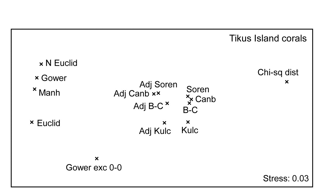
Fig. 16.9. Indonesian reef-corals, Tikus Island {I}. Second-stage MDS of Spearman matrix correlations between every pair of 14 resemblance matrices, calculated from square-root cover from 75 species on 60 reef transects. (The ‘fix collapse’ option, on page 5.8, was applied in this case℈). Resemblance coefficients are: Euclidean (normalised or not), Gower (excluding joint absences or not), Manhattan, $\chi ^ 2$ distance, and four ‘biological’ measures, all calculated with zero-adjustments (dummy species) or not: Bray-Curtis, Kulczynski, Canberra and Sorensen (the latter on presence/absence data). Proximity of coefficients indicates how similarly they describe multivariate patterns of the 60 samples.
Fig. 16.9 displays the second-stage nMDS plot for 14 resemblance measures, calculated on the Tikus Island samples, for some of which measures the (first-stage) MDS plots are seen in Figs. 16.7 & 16.8. Such second stage plots, of relationships amongst the multivariate patterns obtained by different coefficient definitions, tend to display a consistent pattern for different data sets. As with the discussion on Fig. 8.16, on patterns of correlation between differing diversity definitions, what such plots are able to reveal is not primarily the characteristics of particular data sets, but mechanistic relationships among the indices/coefficients. These arise as a result of their mathematical form, and the way that form dictates which general features of the data are emphasised and what assumptions they make (implicitly) about issues such as those listed on page 2.2): should the result be a function of sample totals?; are all the species to be given essentially similar weight?; are joint absences to be ignored?; should the coefficient have a concept of complete dissimilarity?; etc.
It is evident from the figure that the ‘biological’ coefficients do take a strongly similar view of the data and that the zero-adjustment does affect the outcome in the same way for all four such measures. Interestingly the difference between square-root transformed and presence/absence data under the same Bray-Curtis coefficient (the Sorensen point is Bray-Curtis on P/A) is hardly detectable amongst the major differences seen in changing to a different coefficient. The move from Euclidean to normalised Euclidean, and similar coefficients giving species equal weight irrespective of their total/range, is also very evident (this sequence of coefficients on the extreme left of the plot is also consistent across data sets), and the very different view taken of this data by the $\chi ^ 2$ distance measure is equally clear. Taken together, this plot is a salutary lesson in the importance of choosing an appropriate similarity measure for the scientific context, and making consistent use of it for all the analyses of that data setȹ.
Other data sets will produce similar patterns to Fig. 16.9, though with subtle and interesting differences, e.g. if sparsity of samples is not an issue then the zero-adjusted coefficients will be totally coincident with their standard forms. For data in which turnover of species under the different conditions (sites/times/ treatments) is low, then coefficient differences will generally have smaller effect℈ - thankfully not all data sets produce the distressingly large array of outcomes seen in Figs 16.7 and 16.8!
Clarke, Somerfield & Chapman (2006)
give a number of further examples, but we shall show one more instructive example, that of the Clyde macrobenthic data first seen in Chapter 1, Fig. 1.11.
Garroch Head macrofauna counts
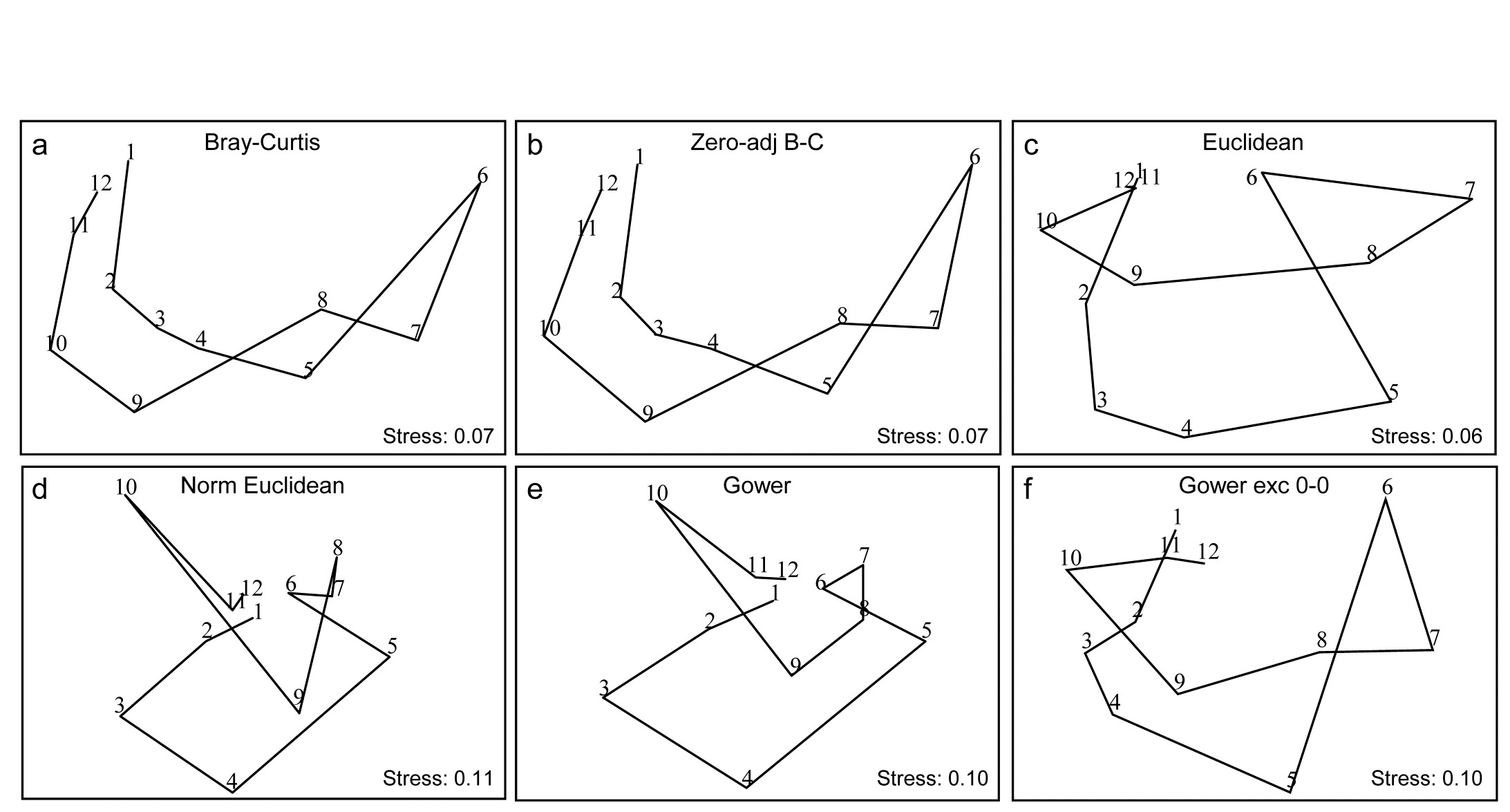
Fig. 16.10. Garroch Head macrofauna {G}. 2-d nMDS of counts of 84 species from soft-sediment benthic samples along a transect of 12 sites (1-12) in the Firth of Clyde (see map fig. 8.3), across the sludge disposal location (site 6). Counts are fourth-root transformed with resemblance measures: a) standard Bray-Curtis (equation 2.1), b) zero-adjusted Bray-Curtis (16.1), c) Euclidean distance (2.13), d) normalised Euclidean distance (p4-6), e) basic Gower coefficient (16.3), f) Gower excluding joint absences (p16-10).
Previous analyses of the E-W transect of 12 sites over the sewage-sludge dumpground in the Firth of Clyde, {G}, have been of the macrofaunal biomass data (e.g. Figs. 1.11, 7.9, 11.5) but Fig. 16.10 is of fourth-root transformed counts for the 84 macrobenthic species, ordinated using six different resemblance measures. The main feature of this data is the steady change in community as the dump centre (site 6) is approached and steady reversion back to a similar community at the opposite ends of the transect (sites 1 and 12). As the ‘meta-analysis’ of Fig. 15.1 shows, this is a major change in assemblage resulting from a clear pattern of impact of organic enrichment and (most) heavy metal concentrations on nearing the dump centre, Fig. 11.1. In fact, only three species are found at site 6, though in reasonably large numbers (76 Tubificoides benedii, 4 Capitella capitata and 250 nematodes, meiofauna which were not taxonomically separated in this study but captured in a macrofauna sieve by virtue of their large size). These species are virtually absent from sites 1, 2, 11 and 12, which are characterised by a distinctly different suite of species (e.g. Nuculoma, Nucula, Spiophanes sp.) but still with rather modest total counts (<200 individuals at any of those 5 sites). At in-between sites along the transect, the number of species and the total number of individuals steadily increase then decrease, as the dump centre is neared. This appears a classic case of the intermediate disturbance hypothesis ( Connell (1978) ; Huston (1979) ), as a result of the organic enrichment, in which the richness diversity and abundance increase with mild forms of disturbance, because of influx of opportunist species (typically small-bodied and in large numbers) before everything crashes at severe impact levels. Such a clear and ecologically meaningful pattern is quite enough to completely confuse some distance measures in Fig. 16.10! Euclidean distance (whether normalised or not) and the basic form of the Gower coefficient are strongly influenced by the fact that the abundance totals are similar at the ends and mid-point of the transect, and the fact that these sites have many jointly-absent species, i.e. joint absences are inferred as evidence for similarity of samples, whereas they are nothing of the sort. The species which are present are largely completely different ones, which will indicate some dissimilarity in all coefficients, but this contribution is largely overwhelmed by the evidence for similarity from joint absences in the inappropriate distance measures! The net effect is for the latter ordinations to show sites 6 and 7 merging with 1, 11 and 12 in a highly misleading way. The Bray-Curtis family, on the other hand - and to a lesser extent, the Gower coefficient, excluding joint absences - have no problem generating the correct and meaningful ecological gradient here, though the latter’s insistence on giving the rare species equal weight with dominant ones does tend to diffuse the tight gradient of change. Note also (Fig. 6.10a & b) that no useful purpose is served by a ‘dummy species’ addition: none of the samples is sparse enough for the zero-adjusted coefficients to alter the relative among-sample similarities.

Fig. 16.11. Garroch Head macrofauna {G}. Second-stage MDS of Spearman matrix correlations between every pair of 25 resemblance matrices, calculated from fourth-root counts of 84 species on a transect of 12 sites across the sludge disposal site. Resemblance coefficients are: Euclidean (normalised or not), Gower (exclude joint absences or not), Manhattan, Hellinger and chi-squared distance, the coefficient of divergence, Canberra similarity and Canberra metric, Bray-Curtis (zero-adjusted or not), Kulczynski (and in P/A form), Ochiai (and in P/A form), Czekanowski’s mean character difference, Faith P/A, Russell & Rao P/A, and three pairs of coefficients which are coincident since they are monotonically related to each other (denoted by $\Leftrightarrow$): Simple matching and Rogers & Tanimoto P/A, Geodesic metric and Orloci’s Chord distance, and finally Jaccard and Sorensen P/A (the P/A form of Bray-Curtis). See the PRIMER User manual for definition of all coefficients.
Fig. 6.11 is the second-stage MDS from the Spearman matrix correlation ($\rho$) among a very wide range of coefficients, not all of which have been defined here but all of which are available on the PRIMER menu for resemblance calculation (and for which equations are given in the User Manual). They exclude those coefficients which are designed for untransformed, real counts, with coefficients constructed from multinomial likelihoods, and other measures with their own built in transformations (e.g. ‘modified Gower’) which cannot then sensibly be applied to fourth-root transformed data. All the displayed measures are thus compared on the same (transformed) data though note that several of the coefficients utilise only presence or absence data. Only one zero-adjusted similarity - that for Bray-Curtis - is included, since the adjustment is rather minor in all cases for this example.
Similar groupings are evident as for the previous Fig. 6.9, for those coefficients which are present in both, though a number of measures which are only in Fig. 6.11 are seen to take further different ‘views’ of the data. (Note that the wider range of inter-relationships ensured that the nMDS did not collapse as previously and there was no need to stabilise the plot by mixing with a degree of metric stress). Note again the large difference made by adjusting for joint absences, both between the forms of the Gower coefficient, as seen previously (the scale of this change can be seen in Fig. 16.10e & f), and the equivalent difference for the Canberra similarity of equation (2.12), as used in Fig. 16.9, and the Canberra metric which is a function of joint absences. Three pairs of coefficients identified in the legend to Fig. 16.11 do not have precisely the same mathematical form but it is straightforward to show that they increase and decrease in step (though not linearly), i.e. their ranks similarities/distances will be identical. The best known of these are the two presence/absence measures, Sorensen and Jaccard, which because of this monotonic relation will give identical nMDS plots, ANOSIM tests etc for all data sets (though not identical PERMANOVA tests). Note also that, though the differences between fourth-root transform and P/A for the same measure (Bray-Curtis to Sorensen, Ochiai, Kulczynski) are not large, they are consistent and non-negligible, indicating that the data have not been over-transformed to a point where all the quantitative information is ‘squeezed out’. Bray-Curtis, Ochiai and Kulczynski are also seen to fall in logical order (of the arithmetic, geometric and harmonic means in their respective denominators).
Many such subtle points to do with construction of coefficients can be seen in the second-stage plots, but another strength is their ability to place in context any proposed measure, perhaps newly defined (and the ease with which plausible new coefficients can be defined was commented on in the footnote on page 2.2)). If a new measure is an asymptotic equivalent of an existing one, the two points will be consistently juxtaposed; if it captures new aspects of similarity or distance, it should occupy a different space in the plot. Together with assessments of the theoretical rationale or mathematical form of coefficients, the practical implications seen from a second-stage plot might therefore help to provide a way forward in defining a classification of resemblance measures.
¶ The PRIMER Resemblance routine offers addition of a dummy species, with a specified dummy value, for any coefficient, since the idea will apply to other members of the Bray-Curtis family (page 2.2)), but it will not always make sense, and on coefficients not excluding joint absences (such as distance measures) it will have little or no effect at all. As with the log transform, choice of the dummy value is a balance between being too small to be relevant (it will always give two blank samples a similarity of 100% but two nearly blank samples can still be effectively 0% similar) or too large and thus impact on samples that are not at all denuded.
† The theoretical basis of CA is that the entries in the matrix are real frequencies, following multinomial distributions for each species (the distributional basis of $\chi ^2$ tests, for example), which this distance measure reflects. Species count matrices are never real frequencies because individuals are not distributed randomly (and with the same mean density) over the area or water volume being sampled, i.e. they are clumped, not Poisson distributed (see page 9.5). Real frequencies are produced from, say, several quadrats taken for each sample, which are then condensed to ‘number of quadrats in which species X is found’. Where such sampling is possible, frequency data can be an effective alternative to strong transformation or dispersion weighting of highly clumped counts, or of dominance of area cover % by a few large and common rocky shore algae or coral species, see for example Clarke, Tweedley & Valesini (2014) . Even for such data, a $\chi ^2$ distance measure can still be problematic in respect of the rare species (the mantra for $\chi ^2$ tests in standard statistics, that ‘expected frequencies should be >5’, arises for much the same reason) and the CA-based methods in the excellent CANOCO package ( ter Braak & Smilauer (2002) ) build in a downweighting of rare species to circumvent the issue.
§ PRIMER offers about 45 different resemblance measures, under (not mutually exclusive) divisions of: similarity or dissimilarity/ distance; quantitative or P/A; correlation; and the P/A taxonomic dissimilarity measures at the end of Chapter 17.
‡ Standardising species (or samples) either by their totals or by their maxima, are options offered by the PRIMER Standardise routine, under the Pre-treatment menu.
⸙ There is little necessity to worry about whether these Spearman matrix correlations are all positive, as befits similarities. Indeed some are not, such is the disagreement between Fig. 16.8c & d for example, giving RELATE $\rho = -0.22$! Positivity can be ensured by the conversion $S = 50( 1 + \rho )$, but this is unnecessary if nMDS is to be used, because only the rank orders of the values matter.
ȹ It is one if the authors’ bête noires to see how inconsistent and incompatible a use some ecologists make of the available multivariate tools. The Cornell Ecology routines (detrended CA, and TWINSPAN) and CANOCO’s CA and CCA plots and tests (from $\chi ^2$ distance), classic PCA, canonical correlation, MANOVA or discriminant analysis (from Euclidean or Mahalanobis distance), PRIMER and PERMANOVA+ methods such as MDS, ANOSIM, SIMPER, PERMANOVA etc (using a specific measure such as Bray-Curtis) all have their place in historical development and current use, but it is generally a mistake to mix their use across different implicit or explicit resemblance measures on the same data matrix. (Of course different data matrices, e.g. for species or environmental variables, will usually need different coefficient choices). Choice of coefficient (and to a lesser extent transformation) is sufficiently important to the outcome, that you need: a) to understand why you are choosing this particular coefficient and transformation, b) to apply it as consistently as possible to your testing, visualisation and interpretation of that matrix.
℈ The differences between coefficients are so stark for the Tikus Island data that the nMDS shown by Clarke, Somerfield & Chapman (2006) did collapse into three groups: Euclidean to Normalised Euclidean, the ‘biological’ measures and $\chi ^2$ distance (all correlations among those three groups being smaller than any correlations within them), and two of the groups were separately ordinated. Here Fig. 16.9 can avoid this problem by using PRIMER v7’s new ‘fix collapse’ option, page 5.8, in which a small amount (5%) of mMDS stress is mixed with 95% nMDS stress, to stabilise the plot.
16.7 Second-stage interaction plots
Phuket coral-reef times series
A rather different application of second-stage MDS¶ is motivated by considering the two-way layout from a time-series of coral-reef assemblages, along an onshore-offshore transect in Ko Phuket, Thailand {K}. These data were previously met in Chapter 15, where only samples from the earlier years 1983, 86, 87, 88 were considered (as available to Clarke, Warwick & Brown (1993) ). The time series was subsequently expanded to the 13 years 1983–2000, omitting 1984, 85, 89, 90 and 96, on transect A ( Brown, Clarke & Warwick (2002) ). The A transect consisted of 12 equally-spaced positions along the onshore-offshore gradient, and was subject to sedimentation disturbance from dredging for a new deep-water port in 1986 and 87. For 10 months during late 1997 and 98 there was also a wide scale sea-level depression in the Indian Ocean, leading to significantly greater irradiance exposures at mid-day low tides. Elevated sea temperatures were also observed (in 1991, 95, 97, 98), sometimes giving rise to coral bleaching events, but these generally resulted in only short-term partial mortalities.
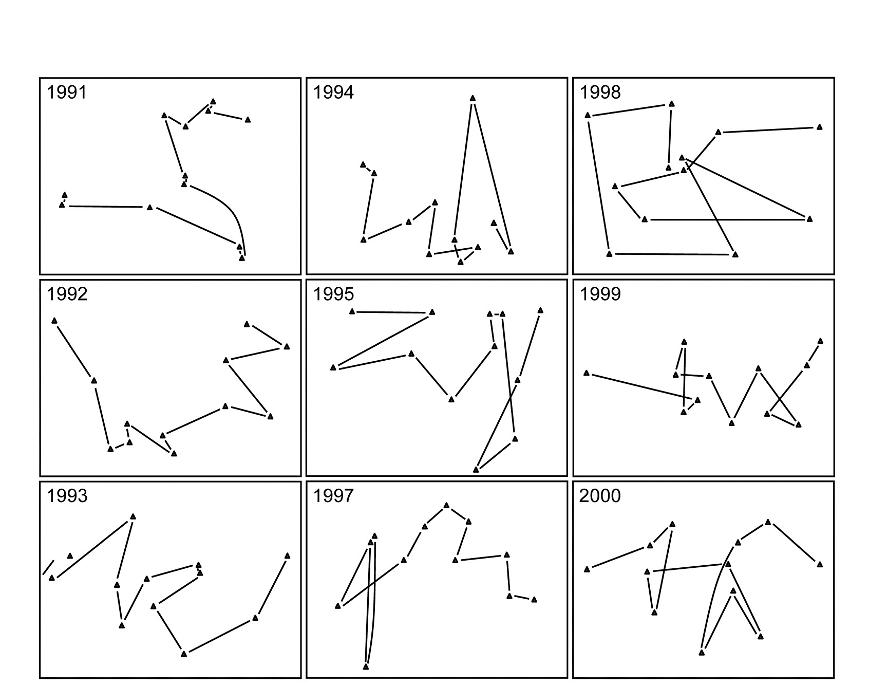
Fig. 16.12. Ko Phuket corals {K}. MDS plots of square-root transformed cover of 53 coral species for 12 positions (plotless line samples) on the A transect, running onshore to offshore, ordinated separately for each of 9 years (4 earlier years are shown in Fig. 15.6).
The two (crossed) factors here are the years and the positions along transect A (1-12, at the same spacing each year). Separate MDS plots of these 12 positions for each of the years 1983, 86, 87 and 88 were seen in Fig. 15.6 (first column). Fig. 16.12 adds nine more years (1991-95, 1997-2000) of the spatial patterns seen along the transect. The underlying resemblance matrices for each of these MDS plots can be matrix correlated, with the usual Spearman rank coefficient, in all possible pairs of years, giving a second-stage resemblance matrix (turned into a similarity by the transformation $50 (1 + \rho )$, if there are negative values). Input to a cluster analysis and nMDS, the result is Fig. 16.13a, which gives a clear visual demonstration of the years which are exceptional from the point of view of showing different patterns of reef assemblage turnover moving down the shore. The sedimentation-based disruption to the gradient in 1986 and 87, and the negative sea-level anomaly of 1998 seem both to be clearly identified. (There is however no statistical test that we can carry out on this second-stage matrix which would identify ‘significant’ change in those years, because in this simple two-way crossed design there is no replication structure to permit this). It is nonetheless interesting to note that the anomalous years are on opposite sides of the MDS plot, possibly suggesting that the departures from the ‘normal’ type of onshore-offshore gradient are of a different kind in 1998 than in 1986 & 87. Less speculative is the clear evidence from Fig. 16.13b that a comparable ‘first-stage’ nMDS plot does not obviously identify those years as anomalous. This is an ordination based on Bray-Curtis of ‘mean’ communities for each year, obtained by averaging the (square-root transformed) %cover values for each of the 53 coral species over the whole transect for each year.
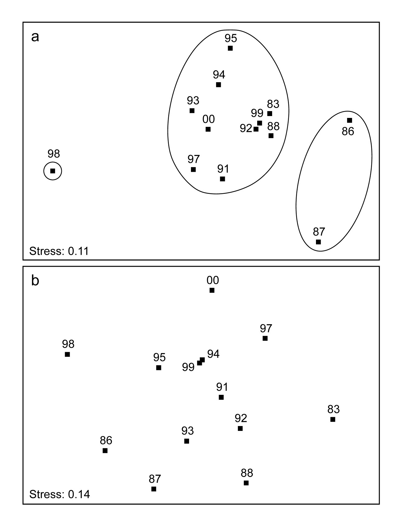
Fig. 16.13. Ko Phuket corals {K}. a) Second-stage MDS plot of 13 years in the period 1983 to 2000, based on comparing the multivariate pattern for each year of the 12 transect positions down the shore (transect A). Note the anomalous (non-seriated) patterns in 1986/7 and again in 1998, evidenced by the separation of these years on the plot and in the groups obtained from slicing a cluster dendrogram at a fixed similarity level. b) First-stage MDS of the whole assemblage in each year, by averaging the transformed cover matrix over transect positions.
Note the subtlety therefore of what a second-stage analysis is trying to isolate here. The compositions of the transect over the different years are not directly compared, as they are in a first-stage plot. There may (and will) be natural year-to-year fluctuations in area cover which would separate the transects on an MDS plot in which all transect positions and all years are displayed, but which do not disrupt the serial change in assemblage along the transect. The second-stage procedure will not be sensitive to such fluctuations. It eliminates them by concentrating only on whether the pattern is the same each year: assemblage similarities between the same transect points in different years do not enter the calculations at all (as observed in the schematic diagram for second-stage analysis of Fig. 16.4, where now each of the data matrices on the left represents the transect samples for a particular year). Disruptions to the (generally gradient) pattern in certain years are, in a sense, interactions between transect position and year, removing year-to-year main effects (by working only within each year) and it is such secondary, interaction effects that the second-stage MDS sets out to display.†
Clarke, Somerfield, Airoldi et al. (2006)
give the same analysis for the B transect and discuss two further applications, to Tees Bay data {t}, and a rocky shore colonisation study (see later).

Fig. 16.14. Schematic of the construction of a second-stage ‘interaction’ plot and test for a Before-After/Control-Impact design with (replicate) fixed sites from Impact and Control conditions sampled over several times Before and After an anticipated impact.
Before-After Control-Impact designs, over times
When there are sufficient sampling times in a study of the effects of an impact, both before and after that impact, and for multiple spatial replicates at both control and impact locations, the concept of a second-stage multivariate analysis may be a solution to one significant problem in handling such studies (known as ‘Beyond BACI’ designs, Underwood (1992) ), viz. how to allow for lack of independence in the communities observed when repeatedly returning to the same spatial patch. Monitoring communities at fixed locations (e.g. on permanent reef transects or over designated areas of rocky shore etc), in so-called repeated measures designs can sometimes be an efficient way of removing the effects of major spatial heterogeneity in the relevant habitat which would overwhelm any attempt at repeated random sampling, at each time, of different areas from the same general regions or treatment conditions under study. In other words, to detect smaller temporal change against a backdrop of large spatial variability could prove impossible without isolating the two factors, e.g. by monitoring the same area in space at different times, and different areas in space at the same time. A major imperative goes with this, however, and that is to recognise that the repeated measures (of community structure) in a single, restricted area, cannot in most cases be analysed as if they were independent§.
This is a problem that the second-stage multivariate analysis strategy neatly side-steps, because it has no need to invoke an assumption that the points making up a time course are in any way independent of each other: what ends up being compared is one whole time course with another (independent) time course, both resulting in single (independent) multivariate points in a second stage analysis. The above schema (Fig. 6.14) demonstrates the concept.
The data structure, on the left, shows the elements of a ‘Beyond BACI’ design‡, in which several areas (to call them fixed quadrats gives the right idea) will be sampled under both impact and reference (control) conditions, each quadrat being sampled at the same set of fixed times, which must be multiple occasions both before and after the impact is anticipated. It is the time courses of the multivariate community (seen here as MDS plots, but in reality the similarities that underlie these) which are then matched over quadrats in a second-stage correlation ($\rho$) matrix, shown to the right. This has a factor with two levels, control and impact, and replicate quadrats in each condition. A second-stage MDS plot from this second-stage similarity matrix would then show whether the temporal patterns differed for the two conditions, by noting whether the control and impacted quadrats clustered separately. A formal test for a significant effect of the impact is given by a 1-way ANOSIM on the second-stage similarity matrix. This is ‘on message’ with the purpose of a BACI design, namely to show (or not) that the temporal pattern under impact differs from that under control conditions, and we are justified in calling this an interaction test between B/A and C/I. In fact it is a rather general definition of interaction, entirely within the non-parametric framework that PRIMER adopts, and not at all in the same mould as the interaction term in a 2-way crossed ANOVA (or PERMANOVA) model, which is a strongly metric concept (see the discussion on page 6.17).
There are two strengths of this approach that can be immediately appreciated. Firstly, it is rare for control /reference sites to have the same Before assemblages as do the sites that will be part of the Impact group. For many studies, in order to find reference sites that will be outside the impact zone, one must move perhaps to a different estuary or coastal stretch, in which the natural assemblages will inevitably be a little different. Such initial differences are entirely removed however, in the above process - the only thing monitored and compared is the pattern of change over time within each site. Secondly, there is no suggestion here that assemblages at the sites (quadrats) will be independent observations from one time to the next. This is a repeated measures design, as previously alluded to. It is the whole time course of a quadrat, with all its internal autocorrelations among successive times, which becomes a single (multivariate) point in the final ANOSIM test, and all that is necessary for full validity of the test is that the quadrats should be chosen independently from each other, e.g. randomly and representatively across their particular conditions (C or I). This ability to compare whole temporal (or sometimes spatial) profiles as the experimental units of a design is certainly a viable approach to some ‘repeated measures’ data sets.
However, there are also some significant drawbacks. Using similarities only from within each quadrat will remove all differences in initial assemblage but will also remove differences in relative dispersion of the set of time trajectories. When control and impact sites do have similar initial assemblages, there will be no way of judging how far an impact site has moved from the control condition and whether it returns to that at some post-impact time; all that is seen is the extent to which the impact site reverts to its own initial state, before impact. Thus the second-stage process has inevitably ‘turned its back’ on the full information available in the species $\times$ samples matrix, to concentrate on only a small (though important) part, which might be considered a disadvantage. Also the simpler forms of BACI design in which there is only one time before and after the impact can clearly not be handled; there needs to be a rich enough set of times to be able to judge whether internal temporal patterns differ for control and impacted quadrats.
¶ Both applications of the second-stage idea are catered for in the PRIMER 2STAGE routine, the inputs either being a series of similarity matrices (which can be taken from any source provided they refer to the same set of sample labels), which is the use we have made of the routine so far, or a single similarity matrix, from a 2–way crossed layout with appropriately defined ‘outer’ and ‘inner’ factors (time and space, respectively, in this case so that patterns in space are matched up across times, or more often it will be the converse, matching up patterns in time across spatial layouts, so that space becomes the outer factor and time the inner). There can be no replication below each combination of inner and outer levels in the input similarity matrix, though levels of the outer factor might themselves encompass replication, by the ‘flattening’ of a 1-way layout of groups and replicates. An example will follow of a colonisation study in which replicate sites within treatments (which together make up the outer factor) are monitored through time (the inner factor).
† The idea also has close ties with the special form of ANOSIM test described in Chapter 6 (Fig. 6.9), with the ‘blocks’ as the outer year factor and the ‘treatments’ as the inner position factor, but instead of averaging the $\rho$ values in the final triangular matrix of that Fig. 6.9 schematic, we ordinate that matrix to obtain the second-stage MDS.
§ Unless the communities themselves are dynamic in the environment, so stochastic assumptions for the process being monitored replace randomness of sampling units for a fixed environment.
‡ Of course the samples are not entered into PRIMER in this rectangular form but by the usual entry of (say) rows as the species constituting the assemblages and columns as all the samples, but with factors defining Condition (levels of Control/Impact) and the unique Quadrat number which identifies that fixed quadrat over time, and a factor giving the sampling Time (with matching levels for all quadrats). The 2STAGE routine is then entered with the outer factor Quadrat and the inner factor Time, resulting in a resemblance matrix among all quadrats, in terms of their patterns though time. This has a 1-way structure of Condition (C/I) and replicate quadrats within each condition, input to ANOSIM.
16.8 Example: Algal recolonisation, Calafuria
An example of this type (though not a classic BACI situation) is given by Clarke, Somerfield, Airoldi et al. (2006) , for a study by Airoldi (2000) . Sub-tidal patches of rocky reefs were cleared of algae at one station (Calafuria) on the Ligurian Sea coast of N Italy (data from two further stations is not shown here). Multiple marked (and interspersed) patches were cleared on 8 different months over the year 1995/6, and the time course of recolonisation examined at 6 times (c. bi-monthly) in the year following clearance, utilising non-destructive (photographic) estimates of % area cover by the algal species community. Data from three ‘patches’ (in fact these were themselves the average from three sub- patches) were tracked for each of the clearance start months (the ‘treatment’). One rationale for the design was to examine likely differences in recovery rates and patterns (after reef damage by shipping/boats) for the different times of year at which this may happen. It is clearly a repeated measures design, with the 6 bi-monthly samples of fixed patches being dependent.
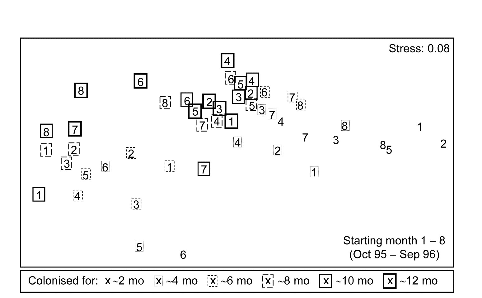
Fig. 16.15. Algal colonisation, Calafuria {a}. MDS of macroalgal species based on zero-adjusted Bray-Curtis from fourth-root transformed area cover, using photographs, for 48 samples, each an average over three replicate ‘patches’ (three sub-patches in each) for all $ 8 \times 6$ combinations of month of clearance (numbers 1-8 over the course of a year) and time over which colonisation has been taking place (six approximately bi-monthly sampling times, shown by a succession of larger/bolder boxes).
Fig. 16.15 is an nMDS of the 48 community samples, over 6 recovery periods (successively bolder squares) for the 8 different starting months of clearance (1-8), the three replicate patches for each ‘treatment’ (start date) having been averaged for this plot. Whilst a colonisation pattern through time is evident (mid-right to low left then upwards) there is no prospect of seeing whether that pattern is the same across the start times since assemblage differences are naturally large over the colonisation period. The trajectories of the 6 times for each of the patches, viewed separately by MDS ordination in their groups of three patches per treatment (Fig. 16.16), do however show strong differences in these time profiles. Though they are spatially interspersed, there is a marked consistency of replicate patches within treatments and characteristically different colonisation profiles across them.
Fig. 16.16. Algal recolonisation, Calafuria {a}. Separate nMDS plots for each of the 8 clearance months (‘treatments’), showing time trajectories over the following 6 approximately bi-monthly observations of the colonising macroalgal communities, for three replicate patches in each treatment (different line shading). Note the similarity of trajectories within, and dissimilarity between, treatments.
With outer factor the patch designators and inner factor the 6 bi-monthly times, the 2STAGE routine extracts the $6 \times 6$ similarity matrix representing each profile, from diagonals of the $144 \times 144$ Bray-Curtis matrix for the full set of samples, and then relates the 24 such sub-matrices with rank matrix correlations $\rho$, each sub-matrix then becoming a single point in the second-stage nMDS of Fig. 16.17. Unlike the earlier coral reef example, there are now replicates which will allow a formal hypothesis test, and ANOSIM on the differences among starting times assessed against the variability over replicate patches (in their time profiles, not in their communities!) gives a decisive global R of 0.96.¶ By averaging over the replicate level, Clarke, Somerfield, Airoldi et al. (2006) go on to demonstrate that the experiment is repeatable, since the second-stage pattern of the 8 starting months at the Calafuria station is strongly related to the pattern for the same sampling design at another station, Boccale. This utilises a RELATE test on the two second-stage matrices, a procedure which comes dangerously close to being a third-stage analysis, by which point the original data has become merely a distant memory!
The serious point here, of course, is that plots such as Fig. 16.17 are never the end point of a multivariate analysis. They may help to tease out, and sometimes formally test, interesting and relevant assemblage patterns, but having established that there are valid interpretations to be made, a return to the data matrix is always desirable, and the types of species analyses covered in Chapter 7 (much enhanced in PRIMER v7) will then usually play an important part in the final interpretation.
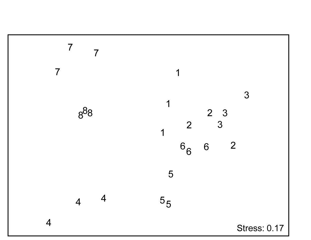
Fig. 16.17. Algal recolonisation, Calafuria {a}. Second-stage nMDS of similarities in the time course of recolonisation of macroalgae, as seen in the first-stage MDS plots of Fig. 16.16, i.e. at 3 ‘patches’ under 8 different months (1-8) of clearance of algae from the subtidal rocky reefs (the ‘treatments’). The very consistent time course within, and marked differences between, treatments is seen in the tight dispersion of the replicates, giving a large and highly significant ANOSIM statistic, R = 0.96.
¶ In fact, had the nested design of smaller patches within each of these replicate ‘patches’ been exploited, the second-stage tests at this point would have been 2-way nested ANOSIM.