Chapter 18: Bootstrapped averages for region estimates in multivariate means plots
- 18.1 Means plots
- 18.2 Example: Indonesian reef corals, S. Tikus
- 18.3 ‘Bootstrap average’ regions
- 18.4 Example: Loch Creran macrobenthos
- 18.5 Example: Fal estuary macrofauna
18.1 Means plots
Several examples have been seen in previous chapters of the advantages of viewing ordination plots of the samples averaged over replicates within each factor level, or sometimes over the levels of other factors. This reduces the variance (technically, ‘multivariate dispersion’) in the resulting mean samples, usually allowing the structure of factor levels, e.g. patterns over sites, times or treatments, to be viewed with low stress on a 2- or 3-d non-metric or metric MDS plot. Chapter 5 (e.g. page 5.7 and the footnote on page 5.9) discusses the range of choices here, from averaging transformed data, through averaging similarities, to calculating distances among centroids in high-d PCO space computed from the resemblances, and the point was made that there is not often much practical difference in the resulting ordination of these means.
Here we shall concentrate on just the simplest, and most common case, that of replicate data from a one-factor design (which may, of course, result from a combination of two or more crossed factors or from examining a higher level of a nested design in which the replicates are the averaged levels of the factor immediately below). If the data is univariate, e.g. a diversity measure computed from replicate transects of coral communities sampled over a series of years, standard practice would be to test for inter-annual differences using the replicate data and then construct a means plot with interval estimates, as in Fig. 14.5. It is rare in such cases to see a plot of the replicate values themselves, plotted against year, because the large variability from transect to transect in the index can make it difficult to see the patterns, even where these are clearly established by the hypothesis tests. And so it should be with a multivariate response, e.g. the coral species communities themselves: a useful mantra will often be to test effects using replicates but – having established the existence of such effects – to display them in ordinations on averaged data.
18.2 Example: Indonesian reef corals, S. Tikus
The point is made here in Fig 18.1 for the Shannon diversity of coral community transects (% cover data) at S. Tikus Island, Indonesia {I} first met in Fig 6.5. Normal-theory based tests are usually entirely valid for most diversity indices, often without transformation, since the normality is typically induced by the central limit theorem, most indices being a sum over a large number of species contributions. Pairwise tests show a clear diversity change in 1983, post the El Niño-induced bleaching event, and change again of the index thereafter, but still distinct from its 1981 level. This interpretation is evident from the means plot of Fig 18.1b (though it is by no means as clear in the replicate plot, 18.1a!). The means plot also allows the direct inference that, in the later years, the index is intermediate between its 1981 and 1983 levels.
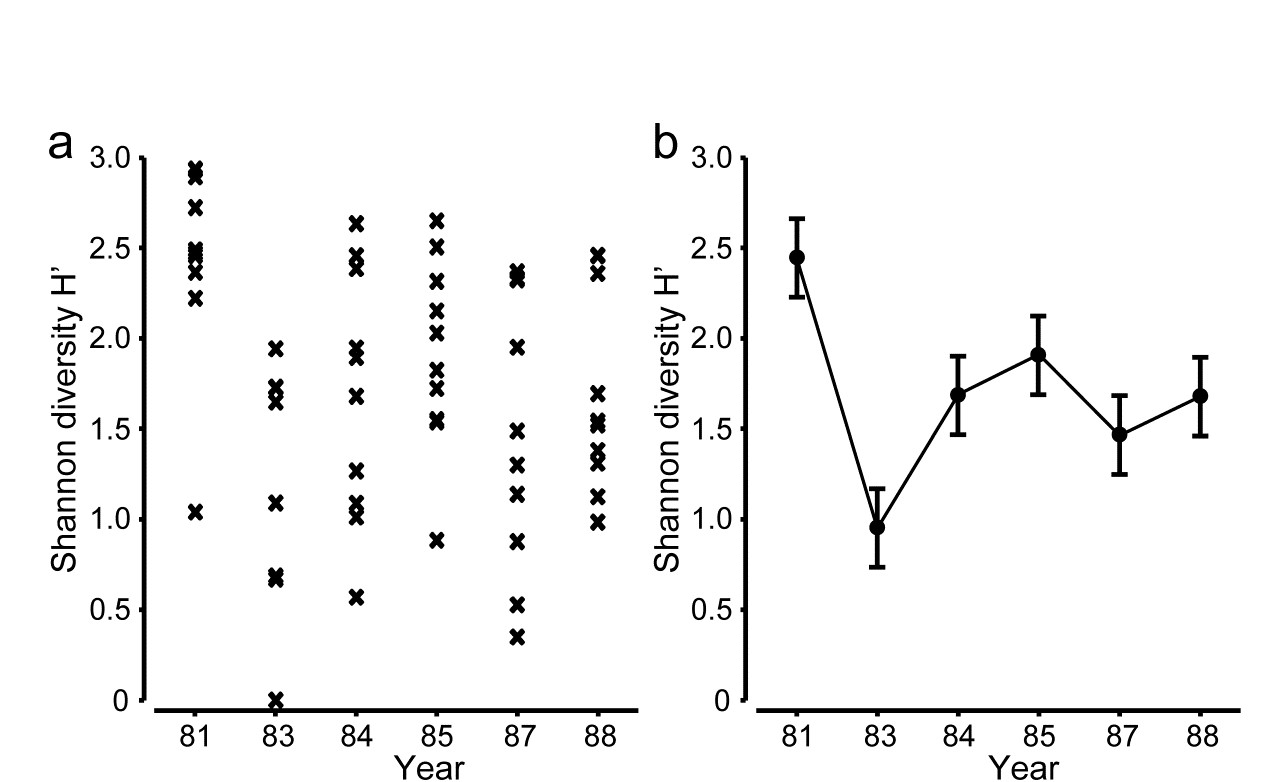
Fig. 18.1. Indonesian reef corals, S. Tikus Island {I}. a) Shannon diversity (base e) for % cover of 75 coral species on 10 replicate transects in each of 6 years, over the period 1981-1988, spanning a coral bleaching event in 1982; b) ‘means plot’ for the replicates in (a), with 95% interval estimates for mean diversity in each year.
The same pattern of analysis should be applied to the community response. Here, the appropriate similarity is the zero-adjusted Bray-Curtis (see page 16.6), on root-transformed % cover: the global ANOSIM statistic, R = 0.47, is sizeable and overwhelmingly significant. Pairwise ANOSIM values (Table 18.1) also have tests based on large numbers of permutations (92,378), a result of the 10 replicates per year, and differences are thus demonstrated between every pair of years. However, many of the pairwise R values are not just significant but substantial, ranging up to 0.87.
Table 18.1. Indonesian reef corals, S. Tikus Island {I}. Pairwise ANOSIM R statistics, from square-root transformed % cover of coral communities on 10 transects in 6 years, and zero-adjusted Bray-Curtis similarity. All years are significantly different (p < 2%), with ’81 and ’83 differing from all other years at p<0.1%.
| R | 1981 | 1983 | 1984 | 1985 | 1987 |
|---|---|---|---|---|---|
| 1983 | 0.87 | ||||
| 1984 | 0.73 | 0.43 | |||
| 1985 | 0.63 | 0.67 | 0.31 | ||
| 1987 | 0.50 | 0.64 | 0.25 | 0.33 | |
| 1988 | 0.64 | 0.54 | 0.49 | 0.30 | 0.25 |
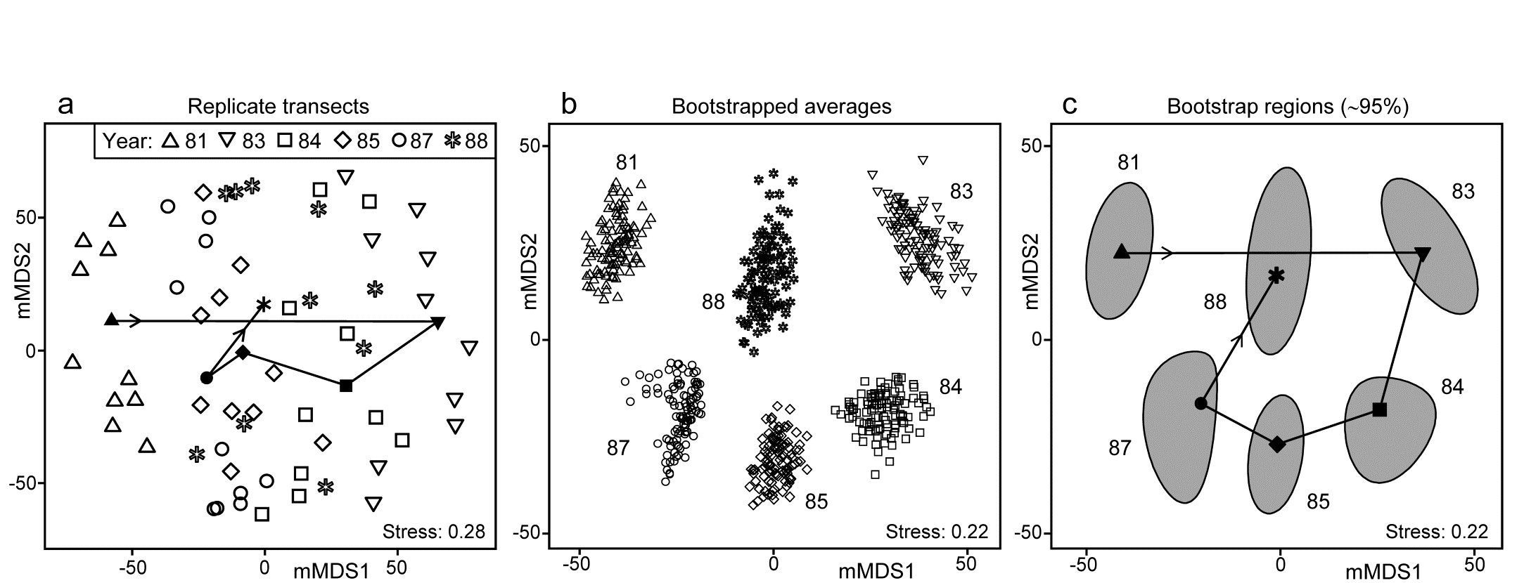
Fig. 18.2. Indonesian reef corals, S. Tikus Island {I}. a) Metric MDS (mMDS) of the coral communities on 10 transects sampled in each of 6 years, spanning a coral bleaching event in 1982, based on zero-adjusted Bray-Curtis similarities (dummy value = 1) on square-root transformed data of % cover. Also shown are the mean communities for each year (filled symbols, joined in date order), from averaging the transformed data over the 10 replicates and merging this with the transformed matrix, prior to resemblance calculation. b) mMDS of ‘whole sample’ bootstrap averages, resampling the 10 transects 100 times for each of the 6 years. c) mMDS ordination as in (b) but with approximate 95% region estimates fitted to the bootstrap averages in (b); also seen are the group means of these repeated bootstrap averages, again joined in a trajectory across years. See later text for details of precise construction in (b) and (c).
The initial, stark change in the community from ’81 to ’83 is evident from the ordination plot of replicate transects (Fig. 18.2a), and the following years can be seen to be intermediate between these extremes, but their pattern only becomes clearer when the average points for each year are also included in the plot, as closed symbols joined by a trajectory in time order. Displaying all 60 replicate points (and the means) in the same 2-d ordination, given the large degree of variability from transect to transect within a year, is in any case over-optimistic: the stress is unacceptably high. (Note that this is a metric MDS, for consistency with the following exposition, but the nMDS plot is similar and still has an uncomfortable stress of 0.21). If the averaged values are mMDS-ordinated on their own, the pattern is similar (as it is for the ‘distance among centroids’ construction¶, Anderson, Gorley & Clarke (2008) ) but what is missing in comparison with the univariate plot is some indication of reliability in the position of these averaged communities, i.e. an analogue of the interval estimates in Fig. 18.1b. What region of the 6-point mMDS would we expect each of these averages to occupy, if we had been able to take repeated sets of 10 transects from each year, computing the averaged community for each set? To attempt formal modelling of confidence regions with exact coverage properties is highly problematic for typical multivariate datasets, with their often high (and correlated) dimensionality and zero-inflated distributions. Also permutation does not provide an obvious distribution-free solution: by permuting labels of the replicates in a particular year we clearly do not construct new realisations of the averaged community for that year. But bootstrapping these replicates, resampling them with replacement, does provide a way forward without distributional assumptions, and produces bootstrap regions for the averaged communities with at least nominal coverage probabilities (subject to a number of approximations).
¶ There is an important distinction in what these two approaches are trying to achieve. ‘Distance among centroids’, in the high-d PCO space calculated from the resemblances, is trying to locate the ‘centre’ of each cloud of replicate points and then project this, potentially along with the replicates, into low-d (say 2-d) PCO space; such centroids will then be at the centre of gravity of the replicates in the 2-d PCO. Averaging of community samples, on the other hand, may not produce a sample which is ‘central’ to the replicates (though often, such as in Fig. 18.2a, it more or less does so). For example, unless species are ubiquitous, the average is likely to contain more species than most of the replicates and, if a biological similarity measure which pays much attention to presence/absence structure is chosen (Bray-Curtis under heavy transformation, Jaccard etc), then the averaged sample need not be highly similar to any of the replicates. Ecologists will be very familiar with this idea from measuring diversity by species richness (S). The average number of species in a replicate core from a location is not the same as the number of species found at that location, but both have validity as measures of richness, at different spatial scales. Similarly both ‘centroid’ and ‘average’ are interpretable constructs in this context (as a central, single community sample and a representation of the ‘pooled’ community at that location, respectively), and it is interesting to note that they often tell you an almost identical story about the relationships between the locations (/times etc).
Averages in the species space have substantial practical advantages over centroids in the resemblance space in that they do not lose the link to the individual species, thus shade plots, species bubble plots, SIMPER analyses etc are all possible with averaged community samples, and impossible with the centroids in resemblance space. Averages have a clear disadvantage of potential biases for strongly unbalanced numbers of replicates across locations, for exactly the same reasons (though usually less acutely) as in calculating species richness as the number of species observed at each location (under uneven sampling effort). If averaging in such strongly unbalanced cases, it would usually be wise to avoid severe transformations, which drag the data matrix close to presence/absence, and to check whether the final ordination shows a pattern linked to replicate numbers making up each group average. A useful graph is an ordination bubble plot, in which the circles (or spheres) have sizes representing numbers of samples making up each ordination point. Tell-tale signs of potential bias problems are often where points at the extremities of an ordination are all averages involving low sample sizes.
18.3 ‘Bootstrap average’ regions
The idea of the (univariate) bootstrap ( Efron (1979) ) is that our best estimate of the distribution of values taken by the (n) replicates in a single group, if we are not prepared to assume a model form (e.g. normality), is just the set of observed points themselves, each with equal probability (1/n). We can thus construct an example of what a further mean from this distribution would look like – had we been given a second set of n samples from the same group and averaged those – by simply reselecting our original points, independently, one at a time and with equal probability of selection, stopping when we have obtained n values. This is a valid sample from the assumed equi-probable distribution and such reselection with replacement makes it almost certain that several points will have been selected two or more times, and others not at all, and thus the calculated average will differ from that for the original set of n points. This reselection process and recalculation of the mean is repeated as many times (b) as we like, resulting in what we shall refer to as b bootstrap averages. These can be used to construct a bootstrap interval, within which (say) 95% of these bootstrap averages fall. This is not a formal confidence interval as such but gives a good approximation to the precision with which we have determined the average for that group. Under quite general conditions, these bootstrap averages are unbiased for the true mean of the underlying distribution, though their calculated variance underestimates the true variance by a factor of ($1 – n ^ {-1}$); the interval estimate can be adjusted to compensate for this.
Turning to the multivariate case, in the same way we could define ‘whole sample’ bootstrap averages by, in the coral reef context say, reselecting 10 transects with replacement from the 10 replicate transects in one year, and averaging their root-transformed cover values, for each of the 75 species. If this is repeated b = 100 times, separately for each of the years, the resulting 600 bootstrap averages could then be input to Bray-Curtis similarity calculation and metric MDS, which would result in a plot such as Fig. 18.2b. (This is not quite how this figure has been derived but we will avoid a confusing digression at this point, and return to an important altered step on the next page). Fig. 18.2b thus shows the wide range of alternative averages that can be generated in this way. The total possible number of different bootstrap sets of size n from n samples is $(2n)! / [2(n!) ^ 2]$, a familiar formula from ANOSIM permutations and giving again the large number of 92,378 possibilities when there are n = 10 replicates, though the combinations are this time very far from being equally likely.
With such relatively good replication, Fig. 18.2b now gives a clear, intuitively appealing idea both of the relation between the yearly averages and of the limits within which we should interpret the structure of the means. Put simply, all these are possible alternative averages which we could have obtained: if we pick out any two sets of 6, one point from each year in both cases, and would have interpreted the relations among years differently for the two sets, then we are guilty of over-interpreting the data¶. The simplicity of the plot inevitably comes with some caveats, not least that 2-d ordination may not be an accurate representation of the higher-d bootstrap averages. But this is a familiar problem and the solution is as previously: we look at 3-d (or perhaps higher-d) plots. The mMDS in 3-d is shown in Fig. 18.3, and is essentially similar to Fig. 18.2b, though it does a somewhat better job of describing the relative differences between years, as seen by the drop in stress from 0.22 to 0.12 (both are not unduly high for mMDS plots, which will always have much higher stress than the equivalent nMDS – bear in mind that this is an ordination of 600 points!). With balanced replication, as here, one should expect the degree of separation between pairs of bootstrap ‘clouds’ for the different groups to bear a reasonable relationship to the ordering of pairwise ANOSIM R values in Table 18.1, and by spinning the 3-d solution this is exactly what is seen to happen. By comparison, the 2-d plot somewhat under-represents the difference between 1981 and 88 and over-separates 1984 and 87.
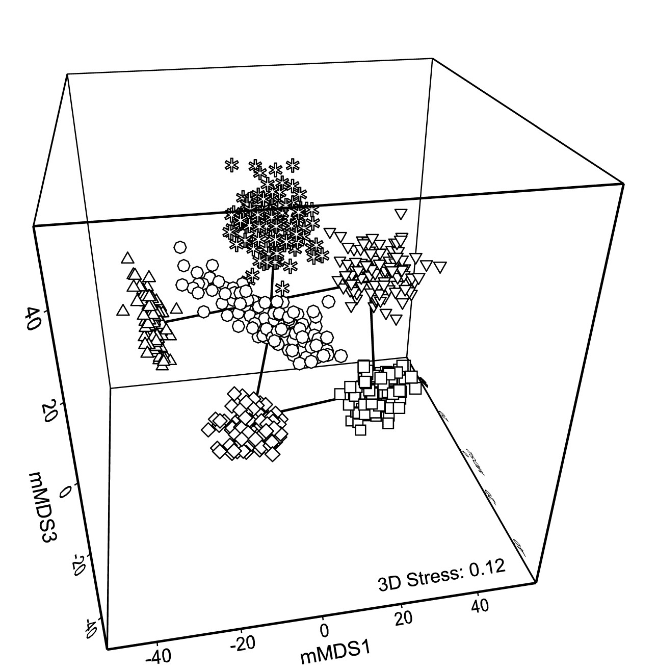
Fig. 18.3. Indonesian reef corals, S. Tikus Island {I} 3-d mMDS of whole sample bootstrap averages constructed as in Fig. 18.2b .
Fig. 18.2c takes the next natural step and constructs smoothed, nominal 95% bootstrap regions on the 2-d plot of Fig. 18.2b. The ordination is unchanged, being still based on the 600 bootstrap averages, the points being suppressed in the display in favour of convex regions describing their spread. These are constructed in a fairly straightforward manner by fitting bivariate normal distributions, with separately estimated mean, variance and correlation parameters to each group of bootstrap averages. Given that each point represents a mean of 10 independent samples, it is to be expected that the ‘cloud’ of bootstrap averages will be much closer to multivariate normality, at least in a space of high enough dimension for adequate representation, than the original single-transect samples. However, non-elliptic contours should be expected in a 2-d ordination space both from any non-normality of the high-dimensional cloud and because of the way the groups interact in this limited MDS display space – some years may be ‘squeezed’ between others. The shifted power transform (of a type used on page 17.9 for the construction of joint $\Delta ^ +$, $\Lambda ^ +$ probability regions) is thus used on a rotation of each 2-d cloud to principal axes, again separately for each group (and axis). The bivariate normals are fitted in the transformed spaces and their 95% contours back transformed to obtain the regions of Fig. 18.2c. Such a procedure cannot generate non-convex regions (as seen for means in 1987, though there is less evidence of non-convexity in the 3-d plot) but often seems to do a good job of summarising the full set of bootstrap averages.
In one important respect the regions are superior to the clouds of points: when the bivariate normals are fitted in the separate transformed spaces, correction can be made for the variance underestimation noted earlier for bootstrap averages in the univariate case. The details are rather involved† but the net effect is to slightly enlarge the regions to cover more than 95% of the bootstrapped averages, to produce the nominal 95% region. The enlargement will be greater as n, the number of replicates for a group, reduces, because the underestimation of variance by bootstrapping is then more substantial.
Fig. 18.2c also allows a clear display of the means for each group. The points (joined by a time trajectory) are the group means of the 100 bootstrap averages in each year, which are merged with those 600 averages, and then ordinated with them into 2-d space. Region plots in the form of Fig. 18.2c thus come closest to an analogue of the univariate means plot, of averages and their interval estimates.
¶ It is likely to be important for such interpretation that we have chosen mMDS rather than nMDS for this ordination. One of the main messages from any such plot is the magnitude of differences between groups compared to the uncertainty in group locations. Metric MDS takes the resemblance scale seriously, relating the distances in ordination space linearly through the origin to the inter-point dissimilarities. As discussed on page 5.8, this is usually a disaster in trying to display complex sample patterns accurately in low-d space because the mMDS ordination has, at the same time, to reconcile those patterns with displaying the full scale of random sampling variability from point to point (samples from exactly the same condition never have 0% dissimilarity). The pattern here is not complex however, just a simple 6 points (with an important indication of the uncertainty associated with each), and the retention of a scale makes mMDS the more useful display.
† An elliptic contour of the bivariate normal is found in the transformed space, with P% cover, where P is greater than the target $P _ 0$ (95%, say), such that the variance bias is countered. A neat simplification results from $P = 100 \left[1 – \left[ 1 – (P _ 0 /100) \right] ^ {1/W} \right]$ for bivariate normal probabilities from concentric ellipses, where W is the bootstrap underestimate of the total variance, from both axes. Under rather general conditions, the expected value of W is again only (1 – n-1), though this cannot be simply substituted into the expression for P since the mean of a function of W is not the function of the mean of W. Hence a large-scale simulation of W is needed to give mean P from the above expression, for a full range of n and a few key $P _ 0$ values. Once computed, the adjustment can be put in a simple look-up table for software (in practice an empirical quadratic fit of P to n-1 suffices), and this is implemented in PRIMER 7’s Bootstrap Averages routine.
18.4 Example: Loch Creran macrobenthos
Gage & Coghill (1977) collected a set of 256 soft-sediment macrobenthic samples along a transect in Loch Creran, Scotland {c}, data which have little or no evidence of a trend or spatial group structure and will therefore be useful here in illustrating a potential bootstrapping artefact, discussion of which we postponed from the previous page. For this example, 16 cores are pooled at a time, giving 16 replicates spaced along the transect, each having sufficient biological material to fairly reflect the community (an average of 26 species per replicate). A 2-level group factor is defined as the first and second halves of the transect (1-8 for group A and 9-16 for group B) and Fig. 18.4a shows the resulting mMDS plot. A stress of 0.27 on only 16 points is too high for a reliable plot, even for a metric MDS, and the Shepard plot of 18.4b shows the inadequacy of metric linear regression (through the origin) for this 2-d ordination. Nonetheless, whilst there is some suggestion that the ‘centres’ for the two groups are not in precisely the same position (with 5 of the 8 replicates from group A being to the left and bottom of those for group B), it is no surprise to find that an ANOSIM test (or a PERMANOVA test), on the Bray-Curtis similarities from the untransformed species counts in the 67-d samples $\times$ species matrix, does not distinguish the two groups at all. But what happens to the bootstrap averages?
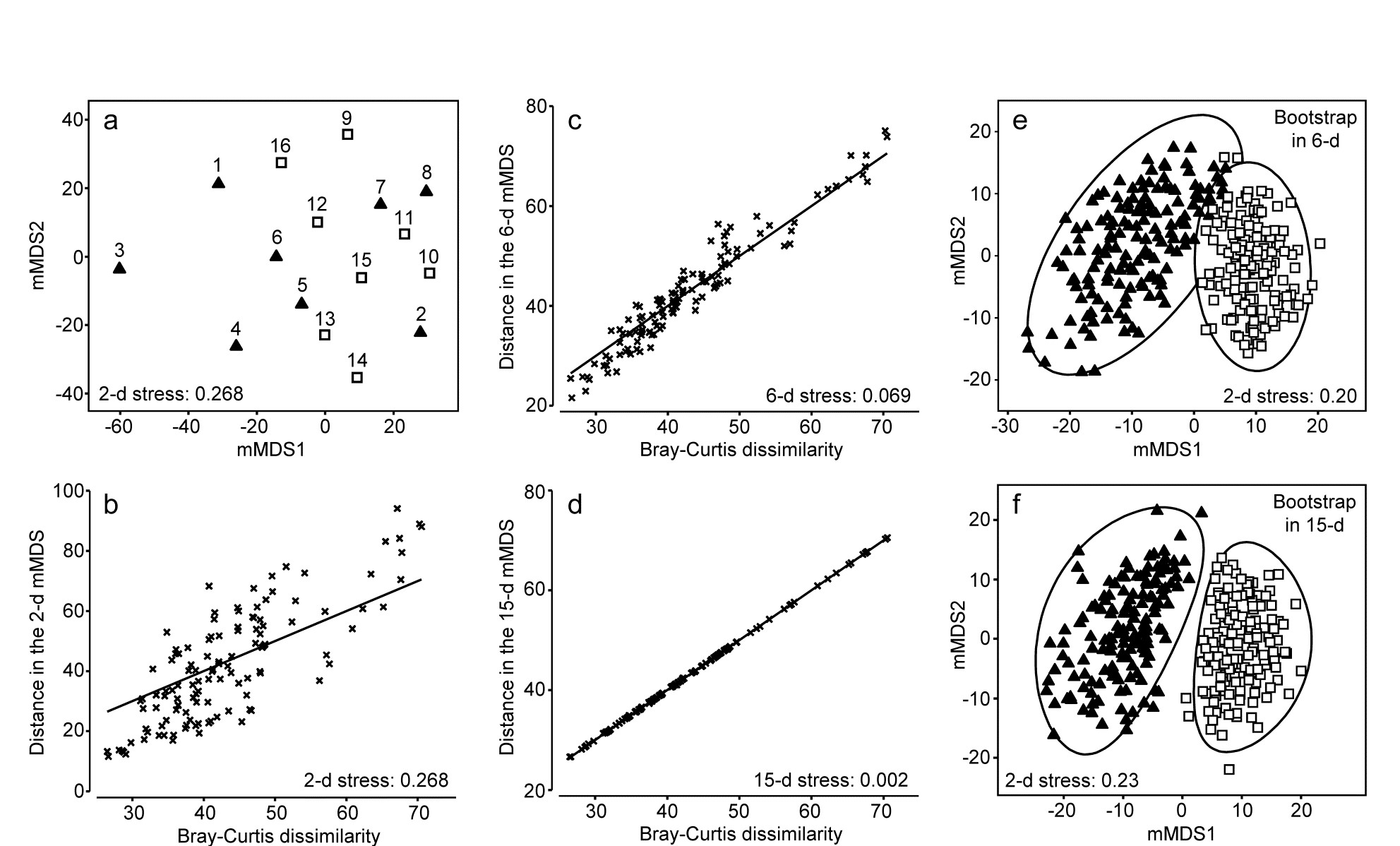
Fig. 18.4. Loch Creran macrobenthos {c}. (a) mMDS plot of (pooled) samples, 1-16, along a single transect, from untransformed data and Bray-Curtis dissimilarities. Triangles and squares denote groups A (1-8) and B (9-16). b-d) Shepard diagrams for the mMDS plots of these 16 samples in 2-d, 6-d and 15-d. e) Bootstrap average regions (95%) for groups A and B, symbols as in (a), by bootstrapping co-ordinates of the 16 samples in the 6-d mMDS approximation to the original 67-d space (Pearson matrix correlation $\rho = 0.968$, of those inter-point distances with the original resemblance matrix). f) Regions as in (e) but by bootstrapping co-ordinates in the 15-d mMDS space, which in this case perfectly preserves the Bray-Curtis similarities from the full space, as shown by (d), and $\rho = 1$.
Artefact of bootstrapping in high dimensions
The 95% region estimates for the means of the two groups, whilst they will inevitably be ‘centred’ in different places, would be expected to overlap, but this is not what happens when bootstrap averages are calculated separately for the two sets of 8 replicates in their full (67-d) species space and then ordinated into lower dimensions, as shown in the 2-d mMDS of Fig. 18.5.
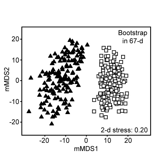
Fig. 18.5.Loch Creran macrobenthos {c}. 2-d mMDS of bootstrap averages in the original 67-d species space, for groups A and B.
What has gone horribly wrong here? The answer lies in the vastness of high-dimensional space¶. Bootstrap samples ‘work’, in the sense of giving a plausible set of alternative samples (with the same properties) to the set we actually did obtain, because the spread of values produced, along a line, in a plane, in a 3-d box etc, cover much the same interval, areal and spatial extents as the original samples. However, this feature gradually starts to disappear for increasingly higher dimensions. This data set contains only 16 points, but these are in 67-dimensional space. Many of the points could ‘have some dimensions to themselves’, purely by chance, when there are no real differences in the two communities, e.g. because of the sparse presence of many species in a typical assemblage matrix. The two groups of samples will thus occupy a somewhat different set of dimensions (many dimensions will be found in both sets, of course, but some will only be found in one or other group). On repeated sampling separately from each of the groups, it is inevitable that bootstrap averages for a group will remain in its own subset of dimensions. Those averages vary over a tighter range than the original samples – that is the nature of averages – and the non-identity of the two sets of dimensions will cause the bootstrap averages to shrink apart so that, even in a low-d ordination, the two groups will not overlap. This oversimplifies a complex situation but is likely to be one of the basic reasons why the high-d bootstrap artefact is seen.
This way of posing the problem immediately suggests a possible solution, namely to bootstrap the samples in a much lower-d space, which nonetheless retains essentially all the information present in the original resemblances from the 67-d samples $\times$ species matrix. Here, we have only 16 samples and a 15-d mMDS can, in this case, near-perfectly† reconstruct the set of among-sample Bray-Curtis resemblances in 15-d, as can be seen in the Shepard diagram of Fig. 18.4d. However, the 15-d mMDS of Fig. 18.4f shows that the high-d artefact is still present, though apparently substantially reduced. This is perhaps unsurprising, given there are still as many dimensions as points, and we need to search for a lower-dimensional space in which to create the bootstrap averages.
The technique we have used in previous chapters to measure information loss in replacing a resemblance matrix with an alternative is simple matrix correlation of the two sets of resemblances. Here, in the context of metric MDS, which tries to preserve dissimilarity values themselves, it would be appropriate to use a standard (Pearson) correlation $\rho$, rather than the non-parametric Spearman correlation which fits better to preserving rank orders of resemblances in nMDS. A suggested procedure is therefore to ordinate the data by mMDS, from the chosen dissimilarity matrix, into increasingly higher dimensions, until a predetermined threshold for $\rho$ is crossed (say $\rho > 0.95$ or $\rho > 0.99$). The $\rho$ value is almost sure to increase monotonically with the dimension, $m$. The process can probably start with $m \ge 4$, since evidence suggests the high-d artefact does not trouble such relatively low-d space. At the upper end, as $m$ gets much larger than 10, the artefact can become non-negligible, especially if (as for the current example) this is nearing the total sample size in the original data. This suggests that the search is made over $4 \le m \le 10$ (and this will certainly produce $\rho$ values in the range 0.95-0.99).
In the current Loch Creran example, an mMDS in $m = 6$ dimensions provides a reasonable linear fit to the original resemblance values, as shown in Fig. 18.4c (for which $\rho = 0.97$). The co-ordinates of the sample points in this m-dimensional mMDS space are now used to produce a large number of bootstrap averages (b) for each group. b ≥ 100 is recommended, though lower values may have to be used if there are many groups, in order to obtain mMDS region plots in a viable computation time. Here, for only two groups, b = 150 averages were taken from each. Euclidean distances are then computed among these bootstrap averages, this being the relevant resemblance matrix for points in ordination space, naturally§. These are then input to metric MDS to obtain the final 2- or 3-d ordination plot and the smoothed region estimates, as previously described for the S Tikus data of Fig. 18.2 and 18.3 (this is the procedure that was followed for those earlier plots, selecting m=7, for which $\rho$ >0.95). The 95% region plot for the Creran data (Fig. 18.4e) now shows the two groups overlapping, as expected‡.
A somewhat subtle but important consequence of this solution to the high-d bootstrap artefact is that it also addresses the issue raised in the footnote on page 18.2, that simple averages of replicates in species space will often not occupy the centre of gravity of those replicates when they and the averages are ordinated together, using a similarity such as Bray-Curtis (or any biological measure responding to the presence/ absence structure in the data). But now the averaging is carried out in the Euclidean distance-based mMDS space which approximates those similarities so, for each group, the mean of the bootstrap averages is just their centre of gravity (in the m-dimensional space).⸙ And theoretical unbiasedness of the bootstrap method (a univariate result which carries over to multivariate Euclidean space) dictates that this mean will be close to the group average of the original replicates, when the latter is calculated in the m-dimensional space. (This is not, of course, the same as computing these averages in the original species space and ordinating them, along with the replicates, into m dimensions.)
Thus, in Fig. 18.2c for example, the means shown should be close to the centres of gravity of the clouds of bootstrap averages in 18.2b; they can only not be so because of the distortion involved in the final step of approximating the m-dimensional space by a 2-d mMDS solution. Thus the means are usually worth displaying, as a further guide to such distortion.
A final example of bootstrapping is one with slightly different numbers of replicate samples across groups, though bootstrap averages are calculated in just the same way and without bias from the varying sampling effort for one of the means (again see footnote ⸙).
¶ “Space is big. Really big. You just won't believe how vastly, hugely, mindbogglingly big it is. I mean, you may think it's a long way down the road to the chemist's, but that's just peanuts to space.” Douglas Adams, 1978, The Hitchhiker’s Guide to the Galaxy. Not a quote about high-d space, but it could have been!
† Euclidean distances among k points can always be represented in k-1 dimensions but here we are dealing with biological resemblance measures which are never ‘metrics’, so this can only be achieved in general with a mix of real and imaginary axes (i.e. in complex space, see for example Fig. 3.4 of Anderson, Gorley & Clarke (2008) ). A real-space mMDS can nearly always get close to recreating the original dissimilarities however; often near-perfectly, as here.
§ Do not confuse this with making Euclidean distance assumptions for the original samples $\times$ species matrix! We are still computing, say, Bray-Curtis dissimilarities among the samples, exactly as previously, but then we approximate those by Euclidean distances among points in m dimensions (this is what the Shepard diagram shows and is what ordination is all about). For each of g groups, a bootstrap average is then a simple centroid (‘centre of gravity’) of n bootstrap samples drawn with replacement from that group’s n points in this Euclidean space. b such averages are produced for each group, and it is the (Euclidean) distances among those b$\times$g points which are input to the final mMDS, to obtain plots such as Fig. 18.4e.
‡ It is a mistake to expect an exact parallel between overlap of bootstrap regions and the significance of (say) pairwise ANOSIM tests, in the way that (with careful choice of confidence probabilities) univariate confidence intervals, based on normality, can be turned into hypothesis tests. Bootstraps do not give formal confidence regions and a number of approximations are made (e.g. sample size is often small for bootstrapping, the final display is in approximate low-d space, etc); in contrast ANOSIM is an exact permutation test, but utilises only the ranks from the full resemblance matrix. Nonetheless, as we saw for S Tikus corals, the relative positioning and size of regions in these plots can add real interpretative value, following hypothesis testing.
⸙ And this also sidesteps the issues raised in the last paragraph of the footnote on page 18.2. Averaging over unbalanced numbers of replicates for the differing groups will not now introduce a bias coming from the relative species richness of these averages, since that averaging is in the Euclidean space of the low-d mMDS, not the species matrix. Thus it can be carried out with impunity on heavily transformed (or even presence/absence) samples from unbalanced group sizes. However, the same remarks apply now, about breaking the link to the species, as to the centroids in PCO space calculated in PERMANOVA+ ( Anderson, Gorley & Clarke (2008) ), to which these mMDS spaces have a strong affinity. The differences are that the PERMANOVA+ centroids are calculated in the full PCO space (and in general will have real and imaginary components) whilst the mMDS is an approximation in real space; also that lower-d plots are produced by projection through the higher axes with PCO but by placement of points in low-d in mMDS (in such a way as to optimise the fit to the actual resemblances).
18.5 Example: Fal estuary macrofauna
The soft-sediment macrobenthic communities from five creeks of the Fal estuary, SW England, {f} were examined by Somerfield, Gee & Warwick (1994a) and Somerfield, Gee & Warwick (1994b) . For location of the creeks (Restronguet, Mylor, Pill, St Just, Percuil) see the map in Fig. 9.3, where the analysis was of the sediment meiofaunal assemblages. The sediments in this estuary are heavily contaminated by heavy metal levels, resulting from historic tin and copper mining in the surrounding area, and the macrofaunal species list for the 5 replicates per creek (7 in Restronguet) consists of only 23 taxa. A 2-d metric MDS of these 27 samples, based on fourth-root transformed counts and Bray-Curtis similarity, is seen in Fig. 18.6a, and the associated Shepard plot in 18.6b. In this case, an excellent approximation to the Bray-Curtis resemblances is obtained from the Euclidean distances in an m = 4-dimensional mMDS, for which the Pearson correlation to the Bray-Curtis dissimilarities is $\rho = 0.991$, as seen from the Shepard diagram, Fig. 18.6c.
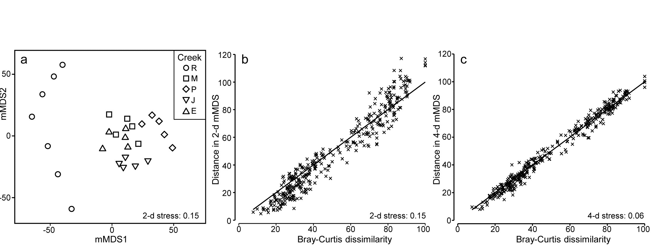
Fig. 18.6. Fal estuary macrofauna {f}. a) mMDS from Bray-Curtis similarities on fourth-root transformed counts of 23 soft-sediment macrofaunal species in a total of 27 samples from 5 creeks of the Fal estuary (R = Restronguet, M = Mylor, P = Pill, J = St Just, E = Percuil); b) Shepard plot for this 2-d mMDS ; c) Shepard plot for a 4-d mMDS of the same data (Pearson correlation = 0.991)
A total of 100 bootstrap averages are generated in this 4-d space, for each creek, and the full set of 500 bootstraps is ordinated into 2-d in Fig. 18.7. Approximate 95% regions are superimposed, in the way outlined earlier. In all cases, fewer than 5 of the 100 bootstrap averages fall outside of these regions, because of the adjustment made to the coverage probability from simulations based on a theoretical bias of ($1 - n ^ {-1}$) in their variance. These adjustments are rather modest however, and cannot be expected to compensate for all sources of potential uncertainty in bootstrapping with small n, and of course displaying in low-d space.
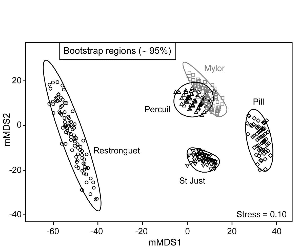
Fig. 18.7. Fal estuary macrofauna {f}. Metric MDS of bootstrap averages for the five creeks from the replicate samples of Fig 8.6a (Mylor creek in grey to aid distinction), including ~95% region estimates for the ‘mean communities’ in each creek. Bootstrapping performed in m = 4 dimensional mMDS space.
It should not be forgotten that the bootstrap concept in univariate space was introduced and justified on the basis of its asymptotic (large n) behaviour. It has some desirable small-sample properties, such as the unbiasedness of bootstrap means for the underlying true mean. But there is no guarantee that, for small n, intervals produced from the percentiles of the set of averages of randomly drawn bootstrap samples will achieve their nominal ‘% cover’. Some authors have even suggested the need for n>50 replicates (for each group!). Whilst this is unrealistic, and unnecessary, it should caution us not to take a nominal 95% cover value too seriously.
One formula worth bearing in mind is that given on page 18.3 for the number of possible different bootstrap averages (B) that could be obtained from n samples, $B = (2n) ! / [2 ( n ! ) ^ 2]$. For n = 2, B = 3; for n=3, B = 10; for n = 4, B = 35; and only when n = 5 do we have more than 100 possibilities (B = 126). At that level, though not all these distinct combinations will be found in b=100 random draws¶, the majority will appear, giving at least a range of bootstrap averages to generate the regions, as can be seen from the Mylor, Pill, St Just and Percuil creeks in Fig. 18.7. (Restronguet, with n=7, has more combinations, B = 1716, and that can be seen in the more random cover of points, rather than the striated patterns of the other bootstraps). Certainly n=5 should be considered as absolutely minimal for such bootstrap regions.
These caveats aside, and minimal though replication may be in the case of Fig. 18.7, it is clear nonetheless that the only two creeks whose regions overlap – and strongly so – are Mylor and Percuil. And pairwise ANOSIM test results, using the original Bray-Curtis similarities, are again consistent with these bootstrap averages: R = -0.01 for the Mylor v. Percuil test, but all other R statistics are > 0.55 and significant at the 1% level. (This level is the most extreme of the 126 permutations possible for all pairwise comparisons of 5 replicates; comparisons with Restronguet, with its 7 replicates, are based on 792 permutations, but all those pairwise tests again return p<1%). Whilst the warning given in the footnote on page 18.4 (that it would be most unwise to use these regions as substitutes for hypothesis tests) is still very germane, it is reassuring to note how often the interpretations broadly concur.
Finally, comparison of Figs. 18.6a and 18.7 restates the point made by the initial Fig. 18.1. In univariate statistics, we do not expect a plot of the replicates themselves to be the most informative way to picture the patterns in a data set. The means plot, with its interval estimates (which are not of course trying to summarise variation in the replicates, but uncertainty in the knowledge of the averages for each group), can often be a more informative way of interpreting the results of hypothesis tests. The same reasoning is true in the multivariate case. Fig. 18.6a has few samples to clutter the basic ordination plot, by comparison with many studies, but the patterns demonstrated by the ANOSIM (or PERMANOVA) tests are then more clearly visualised in a means plot such as Fig. 18.7. To repeat the mantra: test using the replicates, display using the means (with or without bootstrap regions).
¶ They are not equally likely but have a multinomial distribution, thus the probability that a single bootstrap sample will consist of all 5 of one of the original samples is small, at only 1/625, so is unlikely to be seen in most runs of b=100 averages. In contrast, the probability that a bootstrap sample reselects all 5 replicates in the original sample is 24/625 = 0.038, so its average point will occur about 4 times in a run of b=100, and has about a 98% chance of being in the set at least once.