Chapter 5: Ordination of samples by multi-dimensional scaling (MDS)
- 5.1 Other ordination methods
- 5.2 Non-metric multidimensional scaling (MDS)
- 5.3 Diagnostics: Adequacy of MDS representation
- 5.4 EXAMPLE: Dosing experiment, Solbergstrand
- 5.5 Example: Celtic Sea zooplankton
- 5.6 Example: Amoco-Cadiz oil spill, Morlaix
- 5.7 MDS strengths and weaknesses
- 5.8 Further nMDS/mMDS developments
- 5.9 Example: Okura estuary macrofauna
- 5.10 Example: Messolongi lagoon diatoms
- 5.11 Recommendations
5.1 Other ordination methods
Principal Co-ordinates Analysis
The two main weaknesses of PCA, identified at the end of Chapter 4, are its inflexibility of dissimilarity measure and its poor distance-preservation. The first problem is addressed in an important paper by
Gower (1966)
, describing an extension to PCA termed Principal Co-ordinates Analysis (PCO), also sometimes referred to as classical scaling. This allows a wider definition of distance than simple Euclidean distance in the species space (the basis of PCA), but was initially restricted to a specific class of resemblance measures for which the samples could be represented by points in some reconfigured high-dimensional (real) space, in which Euclidean distance between two points is just the (non-Euclidean) resemblance between those samples. Effectively none of the most useful biological resemblance coefficients fall into this class – the high-d space representing those dissimilarities has both real and imaginary axes – but it has become clearer in the intervening decades that much useful inference can still be performed in this complex space, e.g.
McArdle & Anderson (2001)
,
Anderson (2001a)
,
Anderson (2001b)
. (This is essentially the space in which the PERMANOVA+ add-on routines to the PRIMER software carry out their core analyses). PCO can thus be applied completely generally to any resemblance measure but the final step is again a projection onto a low-dimensional ordination space (e.g. a 2-dimensional plane), as in ordinary PCA. It follows that PCA is just a special case of PCO, when the original dissimilarity is just Euclidean distance, but note that PCO is still subject to the second criticism of PCA: its lack of emphasis on distance-preservation when the information is difficult to represent in a low number of dimensions.
Detrended Correspondence Analysis
Correspondence analyses are a class of ordination methods originally featuring strongly in French data-analysis literature (for an early review in English see Greenacre (1984) ). Key papers in ecology are Hill (1973a) and Hill & Gauch (1980) , who introduced detrended correspondence analysis (DECORANA). The methods start from the data matrix, rather than a resemblance measure, so are rather inflexible in their definition of sample dissimilarity; in effect, multinomial assumptions generate an implicit dissimilarity measure of chi-squared distance (Chapter 16). Correspondence analysis (CA) has its genesis in a particular model of unimodal species response to underlying (unmeasured) environmental gradients. Description is outside the scope of this manual but good accounts of CA can be found in the works of Cajo ter Braak (e.g. in Jongman, ter Braak & Tongeren (1987) ), who has contributed a great deal in this area, not least CCA, Canonical Correspondence Analysis ( ter Braak (1986) ).¶
The DECORANA version of CA, widely used in earlier decades, has a primary motivation of straightening out an arch effect in a CA ordination, which is expected on theoretical grounds if species abundances have unimodal (Guassian) responses along a single strong environmental gradient. Where such models are not appropriate, it is unclear what artefacts the algorithms may introduce into the final picture. In the Hill & Gauch (1980) procedure, the detrending is essentially carried out by first splitting the ordination space into segments, stretching or shrinking the scale in each segment and then realigning the segments to remove wide-scale curvature. For some people, this is uncomfortably close to attacking the data with scissors and glue and, though the method is not as subjective as this would imply, some arbitrary decisions about where and how the segmentation and rescaling are defined are hidden from the user in the software code. Thus Pielou (1984) and others criticized DECORANA for its ‘overzealous’ manipulation of the data. It is also unfortunate that the multivariate methods which were historically applied in ecology were often either poorly suited to the data or were based on conceptually complex algorithms (e.g. DECORANA and TWINSPAN, Hill (1979a) and Hill (1979b) ), erecting a communication barrier between data analyst and ecologist.
The ordination technique which is adopted in this manual’s strategy, non-metric MDS, is itself a complex numerical algorithm but it will be argued that it is conceptually simple. It makes few (if any) model assumptions about the form of the data, and the link between the final picture and the user’s original data is relatively transparent and easy to explain. Importantly, it addresses both the major criticisms of PCA made earlier: it has great flexibility both in the definition and conversion of dissimilarity to distance and its rationale is the preservation of these relationships in the low-dimensional ordination space.
¶ A convenient way of carrying out CA-related routines is to use the excellent CANOCO package, ter Braak & Smilauer (2002) .
5.2 Non-metric multidimensional scaling (MDS)
The method of non-metric MDS was introduced by Shepard (1962) and Kruskal (1964) , for application to problems in psychology; a useful introductory text is Kruskal & Wish (1978) , though the applications given are not ecological. Generally, we use the term MDS to refer to Kruskal’s non-metric procedure (though if there is any risk of confusion, nMDS is used). Metric MDS (always mMDS) is generally less useful but will be discussed in specific contexts later in the chapter.
The starting point is the resemblance matrix among samples (Chapter 2). This can be whatever similarity matrix is biologically relevant to the questions being asked of the data. Through choice of coefficient and possible transformation or standardisation, one can choose whether to ignore joint absences, emphasise similarity in common or rare species, compare only % composition or allow sample totals to play a part, etc. In fact, the flexibility of (n)MDS goes beyond this. It recognises the essential arbitrariness of absolute similarity values: Chapter 2 shows that the range of values taken can alter dramatically with transformation (often, the more severe the transformation, the higher and more compressed the similarity values become). There is no clear interpretation of a statement like ‘the similarity of samples 1 and 2 is 25 less than, or half that of, samples 1 and 3’. A transparent interpretation, however, is in terms of the rank values of similarity to each other, e.g. simply that ‘sample 1 is more similar to sample 2 than it is to sample 3’. This is an intuitively appealing and very generally applicable base from which to build a graphical representation of the sample patterns and, in effect, the ranks of the similarities are the only information used by a non-metric MDS ordination.
The purpose of MDS can thus be simply stated: it constructs a ‘map’ or configuration of the samples, in a specified number of dimensions, which attempts to satisfy all the conditions imposed by the rank (dis)similarity matrix, e.g. if sample 1 has higher similarity to sample 2 than it does to sample 3 then sample 1 will be placed closer on the map to sample 2 than it is to sample 3.
Example: Loch Linnhe macrofauna
This is illustrated in Table 5.1 for the subset of the Loch Linnhe macrofauna data used to show hierarchical clustering (Table 3.2). Similarities between $\sqrt{} \sqrt{}$-transformed counts of the four year samples are given by Bray-Curtis similarity coefficients, and Table 5.1 then shows the corresponding rank similarities. (The highest similarity has the lowest rank, 1, and the lowest similarity the highest rank, n(n-1)/2.) The MDS configuration is constructed to preserve the similarity ranking as Euclidean distances in the 2-dimensional plot: samples 2 and 4 are closest, 2 and 3 next closest, then 1 and 4, 3 and 4, 1 and 2, and finally, 1 and 3 are furthest apart. The resulting figure is a more informative summary than the corresponding dendrogram in Chapter 3, showing, as it does, a gradation of change from clean (1) to progressively more impacted years (2 and 3) then a reversal of the trend, though not complete recovery to the initial position (4).
Though the mechanism for constructing such MDS plots has not yet been described, two general features of MDS can already be noted:
-
MDS plots can be arbitrarily scaled, located, rotated or inverted. Clearly, rank order information about which samples are most or least similar can say nothing about which direction in the MDS plot is up or down, or the absolute distance apart of two samples: what is interpretable is relative distances apart, in whatever direction.
-
It is not difficult in the above example to see that four points could be placed in two dimensions in such a way as to satisfy the similarity ranking perfectly.‡ For more realistic data sets, though, this will not usually be possible and there will be some distortion (stress) between the similarity ranks and the corresponding distance ranks in the ordination. This motivates the principle of the MDS algorithm: to choose a configuration of points which minimises this degree of stress, appropriately measured.
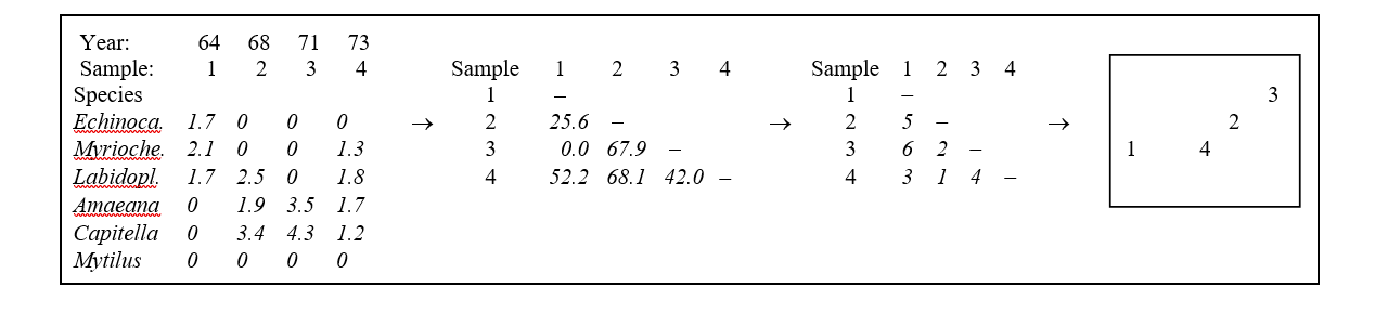
Table 5.1. Loch Linnhe macrofauna {L} subset. Abundance array after $\sqrt{} \sqrt{}$-transform, the Bray-Curtis similarities (as in Table 3.2), the rank similarity matrix and the resulting 2-dimensional MDS ordination.
Example: Exe estuary nematodes
The construction of an MDS plot is illustrated with data collected by Warwick (1971) and subsequently analysed in this way by Field, Clarke & Warwick (1982) . A total of 19 sites from different locations and tide-levels in the Exe estuary, UK, were sampled bi-monthly at low spring tides over the course of a year, between October 1966 and September 1967.
Three replicate sediment cores were taken for meiofaunal analysis on each occasion, and nematodes identified and counted. This analysis here considers only the mean nematode abundances across replicates and season (seasonal variation was minimal) and the matrix consists of 140 species found at the 19 sites.
This is not an example of a pollution study: the Exe estuary is a relatively pristine environment. The aim here is to display the biological relationships among the 19 stations and later to link these to the environmental variables (granulometry, interstitial salinity etc.) measured at these sites, to reveal potential determinants of nematode community structure. Fig. 5.1 shows the 2-dimensional MDS ordination of the 19 samples, based on $\sqrt{} \sqrt{}$-transformed abundances and a Bray-Curtis similarity matrix. Distinct clusters of sites emerge (in agreement with those from a matching cluster analysis), bearing no clear-cut relationship to geographical position or tidal level of the samples. Instead, they appear to relate to sediment characteristics and these links are discussed in Chapter 11. For now the question is: what are stages in the construction of Fig. 5.1?
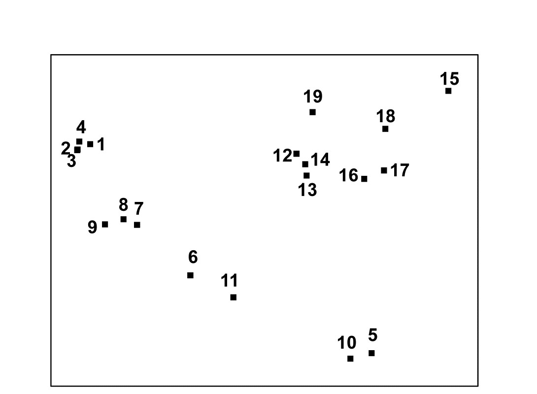
Fig. 5.1. Exe estuary nematodes {X}. MDS ordination of the 19 sites based on √√-transformed abundances and Bray-Curtis similarities (stress = 0.05).
MDS algorithm
The non-metric MDS algorithm, as first employed in Kruskal’s original MDSCAL program for example, is an iterative procedure, constructing the MDS plot by successively refining the positions of the points until they satisfy, as closely as possible, the dissimilarity relations between samples.§ It has the following steps.
-
Specify the number of dimensions (m) required in the final ordination. If, as will usually be desirable, one wishes to compare configurations in different dimensions then they have to be constructed one at a time. For the moment think of m as 2.
-
Construct a starting configuration of the n samples. This could be the result of an ordination by another method, for example PCA or PCO, but there are advantages in using just a random set of n points in m (=2) dimensions.
-
Regress the interpoint distances from this plot on the corresponding dissimilarities. Let {$d _ {jk}$} denote the distance between the jth and kth sample points on the current ordination plot, and {$\delta _ {jk}$} the corresponding dissimilarity in the original dissimilarity matrix (e.g. of Bray-Curtis coefficients, or whatever resemblance measure is relevant to the context). A scatter plot is then drawn of distance against dissimilarity for all n(n–1)/2 such pairs of values. This is termed a Shepard diagram and Fig. 5.2 shows the type of graph that results. (In fact, Fig. 5.2 is at a late stage of the iteration, corresponding to the final 2-dimensional configuration of Fig. 5.1; at earlier stages the graph will appear similar though with a greater degree of scatter). The decision that characterises different ordination procedures must now be made: how does one define the underlying relation between distance in the plot and the original dissimilarity?
There are two main approaches.
a) Fit a standard linear regression of $d$ on $\delta$, so that final distance is constrained to be proportional to original dissimilarity. This is metric MDS (mMDS). (More flexible would be to fit some form of curvilinear regression model, termed parametric MDS, though this is rarely seen.)
b) Perform a non-parametric regression of $d$ on $\delta$ giving rise to non-metric MDS. Fig. 5.2 illustrates the non-parametric (monotonic) regression line. This is a ‘best-fitting’ step function which moulds itself to the shape of the scatter plot, and at each new point on the x axis is always constrained to either remain constant or step up. The relative success of non-metric MDS, in preserving the sample relationships in the distances of the ordination plot, comes from the flexibility in shape of this non-parametric regression line. A perfect MDS was defined before as one in which the rank order of dissimilarities was fully preserved in the rank order of distances. Individual points on the Shepard plot must then all be monotonic increasing: the larger a dissimilarity, the larger (or equal) the corresponding distance, and the non-parametric regression line is a perfect fit. The extent to which the scatter points deviate from the line measures the failure to match the rank order dissimilarities, motivating the following.
-
Measure goodness-of-fit of the regression by a stress coefficient (Kruskal’s stress formula 1):
$$ Stress = \sqrt{ \sum_j \sum_k ( d_ {jk} - \hat{d}_ {jk} ) ^ 2 / \sum_j \sum_k d _ {jk}^2 } \tag{5.1} $$
where $\hat{d} _ {jk}$ is the distance predicted from the fitted regression line corresponding to dissimilarity $\delta _ {jk}$. If $d _ {jk} = \hat{d} _ {jk}$ for all the n(n–1)/2 distances in this summation, the stress is zero. Large scatter clearly leads to large stress and this can be thought of as measuring the difficulty involved in compressing the sample relationships into two (or a small number) of dimensions. Note that the denominator is simply a scaling term: distances in the final plot have only relative not absolute meaning and the squared distance term in the denominator makes sure that stress is a dimensionless quality.
-
Perturb the current configuration in a direction of decreasing stress. This is perhaps the most difficult part of the algorithm to visualise and will not be detailed; it is based on established techniques of numerical optimisation, in particular the method of steepest descent. The key idea is that the regression relation is used to calculate the way stress changes for small changes in the position of individual points on the ordination, and points are then moved to new positions in directions which look like they will decrease the stress most rapidly.
-
Repeat steps 3 to 5 until convergence is achieved. The iteration now cycles around the two stages of a new regression of distance on dissimilarity for the new ordination positions, then further perturbation of the positions in directions of decreasing stress. The cycle stops when adjustment of points leads to no further improvement in stress¶ (or when, say, 100 such regression/steepest descent/regression/… cycles have been performed without convergence).
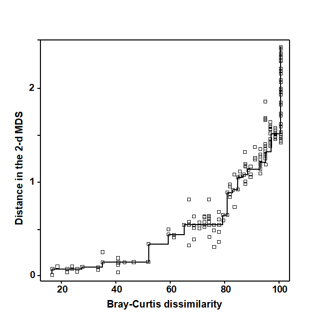
Fig. 5.2. Exe estuary nematodes {X}. Shepard diagram of the distances (d) in the MDS plot (Fig. 5.1) against the dissimilarities ($\delta$) in the Bray-Curtis matrix. The line is the fitted non-parametric regression; stress (=0.05) is a measure of scatter about the line in the vertical direction.
Features of the algorithm
Local minima. Like all iterative processes, especially ones this complex, things can go wrong! By a series of minor adjustments to the parameters at its disposal (the co-ordinate positions in the configuration), the method gradually finds its way down to a minimum of the stress function. This is most easily envisaged in three dimensions, with just a two-dimensional parameter space (the x, y plane) and the vertical axis (z) denoting the stress at each (x, y) point. In reality the stress surface is a function of more parameters than this of course, but we have seen before how useful it can be to visualise high-dimensional algebra in terms of three-dimensional geometry. A relevant analogy is to imagine a rambler walking across a range of hills in a thick fog, attempting to find the lowest point within an encircling range of high peaks. A good strategy is always to walk in the direction in which the ground slopes away most steeply (the method of steepest descent, in fact) but there is no guarantee that this strategy will necessarily find the lowest point overall, i.e. the global minimum of the stress function. The rambler may reach a low point from which the ground rises in all directions (and thus the steepest descent algorithm converges) but there may be an even lower point on the other side of an adjacent hill. He is then trapped in a local minimum of the stress function. Whether he finds the global or a local minimum depends very much on where he starts the walk, i.e. the starting configuration of points in the ordination plot.
Such local minima do occur routinely in all MDS analyses, usually corresponding to configurations of sample points which are only slightly different to each other. Sometimes this may be because there are one or two points which bear little relation to any of the other samples and there is a choice as to where they may best be placed, or perhaps they have a more complex relationship with other samples and may be difficult to fit into (say) a 2-dimensional picture.
There is no guaranteed method of ensuring that a global minimum of the stress function has been reached; the practical solution is therefore to repeat the MDS analysis several times starting with different random positions of samples in the initial configuration (step 2 above). If the same (lowest stress) solution re-appears from a number of different starts then there is a strong assurance, though never a guarantee, that this is indeed the best solution. Note that the easiest way to determine whether the same solution has been reached as in a previous attempt is simply to check for equality of the stress values; remember that the configurations themselves could be arbitrarily rotated or reflected with respect to each other.† In genuine applications, converged stress values are rarely precisely the same if configurations differ. (Outputting stress values to 3 d.p. can help with this, though solutions which are the same to 2 d.p. will be telling you the same story, in practice).
Degenerate solutions can also occur, in which groups of samples collapse to the same point (even though they are not 100% similar), or to the vertices of a triangle, or strung out round a circle. In these cases the stress may go to zero. (This is akin to our rambler starting his walk outside the encircling hills, so that he sets off in totally the wrong direction and ends up at the sea!). Artefactual solutions of this sort are relatively rare and easily seen in the MDS plot and the Shepard diagram (the latter may have just a single step at one end): repetition from different random starts will find many solutions which are sensible. (In fact, a more likely cause of a plot in which points tend to be placed around the circumference of a circle is that the input matrix is of similarities when the program has been told to expect dissimilarities, or vice-versa; in such cases the stress will be very high.)
A much more common form of degenerate solution is repeatable and is a genuine result of a disjunction in the data. For example, if the data split into two well-separated groups for which dissimilarities between the groups are much larger than any within either group, then there may be no yardstick within our rank-based approach for determining how far apart the groups should be placed in the MDS plot. Any solution which places the groups ‘far enough’ apart to satisfy the conditions may be equally good, and the algorithm can then iterate to a point where the two groups are infinitely far apart, i.e. the group members collapse on top of each other, even though they are not 100% similar (a commonly met special case is when one of the two groups consists of a single outlying point). There are two solutions:
a) split the data and carry out an MDS separately on the two groups (e.g. use ‘MDS subset’ in PRIMER);
b) neater is to mix mostly non-metric MDS with a small contribution of metric MDS. The ‘Fix collapse’ option in the PRIMER v7 MDS routine offers this, with the stress defined as a default of (0.95 nMDS stress + 0.05 mMDS stress). The ordination then retains the flexibility of the rank-based solution, but a very small amount of metric stress is usually enough to pin down the relative positions of the two groups (in terms of the metric dissimilarity between groups to that within them); the process does not appear to be at all sensitive to the precise mixing proportions. An example is given later in this chapter.
Distance preservation. Another feature mentioned earlier is that in MDS, unlike PCA, there is not any direct relationship between ordinations in different numbers of dimensions. In PCA, the 2-dimensional picture is just a projection of the 3-dimensional one, and all PC axes can be generated in a single analysis. With MDS, the minimisation of stress is clearly a quite different optimisation problem for each ordination of different dimensionality; indeed, this explains the greater success of MDS in distance-preservation. Samples that are in the same position with respect to (PC1, PC2) axes, though are far apart on the PC3 axis, will be projected on top of each other in a 2-dimensional PCA but they will remain separate, to some degree, in a 2-dimensional as well as a 3-dimensional MDS.
Even though the ultimate aim is usually to find an MDS configuration in 2- or 3-dimensions it may sometimes be worth generating higher-dimensional solutions⸙: this is one of several ways in which the advisability of viewing a lower-dimensional MDS can be assessed. The comparison typically takes the form of a scree plot, a line plot in which the stress (y axis) is plotted as a function of the number of dimensions (x axis). This and other diagnostic tools for reliability of MDS ordinations are now considered.
‡ In fact, there are rather too many ways of satisfying it and the algorithm described in this chapter will find slightly different solutions each time it is run, all of them equally correct. However, this is not a problem in genuine applications with (say) six or more points. The number of similarities increases roughly with the square of the number of samples and a position is reached very quickly in which not all rank orders can be preserved and this particular indeterminacy disappears.
§ This is also the algorithm used in the PRIMER nMDS routine. The required input is a similarity matrix, either as calculated in PRIMER or read in directly from Excel, for example.
¶ PRIMER7 has an animation option which allows the user to watch this iteration take place, from random starting positions.
† The arbitrariness of orientation needs to be borne in mind when comparing different ordinations of the same sample labels; the PRIMER MDS routine helps by automatically rotating the MDS co-ordinates to principal axes (this is not the same thing as PCA applied to the original data matrix!) but it may still require either or both axes to be reflected to match the plots. This is easily accomplished manually in PRIMER but, in cases where there may be less agreement (e.g. visually matching ordination plots from biota and environmental variables), PRIMER v7 also implements an automatic rotation/reflection/rescaling routine (Align graph), using Gower (1971) ’s Procrustes analysis (see also Chapter 11).
⸙ The PRIMER v7 MDS routine permits a large range of dimensions to be calculated in one run; a comparison not just of the stress values (scree plot) but also of the changing nature of the Shepard plots can be instructive. For each dimension, the default is now to calculate 50 random restarts, independently of solutions in other dimensions; this is a change from PRIMER v6 where the first 2 axes of the 3-d solution were used to start the 2-d search. Whilst this reduced computation time, it could over-restrict the breadth of search area; ever increasing computer power makes this a sensible change. The results window gives the stress values for all repeats, and the co-ordinates of the best (lowest stress) solutions for each dimension can be sent to new worksheets.
5.3 Diagnostics: Adequacy of MDS representation
-
Is the stress value small? By definition, stress reduces with increasing dimensionality of the ordination; it is always easier to satisfy the full set of rank order relationships among samples if there is more space to display them. The scree plot of best stress values in 2, 3, 4,.. dimensions therefore always declines. Conventional wisdom is to look for a ‘shoulder’ in this plot, indicating a sudden improvement once the ‘correct’ dimensionality is found, but this rarely happens. It is also to miss the point about MDS plots: they are always approximations to the true sample relationships expressed in the resemblance matrix. So for testing and many other purposes in this manual’s approach we will use the full resemblance matrix. The 2-d and 3-d MDS ordinations are potentially useful to give an idea of the main features of the high dimensional structure, so the valid question is whether they are a usable approximation or likely to be misleading.
One answer to this is through empirical evidence and simulation studies of stress values. Stress increases not only with reducing dimensionality but also with increasing quantity of data, but a rough rule-of-thumb, using the stress formula (5.1), is as follows.†
Stress <0.05 gives an excellent representation with no prospect of misinterpretation (a perfect representation would probably be one with stress <0.01 since numerical iteration procedures often terminate when stress reduces below this value§).
Stress <0.1 corresponds to a good ordination with no real prospect of a misleading interpretation; higher-dimensional solutions will probably not add any additional information about the overall structure (though the fine structure of any compact groups may bear closer examination).
Stress <0.2 still gives a potentially useful 2-dimensional picture, though for values at the upper end of this range little reliance should be placed on the detail of the plot. A cross-check of any conclusions should be made against those from an alternative method (e.g. the superimposition of cluster groups suggested in point 5 below), higher-dimensional solutions examined or ways founds of reducing the number of samples whose inter-relationships are being represented, by averaging over replicates, times, sites etc or by selection of subsets of samples to examine separately, in turn.
Stress >0.3 indicates that the points are close to being arbitrarily placed in the ordination space. In fact, the totally random positions used as a starting configuration for the iteration usually give a stress around 0.35–0.45. Values of stress in the range 0.2–0.3 should therefore be treated with a great deal of scepticism and certainly discarded in the upper half of this range. Other techniques will be certain to highlight inconsistencies.
-
Does the Shepard diagram appear satisfactory? The stress value totals the scatter around the regression line in a Shepard diagram, for example the low stress of 0.05 for Fig. 5.1 is reflected in the low scatter in Fig. 5.2. Outlying points in the plot could be identified with the samples involved; often there are a range of outliers all involving dissimilarities with a particular sample and this can indicate a point which really needs a higher-dimensional representation for accurate placement, or simply corresponds to a major error in the data matrix.
-
Is there distortion when similar samples are connected in the ordination plot? One simple check on the success of the ordination in dissimilarity-preservation is to specify an arbitrary similarity threshold (in practice try a series of thresholds) and join all samples in the ordination whose similarity is greater than this threshold. This is shown for the Exe data in Fig. 5.3a, at a similarity level of 30% and indicates no strong inconsistencies of the MDS distances with the similarity matrix (e.g. the group 5,10 is further from 6,11 than the latter is from 7,8,9, and clearly of greater dissimilarity). However, though low, the stress is not zero, and it is clear that some of this comes from representation of the detailed structure of the (looser) 12-19 group. For example, Fig. 5.3a shows that sample 15 is more similar to 16 than it is to either 18 or 17, which is not the picture seen from the 2-d MDS.
-
Is the ‘minimum spanning tree’ consistent with the ordination picture? A similar idea to the above is to construct the minimum spanning tree (MST, Gower & Ross (1969) ). All samples are connected on the MDS plot by a single line which is allowed to branch but does not form a closed loop, such that the sum along this line of the relevant pairwise dissimilarities is minimised (again, this is taken from the original dissimilarity matrix not the distance matrix from the ordination points, note). Inadequacy is again indicated by connections which look unnatural in the context of placement of samples in the MDS configuration. The MST is shown for the Exe data in Fig. 5.3b and the same point about stress in the 2-d MDS for samples 15-18 can be seen. Similarly, there is clearly higher-dimensional structure than can be seen here among samples 12-14 and their relation with 19, since the MST shows that 12 is more similar to 13 than it is to the apparently intermediate point 14, and the MST does not take the apparently shortest route to sample 19. A lower stress must be obtained for a 3-d MDS (it drops a little to 0.03 here), and Fig. 5.3c of the 3-d MDS does show, for example, that points 12,13 are close and 14 a little separated, as Figs. 5.3a, 5.3b and the cluster analysis Fig. 5.4 would all suggest. (Viewing 3-d pictures in 2-d is not always easy but can be very much clearer with dynamic rotation of the 3-d plot, which is allowed in PRIMER as with many other plotting programs). When 2-d stress is as low, as it is here, the extra difficulty of displaying a 3-d solution for such a marginal improvement must be of doubtful utility, but in many cases there will be real interpretational gains in moving to a 3-d MDS solution.
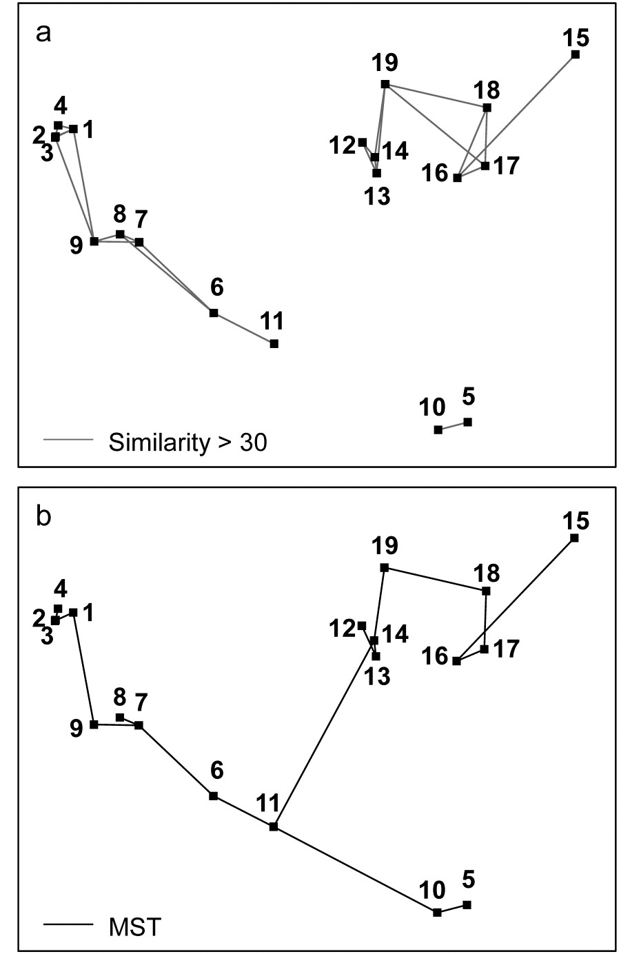
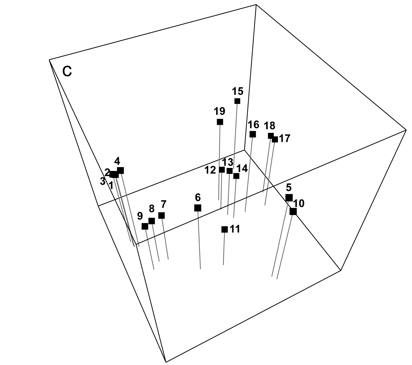
Fig. 5.3. Exe estuary nematodes {X}. a) & b) Two-dimensional MDS configuration, as in Fig. 5.1 (stress = 0.05), with:
a) samples >30% similar (by Bray-Curtis) joined by grey lines;
b) the minimum spanning tree through the dissimilarity matrix indicated by the continuous line.
c) Three-dimensional MDS configuration (stress = 0.03).

Fig. 5.4. Exe estuary nematodes {X}. Dendrogram of the 19 sites, using group-average clustering from Bray-Curtis similarities on $\sqrt{}\sqrt{}$-transformed abundances. The four site groups (1 to 4) identified by Field et al (1982) at a 17.5% similarity threshold are indicated by a dashed line (they also split the two tightly clustered sub-groups in group 1). A 35% slice is also shown.
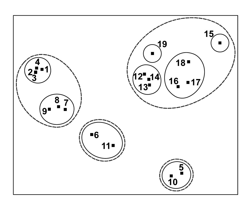
Fig. 5.5. Exe estuary nematodes {X}. Two-dimensional MDS configuration, as in Fig. 5.1 (stress = 0.05), with clusters identified from Fig. 5.4 at similarity levels of 35% (continuous line) and 17.5% (dashed line).
- Do superimposed groups from a cluster analysis distort the ordination plot? The combination of clustering and ordination analyses can also be an effective way of checking the adequacy and mutual consistency of both representations. Slicing the dendrogram of Fig. 5.4 at two (or more) arbitrary similarity levels determines groupings which can be identified on the 2-d ordination by a closed region around the points. (PRIMER uses its own ‘nail and string’ algorithm to produce smoothed convex hulls of the points in each cluster, where the degree of smoothing is under user control, with a smoothing parameter of zero resulting in the convex hull). Here the approximately 17.5% similarity used by the original Field, Clarke & Warwick (1982) paper is shown by the dashed line in Figs. 5.4 and 5.5, and a continuous line shows the clusters produced from slicing the dendrogram between about 30-45% similarity. It is clear that the agreement between the MDS and the cluster analysis is excellent: the clusters are well defined and would be determined in much the same way if one were to select clusters by eye from the 2-dimensional ordination alone. One is not always as fortunate as this, and a more revealing example of the benefits of viewing clustering and ordination in combination is provided by the data of Fig. 4.2.¶
† There are alternative definitions of stress, for example the stress formula 2 option provided in the MDSCAL and KYST programs. This differs only in the denominator scaling term in (5.1) but is believed to increase the risk of finding local minima and to be more appropriate for other forms of multivariate scaling, e.g. multidimensional unfolding, which are outside the scope of this manual.
§ This is under user control with the PRIMER routine, for example, but the default is 0.01.
¶ One option within PRIMER is to run CLUSTER on the ranks of the similarities rather than the similarities themselves. Whilst not of any real merit in itself (and not the default option), Clarke (1993) argues that this could have marginal benefit when performing a group-average cluster analysis solely to see how well the clusters agree with the MDS plot: the argument is that the information utilised by both techniques is then made even more comparable.
5.4 EXAMPLE: Dosing experiment, Solbergstrand
The nematode abundance data from the dosing experiment {D} at the GEEP Oslo Workshop was previously analysed by PCA, see Fig. 4.2 and accompanying text. The analysis was likely to be unsatisfactory, since the % of variance explained by the first two principal components was very low, at 37%. Fig. 5.6c shows the MDS ordination from the same data, and in order to make a fair comparison with the PCA the data matrix was treated in exactly the same way prior to analysis. (The same 26 species were used and a log transform applied before computation of Bray-Curtis similarities). The stress for the 2-dimensional MDS configuration is moderately high (at 0.16), indicating some difficulty in displaying the relationships between these 16 samples in two dimensions. However, the PCA was positively misleading in its apparent separation of the four high dose (H) replicates in the 2-dimensional space; by contrast the MDS does provide a usable summary which would probably not lead to serious misinterpretation (the interpretation is that nothing very much is happening!). This can be seen by superimposing the corresponding cluster analysis results, Fig. 5.6a, onto the MDS. Two similarity thresholds have been chosen in Fig. 5.6a such that they (arbitrarily) divide the samples into 5 and 10 groups, the corresponding hierarchy of clusters being indicated in Fig. 5.6c by thin and thick lines respectively. Whilst it is clear that there are no natural groupings of the samples in the MDS plot, and the groupings provided by the cluster analysis must therefore be regarded with great caution, the two analyses are not markedly inconsistent.
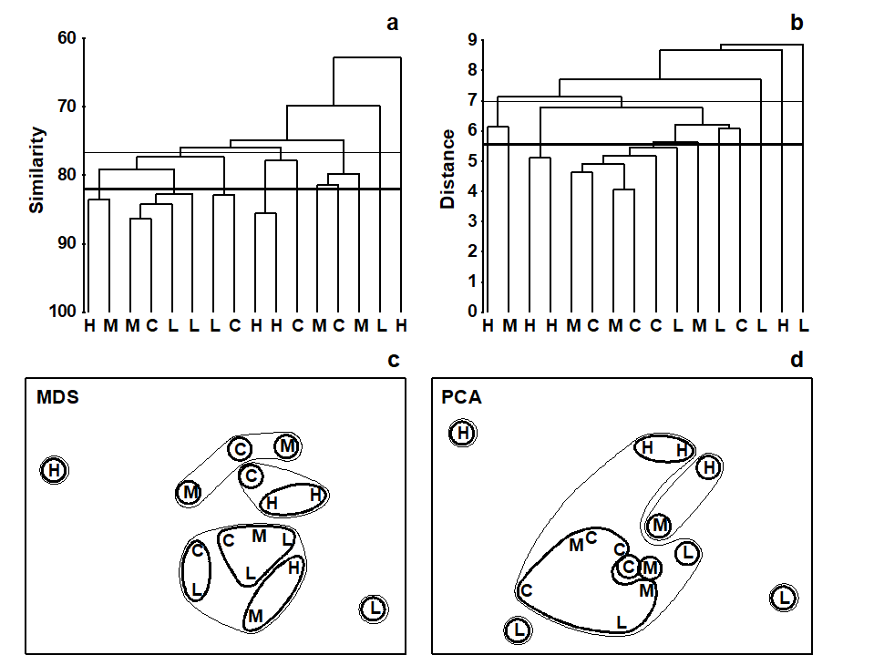
Fig. 5.6. Dosing experiment, Solbergstrand mesocosm {D}. Nematode abundances for four replicates from each of four treatments (control, low, medium and high dose of hydrocarbons and Cu) after species reduction and log transformation as in Fig. 4.2. a), c) Group-averaged clustering from Bray-Curtis similarities; clusters formed at two arbitrary levels are superimposed on the 2-dimensional MDS obtained from the same similarities (stress = 0.16). b), d) Group-average clustering from Euclidean distances; clusters from two levels are superimposed on the 2-dimensional PCA of Fig. 4.2. Note the greater degree of distortion in the latter. (Contours drawn by hand, note, not in PRIMER which only allows convexity of such contours).
In contrast, the parallel operation for the PCA ordination clearly illustrates the poorer distance-preserving properties of this method. Fig. 5.6d repeats the 2-dimensional PCA of Fig. 4.2 but with superimposed groups from a cluster analysis of the Euclidean distance matrix (the implicit distance for a PCA) between the 16 samples (Fig. 5.6b). With the same division into five clusters (thin lines) and ten clusters (thick lines), a much more distorted picture results, with samples that are virtually coincident in the PCA plot being placed in separate groups and samples appearing distant from each other forming a common group.
The outcome that would be expected on theoretical grounds is therefore apparent in practice here: MDS (with a relevant similarity matrix for species data, Bray-Curtis) can provide a more realistic picture in situations where PCA (on Euclidean distance) gives a distorted representation of the those distance relationships among samples, because of the projection step: the H samples are not clustered together in the dendrogram. In fact, the biological conclusion from this particular study is entirely negative: the ANOSIM test (Chapter 6) shows that there are no statistically significant differences in community structure among any of the four dosing levels in this experiment.
5.5 Example: Celtic Sea zooplankton
In situations where the samples are strongly grouped, as in Figs. 5.4 and 5.5, both clustering and ordination analyses will demonstrate this, usually in equally adequate fashion. The strength of ordination is in displaying a gradation of community composition over a set of samples. An example is provided by Fig. 5.7, of zooplankton data from the Celtic Sea {C}. Samples were collected from 14 depths, separately for day and night time studies at a single site. The changing community composition with depth can be traced on the resulting MDS plot (from Bray-Curtis similarities). There is a greater degree of variability in community structure of the near-surface samples, with a marked change in composition at about 20-25m; deeper than this the changes are steady but less pronounced and they step in parallel for day and night time samples.¶ Another obvious feature is the strong difference in community composition between day and night near-surface samples, contrasted with their relatively higher similarity at greater depth. Cluster analysis of the same data would clearly not permit the accuracy and subtlety of interpretation that is possible from ordination of such a gradually changing community pattern.
Fig. 5.7. Celtic Sea zooplankton {C}. MDS plot for night (boxed) and day time samples (dashed lines) from 14 depths (5 to 70m, denoted A,B,...,N), taken at a single site during September 1978.
Common examples of the same point can be found for time series data, where the construction of a time trajectory by connecting points on an ordination (sometimes, as above, with multiple trajectories on the same plot, e.g. contrasting time sequences at reference and impacted conditions) can be a powerful tool in the interpretational armoury from multivariate analysis, and another example of this point follows
¶ The precise relationships between the day and night samples for the larger depths (F-N) would now best be examined by an MDS of that data alone, the greater precision resulting from the MDS then not needing to cater, in the same 2-d picture, for the relationships to (and between) the A-E samples. This re-analysis of subsets should be a commonly-used strategy in the constant battle to display high-dimensional information in low dimensions.
5.6 Example: Amoco-Cadiz oil spill, Morlaix
Benthic macrofaunal abundances of 251 species were sampled by Dauvin (1984) at 21 times between April 1977 and February 1982 (approximately quarterly), at station ‘Pierre Noire’ in the Bay of Morlaix. Ten grab samples (1m²) of sediment were collected on each occasion and pooled, thus substantially reducing the contribution of local-scale spatial variability to the ensuing multivariate analysis, which should allow temporal patterns to be seen more clearly. The time-series spanned the period of the ‘Amoco-Cadiz’ oil tanker disaster of March 1978; the sampling site was some 40km from the initial tanker break-up but major coastal oil slicks reached the Bay of Morlaix, {A}.
The 2-d MDS from Bray-Curtis similarities computed on 4th-root transformed abundances is seen in Fig. 5.8a, and has succeeded in reducing the 251-d species data to a 2-d plot with only modest stress (=0.09). It neatly shows: a) the scale of the seasonal cycle prior to the oil-spill (times A to E); b) marked community change immediately following the spill (time F), and further changes over the next year or so (G-K); c) a move towards greater stability, with a suggestion that the community is returning towards the region of its initial state, though it has certainly not achieved that by the end of the 5-year period; and d) the re-establishment of the seasonal cycle in this latter phase (J-M, N-Q, R-U).
In fact, this is an astonishingly succinct and meaningful summary of the main pattern of change in a very speciose data set, and shows well the power of MDS ordinations to capture continuous change rather than groupings of samples, which is all that a dendrogram displays. The latter is seen in the differing symbols in Fig 5.8a, used for SIMPROF groups (Chapter 3) from agglomerative clustering (Fig. 5.8b): eight groups are identified and they do split samples before and after the spill, and also by season, between winter+spring and summer+autumn periods, even in the last two years overriding inter-annual differences. The exception to that is over the immediate post-spill year, in which seasonal differences are not apparent. All of this makes sense and demonstrates the power of ordination and clustering methods together (literally, for the rotatable Fig. 5.8c, another PRIMER7 option). On their own, however, in a case where a time course of change is expected, the supremacy of ordination over cluster analysis is clear (contrast Figs. 5.8 a and b). A simple dendrogram gives weak interpretation since it lacks ordering, i.e. has no way of associating clusters with a temporal or spatial gradient (though see the discussion on dendrograms in shade plots, Chapter 7).
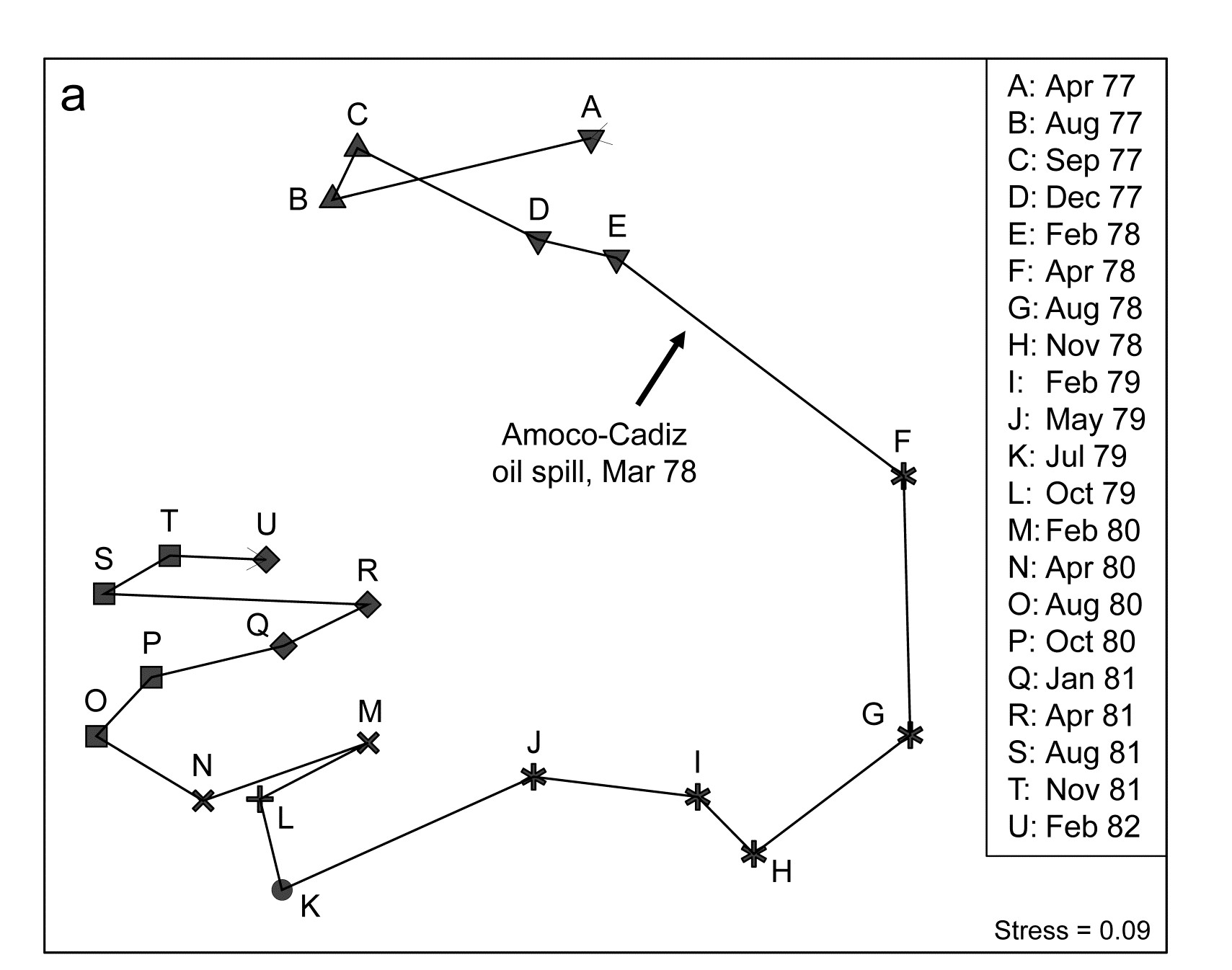
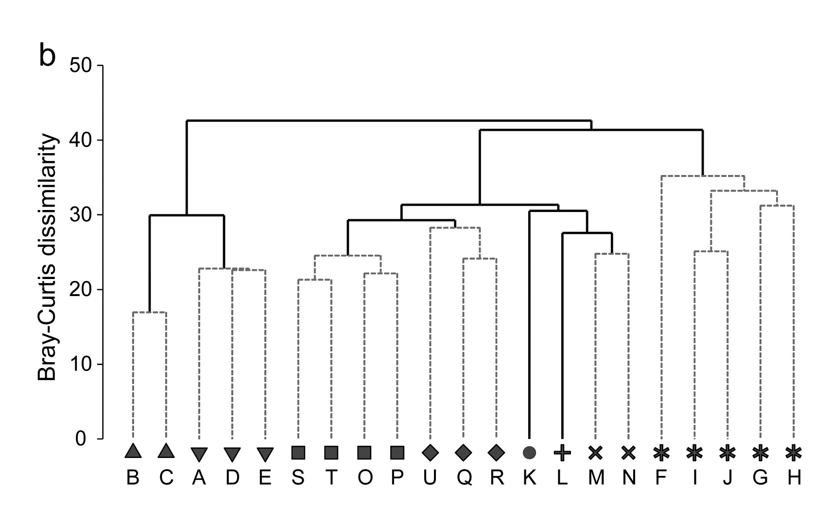
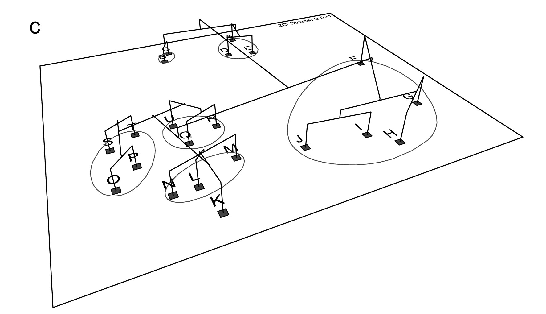
Fig. 5.8. Amoco-Cadiz oil spill {A}. Morlaix macrobenthos at 21 times (A to N). For Bray-Curtis on 4th-root transformed abundances: a) 2-d nMDS; b) agglomerative cluster analysis, both using symbols identifying the 8 groups given by SIMPROF tests; c) 2-d MDS as in (a) with SIMPROF groups identified and the dendrogram from (b) displayed in the 3rd dimension.
5.7 MDS strengths and weaknesses
MDS strengths
-
MDS is simple in concept. The numerical algorithm is undeniably complex, but it is always clear what non-metric MDS is setting out to achieve: the construction of a sample map whose inter-point distances have the same rank order as the corresponding dissimilarities between samples.
-
It is based on the relevant sample information. MDS works on the sample dissimilarity matrix not on the original data array, so that there is complete freedom of choice to define similarity of community composition in whatever terms are biologically most meaningful.
-
Species deletions are unnecessary. Another advantage of starting from the sample dissimilarity matrix is that the number of species on which it was based is largely irrelevant to the amount of calculation required. Of course, if the original matrix contained many species whose patterns of abundance across samples varied widely, and prior transformation (or choice of similarity coefficient) dictated that all species were given rather equal weight, then the structure in the sample dissimilarities is likely to be more difficult to represent in a low number of dimensions. More usually, the similarity measure will automatically down-weight the contribution of species that are rarer (and thus more prone to random and uninterpretable fluctuations). There is then no necessity to delete species, either to obtain reliable low-dimensional ordinations or to make the calculations viable; the computational scale is determined solely by the number of samples.
-
MDS is generally applicable. MDS can validly be used in a wide variety of situations; fewer assumptions are made about the nature and quality of the data when using non-metric MDS than (arguably) for any other ordination method. It seems difficult to imagine a more parsimonious position than stating that all that should be relied on is the rank order of similarities (though of course this still depends on the data transformation and similarity coefficient chosen). The step to considering only rank order of similarities, rather than their actual values, is not as potentially inefficient as it might at first appear, in cases where the resemblances are genuine Euclidean distances. Provided the number of points in the ordination is not too small (nMDS struggles when there are only 4 or 5, thus few dissimilarities to rank), nMDS will effectively reconstruct those Euclidean distances solely from their rank orders so that metric MDS (mMDS) and nMDS solutions will appear identical. The great advantage of nMDS, of course, is that it can cope equally well with very non-Euclidean resemblance matrices, commonplace in biological contexts.
-
The algorithm is able to cope with a certain level of ‘missing’ similarities. This is not a point of great practical importance because resemblances are generally calculated from a data matrix. If that has a missing sample then this results in missing values for all the similarities involving that sample, and MDS could not be expected to ‘make up’ a sensible place to locate that point in the ordination! Occasionally, however, data arrives directly as a similarity matrix and then MDS can cleverly stitch together an ordination from incomplete sets of similarities, e.g. knowing the similarities A to (B, C, D) and B to (C, D) tells you quite a lot about the missing similarity of C to D. And if, as noted above, there are a reasonable number of points, so a fairly rich set of ranks, even nMDS (as found in PRIMER) would handle such missing similarities.
MDS weaknesses
-
MDS can be computationally demanding. The vastly improved computing power of the last two decades has made it comfortable to produce MDS plots for several hundred samples, with numerous random restarts (by default PRIMER now does 50), in a matter of a few seconds. However, for n in the thousands, it is still a challenging computation (processor time increases roughly proportional to n2). It should be appreciated, though, that larger sample sizes generally bring increasing complexity of the sample relationships, and a 2 or 3-dimensional representation is unlikely to be adequate in any case. (Of course this last point is just as true, if not more true, for other ordination methods). Even where it is of reasonably low stress, it becomes extremely difficult to label or make sense of an MDS plot containing thousands of points. This scenario was touched on in Chapter 4 and in the discussion of Fig. 5.7, where it was suggested that data sets will often benefit by being sub-divided by the levels of a factor, or on the basis of subsets from a cluster analysis, and the groups analysed separately by MDS (agglomerative clustering is very fast, for large numbers of samples¶). Averages for each level might then be input to another MDS to display the large-scale structure across groups. It is the authors’ experience that, far too often, users produce ordination plots from all their (replicate) samples and are then surprised that the ordination, containing many points, has high stress and little apparent pattern. Not enough use is made of averaging, whether of the transformed data matrix, the similarities, or the centroids from PCO ( Anderson, Gorley & Clarke (2008) ), taken over replicates, over sites for each time, over times for each site etc, and entering those averages into MDS ordinations. In univariate analysis, it is rare to produce a scatter plot of the replicates themselves: we are much more likely to plot the means for each group, or the main effects of times and sites etc (for each factor, averaging over the other factors), and the situation should be no different for multivariate data.
-
Convergence to the global minimum of stress is not guaranteed. As we have seen, the iterative nature of the MDS algorithm makes it necessary to repeat each analysis many times, from different starting configurations, to be fairly confident that a solution that re-appears several times (with the lowest observed stress) is indeed the global minimum of the stress function. Generally, the higher the stress, the greater the likelihood of non-optimal solutions, so a larger number of repeats is required, adding to the computational burden. However, the necessity for a search algorithm with no guarantee of the optimal solution (by comparison with the more deterministic algorithm of a PCA) should not be seen, as it sometimes has, as a defect of MDS vis-à-vis PCA. Remember that an ordination is only ever an approximation to the high-dimensional truth (the resemblance matrix) and it is much better to seek an approximate answer to the right problem (MDS on Bray-Curtis similarity, say) rather than attack the wrong problem altogether (PCA on Euclidean distance), however deterministic the computation is for the latter.
-
The algorithm places most weight on the large distances. A common feature of most ordination methods (including MDS and PCA) is that more attention is given to correct representation of the overall structure of the samples than their local structure. For MDS, it is clear from the form of equation (5.1) that the largest contributions to stress will come from incorrect placement of samples which are very distant from each other. Where distances are small, the sum of squared difference terms will also be relatively small and the minimisation process will not be as sensitive to incorrect positioning. This is another reason therefore for repeating the ordination within each large cluster: it will lead to a more accurate display of the fine structure, if this is important to interpretation. An example is given later in Figs. 6.2a and 6.3, and is typical of the generally minor differences that result: the subset of points are given more freedom to expand in a particular direction but their relative positions are usually only marginally changed.
¶ PRIMER has no explicit constraint on the size of matrices that it can handle; the constraints are mainly those of available RAM. On a typical laptop PC it is possible to perform sample analyses on matrices with tens of thousands of variables (species or OTUs) and hundreds of samples without difficulty; once the resemblance matrix is computed most calculations are then a function of the number of samples (n), and cluster analysis on hundreds of samples is virtually instantaneous. (The same is not true of the SIMPROF procedure, note, since it works by permuting the data matrix and is highly compute-intensive; v7 does however make good use of multi-core processors where these are available).
5.8 Further nMDS/mMDS developments
Higher dimensional solutions
MDS solutions can be sought in higher dimensions and we noted previously that the stress will naturally decrease as the dimension increases. Fig 5.9a shows the scree plot of this decreasing stress (y axis) against the increasing number of dimensions, for the Amoco-Cadiz oil spill data of Fig. 5.8. There is a suggestion of a ‘shoulder’ in this line plot as the stress drops from 2-d to 3-d, thereafter declining steadily. The 2-d stress is already a rather satisfactory 0.09 but drops quite strongly to about 0.05 with the extra dimension, now in our category of an excellent representation, and so should certainly be further examined. Figs. 5.9c and d show the 2- and 3-d Shepard plots, and it is clear that the stress (scatter about the fitted monotonic regression line) has reduced quite sharply. Fig. 5.9b shows the 3-d nMDS itself, with the box rotated to highlight, in the vertical direction (z), the third MDS axis (as defined by the automatic rotation of the configuration to principal axes). The seasonal cycle is clearly expressed by changes along this axis, which is orthogonal to the main inter-annual changes seen in the x, y plane (the latter is very likely to be the effect of the oil spill and partial recovery, though it is impossible of course to infer that with full confidence, given the absence of any sort of reference conditions for the natural inter-annual variation). This example suggests that, even in cases with acceptable 2-d stress, at least the 3-d solution should be calculated and then rotated to see if it offers further insight†. Here, for example, the apparent synchrony in direction of the seasonal cycle between the start (A-E) and end (R-U) years of this time course, seen in the 2-d plot (Fig. 5.8a), is confirmed in the 3-d plot (Fig. 5.9b) with its more complete separation of season and year. The 3-d plot gives us greater confidence in this case that the 2-d plot (with its perfectly acceptable stress level) in no way misleads. Of course, for static displays, one would then always prefer the 2-d plot, as a suitable approximation to the high-dimensional structure.
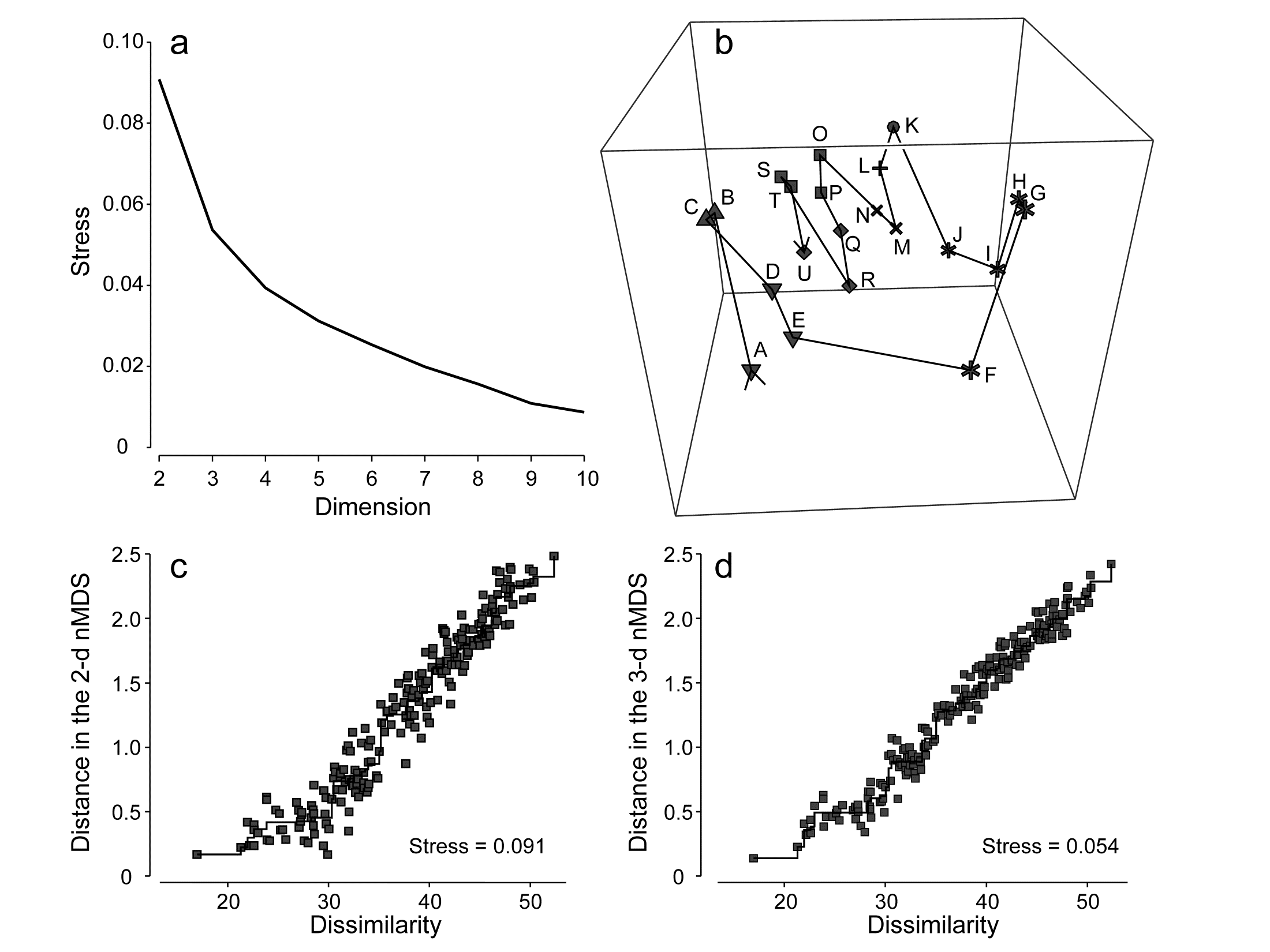
Fig. 5.9. Amoco-Cadiz oil spill {A}. a) Scree plot of stress for nMDS solutions in 2-d to 10-d (data matrix as in Fig. 5.8); b) 3-d nMDS plot for the 21 times; c) & d) Shepard plots for the 2-d (Fig 5.8) and 3-d MDS ordinations showing the decreasing scatter about the monotonic regression (stress).
(Non-)linearity of the Shepard diagram
Shepard diagrams for the 2-d and 3-d non-metric MDS ordinations for Morlaix were seen in Figs. 5.9c and 5.9d; note how relatively restricted the range of (dis)similarities is, by comparison with the equivalent plot (Fig. 5.2) for the (spatial) Exe nematode study. The latter exemplifies a long baseline of community change: there are pairs of sites with no species in common, thus dissimilarities at the extreme of their range (100). For the (temporal) Morlaix study, the baseline of change is relatively much shorter, nearly all dissimilarities being between 20 and 50: there is no complete turnover of species composition through time, nor anything approaching it. This difference results in a (commonly observed) effect of greater linearity of the relationship between original dissimilarity and final distance in the MDS plots, as seen in Figs. 5.9c&d. It is linear regression of the Shepard plot distances vs. dissimilarities, through the origin, which is the basis of a less-commonly used technique for MDS, metric multidimensional scaling (mMDS), in which dissimilarities are treated as if they are, in reality, distances. Through the origin is an important caveat here and it is clear that Figs. 5.9c&d would not be well-fitted by such a regression – the natural line through these points passes through distance y = 0 at about a dissimilarity of x = 20. Thus the flexible nMDS fits instead more of a threshold relationship, in which the linearity tails off smoothly in a compressed set of distances for the smallest dissimilarities.
Metric multi-dimensional scaling (mMDS)
The above example will be returned to later, but there are situations in which a simple linear regression on the Shepard plot is certainly appropriate, e.g. when the resemblance coefficient is Euclidean distance, as would be the case for analysis of (normalised) environmental variables. Then mMDS becomes a viable alternative to PCA (which also uses distances that are Euclidean) but with the great advantage of ordination which does not resort to a projection of the higher-dimensional data but sets out to preserve the high-d distances in the low-d plot, as closely as it can. This lack of distance preservation was one of the two main objections to PCA discussed at the end of Chapter 4.
The metric MDS algorithm is in principle that earlier described for nMDS, replacing the step involving monotonic regression with simple linear regression through the origin. This allows the distances on the mMDS plot to be scaled in the same units as the input resemblance matrix (usually a distance measure), and there are now therefore measurement scales on the axes of the plot. Orientation and reflection are again arbitrary (though usually the convention is adopted as for nMDS, of rotating co-ordinates to principal axes).
Table. 5.2. World map {W}. a) Distance (in miles) between pairs of ‘European’ cities; b) rank distances (1= closest, 21 = furthest)
| (a) | London | Madrid | Moscow | Oslo | Paris | Rome |
|---|---|---|---|---|---|---|
| London | ||||||
| Madrid | 774 | |||||
| Moscow | 1565 | 2126 | ||||
| Oslo | 723 | 1474 | 1012 | |||
| Paris | 215 | 641 | 1542 | 822 | ||
| Rome | 908 | 844 | 1491 | 1253 | 689 | |
| Vienna | 791 | 1122 | 1033 | 848 | 648 | 477 |
| (b) | London | Madrid | Moscow | Oslo | Paris | Rome |
|---|---|---|---|---|---|---|
| London | ||||||
| Madrid | 7 | |||||
| Moscow | 20 | 21 | ||||
| Oslo | 6 | 17 | 13 | |||
| Paris | 1 | 3 | 19 | 9 | ||
| Rome | 12 | 10 | 18 | 16 | 5 | |
| Vienna | 8 | 15 | 14 | 11 | 4 | 2 |
A simple example illustrates metric MDS well, that of recreating a map of cities from a triangular matrix of the road/rail/air distances (or perhaps travel times) between every pair of them, {W} ¶. Table 5.2a gives the great-circle distances between only 7 cities (called European for brevity though they include Moscow). The negligible curvature of the earth over the range of about 2000 miles makes it clear that this distance matrix should be enough to locate these cities on a 2-dimensional map near-perfectly, and Fig. 5.10a shows the result of the metric MDS. As can be seen from Fig. 5.10c, the Shepard diagram is now precisely a linear fit through the origin, with no scatter and thus zero stress (stress is defined exactly as for nMDS, equation 5.1). The mMDS has been manually rotated to align with the conventional N-S direction for such a map, though that is clearly arbitrary; the axis scales are in miles since the fully metric information is used.
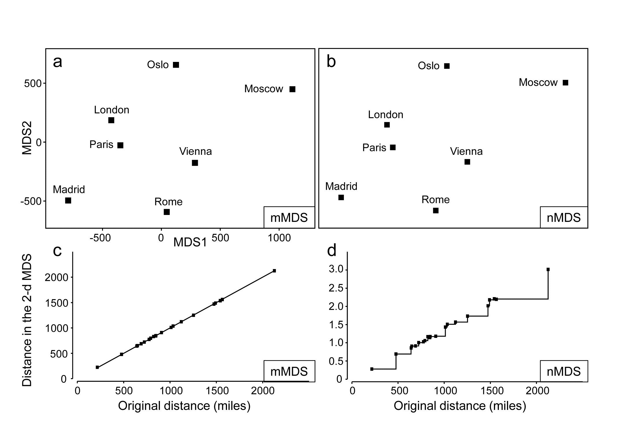
Fig. 5.10. World map {W}. For the distance matrix Table 5.2a & b from 7 ‘European’ cities: a&c) metric MDS and its associated Shepard plot; b&d) non-metric MDS and Shepard plot (stress = 0 in all cases)
Perhaps more striking is the equivalent nMDS, Fig. 5.10b, which is more or less identical. Though the Shepard diagram, Fig. 5.10d, is given in terms of distance in the ordination against the input resemblances (city distances), the monotonic regression fit ensures that all that matters to the stress (see equation 5.1) are the y axis values of ordination distances, and their departure from the fitted step function (also zero throughout). Points on the x axis could be stretched and squeezed differentially along its length, and the step function would stretch and squeeze with them, thus leaving the stress unchanged (zero, here). In other words, the only information used by the nMDS is the rank orders of city distances in Table 5.2b. And that is actually quite remarkable: a near-perfect map has been obtained solely from all possible statements of the form ‘Oslo is closer to Paris than Madrid is to Rome’. The general suitability of nMDS comes from the fact that it can accommodate not just very non-linear Shepard diagrams but, also, where a straight line is the best relationship (and there are more than a minimal number of relationships to work with) nMDS should find it: the points in Fig. 5.10d do effectively fall on a straight line through the origin. What the monotonic regression loses is the link to the original measurements: the y axis scale is in arbitrary standard deviation units, and nMDS plots have no axis scales that can be related to the original distances.
This example becomes more interesting still when we expand the data to 34 cities from all around the globe, again utilising the great-circle (‘direct flight’) inter-city distances from the same atlas source. Fig. 5.11a shows the nMDS solution in 3-d, and it is again near-perfect, with zero stress. There is one subtlety here that should not be missed: the supplied great-circle distances are not the same as the direct (‘through the earth’) distances between cities, represented in the nMDS plot, and the relationship between the two is not linear. This is clear from the Shepard diagram, Fig. 5.11d: nMDS is able to preserve the rank orders of great-circle distances perfectly in the final 3-d direct distances only if it can non-linearly transform the supplied distance scale, i.e. ‘squash up’ the larger distances, where the earth’s curvature matters more than for the smaller distances within a region. It has not been told how to do this, it does not use any form of parametric relationship to do it – it simply uses the flexibility of fitting an increasing step function to mould itself to a shape that will ‘square this particular circle’, and thus reduce the stress (to zero, here). In comparison, mMDS will also make a reasonable job of this ordination (the final plot is not very different than Fig 5.11a) but, because it must fit a straight line to the Shepard plot, the stress is not zero but 0.07.
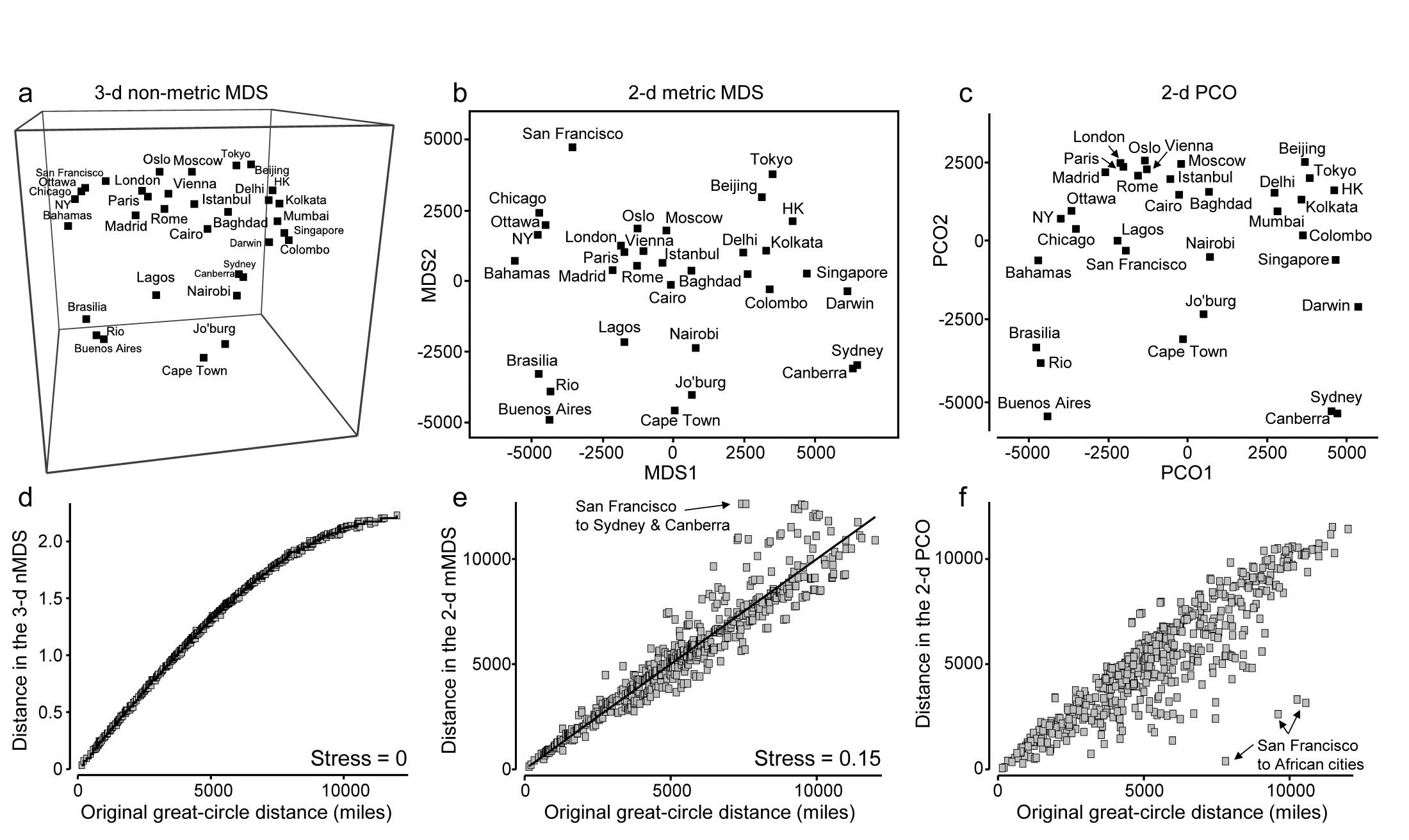
Fig. 5.11. World map {W}. a&d) 3-d non-metric MDS from great-circle distances between every pair of 34 world cities, and associated Shepard plot of (‘through the earth’) distances in the 3-d plot, y, against original great-circle distances, x (stress = 0); and for the same data: b&e) 2-d metric MDS and Shepard plot (stress = 0.15); c&f) 2-d PCO and Shepard plot (stress undefined for this technique, since not based on a modelled distance vs. resemblance relation, but the scatter is clearly greater for plot f than plot e).
In addition to turning ‘distance’ matrices into ‘maps’, the other crucial role for ordination methods is, of course, dimensionality-reduction. This can be well illustrated by seeking a 2-d MDS of the great-circle distances. Figs. 5.11b&e show the mMDS plot and associated Shepard diagram. The stress is, naturally, higher, at about 0.15. (The nMDS ‘map’, given by Clarke (1993) , looks very similar because the Shepard plot is close to linearity in this case, and has a slightly lower stress of 0.14). We previously categorised such stress values as ‘potentially useful but with detail not always accurate’, and this is an apt description of the 2-d approximation in plot b) to the true 3-d map of a). The placement within most regions (denoted by different symbols on the map) is accurate, as can be seen from the tight scatter in the Shepard plot for smaller distances, but the MDS has trouble placing cities like San Francisco – it cannot be put on the extreme left of the plot since that implies that the largest distances in the original matrix are from there to the far-eastern cities of Beijing, Tokyo, Sydney etc, which is clearly untrue. So the n/mMDS drags San Francisco towards those cities whilst keeping it away from eastern USA and Europe, which can only ever partly succeed – it is no surprise to observe therefore that the worst outliers on the Shepard plot involve San Francisco.
Nonetheless, the mMDS does give a reasonably fair 2-d map of the world and the advantage it can have over its natural competitor, Principal Co-ordinates (PCO) is well illustrated in the PCO ordination, Fig. 5.11c. PCO does its dimensionality reduction here by projecting from the 3-d space to the ‘best’ 2-d plane (‘squashing the earth flat’, in effect). San Francisco is now uncomfortably close to Lagos and the generally poor distance preservation is evident from a Shepard plot, Fig. 5.11f§, for which the most extreme outliers are, not surprisingly, between San Francisco and the African cities. In defence of PCO, it does not set out to preserve distances. Its strengths lie elsewhere, in attempting to partition meaningful structure, seen on the primary axes, from meaningless residual variability, which it assumes will appear on the higher axes and thus be ‘flattened’ by the projection. However, this example is a salutary one if the main motivation is to display all of the high-dimensional structure of a resemblance matrix in the best possible way in low-dimensional space.
mMDS for Amoco-Cadiz oil-spill data
Fig. 5.12a shows the result of metric MDS for the Morlaix macrofauna data of Figs. 5.8 and 5.9. Whilst the metric ordination plot shares the same features as its non-metric counterpart, the stress value is much higher (at 0.23). Fig. 5.12c shows why: the linear regression through the origin, the basis of mMDS, is a very poor fit. In spite of the way mMDS is seeking to force the Bray-Curtis dissimilarities to be interpreted exactly as distances, the data resolutely refuses to go along with this! It maintains its own linear relationship (not through the origin) as the solution which best minimises the overall stress; this explains the retention of a similar-looking ordination in spite of the high stress. But the conflict between the fitted model and the data carries a price: it does not result in an adequate 2-d representation. For example, it suggests that the apparent ‘recovery’ towards the pre-spill year is better than is justified by the similarities. Also the only significant advantage of a successful mMDS here, that the axis scales could then be read as Bray-Curtis dissimilarities, is entirely nullified. The ordination scale suggests that times G and O (the first week of August in 1978 and 1980) are separated by a distance (=dissimilarity) of nearly 70, yet the real value is around 50; this is a direct result of the way the points form a steeper gradient than the fitted line in Fig. 5.12c. What this figure strongly suggests, in fact, is that we can retain a linear relationship of distance with dissimilarity, using what we shall term a threshold metric MDS (tmMDS), by fitting a linear regression to the Shepard plot but with a non-zero intercept (this is an option in PRIMER7’s mMDS).
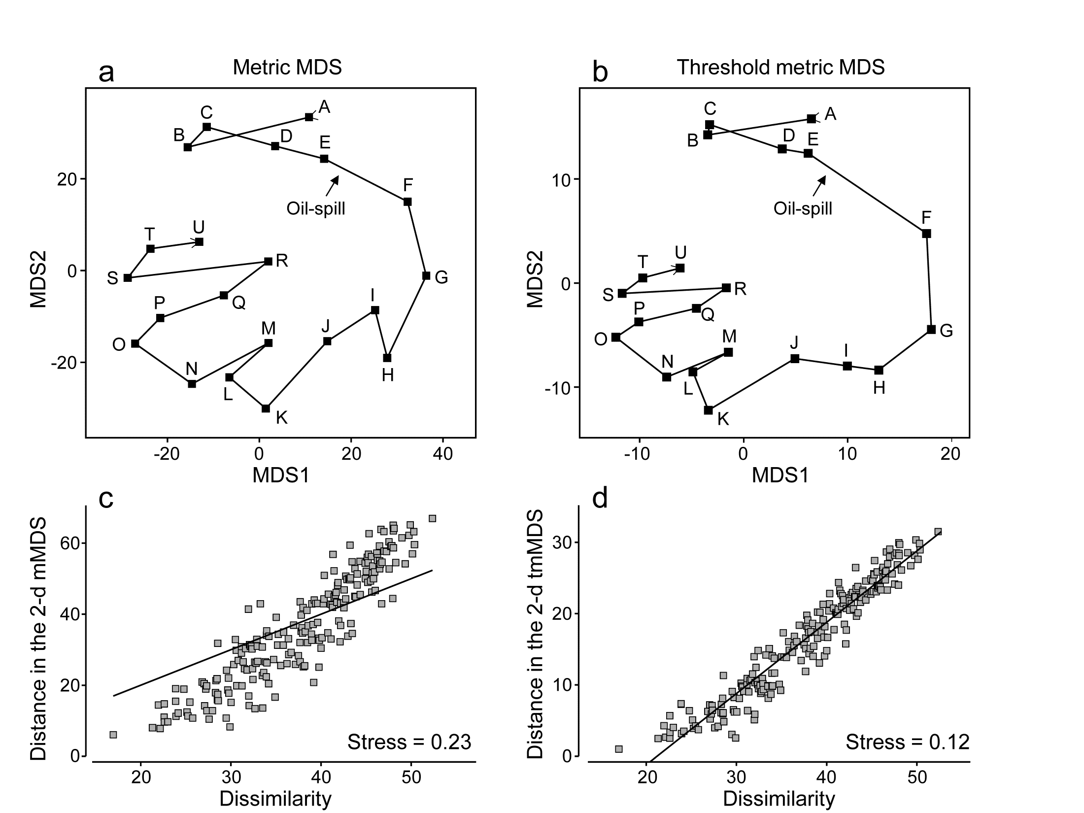
Fig. 5.12. Amoco-Cadiz oil-spill {A}. a&c) mMDS for 21 sampling times (data as Fig. 5.8) and Shepard plot (stress 0.23); b&d) threshold mMDS and Shepard plot (stress 0.12)
The resulting tmMDS and Shepard plot are shown in Fig. 5.12 b&d. The model is seen to fit very well and the stress greatly reduces, to a very acceptable 0.12, (not much higher than the vastly more flexible step function of nMDS, with stress 0.09). The resulting ordination is now virtually identical to the 2-d nMDS, Fig. 5.8a, and because the linear threshold model in Fig. 5.12d fits the dissimilarities so accurately and tightly, we are justified in interpreting the distance scales on the mMDS axes as dissimilarities, after one adjustment. Dissimilarities of about 20, the intercept on the x axis in the Shepard plot, are represented in the ordination by zero distance, i.e. the points for those samples would effectively coincide (samples B and C are a case in point, with dissimilarity of 17, the lowest in the matrix). Points G and O are now separated by about 30 units on the mMDS axes, so their dissimilarity is represented as being 20+30 = 50 (and their true dissimilarity is a slightly fortuitous 49.9!)
Reference was made earlier to the way PCO and PCA hope to display meaningful structure on the first few axes and remove smaller-scale sampling variation by projecting across the higher PCs. nMDS can achieve this in a different way, by compression of the scale of smaller dissimilarities, smoothly ‘tailing in’ samples below a certain dissimilarity to be represented by points closer together on the plot than could happen under standard mMDS, where the linearity demands that only points of zero dissimilarity are coincident. Threshold mMDS, using liner regression not through the origin, is thus a combination of metric and non-metric ideas: points below some fitted threshold of dissimilarity (20 here) are literally placed on top of each other, so what could be just sampling variation (e.g. among replicates at the same point in space or time or treatment combination) is eliminated in that way. Above the threshold, strict linearity is enforced, so such a threshold mMDS is not well-suited to many cases which have long baseline gradients of assemblage change (such as Fig. 5.2) where samples have few or no species in common and dissimilarities abut 100. Where the Shepard plot shows them to be accurate models, with low stress, mMDS and threshold mMDS bring the advantage of interpretable axis scales for the MDS plot; where they are less accurate, nMDS is usually much preferable.
Combined nMDS and mMDS ordinations
The combination of non-metric and metric concepts can be taken one logical step further‡, to tackle a problem raised on page 5.2, which can occur with nMDS, that of degenerate solutions with zero stress arising from the collapse of the ordination into two (or a small number of) groups, in cases where among- group dissimilarities are all uniformly larger than any within-group ones. The non-metric algorithm can then place such groups infinitely far apart (in effect) and the display of any real within-group structure is lost as they collapse to points. The problem does not arise at all for standard mMDS (or PCO/PCA) since positioning of the most distant samples is constrained by the simple linear relation with smaller distances.
In cases of collapse where there are very few points in the ordination in the first place, an mMDS solution is an obvious place to start. In an extreme case, e.g. when ordinating only 3 points, nMDS will not run at all (the only data available to it are the three ranks 1, 2, 3!). Such cases are not pathological – they arise very naturally when looking at the equivalent of ‘means plots’ for multivariate analyses. Just as in univariate analyses, where an ANOVA is followed by plots of the means, e.g. ‘main effects’ of a factor, so in multivariate analysis, ANOSIM or PERMANOVA tests are followed by ordinations of the averages or centroids of the factor levels, to interpret the relationships among groups that have been demonstrated by tests at the replicate level. Such plots can sometimes have very few points and mMDS can then provide an effective, low stress, solution to displaying them.
However, for less trivial numbers of points, and in the common cases where Shepard plots are non-linear and the flexibility of nMDS is required, an effective solution to ‘collapsing plots’ is to combine mMDS and nMDS stress functions over all dissimilarities, in mixing proportions of (say) 0.05 and 0.95.
† PRIMER v7 also offers a dynamic display of the ‘evolution’ of a community in 3-d MDS space, typically over a time course. This is unnecessary for Fig 5.9b because there are only 21 points and they do not tread similar paths at later times, but the continued study of the macrobenthos at station ‘Pierre Noire’ in Morlaix Bay over three decades has given rise to a data set of nearly 200 time steps and a complex, multi-layered 3-d plot; it is then fascinating to watch the evolving trajectory of newer samples over the fading background of older community samples, and thus to set the potential oil-spill effects in the context of longer-term inter-annual patterns.
¶ Such examples are very useful in explaining the purpose and interpretation of ordinations to the non-specialist and are quite commonly found (e.g. Everitt (1978) starts from a road distance matrix for UK cities; Clarke (1993) uses the example in this chapter of great-circle distances between world cities, taken from the Reader’s Digest Great World Atlas of 1962).
§ Note that, though a Shepard diagram is not normally produced by a PCO, it can be created in PRIMER7 (with PERMANOVA+) by saving the 2-d PCO co-ordinates to a worksheet, calculating the Euclidean distances, using Unravel to generate a single y axis column, and likewise for the original distances (x), and running a Scatter Plot of y on x. Note also that PCO looks close to being PCA here, but is not – great-circle distances are not Euclidean.
‡ Though not implemented in the same way as in the PRIMER7 ‘Fix Collapse’ option, and with different motivation, the hybrid scaling (HS) technique of Faith, Minchin & Belbin (1987) , and the semi-strong hybrid scaling (SHS) of Belbin (1991) , introduced this combination idea into ecology in the PATN software. Briefly, using the original Kruskal, Young and Seer software (KYST), which allows combined stress function optimisation, HS mixes mMDS for all dissimilarities below a specified value with nMDS on the full set of dissimilarities. SHS also uses mMDS below a specified value but mixes that with nMDS above that value (and also substitutes Guttman’s algorithm for Kruskal’s). The primary motivation is in reconstruction of ecological gradients driven environmentally on a transect or grid and the methods do not appear to be optimal for a ‘collapsing MDS’ problem, since neither applies a direct constraint to dissimilarities greater than the threshold. (E.g. they would not stop the collapse for two well-separated groups whose between-group dissimilarities all exceeded that threshold.) The approach of this section achieves this by the common metric scale imposed (very mildly) on the largest distances by smaller ones.
5.9 Example: Okura estuary macrofauna
Anderson, Ford, Feary et al. (2004) describe macrofauna samples from the Okura estuary {O}, on the northern fringes of urban Auckland, NZ, taken inter-tidally at 2 times in each of 3 seasons under 3 sedimentary regimes (High, Medium and Low sedimentation levels), each regime represented by 5 sites, with 6 cores taken per site at each time. Taking averages¶ of log(x+1) transformed abundances over the sets of 30 site $\times$ replicate samples gives a very robust estimate of the community structure at each of the 18 time $\times$ sedimentation levels. However, calculating Bray-Curtis similarities then leads to the collapsed nMDS plot of Fig. 5.13a, since all dissimilarities between the highest and lower sedimentation levels (H compared with L and M) are greater than 40 and those within either of these two groups are all less than 30. The two sub-plots can be extracted, as shown in insets to Fig. 5.13a (simply achieved in PRIMER by drawing a box round each collapsed point and taking the ‘MDS subset’ routine), but it is more instructive to retain these averages on the same ordination. Just a small amount of metric stress here (5%, though the solution is robust to a wide range of values for the mixing proportion) is enough to calibrate the relative dissimilarities between the two sedimentation regimes (H and L/M) to those within them, Fig. 5.13b. The Shepard plots (c and d) show the contrast between a solution which is degenerate and a valid nMDS ordination: the disjunction in dissimilarities which forced the original collapse is very clear in both plots. As emphasised by Anderson, Gorley & Clarke (2008) ) the advantage of the single ordination is seen in the way the seasonal ordering (1=winter/spring, 2=spring/summer, 3=late summer) is matched, across the (large) sedimentation divide.
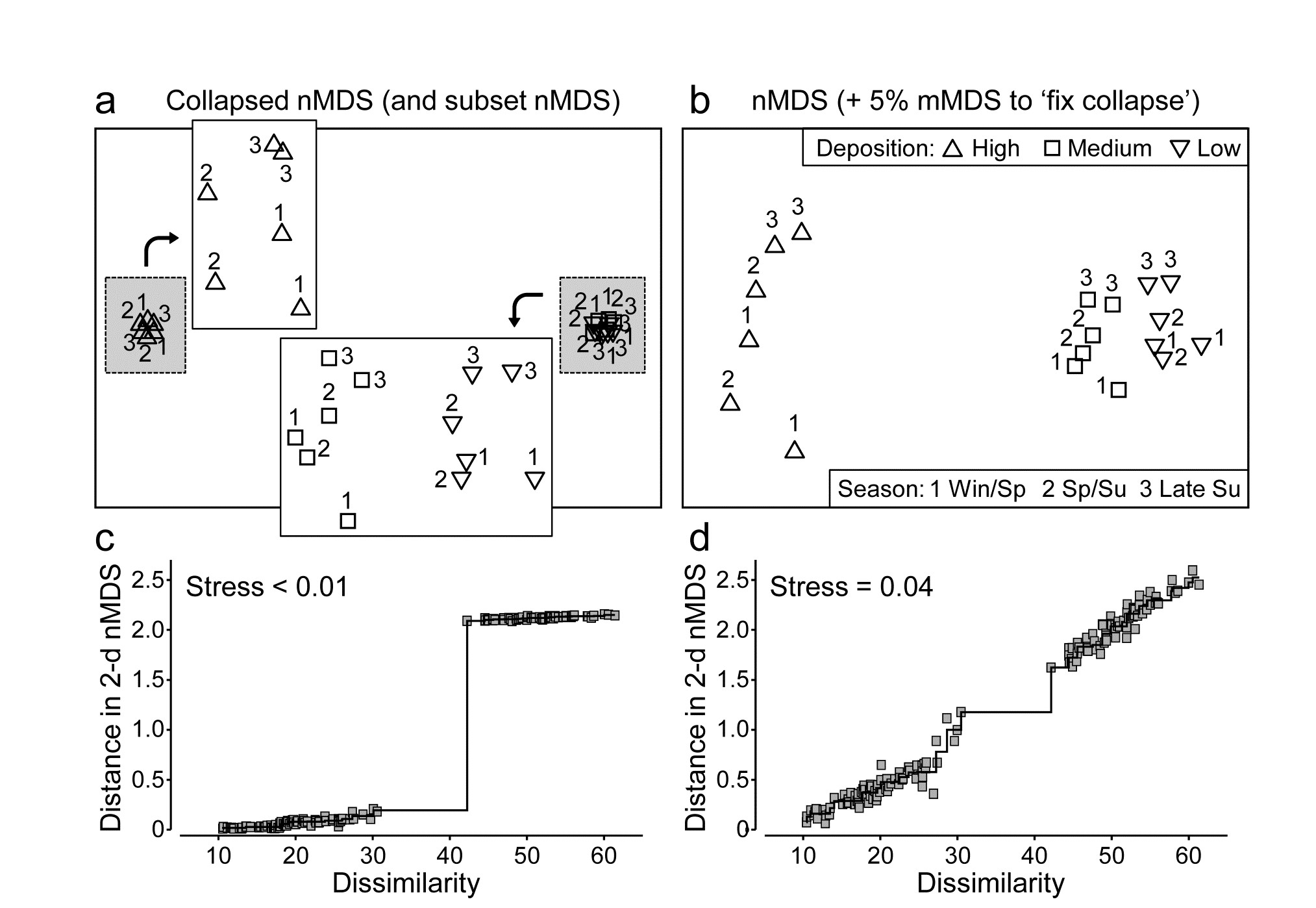
Fig. 5.13. Okura macrofauna {O}. a&c) Collapsed nMDS and associated Shepard plot from Bray-Curtis similarities on averages over 30 samples of log transformed abundances of 73 taxa, for 2 times in each season (1-3: Winter-Spring, Spring-Summer and Late Summer) and 3 levels of sedimentation (High, Medium, Low). Stress$\rightarrow 0$ for collapsed nMDS; subset nMDS plots for H and L/M separately (insets in a) have stress = 0.04, 0.07.
b&d) nMDS for Fix Collapse option (stress defined as mix 0.95$\times$nMDS + 0.05$\times$mMDS), and the Shepard plot for that nMDS, with stress 0.04.
Combining data sets
Another context in which we might want to combine MDS solutions into a single ordination, which optimises their combined stress function, arises when there is no clear way of merging two data sets with exactly the same sample labels (same times, sites, treatments etc) but of very different type. For example, in rocky shores, counts might be made of motile species but area cover of sessile or colonial organisms, and it may be hard to reconcile those two types of measurement in a single array. The classic solution to mixed measurement scales is to normalise variables but this gives each species an equal contribution in defining resemblance, irrespective of their total counts or area cover, and this may be very undesirable (it can add a great deal of ‘noise’ from rare species); it is much better to keep the natural internal weightings for each species. Perhaps the best solution is to convert both matrices onto a common scale (such as biomass or ‘equivalent area cover’) and merge them into a single array, but an alternative worth considering is to run a combined nMDS (an option under PRIMER7) which fits separate Shepard plots for each matrix to common ordination co-ordinates, minimising the average of the two stress values. The result is an equal mix of the two sets of information on sample relationships.
Note that it is inevitable that the resulting stress value will be higher than for either of the separate nMDS ordinations, since it must represent a compromise of two potentially conflicting sets of relationships; it can only come close to the stress in the separate plots if they have effectively identical patterns. (The same is not true of merging the two matrices into a single array, of course, because there the compromise is effected in the calculation of the resemblances).
An example of where a merged matrix is usually not possible but a combined nMDS is a viable solution is where the matrices to combine require very different dissimilarity measures, such as for assemblage counts (e.g. Bray-Curtis) and environmental variables which may be driving those counts (e.g. Euclidean distance). Arguably, there are few convincing examples of why a compromise MDS is a desirable output here (rather than adopting the approach in Chapter 11 that we let the two components ‘speak for themselves’ and then seek variables, or sets of variables, which ‘explain’ the biotic patterns) but an example is given below of the result of a combined MDS, were it to be needed.
¶ This example is taken from the PERMANOVA+ manual, Anderson, Gorley & Clarke (2008) . There, the ‘averages’ are the (theoretically more correct) centroids in the high-dimensional ‘Bray-Curtis space’ from the full 540 samples, i.e. averaging is performed after similarity calculation not before. Whilst data averages are not the same as centroids from dissimilarity space (e.g. an averaged assemblage may not be ‘central’ to individual samples, since it will usually have higher species richness), it is commonly found that the relationship amongst averages can be very similar to the relationship amongst centroids, as is seen here when comparing Fig. 5.13a with the PCO of Fig. 3.13 in Anderson, Gorley & Clarke (2008) .
5.10 Example: Messolongi lagoon diatoms
Danielidis (1991) sampled 17 lagoons in E Central Greece for diatom communities (193 species), and also recorded a suite of 12 water-column variables: temperature, salinity, DO$_2$, pH, PO$_4$, total P, NH$_3$, NO$_2$, NO$_3$, inorganic N and SiO$_2$. After global square root transformations and Bray-Curtis dissimilarities are calculated on the species densities, and selective log transforms (of the nutrients) and Euclidean distances are calculated on the environmental variables, Fig. 5.14a&b display the resulting separate nMDS ordinations. In this case, there is a remarkable degree of uniformity in the way these two independent sets of variables describe the sample patterns, suggesting that the structuring environmental variables for these communities have been correctly identified (and this idea leads into the BEST technique in Chapter 11 for further refinement of ‘structuring variable’ selection). A combined nMDS of the two resemblance matrices is given in Fig. 5.14c. The 2-d stress of 0.13, c.f. 0.09 and 0.08 for the separate biotic and abiotic plots, shows that one must expect an increased stress even when agreement is very good.
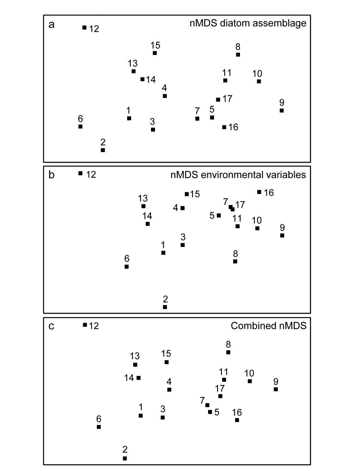
Fig. 5.14. Messolongi diatoms {m}. nMDS plots for17 lagoon sites based on: a) 193 species (from Bray-Curtis dissimilarities), b) 12 water-column variables (normalised Euclidean distances), c) combined nMDS, the configuration simultaneously minimising average stress from the biotic and abiotic Shepard diagrams. Stress: a) 0.09, b) 0.08, c) 0.13.
5.11 Recommendations
- Non-metric MDS can be recommended as the best general ordination technique available (e.g.
Everitt (1978)
). Important early studies comparing ordination methods for community data gave nMDS a high rating (e.g.
Kenkel & Orloci (1986)
) and improvements in computing power since those early studies have made it even more attractive. In comparison with (even) older techniques such as PCA, nMDS has a number of practical advantages stemming from its flexibility and lack of assumptions.
- When the inter-sample relationships are relatively simple, e.g. there are some strong clusters or strong gradient of change across all samples, several ordination methods will perform adequately and give comparable pictures. The main advantage of nMDS is its greater ability, by comparison with projection-based methods such as PCA or PCO to better represent relations accurately in low-dimensional space. It outcompetes its metric form, mMDS, and also PCO, especially in cases where biological coefficients such as Bray-Curtis are used and there is a strong turnover of species across the sites, times, treatments etc, such that a fair number of samples have few or no species in common. Then, the dissimilarity scale becomes strongly compressed in the region of 100% (with many values at 100, perhaps, as can be seen for the Exe Shepard plot in Fig. 5.2) and the ability of the monotonic regression to expand this tight range of dissimilarities to wider-spaced distances is the key to a successful ordination. In contrast, where the Shepard diagram is fairly linear through the origin, nMDS, mMDS and PCO will often produce similar ordinations.
- If the stress is low (say <0.1), an MDS ordination is generally a more useful representation than a cluster analysis: when the samples are strongly grouped the MDS will reveal this anyway, and when there is a more gradual continuum of change, or some interest in the placement of major groups with respect to each other, MDS will display this in a way that a cluster analysis is quite incapable of doing. For higher values of stress, the techniques should be thought of as complementary to each other; neither may present the full picture so the recommendation is to perform both and view them in combination. This may make it clear which points on the MDS are problematic to position (examining some of the local minimum solutions can help here¶, as can animation of the iterative procedure), and an ordination in a higher dimension may prove more consistent with the cluster groupings. Conversely, the MDS plots may make it clear that some groups in the cluster analysis are arbitrary subdivisions of a natural continuum.
¶ For example, run the PRIMER MDS routine several times, with a single random starting position on each occasion, and examine the plots that give a higher stress than the ‘optimal’ one found. In PRIMER7, run the MDS animation for a number of restarts. Also, outliers on the Shepard diagram can be identified by clicking on the appropriate point on the plot.