Chapter 7: Species analyses
- 7.1 Species clustering
- 7.2 Type 2 and type 3 SIMPROF tests
- 7.3 Example: Amoco-Cadiz oil spill
- 7.4 Shade plots
- 7.5 Example: Bristol Channel zooplankton
- 7.6 Example: Garroch Head macrofauna
- 7.7 Example: Ekofisk oil-field macrofauna
- 7.8 Species contributions to sample (dis)similarities – SIMPER
- 7.9 Example: Tasmanian meiofauna
- 7.10 Bubble plots (plus examples)
7.1 Species clustering
Chapter 2 (page 2.4) describes how the original data matrix can be used to define similarities between every pair of species; two species are positively associated (i.e. ‘similar’) if their numbers or biomass or cover etc tend to fluctuate in proportion across samples. They are negatively associated (i.e. ‘dissimilar’) if species have opposite patterns of abundance over samples, with the maximum dissimilarity of 100 occurring if two species are never found in the same samples. Clearly, differences in total abundance of species across samples are of no relevance to association – some species (perhaps with much smaller body size) inevitably have higher counts than others, but can still be perfectly associated with them – so some means of ‘relativising’ species is essential. Pearson correlation does this by dividing by standard deviations and non-parametric correlation by converting to ranks but both are poor measures of species association because of the ‘joint absence’ issue: two species are not similar because neither appear at a particular site or time, yet correlation will make them so. In contrast, standardising species across samples (dividing by their total and multiplying by 100, making species add to 100), followed by Bray-Curtis similarity on pairs of species is not a function of joint absences and takes values over a scale of 0 (perfect ‘negative’ association) to 100 (perfect positive association). It is helpful here to retain the idea of ‘negative’ and ‘positive’ relations even though the index is always in the range (0,100). This combination of species-standardising and Bray-Curtis is more succinctly referred to as Whittaker’s index of association ( Whittaker (1952) ), e.g. of species 1 and 2:
$$ IA = 100 \left[ 1 - \frac{1}{2} \sum_ {j=1} ^n \left|\frac{y_{1j}}{\sum_ {k=1} ^n y _ {1k} } - \frac{y _ {2j}}{\sum_ {k=1} ^n y _ {2k} }\right| \right] \tag{7.1} $$
where $y_{ij}$ is the abundance of the ith species (i=1,.., p) in the jth sample (j=1,.., n).
The species similarity matrix which results can be input to a cluster analysis or ordination in exactly the same way as for sample similarities. This is referred to historically (e.g. see
Field, Clarke & Warwick (1982)
) as inverse or r-mode analysis. However, an ordination is rarely a good idea except in special circumstances with small numbers of species, all of which are well-represented. More typically, there are many species found in small numbers rather randomly across the set of samples, and these have associations to each other which are wildly varying, between 0 (if their few individuals are from different samples) and close to 100 (e.g. if their individuals happen to occur in the same one or two samples). Minor species such as this have very little influence on a samples analysis because their effect on the Bray-Curtis similarities are generally small, but they can provide a large amount of ‘noise’ in a species ordination, resulting in very high stress, and therefore unhelpful displays. An important initial step in most species analyses is therefore to eliminate the ‘rare’ species, e.g. selecting only species which are ‘important somewhere’ in the sense that they account for more than a threshold q% (perhaps q = 1% to 5%) of the total abundance in one or more samples, or by adjusting that percentage to reduce the matrix to a specified number of species n, or by retaining only species which are seen in at least n samples.
Example: Exe estuary nematodes
Fig. 7.1 displays the results of a cluster analysis on the Exe estuary nematode data {X} first seen in Chapter 5, in which 19 intertidal sites with differing environments were sampled bimonthly over a year and time-averaged to give a matrix of 19 samples $\times$ 174 species. Initial species reduction retained only those accounting for ≥5% of the total (averaged) abundance at one or more of the sites, and the index of association was calculated among those 52 species, followed by standard agglomerative hierarchical clustering. From the range of y axis values it is clear that some species are highly positively associated, and other species subsets are negatively associated, apparently found at quite different sites (from the zero associations) but this immediately raises the question as to how much of this clustering structure we are entitled to interpret. The solution to that will be an extension to the SIMPROF procedure first met in Chapter 3 (page 3.5), but this time applied to species rather than sample groupings.
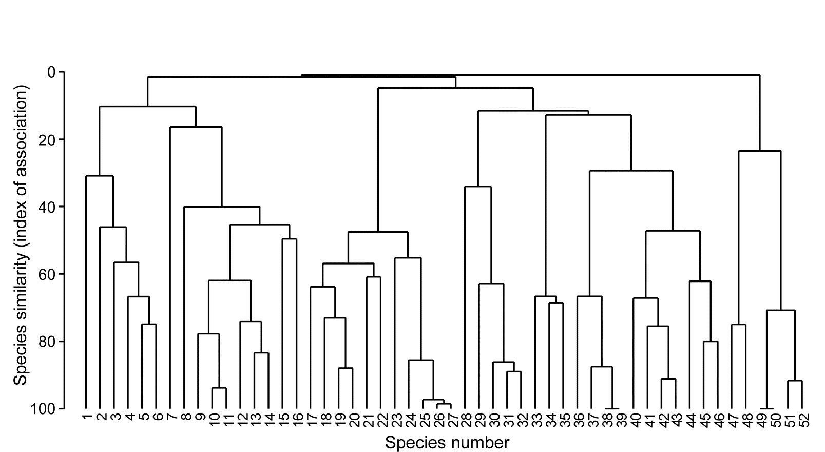
Fig. 7.1. Exe estuary nematodes {X}. Dendrogram using group average linking on species similarities defined by the index of association (i.e. Bray-Curtis on species-standardised but otherwise untransformed abundance for pairs of species compared across the 19 sites). Analysis is only for the species accounting for ≥5% of the total abundance at one or more of the sites (the 52 species numbers are defined later, in Fig. 7.7).
7.2 Type 2 and type 3 SIMPROF tests
Somerfield & Clarke (2013) describe in full detail a range of useful SIMPROF tests, which they classify as Types 1, 2 and 3. Type 1 SIMPROF has already been seen in Chapter 3 (page 3.5) and is concerned with testing hypotheses, in subsets of the samples, about whether the similarities among those samples show any departure from homogeneity: if all samples appear equally similar to each other, within the bounds of random chance, then there is no basis for further exploration of structure within that subset.
The left-hand side of the schematic below (Fig. 7.2) repeats the steps seen in Chapter 3: the test statistic $\pi$ is the departure of the real similarity profile for that subset (i.e. the ordered set of similarities plotted from smallest to largest) from the average profile expected under the null hypothesis of absence of structure in those samples. Construction of this average (and the variation to be expected about it, under the null) uses permutations of species values over the samples. This Type 1 test is repeated many times for different subsets of samples, e.g. at all nodes of an agglomerative or divisive dendrogram from hierarchical clustering (or even for the groups from the non-hierarchical k-R clustering), seen in Chapter 3 (and 11).
The right-hand side of Fig. 7.2 is concerned with similarities (associations) computed among species, over the full set of samples. Type 2 SIMPROF (top right) tests the hypothesis that no associations of any sort are detectable among all the (retained) species. The test statistic $\pi$ is constructed in exactly the same way, by ordering all the species associations, from smallest to largest to produce a similarity profile, compared against profiles generated under the null hypothesis, by again independently permuting the values for each species across all samples. Clearly such permutations must break down any possible associations of species but, as with all permutation tests, have the immense advantage of retaining exactly the same set of counts (/biomass/cover etc) for each species, so the process is entirely free of any distributional assumptions.
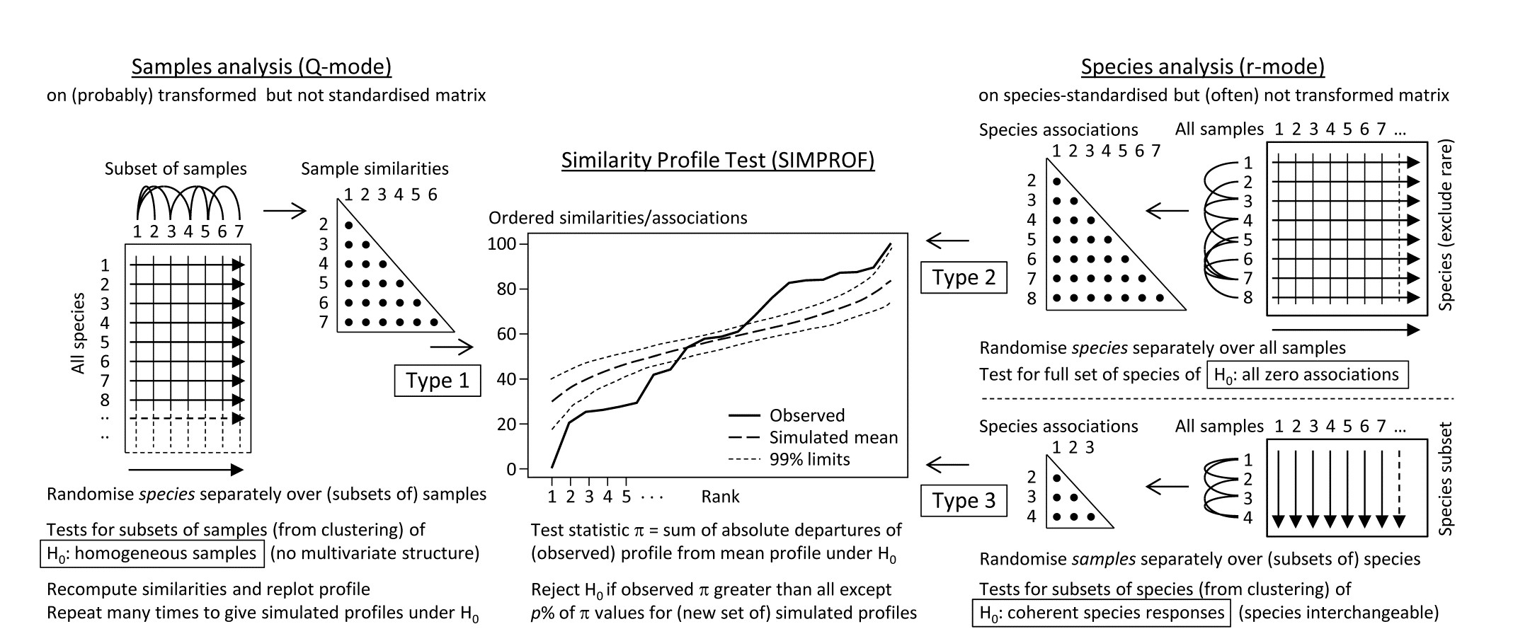
Fig. 7.2. Schematic of the three types of SIMPROF test. Type 1 tests samples (covered earlier) and 2 & 3 test species. Type 2 is a global test of the null hypothesis ($H_0$) of no associations among all species, thus typically carried out only once. Type 3 (as with Type 1) is performed repeatedly in conjunction with some form of cluster analysis (agglomerative, divisive or the non-hierarchical k-R clustering, as in Chapter 3 but applied to the species, not sample similarities) on subdivisions of the species list, to test the null hypothesis of uniformity of species similarities within that sublist. These are best defined by the ‘index of association’. To apply to environmental-type variables (i.e. non-commonly scaled and/or without the need to capture a presence-absence structure, though they may still be biotic), use Pearson or rank correlation for variable similarities. In order for the permutation process to work correctly for Type 3 tests, prior normalisation or ranking is essential (even though these coefficients include a normalisation or ranking step), for the same reason that species standardisation is necessary before employing the index of association (though it includes such standardisation).
Type 2 SIMPROF is therefore designed mainly to be used as a single test, permitting or barring the road to further examination of particular groups of species associations. If the null hypothesis is not rejected, there is no case at all for interpreting a dendrogram such as Fig. 7.1 – we would have no evidence that there were any associations (positive or negative) to interpret. Once we have rejected this specific null for the whole set of species, however, there is no logic in testing it again for a subgroup of those species. What is needed then are tests of a different null hypothesis, that the associations within a subset of species are not distinguishable, i.e. that the species are coherent in their patterns of abundance across the full sample set. In other words, clusters seen in the dendrogram of Fig. 7.1, for example, can be identified statistically as differing in their mutual associations from a wider group of which they are part, but not differentiated internally. This requires a series of Type 3 SIMPROF tests, each as shown in the bottom right of Fig. 7.2, which requires an orthogonal permutation scheme, namely across the subset of species (the species are interchangeable under the null), independently for each sample. Type 3 tests are therefore the natural analogue for species dendrograms of the sequence of Type 1 SIMPROF tests used for sample dendrograms.
Species associations for Exe estuary nematodes
Returning to the Type 2 SIMPROF test, and carrying this out for the Exe estuary nematode data of Fig. 7.1, gives the similarity (association) profile in the main plot of Fig. 7.3, which is seen to differ from profiles under the null both in respect of having many more similarities which are larger (‘positive’ associations) and smaller (‘negative’ associations) than expected. That this is statistically significant, at any probability level we care to nominate, is clear from the histogram of $\pi$ values under the null, in relation to the observed $\pi$ (Fig. 7.3 inset). Note that there are a large number of zero values (fully ‘negative’ associations) in the real profile, but also in all the permuted cases. This is typical of many community matrices: species which occur only in one or two samples are almost certain to be deemed totally dissimilar to other equally sparse species. The difference here is that we have removed many of the sparse species and the real profile is seen to ‘hug the x axis’ longer – it has more species pairs only ever found in different locations than would be expected by chance, as can be seen from Fig. 7.1.
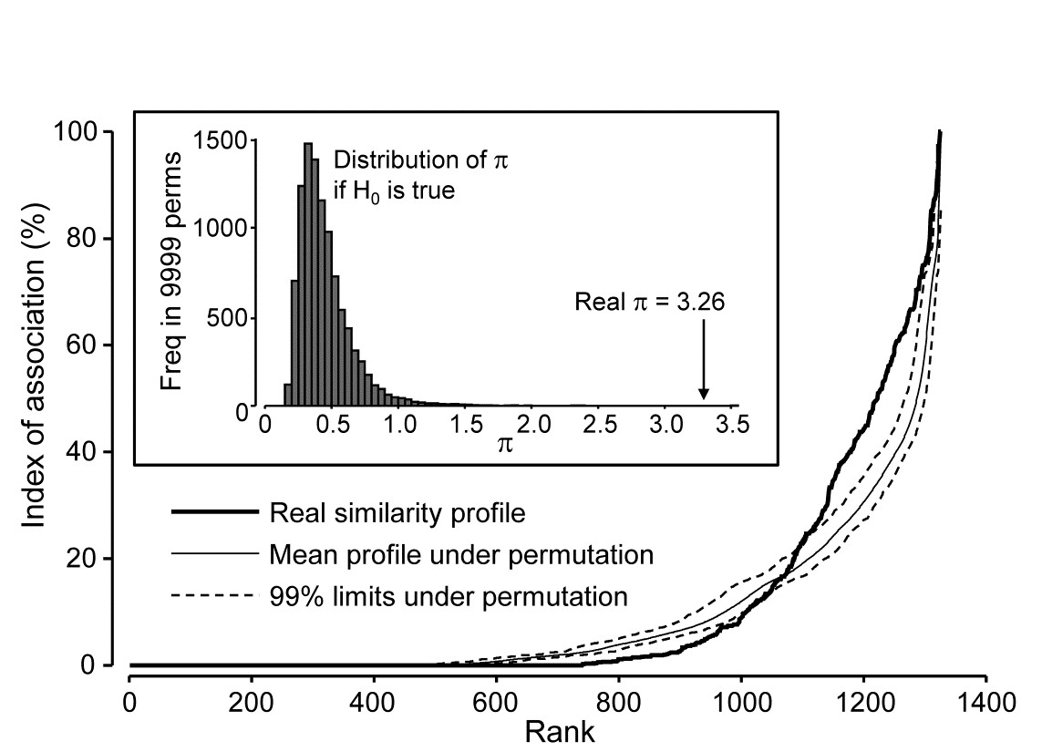
Fig. 7.3. Exe estuary nematodes {X}. Similarity profile (bold line) for a Type 2 SIMPROF test of the null hypothesis of no genuine associations among any of the 52 species making up the dendrogram of Fig. 7.1, consisting of the (52$\times$51)/2 = 1326 indices of association measures computed there, ordered (y axis) and plotted against their ranks (x axis). Also shown, for each value of x, is the mean index (continuous line) from 9999 permutations of the data matrix (under the null hypothesis), and the range (dotted line) in which 99% of the permuted index values lie. Inset: distribution of the distance $\pi$ of (a further) 9999 permuted profiles from the mean profile, in comparison with $\pi$ for the real profile (seen not to come from the null, establishing the existence of species associations).
Type 2 tests can also have a role in testing whether a set of environmental variables may be considered as mutually uncorrelated with each other. The variable ‘similarities’ are then defined as standard Pearson or rank-based Spearman correlations. One might even consider testing a priori designated pairs of variables for evidence of correlation by such a Type 2 permutation method, and this then becomes a distribution-free alternative to Fisher’s z score (or tabulations) for computing significance levels¶. However, systematic testing of large numbers of pairs of variables in this way is probably best avoided: not only is there the problem of repeated testing but also the tests themselves will be highly dependent. This is a familiar theme: the statistics (matrix of correlations) can be extremely useful for interpretation, and the global test (Type 2 SIMPROF) of whether there are any correlations to interpret are key, but the p values for individual correlations must be treated cautiously.
Coherent species curves by Type 3 SIMPROF tests
The procedure is well illustrated by reference to Fig. 7.1, for the reduced set of 52 nematode species from the 19 Exe estuary sites. As we work down from the top of the dendrogram, highly heterogeneous groups (in terms of mixing very low and high associations) gradually give way to sub-groups in which all species are positively associated, though they may not yet be uniformly so, within each subgroup. At one node on each branch the remaining species become totally interchangeable, in the sense that permuting their abundances over that group of species, separately for each sample†, results in more or less the same set of associations: there is no longer significant evidence for any heterogeneity. The non-differentiated species are described as coherent, and no structure is examined below that node. This point may come at quite different similarity levels on each branch – one group might consist of more loosely associated species than another – that is the nature of an exchangeability test. But there is no denying that the results of such a set of Type 3 SIMPROF tests can be profoundly helpful in a key step that has been missing in the exposition so far, namely how to interpret sample patterns in terms of the species that constitute these samples.
To achieve this it is not enough to know how species are grouped; we also need to relate their (common) patterns of abundance to the samples. Here, samples are ordered in keeping with the dendrogram and MDS ordination of samples seen in Chapter 5. The standardised species counts (each species adds to 100 over the 19 sites) are plotted as simple line plots, Fig. 7.4, grouped into the sets identified as internally coherent and externally distinguishable, by the Type 3 tests. These are referred to as coherent species curves, and it is instantly clear that, in this case, the clear clusters seen, for example, in the sample MDS plot (Fig. 5.5) result from a high degree of species turnover among groups of sites, with many of the groups having rather few species in common (or occasionally, none at all).

Fig. 7.4. Exe estuary nematodes {X}. ‘Coherent species curves’, namely groups (A-H) of line plots of relative species abundances, each species standardised (but otherwise untransformed) to total 100% across all 19 sites, and plotted against an arrangement of sites which preserves the sample clustering structure seen in Fig. 5.4. The species groups are identified by a series of SIMPROF (Type 3) tests at the 5% level, on the nodes of the dendrogram of Fig. 7.1, following each branch down from the top until the null hypothesis of coherence (that species below a node are indistinguishable in their associations) cannot be rejected. The later Fig. 7.7 ‘shade plot’ relates these species numbers to respective names, in its redisplay of the dendrogram, with SIMPROF groups identified. Note that groups D and E are plotted together here; they are separated at a higher level of association than found elsewhere and would not have been so by tests with more stringent p values.
Some discussion of the species involved and how the pattern relates to measured environmental differences can be found in Somerfield & Clarke (2013) but, on the methodological front, note that the use of Type 3 SIMPROF tests at a particular significance level is not often a really critical step, as was remarked for the Type 1 tests on page 3.5. E.g. for the data of Fig. 7.4, the same groups are found for tests at the 1% level as at the 5% level. At 0.5%, two group mergers take place: D & E (which are similar and displayed in the same line plot above), and F & G, which fairly reflects the loose grouping of sites 12-19 in the MDS of Fig. 5.5. Pragmatically, the advice is to repeat the tests at three levels and report any minor differences.
¶ For just two variables, the similarity profile reduces to a point but – unlike Type 3 (and Type 1) SIMPROF tests for which all permutations then give a value which is no different than the real one and thus a test is impossible – here the different permutation direction, of the two variables across the full set of samples, gives a full null distribution for this point. In fact the test statistic, $\pi$, is more or less just the absolute value of the correlation coefficient (at least with enough permutations to ensure that the permuted ‘mean profile’ is effectively a point at zero, as it will theoretically be). Another corollary of the permutation direction in Type 2 tests (across samples for each variable) is that there is actually now no need to ‘relativise’ the variables in advance, e.g. by normalising environmental variables or standardising the counts for species, since both correlation and association coefficients include this step internally. However, it is still wise to get into the habit of ‘relativising’ routinely for variable analyses, because it is crucial for Type 3 tests, which otherwise would be meaningless.
† With reference to the previous footnote, it becomes clear at this point exactly why it is necessary to standardise all species across samples before applying the Type 3 SIMPROF permutations: if species have different total abundances then values for a single sample are not meaningfully exchangeable across species, however tightly the patterns of increasing and decreasing abundances over samples may match. The point is obvious for environmental-type variables also, where the permutations might exchange, for example, temperature, salinity and dissolved oxygen values. This could only make sense for normalised variables.
7.3 Example: Amoco-Cadiz oil spill
A second example of deriving sets of coherent species curves, this time temporal rather than spatial, is for the benthic macrofauna sampled at one site in the Bay of Morlaix, on 21 occasions over 5 years, spanning the period of the Amoco-Cadiz oil tanker spill, for which the samples MDS and clustering were in Fig. 5.8, {A}. This is a more challenging example because many of the same species are present throughout the period, so Type 3 SIMPROF groups will not identify subsets of species which are exclusively found only in different groups of samples. In fact, Type 2 SIMPROF (see the plot in Somerfield & Clarke (2013) gives very little, if any, evidence of an excess of negative associations: species do not appear to be ‘excluding’ other species (by competitive interactions or by independent but opposite responses to seasonal or other environmental changes), on any substantial scale at least. Again 52 species, coincidentally, were retained from the large original set of 251, these being all the species which accounted for at least 0.5% of the total abundance at one or more of the 21 sampling times.
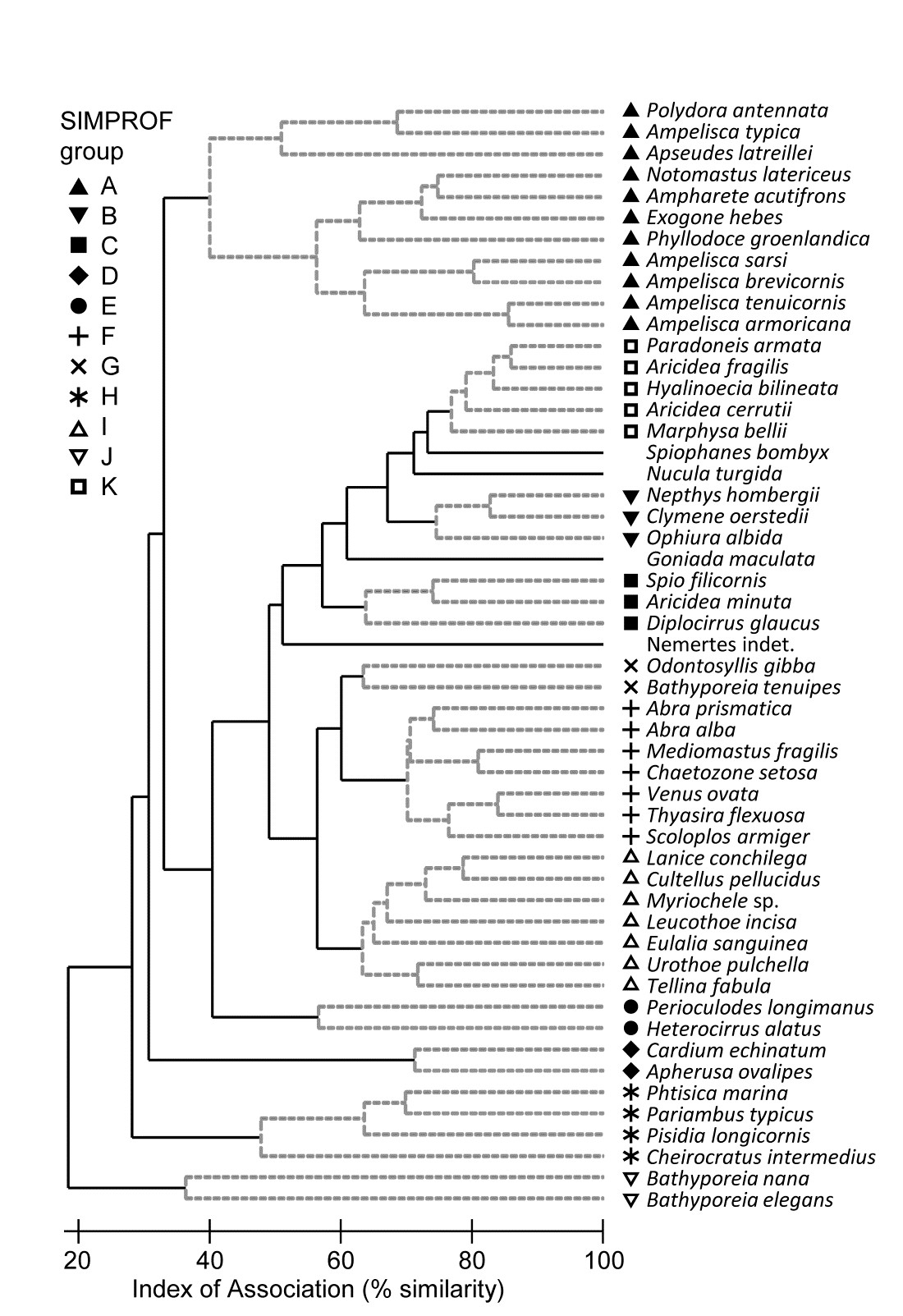
Fig. 7.5. Amoco-Cadiz oil spill {A}. Dendrogram (agglomerative, group average linked) from an index of association matrix among 52 macrofaunal species, each of which accounts for at least 0.5% of the total abundance at one or more of the 21 sampling times. Grey dashed lines and differing symbols denote the 11 ‘coherent groups’ (A-K) containing more than one species, from 5% level Type 3 SIMPROF tests. There are a further four singleton groups, similar to B, C and K, not displayed in the subsequent line plots.
Fig 7.5 shows the species cluster analysis, based on the index of association computed on untransformed species counts, standardised to total 100 over the times. Type 3 SIMPROF tests yield 15 distinct species groups (A-K), and standardised counts for 11 of them appear as component line plots in Fig. 7.6. These demonstrate a wealth of fascinating biological information on the coherent responses of groups of species, seasonally and in response to the oil spill year and potential recovery over the next three years. The groups are arranged in approximate order A-J of a move of peak abundance towards the later times, with species in K showing consistent abundances (they are always present) and little convincing evidence of temporal patterns at all. The large A group, which contains a number of Ampelisca species found in high densities prior to the oil spill is characterised by virtual non-recruitment in the spill year and then a gradual recovery of its seasonal cycle, though not generally to the same peaks by the 5th year. Group B has something of the same pattern though with an apparently fuller recovery. Groups D and E appear to show an opportunist response to the spill, with peak numbers in the year immediately following, whereas F species are of consistently low abundance pre-spill but this starts to rise a year or so later, peak and then fall away in the 5th year; it is a group without a very clear seasonal pattern. Group I has a similar structure but the rise is more delayed still, and the seasonal pattern perhaps more evident; the latter is more marked still in H, and so on. Of course, some of these temporal patterns may simply be the result of natural inter-annual variability driven by a range of environmental factors and, without a spatio-temporal control/reference structure, inference about the causes for any particular patterns has to be suitably guarded. But what is unarguable is that the Type 3 SIMPROF technique has pulled out an apparently convincing set of differing temporal responses – consistent within a group, distinguishable between groups – a combination of patterns which is synthesised in the multivariate pattern of the nMDS, with its obvious change, partial recovery and re-establishment of the seasonal cycles.
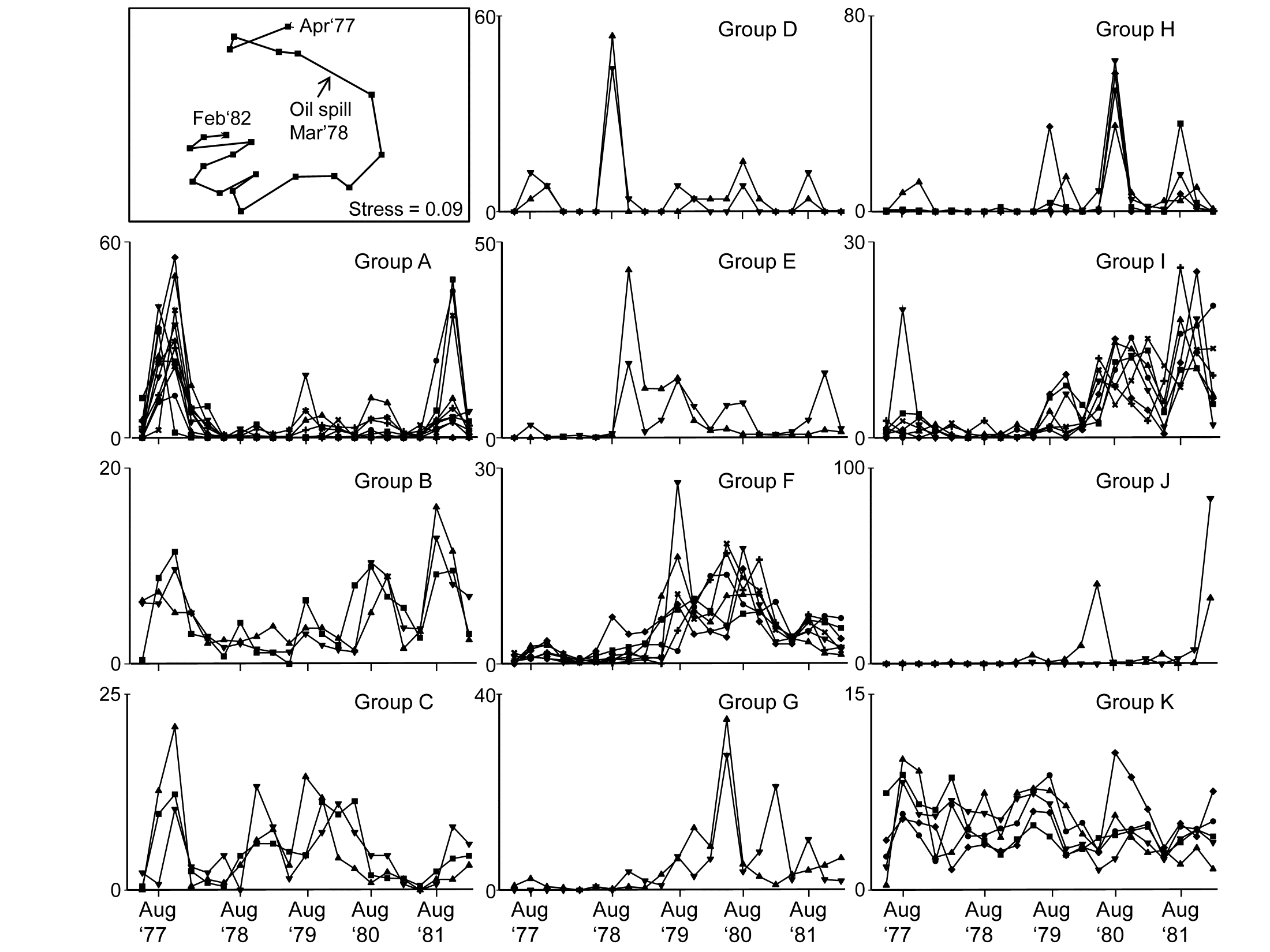
Fig. 7.6. Amoco-Cadiz oil spill {A}. 'Coherent species curves’ for the SIMPROF groups A-K of Fig. 7.5. Also re-shown (top left) is the nMDS plot Fig. 5.8a of the 21 samples over 5 years, displaying community change and partial recovery, with the seasonal cycle re-established. Note that this MDS is based on heavily transformed (4th root) abundances so its similarities do draw from a wide range of these species patterns. The explanation of the clear MDS structure is seen in the combination of differing responses from the various species sets.
Some general points about Type 3 SIMPROF tests
-
As pointed out on the footnote on page 7.2, a Type 3 test is impossible to perform with only two species, so where a group of two is split from other clusters, as for the two Bathyporeia species, group J above, it cannot be further subdivided, whatever the association is between the species. Nonetheless, it will be distinct from other groups and (as here) the two species must have some common association otherwise they will be sliced off from the larger cluster as singletons. Naturally this raises the issue of the power of the SIMPROF test and much the same comments apply as for Type 1 tests, see the discussion on page 3.5 (though you will need to mentally transpose ‘samples’ and ‘species’!). In brief, though power to further divide a group is difficult to define formally in a multivariate context, it will clearly increase with the number of species in the group and especially with the number of samples over which the association is calculated. Thus, a time series of just 4 seasons will tend to lead to fewer and larger species groups than for a series of 12, monthly, samples. Large spatial or long temporal series could distinguish fine-scale, and somewhat trivially different, sets of species responses. Judicious use of averaging (but not over-averaging) may be needed if there is much ‘noise’ in the data, so that more genuine ‘signals’ are compared.
-
It is worth re-iterating the point that Type 3 tests require an association measure with an inbuilt species standardisation (such as equation 7.1) and entry of a matrix which has already been standardised. Tempting though it is to feel that: a) input of an unstandardised matrix and use of the index of association; or b) input of a standardised matrix and use of the normal Bray-Curtis measure (applied to the species, equation 2.9) will both do the trick, this is wrong – both will give results which are incorrect. The first is more plainly wrong, as noted in the footnote on page 7.2 but the second will, more subtly, make the test unconservative, leading to a greater number of smaller-sized groups. Whilst the real similarity profile will be fine, since the index of association is just Bray-Curtis on standardised data, after the permutations the species are no longer exactly standardised, so the permuted profiles will tend to contain (artefactually) lower similarities, making the real profile’s larger values appear more significant.
-
Whilst the Exe estuary and Morlaix examples above both appeared to work well with standardising a data matrix which had not been previously transformed, it is not clear that this is always the best approach. Species standardisation removes the sometimes very large disparity between abundances of different species (e.g. between large and very small-bodied organisms) but it does not address erratically large counts across samples for the same species. Pre-treatment by transformation is sometimes needed to tackle these outliers, as well as to better balance contributions from abundant and less abundant species, in which case it would make perfect sense to transform prior to standardising ‘noisy’ data, before input to Type 3 tests. It is perhaps not entirely coincidental that the Exe and Morlaix data matrices were both averaged (over seasons and over replicates), reducing the severity of any such outliers.
-
Though this chapter concerns only species variables, it is clear that Type 3 SIMPROF tests are much more widely applicable, to other measures of association or correlation and to environmental variables or biotic variables which are not positive (or zero) ‘quantities’, as in an abundance matrix. Somerfield & Clarke (2013) give examples of Type 3 tests for both classes of variables: an environmental suite of heavy metals and organics in the Garroch Head study {G}, and a biomarker study of biochemical/histological ‘health’ indices from flounder sampled along a North Sea transect (see the PRIMER User manual for the data source). Standard Pearson correlations are relevant as association measures in both cases, sometimes with (differing) transformation of individual variables. The only new issue that arises is that, for the biomarker data at least, whether correlations between variables are positive or negative is not of primary concern – some biomarkers increase when an organism is subject to anthropogenic impact and some decrease. This is best handled by reversing some variables so that all are expected to decrease (say) under impact, so that the range of associations go from ‘uncorrelated’ to ‘exactly correlated’ variables – there is no longer a meaningful concept of ‘strongly negatively correlated’. In precise analogy with the species examples, matrices need to be normalised (after any transformation) before entry to Type 3 tests using Pearson correlation, and ranked before tests using a Spearman rank correlation.
In conclusion
Ultimately, like most of the techniques in PRIMER, coherent species curves are fundamentally simple and transparent. Indeed, practitioners have been drawing line plots of species responses over spatio-temporal gradients throughout the history of ecology, but they have usually been for single species or combinations that are arbitrarily selected. What Type 3 SIMPROF tests do is to give some objectivity to the selection of species to place in the same component line plot and provide a statistical basis for inferring differences in pattern between, and similarity within, components.
7.4 Shade plots
An alternative to line plots, and a technique that can often be even more useful, in terms of the range and quality of information it can present, is that of shade plots. These are visual displays in the form of the data matrix itself, with rows being species and columns the samples, and the entries rectangles whose grey-shading deepens with increasing species counts (or biomass, area cover etc). White denotes absence of that species in that sample and full black represents the maximum abundance in the matrix. Many choices are possible for the column and row orderings.
Whilst the coherent species plots can do a striking job of visually displaying common patterns of change in relative abundance across the samples for groups of species (i.e. species standardised data), they do not represent the patterns of dominant and less abundant species over the samples, which is key to understanding the contributions of particular species to sample multivariate analyses. Of course, coherent species curves could be graphed using absolute, not relative, counts but this is generally ineffective, the coherence becoming lost, visually, in the major differences in mean abundance across species. In contrast, one of the strengths of shade plots is the way they (typically) can be used to display the abundances on exactly the measurement scale which is being entered to a multivariate analysis: this may be sample standardised and/ or transformed (or dispersion weighted, Chapter 9), or any other potential pre-treatment step, including species standardisation (though this is generally not recommended for input to sample resemblances).
The visual impact of grey-scale intensities¶ in a shade plot can give a strong idea of which species are likely primarily to be influencing the multivariate results, and
Clarke, Tweedley & Valesini (2014)
show how these plots can therefore be utilised to aid sound long-term choice of transformation and/or other pre-treatment for specific faunal groups and study types. Choice of transform is often something that perplexes the novice user but a simple shade plot will often make it abundantly clear which transforms are likely to capture the required ‘depth of view’ of the community (from solely the dominant to the entire species set), and thus avoid under- or over-transforming the matrix to achieve that desired view (see Chapter 9 for some examples).
Shade plot for Exe estuary nematodes
Fig. 7.7 provides a good initial example of the range of information that can be captured by a shade plot, since we have seen the sample dendrogram and MDS plots in Figs. 5.4 and 5.5, the species clustering in Fig. 7.1 and the Type 3 SIMPROF tests producing the coherent species groups of Fig. 7.4. Here the sites are in the same order as in Fig. 7.4 and the 4 to 5 major clusters from Fig. 5.4 are separated by vertical lines.
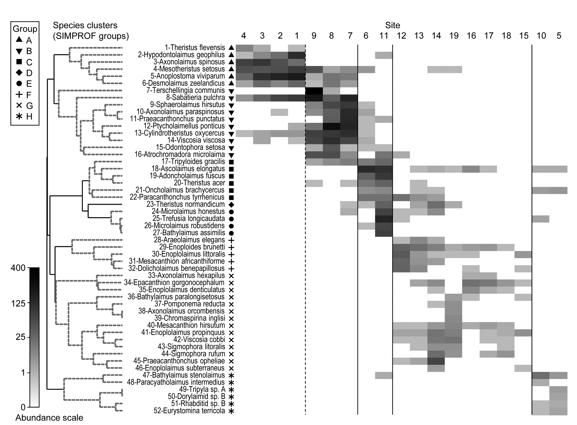
Fig. 7.7. Exe estuary nematodes {X). Shade plot, a visual representation of the data matrix of (in the columns) the 19 sites and (in the rows) the most dominant species, those accounting for ≥ 5% of the total abundance at one or more of the sites. White space denotes absence of that species at that site; depth of grey scale is then linearly proportional to a fourth-root transformation of abundance (see key), the same transform as used for the sample clustering and ordination of Figs. 5.4 and 5.5. Sites are divided by vertical lines into the 4 to 5 groups initially identified by
Field, Clarke & Warwick (1982)
from essentially those figures, and then ordered in the same way as in the ‘coherent species’ line plots (Fig. 7.4). Species are shown in the numbered dendrogram order of Fig. 7.1, with the Type 3 SIMPROF groups (A-H, Fig. 7.4) identified by grey dashed lines and a range of symbols in the redisplay of that dendrogram here. The high turnover of species between site groups (matching that seen in Fig. 7.4) is self-evident, resulting in the clear clustering seen in the ordination of Fig. 5.5, and strongly curvilinear shape of the Shepard plot of Fig. 5.2, with many dissimilarities of 100%. Note the important distinction with Fig. 7.4 that the shade plot uses the fourth-root transformed data for its grey scale, whereas the line plots are of species-standardised untransformed data. Either technique could be used with either data form but the particular strengths of each display lend themselves to the combination shown.
The rows present the same subset of species as used for the coherent curves, with the species dendrogram given in the same species order (numbers in Fig. 7.1 are now identifiable to species names), and showing the species groups from the Type 3 SIMPROF tests. The grey-shade scale is the fourth-root transformed one appropriate to the samples multivariate analysis, but the linearly increasing grey intensity in the scale bar has been back-transformed to original counts for the displayed scale values, allowing an excellent ‘feel’ for the abundances of each of these 52 species. Note that, since the lowest number in the matrix is a count of 1, the fourth-root transform ensures that even this is visible, so the presence-absence structure of the data is immediately apparent. An important implication is that, under this transformation, all the species will have a not entirely negligible role in determining the sample resemblances, though some still clearly have a more dominant contribution (e.g. by comparison with a P/A analysis in which all the shaded rectangles will, of course, be black). But the dominant impression from Fig. 7.7 is of overlapping but highly characteristic assemblages for each of the main five sample groups, with the more diffuse clustering of samples 12-19 in relation to the tightness of the other 4 groups (seen in Fig. 5.5) readily apparent.
¶ Shade plots can be graphed effectively in colour also, and are then often referred to as heat maps, though since the genesis of a heat map is a temperature scale in which black denotes absence (extreme cold), increasing through blue, orange and red to white (‘white hot’) as the largest value, this seems a less helpful nomenclature than shade plot for our use, where the large numbers of zeros are much more effectively represented as white space. And it is necessary that the scale transparently represents the linearity of increasing (transformed) abundances by linear-scale shading or colour changes. Too richly colourful a plot might not aid this.
7.5 Example: Bristol Channel zooplankton
This example, last seen in Chapter 3, consists of 24 (seasonally-averaged) zooplankton net samples at 57 sites in the Bristol Channel, UK. Fig. 7.8 shows the shade plot for fourth-root transformed abundances. All 24 species are used and this is again an example where there was no specific a priori structure to the samples, so various clustering methods were used in Figs. 3.9 and 3.10 to group the samples (with Type 1 SIMPROF tests), and for the hierarchical methods it is appropriate to display dendrograms on both axes. The species axis again uses the index of association among untransformed species counts and agglomerative clustering, this time without the SIMPROF tests (Type 3) and, purely to demonstrate that any method of clustering can be used on either axis, the sample grouping utilises the unconstrained divisive algorithm of the PRIMER UNCTREE routine, Fig. 3.9, based on a maximisation of the (ANOSIM) R statistic on each binary split. The 4 significantly different groups of sites given by SIMPROF tests are again shown by vertical lines and (in spite of the heavy transform) the grouping can now be seen to be driven by a very few dominant species, perhaps no more than 8 or 9 of the 24 species, which clearly typify the four clusters and discriminate them from each other. It can also readily be appreciated why two alternative methods, seen in Fig. 3.10 (standard agglomerative and k-R clustering), which again give just four groups, differ in respect of only the allocation of three sites: 9, 23 and 24. For example, the trade-off between absence (or nearly so) of Eurytemora, Temora sp. and Centropages hamatus decides the placement of sites 9 and 24 in groups A or B, and the high values for the Calanus and Paracalanus species mitigate against a move of 23 to B.
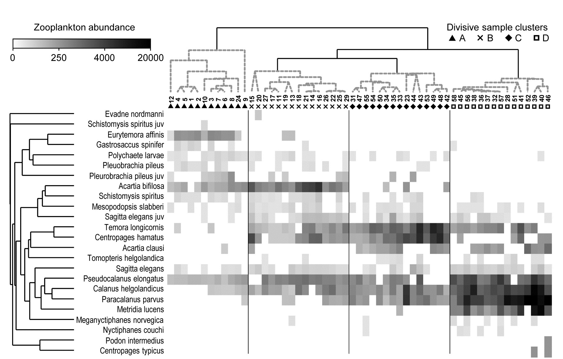
Fig. 7.8. Bristol Channel zooplankton {B}. Shade plot of abundance (averaged over seasons) of 24 zooplankton species from 57 sites, with linear grey-scale intensity proportional to fourth-root abundance (see the key for back-transform to original abundances). Sites have been grouped using Bray-Curtis similarities on the transformed data, by hierarchical, unconstrained divisive clustering (UNCTREE), as in Fig. 3.9, together with (Type 1) SIMPROF tests which identify four groups, A-D in Fig. 3.10b. The dendrogram is further rotated to produce a site ordering which optimises the matrix correlation $\rho$ with a serial model (gradient of community change). Species are also clustered, this time with the standard agglomerative method, based on ‘index of association’ resemblances computed on species-standardised (but otherwise untransformed) abundances; their dendrogram is again rotated to maximise the seriation statistic $\rho$, non-parametrically correlating their resemblances to the distance structure of a linear sequence.
Serial ordering of shade plot axes
This example is not just about grouping however. The MDS plots of Fig. 3.10 have already demonstrated that the rather clear clustering of sites forms part of a gradation of community change (and this is clearly associated with, if not actually driven by, the salinity gradient, 3.10b). The shade plot routine in PRIMER also incorporates a powerful facility which attempts to re-order either (or both) of the samples and species axes, independently of each other, in such a way as to maximise the serial change in the similarity pattern over the final ordering(s). In keeping with the non-parametric philosophy of other core techniques, this utilises the RELATE $\rho$ statistic, which will be used frequently in later chapters, but which was first met in equation (6.3) and discussed in terms of measuring serial change on page 6.10, on the ordered ANOSIM test. This is a non-parametric Mantel-type statistic, computing a rank correlation coefficient (for example Spearman’s $\rho$) between matching entries of two dissimilarity/distance matrices, namely the resemblance matrix (e.g. Bray-Curtis dissimilarity of the biological samples) and distances among points equi-spaced on a line (so that neighbouring points are one step apart, next-but-one neighbours are two steps apart, etc). We need to ‘run before we can walk’ here because later we discuss more straightforward RELATE examples, in which the community samples are tested for how much simple seriation they show in their transect or time order of collection, i.e. tested against known a priori ordering of the samples in space or time (or environmental condition). In the current context, we are not using $\rho$ as a test statistic at all, but simply as a useful way of measuring the degree of serial change in a resemblance matrix, for any given ordering of its rows (and columns)¶.
In theory, we could envisage looking at all possible sample orderings, calculating the $\rho$ seriation statistic for each, and choosing the order that maximises $\rho$. This is not viable however (there are 57!/2 possible orders, i.e. 2$ \times 10^{76}$) and an iterative search procedure is required, to attempt to get close to the optimum $\rho$. As with previous search procedures (such as for MDS ordination), the iterative process can converge to a solution which is some way from the optimal one, so repeat runs are required (1000 are suggested, if this runs in a reasonable time), from randomly different starting orders, and the best selected.†
This is still an intensive search problem however, and there are limitations which this unconstrained search procedure would ignore here, namely that we wish to display a dendrogram along the sample axis, showing the clustering (and here, the SIMPROF groups). The vast majority of the permutations of sample ordering would conflict with that hierarchy. Chapter 3 described the arbitrariness in ordering of a dendrogram and how it was not to interpreted as an ordination – but it is not completely arbitrary. The clustering and sub-clustering structures must be maintained, and the plot is determined only down to random rotation of the bars of the ‘mobile’ it can be considered to represent (i.e. with horizontal lines as bars and vertical lines as strings). So a constrained seriation of the samples is required in this case, iteratively searching through the set of possible rotations of the dendrogram for that which again gets as close as possible to optimising the seriation statistic $\rho$. This is a further option in the PRIMER shade plot routine and is the ordering seen in Fig. 7.8. In fact, the reduction in the immense size of the search space that this constraint induces does seem to make the algorithm more efficient, and good orderings will often result with a much smaller degree of computation.
Exactly the same constrained seriation procedure is also implemented on the species axis of Fig. 7.8, this time using the species resemblance matrix (index of association measure) §. The ability to seriate one or other (or both) axes imparts an order and structure to the data matrix which can often be apparent in the multivariate analysis – here in the strong gradient of samples (Fig. 3.10b) as well as the group structure – but which can be difficult to spot in the matrix itself without such rearrangement of rows and columns. (A striking example of this is seen later, in Fig. 7.10).
It is important to note that these orderings are carried out independently for samples and species, if both are performed. The sample re-arrangement uses only the sample similarities, and the species ordering is quite immaterial to the calculation of those resemblances. In the same way, species similarities make no use of the sample ordering, and they are all that is used in the clustering or seriation of the species. Now, if both axes are rearranged to be as close to a serial trend as possible then it is inevitable that the matrix will have at least a very weak diagonalisation‡, even if what is being seriated is just ‘noise’ rather than real ‘signal’. So visual evidence of diagonalisation of the matrix is not, in itself, conclusive evidence of a trend in the samples – that comes from a RELATE ($\rho$) seriation test on the sample similarities, mentioned earlier. In other words, shade plots are not tools for testing but for interpretation of structures established by testing.
However, in other cases, where the sample axis is in a fixed order based on spatial location or a time course – or the result of seriation of samples on independent information such as environmental conditions – then apparent diagonalisation of the shade plot, after the species have been seriated, does become prima facie evidence of a real gradient of community structure in that sample order. This is formally established by a seriation test on the sample resemblances, in rank correlation with (distances from) that sample order.
¶ This is analogous to the way we used the ANOSIM R statistic in the binary divisive and k-R clustering methods of Chapter 3, in which a test of the null hypothesis R=0 (as in ANOSIM) would have been quite incorrect, and irrelevant. What was needed there was, for example, to find a binary division of a cluster which maximised the value of ANOSIM R between the two sub-clusters formed by this division. Here we use RELATE $\rho$ in the same way, to find an ordering of the samples which maximises the match of their dissimilarities to a triangular matrix of distances among equi-spaced points along a line. This is showing us the ‘natural order’ in which the samples would align themselves, in terms of their community change, if no external constraints were made.
†This unconstrained seriation search, on either axis, is one of the options in the PRIMER Shade Plot routine. That it may not find the exact maximum $\rho$ of the $2 \times 10 ^ {76}$ possibilities is not a concern. We are not seeking the ‘correct’ solution but trying to display samples (and species) in a reasonably natural order, which will enhance the prospects for visual interpretation of the data matrix.
§ Note that the latter is computed by first species-standardising the untransformed data, not standardising the fourth-root transformed values represented by the grey-scale rectangles. This is true for the Exe example above and all other shade plots in this manual, though species-standardising transformed abundances could certainly be considered in some situations (for the reasons discussed in point 3 on page 7.3). Note that it is also universally true in these examples that the sample clustering or seriation is performed on the sample resemblances calculated from the full set of species, not the reduced set of species that it is convenient to view in a shade plot (though in the case of Fig. 7.8 there is no need to reduce to a smaller number of species). In a particular context, it might make sense to use only the reduced species set for all aspects of the sample analysis (and of course this is easy to do in PRIMER) but the difference this would make to multivariate analyses will typically be inconsequential, and it is logically more satisfactory to cluster and seriate the samples in the shade plot using the full set of species, which are the basis of the MDS plots, ANOSIM and RELATE tests etc. This is certainly the path which PRIMER’s Wizard for Matrix display assumes will be needed, though the direct Shade plot routine permits wide flexibility.
‡ This interesting and powerful independence of seriation on the two axes is in contrast to Correspondence Analysis-based tools, which produce a 2-way table by iteratively reweighting the axes in turn, so that the converged solution forces a mutual ordering to optimise diagonalisation. Here the diagonalisation emerges more spontaneously, and may not be guaranteed in cases of extreme species turnover. For example, if a group of samples has a completely disjunct species set from all other samples, those samples and species will be placed at one or other end of their respective gradients, but at which end is entirely arbitrary, the similarities (or associations) to all other samples (or species) being zero. In such extreme cases, it might be thought neater to follow automatic seriation by manual rotation of a disassociated group to a more ‘natural’ place. The ability to manually rotate dendrograms by clicking on ‘bars’ in the usual way is built into the PRIMER Shade Plot routine.
7.6 Example: Garroch Head macrofauna
An example where the biotic sample axis could have sensibly been ordered according to an a priori spatial layout, or in terms of environmental conditions (e.g. the first principal component of a suite of organics and heavy metal levels in sediments, PC1), is that of the root-transformed biomass data from 12 sites on an E-W transect across the sewage-sludge dump-ground in the Firth of Clyde, discussed in Chapter 4, {G}. A shade plot very similar to that of Fig. 7.9a will result from sites ordered by this PC1, and there is again a marked diagonalisation – species turn-over is strong as sites approach the high pollution levels closer to the dump-ground. In fact, we have chosen here to use this instead as an example contrasting the two choices that PRIMER gives for ordering samples. Fig. 7.9a is displayed with a reduced species set (of 35), using a seriation on both site and species axes, unconstrained by dendrograms for either axis. In contrast, Fig. 7.9b shows the result of ordering both sites and species in an order given by a nearest neighbour trajectory.
Nearest neighbour ordering of shade plot axes
Whilst arranging sample and species axes according to serial trends is generally the preferred choice for a shade plot, and is certainly instructive in the current case, there will be situations in which this is not so appropriate, for example if a cyclic pattern of samples is expected or observed (e.g. seasonality, cyclic inter-annual change etc) and the data matrix would then not be expected to diagonalise. In such cases, we may want to place the samples in order of some observed natural trajectory in community structure, not limited to a simple gradient. An illustration of this is in Figs. 7.9c and d, which are the same nMDS plot, for root-transformed biomass at the 12 transect sites (data as in the shade plot above), and Bray-Curtis similarities. It is only the trajectories, defining the axis orders in the otherwise identical shade plots, which differ, with 7.9c showing the optimum serial change and 7.9d an approximate solution to the ‘travelling salesman’ problem. This, as its name suggests, tries to find a route through all the sites, of minimum distance, and starting from whichever point minimises that length. Distance in this context means (Bray-Curtis) sample dissimilarity among the samples, not actual distance in the (only approximate) low-d nMDS ordination. And here there is a fairly natural trajectory joining the sites, which is not the zig-zag route of the serial trend, and the shade plot of 7.9b orders the samples and the species by these attempted minimum trajectories (in the case of the species order, minimisation is of the total index of association along its trajectory).
There is again potentially an immense computational problem here (termed NP-hard in numerical analysis jargon), since there are 12!/2 sample orders and 35!/2 species orders to consider. The solution implemented in PRIMER is a simple, non-iterative routine (which is often surprisingly effective) known as the ‘greedy travelling salesman’ or nearest neighbour ordering, and is simply described. First, join the two sites (say) which have the lowest dissimilarity, then go into a loop in which the nearest neighbour (lowest dissimilarity) to each current end point is found, the lowest of these two values defining the next link in the chain.
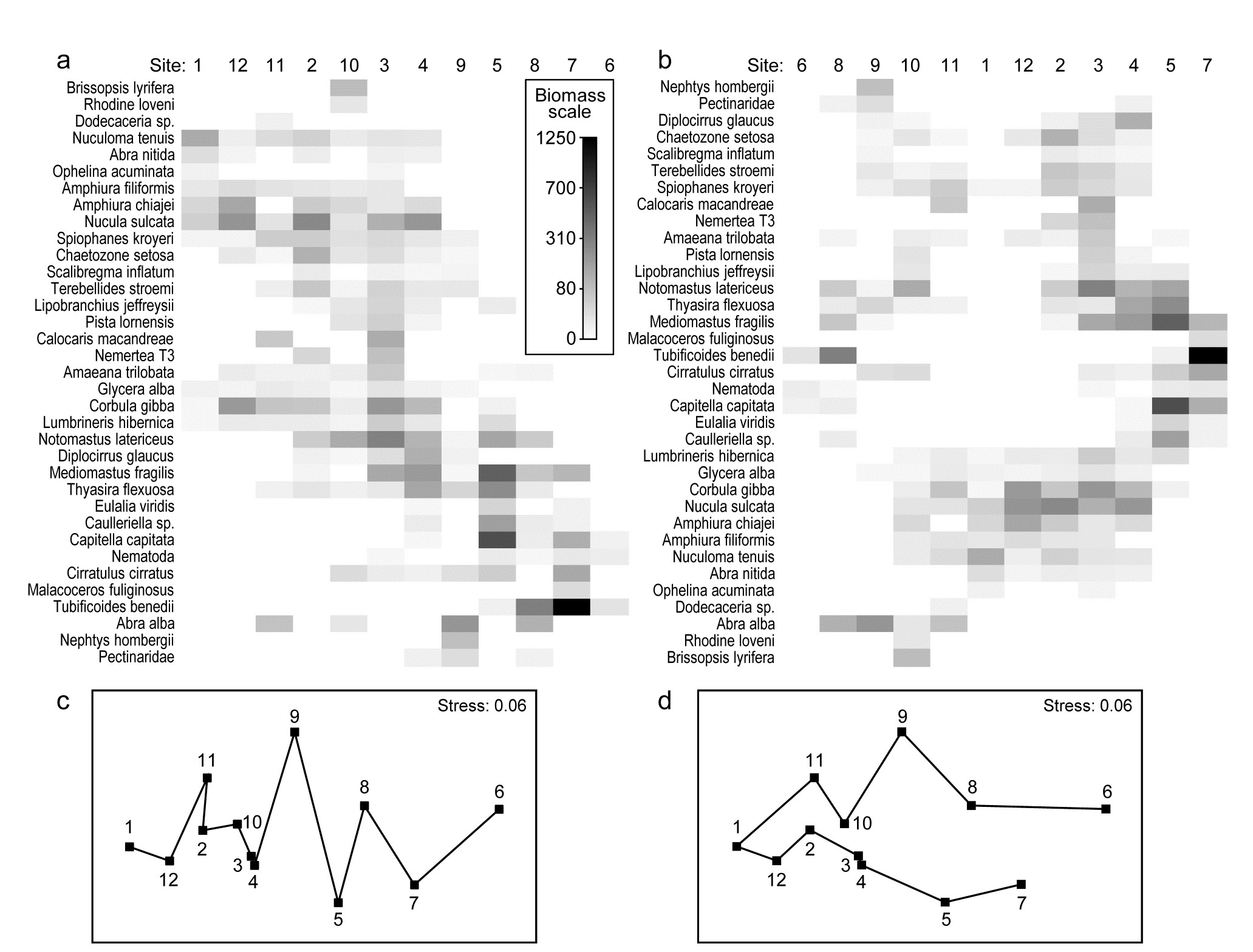
Fig. 7.9. Garroch Head macrofauna {G}. Shade plots of sites 1-12 on an E-W transect (Fig. 1.5) covering a sewage-sludge dumpground (centred at site 6), based on square-root transformed biomass of 35 macrofaunal species, namely those accounting for at least 1% of the total biomass at one or more sites. The grey-scale intensity key has units back-transformed to the original biomass measurements. Axes for samples and species are ordered by: a) iterative maximisation independently on both axes (from 1000 starting configurations) of the seriation statistic, $\rho$, based for samples on Bray-Curtis similarities on root-transformed biomass, and for species on the association index on untransformed but species-standardised data; b) using the same similarity and association measures, both axes independently placed in nearest neighbour order (using the ‘greedy travelling salesman’ algorithm). Neither axis, on either plot, is constrained to be a rotation of a cluster dendrogram. The nMDS plot of the 12 sites (on the Bray-Curtis similarities) is shown with: c) serial and d) nearest neighbour trajectories from the sample orders in (a) and (b) respectively.
The process thus works outwards from the first join, adding points at one or other end of the trajectory (or even all at the same end), until all samples are linked. The procedure is the same for species, the only arbitrariness remaining being the same as for seriation, viz. whether the shade plot samples are ordered from left to right or vice-versa (and the species top to bottom or vice-versa); PRIMER simply allows a ‘flip’ option on both axes to suit the user’s preference.¶
We return to seriation of the sample and species axes to make one interesting final point about shade plots. The previous, clear-cut, examples may have given the impression that it is easy to see sample patterns in the data matrix using a shade plot, in whatever form the matrix is entered, but this is rarely the case – the key step is an effective grouping or ordering of the axes.
¶ Note that this nearest neighbour trajectory is not the same thing as the minimum spanning tree (MST) met in point 4 on page 5.3. That is a more tractable problem and has an efficient algorithm for a precise solution, Gower & Ross (1969) , the key difference being that the MST allows branching (see Fig. 5.3b). Of course, this is not helpful in the current context of needing a 1-d ordering of the samples or species.
7.7 Example: Ekofisk oil-field macrofauna
The 39 sites sampled for benthic infauna at different distances from an oil-field in the N Sea were shown in the last chapter to demonstrate a clear gradient of community change with distance (nMDS, Fig. 16.3). The shade plot of Fig. 7.10a however, which orders the sites in increasing distance from the rig, and puts the species (reduced to 74 of the original 173 species) in alphabetic order, does not present a clear picture at all. Apart from Chaetozone setosa, the most dominant species in terms of abundance (an opportunist polychaete which appears to thrive at the impacted sites close to the oilrig), the immediate visual impression is not of a striking gradient potentially caused by the dispersal of THCs and other contaminants from the oilfield. Yet the non-metric MDS does indeed display such a clear and striking gradient (Fig. 7.11), and the explanation is not the C. setosa counts because if that species is removed, the MDS remains unchanged (the two sample resemblance matrices, with and without C. setosa, are rank-correlated at the level of 0.993).
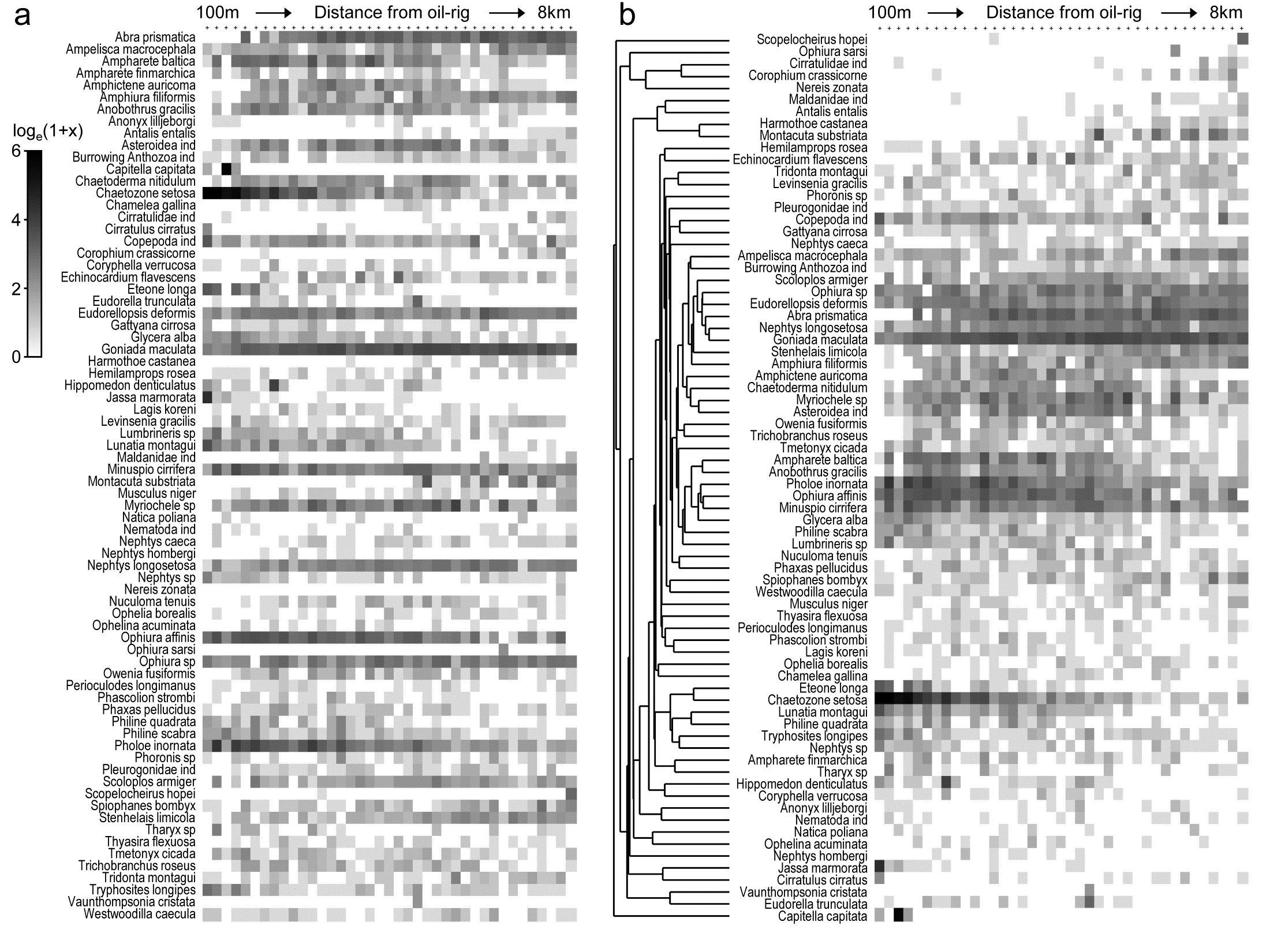
Fig. 7.10. Ekofisk oil-field macrofauna {E}. a) Shade plot of the data matrix of 39 sites (columns), ordered by increasing distance from the oil-rig, and a subset of 74 of the 173 species (rows), those accounting for at least 1% of the total count in at least one of the sites. Depth of grey shading is linearly proportional to a log$_e (x+1)$ transformation of the counts x (see key). Species are in arbitrary (alphabetic) order.
b) Shading is exactly as for (a) but the species are re-arranged, firstly hierarchically grouped by an agglomerative clustering (shown) of untransformed but species-standardised values, using the index of association to define species similarity, then re-ordered (within the constraints of permitted dendrogram rotation) to maximise the seriation $\rho$ statistic (Spearman rank) among species.
Why is MDS picking up such a pattern? The human eye can see it in a clear fashion only if the species are grouped by dendrogram and reordered serially within those constraints, to obtain the shade plot Fig. 7.10b.
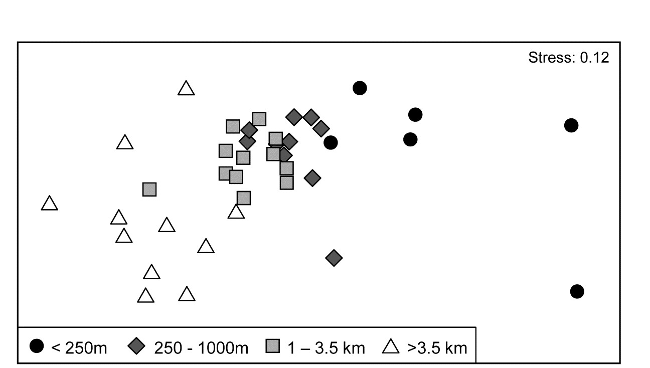
Fig. 7.11. Ekofisk oil-field macrofauna {E}. nMDS ordination of 39 sites from four (pre-assigned) groups of distances from the oil-field, based on the 74 species and log$_e(x+1)$ transformed counts displayed in the shade plots of Fig. 7.10, and utilising Bray-Curtis similarities. (Note the closely similar outcome to the previous ordination of these data, Fig. 6.13a, based on the full set of 173 species and square-root transformed counts). The plot shows a clear change in community structure with distance from the rig, extending to a distinction between sites within and outside 3.5km, even though the latter are in all directions away from the rig and therefore distant from each other.
7.10b contains identical information to 7.10a but now the pattern is obvious! As pointed out earlier, when the sample axis is fixed, independently of the species data (here it is simply a distance scale), any visual suggestion of diagonalisation is prima facie evidence for a community gradient across that sample ordering, and here it is abundantly clear (and ordered ANOSIM or RELATE tests absolutely confirm it). Species near the bottom of the shade plot (7.10b) tend to be those which, like C. setosa, increase sharply in abundance closer to the rig; those which are found throughout the distance range but still tend to increase towards the rig are seen in the mid-plot; above them is a group of species with a non-monotonic response, having their larger values in the mid-distances; then come a further set of abundant species which tend to decline nearer the rig, and at the top, the species which only tend to be found in the ‘background’ communities at >3-4km distant. Scattered throughout are species that show little relation to distance but these tend to be only patchily present, and there is a dominant ‘feel’ of groups of species responding (or least correlating) in different ways to the conditions represented by the distance gradient. The real strength of a multivariate approach is thus seen to be the way it is able to stitch together a little information from a lot of species, not only to produce a striking synthesis such as the MDS of Fig. 7.11 but also formal tests for this relationship. Having seen Fig. 7.10b, it is easier to look at the same information in the unordered 7.10a and note the same individual species patterns. To a multivariate analysis the two plots are naturally identical (sample similarity calculation makes no use of ordering of the species), but to a merely human interpreter, there can be little doubt which of these plots is the more useful!
Immensely helpful though shade plots can be, there is one important way in which they do not fully present the information captured by a multivariate analysis. The pre-treatment steps, such as transformation, are visually well-represented, and a quick glance at the plot is enough to get a good feel of how many, and which, species will contribute to the analysis (a great many for the log-transformed Ekofisk data). But what is not represented is the effect of the specific resemblance measure in synthesising this high-d information. For example, for the Ekofisk analysis, which species primarily account for the dissimilarity between the 1-3.5km distant sites and those beyond 3.5km, seen in the MDS plot of Fig. 7.11? It is clear from the shade plot that there will be many, but it is still instructive to have a list of those species in decreasing relative contribution to the total dissimilarity between those two groups, and this is provided by the similarity percentages routine (SIMPER).
7.8 Species contributions to sample (dis)similarities – SIMPER
Dissimilarity breakdown between groups
The fundamental information on the multivariate structure of an abundance matrix is summarised in the Bray-Curtis similarities between samples, and it is by disaggregating these that one most precisely identifies the species responsible for particular aspects of the multivariate picture.¶ So, first compute the average dissimilarity $\overline{\delta}$ between all pairs of inter-group samples (e.g. every sample in group 1 paired with every sample in group 2) and then break this average down into separate contributions from each species to $\overline{\delta}$.
For Bray-Curtis dissimilarity $\delta_{jk}$ between two samples j and k, the contribution from the ith species, $\delta_{jk} (i)$, could simply be defined as the ith term in the summation of equation (2.12), namely:
$$\delta_{jk} (i) = 100 \left| y_{ij} - y_{ik} \right| / \sum _ {i=1} ^ p \left( y_{ij} + y_{ik} \right) \tag{7.2} $$
$\delta_{jk}(i)$ is then averaged over all pairs (j,k), with j in the first and k in the second group, to give the average contribution $\overline{\delta}_i$ from the ith species to the overall dissimilarity $\overline{\delta}$ between groups 1 and 2.† Typically, there are many pairs of samples (j, k) making up the average $\overline{\delta}_i$, and a useful measure of how consistently a species contributes to $\overline{\delta} _ i$ across all such pairs is the standard deviation $SD(\delta_i)$ of the $\delta _ {jk}(i)$ values.§ If $\overline{\delta}_i$ is large and $SD(\delta_i)$ small (and thus the ratio $\overline{\delta}_i / SD ( \delta_i )$ is large), then the ith species not only contributes much to the dissimilarity between groups 1 and 2 but it also does so consistently in inter-comparisons of all samples in the two groups; it is a good discriminating species.
Table 7.1. Bristol Channel zooplankton {B}. Averages of transformed densities in site groups A and B of Fig. 7.8 (groups from unconstrained divisive tree method), then breakdown of average dissimilarity between groups A and B into contributions from each species (bold). Species ordered in decreasing contribution (until c.90% of average dissimilarity between A and B of 57.9 is attained, see last column). Ratio (also bold) identifies consistent discriminators by dividing average dissimilarity by its SD.
| Species name | Av Ab Gp A | Av Ab Gp B | Av Diss | Diss /SD |
|
|---|---|---|---|---|---|
| Centropages hamatus | 0.00 |
3.76 |
7.92 |
2.14 |
13.67 |
| Eurytemora affinis | 3.37 |
0.32 |
6.78 |
2.08 |
25.38 |
| Temora longicornis | 0.33 |
3.16 |
6.13 |
2.07 |
35.98 |
| Calanus helgolandicus | 1.09 |
3.64 |
6.03 |
1.62 |
46.40 |
| Acartia bifilosa | 3.05 |
5.56 |
5.51 |
1.39 |
55.92 |
| Pseudocalanus elongatus | 2.83 |
4.25 |
4.76 |
2.85 |
64.14 |
| Sagitta elegans juv | 0.17 |
1.71 |
3.35 |
1.97 |
69.93 |
| Pleurobrachia pileus juv | 1.23 |
0.58 |
2.71 |
1.04 |
74.61 |
| Paracalanus parvus | 0.17 |
1.20 |
2.63 |
0.85 |
79.16 |
| Sagitta elegans | 0.62 |
1.38 |
2.12 |
1.36 |
82.82 |
| Mesopodopsis slabberi | 0.47 |
0.99 |
1.72 |
1.34 |
85.80 |
| Pleuobrachia pileus | 0.81 |
0.46 |
1.62 |
1.14 |
88.60 |
| .................................... | ….. | ….. | ….. | ….. | ….. |
For the Bristol Channel zooplankton data {B} of Fig. 7.8, Table 7.1 shows the results of breaking down the dissimilarities between sample groups A and B into species contributions. Species are ordered by the third column, by decreasing values of average dissimilarity contribution $\overline{\delta} _ i$ to total average dissimilarity $\overline{\delta} = \sum \overline{\delta} _ i = 57.9$. They could instead be ordered by the fourth (Diss/SD) column*, $\overline{\delta}_i / SD ( \delta_i )$. The final column rescales the Av Diss values to a percentage of the total dissimilarity that is contributed by the ith species $(100 \overline{\delta} _ i/ \overline{\delta})$, and then cumulates this down the rows of the table. It can be seen that many species play some part in determining dissimilarity of groups A and B, and this is typical of such SIMPER analyses, particularly (as in this case) when a severe transformation has been used, since the intention is then to let many more species come into the reckoning. Here, c. 90% of the contribution to $\overline{\delta}$ is accounted for by the first 12 species, with 55% by the first five.
Naturally, the results agree well with the patterns of Fig. 7.8: C. hamatus and the Temora sp. are first and third in this list because they are scarcely found at all in group A but have good numbers in very many of the group B sites, the Eurytemora sp. between them having the opposite pattern. Calanus and Pseudocalanus spp. are found in group A, consistently so for the latter, but have much higher densities in group B, with a similar pattern (though much less consistency) for Acartia, with all 6 contributing 65% of the dissimilarity between those groups. This is also seen in the first two columns of Table 7.1, which are means of the abundances over all sites in each group. Note that this averaging is on 4th-root transformed scales, so back-transforms of these averages represent major abundance differences (e.g. 1 back-transforms to a density of 1, 3.5 to 150, 5.6 to 1000 etc).
Alternatively, ordering the list by the ratio column (Diss/SD) highlights the consistent discriminators of the two groups and the contrast is well illustrated by Acartia and Pseudocalanus species. While Acartia has large numbers, particularly in group B, and higher mean density difference between the groups, ensuring it contributes to the between group dissimilarities, the shade plot shows this density to be variable within the groups and it moves down the consistent discriminator list. Pseudocalanus now heads the list even though its densities and mean difference are smaller, because of its greater consistency within groups.
Similarity breakdown within groups
In much the same way, one can examine the contribution each species makes to the average similarity within a group, $\overline{S}$. The mean contribution of the ith species,$\overline{S}_i$, could be defined by taking the average, over all pairs of samples (j, k) within a group, of the ith term in the Bray-Curtis similarity definition of equation (2.1), in its alternative form, namely:
$$ S _ {jk} (i) = 200 \times \min \left( y _ {ij}, y _ {ik} \right) / \sum _ {i=1} ^ p \left( y _ {ij} + y _ {ik} \right) \tag{7.3} $$
The more abundant a species is within a group, the more it will contribute to the intra-group similarities. It typifies that group if it is found at consistent abundance throughout, so that the standard deviation of its contribution $SD(S_i)$ is low, and the ratio $\overline{S} _ i /SD(S_i)$ high. Note that this says nothing about whether that species is a good discriminator of one group from another; it may be very typical of a number of groups.
Table 7.2 shows such a breakdown for group A of the Bristol Channel zooplankton data of Fig. 7.8. The average similarity within the group is $\overline{S} = 62.6$, with 70% of this contributed by the Eurytemora, Acartia and Pseudocalanus species; it is clear from the shade plot that these are the only major ‘players’ in group A. Here Pseudocalanus, though the least abundant of the three on average, heads the table, both in terms of contribution to average intra-group similarity and when consistency of that contribution is considered.
Table 7.2. Bristol Channel zooplankton {B}. Average of transformed density in A and breakdown of average similarity into contributions from each species (decreasing order until c.90% of similarity of 62.6 reached); also ratio of contribution to SD.
| Species name | Av Ab Gp A | Av Sim | Sim /SD |
|
|---|---|---|---|---|
| Pseudocalanus elongatus | 2.83 |
15.29 |
5.31 |
24.44 |
| Eurytemora affinis | 3.37 |
14.89 |
1.66 |
48.23 |
| Acartia bifilosa | 3.05 |
13.72 |
2.03 |
70.15 |
| Polychaete larvae | 1.09 |
4.45 |
1.41 |
77.27 |
| Schistomysis spiritus | 0.87 |
3.00 |
0.84 |
82.07 |
| Calanus helgolandicus | 1.09 |
2.38 |
0.53 |
85.86 |
| Pleurobrachia pileus | 0.81 |
2.34 |
0.67 |
89.61 |
| .................................... | ….. | ….. | ….. | ….. |
Interpretation
The dangers of taking the precise ordering in these tables too seriously, however, is well illustrated by noting that, if sites 9 and 24 had fallen into group B rather than A, which they did for the agglomerative clustering of this data (with k-R clustering giving a third – equally arbitrary – split; see Fig. 3.10), then the contribution and consistency of Eurytemora to the intra-group similarities of A would have been notably enhanced. This would have taken it to the head of the list both for contributions to similarity within group A and to dissimilarity between groups A and B.
Some of the confusion that can arise with interpreting SIMPER output stems from the failure to appreciate that SIMPER is not a hypothesis testing technique but an interpretation step that is only permissible once there has been a testing-based justification. So groups to be compared must either be defined a priori and then seen to be significantly different under pairwise testing by ANOSIM, or the groups have been determined in a posteriori testing by SIMPROF analyses. It is inevitable that two groups which are not significantly different will have some breakdown of their between-group dissimilarities (which will never be zero) into contributions from each species, but if the mean dissimilarity between two groups is no different (statistically) from that within the groups then it is not meaningful or sensible to look at that breakdown.
Another occasional source of confusion is that sometimes a species will have similar mean abundance in two groups but will still feature somewhere in the list of species contributing to the dissimilarities between them. One simple explanation‡ is that if the densities (or biomass, area cover etc) are not negligible then samples from one group will inevitably have some dissimilarity to samples in the other group (except in the unlikely event that values are effectively identical in all replicates of both groups, in which case that species cannot feature in the list). The outcome will be that the standard deviation of those dissimilarities is relatively large, so that the Diss/SD ratio column is too small for that species to be taken seriously – on its own it would certainly not suggest that the groups differ (the implication of a low ratio). In other words, you need to keep an eye on both columns in bold in Table 7.1 (and 7.2) for any interpretation, whether you are primarily using the Av Diss column to better understand which species have contributed to the difference between those groups or Diss/SD to pick out a small number of key species you might monitor to characterise future changes, for example. This is the motivation for SIMPER’s reporting of these two criteria – they serve different practical requirements.
Extensions of SIMPER (Euclidean and 2-way)
The Bray-Curtis measure lends itself to this breakdown into species contributions, both in terms of the dissimilarities between groups and similarities within groups, because of its two equivalent definitions that are expressible as sums over species – of equations (7.2) and (7.3) respectively. Other coefficients can be used; for example, it is straightforward to break down (squared) Euclidean distances into contributions from each of a set of (usually normalised) environmental-type variables, since from equation (2.13):
$$ d _ {jk} ^ 2 (i) = (y _ {ij} - y _ {ik} ) ^ 2 \tag{7.4} $$
needs simply to be summed over species i = 1, ..., p. This deals with identifying variables which primarily differentiate two groups of environmental samples (or other data for which Euclidean distance is relevant), but the reverse table of ‘nearness’ breakdowns within groups is less intuitively constructed.⸙
¶ This is implemented in the SIMPER routine in PRIMER, both in respect of contribution to average similarity within a group and average dissimilarity between groups.
† Though this is a natural definition, it should be noted that, in the general unstandardised case, there is no unambiguous partition of $\delta_{jk}$ into contributions from each species, since the standardising term in the denominator of (7.2) is a function of all species values.
§ The usual definition of standard deviation from elementary statistics is a convenient measure of variability here, but note that the $\delta_{jk}$(i) values are not independent observations, and standard statistical inference cannot be used to define, for example, 95% confidence intervals for the mean contribution from the ith species.
‡ A more subtle possibility is that SIMPER (in line with ANOSIM, which has the same property) is identifying a difference which is more a function of very strong dispersion differences between the groups rather than mean differences, where that arises from a consistent pattern of variance differences in the key species (but note that, quite often, community dispersion differences between groups arises from a totally different source – that of higher turnover or greater sparsity of species in one group than another).
⸙ PRIMER does this by again tabulating a breakdown of squared (usually normalised) Euclidean distances, but for values within a group the table is therefore headed by variables which have zero or low contributions, taking the same or similar values within the group and thus accounting for little of its total squared Euclidean distance. For comparison between groups, the tables have a more familiar ‘feel’ in terms of the analogy with Bray-Curtis SIMPER output. That only squared Euclidean distance is partitioned, not Euclidean distance itself, is not generally of great concern in the context of PRIMER analyses, since they (ANOSIM, nMDS, BEST, RELATE etc) are usually only a function of ranks of the resemblances – identical whether Euclidean distance is squared or not.
7.9 Example: Tasmanian meiofauna
Another clear generalisation is to a 2-way rather than 1-way layout, illustrated by the 16 meiofaunal cores from Eaglehawk Neck, Tasmania, Fig. 6.7. The MDS for the 59 nematode and copepod species from two crossed factors, treatments (disturbed or undisturbed sediment from activity of soldier crabs) and blocks (locations B1 to B4 across the sandflat) is again seen in Fig. 7.12, this time with the 16 pairs of dissimilarities between treatments for the same block shown by dashed lines. Clearly, they are the only dissimilarities appropriate to a SIMPER analysis of which species are primarily responsible for the community change between Disturbed and Undisturbed conditions which was established in Chapter 6 by the 2-way ANOSIM test, and they are the similarities used in the species breakdown produced by the 2-way crossed SIMPER calculations (e.g. Platell, Potter & Clarke (1998) ).
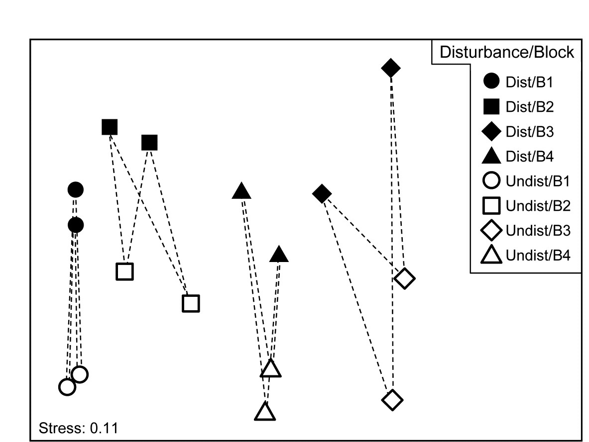
Fig. 7.12. Tasmania, Eaglehawk Neck {T}. nMDS of 2 replicates from each of 4 blocks under disturbed/undisturbed conditions (see Fig. 6.7). 2-way SIMPER for the species contributing to the disturbance effect uses only the dissimilarities indicated by dashed lines, i.e. between disturbance conditions within each block.
A 1-way SIMPER on the treatment factor in this case would look at all 64 dissimilarities between the 8 samples in each of the two conditions, but this mixes up effects which are due to treatment with those due to block differences, since for example they would use the dissimilarity between a Disturbed sample in Block 1 and an Undisturbed sample in Block 2. A separate 1-way SIMPER analysis could be run on the treatment difference for each of the blocks, but the 2-way SIMPER here combines these neatly into a more succinct table, and there seems little evidence (from the MDS plot) of the disturbance effect differing to any great extent from block to block – this appears to be an approximately additive 2-factor pattern.
Other techniques for identifying species
A significant weakness of the SIMPER approach is its limitation to comparing two identified groups of samples at a time, sometimes leading to very large numbers of tables which are difficult to synthesise. In some contexts, a grouping structure of samples is not even observed or expected, the sample pattern being that of a continuous gradient (or gradients). What is needed here is a more holistic technique, identifying the set of influential species which between them are able to capture the full multivariate pattern (whether clustered or a gradation), and which operates with any appropriately-defined similarity coefficient. A solution to this is presented later, in Chapter 16 on comparing multivariate patterns. It has a somewhat different premise than SIMPER: the search is not for the (possibly very large) suite of species which do actually contribute to the full multivariate pattern but the smallest possible set of species which could stand in for the full set. They encompass the various ways in which groups of species respond differently to the drivers of that community structure but only one representative of each group may be required in order to capture that response. The links to the ‘coherent species’ topic at the start of this chapter are evident.
Linking species to MDS displays
Whether the primary species of interest are generated from SIMPER tables for discrete groups, or in more continuous cases by noting their gradient behaviour in a shade plot or extracting them from the (Chapter 16) redundancy analysis, a final step would best view these selected species in the context of the displayed multivariate sample pattern (when low-dimensional ordination is acceptable), therefore stitching all the various threads together. The choice here is usually a 2-d or 3-d MDS, either nMDS or mMDS, sometimes based on averaging replicates (or on centroids in the high-d resemblance space in the context of PERMANOVA) because then the MDS will very often be of sufficiently low stress to be a reliable summary. The relationship of the individual species to this overall community pattern is achieved by bubble plots.
7.10 Bubble plots (plus examples)
Bubble plots
Abundance (or density, biomass, area cover etc) for a particular species can be shown on the corresponding ordination point by a circle (‘bubble’) of size proportional to that abundance, based either on its original scaling (e.g. counts), or on the transformed scale (e.g. log counts) employed for all species to produce that ordination. The idea was previously met in Fig. 6.15, in the context of relating individual components of diet of a specific fish predator species to the nMDS produced for the (averaged) full dietary assemblage. But bubble plots can be useful in any context where values of a single variable need to be related to a 2-d or 3-d configuration¶ based on a wider or different set of variables, e.g. in relating an ordination based on assemblage data to specific environmental variables which are potential community drivers (Chapter 11).
Example: Ekofisk oil-field macrofauna
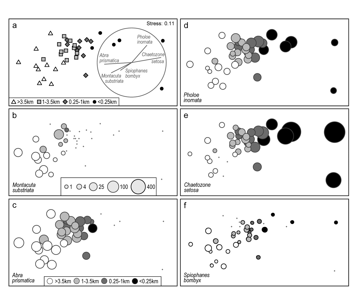
Fig. 7.13. Ekofisk oil-field macrofauna {E}. a) nMDS of 39 sites at different distances from the rig (a priori assigned to four distance groups, denoted by different symbols/shading), based on square-root transformed counts of 173 species and showing a clear gradient of community change with distance. Superimposed is a vector plot for five species, chosen to display a range of observed responses to the gradient, with the vector direction for each species reflecting the (Pearson) correlations of their (root-transformed) counts with the two ordination axes (the latter rotated, as usual for an MDS, to PCs), and length giving the multiple correlation coefficient from this linear regression on the ordination points (the circle is a correlation of 1). b-f) Individual bubble plots for these 5 species, on the same nMDS, with dot representing absence and circle sizes proportional to transformed counts; the back-transformed scale of original counts is in (b), common to all plots.
Fig. 7.13a replots the nMDS ordination of sediment macrofaunal assemblages (173 species) for 39 sites at different distances from the Ekofisk oil-field, in the form previously seen at Fig. 6.13a (based on square-root transformed counts). The a priori site groups at different distances are indicated by differing symbols but also by grey-shading, which is used in the bubble plots which follow, Figs. 7.13b-f, for five individual species. These are chosen to illustrate a range of the differing responses which meld together to produce the main gradient of assemblage change as sites near the oil-field (from four or five directions). That many species replicate each of these patterns, and more, is seen from the shade plot of Fig. 7.10b (that is based on log-transformed counts but the outcome is similar here). M. substriata is typical of species found in the background conditions but which are virtually absent at <1km from the oilrig. Species like A. prismatica are found in reasonable numbers right up to 250m from the rig but then appear to die out at the closest distances. P. inornata typifies an interesting group of species which, though present in background assemblages, are opportunists whose numbers increase as sites near the rig, in this case up to the very closest distances (<100m) before decreasing in abundance. C. setosa similarly shows an opportunist pattern with the highest counts in the matrix overall, and these are all within the <250m group, with counts increasing steadily as sites approach the oil-field centre. Counts of other species, such as S. bombyx, appear to bear a much weaker relation to the position of the points on the MDS, as well as having generally smaller values. Here, bubble sizes are chosen to be proportional to the transformed counts (and the common key, shown in b, back-transformed to original scales), in order to gauge relative species contributions to the MDS.
Vector plots
A great many bubble plots could be produced in this case, where the clear gradient is constructed from the combination of a large number of species, each highlighting particular parts of the gradient. It is therefore tempting to attempt to represent these in a single plot, each species defined by a vector whose direction and length define, respectively, the direction in the MDS space in which that species increases its counts, and the (multiple) correlation coefficient of that species with the ordination configuration†. The combination of these vectors is then superimposed on the MDS, as in Fig. 7.13a for the 5 species shown in the bubble plots of 7.13b-f. Technically, this is carried out by fitting multiple linear regression of the species counts to the MDS (x, y) co-ordinates – or (x, y, z) points if the MDS is in 3-d. If the MDS has been rotated such that the axes are uncorrelated (as noted earlier, this is automatic for the initial plot), then the vector lengths projected onto the x and y axes represent the Pearson correlations of that species with each axis. These are thus comparable across species in the vector diagram, with the circle representing a multiple correlation of 1, but note that since these are separate regressions for each species, differences in scale among species counts are not seen in vector lengths. They reflect (scale-free) correlations with axes, not contributions to the MDS, e.g. the smaller counts of S. bombyx, see Fig. 7.13f, do not of themselves shorten their vector.§
It is crucial to appreciate that the vector plot can be placed anywhere on the ordination plot, and can be scaled to any size, with its interpretation completely unchanged. This is often misunderstood, with users of vector plots sometimes inferring that the end point of a vector being close to a particular sample indicates, in some way, that this species takes its largest values at, or in the vicinity of, that sample. This is absolutely incorrect. All a vector indicates is a direction – the centre point of the vectors can be placed anywhere but the direction in which a vector extends from that point is the direction in which that variable increases, e.g. the lowest C. setosa values are expected to the left and highest to the right of the plot (as in 7.13e).
Widely used though such vector plots are, they have a serious problem, also poorly understood in the literature. They make the fundamental assumption that the relationship of species values to the plot co-ordinates is a linear one. But most of the bubble plots of Fig. 7.13 (and the much larger species set of Fig. 7.10b) do not show such a relationship. Here, only C. setosa displays a linear-like increase from left to right of the plot, and arguably S. bombyx (right to left), with a weaker correlation. Others are distinctly non-linear, M. substriata and A. prismatica having a threshold-type relation (constant then dropping to nothing), and P. inornata an increasing then decreasing pattern, not even monotonic. The telling comparison is between the vector plot of Fig. 7.13a and the bubble plots of b-f. Does the vector plot really describe the pattern of relationships seen in the bubble plots? Scarcely, when at all – it is unquestionably a poor substitute for them.
Nonetheless, a space limitation on multiple plots will often be encountered, and the ability to replace 4 or 5 bubble plots (or more) by a single graph is necessary. This may be achievable by segmented bubble plots.
Multi-variable (segmented) bubble plots
Fig. 7.14 condenses the bubble plots of Fig. 7.13b-e into a single MDS plot, by simply showing segments of a circle (or, in 3-d, a sphere), differently shaded or coloured, with sizes again reflecting values of those four species in each sample, also commonly scaled as before (root-transformed). Whilst colour would aid distinction of the species (which of course PRIMER allows), it is still possible to draw exactly the same inference from this graph as for the four bubble plots.
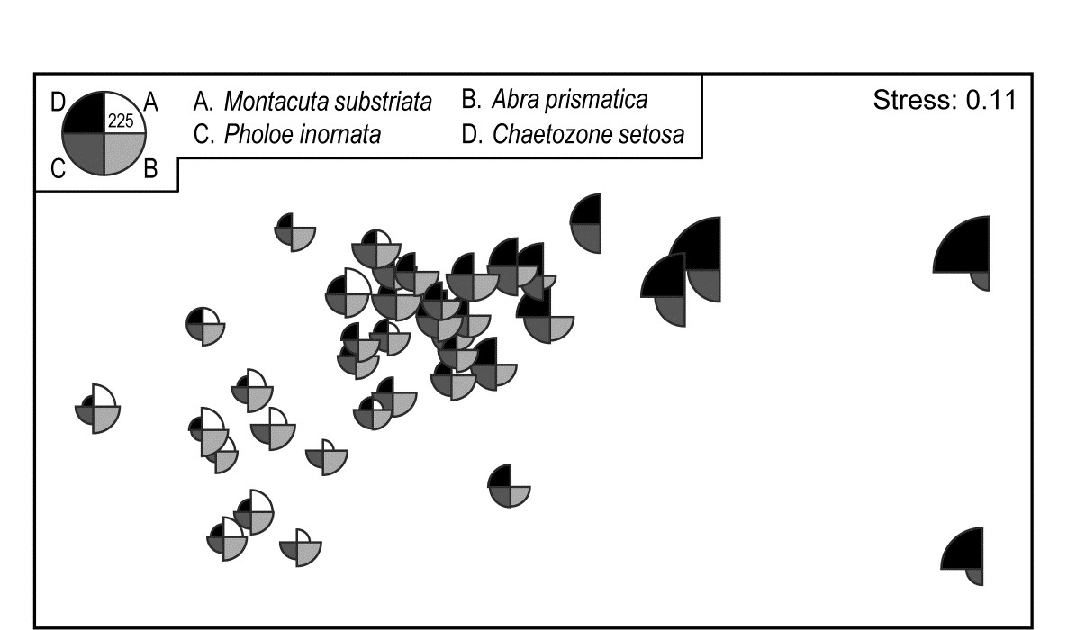
Fig. 7.14. Ekofisk oil-field macrofauna {E}. Segmented bubble plot for MDS ordination as in Fig. 7.13a, with segment sizes proportional to the root-transformed counts of four species, commonly scaled. The size of segments in the key corresponds to a count of 225, when back-transformed to the original scale.
A remarkably clear example of a similar graph is seen for the Bristol Channel zooplankton data last met in the shade plot of Fig. 7.8. This example uses the agglomerative clusters and MDS ordination of Fig. 3.10a, selecting four species to display by the criterion that they head the list of typifying species for each of the four clusters in the corresponding SIMPER analysis table‡. The combination of information from a shade plot and SIMPER analyses will often dictate species which could be usefully graphed in this way. Note that the bubble segment sizes use the original scales here and not the fourth-root transformed values that went into the MDS construction. This is a legitimate and often useful step, if the requirement is primarily to look at how the abundance of individual species behaves, e.g. over a community gradient, rather than the precise influence this has on the MDS itself. In that context, separate scaling of variables is not only permissible, it is almost mandatory if the plot is to be interpretable, e.g. here the Eurytemora values range only up to <500 whereas the maximum Paracalanus density is >30,000 (this is precisely why a severe 4th-root transform was essential in this case, of course). We shall also see later (Chapter 11) that bubble plots have a useful role in displaying environmental-type variables on the points of an assemblage ordination, and the original units are rarely commonly scalable.
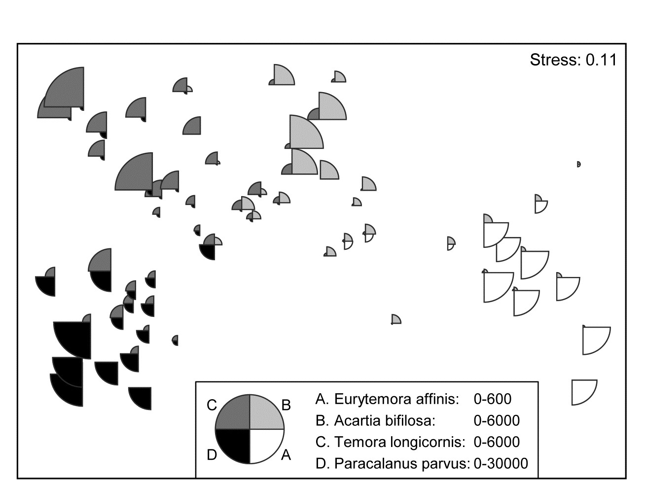
Fig. 7.15. Bristol Channel zooplankton {B}. Segmented bubble plot on nMDS ordination of the 57 sites, using Bray-Curtis on $\sqrt{} \sqrt{}$- abundances, leading by Type 1 SIMPROF to the 4 site clusters (A-D) of Fig. 3.10a, agglomerative clustering. Bubble segments are proportional to raw counts of the four species which ‘most typify’ those clusters, from SIMPER tables. Counts for these species (correspondingly labelled A-D) are differently scaled.
Segmented bubble plots often prove most useful when the number of points on an ordination plot is small and the sampling error of each point has been substantially reduced, so that the picture consists mainly of genuine differences; then it is sometimes possible to show quite large numbers of species simultaneously. Such bubble plots thus have a strong role to play in means plots.
Example: W Australian fish diets
Hourston, Platell, Valesini et al. (2004) and Schafer, Platell, Valesini et al. (2002) report dietary data on gut contents (identified to one of 32 taxon groups) of 7 marine fish species in nearshore, lower west coast Australian waters. Analysis was of sample-standardised (thus percent composition) data, in similar fashion to that for the (different) labrid fish dietary data of Fig. 16.5. The nMDS plot⸙ of Fig. 7.16 is based on meaned data over all fish guts for each of the 7 species (species names shown on the plot). This time it is SIMPER tables of the major dietary contributors, to the dissimilarities between fish species pairs, which have identified 6 dietary taxon groups to show as segmented bubbles overlaid on the mean points. Interpretation of the differing dietary regimes found amongst these co-occurring species, including those for three congeneric species, is now clear and direct, but must of course be made in conjunction with tests (such as in ANOSIM or PERMANOVA) to establish their statistical significance.
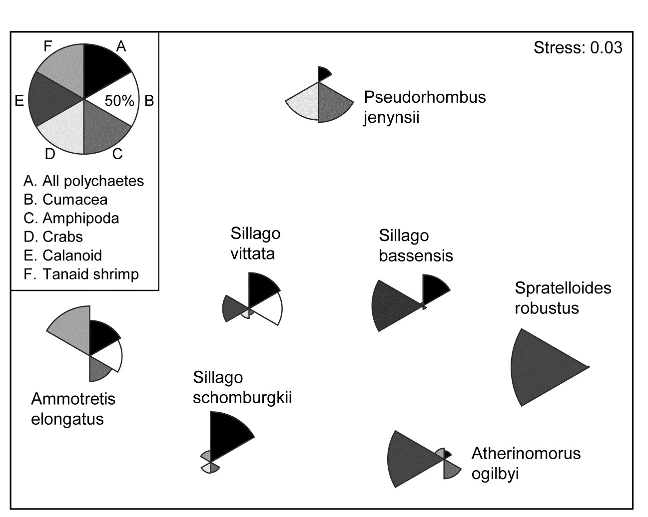
Fig. 7.16. Diets of W Australian fish {d}. Segmented bubble plot. nMDS ordination (using Bray-Curtis similarities) of standardised, transformed, then averaged gut compositions (by volume) of 32 broad dietary categories, from 7 abundant fish species in nearshore habitats. Superimposed bubble segment sizes represent % composition (untransformed) for 6 dietary categories, shown from SIMPER analysis to contribute most to the average dissimilarities among the diets of the different fish species. Segment sizes are commonly scaled here (key sizes represent 50% composition).
¶ PRIMER can plot 3-d versions (when the term ‘bubble plot’ is more appropriate!) for both simple and segmented bubble plots, though none are reproduced here since rotatable 3-d colour plots are not very successfully reproduced in static 2-d mono pictures.
† Significance tests for these correlations would not be valid, not least because the vectors represent species which are part of the full set used to create the ordination points in the first place!
§ There are two other definitions of vectors available in PRIMER for 2- or 3-d ordinations. Pearson, here, is the default; an alternative is a multivariate (multiple) correlation method, which fits the supplied superimposed variables jointly, so vector directions will change if further variables are added, see discussion in the PERMANOVA+ manual, Anderson, Gorley & Clarke (2008) , where this is used with Principal Co-ordinates, PCO. A third method (‘base variables’) arises only for PCA plots, a relevant ordination for analysis of environmental-type data, not the current case. The vectors then reflect the relative size and magnitude of coefficients of each variable in the PC1, PC2,... definitions, as in equation (4.1). Linear relationships of these variables to the co-ordinates of the plot is thus guaranteed and a vector plot always justified.
‡ Of the type seen in Table 7.2, noting that Eurytemora affinis will head this table if the agglomerative groups are used (page 7.8).
⸙ As seen on page 5.9, nMDS plots with few points, as here, can collapse, e.g. because one species predates on primarily different dietary categories than found anywhere else in the matrix. Metric MDS (or an nMDS solution which mixes a small amount of metric stress, to ‘fix’ the collapse) are often useful for such means plots, though they were not necessary in this case, with the main dietary categories usually being shared between more than one species.