Chapter 8: Diversity measures, dominance curves and other graphical analyses
- 8.1 Univariate measures
- 8.2 Graphical/distributional plots
- 8.3 Examples: Garroch Head and Ekofisk macrofauna
- 8.4 Examples: Loch Linnhe and Garroch Head macrofauna
- 8.5 Multivariate tools used on univariate data
- 8.6 Example: Plymouth particle-size data
- 8.7 Multiple diversity indices
8.1 Univariate measures
A variety of different statistics (single numbers) can be used as measures of some attribute of community structure in a sample. These include the total number of individuals (N), total number of species (S), the total biomass (B), and also ratios such as B/N (the average size of an organism in the sample) and N/S (the average number of individuals per species). Abundance or biomass totals (or averages) are not dimensionless quantities so tend to be less informative than diversity indices, such as: richness of the sample, in terms of the number of species (perhaps for a given number of individuals); dominance or evenness in the way in which the total number of individuals in the sample is divided up among the different species (and, in one version of this, a parameter of the species abundance distribution first described by
Fisher, Corbet & Williams (1943)
).
Diversity indices
The main aim is to reduce the multivariate (multi-species) complexity of assemblage data into a single index (or small number of indices) evaluated for each sample, which can then be handled statistically by univariate analyses. It will often be possible to apply standard normal-theory tests (t-tests and ANOVA) to such derived indices (see page 6.1), possibly after transformation.
A bewildering variety of diversity indices has been used, in a large literature on the subject, and some of the most frequently used candidates are listed below.¶ More detail can be found in two (of several) overviews aimed specifically at the biological reader, Heip, Herman & Soetaert (1988) and Magurran (1991) . It should be noted, however, that diversity indices of this type tend to exploit some combination of just two features of the sample information:
a) Species richness. This measure is either simply the total number of species present or some adjusted form which attempts to allow for differing numbers of individuals. Obviously, for samples which are strictly comparable, we would consider a sample containing more species than another to be the more diverse.
b) Equitability. This expresses how evenly the individuals are distributed among the different species, and is often termed evenness. For example, if two samples each comprising 100 individuals and four species had species abundances of 25, 25, 25, 25 and 97, 1, 1, 1, we would intuitively consider the former to be more diverse although the species richness is the same. The former has high evenness, and low dominance (essentially the reverse of evenness), while the latter has low evenness and high dominance (the sample being highly dominated by one species).
Different diversity indices emphasize the species richness or equitability components of diversity to varying degrees. The most commonly used diversity measure is the Shannon (or Shannon–Wiener) diversity index:
$$H^\prime = – \sum _ i p _ i \log(p _ i) \tag{8.1} $$
where $p _ i$ is the proportion of the total count (or biomass etc) arising from the ith species. Note that logarithms to the base 2 are sometimes used in the calculation, reflecting the index’s genesis in information theory. There is, however, no natural biological interpretation here, so the more usual natural logarithm (to the base e) is probably preferable, and commonly used. Clearly, when comparing published indices it is important to check that the same logarithm base has been used in each case. If not, it is simple to convert between results since $\log _ 2 x = (\log _ e x ) / (\log_e 2)$, i.e. all indices just need to be multiplied or divided by a constant factor. Whether it is sensible to compare $H ^ \prime$ across different studies is another matter, since Chapter 17 shows that, like many of the indices given here (Simpson being a notable exception, Fig. 17.1), it can be sensitive to the degree of sampling effort. Hence $H ^ \prime$ should only be compared across equivalent sampling designs.
Species richness
Species richness is often given simply as the total number of species (S), which is obviously very dependent on sample size (the bigger the sample, the more species there are likely to be). Alternatively, Margalef’s index (d) is used, which also incorporates the total number of individuals (N), in an attempt to adjust for the fact that within a larger number of individuals, more species may expect to be found:
$$ d = (S-1) / \log N \tag{8.2} $$
Equitability
This is often expressed as Pielou’s evenness index:
$$ J^ \prime = H ^ \prime / H ^ \prime _ {max} = H ^ \prime / \log S \tag{8.3} $$
where $H ^ \prime _ {max}$ is the maximum possible value of Shannon diversity, i.e. that which would be achieved if all species were equally abundant (namely, log S).
Simpson
Another commonly used measure is the Simpson index, which has a number of forms:
$$ \lambda = \sum p _ i ^ 2 $$ $$ 1 - \lambda = 1 - \left( \sum p _ i ^ 2 \right) $$ $$ \lambda ^ \prime = \left( \sum _ i N _i (N _ i -1) \right) / \left[ N ( N -1) \right] $$ $$ 1 - \lambda ^ \prime = 1 - \left( \sum _ i N _i (N _ i -1) \right) / \left[ N ( N -1) \right] \tag{8.4} $$
where $N _ i$ is the number of individuals of species i. The index $\lambda$ has a natural interpretation as the probability that any two individuals from the sample, chosen at random, are from the same species ($\lambda$ is always $ \le 1$). It is a dominance index, in the sense that its largest values correspond to assemblages whose total abundance is dominated by one, or a very few, of the species present. Its complement, $1 – \lambda$, is thus an equitability or evenness index (sometimes called Gini-Simpson), taking its largest value (of $1 – S ^ {–1}$) when all species have the same abundance. The slightly revised forms $\lambda ^ \prime$ and $1 – \lambda ^ \prime$ are appropriate when total sample size (N) is small (they correspond to choosing the two individuals at random without replacement rather than with replacement). As with Shannon, Simpson diversity can be employed when the {$p_i$} come from proportions of biomass, standardised abundance or other data that are not strictly integral counts but, in that case, the $\lambda ^ \prime$ and $1 – \lambda ^ \prime$ forms are not appropriate.
Other count-based measures
Further well-established indices include that of Brillouin (see Pielou (1975) ):
$$H = N ^ {–1} \log _ e \left( N!/[N _ 1! N _ 2! \ldots N _ S!] \right) \tag{8.5} $$
and a further model-based description, Fisher’s $\alpha$ ( Fisher, Corbet & Williams (1943) ), which is the shape parameter, fitted by maximum likelihood, under the assumption that the species abundance distribution (SAD curve) follows a log series distribution. This has certainly been shown to be the case for some ecological data sets but can by no means be universally assumed, and (as with Brillouin) its use is clearly restricted to genuine (integral) counts.
The final option in this category is the rarefaction method of Sanders (1968) and Hurlbert (1971) , which under the strict assumption that individuals arrive in the sample independently of each other, can be used to project back from the counts of total species (S) and individuals (N), how many species ($E S _ n$) would have been ‘expected’ had we observed a smaller number (n) of individuals:
$$ E S _ n = \sum _ {i=1} ^ S \left[ 1 - \frac{ ( N - N _ i ) ! ( N - n ) ! }{ ( N - N _ i -n) ! N !} \right] \tag{8.6} $$
The idea is thereby to generate an absolute measure of species richness, say $E S _ {100}$ (the number of different species ‘expected’ in a sample of 100 individuals), which can be compared across samples of very differing sizes. It must be admitted, however, that the independence assumption is practically unrealistic. It corresponds to individuals from each species being spatially randomly distributed, giving rise to independent Poisson counts in replicate samples. This is rarely observed in practice, with most species exhibiting some form of spatial clustering, which can often be extreme. Rarefaction will then be strongly biased, consistently overestimating the expected number of species for smaller sample sizes.
Hill numbers
Finally, Hill (1973b) proposed a unification of several diversity measures in a single statistic, which includes as special cases:
$$ N _ 0 = S $$ $$ N _ 1 = \exp( H ^ \prime) $$ $$ N _ 2 = 1 / \sum p _ i ^ 2 $$ $$ N _ \infty = 1 / \max (p _ i ) \tag{8.7} $$
$N _ 1$ is thus a transform of Shannon diversity, $N _ 2$ the reciprocal of Simpson’s dominance $\lambda$ (called inverse Simpson) and $ N _ \infty$ is another possible evenness index (the reciprocal of the Berger-Parker index), which takes larger values if no single species dominates the total abundance. Other variations on these Hill numbers are given by
Heip, Herman & Soetaert (1988)
.
Units of measurement
The numbers of individuals belonging to each species are the most common units used in the calculation of the above indices. For internal comparative purposes other units can sometimes be used, e.g. biomass or total cover of each species along a transect or in quadrats (e.g. for hard-bottom epifauna), but obviously diversity measures using different units are not difficult to compare. Often, on hard bottoms where colonial encrusting organisms are difficult to enumerate, total or percentage cover will be much more realistic to determine than species abundances.
Representing communities
Changes in univariate indices between sites or over time are usually presented graphically† simply as plots of means and confidence intervals for each site or time. For example, Fig. 8.1 graphs the differences in diversity of the macrobenthos and meiobenthic nematodes at six stations in Hamilton Harbour, Bermuda, showing that there are clear differences in diversity between sites for the former but much less obvious differences for the latter. Fig. 8.2 graphs the temporal changes in three univariate indices for reef corals at South Tikus Island, Indonesia, spanning the period of the 1982–3 El Niño (an abnormally long period of high water temperatures which caused extensive coral bleaching in many areas throughout the Pacific). Note the dramatic decline between 1981 and 1983 and subsequent partial recovery in both the number of species ($S$) and the Shannon diversity ($ H ^ \prime$), but no obvious changes in evenness ($ J ^ \prime$).
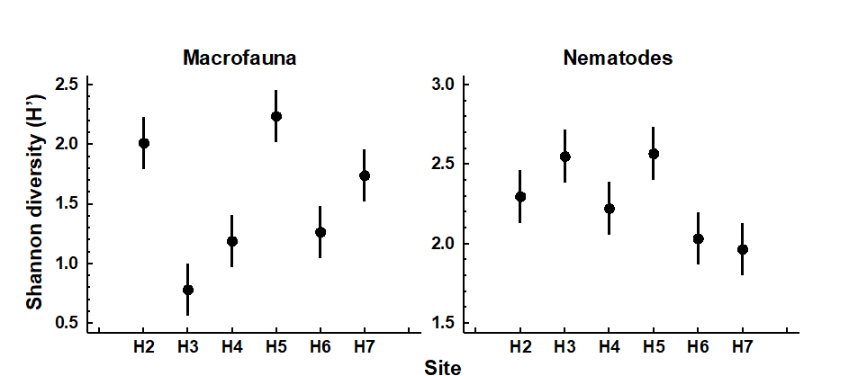
Fig. 8.1. Hamilton Harbour, Bermuda {H}. Diversity (H′) and 95% confidence intervals for macrobenthos (left) and meiobenthic nematodes (right) at six stations.
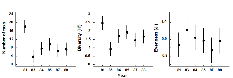
Fig. 8.2. Indonesian reef corals, South Tikus Island {I}. Total number of species (S), Diversity (H') and Evenness (J') based on coral species cover data along transects, spanning the 1982–3 El Niño.
Discriminating sites or times
The significance of differences in univariate indices between sampling sites or times can simply be tested by one-way analysis of variance (ANOVA)§ followed by t-tests or multiple comparison tests for individual pairs of sites; see discussion at the start of Chapter 6.
Determining stress levels
Increasing levels of environmental stress have historically been considered to decrease diversity (e.g. $H ^ \prime$), decrease species richness (e.g. d) and decrease evenness (e.g. $J ^ \prime$), i.e. increase dominance. This interpretation may, however, be an over-simplification of the situation. Subsequent theories on the influence of disturbance or stress on diversity have suggested that in situations where disturbance is minimal, species diversity is reduced because of competitive exclusion between species; with a slightly increased level or frequency of disturbance competition is relaxed, resulting in an increased diversity, and then at still higher or more frequent levels of disturbance species start to become eliminated by stress, so that diversity falls again. Thus it is at intermediate levels of disturbance that diversity is highest (
Connell (1978)
;
Huston (1979)
). Therefore, depending on the starting point of the community in relation to existing stress levels, increasing levels of stress (e.g. induced by pollution) may either result in an increase or decrease in diversity. It is difficult, if not impossible, to say at what point on this continuum the community under investigation exists, or what value of diversity one might expect at that site if the community were not subjected to any anthropogenic stress. Thus, changes in diversity can only be assessed by comparisons between stations along a spatial contamination gradient (e.g. Fig. 8.1) or with historical data (Fig. 8.2).
Caswell’s neutral model
In some circumstances, the equitability component of diversity can, however, be compared with a theoretical expectation for diversity, given the number of individuals and species present. Observed diversity has been compared with predictions from Caswell’s neutral model ( Caswell (1976) ). This model constructs an ecologically ‘neutral’ community with the same number of species and individuals as the observed community, assuming certain community assembly rules (random births/deaths and random immigrations/emigrations) and no interactions between species. The deviation statistic V is then determined which compares the observed diversity ($H ^ \prime$) with that predicted from the neutral model ($E(H ^ \prime)$):
$$ V = \frac{ \left[ H ^ \prime - E (H ^ \prime) \right] }{SD ( H ^ \prime) } \tag{8.8} $$
A value of zero for the V statistic indicates neutrality, positive values indicate greater diversity than predicted and negative values lower diversity. Values > +2 or < -2 indicate ‘significant’ departures from neutrality. The computer program of Goldman and Lambshead (1989) is useful.‡
Table 8.1 gives the V statistics for the macrobenthos and nematode component of the meiobenthos from Hamilton Harbour, Bermuda (c.f. Fig. 8.1). Note that the diversity of the macrobenthos at stations H4 and H3 is significantly below neutral model predictions, but the nematodes are close to neutrality at all stations. This might indicate that the macrobenthic communities are under some kind of stress at these two stations. However, it must be borne in mind that deviation in H′ from the neutral model prediction depends only on differences in equitability, since the species richness is fixed, and that the equitability component of diversity may behave differently from the species richness component in response to stress (see, for example, Fig. 8.2). Also, it is quite possible that the ‘intermediate disturbance hypothesis’ will have a bearing on the behaviour of V in response to disturbance, and increased disturbance may either cause it to decrease or increase. Using this method, Caswell found that the flora of tropical rain forests had a diversity below neutral model predictions!
Table 8.1. Hamilton Harbour, Bermuda {H}. V statistics for summed replicates of macrobenthos and meiobenthic nematode samples at six stations.
| Station | Macrobenthos | Nematodes |
|---|---|---|
| H2 | +0.5 | –0.1 |
| H3 | –5.4 | +0.4 |
| H4 | –4.5 | –0.5 |
| H5 | –1.9 | 0.0 |
| H6 | –1.3 | –0.4 |
| H7 | –0.2 | –0.4 |
¶ The PRIMER DIVERSE routine permits selection of a subset from a list of over 20 indices, sending the values to a worksheet for plotting or export to a mainstream statistical package. Whilst the (non-parametric multivariate) PRIMER package does not do conventional univariate statistical testing, under the usual normality and constant variance assumptions across groups (which can be found in all standard statistical software), some of the elements of univariate analysis are certainly possible, univariate being a special case of multivariate! – see later. PRIMER also has plotting routines for Means Plots, Histograms, Box Plots, Line Plots, Scatter Plots for pairs or triples of indices etc.
† PRIMER 7’s Means Plot produces plots such as Fig. 8.1, the 95% confidence intervals either based on separate estimates of variance for each group or, as throughout this manual, assuming a pooled variance estimate (constant variance) across groups.
§ A rank-based alternative, using PRIMER, would be to compute Euclidean distance on a single variable (index) and input this to ANOSIM. This does not give the usual non-parametric univariate tests (Wilcoxon Mann-Whitney U for two groups, Kruskal-Wallis for several groups), but gives an alternative which generalises to multivariate data in a way that those tests do not, the permutation structure being the same but the test statistics differing. Or using PERMANOVA on the Euclidean distances gives an exact copy of the classical ANOVA table (see Anderson, Gorley & Clarke (2008) ), except that the ‘F tests’ are permutation-based rather than making the less robust F distribution assumption, from normality (but the two will be very similar here, since normality is realistic for most indices).
‡ This is implemented in the PRIMER CASWELL routine, but the significance aspects should be treated with some caution since they are inevitably crucially dependent on the neutral model assumptions. These are usually over-simplistic for real assemblages (even when genuinely neutral, in the sense that their species do not interact) because they again assume simple spatial randomness.
8.2 Graphical/distributional plots
The purpose of graphical/distributional representations is to extract information on patterns of relative species abundances without reducing that information to a single summary statistic, such as a diversity index. This class of techniques can be thought of as intermediate between univariate summaries and full multivariate analyses. Unlike multivariate methods, these distributions may extract universal features of community structure which are not a function of the specific taxa present, and may therefore be related to levels of biological ‘stress’.¶
-
Rarefaction curves Sanders (1968) were among the earliest to be used in marine studies. They are plots of the number of individuals on the x-axis against the number of species on the y-axis. The more diverse the community is, the steeper and more elevated is the rarefaction curve. The sample sizes (N) may differ widely between stations, but the relevant sections of the curves can still be compared.
-
Gray & Pearson (1982) recommend plotting the number of species in x2 geometric abundance classes (the SAD curves) as a means of detecting pollution effects. The plots are of the number of species represented by only 1 individual in the sample (class 1), 2–3 individuals (class 2), 4–7 (class 3), 8–15 (class 4) etc. In unpolluted situations there are many rare species and the curve is smooth with its mode well to the left. In polluted situations there are fewer rare species and more abundant species so that the higher geometric abundance classes are more strongly represented, and the curve may also become more irregular or ‘jagged’ (although this latter feature is more difficult to quantify). Gray and Pearson further suggest that it is the species in the intermediate abundance classes 3 to 5 that are the most sensitive to pollution-induced changes and might best illustrate the differences between polluted and unpolluted sites (e.g. this is a way of selecting ‘indicator species’ objectively).
-
Ranked species abundance (dominance) curves are based on the ranking of species (or higher taxa) in decreasing order of their importance in terms of abundance or biomass. The ranked abundances, expressed as a percentage of the total abundance of all species, are plotted against the relevant species rank. Log transformations of one or both axes have frequently been used to emphasise or downweight different sections of the curves. Logging the x (rank) axis enables the distribution of the commoner species to be better visualised.
-
k-dominance curves are cumulative ranked abundances plotted against species rank, or log species rank ( Lambshead, Platt & Shaw (1983) ). This has a smoothing effect on the curves. Ordering of curves on a plot will obviously be the reverse of rarefaction curves, with the most elevated curve having the lowest diversity. To compare dominance separately from the number of species, the x-axis (species rank) may be rescaled from 0–100 (relative species rank), to produce Lorenz curves.
¶ Two plotting programs of this type are available in PRIMER: a) Geometric Class Plots, which produce a frequency distribution of geometric abundance classes, the so-called SAD curves ( Fisher, Corbet & Williams (1943) ), from which fitting log-series distributions gives rise to the $\alpha$ index output by the DIVERSE routine, and b) Dominance Plots, which generate ranked abundance (or biomass) curves, with options to choose from ordinary, cumulative or partial forms, and single or dual (Abundance-Biomass Comparison) curves, as seen below. DIVERSE also outputs rarefaction estimates: expected number of species, $ES(n)$, for one or more values of numbers of individuals, $n$ (where $n$ must be chosen <min(N) in the samples).
8.3 Examples: Garroch Head and Ekofisk macrofauna
Plots of geometric abundance classes along a transect across the Garroch Head {G} sewage-sludge dump site (Fig. 8.3) are given in Fig. 8.4. Note that the curves are very steep at both ends of the transect (the relatively unpolluted stations) with many species represented by only one individual, and they extend across very few abundance classes (6 at station 1 and 3 at station 12). As the dump centre at station 6 is approached the curves become much flatter, extending over many more abundance classes (13 at station 7), and there are fewer rare species.
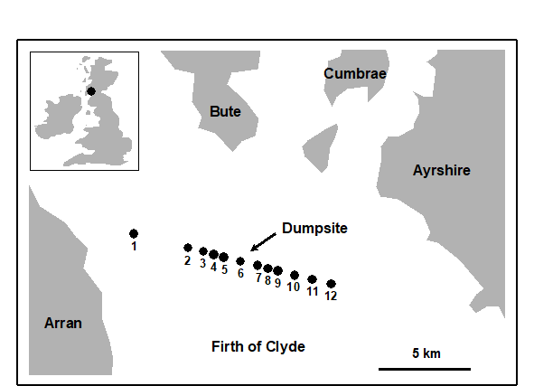
Fig. 8.3. Garroch Head macrofauna {G}. Map showing location of dump-ground and position of sampling stations (1–12); the dump centre is at station 6.
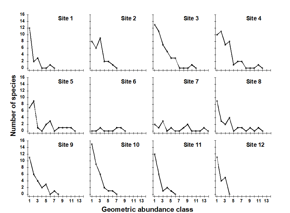
Fig. 8.4. Garroch Head macrofauna {G}. Plots of $\times 2$ geometric species abundance classes for the 12 sampling stations shown in Fig. 8.3.
In Fig. 8.5a, average ranked species abundance curves (with the x-axis logged) are given for the macrobenthos at a group of 6 sampling stations within 250m of the current centre of oil-drilling activity at the Ekofisk field in the North Sea {E}, compared with a group of 10 stations between 250m and 1km from the centre (see inset map in Fig. 10.6a for locations of these stations). Note that the curve for the more polluted (inner) stations is J-shaped, showing high dominance of abundant species, whereas the curve for the less polluted (outer) stations is much flatter, with low dominance. Fig. 8.5b shows k-dominance curves for the same data. Here the curve for the inner stations is elevated, indicating lower diversity than at the 250m–1km stations.

Fig. 8.5. Ekofisk macrobenthos {E}. a) Average ranked species abundance curves (x-axis logged) for 6 stations within 250m of the centre of drilling activity (dotted line) and 10 stations between 250m and 1km from the centre (solid line); b) k-dominance curves for the same groups of stations.
Abundance/biomass comparison plots
Whether k-dominance curves are plotted from the species abundance distribution or from species biomass values, the y-axis is always scaled in the same range (0 to 100). This facilitates the Abundance/Biomass Comparison (ABC) method of determining levels of disturbance (pollution-induced or otherwise) on community structure. The initial paradigm was for soft-sediment macrobenthos . Under stable conditions of infrequent disturbance the competitive dominants in benthic communities are K-selected (conservative) species, with the attributes of large body size and long life-span: these are rarely dominant numerically but are generally dominant in terms of biomass. Also present in these communities are smaller r-selected (opportunistic) species with a smaller body size and short life-span, which can be numerically significant but do not represent a large proportion of the community biomass. When pollution perturbs a community, conservative species are less favoured in comparison with opportunists. Thus, under pollution stress, the distribution of numbers of individuals among species behaves differently from the distribution of biomass among species.
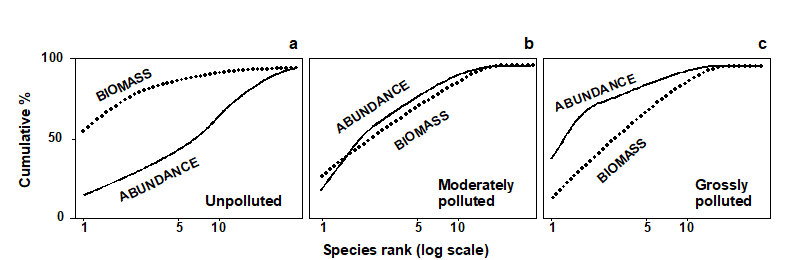
Fig. 8.6. Hypothetical k-dominance curves for species biomass and abundance, showing ‘unpolluted’, ‘moderately polluted’ and ‘grossly polluted’ conditions.
The ABC method, as originally described by Warwick (1986) , involves the plotting of separate k-dominance curves ( Lambshead, Platt & Shaw (1983) ) for species abundances and species biomass on the same graph and making a comparison of the forms of these curves. The species are ranked in order of importance in terms of abundance or biomass on the x-axis (logarithmic scale) with percentage dominance on the y-axis (cumulative scale¶). In undisturbed communities the biomass is dominated by one or a few large species, leading to an elevated biomass curve. Each of these species, however, is represented by rather few individuals so they do not dominate the abundance curve, which shows a typical diverse, equitable distribution. Thus, the k-dominance curve for biomass lies above the curve for abundance for its entire length (Fig. 8.6a). Under moderate pollution (or disturbance), the large competitive dominants are eliminated and the inequality in size between the numerical and biomass dominants is reduced so that the biomass and abundance curves are closely coincident and may cross each other one or more times (Fig. 8.6b). As pollution becomes more severe, benthic communities become increasingly dominated by one or a few opportunistic species which whilst they dominate the numbers do not dominate the biomass, because they are very small-bodied. Hence, the abundance curve lies above the biomass curve throughout its length (Fig. 8.6c).
The contention is that these three conditions (termed unpolluted, moderately polluted and grossly polluted) should be recognisable in a community without reference to control samples in time or space, the two curves acting as an ‘internal control’ against each other. Reference to spatial or temporal control samples is, however, still desirable. Adequate replication of sampling is a prerequisite of the method, since the large biomass dominants are often represented by few individuals, which will be liable to a higher sampling error than the numerical dominants.
Whilst described in terms of benthic macrofauna the paradigm is likely to apply much more generally†.
¶ The species are therefore in a different order on the x axis for the abundance and biomass curves – the species identities are not matched up in any way, it is simply the dominance structure of the community that is separately captured for abundance and biomass.
† Indeed, the several hundred papers that cite Warwick (1986) include many examples of application to other marine fauna (e.g. fish communities, where over-fishing tends to be accompanied by reduction in average body-size and replacement of large-bodied by increased abundance of smaller-bodied species) and terrestrial/freshwater fauna: birds, dragonflies, small mammals, herpetofauna (whose ABC curves tracked successional recovery after forest fires, Smith & Rissler (2010) ) etc.
8.4 Examples: Loch Linnhe and Garroch Head macrofauna
ABC curves for the macrobenthos at site 34 in Loch Linnhe, Scotland {L} between 1963 and 1973 are given in Fig. 8.7. The time course of organic pollution from a pulp-mill, and changes in species diversity ($H ^ \prime$), are shown top left. Moderate pollution started in 1966, and by 1968 species diversity was reduced. Prior to 1968 the ABC curves had the unpolluted configuration. From 1968 to 1970 the ABC plots indicated moderate pollution. In 1970 there was an increase in pollutant loadings and a further reduction in species diversity, reaching a minimum in 1972, and the ABC plots for 1971 and 1972 show the grossly polluted configuration. In 1972 pollution was decreased and by 1973 diversity had increased and the ABC plots again indicated the unpolluted condition. Thus, the ABC plots provide a good ‘snapshot’ of the pollution status of the benthic community in any one year, without reference to the historical comparative data which would be necessary if a single species diversity measure based on the abundance distribution was used as the only criterion.
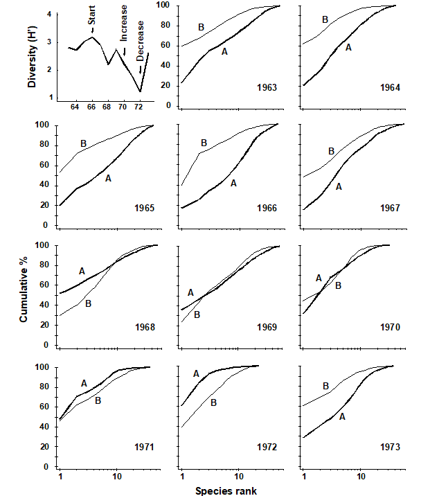
Fig. 8.7. Loch Linnhe macrofauna {L}. Shannon diversity ($ H ^ \prime$) and ABC plots over the 11 years, 1963 to 1973. Abundance = thick line, biomass = thin line.
ABC plots for the macrobenthos along a transect of stations across the accumulating sewage-sludge dump-ground at Garroch Head, Scotland {G} (Fig 8.3) are given in Fig. 8.8. Note how the ABC curves behave along the transect, with the peripheral stations 1 and 12 having unpolluted configurations, those near the dump-centre at station 6 with grossly polluted configurations and intermediate stations showing moderate pollution. Of course, at the dump-centre itself there are only three species present, so that any method of data analysis would have indicated gross pollution. However, the biomass and abundance curves start to become transposed at some distance from the dump-centre, when species richness is still high.
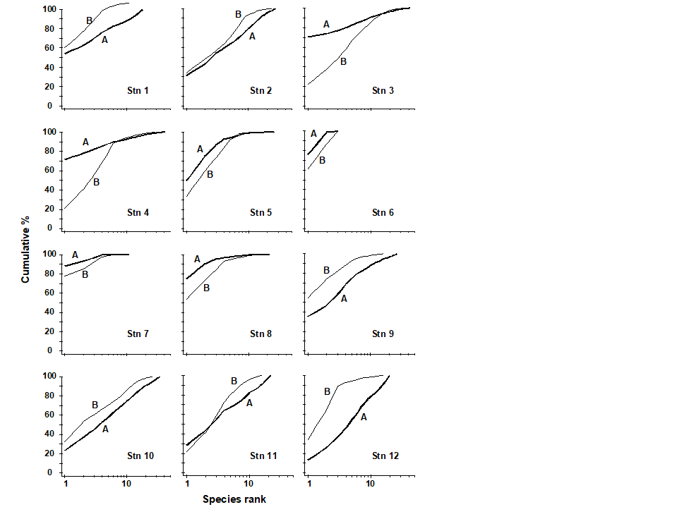
Fig. 8.8. Garroch Head macrofauna {G}. ABC curves for macrobenthos in 1983. Abundance = thick line, biomass = thin line.
Transformations of k-dominance curves
Very often k-dominance curves approach a cumulative frequency of 100% for a large part of their length, and in highly dominated communities this may be after the first two or three top-ranked species. Thus, it may be difficult to distinguish between the forms of these curves. One solution to this problem is to transform the y-axis so that the cumulative values are closer to linearity. Clarke (1990) suggests the modified logistic transformation:
$$ y _ i ^ \prime = \log [(1 + y _ i)/(101 – y _ i)] \tag{8.9} $$
An example of the effect of this transformation on ABC curves is given in Fig. 8.9 for the macrofauna at two stations in Frierfjord, Norway {F}, A being an unimpacted reference site and C a potentially impacted site. At site C there is an indication that the biomass and abundance curves cross at about the tenth species, but since both curves are close to 100% at this point, the crossover is unclear. The logistic transformation enables this crossover to be better visualised, and illustrates more clearly the differences in the ABC configurations between these two sites.
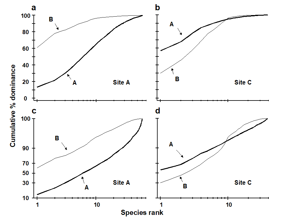
Fig. 8.9. Frierfjord macrofauna {F}. a), b) Standard ABC plots for sites A (reference) and C (potentially impacted). c), d) ABC plots for sites A and C with the y-axis subjected to modified logistic transformation. Abundance = thick line, biomass = thin line.
Partial dominance curves
A second problem with the cumulative nature of k-dominance (and ABC) curves is that the visual information presented is over-dependent on the single most dominant species. The unpredictable presence of large numbers of a species with small biomass, perhaps an influx of the juveniles of one species, may give a false impression of disturbance. With genuine disturbance, one might expect patterns of ABC curves to be unaffected by successive removal of the one or two most dominant species in terms of abundance or biomass, and so Clarke (1990) recommended the use of partial dominance curves, which compute the dominance of the second ranked species over the remainder (ignoring the first ranked species), the same with the third most dominant etc. Thus if $a _ i$ is the absolute (or percentage) abundance of the ith species, when ranked in decreasing abundance order, the partial dominance curve is a plot of $p _ i$ against log i (i = 1, 2, ..., S–1), where
$$ p _ 1 = 100 a _1 \big/ \sum _ {j=1} ^ S a _ j, \hspace{5mm} p _ 2 = 100 a _2 / \sum _ {j=2} ^ S a _ j, \hspace{2.5mm} \ldots \hspace{2.5mm} p _ {S-1} = 100 a _ {S-1} / ( a _ {S-1} + a _ {S} ) \tag{8.10} $$
Earlier values can therefore never affect later points on the curve. The partial dominance curves (ABC) for undisturbed macrobenthic communities typically look like Fig. 8.10, with the biomass curve (thin line) above the abundance curve (thick line) throughout its length. The abundance curve is much smoother than the biomass curve, showing a slight and steady decline before the inevitable final rise. Under polluted conditions there is still a change in position of partial dominance curves for abundance and biomass, with the abundance curve now above the biomass curve in places, and the abundance curve becoming much more variable. This implies that pollution effects are not just seen in changes to a few dominant species but are a phenomenon which pervades the complete suite of species in the community. For example, the time series of macrobenthos data from Loch Linnhe (see Fig. 8.11) shows that in the most polluted years 1971 and 1972 the abundance curve is above the biomass curve for most of its length (and the abundance curve is very atypically erratic), the curves cross over in the moderately polluted years 1968 and 1970 and have an unpolluted configuration prior to the pollution impact in 1966. In 1967, there is perhaps the suggestion of incipient change in the initial rise in the abundance curve. Although these curves are not so smooth (and therefore not so visually appealing!) as the original ABC curves, they may provide a useful alternative aid to interpretation and are certainly more robust to random fluctuations in the abundance of a small-sized, numerically dominant species.

Fig. 8.10. Frierfjord macrofauna {F}. Partial dominance curves (abundance/biomass comparison) for reference site A (c.f. Figs 8.9a,c for corresponding standard and transformed ABC plots).
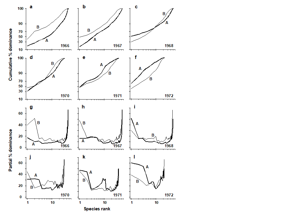
Fig. 8.11. Loch Linnhe macrofauna {L}. Selected years 1966–68 and 1970–72. a–f) ABC curves (logistic transform). g)–l) Partial dominance curves for abundance (thick line) and biomass (thin line) for the same years.
Phyletic role in ABC method
Warwick & Clarke (1994)
have shown that the ABC response in macrobenthos results from (i) a shift in the proportions of different phyla present in communities, some phyla having larger-bodied species than others, and (ii) a shift in the relative distributions of abundance and biomass among species within the Polychaeta but not within any of the other major phyla (Mollusca, Crustacea, Echinodermata). The shift within polychaetes reflects the substitution of larger-bodied by smaller-bodied species, and not a change in the average size of individuals within a species. In most instances the phyletic changes reinforce the trend in species substitutions within the polychaetes, to produce the overall ABC response, but in some cases they may work against each other. In cases where the ABC method has not succeeded as a measure of the pollution status of marine macrobenthic communities, it is because small non-polychaete species have been dominant. Prior to the Amoco Cadiz oil-spill, small ampeliscid amphipods (Crustacea) were present at the Pierre Noire sampling station in relatively high abundance (
Dauvin (1984)
), and their disappearance after the spill confounded the ABC plots (
Ibanez & Dauvin (1988)
). It was the erratic presence of large numbers of small amphipods (Corophium) or molluscs (Hydrobia) which confounded these plots in the Wadden Sea (
Beukema (1988)
). These small non-polychaetous species are not an indication of polluted conditions, as Beukema points out. Indications of pollution or disturbance detected by this method for marine macrobenthos should therefore be viewed with caution if the species responsible for the polluted configurations are not polychaetes.
W statistics
When the number of sites, times or replicates is large, presenting ABC plots for every sample can be cumbersome, and it would be convenient to reduce each plot to a single summary statistic. Clearly, some information must be lost in such a condensation: cumulative dominance curves are plotted, rather than quoting a diversity index, precisely because of a reluctance to reduce the diversity information to a single statistic. Nonetheless, Warwick (1986) ’s contention that the biomass and abundance curves increasingly overlap with moderate disturbance, and transpose altogether for the grossly disturbed condition, is a unidirectional hypothesis and very amenable to quantification by a single summary statistic.
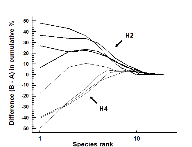
Fig. 8.12. Hamilton Harbour macrobenthos {H}. Difference (B–A) between cumulative dominance curves for biomass and abundance for four replicate samples at stations H2 (thick line) and H4 (thin line).
Fig. 8.12 displays the difference curves B–A for each of four replicate macrofauna samples from two stations (H2 and H4) in Hamilton Harbour, Bermuda; these are simply the result of subtracting the abundance ($A _ i$) from the biomass ($B _ i$) value for each species rank (i) in an ABC curve.¶ For all four replicates from H2, the biomass curve is above the abundance curve throughout its length, so the sum of the $B _ i – A _ i$ values across the ranks i will be strongly positive. In contrast, this sum will be strongly negative for the replicates at H4, for which abundance and biomass curves are largely transposed. Intermediate cases in which A and B curves are intertwined will tend to give $ \sum (B _ i – A _ i)$ values near zero. The summation requires some form of standardisation to a common scale, so that comparisons can be made between samples with differing numbers of species, and Clarke (1990) proposes the W (for Warwick) statistic:
$$ W = \sum _ {i =1} ^ S (B _ i – A _ i) / [ 50 ( S - 1)] \tag{8.11} $$
It can be shown algebraically that W takes values in the range (–1, 1), with $W \rightarrow +1$ for even abundance across species but biomass dominated by a single species, and $W \rightarrow –1$ in the converse case (though neither limit is likely to be attained in practice).
An example is given by the changing macrofauna communities along the transect across the sludge dump-ground at Garroch Head {G}. Fig. 8.13 plots the W values for each of the 12 stations against the station number. These summarise the 12 component ABC plots of Fig. 8.8 and clearly delineate a similar pattern of gradual change from unpolluted to disturbed conditions, as the centre of the dumpsite is approached.
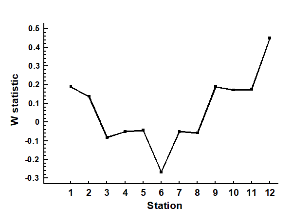
Fig. 8.13. Garroch Head macrofauna {G}. W values corresponding to the 12 ABC curves of Fig. 8.8, plotted against station number; station 6 is the centre of the dump ground (Fig. 8.3).
Hypothesis testing for dominance curves
There are no replicates in the Garroch Head data to allow testing for statistical significance of observed changes in ABC patterns but, for studies involving replication, the W statistic provides an obvious route to hypothesis testing. For the Bermuda samples of Fig. 8.12, W takes values 0.431, 0.253, 0.250 and 0.349 for the four replicates at H2 and -0.082, 0.053, -0.081 and -0.068 for the four H4 samples. These data can be input into a standard univariate ANOVA (equivalent in the case of two groups to a standard 2-sample t-test), showing that there is indeed a clearly established difference in abundance-biomass patterns between these two sites (F = 45.3, p<0.1%).
More general forms of hypothesis testing are possible, likely to be particularly relevant to the comparison of k-dominance curves calculated for replicates at a number of sites, times or conditions (or in some two-way layout, as discussed in Chapter 6). A measure of ‘dissimilarity’ could be constructed between any pair of k-dominance (or B-A) curves, for example based on their absolute distance apart, summed across the species ranks. When computed for all pairs of samples in a study this provides a (ranked) triangular dissimilarity matrix, essentially similar in structure to that from a multivariate analysis; thus the 1-way and 2-way ANOSIM tests (Chapter 6) can be used in exactly the same way to test hypotheses about differences between a priori specified groups of samples. Clarke (1990) discusses some appropriate definitions of dissimilarity for use with dominance curves in such tests, as now described and illustrated.
¶ Note that, as always with an ABC curve, $B _ i$ and $A _ i$ do not necessarily refer to values for the same species; the ranking is performed separately for abundance and biomass.
8.5 Multivariate tools used on univariate data
Ekofisk macrofauna: testing dominance curves
Fig. 8.5b compares the averaged community samples for the closest distances to the oil platform (< 250m) with the second closest group (250m – 1km), in terms of their k-dominance curves, and the closest samples appear to be more heavily dominated. But, to test this, we must return to the replicate rather than averaged curves, and these are seen for the 6 and 10 samples in the two distance groups in Fig. 8.14a,b, the two plots being identical apart from a log scaled x axis in (a).
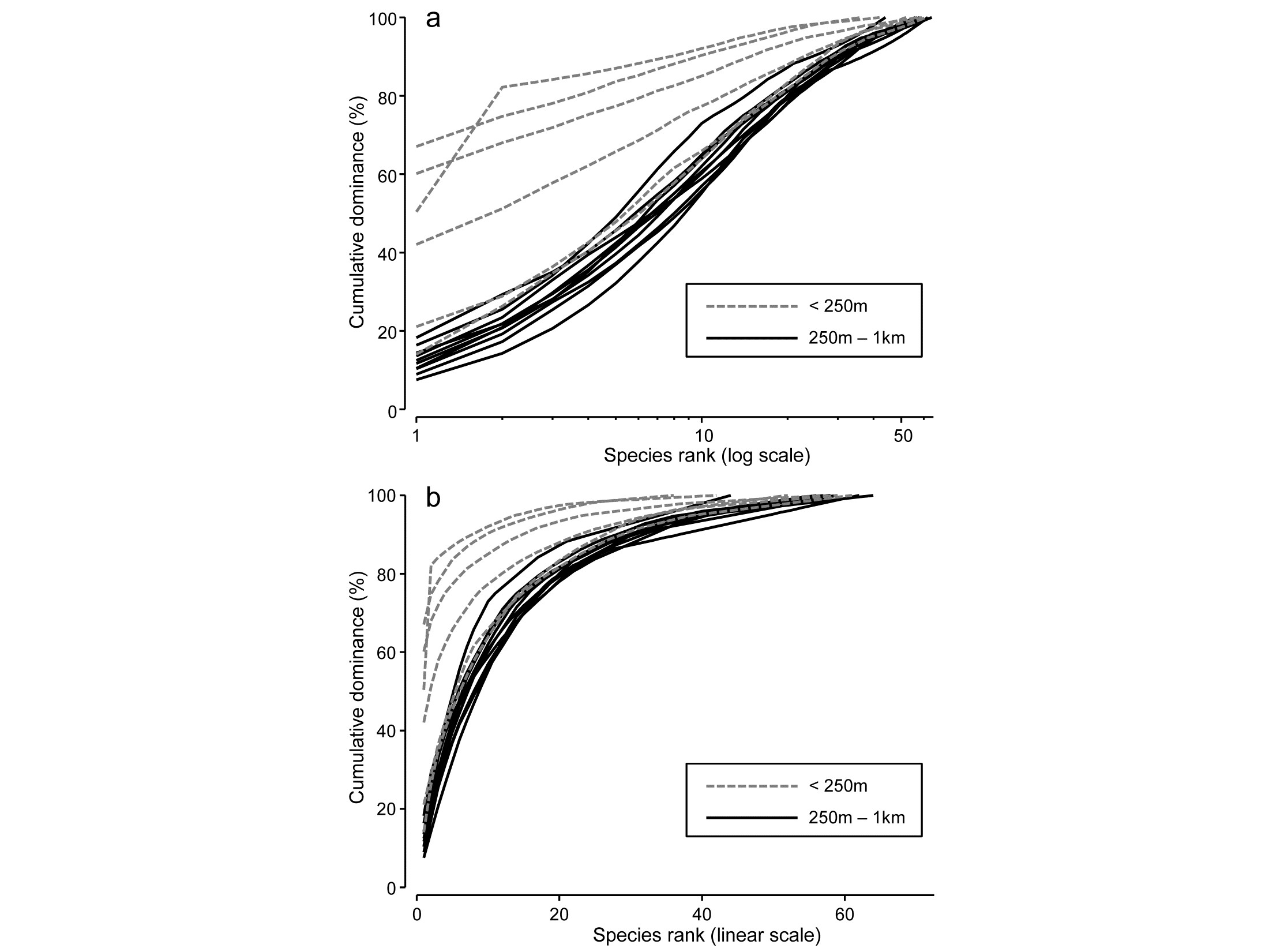
Fig. 8.14. Ekofisk oil-field macrofauna {E}. k-dominance curves for sites in the closest and second closest distance groups to the oil-field, plotted with x axis on: a) log scale, b) linear scale.
For any two curves, in the same or different groups, their absolute distance apart on the y axis, for each x axis point, is calculated and totalled, giving a possible measure of the ‘dissimilarity’ of the two curves. This can be thought of as the area between two curves in Fig.8.14b, taking the value 0 only if they lie totally on top of each other. In Fig. 8.14a, which is the more usual form of a k-dominance curve, the absolute y- axis deviations are given increasingly less weight for larger x-axis ranks, so the distance apart of curves 1 and 2 ($y$ axis values {$y _ {i1}$} and {$y _ {i2}$}) is defined as:
$$ d ^ \prime = \sum _ {i=1} ^ { S _ {\max}} | y _ {i1} - y _ {i2} | \log \left( 1 +i ^ {-1} \right) \tag{8.12} $$
where $S {_{\max}}$ is the largest number of species seen in a single sample and all curves are assumed to continue at 100% after they reach that maximum point. This again effectively defines the ‘dissimilarity’ of two curves in Fig. 8.14a as the area separating them. This is the default for the DOMDIS routine in PRIMER, since this ‘log weighting of species ranks’ matches the standard k-dominance plot, with its emphasis on dominance differences for the most abundant species.
Computing (8.12) among every pair of samples (the output from DOMDIS) and subjecting the resulting dissimilarities to an ANOSIM test of the two distance groups gives R = 0.51 (p<0.3%), a clear difference in dominance structure. The matching test to Fig. 8.14b is little different, with R = 0.56 (p<0.2%).
General curve comparisons: size distributions
The simplicity of a dissimilarity-based approach to testing for significant differences between groups of curves immediately suggests many other contexts in which a similarly robust, multivariate ANOSIM test could be employed. Particle-size distributions in sediment or water-column sampling are often measured in replicate samples, and need comparison between different factor levels in space and/or time. In effect, each curve (whether cumulative frequency or simple frequency polygon¶) needs to be treated as a single, multivariate point, the variables (‘species’) being the differing size classes and their observed values the relative frequencies (i.e. samples are automatically standardised to total to 1 or 100%), or cumulative relative frequencies, and this matrix is input to either Euclidean or Manhattan distance calculation§. The resulting resemblances are then available for the full range of multivariate techniques, including ANOSIM (or PERMANOVA) tests on the groups of replicate curves, ordination by MDS etc.
¶ These are usually not ‘true’ statistical probability distributions, in the sense of individual particles arriving randomly and independently of each other, which would be needed to justify multinomial assumptions for a Kolmogorov-Smirnov test of difference between two such (cumulative) sample distribution functions. Typically, instruments such as Coulter counters will scan vast numbers of particles to construct a size distribution, and the important level of variability is not within a sample but among independent samples taken at the same place or time. Fitting specific parametric distributions, such as a 2- or 3-parameter Weibull, in order to compare parameter estimates among curves, is therefore unappealing: the data is not a true probability distribution and the parametric form will usually not fit well (mixture curves, and even bimodality, may be commonplace), and an unnecessary approximation step is interposed. Comparing simple moment estimators such as mean, standard deviation, skewness (or medians, percentiles etc) of grain sizes in each sample using classic univariate tests is a commonly used and viable alternative, but this may easily miss differences which are due to bimodality or other characteristic shapes repeated across replicates – why not instead just directly compare the curves with each other?
§ PRIMER’s DOMDIS routine is not needed here since this is simply calculation of a distance measure between pairs of samples in a given matrix. DOMDIS’s role in k-dominance curves also includes the initial re-ordering of the matrix in decreasing species abundance order, separately for each sample, before calculating Manhattan distance, in effect, on the resulting matrix. Other distance options given in PRIMER include, for example, the maximum distance of two curves from each other (usually applied to cumulative curves, as in a Kolmogorov-Smirnov statistic). Note that, if no transform is applied to the relative frequency data prior to distance calculation (often the case, though occasionally a mild transform may be preferred, to downweight a dominant size category) then Manhattan distance is equivalent to Bray-Curtis dissimilarity in this case, since the denominator term in equation (2.1) is fixed at 200.
8.6 Example: Plymouth particle-size data
Fig. 8.15 is from Coulter Counter data of particle-size distributions for estuarine water samples from 5 sites, over 92 logarithmically increasing size-classes, based on 4 replicate samples per site (A. Bale, pers. comm.), {P}. For clarity, the line plot¶ of Fig. 8.15a shows the size distributions averaged over replicates, and some differences in profiles (multimodality etc) are apparent for the various locations, but are such differences statistically demonstrable in the context of variation among replicate water samples at a site? A Manhattan distance matrix calculated for all pairs of frequency curves from the 20 samples can be input to ordination – here metric MDS is preferred because the Shepard diagram between input distances and final distances in the MDS is perfectly linear, and has low stress (for a metric plot, especially) of 0.07, Fig. 8.15b. The plot indicates clear differences between sites and this is established by significance (at p<3%) for all pairwise ANOSIM tests, with the lowest R of 0.63 between Saltram and Devoran locations.
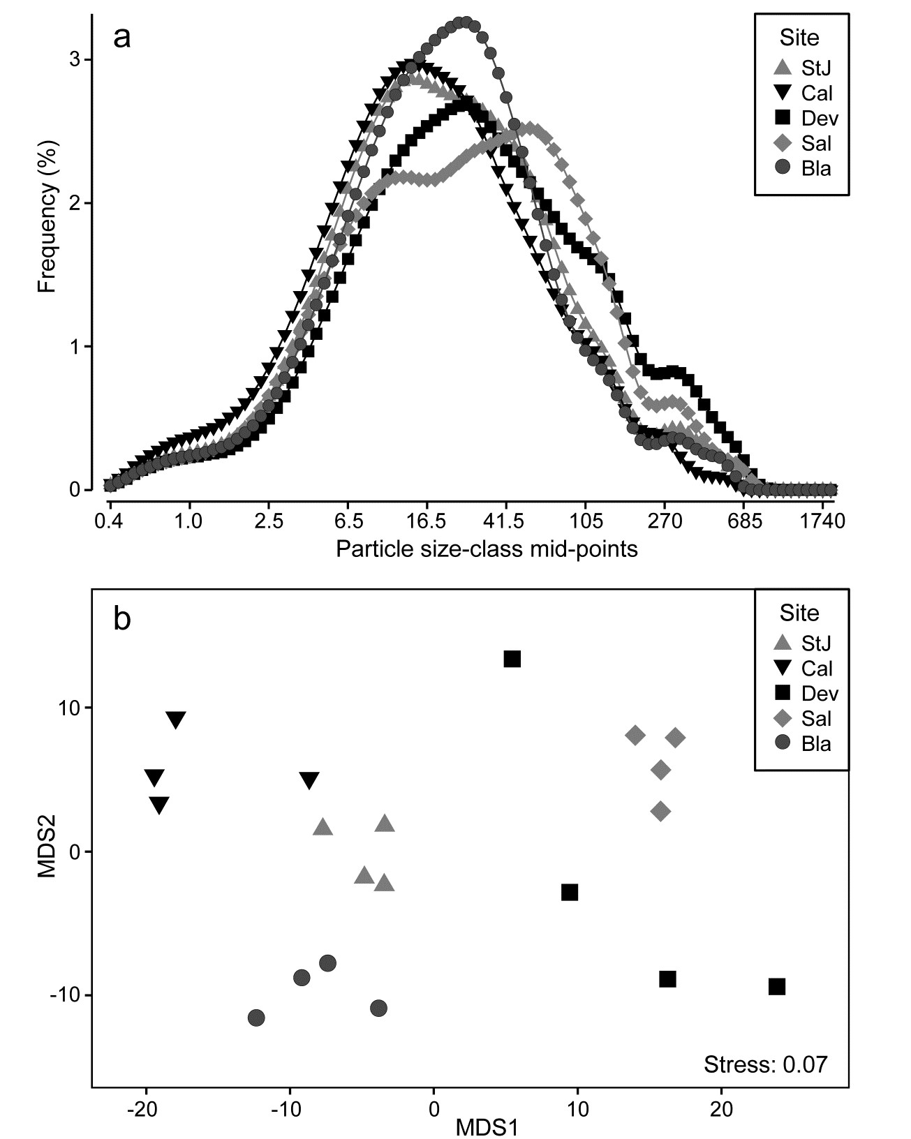
Fig. 8.15. Plymouth particle-size data {P}. a) Frequency distribution (y axis) of particle sizes in logarithmic size-classes (x axis) from water samples at 5 Plymouth sites. Frequency scale is the percentage of particulates in each of 92 classes, then averaged over 4 replicates per site. b)Metric MDS of replicate-level data based on Manhattan distances between all pairs of samples.
Ordering of the variable list
Applying multivariate methods to a matrix which is abundances not of different species, but of different size classes of a single species, has always been an (implicit) option throughout this manual, but there is one important way in which such a matrix (and the above data on particle sizes) differ from a standard community matrix: there is an explicit ordering of the variables. None of the resemblance measures (Bray-Curtis may often be appropriate again) would return different values if the ‘species’ list was re-ordered; all that matters is the degree to which the matching size-classes in the two samples have similar abundances (or relative frequencies). This was not an issue with the very smooth particle-size profiles above, but it could be when comparing (say) size-class histograms which are very ‘noisy’. That peaks for sample 1 are seen opposite troughs for sample 2 may have more to do with a choice of size interval which is too narrow, for the total frequency (arbitrarily) categorised in this way, than it does to a genuine mismatch in profiles.
A perfectly valid solution, if this is an issue, is firstly to smooth the relative frequencies (or abundances) over the size-classes before entering them to distance calculations§. Any such smoothing is ‘fair game’, provided it is done in the same way for each sample. Naturally, it increases correlation among the variables but no assumption of independence of variables is made in multivariate analysis. Quite the reverse: the techniques are designed specifically to handle and exploit correlated variables, because each sample is only treated as one ‘point’ in the analysis.
Growth curves & other repeated measures designs
Realisation that it is not necessary for the points on a curve to be independent of each other, for a method which uses the whole curve as a single (independent) replicate, naturally suggests an application to growth curves. Such a profile would be the increasing size of a specific organism (or, say, the number of hatching larvae in a single bioassay vial) monitored through time. These are (univariate) repeated measures on a single experimental/observational unit and therefore certainly not independent. But, given an appropriate design, the organisms (or the vials) are independently and randomly allocated to a specific treatment or observational condition, and statistical tests can compare this set of growth profiles with each other, among and within conditions etc, exactly as above, as a group of independent points in multivariate space. This time the variables are simply the sequence of time points, which must of course be commonly spaced across all measured profiles. In fact, this is what is known as the fully multivariate approach to univariate repeated measures designs,† except that we are here suggesting a distribution-free approach to analysis, side-stepping the need for model-based estimation of the auto-correlation structure amongst the times (‘variables’). Put simply, the problem reduces to asking whether, for example, the set of n growth profiles of organisms in group A are identifiably different in shape from the set of m profiles in B, in any respect, and consistently enough to determine significance. This needs only a measure of dissimilarity of profile pairs (e.g. Euclidean or Manhattan) and ANOSIM (/PERMANOVA).
¶ This line plot was produced in PRIMER, which has a facility for drawing line plots over the sample order in the worksheet (x axis) for each ‘species’ (y axis), with multiple species on the same plot. Of course this is the only possibility which makes sense for the usual type of community matrix, since species variables would not normally have a meaningful order to place on the x axis of a line plot (apart from the ranking by abundance of dominance plots). In this case, however, the size-class variables are automatically ordered and the natural line plot of Fig. 8.15b can be obtained by duplicating the worksheet and switching the definition of samples and variables from the Edit>Properties menu.
§ This could be by, for example, simple moving averages or more sophisticated kernel density estimation (found in many standard packages). PRIMER offers another simple form of smoothing, viz. cumulating values over the size-classes (abundances must first be sample standardised). Smoothing makes no sense for assemblage data of different species – unless the ‘nearby’ species whose abundances contribute to the moving average (say) for a specific species are defined by their taxonomic or functional affinity with that species (pooling species into higher taxa would be a crude example of this) – but is natural for ordered size-class variables
† It will not be lost on the reader that it might also be nice to have a ‘fully multivariate approach to multivariate repeated measures designs’, as arise, say, when monitoring an algal community on a marked quadrat through time. Removing a ‘quadrat effect’ in a higher-way ANOVA-type design can adjust for the fact that some quadrats have consistently different communities than others at all times, within the same ‘treatment’, but does not address the lack of symmetry in the correlation structure among times: observations at the beginning and end of a time sequence will be likely to have lower autocorrelation than adjacent times (see also the discussion in Anderson, Gorley & Clarke (2008) . A fully multivariate approach to multivariate repeated measures, using second stage analysis, is possible in limited cases, and is essentially an extension of the idea here. The ‘profile’ (in that case an entire dissimilarity matrix covering the changing community pattern over all times for a single experimental unit) becomes the single, independent point in a multivariate space which, along with other (matrix) points, we can enter into ANOSIM tests, MDS etc. Chapter 16 gives an example of such a rocky-shore experiment to monitor algal recolonisation of quadrats under different clearance conditions
8.7 Multiple diversity indices
A large number of different diversity measures can be computed from a single data set and it is relevant to ask if anything is achieved by doing so. The classic ‘spot’ (alpha) diversity indices, many of which were listed earlier in equations (8.1) to (8.7), are all based either on the set of species proportions {$p _ i$}, the total number of species S, or some mix of these two largely unrelated strands of information, and most are therefore mechanistically inter-correlated as a result, i.e. they will be seen to be correlated whatever the set of data for which they are calculated. Of course, for any particular data set, a richness measure such as simple S and a purely relatedness measure such as Simpson’s $1 - \lambda$ may be observed to correlate across samples, e.g. when a contaminant impact removes a wide range of climax community species, replacing them with a smaller number of opportunists which dominate the total numbers (or area cover), so that both richness and evenness indices decline. But this is a biological correlation not a mechanistic one. In other situations S and $1 - \lambda$ may do something quite different, but H′ (Shannon), J′ (Pielou) and $1 - \lambda$ will always be seen to correlate positively, as a result of their definitions.
We can (and should) examine such issues of whether anything is to be gained in calculating further indices by taking a multivariate approach, in contravention to what many ecologists have done for decades, i.e. test and interpret multiple measures (often mechanistically correlated) separately, as if they were providing independent scrutiny of a specific hypothesis (we are not immune from such strictures ourselves!). Though biological in origin, diversity indices are (statistically speaking) ‘environmental-type’ variables in that their distributions are generally rather well-behaved (as a result of the central limit theorem), needing only mild transformation if at all, and normalisation since they are on different measurement scales. The resulting data matrix of multiple indices across all samples can then be input to PCA (Chapter 4) to reveal the ‘true’ dimensionality, i.e. how many uncorrelated axes of information does this set of indices really contain?
As referred to in Chapter 7 on variables analysis, to examine the relationship of variables to each other, a resemblance matrix can be derived which is initially just the correlations over the samples for every pair of indices; Pearson correlation of (perhaps transformed) measures is appropriate. This may include positive or negative values, for example if Simpson is included as a dominance measure $\lambda$, it will be negatively correlated with evenness indices such as $H ^ \prime$ and $J ^ \prime$. But these indices are still considered closely related so similarity is defined as absolute correlation ($\times 100$). MDS on these similarities displays the relationships.
Garroch Head dump-ground macrofauna
Earlier in the chapter we saw the behaviour of some diversity-based constructions for the 12 sites on the E-W transect across the sewage-sludge dumpsite in the Firth of Clyde (1983 data), e.g. the ‘ABC’ method for contrasting abundance and biomass k-dominance curves, summarised in the W statistic of eqn. (8.11). Calculating also a range of standard diversity indices, none of which needed transformation, the normalised full set of 10 measures when input to PCA¶ is seen to contain only two (or at most three) dimensions of uncorrelated information. The first two PCs account for 95.4% of the variance and the first three for 98.2% (if W is omitted, the first two PCs account for 97.3%).
The MDS plot of the diversity index ‘similarities’ is shown in Fig. 8.16 and tells a simple, and universal, story. To the right are the richness measures (S and Margalef’s d) and to the left the evenness measures (Pielou’s $J ^ \prime$ and Simpson, $1 - \lambda$). On the line between them, mixing evenness and richness, Shannon $H ^ \prime$ and its discrete form, Brillouin H, are seen to be close to evenness indices, though they contain a small element of richness. Fisher’s $\alpha$, essentially the steepness of declines seen in the (log series) distributions of the SAD curves, Fig. 8.4, is seen to be a mixture of both elements. Perhaps the initially surprising observation is that the rarefaction estimates (equation 8.6) – the expected number of species for a given number of individuals, here calculated for ‘rarefying’ to 20 and 45 individuals (the most depauperate sample containing only 46 individuals) – is seen not to estimate richness at all here but to mainly reflect sample evenness. This is not so surprising when the construction is considered in more detail: individuals dropped at random until a small percentage are left (most samples have 100’s or 1000’s of individuals), and so the number of species remaining will be dictated by how dominated the community is by just a few species.
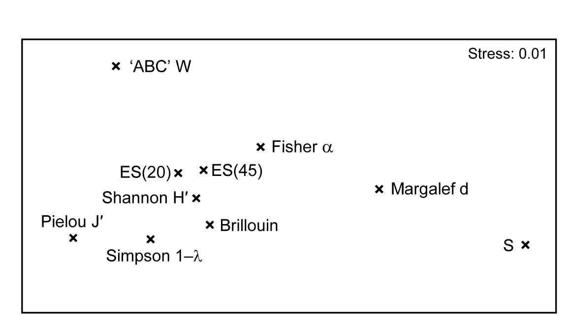
Fig. 8.16. Garroch Head macrofauna {G}. nMDS from absolute Pearson correlations among 10 diversity indices (variables) computed on soft-sediment faunal samples from 12 sites on a transect across the Clyde sewage sludge dump-ground.
Another interesting feature is that the W statistic does not lie on this richness-evenness axis. It is towards the evenness end, as might be expected from its use of the abundance k-dominance curve but here it also provides fresh information from the biomass dominance pattern. And this is the general point that such plots make: whatever the input data matrix, a pattern broadly in line with Fig. 8.16 will emerge. What this plot mainly captures is the mechanistic relationships among the diversity indices rather than the ecological information of a specific context§. The implication is always that the number of diversity indices it makes sense to calculate, based only on the species abundances, is very small – basically one richness and one evenness measure. Striking out from these two axes into third or higher dimensional diversity space needs introduction of fresh information, on biomass patterns perhaps or, for genuinely unrelated dimensions, the concept of average distinctness of a species set, for a given numbers of species, in terms of the taxonomic or genetic/phylogenetic relatedness of the species (or, indeed, their functional relatedness). Such a concept of diversity is returned to in Chapter 17.
¶ More detailed working of PCA for an index set from this data is shown in the PRIMER User Manual, e.g. the extent to which the diversity measures capture the impact gradient seen in the full multivariate analysis, and the definition of the PCs as an overall decline in all diversity measures when sites near the dump centre (PC1) and a contrast between evenness and richness (PC2).
§ A similar idea is seen for ordination of the relationship among competing definitions of distance or dissimilarity, utilising second stage plots (Chapter 16), viz. which coefficients capture the same, and which very different information on multivariate structure?