Change in Marine Communities
An Approach to Statistical Analysis and Interpretation, 3rd edition by K R Clarke, R N Gorley, P J Somerfield & R M Warwick (2014)
- Introduction and acknowledgements
- Chapter 1: A framework for studying changes in community structure
- 1.1 Introduction
- 1.2 Univariate techniques
- 1.3 Example: Frierfjord macrofauna
- 1.4 Distributional techniques
- 1.5 Example: Loch Linnhe macrofauna
- 1.6 Example: Garroch Head macrofauna
- 1.7 Multivariate techniques
- 1.8 Example: Nutrient enrichment experiment, Solbergstrand
- 1.9 Summary
- Chapter 2: Simple measures of similarity of species ‘abundance’ between samples
- 2.1 Similarity for quantitative data matrices
- 2.2 Example: Loch Linnhe macrofauna
- 2.3 Presence/absence data
- 2.4 Species similarities
- 2.5 Dissimilarity coefficients
- 2.6 More on resemblance measures
- Chapter 3: Clustering methods
- 3.1 Cluster analysis
- 3.2 Hierarchical agglomerative clustering
- 3.3 Example: Bristol Channel zooplankton
- 3.4 Recommendations
- 3.5 Similarity profiles (SIMPROF)
- 3.6 Binary divisive clustering
- 3.7 k-R clustering (non-hierarchical)
- Chapter 4: Ordination of samples by principal components analysis (PCA)
- 4.1 Ordinations
- 4.2 Principal components analysis
- 4.3 Example: Garroch Head macrofauna
- 4.4 PCA for environmental data
- 4.5 Example: Dosing experiment, Solbergstrand mesocosm
- Chapter 5: Ordination of samples by multi-dimensional scaling (MDS)
- 5.1 Other ordination methods
- 5.2 Non-metric multidimensional scaling (MDS)
- 5.3 Diagnostics: Adequacy of MDS representation
- 5.4 EXAMPLE: Dosing experiment, Solbergstrand
- 5.5 Example: Celtic Sea zooplankton
- 5.6 Example: Amoco-Cadiz oil spill, Morlaix
- 5.7 MDS strengths and weaknesses
- 5.8 Further nMDS/mMDS developments
- 5.9 Example: Okura estuary macrofauna
- 5.10 Example: Messolongi lagoon diatoms
- 5.11 Recommendations
- Chapter 6: Testing for differences between groups of samples
- 6.1 Univariate tests and multivariate tests
- 6.2 ANOSIM for the one-way layout
- 6.3 Example: Frierfjord macrofauna
- 6.4 Example: Indonesian reef-corals
- 6.5 ANOSIM for two-way layouts
- 6.6 Example: Clyde nematodes (2-way nested case)
- 6.7 Example: Eaglehawk Neck meiofauna (two-way crossed case)
- 6.8 Example: Mesocosm experiment (two-way crossed case with no replication)
- 6.9 Example: Exe nematodes (no replication and missing data)
- 6.10 ANOSIM for ordered factors
- 6.11 Example: Ekofisk oil-field macrofauna
- 6.12 Two-way ordered ANOSIM designs
- 6.13 Example: Phuket coral-reef time series
- 6.14 Three-way ANOSIM designs
- 6.15 Example: King Wrasse fish diets, WA
- 6.16 Example: NZ kelp holdfast macrofauna
- 6.17 Example: Tees Bay macrofauna
- 6.18 Recommendations
- Chapter 7: Species analyses
- 7.1 Species clustering
- 7.2 Type 2 and type 3 SIMPROF tests
- 7.3 Example: Amoco-Cadiz oil spill
- 7.4 Shade plots
- 7.5 Example: Bristol Channel zooplankton
- 7.6 Example: Garroch Head macrofauna
- 7.7 Example: Ekofisk oil-field macrofauna
- 7.8 Species contributions to sample (dis)similarities – SIMPER
- 7.9 Example: Tasmanian meiofauna
- 7.10 Bubble plots (plus examples)
- Chapter 8: Diversity measures, dominance curves and other graphical analyses
- 8.1 Univariate measures
- 8.2 Graphical/distributional plots
- 8.3 Examples: Garroch Head and Ekofisk macrofauna
- 8.4 Examples: Loch Linnhe and Garroch Head macrofauna
- 8.5 Multivariate tools used on univariate data
- 8.6 Example: Plymouth particle-size data
- 8.7 Multiple diversity indices
- Chapter 9: Transformations and dispersion weighting
- 9.1 Introduction
- 9.2 Univariate case
- 9.3 Multivariate case
- 9.4 Recommendations
- 9.5 Dispersion weighting
- 9.6 Example: Fal estuary copepods
- 9.7 Variability weighting
- Chapter 10: Species aggregation to higher taxa
- Chapter 11: Linking community analyses to environmental variables
- 11.1 Introduction
- 11.2 Example: Garroch Head macrofauna
- 11.3 Linking biota to univariate environmental measures (and examples)
- 11.4 Linking biota to multivariate environmental patterns
- 11.5 Further ‘BEST’ variations
- 11.6 Linkage trees (and example)
- 11.7 Concluding remarks
- Chapter 12: Causality - community experiments in the field and laboratory
- Chapter 13: Data requirements for biological effects studies - which components and attributes of the marine biota to examine?
- 13.1 Components
- 13.2 Plankton and fish
- 13.3 Macrobenthos and meiobenthos
- 13.4 Hard-bottom epifauna and hard-bottom motile fauna
- 13.5 Attributes and recommendations
- Chapter 14: Relative sensitivities and merits of univariate, graphical/distributional and multivariate techniques
- 14.1 Introduction
- 14.2 Examples 1, 2 and 3
- 14.3 Examples 4, 5, 6 and 7
- 14.4 General conclusions and recommendations
- Chapter 15: Multivariate measures of community stress and relating to models
- 15.1 Introduction
- 15.2 Meta-analysis of marine macrobenthos
- 15.3 Increased variability
- 15.4 Breakdown of seriation
- 15.5 Model matrices & ‘RELATE’ tests
- 15.6 Examples
- Chapter 16: Further multivariate comparisons and resemblance measures
- 16.1 Introduction
- 16.2 Matching of ordinations
- 16.3 Example: Amoco-Cadiz oil spill
- 16.4 Further extensions
- 16.5 Second-stage MDS
- 16.6 Comparison of resemblance measures
- 16.7 Second-stage interaction plots
- 16.8 Example: Algal recolonisation, Calafuria
- Chapter 17: Biodiversity and dissimilarity measures based on relatedness of species
- 17.1 Species richness disadvantages
- 17.2 Average taxonomic diversity and distinctness
- 17.3 Examples: Ekofisk oil-field and Tees Bay soft-sediment macrobenthos
- 17.4 Other relatedness measures
- 17.5 ‘Expected distinctness’ tests
- 17.6 Example: UK free-living nematodes
- 17.7 Example: N Europe groundfish surveys
- 17.8 Variation in taxonomic distinctness, $\Lambda ^ +$
- 17.9 Joint (AvTD, VarTD) analyses
- 17.10 Concluding remarks on taxonomic distinctness
- 17.11 Taxonomic dissimilarity
- 17.12 Examples
- Chapter 18: Bootstrapped averages for region estimates in multivariate means plots
- 18.1 Means plots
- 18.2 Example: Indonesian reef corals, S. Tikus
- 18.3 ‘Bootstrap average’ regions
- 18.4 Example: Loch Creran macrobenthos
- 18.5 Example: Fal estuary macrofauna
- Appendices
Introduction and acknowledgements
0.1 Introduction
Third edition
The third edition of this unified framework for non-parametric analysis of multivariate data, underlying the PRIMER software package, has the same form and similar chapter headings to its predecessor (with an additional chapter). However, the text has been much expanded to include full cover of methods that were implemented in PRIMER v6 but only described in the PRIMER v6 User Manual, and also the entire range of new methods contained in PRIMER v7.
Whilst text has been altered throughout, PRIMER v6 users familiar with the 2nd edition, who just want to locate the new material, will find it below:
Table 0.1. Manual pages primarily covering new material
 Topics Topics |
Pages |
|---|---|
| 1.7 | |
| 2.6 | |
| 3.5 | |
| Unconstrained binary divisive (UNCTREE) and fixed group (k-R) clustering | 3.6, 3.7 |
| More nMDS diagnostics (MST, similarity joins, 3-d cluster on MDS, scree plots) | 5.3, 5.7 |
| Metric MDS (mMDS), threshold MDS | 5.8 |
| Combined MDS (‘fix collapse’ by nMDS + mMDS, composite biotic/abiotic nMDS) | 5.9, 5.10 |
| ANOSIM for ordered factors | 6.10 to 6.13 |
| 3-way ANOSIM designs | 6.14 to 6.17 |
Species Analyses (new chapter, in effect):
|
|
| Testing curves (dominance/particle/growth) | 8.5, 8.6 |
| Analysing multiple diversity indices | 8.7 |
| Dispersion weighting | 9.5, 9.6 |
| Vector plots in PCA and MDS | 11.2, 11.3 |
Global BEST test (allowing for selection)
|
11.4 |
| Linkage trees: binary clusters, constrained by abiotic ‘explanations’ (LINKTREE) | 11.6 |
| Model matrices, RELATE tests of seriation and cyclicity, constrained RELATE | 15.5, 15.6 |
Second-stage analysis (2STAGE)
|
|
| Taxonomic (relatedness-based) dissimilarity | 17.11, 17.12 |
| Means plots & ‘bootstrap average’ regions | 18.1 to 18.5 |
Attribution (and responsibility for queries)
These new sections have all been authored by KRC but build heavily on collaborations, joint publications and novel algorithmic and computer coding work with/by PJS and RNG. In the retained material from the 2nd edition (authored by KRC and RMW), KRC was largely responsible for Chapters 1-7, 9, 11 and 16 and RMW for 10 and 12-14, with the responsibility for Chapters 8, 15 and 17 shared between them.
Purpose
This manual accompanies the computer software package PRIMER (Plymouth Routines In Multivariate Ecological Research), obtainable from PRIMER-e, (see www.primer-e.com). Its scope is the analysis of data arising in community ecology and environmental science which is multivariate in character (many species, multiple environmental variables), and it is intended for use by ecologists with no more than a minimal background in statistics. As such, this methods manual complements the PRIMER user manual, by giving the background to the statistical techniques employed by the analysis programs (Table 0.2), at a level of detail which should allow the scientist to understand the output from the programs, be able to describe the results in a non-technical way to others and have confidence that the right methods are being used for the right problem.
This may seem a tall order, in an area of statistics (primarily multivariate analysis) which has a reputation as esoteric and mathematically complex! However, whilst it is true that the computational details of some of the core techniques described here (for example, non-metric multidimensional scaling) are decidedly non- trivial, we maintain that all of the methods that have been adopted or developed within PRIMER are so conceptually straightforward as to be amenable to simple explanation and transparent interpretation. In fact, the adoption of non-parametric and permutation approaches for display and testing of multivariate data requires, paradoxically, a lower level of statistical sophistication on the part of the user than does a satisfactory exposition of classic (parametric) hypothesis testing in the univariate case.
Table 0.2. Chapters in this manual in which the methods underlying specific PRIMER routines are principally found.¶
 Routines Routines |
Chapters |
|---|---|
|
|
Cluster
|
|
SIMPROF
|
|
| PCA (+ Vector plot) | 4, 11 |
MDS
|
|
| ANOSIM (1/2/3-way, crossed/nested, ordered) | 6 |
| SIMPER | 7 |
| Shade Plot (Matrix display) | 7 |
Diversity indices
|
|
Pre-treatment
|
|
| Aggregate | 10, 16 |
BEST
|
|
| MVDISP | 15 |
| RELATE (Seriation, Cyclicity, Model Matrix) | 15 |
| 2STAGE (Single and Multiple matrices) | 16 |
| Bootstrap Averages | 18 |
¶PRIMER has a range of other data manipulation and plotting routines: Select, Edit, Summary stats, Average, Sum, Transpose, Rank, Merge, Missing data and Bar/Box/Means/Scatter/Surface/ Histogram Plots, etc – see the PRIMER User Manual/Tutorial.*
One primary aim of this manual is therefore to describe a coherent strategy for the interpretation of data on community structure, namely values of abundance, biomass, % cover, presence/absence etc. for a set of ‘species’ variables and one or more replicate samples which are taken:
a) at a number of sites at one time (spatial analysis);
b) at the same site at a number of times (temporal analysis);
c) for a community subject to different uncontrolled or controlled manipulative ‘treatments’;
or some combination of these.
These species-by-samples arrays are typically quite large, and usually involve many variables (p species, say) so that the total number (n) of observed samples can be considered to be n points in high-dimensional (p-dimensional) space. Classical statistical methods, based on multivariate normality are often impossible to reconcile with abundance values which are predominantly zero for many species in most samples, making their distributions highly right-skewed. Even worse, classic methods require that n is much larger than p in order to have any hope of estimating the parameters (unknown constants, such as means and variances for each species, and correlations between species) on which such parametric models are based.
Statistical testing therefore requires methods which can represent high-dimensional relationships among samples through similarity measures between them, and test hypotheses without such model assumptions (non-parametrically within PRIMER by permutation). A key feature is that testing must be carried out on the similarities, which represent the true relationships among samples (in the high-d space), rather than on some lower-dimensional approximation to this high-d space, such as a 2- or 3-d ‘ordination’.
Data visualisation, however, makes good use of such low-dimensional ordinations to view the approximate biological relationships among samples, in the form of a ‘map’ in 2- or 3-d. Patterns of distance between sample points in that map should then reflect, as closely as possible, the patterns of biological dissimilarity among samples. Testing and visualisation are therefore used in conjunction to identify and characterise changes in community structure in time or space, and in relation to changing environmental or experimental conditions.
Scope of techniques
It should be made clear at the outset that the title ‘Change in Marine Communities’ does not in any way reflect a restriction in the scope of the techniques in the PRIMER package to the marine environment. The first edition of this manual was intended primarily for a marine audience and, given that the examples and rationale are still largely set around the literature of marine ecology, and some of the original chapters in this context have been retained, it seems sensible to retain the historic continuity of title. However, it will soon be evident to the reader that there is rather little in the methods of the following pages that is exclusively marine or even confined to ecology. In fact, the PRIMER package is now not only used in over 120 countries world-wide (and in all US states) for a wide range of marine community surveys and experiments, of benthic fauna, algae, fish, plankton, corals, dietary data etc, but is also commonly found in freshwater & terrestrial ecology, palaeontology, agriculture, vegetation & soil science, forestry, bio-informatics and genetics, microbiology, physical (remote sensing, sedimentary, hydrological) and chemical/biochemical studies, geology, biogeography and even in epidemiology, medicine, environmental economics, social sciences (questionnaire returns), on ecosystem box model outputs, archaeology, and so on§.
Indeed, it is relevant to any context in which multiple measurement variables are recorded from each sample unit (the definition of multivariate data) and classical multivariate statistics is unavailable, i.e. especially (as intimated above) where there are a large number of variables in relation to the number of samples (and in microbial/genetic studies there can be many thousands of bands with intensities measured, from each sample), or characterised by a presence/absence structure in which the information is contained at least partly in pattern of the presences of non-zero readings, as well as their actual values (in other words, data for which zero is a ‘special’ number).
As a result of the authors’ own research interests and the widespread use of community data in pollution monitoring, a major thrust of the manual is the biological effects of contaminants but, again, most of the methods are much more generally applicable. This is reflected in a range of more fundamental ecological studies among the real data sets exemplified here.
The literature contains a large array of sophisticated statistical techniques for handling species-by-samples matrices, ranging from their reduction to simple diversity indices, through curvilinear or distributional representations of richness, dominance, evenness etc., to a plethora of multivariate approaches involving clustering or ordination methods. This manual does not attempt to give an overview of all the options. Instead it presents a strategy which has evolved over decades within the Community Ecology/Biodiversity groups at Plymouth Marine Laboratory (PML), and subsequently within the ‘spin-out’ PRIMER-E Ltd company, and which has now been tested for ease of understanding and relevance to analysis requirements at well over 100 practical 1-week training workshops.
The workshop content has continued to evolve, in line with development of the software, and the utility of the methods in interpreting a range of community data can be seen from the references listed under Clarke, Warwick, Somerfield or Gorley in Appendix 3, which between them have amassed a total of >20,000 citations in SCI journals. The analyses and displays in these papers, and certainly in this manual, have very largely been accomplished with routines available in PRIMER (though in many cases annotations etc have been edited by simply copying and pasting into graphics presentation software such as Microsoft Powerpoint).
Note also that, whilst other software packages will not encompass this specific combination of routines, several of the individual techniques (though by no means all) can be found elsewhere. For example, the core clustering and ordination methods described here are available in many mainstream statistical packages, and there are at least two other specialised statistical programs (CANOCO and PC-ORD) which tackle essentially similar problems, though usually employing different techniques and strategies; other authors have produced freely-downloadable routines in the R statistical framework, covering some of these methods.
This manual does not cover the PERMANOVA+ routines, which are available as an add-on to the PRIMER package. The PERMANOVA+ software has been further developed and fully coded by PRIMER-E (in the Microsoft Windows ‘.Net’ framework of all recent PRIMER versions) in very close collaboration with their instigator, Prof Marti Anderson (Massey University, NZ). These methods complement those in PRIMER, utilising the same graphical/data-handling environment, moving the emphasis away from non-parametric to semi-parametric (but still permutation based and thus distribution-free) techniques, which are able to extend hypothesis testing for data with more complex, higher-way designs (allowing, for example, for concepts of fixed vs random effects, and factor partitioning into main effect and interaction terms). This, and several other analyses which more closely parallel those available in classical univariate contexts, but are handled by permutation testing, are fully described in the combined Methods and User manual for PERMANOVA+, Anderson, Gorley & Clarke (2008) .
Example data sets
Throughout the manual, extensive use is made of data sets from the published literature to illustrate the techniques. Appendix 1 gives the original literature source for each of these 40 data sets and an index to all the pages on which they are analysed. Each data set is allocated a single letter designation (upper or lower case) and, to avoid confusion, referred to in the text of the manual by that letter, placed in curly brackets (e.g. {A} = Amoco-Cadiz oil spill, macrofauna; {B} = Bristol Channel, zooplankton; {C} = Celtic Sea, zooplankton, {c} = Creran Loch, macrobenthos etc). Many of these data sets (though not all) are made available automatically with the PRIMER software.
Literature citation
Appendix 2 lists some background papers appropriate to each chapter, including the source of analyses and figures, and a full listing of references cited is given in Appendix 3. Since this manual is effectively a book, not accessible within the refereed literature, referral to the methods it describes should probably be by citing the primary papers for these methods (this will not always be possible, however, since some of the new routines in PRIMER v7 are being described here for the first time). Summaries of the early core methods in PRIMER for multivariate and univariate/graphical analyses are given respectively in Clarke (1993) and Warwick (1993) . Some primary techniques papers are: Field, Clarke & Warwick (1982) for clustering, MDS; Warwick (1986) and Clarke (1990) for ABC and dominance plots; Clarke & Green (1988) for 1-way ANOSIM, transformation; Warwick (1988b) and Olsgard, Somerfield & Carr (1997) for aggregation; Clarke & Ainsworth (1993) for BEST/ Bio-Env; Clarke (1993) and Clarke & Warwick (1994) for 2-way ANOSIM with and without replicates, similarity percentages; Clarke, Warwick & Brown (1993) for seriation; Warwick & Clarke (1993b) for multivariate dispersion; Clarke & Warwick (1998a) for structural redundancy, BEST/BVStep; Somerfield & Clarke (1995) and Clarke, Somerfield, Airoldi et al. (2006) for second-stage analyses; Warwick & Clarke (1995b) , Warwick (1988a) , Warwick & Clarke (2001) , Clarke & Warwick (1998b) , Clarke & Warwick (2001) for taxonomic distinctness; Clarke, Chapman, Somerfield et al. (2006) for dispersion weighting; Clarke, Somerfield & Chapman (2006) for resemblances and sparsity; Clarke, Somerfield & Gorley (2008) for similarity profiles and linkage trees; Clarke, Tweedley & Valesini (2014) for shade plots; and Somerfield & Clarke (2013) for coherent species curves.
§The list seems endless: the most recent attempt to look at which papers have cited at least one of the PRIMER manuals, or a highly cited paper ( Clarke (1993) ) which lays out the philosophy and some core methods in the PRIMER approach, was in August 2012, and resulted in 8370 citations in refereed journals (SCI-listed), from 773(!) different journal titles. Of course, there is no guarantee that a paper citing the PRIMER manuals has used PRIMER – though most will have – but, equally, there are several score of PRIMER methods papers that may have been cited in place of the manuals, especially for the many PRIMER developments that have taken place since the Clarke (1993) paper, so the above citation total is likely to be a significant underestimate.
0.2 Acknowledgements
Any initiative spanning quite as long a period as the PRIMER software represents (the first recognisable elements were committed to paper over 30 years ago) is certain to have benefited from the contributions of a vast number of individuals: colleagues, students, collaborators and a plethora of PRIMER users. So much so, that it would be invidious to try to produce a list of names – we would be certain to miss out important influences on the development of the ideas and examples of this manual and thereby lose good friends! But we are no less grateful to all who have interacted with us in connection with PRIMER and the concepts that this manual represents. One name cannot be overlooked however, that of Prof Marti Anderson (Massey University, NZ); our collaboration with Marti, in which her research has been integrated into add-on software (PERMANOVA+) to PRIMER, has further broadened and deepened these concepts.
Similar sentiments apply to funding sources: most of the earlier work was done while all authors were employed by Plymouth Marine Laboratory (PML), and for the last 14 years two of us (KRC, RNG) have managed to turn this research into a micro-business (PRIMER-E Ltd) which, though operating quite independently of PML, continues to have close ties to its staff and former staff, represented by the other two authors (PJS, RMW). We are grateful to the former senior administrators in the PML and the Natural Environment Research Council of the UK who actively supported us in a new life for this research in the private sector – it has certainly kept us out of mischief for longer than we had originally expected!
Prof K R Clarke (founder PRIMER-E and Hon Fellow, PML)
R N Gorley (founder PRIMER-E)
Dr P J Somerfield (PML)
Prof R M Warwick (Hon Fellow, PML)
2014
0.3 Citing this book
Please use the following to cite this book or any of its content:
Clarke KR, Gorley RN, Somerfield PJ & Warwick RM. (2014). Change in marine communities: an approach to statistical analysis and interpretation, 3rd edition. PRIMER-E: Plymouth.
Chapter 1: A framework for studying changes in community structure
1.1 Introduction
The purpose of this opening chapter is twofold:
a) to introduce some of the data sets which are used extensively, as illustrations of techniques, throughout the manual;
b) to outline a framework for the various possible stages in a community analysis¶.
Examples are given of some core elements of the recommended approaches, foreshadowing the analyses explained in detail later and referring forward to the relevant chapters. Though, at this stage, the details are likely to remain mystifying, the intention is that this opening chapter should give the reader some feel for where the various techniques are leading and how they slot together. As such, it is intended to serve both as an introduction and a summary.
Stages
It is convenient to categorise possible analyses broadly into four main stages.
1) Representing communities by graphical description of the relationships between the biota in the various samples. This is thought of as pure description, rather than explanation or testing, and the emphasis is on reducing the complexity of the multivariate information in typical species/samples matrices, to obtain some form of low-dimensional picture of how the biological samples interrelate.
2) Discriminating sites/conditions on the basis of their biotic composition. The paradigm here is that of the hypothesis test, examining whether there are ‘proven’ community differences between groups of samples identified a priori, for example demonstrating differences between control and putatively impacted sites, establishing before/after impact differences at a single site, etc. A different type of test is required for groups identified a posteriori.
3) Determining levels of stress or disturbance, by attempting to construct biological measures from the community data which are indicative of disturbed conditions. These may be absolute measures (“this observed structural feature is indicative of pollution”) or relative criteria (‘under impact, this coefficient is expected to decrease in comparison with control levels’). Note the contrast with the previous stage, which is restricted to demonstrating differences between groups of samples, not ascribing directional change (e.g. deleterious consequence).
4) Linking to environmental variables and examining issues of causality of any changes. Having allowed the biological information to ‘tell its own story’, any associated physical or chemical variables matched to the same set of samples can be examined for their own structure and its relation to the biotic pattern (its ‘explanatory power’). The extent to which identified environmental differences are actually causal to observed community changes can only really be determined by manipulative experiments, either in the field or through laboratory /mesocosm studies.
Techniques
The spread of methods for extracting workable representations and summaries of the biological data can be grouped into three categories.
1) Univariate methods collapse the full set of species counts for a sample into a single coefficient, for example a species diversity index. This might be some measure of the numbers of different species (species richness), perhaps for a given number of individuals, or the extent to which the community counts are dominated by a small number of species (dominance/evenness index), or some combination of these. Also included are biodiversity indices that measure the degree to which species or organisms in a sample are taxonomically or phylogenetically related to each other. Clearly, the a priori selection of a single taxon as an indicator species, amenable to specific inferences about its response to a particular environmental gradient, also gives rise to a univariate analysis.
2) Distributional techniques, also termed graphical or curvilinear plots (when they are not strictly distributional), are a class of methods which summarise the set of species counts for a single sample by a curve or histogram. One example is k-dominance curves ( Lambshead, Platt & Shaw (1983) ), which rank the species in decreasing order of abundance, convert the values to percentage abundance relative to the total number of individuals in the sample, and plot the cumulated percentages against the species rank. This, and the analogous plot based on species biomass, are superimposed to define ABC (abundance-biomass comparison) curves ( Warwick (1986) ), which have proved a useful construct in investigating disturbance effects. Another example is the species abundance distribution (sometimes termed SAD curves or the distribution of individuals amongst species), in which the species are categorised into geometrically-scaled abundance classes and a histogram plotted of the number of species falling in each abundance range (e.g. Gray & Pearson (1982) ). It is then argued, again from empirical evidence, that there are certain characteristic changes in this distribution associated with community disturbance.
Such distributional techniques relax the constraint in the previous category that the summary from each sample should be a single variable; here the emphasis is more on diversity curves than single diversity indices, but note that both these categories share the property that comparisons between samples are not based on particular species identities: two samples can have exactly the same diversity or distributional structure without possessing a single species in common.
3) Multivariate methods are characterised by the fact that they base their comparisons of two (or more) samples on the extent to which these samples share particular species, at comparable levels of abundance. Either explicitly or implicitly, all multivariate techniques are founded on such similarity coefficients, calculated between every pair of samples. These then facilitate a classification or clustering§ of samples into groups which are mutually similar, or an ordination plot in which, for example, the samples are ‘mapped’ (usually in two or three dimensions) in such a way that the distances between pairs of samples reflect their relative dissimilarity of species composition.
Methods of this type in the manual include: hierarchical agglomerative clustering (see Everitt (1980) ) in which samples are successively fused into larger groups; binary divisive clustering, in which groups are successively split; and two types of ordination method, principal components analysis (PCA, e.g. Chatfield & Collins (1980) ) and non-metric/metric multi-dimensional scaling (nMDS/mMDS, the former often shortened to MDS, Kruskal & Wish (1978) ).
For each broad category of analysis, the techniques appropriate to each stage are now discussed, and pointers given to the relevant chapters.
¶ The term community is used throughout the manual, somewhat loosely, to refer to any assemblage data (samples leading to counts, biomass, % cover, etc. for a range of species); the usage does not necessarily imply internal structuring of the species composition, for example by competitive interactions.
§These terms tend to be used interchangeably by ecologists, so we will do that also, but in statistical language the methods given here are all clustering techniques, classification usually being reserved for classifying unknown new samples into known prior group structures.
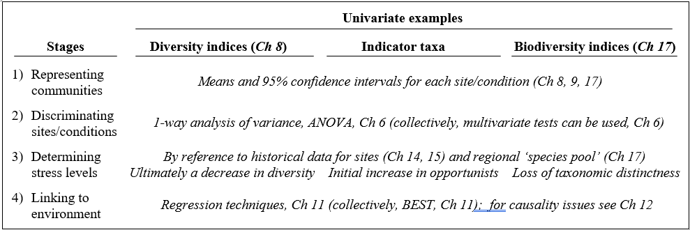
1.2 Univariate techniques
For diversity indices and other single-variable extractions from the data matrix, standard statistical methods are usually applicable and the reader is referred to one of the many excellent general statistics texts (e.g. Sokal & Rohlf (1981) ). The requisite techniques for each stage are summarised in Table 1.1. For example, when samples have the structure of a number of replicates taken at each of a number of sites (or times, or conditions), computing the means and 95% confidence intervals gives an appropriate representation of the Shannon diversity (say) at each site, with discrimination between sites being demonstrated by one-way analysis of variance (ANOVA), which is a test of the null hypothesis that there are no differences in mean diversity between sites. Linking to the environment is then also relatively straightforward, particularly if the environmental variables can be condensed into one (or a small number of) key summary statistics. Simple or multiple regression of Shannon diversity as the dependent variable, against the environmental descriptors as independent variables, is then technically feasible, though rarely very informative in practice, given the over-condensed nature of the information utilised.§
Table 1.1. Univariate techniques. Summary of analyses for the four stages.
For impact studies, much has been written about the effect of pollution or disturbance on diversity measures: whilst the response is not necessarily undirectional (under the hypothesis of Huston (1979) , diversity is expected to rise at intermediate disturbance levels before its strong decline with gross disturbance), there is a sense in which determining stress levels is possible, through relation to historical diversity patterns for particular environmental gradients. Similarly, empirical evidence may exist that particular indicator taxa (e.g. Capitellids) change in abundance along specific pollution gradients (e.g. of organic enrichment). Note though that, unlike the diversity measures constructed from abundances across species, averaged in some way¶, indicator species levels will not initially satisfy the assumptions necessary for routine statistical analysis. Log transforms of such counts will help but, for most individual species, abundance across the set of samples is likely to be a poorly-behaved variable, statistically speaking. Typically, a species will be absent from many of the samples and, when present, the counts are often highly variable, with abundance probability distribution heavily right-skewed†. Thus, for all but the most common individual species, transformation is no real help and parametric statistical analyses cannot be applied to the counts, in any form. In any case, it is not valid to ‘snoop’ in a large data matrix, of typically 100–250 taxa, for one or more ‘interesting’ species to analyse by univariate techniques (any indicator or keystone species selection must be done a priori). Such arguments lead to the tenets underlying this manual:
a) community data are usually highly multivariate (large numbers of species, each subject to high statistical noise) and need to be analysed en masse in order to elicit the important biological signal and its relation to the environment;
b) standard parametric modelling is totally invalid.
Thus, throughout, little emphasis is given to representing communities by univariate measures, though some definitions of indices can be found at the start of Chapter 8, some brief remarks on hypothesis testing (ANOVA) at the start of Chapter 6, a discussion of transformations (to approximate normality and constant variance) at the start of Chapter 9, an example given of a univariate regression between biota and environment in Chapter 11, and a more extensive discussion of sampling properties of diversity indices, and biodiversity measures based on taxonomic relatedness, makes up Chapter 17. Finally, Chapter 14 gives a series of detailed comparisons of univariate with distributional and multivariate techniques, in order to gauge their relative sensitivities and merits in a range of practical studies.
§ Though most of this chapter assumes that diversity indices will be treated independently (hence ANOVA and regression models), an underused possibility is illustrated at the end of Chapter 8, that a set of differing univariate diversity measures be treated as a multivariate data matrix, with ‘dissimilarity’ defined as normalised Euclidean distance, and input to the same tools as used for multivariate community data (thus ANOSIM and BEST analyses).
¶ And thus subject to the central limit theorem, which will tend to induce statistical normality.
1.3 Example: Frierfjord macrofauna
The first example is from the IOC/GEEP practical workshop on biological effects of pollutants ( Bayne, Clarke & Gray (1988) ), held at the University of Oslo, August 1986. This attempted to contrast a range of biochemical, cellular, physiological and community analyses, applied to field samples from potentially contaminated and control sites, in a fjordic complex (Frierfjord/Langesundfjord) linked to Oslofjord ({F}, Fig. 1.1). For the benthic macrofaunal component of this study ( Gray, Aschan, Carr et al. (1988) ), four replicate 0.1m2 Day grab samples were taken at each of six sites (A-E and G, Fig 1.1) and, for each sample, organisms retained on a 1.0 mm sieve were identified and counted. Wet weights were determined for each species in each sample, by pooling individuals within species.
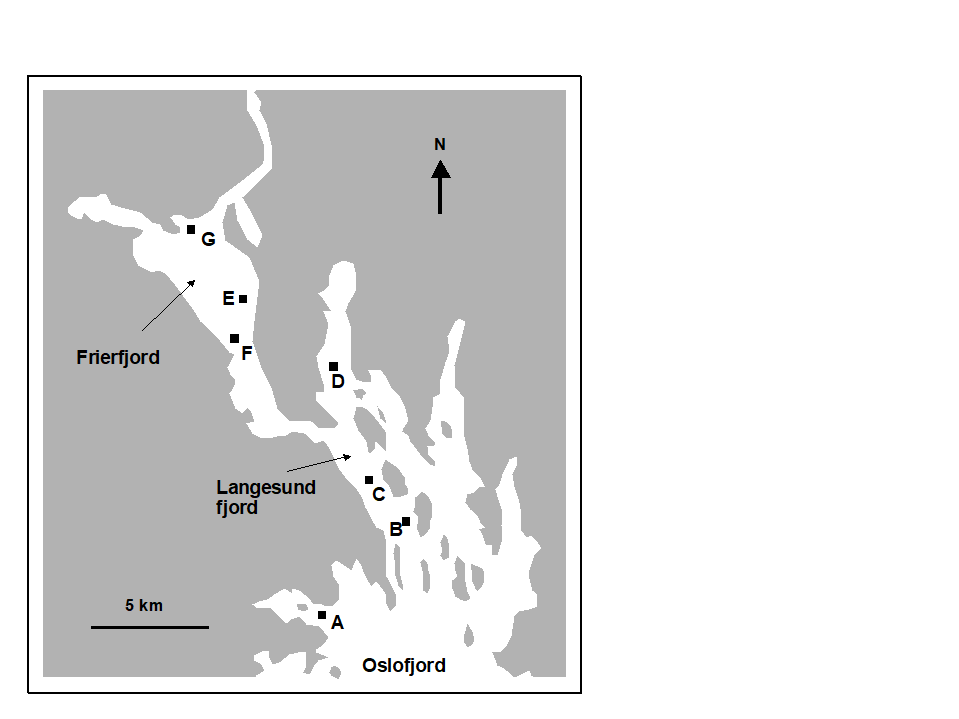 Fig. 1.1. Frierfjord, Norway {F}. Benthic community sampling sites (A-G) for the IOC/GEEP Oslo Workshop; site F omitted for macrobenthos.
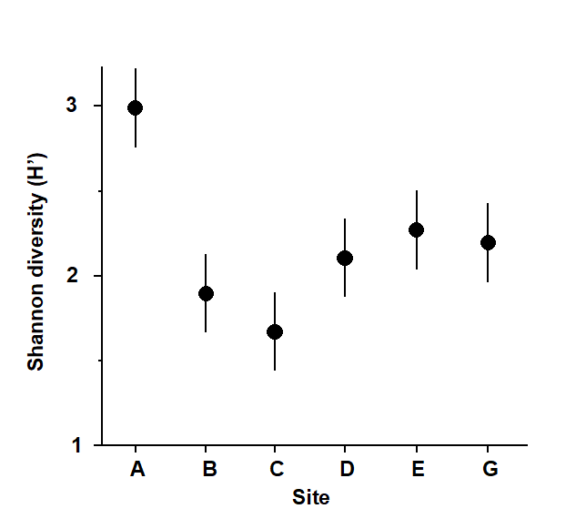
Fig. 1.2. Frierfjord macrofauna {F}. Means and 95% confidence intervals for Shannon diversity (H'), from four replicates at each of six sites (A-E, G).
Part of the resulting data matrix can be seen in Table 1.2: in total there were 110 different taxa categorised from the 24 samples. Such matrices (abundance, A, and/or biomass, B) are the starting point for the biotic analyses of this manual, and this example is typical in respect of the relatively high ratio of species to samples (always >> 1) and the prevalence of zeros. Here, as elsewhere, even an undesirable reduction to the 30 ‘most important’ species (see Chapter 2) leaves more than 50% of the matrix consisting of zeros. Standard multivariate normal analyses (e.g. Mardia, Kent & Bibby (1979) ) of these counts are clearly ruled out; they require both that the number of species (variables) be small in relation to the number of samples, and that the abundance or biomass values are transformable to approximate normality: neither is possible.
Table 1.2. Frierfjord macrofauna {F}. Abundance and biomass matrices (part only) for the 110 species in 24 samples (four replicates at each of six sites A-E, G); abundance in numbers per 0.1m2, biomass in mg per 0.1m2.
| Species | Samples |
|---|
|
A1 | A2 | A3 | A4 | B1 | B2 | B3 | B4 |
|---|---|---|---|---|---|---|---|---|
| Abundance | ||||||||
| Cerianthus lloydi | 0 | 0 | 0 | 0 | 0 | 0 | 0 | 0 |
| Halicryptus sp. | 0 | 0 | 0 | 1 | 0 | 0 | 0 | 0 |
| Onchnesoma | 0 | 0 | 0 | 0 | 0 | 0 | 0 | 0 |
| Phascolion strombi | 0 | 0 | 0 | 1 | 0 | 0 | 1 | 0 |
| Golfingia sp. | 0 | 0 | 0 | 0 | 0 | 0 | 0 | 0 |
| Holothuroidea | 0 | 0 | 0 | 0 | 0 | 0 | 0 | 0 |
| Nemertina, indet. | 12 | 6 | 8 | 6 | 40 | 6 | 19 | 7 |
| Polycaeta, indet. | 5 | 0 | 0 | 0 | 0 | 0 | 1 | 0 |
| Amaena trilobata | 1 | 1 | 1 | 0 | 0 | 0 | 0 | 0 |
| Amphicteis gunneri | 0 | 0 | 0 | 0 | 4 | 0 | 0 | 0 |
| Ampharetidae | 0 | 0 | 0 | 0 | 1 | 0 | 0 | 0 |
| Anaitides groenl. | 0 | 0 | 0 | 1 | 1 | 0 | 0 | 0 |
| Anaitides sp. | 0 | 0 | 0 | 0 | 0 | 0 | 0 | 0 |
| . . . . | ||||||||
| Biomass | ||||||||
| Cerianthus lloydi | 0 | 0 | 0 | 0 | 0 | 0 | 0 | 0 |
| Halicryptus sp. | 0 | 0 | 0 | 26 | 0 | 0 | 0 | 0 |
| Onchnesoma | 0 | 0 | 0 | 0 | 0 | 0 | 0 | 0 |
| Phascolion strombi | 0 | 0 | 0 | 6 | 0 | 0 | 2 | 0 |
| Golfingia sp. | 0 | 0 | 0 | 0 | 0 | 0 | 0 | 0 |
| Holothuroidea | 0 | 0 | 0 | 0 | 0 | 0 | 0 | 0 |
| Nemertina, indet. | 1 | 41 | 391 | 1 | 5 | 1 | 2 | 1 |
| Polycaeta, indet. | 9 | 0 | 0 | 0 | 0 | 0 | 0 | 0 |
| Amaena trilobata | 144 | 14 | 234 | 0 | 0 | 0 | 0 | 0 |
| Amphicteis gunneri | 0 | 0 | 0 | 0 | 45 | 0 | 0 | 0 |
| Ampharetidae | 0 | 0 | 0 | 0 | 0 | 0 | 0 | 0 |
| Anaitides groenl. | 0 | 0 | 0 | 7 | 11 | 0 | 0 | 0 |
| Anaitides sp. | 0 | 0 | 0 | 0 | 0 | 0 | 0 | 0 |
| . . . . |
As discussed above, one easy route to simplification of this high-dimensional (multi-species) complexity is to reduce each matrix column (sample) to a single univariate description. Fig. 1.2 shows the results of computing the Shannon diversity (H', see Chapter 8) of each sample¶, and plotting for each site the mean diversity and its 95% confidence interval, based on a pooled estimate of variance across all sites from the ANOVA table, Chapter 6. (An analysis of the type outlined in Chapter 9 shows that prior transformation of H' is not required; it already has approximately constant variance across the sites, a necessary prerequisite for standard ANOVA). The most obvious feature of Fig. 1.2 is the relatively higher diversity at the control/reference location, A.
¶ Using the PRIMER DIVERSE routine.
1.4 Distributional techniques
Table 1.3. Distributional techniques. Summary of analyses for the four stages.
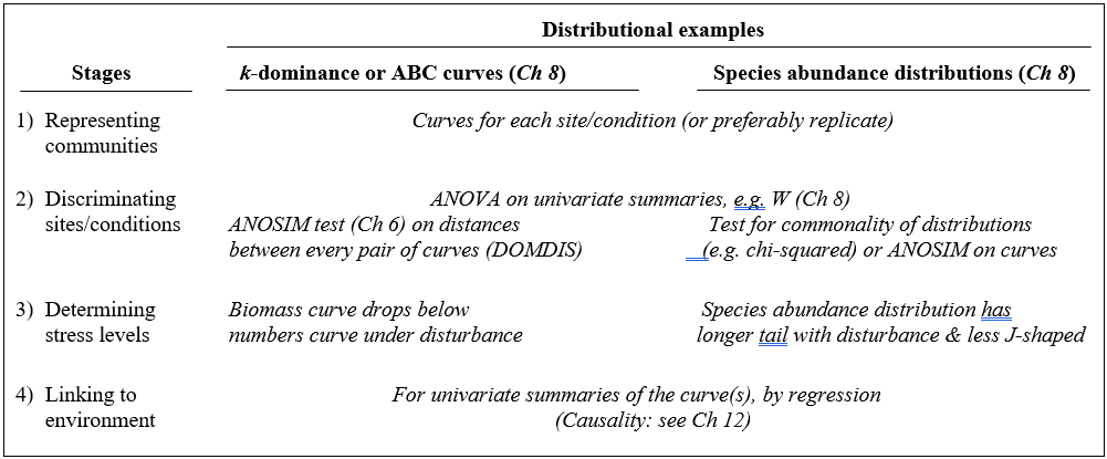
A less condensed form of diversity summary for each sample is offered by distributional/graphical methods, outlined for the four stages in Table 1.3.
Representation is by curves or histograms (Chapter 8), either plotted for each replicate sample separately or for pooled data within sites or conditions. The former permits a visual judgement of the sampling variation in the curves and, as with diversity indices, replication is required to discriminate sites, i.e. test the null hypothesis that two or more sites (/conditions etc.) have the same curvilinear structure. One approach to testing is to summarise each replicate curve by a single statistic and apply ANOVA as before: for the ABC method the W statistic (Chapter 8) measures the extent to which the biomass curve ‘dominates’ the abundance curve, or vice-versa. This is simply one more diversity index but it can be an effective supplement to the standard suite (richness, evenness etc), because it is seen to capture a ‘different axis’ of information in a multivariate treatment of multiple diversity indices (see the end of Chapter 8). For k-dominance or SAD curves, pairwise distance between replicate curves† can turn testing into exactly the same problem as that for fully multivariate data and the ANOSIM tests of Chapter 6 can then be used.
The distributional and graphical techniques have been proposed specifically as a way of determining stress levels. For the ABC method, the strongly polluted (/disturbed) state is indicated if the abundance k-dominance curve falls above the biomass curve throughout its length (e.g. Fig. 1.4): the phenomenon is linked to the loss of large-bodied ‘climax’ species and the rise of small-bodied opportunists. Note that the ABC method claims to give an absolute measure, in the way that disturbance status is indicated on the basis of samples from a single site; in practice, however, it is always wise to design collection from (matched) impacted and control sites to confirm that the control condition exhibits the undisturbed ABC pattern (biomass curve above the abundance curve, throughout).
Similarly, the species abundance distribution has features characteristic of disturbed status (e.g. see the middle plots in Fig. 1.6), namely a move to a less J-shaped distribution by a reduction in the first one or two abundance classes (loss of rarer species), combined with the gain of some higher abundance classes (very numerous opportunist species).
The distributional and graphical methods may thus have particular merits in allowing stressed conditions to be recognised, but they are limited in sensitivity to detect environmental change (Chapter 14). This is also true of linking to environmental data, which needs the curve(s) for each sample to be reduced to a summary statistic (e.g. W), single statistics then being linked to an environmental set by multiple regression.¶
† This uses the PRIMER DOMDIS routine for k-dominance plots, page 8.5, as in Clarke (1990) , with a similar idea applicable to SAD curves or other histogram or cumulative frequency data. This will be generally more valid than Kolmogorov-Smirnov or $\chi ^ 2$ type tests because of the lack of independence of species in a single sample. A valid alternative is again to calculate a univariate summary from each distribution (location or spread or skewness), and test as with any other diversity index, by ANOVA tests.
¶ As for the discussion on diversity indices (Table 1.1), if such univariate summaries from curves are added to other diversity indices then all could be entered into multivariate ANOSIM and BEST/linkage analyses, as for community data (Chapters 6, 11).
1.5 Example: Loch Linnhe macrofauna
Table 1.4. Loch Linnhe macrofauna {L}. Abundance/biomass matrix (part only); one (pooled) set of values per year (1963–1973).
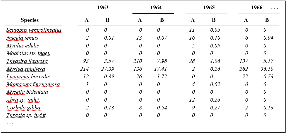
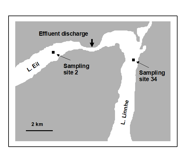
Fig. 1.3. Loch Linnhe and Loch Eil, Scotland {L}. Map of site 34 (Linnhe) and site 2 (Eil), sampled annually over 1963–1973.
Pearson (1975) describes a time series of macrobenthic community samples, taken over the period 1963–1973 inclusive, at two sites in a sea loch system on the west coast of Scotland ({L}, Fig. 1.3.) Pooling to a single sample for each of the 11 years resulted in abundance and biomass matrices of 111 rows (species) and 11 columns (samples), a small part of which is shown in Table 1.4.¶ Starting in 1966, pulp-mill effluent was discharged to the sea lochs (Fig. 1.3), with the rate increasing in 1970 and a significant reduction taking place in 1972 ( Pearson (1975) ). The top left-hand plot of Fig 1.4 shows the Shannon diversity of the macrobenthic samples over this period, and the remaining plots the ABC curves for each year.† There appears to be a consistent change of structure from one in which the biomass curve dominates the abundance curve in the early years, to the curves crossing, reversing altogether and then finally reverting to their original form.
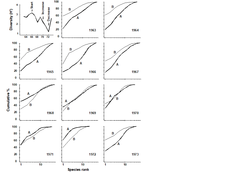 Fig. 1.4. Loch Linnhe macrofauna {L}. Top left: Shannon diversity over the 11 annual samples, also indicating timing of start of effluent discharge and a later increase and decrease in level; remaining plots show ABC curves for the separate years 1963–1973 (B = biomass, thin line; A = abundance, thick line).
¶ It is displayed in this form purely for illustration; this is not a valid file format for PRIMER, which requires the abundance and biomass information to be in separate (same-shape) arrays.
† Computed from the PRIMER Dominance Plot routine.
1.6 Example: Garroch Head macrofauna
Pearson & Blackstock (1984) describe the sampling of a transect of 12 sites across the sewage-sludge disposal ground at Garroch Head in the Firth of Clyde, SW Scotland ({G}, Fig. 1.5). The samples considered here were taken during 1983 and consisted of abundance and biomass values of 84 macrobenthic species, together with associated contaminant data on the extent of organic enrichment and the concentrations of heavy metals in the sediments. Fig. 1.6 shows the resulting species abundance distributions for the twelve sites, i.e. at site 1, twelve species were represented by a single individual, two species by 2–3 individuals, three species by 4–7 individuals, etc. ( Gray & Pearson (1982) ). For the middle sites close to the dump centre, the hypothesised loss of less-abundant species, and gain of a few species in the higher geometric classes, can clearly be seen.
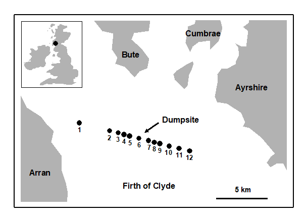
Fig. 1.5. Garroch Head, Scotland {G}. Location of sewage sludge dump ground and position of sampling sites (1–12); the dump centre is at site 6.
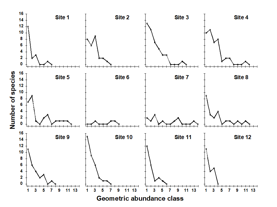
Fig. 1.6. Garroch Head macrofauna {G}, Plots of number of species against number of individuals per species in $\times$2 geometric classes, for the 12 sampling sites of Fig. 1.5.
1.7 Multivariate techniques
Table 1.5 summarises some multivariate methods for the four stages, starting with three descriptive tools: hierarchical clustering (agglomerative or divisive), multi-dimensional scaling (MDS, usually non-metric) and principal components analysis (PCA).
Table 1.5. Multivariate techniques. Summary of analyses for the four stages.
The first two of these start explicitly from a triangular matrix of similarity coefficients computed between every pair of samples (e.g. Table 1.6). The coefficient is usually some simple algebraic measure (Chapter 2) of how close the abundance levels are for each species, averaged over all species, and defined such that 100% represents total similarity and 0% complete dissimilarity. There is a range of properties that such a coefficient should possess but still some flexibility in its choice: it is important to realise that the definition of what constitutes similarity of two communities may vary, depending on the biological question under consideration. As with the earlier methods, a multivariate analysis too will attempt to reduce the complexity of the community data by taking a particular ‘view’ of the structure it exhibits. One in which the emphasis is on the pattern of occurrence of rare species will be different than a view in which the emphasis is wholly on the species that are numerically dominant. One convenient way of providing this spectrum of choice, is to restrict attention to a single coefficient†, that of Bray & Curtis (1957) , which has several desirable properties, but allow a choice of prior transformation of the data. A useful transformation continuum (see Chapter 9) ranges through: no transform, square root, fourth root, logarithmic and finally, reduction of the sample information to the recording only of presence or absence for each species.¶ At the former end of the spectrum all attention will be focused on dominant counts, at the latter end on the rarer species.
Table 1.6. Frierfjord macrofauna {F}. Bray-Curtis similarities, after $\sqrt{}\sqrt{}$-transformation of counts, for every pair of replicate samples from sites A, B, C only (four replicates per site).
| A1 | A2 | A3 | A4 | B1 | B2 | B3 | B4 | C1 | C2 | C3 | C4 | |
|---|---|---|---|---|---|---|---|---|---|---|---|---|
| A1 | – | |||||||||||
| A2 | 61 | – | ||||||||||
| A3 | 69 | 60 | – | |||||||||
| A4 | 65 | 61 | 66 | – | ||||||||
| B1 | 37 | 28 | 37 | 35 | – | |||||||
| B2 | 42 | 34 | 31 | 32 | 55 | – | ||||||
| B3 | 45 | 39 | 39 | 44 | 66 | 66 | – | |||||
| B4 | 37 | 29 | 29 | 37 | 59 | 63 | 60 | – | ||||
| C1 | 35 | 31 | 27 | 25 | 28 | 56 | 40 | 34 | – | |||
| C2 | 40 | 34 | 26 | 29 | 48 | 69 | 62 | 56 | 56 | – | ||
| C3 | 40 | 31 | 37 | 39 | 59 | 61 | 67 | 53 | 40 | 66 | – | |
| C4 | 36 | 28 | 34 | 37 | 65 | 55 | 69 | 55 | 38 | 64 | 74 | – |
For the clustering technique, representation of the communities for each sample is by a dendrogram (e.g. Fig. 1.7a), linking the samples in hierarchical groups on the basis of some definition of similarity between each cluster (Chapter 3). This is a particularly relevant representation in cases where the samples are expected to divide into well-defined groups, perhaps structured by some clear-cut environmental distinctions. Where, on the other hand, the community pattern is responding to abiotic gradients which are more continuous, then representation by an ordination is usually more appropriate. The method of non-metric MDS (Chapter 5) attempts to place the samples on a ‘map’, usually in two dimensions (e.g. see Fig. 1.7b), in such a way that the rank order of the distances between samples on the map exactly agrees with the rank order of the matching (dis)similarities, taken from the triangular similarity matrix. If successful, and success is measured by a stress coefficient which reflects lack of agreement in the two sets of ranks, the ordination gives a simple and compelling visual representation of ‘closeness’ of the species composition for any two samples.
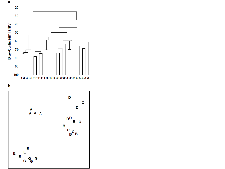
Fig. 1.7. Frierfjord macrofauna {F}. a) Dendrogram for hierarchical clustering (group-average linking); b) non-metric multi-dimensional scaling (MDS) ordination in two dimensions; both computed for the four replicates from each of the six sites (A–E, G), using the similarity matrix partially shown in Table 1.4 (2-d MDS stress = 0.08)
The PCA technique (Chapter 4) takes a different starting position, and makes rather different assumptions about the definition of (dis)similarity of two samples, but again ends up with an ordination plot, often in two or three dimensions (though it could be more), which approximates the continuum of relationships among samples (e.g. Fig. 1.8). In fact, PCA is a rather unsatisfactory procedure for most species-by-samples matrices, for at least two reasons:
a) it defines dissimilarity of samples in an inflexible way (Euclidean distance in the full-dimensional species space, Chapter 4), not well-suited to the rather special nature of species abundance data, with its predominance of zero values;
b) it uses a projection from the higher-dimensional to lower-d space which does not aim to preserve the relative values of these Euclidean distances in the low-d plot, cf MDS, which has that rationale.
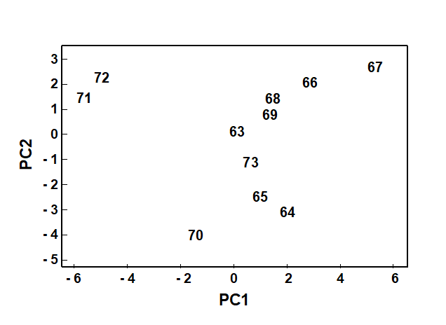
Fig. 1.8. Loch Linnhe macrofauna {L}. 2-dimensional principal components analysis (PCA) ordination of the $\sqrt{} \sqrt{}$-transformed abundances from the 11 years 1963–1973 (% of variance explained only 57%, and not an ideal technique for such data).
However, a description of the operation of PCA is included here because it is an historically important technique, the first ordination method to be devised and one which is still commonly encountered§, and because it comes into its own in the analysis of environmental samples. Abiotic variables (e.g. physical or contaminant readings) are usually relatively few in number, continuously scaled, and their distributions can be transformed so that (normalised) Euclidean distances are appropriate ways of describing the inter-relationships among samples. PCA is then a more satisfactory low-dimensional summary (albeit still a projection), and even has an advantage over MDS of providing an interpretation of the plot axes (which are linear in the abiotic variables).
Discriminating sites/conditions from a multivariate analysis requires non-classical hypothesis testing ideas, since it is totally invalid to make the standard assumptions of normality (which in this case would need to be multivariate normality of the sometimes hundreds or even thousands of different species!). Instead, Chapter 6 describes a simple permutation or randomisation test (of the type first developed by Mantel (1967) ), which makes very few assumptions about the data and is therefore widely applicable. In Fig. 1.7b for example, it is clear without further testing that site A has a different community composition across its replicates than the groups (E, G) or (B, C, D). Much less clear is whether there is any statistical evidence of a distinction between the B, C and D sites. A non-parametric test of the null hypothesis of ‘no site differences between B, C and D’ could be constructed by defining a statistic which contrasts among-site and within-site distances, which is then recomputed for all possible permutations of the 12 labels (4 Bs, 4 Cs and 4 Ds) among the 12 locations on the MDS. If these arbitrary site relabellings can generate values of the test statistic which are similar to the value for the real labelling, then there is clearly little evidence that the sites are biologically distinguishable. This idea is formalised and extended to more complex sample designs in Chapter 6. For reasons which are described there it is preferable to compute an ‘among versus within site’ summary statistic directly from the (rank) similarity matrix rather than the distances on the MDS plot. This, and the analogy with ANOVA, suggests the term ANOSIM for the test (Analysis of Similarities, Clarke & Green (1988) ; Clarke (1993) ).‡ It is possible to employ the same test in connection with PCA, using an underlying dissimilarity matrix of Euclidean distances, though when the ordination is of a relatively small number of environmental variables, which can be transformed into approximate multivariate normality, then abiotic differences between sites can use a classical test (MANOVA, e.g. Mardia, Kent & Bibby (1979) ), a generalisation of ANOVA.
Part of the process of discriminating sites, times, treatments etc., where successful, is the ability to identify the species that are principally responsible for these distinctions: it is all too easy to lose sight of the basic data matrix in a welter of sophisticated multivariate analyses of samples.⸸ Similarly, as a result of cluster analyses and associated a posteriori tests for the significance of the groups of sites/times etc obtained (SIMPROF, Chapter 3), one would want to identify the species mainly responsible for distinguishing the clusters from each other. Note the distinction here between a priori groups, identified before examination of the data, for which ANOSIM tests are appropriate (Chapter 6), and a posteriori groups with membership identified as a result of looking at the data, for which ANOSIM is definitely invalid; they need SIMPROF.
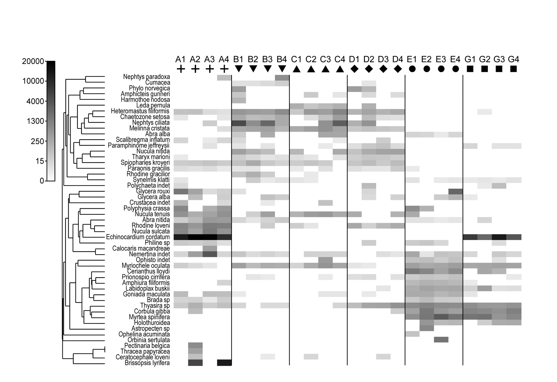
Fig. 1.9. Frierfjord macrofauna {F}. Shade plot of 4th-root transformed species (rows) $\times$ samples (columns) matrix of abundances for the 4 replicate samples at each of 6 sites (Fig. 1.1, Table 1.2). The (linear) grey scale is shown in the key with back-transformed counts.
Species analyses and displays are pursued in Chapter 7, and Fig. 1.9 gives a Shade Plot for the ‘most important’ ~50 species from the 110 recorded from the 24 samples of the Frierfjord macrobenthic abundance data of Table 1.2. (‘Most important’ is here defined as all the species which account for at least 1% of the total abundance in one or more of the samples). The shade plot is a visual representation of the data matrix, after it has been 4th-root transformed, in which white denotes absence and black the largest (transformed) abundance in the data. Importantly, the species axis has been re-ordered in line with a (displayed) cluster analysis of the species, utilising Whittaker’s Index of Association to give the among-species similarities, see Chapters 2 and 7. The pattern of differences between samples from the differing sites is clearly apparent, at least for the three main groups seen in the MDS plot of Fig. 1.7, viz. A, (B-D), (E-G). Such plots are also very useful in visualising the effects of different transformations on the data matrix, prior to similarity computation (see Clarke, Tweedley & Valesini (2014) and Chapter 9). Without transformation, the shade plot would be largely white space with only a handful of species even visible (and thus contributing).
Since ANOSIM indicates statistical significance and pairwise tests give particular site differences (Chapter 6), a ranking of species contributions to the dissimilarity between any specific pair of groups can be obtained from a similarity percentage breakdown (the SIMPER routine, Clarke (1993) ), see Chapter 7.⸙
The clustering of species in shade plots such as Fig. 1.9 can be taken one stage further, to determine statistical significance of species groupings (a Type 3 SIMPROF test, see Chapter 7). This identifies groups of species within which the species have statistically indistinguishable patterns of abundance across the set of samples, and between which the patterns do differ significantly. Fig. 1.10 shows simple line plots for the standardised abundance of 51 species (those accounting for > 1% of the total abundance in any one year) over the 11 years of the Loch Linnhe sampling of Table 1.4 and Fig. 1.8. SIMPROF tests give 7 groups of species (one omitted contains just a single species found only in 1973). The standardisation puts each species on an equal footing, with its values summing to 100% across all samples. It can be seen how some species start to disappear, and others arrive, at the initial levels of disturbance, in the mid-years – some of the latter dying out as pollution increases in the later years – with further opportunists (Capitellids etc) flourishing at that point, and then declining with the improvement in conditions in 1973.
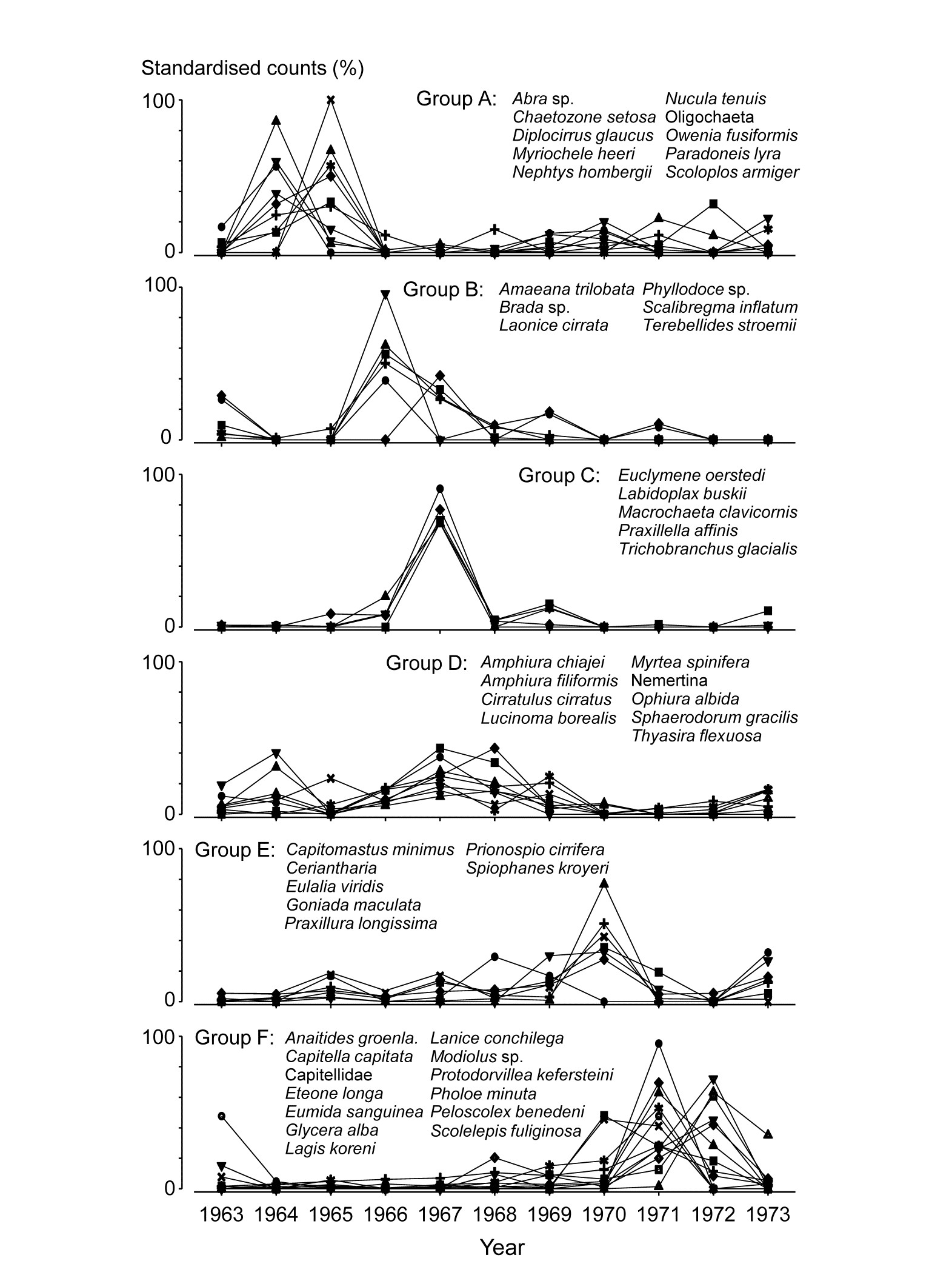
Fig. 1.10. Loch Linnhe macrofauna {L}. Line plots of the 11-year time series for the ‘most important’ 51 species (see text), with y axis the standardised counts for each species, i.e. all species add to 100% across years. The 6 species groups (A-F), and a 7th consisting of a single species found in only one year, have internally indistinguishable curves (‘coherent species’) but the sets differ significantly from each other, by SIMPROF tests.
In the determination of stress levels, whilst the multivariate techniques are sensitive (Chapter 14) and well-suited to establishing community differences associated with different sites/times/treatments etc., their species-specific basis would appear to make them unsuitable for drawing general inferences about the pollution status of an isolated group of samples. Even in comparative studies, on the face of it there is not a clear sense of directionality of change when it is established that communities at putatively impacted sites differ from those at control or reference sites in space or time (is the change ‘good’ or ‘bad’?). Nonetheless, there are a few ways in which directionality has been asserted in published studies, whilst retaining a multivariate form of analysis (Chapter 15):
a) a meta-analysis: a combined ordination of data from NE Atlantic shelf waters, at a coarse level of taxonomic discrimination (the effects of taxonomic aggregation are discussed in Chapter 10), suggests a common directional change in the balance of taxa under a variety of types of pollution or disturbance ( Warwick & Clarke (1993a) );
b) a number of studies demonstrate increased multivariate dispersion among replicates under impacted conditions, in comparison to controls ( Warwick & Clarke (1993b) );
c) another feature of disturbance, demonstrated in a spatial coral community study (but with wider applicability to other spatial and temporal patterns), is a loss of smooth seriation along transects of increasing depth, again in comparison to reference data in time and space ( Clarke, Warwick & Brown (1993) ).
Methods which link multivariate biotic patterns to environmental variables are explored in Chapter 11; these are illustrated here by the Garroch Head dump-ground study described earlier (Fig. 1.5). The MDS of the macrofaunal communities from the 12 sites is shown in Fig. 1.11a; this is based on Bray-Curtis similarities computed from (transformed) species biomass values.ꞎ
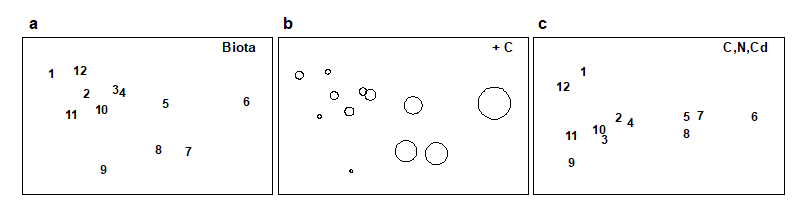
Fig. 1.11. Garroch Head macrofauna {G}. a) MDS ordination of Bray-Curtis similarities from $\sqrt{}$-transformed species biomass data for the sites shown in Fig. 1.5; b) the same MDS but with superimposed circles of increasing size, representing increasing carbon concentrations in matched sediment samples; c) ordination of (log-transformed) carbon, nitrogen and cadmium concentrations in the sediments at the 12 sites (2-d MDS stress = 0.05).
Steady change in the community is apparent as the dump centre (site 6) is approached along the western arm of the transect (sites 1 to 6), then with a mirrored structure along the eastern arm (sites 6 to 12), so that the samples from the two ends of the transect have similar species composition. That this biotic pattern correlates with the organic loading of the sediments can best be seen by superimposing the values for a single environmental variable, such as Carbon concentration, on the MDS configuration. The bubble plot of Fig. 1.11b represents C values by circles of differing diameter, placed at the corresponding site locations on the MDS, and the pattern across sites of the 11 available environmental variables (sediment concentrations of C, N, Cu, Cd, Zn, Ni, etc.) can be viewed in this way (Chapter 11). This either uses a single abiotic variable at a time or displays several at once, as vectors – usually unsatisfactorily because it assumes a linear relationship of the variable to the biotic ordination points – or (more satisfactorily) by segmented bubble plots in which each variable is only a circle segment, of different sizes but at the same position on the circle (of the type seen in Figs. 7.14-16; see also Purcell, Rushworth, Clarke et al. (2014) .Ɥ
Where bubble plots are not adequate, because the 2- or 3-d MDS is a poor approximation (high stress) to the biotic similarity matrix, an alternative technique is that of linkage trees (multivariate regression trees), which carry out constrained binary divisive clustering on the biotic similarities, each division of the samples (into ever smaller groups) being permitted only where it has an ‘explanation’ in terms of an inequality on one of the abiotic variables (Chapter 11), e.g. “group A splits into B and C because all sites in group B have salinity > 20ppt but all in group C have salinity < 20ppt” and this gives the maximal separation of site A communities into two groups. Stopping the search for new divisions uses the SIMPROF tests that were mentioned earlier, in relation to unconstrained cluster methods (for a LINKTREE example see Fig. 11.14).
A different approach is required in order to answer questions about combinations of environmental variables, for example to what extent the biotic pattern can be ‘explained’ by knowledge of the full set, or a subset, of the abiotic variables. Though there is clearly one strong underlying gradient in Fig. 1.11a (horizontal axis), corresponding to an increasing level of organic enrichment, there are nonetheless secondary community differences (e.g. on the vertical axis) which may be amenable to explanation by metal concentration differences, for example. The heuristic approach adopted here is to display the multivariate pattern of the environmental data, ask to what extent it matches the between-site relationships observed in the biota, and then maximise some matching coefficient between the two, by examining possible subsets of the abiotic variables (the BEST procedure, Chapters 11 and 16).ȸ
Fig. 1.11c is based on this optimal subset for the Garroch Head sediment variables, namely (C, N, Cd). It is an MDS plot, using Euclidean distance for its dissimilarities,Ͷ and is seen to replicate the pattern in Fig. 1.11a rather closely. In fact, the optimal match is determined by correlating the underlying dissimilarity matrices rather than the ordinations themselves, in parallel with the reasoning behind the ANOSIM tests, seen earlier.
The suggestion is therefore that the biotic pattern of the Garroch Head sites is associated not just with an organic enrichment gradient but also with a particular heavy metal. It is important, however, to realise the limitations of such an ‘explanation’. Firstly, there are usually other combinations of abiotic variables which will correlate nearly as well with the biotic pattern, particularly as here when the environmental variables are strongly inter-correlated amongst themselves. Secondly, there can be no direct implication of causality of the link between these abiotic variables and the community structure, based solely on field survey data: the real driving factors could be unmeasured but happen to correlate highly with the variables identified as producing the optimal match. This is a general feature of inference from purely observational studies and can only be avoided formally by ‘randomising out’ effects of unmeasured variables; this requires random allocation of treatments to observational units for field or laboratory-based community experiments (Chapter 12).
† Though PRIMER offers nearly 50 of the (dis)similarity/distance measures that have been proposed in the literature.
¶ The PRIMER routines automatically offer this set of transformation choices, applied to the whole data matrix, but also cater for more selective transformations of particular sets of variables, as is often appropriate to environmental rather than species data.
§ Other ordination techniques in common use include: Principal Co-ordinates Analysis, PCO; Detrended Correspondence Analysis, DCA. Chapter 5 has some brief remarks on their relation to PCA and nMDS/mMDS but this manual concentrates on PCA and MDS, found in PRIMER; PCO is available in PERMANOVA+.
‡ PRIMER now performs tests for all 1-, 2- and 3-way crossed and/or nested combinations of factors in its ANOSIM routine, also including a more indirect test, with a different form of statistic, for factors (with sufficient levels) which do not have replication within their levels. These are all robust, non-parametric (rank-based) tests and therefore do not permit the (metric) partition of overall effects into ‘main’ and ‘interaction’ components. Within a semi-parametric framework (and still by permutation testing), such partitions are achieved by the PERMANOVA routine within the PERMANOVA+ add-on to PRIMER, Anderson, Gorley & Clarke (2008) .
⸸ This has been rectified in PRIMER 7, with its greater emphasis on species analyses, such as Shade plots, SIMPROF tests for coherent species groups, segmented bubble plots etc (Chapter 7).
⸙ SIMPER in PRIMER first tabulates species contributions to the average similarity of samples within each group then of average dissimilarity between all pairs of groups. Two-way and (squared) Euclidean distance options are given, the latter for abiotic data.
ꞎ Chapter 13, and the meta-analysis section in Chapter 15, discuss the relative merits and drawbacks of using species abundance or biomass when both are available; in fact, Chapter 13 is a wider discussion of the advantages of sampling particular components of the marine biota, for a study on the effects of pollutants.
Ɥ The PRIMER ‘bubble plot’ overlay can be on any ordination type, in 2- or 3-d, and has flexible colour/scaling options, as well as some scope for using a supplied image as the overlay.
ȸ The BEST/Bio-Env option in PRIMER optimises the match by examining all combinations of abiotic variables. Where this is not computationally feasible, the BEST/BVStep option performs a stepwise search, adding (or subtracting) single abiotic variables at each step, much as in stepwise multiple regression. Avoidance of a full search permits a generalisation to pattern-matching scenarios other than abiotic-to-biotic, e.g. BVStep can select a subset of species whose multivariate structure matches, to a high degree, the pattern for the full set of species (Chapter 16), thus indicating influential species or potential surrogates for the full community.
Ͷ It is, though, virtually indistinguishable in this case from a PCA, because of the small number of variables and the implicit use of the same dissimilarity matrix for both techniques.
1.8 Example: Nutrient enrichment experiment, Solbergstrand
Table 1.7. Nutrient enrichment experiment, Solbergstrand mesocosm, Norway {N}. Meiofaunal abundances (shown for copepods only) from four replicate boxes for each of three treatments (Control, Low and High levels of added nutrients).
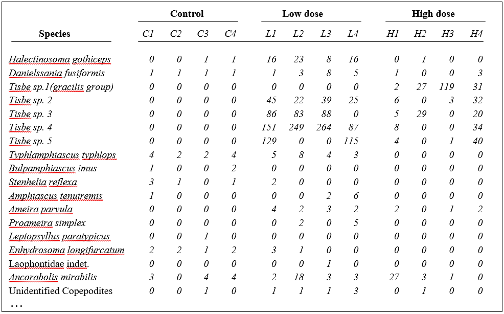
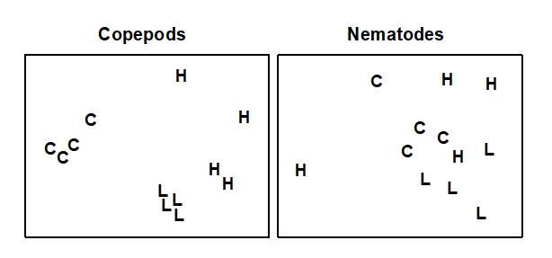
Fig. 1.12. Nutrient enrichment experiment {N}. Separate MDS ordinations of $\sqrt{} \sqrt{}$-transformed abundances for copepod and nematode species, in four replicate boxes from each of three treatments: Control, Low, High. (2-d MDS stresses: 0.09, 0.18)
An example is given in Table 1.7 of meiofaunal community data from a nutrient enrichment experiment in the Solbergstrand mesocosm, Norway {N}, in which 12 undisturbed box cores of sediment were transferred into the mesocosm basins and separately dosed with two levels of increased nutrients (low, L, and high, H), with some boxes remaining undosed (control, C). Fig. 1.12 shows the MDS plots of the four replicate boxes from each treatment, separately for the copepod and nematode components of the meiofaunal communities (see also Chapter 12). For the copepods, there is a clear imputation of a (causal) response to the treatment, though this is less apparent for the nematodes, and requires a test of the null hypothesis of ‘no treatment effect’, using the ANOSIM test of Chapter 6.
1.9 Summary
A framework has been outlined of three categories of technique (univariate, graphical/distributional and multivariate) and four analysis stages (representing communities, discriminating sites/conditions, determining levels of stress and linking to environmental variables). The most powerful tools are in the multivariate category, and those that underlie the PRIMER routines are now examined from first principles.
Chapter 2: Simple measures of similarity of species ‘abundance’ between samples
2.1 Similarity for quantitative data matrices
Data matrix
The available biological data is assumed to consist of an array of p rows (species) and n columns (samples), whose entries are counts or densities of each species for each sample, or the total biomass of all individuals, or their percentage cover, or some other quantity of each species in each sample, which we will typically refer to as abundance. This includes the special case where only presence (1) or absence (0) of each species is known. For the moment nothing further is assumed about the structure of the samples. They might consist of one or more replicates (repeated samples) from a number of different sites, times or experimental treatments but this information is not used in the initial analysis. The strategy outlined in Chapter 1 is to observe any pattern of similarities and differences across the samples (i.e. let the biology ‘tell its own story’) and then compare this with known or a priori hypothesised inter-relations between the samples based on environmental or experimental factors.
Similarity coefficient
The starting point for many of the analyses that follow is the concept of similarity (S) between any pair of samples, in terms of the biological communities they contain. Inevitably, because the information for each sample is multivariate (many species), there are many ways of defining similarity, each giving different weight to different aspects of the community. For example, some definitions might concentrate on the similarity in abundance of the few commonest species whereas others pay more attention to rarer species.
The data matrix itself may first be modified; there are three main possibilities.
a) The absolute numbers (biomass/cover), i.e. the fully quantitative data observed for each species, are most commonly used. In this case, two samples are considered perfectly similar only if they contain the same species in exactly the same abundance.
b) The relative numbers (biomass/cover) are sometimes used, i.e. the data is standardised to give the percentage of total abundance (over all species) that is accounted for by each species. Thus each matrix entry is divided by its column total (and multiplied by 100) to form the new array. Such standardisation will be essential if, for example, differing and unknown volumes of sediment or water are sampled, so that absolute numbers of individuals are not comparable between samples. Even if sample volumes are the same (or, if different and known, abundances are adjusted to a unit sample volume, to define densities), it may still sometimes be biologically relevant to define two samples as being perfectly similar when they have the same % composition of species, fluctuations in total abundance being of no interest. (An example might be fish dietary data on the predated assemblage in the gut, where it is the fish doing the sampling and no control of total gut content is possible, of course.)
c) A reduction to simple presence or absence of each species may be all that is justifiable, e.g. sampling artefacts may make quantitative counts unreliable, or concepts of abundance may be difficult to define for some important faunal components.
A similarity coefficient S is conventionally defined to take values in the range (0, 100%), or alternatively (0, 1), with the ends of the range representing the extreme possibilities:
S = 100% (or 1) if two samples are totally similar;
S = 0 if two samples are totally dissimilar.
Dissimilarity ($\delta$) is defined simply as 100 – S, the “opposite side of the coin” to similarity.
What constitutes total similarity, and particularly total dissimilarity, of two samples depends on the specific similarity coefficient adopted but there are clearly some properties that it would be desirable for a biologically-based coefficient to possess. Full discussion of these is given in Clarke, Somerfield & Chapman (2006) , e.g. most ecologists would feel that S should equal zero when two samples have no species in common and S must equal 100% if two samples have identical entries (after modification, in cases b and c above).** Such guidelines lead to a small set of coefficients termed the Bray-Curtis family by Clarke, Somerfield & Chapman (2006) .
Similarity matrix
Similarities are calculated between every pair of samples and it is conventional to set these n(n–1)/2 values out in a lower triangular matrix. This is a square array, with row and column labels being the sample numbers 1 to n, but it is not necessary to fill in either the diagonals (similarity of sample j with itself is always 100%!) or the upper right triangle (the similarity of sample j to sample k is the same as the similarity of sample k to sample j, of course).
Similarity matrices are the basis (explicitly or implicitly) of many multivariate methods, both in the representation given by a clustering or ordination analysis and in some associated statistical tests. A similarity matrix can be used to:
a) discriminate sites (or times) from each other, by noting that similarities between replicates within a site are consistently higher than similarities between replicates at different sites (ANOSIM test, Chapter 6);
b) cluster sites into groups that have similar communities, so that similarities within each group of sites are usually higher than those between groups (Clustering, Chapter 3);
c) allow a gradation of sites to be represented graphically, in the case where site A has some similarity with site B, B with C, C with D but A and C are less similar, A and D even less so etc. (Ordination, Chapter 4).
Species similarity matrix
In a complementary way, the original data matrix can be thought of as describing the pattern of occurrences of each species across the given set of samples, and a matching triangular array of similarities can be constructed between every pair of species. Two species are similar (S΄ near 100 or 1) if they have significant representation at the same set of sites, and totally dissimilar (S΄ = 0) if they never co-occur. Species similarities are discussed later in this chapter, and the resulting clustering diagrams in Chapter 7 but, in most of this manual, ‘similarity’ refers to between-sample similarity.
Bray-Curtis coefficient
Of the numerous similarity measures that have been suggested over the years¶, one has become particularly common in ecology, usually referred to as the Bray-Curtis coefficient, since Bray & Curtis (1957) were primarily responsible for introducing this coefficient into ecological work. The similarity between the jth and kth samples, $S_{jk}$, has two definitions (they are entirely equivalent, as can be seen from some simple algebra or by calculating a few examples):
$$S_{jk} = 100 \left[ 1 - \frac{\sum_{i=1}^{p} | y_{ij} - y_{ik} | }{\sum_{i=1}^{p} ( y_{ij} + y_{ik} ) } \right] = 100 \frac{\sum_{i=1}^{p} 2 \min (y_{ij}, y_{ik} ) }{\sum_{i=1}^{p} ( y_{ij} + y_{ik} ) } \tag{2.1}$$
Here $y_{ij}$ represents the entry in the ith row and jth column of the data matrix, i.e. the abundance for the ith species in the jth sample (i = 1, 2, ..., p; j = 1, 2, ..., n). Similarly, $y_{ik}$ is the count for the ith species in the kth sample. |...| represents the absolute value of the difference (the sign is ignored) and min(.,.) the minimum of the two counts; the separate sums in the numerator and denominator are both over all rows (species) in the matrix.
¶ Legendre & Legendre (2012) , in their invaluable text on Numerical Ecology, give very many definitions of similarity, dis-similarity and distance coefficients, and PRIMER follows their suggestion of the collective term resemblance to cover any such measure and, where possible, uses their numbering system.
2.2 Example: Loch Linnhe macrofauna
A trivial example, used in this and the following chapter to illustrate simple manual computation of similarities and hierarchical clusters, is provided by extracting six species and four years from the Loch Linnhe macrofauna data {L} of Pearson (1975) , seen already in Fig. 1.3 and Table 1.4. (Of course, arbitrary extraction of ‘interesting’ species and years is not a legitimate procedure in a real application; it is done here simply as a means of showing the computational steps.)
Table 2.1. Loch Linnhe macrofauna {L} subset. (a) Abundance (untransformed) for some selected species and years. (b) The resulting Bray-Curtis similarities between every pair of samples.
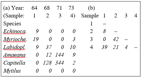
Table 2.1a shows the data matrix of counts and Table 2.1b the resulting lower triangular matrix of Bray-Curtis similarity coefficients. For example, using the first form of equation (2.1), the similarity between samples 1 and 4 (years 1964 and 1973) is:
$$S_{14} = 100 \left[ 1 - \frac{9+16+1+9+2+0}{9+22+19+9+2+0} \right] = 39.3 $$
The second form of equation (2.1) can be seen to give the same result:
$$S_{14} = 100 \left[\frac{2[0+3+9+0+0+0]}{9+22+19+9+2+0} \right] = 39.3 $$
Computation is therefore simple and it is easy to verify that the coefficient possesses the following desirable properties.
a) S = 0 if the two samples have no species in common, since min ($y_{ij}$, $y_{ik}$) = 0 for all i (e.g. samples 1 and 3 of Table 2.1a). Of course, S = 100 if two samples are identical, since |$y_{ij} - y_{ik}$| = 0 for all i.
b) A scale change in the measurements does not change S. For example, biomass could be expressed in g rather than mg or abundance changed from numbers per cm$^2$ of sediment surface to numbers per m$^2$; all y values are simply multiplied by the same constant and this cancels in the numerator and denominator terms of equation (2.1).
c) ‘Joint absences’ also have no effect on S. In Table 2.1a the last species is absent in all samples; omitting this species clearly makes no difference to the two summations in equation (2.1). That similarity should depend on species which are present in one or other (or both) samples, and not on species which are absent from both, is usually a desirable property. As Field, Clarke & Warwick (1982) put it: "taking account of joint absences has the effect of saying that estuarine and abyssal samples are similar because both lack outer-shelf species”. Note that a lack of dependence on joint absences is by no means a property shared by all similarity coefficients.
Transformation of raw data
In one or two ways, the similarities of Table 2.1b are not a good reflection of the overall match between the samples, taking all species into account. To start with, the similarities all appear too low; samples 2 and 3 would seem to deserve a similarity rating higher than 50%. As will be seen later, this is not an important consideration since most of the multivariate methods in this manual depend only on the relative order (ranking) of the similarities in the triangular matrix, rather than their absolute values. More importantly, the similarities of Table 2.1b are unduly dominated by counts for the two most abundant species (4 and 5), as can be seen from studying the form of equation (2.1): terms involving species 4 and 5 will dominate the sums in both numerator and denominator. Yet the larger abundances in the original data matrix will often be extremely variable in replicate samples (the issue of variance structures in community data is returned to in Chapter 9) and it is usually undesirable to base an assessment of similarity of two communities only on the counts for a handful of very abundant species.
The answer is to transform the original y values (the counts, biomass, % cover or whatever) before computing the Bray-Curtis similarities. Two useful transformations are the root transform, $\sqrt{}$y, and the double root (or 4th root) transform, $\sqrt{}\sqrt{}$y. There is more on the effects of transformation later, in Chapter 9; for now it is only necessary to note that the root transform, $\sqrt{}$y, has the effect of down-weighting the importance of the highly abundant species, so that similarities depend not only on their values but also those of less common (‘mid-range’) species. The 4th root transform, $\sqrt{}\sqrt{}$y, takes this process further, with a more severe down-weighting of the abundant species, allowing not only the mid-range but also the rarer species to exert some influence on the calculation of similarity. An alternative severe transformation, with very similar effect to the 4th root, is the log transform, log(1+y).
The result of the 4th root transform for the previous example is shown in Table 2.2a, and the Bray-Curtis similarities computed from these transformed abundances, using equation (2.1), are given in Table 2.2b.‡ There is a general increase in similarity levels but, of more importance, the rank order of similarities is no longer the same as in Table 2.1b (e.g. $S _ {24} > S _ {14}$ and $S _ {34} > S _ {12}$ now), showing that transformations can have a significant effect on the final multivariate display.
Table 2.2. Loch Linnhe macrofauna {L} subset. (a) $\sqrt{}\sqrt{}$-transformed abundance for the four years and six species of Table 2.1. (b) Resulting Bray-Curtis similarity matrix.
In fact, choice of transformation can be more important than level of taxonomic identification (see Chapter 16) especially when abundances are extreme, such as for highly-clumped or schooling species, when dispersion weighting, in place of (or prior to) transformation can be an effective strategy, see Chapter 9.
Canberra coefficient
An alternative which also reduces variability and may sometimes eliminate the need for transformation§ is to select a similarity measure that automatically balances the weighting given to each species when computed on original counts. One such possibility, the Stephenson, Williams & Cook (1972) form of the so-called Canberra coefficient of Lance & Williams (1967) , defines the similarity between samples j and k as:
$$S_{jk} = 100 \left[ 1 - \frac{1}{p} \sum_{i=1}^{p} \frac{| y_{ij} - y_{ik} | }{( y_{ij} + y_{ik} ) } \right] \tag{2.2}$$
This is another member of the ‘Bray-Curtis family’, bearing a strong likeness to (2.1), but the absolute differences in counts for each species are separately scaled, i.e. the denominator scaling term is inside not outside the summation over species. For example, from Table 2.1a, the Canberra similarity between samples 1 and 4 is:
$$S_{14} = 100 \left[ 1 -\frac{1}{5} \left( \frac{9}{9} + \frac{16}{22} + \frac{1}{19} +\frac{9}{9} +\frac{2}{2} \right) \right] = 24.4 $$
Note that joint absences have no effect here because they are deliberately excluded (since 0/0 is undefined) and p is reset to be the number of species that are present in at least one of the two samples under consideration, an important step for a number of biological measures.
The separate scaling constrains each species to make equal contribution (potentially) to the similarity between two samples. However abundant a species is, its contribution to S can never be more than 100/p, and a rare species with a single individual in each of the two samples contributes the same as a common species with 1000 individuals in each. Whilst there may be circumstances in which this is desirable, more often it leads to overdomination of the pattern by a large number of rare species, of no real significance. (Often the sampling strategy is incapable of adequately quantifying the rarer species, so that they are distributed arbitrarily, to some degree, across the samples.)
Correlation coefficient
A common statistical means of assessing the relationship between two columns of data (samples j and k here) is the standard product moment, or Pearson, correlation coefficient:
$$r_{jk} = \frac{\sum_i ( y_{ij} - \overline{y} _ {\bullet j})( y_{ik} - \overline{y} _ {\bullet k}) } {\sqrt{ \sum_i ( y_{ij} - \overline{y} _ {\bullet j})^2 \sum_i ( y_{ik} - \overline{y} _ {\bullet k})^2}} \tag{2.3}$$
where $ \overline{y} _ {\bullet j}$ is defined as the mean value over all species for the jth sample. In this form it is not a similarity coefficient, since it takes values in the range (–1, 1), not (0, 100), with positive correlation (r near +1) if high counts in one sample match high counts in the other, and negative correlation (r < 0) if high counts match absences. There are a number of ways of converting r to a similarity coefficient, the most obvious for community data being S = 50(1+r).
Whilst correlation is sometimes used as a similarity coefficient, it is not particularly suitable for much biological community data, with its plethora of zero values. For example, it violates the criterion that S should not depend on joint absences; here two columns are more highly positively correlated (and give S nearer 100) if species are added which have zero counts for both samples. If correlation is to be used a measure of similarity, it makes good sense to transform the data initially, exactly as for the Bray-Curtis computation, so that large counts or biomass do not totally dominate the coefficient.
General suitability of Bray-Curtis
The ‘Bray-Curtis family’ is defined by Clarke, Somerfield & Chapman (2006) as any similarity which satisfies all of the following desirable, ecologically-oriented guidelines¶
a) takes the value 100 when two samples are identical (applies to most coefficients);
b) takes the value 0 when two samples have no species in common (this is a much tougher condition and most coefficients do not obey it);
c) a change of measurement unit does not affect its value (most coefficients obey this one);
d) value is unchanged by inclusion or exclusion of a species which is jointly absent from the two samples (another difficult condition to satisfy, and many coefficients do not obey this one);
e) inclusion (or exclusion) of a third sample, C, in the data array makes no difference to the similarity between samples A and B (several coefficients do not obey this, because they depend on some form of standardisation carried out for each species, by the species total or maximum across all samples);
f) has the flexibility to register differences in total abundance for two samples as a less-than-perfect similarity when the relative abundances for all species are identical (some coefficients standardise automatically by sample totals, so cannot reflect this component of similarity/difference).
In addition, Faith, Minchin & Belbin (1987) use a simulation study to look at the robustness of various similarity coefficients in reconstructing a (non-linear) ecological response gradient. They find that Bray-Curtis and a very closely-related modification (also in the Bray-Curtis family), the Kulczynski coefficient
$$S_{jk} = 100 \frac{\sum _ {i=1} ^ p \min ( y_{ij}, y_{ik}) } {2 / \left[ \left( \sum _ {i=1} ^ p y_{ij} \right) ^ {-1} + \left( \sum _ {i=1} ^ p y_{ij} \right) ^ {-1} \right] } \tag{2.4}$$
Kulczynski (1928) , perform most satisfactorily†.
Coefficients other than Bray-Curtis, which satisfy all of the above conditions, tend either to have counterbalancing drawbacks, such as the Canberra measure’s forced equal weighting of rare and common species, or to be so closely related to Bray-Curtis as to make little practical difference to most analyses, such as the Kulczynski coefficient, which clearly reverts to Bray-Curtis exactly for standardised samples (when sample totals are all 100).
‡ After a range of Pre-treatment options (including transformation) Bray-Curtis is the default coefficient in the PRIMER Resemblance routine, on data defined as type Abundance (or Biomass), but PRIMER also offers nearly 50 other resemblance measures.
§ This removes all differences across species in terms of absolute mean abundance but does not address erratic differences within species resulting from schooled or clumped arrivals over the samples. The converse is true of dispersion weighting.
¶ They are not, of course, universally accepted as desirable! In non-ecological contexts there may be no concept of zero as a ‘special’ number, which must be preserved under transformation because it indicates absence of a species (and ecological work is often concerned as much with the balance of species that are present or absent, as it is with the numbers of individuals found). Even in ecological contexts, some authors prefer not to use a coefficient which has a finite limit (100% = perfect dissimilarity), in part because of technical difficulties this may cause for parametric or semi-parametric modelling when there are many samples with no species in common. These technical issues do not arise for the flexible rank-based methods advocated here (such as non-metric multi-dimensional scaling ordination).
† This is simply the second form of the Bray-Curtis definition in (2.1), with the denominator terms of the arithmetic mean of the two sample totals across species, $(f+g)/2$, being replaced with a harmonic mean, $2/ ( f^{-1} + g^{-1} )$. In the current authors’ experience, this behaves slightly less well than Bray-Curtis because of the way a harmonic mean is strongly dragged towards the smallest of the totals f and g. Clarke, Somerfield & Chapman (2006) define an intermediate option (also therefore in the Bray-Curtis family) which has a geometric mean divisor $(fg) ^ {0.5}$. This is termed quantitative Ochiai because it reduces to a well-known measure ( Ochiai (1957) ) when the data are only of presences or absences. The serious point here is that it is sufficiently easy to produce new, sensible similarity coefficients that some means of summarising their ‘similarity’ to each other, in terms of their effects on a multivariate analysis, is essential. This is deferred until the 2nd stage plots of Chapter 16.
2.3 Presence/absence data
As discussed at the beginning of this chapter, quantitative uncertainty may make it desirable to reduce the data simply to presence or absence of each species in each sample, or this may be the only feasible or cost-effective option for data collection in the first place. Alternatively, reduction to presence/absence may be thought of as the ultimate in severe transformation of counts; the data matrix (e.g. in Table 2.1a) is replaced by 1 (presence) or 0 (absence) and Bray-Curtis similarity (say) computed. This will have the effect of giving potentially equal weight to all species, whether rare or abundant (and will thus have somewhat similar effect to the Canberra coefficient, a suggestion confirmed by the comparative analysis in Chapter 16).
Many similarity coefficients have been proposed based on (0, 1) data arrays; see for example, Sneath & Sokal (1973) or Legendre & Legendre (2012) . When computing similarity between samples j and k, the two columns of data can be reduced to the following four summary statistics without any loss of relevant information:
a = the number of species which are present in both samples;
b = the number of species present in sample j but absent from sample k;
c = the number of species present in sample k but absent from sample j;
d = the number of species absent from both samples.
For example, when comparing samples 1 and 4 from Table 2.1a, these frequencies are:
| Sample 4: | 1 |
0 |
||
|---|---|---|---|---|
| Sample 1: | 1 | a = 2 | b = 1 | |
| 0 | c = 2 | d = 1 |
In fact, because of the symmetry, coefficients must be a symmetric function of b and c, otherwise $S _ {14}$ will not equal $S _ {41}$. Also, similarity measures not affected by joint absences will not contain d. The following are some of the more commonly advocated coefficients.
The simple matching similarity between samples j and k is defined as:
$$ S _ {jk} = 100 \left[ (a + d) / (a + b + c + d) \right] \tag{2.5} $$
so called because it represents the probability ($\times 100$) of a single species picked at random (from the full species list) being present in both samples or absent in both samples. Note that S is a function of d here, and thus depends on joint absences.
If the simple matching coefficient is adjusted, by first removing all species which are jointly absent from samples j and k, one obtains the Jaccard coefficient:
$$ S _ {jk} = 100 \left[ a / (a + b + c ) \right] \tag{2.6} $$
i.e. S is the probability ($\times 100$) that a single species picked at random (from the reduced species list) will be present in both samples.
A popular coefficient found under several names, commonly Sørensen or Dice, is
$$ S _ {jk} = 100 \left[ 2a / (2a + b + c ) \right] \tag{2.7} $$
Note that this is identical to the Bray-Curtis coefficient when the latter is calculated on (0, 1) presence/absence data, as can be seen most clearly from the second form of equation (2.1).¶ For example, reducing Table 2.1a to (0, 1) data, and comparing samples 1 and 4 as previously, equation (2.1) gives:
$$S_{14} = 100 \left[ \frac{2(0+1+1+0+0+0)}{1+2+2+1+1+0} \right] = 57.1 $$
This is clearly the same construction as substituting a = 2, b = 1, c = 2 into equation (2.7).
Several other coefficients have been proposed; Legendre & Legendre (2012) list at least 15, but only one further measure is given here. In the light of the earlier discussion on coefficients satisfying desirable, biologically-motivated criteria, note that there is a presence/absence form of the Kulczynski coefficient (2.4), a close relative of Bray-Curtis/Sørensen, namely:
$$S _ {jk} = 50 \left( \frac{a}{a+b} + \frac{a}{a+c} \right) \tag{2.8} $$
Recommendations
-
In most ecological studies, some intuitive axioms for desirable behaviour of a similarity coefficient lead to the use of the Bray-Curtis coefficient (or a closely-related measure such as Kulczynski).
-
Similarities calculated on original abundance (or biomass) values can often be over-dominated by a small number of highly abundant (or large-bodied) species, so that they fail to reflect similarity of overall community composition.
-
Some coefficients (such as Canberra and that of Gower (1971) , see later), which separately scale the contribution of each species to adjust for this, have a tendency to over-compensate, i.e. rare species, which may be arbitrarily distributed across the samples, are given equal weight to abundant ones. The same criticism applies to reduction of the data matrix to simple presence/absence of each species. In addition, the latter loses potentially valuable information about the approximate numbers of a species (0: absent, 1: singleton, 2: present only as a handful of individuals, 3: in modest numbers, 4: in sizeable numbers; 5: abundant; 6: highly abundant. This apparently crude scale can often be just as effective as analysing the precise counts in a multivariate analysis, which typically extracts a little information from a lot of species).
-
A balanced compromise is often to apply the Bray-Curtis similarity to counts (or biomass, area cover etc) which have been moderately, $\sqrt{}$y, or fairly severely transformed, log(1+y) or $\sqrt{} \sqrt{}$y (i.e. $y ^ {0.25}$). Most species then tend to contribute something to the definition of similarity, whilst the retention of some information on species numbers ensures that the more abundant species are given greater weight than the rare ones. A good way of assessing where this balance lies – how much of the matrix is being used for any specific transformation – is to view shade plots of the data matrix, as seen in Figs. 7.7 to 7.10 and 9.5 and 9.6.
-
Pre-treating the data, prior to transformation, by standardisation of samples is sometimes desirable, depending on the context. This divides each count by the total abundance of all species in that sample and multiplies up by 100 to give a percent composition (or perhaps standardises by the maximum abundance). Worries that this somehow makes the species variables non-independent, since they must now add to 100, are misplaced: species variables are always non-independent – that is the point of multivariate analysis! Without sample standardisation, the Bray-Curtis coefficient will reflect both compositional differences among samples and (to a weak extent after transformation) changing total abundance at the different sites/times/treatments.§
¶ Thus the Sorensen coefficient can be obtained in two ways in the PRIMER Resemblance routine, either by taking S8 Sorensen in the P/A list or by transforming the data to presence/absence and selecting Bray-Curtis similarity.
§ The latter is usually thought necessary, by marine benthic ecologists at least: if everything becomes half as abundant they want to know about it! However, much depends on the sampling device and the patchiness of biota; plankton ecologists usually do standardise, as will kick-samplers in freshwater, where there is much less control of ‘sample volume’. Standardisation removes any contribution from totals but it does not remove the subsequent need to transform, in order to achieve a better balance of the abundant and rarer species.
2.4 Species similarities
Starting with the original data matrix of abundances (or biomass, area cover etc), the similarity between any pair of species can be defined in an analogous way to that for samples, but this time involving comparison of the ith and lth row (species) across all j = 1, ..., n columns (samples).
Bray-Curtis coefficient
The Bray-Curtis similarity between species i and l is:
$$S _ {il} ^ \prime = 100 \left[ 1 - \frac{\sum_{j=1}^{n} | y_{ij} - y_{lj} | }{\sum_{j=1}^{n} ( y_{ij} + y_{lj} ) } \right] \tag{2.9}$$
The extreme values are (0, 100) as previously:
$S ^ \prime = 0 $ if two species have no samples in common (i.e. are never found at the same sites)
$S ^ \prime= 100$ if the y values for two species are the same at all sites
However, different initial treatment of the data is required, in two respects.
-
Similarities between rare species have little meaning; very often such species have single occurrences, distributed more or less arbitrarily across the sites, so that S′ is usually zero (or occasionally 100). If these values are left in the similarity matrix they will tend to confuse and disrupt the patterns in any subsequent multivariate analysis; the rarer species should thus be omitted from the data matrix before computing species similarities.
-
A different form of standardisation (species standardisation) of the data matrix is relevant and, in contrast to the samples analysis, it usually makes sense to carry this out routinely, usually in place of a transformation¶. Two species could have quite different mean levels of abundance yet be perfectly similar in the sense that their counts are in strict ratio to each other across the samples. One species might be of much larger body size, and thus tend to have smaller counts, for example; or there might be a direct host-parasite relationship between the two species. It is therefore appropriate to standardise the original data by dividing each entry by its species total over samples, and multiplying by 100:
$$y _ {ij} ^ \prime = 100 y _ {ij} / \sum_{k=1}^{n} y_{ik} \tag{2.10}$$
before computing the similarities ($S ^ \prime$). The effect of this can be seen from the artificial example in the following table, for three species and five samples. For the original matrix, the Bray-Curtis similarity between species 1 and 2, for example, is only $S ^ \prime = 33$% but the two species are found in strict proportion to each other across the samples so that, after row standardisation, they have a more realistic similarity of $S ^ \prime = 100$%.
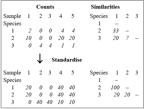
Correlation coefficient
The standard product moment correlation coefficient defined in equation (2.3), and subsequently modified to a similarity, is perhaps more appropriate for defining species similarities than it was for samples, in that it automatically incorporates a type of row standardisation. In fact, this is a full normalisation (subtracting the row mean from each count and dividing by the row standard deviation) and it is less appropriate than the simple row standardisation above. One of the effects of normalisation here is to replace zeros in the matrix with largish negative values which differ from species to species – the presence/absence structure is entirely lost. The previous argument about the effect of joint absences is equally appropriate to species similarities: an inter-tidal species is no more similar to a deep-sea species because neither is found in shelf samples. A correlation coefficient will again be a function of joint absences; the Bray-Curtis coefficient will not.
Recommendation
For species similarities, a coefficient such as Bray-Curtis calculated on row-standardised and untransformed data seems most appropriate. The rarer species (often at least half of the species set) should first be removed from the matrix, to have any chance of an interpretable multivariate clustering or other analysis. There are several ways of doing this, all of them arbitrary to some degree. Field, Clarke & Warwick (1982) suggest removal of all species that never constitute more than q% of the total abundance (/biomass/cover) of any sample, where q is chosen to retain around 50 or 60 species (typically q = 1 to 3%, for benthic macrofauna samples). This is preferable to simply retaining the 50 or 60 species with the highest total abundance over all samples, since the latter strategy may result in omitting several species which are key constituents of a site which is characterised by a low total number of individuals.§ It is important to note, however, that this inevitably arbitrary process of omitting species is not necessary for the more usual between-sample similarity calculations. There the computation of the Bray-Curtis coefficient downweights the contributions of the less common species in an entirely natural and continuous fashion (the rarer the species the less it contributes, on average), and all species should be retained in those calculations.
¶ Species standardisation will remove the typically large overall abundance differences between species (which is one reason we needed transformation for a samples analysis, which dilutes this effect without removing it altogether) but it does not address the issue of large outliers for single species across samples. Transformations might help here but, in that case, they should be done before the species standardisation.
§ The PRIMER Resemblance routine will compute Bray-Curtis species similarities, though you need to have previously species- standardised the matrix (by totals) in the Pre-treatment routine. An alternative is to directly calculate Whittaker’s Index of Association on the species, see equation (7.1), since this is the same calculation except that it includes the standardisation step as part of the coefficient definition. (As Chapter 7 shows, if you are planning on using the SIMPROF test on species, described there, species standardisation is still needed). Prior to this, the Select Variables option allows reduction of the number of species, by retaining those that contribute q% or more to at least one of the samples, or by specifying the number n of ‘most important’ species to retain. The latter uses the same q% criterion but gradually increases q until only n species are left.
2.5 Dissimilarity coefficients
The converse concept to similarity is that of dissimilarity, the degree to which two samples are unlike each other. As previously stated, similarities (S) can be turned into dissimilarities ($\delta$), simply by:
$$ \delta = 100 -S \tag{2.11} $$
which of course has limits $\delta = 0$ (no dissimilarity) and $\delta = 100$ (total dissimilarity). $\delta$ is a more natural starting point than S when constructing ordinations, in which dissimilarities between pairs of samples are turned into distances (d) between sample locations on a ‘map’ – the highest dissimilarity implying, naturally, that the samples should be placed furthest apart.
Bray-Curtis dissimilarity is thus defined by (2.1) as:
$$\delta_{jk} = 100 \frac{\sum_{i=1}^{p} | y_{ij} - y_{ik} | }{\sum_{i=1}^{p} ( y_{ij} + y_{ik} ) } \tag{2.12}$$
However, rather than conversion from similarities, other important measures arise in the first place as dissimilarities, or more often distances, the key difference between the latter being that distances are not limited to a finite range but defined over (0, $\infty$). They may be calculated explicitly or have an implicit role as the distance measure underlying a specific ordination method, e.g. as Euclidean distance is for PCA (Principal Components Analysis, Chapter 4) or chi-squared distance for CA (Correspondence Analysis).
Euclidean distance
The natural distance between any two points in space is referred to as Euclidean distance (from classical or Euclidean geometry). In the context of a species abundance matrix, the Euclidean distance between samples j and k is defined algebraically as:
$$d_{jk} = \sqrt{\sum_{i=1}^{p} ( y_{ij} - y_{ik} )^2 } \tag{2.13}$$
This can best be understood, geometrically, by taking the special case where there are only two species so that samples can be represented by points in 2-dimensional space, namely their position on the two axes of Species 1 and Species 2 counts. This is illustrated below for a simple two samples by two species abundance matrix. The co-ordinate points (2, 3) and (5, 1) on the (Sp. 1, Sp. 2) axes are the two samples j and k. The direct distance $d_{jk}$ between them of $\sqrt{(2–5)^2 + (3–1)^2}$ (from Pythagoras) clearly corresponds to equation (2.13).
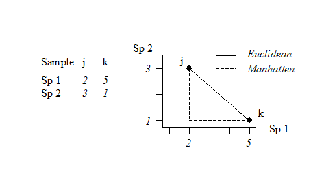
It is easy to envisage the extension of this to a matrix with three species; the two points are now simply located on 3-dimensional species axes and their straight line distance apart is a natural geometric concept. Algebraically, it is the root of the sums of squared distances apart along the three axes, equation (2.13) –Pythogoras applies in any number of dimensions! Extension to four and higher numbers of species (dimensions) is harder to envisage geometrically, in our 3-dimensional world, but the concept remains unchanged and the algebra is no more difficult to understand in higher dimensions than three: additional squared distances apart on each new species axis are added to the summation under the square root in equation (2.13). In fact, this concept of representing a species-by-samples matrix as points in high-dimensional species space is a very fundamental and important one and will be met again in Chapter 4, where it is crucial to an understanding of Principal Components Analysis.
Manhattan distance
Euclidean distance is not the only way of defining distance apart of two samples in species space; an alternative is to sum the distances along each species axis:
$$d_{jk} = \sum_{i=1}^{p} | y_{ij} - y_{ik} | \tag{2.14}$$
This is often referred to as Manhattan (or city-block) distance because in two dimensions it corresponds to the distance you would have to travel to get between any two locations in a city whose streets are laid out in a rectangular grid. It is illustrated in the simple figure above by the dashed lines. Manhattan distance is of interest here because of its obvious close affinity to Bray-Curtis dissimilarity, equation (2.12). In fact, when a data matrix has initially been sample standardised (but not transformed), Bray-Curtis dissimilarity is just (half) the Manhattan distance, since the summation in the bottom line of (2.12) then always takes the value 200.
In passing, it is worth noting a point of terminology, though not of any great practical consequence for us. Euclidean and Manhattan measures, equations (2.13) and (2.14), are known as metrics because they obey the triangle inequality, i.e. for any three samples j, k, r:
$$ d _ {jk} + d _ {kr} \ge d_{jr} \tag{2.15} $$
Bray-Curtis dissimilarity does not, in general, satisfy the triangle inequality, so should not be called a metric. However, many other useful coefficients are also not metric distances. For example, the square of Euclidean distance (i.e. equation (2.13) without the $\sqrt{}$ sign) is another natural definition of ‘distance’ which is not a metric, yet the values from this would have the same rank order as those from Euclidean distance and thus give rise, for example, to identical MDS ordinations (Chapter 5). It follows that whether a dissimilarity coefficient is, or is not, a metric is likely to be of no practical significance for the non-parametric (rank-based) strategy that this manual generally advocates.¶
¶ Though it is of slightly more consequence for the Principal Co-ordinates Analysis ordination, PCO, and the semi-parametric modelling framework of the add-on PERMANOVA+ routines to PRIMER, see Anderson, Gorley & Clarke (2008) , page 110.
2.6 More on resemblance measures
On the grounds that it is better to walk before you try running, discussion of comparisons between specific similarity, dissimilarity and distance coefficients, that the PRIMER software refers to generally by the term resemblance measures, is left until after presentation of a useful suite of multivariate analyses that can be generated from a given set of sample resemblances, and then how such sets of resemblances themselves can be compared (second-stage analysis, Chapter 16). One topic can realistically be addressed here, though.
Missing data and resemblance calculation
Missing data in this context does not mean missing whole samples (e.g. the intention was to collect five replicates but at one location only four were taken). The latter is better described as unbalanced sampling design and is handled automatically, and without difficulty, by most of the methods in this manual (an exception is when trying to link the biotic assemblage at a site to a set of measured environmental variables, e.g. in the BEST routine of Chapter 11, where a full match is required). Missing data here means missing values for only some of the combinations of variables (species) and samples. As such, it is more likely to occur for environmental-type variables or – to take an entirely different type of data – questionnaire returns. There, the variables are the different questions and the samples the people completing the questionnaire, and missing answers to questions are commonplace.
Of course, one solution is to omit some combination of variables and samples such that a complete matrix results, but this might throw away a great deal of the data. Separately for each sample pair whose resemblance is being calculated, one could eliminate any variables with a missing value in either sample (this is known as pairwise elimination of missing values). But this can be biased for some coefficients, e.g. the Euclidean distance (2.13) sums the (squared) contributions from each variable; if several variables have to be omitted for one distance calculation, but none are left out for a second distance, then the latter will be an (artefactually) larger distance, inevitably. The same will be true of, for example, Manhattan distance but not of some other measures, such as Bray-Curtis or average Euclidean (which divides the Euclidean distance by p’, the fluctuating number of terms being summed over) – in fact for anything which behaves more like an average of contributions rather than a sum. An approximate correction for this crude bias can be made for all coefficients, where necessary.†
Variable weighting in resemblance calculation
We have already mentioned the effects of transformation on the outcome of a resemblance calculation and Chapter 9 discusses this in more detail, ending with a description of another important pre-treatment method, as an alternative to (or precursor of) transforming abundances, viz. the differential weighting of species by dispersion weighting. This down-weights species whose counts are shown to be unreliable in replicates of the same site/time/condition, i.e. they have a high variance-to-mean ratio (dispersion index) over such replicates. The solution, in a quite general way, is to downweight each species contribution by the dispersion index, averaged over replicates. In a rather similar idea, variables can be subjected to variability weighting, in which downweighting is not by the index of dispersion (suitable for species count data) but by the average standard deviation¶ over replicates. This is relevant to variables like indices (of diversity, health etc, see Hallett, Valesini & Clarke (2012) ) and results in more weight being given to indices which are more reliable in repeated measurement. A final possibility in PRIMER is just to weight variables according to some pre-defined scale, e.g. in studies of coral communities by amateur divers, Mumby, Clarke & Harborne (1996) give an example in which some species are often misidentified, with known rates calibrated against professional assessments; these species are thus downweighted in the resemblance calculation.
Recommendations
Thus, depending on the type of data, there are a variety of means to generate a resemblance matrix (similarity, dissimilarity or distance) to input to the next stage of a multivariate analysis, which might be either a clustering or ordination of samples, Fig. 2.1. For comparative purposes it may sometimes be of interest to use Euclidean distance in the species space as input to a cluster analysis** (an example is given later in Fig. 5.5) but, in general, the recommendation remains unchanged: Bray-Curtis similarity/dissimilarity, computed after suitable transformation, will often be a satisfactory coefficient for biological data of community structure. That is, use Bray-Curtis, or one of the closely related coefficients satisfying the criteria given on page 2.2 (the ‘Bray-Curtis family’ of Clarke, Somerfield & Chapman (2006) ) for data in which it is important to capture the structure of presences and absences in the samples in addition to the quantitative counts (or density/biomass/area cover etc) of the species which are present. Background physical or chemical data is a different matter since it is usually of a rather different type, and Chapter 11 shows the usefulness of the idea of linking to environmental variable space, assessed by Euclidean distance on normalised data. The first step though is to calculate resemblances for the biotic data on its own, followed by a cluster analysis or ordination (Fig. 2.1).
Fig. 2.1. Stages in a multivariate analysis based on (dis)similarity coefficients.
† Earlier PRIMER versions did not offer this, but v7 makes this bias correction for all coefficients that need it, e.g. for standard Euclidean distance, the pairwise-eliminated distance is multiplied by $\sqrt{p/p^\prime}$, where $p$ is the (fixed) number of variables in the matrix and $p^\prime$ the (differing) number of retained pairs for each specific distance. Manhattan uses factor $(p/p^\prime)$ but the Bray-Curtis family does not need it.
¶ The PRIMER Pre-treatment menu, under Variability Weighting, offers the choice between dividing each species through by its average replicate range, inter-quartile (IQ) range, standard deviation (SD) or pooled SD (as would be calculated in ANOVA from a common variance estimate, then square rooted). Note that this weighting uses only variability within factor levels not across the whole sample set, as in normalisation (dividing by overall SD). Clearly, variability weighting is only applicable when there are replicate samples, and these must be genuinely independent of each other, properly capturing the variability at each factor level, for the technique to be meaningful.
Chapter 3: Clustering methods
3.1 Cluster analysis
The previous chapter has shown how to replace the original data matrix with pairwise similarities, chosen to reflect the particular aspect of community similarity of interest for that study (similarity in counts of abundant species, similarity in location of rare species etc). Typically, the number of pairwise similarities is large, n(n–1)/2 for n samples, and it is difficult visually to detect a pattern in the triangular similarity matrix. Table 3.1 illustrates this for just part (roughly a quarter) of the similarity matrix for the Frierfjord macrofauna data {F}. Close examination shows that the replicates within site A generally have higher within-site similarities than do pairs of replicates within sites B and C, or between-site samples, but the pattern is far from clear. What is needed is a graphical display linking samples that have mutually high levels of similarity.
Table 3.1. Frierfjord macrofauna counts {F}. Bray-Curtis similarities, on $\sqrt{}\sqrt{}$-transformed counts, for every pair of replicate samples from sites A, B, C only (four replicate samples per site).
| A1 | A2 | A3 | A4 | B1 | B2 | B3 | B4 | C1 | C2 | C3 | C4 | |
|---|---|---|---|---|---|---|---|---|---|---|---|---|
| A1 | – | |||||||||||
| A2 | 61 | – | ||||||||||
| A3 | 69 | 60 | – | |||||||||
| A4 | 65 | 61 | 66 | – | ||||||||
| B1 | 37 | 28 | 37 | 35 | – | |||||||
| B2 | 42 | 34 | 31 | 32 | 55 | – | ||||||
| B3 | 45 | 39 | 39 | 44 | 66 | 66 | – | |||||
| B4 | 37 | 29 | 29 | 37 | 59 | 63 | 60 | – | ||||
| C1 | 35 | 31 | 27 | 25 | 28 | 56 | 40 | 34 | – | |||
| C2 | 40 | 34 | 26 | 29 | 48 | 69 | 62 | 56 | 56 | – | ||
| C3 | 40 | 31 | 37 | 39 | 59 | 61 | 67 | 53 | 40 | 66 | – | |
| C4 | 36 | 28 | 34 | 37 | 65 | 55 | 69 | 55 | 38 | 64 | 74 | – |
Cluster analysis (or classification, see footnote on terminology on page 1.2) aims to find natural groupings of samples such that samples within a group are more similar to each other, generally, than samples in different groups. Cluster analysis is used in the present context in the following ways.
a) Different sites (or different times at the same site) can be seen to have differing community compositions by noting that replicate samples within a site form a cluster that is distinct from replicates within other sites. This can be an important hurdle to overcome in any analysis; if replicates for a site are clustered more or less randomly with replicates from every other site then further interpretation is likely to be dangerous. (A more formal statistical test for distinguishing sites is the subject of Chapter 6).
b) When it is established that sites can be distinguished from one another (or, when replicates are not taken, it is assumed that a single sample is representative of that site or time), sites or times can be partitioned into groups with similar community structure.
c) Cluster analysis of the species similarity matrix can be used to define species assemblages, i.e. groups of species that tend to co-occur in a parallel manner across sites.
Range of methods
Literally hundreds of clustering methods exist, some of them operating on similarity/dissimilarity matrices whilst others are based on the original data. Everitt (1980) and Cormack (1971) give excellent and readable reviews. Clifford & Stephenson (1975) is another well-established text from an ecological viewpoint.
Five classes of clustering methods can be distinguished, following the categories of Cormack (1971) .
-
Hierarchical methods. Samples are grouped and the groups themselves form clusters at lower levels of similarity.
-
Optimising techniques. A single set of mutually exclusive groups (usually a pre-specified number) is formed by optimising some clustering criterion, for example minimising a within-cluster distance measure in the species space.
-
Mode-seeking methods. These are based on considerations of density of samples in the neighbourhood of other samples, again in the species space.
-
Clumping techniques. The term ‘clumping’ is reserved for methods in which samples can be placed in more than one cluster.
-
Miscellaneous techniques.
Cormack (1971) also warned against the indiscriminate use of cluster analysis: “availability of … classification techniques has led to the waste of more valuable scientific time than any other ‘statistical’ innovation”. The ever larger number of techniques and their increasing accessibility on modern computer systems makes this warning no less pertinent today. The policy adopted here is to concentrate on a single technique that has been found to be of widespread utility in ecological studies, whilst emphasising the potential arbitrariness in all classification methods and stressing the need to perform a cluster analysis in conjunction with a range of other techniques (e.g. ordination, statistical testing) to obtain balanced and reliable conclusions.
3.2 Hierarchical agglomerative clustering
The most commonly used clustering techniques are the hierarchical agglomerative methods. These usually take a similarity matrix as their starting point and successively fuse the samples into groups and the groups into larger clusters, starting with the highest mutual similarities then lowering the similarity level at which groups are formed, ending when all samples are in a single cluster. Hierarchical divisive methods perform the opposite sequence, starting with a single cluster and splitting it to form successively smaller groups.
The result of a hierarchical clustering is represented by a tree diagram or dendrogram, with the x axis representing the full set of samples and the y axis defining a similarity level at which two samples or groups are considered to have fused. There is no firm convention for which way up the dendrogram should be portrayed (increasing or decreasing y axis values) or even whether the tree can be placed on its side; all three possibilities can be found in this manual.
Fig. 3.1 shows a dendrogram for the similarity matrix from the Frierfjord macrofauna, a subset of which is in Table 3.1. It can be seen that all four replicates from sites A, D, E and G fuse with each other to form distinct site groups before they amalgamate with samples from any other site; that, conversely, site B and C replicates are not distinguished, and that A, E and G do not link to B, C and D until quite low levels of between-group similarities are reached.
Fig. 3.1. Frierfjord macrofauna counts {F}. Dendrogram for hierarchical clustering (using group-average linking) of four replicate samples from each of sites A-E, G, based on the Bray- Curtis similarity matrix shown (in part) in Table 3.1.
The mechanism by which Fig. 3.1 is extracted from the similarity matrix, including the various options for defining what is meant by the similarity of two groups of samples, is best described for a simpler example.
Construction of dendrogram
Table 3.2 shows the steps in the successive fusing of samples, for the subset of Loch Linnhe macrofaunal abundances used as an example in the previous chapter. The data matrix has been $\sqrt{}\sqrt{}$-transformed, and the first triangular array is the Bray-Curtis similarity of Table 2.2.
Samples 2 and 4 are seen to have the highest similarity (underlined) so they are combined, at similarity level 68.1%. (Above this level there are considered to be four clusters, simply the four separate samples.) A new similarity matrix is then computed, now containing three clusters: 1, 2&4 and 3. The similarity between cluster 1 and cluster 3 is unchanged at 0.0 of course but what is an appropriate definition of similarity S(1, 2&4) between clusters 1 and 2&4, for example? This will be some function of the similarities S(1,2), between samples 1 and 2, and S(1,4), between 1 and 4; there are three main possibilities here.
a) Single linkage. S(1, 2&4) is the maximum of S(1, 2) and S(1, 4), i.e. 52.2%.
b) Complete linkage. S(1, 2&4) is the minimum of S(1, 2) and S(1, 4), i.e. 25.6%.
c) Group-average link. S(1, 2&4) is the average of S(1, 2) and S(1, 4), i.e. 38.9%.
Table 3.2 adopts group-average linking, hence
$$ S(2 \& 4, 3) = \left[ S(2, 3) + S(4, 3) \right]/2 = 55.0 $$
The new matrix is again examined for the highest similarity, defining the next fusing; here this is between 2&4 and 3, at similarity level 55.0%. The matrix is again reformed for the two new clusters 1 and 2&3&4 and there is only a single similarity, S(1, 2&3&4), to define. For group-average linking, this is the mean of S(1, 2&4) and S(1, 3) but it must be a weighted mean, allowing for the fact that there are twice as many samples in cluster 2&4 as in cluster 3. Here:
$$ S(1, 2 \& 3 \& 4) = \left[ 2 \times S (1, 2 \& 4) + 1 \times S(1, 3) \right]/3 = \left[ 2 \times 38.9 + 1 \times 0 \right]/3 = 25.9 $$
Table 3.2. Loch Linnhe macrofauna {L} subset. Abundance array after $\sqrt{}\sqrt{}$-transformation, the resulting Bray-Curtis similarity matrix and the successively fused similarity matrices from a hierarchical clustering, using group average linking.
Though it is computationally efficient to form each successive similarity matrix by taking weighted averages of the similarities in the previous matrix (known as combinatorial computation), an alternative which is entirely equivalent, and perhaps conceptually simpler, is to define the similarity between the two groups as the simple (unweighted) average of all between-group similarities in the initial triangular matrix (hence the terminology Unweighted Pair Group Method with Arithmetic mean, UPGMA¶). So:
$$ S(1, 2 \& 3 \& 4) = \left[S(1, 2) + S(1, 3) + S(1, 4)\right]/3 = (25.6 + 0.0 + 52.2)/3 = 25.9,$$
the same answer as above.
The final merge of all samples into a single group therefore takes place at similarity level 25.9%, and the clustering process for the group-average linking shown in Table 3.2 can be displayed in the following dendrogram.
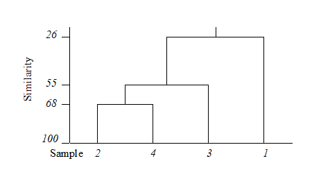
Dendrogram features
This example raises a number of more general points about the use and appearance of dendrograms.
-
Samples need to be re-ordered along the x axis, for clear presentation of the dendrogram; it is always possible to arrange samples in such an order that none of the dendrogram branches cross each other.
-
The resulting order of samples on the x axis is not unique. A simple analogy would be with an artist’s ‘mobile’; the vertical lines are strings and the horizontal lines rigid bars. When the structure is suspended by the top string, the bars can rotate freely, generating many possible re-arrangements of samples on the x axis. For example, in the above figure, samples 2 and 4 could switch places (new sequence 4, 2, 3, 1) or sample 1 move to the opposite side of the diagram (new sequence 1, 2, 4, 3), but a sequence such as 1, 2, 3, 4 is not possible. It follows that to use the x axis sequence as an ordering of samples is misleading.
-
Cluster analysis attempts to group samples into discrete clusters, not display their inter-relations on a continuous scale; the latter is the province of ordination and this would be preferable for the simple example above. Clustering imposes a rather arbitrary grouping on what appears to be a continuum of change from an unpolluted year (1964), through steadily increasing impact (loss of some species, increase in abundance of opportunists such as Capitella), to the start of a reversion to an improved condition in 1973. Of course it is unwise and unnecessary to attempt serious interpretation of such a small subset of data but, even so, the equivalent MDS ordination for this subset (met in Chapter 5) contrasts well with the relatively unhelpful information in the above dendrogram.
-
The hierarchical nature of this clustering procedure dictates that, once a sample is grouped with others, it will never be separated from them in a later stage of the process. Thus, early borderline decisions which may be somewhat arbitrary are perpetuated through the analysis and may sometimes have a significant effect on the shape of the final dendrogram. For example, similarities S(2, 3) and S(2, 4) above are very nearly equal. Had S(2, 3) been just greater than S(2, 4), rather than the other way round, the final picture would have been a little different. In fact, the reader can verify that had S(1, 4) been around 56% (say), the same marginal shift in the values of S(2, 4) and S(2, 3) would have had radical consequences, the final dendrogram now grouping 2 with 3 and 1 with 4 before these two groups come together in a single cluster. From being the first to be joined, samples 2 and 4 now only link up at the final step. Such situations are certain to arise if, as here, one is trying to force what is essentially a steadily changing pattern into discrete clusters.
Dissimilarities
Exactly the converse operations are needed when clustering from a dissimilarity rather than a similarity matrix. The two samples or groups with the lowest dissimilarity at each stage are fused. The single linkage definition of dissimilarity of two groups is the minimum dissimilarity over all pairs of samples between groups; complete linkage selects the maximum dissimilarity and group-average linking involves just an unweighted mean dissimilarity.
Linkage options
The differing consequences of the three linkage options presented earlier† are most easily seen for the special case used in Chapter 2, where there are only two species (rows) in the original data matrix. Samples are then points in the species space, with the (x,y) axes representing abundances of (Sp.1, Sp.2) respectively. Consider also the case where dissimilarity between two samples is defined simply as their (Euclidean) distance apart in this plot.
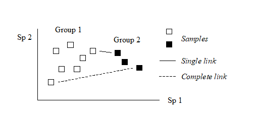
In the above diagram, the single link dissimilarity between Groups 1 and 2 is then simply the minimum distance apart of the two groups, giving rise to an alternative name for the single linkage, namely nearest neighbour clustering. Complete linkage dissimilarity is clearly the maximum distance apart of any two samples in the different groups, namely furthest neighbour clustering. Group-average dissimilarity is the mean distance apart of the two groups, averaging over all between-group pairs.
Single and complete linkage have some attractive theoretical properties. For example, they are effectively non-metric. Suppose that the Bray-Curtis (say) similarities in the original triangular matrix are replaced by their ranks, i.e. the highest similarity is given the value 1, the next highest 2, down to the lowest similarity with rank n(n–1)/2 for n samples. Then a single (or complete) link clustering of the ranked matrix will have the exactly the same structure as that based on the original similarities (though the y axis similarity scale in the dendrogram will be transformed in some non-linear way). This is a desirable feature since the precise similarity values will not often have any direct significance; what matters is their relationship to each other and any non-linear (monotonic) rescaling of the similarities would ideally not affect the analysis. This is also the stance taken for the preferred ordination technique in this manual’s strategy, the method of non-metric multi-dimensional scaling (MDS, see Chapter 5).
However, in practice, single link clustering has a tendency to produce chains of linked samples, with each successive stage just adding another single sample onto a large group. Complete linkage will tend to have the opposite effect, with an emphasis on small clusters at the early stages. (These characteristics can be reproduced by experimenting with the special case above, generating nearest and furthest neighbours in a 2-dimensional species space). Group-averaging, on the other hand, is often found empirically to strike a balance in which a moderate number of medium-sized clusters are produced, and only grouped together at a later stage.
¶ The terminology is inevitably a little confusing therefore! UPGMA is an unweighted mean of the original (dis)similarities among samples but this gives a weighted average among group dissimilarities from the previous merges. Conversely, WPGMA (also known as McQuitty linkage) is defined as an unweighted average of group dissimilarities, leading to a weighted average of the original sample dissimilarities (hence WPGMA).
† PRIMER v7 offers single, complete and group average linking, but also the flexible beta method of Lance & Williams (1967) , in which the dissimilarity of a group (C) to two merged groups (A and B) is defined as $\delta _ {C,AB} = (1 – \beta)[(\delta _ {CA} + \delta _ {CB} ) / 2] + \beta \delta _ {AB} $. If $\beta = 0$ this is WPGMA, $( \delta _ {CA} + \delta _ {CB} ) / 2$, the unweighted average of the two group dissimilarities. Only negative values of $\beta$, in the range (-1, 0), make much sense in theory; Lance and Williams suggest $ \beta = -0.25 $ (for which the flexible beta has affinities with Gower’s median method) but PRIMER computes a range of $ \beta$ values and chooses that which maximises the cophenetic correlation. The latter is a Pearson matrix correlation between original dissimilarity and the (vertical) distance through a dendrogram between the corresponding pair of samples; a dendrogram is a good representation of the dissimilarity matrix if cophenetic correlation is close to 1. Matrix correlation is a concept used in many later chapters, first defined on page 6.10, though there (and usually) with a Spearman rank correlation; however the Pearson matrix correlation is available in PRIMER 7’s RELATE routine, and can be carried out on the cophenetic distance matrix available from CLUSTER. (It is also listed in the results window from a CLUSTER run). In practice, judged on the cophenetic criterion, an optimum flexible beta solution is usually inferior to group average linkage (perhaps as a result of its failure to weight $\delta _ {CA}$ and $\delta _ {CB}$ appropriately when averaging ‘noisy’ data).
3.3 Example: Bristol Channel zooplankton
Collins & Williams (1982) perform hierarchical cluster analyses of zooplankton samples, collected by double oblique net hauls at 57 sites in the Bristol Channel UK, for three different seasons in 1974 {B}. This was not a pollution study but a baseline survey carried out by the Plymouth laboratory, as part of a major programme to understand and model the ecosystem of the estuary. Fig. 3.2 is a map of the sample locations, sites 1-58 (site 30 not sampled).
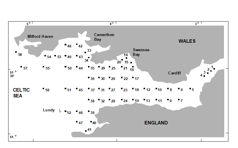 Fig. 3.2 Bristol Channel zooplankton {B}. Sampling sites.
Fig. 3.3 shows the results of a hierarchical clustering using group-average linking of the 57 sites. The raw data were expressed as numbers per cubic metre for each of 24 holozooplankton species, and Bray-Curtis similarities calculated on $\sqrt{}\sqrt{}$-transformed densities. From the resulting dendrogram, Collins and Williams select the four groups determined at a 55% similarity level and characterise these as true estuarine (sites 1-8, 10, 12), estuarine and marine (9, 11, 13-27, 29), euryhaline marine (28, 31, 33-35, 42-44, 47-50, 53-55) and stenohaline marine (32, 36-41, 45, 46, 51, 52, 56-58). A corresponding clustering of species and a re-ordering of the rows and columns of the original data matrix allows the identification of a number of species groups characterising these main site clusters, as is seen later (Chapter 7).
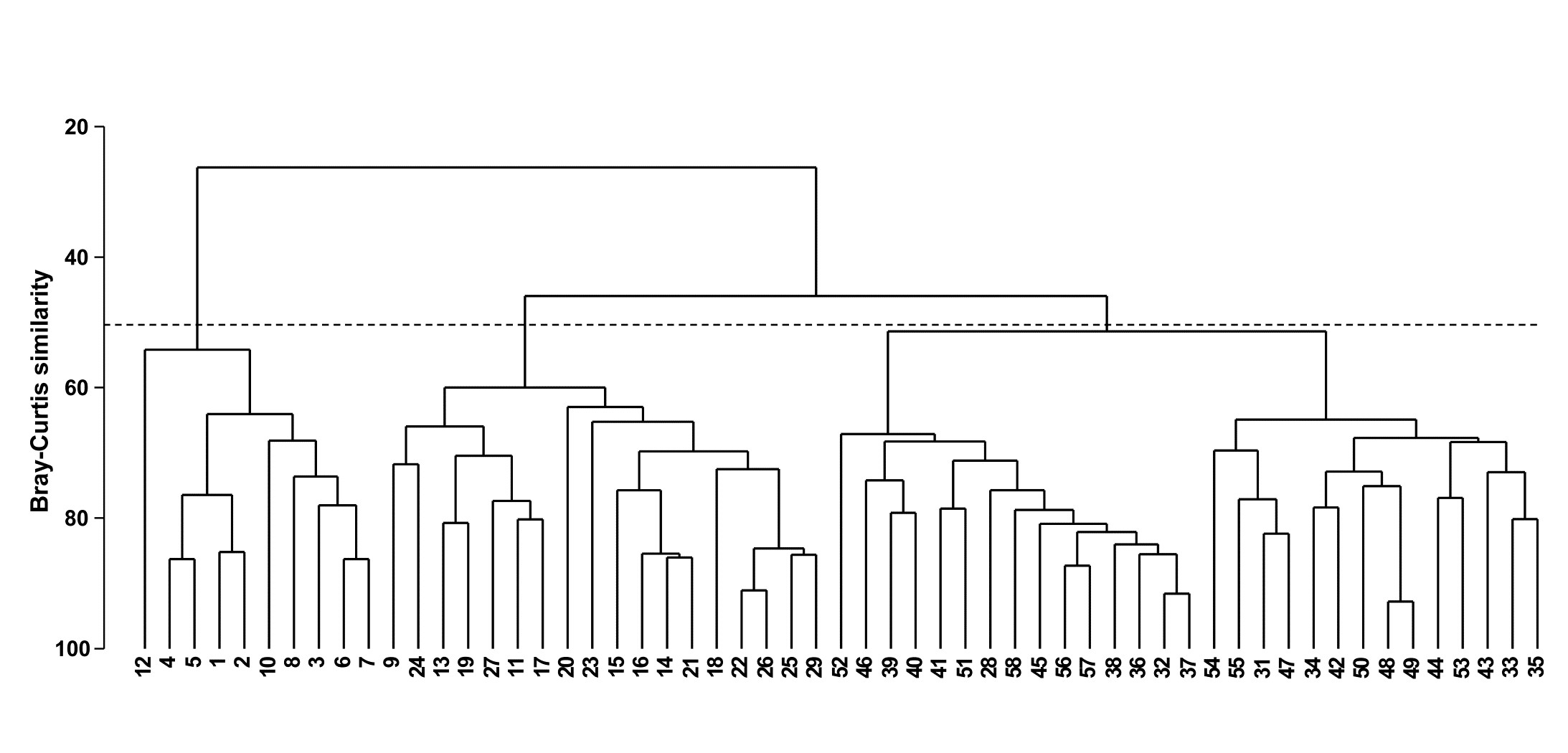
Fig. 3.3. Bristol Channel zooplankton {B}. Dendrogram for hierarchical clustering of the 57 sites, using group-average linking of Bray-Curtis similarities calculated on $\sqrt{}\sqrt{}$-transformed abundance data. The three groups produced by an (arbitrary) threshold similarity of 50% are shown.
The dendrogram provides a sequence of fairly convincing groups; once each of the four main groups has formed it remains separate from other groups over a relatively large drop in similarity. Even so, a cluster analysis gives an incomplete and disjointed picture of the sample pattern. Remembering the analogy of the ‘mobile’, it is not clear from the dendrogram alone whether there is any natural sequence of community change across the four main clusters (implicit in the designations true estuarine, estuarine and marine, euryhaline marine, stenohaline marine). For example, the stenohaline marine group could just as correctly have been rotated to lie between the estuarine and marine and euryhaline marine groups. In fact, there is a strong (and more-or-less continuous) gradient of community change across the region, associated with the changing salinity levels. This is best seen in an ordination of the 57 samples on which are superimposed the salinity levels at each site; this example is therefore returned to in Chapter 11.
3.4 Recommendations
-
Hierarchical clustering with group-average linking, based on sample similarities or dissimilarities such as Bray-Curtis, has proved a useful technique in a number of ecological studies of the past half-century. It is appropriate for delineating groups of sites with distinct community structure (this is not to imply that groups have no species in common, of course, but that different characteristic patterns of abundance are found consistently in different groups).
-
Clustering is less useful (and could sometimes be misleading) where there is a steady gradation in community structure across sites, perhaps in response to strong environmental forcing (e.g. large range of salinity, sediment grain size, depth of water column, etc). Ordination is preferable in these situations.
-
Even for samples which are strongly grouped, cluster analysis is often best used in conjunction with ordination. Superimposition of the clusters (at various levels of similarity) on an ordination plot will allow any relationship between the groups to be more informatively displayed, and it will be seen later (Chapter 5) that agreement between the two representations strengthens belief in the adequacy of both.
-
Historically, in order to define clusters, it was necessary to specify a threshold similarity level (or levels) at which to ‘cut’ the dendrogram (Fig. 3.3 shows a division for a threshold of 50%). This seems arbitrary, and usually is: it is unwise to take the absolute values of similarity too seriously since these vary with standardisation, transformation, taxonomic identification level, choice of coefficient etc. Most of the methods of this manual are a function only of the relative similarities among a set of samples. Nonetheless, it is still an intriguing question to ask how strong the evidence is for the community structure differing between several of the observed groups in a dendrogram. Note the difference between this a posteriori hypothesis and the equivalent a priori test from Fig. 3.1, namely examining the evidence for different communities at (pre-defined) sites A, B, C, etc. A priori groups need the ANOSIM test of Chapter 6; a posteriori ones can be tackled by the similarity profile test (SIMPROF) described below. This test also has an important role in identifying meaningful clusters of species (those which behave in a coherent fashion across samples, see Chapter 7) and in the context of two further (divisive) clustering techniques. The unconstrained form of the latter is described later in this chapter, and its constrained alternative (a linkage tree, ‘explaining’ a biotic clustering by its possible environmental drivers) is in Chapter 11.
3.5 Similarity profiles (SIMPROF)
Given the form of the dendrogram in Fig. 3.3, with high similarities in apparently tightly defined groups and low similarities among groups, there can be little doubt that some genuine clustering of the samples exists for this data set. However, a statistical demonstration of this would be helpful, and it is much less clear, for example, that we have licence to interpret the sub-structure within any of the four apparent main groups. The purpose of the SIMPROF test is thus, for a given set of samples, to test the hypothesis that within that set there is no genuine evidence of multivariate structure (and though SIMPROF is primarily used in clustering contexts, multivariate structure could include seriation of samples, as seen in Chapter 10). Failure to reject this ‘null’ hypothesis debars us from further examination, e.g. for finer-level clusters, and is a useful safeguard to over-interpretation. Thus, here, the SIMPROF test is used successively on the nodes of a dendrogram, from the top downwards.
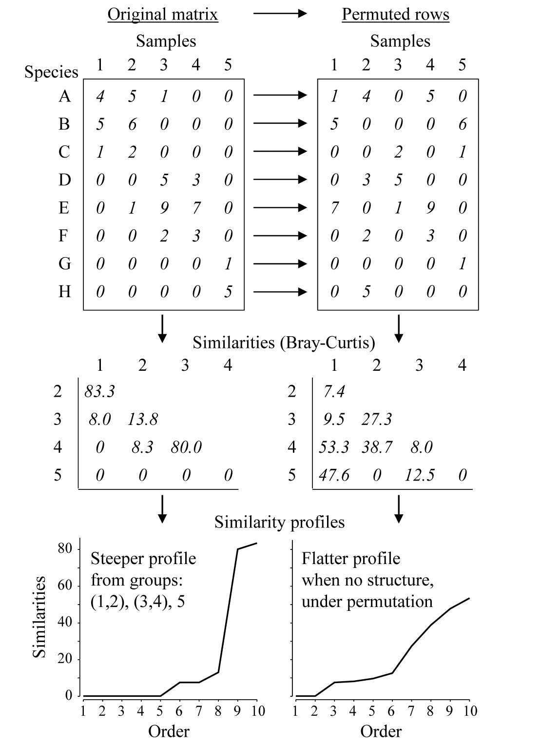 Fig. 3.4. Simple example of construction of a similarity profile from 5 samples (1-5) of 8 species (A-H), for the original matrix (left-hand column) and in a permuted form (right-hand column).
Construction of a single SIMPROF test
The SIMPROF technique is based on the realisation that there is a duality between structure in samples and correlation (association) in species, and Fig. 3.4 demonstrates this for a simple example. The original matrix, in the left-hand column, appears to have a structure of three clusters (samples 1 and 2, samples 3 and 4, and sample 5), driven by, or driving, species sets with high internal associations (A-C, D-F and G-H). This results in some high similarities within the clusters (80, 83.3) and low similarities between the clusters (0, 8, 8.3, 13.8) and few intermediate similarities, in this case none at all. Here, the Bray-Curtis coefficient is used but the argument applies equally to other appropriate resemblance measures. When the triangular similarity matrix is unravelled and the full set of similarities ordered from smallest to largest and plotted on the y axis against that order (the numbers 1, 2, 3, …) on the x axis, a relatively steep similarity profile is therefore obtained (bottom left of Fig. 3.4).
In contrast, when there are no positive or negative associations amongst species, there is no genuinely multivariate structure in the samples and no basis for clustering the samples into groups (or, indeed, identifying other multivariate structures such as gradients of species turnover). This is illustrated in the right-hand column of Fig. 3.4, where the counts for each row of the matrix have been randomly permuted over the 5 samples, independently for each species. There can now be no genuine association amongst species – we have destroyed it by the randomisation – and the similarities in the triangular matrix will now tend to be all rather more intermediate, for example there are no really high similarities and many fewer zeros. This is seen in the corresponding similarity profile which, though it must always increase from left to right, as the similarities are placed in increasing order, is a relatively flatter curve (bottom right, Fig. 3.4).
This illustration suggests the basis for an effective test of multivariate structure within a given group of samples: a schematic of the stages in the SIMPROF permutation test is shown in Fig. 3.5, for a group of 7 samples. The similarity profile for the real matrix needs to be compared with a large set of profiles that would be expected to occur under the null hypothesis that there is no multivariate structure in that group. Examples of the latter are generated by permutation: the independent random re-arrangement of values within rows of the matrix, illustrated once in Fig. 3.4, is repeated (say) 1000 times, each time calculating the full set of similarities and their similarity profile. The bundle of ‘random’ profiles that result are shown in Fig. 3.5 by their mean profile (light, continuous line) and their 99% limits (dashed line). The latter are defined as intervals such that, at each point on the x axis, only 5 of the 1000 permuted profiles fall above, and 5 below, the dashed line. Under the null hypothesis, the real profile (bold line) should appear no different than the other 1000 profiles calculated. Fig. 3.5 illustrates a profile which is not at all in keeping with the randomised profiles and should lead to the null hypothesis being rejected, i.e. providing strong evidence for meaningful clustering (or other multivariate structure) within these 7 samples.
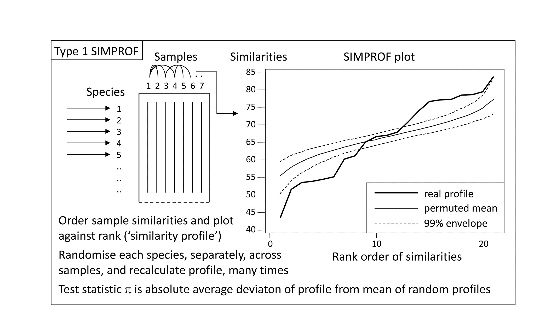 *Fig. 3.5. Schematic diagram of construction of similarity profile (SIMPROF) and testing of null hypothesis of no multivariate structure in a group of samples, by permuting species values. (This is referred to as a Type 1 SIMPROF test, if it needs to be distinguished from Type 2 and 3 tests of species similarities – see Chapter 7. If no Type is mentioned, Type 1 is assumed).
A formal test requires definition of a test statistic and SIMPROF uses the average absolute departure $\pi$ of the real profile from the mean of the permuted ones (i.e. positive and negative deviations are all counted as positive). The null distribution for $\pi$ is created by calculating its value for 999 (say) further random permutations of the original matrix, comparing those random profiles to the mean from the original set of 1000. There are therefore 1000 values of $\pi$, of which 999 represent the null hypothesis conditions and one is for the real profile. If the real $\pi$ is larger than any of the 999 random ones, as would certainly be the case in the schematic of Fig. 3.4, the null hypothesis could be rejected at least at the p < 0.1% significance level. In less clear-cut cases, the % significance level is calculated as 100(t+1)/(T+1)%, where t of the T permuted values of $\pi$ are greater than or equal to the observed $\pi$. For example, if not more than 49 of the 999 randomised values exceed or equal the real $\pi$ then the hypothesis of no structure can be rejected at the 5% level.
SIMPROF for Bristol Channel zooplankton data
Though a SIMPROF test could be used in isolation, e.g. on all samples as justification for starting a multivariate analysis at all, its main use is for a sequence of tests on a hierarchical group structure established by an agglomerative (or divisive) cluster analysis. Using the Bristol Channel zooplankton dendrogram (Fig. 3.3) as an illustration, the first SIMPROF test would be on all 57 sites, to establish that there are at least some interpretable clusters within these. The similarity profile diagram and the resulting histogram of the null distribution for $\pi$ are given in the two left-hand plots of Fig. 3.6. Among the $(57 \times 56)/2 = 1596$ similarities, there are clearly many more large and small, and fewer mid-range ones, than is compatible with a hypothesis of no structure in these samples. (Note that the large number of similarities ensures that the 99% limits hug the mean of the random profiles rather closely.) The real $\pi$ of 6.4 is seen to be so far from the null distribution as to be significant at any specified level, effectively.
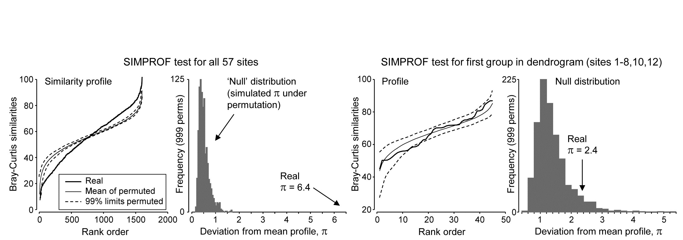
Fig. 3.6. Bristol Channel zooplankton {B}. Similarity profiles and the corresponding histogram for the SIMPROF test, in the case of (left pair) all 57 sites and (right pair) the first group of 10 sites identified in the dendrogram of Fig. 3.3
As is demonstrated in Fig. 3.7, we now drop to the next two levels in the dendrogram. On the left, what evidence is there now for clustering structure within the group of samples {1-8,10,12}? This SIMPROF test is shown in the two right-hand plots of Fig. 3.6: here the real profile lies within the 99% limits over most of its length and, more importantly, the real $\pi$ of 2.4 falls within the null distribution (though in its right tail), giving a significance level p of about 7%. This is marginal, and would not normally be treated as evidence to reject the null hypothesis, especially bearing in mind that multiple significance tests are being carried out.
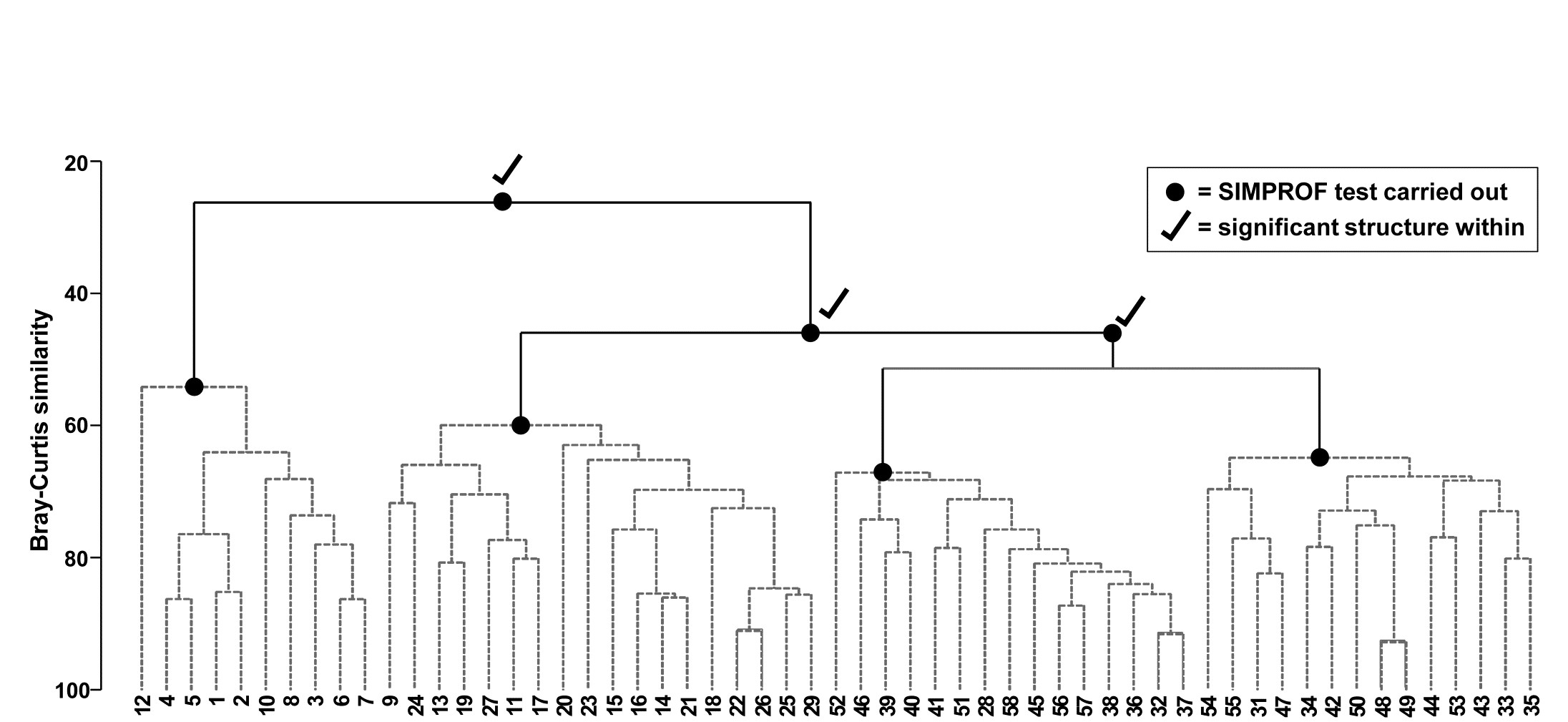
Fig. 3.7. Bristol Channel zooplankton {B}. Dendrogram as in Fig. 3.4 but showing the results of successive SIMPROF tests on nodes of the tree, starting at the top. Only the first three tests showed significant multivariate structure in the samples below that point (bold dots), so there is no evidence from SIMPROF for the detailed clustering structure (grey dashed lines) within each of the 4 main groups.
The conclusion is therefore that there is no clear evidence to allow interpretation of further clusters within the group of samples 1-8,10,12 and this is considered a homogenous set. The remaining 47 samples show strong evidence of heterogeneity in their SIMPROF test (not shown, $\pi = 3.4$, way off the top of the null distribution), so the process drops through to the next level of the dendrogram, where the left-hand group is deemed homogeneous and the right hand group again splits, and so on. The procedure stops quickly in this case, with only four main groups identified as significantly different from each other. The sub-structure of clusters within the four main groups, produced by the hierarchical procedure, therefore has no statistical support and is shown in grey dashed lines in Fig 3.7.
Features of the SIMPROF test
These are discussed more extensively in the primary paper on SIMPROF, Clarke, Somerfield & Gorley (2008) , but some important attributes of the test are worth noting here.
-
A key feature of permutation tests, which are exploited many times in this manual, is that the distribution of abundances (or biomass, area cover etc) for each species remains exactly the same under the random permutations, and is therefore fully realistic. Some species are highly abundant whilst some are much rarer, some species have very right-skewed values, some much less so, and so on. All of this is represented faithfully in the permuted values for each species, since they are exactly the same counts. There is no need to assume specific probability distributions for the test statistics (as in classic statistical tests) or to invoke particular probability distributions for the observations, from which to create matrices simulating the original data (as in Monte Carlo testing). The original data is simply reused, but in a way that is consistent with the null hypothesis being tested. This makes permutation tests, for hypotheses where they can be exploited, extraordinarily general and powerful, as well as simple to understand and interpret.
-
There are at least two asymmetries in the interpretation of a sequence of SIMPROF tests from a cluster hierarchy. Firstly, they provide a ‘stopping rule’ for how far down a dendrogram structure may be interpreted which is not a constant similarity ‘slice’ over the hierarchy: some branches may contain more samples exhibiting more detailed structure, which is validly interpretable at higher similarity levels than other branches. Secondly, in cases where the test sequence justifies interpreting a rather fine-scale group structure (which it would therefore be unwise to interpret at an even more detailed level), it may still be perfectly sensible to choose a coarser sample grouping, by slicing at a lower similarity. SIMPROF gives limits to detailed interpretation but the groups it can identify as differing statistically may be too trivially different to be operationally useful.
-
There can be a good deal of multiple testing in a sequence of SIMPROF tests. Some adjustment for this could be made by Bonferroni corrections. Thus, for the dendrogram of Fig. 3.7, a total of 7 tests are performed. This might suggest repeating the process with individual significance levels of 5/7 = 0.7%, but that is over-precise. What would be informative is to re-run the SIMPROF sequence with a range of significance levels (say 5%, 1%, 0.1%), to see how stable the final grouping is to choice of level. (But scale up your numbers of permutations at higher significance levels, e.g. use at least 9999 for 0.1% level tests; 999 would simply fail to find any significance!). In fact, you are highly likely to find that tinkering with the precise significance levels makes little difference to such a sequence of tests; only a small percentage of the cases will be borderline, the rest being clear-cut in one or other direction. In Fig. 3.7 for example, all four groups are maintained at more stringent significance levels than 5%, until unreasonable levels of 0.01% are reached, when the third and fourth groups (right side of plot) merge.
-
The discussion of more stringent p values naturally raises the issue of power of SIMPROF tests. Power is a difficult concept to formalise in a multivariate context since it requires a precise definition of the alternative to the null hypothesis here of ‘no multivariate structure’, when in fact there are an infinite number of viable alternatives. (These issues are mentioned again in Chapters 6 and 10, and see also Somerfield, Clarke & Olsgard (2002) ). However, in a general sense it is plausible that, all else being equal, SIMPROF will be increasingly likely to detect structure in a group of samples as the group size increases. This is evident if only from the case of just two samples: all random and independent permutations of the species entries over those two samples will lead to exactly the same similarity, hence the real similarity profile (a point) will be at the same position as all the random profiles and could never lead to rejection of the null hypothesis – groups of two are never split. Surprisingly often, though, there is enough evidence to split groups of three into a singleton and pair, an example being for samples 3, 4 and 5 of Fig. 3.4.
-
The number of species will also (and perhaps more clearly) contribute to the power of the test, as can be seen from the obvious fact that if there is just one species, the test has no power at all to identify clusters (or any other structure) among the samples. It does not work by exploring the spacing of samples along a single axis, for example to infer the presence of mixture distributions, a process highly sensitive to distributional assumptions. Instead, it robustly (without such assumptions) exploits associations among species to infer sample structure (as seen in Fig 3.3), and it seems clear that greater numbers of species should give greater power to that inference. It might therefore be thought that adding a rather unimportant (low abundance, low presence) species to the list, highly associated with an existing taxon, will automatically generate significant sample structure, hence of little practical consequence. But that is to miss the subtlety of the SIMPROF test statistic here. It is not constructed from similarities (associations) among species but sample similarities, which will reflect only those species which have sufficient presence or abundance to impact on those similarity calculations (under whatever pre-treatment options of standardising or transforming samples has been chosen as relevant to the context). In other words, for a priori unstructured samples, the test exploits only species associations (either intrinsic or driven by differing environments) that matter to the definition of community patterns, and it is precisely the presence of such associations that define meaningful assemblage structure in that case.
One final point to emphasise. It will be clear to those already familiar with the ANOSIM and RELATE tests of Chapters 6 and 10 that SIMPROF is a very different type of permutation test. ANOSIM starts from a known a priori structure of groups of samples (different sites, times, treatments etc, as in Fig. 3.1), containing replicate samples of each group, and tests for evidence that this imposed group structure is reflected in real differences in similarities calculated among and within groups. If there is such an a priori structure then it is best utilised: though SIMPROF is not invalid in this case, the non-parametric ANOSIM test, or the semi-parametric PERMANOVA test (see the Anderson, Gorley & Clarke (2008) manual) are the correct and better tests. If there is no such prior structuring of samples into groups, and the idea is to provide some rigour to the exploratory nature of cluster analysis, then a sequence of SIMPROF tests is likely to be an appropriate choice: ANOSIM would definitely be invalid in this case. Defining groups by a cluster analysis and then using the same data to test those groups by ANOSIM, as if they were a priori defined, is one of the most heinous crimes in the misuse of PRIMER, occasionally encountered in the literature!
3.6 Binary divisive clustering
All discussion so far has been in terms of hierarchical agglomerative clustering, in which samples start in separate groups and are successively merged until, at some level of similarity, all are considered to belong to a single group. Hierarchical divisive clustering does the converse operation: samples start in a single group and are successively divided into two sub-groups, which may be of quite unequal size, each of those being further sub-divided into two (i.e. binary division), and so on. Ultimately, all samples become singleton groups unless (preferably) some criterion ‘kicks in’ to stop further sub-division of any specific group. Such a stopping rule is provided naturally here by the SIMPROF test: if there is no demonstrable structure within a group, i.e. the null hypothesis for a SIMPROF test cannot be rejected, then that group is not further sub-divided.
Binary divisive methods are thought to be advantageous for some clustering situations: they take a top-down view of the samples, so that the initial binary splits should (in theory) be better able to respect any major groupings in the data, since these are found first (though as with all hierarchical methods, once a sample has been placed within one initial group it cannot jump to another at a later stage). In contrast, agglomerative methods are bottom-up and ‘see’ only the nearby points throughout much of the process; when reaching the top of the dendrogram there is no possibility of taking a different view of the main merged groups that have formed. However, it is not clear that divisive methods will always produce better solutions in practice and there is a counterbalancing downside to their algorithm: it can be computationally more intensive and complex. The agglomerative approach is simple and entirely determined, requiring at each stage (for group average linkage, say) just the calculation of average (dis)similarities between every pair of groups, many of which are known from the previous stage (see the simple example of Table 3.2).
In contrast the divisive approach needs, for each of the current groups, a (binary) flat clustering, a basic idea we meet again below in the context of k-means clustering. That is, we need to look, ideally, at all ways of dividing the n samples of that group into two sub-groups, to determine which is optimal under some criterion. There are $2 ^ {n-1} -1$ possibilities and for even quite modest n (say >25) evaluating all of them quickly becomes prohibitive. This necessitates an iterative search algorithm, using different starting allocations of samples to the two sub-groups, whose members are then re-allocated iteratively until convergence is reached. The ‘best’ of the divisions from the different random restarts is then selected as likely, though not guaranteed, to be the optimal solution. (A similar idea is met in Chapter 5, for MDS solutions.)
The criterion for quantifying a good binary division is clearly central. Classically, ordinary distance (Euclidean) is regarded as the relevant resemblance measure, and Fig. 3.8 (left) shows in 2-d how the total sums of squared distances of all points about the grand mean (overall centroid) is partitioned into a combination of sums of squares within the two groups about their group centroids, and that between the group centroids about the overall centroid (the same principle applies to higher dimensions and more groups). By minimising the within-group sums of squares we maximise that between groups, since the total sums of squares is fixed. For each group, Huygens theorem (e.g. see Anderson, Gorley & Clarke (2008) ) expresses those within-group sums of squares as simply the sum of the squared Euclidean distances between every pair of points in the group (Fig. 3.8, right), divided by that number of points. In other words, the classic criterion minimises a weighted combination of within group resemblances, defined as squared Euclidean distances. Whilst this may be a useful procedure for analysing normalised environmental variables (see Chapter 11), where Euclidean distance (squared) might be a reasonable resemblance choice, for community analyses we need to replace that by Bray-Curtis or other dissimilarities (Chapter 2), and partitioning sums of squares is no longer a possibility. Instead, we need another suitably scaled way of relating dissimilarities between groups to those within groups, which we can maximise by iterative search over different splits of the samples.
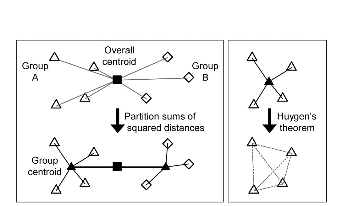
Fig. 3.8. Left: partitioning total sums of squared distances about centroid (d2) into within- and between-group d2. Right: within-group d2 determined by among-point d2, Huygen’s theorem.
There is a simple answer to this, a natural generalisation of the classic approach, met in equation (6.1), where we define the ANOSIM R statistic as:
$$ R = \frac{ \left( \overline{r} _ B - \overline{r} _ W \right) } { \frac{1}{2} M } \tag{3.1} $$
namely the difference between the average of the rank dissimilarities between the (two) groups and within the groups. This is suitably scaled by a divisor of M/2, where M = n(n-1)/2 is the total number of dissimilarities calculated between all the n samples currently being split. This divisor ensures that R takes its maximum value of 1 when the two groups are perfectly separated, defined as all between-group dissimilarities being larger than any within-group ones. R will be approximately zero when there is no separation of groups at all but this will never occur in this context, since we will be choosing the groups to maximise the value of R.
There is an important point not to be missed here: R is in no way being used as a test statistic, the reason for its development in Chapter 6 (for a test of no differences between a priori defined groups, R=0). Instead, we are exploiting its value as a pure measure of separation of groups of points represented by the high-dimensional structure of the resemblances (here perhaps Bray-Curtis, but any coefficient can be used with R, including Euclidean distance). And in that context it has some notable advantages: it provides the universal scaling we need of between vs. within group dissimilarities/distances (whatever their measurement scale) through their reduction to simple ranks, and this non-parametric use of dissimilarities is coherent with other techniques in our approach: non-metric MDS plots, ANOSIM and RELATE tests etc.
To recap: the binary divisive procedure starts with all samples in a single group, and if a SIMPROF test provides evidence that the group has structure which can be further examined, we search for an optimal split of those samples into two groups, maximising R, which could produce anything from splitting off a singleton sample through to an even balance of the sub-group sizes. The SIMPROF test is then repeated for each sub-group and this may justify a further split, again based on maximising R, but now calculated having re-ranked the dissimilarities in that sub-group. The process repeats until SIMPROF cannot justify further binary division on any branch: groups of two are therefore never split (see the earlier discussion).
Fig. 3.9. Bristol Channel zooplankton {B}. Unconstrained divisive clustering of 57 sites (PRIMER’s UNCTREE routine, maximising R at each binary split), from Bray-Curtis on $\sqrt{} \sqrt{} $-transformed abundances. As with the agglomerative dendrogram (Fig. 3.7), continuous lines indicate tree structure which is supported by SIMPROF tests; this again divides the data into only four groups.
Bristol Channel zooplankton example
The tree diagram which results from the Bray-Curtis resemblances for the 57 Bristol Channel zooplankton samples is given in Fig 3.9. As with the comparative agglomerative clustering, Fig 3.7, it is convenient to represent all splits down to single points, but the grey dashed lines indicate divisions where SIMPROF provides no support for that sub-structure. Visual comparison of two such trees is not particularly easy, though they have been manually rotated to aid this (remember that a dendrogram is only defined down to arbitrary rotations of its branches, in the manner of a ‘mobile’). Clearly, however, only four groups have been identified by the SIMPROF tests in both cases, and the group constitutions have much in common, though are not identical. This is more readily seen from Figs. 3.10 a & b, which use a non-metric MDS plot (for MDS method see Chapter 5) to represent the community sample relationships in 2-d ordination space. These are identical plots, but demonstrate the agglomerative and divisive clustering results by the use of differing symbols to denote the 4 groups (A-D) produced by the respective trees. The numbering on Fig. 3.10a is that of the sites, shown in Fig. 3.2 (and on Fig. 3.10b the mean salinity at those sites, discretised into salinity scores, see equation 11.2). It is clear that only sites 9, 23 and 24 change groups between the two clustering methods and these all appear at the edges of their groups in both plots, which are thus reassuringly consistent (bear in mind also that a 2-d MDS plot gives only an approximation to the true sample relationships in higher dimensions, the MDS stress of 0.11 here being low but not negligible).
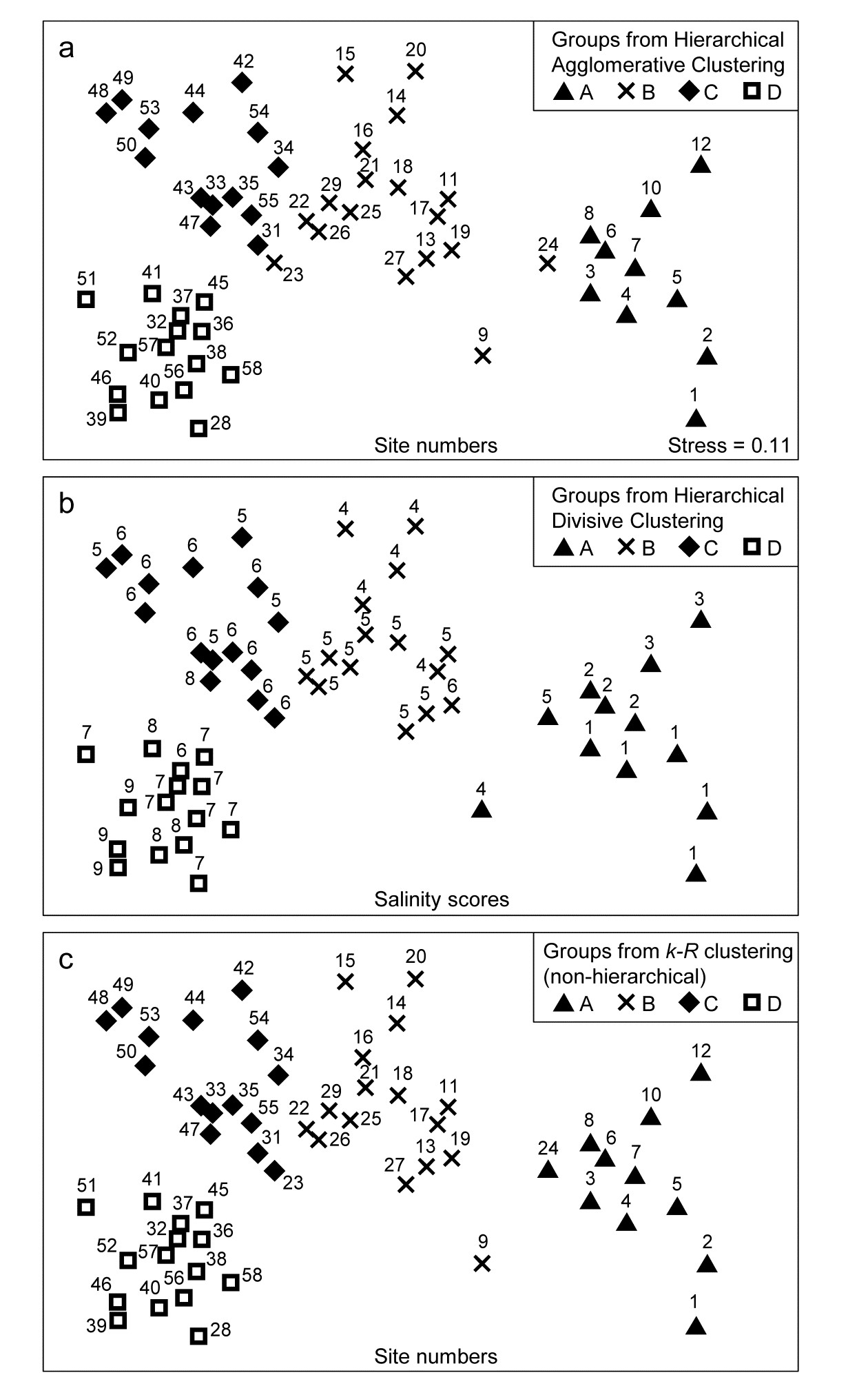
Fig. 3.10. Bristol Channel zooplankton {B}. Non-metric MDS ordination (Chapter 5) of the 57 sites, from Bray-Curtis on $\sqrt{} \sqrt{} $-transformed abundances. Symbols indicate the groups found by SIMPROF tests (four in each case, as it happens) for each of three clustering methods: a) agglomerative hierarchical, b) divisive hierarchical, c) k-R non-hierarchical. Sample labels are: a) & c) site numbers (as in Fig. 3.2), b) site salinity scores (on a 9-point scale, 1: <26.3, …, 9: > 35.1 ppt, see equation 11.2).
PRIMER v7 implements this unconstrained binary divisive clustering in its UNCTREE routine. This terminology reflects a contrast with the PRIMER (v6/ v7) LINKTREE routine for constrained binary divisive clustering, in which the biotic samples are linked to environmental information which is considered to be driving, or at least associated with, the community patterns. Linkage trees, also known as multivariate regression trees, are returned to again in Chapter 11. They perform the same binary divisive clustering of the biotic samples, using the same criterion of optimising R, but the only splits that can be made are those which have an ‘explanation’ in terms of an inequality on one of the environmental variables. Applied to the Bristol Channel zooplankton data, this might involve constraining the splits to those for which all samples in one sub-cluster have a higher salinity score than all samples in the other sub-cluster (better examples for more, and more continuous, environmental variables are given in Chapter 11 and Clarke, Somerfield & Gorley (2008) ). By imposing threshold constraints of this type we greatly reduce the number of possible ways in which splits can be made; evaluation of all possibilities is now viable so an iterative search algorithm is not required. LINKTREE gives an interesting capacity to ‘explain’ any clustering produced, in terms of thresholds on environmental values, but it is clear from Fig. 3.10b that its deterministic approach is quite likely to miss natural clusterings of the data: the C and D groups cannot be split up on the basis of an inequality on the salinity score (e.g. ≤6, ≥7) because this is not obeyed by sites 37 and 47.
For both the unconstrained or constrained forms of divisive clustering, PRIMER offers a choice of y axis scale between equi-spaced steps at each subsequent split (A% scale) and one which attempts to reflect the magnitude of divisions involved (B%), in terms of the generally decreasing dissimilarities between sub-groups as the procedure moves to finer distinctions. Clarke, Somerfield & Gorley (2008) define the B% scale in terms of average between-group ranks based on the originally ranked resemblance matrix, and that is used in Fig. 3.9. The A% scale generally makes for a more easily viewable plot, but the y axis positions at which identifiable groups are initiated cannot be compared.
3.7 k-R clustering (non-hierarchical)
Another major class of clustering techniques is non-hierarchical, referred to above as flat clustering. The desired number of clusters (k) must be specified in advance, and an iterative search attempts to divide the samples in an optimal way into k groups, in one operation rather than incrementally. The classic method, the idea of which was outlined in the two-group case above, is k-means clustering, which seeks to minimise within-group sums of squares about the k group centroids. This is equivalent to minimising some weighted combination of within-group resemblances between pairs of samples, as measured by a squared Euclidean distance coefficient (you can visualise this by adding additional groups to Fig. 3.8). The idea can again be generalised to apply to any resemblance measure, e.g. Bray-Curtis, by maximising ANOSIM R, which measures (non-parametrically) the degree of overall separation of the k groups, formed from the ranks in the full resemblance matrix. (Note that we defined equation (3.1) as if it applied only to two groups, but the definition of R is exactly the same for the k-group case, equation (6.1)). By analogy with k-means clustering, the principle of maximising R to obtain a k-group division of the samples is referred to as k-R clustering, and it will again involve an iterative search, from several different random starting allocations of samples to the k groups.
Experience with k-means clustering suggests that a flat clustering of the k-R type should sometimes have slight advantages over a hierarchical (agglomerative or divisive) method, since samples are able to move between different groups during the iterative process. The k-group solution will not, of course, simply split one of the groups in the (k-1)-group solution: there could be a widescale rearrangement of many of the points into different groups. A widely perceived disadvantage of the k-means idea is the need to specify k before entering the routine, or if it is re-run for many different k values, the absence of a convenient visualisation of the clustering structure for differing values of k, analogous to a dendrogram. This has tended to restrict its use to cases where there is a clear a priori idea of the approximate number of groups required, perhaps for operational reasons (e.g. in a quality classification system). However, the SIMPROF test can also come to the rescue here, to provide a choice of k which is objective. Starting from a low value for k (say 2) the two groups produced by k-R clustering are tested for evidence of within-group structure by SIMPROF. If either of the tests are significant, the routine increments k (to 3), finds the 3-group solution and retests those groups by SIMPROF. The procedure is repeated until a value for k is reached in which none of the k groups generates significance in their SIMPROF test, and the process terminates with that group structure regarded as the best solution. (This will not, in general, correspond to the maximum R when these optima for each k are compared across all possible k; e.g. R must increase to its maximum of 1 as k approaches n, the number of samples.)
Fig. 3.10c shows the optimum grouping produced by k-R clustering, superimposed on the same MDS plot as for Figs. 3.10 a & b. The SIMPROF routine has again terminated the procedure with k=4 groups (A to D), which are very similar to those for the two hierarchical methods, but with the three sites 9, 23 and 24 allocated to the four groups in yet a third way. This appears to be at least as convincing an allocation as for either of the hierarchical plots (though do not lose sight of the fact that the MDS itself is only an approximation to the real inter-sample resemblances).
Average rank form of flat clustering
A variation of this flat-clustering procedure does not use R but a closely related statistic, arising from the concept of group-average linking met earlier in Table 3.2. For a pre-specified number of groups (k), every stage of the iterative process involves removing each sample in turn and then allocating it to one of the k-1 other groups currently defined, or returning it to its original group. In k-R clustering it is re-allocated to the group yielding the highest R for the resulting full set of groups. In the group average rank variation, the sample is re-allocated to the group with which it has greatest (rank) similarity, defined as the average of the pairwise values (from the ranked form of the original similarity matrix) between it and all members of that group – or all of the remaining members, in the case of its original group. The process is iterated until it converges and repeated a fair number of times from different random starting allocations to groups, as before. The choice of k uses the same SIMPROF procedure as previously, and it is interesting to note that, for the Bristol Channel zooplankton data, this group-average variation of k-R clustering produces exactly the same four groups as seen in Fig 3.10c. This will not always be the case because the statistic here is subtly different than the ANOSIM R statistic, but both exploit the same non-parametric form of the resemblance matrix so it should be expected that the two variations will give closer solutions to each other than to the hierarchical methods.
In conclusion
A ‘take-home’ message from Fig. 3.10 is that clustering rarely escapes a degree of arbitrariness: the data simply may not represent clearly separated clusters. For the Bristol Channel sites, where there certainly are plausible groups but within a more or less continuous gradation of change in plankton communities (strongly correlated with increased average salinity of the sites), different methods must be expected to chop this continuum up in slightly different ways. Use of a specific grouping from an agglomerative hierarchy should probably be viewed operationally as little worse (or better) than that from a divisive hierarchy or from the non-hierarchical k-R clustering, in either form; it is reassuring here that SIMPROF supports four very similar groups for all these methods. In fact, especially in cases where a low-dimensional MDS plot is not at all reliable because of high stress (see Chapter 5), the plurality of clustering methods does provide some insight into the robustness of conclusions that can be drawn about group structures from the ‘high-dimensional’ resemblance matrix. Such comparisons of differing clustering methods need to ‘start from the same place’, namely using the same resemblance matrix, otherwise an inferred lack of a stable group structure could be due to the differing assumptions being made about how the (dis)similarity between two samples is defined (e.g. Bray-Curtis vs squared Euclidean distance). This is also a point to bear in mind in the following chapters on competing ordination methods: a primary difference between them is often not the way they choose to represent high-dimensional information in lower dimensional space but how they define that higher-dimensional information differently, in their choice of explicit or implicit resemblance measure.
Chapter 4: Ordination of samples by principal components analysis (PCA)
4.1 Ordinations
An ordination is a map of the samples, usually in two or three dimensions, in which the placement of samples, rather than representing their location in space (or time), reflects the similarity of their biological communities. To be more precise, distances between samples on the ordination attempt to match the corresponding dissimilarities in community structure: nearby points have very similar communities, samples which are far apart have few species in common or the same species at very different levels of abundance (or biomass). The word ‘attempt’ is important here since there is no uniquely defined way in which this can be achieved. Indeed, when a large number of species fluctuate in abundance in response to a wide variety of environmental variables, with many species being affected in different ways, the community structure is essentially high-dimensional and it may be impossible to obtain a useful two or three-dimensional representation.
So, as with cluster analysis, several methods have been proposed, each using different forms of the original data and varying in their technique for approximating high-dimensional information in low-dimensional plots. They include:
a) Principal Components Analysis, PCA (see, for example, Chatfield & Collins (1980) );
b) Principal Co-ordinates Analysis, PCO ( Gower (1966) );
c) Correspondence Analysis and Detrended Correspondence Analysis, DECORANA ( Hill & Gauch (1980) );
d) Multi-Dimensional Scaling, MDS; in particular non-metric MDS (see, for example, Kruskal & Wish (1978) ).
A comprehensive survey of ordination methods is outside the scope of this manual. As with clustering methods, detailed explanation is given only of the techniques required for the analysis strategy adopted throughout the manual. This is not to deny the validity of other methods but simply to affirm the importance of applying, with understanding, one or two techniques of proven utility. The two ordination methods selected are therefore (arguably) the simplest of the various options, at least in concept.
a) PCA is the longest-established method, though the relative inflexibility of its definition limits its practical usefulness more to multivariate analysis of environmental data rather than species abundances or biomass; nonetheless it is still widely encountered and is of fundamental importance.
b) Non-metric MDS does not have quite such a long history (though the key paper, by Kruskal, is from 1964!). Its clever and subtle algorithm, some years ahead of its time, could have been contemplated only in an era in which significant computational power was foreseen (it was scarcely practical at its time of inception, making Kruskal’s achievement even more remarkable). However, its rationale can be very simply described and understood, and many would argue that the need to make few (if any) assumptions about the data make it the most widely applicable and effective method available.
4.2 Principal components analysis
The starting point for PCA is the original data matrix rather than a derived similarity matrix (though there is an implicit dissimilarity matrix underlying PCA, that of Euclidean distance). The data array is thought of as defining the positions of samples in relation to axes representing the full set of species, one axis for each species. This is the very important concept introduced in Chapter 2, following equation (2.13). Typically, there are many species so the samples are points in a very high-dimensional space.
A simple 2-dimensional example
It helps to visualise the process by again considering an (artificial) example in which there are only two species (and nine samples).
| Sample | 1 | 2 | 3 | 4 | 5 | 6 | 7 | 8 | 9 | |
|---|---|---|---|---|---|---|---|---|---|---|
| Abundance | Sp.1 | 6 | 0 | 5 | 7 | 11 | 10 | 15 | 18 | 14 |
| Sp.2 | 2 | 0 | 8 | 6 | 6 | 10 | 8 | 14 | 14 |
The nine samples are therefore points in two dimensions, and labelling these points with the sample number gives:
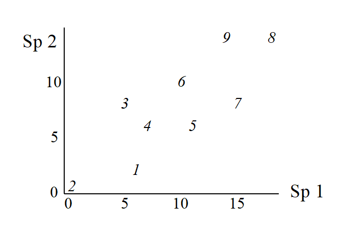
This is an ordination already, of 2-dimensional data on a 2-dimensional map, and it summarises pictorially all the relationships between the samples, without needing to discard any information at all. However, suppose for the sake of example that a 1-dimensional ordination is required, in which the original data is reduced to a genuine ordering of samples along a line. How do we best place the samples in order? One possibility (though a rather poor one!) is simply to ignore altogether the counts for one of the species, say Species 2. The Species 1 axis then automatically gives the 1-dimensional ordination (Sp.1 counts are again labelled by sample number):
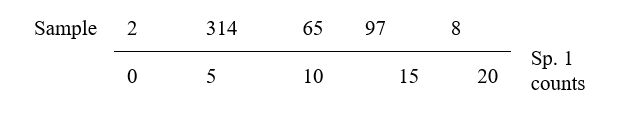
(Think of this as projecting the points in the 2-dimensional space down onto the Sp.1 axis). Not surprisingly, this is a rather inaccurate 1-dimensional summary of the sample relationships in the full 2-dimensional data, e.g. samples 7 and 9 are rather too close together, certain samples seem to be in the wrong order (9 should be closer to 8 than 7 is, 1 should be closer to 2 than 3 is) etc. More intuitively obvious would be to choose the 1-dimensional picture as the (perpendicular) projection of points onto the line of ‘best fit’ in the 2-dimensional plot.
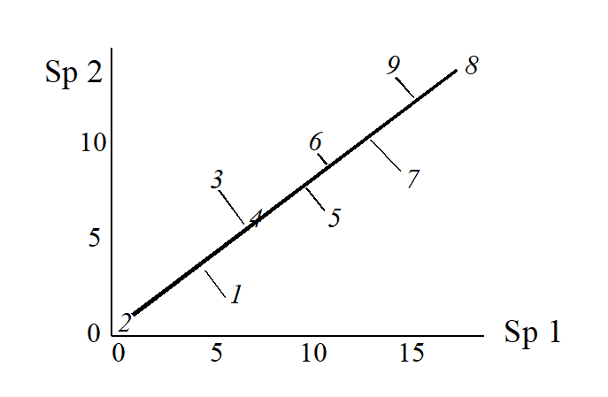
The 1-dimensional ordination, called the first principal component axis (PC1), is then:
and this picture is a much more realistic approximation to the 2-dimenensional sample relationships (e.g. 1 is now closer to 2 than 3 is, 7, 9 and 8 are more equally spaced and in the ‘right’ sequence etc).
The second principal component axis (PC2) is defined as the axis perpendicular to PC1, and a full principal component analysis then consists simply of a rotation of the original 2-dimensional plot:
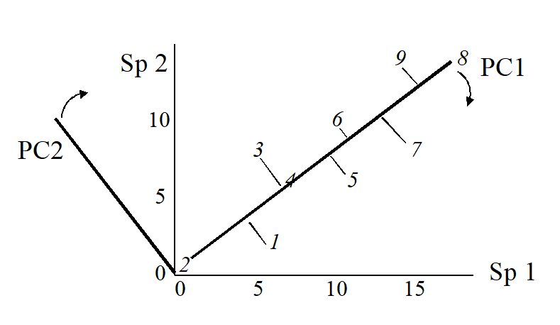
to give the following principal component plot.
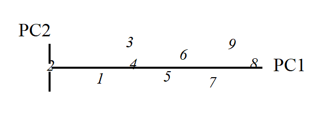
Obviously the (PC1, PC2) plot contains exactly the same information as the original (Sp.1, Sp.2) graph. The whole point of the procedure though is that, as in the current example, we may be able to dispense with the second principal component (PC2): the points in the (PC1, PC2) space are projected onto the PC1 axis and relatively little information about the sample relationships is lost in this reduction of dimensionality.
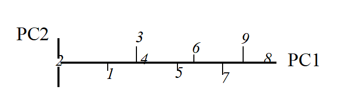
Definition of PC1 axis
Up to now we have been rather vague about what is meant by the ‘best fitting’ line through the sample points in 2-dimensional species space. There are two natural definitions. The first chooses the PC1 axis as the line which minimises the sum of squared perpendicular distances of the points from the line.¶ The second approach comes from noting in the above example that the biggest differences between samples take place along the PC1 axis, with relatively small changes in the PC2 direction. The PC1 axis is therefore defined as that direction in which the variance of sample points projected perpendicularly onto the axis is maximised. In fact, these two separate definitions of the PC1 axis turn out to be totally equivalent† and one can use whichever concept is easier to visualise.
Extensions to 3-dimensional data
Suppose that the simple example above is extended to the following matrix of counts for three species.
| Sample | 1 | 2 | 3 | 4 | 5 | 6 | 7 | 8 | 9 | |
|---|---|---|---|---|---|---|---|---|---|---|
| Abundance | Sp.1 | 6 | 0 | 5 | 7 | 11 | 10 | 15 | 18 | 14 |
| Sp.2 | 2 | 0 | 8 | 6 | 6 | 10 | 8 | 14 | 14 | |
| Sp.3 | 3 | 1 | 6 | 6 | 9 | 11 | 10 | 16 | 15 |
Samples are now points in three dimensions (Sp.1, Sp.2 and Sp.3 axes) and there are therefore three principal component axes, again simply a rotation of the three species axes. The definition of the (PC1, PC2, PC3) axes generalises the 2-dimensional case in a natural way:
PC1 is the axis which maximises the variance of points projected perpendicularly onto it;
PC2 is constrained to be perpendicular to PC1, but is then again chosen as the direction in which the variance of points projected perpendicularly onto it is maximised;
PC3 is the axis perpendicular to both PC1 and PC2 (there is no choice remaining here).
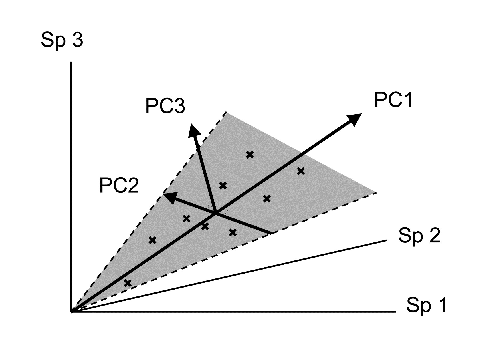
An equivalent way of visualising this is again in terms of ‘best fit’: PC1 is the best fitting line to the sample points and, together, the PC1 and PC2 axes define a plane (grey in the above diagram) which is the best fitting plane.
Algebraic definition
The above geometric formulation can be expressed algebraically. The three new variables (PCs) are just linear combinations of the old variables (species), such that PC1, PC2 and PC3 are uncorrelated. In the above example:
$$ PC1 = 0.62 \times Sp.1 + 0.52 \times Sp.2 + 0.58 \times Sp.3 $$ $$ PC2 = –0.73 \times Sp.1 + 0.65 \times Sp.2 + 0.20 \times Sp.3 \tag{4.1} $$ $$ PC3 = 0.28 \times Sp.1 + 0.55 \times Sp.2 – 0.79 \times Sp.3 $$
The principal components are therefore interpretable (in theory) in terms of the counts for each original species axis. Thus PC1 is a sum of roughly equal (and positive) contributions from each of the species; it is essentially ordering the samples from low to high total abundance. At a more subtle level, for samples with the same total abundance, PC2 then mainly distinguishes relatively high counts of Sp.2 (and low Sp.1) from low Sp.2 (and high Sp.1); Sp.3 values do not feature strongly in PC2 because the corresponding coefficient is small. Similarly the PC3 axis mainly contrasts Sp.3 and Sp.2 counts.
Variance explained by each PC
The definition of principal components given above is in terms of successively maximising the variance of sample points projected along each axis, with the variance therefore decreasing from PC1 to PC2 to PC3. It is thus natural to quote the values of these variances (in relation to their total) as a measure of the amount of information contained in each axis. And the total of the variances along all PC axes equals the total variance of points projected successively onto each of the original species axes, total variance being unchanged under a simple rotation. That is, letting var(PCi) denote variance of samples on the ith PC axis and var(Sp.i) denote variance of points on the ith species axis (i = 1, 2, 3):
$$ \sum_i var ( PCi ) = \sum_i var ( Sp.i) \tag{4.2} $$
Thus, the relative variation of points along the ith PC axis (as a percentage of the total), namely
$$ P_i = 100 \frac{ var ( PCi ) } { \sum_i var ( PCi ) } = 100 \frac{ var ( PCi ) } { \sum_i var ( Sp.i ) } \tag{4.3} $$
has a useful interpretation as the % of the original total variance explained by the ith PC. For the simple 3-dimensional example above, PC1 explains 93%, PC2 explains 6% and PC3 only 1% of the variance in the original samples.
Ordination plane
This brings us back finally to the reason for rotating the original three species axes to three new principal component axes. The first two PCs represent a plane of ‘best fit’, encompassing the maximum amount of variation in the sample points. The % variance explained by PC3 may be small and we can dispense with this third axis, projecting all points perpendicularly onto the (PC1, PC2) plane to give the 2-dimensional ordination plane that we have been seeking. For the above example this is:


and it is almost a perfect 2-dimensional summary of the 3-dimensional data, since PC1 and PC2 account for 99% of the total variation. In effect, the points lie on a plane (in fact, nearly on a line!) in the original species space, so it is no surprise to find that this PCA ordination differs negligibly from that for the initial 2-species example: the counts added for the third species were highly correlated with those for the first two species.
Higher-dimensional data
Of course there are many more species than three in a normal species by samples array, let us say 50, but the approach to defining principal components and an ordination plane is the same. Samples are now points in (say) a 50-dimensional species space§ and the best fitting 2-dimensional plane is found and samples projected onto it to give the 2-dimensional PCA ordination. The full set of PC axes are the perpendicular directions in this high-dimensional space along which the variances of the points are (successively) maximised. The degree to which a 2-dimensional PCA succeeds in representing the information in the full space is seen in the percentage of total variance explained by the first two principal components. Often PC1 and PC2 may not explain more than 40-50% of the total variation, and a 2-dimensional PCA ordination then gives an inadequate and potentially misleading picture of the relationship between the samples. A 3-dimensional sample ordination, using the first three PC axes, may give a fuller picture or it may be necessary to invoke PC4, PC5 etc. before a reasonable percentage of the total variation is encompassed. Guidelines for an acceptable level of ‘% variance explained’ are difficult to set, since they depend on the objectives of the study, the number of species and samples etc., but an empirical rule-of-thumb might be that a picture which accounts for as much as 70-75% of the original variation is likely to describe the overall structure rather well.
The geometric concepts of fitting planes and projecting points in high-dimensional space are not ones that most people are comfortable with (!) so it is important to realise that, algebraically, the central ideas are no more complex than in three dimensions. Equations like (4.1) simply extend to p principal components, each a linear function of the p species counts. The ‘perpendicularity’ (orthogonality) of the principal component axes is reflected in the zero values for all sums of cross-products of coefficients (and this is what defines the PCs as statistically uncorrelated with each other), e.g. for equation (4.1):
$$ (0.62) \times (-0.73) + (0.52) \times (0.65) + (0.58) \times (0.20) = 0 $$ $$ (0.62) \times (0.28) + (0.52) \times (0.55) + (0.58) \times (-0.79) = 0 $$ $$ etc $$
The coefficients are also scaled so that their sum of squares adds to one – an axis only defines a direction not a length so this (arbitrarily) scales the values, i.e.
$$ (0.62)^2 + (0.52)^2 + (0.58)^2 = 1$$ $$ (-0.73)^2 + (0.65)^2 + (0.20)^2 = 1$$ $$etc$$
There is clearly no difficulty in extending such relations to 4, 5 or any number of coefficients.
The algebraic construction of coefficients satisfying these conditions but also defining which perpendicular directions maximise variation of the samples in the species space, is outside the scope of this manual. It involves calculating eigenvalues and eigenvectors of a p by p matrix, see
Chatfield & Collins (1980)
, for example. (Note that a knowledge of matrix algebra is essential to understanding this construction). The advice to the reader is to hang on to the geometric picture: all the essential ideas of PCA are present in visualising the construction of a 2-dimensional ordination plot from a 3-dimensional species space.
(Non-)applicability of PCA to species data
The historical background to PCA is one of multivariate normal models for the individual variables, i.e. individual species abundances being normally distributed, each defined by a mean and symmetric variability around that mean, with dependence among species determined by correlation coefficients, which are measures of linearly increasing or decreasing relationships. Though transformation can reduce the right-skewness of typical species abundance/biomass distributions they can do little about the dominance of zero values (absence of most species in most of the samples). Worse still, classical multivariate methods require the parameters of these models (the means, variances and correlations) to be estimated from the entries in the data matrix. But for the Garroch Head macrofaunal biomass data introduced on page 1.6, which is typical of much community data, there are p=84 species and only n=12 samples. Thus, even fitting a single multivariate normal distribution to these 12 samples requires estimation of 84 means, 84 variances and $_{84} C _ 2 = 84 \times 83 / 2 = 3486$ correlations! It is, of course, impossible to estimate over 3500 parameters from a matrix with only $12 \times 86 = 1032$ entries, and herein lies much of the difficulty of applying classical testing techniques which rely on normality, such as MANOVA, Fisher’s linear discriminant analysis, multivariate multiple regression etc, to typical species matrices.
Whilst some significance tests associated with PCA also require normality (e.g. sphericity tests for how many eigenvalues can be considered significantly greater than zero, attempting to establish the ‘true dimensionality’ of the data), as it has just been simply outlined, PCA has a sensible rationale outside multi-normal modelling and can be more widely applied. However, it will always work best with data which are closest to that model. E.g. right skewness will produce outliers which will always be given an inordinate weight in determining the direction of the main PC axes, because the failure of an axis to pass through those points will lead to large residuals, and these will dominate the sum of squared residuals that is being minimised. Also, the implicit way in which dissimilarity between samples is assessed is simply Euclidean distance, which we shall see now (and again much later when dissimilarity measures are examined in more detail in Chapter 16) is a poor descriptor of dissimilarity for species communities. This is primarily because Euclidean distance pays no special attention to the role that zeros play in defining the presence/absence structure of a community. In fact, PCA is most often used on variables which have been normalised (subtracting the mean and dividing by the standard deviation, for each variable), leading to what is termed correlation-based PCA (as opposed to covariance-based PCA, when non-normalised data is submitted to PCA). After normalising, the zeros are replaced by different (largish) negative values for each species, and the concept of zero representing absence has disappeared. Even if normalisation is avoided, Euclidean distance (and thus PCA) is what is termed ‘invariant to a location change’ applied throughout the data matrix, whereas biological sense dictates that this should not be the case, if it is to be a useful method for species data. (Add 10 to all the counts in Table 2.1 and ask yourself whether it now carries the same biological meaning. To Euclidean distance nothing has changed; to an ecologist the data are telling you a very different story!)
Another historical difficulty with applying PCA to community matrices was computational issues with eigen-analyses on matrices with large numbers of variables, especially when there is parameter indeterminacy in the solution, from matrices having a greater number of species than samples (p > n). However, modern computing power has long since banished such issues, and very quick and efficient algorithms can now generate a PCA solution (with n-1 non-zero eigenvalues in the p > n case), so that it is not necessary, for example, to arbitrarily reduce the number of species to p < n before entering PCA.
¶ This idea may be familiar from ordinary linear regression, except that this is formulated asymmetrically: regression of y on x minimises the sum of squared vertical distances of points from the line. Here x and y are symmetric and could be plotted on either axis.
† The explanation for this is straightforward. As is about to be seen in (4.2), the total variance of the data, var(Sp1) + var (Sp2), is preserved under any rotation of the (perpendicular) axes, so it equals the sum of the variances along the two PC axes, var(PC1) + var(PC2). If the rotation is chosen to maximise var(PC1), and var(PC1) + var(PC2) is fixed (the total variance) then var(PC2) must be minimised. But what is var(PC2)? It is simply the sum of squares of the PC2 values round about their mean (divided by a constant), in other words, the sum of squares of the perpendicular projections of each point on to the PC1 axis. But minimising this sums of squares is just the definition given of ‘best fitting line’.
§ If there are, say, only 25 samples then all 50 dimensions are not necessary to exactly represent the distances among the 25 samples – 24 dimensions will do (any two points fit on a line, any three points fit in a plane, any four points in 3-d space, etc). But a 2-d representation still has to approximate a 24-d picture!
4.3 Example: Garroch Head macrofauna
Fig. 4.1 shows the result of applying PCA to square-root transformed macrofaunal biomass data from the 65 species¶ found in subtidal sediments at 12 sites (1-12) along an E-W transect in the Firth of Clyde, Scotland ({G}, map at Fig. 1.5). A central site of the transect (site 6) is an accumulating sewage-sludge dump-ground and is subject to strong impacts of organic enrichment and heavy metal concentrations.
It makes sense to transform the biomass values, for much the same reasons as for the cluster analyses of Chapter 3, so that analysis is not dominated by large biomass values from a small number of species; here a mild square-root transform was adequate to avoid the PCA becoming over-dependent on a few outliers. There is also no need to normalise species variables: they are on comparable and meaningful measurement scales (of biomass), so PCA will naturally give more weight to species with larger (transformed) biomass.
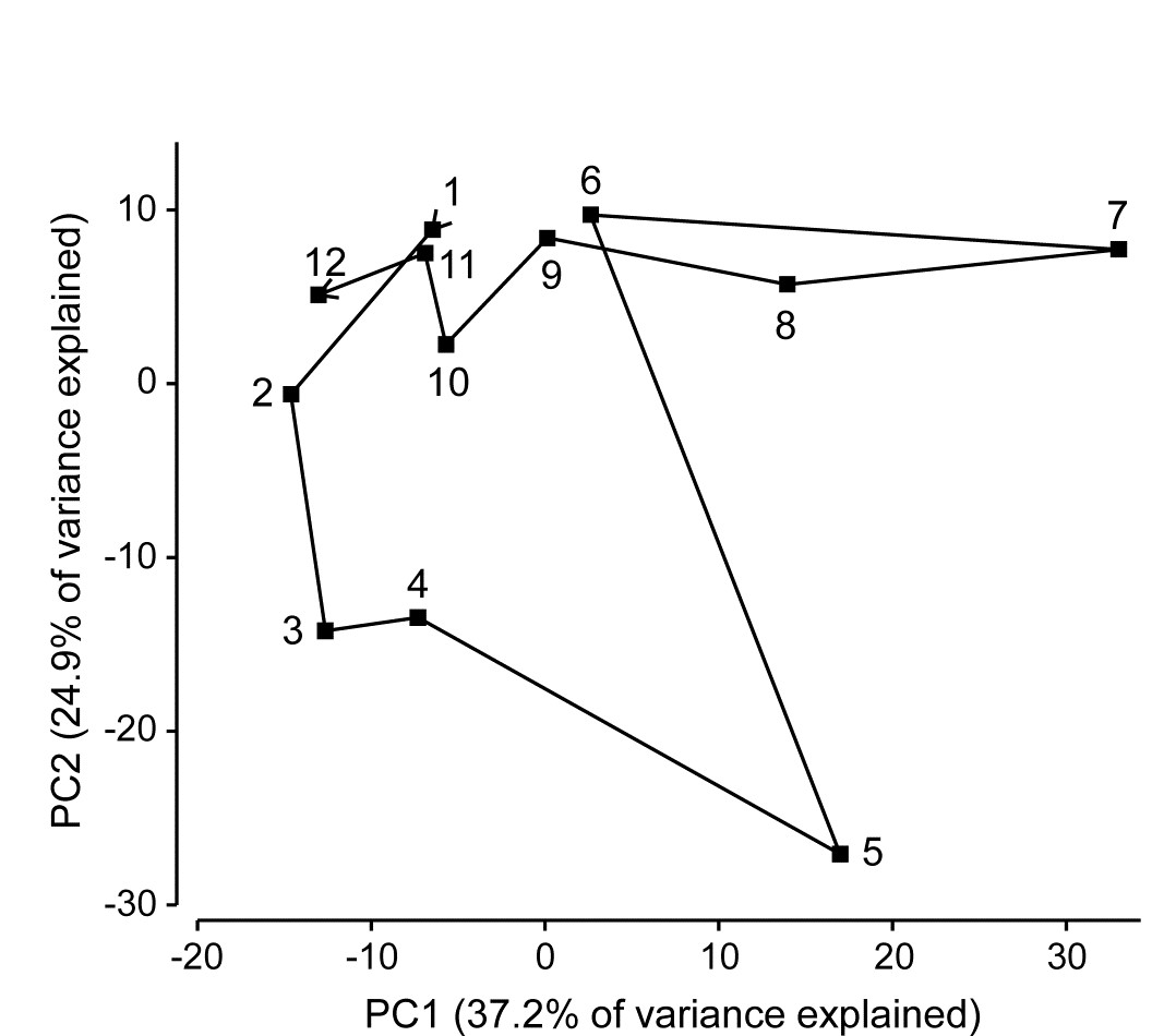
Fig. 4.1. Garroch Head macrofauna {G}. 2-dimensional PCA ordination of square-root transformed biomass of 65 species at 12 sites (1-12) along a transect over the sludge disposal ground at site 6; points joined in transect order (see map in Fig. 1.5).
A total of 11 PC’s are sufficient to capture all the information in this sample matrix, because there are only n=12 samples. (Had n been greater than p, then p PCs would theoretically have been needed to do this, the full PCA then being simply a rotation of the original 65 species axes). However, many fewer than 11 axes are needed to ‘capture’ much of the variability in samples here, the first two axes in Fig. 4.1 explaining 62% of the total variance (a third and fourth would have added another 20% but made no fundamental changes to the broad pattern of this ordination).
There is a puzzling feature to this pattern: the PCA points are joined in their transect order and a natural and interpretable progression of community structure is seen on approach to the dumpsite (1-5) and also on leaving it (7-12). However, site 6 (the dumpsite itself) appears close to sites 1 and 9-12 at the extremes of the transect, suggesting some commonality of the assemblages. Yet examination of the original biomass matrix shows that site 6 has no species in common at all with sites 1 and 9-12! And examination of the environmental data for these sites (on organics, heavy metals and water depth), seen in the later Table 11.1, confirms the expected pattern of contaminant levels in the sediments being greatest at site 6, and least at the transect end-points. The issue here is not that a 2-dimensional PCA is an inadequate description, and that in higher dimensions site 6 would appear well separated from the transect end-points - it does not do so - but that the implicit dissimilarity measure that PCA uses is Euclidean distance, and that is a poor descriptor of differences in biological communities. In other words, the ordination technique itself may not, in some cases, be an inherently defective one, if a high percentage of the original variance is explained in the low-d picture, but the problem is that it starts in the wrong place - with a defective measure of community dissimilarity. The reasons for this are covered in much more detail later, when Euclidean and other resemblance measures are compared for this (and other) data, e.g. Fig. 16.10 on page 16.6.
¶ Later analysis of the count data from this study uses 84 species; 19 of them were too small-bodied to have a weighable biomass.
4.4 PCA for environmental data
The above example makes it clear that PCA is an unsatisfactory ordination method for biological data. However, PCA is a much more useful in the multivariate analysis of environmental rather than species data¶. Here variables are perhaps a mix of physical parameters (grain size, salinity, water depth etc) and chemical contaminants (nutrients, PAHs etc). Patterns in environmental data across samples can be examined in an analogous way to species data, by multivariate ordination, and tools for linking biotic and environmental summaries are fully discussed in Chapter 11.
PCA is more appropriate to environmental variables because of the form of the data: there are no large blocks of zero counts; it is no longer necessary to select a dissimilarity coefficient which ignores joint absences, etc. and Euclidean distance thus makes more sense for abiotic data. However, a crucial difference between species and environmental data is that the latter will usually have a complete mix of measurement scales (salinity in ‰, grain size in $\phi$ units, depth in m, etc). In a multi-dimensional visualisation of environmental data, samples are points referred to environmental axes rather than species axes, but what does it mean now to talk about (Euclidean) distance between two sample points in the environmental variable space? If the units on each axis differ, and have no natural connection with each other, then point A can be made to appear closer to point B than point C, or closer to point C than point B, simply by a change of scale on one of the axes (e.g. measuring PCBs in $\mu$g/g not ng/g). Obviously it would be entirely wrong for the PCA ordination to vary with such arbitrary scale changes. There is one natural solution to this: carry out a correlation-based PCA, i.e. normalise all the variable axes (after transformations, if any) so that they have comparable, dimensionless scales.
The problem does not generally arise for species data, of course, because though a scale change might be made (e.g. from numbers of individuals per core to densities per m2 of sediment surface), the same scale change is made on each axis and the PCA ordination will be unaffected. If PCA is to be used for biotic as well as abiotic analysis, the default position would be to use correlation-based PCA for environmental data and covariance-based PCA for species data (but much better still, use an alternative ordination method such as MDS for species, starting from a more appropriate dissimilarity matrix, such as Bray-Curtis!). For both biotic or abiotic matrices, prior transformation is likely to be beneficial. Different transformations may be desirable for different variables in the abiotic analysis, e.g. contaminant concentrations will often be right-skewed (and require, say, a log transform) but salinity might be left-skewed and need a reverse log transform, see equation (11.2), or no transform at all. The transform issues are returned to in Chapter 9.
PCA strengths
-
PCA is conceptually simple. Whilst the algebraic basis of the PCA algorithm requires a facility with matrix algebra for its understanding, the geometric concepts of a best-fitting plane in the species space, and perpendicular projection of samples onto that plane, are relatively easily grasped. Some of the more recently proposed ordination methods, which either extend or supplant PCA (e.g. Principal Co-ordinates Analysis, Detrended Correspondence Analysis) can be harder to understand for practitioners without a mathematical background.
-
It is computationally straightforward, and thus fast in execution. Software is widely available to carry out the necessary eigenvalue extraction for PCA. Unlike the simplest cluster analysis methods, e.g. the group average UPGMA, which could be accomplished manually in the pre-computer era, the simplest ordination technique, PCA, has always realistically needed computer calculation. But on modern machines it can take small fractions of a second processing time for small to medium sized matrices. Computation time, however, will tend to scale with the number of variables, whereas with MDS, clustering etc, which are based on sample resemblances (and which have lost all knowledge of the species which generated these) computing time tends to scale with (squared) sample numbers.
-
Ordination axes are interpretable. The PC axes are simple linear combinations of the values for each variable, as in equation (4.1), so have good potential for interpretation, e.g. see the Garroch Head environmental data analysis in Chapter 11, Fig. 11.1 and equation (11.1). In fact, PCA is a tool best reserved for abiotic data and this Clyde data set is thus examined in much more detail in Chapter 11.
PCA weaknesses
-
There is little flexibility in defining dissimilarity. An ordination is essentially a technique for converting dissimilarities of community composition between samples into (Euclidean) distances between these samples in a 2- or higher-dimensional ordination plot. Implicitly, PCA defines dissimilarity between two samples as their Euclidean distance apart in the full p-dimensional species space; however, as has been emphasised, this is rather a poor way of defining sample dissimilarity: something like a Bray-Curtis coefficient would be preferred but standard PCA cannot accommodate this. The only flexibility it has is in transforming (and/or normalising) the species axes so that dissimilarity is defined as Euclidean distance on these new scales.
-
Its distance-preserving properties are poor. Having defined dissimilarity as distance in the p-dimensional species space, PCA converts these distances by projection of the samples onto the 2-dimensional ordination plane. This may distort some distances rather badly. Taking the usual visual analogy of a 2-dimensional ordination from three species, it can be seen that samples which are relatively far apart on the PC3 axis can end up being co-incident when projected (perhaps from ‘opposite sides’) onto the (PC1, PC2) plane.
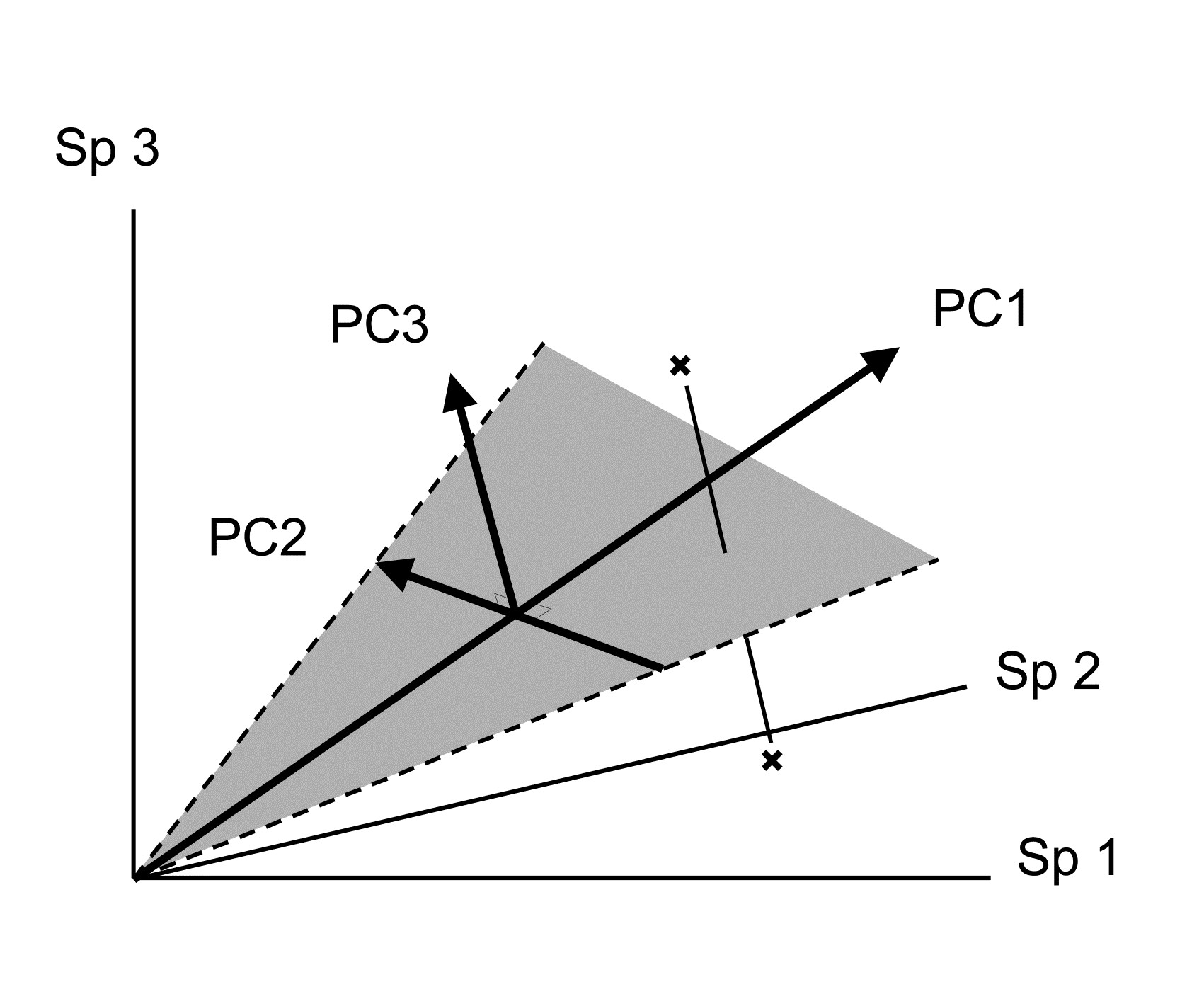
¶ An environmental data matrix can be input to PRIMER in the same way as a species matrix, though it is helpful to identify its Data type as ‘Environmental’ (other choices are ‘Abundance’, ‘Biomass’ or ‘Other’) because PRIMER then offers sensible default options for each type, e.g. in the selection of Resemblance coefficient. In statistics texts, the data matrix is usually described as having n rows (samples) by p columns (variables) whereas the biological matrices we have seen so far have always had species variables as rows (the reason for this convention in biological contexts is clear: p is often larger than n, and binomial species names are much more neatly displayed as row than column labels!). It is not necessary to transpose either matrix type before entry into PRIMER: in the Open dialog, simply select whether the input matrix has samples as rows or columns, or amend that information later (on the Edit>Properties menu) if it has been incorrectly entered initially.
4.5 Example: Dosing experiment, Solbergstrand mesocosm
An example of this final point for a real data set can be seen in Fig. 4.2. This is of nematode data for the dosing experiment {D} in the Solbergstrand mesocosms, at the GEEP Oslo Workshop ( Bayne, Clarke & Gray (1988) ). Box core samples were collected from Oslofjord and held for three months under four dosing regimes: control, low, medium, high doses of a hydrocarbon and Cu contaminant mixture, continuously dosed to the basin waters. Four replicate box cores were subjected to each treatment and at the end of the period cores for all 16 boxes were examined for nematode communities (amongst other faunistic components). Fig. 4.2 shows the resulting PCA, based on log-transformed counts for 26 nematode genera. The interest here, of course, is in whether all replicates from one of the four treatments separate out from other treatments, which might indicate a change in community composition attributable to a directly causal effect of the PAH and Cu contaminant dosing. A cursory glance suggests that the high dose replicates (H) may indeed do this. However, closer study shows that the % of variance explained by the first two PC axes is very low: 22% for PC1 and 15% for PC2. The picture is likely to be very unreliable therefore, and an examination of the third and higher PCs confirms the distortion: some of the H replicates are much further apart in the full species space than this projection into two dimensions would imply. For example, the right-hand H sample is actually closer to the nearest M sample than it is to other H samples. The distances in the full species space are therefore poorly-preserved in the 2-dimensional ordination.
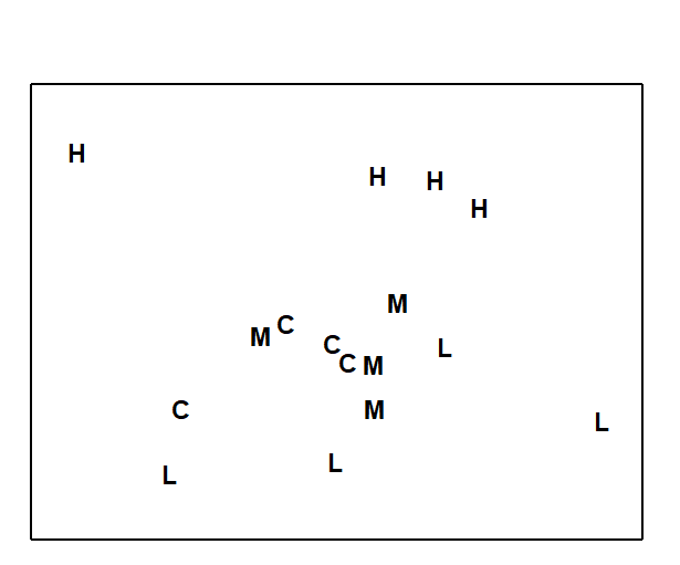
Fig. 4.2. Dosing experiment, Solbergstrand {D}. 2-dimensional PCA ordination of log-transformed nematode abundances from 16 box cores (4 replicates from each of control, low, medium and high doses of a hydrocarbon and Cu contaminant mixture). PC1 and PC2 account for 37% of the total variance.
This example is returned to again in Chapter 5, Fig. 5.5, where it is seen that an MDS of the same data under a more appropriate Bray-Curtis dissimilarity makes a better job of ‘dissimilarity preservation’, though the data is such that no method will find it easy to represent in two dimensions. The moral here is clear:
a) be very wary of interpreting any PCA plot which explains so little of the total variability in the original data;
b) statements about apparent differences in a multivariate community analysis of one site (or time or treatment) from another should be backed-up by appropriate statistical tests; this is the subject of Chapter 6.
Chapter 5: Ordination of samples by multi-dimensional scaling (MDS)
5.1 Other ordination methods
Principal Co-ordinates Analysis
The two main weaknesses of PCA, identified at the end of Chapter 4, are its inflexibility of dissimilarity measure and its poor distance-preservation. The first problem is addressed in an important paper by
Gower (1966)
, describing an extension to PCA termed Principal Co-ordinates Analysis (PCO), also sometimes referred to as classical scaling. This allows a wider definition of distance than simple Euclidean distance in the species space (the basis of PCA), but was initially restricted to a specific class of resemblance measures for which the samples could be represented by points in some reconfigured high-dimensional (real) space, in which Euclidean distance between two points is just the (non-Euclidean) resemblance between those samples. Effectively none of the most useful biological resemblance coefficients fall into this class – the high-d space representing those dissimilarities has both real and imaginary axes – but it has become clearer in the intervening decades that much useful inference can still be performed in this complex space, e.g.
McArdle & Anderson (2001)
,
Anderson (2001a)
,
Anderson (2001b)
. (This is essentially the space in which the PERMANOVA+ add-on routines to the PRIMER software carry out their core analyses). PCO can thus be applied completely generally to any resemblance measure but the final step is again a projection onto a low-dimensional ordination space (e.g. a 2-dimensional plane), as in ordinary PCA. It follows that PCA is just a special case of PCO, when the original dissimilarity is just Euclidean distance, but note that PCO is still subject to the second criticism of PCA: its lack of emphasis on distance-preservation when the information is difficult to represent in a low number of dimensions.
Detrended Correspondence Analysis
Correspondence analyses are a class of ordination methods originally featuring strongly in French data-analysis literature (for an early review in English see Greenacre (1984) ). Key papers in ecology are Hill (1973a) and Hill & Gauch (1980) , who introduced detrended correspondence analysis (DECORANA). The methods start from the data matrix, rather than a resemblance measure, so are rather inflexible in their definition of sample dissimilarity; in effect, multinomial assumptions generate an implicit dissimilarity measure of chi-squared distance (Chapter 16). Correspondence analysis (CA) has its genesis in a particular model of unimodal species response to underlying (unmeasured) environmental gradients. Description is outside the scope of this manual but good accounts of CA can be found in the works of Cajo ter Braak (e.g. in Jongman, ter Braak & Tongeren (1987) ), who has contributed a great deal in this area, not least CCA, Canonical Correspondence Analysis ( ter Braak (1986) ).¶
The DECORANA version of CA, widely used in earlier decades, has a primary motivation of straightening out an arch effect in a CA ordination, which is expected on theoretical grounds if species abundances have unimodal (Guassian) responses along a single strong environmental gradient. Where such models are not appropriate, it is unclear what artefacts the algorithms may introduce into the final picture. In the Hill & Gauch (1980) procedure, the detrending is essentially carried out by first splitting the ordination space into segments, stretching or shrinking the scale in each segment and then realigning the segments to remove wide-scale curvature. For some people, this is uncomfortably close to attacking the data with scissors and glue and, though the method is not as subjective as this would imply, some arbitrary decisions about where and how the segmentation and rescaling are defined are hidden from the user in the software code. Thus Pielou (1984) and others criticized DECORANA for its ‘overzealous’ manipulation of the data. It is also unfortunate that the multivariate methods which were historically applied in ecology were often either poorly suited to the data or were based on conceptually complex algorithms (e.g. DECORANA and TWINSPAN, Hill (1979a) and Hill (1979b) ), erecting a communication barrier between data analyst and ecologist.
The ordination technique which is adopted in this manual’s strategy, non-metric MDS, is itself a complex numerical algorithm but it will be argued that it is conceptually simple. It makes few (if any) model assumptions about the form of the data, and the link between the final picture and the user’s original data is relatively transparent and easy to explain. Importantly, it addresses both the major criticisms of PCA made earlier: it has great flexibility both in the definition and conversion of dissimilarity to distance and its rationale is the preservation of these relationships in the low-dimensional ordination space.
¶ A convenient way of carrying out CA-related routines is to use the excellent CANOCO package, ter Braak & Smilauer (2002) .
5.2 Non-metric multidimensional scaling (MDS)
The method of non-metric MDS was introduced by Shepard (1962) and Kruskal (1964) , for application to problems in psychology; a useful introductory text is Kruskal & Wish (1978) , though the applications given are not ecological. Generally, we use the term MDS to refer to Kruskal’s non-metric procedure (though if there is any risk of confusion, nMDS is used). Metric MDS (always mMDS) is generally less useful but will be discussed in specific contexts later in the chapter.
The starting point is the resemblance matrix among samples (Chapter 2). This can be whatever similarity matrix is biologically relevant to the questions being asked of the data. Through choice of coefficient and possible transformation or standardisation, one can choose whether to ignore joint absences, emphasise similarity in common or rare species, compare only % composition or allow sample totals to play a part, etc. In fact, the flexibility of (n)MDS goes beyond this. It recognises the essential arbitrariness of absolute similarity values: Chapter 2 shows that the range of values taken can alter dramatically with transformation (often, the more severe the transformation, the higher and more compressed the similarity values become). There is no clear interpretation of a statement like ‘the similarity of samples 1 and 2 is 25 less than, or half that of, samples 1 and 3’. A transparent interpretation, however, is in terms of the rank values of similarity to each other, e.g. simply that ‘sample 1 is more similar to sample 2 than it is to sample 3’. This is an intuitively appealing and very generally applicable base from which to build a graphical representation of the sample patterns and, in effect, the ranks of the similarities are the only information used by a non-metric MDS ordination.
The purpose of MDS can thus be simply stated: it constructs a ‘map’ or configuration of the samples, in a specified number of dimensions, which attempts to satisfy all the conditions imposed by the rank (dis)similarity matrix, e.g. if sample 1 has higher similarity to sample 2 than it does to sample 3 then sample 1 will be placed closer on the map to sample 2 than it is to sample 3.
Example: Loch Linnhe macrofauna
This is illustrated in Table 5.1 for the subset of the Loch Linnhe macrofauna data used to show hierarchical clustering (Table 3.2). Similarities between $\sqrt{} \sqrt{}$-transformed counts of the four year samples are given by Bray-Curtis similarity coefficients, and Table 5.1 then shows the corresponding rank similarities. (The highest similarity has the lowest rank, 1, and the lowest similarity the highest rank, n(n-1)/2.) The MDS configuration is constructed to preserve the similarity ranking as Euclidean distances in the 2-dimensional plot: samples 2 and 4 are closest, 2 and 3 next closest, then 1 and 4, 3 and 4, 1 and 2, and finally, 1 and 3 are furthest apart. The resulting figure is a more informative summary than the corresponding dendrogram in Chapter 3, showing, as it does, a gradation of change from clean (1) to progressively more impacted years (2 and 3) then a reversal of the trend, though not complete recovery to the initial position (4).
Though the mechanism for constructing such MDS plots has not yet been described, two general features of MDS can already be noted:
-
MDS plots can be arbitrarily scaled, located, rotated or inverted. Clearly, rank order information about which samples are most or least similar can say nothing about which direction in the MDS plot is up or down, or the absolute distance apart of two samples: what is interpretable is relative distances apart, in whatever direction.
-
It is not difficult in the above example to see that four points could be placed in two dimensions in such a way as to satisfy the similarity ranking perfectly.‡ For more realistic data sets, though, this will not usually be possible and there will be some distortion (stress) between the similarity ranks and the corresponding distance ranks in the ordination. This motivates the principle of the MDS algorithm: to choose a configuration of points which minimises this degree of stress, appropriately measured.
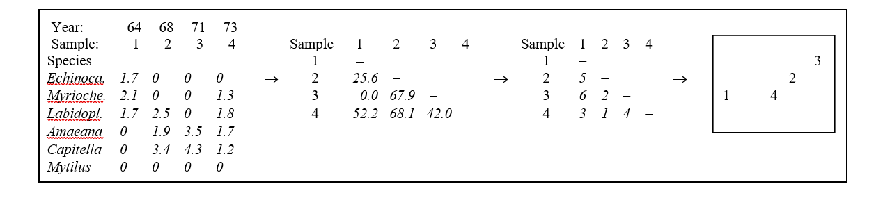
Table 5.1. Loch Linnhe macrofauna {L} subset. Abundance array after $\sqrt{} \sqrt{}$-transform, the Bray-Curtis similarities (as in Table 3.2), the rank similarity matrix and the resulting 2-dimensional MDS ordination.
Example: Exe estuary nematodes
The construction of an MDS plot is illustrated with data collected by Warwick (1971) and subsequently analysed in this way by Field, Clarke & Warwick (1982) . A total of 19 sites from different locations and tide-levels in the Exe estuary, UK, were sampled bi-monthly at low spring tides over the course of a year, between October 1966 and September 1967.
Three replicate sediment cores were taken for meiofaunal analysis on each occasion, and nematodes identified and counted. This analysis here considers only the mean nematode abundances across replicates and season (seasonal variation was minimal) and the matrix consists of 140 species found at the 19 sites.
This is not an example of a pollution study: the Exe estuary is a relatively pristine environment. The aim here is to display the biological relationships among the 19 stations and later to link these to the environmental variables (granulometry, interstitial salinity etc.) measured at these sites, to reveal potential determinants of nematode community structure. Fig. 5.1 shows the 2-dimensional MDS ordination of the 19 samples, based on $\sqrt{} \sqrt{}$-transformed abundances and a Bray-Curtis similarity matrix. Distinct clusters of sites emerge (in agreement with those from a matching cluster analysis), bearing no clear-cut relationship to geographical position or tidal level of the samples. Instead, they appear to relate to sediment characteristics and these links are discussed in Chapter 11. For now the question is: what are stages in the construction of Fig. 5.1?
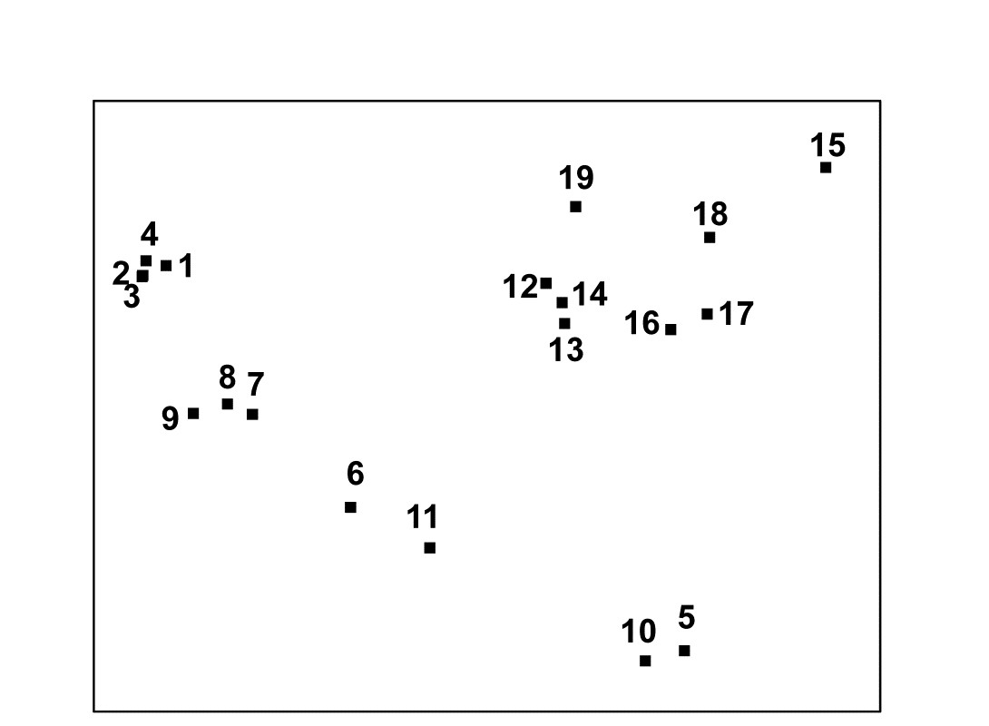
Fig. 5.1. Exe estuary nematodes {X}. MDS ordination of the 19 sites based on √√-transformed abundances and Bray-Curtis similarities (stress = 0.05).
MDS algorithm
The non-metric MDS algorithm, as first employed in Kruskal’s original MDSCAL program for example, is an iterative procedure, constructing the MDS plot by successively refining the positions of the points until they satisfy, as closely as possible, the dissimilarity relations between samples.§ It has the following steps.
-
Specify the number of dimensions (m) required in the final ordination. If, as will usually be desirable, one wishes to compare configurations in different dimensions then they have to be constructed one at a time. For the moment think of m as 2.
-
Construct a starting configuration of the n samples. This could be the result of an ordination by another method, for example PCA or PCO, but there are advantages in using just a random set of n points in m (=2) dimensions.
-
Regress the interpoint distances from this plot on the corresponding dissimilarities. Let {$d _ {jk}$} denote the distance between the jth and kth sample points on the current ordination plot, and {$\delta _ {jk}$} the corresponding dissimilarity in the original dissimilarity matrix (e.g. of Bray-Curtis coefficients, or whatever resemblance measure is relevant to the context). A scatter plot is then drawn of distance against dissimilarity for all n(n–1)/2 such pairs of values. This is termed a Shepard diagram and Fig. 5.2 shows the type of graph that results. (In fact, Fig. 5.2 is at a late stage of the iteration, corresponding to the final 2-dimensional configuration of Fig. 5.1; at earlier stages the graph will appear similar though with a greater degree of scatter). The decision that characterises different ordination procedures must now be made: how does one define the underlying relation between distance in the plot and the original dissimilarity?
There are two main approaches.
a) Fit a standard linear regression of $d$ on $\delta$, so that final distance is constrained to be proportional to original dissimilarity. This is metric MDS (mMDS). (More flexible would be to fit some form of curvilinear regression model, termed parametric MDS, though this is rarely seen.)
b) Perform a non-parametric regression of $d$ on $\delta$ giving rise to non-metric MDS. Fig. 5.2 illustrates the non-parametric (monotonic) regression line. This is a ‘best-fitting’ step function which moulds itself to the shape of the scatter plot, and at each new point on the x axis is always constrained to either remain constant or step up. The relative success of non-metric MDS, in preserving the sample relationships in the distances of the ordination plot, comes from the flexibility in shape of this non-parametric regression line. A perfect MDS was defined before as one in which the rank order of dissimilarities was fully preserved in the rank order of distances. Individual points on the Shepard plot must then all be monotonic increasing: the larger a dissimilarity, the larger (or equal) the corresponding distance, and the non-parametric regression line is a perfect fit. The extent to which the scatter points deviate from the line measures the failure to match the rank order dissimilarities, motivating the following.
-
Measure goodness-of-fit of the regression by a stress coefficient (Kruskal’s stress formula 1):
$$ Stress = \sqrt{ \sum_j \sum_k ( d_ {jk} - \hat{d}_ {jk} ) ^ 2 / \sum_j \sum_k d _ {jk}^2 } \tag{5.1} $$
where $\hat{d} _ {jk}$ is the distance predicted from the fitted regression line corresponding to dissimilarity $\delta _ {jk}$. If $d _ {jk} = \hat{d} _ {jk}$ for all the n(n–1)/2 distances in this summation, the stress is zero. Large scatter clearly leads to large stress and this can be thought of as measuring the difficulty involved in compressing the sample relationships into two (or a small number) of dimensions. Note that the denominator is simply a scaling term: distances in the final plot have only relative not absolute meaning and the squared distance term in the denominator makes sure that stress is a dimensionless quality.
-
Perturb the current configuration in a direction of decreasing stress. This is perhaps the most difficult part of the algorithm to visualise and will not be detailed; it is based on established techniques of numerical optimisation, in particular the method of steepest descent. The key idea is that the regression relation is used to calculate the way stress changes for small changes in the position of individual points on the ordination, and points are then moved to new positions in directions which look like they will decrease the stress most rapidly.
-
Repeat steps 3 to 5 until convergence is achieved. The iteration now cycles around the two stages of a new regression of distance on dissimilarity for the new ordination positions, then further perturbation of the positions in directions of decreasing stress. The cycle stops when adjustment of points leads to no further improvement in stress¶ (or when, say, 100 such regression/steepest descent/regression/… cycles have been performed without convergence).
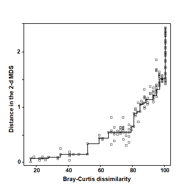
Fig. 5.2. Exe estuary nematodes {X}. Shepard diagram of the distances (d) in the MDS plot (Fig. 5.1) against the dissimilarities ($\delta$) in the Bray-Curtis matrix. The line is the fitted non-parametric regression; stress (=0.05) is a measure of scatter about the line in the vertical direction.
Features of the algorithm
Local minima. Like all iterative processes, especially ones this complex, things can go wrong! By a series of minor adjustments to the parameters at its disposal (the co-ordinate positions in the configuration), the method gradually finds its way down to a minimum of the stress function. This is most easily envisaged in three dimensions, with just a two-dimensional parameter space (the x, y plane) and the vertical axis (z) denoting the stress at each (x, y) point. In reality the stress surface is a function of more parameters than this of course, but we have seen before how useful it can be to visualise high-dimensional algebra in terms of three-dimensional geometry. A relevant analogy is to imagine a rambler walking across a range of hills in a thick fog, attempting to find the lowest point within an encircling range of high peaks. A good strategy is always to walk in the direction in which the ground slopes away most steeply (the method of steepest descent, in fact) but there is no guarantee that this strategy will necessarily find the lowest point overall, i.e. the global minimum of the stress function. The rambler may reach a low point from which the ground rises in all directions (and thus the steepest descent algorithm converges) but there may be an even lower point on the other side of an adjacent hill. He is then trapped in a local minimum of the stress function. Whether he finds the global or a local minimum depends very much on where he starts the walk, i.e. the starting configuration of points in the ordination plot.
Such local minima do occur routinely in all MDS analyses, usually corresponding to configurations of sample points which are only slightly different to each other. Sometimes this may be because there are one or two points which bear little relation to any of the other samples and there is a choice as to where they may best be placed, or perhaps they have a more complex relationship with other samples and may be difficult to fit into (say) a 2-dimensional picture.
There is no guaranteed method of ensuring that a global minimum of the stress function has been reached; the practical solution is therefore to repeat the MDS analysis several times starting with different random positions of samples in the initial configuration (step 2 above). If the same (lowest stress) solution re-appears from a number of different starts then there is a strong assurance, though never a guarantee, that this is indeed the best solution. Note that the easiest way to determine whether the same solution has been reached as in a previous attempt is simply to check for equality of the stress values; remember that the configurations themselves could be arbitrarily rotated or reflected with respect to each other.† In genuine applications, converged stress values are rarely precisely the same if configurations differ. (Outputting stress values to 3 d.p. can help with this, though solutions which are the same to 2 d.p. will be telling you the same story, in practice).
Degenerate solutions can also occur, in which groups of samples collapse to the same point (even though they are not 100% similar), or to the vertices of a triangle, or strung out round a circle. In these cases the stress may go to zero. (This is akin to our rambler starting his walk outside the encircling hills, so that he sets off in totally the wrong direction and ends up at the sea!). Artefactual solutions of this sort are relatively rare and easily seen in the MDS plot and the Shepard diagram (the latter may have just a single step at one end): repetition from different random starts will find many solutions which are sensible. (In fact, a more likely cause of a plot in which points tend to be placed around the circumference of a circle is that the input matrix is of similarities when the program has been told to expect dissimilarities, or vice-versa; in such cases the stress will be very high.)
A much more common form of degenerate solution is repeatable and is a genuine result of a disjunction in the data. For example, if the data split into two well-separated groups for which dissimilarities between the groups are much larger than any within either group, then there may be no yardstick within our rank-based approach for determining how far apart the groups should be placed in the MDS plot. Any solution which places the groups ‘far enough’ apart to satisfy the conditions may be equally good, and the algorithm can then iterate to a point where the two groups are infinitely far apart, i.e. the group members collapse on top of each other, even though they are not 100% similar (a commonly met special case is when one of the two groups consists of a single outlying point). There are two solutions:
a) split the data and carry out an MDS separately on the two groups (e.g. use ‘MDS subset’ in PRIMER);
b) neater is to mix mostly non-metric MDS with a small contribution of metric MDS. The ‘Fix collapse’ option in the PRIMER v7 MDS routine offers this, with the stress defined as a default of (0.95 nMDS stress + 0.05 mMDS stress). The ordination then retains the flexibility of the rank-based solution, but a very small amount of metric stress is usually enough to pin down the relative positions of the two groups (in terms of the metric dissimilarity between groups to that within them); the process does not appear to be at all sensitive to the precise mixing proportions. An example is given later in this chapter.
Distance preservation. Another feature mentioned earlier is that in MDS, unlike PCA, there is not any direct relationship between ordinations in different numbers of dimensions. In PCA, the 2-dimensional picture is just a projection of the 3-dimensional one, and all PC axes can be generated in a single analysis. With MDS, the minimisation of stress is clearly a quite different optimisation problem for each ordination of different dimensionality; indeed, this explains the greater success of MDS in distance-preservation. Samples that are in the same position with respect to (PC1, PC2) axes, though are far apart on the PC3 axis, will be projected on top of each other in a 2-dimensional PCA but they will remain separate, to some degree, in a 2-dimensional as well as a 3-dimensional MDS.
Even though the ultimate aim is usually to find an MDS configuration in 2- or 3-dimensions it may sometimes be worth generating higher-dimensional solutions⸙: this is one of several ways in which the advisability of viewing a lower-dimensional MDS can be assessed. The comparison typically takes the form of a scree plot, a line plot in which the stress (y axis) is plotted as a function of the number of dimensions (x axis). This and other diagnostic tools for reliability of MDS ordinations are now considered.
‡ In fact, there are rather too many ways of satisfying it and the algorithm described in this chapter will find slightly different solutions each time it is run, all of them equally correct. However, this is not a problem in genuine applications with (say) six or more points. The number of similarities increases roughly with the square of the number of samples and a position is reached very quickly in which not all rank orders can be preserved and this particular indeterminacy disappears.
§ This is also the algorithm used in the PRIMER nMDS routine. The required input is a similarity matrix, either as calculated in PRIMER or read in directly from Excel, for example.
¶ PRIMER7 has an animation option which allows the user to watch this iteration take place, from random starting positions.
† The arbitrariness of orientation needs to be borne in mind when comparing different ordinations of the same sample labels; the PRIMER MDS routine helps by automatically rotating the MDS co-ordinates to principal axes (this is not the same thing as PCA applied to the original data matrix!) but it may still require either or both axes to be reflected to match the plots. This is easily accomplished manually in PRIMER but, in cases where there may be less agreement (e.g. visually matching ordination plots from biota and environmental variables), PRIMER v7 also implements an automatic rotation/reflection/rescaling routine (Align graph), using Gower (1971) ’s Procrustes analysis (see also Chapter 11).
⸙ The PRIMER v7 MDS routine permits a large range of dimensions to be calculated in one run; a comparison not just of the stress values (scree plot) but also of the changing nature of the Shepard plots can be instructive. For each dimension, the default is now to calculate 50 random restarts, independently of solutions in other dimensions; this is a change from PRIMER v6 where the first 2 axes of the 3-d solution were used to start the 2-d search. Whilst this reduced computation time, it could over-restrict the breadth of search area; ever increasing computer power makes this a sensible change. The results window gives the stress values for all repeats, and the co-ordinates of the best (lowest stress) solutions for each dimension can be sent to new worksheets.
5.3 Diagnostics: Adequacy of MDS representation
-
Is the stress value small? By definition, stress reduces with increasing dimensionality of the ordination; it is always easier to satisfy the full set of rank order relationships among samples if there is more space to display them. The scree plot of best stress values in 2, 3, 4,.. dimensions therefore always declines. Conventional wisdom is to look for a ‘shoulder’ in this plot, indicating a sudden improvement once the ‘correct’ dimensionality is found, but this rarely happens. It is also to miss the point about MDS plots: they are always approximations to the true sample relationships expressed in the resemblance matrix. So for testing and many other purposes in this manual’s approach we will use the full resemblance matrix. The 2-d and 3-d MDS ordinations are potentially useful to give an idea of the main features of the high dimensional structure, so the valid question is whether they are a usable approximation or likely to be misleading.
One answer to this is through empirical evidence and simulation studies of stress values. Stress increases not only with reducing dimensionality but also with increasing quantity of data, but a rough rule-of-thumb, using the stress formula (5.1), is as follows.†
Stress <0.05 gives an excellent representation with no prospect of misinterpretation (a perfect representation would probably be one with stress <0.01 since numerical iteration procedures often terminate when stress reduces below this value§).
Stress <0.1 corresponds to a good ordination with no real prospect of a misleading interpretation; higher-dimensional solutions will probably not add any additional information about the overall structure (though the fine structure of any compact groups may bear closer examination).
Stress <0.2 still gives a potentially useful 2-dimensional picture, though for values at the upper end of this range little reliance should be placed on the detail of the plot. A cross-check of any conclusions should be made against those from an alternative method (e.g. the superimposition of cluster groups suggested in point 5 below), higher-dimensional solutions examined or ways founds of reducing the number of samples whose inter-relationships are being represented, by averaging over replicates, times, sites etc or by selection of subsets of samples to examine separately, in turn.
Stress >0.3 indicates that the points are close to being arbitrarily placed in the ordination space. In fact, the totally random positions used as a starting configuration for the iteration usually give a stress around 0.35–0.45. Values of stress in the range 0.2–0.3 should therefore be treated with a great deal of scepticism and certainly discarded in the upper half of this range. Other techniques will be certain to highlight inconsistencies.
-
Does the Shepard diagram appear satisfactory? The stress value totals the scatter around the regression line in a Shepard diagram, for example the low stress of 0.05 for Fig. 5.1 is reflected in the low scatter in Fig. 5.2. Outlying points in the plot could be identified with the samples involved; often there are a range of outliers all involving dissimilarities with a particular sample and this can indicate a point which really needs a higher-dimensional representation for accurate placement, or simply corresponds to a major error in the data matrix.
-
Is there distortion when similar samples are connected in the ordination plot? One simple check on the success of the ordination in dissimilarity-preservation is to specify an arbitrary similarity threshold (in practice try a series of thresholds) and join all samples in the ordination whose similarity is greater than this threshold. This is shown for the Exe data in Fig. 5.3a, at a similarity level of 30% and indicates no strong inconsistencies of the MDS distances with the similarity matrix (e.g. the group 5,10 is further from 6,11 than the latter is from 7,8,9, and clearly of greater dissimilarity). However, though low, the stress is not zero, and it is clear that some of this comes from representation of the detailed structure of the (looser) 12-19 group. For example, Fig. 5.3a shows that sample 15 is more similar to 16 than it is to either 18 or 17, which is not the picture seen from the 2-d MDS.
-
Is the ‘minimum spanning tree’ consistent with the ordination picture? A similar idea to the above is to construct the minimum spanning tree (MST, Gower & Ross (1969) ). All samples are connected on the MDS plot by a single line which is allowed to branch but does not form a closed loop, such that the sum along this line of the relevant pairwise dissimilarities is minimised (again, this is taken from the original dissimilarity matrix not the distance matrix from the ordination points, note). Inadequacy is again indicated by connections which look unnatural in the context of placement of samples in the MDS configuration. The MST is shown for the Exe data in Fig. 5.3b and the same point about stress in the 2-d MDS for samples 15-18 can be seen. Similarly, there is clearly higher-dimensional structure than can be seen here among samples 12-14 and their relation with 19, since the MST shows that 12 is more similar to 13 than it is to the apparently intermediate point 14, and the MST does not take the apparently shortest route to sample 19. A lower stress must be obtained for a 3-d MDS (it drops a little to 0.03 here), and Fig. 5.3c of the 3-d MDS does show, for example, that points 12,13 are close and 14 a little separated, as Figs. 5.3a, 5.3b and the cluster analysis Fig. 5.4 would all suggest. (Viewing 3-d pictures in 2-d is not always easy but can be very much clearer with dynamic rotation of the 3-d plot, which is allowed in PRIMER as with many other plotting programs). When 2-d stress is as low, as it is here, the extra difficulty of displaying a 3-d solution for such a marginal improvement must be of doubtful utility, but in many cases there will be real interpretational gains in moving to a 3-d MDS solution.
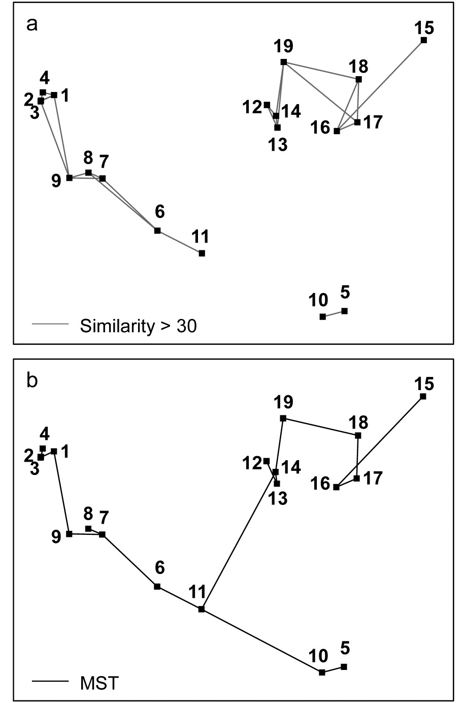
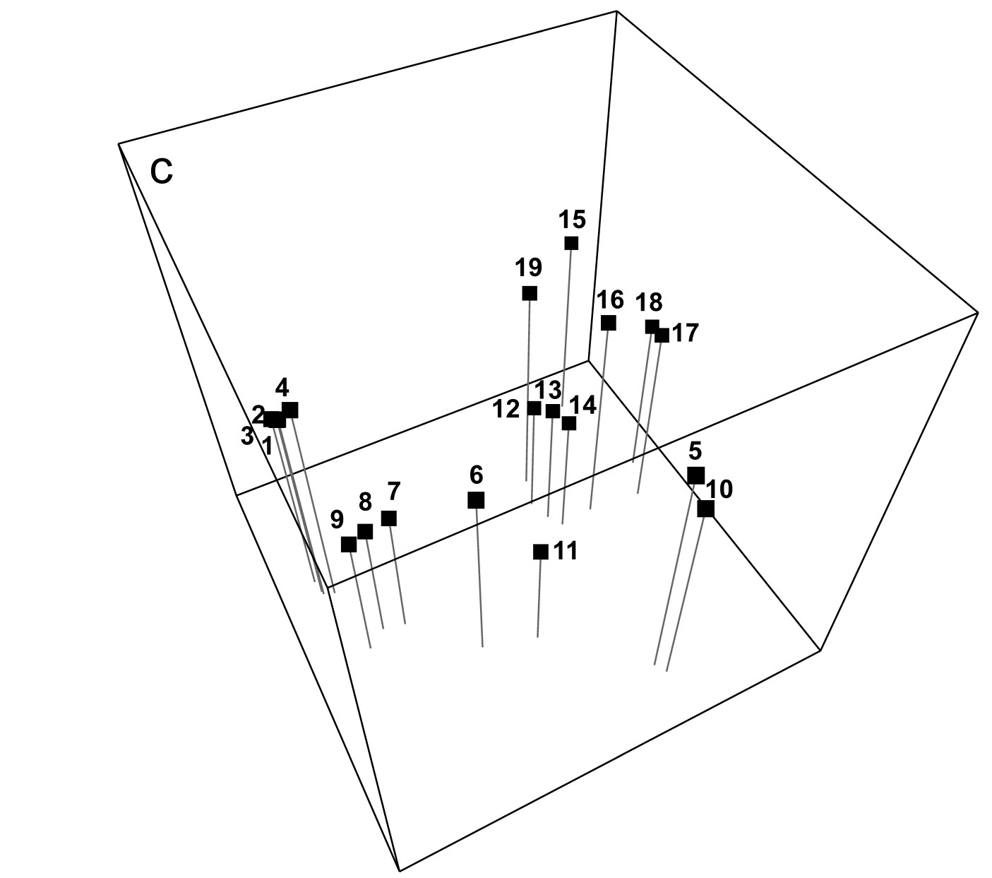
Fig. 5.3. Exe estuary nematodes {X}. a) & b) Two-dimensional MDS configuration, as in Fig. 5.1 (stress = 0.05), with:
a) samples >30% similar (by Bray-Curtis) joined by grey lines;
b) the minimum spanning tree through the dissimilarity matrix indicated by the continuous line.
c) Three-dimensional MDS configuration (stress = 0.03).

Fig. 5.4. Exe estuary nematodes {X}. Dendrogram of the 19 sites, using group-average clustering from Bray-Curtis similarities on $\sqrt{}\sqrt{}$-transformed abundances. The four site groups (1 to 4) identified by Field et al (1982) at a 17.5% similarity threshold are indicated by a dashed line (they also split the two tightly clustered sub-groups in group 1). A 35% slice is also shown.
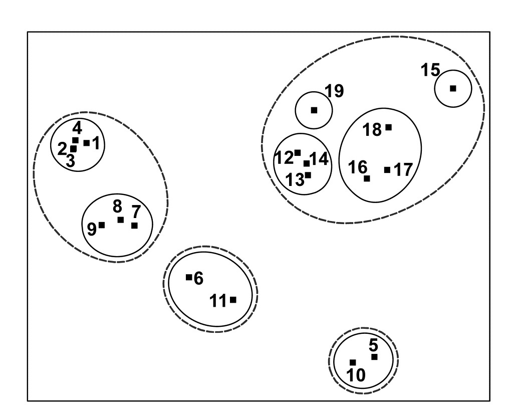
Fig. 5.5. Exe estuary nematodes {X}. Two-dimensional MDS configuration, as in Fig. 5.1 (stress = 0.05), with clusters identified from Fig. 5.4 at similarity levels of 35% (continuous line) and 17.5% (dashed line).
- Do superimposed groups from a cluster analysis distort the ordination plot? The combination of clustering and ordination analyses can also be an effective way of checking the adequacy and mutual consistency of both representations. Slicing the dendrogram of Fig. 5.4 at two (or more) arbitrary similarity levels determines groupings which can be identified on the 2-d ordination by a closed region around the points. (PRIMER uses its own ‘nail and string’ algorithm to produce smoothed convex hulls of the points in each cluster, where the degree of smoothing is under user control, with a smoothing parameter of zero resulting in the convex hull). Here the approximately 17.5% similarity used by the original Field, Clarke & Warwick (1982) paper is shown by the dashed line in Figs. 5.4 and 5.5, and a continuous line shows the clusters produced from slicing the dendrogram between about 30-45% similarity. It is clear that the agreement between the MDS and the cluster analysis is excellent: the clusters are well defined and would be determined in much the same way if one were to select clusters by eye from the 2-dimensional ordination alone. One is not always as fortunate as this, and a more revealing example of the benefits of viewing clustering and ordination in combination is provided by the data of Fig. 4.2.¶
† There are alternative definitions of stress, for example the stress formula 2 option provided in the MDSCAL and KYST programs. This differs only in the denominator scaling term in (5.1) but is believed to increase the risk of finding local minima and to be more appropriate for other forms of multivariate scaling, e.g. multidimensional unfolding, which are outside the scope of this manual.
§ This is under user control with the PRIMER routine, for example, but the default is 0.01.
¶ One option within PRIMER is to run CLUSTER on the ranks of the similarities rather than the similarities themselves. Whilst not of any real merit in itself (and not the default option), Clarke (1993) argues that this could have marginal benefit when performing a group-average cluster analysis solely to see how well the clusters agree with the MDS plot: the argument is that the information utilised by both techniques is then made even more comparable.
5.4 EXAMPLE: Dosing experiment, Solbergstrand
The nematode abundance data from the dosing experiment {D} at the GEEP Oslo Workshop was previously analysed by PCA, see Fig. 4.2 and accompanying text. The analysis was likely to be unsatisfactory, since the % of variance explained by the first two principal components was very low, at 37%. Fig. 5.6c shows the MDS ordination from the same data, and in order to make a fair comparison with the PCA the data matrix was treated in exactly the same way prior to analysis. (The same 26 species were used and a log transform applied before computation of Bray-Curtis similarities). The stress for the 2-dimensional MDS configuration is moderately high (at 0.16), indicating some difficulty in displaying the relationships between these 16 samples in two dimensions. However, the PCA was positively misleading in its apparent separation of the four high dose (H) replicates in the 2-dimensional space; by contrast the MDS does provide a usable summary which would probably not lead to serious misinterpretation (the interpretation is that nothing very much is happening!). This can be seen by superimposing the corresponding cluster analysis results, Fig. 5.6a, onto the MDS. Two similarity thresholds have been chosen in Fig. 5.6a such that they (arbitrarily) divide the samples into 5 and 10 groups, the corresponding hierarchy of clusters being indicated in Fig. 5.6c by thin and thick lines respectively. Whilst it is clear that there are no natural groupings of the samples in the MDS plot, and the groupings provided by the cluster analysis must therefore be regarded with great caution, the two analyses are not markedly inconsistent.
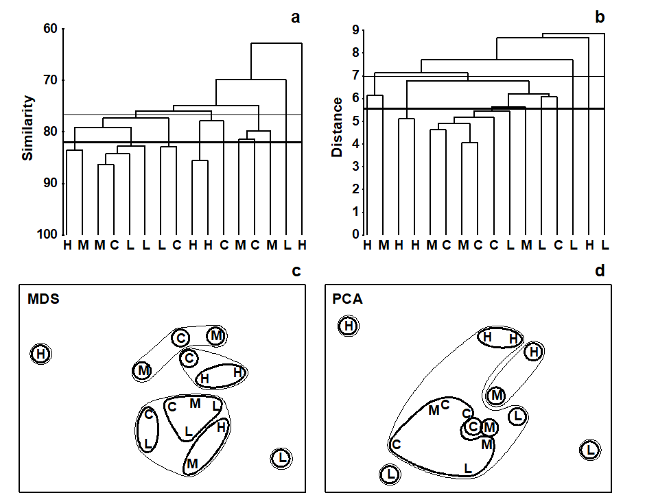
Fig. 5.6. Dosing experiment, Solbergstrand mesocosm {D}. Nematode abundances for four replicates from each of four treatments (control, low, medium and high dose of hydrocarbons and Cu) after species reduction and log transformation as in Fig. 4.2. a), c) Group-averaged clustering from Bray-Curtis similarities; clusters formed at two arbitrary levels are superimposed on the 2-dimensional MDS obtained from the same similarities (stress = 0.16). b), d) Group-average clustering from Euclidean distances; clusters from two levels are superimposed on the 2-dimensional PCA of Fig. 4.2. Note the greater degree of distortion in the latter. (Contours drawn by hand, note, not in PRIMER which only allows convexity of such contours).
In contrast, the parallel operation for the PCA ordination clearly illustrates the poorer distance-preserving properties of this method. Fig. 5.6d repeats the 2-dimensional PCA of Fig. 4.2 but with superimposed groups from a cluster analysis of the Euclidean distance matrix (the implicit distance for a PCA) between the 16 samples (Fig. 5.6b). With the same division into five clusters (thin lines) and ten clusters (thick lines), a much more distorted picture results, with samples that are virtually coincident in the PCA plot being placed in separate groups and samples appearing distant from each other forming a common group.
The outcome that would be expected on theoretical grounds is therefore apparent in practice here: MDS (with a relevant similarity matrix for species data, Bray-Curtis) can provide a more realistic picture in situations where PCA (on Euclidean distance) gives a distorted representation of the those distance relationships among samples, because of the projection step: the H samples are not clustered together in the dendrogram. In fact, the biological conclusion from this particular study is entirely negative: the ANOSIM test (Chapter 6) shows that there are no statistically significant differences in community structure among any of the four dosing levels in this experiment.
5.5 Example: Celtic Sea zooplankton
In situations where the samples are strongly grouped, as in Figs. 5.4 and 5.5, both clustering and ordination analyses will demonstrate this, usually in equally adequate fashion. The strength of ordination is in displaying a gradation of community composition over a set of samples. An example is provided by Fig. 5.7, of zooplankton data from the Celtic Sea {C}. Samples were collected from 14 depths, separately for day and night time studies at a single site. The changing community composition with depth can be traced on the resulting MDS plot (from Bray-Curtis similarities). There is a greater degree of variability in community structure of the near-surface samples, with a marked change in composition at about 20-25m; deeper than this the changes are steady but less pronounced and they step in parallel for day and night time samples.¶ Another obvious feature is the strong difference in community composition between day and night near-surface samples, contrasted with their relatively higher similarity at greater depth. Cluster analysis of the same data would clearly not permit the accuracy and subtlety of interpretation that is possible from ordination of such a gradually changing community pattern.
Fig. 5.7. Celtic Sea zooplankton {C}. MDS plot for night (boxed) and day time samples (dashed lines) from 14 depths (5 to 70m, denoted A,B,...,N), taken at a single site during September 1978.
Common examples of the same point can be found for time series data, where the construction of a time trajectory by connecting points on an ordination (sometimes, as above, with multiple trajectories on the same plot, e.g. contrasting time sequences at reference and impacted conditions) can be a powerful tool in the interpretational armoury from multivariate analysis, and another example of this point follows
¶ The precise relationships between the day and night samples for the larger depths (F-N) would now best be examined by an MDS of that data alone, the greater precision resulting from the MDS then not needing to cater, in the same 2-d picture, for the relationships to (and between) the A-E samples. This re-analysis of subsets should be a commonly-used strategy in the constant battle to display high-dimensional information in low dimensions.
5.6 Example: Amoco-Cadiz oil spill, Morlaix
Benthic macrofaunal abundances of 251 species were sampled by Dauvin (1984) at 21 times between April 1977 and February 1982 (approximately quarterly), at station ‘Pierre Noire’ in the Bay of Morlaix. Ten grab samples (1m²) of sediment were collected on each occasion and pooled, thus substantially reducing the contribution of local-scale spatial variability to the ensuing multivariate analysis, which should allow temporal patterns to be seen more clearly. The time-series spanned the period of the ‘Amoco-Cadiz’ oil tanker disaster of March 1978; the sampling site was some 40km from the initial tanker break-up but major coastal oil slicks reached the Bay of Morlaix, {A}.
The 2-d MDS from Bray-Curtis similarities computed on 4th-root transformed abundances is seen in Fig. 5.8a, and has succeeded in reducing the 251-d species data to a 2-d plot with only modest stress (=0.09). It neatly shows: a) the scale of the seasonal cycle prior to the oil-spill (times A to E); b) marked community change immediately following the spill (time F), and further changes over the next year or so (G-K); c) a move towards greater stability, with a suggestion that the community is returning towards the region of its initial state, though it has certainly not achieved that by the end of the 5-year period; and d) the re-establishment of the seasonal cycle in this latter phase (J-M, N-Q, R-U).
In fact, this is an astonishingly succinct and meaningful summary of the main pattern of change in a very speciose data set, and shows well the power of MDS ordinations to capture continuous change rather than groupings of samples, which is all that a dendrogram displays. The latter is seen in the differing symbols in Fig 5.8a, used for SIMPROF groups (Chapter 3) from agglomerative clustering (Fig. 5.8b): eight groups are identified and they do split samples before and after the spill, and also by season, between winter+spring and summer+autumn periods, even in the last two years overriding inter-annual differences. The exception to that is over the immediate post-spill year, in which seasonal differences are not apparent. All of this makes sense and demonstrates the power of ordination and clustering methods together (literally, for the rotatable Fig. 5.8c, another PRIMER7 option). On their own, however, in a case where a time course of change is expected, the supremacy of ordination over cluster analysis is clear (contrast Figs. 5.8 a and b). A simple dendrogram gives weak interpretation since it lacks ordering, i.e. has no way of associating clusters with a temporal or spatial gradient (though see the discussion on dendrograms in shade plots, Chapter 7).
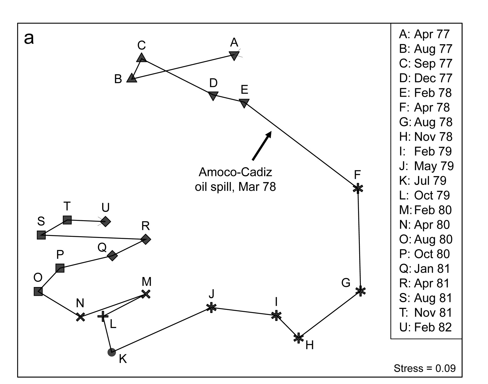
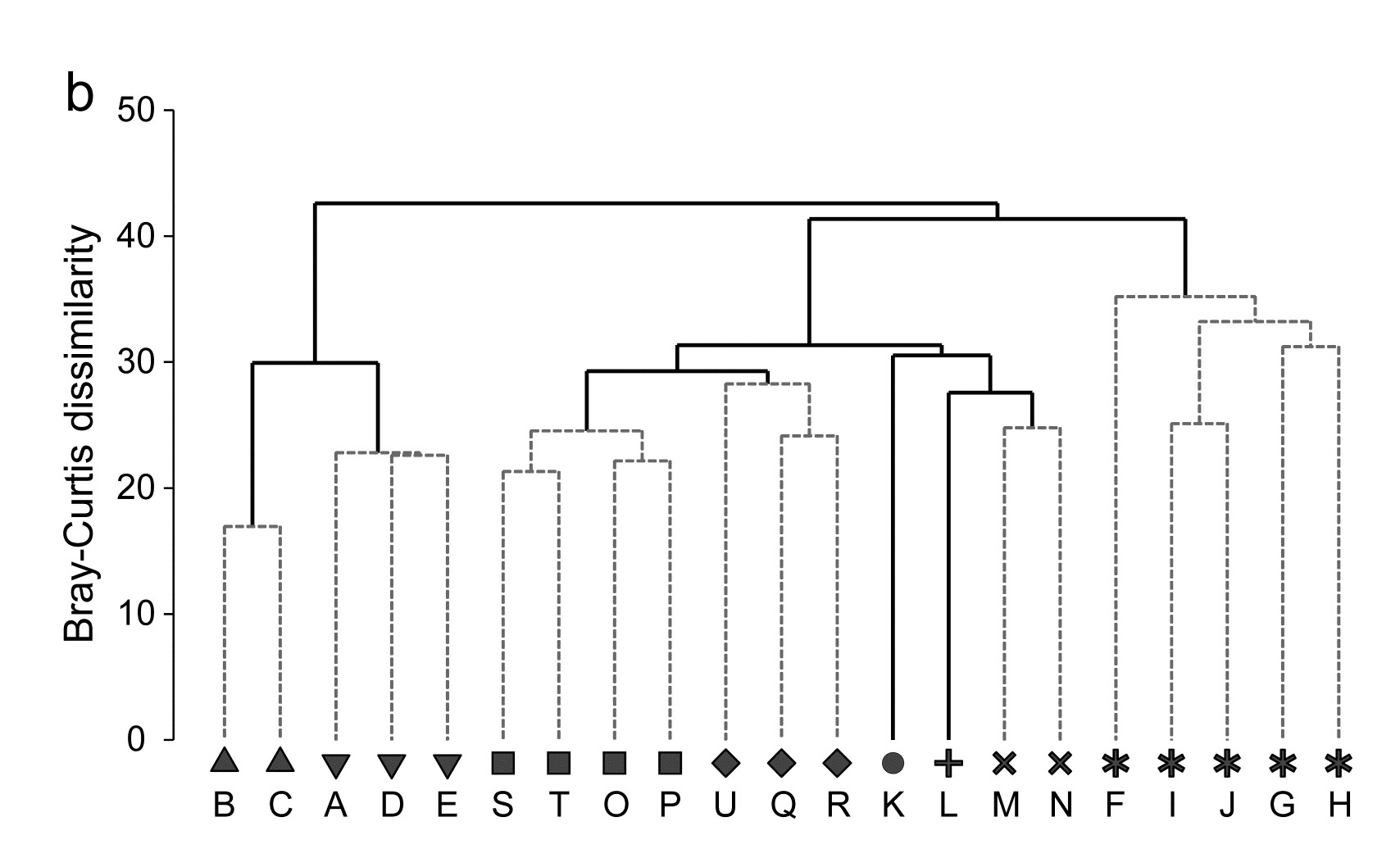
Fig. 5.8. Amoco-Cadiz oil spill {A}. Morlaix macrobenthos at 21 times (A to N). For Bray-Curtis on 4th-root transformed abundances: a) 2-d nMDS; b) agglomerative cluster analysis, both using symbols identifying the 8 groups given by SIMPROF tests; c) 2-d MDS as in (a) with SIMPROF groups identified and the dendrogram from (b) displayed in the 3rd dimension.
5.7 MDS strengths and weaknesses
MDS strengths
-
MDS is simple in concept. The numerical algorithm is undeniably complex, but it is always clear what non-metric MDS is setting out to achieve: the construction of a sample map whose inter-point distances have the same rank order as the corresponding dissimilarities between samples.
-
It is based on the relevant sample information. MDS works on the sample dissimilarity matrix not on the original data array, so that there is complete freedom of choice to define similarity of community composition in whatever terms are biologically most meaningful.
-
Species deletions are unnecessary. Another advantage of starting from the sample dissimilarity matrix is that the number of species on which it was based is largely irrelevant to the amount of calculation required. Of course, if the original matrix contained many species whose patterns of abundance across samples varied widely, and prior transformation (or choice of similarity coefficient) dictated that all species were given rather equal weight, then the structure in the sample dissimilarities is likely to be more difficult to represent in a low number of dimensions. More usually, the similarity measure will automatically down-weight the contribution of species that are rarer (and thus more prone to random and uninterpretable fluctuations). There is then no necessity to delete species, either to obtain reliable low-dimensional ordinations or to make the calculations viable; the computational scale is determined solely by the number of samples.
-
MDS is generally applicable. MDS can validly be used in a wide variety of situations; fewer assumptions are made about the nature and quality of the data when using non-metric MDS than (arguably) for any other ordination method. It seems difficult to imagine a more parsimonious position than stating that all that should be relied on is the rank order of similarities (though of course this still depends on the data transformation and similarity coefficient chosen). The step to considering only rank order of similarities, rather than their actual values, is not as potentially inefficient as it might at first appear, in cases where the resemblances are genuine Euclidean distances. Provided the number of points in the ordination is not too small (nMDS struggles when there are only 4 or 5, thus few dissimilarities to rank), nMDS will effectively reconstruct those Euclidean distances solely from their rank orders so that metric MDS (mMDS) and nMDS solutions will appear identical. The great advantage of nMDS, of course, is that it can cope equally well with very non-Euclidean resemblance matrices, commonplace in biological contexts.
-
The algorithm is able to cope with a certain level of ‘missing’ similarities. This is not a point of great practical importance because resemblances are generally calculated from a data matrix. If that has a missing sample then this results in missing values for all the similarities involving that sample, and MDS could not be expected to ‘make up’ a sensible place to locate that point in the ordination! Occasionally, however, data arrives directly as a similarity matrix and then MDS can cleverly stitch together an ordination from incomplete sets of similarities, e.g. knowing the similarities A to (B, C, D) and B to (C, D) tells you quite a lot about the missing similarity of C to D. And if, as noted above, there are a reasonable number of points, so a fairly rich set of ranks, even nMDS (as found in PRIMER) would handle such missing similarities.
MDS weaknesses
-
MDS can be computationally demanding. The vastly improved computing power of the last two decades has made it comfortable to produce MDS plots for several hundred samples, with numerous random restarts (by default PRIMER now does 50), in a matter of a few seconds. However, for n in the thousands, it is still a challenging computation (processor time increases roughly proportional to n2). It should be appreciated, though, that larger sample sizes generally bring increasing complexity of the sample relationships, and a 2 or 3-dimensional representation is unlikely to be adequate in any case. (Of course this last point is just as true, if not more true, for other ordination methods). Even where it is of reasonably low stress, it becomes extremely difficult to label or make sense of an MDS plot containing thousands of points. This scenario was touched on in Chapter 4 and in the discussion of Fig. 5.7, where it was suggested that data sets will often benefit by being sub-divided by the levels of a factor, or on the basis of subsets from a cluster analysis, and the groups analysed separately by MDS (agglomerative clustering is very fast, for large numbers of samples¶). Averages for each level might then be input to another MDS to display the large-scale structure across groups. It is the authors’ experience that, far too often, users produce ordination plots from all their (replicate) samples and are then surprised that the ordination, containing many points, has high stress and little apparent pattern. Not enough use is made of averaging, whether of the transformed data matrix, the similarities, or the centroids from PCO ( Anderson, Gorley & Clarke (2008) ), taken over replicates, over sites for each time, over times for each site etc, and entering those averages into MDS ordinations. In univariate analysis, it is rare to produce a scatter plot of the replicates themselves: we are much more likely to plot the means for each group, or the main effects of times and sites etc (for each factor, averaging over the other factors), and the situation should be no different for multivariate data.
-
Convergence to the global minimum of stress is not guaranteed. As we have seen, the iterative nature of the MDS algorithm makes it necessary to repeat each analysis many times, from different starting configurations, to be fairly confident that a solution that re-appears several times (with the lowest observed stress) is indeed the global minimum of the stress function. Generally, the higher the stress, the greater the likelihood of non-optimal solutions, so a larger number of repeats is required, adding to the computational burden. However, the necessity for a search algorithm with no guarantee of the optimal solution (by comparison with the more deterministic algorithm of a PCA) should not be seen, as it sometimes has, as a defect of MDS vis-à-vis PCA. Remember that an ordination is only ever an approximation to the high-dimensional truth (the resemblance matrix) and it is much better to seek an approximate answer to the right problem (MDS on Bray-Curtis similarity, say) rather than attack the wrong problem altogether (PCA on Euclidean distance), however deterministic the computation is for the latter.
-
The algorithm places most weight on the large distances. A common feature of most ordination methods (including MDS and PCA) is that more attention is given to correct representation of the overall structure of the samples than their local structure. For MDS, it is clear from the form of equation (5.1) that the largest contributions to stress will come from incorrect placement of samples which are very distant from each other. Where distances are small, the sum of squared difference terms will also be relatively small and the minimisation process will not be as sensitive to incorrect positioning. This is another reason therefore for repeating the ordination within each large cluster: it will lead to a more accurate display of the fine structure, if this is important to interpretation. An example is given later in Figs. 6.2a and 6.3, and is typical of the generally minor differences that result: the subset of points are given more freedom to expand in a particular direction but their relative positions are usually only marginally changed.
¶ PRIMER has no explicit constraint on the size of matrices that it can handle; the constraints are mainly those of available RAM. On a typical laptop PC it is possible to perform sample analyses on matrices with tens of thousands of variables (species or OTUs) and hundreds of samples without difficulty; once the resemblance matrix is computed most calculations are then a function of the number of samples (n), and cluster analysis on hundreds of samples is virtually instantaneous. (The same is not true of the SIMPROF procedure, note, since it works by permuting the data matrix and is highly compute-intensive; v7 does however make good use of multi-core processors where these are available).
5.8 Further nMDS/mMDS developments
Higher dimensional solutions
MDS solutions can be sought in higher dimensions and we noted previously that the stress will naturally decrease as the dimension increases. Fig 5.9a shows the scree plot of this decreasing stress (y axis) against the increasing number of dimensions, for the Amoco-Cadiz oil spill data of Fig. 5.8. There is a suggestion of a ‘shoulder’ in this line plot as the stress drops from 2-d to 3-d, thereafter declining steadily. The 2-d stress is already a rather satisfactory 0.09 but drops quite strongly to about 0.05 with the extra dimension, now in our category of an excellent representation, and so should certainly be further examined. Figs. 5.9c and d show the 2- and 3-d Shepard plots, and it is clear that the stress (scatter about the fitted monotonic regression line) has reduced quite sharply. Fig. 5.9b shows the 3-d nMDS itself, with the box rotated to highlight, in the vertical direction (z), the third MDS axis (as defined by the automatic rotation of the configuration to principal axes). The seasonal cycle is clearly expressed by changes along this axis, which is orthogonal to the main inter-annual changes seen in the x, y plane (the latter is very likely to be the effect of the oil spill and partial recovery, though it is impossible of course to infer that with full confidence, given the absence of any sort of reference conditions for the natural inter-annual variation). This example suggests that, even in cases with acceptable 2-d stress, at least the 3-d solution should be calculated and then rotated to see if it offers further insight†. Here, for example, the apparent synchrony in direction of the seasonal cycle between the start (A-E) and end (R-U) years of this time course, seen in the 2-d plot (Fig. 5.8a), is confirmed in the 3-d plot (Fig. 5.9b) with its more complete separation of season and year. The 3-d plot gives us greater confidence in this case that the 2-d plot (with its perfectly acceptable stress level) in no way misleads. Of course, for static displays, one would then always prefer the 2-d plot, as a suitable approximation to the high-dimensional structure.
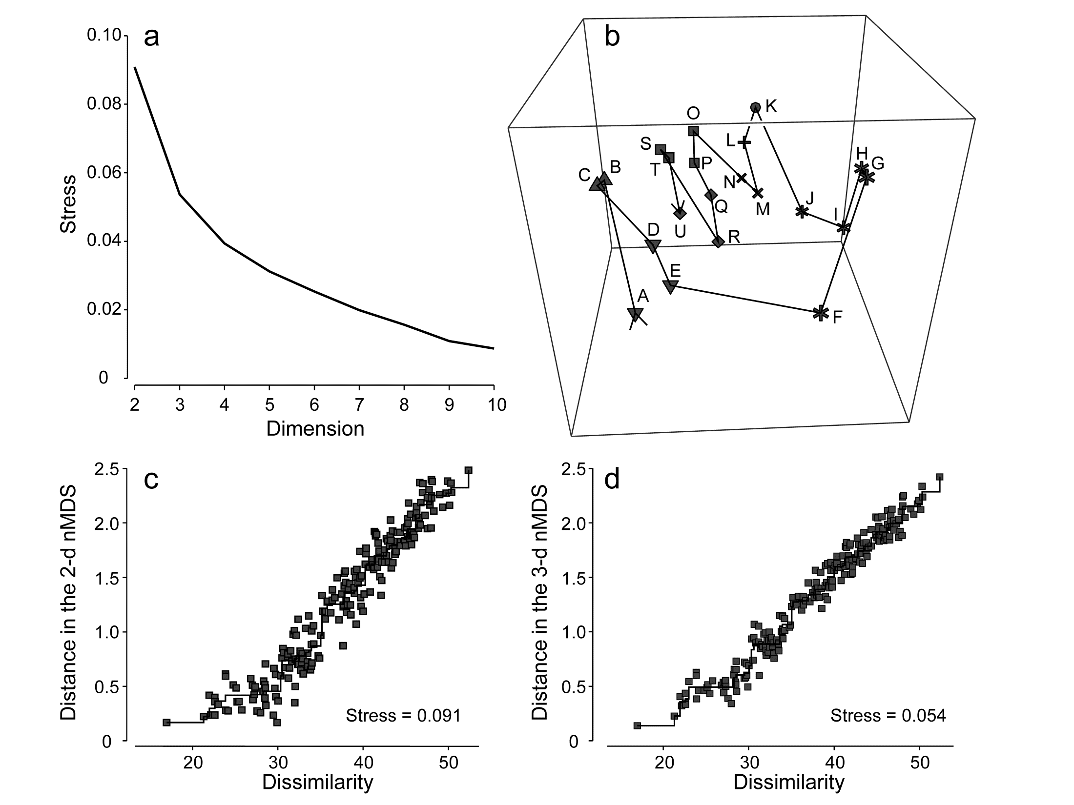
Fig. 5.9. Amoco-Cadiz oil spill {A}. a) Scree plot of stress for nMDS solutions in 2-d to 10-d (data matrix as in Fig. 5.8); b) 3-d nMDS plot for the 21 times; c) & d) Shepard plots for the 2-d (Fig 5.8) and 3-d MDS ordinations showing the decreasing scatter about the monotonic regression (stress).
(Non-)linearity of the Shepard diagram
Shepard diagrams for the 2-d and 3-d non-metric MDS ordinations for Morlaix were seen in Figs. 5.9c and 5.9d; note how relatively restricted the range of (dis)similarities is, by comparison with the equivalent plot (Fig. 5.2) for the (spatial) Exe nematode study. The latter exemplifies a long baseline of community change: there are pairs of sites with no species in common, thus dissimilarities at the extreme of their range (100). For the (temporal) Morlaix study, the baseline of change is relatively much shorter, nearly all dissimilarities being between 20 and 50: there is no complete turnover of species composition through time, nor anything approaching it. This difference results in a (commonly observed) effect of greater linearity of the relationship between original dissimilarity and final distance in the MDS plots, as seen in Figs. 5.9c&d. It is linear regression of the Shepard plot distances vs. dissimilarities, through the origin, which is the basis of a less-commonly used technique for MDS, metric multidimensional scaling (mMDS), in which dissimilarities are treated as if they are, in reality, distances. Through the origin is an important caveat here and it is clear that Figs. 5.9c&d would not be well-fitted by such a regression – the natural line through these points passes through distance y = 0 at about a dissimilarity of x = 20. Thus the flexible nMDS fits instead more of a threshold relationship, in which the linearity tails off smoothly in a compressed set of distances for the smallest dissimilarities.
Metric multi-dimensional scaling (mMDS)
The above example will be returned to later, but there are situations in which a simple linear regression on the Shepard plot is certainly appropriate, e.g. when the resemblance coefficient is Euclidean distance, as would be the case for analysis of (normalised) environmental variables. Then mMDS becomes a viable alternative to PCA (which also uses distances that are Euclidean) but with the great advantage of ordination which does not resort to a projection of the higher-dimensional data but sets out to preserve the high-d distances in the low-d plot, as closely as it can. This lack of distance preservation was one of the two main objections to PCA discussed at the end of Chapter 4.
The metric MDS algorithm is in principle that earlier described for nMDS, replacing the step involving monotonic regression with simple linear regression through the origin. This allows the distances on the mMDS plot to be scaled in the same units as the input resemblance matrix (usually a distance measure), and there are now therefore measurement scales on the axes of the plot. Orientation and reflection are again arbitrary (though usually the convention is adopted as for nMDS, of rotating co-ordinates to principal axes).
Table. 5.2. World map {W}. a) Distance (in miles) between pairs of ‘European’ cities; b) rank distances (1= closest, 21 = furthest)
| (a) | London | Madrid | Moscow | Oslo | Paris | Rome |
|---|---|---|---|---|---|---|
| London | ||||||
| Madrid | 774 | |||||
| Moscow | 1565 | 2126 | ||||
| Oslo | 723 | 1474 | 1012 | |||
| Paris | 215 | 641 | 1542 | 822 | ||
| Rome | 908 | 844 | 1491 | 1253 | 689 | |
| Vienna | 791 | 1122 | 1033 | 848 | 648 | 477 |
| (b) | London | Madrid | Moscow | Oslo | Paris | Rome |
|---|---|---|---|---|---|---|
| London | ||||||
| Madrid | 7 | |||||
| Moscow | 20 | 21 | ||||
| Oslo | 6 | 17 | 13 | |||
| Paris | 1 | 3 | 19 | 9 | ||
| Rome | 12 | 10 | 18 | 16 | 5 | |
| Vienna | 8 | 15 | 14 | 11 | 4 | 2 |
A simple example illustrates metric MDS well, that of recreating a map of cities from a triangular matrix of the road/rail/air distances (or perhaps travel times) between every pair of them, {W} ¶. Table 5.2a gives the great-circle distances between only 7 cities (called European for brevity though they include Moscow). The negligible curvature of the earth over the range of about 2000 miles makes it clear that this distance matrix should be enough to locate these cities on a 2-dimensional map near-perfectly, and Fig. 5.10a shows the result of the metric MDS. As can be seen from Fig. 5.10c, the Shepard diagram is now precisely a linear fit through the origin, with no scatter and thus zero stress (stress is defined exactly as for nMDS, equation 5.1). The mMDS has been manually rotated to align with the conventional N-S direction for such a map, though that is clearly arbitrary; the axis scales are in miles since the fully metric information is used.
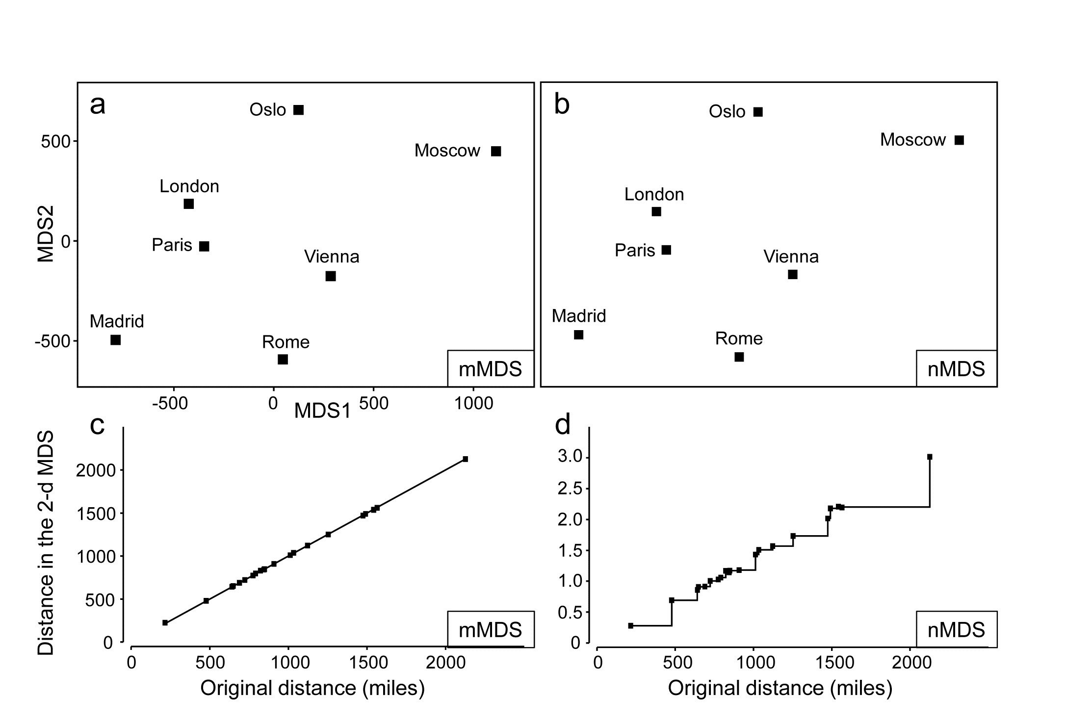
Fig. 5.10. World map {W}. For the distance matrix Table 5.2a & b from 7 ‘European’ cities: a&c) metric MDS and its associated Shepard plot; b&d) non-metric MDS and Shepard plot (stress = 0 in all cases)
Perhaps more striking is the equivalent nMDS, Fig. 5.10b, which is more or less identical. Though the Shepard diagram, Fig. 5.10d, is given in terms of distance in the ordination against the input resemblances (city distances), the monotonic regression fit ensures that all that matters to the stress (see equation 5.1) are the y axis values of ordination distances, and their departure from the fitted step function (also zero throughout). Points on the x axis could be stretched and squeezed differentially along its length, and the step function would stretch and squeeze with them, thus leaving the stress unchanged (zero, here). In other words, the only information used by the nMDS is the rank orders of city distances in Table 5.2b. And that is actually quite remarkable: a near-perfect map has been obtained solely from all possible statements of the form ‘Oslo is closer to Paris than Madrid is to Rome’. The general suitability of nMDS comes from the fact that it can accommodate not just very non-linear Shepard diagrams but, also, where a straight line is the best relationship (and there are more than a minimal number of relationships to work with) nMDS should find it: the points in Fig. 5.10d do effectively fall on a straight line through the origin. What the monotonic regression loses is the link to the original measurements: the y axis scale is in arbitrary standard deviation units, and nMDS plots have no axis scales that can be related to the original distances.
This example becomes more interesting still when we expand the data to 34 cities from all around the globe, again utilising the great-circle (‘direct flight’) inter-city distances from the same atlas source. Fig. 5.11a shows the nMDS solution in 3-d, and it is again near-perfect, with zero stress. There is one subtlety here that should not be missed: the supplied great-circle distances are not the same as the direct (‘through the earth’) distances between cities, represented in the nMDS plot, and the relationship between the two is not linear. This is clear from the Shepard diagram, Fig. 5.11d: nMDS is able to preserve the rank orders of great-circle distances perfectly in the final 3-d direct distances only if it can non-linearly transform the supplied distance scale, i.e. ‘squash up’ the larger distances, where the earth’s curvature matters more than for the smaller distances within a region. It has not been told how to do this, it does not use any form of parametric relationship to do it – it simply uses the flexibility of fitting an increasing step function to mould itself to a shape that will ‘square this particular circle’, and thus reduce the stress (to zero, here). In comparison, mMDS will also make a reasonable job of this ordination (the final plot is not very different than Fig 5.11a) but, because it must fit a straight line to the Shepard plot, the stress is not zero but 0.07.
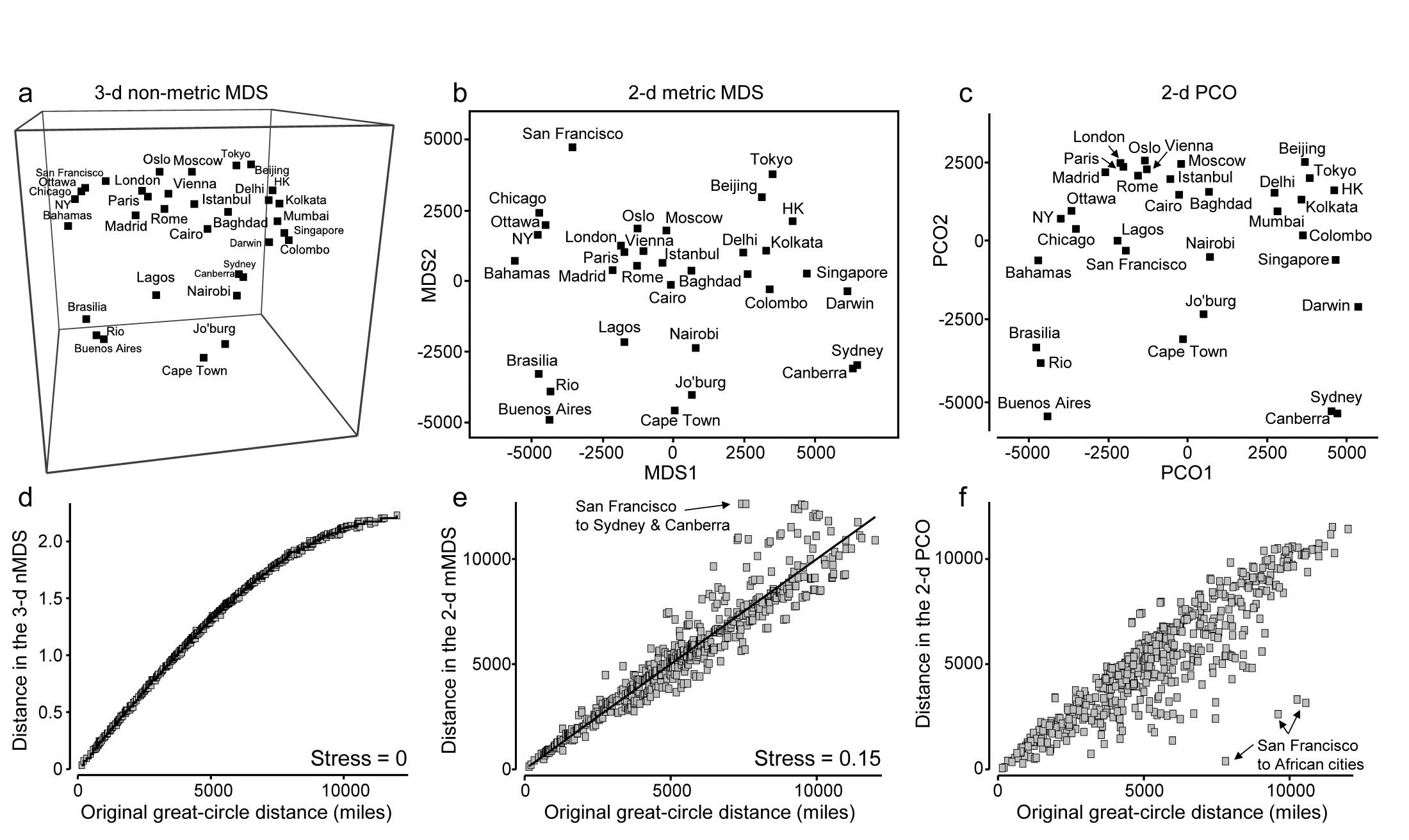
Fig. 5.11. World map {W}. a&d) 3-d non-metric MDS from great-circle distances between every pair of 34 world cities, and associated Shepard plot of (‘through the earth’) distances in the 3-d plot, y, against original great-circle distances, x (stress = 0); and for the same data: b&e) 2-d metric MDS and Shepard plot (stress = 0.15); c&f) 2-d PCO and Shepard plot (stress undefined for this technique, since not based on a modelled distance vs. resemblance relation, but the scatter is clearly greater for plot f than plot e).
In addition to turning ‘distance’ matrices into ‘maps’, the other crucial role for ordination methods is, of course, dimensionality-reduction. This can be well illustrated by seeking a 2-d MDS of the great-circle distances. Figs. 5.11b&e show the mMDS plot and associated Shepard diagram. The stress is, naturally, higher, at about 0.15. (The nMDS ‘map’, given by Clarke (1993) , looks very similar because the Shepard plot is close to linearity in this case, and has a slightly lower stress of 0.14). We previously categorised such stress values as ‘potentially useful but with detail not always accurate’, and this is an apt description of the 2-d approximation in plot b) to the true 3-d map of a). The placement within most regions (denoted by different symbols on the map) is accurate, as can be seen from the tight scatter in the Shepard plot for smaller distances, but the MDS has trouble placing cities like San Francisco – it cannot be put on the extreme left of the plot since that implies that the largest distances in the original matrix are from there to the far-eastern cities of Beijing, Tokyo, Sydney etc, which is clearly untrue. So the n/mMDS drags San Francisco towards those cities whilst keeping it away from eastern USA and Europe, which can only ever partly succeed – it is no surprise to observe therefore that the worst outliers on the Shepard plot involve San Francisco.
Nonetheless, the mMDS does give a reasonably fair 2-d map of the world and the advantage it can have over its natural competitor, Principal Co-ordinates (PCO) is well illustrated in the PCO ordination, Fig. 5.11c. PCO does its dimensionality reduction here by projecting from the 3-d space to the ‘best’ 2-d plane (‘squashing the earth flat’, in effect). San Francisco is now uncomfortably close to Lagos and the generally poor distance preservation is evident from a Shepard plot, Fig. 5.11f§, for which the most extreme outliers are, not surprisingly, between San Francisco and the African cities. In defence of PCO, it does not set out to preserve distances. Its strengths lie elsewhere, in attempting to partition meaningful structure, seen on the primary axes, from meaningless residual variability, which it assumes will appear on the higher axes and thus be ‘flattened’ by the projection. However, this example is a salutary one if the main motivation is to display all of the high-dimensional structure of a resemblance matrix in the best possible way in low-dimensional space.
mMDS for Amoco-Cadiz oil-spill data
Fig. 5.12a shows the result of metric MDS for the Morlaix macrofauna data of Figs. 5.8 and 5.9. Whilst the metric ordination plot shares the same features as its non-metric counterpart, the stress value is much higher (at 0.23). Fig. 5.12c shows why: the linear regression through the origin, the basis of mMDS, is a very poor fit. In spite of the way mMDS is seeking to force the Bray-Curtis dissimilarities to be interpreted exactly as distances, the data resolutely refuses to go along with this! It maintains its own linear relationship (not through the origin) as the solution which best minimises the overall stress; this explains the retention of a similar-looking ordination in spite of the high stress. But the conflict between the fitted model and the data carries a price: it does not result in an adequate 2-d representation. For example, it suggests that the apparent ‘recovery’ towards the pre-spill year is better than is justified by the similarities. Also the only significant advantage of a successful mMDS here, that the axis scales could then be read as Bray-Curtis dissimilarities, is entirely nullified. The ordination scale suggests that times G and O (the first week of August in 1978 and 1980) are separated by a distance (=dissimilarity) of nearly 70, yet the real value is around 50; this is a direct result of the way the points form a steeper gradient than the fitted line in Fig. 5.12c. What this figure strongly suggests, in fact, is that we can retain a linear relationship of distance with dissimilarity, using what we shall term a threshold metric MDS (tmMDS), by fitting a linear regression to the Shepard plot but with a non-zero intercept (this is an option in PRIMER7’s mMDS).
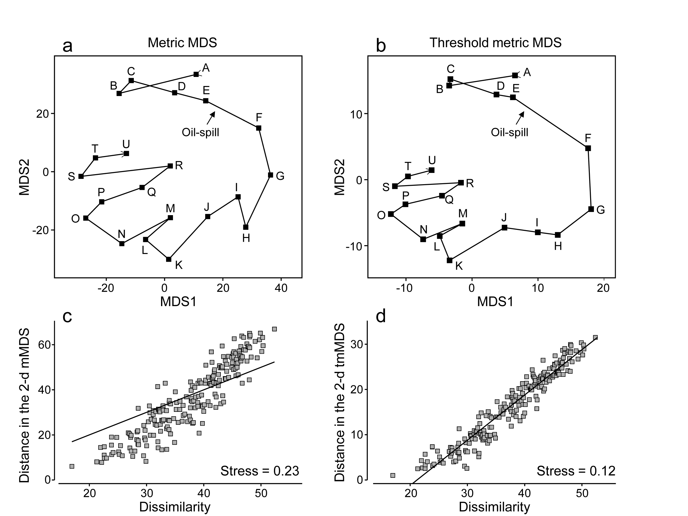
Fig. 5.12. Amoco-Cadiz oil-spill {A}. a&c) mMDS for 21 sampling times (data as Fig. 5.8) and Shepard plot (stress 0.23); b&d) threshold mMDS and Shepard plot (stress 0.12)
The resulting tmMDS and Shepard plot are shown in Fig. 5.12 b&d. The model is seen to fit very well and the stress greatly reduces, to a very acceptable 0.12, (not much higher than the vastly more flexible step function of nMDS, with stress 0.09). The resulting ordination is now virtually identical to the 2-d nMDS, Fig. 5.8a, and because the linear threshold model in Fig. 5.12d fits the dissimilarities so accurately and tightly, we are justified in interpreting the distance scales on the mMDS axes as dissimilarities, after one adjustment. Dissimilarities of about 20, the intercept on the x axis in the Shepard plot, are represented in the ordination by zero distance, i.e. the points for those samples would effectively coincide (samples B and C are a case in point, with dissimilarity of 17, the lowest in the matrix). Points G and O are now separated by about 30 units on the mMDS axes, so their dissimilarity is represented as being 20+30 = 50 (and their true dissimilarity is a slightly fortuitous 49.9!)
Reference was made earlier to the way PCO and PCA hope to display meaningful structure on the first few axes and remove smaller-scale sampling variation by projecting across the higher PCs. nMDS can achieve this in a different way, by compression of the scale of smaller dissimilarities, smoothly ‘tailing in’ samples below a certain dissimilarity to be represented by points closer together on the plot than could happen under standard mMDS, where the linearity demands that only points of zero dissimilarity are coincident. Threshold mMDS, using liner regression not through the origin, is thus a combination of metric and non-metric ideas: points below some fitted threshold of dissimilarity (20 here) are literally placed on top of each other, so what could be just sampling variation (e.g. among replicates at the same point in space or time or treatment combination) is eliminated in that way. Above the threshold, strict linearity is enforced, so such a threshold mMDS is not well-suited to many cases which have long baseline gradients of assemblage change (such as Fig. 5.2) where samples have few or no species in common and dissimilarities abut 100. Where the Shepard plot shows them to be accurate models, with low stress, mMDS and threshold mMDS bring the advantage of interpretable axis scales for the MDS plot; where they are less accurate, nMDS is usually much preferable.
Combined nMDS and mMDS ordinations
The combination of non-metric and metric concepts can be taken one logical step further‡, to tackle a problem raised on page 5.2, which can occur with nMDS, that of degenerate solutions with zero stress arising from the collapse of the ordination into two (or a small number of) groups, in cases where among- group dissimilarities are all uniformly larger than any within-group ones. The non-metric algorithm can then place such groups infinitely far apart (in effect) and the display of any real within-group structure is lost as they collapse to points. The problem does not arise at all for standard mMDS (or PCO/PCA) since positioning of the most distant samples is constrained by the simple linear relation with smaller distances.
In cases of collapse where there are very few points in the ordination in the first place, an mMDS solution is an obvious place to start. In an extreme case, e.g. when ordinating only 3 points, nMDS will not run at all (the only data available to it are the three ranks 1, 2, 3!). Such cases are not pathological – they arise very naturally when looking at the equivalent of ‘means plots’ for multivariate analyses. Just as in univariate analyses, where an ANOVA is followed by plots of the means, e.g. ‘main effects’ of a factor, so in multivariate analysis, ANOSIM or PERMANOVA tests are followed by ordinations of the averages or centroids of the factor levels, to interpret the relationships among groups that have been demonstrated by tests at the replicate level. Such plots can sometimes have very few points and mMDS can then provide an effective, low stress, solution to displaying them.
However, for less trivial numbers of points, and in the common cases where Shepard plots are non-linear and the flexibility of nMDS is required, an effective solution to ‘collapsing plots’ is to combine mMDS and nMDS stress functions over all dissimilarities, in mixing proportions of (say) 0.05 and 0.95.
† PRIMER v7 also offers a dynamic display of the ‘evolution’ of a community in 3-d MDS space, typically over a time course. This is unnecessary for Fig 5.9b because there are only 21 points and they do not tread similar paths at later times, but the continued study of the macrobenthos at station ‘Pierre Noire’ in Morlaix Bay over three decades has given rise to a data set of nearly 200 time steps and a complex, multi-layered 3-d plot; it is then fascinating to watch the evolving trajectory of newer samples over the fading background of older community samples, and thus to set the potential oil-spill effects in the context of longer-term inter-annual patterns.
¶ Such examples are very useful in explaining the purpose and interpretation of ordinations to the non-specialist and are quite commonly found (e.g. Everitt (1978) starts from a road distance matrix for UK cities; Clarke (1993) uses the example in this chapter of great-circle distances between world cities, taken from the Reader’s Digest Great World Atlas of 1962).
§ Note that, though a Shepard diagram is not normally produced by a PCO, it can be created in PRIMER7 (with PERMANOVA+) by saving the 2-d PCO co-ordinates to a worksheet, calculating the Euclidean distances, using Unravel to generate a single y axis column, and likewise for the original distances (x), and running a Scatter Plot of y on x. Note also that PCO looks close to being PCA here, but is not – great-circle distances are not Euclidean.
‡ Though not implemented in the same way as in the PRIMER7 ‘Fix Collapse’ option, and with different motivation, the hybrid scaling (HS) technique of Faith, Minchin & Belbin (1987) , and the semi-strong hybrid scaling (SHS) of Belbin (1991) , introduced this combination idea into ecology in the PATN software. Briefly, using the original Kruskal, Young and Seer software (KYST), which allows combined stress function optimisation, HS mixes mMDS for all dissimilarities below a specified value with nMDS on the full set of dissimilarities. SHS also uses mMDS below a specified value but mixes that with nMDS above that value (and also substitutes Guttman’s algorithm for Kruskal’s). The primary motivation is in reconstruction of ecological gradients driven environmentally on a transect or grid and the methods do not appear to be optimal for a ‘collapsing MDS’ problem, since neither applies a direct constraint to dissimilarities greater than the threshold. (E.g. they would not stop the collapse for two well-separated groups whose between-group dissimilarities all exceeded that threshold.) The approach of this section achieves this by the common metric scale imposed (very mildly) on the largest distances by smaller ones.
5.9 Example: Okura estuary macrofauna
Anderson, Ford, Feary et al. (2004) describe macrofauna samples from the Okura estuary {O}, on the northern fringes of urban Auckland, NZ, taken inter-tidally at 2 times in each of 3 seasons under 3 sedimentary regimes (High, Medium and Low sedimentation levels), each regime represented by 5 sites, with 6 cores taken per site at each time. Taking averages¶ of log(x+1) transformed abundances over the sets of 30 site $\times$ replicate samples gives a very robust estimate of the community structure at each of the 18 time $\times$ sedimentation levels. However, calculating Bray-Curtis similarities then leads to the collapsed nMDS plot of Fig. 5.13a, since all dissimilarities between the highest and lower sedimentation levels (H compared with L and M) are greater than 40 and those within either of these two groups are all less than 30. The two sub-plots can be extracted, as shown in insets to Fig. 5.13a (simply achieved in PRIMER by drawing a box round each collapsed point and taking the ‘MDS subset’ routine), but it is more instructive to retain these averages on the same ordination. Just a small amount of metric stress here (5%, though the solution is robust to a wide range of values for the mixing proportion) is enough to calibrate the relative dissimilarities between the two sedimentation regimes (H and L/M) to those within them, Fig. 5.13b. The Shepard plots (c and d) show the contrast between a solution which is degenerate and a valid nMDS ordination: the disjunction in dissimilarities which forced the original collapse is very clear in both plots. As emphasised by Anderson, Gorley & Clarke (2008) ) the advantage of the single ordination is seen in the way the seasonal ordering (1=winter/spring, 2=spring/summer, 3=late summer) is matched, across the (large) sedimentation divide.
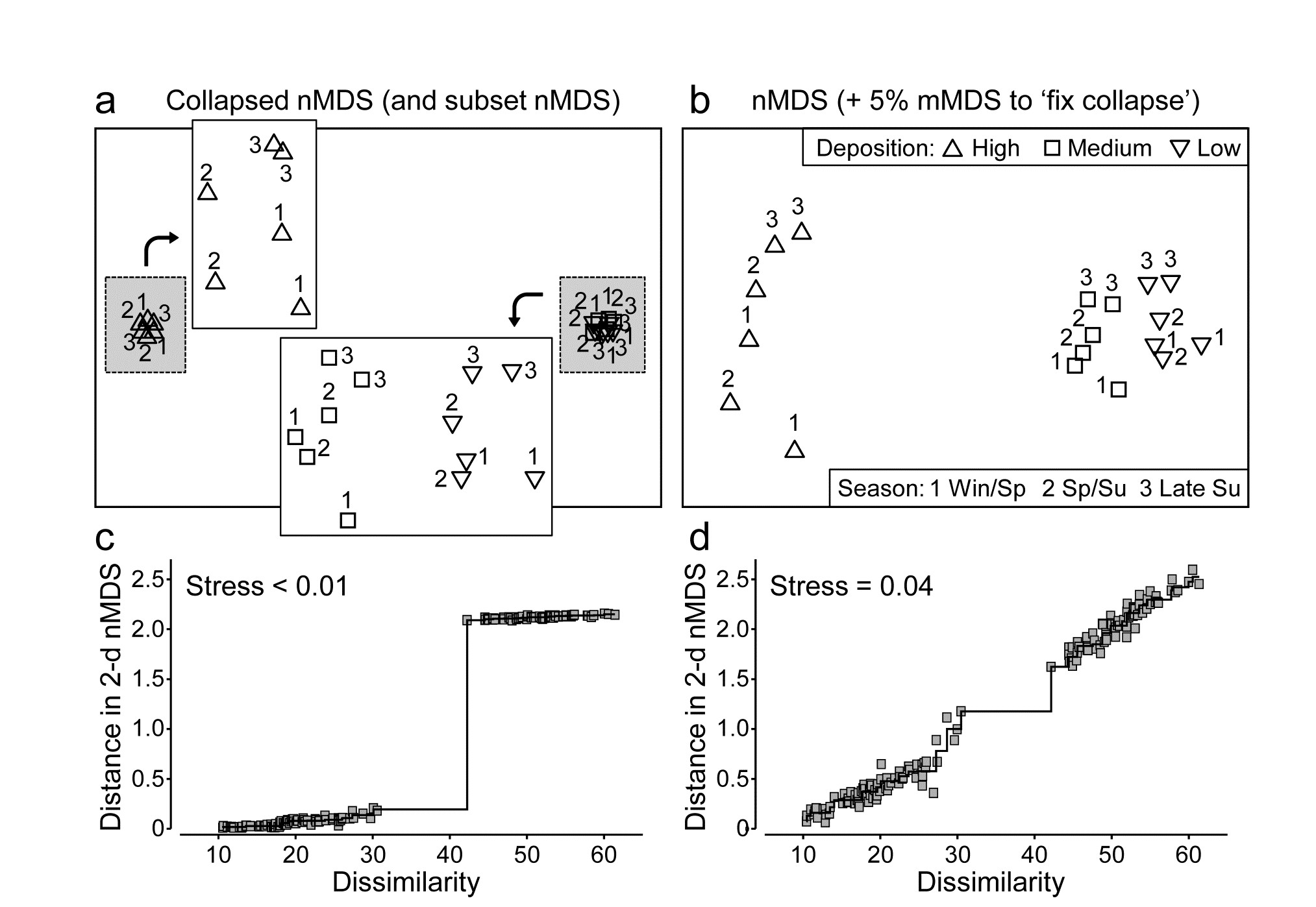
Fig. 5.13. Okura macrofauna {O}. a&c) Collapsed nMDS and associated Shepard plot from Bray-Curtis similarities on averages over 30 samples of log transformed abundances of 73 taxa, for 2 times in each season (1-3: Winter-Spring, Spring-Summer and Late Summer) and 3 levels of sedimentation (High, Medium, Low). Stress$\rightarrow 0$ for collapsed nMDS; subset nMDS plots for H and L/M separately (insets in a) have stress = 0.04, 0.07.
b&d) nMDS for Fix Collapse option (stress defined as mix 0.95$\times$nMDS + 0.05$\times$mMDS), and the Shepard plot for that nMDS, with stress 0.04.
Combining data sets
Another context in which we might want to combine MDS solutions into a single ordination, which optimises their combined stress function, arises when there is no clear way of merging two data sets with exactly the same sample labels (same times, sites, treatments etc) but of very different type. For example, in rocky shores, counts might be made of motile species but area cover of sessile or colonial organisms, and it may be hard to reconcile those two types of measurement in a single array. The classic solution to mixed measurement scales is to normalise variables but this gives each species an equal contribution in defining resemblance, irrespective of their total counts or area cover, and this may be very undesirable (it can add a great deal of ‘noise’ from rare species); it is much better to keep the natural internal weightings for each species. Perhaps the best solution is to convert both matrices onto a common scale (such as biomass or ‘equivalent area cover’) and merge them into a single array, but an alternative worth considering is to run a combined nMDS (an option under PRIMER7) which fits separate Shepard plots for each matrix to common ordination co-ordinates, minimising the average of the two stress values. The result is an equal mix of the two sets of information on sample relationships.
Note that it is inevitable that the resulting stress value will be higher than for either of the separate nMDS ordinations, since it must represent a compromise of two potentially conflicting sets of relationships; it can only come close to the stress in the separate plots if they have effectively identical patterns. (The same is not true of merging the two matrices into a single array, of course, because there the compromise is effected in the calculation of the resemblances).
An example of where a merged matrix is usually not possible but a combined nMDS is a viable solution is where the matrices to combine require very different dissimilarity measures, such as for assemblage counts (e.g. Bray-Curtis) and environmental variables which may be driving those counts (e.g. Euclidean distance). Arguably, there are few convincing examples of why a compromise MDS is a desirable output here (rather than adopting the approach in Chapter 11 that we let the two components ‘speak for themselves’ and then seek variables, or sets of variables, which ‘explain’ the biotic patterns) but an example is given below of the result of a combined MDS, were it to be needed.
¶ This example is taken from the PERMANOVA+ manual, Anderson, Gorley & Clarke (2008) . There, the ‘averages’ are the (theoretically more correct) centroids in the high-dimensional ‘Bray-Curtis space’ from the full 540 samples, i.e. averaging is performed after similarity calculation not before. Whilst data averages are not the same as centroids from dissimilarity space (e.g. an averaged assemblage may not be ‘central’ to individual samples, since it will usually have higher species richness), it is commonly found that the relationship amongst averages can be very similar to the relationship amongst centroids, as is seen here when comparing Fig. 5.13a with the PCO of Fig. 3.13 in Anderson, Gorley & Clarke (2008) .
5.10 Example: Messolongi lagoon diatoms
Danielidis (1991) sampled 17 lagoons in E Central Greece for diatom communities (193 species), and also recorded a suite of 12 water-column variables: temperature, salinity, DO$_2$, pH, PO$_4$, total P, NH$_3$, NO$_2$, NO$_3$, inorganic N and SiO$_2$. After global square root transformations and Bray-Curtis dissimilarities are calculated on the species densities, and selective log transforms (of the nutrients) and Euclidean distances are calculated on the environmental variables, Fig. 5.14a&b display the resulting separate nMDS ordinations. In this case, there is a remarkable degree of uniformity in the way these two independent sets of variables describe the sample patterns, suggesting that the structuring environmental variables for these communities have been correctly identified (and this idea leads into the BEST technique in Chapter 11 for further refinement of ‘structuring variable’ selection). A combined nMDS of the two resemblance matrices is given in Fig. 5.14c. The 2-d stress of 0.13, c.f. 0.09 and 0.08 for the separate biotic and abiotic plots, shows that one must expect an increased stress even when agreement is very good.
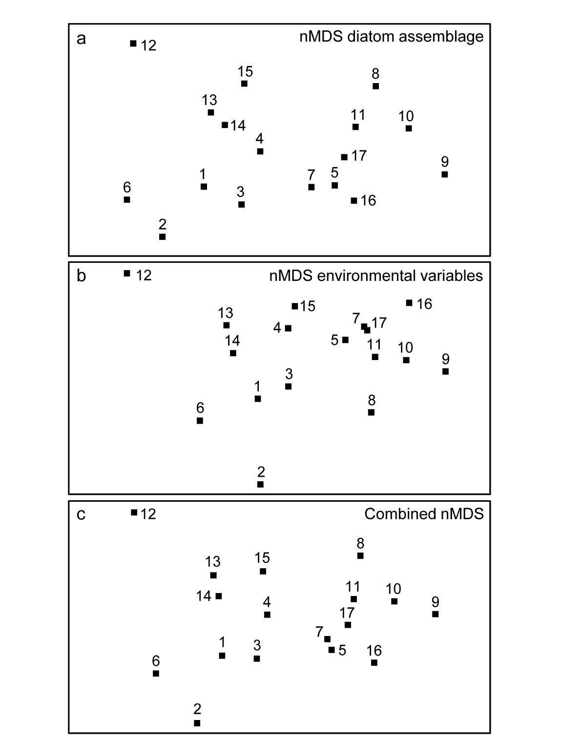
Fig. 5.14. Messolongi diatoms {m}. nMDS plots for17 lagoon sites based on: a) 193 species (from Bray-Curtis dissimilarities), b) 12 water-column variables (normalised Euclidean distances), c) combined nMDS, the configuration simultaneously minimising average stress from the biotic and abiotic Shepard diagrams. Stress: a) 0.09, b) 0.08, c) 0.13.
5.11 Recommendations
- Non-metric MDS can be recommended as the best general ordination technique available (e.g.
Everitt (1978)
). Important early studies comparing ordination methods for community data gave nMDS a high rating (e.g.
Kenkel & Orloci (1986)
) and improvements in computing power since those early studies have made it even more attractive. In comparison with (even) older techniques such as PCA, nMDS has a number of practical advantages stemming from its flexibility and lack of assumptions.
- When the inter-sample relationships are relatively simple, e.g. there are some strong clusters or strong gradient of change across all samples, several ordination methods will perform adequately and give comparable pictures. The main advantage of nMDS is its greater ability, by comparison with projection-based methods such as PCA or PCO to better represent relations accurately in low-dimensional space. It outcompetes its metric form, mMDS, and also PCO, especially in cases where biological coefficients such as Bray-Curtis are used and there is a strong turnover of species across the sites, times, treatments etc, such that a fair number of samples have few or no species in common. Then, the dissimilarity scale becomes strongly compressed in the region of 100% (with many values at 100, perhaps, as can be seen for the Exe Shepard plot in Fig. 5.2) and the ability of the monotonic regression to expand this tight range of dissimilarities to wider-spaced distances is the key to a successful ordination. In contrast, where the Shepard diagram is fairly linear through the origin, nMDS, mMDS and PCO will often produce similar ordinations.
- If the stress is low (say <0.1), an MDS ordination is generally a more useful representation than a cluster analysis: when the samples are strongly grouped the MDS will reveal this anyway, and when there is a more gradual continuum of change, or some interest in the placement of major groups with respect to each other, MDS will display this in a way that a cluster analysis is quite incapable of doing. For higher values of stress, the techniques should be thought of as complementary to each other; neither may present the full picture so the recommendation is to perform both and view them in combination. This may make it clear which points on the MDS are problematic to position (examining some of the local minimum solutions can help here¶, as can animation of the iterative procedure), and an ordination in a higher dimension may prove more consistent with the cluster groupings. Conversely, the MDS plots may make it clear that some groups in the cluster analysis are arbitrary subdivisions of a natural continuum.
¶ For example, run the PRIMER MDS routine several times, with a single random starting position on each occasion, and examine the plots that give a higher stress than the ‘optimal’ one found. In PRIMER7, run the MDS animation for a number of restarts. Also, outliers on the Shepard diagram can be identified by clicking on the appropriate point on the plot.
Chapter 6: Testing for differences between groups of samples
6.1 Univariate tests and multivariate tests
Many community data sets possess some a priori defined structure within the set of samples, for example there may be replicates from a number of different sites (and/or times). A pre-requisite to interpreting community differences between sites should be a demonstration that there are statistically significant differences to interpret.
Univariate tests
When the species abundance (or biomass) information in a sample is reduced to a single index, such as Shannon diversity (see Chapter 8), the existence of replicate samples from each of the groups (sites/times etc.) allows formal statistical treatment by analysis of variance (ANOVA). This requires the assumption that the univariate index is normally distributed and has constant variance across the groups, conditions which are normally not difficult to justify (perhaps after transformation, see Chapter 9). A so-called global test of the null hypothesis (H$ _ o$), that there are no differences between groups, involves computing a particular ratio of variability in the group means to variability among replicates within each group. The resulting F statistic takes values near 1 if the null hypothesis is true, larger values indicating that H$ _ o$ is false; standard tables of the F distribution yield a significance level (p) for the observed F statistic. Broadly speaking, p is interpreted as the probability that the group means we have observed (or a set of means which appear to differ from each other to an even greater extent) could have occurred if the null hypothesis H$_ o$ is actually true.
Fig.6.1 and Table 6.1 provide an illustration, for the 6 sites and 4 replicates per site of the Frierfjord macrofauna samples. The mean Shannon diversity for the 6 sites is seen in Fig.6.1, and Table 6.1 shows that the F ratio is sufficiently high that the probability of observing means as disparate as this by chance is p<0.001 (or p<0.1%), if the true mean diversity at all sites is the same. This is deemed to be a sufficiently unlikely chance event that the null hypothesis can safely be rejected. Convention dictates that values of p<5% are sufficiently small, in a single test, to discount the possibility that H$_ o$ is true, but there is nothing sacrosanct about this figure: clearly, values of p = 4% and 6% should result in the same inference. It is also clear that repeated significance tests, each of which has (say) a 5% possibility of describing a chance event as a real difference, will cumulatively run a much greater risk of drawing at least one false inference. This is one of the (many) reasons why it is not usually appropriate to handle a multi-species matrix by performing an ANOVA on each species in turn. (Further reasons are the complexities of dependence between species and the general inappropriateness of normality assumptions for abundance-type data).
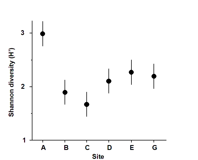
Fig. 6.1. Frierfjord macrofauna {F}. Means and 95% confidence intervals of Shannon diversity (H$^\prime$) at the 6 field sites (A-E, G) shown in Fig. 1.1.
Fig. 6.1 shows the main difference to be a higher diversity at the outer site, A. The intervals displayed are 95% confidence intervals for the true mean diversity at each site; note that these are of equal width because they are based on the assumption of constant variance, that is, they use a pooled estimate of replication variability from the residual mean square in the ANOVA table.
Table 6.1. Frierfjord macrofauna {F}. ANOVA table showing rejection (at a significance level of 0.1%) of the global hypothesis of ‘no site-to-site differences’ in Shannon diversity (H’).
| Sum of squares | Deg. of freedom | Mean Square | F ratio | Sig. level | |
|---|---|---|---|---|---|
| Sites | 3.938 | 5 |
0.788 | 15.1 | < 0.1% |
| Residual | 0.937 | 18 | 0.052 | ||
| Total | 4.874 | 23 |
Further details of how confidence intervals are determined, why the ANOVA F ratio and F tables are defined in the way they are, how one can allow to some extent for the repeated significance tests in pairwise comparisons of site means etc, are not pursued here. This is the ground of basic statistics, covered by many standard texts, for example
Sokal & Rohlf (1981)
, and such computations are available in all general-purpose statistics packages. This is not to imply that these concepts are elementary; in fact it is ironic that a proper understanding of why the univariate F test works requires a level of mathematical sophistication that is not needed for the simple permutation approach to the analogous global test for differences in multivariate structure between groups, outlined below.
Multivariate tests
One important feature of the multivariate analyses described in earlier chapters is that they in no way utilise any known structure among the samples, e.g. their division into replicates within groups. (This is in contrast with Canonical Variate Analysis, for example, which deliberately seeks out ordination axes that, in a certain well-defined sense, best separate out the known groups; e.g. Mardia, Kent & Bibby (1979) ). Thus, the ordination and dendrogram of Fig 6.2, for the Frierfjord macrofauna data, are constructed only from the pairwise similarities among the 24 samples, treated simply as numbers 1 to 24. By superimposing the group (site) labels A to G on the respective replicates it becomes immediately apparent that, for example, the 4 replicates from the outer site (A) are quite different in community composition from both the mid-fjord sites B, C and D and the inner sites E and G. A statistical test of the hypothesis that there are no site-to-site differences overall is clearly unnecessary, though it is less clear whether sufficient evidence exists to assert that B, C and D differ.
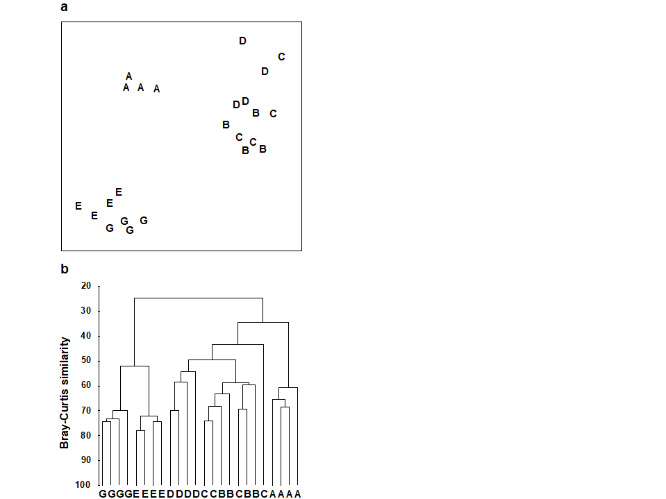
Fig. 6.2 Frierfjord macrofauna {F}. a) MDS plot, b) dendrogram, for 4 replicates from each of the 6 sites (A-E and G), from Bray Curtis similarities computed for $\sqrt{} \sqrt{}$-transformed species abundances (MDS stress = 0.05).
This simple structure of groups, and replicates within groups, is referred to as a 1-way layout, and it was seen above that 1-way ANOVA would provide the appropriate testing framework if the data were univariate (e.g. diversity or total abundance across all species). There is an analogous multivariate analysis of variance (MANOVA, e.g. Mardia, Kent & Bibby (1979) ), in which the F test is replaced by a test known as Wilks’ $\Lambda$, but its assumptions will never be satisfied for typical multi-species abundance (or biomass) data. This is the problem referred to in the earlier chapters on choosing similarities and ordination methods; there are typically many more species (variables) than samples and the probability distribution of counts could never be reduced to approximate (multivariate) normality, by any transformation, because of the dominance of zero values. For example, for the Frierfjord data, as many as 50% of the entries in the species/samples matrix are zero, even after reducing the matrix to only the 30 most abundant species!
A valid test can instead be built on a simple non-parametric permutation procedure, applied to the (rank) similarity matrix underlying the ordination or classification of samples, and therefore termed an ANOSIM test (analysis of similarities)¶, by analogy with the acronym ANOVA (analysis of variance). The history of such permutation tests dates back to the epidemiological work of Mantel (1967) , and this is combined with a general randomization approach to the generation of significance levels ( Hope (1968) ). In the context below, it was described by Clarke & Green (1988) .
¶ The PRIMER ANOSIM routine covers tests for replicates from 1-, 2- and 3-way (nested or crossed) layouts in all combinations. In 2- or 3-way crossed cases without replication, a special form of the ANOSIM routine can still provide a (rather different style of) test; all the possibilities are worked through in this chapter.
6.2 ANOSIM for the one-way layout
Fig.6.3 displays the MDS based only on the 12 samples (4 replicates per site) from the B, C and D sites of the Frierfjord macrofauna data. The null hypothesis (H$_o$) is that there are no differences in community composition at these 3 sites. In order to examine H$_o$, there are 3 main steps:
-
Compute a test statistic reflecting the observed differences between sites, contrasted with differences among replicates within sites. Using the MDS plot of Fig. 6.3, a natural choice might be to calculate the average distance between every pair of replicates within a site, and contrast this with the average distance apart of all pairs of samples corresponding to replicates from different sites. A test could certainly be constructed from these distances but it would have a number of drawbacks.
a) Such a statistic could only apply to a situation in which the method of display was an MDS rather than, say, a cluster analysis.
b) The result would depend on whether the MDS was constructed in two, three or higher dimensions. There is often no ‘correct’ dimensionality and one may end up viewing the picture in several different dimensions – it would be unsatisfactory to generate different test statistics in this way.
c) The configuration of B, C and D replicates in Fig. 6.3 also differs slightly from that in Fig. 6.2a, which includes the full set of sites A-E, G. It is again undesirable that a test statistic for comparing only B, C and D should depend on which other sites are included in the picture.
These three difficulties disappear if the test is based not on distances between samples in an MDS but on the corresponding rank similarities between samples in the underlying triangular similarity matrix. If $\overline{r}_W$ is defined as the average of all rank similarities among replicates within sites, and $\overline{r}_B$ is the average of rank similarities arising from all pairs of replicates between different sites¶, then a suitable test statistic is $$ R = \frac{ \left( \overline{r}_B - \overline{r}_W \right) }{ \frac{1}{2} M} \tag{6.1} $$ where M = n(n–1)/2 and n is the total number of samples under consideration. Note that the highest similarity corresponds to a rank of 1 (the lowest value), following the usual mathematical convention for assigning ranks.
The denominator constant in equation (6.1) has been chosen so that:
a) R can never technically lie outside the range (-1,1);
b) R = 1 only if all replicates within sites are more similar to each other than any replicates from different sites;
c) R is approximately zero if the null hypothesis is true, so that similarities between (among¶) and within sites will be the same on average.
R will usually fall between 0 and 1, indicating some degree of discrimination between the sites. R substantially less than zero is unlikely since it would correspond to similarities across different sites being higher than those within sites; such an occurrence is more likely to indicate an incorrect labelling of samples.† The R statistic itself is a very useful comparative measure of the degree of separation of sites§, and its value is at least as important as its statistical significance, and arguably more so. As with standard univariate tests, it is perfectly possible for R to be significantly different from zero yet inconsequentially small, if there are many replicates at each site.
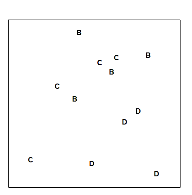
Fig. 6.3. Frierfjord macrofauna {F}. MDS ordination as for Fig. 6.2 but computed only from the similarities involving sites B, C and D (stress = 0.11).
-
Recompute the statistic under permutations of the sample labels. Under the null hypothesis H$ _ o$: ‘no difference between sites’, there will be little effect on average to the value of R if the labels identifying which replicates belong to which sites are arbitrarily rearranged; the 12 samples of Fig. 6.3 are just replicates from a single site if H$ _ o$ is true. This is the rationale for a permutation test of H$ _ o$; all possible allocations of four B, four C and four D labels to the 12 samples are examined and the R statistic recalculated for each. In general there are
$$ \left( kn \right) ! / \left[ \left( n! \right)^k k! \right] \tag{6.2}$$
distinct ways of permuting the labels for n replicates at each of k sites, giving 5775 permutations here. It is computationally possible to examine this number of re-labellings but the scale of calculation can quickly get out of hand with modest increases in replication, so the full set of permutations is randomly sampled (usually with replacement) to give the null distribution of R. In other words, the labels in Fig. 6.3 are randomly reshuffled, R recalculated and the process repeated a large number of times (T).
- Calculate the significance level by referring the observed value of R to its permutation distribution. If H$ _ o$ is true, the likely spread of values of R is given by the random rearrangements, so that if the true value of R looks unlikely to have come from this distribution there is evidence to reject the null hypothesis. Formally (as seen for the earlier SIMPROF test), if only t of the T simulated values of R are as large (or larger than) the observed R then H$_o$ can be rejected at a significance level of (t+1)/(T+1), or in percentage terms, 100(t+1)/(T+1)%.
¶ There is an interesting semantic difference here between US and British English, which has occasionally caused confusion in the literature! Here ‘between groups’ can imply between several groups and not just two (see Fowler’s Modern English Usage) whereas US usage always prefers ‘among groups’ in that context.
† Chapman & Underwood (1999) point out some situations in which negative R values (though not necessarily significantly negative) do occur in practice, when the community is species- poor and individuals have a heavily clustered spatial distribution, so that variability within a group is extreme. It usually also requires a design failure, e.g. a major stratifying factor (a differing substrate, say) is encompassed within each group but its effect is ignored in the analysis.
§ As was seen when assessing relative magnitude of competing group divisions in divisive cluster analysis, in Chapter 3.
6.3 Example: Frierfjord macrofauna
The rank similarities underlying Fig. 6.3 are shown in Table 6.2 (note that these are the similarities involving only sites B, C and D, extracted from the matrix for all sites and re-ranked). Averaging across the 3 diagonal sub-matrices (within groups B, C and D) gives $\overline{r}_W = 22.7$, and across the remaining (off-diagonal) entries gives $\overline{r}_B = 37.5$. Also $n = 12$ and $M = 66$, so that $R = 0.45$. In contrast, the spread of R values possible from random re-labelling of the 12 samples can be seen in the histogram of Fig. 6.4: the largest of $T = 999$ simulations is less than 0.45 ($t = 0$). An observed value of $R = 0.45$ is seen to be a most unlikely event, with a probability of less than 1 in a 1000 if H$_o$ is true, and we can therefore reject H$_o$ at a significance level of p<0.1% (at least, because $R = 0.45$ may still have been the most extreme outcome observed had we chosen an even larger number of permutations. If it is the most extreme of all 5775 – it will be one of them – then p = 100(1/5775) = 0.02%).
Table 6.2. Frierfjord macrofauna {F}. Rank similarity matrix for the 4 replicates from each of B, C and D, i.e. C3 and C4 are the most, and B1 and C1 the least, similar samples.
| B1 | B2 | B3 | B4 | C1 | C2 | C3 | C4 | D1 | D2 | D3 | D4 | |
|---|---|---|---|---|---|---|---|---|---|---|---|---|
| B1 | – | |||||||||||
| B2 | 33 | – | ||||||||||
| B3 | 8 | 7 | – | |||||||||
| B4 | 22 | 11 | 19 | – | ||||||||
| C1 | 66 | 30 | 58 | 65 | – | |||||||
| C2 | 44 | 3 | 15 | 28 | 29 | – | ||||||
| C3 | 23 | 16 | 5 | 38 | 57 | 6 | – | |||||
| C4 | 9 | 34 | 4 | 32 | 61 | 10 | 1 | – | ||||
| D1 | 48 | 17 | 42 | 56 | 37 | 55 | 51 | 62 | – | |||
| D2 | 14 | 20 | 24 | 39 | 52 | 46 | 35 | 36 | 21 | – | ||
| D3 | 59 | 49 | 50 | 64 | 54 | 53 | 63 | 60 | 43 | 41 | – | |
| D4 | 40 | 12 | 18 | 45 | 47 | 27 | 26 | 31 | 25 | 2 | 13 | – |
Pairwise tests
The above is a global test, indicating that there are site differences somewhere that may be worth examining further. Specific pairs of sites can then be compared: for example, the similarities involving only sites B and C are extracted, re-ranked and the test procedure repeated, giving an R value of 0.23. This time there are only 35 distinct relabellings so, under the null hypothesis H$ _ o$ that sites B and C do not differ, the full permutation distribution of possible values of R can be computed; 12% of these values are equal to or larger than 0.23 so H$ _ o$ cannot be rejected. By contrast, R = 0.54 for the comparison of B against D, which is the most extreme value possible under the 35 permutations. B and D are therefore inferred to differ significantly at the p< 3% level. For C against D, R = 0.57 similarly leads to rejection of the null hypothesis (p<3%).
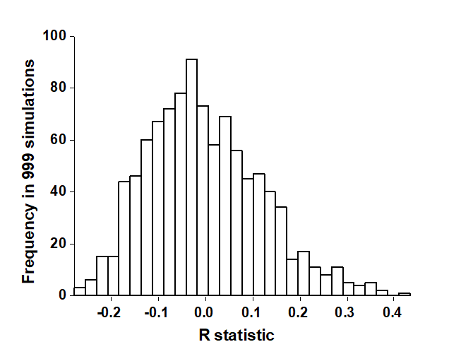
Fig. 6.4. Frierfjord macrofauna {F}. Permutation distribution of the test statistic R (equation 6.1) under the null hypothesis of ‘no site differences’; this contrasts with an observed value for R of 0.45.
There is a danger in such repeated significance tests which should be noted (although rather little can be done to ameliorate it here). To reject the null hypothesis at a significance level of 3% implies that a 3% risk is being run of drawing an incorrect conclusion (a Type I error in statistical terminology). If many such tests are performed this risk will cumulate. For example, all pairwise comparisons between 10 sites, each with 4 replicates (allowing 3% level tests at best), would involve 45 tests, and the overall risk of drawing at least one false conclusion is high. For the analogous pairwise comparisons following the global F test in a univariate ANOVA, there exist multiple comparison tests which attempt to adjust for this repetition of risk. One straightforward possibility, which could be carried over to the present multivariate test, is a Bonferroni correction. In its simplest form, this demands that, if there are n pairwise comparisons in total, each test uses a significance level of 0.05/n. The so-called experiment-wise Type I error, the overall probability of rejecting the null hypothesis at least once in the series of pairwise tests, when there are no genuine differences, is then kept to 0.05.
However, the difficulty with such a Bonferroni correction is clear from the above example: with only 4 replicates in each group, and thus only 35 possible permutations, a significance level of 0.05/3 (=1.7%) can never be achieved! It may be possible to plan for a modest improvement in the number of replicates: 5 replicates from each site would allow a 1% level test for a pairwise comparison, equation (6.2) showing that there are then 126 permutations, and two groups of 6 replicates would give close to a 0.2% level test. However, this may not be realistic in some practical contexts, or it may be inefficient to concentrate effort on too many replicates at one site, rather than (say) increasing the spatial coverage of sites. Also, for a fixed number of replicates, a too demandingly low Type I error (significance level) will be at the expense of a greater risk of Type II error, the probability of not detecting a difference when one genuinely exists.
Strategy for interpretation
The solution, as with all significance tests, is to treat them in a more pragmatic way, exercising due caution in interpretation certainly, but not allowing the formality of a test procedure for pairwise comparisons to interfere with the natural explanation of the group differences. Herein lies the real strength of defining a test statistic, such as R, which has an absolute interpretation of its value†. This is in contrast to a standard Z-type statistic, which typically divides an appropriate measure (taking the value zero under the null hypothesis) by its standard deviation, so that interpretation is limited purely to statistical significance of the departure from zero.
The recommended course of action, for a case such as the above Frierfjord data, is therefore always to carry out, and take totally seriously, the global ANOSIM test for overall differences between groups. Usually the total number of replicates, and thus possible permutations, is relatively large, and the test will be reliable and informative. If it is not significant, then generally no further interpretation is permissible. If it is significant, it is legitimate to ask where the main between-group differences have arisen. The best tool for this is an examination of the R value for each pairwise comparison: large values (close to unity) are indicative of complete separation of the groups, small values (close to zero) imply little or no segregation. If the MDS is of sufficiently low stress to give a reliable picture, then the relative group separations will also be evident from this.¶ The R value itself is not unduly affected by the number of replicates in the two groups being compared; this is in stark contrast to its statistical significance, which is dominated by the group sizes (for large numbers of replicates, R values near zero could still be deemed ‘significant’, and conversely, few replicates could lead to R values close to unity being classed as ‘non-significant’).
The analogue of this approach in the univariate case (say in the comparison of species richness between sites) would be firstly to compute the global F test for the ANOVA. If this establishes that there are significant overall differences between sites, the size of the effects would be ascertained by examining the differences in mean values between each pair of sites, or equivalently, by simply looking at a plot of how the mean richness varies across sites (usually without the replicates also shown). It is then immediately apparent where the main differences lie, and the interpretation is a natural one, emphasising the important biological features (e.g. absolute loss in richness is 5, 10, 20 species, or relative loss is 5%, 10%, 20% of the species pool, etc), rather than putting the emphasis solely on significance levels in pairwise comparisons of means that run the risk of missing the main message altogether.
So, returning to the multivariate data of the above Frierfjord example, interpretation of the ANOSIM tests is seen to be straightforward: a significant level (p<0.1%) and a mid-range value of R (= 0.45) for the global test of sites B, C and D establishes that there are statistically significant differences between these sites. Similarly mid-range values of R (slightly higher, at 0.54 and 0.57) for the B v D and C v D comparisons, contrasted with a much lower value (of 0.27) for B v C, imply that the explanation for the global test result is that D differs from both B and C, but the latter sites are not distinguishable.
The above discussion has raised the issue of Type II error for an ANOSIM permutation test, and the complementary concept, that of the power of the test, namely the probability of detecting a difference between groups when one genuinely exists. Ideas of power are not easily examined for non-parametric procedures of this type, which make no distributional assumptions and for which it is difficult to specify a precise non-null hypothesis. All that can be obviously said in general is that power will improve with increasing replication, and some low levels of replication should be avoided altogether. For example, if comparing only two groups with a 1-way ANOSIM test, based on only 3 replicates for each group, then there are only 10 distinct permutations and a significance level better than 10% could never be attained. A test demanding a significance level of 5% would then have no power to detect a difference between the groups, however large that difference is!
Generality of application
It is evident that few, if any, assumptions are made about the data in constructing the 1-way ANOSIM test, and it is therefore very generally applicable. It is not restricted to Bray-Curtis similarities or even to similarities computed from species abundance data: it could provide a non-parametric alternative to Wilks’ $\Lambda$ test for data which are more nearly multivariate-normally distributed, e.g. for testing whether groups (sites or times) can be distinguished on the basis of their environmental data (see Chapter 11). The latter would involve computing a Euclidean distance matrix between samples (after suitable transformation and normalising of the environmental variables) and entry of this distance matrix to the ANOSIM procedure. Clearly, if multivariate normality assumptions are genuinely justified then the ANOSIM test must lack sensitivity in comparison with standard MANOVA, but this would seem to be more than compensated for by its greater generality.
Note also that there is no restriction to a balanced number of replicates. Some groups could even have only one replicate provided enough replication exists in other groups to generate sufficient permutations for the global test (though there will be a sense in which the power of the test is compromised by a markedly unbalanced design, here as elsewhere). More usefully, note that no assumptions have been made about the variability of within-group replication needing to be similar for all groups. This is seen in the following example, for which the groups in the 1-way layout are not sites but samples from different years at a single site.
† A standard correlation coefficient, r, would be another example, like ANOSIM R, of a statistic which is both a test statistic (for the null hypothesis of absence of correlation, r = 0) and which has an interpretation as an effect size (large r is strong correlation).
¶ But the comparison of ANOSIM R values is the more generally valid approach, e.g. when the two descriptions do not appear to be showing quite the same thing. Calculation of R is in no way dependent on whether the 2-dimensional approximation implicit in an MDS is satisfactory or not, since R is computed from the underlying, full-dimensional similarity matrix.
6.4 Example: Indonesian reef-corals
Warwick, Clarke & Suharsono (1990) examined data from 10 replicate transects across a single coral-reef site in S. Tikus Island, Thousand Islands, Indonesia, for each of the six years 1981, 1983, 1984, 1985, 1987 and 1988. The community data are in the form of % cover of a transect by each of the 75 coral species identified, and the analysis used Bray-Curtis similarities on untransformed data to obtain the MDS of Fig. 6.5. There appears to be a strong change in community pattern between 1981 and 1983 (putatively linked to the 1982/3 El Niño) and this is confirmed by a 1-way ANOSIM test for these two years alone: R = 0.43 (p< 0.1%). Note that, though not really designed for this situation, the test is perfectly valid in the face of greater variability in 1983 than 1981; in fact it is mainly a change in variability rather than location in the MDS plot that distinguishes the 1981 and 1983 groups (a point returned to in Chapter 15).¶ This is in contrast with the standard univariate ANOVA (or multivariate MANOVA) test, which will have no power to detect a variability change; indeed it is invalid without an assumption of approximately equal variances (or variance-covariance matrices) across the groups.

Fig. 6.5. Indonesian reef corals, S. Tikus Island {I}. MDS of % species cover from 10 replicate transects in each of 6 years: 1 = 1981, 3 = 1983 etc (stress = 0.19).
The basic 1-way ANOSIM test can also be extended to cater for more complex sample designs. Firstly we consider the basic types of 2-factor designs (and later move on to look at 3-factor combinations).
¶ Of course it could equally be argued that, as with any portmanteau test, this is a drawback rather than an advantage of ANOSIM. The price for being able to detect changes of different types is arguably a loss of specificity in interpretation, in cases where it is important to ascribe differences solely to a shift in the ‘mean’ community rather than variation changes. The key point here is that ANOSIM tests the hypothesis of no difference among groups in any way, either (multivariate) location or dispersion. It has more power to detect a location shift than a dispersion difference because of its construction, but a sufficiently large change in either between groups can lead to significance – this is very different than the PERMANOVA test which is constructed to be a test only of location, and assumes constant dispersion. An issue for the latter is how sensitive it is to this assumption, and recent simulation work, Anderson & Walsh (2013) , suggests it is not.
6.5 ANOSIM for two-way layouts
Three types of field and laboratory designs are considered here:
a) the 2-way nested case can arise where two levels of spatial replication are involved, e.g. sites are grouped a priori to be representative of two ‘treatment’ categories (control and polluted, say) but there are also replicate samples taken within sites;
b) the 2-way crossed case can arise from studying a fixed set of sites at several times (with replicates at each site/time combination), or from an experimental study in which the same set of ‘treatments’ (e.g. control and impact) are applied at a number of locations (‘blocks’), for example in the different mesocosm basins of a laboratory experiment, or of course many other combinations of two factors;
c) a 2-way crossed case with no replication of each treatment/block combination can also be catered for, to a limited extent, by a different style of permutation test.
The following examples of cases a) and b) are drawn from Clarke (1993) and the two examples of case c) are from Clarke & Warwick (1994) .
6.6 Example: Clyde nematodes (2-way nested case)
Lambshead (1986) analysed meiobenthic communities from three putatively polluted (P) areas of the Firth of Clyde and three control (C) sites, taking three replicate samples at each site (with one exception). The resulting MDS, based on fourth-root transformed abundances of the 113 species in the 16 samples, is given in Fig. 6.6a. The sites are numbered 1 to 3 for both conditions but the numbering is arbitrary – there is nothing in common between P1 and C1 (say). This is what is meant by sites being ‘nested within conditions’. Two hypotheses are then appropriate:
H1: there are no differences among sites within each treatment (control or polluted conditions);
H2: there are no differences between control and polluted conditions.
The approach to H2 might depend on the outcome of testing H1.
H1 can be examined by extending the 1-way ANOSIM test to a constrained randomisation procedure. The presumption under H1 is that there may be a difference between general location of C and P samples in the multivariate space (as approximately viewed in the MDS plot) but within each condition there cannot be any pattern in allocation of replicates to the three sites. Treating the two conditions entirely separately, one therefore has two separate 1-way permutation analyses of exactly the same type as for the Frierfjord macrofauna data (Fig. 6.3). These generate test statistics $R_C$ and $R_P$, computed from equation (6.1), which can be combined to produce an average statistic $\overline{R}$. This can be tested by comparing it with $\overline{R}$ values from all possible permutations of sample labels permitted under the null hypothesis. This does not mean that all 16 sample labels may be arbitrarily permuted; the randomisation is constrained to take place only within the separate conditions: P and C labels may not be switched. Even so, the number of possible permutations is large (around 20,000).
Notice again that the test is not restricted to balanced designs, i.e. those with equal numbers of replicate samples within sites and/or equal numbers of sites within treatments (although lack of balance causes a minor complication in the efficient averaging of $R_C$ and $R_P$, see Clarke (1988) and Clarke (1993) ). Fig. 6.6b displays the results of 999 simulations (constrained relabellings) from the permutation distribution for $\overline{R}$ under the null hypothesis H1. Possible values range from –0.3 to 0.6, though 95% of the values are seen to be <0.27 and 99% are <0.46. The observed $\overline{R}$ of 0.75 therefore provides a strongly significant rejection of hypothesis H1.

Fig. 6.6. Clyde nematodes {Y}. a) MDS of species abundances from three polluted (P1-P3) and three control sites (C1–C3), with three replicate samples at most sites (stress = 0.09). b) Simulated distribution of the test statistic $\overline{R}$ under the hypothesis H1 of ‘no site differences’ within each condition; the observed $\overline{R}$ is 0.75.
H2, which will usually be the more interesting of the two hypotheses, can now be examined. The test of H1 demonstrated that there are, in effect, only three genuine replicates (the sites 1-3) at each of the two conditions (C and P).
This is a 1-way layout, and H2 can be tested by 1-way ANOSIM but one first needs to combine the information from the three original replicates at each site, to define a similarity matrix for the 6 new ‘replicates’. Consistent with the overall strategy that tests should only be dependent on the rank similarities in the original triangular matrix, averages are first taken over the appropriate ranks to obtain a reduced matrix. For example, the similarity between the three P1 and three P2 replicates is defined as the average of the nine inter-group rank similarities; this is placed into the new similarity matrix along with the 14 other averages (C1 with C2, P1 with C1 etc) and all 15 values are then re-ranked; the 1-way ANOSIM then gives R = 0.74. There are only 10 distinct permutations so that, although this is actually the most extreme R value possible in this case, H2 is only able to be rejected at a p<10% significance level.
The other scenario to consider is that the first test fails to reject H1. There are then two possibilities for examining H2:
a) Proceed with the average ranking and re-ranking exactly as above, on the assumption that even if it cannot be proved that there are no differences between sites it would be unwise to assume that this is so; the test may have had rather little power to detect such a difference.
b) Infer from the test of H1 that there are no differences between sites, and treat all replicates as if they were separate sites, e.g. there would be 7 replicates for control and 9 replicates for polluted conditions in a 1-way ANOSIM test applied to the 16 samples in Fig. 6.6a.
Which of these two courses to take is a matter for debate, and the argument here is exactly that of whether “to pool or not to pool” in forming the residual for the analogous univariate 2-way ANOVA. Option b) will certainly have greater power but runs a real risk of being invalid; option a) is the conservative test and it is certainly unwise to design a study with anything other than option a) in mind.¶
¶ Note that the ANOSIM program in the PRIMER package always takes the first of these options, so if the second option is required the resemblance matrix needs to be put through ANOSIM again, this time as a 1-factor design with the combined factor of condition and site (6 levels, C1, C2, C3, P1, P2, P3 and 3 replicates within most of these levels).
6.7 Example: Eaglehawk Neck meiofauna (two-way crossed case)
An example of a two-way crossed design is given in Warwick, Clarke & Gee (1990) and is introduced more fully here in Chapter 12. This is a so-called natural experiment, studying disturbance effects on meiobenthic communities by the continual reworking of sediment by soldier crabs. Two replicate samples were taken from each of four disturbed patches of sediment, and from adjacent undisturbed areas, on a sand flat at Eaglehawk Neck, Tasmania; Fig. 6.7a is a schematic representation of the 16 sample locations. There are two factors: the presence or absence of disturbance by the crabs and the ‘block effect’ of the four different disturbance patches. It might be anticipated that the community will change naturally across the sand flat, from block to block, and it is important to be able to separate this effect from any changes associated with the disturbance itself. There are parallels here with impact studies in which pollutants affect sections of several bays, so that matched control and polluted conditions can be compared against a background of changing community pattern across a wide spatial scale. There are presumed to be replicate samples from each treatment/block combination (the meaning of the term crossed), though balanced numbers are not essential.
For the Eaglehawk Neck data, Fig. 6.7b displays the MDS for the 16 samples (2 treatments $\times$ 4 blocks $\times$ 2 replicates), based on Bray-Curtis similarities from root-transformed abundances of 59 meiofaunal species. The pattern is remarkably clear and a classic analogue of what, in univariate two-way ANOVA, would be called an additive model. The meiobenthic community is seen to change from area to area across the sand flat but also appears to differ consistently between disturbed and undisturbed conditions. A test for the latter sets up a null hypothesis that there are no disturbance effects, allowing for the fact that there may be block effects, and the procedure is then exactly that of the 2-way ANOSIM test for hypothesis H1 of the nested case. For each separate block an R statistic is calculated from equation (6.1), as if for a simple one-way test for a disturbance effect, and the resulting values averaged to give $\overline{R}$. Its permutation distribution under the null hypothesis is generated by examining all simultaneous re-orderings of the four labels (two disturbed, two undisturbed) within each block. There are only three distinct permutations in each block, giving a total of $3^4$ (= 81) combinations overall and the observed value of $\overline{R}$ (= 0.94) is the highest value attained in the 81 permutations. The null hypothesis is therefore rejected at a significance level of just over 1%.
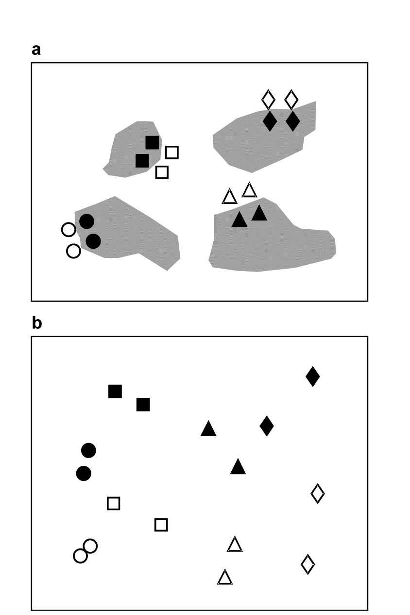
Fig. 6.7. Tasmania, Eaglehawk Neck {T}. a) Schematic of the ‘2-way crossed’ sampling design for 16 meiofaunal cores with two disturbed and two undisturbed replicates from each of four patches of burrowing activity by soldier crabs (shaded). b) MDS of species abundances for the 16 samples, showing separation of the blocks on the x-axis and discrimination of disturbed from undisturbed communities on the y-axis (stress = 0.11).
The procedure departs from the nested case because of the symmetry in the crossed design. One can now test the null hypothesis that there are no block effects, allowing for the fact that there are treatment (disturbance) differences, by simply reversing the roles of treatments and blocks. $\overline{R}$ is now an average of two R statistics, separately calculated for disturbed and undisturbed samples, and there are $8!/[(2!)^4 4!] = 105$ permutations of the 8 labels for each treatment. A random selection from the $105^2 = 11,025$ possible combinations must therefore be made. In 1000 trials the true value of $\overline{R}$ (=0.85) is again the most extreme and is almost certainly the largest in the full set; the null hypothesis is decisively rejected. In this case the test is inherently uninteresting but in other situations (e.g. a sites $\times$ times study) tests for both factors could be of practical importance.
6.8 Example: Mesocosm experiment (two-way crossed case with no replication)
Although the above test may still function if a few random cells in the 2-way layout have only a single replicate, its success depends on reasonable levels of replication overall to generate sufficient permutations. A commonly arising situation in practice, however, is where the 2-way design includes no replication at all.¶ Typically this could be a sites $\times$ times field study (see next section) but it may also occur in experimental work: an example is given by Austen & Warwick (1995) of a laboratory mesocosm study in which a complex array of treatments was applied to soft-sediment cores taken from a single, intertidal location in the Westerschelde estuary, Netherlands, {w}. A total of 64 cores were randomly divided between 4 mesocosm basins, 16 to a basin.
The experiment involved 15 different nutrient enrichment conditions and one control, the treatments being applied to the surface of the undisturbed sediment cores. After 16 weeks controlled exposure in the mesocosm environment, the meiofaunal communities in the 64 cores were identified, and Bray-Curtis similarities on root-transformed abundances gave the MDS of Fig. 6.8. The full set of 16 treatments was repeated in each of the 4 basins (blocks), so the structure is a 2-way treatments $\times$ blocks layout with only one replicate per cell. Little, if any, of this structure is apparent from Fig. 6.8 and a formal test of the null hypothesis
H$_o$: there are no treatment differences (but allowing the possibility of basin effects)
is clearly necessary before any sort of interpretation is attempted.
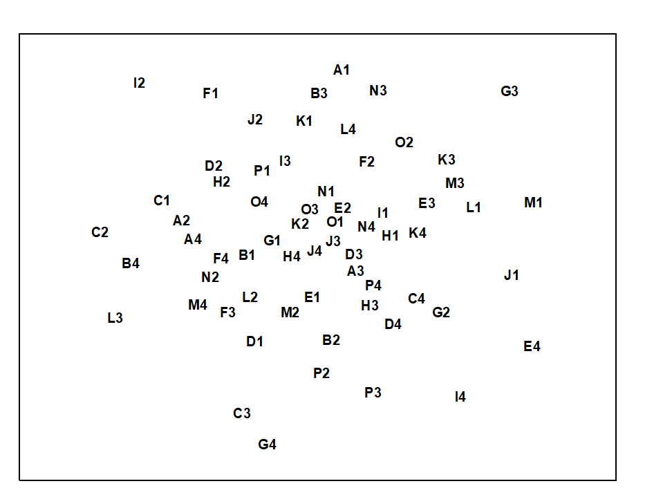
Fig. 6.8. Westerschelde nematodes experiment {w}. MDS of species abundances from 16 different nutrient-enrichment treatments, A to P, applied to sediment cores in each of four mesocosm basins, 1 to 4 (stress = 0.28).
In the absence of replication, a test is still possible in the univariate case, under the assumption that interaction effects are small in relation to the main treatment or block differences ( Scheffe (1959) . In a similar spirit, a global test of H$ _ o$ is possible here, relying on the observation that if certain treatments are responsible for community changes, in a more-or-less consistent way across blocks, separate MDS analyses for each block should show a repeated treatment pattern. This is illustrated schematically in the top half of Fig. 6.9: the fact that treatment A is consistently close to B (and C to D) can only arise if H$_ o$ is false. The analogy with the univariate test is clear: large interaction effects imply that the treatment pattern differs from block to block and there is little chance of identifying a treatment effect; on the other hand, for a treatment $\times$ block design such as the current mesocosm experiment there is no reason to expect treatments to behave very differently in the different basins.
 Fig. 6.9. Schematic diagram illustrating the stages in defining concordance of treatment patterns across the blocks, and the two computational routes for$\rho _ {av}$.
What is therefore required is a measure of how well the treatment patterns in the ordinations for the different blocks match; this statistic can then be recomputed under all possible (or a random subset of) permutations of the treatment labels within each block. As previously, if the observed statistic does not fall within the body of this permutation distribution there is significant evidence to reject H$_o$. Note that, as required by the statement of H$_o$, the test makes no assumption about the absence of block effects; between-block similarities are irrelevant to a statistic based only on agreement in within-block patterns.
In fact, for the same reasons advanced for the previous ANOSIM tests (e.g. arbitrariness in choice of MDS dimensionality), it is more satisfactory to define agreement between treatment patterns by reference to the underlying similarity matrix and not the MDS locations. Fig. 6.9 indicates two routes, which lead to equivalent formulations. If there are n treatments and thus N = n(n–1)/2 similarities within a block, a natural choice for agreement of two blocks, j and k, is the Spearman correlation coefficient†
$$ \rho _ {jk} = 1 - \frac {6}{N (N^2 -1)} \sum _ {i=1} ^ N (r_ {ij} - r _ {ik})^2 \tag{6.3} $$
between the matching elements of the two rank similarity matrices {rij, rik; i=1,…,N}, since these ranks are the only information used in successful MDS plots. The coefficients can be averaged across all b(b–1)/2 pairs from the b blocks, to obtain an overall measure of agreement $\rho _ {av}$ on which to base the test. A short cut is to define, from the row totals {$r_ i.$} and grand total $r _{..}$ shown in Fig. 6.9, Kendall's coefficient of concordance ( Kendall (1970) )between the full set of ranks:
$$ W = \frac {12}{b^2 N (N^2 -1)} \sum _ {i=1} ^ N \left( r_ {i.} - \frac{r _ {..}}{N} \right)^2 \tag{6.4} $$
and then exploit the known relationship between this and $\rho _ {av}$:
$$ \rho_{av} = \left( bW - 1 \right) / \left( b - 1 \right) \tag{6.5} $$
As a correlation coefficient, $\rho _ {av}$ takes values in the range (–1, 1), with $ \rho_{av} = 1$ implying perfect agreement and $ \rho_{av} \approx 0$ if the null hypothesis H$_ o$ is true.

Fig. 6.10. Westerschelde nematodes experiment {w}. MDS for the 16 treatments (A to P), performed separately for each of the four basins; no shared treatment pattern is apparent (stress ranges from 0.16 to 0.20).
Note that standard significance tests and confidence intervals for $\rho$ or W (e.g. as given in basic statistical tables) are totally invalid, since they rely on the ranks {$r_{ij}$; i=1,…,N} being from independent variables. This is obviously not true of similarity coefficients from all possible pairs of a set of samples – the samples will be independent but they are repeatedly re-used in calculating the similarities. This does not make $\rho _ {av}$ any the less appropriate, however, as a measure of agreement whose departure from zero (rejection of H$_ o$) is testable by permutation.
For the nutrient enrichment experiment, Fig. 6.10 shows the separate MDS plots for the 4 mesocosm basins. Although the stress values are rather high (and the plots therefore slightly unreliable as a summary of the among treatment relationships), there appears to be no commonality of pattern, and this is borne out by a near zero value for $\rho _ {av}$ of –0.03. This is central to the range of permuted values for $\rho _ {av}$ under H$ _ o$ (obtained by permuting treatment labels separately for each block and recomputing $\rho _ {av}$), so the test provides no evidence of any treatment differences. Note that the symmetry of the 2-way layout also allows a test of the (less interesting) hypothesis that there are no block effects, by looking for any consistency in the among-basin relationships across separate analyses for each of the 16 treatments. The test is again non-significant, with $\rho _ {av} = –0.02$. The negative conclusion to the tests should bar any further attempts at interpretation.
¶ PRIMER 7’s ANOSIM routine automatically switches to attempting the test described here if it finds no replicates to permute. The test will not work for actual or effective 1-way layouts (this is no surprise since univariate ANOVA is powerless to conclude anything if there are no replicates, e.g. in each of 4 treatments it is clearly a silly question to ask: ‘Are the responses 5, 3, 12, 10 different or not?’ if there is no way of assessing the variability in a single number!). But for 2- or 3-factor crossed designs without replication, with enough levels in the tested factor, the test automatically reverts to the correlation method here.
† We will return to this very important concept of a non-parametric matrix (or Mantel) correlation between two resemblance matrices later: it is also at the core of several later Chapters (e.g. 11, 15, 16).
6.9 Example: Exe nematodes (no replication and missing data)
A final example demonstrates a positive outcome to such a test, in a common case of a 2-way layout of sites and times with the additional feature that samples are missing altogether from a small number of cells. Fig. 6.11 shows again the MDS, from Chapter 5, of nematode communities at 19 sites in the Exe estuary.
Fig. 6.11. Exe estuary nematodes {X}. MDS, for 19 inter-tidal sites, of species abundances averaged over 6 bi-monthly sampling occasions; see also Fig.5.1 (stress = 0.05).
In fact, this is based on an average of data over six successive bi-monthly sampling occasions. For the individual times, the samples remain strongly clustered into the 4 or 5 main groups apparent from Fig. 6.11. Less clear, however, is whether any structure exists within the largest group (sites 12 to 19) or whether their scatter in Fig. 6.11 is just sampling variation.
Rejection of the null hypothesis of ‘no site differences’ would be suggested by a common site pattern in the separate MDS plots for the 6 times (Fig. 6.12). At some of the times, however, one of the site samples is missing (site 19 at times 1 and 2, site 15 at time 4 and site 18 at time 6). Instead of removing these sites from all plots, in order to achieve matching sets of similarities, one can remove for each pair of times only those sites missing for either of that pair, and compute the Spearman correlation $\rho$ between the remaining rank similarities. The $\rho$ values for all pairs of times are then averaged to give $\rho_{av}$, i.e. the left-hand route is taken in the lower half of Fig. 6.9. This is usually referred to as pairwise removal of missing data, in contrast to the listwise removal that would be needed for the right-hand route. Though increasing the computation time, pairwise removal clearly utilises more of the available information.
Fig. 6.12 shows evidence of a consistent site pattern, for example in the proximity of sites 12 to 14 and the tendency of site 15 to be placed on its own; the fact that site 15 is missing on one occasion does not undermine this perceived structure. Pairwise computation gives $\rho _ {av} = 0.36$ and its significance can be determined by a permutation test, as before. The (non-missing) site labels are permuted amongst the available samples, separately for each time, and these designations fixed whilst all the paired $\rho$ values are computed (using pairwise removal) and averaged. Here the, largest such $\rho _ {av}$ value in 999 simulations was 0.30, so the null hypothesis is rejected at the p<0.1% level.
In the same way, one can also carry out a test of the hypothesis that there are no differences across time for sites 12 to 19. The component plots, of the 4 to 6 times for each site, display no obvious features and $\rho_{av}$= 0.08 (p<18%). The failure to reject this null hypothesis justifies the use of averaged data across the 6 times, in the earlier analyses, and could even be thought to justify use of times as ‘replicates’ for sites in a 1-way ANOSIM test for sites.
Tests of this form, searching for agreement between two or more similarity matrices, occur also in Chapter 11 (in the context of matching species to environmental data) and Chapter 15 (where they link biotic patterns to some model structure). The discussion there includes use of measures other than a simple Spearman coefficient, for example a weighted Spearman coefficient $\rho _ w$ (suggested for reasons explained in Chapter 11), and these adjustments could certainly be implemented here also if desired, using the left-hand route in the lower half of Fig.6.9. In the present context, this type of ‘matching’ test is clearly an inferior one to that possible where genuine replication exists within the 2-way layout. It cannot cope with follow-up tests for differences between specific pairs of treatments, and it can have little sensitivity if the numbers of treatments and blocks are both small. A test for two treatments is impossible note, since the treatment pattern in all blocks would be identical.
Fig. 6.12. Exe estuary nematodes {X}. MDS for sites 12 to 19 only, performed separately for the 6 sampling times (read across rows for time order); in spite of the occasional missing sample some commonality of site pattern is apparent (stress ranges from 0.01 to 0.08).
6.10 ANOSIM for ordered factors
Generalised ANOSIM statistic for the 1-way case
Now return to the simple one-way case of page 6.2, with multivariate data from a number of pre-specified groups (A, B, C, …, e.g. sites, times or treatments) and with replicate samples from each group. It is well known that the ANOSIM test, using the R statistic of equation 6.1, is formally equivalent to a non-parametric Mantel-type test (which PRIMER calls a RELATE test), in which the dissimilarities are correlated with a simple model matrix, using a Spearman rank correlation coefficient ($\rho$, introduced in equation 6.3). Such model matrices are idealised distance matrices which describe the structure expected under the alternative hypothesis (to the null hypothesis of ‘no differences between groups’), and a range of such models are introduced and discussed in Chapter 15, but here we need just the simple case in which samples in the same group are considered to be a distance 0 apart and in different groups a distance 1 unit apart. (The units are not important because Pearson correlation between matching elements is calculated having first ranked both matrices, which is the definition of a Spearman rank correlation).
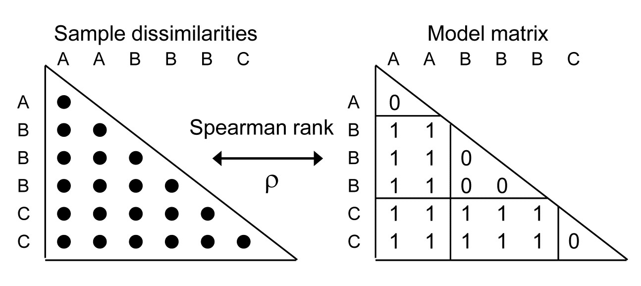
A RELATE $\rho$ statistic is not the same as an ANOSIM R statistic but the tests (which permute the labels over samples in the same way for the two tests) produce results which are identical because the two statistics are linked, in this simple case, by the relationship:
$$ R = \rho \sqrt{ \frac{ M^2 -1}{3w (M-w)}} \tag{6.6} $$
where w is the number of within-group ranks and M is the total number of ranks in the triangular matrix (thus for the simple example above, with groups A, B, C having replicates 2, 3, 2 respectively, w = 5, M = 21 and R = 1.35 $\rho$).
Importantly, there is a more fundamental relationship between the two statistics, which allows us to generalise the concept of an ANOSIM statistic to cater for ordered models. Then, the test is not of the null:
$$H_0: A = B = C = \ldots $$
against the general alternative
$$H_1: A, B, C, \ldots \text{ differ (in ways unspecified)}$$
but of the same null $H_0$ against an ordered alternative:
$$H_1: A < B < C < \ldots, $$
i.e. A & B and B & C are only one step apart but A & C are 2 steps (and A & D are 3 steps etc). This is an appropriate model for testing, say, for an inter-annual drift in an assemblage away from its initial state, or for serial change in community composition along an environmental gradient (e.g. with increasing water depth or away from a pollution source). The model matrix is now of the form:
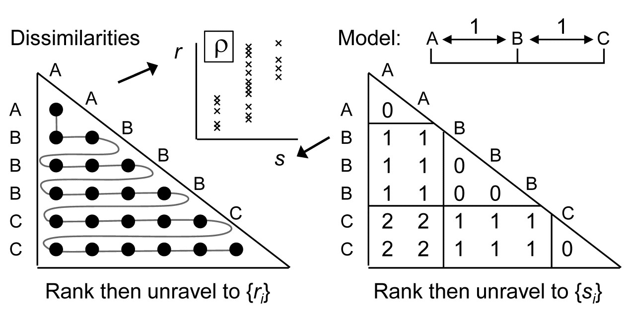
and the RELATE test is again the correlation $\rho$ of the dissimilarity ranks {$r_i$} against model ranks {$s_i$}. In contrast, the generalised ANOSIM statistic is defined totally generally as the slope of a linear regression of {$r_i$} on {$s_i$}, and denoted in the above ordered case by $R^O$ (the superscript upper case O denoting ‘ordered’). Testing of this statistic uses the appropriate permutation distribution; standard tests (or interval estimates) for the slope of the regression cannot be used because of the high degree of internal dependency among the {$r_i$} (dissimilarities are not mutually independent).
Several important points follow from this definition. Firstly, it takes only a few lines of algebra to show that, in the unordered case, this slope reduces to the usual ANOSIM R statistic. Secondly, the equations defining slopes and correlations dictate that $R^O$ is zero if and only if $\rho$ is zero, the null hypothesis condition. Thirdly, $R^O$ can never exceed 1 and it takes that value only under a generalisation of our standard ‘mantra’ for the (non-parametrically) most extreme multivariate separation that can be observed between groups, namely that ‘all dissimilarities between groups are larger than any within groups’, to which we must now add ‘and all dissimilarities between groups which are further apart in the model matrix are larger than any dissimilarities between groups which the model puts closer together’. This extreme case is illustrated by the following scatter plot for of {$r_i$} against {$s_i$} for the example above of three ordered groups A< B<C.

The absence of any overlap (or equality) of values on the y axis (for $r_i$) across the three possible tied ranks on the x axis ($s_i$ values) is what ensures that $R^O = 1$.
Fourthly, the model values {$s_i$} will always involve tied ranks in designs with replication (and also for simple trend models without replication), and the plot makes it clear that the correlation $\rho$ cannot in general attain its theoretical maximum of 1 (in all except pathological cases there has to be a scatter of y values at some x axis points). This makes $R^O$ potentially a more useful descriptor for these seriation with replication designs (as they are termed in Chapter 15, and Somerfield, Clarke & Olsgard (2002) ). Finally, one should note the asymmetry of the $R^O$ statistic relative to the symmetry of $\rho$. The generalised ANOSIM concept is restricted to regressing real data in the ranks {$r_i$} on modelled distances in the ranks {$s_i$}; it does not make sense to carry out the regression the other way round. The RELATE $\rho$ statistic, on the other hand, is appropriate for a wider sweep of problems where the interest is in comparing the sample patterns of any two triangular matrices¶; we have already met it used in this way, entirely symmetrically, in equation 6.3, and will do so repeatedly in later chapters.
¶ This contrast is also in part an issue of what to do about tied ranks, and identifies a context-dependent dichotomy noted early in the development of non-parametric methods ( Kendall (1970) ). Would we say that two judges were in perfect agreement only if they ranked 10 candidates in exactly the same order, or does placing the candidates into the same two groups of 5 ‘acceptable’ and 5 ‘not acceptable’ count as perfect agreement? In our case, $\rho$ (the former, which does not adjust for tied ranks) will be more appropriate for some problems, and generalised R (the latter, which does, in effect, build in an adjustment for ties in the {$s_i$}) more appropriate for other problems.
6.11 Example: Ekofisk oil-field macrofauna
Gray, Clarke, Warwick et al. (1990) studied the soft-sediment macrobenthos at 39 sites at different distances (100m to 8km) and different directions away from the Ekofisk oil platform in the N Sea {E}, to examine evidence for changes in the assemblage with distance from the oil-rig. The sites were allocated (somewhat arbitrarily, but a priori) into 4 distance groups, A: >3.5km from the rig (11 sites), B: 1-3.5km (12), C: 250m-1km (10), D: <250m (6). An ordered 1-way ANOSIM test, with sites used as replicates for the four distance groups, does seem preferable here to the standard (unordered) ANOSIM. Though the null hypothesis $H_0: A=B=C=D$ is the same, the ordered alternative $H_1: A<B<C<D$ is an appropriate model for directed community change with distance. That is, there is no need for the test to have power to detect an (uninterpretable) alternative in which, for example, the communities in D are very different from C and B but then very similar to A, so by restricting the alternative to a smaller set of possibilities, we choose to employ a more powerful¶ test statistic $R^O$ for detecting that alternative, and for appropriately measuring its magnitude.
Fig 6.13a shows the (n)MDS for the 39 sites based on square-root transformed abundances of 173 species, under Bray-Curtis dissimilarity, with the 4 distance groups (differing symbols) clearly showing a pattern of steady community change with distance from the oil-rig. Fig 6.13b plots† the $39 \times 38/2 = 741$ rank dissimilarities {$r_i$} against the (ordered) model ranks {$s_i$}, the four sets of tied ranks for the latter representing (left to right): within A, B, C or D; then A to B, B to C or C to D; then A to C or B to D; and finally A to D. The fitted regression of r on s has a strong slope of $R^O = 0.656$, the ordered ANOSIM statistic, and this is larger than its value for 9999 random permutations of the group labels to the 39 samples, so P<0.01% at least (and it would clearly be more significant than effectively any proposed significance boundary here). The contrast is with a standard (unordered) ANOSIM test which records the lower (though still highly significant) value of R = 0.54. Clearly, if there are only two groups, $R^O$ and R become the same statistic, so the pairwise tests between all pairs of groups which follows this (global) ordered ANOSIM test are all exactly the same as for the usual unordered analysis.
 Fig. 6.13. Ekofisk oil-field macrofauna {E}. a) nMDS of the 39 sites from square-root transformed abundances of 173 species and Bray-Curtis similarities, with the four distance groups from the oil-rig indicated by differing symbols. b) Scatter plot of rank dissimilarities (r) among the 39 sites against tied ranks (s) from a serial ordering model of groups, showing the fitted regression line with slope $R^O$, the ordered ANOSIM statistic.
For the four Ekofisk distance groups, the pairwise R values do show the pattern expected from a gradient of change: for groups one step apart (A to B, B to C, C to D), R = 0.56, 0.16, 0.55; for two steps (A to C, B to D), R = 0.76, 0.82; and for three steps (A to D), R = 0.93 (all ‘significant’ by conventional criteria).
Fig. 6.13b clearly demonstrates how the (global) $R^O$ captures both the standard ANOSIM R’s contrast of within and between group ranks (the left-hand set of points vs the right-hand three sets) and the regression relation of greater change with greater distance (the right-hand three). It is thus useful in what follows to distinguish two cases for the ordered 1-way ANOSIM test, namely ordered category and ordered single statistics, denoted by $R^{Oc}$ and $R^{Os}$. The difference is simply that the notation $R^{Oc}$ is used when the data has replicates, so that it gives both a test for the presence of group structure and the ordering of those groups, whereas $R^{Os}$ refers to 1-way layouts with no replicates and where the test is thus entirely based on whether or not there is a serial ordering (trend) in the multivariate pattern of the ‘groups’ (i.e. single samples in this case), in the specified order. Technically, the computation is no different: both are simply the slope of the regression of the ranks {$r_i$} on {$s_i$}, though clearly the unreplicated design requires a reasonable number of ‘groups’ (at least 5, in the 1-way case) to generate sufficient permutations to have any prospect of demonstrating serial change.
¶ Somerfield, Clarke & Olsgard (2002) discuss the difficult issue of power in the context of multivariate analyses (for which a myriad of simple hypotheses make up the complex alternative to ‘no change’, since every species may respond in a different way to potential changes in its environment). They use the Spearman $\rho$ statistic throughout and demonstrate improved power for the alternative ‘seriation with replication’ model over the unordered case.
† Construction of such scatter plots (though not the regression line) can be achieved by a combination of routines on the Tools menu for PRIMER7, i.e. the Ranked resemblance matrix and Ranked triangular matrix created by the Model Matrix option under Seriation are Unravelled and then Merged, to give (x, y) columns for the Scatter Plot. The test itself uses the PRIMER7 extended ANOSIM routine.
6.12 Two-way ordered ANOSIM designs
Under the non-parametric framework adopted in this manual (and in the PRIMER package) three forms of 2-way ANOSIM tests were presented on page 6.5: 2-factor nested, B within A (denoted by B(A)); 2-factor crossed (denoted A$\times$B); and a special case of A$\times$B in which there are no replicates, either because only one sample was taken for each combination of A and B, or replicates were taken but considered to be ‘pseudo-replicates’ (sensu Hurlbert (1984) ) and averaged.¶
The principle of these tests, and their permutation procedures, remain largely unchanged when A or B (or both factors) are ordered. Previously, the test for B under the nested B(A) model (page 6.6) averaged the 1-way $R$ statistic for each level of A, denoted $\overline{R}$, and the same form of averaged statistic was used for testing B under the crossed A$\times$B model with replicates (page 6.7); without replicates the crossed test used the special (and less powerful) construction of page 6.8, with test statistic the pairwise averaged matrix correlation, $\rho_{av}$. (There was no test for B in the nested model, in the absence of replicates for B). If B is now ordered, $R$ is replaced by $R^{Oc}$ where there are replicates (becoming $\overline{R}^{Oc}$ when averaged across the levels of A), or by $R^{Os}$ where there are not (becoming $\overline{R}^{Os}$); there is no longer any necessity to invoke the special form of test based on $\rho_{av}$ when the factor is ordered. The same substitutions then happen for the test of A, if it too is ordered: $\overline{R}$ and $\rho_{av}$ are replaced by $\overline{R}^{Oc}$ and $\overline{R}^{Os}$. If A is not ordered, any ordering in B does not change the way the tests for A are carried out, e.g. for A$\times$B, the A test is still constructed by calculating the appropriate 1-way statistic for A, separately for each level of B, and then averaging those statistics.

Such a plethora of possibilities are best summarised in a table, and the later Table 6.3 lists all the possible combinations of 2-way design, factor ordering (or not) and presence (or absence) of replicates, giving the test statistic and its method of construction, listing whether or not pairwise tests make sense†, and then giving some examples of marine studies in which the factors would have the right structure for such a test.
We have already seen unordered examples of 1-way tests (1a, Table 6.3) in Figs. 6.3 & 6.5, 2-way crossed (2a) in Fig. 6.7 and, without replication (2b), in Figs. 6.10 & 6.12; Fig. 6.6 is 2-way nested (2g). Examples of 2-way crossed without replicates, with one (2d) or both (2f) factors ordered, now follow.
¶ An example of the latter might be ‘replicate’ cores from a multi-corer deployed only once at each of a number of sites (A) for the same set of months (B); these multiple cores are neither spatially representative of the extent of a site (a return trip would result in multi-cores from a slightly different area within the site) nor, it might be argued, temporally representative of that month.
† If they do make sense, the PRIMER7 ANOSIM routine will give them. Performing such a 2-(or 3-) way analysis is much simpler than reading these tables! It is simply a matter of selecting the form of design (all likely combinations of 1-, 2- or 3-factor, crossed or nested) and then specifying which factors are to be considered ordered – the factor levels must be numeric in that case but only their rank order is used. Analyses that use specific numerical levels (unequally-spaced) can be catered for in many cases within the expanded RELATE routine, utilising a $\rho$ statistic, see Chapter 15.
6.13 Example: Phuket coral-reef time series
These data are discussed more fully in Chapters 15 and 16; sampling of coral assemblages took place over a number of years between 1983 and 2000, see Brown, Clarke & Warwick (2002) , along three permanent transects. Transect A, considered here, was sampled on each occasion by twelve ‘10m plotless line samples’, perpendicular to the main transect and spaced at about 10m. Percentage cover of each line sample by each of 53 coral taxa was recorded, {K}.
For this example, we consider a sequence of 7 years of ‘normal’ conditions, i.e. all samples collected over 1988 to 1997 (later chapters examine earlier and later years subject to impacts of different types). This is therefore a two-factor unreplicated crossed design, with one spatial factor (position on transect) and one temporal factor (year), with the spatial factor clearly ordered and the temporal factor capable of being analysed either as unordered or ordered, depending on whether the test is for non-specific inter-annual variation or for a trend in time.
Fig. 6.14 shows the MDS of the beginning and ending years of this selected time period, for the 12 positions along the transect (inshore to offshore, 1 to 12), based on Bray-Curtis similarities from the root-transformed %cover data. The other 4 years have similarly clear spatial trends, so it is not surprising that the ordered ANOSIM test for Position (the B factor in case 2d of Table 6.3), which uses the unreplicated $\overline{R}^{Os}$ statistic, an average of the separate $R^{Os}$ statistics over 7 years, returns the high value of 0.68 (p < 0.1%, though significant at any specified level, in practice). In spite of the absence of replication, separate analyses of the position factor for each year are now possible, i.e. a 1-way ordered ANOSIM without replication (case 1d). E.g. the spatial trends seen in Fig. 6.14 for 1988 and 1997 have $R^{Os} = 0.65$ and 0.73 (both p < 0.1%).
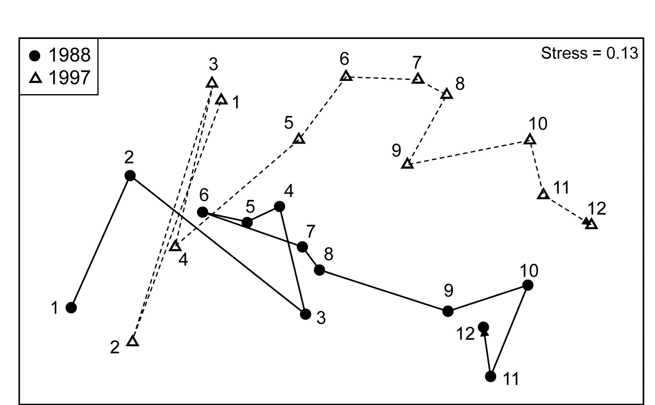
Fig. 6.14. Ko Phuket corals {K}. nMDS for two years from coral cover of 53 taxa (root-transform, Bray-Curtis similarities), at 12 positions along an inshore-offshore transect.
The general test for the Year factor (A in case 2d of Table 6.3), in contrast gives $\rho_{av} = 0.02$ (ns, no year effect). A more directed test of a trend over the seven years between the starting and ending configurations seen in Fig. 6.14 (case 2f), based on an average of the $R^{Os}$ statistics through the years, separately for each transect position, also gives a low and non-significant value for $\overline{R}^{Os}$ of 0.08 (p $\approx$ 10%). However, if earlier and later years are also included, which saw a sedimentation impact and a prolonged desiccation of the reefs, then a small trend is detected $\overline{R}^{Os} = 0.18$, p < 0.1%), though this is more clearly seen as an ‘interaction’ in the second-stage analysis in Chapter 16.
6.14 Three-way ANOSIM designs
Table 6.4 details all viable combinations of 3 factors, A, B, C, in crossed/nested form, ordered/unordered, and with/without replication at the lowest level. Fully crossed designs are denoted A$\times$B$\times$C, e.g. locations (A) each examined at the same set of times (B) and for the same set of depths (C) ¶.
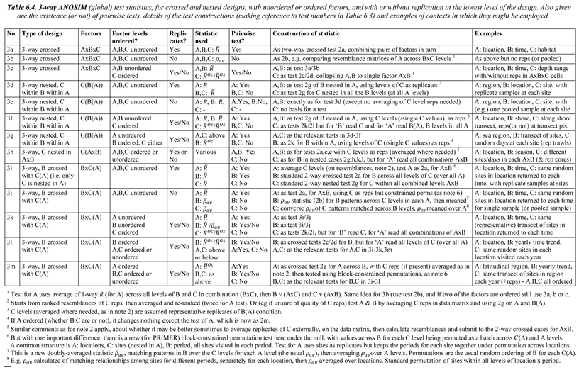
With a fully symmetric design like this (cases 3a-c in Table 6.4), the idea is to test each factor in turn (A, say), by ‘flattening/collapsing’ the other two into a single factor (B$\times$C) whose levels are all the possible combinations of levels of B and C; the test for A from the relevant 2-way crossed design is then carried out. E.g. the global test for time effects (B removing A$\times$C) will only compare those different times at the same depth and location, and will then average those time-comparison statistics across all depth by location levels. Whichever of the definitions $\overline{R}$ / $\overline{R}^{Oc}$ / $\overline{R}^{Os}$ / $\rho_{av}$ is used, the three global statistics (A removing B$\times$C, B removing A$\times$C, C removing A$\times$B) can be directly compared to gauge relative importance of A, B & C.
The fully nested design C(B(A)), e.g. area (C) nested in site (B), nested in location (A), cases 3d-g, can also be handled by repeated application of the 2-way case. This tests the lowest factor (C) inside the levels of the next highest (B), then averaging (in some form, see later) the replicate level, so that levels of C are now replicates for a test of B, then averaging the levels of C so that B levels are the replicates for a test of A.
Another straightforward possibility is C(A$\times$B), 3h, in which C is nested in all combinations of A and B, e.g. multiple sites (C) are chosen from all combinations of location (A) and habitat type (B), in a case where all habitat types are found at each location, with replication (or not) at each site. The test for C uses the A$\times$B ‘flattened’ factor at the top level of a 2-way nested design, and tests for A and B are exactly as for the 2-way crossed design but, if replicates exist, averaging them (again, in some form) to utilise the levels of C as replicates for the crossed A and B tests.
The only other practical combination, and one which is quite frequently encountered, is B$\times$C(A), 3i-m, in which only C is nested in A, and B is crossed with C, e.g. multiple sites (C) are identified at locations (A), and the same sites are returned to in each of a number of seasons (B), with (or without) genuine replicate day/area samples taken at each site in each season. Here there are one or two new issues of principle and these are illustrated in more detail later.
¶ One of the commonest mistakes made by people new to ANOVA-type designs (whether in ANOSIM or PERMANOVA) is to assume here that depth is a nested factor in location, since the differing depth samples are all taken at the same location. But they are the same depths (or depth ranges) across locations, hence one can remove the location effect when studying depth and the depth effect when studying location, which is the whole point and power of a crossed design.
6.15 Example: King Wrasse fish diets, WA
We begin the 3-factor examples with a fully crossed design A$\times$B$\times$C of the composition by volume of the taxa found in the foreguts of King Wrasse fish from two regions of the western Australian coast, just part of the data on labrid diets studied by Lek, Fairclough, Platell et al. (2011) , {k}. Taxonomic composition of the prey assemblage was reduced to 21 broad groups (such as gastropods, bivalves, annelids, ophiuroids, echinoids, small and large crustaceans, teleost fish, etc). Here the fish are ‘doing the sampling’ of the assemblages and there is, naturally, no control over the total volume of material in each gut, so standardisation of the taxon volumes to relative composition (all taxa add to 100% for each sample) is essential. In addition, prior to this, foregut contents of c. 4 fish need to be (randomly) pooled to make a viable single sample of ingested material.
For this illustration, the base-level samples have been further pooled to give two replicate times from each combination of A: three region/habitat levels (Jurien Bay Marine Park, JBMP, at exposed and sheltered sites, and Perth coast exposed sites); B: body size of the wrasse predator, with four ordered levels; C: two seasonal periods, summer/autumn and winter/spring¶.
Three-factor crossed ANOSIM (case 3c in Table 6.4, but for B ordered rather than C), testing for A within all 8 combinations of B and C levels gives $\overline{R} = 0.26$ ($p \approx$ 1.5%, on a random subset of 9999 from the $15^8$ possible permutations); the pairwise tests between the region/habitat levels (now on $3^8 = 6561$ permutations) give similar values of $\overline{R}$ between 0.20 and 0.29. The ordered ANOSIM test for length-class B, across the 6 strata of A and C, has a larger $\overline{R}^{Oc}$ of 0.49 (p<0.01%) with a clear pattern in the pairwise $\overline{R}$ of increasing values with wider-separated wrasse size-classes ($R_{12}$, $R_{23}$, $R_{34}$ = 0, 0.21, 0.08; $R_{13}$, $R_{24}$ = 0.46, 0.5; $R_{14}$ = 0.63; p<5% only for the last three tests). Unsurprisingly therefore, the appropriately ordered ANOSIM test outperforms the equivalent unordered test (case 3a), which has $\overline{R} = 0.32 $ (p<0.1%). The test for period C, removing A and B, gives no effect, with $\overline{R} = 0.0$.
The key point here is that the 3 global statistics, $\overline{R}$ or $\overline{R}^{Oc}$ of A: 0.26, B: 0.49, C: 0 (and pairwise values), are directly comparable as measures of the effect size for each factor; the ANOSIM statistic is not hi-jacked by the differences in group sizes, in sharp contrast to the significance level, p, which never escapes strong dependence on the number of permutations.
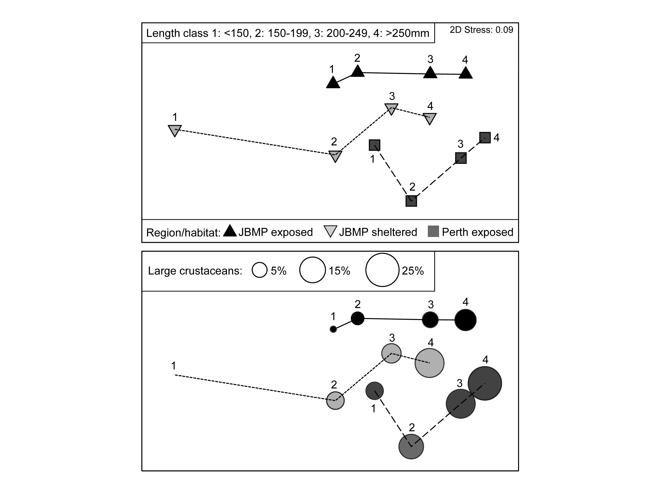 Fig. 6.15. King Wrasse diets {k}. nMDS (on Bray-Curtis) of $\sqrt{}$ taxon volumes averaged over replicates and seasonal periods, showing clear dietary change with King Wrasse body size and between regions/habitats; lower plot overlays bubbles with sizes proportional to one component of the average diet.
As for univariate ANOVA, the natural successor to hypothesis tests should be a means plot, illustrating these effect sizes. Since the period effect is absent, an average of the data matrix over both the 2 replicates and 2 periods is appropriate†. The resulting nMDS of the dietary assemblages for the 4 wrasse size-classes at the 3 locations is shown in Fig. 6.15. It has low stress (0.09) and displays the relationships seen in the tests with great clarity, unlike the high-stress (0.19) nMDS on the full set of samples, which is the typical ‘blob’ of replicate-level plots (an often useful mantra is: ‘test on the replicates – but ordinate the means’!).
The next question is always likely to be: ‘and which taxa are mainly implicated in the steady change in the dietary assemblage through the size classes?’. This is the subject of Chapter 7, but one of the simplest and most effective tools is a bubble plot, superimposing on each ordination point a circle (or in 3-d, a sphere) with size proportional to the (averaged) value for a specific taxon in that (averaged) sample. The lower plot in Fig. 6.15 shows a bubble plot for the ‘large crustaceans’, which are seen to become an increasing part of King Wrasse diet with size, in all locations.
¶ The original data potentially have a 5-factor crossed design, treating region and habitat separately and with 2 further common labrid species studied, but such higher-way designs can always be analysed at a lower level, flattening pairs of factors, as for A above. In fact, Lek, Fairclough, Platell et al. (2011) found it necessary to analyse only 3 factors at a time to explore dietary change with region, habitat, species, size and season because there were no sheltered sites on the Perth coast, and not all labrid species and not all size classes were found in each location. Examining different hypotheses may often require separate analysis of different selections from a data set, and you should not be reluctant to do this!
† Average the transformed data not the original matrix, or use the ‘distances among centroids’ option in PERMANOVA+, though again these give virtually identical plots, see footnote on page 5.9. The major step forward that PERMANOVA takes, albeit under the more restrictive assumptions of a linear model, is that it allows partitioning of the effects seen here into ‘main effects’ and ‘interactions’, something which is simply undefinable in a non-parametric approach (see later). Here, PERMANOVA tests give no evidence at all for any interactions: as the ordination shows, the orderly progression of diet as the wrasse grows is maintained in much the same way across the differing conditions (balance of food availability, in part, presumably) at the three locations.
6.16 Example: NZ kelp holdfast macrofauna
We now consider the fully nested design, C(B(A)). In north-eastern New Zealand, Anderson, Diebel, Blom et al. (2005) examined assemblages of invertebrates colonising kelp holdfasts at three spatial scales: 4 locations (A), with 2 sites (B) per location, sampling 2 areas (C) at each site and with 5 replicate holdfasts per area, {n}. This data is covered in detail in the PERMANOVA+ manual, Anderson, Gorley & Clarke (2008) ¶. Since B and C have only 2 levels, there can be no concept of them being ‘ordered’ or not; A is also seen as unordered. The test statistics are therefore $R$ and $\overline{R}$, case 3d in Table 6.4, giving for A: $R = 0.81$, B: $\overline{R}= 0.38$ and C: $\overline{R}= 0.26$.
These three ANOSIM R statistics are again directly comparable with each other. Their increase in size as the spatial scale increases is coincidental; they do not reflect accumulation of differences at all the spatial scales but only the additional assemblage differences when moving from replicates (with spacing at metres) to areas (at 10’s of metres) to sites (100’s of metres to kms) to locations (100’s of km). Thus, they can be seen as non-parametric equivalents of the univariate variance components (or the multivariate components of variation in PERMANOVA): the area differences
are small ($\overline{R} = 0.26$) in relation to assemblage variability from one holdfast to another, somewhat larger between sites (0.38), in relation to changes between areas, and very large among locations (0.81), relative to change in sites within those locations. This is in stark contrast to the conclusions one might draw from looking only at the significance levels (as seen from the permutation distributions under the null hypotheses, Fig. 6.16), A: p=1%, B: p=1.2%, C: p<<0.01%, a result of the very different numbers of replicates, and thus possible permutations (105, 85 and 1268). As always, it is the $R$ values which give the effect sizes.
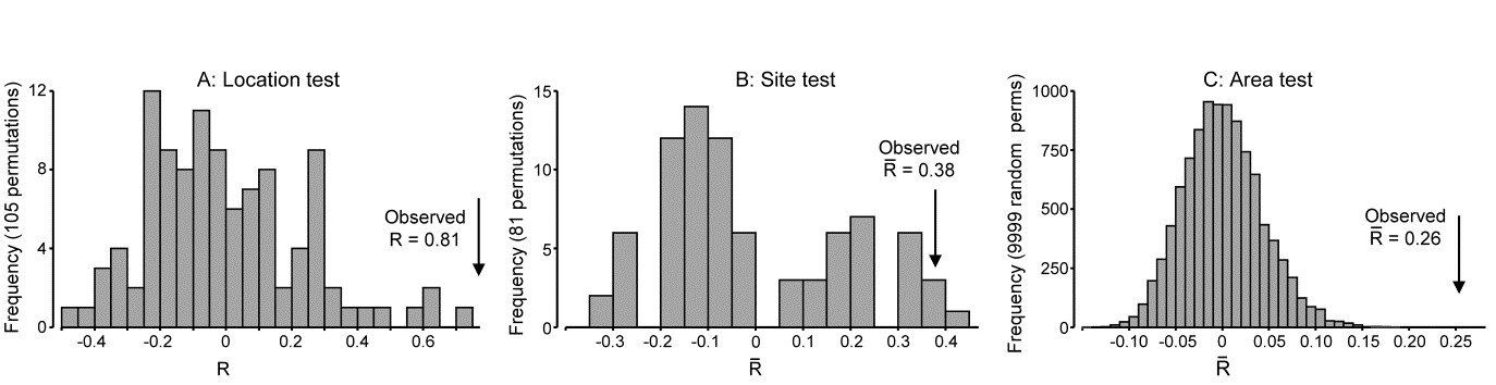
Fig. 6.16. NZ kelp holdfast fauna {n}. Null distributions by permutation for 3-factor fully nested (unordered) ANOSIM tests, C(B(A)), with 5 replicates from each of 2 areas (C), nested in 2 sites (B), nested in 4 locations (A). Very large numbers of permutations possible for the lowest level test of areas, so 9999 selected at random; all permutations are computed for site test (81) and location test (105).
Pairwise tests are only meaningful at the top level of such a nested design and there are insufficient permutations here (3) to make these at all informative. The best way, as always, to follow up the global ANOSIM tests, and visualise the effect sizes, is an MDS based on averaged data (but see footnotes on pages 5.9 & 6.15). Here Fig. 6.17 averages the (square root-transformed) replicate counts for the 16 areas, recomputes Bray-Curtis and the nMDS plot re-affirms the test results.
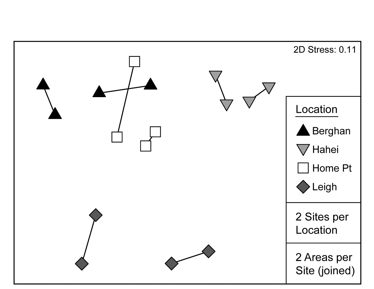
Fig. 6.17. NZ kelp holdfast fauna {n}. nMDS (on Bray-Curtis) of square-rooted abundances of 351 species, averaged over five replicates holdfasts in each area (nested in site and location).
There is a minor technical issue, in the sequence of nested ANOSIM tests, as to how best to combine the original replicates to provide ‘area replicates’ for a test of site, and then how best to combine the areas to provide ‘site replicates’ for a test of locations. There are many possibilities: PERMANOVA uses centroids calculated in the high-dimensional resemblance space (see Anderson, Gorley & Clarke (2008) ) whereas the rank-based approach in PRIMER was given on page 6.6 for the two-way nested case (the original resemblances are ranked, then averaged and re-ranked, at each level). Averaging the similarities rather than their ranks is another possibility, as is averaging the data, both transformed (as in Fig. 6.17) or untransformed. Only slight variations would be likely from the different choices, though experience suggests that averaging untransformed data makes the greatest difference. But in one situation even this might be considered appropriate, namely when the original replicates are sufficiently sparse and unreliable not to constitute a fair reflection of the assemblage structure at all: to pool them (i.e. average untransformed counts) and run the 3-way nested case as 2-way nested for A and B(A) tests (2g-n, Table 6.3) might then be preferable.
¶ We are ignoring for the purposes of this illustration that, as Anderson, Gorley & Clarke (2008) explain, the holdfasts will have different volumes and, even after we have attempted to correct for this by standardising all samples to relative composition not absolute numbers, there may still be some artefactual dissimilarity arising from higher species richness in larger holdfasts. PERMANOVA tests can attempt to model the ‘nuisance’ effects of covariates such as this, through a linear regression, and thereby adjust the C(B(A)) tests (as Anderson, Gorley & Clarke (2008) do in this case); clearly nothing similar could ever be available in the non model-based approach here. However, such biases from unequal sample sizes will still remain in any ordination configuration, whatever the approach, and it should be examined by bubble plots of (here) holdfast volume on the area MDS. Characteristic indicators of a problem are that all the outlying points have low sample volumes (which does not happen here). Presence/absence analyses will be most prone to this artefact, so where such a problem is expected, some amelioration is likely from using less severe transforms – here the mild square root is used – or possibly dispersion weighting (Chapter 9). This downweights the contribution of highly abundant, but highly variable, species without also effectively ‘squashing’ species with low counts (but consistent over replicates) to presence/absence, as severe transformations will do.
6.17 Example: Tees Bay macrofauna
The final example in this chapter is of a mixed nested and crossed design B$\times$C(A), for a total of 192 macrobenthic samples (282 species) from: A: four sub-tidal Areas of Tees Bay (Fig. 6.18, top left), with C: two Sites from each area, the same sites being returned to each September over B: 24 Years (1973-1996), part of a wider study of the Tees estuary, Warwick, Ashman, Brown et al. (2002) , {t}. Sites (C) are therefore nested in Areas (A) but crossed with Years (B). There was a further level of replication, with multiple grab samples collected but these have been averaged to give a more reliable picture of the assemblage on that occasion (the repeat grabs from a single ship stationing being considered ‘pseudo-replicates’ in time, and possibly space). The areas lie on a spatial transect (c. 5km spacing) but are probably not ordered hydrodynamically, so we shall contrast both ordered and unordered tests for A (cases 3m/3j in Table 6.4). The years are also amenable to analysis under either assumption: as it happens, there is a clear annual trend in assemblage structure over the period (seen in the right-hand plots of Fig. 6.18, for the two sites in each area averaged), but the prior expectation might have been for a more complex time signal of cycles or short-term changes and reversions, so this data will serve as an illustration of both the case of B ordered or unordered (cases 3l/3j). There being only two sites in each area, it is then irrelevant whether C is considered ordered or not; with no real replication, there can be no test for a site effect from only two sites (though there would be a test with a greater number of sites, either ordered or not, 3k/3j).
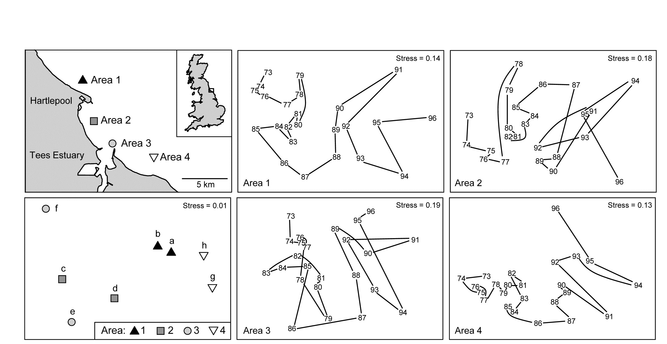
Fig. 6.18. Tees Bay macrofauna {t}. Map of four sampling areas in Tees Bay, NE England, and separate nMDS time-series plots for each area, of the macrobenthic assemblages over 24 years of September sampling; abundances were fourth-root transformed then averaged over the two sites in each area, then input to Bray-Curtis similarity calculation. Bottom left plot is the nMDS of averages of transformed abundances over the 24 time points for the two sites (a-b, c-d, e-f, g-h) in each of the four areas.
Test for Area factor (A)
The schematic below displays the construction of the ANOSIM permutation test for area (A), case 3m/3j¶.

The building blocks are the 1-way ANOSIM statistics $R$ (or $R^{Oc}$ if A is considered ordered) for a test of the 4 areas, using as replicates the 2 sites in each area, computed separately for each year. These are then averaged over the 24 years, to obtain the overall test statistic for A of $\overline{R}$ (or $\overline{R}^{Oc}$), exactly as for the usual 2-way crossed case A$\times$B met on page 6.7. The crucial difference however is in generating the null hypothesis distribution for this test statistic. Permuting the 8 sites across the 4 areas separately for each year, as the standard A$\times$B test would do, is to assume that the sites are randomly drawn afresh each year from the defined area, rather than determined only once and then revisited each year. The relevant permutation is therefore to keep the columns of this schematic table intact and shuffle the 8 whole columns randomly over the 4 areas, recalculating $\overline{R}$ (or $\overline{R}^{Oc}$) each time. There will be many fewer permutations for the A test under this B$\times$C(A) design (8!/2!2!2!2!4! =105 for the unordered case, compared with $105^{24}$) but what it loses in ‘power’ here it may make up for in improved focus when examining the time factor: subtle assemblage changes from year to year may be seen by returning to the same site(s), and these might otherwise get swamped by large spatial variability from site to site, if the latter are randomly reselected each year.
If area is considered an unordered factor, $\overline{R}= 0.60$, a high value (and the most extreme of the 105 permutations, so p = 1%); this is clearly seen in the time-averaged MDS plot for the 8 sites (Fig. 6.18, lower left). If treated as an ordered factor, the area test gives $\overline{R}^{Oc} = 0.13$, now not even significant. These two $\overline{R}$ values are directly comparable; both are slopes of a linear regression of the type seen in Fig. 6.13b, with the same y axis values but only two rather than four x axis points in the unordered case (within and among groups, as earlier explained). The MDS plot of sites in Fig. 6.18 makes clear the down side of an ordered test, based solely on the NW to SE transect of areas: here the middle two areas are within the confines of Tees Bay, their assemblages potentially influenced by the hydrodynamics or even anthropogenic discharges from the Tees estuary. Thus areas 1 and 4 are rather similar to each other but differ from areas 2 and 3. Opting for what can be a more powerful test if there is a serial pattern risks failing to detect obvious differences when they are not serial, as illustrated below for one of the 24 components of the average $\overline{R}$ and $\overline{R}^{Oc}$, namely the $R$ and $R^{Oc}$ constructions for 1978:
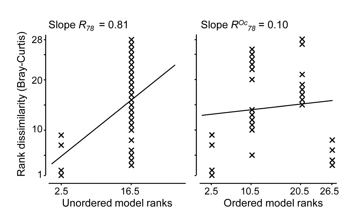
Test for Year factor (B)
Turning to the test for the Year factor (B), case 3l/3j in Table 6.4, the schema for construction of the test statistic in both ordered and unordered cases is now:
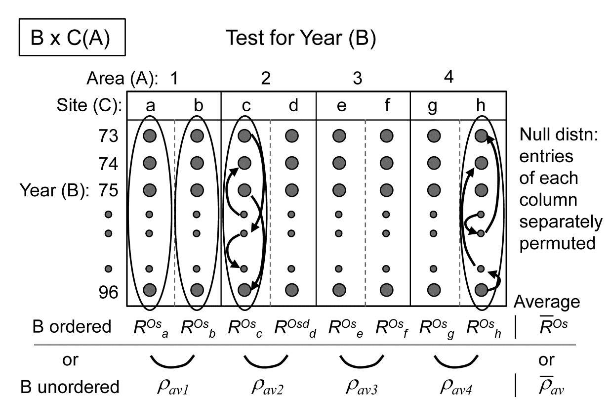
When years are considered ordered, the test reduces to the 2-way crossed layout B$\times$C (case 2d, Table 6.3) in which a 1-way ordered ANOSIM statistic without replicates ($R^{Os}$) is calculated over years, separately for each of the 8 sites, and these values averaged to give $\overline{R}^{Os}$, exactly the test for trend seen in Fig. 6.14 for the Phuket coral reef data (though there the trend was for spatial positions averaged over years, whilst here it is the opposite, of inter-annual trends averaged over sites). The appropriate permutation is the usual one of samples in each site being randomly permuted across the years (since the null hypothesis specifies that there is no year effect, at any site). As Fig. 6.18 illustrates, this will be roundly rejected, with global $\overline{R}^{Os} = 0.52$, which is significant at any fixed level, in effect, as shown by the null permutation distribution:

If it is considered unwise to test only for a time trend, rather than a more general pattern of annual changes, there is no replication which the test for B can exploit so the design falls back on an indirect test of the type introduced in Fig. 6.9: evidence of differences among years is provided by a commonality of time patterns in space. A modified test statistic is needed here to cope with the structuring of the spatial factors into a 2-way nested design of sites within areas. As shown in the above schematic diagram, a logical construction for the test statistic here is to use the matching statistic $\rho_{av}$ among the sites within each area (though in this case there is only one $\rho$ since there are only 2 sites) and then average this across the areas, to give a doubly-averaged $\overline{\rho}_ {av}$ statistic. If there are no annual differences this will, as usual, take the value zero, and the null hypothesis distribution is created by the same permutations as for the ordered test. An inter-annual effect is therefore inferred from consistency in time patterns between sites. If (as might well be thought in this context) it is more appropriate to infer consistent temporal change by noting commonality at the wider spatial scale of areas, then the sites should simply be averaged (see previous footnotes on how best to do this) to leave a 2-way A$\times$B design with both factors unordered, and the B test uses the (singly-averaged) $\rho_{av}$ statistic of Fig. 6.9.
Generally one might expect the time pattern to be less consistent as the spatial scale widens, but here, based on sites, $ \overline{\rho}_ {av} = 0.62$ and on areas, $\rho_ {av} = 0.66$, perhaps because averaging sites removes some of the variability in the sampling. Both $\rho$ statistics are again highly significant, though note that they cannot be compared with the $\overline{R}^{Os}$ value for the ordered case; the statistics are constructed differently.
Returning to the $\overline{R}^{Os}$ test for temporal trend, doubly averaging the statistics in that case, by site then area, could not actually change the previous value (0.52), though averaging sites first and performing the 2-way design on areas $\times$ years does increase the value to $\overline{R}^{Os} = 0.60$, for the same reasons of reduction in sampling ‘noise’; it is this statistic that reflects the overall trend seen in the four right-hand plots of Fig. 6.18. It would generally be of interest to ask whether the averaged $\overline{R}^{Os}$ hides a rather different trend for each area, and the individual trend values $R^{Os}$ for each area (or site) could certainly be calculated and tested. The 4 areas here give the reasonably consistent values $R^{Os}$ = 0.67, 0.54, 0.50, 0.67 respectively (all p<<0.01%), though there is perhaps a suggestion here and in the plots that the wider regional trend seen in Areas 1 and 4, and for which there is evidence from other North Sea locations (a potential result of changing hydrodynamics), is being impacted by more local changes within the Tees estuary, which will affect areas 2 and 3, within Tees Bay. This is a form of interaction between Year and Area factors and we shall see later that limited progress can be made in exploring this type of interaction non-parametrically, through the definition of second-stage MDS and tests (Chapter 16). These ask the question “does the assemblage temporal pattern change between areas, in contrast with its fluctuation within an area?”, and the comparison becomes one between entire time sequences rather than between individual multivariate samples.
This raises the following important issue about the limitations of non-parametric tests in exploring the conventional interactions of additive linear models.
Partitioning
One crucial point needs to be made about all the 2- and 3-way tests of this chapter. They are fully non-parametric, being based only on the rank order of dissimilarities, which delivers great robustness, but they cannot deliver the variance partitioning found in the semi-parametric methods of PERMANOVA+, the add-on routines to PRIMER ( Anderson, Gorley & Clarke (2008) ). PERMANOVA uses the precise measurement scale of the dissimilarities to fit general linear models in the high-dimensional PCO ‘resemblance space’ and it is then able to partition effects of a factor into main effects and 2-way (or 3-way or higher) interactions, each of which can then be tested. For some scientific questions, testing for the presence or absence of an interaction is the only form of inference that will suffice: a good example would be for Before-After/ Control-Impact (BACI) study designs, and there are many further examples in Anderson, Gorley & Clarke (2008) and associated papers. The non-parametric ANOSIM routine cannot (and could never) do this linear model variance-partitioning, of effects into main effects and interactions, because this form of interaction is a purely metric concept. This is simply illustrated in the univariate case by a hypothetical 2-factor crossed design with two levels for both A and B (e.g. where the response variable y is clearance rate of particles by a filter-feeding species under A1: low density and A2: high density of particulates, and B1: at night, B2: during the day), let us suppose with minimal variance in the replicates, giving cell means of (left-hand side):
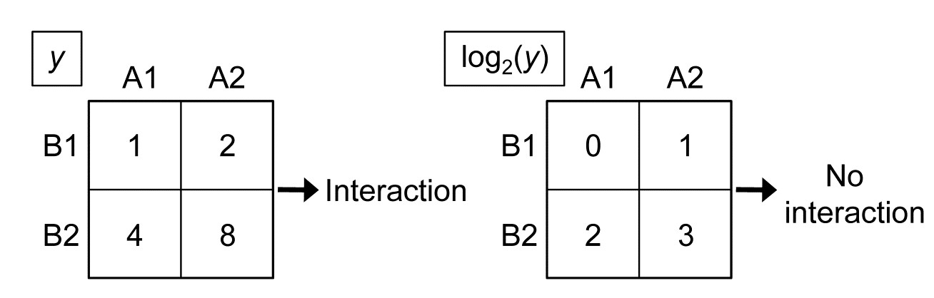
The data matrix for variable y demonstrates that there is significant interaction between particle density and day/night factors, because the means are not additive: the difference in clearance rate between high and low density is not the same during the night (1) as during the day (4). But a simple log$_2$ transform of y gives the table to the right, in which there is now no interaction between the factors: the difference between logged clearance rate at low and high particle density is the same during both day and night (1). Yet, both these tables are identical if viewed non-parametrically, i.e. with the values replaced by their ranks.
This example is scarcely representative of the typical multivariate abundance matrix but it does illustrate that this simple form of interaction is essentially a parametric construction, based on linear models of adding main effects, interactions and error. Though, as previously mentioned, ‘non-parametric interaction’ is not an altogether invalid concept (see Chapter 16), it cannot be straightforwardly defined. The ANOSIM crossed designs are tests for the presence or otherwise of an effect of factor A; this may be a large effect at one level of another factor B, and smaller ones at its other levels, or it may be a more consistent effect of A at all levels of B – these situations are not distinguished, and one way of viewing these $\overline{R}$ statistics is as combinations of ‘main effects’ and ‘interactions’. What they tell you, robustly, is whether factor A has an overall effect, at least somewhere, having removed all contributions that the other crossed factor(s) could possibly be having. They do not do this by subtracting some estimate under a general linear model of the effect of other terms. Their excision of other factors is more surgical than that: they only ever compare the different levels of A under an identical level for all other combinations of factors. Therefore there can be no equivalent, for example, of the way that in linear models main effects can apparently disappear because interactions ‘in different directions’ cancel them out. An $\overline{R}$ statistic is perfectly meaningful in the presence of interactions. Under the null hypothesis, the component R values making up that average are all approximately zero; where there are effects some or all of those R values become positive. If enough of them do so (or one or two of them do so enough), an effect is detected.
¶ It is to be understood that each dot represents a sample of 282 species abundances (going into the page, if you like). Of course, data is not input into PRIMER in this (3-way) format but in the usual species $\times$ (all) samples worksheet, with areas (1-4), years (73-96) and sites (a-h) identified in the associated factors sheet.
6.18 Recommendations
-
For typical species abundance matrices, it is much preferable to use a non-parametric ANOSIM-type permutation test rather than classical MANOVA; the latter will almost always be totally invalid. A realistic alternative is the semi-parametric PERMANOVA tests of Anderson, Gorley & Clarke (2008) . These do make more assumptions, fitting additive linear models in a (complex) high-dimensional space defined by the (metric) resemblance matrix but, crucially, do not make unacceptable normality assumptions in carrying out their tests, which use (approximate) null distributions from permutation procedures. In simple designs, ANOSIM’s greater robustness might be preferred; in more complex designs some questions can only be answered by PERMANOVA. This is a familiar balance from univariate statistics: non-parametric methods are more robust but give shallower inference, model estimation of parameters inevitably involves more assumptions but allows a deeper level of inference.
-
Choice of the level and type of replication should be carefully considered. Though it is difficult to define power for any of the ANOSIM (or PERMANOVA) tests, it is important to ensure sufficient samples are taken at the right level to generate enough permutations for meaningful significance levels. Equally important is that replicates which are crucial for the tests being undertaken should genuinely represent the condition being sampled: pseudo-replication is commonplace, e.g. analyses of sub-cores of single cores, or sets of spatially contiguous or temporally coincident samples which are unrepresentative of the extent of the sites or times about which inference is desired. Pseudo-replicates may still have an important role, when pooled, in providing enough material for sensible definition of a single replicate of that time or place, but the balance of collection or analysis effort at different levels of a design is often context dependent, and pilot experimentation will usually reap dividends for efficiency of the main study. As a general rule, design to provide fully representative replication at the level immediately below the effect of main interest, and use balanced crossed designs to eliminate non-negligible factors which are not the main focus of the study.
-
A point that cannot be over-stressed is that ANOSIM tests only apply to groups of samples specified prior to seeing (or collecting) the data. A dangerous misconception is that one can use a cluster analysis of the species abundance data to define sample groupings whose statistical validity can be established by performing an ANOSIM test for differences among those groups. This is entirely wrong, the reasoning being completely circular. Sometimes, independent data exists (e.g. environmental) which can permit the definition of groups to test with the biotic data. Another safe course here can be to use a first set of (biotic) data to define the groups of interest, i.e. to erect the hypothesis, and then to collect a further set of the same assemblage data to test that hypothesis. Alternatively, the SIMPROF procedure of Chapter 3 may allow you to make some (weaker) statements about structure in the data that is worth exploring in future studies. If prior structure exists, use it: where ANOSIM (or PERMANOVA) tests are valid, they are your most useful testing tools.
Chapter 7: Species analyses
7.1 Species clustering
Chapter 2 (page 2.4) describes how the original data matrix can be used to define similarities between every pair of species; two species are positively associated (i.e. ‘similar’) if their numbers or biomass or cover etc tend to fluctuate in proportion across samples. They are negatively associated (i.e. ‘dissimilar’) if species have opposite patterns of abundance over samples, with the maximum dissimilarity of 100 occurring if two species are never found in the same samples. Clearly, differences in total abundance of species across samples are of no relevance to association – some species (perhaps with much smaller body size) inevitably have higher counts than others, but can still be perfectly associated with them – so some means of ‘relativising’ species is essential. Pearson correlation does this by dividing by standard deviations and non-parametric correlation by converting to ranks but both are poor measures of species association because of the ‘joint absence’ issue: two species are not similar because neither appear at a particular site or time, yet correlation will make them so. In contrast, standardising species across samples (dividing by their total and multiplying by 100, making species add to 100), followed by Bray-Curtis similarity on pairs of species is not a function of joint absences and takes values over a scale of 0 (perfect ‘negative’ association) to 100 (perfect positive association). It is helpful here to retain the idea of ‘negative’ and ‘positive’ relations even though the index is always in the range (0,100). This combination of species-standardising and Bray-Curtis is more succinctly referred to as Whittaker’s index of association ( Whittaker (1952) ), e.g. of species 1 and 2:
$$ IA = 100 \left[ 1 - \frac{1}{2} \sum_ {j=1} ^n \left|\frac{y_{1j}}{\sum_ {k=1} ^n y _ {1k} } - \frac{y _ {2j}}{\sum_ {k=1} ^n y _ {2k} }\right| \right] \tag{7.1} $$
where $y_{ij}$ is the abundance of the ith species (i=1,.., p) in the jth sample (j=1,.., n).
The species similarity matrix which results can be input to a cluster analysis or ordination in exactly the same way as for sample similarities. This is referred to historically (e.g. see
Field, Clarke & Warwick (1982)
) as inverse or r-mode analysis. However, an ordination is rarely a good idea except in special circumstances with small numbers of species, all of which are well-represented. More typically, there are many species found in small numbers rather randomly across the set of samples, and these have associations to each other which are wildly varying, between 0 (if their few individuals are from different samples) and close to 100 (e.g. if their individuals happen to occur in the same one or two samples). Minor species such as this have very little influence on a samples analysis because their effect on the Bray-Curtis similarities are generally small, but they can provide a large amount of ‘noise’ in a species ordination, resulting in very high stress, and therefore unhelpful displays. An important initial step in most species analyses is therefore to eliminate the ‘rare’ species, e.g. selecting only species which are ‘important somewhere’ in the sense that they account for more than a threshold q% (perhaps q = 1% to 5%) of the total abundance in one or more samples, or by adjusting that percentage to reduce the matrix to a specified number of species n, or by retaining only species which are seen in at least n samples.
Example: Exe estuary nematodes
Fig. 7.1 displays the results of a cluster analysis on the Exe estuary nematode data {X} first seen in Chapter 5, in which 19 intertidal sites with differing environments were sampled bimonthly over a year and time-averaged to give a matrix of 19 samples $\times$ 174 species. Initial species reduction retained only those accounting for ≥5% of the total (averaged) abundance at one or more of the sites, and the index of association was calculated among those 52 species, followed by standard agglomerative hierarchical clustering. From the range of y axis values it is clear that some species are highly positively associated, and other species subsets are negatively associated, apparently found at quite different sites (from the zero associations) but this immediately raises the question as to how much of this clustering structure we are entitled to interpret. The solution to that will be an extension to the SIMPROF procedure first met in Chapter 3 (page 3.5), but this time applied to species rather than sample groupings.
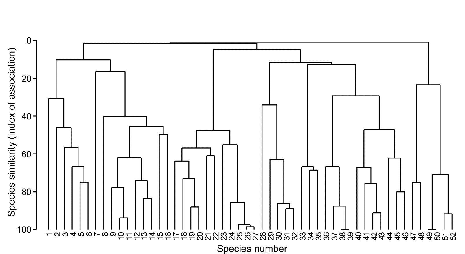
Fig. 7.1. Exe estuary nematodes {X}. Dendrogram using group average linking on species similarities defined by the index of association (i.e. Bray-Curtis on species-standardised but otherwise untransformed abundance for pairs of species compared across the 19 sites). Analysis is only for the species accounting for ≥5% of the total abundance at one or more of the sites (the 52 species numbers are defined later, in Fig. 7.7).
7.2 Type 2 and type 3 SIMPROF tests
Somerfield & Clarke (2013) describe in full detail a range of useful SIMPROF tests, which they classify as Types 1, 2 and 3. Type 1 SIMPROF has already been seen in Chapter 3 (page 3.5) and is concerned with testing hypotheses, in subsets of the samples, about whether the similarities among those samples show any departure from homogeneity: if all samples appear equally similar to each other, within the bounds of random chance, then there is no basis for further exploration of structure within that subset.
The left-hand side of the schematic below (Fig. 7.2) repeats the steps seen in Chapter 3: the test statistic $\pi$ is the departure of the real similarity profile for that subset (i.e. the ordered set of similarities plotted from smallest to largest) from the average profile expected under the null hypothesis of absence of structure in those samples. Construction of this average (and the variation to be expected about it, under the null) uses permutations of species values over the samples. This Type 1 test is repeated many times for different subsets of samples, e.g. at all nodes of an agglomerative or divisive dendrogram from hierarchical clustering (or even for the groups from the non-hierarchical k-R clustering), seen in Chapter 3 (and 11).
The right-hand side of Fig. 7.2 is concerned with similarities (associations) computed among species, over the full set of samples. Type 2 SIMPROF (top right) tests the hypothesis that no associations of any sort are detectable among all the (retained) species. The test statistic $\pi$ is constructed in exactly the same way, by ordering all the species associations, from smallest to largest to produce a similarity profile, compared against profiles generated under the null hypothesis, by again independently permuting the values for each species across all samples. Clearly such permutations must break down any possible associations of species but, as with all permutation tests, have the immense advantage of retaining exactly the same set of counts (/biomass/cover etc) for each species, so the process is entirely free of any distributional assumptions.
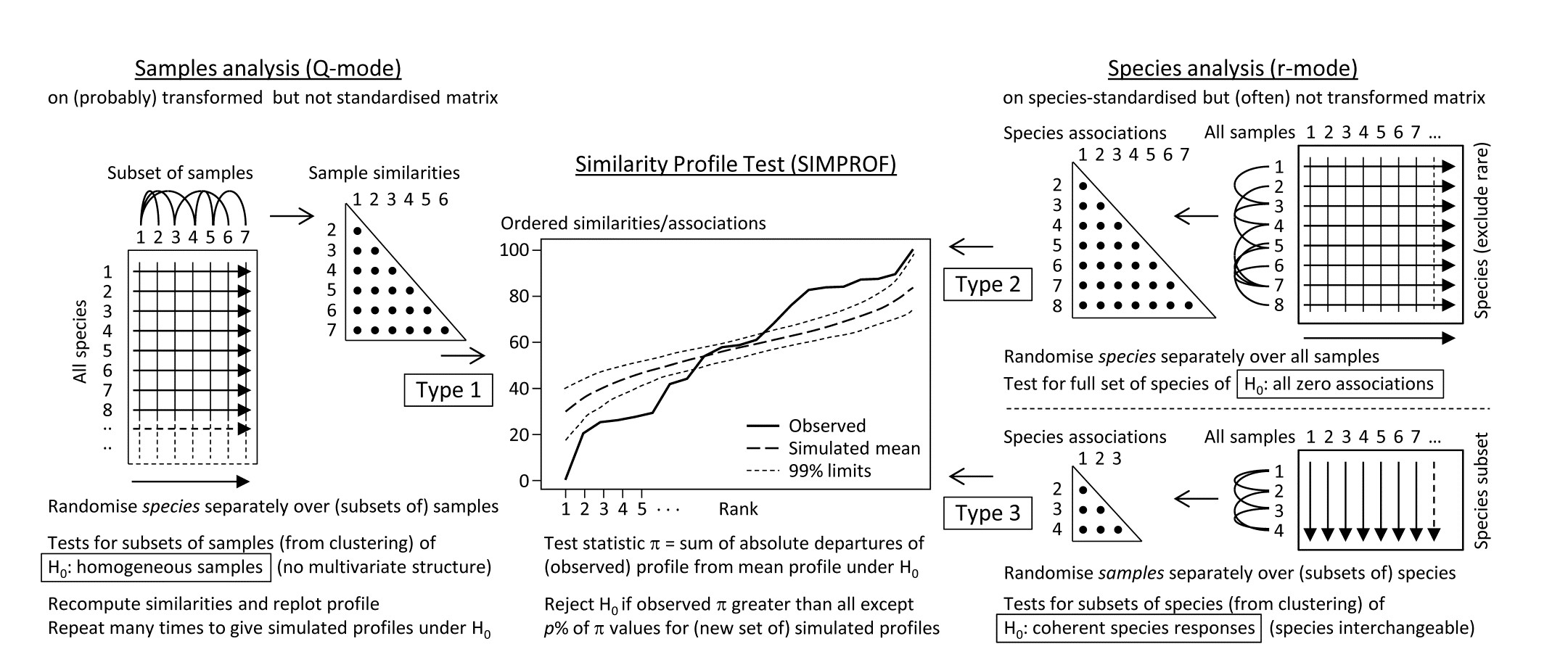
Fig. 7.2. Schematic of the three types of SIMPROF test. Type 1 tests samples (covered earlier) and 2 & 3 test species. Type 2 is a global test of the null hypothesis ($H_0$) of no associations among all species, thus typically carried out only once. Type 3 (as with Type 1) is performed repeatedly in conjunction with some form of cluster analysis (agglomerative, divisive or the non-hierarchical k-R clustering, as in Chapter 3 but applied to the species, not sample similarities) on subdivisions of the species list, to test the null hypothesis of uniformity of species similarities within that sublist. These are best defined by the ‘index of association’. To apply to environmental-type variables (i.e. non-commonly scaled and/or without the need to capture a presence-absence structure, though they may still be biotic), use Pearson or rank correlation for variable similarities. In order for the permutation process to work correctly for Type 3 tests, prior normalisation or ranking is essential (even though these coefficients include a normalisation or ranking step), for the same reason that species standardisation is necessary before employing the index of association (though it includes such standardisation).
Type 2 SIMPROF is therefore designed mainly to be used as a single test, permitting or barring the road to further examination of particular groups of species associations. If the null hypothesis is not rejected, there is no case at all for interpreting a dendrogram such as Fig. 7.1 – we would have no evidence that there were any associations (positive or negative) to interpret. Once we have rejected this specific null for the whole set of species, however, there is no logic in testing it again for a subgroup of those species. What is needed then are tests of a different null hypothesis, that the associations within a subset of species are not distinguishable, i.e. that the species are coherent in their patterns of abundance across the full sample set. In other words, clusters seen in the dendrogram of Fig. 7.1, for example, can be identified statistically as differing in their mutual associations from a wider group of which they are part, but not differentiated internally. This requires a series of Type 3 SIMPROF tests, each as shown in the bottom right of Fig. 7.2, which requires an orthogonal permutation scheme, namely across the subset of species (the species are interchangeable under the null), independently for each sample. Type 3 tests are therefore the natural analogue for species dendrograms of the sequence of Type 1 SIMPROF tests used for sample dendrograms.
Species associations for Exe estuary nematodes
Returning to the Type 2 SIMPROF test, and carrying this out for the Exe estuary nematode data of Fig. 7.1, gives the similarity (association) profile in the main plot of Fig. 7.3, which is seen to differ from profiles under the null both in respect of having many more similarities which are larger (‘positive’ associations) and smaller (‘negative’ associations) than expected. That this is statistically significant, at any probability level we care to nominate, is clear from the histogram of $\pi$ values under the null, in relation to the observed $\pi$ (Fig. 7.3 inset). Note that there are a large number of zero values (fully ‘negative’ associations) in the real profile, but also in all the permuted cases. This is typical of many community matrices: species which occur only in one or two samples are almost certain to be deemed totally dissimilar to other equally sparse species. The difference here is that we have removed many of the sparse species and the real profile is seen to ‘hug the x axis’ longer – it has more species pairs only ever found in different locations than would be expected by chance, as can be seen from Fig. 7.1.
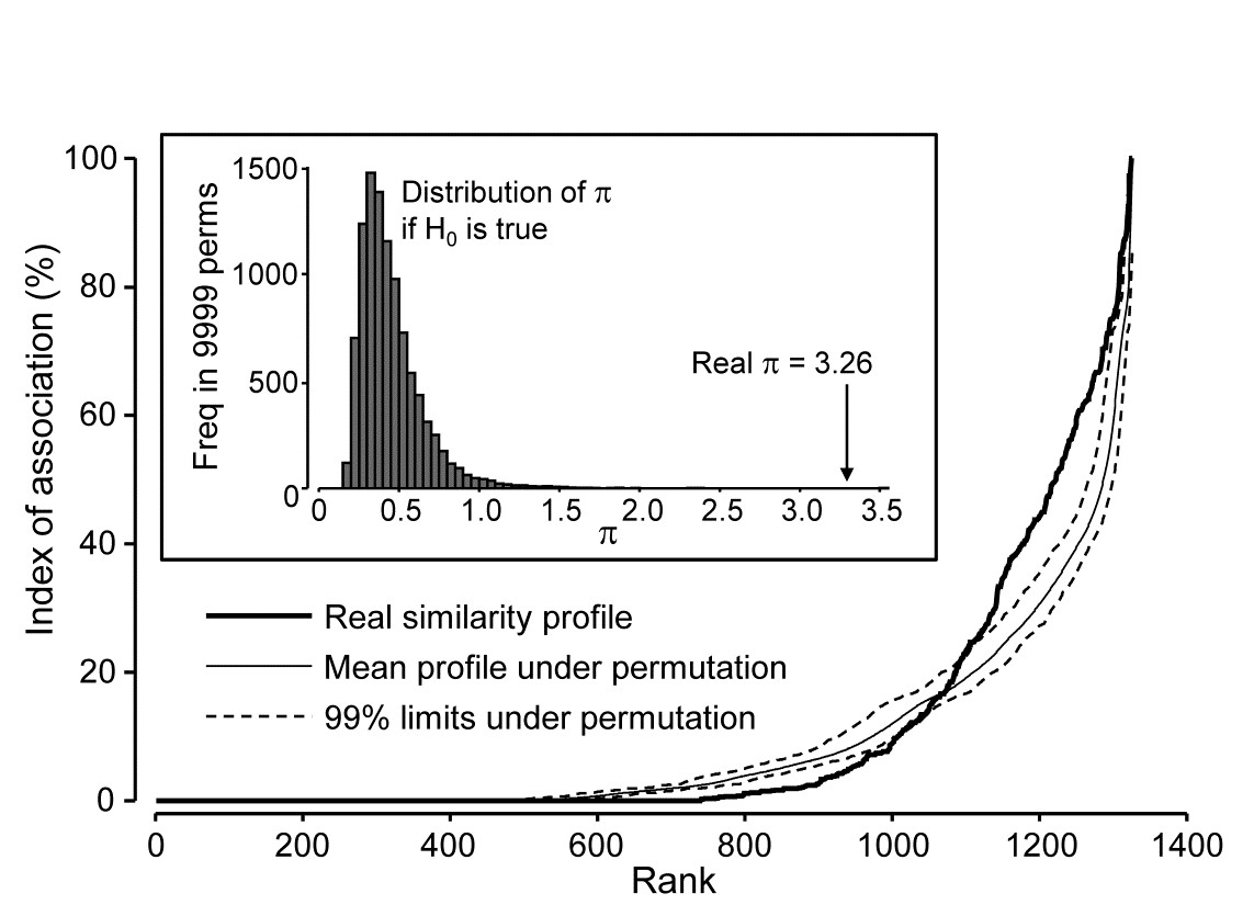
Fig. 7.3. Exe estuary nematodes {X}. Similarity profile (bold line) for a Type 2 SIMPROF test of the null hypothesis of no genuine associations among any of the 52 species making up the dendrogram of Fig. 7.1, consisting of the (52$\times$51)/2 = 1326 indices of association measures computed there, ordered (y axis) and plotted against their ranks (x axis). Also shown, for each value of x, is the mean index (continuous line) from 9999 permutations of the data matrix (under the null hypothesis), and the range (dotted line) in which 99% of the permuted index values lie. Inset: distribution of the distance $\pi$ of (a further) 9999 permuted profiles from the mean profile, in comparison with $\pi$ for the real profile (seen not to come from the null, establishing the existence of species associations).
Type 2 tests can also have a role in testing whether a set of environmental variables may be considered as mutually uncorrelated with each other. The variable ‘similarities’ are then defined as standard Pearson or rank-based Spearman correlations. One might even consider testing a priori designated pairs of variables for evidence of correlation by such a Type 2 permutation method, and this then becomes a distribution-free alternative to Fisher’s z score (or tabulations) for computing significance levels¶. However, systematic testing of large numbers of pairs of variables in this way is probably best avoided: not only is there the problem of repeated testing but also the tests themselves will be highly dependent. This is a familiar theme: the statistics (matrix of correlations) can be extremely useful for interpretation, and the global test (Type 2 SIMPROF) of whether there are any correlations to interpret are key, but the p values for individual correlations must be treated cautiously.
Coherent species curves by Type 3 SIMPROF tests
The procedure is well illustrated by reference to Fig. 7.1, for the reduced set of 52 nematode species from the 19 Exe estuary sites. As we work down from the top of the dendrogram, highly heterogeneous groups (in terms of mixing very low and high associations) gradually give way to sub-groups in which all species are positively associated, though they may not yet be uniformly so, within each subgroup. At one node on each branch the remaining species become totally interchangeable, in the sense that permuting their abundances over that group of species, separately for each sample†, results in more or less the same set of associations: there is no longer significant evidence for any heterogeneity. The non-differentiated species are described as coherent, and no structure is examined below that node. This point may come at quite different similarity levels on each branch – one group might consist of more loosely associated species than another – that is the nature of an exchangeability test. But there is no denying that the results of such a set of Type 3 SIMPROF tests can be profoundly helpful in a key step that has been missing in the exposition so far, namely how to interpret sample patterns in terms of the species that constitute these samples.
To achieve this it is not enough to know how species are grouped; we also need to relate their (common) patterns of abundance to the samples. Here, samples are ordered in keeping with the dendrogram and MDS ordination of samples seen in Chapter 5. The standardised species counts (each species adds to 100 over the 19 sites) are plotted as simple line plots, Fig. 7.4, grouped into the sets identified as internally coherent and externally distinguishable, by the Type 3 tests. These are referred to as coherent species curves, and it is instantly clear that, in this case, the clear clusters seen, for example, in the sample MDS plot (Fig. 5.5) result from a high degree of species turnover among groups of sites, with many of the groups having rather few species in common (or occasionally, none at all).

Fig. 7.4. Exe estuary nematodes {X}. ‘Coherent species curves’, namely groups (A-H) of line plots of relative species abundances, each species standardised (but otherwise untransformed) to total 100% across all 19 sites, and plotted against an arrangement of sites which preserves the sample clustering structure seen in Fig. 5.4. The species groups are identified by a series of SIMPROF (Type 3) tests at the 5% level, on the nodes of the dendrogram of Fig. 7.1, following each branch down from the top until the null hypothesis of coherence (that species below a node are indistinguishable in their associations) cannot be rejected. The later Fig. 7.7 ‘shade plot’ relates these species numbers to respective names, in its redisplay of the dendrogram, with SIMPROF groups identified. Note that groups D and E are plotted together here; they are separated at a higher level of association than found elsewhere and would not have been so by tests with more stringent p values.
Some discussion of the species involved and how the pattern relates to measured environmental differences can be found in Somerfield & Clarke (2013) but, on the methodological front, note that the use of Type 3 SIMPROF tests at a particular significance level is not often a really critical step, as was remarked for the Type 1 tests on page 3.5. E.g. for the data of Fig. 7.4, the same groups are found for tests at the 1% level as at the 5% level. At 0.5%, two group mergers take place: D & E (which are similar and displayed in the same line plot above), and F & G, which fairly reflects the loose grouping of sites 12-19 in the MDS of Fig. 5.5. Pragmatically, the advice is to repeat the tests at three levels and report any minor differences.
¶ For just two variables, the similarity profile reduces to a point but – unlike Type 3 (and Type 1) SIMPROF tests for which all permutations then give a value which is no different than the real one and thus a test is impossible – here the different permutation direction, of the two variables across the full set of samples, gives a full null distribution for this point. In fact the test statistic, $\pi$, is more or less just the absolute value of the correlation coefficient (at least with enough permutations to ensure that the permuted ‘mean profile’ is effectively a point at zero, as it will theoretically be). Another corollary of the permutation direction in Type 2 tests (across samples for each variable) is that there is actually now no need to ‘relativise’ the variables in advance, e.g. by normalising environmental variables or standardising the counts for species, since both correlation and association coefficients include this step internally. However, it is still wise to get into the habit of ‘relativising’ routinely for variable analyses, because it is crucial for Type 3 tests, which otherwise would be meaningless.
† With reference to the previous footnote, it becomes clear at this point exactly why it is necessary to standardise all species across samples before applying the Type 3 SIMPROF permutations: if species have different total abundances then values for a single sample are not meaningfully exchangeable across species, however tightly the patterns of increasing and decreasing abundances over samples may match. The point is obvious for environmental-type variables also, where the permutations might exchange, for example, temperature, salinity and dissolved oxygen values. This could only make sense for normalised variables.
7.3 Example: Amoco-Cadiz oil spill
A second example of deriving sets of coherent species curves, this time temporal rather than spatial, is for the benthic macrofauna sampled at one site in the Bay of Morlaix, on 21 occasions over 5 years, spanning the period of the Amoco-Cadiz oil tanker spill, for which the samples MDS and clustering were in Fig. 5.8, {A}. This is a more challenging example because many of the same species are present throughout the period, so Type 3 SIMPROF groups will not identify subsets of species which are exclusively found only in different groups of samples. In fact, Type 2 SIMPROF (see the plot in Somerfield & Clarke (2013) gives very little, if any, evidence of an excess of negative associations: species do not appear to be ‘excluding’ other species (by competitive interactions or by independent but opposite responses to seasonal or other environmental changes), on any substantial scale at least. Again 52 species, coincidentally, were retained from the large original set of 251, these being all the species which accounted for at least 0.5% of the total abundance at one or more of the 21 sampling times.
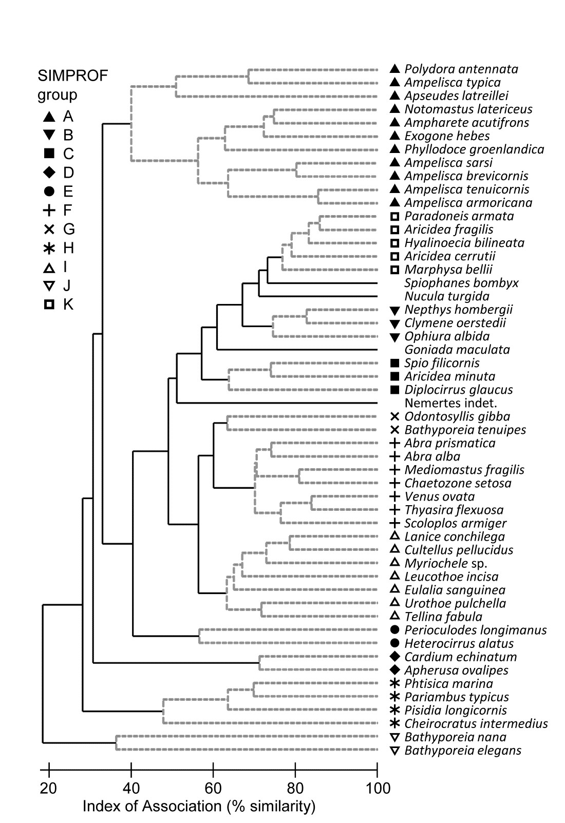
Fig. 7.5. Amoco-Cadiz oil spill {A}. Dendrogram (agglomerative, group average linked) from an index of association matrix among 52 macrofaunal species, each of which accounts for at least 0.5% of the total abundance at one or more of the 21 sampling times. Grey dashed lines and differing symbols denote the 11 ‘coherent groups’ (A-K) containing more than one species, from 5% level Type 3 SIMPROF tests. There are a further four singleton groups, similar to B, C and K, not displayed in the subsequent line plots.
Fig 7.5 shows the species cluster analysis, based on the index of association computed on untransformed species counts, standardised to total 100 over the times. Type 3 SIMPROF tests yield 15 distinct species groups (A-K), and standardised counts for 11 of them appear as component line plots in Fig. 7.6. These demonstrate a wealth of fascinating biological information on the coherent responses of groups of species, seasonally and in response to the oil spill year and potential recovery over the next three years. The groups are arranged in approximate order A-J of a move of peak abundance towards the later times, with species in K showing consistent abundances (they are always present) and little convincing evidence of temporal patterns at all. The large A group, which contains a number of Ampelisca species found in high densities prior to the oil spill is characterised by virtual non-recruitment in the spill year and then a gradual recovery of its seasonal cycle, though not generally to the same peaks by the 5th year. Group B has something of the same pattern though with an apparently fuller recovery. Groups D and E appear to show an opportunist response to the spill, with peak numbers in the year immediately following, whereas F species are of consistently low abundance pre-spill but this starts to rise a year or so later, peak and then fall away in the 5th year; it is a group without a very clear seasonal pattern. Group I has a similar structure but the rise is more delayed still, and the seasonal pattern perhaps more evident; the latter is more marked still in H, and so on. Of course, some of these temporal patterns may simply be the result of natural inter-annual variability driven by a range of environmental factors and, without a spatio-temporal control/reference structure, inference about the causes for any particular patterns has to be suitably guarded. But what is unarguable is that the Type 3 SIMPROF technique has pulled out an apparently convincing set of differing temporal responses – consistent within a group, distinguishable between groups – a combination of patterns which is synthesised in the multivariate pattern of the nMDS, with its obvious change, partial recovery and re-establishment of the seasonal cycles.
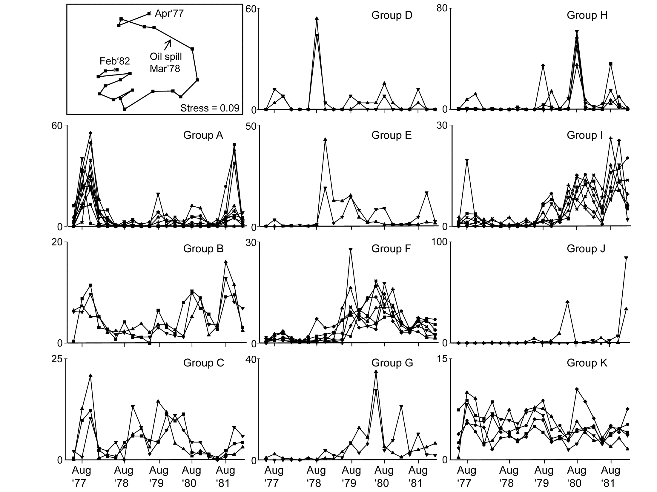
Fig. 7.6. Amoco-Cadiz oil spill {A}. 'Coherent species curves’ for the SIMPROF groups A-K of Fig. 7.5. Also re-shown (top left) is the nMDS plot Fig. 5.8a of the 21 samples over 5 years, displaying community change and partial recovery, with the seasonal cycle re-established. Note that this MDS is based on heavily transformed (4th root) abundances so its similarities do draw from a wide range of these species patterns. The explanation of the clear MDS structure is seen in the combination of differing responses from the various species sets.
Some general points about Type 3 SIMPROF tests
-
As pointed out on the footnote on page 7.2, a Type 3 test is impossible to perform with only two species, so where a group of two is split from other clusters, as for the two Bathyporeia species, group J above, it cannot be further subdivided, whatever the association is between the species. Nonetheless, it will be distinct from other groups and (as here) the two species must have some common association otherwise they will be sliced off from the larger cluster as singletons. Naturally this raises the issue of the power of the SIMPROF test and much the same comments apply as for Type 1 tests, see the discussion on page 3.5 (though you will need to mentally transpose ‘samples’ and ‘species’!). In brief, though power to further divide a group is difficult to define formally in a multivariate context, it will clearly increase with the number of species in the group and especially with the number of samples over which the association is calculated. Thus, a time series of just 4 seasons will tend to lead to fewer and larger species groups than for a series of 12, monthly, samples. Large spatial or long temporal series could distinguish fine-scale, and somewhat trivially different, sets of species responses. Judicious use of averaging (but not over-averaging) may be needed if there is much ‘noise’ in the data, so that more genuine ‘signals’ are compared.
-
It is worth re-iterating the point that Type 3 tests require an association measure with an inbuilt species standardisation (such as equation 7.1) and entry of a matrix which has already been standardised. Tempting though it is to feel that: a) input of an unstandardised matrix and use of the index of association; or b) input of a standardised matrix and use of the normal Bray-Curtis measure (applied to the species, equation 2.9) will both do the trick, this is wrong – both will give results which are incorrect. The first is more plainly wrong, as noted in the footnote on page 7.2 but the second will, more subtly, make the test unconservative, leading to a greater number of smaller-sized groups. Whilst the real similarity profile will be fine, since the index of association is just Bray-Curtis on standardised data, after the permutations the species are no longer exactly standardised, so the permuted profiles will tend to contain (artefactually) lower similarities, making the real profile’s larger values appear more significant.
-
Whilst the Exe estuary and Morlaix examples above both appeared to work well with standardising a data matrix which had not been previously transformed, it is not clear that this is always the best approach. Species standardisation removes the sometimes very large disparity between abundances of different species (e.g. between large and very small-bodied organisms) but it does not address erratically large counts across samples for the same species. Pre-treatment by transformation is sometimes needed to tackle these outliers, as well as to better balance contributions from abundant and less abundant species, in which case it would make perfect sense to transform prior to standardising ‘noisy’ data, before input to Type 3 tests. It is perhaps not entirely coincidental that the Exe and Morlaix data matrices were both averaged (over seasons and over replicates), reducing the severity of any such outliers.
-
Though this chapter concerns only species variables, it is clear that Type 3 SIMPROF tests are much more widely applicable, to other measures of association or correlation and to environmental variables or biotic variables which are not positive (or zero) ‘quantities’, as in an abundance matrix. Somerfield & Clarke (2013) give examples of Type 3 tests for both classes of variables: an environmental suite of heavy metals and organics in the Garroch Head study {G}, and a biomarker study of biochemical/histological ‘health’ indices from flounder sampled along a North Sea transect (see the PRIMER User manual for the data source). Standard Pearson correlations are relevant as association measures in both cases, sometimes with (differing) transformation of individual variables. The only new issue that arises is that, for the biomarker data at least, whether correlations between variables are positive or negative is not of primary concern – some biomarkers increase when an organism is subject to anthropogenic impact and some decrease. This is best handled by reversing some variables so that all are expected to decrease (say) under impact, so that the range of associations go from ‘uncorrelated’ to ‘exactly correlated’ variables – there is no longer a meaningful concept of ‘strongly negatively correlated’. In precise analogy with the species examples, matrices need to be normalised (after any transformation) before entry to Type 3 tests using Pearson correlation, and ranked before tests using a Spearman rank correlation.
In conclusion
Ultimately, like most of the techniques in PRIMER, coherent species curves are fundamentally simple and transparent. Indeed, practitioners have been drawing line plots of species responses over spatio-temporal gradients throughout the history of ecology, but they have usually been for single species or combinations that are arbitrarily selected. What Type 3 SIMPROF tests do is to give some objectivity to the selection of species to place in the same component line plot and provide a statistical basis for inferring differences in pattern between, and similarity within, components.
7.4 Shade plots
An alternative to line plots, and a technique that can often be even more useful, in terms of the range and quality of information it can present, is that of shade plots. These are visual displays in the form of the data matrix itself, with rows being species and columns the samples, and the entries rectangles whose grey-shading deepens with increasing species counts (or biomass, area cover etc). White denotes absence of that species in that sample and full black represents the maximum abundance in the matrix. Many choices are possible for the column and row orderings.
Whilst the coherent species plots can do a striking job of visually displaying common patterns of change in relative abundance across the samples for groups of species (i.e. species standardised data), they do not represent the patterns of dominant and less abundant species over the samples, which is key to understanding the contributions of particular species to sample multivariate analyses. Of course, coherent species curves could be graphed using absolute, not relative, counts but this is generally ineffective, the coherence becoming lost, visually, in the major differences in mean abundance across species. In contrast, one of the strengths of shade plots is the way they (typically) can be used to display the abundances on exactly the measurement scale which is being entered to a multivariate analysis: this may be sample standardised and/ or transformed (or dispersion weighted, Chapter 9), or any other potential pre-treatment step, including species standardisation (though this is generally not recommended for input to sample resemblances).
The visual impact of grey-scale intensities¶ in a shade plot can give a strong idea of which species are likely primarily to be influencing the multivariate results, and
Clarke, Tweedley & Valesini (2014)
show how these plots can therefore be utilised to aid sound long-term choice of transformation and/or other pre-treatment for specific faunal groups and study types. Choice of transform is often something that perplexes the novice user but a simple shade plot will often make it abundantly clear which transforms are likely to capture the required ‘depth of view’ of the community (from solely the dominant to the entire species set), and thus avoid under- or over-transforming the matrix to achieve that desired view (see Chapter 9 for some examples).
Shade plot for Exe estuary nematodes
Fig. 7.7 provides a good initial example of the range of information that can be captured by a shade plot, since we have seen the sample dendrogram and MDS plots in Figs. 5.4 and 5.5, the species clustering in Fig. 7.1 and the Type 3 SIMPROF tests producing the coherent species groups of Fig. 7.4. Here the sites are in the same order as in Fig. 7.4 and the 4 to 5 major clusters from Fig. 5.4 are separated by vertical lines.
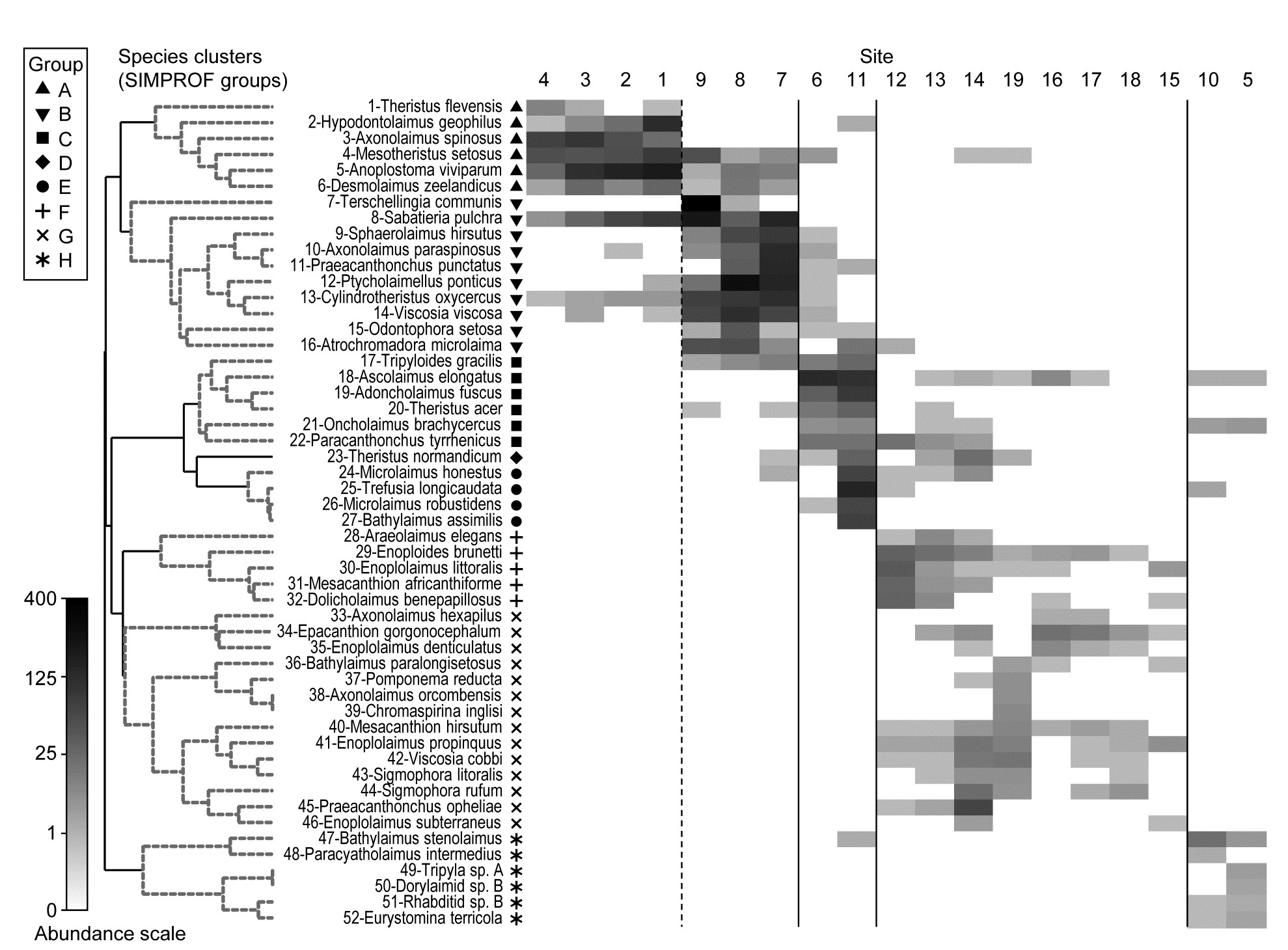
Fig. 7.7. Exe estuary nematodes {X). Shade plot, a visual representation of the data matrix of (in the columns) the 19 sites and (in the rows) the most dominant species, those accounting for ≥ 5% of the total abundance at one or more of the sites. White space denotes absence of that species at that site; depth of grey scale is then linearly proportional to a fourth-root transformation of abundance (see key), the same transform as used for the sample clustering and ordination of Figs. 5.4 and 5.5. Sites are divided by vertical lines into the 4 to 5 groups initially identified by
Field, Clarke & Warwick (1982)
from essentially those figures, and then ordered in the same way as in the ‘coherent species’ line plots (Fig. 7.4). Species are shown in the numbered dendrogram order of Fig. 7.1, with the Type 3 SIMPROF groups (A-H, Fig. 7.4) identified by grey dashed lines and a range of symbols in the redisplay of that dendrogram here. The high turnover of species between site groups (matching that seen in Fig. 7.4) is self-evident, resulting in the clear clustering seen in the ordination of Fig. 5.5, and strongly curvilinear shape of the Shepard plot of Fig. 5.2, with many dissimilarities of 100%. Note the important distinction with Fig. 7.4 that the shade plot uses the fourth-root transformed data for its grey scale, whereas the line plots are of species-standardised untransformed data. Either technique could be used with either data form but the particular strengths of each display lend themselves to the combination shown.
The rows present the same subset of species as used for the coherent curves, with the species dendrogram given in the same species order (numbers in Fig. 7.1 are now identifiable to species names), and showing the species groups from the Type 3 SIMPROF tests. The grey-shade scale is the fourth-root transformed one appropriate to the samples multivariate analysis, but the linearly increasing grey intensity in the scale bar has been back-transformed to original counts for the displayed scale values, allowing an excellent ‘feel’ for the abundances of each of these 52 species. Note that, since the lowest number in the matrix is a count of 1, the fourth-root transform ensures that even this is visible, so the presence-absence structure of the data is immediately apparent. An important implication is that, under this transformation, all the species will have a not entirely negligible role in determining the sample resemblances, though some still clearly have a more dominant contribution (e.g. by comparison with a P/A analysis in which all the shaded rectangles will, of course, be black). But the dominant impression from Fig. 7.7 is of overlapping but highly characteristic assemblages for each of the main five sample groups, with the more diffuse clustering of samples 12-19 in relation to the tightness of the other 4 groups (seen in Fig. 5.5) readily apparent.
¶ Shade plots can be graphed effectively in colour also, and are then often referred to as heat maps, though since the genesis of a heat map is a temperature scale in which black denotes absence (extreme cold), increasing through blue, orange and red to white (‘white hot’) as the largest value, this seems a less helpful nomenclature than shade plot for our use, where the large numbers of zeros are much more effectively represented as white space. And it is necessary that the scale transparently represents the linearity of increasing (transformed) abundances by linear-scale shading or colour changes. Too richly colourful a plot might not aid this.
7.5 Example: Bristol Channel zooplankton
This example, last seen in Chapter 3, consists of 24 (seasonally-averaged) zooplankton net samples at 57 sites in the Bristol Channel, UK. Fig. 7.8 shows the shade plot for fourth-root transformed abundances. All 24 species are used and this is again an example where there was no specific a priori structure to the samples, so various clustering methods were used in Figs. 3.9 and 3.10 to group the samples (with Type 1 SIMPROF tests), and for the hierarchical methods it is appropriate to display dendrograms on both axes. The species axis again uses the index of association among untransformed species counts and agglomerative clustering, this time without the SIMPROF tests (Type 3) and, purely to demonstrate that any method of clustering can be used on either axis, the sample grouping utilises the unconstrained divisive algorithm of the PRIMER UNCTREE routine, Fig. 3.9, based on a maximisation of the (ANOSIM) R statistic on each binary split. The 4 significantly different groups of sites given by SIMPROF tests are again shown by vertical lines and (in spite of the heavy transform) the grouping can now be seen to be driven by a very few dominant species, perhaps no more than 8 or 9 of the 24 species, which clearly typify the four clusters and discriminate them from each other. It can also readily be appreciated why two alternative methods, seen in Fig. 3.10 (standard agglomerative and k-R clustering), which again give just four groups, differ in respect of only the allocation of three sites: 9, 23 and 24. For example, the trade-off between absence (or nearly so) of Eurytemora, Temora sp. and Centropages hamatus decides the placement of sites 9 and 24 in groups A or B, and the high values for the Calanus and Paracalanus species mitigate against a move of 23 to B.
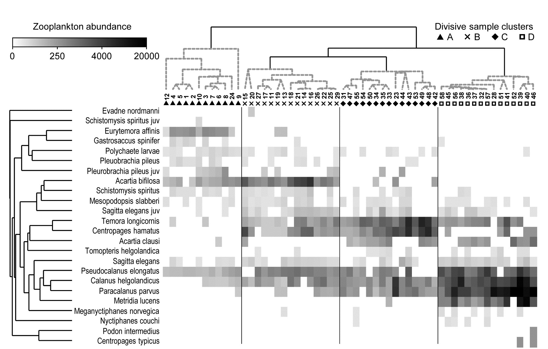
Fig. 7.8. Bristol Channel zooplankton {B}. Shade plot of abundance (averaged over seasons) of 24 zooplankton species from 57 sites, with linear grey-scale intensity proportional to fourth-root abundance (see the key for back-transform to original abundances). Sites have been grouped using Bray-Curtis similarities on the transformed data, by hierarchical, unconstrained divisive clustering (UNCTREE), as in Fig. 3.9, together with (Type 1) SIMPROF tests which identify four groups, A-D in Fig. 3.10b. The dendrogram is further rotated to produce a site ordering which optimises the matrix correlation $\rho$ with a serial model (gradient of community change). Species are also clustered, this time with the standard agglomerative method, based on ‘index of association’ resemblances computed on species-standardised (but otherwise untransformed) abundances; their dendrogram is again rotated to maximise the seriation statistic $\rho$, non-parametrically correlating their resemblances to the distance structure of a linear sequence.
Serial ordering of shade plot axes
This example is not just about grouping however. The MDS plots of Fig. 3.10 have already demonstrated that the rather clear clustering of sites forms part of a gradation of community change (and this is clearly associated with, if not actually driven by, the salinity gradient, 3.10b). The shade plot routine in PRIMER also incorporates a powerful facility which attempts to re-order either (or both) of the samples and species axes, independently of each other, in such a way as to maximise the serial change in the similarity pattern over the final ordering(s). In keeping with the non-parametric philosophy of other core techniques, this utilises the RELATE $\rho$ statistic, which will be used frequently in later chapters, but which was first met in equation (6.3) and discussed in terms of measuring serial change on page 6.10, on the ordered ANOSIM test. This is a non-parametric Mantel-type statistic, computing a rank correlation coefficient (for example Spearman’s $\rho$) between matching entries of two dissimilarity/distance matrices, namely the resemblance matrix (e.g. Bray-Curtis dissimilarity of the biological samples) and distances among points equi-spaced on a line (so that neighbouring points are one step apart, next-but-one neighbours are two steps apart, etc). We need to ‘run before we can walk’ here because later we discuss more straightforward RELATE examples, in which the community samples are tested for how much simple seriation they show in their transect or time order of collection, i.e. tested against known a priori ordering of the samples in space or time (or environmental condition). In the current context, we are not using $\rho$ as a test statistic at all, but simply as a useful way of measuring the degree of serial change in a resemblance matrix, for any given ordering of its rows (and columns)¶.
In theory, we could envisage looking at all possible sample orderings, calculating the $\rho$ seriation statistic for each, and choosing the order that maximises $\rho$. This is not viable however (there are 57!/2 possible orders, i.e. 2$ \times 10^{76}$) and an iterative search procedure is required, to attempt to get close to the optimum $\rho$. As with previous search procedures (such as for MDS ordination), the iterative process can converge to a solution which is some way from the optimal one, so repeat runs are required (1000 are suggested, if this runs in a reasonable time), from randomly different starting orders, and the best selected.†
This is still an intensive search problem however, and there are limitations which this unconstrained search procedure would ignore here, namely that we wish to display a dendrogram along the sample axis, showing the clustering (and here, the SIMPROF groups). The vast majority of the permutations of sample ordering would conflict with that hierarchy. Chapter 3 described the arbitrariness in ordering of a dendrogram and how it was not to interpreted as an ordination – but it is not completely arbitrary. The clustering and sub-clustering structures must be maintained, and the plot is determined only down to random rotation of the bars of the ‘mobile’ it can be considered to represent (i.e. with horizontal lines as bars and vertical lines as strings). So a constrained seriation of the samples is required in this case, iteratively searching through the set of possible rotations of the dendrogram for that which again gets as close as possible to optimising the seriation statistic $\rho$. This is a further option in the PRIMER shade plot routine and is the ordering seen in Fig. 7.8. In fact, the reduction in the immense size of the search space that this constraint induces does seem to make the algorithm more efficient, and good orderings will often result with a much smaller degree of computation.
Exactly the same constrained seriation procedure is also implemented on the species axis of Fig. 7.8, this time using the species resemblance matrix (index of association measure) §. The ability to seriate one or other (or both) axes imparts an order and structure to the data matrix which can often be apparent in the multivariate analysis – here in the strong gradient of samples (Fig. 3.10b) as well as the group structure – but which can be difficult to spot in the matrix itself without such rearrangement of rows and columns. (A striking example of this is seen later, in Fig. 7.10).
It is important to note that these orderings are carried out independently for samples and species, if both are performed. The sample re-arrangement uses only the sample similarities, and the species ordering is quite immaterial to the calculation of those resemblances. In the same way, species similarities make no use of the sample ordering, and they are all that is used in the clustering or seriation of the species. Now, if both axes are rearranged to be as close to a serial trend as possible then it is inevitable that the matrix will have at least a very weak diagonalisation‡, even if what is being seriated is just ‘noise’ rather than real ‘signal’. So visual evidence of diagonalisation of the matrix is not, in itself, conclusive evidence of a trend in the samples – that comes from a RELATE ($\rho$) seriation test on the sample similarities, mentioned earlier. In other words, shade plots are not tools for testing but for interpretation of structures established by testing.
However, in other cases, where the sample axis is in a fixed order based on spatial location or a time course – or the result of seriation of samples on independent information such as environmental conditions – then apparent diagonalisation of the shade plot, after the species have been seriated, does become prima facie evidence of a real gradient of community structure in that sample order. This is formally established by a seriation test on the sample resemblances, in rank correlation with (distances from) that sample order.
¶ This is analogous to the way we used the ANOSIM R statistic in the binary divisive and k-R clustering methods of Chapter 3, in which a test of the null hypothesis R=0 (as in ANOSIM) would have been quite incorrect, and irrelevant. What was needed there was, for example, to find a binary division of a cluster which maximised the value of ANOSIM R between the two sub-clusters formed by this division. Here we use RELATE $\rho$ in the same way, to find an ordering of the samples which maximises the match of their dissimilarities to a triangular matrix of distances among equi-spaced points along a line. This is showing us the ‘natural order’ in which the samples would align themselves, in terms of their community change, if no external constraints were made.
†This unconstrained seriation search, on either axis, is one of the options in the PRIMER Shade Plot routine. That it may not find the exact maximum $\rho$ of the $2 \times 10 ^ {76}$ possibilities is not a concern. We are not seeking the ‘correct’ solution but trying to display samples (and species) in a reasonably natural order, which will enhance the prospects for visual interpretation of the data matrix.
§ Note that the latter is computed by first species-standardising the untransformed data, not standardising the fourth-root transformed values represented by the grey-scale rectangles. This is true for the Exe example above and all other shade plots in this manual, though species-standardising transformed abundances could certainly be considered in some situations (for the reasons discussed in point 3 on page 7.3). Note that it is also universally true in these examples that the sample clustering or seriation is performed on the sample resemblances calculated from the full set of species, not the reduced set of species that it is convenient to view in a shade plot (though in the case of Fig. 7.8 there is no need to reduce to a smaller number of species). In a particular context, it might make sense to use only the reduced species set for all aspects of the sample analysis (and of course this is easy to do in PRIMER) but the difference this would make to multivariate analyses will typically be inconsequential, and it is logically more satisfactory to cluster and seriate the samples in the shade plot using the full set of species, which are the basis of the MDS plots, ANOSIM and RELATE tests etc. This is certainly the path which PRIMER’s Wizard for Matrix display assumes will be needed, though the direct Shade plot routine permits wide flexibility.
‡ This interesting and powerful independence of seriation on the two axes is in contrast to Correspondence Analysis-based tools, which produce a 2-way table by iteratively reweighting the axes in turn, so that the converged solution forces a mutual ordering to optimise diagonalisation. Here the diagonalisation emerges more spontaneously, and may not be guaranteed in cases of extreme species turnover. For example, if a group of samples has a completely disjunct species set from all other samples, those samples and species will be placed at one or other end of their respective gradients, but at which end is entirely arbitrary, the similarities (or associations) to all other samples (or species) being zero. In such extreme cases, it might be thought neater to follow automatic seriation by manual rotation of a disassociated group to a more ‘natural’ place. The ability to manually rotate dendrograms by clicking on ‘bars’ in the usual way is built into the PRIMER Shade Plot routine.
7.6 Example: Garroch Head macrofauna
An example where the biotic sample axis could have sensibly been ordered according to an a priori spatial layout, or in terms of environmental conditions (e.g. the first principal component of a suite of organics and heavy metal levels in sediments, PC1), is that of the root-transformed biomass data from 12 sites on an E-W transect across the sewage-sludge dump-ground in the Firth of Clyde, discussed in Chapter 4, {G}. A shade plot very similar to that of Fig. 7.9a will result from sites ordered by this PC1, and there is again a marked diagonalisation – species turn-over is strong as sites approach the high pollution levels closer to the dump-ground. In fact, we have chosen here to use this instead as an example contrasting the two choices that PRIMER gives for ordering samples. Fig. 7.9a is displayed with a reduced species set (of 35), using a seriation on both site and species axes, unconstrained by dendrograms for either axis. In contrast, Fig. 7.9b shows the result of ordering both sites and species in an order given by a nearest neighbour trajectory.
Nearest neighbour ordering of shade plot axes
Whilst arranging sample and species axes according to serial trends is generally the preferred choice for a shade plot, and is certainly instructive in the current case, there will be situations in which this is not so appropriate, for example if a cyclic pattern of samples is expected or observed (e.g. seasonality, cyclic inter-annual change etc) and the data matrix would then not be expected to diagonalise. In such cases, we may want to place the samples in order of some observed natural trajectory in community structure, not limited to a simple gradient. An illustration of this is in Figs. 7.9c and d, which are the same nMDS plot, for root-transformed biomass at the 12 transect sites (data as in the shade plot above), and Bray-Curtis similarities. It is only the trajectories, defining the axis orders in the otherwise identical shade plots, which differ, with 7.9c showing the optimum serial change and 7.9d an approximate solution to the ‘travelling salesman’ problem. This, as its name suggests, tries to find a route through all the sites, of minimum distance, and starting from whichever point minimises that length. Distance in this context means (Bray-Curtis) sample dissimilarity among the samples, not actual distance in the (only approximate) low-d nMDS ordination. And here there is a fairly natural trajectory joining the sites, which is not the zig-zag route of the serial trend, and the shade plot of 7.9b orders the samples and the species by these attempted minimum trajectories (in the case of the species order, minimisation is of the total index of association along its trajectory).
There is again potentially an immense computational problem here (termed NP-hard in numerical analysis jargon), since there are 12!/2 sample orders and 35!/2 species orders to consider. The solution implemented in PRIMER is a simple, non-iterative routine (which is often surprisingly effective) known as the ‘greedy travelling salesman’ or nearest neighbour ordering, and is simply described. First, join the two sites (say) which have the lowest dissimilarity, then go into a loop in which the nearest neighbour (lowest dissimilarity) to each current end point is found, the lowest of these two values defining the next link in the chain.
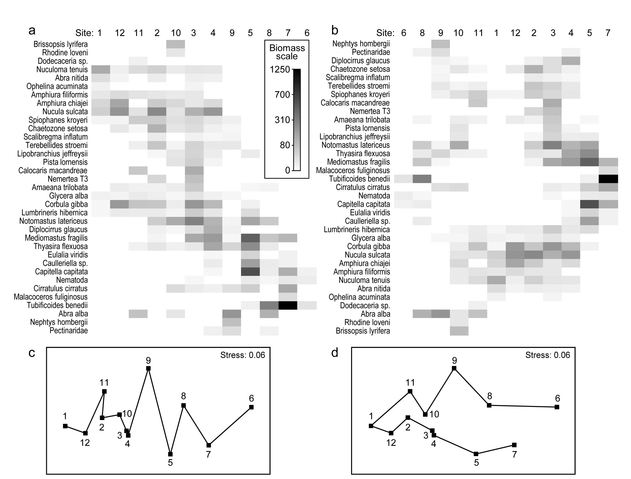
Fig. 7.9. Garroch Head macrofauna {G}. Shade plots of sites 1-12 on an E-W transect (Fig. 1.5) covering a sewage-sludge dumpground (centred at site 6), based on square-root transformed biomass of 35 macrofaunal species, namely those accounting for at least 1% of the total biomass at one or more sites. The grey-scale intensity key has units back-transformed to the original biomass measurements. Axes for samples and species are ordered by: a) iterative maximisation independently on both axes (from 1000 starting configurations) of the seriation statistic, $\rho$, based for samples on Bray-Curtis similarities on root-transformed biomass, and for species on the association index on untransformed but species-standardised data; b) using the same similarity and association measures, both axes independently placed in nearest neighbour order (using the ‘greedy travelling salesman’ algorithm). Neither axis, on either plot, is constrained to be a rotation of a cluster dendrogram. The nMDS plot of the 12 sites (on the Bray-Curtis similarities) is shown with: c) serial and d) nearest neighbour trajectories from the sample orders in (a) and (b) respectively.
The process thus works outwards from the first join, adding points at one or other end of the trajectory (or even all at the same end), until all samples are linked. The procedure is the same for species, the only arbitrariness remaining being the same as for seriation, viz. whether the shade plot samples are ordered from left to right or vice-versa (and the species top to bottom or vice-versa); PRIMER simply allows a ‘flip’ option on both axes to suit the user’s preference.¶
We return to seriation of the sample and species axes to make one interesting final point about shade plots. The previous, clear-cut, examples may have given the impression that it is easy to see sample patterns in the data matrix using a shade plot, in whatever form the matrix is entered, but this is rarely the case – the key step is an effective grouping or ordering of the axes.
¶ Note that this nearest neighbour trajectory is not the same thing as the minimum spanning tree (MST) met in point 4 on page 5.3. That is a more tractable problem and has an efficient algorithm for a precise solution, Gower & Ross (1969) , the key difference being that the MST allows branching (see Fig. 5.3b). Of course, this is not helpful in the current context of needing a 1-d ordering of the samples or species.
7.7 Example: Ekofisk oil-field macrofauna
The 39 sites sampled for benthic infauna at different distances from an oil-field in the N Sea were shown in the last chapter to demonstrate a clear gradient of community change with distance (nMDS, Fig. 16.3). The shade plot of Fig. 7.10a however, which orders the sites in increasing distance from the rig, and puts the species (reduced to 74 of the original 173 species) in alphabetic order, does not present a clear picture at all. Apart from Chaetozone setosa, the most dominant species in terms of abundance (an opportunist polychaete which appears to thrive at the impacted sites close to the oilrig), the immediate visual impression is not of a striking gradient potentially caused by the dispersal of THCs and other contaminants from the oilfield. Yet the non-metric MDS does indeed display such a clear and striking gradient (Fig. 7.11), and the explanation is not the C. setosa counts because if that species is removed, the MDS remains unchanged (the two sample resemblance matrices, with and without C. setosa, are rank-correlated at the level of 0.993).
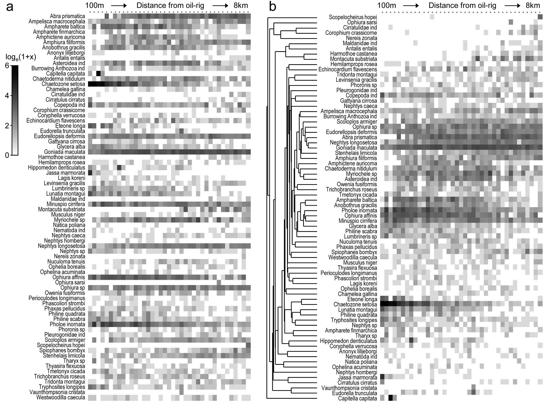
Fig. 7.10. Ekofisk oil-field macrofauna {E}. a) Shade plot of the data matrix of 39 sites (columns), ordered by increasing distance from the oil-rig, and a subset of 74 of the 173 species (rows), those accounting for at least 1% of the total count in at least one of the sites. Depth of grey shading is linearly proportional to a log$_e (x+1)$ transformation of the counts x (see key). Species are in arbitrary (alphabetic) order.
b) Shading is exactly as for (a) but the species are re-arranged, firstly hierarchically grouped by an agglomerative clustering (shown) of untransformed but species-standardised values, using the index of association to define species similarity, then re-ordered (within the constraints of permitted dendrogram rotation) to maximise the seriation $\rho$ statistic (Spearman rank) among species.
Why is MDS picking up such a pattern? The human eye can see it in a clear fashion only if the species are grouped by dendrogram and reordered serially within those constraints, to obtain the shade plot Fig. 7.10b.
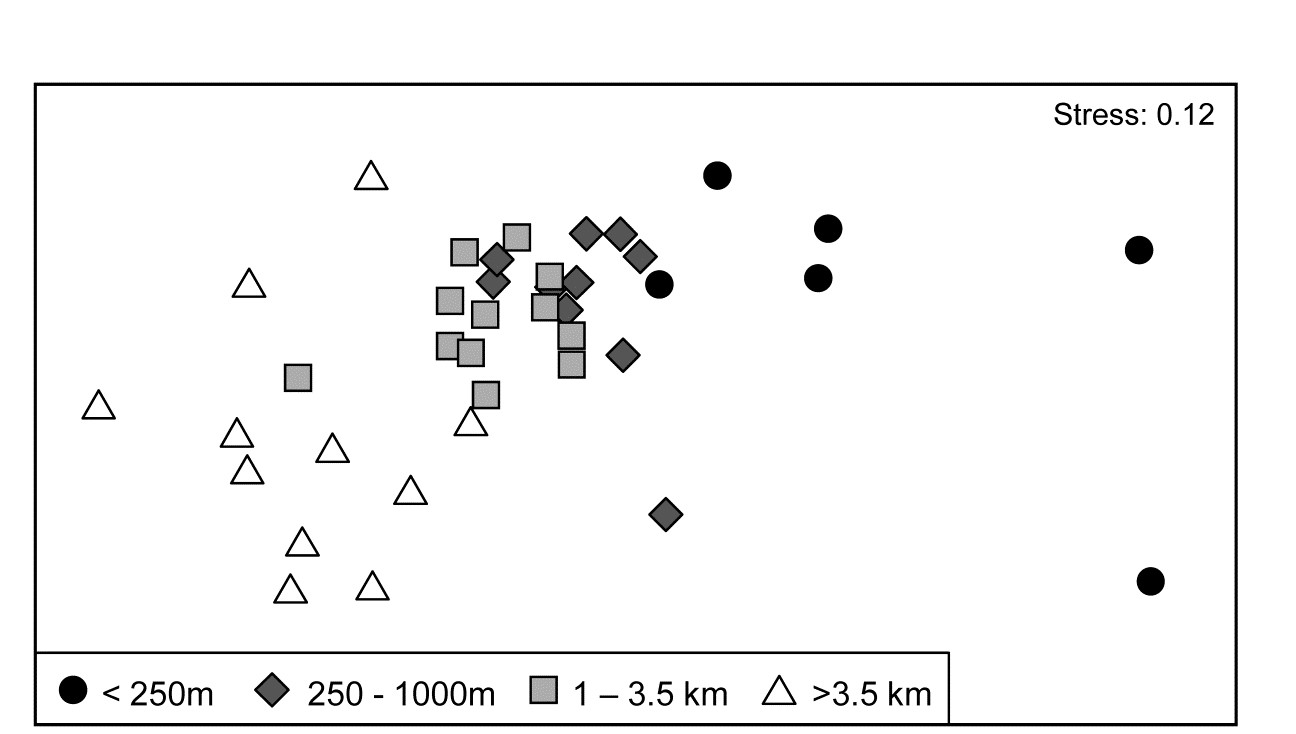
Fig. 7.11. Ekofisk oil-field macrofauna {E}. nMDS ordination of 39 sites from four (pre-assigned) groups of distances from the oil-field, based on the 74 species and log$_e(x+1)$ transformed counts displayed in the shade plots of Fig. 7.10, and utilising Bray-Curtis similarities. (Note the closely similar outcome to the previous ordination of these data, Fig. 6.13a, based on the full set of 173 species and square-root transformed counts). The plot shows a clear change in community structure with distance from the rig, extending to a distinction between sites within and outside 3.5km, even though the latter are in all directions away from the rig and therefore distant from each other.
7.10b contains identical information to 7.10a but now the pattern is obvious! As pointed out earlier, when the sample axis is fixed, independently of the species data (here it is simply a distance scale), any visual suggestion of diagonalisation is prima facie evidence for a community gradient across that sample ordering, and here it is abundantly clear (and ordered ANOSIM or RELATE tests absolutely confirm it). Species near the bottom of the shade plot (7.10b) tend to be those which, like C. setosa, increase sharply in abundance closer to the rig; those which are found throughout the distance range but still tend to increase towards the rig are seen in the mid-plot; above them is a group of species with a non-monotonic response, having their larger values in the mid-distances; then come a further set of abundant species which tend to decline nearer the rig, and at the top, the species which only tend to be found in the ‘background’ communities at >3-4km distant. Scattered throughout are species that show little relation to distance but these tend to be only patchily present, and there is a dominant ‘feel’ of groups of species responding (or least correlating) in different ways to the conditions represented by the distance gradient. The real strength of a multivariate approach is thus seen to be the way it is able to stitch together a little information from a lot of species, not only to produce a striking synthesis such as the MDS of Fig. 7.11 but also formal tests for this relationship. Having seen Fig. 7.10b, it is easier to look at the same information in the unordered 7.10a and note the same individual species patterns. To a multivariate analysis the two plots are naturally identical (sample similarity calculation makes no use of ordering of the species), but to a merely human interpreter, there can be little doubt which of these plots is the more useful!
Immensely helpful though shade plots can be, there is one important way in which they do not fully present the information captured by a multivariate analysis. The pre-treatment steps, such as transformation, are visually well-represented, and a quick glance at the plot is enough to get a good feel of how many, and which, species will contribute to the analysis (a great many for the log-transformed Ekofisk data). But what is not represented is the effect of the specific resemblance measure in synthesising this high-d information. For example, for the Ekofisk analysis, which species primarily account for the dissimilarity between the 1-3.5km distant sites and those beyond 3.5km, seen in the MDS plot of Fig. 7.11? It is clear from the shade plot that there will be many, but it is still instructive to have a list of those species in decreasing relative contribution to the total dissimilarity between those two groups, and this is provided by the similarity percentages routine (SIMPER).
7.8 Species contributions to sample (dis)similarities – SIMPER
Dissimilarity breakdown between groups
The fundamental information on the multivariate structure of an abundance matrix is summarised in the Bray-Curtis similarities between samples, and it is by disaggregating these that one most precisely identifies the species responsible for particular aspects of the multivariate picture.¶ So, first compute the average dissimilarity $\overline{\delta}$ between all pairs of inter-group samples (e.g. every sample in group 1 paired with every sample in group 2) and then break this average down into separate contributions from each species to $\overline{\delta}$.
For Bray-Curtis dissimilarity $\delta_{jk}$ between two samples j and k, the contribution from the ith species, $\delta_{jk} (i)$, could simply be defined as the ith term in the summation of equation (2.12), namely:
$$\delta_{jk} (i) = 100 \left| y_{ij} - y_{ik} \right| / \sum _ {i=1} ^ p \left( y_{ij} + y_{ik} \right) \tag{7.2} $$
$\delta_{jk}(i)$ is then averaged over all pairs (j,k), with j in the first and k in the second group, to give the average contribution $\overline{\delta}_i$ from the ith species to the overall dissimilarity $\overline{\delta}$ between groups 1 and 2.† Typically, there are many pairs of samples (j, k) making up the average $\overline{\delta}_i$, and a useful measure of how consistently a species contributes to $\overline{\delta} _ i$ across all such pairs is the standard deviation $SD(\delta_i)$ of the $\delta _ {jk}(i)$ values.§ If $\overline{\delta}_i$ is large and $SD(\delta_i)$ small (and thus the ratio $\overline{\delta}_i / SD ( \delta_i )$ is large), then the ith species not only contributes much to the dissimilarity between groups 1 and 2 but it also does so consistently in inter-comparisons of all samples in the two groups; it is a good discriminating species.
Table 7.1. Bristol Channel zooplankton {B}. Averages of transformed densities in site groups A and B of Fig. 7.8 (groups from unconstrained divisive tree method), then breakdown of average dissimilarity between groups A and B into contributions from each species (bold). Species ordered in decreasing contribution (until c.90% of average dissimilarity between A and B of 57.9 is attained, see last column). Ratio (also bold) identifies consistent discriminators by dividing average dissimilarity by its SD.
| Species name | Av Ab Gp A | Av Ab Gp B | Av Diss | Diss /SD |
|
|---|---|---|---|---|---|
| Centropages hamatus | 0.00 |
3.76 |
7.92 |
2.14 |
13.67 |
| Eurytemora affinis | 3.37 |
0.32 |
6.78 |
2.08 |
25.38 |
| Temora longicornis | 0.33 |
3.16 |
6.13 |
2.07 |
35.98 |
| Calanus helgolandicus | 1.09 |
3.64 |
6.03 |
1.62 |
46.40 |
| Acartia bifilosa | 3.05 |
5.56 |
5.51 |
1.39 |
55.92 |
| Pseudocalanus elongatus | 2.83 |
4.25 |
4.76 |
2.85 |
64.14 |
| Sagitta elegans juv | 0.17 |
1.71 |
3.35 |
1.97 |
69.93 |
| Pleurobrachia pileus juv | 1.23 |
0.58 |
2.71 |
1.04 |
74.61 |
| Paracalanus parvus | 0.17 |
1.20 |
2.63 |
0.85 |
79.16 |
| Sagitta elegans | 0.62 |
1.38 |
2.12 |
1.36 |
82.82 |
| Mesopodopsis slabberi | 0.47 |
0.99 |
1.72 |
1.34 |
85.80 |
| Pleuobrachia pileus | 0.81 |
0.46 |
1.62 |
1.14 |
88.60 |
| .................................... | ….. | ….. | ….. | ….. | ….. |
For the Bristol Channel zooplankton data {B} of Fig. 7.8, Table 7.1 shows the results of breaking down the dissimilarities between sample groups A and B into species contributions. Species are ordered by the third column, by decreasing values of average dissimilarity contribution $\overline{\delta} _ i$ to total average dissimilarity $\overline{\delta} = \sum \overline{\delta} _ i = 57.9$. They could instead be ordered by the fourth (Diss/SD) column*, $\overline{\delta}_i / SD ( \delta_i )$. The final column rescales the Av Diss values to a percentage of the total dissimilarity that is contributed by the ith species $(100 \overline{\delta} _ i/ \overline{\delta})$, and then cumulates this down the rows of the table. It can be seen that many species play some part in determining dissimilarity of groups A and B, and this is typical of such SIMPER analyses, particularly (as in this case) when a severe transformation has been used, since the intention is then to let many more species come into the reckoning. Here, c. 90% of the contribution to $\overline{\delta}$ is accounted for by the first 12 species, with 55% by the first five.
Naturally, the results agree well with the patterns of Fig. 7.8: C. hamatus and the Temora sp. are first and third in this list because they are scarcely found at all in group A but have good numbers in very many of the group B sites, the Eurytemora sp. between them having the opposite pattern. Calanus and Pseudocalanus spp. are found in group A, consistently so for the latter, but have much higher densities in group B, with a similar pattern (though much less consistency) for Acartia, with all 6 contributing 65% of the dissimilarity between those groups. This is also seen in the first two columns of Table 7.1, which are means of the abundances over all sites in each group. Note that this averaging is on 4th-root transformed scales, so back-transforms of these averages represent major abundance differences (e.g. 1 back-transforms to a density of 1, 3.5 to 150, 5.6 to 1000 etc).
Alternatively, ordering the list by the ratio column (Diss/SD) highlights the consistent discriminators of the two groups and the contrast is well illustrated by Acartia and Pseudocalanus species. While Acartia has large numbers, particularly in group B, and higher mean density difference between the groups, ensuring it contributes to the between group dissimilarities, the shade plot shows this density to be variable within the groups and it moves down the consistent discriminator list. Pseudocalanus now heads the list even though its densities and mean difference are smaller, because of its greater consistency within groups.
Similarity breakdown within groups
In much the same way, one can examine the contribution each species makes to the average similarity within a group, $\overline{S}$. The mean contribution of the ith species,$\overline{S}_i$, could be defined by taking the average, over all pairs of samples (j, k) within a group, of the ith term in the Bray-Curtis similarity definition of equation (2.1), in its alternative form, namely:
$$ S _ {jk} (i) = 200 \times \min \left( y _ {ij}, y _ {ik} \right) / \sum _ {i=1} ^ p \left( y _ {ij} + y _ {ik} \right) \tag{7.3} $$
The more abundant a species is within a group, the more it will contribute to the intra-group similarities. It typifies that group if it is found at consistent abundance throughout, so that the standard deviation of its contribution $SD(S_i)$ is low, and the ratio $\overline{S} _ i /SD(S_i)$ high. Note that this says nothing about whether that species is a good discriminator of one group from another; it may be very typical of a number of groups.
Table 7.2 shows such a breakdown for group A of the Bristol Channel zooplankton data of Fig. 7.8. The average similarity within the group is $\overline{S} = 62.6$, with 70% of this contributed by the Eurytemora, Acartia and Pseudocalanus species; it is clear from the shade plot that these are the only major ‘players’ in group A. Here Pseudocalanus, though the least abundant of the three on average, heads the table, both in terms of contribution to average intra-group similarity and when consistency of that contribution is considered.
Table 7.2. Bristol Channel zooplankton {B}. Average of transformed density in A and breakdown of average similarity into contributions from each species (decreasing order until c.90% of similarity of 62.6 reached); also ratio of contribution to SD.
| Species name | Av Ab Gp A | Av Sim | Sim /SD |
|
|---|---|---|---|---|
| Pseudocalanus elongatus | 2.83 |
15.29 |
5.31 |
24.44 |
| Eurytemora affinis | 3.37 |
14.89 |
1.66 |
48.23 |
| Acartia bifilosa | 3.05 |
13.72 |
2.03 |
70.15 |
| Polychaete larvae | 1.09 |
4.45 |
1.41 |
77.27 |
| Schistomysis spiritus | 0.87 |
3.00 |
0.84 |
82.07 |
| Calanus helgolandicus | 1.09 |
2.38 |
0.53 |
85.86 |
| Pleurobrachia pileus | 0.81 |
2.34 |
0.67 |
89.61 |
| .................................... | ….. | ….. | ….. | ….. |
Interpretation
The dangers of taking the precise ordering in these tables too seriously, however, is well illustrated by noting that, if sites 9 and 24 had fallen into group B rather than A, which they did for the agglomerative clustering of this data (with k-R clustering giving a third – equally arbitrary – split; see Fig. 3.10), then the contribution and consistency of Eurytemora to the intra-group similarities of A would have been notably enhanced. This would have taken it to the head of the list both for contributions to similarity within group A and to dissimilarity between groups A and B.
Some of the confusion that can arise with interpreting SIMPER output stems from the failure to appreciate that SIMPER is not a hypothesis testing technique but an interpretation step that is only permissible once there has been a testing-based justification. So groups to be compared must either be defined a priori and then seen to be significantly different under pairwise testing by ANOSIM, or the groups have been determined in a posteriori testing by SIMPROF analyses. It is inevitable that two groups which are not significantly different will have some breakdown of their between-group dissimilarities (which will never be zero) into contributions from each species, but if the mean dissimilarity between two groups is no different (statistically) from that within the groups then it is not meaningful or sensible to look at that breakdown.
Another occasional source of confusion is that sometimes a species will have similar mean abundance in two groups but will still feature somewhere in the list of species contributing to the dissimilarities between them. One simple explanation‡ is that if the densities (or biomass, area cover etc) are not negligible then samples from one group will inevitably have some dissimilarity to samples in the other group (except in the unlikely event that values are effectively identical in all replicates of both groups, in which case that species cannot feature in the list). The outcome will be that the standard deviation of those dissimilarities is relatively large, so that the Diss/SD ratio column is too small for that species to be taken seriously – on its own it would certainly not suggest that the groups differ (the implication of a low ratio). In other words, you need to keep an eye on both columns in bold in Table 7.1 (and 7.2) for any interpretation, whether you are primarily using the Av Diss column to better understand which species have contributed to the difference between those groups or Diss/SD to pick out a small number of key species you might monitor to characterise future changes, for example. This is the motivation for SIMPER’s reporting of these two criteria – they serve different practical requirements.
Extensions of SIMPER (Euclidean and 2-way)
The Bray-Curtis measure lends itself to this breakdown into species contributions, both in terms of the dissimilarities between groups and similarities within groups, because of its two equivalent definitions that are expressible as sums over species – of equations (7.2) and (7.3) respectively. Other coefficients can be used; for example, it is straightforward to break down (squared) Euclidean distances into contributions from each of a set of (usually normalised) environmental-type variables, since from equation (2.13):
$$ d _ {jk} ^ 2 (i) = (y _ {ij} - y _ {ik} ) ^ 2 \tag{7.4} $$
needs simply to be summed over species i = 1, ..., p. This deals with identifying variables which primarily differentiate two groups of environmental samples (or other data for which Euclidean distance is relevant), but the reverse table of ‘nearness’ breakdowns within groups is less intuitively constructed.⸙
¶ This is implemented in the SIMPER routine in PRIMER, both in respect of contribution to average similarity within a group and average dissimilarity between groups.
† Though this is a natural definition, it should be noted that, in the general unstandardised case, there is no unambiguous partition of $\delta_{jk}$ into contributions from each species, since the standardising term in the denominator of (7.2) is a function of all species values.
§ The usual definition of standard deviation from elementary statistics is a convenient measure of variability here, but note that the $\delta_{jk}$(i) values are not independent observations, and standard statistical inference cannot be used to define, for example, 95% confidence intervals for the mean contribution from the ith species.
‡ A more subtle possibility is that SIMPER (in line with ANOSIM, which has the same property) is identifying a difference which is more a function of very strong dispersion differences between the groups rather than mean differences, where that arises from a consistent pattern of variance differences in the key species (but note that, quite often, community dispersion differences between groups arises from a totally different source – that of higher turnover or greater sparsity of species in one group than another).
⸙ PRIMER does this by again tabulating a breakdown of squared (usually normalised) Euclidean distances, but for values within a group the table is therefore headed by variables which have zero or low contributions, taking the same or similar values within the group and thus accounting for little of its total squared Euclidean distance. For comparison between groups, the tables have a more familiar ‘feel’ in terms of the analogy with Bray-Curtis SIMPER output. That only squared Euclidean distance is partitioned, not Euclidean distance itself, is not generally of great concern in the context of PRIMER analyses, since they (ANOSIM, nMDS, BEST, RELATE etc) are usually only a function of ranks of the resemblances – identical whether Euclidean distance is squared or not.
7.9 Example: Tasmanian meiofauna
Another clear generalisation is to a 2-way rather than 1-way layout, illustrated by the 16 meiofaunal cores from Eaglehawk Neck, Tasmania, Fig. 6.7. The MDS for the 59 nematode and copepod species from two crossed factors, treatments (disturbed or undisturbed sediment from activity of soldier crabs) and blocks (locations B1 to B4 across the sandflat) is again seen in Fig. 7.12, this time with the 16 pairs of dissimilarities between treatments for the same block shown by dashed lines. Clearly, they are the only dissimilarities appropriate to a SIMPER analysis of which species are primarily responsible for the community change between Disturbed and Undisturbed conditions which was established in Chapter 6 by the 2-way ANOSIM test, and they are the similarities used in the species breakdown produced by the 2-way crossed SIMPER calculations (e.g. Platell, Potter & Clarke (1998) ).
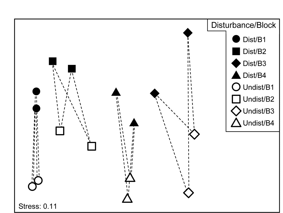
Fig. 7.12. Tasmania, Eaglehawk Neck {T}. nMDS of 2 replicates from each of 4 blocks under disturbed/undisturbed conditions (see Fig. 6.7). 2-way SIMPER for the species contributing to the disturbance effect uses only the dissimilarities indicated by dashed lines, i.e. between disturbance conditions within each block.
A 1-way SIMPER on the treatment factor in this case would look at all 64 dissimilarities between the 8 samples in each of the two conditions, but this mixes up effects which are due to treatment with those due to block differences, since for example they would use the dissimilarity between a Disturbed sample in Block 1 and an Undisturbed sample in Block 2. A separate 1-way SIMPER analysis could be run on the treatment difference for each of the blocks, but the 2-way SIMPER here combines these neatly into a more succinct table, and there seems little evidence (from the MDS plot) of the disturbance effect differing to any great extent from block to block – this appears to be an approximately additive 2-factor pattern.
Other techniques for identifying species
A significant weakness of the SIMPER approach is its limitation to comparing two identified groups of samples at a time, sometimes leading to very large numbers of tables which are difficult to synthesise. In some contexts, a grouping structure of samples is not even observed or expected, the sample pattern being that of a continuous gradient (or gradients). What is needed here is a more holistic technique, identifying the set of influential species which between them are able to capture the full multivariate pattern (whether clustered or a gradation), and which operates with any appropriately-defined similarity coefficient. A solution to this is presented later, in Chapter 16 on comparing multivariate patterns. It has a somewhat different premise than SIMPER: the search is not for the (possibly very large) suite of species which do actually contribute to the full multivariate pattern but the smallest possible set of species which could stand in for the full set. They encompass the various ways in which groups of species respond differently to the drivers of that community structure but only one representative of each group may be required in order to capture that response. The links to the ‘coherent species’ topic at the start of this chapter are evident.
Linking species to MDS displays
Whether the primary species of interest are generated from SIMPER tables for discrete groups, or in more continuous cases by noting their gradient behaviour in a shade plot or extracting them from the (Chapter 16) redundancy analysis, a final step would best view these selected species in the context of the displayed multivariate sample pattern (when low-dimensional ordination is acceptable), therefore stitching all the various threads together. The choice here is usually a 2-d or 3-d MDS, either nMDS or mMDS, sometimes based on averaging replicates (or on centroids in the high-d resemblance space in the context of PERMANOVA) because then the MDS will very often be of sufficiently low stress to be a reliable summary. The relationship of the individual species to this overall community pattern is achieved by bubble plots.
7.10 Bubble plots (plus examples)
Bubble plots
Abundance (or density, biomass, area cover etc) for a particular species can be shown on the corresponding ordination point by a circle (‘bubble’) of size proportional to that abundance, based either on its original scaling (e.g. counts), or on the transformed scale (e.g. log counts) employed for all species to produce that ordination. The idea was previously met in Fig. 6.15, in the context of relating individual components of diet of a specific fish predator species to the nMDS produced for the (averaged) full dietary assemblage. But bubble plots can be useful in any context where values of a single variable need to be related to a 2-d or 3-d configuration¶ based on a wider or different set of variables, e.g. in relating an ordination based on assemblage data to specific environmental variables which are potential community drivers (Chapter 11).
Example: Ekofisk oil-field macrofauna
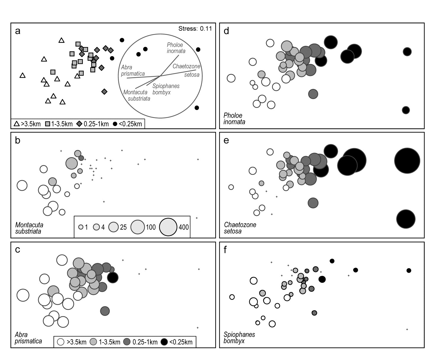
Fig. 7.13. Ekofisk oil-field macrofauna {E}. a) nMDS of 39 sites at different distances from the rig (a priori assigned to four distance groups, denoted by different symbols/shading), based on square-root transformed counts of 173 species and showing a clear gradient of community change with distance. Superimposed is a vector plot for five species, chosen to display a range of observed responses to the gradient, with the vector direction for each species reflecting the (Pearson) correlations of their (root-transformed) counts with the two ordination axes (the latter rotated, as usual for an MDS, to PCs), and length giving the multiple correlation coefficient from this linear regression on the ordination points (the circle is a correlation of 1). b-f) Individual bubble plots for these 5 species, on the same nMDS, with dot representing absence and circle sizes proportional to transformed counts; the back-transformed scale of original counts is in (b), common to all plots.
Fig. 7.13a replots the nMDS ordination of sediment macrofaunal assemblages (173 species) for 39 sites at different distances from the Ekofisk oil-field, in the form previously seen at Fig. 6.13a (based on square-root transformed counts). The a priori site groups at different distances are indicated by differing symbols but also by grey-shading, which is used in the bubble plots which follow, Figs. 7.13b-f, for five individual species. These are chosen to illustrate a range of the differing responses which meld together to produce the main gradient of assemblage change as sites near the oil-field (from four or five directions). That many species replicate each of these patterns, and more, is seen from the shade plot of Fig. 7.10b (that is based on log-transformed counts but the outcome is similar here). M. substriata is typical of species found in the background conditions but which are virtually absent at <1km from the oilrig. Species like A. prismatica are found in reasonable numbers right up to 250m from the rig but then appear to die out at the closest distances. P. inornata typifies an interesting group of species which, though present in background assemblages, are opportunists whose numbers increase as sites near the rig, in this case up to the very closest distances (<100m) before decreasing in abundance. C. setosa similarly shows an opportunist pattern with the highest counts in the matrix overall, and these are all within the <250m group, with counts increasing steadily as sites approach the oil-field centre. Counts of other species, such as S. bombyx, appear to bear a much weaker relation to the position of the points on the MDS, as well as having generally smaller values. Here, bubble sizes are chosen to be proportional to the transformed counts (and the common key, shown in b, back-transformed to original scales), in order to gauge relative species contributions to the MDS.
Vector plots
A great many bubble plots could be produced in this case, where the clear gradient is constructed from the combination of a large number of species, each highlighting particular parts of the gradient. It is therefore tempting to attempt to represent these in a single plot, each species defined by a vector whose direction and length define, respectively, the direction in the MDS space in which that species increases its counts, and the (multiple) correlation coefficient of that species with the ordination configuration†. The combination of these vectors is then superimposed on the MDS, as in Fig. 7.13a for the 5 species shown in the bubble plots of 7.13b-f. Technically, this is carried out by fitting multiple linear regression of the species counts to the MDS (x, y) co-ordinates – or (x, y, z) points if the MDS is in 3-d. If the MDS has been rotated such that the axes are uncorrelated (as noted earlier, this is automatic for the initial plot), then the vector lengths projected onto the x and y axes represent the Pearson correlations of that species with each axis. These are thus comparable across species in the vector diagram, with the circle representing a multiple correlation of 1, but note that since these are separate regressions for each species, differences in scale among species counts are not seen in vector lengths. They reflect (scale-free) correlations with axes, not contributions to the MDS, e.g. the smaller counts of S. bombyx, see Fig. 7.13f, do not of themselves shorten their vector.§
It is crucial to appreciate that the vector plot can be placed anywhere on the ordination plot, and can be scaled to any size, with its interpretation completely unchanged. This is often misunderstood, with users of vector plots sometimes inferring that the end point of a vector being close to a particular sample indicates, in some way, that this species takes its largest values at, or in the vicinity of, that sample. This is absolutely incorrect. All a vector indicates is a direction – the centre point of the vectors can be placed anywhere but the direction in which a vector extends from that point is the direction in which that variable increases, e.g. the lowest C. setosa values are expected to the left and highest to the right of the plot (as in 7.13e).
Widely used though such vector plots are, they have a serious problem, also poorly understood in the literature. They make the fundamental assumption that the relationship of species values to the plot co-ordinates is a linear one. But most of the bubble plots of Fig. 7.13 (and the much larger species set of Fig. 7.10b) do not show such a relationship. Here, only C. setosa displays a linear-like increase from left to right of the plot, and arguably S. bombyx (right to left), with a weaker correlation. Others are distinctly non-linear, M. substriata and A. prismatica having a threshold-type relation (constant then dropping to nothing), and P. inornata an increasing then decreasing pattern, not even monotonic. The telling comparison is between the vector plot of Fig. 7.13a and the bubble plots of b-f. Does the vector plot really describe the pattern of relationships seen in the bubble plots? Scarcely, when at all – it is unquestionably a poor substitute for them.
Nonetheless, a space limitation on multiple plots will often be encountered, and the ability to replace 4 or 5 bubble plots (or more) by a single graph is necessary. This may be achievable by segmented bubble plots.
Multi-variable (segmented) bubble plots
Fig. 7.14 condenses the bubble plots of Fig. 7.13b-e into a single MDS plot, by simply showing segments of a circle (or, in 3-d, a sphere), differently shaded or coloured, with sizes again reflecting values of those four species in each sample, also commonly scaled as before (root-transformed). Whilst colour would aid distinction of the species (which of course PRIMER allows), it is still possible to draw exactly the same inference from this graph as for the four bubble plots.
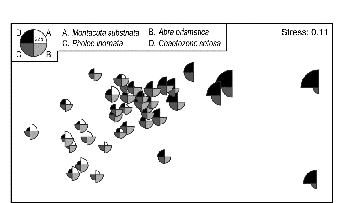
Fig. 7.14. Ekofisk oil-field macrofauna {E}. Segmented bubble plot for MDS ordination as in Fig. 7.13a, with segment sizes proportional to the root-transformed counts of four species, commonly scaled. The size of segments in the key corresponds to a count of 225, when back-transformed to the original scale.
A remarkably clear example of a similar graph is seen for the Bristol Channel zooplankton data last met in the shade plot of Fig. 7.8. This example uses the agglomerative clusters and MDS ordination of Fig. 3.10a, selecting four species to display by the criterion that they head the list of typifying species for each of the four clusters in the corresponding SIMPER analysis table‡. The combination of information from a shade plot and SIMPER analyses will often dictate species which could be usefully graphed in this way. Note that the bubble segment sizes use the original scales here and not the fourth-root transformed values that went into the MDS construction. This is a legitimate and often useful step, if the requirement is primarily to look at how the abundance of individual species behaves, e.g. over a community gradient, rather than the precise influence this has on the MDS itself. In that context, separate scaling of variables is not only permissible, it is almost mandatory if the plot is to be interpretable, e.g. here the Eurytemora values range only up to <500 whereas the maximum Paracalanus density is >30,000 (this is precisely why a severe 4th-root transform was essential in this case, of course). We shall also see later (Chapter 11) that bubble plots have a useful role in displaying environmental-type variables on the points of an assemblage ordination, and the original units are rarely commonly scalable.
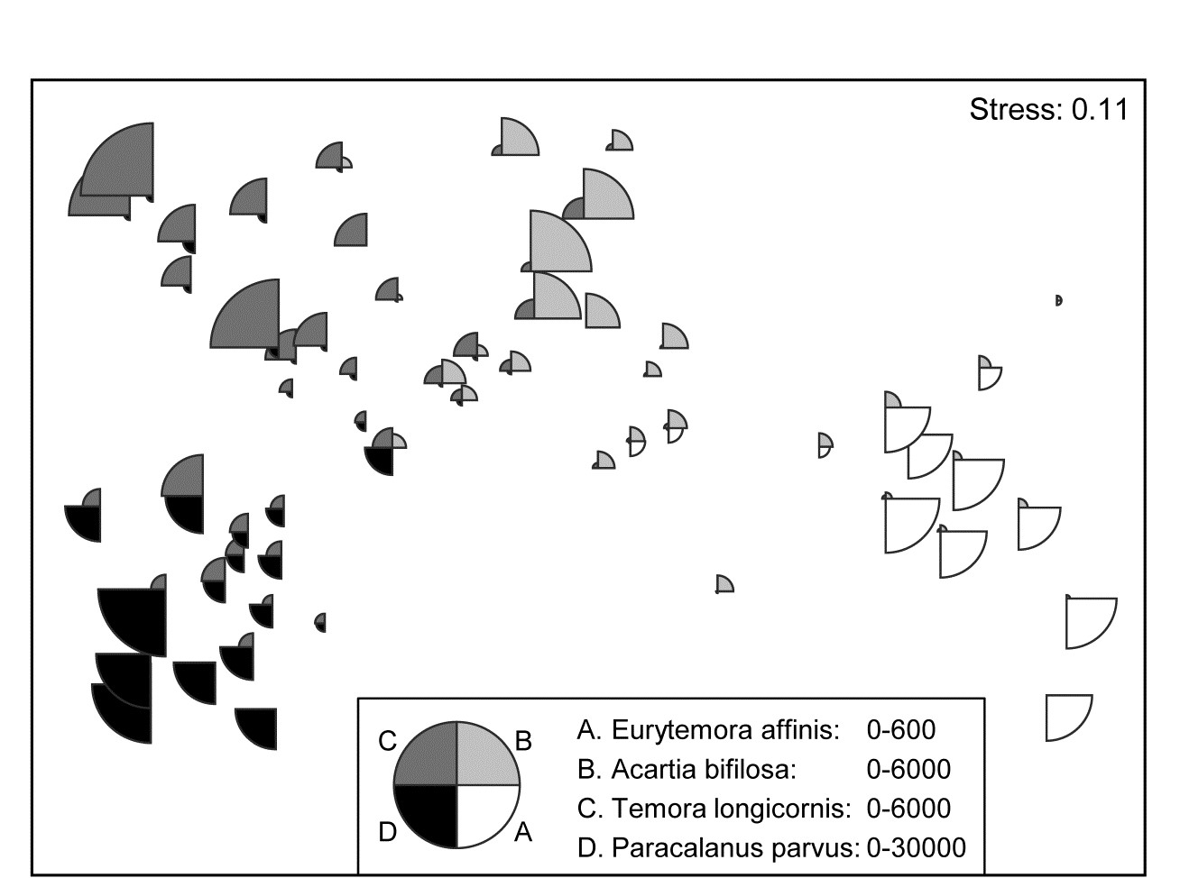
Fig. 7.15. Bristol Channel zooplankton {B}. Segmented bubble plot on nMDS ordination of the 57 sites, using Bray-Curtis on $\sqrt{} \sqrt{}$- abundances, leading by Type 1 SIMPROF to the 4 site clusters (A-D) of Fig. 3.10a, agglomerative clustering. Bubble segments are proportional to raw counts of the four species which ‘most typify’ those clusters, from SIMPER tables. Counts for these species (correspondingly labelled A-D) are differently scaled.
Segmented bubble plots often prove most useful when the number of points on an ordination plot is small and the sampling error of each point has been substantially reduced, so that the picture consists mainly of genuine differences; then it is sometimes possible to show quite large numbers of species simultaneously. Such bubble plots thus have a strong role to play in means plots.
Example: W Australian fish diets
Hourston, Platell, Valesini et al. (2004) and Schafer, Platell, Valesini et al. (2002) report dietary data on gut contents (identified to one of 32 taxon groups) of 7 marine fish species in nearshore, lower west coast Australian waters. Analysis was of sample-standardised (thus percent composition) data, in similar fashion to that for the (different) labrid fish dietary data of Fig. 16.5. The nMDS plot⸙ of Fig. 7.16 is based on meaned data over all fish guts for each of the 7 species (species names shown on the plot). This time it is SIMPER tables of the major dietary contributors, to the dissimilarities between fish species pairs, which have identified 6 dietary taxon groups to show as segmented bubbles overlaid on the mean points. Interpretation of the differing dietary regimes found amongst these co-occurring species, including those for three congeneric species, is now clear and direct, but must of course be made in conjunction with tests (such as in ANOSIM or PERMANOVA) to establish their statistical significance.
Fig. 7.16. Diets of W Australian fish {d}. Segmented bubble plot. nMDS ordination (using Bray-Curtis similarities) of standardised, transformed, then averaged gut compositions (by volume) of 32 broad dietary categories, from 7 abundant fish species in nearshore habitats. Superimposed bubble segment sizes represent % composition (untransformed) for 6 dietary categories, shown from SIMPER analysis to contribute most to the average dissimilarities among the diets of the different fish species. Segment sizes are commonly scaled here (key sizes represent 50% composition).
¶ PRIMER can plot 3-d versions (when the term ‘bubble plot’ is more appropriate!) for both simple and segmented bubble plots, though none are reproduced here since rotatable 3-d colour plots are not very successfully reproduced in static 2-d mono pictures.
† Significance tests for these correlations would not be valid, not least because the vectors represent species which are part of the full set used to create the ordination points in the first place!
§ There are two other definitions of vectors available in PRIMER for 2- or 3-d ordinations. Pearson, here, is the default; an alternative is a multivariate (multiple) correlation method, which fits the supplied superimposed variables jointly, so vector directions will change if further variables are added, see discussion in the PERMANOVA+ manual, Anderson, Gorley & Clarke (2008) , where this is used with Principal Co-ordinates, PCO. A third method (‘base variables’) arises only for PCA plots, a relevant ordination for analysis of environmental-type data, not the current case. The vectors then reflect the relative size and magnitude of coefficients of each variable in the PC1, PC2,... definitions, as in equation (4.1). Linear relationships of these variables to the co-ordinates of the plot is thus guaranteed and a vector plot always justified.
‡ Of the type seen in Table 7.2, noting that Eurytemora affinis will head this table if the agglomerative groups are used (page 7.8).
⸙ As seen on page 5.9, nMDS plots with few points, as here, can collapse, e.g. because one species predates on primarily different dietary categories than found anywhere else in the matrix. Metric MDS (or an nMDS solution which mixes a small amount of metric stress, to ‘fix’ the collapse) are often useful for such means plots, though they were not necessary in this case, with the main dietary categories usually being shared between more than one species.
Chapter 8: Diversity measures, dominance curves and other graphical analyses
8.1 Univariate measures
A variety of different statistics (single numbers) can be used as measures of some attribute of community structure in a sample. These include the total number of individuals (N), total number of species (S), the total biomass (B), and also ratios such as B/N (the average size of an organism in the sample) and N/S (the average number of individuals per species). Abundance or biomass totals (or averages) are not dimensionless quantities so tend to be less informative than diversity indices, such as: richness of the sample, in terms of the number of species (perhaps for a given number of individuals); dominance or evenness in the way in which the total number of individuals in the sample is divided up among the different species (and, in one version of this, a parameter of the species abundance distribution first described by
Fisher, Corbet & Williams (1943)
).
Diversity indices
The main aim is to reduce the multivariate (multi-species) complexity of assemblage data into a single index (or small number of indices) evaluated for each sample, which can then be handled statistically by univariate analyses. It will often be possible to apply standard normal-theory tests (t-tests and ANOVA) to such derived indices (see page 6.1), possibly after transformation.
A bewildering variety of diversity indices has been used, in a large literature on the subject, and some of the most frequently used candidates are listed below.¶ More detail can be found in two (of several) overviews aimed specifically at the biological reader, Heip, Herman & Soetaert (1988) and Magurran (1991) . It should be noted, however, that diversity indices of this type tend to exploit some combination of just two features of the sample information:
a) Species richness. This measure is either simply the total number of species present or some adjusted form which attempts to allow for differing numbers of individuals. Obviously, for samples which are strictly comparable, we would consider a sample containing more species than another to be the more diverse.
b) Equitability. This expresses how evenly the individuals are distributed among the different species, and is often termed evenness. For example, if two samples each comprising 100 individuals and four species had species abundances of 25, 25, 25, 25 and 97, 1, 1, 1, we would intuitively consider the former to be more diverse although the species richness is the same. The former has high evenness, and low dominance (essentially the reverse of evenness), while the latter has low evenness and high dominance (the sample being highly dominated by one species).
Different diversity indices emphasize the species richness or equitability components of diversity to varying degrees. The most commonly used diversity measure is the Shannon (or Shannon–Wiener) diversity index:
$$H^\prime = – \sum _ i p _ i \log(p _ i) \tag{8.1} $$
where $p _ i$ is the proportion of the total count (or biomass etc) arising from the ith species. Note that logarithms to the base 2 are sometimes used in the calculation, reflecting the index’s genesis in information theory. There is, however, no natural biological interpretation here, so the more usual natural logarithm (to the base e) is probably preferable, and commonly used. Clearly, when comparing published indices it is important to check that the same logarithm base has been used in each case. If not, it is simple to convert between results since $\log _ 2 x = (\log _ e x ) / (\log_e 2)$, i.e. all indices just need to be multiplied or divided by a constant factor. Whether it is sensible to compare $H ^ \prime$ across different studies is another matter, since Chapter 17 shows that, like many of the indices given here (Simpson being a notable exception, Fig. 17.1), it can be sensitive to the degree of sampling effort. Hence $H ^ \prime$ should only be compared across equivalent sampling designs.
Species richness
Species richness is often given simply as the total number of species (S), which is obviously very dependent on sample size (the bigger the sample, the more species there are likely to be). Alternatively, Margalef’s index (d) is used, which also incorporates the total number of individuals (N), in an attempt to adjust for the fact that within a larger number of individuals, more species may expect to be found:
$$ d = (S-1) / \log N \tag{8.2} $$
Equitability
This is often expressed as Pielou’s evenness index:
$$ J^ \prime = H ^ \prime / H ^ \prime _ {max} = H ^ \prime / \log S \tag{8.3} $$
where $H ^ \prime _ {max}$ is the maximum possible value of Shannon diversity, i.e. that which would be achieved if all species were equally abundant (namely, log S).
Simpson
Another commonly used measure is the Simpson index, which has a number of forms:
$$ \lambda = \sum p _ i ^ 2 $$ $$ 1 - \lambda = 1 - \left( \sum p _ i ^ 2 \right) $$ $$ \lambda ^ \prime = \left( \sum _ i N _i (N _ i -1) \right) / \left[ N ( N -1) \right] $$ $$ 1 - \lambda ^ \prime = 1 - \left( \sum _ i N _i (N _ i -1) \right) / \left[ N ( N -1) \right] \tag{8.4} $$
where $N _ i$ is the number of individuals of species i. The index $\lambda$ has a natural interpretation as the probability that any two individuals from the sample, chosen at random, are from the same species ($\lambda$ is always $ \le 1$). It is a dominance index, in the sense that its largest values correspond to assemblages whose total abundance is dominated by one, or a very few, of the species present. Its complement, $1 – \lambda$, is thus an equitability or evenness index (sometimes called Gini-Simpson), taking its largest value (of $1 – S ^ {–1}$) when all species have the same abundance. The slightly revised forms $\lambda ^ \prime$ and $1 – \lambda ^ \prime$ are appropriate when total sample size (N) is small (they correspond to choosing the two individuals at random without replacement rather than with replacement). As with Shannon, Simpson diversity can be employed when the {$p_i$} come from proportions of biomass, standardised abundance or other data that are not strictly integral counts but, in that case, the $\lambda ^ \prime$ and $1 – \lambda ^ \prime$ forms are not appropriate.
Other count-based measures
Further well-established indices include that of Brillouin (see Pielou (1975) ):
$$H = N ^ {–1} \log _ e \left( N!/[N _ 1! N _ 2! \ldots N _ S!] \right) \tag{8.5} $$
and a further model-based description, Fisher’s $\alpha$ ( Fisher, Corbet & Williams (1943) ), which is the shape parameter, fitted by maximum likelihood, under the assumption that the species abundance distribution (SAD curve) follows a log series distribution. This has certainly been shown to be the case for some ecological data sets but can by no means be universally assumed, and (as with Brillouin) its use is clearly restricted to genuine (integral) counts.
The final option in this category is the rarefaction method of Sanders (1968) and Hurlbert (1971) , which under the strict assumption that individuals arrive in the sample independently of each other, can be used to project back from the counts of total species (S) and individuals (N), how many species ($E S _ n$) would have been ‘expected’ had we observed a smaller number (n) of individuals:
$$ E S _ n = \sum _ {i=1} ^ S \left[ 1 - \frac{ ( N - N _ i ) ! ( N - n ) ! }{ ( N - N _ i -n) ! N !} \right] \tag{8.6} $$
The idea is thereby to generate an absolute measure of species richness, say $E S _ {100}$ (the number of different species ‘expected’ in a sample of 100 individuals), which can be compared across samples of very differing sizes. It must be admitted, however, that the independence assumption is practically unrealistic. It corresponds to individuals from each species being spatially randomly distributed, giving rise to independent Poisson counts in replicate samples. This is rarely observed in practice, with most species exhibiting some form of spatial clustering, which can often be extreme. Rarefaction will then be strongly biased, consistently overestimating the expected number of species for smaller sample sizes.
Hill numbers
Finally, Hill (1973b) proposed a unification of several diversity measures in a single statistic, which includes as special cases:
$$ N _ 0 = S $$ $$ N _ 1 = \exp( H ^ \prime) $$ $$ N _ 2 = 1 / \sum p _ i ^ 2 $$ $$ N _ \infty = 1 / \max (p _ i ) \tag{8.7} $$
$N _ 1$ is thus a transform of Shannon diversity, $N _ 2$ the reciprocal of Simpson’s dominance $\lambda$ (called inverse Simpson) and $ N _ \infty$ is another possible evenness index (the reciprocal of the Berger-Parker index), which takes larger values if no single species dominates the total abundance. Other variations on these Hill numbers are given by
Heip, Herman & Soetaert (1988)
.
Units of measurement
The numbers of individuals belonging to each species are the most common units used in the calculation of the above indices. For internal comparative purposes other units can sometimes be used, e.g. biomass or total cover of each species along a transect or in quadrats (e.g. for hard-bottom epifauna), but obviously diversity measures using different units are not difficult to compare. Often, on hard bottoms where colonial encrusting organisms are difficult to enumerate, total or percentage cover will be much more realistic to determine than species abundances.
Representing communities
Changes in univariate indices between sites or over time are usually presented graphically† simply as plots of means and confidence intervals for each site or time. For example, Fig. 8.1 graphs the differences in diversity of the macrobenthos and meiobenthic nematodes at six stations in Hamilton Harbour, Bermuda, showing that there are clear differences in diversity between sites for the former but much less obvious differences for the latter. Fig. 8.2 graphs the temporal changes in three univariate indices for reef corals at South Tikus Island, Indonesia, spanning the period of the 1982–3 El Niño (an abnormally long period of high water temperatures which caused extensive coral bleaching in many areas throughout the Pacific). Note the dramatic decline between 1981 and 1983 and subsequent partial recovery in both the number of species ($S$) and the Shannon diversity ($ H ^ \prime$), but no obvious changes in evenness ($ J ^ \prime$).
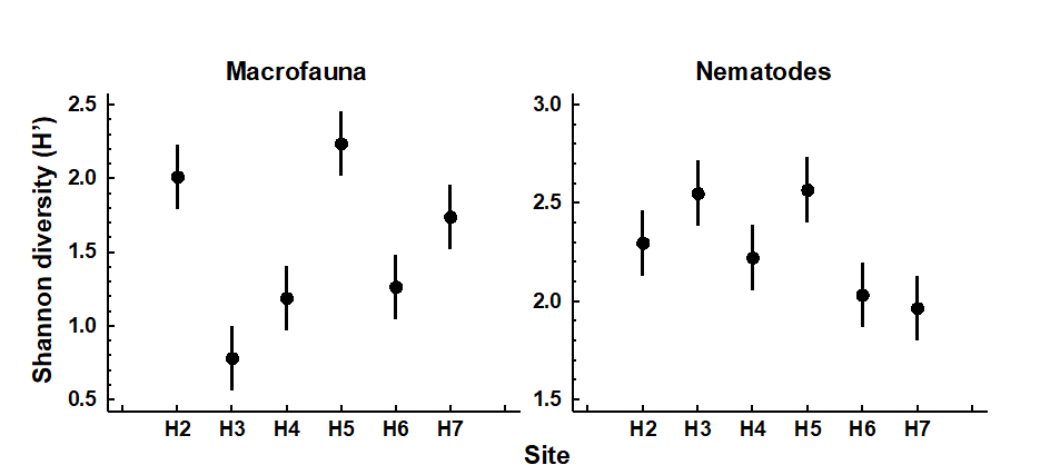
Fig. 8.1. Hamilton Harbour, Bermuda {H}. Diversity (H′) and 95% confidence intervals for macrobenthos (left) and meiobenthic nematodes (right) at six stations.
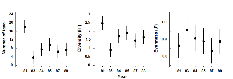
Fig. 8.2. Indonesian reef corals, South Tikus Island {I}. Total number of species (S), Diversity (H') and Evenness (J') based on coral species cover data along transects, spanning the 1982–3 El Niño.
Discriminating sites or times
The significance of differences in univariate indices between sampling sites or times can simply be tested by one-way analysis of variance (ANOVA)§ followed by t-tests or multiple comparison tests for individual pairs of sites; see discussion at the start of Chapter 6.
Determining stress levels
Increasing levels of environmental stress have historically been considered to decrease diversity (e.g. $H ^ \prime$), decrease species richness (e.g. d) and decrease evenness (e.g. $J ^ \prime$), i.e. increase dominance. This interpretation may, however, be an over-simplification of the situation. Subsequent theories on the influence of disturbance or stress on diversity have suggested that in situations where disturbance is minimal, species diversity is reduced because of competitive exclusion between species; with a slightly increased level or frequency of disturbance competition is relaxed, resulting in an increased diversity, and then at still higher or more frequent levels of disturbance species start to become eliminated by stress, so that diversity falls again. Thus it is at intermediate levels of disturbance that diversity is highest (
Connell (1978)
;
Huston (1979)
). Therefore, depending on the starting point of the community in relation to existing stress levels, increasing levels of stress (e.g. induced by pollution) may either result in an increase or decrease in diversity. It is difficult, if not impossible, to say at what point on this continuum the community under investigation exists, or what value of diversity one might expect at that site if the community were not subjected to any anthropogenic stress. Thus, changes in diversity can only be assessed by comparisons between stations along a spatial contamination gradient (e.g. Fig. 8.1) or with historical data (Fig. 8.2).
Caswell’s neutral model
In some circumstances, the equitability component of diversity can, however, be compared with a theoretical expectation for diversity, given the number of individuals and species present. Observed diversity has been compared with predictions from Caswell’s neutral model ( Caswell (1976) ). This model constructs an ecologically ‘neutral’ community with the same number of species and individuals as the observed community, assuming certain community assembly rules (random births/deaths and random immigrations/emigrations) and no interactions between species. The deviation statistic V is then determined which compares the observed diversity ($H ^ \prime$) with that predicted from the neutral model ($E(H ^ \prime)$):
$$ V = \frac{ \left[ H ^ \prime - E (H ^ \prime) \right] }{SD ( H ^ \prime) } \tag{8.8} $$
A value of zero for the V statistic indicates neutrality, positive values indicate greater diversity than predicted and negative values lower diversity. Values > +2 or < -2 indicate ‘significant’ departures from neutrality. The computer program of Goldman and Lambshead (1989) is useful.‡
Table 8.1 gives the V statistics for the macrobenthos and nematode component of the meiobenthos from Hamilton Harbour, Bermuda (c.f. Fig. 8.1). Note that the diversity of the macrobenthos at stations H4 and H3 is significantly below neutral model predictions, but the nematodes are close to neutrality at all stations. This might indicate that the macrobenthic communities are under some kind of stress at these two stations. However, it must be borne in mind that deviation in H′ from the neutral model prediction depends only on differences in equitability, since the species richness is fixed, and that the equitability component of diversity may behave differently from the species richness component in response to stress (see, for example, Fig. 8.2). Also, it is quite possible that the ‘intermediate disturbance hypothesis’ will have a bearing on the behaviour of V in response to disturbance, and increased disturbance may either cause it to decrease or increase. Using this method, Caswell found that the flora of tropical rain forests had a diversity below neutral model predictions!
Table 8.1. Hamilton Harbour, Bermuda {H}. V statistics for summed replicates of macrobenthos and meiobenthic nematode samples at six stations.
| Station | Macrobenthos | Nematodes |
|---|---|---|
| H2 | +0.5 | –0.1 |
| H3 | –5.4 | +0.4 |
| H4 | –4.5 | –0.5 |
| H5 | –1.9 | 0.0 |
| H6 | –1.3 | –0.4 |
| H7 | –0.2 | –0.4 |
¶ The PRIMER DIVERSE routine permits selection of a subset from a list of over 20 indices, sending the values to a worksheet for plotting or export to a mainstream statistical package. Whilst the (non-parametric multivariate) PRIMER package does not do conventional univariate statistical testing, under the usual normality and constant variance assumptions across groups (which can be found in all standard statistical software), some of the elements of univariate analysis are certainly possible, univariate being a special case of multivariate! – see later. PRIMER also has plotting routines for Means Plots, Histograms, Box Plots, Line Plots, Scatter Plots for pairs or triples of indices etc.
† PRIMER 7’s Means Plot produces plots such as Fig. 8.1, the 95% confidence intervals either based on separate estimates of variance for each group or, as throughout this manual, assuming a pooled variance estimate (constant variance) across groups.
§ A rank-based alternative, using PRIMER, would be to compute Euclidean distance on a single variable (index) and input this to ANOSIM. This does not give the usual non-parametric univariate tests (Wilcoxon Mann-Whitney U for two groups, Kruskal-Wallis for several groups), but gives an alternative which generalises to multivariate data in a way that those tests do not, the permutation structure being the same but the test statistics differing. Or using PERMANOVA on the Euclidean distances gives an exact copy of the classical ANOVA table (see Anderson, Gorley & Clarke (2008) ), except that the ‘F tests’ are permutation-based rather than making the less robust F distribution assumption, from normality (but the two will be very similar here, since normality is realistic for most indices).
‡ This is implemented in the PRIMER CASWELL routine, but the significance aspects should be treated with some caution since they are inevitably crucially dependent on the neutral model assumptions. These are usually over-simplistic for real assemblages (even when genuinely neutral, in the sense that their species do not interact) because they again assume simple spatial randomness.
8.2 Graphical/distributional plots
The purpose of graphical/distributional representations is to extract information on patterns of relative species abundances without reducing that information to a single summary statistic, such as a diversity index. This class of techniques can be thought of as intermediate between univariate summaries and full multivariate analyses. Unlike multivariate methods, these distributions may extract universal features of community structure which are not a function of the specific taxa present, and may therefore be related to levels of biological ‘stress’.¶
-
Rarefaction curves Sanders (1968) were among the earliest to be used in marine studies. They are plots of the number of individuals on the x-axis against the number of species on the y-axis. The more diverse the community is, the steeper and more elevated is the rarefaction curve. The sample sizes (N) may differ widely between stations, but the relevant sections of the curves can still be compared.
-
Gray & Pearson (1982) recommend plotting the number of species in x2 geometric abundance classes (the SAD curves) as a means of detecting pollution effects. The plots are of the number of species represented by only 1 individual in the sample (class 1), 2–3 individuals (class 2), 4–7 (class 3), 8–15 (class 4) etc. In unpolluted situations there are many rare species and the curve is smooth with its mode well to the left. In polluted situations there are fewer rare species and more abundant species so that the higher geometric abundance classes are more strongly represented, and the curve may also become more irregular or ‘jagged’ (although this latter feature is more difficult to quantify). Gray and Pearson further suggest that it is the species in the intermediate abundance classes 3 to 5 that are the most sensitive to pollution-induced changes and might best illustrate the differences between polluted and unpolluted sites (e.g. this is a way of selecting ‘indicator species’ objectively).
-
Ranked species abundance (dominance) curves are based on the ranking of species (or higher taxa) in decreasing order of their importance in terms of abundance or biomass. The ranked abundances, expressed as a percentage of the total abundance of all species, are plotted against the relevant species rank. Log transformations of one or both axes have frequently been used to emphasise or downweight different sections of the curves. Logging the x (rank) axis enables the distribution of the commoner species to be better visualised.
-
k-dominance curves are cumulative ranked abundances plotted against species rank, or log species rank ( Lambshead, Platt & Shaw (1983) ). This has a smoothing effect on the curves. Ordering of curves on a plot will obviously be the reverse of rarefaction curves, with the most elevated curve having the lowest diversity. To compare dominance separately from the number of species, the x-axis (species rank) may be rescaled from 0–100 (relative species rank), to produce Lorenz curves.
¶ Two plotting programs of this type are available in PRIMER: a) Geometric Class Plots, which produce a frequency distribution of geometric abundance classes, the so-called SAD curves ( Fisher, Corbet & Williams (1943) ), from which fitting log-series distributions gives rise to the $\alpha$ index output by the DIVERSE routine, and b) Dominance Plots, which generate ranked abundance (or biomass) curves, with options to choose from ordinary, cumulative or partial forms, and single or dual (Abundance-Biomass Comparison) curves, as seen below. DIVERSE also outputs rarefaction estimates: expected number of species, $ES(n)$, for one or more values of numbers of individuals, $n$ (where $n$ must be chosen <min(N) in the samples).
8.3 Examples: Garroch Head and Ekofisk macrofauna
Plots of geometric abundance classes along a transect across the Garroch Head {G} sewage-sludge dump site (Fig. 8.3) are given in Fig. 8.4. Note that the curves are very steep at both ends of the transect (the relatively unpolluted stations) with many species represented by only one individual, and they extend across very few abundance classes (6 at station 1 and 3 at station 12). As the dump centre at station 6 is approached the curves become much flatter, extending over many more abundance classes (13 at station 7), and there are fewer rare species.
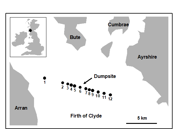
Fig. 8.3. Garroch Head macrofauna {G}. Map showing location of dump-ground and position of sampling stations (1–12); the dump centre is at station 6.
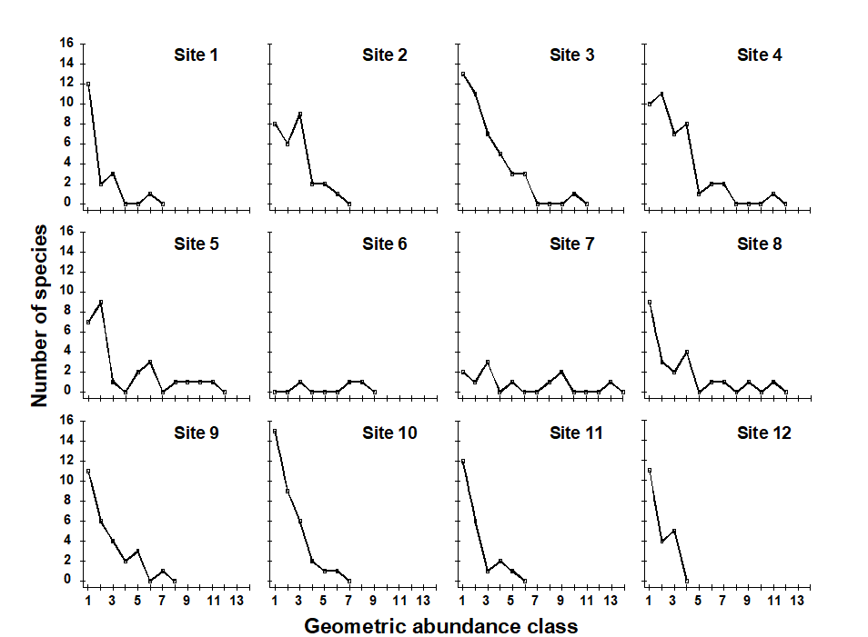
Fig. 8.4. Garroch Head macrofauna {G}. Plots of $\times 2$ geometric species abundance classes for the 12 sampling stations shown in Fig. 8.3.
In Fig. 8.5a, average ranked species abundance curves (with the x-axis logged) are given for the macrobenthos at a group of 6 sampling stations within 250m of the current centre of oil-drilling activity at the Ekofisk field in the North Sea {E}, compared with a group of 10 stations between 250m and 1km from the centre (see inset map in Fig. 10.6a for locations of these stations). Note that the curve for the more polluted (inner) stations is J-shaped, showing high dominance of abundant species, whereas the curve for the less polluted (outer) stations is much flatter, with low dominance. Fig. 8.5b shows k-dominance curves for the same data. Here the curve for the inner stations is elevated, indicating lower diversity than at the 250m–1km stations.

Fig. 8.5. Ekofisk macrobenthos {E}. a) Average ranked species abundance curves (x-axis logged) for 6 stations within 250m of the centre of drilling activity (dotted line) and 10 stations between 250m and 1km from the centre (solid line); b) k-dominance curves for the same groups of stations.
Abundance/biomass comparison plots
Whether k-dominance curves are plotted from the species abundance distribution or from species biomass values, the y-axis is always scaled in the same range (0 to 100). This facilitates the Abundance/Biomass Comparison (ABC) method of determining levels of disturbance (pollution-induced or otherwise) on community structure. The initial paradigm was for soft-sediment macrobenthos . Under stable conditions of infrequent disturbance the competitive dominants in benthic communities are K-selected (conservative) species, with the attributes of large body size and long life-span: these are rarely dominant numerically but are generally dominant in terms of biomass. Also present in these communities are smaller r-selected (opportunistic) species with a smaller body size and short life-span, which can be numerically significant but do not represent a large proportion of the community biomass. When pollution perturbs a community, conservative species are less favoured in comparison with opportunists. Thus, under pollution stress, the distribution of numbers of individuals among species behaves differently from the distribution of biomass among species.
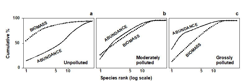
Fig. 8.6. Hypothetical k-dominance curves for species biomass and abundance, showing ‘unpolluted’, ‘moderately polluted’ and ‘grossly polluted’ conditions.
The ABC method, as originally described by Warwick (1986) , involves the plotting of separate k-dominance curves ( Lambshead, Platt & Shaw (1983) ) for species abundances and species biomass on the same graph and making a comparison of the forms of these curves. The species are ranked in order of importance in terms of abundance or biomass on the x-axis (logarithmic scale) with percentage dominance on the y-axis (cumulative scale¶). In undisturbed communities the biomass is dominated by one or a few large species, leading to an elevated biomass curve. Each of these species, however, is represented by rather few individuals so they do not dominate the abundance curve, which shows a typical diverse, equitable distribution. Thus, the k-dominance curve for biomass lies above the curve for abundance for its entire length (Fig. 8.6a). Under moderate pollution (or disturbance), the large competitive dominants are eliminated and the inequality in size between the numerical and biomass dominants is reduced so that the biomass and abundance curves are closely coincident and may cross each other one or more times (Fig. 8.6b). As pollution becomes more severe, benthic communities become increasingly dominated by one or a few opportunistic species which whilst they dominate the numbers do not dominate the biomass, because they are very small-bodied. Hence, the abundance curve lies above the biomass curve throughout its length (Fig. 8.6c).
The contention is that these three conditions (termed unpolluted, moderately polluted and grossly polluted) should be recognisable in a community without reference to control samples in time or space, the two curves acting as an ‘internal control’ against each other. Reference to spatial or temporal control samples is, however, still desirable. Adequate replication of sampling is a prerequisite of the method, since the large biomass dominants are often represented by few individuals, which will be liable to a higher sampling error than the numerical dominants.
Whilst described in terms of benthic macrofauna the paradigm is likely to apply much more generally†.
¶ The species are therefore in a different order on the x axis for the abundance and biomass curves – the species identities are not matched up in any way, it is simply the dominance structure of the community that is separately captured for abundance and biomass.
† Indeed, the several hundred papers that cite Warwick (1986) include many examples of application to other marine fauna (e.g. fish communities, where over-fishing tends to be accompanied by reduction in average body-size and replacement of large-bodied by increased abundance of smaller-bodied species) and terrestrial/freshwater fauna: birds, dragonflies, small mammals, herpetofauna (whose ABC curves tracked successional recovery after forest fires, Smith & Rissler (2010) ) etc.
8.4 Examples: Loch Linnhe and Garroch Head macrofauna
ABC curves for the macrobenthos at site 34 in Loch Linnhe, Scotland {L} between 1963 and 1973 are given in Fig. 8.7. The time course of organic pollution from a pulp-mill, and changes in species diversity ($H ^ \prime$), are shown top left. Moderate pollution started in 1966, and by 1968 species diversity was reduced. Prior to 1968 the ABC curves had the unpolluted configuration. From 1968 to 1970 the ABC plots indicated moderate pollution. In 1970 there was an increase in pollutant loadings and a further reduction in species diversity, reaching a minimum in 1972, and the ABC plots for 1971 and 1972 show the grossly polluted configuration. In 1972 pollution was decreased and by 1973 diversity had increased and the ABC plots again indicated the unpolluted condition. Thus, the ABC plots provide a good ‘snapshot’ of the pollution status of the benthic community in any one year, without reference to the historical comparative data which would be necessary if a single species diversity measure based on the abundance distribution was used as the only criterion.
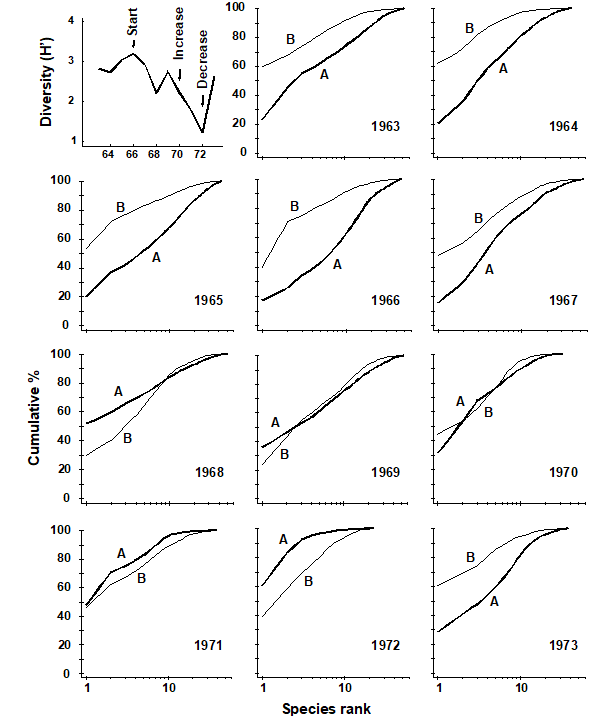
Fig. 8.7. Loch Linnhe macrofauna {L}. Shannon diversity ($ H ^ \prime$) and ABC plots over the 11 years, 1963 to 1973. Abundance = thick line, biomass = thin line.
ABC plots for the macrobenthos along a transect of stations across the accumulating sewage-sludge dump-ground at Garroch Head, Scotland {G} (Fig 8.3) are given in Fig. 8.8. Note how the ABC curves behave along the transect, with the peripheral stations 1 and 12 having unpolluted configurations, those near the dump-centre at station 6 with grossly polluted configurations and intermediate stations showing moderate pollution. Of course, at the dump-centre itself there are only three species present, so that any method of data analysis would have indicated gross pollution. However, the biomass and abundance curves start to become transposed at some distance from the dump-centre, when species richness is still high.
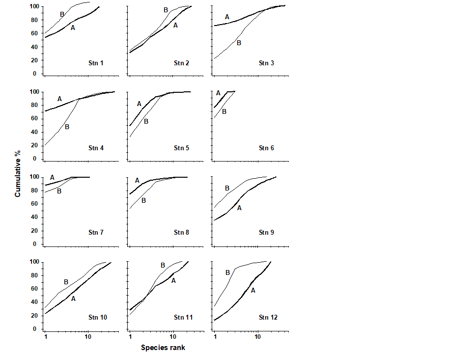
Fig. 8.8. Garroch Head macrofauna {G}. ABC curves for macrobenthos in 1983. Abundance = thick line, biomass = thin line.
Transformations of k-dominance curves
Very often k-dominance curves approach a cumulative frequency of 100% for a large part of their length, and in highly dominated communities this may be after the first two or three top-ranked species. Thus, it may be difficult to distinguish between the forms of these curves. One solution to this problem is to transform the y-axis so that the cumulative values are closer to linearity. Clarke (1990) suggests the modified logistic transformation:
$$ y _ i ^ \prime = \log [(1 + y _ i)/(101 – y _ i)] \tag{8.9} $$
An example of the effect of this transformation on ABC curves is given in Fig. 8.9 for the macrofauna at two stations in Frierfjord, Norway {F}, A being an unimpacted reference site and C a potentially impacted site. At site C there is an indication that the biomass and abundance curves cross at about the tenth species, but since both curves are close to 100% at this point, the crossover is unclear. The logistic transformation enables this crossover to be better visualised, and illustrates more clearly the differences in the ABC configurations between these two sites.
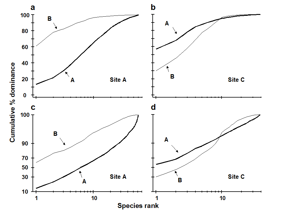
Fig. 8.9. Frierfjord macrofauna {F}. a), b) Standard ABC plots for sites A (reference) and C (potentially impacted). c), d) ABC plots for sites A and C with the y-axis subjected to modified logistic transformation. Abundance = thick line, biomass = thin line.
Partial dominance curves
A second problem with the cumulative nature of k-dominance (and ABC) curves is that the visual information presented is over-dependent on the single most dominant species. The unpredictable presence of large numbers of a species with small biomass, perhaps an influx of the juveniles of one species, may give a false impression of disturbance. With genuine disturbance, one might expect patterns of ABC curves to be unaffected by successive removal of the one or two most dominant species in terms of abundance or biomass, and so Clarke (1990) recommended the use of partial dominance curves, which compute the dominance of the second ranked species over the remainder (ignoring the first ranked species), the same with the third most dominant etc. Thus if $a _ i$ is the absolute (or percentage) abundance of the ith species, when ranked in decreasing abundance order, the partial dominance curve is a plot of $p _ i$ against log i (i = 1, 2, ..., S–1), where
$$ p _ 1 = 100 a _1 \big/ \sum _ {j=1} ^ S a _ j, \hspace{5mm} p _ 2 = 100 a _2 / \sum _ {j=2} ^ S a _ j, \hspace{2.5mm} \ldots \hspace{2.5mm} p _ {S-1} = 100 a _ {S-1} / ( a _ {S-1} + a _ {S} ) \tag{8.10} $$
Earlier values can therefore never affect later points on the curve. The partial dominance curves (ABC) for undisturbed macrobenthic communities typically look like Fig. 8.10, with the biomass curve (thin line) above the abundance curve (thick line) throughout its length. The abundance curve is much smoother than the biomass curve, showing a slight and steady decline before the inevitable final rise. Under polluted conditions there is still a change in position of partial dominance curves for abundance and biomass, with the abundance curve now above the biomass curve in places, and the abundance curve becoming much more variable. This implies that pollution effects are not just seen in changes to a few dominant species but are a phenomenon which pervades the complete suite of species in the community. For example, the time series of macrobenthos data from Loch Linnhe (see Fig. 8.11) shows that in the most polluted years 1971 and 1972 the abundance curve is above the biomass curve for most of its length (and the abundance curve is very atypically erratic), the curves cross over in the moderately polluted years 1968 and 1970 and have an unpolluted configuration prior to the pollution impact in 1966. In 1967, there is perhaps the suggestion of incipient change in the initial rise in the abundance curve. Although these curves are not so smooth (and therefore not so visually appealing!) as the original ABC curves, they may provide a useful alternative aid to interpretation and are certainly more robust to random fluctuations in the abundance of a small-sized, numerically dominant species.

Fig. 8.10. Frierfjord macrofauna {F}. Partial dominance curves (abundance/biomass comparison) for reference site A (c.f. Figs 8.9a,c for corresponding standard and transformed ABC plots).
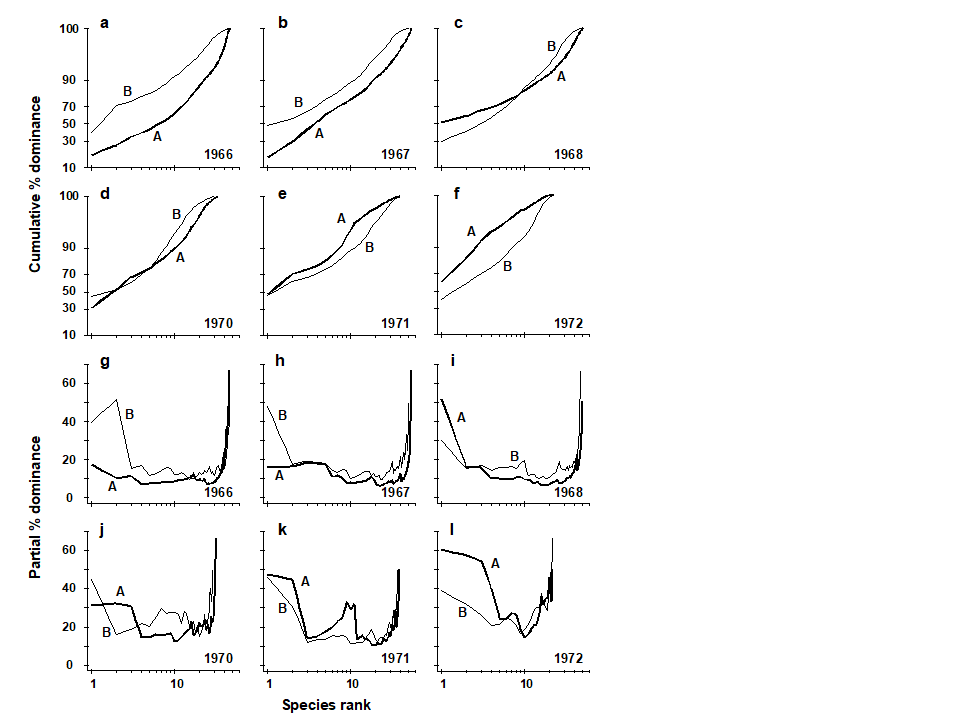
Fig. 8.11. Loch Linnhe macrofauna {L}. Selected years 1966–68 and 1970–72. a–f) ABC curves (logistic transform). g)–l) Partial dominance curves for abundance (thick line) and biomass (thin line) for the same years.
Phyletic role in ABC method
Warwick & Clarke (1994)
have shown that the ABC response in macrobenthos results from (i) a shift in the proportions of different phyla present in communities, some phyla having larger-bodied species than others, and (ii) a shift in the relative distributions of abundance and biomass among species within the Polychaeta but not within any of the other major phyla (Mollusca, Crustacea, Echinodermata). The shift within polychaetes reflects the substitution of larger-bodied by smaller-bodied species, and not a change in the average size of individuals within a species. In most instances the phyletic changes reinforce the trend in species substitutions within the polychaetes, to produce the overall ABC response, but in some cases they may work against each other. In cases where the ABC method has not succeeded as a measure of the pollution status of marine macrobenthic communities, it is because small non-polychaete species have been dominant. Prior to the Amoco Cadiz oil-spill, small ampeliscid amphipods (Crustacea) were present at the Pierre Noire sampling station in relatively high abundance (
Dauvin (1984)
), and their disappearance after the spill confounded the ABC plots (
Ibanez & Dauvin (1988)
). It was the erratic presence of large numbers of small amphipods (Corophium) or molluscs (Hydrobia) which confounded these plots in the Wadden Sea (
Beukema (1988)
). These small non-polychaetous species are not an indication of polluted conditions, as Beukema points out. Indications of pollution or disturbance detected by this method for marine macrobenthos should therefore be viewed with caution if the species responsible for the polluted configurations are not polychaetes.
W statistics
When the number of sites, times or replicates is large, presenting ABC plots for every sample can be cumbersome, and it would be convenient to reduce each plot to a single summary statistic. Clearly, some information must be lost in such a condensation: cumulative dominance curves are plotted, rather than quoting a diversity index, precisely because of a reluctance to reduce the diversity information to a single statistic. Nonetheless, Warwick (1986) ’s contention that the biomass and abundance curves increasingly overlap with moderate disturbance, and transpose altogether for the grossly disturbed condition, is a unidirectional hypothesis and very amenable to quantification by a single summary statistic.
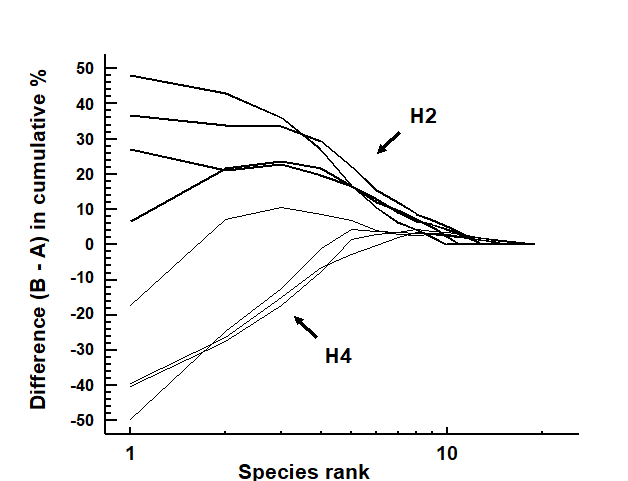
Fig. 8.12. Hamilton Harbour macrobenthos {H}. Difference (B–A) between cumulative dominance curves for biomass and abundance for four replicate samples at stations H2 (thick line) and H4 (thin line).
Fig. 8.12 displays the difference curves B–A for each of four replicate macrofauna samples from two stations (H2 and H4) in Hamilton Harbour, Bermuda; these are simply the result of subtracting the abundance ($A _ i$) from the biomass ($B _ i$) value for each species rank (i) in an ABC curve.¶ For all four replicates from H2, the biomass curve is above the abundance curve throughout its length, so the sum of the $B _ i – A _ i$ values across the ranks i will be strongly positive. In contrast, this sum will be strongly negative for the replicates at H4, for which abundance and biomass curves are largely transposed. Intermediate cases in which A and B curves are intertwined will tend to give $ \sum (B _ i – A _ i)$ values near zero. The summation requires some form of standardisation to a common scale, so that comparisons can be made between samples with differing numbers of species, and Clarke (1990) proposes the W (for Warwick) statistic:
$$ W = \sum _ {i =1} ^ S (B _ i – A _ i) / [ 50 ( S - 1)] \tag{8.11} $$
It can be shown algebraically that W takes values in the range (–1, 1), with $W \rightarrow +1$ for even abundance across species but biomass dominated by a single species, and $W \rightarrow –1$ in the converse case (though neither limit is likely to be attained in practice).
An example is given by the changing macrofauna communities along the transect across the sludge dump-ground at Garroch Head {G}. Fig. 8.13 plots the W values for each of the 12 stations against the station number. These summarise the 12 component ABC plots of Fig. 8.8 and clearly delineate a similar pattern of gradual change from unpolluted to disturbed conditions, as the centre of the dumpsite is approached.
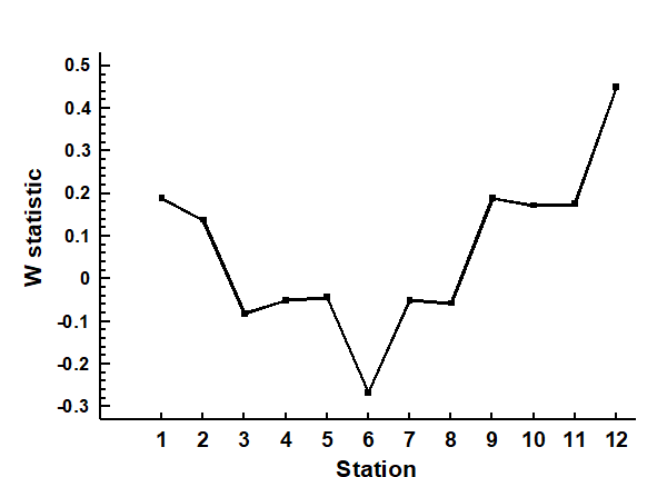
Fig. 8.13. Garroch Head macrofauna {G}. W values corresponding to the 12 ABC curves of Fig. 8.8, plotted against station number; station 6 is the centre of the dump ground (Fig. 8.3).
Hypothesis testing for dominance curves
There are no replicates in the Garroch Head data to allow testing for statistical significance of observed changes in ABC patterns but, for studies involving replication, the W statistic provides an obvious route to hypothesis testing. For the Bermuda samples of Fig. 8.12, W takes values 0.431, 0.253, 0.250 and 0.349 for the four replicates at H2 and -0.082, 0.053, -0.081 and -0.068 for the four H4 samples. These data can be input into a standard univariate ANOVA (equivalent in the case of two groups to a standard 2-sample t-test), showing that there is indeed a clearly established difference in abundance-biomass patterns between these two sites (F = 45.3, p<0.1%).
More general forms of hypothesis testing are possible, likely to be particularly relevant to the comparison of k-dominance curves calculated for replicates at a number of sites, times or conditions (or in some two-way layout, as discussed in Chapter 6). A measure of ‘dissimilarity’ could be constructed between any pair of k-dominance (or B-A) curves, for example based on their absolute distance apart, summed across the species ranks. When computed for all pairs of samples in a study this provides a (ranked) triangular dissimilarity matrix, essentially similar in structure to that from a multivariate analysis; thus the 1-way and 2-way ANOSIM tests (Chapter 6) can be used in exactly the same way to test hypotheses about differences between a priori specified groups of samples. Clarke (1990) discusses some appropriate definitions of dissimilarity for use with dominance curves in such tests, as now described and illustrated.
¶ Note that, as always with an ABC curve, $B _ i$ and $A _ i$ do not necessarily refer to values for the same species; the ranking is performed separately for abundance and biomass.
8.5 Multivariate tools used on univariate data
Ekofisk macrofauna: testing dominance curves
Fig. 8.5b compares the averaged community samples for the closest distances to the oil platform (< 250m) with the second closest group (250m – 1km), in terms of their k-dominance curves, and the closest samples appear to be more heavily dominated. But, to test this, we must return to the replicate rather than averaged curves, and these are seen for the 6 and 10 samples in the two distance groups in Fig. 8.14a,b, the two plots being identical apart from a log scaled x axis in (a).
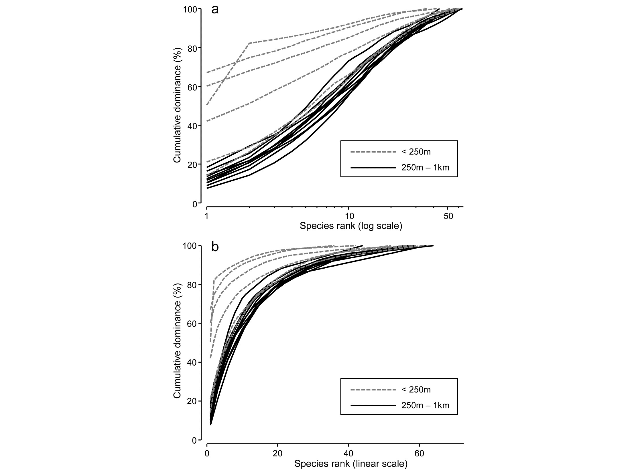
Fig. 8.14. Ekofisk oil-field macrofauna {E}. k-dominance curves for sites in the closest and second closest distance groups to the oil-field, plotted with x axis on: a) log scale, b) linear scale.
For any two curves, in the same or different groups, their absolute distance apart on the y axis, for each x axis point, is calculated and totalled, giving a possible measure of the ‘dissimilarity’ of the two curves. This can be thought of as the area between two curves in Fig.8.14b, taking the value 0 only if they lie totally on top of each other. In Fig. 8.14a, which is the more usual form of a k-dominance curve, the absolute y- axis deviations are given increasingly less weight for larger x-axis ranks, so the distance apart of curves 1 and 2 ($y$ axis values {$y _ {i1}$} and {$y _ {i2}$}) is defined as:
$$ d ^ \prime = \sum _ {i=1} ^ { S _ {\max}} | y _ {i1} - y _ {i2} | \log \left( 1 +i ^ {-1} \right) \tag{8.12} $$
where $S {_{\max}}$ is the largest number of species seen in a single sample and all curves are assumed to continue at 100% after they reach that maximum point. This again effectively defines the ‘dissimilarity’ of two curves in Fig. 8.14a as the area separating them. This is the default for the DOMDIS routine in PRIMER, since this ‘log weighting of species ranks’ matches the standard k-dominance plot, with its emphasis on dominance differences for the most abundant species.
Computing (8.12) among every pair of samples (the output from DOMDIS) and subjecting the resulting dissimilarities to an ANOSIM test of the two distance groups gives R = 0.51 (p<0.3%), a clear difference in dominance structure. The matching test to Fig. 8.14b is little different, with R = 0.56 (p<0.2%).
General curve comparisons: size distributions
The simplicity of a dissimilarity-based approach to testing for significant differences between groups of curves immediately suggests many other contexts in which a similarly robust, multivariate ANOSIM test could be employed. Particle-size distributions in sediment or water-column sampling are often measured in replicate samples, and need comparison between different factor levels in space and/or time. In effect, each curve (whether cumulative frequency or simple frequency polygon¶) needs to be treated as a single, multivariate point, the variables (‘species’) being the differing size classes and their observed values the relative frequencies (i.e. samples are automatically standardised to total to 1 or 100%), or cumulative relative frequencies, and this matrix is input to either Euclidean or Manhattan distance calculation§. The resulting resemblances are then available for the full range of multivariate techniques, including ANOSIM (or PERMANOVA) tests on the groups of replicate curves, ordination by MDS etc.
¶ These are usually not ‘true’ statistical probability distributions, in the sense of individual particles arriving randomly and independently of each other, which would be needed to justify multinomial assumptions for a Kolmogorov-Smirnov test of difference between two such (cumulative) sample distribution functions. Typically, instruments such as Coulter counters will scan vast numbers of particles to construct a size distribution, and the important level of variability is not within a sample but among independent samples taken at the same place or time. Fitting specific parametric distributions, such as a 2- or 3-parameter Weibull, in order to compare parameter estimates among curves, is therefore unappealing: the data is not a true probability distribution and the parametric form will usually not fit well (mixture curves, and even bimodality, may be commonplace), and an unnecessary approximation step is interposed. Comparing simple moment estimators such as mean, standard deviation, skewness (or medians, percentiles etc) of grain sizes in each sample using classic univariate tests is a commonly used and viable alternative, but this may easily miss differences which are due to bimodality or other characteristic shapes repeated across replicates – why not instead just directly compare the curves with each other?
§ PRIMER’s DOMDIS routine is not needed here since this is simply calculation of a distance measure between pairs of samples in a given matrix. DOMDIS’s role in k-dominance curves also includes the initial re-ordering of the matrix in decreasing species abundance order, separately for each sample, before calculating Manhattan distance, in effect, on the resulting matrix. Other distance options given in PRIMER include, for example, the maximum distance of two curves from each other (usually applied to cumulative curves, as in a Kolmogorov-Smirnov statistic). Note that, if no transform is applied to the relative frequency data prior to distance calculation (often the case, though occasionally a mild transform may be preferred, to downweight a dominant size category) then Manhattan distance is equivalent to Bray-Curtis dissimilarity in this case, since the denominator term in equation (2.1) is fixed at 200.
8.6 Example: Plymouth particle-size data
Fig. 8.15 is from Coulter Counter data of particle-size distributions for estuarine water samples from 5 sites, over 92 logarithmically increasing size-classes, based on 4 replicate samples per site (A. Bale, pers. comm.), {P}. For clarity, the line plot¶ of Fig. 8.15a shows the size distributions averaged over replicates, and some differences in profiles (multimodality etc) are apparent for the various locations, but are such differences statistically demonstrable in the context of variation among replicate water samples at a site? A Manhattan distance matrix calculated for all pairs of frequency curves from the 20 samples can be input to ordination – here metric MDS is preferred because the Shepard diagram between input distances and final distances in the MDS is perfectly linear, and has low stress (for a metric plot, especially) of 0.07, Fig. 8.15b. The plot indicates clear differences between sites and this is established by significance (at p<3%) for all pairwise ANOSIM tests, with the lowest R of 0.63 between Saltram and Devoran locations.
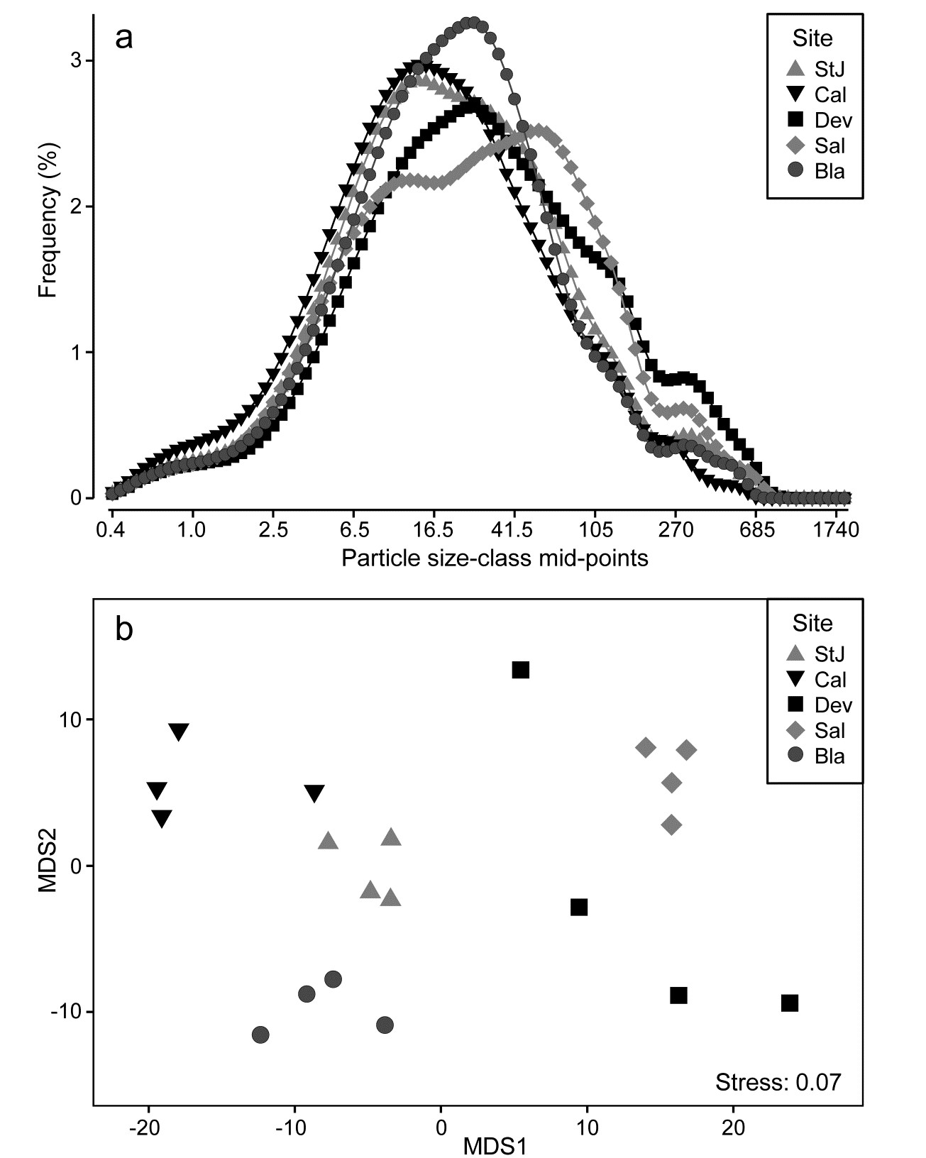
Fig. 8.15. Plymouth particle-size data {P}. a) Frequency distribution (y axis) of particle sizes in logarithmic size-classes (x axis) from water samples at 5 Plymouth sites. Frequency scale is the percentage of particulates in each of 92 classes, then averaged over 4 replicates per site. b)Metric MDS of replicate-level data based on Manhattan distances between all pairs of samples.
Ordering of the variable list
Applying multivariate methods to a matrix which is abundances not of different species, but of different size classes of a single species, has always been an (implicit) option throughout this manual, but there is one important way in which such a matrix (and the above data on particle sizes) differ from a standard community matrix: there is an explicit ordering of the variables. None of the resemblance measures (Bray-Curtis may often be appropriate again) would return different values if the ‘species’ list was re-ordered; all that matters is the degree to which the matching size-classes in the two samples have similar abundances (or relative frequencies). This was not an issue with the very smooth particle-size profiles above, but it could be when comparing (say) size-class histograms which are very ‘noisy’. That peaks for sample 1 are seen opposite troughs for sample 2 may have more to do with a choice of size interval which is too narrow, for the total frequency (arbitrarily) categorised in this way, than it does to a genuine mismatch in profiles.
A perfectly valid solution, if this is an issue, is firstly to smooth the relative frequencies (or abundances) over the size-classes before entering them to distance calculations§. Any such smoothing is ‘fair game’, provided it is done in the same way for each sample. Naturally, it increases correlation among the variables but no assumption of independence of variables is made in multivariate analysis. Quite the reverse: the techniques are designed specifically to handle and exploit correlated variables, because each sample is only treated as one ‘point’ in the analysis.
Growth curves & other repeated measures designs
Realisation that it is not necessary for the points on a curve to be independent of each other, for a method which uses the whole curve as a single (independent) replicate, naturally suggests an application to growth curves. Such a profile would be the increasing size of a specific organism (or, say, the number of hatching larvae in a single bioassay vial) monitored through time. These are (univariate) repeated measures on a single experimental/observational unit and therefore certainly not independent. But, given an appropriate design, the organisms (or the vials) are independently and randomly allocated to a specific treatment or observational condition, and statistical tests can compare this set of growth profiles with each other, among and within conditions etc, exactly as above, as a group of independent points in multivariate space. This time the variables are simply the sequence of time points, which must of course be commonly spaced across all measured profiles. In fact, this is what is known as the fully multivariate approach to univariate repeated measures designs,† except that we are here suggesting a distribution-free approach to analysis, side-stepping the need for model-based estimation of the auto-correlation structure amongst the times (‘variables’). Put simply, the problem reduces to asking whether, for example, the set of n growth profiles of organisms in group A are identifiably different in shape from the set of m profiles in B, in any respect, and consistently enough to determine significance. This needs only a measure of dissimilarity of profile pairs (e.g. Euclidean or Manhattan) and ANOSIM (/PERMANOVA).
¶ This line plot was produced in PRIMER, which has a facility for drawing line plots over the sample order in the worksheet (x axis) for each ‘species’ (y axis), with multiple species on the same plot. Of course this is the only possibility which makes sense for the usual type of community matrix, since species variables would not normally have a meaningful order to place on the x axis of a line plot (apart from the ranking by abundance of dominance plots). In this case, however, the size-class variables are automatically ordered and the natural line plot of Fig. 8.15b can be obtained by duplicating the worksheet and switching the definition of samples and variables from the Edit>Properties menu.
§ This could be by, for example, simple moving averages or more sophisticated kernel density estimation (found in many standard packages). PRIMER offers another simple form of smoothing, viz. cumulating values over the size-classes (abundances must first be sample standardised). Smoothing makes no sense for assemblage data of different species – unless the ‘nearby’ species whose abundances contribute to the moving average (say) for a specific species are defined by their taxonomic or functional affinity with that species (pooling species into higher taxa would be a crude example of this) – but is natural for ordered size-class variables
† It will not be lost on the reader that it might also be nice to have a ‘fully multivariate approach to multivariate repeated measures designs’, as arise, say, when monitoring an algal community on a marked quadrat through time. Removing a ‘quadrat effect’ in a higher-way ANOVA-type design can adjust for the fact that some quadrats have consistently different communities than others at all times, within the same ‘treatment’, but does not address the lack of symmetry in the correlation structure among times: observations at the beginning and end of a time sequence will be likely to have lower autocorrelation than adjacent times (see also the discussion in Anderson, Gorley & Clarke (2008) . A fully multivariate approach to multivariate repeated measures, using second stage analysis, is possible in limited cases, and is essentially an extension of the idea here. The ‘profile’ (in that case an entire dissimilarity matrix covering the changing community pattern over all times for a single experimental unit) becomes the single, independent point in a multivariate space which, along with other (matrix) points, we can enter into ANOSIM tests, MDS etc. Chapter 16 gives an example of such a rocky-shore experiment to monitor algal recolonisation of quadrats under different clearance conditions
8.7 Multiple diversity indices
A large number of different diversity measures can be computed from a single data set and it is relevant to ask if anything is achieved by doing so. The classic ‘spot’ (alpha) diversity indices, many of which were listed earlier in equations (8.1) to (8.7), are all based either on the set of species proportions {$p _ i$}, the total number of species S, or some mix of these two largely unrelated strands of information, and most are therefore mechanistically inter-correlated as a result, i.e. they will be seen to be correlated whatever the set of data for which they are calculated. Of course, for any particular data set, a richness measure such as simple S and a purely relatedness measure such as Simpson’s $1 - \lambda$ may be observed to correlate across samples, e.g. when a contaminant impact removes a wide range of climax community species, replacing them with a smaller number of opportunists which dominate the total numbers (or area cover), so that both richness and evenness indices decline. But this is a biological correlation not a mechanistic one. In other situations S and $1 - \lambda$ may do something quite different, but H′ (Shannon), J′ (Pielou) and $1 - \lambda$ will always be seen to correlate positively, as a result of their definitions.
We can (and should) examine such issues of whether anything is to be gained in calculating further indices by taking a multivariate approach, in contravention to what many ecologists have done for decades, i.e. test and interpret multiple measures (often mechanistically correlated) separately, as if they were providing independent scrutiny of a specific hypothesis (we are not immune from such strictures ourselves!). Though biological in origin, diversity indices are (statistically speaking) ‘environmental-type’ variables in that their distributions are generally rather well-behaved (as a result of the central limit theorem), needing only mild transformation if at all, and normalisation since they are on different measurement scales. The resulting data matrix of multiple indices across all samples can then be input to PCA (Chapter 4) to reveal the ‘true’ dimensionality, i.e. how many uncorrelated axes of information does this set of indices really contain?
As referred to in Chapter 7 on variables analysis, to examine the relationship of variables to each other, a resemblance matrix can be derived which is initially just the correlations over the samples for every pair of indices; Pearson correlation of (perhaps transformed) measures is appropriate. This may include positive or negative values, for example if Simpson is included as a dominance measure $\lambda$, it will be negatively correlated with evenness indices such as $H ^ \prime$ and $J ^ \prime$. But these indices are still considered closely related so similarity is defined as absolute correlation ($\times 100$). MDS on these similarities displays the relationships.
Garroch Head dump-ground macrofauna
Earlier in the chapter we saw the behaviour of some diversity-based constructions for the 12 sites on the E-W transect across the sewage-sludge dumpsite in the Firth of Clyde (1983 data), e.g. the ‘ABC’ method for contrasting abundance and biomass k-dominance curves, summarised in the W statistic of eqn. (8.11). Calculating also a range of standard diversity indices, none of which needed transformation, the normalised full set of 10 measures when input to PCA¶ is seen to contain only two (or at most three) dimensions of uncorrelated information. The first two PCs account for 95.4% of the variance and the first three for 98.2% (if W is omitted, the first two PCs account for 97.3%).
The MDS plot of the diversity index ‘similarities’ is shown in Fig. 8.16 and tells a simple, and universal, story. To the right are the richness measures (S and Margalef’s d) and to the left the evenness measures (Pielou’s $J ^ \prime$ and Simpson, $1 - \lambda$). On the line between them, mixing evenness and richness, Shannon $H ^ \prime$ and its discrete form, Brillouin H, are seen to be close to evenness indices, though they contain a small element of richness. Fisher’s $\alpha$, essentially the steepness of declines seen in the (log series) distributions of the SAD curves, Fig. 8.4, is seen to be a mixture of both elements. Perhaps the initially surprising observation is that the rarefaction estimates (equation 8.6) – the expected number of species for a given number of individuals, here calculated for ‘rarefying’ to 20 and 45 individuals (the most depauperate sample containing only 46 individuals) – is seen not to estimate richness at all here but to mainly reflect sample evenness. This is not so surprising when the construction is considered in more detail: individuals dropped at random until a small percentage are left (most samples have 100’s or 1000’s of individuals), and so the number of species remaining will be dictated by how dominated the community is by just a few species.
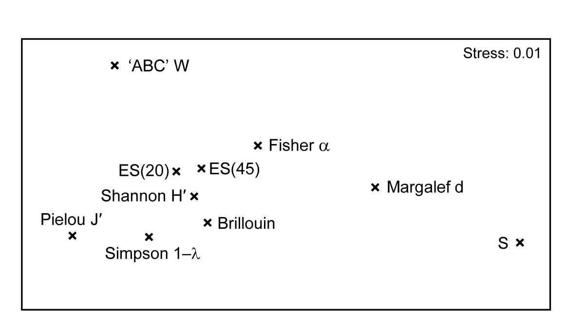
Fig. 8.16. Garroch Head macrofauna {G}. nMDS from absolute Pearson correlations among 10 diversity indices (variables) computed on soft-sediment faunal samples from 12 sites on a transect across the Clyde sewage sludge dump-ground.
Another interesting feature is that the W statistic does not lie on this richness-evenness axis. It is towards the evenness end, as might be expected from its use of the abundance k-dominance curve but here it also provides fresh information from the biomass dominance pattern. And this is the general point that such plots make: whatever the input data matrix, a pattern broadly in line with Fig. 8.16 will emerge. What this plot mainly captures is the mechanistic relationships among the diversity indices rather than the ecological information of a specific context§. The implication is always that the number of diversity indices it makes sense to calculate, based only on the species abundances, is very small – basically one richness and one evenness measure. Striking out from these two axes into third or higher dimensional diversity space needs introduction of fresh information, on biomass patterns perhaps or, for genuinely unrelated dimensions, the concept of average distinctness of a species set, for a given numbers of species, in terms of the taxonomic or genetic/phylogenetic relatedness of the species (or, indeed, their functional relatedness). Such a concept of diversity is returned to in Chapter 17.
¶ More detailed working of PCA for an index set from this data is shown in the PRIMER User Manual, e.g. the extent to which the diversity measures capture the impact gradient seen in the full multivariate analysis, and the definition of the PCs as an overall decline in all diversity measures when sites near the dump centre (PC1) and a contrast between evenness and richness (PC2).
§ A similar idea is seen for ordination of the relationship among competing definitions of distance or dissimilarity, utilising second stage plots (Chapter 16), viz. which coefficients capture the same, and which very different information on multivariate structure?
Chapter 9: Transformations and dispersion weighting
9.1 Introduction
There are two distinct roles for transformations in community analyses:
a) to validate statistical assumptions for parametric techniques – in the approach of this manual such methods are restricted to univariate tests;
b) to weight the contributions of common and rare species in the (non-parametric) multivariate representations.
The second reason is the only one of relevance to the preceding chapters, with the exception of Chapter 8 where it was seen that standard parametric analysis of variance (ANOVA) could be applied to diversity indices computed from replicate samples at different sites or times. Being composite indices, derived from all species counts in a sample, some of these will already be approximately continuous variates with symmetric distributions, and others can be readily transformed to the normality and constant variance requirements of standard ANOVA. Also, there may be interest in the abundance patterns of individual species, specified a priori (e.g. keystone species), which are sufficiently common across most sites for there to be some possibility of valid parametric analysis after transformation.
9.2 Univariate case
For purely illustrative purposes, Table 9.1 extracts the counts of a single Thyasira species from the Frierfjord macrofauna data {F}, consisting of four replicates at each of six sites.
Table 9.1. Frierfjord macrofauna {F}. Abundance of a single species (Thyasira sp.) in four replicate grabs at each of the six sites (A–E, G).
| Site: | A | B | C | D | E | G |
|---|---|---|---|---|---|---|
| Replicate | ||||||
| 1 | 1 | 7 | 0 | 1 | 62 | 66 |
| 2 | 4 | 0 | 0 | 8 | 102 | 68 |
| 3 | 3 | 3 | 0 | 5 | 93 | 52 |
| 4 | 11 | 2 | 3 | 13 | 69 | 36 |
| Mean | 4.8 | 3.0 | 0.8 | 6.8 | 81.8 | 55.5 |
| Stand. dev. | 4.3 | 2.9 | 1.5 | 5.1 | 18.7 | 14.8 |
Two features are apparent:
-
the replicates are not symmetrically distributed (they tend to be right-skewed);
-
the replication variance tends to increase with increasing mean, as is clear from the mean and standard deviation (s.d.) values given in Table 9.1.
The lack of symmetry (and thus approximate normality) of the replication distribution is probably of less importance than the large difference in variability; ANOVA relies on an assumption of constant variance across the groups. Fortunately, both defects can be overcome by a simple transformation of the raw data; a power transformation (such as a square root), or a logarithmic transformation, have the effect both of reducing right-skewness and stabilising the variance.
Power transformations
The power transformations $y ^ * = y ^ \lambda$ form a simple and useful family, in which decreasing values of $\lambda$ produce increasingly severe transformations. The log transform, $y ^ * =\log _ e (y)$, can also be encompassed in this series (technically, $(y ^ \lambda-1)/\lambda \rightarrow \log _ e (y)$ as $\lambda \rightarrow 0$). Box & Cox (1964) give a maximum likelihood procedure for optimal selection of $\lambda$ but, in practice, a precise value is not important, and indeed rather artificial if one were to use slightly different values of $\lambda$ for each new analysis. The aim should be to select a transformation of the right order for all data of a particular type, choosing only from, say: none, square root, 4th root or logarithmic. It is not necessary for a valid ANOVA that the variance be precisely stabilised or the non-normality totally removed, just that gross departures from the parametric assumptions (e.g. the order of magnitude change in s.d. in Table 9.1) are avoided. One useful technique is to plot log(s.d.) against log(mean) and estimate the approximate slope of this relationship ($\beta$). This is shown here for the data of Table 9.1.

It can be shown that, approximately, if $\lambda$ is set roughly equal to $1 – \beta$, the transformed data will have constant variance. That is, a slope of zero implies no transformation, 0.5 implies the square root, 0.75 the 4th root and 1 the log transform. Here, the square root is indicated and Table 9.2 gives the mean and standard deviations of the root-transformed abundances: the s.d. is now remarkably constant in spite of the order of magnitude difference in mean values across sites. An ANOVA would now be a valid and effective testing procedure for the hypothesis of ‘no site-to-site differences’, and the means and 95% confidence intervals for each site can be back-transformed to the original measurement scales for a more visually helpful plot.
Table 9.2. Frierfjord macrofauna {F}. Mean and standard deviation over the four replicates at each site, for root-transformed abundances of Thyasira sp.
| Site: | A | B | C | D | E | G |
|---|---|---|---|---|---|---|
| Mean(y*) | 2.01 | 1.45 | 0.43 | 2.42 | 9.00 | 7.40 |
| S.d.(y*) | 0.97 | 1.10 | 0.87 | 1.10 | 1.04 | 1.04 |
Like all illustrations, though genuine enough, this one works out too well to be typical! In practice, there is usually a good deal of scatter in the log s.d. versus log mean plots; more importantly, most species will have many more zero entries than in this example and it is impossible to ‘transform these away’: species abundance data are simply not normally distributed and can only rarely be made so. Another important point to note here is that it is never valid to ‘snoop’ in a data matrix of, perhaps, several hundred species for one or two species that display apparent differences between sites (or times), and then test the significance of these groups for that species. This is the problem of multiple comparisons referred to in Chapter 6; a purely random abundance matrix will contain some species which fallaciously appear to show differences between groups in a standard 5% significance level ANOVA (even were the ANOVA assumptions to be valid). The best that such snooping can do, in hypothesis testing terms, is identify one or two potential key or indicator species that can be tested with an entirely independent set of samples.
These two difficulties between them motivate the only satisfactory approach to most community data sets: a properly multivariate one in which all species are considered in combination in non-parametric methods of display and testing, which make no distributional assumptions at all about the individual counts.
9.3 Multivariate case
There being no necessity to transform to attain distributional properties, transformations play an entirely separate (but equally important) role in the clustering and ordination methods of the previous chapters, that of defining the balance between contributions from common and rarer species in the measure of similarity of two samples.
Returning to the simple example of Chapter 2, a subset of the Loch Linnhe macrofauna data, Table 9.3 shows the effect of a 4th root transformation of these abundances on the Bray-Curtis similarities. The rank order of the similarity values is certainly changed from the untransformed case, and one way of demonstrating how dominated the latter is by the single most numerous species (Capitella capitata) is shown in Table 9.4. Leaving out each of the species in turn, the Bray-Curtis similarity between samples 2 and 4 fluctuates wildly when Capitella is omitted in the untransformed case, though changes much less dramatically under 4th root transformation, which downweights the effect of single species.
Table 9.3. Loch Linnhe macrofauna {L} subset. Untransformed and 4th root-transformed abundances for some selected species and samples (years), and the resulting Bray-Curtis similarities between samples.
| Untransformed | ||||||||||
|---|---|---|---|---|---|---|---|---|---|---|
| Sample: | 1 | 2 | 3 | 4 | ||||||
| Species | Sample | 1 | 2 | 3 | 4 | |||||
| Echinoca. | 9 | 0 | 0 | 0 | 1 |
– | ||||
| Myrioche. | 19 | 0 | 0 | 3 | 2 |
8 | – | |||
| Labidopl. | 9 | 37 | 0 | 10 | 3 |
0 | 42 | – | ||
| Amaeana | 0 | 12 | 144 | 9 | 4 |
39 | 21 | 4 | – | |
| Capitella | 0 | 128 | 344 | 2 | ||||||
| Mytilus | 0 | 0 | 0 | 0 | ||||||
| $\sqrt{} \sqrt{}$-transformed | ||||||||||
| Sample: | 1 | 2 | 3 | 4 | ||||||
| Species | Sample | 1 | 2 | 3 | 4 | |||||
| Echinoca. | 1.7 | 0 | 0 | 0 | 1 |
– | ||||
| Myrioche. | 2.1 | 0 | 0 | 1.3 | 2 |
26 | – | |||
| Labidopl. | 1.7 | 2.5 | 0 | 1.8 | 3 |
0 | 68 | – | ||
| Amaeana | 0 | 1.9 | 3.5 | 1.7 | 4 |
52 | 68 | 42 | – | |
| Capitella | 0 | 3.4 | 4.3 | 1.2 | ||||||
| Mytilus | 0 | 0 | 0 | 0 |
Transformation sequence
The previous remarks about the family of power transformations apply equally here: they provide a continuum of effect from $\lambda = 1$ (no transform), for which only the common species contribute to the similarity, through $\lambda = 0.5$ (square root), which allows the intermediate abundance species to play a part, to $\lambda = 0.25$ (4th root), which takes some account also of rarer species. As noted earlier, $\lambda \rightarrow 0$ can be thought of as equivalent to the $\log _ e (y)$ transformation and the latter would therefore be more severe than the 4th root transform. However, in this form, the transformation is impractical because the (many) zero values produce $\log(0) \rightarrow - \infty$. Thus, common practice is to use $\log(1+y)$ rather than $\log(y)$, since $\log(1+y)$ is always positive for positive $y$ and $\log(1+y)= 0$ for $y = 0$. The modified transformation no longer falls strictly within the power sequence; on large abundances it does produce a more severe transformation than the 4th root but for small abundances it is less severe than the 4th root. In fact, there are rarely any practical differences between cluster and ordination results performed following $y ^ {0.25}$ or $\log(1+y)$ transformations; they are effectively equivalent in focusing attention on patterns within the whole community, mixing contributions from both common and rare species.¶
Table 9.4. Loch Linnhe macrofauna {L} subset. The changing similarity between samples 2 and 4 (of Table 9.3) as each of the six species is omitted in turn, for both untransformed and 4th root-transformed abundances.
| Species omitted: | None | 1 | 2 | 3 | 4 | 5 | 6 |
| Bray-Curtis (S): | 21 | 21 | 21 | 14 | 13 | 54 | 21 |
| $\sqrt{} \sqrt{}$-transformed | |||||||
| Species omitted: | None | 1 | 2 | 3 | 4 | 5 | 6 |
| Bray-Curtis (S): | 68 | 68 | 75 | 61 | 59 | 76 | 68 |
The logical end-point of this transformation sequence is therefore not the log transform but a reduction of the quantitative data to presence/absence, the Bray-Curtis coefficient (say) being computed on the resulting matrix of 1’s (presence) and 0’s (absence). This computation is illustrated in Table 9.5 for the subset of the Loch Linnhe macrofauna data used earlier. Comparing with Table 9.3, note that the rank order of similarities again differs, though it is closer to that for the 4th root transformation than for the untransformed data. In fact, reduction to presence/absence can be thought of as the ultimate transformation in down-weighting the effects of common species. Species which are sufficiently ubiquitous to appear in all samples (i.e. producing a 1 in all columns) clearly cannot discriminate between the samples in any way, and therefore do not contribute to the final multivariate description. The emphasis is therefore shifted firmly towards patterns in the intermediate and rarer species, the generally larger numbers of these tending to over-ride the contributions from the few numerical or biomass dominants.
Table 9.5. Loch Linnhe macrofauna {L} subset. Presence (1) or absence (0) of the six species in the four samples of Table 9.3, and the resulting Bray-Curtis similarities.
| Presence/absence | |||||||||
|---|---|---|---|---|---|---|---|---|---|
| Sample: | 1 | 2 | 3 | 4 | |||||
| Species | Sample | 1 | 2 | 3 | 4 | ||||
| Echinoca. | 1 | 0 | 0 | 0 | 1 |
– | |||
| Myrioche. | 1 | 0 | 0 | 1 | 2 |
33 | – | ||
| Labidopl. | 1 | 1 | 0 | 1 | 3 |
0 | 80 | – | |
| Amaeana | 0 | 1 | 1 | 1 | 4 |
57 | 86 | 67 | – |
| Capitella | 0 | 1 | 1 | 1 | |||||
| Mytilus | 0 | 0 | 0 | 0 |
One inevitable consequence of ‘widening the franchise’ in this way, allowing many more species to have a say in determining the overall community pattern, is that it will become increasingly harder to obtain 2-d ordinations with low stress: the view we have chosen to take of the community is inherently high-dimensional. This can be seen in Fig. 9.1, for the dosing experiment {D} in the Solbergstrand mesocosm (GEEP Oslo workshop), previously met in Figs. 4.2 and 5.6. Four levels of contaminant dosing (designated Control, Low, Medium, High) were each represented by four replicate samples of the resulting nematode communities, giving the MDS ordinations of Fig. 9.1. Note that as the severity of the transformation increases, through none, root, 4th root and presence/absence (Fig. 9.1a to 9.1d respectively), the stress values rise from 0.08 to 0.19.

Fig 9.1 Dosing experiment, Solbergstrand {D}. MDS of nematode communities in four replicates from each of four treatments (C = control, L = low, M = medium, H = high dose of a hydrocarbon/copper contaminant mixture dosed to mesocosm basins), based on Bray-Curtis similarities from transformed data: a) no transform (stress = 0.08), b) $\sqrt{}$ (stress = 0.14), c) $\sqrt{} \sqrt{}$ (stress = 0.18), d) presence/absence (stress = 0.19).
It is important to realise that this is not an argument for deciding against transformation of the data. Fig. 9.1a is not a better representation of the between-sample relationships than the other plots: it is a different one. The choice of transformation is determined by which aspects of the community we wish to study. If interest is in the response of the whole community then we have to accept that it may be more difficult to capture this in a low-dimensional picture (a 3-d or higher-dimensional MDS may be desirable). On the other hand, if the data are totally dominated by one or two species, and it is these that are of key biological interest, then of course it will be possible to visualise in a 1- or 2-d picture how their numbers (or biomass) vary between samples: in that case an ordination on untransformed data will be little different from a simple scatter plot of the counts for the two main species.
¶ Though practical differences are likely to be negligible, on purely theoretical grounds it could be argued that the 4th root is the more satisfactory of the two transformations because Bray-Curtis similarity is then invariant to a scale change in y. Similarity values would be altered under a log(1+y) transformation if abundances were converted from absolute values to numbers per $m^2$ of the sampled substrate, or if biomass readings were converted from mg to g. This does not happen with a strict power transformation; it is clear from equation (2.1) that any multiplying constant applied to y will cancel on the top and bottom lines of the summations.
9.4 Recommendations
The transformation sequence in a multivariate analysis, corresponding to a progressive downweighting of the common species, is effectively:

The choice of transformation from this sequence can affect the conclusions of an analysis, and in many respects it is more a biological than a statistical question: which view of the community do we wish to take (shallow or deep), given that there are potentially many different 2-dimensional summaries of this high-dimensional data?
Statistical considerations do enter, however, particularly in relation to the reliability of sampling. At one extreme, a presence/absence analysis can give too much weight to the chance capture of species only found occasionally as single individuals. At the other extreme, an abundance MDS plot can be distorted by the capture of larvae or opportunist colonisers with a strong degree of spatial clumping, such that replicate samples at the same time/location give counts from absent to thousands. Under certain conditions, e.g. when the data matrix consists of real counts (not adjusted densities per area of sediment or volume of water) and there are replicate samples which will allow the degree of clumping of individuals to be quantified, the next section describes a useful way of removing the effects of this clumping (by dispersion weighting). This replaces the statistical need for transformation (to reduce highly erratic counts over replicates) but not necessarily the biological need, which remains that of balancing contributions from (consistently) abundant with less abundant species.
If conditions do not allow dispersion weighting (e.g. absence of replicates), the practical choice of transformation is often between moderate ($\sqrt{}$) and rather severe ($\sqrt{} \sqrt{}$ or log), retaining the quantitative information but downplaying the species dominants. (After dispersion weighting the severest transformations are not usually necessary). Note that the severe transformations come close to reducing the original data to about a 6 point scale: 0 = absent, 1 = one individual, 2 = handful, 3 = sizeable number, 4 = abundant, ≥5 = very abundant. Rounding the transformed counts to this discrete scale will usually make little or no difference to the multivariate ordination (though this would not be the case for some of the univariate and graphical methods of Chapter 8). The scale may appear crude but is not unrealistic; species densities are often highly variable over small-scale spatial replication, and if the main requirement is a multivariate description, effort expended in deriving precise counts from a single sample could be better spent in analysing more samples, to a less exacting level of detail. This is also a central theme of Chapter 10.
9.5 Dispersion weighting
There is a clear dichotomy, in defining sample similarities, between methods which give each variable (species) equal weight, such as normalisation or species standardisation, and those which treat counts (of whatever species) as comparable and therefore give greater weight to more numerically dominant species. As pointed out above, giving rare species the same weight as dominant ones bundles in a great deal of ‘noise’, diffusing the ‘signal’, but it can be equally unhelpful to allow the analysis to be driven by highly abundant, but very erratic counts, from motile species occurring in schools, or more static species which are spatially clumped by virtue of their colonising or reproductive patterns. A severe transformation will certainly reduce the dominance of such species, but it can be seen as rather a blunt instrument, since it also squeezes out much of the quantitative information from mid- or low-abundance species, some of which may not exhibit this erratic behaviour over replicates of the same condition (site/time/treatment), because they are not spatially clumped. If data are genuinely counts and information from replicates is available, a better solution ( Clarke, Chapman, Somerfield et al. (2006) ) is to weight species differently, according to the reliability of the information they contain, namely the extent to which their counts in replicates display overdispersion.
It is important to appreciate the subtlety of the idea of dispersion weighting: species are not down-weighted because they show large variation across the full set of samples; they may do that because their abundance changes strongly across the different conditions (and it is precisely those species which will best indicate community change). Species are down-weighted if they have high variability, for their mean count, in replicates of the same condition. In fact, we must be careful to make no use of information about the way abundances vary across conditions when determining the weight each species gets in the analysis, otherwise we are in serious danger of a self-fulfilling argument (e.g. high weight given to species which, on visual inspection, appear to show the greatest differences between groups will clearly bias tests unfairly in favour of demonstrating community change, just as surely as picking out only a subset of species, a posteriori, to input to the analyses).
Dispersion weighting (DW) therefore simply divides all counts for a single species by a particular constant, calculated as the index of dispersion D (the ratio of the variance to the mean) within each group, averaged across all groups to give divisor $\overline{D}$ for that species. The justification for this is a rather simple but general model in which counts of a species in each replicate are from a generalised Poisson distribution. Details are given in Clarke, Chapman, Somerfield et al. (2006) , but the concept is illustrated in Fig. 9.2, thought of as replicate quadrats ‘catching’ a different number of centres of population (clumps) for that species as the conditions (groups) change, but with each centre containing a variable number of individuals, with unknown probability distribution. The only assumption is that the different conditions change the number of clumps but not the average or standard deviation of the clump size, e.g. in some sites a particular species is quite commonly found and in others hardly at all, but its propensity to school or clump is something innate to the species.
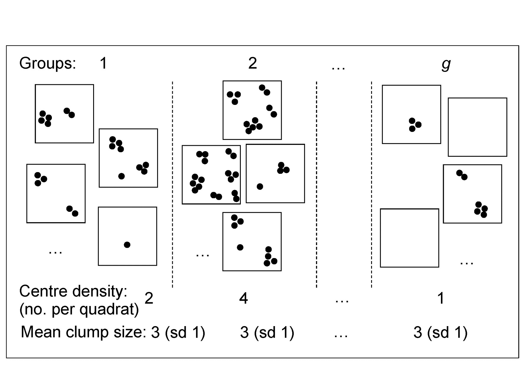
Fig 9.2 Simple graphic of generalised Poisson model for counts of a single species: centres of population are spatially random but with density varying across groups (sites/times/treatments). The distribution of the number of individuals(≥1) found at each centre is assumed constant across groups, though unknown.
Technically, for a particular species, if the number of centres in a replicate from group g has a Poisson distribution with mean $\nu _ g$ and the number of individuals at each centre has an unknown distribution with mean $\mu$ and variance $\sigma^2$, then $X _ j$, the count in the jth replicate from group g, has mean $\nu _ g \mu$ and variance $\nu _ g (\mu ^ 2 + \sigma ^ 2)$. Thus the index of dispersion D, the ratio of variance to mean counts for the group is $(\mu ^ 2 + \sigma ^ 2)/\mu$ and this is not a function of $\nu _ g$, i.e. D is the same for all groups, and an average D can be computed across groups (weighted, if replicates unbalanced). Dividing all counts by this average gives values which have the ‘Poisson-like’ property of variance $\approx$ mean.
The process is repeated for all species separately. Note that there is certainly no assumption that the clump size distribution is the same for all species, not even in distributional form: some species will be heavily clumped, others not at all, with all possibilities in between, but all are reduced by DW to giving (non-integral) abundances that are equally variable in relation to their mean, i.e. the unwanted contributions made by large but highly erratic counts are greatly down-weighted by their large dispersion indices.
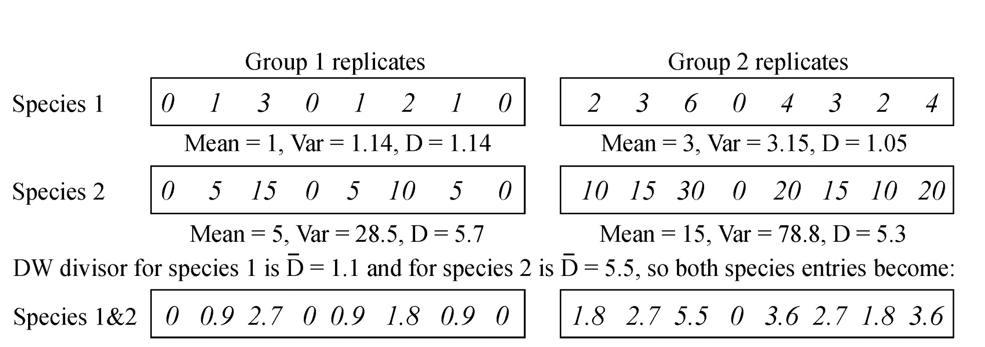
Table 9.5. Simple example of dispersion weighting (DW) on abundances from a matrix of two species sampled for two groups (e.g. sites/times), each of eight replicates. Prior to DW, species 2 would receive greater weight but its arrivals are clumped. After DW, the species have identical entries in the matrix.
One simple (over-simple) way of thinking of this is that we count clumps instead of individuals, and the calculation for such a simple hypothetical case is illustrated above. Here, there are two groups, with 8 replicates per group and two species. The individuals of species 1 arrive independently (the replicates show the Poisson-like property of variance $\approx$ mean) whereas species 2 has an identical pattern of arrivals but of clumps of 5 individuals at a time. Dividing through each set of species counts by the averaged dispersion indices (1.1 and 5.5 respectively) would reduce both rows of data to the same Poisson-like ‘abundances’.¶
However, DW is much more general than this simple case implies. The generalised Poisson model certainly includes the case of fixed-size clumps, and the even simpler case where the clump size is one, so that individuals arrive into the sample independently of each other, for which the counts are then Poisson and D=1 (DW applies no down-weighting). More realistically, it includes the Negative Binomial distribution as a special case, a distribution often advocated for fully parametric modelling of overdispersed counts (e.g. recently by Warton, Wright & Wang (2012) ). Such modelling needs the further assumption that the clump size distribution is of the same type for all species, namely Fisher’s log series. Also subsumed under DW are the Neyman type A (where the clump size distribution is also Poisson) and the Pólya-Aeppli (geometric clump size distribution) and many others.
Our approach here is to remain firmly distribution-free. In order to remove the large contributions that highly erratic (clumped) species counts can make to multivariate analyses such as the SIMPER procedure, it is not necessary (as Warton, Wright & Wang (2012) advocate) to throw out all the advantages of a fully multivariate approach to analysis, based on a biologically relevant similarity matrix, replacing them with what might be characterised as ‘parallel univariate analyses’. (This seems a classic case of ‘throwing the baby out with the bathwater’). Instead, it is simply necessary first to down-weight such species semi-parametrically, by dispersion weighting, which subsumes the negative binomial and many other commonly-used parametric models for overdispersed counts, and the (perceived§) problem disappears.
¶ In fact the counts for species 1 would not lead to rejection of the null hypothesis of independent random arrivals (D=1) in this case, using the permutation test discussed later, so no DW would be applied to species 1.
§ It is relevant to point out here that the later example (and much other experience) suggests that, whilst DW is more logically satisfactory than the cruder use of severe transformations for this purpose, the practical differences between analyses based on DW and on simple transforms are, at their greatest, only marginal. Since most of the 10,000+ papers using PRIMER software in its 20-year history have used transformed data (PRIMER even issues a warning if Bray-Curtis calculation has not been preceded by a transformation), Warton’s conclusions, largely based on analyses of untransformed data, that “hundreds of papers every year currently use methods [which] risk undesirable consequences” seem unjustified.
9.6 Example: Fal estuary copepods
Somerfield, Gee & Warwick (1994a) and Somerfield, Gee & Warwick (1994b) present biotic and environmental data from five creeks of the Fal estuary, SW England, whose sediments can contain high heavy metal levels resulting from historic tin and copper mining in the surrounding valleys ({f}, Fig. 9.3).
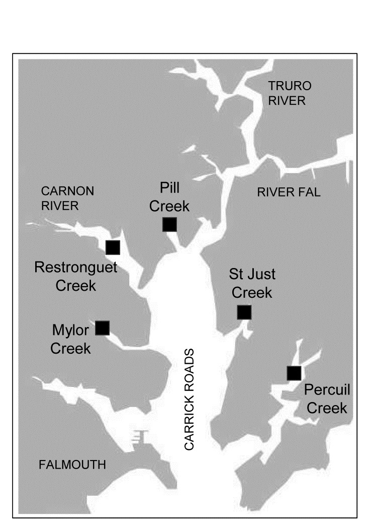
Fig. 9.3 Fal estuary copepods {f}. Five creeks sampled for meiofauna/macrofauna
Table 9.6. Fal estuary copepods {f}. Original counts from five replicate meiofaunal cores in each of two creeks (Mylor and Pill). Final three columns give the average dispersion index, its significance, and the divisor used to downweight each row (matrix is ordered by the latter) under the dispersion weighting procedure. Divisor=1 if permutation test does not give significant clumping for that species.
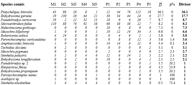
Here, only the infaunal copepod counts are analysed, from five replicate meiofaunal cores in each of two creeks (Mylor, M and Pill, P), subject to differing sediment concentrations of contaminants (Table 9.6). Species are listed in decreasing order of their average dispersion index $\overline{D}$ over the two groups, e.g. for the first species, Platychelipus littoralis, $D _ M =35.9$ and $D _ P =36.2$, giving average $\overline{D} = 36.1 $, the divisor for the first row of the matrix. This represents rather strong overdispersion for this species, as does the divisor $\overline{D} = 27.7$ for the second row, Enhydrosoma gariene. In fact, the highest counts in the matrix are found in these two species and, without DW, they would have played an influential role in determining the similarity measures input to the multivariate analyses. But their counts are not consistent over replicates, ranging from 1 to 88, 12 to 112, 19 to 130 etc, hence giving large dispersion indices (variance-to-mean ratios). The dispersion-weighted values, however, are now much lower, ranging only up to 3 or 4, and therefore strongly down-weighted in favour of more consistent species (over replicates), such as Microarthridion fallax. Its counts were initially similarly high but are subject to a much lower divisor, so this fourth row of the weighted matrix now ranges up to 13, giving it much greater prominence. Interestingly, even quite low-abundance species, such as the last in the list (Stenhelia elizabethae) will now make a significant contribution, because of its consistency; it does not get down-weighted at all, as the following permutation test shows.
Test for overdispersion
The final six species in the table exhibit no significant evidence of overdispersion at all, and their divisor is therefore 1. What is needed here to examine this is a test of the null hypothesis $D=1$ in all groups, and a relevant large-sample test is based on the standard Wald statistic for multinomial likelihoods (further details in Clarke, Chapman, Somerfield et al. (2006) ). This has the familiar chi-squared form, e.g. for Tachidius discipes how likely is it that observed counts for Mylor of 6, 2, 8, 0, 0 could arise from placing 16 individuals into 5 replicates independently and with equal probability, i.e. when the ‘expected’ values in each replicate are 3.2? Simultaneously, how likely is it that the two individuals from Pill both fall into the same replicate if they arrive independently (i.e. observed values are 0, 0, 0, 0, 2 and expected values 0.4 in each cell)? The usual chi-squared form $X ^2 = \sum \left[ (Obs - Exp)^2 / Exp \right] $ can be computed, but these are far from large samples so its distribution under the null hypothesis will only be poorly approximated by the standard $\chi ^ 2$ distribution on 8 df. Instead, in keeping with other tests of this manual, the null distribution is simply created by permutation: 16 and 2 individuals are randomly and independently placed into the first and second set of replicates, respectively, and $X ^ 2$ recalculated many times. For T. discipes the observed $X ^ 2$ is larger than any number of simulated ones and $D=1$ can be firmly rejected, so the divisor of 3.1 is used, but for the final 6 species $D=1$ is not rejected (at p=5% on this one-tailed test), and no down-weighting is carried out.
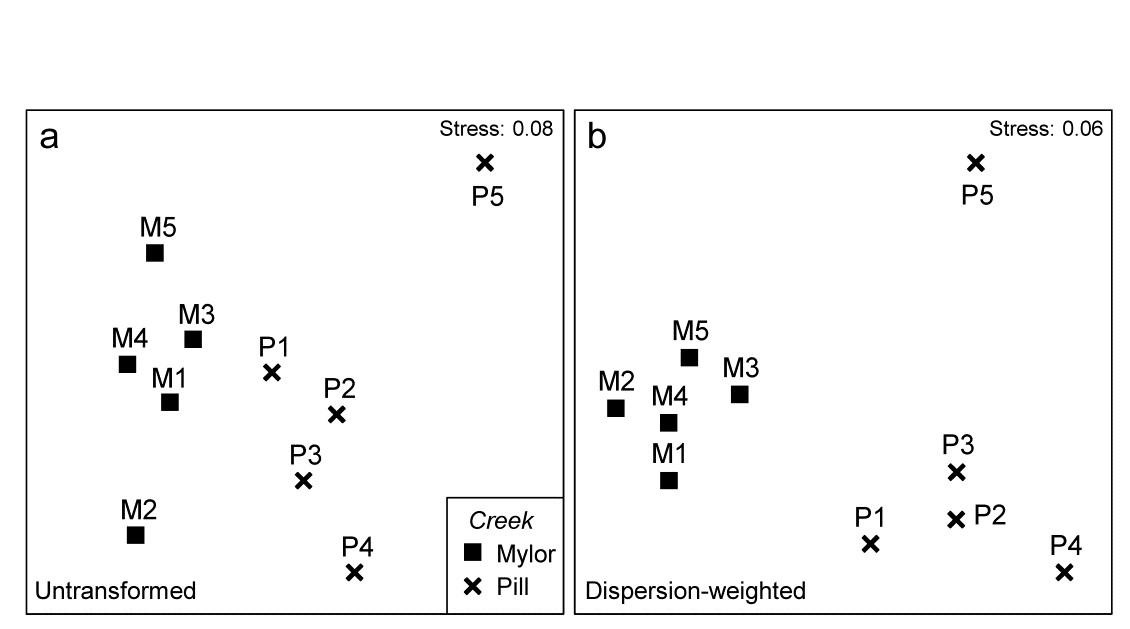
Fig 9.4 Fal estuary copepods {f}. MDS of copepod assemblages for 5 meiofaunal cores in each of two creeks (Mylor and Pill), from Bray-Curtis similarities on: a) untransformed counts; b) dispersion-weighted counts
Effect of dispersion weighting
The effect of DW on the multivariate analysis can be seen in Fig. 9.4, which contrasts the (non-metric) MDS plots from Bray-Curtis similarities based on untransformed and dispersion-weighted counts. A major difference is not observed, but there is a clear suggestion that the replicates within the M group in particular have tightened up, and the distinction between the two groups enhanced. The former is exactly what might be expected: by down-weighting species with large but erratic abundances in replicates we should be reducing the ‘noise’, allowing any ‘signal’ that may be there to be seen more clearly. But the latter cannot, and should not, be guaranteed. It is perfectly possible that when attention is focussed on the species that are consistent in replicates, they may display no change at all across groups – so be it. In fact, in this case, DW makes a sizeable difference to the ANOSIM test for the group effect, with the R statistic increasing from 0.41 to 0.71 after DW.
Shade plots to demonstrate matrix changes
The explanation, in terms of particular species, for changes seen in the multivariate analyses following DW, are well illustrated by simple shade plots (p7-7,
Clarke, Tweedley & Valesini (2014)
). For these visual representations of the data matrices, the intensity of grey shading is linearly proportional to the matrix entry, with white representing absence and full black the largest count (or weighted count) in the matrix, Fig. 9.5. Here, the species have been ordered according to a species clustering using the index of association on the original counts (equation 7.1), and the same species ordering is preserved for the shade plot under DW. It is readily seen that some of the less erratic species, such as M. fallax and S. elizabethae, do show a clear pattern of larger values at Mylor than Pill, and several other species which are not heavily down-weighted (Enhydrosoma longifurcatum, Amphiascoides limicola, Mesochra lilljeborgi) show the reverse pattern. The highly erratic species formerly given the most weight, P. littoralis and E. gariene, did not clearly distinguish the two creeks, so that their reduction in importance under DW has again, in this case, aided discrimination of the two groups.
Further DW issues
The DW procedure makes few assumptions about the data, but is derived from a model in which the degree of clumping, and thus the index of dispersion, of a particular species is constant across groups. In some cases this may well be a poor assumption, e.g. when impacts represented by a group structure affect both the propensity for that species to clump as well as the density of clump centres. Clearly, in that case, we must not use a different dispersion divisor D for each group; as earlier emphasised, doing different things for each group risks creating an artefactual group effect where none exists. Using an averaged index ($\overline{D}$) across groups might thus still provide a sensible ‘middle course’ in deciding how much weight to give to that species. Faced with the alternatives of doing no species weighting (so that erratic, clumped species dominate) or giving all species, abundant and rare, exactly the same weight (e.g. as in normalising the variables or the implicit standardisations of a Gower resemblance measure), DW may indeed be a robust general means of weighting species. As is seen later (e.g. Chapter 10 and 16 and Fig. 13.8), even quite major changes to the balance of information utilised from different species can have surprisingly little effect on a multivariate analysis, mainly because the latter typically uses only a small amount of information from each species and the same driving patterns are present in many species.
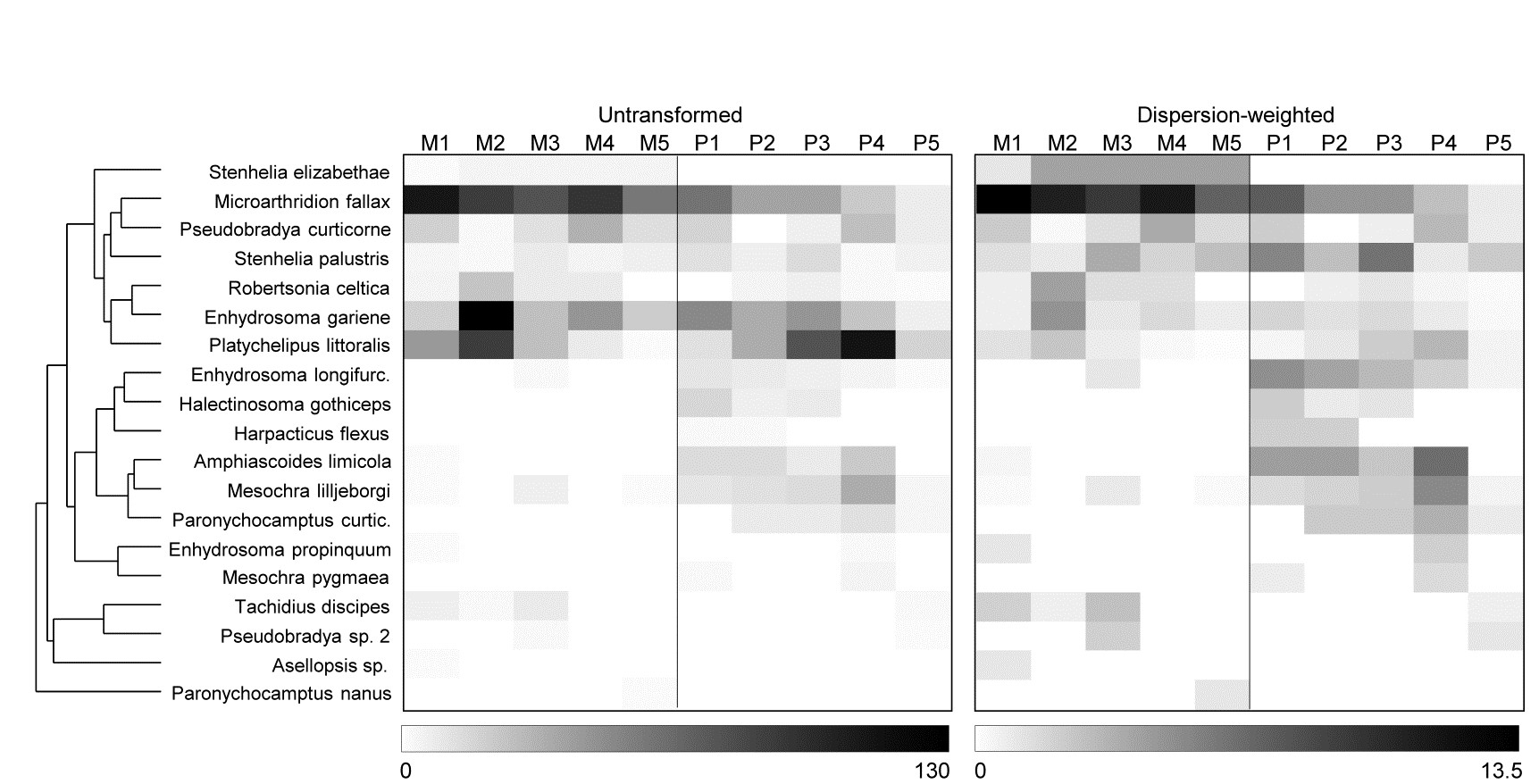
Fig. 9.5 Fal estuary copepods {f}. Shade plot, showing: left-hand, the untransformed counts of Table 9.6, represented by rectangles of linearly increasing grey scale (species clustering gives y-axis ordering); right-hand, the dispersion weighted values (maximum 13.4).
Clarke, Chapman, Somerfield et al. (2006) discuss further DW questions naturally arising. For example, should one upweight species that are significantly underdispersed, i.e. are territorially spaced, more evenly than expected under randomness, so that replicate counts are ‘too similar’ and chi-squared is significantly small? This is rarely observed, in the marine environment at least! Indeed, one of the beneficial side effects of applying DW is likely to be a clearer understanding of how a range of species are distributed in the environment, through histograms of dispersion indices calculated from all species in assemblages of different faunal types.
Also, how much more general can the DW idea be made? Clearly the test for D=1 is based on a realistic probability model for genuine counts but, if the testing structure is ignored, it would still logically make sense to apply downweighting by the variance-to-mean ratio for densities as well as counts, at least provided the adjustment from count to density was only of a modestly varying constant across samples. (A typical context might be where real counts from trawl samples are variably adjusted for modest differences in the volume of water filtered.) An extension to area cover data for rocky-shore or coral reef studies seems equally plausible. Here, the ‘counts’ can be thought of as number of grid points within a sampled area (one replicate) which fall on a particular species. If an individual algal or coral colony is larger than the grain of the grid points then the same colony will be ‘captured’ by several points, expressed as over-dispersion of the ‘counts’ from replicate to replicate (in the extreme, one species with an average area cover of 50% might vary from 100% in one replicate to 0% in the next, where another ubiquitous species, whose clump size is much smaller than the sampling grain, might record variation of only 40% to 60%). Relative down-weighting by dispersion indices then makes reasonable sense, and similar arguments could be adduced for biomass data of motile species. Larger-bodied species give greater ‘overdispersed’ biomass relative to smaller-bodied ones. In fact, by overlaying the previous model of real counts of organisms with a fixed body mass per individual (varying between species), relative downweighting by D works in exactly the same way as earlier, removing at the same time both greater clumping of individuals and the size differential between species, to leave a natural and robust weighting of the different species in subsequent multivariate analyses. It is, however, only relative D values that matter in all these cases; D=1 has no meaning outside the case of real counts.
DW vs. Transformation
DW is advocated above as an alternative to transformation, providing a more targeted way of dealing with large and highly variable counts in some species. The disadvantage of simple, severe transformations in this context (e.g. fourth root) is that, whilst effective in reducing the contribution of the erratic P. littoralis and E. gariene in the earlier example, they will also ‘squash’ consistent but low-abundance species, such as S. elizabethae, into a near presence/absence state. Nonetheless, simple transformations can be applied universally (e.g. without the need for replicates), and will often give similar results to DW. A fourth root transformation here actually leads to an even higher R value for the ANOSIM test for a group difference of 0.81, and the MDS plot, while similar, tightens up the Pill group by giving less emphasis to the lower total abundance at P5 than the other Pill creek sites; the latter was clearly seen in the shade plot, Fig. 9.5.
A shade plot for this fourth-root transformed matrix is shown in Fig. 9.6 (left-hand plot) and it is clear that the multivariate analyses will now mainly be driven by the differing presence/absence structure, with the originally important species playing a much smaller role (e.g. M. fallax now appears scarcely to differ between the two creeks).
DW and Transformation
However, the key step here is to realise that DW and transformation are not necessarily alternatives; it may be optimal to use them in combination. DW directly addresses the problem of undue emphasis being given to high abundance-high variance species, ensuring all weighted species values now have strictly comparable reliability. But DW does not address the primary motivation for transformations outlined in Chapter 2, that of better balancing the contributions from less abundant (and consistent) species with the more abundant (and now equally consistent) species. Not all high abundance species are erratic in replicates and, if they are, they may still have largely dominant values after DW has ensured their consistency. In short: DW is applied for statistical reasons but we may still need to transform further (after DW) for biological reasons, if we seek a ‘deeper rather than shallower’ view of the assemblage. That transform will likely now be less severe than if no DW had been carried out since it is no longer trying to address two issues at once. Here, the shade plot for DW followed by square root transformation is shown in Fig. 9.6 (right-hand plot) and this combination does actually give (marginally) the best separation of Mylor and Pill creeks in the multivariate analysis, amongst the analyses shown here, with R = 0.85.
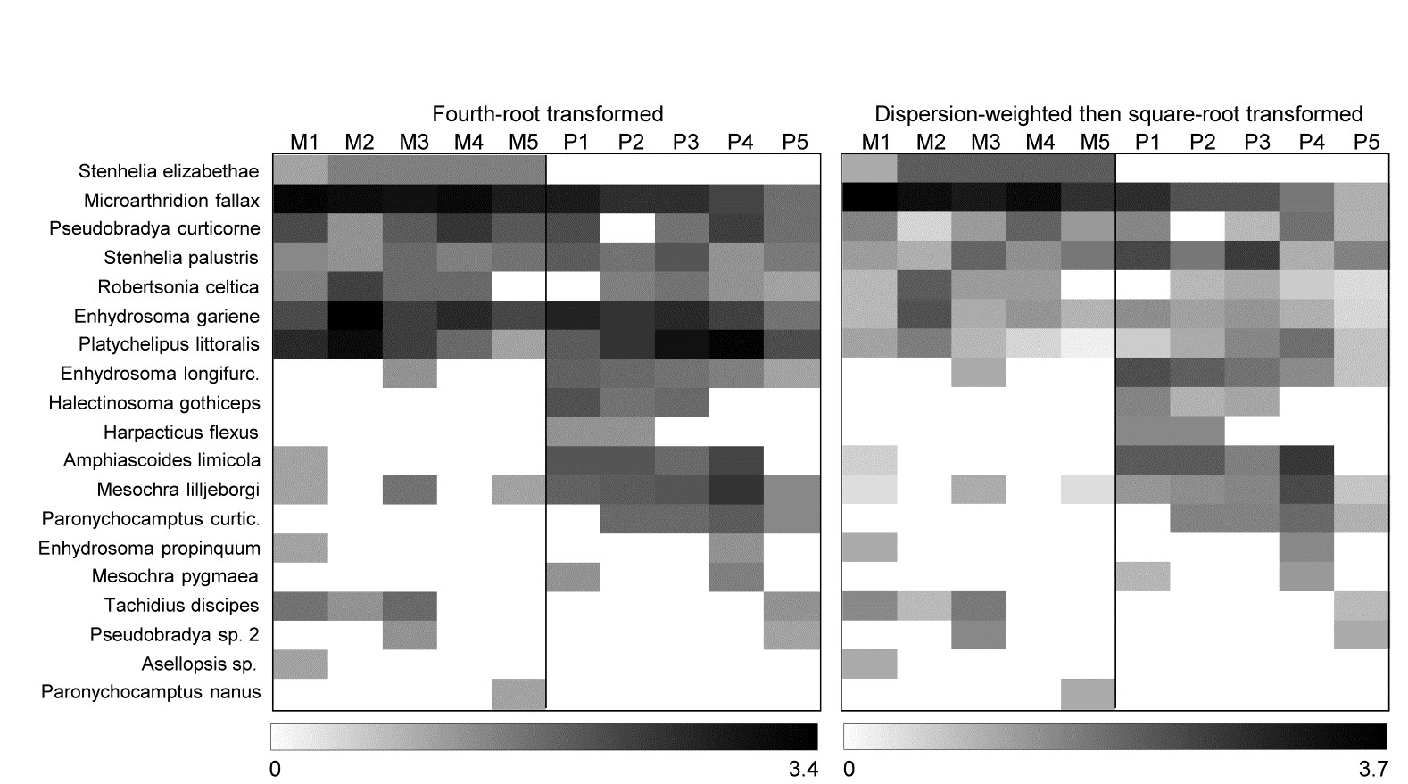
Fig. 9.6 Fal estuary copepods {f}. Shade plot, with linear grey scale for: left-hand, 4th-root transformed counts; right-hand, dispersion weighted values subsequently square-root transformed. Species order kept the same as in (untransformed) species clustering, Fig. 9.5.
This is not an uncommon finding. Clarke, Tweedley & Valesini (2014) describe the role of shade plots in assisting long-term choice of better transformation and/or DW strategies, and give examples. One is of fish studies in which highly schooling species, though heavily down-weighted by DW (by two orders of magnitude), remain dominant because they are consistently found in some quantity in all replicates. DW followed by mild transformation was transparently a better option than either DW or severe transformation on its own.
‘Long-term choice’ is an important phrase here: one must avoid the selection bias inherent in chasing the best combination of DW and transformation for each new study – ‘best’ in the sense of appealing most to our preconceptions of what the analysis should have demonstrated! Instead, the idea is to settle on a pre-treatment strategy to be used consistently in future for that faunal type in those sampling contexts.
9.7 Variability weighting
Hallett, Valesini & Clarke (2012) describe a similar idea to dispersion weighting for use when the data are continuous biological variables, such as diversity indices or other measures of ecological health of an assemblage. For such non-quantity data, for which zero plays no special role (and measures can be negative), variance-to-mean ratios are inappropriate. Instead, a natural weighting of indices in Euclidean distance calculation might be to divide each index by an average measure of its standard deviation (or range or IQ range) over replicates from each group. Indices with high replicate variability are then given less weight than more consistent ones. In some cases this may be preferable to normalising, which gives each index equal weight.
Chapter 10: Species aggregation to higher taxa
10.1 Species aggregation
Fig. 10.1a repeats the multivariate ordination (nMDS) seen in Fig. 1.7 for the macrofaunal data from Frierfjord, based on 4th-root transformed species counts and Bray-Curtis similarities among the 24 samples (at 6 sites, A-E,G). The assemblage consisted of 110 taxa identified in three-quarters of the cases to the species level (the remainder, as is commonly the case, were only identified to some higher taxonomic level, e.g. Nemertines, Oligochaetes etc). Fig. 10.1b shows the same ordination plot that would have been obtained had all species-level identifications only been to the level of genus, and it is clear that the conclusions about the relationships among the 6 sites would have remained more or less identical had the identification level been that degree coarser. This is not really that surprising since many of the identified genera only contained a single species, the number of variables (taxa) reducing only from 110 species to 88 genera¶. However, the insensitivity of the multivariate analysis to the change in identification effort in this case is suggestive of more general possibilities.
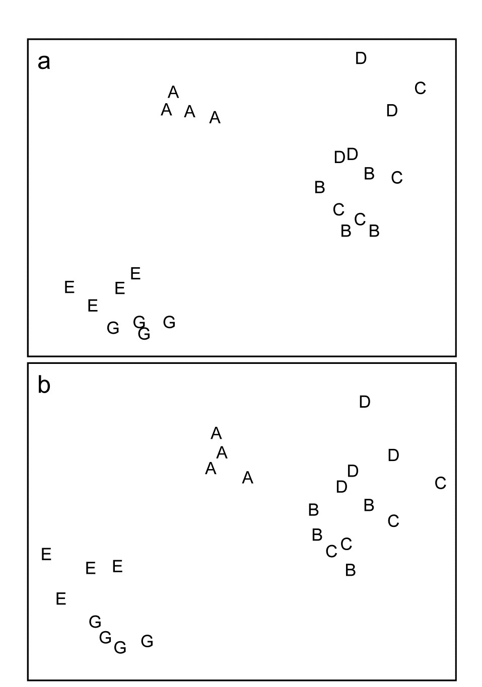
Fig. 10.1 Frierfjord macrofauna {F}. Sample MDS using Bray-Curtis similarities on $ \sqrt{} \sqrt{} $-transformed counts for a) 110 species, b) 88 genera (stress = 0.10, 0.09 respectively).
The painstaking work involved in sorting and identifying samples to the species level has resulted in community analysis for environmental impact studies being traditionally regarded as labour-intensive, time-consuming and therefore relatively expensive. One practical means of overcoming this problem might therefore be to try analysing the samples to some higher taxonomic level, such as family. If results from this coarser level are comparable to full species analysis, this means that:
a) A great deal of labour can be saved. Several groups of marine organisms are taxonomically difficult, for example (in the macrobenthos) several families of polychaetes and amphipods; as much time can be spent in separating a few of these difficult groups into species as the entire remainder of the sample, even in Northern Europe where taxonomic keys for identification are most readily available.
b) Less taxonomic expertise is needed. Many taxa really require the skills of specialists to separate them into species, and this is especially true in parts of the world where fauna is poorly described. For certain groups of marine organisms, e.g. the meiobenthos, the necessary expertise required to identify even the major taxa (nematodes and copepods) to species is lacking in most laboratories which are concerned with the monitoring of marine pollution, so that these components of the biota are rarely used in such studies, despite their many inherent advantages (see Chapter 13).
For the marine macro- and meiobenthos, aggregations of the species data to higher taxonomic levels are examined below in a few applications, and resultant data matrices subjected to several forms of statistical analysis to see how much information has been lost compared with species-level analysis. Examples are also seen in Chapter 16, where a more sophisticated methodology is given for summarising the relative effects of differing levels of taxonomic aggregation, in comparison with other decisions that need to be made about a multivariate analysis, e.g. severity of transformation and choice of resemblance measure (we defer such discussion until the needed tools have been presented in Chapters 11 and 15). Aggregation, followed by simple re-analysis, has now been looked at very widely in the marine (and non-marine) literature for a range of faunal groups.
Methods amenable to aggregation
- Multivariate methods. Although taxonomic levels higher than that of species can be used to some degree for all types of statistical analysis of community data, it is probably for multivariate methods that this is most appropriate, at least when the taxa is relatively species rich; e.g. Chapter 16 shows the high degree of structural redundancy in marine macrobenthic assemblages, with many sets of species ‘carrying the same information’, in effect, about the spatio-temporal changes which drive the community patterns. (On the other hand, it is clear that for a very limited faunal group such as, say, the freshwater fish of Australian river systems, with species numbers typically only in single figures, there is much to lose and little to gain by aggregation to higher taxa). All ordination/clustering techniques are amenable to aggregation, and there is now substantial evidence that identification only to the family level for macrobenthos, and the genus level for meiobenthos, makes very little difference to the results (see, for example, Figs. 10.2–10.6, and the results in Chapter 16). There are possibly also theoretical advantages to conducting multivariate analyses at a high taxonomic level for pollution impact studies. Natural environmental variables which also affect community structure are rarely constant in surveys designed to detect pollution effects over relatively large geographical areas. For the benthos, such ‘nuisance’ variables include water depth and sediment granulometry. However, it is a tenable hypothesis that these variables influence the fauna more by species replacement than by changes in the proportions of the major taxa present. Each major group, in its adaptive radiation, has evolved species which are suited to rather narrow ranges of natural environmental conditions, whereas anthropogenic contamination has been too recent for the evolution of suitably adapted species. Ordinations of abundance or biomass data of these major taxa are thus more likely to correlate with a contaminant gradient than are species ordinations, the latter being more complicated by the effects of natural environmental variables. In short, higher taxa may well reflect well-defined pollution gradients more closely than species.
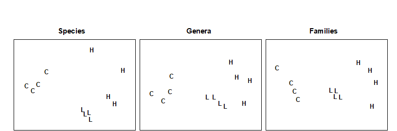
Fig. 10.2. Nutrient-enrichment experiment, Solbergstrand {N}. MDS plot of copepod abundances ($ \sqrt{} \sqrt{} $-transformed, Bray-Curtis similarities) for 4 replicates from 3 treatments; species data aggregated into genera and families (stress = 0.09, 0.09, 0.08).

Fig. 10.3. Loch Linnhe macrofauna {L}. MDS (using Bray-Curtis similarities) of samples from 11 years. Abundances are $ \sqrt{} \sqrt{} $-transformed (top) and untransformed (bottom), with 111 species (left), aggregated into 45 families (middle) and 9 phyla (right). (Reading across rows, stress = 0.09, 0.09, 0.10, 0.09, 0.09, 0.02).
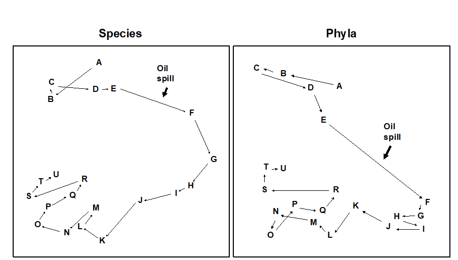
Fig. 10.4. Amoco-Cadiz oil spill {A}. MDS for macrobenthos at station ‘Pierre Noire’ in the Bay of Morlaix. Species data (left) aggregated into phyla (right). Sampling months are A:4/77, B:8/77, C:9/77, D:12/77, E:2/78, F:4/78, G:8/78, H:11/78, I:2/79, J:5/79, K:7/79, L:10/79, M:2/80, N:4/80, O:8/80, P:10/80, Q:1/81, R:4/81, S:8/81, T:11/81, U:2/82. The oil-spill was during 3/78, (stress = 0.09, 0.07).
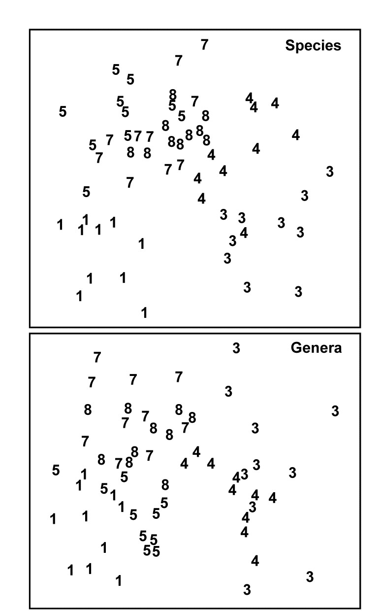
Fig. 10.5. Indonesian reef corals {I}. MDS for species (p=75) and genus (p=24) data at South Pari Island (Bray-Curtis similarities on untransformed % cover). The El Niño occurred in 1982–3. 1=1981, 3=1983 etc. (stress = 0.25).
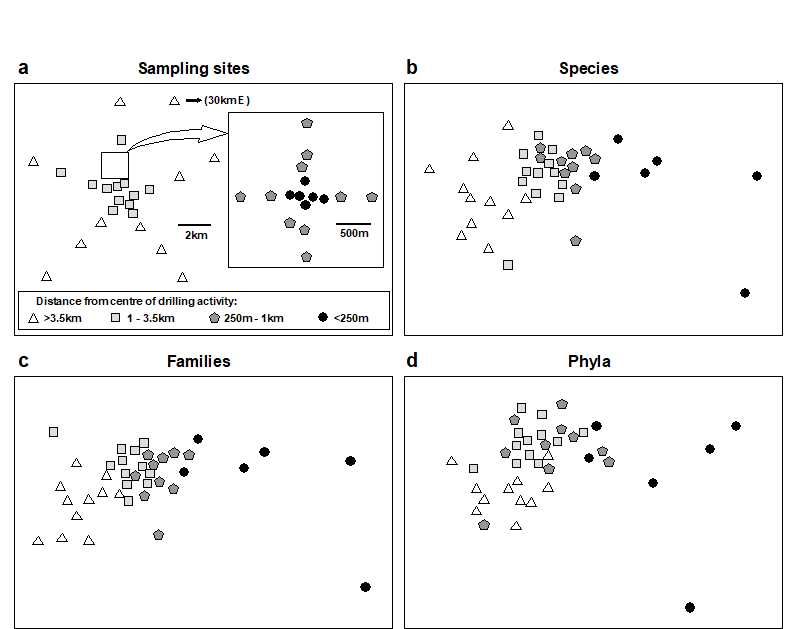
Fig. 10.6. Ekofisk oil-platform macrobenthos {E}. a) Map of station positions, indicating symbol/shading conventions for distance zones from the centre of drilling activity; b)-d) MDS for root-transformed species, family and phyla abundances (stress = 0.12, 0.11, 0.13).
-
Distributional methods. Aggregation for ABC curves is possible, and family level analyses are often identical to species level analyses (Fig. 10.7).
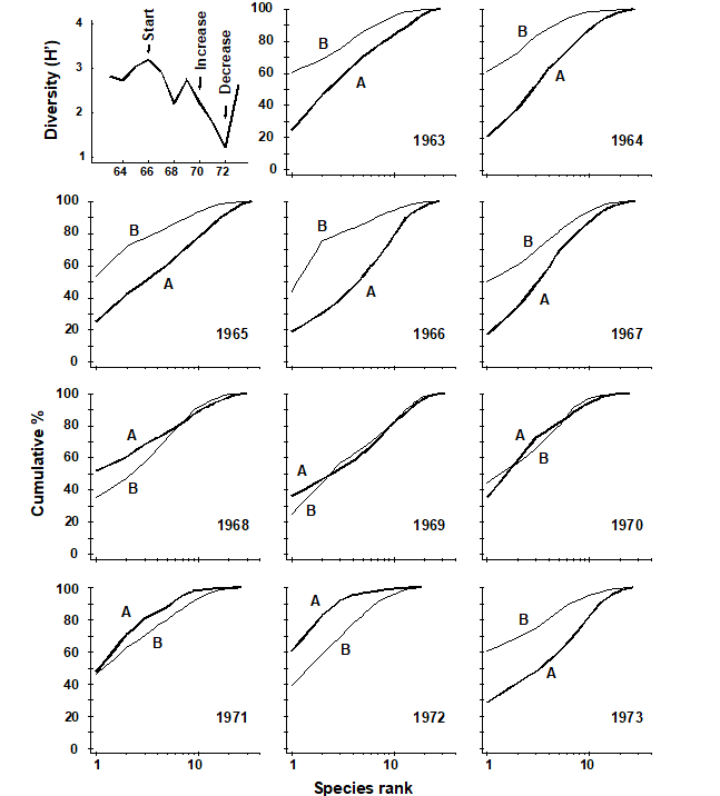
Fig. 10.7. Loch Linnhe macro¬fauna {L}. Shannon diversity (H´) and ABC plots over the 11 years, 1963 to 1973, for data aggregated to family level (c.f. Fig. 8.7). Abundance = thick line, biomass = thin line.
- Univariate methods. The concept of pollution indicator groups rather than indicator species is well-established. For example, at organically enriched sites, polychaetes of the family Capitellidae become abundant (not just Capitella capitata), as do meiobenthic nematodes of the family Oncholaimidae. The nematode copepod ratio ( Raffaelli & Mason (1981) ) is an example of a pollution index based on higher taxonomic levels. Such indices are likely to be of more general applicability than those based on species level data. Diversity indices themselves can be defined at hierarchical taxonomic levels for internal comparative purposes, although this is not commonly done in practice.
¶ This pooling of counts to any specified coarser taxonomic level (called aggregation by PRIMER) uses the Aggregate routine on the Tools menu and requires a look-up table, an aggregation file, which can consist of a much larger species set (probably in a different order), from which each variable (species) in the data matrix is allocated to a specified genus, family, order, class, etc. Such aggregation files are also of fundamental importance in computing biodiversity measures based on the taxonomic relatedness of species in each sample, see Chapter 17.
10.2 Examples
Multivariate examples
Nutrient-enrichment experiment
In the soft-bottom mesocosms at Solbergstrand, Norway {N}, box-cores of sublittoral sediment were subjected to three levels of particulate organic enrichment (L = low dose, H = high dose and C = control), there being four replicates from each treatment. After 56 days the meiobenthic communities were analysed. Fig 10.2 shows that, for the copepods, there were clear differences in community structure between treatments at the species level, which were equally evident when the species data were aggregated into genera and families. (Indeed, at the family level the configuration is arguably more linearly related to the pollution gradient than at the species level).
Loch Linnhe macrofauna
MDS ordinations of the Loch Linnhe macrobenthos are given in Fig. 10.3, using both double square root and untransformed abundance data. Information on the time-course of pollution events and changes in diversity are given in Fig. 10.7 (top left). The ordinations have been performed separately using all 111 species, the 45 families and the 9 phyla. In all ordinations there is a separation to the right of the years 1970, 1971 and 1972 associated with increasing pollution levels and community stress, and a return to the left in 1973 associated with reduced pollution levels and community stress. This pattern is equally clear at all levels of taxonomic aggregation. Again, the separation of the most polluted years is most distinct at the phylum level, at least for the double square root transformed data (and the configuration is more linear with respect to the pollution gradient at the phylum level for the untransformed data).
Amoco-Cadiz oil-spill
Macrofauna species were sampled at station ‘Pierre Noire’ in the Bay of Morlaix on 21 occasions between April 1977 and February 1982, spanning the period of the wreck of the ‘Amoco-Cadiz’ in March 1978. The sampling site was some 40km from the initial tanker disaster but substantial coastal oil slicks resulted. The species abundance MDS has been repeated with the data aggregated into five phyla: Annelida, Mollusca, Arthropoda, Echinodermata and ‘others’ (Fig. 10.4). The analysis of phyla closely reflects the timing of pollution events, the configuration being slightly more linear than in the species analysis. All pre-spill samples (A-E) are in the top left of the configuration, the immediate post-spill sample (F) shifts abruptly to the bottom right after which there is a gradual recovery in the pre-spill direction. Note that in the species analysis, although results are similar, the immediate post-spill response is rather more gradual. The community response at the phylum level is remarkably clear.
Indonesian reef corals
The El Niño of 1982-3 resulted in extensive bleaching of reef corals throughout the Pacific. Fig. 10.5 shows the coral community response at South Pari Island over six years in the period 1981-1988, based on ten replicate line transects along which coral species cover was determined. Note the immediate post-El Niño location shift on the species MDS and a circuitous return towards the pre-El Nino condition. This is closely reflected in the genus level analysis.
Ekofisk oil-platform macrobenthos
Changes in community structure of the soft-bottom benthic macrofauna in relation to oil drilling activity at the Ekofisk platform in the North Sea {E} have been studied by
Gray, Clarke, Warwick et al. (1990)
and
Warwick & Clarke (1991)
. The positions of the 39 sampling stations around the rig are coded by different symbol and shading conventions in Fig. 10.6a, according to their distance from the centre of drilling activity at that time. In the MDS species abundance analysis (Fig. 10.6b), community composition in all of the zones is distinct, and there is a clear gradation of change from the (black circle) inner to the (open triangle) outer zones. Formal significance testing (using the methods of Chapter 6) confirms statistically the differences between all zones. The MDS has been repeated with the species data aggregated into families (Fig. 10.6c) and phyla (Fig. 10.6d). The separation of sites is still clear, and pairwise comparisons confirm the statistical significance of differences between all zones, even at the phylum level, which does show some deterioration of the pattern. This is in contrast to (species-level) univariate and graphical/distributional measures, in which only the inner zone (less than 250m from the rig) was significantly different from the other three zones (see Chapter 14). Thus, phylum level analyses are again shown to be surprisingly sensitive in detecting pollution-induced community change, and little information at all is lost by working at the family level.
Graphical examples
Loch Linnhe macrofauna
ABC plots for the Loch Linnhe macrobenthos species data are given in Chapter 8, Fig. 8.7, where the performance of these curves with respect to the time-course of pollution events is discussed. In Fig. 10.7 the species data are aggregated to family level, and the curves are virtually identical to the species level analysis, so that there would have been no loss of information had the samples only been sorted originally into families.
Similar results were produced by replotting the ABC curves for the Garroch Head sewage sludge dumping ground macrobenthos {G} (Fig. 8.8) at the family level ( Warwick (1988b) ).
Univariate example
Indonesian reef corals
Fig. 10.8 shows results from another survey of 10 replicate line transects for coral cover over the period 1981-1988, in this case at South Tikus Island, Indonesia {I}. Note the similarity of the species and genus analyses for the number of taxa and Shannon diversity, with an immediate post-El Niño drop and subsequent suggestion of partial recovery.
Fig. 10.8. Indonesian reef corals {I}. Means and 95% confidence intervals for number of taxa and Shannon diversity at South Tikus Island, showing the impact and partial recovery from the 1982–3 El Niño. Species data (left) have been aggregated into genera (right).
10.3 Recommendation
Clearly the operational taxonomic level for environmental impact studies is another factor to be considered when planning such a survey, along with decisions about the number of stations to be sampled, number of replicates, types of statistical analysis to be employed etc. The choice will depend on several factors, particularly the time, manpower and expertise available and the extent to which that component of the biota being studied is known to be robust to taxonomic aggregation, for the type of statistical analysis being employed, and the type of perturbation expected. Thus, it is difficult to give general recommendations and each case must be treated on its individual merits. However, for routine monitoring of organic enrichment situations using macrobenthos, one can by now be rather certain that family level analysis will be perfectly adequate. Also, for the free-living meiofauna, there are by now many examples where multivariate analysis of genus-level information is indistinguishable from that for species, and broadly similar results have been found now for a wide range of faunal groups. The topic is returned to in Chapter 16.
Chapter 11: Linking community analyses to environmental variables
11.1 Introduction
Approach
In many studies, the biotic data is matched by a suite of environmental variables measured at the same set of sites. These could be natural variables describing the physical properties of the substrate (or water) from which the samples were taken, e.g. median particle diameter, depth of the water column, salinity etc, or they could be contaminant variables such as sediment concentrations of heavy metals. The requirement here is to examine the extent to which the physico-chemical data is related to (‘explains’) the biological pattern.
The approach adopted is firstly to analyse the biotic data and then ask how well the information on environmental variables, taken either singly ( Field, Clarke & Warwick (1982) ) or in combination ( Clarke & Ainsworth (1993) ), matches this community structure.¶ The motivation here, as in earlier chapters, is to retain simplicity and transparency of analysis, by letting the species and environmental data ‘tell their own stories’ (under minimal model assumptions) before judging the extent to which one provides an ‘explanation’ of the other.
Environmental data analysis
An analogous range of multivariate methods is available for display and testing of environmental samples as has been described for biotic data: species are simply replaced by physical/chemical variables. However, the matrix entries are now of a rather different type and lead to different analysis choices. No longer do zeros predominate; the readings are usually more nearly continuous and, though their distributions are often right-skewed (with variability increasing with the mean), it is often possible to transform them to approximate normality (and stabilise the variance) by a simple root or logarithmic transformation, see Chapter 9. Under these conditions, Euclidean distance is an appropriate measure of dissimilarity and PCA (Chapter 4) is an effective ordination technique, though note that this will need to be performed on the correlation rather than the covariance matrix, i.e. the variables will usually have different units of measurement and need normalising to a common scale (see the discussion on page 4.4).
In the typical case of samples from a spatial contaminant gradient, it is also usually true that the number of variables is either much smaller than for a biotic matrix or, if a large number of chemical determinations has been made (e.g. GC/MS analysis of a range of specific aromatic hydrocarbons, PCB congeners etc.) they are often highly inter-correlated, tending to preserve a fixed relation to each other in a simple dilution model. A PCA can thus be expected to do an adequate job of representing in (say) two dimensions a pattern which is inherently low-dimensional to start with.
In a case where the samples are replicates from different groups, defined a priori, the ANOSIM tests of Chapter 6 are equally available for testing environmental hypotheses, e.g. establishing differences between sites, times, conditions etc., where such tests are meaningful.§ The appropriate (rank) dissimilarity matrix would use normalised Euclidean distances.
¶ Methods such as canonical correlation (e.g. Mardia, Kent & Bibby (1979) ), and the important technique of canonical correspondence ( ter Braak (1986) ), take the rather different stance of embedding the environmental data within the biotic analysis, motivated by specific gradient models defining the species-environment relationships.
§ The ANOSIM tests in the PRIMER package are not now the only possibility; the data will have been transformed to approximate normality so classical multivariate (MANOVA) tests such as Wilks’ $\Lambda$ (e.g. Mardia, Kent & Bibby (1979) ) may be valid, but only if the number of variables is small in relation to the number of samples.
11.2 Example: Garroch Head macrofauna
For the 12 sampling stations (Fig. 8.3) across the sewage-sludge dump ground at Garroch Head {G}, the biotic information was supplemented by sediment chemical data on metal concentrations (Cu, Mn, Co, ...) and organic loading (% carbon and nitrogen); also recorded was the water depth at each station. The data matrix is shown in Table 11.1; it follows the normal convention in classical multivariate analysis of the variables appearing as columns and the samples as rows.¶
Table 11.1. Garroch Head dump ground {G}. Sediment metal concentrations (ppm), water depth at the site (m) and organic loading of the sediment (% carbon and nitrogen), for the transect of 12 stations across the sewage-sludge dump site (centre at station 6), see Fig. 8.3.
| Station |  Cu Cu |
Mn | Co | Ni | Zn | Cd | Pb | Cr | Dep | %C | %N |
|---|---|---|---|---|---|---|---|---|---|---|---|
| 1 | 26 | 2470 | 14 | 34 | 160 | 0 | 70 | 53 | 144 | 3 | 0.53 |
| 2 | 30 | 1170 | 15 | 32 | 156 | 0.2 | 59 | 15 | 152 | 3 | 0.46 |
| 3 | 37 | 394 | 12 | 38 | 182 | 0.2 | 81 | 77 | 140 | 2.9 | 0.36 |
| 4 | 74 | 349 | 12 | 41 | 227 | 0.5 | 97 | 113 | 106 | 3.7 | 0.46 |
| 5 | 115 | 317 | 10 | 37 | 329 | 2.2 | 137 | 177 | 112 | 5.6 | 0.69 |
| 6 | 344 | 221 | 10 | 37 | 652 | 5.7 | 319 | 314 | 82 | 11.2 | 1.07 |
| 7 | 194 | 257 | 11 | 34 | 425 | 3.7 | 175 | 227 | 74 | 7.1 | 0.72 |
| 8 | 127 | 246 | 10 | 33 | 292 | 2.2 | 130 | 182 | 70 | 6.8 | 0.58 |
| 9 | 36 | 194 | 6 | 16 | 89 | 0.4 | 42 | 57 | 64 | 1.9 | 0.29 |
| 10 | 30 | 326 | 11 | 26 | 108 | 0.1 | 44 | 52 | 80 | 3.2 | 0.38 |
| 11 | 24 | 439 | 12 | 34 | 119 | 0.1 | 58 | 36 | 83 | 2.1 | 0.35 |
| 12 | 22 | 801 | 12 | 33 | 118 | 0 | 52 | 51 | 83 | 2.3 | 0.45 |
No replication is available for the 12 stations so the variance-to-mean plots suggested in Chapter 9 are not possible, but simple scatter plots of all pairwise combinations of variables (draftsman plots, see the later Fig. 11.9) suggest that log transformations are appropriate for the concentration variables, though not for water depth. The criteria here are that variables should not show marked skewness across the samples, enabling meaningful normalisation, and that the relationships between them should be approximately linear; the standard product-moment correlations between variables and Euclidean distances between samples are then satisfactory summaries. In pursuit of this, note that whilst each variable could in theory be subjected to a different transformation it is more logical to apply the same transformation to all variables of the same type. Thus the decision to log all the metal data stems not just from the draftsman plots but also from previous experience that such concentration variables often have standard deviations proportional to their means; i.e. a roughly constant percentage variation is log transformed to a stable absolute variance.
Fig. 11.1 displays the first two axes (PC1 and PC2) of a PCA ordination on the transformed data of Table 11.1. In fact, the first component accounts for much of the variability (61%) in the full matrix, and the second a further 27%, so the first two components account for 88% and the 2-d plot provides an accurate summary of the relationships. The axes are defined as
$$ PC1 = 0.38 Cu ^ \prime – 0.22 Mn ^ \prime – 0.08 Co ^ \prime + 0.15 Ni ^ \prime + 0.37 Zn ^ \prime + 0.33 Cd ^ \prime + 0.37 Pb ^ \prime + 0.35 Cr ^ \prime $$ $$ – 0.12 Dep ^ \prime + 0.37 C ^ \prime + 0.33 N ^ \prime \tag{11.1} $$ $$ PC2 = -0.04 Cu ^ \prime + 0.42 Mn ^ \prime +0.54 Co ^ \prime + 0.47 Ni ^ \prime + 0.16 Zn ^ \prime -0.11 Cd ^ \prime + 0.13 Pb ^ \prime - 0.09 Cr ^ \prime $$ $$ +0.46 Dep ^ \prime + 0.09 C ^ \prime + 0.19 N ^ \prime $$
Broadly, PC1 represents an axis of increasing contaminant load since the sizeable coefficients are all positive. (The dash denotes that variables have been log transformed, excepting Dep, and normalised to zero mean and unit standard deviation). PC2 needs to be orthogonal to PC1 (coefficients cross-multiplying to zero) and it does this simply here by, e.g., the large PC1 coefficients being small in PC2 and vice-versa.

Fig. 11.1. Garroch Head dump ground {G}. Two-dimensional PCA ordination of the 11 environmental variables of Table 11.1 (transformed and normalised), for the stations (1–12) across the sewage-sludge dump site centred at station 6 (% variance explained = 88%). Selected vectors are shown; they represent direction and relative strength of linear increase of normalised variables in this 2-d plane (‘base variables’ option). Only the directions of vectors should be interpreted; their location is arbitrary.
Fig. 11.1 shows a strong pattern of change on moving from the ends of the transect to the dump site centre, which (unsurprisingly) has the greatest levels of organic enrichment and metal concentrations (exceptions are Mn$^ \prime$, Co$^ \prime$ and Ni$^ \prime$). The superimposed vectors are in this case entirely accurate (see the footnote on p7-19), since equation (11.1) shows that the axes are linear in the variables. For example, the Cu$^ \prime$ vector is pointing along the x axis (to the right) because it has a sizeable positive coefficient of 0.38 on PC1, and only slightly downwards because of its small negative coefficient (-0.04) on the PC2 axis, whereas Mn$^ \prime$ and Ni$^ \prime$ increase strongly up the y axis (i.e. one would expect Ni$^ \prime$ to be at its lowest for site 9), with Mn$^ \prime$ pointing left and Ni$^ \prime$ right because of their (smaller) negative and positive PC1 terms. %C and Pb vectors are coincident, at least on these 2 axes, from their near identical coefficients.
¶ This is in contrast with abundance matrices which, because of their often larger number of variables (species) are usually transposed, i.e. the samples are displayed as columns. The PRIMER software package handles data entered either way round, of course, though it is important to specify in the entry dialog whether the rows or the columns should be taken as samples.
11.3 Linking biota to univariate environmental measures (and examples)
Univariate community measures
If the biotic data are best summarised by one, or a few, simple univariate measures (such as diversity indices), one possibility is to attempt to correlate these with a similarly small number of environmental variables, taken one at a time. The summary provided by a principal component from a PCA of environmental variables can be exploited in this way. In the case of the Garroch Head dump ground, Fig. 11.2 shows the relation between Shannon diversity of the macrofauna samples at the 12 sites and the overall contaminant load, as reflected in the first PC of the environmental data (Fig. 11.1). Here the relationship appears to be a simple linear decrease in diversity with increasing load, and the fitted linear regression line clearly has a significantly negative slope ($\beta$ = – 0.29, p < 0.1%).
Fig. 11.2. Garroch Head macrofauna {G}. Linear regression of Shannon diversity ($H ^ \prime$), at the 12 sampling stations, against the first PC axis score from the environmental PCA of Fig. 11.1, which broadly represents an axis of increasing contaminant load (first part of equation 11.1).
Multivariate community measures
In most cases however, the biotic data is best described by a multivariate summary, such as an MDS ordination. Its relation to a univariate environmental measure can then be visualized in bubble plots¶, by representing the values of this variable as bubbles of different sizes centred on the biotic ordination points (see page 7.10). This, or the alternative plotting of coded values for the environmental variable, can be a useful means of noting consistent differences in an abiotic variable between biotic clusters, or of observing a smooth relationship with ordination gradients (
Field, Clarke & Warwick (1982)
).
Example: Bristol Channel zooplankton
A cluster analyses of zooplankton samples at 57 sites in the Bristol Channel {B} was seen in Chapter 3, and a SIMPROF analyses determined divisions into four main clusters (Fig. 3.7). The associated MDS plot of Fig. 3.10a, whilst not in conflict with those groups, shows a continuity of change. Whether this gradient in community bears some relation (causal or not) to the salinity gradient at these sites is seen by plotting salinity classes as codes or bubble sizes on the MDS.
If an arbitrary coding is used (or a continuous salinity scale for bubble size), biological considerations might suggest that simple linear coding/scaling is less than optimal here. The species turnover would be expected to be larger with a salinity differential of 1 ppt from full salinity water than for a similar change at (say) 25 ppt. This motivates application of a reverse logarithmic transformation, log (36 – s), or more precisely:
$$ s ^ \star = a - b \log _ e (36 -s ) \tag{11.2} $$
where a = 8.33, b = 3 are simple constants chosen for this data to constrain the transformed variable $ s ^ \star$ to lie, when rounded to the nearest integer, in the range 1 (low) to 9 (high salinity).† The resulting MDS plots, Figs. 11.3 and 11.4, show the strong relation to the salinity gradient§ and might also help to direct attention to sites which appear slightly anomalous in respect of this gradient, and raise questions of whether there are secondary environmental variables which could explain the biological differentiation of samples at similar salinities.
Fig. 11.3. Bristol Channel zooplankton {B}. Biotic MDS for the 57 sampling sites, as in Fig. 3.10 (based on Bray-Curtis similarities on $\sqrt{}\sqrt{}$-transformed abundances), stress = 0.11. Numbers are the 9 salinity codes for sites, 1: <26.3, 2: (26.3, 29.0), 3: (29.0, 31.0), ..., 8: (34.7, 35.1), 9: >35.1 ppt..
Fig. 11.4. Bristol Channel zooplankton {B}. Biotic MDS as in Fig. 11.3, with superimposed ‘bubbles’ whose sizes represent the same salinity scale as above, i.e. the transformed values given by equation (11.2). The four community groups identified from agglomerative clustering and SIMPROF tests (as in Fig. 3.10a) are shown by different shading.
Example: Garroch Head macrofauna
The macrofauna samples from the 12 stations on the Garroch Head transect {G} lead to the MDS plot of Fig. 11.5a. For a change, this is based not on abundance but biomass values (root-transformed).‡ Earlier in the chapter, it was seen that the contaminant gradient induced a marked response in species diversity (Fig. 11.2), and there is an even more graphic representation of steady community change in the multivariate plot as the dump centre is approached (stations 1 through to 6), with gradual reversion to the original community structure on moving away from the centre (stations 6 through to 12).⸙
The correlation of the biotic pattern with some of the contaminant variables is well illustrated by the bubble plots of Figs. 11.5b-d. In fact, the inter-correlation of many of the contaminants is clear from the later Fig. 11.9, so several other bubble plots will look similar to that for %C and Pb, which are virtually identical. It is clear that, when two environmental variables are so strongly related (collinear), separate putative effects on the biotic structure could never be disentangled (effects are said to be confounded).
A decision needs to be made about whether the scale for the contaminant circles (genuine ‘bubbles’ if a 3-d MDS plot is used) is that for the original data or its transformed form. Either may be useful in particular contexts but, whichever is chosen, the plots are likely to need rescaling ȹ such that minimum and maximum values are represented by vanishingly small circles up to a fixed maximum circle size, respectively, as is the case in Fig. 11.5, based on the log-transformed data. Note the distinction here with the previous use (Figs. 7.13-7.16) of bubble size to represent species counts, usually on a common scale over species (though also often transformed); the natural interpretation there of absence as a vanishingly small bubble rarely has a counterpart with bubble plots of abiotic variables.
As with the earlier Fig. 11.1, a selection of vectors is shown in Fig. 11.5a but these are no longer the coefficients in the definition of the axis; the environmental variables are an independent data set from the biotic variables producing these axes. Instead, they reflect the (individual) multiple correlations of each abiotic variable to the ordination axes, derived from multiple linear regression (Pearson option, page 7.10). There is no longer any guarantee that the relationship of an environmental variable to the biotic ordination axes is now linear, and vectors only represent linear relationships (see the strictures on this point on page 7.10). Here the full set of bubble plots gives no undue cause for concern that the vector plot is misleading, but this will not always be the case (see Fig. 11.6c below) and it is wise to check bubble plots before summarising the relationships solely by vectors.
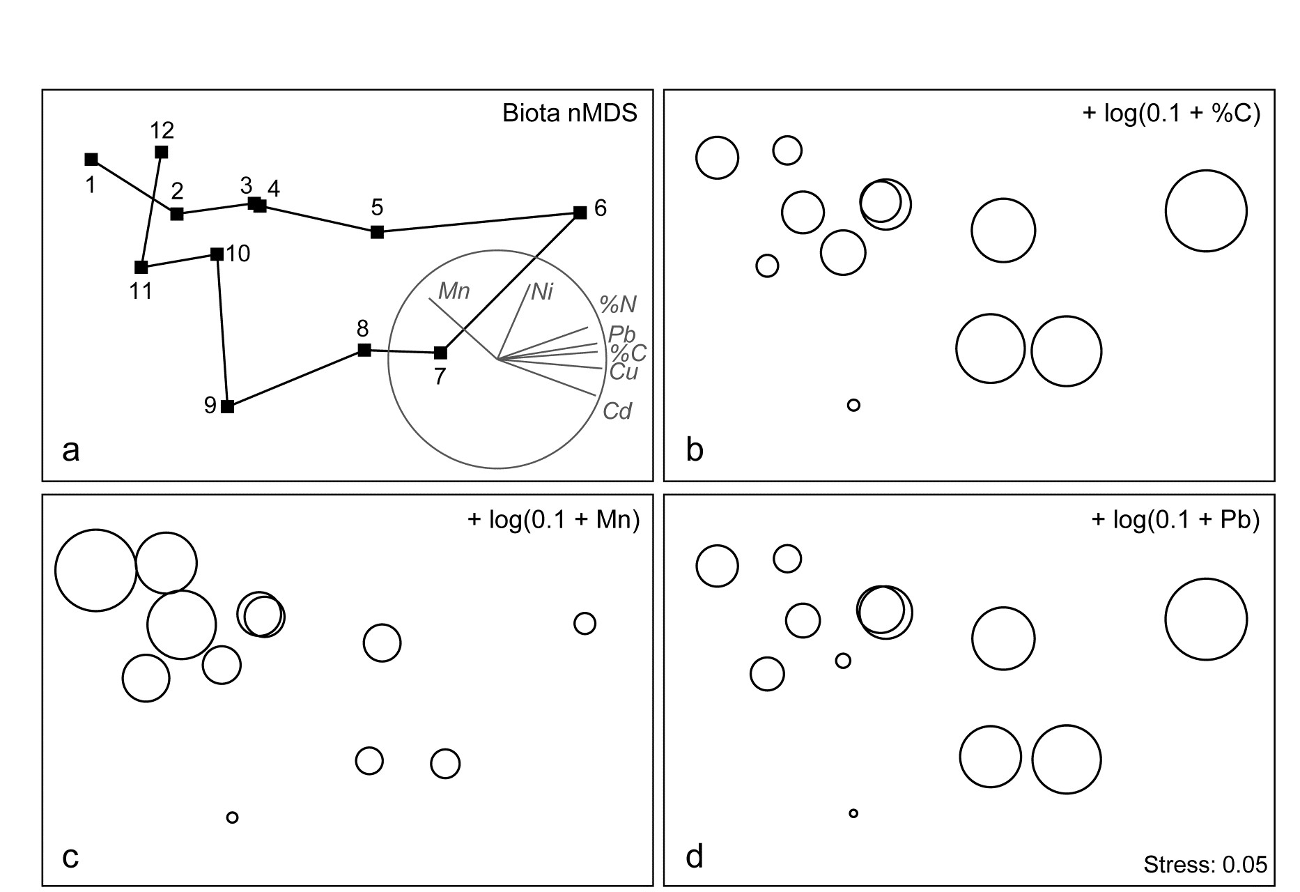
Fig. 11.5. Garroch Head macrofauna {G}. a) nMDS of Bray-Curtis similarities from $\sqrt{}$-transformed species biomass data at the 12 sites (Fig. 8.3) on the E-W transect, stress=0.05. Vector plot (right) shows the direction of linear increase of sediment concentrations for selected contaminants, and the multiple correlation of each (transformed) variable on the 2-d ordination points (circle is correlation of 1). b)-d) bubble plots, i.e. same MDS plot but with circles of increasing size representing sediment concentrations at those sites, of %C, Mn and Pb, from $\log _ e (0.1+x)$ transformation of Table 11.1 data.
Example: Exe estuary nematodes
The Garroch Head data is an example of a smooth gradation in faunal structure reflected in a matching gradation in several contaminant variables. In contrast, the Exe estuary nematode communities {X}, discussed in Chapter 5, separate into five well-defined clusters of samples (Fig. 11.6a). For each of the 19 intertidal sites, six environmental variables were also recorded: the median particle diameter of the sediment (MPD), its percentage organic content (% Org), the depth of the water table (WT) and of the blackened hydrogen sulphide layer (H$_ 2$S), the interstitial salinity (Sal) and the height of the sample on the shore, in relation to the inter-tidal range (Ht).
When each of these is superimposed in turn on the biotic ordination, as bubble plots, some instructive patterns emerge. MPD (Fig. 11.6b) appears to increase monotonically along the main MDS axis but cannot be responsible for the division, for example, between sites 1-4 and 7-9. On the other hand, the relation of salinity to the MDS configuration is non-monotonic (Fig. 11.6c), with larger values for the ‘middle’ groups, but now providing a contrast between the 1-4 and 7-9 clusters. Some other variables, such as the height up the shore (Fig. 11.6d), appear to bear little relation to the overall biotic structure, in that samples within the same faunal groups are frequently at opposite extremes of the intertidal range.
These patterns have some important implications for vector plots. Previously, in the Garroch Head data of Fig. 11.5, it was suggested that viewing the relations between environmental variables and the ordination via a vector plot was unlikely to mislead, because perusal of bubble plots for each variable in that case suggested that changes were, if not truly linear, at least monotonically increasing or decreasing across the plot. However, that this will not always be true and, here, the salinity bubble plot clearly shows the difficulty. In which direction does salinity increase? A linear regression of, say, a quadratic function may well have a zero slope (small vector, in no particular direction) thus making it impossible to distinguish between a vector for an obvious, but non-monotonic relationship and that for a situation in which there is apparently little relationship at all, such as for the Ht variable in Fig. 11.6d.
These plots, however, make clear the limitations in relating the community structure to a single environmental variable at a time: there is no basis for answering questions such as “how well does the full set of abiotic data jointly explain the observed biotic pattern?” and “is there a subset of the environmental variables that explains the pattern equally well, or better?” These questions are answered in classical multivariate statistics by techniques such as canonical correlation (e.g. Mardia, Kent & Bibby (1979) ) but, as discussed in earlier chapters, this requires assumptions which are unrealistic for species abundance or biomass data (correlation and Euclidean distance as measures of similarity for biotic data, linear relationships between abundance and environmental gradients etc).
Instead, the need is to relate community structure to multivariate descriptions of the abiotic variables, using the type of non-parametric, similarity-based methods of previous chapters.
Fig. 11.6. Exe estuary nematodes {X}. a) MDS of species abundances at the 19 sites, as in Fig. 5.1; b)-d) the same MDS but with superimposed circles representing, respectively, median particle diameter of the sediment, its interstitial salinity and height up the shore of the sampling locations. (Stress = 0.05).
¶ Bubble plots can also be useful in a wider context: Field, Clarke & Warwick (1982) superimpose morphological characteristics of each species onto a species MDS, and Chapter 7 gives a number of examples of how single and segmented bubble plots can show relationships between ordinations and some of the biotic variables used in their construction. Segmented bubble plots can similarly be used with abiotic variables, if carefully enough scaled ( Purcell, Rushworth, Clarke et al. (2014) ).
† In the PRIMER ‘Transform (individual)’ routine the expression for the salinity variable is thus: INT(0.5 + 8.33 – 3*log(36–V)), and these bubble values can then be used to label the MDS plot.
§ Note the horseshoe effect (more properly termed the arch effect), which is a common feature of the ordination from single, strong environmental gradients. Both theoretically and empirically, non-metric MDS would seem to be less susceptible to this than metric ordination methods. But without the drastic (and somewhat arbitrary) intervention in the plot that a technique like detrended correspondence analysis uses (specifically to ‘cut and paste’ such ordinations to a straight line), some degree of curvature is unavoidable and natural. Where samples towards opposite ends of the environmental gradient have few species in common (thus giving dissimilarities near 100%), samples which are even further apart on the gradient have little scope to increase their dissimilarity further. To some extent, non-metric MDS can compensate for this by the flexibility of its monotonic regression of distance on dissimilarity (Chapter 5), but arching of the tails of the plot is clearly likely when dissimilarities near 100% are reached.
‡ Chapter 14 argues that, where it is available, biomass can sometimes be more biologically relevant than abundance, though in practice MDS plots from both will be broadly similar, especially under heavy transformation, as the data tends towards presence/ absence (Chapter 9).
⸙ This can be seen also in the MDS plots of Figs. 7.9c & d, though the known ordering of sites was not used for the purposes of that example. The minor difference in the MDS configuration from Fig. 11.5 is not due to any difference in transformation or similarity but the fact that the analysis here uses all 65 species with recorded biomass whereas, for illustrative purposes, the previous shade plot used only the 35 accounting for at least 1% of the biomass in one or more samples.
ȹ This is best accomplished within PRIMER by using output from the Summary Stats routine (for variables) on the Analyse menu.
11.4 Linking biota to multivariate environmental patterns
The intuitive premise adopted here is that if the suite of environmental variables responsible for structuring the community were known¶, then samples having rather similar values for these variables would be expected to have rather similar species composition, and an ordination based on this abiotic information would group sites in the same way as for the biotic plot. If key environmental variables are omitted, the match between the two plots will deteriorate. By the same token, the match will also worsen if abiotic data which are irrelevant to the community structure are included.†
The Exe estuary nematode data {X} again provides an appropriate example. Fig. 11.7a repeats the species MDS for the 19 sites seen in Fig. 11.6a. The remaining plots in Fig. 11.7 are of specific combinations of the six sediment variables:
H$_2$S, Sal, MPD, %Org, WT and Ht, as defined above. For consistency of presentation, these plots are also MDS ordinations but based on an appropriate dissimilarity matrix (Euclidean distance on the normalised abiotic variables). In practice, since the number of variables is small, and the distance measures the same, the MDS plots will be largely indistinguishable from PCA configurations (note that Fig. 11.7b is effectively just a scatter plot, since it involves only two variables).
The point to notice here is the remarkable degree of concordance between biotic and abiotic plots, especially Figs. 11.7a and c; both group the samples in very similar fashion. Leaving out MPD (Fig. 11.7b), the (7–9) group is less clearly distinguished from (6, 11) and one also loses some matching structure in the (12–19) group. Adding variables such as depth of the water table and height up the shore (Fig. 11.7d), the (1–4) group becomes more widely spaced than is in keeping with the biotic plot, sample 9 is separated from 7 and 8, sample 14 split from 12 and 13 etc, and the fit again deteriorates. In fact, Fig. 11.7c represents the best fitting environmental combination, in the sense defined below, and therefore best ‘explains’ the community pattern.

Fig. 11.7. Exe estuary nematodes {X}. MDS ordinations of the 19 sites, based on: a) species abundances, as in Fig. 5.1; b) two sediment variables, depth of the $H _ 2S$ layer and interstitial salinity; c) the environmental combination ‘best matching’ the biotic pattern: $H _ 2 S$, salinity and median particle diameter; d) all six abiotic variables. (Stress = 0.05, 0, 0.04, 0.06).
Measuring agreement in pattern
Quantifying the match between any two plots could be accomplished by a Procrustes analysis ( Gower (1971) ), in which one plot is rotated, scaled or reflected to fit the other, in such a way as to minimize a sum of squared distances between the superimposed configurations. This is not wholly consistent, however, with the approach in earlier chapters; for exactly the same reasons as advanced in deriving the ANOSIM statistic in Chapter 6, the ‘best match’ should not be dependent on the dimensionality one happens to choose to view the two patterns. The more fundamental constructs are, as usual, the similarity matrices underlying both biotic and abiotic ordinations.§ These are chosen differently to match the respective form of the data (i.e. Bray-Curtis for biota, Euclidean distance for environmental variables) and will not be scaled in the same way. Their ranks, however, can be compared through a rank correlation coefficient, a very natural measure to adopt bearing in mind that a successful MDS is a function only of the similarity ranks.
The procedure is summarised schematically in Fig. 11.8, and Clarke & Ainsworth (1993) describe the approach in detail. Three possible matching coefficients are defined between the (unravelled) elements of the respective rank similarity matrices {$r_i$; i = 1, ..., N} and {$s_ i $; i = 1, ..., N}, where N = n(n–1)/2 and n is the number of samples. The simplest is the Spearman coefficient (e.g. Kendall (1970) )‡:
$$ \rho_s = 1 - \frac{6} {N \left( N ^ 2 - 1 \right) } \sum _ {i=1} ^ N \left( r_i - s_i \right) ^2 \tag{11.3} $$
A standard alternative is Kendall’s $\tau$ ( Kendall (1970) ) which, in practice, tends to give rather similar results to $\rho _ s$. The third possibility is a modified form of Spearman, the weighted Spearman (or harmonic⸙) rank correlation:
$$ \rho_w = 1 - \frac{6} {N \left( N - 1 \right) } \sum _ {i=1} ^ N \frac{ \left( r_i - s_i \right) ^2 } { r_i + s_i} \tag{11.4} $$
The constant terms are defined such that, in both (11.3) and (11.4), $\rho$ lies in the range (–1, 1), with the extremes of $\rho$ = –1 and +1 corresponding to the cases where the two sets of ranks are in complete opposition or complete agreement, though the former is unlikely to be attainable in practice because of the constraints inherent in a similarity matrix. Values of $\rho$ around zero correspond to the absence of any match between the two patterns, but typically $\rho$ will be positive. It is tempting, but wholly wrong, to refer $\rho _ s$ to standard statistical tables of Spearman’s rank correlation, to assess whether two patterns are significantly matched ($\rho > 0$). This is invalid because the ranks {$r _ i$} (or {$s _ i$}) are not mutually independent variables, since they are based on a large number (N) of strongly interdependent similarity calculations.
In itself, this does not compromise the use of $\rho _ s$ as an index of agreement of the two triangular matrices. However, it could be less than ideal because few of the equally-weighted difference terms in equation (11.3) involve ‘nearby’ samples. In contrast, the premise at the beginning of this section makes it clear that we are seeking a combination of environmental variables which attains a good match of the high similarities (low ranks) in the biotic and abiotic matrices. The value of $\rho _ s$ , when computed from triangular similarity matrices, will tend to be swamped by the larger number of terms involving distant pairs of samples, contributing large squared differences in (11.3). This motivates the down-weighting denominator term in (11.4). However, experience suggests that, typically, this modification affects the outcome only marginally and, in the interests of simplicity of explanation, the well-known Spearman coefficient may be preferred.
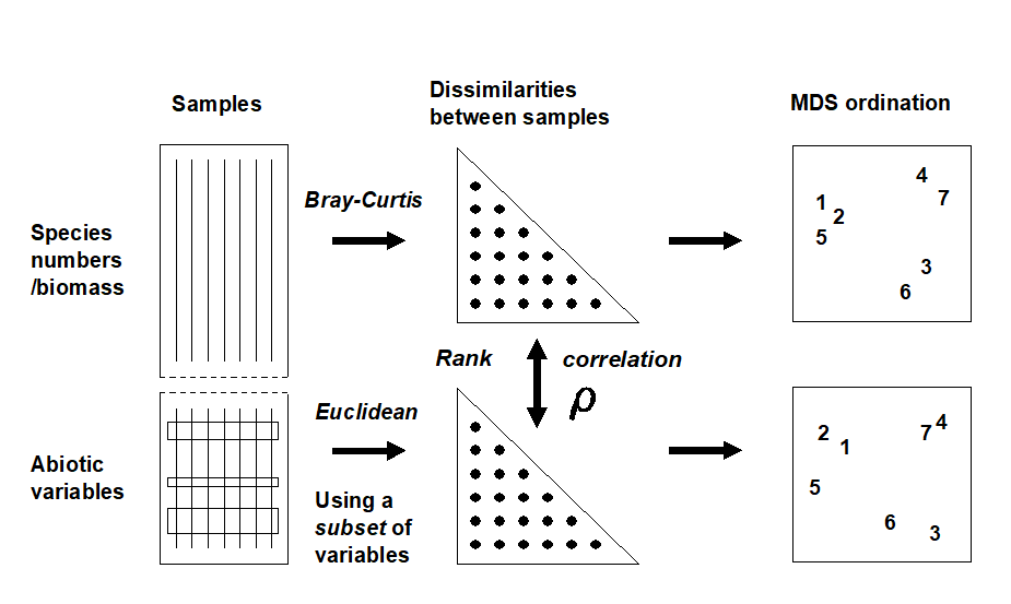
Fig. 11.8. Schematic diagram of the BEST procedure (Bio-Env): selection of the abiotic variable subset maximising rank correlation ($\rho$) between biotic and abiotic (dis)similarity matrices, by checking all combinations of variables.
The BEST (Bio-Env) procedure
The matching of biotic to environmental patterns can now take place ȹ, as outlined schematically in Fig. 11.8. Combinations of the environmental variables are considered at steadily increasing levels of complexity, i.e. k variables at a time (k = 1, 2, 3, ..., v). Table 11.2 displays the outcome for the Exe estuary nematodes.
Table 11.2. Exe estuary nematodes {X}. Combinations of the 6 environmental variables, taken k at a time, yielding the best matches of biotic and abiotic similarity matrices for each k, as measured by weighted Spearman rank correlation $\rho _ s$; bold type indicates overall optimum. See earlier text for variable abbreviations.
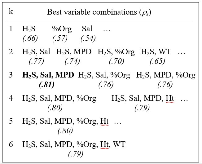
The single abiotic variable which best groups the sites, in a manner consistent with the faunal patterns, is the depth of the $H _ 2 S$ layer ($\rho _ s = 0.66$); next best is the organic content ($\rho _ s = 0.57$), etc. Naturally, since the faunal ordination is not one-dimensional (Fig. 11.7a), it would not be expected that a single abiotic variable would provide a very successful match, though knowledge of the H$_ 2$S variable alone does distinguish points to the left and right of Fig. 11.7a (samples 1 to 4 and 6 to 9 have lower values than for samples 5, 10 and 12 to 19, with sample 11 between).
The best 2-variable combination also involves depth of the $H _ 2 S$ layer but adds the interstitial salinity. The correlation ($\rho _ s = 0.77$) is markedly better than for the single variables, and this is the combination shown in Fig. 11.7b. The best 3-variable combination retains these two but adds the median particle diameter, and gives the overall optimum value for $\rho _ s$ of 0.81 (Fig. 11.7c); $\rho _ s$ drops slightly to 0.80 for the best 4- and higher-way combinations. The results in Table 11.2 do therefore seem to accord with the visual impressions in Fig. 11.7.Ɥ In this case, the first column of Table 11.2 has a hierarchical structure: the best combination at one level is always a subset of the best combination on the line below. This is not guaranteed since all combinations have been evaluated and simply ranked, though it will tend to happen when the explanatory variables are only weakly related to each other, if at all.
An exhaustive search over v variables involves
$$ \sum _ {k =1} ^ {v} = \frac{ v ! } { k ! \left( v - k \right) ! } = 2 ^ v - 1 \tag{11.5} $$
combinations, i.e. 63 for the Exe estuary study, though this number quickly becomes prohibitive when v is larger than about 15. Above that level, one could consider stepwise procedures which search in a more hierarchical fashion, adding and deleting variables one at a time (see the BEST BVStep option, Chapter 16). In practice though, it may be desirable to limit the scale of the search initially, for a number of reasons, e.g. always to include a variable known from previous experience or external information to be potentially causal. Alternatively, scatter plots of the environmental variables may demonstrate that some are highly inter-correlated and nothing in the way of improved ‘explanation’ could be achieved by entering them all into the analysis.
An example is given by the Garroch Head macrofauna study {G}, for which the 11 abiotic variables of Table 11.1 are first transformed, to validate the use of Euclidean distances and standard product-moment correlations (page 11.2). As indicated earlier, choice of transformations is aided by a draftsman plot, i.e. scatter plots of all pairwise combinations of variables, Fig. 11.9. Here, this is after all the concentration variables, but not water depth, have been log transformed℈, in line with the recommendations on page 11.2
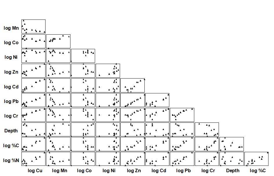
Fig. 11.9. Garroch Head macrofauna {G}. Draftsman plot (all possible pairwise scatter plots) for the 11 abiotic variables recorded at 12 sampling stations across the sewage sludge dumpsite. All variables except water depth have been log transformed.
The draftsman plot, and the associated correlation matrix between all pairs of variables, can then be examined for evidence of collinearity (page 11.3), indicated by straight-line relationships, with little scatter, in Fig. 11.9. A further rule-of-thumb would be to reduce all subsets of (transformed) variables which have mutual correlations averaging more than about 0.95 to a single representative. This suggests that %C, Cu, Zn and Pb are so highly inter-correlated that it would serve no useful purpose to leave them all in the BEST analysis. For every good match that included %C, there would be equally good matches including Cu, Zn or Pb, leading to a plethora of effectively identical solutions. Here, the organic carbon load (%C) is retained and the other three excluded, leaving 8 abiotic variables in the full Bio-Env search. This results in an optimal match of the biotic pattern with %C, %N and Cd ($\rho _ s = 0.86$). The corresponding ordination plots are seen in Fig. 11.10. The biotic MDS of Fig. 11.10a, though structured mainly by a single strong gradient towards the dump centre (e.g. the organic enrichment gradient seen in Fig. 11.10b), is not wholly 1-dimensional. Additional information, on a heavy metal, appears to improve the ‘explanation’.
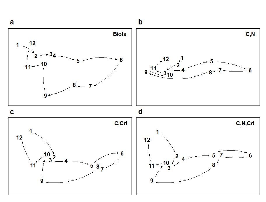
Fig 11.10. Garroch Head macrofauna {G}. MDS plots for the 12 sampling stations across the sewage-sludge dump site (Fig. 8.3), based on: a) species biomass, as in Fig. 11.5a; b)-d) three combinations of carbon, nitrogen and cadmium concentrations (log transformed) in the sediments, the best match with the biota over all combinations of the 8 variables being for %C, %N and Cd ($\rho_s$ = 0.86). (Stress = 0.05, 0, 0.01, 0.01).
Further examples of the Bio-Env procedure are given in
Clarke & Ainsworth (1993)
,
Clarke (1993)
,
Somerfield, Gee & Warwick (1994a)
,
Somerfield, Gee & Warwick (1994b)
and many subsequent applications. For a series of data sets on impacts on benthic macrofauna around N Sea oil rigs,
Olsgard, Somerfield & Carr (1997)
and
Olsgard, Somerfield & Carr (1998)
use the Bio-Env procedure in a particularly interesting way. They examine which transformations (Chapter 9) and what level of taxonomic aggregation (Chapter 10) tend to maximise the Bio-Env correlation, $\rho$. The hypotheses examined are that certain parts of the community, on the spectrum of rare to common species, may delineate the underlying impact gradient more clearly (see page 9.4), as may some taxonomic levels, higher than species (see page 10.1).
Global BEST test
Another question which naturally arises is the extent to which the conclusions from a BEST run can be supported by significance tests. This is problematic given the lack of model assumptions underlying this procedure, which can be seen as both a strength (i.e. generality, ease of understanding, simplicity of interpretation) and a weakness (lack of a structure for formal statistical inference). A simple RELATE test is available (see page 6.10 and later) of the hypothesis that there is no relationship between the biotic information and that from a specified set of abiotic variables, i.e. that $\rho$ is effectively zero. This can be examined by a permutation or randomisation test, of a type met previously on pages 6.8 & 6.10, in which $\rho$ is recomputed for all (or a large random subset of) permutations of the sample labels in one of the two underlying similarity matrices. As usual, if the observed value of $\rho$ exceeds that found in 95% of the simulations, which by definition correspond to unrelated ordinations, then the null hypothesis can be rejected at the 5% level.
Note however that this is not a valid procedure if the abiotic set being tested against the biotic pattern is the result of optimal selection by the BEST procedure, on the same data. For v variables, this is implicitly the same as carrying out $2 ^ v –1$ null hypothesis tests, each of which potentially runs a 5% risk of Type 1 error (rejecting the null hypothesis when it is really true). This rapidly becomes a very large number of tests as v increases, and a naïve RELATE test on the optimal combination is almost certain to indicate a significant biotic-abiotic relation, even with entirely random data sets!
What is needed here is a randomisation test which incorporates the fitting stage and thus allows for the selection bias in the optimal solution. This can be readily achieved, though requires quite a heavy computational load. The requirement is to generate the (null) distribution of the maximum $\rho$ that can be obtained, by an exhaustive search over all subsets of environmental variables (see Fig. 11.8), when there really is no matching structure between biotic and abiotic data. The null situation is again produced by randomly permuting the columns (samples) of one of the data matrices on the left hand side of Fig. 11.8, in relation to the other. The two matrices are then treated as if their samples do have matching labels and the full Bio-Env procedure is applied, to find the subset of environmental variables which gives the ‘best’ match. Of course, this $\rho$ would not be expected to be large, since any real match has been destroyed by the permutation, but $\rho$ will clearly be greater than zero since the largest of all the $2 ^ v –1$ calculated correlations has been selected.
So far, then, we have produced a single value from the null distribution of (max) $\rho$, when there is no biotic-environmental link. This whole procedure is now repeated a total of (say) 999 times, each time randomly reshuffling the columns of the abiotic matrix and running through the entire Bio-Env procedure, to obtain an optimum $\rho$. A histogram of these values is the null distribution, namely, the expected range of BEST Bio-Env $\rho$ values that it is possible to obtain by chance when there is no biotic to abiotic link. As usual, comparison with the observed value of $\rho$ shows the statistical significance, or otherwise, of this observed $\rho$.
Fig 11.11 shows the resulting histograms for the two examples used in this chapter to illustrate the BEST (Bio-Env) procedure. For both the Exe nematodes {X} and the Garroch Head macrofauna {G}, we can be confident in interpreting the biota to environment links because the observed best matches of $\rho _ s$ = 0.81 and 0.86 are larger than could have been obtained by chance: they are greater than any of their 999 simulated $\rho _ s$ values (p<0.1%). Note, however, how far the null distributions are from being centred at $\rho = 0$, particularly for the Garroch Head data, which has a mode at about 0.25 and right-tail values up to about 0.7. This reflects both the small number of sites that are being matched and the simplicity of the strong linear gradient in the sample structure. With 8 abiotic variables (and thus a choice of 255 possible subsets) it is clearly not that difficult to find an environmental combination, by chance, that gives some degree of match to any rank order of the samples along a line.
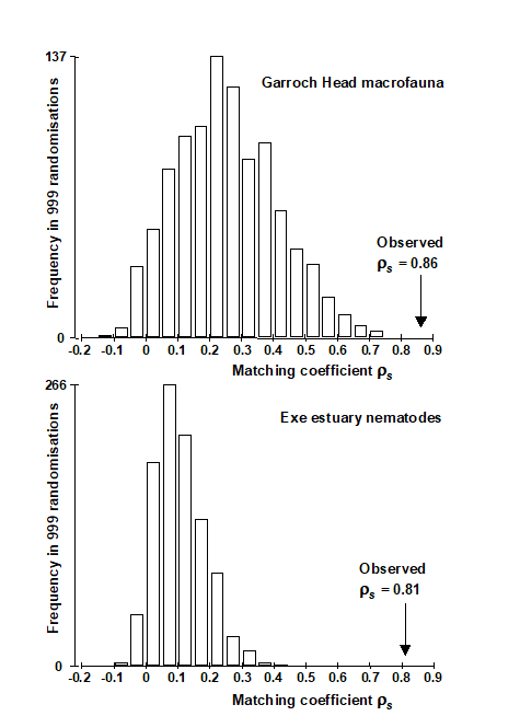
Fig. 11.11. Garroch Head macrofauna {G} and Exe estuary nematodes {X}. Global BEST (Bio-Env) test for a significant relationship between community and environmental samples. The histograms are the null permutation distributions of possible values for the best Bio-Env match (Spearman $\rho_s$), in the absence of a biota-environment relationship.
The same idea can be used to derive a permutation test for the BVStep context, in which only a stepwise-selected set of optimal variables are generated. The simulations of the null condition simply require an equivalent stepwise search on the randomly permuted (and thus non-matching) matrices for the maximum $\rho$, repeated many times to obtain the null distribution for $\rho$. This is the principle of permutation tests: permute the data appropriately to reflect the null condition, then repeat exactly the same steps (however complicated) in calculating the test statistic as were carried out on the data in its original form, and compare the true statistic to the values under permutation.
These tests for Bio-Env and BVStep procedures are together referred to as global BEST tests, and as with the global ANOSIM test of Chaper 6, this becomes an important initial ‘traffic light’. The null hypothesis, of no biotic to abiotic link, must be decisively rejected before any attempt is made to interpret the environmental variables that BEST selects. This is always helped by increasing the number of sites, conditions, times etc that are being matched. For the Exe data, there were 19 sites (compared with 12 for Garroch Head) and only 6 environmental variables, and the null distribution of $\rho _ s$ in Fig. 11.11 now has mode less than 0.1, with right tail values stretching to no higher than about 0.4. Any reasonably large observed $\rho _ s$ is therefore likely to be interpretable.
¶ These might sometimes include biotic as well as abiotic data, e.g. when assessing how coral reef fish communities might be structured by area cover of specific, dominant species of coral.
† Additional reasons for a poor match include: cases where the observed biotic patterns are largely a function of internal stochastic forces, e.g. competitive interactions within the assemblage, rather than external forcing variables; abiotic variables are measured over the wrong spatio-temporal scales in terms of their impact on community structure; there is a large element of random variation from sample to sample, under the same environmental conditions, e.g. the unit sample size is inadequate to characterise the assemblage; and a more technical reason (addressed later) concerning non-additive effects of structuring variables. In all these cases, the procedure may fail to ‘explain’ the community structure well, in terms of the provided set of environmental variables.
§ For example, in spite of the very low stress in Fig. 11.7, a 2-d Procrustes fit of 11.7a with 11.7c will be rather poor, since the (5, 10) and (12–19) groups are interchanged between the plots. Yet, the interpretation of the two analyses is fundamentally the same (five clusters, with the (5, 10) group out on a limb etc). This match will probably be better in 3-d but will be fully expressed, without arbitrary dimensionality constraints, in the underlying similarity matrices.
‡ This matrix correlation statistic has already been met, e.g. on pages 6.8, 6.10, 7.5, and will be used extensively again later.
⸙ This is so defined by Clarke & Ainsworth (1993) because it is algebraically related to the average of the harmonic mean of each ($r _ i $, $s _ i$) pair. The denominator term, $r _ i + s _ i$, down-weights the contribution of large ranks; these are the low similarities, the highest similarity corresponding to the lowest value of rank similarity (1), as usual. Note that $\rho _w$ and $\tau$ tend to give consistently lower values than $\rho _s$ for the same match; nothing should therefore be inferred from a comparison of absolute values of $\rho _s$, $\tau$ and $\rho _w$.
ȹ This is implemented in the PRIMER BEST routine, which includes both a full search (the Bio-Env option) and a sequential, stepwise, form of this (BVStep), when there are too many variables to permit an exhaustive search.
Ɥ This will not always be the case if the 2-d faunal ordination has non-negligible stress. It is the matching of the similarity matrices which is definitive, although it would usually be a good idea to plot the abiotic ordination for the best combination at each value of k, in order to gauge the effect of a small change in $\rho$ on the interpretation. Experience suggests that combinations giving the same value of $\rho$ to two decimal places do not give rise to ordinations which are distinguishable in any practically important way, thus it is recommended that $\rho$ is quoted only to this accuracy, as in Table 11.2.
℈ This actually uses a log(c+x) transformation where c is a constant such as 1 or 0.1. The necessity for this, rather than a simple log(x) transform, comes from the zero values for the Cd concentrations in Table 11.1, log(0) being undefined. A useful rule-of-thumb here is to set the constant c to the lowest non-zero measurement, or the concentration detection limit.
11.5 Further ‘BEST’ variations
Entering variables in groups
In some contexts, it makes good sense to utilise an a priori group structure for the explanatory variables and enter or drop all variables within a single group simultaneously, e.g. if locations of sites expressed in latitude and longitude are two of the variables, it does not make sense to enter one into the ‘explanation’ and leave out the other.
Valesini, Tweedley, Clarke et al. (2014)
{e} give a more major example of an estuarine fish study, where abiotic variables potentially driving the assemblages over different spatial scales were divided into those measuring wave exposure, substrate/vegetation type, extent of marine water intrusion, and more dynamic water quality parameters – with multiple variables in each group – all within a categorical structure, e.g. of different microtidal estuaries in Western Australia. Groups were entered into the BEST Bio-Env routine as indivisible units, to determine which variable type, or types, best explained the fish communities (at sites aggregated by SIMPROF into homogeneous clusters of their fish communities). Both BEST and the global BEST test need thus to be run on these (aggregated) samples by searching all combinations of groups of explanatory variables, which involves a much smaller number of combinations – and consequently lower selection bias to allow for in the permutation test – than if all variables had been separately entered.¶
Constrained (‘two-way’) BEST analyses
A further BEST modification parallels the two-way ANOSIM test of Chapter 6 and two-way SIMPER breakdown of Chapter 7. A strong categorical factor, clearly dominating the main differences observed in community structure among samples in an ordination, may sometimes not be comfortably incorporated into a set of quantitative explanatory variables to enter into BEST, e.g. if the factor has several levels which are in no sense ordered. An example could again be found in the Valesini, Tweedley, Clarke et al. (2014) study in which the suite of c. 15 quantitative environmental variables are measured at a wide range of sites within each of a number of different estuaries. Rather than attempt to convert the estuary factor into a quantitative form†, or simply ignore it on the grounds (say) that the major differences noted between estuaries should be identified by one of the measurement variables, in some circumstances it may be appropriate to accept that the differing locations will have differing assemblages and remove this categorical estuarine factor. For each considered combination of explanatory variables (or groups of variables perhaps, in the previous section), the matching statistic $\rho$ is calculated separately within each of the levels (each estuary) and its values then averaged over those levels. The variable combination giving the largest average $\rho$ is the constrained BEST match, and it can be tested for departure from the null hypothesis of ‘no genuine match’ by the same style of global BEST test as previously, but with constrained permutation of sample labels only within each level, then recalculating the largest average $\rho$, etc. The 2-way crossed ANOSIM analogy is very clear.
¶ The option to group variables, using a pre-defined indicator, is implemented in the PRIMER BEST routine and its associated test, as is the conditional BEST analysis which follows.
† Clearly it would usually be inappropriate to number estuaries 1, 2, 3, 4, and then treat this as a quantitative variable, since it forces estuaries 1 and 4 to be ‘further apart’ environmentally than 1 and 3, which may be arbitrary. Instead, the trick is usually to replace this single factor by four new binary factors. (Is the sample in estuary 1? If so score 1, otherwise 0. Is it in estuary 2? … etc). Such binary variables are quantitative and now ordered.
11.6 Linkage trees (and example)
The idea of linkage trees¶ is most easily understood in the context of a particular example, so Fig. 11.12 redisplays some of the nMDS bubble plots for the 17 Exe estuary sites used to illustrate the BEST/Bio-Env procedure, earlier in this chapter. Bio-Env shows that three variables, MPD, Sal% and H$_2$S, can ‘explain’ a large (and significant, Fig. 11.11) component of the multivariate biotic structure but this does not tell us how they explain the structure, e.g. for the five main clusters seen in Fig. 5.4, which abiotic variables are distinguishing which clusters? The answer is readily seen in this case from a few simple bubble plots, but this is only possible because the 2-d MDS stress is low (0.05) and thus the plot is reliable. In general it would be useful to have some means of describing how particular abiotic variables ‘explain’ particular divisions of samples in the full, high-d biotic space: the PRIMER LINKTREE routine can be helpful here.
Binary divisive clustering was introduced on page 3.6. The unconstrained clustering technique described there (UNCTREE) divides each sample set into two subsets, successively, each binary division being chosen in some optimum way, until a stopping rule is triggered, which is typically a SIMPROF test failing to demonstrate community differences among the remaining samples in a group. LINKTREE, in contrast, is a constrained binary divisive clustering, in which the only subdivisions allowed are those for which an ‘explanation’ exists in terms of a threshold on one of the environmental variables in a separately supplied abiotic matrix for a matching set of samples. For the Exe nematode data, the first stage is shown in Fig. 11.12: MPD, Sal% and H$_2$S are considered one at a time. For Median Particle Diameter, the ‘best’ split of the full set of samples into two groups is shown on the biotic MDS for all 19 sites (seen previously at Fig 11.6), corresponding to the threshold MPD<0.18 for sites 1-4, 7-9 (sites to the left of the dotted line) and MPD>0.21 for the remaining sites (to the right), Fig. 11.12a. The ‘best’ split is defined here as that which maximises the ANOSIM R statistic between the two groups formed†, as was the case for the unconstrained (UNCTREE) procedure, and it does not use the MDS plot in any way – thus ensuring that the procedure works in the true high-d space of the biota data.
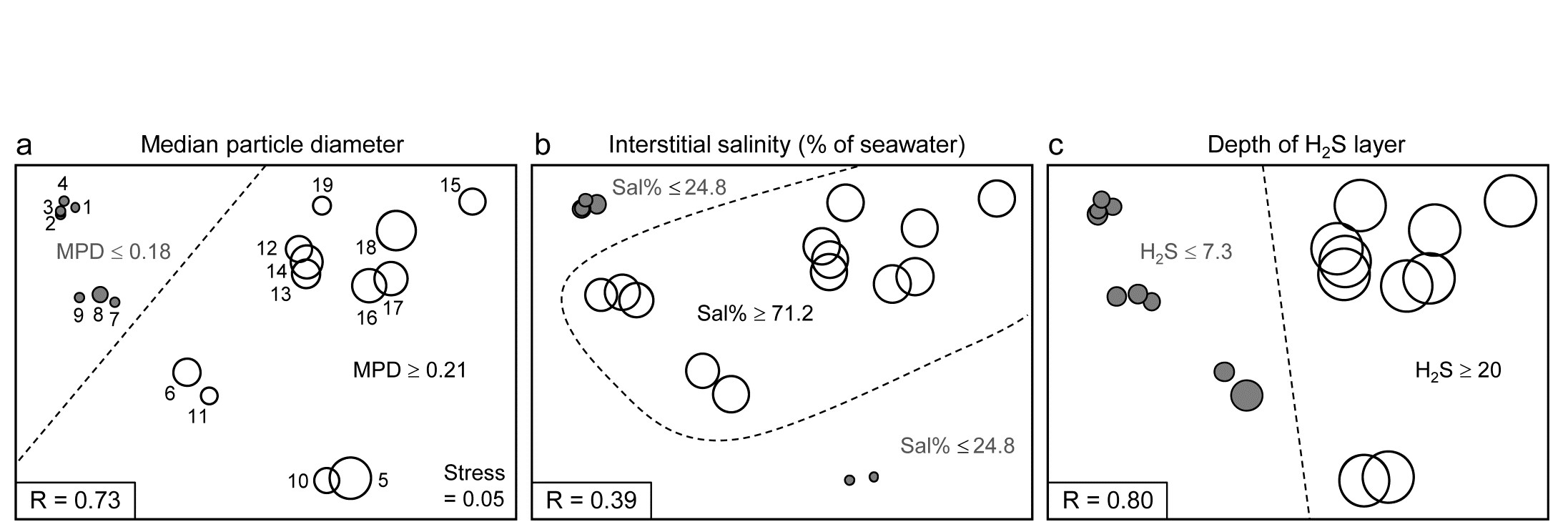
Fig. 11.12. Exe estuary nematodes {X}. First step in LINKTREE illustrated by a biotic nMDS of the 19 sites, as Fig. 11.6, with bubble plots for: a-c) median particle diameter, interstitial salinity (as % of 36ppt) and depth of the anoxic layer (cm). Dotted line indicates the optimal split of the communities at the 19 sites into two groups (open and closed circles), based on maximising the ANOSIM R statistic between them, subject to the constraint that the figured abiotic variable takes consistently lower values in one group than the other.
For LINKTREE (unlike UNCTREE), not all $2 ^ {18}$ ways of dividing 19 samples into two groups are permitted, because most of them will not correspond to a precise threshold on the median particle diameter. In fact, by ranking the sites in increasing MPD order, it is clear that we only need to consider 18 possible divisions in the constrained case (the site with smallest MPD vs. the rest, the two smallest vs. the rest, and so on). Fig. 11.2a shows the best of these 18 splits gives R=0.73.
Now the other two abiotic variables are considered in turn. Sal%, though important (as will be seen later), does not do a good job of an initial binary split, the best division giving only R=0.39 (Fig. 11.12b) – it is clear that sites are either of greatly reduced interstitial salinity (<24.8% of seawater) or are reasonably saline (>71.2%), with no sites in between. However, depth of the blackened H$_ 2$S layer separates the 19 sites into two groups best of all here, with R=0.80 (Fig 11.12c), so this becomes the first division (labelled A) in the dendrogram of Fig. 11.13a.
Each subset is now subject to further binary division, exploring thresholds on all three abiotic variables. It is clear from Fig. 11.12b, for example, that Sal% will provide the best explanation for the natural separation of sites (5,10) from (12-19), those for which H$_ 2$S>20 in the first split. This gives R=1, split G on Fig. 11.13a, and the remaining divisions proceed in the same way. The figure legend gives some detail on layout of the full divisive dendrogram of Fig. 11.3a. One point to note is that inequalities can be in either direction, e.g. the division at J has sites to the left with Sal%>89.4 and to the right with Sal%<89, and these will reverse if the dendrogram branches are arbitrarily rotated (in the same way as for any other dendrogram). Further, though all splits are shown§, it would be incorrect to interpret some, since they ‘fail’ the SIMPROF test, i.e. if there is no evidence of biological heterogeneity of samples in a current group, then there can be no justification for seeking an environmental explanation for further dividing that group – thus these parts of the dendrogram are ‘greyed out’.
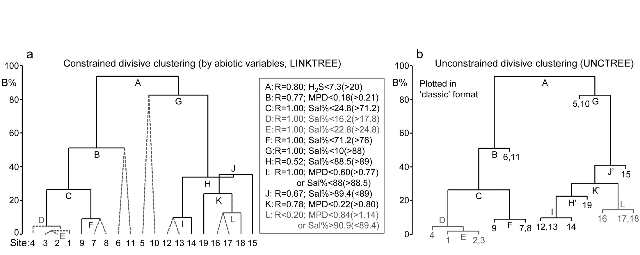
Fig. 11.13. Exe estuary nematodes {X}. a) Binary divisive clustering (LINKTREE) of the communities at 19 sites, for which step A was illustrated in Fig. 11.12, i.e. each split constrained by a threshold on one of the three abiotic variables: MPD, Sal%, H$_ 2$S. The first in-equality (e.g. for split A, H$_2$S<7.3) always indicates sites to the left side of the split, the second (in brackets, e.g. >20) sites to the right. The same splits will be obtained whether abiotic data is transformed or not (the process is truly non-parametric!) so the inequalities should always quote untransformed values, for greater clarity. Dotted or grey lines or text denote splits not to be interpreted because they are below the stopping rules; here the latter use SIMPROF tests before each split and also require that R>0.2 (e.g. the split at L would be allowed by SIMPROF but has R<0.2). The y axis scale (B%) is the average of the between-group rank dissimilarities, using the original ranks from the biotic resemblance matrix, scaled to take the value 100% if the first split is a perfect division (i.e. R=1).
b) Unconstrained binary divisive clustering (UNCTREE) of the same data, plotted in ‘classic’ style (e.g. as for LINKTREE in PRIMER v6; v7 allows both formats for either analysis). UNCTREE is based only on the biotic resemblances, with grey lines/letters again denoting divisions with R<0.2 or not supported by SIMPROF tests.
The scale on the y axis can be chosen (the A% scale) to make the divisions equi-step, arbitrarily, down the dendrogram (this is the option used in most standard CART programs) but here we display divisions at a y axis level (B%) which reflects the magnitude of differences between the subsets of samples formed at each division, in relation to the community structural differences across all samples. Such an absolute scale cannot be created from the ANOSIM R values used to make each split, since they continually ‘relativise’, by re-ranking the dissimilarities within each current set. Clarke, Somerfield & Gorley (2008) show that an appropriate scale can be based only on between-group average rank dissimilarity, using the original ranks from the full matrix. This is scaled by dividing by its value for the case of maximum possible separation of the first two groups produced by the initial division (the case R=1) and multiplying by 100, to give the B% scale. The Fig. 11.13a dendrogram does not quite start at B = 100 therefore, since the split seen in Fig. 11.12c gives R = 0.80 (clearly a few between group dissimilarities are smaller than some within group values) but the split at G is seen to be between very different groups (B = 82%), whilst that at, for example, D (the division of site 4 from 1 to 3), is inconsequential in comparison (B = 5%); that pattern is clear from the MDS plot.
An interesting but subtle point arises for split J, with its B = 35% value just exceeding that for H, a prior division (B = 34%). This reversal in the dendrogram is here an indication that the split of site 15 from (12-14, 16-19) would have been a more natural first step than the LINKTREE division of sites 12-14 from 15-19. In fact this is exactly what unconstrained (UNCTREE) clustering does, as seen in Fig. 11.13b (split J’). The point to note here is that LINKTREE is not able to make this more natural division because none of the three variables gives a threshold value which can separate site 15 from the set (12-14, 16-19). It is only after the group 12-14 has been removed that the separation of site 15 (now only from 16-19) has an ‘explanation’. So the presence of such reversals in a dendrogram could be an indication that an abiotic variable capable of ‘explaining’ a natural pattern has not been measured. Here, site 15 is discriminated by Ht (height up the shore) and, had that variable been included, the dendrogram would have separated 15 before others in that group. However, a reversal could equally well reflect large sampling variability in the biotic community or the measured abiotic variables – it is clear that LINKTREE is a technique suited only to robust data, with well-established detailed patterns in SIMPROF tests, and it is relevant that this successful example of a LINKTREE run is a case where both biotic and abiotic data have been (time-)averaged to reduce the variability‡.
One unwelcome result, however, of introducing more explanatory variables is that there are certain to be multiple explanations for each split, whereas this is only seen in a limited way in Fig. 11.13a, e.g. at split I, where a threshold on MPD or on Sal% will give the same division of sites (12,13) from 14. Had we used all 6 abiotic variables, nearly every division would have had multiple explanations, e.g. the first split A would have resulted from %Org>0.37(<0.24) as well as H$_ 2$S<7.3(>20). The routine can have no basis for choosing between ‘explanations’ which give the same split – neither may be causal, of course! So there is a strong incentive in LINKTREE to be disciplined and use few abiotic variables, chosen for their potential causality and likely independence, as now seen.
Example: Fal estuary nematodes
Fig. 11.14 shows the divisive LINKTREE clustering of 27 sites in 5 creeks of the Fal estuary, UK, based on nematode assemblages (creek map at Fig. 9.3, {f}). The creeks have varying levels of metal pollution by historic mining, here represented by sediment Cu concentrations (other metals being highly correlated with Cu), and a single grain size variable, %Silt/Clay.
Though the creek distinctions are not utilised at all, the resulting divisive clustering and SIMPROF tests largely divides the sites into their creeks (with a few sub-divisions), Fig. 11.14a. In spite of the non-trivial stress in this case (0.12), making the MDS (11.14b) only an approximation to the biotic relationships, it can be still be useful to indicate the sub-groupings, by increasingly fainter dividing lines, and the thresholds from the LINKTREE run, manually on the ordination.
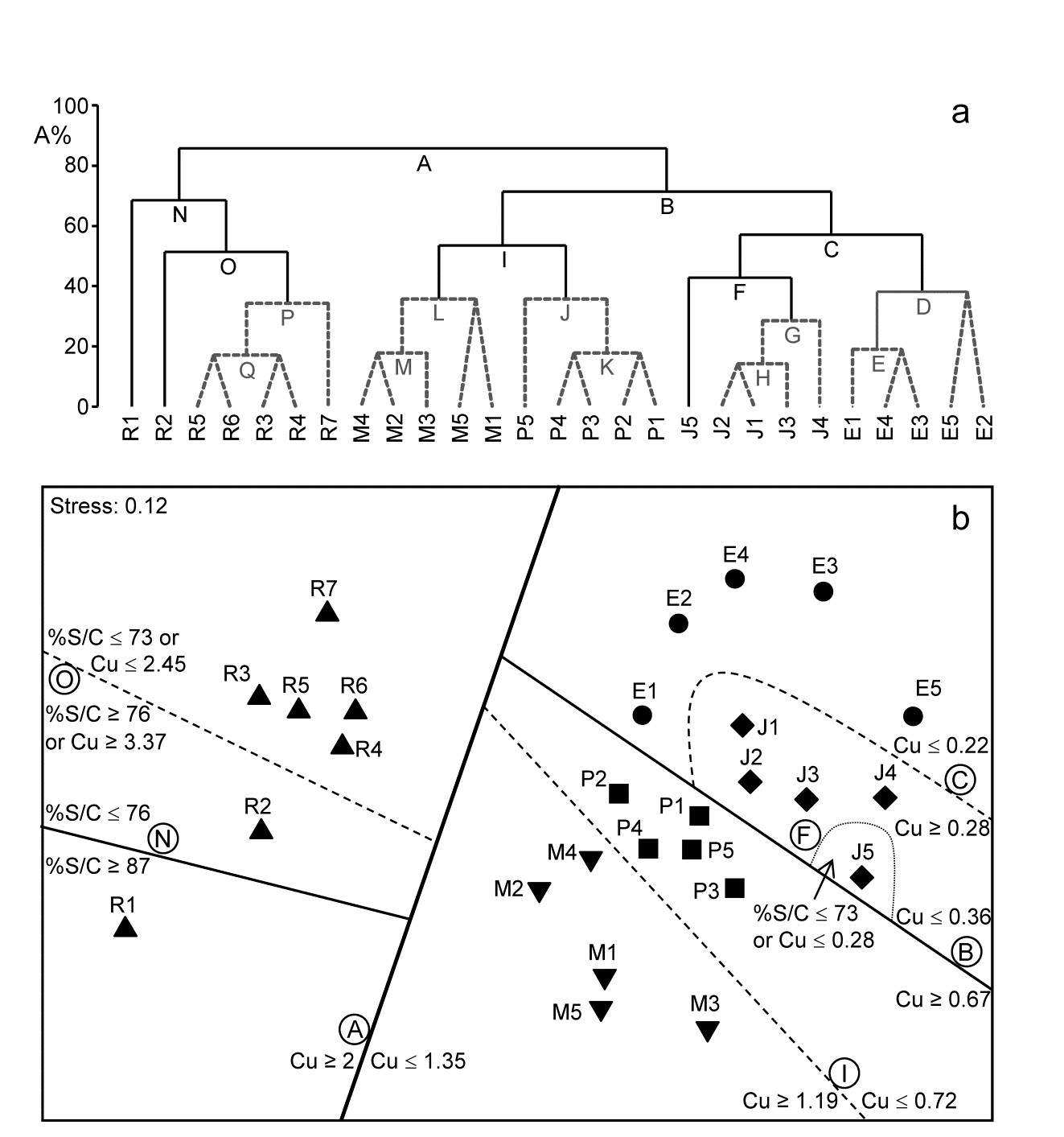
Fig. 11.14. Fal estuary nematodes {f}. a) Constrained divisive clustering (LINKTREE, using y axis scale A%, of arbitrary equi-steps), and b) nMDS of the 27 sites (in 5 creeks, see map in Fig. 9.3: Restronguet, Mylor, Pill, St Just, Percuil), based on fourth-root transformed counts and Bray-Curtis similarities. Divisions subject to thresholds on two environmental variables: sediment Cu concentration and %Silt/Clay ratio. Dashed lines and grey letters on the dendrogram denote groupings not supported by SIMPROF. Supported divisions identified by the same letters on the MDS, together with the inequalities ‘explaining’ them.
¶ De'Ath (2002) introduced this idea into ecology as ‘multivariate regression trees’, extending the ‘classification and regression trees’ (CART) routines found in major statistics packages such as S-Plus. Clarke, Somerfield & Gorley (2008) adapt this technique to be consistent with PRIMER’s non-parametric approach, and therefore use binary clustering divisions based on optimising the rank-based ANOSIM R statistic rather than, for example, maximising among- group sums of squares. They use the terminology ‘linkage trees’ since the method has little to do with model-based ‘regression’ as such (a historical term arising from the ‘regression to the mean’ seen when the slope of a linear relationship declines as the residual variance increases).
† As explained on page 3.6 we are not using ANOSIM as a test here, merely exploiting its very useful role as a measure of separation between groups of samples in multivariate space. Note therefore that the resemblance matrix among samples for each new set is re-ranked in order to calculate the R values for all the possible subsets from the next division. There are no constraints that subsets should be of comparable size. PRIMER does allow the user to debar groups of fewer than n samples (n specified) but there seems no good reason to rule out e.g. singleton groups, or not to split a group of less than n samples, if a SIMPROF test would allow it. (Note, however, that SIMPROF will never split a group of two samples, page 3.5). PRIMER can also allow a split not to be made if R does not exceed a threshold value – see later.
§ This is to make it possible to display labels or factor levels and symbols for the samples, rather than the previous LINKTREE format in PRIMER v6 (the ‘classic’ style of Fig. 11.13b) which was restricted to using sample numbers. In the new form, it can be incorporated into shade plots, see the sample axis in Fig. 7.8.
‡ LINKTREE can also sometimes succeed because of its total lack of assumptions and thus great flexibility. An (over)simple characterisation is that DISTLM (multivariate multiple linear regression in PERMANOVA+) assumes linearity and additivity of the abiotic variables on the high-d community response, whereas Bio-Env caters for non-linearity but still makes the additivity assumption, i.e. both are holistic methods applying across the full set of sites. For example, Ht (shore height) did not feature in Bio-Env results (Table 11.2) and would not do so in DISTLM, because its ‘effect’ is inconsistent across the sites: 1-4 have a wide range of shore heights yet identical communities (largely true of sites 7-9 also), whereas the assemblage at site 15 appears to be separated from all those at 12-19 by the greater shore height (the only variable that makes this split). If, as here, Ht only appears to be important to the community when the sediment is coarser (MPD>0.21), but does not matter at all when it is finer (MPD<0.18), Fig. 11.12a, this is exactly the definition of interaction (non-additivity) of the two abiotic variables in their effect on the biota. By the intuitive premise for Bio-Env (first paragraph on page 11.4 it is clear that the procedure will be ambivalent about including Ht in its explanation. Similarly, in modelled multiple regression, whilst DISTLM could theoretically be extended to include all interaction effects (in addition to all quadratic terms, to try to allow for the non-linear response) this is usually impossible because of the large number of model parameters that would then need fitting. LINKTREE is designed to cater for strong non-linearity through its use of thresholds, and interaction through its compartmentalisation – explanations are only local to a few sites not global. But it has major drawbacks: no allowance for sampling variability and an inability to cater sensibly for more than a few variables.
11.7 Concluding remarks
For this chapter as a whole, two final points need to be made. The topic of experimental and field survey design for ecologists is a large one, addressed to some extent in the accompanying PERMANOVA+ manual ( Anderson, Gorley & Clarke (2008) )¶, but this is a problematic area for all multivariate techniques because of the difficulty of specifying an explicit alternative hypothesis to the null hypothesis of, for example, no link of an assemblage to abiotic variables. A specified alternative is required to define power of statistical procedures but there are a myriad of ways in which individual species can react, even to a single environmental variable (some increase along an abiotic gradient, some decrease, some increase then decrease, others change little etc), any combination of which, for each of the variables, will be inferred as a biotic-abiotic link. Formal power calculations, analogous to those for simple univariate regression (e.g. Bayne, Clarke & Moore (1981) ), are a non-starter, and simulation from observed alternatives to the null conditions are the only possible approach (see, for example, Somerfield, Clarke & Olsgard (2002) ). However, in the context of linking biotic and abiotic patterns, it is intuitively clear that this has the greatest prospect of success if there are a moderately large number of sample conditions, and the closest possible matching of environmental with biological data. In the case of a number of replicates from each of a number of sites, this could imply that the biotic replicates would each have a closely-matched environmental replicate. Without matching of biotic and abiotic samples none of the methods of this chapter could be used, so data from the two sources will always need averaging up to the lowest common denominator, giving a one-to-one match of ‘response’ and ‘explanatory’ samples.
Another lesson of the Fal estuary nematode study and the Garroch Head example of Fig 11.9 is the difficulty of drawing conclusions about causal variables from any observational study. In the Garroch Head case, four of the abiotic variables were so highly correlated with each other that it was desirable to omit all but one of them from the computations. There may sometimes be good external reasons for retaining a particular member of the set but, in general, one of them is chosen arbitrarily as a proxy for the rest (e.g. in the Garroch Head data, %C was a proxy for the highly inter-correlated set %C, Cu, Zn, Pb). If that variable does appear to be linked to the biotic pattern then any member of the subset could be implicated, of course. More importantly, there cannot be a definitive causal implication here, since each retained variable is also a proxy for any potentially causal variable which correlates highly with it, but remains unmeasured. Clearly, in an environmental impact study, a design in which the main pollution gradient (e.g. chemical) is highly correlated with variations in some natural environmental measures (e.g. salinity, sediment structure), cannot be very informative, whether the latter variables are measured or not. A desirable strategy, particularly for the non-parametric multivariate analyses considered here, is to limit the influence of important natural variables by attempting to select sites which have the same environmental conditions but a range of contaminant impacts (including control sites† of course). Even then§, in a purely observational study one can never entirely escape the stricture that any apparent change in community, with changing pollution impact, could be the result of an unmeasured and unconsidered natural variable with which the contaminant levels happen to correlate. Such issues of causality motivate the following chapter on experimental approaches.
¶ Green (1979) also provides some useful guidelines, mainly on field observational studies, and Underwood (1997) concentrates on design of field manipulative experiments; both books are largely concerned with univariate data but many of the core issues are common to all analyses.
† Note the plurality; Underwood (1992) argues persuasively that impact is best established against a baseline of site-to-site variability in control conditions.
§ And in spite of impressive modern work on causal models that bring a much-needed sense of discipline to the selection of abiotic variables and prior modelling of causal links among variables and responses, see Paul & Anderson (2013) .
Chapter 12: Causality - community experiments in the field and laboratory
12.1 Introduction
In Chapter 11 we have seen how both the univariate and multivariate community attributes can be correlated with natural and anthropogenic environmental variables. With careful sampling design, these methods can provide strong evidence as to which environmental variables appear to affect community structure most, but they cannot actually prove cause and effect. In experimental situations we can investigate the effects of a single factor (the treatment) on community structure, while other factors are held constant or controlled, thus establishing cause and effect. There are three main study types which have been labelled ‘experiments’ (though many ecologists – and most statisticians! – would argue that it is a misnomer in the first case):
-
‘Natural experiments’. Nature provides the treatment, i.e. we compare places or times which differ in the intensity of the forcing factor in question.
-
Field experiments. The experimenter provides the treatment, i.e. environmental factors (biological, chemical or physical) are manipulated in the field.
- Laboratory experiments. Environmental factors are manipulated by the experimenter in laboratory mesocosms or microcosms.
The degree of ‘naturalness’ (hence realism) decreases from 1-3, but the degree of control which can be exerted over potentially confounding environmental variables increases from 1-3.
In this chapter, each class of experiments is illustrated by a single example. These all happen to concern the meiobenthos, since such data is readily available to the authors(!) but also because the smaller the biotic size component the more amenable it is to community level manipulations (see Chapter 13).¶
In all cases care should be taken to avoid pseudoreplication, i.e. the treatments should be replicated, rather than a series of (pseudo-)replicate samples taken from a single treatment (e.g. Hurlbert (1984) ). This is because other confounding variables, often unknown, may also differ between the treatments. It is also important to run experiments long enough for community changes to occur; this favours components of the fauna with short generation times (Chapter 13).
It should be made clear at the outset that the treatment of experiments in this chapter is somewhat cursory. The subject of ecological experiments requires a book of its own, indeed it gets an excellent one in Underwood (1997) . The latter, though, in common with other biologically oriented texts on experiments, concerns univariate analysis (e.g. of a population abundance). Ecological experiments with multiple outcomes using multivariate methods are now, however, commonplace in publications: useful methods papers include Anderson (2001a) ; Anderson (2001b) ; Chapman & Underwood (1999) ; Krzanowski (2002) ; Legendre & Anderson (1999) ; McArdle & Anderson (2001) ; Underwood & Chapman (1998) ; Clarke, Somerfield, Airoldi et al. (2006) .
¶ A self-evident truth from the explosion of assemblage studies using the PRIMER and PERMANOVA+ multivariate methods on microbiological communities in the last few years, many of which are a result of manipulative experiments. This manual is deficient in not representing such studies in its illustrations, but it is clear that there are few, if any, different issues of principle in carrying over the macro-scale examples to microbiological or genetic contexts.
12.2 `Natural experiments’
It is doubtful whether so called natural experiments deserve to be called ‘experiments’ at all, and not simply well-designed field surveys, since they make comparisons of places or times which differ in the intensity of the particular environmental factor under consideration. The obvious logical flaw with this approach is that its validity rests on the assumption that places or times differ only in the intensity of the selected environmental factor (treatment); there is no possibility of randomly allocating treatments to experimental units, the central tool of experimentation and one that ensures that the potential effects of unmeasured, uncontrolled variables are averaged out across the experimental groups. Design is often a problem, but statistical techniques such as two-way ANOVA, e.g. Sokal & Rohlf (1981) , Underwood (1981) , or two-way ANOSIM (Chapter 6), may enable us to examine the treatment effect allowing for differences between sites, for example. This is illustrated in the first example below.
In some cases natural experiments may be the only possible approach for hypothesis testing in community ecology, because the attribute of community structure under consideration may result from evolutionary rather than ecological mechanisms, and we obviously cannot conduct manipulative field or laboratory experiments over evolutionary time. One example of a community attribute which may be determined by evolutionary mechanisms relates to size spectra in marine benthic communities. Several hypotheses, some complementary and some contradictory, have been invoked to explain biomass size spectra and species size distributions in the metazoan benthos, both of which have bimodal patterns in shallow temperate shelf seas. Ecological explanations involve physical constraints of the sedimentary environment, animals needing to be small enough to move between the particles (i.e. interstitial) or big enough to burrow, with an intermediate size range capable of neither ( Schwinghamer (1981) ). Evolutionary explanations invoke the optimisation of two size-related sets of reproductive and feeding traits: for example small animals (meiobenthos) have direct benthic development and can be dispersed as adults, large animals (macrobenthos) have planktonic larval development and dispersal, there being no room for compromise ( Warwick (1984) ).
To test these hypotheses we can compare situations where the causal mechanisms differ and therefore give rise to different predictions about pattern. For example, the reproductive dichotomy noted above between macrobenthos and meiobenthos breaks down in the deep-sea, in polar latitudes and in fresh water, although the physical sediment constraints in these situations will be the same as in temperate shelf seas. The evolutionary hypothesis therefore predicts that there should be a unimodal pattern in these situations, whereas the ecological hypothesis predicts that it should remain bimodal. Using these situations as natural experiments, we can therefore falsify one or the other (or both) of these hypotheses.
However, natural experiments of this kind are outwith this manual’s scope, and the chosen example concerns ecological effects of disturbance on assemblages.
Fig. 12.1. Tasmania, Eaglehawk Neck {T}. Sketch showing the type of sample design. Sample positions (same symbols as in Fig. 12.3) in relation to disturbed sediment patches (shaded).
The effects of disturbance by soldier crabs on meiobenthic community structure {T}
On a sheltered intertidal sandflat at Eaglehawk Neck, on the Tasman Peninsula in S.E. Tasmania, the burrowing and feeding activities of the soldier crab Mictyris platycheles are evidenced as intensely disturbed areas of sediment which form discrete patches interspersed with smooth undisturbed areas. The crabs feed by manipulating sand grains in their mandibles and removing fine particulate material, but they are not predators on the meiofauna, though their feeding and burrowing activity results in intense sediment disturbance. This situation was used as a ‘natural experiment’ on the effects of disturbance on meiobenthic community structure. Meiofauna samples were collected in a spatially blocked design, such that each block comprised two disturbed and two undisturbed samples, each 5m apart (Fig. 12.1).
Table 12.1. Tasmania, Eaglehawk Neck {T}. Mean values per core sample of univariate measures for nematodes, copepods and total meiofauna (nematodes + copepods) in the disturbed and undisturbed areas. The significance levels for differences are from a two-way ANOVA, i.e. they allow for differences between blocks, although these were not significant at the 5% level.
Total individuals (N) |
Total species (S) |
Species richness (d) |
Shannon diversity (H’) |
Species evenness (J’) |
|
|---|---|---|---|---|---|
| Nematodes | |||||
| Disturbed | 205 | 14.4 | 2.6 | 1.6 | 0.58 |
Undisturbed |
200 | 20.1 | 3.7 | 2.2 | 0.74 |
| Significance (%) | 91 |
1 |
0.3 | 0.1 | 1 |
| Copepods | |||||
| Disturbed | 94 |
5.4 | 1.0 | 0.96 | 0.59 |
| Undisturbed | 146 | 5.7 |
1.0 | 0.84 | 0.49 |
| Significance (%) | 11 |
52 |
99 | 52 |
38 |
| Disturbed | 299 | 19.8 | 3.4 | 2.0 | 0.66 |
| Undisturbed | 346 | 25.9 | 4.4 | 2.3 | 0.69 |
| Significance (%) | 48 |
1 |
3 |
3 |
16 |

Univariate indices. The significance of differences between disturbed and undisturbed samples (treatments) was tested with two-way ANOVA (blocks/treatments), Table 12.1. For the nematodes, species richness, Shannon diversity and evenness were significantly reduced in disturbed as opposed to undisturbed areas, although total abundance was unaffected. For the copepods, however, there were no significant differences in any of these univariate measures.
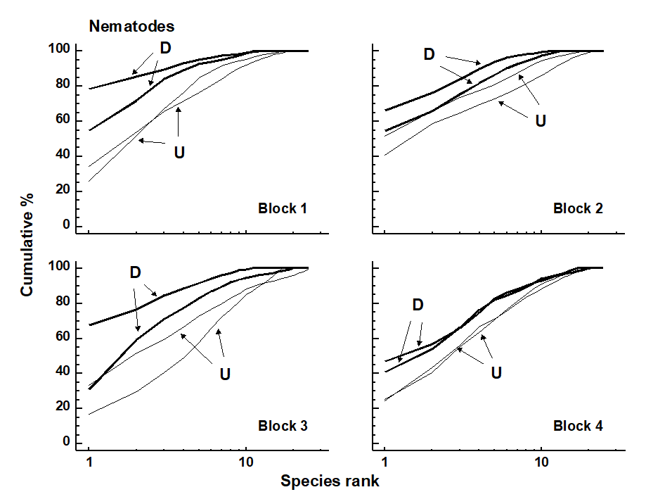
Fig. 12.2. Tasmania, Eaglehawk Neck {T}. Replicate k-dominance curves for nematode abundance in each sampling block. D = disturbed, U = undisturbed.
Graphical/distributional plots. k-dominance curves (Fig. 12.2) also revealed significant differences in the relative species abundance distributions for nematodes (using both ANOVA and ANOSIM-based tests, the latter following DOMDIS, as described on page 8.5, see
Clarke (1990)
). For the copepods, however, (plots given in Chapter 13, Fig. 13.4), k-dominance curves are intermingled and crossing, and there is no significant treatment effect.
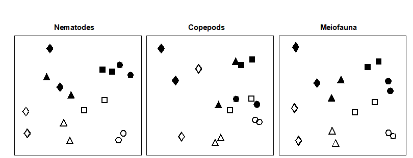
Fig. 12.3. Tasmania, Eaglehawk Neck {T}. MDS configurations for nematode, copepod and ‘meiofauna’ (nematode + copepod) abundance (root-transformed). Different shapes represent the four blocks of samples. Open symbols = undisturbed, filled = disturbed (stress = 0.12, 0.09. 0.11 respectively).
Table 12.2. Tasmania, Eaglehawk Neck {T}. Results of the two-way ANOSIM test for treatment (disturbance/no disturbance) and block effects.
| Disturbance |  Blocks Blocks |
||||
|---|---|---|---|---|---|
| R | Sig.(%) | R | Sig.(%) | ||
| Nematodes | 1.0 | 1.2 | 0.85 | 0.0 | |
| Copepods | 0.56 | 3.7 | 0.62 | 0.0 | |
| Meiofauna | 0.94 | 1.2 | 0.85 | 0.0 |
Multivariate ordinations. MDS revealed significant differences in species composition for both nematodes and copepods: the effects of crab disturbance were similar within each block and similar for nematodes and copepods. Though the ‘treatment signal’ is weaker for the latter, note the general similarities in Fig. 12.3 between the nematode and copepod configurations: both disturbed samples within each block are above both of the undisturbed samples (except for one block for the copepods), and the blocks are arranged in the same sequence across the plot. For both nematodes and copepods, two-way ANOSIM shows a significant effect of both treatment (disturbance) and blocks, Table 12.2, but the differences are more marked for the nematodes (with higher values of the R statistic).
Conclusions. Univariate indices and graphical/distributional plots were only significantly affected by crab disturbance for the nematodes. Multivariate analysis revealed a similar response for nematodes and copepods (i.e. it seems to be a more sensitive measure of community change). In multivariate analyses, natural variations in species composition across the beach (i.e. between blocks) were about as great as those between treatments within blocks, and the disturbance effect would not have been clearly evidenced without this blocked sampling design.
12.3 Field experiments
Field manipulative experiments include, for example, caging experiments to exclude or include predators, controlled pollution of experimental plots, and big-bag experiments with plankton. Their use was historically (unsurprisingly) predominantly for univariate population rather than community studies, although some early examples of multivariate analysis of manipulative field experiments include Anderson & Underwood (1997) , Morrisey, Underwood & Howitt (1996) , Gee & Somerfield (1997) and Austen & Thrush (2001) . The following example is one in which univariate, graphical and multivariate statistical analyses have been applied to meiobenthic communities.
Azoic sediment recolonisation experiment with predator exclusion {Z}
Olafsson & Moore (1992) studied meiofaunal colonisation of azoic sediment in a variety of cages designed to exclude epibenthic macrofauna to varying degrees: A – 1 mm mesh cages designed to exclude all macrofauna; B –1 mm control cages with two ends left open; C – 10 mm mesh cages to exclude only larger macro-fauna; D – 10 mm control cages with two ends left open; E – open unmeshed cages; F – uncaged background controls. Three replicates of each treatment were sampled after 1 month, 3 months and 8 months and analysed for nematode and harpacticoid copepod species composition.
Univariate indices. The presence of cages had a more pronounced impact on copepod diversity than nematode diversity. For example, after 8 months, $H ^ \prime$ and $J ^ \prime$ (but not $S$) for copepods had significantly higher values inside the exclusion cages than in the control cages with the ends left open, but for the nematodes, differences in $H ^ \prime$ were of borderline significance (p = 5.3%).
Graphical/distributional plots. No significant treatment effect for either nematodes or copepods could be detected between k-dominance curves for all sampling dates, using the ANOSIM test for curves, referred towards the end of Chapter 8 (page 8.5).
Multivariate analysis. For the harpacticoid copepods there was a clear successional pattern of change in community composition over time (Fig. 12.4), but no such pattern was obvious for the nematodes. Fig. 12.4 uses data from Table 2 in Olafsson and Moore’s paper, which are for the 15 most abundant harpacticoid species in all treatments and for the mean abundances of all replicates within a treatment on each sampling date. On the basis of these data, there is no significant treatment effect using the 2-way crossed ANOSIM test with no replication¶ (see page 6.8), but the fuller replicated data may have been more revealing.
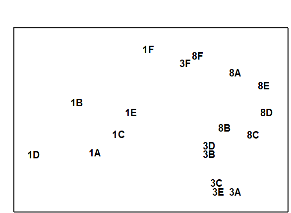
Fig. 12.4. Azoic sediment recolonisation experiment {Z}. MDS configuration for harpacticoid copepods (4th root transformed abundances) after 1, 3 and 8 months, with 6 different treatments (A–F), see text (stress = 0.07).
¶ Note, however, that this test (or the equivalent PERMANOVA test which exploits the interaction term as its residual) will be uninformative in the presence of large treatment $\times$ time interactions, which is a likely possibility here.
12.4 Laboratory experiments
More or less natural communities of some components of the biota can be maintained in laboratory (and also outdoor) experimental containers and subjected to a variety of manipulations. Many types of experimental systems have been used for marine studies, ranging from microcosms (containers less than 1 m$^3$) to mesocosms (1–1000 m$^3$). Early examples of microcosm experiments analysed by multivariate means can be found, for example, in
Austen & McEvoy (1997)
,
Schratzberger & Warwick (1998b)
,
Schratzberger & Warwick (1999)
, and mesocosm experiments in
Austen, Widdicombe & Villano-Pitacco (1998)
,
Widdicombe & Austen (1998)
and
Widdicombe & Austen (2001)
. Macrocosms (larger than $10 ^ 3$ m$^ 3$), usually involving the artificial enclosure of natural areas in the field, have also been used, for pelagic studies, though replicating the treatment is often a significant problem.
Effects of organic enrichment on meiofaunal community structure {N}
Gee, Warwick, Schaanning et al. (1985)
collected undisturbed box cores of sublittoral sediment and transferred them to the experimental mesocosms established at Solbergstrand, Oslofjord, Norway. They produced organic enrichment by the addition of powdered Ascophyllum nodosum to the surface of the cores, in quantities equivalent to 50 g C m$^{-2}$ (four replicate boxes) and 200 g C m$^{-2}$ (four replicate boxes), with four undosed boxes as controls, in a randomised design within one of the large mesocosm basins. After 56 days, five small core samples of sediment were taken from each box and combined to give one sample. The structure of the meiofaunal communities in these samples was then compared.
Univariate indices. Table12.3 shows that, for the nematodes, there were no significant differences in species richness or Shannon diversity between treatments, but evenness was significantly higher in enriched boxes than controls. For the copepods, there were significant differences in species richness and evenness between treatments, but not in Shannon diversity.
Table 12.3. Nutrient-enrichment experiment {N}. Univariate measures for all replicates at the end of the experiment, with the F-ratio and significance levels from one-way ANOVA.
Species richness (d) |
Shannon diversity (H') |
Species evenness (J') |
|
|---|---|---|---|
| Nematodes | |||
| Control | 3.02 | 2.25 | 0.750 |
| 3.74 | 2.39 | 0.774 | |
| 3.36 | 2.47 | 0.824 | |
| 4.59 | 2.76 | 0.747 | |
| Low dose | 4.39 | 2.86 | 0.877 |
| 2.65 | 2.47 | 0.840 | |
| 4.67 | 2.89 | 0.875 | |
| 2.33 | 2.27 | 0.860 | |
| High dose | 2.86 | 2.17 | 0.782 |
| 2.82 | 2.39 | 0.843 | |
| 4.30 | 2.40 | 0.829 | |
| 4.09 | 2.47 | 0.853 | |
| F ratio | 0.04 | 1.39 | 5.13 |
| Sig level (p) | ns | ns | <5% |
| Copepods | |||
| Control | 2.53 | 1.93 | 0.927 |
| 1.92 | 1.56 | 0.969 | |
| 2.50 | 1.77 | 0.908 | |
| 2.47 | 1.94 | 0.931 | |
| Low dose | 1.80 | 1.60 | 0.643 |
| 1.66 | 1.28 | 0.532 | |
| 1.66 | 1.16 | 0.484 | |
| 1.79 | 1.54 | 0.640 | |
| High dose | 1.75 | 1.59 | 0.767 |
| 0.97 | 1.00 | 0.620 | |
| 1.03 | 0.30 | 0.165 | |
| 1.18 | 1.70 | 0.872 | |
| F ratio | 17.72 | 2.65 | 4.56 |
| Sig level (p) | <0.1% | ns | <5% |
Graphical/distributional plots. Fig. 12.5 shows the average k-dominance curves over all four boxes in each treatment. For the nematodes these are closely coincident, suggesting no obvious treatment effect. For the copepods, however, there are apparent differences between the curves. A notable feature of the copepod assemblages in the enriched boxes was the presence, in highly variable numbers, of several species of the large epibenthic harpacticoid Tisbe, which are ‘weed’ species often found in old aquaria and associated with organic enrichment. If this genus is omitted from the analysis, a clear sequence of increasing elevation of the k-dominance curves is evident from control to high dose boxes.

Fig. 12.5. Nutrient enrichment experiment {N}. k-dominance curves for nematodes, total copepods and copepods omitting the ‘weed’ species of Tisbe, for summed replicates of each treatment, C = control, L = low and H = high dose.
Table 12.4. Nutrient enrichment experiment {N}. Values of the R statistic from the ANOSIM test, in pairwise comparisons between treatments, together with significance levels. C = control, L = low dose, H = high dose.
| Treatment | Statistic value (R) |
% Sig. level |
|
|---|---|---|---|
| Nematodes | |||
| (L,C) | 0.27 | 2.9 | |
| (H,C) | 0.22 | 5.7 | |
| (H,L) | 0.28 | 8.6 | |
| Copepods | |||
| (L,C) | 1.00 | 2.9 | |
| (H,C) | 0.97 | 2.9 | |
| (H,L) | 0.59 | 2.9 |
Multivariate analysis. Fig. 12.6 shows that, in an MDS of $\sqrt{} \sqrt{}$-transformed species abundance data, there is no obvious discrimination between treatments for the nematodes. In the ANOSIM test (Table 12.4) the values of the R statistic in pairwise comparisons between treatments are low (0.2–0.3), but there is a significant difference between the low dose treatment and the control, at the 5% level. For the copepods, there is a clear separation of treatments on the MDS, the R statistic values are much higher (0.6–1.0), and there are significant differences in community structure between all treatments.
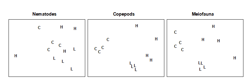
Fig. 12.6. Nutrient enrichment experiment {N}. MDS of $\sqrt{} \sqrt{}$-transformed abundances of nematodes, copepods and total meiofauna (nematodes + copepods). C = control, L = low dose, H = high dose (stress = 0.18, 0.09, 0.12).
Conclusions. The univariate and graphical/distributional techniques show lowered diversity with increasing dose for copepods, but no effect on nematodes. The multivariate techniques clearly discriminate between treatments for copepods, and still have some discriminating power for nematodes. Clearly the copepods have been much more strongly affected by the treatments in all these analyses, but changes in the nematode community may not have been detectable because of the great variability in abundance of nematodes in the high dose boxes. The responses observed in the mesocosm were similar to those sometimes observed in the field where organic enrichment occurs. For example, there was an increase in abundance of epibenthic copepods (particularly Tisbe spp.) resulting in a decrease in the nematode/copepod ratio. In this experiment, however, the causal link is closer to being established, though the possible constraints and artefacts inherent in any laboratory mesocosm study should always be borne in mind (see, for example, the discussion in Underwood & Peterson (1988) ).
Chapter 13: Data requirements for biological effects studies - which components and attributes of the marine biota to examine?
13.1 Components
The biological effects of pollutants can be studied on assemblages of a wide variety of marine organisms:
Pelagos
- plankton (both phytoplankton and zooplankton)
- fish (pelagic and demersal)
Benthos (soft-bottom)
- macrobenthos
- meiobenthos
- microbenthos, not much used in community studies
Benthos (hard-bottom)
- epifauna (encrusting forms, e.g. corals)
- motile fauna (both macrofauna and meiofauna in e.g. algae, holdfasts and epifauna)
These various components of the biota each have certain practical and conceptual advantages and disadvantages for use in biological effects studies. These are discussed in this chapter, and an example is given for each of the components (although not all of these examples are directly concerned with pollution effects).
13.2 Plankton and fish
Plankton
The advantages of plankton are that:
a) Long tows over relatively large distances result in community samples which reflect integrated ecological conditions over large areas. They are therefore useful in monitoring more global changes.
b) Identification of macro-planktonic organisms is moderately easy, because of the ready availability of appropriate literature.
The disadvantage of plankton is that, because the water masses in which they are suspended are continually mobile, they are not useful for monitoring the local effects of a particular pollutant source.
Example: Continuous Plankton Recorder
Plankton samples have been collected from ‘ships of opportunity’ plying their usual commercial routes across the NE Atlantic since the late 1940s (e.g. Colebrook (1986) ) and continue today, their historical continuity (through the Sir Alister Hardy Foundation for Ocean Science, Plymouth, UK) giving the survey ever greater importance with respect to climate change monitoring. The CPR plankton recorders collect samples through a small aperture, and these are trapped on a continuously winding roll of silk so that each section of silk contains an integrated sample from a relatively large area. This has enabled long term trends in plankton abundance to be assessed; e.g. Colebrook (1986) describes a gradual decline in both zooplankton and phytoplankton since the early 1950s, with an upturn in the 1980s (Fig. 13.1).
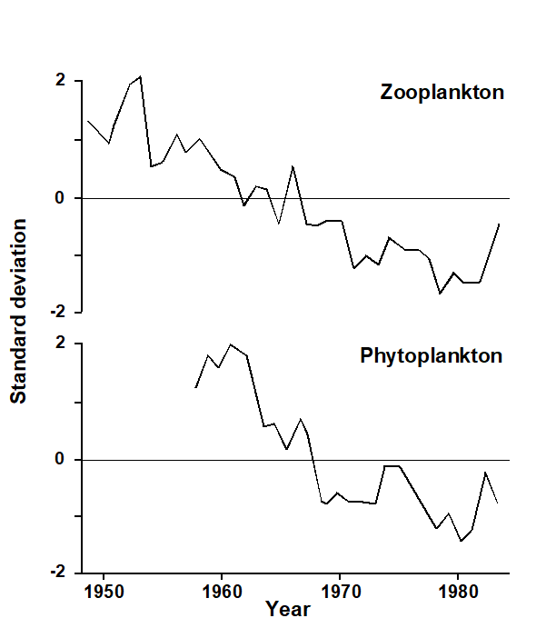
Fig. 13.1. Continuous Plankton Recorder Survey of the NE Atlantic {p}. First principal components for zooplankton and phytoplankton over the first 35 years of the survey (from
Colebrook (1986)
). Graphs scaled to zero mean and unit variance.
Fish
The advantages of fish are that:
a) Because of their mobility they are again more useful for studying general rather than local effects, but some demersal fish communities may show site fidelity, such as the coral-reef fish in the example below.
b) The taxonomy of fish is relatively easy, in all parts of the world.
c) Fish are of immediate commercial and public interest, and so studies of fish communities are more directly related to the needs of environmental managers than, for example, the meiobenthos (despite the fact, of course, that the latter are vitally important to the early life-stages of fish!).
The disadvantages of fish are that:
a) Strictly quantitative sampling which is equally representative of all the species in the community is difficult. The overall catching efficiency of nets, traps etc. is often unknown, as are the differing abilities of species to evade capture or their susceptibility to be attracted to traps. Visual census methods are also not free from bias, since some species will be more conspicuous in colouration or behaviour than other dull secretive species.
b) Uncertainty about site fidelity is usually, but not always, a problem.
Example: Maldives coral reef-fish
For a study in the Maldive islands, Dawson-Shepherd, Warwick, Clarke et al. (1992) used visual census methods to compare reef-fish assemblages at 23 coral reef-flat sites, 11 of which had been subjected to coral mining for the construction industry and 12 were non-mined controls. The MDS (Fig. 13.2) clearly distinguished mined from non-mined sites.
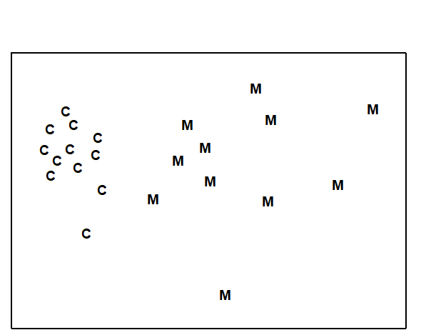
Fig. 13.2. Maldive Islands, coral-reef fish {M}. MDS ordination of fish species abundance data from mined (M) and control (C) reef-flats (stress = 0.08).
13.3 Macrobenthos and meiobenthos
Macrobenthos
The advantages of soft-bottom macrobenthos are that:
a) They are relatively non-mobile and are therefore useful for studying the local effects of pollutants.
b) Their taxonomy is relatively easy.
c) Quantitative sampling is relatively easy.
d) There is an extensive research literature on the effects of pollution, particularly organic enrichment, on macrobenthic communities, against which specific case-histories can be evaluated.
This combination of advantages has resulted in the soft-bottom macrobenthos being probably the most widely used component of the marine biota in environmental impact studies. Despite this, they do have several disadvantages:
a) Relatively large-volume sediment samples must be collected, so that sampling requires relatively large research ships.
b) Because it is generally not practicable to bring large volumes of sediment back to the laboratory for processing, sieving must be done at sea and is rather labour intensive and time consuming (therefore expensive).
c) The potential response time of the macrobenthos to a pollution event is slow. Their generation times are measured in years, so that although losses of species due to pollution may take immediate effect, the colonisation of new species which may take advantage of the changed conditions is slow. Thus, the full establishment of a community characterising the new environmental conditions may take several years.
d) The macrobenthos are generally unsuitable for causality experiments in mesocosms, because such experiments can rarely be run long enough for fully representative community changes to occur, and recruitment of species to mesocosm systems is often a problem because of their planktonic larval stages (see Chapter 12).
Example: Amoco Cadiz oil-spill
The sensitivity of macrobenthic community structure to pollution events, when using multivariate methods of data analysis, is discussed in Chapter 14. The response of the macrobenthos in the Bay of Morlaix to the Amoco Cadiz oil-spill some 40 km away, already seen in Chapters 5, 7 and 10, is a good example of this (Fig. 13.3).
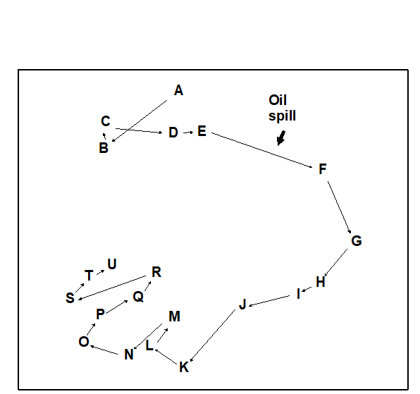
Fig. 13.3. Amoco-Cadiz oil spill, Bay of Morlaix {A}. MDS for macrobenthos at station ‘Pierre Noire’, at approximately three-monthly sampling intervals (stress = 0.09).
Meiobenthos
Apart from sharing the advantage of non-mobility, and therefore usefulness for local effects studies, the relative advantages and disadvantages of the meiobenthos are exactly the reverse of the macrobenthos. Their advantages are:
a) Because of their small size and high density in marine sediments, quantitative sampling of the meiobenthos is easy from small ships, open boats etc.
b) The small volume of the samples means that they can easily be transported to the laboratory, and need not be processed on board ship.
c) Their generation times are usually measured in months rather than years, so that their potential response time to pollution events is much faster than that of the macrobenthos.
d) Because of this fast response time, and direct benthic rather than planktonic development, the meiobenthos are good candidates for causality experiments in experimental microcosms and mesocosms.
The disadvantages of meiobenthos are that:
a) Their taxonomy is considered difficult. Identification of almost all the meiobenthic taxa to species level presents difficulties even in Europe and N America, and in many parts of the world the fauna is almost completely unknown. However, to a considerable degree, three factors mitigate against this problem:
i. The robustness of community analyses to the use of taxonomic levels higher than species (see Chapter 10).
ii. The cosmopolitan nature of most meiobenthic genera.
iii. The increasing availability of easily used keys to meiobenthic genera. For example, the pictorial keys to marine nematodes of Platt & Warwick (1988) have been used successfully worldwide.
b) Community responses of the meiobenthos to pollution are not as well documented as for the macrobenthos, and there is only a modest body of information in the literature against which particular case-histories can be evaluated.
Example: Soldier crab disturbance of nematode assemblages, Tasmania
This natural field experiment was first met in Chapters 6 and 12. It will be remembered that the nematode diversity profiles were affected by the crab disturbance (Fig. 12.2), whereas no significant effect was noted for copepods (Fig. 13.4). Many nematode species are more sedentary in habit than copepods, often adhering to sand-grains by secretions from their caudal glands, and some species prefer conditions of low oxygen concentration or are obligate anaerobes. The so called ‘thiobiotic’ meiofaunal community contains many nematode species, but apparently no copepods. Non-bioturbated sediments will have a vertical gradient in physical and chemical conditions ranging from wave-disturbed sediments with an oxiphilic meiofauna community near the surface to a stable sediment with a thiobiotic community deeper down. Dramatic disturbance by crabs, of the kind found at this site, will inevitably destroy this gradient, so that the whole sediment column will be well aerated and unstable. This reduction in habitat complexity is probably the most parsimonious explanation for the reduction in nematode species diversity.
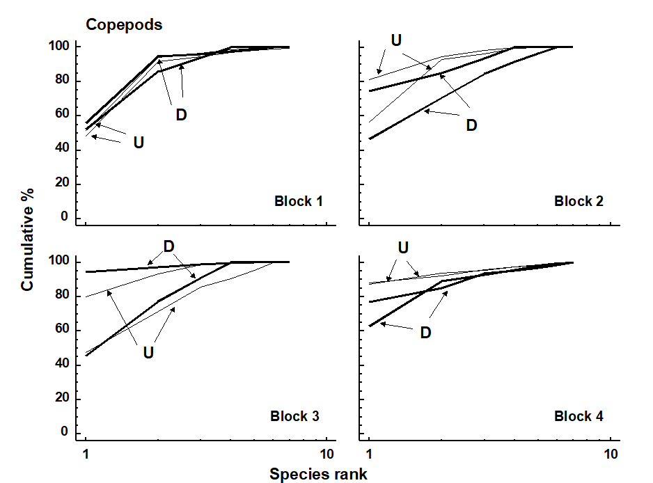
Fig. 13.4. Tasmania, Eaglehawk Neck {T}. k-dominance curves for disturbed (D) and undisturbed (U) copepod samples in in 4 separate sampling blocks.
The differential response of these two components of the meiobenthos has been elaborated here in order to demonstrate how a knowledge of the biology of these components can aid in the interpretation of community responses to perturbation. The macrobenthos and meiobenthos may also respond differently to different kinds of perturbation (e.g. physical disturbance, pollution) so that a comparative study of both may be indicative of the cause.
Example: Macrobenthos and meiobenthos in Hamilton Harbour, Bermuda
Fig. 13.5 shows the average k-dominance curves for the macrobenthos and the nematode component of the meiobenthos at six stations in Hamilton Harbour. For the macrobenthos, the curves at three of the stations (H3, H4 & H6) are much more elevated than the other three, suggesting some kind of perturbation at these sites. For the nematodes, however, all curves are closely coincident. There must therefore be some form of perturbation affecting the macrobenthos but not the meiobenthos, and it was suggested by Warwick, Platt, Clarke et al. (1990) that this is more likely to be physical disturbance of the sediment resulting from the regular passage of large cruise liners within the harbour, rather than pollution. This is because the macrobenthos are much more dependent on sediment stability to maintain diversity than are the meiobenthos.
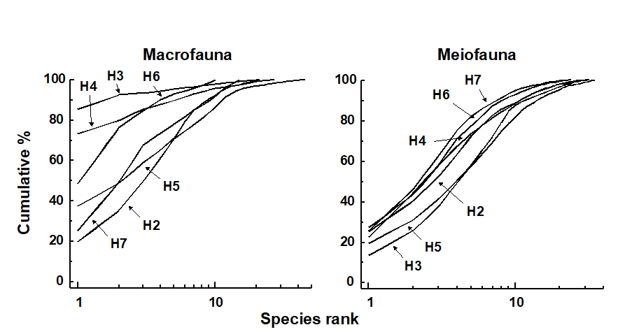
Fig. 13.5. Hamilton Harbour, Bermuda {H}. k-dominance curves for macrobenthos (left) and meiobenthic nematodes (right) at six stations (H2-H7).
13.4 Hard-bottom epifauna and hard-bottom motile fauna
Hard-bottom epifauna
The advantages of using hard-bottom encrusting faunas, reef-corals etc. are:
a) They are immobile and therefore good for local effects studies.
b) A major advantage over sedimentary faunas is that non-destructive (visual/photographic) sampling is possible.
The disadvantages are:
a) Remote sampling is more difficult. Intertidal or shallow subtidal sites can be surveyed (the latter by divers); remote cameras require a greater level of technical sophistication but great strides have been made with this technology in recent decades.
b) Enumeration of colonial organisms is difficult, so that abundance units such as number of colonies or percentage cover must be used – this only becomes a problem when it is necessary to combine data on colonial organisms with that on motile species (see page 5.9). However, biomass measurements are difficult to make.
Example: Indonesian reef corals
The example shown in Fig. 13.6, of the effects of the 1982-3 El Niño on reef coral communities at South Pari Island, was seen in Chapter 10. A clear difference is seen in community composition between 1981 and 1983, with a more steady pattern of change thereafter, though without full reversion to the initial state.
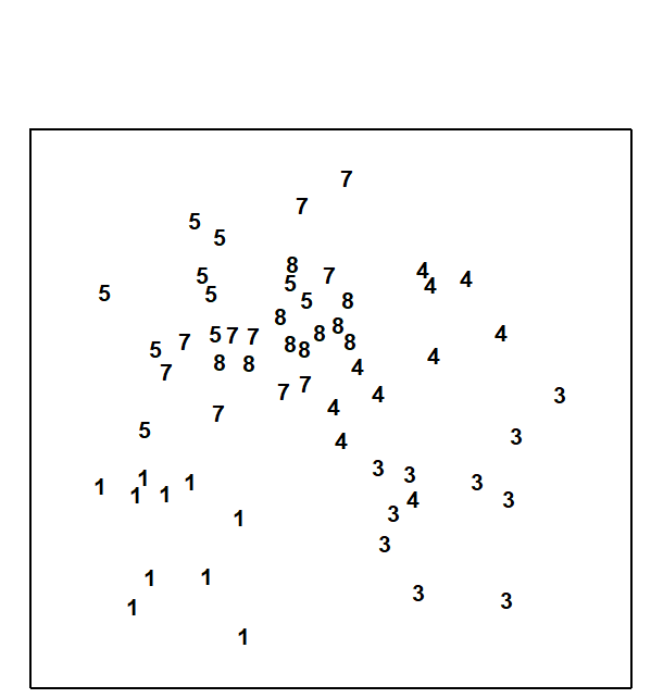
Fig. 13.6. Indonesian reef-corals {I}. MDS for coral species percentage cover data for South Pari Island (10 replicate transects in each year). 1=1981, 3=1983 etc. (stress = 0.25).
Hard-bottom motile fauna
The motile fauna living on rocky substrates and associated with algae, holdfasts, hydroids etc. has rarely been used in pollution impact studies because of its many disadvantages:
a) Remote sampling is difficult.
b) Quantitative extraction from the substrate, and comparative quantification of abundances between different substrate types, are difficult.
c) Responses to perturbation are largely unknown.
d) A suitable habitat (e.g. algae) is not always available. A solution to this problem, and also problem (b),
that has sometimes been tried in practice, is to deploy standardised artificial substrates, e.g. plastic mesh pan-scrubbers, along suspected pollution gradients in the field, allowing these to become colonised.
Example: Metazoan fauna of intertidal seaweed samples from the Isles of Scilly
The entire metazoan fauna (macrofauna + meiofauna) was examined from five species of intertidal macro-algae (Chondrus, Laurencia, Lomentaria, Cladophora, Polysiphonia) each collected at eight sites near low water from rocky shores on the Isles of Scilly, UK ( Gee & Warwick (1994a) , Gee & Warwick (1994b) ). The MDS plots for meiobenthos and macrobenthos were very similar, with the algal species showing very similar relationships to each other in terms of their meiofaunal and macrofaunal community structure (Fig. 13.7). The structure of the weed therefore clearly influenced community structure in both these components of the benthic fauna.
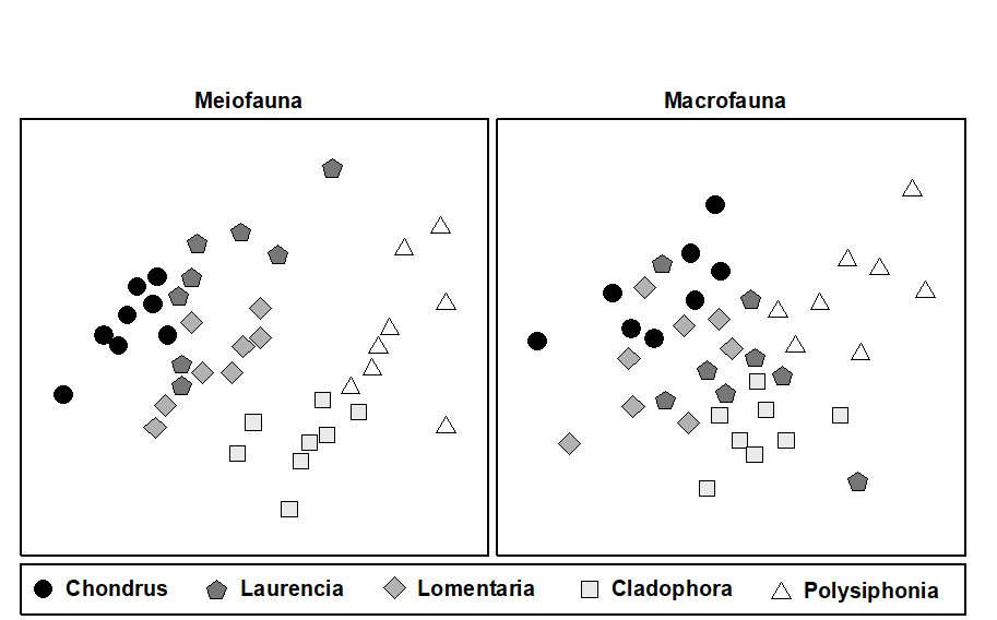
Fig. 13.7. Scilly Isles seaweed fauna {S}. MDS of standardised $\sqrt{} \sqrt{}$-transformed meiofauna and macrofauna species abundance data. The five seaweed species are indicated by different symbol and shading conventions (stress = 0.19, 0.18).
13.5 Attributes and recommendations
Attributes
Species abundance data are by far the most commonly used in environmental impact studies at the community level. However, the abundance of a species is perhaps the least ecologically relevant measure of its relative importance in a community, and we have already seen in Chapter 10 that higher taxonomic levels than species may be sufficient for environmental impact analyses. So, when planning a survey, consideration should be given not only to the number of stations and number of replicates to be sampled, but also to the level of taxonomic discrimination which will be used, and which measure(s) of the relative importance of these taxa will be made.
Abundance, biomass and production
As a measure of the relative ecological importance for soft-sediment and water-column sampling of species, biomass is better than abundance, and production in turn is better than biomass. However, the determination of annual production of all species within a community over a number of sites or times would be so time consuming as to be completely impracticable.¶ We are therefore left with the alternatives of studying abundances, biomasses, or both. Abundances are marginally easier to measure, biomass may be a better reflection of ecological importance, and measurement of both abundance and biomass opens the possibility of comparing species-by-sites matrices based on these two different measures (e.g. by the ABC method discussed in Chapter 8).
In practice, multivariate analyses of abundance and biomass data often give remarkably similar results, despite that fact that the species mainly responsible for discriminating between stations are usually different. In Fig. 13.8, for example, the Frierfjord macrobenthos MDS configurations for abundance and biomass are very similar but it is small polychaete species which are mainly responsible for discriminating between sites on the basis of abundance, and species such as the large echinoid Echinocardium cordatum which discriminate the sites on the basis of biomass.
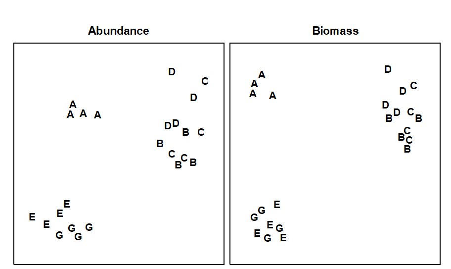
Fig. 13.8. Frierfjord macrofauna {F}. MDS ordinations for abundance and biomass of the 4 replicates at each of the 6 sites (stress = 0.10, 0.08).
Species or higher taxa
We have already seen in Chapter 10 that, in many pollution-impact studies, it has been found for both graphical and multivariate analyses that there is surprisingly little loss of information when the species data are aggregated to higher taxa, e.g. genera, families or sometimes even phyla. For the detection of pollution impact, initial collection of data at the level of higher taxa would result in a considerable saving of time (and cost) in the analysis of samples. Such a strategy would, of course, be quite inappropriate if the objective were to be differently defined, for example, the quantification of biodiversity properties.
Recommendations
It is difficult to give firm recommendations as to which components or attributes of the biota should be studied, since this depends on the problem in hand and the expertise and funds available. In general, however, the wider the variety of components and attributes studied, the easier the results will be to interpret. A broad approach at the level of higher taxa is often preferable to a painstakingly detailed analysis of species abundances. If only one component of the fauna is to be studied, then consideration should be given to working up a larger number of stations/replicates at the level of higher taxa in preference to a small number of stations at the species level. Of course, a large number of replicated stations at which both abundance and biomass are determined at the species level is always the ideal!
¶ Although relative ‘production’ of species can be approximated using empirical relationships between biomass, abundance and production, and these ‘production’ matrices subjected to multivariate analysis, see Chapter 15.
Chapter 14: Relative sensitivities and merits of univariate, graphical/distributional and multivariate techniques
14.1 Introduction
Two communities with a completely different taxonomic composition may have identical univariate or graphical/ distributional structure, and conversely those comprising the same species may have very different univariate or graphical structure. This chapter compares univariate, graphical and multivariate methods of data analysis by applying them to a broad range of studies on various components of the marine biota from a variety of localities, in order to address the question of whether species dependent and species independent attributes of community structure behave the same or differently in response to environmental changes, and which are the most sensitive. Within each class of methods we have seen in previous chapters that there is a very wide variety of different techniques employed, and to make this comparative exercise more tractable we have chosen to examine only one method for each class:
-
Shannon-Wiener diversity index $H ^ \prime$ (see Chapter 8),
-
k-dominance curves including ABC plots (Chapter 8),
-
non-metric MDS ordination on a Bray-Curtis similarity matrix of appropriately transformed species abundance or biomass data (Chapter 5).
14.2 Examples 1, 2 and 3
Example 1: Macrobenthos from Frierfjord/Langesundfjord, Norway
As part of the GEEP/IOC Oslo Workshop, macrobenthos samples were collected at a series of six stations in Frierfjord/Langesundfjord {F}, station A being the outermost and station G the innermost (station F was not sampled for macrobenthos). For a map of the sampling locations see Fig. 1.1.
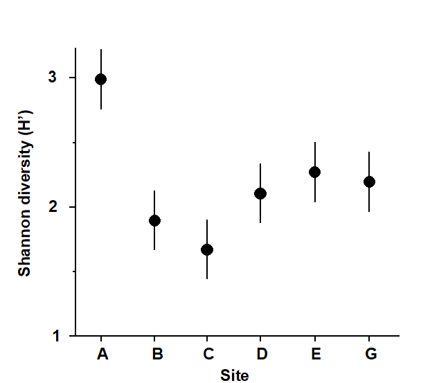
Fig. 14.1. Frierfjord macrobenthos {F}. Shannon diversity (mean and 95% confidence intervals) for each station.
Univariate indices
Site A had a higher species diversity and site C the lowest but the others were not significantly different (Fig. 14.1).
Graphical/distributional plots
ABC plots indicated that stations C, D and E were most stressed, B was moderately stressed, and A and G were unstressed (Fig. 14.2).
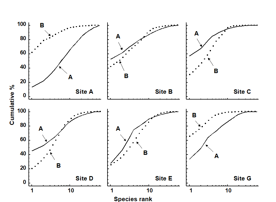
Fig. 14.2. Frierfjord macrobenthos {F}. ABC plots based on the totals from 4 replicates at each of the 6 sites. Solid lines: abundances; dotted lines: biomass.
Multivariate analysis
An MDS of all 24 samples (4 replicates at each station), supported by the ANOSIM test, showed that only stations B and C were not significantly different from each other (Fig. 14.3). Gray, Aschan, Carr et al. (1988) show that the clusters correlate with water depth rather than with measured levels of anthropogenic variables such as hydrocarbons or metals.
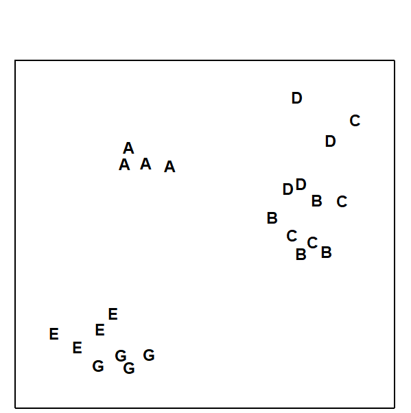
Fig. 14.3. Frierfjord macrobenthos {F}. MDS of 4 replicates at each of sites A–E, G, from Bray-Curtis similarities on 4th root-transformed counts (stress = 0.10).
Conclusions
The MDS was much better at discriminating between stations than the diversity measure, but perhaps more importantly, sites with similar univariate or graphical/ distributional community structure did not cluster together on the MDS. For example, diversity at E was not significantly different from D but they are furthest apart on the MDS; conversely, E and G had different ABC plots but clustered together. However, B, C and D all have low diversity and the ABC plots indicate disturbance at these stations. The most likely explanation is that these deep-water stations are affected by seasonal anoxia, rather than anthropogenic pollution.
Example 2: Macrobenthos from the Ekofisk oilfield, N. Sea
Changes in community structure of the soft-bottom benthic macrofauna in relation to oil drilling activity at the Ekofisk platform in the North Sea {E} have been described by Gray, Clarke, Warwick et al. (1990) . The positions of the sampling stations around the rig are coded by shading and symbol conventions in Fig. 14.4a, according to their distance from the active centre of drilling activity at the time of sampling.
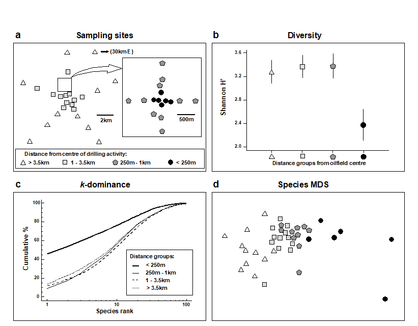
Fig. 14.4. Ekofisk macrobenthos {E}. a) Map of sampling sites, represented by different symbol and shading conventions according to their distance from the 2/4K rig at the centre of drilling activity; b) Shannon diversity (mean and 95% confidence intervals) in these distance zones; c) mean k-dominance curves; d) MDS from root-transformed species abundances (stress = 0.12).
Univariate indices
It can be seen from Fig. 14.4b that species diversity was only significantly reduced in the zone closer than 250m from the rig, and that the three outer zones did not differ from each other in terms of Shannon diversity (this conclusion extends to the other standard measures such as species richness and other evenness indices).
Graphical/distributional plots
The k-dominance curves (Fig. 14.4c) also only indicate a significant effect within the inner zone, the curves for the three outer zones being closely coincident.
Multivariate analysis
In the MDS analysis (Fig. 14.4d) community composition in all of the zones was distinct, and there was a clear gradation of change from the inner to outer zones. Formal significance testing (using ANOSIM) confirmed statistically the differences between all zones. It will be recalled from Chapter 10 that there was also a clear distinction between all zones at higher taxonomic levels than species (e.g. family), even at the phylum level for some zones.
Conclusions
Univariate and graphical methods of data analysis suggest that the effects on the benthic fauna are rather localised. The MDS is clearly more sensitive, and can detect differences in community structure up to 3 km away from the centre of activity.
Example 3: Reef corals at South Pari Island, Indonesia
Warwick, Clarke & Suharsono (1990)
analysed coral community responses to the El Niño of 1982-3 at two reef sites in the Thousand Islands, Indonesia {I}, based on 10 replicate line transects for each of the years 1981, 83, 84, 85, 87 and 88.
Univariate indices
At Pari Island there was an immediate reduction in diversity in 1983, apparent full recovery by 1985, with a subsequent but not significant reduction (Fig. 14.5).
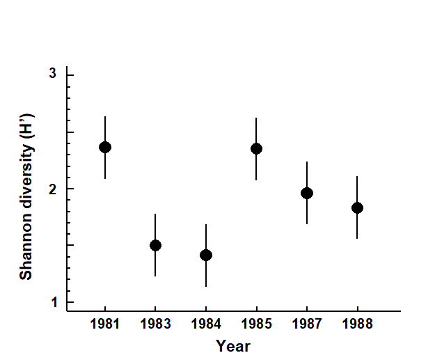
Fig. 14.5. Indonesian reef corals, Pari Island {I}. Shannon diversity (means and 95% confidence intervals) of the species coral cover from 10 transects in each year.
Graphical/distributional plots
The mean k-dominance curves were similar in 1981 and 1985, with the curves for 1983, 1984, 1987 and 1988 more elevated (Fig. 14.6). Tests on the replicate curves (using the DOMDIS routine given on page 8.5, followed by ANOSIM) confirmed the significance of differences between 1981, 1985 and the other years, but the latter were not distinguishable from each other.
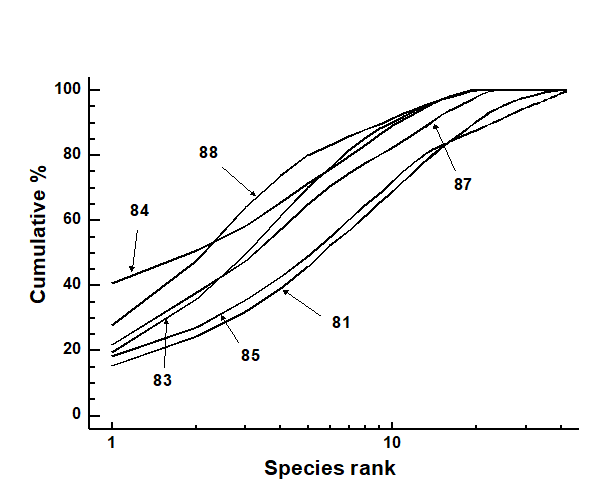
Fig. 14.6. Indonesian reef-corals, Pari Island {I}. k-dominance curves for totals of all ten replicates in each year.
Multivariate analysis
Though the MDS has rather a high stress it nonetheless shows an immediate location shift in community composition at the ten replicate sites between 1981 and 1983, and ANOSIM indicates significant differences between all pairs of years. Recovery proceeded in the pre-El Niño direction but was not complete by 1988 (Fig. 14.7).
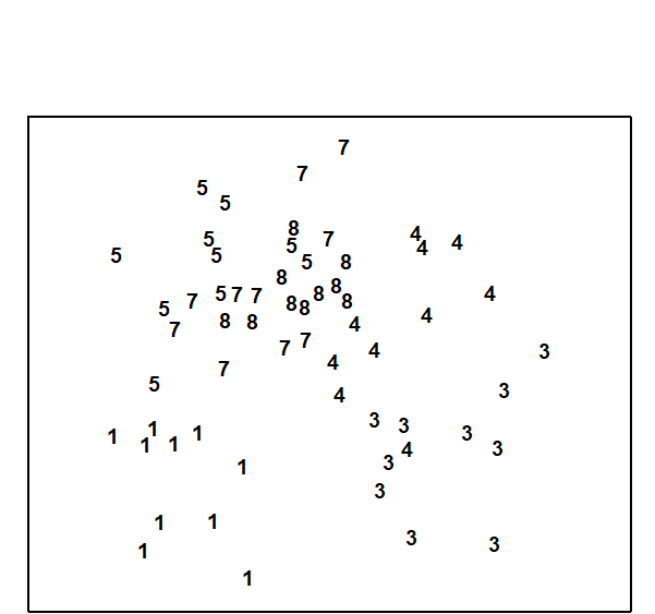
Fig. 14.7. Indonesian reef-corals, Pari Island {I}. MDS for coral species percentage cover data (1 = 1981, 3 = 1983 etc).
Conclusions
All methods of data analysis demonstrated the dramatic post El Niño decline in species, though the multivariate techniques were seen to be more sensitive in monitoring the recovery phase in later years.
14.3 Examples 4, 5, 6 and 7
Example 4: Fish communities from coral reefs in the Maldives
In the Maldive islands,
Dawson-Shepherd, Warwick, Clarke et al. (1992)
compared reef-fish assemblages at 23 coral reef-flat sites {M}, 11 of which had been subjected to coral mining for the construction industry and 12 were non-mined controls. The reef-slopes adjacent to these flats were also surveyed.
Univariate indices
Using ANOVA, no significant differences in diversity (Fig. 14.8) were observed between mined and control sites, with no differences either between reef flats and slopes.
Fig. 14.8. Maldive Islands, coral-reef fish {M}. Shannon species diversity (means and 95% confidence intervals) at mined (closed symbols) and control (open symbols) sites, for both reef flats (circles) and reef slopes (squares).
Graphical/distributional plots
No significant differences could be detected between mined and control sites, in k-dominance curves for either species abundance or biomass. Fig. 14.9 displays the mean curves for reef-flat data pooled across the replicates for each condition.
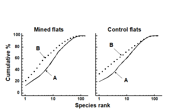
Fig. 14.9. Maldive Islands, coral-reef fish {M}. Average k-dominance curves for abundance and biomass at mined and control reef-flat sites.
Multivariate analysis
The MDS (Fig.14.10) clearly distinguished mined from control sites on the reef-flats, and also to a lesser degree even on the slopes adjacent to these flats, where ANOSIM confirmed the significance of this difference.

Fig. 14.10. Maldive Islands, coral-reef fish {M}. MDS of 4th root-transformed species abundance data. Symbols as in Fig. 14.8, i.e. circles = reef-flat, squares = slope, solid = mined, open = control (stress = 0.09).
Conclusions
There were clear differences in community composition due to mining activity revealed by multivariate methods, even on the reef-slopes adjacent to the mined flats, but these were not detected at all by univariate or graphical/ distributional techniques, even on the flats, where the separation in the MDS is so obvious.
Example 5: Macro- and meiobenthos from Isles of Scilly seaweeds
The entire metazoan fauna (macrofauna + meiofauna) has been analysed from five species of intertidal macro-algae (Chondrus, Laurencia, Lomentaria, Cladophora, Polysiphonia) each collected at eight sites near low water from rocky shores on the Isles of Scilly {S} (Fig. 14.11).
Fig. 14.11. Scilly Isles {S}. Map of the sites (1-8) from each of which 5 seaweed species were collected.
Univariate indices
The meiofauna and macrofauna showed clearly different diversity patterns with respect to weed type; for the meiofauna there was a trend of increasing diversity from the coarsest (Chondrus) to the finest (Polysiphonia) weed, but for the macrofauna there was no clear trend and Polysiphonia had the lowest diversity (Fig. 14.12).

Fig. 14.12. Isles of Scilly seaweed fauna {S}. Shannon diversity (mean and 95% confidence intervals) for the meiofauna and macrofauna of different weed species: Ch = Chondrus, La = Laurencia, Lo = Lomentaria, Cl = Cladophora, Po = Polysiphonia.
Graphical/distributional plots
These differences in meiofauna and macrofauna species diversity profiles were also reflected in the k-dominance curves (Fig. 14.13) which had different sequencing for these two faunal components, for example the Polysiphonia curve was the lowest for meiofauna and highest for macrofauna.
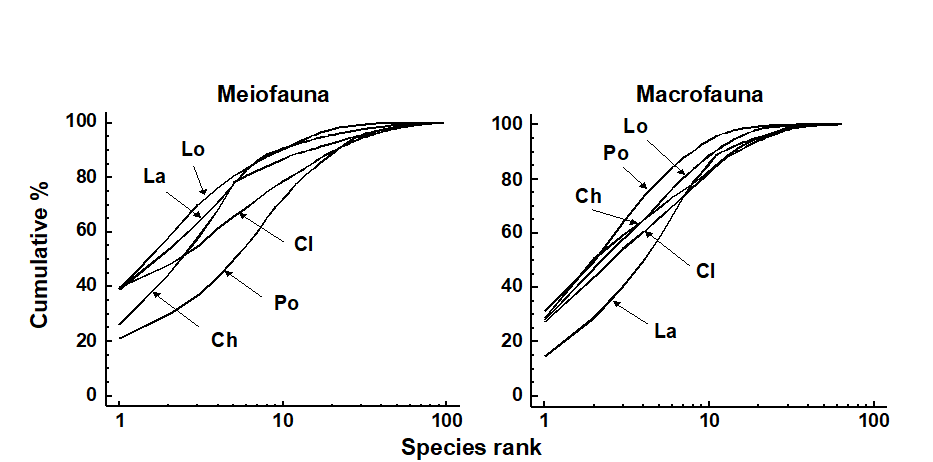
Fig. 14.13. Isles of Scilly seaweed fauna {S}. k-dominance curves for meiofauna (left) and macrofauna (right). Ch = Chondrus, La = Laurencia, Lo = Lomentaria, Cl = Cladophora, Po = Polysiphonia.
Multivariate analysis
The MDS plots for meiobenthos and macrobenthos were very similar, with the algal species showing very similar relationships to each other in terms of their meiofaunal and macrofaunal community structure (see Fig. 13.7, in which the shading and symbol conventions for the different weed species are the same as those in Fig. 14.12). Two-way crossed ANOSIM (factors: weed species and site), using the form without replicates (page 6.8), showed all weed species to be significantly different from each other in the composition of both macrofauna and meiofauna.
Conclusions
The MDS was more sensitive than the univariate or graphical methods for discriminating between weed species. Univariate and graphical methods gave different results for macrobenthos and meiobenthos, whereas for the multivariate methods the results were similar for both.
Example 6: Meiobenthos from the Tamar Estuary, S.W. England
Austen & Warwick (1989) compared the structure of the two major taxonomic components of the meiobenthos, nematodes and harpacticoid copepods, in the Tamar estuary {R}. Six replicate samples were taken at a series of ten intertidal soft-sediment sites (Fig. 14.14).
Fig. 14.14. Tamar estuary meiobenthos {R}. Map showing locations of 10 intertidal mud-flat sites.
Graphical/distributional plots
The average k-dominance curves showed no clear sequencing of sites for the nematodes, for example the curve for site 1 was closely coincident with that for site 10 (Fig. 14.15). For the copepods, however, the curves became increasingly elevated from the mouth to the head of the estuary. However, for both nematodes and copepods, many of the curves were not distinguishable from each other.
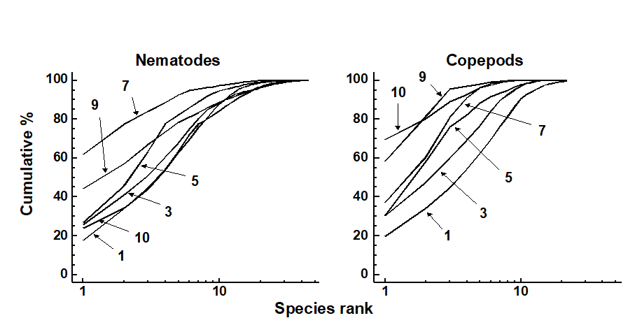
Fig. 14.15. Tamar estuary meiobenthos {R}. k-dominance curves for amalgamated data from 6 replicate cores for nematode and copepod species abundances. For clarity of presentation, some sites have been omitted.
Multivariate analysis
In the MDS, both nematodes and copepods showed a similar (arched) sequencing of sites from the mouth to the head of the estuary (Fig. 14.16). ANOSIM showed that the copepod assemblages were significantly different in all pairs of sites, and the nematodes in all pairs except 6/7 and 8/9.
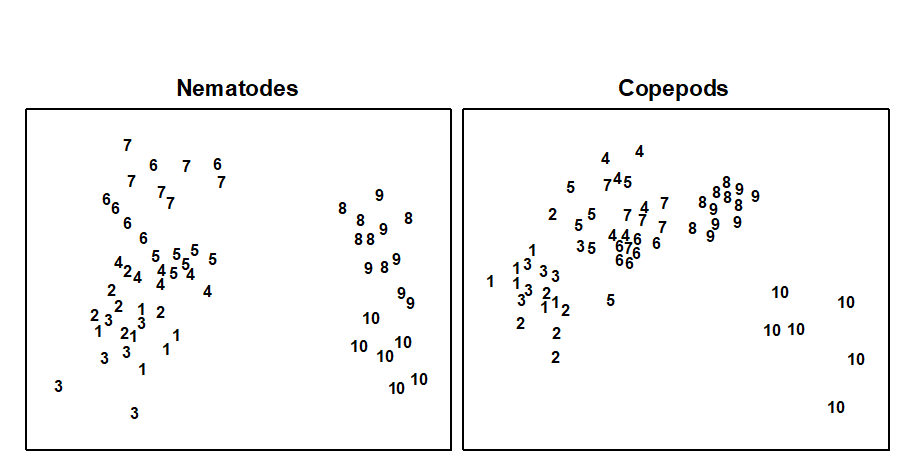
Fig. 14.16. Tamar estuary meiobenthos {R}. MDS of 4th root-transformed nematode and copepod species abundance data for six replicate cores at each of 10 stations.
Conclusions
The multivariate technique was more sensitive in discriminating between sites, and gave similar patterns for nematodes and copepods, whereas graphical methods gave different patterns for the two taxa. For nematodes, factors other than salinity seemed to be more important in determining diversity profiles, but for copepods salinity correlated well with diversity.
Example 7: Meiofauna from Eaglehawk Neck sandflat, Tasmania
This example of the effect of disturbance by burrowing and feeding of soldier crabs {T} was dealt with in some detail in Chapter 12. For nematodes, univariate, graphical and multivariate methods all distinguished disturbed from undisturbed sites. For copepods only the multivariate methods did. Univariate and graphical methods indicated different responses for nematodes and copepods, whereas the multivariate methods indicated a similar response for these two taxa.
14.4 General conclusions and recommendations
General conclusions
Three general conclusions emerge from these examples:
-
The similarity in community structure between sites or times based on their univariate or graphical/distributional attributes is different from their clustering in the multivariate analysis.
-
The species-dependent multivariate method is much more sensitive than the species-independent methods in discriminating between sites or times.
-
In examples where more than one component of the fauna has been studied, univariate and graphical methods may give different results for different components, whereas multivariate methods tend to give the same results.
The sensitive multivariate methods are essentially geared towards detecting differences in community composition between sites. Although these differences can be correlated with measured levels of stressors such as pollutants, the multivariate methods so far described do not in themselves indicate deleterious change which can be used in value judgements. Only the species-independent methods of data analysis lend themselves to the determination of deleterious responses although, as we have seen in Chapter 8 (and will do so again in Chapter 17), even the interpretation of changes in diversity is not always straightforward in these terms. There is a need to employ sensitive techniques for determining stress which utilise the full multivariate information contained in a species/sites matrix, and three such possibilities form the subject of the next chapter.
Recommendations
It is important to apply a wide variety of classes of data analysis, as each will give different information and this will aid interpretation. Sensitive multivariate methods will give an ‘early warning’ that community changes are occurring, but indications that these changes are deleterious are required by environmental managers, and the less sensitive taxa-independent methods will also play a role. Amongst the latter are the newly-devised biodiversity measures based on taxonomic (or phylogenetic) distinctness of the species making up a sample – see the discussion in Chapter 17 of their advantages over classical diversity indices.
Chapter 15: Multivariate measures of community stress and relating to models
15.1 Introduction
We have seen in Chapter 14 that multivariate methods of analysis are very sensitive for detecting differences in community structure between samples in space, or changes over time. Generally, however, these methods are used to detect differences between communities, and not in themselves as measures of community stress in the same sense that species-independent methods (e.g. diversity, ABC curves) are employed. Even using the relatively less-sensitive species-independent methods there may be problems of interpretation in this context. Diversity does not behave consistently or predictably in response to environmental stress. Both theory ( Connell (1978) ; Huston (1979) ) and empirical observation (e.g. Dauvin (1984) ; Widdicombe & Austen (1998) ) suggest that increasing levels of disturbance may either decrease or increase diversity, or it may even remain the same. A monotonic response would be easier to interpret. False indications of disturbance using the ABC method may also arise when, as sometimes happens, the species responsible for elevated abundance curves are pollution sensitive rather than pollution tolerant species (e.g. small amphipods, Hydrobia etc). Knowledge of the actual identities of the species involved will therefore aid the interpretation of ABC curves, and the resulting conclusions will be derived from an informal hybrid of species-independent and species-dependent information ( Warwick & Clarke (1994) ). In this chapter we describe three possible approaches to the measurement of community stress using the fully species-dependent multivariate methods.
15.2 Meta-analysis of marine macrobenthos
This method was initially devised as a means of comparing the severity of community stress between various cases of both anthropogenic and natural disturbance. On initial consideration, measures of community degradation which are independent of the taxonomic identity of the species involved would be most appropriate for such comparative studies. Species composition varies so much from place to place depending on local environmental conditions that any general species-dependent response to stress would be masked by this variability. However, diversity measures are also sensitive to changes in natural environmental variables and an unperturbed community in one locality could easily have the same diversity as a perturbed community in another. Also, to obtain comparative data on species diversity requires a highly skilled and painstaking analysis of species and a high degree of standardisation with respect to the degree of taxonomic rigour applied to the sample analysis; e.g. it is not valid to compare diversity at one site where one taxon is designated as Nematodes with another at which this taxon has been divided into species.
The problem of natural variability in species composition from place to place can be potentially overcome by working at taxonomic levels higher than species. The taxonomic composition of natural communities tends to become increasingly similar at these higher levels. Although two communities may have no species in common, they will almost certainly comprise the same phyla. For soft-bottom marine benthos, we have already seen in Chapter 10 that disturbance effects are detectable with multivariate methods often at the highest taxonomic levels, even in some instances where these effects are rather subtle and are not evidenced in univariate measures even at the species level, e.g. the Ekofisk {E} study.
Meta-analysis is a term widely used in biomedical statistics and refers to the combined analysis of a range of individual case-studies which in themselves are of limited value but in combination provide a more global insight into the problem under investigation. Warwick & Clarke (1993a) have combined macrobenthic data aggregated to phyla from a range of case studies {J} relating to varying types of disturbance, and also from sites which are regarded as unaffected by such perturbations. A choice was made of the most ecologically meaningful units in which to work, bearing in mind the fact that abundance is a rather poor measure of such relevance, biomass is better and production is perhaps the most relevant of all (Chapter 13). Of course, no studies have measured production (P) of all species within a community, but many studies provide both abundance (A) and biomass (B) data. Production was therefore approximated using the allometric equation:
$$ P = (B/A) ^ {0.73} \times A \tag{15.1} $$
where B/A is simply the mean body-weight, and 0.73 is the average exponent of the regression of annual production on body-size for macrobenthic invertebrates. Since the data from each study are standardised (i.e. production of each phylum is expressed as a proportion of the total) the intercept of this regression is irrelevant. For each data set the abundance and biomass data were first aggregated to phyla, following the classification of Howson (1987) ; 14 phyla were encountered overall (see the later Table 15.1). Abundance and biomass were then combined to form a production matrix using the above formula. All data sets were then merged into a single production matrix and an MDS performed on the standardised, 4th root-transformed data using the Bray-Curtis similarity measure. All macrobenthic studies from a single region (the NE Atlantic shelf) for which both abundance and biomass data were available were used, as follows:
-
A transect of 12 stations sampled in 1983 on a west-east transect (Fig. 1.5) across a sewage sludge dump-ground at Garroch Head, Firth of Clyde, Scotland {G}. Stations in the middle of the transect show clear signs of gross pollution.
-
A time series of samples from 1963–1973 at two stations (sites 34 and 2, Fig. 1.3) in West Scottish sea-lochs, L. Linnhe and L. Eil {L}, covering the period of commissioning of a pulp-mill. The later years show increasing pollution effects on the macrofauna, except that in 1973 a recovery was noted in L. Linnhe following a decrease in pollution loading.
-
Samples collected at six stations in Frierfjord (Oslofjord), Norway {F}. The stations (Fig. 1.1) were ranked in order of increasing stress A–G–E–D–B–C, based on thirteen different criteria. The macrofauna at stations B, C and D were considered to be influenced by seasonal anoxia in the deeper basins of the fjord.
-
Amoco-Cadiz oil spill, Bay of Morlaix {A}. In order not to swamp the analysis with one study, the 21 sampling times have been aggregated into 5 years for the meta-analysis: 1977 = pre-spill year, 1978 = post-spill year and 1979-81 = ‘recovery’ period.
-
Two stations in the Skagerrak at depths of 100 and 300m. The 300m station showed signs of disturbance attributable to the dominance of the sediment reworking bivalve Abra nitida.
-
An undisturbed station off the coast of Northumberland, NE England.
-
An undisturbed station in Carmarthen Bay, S Wales.
-
An undisturbed station in Kiel Bay; mean of 22 sets of samples.
In all, this gave a total of 50 samples, the disturbance status of which has been assessed by a variety of different methods including univariate indices, dominance plots, ABC curves, measured contaminant levels etc. The MDS for all samples (Fig.15.1) takes the form of a wedge with the pointed end to the right and the wide end to the left. It is immediately apparent that the long axis of the configuration represents a scale of disturbance, with the most disturbed samples to the right and the undisturbed samples to the left. (The reason for the spread of sites on the vertical axis is less obvious). The relative positions of samples on the horizontal axis can thus be used as a measure of the relative severity of disturbance. Another gratifying feature of this plot is that in all cases increasing levels of disturbance result in a shift in the same direction, i.e. to the right. For visual clarity, the samples from individual case studies are plotted in Fig. 15.2, with the remaining samples represented as dots.
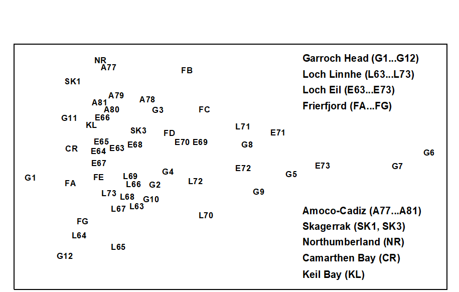
Fig. 15.1. Joint NE Atlantic shelf studies (‘meta-analysis’) {J}. Two dimensional MDS ordination of phylum level ‘production’ data (stress = 0.16).
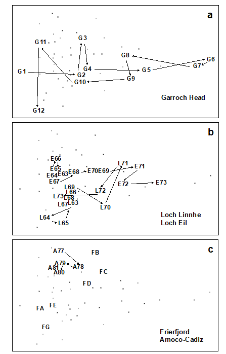
Fig. 15.2. Joint NE Atlantic shelf studies (‘meta-analysis’) {J}. As Fig. 15.1 but with individual studies highlighted: a) Garroch Head (Clyde) dump-ground; b) Loch Linnhe and Loch Eil; c) Frierfjord and Amoco-Cadiz spill (Morlaix).
-
Garroch Head (Clyde) sludge dump-ground {G}. Samples taken along this transect span the full scale of the long axis of the configuration (Fig. 15.2a). Stations at the two extremities of the transect (1 and 12) are at the extreme left of the wedge, and stations close to the dump centre (6) are at the extreme right.
-
Loch Linnhe and Loch Eil {L}. In the early years (1963–68) both stations are situated at the unpolluted left-hand end of the configuration (Fig. 15.2b). After this the L. Eil station moves towards the right, and at the end of the sampling period (1973) it is close to the right-hand end; only the sites at the centre of the Clyde dump-site are more polluted. The L. Linnhe station is rather less affected and the previously mentioned recovery in 1973 is evidenced by the return to the left-hand end of the wedge.
-
Frierfjord (Oslofjord) {F}. The left to right order of stations in the meta-analysis is A–G–E–D–B–C (Fig. 15.2c), exactly matching the ranking in order of increasing stress. Note that the three stations affected by seasonal anoxia (B,C and D) are well to the right of the other three, but are not as severely disturbed as the organically enriched sites in 1) and 2) above.
-
Amoco-Cadiz spill, Morlaix {A}. Note the shift to the right between 1977 (pre-spill) and 1978 (post-spill), and the subsequent return to the left in 1979–81 (Fig. 15.2c). However, the shift is relatively small, suggesting that this is only a mild effect.
-
Skagerrak. The biologically disturbed 300m station is well to the right of the undisturbed 100m station, although the former is still quite close to the left-hand end of the wedge.
-
to 8 Unpolluted sites. The Northumberland, Carmarthen Bay and Keil Bay stations are all situated at the left-hand end of the wedge.
An initial premise of this method was that, at the phylum level, the taxonomic composition of communities is relatively less affected by natural environmental variables than by pollution or disturbance (Chapter 10). To examine this, Warwick & Clarke (1993a) superimposed symbols scaled in size according to the values of the two most important environmental variables considered to influence community structure, sediment grain size and water depth, onto the meta-analysis MDS configuration (a technique described in Chapter 11). Both variables had high and low values scattered arbitrarily across the configuration, which supports the original assumption.
With respect to individual phyla, annelids comprise a high proportion of the total ‘production’ at the polluted end of the wedge, with a decrease at the least polluted sites. Molluscs are also present at all sites, except the two most polluted, and have increasingly higher dominance towards the non-polluted end of the wedge. Echinoderms are even more concentrated at the non-polluted end, with some tendency for higher dominance at the bottom of the configuration (Fig. 15.3a). Crustacea are again concentrated to the left, but this time entirely confined to the top part of the configuration (Fig. 15.3b). Clearly, the differences in relative proportions of crustaceans and echinoderms are largely responsible for the vertical spread of samples at this end of the wedge, but these differences cannot be explained in terms of the effects of any recorded natural environmental variables. Nematoda are clearly more important at the polluted end of the wedge, an obvious consequence of the fact that species associated with organic enrichment tend to be very large in comparison with their normal meiofaunal counterparts (e.g. Oncholaimids), and are therefore retained on the macrofaunal ecologists’ sieves. Other less important phyla show no clear distribution pattern, except that most are absent from the extreme right-hand samples.
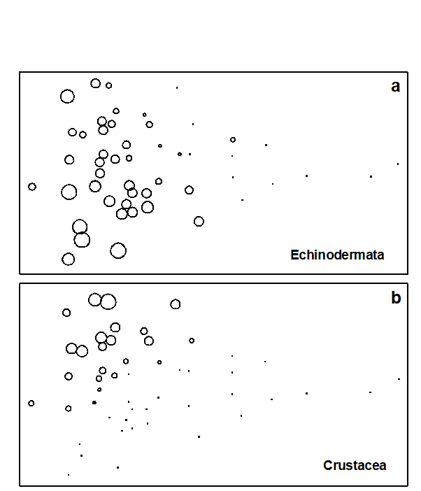
Fig. 15.3. Joint NE Atlantic shelf studies (‘meta-analysis’) {J}. As Fig. 15.1 but highlighting the role of specific phyla in shaping the MDS; symbol size represents % production in each sample from: a) echinoderms, b) crustaceans.
This multivariate approach to the comparative scaling of benthic community responses to environmental stress seems to be more satisfactory than taxon-independent methods, having both generality and consistency of behaviour. It is difficult to assess the sensitivity of the technique because data on abundance and biomass of phyla are not available for any really low-level or subtle perturbations. However, its ability to detect the deleterious effect of the Amoco-Cadiz oil spill, where diversity was not impaired, and to rank the Frierfjord samples correctly with respect to levels of stress which had been determined by a wide variety of more time-consuming species-level techniques, suggests that this approach may retain much of the sensitivity of multivariate methods. It certainly seems, at least, that there is a high signal/noise ratio in the sense that natural environmental variation does not affect the communities at this phyletic level to an extent which masks the response to perturbation. The fact that this meta-analysis ‘works’ has a rather weak theoretical basis. Why should Mollusca as a phylum be more sensitive to perturbation than Annelida, for example? The answer to this is unlikely to be straightforward and would need to be addressed by considering a broad range of toxicological, physiological and ecological characteristics which are more consistent within than between phyla.
The application of these findings to the evaluation of data from new situations requires that both abundance and biomass data are available. The scale of perturbation is determined by the 50 samples present in the meta-analysis. These can be regarded as the training set against which the status of new samples can be judged. The best way to achieve this would be to merge the new data with the training set to generate a single production matrix for a re-run of the MDS analysis. The positions of the new data in the two dimensional configuration, especially their location on the principal axis, can then be noted. Of course the positions of the samples in the training set may then be altered relative to each other, though such re-adjustments would be expected to be small. It is also natural, at least in some cases, that each new data set should add to the body of knowledge represented in the meta-analysis, by becoming part of an expanded training set against which further data are assessed. This approach would preserve the theoretical superiority and practical robustness of applying MDS (Chapter 5) in preference to ordination methods such as PCA.
However, there are circumstances in which more approximate methods might be appropriate, such as when it is preferable to leave the training data set unmodified. Fortunately, because of the relatively low dimensionality of the multivariate space (14 phyla, of which only half are of significance), a two-dimensional PCA of the ‘production’ data gives a plot which is rather close to the MDS solution. The eigenvectors for the first three principal components, which explain 72% of the total variation, are given in Table 15.1. The value of the PC1 score for any existing or new sample can then easily be calculated from the first column of this table, without the need to re-analyse the full data set. This score could, with certain caveats (see below), be interpreted as a disturbance index. This index is on a continuous scale but, on the basis of the training data set given here, samples with a score of >+1 can be regarded as grossly disturbed, those with a value between –0.2 and +1 as showing some evidence of disturbance and those with values <–0.2 as not signalling disturbance with this methodology. A more robust, though less incisive, interpretation would place less reliance on the absolute location of samples on the MDS or PCA plots and emphasise the movement (to the right) of putatively impacted samples relative to appropriate controls. For a new study, the spread of sample positions in the meta-analysis allows one to scale the importance of observed changes, in the context of differences between control and impacted samples for the training set.
Table 15.1. Joint NE Atlantic shelf studies (‘meta-analysis’) {J}. Eigenvectors for the first three principal components from covariance-based PCA of standardised and 4th root-transformed phylum ‘production’ (all samples).
 Phylum Phylum |
PC1 | PC2 | PC3 |
|---|---|---|---|
| Cnidaria | -0.039 | 0.094 |
0.039 |
| Platyhelminthes | -0.016 | 0.026 |
-0.105 |
| Nemertea | 0.169 |
0.026 |
0.061 |
| Nematoda | 0.349 |
-0.127 | -0.166 |
| Priapulida | -0.019 | 0.010 |
0.003 |
| Sipuncula | -0.156 | 0.217 |
0.105 |
| Annelida | 0.266 |
0.109 |
-0.042 |
| Chelicerata | -0.004 |
0.013 |
-0.001 |
| Crustacea | 0.265 |
0.864 |
-0.289 |
| Mollusca | -0.445 |
-0.007 | 0.768 |
| Phoronida | -0.009 |
0.005 |
0.008 |
| Echinodermata | -0.693 |
-0.404 |
-0.514 |
| Hemichordata | -0.062 |
-0.067 |
-0.078 |
| Chordata | -0.012 |
0.037 |
-0.003 |
It should be noted that the training data is unlikely to be fully representative of all types of perturbation that could be encountered. For example, in Fig. 15.1, all the grossly polluted samples involve organic enrichment of some kind, which is conducive to the occurrence of the large nematodes which play some part in the positioning of these samples at the extreme right of the meta-analysis MDS or PCA. This may not happen with communities subjected to toxic chemical contamination only. Also, the training data are only from the NE European shelf, although data from a tropical locality (Trinidad, West Indies) have also been shown to conform with the same trend ( Agard, Gobin & Warwick (1993) ). Other studies have looked at specific impact data merged with the above training set (e.g. Somerfield, Atkins, Bolam et al. (2006) , on dredged-material disposal in UK waters), though these studies have been rather few in number. It is unclear whether this represents a paucity of data of the right type (biomass measurements are still uncommon, in spite of the relative ease with which they can be made, given the faunal sorting necessary for abundance quantification), or reflects a failure of the analysis to generalise.
15.3 Increased variability
Warwick & Clarke (1993b) noted that, in a variety of environmental impact studies, the variability among samples collected from impacted areas was much greater than that from control sites. The suggestion was that this variability in itself may be an identifiable symptom of perturbed situations. The four examples examined were:
-
Meiobenthos from a nutrient-enrichment study {N}; a mesocosm experiment to study the effects of three levels of particulate organic enrichment (control, low dose and high dose) on meiobenthic community structure (nematodes plus copepods), using four replicate box-cores of sediment for each treatment.
-
Macrobenthos from the Ekofisk oil field, N Sea {E}; a grab sampling survey at 39 stations around the oil field centre. To compare the variability among samples at different levels of pollution impact, the stations were divided into four groups (A-D) with approximately equal variability with respect to pollution loadings. These groups were selected from a scatter plot of the concentrations of two key pollution-related environmental variables, total PAHs and barium. Since the dose/response curve of organisms to pollutant concentrations is usually logarithmic, the values of these two variables were log-transformed.
-
Corals from S Tikus Island, Indonesia {I}; changes in the structure of reef-coral communities between 1981 and 1983, along ten replicate line transects, resulting from the effects of the 1982–83 El Niño.
-
Reef-fish in the Maldive Islands {M}; the structure of fish communities on reef flats at 23 coral sites, 11 of which had been subjected to mining, with the remaining 12 unmined sites acting as controls.
Data were analysed by non-metric MDS using the Bray-Curtis similarity measure and either square root (mesocosm, Ekofisk, Tikus) or fourth root (Maldives) transformed species abundance data (Fig. 15.4). While the control and low dose treatments in the meiofaunal mesocosm experiment show tight clustering of replicates, the high dose replicates are much more diffusely distributed (Fig. 15.4a). For the Ekofisk macrobenthos, the Group D (most impacted) stations are much more widely spaced than those in Groups A–C (Fig. 15.4b). For the Tikus Island corals, the 1983 replicates are widely scattered around a tight cluster of 1981 replicates (Fig. 15.4c)¶, and for the Maldives fish the control sites are tightly clustered entirely to the left of a more diffuse cluster of replicates of mined sites (Fig. 15.4d). Thus, the increased variability in multivariate structure with increased disturbance is clearly evident in all examples.
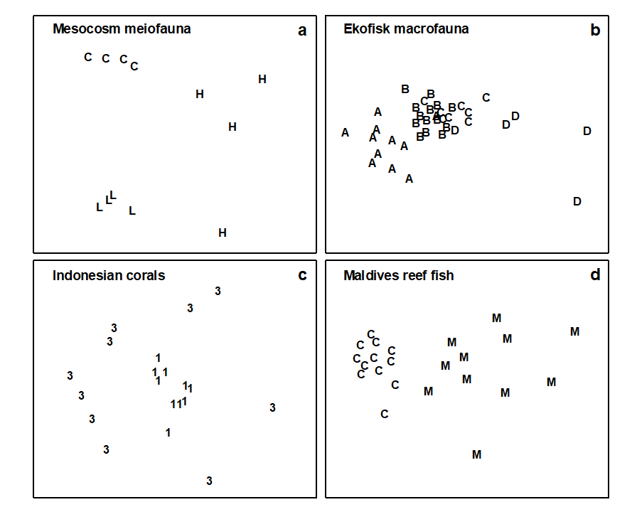
Fig. 15.4. Variability study {N, E, I, M}. Two-dimensional configurations for MDS ordinations of the four data sets. Treatment codes: a) H = High dose, L = Low dose, C = Controls; b) A–D are the station groupings by pollution load; c) 1 = 1981, 3 = 1983; d) M = Mined, C = Controls (stress: 0.08, 0.12, 0.11, 0.08).
It is possible to construct an index from the relative variability between impacted and control samples. One natural comparative measure of dispersion would be based on the difference in average distance among replicate samples for the two groups in the 2-d MDS configuration. However, this configuration is usually not an exact representation of the rank orders of similarities between samples in higher dimensional space. These rank orders are contained in the triangular similarity matrix which underlies any MDS. (The case for using this matrix rather than the distances is the same as that given for the ANOSIM statistic in Chapter 6.) A possible comparative Index of Multivariate Dispersion (IMD) would therefore contrast the average rank of the similarities among impacted samples ($\overline{r} _ t$) with the average rank among control samples ($\overline{r} _ c$) , having re-ranked the full triangular matrix ignoring all between-treatment similarities. Noting that high similarity corresponds to low rank similarity, a suitable statistic, appropriately standardised, is:
$$ IMD = 2 ( \overline{r} _ t - \overline{r} _ c ) / ( N _ t + N _ c) \tag{15.2} $$
where
$$ N _ c = n_ c (n _ c – 1)/2, \hspace{10mm} N _ t = n _ t (n _ t – 1)/2 \tag{15.3} $$
and $n _ c$, $n _ t$ are the number of samples in the control and treatment groups respectively. The chosen denominator ensures that IMD has maximum value of +1 when all similarities among impacted samples are lower than any similarities among control samples. The converse case gives a minimum for IMD of –1, and values near zero imply no difference between treatment groups.
In Table 15.2, IMD values are compared between each pair of treatments or conditions for the four examples. For the mesocosm meiobenthos, comparisons between the high dose and control treatments and the high dose and low dose treatments give the most extreme IMD value of +1, whereas there is little difference between the low dose and controls. For the Ekofisk macrofauna, strongly positive values are found in comparisons between the group D (most impacted) stations and the other three groups. It should be noted however that stations in groups C, B and A are increasingly more widely spaced geographically. Whilst groups B and C have similar variability, the degree of dispersion increases between the two outermost groups B and A, probably due to natural spatial variability. However, the most impacted stations in group D, which fall within a circle of 500 m diameter around the oil-field centre, still show a greater degree of dispersion than the stations in the outer group A which are situated outside a circle of 7 km diameter around the oil-field. Comparison of the impacted versus control conditions for both the Tikus Island corals and the Maldives reef-fish gives strongly positive IMD values. For the Maldives study, the mined sites were more closely spaced geographically than the control sites, so this is another example for which the increased dispersion resulting from the anthropogenic impact is ‘working against’ a potential increase in variability due to wider spacing of sites. Nonetheless, for both the Ekofisk and Maldives studies the increased dispersion associated with the impact more than cancels out that induced by the differing spatial scales.
Table 15.2. Variability study {N, E, I, M}. Index of Multivariate Dispersion (IMD) between all pairs of conditions.
 Study Study |
Conditions compared | IMD |
|---|---|---|
| Meiobenthos | High dose / Control | +1 |
| High dose / Low dose | +1 | |
| Low dose / Control | -0.33 | |
| Macrobenthos | Group D / Group C | +0.77 |
| Group D / Group B | +0.80 | |
| Group D / Group A | +0.60 | |
| Group C / Group B | -0.02 | |
| Group C / Group A | -0.50 | |
| Group B / Group A | -0.59 | |
| Corals | 1983 / 1981 | +0.84 |
| Reef-fish | Mined / Control reefs | +0.81 |
Application of the comparative index of multivariate dispersion (the MVDISP routine in PRIMER) suffers from the lack of any statistical framework for testing hypotheses of comparable variability among groups§. As given above, it is also restricted to the comparison of only two groups, though it can be extended to several groups in straightforward fashion. Let $\overline{r} _ i $ denote the mean of the $N _ i = n _ i ( n _ i – 1)/2$ rank similarities among the $n _ i$ samples within the ith group (i = 1, …, g), having (as before) re-ranked the triangular matrix ignoring all between-group similarities, and let N be the number of similarities involved in this ranking ($N = \sum _ i N _ i$). Then the dispersion sequence
$$ \overline{r} _ 1 /k, \hspace{3mm} \overline{r} _ 2 /k, \ldots \overline{r} _ g /k \tag{15.4} $$
defines the relative variability within each of the g groups, the larger values corresponding to greater within-group dispersion. The denominator scaling factor k is (N + 1)/2, i.e. simply the mean of all N ranks involved, so that a relative dispersion of unity corresponds to ‘average dispersion’. (If the number of samples is the same in all groups then the values in equation (15.4) will average 1, though this will not quite be the case if the {$n _ i$} are unbalanced.)
Table 15.3. Variability study {N, E, I, M}. Relative dispersion of the groups (equation 15.4) in each of the four studies.
| Meiobenthos | Control | 0.58 |
| Low dose | 0.79 | |
| High dose | 1.63 | |
| Macrobenthos | Group A | 1.34 |
| Group B | 0.79 | |
| Group C | 0.81 | |
| Group D | 1.69 | |
| Corals | 1981 | 0.58 |
| 1983 | 1.42 | |
| Reef-fish | Control reefs | 0.64 |
| Mined reefs | 1.44 |
As an example, the relative dispersion values given by (15.4) have been computed for the four studies (Table 15.3). This is complementary information to the IMD values; Table 15.2 provides the pairwise comparisons which follow the global picture in Table 15.3. The conclusions from the latter are, of course, consistent with the earlier discussion, e.g. the increase in variability at the outermost sites in the Ekofisk study, because of their greater geographical spread, being nonetheless smaller than the increased dispersion at the central, impacted stations.
These four examples all involve either experimental or spatial replication but a similar phenomenon can also be seen with temporal replication. Warwick, Ashman, Brown et al. (2002) report a study of macrobenthos in Tees Bay, UK, for annual samples (taken at the same two times each year) over the period 1973–96 {t}. This straddled a significant, and widely reported, phase shift in planktonic communities in the N Sea, in about 1987. The multivariate dispersion index (IMD), contrasting pre-1987 with post-1987, showed a consistent negative value (increase in inter-annual dispersion in later years) for each of six locations in Tees Bay, at each of the two sampling times (Table 15.4).
Table 15.4. Tees Bay macrobenthos {t}. Index of Multivariate Dispersion (IMD) between pre- and post-1987 years, before/after a reported change in N Sea pelagic assemblages.
| March | September | |
|---|---|---|
| Area 0 | –0.15 | –0.15 |
| Area 1 | –0.09 | –0.60 |
| Area 2 | –0.33 | –0.33 |
| Area 3 | –0.35 | –0.36 |
| Area 4 | –0.28 | –0.67 |
| Area 6 | –0.46 | –0.15 |
¶ We shall explore this data set in more detail in Chapter 16, in connection with the effect that choice of different resemblance measures has on the ensuing multivariate analyses. It is crucial to realise that this multivariate dispersion (seen in the MDS plot) represents variability in similarities among different replicate pairs and is not much influenced by, e.g., absolute variation in total cover. Euclidean distance, which is strongly influenced by the latter, shows the opposite pattern, with the replicates widely varying for 1981 and much tighter for 1983. Here, Bray-Curtis is driven by the turnover in species present (a concept ignored by Euclidean distance) in what is a sparse assemblage by 1983.
§ This is because there is no exact permutation process possible under a null hypothesis which says that dispersion is the same but location of the groups may differ. The only viable route to a test is firstly to estimate the locations of each group in some high-d ‘resemblance space’, and move those group centroids on top of each other. Having removed location differences, permuting the group labels becomes permissible under the null hypothesis. This is the procedure carried out by the PERMDISP routine in PERMANOVA+, Anderson (2006) . Like most tests in this add-on software it is therefore an approximate rather than exact permutation test (because of the estimation step) and is semi-parametric not non-parametric (based on similarities themselves not their ranks).
15.4 Breakdown of seriation
Clear-cut zonation patterns in the form of a serial change in community structure with increasing water depth are a striking feature of intertidal and shallow-water benthic communities on both hard and soft substrata. The causes of these zonation patterns are varied, and may differ according to circumstances, but include environmental gradients such as light or wave energy, competition and predation. None of these mechanisms, however, will necessarily give rise to discontinuous bands of different assemblages of species, which is implied by the term zonation, and the more general term seriation is perhaps more appropriate for this pattern of community change, zonation (with discontinuities) being a special case.
Many of the factors which determine the pattern of seriation are likely to be modified by disturbances of various kinds. For example, dredging may affect the turbidity and sedimentation regimes and major engineering works may alter the wave climate. Elimination of a particular predator may affect patterns which are due to differential mortality of species caused by that predator. Increased disturbance may also result in the relaxation of interspecific competition, which may in turn result in a breakdown of the pattern of seriation induced by this mechanism. Where a clear sequence of community change along transects is evident in the undisturbed situation, the degree of breakdown of this sequencing could provide an index of subsequent disturbance. Clarke, Warwick & Brown (1993) have described a simple non-parametric index of multivariate seriation, and applied it to a study of dredging impact on intertidal coral reefs at Ko Phuket, Thailand {K}.
In 1986, a deep-water port was constructed on the SE coast of Ko Phuket, involving a 10-month dredging operation. Three transects were established across nearby coral reefs (Fig. 15.5), transect A being closest to the port and subject to the greatest sedimentation, partly through escape of fine clay particles through the southern containing wall. Transect C was some 800 m away, situated on the edge of a channel where tidal currents carry sediment plumes away from the reef, and transect B was expected to receive an intermediate degree of sedimentation. Data from surveys of these three transects, perpendicular to the shore, are presented here for 1983, 86, 87 and 88 (see Chapter 16 for later years). Line-samples of 10m were placed parallel to the shore at 10m intervals along the main transect from the inner reef flat to the outer reef edge, 12 lines along each of transects A and C and 17 along transect B. The same transects were relocated each year and living coral cover of each species recorded.

Fig. 15.5. Ko Phuket corals {K}. Map of study site showing locations of transects, A, B and C.
The basic data were root-transformed and Bray-Curtis similarities calculated between every pair of samples within each year/transect combination (C was not surveyed in 1986); the resulting triangular similarity matrices were then input to non-metric MDS (Fig. 15.6). By joining the points in an MDS, in the order of the samples along the inshore-to-offshore transect, one can visualise the degree of seriation, that is, the extent to which the community changes in a smooth and regular fashion, departing ever further from the community at the start of the transect. A measure of linearity of the resulting sequence could be constructed directly from the location of the points in the MDS. However, this could be misleading when the stress is not zero, so that the pattern of relationships between the samples cannot be perfectly represented in 2 dimensions; this will often be the case, as with some of the component plots in Fig. 15.6¶. Again, a better approach is to work with the fundamental similarity matrix that underlies the MDS plots, of whatever dimension.
Fig. 15.6. Ko Phuket corals {K}. MDS ordination of the changing coral communities (species cover data) along three transects (A to C) at four times (1983 to 1988). The lines indicate the degree of seriation by linking successive points along a transect, from onshore (1) to offshore samples (12 or 17); $\rho$ values (seriation statistic, IMS) are at top right. Sample 1 from transect A in 1983 is omitted (see text) and no samples were taken for transect C in 1986 (reading across rows, stress = 0.10, 0.11, 0.09; 0.10, 0.11; 0.08, 0.14, 0.11; 0.07, 0.09, 0.10).
The index of multivariate seriation (IMS) proposed is therefore defined as a Spearman correlation coefficient ($\rho _ s$, e.g. Kendall (1970) , see also equation 6.3) computed between the corresponding elements of two triangular matrices of rank ‘dissimilarities’. The first is that of Bray-Curtis coefficients calculated for all pairs from the n coral community samples (n = 12 or 17 in this case). The second is formed from the inter-point distances of n points laid out, equally-spaced, along a line. If the community changes exactly match this linear sequence (for example, sample 1 is close in species composition to sample 2, samples 1 and 3 are less similar; 1 and 4 less similar still, up to 1 and 12 having the greatest dissimilarity) then the IMS has a value $\rho = 1$. If, on the other hand, there is no discernible biotic pattern along the transect, or if the relationship between the community structure and distance offshore is very non-monotonic – with the composition being similar at opposite ends of the transect but very different in the middle – then $\rho$ will be close to zero. These near-zero values can be negative as well as positive but no particular significance attaches to this.
A statistical significance test would clearly be useful, to answer the question: what value of $\rho$ is sufficiently different from zero to reject the null hypothesis of a complete absence of seriation? Such an (exact) test can be derived by permutation in this case. If the null hypothesis is true then the labelling of samples along the transect (1, 2, …, n) is entirely arbitrary, and the spread of $\rho$ values which are consistent with the null hypothesis can be determined by recomputing its value for permutations of the sample labels in one of the two similarity matrices (holding the other fixed). For T randomly selected permutations of the sample labels, if only t of the T simulated $\rho$ values are greater than or equal to the observed $\rho$, the null hypothesis can be rejected at a significance level of 100(t+1)/(T+1)%.†
In 1983, before the dredging operations, MDS configurations (Fig.15.6) indicate that the points along each transect conform rather closely to a linear sequence, and there are no obvious discontinuities in the sequence of community change (i.e. no discrete clusters separated by large gaps); the community change follows a quite gradual pattern. The values of $\rho$ are consequently high (Table 15.5), ranging from 0.62 (transect C) to 0.72 (transect B).
Table 15.5. Ko Phuket corals {K}. Index of Multivariate Seriation ($\rho$) along the three transects, for the four sampling occasions. Figures in parentheses are the % significance levels in a permutation test for absence of seriation (T = 999 simulations).
| Year | Transect A | Transect B | Transect C |
|---|---|---|---|
| 1983 | 0.65 (0.1%) | 0.72 (0.1%) | 0.62 (0.1%) |
| 1986 | 0.26 (3.8%) | 0.71 (0.1%) | – |
| 1987 | 0.19 (6.4%) | 0.32 (0.2%) | 0.65 (0.1%) |
| 1988 | 0.64 (0.1%) | 0.80 (0.1%) | 0.72 (0.1%) |
The correlation with a linear sequence is highly significant in all three cases. Note that in the 1983 MDS for transect A, the furthest inshore sample has been omitted; it had very little coral cover and was an outlier on the plot, resulting in an unhelpfully condensed display of the remaining points. The MDS has therefore been run with this point removed§. There is no similar technical need, however, to remove this sample from the $\rho$ calculation; this was not done in Table 15.5 though doing so would increase the $\rho$ value from 0.65 to 0.74 (as indicated in Fig. 15.6).
On transect A, subjected to the highest sedimentation, visual inspection of the MDS gives a clear impression of the breakdown of the linear sequence for the next two sampling occasions. The IMS is dramatically reduced to 0.26 in 1986, when the dredging operations commenced, although the correlation with a linear sequence is still just significant (p=3.8%). By 1987, $\rho$ on this transect is further reduced to 0.19 and the correlation with a linear sequence is no longer significant. On transect B, further away from the dredging activity, the loss of seriation is not evident until 1987, when the sequencing of points on the MDS configureation breaks down and the IMS is reduced to 0.32, although the latter is still significant (p=0.2%). Note that the MDS plots of Fig. 15.6 may not tell the whole story; the stress values lie between 0.07 and 0.14, indicating that the 2-dimensional pictures are not perfect representations. The largest stress is, in fact, that for transect B in 1987, so that the seriation that is still detectable by the test is only imperfectly seen in the 2-dimensional plot. It is also true that the increased number of points (17) on transect B, in comparison with A and C (12), will lead to a more powerful test. Essentially though what the test is picking up is a tendency for nearby samples on the transect to have more similar assemblages and one should bear in mind in interpreting such analyses that (as with the earlier ANOSIM test) it is the value of the statistic itself which gives the key information here: values around 0.6 or more will only be obtained if there is a clear serial trend in the samples. Smaller, but still significant values could result from serial autocorrelation, which the test will have some limited power to detectȹ.
On transect C there is no evidence of the breakdown of seriation at all, either from the $\rho$ values or from inspection of the MDS plot. By 1988 transects A and B had completely recovered their seriation pattern, with $\rho$ values highly significant (p<0.1%) and of similar size to those in 1983, and clear sequencing evident on the MDS plots. There was clearly a graded response, with a greater breakdown of seriation occurring earlier on the most impacted transect, some breakdown on the middle transect but no breakdown at all on the transect least subject to sedimentation.
Overall, the breakdown in the pattern of seriation was due to the increase in distributional range of species which were previously confined to distinct sections of the shore. This is commensurate with the disruption of almost all the types of mechanism which have been invoked to explain patterns of seriation, and gives us no clue as to which of these is the likely cause.
¶ Even where the stress is low, the well-known arch effect, Seber (1984) , mitigates against a genuinely linear sequence appearing in a 2-d ordination as a straight line; see the footnote on page 11.3. Or to put it a simpler way, given the whole of 2-d space in which to place points which are essentially in sequence (i.e. the distance between points 1 and 2 is less than that between 1 and 3 which is less than between 1 and 4 etc), it is clear that points can ‘snake around’ (without coiling!) in that 2-d space in a large number of possible ways, few of which will end up looking like a straight line. Transect B in Years 83, 86 and 88 are a good case in point: none will be well fitted by a straight line regression on the MDS plot but they clearly have a very strong serial trend.
† The calculations for the tests were carried out using the PRIMER RELATE routine, which is examined in more detail, and in more general form below, when this particular example is concluded. It has been referred to previously in Chapters 6 & 11 ($\rho$ statistic).
§ The problem is discussed on page 5.8 and the solution presented there, mixing a small amount of mMDS stress to the nMDS stress would have been an alternative, effective way of dealing with this.
ȹ The distinction between trend and serial autocorrelation in univariate statistics can be somewhat arbitrary. One can often model a time series just as convincingly by (say) a cubic polynomial response with a simple independent error term as by a simple linear fit with an autocorrelated error structure: which we choose is sometimes a matter of convention. Here, where the non-parametric framework steers clear of any parametric modelling, the test needs to be realistic in ambition: it can demonstrate an effect, and the size of that effect ($\rho$) and the accompanying MDS plot guides interpretation: large values imply a strong serial trend.
15.5 Model matrices & ‘RELATE’ tests
The form of the seriation statistic is simply a matrix correlation coefficient (e.g. equation 11.3) between the unravelled entries of the similarity matrix of the biotic samples and a model distance matrix defined, in this case from equi-spaced points on a line:

Correlation coefficients available with the PRIMER RELATE routine are three non-parametric options: Spearman, equation (11.3); Kendall’s $\tau$ ( Kendall (1970) ); weighted Spearman (11.4); and one measure which uses the similarities themselves rather than their ranks: the standard product-moment or Pearson correlation, (2.3). The latter is the form of matrix correlation first defined by Mantel (1967) , in an epidemiological context. The Spearman coefficient $\rho$ is a natural choice for our rank-based philosophy and has an interesting affinity with the ordered ANOSIM statistic, $R ^ O$, discussed on page 6.10, which builds the same model matrix of serial trend (with or without replication, see later). This can, of course, be seriation in time rather than space, so this form of RELATE test provides a useful means of testing and quantifying the extent of a time trend – perhaps an inter-annual drift away of an assemblage from its initial state, through gradual processes such as climate change.
15.6 Examples
Example: Tees Bay macrofauna
Fig. 15.7 shows the nMDS plot for the inter-annual macrofauna samples (282 species) collected every September from 1973 to 1976 in four areas of Tees Bay ({t}, see Fig. 6.17 for map, and individual MDS plots for each area). The current plot uses averages of the 4th-root transformed counts over the four areas (and the two sites within each area), and Bray-Curtis similarities, to obtain an overall picture of the time trend in the benthos. Relating the Bray-Curtis matrix to a triangular matrix of a seriation model, as shown schematically above, the (matrix) Spearman rank correlation ($\rho$) takes a high value of 0.68. Though the stress in the MDS is not negligibly low, the strong time trend seen in this statistic is very evident in the plot. Notice again that is it not at all necessary for the plot to take the form of a straight line to obtain a high $\rho$ value: the statistic is much more general than this and the approximations inherent in any low-d ordination are avoided by direct correlation of the observed and modelled resemblance matrices. High $\rho$ values are triggered by any continuing movement of the community away from its initial state.
Fig. 15.7. Tees Bay macrofauna {t}. MDS plot of inter-annual time trend in averaged data over 4 areas (and 2 sites per area), for September samples, based on 4th-root transformed counts of 282 species and Bray-Curtis similarities among averaged samples.
As explained above, the hypothesis test available is only of the null hypothesis H$_ 0$: $\rho = 0$, that there is no link of the assemblage to such a serial time sequence, and the null distribution is obtained by recalculating $\rho$ for a large number of random reassignments of the 24 year numbers to the 24 samples. (Note that this is not a test of the hypothesis $\rho = 1$, of a perfect time trend – that is a common misunderstanding!). Here, unsurprisingly, the observed sequence gives a higher $\rho$ than any of 9999 such permutations (p << 0.1%) and is never higher here than about $\rho$ = 0.3 by chance (the large number of years gives a ‘powerful’ test).
The matrix correlation idea can be much more general than seriation, as was seen in Chapter 11, where it was used in the BEST routine to link biotic dissimilarity to a distance calculated from environmental variables. Model matrices can therefore be viewed as just special cases of abiotic data which define an a priori structure, an (alternative) hypothesis which we erect as a plausible model for the biotic data. We wish then to do two things: to test the null hypothesis that there is no link of the data to the hypothesised model, and if rejected, to interpret the size of the correlation $\rho$ of the data to the model.
The model matrix for the Phuket coral data was based on simple physical distance between the 10m-spaced transect positions down the shore. This generalises in an obvious way to the physical distance between all pairs of sampling locations in a geographical layout (indeed this was the distance matrix used by Mantel for his work on clustering of cancer incidences). The test and $\rho$ statistic then quantify how strongly related observed assemblages are to mutual proximity of the samples, and the model matrix can be created by inputting simple x, y co-ordinates (e.g. the decimalised latitude-longitude) to a resemblance calculation of non-normalised Euclidean distance.
Example: Loch Creran/Etive macrofauna
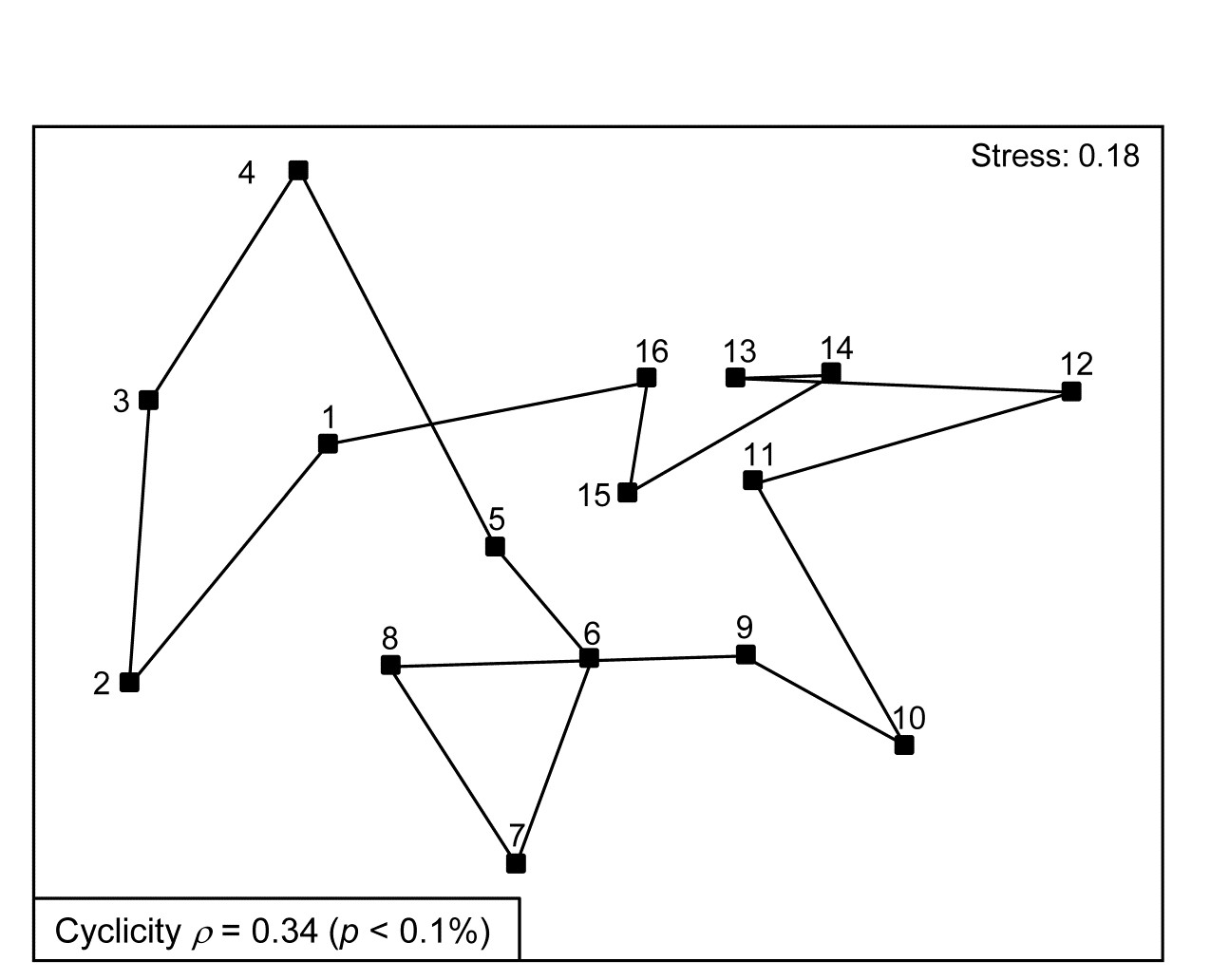
Fig. 15.8. Creran & Etive sea-loch macrofauna {c}. MDS of species abundance data from sub-tidal samples taken at 16 equally-spaced locations on the circumference of a circle (in an unperturbed environment). Significant (albeit weak) match to a cyclic model matrix.
Somerfield & Gage (2000) describe grab sampling of subtidal soft sediments in Scottish sea-lochs, by a vessel positioning at points equidistant (~50m) from a moored buoy, giving 16 equal-spaced samples around a 100m diameter circle (samples numbered 1-16). An MDS ordination from this data set is seen in Fig. 15.8 and while again the stress is high, so the 2-d MDS is not very reliable, there is certainly a suggestion that the samples, joined in their order of sampling, around the circle, match this spatial layout. A model matrix from a serial trend is no longer appropriate of course; instead it will be of the following general form (but illustrated only for 6 points around a circle)¶.
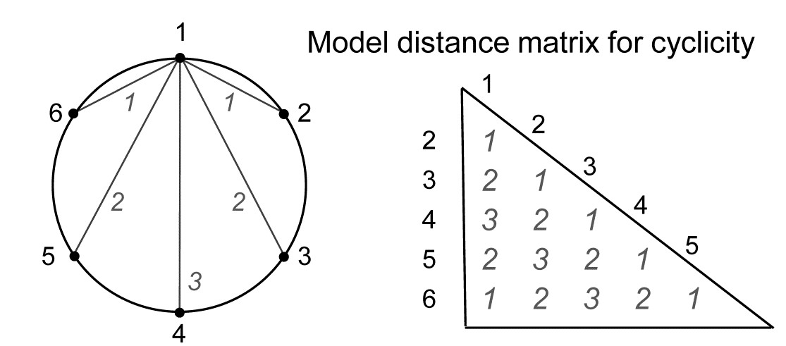
For equal-spaced points round a circle, the inter-point distances shown are not physically accurate – they are chords of a circle, and if that is of radius 1, the actual distances would be 1, 1.73 ($= \sqrt{3}$) and 2, rather than 1, 2 and 3 – but the model matrix is shown with distances 1, 2 and 3 because a Spearman correlation is only a function of the rank orders of the distances.
The matching coefficient of the assemblage (dis)similarities to this distance coefficient is $\rho = 0.34$, and this was larger than produced by any of 999 random permutations of the labels, hence the null hypothesis of no match can be rejected (at p < 0.1%), on a test designed for an alternative hypothesis of cyclicity.
However, rather than a spatial context, a cyclic model matrix is much more likely to be useful in a temporal study, e.g. where seasonality (or perhaps diurnal data) is involved. A data set with monthly levels 1-12, for January to December, would fit poorly to a seriation since the latter would dictate that December was the most dissimilar month to January. An example of bi-monthly sampling, where a test for a hypothesis of no seasonality is not a foregone conclusion, is provided by the Exe estuary nematode data met extensively in Chapters 5 and 11, and also in Chapter 7.
Example: Exe estuary nematodes
Fourth-root transformed nematode counts from 174 species are averaged over the 19 sampling sites of the Exe estuary study {X}, separately for each of the 6 bi-monthly sampling times through a single year. (Note that most previous analyses in this manual have used the data averaged over the months, separately for the sites, though an exception is Fig. 6.12). The question is simply whether there is any overall demonstration of seasonal pattern in these 6 meiofaunal community samples? The model matrix is now exactly that shown immediately to the left and the Spearman correlation of Bray-Curtis dissimilarities with this matrix is 0.21. The evidence in Fig. 15.9 for any such cyclic pattern is unconvincing, either in the MDS or in the formal RELATE test (p = 20%, see inset, where the jagged null distribution is a result of the small number of distinct permutations of the 6 numbers, i.e. 5! = 120).

Fig. 15.9. Exe estuary nematodes {X}. nMDS on Bray-Curtis similarities from counts of 174 species, 4th-root transformed then averaged over the 19 locations, for each of 6 bi-monthly sampling times over one year (1-6). Inset: null distribution for test of cyclicity (r=0.21).
Seriation with replication
Quite commonly, there will be interest in testing for a serial trend in the presence of replicate observations at each of the points in time or space (or at ordered treatment levels etc). This is precisely the problem that was posed towards the end of Chapter 6 (page 6.10 onwards) in setting up the ordered ANOSIM tests. There are now ordered groups of samples (A, B, C, …), and the null hypothesis ‘H$_ 0$: A=B=C=…’ that the groups are indistinguishable is not tested against a non-specific alternative ‘H$_ 1$: A, B, C, … differ’ but against the ordered seriation model ‘H$_ 1$: A<B< C …’. More detail is given on page 6.10 to page 6.12 , but the only difference here is that instead of using the generalised ANOSIM statistic $R ^ 0$, the slope of the regression line of the ranks {$r _ i$} in the (biotic) dissimilarity matrix against the ranks {$s _ i$} in the model matrix, we use here their correlation $\rho$ (this is Pearson correlation on the ranks, i.e. Spearman on the matrices).

The simple form of seriation with replication (the model matrix for which is seen above, illustratively, for 3 groups A, B, C, with 2 replicates in groups A and C, and 3 replicates in B), was extensively studied by
Somerfield, Clarke & Olsgard (2002)
and illustrated by further Norwegian oilfield benthic data from the N Sea, {g}.
Example: Gullfaks oilfield macrofauna
Routine monitoring of soft-sediment macrobenthos around all the Norwegian oilfields typically involves sites radiating in several directions (usually 4) from the centre of each field (as in the Ekofisk study, see Fig. 10.6), but for analysis purposes broadly grouped into distance classes. For the two oilfields: GullfaksA (16 sites, 1989 data) and GullfaksB (12 sites, 1993), 3 groups were defined as C: <1km, B: ~1km, A: > 1km from the centre of drilling activity, each consisting of between 4 and 6 replicate sites. These are shown as differing symbols and shading on their faunal MDS plots in Fig. 15.10. Unlike the Ekofisk data, where the oilfield had been operating for longer, the group differences are less clear-cut, and differences are not significantly established in unordered ANOSIM tests.
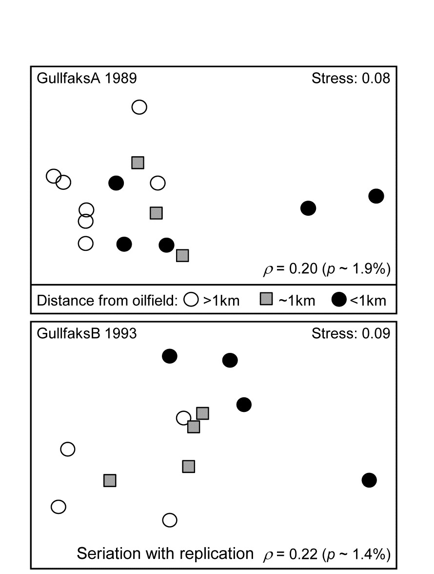
Fig. 15.10. Gullfaks oilfields, macrofauna {g}. nMDS on Bray-Curtis similarities from transformed species counts for sites in 3 distance groups A: >1km, B: ~1km, C: <1km from the oilfield centres. Both show a significant left to right progression, with seriation statistics $\rho$ =0.20 and $\rho$ =0.22 for GullfaksA and GullfaksB fields respectively.
However, when tested against the ordered alternative, using the seriation with replication schematic (above) the $\rho$ values of 0.20 and 0.22 are both significant at about the p < 2% level. The issue here is one of power of the test. As Somerfield, Clarke & Olsgard (2002) show, where a test against an ordered alternative is relevant, it will have more power to reject the null hypothesis (‘no group differences’) in favour of that alternative†. The improved power always comes at a price though, namely the likely inability to detect an alternative which is not the postulated model matrix. Thus, in Fig. 15.10, B is generally intermediate between A and C, and this is as postulated. If the benthic community is distinct at differing distances from the oilfield as a result of dilution of contaminants coming from the centre§, then a situation in which groups A and C have indistinguishable benthic assemblages but B has a different one would not be interpretable, and would be discounted as a ‘fluke’. If we are happy to forgo the prospect of ever detecting such a case then it makes sense to focus the statistic on alternatives that are of interest, and thereby gain power.
Constrained (‘2-way’) RELATE tests
Just as was seen with the BEST procedure in Chapter 11 (page 11.5), it is straightforward to remove the effect of a further (crossed) factor when testing similarities against a model matrix (or any secondary matrix). The $\rho$ statistic is calculated separately within each level of the ‘nuisance’ factor, so that any effect of the latter is removed, and the resulting $\rho$ statistics then averaged. The same procedure is carried out for the permutations under the null hypothesis, i.e. it is a constrained permutation in which labels are only permuted within the levels of the second (nuisance) factor, just as in 2-way ANOSIM or its ordered form (page 6.5 and page 6.12). However, the ordered ANOSIM tests in PRIMER v7 only implement the seriation model (with or without replication), so the following RELATE example illustrates a 2-factor case where a cyclic test is needed on (replicated) seasons, having removed regional differences in the assemblages, {l}.
Example: Leschenault estuarine fish
Veale, Tweedley, Clarke et al. (2014) describe nearshore trawls for fish abundance (43 species) in a microtidal W Australian estuary, with freshwater inflow only near the estuary mouth (Basal region, B) and thus a reverse salinity gradient increasing through its Lower (L), Upper (U) and Apex (A) regions. That region has a strong effect on fish communities is evident from the MDS of Fig. 15.11b, for 6-8 replicate samples (both spatially, in regions, and temporally, across years) from each of 16 combinations of 4 seasons and 4 regions. There is some suggestion from Fig. 15.11a (the same MDS but showing seasons) of a seasonal effect, but this is hard to discern, given also the strong regional effect.
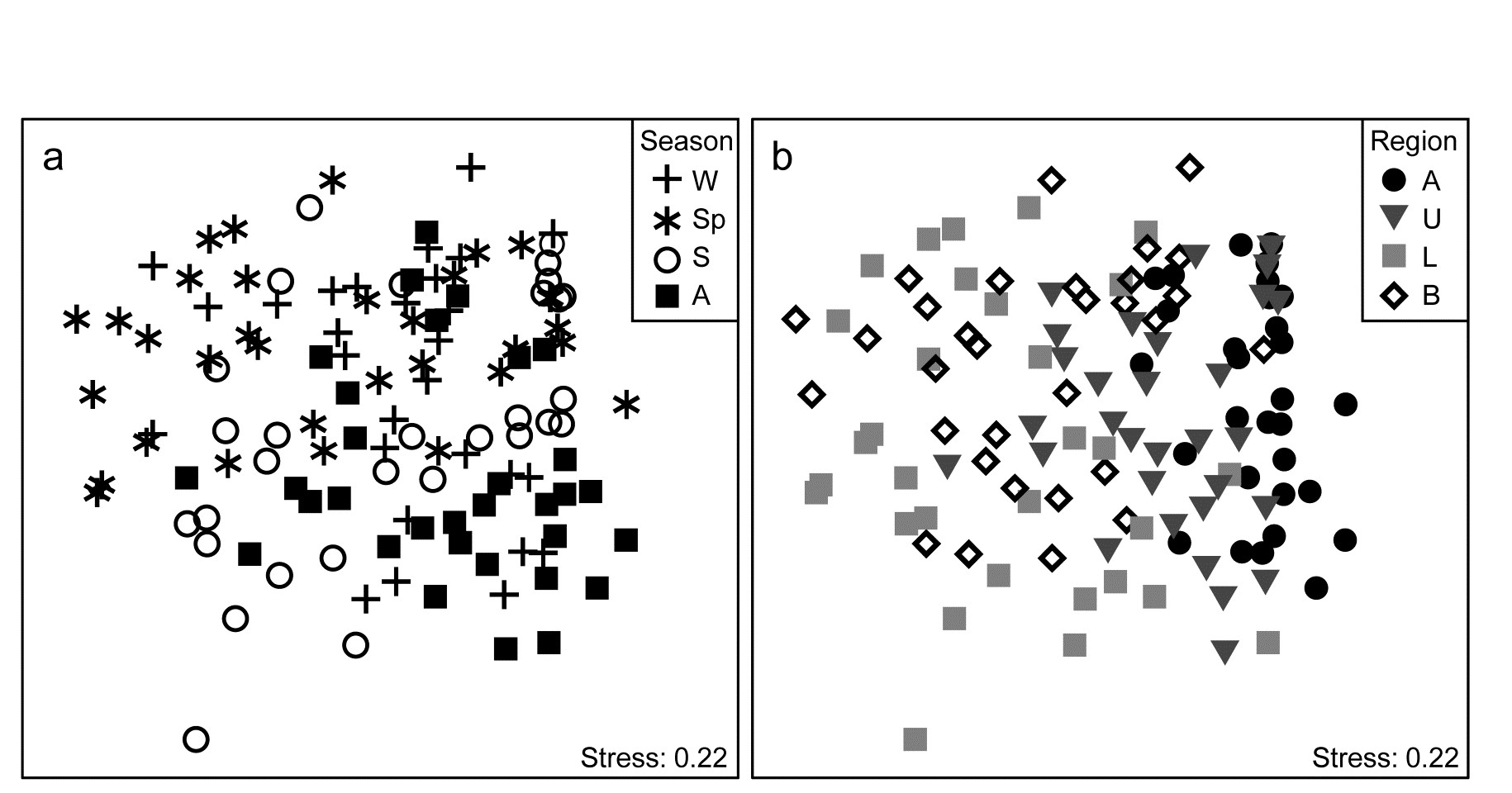
Fig. 15.11. Leschenault estuary fish {l}. nMDS from Bray-Curtis on dispersion weighted then $\sqrt{}$-transformed samples of counts from 43 species, of sites within the four regions (Apex, Upper, Lower, Basal) over two years and in all seasons of each year (Winter, Spring, Summer and Autumn). a) and b) are the same MDS but indicate samples from seasons & regions respectively.
The conditional test for seasonality fits the model matrix on page 15.6, but for only 4 not 6 times (Autumn, Winter, Spring, Summer) and with replication. (A test without replication is possible but this really needs to be for monthly or bimonthly data rather than just four seasons, since there are only 3! = 6 distinct permutations from a single set of 4 times). The $\overline{\rho}$ statistic, averaging the cyclicity (seasonality) $\rho$ values, given by each region separately, is only 0.27, indicating the high replicate variability (seen in Fig. 15.11a and b), but this is strongly significantly different from zero (p<<0.01%) since the permutations never came close to producing an average $\rho$ larger than 0.1. That there is a clear seasonal effect, consistently across regions, can be seen (as must always be done, and rarely is!) by averaging over the temporal and spatial replicates to obtain the 16-sample nMDS of Fig. 15.12.
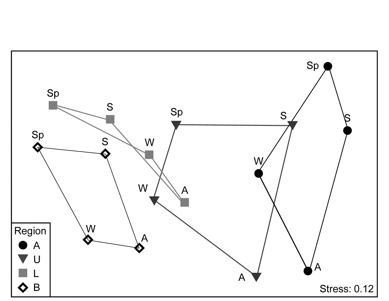
Fig. 15.12. Leschenault estuary fish {l}. nMDS from Bray-Curtis for averages over all samples (previously dispersion weighted then transformed, page 9.6) from 4 regions over 4 seasons. Regions align left to right in increasing salinity up the estuary, clearly with parallel seasonal cycles.
¶ The PRIMER RELATE routine gives three options: match to a simple seriation (distance matrix of the type on page 15.5), simple cyclicity (distance matrix as seen here) or to any other supplied triangular matrix (a further model matrix, or possibly a second biotic resemblance matrix, e.g. testing and quantifying the match of reef fish community structure to the coral reef assemblages on which they are found). A separate routine on the Tools menu, Model Matrix, allows the user to create more complex models, for seriation or cyclicity where spacing is unequal or where there are replicates at each point. These are specified by numeric levels of a factor. E.g. though this simple 6-point circular model is automatically catered for by RELATE, recreating it using the Model Matrix routine needs a factor with levels in (0,1), taken to be the same point at the start and end of the circle, i.e. use levels 0, 0.167, 0.333, 0.5, 0.667, 0.833 for the samples 1, 2, 3, 4, 5, 6.
† This is certainly true of the analogue in univariate statistics (see Somerfield, Clarke & Olsgard (2002) ), e.g. the choice between ANOVA and linear regression when treatment levels (with replication) are numeric. Regression is always the more powerful, though it would completely miss, for example, a hormesis response that ANOVA would detect. Power is a much more difficult concept in multivariate space but Somerfield, Clarke & Olsgard (2002) demonstrate a similar result for unordered ANOSIM vs RELATE (i.e. ordered ANOSIM) in some special cases, by simulation from observed alternatives to the null of ‘no change’.
§ Or a number of other causal mechanisms to do with existence of the oilfield that might be tricky to distinguish by biotic observational data alone, e.g. a change in the sediment structure resulting from deposition of finer grained drilling muds, maybe disruption of current flows, even reduced commercial fishing pressure etc.
Chapter 16: Further multivariate comparisons and resemblance measures
16.1 Introduction
To motivate the first method of this chapter look again at the analysis of macrobenthic samples from the Bay of Morlaix {A}, before and after the Amoco-Cadiz oil spill. The MDS of Fig. 16.1 shows a clear signal of community change through time, a combination of cyclical seasonal fluctuations (the samples are approximately quarterly) with the major perturbation of the oil spill after approximately a year, and a partial recovery over the next four years. The intricate and informative picture is based on a matrix of 257 species but the question naturally arises as to whether all these species are influential in forming the temporal pattern. This cannot be the case, of course, because many species are very uncommon. The later Fig. 16.3a shows an identical MDS plot based on only 125 species, the omitted ‘least important’ 132 species accounting for only 0.2% of the total abundance and, on average, being absent from all 5 replicate samples on 90% of the 21 sampling times. However, the question still remains: do all the 125 species contribute to the MDS or is the pattern largely determined by a small number of highly influential species? If the latter, an MDS of that small species subset should generate an ordination that looks very like Fig. 16.1, and this suggests the following approach ( Clarke & Warwick (1998a) ).
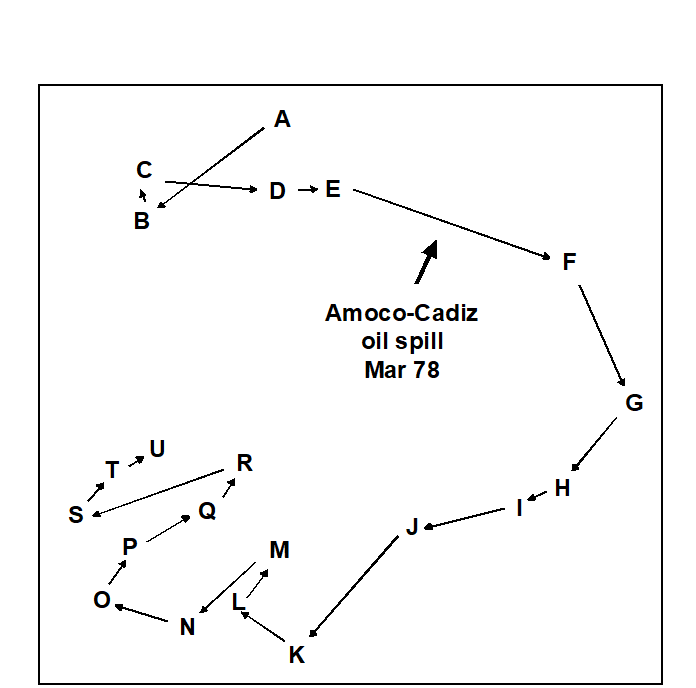
Fig. 16.1. Amoco-Cadiz oil spill {A}. MDS for 257 macrobenthic species in the Bay of Morlaix, for 21 sampling times (A, B, C, …, U; see legend to Fig. 10.4 for precise dates). The ordination is based on Bray-Curtis similarities from fourth root-transformed abundances and the samples were taken at approximately quarterly intervals over 5 years, reflecting normal seasonal cycles and the perturbation of the oil spill (stress = 0.09).
16.2 Matching of ordinations
The BEST (Bio-Env) technique of Chapter 11 can be generalised in a natural way, to the selection of species rather than abiotic variables. The procedure is shown schematically in Fig. 16.2. Here the two starting data sets are not: 1) biotic, and 2) abiotic descriptions of the same set of samples, but: 1) the faunal matrix, and 2) a copy of that same faunal matrix. Variable sets (species) are selected from the second matrix such that their sample ordination matches, ‘as near as makes no difference’, the ordination of samples from the first matrix, the full species set. This matching process, as seen in Chapter 11, best takes place by optimising the correlation between the elements of the underlying similarity matrices, rather than matching the respective ordinations, because of the approximation inherent in viewing inter-sample relationships in only 2-dimensions, say. The appropriate correlation coefficient could be Spearman or Kendall, or some weighted form of Spearman, but there is little to be gained in this context from using anything other than the simplest form, the standard Spearman coefficient ($\rho$).
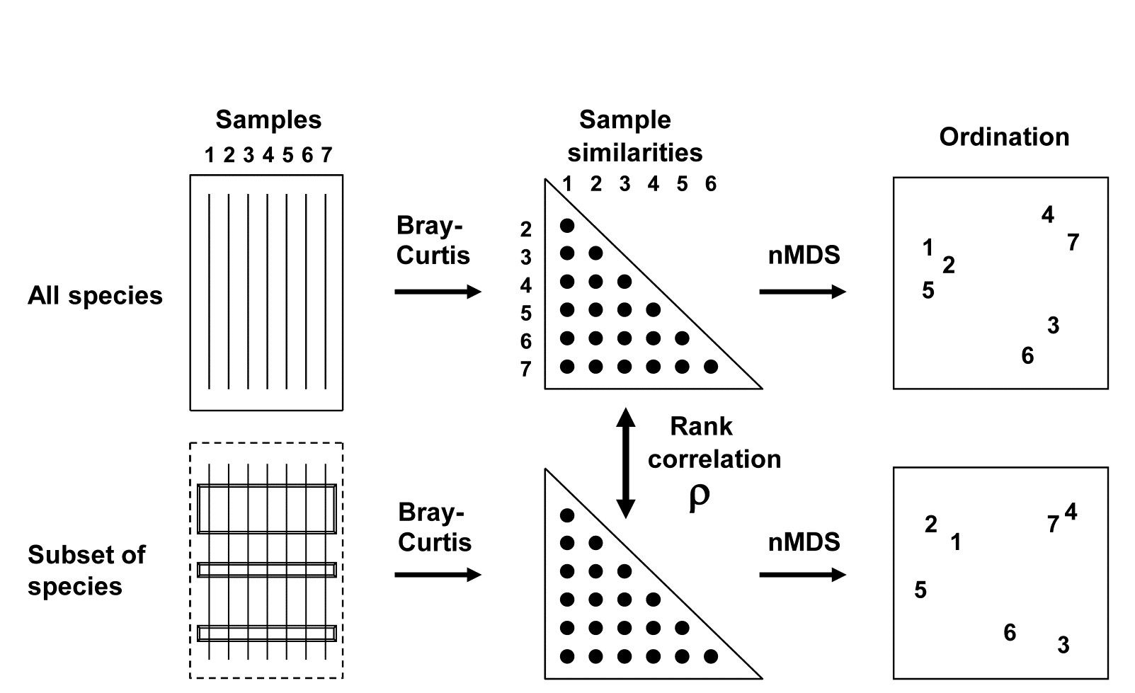
Fig. 16.2. Schematic diagram of selection of a subset of species whose multivariate sample pattern matches that for the full set of species (BEST routine). The search is either over all subsets of the species (Bio-Env option) or, more practically, a stepwise selection of species (BVStep option), aiming to find the smallest subset of species giving rank correlation between the similarity matrices of $\rho \ge 0.95$.
A definition of a ‘near-perfect’ match is needed, and this is (somewhat arbitrarily) deemed to be when $\rho$ exceeds 0.95. Certainly two ordinations from similarity matrices that are correlated at this level will be virtually indistinguishable and could not lead to different interpretation of the patterns. The requirement is therefore to find the smallest possible species subset whose Bray-Curtis similarity matrix correlates at least at $\rho = 0.95$ with the (fixed) similarity matrix for the full set of species.
There is a major snag, however, to carrying over the Bio-Env approach to this context. A search through all possible subsets of 125 species involves: 125 possibilities for a single species, $ _ {125} C _ 2 ( = 125 \times 124 / 2 ) $ pairs of species, $_{125}C _ 3 ( = 125 \times 124 \times 123 / 6) $ triples, etc., and this number clearly gets rapidly out of control. In fact a full search would need to look at $2 ^ {125} – 1$ possible combinations, an exceedingly large number!
Stepwise procedure
One way round the problem is to search not over every possible combination but some more limited space, and the natural choice here is a stepwise algorithm which operates sequentially and involves both forward and backward-stepping phases.¶ At each stage, a selection is made of the best single species to add to or drop from the existing selected set. Typically, the procedure will start with a null set, picking the best single variable (maximising $\rho$), then adding a second variable which gives the best combination with the first, then adding a third to the existing pair. The backward elimination phase then intervenes, to check whether the first selected variable can now be dropped, the combination of second and third selections alone not having been considered before. The forward selection phase returns and the algorithm proceeds in this fashion until no further improvement is possible by the addition of a single variable to the existing set or, more likely here, the stopping criterion is met ($\rho$ exceeds 0.95). In order fully to clarify the alternation of forward and backward stepping phases, Table 16.1 describes a purely hypothetical (and unrealistically convoluted) search over 6 variables. Analogously to the MDS algorithm of Chapter 6, it is quite possible that such an iterative search procedure will get trapped in a local optimum and miss the true best solution; only a minute fraction of the vast search space is ever examined. Thus, it may be helpful to begin the search at several, different, random starting points, i.e. to start sequential addition or deletion from an existing, randomly selected set of half a dozen (say) of the species.†
Table 16.1. Hypothetical illustration of stages in a stepwise algorithm (F: forward selection, B: backward elimination steps) to select a subset of species which match the multivariate sample pattern for a full set (here, 6 species). Bold underlined type indicates the subset with the highest $\rho$ at each stage, and italics denote a backward elimination step that decreases $\rho$ and is therefore ignored. The procedure ends when $\rho$ attains a certain threshold ($\rho \ge 0.95$), or when forward selection does not increase $\rho$.
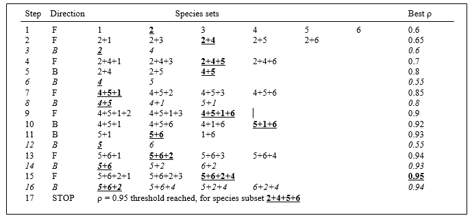
¶ This concept may be familiar from stepwise multiple regression in univariate statistics, which tackles a similar problem of selecting a subset of explanatory variables which account for as much as possible of the variance in a single response variable.
† The PRIMER BEST routine (BVStep option) carries out this stepwise approach on an active sheet which is the similarity matrix from all species (Bray-Curtis here), supplying a secondary sheet which is the (transformed) data matrix itself. There are options always to exclude, or always to include, certain variables (species) in the selection, to start the algorithm either with none, all or a random set of species in the initial selection, and to output results of the iteration at various levels of detail (full detail recommended).
16.3 Example: Amoco-Cadiz oil spill
Applying this (BVStep) procedure to the 125-species set from the Bay of Morlaix, a smallest subset of only 9 species can be found, whose similarity matrix across the 21 samples correlates with that for the full species set, at $\rho \ge 0.95$. The MDS plot for the 21 samples based only on these 9 species is shown in Fig.16.3b and is seen to be largely indistinguishable from 16.3a. The make-up of this influential species set is discussed later but it is important to realise, as often with stepwise procedures, that this may be far from a unique solution. There are likely to be other sets of species, a little larger in number or giving a slightly lower $\rho$ value, that would do a (nearly) equally good job of ‘explaining’ the full pattern.
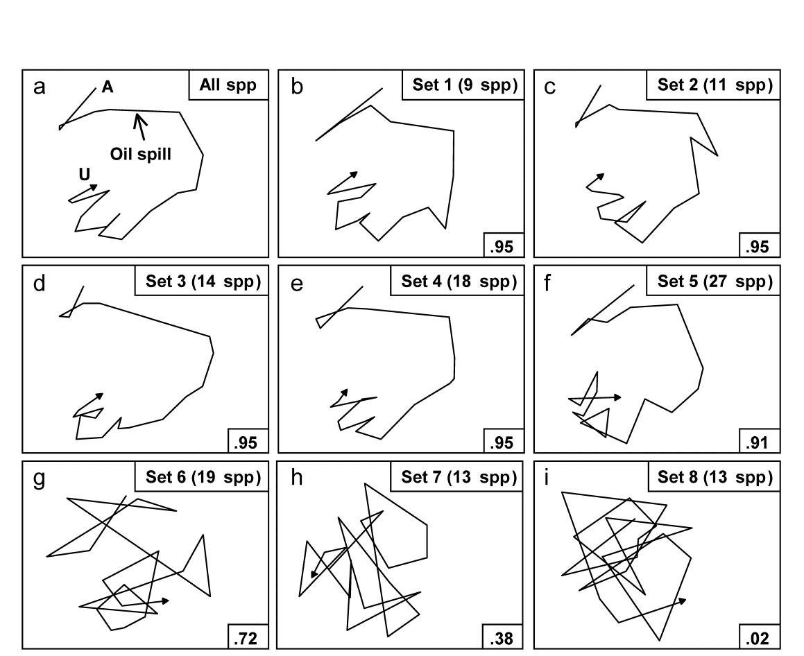
Fig. 16.3. Amoco-Cadiz oil spill {A}. MDS plots from 21 samples (approximately quarterly) of macrobenthos in the Bay of Morlaix (Bray-Curtis on 4th-root transformed abundances). a) As Fig. 16.1 but discarding the rare species, leaving 125; b)–f) based on a succession of five, small, mutually exclusive subsets of species, generated by the BEST/BVStep option, showing the high level of matching with the full data ($\rho$ values in bottom right of plots, and number of species in top right); g)–i) after successive removal of the species in previous plots, the ability to match the original pattern by selecting from the remaining species rapidly degrades (stress = 0.09, 0.08, 0.08, 0.08, 0.12, 0.12, 0.21, 0.24, 0.24 respectively).
One interesting way of seeing this is to discard the initial selection of 9 species, and search again for a further subset that produces a near-perfect match ($\rho \ge 0.95$) to the pattern for the full set of 125 species. Fig. 16.3c shows that a second such set can be found, this time of 11 species. If the two sets are discarded, a third (of 14 species), then a fourth (of 18 species) can also be identified, and Fig. 16.3d and e again show the high level of concordance with the full set, Fig. 16.3a. There are now 73 species left and a fifth set can just about be pulled out of them (Fig. 16.3f), though now the algorithm terminates at a genuine maximum of $\rho$; a match better than $\rho = 0.91$ cannot be found by the stepwise procedure, even after several attempts with different random starting positions. If these (27) species are also discarded, the ability of the remaining 46 species to reconstruct the initial pattern degrades slowly (Fig. 16.3g) then rapidly (Fig. 16.3h and i), i.e. little of the original ‘signal’ remains.
Clarke & Warwick (1998a) discuss the implication of these plots for concepts of structural redundancy in assemblages (and, arguably, for functional redundancy, or at least compensation capacity). They investigate whether the various sets of species ‘peeled’ out from the matrix have a similar taxonomic structure. For example, Table 16.2 displays the first and second ‘peeled’ species lists and defines a taxonomic mapping coefficient, used to measure the degree to which the first set has taxonomically closely-related counterparts in the second set, and vice-versa. (Note that taxonomic relatedness concepts are the basis of several indices used in Chapter 17, this specific coefficient being the $\Theta ^ +$ of eqn. 17.8) A permutation test can be constructed that leads to the conclusion that the peeled subsets are more taxonomically similar (i.e. have greater taxonomic coherence) than would be expected by chance. The number of such coherent subsets which can be ‘peeled out’ from the matrix is clearly some measure of redundancy of information content.
Table 16.2. Amoco-Cadiz oil spill {A}. Illustration of taxonomic mapping of the second and third ‘peeled’ species subsets (i.e. those underlying Fig. 16.3c,d), from the successive application of BVStep, highlighting the (closer than random) taxonomic parallels between the species sets which are capable of ‘explaining’ the full pattern of Fig. 16.3a. Continuous lines represent the closest relatives in the right-hand set to each species in the left-hand set (underlined values are the number of steps distant through the taxonomic tree, see Chapter 17 for examples). Dashed lines map the right-hand set to the left-hand (non-underlined values are again the taxonomic distances). The taxonomic mapping similarity coefficient, M, averages the two displayed mean taxonomic distances (denoted $\Theta ^ + $ in Chapter 17).
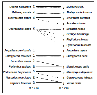
Viewed at a pragmatic level, the message of Fig. 16.3 is therefore clear. It is not a single, small set of species which is responsible for generating the observed sample patterns of Fig. 16.1, of disturbance and (partial) recovery superimposed on a seasonal cycle. Instead, the same temporal patterns are imprinted several times in the full species matrix. The steady increase in size of successive ‘peeled’ sets reflects the different signal-to-noise ratios for different species, or groups of species. The signal can be reproduced by only a few species initially but, as these are sequentially removed, the remaining species have increasingly higher ‘noise’ levels, requiring an ever greater number of them to generate the same strength of ‘signal’. Clarke & Warwick (1998a) give further macrobenthic examples, of time series from Northumberland subtidal sites, whose structural redundancy is at a similar level (4–5 peeled subsets), though this is by no means a universal phenomenon (M G Chapman, pers. comm., for rocky shore assemblages; Clarke & Gorley (2006 or 2015) , for zooplankton communities, both of which examples are much less species-rich in the first place).
16.4 Further extensions
Both BEST Bio-Env and BVStep routines can be generalised to accommodate possibilities other than their ‘defaults’ of selecting abiotic variables to optimise a match with fixed biotic similarities, and selecting subsets of species to link to the sample patterns of the full species set. In fact, the only distinction between the two options in BEST is simply one of whether a full search is performed (Bio-Env) or a stepwise search is adopted (BVStep), the latter being essential where there are many variables to select from (e.g. >16) so that a full search is prohibitive ($> 2 ^ {16} $ combinations).
The fixed similarity matrix can be from species (e.g. Bray-Curtis), environmental variables (e.g. Euclidean), or even a model matrix, such as the equally-spaced inter-point distances in the seriation matrix of Chapter 15. The secondary matrix, whose variables are to be selected from, can also be of biotic or abiotic form. Some possible applications involve searching for:¶
-
species within one faunal group that ‘best explain’ the pattern of a different faunal group (‘Bio–Bio’), e.g. key macrofaunal species which are structuring (or are correlated with environmental variables that are structuring) the full meiofaunal assemblages;
-
species subsets which best respond to (characterise) a given gradient of one or more observed contaminants (‘Env–Bio’);
-
species subsets which match a given spatial or temporal pattern (‘Model–Bio’), e.g. the model might be the geographic layout of samples, expressed literally as inter-sample distances, or a linear time-trend (equal-spaced steps, as with seriation), or a circular pattern appropriate to a single seasonal cycle, etc;
-
subsets of environmental variables which best characterise an a priori categorisation of samples (‘Model-Env’), e.g. selecting quantitative beach morphology variables which best delineate a given classification of beach types ( Valesini, Clarke, Eliot et al. (2003) ).
¶ All these combinations are possible in the PRIMER BEST routine with either Bio-Env (full search) or BVStep (stepwise) options. In v7, the fixed resemblance matrix (biotic, abiotic or model) is the active sheet from which the BEST routine is run, and determines the samples to be analysed. The secondary data matrix supplied to the routine, from which variables are to be selected, can be a ‘look-up table’ of a larger set of samples (e.g. from an environmental database for that region) but all sample labels in the resemblance matrix must have a matching sample label in the data matrix. (In v6, the active sheet was the data matrix and not the resemblance matrix but the v7 structure is more logical, and consistent with the analogous DISTLM routine in PERMANOVA+).
16.5 Second-stage MDS
It is not normally a viable sampling strategy, for soft-sediment benthos at least, to use BVStep to identify a subset of species as the only ones whose abundance is recorded in future, since all specimens have to be sorted and identified to species, to determine the subset. Saving of monitoring effort on identification can sometimes be made, however, by working at a higher taxonomic level than species (see Chapter 10). Where full species-based information is available, MDS plots can be generated at different levels of taxonomic aggregation (i.e. using species, genera, families, etc) and the configurations visually compared. Another axis of choice for the biologist is that of the transformation applied to the original counts (or biomass/cover etc). Chapter 9 shows that different transformations pick out different components of the assemblage, from only the dominant species (no transform), through increasing contributions from mid-abundance and less-common species ($\sqrt{}$, $\sqrt{} \sqrt{}$, log) to a weighting placing substantial attention on less-common species (presence/absence). The environmental impact, or other spatial or temporal ‘signal’, may be clearer to discern from the ‘noise’ under some transformations than it is for others.
Amoco-Cadiz oil spill
The difficulty arises that so many MDS plots can be produced by these choices that visual comparison is no longer easy, and it is always subjective, relying only on the 2-d approximation in an MDS plot, rather than the full high-dimensional information. For example, Fig. 16.4 displays the MDS plots for the Morlaix study at only two taxonomic levels: data at species and aggregated to family level, for each of the full range of transformations, but it is already difficult to form a clear summary of the relative effects of the different choices. However, part of the solution to this problem has already been met earlier in the chapter. For every pair of MDS plots – or rather the similarity matrices that underlie them – it is easy to define a measure of how closely the sample patterns match: it is the Spearman rank correlation ($\rho$) applied to the elements of the similarity matrices. Different transformations and aggregation levels will affect the absolute range of calculated Bray-Curtis similarities but, as always, it is their relative values that matter. If all statements of the form ‘sample A is closer to B than it is to C’ are identical for the two similarity matrices then the conclusions of the analyses will be identical, the MDS plots will match perfectly and $\rho$ will take the value 1.
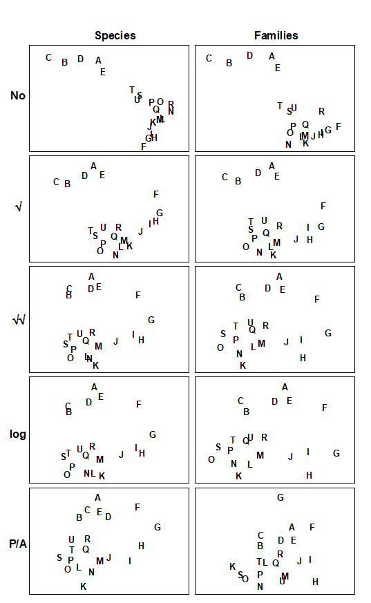
Fig. 16.4. Amoco-Cadiz oil spill {A}. MDS plots of the 21 sampling occasions (A, B, C, …) in the Bay of Morlaix, for all macrobenthic species (left) and aggregated into families (right), and for different transformations of the abundances (in top to bottom order: no transform, root, 4th-root, log(1+x), presence/absence). For precise dates see the legend to Fig. 10.4; the oil-spill occurred between E and F (stress, reading left to right: 0.06, 0.07; 0.07, 0.08; 0.09, 0.10; 0.09, 0.09; 0.14, 0.18).
Table 16.3 shows the results of calculating the rank correlations ($\rho$) between every pair of analysis options represented in Fig. 16.4. For example, the largest correlation is 0.996 for untransformed species and family-level analyses, the smallest is 0.639 between untransformed and presence/absence family-level analyses, etc. Though Table 16.3 is clearly a more quantitatively objective description of the pairwise comparisons between analyses, the plethora of coefficients still make it difficult to extract the overall message. Looking at the triangular form of the table, however, the reader can perhaps guess what the next step is! Spearman correlations are themselves a type of similarity measure: two analyses telling essentially the same story have a higher $\rho$ (high similarity) than two analyses giving very different pictures (low $\rho$, low similarity). All that needs adjustment is the similarity scale, since correlations can potentially take values in (–1, 1) rather than (0,100) say. In practice, negative correlations in this context will be rare (but if they arise they indicate even less similarity of the two pictures) but the problem is entirely solved anyway by working, as usual, with the ranks of the $\rho$ values, i.e. rank (dis)similarities. It is then natural to input these into an MDS ordination, as shown schematically in Fig. 16.5.
Table 16.3. Amoco-Cadiz oil spill {A}. Spearman correlation matrix between every pair of similarity matrices underlying the 10 plots of Fig. 16.4, measuring the extent to which they ‘tell the same story’ about the 21 Morlaix samples. These correlations (rank ordered) are treated like a similarity matrix and input to a second-stage MDS. Key: s = species-level analysis, f = family-level; 0 = no transform, 1 = root, 2 = 4th root, 3 = log(1+x), 4 = presence /absence.
| s0 | s1 | s2 | s3 | s4 | f0 | f1 | f2 | f3 | |
|---|---|---|---|---|---|---|---|---|---|
| s1 | .970 | ||||||||
| s2 | .862 | .949 | |||||||
| s3 | .852 | .942 | .995 | ||||||
| s4 | .736 | .847 | .961 | .946 | |||||
| f0 | .996 | .965 | .855 | .845 | .726 | ||||
| f1 | .949 | .993 | .961 | .958 | .865 | .947 | |||
| f2 | .791 | .893 | .972 | .974 | .953 | .785 | .924 | ||
| f3 | .760 | .869 | .962 | .971 | .946 | .753 | .904 | .993 | |
| f4 | .645 | .756 | .877 | .870 | .923 | .639 | .792 | .946 | .929 |
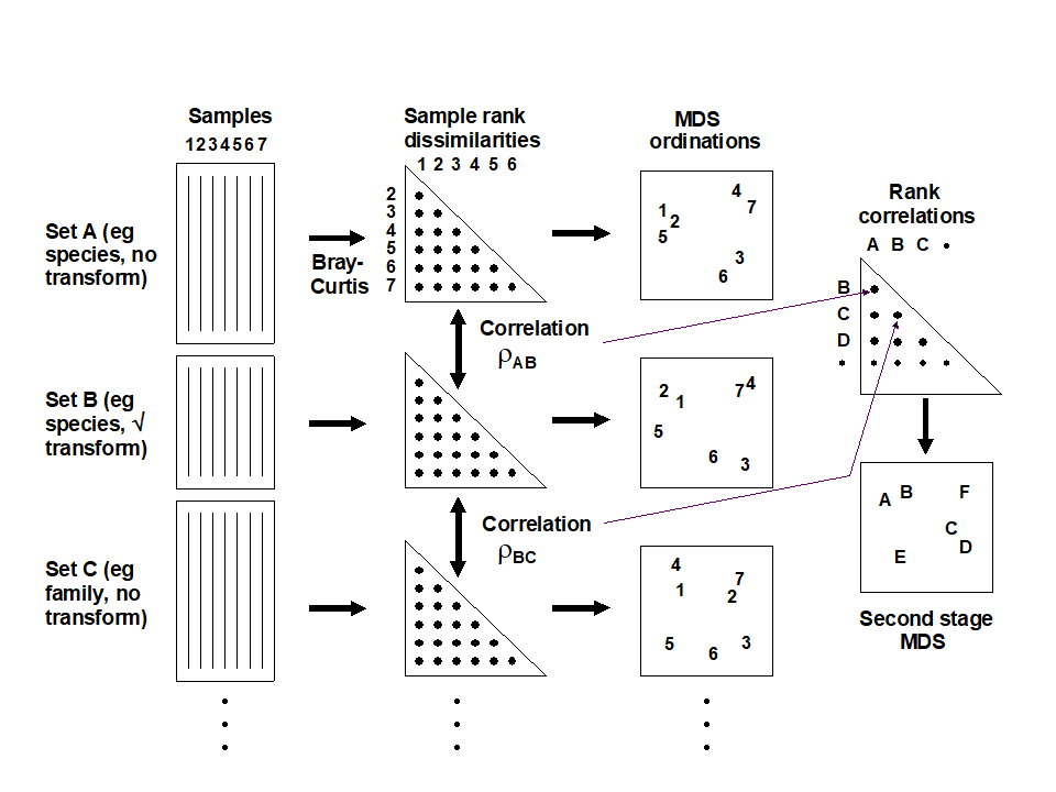
Fig. 16.5. Schematic diagram of the stages in quantifying and displaying agreement, by second-stage MDS, of different multivariate analyses of a corresponding set of samples.
The resulting picture is termed a second-stage MDS and is displayed in Fig. 16.6 for the Morlaix analyses of Fig. 16.4. The relationship between the various analysis options is now summarised in a clear and straightforward fashion (with near-zero stress). The different transformations form the main (left to right) axis, in steady progression through: no transform, $\sqrt{}$, $\sqrt{}\sqrt{}$ and log(1+x), to pres/abs. The difference between species and family level analyses largely forms the other (bottom to top) axis. Three important points are immediately clear:
-
Log and $\sqrt{}\sqrt{}$ transforms are virtually identical in their effect on the data, with differences between these transformations being much smaller than that between species and family-level analyses in that case.
-
With the exception of these two, the transformations generally have a much more marked effect on the outcome than the aggregation level (the relative distance apart on the MDS of the points representing different transformations, but the same taxonomic level, is much greater than the distance apart of species and family-level analyses, for the same transformation).
-
The effect of taxonomic aggregation becomes greater as the transformation becomes more severe, so that for presence/absence data the difference between species and family-level is much more important than it is for untransformed or mildly transformed counts. Whilst this is not unexpected, it does indicate the necessity to think about analysis choices in combination, when designing a study.
Fig. 16.6. Amoco-Cadiz oil spill {A}. Second-stage MDS of the 10 analyses of Fig. 16.4. The proximity of the points indicates the extent to which different analysis options capture the same information. s = species-level analysis, f = family-level; 0 = no transform, 1 = root, 2 = 4th root, 3 = log(1+x), 4 = presence /absence. Stress = 0.01, so the 2-d picture tells the whole story, e.g. that choice of aggregation level has less effect here than transformation. .
Other applications
The concept of a second-stage MDS used on rank correlations between similarity matrices – from different taxonomic aggregation levels (species, genus, family, trophic group) and, in the same analysis, different faunal groups (nematodes, macrofauna) recorded for the same set of sites – was introduced by Somerfield & Clarke (1995) , for studies in Liverpool Bay and the Fal estuary, UK. Olsgard, Somerfield & Carr (1997) and Olsgard, Somerfield & Carr (1998) expanded the scope to include the effects of different transformation, simultaneously with differing aggregation levels, for data from N Sea oilfield studies.¶ Other interesting applications include Kendall & Widdicombe (1999) who examined different body-size components of the fauna as well as different faunal groups, from a hierarchical spatial sampling design (spacings of 50cm, 5m, 50m, 500m) in Plymouth subtidal waters. They used a second-stage MDS to display the effects of different combinations of body-sizes, faunal groups and transformation. Olsgard & Somerfield (2000) introduced the pattern from environmental variables as an additional point on a second-stage MDS, together with biotic analyses from different faunal components (polychaetes, molluscs, crustacea, echinoderms) at another N Sea oilfield. The idea is that biotic subsets whose multivariate pattern links well to the environmental data will be represented by points on the second-stage MDS which lie close to the environmental point. The converse operation can also be envisaged, as a visual counterpart to the Bio–Env procedure. For small numbers of environmental variables, the abiotic patterns from subsets of these can be represented as points on the second-stage MDS, in which the (fixed) biotic similarity matrix is also shown. The best environmental combinations should then ‘converge’ on the (single) biotic point.
¶ They also carried out another interesting analysis, assessing Bio–Env results in the light of analysis choices. It was hypothesised earlier (pages 9.4 and 10.1), that a contaminant impact may manifest itself more clearly in the assemblage pattern for intermediate transform and aggregation choices. Olsgard, Somerfield & Carr (1997) do indeed show, for the Valhall oilfield, that the Bio–Env matching of sediment macrobenthos to the degree of disturbance from drilling muds disposal (measured by sediment THC, Ba concentrations etc), was optimised by intermediate transform ($\sqrt{}$) and aggregation level (family).
16.6 Comparison of resemblance measures
S Tikus Island coral cover
The use of second-stage MDS plots can be extended to also include the relative effects of choosing among different resemblance measures (similarities/dissimilarities or distances) in defining sample relationships. To illustrate this we will use area cover of 75 coral reef species on ten 30m line transects from S Tikus in the Thousand Islands, Indonesia, {I}, taken in each of the years 1981, 83, 84, 85, 87, 88, spanning a coral bleaching episode related to the 1982-3 El Niño, see Warwick, Clarke & Suharsono (1990) ; data met originally on page 6.4. Though by no means typical, the data gives a salutary lesson on the importance of selecting an appropriate resemblance measure with some care, since different coefficients result in widely differing descriptions.
The 1983 samples were notably denuded of live coral cover, with average % cover reducing by an order of magnitude and number of species more than halving. The sparsity of non-zero entries on the 1983 transects makes the Bray-Curtis dissimilarity rather unstable, with many 100% dissimilarities between transects in that year.
Clarke, Somerfield & Chapman (2006)
suggest that a modified form of Bray-Curtis could be useful in such cases.
Zero-adjusted Bray-Curtis
Two samples with small numbers of only one or two species can vary wildly in their dissimilarity, from 0% if they happen to consist of a single individual of the same species, to 100% if those two individuals are from different species. If the samples contain no species whatsoever, their Bray-Curtis dissimilarity is undefined, since it is a coefficient which ignores joint absences thus leaving no data on which to perform a calculation. (Both the numerator and denominator in equation 2.1 are zero, and 0/0 is undefined). This may be a reasonable conclusion in some contexts: if the sampler size is inadequate, and capable of missing all organisms in two quite different locations (or times or treatments), then nothing can be said about whether the communities might have been similar or not, had anything actually been captured. If, on the other hand, sparsity arises as a result of increasing impacts on an assemblage, to the point where samples become fully azoic, however large the sampler size, then it might be desirable to define those samples as 100% similar (0% dissimilar). Another example is of tracking over time the colonisation of a settlement plate or a rock patch which has been cleared: very sparse assemblages would be inevitable at the start, and one would want to define these early samples as highly similar.
A modified dissimilarity is thus needed, exploiting this extra information that we have from the context, that very sparse samples are to be deemed similar. A simple addition to the denominator of Bray-Curtis achieves this, giving the zero-adjusted Bray-Curtis:
$$ \delta _ {jk} = 100 \left[ \frac{ \sum _ {i=1} ^ p | y _ {ij} - y _ {ik} | }{2 + \sum _ {i=1} ^ p ( y _ {ij} + y _ {ik} ) } \right] \tag{16.1} $$
between samples j and k, where {$y _ {ij}$} is the quantity of species i in the jth sample (for i = 1, .., p species). An alternative way of viewing this coefficient is that it is ordinary Bray-Curtis calculated on a data matrix with an added dummy species consisting of one individual in each sample. This cannot change the numerator, since the dummy species adds |1 - 1| for every pair of samples but it adds 1 + 1 to the denominator for each pair, explaining the 2 on the bottom line of (16.1). A pair of samples containing no species must now be 0% dissimilar because they share the same abundance of their only species (the dummy species), and even two samples that have a single individual of different species will no longer be 100% dissimilar but only 50% dissimilar, because of their shared (dummy) species. And Clarke, Somerfield & Chapman (2006) show that if the numbers in the matrix are not vanishingly small then this zero adjustment can make no difference at all to the resulting resemblance structure. Bray-Curtis will operate as previously but it will behave in a particular (and sometimes required) way for highly denuded samples which ‘go to zero’.
The adjustment is in the same spirit as the use of log transforms on species counts: the $\log(y)$ function will behave badly as $y$ goes to zero (it tends to $- \infty$) so we use $\log(1+y)$, which makes no difference if $y$ is not small but ‘feathers in’ the behaviour as $ y \rightarrow 0$. That analogy is useful because it suggests what we should do for abundances which are not counts but biomass or area cover. Then the dummy value would be better taken not as 1 but the smallest non-zero entry in the matrix¶. In fact, here, the Tikus coral cover does have effectively a minimum value of about 1 after the root-transformation is applied, so this is used both for the quantitative data and for a presence/absence analysis.
Fig. 16.7. Indonesian reef-corals, Tikus Island {I}. nMDS of 6 years (1=1981, 3=1983, 4=1984, 5=1985, 7=1987, 8=1988), with 10 transects per year. Data are %cover of 75 coral species, $\sqrt{}$-transformed, and similarities calculated as: a) standard Bray-Curtis; b) zero-adjusted Bray-Curtis; c) zero-adjusted Sorensen. The ANOSIM R statistics for the global test (R, among all years) and pairwise (R13, for years 1 and 3 only) are also shown, given that stress values in the MDS are high: a) 0.18; b) 0.21; c) 0.21.
The effect of applying this modification to the Tikus Island corals MDS can be seen in Fig. 16.7a-c, which contrasts the standard Bray-Curtis coefficient with its zero-adjusted form and zero-adjusted Sorensen (eqn. 2.7) which is simply Bray Curtis on species presence/ absence, including an always-present dummy species. The wide spread of 1983 values, which come from a large number of zero similarities within that sparse group, are tightened up substantially with the zero-adjusted coefficient, reflected in the high pairwise ANOSIM statistic $R _ {13} = 0.87$ between 1981 and 1983, cf $R _ {13} = 0.43$ for the standard Bray-Curtis. Sorensen similarly benefits from the use of the adjustment here, since five of the ten 1983 transects have $ \le 2 $ species.
Fig. 16.8. Indonesian reef-corals, Tikus Island {I}. nMDS of 6 years, exactly as in Fig. 16.7, but based on: a) Kulczynski; b) zero-adjusted Kulczynski; c) Euclidean distance; d) $\chi ^ 2$ distance with MDS stress: a) 0.21; b) 0.24; c) 0.12; d) 0.13. Global and pairwise (81 v 83) ANOSIM R statistics again shown.
The Kulczynski similarity (equation 2.4), Fig. 16.8a, is also in the Bray-Curtis family and, whilst it would appear to perform less satisfactorily than Bray-Curtis in this case, and also generally (though see Faith, Minchin & Belbin (1987) and footnote on page 2.2), it too benefits from the dummy species adjustment, Fig. 16.8b. Even more dramatic changes are seen to these plots for a wider range of coefficients: Euclidean distance (eqn 2.13, Fig. 16.8c) reverses the within-group dispersion of 1981 and 1983 samples. All these analyses (apart from P/A measures) are on square-root transformed area cover, but even after transformation there are big differences in total cover between the samples, and Euclidean distance is primarily dominated by these, with the tight cluster of 1983 transects resulting from the strong reduction in total cover noted earlier.
The $\chi ^ 2$ distance measure, defined as:
$$ d _ {jk} = \sqrt{ \sum _ i \frac{1}{y _ {i+} / \sum _ i y _ {i+}} \left[ \frac{y _ {ij} }{ \sum _ i y _ {ij}} - \frac{y _ {ik} }{ \sum _ i y _ {ik}} \right] ^ 2} $$
$$ y _ {i+} = \sum _ j y _ {ij} \tag{16.2} $$
which is the implicit dissimilarity in Correspondence Analysis (CA) and its detrended (DCA) and canonical versions (CCA), is seen to be at the other end of the spectrum (Fig. 16.8d), increasing the spread of 1983 (and 1984) values further than standard Bray-Curtis and collapsing the 1981 transects almost to a single point. The $\chi ^ 2$ distance coefficient is always susceptible to dominance by rare species, with very small area covers, since its genesis is for data values which are real frequencies†. The problem can be seen in the (first) denominator for each term in the sum, which is the total across samples for each species, an area cover which can be very small, giving instability. (In fact three outlying 1983 replicates are omitted in Fig. 16.8d to even get this plot). Another implication of the form of this coefficient is that methods based on CA always standardise samples (the denominators inside the squared term are totals across species for each sample) hence the effects of much larger total (square-rooted) area covers in 1981, which dominate the Euclidean plot, entirely disappear for $\chi ^ 2$ distance. The Bray-Curtis family coefficients are intermediate in this spectrum: they make some use of differences in sample totals but are also influenced by the species presence/absence structure, a feature with no special role in Euclidean (and similar) distance measures.
Other quite commonly used coefficients§ (for which MDS ordinations are not shown) include Manhattan distance, equation (2.14), whose behaviour is close to that of Euclidean distance though it should be less susceptible to outliers in the data, because distances are not squared as in the Euclidean definition. Note that Manhattan does, however, share some affinity of definition with Bray-Curtis. To within a constant, Bray-Curtis will reduce to Manhattan distance when the totals of all (transformed) data values for samples, summed across species, are the same. For the data of Fig. 16.8, the Manhattan ordination is very similar to that for the Euclidean plot (Fig. 16.8c); it gives global $R = 0.28$ and pairwise $R _ {13} = 0.38$.
The normalised form of Euclidean distance, in which each species is first centred at its mean over samples (again after transformation) and, more importantly, divided by its standard deviation over samples, is about as inappropriate a measure for species data as could be envisaged! This is both because it does not honour the status of a zero entry as indicating species absence (as noted on page 2.4, the zeros are replaced by a different number for each species) and also because each species is now given exactly the same weight in the calculation, irrespective of whether it is very rare or extremely common, often a recipe for anarchy in the ensuing analysis. And indeed the MDS plot for the coral data is essentially a slightly more extreme form of the Euclidean plot of Fig. 16.8c, with even lower ANOSIM statistics of $R = 0.19$, $R _ {13} = 0.34$. It should be noted, of course, that normalised Euclidean is a perfectly sensible resemblance measure (usually the preferred choice) for data of environmental type, in which zeros play no special role and the variables are on different measurement scales, hence must be adjusted to a common scale.
The basic form of Gower’s coefficient ( Gower (1971) ) is defined as:
$$ d _ {jk} = \frac{1}{p} \sum _ i \frac{ | y _ {ij} - y _ {ik} | }{ R _ i} \tag{16.3} $$
where the Manhattan-like numerator is standardised by dividing by the range for that species across all samples, $ R _ i = \max _ i \left[ y _ {ij} \right] - \min _ i \left[ y _ {ij} \right] $ . Since nearly all species will often be absent somewhere in the set of samples, in effect this is calculating Manhattan on a data matrix which has been species-standardised by the species maximum‡. The equal weight it therefore gives to each species and the use of a simple distance measure on those standardised values ensures that it will behave very similarly to normalised Euclidean, as is observed for the coral MDS plot; global $R$ is 0.21 and $ R _ {13} = 0.39$. There is, however, a form of the Gower measure in which joint absences are identified and removed from the calculation. In practice this just means that the p divisor (the number of species in the matrix) outside the sum in (16.3) is replaced by the number of non-jointly absent species for each specific pair of samples. The same trick was seen in (2.12) in the
Stephenson, Williams & Cook (1972)
formulation of Canberra similarity, and it has a major effect in bringing both coefficients into step with one of the defining guidelines of biologically-useful measures, viz. point (d) on page 2.3, that jointly absent species carry no information about similarity of those two samples. The MDS plot for the Gower (exc 0-0) coefficient does result in a configuration closer to that for the (zero-adjusted) Bray-Curtis than it is to the basic Gower coefficient and gives
$R = 0.41$, $R _ {13} = 0.61$. The Canberra measure here gives highly similar plots and ANOSIM values to Bray-Curtis (as is quite often the case, since it does satisfy all the ‘Bray-Curtis family’ guidelines, page 2.2), and also benefits in the same way from adding the ‘dummy species’, giving $R = 0.48$, $R _ {13} = 0.87$.
Second-stage MDS on resemblance measures
This plethora of MDS plots and, more importantly, the relationships among their underlying resemblance matrices, can best be summarised using the same tool as for comparing different transforms or taxonomic levels, earlier in this section: the second stage MDS. This is based on similarities of similarity coefficients typically measured by the usual (RELATE) Spearman rank correlations between every pair of resemblance matrices, which values are themselves re-ranked as part of the second-stage nMDS ordination⸙.
Fig. 16.9. Indonesian reef-corals, Tikus Island {I}. Second-stage MDS of Spearman matrix correlations between every pair of 14 resemblance matrices, calculated from square-root cover from 75 species on 60 reef transects. (The ‘fix collapse’ option, on page 5.8, was applied in this case℈). Resemblance coefficients are: Euclidean (normalised or not), Gower (excluding joint absences or not), Manhattan, $\chi ^ 2$ distance, and four ‘biological’ measures, all calculated with zero-adjustments (dummy species) or not: Bray-Curtis, Kulczynski, Canberra and Sorensen (the latter on presence/absence data). Proximity of coefficients indicates how similarly they describe multivariate patterns of the 60 samples.
Fig. 16.9 displays the second-stage nMDS plot for 14 resemblance measures, calculated on the Tikus Island samples, for some of which measures the (first-stage) MDS plots are seen in Figs. 16.7 & 16.8. Such second stage plots, of relationships amongst the multivariate patterns obtained by different coefficient definitions, tend to display a consistent pattern for different data sets. As with the discussion on Fig. 8.16, on patterns of correlation between differing diversity definitions, what such plots are able to reveal is not primarily the characteristics of particular data sets, but mechanistic relationships among the indices/coefficients. These arise as a result of their mathematical form, and the way that form dictates which general features of the data are emphasised and what assumptions they make (implicitly) about issues such as those listed on page 2.2): should the result be a function of sample totals?; are all the species to be given essentially similar weight?; are joint absences to be ignored?; should the coefficient have a concept of complete dissimilarity?; etc.
It is evident from the figure that the ‘biological’ coefficients do take a strongly similar view of the data and that the zero-adjustment does affect the outcome in the same way for all four such measures. Interestingly the difference between square-root transformed and presence/absence data under the same Bray-Curtis coefficient (the Sorensen point is Bray-Curtis on P/A) is hardly detectable amongst the major differences seen in changing to a different coefficient. The move from Euclidean to normalised Euclidean, and similar coefficients giving species equal weight irrespective of their total/range, is also very evident (this sequence of coefficients on the extreme left of the plot is also consistent across data sets), and the very different view taken of this data by the $\chi ^ 2$ distance measure is equally clear. Taken together, this plot is a salutary lesson in the importance of choosing an appropriate similarity measure for the scientific context, and making consistent use of it for all the analyses of that data setȹ.
Other data sets will produce similar patterns to Fig. 16.9, though with subtle and interesting differences, e.g. if sparsity of samples is not an issue then the zero-adjusted coefficients will be totally coincident with their standard forms. For data in which turnover of species under the different conditions (sites/times/ treatments) is low, then coefficient differences will generally have smaller effect℈ - thankfully not all data sets produce the distressingly large array of outcomes seen in Figs 16.7 and 16.8!
Clarke, Somerfield & Chapman (2006)
give a number of further examples, but we shall show one more instructive example, that of the Clyde macrobenthic data first seen in Chapter 1, Fig. 1.11.
Garroch Head macrofauna counts
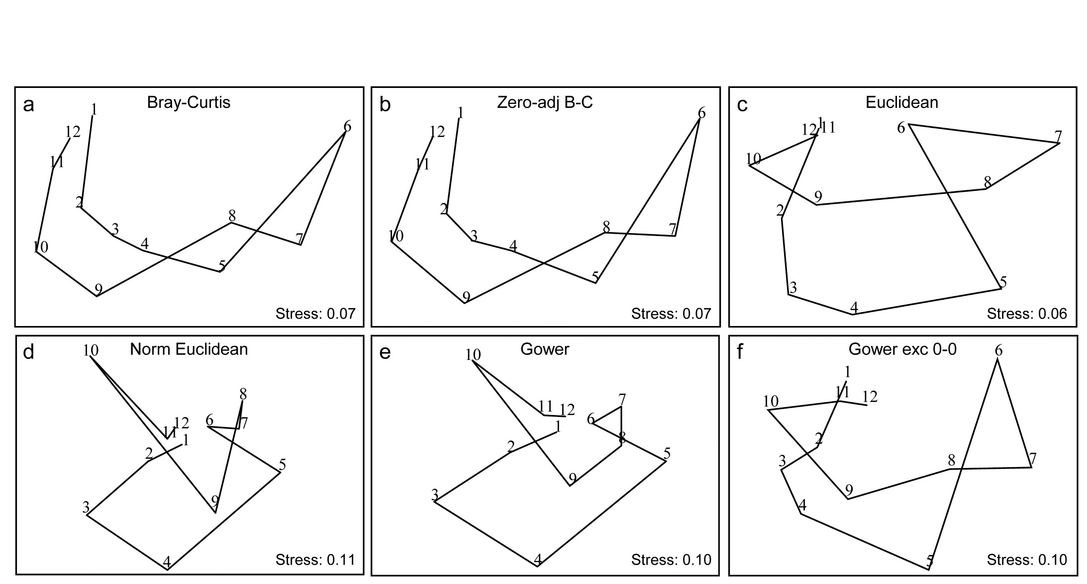
Fig. 16.10. Garroch Head macrofauna {G}. 2-d nMDS of counts of 84 species from soft-sediment benthic samples along a transect of 12 sites (1-12) in the Firth of Clyde (see map fig. 8.3), across the sludge disposal location (site 6). Counts are fourth-root transformed with resemblance measures: a) standard Bray-Curtis (equation 2.1), b) zero-adjusted Bray-Curtis (16.1), c) Euclidean distance (2.13), d) normalised Euclidean distance (p4-6), e) basic Gower coefficient (16.3), f) Gower excluding joint absences (p16-10).
Previous analyses of the E-W transect of 12 sites over the sewage-sludge dumpground in the Firth of Clyde, {G}, have been of the macrofaunal biomass data (e.g. Figs. 1.11, 7.9, 11.5) but Fig. 16.10 is of fourth-root transformed counts for the 84 macrobenthic species, ordinated using six different resemblance measures. The main feature of this data is the steady change in community as the dump centre (site 6) is approached and steady reversion back to a similar community at the opposite ends of the transect (sites 1 and 12). As the ‘meta-analysis’ of Fig. 15.1 shows, this is a major change in assemblage resulting from a clear pattern of impact of organic enrichment and (most) heavy metal concentrations on nearing the dump centre, Fig. 11.1. In fact, only three species are found at site 6, though in reasonably large numbers (76 Tubificoides benedii, 4 Capitella capitata and 250 nematodes, meiofauna which were not taxonomically separated in this study but captured in a macrofauna sieve by virtue of their large size). These species are virtually absent from sites 1, 2, 11 and 12, which are characterised by a distinctly different suite of species (e.g. Nuculoma, Nucula, Spiophanes sp.) but still with rather modest total counts (<200 individuals at any of those 5 sites). At in-between sites along the transect, the number of species and the total number of individuals steadily increase then decrease, as the dump centre is neared. This appears a classic case of the intermediate disturbance hypothesis ( Connell (1978) ; Huston (1979) ), as a result of the organic enrichment, in which the richness diversity and abundance increase with mild forms of disturbance, because of influx of opportunist species (typically small-bodied and in large numbers) before everything crashes at severe impact levels. Such a clear and ecologically meaningful pattern is quite enough to completely confuse some distance measures in Fig. 16.10! Euclidean distance (whether normalised or not) and the basic form of the Gower coefficient are strongly influenced by the fact that the abundance totals are similar at the ends and mid-point of the transect, and the fact that these sites have many jointly-absent species, i.e. joint absences are inferred as evidence for similarity of samples, whereas they are nothing of the sort. The species which are present are largely completely different ones, which will indicate some dissimilarity in all coefficients, but this contribution is largely overwhelmed by the evidence for similarity from joint absences in the inappropriate distance measures! The net effect is for the latter ordinations to show sites 6 and 7 merging with 1, 11 and 12 in a highly misleading way. The Bray-Curtis family, on the other hand - and to a lesser extent, the Gower coefficient, excluding joint absences - have no problem generating the correct and meaningful ecological gradient here, though the latter’s insistence on giving the rare species equal weight with dominant ones does tend to diffuse the tight gradient of change. Note also (Fig. 6.10a & b) that no useful purpose is served by a ‘dummy species’ addition: none of the samples is sparse enough for the zero-adjusted coefficients to alter the relative among-sample similarities.

Fig. 16.11. Garroch Head macrofauna {G}. Second-stage MDS of Spearman matrix correlations between every pair of 25 resemblance matrices, calculated from fourth-root counts of 84 species on a transect of 12 sites across the sludge disposal site. Resemblance coefficients are: Euclidean (normalised or not), Gower (exclude joint absences or not), Manhattan, Hellinger and chi-squared distance, the coefficient of divergence, Canberra similarity and Canberra metric, Bray-Curtis (zero-adjusted or not), Kulczynski (and in P/A form), Ochiai (and in P/A form), Czekanowski’s mean character difference, Faith P/A, Russell & Rao P/A, and three pairs of coefficients which are coincident since they are monotonically related to each other (denoted by $\Leftrightarrow$): Simple matching and Rogers & Tanimoto P/A, Geodesic metric and Orloci’s Chord distance, and finally Jaccard and Sorensen P/A (the P/A form of Bray-Curtis). See the PRIMER User manual for definition of all coefficients.
Fig. 6.11 is the second-stage MDS from the Spearman matrix correlation ($\rho$) among a very wide range of coefficients, not all of which have been defined here but all of which are available on the PRIMER menu for resemblance calculation (and for which equations are given in the User Manual). They exclude those coefficients which are designed for untransformed, real counts, with coefficients constructed from multinomial likelihoods, and other measures with their own built in transformations (e.g. ‘modified Gower’) which cannot then sensibly be applied to fourth-root transformed data. All the displayed measures are thus compared on the same (transformed) data though note that several of the coefficients utilise only presence or absence data. Only one zero-adjusted similarity - that for Bray-Curtis - is included, since the adjustment is rather minor in all cases for this example.
Similar groupings are evident as for the previous Fig. 6.9, for those coefficients which are present in both, though a number of measures which are only in Fig. 6.11 are seen to take further different ‘views’ of the data. (Note that the wider range of inter-relationships ensured that the nMDS did not collapse as previously and there was no need to stabilise the plot by mixing with a degree of metric stress). Note again the large difference made by adjusting for joint absences, both between the forms of the Gower coefficient, as seen previously (the scale of this change can be seen in Fig. 16.10e & f), and the equivalent difference for the Canberra similarity of equation (2.12), as used in Fig. 16.9, and the Canberra metric which is a function of joint absences. Three pairs of coefficients identified in the legend to Fig. 16.11 do not have precisely the same mathematical form but it is straightforward to show that they increase and decrease in step (though not linearly), i.e. their ranks similarities/distances will be identical. The best known of these are the two presence/absence measures, Sorensen and Jaccard, which because of this monotonic relation will give identical nMDS plots, ANOSIM tests etc for all data sets (though not identical PERMANOVA tests). Note also that, though the differences between fourth-root transform and P/A for the same measure (Bray-Curtis to Sorensen, Ochiai, Kulczynski) are not large, they are consistent and non-negligible, indicating that the data have not been over-transformed to a point where all the quantitative information is ‘squeezed out’. Bray-Curtis, Ochiai and Kulczynski are also seen to fall in logical order (of the arithmetic, geometric and harmonic means in their respective denominators).
Many such subtle points to do with construction of coefficients can be seen in the second-stage plots, but another strength is their ability to place in context any proposed measure, perhaps newly defined (and the ease with which plausible new coefficients can be defined was commented on in the footnote on page 2.2)). If a new measure is an asymptotic equivalent of an existing one, the two points will be consistently juxtaposed; if it captures new aspects of similarity or distance, it should occupy a different space in the plot. Together with assessments of the theoretical rationale or mathematical form of coefficients, the practical implications seen from a second-stage plot might therefore help to provide a way forward in defining a classification of resemblance measures.
¶ The PRIMER Resemblance routine offers addition of a dummy species, with a specified dummy value, for any coefficient, since the idea will apply to other members of the Bray-Curtis family (page 2.2)), but it will not always make sense, and on coefficients not excluding joint absences (such as distance measures) it will have little or no effect at all. As with the log transform, choice of the dummy value is a balance between being too small to be relevant (it will always give two blank samples a similarity of 100% but two nearly blank samples can still be effectively 0% similar) or too large and thus impact on samples that are not at all denuded.
† The theoretical basis of CA is that the entries in the matrix are real frequencies, following multinomial distributions for each species (the distributional basis of $\chi ^2$ tests, for example), which this distance measure reflects. Species count matrices are never real frequencies because individuals are not distributed randomly (and with the same mean density) over the area or water volume being sampled, i.e. they are clumped, not Poisson distributed (see page 9.5). Real frequencies are produced from, say, several quadrats taken for each sample, which are then condensed to ‘number of quadrats in which species X is found’. Where such sampling is possible, frequency data can be an effective alternative to strong transformation or dispersion weighting of highly clumped counts, or of dominance of area cover % by a few large and common rocky shore algae or coral species, see for example Clarke, Tweedley & Valesini (2014) . Even for such data, a $\chi ^2$ distance measure can still be problematic in respect of the rare species (the mantra for $\chi ^2$ tests in standard statistics, that ‘expected frequencies should be >5’, arises for much the same reason) and the CA-based methods in the excellent CANOCO package ( ter Braak & Smilauer (2002) ) build in a downweighting of rare species to circumvent the issue.
§ PRIMER offers about 45 different resemblance measures, under (not mutually exclusive) divisions of: similarity or dissimilarity/ distance; quantitative or P/A; correlation; and the P/A taxonomic dissimilarity measures at the end of Chapter 17.
‡ Standardising species (or samples) either by their totals or by their maxima, are options offered by the PRIMER Standardise routine, under the Pre-treatment menu.
⸙ There is little necessity to worry about whether these Spearman matrix correlations are all positive, as befits similarities. Indeed some are not, such is the disagreement between Fig. 16.8c & d for example, giving RELATE $\rho = -0.22$! Positivity can be ensured by the conversion $S = 50( 1 + \rho )$, but this is unnecessary if nMDS is to be used, because only the rank orders of the values matter.
ȹ It is one if the authors’ bête noires to see how inconsistent and incompatible a use some ecologists make of the available multivariate tools. The Cornell Ecology routines (detrended CA, and TWINSPAN) and CANOCO’s CA and CCA plots and tests (from $\chi ^2$ distance), classic PCA, canonical correlation, MANOVA or discriminant analysis (from Euclidean or Mahalanobis distance), PRIMER and PERMANOVA+ methods such as MDS, ANOSIM, SIMPER, PERMANOVA etc (using a specific measure such as Bray-Curtis) all have their place in historical development and current use, but it is generally a mistake to mix their use across different implicit or explicit resemblance measures on the same data matrix. (Of course different data matrices, e.g. for species or environmental variables, will usually need different coefficient choices). Choice of coefficient (and to a lesser extent transformation) is sufficiently important to the outcome, that you need: a) to understand why you are choosing this particular coefficient and transformation, b) to apply it as consistently as possible to your testing, visualisation and interpretation of that matrix.
℈ The differences between coefficients are so stark for the Tikus Island data that the nMDS shown by Clarke, Somerfield & Chapman (2006) did collapse into three groups: Euclidean to Normalised Euclidean, the ‘biological’ measures and $\chi ^2$ distance (all correlations among those three groups being smaller than any correlations within them), and two of the groups were separately ordinated. Here Fig. 16.9 can avoid this problem by using PRIMER v7’s new ‘fix collapse’ option, page 5.8, in which a small amount (5%) of mMDS stress is mixed with 95% nMDS stress, to stabilise the plot.
16.7 Second-stage interaction plots
Phuket coral-reef times series
A rather different application of second-stage MDS¶ is motivated by considering the two-way layout from a time-series of coral-reef assemblages, along an onshore-offshore transect in Ko Phuket, Thailand {K}. These data were previously met in Chapter 15, where only samples from the earlier years 1983, 86, 87, 88 were considered (as available to Clarke, Warwick & Brown (1993) ). The time series was subsequently expanded to the 13 years 1983–2000, omitting 1984, 85, 89, 90 and 96, on transect A ( Brown, Clarke & Warwick (2002) ). The A transect consisted of 12 equally-spaced positions along the onshore-offshore gradient, and was subject to sedimentation disturbance from dredging for a new deep-water port in 1986 and 87. For 10 months during late 1997 and 98 there was also a wide scale sea-level depression in the Indian Ocean, leading to significantly greater irradiance exposures at mid-day low tides. Elevated sea temperatures were also observed (in 1991, 95, 97, 98), sometimes giving rise to coral bleaching events, but these generally resulted in only short-term partial mortalities.
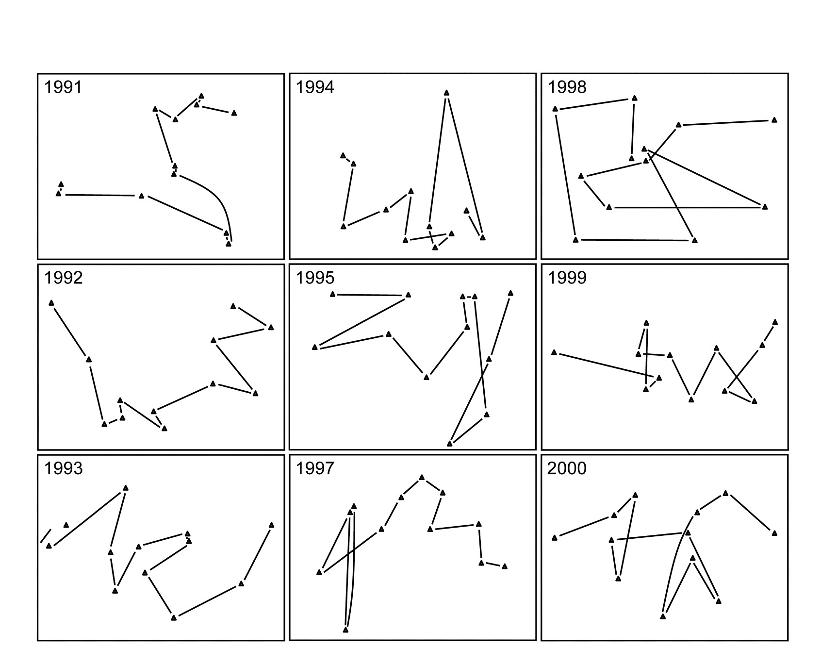
Fig. 16.12. Ko Phuket corals {K}. MDS plots of square-root transformed cover of 53 coral species for 12 positions (plotless line samples) on the A transect, running onshore to offshore, ordinated separately for each of 9 years (4 earlier years are shown in Fig. 15.6).
The two (crossed) factors here are the years and the positions along transect A (1-12, at the same spacing each year). Separate MDS plots of these 12 positions for each of the years 1983, 86, 87 and 88 were seen in Fig. 15.6 (first column). Fig. 16.12 adds nine more years (1991-95, 1997-2000) of the spatial patterns seen along the transect. The underlying resemblance matrices for each of these MDS plots can be matrix correlated, with the usual Spearman rank coefficient, in all possible pairs of years, giving a second-stage resemblance matrix (turned into a similarity by the transformation $50 (1 + \rho )$, if there are negative values). Input to a cluster analysis and nMDS, the result is Fig. 16.13a, which gives a clear visual demonstration of the years which are exceptional from the point of view of showing different patterns of reef assemblage turnover moving down the shore. The sedimentation-based disruption to the gradient in 1986 and 87, and the negative sea-level anomaly of 1998 seem both to be clearly identified. (There is however no statistical test that we can carry out on this second-stage matrix which would identify ‘significant’ change in those years, because in this simple two-way crossed design there is no replication structure to permit this). It is nonetheless interesting to note that the anomalous years are on opposite sides of the MDS plot, possibly suggesting that the departures from the ‘normal’ type of onshore-offshore gradient are of a different kind in 1998 than in 1986 & 87. Less speculative is the clear evidence from Fig. 16.13b that a comparable ‘first-stage’ nMDS plot does not obviously identify those years as anomalous. This is an ordination based on Bray-Curtis of ‘mean’ communities for each year, obtained by averaging the (square-root transformed) %cover values for each of the 53 coral species over the whole transect for each year.
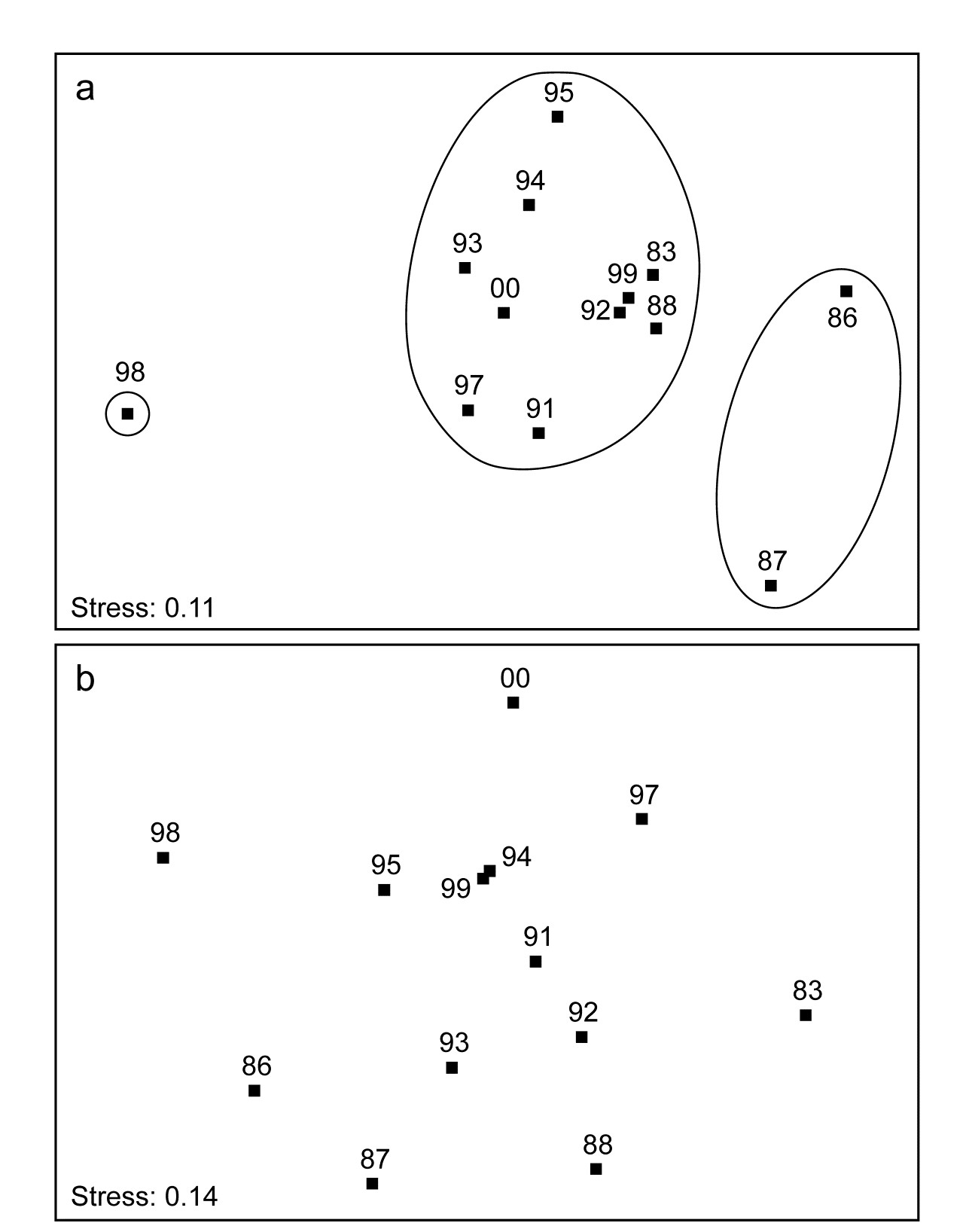
Fig. 16.13. Ko Phuket corals {K}. a) Second-stage MDS plot of 13 years in the period 1983 to 2000, based on comparing the multivariate pattern for each year of the 12 transect positions down the shore (transect A). Note the anomalous (non-seriated) patterns in 1986/7 and again in 1998, evidenced by the separation of these years on the plot and in the groups obtained from slicing a cluster dendrogram at a fixed similarity level. b) First-stage MDS of the whole assemblage in each year, by averaging the transformed cover matrix over transect positions.
Note the subtlety therefore of what a second-stage analysis is trying to isolate here. The compositions of the transect over the different years are not directly compared, as they are in a first-stage plot. There may (and will) be natural year-to-year fluctuations in area cover which would separate the transects on an MDS plot in which all transect positions and all years are displayed, but which do not disrupt the serial change in assemblage along the transect. The second-stage procedure will not be sensitive to such fluctuations. It eliminates them by concentrating only on whether the pattern is the same each year: assemblage similarities between the same transect points in different years do not enter the calculations at all (as observed in the schematic diagram for second-stage analysis of Fig. 16.4, where now each of the data matrices on the left represents the transect samples for a particular year). Disruptions to the (generally gradient) pattern in certain years are, in a sense, interactions between transect position and year, removing year-to-year main effects (by working only within each year) and it is such secondary, interaction effects that the second-stage MDS sets out to display.†
Clarke, Somerfield, Airoldi et al. (2006)
give the same analysis for the B transect and discuss two further applications, to Tees Bay data {t}, and a rocky shore colonisation study (see later).

Fig. 16.14. Schematic of the construction of a second-stage ‘interaction’ plot and test for a Before-After/Control-Impact design with (replicate) fixed sites from Impact and Control conditions sampled over several times Before and After an anticipated impact.
Before-After Control-Impact designs, over times
When there are sufficient sampling times in a study of the effects of an impact, both before and after that impact, and for multiple spatial replicates at both control and impact locations, the concept of a second-stage multivariate analysis may be a solution to one significant problem in handling such studies (known as ‘Beyond BACI’ designs, Underwood (1992) ), viz. how to allow for lack of independence in the communities observed when repeatedly returning to the same spatial patch. Monitoring communities at fixed locations (e.g. on permanent reef transects or over designated areas of rocky shore etc), in so-called repeated measures designs can sometimes be an efficient way of removing the effects of major spatial heterogeneity in the relevant habitat which would overwhelm any attempt at repeated random sampling, at each time, of different areas from the same general regions or treatment conditions under study. In other words, to detect smaller temporal change against a backdrop of large spatial variability could prove impossible without isolating the two factors, e.g. by monitoring the same area in space at different times, and different areas in space at the same time. A major imperative goes with this, however, and that is to recognise that the repeated measures (of community structure) in a single, restricted area, cannot in most cases be analysed as if they were independent§.
This is a problem that the second-stage multivariate analysis strategy neatly side-steps, because it has no need to invoke an assumption that the points making up a time course are in any way independent of each other: what ends up being compared is one whole time course with another (independent) time course, both resulting in single (independent) multivariate points in a second stage analysis. The above schema (Fig. 6.14) demonstrates the concept.
The data structure, on the left, shows the elements of a ‘Beyond BACI’ design‡, in which several areas (to call them fixed quadrats gives the right idea) will be sampled under both impact and reference (control) conditions, each quadrat being sampled at the same set of fixed times, which must be multiple occasions both before and after the impact is anticipated. It is the time courses of the multivariate community (seen here as MDS plots, but in reality the similarities that underlie these) which are then matched over quadrats in a second-stage correlation ($\rho$) matrix, shown to the right. This has a factor with two levels, control and impact, and replicate quadrats in each condition. A second-stage MDS plot from this second-stage similarity matrix would then show whether the temporal patterns differed for the two conditions, by noting whether the control and impacted quadrats clustered separately. A formal test for a significant effect of the impact is given by a 1-way ANOSIM on the second-stage similarity matrix. This is ‘on message’ with the purpose of a BACI design, namely to show (or not) that the temporal pattern under impact differs from that under control conditions, and we are justified in calling this an interaction test between B/A and C/I. In fact it is a rather general definition of interaction, entirely within the non-parametric framework that PRIMER adopts, and not at all in the same mould as the interaction term in a 2-way crossed ANOVA (or PERMANOVA) model, which is a strongly metric concept (see the discussion on page 6.17).
There are two strengths of this approach that can be immediately appreciated. Firstly, it is rare for control /reference sites to have the same Before assemblages as do the sites that will be part of the Impact group. For many studies, in order to find reference sites that will be outside the impact zone, one must move perhaps to a different estuary or coastal stretch, in which the natural assemblages will inevitably be a little different. Such initial differences are entirely removed however, in the above process - the only thing monitored and compared is the pattern of change over time within each site. Secondly, there is no suggestion here that assemblages at the sites (quadrats) will be independent observations from one time to the next. This is a repeated measures design, as previously alluded to. It is the whole time course of a quadrat, with all its internal autocorrelations among successive times, which becomes a single (multivariate) point in the final ANOSIM test, and all that is necessary for full validity of the test is that the quadrats should be chosen independently from each other, e.g. randomly and representatively across their particular conditions (C or I). This ability to compare whole temporal (or sometimes spatial) profiles as the experimental units of a design is certainly a viable approach to some ‘repeated measures’ data sets.
However, there are also some significant drawbacks. Using similarities only from within each quadrat will remove all differences in initial assemblage but will also remove differences in relative dispersion of the set of time trajectories. When control and impact sites do have similar initial assemblages, there will be no way of judging how far an impact site has moved from the control condition and whether it returns to that at some post-impact time; all that is seen is the extent to which the impact site reverts to its own initial state, before impact. Thus the second-stage process has inevitably ‘turned its back’ on the full information available in the species $\times$ samples matrix, to concentrate on only a small (though important) part, which might be considered a disadvantage. Also the simpler forms of BACI design in which there is only one time before and after the impact can clearly not be handled; there needs to be a rich enough set of times to be able to judge whether internal temporal patterns differ for control and impacted quadrats.
¶ Both applications of the second-stage idea are catered for in the PRIMER 2STAGE routine, the inputs either being a series of similarity matrices (which can be taken from any source provided they refer to the same set of sample labels), which is the use we have made of the routine so far, or a single similarity matrix, from a 2–way crossed layout with appropriately defined ‘outer’ and ‘inner’ factors (time and space, respectively, in this case so that patterns in space are matched up across times, or more often it will be the converse, matching up patterns in time across spatial layouts, so that space becomes the outer factor and time the inner). There can be no replication below each combination of inner and outer levels in the input similarity matrix, though levels of the outer factor might themselves encompass replication, by the ‘flattening’ of a 1-way layout of groups and replicates. An example will follow of a colonisation study in which replicate sites within treatments (which together make up the outer factor) are monitored through time (the inner factor).
† The idea also has close ties with the special form of ANOSIM test described in Chapter 6 (Fig. 6.9), with the ‘blocks’ as the outer year factor and the ‘treatments’ as the inner position factor, but instead of averaging the $\rho$ values in the final triangular matrix of that Fig. 6.9 schematic, we ordinate that matrix to obtain the second-stage MDS.
§ Unless the communities themselves are dynamic in the environment, so stochastic assumptions for the process being monitored replace randomness of sampling units for a fixed environment.
‡ Of course the samples are not entered into PRIMER in this rectangular form but by the usual entry of (say) rows as the species constituting the assemblages and columns as all the samples, but with factors defining Condition (levels of Control/Impact) and the unique Quadrat number which identifies that fixed quadrat over time, and a factor giving the sampling Time (with matching levels for all quadrats). The 2STAGE routine is then entered with the outer factor Quadrat and the inner factor Time, resulting in a resemblance matrix among all quadrats, in terms of their patterns though time. This has a 1-way structure of Condition (C/I) and replicate quadrats within each condition, input to ANOSIM.
16.8 Example: Algal recolonisation, Calafuria
An example of this type (though not a classic BACI situation) is given by Clarke, Somerfield, Airoldi et al. (2006) , for a study by Airoldi (2000) . Sub-tidal patches of rocky reefs were cleared of algae at one station (Calafuria) on the Ligurian Sea coast of N Italy (data from two further stations is not shown here). Multiple marked (and interspersed) patches were cleared on 8 different months over the year 1995/6, and the time course of recolonisation examined at 6 times (c. bi-monthly) in the year following clearance, utilising non-destructive (photographic) estimates of % area cover by the algal species community. Data from three ‘patches’ (in fact these were themselves the average from three sub- patches) were tracked for each of the clearance start months (the ‘treatment’). One rationale for the design was to examine likely differences in recovery rates and patterns (after reef damage by shipping/boats) for the different times of year at which this may happen. It is clearly a repeated measures design, with the 6 bi-monthly samples of fixed patches being dependent.
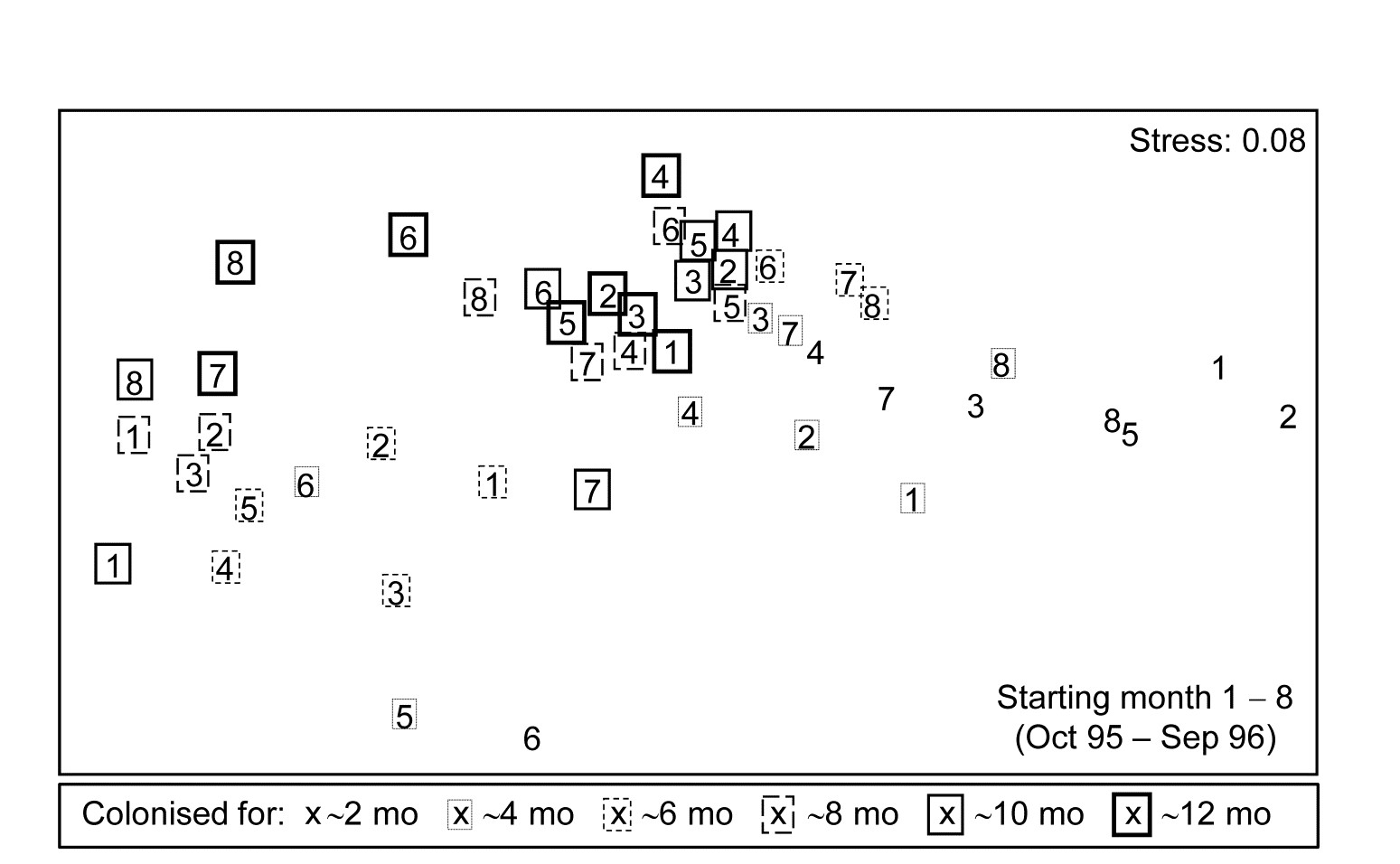
Fig. 16.15. Algal colonisation, Calafuria {a}. MDS of macroalgal species based on zero-adjusted Bray-Curtis from fourth-root transformed area cover, using photographs, for 48 samples, each an average over three replicate ‘patches’ (three sub-patches in each) for all $ 8 \times 6$ combinations of month of clearance (numbers 1-8 over the course of a year) and time over which colonisation has been taking place (six approximately bi-monthly sampling times, shown by a succession of larger/bolder boxes).
Fig. 16.15 is an nMDS of the 48 community samples, over 6 recovery periods (successively bolder squares) for the 8 different starting months of clearance (1-8), the three replicate patches for each ‘treatment’ (start date) having been averaged for this plot. Whilst a colonisation pattern through time is evident (mid-right to low left then upwards) there is no prospect of seeing whether that pattern is the same across the start times since assemblage differences are naturally large over the colonisation period. The trajectories of the 6 times for each of the patches, viewed separately by MDS ordination in their groups of three patches per treatment (Fig. 16.16), do however show strong differences in these time profiles. Though they are spatially interspersed, there is a marked consistency of replicate patches within treatments and characteristically different colonisation profiles across them.
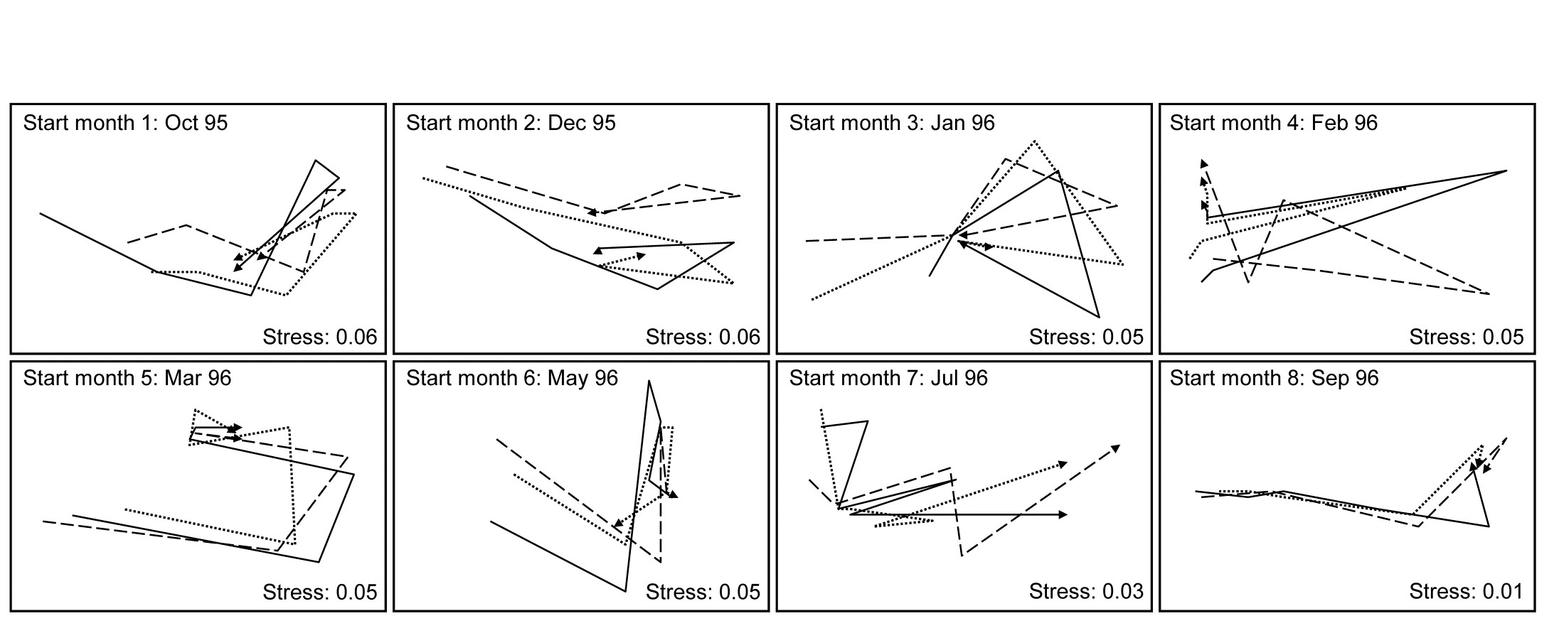
Fig. 16.16. Algal recolonisation, Calafuria {a}. Separate nMDS plots for each of the 8 clearance months (‘treatments’), showing time trajectories over the following 6 approximately bi-monthly observations of the colonising macroalgal communities, for three replicate patches in each treatment (different line shading). Note the similarity of trajectories within, and dissimilarity between, treatments.
With outer factor the patch designators and inner factor the 6 bi-monthly times, the 2STAGE routine extracts the $6 \times 6$ similarity matrix representing each profile, from diagonals of the $144 \times 144$ Bray-Curtis matrix for the full set of samples, and then relates the 24 such sub-matrices with rank matrix correlations $\rho$, each sub-matrix then becoming a single point in the second-stage nMDS of Fig. 16.17. Unlike the earlier coral reef example, there are now replicates which will allow a formal hypothesis test, and ANOSIM on the differences among starting times assessed against the variability over replicate patches (in their time profiles, not in their communities!) gives a decisive global R of 0.96.¶ By averaging over the replicate level, Clarke, Somerfield, Airoldi et al. (2006) go on to demonstrate that the experiment is repeatable, since the second-stage pattern of the 8 starting months at the Calafuria station is strongly related to the pattern for the same sampling design at another station, Boccale. This utilises a RELATE test on the two second-stage matrices, a procedure which comes dangerously close to being a third-stage analysis, by which point the original data has become merely a distant memory!
The serious point here, of course, is that plots such as Fig. 16.17 are never the end point of a multivariate analysis. They may help to tease out, and sometimes formally test, interesting and relevant assemblage patterns, but having established that there are valid interpretations to be made, a return to the data matrix is always desirable, and the types of species analyses covered in Chapter 7 (much enhanced in PRIMER v7) will then usually play an important part in the final interpretation.
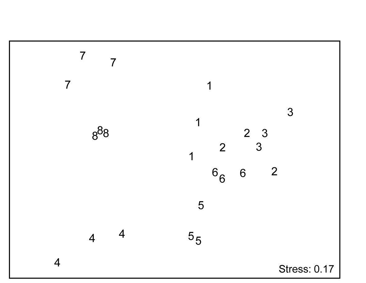
Fig. 16.17. Algal recolonisation, Calafuria {a}. Second-stage nMDS of similarities in the time course of recolonisation of macroalgae, as seen in the first-stage MDS plots of Fig. 16.16, i.e. at 3 ‘patches’ under 8 different months (1-8) of clearance of algae from the subtidal rocky reefs (the ‘treatments’). The very consistent time course within, and marked differences between, treatments is seen in the tight dispersion of the replicates, giving a large and highly significant ANOSIM statistic, R = 0.96.
¶ In fact, had the nested design of smaller patches within each of these replicate ‘patches’ been exploited, the second-stage tests at this point would have been 2-way nested ANOSIM.
Chapter 17: Biodiversity and dissimilarity measures based on relatedness of species
17.1 Species richness disadvantages
Chapter 8 discussed a range of diversity indices based on species richness and the species abundance distribution. Richness (S) is widely used as the preferred measure of biological diversity (biodiversity) but it has some major drawbacks, many of which apply equally to other diversity indices such as H$^\prime$, H, J$^\prime$, etc.
- Observed richness is heavily dependent on sample size/effort. In nearly all marine contexts, it is not possible to collect exhaustive census data. The assemblages are sampled using sediment cores, trawls etc, and the ‘true’ species richness of a station is rarely fully represented in such samples. For example, Gage & Coghill (1977) describe a set of contiguous core samples taken for macrobenthic species in a Scottish sea-loch. A species-area plot (or accumulation curve) which illustrates how the number of different species detected increases as the samples are accumulated¶, shows that, even after 64 replicate samples are taken at this single locality, the observed number of species is still rising.
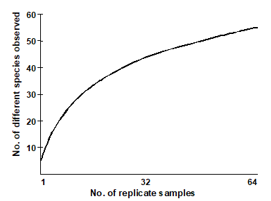
“The harder you look, the more species you find” is fundamental to much biological sampling and the asymptote of accumulation curves is rarely reached. Observed species richness S is therefore highly sensitive to sample size and totally non-comparable across studies involving unknown, uncontrolled or simply differing degrees of sampling effort. The same is true, to a lesser extent, of many other standard diversity indices. Fig. 17.1 shows the effect of increasing numbers of individuals on the values of some of the diversity indices defined in Chapter 8. This is a sub-sampling study, selecting different numbers of individuals at random from a single, large community sample. The only index to demonstrate a lack of bias in mean value is Simpson diversity, given here in the form $1 - \lambda ^ \prime$, see equation (8.4). Comparison of richness, Shannon, evenness, Brillouin etc values for differing sample sizes is clearly problematic.
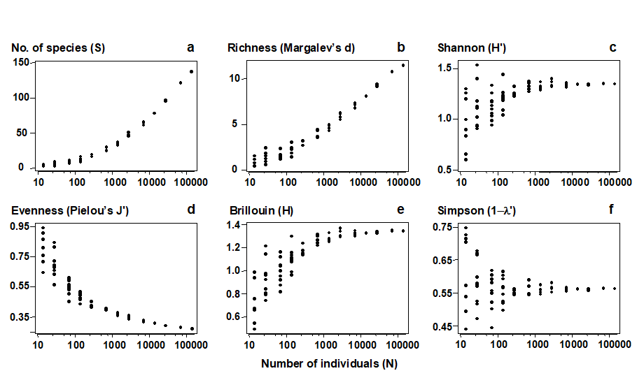
Fig. 17.1. Amoco-Cadiz oil spill {A}, pooled pre-impact data. Values of 6 standard diversity indices (y-axis, see Chapter 8 for definitions), for simulated samples of increasing numbers of individuals (x-axis, log scaled), drawn randomly without replacement from the full set of 140,344 macrobenthic organisms.
-
Species richness does not directly reflect phylogenetic diversity. “A measure of biodiversity of a site ought ideally to say something about how different the inhabitants are from each other” ( Harper & Hawksworth (1994) ). It is clear that a sample consisting of 10 species from the same genus should be seen as much less biodiverse than another sample of 10 species, all of which are from different families: genetic, phylogenetic or, at least, taxonomic relatedness of the individuals in a sample is the key concept which is developed in this chapter, into practical indices which genuinely reflect biodiversity and are robust to sampling effort variations.
-
No statistical framework exists for departure of S from ‘expectation’. Whilst observed species richness measures can be compared across sites (or times) which are subject to strictly controlled and equivalent sampling designs, there is no sense in which the values of S can be compared with some absolute standard, i.e. we cannot generally answer the question “what do we expect the richness to be at this site?”, in the absence of anthropogenic impact, say.
-
The response of S to environmental degradation is not monotonic. Chapter 8 discusses the well-established paradigm (see Wilkinson (1999) and references therein) that, under moderate levels of disturbance, species richness may actually increase, before decreasing again at higher impact levels. It would be preferable to work with a biological index whose relation to the degree of perturbation was purely monotonic (increasing or decreasing, but not both).
-
Richness can vary markedly with differing habitat type. Again, the ideal would be a measure which is less sensitive to differences in natural environmental variables but is responsive to anthropogenic disturbance.
¶ This uses the Species-Accumulation Plot routine in PRIMER, with the option of plotting the curve in the presented sample order or (as here) randomising that order a large number of times. In the latter case, the resulting curves are averaged to obtain a smooth relationship of average number of species for each number of replicates. The routine also computes several standard extrapolation models which attempt to predict the asymptotic number of species that would be found for an infinity of samples from the same (closed) location. Included are Chao estimators, jacknife and bootstrap techniques, see Colwell & Coddington (1994) .
17.2 Average taxonomic diversity and distinctness
Two measures, which address some of the problems identified with species richness and the other diversity indices, are defined by Warwick & Clarke (1995b) . They are based not just on the species abundances (denoted by $x _ i$, the number of individuals of species i in the sample) but also the taxonomic distances ($\omega _ {ij}$), through the classification tree, between every pair of individuals (the first from species i and the second from species j). For a standard Linnean classification, these are discrete distances, the simple tree below illustrating path lengths of zero steps (individuals from the same species), one step (same genus but different species) and two steps (different genera)¶. Clarke & Warwick (1999) advocate a simple linear scaling whereby the largest number of steps in the tree (two species at greatest taxonomic distance apart) is set to $\omega = 100$. Thus, for a sample consisting only of the 5 species shown, the path between individuals in species 3 and 4 is $\omega _ {34} = 100$, between species 1 and 2 is $\omega _ {12} = 50$, between two individuals of species 5 is $\omega _ {55} = 0$, etc.
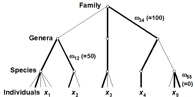
Average taxonomic diversity of a sample is then defined ( Warwick & Clarke (1995b) ) as: $$ \Delta = \left[ \sum \sum _ {i < j} \omega _ {ij} x _ i x _ j \right] / \left[ N (N – 1)/2 \right] \tag{17.1} $$
where the double summation is over all pairs of species i and j (i,j = 1, 2, …, S; i<j), and $N = \sum _ i x _ i$, the total number of individuals in the sample. $\Delta$ has a simple interpretation: it is the average ‘taxonomic distance apart’ of every pair of individuals in the sample or, to put it another way, the expected path length between any two individuals chosen at random.
Note also that when the taxonomic tree collapses to a single-level hierarchy (all species in the same genus, say), $\Delta$ becomes
$$ \Delta ^ \circ = \left[ 2 \sum \sum _ {i < j} p _i p _ j \right] / ( 1 - N ^ {-1} ) = \left( 1 - \sum _ i p _ i ^ 2 \right) / ( 1 - N ^ {-1} ) \tag{17.2}$$ $ \hspace{117pt}$ where $p _ i = x _ i / N $
which is a form of Simpson diversity. The Simpson index is actually defined from the probability that any two individuals selected at random from a sample belong to the same species ( Simpson (1949) ). $\Delta$ is therefore seen to be a natural extension of Simpson, from the case where the path length between individuals is either 0 (same species) or 100 (different species) to a more refined scale of intervening relatedness values (0 = same species, 20 = different species in the same genera, 40 = different genera but same family, etc).† It follows that $\Delta$ will often track Simpson diversity fairly closely. To remove the dominating effect of the species abundance distribution {$x _ i$}, leaving a measure which is more nearly a pure reflection of the taxonomic hierarchy, Warwick & Clarke (1995b) proposed dividing $\Delta$ by the Simpson index $\Delta ^ \circ$ to give average taxonomic distinctness $$ \Delta ^ \ast = \left[ \sum \sum _ {i < j} \omega _ {ij} x _ i x _ j \right] / \left[\sum \sum _ {i < j} x _ i x _ j \right] \tag{17.3} $$ Another way of thinking of this is as the expected taxonomic distance apart of any two individuals chosen at random from the sample, provided those two individuals are not from the same species.
A further form of the index, exploited greatly in what follows, takes the special case where quantitative data is not available and the sample consists simply of a species list (presence/absence data). Both $\Delta$ and $\Delta ^ \ast$ reduce to the same coefficient
$$ \Delta ^ + = \left[ \sum \sum _ {i < j} \omega _ {ij} \right] / \left[ S (S - 1) / 2 \right] \tag{17.4} $$
where S, as usual, is the observed number of species in the sample and the double summation ranges over all pairs i and j of these species (i<j). Put simply, the average taxonomic distinctness (AvTD) $\Delta ^ +$ of a species list is the average taxonomic distance apart of all its pairs of species. This is a very intuitive definition of biodiversity, as average taxonomic breadth of a sample.
Sampling properties
For quantitative data, repeating the pairwise exercise (Fig. 17.1) of random subsampling of individuals from a single, large sample, Fig. 17.2a and b show that both taxonomic diversity ($\Delta$) and average taxonomic distinctness ($\Delta ^ \ast$) inherit the sample-size independence seen in the Simpson index, from which they are generalised. Clarke & Warwick (1998b) formalise this result by showing that, whatever the hierarchy or subsample size, $\Delta$ is exactly unbiased and $\Delta ^ \ast$ is close to being so (except for very small subsamples). For non-quantitative data (a species list), the corresponding question is to ask what happens to the values of $\Delta ^ +$ for random subsamples of a fixed number of species drawn from the full list. Fig. 17.2c demonstrates that the mean value of $\Delta ^ +$ is unchanged, its exact unbiasedness in all cases again being demonstrated in Clarke & Warwick (1998b) . This lack of dependence of $\Delta ^ +$ (in mean value) on the number of species in the sample has far-reaching consequences for its use in comparing historic data sets and other studies for which sampling effort is uncontrolled, unknown or unequal.
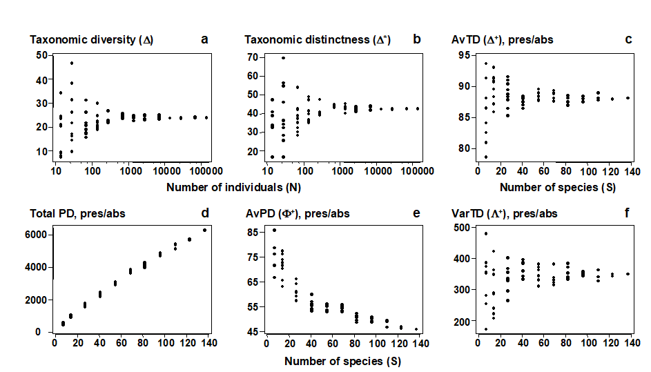
Fig. 17.2. Amoco-Cadiz oil spill {A}, pooled pre-impact data. a), b) Quantitative indices (y-axis): Average taxonomic diversity ($\Delta$) and distinctness ($\Delta ^ \ast$) for random subsets of fixed numbers of individuals (x-axis, logged), drawn randomly from the pooled sample, as in Fig. 17.1. c)–f) List-based (presence/absence) indices (y-axis): Average taxonomic distinctness ($\Delta ^ +$), total phylogenetic diversity (PD), average phylogenetic diversity ($\Phi ^ +$) and Variation in taxonomic distinctness ($\Lambda ^ +$), for random subsets of fixed numbers of species (x-axis) drawn from the full species list for the pooled sample. The sample-size independence of TD-based indices is clear, contrasting with PD and most standard diversity measures (Fig. 17.1).
¶ The principle extends naturally to a phylogeny with continuously varying branch lengths and even, ultimately, to a molecular-based genetic distance between individuals (of the same or different species), see Clarke & Warwick (2001) , Fig. 1. And one of the interesting further developments is to apply the ideas of this chapter to a tree which reflects functional relationships among species, leading to functional diversity measures ( Somerfield, Clarke, Warwick et al. (2008) ).
† In addition, there is a relationship between $\Delta$ and Simpson indices computed at higher taxonomic levels, see Shimatani (2001) . In effect, $\Delta$ is a (weighted) mean of Simpson at all taxonomic levels.
17.3 Examples: Ekofisk oil-field and Tees Bay soft-sediment macrobenthos
The earlier Fig. 14.4 demonstrated a change in the sediment macrofaunal communities around the Ekofisk oil-field {E}, out to a distance of about 3 km from the centre of drilling activity. This was only evident, however, from the multivariate (MDS and ANOSIM) analyses, not from univariate diversity measures such as Shannon H$^ \prime$, where reduced diversity was only apparent up to a few hundred metres from the centre (Fig. 17.3a). The implication is that the observed community change resulted in no overall loss of diversity but this is not the conclusion that would have been drawn from calculating the quantitative average taxonomic distinctness index, $\Delta ^ \ast$. Fig. 17.3b shows a clear linear trend of increase in $\Delta ^ \ast$ with (log) distance from the centre, the relationship only breaking down into a highly variable response for the strongly impacted sites, within 100m of the drilling activity.
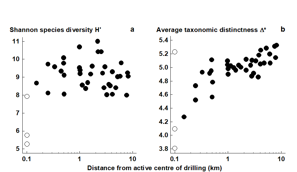
Fig. 17.3. Ekofisk macrobenthos {E}. a) Shannon diversity (H$^ \prime$) for the 39 sites (y-axis), plotted against distance from centre of drilling activity (x-axis, log scale). b) Quantitative average taxonomic distinctness $\Delta ^ \ast$ for the 39 sites, indicating a response trend not present for standard diversity indices.
A further example, from the coastal N Sea, is given by a time-series of macrobenthic samples, with data averaged over 6 locations in Tees Bay, UK, ({t}, Warwick, Ashman, Brown et al. (2002) ). Samples were taken in March and September for each of the years 1973 to 1996, and Fig. 17.4 shows the September inter-annual patterns for four (bio)diversity measures. Notable is the clear increase in Shannon diversity at around 1987/88 (Fig. 17.4b), coinciding with significant widescale changes in the N Sea planktonic system which have been reported elsewhere (e.g. Reid, Barges & Svendsen (2001) ). However, Shannon diversity is very influenced here by the high numbers of a single abundance dominant (Spiophanes bombyx), whose decline after 1987 led to greater equitability in the quantitative species diversity measures. A more far-reaching change, representative of what was happening to the community as a whole, is indicated by looking at the taxonomic relatedness statistics based only on presence/absence data. Use of simple species lists has the advantage here of ensuring that no one species can dominate the contributions to the index. Average taxonomic distinctness ($\Delta ^ +$) is seen to show a marked decline at about the time of this N Sea regime shift (Fig. 17.4c), indicating a biodiversity loss, a very different (and more robust) conclusion than that drawn from Shannon diversity.

Fig. 17.4. Tees macrobenthos {t}. (Bio)diversity indices for Tees Bay areas combined, from sediment samples in September each year, over the period 1973–96, straddling a major regime-shift in N Sea ecosystems, about 1987. a) Richness, S; b) Shannon, H$^ \prime$; c) Average taxonomic distinctness, $\Delta ^ +$, based on presence/absence and reflecting the mean taxonomic breadth of the species lists; d) Variation in taxonomic distinctness, $\Lambda ^ +$ (also pres/abs), reflecting unevenness in the taxonomic hierarchy.
17.4 Other relatedness measures
The remainder of this chapter deals only with data in the form of a species list for a locality (presence/absence data). There is a substantial literature on measures incorporating, primarily, phylogenetic relationships amongst species (see references in the review-type papers of
Faith (1994)
and
Humphries, Williams & Vane-Wright (1995)
). The context is conservation biology, with the motivation being the selection of individual species, or sets of species (or reserves), with the highest conservation priority, based on the unique evolutionary history they represent, or their complementarity to existing well-conserved species (or reserves).
Warwick & Clarke (2001)
draw a potentially useful distinction of terminology between this individual species-focused conservation context and the use, as in this chapter, of relatedness information to monitor differences in community-wide patterns in relation to changing environmental conditions. They suggest that the term taxonomic/phylogenetic distinctiveness (of a species) is reserved for weights assigned to individual species, reflecting their priority for conservation; whereas taxonomic/phylogenetic distinctness (of a community) summarises features of the overall hierarchical structure of an assemblage (the spread, unevenness etc. of the classification tree).
Phylogenetic diversity (PD)
In the distinctiveness context, Vane-Wright, Humphries & Williams (1991) , Williams, Humphries & Vane-Wright (1991) and May (1990) introduced measures based only on the topology (‘elastic shape’) of a phylogenetic tree, appropriate when branch lengths are entirely unknown. Faith (1992) and Faith (1994) defined a phylogenetic diversity (PD) measure based on known branch lengths: PD is simply the cumulative branch length of the full tree. Whether this is thought of as representing the total evolutionary history, the genetic turnover or morphological richness, it is an appealingly simple statistic. Unfortunately, Fig. 17.5 demonstrates some of the disadvantages of using these measures in a distinctness context. The figure compares only samples (lists) with the same number of species (7), at four hierarchical levels (say, species within genera within families, all in one order), so that each step length is set to 33.3. Fig. 17.5b and c have the same tree topology, yet we should not consider them to have the same average (or total) distinctness, since each species is more taxonomically similar to its neighbours in b than c (reflected in $\Delta ^ +$ values of 33.3 and 66.6 respectively). Similarly, contrasting Fig. 17.5d and e, the total PD is clearly identical, the sum of all the branch lengths being 333 in both cases, but this does not reflect the more equitable distribution of species amongst higher taxa in d than e ($\Delta ^ +$ does, however, capture this intuitive element of biodiversity, with respective values of 52 and 43).
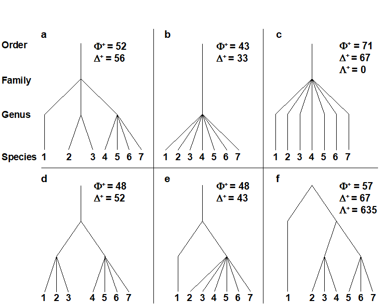
Fig. 17.5. a)-f) Example taxonomic hierarchies for presence/ absence data on 7 species (i.e. of fixed species richness), with 4 levels and 3 step lengths (thus each of 33.3, though the third step only comes into play for plot f). $\Phi ^ +$: average phylogenetic diversity,$\Delta ^ +$: average taxonomic distinctness, $\Lambda ^ +$: variation in TD. The plots show, inter alia: the expected ‘biodiversity’ decrease from a) to d) and e) to b) (in both $\Delta ^ +$ and $\Phi ^ +$), and from d) to e) (but only in $\Delta ^ +$, not in $\Phi ^ +$); unevenness of f) in relation to c), reflected in increased $\Lambda ^ +$ though unchanged $\Delta ^ +$.
Average PD
More importantly, there is another clear reason why phylogenetic diversity PD is unsuitable for monitoring purposes. Firstly, note that PD itself is a total rather than average property; as new species are added to the list it always increases. This makes PD highly dependent on species richness S and thus sampling effort, a demonstration of which can be seen in Fig. 17.2d (and the later Fig. 17.9a), a near straight line relationship of PD with S. This is to be expected, and a better equivalent to average taxonomic distinctness (AvTD, $\Delta ^ +$) would be average phylogenetic diversity (AvPD), defined as the ratio:
$$ \Phi ^ + = PD / S \tag{17.5} $$
This is a very intuitive summary of average distinctness, being the contribution that each species makes on average to the total tree length, but unfortunately it does not have the same lack of dependence on sampling effort that characterises $\Delta ^ +$. Fig. 17.2e (and the later Fig. 17.9b) show that its value decreases markedly as the number of species (S) increases, making it misleading to compare AvPD values across studies with differing levels of sampling effort.
‘Total’ versus ‘average’ measures
Note the distinction here between total and average distinctness measures. AvPD ($\Phi ^ +$) is the analogue of AvTD ($\Delta ^ +$), both being ways of measuring the average taxonomic breadth of an assemblage (a species list), for a given number of species. $\Delta ^ +$ will give the same value (on average) whatever that number of species; $\Phi ^ +$ will not. Total PD measures the total taxonomic breadth of the assemblage and has a direct analogue in total taxonomic distinctness:
$$ TTD = S \times \Delta ^ + = \sum _ i \left[ \left( \sum _ {j \ne i} \omega _ {ij} \right) / \left(S – 1 \right) \right] \tag{17.6} $$
Explained in words, this is the average taxonomic distance from species i to every other species, summed over all species, i = 1, 2, …, S. (Taking an average rather than a sum gets you back to AvTD, $\Delta ^ +$.) TTD may well be a useful measure of total taxonomic breadth of an assemblage, as a modification of species richness which allows for the species inter-relatedness, so that it would be possible, for example, for an assemblage of 20 closely-related species to be deemed less ‘rich’ than one of 10 distantly-related species. In general, however, like total PD, total TD will tend to track species richness rather closely, and will only therefore be useful for tightly controlled designs in which effort is identical for the samples being compared, or sampling is sufficiently exhaustive for the asymptote of the species-area curve to have been reached (i.e. comparison of censuses rather than samples).
Variation in TD
Finally, a comparison of Fig. 17.5c and f shows that the scope for extracting meaningful biodiversity indices (unrelated to richness) from simple species lists has not yet been exhausted. Average taxonomic distinctness is the same in both cases ($\Delta ^ + = 66.6$) but the tree constructions are very different, the former having consistent, intermediate taxonomic distances between pairs of species, in comparison with the latter’s disparate range of small and large values. This can be conveniently summarised in a further statistic, the variance of the taxonomic distances {$\omega_{ij}$} between each pair of species i and j, about their mean value $\Delta ^ +$:
$$ \Lambda ^ + = \left[ \sum \sum _ {i < j} ( \omega _ {ij} - \Delta ^ + ) ^ 2 \right] / \left[ S (S - 1)/2 \right] \tag{17.7} $$
termed the variation in taxonomic distinctness, VarTD. Its behaviour in a practical application will be examined later in the chapter¶, but note for the moment that it, too, appears to have the desirable sampling property of (approximate) lack of dependence of its mean value on sampling effort (see Fig. 17.2f).
¶ The PRIMER DIVERSE routine has options to compute the full range of relatedness-based biodiversity measures discussed in this chapter: $\Delta$, $\Delta ^ \ast$, $\Delta ^ +$, TTD, $\Lambda ^ +$, PD, $\Phi ^ +$, simultaneously for all the samples in a species matrix. It returns the values to a worksheet which can be displayed as Scatter Plots, Histograms, Draftsman Plots etc, analysed in a multivariate way (with the indices as the variables, page 8.7) or by conventional univariate tests, either in PERMANOVA on Euclidean distance matrices from single indices ( Anderson, Gorley & Clarke (2008) ) or exported to ANOVA software. These DIVERSE options require the availability of an aggregation file, detailing which species map to which genus, families etc, in exactly the same format needed for the Aggregate routine used to perform higher taxonomic level analyses in Chapter 10.
17.5 ‘Expected distinctness’ tests
Species master list
The construction of taxonomic distinctness indices from simple species lists makes it possible to address another of the ‘desirable features’ listed at the beginning of the chapter: there is a potential framework within which TD measures can be tested for departure from ‘expectation’. This envisages a master list or inventory of species, within defined taxonomic boundaries and encompassing the appropriate region/biogeographic area, from which the species found at one locality can be thought of as drawn. For example, the next illustration uses the full British faunal list of 395 free-living marine nematodes, updated from the keys of
Platt & Warwick (1983)
and
Platt & Warwick (1988)
. The species complement at any specific locality and/or historic period (e.g. putatively impacted areas such as Liverpool Bay or the Firth of Clyde) can be compared with this master list, to ask whether the observed subset of species represents the biodiversity expressed in the full species inventory. Clearly, such a comparison is impossible for species richness S, or total TD or PD, since the list at one location is automatically shorter than the master list. Also, comparison of S between different localities (or historic periods) is invalidated by the inevitable differences in sampling effort in constructing the lists for different places (or times). However, the key observation here (
Clarke & Warwick (1998b)
) is that average taxonomic distinctness ($\Delta ^ +$) of a randomly selected sublist does not differ, in mean value, from AvTD for the master list. So, localities that have attracted differing degrees of sampling effort are potentially directly comparable, with each other and with $\Delta ^ +$ for the full inventory. The latter is the ‘expected value’ for average distinctness from a defined faunal group, and reductions from this level, at one place or time, can potentially be interpreted as loss of biodiversity.
Testing framework
Furthermore, there is a natural testing framework for how large a decrease (or increase) from expectation needs to be, in order to be deemed statistically ‘significant’. For an observed set of m species at one location, sublists of size m are drawn at random from the master inventory, and their AvTD values computed. From, say, 999 such simulated sublists, a histogram can be constructed of the expected range of $\Delta ^ +$ values, for sublists of that size, against which the true $\Delta ^ +$ for that locality can be compared. If the observed $\Delta ^ +$ falls outside the central 95% of the simulated $\Delta ^ +$ values, it is considered to have departed significantly from expectation: a two-sided test is probably appropriate since departure could theoretically be in the direction of enhanced as well as reduced distinctness.
The next stage is to repeat the construction of these 95% probability intervals for a range of sublist sizes (m = 10, 15, 20, …) and plot the resulting upper and lower limits on a graph of $\Delta ^ +$ against m. When these limit points are connected across the range of m values, the effect is to produce a funnel plot (such as seen in Fig. 17.8). The real $\Delta ^ +$ values for a range of observational studies are now added to this plot, allowing simultaneous comparison to be made of distinctness values with each other and with the ‘expected’ limits.¶
¶ Histogram and funnel plots of the ‘expected’ spread of $\Delta ^ +$ values for a given subsample size (or size range), drawn from a master species list, are plotted in the PRIMER TAXDTEST routine, accessible when the active sheet is the aggregation file for the master list. An option is given to superimpose a real data value on the simulated histogram, or a set of real values on the funnel plot.
17.6 Example: UK free-living nematodes
Warwick & Clarke (1998) examined 14 species lists from a range of different habitats and impacted/undisturbed UK areas ({U}, Fig. 17.6), referring them to a 6-level classification of free-living, marine nematodes ( Lorenzen (1994) ), based on cladistic principles. The taxonomic groupings were: species, genus, family, suborder, order and subclass, all within one class, thus giving equal step lengths between adjacent taxonomic levels of 16.67 (species within different subclasses then being at a taxonomic distance of $\omega = 100$). The relatively comprehensive British master list (updated from Platt & Warwick (1983) , Platt & Warwick (1988) , Warwick, Platt & Somerfield (1998) ) consisted of 395 species, the individual area/ habitat sublists ranging in size from 27 to 164 species. They included two studies of the same (generally impacted) area, the Firth of Clyde, carried out by different workers and resulting in very disparate sublist sizes (53 and 112).
Fig. 17.6. UK regional study, free-living nematodes {U}. The location/habitat combinations for the 14 species sublists whose taxonomic distinctness structure is to be compared. Sublittoral offshore sediments at N: Northumberland (
Warwick & Buchanan (1970)
); TY: Tyne (
Somerfield, Gee & Widdicombe (1993)
); L: Liverpool Bay (
Somerfield, Rees & Warwick (1995)
. Intertidal sand beaches at ES: Exe (
Warwick (1971)
); C1: Clyde (
Lambshead (1986)
); C2: Clyde (
Jayasree (1976)
); FO: Forth (
Jayasree (1976)
); SS: Scilly (
Warwick & Coles (1977)
). Estuarine intertidal mudflats at EM: Exe (
Warwick (1971)
); TA: Tamar (
Austen & Warwick (1989)
); FA: Fal (
Somerfield, Gee & Warwick (1994a)
and
Somerfield, Gee & Warwick (1994b)
). Algal habitats in SA: Scilly (
Gee & Warwick (1994a)
and
Gee & Warwick (1994b)
). Also mixed habitats at E: Exe, S: Scilly.
Histograms
Species richness levels of the 14 lists are clearly not comparable since sampling effort is unequal. However, the studies have been rationalised to a common taxonomy and AvTD values may be meaningfully compared. Fig. 17.7 contrasts two of the studies, which have similar-length species lists: sandy sites in the Exe estuary (ES, 122 species) and the Firth of Clyde (C1, 112 species). Fig. 17.7a displays the histogram of $\Delta ^ +$ values for 999 random subsamples of size m = 122, drawn from the full inventory of 395 species, and this is seen to be centred around the master AvTD of 78.7, with a (characteristic) left-skewness to the $\Delta ^ +$ distribution. The observed $\Delta ^ +$ of 79.1 for the Exe data falls very close to this mean, in the body of the distribution, and therefore suggests no evidence of reduced taxonomic distinctness. Fig. 17.7b shows the histogram of simulated $\Delta ^ +$ values in subsets of size m = 112, having (of course) the same mean $\Delta ^ +$ of 78.7 but, in contrast, the observed $\Delta ^ +$ of 74.1 for the Clyde data now falls well below its value for any of the randomly selected subsets, demonstrating a significantly reduced average distinctness.
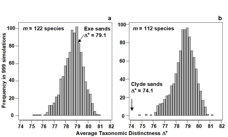
Fig. 17.7. UK regional study, free-living nematodes {U}. Histograms of simulated AvTD, from 999 sublists drawn randomly from a UK master list of 395 species. Sublist sizes of a) m=122, b) m=112, corresponding to the observed number of species in the Exe (ES) and Clyde (C1) surveys. True $\Delta ^ +$ also indicated: the Exe value is central but the null hypothesis that AvTD for the Clyde equates to that for the UK list as a whole is clearly rejected (p<0.001 or 0.1%)
Funnel plots

Fig. 17.8. UK regional study, free-living nematodes {U}. Funnel plot for simulated AvTD, as in Fig. 17.7, but for a range of sublist sizes m=10, 15, 20, …, 250 (x-axis). Crosses, and thick lines, indicate limits within which 95% of simulated $\Delta^+$ values lie; the thin line indicates mean $\Delta ^ +$ (the AvTD for the master list), which is not a function of m. Points are the true AvTD (y-axis) for the 14 location/habitat studies (see Fig. 17.6 for codes), plotted against their sublist size (x-axis).
Fig. 17.8 displays the funnel plot, catering for all sublist sizes. The simulated 95% probability limits are again based on 999 random selections for each of m = 10, 15, 20, …, 250 species from the 395. The mean $\Delta ^ +$ is constant for all m (at 78.7) but the limits become increasingly wide as the sample size decreases, reducing the likelihood of being able to detect a change in distinctness (i.e. reducing the power of the test). The probability limits also demonstrate the left-skewness of the $\Delta ^ +$ distribution about its mean throughout, though especially for low numbers of species. Superimposing the real $\Delta ^ +$ values for the 14 habitat/location combinations, five features are apparent:
-
The impacted areas of Clyde, Liverpool Bay, Fal and, to a lesser extent, Tamar, are all seen to have significantly reduced average distinctness, whereas pristine locations in the Exe and Scilly have $\Delta ^ +$ values close to that of the UK master list.
-
Unlike species richness (and in keeping with the ‘desirability criteria’ stated earlier), $\Delta^+$ does not appear to be strongly dependent on habitat type: Exe sand and mud habitats have very different numbers of species but rather centrally-placed distinctness; Scilly algal and sand habitats have near-identical $\Delta ^ +$ values. Warwick & Clarke (1998) also demonstrate a lack of habitat dependence in $\Delta ^ +$ from a survey of Chilean nematodes (data of W Wieser).
-
There is apparent monotonicity of response of the index to environmental degradation (also in keeping with another initial criterion). To date, there is no evidence of average taxonomic distinctness increasing in response to stress.
-
In spite of the widely differing lengths of their species lists, it is notable that the two Clyde studies (C1, C2) return rather similar (depressed) values for $\Delta ^ +$.
-
There is no evidence of any empirical relation in the ($\Delta ^ +$, S) scatter plot. We know from the sampling theory that the mechanics of calculating $\Delta ^ +$ does not lead to an intrinsic relationship between the two but that does not prevent there being an observed correlation; the latter would imply some genuine assemblage structuring which predisposed large communities to be more (or less) ‘averagely distinct’ than small communities. The lack of an intrinsic, mechanistic correlation greatly aids the search for such interesting observational relationships (see also the later discussion on AvTD, VarTD correlations). The same cannot be said for phylogenetic diversity, PD. Fig. 17.9a shows the expected near-linear relation between total PD and S for these meiofaunal studies (total TD and S would have given a similar picture) but, more significantly, Fig. 17.9b bears out the previous statements about the dependence also of average PD ($\Phi ^ +$) on S. This intrinsic relationship, shown by the declining curve for the expected value of $\Phi^+$ as a function of the number of species in the list, contrasts markedly with the constant mean line for $\Delta ^ +$ in Fig. 17.8. Nothing can therefore by read into an observed negative correlation of $\Phi ^ +$ and S in a practical study: such a relationship would be likely, as here, to be purely mechanistic, i.e. artefactual.
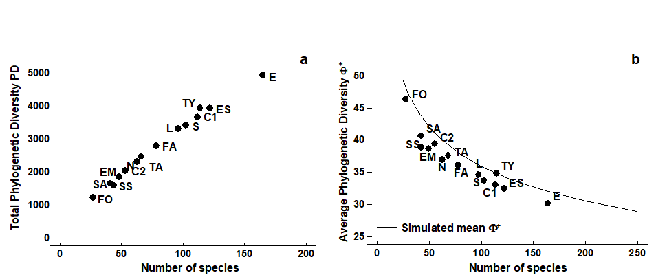
Fig. 17.9. UK regional study, free-living nematodes {U}. Scatter plots for the 14 location/habitat studies (Fig. 17.6) of: a) total PD, b) AvPD against list size m, the latter also showing the declining ‘expected’ mean $\Phi ^ +$ with m, simulated from sublists of the UK master list.
AvTD is therefore seen to possess many of the features listed at the beginning of the chapter as desirable in a biodiversity index – a function, in part, of its attractive mathematical sampling properties (for formal statistical results on unbiasedness and variance structure see Clarke & Warwick (1998b) and Clarke & Warwick (2001) ). Many questions remain, however – from theoretical issues of its dependence (or lack of it) on essentially arbitrary assumptions about relative weighting of step lengths through the taxonomic tree, to further practical demonstration of its performance (or lack of it) for other faunal groups and environmental impacts. The following example addresses these two questions in particular.
17.7 Example: N Europe groundfish surveys
An investigation of the taxonomic structure of demersal fish assemblages in the North Sea, English Channel and Irish Sea, motivated by concerns over the impacts of beam trawling, is reported by Rogers, Clarke & Reynolds (1999) . A total of 277 ICES quarter-rectangles were sampled for 93 species of groundfish {b}, by research vessels from different N European countries. Sampling effort per rectangle was not constant. For the purposes of display, quarter-rectangles were grouped into 9 larger sea-areas: 1–Bristol Channel, …, 9–Eastern Central N Sea (Fig. 17.10, see legend for area definitions).
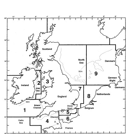
Fig. 17.10. Beam-trawl surveys, for groundfish, N Europe {b}. 277 rectangles from 9 sea areas. 1: Bristol Channel, 2: W Irish Sea, 3: E Irish Sea, 4: W Channel, 5: NE Channel, 6: SE Channel, 7: SW North Sea, 8: SE North Sea, 9: E Central North Sea.
There is a wealth of taxonomic detail to exploit in this case. The analysis uses a 14-level classification (Fig. 17.11), based on phylogenetic information, compiled by J.D. Reynolds (Univ E Anglia), primarily from Nelson (1994) and McEachran & Miyake (1990) . The distinctness structure of this master list, and its AvTD of $\Delta ^ + = 80.1$, for all groundfish species that could be reliably sampled and identified, becomes the standard against which the species lists from the various quarter-rectangles are assessed.
Fig. 17.11. Beam-trawl surveys, for groundfish, N Europe {b}. 14-level classification (phylogenetically-based) used for the construction of taxonomic distances between 93 demersal fish species, those that could be reliably sampled and identified for the 277 rectangles in this N European study.
Funnel plot
Fig. 17.12 displays the resulting funnel plot of the range of $\Delta ^ +$ values expected from sublists of size 5 to 35, repeating the mean, lower and upper limits in sub-plots of observed $\Delta ^ +$ values for the 9 sea areas. $\Delta ^ +$ is clearly seen to be reduced in some areas, particularly 6, 8 and 9, whilst remaining at ‘expected’ levels in others. Rogers, Clarke & Reynolds (1999) discuss possible explanations for this, noting the contribution made by the spatial pattern of elasmobranchs, a taxonomic group they argue may be particularly susceptible to disturbance by commercial trawling, because of their life history traits.
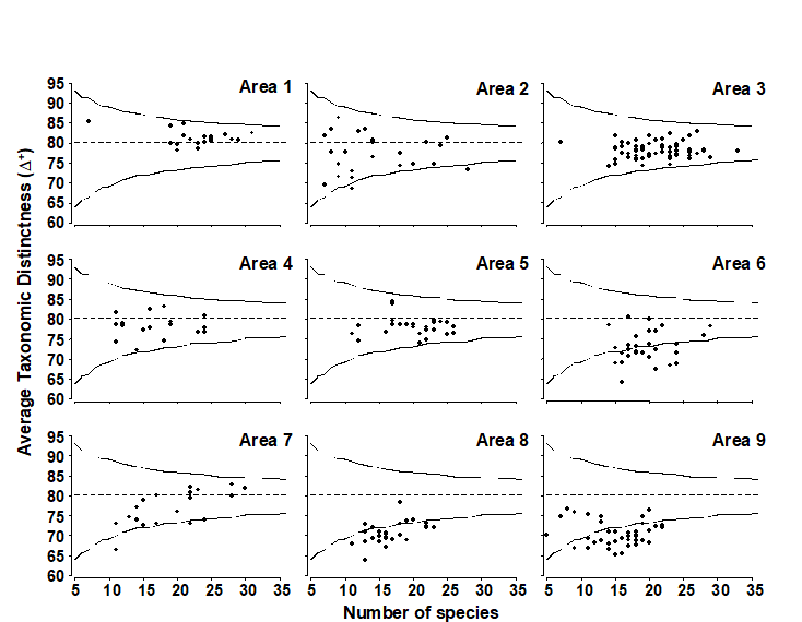
Fig. 17.12. Beam-trawl surveys, for groundfish, N Europe {b}. AvTD (presence/absence data) against observed number of species, in each of 274 rectangles, grouped into 9 sea areas (Fig. 17.10). Dashed line indicates mean of 5000 simulated sublists for each size m = 5, 6, 7, …, 35, confirming the theoretical unbiasedness and therefore comparability of $\Delta ^ +$ for widely differing degrees of sampling effort. Continuous lines denote 95% probability limits for $\Delta ^ +$ from a single sublist of specified size from the master list (of 93 species).
Weighting of step lengths
Many of the fine-scale phylogenetic groupings in Fig. 17.11 are utilised comparatively rarely (e.g. subgenera only within Raja, tribe only within the Pleuronectidae etc), and the standard assumption that all step lengths between taxonomic levels are given equal weight (7.69, in this case) may appear arbitrary. For example, if a new category is defined which is not actually used, then the resulting change in all the step lengths, in order to accommodate it, seems unwarranted. The natural alternative here is to make the step lengths proportional to the extent of group melding that takes place, larger steps corresponding to larger decreases in taxon richness. A null category would then add no additional step length. Table 17.1 shows the resulting taxonomic distances {$\omega ^ {(0)}$} between species connected at the differing levels, contrasted with the standard, equal-stepped, distances {$\omega$}. Obviously, both are standardised so that the largest distance in the tree (between species in the different classes Chondrichthyes and Osteichthyes) is set to 100.
Table 17.1. Beam-trawl surveys, for groundfish, N Europe {b}. The 13 taxonomic/phylogenetic categories (k) used in the groundfish study, the standard taxonomic distances {$\omega _ k$} and an alternative formulation {$\omega _ k ^ {(0)}$} based on taxon richness {sk} at each level. $\omega_k$ (or $\omega _ k ^ {(0)}$) is the path length between species from different taxon group k but the same group k+1.
 k k |
Taxon | sk | $\omega _ k$ | $\omega _ k ^ {(0)}$ |
|---|---|---|---|---|
| 1 | Species | 93 | 7.7 | 1.3 |
| 2 | Sub-genus | 89 | 15.4 | 6.9 |
| 3 | Genus | 72 | 23.1 | 8.9 |
| 4 | Tribe | 67 | 30.8 | 12.5 |
| 5 | Sub-family | 59 | 38.5 | 21.4 |
| 6 | Family | 41 | 46.2 | 22.9 |
| 7 | Super-family | 39 | 53.8 | 27.4 |
| 8 | Sub-order | 33 | 61.5 | 44.4 |
| 9 | Order | 14 | 69.2 | 54.9 |
| 10 | Series | 9 | 76.9 | 61.4 |
| 11 | Super-order | 7 | 84.6 | 65.6 |
| 12 | Sub-division | 6 | 92.3 | 85.3 |
| 13 | Class | 2 | 100.0 | 100.0 |
Fig. 17.13 demonstrates the minimal effect these revised weights have on the calculation of average taxonomic distinctness, $\Delta ^ +$ . It is a scatter plot of $\Delta ^ {+ (0)}$ (revised weights) against $\Delta ^ +$ (standard, equal-stepped, distances) for the 277 quarter-rectangle species lists. The relation is seen to be very tight, with only about 3 samples departing from near-linearity. (These are outliers of very low species richness – in one case as few as 2 species – and have been removed from Fig. 17.12.) Clearly, the relative values of $\Delta ^ +$ are robust in this case to the precise definition of the step-length weights, a reassuring conclusion which is also borne out for the UK nematode study {U}. For the data of Fig. 17.8, Clarke & Warwick (1999) consider the effects of various alternative step-length definitions, consistently increasing or decreasing the weights at higher taxonomic levels as well as weighting them by changes in taxon richness. The only alteration to the conclusions came from decreasing the step lengths at the higher (coarsest) taxonomic levels, especially suppressing the highest level altogether (so that species within different subclasses were considered no more taxonomically distant than those within different orders). The Scilly data sets then showed a clear change in their average distinctness in comparison with the other 11 $\Delta ^ +$ values.¶
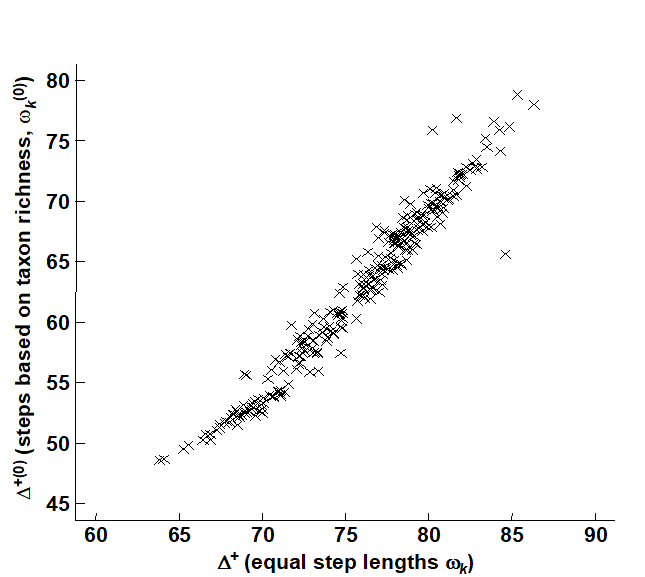
Fig. 17.13. Beam-trawl surveys, for groundfish, N Europe {g}. Comparison of observed $\Delta^+$, for each of 277 rectangles, between two weighting options for taxonomic distance between species: equal step-lengths between hierarchical levels (x-axis), and lengths proportional to change in taxonomic richness at that step (y-axis).
The unusual structure of the Scillies sublists is also exemplified, in a more elegant way, by considering not just average but variation in taxonomic distinctness.
¶ Both the PRIMER DIVERSE and TAXDTEST routines allow such compression of taxonomic levels, either at the top or bottom of the tree (or both), and also permit automatic computation of step-length weights based on changes in taxon richness and, indeed, any user-specified weighting.
17.8 Variation in taxonomic distinctness, $\Lambda ^ +$
VarTD was defined in equation (17.7), as the variance of the taxonomic distances {$\omega _ {ij}$} between each pair of species i and j, about their mean distance $\Delta ^ +$. It has the potential to distinguish differences in taxonomic structure resulting, for example, in assemblages with some genera becoming highly species-rich whilst a range of other higher taxa are represented by only one (or a very few) species. In that case, average TD may be unchanged but variation in TD will be greatly increased, and Clarke & Warwick (2001) argue (on a sample of one!) that this might be expected to be characteristic of island fauna, such as that for the Isles of Scilly.
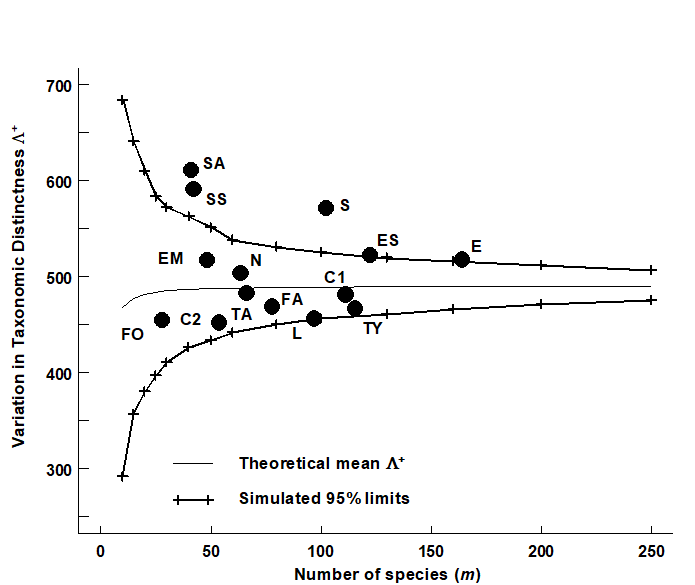
Fig. 17.14. UK regional study, free-living nematodes {U}. Funnel plot, as in Fig. 17.8, but for simulated VarTD ($\Lambda ^ +$), against sublist sizes m=10, 15, 20, …, 250 (x-axis), drawn from the 395-species master list. Thin line denotes the theoretical (and simulated) mean $\Lambda ^ +$, which is no longer entirely constant, declining very slightly for small values of m. The bias is clearly negligible, however, showing that (like $\Delta ^ +$) $\Lambda ^ +$ is comparable across studies with differing sampling effort (as here). Superimposed observed $\Lambda ^ +$ values for the 14 location/habitat combinations (Fig. 17.6) show a significantly larger than expected VarTD for the Scilly datasets.
For the UK nematode study {U}, Fig. 17.14 displays the funnel plot for VarTD ($\Lambda ^ +$) which is the companion to Fig. 17.8 (for AvTD, $\Delta ^ +$). It is constructed in the same way, by many random selections of sublists of a fixed size m from the UK master list of 395 nematode species, and recomputation of $\Lambda ^ +$ for each subset. The resulting histograms are typically more symmetric than for $\Delta ^ +$, as seen by the 95% probability limits for ‘expected’ $\Lambda ^ +$ values, across the full range of sublist sizes: m = 10, 15, 20, 25, …, shown in Fig. 17.14. Three features are noteworthy:
-
The simulated mean $\Lambda ^ +$ (thin line in Fig. 17.14) is again largely independent of sublist size, only declining slightly for very short lists (and the slight bias is dwarfed by the large uncertainty at these low sizes). Clarke & Warwick (2001) derive an exact formula for the sampling bias of $\Lambda ^ +$ and show, generally, that it will be negligible. This again has important practical implications because it allows $\Lambda ^ +$ to be meaningfully compared across (historic) studies in which sampling effort is uncontrolled.
-
The various UK habitat/location combinations all fall within ‘expected’ ranges, with the interesting exception of the Scilly data sets. These have significantly higher VarTD values, as discussed above.
-
$\Lambda ^ +$ therefore appears to be extracting independent information, separately interpretable from $\Delta ^ +$, about the taxonomic structure of individual data sets. This assertion is testable by a bivariate approach.
17.9 Joint (AvTD, VarTD) analyses
The histogram and funnel plots of Figs. 17.7 and 17.8 are univariate analyses, concentrating on only one index at a time. Also possible is a bivariate approach in which ($\Delta ^ +$, $\Lambda ^ +$) values are considered jointly, both in respect of the observed outcomes from real data sets and their expected values under subsampling from a master species inventory. Fig. 17.15 shows the results of a large number of random selections of m = 100 species from the 395 in the UK nematode list {U}; each selection gives rise to an (AvTD, VarTD) pair and these are graphed in a scatter plot (Fig. 17.15a). Their spread defines the ‘expected’ region (rather than range) of distinctness behaviour, for a sublist of 100 species. Superimposed on the same plot are the observed ($\Delta ^ +$, $\Lambda ^ +$) pairs for three of the studies with list sizes of about that order: all three (Clyde, Liverpool Bay and Scilly) are seen to fall outside the expected structure, though in different ways, as previously discussed.
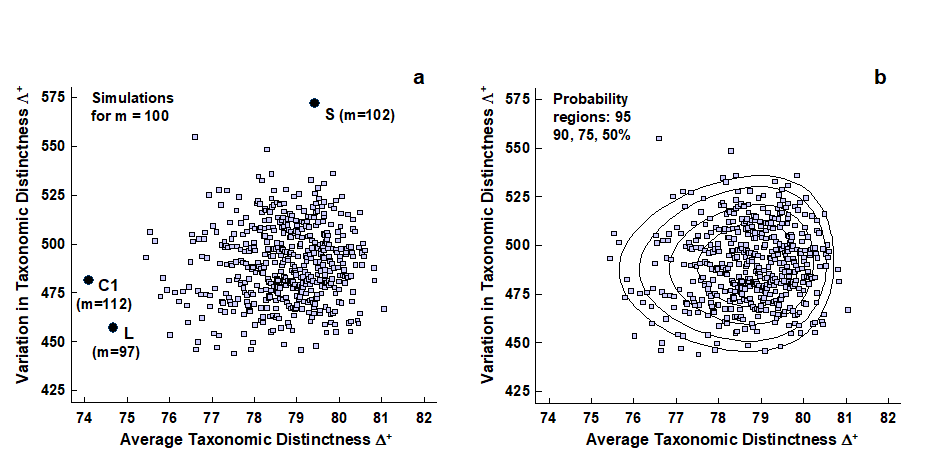
Fig. 17.15. UK regional study, free-living nematodes {U}. a) Scatter plot of (AvTD, VarTD) pairs from random selections of m = 100 species from the UK nematode list of 395; also superimposed are three observed points: Clyde (C1), Liverpool Bay (L) and Scilly (S), all falling outside ‘expectation’. b) Probability contours (back-transformed ellipses) containing approximately 95, 90, 75 and 50% of the simulated values. Both plots are based on 1000 simulations though only 500 points are displayed, for clarity.
‘Ellipse’ plots
It aids interpretation to construct the bivariate equivalent of the univariate 95% probability limits in the histogram or funnel plots, namely a 95% probability region, within which (approximately) 95% of the simulated values fall. An adequate description here is provided by the ellipse from a fitted bivariate normal distribution to separately transformed scales for $\Delta ^ +$ and $\Lambda ^ +$.
AvTD in particular needs a reverse power transform to eliminate the left-skewness though, as previously noted, any transformation of VarTD can be relatively mild, if needed at all. Clarke & Warwick (2001) discuss the fitting procedure in detail¶ and Fig. 17.15b shows its success in generating convincing probability contours, containing very close to the nominal levels of 50, 75, 90 and 95% of simulated data points. In the normal convention, the ‘expected region’ is taken as the outer (95%) contour, which is an ellipse on the transformed scales, though typically ‘egg-shaped’ when back-transformed to the original ($\Delta ^ +$, $\Lambda ^ +$) plot.
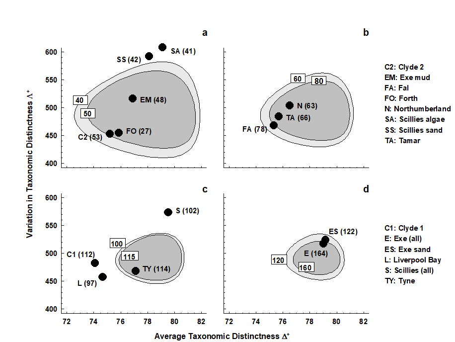
Fig. 17.16. UK regional study, free-living nematodes {U}. ‘Ellipse’ plots of 95% probability regions for (AvTD, VarTD) pairs, as for Fig. 17.15 but for a range of sublist sizes: a) m = 40, 50; b) m = 60, 80; c) m = 100, 115; d) m = 120, 160. The observed ($\Delta ^ +$, $\Lambda ^ +$) values for the 14 location/habitat studies are superimposed on the appropriate plot for their particular species list size (given in brackets). As seen in the separate funnel plots (Figs. 17.8 and 17.14), Clyde, Liverpool Bay, Fal (borderline) and all the Isles of Scilly data sets depart significantly from expectation.
A different region needs to be constructed for each sublist size or, in practice, for a range of m values, straddling the observed sizes. It may improve clarity to plot the regions in groups of two or three, as in Fig. 17.16. The conclusions are largely unchanged here, perhaps querying the need for a bivariate approach. However, there are at least three advantages to this:
-
A bivariate test naturally compensates for repeated testing which is inherent in separate univariate tests.
-
The ‘failure to reject’ region of the null hypothesis, inside the simulated 95% probability contour, is not rectangular, as it would be for two separate tests. This opens the possibility for other faunal groups, where simulated $\Delta ^ +$ and $\Lambda ^ +$ values may be negatively correlated (as appears to happen for components of the macrobenthos, Clarke & Warwick (2001) ), that significance could follow from the combination of moderately low AvTD and VarTD values, where neither of them on their own would indicate rejection.
-
It aids interpretation of spatial biodiversity patterns to know whether there is any intrinsic, artefactual correlation to be expected between the two indices, resulting from the fact that they are both calculated from the same set of data. Here, Fig. 17.15 shows emphatically that no such internal correlation is to be expected (though, as just commented, the independence of $\Delta ^ +$ and $\Lambda ^ +$ is not a universal result, and needs to be examined by simulation for each new master list). Yet the empirical correlation between $\Delta ^ +$ and $\Lambda ^ +$ for the 14 studies is not zero but large and positive (Fig. 17.17). This implies a genuine correlation from location to location in these two assemblage features, which it is legitimate to interpret. The suggestion ( Clarke & Warwick (2001) ) is that pollution may be connected with a loss both of the normal wide spread of higher taxa (reduced $\Delta ^ +$), and that the higher taxa lost are those with a simple subsidiary structure, represented only by one or two species, genera or families, leaving a more balanced tree (reduced $\Lambda ^ +$).
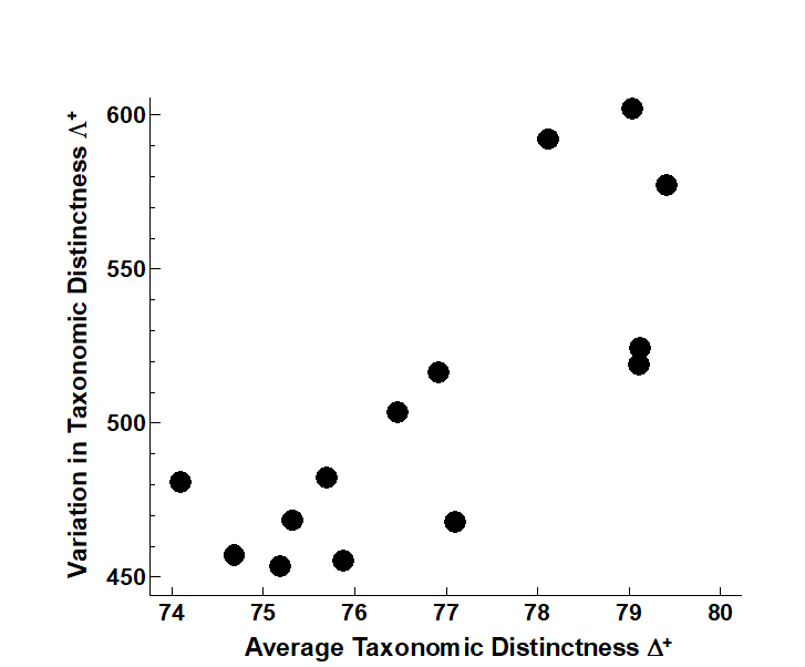
Fig. 17.17. UK regional study, free-living nematodes {U}. Simple scatter plot of observed (AvTD, VarTD) values for the 14 location/ habitat studies, showing the strongly positive empirical correlation (Pearson r = 0.79), which persists even if the three Scilly values are excluded (r = 0.75).
¶ Accomplished by the PRIMER TAXDTEST routine, which automatically carries out the simulations and transformation/fitting of bivariate probability regions to obtain (transformed) ‘ellipse’ plots, for specified sublist sizes, on which real data pairs ($\Delta ^ +$, $\Lambda ^ +$) may be superimposed. Another variation introduced into TAXDTEST in later versions of PRIMER is to generate the model histograms, funnels etc for the ‘expected’ AvTD, VarTD not by assembling species by simple random picks from the master list, but by selecting species proportionally to their frequency of occurrence in a master data matrix (which will often be just the set of all samples in the study) – it can be argued that this provides a more realistic null hypothesis against which to compare the observed relatedness. The mean AvTD line is no longer quite independent of S (though dependence is weak) but funnels can be generated in just the same way – they may move slightly up or down the y axis, but again this modelling in no way changes the observed indices.
17.10 Concluding remarks on taxonomic distinctness
Early applications of taxonomic distinctness ideas in marine science can be found in Hall & Greenstreet (1998) for demersal fish, Piepenburg, Voss & Gutt (1997) for starfish and brittle-stars in polar regions, Price, Keeling & O’Callaghan (1999) for starfish in the Atlantic, and Woodd-Walker, Ward & Clarke (2002) for a latitudinal study of pelagic copepods. An early non-marine example is the work of Shimatani (2001) for forest stands. Over the last decade the index has become very widely used and cited. A bivariate example is given by Warwick & Light (2002) who use ‘ellipse’ plots of expected ($\Delta ^ +$, $\Lambda ^ +$) values, from live faunal records of the Isles of Scilly, to examine whether easily sampled bivalve and gastropod ‘death assemblages’ could be considered representative of the taxonomic distinctness structure of the live fauna.
Too much should not be claimed for these methods. It is surprising that anything sensible can be said about diversity at all, for data consisting simply of species presences, and arising from unknown or uncontrolled sampling effort (which usually renders it impossible to read anything into the relative size of these lists). Yet, much of the later part of this chapter suggests that not only can we find one index (AvTD) which is comparable across such studies, capturing an intuitive sense of biodiversity, but we can also find a second one (VarTD), with equally good statistical properties, and which may (sometimes at least) capture a near independent attribute of biodiversity structure.
Nonetheless, it is clear that controlled sampling designs, carried out in a strictly uniform way across different spatial, temporal or experimental conditions, must provide additional, meaningful, comparative diversity information (on richness, primarily) that $\Delta ^ +$ and $\Lambda ^ +$ are designed to ignore. Even here, though, concepts of taxonomic relatedness can expand the relevance of richness indices: rather than use S, or one of its variants (see Chapter 8), total taxonomic distinctness (TTD) or total phylogenetic diversity (PD), see page 17.4, capture the richness of an assemblage in terms of its number of species and whether they are closely or distantly related.
Sensitivity and robustness
Returning to the quantitative form $\Delta^*$, the Ekofisk oilfield study suggested that such relatedness measures may have a greater sensitivity to disturbance events than is seen with species-level richness or evenness indices ( Warwick & Clarke (1995a) and Warwick & Clarke (1995b) ). This suggestion was not borne out by subsequent oil-field studies ( Somerfield, Olsgard & Carr (1997) ), particularly where the impact was less sustained, the data collection at a less extensive level and hence the gradients more subtly entwined with natural variability. But it would be a mistake to claim sensitivity as a rationale for this approach: there is much empirical evidence that the best way of detecting subtle community shifts arising from environmental impacts is not through univariate indices at all, but by non-parametric multivariate display and testing (Chapter 14). The difficulty with the multivariate techniques is that, since they match precise species identities through the construction of similarity coefficients, they can be sensitive to wide scale differences in habitat type, geographic location (and thus species pool) etc.
Though independent of particular species identities, many of the traditional univariate indices have their own sensitivities, to habitat type, dominant species and sampling effort differences, as we have discussed. The general point here is that robustness (to sampling details) and sensitivity (to impact) are usually conflicting criteria. What is properly claimed for average taxonomic distinctness is not sensitivity but:
a) relevance – it is a genuine reflection of biodiversity loss, gain, or neither (rather than recording simply a change of assemblage composition), and one that appears to respond in a monotonic way to impact;
b) robustness – it can be meaningfully compared across studies from widely separated locations, with few (or even no) species in common, from different habitats, using data in presence/absence form (and thus not sensitive to dominant species), and with different sampling effort. This makes its natural use the comparison of regional/global studies and/or historic data sets, and it is no surprise to find that many of the citing papers address such questions.
Taxonomic artefacts
A natural question is the extent to which relatedness indices are subject to taxonomic artefacts. Linnean hierarchies can be inconsistent in the way they define taxonomic units across different phyla, for example. This concern can be addressed on a number of levels. As suggested earlier, the concept of mutual distinctness of a set of species is not constrained to a Linnean classification. The natural metric may be one of genetic distance (e.g.
Nei (1996)
) or that from a soundly-based phylogeny combining molecular approaches with more traditional morphology. The Linnean classification clearly gives a discrete approximation to a more continuous distinctness measure, and this is why it is important to establish that the precise weightings given to the step lengths between taxonomic levels are not critical to the relative values that the index takes, across the studies being compared. Nonetheless, it is a legitimate concern that a cross-phyletic distinctness analysis could represent a simple shift in the balance of two major phyla as a decrease in biodiversity, not because the phylum whose presences are increasing is genuinely less (phylogenetically) diverse but because its taxonomic sub-units have been arbitrarily set at a lower level. Such taxonomic artefacts can be examined by computing the (AvTD, VarTD) structure across different phyla in a standard species catalogue, and
Warwick & Somerfield (2008)
show that the 4 major marine phyla do not suffer badly from this problem, though rare phyla with few species do have substantially lower AvTD. The pragmatic approach, as here, is to work within a well-characterised, taxonomically coherent group.
Master species list
Concerns about the precise definition of the master list (e.g. its biogeographic range or habitat specificity) also naturally arise. Note, however, that the existence of such a wide-scale inventory is not a central requirement, more of a secondary refinement. It is not used in constructing and contrasting the values of $\Delta ^ +$ for individual samples, and only features in two ways in these analyses:
-
In the funnel plots (Figs. 17.8, 17.12, 17.14), location of the points does not require a master species list, the latter being used only to display the background reference of the mean value and limits that would be expected for samples drawn at random from such an inventory. In Fig. 17.12, in fact, the limits are not even that relevant since they apply to single samples rather than, for example, to the mean of the tens of samples plotted for each sea area. The most useful plot for interpretation here is simply a standard means plot of the observed mean $\Delta ^ +$ and its 95% confidence interval, calculated from the replicates for each sea area (see Rogers, Clarke & Reynolds (1999) and Warwick & Clarke (2001) ).
-
In Table 17.1 and Fig. 17.3, the master species list is employed to calculate step lengths in a revised form of $\Delta ^ +$ – weighting by taxon richness at the different hierarchical levels. The existence of a master inventory makes this procedure more appealing, since if the taxon richness weighting was determined only by the samples to hand, the index would need to be adjusted as each new sample (containing further species) was added. The message of this chapter, however, is that the complication of adjusting weights in $\Delta ^ +$ for differences in taxon richness is unnecessary. Constant step lengths appear to be adequate.
The inventory is therefore only used for setting a background context, the theoretical mean and funnel limits. Various lists could sensibly be employed: global, local geographic, biogeographic provinces, or simply the combined species list of all the studies being analysed. The addition of a small number of newly-discovered species to the master inventory is unlikely to have a detectable effect on the overall mean and funnel for $\Delta ^ +$. If these are located in the taxonomic tree at random with respect to the existing taxa (rather than all belonging to the same high or low order group) they will have little or no effect on the theoretical mean $\Delta ^ +$. This, of course, is one of the advantages of using an index of average rather than total taxonomic distinctness.
It also makes clear what the limitations are to the validity of $\Delta ^ +$ comparisons. Whilst many marine community studies seem to consist of the low-level (species or genera) identifications which are necessary for meaningful computation of $\Delta ^ +$, there are always some taxa that cannot be identified to this level. There is no real difficulty here, since $\Delta ^ +$ is always used in a relative manner, provided these taxa are treated in the same way in all samples (e.g. treated as a single species in a single genus, single family, etc., of that higher taxon). The ability to impose taxonomic consistency is clearly an important caveat on the use of taxonomic distinctness for historic or widely-sourced data sets. Where such conditions can be met, however, we believe that these and similar formulations based on species relatedness, have a useful role in biodiversity assessment of biogeographic pattern and widescale change.
17.11 Taxonomic dissimilarity
A natural extension of the ideas of this chapter is from $\alpha$- or ‘spot’ diversity indices to $\beta$- or ‘turn-over’ diversity. The latter are essentially based on measures of dissimilarity between pairs of samples, the starting point for most of the methods of this manual. It is intriguing to ask whether there are natural analogues of some of the widely-used ‘biological’ dissimilarity coefficients, such as Sørensen (Bray-Curtis on presence/absence data, equation 2.7) or Kulczynski (P/A, equation 2.8), which exploit the taxonomic, phylogenetic or genetic relatedness of the species making up the pair of samples being compared. Thus two samples would be considered highly similar if they contain the same species, or closely related ones, and highly dissimilar if most of the species in one sample have no near relations in the other sample.
In fact, Clarke & Warwick (1998a) first defined a taxonomic mapping similarity between two species lists, in order to examine the taxonomic relatedness of the species sets successively ‘peeled’ from the full list, in a structural redundancy analysis of influential groups of species (the M statistic of Chapter 16, Table 16.2). This turns out to be the natural extension of Kulczynski dissimilarity and (to be consistent with our use in Chapter 17 of u.c. Greek characters for taxonomic relatedness measures) it is denoted here by $\Theta ^ +$. Izsak & Price (2001) used a slightly different form of coefficient, which proves to be the extension of the Sørensen coefficient, denoted here by $\Gamma ^ +$. Before defining these coefficients, however, it is desirable to state the potential benefits of such a taxonomic dissimilarity measure:
a) samples from different biogeographic regions do not lend themselves to conventional clustering or MDS ordination analyses using Sørensen (Bray-Curtis) or other traditional similarity coefficients. This is because few species may be shared between samples from different parts of the world. In extreme cases, there may be no species in common among any of the samples and all Bray-Curtis dissimilarities will be 100, leaving no possibility for a dendrogram or ordination plot. A taxonomic dissimilarity measure, however, takes into account not just whether the second sample has matching species to the first sample but, if it does not, whether there are closely related species in the second sample to all those found in the first sample (and vice-versa). Two lists with no species in common therefore have a defined dissimilarity, measuring whether they contain distantly or closely related species, and meaningful MDS plots ensue.
b) standard similarity measures will, inevitably, be susceptible to variation in taxonomic expertise or (in the case of time series) revisions in taxonomic definition, across the samples being compared. For example, suppose at some point in a time series, an increase in taxonomic expertise results in what was previously identified as a single taxon being noted as two separate species. The data should, of course, be subsequently rationalised to the lowest common denominator of taxonomic identification over the full series, but if this is not done, an ordination will have a tendency to display some artefactual signal of ‘community change’ at this point (one species has disappeared and two new ones have appeared). A single occurrence of this sort will not have much effect – one of the advantages of similarities based on presence/absence data is that they draw only a little information from each species – but if taxonomic inconsistency is rampant, misleading ordinations could result. Taxonomic dissimilarity would, however, be more robust to species being split in this way. The later samples do not appear to have the same taxon as the earlier samples, but they have one (or two) species which are very closely related to it (the same genus), hence retain high contributions to similarity from that species.
c) it might be hoped that the desirable sampling properties of taxonomic distinctness indices such as $\Delta ^ +$ and $\Lambda ^ +$, in particular their robustness to variable sampling effort across the samples, would carry over to taxonomic dissimilarity measures.
Taxonomic dissimilarity definition
As in Table 16.2, the distance through the taxonomic, (or phylogenetic/genetic) hierarchy, from every species in the first sample (A) to its nearest relation in the second sample (B), is recorded. These are totalled, as are the distances between species in sample B and their nearest neighbours in sample A, see the example in Fig. 17.18. These two totals are not the same, in general, and the way they are converted to an average taxonomic distance between the two samples defines the difference between $\Gamma ^ +$ and $\Theta ^ +$. Formally, if $\omega _ {ij}$ is the path length between species i and j, and there are $s _ A$ and $s _ B$ species in samples A and B, then:
$$\Gamma ^ + = 100 \times \left( \sum _ {i \in A} \min _ {j \in B} ( \omega _ {ij} ) + \sum _ {j \in B} \min _ {i \in A} ( \omega _ {ji}) \right) \big/ (s _ A + s _ B)$$ $$\Theta ^ + = 100 \times \frac{1}{2} \left( \frac{ \sum _ {i \in A} \min _ {j \in B} ( \omega _ {ij} )}{s _A} + \frac{ \sum _ {j \in B} \min _ {i \in A} ( \omega _ {ji})}{s _B} \right) \tag{17.8}$$
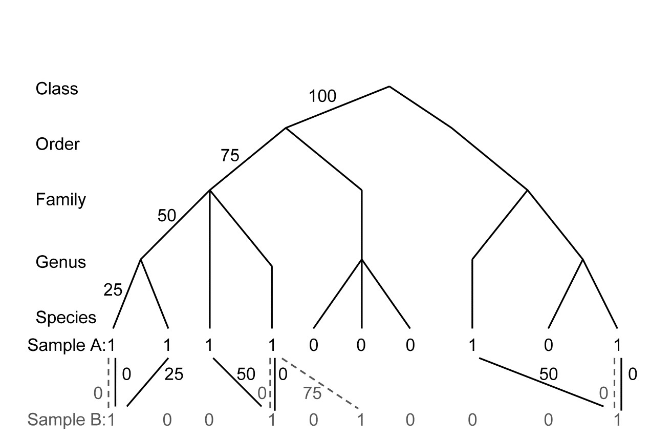
Fig. 17.18. For presence/absences from two hypothetical samples (A with 6 species, B with four), distances through the tree from each species in A to its nearest neighbour in B (black, continuous join) and vice-versa (grey, dashed join).
In words, $\Gamma ^ +$ is the average path length to the nearest relation in the opposite sample¶, i.e. a simple average of all the path lengths shown in Fig. 17.18. Thus:
$$\Gamma ^ + = [(0+25+50+0+50+0)+(0+0+75+0)]/(6+4) = 20.0 $$
whereas $\Theta ^ +$ is a simple mean of the separate averages in the two directions: A to B, then B to A. Thus:
$$\Theta ^ + = [(125/6) + (75/4)]/2 = 19.8 $$
Clearly, the two measures give identical answers if the number of species is the same in the two samples, and they cannot give very different dissimilarities unless the richness is highly unbalanced. This is precisely as found for the relationship between the Bray-Curtis and Kulczynski measures on P/A data; they cannot give a different ordination plot unless species numbers are very variable. The relation of these standard coefficients to $\Gamma ^ +$ and $\Theta ^ +$ is readily seen: imagine flattening the taxonomic hierarchy to just two levels, species and genus, with all species in the same genus, so that different species are always 100 units apart. The branch length between a species in sample A and its nearest neighbour in sample B is either 0 (the same species is in sample B) or 100 (that species is not found in sample B). In that case:
$$\Gamma ^ + = (300 + 100)/(6+4) = 40.0 \equiv B ^ + $$ $$ \Theta ^ + = (300/6 + 100/4)/2 = 37.5 \equiv K ^ + \tag{17.8}$$
where $B ^ +$ and $K ^ +$ denote Bray-Curtis and Kulczynski dissimilarity for P/A data, respectively. The truth of this identity can be seen from their general definitions (see equations 2.7 and 2.8 for the similarity forms):
$$ B ^ + = (100 b + 100 c)/[(a + b) + (a + c)] $$ $$ K ^ + = [(100 b)/(a + b) + (100 c) / (a + c)]/2 \tag{17.9} $$
where b is the number of species present in sample A but not sample B, c is the number present in B but not A, and a is the number present in both. Clearly, 100b is the total of the (a+b) path lengths from A to B, and 100c the total of the (a+c) path lengths from B to A.
Taxonomic dissimilarity, $\Gamma ^ +$, is therefore a natural generalisation of the Sørensen coefficient, adding a more graded hierarchy on top of standard Bray-Curtis (instead of matching ‘hits’ and ‘misses’ there are now ‘near hits’ and ‘far misses’). In some ways, this is analogous to the relationship shown earlier, between Simpson diversity ($\Delta ^ \circ$) and taxonomic diversity ($\Delta$), and it has two likely consequences:
-
ordinations based on $\Gamma ^ +$ will bear an evolutionary, rather than revolutionary, relationship to those based on P/A Bray-Curtis†; when there are many direct species matches $\Gamma ^ +$ may tend to track B$^ +$ rather closely.
-
$\Gamma ^ +$ will tend to carry across the sampling properties of B$^ +$; it is well-known that Bray-Curtis (and indeed, all widely-used dissimilarity coefficients) are susceptible to bias from variations in sampling effort. It is axiomatic in multivariate analysis that similarities be calculated between samples which are either rigidly controlled to represent the same degree of sampling effort, or in the case of non-quantitative sampling, samples are large enough for richness to be near the asymptote of the species -area curve (this is very difficult to arrange in most practical contexts!) Otherwise, it is inevitable that samples of smaller extent will contain fewer species and thus similarities calculated with larger samples will be lower, even when true assemblages are the same. Theory shows that, indeed, $\Gamma ^ +$ and $\Theta ^ +$ (along with B$^ +$, K$ ^ +$, $\Phi ^ +$) are not independent of sampling effort, so the third of our hoped-for properties for taxonomic dissimilarity – that it would carry across the nice statistical properties of taxonomic distinctness measures $\Delta ^ +$ and $\Lambda ^ +$ – is not borne out§.
The other two potential advantages of taxonomic dissimilarity, given above, do stand up to practical examination. One of us (PJS), in the description of these taxonomic dissimilarity measures in Clarke, Somerfield & Chapman (2006) , gives the following two examples.
¶ $\Gamma ^ +$ is the taxonomic distance, ‘TD’, of Izsak & Price (2001) (not to be confused with the AvTD and TTD of this chapter, which are diversity indices not dissimilarities!), except that the longest path length in their taxonomic trees is not scaled to a fixed number, such as 100 or 1, so they rescale it in similarity form, denoted $\Delta _s$.
† It is tempting to define, by analogy with equations (17.1) to (17.3), a further coefficient, the ratio $\Phi ^ + = \Gamma ^ + / B ^ +$, which reflects more purely the relatedness dissimilarity, removing the Bray-Curtis component in $\Gamma ^ +$, coming from direct species matches. In fact, $\Phi ^ +$ is simply the average of the minimum distance from each species to its nearest relation in the other sample, calculated only for the ‘b+c’ species which do not have a direct match. It is thus independent of ‘a’ (number of matches) as well as ‘d’ of course (number of joint absences). Limited practical experience, however, suggests that $\Phi ^ +$ tends to ‘throw the baby out with the bathwater’ and leads to uninterpretably ‘noisy’ ordination plots.
§ Note, however, that Izsak & Price (2001) provide some limited simulation evidence for $\Gamma ^ +$ being less biased by uneven sampling effort than one of the other standard P/A indices, Jaccard, equation (2.6). This suggests that the comparison with Sørensen – the more natural comparator, given the above discussion – would also indicate some advantage for the taxonomic dissimilarity measure (Jaccard and Sørensen are quite closely linked, in fact monotonically related, so they produce identical non-metric MDS plots for example).
17.12 Examples
Example: Island fish species lists
Fish species lists extracted from FishBase for a selection of 26 world island groups {i} were slimmed down to leave only species that are ‘endemic’ to the total list, in the sense of being found at only one of these 26 locations. This is an artificial construction, clearly, but it makes the point that the presence/absence matrix which results could never be input to species-level multivariate analysis because all locations then have no species in common, i.e. are 100% dissimilar to each other, and the Bray-Curtis resemblance matrix is uninformative. However, if the taxonomic dissimilarity $\Gamma ^ +$ is calculated for this data, the MDS ordination of Fig. 17.19 is obtained.
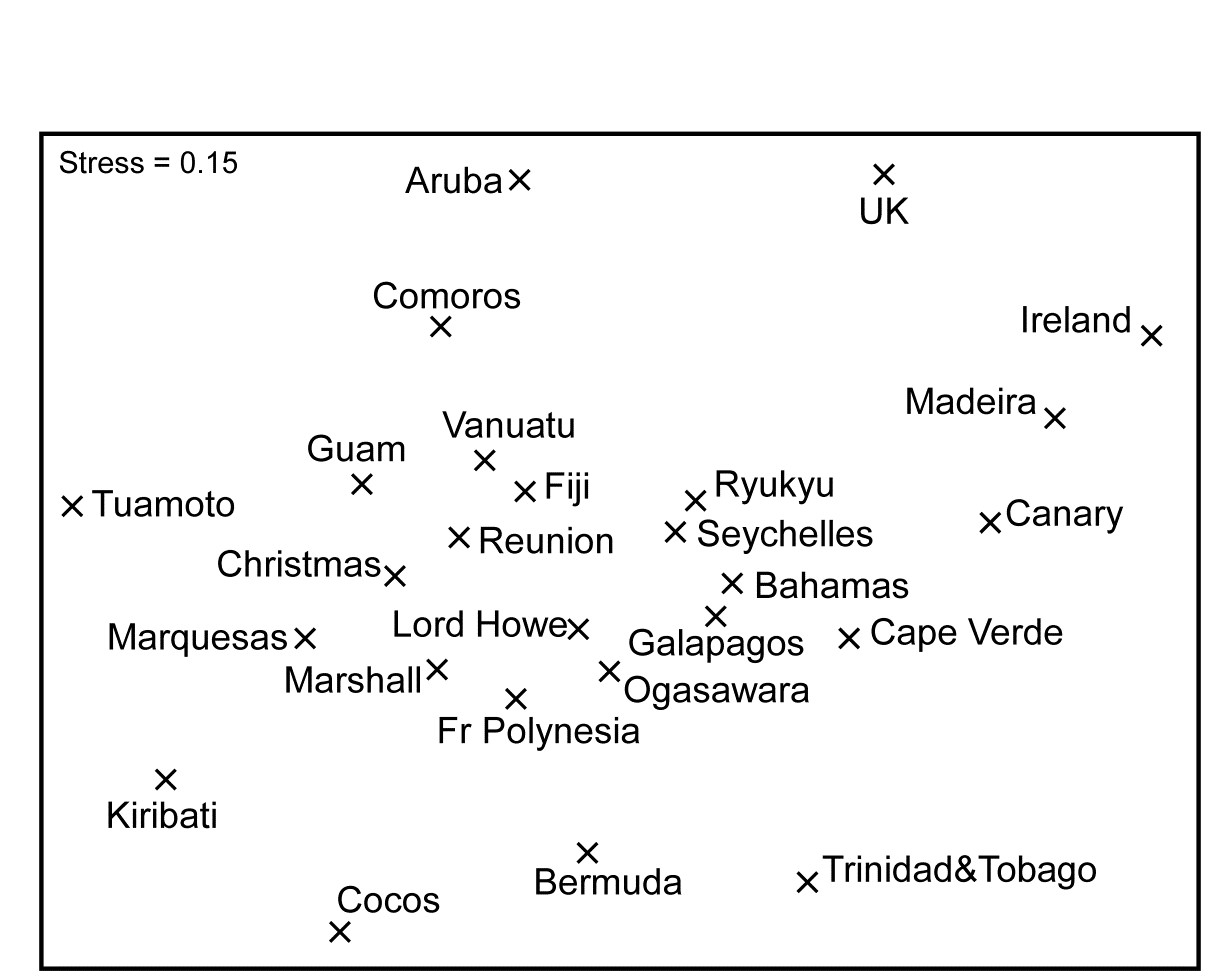
Fig. 17.19. Island group fish species {i}. nMDS ordination from presence/absence data on (pseudo-)endemic species found at 26 island groups, using taxonomic dissimilarity $\Gamma ^ +$.
Whilst this has reasonably high stress, a somewhat interpretable pattern of biogeographic relationships among the island groups is evident.
Example: Valhall oilfield macrofauna
This is another oilfield study, similar to the Ekofisk data ({E}), in which sediment samples are taken at one of five distance groups from the oilfield centre (0.5, 1, 2, 4 and 6 km), in a cross-hair design, and the macrobenthos examined through the time-course of operation of the field (data discussed by Olsgard, Somerfield & Carr (1997) , {V}). The data used here is of 20 samples taken in two years, 1988 and 1991, and the questions of interest concern not just whether a gradient of change exists in the community moving away from the field (which is clear) but whether this gradient is longer – a more accentuated change – in the later year.
After reduction to presence/absence and computation of Bray-Curtis dissimilarity (Sørensen, in effect, see equation 2.7) the nMDS of data from both years in a single ordination is shown in Fig. 17.20a. Whilst it is clear that there is a gradient of change away from the field in a parallel direction for the two years, the most obvious feature is the apparently large change in the community between 1988 and 1991 at all distances, and this certainly makes it difficult to gauge the size of relative changes along the two gradients. This gulf between the two years, e.g. even in the background community at 6km distant from the field, would not be expected at all, and is quite clearly an artefact. It does not take long to realise that the problem was that in 1988 (presumably with less-skilled contractors) the species were not identified with the same degree of discrimination: many species identified only as A in the earlier year had been split into species A and B (or even A, B, C, ..) in the later year, leading to an apparent major increase in species richness! Such an (artefactual) change in the data – an apparent influx of a large number of ‘new’ species – is certain to lead to the wide division of the two years in the MDS. The best solution, of course, is always to work with data at the lowest common denominator of identification: loss of precision in failing to split ‘difficult’ species is usually inconsequential in comparison to artefacts that arise from using inconsistent identification.
Such identification issues can be less obvious than in this case, of course: they may occur infrequently and balance out in terms of numbers of species recorded.

Fig. 17.20. Valhall oilfield macrofauna {V}. nMDS ordinations of macrobenthos from 20 sites in 5 distance groups from the oilfield centre, sampled in 1988 and 1991, using presence/absence data and: a) Bray-Curtis (Sørensen); b) taxonomic dissimilarity $\Gamma ^ +$.
One possibility, if such problems are suspected, is simply to coarsen the data by aggregation to a much higher taxonomic level (Chapter 10), but a less severe course, retaining the finer identification structure, is to use a taxonomic dissimilarity measure. The effect is to say that, whilst species B, C, .. in the later year may not have exact counterparts in the earlier year, they will have a species which is very closely related (species A) and thus contribute little to dissimilarity between the two years. This follows because species which are discriminated to a greater or lesser degree will still usually be placed in the same slightly higher taxonomic group (e.g. genus or family). The dramatic effect of using $\Gamma ^ +$ and not Bray-Curtis on the Valhall data can be seen in Fig. 17.20b. There is still likely to be an artefactual gulf between the years, though they are now much closer together; it can be argued that the distant ‘reference’ samples converge to a greater extent, the remaining difference still being identification issues though one cannot rule out some natural time changes over a wide spatial scale. But what is unarguable is that it is much easier to see the relative scale of gradient change with distance, and note that there is no strong evidence for it having lengthened.
Chapter 18: Bootstrapped averages for region estimates in multivariate means plots
18.1 Means plots
Several examples have been seen in previous chapters of the advantages of viewing ordination plots of the samples averaged over replicates within each factor level, or sometimes over the levels of other factors. This reduces the variance (technically, ‘multivariate dispersion’) in the resulting mean samples, usually allowing the structure of factor levels, e.g. patterns over sites, times or treatments, to be viewed with low stress on a 2- or 3-d non-metric or metric MDS plot. Chapter 5 (e.g. page 5.7 and the footnote on page 5.9) discusses the range of choices here, from averaging transformed data, through averaging similarities, to calculating distances among centroids in high-d PCO space computed from the resemblances, and the point was made that there is not often much practical difference in the resulting ordination of these means.
Here we shall concentrate on just the simplest, and most common case, that of replicate data from a one-factor design (which may, of course, result from a combination of two or more crossed factors or from examining a higher level of a nested design in which the replicates are the averaged levels of the factor immediately below). If the data is univariate, e.g. a diversity measure computed from replicate transects of coral communities sampled over a series of years, standard practice would be to test for inter-annual differences using the replicate data and then construct a means plot with interval estimates, as in Fig. 14.5. It is rare in such cases to see a plot of the replicate values themselves, plotted against year, because the large variability from transect to transect in the index can make it difficult to see the patterns, even where these are clearly established by the hypothesis tests. And so it should be with a multivariate response, e.g. the coral species communities themselves: a useful mantra will often be to test effects using replicates but – having established the existence of such effects – to display them in ordinations on averaged data.
18.2 Example: Indonesian reef corals, S. Tikus
The point is made here in Fig 18.1 for the Shannon diversity of coral community transects (% cover data) at S. Tikus Island, Indonesia {I} first met in Fig 6.5. Normal-theory based tests are usually entirely valid for most diversity indices, often without transformation, since the normality is typically induced by the central limit theorem, most indices being a sum over a large number of species contributions. Pairwise tests show a clear diversity change in 1983, post the El Niño-induced bleaching event, and change again of the index thereafter, but still distinct from its 1981 level. This interpretation is evident from the means plot of Fig 18.1b (though it is by no means as clear in the replicate plot, 18.1a!). The means plot also allows the direct inference that, in the later years, the index is intermediate between its 1981 and 1983 levels.
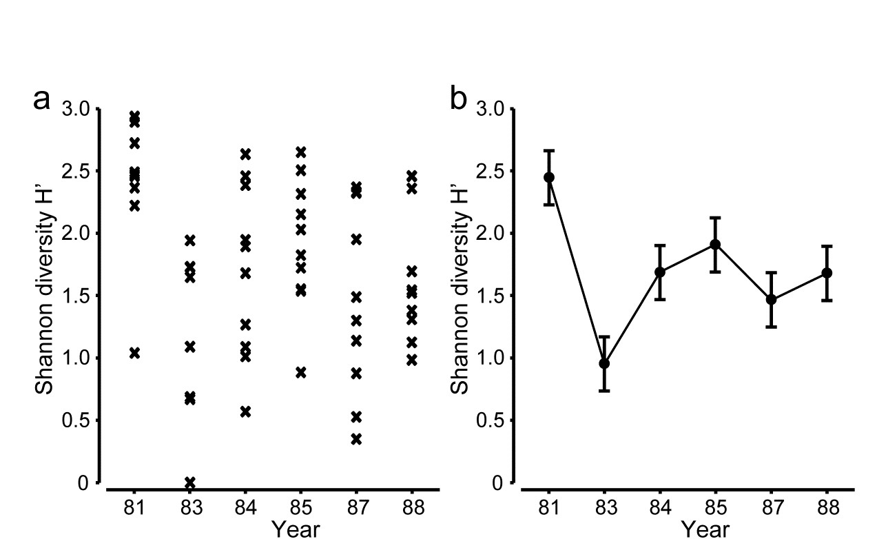
Fig. 18.1. Indonesian reef corals, S. Tikus Island {I}. a) Shannon diversity (base e) for % cover of 75 coral species on 10 replicate transects in each of 6 years, over the period 1981-1988, spanning a coral bleaching event in 1982; b) ‘means plot’ for the replicates in (a), with 95% interval estimates for mean diversity in each year.
The same pattern of analysis should be applied to the community response. Here, the appropriate similarity is the zero-adjusted Bray-Curtis (see page 16.6), on root-transformed % cover: the global ANOSIM statistic, R = 0.47, is sizeable and overwhelmingly significant. Pairwise ANOSIM values (Table 18.1) also have tests based on large numbers of permutations (92,378), a result of the 10 replicates per year, and differences are thus demonstrated between every pair of years. However, many of the pairwise R values are not just significant but substantial, ranging up to 0.87.
Table 18.1. Indonesian reef corals, S. Tikus Island {I}. Pairwise ANOSIM R statistics, from square-root transformed % cover of coral communities on 10 transects in 6 years, and zero-adjusted Bray-Curtis similarity. All years are significantly different (p < 2%), with ’81 and ’83 differing from all other years at p<0.1%.
| R | 1981 | 1983 | 1984 | 1985 | 1987 |
|---|---|---|---|---|---|
| 1983 | 0.87 | ||||
| 1984 | 0.73 | 0.43 | |||
| 1985 | 0.63 | 0.67 | 0.31 | ||
| 1987 | 0.50 | 0.64 | 0.25 | 0.33 | |
| 1988 | 0.64 | 0.54 | 0.49 | 0.30 | 0.25 |
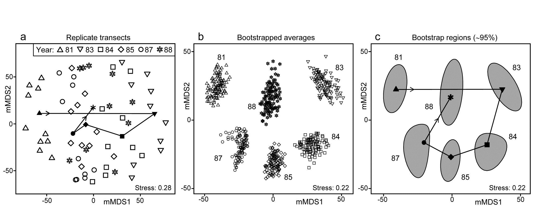
Fig. 18.2. Indonesian reef corals, S. Tikus Island {I}. a) Metric MDS (mMDS) of the coral communities on 10 transects sampled in each of 6 years, spanning a coral bleaching event in 1982, based on zero-adjusted Bray-Curtis similarities (dummy value = 1) on square-root transformed data of % cover. Also shown are the mean communities for each year (filled symbols, joined in date order), from averaging the transformed data over the 10 replicates and merging this with the transformed matrix, prior to resemblance calculation. b) mMDS of ‘whole sample’ bootstrap averages, resampling the 10 transects 100 times for each of the 6 years. c) mMDS ordination as in (b) but with approximate 95% region estimates fitted to the bootstrap averages in (b); also seen are the group means of these repeated bootstrap averages, again joined in a trajectory across years. See later text for details of precise construction in (b) and (c).
The initial, stark change in the community from ’81 to ’83 is evident from the ordination plot of replicate transects (Fig. 18.2a), and the following years can be seen to be intermediate between these extremes, but their pattern only becomes clearer when the average points for each year are also included in the plot, as closed symbols joined by a trajectory in time order. Displaying all 60 replicate points (and the means) in the same 2-d ordination, given the large degree of variability from transect to transect within a year, is in any case over-optimistic: the stress is unacceptably high. (Note that this is a metric MDS, for consistency with the following exposition, but the nMDS plot is similar and still has an uncomfortable stress of 0.21). If the averaged values are mMDS-ordinated on their own, the pattern is similar (as it is for the ‘distance among centroids’ construction¶, Anderson, Gorley & Clarke (2008) ) but what is missing in comparison with the univariate plot is some indication of reliability in the position of these averaged communities, i.e. an analogue of the interval estimates in Fig. 18.1b. What region of the 6-point mMDS would we expect each of these averages to occupy, if we had been able to take repeated sets of 10 transects from each year, computing the averaged community for each set? To attempt formal modelling of confidence regions with exact coverage properties is highly problematic for typical multivariate datasets, with their often high (and correlated) dimensionality and zero-inflated distributions. Also permutation does not provide an obvious distribution-free solution: by permuting labels of the replicates in a particular year we clearly do not construct new realisations of the averaged community for that year. But bootstrapping these replicates, resampling them with replacement, does provide a way forward without distributional assumptions, and produces bootstrap regions for the averaged communities with at least nominal coverage probabilities (subject to a number of approximations).
¶ There is an important distinction in what these two approaches are trying to achieve. ‘Distance among centroids’, in the high-d PCO space calculated from the resemblances, is trying to locate the ‘centre’ of each cloud of replicate points and then project this, potentially along with the replicates, into low-d (say 2-d) PCO space; such centroids will then be at the centre of gravity of the replicates in the 2-d PCO. Averaging of community samples, on the other hand, may not produce a sample which is ‘central’ to the replicates (though often, such as in Fig. 18.2a, it more or less does so). For example, unless species are ubiquitous, the average is likely to contain more species than most of the replicates and, if a biological similarity measure which pays much attention to presence/absence structure is chosen (Bray-Curtis under heavy transformation, Jaccard etc), then the averaged sample need not be highly similar to any of the replicates. Ecologists will be very familiar with this idea from measuring diversity by species richness (S). The average number of species in a replicate core from a location is not the same as the number of species found at that location, but both have validity as measures of richness, at different spatial scales. Similarly both ‘centroid’ and ‘average’ are interpretable constructs in this context (as a central, single community sample and a representation of the ‘pooled’ community at that location, respectively), and it is interesting to note that they often tell you an almost identical story about the relationships between the locations (/times etc).
Averages in the species space have substantial practical advantages over centroids in the resemblance space in that they do not lose the link to the individual species, thus shade plots, species bubble plots, SIMPER analyses etc are all possible with averaged community samples, and impossible with the centroids in resemblance space. Averages have a clear disadvantage of potential biases for strongly unbalanced numbers of replicates across locations, for exactly the same reasons (though usually less acutely) as in calculating species richness as the number of species observed at each location (under uneven sampling effort). If averaging in such strongly unbalanced cases, it would usually be wise to avoid severe transformations, which drag the data matrix close to presence/absence, and to check whether the final ordination shows a pattern linked to replicate numbers making up each group average. A useful graph is an ordination bubble plot, in which the circles (or spheres) have sizes representing numbers of samples making up each ordination point. Tell-tale signs of potential bias problems are often where points at the extremities of an ordination are all averages involving low sample sizes.
18.3 ‘Bootstrap average’ regions
The idea of the (univariate) bootstrap ( Efron (1979) ) is that our best estimate of the distribution of values taken by the (n) replicates in a single group, if we are not prepared to assume a model form (e.g. normality), is just the set of observed points themselves, each with equal probability (1/n). We can thus construct an example of what a further mean from this distribution would look like – had we been given a second set of n samples from the same group and averaged those – by simply reselecting our original points, independently, one at a time and with equal probability of selection, stopping when we have obtained n values. This is a valid sample from the assumed equi-probable distribution and such reselection with replacement makes it almost certain that several points will have been selected two or more times, and others not at all, and thus the calculated average will differ from that for the original set of n points. This reselection process and recalculation of the mean is repeated as many times (b) as we like, resulting in what we shall refer to as b bootstrap averages. These can be used to construct a bootstrap interval, within which (say) 95% of these bootstrap averages fall. This is not a formal confidence interval as such but gives a good approximation to the precision with which we have determined the average for that group. Under quite general conditions, these bootstrap averages are unbiased for the true mean of the underlying distribution, though their calculated variance underestimates the true variance by a factor of ($1 – n ^ {-1}$); the interval estimate can be adjusted to compensate for this.
Turning to the multivariate case, in the same way we could define ‘whole sample’ bootstrap averages by, in the coral reef context say, reselecting 10 transects with replacement from the 10 replicate transects in one year, and averaging their root-transformed cover values, for each of the 75 species. If this is repeated b = 100 times, separately for each of the years, the resulting 600 bootstrap averages could then be input to Bray-Curtis similarity calculation and metric MDS, which would result in a plot such as Fig. 18.2b. (This is not quite how this figure has been derived but we will avoid a confusing digression at this point, and return to an important altered step on the next page). Fig. 18.2b thus shows the wide range of alternative averages that can be generated in this way. The total possible number of different bootstrap sets of size n from n samples is $(2n)! / [2(n!) ^ 2]$, a familiar formula from ANOSIM permutations and giving again the large number of 92,378 possibilities when there are n = 10 replicates, though the combinations are this time very far from being equally likely.
With such relatively good replication, Fig. 18.2b now gives a clear, intuitively appealing idea both of the relation between the yearly averages and of the limits within which we should interpret the structure of the means. Put simply, all these are possible alternative averages which we could have obtained: if we pick out any two sets of 6, one point from each year in both cases, and would have interpreted the relations among years differently for the two sets, then we are guilty of over-interpreting the data¶. The simplicity of the plot inevitably comes with some caveats, not least that 2-d ordination may not be an accurate representation of the higher-d bootstrap averages. But this is a familiar problem and the solution is as previously: we look at 3-d (or perhaps higher-d) plots. The mMDS in 3-d is shown in Fig. 18.3, and is essentially similar to Fig. 18.2b, though it does a somewhat better job of describing the relative differences between years, as seen by the drop in stress from 0.22 to 0.12 (both are not unduly high for mMDS plots, which will always have much higher stress than the equivalent nMDS – bear in mind that this is an ordination of 600 points!). With balanced replication, as here, one should expect the degree of separation between pairs of bootstrap ‘clouds’ for the different groups to bear a reasonable relationship to the ordering of pairwise ANOSIM R values in Table 18.1, and by spinning the 3-d solution this is exactly what is seen to happen. By comparison, the 2-d plot somewhat under-represents the difference between 1981 and 88 and over-separates 1984 and 87.
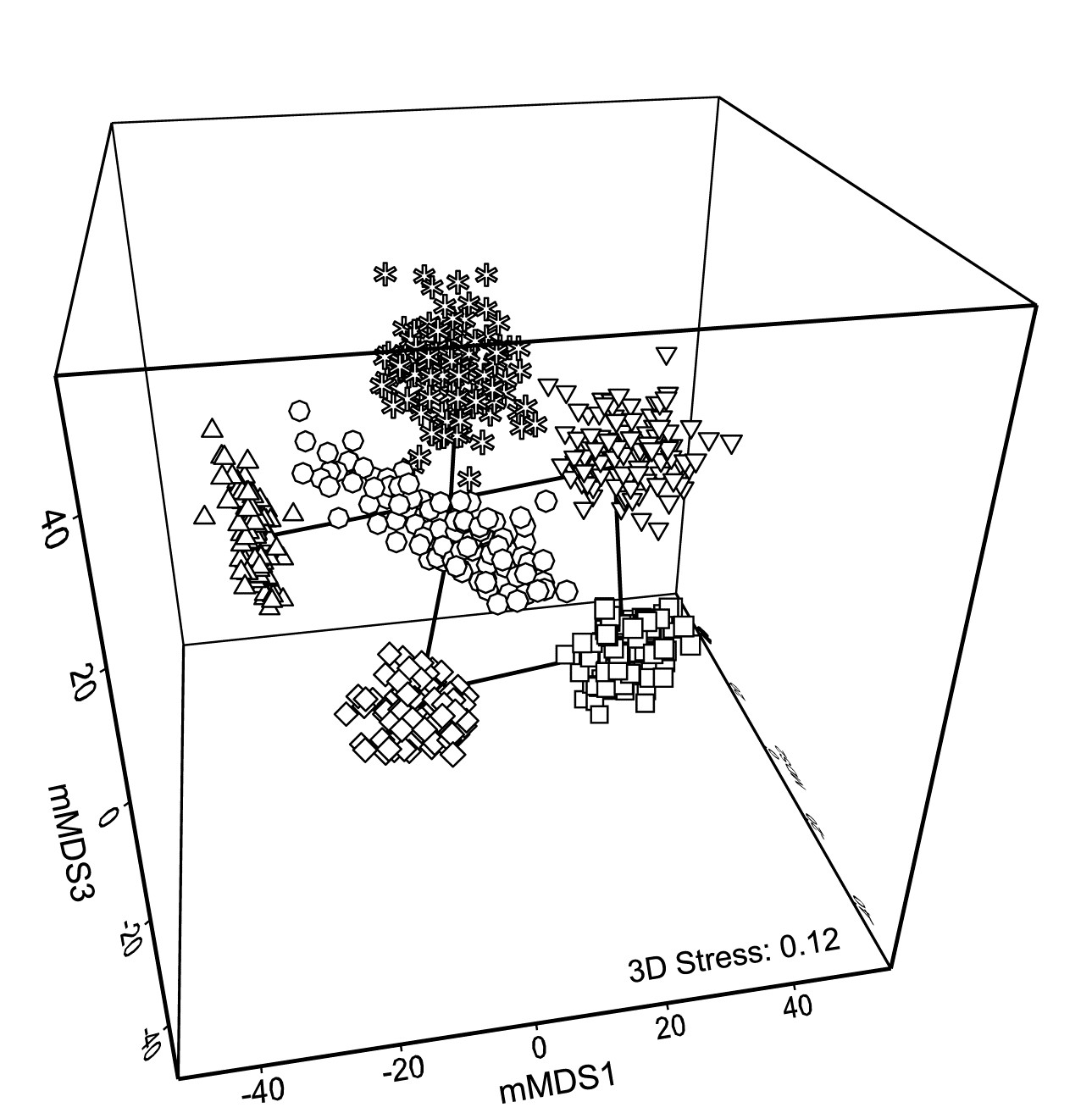
Fig. 18.3. Indonesian reef corals, S. Tikus Island {I} 3-d mMDS of whole sample bootstrap averages constructed as in Fig. 18.2b .
Fig. 18.2c takes the next natural step and constructs smoothed, nominal 95% bootstrap regions on the 2-d plot of Fig. 18.2b. The ordination is unchanged, being still based on the 600 bootstrap averages, the points being suppressed in the display in favour of convex regions describing their spread. These are constructed in a fairly straightforward manner by fitting bivariate normal distributions, with separately estimated mean, variance and correlation parameters to each group of bootstrap averages. Given that each point represents a mean of 10 independent samples, it is to be expected that the ‘cloud’ of bootstrap averages will be much closer to multivariate normality, at least in a space of high enough dimension for adequate representation, than the original single-transect samples. However, non-elliptic contours should be expected in a 2-d ordination space both from any non-normality of the high-dimensional cloud and because of the way the groups interact in this limited MDS display space – some years may be ‘squeezed’ between others. The shifted power transform (of a type used on page 17.9 for the construction of joint $\Delta ^ +$, $\Lambda ^ +$ probability regions) is thus used on a rotation of each 2-d cloud to principal axes, again separately for each group (and axis). The bivariate normals are fitted in the transformed spaces and their 95% contours back transformed to obtain the regions of Fig. 18.2c. Such a procedure cannot generate non-convex regions (as seen for means in 1987, though there is less evidence of non-convexity in the 3-d plot) but often seems to do a good job of summarising the full set of bootstrap averages.
In one important respect the regions are superior to the clouds of points: when the bivariate normals are fitted in the separate transformed spaces, correction can be made for the variance underestimation noted earlier for bootstrap averages in the univariate case. The details are rather involved† but the net effect is to slightly enlarge the regions to cover more than 95% of the bootstrapped averages, to produce the nominal 95% region. The enlargement will be greater as n, the number of replicates for a group, reduces, because the underestimation of variance by bootstrapping is then more substantial.
Fig. 18.2c also allows a clear display of the means for each group. The points (joined by a time trajectory) are the group means of the 100 bootstrap averages in each year, which are merged with those 600 averages, and then ordinated with them into 2-d space. Region plots in the form of Fig. 18.2c thus come closest to an analogue of the univariate means plot, of averages and their interval estimates.
¶ It is likely to be important for such interpretation that we have chosen mMDS rather than nMDS for this ordination. One of the main messages from any such plot is the magnitude of differences between groups compared to the uncertainty in group locations. Metric MDS takes the resemblance scale seriously, relating the distances in ordination space linearly through the origin to the inter-point dissimilarities. As discussed on page 5.8, this is usually a disaster in trying to display complex sample patterns accurately in low-d space because the mMDS ordination has, at the same time, to reconcile those patterns with displaying the full scale of random sampling variability from point to point (samples from exactly the same condition never have 0% dissimilarity). The pattern here is not complex however, just a simple 6 points (with an important indication of the uncertainty associated with each), and the retention of a scale makes mMDS the more useful display.
† An elliptic contour of the bivariate normal is found in the transformed space, with P% cover, where P is greater than the target $P _ 0$ (95%, say), such that the variance bias is countered. A neat simplification results from $P = 100 \left[1 – \left[ 1 – (P _ 0 /100) \right] ^ {1/W} \right]$ for bivariate normal probabilities from concentric ellipses, where W is the bootstrap underestimate of the total variance, from both axes. Under rather general conditions, the expected value of W is again only (1 – n-1), though this cannot be simply substituted into the expression for P since the mean of a function of W is not the function of the mean of W. Hence a large-scale simulation of W is needed to give mean P from the above expression, for a full range of n and a few key $P _ 0$ values. Once computed, the adjustment can be put in a simple look-up table for software (in practice an empirical quadratic fit of P to n-1 suffices), and this is implemented in PRIMER 7’s Bootstrap Averages routine.
18.4 Example: Loch Creran macrobenthos
Gage & Coghill (1977) collected a set of 256 soft-sediment macrobenthic samples along a transect in Loch Creran, Scotland {c}, data which have little or no evidence of a trend or spatial group structure and will therefore be useful here in illustrating a potential bootstrapping artefact, discussion of which we postponed from the previous page. For this example, 16 cores are pooled at a time, giving 16 replicates spaced along the transect, each having sufficient biological material to fairly reflect the community (an average of 26 species per replicate). A 2-level group factor is defined as the first and second halves of the transect (1-8 for group A and 9-16 for group B) and Fig. 18.4a shows the resulting mMDS plot. A stress of 0.27 on only 16 points is too high for a reliable plot, even for a metric MDS, and the Shepard plot of 18.4b shows the inadequacy of metric linear regression (through the origin) for this 2-d ordination. Nonetheless, whilst there is some suggestion that the ‘centres’ for the two groups are not in precisely the same position (with 5 of the 8 replicates from group A being to the left and bottom of those for group B), it is no surprise to find that an ANOSIM test (or a PERMANOVA test), on the Bray-Curtis similarities from the untransformed species counts in the 67-d samples $\times$ species matrix, does not distinguish the two groups at all. But what happens to the bootstrap averages?
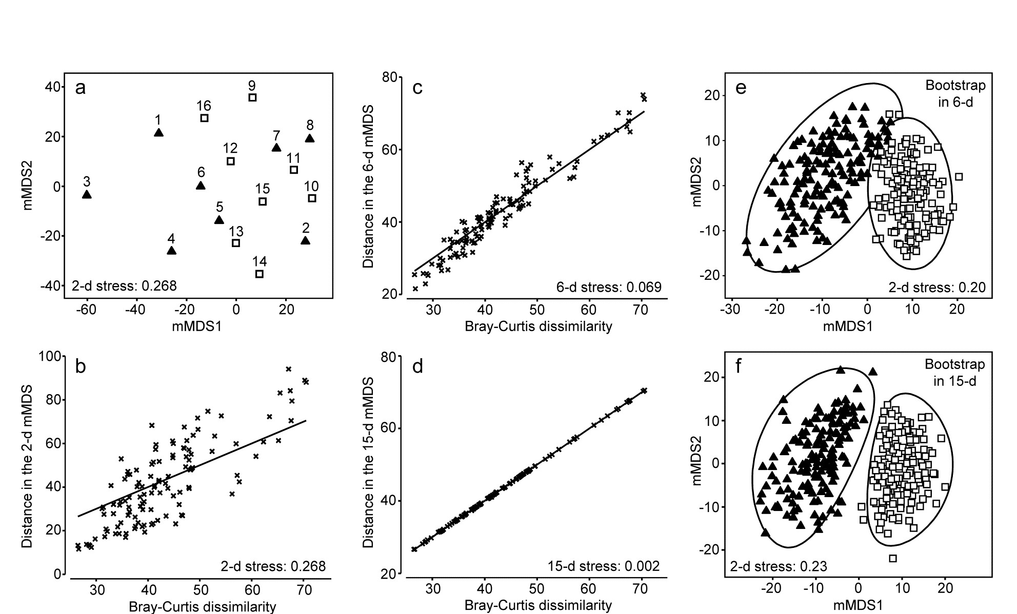
Fig. 18.4. Loch Creran macrobenthos {c}. (a) mMDS plot of (pooled) samples, 1-16, along a single transect, from untransformed data and Bray-Curtis dissimilarities. Triangles and squares denote groups A (1-8) and B (9-16). b-d) Shepard diagrams for the mMDS plots of these 16 samples in 2-d, 6-d and 15-d. e) Bootstrap average regions (95%) for groups A and B, symbols as in (a), by bootstrapping co-ordinates of the 16 samples in the 6-d mMDS approximation to the original 67-d space (Pearson matrix correlation $\rho = 0.968$, of those inter-point distances with the original resemblance matrix). f) Regions as in (e) but by bootstrapping co-ordinates in the 15-d mMDS space, which in this case perfectly preserves the Bray-Curtis similarities from the full space, as shown by (d), and $\rho = 1$.
Artefact of bootstrapping in high dimensions
The 95% region estimates for the means of the two groups, whilst they will inevitably be ‘centred’ in different places, would be expected to overlap, but this is not what happens when bootstrap averages are calculated separately for the two sets of 8 replicates in their full (67-d) species space and then ordinated into lower dimensions, as shown in the 2-d mMDS of Fig. 18.5.
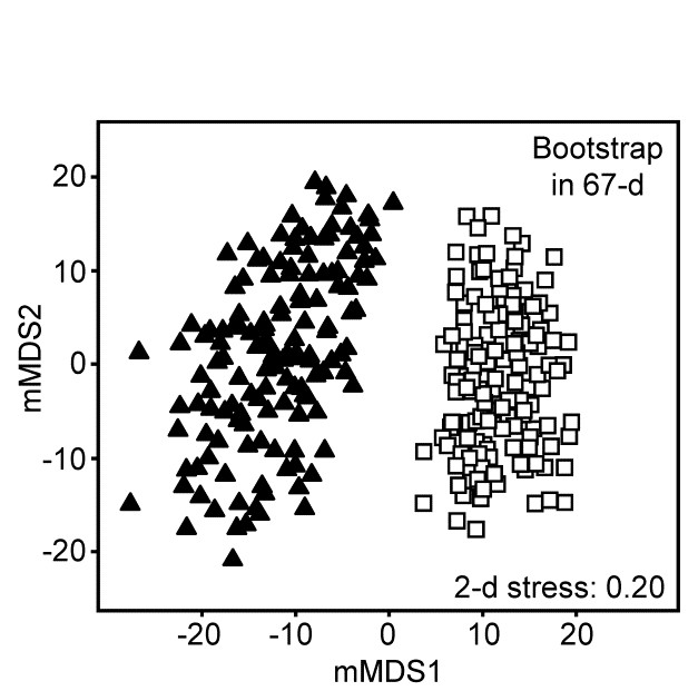
Fig. 18.5.Loch Creran macrobenthos {c}. 2-d mMDS of bootstrap averages in the original 67-d species space, for groups A and B.
What has gone horribly wrong here? The answer lies in the vastness of high-dimensional space¶. Bootstrap samples ‘work’, in the sense of giving a plausible set of alternative samples (with the same properties) to the set we actually did obtain, because the spread of values produced, along a line, in a plane, in a 3-d box etc, cover much the same interval, areal and spatial extents as the original samples. However, this feature gradually starts to disappear for increasingly higher dimensions. This data set contains only 16 points, but these are in 67-dimensional space. Many of the points could ‘have some dimensions to themselves’, purely by chance, when there are no real differences in the two communities, e.g. because of the sparse presence of many species in a typical assemblage matrix. The two groups of samples will thus occupy a somewhat different set of dimensions (many dimensions will be found in both sets, of course, but some will only be found in one or other group). On repeated sampling separately from each of the groups, it is inevitable that bootstrap averages for a group will remain in its own subset of dimensions. Those averages vary over a tighter range than the original samples – that is the nature of averages – and the non-identity of the two sets of dimensions will cause the bootstrap averages to shrink apart so that, even in a low-d ordination, the two groups will not overlap. This oversimplifies a complex situation but is likely to be one of the basic reasons why the high-d bootstrap artefact is seen.
This way of posing the problem immediately suggests a possible solution, namely to bootstrap the samples in a much lower-d space, which nonetheless retains essentially all the information present in the original resemblances from the 67-d samples $\times$ species matrix. Here, we have only 16 samples and a 15-d mMDS can, in this case, near-perfectly† reconstruct the set of among-sample Bray-Curtis resemblances in 15-d, as can be seen in the Shepard diagram of Fig. 18.4d. However, the 15-d mMDS of Fig. 18.4f shows that the high-d artefact is still present, though apparently substantially reduced. This is perhaps unsurprising, given there are still as many dimensions as points, and we need to search for a lower-dimensional space in which to create the bootstrap averages.
The technique we have used in previous chapters to measure information loss in replacing a resemblance matrix with an alternative is simple matrix correlation of the two sets of resemblances. Here, in the context of metric MDS, which tries to preserve dissimilarity values themselves, it would be appropriate to use a standard (Pearson) correlation $\rho$, rather than the non-parametric Spearman correlation which fits better to preserving rank orders of resemblances in nMDS. A suggested procedure is therefore to ordinate the data by mMDS, from the chosen dissimilarity matrix, into increasingly higher dimensions, until a predetermined threshold for $\rho$ is crossed (say $\rho > 0.95$ or $\rho > 0.99$). The $\rho$ value is almost sure to increase monotonically with the dimension, $m$. The process can probably start with $m \ge 4$, since evidence suggests the high-d artefact does not trouble such relatively low-d space. At the upper end, as $m$ gets much larger than 10, the artefact can become non-negligible, especially if (as for the current example) this is nearing the total sample size in the original data. This suggests that the search is made over $4 \le m \le 10$ (and this will certainly produce $\rho$ values in the range 0.95-0.99).
In the current Loch Creran example, an mMDS in $m = 6$ dimensions provides a reasonable linear fit to the original resemblance values, as shown in Fig. 18.4c (for which $\rho = 0.97$). The co-ordinates of the sample points in this m-dimensional mMDS space are now used to produce a large number of bootstrap averages (b) for each group. b ≥ 100 is recommended, though lower values may have to be used if there are many groups, in order to obtain mMDS region plots in a viable computation time. Here, for only two groups, b = 150 averages were taken from each. Euclidean distances are then computed among these bootstrap averages, this being the relevant resemblance matrix for points in ordination space, naturally§. These are then input to metric MDS to obtain the final 2- or 3-d ordination plot and the smoothed region estimates, as previously described for the S Tikus data of Fig. 18.2 and 18.3 (this is the procedure that was followed for those earlier plots, selecting m=7, for which $\rho$ >0.95). The 95% region plot for the Creran data (Fig. 18.4e) now shows the two groups overlapping, as expected‡.
A somewhat subtle but important consequence of this solution to the high-d bootstrap artefact is that it also addresses the issue raised in the footnote on page 18.2, that simple averages of replicates in species space will often not occupy the centre of gravity of those replicates when they and the averages are ordinated together, using a similarity such as Bray-Curtis (or any biological measure responding to the presence/ absence structure in the data). But now the averaging is carried out in the Euclidean distance-based mMDS space which approximates those similarities so, for each group, the mean of the bootstrap averages is just their centre of gravity (in the m-dimensional space).⸙ And theoretical unbiasedness of the bootstrap method (a univariate result which carries over to multivariate Euclidean space) dictates that this mean will be close to the group average of the original replicates, when the latter is calculated in the m-dimensional space. (This is not, of course, the same as computing these averages in the original species space and ordinating them, along with the replicates, into m dimensions.)
Thus, in Fig. 18.2c for example, the means shown should be close to the centres of gravity of the clouds of bootstrap averages in 18.2b; they can only not be so because of the distortion involved in the final step of approximating the m-dimensional space by a 2-d mMDS solution. Thus the means are usually worth displaying, as a further guide to such distortion.
A final example of bootstrapping is one with slightly different numbers of replicate samples across groups, though bootstrap averages are calculated in just the same way and without bias from the varying sampling effort for one of the means (again see footnote ⸙).
¶ “Space is big. Really big. You just won't believe how vastly, hugely, mindbogglingly big it is. I mean, you may think it's a long way down the road to the chemist's, but that's just peanuts to space.” Douglas Adams, 1978, The Hitchhiker’s Guide to the Galaxy. Not a quote about high-d space, but it could have been!
† Euclidean distances among k points can always be represented in k-1 dimensions but here we are dealing with biological resemblance measures which are never ‘metrics’, so this can only be achieved in general with a mix of real and imaginary axes (i.e. in complex space, see for example Fig. 3.4 of Anderson, Gorley & Clarke (2008) ). A real-space mMDS can nearly always get close to recreating the original dissimilarities however; often near-perfectly, as here.
§ Do not confuse this with making Euclidean distance assumptions for the original samples $\times$ species matrix! We are still computing, say, Bray-Curtis dissimilarities among the samples, exactly as previously, but then we approximate those by Euclidean distances among points in m dimensions (this is what the Shepard diagram shows and is what ordination is all about). For each of g groups, a bootstrap average is then a simple centroid (‘centre of gravity’) of n bootstrap samples drawn with replacement from that group’s n points in this Euclidean space. b such averages are produced for each group, and it is the (Euclidean) distances among those b$\times$g points which are input to the final mMDS, to obtain plots such as Fig. 18.4e.
‡ It is a mistake to expect an exact parallel between overlap of bootstrap regions and the significance of (say) pairwise ANOSIM tests, in the way that (with careful choice of confidence probabilities) univariate confidence intervals, based on normality, can be turned into hypothesis tests. Bootstraps do not give formal confidence regions and a number of approximations are made (e.g. sample size is often small for bootstrapping, the final display is in approximate low-d space, etc); in contrast ANOSIM is an exact permutation test, but utilises only the ranks from the full resemblance matrix. Nonetheless, as we saw for S Tikus corals, the relative positioning and size of regions in these plots can add real interpretative value, following hypothesis testing.
⸙ And this also sidesteps the issues raised in the last paragraph of the footnote on page 18.2. Averaging over unbalanced numbers of replicates for the differing groups will not now introduce a bias coming from the relative species richness of these averages, since that averaging is in the Euclidean space of the low-d mMDS, not the species matrix. Thus it can be carried out with impunity on heavily transformed (or even presence/absence) samples from unbalanced group sizes. However, the same remarks apply now, about breaking the link to the species, as to the centroids in PCO space calculated in PERMANOVA+ ( Anderson, Gorley & Clarke (2008) ), to which these mMDS spaces have a strong affinity. The differences are that the PERMANOVA+ centroids are calculated in the full PCO space (and in general will have real and imaginary components) whilst the mMDS is an approximation in real space; also that lower-d plots are produced by projection through the higher axes with PCO but by placement of points in low-d in mMDS (in such a way as to optimise the fit to the actual resemblances).
18.5 Example: Fal estuary macrofauna
The soft-sediment macrobenthic communities from five creeks of the Fal estuary, SW England, {f} were examined by Somerfield, Gee & Warwick (1994a) and Somerfield, Gee & Warwick (1994b) . For location of the creeks (Restronguet, Mylor, Pill, St Just, Percuil) see the map in Fig. 9.3, where the analysis was of the sediment meiofaunal assemblages. The sediments in this estuary are heavily contaminated by heavy metal levels, resulting from historic tin and copper mining in the surrounding area, and the macrofaunal species list for the 5 replicates per creek (7 in Restronguet) consists of only 23 taxa. A 2-d metric MDS of these 27 samples, based on fourth-root transformed counts and Bray-Curtis similarity, is seen in Fig. 18.6a, and the associated Shepard plot in 18.6b. In this case, an excellent approximation to the Bray-Curtis resemblances is obtained from the Euclidean distances in an m = 4-dimensional mMDS, for which the Pearson correlation to the Bray-Curtis dissimilarities is $\rho = 0.991$, as seen from the Shepard diagram, Fig. 18.6c.
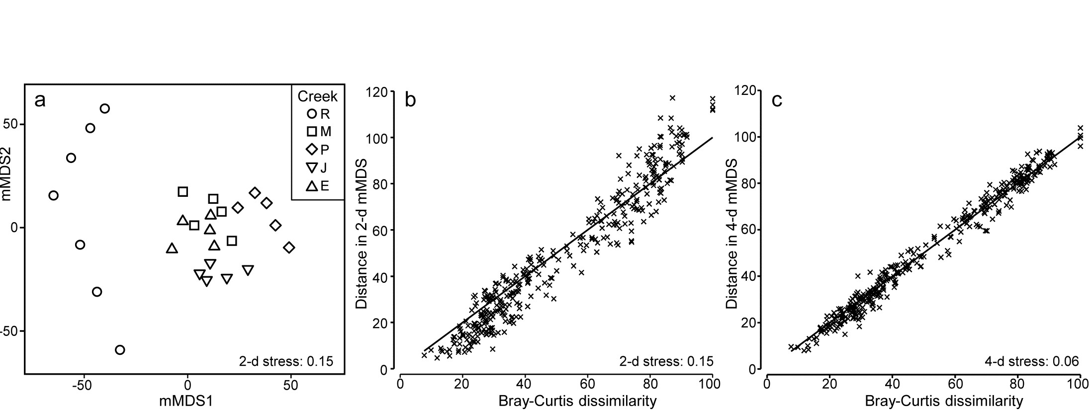
Fig. 18.6. Fal estuary macrofauna {f}. a) mMDS from Bray-Curtis similarities on fourth-root transformed counts of 23 soft-sediment macrofaunal species in a total of 27 samples from 5 creeks of the Fal estuary (R = Restronguet, M = Mylor, P = Pill, J = St Just, E = Percuil); b) Shepard plot for this 2-d mMDS ; c) Shepard plot for a 4-d mMDS of the same data (Pearson correlation = 0.991)
A total of 100 bootstrap averages are generated in this 4-d space, for each creek, and the full set of 500 bootstraps is ordinated into 2-d in Fig. 18.7. Approximate 95% regions are superimposed, in the way outlined earlier. In all cases, fewer than 5 of the 100 bootstrap averages fall outside of these regions, because of the adjustment made to the coverage probability from simulations based on a theoretical bias of ($1 - n ^ {-1}$) in their variance. These adjustments are rather modest however, and cannot be expected to compensate for all sources of potential uncertainty in bootstrapping with small n, and of course displaying in low-d space.
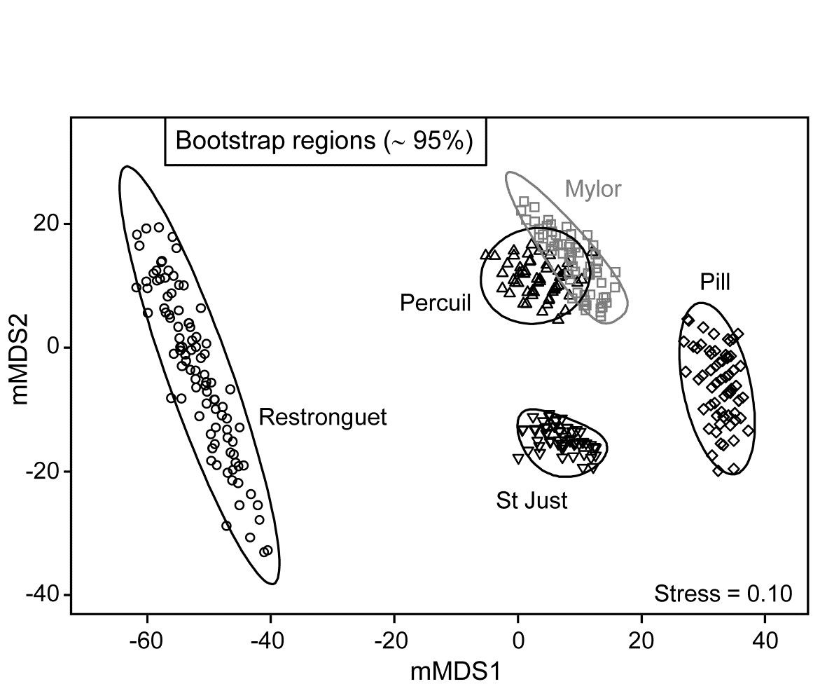
Fig. 18.7. Fal estuary macrofauna {f}. Metric MDS of bootstrap averages for the five creeks from the replicate samples of Fig 8.6a (Mylor creek in grey to aid distinction), including ~95% region estimates for the ‘mean communities’ in each creek. Bootstrapping performed in m = 4 dimensional mMDS space.
It should not be forgotten that the bootstrap concept in univariate space was introduced and justified on the basis of its asymptotic (large n) behaviour. It has some desirable small-sample properties, such as the unbiasedness of bootstrap means for the underlying true mean. But there is no guarantee that, for small n, intervals produced from the percentiles of the set of averages of randomly drawn bootstrap samples will achieve their nominal ‘% cover’. Some authors have even suggested the need for n>50 replicates (for each group!). Whilst this is unrealistic, and unnecessary, it should caution us not to take a nominal 95% cover value too seriously.
One formula worth bearing in mind is that given on page 18.3 for the number of possible different bootstrap averages (B) that could be obtained from n samples, $B = (2n) ! / [2 ( n ! ) ^ 2]$. For n = 2, B = 3; for n=3, B = 10; for n = 4, B = 35; and only when n = 5 do we have more than 100 possibilities (B = 126). At that level, though not all these distinct combinations will be found in b=100 random draws¶, the majority will appear, giving at least a range of bootstrap averages to generate the regions, as can be seen from the Mylor, Pill, St Just and Percuil creeks in Fig. 18.7. (Restronguet, with n=7, has more combinations, B = 1716, and that can be seen in the more random cover of points, rather than the striated patterns of the other bootstraps). Certainly n=5 should be considered as absolutely minimal for such bootstrap regions.
These caveats aside, and minimal though replication may be in the case of Fig. 18.7, it is clear nonetheless that the only two creeks whose regions overlap – and strongly so – are Mylor and Percuil. And pairwise ANOSIM test results, using the original Bray-Curtis similarities, are again consistent with these bootstrap averages: R = -0.01 for the Mylor v. Percuil test, but all other R statistics are > 0.55 and significant at the 1% level. (This level is the most extreme of the 126 permutations possible for all pairwise comparisons of 5 replicates; comparisons with Restronguet, with its 7 replicates, are based on 792 permutations, but all those pairwise tests again return p<1%). Whilst the warning given in the footnote on page 18.4 (that it would be most unwise to use these regions as substitutes for hypothesis tests) is still very germane, it is reassuring to note how often the interpretations broadly concur.
Finally, comparison of Figs. 18.6a and 18.7 restates the point made by the initial Fig. 18.1. In univariate statistics, we do not expect a plot of the replicates themselves to be the most informative way to picture the patterns in a data set. The means plot, with its interval estimates (which are not of course trying to summarise variation in the replicates, but uncertainty in the knowledge of the averages for each group), can often be a more informative way of interpreting the results of hypothesis tests. The same reasoning is true in the multivariate case. Fig. 18.6a has few samples to clutter the basic ordination plot, by comparison with many studies, but the patterns demonstrated by the ANOSIM (or PERMANOVA) tests are then more clearly visualised in a means plot such as Fig. 18.7. To repeat the mantra: test using the replicates, display using the means (with or without bootstrap regions).
¶ They are not equally likely but have a multinomial distribution, thus the probability that a single bootstrap sample will consist of all 5 of one of the original samples is small, at only 1/625, so is unlikely to be seen in most runs of b=100 averages. In contrast, the probability that a bootstrap sample reselects all 5 replicates in the original sample is 24/625 = 0.038, so its average point will occur about 4 times in a run of b=100, and has about a 98% chance of being in the set at least once.
Appendices
Appendix 1: Index of example data
The following is a list of all (real) data sets used as examples in the text, where they are referenced by their indexing letter (A–Z, a-z). The entries give all pages on which each set is analysed or discussed and also its source reference (see also Appendix 3). These are not always the appropriate references for the analyses which can be found in the text; the latter are generally given in Appendix 2.
A – Amoco-Cadiz oil spill, Bay of Morlaix, France. Macrofauna - Dauvin (1984) .
a – Algal recolonisation, Calafuria, Ligurian Sea, Italy. Macroalgae. - Airoldi (2000) .
- page 16.8
B – Bristol Channel, England. Zooplankton - Collins & Williams (1982) .
b – Beam-trawl surveys, N. Europe. Groundfish - Rogers, Clarke & Reynolds (1999) .
- page 17.7
C – Celtic Sea. Zooplankton. (Collins, pers. comm.).
- page 5.5
c – Creran & Etive loch, Scotland. Macrobenthos - Gage & Coghill (1977) , Gage (1972) .
D – Dosing experiment, Solbergstrand mesocosm, Norway (GEEP Workshop). Nematodes - Warwick, Carr, Clarke et al. (1988) .
d – Diets of W Australian fish. Gut contents of seven nearshore species - Hourston, Platell, Valesini et al. (2004) .
- page 7.10
E – Ekofisk oil platform, N.Sea. Macrofauna - Gray, Clarke, Warwick et al. (1990) .
e – Estuaries, W Australia. Fish - Valesini, Tweedley, Clarke et al. (2014) .
- page 11.5
F – Frierfjord, Norway (GEEP Workshop). Macrofauna - Gray, Aschan, Carr et al. (1988) .
f – Fal estuary sediments, S.W. England. Meio- and macrofauna - Somerfield, Gee & Warwick (1994a) , Somerfield, Gee & Warwick (1994b) .
G – Garroch Head, sludge dump-ground, Scotland. Macrofauna - Pearson & Blackstock (1984) .
g – Gullfaks A&B oilfields, Norway. Macrobenthos - Olsgard & Gray (1995) .
- page 15.6
H – Hamilton Harbour, Bermuda (GEEP Workshop). Macrofauna, nematodes - Warwick, Platt, Clarke et al. (1990) .
I – Indonesian reef corals, S. Pari and S. Tikus Islands. Coral % cover - Warwick, Clarke & Suharsono (1990) .
i – Island group species lists. Fish presence/absence - Clarke, Somerfield & Chapman (2006) .
- page 17.12
J – Joint NE Atlantic shelf studies (‘meta-analysis’). Macrofauna ‘production’ - Warwick & Clarke (1993a) .
- page 15.2
K – Ko Phuket coral reefs, Thailand. Coral species cover - , Brown, Clarke & Warwick (2002) .
k – King Wrasse diets, W Australia. Gut contents of labrid fish - Lek, Fairclough, Platell et al. (2011) .
- page 6.15
L – Loch Linnhe and Loch Eil, Scotland, pulp-mill effluent. Macrofauna - Pearson (1975) .
l – Leschenault estuary, W Australia. Estuarine fish assemblage, over seasons - Veale, Tweedley, Clarke et al. (2014) .
- page 15.6
M – Maldive Islands mining. Coral reef fish - Dawson-Shepherd, Warwick, Clarke et al. (1992) .
m – Messolongi lagoons, E. Central Greece. Diatoms and water-column data - Danielidis (1991) .
- page 5.10
N – Nutrient-enrichment experiment, Solbergstrand mesocosm, Norway. Nematodes, copepods - Gee, Warwick, Schaanning et al. (1985) .
n – NE New Zealand kelp holdfasts. Macrofauna - Anderson, Diebel, Blom et al. (2005) .
- page 6.16
O – Okura estuary, Long Bay, New Zealand. Inter-tidal macrofauna - Anderson, Ford, Feary et al. (2004) .
- page 5.9
P – Plymouth particle-size data. Water samples with Coulter Counter. (A. Bale, pers. comm).
- page 8.6
p – Plankton survey (Continuous Plankton Recorder), N.E. Atlantic. Zooplankton, phytoplankton - Colebrook (1986) .
- page 13.2
R – Tamar estuary mud-flat, S.W. England. Nematodes, copepods - Austen & Warwick (1989) .
- page 14.3
S – Scilly Isles, UK. Seaweed metazoa - Gee & Warwick (1994a) , Gee & Warwick (1994b) .
T – Tasmania, Eaglehawk Neck. Nematodes, copepods - Warwick, Clarke & Gee (1990) .
t - Tees Bay, N.E. England. Macrobenthos - Warwick, Ashman, Brown et al. (2002) .
U – UK regional studies. Nematodes - Warwick & Clarke (1998) .
V – Valhall oilfield, N Sea. Macrofauna - Olsgard, Somerfield & Carr (1997) .
- page 17.12
W – World map. Great-circle distances among cities. (Reader’s Digest Great World Atlas, 1962)
- page 5.8
w – Westerschelde estuary cores, Netherlands; mesocosm experiment on food supply. Nematodes - Austen & Warwick (1995) .
- page 6.8
X – Exe estuary, S.W. England. Nematodes - Warwick (1971) .
Y – Clyde, Scotland. Nematodes - Lambshead (1986) .
- page 6.6
Z – Azoic sediment recolonization experiment. Copepods - Olafsson & Moore (1992) .
- page 12.3
Appendix 2: Principal literature sources and further reading
A list of some of the core methods papers was given in the Introduction, and the source papers for the data used in examples can be found in Appendix 1. Here we itemize, for each chapter, the source of analyses which repeat those in published literature, and where figures have been redrawn from. Figures or analyses not mentioned can be assumed to originate with this publication. Also sometimes mentioned are historical references to earlier developments of the ideas in that chapter, or other useful background reading.
Chapter 1: Framework. The categorisation here is an extension of that given by Warwick (1988a) . The Frierfjord macrofauna data and analyses (Tables 1.2 & 1.6 and Figs. 1.1, 1.2 & 1.7) are extracted and re-drawn from Bayne, Clarke & Gray (1988) , Gray, Aschan, Carr et al. (1988) and Clarke & Green (1988) , the Loch Linnhe macrofauna data (Table 1.4 and Fig. 1.3) from Pearson (1975) , and the ABC curves (Fig. 1.4) from Warwick (1986) . The species abundance distribution for Garroch Head macrofauna (Fig. 1.6) is first found in Pearson, Gray & Johannessen (1983) , and the multivariate linking to environmental variables (Fig. 1.11) in Clarke & Ainsworth (1993) . The ‘coherent species curves’ (Fig. 1.10) for the Loch Linnhe data are redrawn from Somerfield & Clarke (2013) . The mescosm data from the nutrient enrichment experiment (Table 1.7) and the MDS plot for copepods and nematodes (Fig. 1.12) are extracted and redrawn from Gee, Warwick, Schaanning et al. (1985) .
Chapters 2 and 3: Similarity and clustering. These methods originated in the 1950’s and 60’s (e.g. Florek, Lukaszewicz, Perkal et al. (1951) ; Sneath (1957) ; Lance & Williams (1967) ). The description here widens that of Field, Clarke & Warwick (1982) , with some points taken from the general texts of Everitt (1980) and Cormack (1971) . The dendrogram of Frierfjord macrofaunal samples (Fig.3.1) is redrawn from Gray, Aschan, Carr et al. (1988) , and the zooplankton example (Figs. 3.2 & 3.3) from Collins & Williams (1982) . The SIMPROF test for samples on agglomerative clusters is described in Clarke, Somerfield & Gorley (2008) ; Fig. 3.8 mimics one in Anderson, Gorley & Clarke (2008) , and the other cluster methods (unconstrained divisive and k-R clustering, maximising R) are somewhat new to this publication.
Chapter 4: Ordination by PCA. This is a founding technique of multivariate statistics, see for example Chatfield & Collins (1980) and Everitt (1978) . The MDS from a dosing experiment in the Solbergstrand mesocosms (Fig. 4.2) is from Warwick, Carr, Clarke et al. (1988) .
Chapter 5: Ordination by MDS. Non-metric MDS was introduced by Shepard (1962) and Kruskal (1964) ; two standard texts are Kruskal & Wish (1978) and Schiffman, Reynolds & Young (1981) . Here, the exposition parallels that in Field, Clarke & Warwick (1982) and Clarke (1993) ; the Exe nematode graphs (Figs. 5.1, 5.2, 5.4, 5.5) are redrawn from the former. The dosing experiment (Fig. 5.6) is discussed in Warwick, Carr, Clarke et al. (1988) . Metric MDS (see Cox & Cox (2001) ), not to be confused with the similar, but not identical, PCO ordinations (produced by PERMANOVA+ for example), was also an early introduction but is much less commonly implemented in software. The combining of nMDS and mMDS stress functions bears some relationship to hybrid and semi-strong hybrid scaling methods ( Faith, Minchin & Belbin (1987) , Belbin (1991) ) but with some important differences in implementation and with a different rationale here (the avoidance of collapsed sub-groups in an MDS plot, and for two nMDS stress functions, the merging of similarities of different types); see footnote on page 5.8.
Chapter 6: Testing. The basic permutation test and simulation of significance levels can be traced to Mantel (1967) and Hope (1968) , respectively. In this context (e.g. Figs. 6.2 & 6.3 and eqt. 6.1) it is described by Clarke & Green (1988) . A fuller discussion of the extension to 2-way nested and crossed ANOSIM tests (including Figs. 6.4 & 6.6) is in Clarke (1993) (with some asymptotic results in Clarke (1988) ); the coral analysis (Fig. 6.5) is in Warwick, Clarke & Suharsono (1990) , and the Tasmanian meiofaunal MDS (Fig. 6.7) in Warwick, Clarke & Gee (1990) . The 2-way design without replication (Figs. 6.8-6.12) is tackled in Clarke & Warwick (1994) ; see also Austen & Warwick (1995) . The ordered ANOSIM test is new to this publication, as are the extensions to 3-way crossed/nested designs. Lek, Fairclough, Platell et al. (2011) give the ‘flattened’ 2-way ANOSIM tests for the 3-way crossed example of labrid diets; Fig. 6.15 is redrawn from there. The NZ kelp holdfast data is provided with the PERMANOVA+ software ( Anderson, Gorley & Clarke (2008) ). Fig. 6.17 is partly extracted from Warwick, Ashman, Brown et al. (2002) .
Chapter 7: Species analyses. Clustering on species similarities is given in Field, Clarke & Warwick (1982) for the Exe nematode data; see also Clifford & Stephenson (1975) . SIMPROF test for species (‘coherent curves’) follows Somerfield & Clarke (2013) ; Figs. 7.1-7.6 are redrawn from there. Shade plots are described in Clarke, Tweedley & Valesini (2014) but have a very long history (see Wilkinson & Friendly (2008) ), though there are some novelties in the options outlined here, in terms of combinations of input data, axis ordering, cluster analysis choices, and so on. The SIMPER (similarity percentages) procedure is given in Clarke (1993) , and the 2-way crossed SIMPER first used in Platell, Potter & Clarke (1998) . Simple bubble plots are a staple routine for graphical output but PRIMER 7’s segmented bubble plots were first used in Stoffels, Clarke, Rehwinkel et al. (2014) and in Purcell, Rushworth, Clarke et al. (2014) .
Chapter 8: Univariate/graphical analyses. Pielou (1975) , Heip, Herman & Soetaert (1988) and Magurran (1991) are useful texts, summarising a large literature on a variety of diversity indices and ranked species abundance plots. The diversity examples here (Figs. 8.1 & 8.2) are discussed by Warwick, Platt, Clarke et al. (1990) and Warwick, Clarke & Suharsono (1990) respectively, and the Caswell V computations (Table 8.1) are from Warwick, Platt, Clarke et al. (1990) . The Garroch Head species abundance distributions (Fig. 8.4) are first found in Pearson, Gray & Johannessen (1983) ; Fig. 8.3 is redrawn from Pearson & Blackstock (1984) . Warwick (1986) introduced Abundance–Biomass Comparison curves, and the Loch Linnhe and Garroch Head illustrations (Figs. 8.7 & 8.8) are redrawn from Warwick (1986) and Warwick, Pearson & Ruswahyuni (1987) . The transformed scale and partial dominance curves of Figs. 8.9-8.11 were suggested by Clarke (1990) , which paper also tackles issues of summary statistics (Fig. 8.12, equation 8.7, and as employed in Fig. 8.13) and significance tests for dominance curves (the DOMDIS routine in PRIMER). Use of ANOSIM on distances among curves (growth curves, particle size distributions etc) has been advocated at PRIMER courses for some years and there are now a few examples in the literature. Similarly, the treatment of multiple diversity indices by multivariate methods, to ascertain the true (and limited) dimensionality of information captured, and the consistent (mechanistic) relationships between indices seen in ordination patterns (such as Fig. 8.16), has long been a staple of PRIMER courses, though never specifically published.
Chapter 9: Transformations. The chapter start is an expansion of the discussion in Clarke & Green (1988) ; Fig. 9.1 is recomputed from Warwick, Carr, Clarke et al. (1988) . Detailed description of dispersion weighting (DW) is in Clarke, Chapman, Somerfield et al. (2006) ; Figs. 9.2, 9.4 of the Fal nematode data ( Somerfield, Gee & Warwick (1994a) and Somerfield, Gee & Warwick (1994b) ) are redrawn from Clarke, Chapman, Somerfield et al. (2006) . The use of shade plots to aid transformation or DW choices is the topic of Clarke, Tweedley & Valesini (2014) . A different form of weighting of variables (by their standard deviation) is described in Hallett, Valesini & Clarke (2012) .
Chapter 10: Aggregation. This description of the effects of changing taxonomic level is based on Warwick (1988b) , from which Figs. 10.2-10.4 and 10.7 are redrawn. Fig. 10.1 is discussed in Gray, Aschan, Carr et al. (1988) , Fig. 10.5 and 10.8 in Warwick, Clarke & Suharsono (1990) and Fig. 10.6 in Gray, Clarke, Warwick et al. (1990) (or Warwick & Clarke (1993a) , in this categorisation). A methodology for examining the comparative effects on an analysis of choice of taxonomic level (and transform) can be found in Olsgard, Somerfield & Carr (1997) , Olsgard, Somerfield & Carr (1998) , and Olsgard & Somerfield (2000) .
Chapter 11: Linking to environment. For wider reading on this type of ‘canonical’ problem, see Chapter 5 of Jongman, ter Braak & Tongeren (1987) , including ter Braak (1986) 's method of canonical correspondence analysis. The approach here of performing environmental and biotic analyses separately, and then comparing them, combines that advocated by Field, Clarke & Warwick (1982) : superimposing variables on the biotic MDS, and by Clarke & Ainsworth (1993) : the BIO-ENV program. The data in Table 11.1 is from Pearson & Blackstock (1984) . Fig 11.3 is redrawn from Collins & Williams (1982) and Fig. 11.6 from Field, Clarke & Warwick (1982) ; Figs. 11.7, 11.8, 11.10 and Table 11.2 are from Clarke & Ainsworth (1993) . The global BEST test is given in Clarke, Somerfield & Gorley (2008) , as is the description of linkage trees, the general idea of which (as ‘multivariate regression trees’) can be found in De'Ath (2002) . The modification to a constrained (2-way) BEST is new to this publication.
Chapter 12: Community experiments. Influential papers and books on field experiments, and causal interpretation from observational studies in general, include Connell (1974) , Hurlbert (1984) , Green (1979) and many papers by A J Underwood, M G Chapman and collaborators, in particular the Underwood (1997) book. Underwood & Peterson (1988) give some thoughts specifically on mesocosm experiments. Lab-based microcosm experiments on community structure, using this analysis approach, are typified by Austen & Somerfield (1997) and Schratzberger & Warwick (1998a) . Figs. 12.2 and 12.3 are redrawn from Warwick, Clarke & Gee (1990) and Figs. 12.5, 12.6 from Gee, Warwick, Schaanning et al. (1985) .
Chapter 13: Data requirements. The exposition parallels that in Warwick (1993) but with additional examples. Figs. 13.1-13.3 and 13.8 are redrawn from Warwick (1993) , and earlier found in Colebrook (1986) , Dawson-Shepherd, Warwick, Clarke et al. (1992) , Warwick (1988b) and Gray, Aschan, Carr et al. (1988) respectively. Fig. 13.4 is redrawn from Warwick, Clarke & Gee (1990) , Fig. 13.5 from Warwick, Platt, Clarke et al. (1990) , Fig. 13.6 from Warwick, Clarke & Suharsono (1990) and Fig. 13.7 from Warwick & Clarke (1991) .
Chapter 14: Relative sensitivities. This parallels the earlier sections of Warwick & Clarke (1991) , from which all these figures (except Figs. 14.11 & 14.14) have been redrawn. Primary source versions of the figures can be found as follows: Figs. 14.1-14.3, Gray, Aschan, Carr et al. (1988) ; Figs. 14.5-14.7, Warwick, Clarke & Suharsono (1990) ; Figs 14.9-14.10, Dawson-Shepherd, Warwick, Clarke et al. (1992) ); Figs. 14.11-14.12, Gee & Warwick (1994a) and Gee & Warwick (1994b) ; Figs. 14.14-14.16, Austen & Warwick (1989) .
Chapter 15: Multivariate measures of disturbance and relating to models. The first part on multivariate measures of stress follows the format of Warwick & Clarke (1995a) and Warwick & Clarke (1995b) , and is an amalgamation of ideas from three primary papers: Warwick & Clarke (1993a) on ‘meta-analysis’ of NE Atlantic macrobenthic studies, Warwick & Clarke (1993b) on the increase in multivariate dispersion under disturbance, and Clarke, Warwick & Brown (1993) on the breakdown of seriation patterns. Figs. 15.1-15.3 and Table 15.1 are redrawn and extracted from the first reference, Fig. 15.4 and Table 15.2 from the second and Figs. 15.5 & 15.6 and Table 15.5 from the third. The analysis in Table 15.4 is from Warwick, Ashman, Brown et al. (2002) . In the second part, the principle of matrix correlations using a Pearson coefficient dates to Mantel (1967) ; RELATE tests are a non-parametric form. The seriation test with replication is discussed in detail by Somerfield, Clarke & Olsgard (2002) , the Tees data is analysed in Warwick, Ashman, Brown et al. (2002) , the sea-loch data in Somerfield & Gage (2000) , the Gullfaks Fig. 15.10 is extracted from Somerfield, Clarke & Olsgard (2002) and the Leschenault Fig. 15.12 redrawn from Veale, Tweedley, Clarke et al. (2014) .
Chapter 16: Further multivariate comparisons and resemblance measures. The general extension of the Bio-Env approach of Chapter 11, to combinations other than selecting environmental variables to match biotic patterns, is described in Clarke & Warwick (1998a) . This details the forward/backward stepping search algorithm BVStep, and uses it to select subsets of ‘influential’ species from a biotic matrix. Second-stage MDS was defined by Somerfield & Clarke (1995) and early examples of its use can be found in Olsgard, Somerfield & Carr (1997) and Olsgard, Somerfield & Carr (1998) . Figs. 16.1 to 16.3, and Tables 16.1 and 16.2, are extracted from Clarke & Warwick (1998a) , and Fig. 16.5 from Somerfield & Clarke (1995) . The definition and behaviour of zero-adjusted Bray-Curtis is given by Clarke, Somerfield & Chapman (2006) , and that paper also discusses the relative merits of the resemblance measures covered here and introduces the use of second-stage MDS for comparing coefficients. Figs. 16.7 to 16.10 are a recalculated form of some of the figures of that paper; Fig. 16.11 expands the set of coefficients considered there. The very different use of second-stage analysis to generate ‘interaction-type’ plots is the subject of . Figs. 16.12 to 16.13 and 16.15 to 16.17 are redrawn from there.
Chapter 17: Taxonomic distinctness measures. Warwick & Clarke (1995b) first defined taxonomic diversity/distinctness. Earlier work, from a conservation perspective, and using different species relatedness properties (such as PD), can be found in, e.g. Faith (1992) , Faith (1994) , Vane-Wright, Humphries & Williams (1991) and Williams, Humphries & Vane-Wright (1991) . The superior sampling properties of average taxonomic distinctness ($\Delta ^ +$), and its testing structure in the case of simple species lists, are given in Clarke & Warwick (1998b) , and applied to UK nematodes by Warwick & Clarke (1998) and Clarke & Warwick (1999) . Variation in taxonomic distinctness ($\Lambda ^ +$) was introduced, and its sampling properties examined, in Clarke & Warwick (2001) , and a review of the area can be found in Warwick & Clarke (2001) , from which Figs. 17.1, 17.2, 17.5, 17.11, 17.12 are redrawn. Fig. 17.3 is discussed in Warwick & Clarke (1995b) , Fig. 17.4 in Warwick, Ashman, Brown et al. (2002) , Figs. 17.6, 17.8, 17.9, 17.14, 17.17 in Clarke & Warwick (2001) , Fig. 17.7 in Clarke & Warwick (1998b) and Figs. 17.10, 17.13 in Rogers, Clarke & Reynolds (1999) . Taxonomic dissimilarities are discussed in Clarke, Somerfield & Chapman (2006) , from which the two examples, Fig. 17.19, 17.20 are taken. The measures were first defined in Clarke & Warwick (1998a) and Izsak & Price (2001) .
Chapter 18: Bootstrap average regions. Bootstrapping univariate data was introduced by Efron (1979) , see also Efron & Tibshirani (1993) . Its specific application to these complex multivariate contexts is new to this publication and might best be treated as experimental, for the moment. Certainly the nominal region coverage probabilities (e.g. 95%) should not be given a formal 95% confidence region interpretation, since some sources of uncertainty are, inevitably, not included in that probability statement – primarily how well the lower-dimensional region represents the higher-dimensional reality.