Chapter 3: Principal coordinates analysis (PCO)
Key references Method: Torgerson (1958), Gower (1966)
- 3.1 General description
- 3.2 Rationale
- 3.3 Mechanics of PCO
- 3.4 Example: Victorian avifauna
- 3.5 Negative eigenvalues
- 3.6 Vector overlays
- 3.7 PCO versus PCA (Clyde environmental data)
- 3.8 Distances among centroids (Okura macrofauna)
- 3.9 PCO versus MDS
3.1 General description
Key references
-
Method:
Torgerson (1958)
,
Gower (1966)
PCO is a routine for performing principal coordinates analysis ( Gower (1966) ) on the basis of a (symmetric) resemblance matrix. PCO is also sometimes referred to as classical scaling, with origins in the psychometric literature ( Torgerson (1958) ). PCO places the samples onto Euclidean axes (i.e., so they can be drawn) using only a matrix of inter-point dissimilarities (e.g., Legendre & Legendre (1998) ). Ordination using non-metric multi-dimensional scaling (MDS) focuses on preserving only the rank order of dissimilarities for an a priori chosen number of dimensions, whereas ordination using PCO (like PCA) is a projection onto axes, but (unlike PCA) in the space of the dissimilarity measure chosen. The user chooses the number of PCO axes to include in the output, but generally only the first two or three axes are drawn in ordination plots. A further utility provided in the PERMANOVA+ add-on that uses PCO axes is the option to calculate distances among centroids for levels of a chosen factor. This allows visualisation of centroids from an experimental design in the space of the resemblance measure chosen.
3.2 Rationale
It is difficult to visualise patterns in the responses of whole sets of variables simultaneously. Each variable can be considered a dimension, with its own story to tell in terms of its mean, variance, skewness, etc. For most sets of multivariate data, there are also correlations among the variables. Ordination is simply the ordering of samples in Euclidean space (e.g., on a page) in some way, using the information provided by the variables. The primary goal of ordination methods is usually to reduce the dimensionality of the data cloud in order to allow the most salient patterns and structures to be observed.
Different ordination methods have different criteria by which the picture in reduced space is drawn (see chapter 9 of Legendre & Legendre (1998) for a more complete discussion). For example:
-
Non-metric multi-dimensional scaling (MDS) preserves the rank order of the inter-point dissimilarities (for whatever resemblance measure has been chosen) as well as possible within the constraints of a small number of dimensions (usually just two or three). The adequacy of the plot is ascertained by virtue of how well the inter-point distances in the reduced-dimension, Euclidean ordination plot reflect the rank orders of the underlying dissimilarities (see, for example, chapter 5 in Clarke & Warwick (2001) ).
-
Principal components analysis (PCA) is a projection of the points (perpendicularly) onto axes that minimise residual variation in Euclidean space. The first principal component axis is defined as the straight line drawn through the cloud of points such that the variance of sample points, when projected perpendicularly onto the axis, is maximised (see, for example, chapter 4 of Clarke & Warwick (2001) ).
-
Correspondence analysis (CA) is also a projection of the points onto axes that minimise residual variation, but this is done in the space defined by the chi-squared distances among points ( ter Braak (1987) , Minchin (1987) , Legendre & Legendre (1998) );
-
Principal coordinates analysis (PCO) is like MDS in that it is very flexible – it can be based on any (symmetric) resemblance matrix. However, it is also like a PCA, in that it is a projection of the points onto axes that minimise residual variation in the space of the resemblance measure chosen.
PCO performed on a resemblance matrix of Euclidean distances reproduces the pattern and results that would be obtained by a PCA on the original variables. Similarly, PCO performed on a resemblance matrix of chi-squared distances reproduces the pattern that would be obtained by a CA on the original variables. Thus, PCO is a more general procedure than either PCA or CA, yielding a projection in the space indicated by the resemblance measure chosen.
Two other features of PCO serve to highlight its affinity with PCA (as a projection). First, the scales of the resulting PCO axes are interpretable in the units of the original resemblance measure. Although the distances between samples in a plot of few dimensions will underestimate the distances in the full-dimensional space, they are, nevertheless, estimated in the same units as the original resemblance measure, but as projected along the PCO axes. Thus, unlike MDS axes, the PCO axes refer to a non-arbitrary quantitative scale defined by the chosen resemblance measure. Second, PCO axes (like PCA axes) are centered at zero and are only defined up to their sign. So, any PCO axis can be reflected (by changing the signs of the sample scores), if convenient61.
For many multivariate applications (especially for species abundance data), MDS is usually the most appropriate ordination method to use for visualising patterns in a small number of dimensions, because it is genuinely the most flexible and robust approach available ( Kenkel & Orloci (1986) , Minchin (1987) ). There is a clear relationship in the philosophy underlying the ANOSIM testing procedure and non-metric MDS in PRIMER. Both are non-parametric approaches that work on the ranks of resemblance measures alone. However, when using PERMANOVA to perform a partitioning for more complex designs, it is the actual dissimilarities (and not just their ranks) that are of interest and which are being modeled directly (e.g., see the section PERMANOVA versus ANOSIM in chapter 1). Therefore, we may wish to use an ordination procedure that is a little more consistent with this philosophy, and PCO may do this by providing a direct projection of the points in the space defined by the actual dissimilarities themselves. Although MDS will provide a more optimal solution for visualising in a few dimensions what is happening in the multi-dimensional cloud, the PCO can in some cases provide additional insights regarding original dissimilarities that might be lost in the non-metric MDS, due to ranking. In addition (as stated in chapter 2), the Euclidean distance between two points in the space defined by the full set of PCO axes (all together) is equivalent to the original dissimilarity between those two points using the chosen resemblance measure on the original variables62. So another main use of PCO axes is to obtain distances among centroids, which can then form the basis of further analyses when dealing with more complex and/or large multi-factorial datasets.
61 This is done within PRIMER in the same manner as for either an MDS or PCA plot, by choosing Graph > Flip X or Graph > Flip Y in the resulting configuration.
62 With appropriate separate treatment of the axes corresponding to the positive and negative eigenvalues, if any, see McArdle & Anderson (2001) and Anderson (2006) and the section on Negative eigenvalues for details.
3.3 Mechanics of PCO
To construct axes that maximise fitted variation (or minimise residual variation) in the cloud of points defined by the resemblance measure chosen, the calculation of eigenvalues (sometimes called “latent roots”) and their associated eigenvectors is required. It is best to hold on to the conceptual description of what the PCO is doing and what it produces, rather than to get too bogged down in the matrix algebra required for its computation. More complete descriptions are available elsewhere (e.g., Gower (1966) , Legendre & Legendre (1998) ), but in essence, the PCO is produced by doing the following steps (Fig. 3.1):
- From the matrix of dissimilarities, D, calculate matrix A, defined (element-wise) as minus one-half times each dissimilarity (or distance)63;
- Centre matrix A on its row and column averages, and on the overall average, to obtain Gower’s centred matrix G;
- Eigenvalue decomposition of matrix G yields eigenvalues ($\lambda _ i$ , i = 1, …, N) and their associated eigenvectors.
- The PCO axes Q (also called “scores”) are obtained by multiplying (scaling) each of the eigenvectors by the square root of their corresponding eigenvalue64.
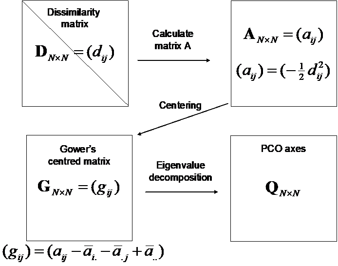
Fig. 3.1. Schematic diagram of the mechanics of a principal coordinates analysis (PCO).
The eigenvalues associated with each of the PCO axes provide information on how much of the variability inherent in the resemblance matrix is explained by each successive axis (usually expressed as a percentage of the total). The eigenvalues (and their associated axes) are ordered from largest to smallest, and their associated axes are also orthogonal to (i.e., perpendicular to or independent of) one another. Thus, $\lambda _ 1$ is the largest and the first axis is drawn through the cloud of points in a direction that maximises the total variation along it. The second eigenvalue, $\lambda _ 2$, is second-largest and its corresponding axis is drawn in a direction that maximises the total variation along it, with the further caveat that it must be perpendicular to (independent of) the first axis, and so on. Although the decomposition will produce N axes if there are N points, there will generally be a maximum of N – 1 non-zero axes. This is because only N – 1 axes are required to place N points into a Euclidean space. (Consider: only 1 axis is needed to describe the distance between two points, only 2 axes are needed to describe the distances among three points, and so on…). If matrix D has Euclidean distances to begin with and the number of variables (p) is less than N, then the maximum number of eigenvalues will be p and the PCO axes will correspond exactly to principal component axes that would be produced using PCA.
The full set of PCO axes when taken all together preserve the original dissimilarities among the points given in matrix D. However, the adequacy of the representation of the points as projected onto a smaller number of dimensions is determined for a PCO by considering how much of the total variation in the system is explained by the first two (or three) axes that are drawn. The two- (or three-) dimensional distances in the ordination will underestimate the true dissimilarities65. The percentage of the variation explained by the ith PCO axis is calculated as ($100 \times \lambda _ i / \sum \lambda _ i $). If the percentage of the variation explained by the first two axes is low, then distances in the two-dimensional ordination will not necessarily reflect the structures occurring in the full multivariate space terribly well. How much is “enough” for the percentage of the variation explained by the first two (or three) axes in order to obtain meaningful interpretations from a PCO plot is difficult to establish, as it will depend on the goals of the study, the original number of variables and the number of points in the system. We suggest that taking an approach akin to that taken for a PCA is appropriate also for a PCO. For example, a two-dimensional PCO ordination that explains ~70% or more of the multivariate variability inherent in the full resemblance matrix would be expected to provide a reasonable representation of the general overall structure. Keep in mind, however, that it is possible for the percentage to be lower, but for the most important features of the data cloud still to be well represented. Conversely, it is also possible for the percentage to be relatively high, but for considerable distortions of some distances still to occur, due to the projection.
63 If a matrix of similarities is available instead, then the PCO routine in PERMANOVA+ will automatically translate these into dissimilarities as an initial step in the analysis.
64 If the eigenvalue ($\lambda _ i$) is negative, then the square root of its absolute value is used instead, but the resulting vector is an imaginary axis (recall that any real number multiplied by $i = \sqrt{-1}$ is an imaginary number).
65Except in certain rare cases, where the first two or three axes might explain greater than 100% of the variability! See the section on Negative eigenvalues.
3.4 Example: Victorian avifauna
As an example, consider the data on Victorian avifauna at the level of individual surveys, in the file vicsurv.pri of the ‘VictAvi’ folder in the ‘Examples add-on’ directory. For simplicity, we shall focus only on a subset of the samples: Select > Samples > •Factor levels > Factor name: Treatment > Levels… and select only those samples taken from either ‘good’ or ‘poor’ sites. Duplicate this sheet containing only the subset of data and rename it vic.good.poor. Next, choose Analyse > Resemblance > (Analyse between•Samples) & (Measure•Bray-Curtis similarity) & ($\checkmark$Add dummy variable > Value: 1). From this resemblance matrix (calculated using the adjusted Bray-Curtis measure), choose PERMANOVA+ > PCO > (Maximum no of PCOs: 15) & ($\checkmark$Plot results). The default maximum number of PCOs corresponds to N – 1.
The output provided from the analysis includes two parts. First, a text file (Fig. 3.2) with information concerning the eigenvector decomposition of the G matrix, including the percentage of the variation explained by each successive PCO axis. Values taken by individual samples along each PCO axis (called “scores”) are also provided. Like any other text file in PRIMER, one can cut and paste this information into a spreadsheet outside of PRIMER, if desired. Note there is also the option ($\checkmark$Scores to worksheet) in the PCO dialog box (Fig. 3.2), which allows further analyses of one or more of these axes from within PRIMER.
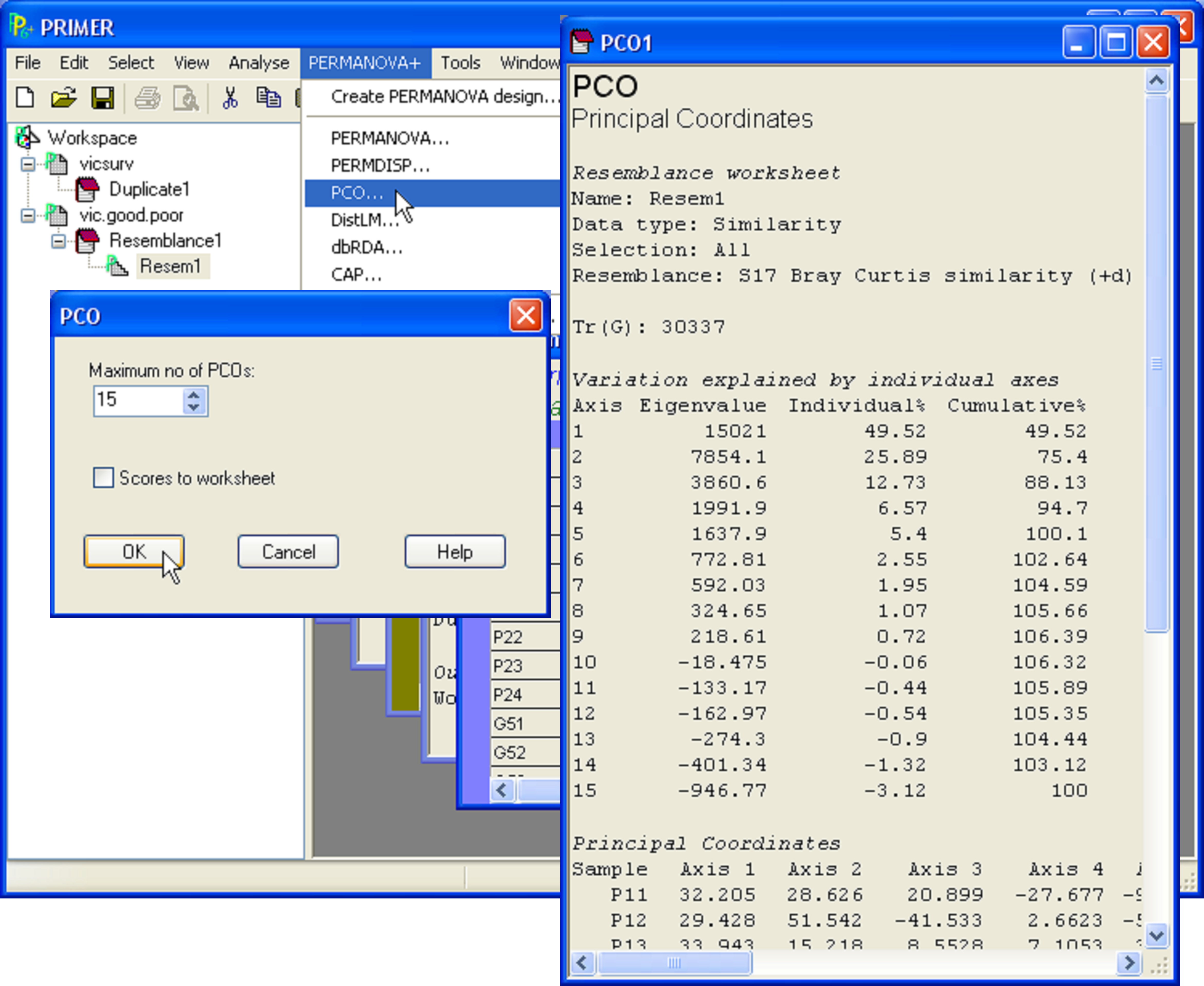
Fig. 3.2. PCO on a subset of the Victorian avifauna survey data.
The other part of the output is a graphical object consisting of the ordination itself (Fig. 3.3). By default, this is produced for the first two PCO axes in two dimensions, but by choosing Graph > Special, the full range of options already in PRIMER for graphical representation is made available for PCO plots, including 3-d scatterplots, bubble plots, the ability to overlay trajectories or cluster solutions, and a choice regarding which axes to plot. One might choose, for example, to also view the third and fourth PCO axes or the second, third and fourth in 3-d, etc., if the percentage of the variation explained by the first two axes is not large. In addition, a new feature provided as part of the PERMANOVA+ add-on is the ability to superimpose vectors onto the plot that correspond to the raw correlations of individual variables with the ordination axes (see the section Vector overlays).
 Fig. 3.3. PCO ordination provided by PRIMER for a subset of the Victorian avifauna.
In the case of the Victorian avifauna, we see the percentage of the total variation inherent in the resemblance matrix that is explained by these first two axes is 75.4% (Fig. 3.2), so the two-dimensional projection is likely to capture the salient patterns in the full data cloud. Also, the two-dimensional plot shows a clear separation of samples from ‘poor’ vs ‘good’ sites on the basis of the (adjusted) Bray-Curtis measure (Fig. 3.3). Although not labeled explicitly, the two ‘poor’ sites are also clearly distinguishable from one another on the plot – the labels 1-4 in the lower-right cluster of points correspond to the four surveys at one of these sites, while the 4 surveys for the other ‘poor’ site are all located in the upper right of the diagram. This contrasts with the avifauna measured from the ‘good’ sites, which are well mixed and not easily distinguishable from one another through time (towards the left of the diagram).
3.5 Negative eigenvalues
The sharp-sighted will have noticed a conundrum in the output given for the Victorian avifauna shown in Fig. 3.2. The values for the percentage variation explained for PCO axes 10 through 15 are negative! How can this be? Variance, in the usual sense, is always positive, so this seems very strange indeed! It turns out that if the resemblance measure used is not embeddable in Euclidean space, then some of the eigenvalues will be negative, resulting in (apparently) negative explained variation. How does this happen and how can it be interpreted?
Negative eigenvalues can occur when the resemblance measure used does not fulfill the four mathematical properties required for it to be classified as a metric distance measure. These are:
- The minimum distance is zero: if point A and point B are identical, then $d _ {AB} = 0$.
- All distances are non-negative: if point A and point B are not identical, then $d _ {AB} > 0$.
- Symmetry: the distance from A to B is equal to the distance from B to A: $d _ {AB} = d _ {BA}$.
- The triangle inequality: $d _ {AB} \le $($d _ {AC} + d _ {BC} )$.
Almost all measures worth using will fulfill at least the first three of these properties. A dissimilarity measure which fulfills the first three of the above properties, but not the fourth, is called semi-metric. Most of the resemblance measures of greatest interest to ecologists are either semi-metric (such as Bray-Curtis) or, although metric, are not necessarily embeddable in Euclidean space (such as Jaccard or Manhattan) and so negative eigenvalues can still be produced by the PCO66.
The fourth property, known as the triangle inequality states that the distance between two points (A and B, say) is equal to or smaller than the distance from A to B via some other point (C, say). How does violation of the triangle inequality produce negative eigenvalues? Perhaps the best way to tackle this question is to step through an example.
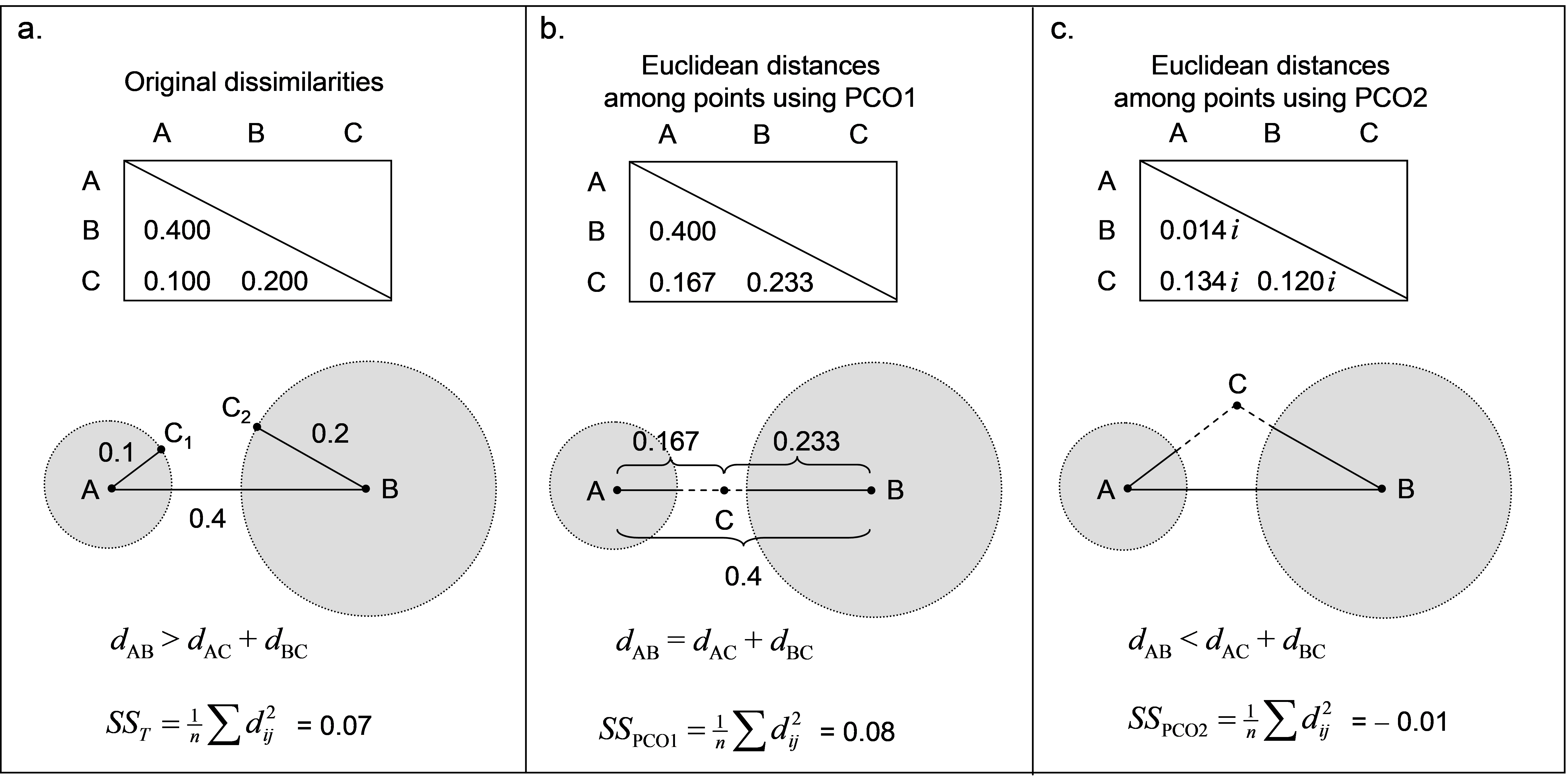 Fig. 3.4. Demonstration of violation of the triangle inequality and how PCO generates a Euclidean solution in two dimensions; the second dimension is imaginary.
Consider a resemblance measure calculated among three points: A, B and C, which produces the dissimilarity matrix shown in Fig. 3.4a. Here, the triangle inequality is clearly violated. Consequently, there is no way to place these three points into Euclidean space in two real dimensions in such a manner which preserves all three original dissimilarities. Point C should lie at a distance of 0.1 from point A (i.e., it may lie at any position along the circumference of a circle of radius 0.1 whose centre is at point A, such as C$_ 1$). However, point C should also lie at a distance of 0.2 from point B (such as at point C$_ 2$). Clearly, point C cannot fulfil both of these criteria simultaneously – it cannot be in two places at once! Well, we have to put point C somewhere in order to draw this configuration in Euclidean space (i.e., on the page) at all. Suppose point C is given a position along a single dimension between points A and B, as shown in Fig. 3.4b. This could be anywhere, perhaps, along the straight-line continuum from A to B, but it would make sense for it to lie somewhere in the “gap” between the two circles. If we had done a PCO of the original dissimilarity matrix, the position for point C shown in Fig. 3.4b is precisely that which is given for it along the first PCO axis.
Clearly, in order to draw this ordination (in one dimension), we have had to “stretch” the distances from A to C and from B to C, just so that C could be represented as a single point in the diagram. A consequence of this is that the total variation (the sum of squared inter-point distances divided by the number of points, see Figs. 1.3 and 1.4 in chapter 1) is inflated. That is, the original total sum of squares was $SS _ T$ = 0.07 (Fig. 3.4a), and now, even using only one dimension, the total sum of squares is actually larger than this ($SS _ {PCO1}$ = 0.08, Fig. 3.4b). We can remove this “extra” variance, introduced by placing the points from a semi-metric system into Euclidean space, by introducing one or more imaginary axes. Distances along an imaginary axis can be treated effectively in the same manner as those along real axes, except they need to be multiplied by the constant $ i = \sqrt{-1}$. Consequently, squared values of distances along an imaginary axis are multiplied by $i ^ 2 = -1$, and, therefore, are simply negative. In our example, the distances among the three points obtained along the second PCO axis (which is imaginary) are shown in Fig. 3.4c. In practice, the configuration output treats the second axis like any other axis (so that it can be drawn), but we need to keep in mind that this second axis (theoretically and algebraically) is actually defined only in imaginary space67. The total sum of squares along this second axis alone is $SS _ {PCO2} = – 0.01$, and so the variance occurring along this imaginary axis is negative. Despite this, we can see in this example that $SS _ T = SS_ {PCO1} + SS_ {PCO2}$. It is true in this example, and it is true in general, that the sum of the individual SS for each of the PCO’s will add up to the total SS from the original dissimilarities provided we take due care when combining real and imaginary axes – the SS of the latter contribute negatively. In this example, there is one positive and one negative eigenvalue, corresponding to PCO1 and PCO2, respectively. The sum of these two eigenvalues, retaining their sign, is equal to the total variance.
Returning now to the Victorian avifauna, we can plot the percentage of the variation explained by each of the PCO axes, as given in the output in Fig. 3.2. This is known as a scree plot (Fig. 3.5), and it provides a visual diagnostic regarding the number of axes that capture the majority of variation for this system. For this example, there are a series of positive eigenvalues which are progressively smaller in size, followed by a series of negative eigenvalues (Fig. 3.5). We can also plot these percentages cumulatively (Fig. 3.5) and see that the percentage of explained variation goes up past 100% when we get to PCO axis 5. The first 9 PCO axes together actually explain ~106% of the original variation (Fig. 3.2). Once again, the reason for this is that the analysis has had to “make do” and “stretch” some of the original distances (for which the triangle inequality does not hold) in order to represent these points on real Euclidean axes. Then, with the addition of subsequent PCO axes (10 through 15) corresponding to negative eigenvalues (imaginary Euclidean axes), this is brought back down to precisely 100% of the original variation based on adjusted Bray-Curtis resemblances.
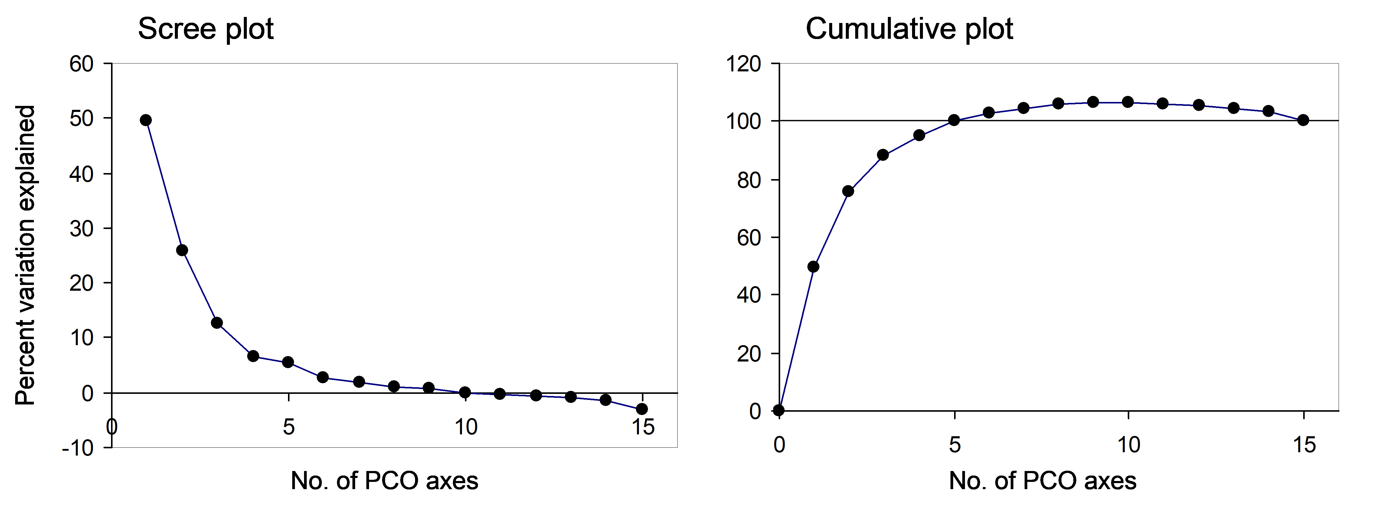 Fig. 3.5. Scree plot and cumulative scree plot for the PCO of the Victorian avifauna data.
For purposes of ordination, our interest will be in plotting and visualising patterns using just the first two or three axes. Generally, these first few axes will correspond to large positive eigenvalues, the axes corresponding to negative eigenvalues will be negligible (i.e., in the “tail” of the scree plot) and need not be of any concern Sibson (1979) , Gower (1987) ). However, if:
- the first two or three PCO axes together explain > 100% of the variation,
- any of the plotted PCO axes are associated with a negative eigenvalue (i.e. corresponding to an imaginary axis), or
- the largest negative eigenvalue in the system as a whole is larger (in absolute value) than the smallest positive eigenvalue associated with the PCO axes in the plot ( Cailliez & Pagès 1976 , as cited by Legendre & Legendre (1998) ,
then interpreting the plot will be problematic. In any of these cases, one would be dealing with a resemblance matrix that rather seriously violates the triangle inequality. This can occur if the resemblance measure being used is inappropriate for the type of data, if there are a lot of repeated values in the resemblance matrix or if the resemblances are ranked prior to analysis. With the PCO routine, as with PERMANOVA or PERMDISP, it makes sense to carefully consider the meaning of the resemblance measure used in the context of the data to be analysed and the questions of interest.
Perhaps not surprisingly, previous workers have been troubled by the presence of negative eigenvalues from PCO analyses and how they should be interpreted (e.g., see pp. 432-438 in Legendre & Legendre (1998) ). One possibility is to “correct” for negative eigenvalues by adding a constant to all of the dissimilarities ( Cailliez (1983) ) or to all of their squares ( Lingoes (1971) ). Clearly, these correction methods inflate the total variation (e.g., Legendre & Anderson (1999) ) and are not actually necessary ( McArdle & Anderson (2001) ). Cailliez & Pagès 1976 also suggested correcting the percentage of the variation among N points explained by (say) the first m PCO axes from what is used above, i.e.: $$ 100 \times \frac{\sum _ {i=1} ^ m \lambda _i }{\sum _ {i=1} ^ N \lambda _i } \tag{3.1} $$ to: $$ 100 \times \frac{\sum _ {i=1} ^ m \lambda _i +m |\lambda _N ^{-} | }{\sum _ {i=1} ^ N \lambda _i +(N -1)|\lambda _ N ^ {-} |} \tag{3.2} $$ where $ |\lambda _ N ^ {-} | $ is the absolute value of the largest negative eigenvalue (see p. 438 in Legendre & Legendre (1998) ). Although it was suggested that (3.2) would provide a better measure of the quality of the ordination in the presence of negative eigenvalues, this is not entirely clear. The approach in (3.2), like the proposed correction methods, inflates the total variation. Alternatively, Gower (1987) has indicated that the adequacy of the ordination can be assessed by calculating percentages using the squares of the eigenvalues, when negative eigenvalues are present. In the PCO routine of the PERMANOVA+ package, we chose simply to retain the former calculation (3.1) in the output, so that the user may examine the complete original diagnostic information regarding the percentage of variation explained by each of the real and imaginary axes, individually and cumulatively (e.g., Figs. 3.2 and 3.5).
An important take-home message is that the PCO axes together do explain 100% of the variation in the original dissimilarity matrix (Fig. 3.4), provided we are careful to retain the signs of the eigenvalues and to treat those axes associated with negative eigenvalues as imaginary. The PCO axes therefore (when taken together) provide a full Euclidean representation of the dissimilarity matrix, albeit requiring both real and complex (imaginary) axes for some (semi-metric) dissimilarity measures. As a consequence of this property, note also that the original dissimilarity between any two samples can be obtained from the PCO axes. More particularly, the square root of the sum of the squared distances between two points along the PCO axes68 is equal to the original dissimilarity for those two points. For example, consider the Euclidean distance between points A and C in Fig. 3.4 that would be obtained using the PCO axes alone: $$ d _ {AC} = \sqrt{ \left( d _ {AC} ^ {PCO1} \right) ^ 2 + \left( d _ {AC} ^ {PCO2} \right) ^ 2 } = \sqrt{ \left( 0.167 \right) ^ 2 + \left( 0.134 i \right) ^ 2}. $$ As $i^2 = -1$, this gives $$ d _ {AC} = \sqrt{ \left( 0.167 \right) ^ 2 - \left( 0.134 \right) ^ 2} = 0.100$$ which is the original dissimilarity between points A and C in Fig. 3.4a. In other words, we can re-create the original dissimilarities by calculating Euclidean distances on the PCO scores ( Gower (1966) ). In order to get this exactly right, however, we have to use all of the PCO axes and we have to treat the imaginary axes correctly and separately under the square root sign (e.g., McArdle & Anderson (2001) ).
66 For a review of the mathematical properties of many commonly used measures, see Gower & Legendre (1986) and chapter 7 of Legendre & Legendre (1998) .
67 Indeed, for any other purposes apart from attempts to physically draw a configuration, PRIMER and the PERMANOVA+ add-on will indeed treat such axes, algebraically, as imaginary, and so maintain the correct sign of the associated eigenvalue.
68 (i.e., the Euclidean distance between two points calculated from the PCO scores)
3.6 Vector overlays
A new feature of the PERMANOVA+ add-on package is the ability to add vector overlays onto graphical outputs. This is offered as purely an exploratory tool to visualise potential linear or monotonic relationships between a given set of variables and ordination axes. For example, returning to the Victorian avifauna data, we may wish to know which of the original species variables are either increasing or decreasing in value from left to right across the PCO diagram. These would be bird species whose abundances correlate with the differences seen between the ‘good’ and the ‘poor’ sites, which are clearly split along PCO axis 1 (Fig. 3.3). From the PCO plot, choose Graph > Special to obtain the ‘Configuration Plot’ dialog box (Fig. 3.6), then, under ‘Vectors’ choose (•Worksheet variables: vic.good.poor) & (Correlation type: Spearman), click on the ‘Select…’ button and choose (Select Vectors •Correlation > 0.5), OK.
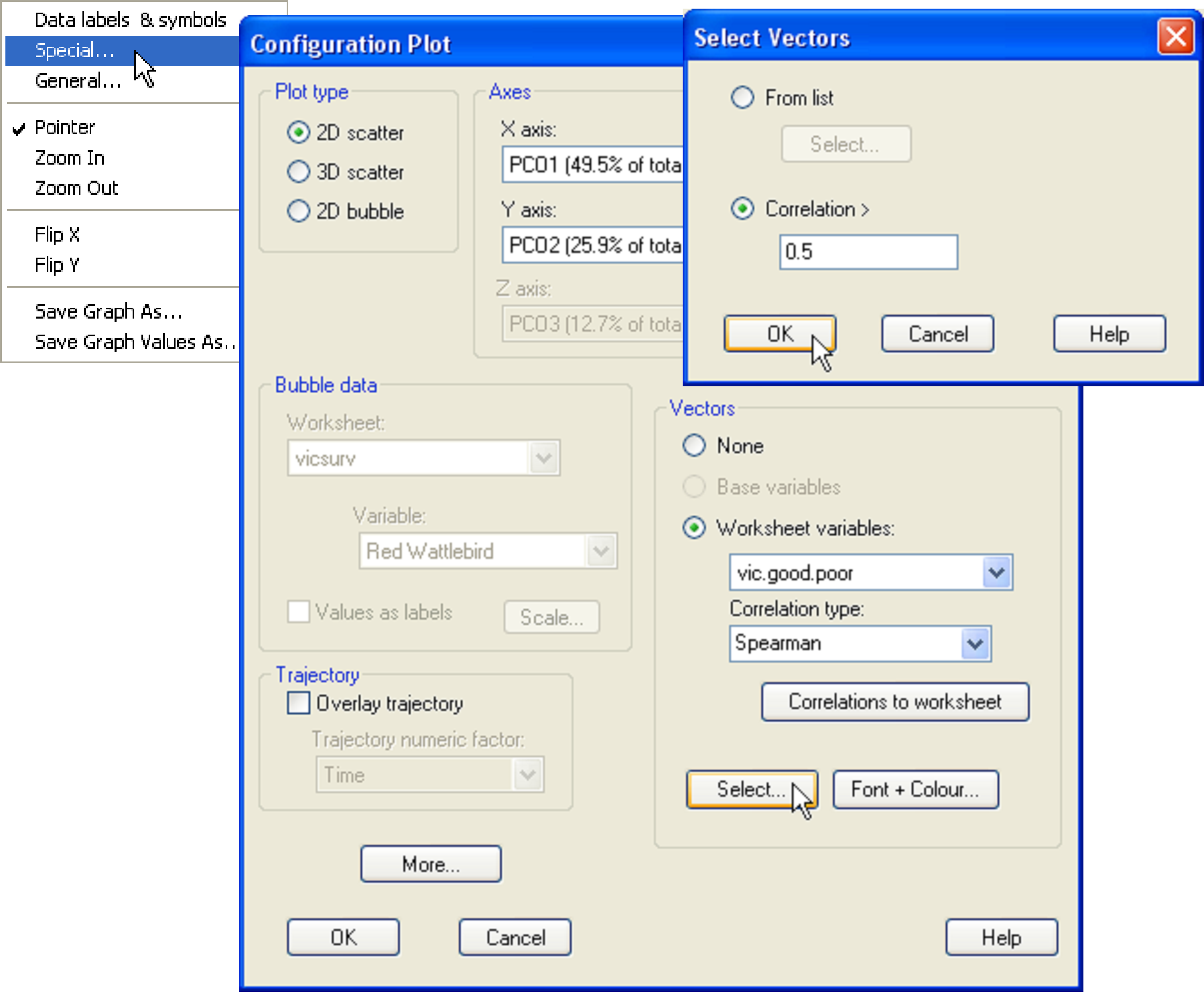
Fig. 3.6. Adding a vector overlay to the PCO of the Victorian avifauna data.
This produces a vector overlay onto the PCO plot as shown in Fig. 3.7. In this case, we have restricted the overlay to include only those variables from the worksheet that have a vector length that is greater than 0.5. Alternatively, Pearson correlations may be used instead. These will specifically highlight linear relationships, whereas Spearman correlations are a bit more flexible, being based on ranks, and so will highlight more simply the overall increasing or decreasing relationships of individual variables across the plot. The primary features of the vector overlay are:
-
The circle is a unit circle (radius = 1.0), whose relative size and position of origin (centre) is arbitrary with respect to the underlying plot.
-
Each vector begins at the centre of the circle (the origin) and ends at the coordinates (x, y) consisting of the correlations between that variable and each of PCO axis 1 and 2, respectively,
-
The length and direction of each vector indicates the strength and sign, respectively, of the relationship between that variable and the PCO axes.
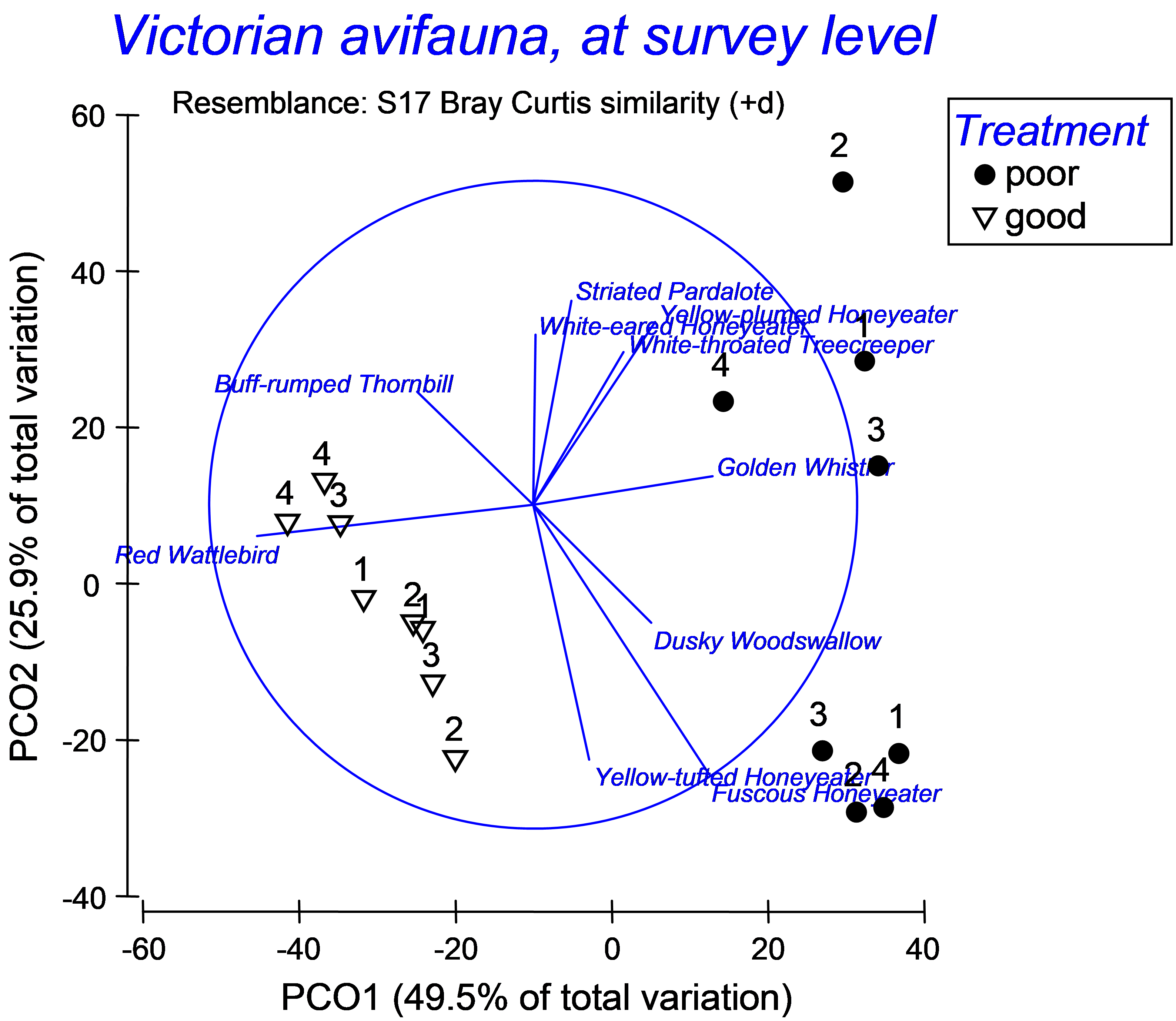 Fig. 3.7. Vector overlay on the PCO of the Victorian avifauna, showing birds with vectors longer than 0.5.
For the Victorian avifauna, we can see that the abundance of Red Wattlebird has a strong negative relationship with PCO 1 (indicative of ‘good’ sites), while the abundance of Golden Whistler has a fairly strong positive relationship with this axis (indicative of ‘poor’ sites). These two species have very weak relationships with PCO 2. There are other species that are correlated with PCO 2, (either positively or negatively), which largely separates the two ‘poor’ sites from one another (Fig. 3.7).
By clicking on the ‘Correlations to worksheet’ button in the ‘Configuration Plot’ dialog box (Fig. 3.6), individual correlations between each variable in the selected worksheet and the PCO axes are output to a new worksheet where they can be considered individually, exported to other programs, or analysed in other ways within PRIMER69. Examining the Spearman correlations given in a worksheet for the Victorian avifauna data helps to clarify how the axes were drawn (Fig. 3.8). For example, the Yellow-plumed Honeyeater has a correlation of $\rho _ 1 = 0.376$ with PCO axis 1 and $\rho _2 = 0.564$ with PCO axis 2. The length of the vector for that species is therefore $l = \sqrt{\rho _1 ^2 + \rho _2 ^ 2} = 0.678$ and it occurs in the upper-right quadrant of the circle, as both correlations are positive (Fig. 3.8). The correlations and associated vectors are also shown for the Yellow-tufted Honeyeater and the Buff-rumped Thornbill (Fig. 3.8).
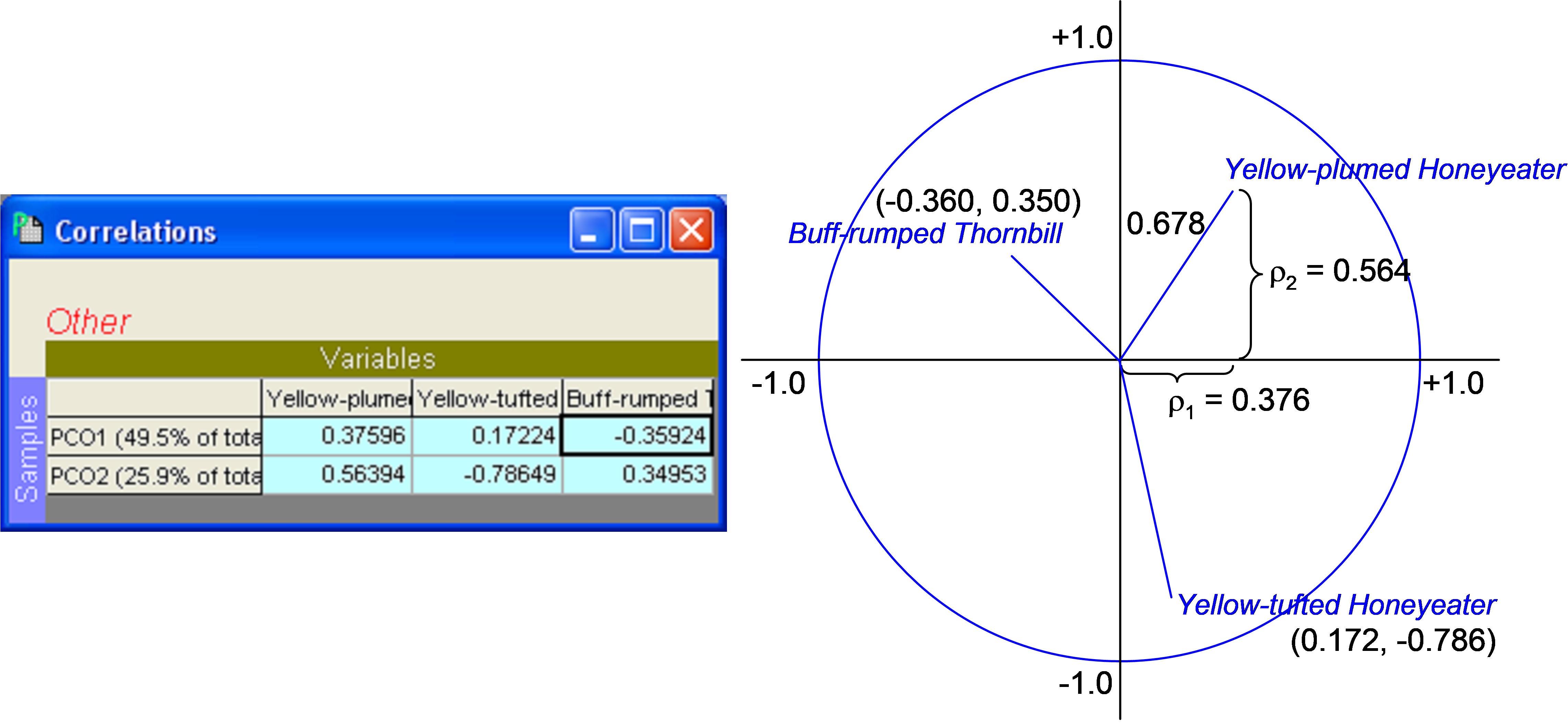 Fig. 3.8. Spearman correlations in datasheet and schematic diagram of calculations used to produce vector overlays on the PCO of the Victorian avifauna data.
There are several important caveats on the use and interpretation of these vector overlays. First, just because a variable has a long vector when drawn on an ordination in this way does not confirm that this variable is necessarily responsible for differences among samples or groups in that direction. These are correlations only and therefore they cannot be construed to indicate causation of either the effects of factors or of dissimilarities between individual sample points. Second, just because a given variable has a short vector when drawn on an ordination in this way does not mean that this variable is unimportant with respect to patterns that might be apparent in the diagram. Pearson correlations will show linear relationships with axes, Spearman rank correlations will show monotonic increasing or decreasing relationships with axes, but neither will show Gaussian, unimodal or multi-modal relationships well at all. Yet these kinds of relationships are very common indeed for ecological species abundance data, especially for a series of sites along one or more environmental gradients ( ter Braak (1985) , Zhu, Hastie & Walter (2005) , Yee (2006) ). Bubble plots, which are also available within PRIMER, can be used to explore these more complex relationships (see chapter 7 in Clarke & Gorley (2006) ).
It is best to view these vector overlays as simply an exploratory tool. They do not mean that the variables do or do not have linear relationships with the axes (except in special cases, see the section PCO vs PCA). For the above example, the split in the data between ‘good’ and ‘poor’ indicates a clear role for PCO axis 1, so seeking variables with increasing or decreasing relationships with this axis (via Spearman raw correlations) is fairly reasonable here. For ordinations that have more complex patterns and gradients, however, the vector overlays may do a poor job of uncovering the variables that are relevant in structuring multivariate variation.
69 Beware of the fact that if you choose to reflect positions of points along axes by changing their sign (i.e., if you choose Graph > Flip X or Flip Y), the signs of the correlations given in the worksheet will no longer correspond to those shown in the diagram!
3.7 PCO versus PCA (Clyde environmental data)
Principal components analysis (PCA) is described in detail in chapter 4 of Clarke & Warwick (2001) . As stated earlier, PCO produces an equivalent ordination to a PCA when a Euclidean distance matrix is used as the basis of the analysis. Consider the environmental data from the Firth of Clyde ( Pearson & Blackstock (1984) ), as analysed using the PCA routine in PRIMER in chapter 10 of Clarke & Gorley (2006) . These data consist of 11 environmental variables, including: depth, the concentrations of several heavy metals, percent carbon and percent nitrogen found in soft sediments from benthic grabs at each of 12 sites along an east-west transect that spans the Garroch Head sewage-sludge dumpground, with site 6 (in the middle) being closest to the actual dump site. The data are located in the file clev.pri in the ‘Clydemac’ folder of the ‘Examples v6’ directory.
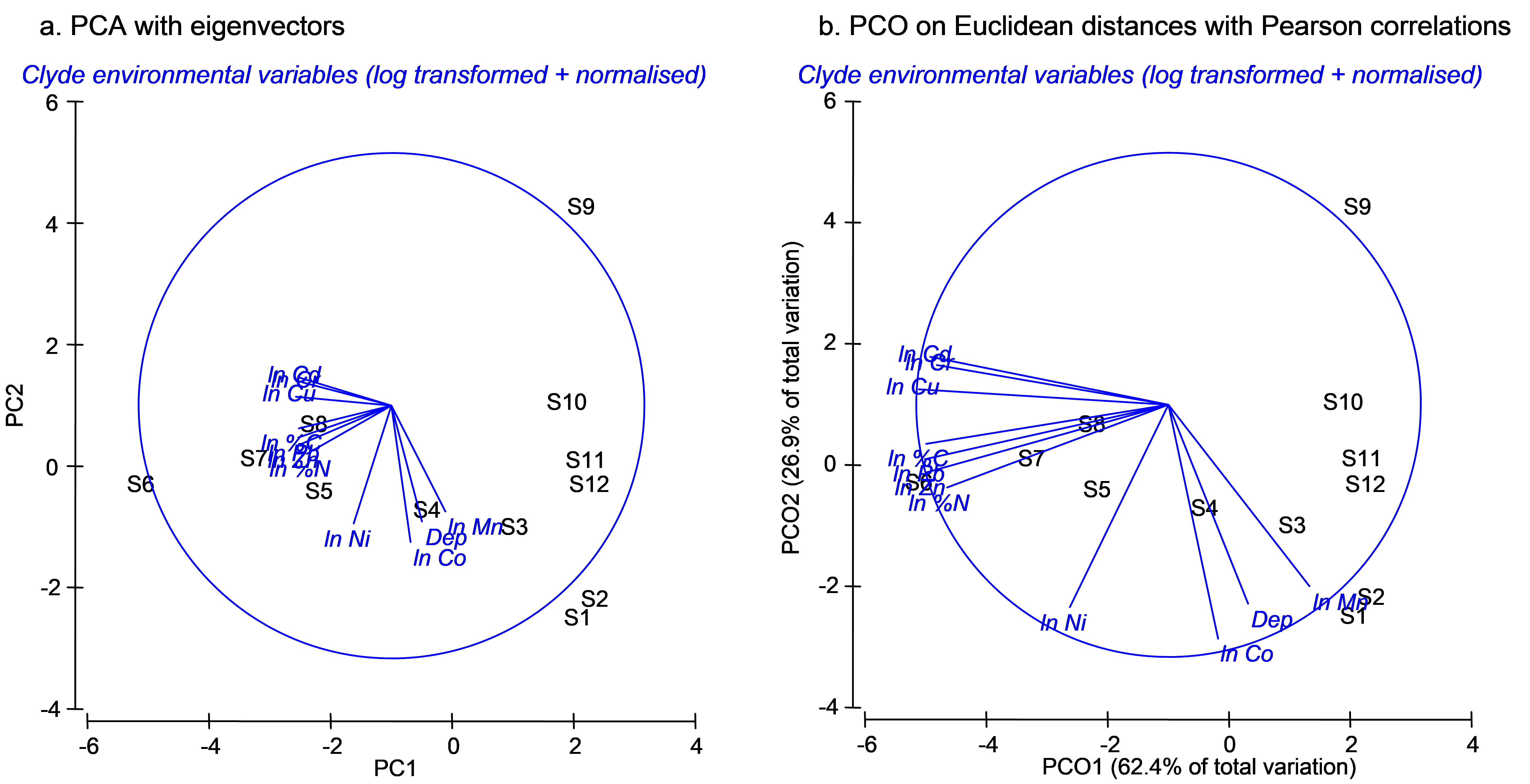 Fig. 3.9. Ordination of 11 environmental variables from the Firth of Clyde using (a) PCA and (b) PCO on the basis of a Euclidean distance matrix. Vectors in (a) are eigenvectors from the PCA, while vectors in (b) are the raw Pearson correlations of variables with the PCO axes.
As indicated by Clarke & Gorley (2006) , it is appropriate to first check the distributions of variables (e.g., for skewness and outliers) before proceeding with a PCA. This can be done, for example, by choosing Analyse>Draftsman Plot in PRIMER. As recommended for these data by Clarke & Gorley (2006) , log-transform all of the variables except depth. This is done by highlighting all of the variables except depth and choosing Tools > Transform(individual) > Expression: log(0.1+V) > OK. Rename the transformed variables, as appropriate (e.g. Cu can be renamed ln Cu, and so on), and then rename the data sheet of transformed data clevt. Clearly, these variables are on quite different measurement scales and units, so a PCA on the correlation matrix is appropriate here. Normalise the transformed data by choosing Analyse > Pre-treatment > Normalise variables. Rename the data sheet of normalised variables clevtn. Finally, do a PCA of the normalised data by choosing Analyse > PCA.
Recall that PCA is simply a centred rotation of the original axes and that the resulting PC axes are therefore linear combinations of the original (in this case, transformed and normalised) variables. The ‘Eigenvectors’ in the output file from a PCA in PRIMER provide explicitly the coefficients associated with each variable in the linear combination that gives rise to each PC axis. Importantly, the vectors shown on the PCA plot are these eigenvectors, giving specific information about these linear combinations. This means, necessarily, that the lengths and positions of the vectors depend on the other variables included in the analysis70.
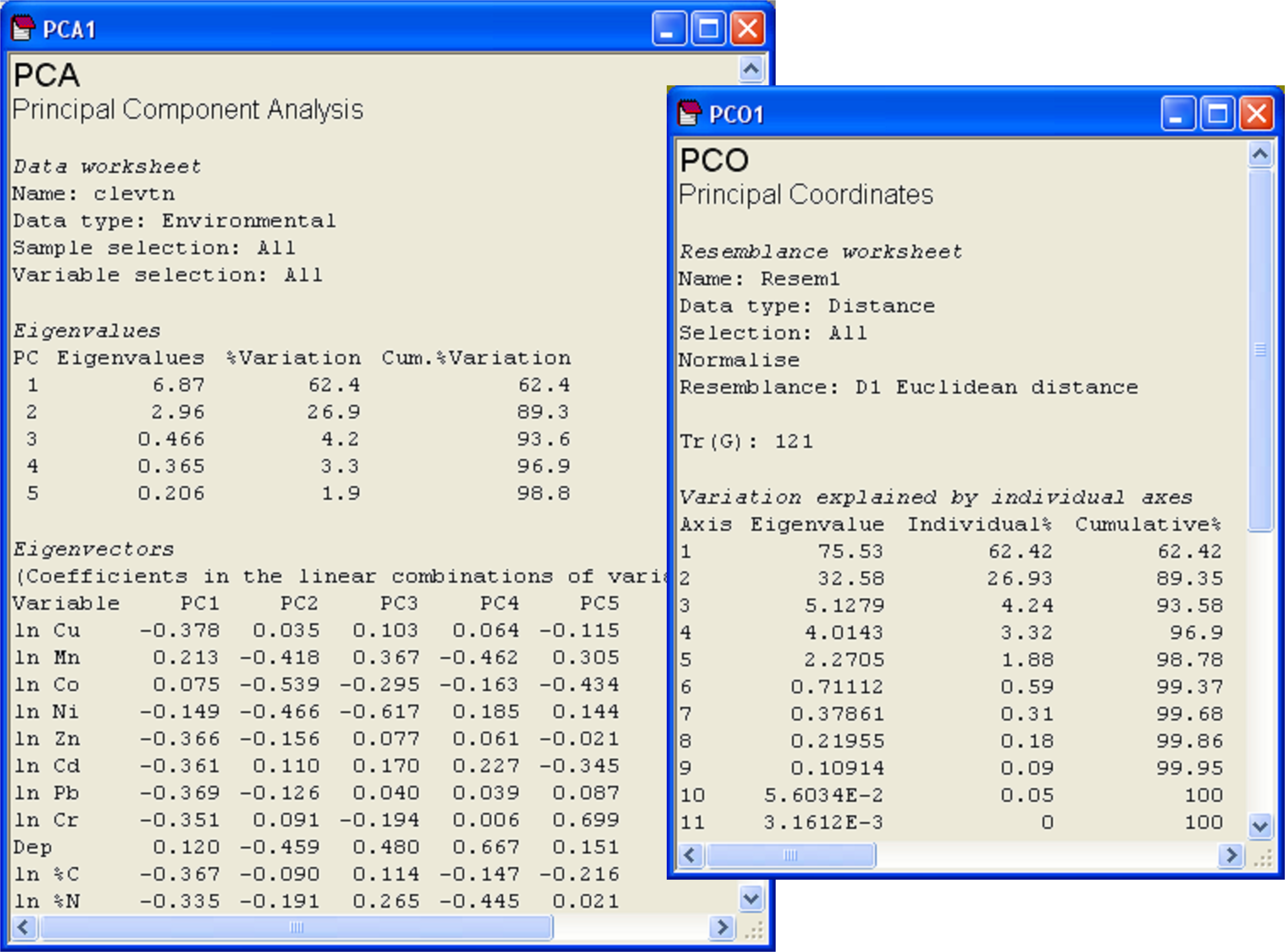
Fig. 3.10. Results of PCA and PCO on Euclidean distances for the transformed and normalised environmental data from the Firth of Clyde.
Next we may replicate the pattern of points seen in the PCA ordination precisely by doing a PCO on the basis of a Euclidean distance matrix. From the clevtn data file, choose Analyse > Resemblance > (Analyse between •Samples) & (Measure •Euclidean distance) > OK. From the resulting resemblance matrix, choose PERMANOVA+ > PCO > OK. For PCO, as for PCA, the sign of axes is arbitrary. It may be necessary to choose Graph > Flip X and/or Graph > Flip Y before the orientation of the PCO plot can be seen to match that of the PCA. Once this is done, however, it should be readily apparent that the patterns of points and even the scaling of axes are identical for these two analyses (Fig. 3.9). Further proof of the equivalence is seen by examining the % variation explained by each of the axes, as provided in the text output files (Fig. 3.10). The first two axes alone explain over 89% of the variation in these 11 environmental variables, indicating that the 2-d ordination is highly likely to have captured the majority of the salient patterns of variation in the multi-dimensional data cloud.
By choosing Graph > Special > (Vectors •Worksheet variables: clevtn > Correlation type: Pearson), vectors are drawn onto the PCO plot that correspond to the Pearson correlations of individual variables with the PCO axes. These are clearly different from the eigenvectors that are drawn by default on the PCA plot. For the vector overlay on the PCO plot, each variable was treated separately and the vectors arise from individual correlations that do not take into account any of the other variables. In contrast, the eigenvectors of the PCA do take into account the other variables in the analysis, and would obviously change if one or more of the variables were omitted. It is not surprising, in the present example, that log-concentrations of many of the heavy metals are strongly correlated with the first PCO axis, showing a gradient of decreasing contamination with increasing distance in either direction away from the dumpsite (site 6).
The PCA eigenvectors are not given in the output from a Euclidean PCO analysis. This is because the PCO uses the Euclidean distance matrix alone as its starting point, so has no “memory” of the variables which gave rise to these distances. We can, however, obtain these eigenvectors retrospectively, as the resulting PCO axes in this case coincide with what would be obtained by running a PCA – they are therefore linear combinations of the original (transformed and normalised) variables. This is done by choosing Graph > Special > (Vectors •Worksheet variables: clevtn > Correlation type: Multiple). What this option does is to overlay vectors that show the multiple partial correlations of the variables in the chosen worksheet with the configuration axes. In this case, these correspond to the eigenvectors. If you click on the option ‘Correlations to worksheet’ in the ‘Configuration plot’ dialog, you will see in this worksheet that the values for each variable correspond indeed to their eigenvector values as provided in the PCA output file71. This equivalence will hold provided variables have been normalised prior to analysis.
More generally, the relevant point here is that the choice of ‘Correlation type: Multiple’ will produce a vector overlay of multiple partial correlations, where the relationships between variables and configuration axes take into account other variables in the worksheet. This contrasts with the choice of ‘Correlation type: Pearson’ (or Spearman), which plot raw correlations for each variable, ignoring all other variables. For the PCA, note that it is also possible to replace the eigenvectors of original variables that are displayed by default on the ordination with an overlay of some other vectors of interest. This is done by simply choosing ‘•Worksheet variables’ and indicating the worksheet that contains the variables of interest, instead of ‘•Base variables’ in the ‘Configuration Plot’ dialog.
A further point to note is the fact that there are no negative eigenvalues in this example. Indeed, the cumulative scree plot for either a PCA or a PCO based on Euclidean distances will simply be a smooth increasing function from zero to 100%. Any measure that is Euclidean-embeddable and fulfils the triangle inequality will have strictly non-negative eigenvalues in the PCO and thus will have all real and no imaginary axes ( Torgerson (1958) , Gower (1982) , Gower & Legendre (1986) ).
If PCO is done on a resemblance matrix obtained using the chi-squared distance measure (measure D16 under the ‘Distance’ option under the ‘More’ tab of the ‘Resemblance’ dialog), then the resulting ordination will be identical to a correspondence analysis (CA) among samples that has been drawn using scaling method 1 (see p. 456 and p. 467 of Legendre & Legendre (1998) for details). Although the relationship between the original variables and the resulting ordination axes is linear for PCO on Euclidean distances (a.k.a. PCA) and unimodal for PCO on chi-squared distances (a.k.a. CA), when PCO is based on some other measure, such as Bray-Curtis, these relationships are likely to be highly non-linear and are generally unknown. Clearly, PCO is more general and flexible than either PCA or CA. This added flexibility comes at a price, however. Like MDS, PCO necessarily must lose any direct link with the original variables by being based purely on the resemblance matrix. Relationships between the PCO axes and the original variables (or any other variables for that matter) can only be investigated retrospectively (e.g., using vector overlays or bubbles), as seen in the above examples.
70This is directly analogous to the fact that the regression coefficient for a variable $X _1$ in the simple regression of $Y$ vs $X _1$, will be different from the partial regression coefficient in the multiple regression of $Y$ vs $X _1$ and $X _2$ together. That is, the relationship between $Y$ and $X _1$ changes once $X _2$ is taken into account. Correlation (non-independence) between $X _1$ and $X _2$ is what causes simple and partial regression coefficients to differ from one another.
71 The sign associated with the values given in this file and given for the eigenvectors will depend, of course, on the sign of the PCO and PCA axes, respectively, that happen to be provided in the output. As these are arbitrary, the signs may need to be “flipped” to see the concordance.
3.8 Distances among centroids (Okura macrofauna)
In chapter 1, the difficulty in calculating centroids for non-Euclidean resemblance measures was discussed (see the section entitled Huygens’ theorem). In chapter 2, the section entitled Generalisation to dissimilarities indicated how PCO axes could be used in order to calculate distances from individual points to their group centroids in the space of a chosen resemblance measure as part of the PERMDISP routine. Furthermore (see the section entitled Dispersion in nested designs in chapter 2), it was shown how a new tool available in PERMANOVA+ can be used to calculate distances among centroids in the space of a chosen resemblance measure. One important use of this tool is to provide insights into the relative sizes and directions of effects in complex experimental designs. Specifically, once distances among centroids from the cells or combinations of levels of an experimental design have been calculated, these can be visualised using PCO (or MDS). The results will provide a suitable visual complement to the output given in PERMANOVA regarding the relative sizes of components of variation in the experimental design and will also clarify the relative distances among centroids for individual levels of factors.
For example, we shall consider again the data on macrofauna from the Okura estuary ( Anderson, Ford, Feary et al. (2004) ), found in the file okura.pri of the ‘Okura’ folder in the ‘Examples add-on’ directory. Previously, we considered only the first time of sampling. Now, however, we shall consider the full data set, which included 6 times of sampling. The full experimental design included four factors:
-
Factor A: Season (fixed with a = 3 levels: winter/spring (W.S), spring/summer (S.S) or late summer (L.S)).
-
Factor B: Rain.Dry (fixed with b = 2 levels: after rain (R) or after a dry period (D)).
-
Factor C: Deposition (fixed with c = 3 levels: high (H), medium (M) or low (L) probability of sediment deposition).
-
Factor D: Site (random wih d = 5 levels, nested in the factor Deposition).
There were n = 6 sediment cores collected at each site at each time of sampling.
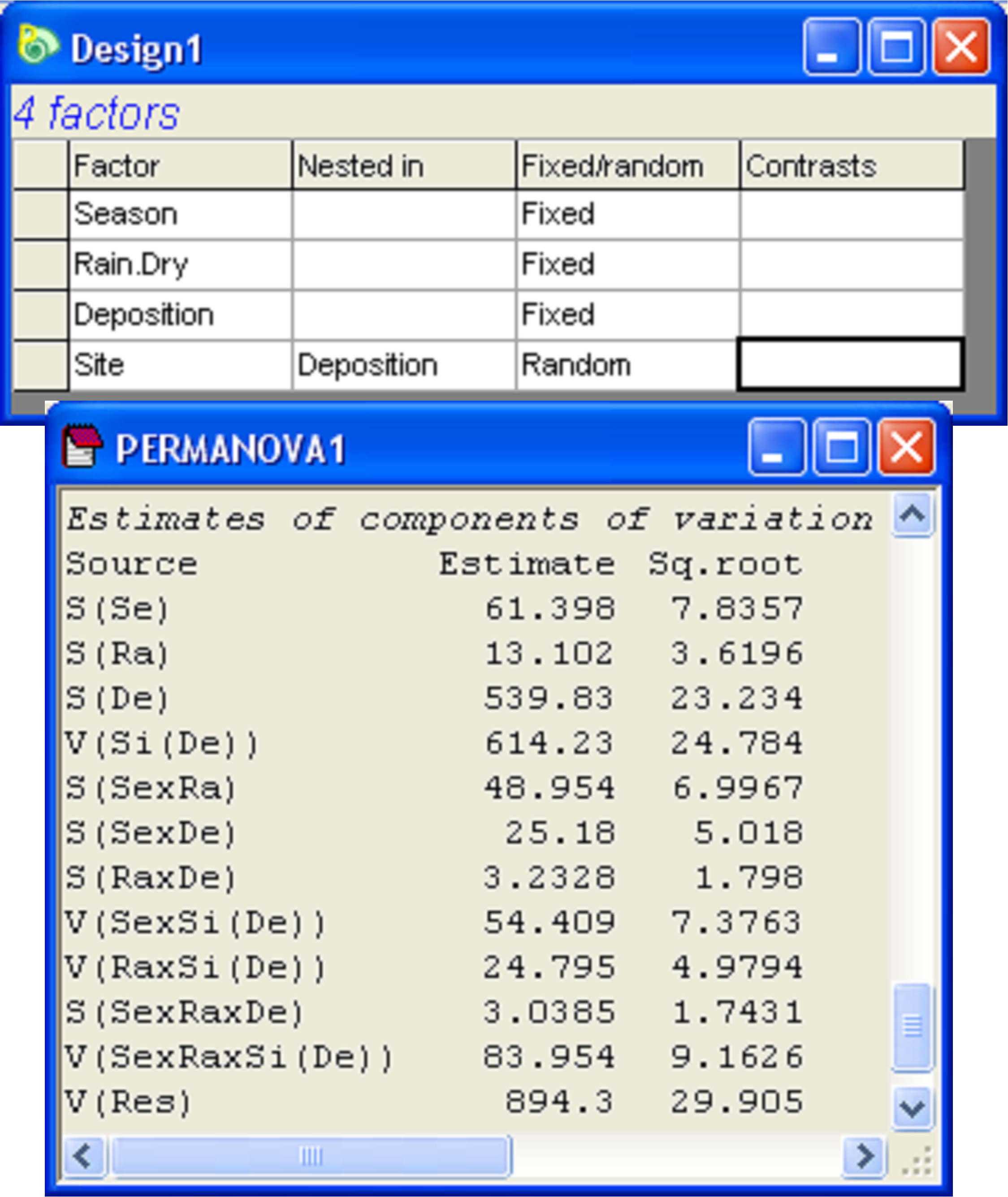
Fig. 3.11. Design file and estimated components of variation from the ensuing PERMANOVA analysis of the Okura macrofaunal data.
A PERMANOVA analysis based on the Bray-Curtis resemblance measure calculated from log(X+1)-transformed variables yielded quantitative measures for the components of variation associated with each term in the model (Fig. 3.11)72. Focusing on the main effects for the non-nested factors only, we can see that the greatest effect size was attributable to Deposition, followed by Season, followed by Rain.Dry. To visualise the variation among the relevant cell centroids in this design, we begin by identifying the cells that correspond to what we wish to plot as levels of a single factor. In this case, we wish to examine the cells corresponding to all combinations of Season × Rain.Dry × Deposition. From the full resemblance matrix, choose Edit > Factors > Combine, then click on each of these main effect terms in turn, followed by the right arrow in order to move them over into the ‘Include’ box on the right, then click ‘OK’. Next, to calculate distances among these centroids, choose PERMANOVA+ > Distances among centroids…> Grouping factor: SeasonRain.DryDeposition > OK (Fig. 3.12). The resulting resemblance matrix will contain distances (in Bray-Curtis space, as that is what formed the basis of the analysis here) among the a × b × c = 3 × 2 × 3 = 18 cells. Note that the names of the samples (centroids) in this newly created resemblance matrix will be the same as the levels of the factor that was used to identify the cells. Whereas the original resemblance matrix had 540 samples, we have now obtained Bray-Curtis resemblances among 18 centroids, each calculated as an average (using PCO axes, not the raw data mind!) from d × n = 5 × 6 = 30 cores.
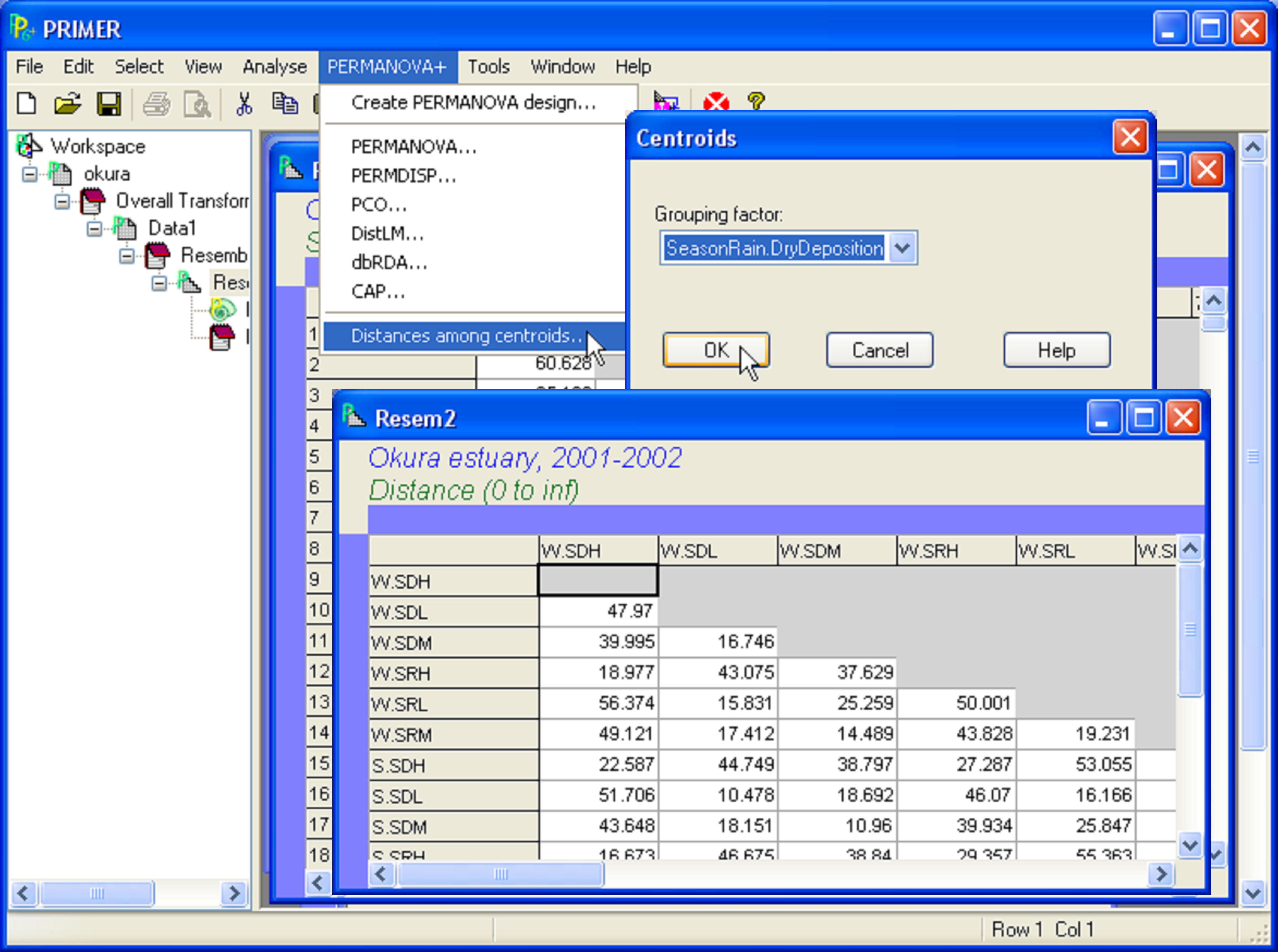 Fig. 3.12. Calculating distances among centroids for the Okura data. The centroids are identified by a factor with 18 levels, consisting of all combinations of three factors in the design: ‘Season’, ‘Rain.Dry’ and ‘Deposition’.
From the distance matrix among centroids (‘Resem2’), choose PERMANOVA+ > PCO and examine the resulting ordination of centroids (Fig. 3.13). The first PCO axis explains the majority of the variation among these cells (nearly 75%) and is strongly associated with the separation of assemblages in high depositional environments (on the right) from those in low or medium depositional environments (on the left). Of far less importance (as was also shown in the PERMANOVA output) is the seasonal factor. Differences among seasons are discernible along PCO axis 2, explaining less than 8% of the variation among cells and with an apparent progression of change in assemblage structure from winter/spring, through spring/summer and then to late summer from the top to the bottom of the PCO plot (Fig. 3.13). Of even less importance is the effect of rainfall – the centroids corresponding to the two sampling times within each season and depositional environment occur quite close together on the plot, further indicating that, for these data (and based on the Bray-Curtis measure), seasonal and depositional effects were of greater importance than rainfall effects, which were negligible.
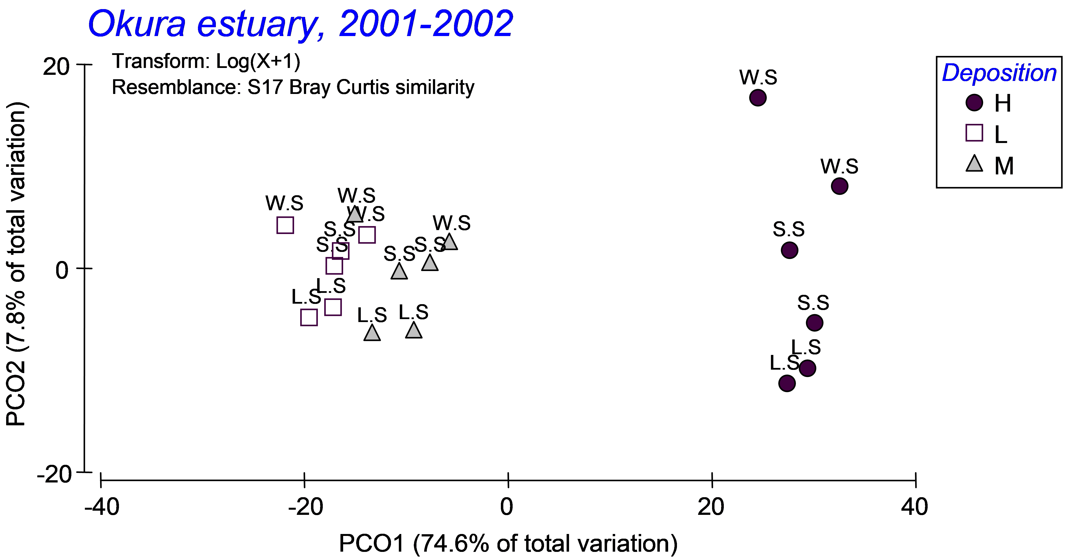
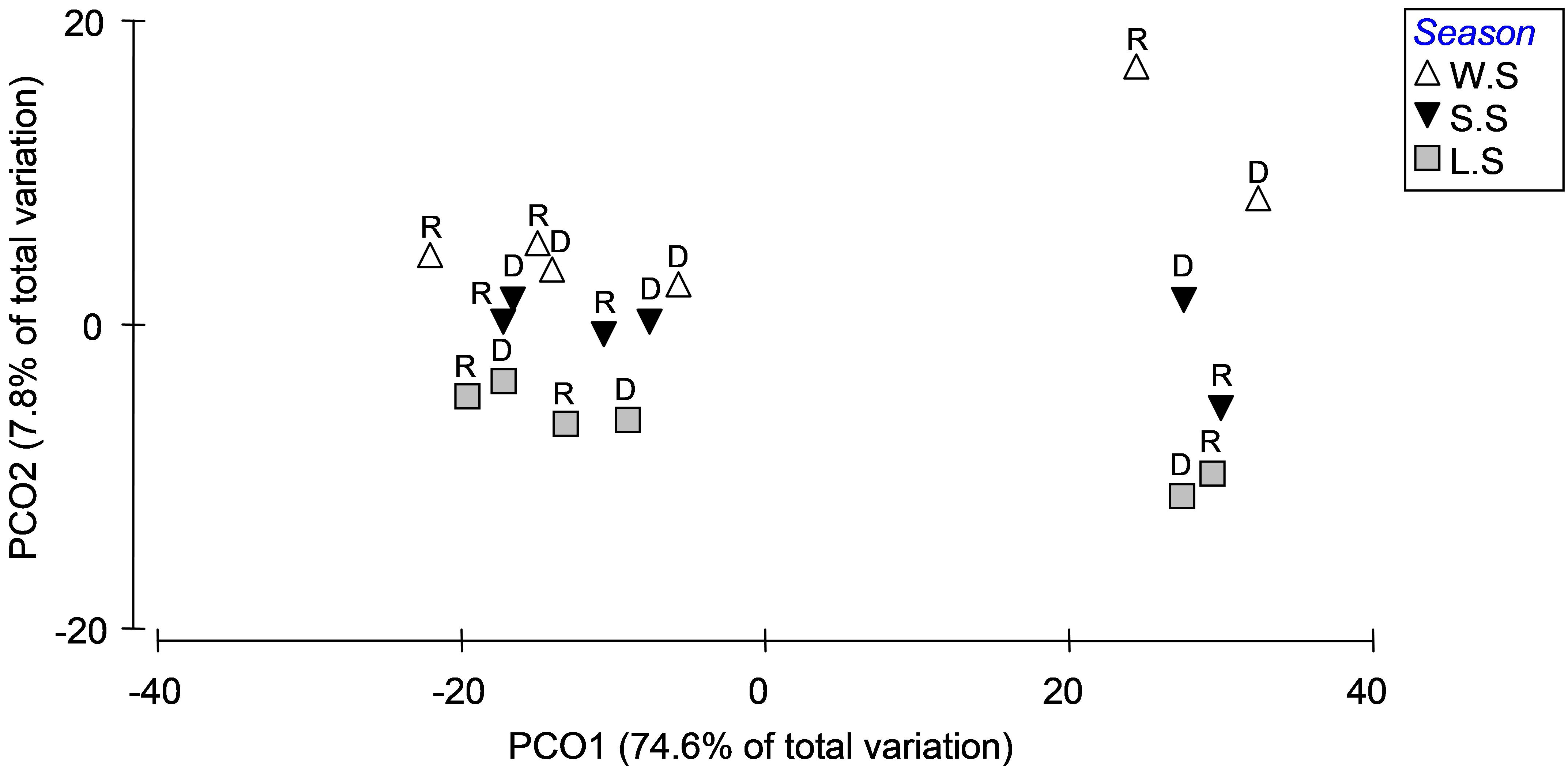 Fig. 3.13. PCO of distances among centroids on the basis of the Bray-Curtis measure of log(X+1)-transformed abundances for Okura macrofauna, first with ‘Deposition’ symbols and ‘Season’ labels (top panel) and then with ‘Season’ symbols and ‘Rain.Dry’ labels (bottom panel).
Interactions among these factors did not contribute large amounts of variation, but they were present and some were statistically significant (see the PERMANOVA output in Fig. 3.11). The seasonal effects appeared to be stronger for the high depositional environments than for either of the medium or low depositional environments, according to the plot, so it is not surprising that the Season×Deposition term is sizable in the PERMANOVA output as well. Similarly, the Season×Rainfall interaction term contributes a reasonable amount to the overall variation, and the plot of centroids suggests that rainfall effects (i.e. the distances between R and D) were more substantial in winter/spring than in late/summer. Of course, ordination plots of appropriate subsets of the data and relevant pair-wise comparisons can be used to further elucidate and interpret significant interactions.
This example demonstrates that ordination plots of distances among centroids can be very useful in unraveling patterns among levels of factors in complex designs. The new tool Distances among centroids in PERMANOVA+ uses PCO axes to calculate these centroids, retaining the necessary distinctions between sets of axes that correspond to positive and negative eigenvalues, respectively, and so maintaining the multivariate structure identified by the choice of resemblance measure as the basis for the analysis as a whole.
Importantly, an analysis that proceeds instead by first calculating centroids (averages) from the raw data first, followed by the rest (i.e. calculating the transformation and Bray-Curtis resemblances on these averages) would not provide the same results. Patterns from the latter would also not necessarily accord with the relative sizes of components of variation from a PERMANOVA partitioning that had been performed on the full set of data. We recommend that the decision to either sum or average the raw data before analysis should be driven by an a priori judgment regarding the appropriate scale of observation of the communities of interest. For example, in some cases, the individual replicates are too small and too highly variable in composition to be considered representative samples of the communities of interest. In such cases, pooling together (summing or averaging) small-scale replicates to obtain an appropriate sample unit for a given spatial scale before performing a PERMANOVA (or other) analysis may indeed be appropriate73. The tool provided here to calculate distances among centroids, instead, assists in understanding the partitioning of the variation in the multivariate space identified by the resemblance measure, well after a decision regarding what should comprise an appropriate lowest-level representative sampling unit has been made.
72 See chapter 1 for a more complete description of how to use the PERMANOVA routine to analyse complex experimental designs.
73 An example where this was done was the Norwegian macrofauna (norbio.pri in the ‘NorMac’ folder), where 5 benthic grabs at a site were pooled together and considered as a single sampling unit for analysis.
3.9 PCO versus MDS
We recommend that, for routine ordination to visualise multivariate data on the basis of a chosen resemblance measure, non-metric MDS is the method of choice ( Kruskal (1964) ; Minchin (1987) ). MDS is robust to outliers, and it explicitly uses a criterion of preserving rank orders of dissimilarities in a reduced number of dimensions, so has excellent distance-preserving properties.
In practice, PCO and MDS will tend to give similar results for a given resemblance matrix. Generally, far more important to the resulting patterns seen in the ordination will be the decisions made regarding the choice of transformation, standardisation and resemblance measure. Trials with a few examples will demonstrate this and are left to the reader to explore. There are, however, a few notable exceptions. Differences between MDS and PCO will be sharpest when there is a large split between groups of one or more samples in the multivariate space. In such cases, MDS can yield what is called a “degenerate” solution (see chapter 5 in Clarke & Warwick (2001) ), where all of the points within a group are tightly clustered or collapsed onto a single point in the MDS configuration. This occurs when all of the “within-group” dissimilarities are smaller than all of the “between-group” dissimilarities. As pointed out by Clarke & Warwick (2001) , in such cases “there is clearly no yardstick within our non-parametric approach for determining how far apart the groups should be placed in the MDS plot”. However, by choosing to use PCO in such cases, we are provided with just such a yardstick.
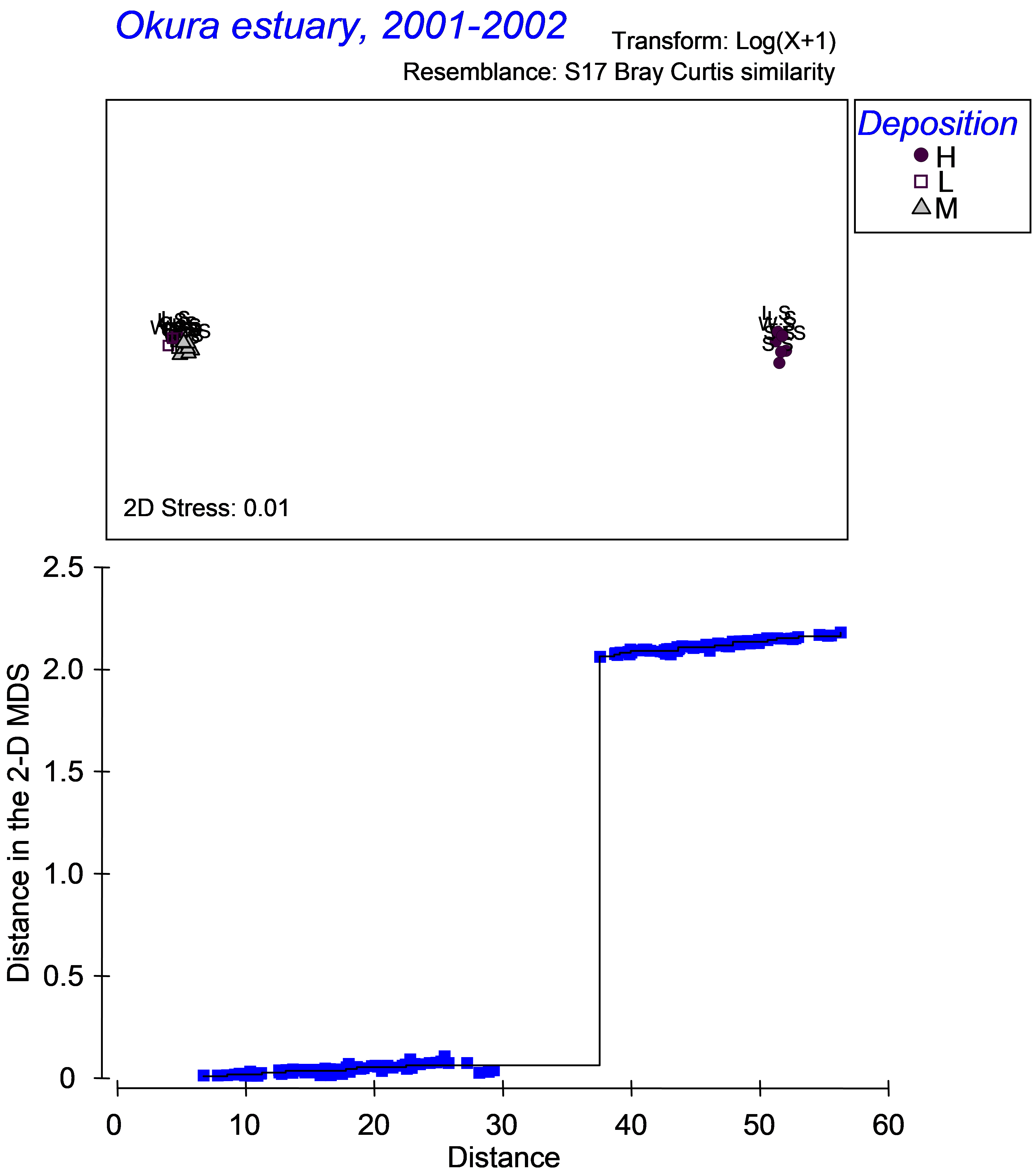 Fig. 3.14. MDS of distances among centroids on the basis of the Bray-Curtis measure of log(X+1)-transformed abundances for Okura macrofauna (top panel) and associated Shepard diagram (bottom panel).
A case in point is the resemblance matrix among centroids analysed using PCO in Fig. 3.13 for the macrofauna from Okura estuary. An MDS plot of this resemblance matrix, and the associated Shepard plot, highlighting the two disjunctive sets of “within-group” and “between-group” dissimilarities, is shown in Fig. 3.14. Clearly, little or no information about the actual relative positions of these centroids can be gained from the MDS plot. The usual solution suggested for dealing with such cases is to carry out separate ordinations on each of the two groups. However, if our interest lies in visualising (as well as we can in a reduced number of dimensions, that is) the relative positions of the full set of centroids in the higher-dimensional space, especially to help us understand the relative quantitative differences among levels and associated effect sizes for factors, the MDS approach may let us down. In this case, it is not possible to relate the information or patterns in the MDS plot to the PERMANOVA output for this experimental design, and splitting the data into pieces will not particularly help here. The PCO routine does a much better job (Fig. 3.13).
As an aside, PCO is not only different from non-metric MDS, it also differs from what might generally be referred to as metric MDS. Both metric and nonmetric MDS encompass many methods (see Gower & Hand (1996) ), but their main focus is to minimise the criterion known as stress, a measure of how well the distances in the Euclidean configuration represent the original dissimilarities. Whereas the non-metric algorithms minimise stress as a monotonic function of the dissimilarities, their metric counterparts minimise stress using a linear or least-squares type of approach. Metric methods are also sometimes called least-squares scaling. Minimising a nonmetric stress criterion with a linear constraint is the same as minimising metric stress, though neither is equivalent to PCO. The point here is that MDS (metric or non-metric) is focused purely on preserving dissimilarities or distances in the configuration for a given number of dimensions, whereas PCO is a projection from the space of the resemblance measure onto Euclidean axes. The success of that projection, with respect to preserving dissimilarities, will therefore depend somewhat on just how high-dimensional the underlying data are and how ‘non-Euclidean’ the original resemblance measure is.
The strength of non-metric MDS lies in its flexible ‘stretching and squeezing’ of the resemblance scale, for example as dissimilarities push up against their upper limit of 100% (communities with no species in common). This focus on preserving rank-order relationships will generally give more sensible descriptions, e.g. of long-baseline gradients, in low dimensions than can be obtained by PCO. (The reader is encouraged to try out the comparison for some of the well-known data sets in the PRIMER ‘Examples v6’ directory, such as the macrofauna data in the Clydemac directory, the study met in Fig. 3.9). Paradoxically, however, the strength of PCO in the PERMANOVA context is precisely that it does not ‘stretch and squeeze’ the dissimilarity scale, so that where a low-dimensional PCO plot is able to capture the high-dimensional structure adequately (as reflected in the % variation explained), it is likely to give a closer reflection of the resemblance values actually used in the partitioning methods such as PERMANOVA and PERMDISP.