Chapter 5: Canonical analysis of principal coordinates (CAP)
Key references Method: Anderson & Robinson (2003), Anderson & Willis (2003)
- 5.1 General description
- 5.2 Rationale (Flea-beetles)
- 5.3 Mechanics of CAP
- 5.4 Discriminant analysis (Poor Knights Islands fish)
- 5.5 Diagnostics
- 5.6 Cross-validation
- 5.7 Test by permutation (Anderson’s irises)
- 5.8 CAP versus PERMANOVA
- 5.9 Caveats on using CAP (Tikus Island corals)
- 5.10 Adding new samples
- 5.11 Canonical correlation: single gradient (Fal estuary biota)
- 5.12 Canonical correlation: multiple X’s
- 5.13 Sphericising variables
- 5.14 CAP versus dbRDA
- 5.15 Comparison of methods using SVD
- 5.16 (Hunting spiders)
5.1 General description
Key references
CAP is a routine for performing canonical analysis of principal coordinates. The purpose of CAP is to find axes through the multivariate cloud of points that either: (i) are the best at discriminating among a priori groups (discriminant analysis) or (ii) have the strongest correlation with some other set of variables (canonical correlation). The analysis can be based on any resemblance matrix of choice. The routine begins by calculating principal coordinates from the resemblance matrix among N samples and it then uses these to do one of the following: (i) predict group membership; (ii) predict positions of samples along some other single continuous variable (q = 1); or (iii) find axes having maximum correlations with some other set of variables (q > 1). There is a potential problem of overparameterisation here, because if we have (N – 1) PCO axes, they will clearly be able to do a perfect job of modeling N points. To avoid this problem, diagnostics are required in order to choose an appropriate subset of PCO axes (i.e., m < (N – 1) ) to use for the analysis. The value of m is chosen either: (i) by maximising a leave-one-out allocation success to groups or (ii) by minimising a leave-one-out residual sum of squares in a canonical correlation. These diagnostics and an appropriate choice for m are provided by the routine. The routine also can perform a permutation test for the significance of the canonical relationship, using either the trace (sum of canonical eigenvalues) or the first canonical eigenvalue as test statistics. Also provided is a plot of the canonical axis scores. A new feature is the capacity to place new observations into the canonical space, based only on their resemblances with prior observations. For a discriminant-type analysis, this includes the allocation of new observations to existing groups.
5.2 Rationale (Flea-beetles)
In some cases, we may know that there are differences among some pre-defined groups (for example, after performing a cluster analysis, or after obtaining a significant result in PERMANOVA), and our interest is not so much in testing for group differences as it is in characterising those differences. With CAP, the central question one asks is: can I find an axis through the multivariate cloud of points that is best at separating the groups? The motivation for the CAP routine arose from the realisation that sometimes there are real differences among a priori groups in multivariate space that cannot be easily seen in an unconstrained ordination (such as a PCA, PCO or MDS plot). This happens primarily when the direction through the data cloud that distinguishes the groups from one another is fundamentally different from the direction of greatest total variation across the data cloud.
For example, suppose we have two groups of samples in a two-dimensional space, as shown in Fig. 5.1. These data consist of two morphometric measurements (the distance of the transverse groove from the posterior border of the prothorax, in microns, and the length of the elytra, in 0.01 mm) on two species of flea-beetle: Haltica oleracea (19 individuals) and H. carduorum (20 individuals). For simplicity in what follows, both variables were normalised. The data are due to Lubischew (1962) , appeared in Table 6.1 of Seber (1984) and (along with 2 other morphometric variables) can be found in the file flea.pri in the ‘FleaBeet’ folder of the ‘Examples add-on’ directory.
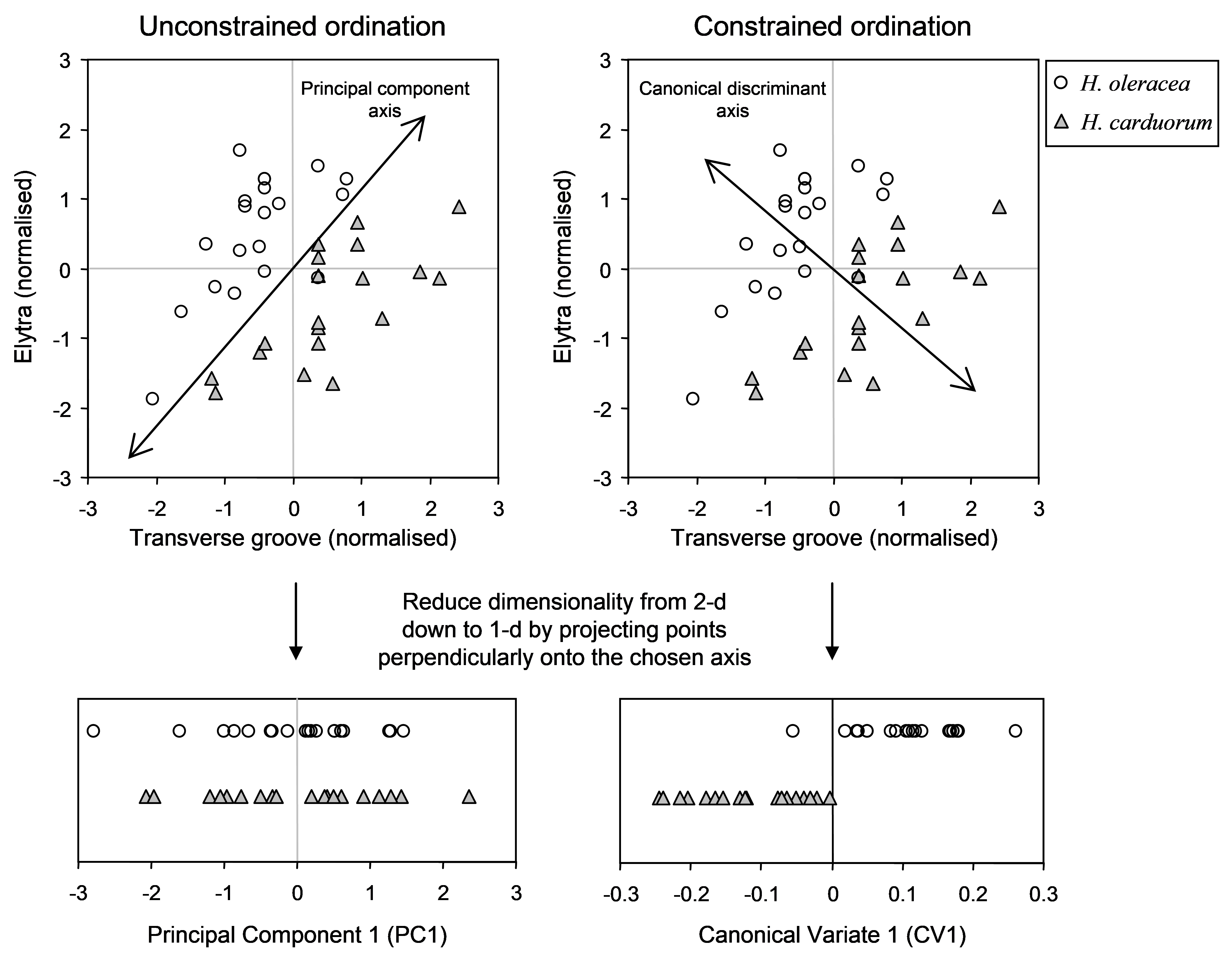 Fig. 5.1. Schematic diagram showing ordinations from two dimensions (a bivariate system) down to one dimension for two groups of samples using either an unconstrained approach (on the left, maximising total variation) or a constrained canonical approach (on the right, maximising separation of the two groups).
Clearly there is a difference in the location of these two data clouds (corresponding to the two species) when we view the scatter plot of the two normalised variables (Fig. 5.1). Imagine for a moment, however, that we cannot see two dimensions, but can only see one. If we were to draw an axis through this cloud of points in such a way that maximises total variation (i.e., a principal component), then, by projecting the samples onto that axis, we would get a mixture of samples from the two groups along the single dimension, as shown on the left-hand side of Fig. 5.1. If patterns along this single dimension were all we could see, we would not suppose there was any difference between these two groups.
Next, suppose that, instead, we were to consider drawing an ordination that utilises our hypothesis of the existence of two groups of samples in some way. Suppose we were to draw an axis through this cloud of points in such a way that maximises the group differences. That is, we shall find an axis that is best at separating the groups. For this example, the direction of this axis is clearly quite different from the one that maximises total overall variation. Projecting the points onto this new axis shows, in the reduced space of one dimension, that there is indeed a clear separation of these two groups in the higher-dimensional space, even though this was not clear in the one-dimensional (unconstrained) ordination that was done in the absence of any hypothesis (Fig. 5.1).
Note that the cloud of points has not changed at all, but our view of that data cloud has changed dramatically, because our criterion for drawing the ordination axis has changed. We might liken this to visiting a city for the first time and deciding which avenue we wish to stroll down in order to observe that city. Clearly, our choice here is going to have consequences regarding what kind of “view” we will get of that city. If we choose to travel in an east-west direction, we will see certain aspects of the buildings, parks, landmarks and faces of the city. If we choose a different direction (axis) to travel, however, we will likely see something very different, and maybe get a quite different impression of what that city is like. Tall buildings might obscure certain landmarks or features from us when viewed from certain directions, and so on. Once again, the city itself (like points in a multi-dimensional space) has not really changed, but our view of it can depend on our choice regarding which direction we will travel through it.
More generally, it is clear how this kind of phenomenon can also occur in a higher-dimensional context and on the basis of some other resemblance measure (rather than the 2-d Euclidean space shown in Fig. 5.1). That is, we may not be able to see group differences in two or three dimensions in an MDS or PCO plot (both of these are unconstrained ordination methods), but it may well be possible to discriminate among groups along some other dimension or direction through the multivariate data cloud. CAP is designed precisely to do this in the multivariate space of the resemblance measure chosen.
The other primary motivation for using CAP is as a tool for classification or prediction. That is, once a CAP model has been developed, it can be used to classify new points into existing groups. For example, suppose I have classified individual fish into one of three species on the basis of a suite of morphometric measures. Given a new fish that has values for each of these same measures, I can allocate or classify that fish into one of the groups, using the CAP routine. Similarly, suppose I have done a cluster analysis of species abundance data on the basis of the Bray-Curtis resemblance measure and have identified that multivariate samples occur in four different distinct communities. If I have a new sample, I might wish to know – in which of these four communities does this new sample belong? The CAP routine can be used to make this prediction, given the resemblances between the new sample and the existing ones.
Another sense in which CAP can be used for prediction is in the context of canonical correlation. Here, the criterion being used for the ordination is to find an axis that has the strongest relationship with one (or more) continuous variables (as opposed to groups). One can consider this a bit like putting the DISTLM approach rather on its head. The DISTLM routine asks: how much variability in the multivariate data cloud is explained by variable X? In contrast, the CAP routine asks: how well can I predict positions along the axis of X using the multivariate data cloud? So, the essential difference between these two approaches is in the role of these two sets of variables in the analysis. DISTLM treats the multivariate data as a response data cloud, whereas in CAP they are considered rather like predictors instead. Thus, for example, I may use CAP to relate multivariate species data to some environmental variable or gradient (altitude, depth, percentage mud, etc.). I may then place a new point into this space and predict its position along the gradient of interest, given only its resemblances with the existing samples.
5.3 Mechanics of CAP
Details of CAP and how it is related to other methods are provided by Anderson & Robinson (2003) and Anderson & Willis (2003) . In brief, a classical canonical analysis is simply done on a subset of the PCO axes. Here, we provide a thumbnail sketch to outline the main features of the analysis. The important issues to keep in mind are the conceptual ones, but a little matrix algebra is included here for completeness. Let D be an N × N matrix of dissimilarities (or distances) among samples99. Let X be an N × q matrix that contains either codes for groups (for discriminant analysis) or one or more quantitative variables of interest (for canonical correlation analysis). Conceptually, we can consider X to contain the hypothesis of interest. When using CAP for discriminant analysis in the PERMANOVA+ add-on package for PRIMER, groups are identified by a factor associated with the resemblance matrix. The CAP routine will internally generate an appropriate X matrix specifying the group structure from this factor information, so no additional data are required. However, if a canonical correlation-type analysis is to be done, then a separate data sheet containing one or more X variables (and having the same number and labels for the samples as the resemblance matrix) needs to be identified. The mechanics of performing a CAP analysis are described by the following steps (Fig. 5.2):
-
First, principal coordinates are obtained from the resemblance matrix to describe the cloud of multivariate data in Euclidean space (see Fig. 3.1 for details). The individual PCO axes are not, however, standardised by their eigenvalues. Instead, they are left in their raw (orthonormal100) form, which we will denote by Q$^0$. This means that not only is each PCO axis independent of all other PCO axes, but also each axis has a sum-of-squares (or length) equal to 1. So, the PCO data cloud is effectively “sphericised” (see the section entitled Sphericising variables).
-
From matrix X, calculate the “hat” matrix H = X[X′X]–1X′. This is the matrix derived from the solutions to the normal equations ordinarily used in multiple regression (e.g., Johnson & Wichern (1992) , Neter, Kutner, Nachtsheim et al. (1996) )101. Its purpose here is to orthonormalise (“sphericise”) the data cloud corresponding to matrix X as well.
-
If the resemblance matrix is N × N, then there will be, at most, (N – 1) non-zero PCO axes. If we did the canonical analysis using all of these axes, it would be like trying to fit a model to N points using (N – 1) parameters, and the fit would be perfect, even if the points were completely random and the hypothesis were false! So, only a subset of m < (N – 1) PCO axes should be used, denoted by Q$^0 _ m$. The value of m is chosen using appropriate diagnostics (see the section Diagnostics).
-
A classical canonical analysis is done to relate the subset of m orthonormal PCO axes to X. This is done by constructing the matrix Q$^0 _ m$′HQ$^0 _ m$. Eigenvalue decomposition of this matrix yields canonical eigenvalues $\delta _1^2$, $\delta _2^2$,$\ldots \delta _s^2$ and their associated eigenvectors. The trace of matrix Q$^0 _ m$′HQ$^0 _ m$ is equal to the sum of the canonical eigenvalues. These canonical eigenvalues are also the squared canonical correlations. They indicate the strength of the association between the data cloud and the hypothesis of interest.
-
The canonical coordinate axis scores C, a matrix of dimension (N × s), are used to produce the the CAP plot. These are made by pre-multiplying the eigenvectors by Q$^0 _ m$ and then scaling (multiplying) each of these by the square root of their corresponding eigenvalue. Thus, the CAP axes are linear combinations of the orthonormal PCO axes.
 Fig. 5.2. Schematic diagram of the steps involved in performing a CAP analysis.
The number of canonical axes produced by the analysis (= s) will be the minimum of (m, q, (N – 1)). For a canonical correlation-type analysis, q is the number of variables in X. For a discriminant analysis, q = (g – 1), where g is the number of groups. If the analysis if based on Euclidean distances to begin with, then CAP is equivalent to classical canonical discriminant analysis (CDA) or canonical correlation analysis (CCorA). In such cases, the number for m should be chosen to be the same as the number of original variables (p) in data matrix Y, except in the event that p is larger than (N – 1), in which case the usual diagnostics should be used to choose m.
99 If a resemblance matrix of similarities is available instead, then the CAP routine in PERMANOVA+ will automatically transform these into dissimilarities before proceeding; the user need not do this as a separate step.
100 Orthonormal axes are uncorrelated and have a sum-of-squares and cross-products matrix (SSCP) equal to the identity matrix I (all sums of squares = 1 and all cross-products = 0).
101 CAP automatically centres the X data cloud.
5.4 Discriminant analysis (Poor Knights Islands fish)
We will begin with an example provided by Trevor Willis and Chris Denny ( Willis & Denny (2000) ; Anderson & Willis (2003) ), examining temperate reef fish assemblages at the Poor Knights Islands, New Zealand. Divers have counted the abundances of fish belonging to each of p = 62 species in each of nine 25 m × 5 m transects at each site. Data from the transects were pooled at the site level and a number of sites around the Poor Knights Islands were sampled at each of three different times: September 1998 ($n _1$ = 15), March 1999 ($n _2$ = 21) and September 1999 ($n _3$ = 20). These times of sampling span the point in time when the Poor Knights Islands were classified as a no-take marine reserve (October 1998). Interest lies in distinguishing among the fish assemblages observed at these three different times of sampling, especially regarding any transitions between the first time of sampling (before the reserve was established) and the other two times (after).
The data are located in the file pkfish.pri in the ‘PKFish’ folder of the ‘Examples add-on’ directory. An unconstrained PCO on Bray-Curtis resemblances of log(X+1)-transformed abundances did not show a clear separation among the three groups, even though a PERMANOVA comparing the three groups was highly statistically significant (Fig. 5.3, P < 0.001). Dr Willis (quite justifiably) said: “I don’t see any differences among the groups in either a PCO or MDS plot, but the PERMANOVA test indicates strong effects. What is going on here?” Indeed, the reason for the apparent discrepancy is that the directions of the differences among groups in the multivariate space, detected by PERMANOVA, are quite different to the directions of greatest total variation across the data cloud, as shown in the PCO plot. The relatively small amount of the total variation captured by the PCO plot (the first two axes explain only 33.1%) is another indication that there is more going on in this data cloud than can be seen in two (or even three) dimensions102.
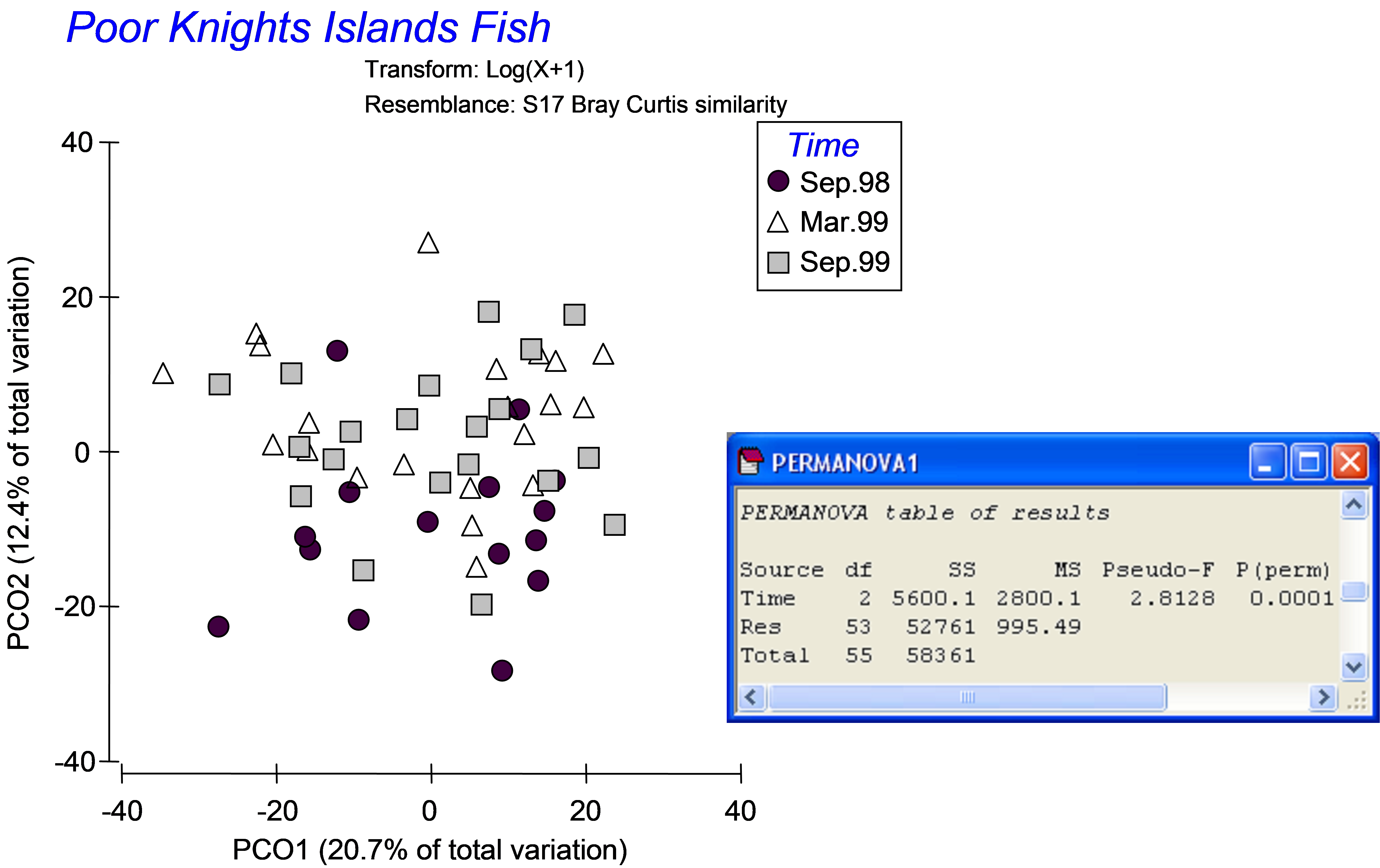
Fig. 5.3. PCO ordination and one-way PERMANOVA of fish data from the Poor Knights Islands.
To characterise these three groups of samples, to visualise the differences among them and to assess just how distinct these groups are from one another in the multivariate space, a CAP analysis can be done (Fig. 5.4). From the Bray-Curtis resemblance matrix calculated from log(X+1)-transformed data, choose PERMANOVA+ > CAP > (Analyse against •Groups in factor) & (Factor for groups or new samples: Time) & (Diagnostics $\checkmark$Do diagnostics), then click ‘OK’.
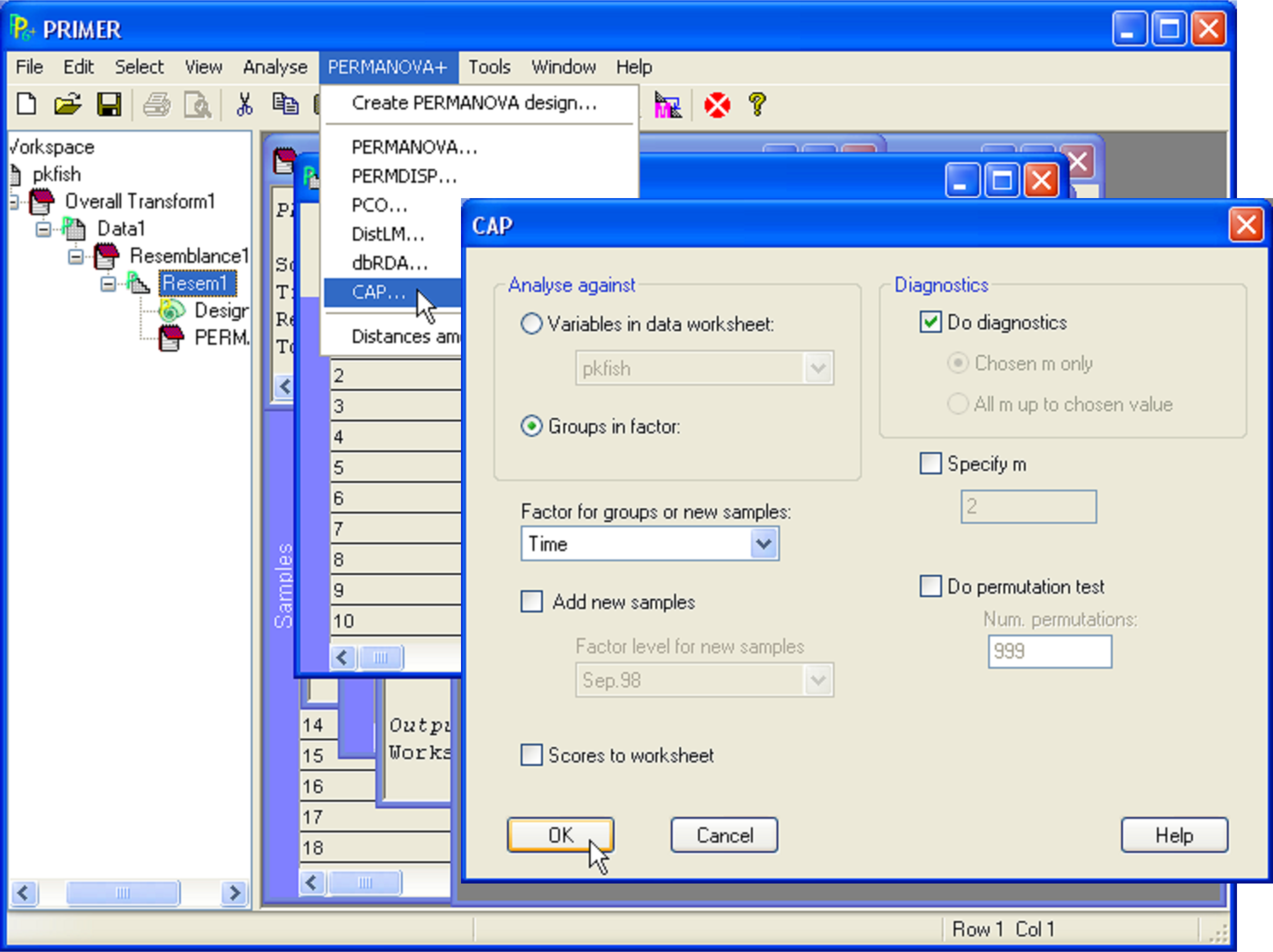 Fig. 5.4. Dialog for the CAP analysis of fish data from the Poor Knights Islands.
The resulting constrained CAP plot (Fig. 5.5) is very different from the unconstrained PCO plot (Fig. 5.3). The constrained analysis shows that the three groups of samples (fish assemblages at three different times) are indeed distinguishable from one another. The number of CAP axes produced is s = min(m, q, (N – 1)) = 2, because in this case, q = (g – 1) = 2; only 2 axes are needed to distinguish among three groups. The sizes of each of these first two canonical correlations are reasonably large: $\delta _1$ = 0.78 and $\delta _2$ = 0.69 (Fig. 5.5). These canonical correlations indicate the strength of the association between the multivariate data cloud and the hypothesis of group differences. For these data, the first canonical axis separates the fish assemblages sampled in September 1998 (on the right) from those sampled in March of 1999 (on the left), while the second canonical axis separates fish assemblages sampled in September 1999 (lower) from the other two groups (upper). Also reported in the output file is the choice for the number of orthonormal PCO axes that were used for the CAP analysis: here, m = 7. If this value is not chosen by the user, then the CAP routine itself will make a choice, based on appropriate diagnostics (see the section Diagnostics).
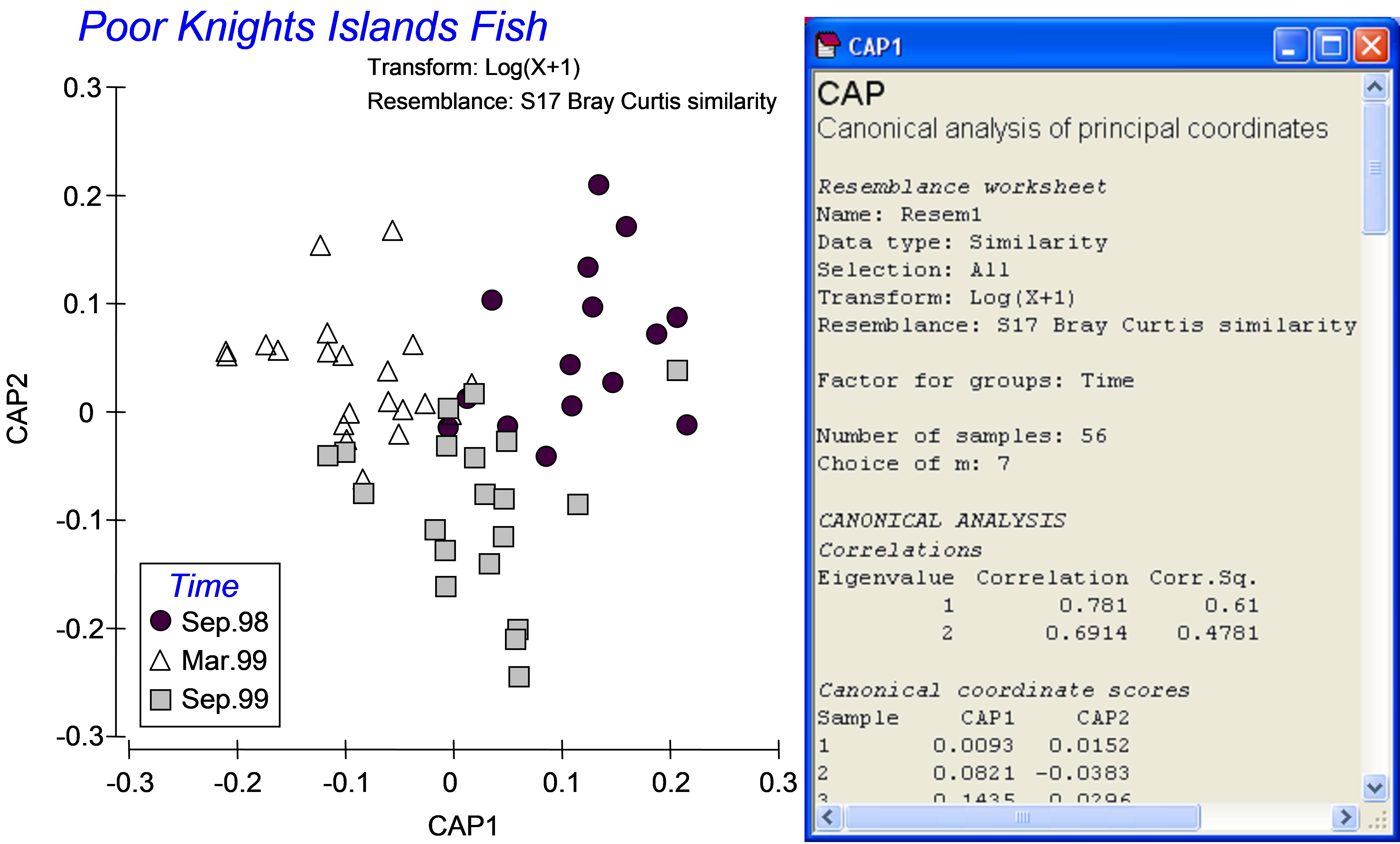 Fig. 5.5. Constrained ordination and part of the output file from the CAP analysis of fish data from the Poor Knights Islands.
A natural question to ask is which fish species characterise the differences among groups found by the CAP analysis? A simplistic approach to answer this is to superimpose vectors corresponding to Pearson (or Spearman rank) correlations of individual species with the resulting CAP axes. Although such an approach is necessarily post hoc, it is quite a reasonable approach in the case of a discriminant-type CAP analysis. The CAP axes have been expressly drawn to separate groups as well as possible, so indeed any variables which show either an increasing or decreasing relationship with these CAP axes will be quite likely to be the ones that are more-or-less responsible for observed differences among the groups.
From the CAP plot, choose Graph > Special > (Vectors •Worksheet variables: pkfish > Correlation type: Spearman ), then click on the ‘Select’ button and in the ‘Select Vectors’ dialog, choose •Correlation > 0.3 and click ‘OK’. Note that you can choose any cut-off here that seems reasonable for the data at hand. The default is to include vectors for variables having lengths of at least 0.2, but it is up to the user to decide what might be appropriate here. Note also that these correlations are for exploratory purposes only and are not intended to be used for hypothesis-testing. For example, it is clearly not appropriate to formally test the significance of correlations between individual species and CAP axes that have been derived from resemblances calculated using those very same species; this is circular logic! For more detailed information on how these vectors are drawn, see the section Vector overlays in chapter 3.
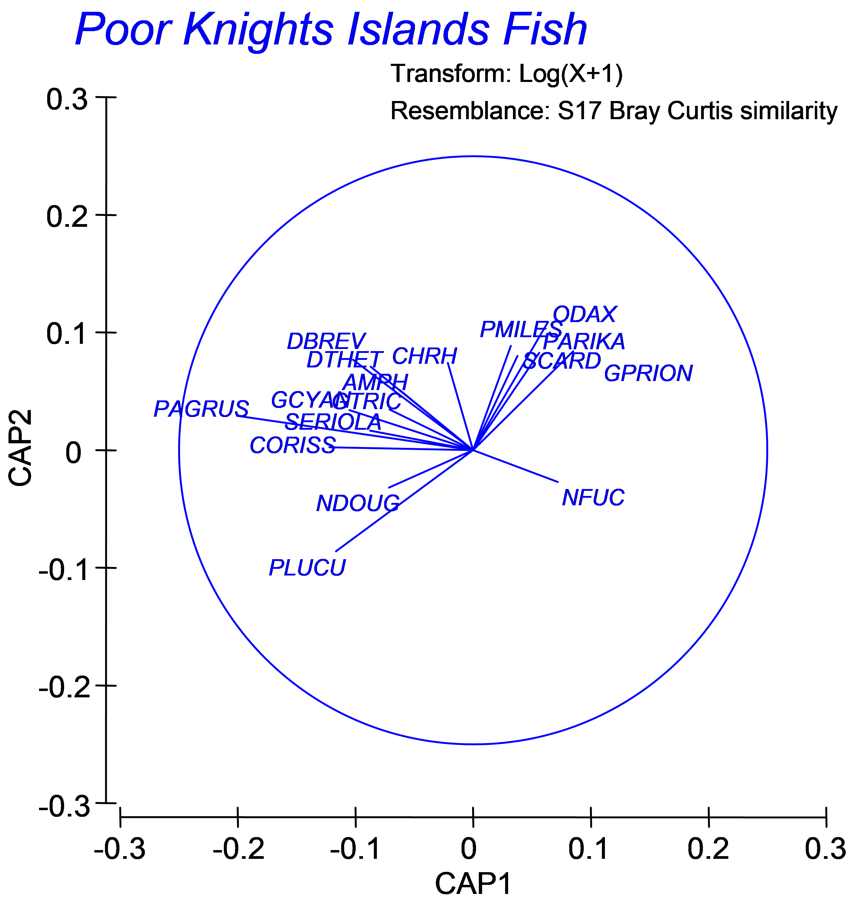 Fig. 5.6. Vector overlay of Spearman rank correlations of individual fish species with the CAP axes (restricted to those having lengths > 0.30).
For the fish assemblages from the Poor Knights (Fig. 5.6), we can see that some species apparently increased in abundance after the establishment of the marine reserve, such as the snapper Pagrus auratus (‘PAGRUS’) and the kingfish Seriola lalandi (‘SERIOLA’), which are both targeted by recreational and commercial fishing, and the stingrays Dasyatis thetidis and D. brevicaudata (‘DTHET’, ‘DBREV’). Vectors for these species point toward the upper left of the diagram in Fig. 5.6 indicating that these species were more abundant, on average, in the March 1999 samples (the group located in that part of the diagram, see Fig. 5.5). Some species, however, were more abundant before the reserve was established, including leatherjackets Parika scaber (‘PARIKA’) and the (herbivorous) butterfish Odax pullus (‘ODAX’). These results lead to new ecological hypotheses that might be investigated by targeted future observational studies or experiments.
102 Similar indications were apparent using MDS. A two-dimensional MDS of these data does not show clear differences among the groups, but has high stress (0.25). The 3-d solution (with stress also quite high at 0.18) does not show any clear differences among these three groups either, though ANOSIM, like PERMANOVA, gives clear significance to the groups (but with a low R of 0.13).
5.5 Diagnostics
How did the CAP routine choose an appropriate number of PCO axes to use for the above discriminant analysis (m = 7)? The essential idea here is that we wish to include as much of the original variability in the data cloud as possible, but we do not wish to include PCO axes which do nothing to enhance our ability to discriminate the groups. To do so would be to look at the problem with “rose-coloured” glasses. Indeed, if we were to use all of the PCO axes, then the canonical plot will just show our hypothesis back at us again, which is useless. Recall that in CAP, we are using the PCO axes to predict the groups, and a linear combination of (N – 1) PCO axes can easily be used to plot N points according to any hypothesis provided in X perfectly. For example, if we choose m = 55 for the above example (as N = 56), we will see a CAP plot with the samples within each of the three different groups superimposed on top of one another onto three equidistant points. This tells us nothing, however, about how distinct the groups are in the multivariate space, nor how well the PCO axes model and discriminate among the groups, particularly given a new observation, for example. One appropriate criterion for choosing m is to choose the number of axes where the probability of misclassifying a new point to the wrong group is minimised.
To estimate the misclassification error using the existing data, we can use a leave-one-out procedure ( Lachenbruch & Mickey (1968) , Seber (1984) ). The steps in this procedure are:
-
Take out one of the points.
-
Do the CAP analysis without it.
-
Place the “left-out” point into the canonical space produced by the others.
-
Allocate the point to the group whose centroid (middle location) is closest to it.
-
Was the allocation successful? (i.e., did the CAP model classify the left-out point to its correct group?)
-
Repeat steps 1-5 for each of the points.
-
Misclassification error = the proportion of points that were misclassified. The proportion of correct allocations is called allocation success (= 1 minus the misclassification error).
By repeating this for each of a series of values for m, we can choose to use the number of axes that minimises the misclassification error. Although not a strict requirement, we should also probably choose m to be at least as large so as to include ~ 60% of the variation in the original resemblance matrix (if not more). The CAP routine will go through the above outlined leave-one-out procedure for each value of m and will show these diagnostics in the output file103. For discriminant-type analyses, a value of m is chosen which maximises the allocation success (i.e., minimises the misclassification error). For canonical correlation-type analyses, the value of m is chosen which minimises the leave-one-out residual sum of squares. The user can also choose the value of m manually in the CAP dialog, with the option to do the diagnostics for this chosen value of m alone or for all values of m up to and including the value chosen (Fig. 5.4).
An output table of diagnostics is shown for the Poor Knights fish dataset in Fig. 5.7. For each value of m, the diagnostic values given are:
-
‘prop.G’ = the proportion of variation in the data cloud described by the resemblance matrix (represented in matrix G) explained by the first m PCO axes;
-
‘ssres’ = the leave-one-out residual sum of squares;
-
‘d_1^2’ = the size of the first squared canonical correlation ($\delta _1 ^2$);
-
‘d_2^2’ = the size of the second104 squared canonical correlation ($\delta _2 ^2$);
-
‘%correct’ = the percentage of the left-out samples that were correctly allocated to their own group using the first m PCO axes for the model.
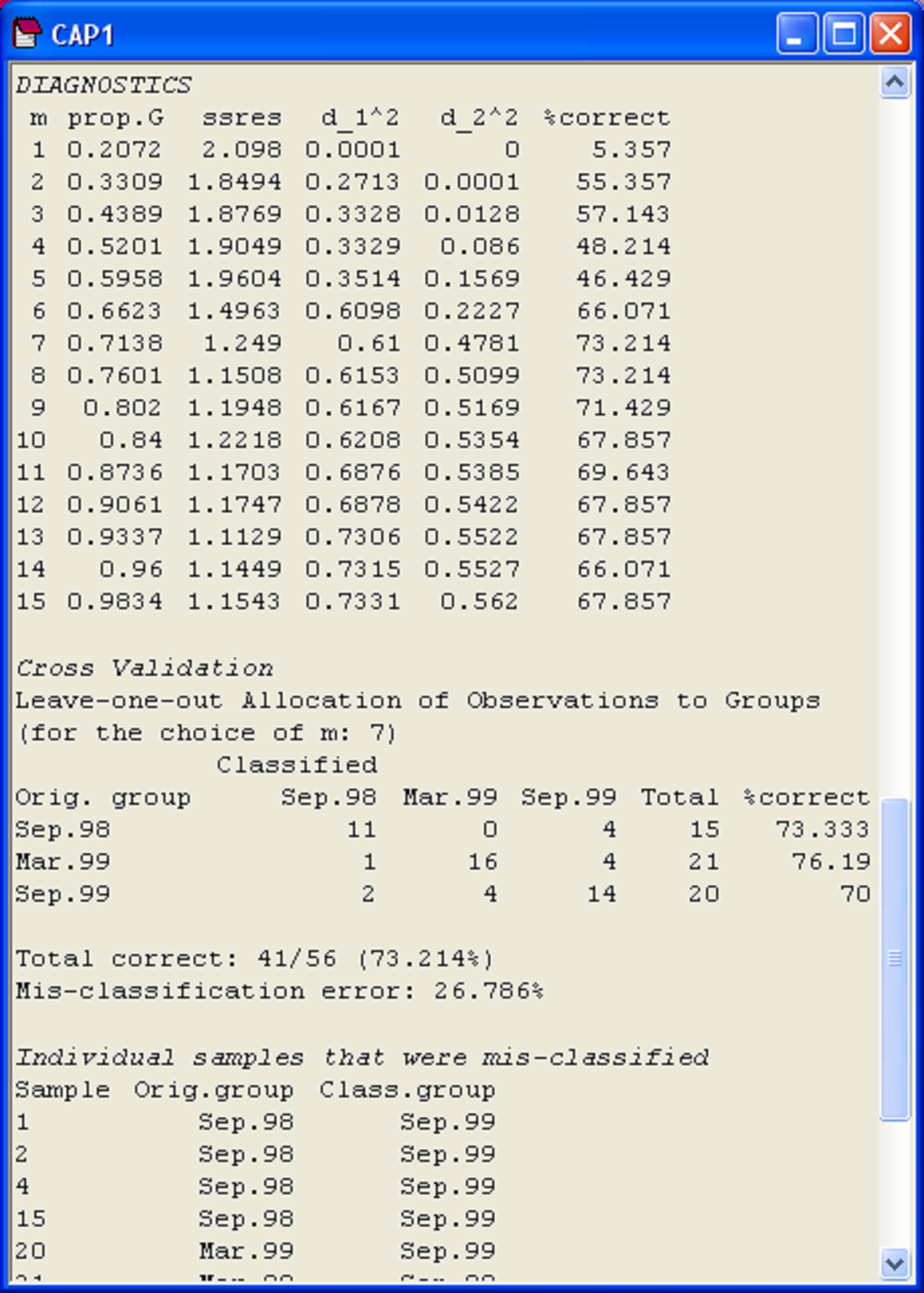 Fig. 5.7. Diagnostics and cross-validation results for the CAP analysis of the Poor Knights fish data.
It often helps to visualise these different diagnostics as a function of m, as shown in Fig. 5.8. First, we can see that the proportion of variation in the original data cloud that is explained by the first m PCO axes (Fig. 5.8a) is a smooth function of m, which is no surprise (as we saw before, the first 2 PCO axes explain 33.1% of the variation, see Fig. 5.3). Next, we can see that the values of the squared canonical correlations ($\delta _1 ^2$ and $\delta _2 ^2$), also just continue to increase, the more axes we choose to use. However, they do appear to pretty much “level-off” after m = 6 or 7 axes (Fig. 5.8b). So, we don’t get large increases or improvements in either of the canonical correlations by including more than m = 7 axes. Unlike the canonical correlations, neither the leave-one-out allocation success, nor the leave-one-out residual sum of squares has a monotonic relationship with m. Although the leave-one-out residual sum of squares is minimised when m = 13 (Fig. 5.7), we can see that no great reduction in its value is achieved beyond about m = 7 or 8 (Fig. 5.8c). Finally, the leave-one-out allocation success was maximised at m = 7, where 41 out of the 56 samples (73.2%) were allocated to the correct group using the CAP model (Fig. 5.8d). The CAP routine has chosen m = 7 based on this diagnostic alone, but the other diagnostic information also indicates that a value of m around 7 indeed would be appropriate for these data. These first 7 PCO axes explain about 71.4% of the total variation in tr(G) (‘prop.G’, Fig. 5.7). Although we would generally like this figure to be above 60% for the chosen value of m, as it is here, this is not a strict requirement of the analysis, and examples do exist where only the first one or two PCO axes are needed to discriminate groups, even though these may not necessarily include a large proportion of the original total variation.
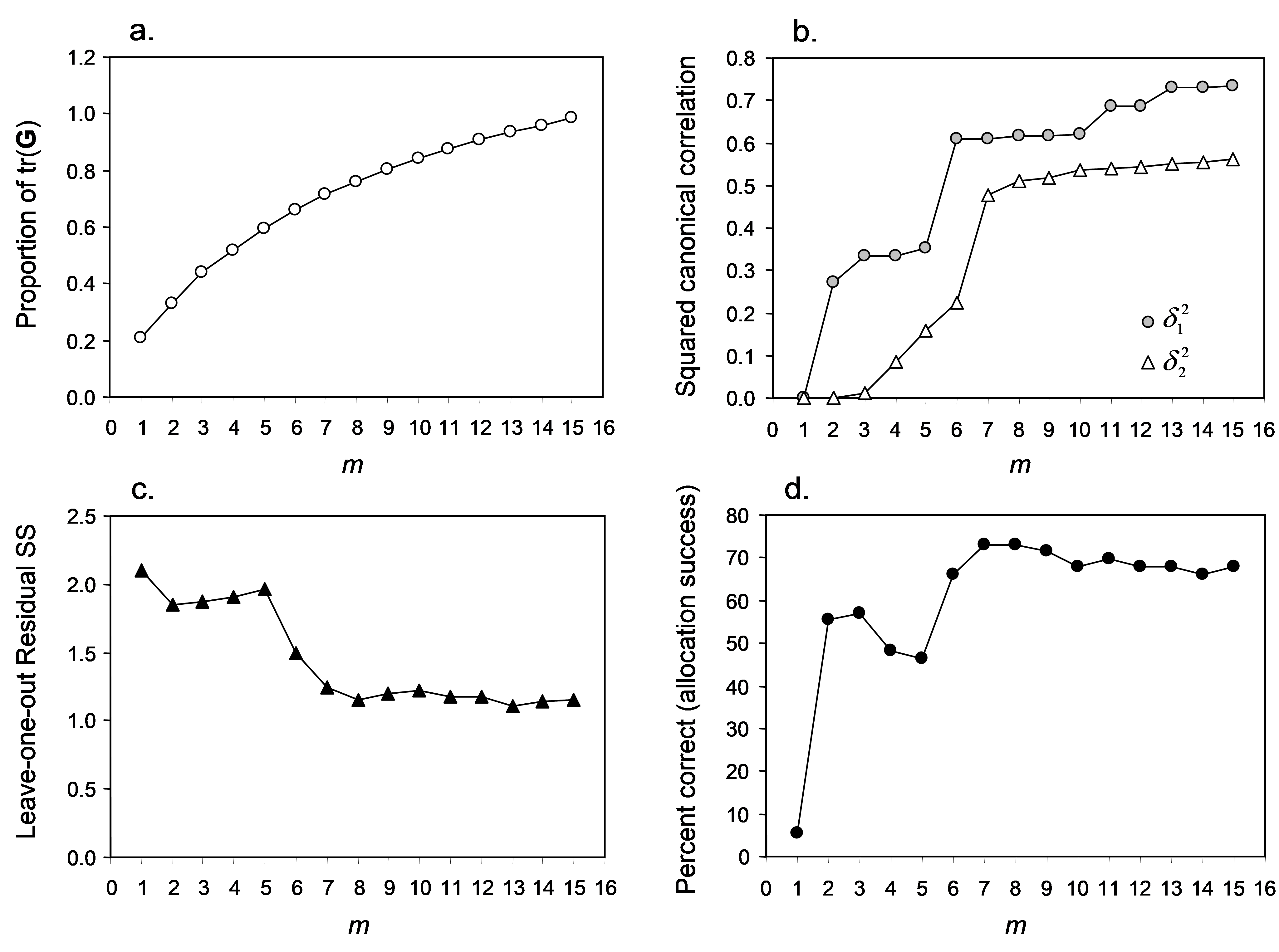 Fig. 5.8. Plots of individual diagnostic criteria for the CAP analysis of Poor Knights fish data.
Generally, the CAP routine will do a pretty decent job of choosing an appropriate value for m automatically, but it is always worthwhile looking at the diagnostics carefully and separately in order to satisfy yourself on this issue before proceeding. In some situations (namely, for data sets with very large N), the time required to do the diagnostics can be prohibitively long. One possibility, in such cases, is to do a PCO analysis of the data first to get an idea of what range of m might be appropriate (encapsulating, say, up to 60-80% of the variability in the resemblance matrix), and then to do a targeted series of diagnostics for individual manual choices of m to get an idea of their behaviour, eventually narrowing in on an appropriate choice.
103 The diagnostics will stop when CAP encounters m PCO axes that together explain more than 100% of the variation in the resemblance matrix, as will occur for systems that have negative eigenvalues (e.g., see Fig. 3.5). In the present case, the diagnostics do not extend beyond m = 15. Examination of the PCO output file for these data shows that the first 16 PCO axes explain 100.58% of the variation in tr(G).
104 There will be as many columns here as required to show all of the canonical eigenvalues – in the present example, there are only two canonical eigenvalues, so there are two columns for these.
5.6 Cross-validation
The procedure of pulling out one sample at a time and checking the ability of the model to correctly classify that sample into its appropriate group is also called cross-validation. An important part of the CAP output from a discriminant type of analysis is the table showing the specific cross-validation results obtained for a chosen value of m. This gives specific information about how distinct the groups are and how well the PCO axes discriminate among the groups. No matter what patterns seem to be apparent from the CAP plot, nor how small the P-value from the permutation test (see the following section), this table of cross-validation results is actually the best way to assess the validity and utility of the CAP model. Indeed, we suggest that when using CAP for discrimination, no CAP plot should be presented without also providing cross-validation results, or at least providing the figure for overall misclassification error (or, equivalently, allocation success). This is because the CAP plot will look better and better (i.e., it will look more and more in tune with the hypothesis) the more PCO axes we choose to use. This does not mean, however, that the predictive capability of the underlying CAP model is improved! Indeed, we have just seen in the previous example how increases in the number of PCO axes (beyond m = 7) actually reduces the allocation success of the model. So, the cross-validation provides a necessary check on the potential arbitrariness of the results.
Furthermore, the more detailed cross-validation results provided in the CAP output provide information about which groups are more distinct than others. Although, in this case, the groups had roughly comparable mis-classification errors (~70-76%, see Fig. 5.7), these errors can sometimes vary quite widely among the groups. The output file also indicates in which direction mistakes are made and for which individual samples this occurred. For example, looking at the cross-validation table for the Poor Knights fish data, 4 of the 15 samples from September 1998 were incorrectly classified as belonging to the group sampled in September 1999, while none were incorrectly classified as belonging to the group sampled in March 1999. Furthermore, the individual samples that were mis-classified (and the group into which they were erroneously allocated) are shown directly under the summary table. For example, the samples numbered 1, 2, 4 and 15 were the particular ones from September 1998 that were mis-classified (Fig. 5.7).
As a rule of thumb, bear in mind that, with three groups, one would expect an allocation success of around 33.3% simply by chance alone. Similarly, one would expect an allocation success of around 50% by chance in the case of two groups, or 25% in the case of 4 groups, etc. If the allocation success is substantially greater than would be expected by chance (as is the case for the Poor Knights data), then the CAP model obtained is a potentially useful one for making future predictions and allocations. Thus, the results of the cross-validation give a direct measure of the relative distinctiveness of the groups and also the potential utility of the model for future classification or prediction.
5.7 Test by permutation (Anderson’s irises)
CAP can be used to test for significant differences among the groups in multivariate space. The test statistics in CAP are different from the pseudo-F used in PERMANOVA. Instead, they are directly analogous to the traditional classical MANOVA test statistics, so we will demonstrate them here in an example of classical canonical discriminant analysis (CDA). The data were obtained by Edgar Anderson ( Anderson (1935) ) and were first used by Sir R. A. Fisher ( Fisher (1936) ) to describe CDA (sometimes also called canonical variate analysis). Data are located in the file iris.pri in the ‘Irises’ folder of the ‘Examples add-on’ directory. The samples here are individual flowers. On each flower, four morphometric variables were measured (in cm): petal length (PL), petal width (PW), sepal length (SL) and sepal width (SW). There were 150 samples in total, with 50 flowers belonging to each of 3 species: Iris versicolor (C), Iris virginica (V) and Iris setosa (S). Interest lies in using the morphometric variables to discriminate or predict the species to which individual flowers belong.
A traditional canonical discriminant analysis is obtained by running the CAP routine on the basis of a Euclidean distance matrix and manually choosing m = p, where p is the number of variables in the original data file. The first m PCO axes will therefore be equivalent to PCA axes and these will contain 100% of the original variation in the data cloud. Even if the original variables are on different units or scales, there is no need to normalise the data before proceeding with the CAP analysis, as this is automatically ensured by virtue of the fact that CAP uses orthonormal PCO axes. In some situations, the number of original variables will exceed (or come close to) the total number of samples in the data file (i.e., p approaches or exceeds N). In such cases, it is appropriate to use the leave-one-out diagnostics to choose m, just as would be done for non-Euclidean cases. An alternative would be to choose a subset of original variables upon which to base the analysis (by removing, for example, strongly correlated variables). Here, the usual issues and caveats regarding variable selection for modelling (see chapter 4) come into play.
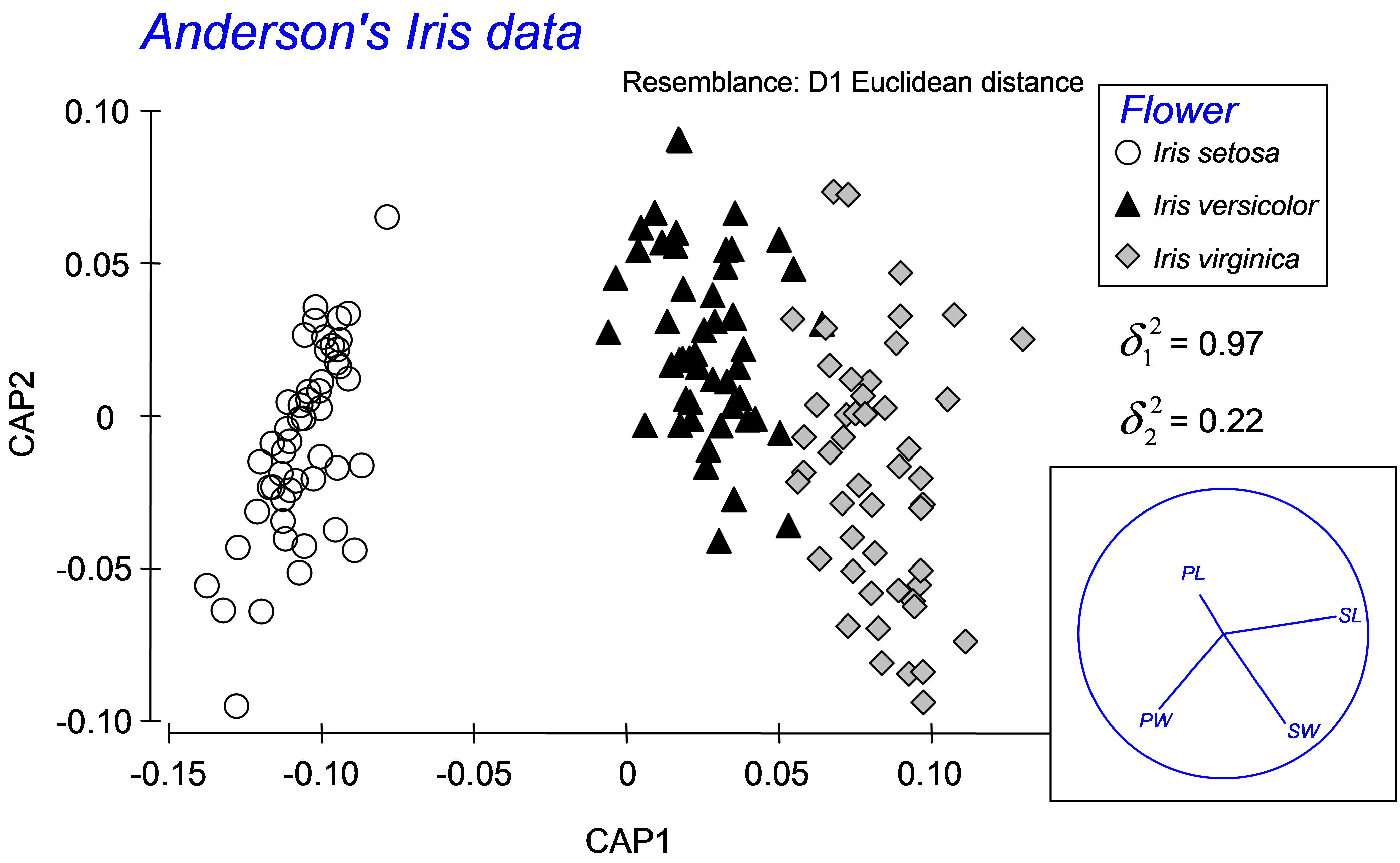 Fig. 5.9. Canonical ordination for the discriminant analysis of Anderson’s Iris data.
To proceed with a traditional analysis of the iris data, calculate a Euclidean distance matrix directly from the data and then choose PERMANOVA+ > CAP > (Analyse against •Groups in factor) & (Factor for groups or new samples: Flower) & ($\checkmark$Specify m 4) & (Diagnostics $\checkmark$Do diagnostics > •Chosen m only) & ($\checkmark$Do permutation test > Num. permutations: 9999), then click ‘OK’. We have chosen m = 4 here, because we wish to obtain the classical analysis and there were 4 original variables (PL, PW, SL and SW). The results show that the first squared canonical correlation is very large ($\delta _ 1 ^ 2$ = 0.97) and indeed the first canonical axis does quite a good job of separating the three iris species from one another (Fig. 5.9). The second canonical axis has a much smaller eigenvalue ($\delta _ 2 ^ 2$ = 0.22), and actually there is no clear separation of the groups along this second axis. The role of the original variables can be visualised by superimposing a vector overlay (shown in the inset of Fig. 5.9) using the option Graph > Special > (Vectors •Worksheet variables: iris > Correlation type: Multiple). These vectors show relationships between each of the original individual variables and the CAP axes, taking into account the other three variables in the worksheet (see the section Vector overlays in dbRDA in chapter 4). For these data, petal width and sepal length appear to play fairly important roles in discriminating among the groups. A draftsman plot of the original variables reveals that sepal length and width are highly correlated with one another (r = 0.96) and petal length is also fairly highly correlated with each of these (r > 0.8), so it is not terribly surprising that PL and SW play more minor roles once SL is taken into account.
Diagnostics show that the choice of m = 4 PCO axes includes 100% of the original variation (‘prop.G’ = 1) and that the leave-one-out allocation success was quite high using the canonical model: 93.3% of the samples (140 out of 150) were correctly classified (Fig. 5.10). The most distinct group, which had 100% success under cross-validation, was Iris setosa, whereas the other two species, Iris versicolor and Iris virginica, were a little less distinct from one another, although their allocation success rates were still admirably large (at 92% and 88%, respectively). These results regarding the relative distinctiveness of the groups coincide well with what can be seen in the CAP plot (Fig. 5.9), where the Iris setosa group is indeed easily distinguished and well separated from the other two groups along the first canonical axis.
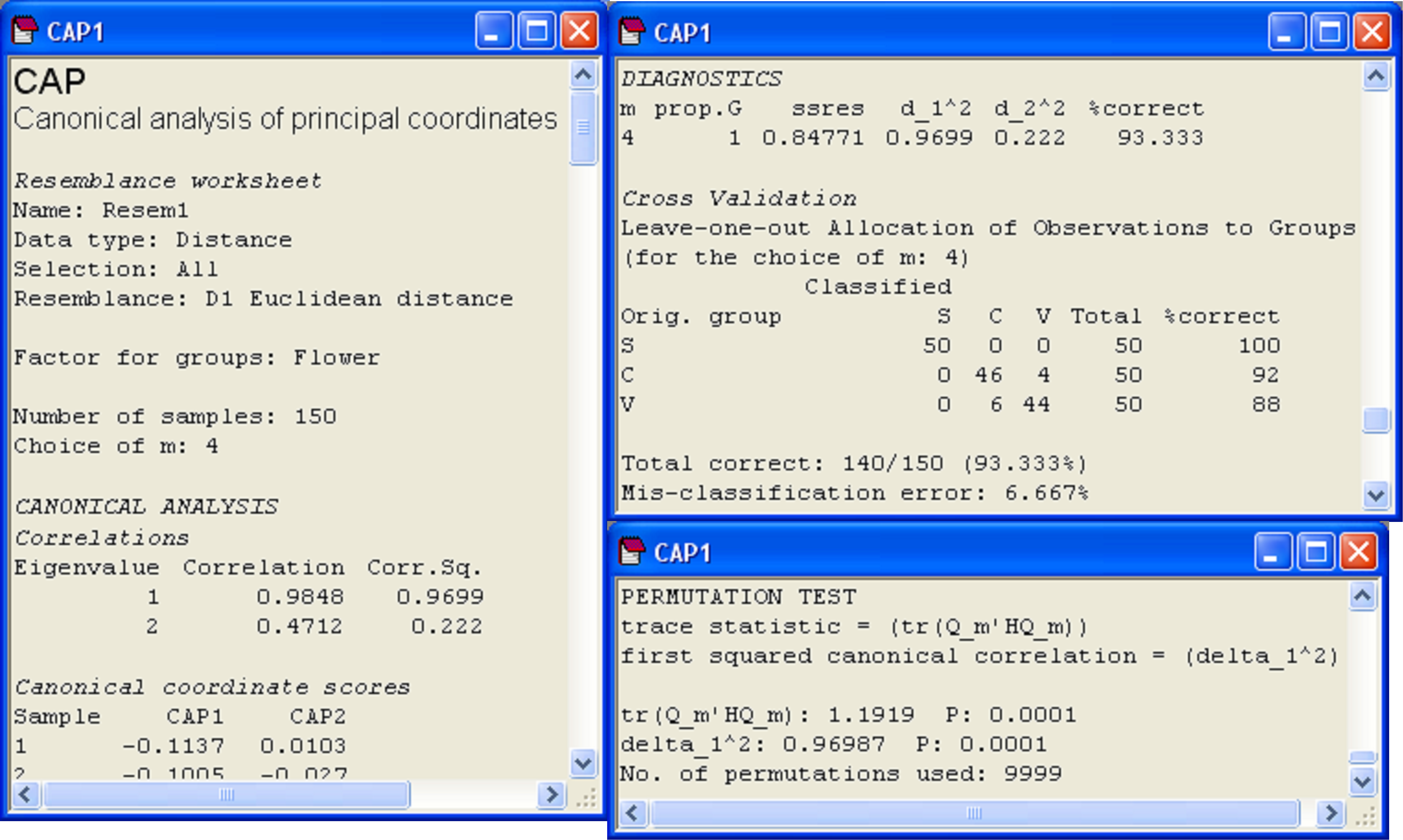 Fig. 5.10. Details from the CAP output file for the analysis of Anderson’s iris data.
The results from the permutation tests are shown at the very bottom of the CAP output file (Fig. 5.10). There are two test statistics that are given in the output for the test. The first is a “trace” test statistic. It is the sum of the canonical eigenvalues (i.e., the sum of the squared canonical correlations) or the trace of the matrix Q$^0 _m$′HQ$^0 _m$ (denoted in the output text by ‘tr(Q_m′HQ_m)’). When a CAP analysis is based on Euclidean distance and m = p, then this is equivalent to the traditional MANOVA test statistic known as Pillai’s trace105. The other test statistic provided in the CAP output is simply the first canonical eigenvalue, which is the first squared canonical correlation, $\delta _ 1 ^ 2$ (denoted in the output text by ‘delta_1^2’). This test statistic is directly related to a statistic called Roy’s greatest root criterion in traditional MANOVA. More specifically, Roy’s criterion is equal to $\delta _ 1 ^ 2$ / (1 – $\delta _ 1 ^ 2$) when $\delta _ 1 ^ 2$ is obtained from a CAP based on Euclidean distances106 and when m = p. There are other MANOVA test statistics (i.e., Wilks’ lambda, Hotelling-Lawley trace, see Mardia, Kent & Bibby (1979) , Seber (1984) , Rencher (1998) ). Studies show that these different MANOVA test statistics differ in their power to detect different kinds of changes among the group centroids in multivariate space (e.g., Olson (1974) , Olson (1975) , Rencher (1998) ). Olson ( Olson (1974) , Olson (1975) , Olson (1976) ) suggested that Pillai’s trace, although not the most powerful in all situations, did perform well in many cases, and importantly, was quite robust to violations of its assumptions, maintaining type I error rates at nominal levels in the face of non-normality or mild heterogeneity of variance-covariance matrices. It is well known that Roy’s criterion, however, will be the most powerful for detecting changes in means along a single axis in the multivariate space ( Seber (1984) , Rencher (1998) ). Generally, we suggest that the trace criterion will provide the best approach for the widest range of circumstances, and should be used routinely, while the test using the first canonical eigenvalue will focus specifically on changes in centroids along a single dimension, where this is of interest. Of course, the two test statistics will be identical when there is only canonical axis (e.g., two groups).
The permutation test in CAP assumes only exchangeability of the samples under a true null hypothesis of no differences in the positions of the centroids among the groups in multivariate space (for a given chosen value of m). Thus, although the values of the trace statistic and the first squared canonical correlation are directly related to Pillai’s trace and Roy’s criterion, respectively (when Euclidean distance is used), there are no stringent assumptions about the distributions of the variables: tests by permutation provide an exact test of the null hypothesis of no differences in the positions of centroids among groups. Mardia (1971) proposed a permutation test based on Pillai’s trace (e.g., see Seber (1984) ), which would be equivalent to the CAP test on the trace statistic when based on Euclidean distances. Of course, the CAP routine (like all of the routines in PERMANOVA+ for PRIMER) also provides the additional flexibility that any resemblance measure can be used as the basis of the analysis.
105 This equivalence is readily seen by doing a traditional MANOVA using some other statistical package on the Iris data, where the output for Pillai’s trace will be given as 1.1919, the value shown for the trace statistic from the CAP analysis in Fig. 5.10.
106 See p. 626 of Legendre & Legendre (1998) for more details.
5.8 CAP versus PERMANOVA
It might seem confusing that both CAP and PERMANOVA can be used to test for differences among groups in multivariate space. At the very least, it begs the question: which test should one use routinely? The main difference between these two approaches is that CAP is designed to ask: are there axes in the multivariate space that separate groups? In contrast, PERMANOVA is designed to ask: does between-group variation explain a significant proportion of the total variation in the system as a whole? So, CAP is designed to purposely seek out and find groups, even if the differences occur in obscure directions that are not apparent when one views the data cloud as a whole, whereas PERMANOVA is more designed to test whether it is reasonable to consider the existence of these groups in the first place, given the overall variability. Thus, in many applications, it makes sense to do the PERMANOVA first and, if significant differences are obtained, one might consider then using the CAP analysis to obtain rigorous measures of the distinctiveness of the groups in multivariate space (using cross-validation), to characterise those differences (e.g., by finding variables related to the canonical axes) and possibly to develop a predictive model for use with future data.
One can also consider the difference between these two methods in terms of differences in the role that the data cloud plays in the analysis vis-à-vis the hypothesis107. For CAP, the hypothesis is virtually a given and the role of the data cloud is to predict that hypothesis (the X matrix plays the role of a response). For PERMANOVA, in contrast, the hypothesis is not a given, and the role of the data cloud is as a response, with the hypothesis (X matrix) playing the role of predictor. This fundamental difference is also apparent when we consider the construction of the among-group SS in PERMANOVA and compare it with the trace statistic in CAP. For PERMANOVA, the among-group SS can be written as tr(HGH) or, equivalently (if there were no negative eigenvalues), we could write: tr(HQH). This is a projection of the variation in the resemblance matrix (represented by Q here) onto the X matrix, via the projection matrix H. For PERMANOVA, all of the PCO axes are utilised and they are each standardised by their eigenvalues ($\lambda$’s, see chapter 3). On the other hand, the trace statistic in CAP is tr(Q$^0 _m$′HQ$^0 _m$). The roles of these two matrices (Q and H) are therefore swapped. Now we have a projection of the X variables (albeit sphericised, since we are using H) into the space of the resemblance matrix instead. Also, the PCO axes in CAP are not scaled by their respective eigenvalues, they are left as orthonormal axes (SS = 1). The purpose of this is really only to save a step. When predicting one set of variables using another, the variables used as predictors are automatically sphericised as part of the analysis108. Since the eigenvector decomposition of matrix G produces orthonormal PCO axes Q$^0$, we may as well use those directly, rather than multiplying them by their eigenvalues and then subsequently sphericising them, which would yield the same thing!
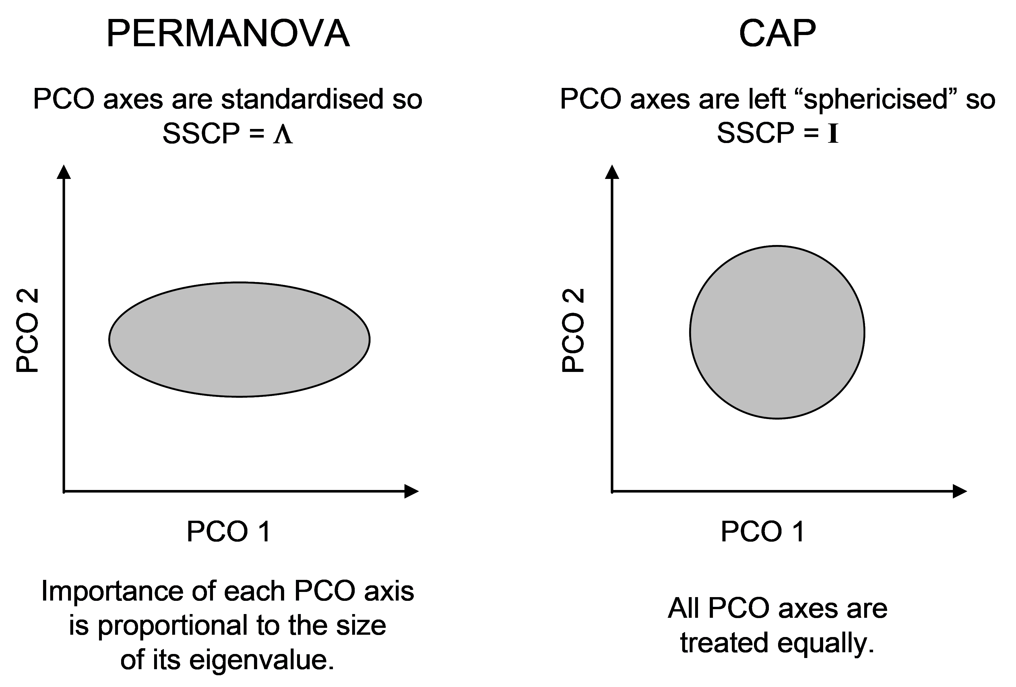 Fig. 5.11. Schematic diagram of the difference in the scaling of PCO axes for PERMANOVA vs CAP.
The difference in the scaling of PCO axes, nevertheless, highlights another difference between CAP and PERMANOVA. In PERMANOVA, the relative importance of each PCO axis is in proportion to its eigenvalue (its variance), whereas in CAP, each PCO is given equal weight in the analysis (Fig. 5.11). The latter ensures that directions that otherwise might be of minor importance in the data cloud as a whole, are given equal weight when it comes to searching for groups. This is directly analogous to the situation in multiple regression, where predictor variables are automatically sphericised (normalised to have SS = 1 and rendered independent of one another) when the hat matrix is calculated.
Another way of expressing the ‘sphericising’ being done by CAP is to see its equivalence with the classical MANOVA statistics, where the between-group variance-covariance structure is scaled by a (pooled) within-group variance-covariance matrix (assumed to be homogeneous among groups). The distances between points being worked on by CAP therefore can also be called Mahalanobis distances (e.g., Seber (1984) ) in the multivariate PCO space because they are scaled in this way. In contrast, to obtain the $SS _ A$ of equation (1.3) for PERMANOVA one could calculate the univariate among-group sum of squares separately and independently for each PCO axis and then sum these up109. Similarly, the $SS _ \text{Res}$ of equation (1.3), may be obtained as the sum of the individual within-group sum of squares calculated separately for each PCO axis. PERMANOVA’s pseudo-F is effectively therefore a ratio of these two sums110.
The relative robustness and power of PERMANOVA versus CAP in a variety of circumstances is certainly an area warranting further research. In terms of performance, we would expect the type I errors for the CAP test statistic and the PERMANOVA test statistic to be the same, as both use permutations to obtain P-values so both will provide an exact test for the one-way case when the null hypothesis is true. However, we would expect the power of these two different approaches to differ. In some limited simulations (some of which are provided by
Anderson & Robinson (2003)
, and some of which are unpublished), CAP was found to be more powerful to detect effects if they were small in size and occurred in a different direction to the axis of greatest total variation. On the other hand, PERMANOVA was more powerful if there were multiple independent effects for each of a number of otherwise unrelated response variables. Although there is clearly scope for more research in this area, the take-home message must be to distinguish and use these two methods on the basis of their more fundamental conceptual differences (Fig. 5.12), rather than to try both and take results from the one that gives the most desirable outcome!
 Fig. 5.12. Schematic diagram of the conceptual and practical differences, in matrix algebra terms, between the CAP analyses and PERMANOVA (or DISTLM).
107 The data cloud in the space of the appropriate resemblance measure is represented either by matrix G, Gower’s centred matrix, or by matrix Q, the matrix of principal coordinate axes.
108 The reader may recall that, for the very same reason, it makes no difference to a dbRDA whether one normalises the X variables before proceeding or not (see chapter 4). The dbRDA coordinate scores and eigenvalues will be the same. Predictor variables are automatically sphericised as part of multiple regression, as a consequence of constructing the H matrix.
109 Note that the SS from PCO axes corresponding to negative eigenvalues would contribute negatively towards such a sum.
110 Other test statistics could be used. For example, a sum of the individual F ratios obtained from each PCO axis (e.g., Edgington (1995) , which one might call a “stacked” multivariate F statistic), could also be used, rather than the ratio of sums that is PERMANOVA’s pseudo-F.
5.9 Caveats on using CAP (Tikus Island corals)
When using the CAP routine, it should come as no surprise that the hypothesis (usually) is evident in the plot. Indeed the role of the analysis is to search for the hypothesis in the data cloud. However, once faced with the constrained ordination, one might be tempted to ask the question whether it is useful to examine an unconstrained plot at all. The answer is most certainly ‘yes’! We would argue that it is always important to examine an unconstrained plot (either a PCO or an MDS if dealing with general resemblances, or a PCA if Euclidean distances are appropriate). There are several reasons for this.
First, a CAP plot (or other constrained plot, such as a dbRDA) views the data cloud through the filter of our hypothesis, so-to-speak, which is a bit like viewing the data through “rose-coloured glasses”, as mentioned before. This will have a tendency to lead us down the path towards an over-emphasis on the importance of the hypothesis, and we can easily neglect to put this into a broader perspective of the data cloud as a whole. Although a restriction on the choice of m and the use of cross-validation to avoid over-parameterising the problem will help to reduce this unfortunate instinct in us (i.e., our intrinsic desire to see our hypothesis in our data), the unconstrained plot has the important quality of “letting the data speak for themselves”. As the unconstrained plot does not include our hypothesis in any way to draw the points (but rather uses a much more general criterion, like preserving ranks of inter-point resemblances, or maximizing total variation across the cloud as a whole), we can trust that if we do happen to see our hypothesis playing a role in the unconstrained plot (e.g., to separate groups), then it is probably a pretty important feature of the data. So, first of all, the unconstrained plot helps to place our hypothesis within a broader perspective. Of course, if we see the separation of groups clearly in the unconstrained plot, then it should come as no surprise that the CAP routine will also have no trouble finding axes that are good at discriminating the groups. Diagnostics (like cross-validation) are crucial, however, for telling us something about the actual distinctiveness of the groups in multivariate space.
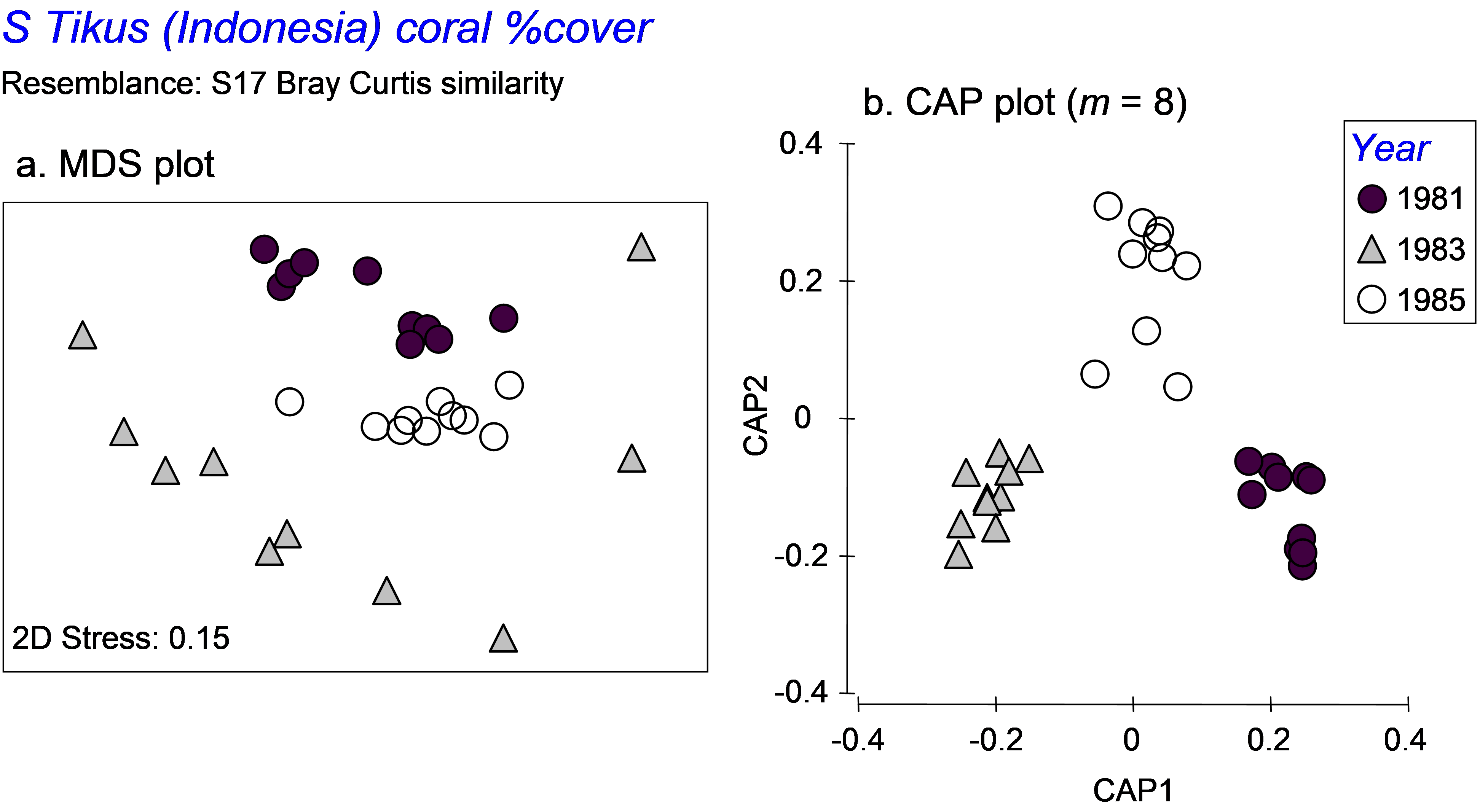 Fig. 5.13. MDS and CAP plots for a subset of three years’ data on percentage cover of coral species from South Tikus Island, Indonesia.
Second, the purpose of the CAP routine is to seek out separation of the group centroids. As a consequence, it effectively completely ignores, and even destroys, differences in dispersions among the groups. A case in point serves as a useful example here. We shall re-visit the Tikus Island corals dataset (tick.pri in the ‘Corals’ folder of the ‘Examples v6’ directory), consisting of the percentage cover of p = 75 coral species in each of 6 years from 10 replicate transects in Indonesia ( Warwick, Clarke & Suharsono (1990) ). Taking only the years 1981, 1983 and 1985, we observed previously that the dispersions of these groups were very different when analysed using Bray-Curtis resemblances (Fig. 5.13a). However, when we analyse the data using CAP, the first two squared canonical correlations are very large (0.90 and 0.84, respectively), the cross-validation allocation success is impressively high (29/30 = 97%), and the plot shows the three groups of samples as very distinct from one another, with not even a hint of the differences in dispersions that we could see clearly before in the unconstrained MDS plot (Fig. 5.13b). These differences in dispersions are quite real (as verified by the PERMDISP routine), yet might well have remained completely unknown to us if we had neglected to examine the unconstrained plot altogether. An important caveat on the use of the CAP routine is therefore to recognise that CAP plots generally tell us absolutely nothing about relative dispersions among the groups. Only unconstrained plots (and associated PERMDISP tests) can do this.
5.10 Adding new samples
A new utility of the windows-based version of the CAP routine in PERMANOVA+ is the ability to place new samples onto the canonical axes of an existing CAP model and (in the case of a discriminant analysis) to classify each of those new samples into one of the existing groups. This is done using only the resemblances between each new sample and the existing set of samples that were used to develop the CAP model. First, these inter-point dissimilarities are used to place the new point onto the (orthonormal) PCO axes. It is then quite straightforward to place these onto the canonical axes, which are simply linear combinations of those PCO axes (see Anderson & Robinson (2003) for more details). The only requirement is that the variables measured on each new sample match the variable list for the existing samples and also that their values occur within the general multivariate region of the data already observed111.
For example, suppose we have three new flowers which we suspect belong to one of the three species of irises analysed by CAP in the section named Test by permutation. Suppose the values of the four morphometric variables for each of these new flowers are:
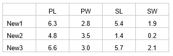
Open the file iris.pri (in ‘Examples add-on\Irises’) and add these three new samples into the data file (use, for example, Edit > Insert > Row), giving them the names of ‘New1’, ‘New2’ and ‘New3’ and typing in the appropriate values for each variable (Fig. 5.14). Choose Edit > Factors and for the factor named ‘Flower’, we clearly do not know which species these three flowers might belong to yet, so give them the level name of ‘New’, to distinguish them from the existing groups of ‘S’, ‘C’ or ‘V’ (Fig. 5.14). One can enter new samples into an existing data file within PRIMER in this fashion, or include the new samples to be read directly into PRIMER with the original data file. The essential criterion for analysis is that the new samples must have a different level name from the existing groups for the factor which is going to be examined in the CAP discriminant analysis. To add new samples to a canonical correlation-type analysis (see below), a factor must be set up which distinguishes the existing samples from new ones (one can use a factor to distinguish ‘model’ samples from ‘validation’ samples, for example).
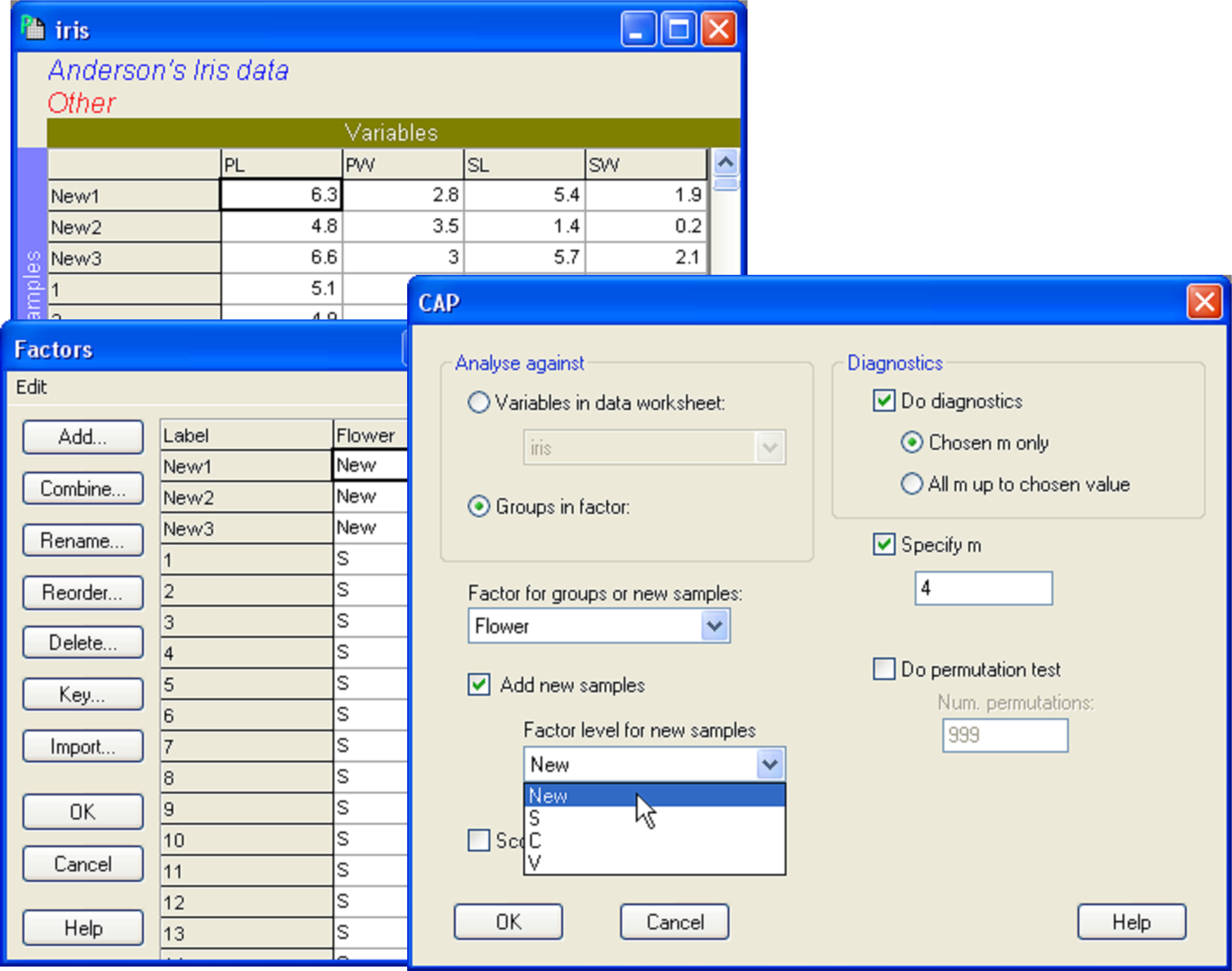 Fig. 5.14. Dialog in CAP showing the addition of three new samples (new individual flowers), to be classified into one of the three species groups using the CAP model developed from the existing data.
Once the new samples have been entered and identified as such, the resemblance matrix for all of the samples together must be calculated. For the iris data set, calculate a Euclidean distance matrix. Proceed with the CAP analysis by choosing: PERMANOVA+ > CAP > (Analyse against •Groups in factor) & (Factor for groups or new samples: Flower) & ($\checkmark$Add new samples > Factor level for new samples New) & (Specify m 4) & (Diagnostics $\checkmark$Do diagnostics •Chosen m only), then click ‘OK’ (Fig. 5.14). The CAP plot shows the three Iris groups, as before, but the new samples are shown using a separate symbol (Fig. 5.15). The only other difference between the CAP plot in Fig. 5.15 compared to Fig. 5.9 is that the y-axis has been flipped. As with PCA, PCO, dbRDA or MDS ordination plots in PRIMER, the signs of the axes are also arbitrary in a CAP plot. The visual representation of the points corresponding to each of the new flowers have been labeled and from this one might make a guess as to which species each of these new samples is likely to belong.
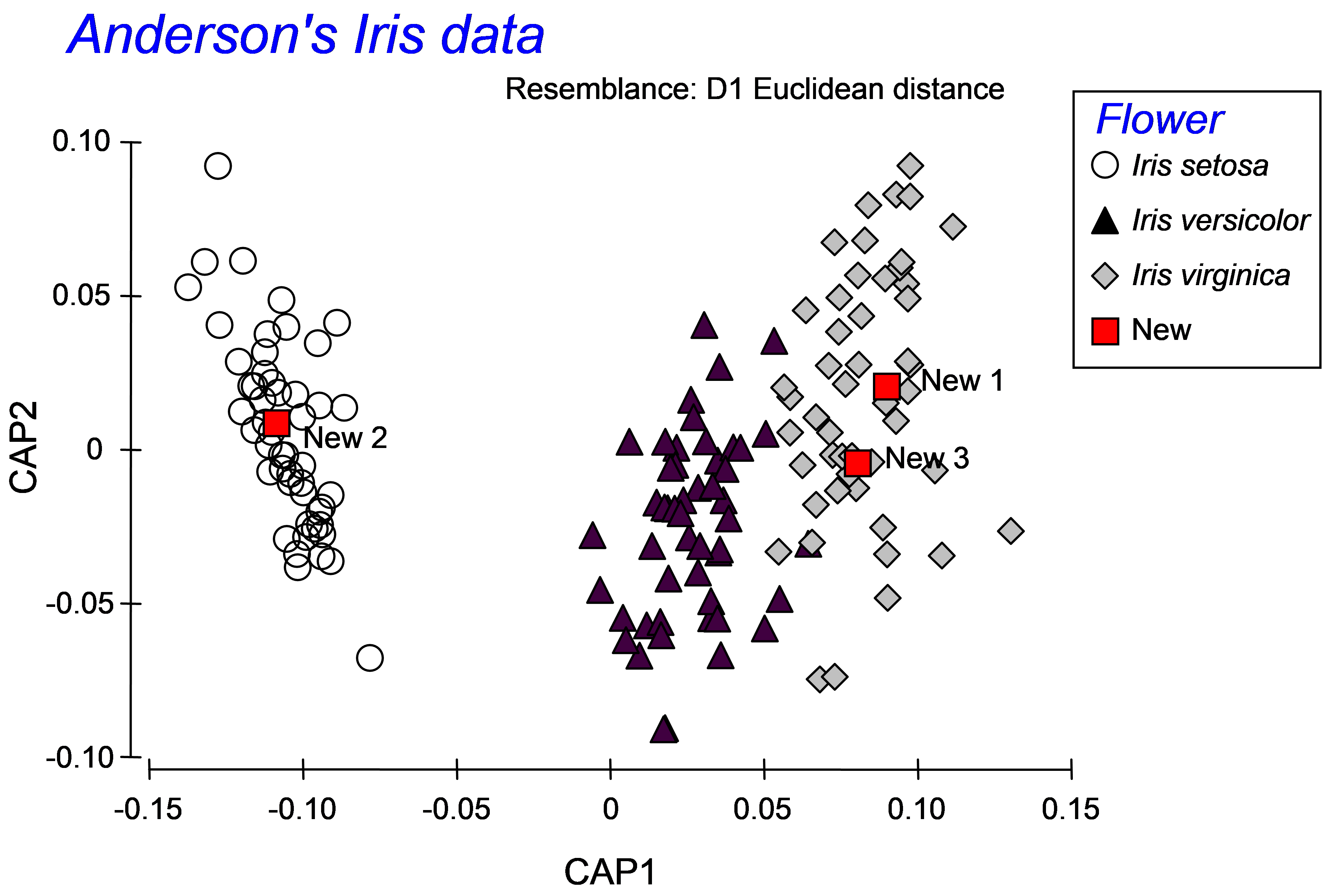 Fig. 5.15. CAP plot of Anderson’s iris data, showing the positions of three new flowers, based on their morphometric resemblances with the other flowers in the existing dataset.
More detailed information is given, however, in the CAP results file under the heading of ‘New samples’ (Fig. 5.16). First are given the positions of each of the new samples on the canonical axes, followed by the classification of each of the new samples according to these positions. In the present case, the samples ‘New1’ and ‘New3’ were allocated to the group Iris virginica, while the sample ‘New2’ was allocated to the group Iris setosa. Each new sample is allocated to the group whose centroid is the closest to it in the canonical space. For reference, the output file includes these distances to centroids for each sample upon which this decision was made (Fig. 5.16).
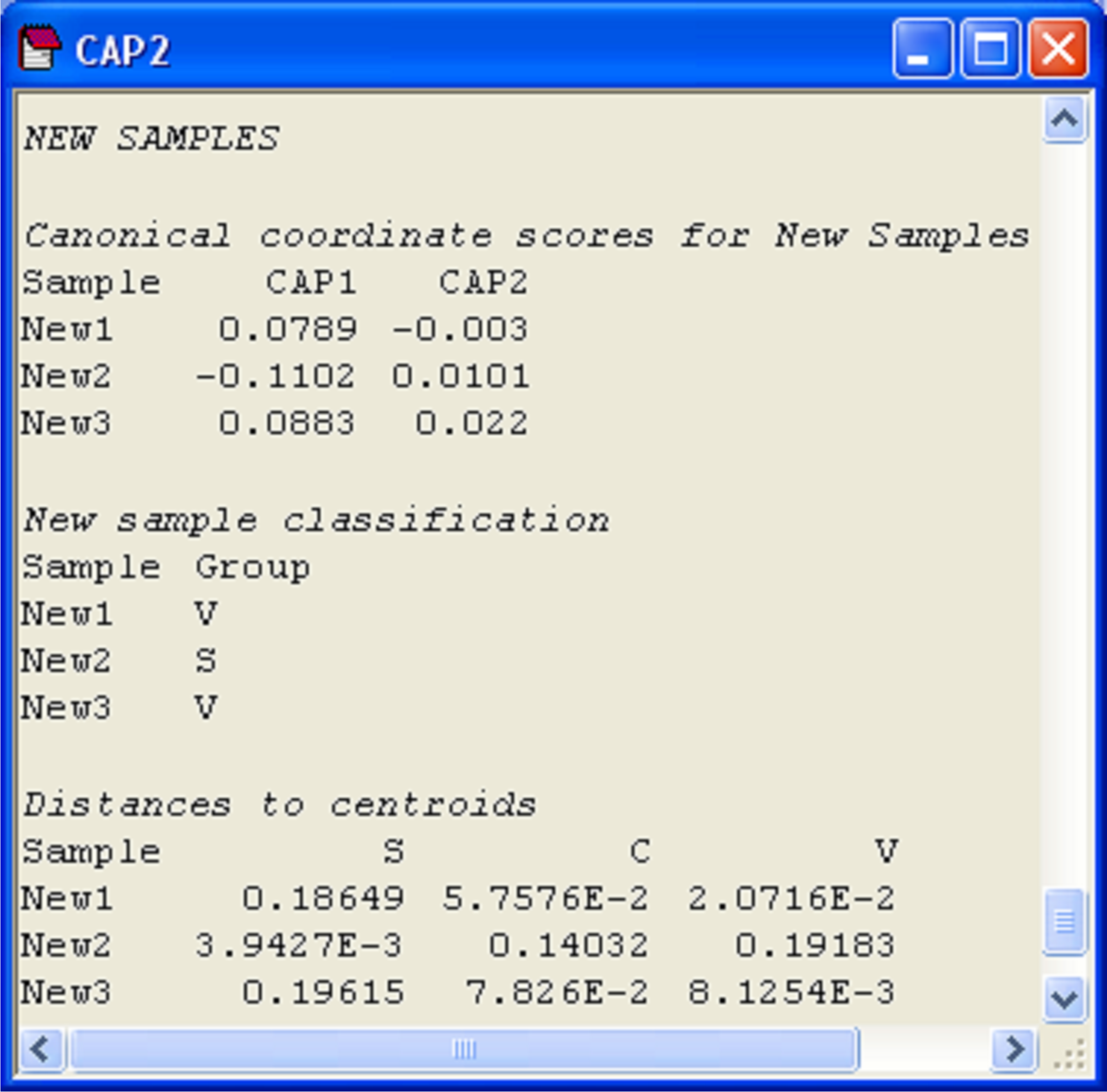 Fig. 5.16. Positions of three new flowers on the canonical coordinate scores, classification of each new flower into one of the groups, and distances from each new flower to each of the group centroids.
111 This latter criterion may be very difficult to check. The CAP routine currently does not attempt to identify data points as “outside previous experience” and the development of an appropriate criterion for doing this would be a worthwhile subject for future research.
5.11 Canonical correlation: single gradient (Fal estuary biota)
So far, the focus has been on hypotheses concerning groups and the use of CAP for discriminant analysis. CAP can also be used to analyse how well multivariate data can predict the positions of samples along a continuous or quantitative gradient. As an example, we shall consider a study of the meiofauna and macrofauna in soft-sediment habitats from five creeks in the Fal estuary along a pollution gradient ( Somerfield, Gee & Warwick (1994) ). These creeks have different levels of metal contamination from long-term historical inputs. Original data are in file Fa.xls in the ‘Fal’ folder of the ‘Examples v6’ directory. This file splits the biotic data into separate groups (nematodes, copepods and macrofauna), but here we will analyse all biotic data together as a whole. A single file containing all of the biotic data (with an indicator to identify the variables corresponding to nematodes, copepods and macrofauna) is located in falbio.pri in the ‘FalEst’ folder of the ‘Examples add-on’ directory. Also available in this folder are the environmental variables in file falenv.pri, which includes concentrations for 10 different metals, % silt/clay and % organic matter.
Previous study (e.g., Somerfield, Gee & Warwick (1994) ) indicated a high degree of correlation among the different metals in the field. Based on this high correlation structure, we might well consolidate this information in order to obtain a single gradient in heavy metal pollution among these samples, using principal components analysis (PCA). A draftsman plot also suggests that log-transformed metal variables will produce more symmetric (less-skewed) distributions for analysis. Select only the metals, highlight them and choose Tools > Transform (individual) > (Expression: log(V) )& ($\checkmark$Rename variables (if unique)) in order to obtain log-transformed metal data. Rename the data sheet log.metals for reference. Next choose Analyse > Pre-treatment > Normalise variables and re-name the resultant sheet norm.log.metals. A draftsman plot of these data demonstrates reasonably even scatter and high correlation structure. Choose Analyse > PCA > (Maximum no of PCs: 5) & ($\checkmark$Plot results) & ($\checkmark$Scores to worksheet). The first 2 PC axes explain 93% of the variation in the normalised log metal data. The first PC axis alone explains 77% of the variability, and with approximately equal weighting on almost all of the metals (apart from Ni and Cr). This first PC axis can clearly serve as a useful proxy variable for the overall gradient in the level of metal contamination across these samples. In the worksheet of PC scores, select the single variable with the scores for samples along PC1, duplicate this so it occurs alone in its own data sheet, rename this single variable PC1 and rename the data sheet containing this variable poll.grad.
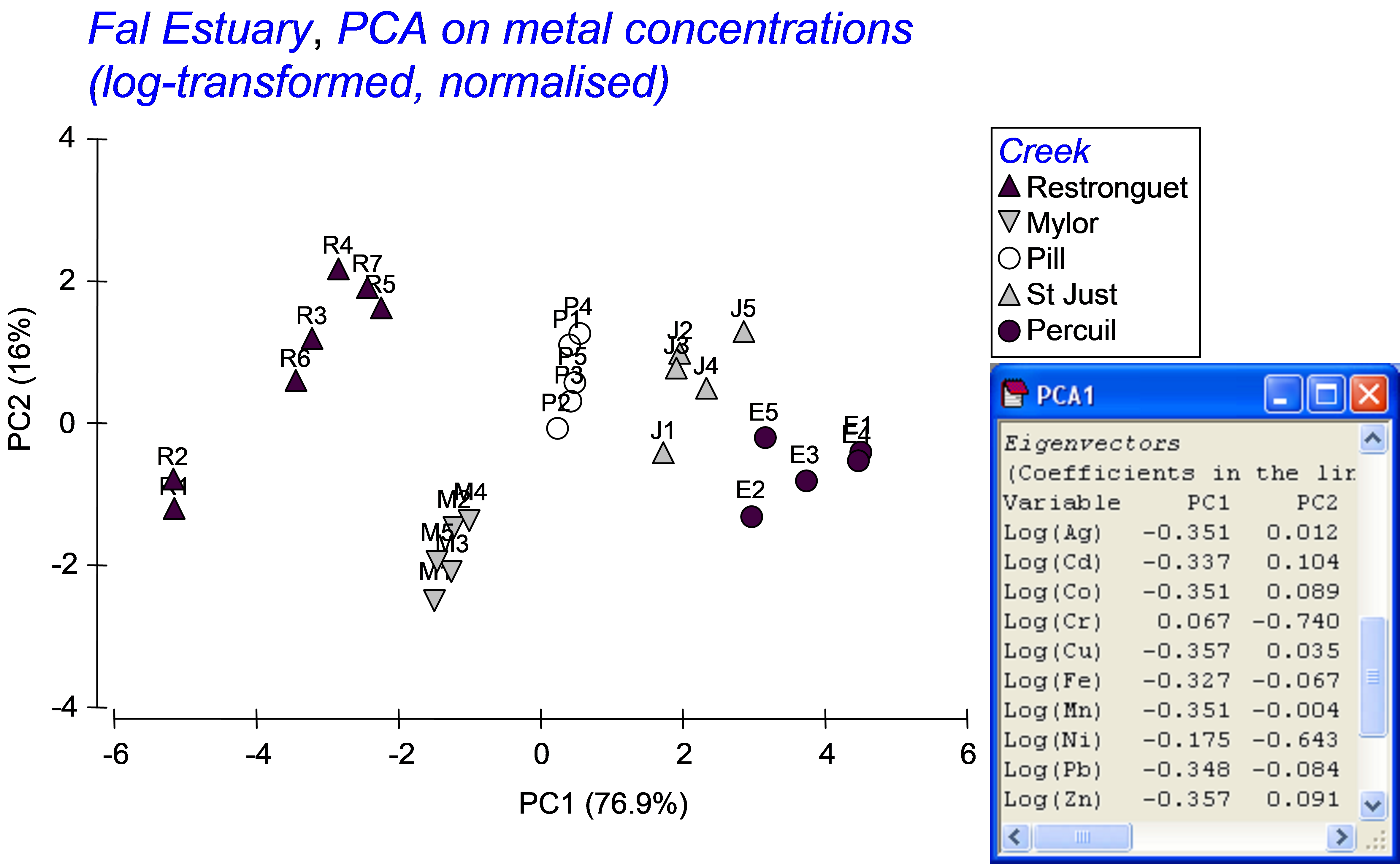 Fig. 5.17. PCA of metal concentrations from soft-sediment habitats in creeks of the Fal estuary.
Our interest lies in seeing how well the biotic data differentiate the samples along this pollution gradient. Also, suppose a new sample were to be obtained from one of these creeks at a later date, could the biota from that sample alone be used to place it along this gradient and therefore to indicate its relative degree of contamination, from low to high concentrations of metals? Although the analysis could be done using only a subset of the data (e.g., just the nematodes, for example), we shall use all of the available biotic information to construct the CAP model. Open the file falbio.pri in the same workspace. As indicated in Clarke & Gorley (2006) (see pp. 40-41 therein), we shall apply dispersion weighting ( Clarke, Chapman, Somerfield et al. (2006) ) to these variables before proceeding. Choose Analyse > Pre-treatment > Dispersion weighting > (Factor: Creek) & (Num perms: 1000). Next transform the data using square-roots and calculate a Bray-Curtis resemblance matrix from the transformed data. We are ready now to run the CAP routine to relate the pollution gradient to the biotic resemblance matrix. Choose PERMANOVA+ > CAP > (Analyse against •Variables in data worksheet: poll.grad) & (Diagnostics $\checkmark$Do diagnostics) (Fig. 5.18).
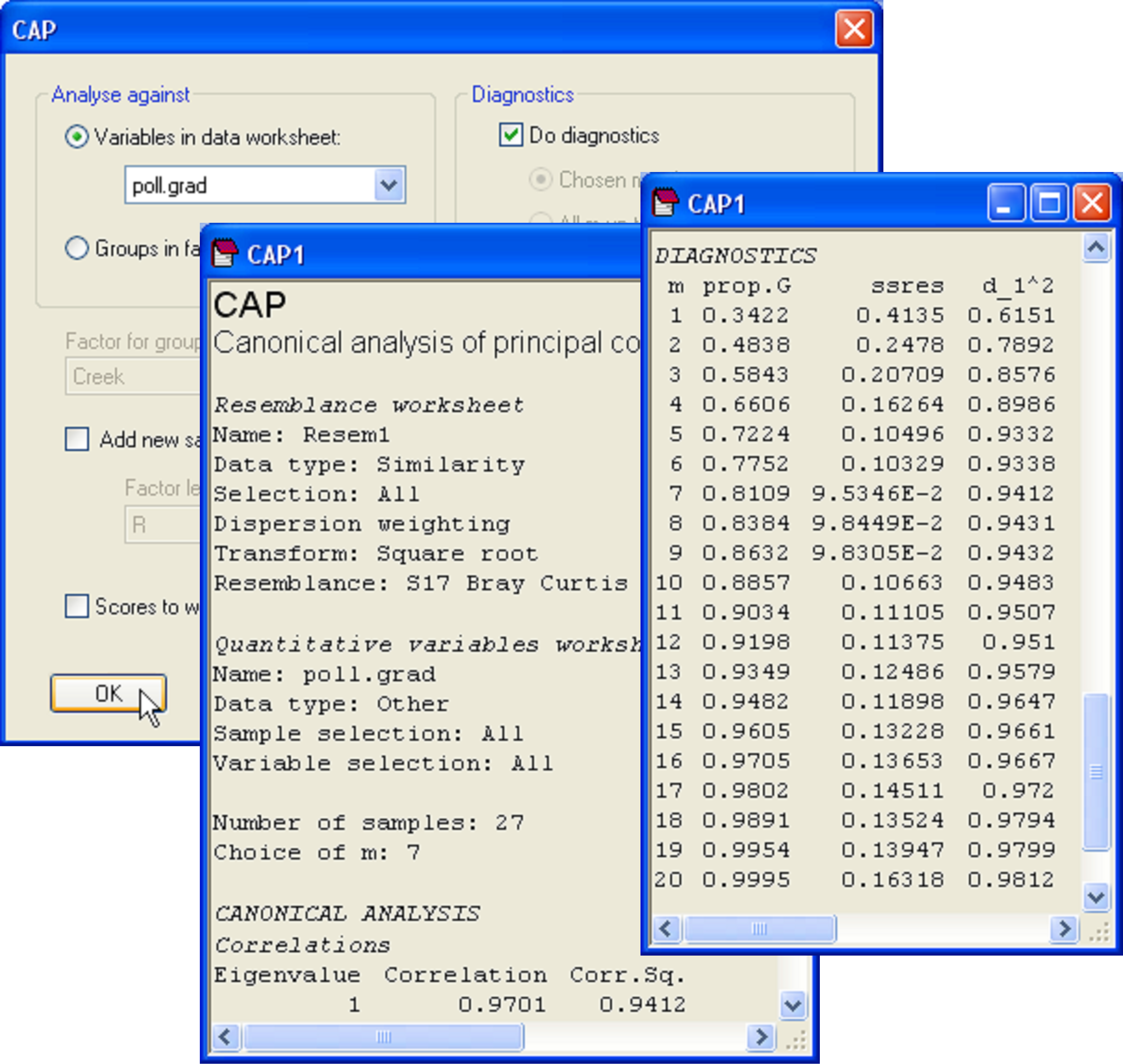 Fig. 5.18. Dialog and excerpts from the output file of a CAP analysis relating biota from sites in the Fal estuary to the pollution gradient (as represented by PC1 from Fig. 5.17).
In the results file, we should first examine the diagnostics. This is not a discriminant analysis, so there are no groups and thus no cross-validation. Instead, the leave-one-out residual sum of squares is the criterion that was used to decide upon an appropriate value for m here. The CAP routine has chosen to use m = 7 PCO axes for the analysis, which encapsulates 81.1% of the variability in the resemblance matrix, and which indeed minimises ‘ssres’. We can see from the diagnostics that no further substantial increases in the canonical correlation occurs if more PCO axes are included, and the model actually gets worse (the leave-one-out residual SS increases) if we were to include more PCO axes (Fig. 5.18). The choice of m = 7 therefore appears reasonable.
As there is only one variable in the data file (PC1), there is only one canonical axis. The squared canonical correlation is very high ($\delta ^2 _ 1$ = 0.94), suggesting we have a very good model here (Fig. 5.19). When there is only 1 canonical axis, CAP will plot this axis with the original variable in a two-dimensional scatter-plot. It is appropriate that the variable (PC1 in this case, which is a proxy for overall metal contamination) be positioned on the y-axis, with the canonical scores on the x-axis, as the purpose of CAP is to find an axis through the cloud of multivariate data that is best at predicting this variable. Given a new sample, we can re-run CAP to place that new sample into the canonical space, yielding a position for it along this x-axis, which in turn (via the CAP model) allows a prediction for the position of that point onto the y-axis (the pollution gradient).
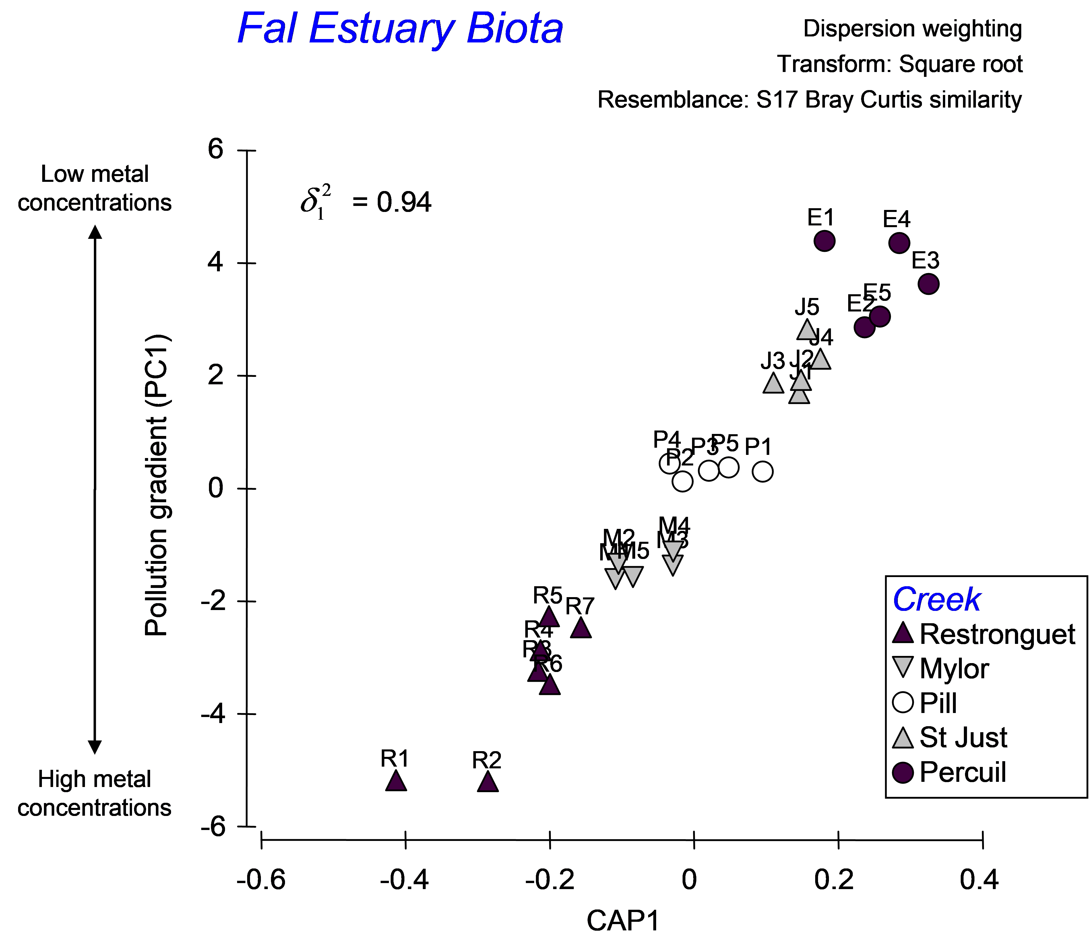 Fig. 5.19. CAP analysis relating biota from sites in the Fal estuary to the pollution gradient.
To see how this works, let us suppose that the samples labeled R2, P2 and E2 had unknown metal concentrations. Accordingly, the environmental data for them would be empty or missing. To place these as ‘new samples’ into the model and predict their position along the pollution gradient, we first need to have a factor that identifies them as new samples. Go to the falbio.pri data sheet and create a new factor called ‘Model’, which has ‘model’ for all of the samples except R2, P2 and E2, which will be identified instead as ‘new’ (Fig. 5.20). Next, go to the poll.grad data sheet and select all of the samples except for R2, P2 and E2 (which we are presuming for the moment to have no value for this variable). Now, from the resemblance matrix (which includes all of the samples) choose PERMANOVA+ > CAP > (Analyse against •Variables in data worksheet: poll.grad) & ($\checkmark$Add new samples > Factor for groups or new samples: Model > Factor level for new samples: new) & ($\checkmark$Specify m 7) & (Diagnostics $\checkmark$Do diagnostics > •Chosen m only). Clearly, there is no need to re-do all of the diagnostics here, and we can specify an appropriate value for m (= 7 in this case) directly (Fig. 5.20).
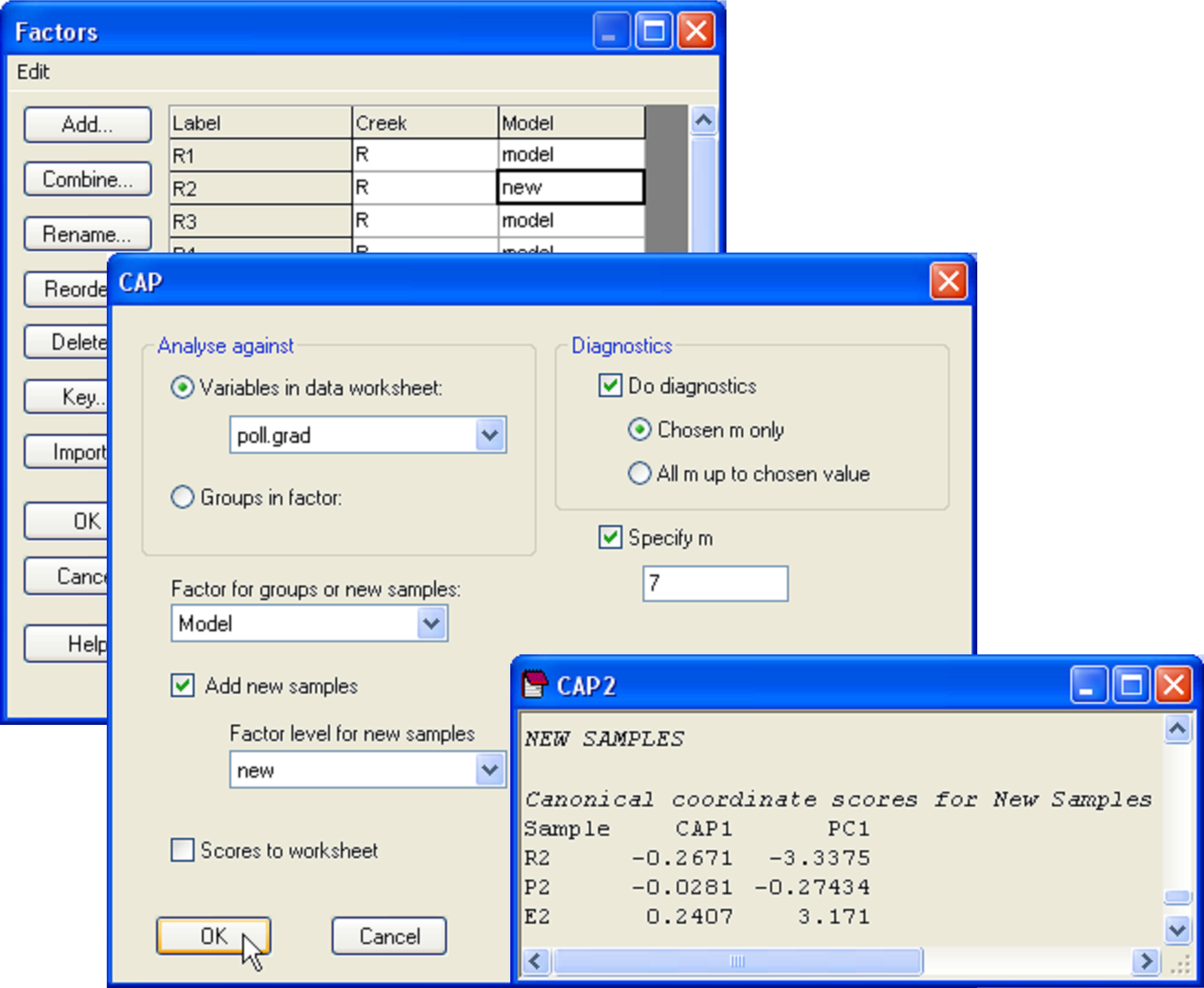 Fig. 5.20. Dialog and portion of the output for the placement of new points into the canonical analysis.
The CAP model for the reduced data set (i.e. minus the three samples that are considered ‘new’) is not identical, but is very similar to the model obtained using all of the data, having the same high canonical correlation of 0.94 for the choice of m = 7. In the CAP output, we are given values for the positions of the new samples along the canonical axis and also, as predicted, along the PC1 gradient (Fig. 5.20). By glancing back at the original plot, we can see that the model, based on the biotic resemblances among samples only, has done a decent job of placing the new samples along the pollution gradient in positions that are pretty close to their actual positions along PC1 (compare Fig. 5.21 with Fig. 5.19).
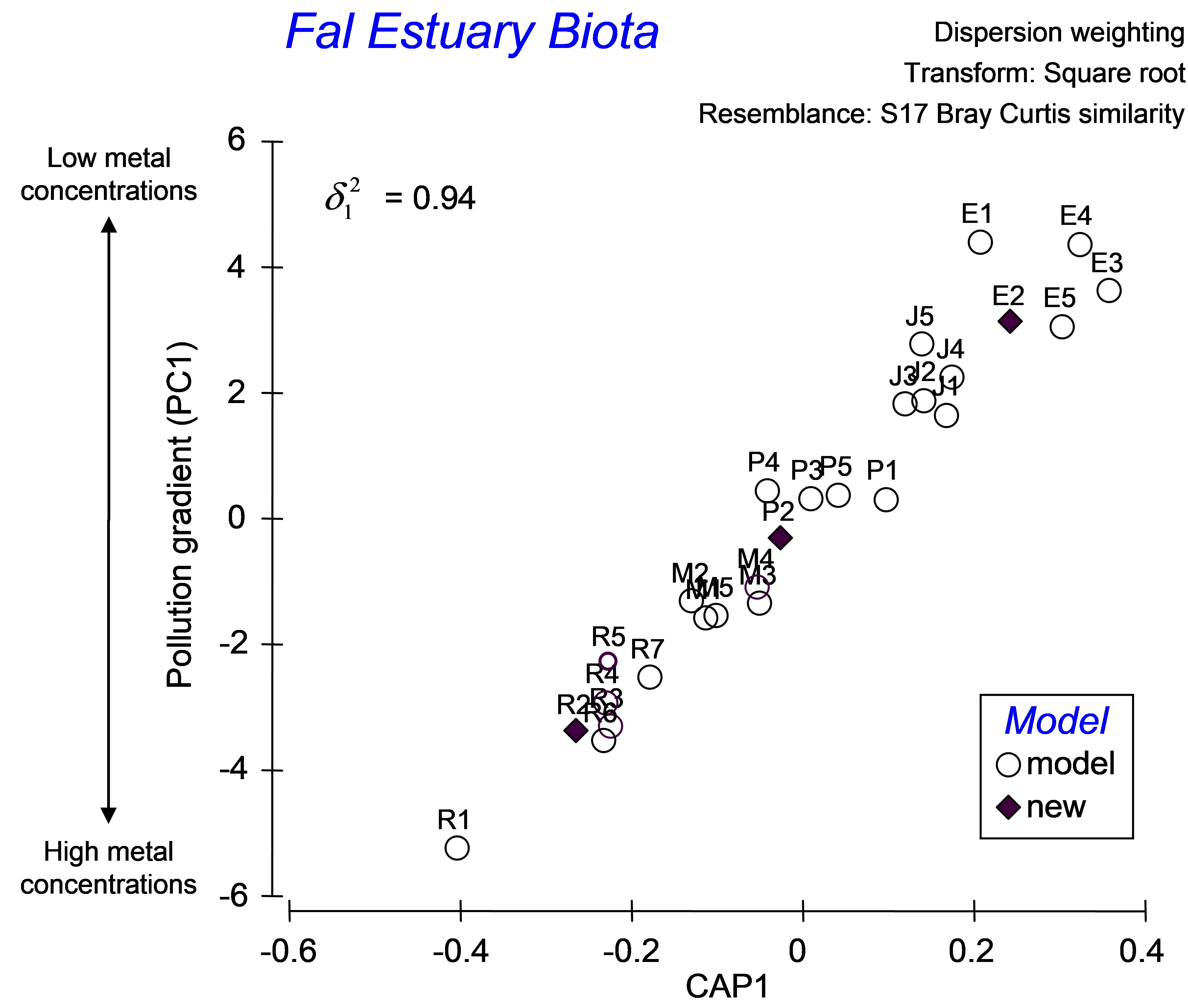 Fig. 5.21. CAP ordination, showing the placement of new points into a gradient analysis.
As highlighted in the section on discriminant analysis, it is instructive also to view the unconstrained data cloud, which helps to place the CAP model into a broader perspective. An unconstrained MDS plot of the biotic data shows that communities from these 5 creeks in the Fal estuary are quite distinct from one another (Fig. 5.22). The differences between assemblages in Restronguet Creek and those in the other creeks are particularly strong. This is not terribly surprising, as this creek has the highest metal concentrations and is directly downstream of the Carnon River, which is the source of most of the heavy metals to the Fal estuary system (
Somerfield, Gee & Warwick (1994)
). Distinctions among the other creeks might include other factors, such as grain size characteristics or %organics. The MDS plot shows differences among these other creeks occur in a direction that is orthogonal (perpendicular) to their differences from Restronguet Creek, which is an indication of this. Therefore, although it is likely that the strongest gradient in the system is caused by large changes in metal concentrations (seen in both the MDS and the CAP plot), there are clearly other pertinent drivers of variation across this system as well. Although an important strength of the CAP method is its ability to identify and “pull out” and assess useful relationships, even in the presence of significant variation in other directions, this is also something to be wary of, in the sense that one can be inclined to forget about the other potential contributors to variation in the system. A look at the unconstrained ordination is, therefore, always a wise idea.
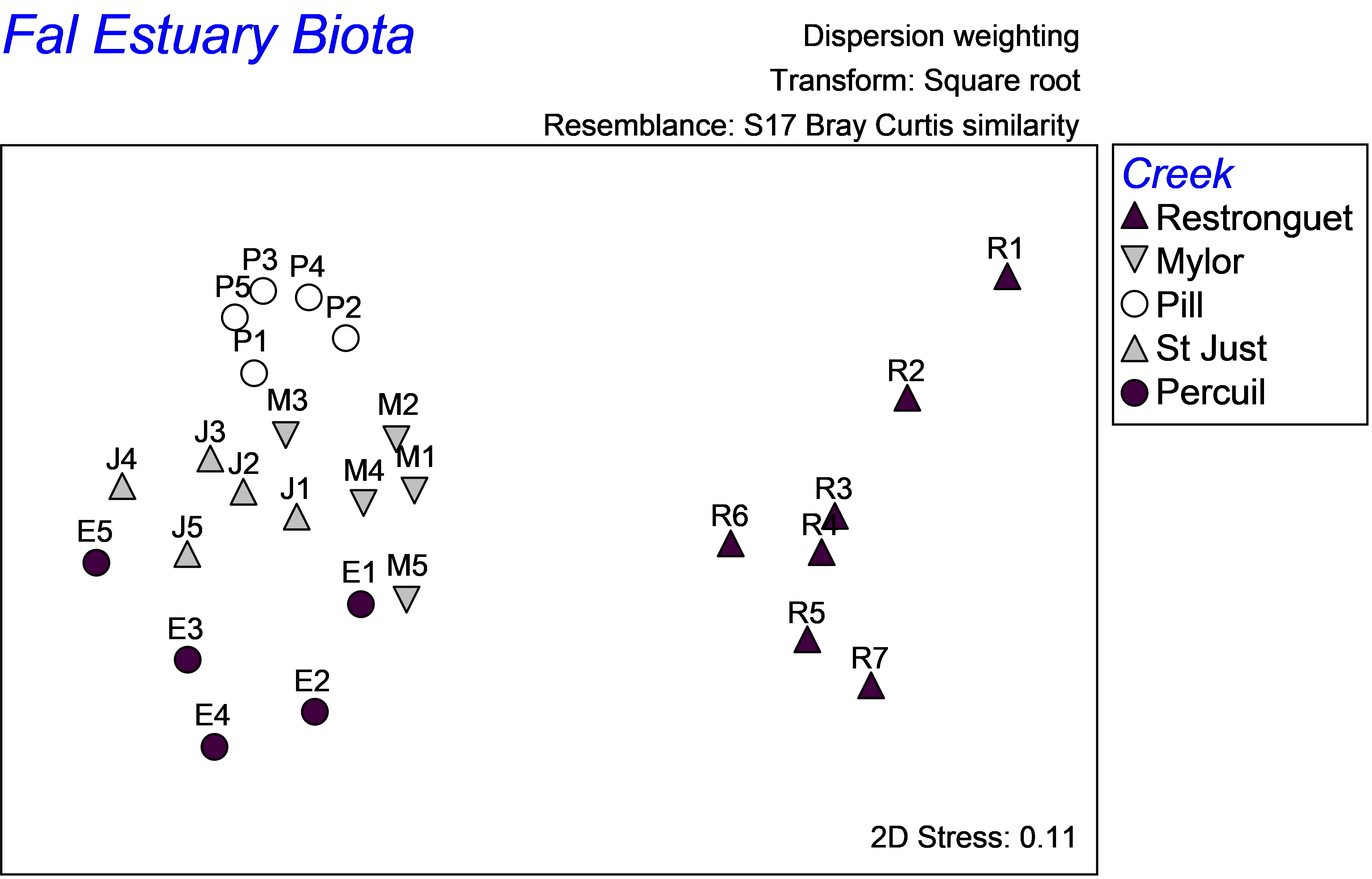 Fig. 5.22. Unconstrained MDS ordination of all biota from the Fal estuary.
5.12 Canonical correlation: multiple X’s
In some cases, interest lies in finding axes through the cloud of points so as to maximise correlation with not just one X variable, but with linear combinations of multiple X variables simultaneously. In such cases, neither of these two sets of variables (i.e. the PCO’s arising from the resemblance matrix, on the one hand, and the X variables, on the other) have a specific role in the analysis – neither set is considered to be either predictors or responses. Rather, when there are several X variables, CAP can be conceptually described as sphericising both sets of variables, and then rotating them simultaneously against one another in order to find axes with maximum inter-correlations between these two sets.
As the agenda here is neither to explain nor predict one set using the other set, canonical correlation analysis with multiple X variables is a method for simply exploring relationships between two sets of variables. As such, its utility is perhaps rather limited for ecological applications, but certainly can be useful for generating hypotheses. CAP does canonical correlation between the PCO axes Q$_ m$ (N × m) and X (N × q), where m is generally chosen so as to minimise the leave-one-out residual sum of squares (see the section on Diagnostics), and the number of canonical axes generated will be min(m, q, (N – 1)). If p < (N – 1) and the measure being used is Euclidean embeddable (e.g., see the section on Negative eigenvalues in chapter 3 herein and Gower & Legendre (1986) regarding the geometric properties of dissimilarity measures), then it makes sense to manually set m = p in the CAP dialog a priori, as the dimensionality of PCO’s in such cases is known to be equal to p.
Note also that, as CAP will search for linear combinations of X variables that are maximally correlated with the PCO’s, it therefore makes sense to spend a little time examining the distributions of the X variables first (just as in dbRDA) to ensure that they have reasonably symmetric distributions and even scatter (using a draftsman plot for example), to transform them if necessary and also to consider eliminating redundant (very highly correlated) variables. The two sets of variables are treated symmetrically here, so CAP also simultaneously searches for linear combinations for the PCO’s that are maximally correlated with the X variables. Thus, one might also consider examining the distributions of the PCO’s (in scatterplot ordinations or a draftsman plot), to ensure that they, too, have fairly even scatter (although certainly no formal assumptions in this regard are brought to bear on the analysis).
5.13 Sphericising variables
It was previously stated that CAP effectively “sphericises” the data clouds as part of the process of searching for inter-correlations between them (e.g., Fig. 5.11). The idea of “sphericising” a set of variables, rendering them orthonormal, deserves a little more attention here, especially in order to clarify further how CAP differs from dbRDA as a method to relate two sets of variables. Let us begin by thinking about a single variable, X. To centre that variable, we would simply subtract its mean. Furthermore, to normalise that variable, we would subtract its mean and divide by its standard deviation. A normalised variable has a mean of zero, a standard deviation of 1 and (therefore) a variance of 1. Often, variables are normalised in order to put them on an “equal footing” prior to multivariate analysis, especially if they are clearly on different scales or are measured in different kinds of units. When we normalise variables individually like this, their correlation structure is, however, ignored.
Now, suppose matrix X has q variables112 that are already centred individually on their means. We might wish to perform a sort of multivariate normalisation in order to standardise them not just for their differing individual variances but also for their correlation (or covariance) structure. In other words, if the original sums-of-squares and cross-products matrix (q × q) for X is:
$$ SSCP _ X = {\bf X ^ \prime X} \tag{5.1} $$
we might like to find a sphericised version of X, denoted X$^ 0$, such that:
$$ SSCP _ {X ^ 0} = {\bf X} ^ {0 \prime} {\bf X} ^ 0 = {\bf I} \tag{5.2} $$
where I is the identity matrix. In other words, the sum of squares (or length, which is the square root of the sum of squares,
Wickens (1995)
) of each of the new variables in X$^ 0$ is equal to 1 and each of the cross products (and hence covariance or correlations between every pair of variables) is equal to zero. In practice, we can find this sphericised matrix by using what is known as the generalised inverse from the singular value decomposition (SVD) of X (e.g.,
Seber (2008)
). More specifically, the matrix X (N × q) can be decomposed into three matrices using SVD, as follows:
$$ {\bf X} = {\bf UWV} ^ \prime \tag{5.3} $$
If N > q (as is generally the case), then U is an (N × q) matrix whose columns contain what are called the left singular vectors, V is a (q × q) matrix whose columns contain what are called the right singular vectors, and W is a (q × q) matrix with eigenvalues (w$_ 1$, w$_ 2$, …, w$_ q$) along the diagonal and zeros elsewhere. The neat thing is, we can now use this in order to construct the generalised inverse of matrix X. For example, to get the inverse of X, defined as X$^ {–1} $ and where X$^ {–1} $X = I, we replace W with its inverse W$^ {–1} $ (which is easy, because W is diagonal, so W$^ {–1} $ is a diagonal matrix with (1/w$_ 1$, 1/w$_ 2$, …, 1/w$_ q$) along the diagonal and zeros elsewhere113) and we get:
$$ {\bf X} ^ {-1} = {\bf UW} ^ {-1} {\bf V} ^ \prime \tag{5.4} $$
Similarly, to get X to the power of zero (i.e., sphericised X), we calculate:
$$ {\bf X} ^ {0} = {\bf UW} ^ {0} {\bf V} ^ \prime \tag{5.5} $$
where W$^ 0$ is I, the identity matrix, a diagonal matrix with 1’s along the diagonal (because for each eigenvalue, we can write w$ ^ 0$ = 1) and zeros elsewhere. Another useful result, which also shows how the hat matrix (whether it is used in dbRDA or in CAP) automatically sphericises the X matrix is:
$$ {\bf H} = {\bf X} ^ {0}{\bf X} ^ {0 \prime} \tag{5.6} $$
If matrix algebra makes you squirm (and don’t worry, you are not alone!), then an actual visual example should help do the trick. Suppose I randomly draw N = 20 samples from a bivariate normal distribution with means of [10, 7], variances of [10, 2] and a covariance of 3. Beginning with a simple scatterplot, we can see a clear positive relationship between these two variables (Fig. 5.23a, the sample correlation here is r = 0.747). Now, each variable can be centred on its mean (Fig. 5.23b), and then the cloud can be sphericised using equation 5.5 (Fig. 5.23c). Clearly, this has resulted in a kind of “ball” of points; the resulting variables (X$ ^ 0$) each now have a mean of zero, a sum of squares of 1 (and hence a length of 1) and a correlation of zero. In summary, sphericising a data cloud to obtain orthonormal axes can be considered as a kind of multivariate normalisation that both standardises the dispersions of individual variables and removes correlation structure among the variables. CAP sphericises both of the data clouds (X and Q) before relating them to one another. Similarly, a classical canonical correlation analysis sphericises both the X and the Y data clouds as part of the analysis.
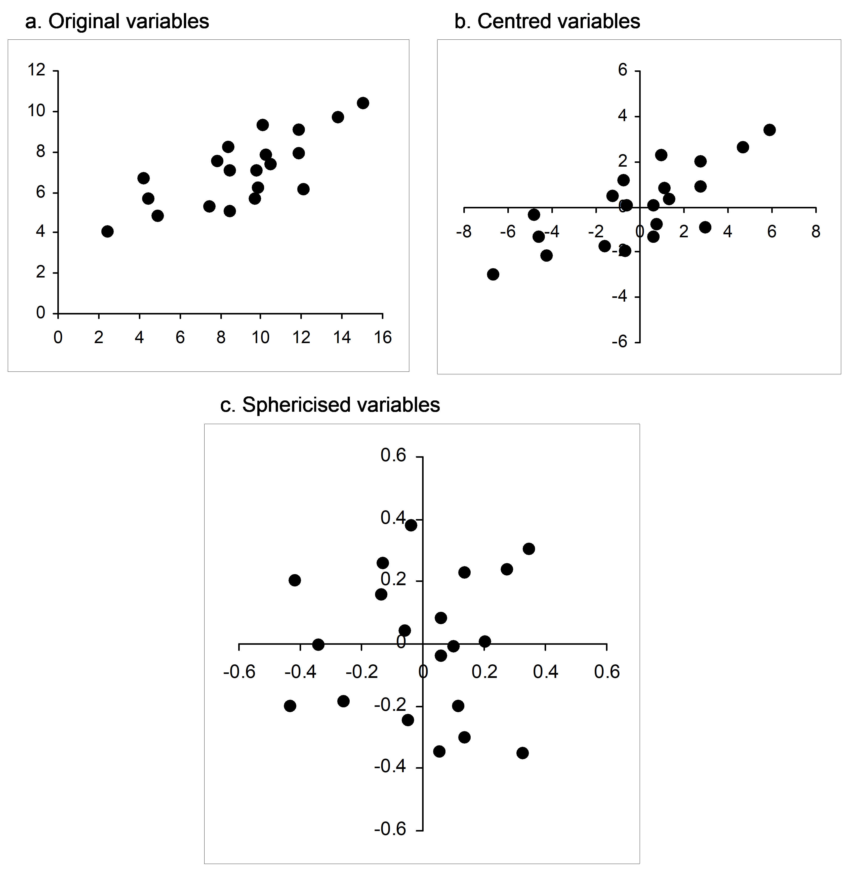 Fig. 5.23. Bivariate scatterplot of normal random variables as (a) raw data, (b) after being centred and (c) after being sphericised (orthonormalised).
112 and suppose also that X is of full rank, so none of the q variables have correlation = 1; all are linearly independent.
113 If X is of full rank, as previously noted, then none of the w eigenvalues in the SVD will be equal to zero. The CAP routine will take care of situations where there are linear dependencies among the X variables (resulting in some of the eigenvalues being equal to zero) appropriately, however, if these are present.
5.14 CAP versus dbRDA
So, how does CAP differ from dbRDA for relating two sets of variables? First, dbRDA is directional. Each set of variables has a role as either predictor variables (X) or response variables (Q), while for CAP (when there are multiple variables in X), the two sets of variables are essentially treated symmetrically. Canonical correlation analysis (on the basis of Euclidean distances) finds linear combinations of Y and linear combinations of X that are maximally correlated with one another. In contrast, RDA finds linear combinations of X that are best at explaining or predicting Y (the latter set of variables are not sphericised). Note that canonical correlation sphericises both of the data clouds using X$^0$ and Y$^0$ in the calculations. This ensures that the correlations among the variables within either set are taken into account. In contrast, RDA uses sphericised X$^0$ (by constructing matrix H), but the variables in Y are not sphericised. Now, CAP generalises canonical correlation to any resemblance measure by replacing Y$^0$ with Q$^0 _m$, while dbRDA generalises RDA to any resemblance measure by replacing Y with Q. Furthermore, no matter how many variables occurred in the original Y matrix, over-parameterisation in CAP can be avoided by a prudent choice for m (generally obtained using diagnostics).
The decision of which method to use should always be based on the conceptual goals of the analysis. When there are multiple X variables, CAP can be helpful for exploring relationships between these variables and a multivariate data cloud expressed by a resemblance matrix. In contrast, dbRDA is more appropriate when one wishes to explicitly model the variability in the multivariate data cloud using a set of X predictor variables. Table 5.1 provides a summary of the differences between these two approaches.
Table 5.1. Summary of differences between CAP and dbRDA for the analysis of the relationships between two sets of variables. Matrices are defined in the text and are also defined in the index of mathematical notation.
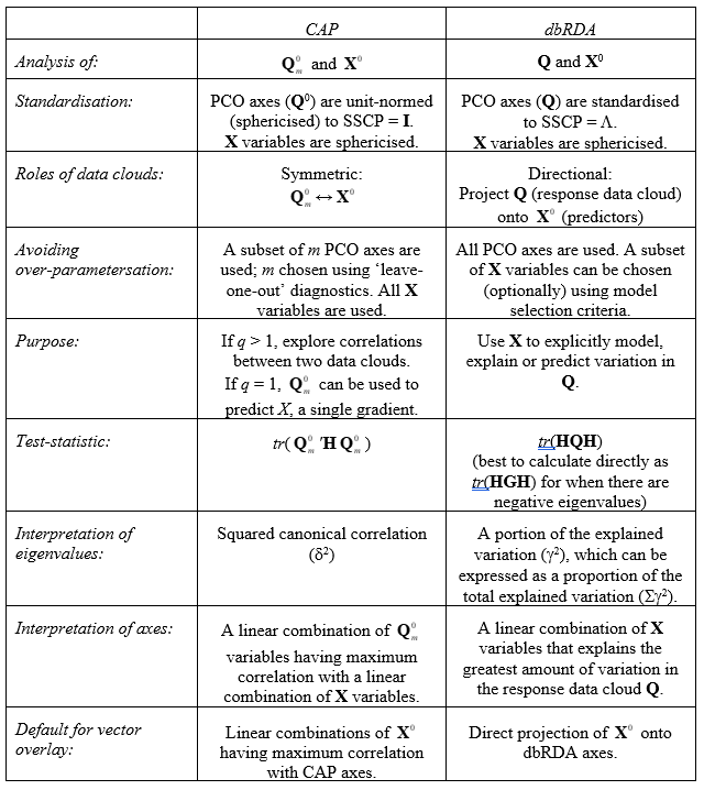
5.15 Comparison of methods using SVD
The relationship between dbRDA and CAP can also be seen if we consider their formulation using singular value decomposition (SVD). For simplicity, but without loss of generality, suppose that each of the variables in matrices Y and X are centred on their means. A classical RDA is then obtained by the SVD of matrix Y$^\prime$X$^0$, namely: $$ {\bf Y} ^\prime {\bf X} _ 0 = {\bf U} _R {\bf W} _R {\bf V} _R ^ \prime \tag{5.7} $$ where W$_R$ = ${\bf \Gamma}$, a diagonal matrix of eigenvalues ($\gamma _1$, $\gamma _2$, …, $\gamma _s$)114. The RDA coordinate scores are then linear combinations of the fitted values, $\hat{\bf Y} = {\bf HY}$, where the coefficients are contained in the left-singular vectors U$_R$. That is, $$ {\bf Z} = \hat{\bf Y} {\bf U} _R \tag{5.8} $$ Now, a classical CCorA is obtained by SVD of matrix Y$^{0 \prime}$X$^0$, namely: $$ {\bf Y}^{0 \prime} {\bf X} ^0 = {\bf U} _C {\bf W} _C {\bf V} _C ^ \prime \tag{5.9} $$ where W$_C$ = ${\bf \Delta}$, a diagonal matrix of eigenvalues ($\delta _1$, $\delta _2$, …, $\delta _s$) that are the classical canonical correlations115. As CCorA is symmetric, we can plot coordinates either in the space of X, or in the space of Y. Canonical coordinate scores in the space of X are: $$ {\bf B} = {\bf X} ^0 {\bf V} _C {\bf \Delta} \tag{5.10} $$ while canonical coordinate scores in the space of Y are: $$ {\bf C} = {\bf Y} ^0 {\bf U} _C {\bf \Delta} \tag{5.11} $$ The correlation between the variables B$_1$ and C$_1$ will be equal to $\delta _1$, between B$_2$ and C$_2$ will be $\delta _2$, and so on. Note also that the scaling of each of these new sets of variables by their corresponding eigenvalues (i.e., multiplying by ${\bf \Delta}$ as shown in equations 5.10 and 5.11) is optional.
Next, we can generalise the above to any resemblance measure by replacing Y with Q, thus dbRDA is obtained by an SVD as follows: $$ {\bf Q} ^ \prime {\bf X} ^ 0 = {\bf U} _R {\bf \Gamma V} _R ^\prime \tag{5.12} $$ with fitted values HQ, dbRDA coordinate scores Z = HQU$_R$ and with an appropriate vector overlay for the plot (eigenvector coefficients for normalised X variables) being contained in V$_R$.
Similarly, CAP is obtained by an SVD of: $$ {\bf Q} ^ {0 \prime} _m {\bf X} ^ 0 = {\bf U} _C {\bf \Delta V} _C ^\prime \tag{5.13} $$ with canonical coordinate scores Q$^ {0 \prime} _m$U$_C {\bf \Delta}$ and an appropriate vector overlay for the plot (eigenvector coefficients for normalised X variables) being contained in V$_C$.
The purpose of this section is not to throw some scary matrix algebra around and generate fear! Rather, it is intended to further highlight the conceptual differences and similarities between these two approaches (as outlined in Table 5.1) and also to provide some algebraic conventions for formulating and discussing these methods which (hopefully) complements existing literature describing the classical (Euclidean-based) versions of them.
114 Note: these are the square root of the eigenvalues that would be obtained from running the dbRDA routine on the data using Euclidean distances.
115 Note: these are the square root of the eigenvalues that would be obtained from running the CAP routine on the data using Euclidean distances.
5.16 (Hunting spiders)
A study by van der Aart & Smeek-Enserink (1975) explored the relationships between two sets of variables: the abundances of hunting spiders (Lycosidae) obtained in pitfall traps and a suite of environmental variables for a series of sites across a dune meadow in the Netherlands. A subset of these data (p = 12 spider species, q = 6 environmental variables and N = 28 sites) are provided in the ‘Spiders’ folder of the ‘Examples add-on’ directory. Open up the files containing the spider data (hspi.pri) and the environmental variables (hspienv.pri) in PRIMER. Transform the spider data using an overall square-root transformation, then calculate a resemblance matrix using the chi-squared distance measure (D16). By using chi-squared distances as the basis for the analysis, we are placing a special focus on the composition of the spider assemblages in terms of proportional (root) abundances. Next, see the description of the environmental data by clicking on hspienv.pri and choosing Edit > Properties. The variables measured and included here are water content, bare sand, moss cover, light reflection, fallen twigs and herb cover, all on a log scale. A draftsman plot (including the choice $\checkmark$Correlations to worksheet) shows that no additional transformations are necessary. Also, the maximum correlation observed is between fallen twigs and light reflection (r = -0.87), so it is not really necessary to remove any of these variables. From the chi-squared resemblance matrix of square-root transformed spider data, choose PERMANOVA+ > CAP > (Analyse against •Variables in data worksheet: hspienv) & (Diagnostics $\checkmark$Do diagnostics) & (Do permutation test > Num. permutations: 9999), then click OK.
The results show that there were some very strong and significant correlations between the spider abundance data cloud (based on chi-squared distances) and the environmental variables (P = 0.0001). The first two canonical correlations are both greater than 0.90 (Fig. 5.24, $\delta _1$ = 0.9809, $\delta _2$ = 0.9256). Diagnostics revealed that the first m = 4 PCO axes (which together explained 92.7% of the total variability in the resemblance matrix) resulted in the smallest leave-one-out residual sum of squares, so there was no need to include more PCO axes in the analysis.
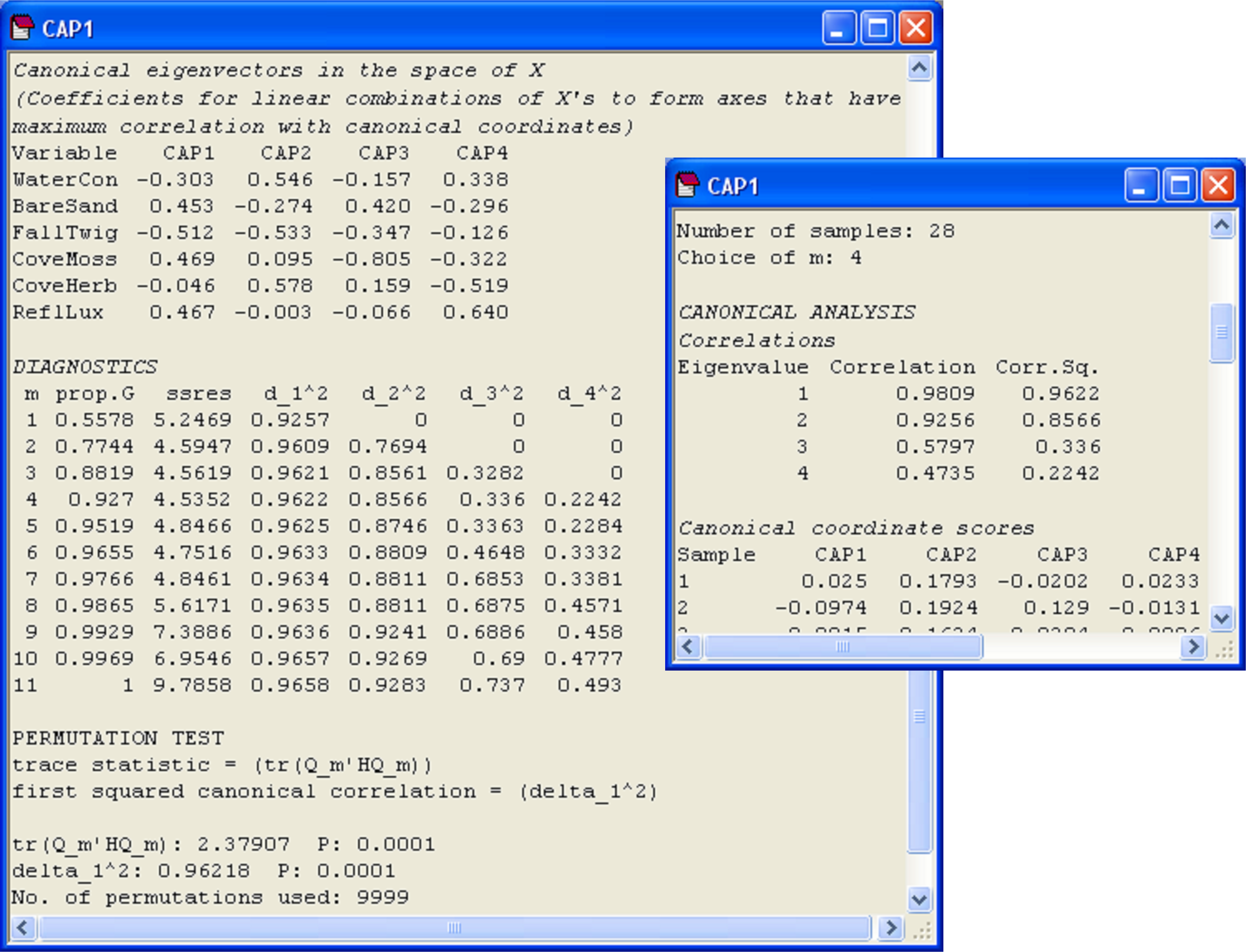 Fig. 5.24. Excerpts from the output file of the CAP analysis of the hunting spider data.
The CAP axes (‘Canonical coordinate scores’) given in the output file and also shown graphically in the plot are new variables (matrix C in Fig. 5.2) that are linear combinations of the PCO’s (based on the resemblance measure of choice) that have maximum correlation with the X’s. Also given in the output file are the weights, labeled ‘Canonical eigenvectors in the space of X’. These are the coefficients for linear combinations of the normalised X variables that will produce axes that have maximum correlation with the CAP axes. For example, the following linear combination of normalised X variables (produced using the weights given under ‘CAP1’ in the output file, Fig. 5.24):
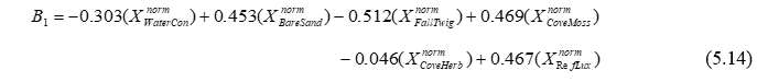
produces a new variable ($B_1$) that has maximum correlation with CAP axis 1 ($C_1$). Furthermore (and the reader is encouraged to verify this by hand, it is perfectly safe!), the Pearson correlation between these two variables ($B_1$ and $C_1$) is precisely the first canonical correlation of $\delta_1$ = 0.98. Similarly, the weights given for the normalised X variables for ‘CAP2’ will produce a second new variable ($B_2$), which is independent of (perpendicular to) the first variable ($B_1$) and has maximum correlation with CAP axis 2 ($C_2$), which is $\delta_2$ = 0.93, and so on. These eigenvector weights are also able to be seen visually on the CAP plot, as the default vector overlay for the X variables (Fig. 5.25).
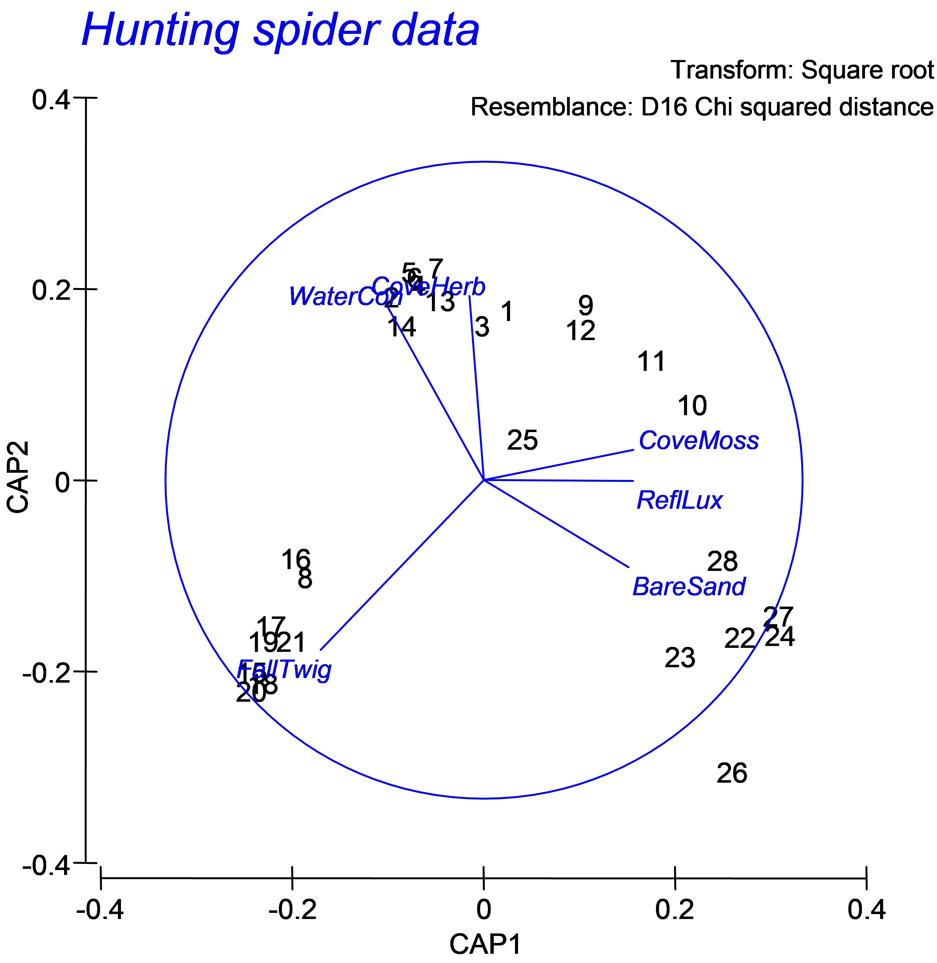 Fig. 5.25. CAP ordination plot relating hunting spiders to environmental variables.
One thing to be aware of here is that the CAP axes shown in the graphic and given in the output file as canonical coordinate scores are not a linear combination of the X variables, but of the PCO’s. Therefore, the default vector overlay shown in the CAP plot is not the same as what would be obtained by a direct projection of the X variables (as multiple partial correlations) onto these axes (i.e., using the ‘Multiple’ option as the correlation type in the ‘Configuration Plot’ dialog of Graph > Special). This contrasts with the dbRDA plot, where the relationships between the X variables and the dbRDA axes shown by the default vector overlay and the projected multiple partial correlations are indeed the same thing (see the section Vector overlays in dbRDA in chapter 4).
For the spiders dataset, we can see a fundamental shift in the structure of the assemblage that is strongly associated with the environmental variable of log percentage cover of fallen leaves and twigs (Fig. 5.25, see the samples numbered 16, 8, 17, 19, 21, 15, 20 and 18 at the bottom lower-left of the diagram and the associated vector labeled ‘FallTwig’). In addition, a gradient in community composition is evident among the other samples (stretching from the upper left to the lower right of the canonical plot), which is strongly related to log percentage of soil dry mass (‘WaterCon’) and log percentage cover of the herb layer (‘CoveHerb’) on the one hand, and log percentage cover of bare sand (‘BareSand’), moss cover (‘CoveMoss’) and light reflection (‘RefLux’) on the other.
Although the purpose here is to do little more than explore relationships, some clear patterns have emerged. Another vector overlay that can elucidate patterns, particularly for the spiders dataset, as we have just a few original species variables (p = 12), is to project the multiple partial correlations of these original variables (suitably transformed, in this case located in the worksheet named ‘Data1’) onto this plot (e.g., Fig. 5.26). Choose Graph > Special > (Vectors: •Worksheet variables: Data1 > Correlation type: Multiple). Certain species, such as Pardosa lugubris (‘Pardlugu’) and Trochosa terricola (‘Trocterr’) are associated with fallen leaves and twigs, while others, such as Arctosa perita (‘Arctperi’), Alopecosa fabrilis (‘Alopfabr’) and Alopecosa accentuata (‘Alopacce’), are associated with bare sand. This type of vector overlay, as outlined previously (see the section on Vector overlays in dbRDA), projects the (orthonormal) Y variables as multiple partial correlations onto the CAP axes. The cautions and caveats associated with interpreting vector overlays should be kept in mind for CAP, as for other ordination techniques in the PERMANOVA+ add-on package.
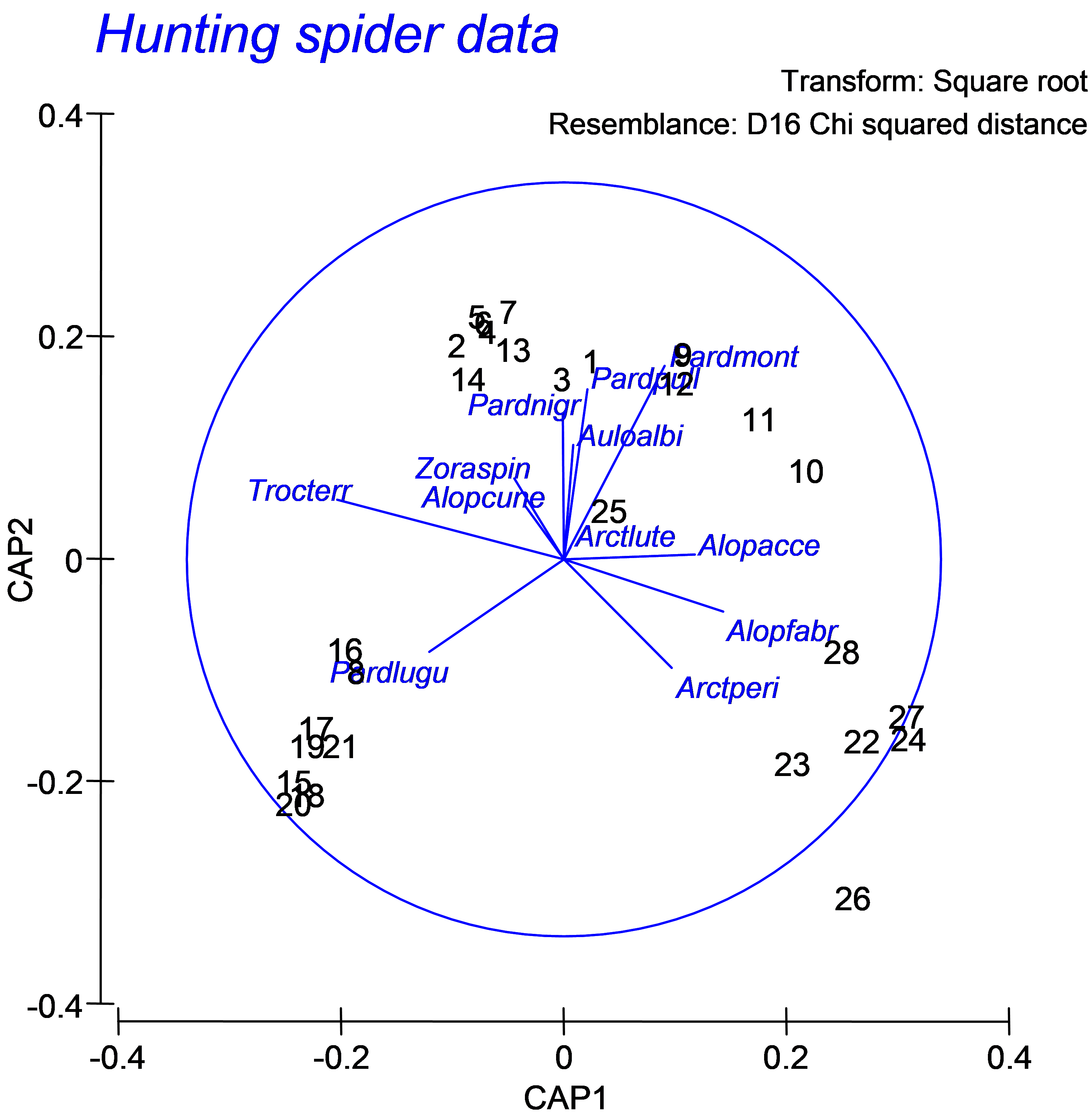 Fig. 5.26. CAP ordination plot relating hunting spiders to environmental variables, but with a vector overlay consisting of the multiple partial correlations of the original species variables (spider abundances, square-root transformed) with the canonical axes.