10. Wizards and species analyses (Basic MVA, Coherence plots, Matrix display, SIMPER)
- Basic multivariate analysis wizard
- Basic MVA for structured data (Fal nematodes)
- Basic MVA for a priori unstructured biotic data
- Basic MVA for environ-mental data
- Wizard for Matrix display
- (Frierfjord macrofauna)
- Reducing the species set
- Transforms in Matrix display
- Branches created in the Explorer tree
- Shade Plot options in Matrix display
- Seriate operation; Seriate a shade plot dendrogram
- (Ekofisk oilfield macrofauna)
- (King Wrasse diets)
- Special menu for shade plot; Shade plot colours
- 3-d shade plot
- Save sample/ variable order
- Clustering on species and samples (Exe nematodes)
- Ordering by a worksheet variable
- Nearest neighbour ordering
- Other tree diagrams & SIMPROF (Bristol Ch. zooplankton)
- Coherence plots wizard & Types 2/3 SIMPROF; (L. Linnhe macrofauna)
- Running Type 2 SIMPROF
- Running Type 3 SIMPROF
- Line plots vs Shade plots
- Shade plots showing coherent sets & variable boundaries
- ‘Mondrian’ shade plots, with sample and variable boundaries
- Coherent sets of abiotic variables (N Sea biomarkers)
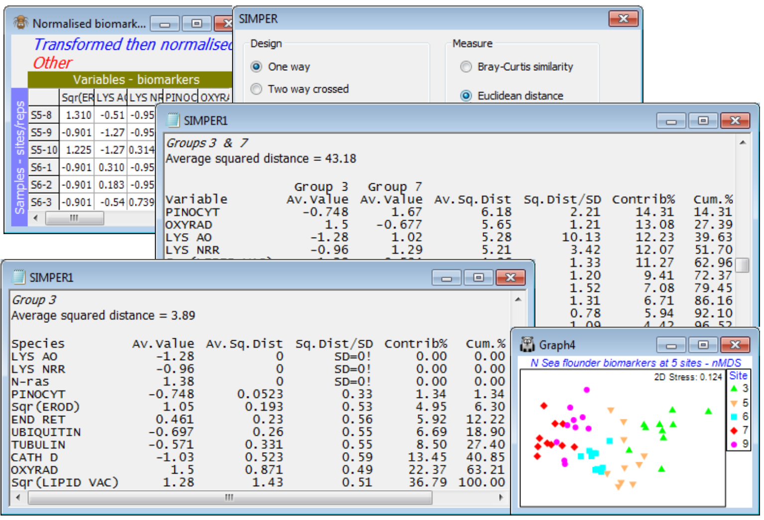
- SIMPER (Similarity Percentages)
- Species dis-criminating two groups (Bristol Ch. zooplankton)
- Species typifying a group
- SIMPER on 2-way crossed layout (Tasmania nematodes)
- SIMPER on (squared) Euclidean (N Sea biomarkers)
Basic multivariate analysis wizard
The three Wizards menu items carry out sequences of routines, all of which can be run separately but which it is either convenient or instructional to have bundled up in this way, at least until you are confident about the steps involved and can dispense with such a prescriptive (and proscriptive) approach. All three menu items are run with a data matrix, not a resemblance matrix, as the active sheet, and usually – though not exclusively – prior to any pre-treatment (they incorporate a limited choice of such options). If you are a novice user and, having opened a data sheet from Excel (with the help of the Excel File Wizard), you have little idea where to start, then the Wizards>Basic multivariate analysis is a simple instructional tool which leads you through the most commonly used steps in a multivariate analysis within PRIMER.
If the data has been created as of type Abundance (or Biomass) – this can be checked or changed with Edit>Properties – you are given options to standardise samples (the default is not to do this) and the usual choices of transformation (square root is the default), see Section 4, before Bray-Curtis similarity is suggested (though you can change this), Section 5. If the data’s first (or only) factor has some repeated levels, then a 1-way ANOSIM test is offered on that factor (Section 9). Standard group average CLUSTER (Section 6) is always suggested, though can be deselected, but the SIMPROF test option is greyed out if the ANOSIM box is ticked, so both cannot be requested in the same run of the wizard. (This makes good sense of course – if there is a predefined structure which you are interested in enough to want to test, then that is the primary test to carry out). If the ANOSIM box is not checked, a SIMPROF test is the default. The MDS box is always checked by default – this will be nMDS with the usual default options of 50 restarts, 2-d and 3-d ordination plots and Shepard diagrams (Section 8). The final proffered option is a SIMPER analysis (yet to be met – see the end of this section), either on the ANOSIM factor if that has been selected, or on the groups created by SIMPROF. If neither is chosen, then SIMPER is greyed out.
Basic MVA for structured data (Fal nematodes)
The benthic faunal study in the Fal estuary, Cornwall UK, was seen in Section 4. Sediment samples were taken at a total of 27 sites across 5 creeks running into the Fal estuary, with differing levels of heavy metal contamination from historic tin and copper mining – 7 sites in Restronguet (R) and 5 in each of Mylor (M), Pill (P), St Just (J) and Percuil (E) creeks. The existing workspace, Fal ws, concerns only the meiofaunal copepod community, and in Section 17 we shall see the macrofaunal component, but open here the nematode assemblages, Fal nematode abundance from C:\Examples v7\Fal benthic fauna, into a clear workspace (Fal ws2). Wizards>Basic multivariate analysis then offers the sequence of analyses shown below – in particular the routine picks up the existence of a Creek factor with repeated levels and checks the ANOSIM not SIMPROF boxes. In this case, a more severe transform is desirable to downweight the highly abundant Metachromadora vivipara, so change to (Transformation: Fourth root) – a shade plot (see later, and Section 4) helps here.
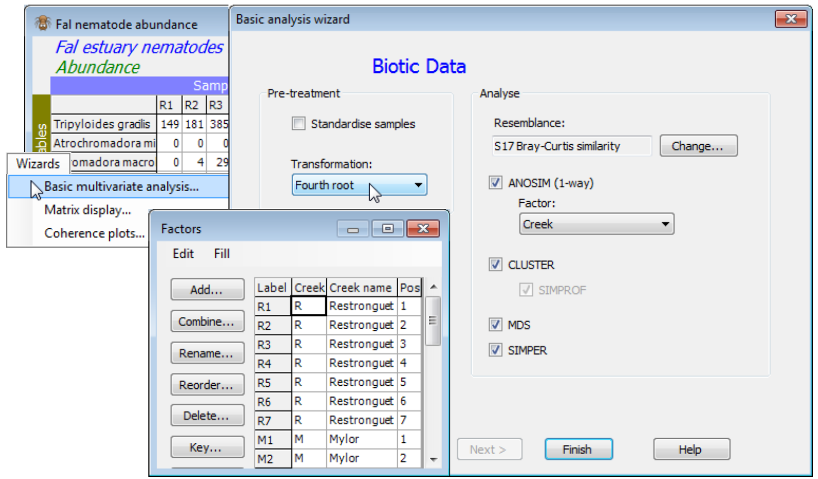
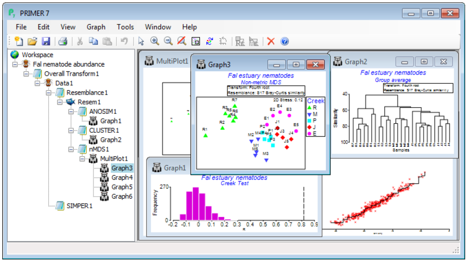
The main intention of the Wizards is to aid understanding of the steps involved, by examining the sequence of windows created in the Explorer tree. In this case, you can create precisely the same outcome by running the following. On Fal nematode abundance, take Pre-treatment>Transform (overall)>(Transformation: Fourth root) and, on the resulting transformed sheet Data1, Analyse> Resemblance>(Measure•Bray-Curtis similarity) & (Analyse between•Samples), giving Resem1. On Resem1, Analyse>ANOSIM>(Model:One-Way - A) & (Factors A: Creek)>(Type: Unordered) leads to ANOSIM test results, testing for significance of differences among creeks overall and pair-wise, in ANOSIM1, and a histogram of the null distribution for the overall (global) test, Graph1. On Resem1, Analyse>Cluster>CLUSTER>(Cluster mode•Group Average)&(✓Plot dendrogram) but without the SIMPROF box ticked, displays a standard UPGMA clustering in Graph2. Again on Resem1, Analyse>MDS>Non-metric MDS (nMDS), with the defaults of (Min. Dimension: 2) & (Max. Dimension: 3)&(Number of restarts: 50)&(Minimum stress: 0.01)&(Kruskal fit scheme•1)& (✓Configuration plot) & (✓Shepard diagrams), gives the results window for MDS, nMDS1, which contains important information on how many times the lowest stress solution was observed in the 50 random restarts (if only a handful of times, consider running again with more restarts), and then the Multiplot1 window, which contains the (best) 2-d and 3-d ordination plots, along with Shepard diagrams. Clicking on any of these plots (or the + sign in front of the Multiplot1 icon) unrolls the four individual plots in the Explorer tree, Graph3 to Graph6. Finally, on the data sheet Data1, not the resemblance sheet Resem1 note, taking Analyse>SIMPER>(Design•One way) & (Factor A: Creek) & (Measure•Bray-Curtis similarity), with the other two boxes ticked, will give the detailed results window SIMPER1, breaking down the average dissimilarity between pairs of the ANOSIM groups (the creeks) into contributions from each species – see later this section.
The main conclusions here are that there are clearly significant differences overall between creeks (global R very large at 0.816, p<0.1%) and, almost equally clearly, between all pairs of creeks – the only pairwise R value which drops as low as 0.5 is between St Just (J) and Percuil (E) (p<2.4%). Other pairwise R values are in the range 0.75-0.99, and all of them are the largest obtainable values – greatest separation possible – in all permutations of the labels between the pair of creeks (i.e. 126 permutations for two creeks which both have 5 replicates, and 792 if Restronguet’s 7 replicates are involved). In keeping with the pairwise ANOSIM R values for Restronguet (all R>0.9 even though the variability in Restronguet sites is large), the nMDS plot displays the very different nematode assemblages for that creek – it has by far the highest sediment concentrations of heavy metals.
Basic MVA for a priori unstructured biotic data
In the Fal estuary study, where there are environmental data matching each of the 27 sites, it is not unreasonable to consider a different form of analysis, in which creek designations are considered secondary to the biotic relationships among sites in relation to the differences in the heavy metal concentrations (and such an analysis, by LINKTREE, is seen for this data in Chapter 11 of CiMC). In other words, we can choose to ignore the Creek factor and analyse the 27 sites as unstructured. Another obvious example of this type of data, which we saw extensively in Section 6, is the zoo-plankton study of 57 sites in the Bristol Channel and Severn Estuary, which are laid out in a grid, and the primary analyses concern both a clustering of those sites into data-determined groups, and observation also (Section 8) of a more continuous gradation in the MDS plot – relating to salinity.
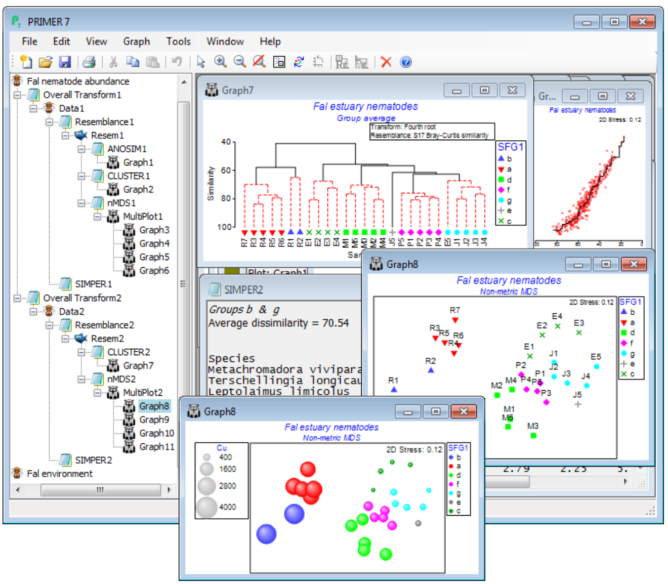
Rather than re-open the Bristol Channel data again, we run through Wizards>Basic multivariate analysis once more on Fal nematode abundance but this time unchecking the (✓ANOSIM) box – the (✓SIMPROF) box is automatically now ticked. The output sequence in the Explorer tree looks similar (without the ANOSIM results of course) but now the dendrogram indicates the clusters of sites which are significantly separated by the series of SIMPROF tests (Section 6) – red dotted lines indicating sub-clustering which has no statistical support, with interpretable structure identified by black continuous lines. In fact, this largely accords with the creek designations – which was partly to be expected given the large pairwise R values in the previous ANOSIM test, but further division of the assemblages within creeks is more or less confined to two outlying sites in Restronguet. The SIMPROF test has automatically created a new factor, SFG1, of its 7 identified groups (one is the singleton J5) and this is available to all sheets and plots on this branch – and on the previous branch actually, since it back-propagates up to the Fal nematode abundance sheet and then forwards down the first branch – and SFG1 is displayed as symbols on the nMDS plot. In order to strengthen the visual association with the clustering, on the dendrogram (Graph7) you may wish to take Graph> Sample Labels & Symbols>Symbols(✓Plot)>(✓By factor SFG1). The SIMPER output is now in terms of these 7 SFG1 groups, rather than the previous Creek designations, naturally. It would also make good sense to superimpose individual heavy metal concentrations (or other abiotic variables) on the nMDS ordination, in a bubble plot. So, open Fal environment from the same directory, and with Graph8 as the active window, right-click over this (or Graph) and Special>Main>(Bubble ✓Bubble plot)>(Worksheet: Fal environment) & (Variables: Cu) – you will need to take Change to select this variable, or you might prefer to Include multiple variables, for a segmented bubble plot. For a single variable, you might prefer the look of (✓3D effect) and, back on the Graph>Sample Labels & Symbols menu, uncheck the (Labels✓Plot) box and also (✓Plot history) on General.
Basic MVA for environ-mental data
Finally, try running Analyse>Basic multivariate analysis on this environmental data matrix, Fal environment, to look at the pattern in the abiotic variables collectively, rather than singly (a match of this multivariate environmental structure to the multivariate assemblage pattern is the basis of the BEST routine, Section 13 & 14). The environmental analysis it provides is fairly skeletal – the dialog box only offers one pre-treatment option, (✓Normalise), which would usually be taken since abiotic variables are typically on non-comparable measurement scales. However, here, as is often the case, the concentration variables would benefit from a transformation before getting to this stage – their distributions are typically right-skewed, as can be seen from Plots>Histogram Plot or Draftsman Plot. It would be optimal therefore to highlight all except the %silt/clay variable and take Pre-treatment>Transform (individual)>(Expression: log(V)), see Section 4, to give the new sheet Data3. The %silt/clay variable is of a very different type so it would not make sense to give it, automatically, the same transform as everything else. In fact, the histogram showed it to be left-skewed and Section 4 then suggests a transformation expression such as log(100-V), or log(101-V) if the maximum value of 100 is attained for one of the samples. So, on Data3, highlight this first row and Pre-treatment>Transform (individual)>(Expression: log(100-V)), giving Data4. A re-run of Plots>Histogram Plot shows a set of transformed variables which are much less prone to the effects of outliers on the upcoming ordinations and tests, being fairly symmetric over their ranges. [If this pre-treatment stage seems all too much for you, at an early stage in your PRIMER experience(!), you could do worse than simply run Tools>Rank variables on Fal environment, which turns the 27 values for each variable into the ranks 1, 2, …, 27, and must totally remove the effects of any outliers, producing uniform distributions (at the price of loss of some sensitivity) – see under the Ranked variables heading in Section 11 and an example of the resulting draftsman plot in Section 12. This would be one of the (rare) occasions when the on entry to the Basic MVA routine, you do not take the default (✓Normalise) option, since all ranks are on the same scale.]
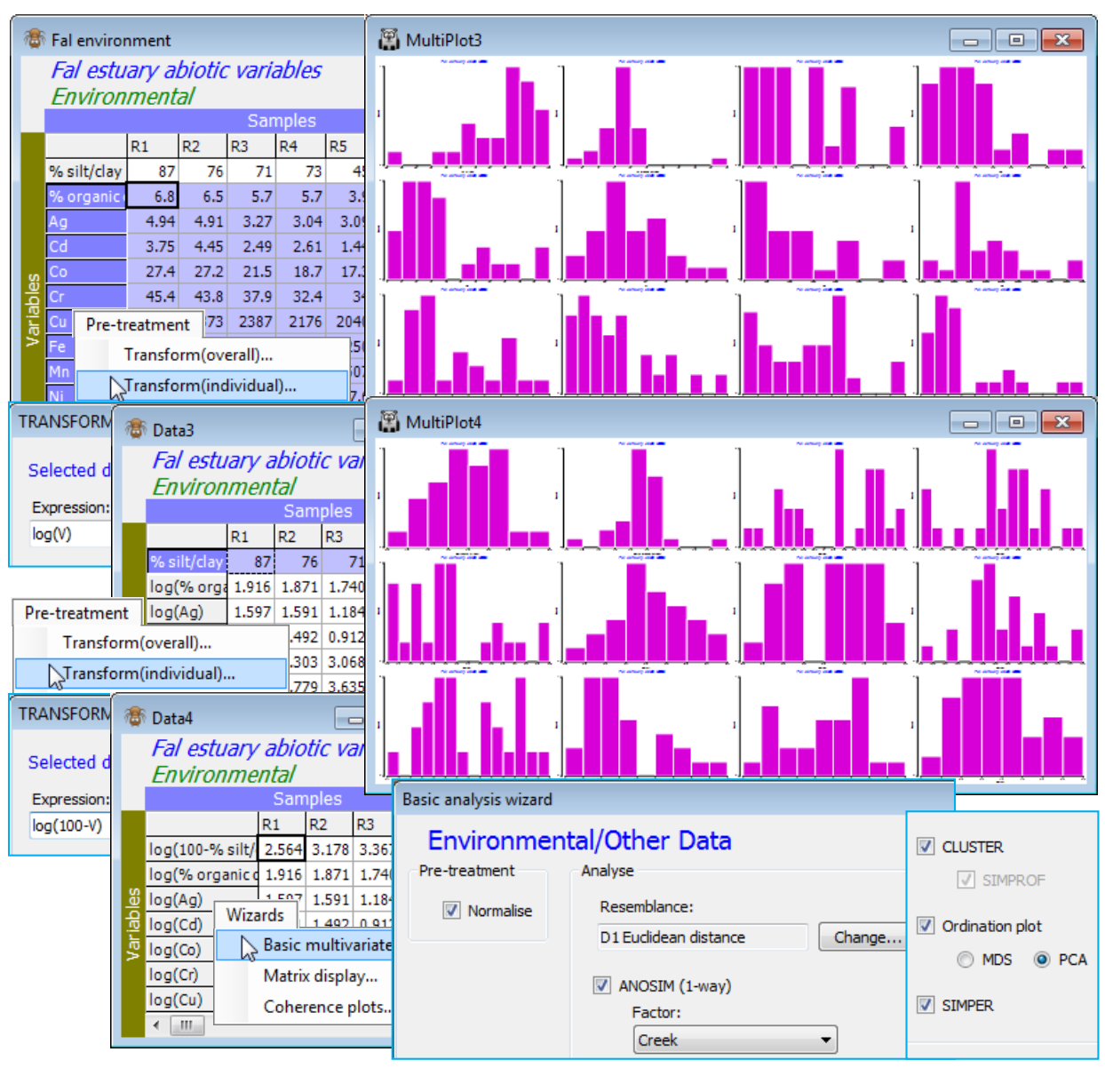
Now, on the final, selectively transformed data sheet, e.g. Data4, take Analyse>Basic multivariate analysis, and because PRIMER has been told that this sheet is of Data type•Environmental (see the window’s header line which will say Environmental, and if you need to change the type use Edit> Properties), the options offered by default will be (✓Normalise) & (Resemblance: D1 Euclidean distance), with the option to Change the latter to another resemblance measure. The analysis tools are now more or less the same as for biotic data, with (✓ANOSIM) proffered if a suitable factor exists (Creek in this case), and (✓Cluster), (✓Ordination plot) and (✓SIMPER). If ANOSIM is not checked, the default switches to (✓SIMPROF) tests on the standard clustering. The only difference now is that there is a choice of ordination options: (✓MDS) or (✓PCA), the former (again nMDS) being explicitly carried out using the supplied choice of distance coefficient, whilst PCA is only possible under an (implicit) Euclidean distance assumption. It follows that if a different distance measure has been selected, the PCA option is greyed out as unavailable. With ANOSIM run on the Creek factor and PCA for the ordination method, the Explorer tree under Fal environment is seen below. Note that PCA is run on the normalised data matrix, i.e. Data6 below, whereas for nMDS, the active sheet would have been the Euclidean distance matrix Resem3.

It is again instructive to repeat the same steps as Analyse>Basic multivariate analysis manually. On Data4, take Pre-treatment>Normalise variables (Section 4). The (✓Stats to worksheet) box is not ticked by default (if you check this, it just sends the mean and variance of each abiotic variable to a new sheet rather than listing them in the results window). On the normalised matrix, Data6, take Analyse>Resemblance>(Measure•Euclidean distance) & (Analyse between•Samples) to give Resem3, which is the active sheet for Analyse>ANOSIM and Analyse>Cluster>CLUSTER, both of which have exactly the same dialog as earlier, for analysing the biotic data in the Creek groups. As seen above, you may wish to add the Creek groups as symbols on the dendrogram with Graph>Sample Labels & Symbols. The other two routines start with the normalised data matrix Data6 as the active sheet. Analyse>SIMPER is set up as for the biotic data but with (Measure•Euclidean distance), which will be the default of course for data of environmental type. Finally, run Principal Components Analysis (Section 12) on Data6, with Analyse>PCA>(Maximum no of PCs: 5) and the other defaults – there is rarely any need to interpret more than the first 5 PCs. A vector plot (in blue) will automatically be overlaid – see Section 8 for the various vector plots available – but this can obscure the plot and is turned off, and on again, on the Graph>Special>Overlays tab with the check box (Vectors✓Overlay vectors)>(•Base variables).
A run of Basic MVA with ANOSIM deselected again parallels the earlier options for biotic data. The results show firstly that there are a lot of strong correlations among the abiotic variables, since the PCA results (PCA1) identify that the first 2 PCs account for 86.6% of the total variance and the first 3 PCs for 93.1% – these are very high figures. This is also seen in the eigenvectors, which give consistently large and negative values for all the metals (except Cr and Ni) on the PC1 axis, and negligible values on PC2. The vector plot shows these numbers graphically, with most metals thus increasing strongly towards Pill, Mylor and then, most strongly, the Restronguet creek samples (bubble plots would confirm this). In contrast, %silt/clay, Cr, Ni all have large eigenvectors on the PC2 axis, and relatively negligible ones on PC1, thus their vectors of increasing values point up or down the y axis (PC2) – Cr and Ni increase in the direction of the Mylor samples and Restronguet sites 1 and 2, as does %silt/clay. (Don’t forget here that the silt/clay variable used was reversed to 100-%silt/clay before taking logs, so %silt/clay increases down the page). The %organic carbon variable has its really large value on PC3, and this will largely account for the rise from 87% to 93% of the explained variation. Its contribution to the full multivariate abiotic pattern is not seen therefore on this 2-d PCA, though a rotatable 3-d PCA plot is simply obtained by Graph>Special>(Plot type•3D) and shows that site J3 largely accounts for this third axis.
The PCA also demonstrates clearly how the different creeks separate out in terms of their environmental variables, and ANOSIM formally confirms this, with a very large overall ANOSIM R of 0.87, reflecting very large pairwise R values also. This is getting close to the point (R=1, Section 9) where all Euclidean distances among samples in different creeks are larger than any within a creek. The cluster analysis is also seen to divide up by creek, more or less perfectly (again, excepting J3). This abiotic analysis therefore gives the basis for a correlative interpretation (likely to be causal, though not necessarily) of the similar patterns from the earlier run of Basic multivariate analysis on the nematode assemblage data – see Section 13 for more on linking biotic and abiotic analyses.
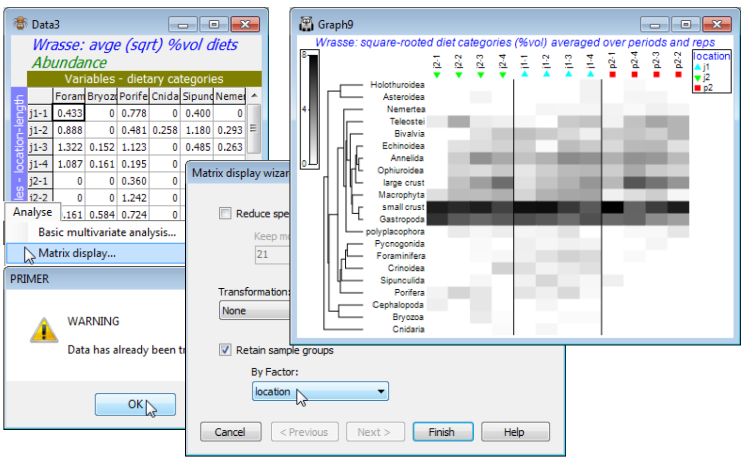
Wizard for Matrix display
Another significant addition to the descriptive tools now available in PRIMER 7 is that of Plots>Shade Plot. This is particularly helpful in two ways. Firstly, we have already seen it used in simple form in Section 4 in relation to choice of transformation. A useful way of determining the effects of differing transformations – and thus which one might be adopted routinely for future analyses of particular community types in specific contexts – is to view differently pre-treated versions of the data matrix through shade plots (see Clarke KR, Tweedley JR, Valesini FJ 2014. ‘Simple shade plots aid better long-term choices of data pre-treatment in multivariate assemblage studies’. J Mar Biol Assoc UK 94: 1-16). Shade plots are visual representations of the data matrix itself, in which the larger the entry in a specific cell, the darker the shade (or colour) plotted, white representing the absence of that species, and full black the largest entry (rounded up) in the whole matrix.
Secondly, a shade plot can be an extremely useful tool at the later stages of an analysis, when the statistical tests have demonstrated the existence of structure, whether that is a priori sample groups or gradients tested with ANOSIM or RELATE, or whether a result of clustering and SIMPROF on unstructured samples, i.e. whenever we have licence from statistical testing to interpret the sample analyses in terms of individual taxa. If the rows and columns of the shade plot are re-ordered carefully enough, such a plot sometimes has a surprising amount of interpretative capacity, even if that is just to narrow down the set of species used in bubble plots on a sample nMDS. This is also the function of the Analyse>SIMPER routine (examples of which are given later in this section) but that has a focus on identifying species which contribute to differences among well-defined groups (as established by ANOSIM or SIMPROF), and is restricted to comparing pairs of groups at a time. It will therefore function poorly, if at all, for gradient structures where patterns of species change are more continuous – and where clear clusters of samples may not even exist. Shade plots can shed light on the reasons for both gradient and group structures and, for example, neatly distinguish between cases where a clear gradient on an nMDS plot is the result of a small number of species with strongly increasing or decreasing abundances across the full gradient, or a larger number of taxa which occupy quite different parts of the gradient, or whether in fact the multivariate summary comes from putting together information from a great number of species, each carrying limited or highly variable information – it is one of the triumphs of multivariate analysis that it is sometimes able to fashion a clear community structure from what would be most unpromising population data.
The Special>Reorder button after Plots>Shade Plot offers a myriad of combinations of clustering and re-ordering, both of rows and columns of the shade plot. The steps that are needed to exploit these to best advantage are quite complex, and Wizards>Matrix Display gets you started.
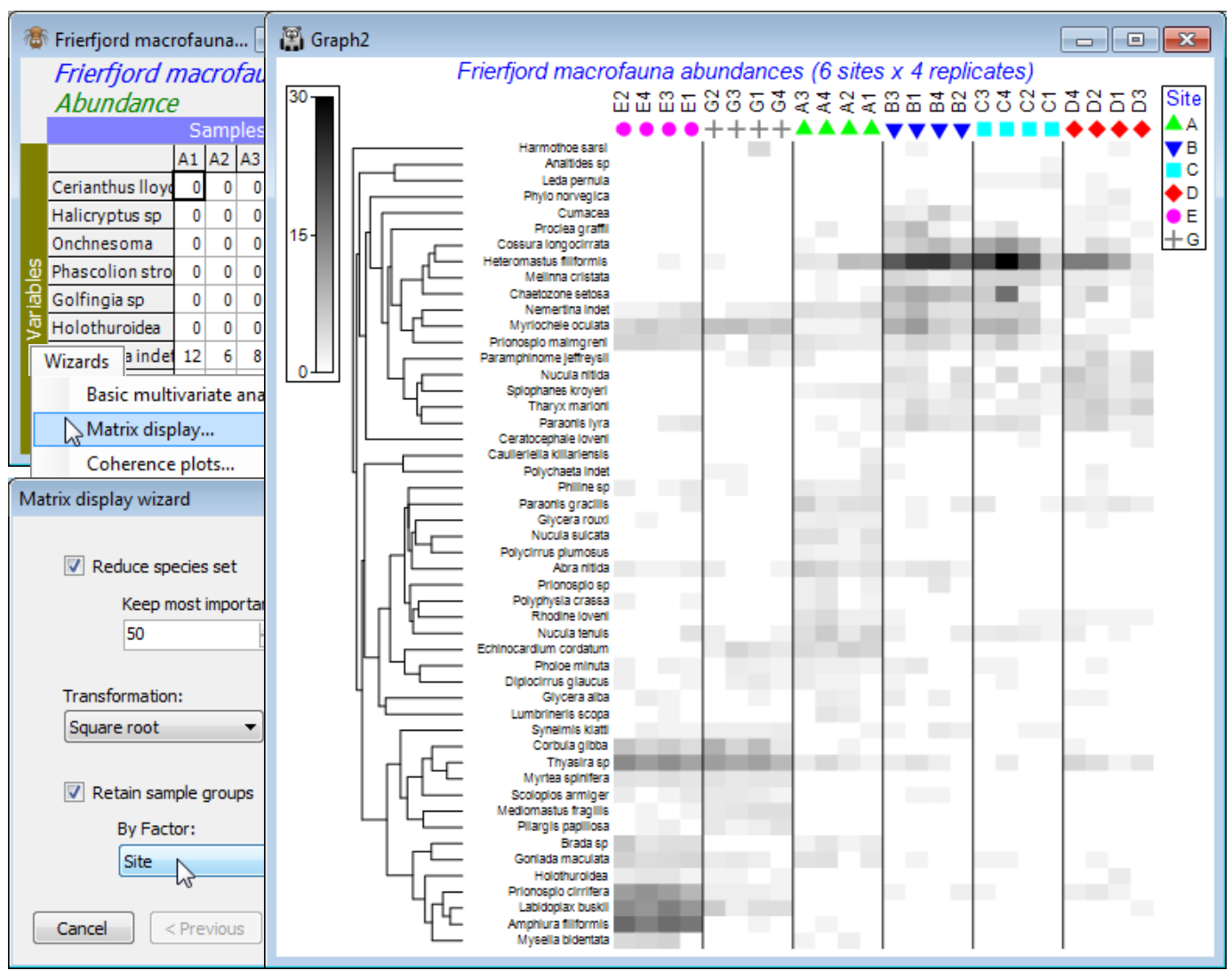
(Frierfjord macrofauna)
A data set not met elsewhere in this manual but which is used a great deal in CiMC, e.g. to start the description of 1-way ANOSIM permutation tests (Chapter 6), is from sub-tidal sampling by Day grabs for benthic macrofauna at 6 sites (labelled A-E, G) in Frierfjord/Langesundfjord, Norway. Four replicate grab samples were taken at each site, and the data matrix consists of counts of 110 macrobenthic species over the 24 samples (Gray JS et al 1988 Mar Ecol Prog Ser 46: 151-165). The file is Frierfjord macrofauna counts(.pri) in C:\Examples v7\Frierfjord macrofauna – though an Excel version of the same data sheet Frierfjord macrofauna (Excel)(.xlsx) is also in that directory, as a reminder of the format necessary to read Excel sheets into PRIMER (Section 1).
So, save and close any open workspace (e.g. Fal ws2), open Frierfjord macrofauna counts and with this as active sheet, run Wizards>Matrix display, taking the options (✓Reduce species set>Keep most important: 50) & (Transformation: Square root) & (✓Retain sample groups>By Factor: Site). The outcome needs one minor change, but for the moment look at the display and note that:
a) the species have been clustered, to place together species which tend to have similar patterns of abundance across the samples, and the dendrogram rotated to attempt to diagonalise the matrix;
b) the samples have been ordered also to diagonalise the matrix, which is arguably unhelpful here, so a later tidying-up step will replace the site alphabetic order, to reflect the spatial layout; but
c) the replicates are kept together within sites by the (✓Retain sample groups) instruction and the vertical bars divide the levels of the specified factor (the sites);
d) the abundance of each species in each sample can be gauged from the depth of shading, but this is on the requested square root scale, so the (rounded up) maximum value on the scale bar of 30 corresponds to a count of 900, and 15 to a count of 225, the same scale bar applying to all species – the number of values and maximum of the scale can be altered by the user;
e) the resulting plot makes it clear why the MDS and pairwise ANOSIM tests (Fig. 6.2 in CiMC) split the sites into three groups: E & G (in Frierfjord above the sill, where there may be seasonal anoxia), B, C & D (in Langesundfjord below the sill, where any pollutants from industrial inputs at the head of the fjord system will be well mixed) and A (the reference site in Oslofjord); and finally
f) distinctions can be seen between E and G on the basis of the replicates and with more subtlety between D and the group (B,C) – ANOSIM (Section 9) does not separate these latter two sites.
We now need to examine in more detail the decisions made and the routines employed to generate this Shade Plot, so that some limitations of the automated Matrix Display wizard can be relaxed. Note, however, that it is still often a good idea to produce an initial plot in this way, since many of the variations that are likely to be of interest can be achieved by one of the many options offered under the Graph>Special menu for shade plots, particularly the Reorder button.
Reducing the species set
Of the 110 species, many occur only in one or two replicates, often as singleton individuals, so that whilst display of the whole matrix is perfectly possible, it will be cumbersome and less effective than viewing species which account for a non-negligible percent of the total number of individuals in each sample, and the Matrix display wizard dialog box default is (✓Reduce species set)>(Keep most important: 50). This concept was seen in Section 3 in the routine to Select>Variables>(•Use those that contribute at least 3 %), say. This would exclude any species which never (in any of the 24 samples) account for 3% or more of the total count for each sample. If that is run here it reduces the matrix to a set of 39 species. A weaker threshold criterion for elimination would be species not accounting for at least 1% of the total count somewhere, which leaves in 67 species. If phrased in terms of number of species retained, as in the option to Select>Variables>(•Use n-most important where n is 50) then the percentage threshold is manipulated until exactly 50 species are retained (this happens here if the % threshold is exactly 2%). This is the condition which Matrix display uses, and there is no flexibility to do other than change that threshold number of 50, but replicating the individual routines making up the wizard would allow a more flexible set of selection criteria, including Select>Variables>(•In at least n samples where n is ). That you will need to do some species selection in large matrices is inevitable and often beneficial. It was stressed earlier that for sample analyses, all species can usually be retained (unless the resemblance measure involves a species standardisation, such as Gower or chi-squared distance) – the random nature of rare species occurrences in low numbers is given little weight in effective biological measures such as Bray-Curtis. But species analyses, defining similarities among species in their response over all samples – the idea of which was introduced in Section 5 – raise entirely different problems, and it is such species analyses that are the main topic of the remainder of this section. As seen above, in Matrix display, species similarities are used to cluster the species and/or re-order them in a way which optimises a seriation criterion and it is helpful if the rarer species, which cannot produce sensible assessments of similarity with other species – values will swing wildly between 0 and 100 – are deselected at the outset. Note, though, that it is an underlying principle of Matrix display, and thus preferably of direct Shade Plot runs, that where ordering/clustering of the samples is involved, it should be based on sample similarities from all species, not just those viewed in the shade plot.
Transforms in Matrix display
The next dialog box on Matrix display is (Transformation: ), with default of Square root. This in effect runs the routine Pre-treatment>Transformation(overall) and thus offers the choices of None, Square root, Fourth root, log(X+1) and Presence/absence. The chosen transform is naturally applied both to the full data matrix submitted to Matrix display and to the reduced matrix (if a reduction is specified) which will form the entries of the shade plot itself. After transforming the full matrix, Bray-Curtis similarities will be computed among samples and used to determine the ordering and/or clustering of the samples on the x axis of the shade plot. On the y axis, the ordering and/or clustering of the (reduced) species set does not use this transform (or any transformation). The definition of similarity among species uses the Index of Association (IA), as defined near the start of Section 5, and this incorporates a species standardisation, which is usually calculated on untransformed data. The requirement for computation of IA on the original, untransformed data means that Wizards>Matrix display should generally be run on the raw data, and if a transformed matrix is submitted to it, this will elicit a warning box. You can happily ignore that if you wish to compute the similarities among species by standardising the transformed data – and there will be occasions when this is a reasonable thing to try. It would usually follow, of course, that when submitting transformed data you do not ask Matrix display for a further transformation step!
Note that there is no facility for changing the choice of sample similarity away from Bray-Curtis, or defining similarity among samples by anything other than the Index of Association, within the Wizards>Matrix display routine. That is not to say that other measures might not be sensible or desirable in some cases but you will then need to create the files to be input into a direct run of Plots>Shade Plot. You can see the steps created by the wizard in the Explorer tree below, along with the Graph>Special>Reorder dialog needed to change the x axis to the original sample order.
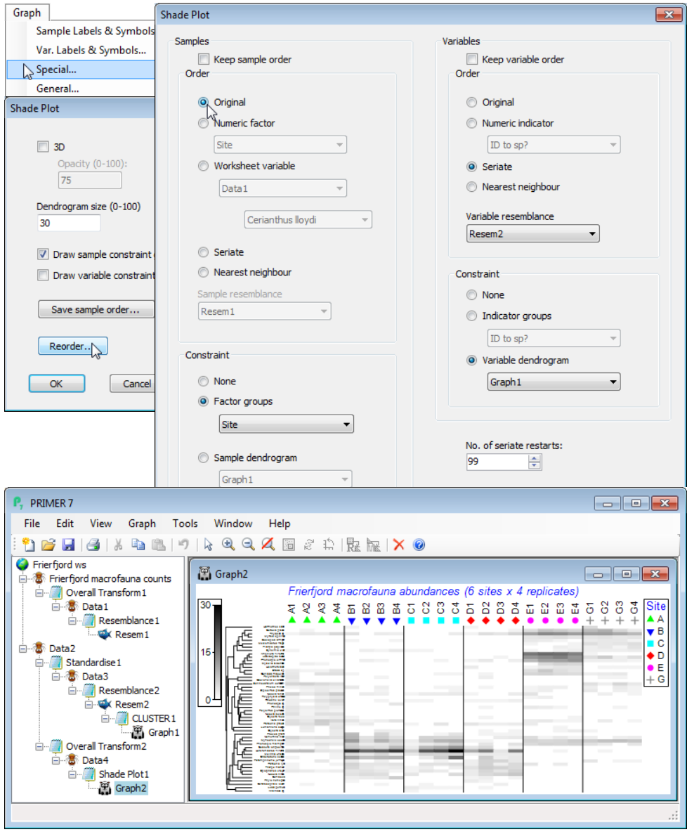
Branches created in the Explorer tree
The first branch takes the square root of the full matrix Frierfjord macrofauna counts, giving Data1, on which sample Bray-Curtis is calculated, Resem1. This was only used to seriate the x axis on the original shade plot but, as seen above, Special>Reorder>Samples>(Order•Original) in place of the default (Order•Seriate) has restored the axis to the label order of the data matrix. If the Wizards>Matrix display default of not retaining sample groups had been followed (no factor supplied), then Resem1 would be input to Analyse>Cluster>CLUSTER, creating a dendrogram (without running SIMPROF), displayed on the x axis and with Resem1 used to seriate samples within the constraints of dendrogram rotation. Resem1 is the right resemblance matrix to use for multivariate routines such as nMDS and ANOSIM. The second branch starts with a Tools>Duplicate copy (Data2) of Frierfjord macrofauna counts on which Select>Variables>(•Use n-most important where n is 50) has been run. It is species-standardised by Pre-treatment>Standardise>(Standardise•Variables) & (By•Total) to give Data3, on which Analyse>Resemblance>(Measure•Index of association) & (Analyse between•Variables) then gives the species similarities Resem2 on which CLUSTER is run in just the same way as it would be for samples. [The Standardise step is not really needed here because IA will restandardise species again as part of its equation. It is included partly to remind you that there is a species standardisation step but also because there are other cases, such as the Type 3 SIMPROF tests for coherent species curves (statistically distinguishable species clusters) later in this section, in which an initial species standardisation is required even though an index of association will be calculated afterwards, so this is a good habit to adopt. (The issue arises there because the permutation direction in Type 3 SIMPROF is across species, and this only makes sense if species are scaled to add to the same total).] The final sub-branch in the Explorer tree, off the data matrix Data2, with its reduced number of species, is the one that generates the Shade Plot. Data2 is transformed with the specified square root, to give Data4, which is input to Plots>Shade Plot to give Graph2. If you repeat that last step manually, you will see that the resulting graph is a simple snapshot of the data matrix with samples and species in exactly the same order as the input matrix and no clustering or other ordering of the axes.
Shade Plot options in Matrix display
The Graph options taken automatically by Matrix Display to produce the final shade plot output are as follows. Firstly, Graph>Sample Labels & Symbols>(Symbols✓Plot)>(✓By factor: Site). Next Special>Reorder>Samples>(Order•Seriate>Sample resemblance Resem1) & (Constraint• Factor groups Site). The Seriate step – using the Bray-Curtis sample similarities from the full data Resem1 – was the one we switched to (Order•Original) above, at which point the Sample resemblance box is greyed out as not needed. The right of this Reorder dialog sets: Variables>(Order• Seriate>Variable resemblance Resem2) & (Constraint•Variable dendrogram Graph1), the latter thus displaying a dendrogram on the y axis which is the species clustering Graph1 we saw above. The seriate step also uses the species resemblances Resem2 on which this clustering is based, and the seriations on both axes (see below) need iterative processes from many different restarts, and this is set to (No. of seriate restarts: 99). It is important to realise, however, that when within the Reorder dialog any other worksheets or graphs could replace those computed automatically by Matrix display, since we are now within the Shade Plot routine, e.g. a different hierarchical clustering method could be shown (on either axis), such as the binary divisive Analyse>Cluster>UNCTREE – which of course you would have to run separately in advance of this Reorder stage, so that the relevant graphs are available. Another example of a separate analysis you might want to incorporate at this stage would be a species clustering which incorporated a (Type 3) SIMPROF grouping of species – see later in this section. Finally when you OK these steps and return to the initial Special dialog box, you will note that Matrix Display has ticked (✓Draw sample constraint group boundaries), which give the vertical divisions on the shade plot – these are determined by the Samples>(Constraint• Factor groups Site) step on the Reorder dialog.
You are likely to agree by now that Wizards>Matrix Display with its minimal three dialog boxes can save a lot of time and complexity compared with creating all the necessary sheets and graphs, and inputting those to Plots>Shade Plot! So it is usually worth using Matrix Display as a starting point and then amending the fine detail on the plot. More importantly, it ensures that robust options are taken so that you can interpret the Shade Plot with confidence that the data is being viewed in the form (in all essential respects) in which it is used by the multivariate ordinations and tests.
Seriate operation; Seriate a shade plot dendrogram
Slightly more detail on how the seriate options are constructed, on both samples and species axes, can be found in Chapter 7 of CiMC but will be described here also, since the concept of a seriation model matrix has not yet been met (see Section 14). There are two distinct, but related, Seriate operations. If a cluster analysis is not being displayed, the •Seriate option will attempt to place the objects (samples or species) in such an order, numbered 1, 2, 3, …, that when the distance matrix among those pairs of integers is calculated (the seriation model matrix), and that distance matrix correlated element-by-element to the resemblance matrix for those objects (using a non-parametric Spearman correlation coefficient $\rho$), the resulting $\rho$ is maximised. A perfect seriation here ($\rho$=1) would be when the order of dissimilarities among (say) the species exactly matches the seriation model matrix – the further species are away from each other in the ordered list, the greater their species dissimilarity. In practice, of course, $\rho$=1 values will not be attained, but the idea is to get as close to this situation as possible. However, to be sure that the optimum $\rho$ has been found would require evaluation of all p! arrangements of p species. Even when the species list is reduced to 50, as here, this is still 50! computations – an impossibly large number – so an approximate search routine is implemented starting from different initial random species orderings. Every time you enter the Special>Reorder dialog for a shade plot, and exit it with OK – whether or not you have made changes to the requested sheets or constraints – the number of random restarts specified, for either (or both) selected Seriate option(s), will be re-run. A different solution may then be found, so that the species or sample ordering changes slightly. It is worth experimenting with larger numbers of restarts to try to optimise the search, but in the end it is simply a slightly re-ordered display and a sub-optimal solution is likely to be just as useful for interpretation as a marginally ‘better’ one, so this is something not to be too concerned about. Note that you can switch the axes direction(s) by Graph>Flip X or Flip Y – these are arbitrary but in some contexts you may prefer a diagonalised shade plot, such as the initial one produced above, to run from top left to bottom right, rather than bottom left to top right. If you do not want to lose a reordering of species that seems to be visually helpful, when then going on to run Reorder options on the samples, you can fix the species order with (Variables✓Keep variable order) – or vice-versa, fixing the sample order in its current state by (Samples✓Keep sample order) before making changes to the species order.
The second Seriate option is when a dendrogram has been selected to be displayed on that axis – this is specified by Special>Reorder>(Constraint•Sample dendrogram) on the shade plot x axis or (Constraint•Variable dendrogram) on its y axis, supplying the appropriate dendrogram/tree plot graph window. Order•Seriate is still a possible option but it is constrained to be consistent with a dendrogram rotation. Section 6 described how the axis order for cluster dendrograms was arbitrary to within all possible rotations of the structure, viewed as a ‘mobile’. But here the (Order•Seriate) option searches through those possible rotations for one which again maximises the correlation $\rho$ of the resemblances to the seriation model matrix. This is a greatly reduced subset of the possible set of orderings in the unconstrained case – though still needing an iterative process – and is often more visually successful on a typically limited number of restarts. You can again Flip X or Flip Y on the resulting plot, but now also manually rotate the dendrogram after (or instead of) the Seriate option, exactly as you would for a standard cluster analysis, i.e. by clicking on the ‘bars’ of the mobile – these may be vertical or horizontal lines depending on whether the dendrogram is on the species or samples axis, respectively. After a careful manual rotation it may be particularly useful, again, to fix the current species ordering with (Variables✓Keep variable order) before tidying up the samples axis (or vice-versa). All such manual rotations are perfectly justifiable – in the end all we are doing is just looking at the data matrix! And a key point to remember is that multivariate analyses of samples (MDS, ANOSIM, RELATE etc.) do not care about the species order in the matrix – they will return the same results, whatever the order. The human eye, however, does find it helpful to put together species with similar responses across samples – this can make the patterns that a multivariate analysis is able to pick out automatically suddenly become visually apparent!
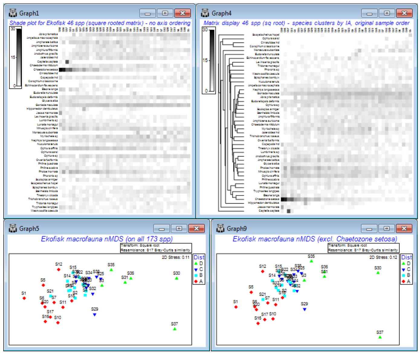
(Ekofisk oilfield macrofauna)
A good example of how ordering of species in a shade plot can aid interpretation is seen for macrobenthic communities at different distances from the Ekofisk oilfield, last saved in Section 9 but which we have seen several times since it was introduced as the first example data set, in Section 1. These data have been run through Plots>Shade Plot before, in the discussion of transformation options in Section 4, where it was clear that unless some sort of transform was applied (square root looked the best bet), the effect of a single species (Chaetozone setosa) would dominate the result of a multivariate analysis. We remarked at the time that it was not immediately clear from the shade plot that, even after transformation, there would be a convincing relationship between the species communities and the distance from the oilfield of each of the 39 samples (note that the sample order in the matrix is of increasing distance from the oilfield, across the columns from left to right, and the species order in the rows is alphabetic, and this order will be unchanged by a simple run of Plots>Shade Plot). Yet we have since seen (in Section 8) a highly convincing nMDS plot of the gradient of change in community structure (on root transformed data and Bray-Curtis similarities) with distance to the oilfield, backed up by a strong 1-way ordered ANOSIM test result in Section 9. It might be argued from the shade plot shown earlier, and repeated below (left), that for the mild square-root transform, Chaetozone setosa will still have rather a strong input to this analysis – and it certainly has increasing values as sites gets closer to the oilfield. But the nMDS is repeated below after omitting this species and the convincing gradient pattern is little changed. Why this is so does become clearer, however, when we run the original data matrix through Matrix display, and re-instate the original sample order on the x axis – because of the clustering/seriation on the species axis we can now see groups of species which are: a) mainly restricted to the ends of the gradient; b) steadily increasing or decreasing with distance from the oilfield; c) in between those – species that increase then decrease along the gradient. It is a combination of all of these that gives a clear MDS.
So, to avoid cluttering the existing Ekofisk ws for later (Section 14), open into a clear workspace Ekofisk macrofauna counts from C:\Examples v7\Ekofisk macrofauna and take Select>Variables> (•Use those that contribute at least 2 %) which retains 46 species, and Pre-treatment>Transform (overall)>(Transformation: Square root). On the result, run Plots>Shade Plot to obtain the left-hand plot below (as in Section 4). In contrast, Select>All on Ekofisk macrofauna counts, and take Wizards>Matrix display>(✓Reduce species set>Keep most important: 46) & (Transformation: Square root) and uncheck (✓Retain sample groups). The same 46 species are retained, as are the matrix entries, but species are re-ordered. So are the samples, which have now been clustered and seriated (subject to the constraints of their dendrogram) on the x axis, but this needs to be removed with Graph>Special>Reorder>Samples>(Order•Original) & (Constraint•None), whilst leaving the Variables side of this dialog unchanged. The only other change is to set (No. of seriate restarts: 999 or 9999). OK takes you back to the initial Special dialog – note that although (✓Draw sample constraint group boundaries) is ticked, no lines divide up the shade plot because (Constraint•Factor groups ) was not specified on the Reorder dialog. The shade plot to the right, below, is the result. Under the shade plots are the nMDS ordinations, left: from all 173 species of Ekofisk macrofauna counts (root-transformed, then Bray-Curtis); and right: having omitted Chaetozone setosa by Edit> Clear Highlight, highlighting just that species, Edit>Invert Highlight and Select>Highlighted, then running root-transforms, Bray-Curtis similarities and nMDS in just the same way.
The interesting point about the re-ordered shade plot (right), which is worth re-iterating, is that the row and column orderings are independently derived. Looked at from the point of view of species rather than samples, the species index of association (IA) matrix is used to place species in their natural order, in terms of the differing similarities of their counts over samples, but it would be identical for any re-ordering of the samples. The sample ordering is fixed by an external factor – distance to the oilfield centre. Hence, if you can discern any diagonalisation of the matrix in this plot then that must be evidence for a serial relation of the community composition to distance from the oilfield. And that is what is now observed, and is picked up by the MDS and ordered ANOSIM. But, equally clearly, it is a subtle, whole community property that is being captured.
Close the workspace – save as Ekofisk ws2 if you wish, but we shall only need Ekofisk ws later.
(King Wrasse diets)
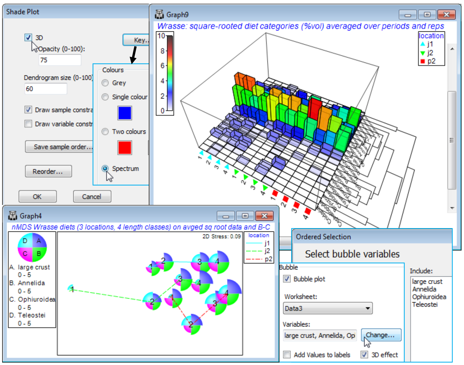
A Western Australian study of the dietary assemblages of a single fish species (King Wrasse) were analysed as a 3-way crossed ANOSIM design, followed by an nMDS means plot, in Section 9. The three factors were samples taken at 3 locations (j1, j2, p2), at 2 periods in the year (S, W), and for wrasse of 4 length-class ranges (1-4), with 2 replicate (pools of) fish guts for each combination. Matrix entries were the percentage of the gut material by volume for each of 21 dietary categories, thus already sample-standardised, i.e. each sample adds to 100%. Square root transformation was taken prior to Bray-Curtis similarities, and the ANOSIM tests showed no effect of period at all (an average R value of 0.0), so the summary nMDS means plot averaged the (transformed) matrix over replicates and periods, to give 12 samples (3 locations by 4 length-classes). It is these averages that we will now input to Matrix display, to attempt to identify the dietary categories that it would be useful to display in a bubble plot on this averaged nMDS, which shows the rather weak location differences (average R = 0.26, p<1.5%) and stronger, ordered length-class effect (average R$^\text{O}$ of 0.49, p<0.01%). In fact, this was the analysis that suggested a bubble plot of the large crust(acean) category seen in Section 9 – as noted earlier, other techniques for identifying contributing species, such as SIMPER (see end of this section), are not well suited to dissecting ordered changes.
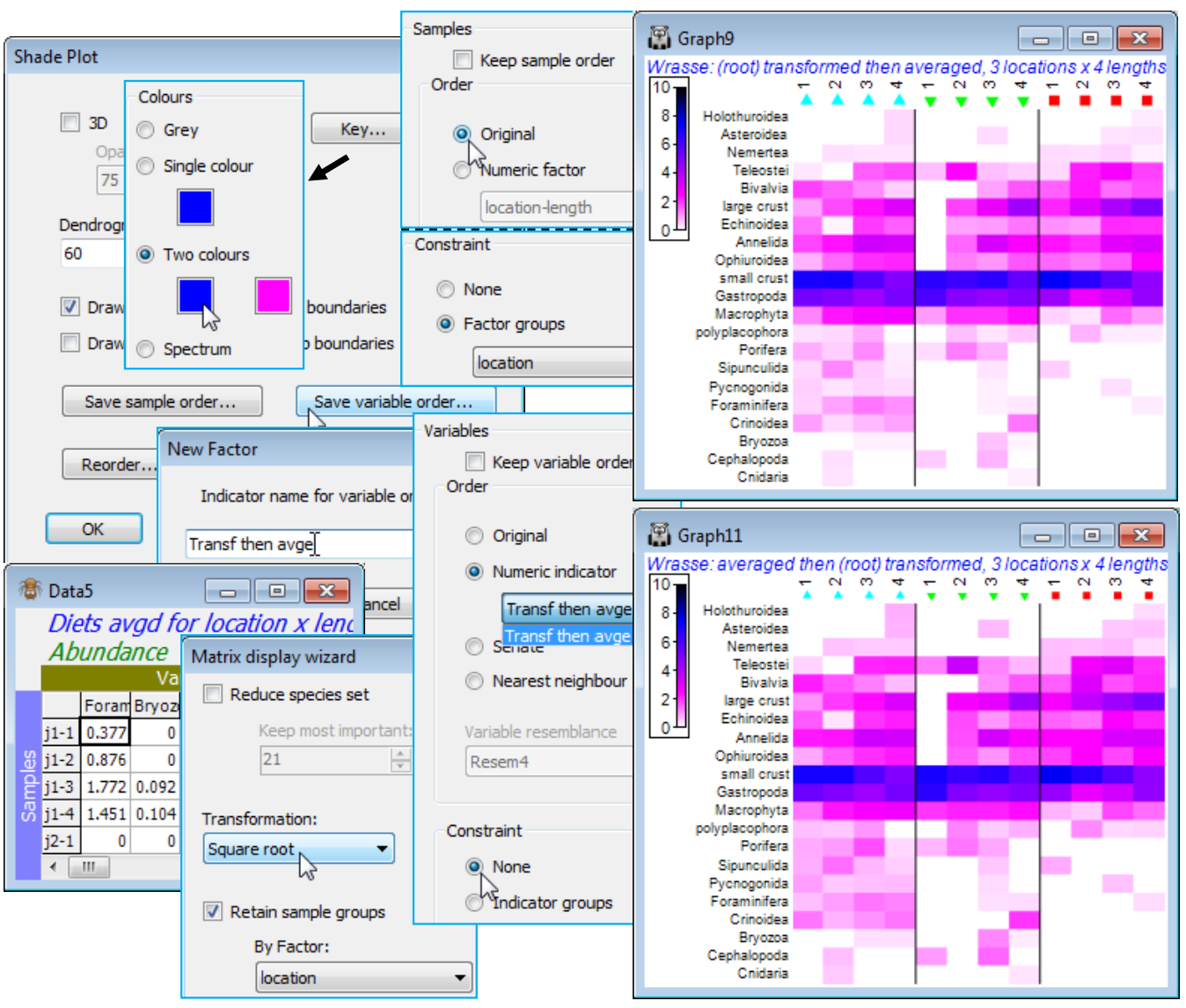
So, open Wrasse ws, or if unavailable, open Wrasse gut composition in C:\Examples v7\Wrasse diets and square-root transform this matrix. [As an aside, from the Edit>Factors sheet you will see how a Combine of the factors: location, -, period, /, length and rep has produced a combined factor then Renamed label, which was highlighted and copied to the clipboard (Ctrl-C), then the factor sheet saved, Edit>Labels>Samples taken, the existing labels (which were previously just integers 1, 2, 3, …) highlighted, and the more meaningful labels pasted over them (Ctrl-V).] We shall need a simpler Combine here under Edit>Factors, of location, - and length. Then run Tools>Average>(Averages for factor: location-length) on the root-transformed form of the matrix and enter this to Wizards>Matrix display. You will get the warning message: Data has already been transformed but this can safely be ignored for averaged data of this sort, where it makes good sense to do the transformation before the averaging (the issue of how best to create averages is briefly mentioned in Section 9 and again at the start of Section 17, but options are discussed in more detail in CiMC). The warning message is here to guide users towards running Matrix display on the raw data, and taking any necessary transformation within the routine, since it is (arguably) the preferred option for the species similarities to be computed on untransformed data, but this is by no means a ‘hard and fast’ rule, and here it is natural to run Matrix display on the (transformed then) averaged matrix – and not to request a further transformation, of course. Take OK on the warning message, uncheck (✓Reduce species set) since there are only 21 ‘species’ (dietary categories), take (Transformation: None) and (✓Retain sample groups>By factor: location), to give the initial shade plot shown.
Note that the submitted matrix had samples (location-length combinations) as rows, and variables (dietary categories) as columns, but the shade plot will always transpose the matrix in that case, to give a shade plot with ‘species’ as the y axis and samples on the x axis – there is no choice here. The resulting plot does still need some fine tuning, as usual, under three Graph dialogs (right-click over the plot). Firstly, Samp. Labels & Symbols>(Labels✓Plot)>(✓By factor length) would make the length categories more prominent. More importantly, these are seen not all to be in the correct sequence – their order was determined by the initial run of Matrix display, with its inbuilt attempt to diagonalise the shade plot (subject to the constraint of keeping location levels together). If we want to order by the length factor, it has to be numeric (we have seen this before with factors) and it is already numeric in this case – the size groups 1 to 4. So, on the Special>Reorder dialog, take Samples>(Order•Numeric factor)>length, leaving all other conditions unchanged, except to change the number of restarts to 9999 – this runs very quickly with the small number of species.
Special menu for shade plot; Shade plot colours
With OK to get back to the first dialog screen under Special, we now look at the options available there. (Dendrogram size 100) will increase the size of the variables dendrogram (and a samples dendrogram at the same time, if one has been selected) so that its structure can be better seen – whether this is beneficial depends on how large a block of matrix entries needs to be squeezed into a sensible display area, but it is very useful if you want to manually rotate the dendrogram(s). The Key button leads to the Shade key dialog, which can also be accessed directly by clicking on the scale bar to the extreme left of the shade plot. This allows adjustment of the scale representing depth of shading, the specified maximum always corresponding to jet black shading(/colouring). It could be argued here that it might be useful to reserve this for the potential upper limit of the %vol scale rather than the default of a (rounded up) observed maximum. So, take (✓Specify maximum> Maximum: 10), since on the square-root scale used, this would back transform to represent 100% of average gut content being from one dietary category only. Also add some intermediate scale levels with (Number of levels: 6). The (✓Reverse palette) box would rarely be changed since this produces a shade plot in which black represents absence and white the specified maximum value. Black seems a less natural way of viewing absence in a community matrix, though it is the natural choice in a heat map, running from extreme cold to white hot. [Reference to this palette as reversed by default really comes from the fact that RGB scales have 0 values for all three colours for black, up to their maximum (255) for all three, producing white]. Other colours than grey for a shade plot are possible and the below shows a single colour choice, switched from the default of green to blue.
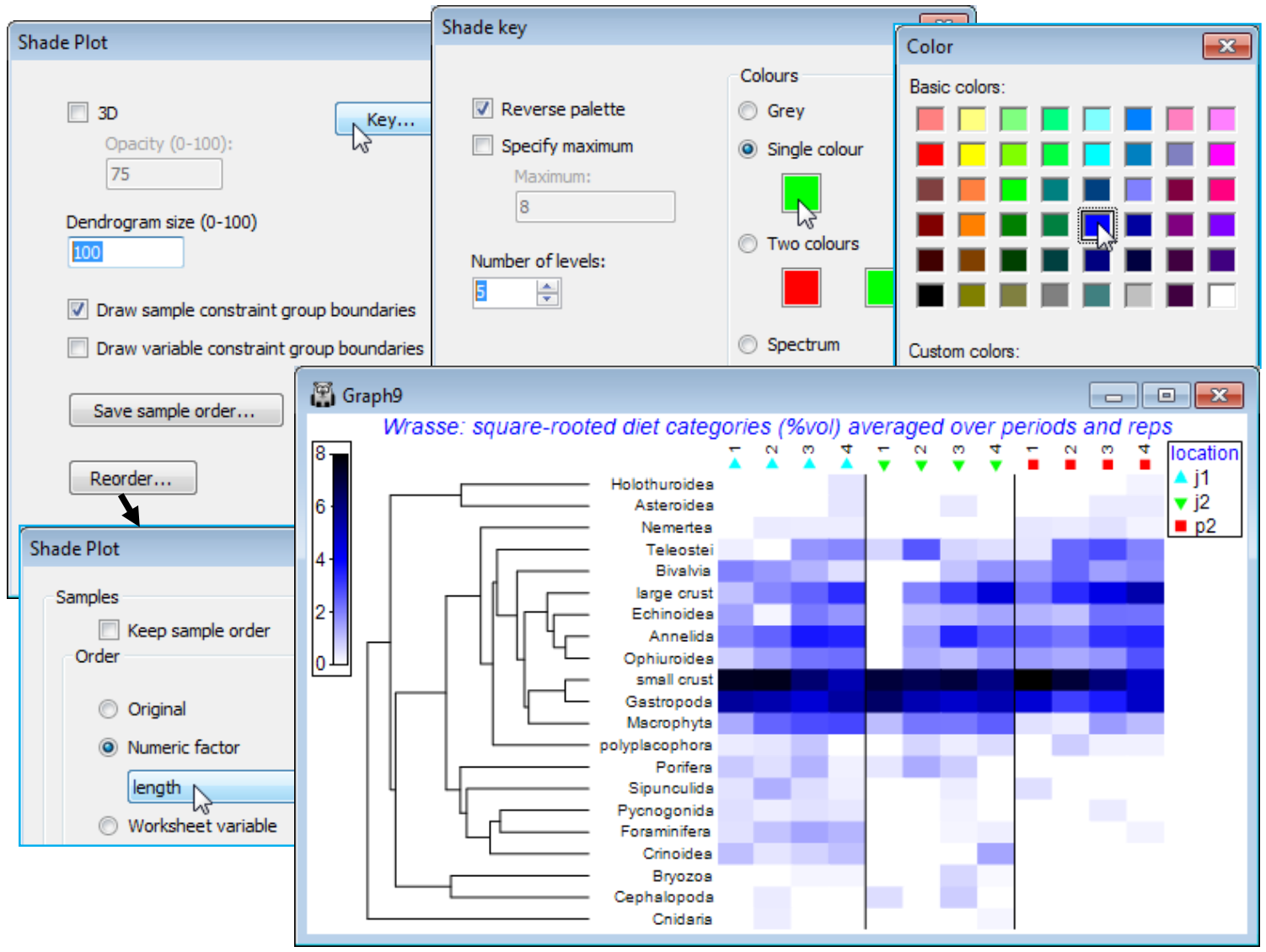
You should experiment with the colour options, though there is not unlimited flexibility here in constructing a scale. A shade plot should ideally show a progression of colour which allows a natural feel for which are the larger and which the smaller entries in the matrix. For the (Colours• Two colours) option, the square to the left should be for the higher values (it will merge into black) and to the right for the lower abundances (it will appear from the white space absences). There is also a fixed colour spectrum choice (below). The other change made above was that the font for both the colour scale and symbol key benefitted from a small increase (both are of few characters). You can change Key font properties (as for any plot) by the Keys tab accessed from the usual Samp. Labels & Symbols or General dialog. For the above, this used Keys font>(Size: 120).
The corresponding nMDS ordination to the above shade plot is shown below – note the capacity a multivariate approach has to pick out the borderline significant (p<1.5%) location differences, from what the shade plot again shows to be rather subtle changes. The more striking (and highly significant) dietary progression with increasing wrasse sizes, running roughly in parallel for the three locations in the nMDS, is also evident on the shade plot. It is seen in the increasing consumption of a range of dietary categories (e.g. large crustaceans, annelids, ophiuroids, teleosts) and a decline in the dominant category of small crustaceans. An effective presentation is then a bubble plot on the MDS, thus linking individual prey categories to the pattern for the dietary assemblage as a whole, and the ordination is shown below as a multiple bubble plot (Section 8). But the selection of dietary categories to display in this way (the ordered ANOSIM test having shown beyond doubt that there are such dietary differences to interpret) is greatly aided by careful study of the shade plot – which, importantly, does represent the matrix entries in the form they enter the similarity calculations.
3-d shade plot
A further option on the initial Special menu for a shade plot (✓3D>Opacity (0-100): 75) turns the 2-d matrix into a 3-d bar plot, also carrying across any dendrograms and sample or variable labels and symbols on the axes. The (transformed) quantities in the cells of the matrix are represented in two ways, both by the height of the bars and by their colour, with the same scale key as for the 2D plot. The default value for opacity (75%) allows some viewing of bars through other bars, and smaller values, of course, lead to greater transparency (and an inevitably lightened colour scale). As for similar 3D plots, this can be manually rotated, or automatically spun with Graph>Spin, allowing the usual options for rotation speed and capturing the animation as an *.mp4 file etc.
Save sample/ variable order
A final choice on the Special dialog for shade plots can be useful when planning to compare plots. Save sample order and Save variable order allow the current order (top to bottom for species and left to right for samples) to be saved to a factor or indicator respectively. These could be used to re-order the original matrix (with Edit>Sort>Rows or Columns) for a direct run of Plots>Shade Plot – i.e. without the reordering which is implicit in Matrix display – or they could be used as an entry to (Order•Numeric factor) or (Order•Numeric indicator) on the Reorder dialog. An example of the latter would be to compare the shade plots produced by transforming then averaging (as performed above) with that obtained by first averaging, with Tools>Average>(Averages for factor: location-length) on the original Wrasse gut composition, then square root transforming the result in a run of Matrix display. Having run Special>Save variable order>(Indicator name for variable order: Transf then avge) on the first shade plot, under Special>Reorder on both plots take Variables> (Order•Numeric indicator Transf then avge) & (Constraint•None), and their species lists will align. The default plots from Matrix display are otherwise certain to have species in a different order, which will not make it easy to compare the two approaches. Note that a default run of Wizards>Matrix display under the (✓Retain sample groups>By factor: location) condition may also re-arrange the order in which the three locations are presented (since the attempted diagonalisation may differ). In general therefore, one could apply Special>Save sample order on the first array and Edit>Factors>Import this factor into the averaged matrix for the second array, thus ensuring that the two shade plots have both samples and species in the same order. In this straightforward case, however, it is simpler just to specify (Samples>Order•Original) under the Special>Reorder dialog for both plots, since we know that the matrix already has its samples listed in the required order (j1, j2, p2 locations, with length classes 1-4 within each, in that order). The comparison is given below, also demonstrating the other colour option not yet seen, mixing two colours between white and black. The conclusion is self-evident – the order in which averaging and a mild transformation (such as square root) are performed makes apparently negligible difference to the shade plot, and this is borne out in the multivariate ordination. In fact it is often observed to be the case that the various ways of displaying some form of meaned data do give very similar outcomes for balanced designs such as this – see the discussion in CiMC, Chapter 18. Save and close Wrasse ws.
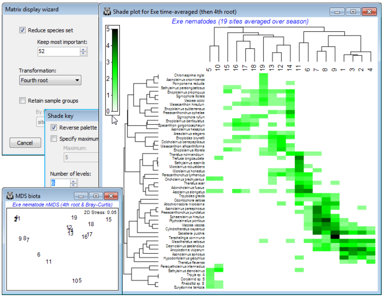
Clustering on species and samples (Exe nematodes)
The time-averaged Exe nematode community data were used extensively in Section 8 to illustrate nMDS ordination, and the workspace Exe ws in C:\Examples v7\Exe nematodes should contain the data sheet Exe nematode abundance of the 19 sites, averaged over the 6 bi-monthly sampling times. This data matrix is now an example where there is no a priori group structure on the samples (sites) so that it would be instructive to cluster both species and samples axes of the shade plot. It is also a case of clear (and almost complete) turnover in species among some groups of sites, contrasting markedly in a shade plot with the more subtle community changes seen for the Ekofisk macrofauna and Wrasse diets. There are many species here which are infrequently found and in low abundance, and a useful shade plot would concentrate on only the 50-60 ‘most important’, e.g. the analysis in Chapter 7, CiMC, picks only those species accounting for $\ge$5% of total abundance at any one of the 19 sites – using Select>Variables>(•Use those that contribute at least: 5 %) – which retains 52 of them. So, on the active matrix Exe nematode abundance, Wizards>Matrix display>(✓Reduce species set>Keep most important: 52) & (Transformation: Fourth root) and uncheck the (✓Retain sample groups) box. The plot needs little tidying up: you might wish to put more levels into the scale key by clicking on the key and (Number of levels: 6), and in order to match Fig. 7.7 in CiMC, you may also need to Flip X or Flip Y (accessed by Graph or right-click). The dominant pattern is one of strong diagonalisation of the matrix but there is a point to note here. In the previous cases, the order of the sample axis was fixed on external information (a physical gradient and an a priori group structure, with ordered categories), and only the serial order of the species axis was given by optimising a matrix correlation $\rho$ – but this seriation cannot be a function of the sample order since the species similarities would be unchanged by any sample re-ordering, hence observed diagonalisation implies a genuine gradient effect. When both axes are seriated as here (subject to constraints imposed by dendrogram rotation) then we need to be more careful in interpreting diagonalisation – it is inevitable that if both axes are internally ordered to an optimum degree, then the combination of them must appear diagonalised, at least to some extent. In fact, the nMDS configuration (Section 8) is not that of a simple linear gradient. Though the primary species in site group (5,10) could be rotated manually (by clicking on the dendrogram bar of the last species grouping) to sit at the top left rather than bottom left corner, this is arbitrary. The group is close to having an exclusive set of species – this would have made it 100% dissimilar to everything else and able to be placed at either end of the sequence (or even in the middle, if there were other sets of mutually exclusive species).
Ordering by a worksheet variable
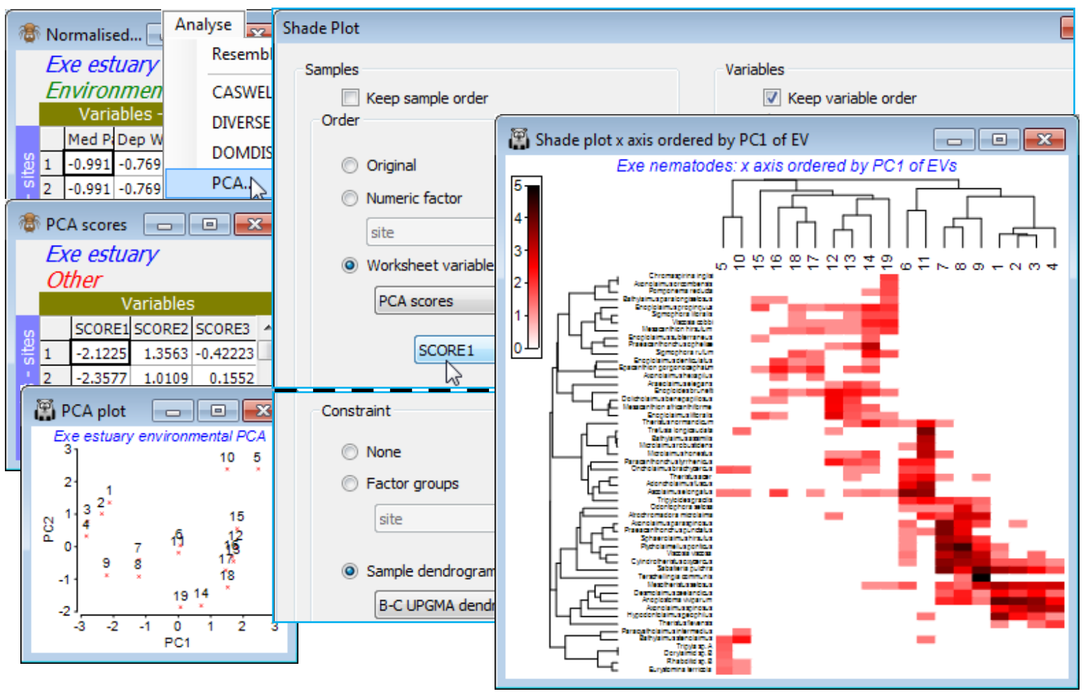
The core task faced by the Special>Reorder operation is to reduce what is inevitably a high-d similarity structure, on either axis, to a 1-d representation of those samples (or species). The default for Matrix display, when no group structure is provided for the samples, is to perform UPGMA (group average) clustering on the sample Bray-Curtis resemblance matrix, followed by optimising correlation $\rho$ to a seriation model matrix. So the Reorder dialog for the above will have Samples> (Order•Seriate & Sample resemblance Resema) & (Constraint•Sample dendrogram Graphb), with the same options for Variables (except based on group average clustering of Index of Association resemblances), but of course these are not the only possibilities. Any resemblance measure can be substituted on either axis, for the seriation, and any tree diagram for either dendrogram. We have seen the alternative of ordering by a numeric factor but (Order•Worksheet variable) also allows the sample axis to be ordered according to, for example, the value of an abiotic variable recorded over the same set of samples. This can be unconditionally or keeping samples from the same factor level together or only allowing rotations specified by a dendrogram – logically the dendrogram would be from the biotic matrix of the display. The latter is thus an interesting example of using both biotic and environmental data to produce a natural 1-d arrangement of samples not serially ordered by the biota. Apparent diagonalisation of the matrix can now be interpreted as a serial link between the selected environmental variable and the community pattern, without fear that we have ‘chased the noise’, since the sample clustering does not use the species order, or an internal seriation – instead it is the external abiotic variable that determines ordering (as opposed to grouping) of the samples.
As an example, open Exe environment if this is not already in the workspace – this manual has not made much use of these 6 abiotic variables, recorded for all 19 sites, though see Fig. 11.7 in CiMC. A logical single summary variable of the abiotic pattern might be the first principal component PC1 from a PCA ordination (Section 12). Take Pre-treatment>Normalise Variables on Exe environment – there is no need for an individual transformation of any variables here – and Analyse>PCA>(✓Scores to worksheet) on the normalised matrix. The PCA plot shows that, if we were to use the first PC (SCORE1 in the sheet – renamed PCA scores – that this creates of the PCA co-ordinates), to order the samples in the shade plot unconditionally by this variable, we would not obtain a very meaningful sample order, either in terms of the (2-d) pattern of the biotic or abiotic samples – this is not a case of a single strong gradient (e.g. on PC1, site 10 would be split from 5 and placed in the middle of the loose 12-19 group). However, constraining by the existing biotic dendrogram (given by the original run of Matrix display) produces a neater, abiotic-driven dendrogram rotation, i.e. Special>Reorder>Samples>(Order•Worksheet variable PCA scores>SCORE1) & (Constraint• Sample dendrogram B-C UPGMA dendro) and (Variables✓Keep variable order). This last step greys out all the variable options and keeps the species list and dendrogram in the same order as above, avoiding a further 9999 seriation restarts – this can be useful in comparing sample options.
Nearest neighbour ordering
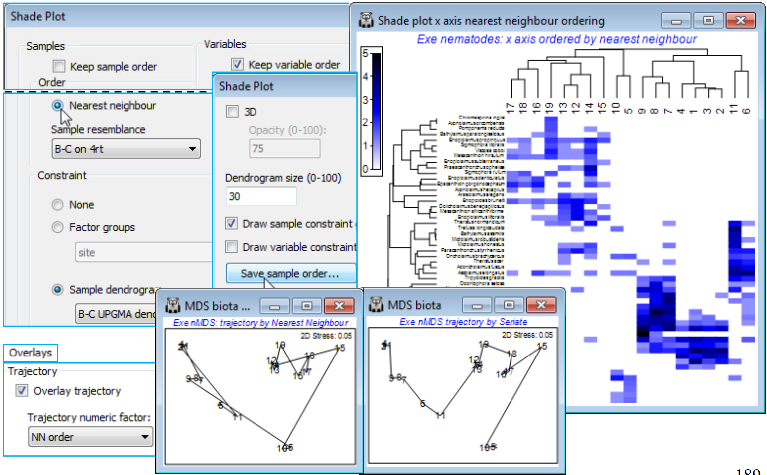
The final option that Reorder offers, attempting to find a useful ordering on a 1-d axis of a non-serial structure, is (Order•Nearest Neighbour) which implements a simplified travelling salesman algorithm. This is available for both samples and species axes, and an example where it is applied to both axes is seen in Fig. 7.9 of CiMC, but here for the Exe nematode data we shall run it on the sample axis only, again keeping the species order the same with (Variables✓Keep variable order). The full travelling salesman problem would be to find a route through the samples in which all are visited just once, and which minimises the total ‘distance’ travelled – in this context that means minimising the total dissimilarity between adjacent pairs of samples when placed in that order. We saw something similar with the minimum spanning tree in Section 8 (see box heading for MST), for precisely these Exe data. However, as the nMDS there shows, an MST allows branching of the route and this does not then provide a unique 1-d order in which to place the samples – but that plot does illustrate the point that a travelling salesman route should be greatly superior to, for example, taking the first axis of the 2-d MDS plot, when sites 5 and 10 would be interpolated in the 12-19 group (thus with unhelpful sample order in the shade plot of …, 12, 14, 13, 10, 19, 5, 16, …). The full travelling salesman problem is numerically highly demanding (a so-called NP-hard problem), even for modest numbers of samples, and PRIMER 7 currently implements the ‘greedy’ travelling salesman algorithm (see Chapter 7, CiMC), which is not an iterative process – so runs quickly – but may find an acceptable route, albeit possibly not an optimal one. It involves successive joining of nearest neighbours to one or other end-point of the route, hence run by (Order•Nearest Neighbour).
For the existing shade plot of the Exe nematode data, Tools>Duplicate it (on the existing branch) and run Special>Reorder>Samples>(Order•Nearest neighbour>Sample resemblance B-C on 4rt) & (Constraint•Sample dendrogram B-C UPGMA dendro) and (Variables✓Keep variable order). The B-C on 4rt sheet is just the sample resemblances from the Matrix display run, used for all these shade plots – Bray-Curtis on 4th root transform of the nematode abundances, using the full set of species, which also gives the clustering B-C UPGMA dendro. You may need to Flip X to obtain the shade plot below. To note the order in which (•Nearest Neighbour) places the sites in relation to their (non-serial) pattern in the 2-d nMDS, on the shade plot take Special>Save sample order>(Factor name for sample order NN order), thus creating a factor which you can import (if necessary) into any sheet on the branch of the nMDS, with Edit>Factors>Import. On MDS biota, the 2-d nMDS, take Graph>Special>Overlays>(✓Overlay trajectory) and supply NN order. If you repeat this for the original serial order factor, the difference between ordering samples across the plot (•Seriate) or along a winding trajectory (•NN) is clear – and seen more starkly still in Fig. 7.9, CiMC – but the constraints imposed by the cluster analysis make either of these solutions better 1-d orderings for the purposes of shade plots than use of the first axis from a 2- or higher-d ordination. (Note that a 1-d MDS is not offered in PRIMER since each restart is sure to get trapped in a local minimum of the stress – there is limited ability to move points past each other in iterations in 1-d ).
Other tree diagrams & SIMPROF (Bristol Ch. zooplankton)
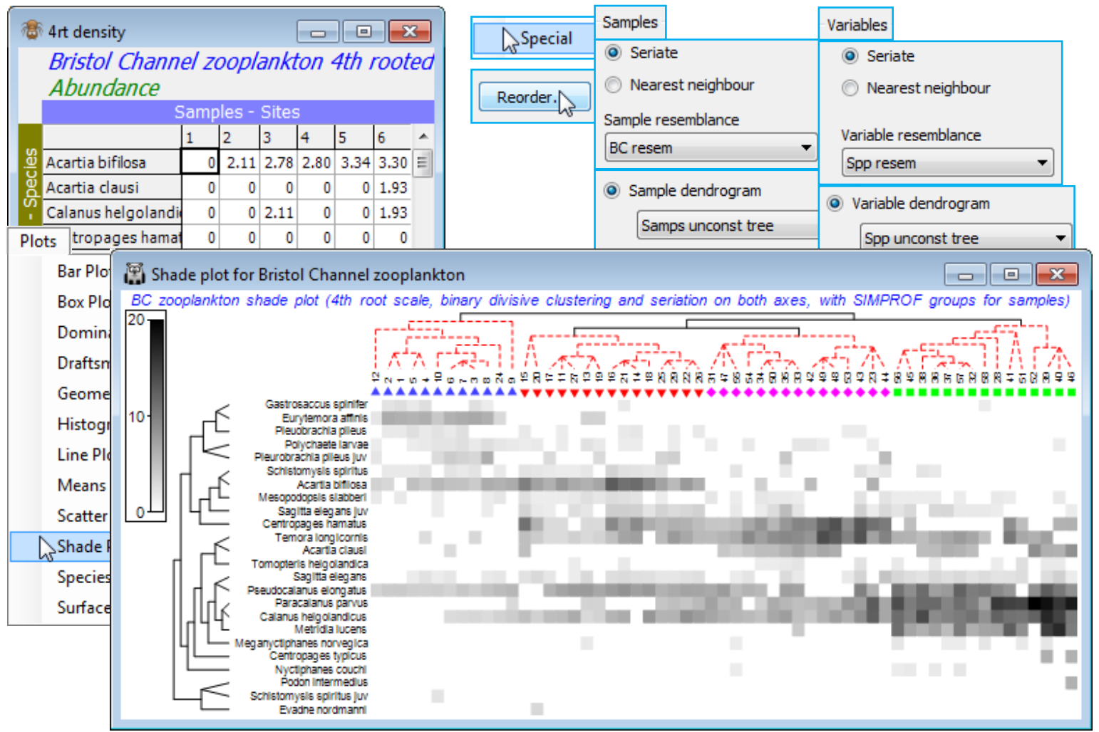
For the final example of the options in shade plot, save and close Exe ws and return to the Bristol Channel ws used extensively in Section 6 to illustrate different clustering methods (and seen again in Section 7 – and 8, for MDS bubble plots). If not available, open BC zooplankton density in C:\ Examples v7\BC zooplankton, fourth-root transform it, calculate Bray-Curtis similarities BC resem and on this, run an unconstrained binary divisive clustering: Analyse>Cluster>UNCTREE>(Min group size: 1) & (Min split size: 4) & (Number of restarts: 50) & (Min split R: 0) & (✓SIMPROF test) & (Vertical positions•A%), and take defaults on the SIMPROF dialog, adding factor name Unctree which holds the SIMPROF group labels. Rename the dendrogram Samps unconst tree.
Though it is usually easier to generate an initial shade plot from Wizards>Matrix display, it is instructive, for once, to create the components individually and input them to Plots>Shade Plot. The data matrix contains only 24 species and there is no real need to reduce it further (though three or four species are infrequently found, in low densities, so could be dropped without affecting the outcome). So, on BC zooplankton density (untransformed) take Analyse>Resemblance>(Measure •Index of association) & (Analyse between•Variables). This creates a species similarity matrix Spp resem which is input to Analyse>CLUSTER>UNCTREE, much as for the samples above except that the SIMPROF test is turned off this time (we shall see SIMPROF on species shortly), creating Spp unconst tree. With active matrix as the 4th-root transformed version of the plankton densities, 4rt density, run Plots>Shade Plot and on this Graph>Special>Reorder>Samples>(Order•Seriate >Sample resemblance BC resem) & (Constraint•Sample dendrogram Samps unconst tree) and then Variables>(Order•Seriate>Variable resemblance Spp resem) & (Constraint•Variable dendrogram Spp unconst tree), and (No. of seriate restarts 9999), the latter applying to the Seriate on both axes. Finally, add the sample SIMPROF groups as symbols with Graph>Sample Labels & Symbols>Symbols>✓Plot>✓By factor Unctree) and you can remove (uncheck ✓Plot key on Unctree) or amend font sizes on the key from the Keys tab (Keys font and Keys title font). An alternative display would use, for the Samples, (Constraint•Factor groups Unctree) with everything else on the Reorder dialog unchanged, and (✓Draw sample constraint group boundaries) would then activate, to draw separating group lines, in place of the sample tree diagram. Other clustering methods such as the constrained binary divisive LINKTREE (Section 13) can also be used, and methods could be mixed on the two axes, if this seems desirable in a particular context. The shade plot here is clearly useful in identifying the key species that typify the four clusters of stations and which discriminate among them. This was used, along with the breakdown of species contributions of (dis)similarities among and within the groups (SIMPER, at the end of this section) to pick out key species for the (strongly serial) nMDS bubble plot of Section 8. Save and close Bristol Channel ws for use later.
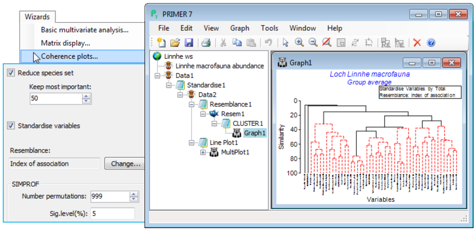
Coherence plots wizard & Types 2/3 SIMPROF; (L. Linnhe macrofauna)
The third item on the Wizards menu is Coherence plots. This is a combination of SIMPROF runs within a species CLUSTER analysis, to identify groups of coherent species, and Plots>Line Plot, to draw line graphs of species-standardised matrix entries (y) across samples (x), separately for each coherent species group. The output plots are therefore simple and transparent, describing patterns of response of each species across the sample ordering in the original matrix (e.g. through time, space or over an environmental gradient). The species abundance – or other quantity measure – is expressed in relative terms, as a percentage of total abundance for that species over all samples. The novelty here is that these line plots are grouped together in species sets which are statistically indistinguishable internally but significantly different over sets, using a series of SIMPROF tests, referred to as Type 3 SIMPROF. These are the precise analogue of similarity profile tests within sample cluster analyses that we saw applied in Section 6, to create significantly different sample groups (Type 1 SIMPROF) – and indeed one could trick earlier versions of PRIMER into carrying out Type 3 SIMPROF tests by defining species as samples and samples as species. This is now unnecessary (and was always rather confusing!) since PRIMER 7 automatically computes the right form of SIMPROF tests (1 or 3) in association with sample or species clustering. A single Type 2 SIMPROF test is also now offered in the Analyse>SIMPROF routine, which applies to species similarities (as with Type 3), but tests a different null hypothesis, namely that a set of species has no associations among any of its species (through competitive interaction or synergy, or more likely through opposite or common responses to differing abiotic conditions). In comparison, the null hypothesis for Type 3 SIMPROF tests is that the subset of species currently under test have a set of common (coherent) pairwise associations with each other. The technical distinction between the types is a combination of whether they calculate sample similarities (Types 1 and 4) or species associations (Types 2 and 3), and whether the tests work by randomly and independently permuting species over samples (Types 1 and 2) or permuting samples over species (Types 3 and 4). The Type 4 combination – testing sample similarity profiles by permuting samples over species is offered by Analyse>SIMPROF for completeness but would appear unlikely to have meaningful application. Some details on Type 2 and 3 SIMPROF tests on species are given in Chapter 7 of CiMC, e.g. the schematic diagram of Fig. 7.2, but the definitive paper on this, which also gives detailed discussion of several applications, is Somerfield PJ & Clarke KR 2013 J Exp Mar Biol Ecol 449: 261-273.
Soft sediment macrofaunal abundance at a single site in Loch Linnhe, Scotland was studied over 1963-73 by Pearson TH 1975, J Exp Mar Biol Ecol 20:1-41 (it is seen again, along with matching biomass data, in the species diversity curves of Section 16). The (pooled) data Linnhe macrofauna abundance, in C:\ Examples v7\Linnhe macrofauna, is of 11 samples (years) containing a total of 111 species. In 1966, pulp-mill effluent started to be discharged in the vicinity of the site, with the rate increasing in 1970 and reducing in 1972. On Linnhe macrofauna abundance, run Wizards> Coherence plots, taking the default settings shown below (50 species retains all those accounting for ~1% or more of the total abundance in at least one year, as seen from Select>Variables). The wizard first creates the selection in Data1, standardises the species, Data2, computes the index of association among species, Resem1, clusters this with Type 3 SIMPROF tests (creating group indicator SFGv1) and runs the line plots for those groups, held as separate graphs in MultiPlot1.
The ‘thumbnail’ multi-plot is seen to contain 8 groups of line plots, of varying numbers of species in each, with two of the SIMPROF groups consisting only of single species which have a presence in only one of the 11 years (a different year). If you wish to remove these from the multiplot, as below, take Graph(/right-click)>Special>Graphs and send Graph8 and Graph9 to the Available rather than Include box. Also use this menu to change the layout to, for example, 3 rows by 2 cols, by (•Horizontal>Cols: 2). Clicking on an individual plot within the multi-plot unfurls the full set in the Explorer tree, and each plot identifies in its subtitle the letter (a, b, c, …) giving the level for that group in the indicator SFGv1. From the reduced set in Data1, the entries for just that group of species could be examined by selecting them with Select>Variables>(•Indicator levels)>(Indicator name: SFGv1)>Levels. Note that in Data1 this would be the original abundances – the standardised values used in the plot could be selected in the same way from Data2. [And if selection was needed from the original Linnhe macrofauna abundance sheet, you would first have to Edit>Indicators>Import>(Worksheet: Data1)>Select>(Include: SFGv1) from that original data matrix to import the SIMPROF groups, since the reduced matrix selection in Data1 is on a new branch of the Explorer tree and any factors and indicators are never automatically propagated between different branches].
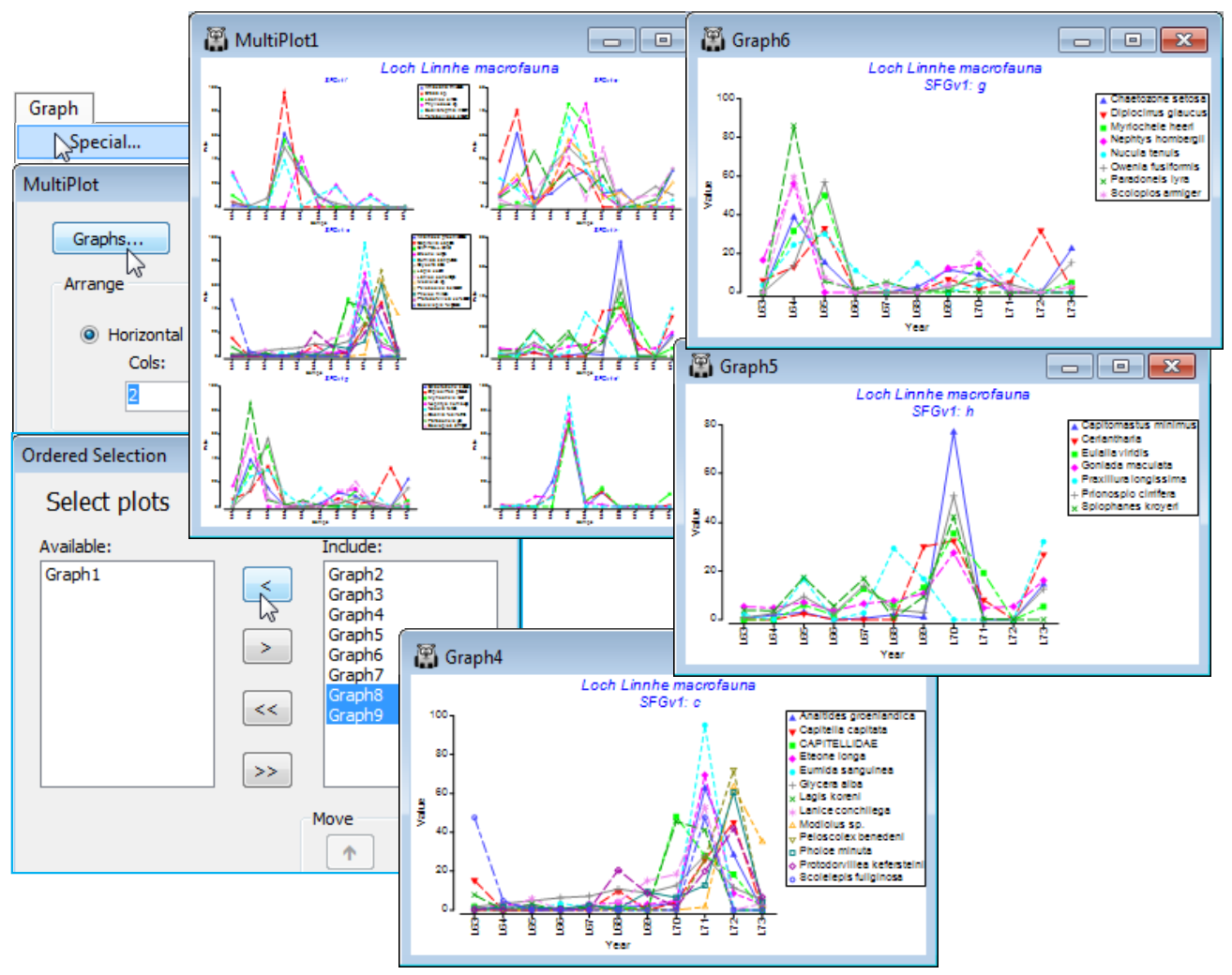
The 6 major coherent species sets identified by the SIMPROF tests span a range of responses to the effects of the pulp-mill effluent from groups of species whose abundances: (g) are largely confined, in relative terms, to the earliest, pre-impact, years; (f) peak at the earliest stages of impact but then decline; (d) have a similar pattern but not kicking in until a year or so later; (h) show the same peak and decline but much further into the impact sequence; (e) stay relatively abundant until the most impacted years of 1970-72; and (c) are mainly the real opportunists (such as the Capitellids) that thrive in the most impacted years but decline sharply under the ameliorated conditions of 1973 – a year in which some of the other groups show signs of bouncing back. [Note that the graphs could have been arranged in the order described here, within MultiPlot1, again by Special>Graphs but now using the Move arrows on the Include list. You may find it helpful to rename the individual graphs Graph2, …, Graph7 with their SIMPROF levels, respectively f, e, c, h, g, d, but note that you will then have a blank multi-plot since it can no longer find the original names(!) – this is fixed easily by Special>Graphs, highlighting f to d and moving them across together to the Include list].
Running Type 2 SIMPROF
A Type 2 SIMPROF test is not part of a Wizards>Coherent plots run, and there is a good case for carrying out a test of its null hypothesis (H$_0$: there are no species associations at all) prior to trying to break down those associations into coherent groups, i.e. within each group the null hypothesis (H$_0$: all species similarities within a group are the same) cannot be rejected. Inclusion of species with so little information that species similarities (index of association, IA) are totally unreliable is again unhelpful, so we start from the matrix reduced to the 50 ‘most important’ species. For this test (Type 2), it does not make any difference whether we use the selection in Data1 or its species-standardised form Data2, because the permutations will be across samples within each species and IA includes a standardisation step in its formula. (It does, however, matter a great deal to use the standardised form Data2 when carrying out Type 3 SIMPROF tests – either as part of clustering or with Analyse>SIMPROF – because permutations are across species within samples, and this will make no sense if species are not first ‘relativised’ in this way, to total 100% over samples).
So, from the selection in Data1 or from Data2, run Analyse>SIMPROF>(Type•Type 2) and take the defaults on the Next screen. The output, MultiPlot2, contains two graphs, of the real similarity profile (red) and the means and 99% probability limits for that profile under the null hypothesis, and the histogram of absolute deviations $\pi$ of 999 (further) permuted profiles from that mean, with the real statistic value $\pi$ indicated by the dotted vertical line. The output is of exactly the same form as previously discussed for single SIMPROF runs (see Section 6), and shows with little doubt that there are real species associations to interpret (p<0.1%). With a large number of similarities making up the profile (50$\times$49/2 = 1225), it is inevitable that the probability limits and the real profile will hug the mean curve fairly closely but it is clear that there is an excess of both higher and lower associations than one would expect by chance under the null hypothesis – some of the species are ‘positively’ associated and some ‘negatively’ (we retain the terminology of correlations being positive or negative though, as explained in Chapter 7 of CiMC, an index of association defined over (0, 100) is a better measure of species inter-relationships than a correlation coefficient). Note that very few of the ‘negative’ associations are at the lower limit of IA = 0, which arises when two species are only ever found in different years – this is the result of removing all the low abundance species. [About half the original 111 species were found in three or fewer years – and if you prefer to carry out a species reduction on this type of criterion, you can do so by Select>Variables>(In at least n samples where n is ), entering that reduced matrix to Analyse>SIMPROF and Wizards> Coherence plots. Leaving in rare species always results in a tail of fully ‘negative’ associations.]
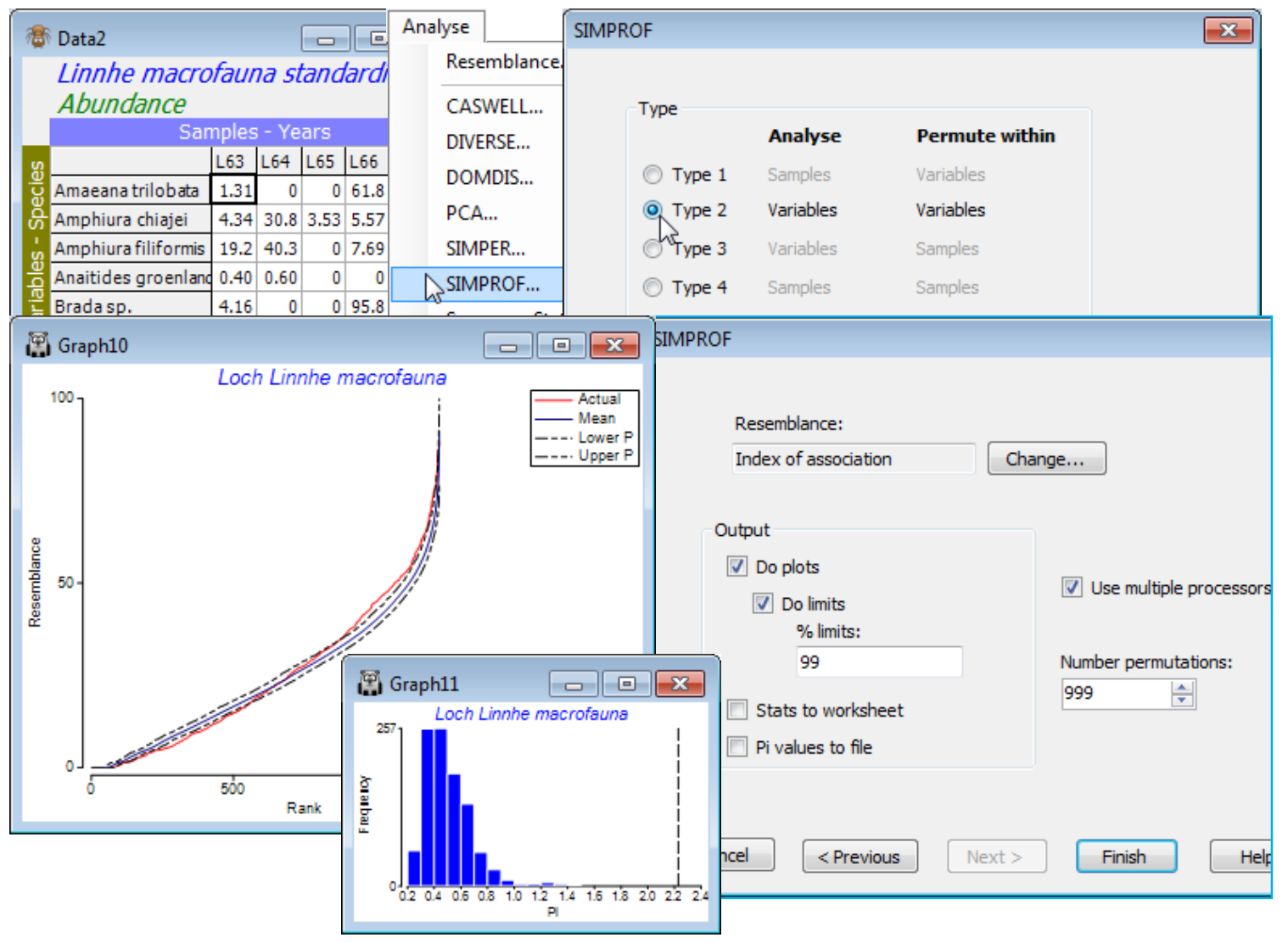
Running Type 3 SIMPROF
Type 3 SIMPROF can be run as a single test on the species set defined by the active matrix (which could be under a selection), using Analyse>SIMPROF>(Type•Type 3), leading to similar dialog and outputs as for the Type 2 test. However, there are two important differences. Firstly, as noted above, it is now essential that the input matrix is species-standardised, for the permutations to make any sense. Secondly, even if all species in the (reduced) data matrix – Data2 in the above context – are submitted to this single run of Type 3 SIMPROF, the procedure is not testing the same null hypothesis as the Type 2 test. That seeks to reject the null hypothesis of no associations amongst any of the pairs of species; Type 3 tests the null that all associations amongst pairs of species in that set are the same. Clearly, it is at least possible (albeit not very likely in practice) for the Type 2 test to reject its null hypothesis, so that there is statistical support for examining the structure of the among-species relationships, but that this further study – which starts with a Type 3 test of all the species – fails to find any species clusters at all. This would happen if all species had exactly the same strong pattern (subject to sampling error) over the samples, e.g. there might be a single strong environmental gradient and all species abundances decline at the same rate along that gradient.
As implied in that comment, a Type 3 test is rarely performed singly. More typically, a series of Type 3 tests are carried out automatically, working down the branches of a hierarchical species clustering, in order to determine the coherent species sets, i.e. all the nodes which give rise to non-significant Type 3 tests. Structure displayed in the species clustering below that point is always in red, indicating that there is no statistical support for interpreting these further sub-divisions. Whilst Wizards>Coherence plots only performs group average (UPGMA) clustering – though using any selected association/correlation coefficient – the other hierarchical clustering methods offered by PRIMER 7 can be applied to variable resemblances by running Analyse>Cluster> and choosing the agglomerative CLUSTER (and an alternative linkage method) or the divisive unconstrained UNCTREE, and specifying (✓SIMPROF test), see Section 6. [Even the constrained LINKTREE routine (Section 13) would run, though defining sensible constraints might prove elusive!].
As with the earlier Matrix display, it is instructive therefore to recreate the exact steps of Wizards>Coherence plots by running the component routines. On data Linnhe macrofauna abundance take Select>Variables>(•Use n-most important where n is 50), then run Pre-treatment>Standardise> (Standardise•Variables) & (By•Total), Analyse>Resemblance>(Measure•Index of association) & (Analyse between•Variables), and Analyse>Cluster>CLUSTER>(Cluster mode•Group average) & (✓SIMPROF test) with the default options of Index of Association, a 5% significance level and (Add indicator named: SFGv2). The resemblance matrix and dendrogram structure will be identical to that for the previous run of Coherence plots, but if the SIMPROF groups are not absolutely the same this will be due to the random nature of the permutations and the fact that one of the tests is rather borderline to the 5% significance level, sometimes falling one side and sometimes the other. A larger number of permutations would firm up the true significance level (9999 is preferable if it can run in minutes – actually seconds here) but that does not address the arbitrariness of specifying a 5% significance level for this (or any!) test. The Somerfield & Clarke (2013) paper suggests re-running at 0.1%, 1%, and 5% to see how stable the final groupings are to the choice of level – the more stringent significance levels will produce a smaller (or the same) number of coherent groups. The final step is to run Plots>Line Plot on the (reduced) species-standardised data sheet (probably named Data3), taking (✓Multiple plots)>(Indicator: SFGv2) to recreate the previous MultiPlot1.
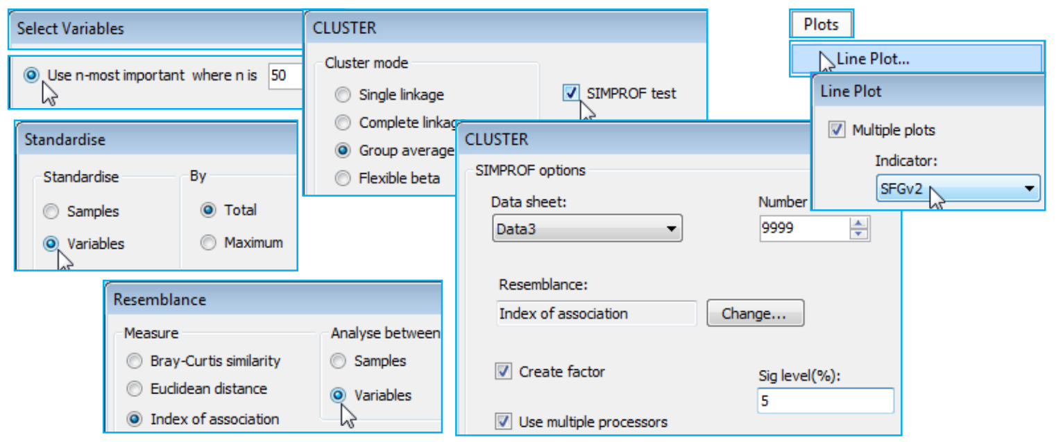
Line plots vs Shade plots
For this (reduced) Loch Linnhe data matrix, e.g. with the selection of 50 species made in Data1, it is straightforward to create also a shade plot. There are, of course, differences in visual impact in the way matrix entries are represented by y axes of a line plot or depth of shading but there are also some contrasts in the emphases that PRIMER gives to the two displays:
a) both would usually require a reduced number of species to be analysed and use the same species resemblance measure (index of association) and species clusters. The automatic Wizards>Matrix display does not, however, carry out the Type 3 SIMPROF tests of the Coherence plots routine – though a direct run of Shade Plot could certainly display the groups resulting from these tests;
b) Wizards>Coherence plots generates line plots based on the standardised species values, usually without transformation, so that the emphasis is on which species follow the same patterns, or have statistically different responses over samples. In contrast, Wizards>Matrix display would usually show the transformed (and not species standardised) values by depth of shading/colouring, since its primary emphasis is on how the species contribute to the multivariate analyses of the samples. It is perfectly possible, however, using a (non-wizard) run of Shade Plot to create a display of the same standardised (non-transformed) values as are used in Coherence plots – see below;
c) Matrix display and the direct Shade Plot routine will terminate with an error if a worksheet of type Environmental is submitted to them – they will only accept data of types Abundance, Biomass or Other. This is because a shade plot is designed to display quantities, with blank (white) space for absence through to black for the (rounded up) largest quantity in the matrix, with the same scale applying to all variables (usually taxa). The measurement units for environmental variables usually differ (or at least the ranges occupied within a common scale differ strongly) and normalisation is required to produce a common scale – zero now has no particular meaning. One could force the software into producing a shade plot for such environmental data – change the data type with Edit>Properties>(Data type•Abundance) then add a constant (k) to move the scale to positive values, with Pre-treatment>Transform (individual)>(Expression: V+k) – but the PRIMER shade plots are visually set up to suit only quantity data. In contrast, the Coherence plots and multiple Line Plot routines work well for all data types, though again for variables converted to a common scale, such as standardising for taxa and normalising for abiotic data – the latter is also seen below.
For the selected 50 species from the Linnhe data (Data1), run Pre-treatment>Transform(overall)>(Transformation: Fourth root) and Plots>Shade Plot. Note that the plot (which is not wonderfully clear!) has the years already in the right order, since that was the sample order in the matrix, but the species need grouping according to the dendrogram given by the run of Coherence plots, Graph1, with Graph>Special>Reorder>Samples>(Order•Original) & (Constraint•None) and Variables> (Order•Seriate>Variable resemblance Resem1) & (Constraint•Variable dendrogram Graph1) and (No. of seriate restarts: 999). The species SIMPROF groups are seen in red on the dendrogram but can be accentuated by Graph>Var. Labels & Symbols>(Symbols✓Plot>✓By indicator SFGv1). This is now a plot of the dominant ~50% of the species contributing to an nMDS based on the 4th-root transform of the original Linnhe macrofauna abundance matrix under Bray-Curtis similarity.
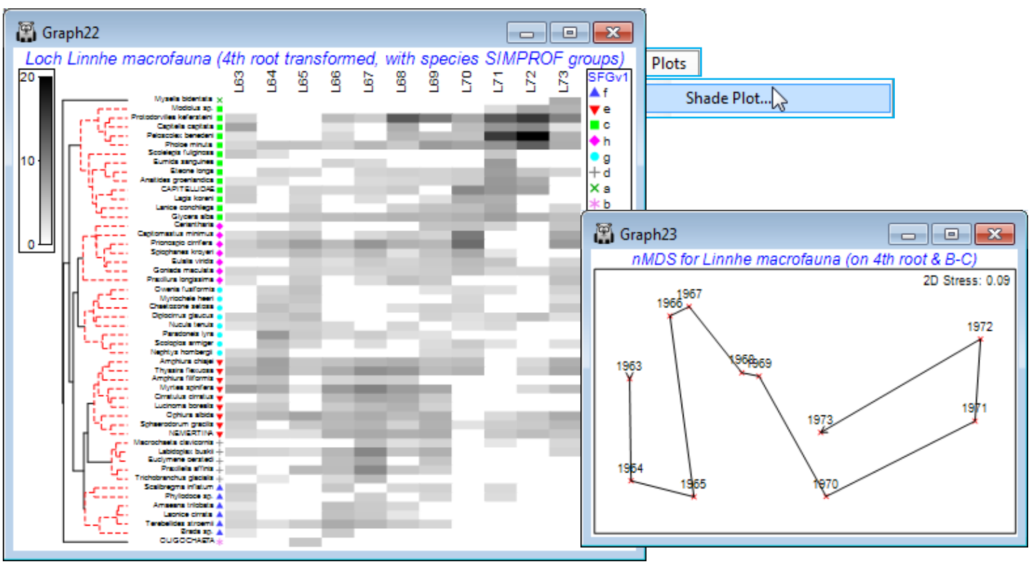
Shade plots showing coherent sets & variable boundaries
In order to display a shade plot carrying precisely the same information as the coherent species line plots, first save the species order in the above shade plot – in order to make it easier to compare the two shade plots – using Graph>Special>Save variable order>(Indicator name for variable order Spp order), then with the active matrix this time as the species-standardised (but not transformed) sheet Data2, run Plots>Shade Plot and note that now many species rows contain the darker entries, i.e. those whose dominant abundances are in a single year, the common scale (0, 100%) now being relative to the total abundance for each species over all years. Rearrange the species in the previous order by Graph>Special>Reorder>Variables>(Order•Numeric indicator Spp order)&(Constraint• Indicator groups SFGv1), and after OK returns you to the first of the Special dialog boxes, take (✓Draw variable constraint group boundaries). This is the first time we have seen horizontal lines on the shade plot, separating the coherent species groups, and it certainly helps the visual message. The plot below also adds symbols for the species groups, using the Var. Labels & Symbols tab as previously, since the key does make a link to the earlier line plots of these groups, for which the indicator level (lower case letter) is given in the sub-titles. Remember also that you can re-order the constituents of a key by clicking on the key and using the Move arrows, which has been done here to re-arrange the indicator levels alphabetically. Abbreviations of the species names can sometimes be necessary and this is simply achieved on the Var. Labels & Symbols tab again, by putting them into another indicator Spp abbrev and (Labels✓Plot>✓By indicator Spp abbrev).
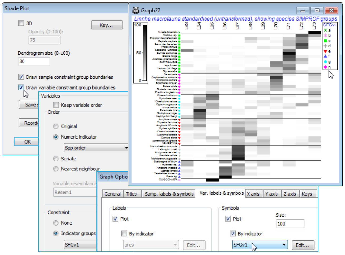
‘Mondrian’ shade plots, with sample and variable boundaries
A final possibility for this Loch Linnhe data is to display both horizontal and vertical divisions in a shade plot, from sets of Type 3 and Type 1 SIMPROF tests respectively. Though it might normally be preferable to display the years in their chronological order, it could make good sense to examine which years cluster together in terms of their communities, i.e. whether there is some evidence that the more contaminated conditions of the early 1970’s and the ameliorated discharges by the time of the final year are paralleled by changes in the multivariate community structure, as suggested by sample SIMPROF tests. So, on the Bray-Curtis sample resemblances from fourth-root data on all species – used earlier to produce the nMDS plot of the 11 years (sheet Resem3 in the Explorer tree shown below) – run a sample clustering with SIMPROF (Graph28), creating factor YrGps, and on any sheet in the branch of the last shade plot Graph27, e.g. Data2, take Edit>Factors>Import>(Worksheet: Graph28)>Select>(Include: YrGps), so that this factor is now available to that shade plot. On this plot, run Graph>Special and both (✓Draw sample constraint group boundaries) and (✓Draw variable constraint group boundaries) should now be ticked, and the Reorder dialog needs Samples>(Order•Seriate>Sample resemblance Resem3) & (Constraint•Factor groups YrGps), with the species selections unchanged at Variables>(Order•Numeric indicator Spp order) & (Constraint• Indicator groups SFGv1). Again increase the seriation restarts for the samples to 999. Returning to the first Special dialog box, take (Number of levels: 5) and Key>(Colours•Two colours), choosing red and yellow (left and right). Finally, from the shade plot, tidy up the sample labels by Graph>Sample Labels & Symbols>(Labels✓Plot>✓By factor Year) and you can remove the key for the species SIMPROF groups species keys, if you wish, by the Keys tab on this Graph Options dialog, unchecking (✓Plot key) under (Select key to edit: SFGv1), to give the ‘Mondrian’(!) plot below.
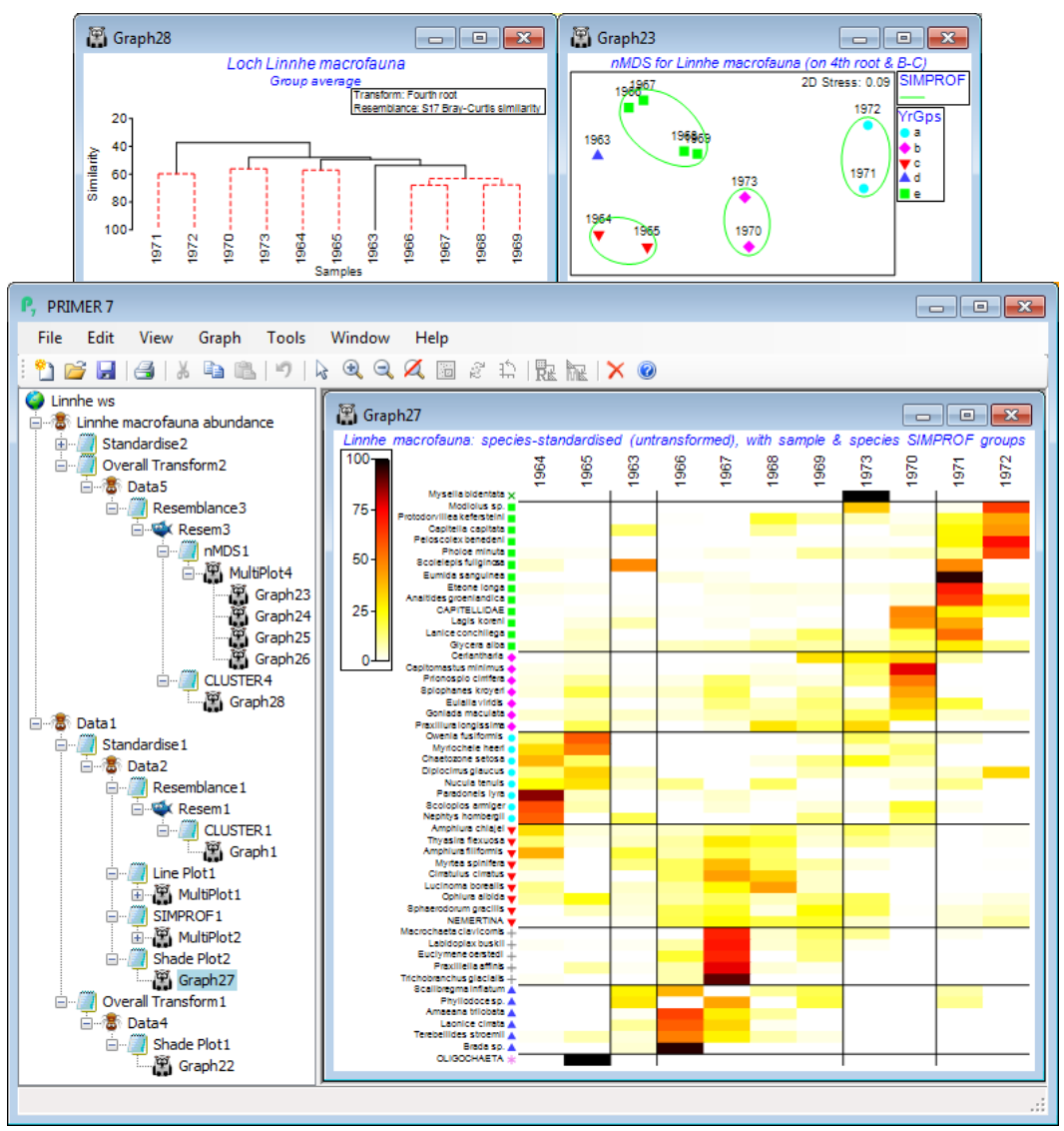
Further examples of analyses leading to sets of coherent species curves are given in CiMC, Chapter 7 and Somerfield & Clarke (2013) J Exp Mar Biol Ecol, with an interesting contrast seen between a (spatial) case with complete species turnover along the samples axis – the Exe nematode study seen above – and a (temporal) case with more subtle seasonal and impact-related changes in abundance – the Morlaix macrofauna over the Amoco-Cadiz oil-spill period, the MDS plots for which were discussed extensively in Section 8. The latter is especially interesting because it does put together coherent groups of species which: define the seasonal cycles; apparently respond to the oil spill by drastic decrease or increase in numbers, at differing time lags; appear to be completely unaffected; or are perhaps responding to more long-term temporal change. This tool therefore helps put the clear changes seen in a multivariate analysis of samples into their proper biological context of temporal/spatial/experimentally-driven patterns in the main species making up that community.
Coherent sets of abiotic variables (N Sea biomarkers)
Save the workspace as Linnhe ws, close it and re-open the data on a suite of biomarkers (‘health’ measures) from flounder sampled at five N Sea sites S3, S5, S6, S7, S9, with 10 replicate samples (pools of fish) from each site. The workspace N Sea ws in C:\Examples v7\N Sea biomarkers holds the datasheet N Sea flounder biomarkers, which was last used in Section 9 to establish differences amongst sites in the full suite of the 11 biomarkers. Two of the variables (EROD and LIPID VAC) were square-root transformed with Pre-treatment>Transformation(individual) and the full set (rename them Transformed biomarkers) then normalised to a common scale with mean 0, variance 1 (named Normalised biomarkers). It of interest here to test whether there are coherent biomarker sets – those within a set having the same pattern of response across the samples, and among sets having statistically distinguishable outcomes – and to create line plots of those common responses on the normalised scales. Here, the measurements are all matched to the individual replicates, so it is multivariate response patterns across 50 samples (not just a mean response at each of five sites) which is used to correlate the 11 variables. And it is correlation which, for most abiotic variables, is the relevant measure of variable resemblance (see Section 5). This will be Pearson correlation here, though the non-parametric Spearman correlation can be used instead.
Running Wizards>Coherence plots on the active matrix Transformed biomarkers, the routine notes that the data type is defined as Other and asks for confirmation that you would like to treat these as environmental rather than community-type variables (i.e. for which correlation measures rather than the index of association are relevant). It is important to retain the (✓Scale variables) default option, with (•Normalise) if the (Resemblance: Pearson correlation) option is chosen, even though the Pearson coefficient itself includes a normalising step. This is because the permutation process for the Type 3 SIMPROF test exchanges values across variables, within samples, prior to calculating the resemblance, and this makes no sense if the variables do not have the same scale. Of course, an alternative is to enter Wizards>Coherence plots from the Normalised biomarkers sheet, with the (✓Scale variables) step not then required. [If you do this and still take (✓Scale variables), PRIMER will remind you of the fact, but this is only a warning because normalising for a second time changes nothing. Similarly, if you start from Transformed biomarkers and propose to use Spearman correlation then you must take (✓Scale variables•Rank) and (Resemblance: Change)> (Measure•Other)>(✓Correlation>Spearman rank correlation). Without the initial ranking, permutation of variables again makes no sense and, much more subtly, do not be lulled into thinking that Pearson correlation will then give you Spearman (since Spearman is just Pearson correlation on ranks), because after permuting ranks over variables, independently for each sample, the ranks no longer add to a constant and the re-ranking implicit in calculating Spearman becomes important].
Do not despair at this point! If you take Wizards>Coherence plots and the default (•Normalise) and (Resemblance: Pearson correlation) very little can go wrong – that is the point of a Wizard! It is only if you recreate the individual Wizard stages that you must not forget the Pre-treatment>Normalise variables step before Analyse>Resemblance>(Measure•Other>Pearson correlation) & (Analyse between•Variables), then Analyse>Cluster>CLUSTER>(✓SIMPROF test), taking the default SIMPROF dialog options, and creating (Add indicator named: SFGv1). Look at the cluster dendrogram – whether produced directly or more likely from the Wizard run – and you will see that clustering handles a correlation matrix with negative values. It is not necessary to input only (dis)similarities in (0,100) or distances over (0,$\infty$) to clustering – the dendrogram y axis scale can include positive and negative correlations. However, large negative correlations between variables are treated as very low similarity, with only large positive correlations implying high similarity. This may not always be the required behaviour – indeed for these data Somerfield & Clarke (2013) make the case that knowledge of whether a biomarker increases or decreases on impact should be used to reverse some of them, by Pre-treatment>Transform(individual)>(Expression: -V), after any other transformation, so that all are expected to decline on impact. (If the behaviour on impact is not monotonic, the index may not be that useful!). That all measurements for those variables are now negative is not important since normalising restores them to the usual range of approximately (-3, 3). The coherent sets may look very different since previous opposite patterns may now match.
The main output automatically from the Wizard – or on the Normalised biomarkers running Plots>Line Plot>(✓Multiple plots>Indicator: SFGv1) – is three coherent sets and one singleton. Having used the replicates to determine the variable groupings, a neater summary is given by a means plot: Tools>Average>(Averages for factor: Site) on Normalised biomarkers, and redo the Line Plot. Save the N Sea ws workspace and close it – it will be needed at the end of the section for SIMPER.
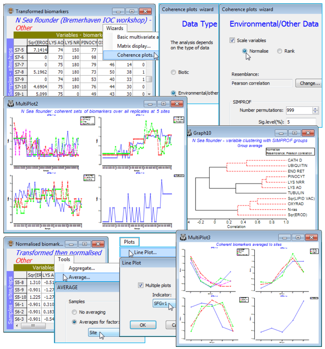
SIMPER (Similarity Percentages)
Shade plots are an excellently succinct way of displaying the abundance (or other quantity) of all the influential species (or other taxon category), in the pre-treated state in which they are input to the multivariate analysis of the community samples. However, they stop short of identifying the precise contribution that each species makes because they take no account of the resemblances calculated on these (transformed) abundances. In the case where there are (a few) established major groupings of the samples, either a posteriori by (Type 1) SIMPROF tests or a priori by ANOSIM, the average (Bray-Curtis) dissimilarity between each pair of groups can be broken down into the contributions from each species using the similarity percentages routine Analyse>SIMPER. This is preceded by a breakdown of the average (Bray-Curtis) similarity within each group into species contributions. Both sets of tables – one table for each group defining the typical species and one table for each pair of groups defining the discriminating species – have their species ordered into decreasing contributions to the overall average (dis)similarity. SIMPER can be used with shade plots to identify species it may be useful to show on a samples MDS in the form of segmented or simple bubble plots (Section 8). However, as with the SIMPROF and ANOSIM tests, the SIMPER routine operates on the (dis)similarities themselves and not the approximate 2- or 3-d ordination space, so is capable of aiding interpretation for established group structures when these are not adequately represented in low-d (i.e. for high MDS stress). It extends also to cases of (squared) Euclidean distance, e.g. from abiotic analyses, broken down into components from each variable, and to two-way crossed layouts, comparing two groups from factor A, within the strata of factor B.
Species dis-criminating two groups (Bristol Ch. zooplankton)
Re-open the Bristol Channel ws workspace from C:\Examples v7\BC zooplankton, for which the shade plot was seen a few pages ago. The BC zooplankton density sheet was 4th-root transformed (4rt density) prior to Bray-Curtis calculation (BC resem) and binary divisive clustering (Analyse>Cluster>UNCTREE), giving four SIMPROF groups of samples (a to d), factor Unctree. On the transformed 4rt density sheet, run Analyse>SIMPER>(Design•One way>Factor A: Unctree) & (Measure•Bray-Curtis similarity) & (✓List only higher-contributing variables>Cut-off percentage: 80) & (✓List pair-wise groups). [This last check box has been added in PRIMER 7 to allow runs on very large numbers of groups where the interest is solely in the species which mainly contribute to the within-group similarities defining each group, rather than cross-group comparisons – there can be sufficiently large numbers of pairs of groups to make SIMPER non-viable unless the cross comparisons are excluded, by unchecking this box]. The restriction to a cut-off (of 80% here) is probably unnecessary when there are only 24 species, but can be useful to avoid long tables, listing all species however small their %contribution to the average dissimilarity between two groups.
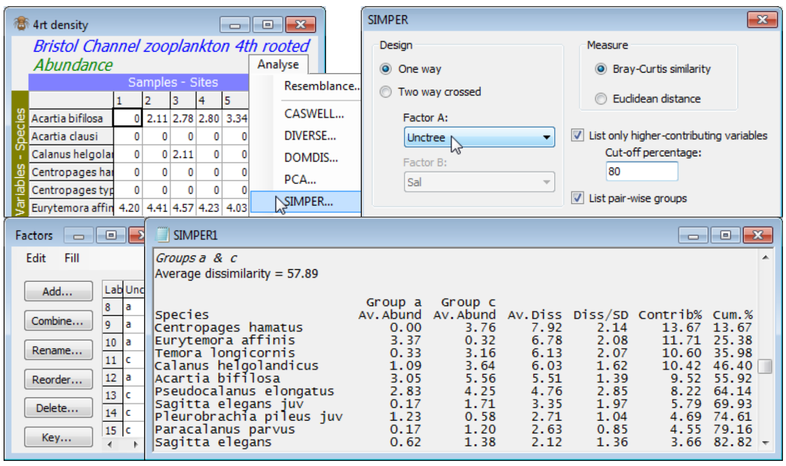
From the results window, SIMPER1, find the table comparing Groups a & c (above) – these are the groups of sites a: 1-10, 12, 24 and c: 11,13-22, 25-27, 29 (the left-hand groups in the shade plot in this section). The average of the Bray-Curtis dissimilarities between all pairs of sites (one in a, the other in c) is 57.9, and this is made up of 7.92 from C. hamatus, 6.78 from E. affinis etc., given in the third data column of the table. The C. hamatus contribution is 13.7% of the total of 57.9 and E. affinis gives 11.7% of the total, etc. (column 5), and these percentages are cumulated in column 6, until the cut-off of >80% is reached. Column 4 is the ratio of the average contribution (column 3) divided by the standard deviation (SD) of those contributions across all pairs of samples making up this average. A good discriminating species is one which contributes relatively consistently to that distinction for all pairs of sites, i.e. with a low SD and thus a higher ratio (e.g. P. parvus, with ratio only 0.85 does contribute something to the difference between a and c but does so inconsistently). Whether the emphasis is on column 3 – which is used to order the species – or column 4 depends on the context. If you are trying to identify species which contribute the most to the differentiation of those groups in the multivariate analyses then it should be the Av. Diss. column – they will tend also to be the species with the larger abundances – but if you are looking for the best indicator of the differences between those conditions the Diss/SD ratio should also be considered. It can sometimes pick out species which are completely absent in one group and with very consistent presence in the other, but with low abundance. Columns 1 and 2 aid the interpretation by giving the average abundance (or biomass, cover etc.) for each species in each of the two groups – something the shade plot also gives a good feel for (note that both these columns and the shade plot present transformed abundances). C. hamatus appears in good numbers in c, having been absent in a, with the opposite pattern for E. affinis. Back-transforming for C. hamatus gives a change from 0 to 159 (3.55$^4$) on the original abundance scale (time-averaged numbers per m$^3$), with the reverse pattern for E. affinis.
Species typifying a group
Earlier in the results window, tables are given of the contributions of each species to the Bray-Curtis similarity within each of the groups (see Chapter 7 of the methods manual for the formula).
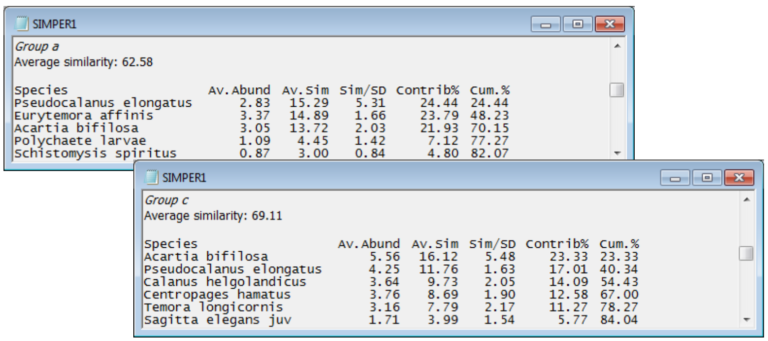
The average Bray-Curtis similarity between all pairs of sites in group a is 62.6, made up mainly of contributions from just three species: P. elongatus (15.3, i.e. 24.4% of total), E. affinis (14.9, i.e. 23.8%), A. bifilosa (13.7, i.e. 21.9%), with a cumulative contribution of 70.2% of the total within- group similarity (the list is again truncated at 80%). These species can be described as typical of Group a (they also have a consistently large presence because the ratio of their contribution to its SD, across the within-group similarities, is relatively high, notably for P. elongatus). However, A. bifilosa and P. elongatus are also typical of group c, which is why they do not head the list of those contributing most to the discrimination between a and c. They did feature lower down in that list, since both have higher average (transformed) values in c than in a (column 1 and earlier shade plot).
Save and close the Bristol Channel ws workspace, and if you would like to try another example of SIMPER on a 1-way layout – but this time with a priori groups – open the WA fish ws workspace examined in Section 9, where ANOSIM tests showed that all pairwise comparisons of (predator) fish species gave significantly different (prey) diets, except two pairs involving S. robustus, for which therefore you should not attempt to interpret the SIMPER table of discriminating species.
SIMPER on 2-way crossed layout (Tasmania nematodes)
A natural extension to the 1-way SIMPER is to the 2-way crossed design, so re-open the Tasmania ws workspace of meiofaunal communities Tasmania nematodes on a sand-flat, with disturbed and undisturbed patches (factor ‘treatment’ Trt: D or U) at 4 locations (factor ‘block’ Blk: 1 to 4) in C:\ Examples v7\Tasmania meiofauna, last seen under 2-way crossed ANOSIM in Section 9. ANOSIM showed there was a clear community difference associated with the natural disturbance by soldier crab activity (not caused by it, necessarily), removing the equally large block differences. In similar fashion, a 2-way SIMPER for treatment differences will remove block differences by looking only at dissimilarities between treatments within blocks and breaking the average of these down into the contributions from species. Starting from the 4th-root transformed nematode sheet gives output:
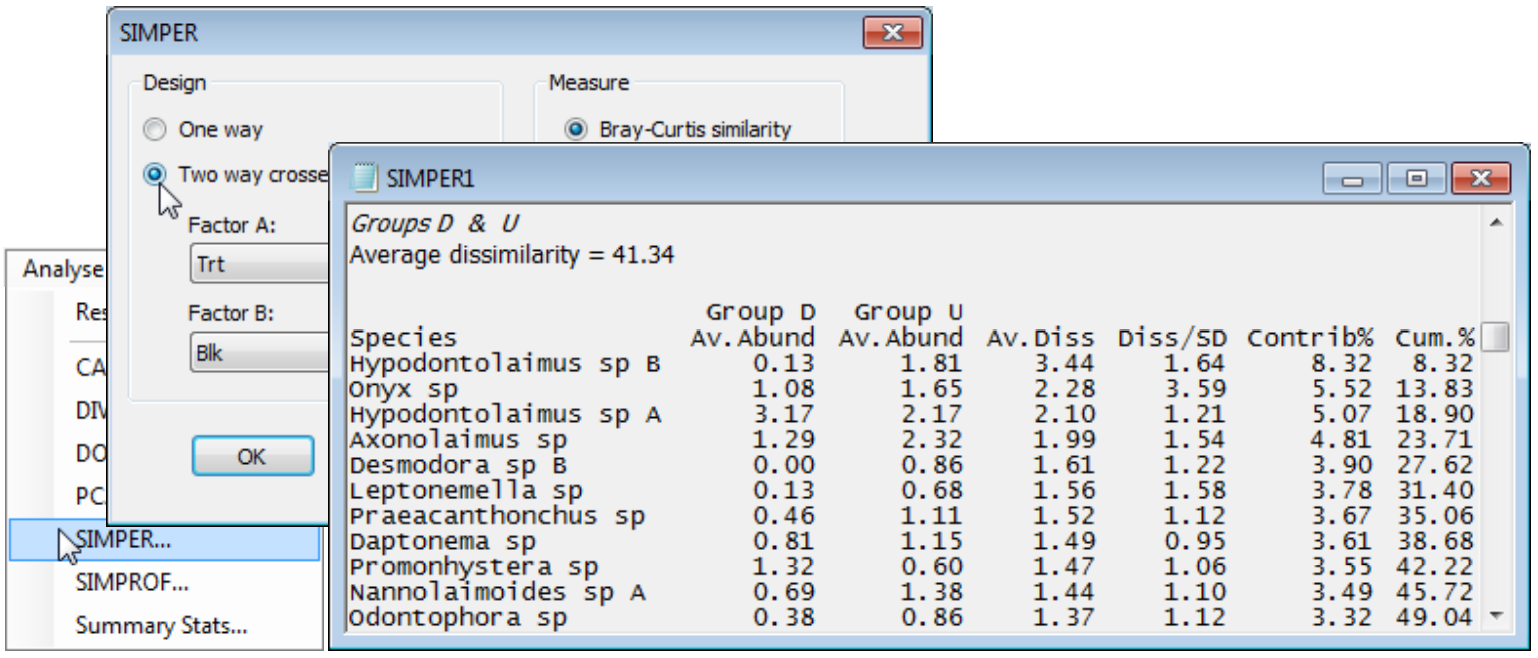
Of course SIMPER must operate with the active sheet as the data matrix rather than from the Bray-Curtis resemblances since it needs to recalculate all the individual species terms that make up the final dissimilarities. The average dissimilarity between disturbed and undisturbed samples (from the same blocks) is not large, at 41.3, but compares with average similarities within the D and U groups (only for pairs of samples within each block, thus removing the block effects again) of 68.6 and 73.2 – the header lines of the first two tables of the output – i.e. dissimilarities of 31.4 and 26.8. The D vs. U difference is seen to be a sum of small contributions from a rather large set of species. (Hypodontolaimus sp B heads the list but this is not because it is the most abundant species overall, e.g. Hypodontolaimus sp A has larger densities). In fact, it is unlikely that one or two species will dominate the contribution because of the severity of a fourth root transformation – the heavier the transform, the more species will be involved in the similarity calculation and thus the breakdowns. The symmetry of a 2-way crossed design dictates that the decomposition can be done on the second factor, removing the first, and these tables are also provided, though of less interest in this context.
SIMPER on (squared) Euclidean (N Sea biomarkers)
Save and close Tasmania ws and, as a last example, open the recently closed N Sea ws workspace. On the Normalised biomarkers sheet, run Analyse>SIMPER>(Design•One way>Factor A: Site) & (Measure•Euclidean distance), unchecking the box which truncates the listings. The contaminant gradient tends to decline from site 3 (mouth of the Elbe) to 7 and increase on the Dogger Bank (9), and the table comparing sites 3 and 7 gives the highest average Euclidean distance squared from all 11 biomarkers – these are also the two endpoint sites of the gradient seen on the biomarker nMDS plot of Section 9 (and ANOSIM R = 0.99 for 3 vs 7). The normalisation puts all biomarkers on an equi-variable scale so all are likely to contribute something, but Pinocytosis, Oxyradicals and the two Lysosomal stability indices head the list of discriminating variables for these sites (evident also from the coherent variables line-plots recently seen). [The SIMPER breakdown is defined naturally in terms of squared Euclidean distance, not Euclidean itself – eqtn (2.13) of CiMC – but this is not important to PRIMER because ANOSIM tests, nMDS etc. all work on ranks of these distances and those are identical between Euclidean and Euclidean squared]. The starting tables in the output that give breakdown of distances within groups are somewhat less natural than they are for Bray-Curtis, (for which both similarity and dissimilarity can be written as a natural sum over species – see eqtns (7.2) and (7.3), CiMC). They are again read from the top downwards, starting with variables which contribute least to the average Euclidean distance (squared) within a group – the key information to scan being column 2. For site 3, having a low average within-group distance (squared) of 3.9 (c.f. 43.2 between sites 3 and 7), the lysosomal stability and Pinocytosis are zero, and N-ras and EROD consistently high for nearly all samples (an indication of impact); these indices fill the top 5 places.