12. Analysing environmental variables (Draftsman Plot, PCA)
- Environment-type data
- Draftsman plots recap & transform choices
- Principal Components Analysis
- PCA eigen-vector plot
- PC scores
- PCA plot options
- Trajectories on PCA
- Bubble plots on PCA
- Multiple 2-d & 3-d plots
- Interpreting PCA vs MDS pairwise plots
- PCA of data on biomarkers
Environment-type data
PRIMER uses the term environmental variables as a shorthand for a wide variety of data types (including biological data!), extending well beyond the archetypal case of physical or chemical measurements made on the environment surrounding an assemblage sample. Environment-type variables can also include matrices of biomarker responses (biochemical, sub-cellular or whole body health indicators from individual organisms, Section 4), morphometric measurements on individuals (perhaps with the aim of separating putative species), PSA data (size-class spectra for soil/sediment/water particulates, Section 4), organism body-size distributions, etc. The unifying factor for these disparate examples is that: a) they all give rise to multivariate arrays of variables by samples which can be analysed by the methods in PRIMER; b) the criteria which lead to use of community-type similarity measures such as Bray-Curtis are not appropriate (e.g. always positive entries, with many zeros and zero playing a special role – joint absences carrying no information, samples with no species in common having zero similarity – and always a common measurement scale across variables, of abundance, biomass, % cover etc.). Instead, resemblance between samples of environment-type variables is better described by standard distance measures such as Euclidean distance (Section 5), where zero plays no special role (e.g. zero temperature, but on what scale?), where negative values can occur (indeed will occur if normalising different scales to common units, Section 4), and where positive similarity is always inferred if two samples have the same value of a variable, even a zero value (e.g. neither sample has a detectable PCB or Hg level, neither sample has particles > size x, etc.). The key message here is that whole assemblage data is different, and requires the specialised methods that are at the core of PRIMER (biological similarity coefficients, non-metric MDS plots, non-parametric ANOSIM tests etc.), environmental-type data is more standard and is often (after individual transformations and normalisation) best treated by the more classic approaches of Euclidean distances and Principal Components (PCA) ordination. The derivation and purpose of PCA is covered in detail in Chapter 4 of CiMC.
Draftsman plots recap & transform choices
Normalisation (subtracting the mean and dividing by the standard deviation, for each variable), and subsequent selection of Euclidean distance or PCA, operates more effectively the closer the data is to approximate (multivariate) normality. The latter is not a prerequisite of PCA but it is the genesis of the method and it is certainly true that, if the data is strongly skewed, the outliers will dominate the PC axes and will often lead to poor-quality interpretation. Transformations of specific variables, or groups of similar variables will often be desirable, by Pre-treatment>Transform(individual) – as in the previous section, and first met for environmental variables in Section 4. A useful aid to transformation choice is given by Plots>Histogram Plot or, where there are fewer samples, Plots> Draftsman Plot. The latter gives pairwise scatter plots between all (selected) variables. Two things are being looked out for here. Firstly, in the draftsman plot, are the samples roughly symmetrically distributed across the range of each variable? Or, if there is enough data to plot sensible histograms, are they very roughly bell-shaped, or at least symmetric rather than strongly skewed to one side? Secondly, if there are strong relationships between some pairs of variables, are these roughly linear rather than strongly curvilinear? This is also characteristic of (approximate) multivariate normality and an underpinning assumption of PCA, that ordinary product-moment correlations describe the dependence between variables (standard correlation measures only linear relationship). Examining these plots can therefore suggest possible transformations. If a distribution is right-skewed (bulk of the distribution to the left, with stragglers to the right) then a $\sqrt{y}$ (mild) or $\log y$ (strong) transform is called for. Use $\log(c+y)$ if $y$ can be zero or negative, choosing a constant $c$ to make all the $(c+y)$ values strictly positive before taking the log. If it is heavily skewed to the left, consider an inverse transform, $1/(c+y)$ where $c$ is close to zero, or a reverse transform, $\log (c–y)$ or$\sqrt{c–y}$ (strong or milder), where $c$ is chosen to be larger than the maximum $y$. Try to use similar transforms for the same types of variables, and don’t be too pernickety! Logically, you need to use the same transform each time you analyse new data in the same context, and over-detailed choices will preclude that. The idea is only to avoid the worst effects of extreme outliers when working on original environmental scales that do not represent the true relationships between samples (those which organisms are responding to, for example – it is often the case that dose-response relationships for individuals to contaminants are more appropriate on log concentration scales). If you are still suffering agonies of indecision (!), then a purely automatic approach was given in the last section, namely to replace all variables by their ranks. This certainly achieves the twin aim of a symmetric distribution and linear relationships (see draftsman plot below) but it must lose a little sensitivity – organisms will be responding to the dose levels themselves, on some scale, not to their rank orders!
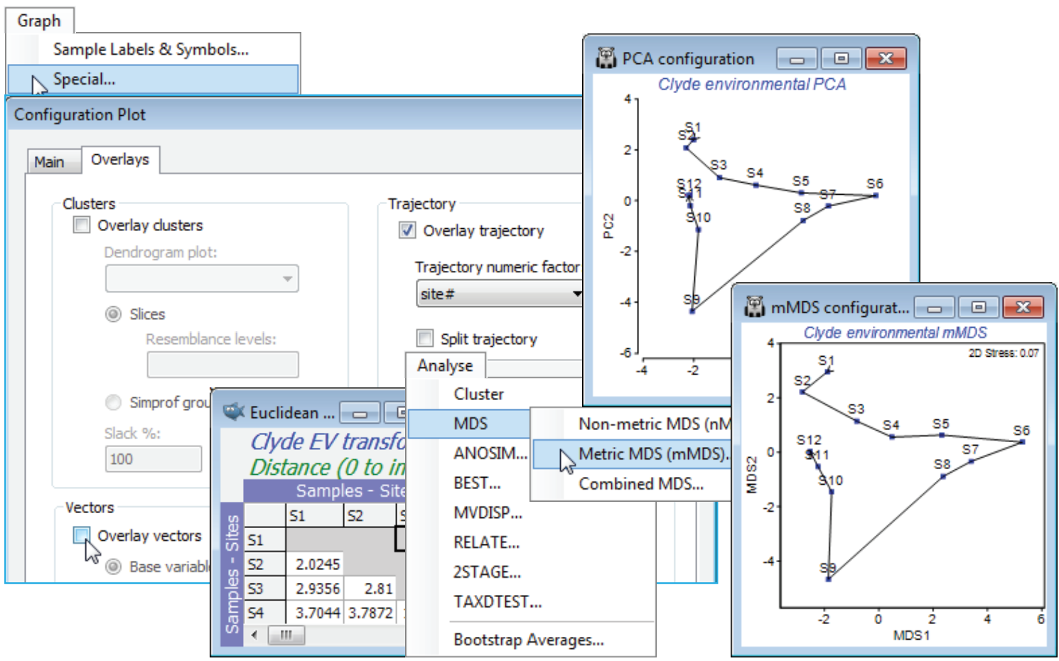
The workspace Clyde ws for the Clyde dumpground study should still be open. If not, open Clyde environment in directory C:\Examples v7\Clyde macrofauna, which has 11 environmental variables from the 12 sites (and was used extensively as an illustration in Section 11). Since there are so few samples, the draftsman plot is probably more effective here than histograms, but try both (Plots> Draftsman Plot and Histogram Plot), taking the usual graphics options to change symbol sizes, titles etc. (right click then Samp. labels & symbols and Titles tab), and zooming in on part of the draftsman plot by drawing a box and Graph>Zoom In, or clicking the zoom icon on the tool bar. Most variables are seen to be right-skewed, which is why they were log transformed with Pre-treatment>Transform(individual) in the previous section (excepting water depth, a very different type of variable, which is seen to be more symmetric and not requiring transformation). Redraw the draftsman plot after you have made these transformations, this time creating the correlations among variables – more appropriate after transforming – with (✓Correlations to worksheet) in the dialog.
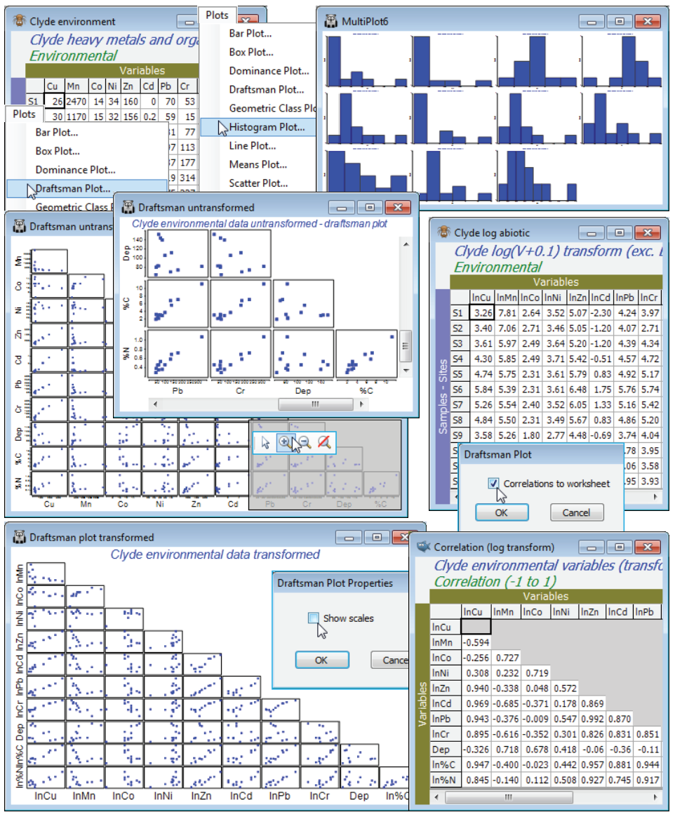
The scales are inevitably unreadable on the full draftsman plot, so the above takes the only graphic option which is specific to draftsman plots under the Graph>Special menu, to turn off (✓Show scales). Keeping scales, when they are readable (e.g. under zooming), does make the point however that even in a transformed state the variables take values over different ranges, and normalising will be required (after transformation) before running a PCA. The correlation matrix shows that many of these variables are highly inter-correlated. This is not a concern for the PCA ordination which follows: part of the point of a multivariate analysis is to represent high-d data in low-d space, and this will actually be more successful if many of these variables are inter-correlated, so the points effectively lie in a 2- or 3-d subspace of the 11-d space. (It is much more of a concern for linkage methods in Section 13, which try to ‘explain’ assemblage structure in terms of driving variables).
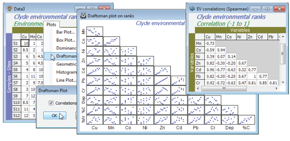
The final possibility is to sidestep individual transformations altogether and work with the variable ranks (the Tools>Rank Variables routine covered in the previous section) – essentially this is just a different type of transformation. The variables are then forced to be symmetric, any (monotonic) relationships are certain to be linear, the variables are placed on a common measurement scale (the ranks 1 to 12 here) and there can, by definition, be no outliers – but the loss of the measurement scale is a significant drawback in using the PC axes for prediction. The correlation matrix is now of Spearman rank correlation ($\rho_s$) because this is ordinary Pearson correlation computed on ranks.
Principal Components Analysis
PCA is an ordination method in which samples, regarded as points in the high-dimensional variable space (11-d here) are projected onto a best-fitting plane, or other low-dimensional solution – the user can specify how many principal components (new axes) are required, and the routine offers 2 d and 3-d plots of any combination of these PC’s. The purpose of the new axes is to capture as much of the variability in the original space as possible, and the extent to which the first few PC’s allow an accurate representation of the true relationship between the samples in the original high-d space is summarised by the % variance explained (a percentage from eigenvalues). The PC’s are simply a rotation of the original axes and thus a linear combination of the input variables (the coefficients are termed eigenvectors); PRIMER allows for superimposition of these vectors on the 2-d PCA plot. The co-ordinates of the samples on the PC axes are called the principal component scores, and these are output to the results, along with the %variance explained by each axis and the linear coefficients defining each PC. Chapter 4 of CiMC has a little more detail.
For the Clyde log abiotic data sheet used above, which resulted from a log(0.1+x) transform of all the environmental variables except water depth (Dep), take Pre-treatment>Normalise Variables, sending the mean and standard deviation for each of these (transformed) variables to a worksheet, and renaming the resulting data matrix Clyde abiotic normalised. On this sheet, run Analyse>PCA, choosing the (default) option of displaying only the first 5 PC axes, and resulting in two outputs: a detailed results window with three sections (Eigenvalues, Eigenvectors and Scores), and a PCA ordination with a superimposed vector plot (blue lines, text and circle). The vector overlay can be turned off (or changed in colour) for improved clarity, by unchecking Graph>Special>Overlays>(Vectors✓Overlay vectors), using Font + Colour to change colour from the default blue, or the circle (indicating a maximal vector) removed by unchecking the (✓Draw circle) box.
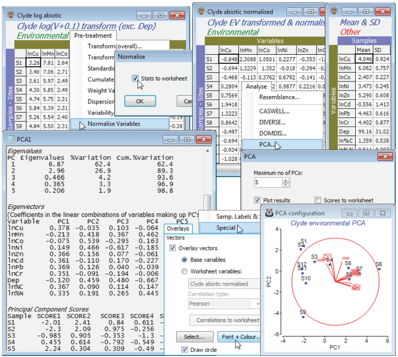
PCA eigen-vector plot
Though the vector overlay has a tendency to clutter the plot, the changing contaminant load along this E-W transect of sampling sites (Fig. 1.5 in CiMC) is clear. The end points S1 and S12 lie close together and there is a strong trend from S1 to the dump centre at S6 (left to right on axis PC1), and a reversal of that trend for S6 to S12, moving away from the dump centre. The trajectory differs on the PC2 axis, however, for the two arms of the transect. The results window (heading Eigenvalues) shows that a 2-d PCA is a very good description of structure in the higher (11-d) space, the first axis (PC1) accounting for much of the variability (62%) and PC2 most of the remainder (a further 27%), i.e. 89% between them. The Eigenvectors are the linear combinations which define the axes:
$$ \text{PC1} = 0.378(\ln \mathit{Cu} )^* – 0.213(\ln \mathit{Mn})^* – 0.075(\ln \mathit{Co})^* + 0.149(\ln \mathit{Ni})^* + …; $$
$$ \text{PC2} = –0.035(\ln \mathit{Cu})^* + 0.418(\ln \mathit{Mn})^* + 0.539(\ln \mathit{Co})^* + 0.466(\ln \mathit{Ni})^* + …, $$
the asterisks being a reminder that the transformed variables are normalised. It is the coefficients in these equations (eigenvectors) that the vector plot shows graphically: $(\ln \mathit{Cu})^*$ has coefficients 0.378 and –0.035, so its main contribution is to the first axis, increasing from left to right because the coefficient is large and positive, with only a slight decrease in the PC2 direction because of the small negative sign; $(\ln \mathit{Ni})^*$ has coefficients 0.149 and 0.466 so points slightly right (positive but small PC1 coefficient) and strongly upwards (large and positive on PC2), etc. The vector length reflects the importance of that variable’s contribution to these particular two PC axes, in relation to all possible PC axes – if the line reaches the circle then none of that variable’s other coefficients in the Eigenvectors table will differ from 0. The vector plot (or more clearly the eigenvector results table) show that PC1 is a roughly equally weighted combination of most of the heavy metals, Cu, Zn, Cd, Pb, Cr and organics, but not Co, Mn, Ni and Depth. The situation is reversed on the PC2 axis, with the first batch scarcely contributing at all, but the second set all increasing strongly in the positive PC2 direction. So, the first PC gives a natural way of combining the different contaminant levels into a single summary variable that characterises the main contaminant gradient.
Chapters 4 and 11 of CiMC give more on this particular example, but the principle of using a Principal Component axis as a natural, objective combination of a suite of variables is one that applies equally strongly to biomarkers, morphometric measures, water-quality metrics etc. The only difference in the latter case is that the metrics may already be standardised to a common impact scale (0 to 10, perhaps) so no prior transformation or normalisation is needed before PCA is carried out. For morphometric measurements too, transformation is often not needed and lengths, widths etc. may be in common units, but normalisation may still be needed if widely different measurement ranges are involved (overall body length, setae width), to stop the larger readings completely dominating the PC’s. For typical biomarker suites, transformation would need to be considered and normalisation would be essential, since entirely different scales are often involved.
PC scores
The final table in the results window is headed Principal Component Scores – these can instead be sent to a new worksheet by checking (✓Scores to worksheet) in the Analyse>PCA dialog, which facilitates their further use in PRIMER. An example would be to compute Euclidean distances among sites in PC spaces of different dimension, which could then be input to Analyse>RELATE (Section 14) to give a matrix correlation with the original 11-d Euclidean distances. (This is another way of measuring the fidelity of the observed low-d ordination structure to the high-d relationships, an idea we met as cophenetic correlation in Section 6 on the fidelity of cluster analyses, and such matrix correlations are fundamental within PRIMER, met especially in the next two sections). The PC scores are simply the x, y (or x, y, z etc.) co-ordinates of the samples on the PCA plot – their values on each PC, obtained by substituting the (normalised) variable values into the above linear equations for PC1, PC2, etc. It is the ability to generate a numerical score for a fresh set of values for the same suite of variables which is one of the strengths of PCA. If values from a new site a are recorded as ($\mathit{Cu}_a$, $\mathit{Mn}_a$, $\mathit{Co}_a$, …) you can see where it fits on the contaminant scale by calculating:
$$ \text{PC1} = 0.378 \left\{ [(ln \mathit{Cu}_a) – 4.046]/0.924 \right\} – 0.213 \left\{ [(ln \mathit{Mn}_a) – 6.062]/0.757 \right\} + … $$
where the means and standard deviations used in the normalisations were given in the Mean & SD worksheet from the normalising of the original logged data set (see output on the previous page). This is the main downside to using rank variables in a PCA, which on other grounds has much going for it – it is harder to relate new sites to the PCA from the original set of samples.
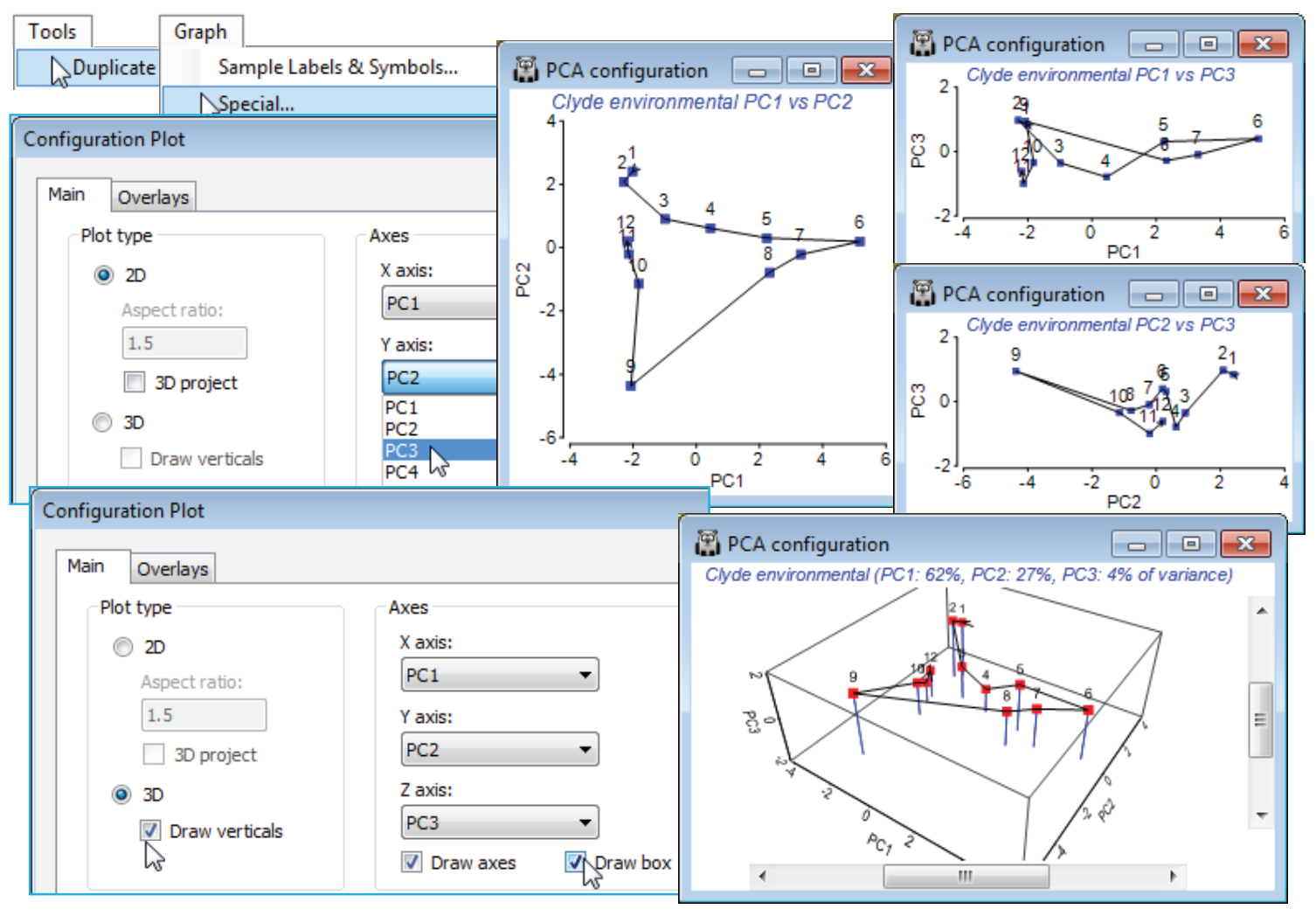
Increasing the default value of (Maximum number of PCs: 5) when running Analyse>PCA will print more columns of PC vectors in the results window (PC6, PC7, etc.), and will allow selection of these higher PCs to be plotted in pairs or triples in the 2-d or 3-d PC configuration. However, it is rarely helpful to interpret more than the first 3 or 4 PCs, so the default computation of the first 5 is usually perfectly adequate. It is important to note that nothing changes at all in the first 5 sets of vectors if it is decided to calculate axes 6 to 10, say. Each lower-d configuration is a projection from the higher-d solution, which therefore just involves dropping out the higher axes. This is not true of MDS ordination, for which the 2-d solution is recalculated from scratch, and not just the first two dimensions of the 3-d solution.
PCA plot options
Many of the options for manipulating PCA configurations are exactly the same as for MDS plots, covered extensively in Section 8, so will not be repeated – only features that differ will be shown. General rotation is not allowed in a PCA: directions have defined meanings as the axis of greatest variation, then the axis perpendicular to that with the greatest variation of that unaccounted for by the first axis, etc. However, any axis can be reflected (flipped) without affecting the interpretation in any way. Which direction the algorithm chooses to plot an axis – to the right or left, up or down, in or out etc. – is arbitrary (though repeatable). In fact, in order visually to match up the PCA plot for environmental data with the mMDS for the same data, and the biomass (or abundance) nMDS ordinations, seen in the previous section, it might be necessary to run Flip X or Flip Y (or, in a 3-d plot, also Flip Z) either from the Graph or floating right-click menu. Note that when you do this, both the points and the vectors will (naturally) reverse. This does mean, however, that information already written to the results window is now slightly incorrect: the signs of the eigenvector for the axis that has been reversed need to be mentally switched (+ to – and – to +). The current location of points (PC scores) after flipping will, however, always be output correctly by File>Save Graph Values As, just as they are for current MDS or CLUSTER rotation states. Mention of mMDS raises the question as to how it differs from PCA, if both use the same metric Euclidean distances? So, now visually compare the PCA with the mMDS under the Ranked variables heading of Section 11.
Trajectories on PCA
From the Graph>Special menu, remove the vector overlay by unchecking the (✓Overlay vectors) box on the Overlays tab, and on the same tab, join the points along the transect with (✓Overlay trajectory>Trajectory numeric factor: Site#) – if the factor doesn’t exist, create or import it, as seen under that Ranked variables heading. A better comparison would be of the current PCA with mMDS not on the ranked variables but on the same Euclidean distances as created from normalised and transformed variables here, so you may wish to run that Analyse>MDS>Metric MDS (mMDS) routine. This indicates one rather obvious difference: mMDS works from the resemblance matrix and PCA from the data matrix underlying that. A more important distinction is that mMDS does not project the points from the high-d to low-d space as in a PCA, but more carefully arranges them in order optimally to match the low-d Euclidean distance structure to the original distance matrix. Here however, all these ordination cases are effectively indistinguishable: the samples largely lie on a 2-d plane in the 11-d space making it easy for both methods to display an accurate 2-d picture.
More interesting is the fact that the PCA (or mMDS) of the abiotic variables is an excellent match to the nMDS of the assemblage (also in Section 11), whether based on biomass, abundance or both, and this observation motivates the BEST routine of Section 13. (Note that a PCA of the biota is poor by comparison, since it implicitly uses Euclidean distance rather than an assemblage-based coefficient such as Bray-Curtis – and it actually fails to display a convincing species gradient even though there patently is one there. Choice of a relevant similarity is much the most crucial decision to make in multivariate analysis – a point seen again in Section 14.)
Bubble plots on PCA
Of the other options on the Graph>Special menu, overlaying groups from a CLUSTER run (which to be consistent must use Euclidean distance) is no different than for MDS ordination, in Section 8, and bubble plots likewise are executed in just the same way as for MDS. Though segmented bubble plots (at least for a selection of the 11 variables) will be visually clear-cut, they are not essential in this case in order to judge the contribution of individual environmental variables to a PCA derived from all of them – the vector plot provides that simultaneous information correctly for all variables. This is because the relationship of a single variable to the PC axes has to be a simple linear one, by definition of PCA, and this is the (•Base variables) option under (✓Overlay vectors), distinctive to a PCA plot. This is very different from a typical biotic nMDS, where the relation of single species to directions in MDS space derived from all species can often be non-linear and sometimes not even monotonic (but increasing and decreasing, impossible to represent by a vector! – Section 8). The (•Base variables) option is greyed out for MDS (or PCO) ordinations, since it only applies to PCA, but all ordinations offer vectors based on correlations with (•Worksheet variables). But the strong potential for non-linearity, e.g. of counts for a particular species across the PCA axes, makes bubble plots a much more attractive option than vectors for both PCA and other ordination types.
Multiple 2-d & 3-d plots
As with MDS, use of Graph>Special>Main>Axes, with (Plot type•2D or •3D), allows any pairs or triples of axes to be plotted: (PC1, PC2), (PC1, PC3), (PC1, PC4), (PC2, PC3), (PC2, PC4), …; or (PC1, PC2, PC3), (PC1, PC2, PC4), … etc. By default, PCA is drawn with (x, y) or (x, y, z) axes rather than the full box used by nMDS, but either or both can be chosen – you need to select both (✓Draw axes) and (✓Draw box) to get the axis scaling and the box (the first, the second and both, are the defaults for PCA, nMDS and mMDS, respectively). Taking Tools>Duplicate when the active window is a plot will allow multiple copies to be displayed on the PRIMER desktop, and neatly arranged with Window>Tile Horizontal or Vertical, having first taken Window>Close All Windows and clicked on the series of plots to redisplay them (or the multiple plots could be placed into a new Multiplot, see Section 7). While the three 2-d plots from PC1, PC2, PC3 give, arguably, a more accurate way of publishing a static 3-d plot, the 3-d PCA graph in PRIMER is certainly the better way to view the structure on screen, and this can be manually rotated with the  icon, i.e. Graph>Rotate Axes (rotating the data itself, within a static box – as in MDS – is not allowed since PC directions in relation to the points are fixed). Automatic rotation is with Graph>Spin and this can be saved as a movie file (*.mp4 or *.gif), as for MDS. Graph>Zoom In (
  ) on a 3D plot is often a good idea, since it is usually better to see the points clearly than display all the box corners.
Interpreting PCA vs MDS pairwise plots
Another subtle distinction from MDS is that only a single PCA graph window is produced initially, allowing a choice between displaying a 2-d or 3-d scatter plot. This is because the PC algorithm generates just one solution, with as many PCs as requested: a 2-d PCA is just the first two axes of the 3-d PCA, etc. With MDS, the 2-d and 3-d plots are entirely separate solutions and thus held in different windows. It is possible, starting from a 3-d MDS window, to take Graph>Special>Main>(Plot type•2D) and generate the three pairwise plots: (MDS1,MDS2), (MDS1,MDS3), (MDS2, MDS3) – as remarked above, this gives an alternative static view of the 3-d solution, rather than an arbitrarily projected view of the 3-d box. But, unlike PCA, do not expect the (MDS1, MDS2) plot from this to be exactly the same as the purely 2-d MDS solution! They mean different things and the purely 2-d MDS solution will always be the better representation of the original relationships.
It is clear from the Clyde environmental 3-d PCA below that a 2-d ordination is perfectly adequate (noted previously from the % variance explained). The various 2-d and 3-d plots show how little absolute variation there is on the third axis – another good reason for preserving the aspect ratio, as PRIMER does for all ordinations, i.e. a distance of 0 to 2 units is the same on all axes. You may even need to change the default scaling, (✓Specify scale) on the Z axis tab, to (-2, 2) to get the plot below, to avoid too much compression of the PC3 axis! Save and close the Clyde ws workspace.
PCA of data on biomarkers
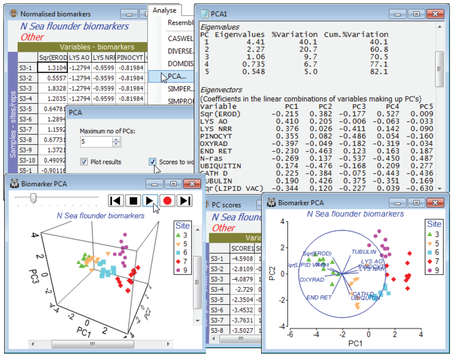
An example where a 3-d plot is marginally more necessary is given by the biomarker data last seen for a 1-way ANOSIM test in Section 9. Re-open the N Sea ws workspace, or if not available, open N Sea flounder biomarkers from C:\ Examples v7\N Sea biomarkers. Work with all the variables, not just the 6 continuous ones used in earlier sections – the remaining 5 are all ordered categorical so it is entirely legitimate to include them in a PCA (or the Euclidean distance used for ANOSIM). Previously, EROD and LIPID VAC were square-rooted with Pre-treatment>Transformation (individual)>(Expression: SQR(V)), but there is not much need for transforming others since there are no strong outliers (it would be pointless for N-ras which is purely binary! – though that still makes it ordered categorical). The resulting data sheet must be normalised, with Pre-treatment>Normalise Variables. It is rather easy to overlook the normalisation step when running PCA, but the analysis here would be disastrous without it, since the PCs are simply hijacked by the variables with highest numbers. In cases where there is a common measurement scale, normalisation may not be needed, as in the particle sizes for Danish sediments (Sections 4, 9) and Plymouth water (5).
On the normalised sheet take Analyse>PCA, and on the plot use the Samp. Labels & Symbols tab to turn off the labels, increase the symbol size and maybe change the Site key colours to avoid blue (the default colour for the vector plot). The 2-d PCA shows the separation of biomarker responses in the 5 areas, with (from the plot and the eigenvectors) sites 3 and 5 separating from 6, 7 and 9, largely on PC1, in the direction of decreasing lysosomal stability and pinocytosis, and increasing levels of oxyradicals, size of lipid vacuoles etc. – indicating stress on the organisms at sites 3 and 5. What tends to separate site 7 and 9 from site 6, largely along PC2, are increased levels of EROD and Tubulin, and decreased Ubiquitin, Cathepsin D and Endoplasmic reticulum. (Remember that the vectors on the plot are read only as indicating size and direction of increase, their location being irrelevant). The eigenvectors also show that N-ras only tends to come out in the higher PC’s. The eigenvalues show that 3 PCs is enough to capture over 70% of the total variability (a good target figure), so it is worth a look at the 3-d plot with Graph>Special>(Plot type•3D) & (Axes✓Draw box). Turn off vectors from the Overlays tab, by unchecking (✓Overlay vectors) and Zoom In, Rotate Axes and Spin from the right-click or Graph menu. The 3-d plot certainly separates the sites clearly but the extra 10% of explained variation in comparison with the 2-d plot does not alter the interpretation to any extent. Resave the workspace as N Sea ws and close it.