16. Diversity curves (Geometric Class, Dominance and Species-Accumulation Plots)
- Range of diversity curves
- Geometric class plots
- Dominance curves
- (L. Linnhe macrofauna time-series); k-dominance, ordinary & partial plots
- Abundance-Biomass Comparison curves
- Matching when there are selections
- Testing for $k$-dominance curves
- (Tikus Is coral cover)
- (Sea-loch contiguous macrofauna cores); Species accumulation plots
- S estimators
Range of diversity curves
PRIMER plots a range of what might be termed diversity curves, under the Plots>Geometric Class Plot and Dominance Plot menus, obtained when the active window is a data matrix, and these are described in Chapter 8 of CiMC. They display a combination of evenness and richness components of diversity in a more continuous way than is achieved by a single index and, in the case of ABC (Abundance-Biomass Comparison) curves, incorporate both abundance and biomass components of the assemblage in a single plot. The multiple ABC plots (one for each sample, matched over the abundance and biomass arrays) are now held in a v7 multi-plot. Factor levels can be identified on the plots by symbols/line types and a structure for testing dominance plot differences over sites/ times/treatments etc., facilitated by Analyse>DOMDIS, generates a triangular matrix of between-curve distances which can be input to ANOSIM (Section 9). Richness (S) estimators are provided in Analyse>Species-Accum Plot, which (as elsewhere) supplements the plot by sending statistics to a new worksheet, making it easy to export information from PRIMER to other software. (There are effectively no changes of functionality for the routines in this section, by comparison with v6).
Geometric class plots
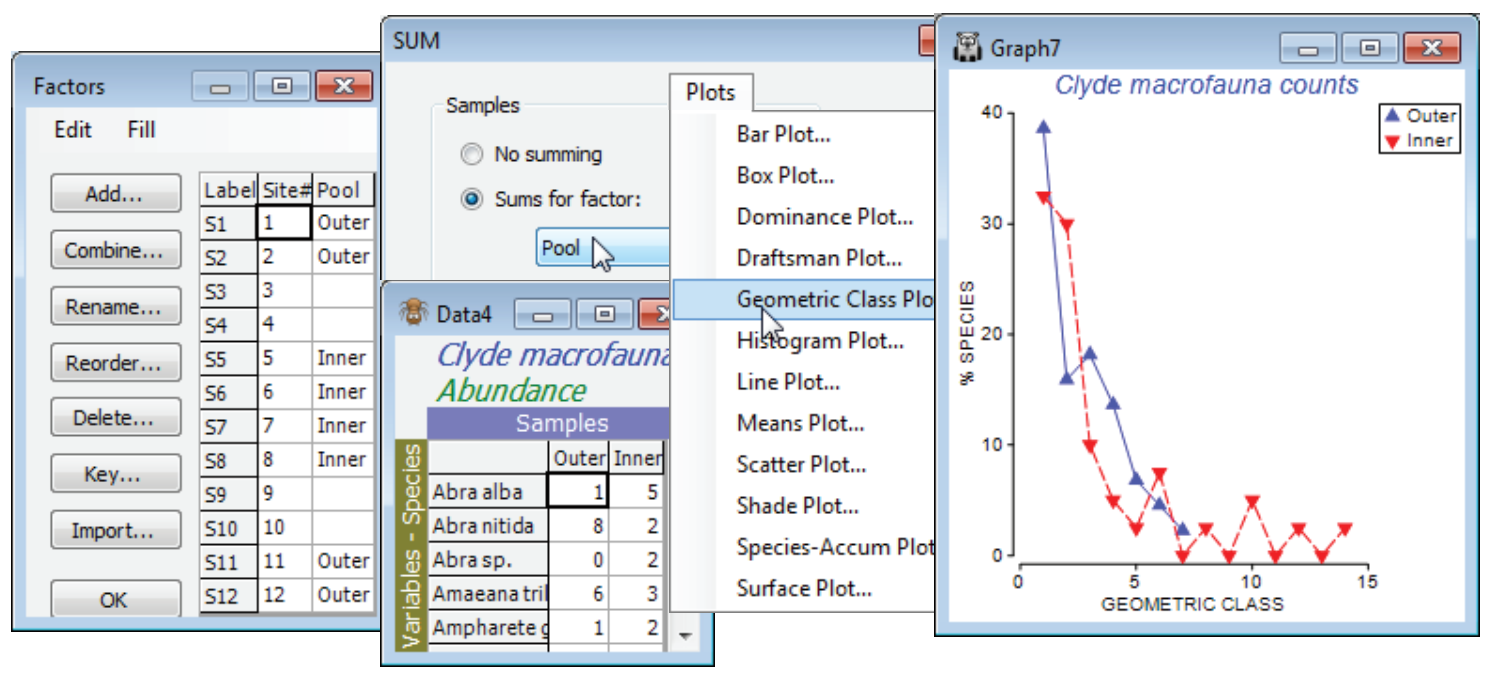
These are essentially multiple frequency polygons, plotted on a single graph, for each sample in the active sheet, which needs to be a taxon (species) by samples array of genuine counts. If you wish to plot a single curve for each of a number of groups of samples then you should first pool replicates in each group with Tools>Sum – or, to pool all the samples in an array into a single sample, you can use Analyse>Summary Stats>(For•Variables)>(✓Sum). Then Plots>Geometric Class Plot gives several line plots (or just one) on a single (x,y) graph in which the y axis is the number of species that fall into a set of geometric ($\times$ 2) abundance classes (x axis). That is, each line on the plot gives the number (or %) of species represented in the sample by a single individual (class 1), 2-3 individuals (class 2), 4-7 individuals (class 3), 8-15 individuals etc. Statistical ecologists call these SAD curves (Species Abundance Distribution), and there is much early literature on fitting by distributions such as the truncated log-normal, proposed on (unconvincing) theoretical grounds. Fisher RA et al 1943, J Anim Ecol 12 was the first (as in so much else, statistically!) to model such data, fitting it to the single-parameter log series distribution – this parameter ($\alpha$) is the Fisher index calculated by Analyse>DIVERSE, see the previous section. It has been suggested that impact on assemblages changes the characteristic form of the SAD curve, lengthening the right tail because some species become very abundant and other, rarer, species (singletons) disappear.
Close the existing workspace (it is not needed again), and re-open the Clyde dumpground study, workspace Clyde ws2 analysed at the start of the last section, or just open the abundance matrix Clyde macrofauna counts from C:\Examples v7\ Clyde macrofauna. The plot would be cluttered with all 12 transect samples displayed, so contrast just two sets of pooled samples – the outer (1, 2, 11, 12) and inner (5, 6, 7, 8) sites – the pools need to be the same size for unbiased comparison. For Clyde macrofauna counts create a factor Pool, with two levels corresponding to these groups, using Edit>Factors>Add (leaving entries for other sites blank), and run Tools>Sum on the counts sheet, giving factor Pool. On the resulting matrix, Plots>Geometric Class Plot clearly shows the right shift in the abundance distribution at the inner sites. Close the workspace; it is not needed again.
Dominance curves
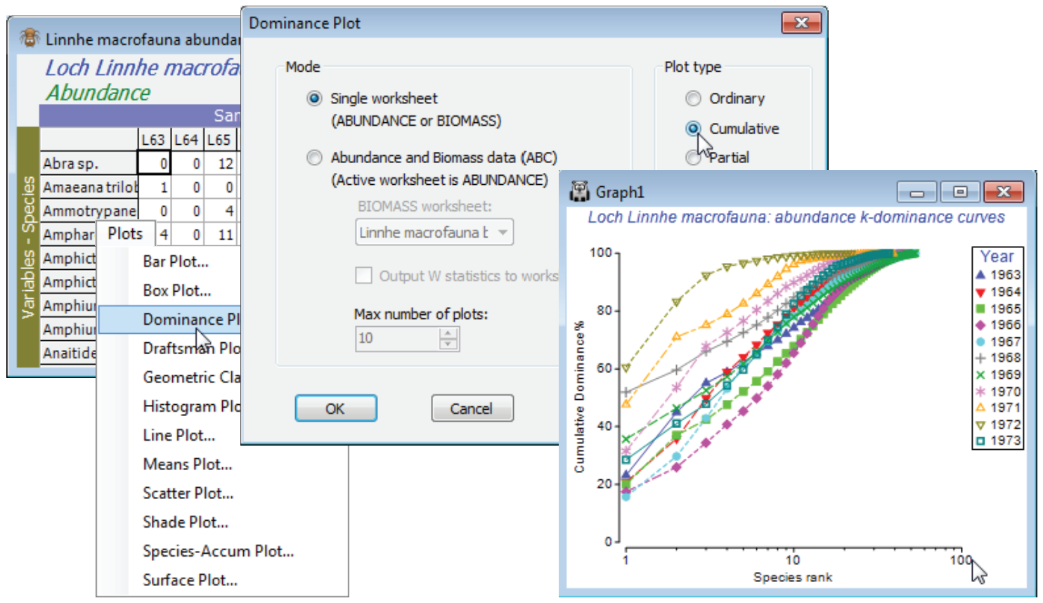
Dominance plot is the convenient generic name for a family of curves also known as ranked species abundance plots, which can be computed for abundance, biomass, % cover or other biotic measure representing quantity of each taxon. For each sample, or pooled set of samples, species are ranked in decreasing order of (say) abundance. Their relative abundance (i.e. percentage of the total abundance in the sample) is plotted against the increasing rank (x axis), the latter on a log scale. The y axis can consist either of relative abundance or cumulative relative abundance, the former therefore always decreasing and the latter always increasing. The cumulative plot is often referred to as a k-dominance plot. There is a third possibility, a partial dominance curve, in which the y axis is the abundance of each species relative to the total of its own abundance plus that of all other less-abundant species. The idea of the latter is to ameliorate the way standard dominance curves tend to be dictated by the most abundant species, by looking at the dominance pattern of the remaining assemblage having removed the most abundant species, then the next most abundant, etc.
A further possibility is to put dominance curves for abundance and biomass, separately calculated, onto the same plot. This is referred to as an Abundance-Biomass Comparison (ABC) curve. A number of published studies have demonstrated a characteristic change in the relative position of these curves under disturbance, particularly for organic enrichment of marine macrobenthos, but a similar paradigm (loss of low-abundance large-bodied species and increased abundance of small-bodied ones) has been described for other faunal groups under impact (fish, birds, dragonflies, small mammals, etc.). The method of display is due to Warwick RM 1986, Mar Biol 92: 557-562.
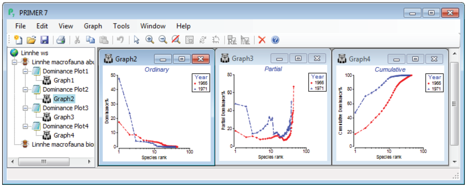
(L. Linnhe macrofauna time-series); k-dominance, ordinary & partial plots
Macrobenthos in soft sediments of a site in Loch Linnhe, Scotland were monitored by Pearson TH 1975, J Exp Mar Biol Ecol 20:1-41, over the period 1963-73, recording both species abundance and biomass. The data are pooled to a single sample for each year, with an assemblage of 111 species. Starting in 1966, pulp-mill effluent was discharged in the vicinity of the site, increasing in 1970 and reducing in 1972. Abundances are in Linnhe macrofauna abundance, and the matching total biomass, of each species for each of 11 years, in Linnhe macrofauna biomass, in C:\Examples v7\ Linnhe macrofauna. Though Linnhe ws was created in Section 10, you may prefer a new start here.
On the abundance matrix take Plots>Dominance Plot>(Mode•Single worksheet) & (Plot type• Cumulative). This produces a single plot of the k-dominance curves for all 11 years, the earlier years being seen to have higher evenness (lower dominance), by their placement lower down the y axis, and higher species richness by their extent along the x axis, before the full 100% is reached. In contrast, the years of highest effluent release are characterised by low evenness (curves move up the plot) and lower richness. The latter tends to be under-emphasised on k-dominance curves since the default is to plot species ranks on a log scale. This can be removed by unchecking (✓Log scale) on the X axis tab of Graph Options, best accessed simply by clicking the x axis scale, but typically that would underemphasise the equitability component, so a log scale is usually preferred. Note that most of the usual plot features, such as a rectangular zoom (changing the aspect ratio) are available.
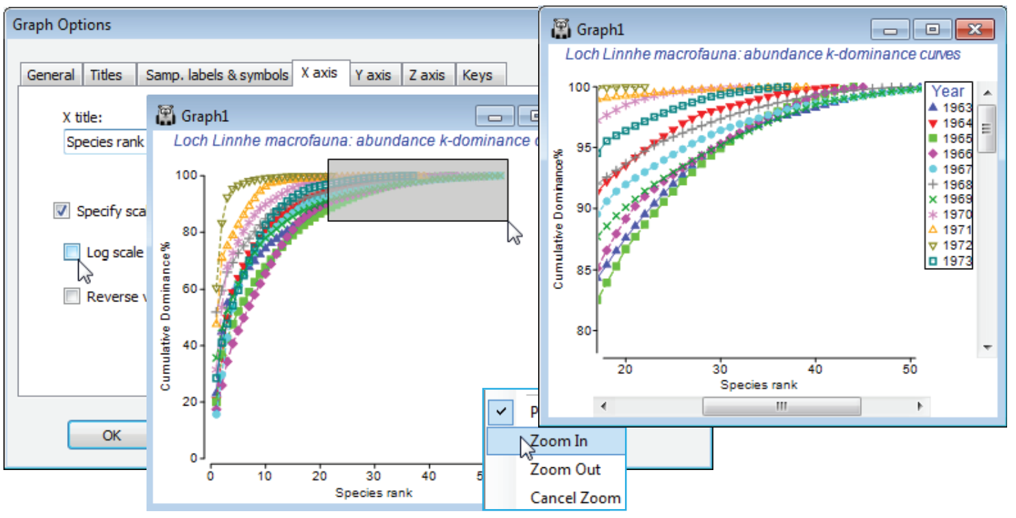
To note the effect of switching from cumulative to ordinary/partial dominance curves, first select just the years 1966 (the last year before effluent discharges began) and 1971 (one of the two peak years of discharge), by highlighting those columns in the data and Select>Highlighted. Perform three separate runs of Plots>Dominance Plot, with Plot type options of •Ordinary, •Cumulative and •Partial, then close all windows except the three graphs and Window>Tile Vertical to obtain the displayed desktop. Note how the cumulative plot emphasises the greater dominance of the two most abundant species in 1971 (once high % values are reached they cannot decrease!), but the partial plot also picks out an unevenness for that year in the dominance structure of species lower in the rank order, an undisturbed partial dominance curve typically looking more like that for 1966.
Abundance-Biomass Comparison curves
ABC curves plot abundance and biomass k-dominance lines on the same plot, and are interpreted in the literature as indicating an undisturbed community if the biomass curve is above the abundance curve, gross disturbance if the abundance curve lies above the biomass and moderate disturbance if the two largely intersect. This is based on the observation that for climax communities of soft-sediment macrobenthos the biomass dominants are large-bodied but do not dominate abundance, and are the more susceptible species to impact, whereas gross disturbance, especially from organic enrichment, leads to abundance dominance by a few, small-bodied opportunist species. (A very different example is given by Smith WH & Rissler LJ, 2010, Restor Ecol 18, 195-204, who show that ABC curves for herpetofauna track succession after forest fires).
Restore the full set of samples for Linnhe macrofauna abundance by Select>All (and Edit>Clear Highlight if you wish, though the latter is unnecessary since all routines – with the exception of Pre-treatment>Transform (individual) – operate on the current selection, not the highlights). The eleven ABC plots, one for each sample (year), are generated by a single run of Analyse>Dominance Plot, and placed in a multi-plot. The active sheet must be the abundance matrix and the Linnhe macrofauna biomass matrix must be available in the workspace as the secondary sheet.
Matching when there are selections
An attempt to run the routine with the matrices reversed, or to run it on a data type Environmental sheet, will provoke one or more warnings (e.g. Primary data not Abundance), though not usually an outright error. It is always advisable to check that Data types have been correctly defined, and change them if necessary with Edit>Properties – you will then get the benefit of sensible defaults and warnings if you make an unexpected choice. As with all routines using a secondary sheet, there is strict matching of sample labels in combining the sheets, but with the option to relax this and take samples in the worksheet orders, if the two matrices are of the same size. If they are not, and all the abundance sample labels can be found in the biomass sheet, then plots will be performed for all the samples with abundance data. (Thus, if the selection of years 1996 and 1971 in the previous illustration had not been rescinded, the routine would return ABC plots only for those two years). This is in line with the general principle throughout v7 – the active sheet determines which samples are analysed, the secondary sheet is a look-up table (but it is advisable in this context to make sure everything matches!). The species labels do need to match because a careful check is made that there are, for example, no species which have a positive biomass but zero abundance (the converse is permitted, since there may be species which are present but too small-bodied to have measurable weight). After those checks are completed satisfactorily however, the dominance curves re-order the species differently (in decreasing rank order) for each sample and for biomass and abundance – it is inherent to the method that the species are not in the same rank order for the B and A curves.
So, on the abundances, take Plots>Dominance Plot>(Mode•Abundance and Biomass data, ABC)> (Biomass worksheet: Linnhe macrofauna biomass) & (✓Output W statistics to worksheet) & (Max number of plots: 11) & (Plot type•Cumulative). In addition to the multi-plot of 11 ABC plots there will be a column of W statistics for each sample. W measures the extent to which the biomass curve lies above the abundance curve (positive for undisturbed, negative for impacted samples, in theory) and is a convenient single index to report, if presenting large numbers of ABC plots is impossible. Note also in the below that the font and symbol sizes in the single plots (obtained by clicking on that component in the multi-plot) are enlarged. This is much more conveniently done in a single operation, prior to running Dominance Plot, by changing defaults with Tools>Options>Graphs. These new defaults are in action for all plots (until changed), even after exit from PRIMER.
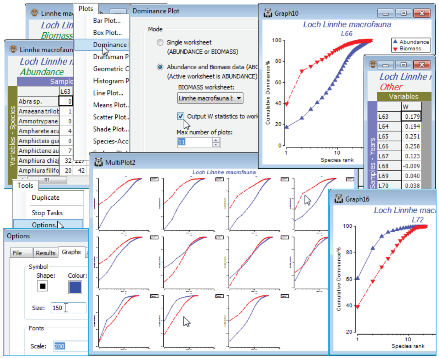
The W sheet can then be Tools>Merge(d) with other classic or distinctness-based diversity indices for univariate plotting, testing etc. Sometimes the juxtaposition of abundance and biomass data in W does capture a different diversity dimension than the classic axis of richness-evenness seen for the multivariate analysis of diversity measures in the previous section. The ABC plots in this case follow the pattern, seen in other diversity indices also, of initial stability (with the biomass curve over abundance), then a gradual switch over of the curves in the period of effluent impacts from 1966, increasing in 1970 (abundance clearly over biomass in 1972), with apparent recovery in 1973 after the discharges decreased in 1972. Close the Linnhe workspace; it will not be needed again.
Testing for $k$-dominance curves
Testing for differences in ABC curves for group structures of sites, times or treatments etc., where there are replicate samples within each group, is probably best accomplished by using the W index. This is computed for every replicate and the W values are treated like any other diversity measure, by univariate statistics. A different approach is needed for k-dominance curves, because of the lack of an internal comparison of curves to generate a univariate statistic. Single cumulative curves now need to be compared across replicates, both within a group and between groups. Clarke KR 1990, J Exp Mar Biol Ecol 138: 143-157 suggests a solution here, which is implemented in the Analyse>DOMDIS routine. This starts from an active sheet of a single species$\times$samples array (abundances, for example, though it could equally be biomass or area cover as in the example that follows), then calculates separately for each sample the cumulative relative abundances of species ranked in their decreasing order, as for the k-dominance plots. The distances apart of all pairs of cumulative curves (samples) is now computed, using Manhattan distance D$_7$ (see Section 5), and the routine therefore generates a resemblance matrix (dissimilarity of curves) among all samples. This can be entered into the multivariate PRIMER routines in just the same way as for any other dissimilarity matrix. (The possibility of inputting pairwise distances between curves – growth curves, PSA curves etc. – to multivariate analysis was seen in Sections 4 and 5). In particular, a run of Analyse>ANOSIM on this distance matrix will produce a significance test for the differences among groups. Replicate curves across groups that tend to be further apart from each other than replicates within groups will give ANOSIM R > 0, and this is tested by permutation as usual. In fact, there is a choice of two curve separation statistics offered by the dialog box in DOMDIS, namely Manhattan distance and a modification of it, which is the default: (✓Log weighting of species ranks). This multiplies the absolute difference between the curves at the ith point on the x axis (the ith ranked species) by log(1 + i$^{-1}$), which successively downweights the contributions from the lower ranked species. It reflects the fact that k-dominance curves are usually plotted with a log scale on the x axis (of ranks), and it approximates to the visually-observed area between the two curves. The unweighted form would be relevant if plots are used without a logged x scale (as seen in an earlier example).
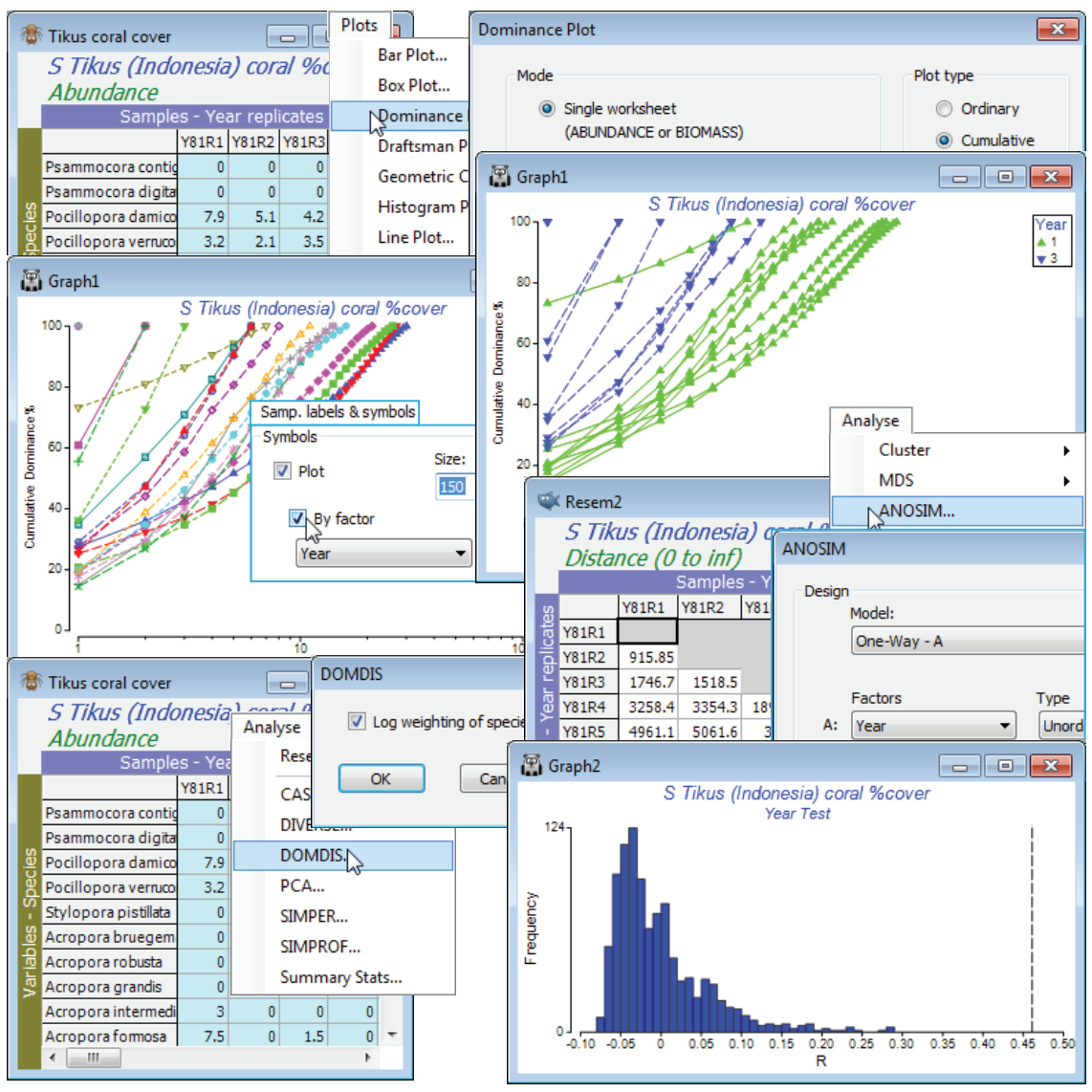
(Tikus Is coral cover)
The Tikus Island, Indonesia, data on % area cover of coral communities on 10 transects in the years 1981, 83, 84, 85, 87 and 88, were first met in Section 5, with data sheet Tikus coral cover in the directory C:\Examples v7\Tikus corals. It is discussed extensively in the context of resemblance choice for multivariate analysis in Chapter 16 of CiMC but here, as an illustration of k-dominance curve testing, we will use only the differences between two of the years: 1981 and 1983, before and after the major El Niño event of 1982/3.
Open Tikus coral cover in a new workspace and Select>Samples>(•Factor levels)>(Factor name: Year)>Levels and Include only 1 and 3. Plots>Dominance Plot, with the defaults of (Mode•Single worksheet) and (Plot type•Cumulative), will generate the k-dominance curves for all the selected samples on a single plot. Show the group structure of 10 replicates from each of two years by Graph>Sample Labels & Symbols, switching on (Symbols:✓Plot>✓By factor: Year). To test for significance of the (rather obvious!) differences between the curves in the two years, run Analyse>DOMDIS>(✓Log weighting of species ranks) on Tikus coral cover. This generates a resemblance matrix Resem1, giving the distance between all pairs of curves, which is then input to Analyse>ANOSIM>(Model: One way - A)>(Factors A: Year)>(Type: Unordered), with the other defaults taken. The R statistic is 0.46, easily larger than for any of the 999 random permutations under the hypothesis of no year difference, thus p<0.1% (and the null histogram shows it would be a great deal smaller, for more simulations), signifying a clear change in dominance pattern between the years. The R value is depressed somewhat by one outlying replicate in 1981 which is much more dominated, and less species rich, than the other 9 transects, but there is no justification for leaving it out of the analysis. Close the workspace – it will not be needed again.
(Sea-loch contiguous macrofauna cores); Species accumulation plots
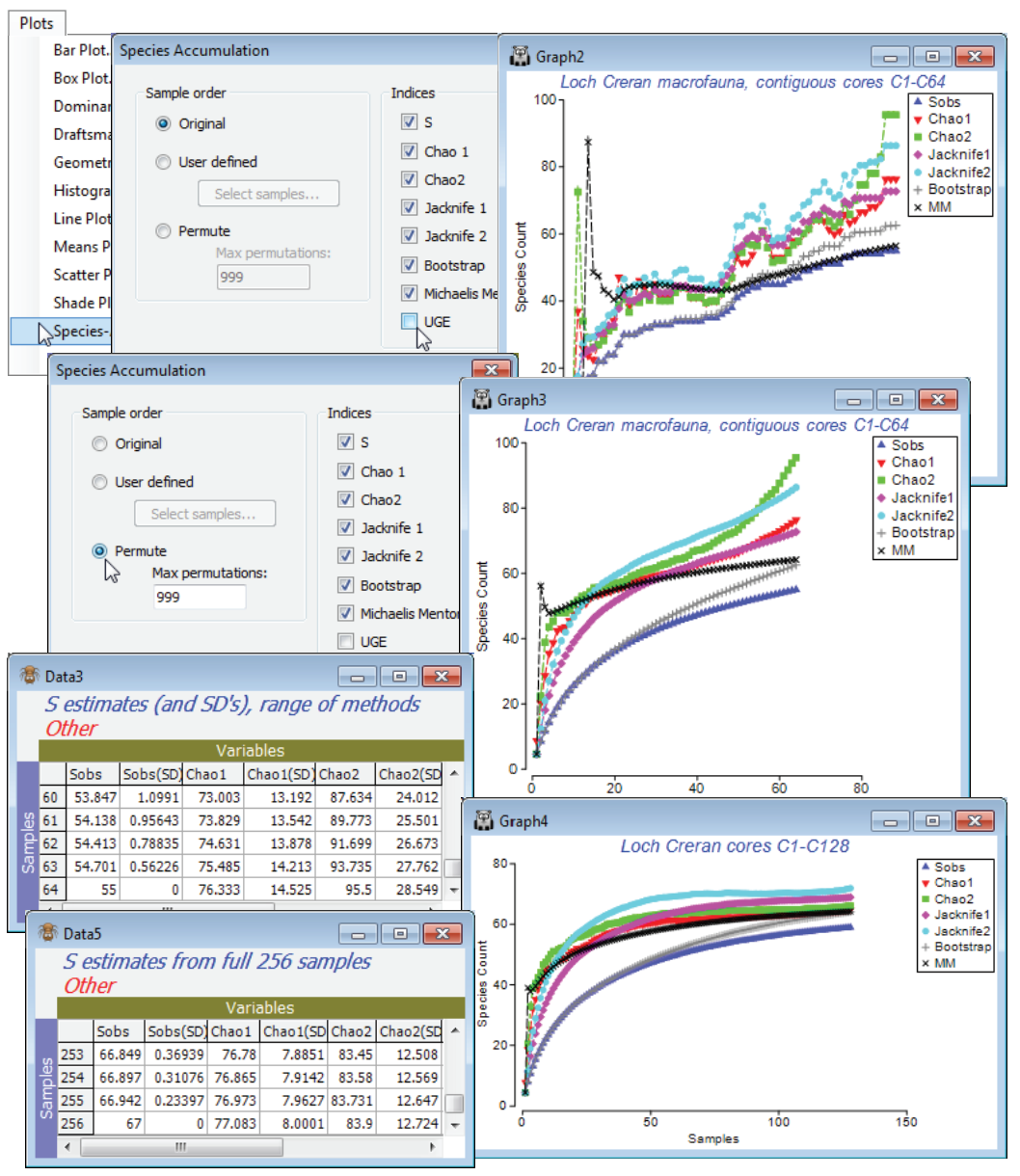
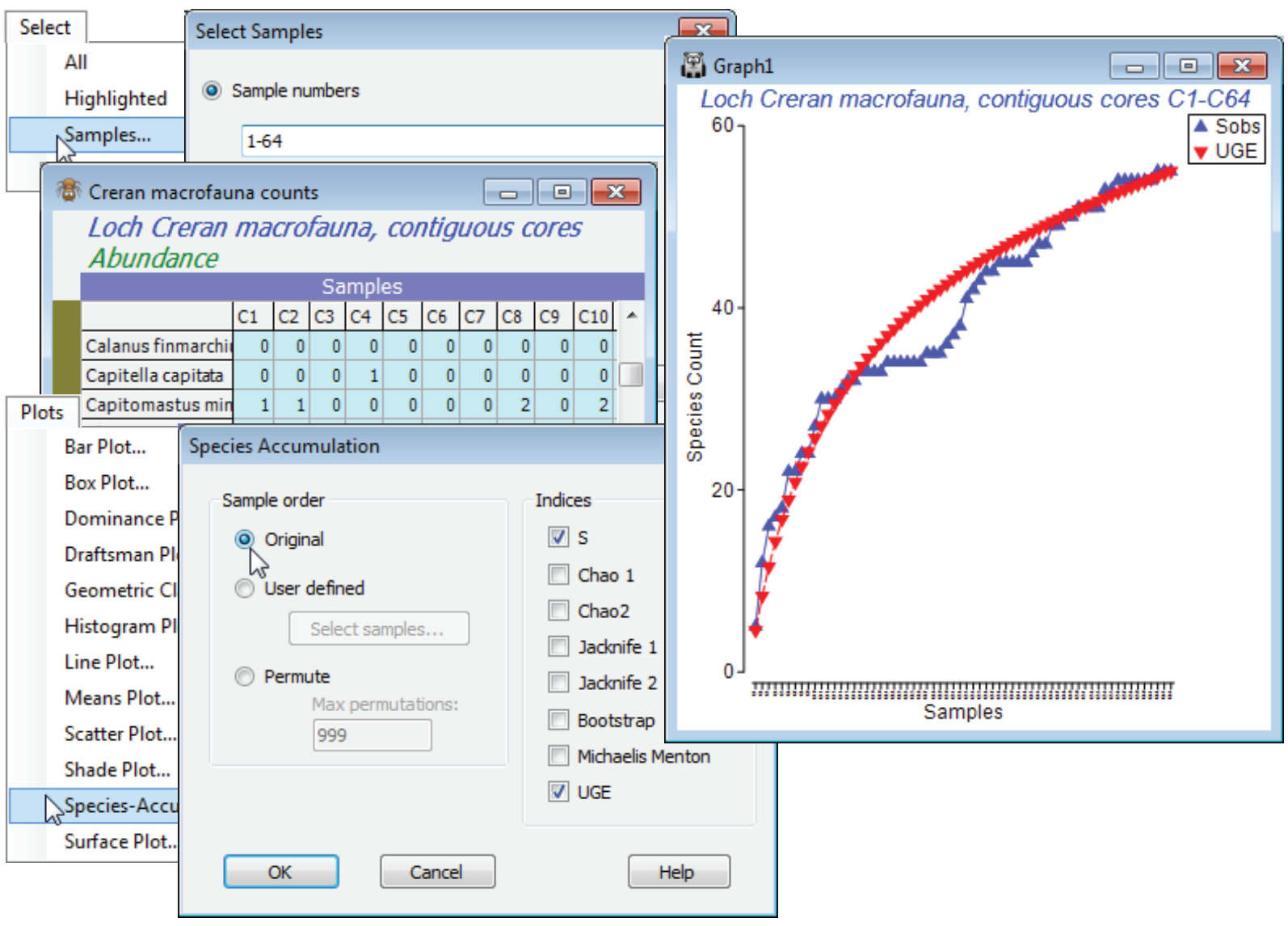
The final set of data in this section is of a benthic study by Gage JD & Coghill GG 1977, in Coull B (ed) Ecology of marine benthos, Univ S Carolina Press, at a single site (C-12) in Loch Creran, Scotland, involving 256 contiguous cores arranged along a single transect. Small cores were used to examine local-scale dispersion (clumping) properties of sediment macrofauna. The data matrix of 67 species by 256 samples is the file Creran macrofauna counts in directory C:\Examples v7\ Sea-loch macrofauna; open this into a new workspace. It will be used here to illustrate the final type of curvilinear plots available in PRIMER, species accumulation curves.
The Plots>Species Accum Plot routine plots (and lists) the increasing total number of different species observed (S), as samples are successively pooled (often referred to as the S obs curve). This is accessed when the active sheet is any species $\times$ samples matrix (though for all except the Chao1 index, see later, which requires genuine counts, only the presence/absence structure is used). There are three options for the order in which samples in the data sheet are successively amalgamated: (Sample order•Original), (•User defined) or (•Permute). The first case simply takes samples in their label order in the worksheet and the second specifies the order by a Select samples button. This provides an Ordered Selection dialog, in which samples can be moved up or down with the usual 
 buttons – alternatively, re-order the original sample labels with Edit>Sort, using a factor. The third (default) option is to enter samples in random order, this being carried out 999 times (or whatever specified) and the resulting curves averaged, giving a smoothed S curve.
The analytical form of this mean value of the accumulation curve (over all permutations, in effect) was given by Ugland K, Gray JS, Ellingsen K 2003, J Anim Ecol 72: 888-897, and is computed by Plots>Species-Accum Plot>(Indices✓UGE). [It is the counterpart of the analytical form given by Hurlbert SH 1971, Ecology 52: 577-586, for the Sanders rarefaction curve met under Analyse>DIVERSE, which gave expected numbers of species for subsets of individuals from a single sample (whereas here we are talking about subsets of samples from a data matrix).] Although, for large numbers of permutations, the (✓UGE) curve will always lie on top of that from specifying (Sample order•Permute) & (Indices✓S), it is included as a separate option so that the combination of original sample order for S with the mean curve (UGE) can be taken. For samples that arrive in a non-arbitrary space or time order, this allows comparison of the real accumulation curve with its smoothed version – spatio-temporal heterogeneity will display as a jagged or stepped S curve.
Select the first 64 samples from Creran macrofauna counts, either using Select>Samples>(•Sample numbers: 1-64) or (•Factor levels)>(Factor name: sixtyfours)>Levels and Include only level 1, and submit to Plots>Species-Accum Plot>(Sample order•Original) & (Indices✓S✓UGE), unchecking the other indices. There is perhaps a suggestion of stepping in the S obs curve (though not much, and this would be hard to test for). However, it is clear that the accumulation curve is still rising and this raises the question as to how much larger S can get, with repeated sampling in this area.
S estimators
PRIMER therefore includes a number of S extrapolators – attempts to predict the true total number of species that would be observed as the number of samples tends to infinity (the asymptote of the species accumulation curve), assuming that a closed community is being successively sampled. This should not be confused with the (✓UGE) or permuted (✓S) curves which, like rarefaction indices, look backwards at the expected behaviour of S as samples are removed, and return simply the observed S at the end of the series. There is a choice of six extrapolators, each of which is calculated as every new sample is added, so the result is again a curve, of the evolution of the S predictor as sample size increases (though mostly one would use the end point prediction as the best estimate of the asymptote). Where the samples are entered in permuted orders, the predictions are again the average of the 999 estimators at each step. These are not parametric approaches, depending on simple functions of the number of species seen only in 1 or 2 samples (Chao2, Jacknife1 and 2), or the number of species that have only 1 or 2 individuals in the entire pool of samples (Chao1), or the set of proportions of samples that contain each species (Bootstrap). The only parametric model given is Michaelis-Menton, which returns (more appropriately, in PRIMER 7!) the predicted asymptote of a hyperbola fitted to the cumulative S curve at each step.
The literature on S estimation is large, and PRIMER does not attempt a comprehensive approach. An early and influential summary for ecologists is Colwell RK & Coddington JA 1994, Phil Trans Roy Soc B 345: 101-118, who detail the above estimators, and an excellent software package for serious users in this area is Colwell’s ‘EstimateS’ (http://viceroy.eeb.uconn.edu/estimates/).
So, produce these six differing S estimates with Plots>Species Accum Plot from samples 1-64 in the Creran macrofauna counts sheet, in two ways: with the samples in their original order and run again with (Sample order•Permute)>(Max permutations: 999), unchecking (✓UGE). In addition to the plots, there is a worksheet of the numeric estimates at each step, which includes (in some cases) simple standard errors based on the permutations – but some of these are certain to underestimate the true degree of uncertainty in practice. (Of course, determining the true number of species not seen is an essentially unsolvable problem without strong assumptions about closed communities and catchability by the sampling device, which in a marine context can be doubtful – accumulation curves rarely approach asymptotes quickly). Check the estimates made at 64 samples against the number of species observed in 128 samples and, run again at that level, against the total S for the full set of 256 contiguous cores. Has an asymptote effectively been reached? Close the workspace.