17. Bootstrap regions for group means (Bootstrap averages)
- Analogue of univariate means plots
- Status of region estimates
- Bootstrap definition
- Bootstrap regions
- Metric or non-metric plots?
- Bootstrap averages in a reduced $m$MDS space
- Output options for region plots
- (W Australia fish diets)
- Running the Bootstrap Averages routine
- Bootstrap regions for Tikus coral reef study
- Bootstrap regions for Fal estuary macrofauna
Analogue of univariate means plots
For this final section, we consider only cases in which the samples form a 1-way layout, i.e. there is a single (a priori defined) factor whose levels divide the data into groups, the samples in a group being considered replicates of that factor level. This factor could, of course, be from a combined factor for a higher-way crossed layout, e.g. all combinations of sites and times with (real) replicates for each combination. For a univariate response, such as a diversity index, the first step would be to test if there were significant differences among the groups and, if so, this is followed by a means plot, showing the respective means for each group with some measure of how reliably that mean has been determined, usually a confidence interval surrounding the mean. This is the type of output generated by all statistical packages (and by the Plots>Means Plot routine, seen in Section 15 for the taxonomic distinctness diversity index). It is uncommon, for example, to see a plot of the actual replicate values juxtaposed for each group in the univariate case. A glance at Fig. 18.1 of CiMC will soon tell you why! By comparison with a means plot, displaying the replicates will often make it difficult to see that pattern among the means clearly. Yet, in the multivariate context, there seems to be a (false) perception that the correct ordinations to plot have always to be ones that contain a point for each sample, in spite of the high stress solutions that often result – with that stress often due to random sampling variability within each group rather than to an inherently high-d structure in the relationship among groups. nMDS is surprisingly successful in capturing underlying group structure from replicate data, partly because it is able to non-linearly stretch and squeeze the dissimilarities into the low-d MDS distance scale, compressing the scale for smaller dissimilarities, which are often those from within groups. However, the logic from univariate practice (and it is sound logic) is that for a priori defined structures, we should run a testing procedure (ANOSIM, RELATE, PERMANOVA, …) to justify interpreting the data and follow this with an ordination means plot, to display and interpret the among-group patterns. On several occasions in this manual and in CiMC, we have followed through this logic to good effect. We have also seen that there are a number of ways of producing a means plot, i.e. different ways of defining a measure of central tendency (to use the accepted jargon of statistics). This is particularly so in the multivariate context, where we have already referred to relationships among means calculated from: averaging the raw data, the transformed data matrix, the similarities, the rank similarities, and (in PERMANOVA+) generating centroids in the high-d PCO space. Chapter 18 of CiMC discusses the pros and cons of some of the different methods, but the practical reality (fortunately) is that the relationship among means is often very similar whichever method is used. The possible exception to this is averaging raw data in cases where a strong transformation is appropriate – the means can then get hijacked by species with large outlying counts in a single replicate, something which the usual process of transformation before computation of similarities is able to resolve. Ordination plots of means, based on averaging a data matrix with Tools>Average (rather than averaging biological-type similarities – also by Tools>Average, but on the resemblance matrix) are therefore preferably better carried out on the transformed form of that data sheet. (This is especially true if that averaging is over the levels of other factors.)
Status of region estimates
Ordination means plots are therefore a vital tool for interpretation but, in relation to their univariate counterparts, they lack one useful feature – the ability to get an approximate feel for the uncertainty in our knowledge of position of each mean point on that plot. In the univariate case, this is provided by 95% confidence intervals, or error bars of $\pm$1 or 2 standard errors (i.e. standard deviations of the mean). These do not reflect primarily the variability in individual replicates from a group but (in a way that is rather precisely defined but rather loosely understood!) the uncertainty in knowledge of the true mean, and this is largely dictated by the number of replicates. Of course, such interval estimates, and the confidence values, are based on parametric assumptions about the distributional form of the observations. This can be carried over into, for example, a concept of 95% confidence regions within an (x,y) plot of groups for a two-variable matrix, but increasingly inflexible and unrealistic assumptions need to be made (the standard multivariate normal MANOVA model). It is realistic, for biological assemblage matrices typically in high-d space and with complex and largely non-identifiable parametric dependencies among the species variables, to set our sights lower and seek to display approximate regions around each group mean, e.g. on a 2-d ordination, which give a ‘feel’ for the uncertainty in that mean’s position. The regions do not have the status of confidence intervals therefore, and should not be used as tests – that is the role of ANOSIM etc.
Bootstrap definition
The construction of approximate regions is approached through bootstrap averages. We only have one observed mean from n replicates for a particular group – leaving aside how that is calculated for the moment. What we need, for a plausible region estimate, is examples of what ‘other means might have looked like’ had we been able to repeat exactly the same sampling protocol, e.g. to obtain another set of n replicates at the same time and/or place (or whatever the group represents). We also need the ‘other means’ to be generated without distributional assumptions, in keeping with the rest of our approach. There is no possibility of obtaining this by permutation (permuting the sample labels across groups destroys the group structure we are trying to represent, and permuting within a group does not change its mean!) However, resampling the set of n samples n times, with replacement, will produce a different sample set (some samples are certain to be missed altogether and some are repeated, possibly a few times), and will have a different mean. This is a bootstrap sample, giving a single bootstrap average, and repeating this process b times will give a set of b such averages which are, to some degree, a set of ‘other means which we might have obtained’.
Bootstrap regions
These averages can then be used to generate a bootstrap region for each of the g groups – at its simplest by displaying the full set of b$\times$g averages in a 2-d (or 3-d) ordination. Here is the first obvious approximation therefore, namely that a 2- or 3-d ordination is not necessarily a perfect representation of the b$\times$g samples, since they are from a higher-d variable space. But this is an issue we are well used to dealing with – we interpret 2-d ordinations cautiously if they have high stress, and look at the 3-d plots (or even subsets of higher axes, though this is rarely necessary in this case) to check whether the 2-d plot has over-simplified some aspect of the groups’ structure. In fact, the stress values for a 2-d plot are often quite acceptably low, even though these are typically ordinations on a very large number of samples of bootstrap averages (the recommendation is b=100+ bootstraps per group, if you can run this in a viable time, i.e. an ordination on 500+ points if you have g=5 groups). This is because the inherent structure of the plot may be just that of the relationships among the g group means, and such means plots are usually low-dimensional. At least this will be the case if the original number of replicates per group is not small, so that the regions are fairly tight (and PRIMER will issue a warning if you run Analyse>Bootstrap Averages with groups which are definitely too small – less than 5 replicates, though many more are preferable).
The Bootstrap Averages routine is able to take this a stage further and, for the 2-d ordination, will construct smooth envelopes for the bootstrap average points which have a nominal 95% coverage (or 80% or 50%). As stressed above, this is not a formal 95% confidence interval, since several sources of uncertainty (such as the approximation to the ‘true’ dimensionality) are not catered for, but a subtle and rather complex correction is made for the well-known underestimation (of order 1-$n^{-1}$ on both axes, where $n$ is the number of original replicates in a group) in variance estimates from bootstrap means. The nominal 95% coverage comes from approximating the shape of the observed bootstrap average regions in 2-d by back-transformed bivariate normals from individual location-shifted power transformations, fitted to the rotated major and minor axes for each group separately (essentially the algorithm used in Section 15 for $\Delta^{\scriptscriptstyle +} / \Lambda^{\scriptscriptstyle +}$ ‘ellipse’ plots). This is another approximation therefore, and will not be able to fit non-convex (e.g. banana-shaped) clusters of points very convincingly – but it does incorporate the variance bias correction, so it is generally seen that the smooth envelopes contain more than 95% of the bootstrap average points.
Metric or non-metric plots?
The Analyse>Bootstrap Averages routine allows both metric and non-metric options for the MDS ordination of the bootstrap average regions. However, mMDS is the recommended choice, and the default. The motivation for constructing a region plot for the group means, rather than just the point estimates of a simple means plot, is to allow interpretation of the among-group structure in relation to the uncertainty in the positions of group means (exactly as we use interval estimates in univariate studies). It is useful to be able to visualise that, for example, along a line connecting two group means A and B, the degree of uncertainty in mean A is about 20 dissimilarity units, in mean B it is about 10 (perhaps B has more replicates or smaller innate dispersion – no assumption of common dispersion or balanced designs need to be made, see later) but at their closest point the two regions are still 20 dissimilarity units apart. This requires the linear measurement scale of a metric MDS (mMDS, not nMDS or even tmMDS, see Section 8). mMDS solutions at the level of replicate samples can often be very poor, with high stress and representation of the among-group structures compromised by the need to display sampling error in full – this is why we use the much more flexible nMDS. But at the level of group means and their greatly reduced sampling variability by averaging, mMDS is often of acceptable stress (even with many bootstraps) and very interpretable.
Bootstrap averages in a reduced $m$MDS space
Though hopefully the above gives the motivation and an idea of the way the region estimates are constructed, the most important instruction of this Section is to read Chapter 18 of CiMC! The detailed reasoning and information it gives will not be repeated here but the upshot is that the best way of constructing the bootstrap averages which are then displayed (and smoothed, bias-corrected etc.) in 2-d mMDS, is to calculate them from m-dimensional metric MDS ordination co-ordinates created by running mMDS on the original dissimilarity matrix. This is carried out for a range of increasing values of m, starting from m=4 (up to m=10, though this limit is usually not reached) and stopping when the ordination configuration crosses a threshold for how well it matches the original dissimilarity matrix. In other words, m is chosen to be just high enough to give a ‘near-perfect’ representation of the dissimilarities. The criterion, as used in several guises in previous sections (the cophenetic correlation of cluster analysis, the matching coefficient for RELATE and BEST/BVStep, e.g. of a subset of species to the multivariate sample pattern for the full species set etc.) is just a matrix correlation $\rho$. Here this is between the original dissimilarities and the distances (which are Euclidean of course) among the sample points on the mMDS – in other words, $\rho$ is the Pearson correlation of the points in the Shepard diagram. (In the context of mMDS and the need to retain the metric information in the original dissimilarities, as discussed above, it makes sense to use a standard Pearson correlation here and not the usual rank-based Spearman correlation). The default in Analyse>Bootstrap Averages for (•Auto m) choice is that the smallest m is chosen to make Pearson $\rho \ge$0.99, though this is under user control. The threshold criterion we adopted for successful reconstructions of the original dissimilarities, in the BVStep runs at the end of Section 14, was (Spearman) $\rho \ge$0.95, so the more severe $\rho \ge$0.99 could certainly be relaxed a little if necessary, without compromising the approach. As shown in Chapter 18, CiMC, the dimension m in which the bootstrapping operates must avoid being too large, otherwise an artefact of high-d bootstrapping becomes increasingly important, resulting in significant underestimation of true dispersion by the bootstrap averages, however many original replicates there are in a group (i.e. however well-behaved a univariate bootstrap might be). This explains the restriction to 4$\le$m$\le$10 in the (•Auto m) option, but the routine also permits manual choice of m, to allow the user to look at the outcome from a wider range of dimensionalities.
Starting from an active sheet which is the full sample resemblance matrix, Analyse>Bootstrap Averages therefore replaces this by m-dimensional mMDS co-ordinates (another approximation therefore in the series leading to our smoothed, nominal 95% region estimates! – but a very useful one, giving the technique some excellent properties). It is in this reduced space that n bootstrap samples are chosen, for a group with n replicates (n will differ for each group, in general) and their means calculated – so the Bootstrap Averages of this section are all simple averages for each of the m co-ordinates of an mMDS ordination. This is repeated b times – also under user choice, though the routine suggests a default which limits the overall number of bootstrap averages across all groups to 300. (However, most machines can run MDS for at least twice that number, hence the earlier encouragement to increase b to at least 100, if at all feasible).
Output options for region plots
These b bootstrap averages for each of the g groups are then displayed in a low-d mMDS space and you have control of whether to display any or all of: the b$\times$g bootstraps (✓Bootstrap averages); the overall averages for each group (✓Group averages); the smoothed envelopes (✓Bootstrap region (2D only)). You cannot easily change your mind about the choice of what is on the display after the run has completed so you may find yourself running the routine more than once, with differing display options. The (✓Group averages) are not the centre of a group’s points in the (usually) 2-d mMDS space of the final display, but the centre of gravity in the m-dimensional space in which the bootstrap averages were calculated, and which are then ordinated into 2-d along with the bootstrap averages. The theoretical unbiasedness of bootstrap averages ensures that this is essentially the same as the centre of gravity of the original samples for that group, after they have been placed in the m-dimensional mMDS space. These group average points can only therefore fail to lie in the centre of the displayed bootstrap averages if there is some distortion in going down from the m-dimensional space of the calculations to the 2-d (say) space of the display, which is potentially useful information (and might suggest looking at the structure in 3-d). This also highlights another important consequence to carrying out the bootstrapping in the reduced m-dimensional mMDS space: because these are simple averages of points in Euclidean space, unequal replication across the groups is not a problem – it will not give the bias that bootstrap averaging in the species space is likely to face (i.e. larger samples produce more species and this changes similarity structures).
(W Australia fish diets)
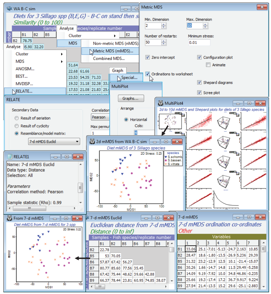
The diet study for 7 species of W Australian fish, with a variable number of dietary samples from each, has been seen several times now. In Section 3 we selected a subset of just the 3 congeneric species, Sillago schomburgkii (10 samples), S. bassensis (14) and S. vittata (16), labelled as B, E and G, and decided to omit samples B3 and B4 from these species (and also A9 from A. ogilbyi) on grounds of very much lower total gut content than other samples. In Section 4, we noted that it was necessary to standardise these samples across the 32 prey categories (the ‘species’ variables) since total gut content of a sample (units are %volume) could not be controlled – since the fish are doing the sampling(!) – and differences in these totals are of no relevance in seeking dietary distinctions among these 3 closely-related species. In Section 8, we looked at nMDS plots for all 7 fish species in higher-dimensions since a 2-d plot had high stress, and noted the differences in variability in diet among the species, and in section 9, we ran the ANOSIM global and pairwise tests between the species to establish the statistical significance (or otherwise) of dietary differences. In Section 10 we referred to use of SIMPER to identify the main dietary categories accounting for dissimilarity among fish species, where these were established with confidence by the ANOSIM tests (and shade plots would also be instructive here). Previously, towards the end of Section 8, we had shown some of those dietary categories on the 3-d nMDS of the samples, in a 3-d bubble plot, and also gave a means plot, averaging over the samples for each of the 7 fish species – on this we then displayed a segmented bubble plot of the main prey categories distinguishing the diets. We can now fit one final small piece to this jigsaw, by adding bootstrap regions to the means plot. In fact, it would be unwise to attempt this for the full set of species, since three of them have only 3, 4 and 5 replicate samples and the motivating concept of bootstrapping (generating ‘other sets of means we could have observed’) is more or less certain to break down with such small replicate numbers – the sampling with replacement just does not produce enough realistically different combinations, see Chapter 18 of CiMC, to avoid major underestimation of the true variation in those means. A fourth species, A. ogilbyi does have plenty of replicates and could be included (and you could do so), but for this illustration we look again at a logical subset – the three congeneric Sillago species – and construct an mMDS plot with bootstrap regions for their average dietary assemblages.
Open workspace WA fish ws from C:\Examples v7\WA fish diets, which should contain the resemblance matrix WA B-C sim for all samples (excluding A9, B3 and B4) of the 7 fish species. If not available, you will have to repeat the earlier steps of: opening the data file WA fish diets %vol, deselecting A9, B3, B4, standardising samples by total (Pre-treatment>Standardise), square root transforming and computing Bray-Curtis, renaming this WA B-C sim. Now highlight and select from this just the B, E and G labels – or instead Select>Samples>(•Factor levels)>(Factor name: species)>Levels>(Include: S.schomb., S.bassen., S.vittata). On these selected resemblances, run Analyse>MDS>Metric MDS(mMDS)>(Min. dimension 2) & (Max. dimension 10), taking other defaults such as (✓Zero intercept), but adding (✓Scree plot) and (✓Ordinations to worksheet). On the multi-plot this produces, reform the rows/columns by Graph>Special>(Arrange•Horizontal) >(Cols: 4). By clicking on individual plots within this multi-plot, note how the 2-d mMDS is of relatively high stress for the (only) 38 samples – as noted earlier, mMDS stress values will always be higher than for the equivalent nMDS but the Shepard diagram for the 2-d plot is also not very convincing. This changes, however, for higher dimensional solutions, with the Shepard diagrams becoming increasingly well described by a straight line through the origin (read across rows of the multi-plot for the Shepard diagrams in dimensions: 2 & 3, 4 & 5, 6 & 7, 8 & 9, 10 & the scree plot). By the time this gets as far as about a 7-dimensional mMDS solution, the stress has reduced to 0.03-0.04 – a very low stress for a metric MDS plot, capturing the original dissimilarities (not just their rank orders) to a high precision in the (Euclidean) distances between co-ordinate points in the 7-d mMDS plots. In fact, it is worth seeing that if you repeat the above 2-d mMDS, but this time starting from those Euclidean distances in 7-d mMDS space, the 2-d ordination appears to be identical to that produced from the original Bray-Curtis similarities for these three species. [You obtain these Euclidean distances by finding the data sheet containing the 7-d co-ordinates from your original mMDS run – because the (✓Ordinations to worksheet) instruction has sent 9 further sheets to the Explorer tree, of the 10-d down to the 2-d mMDS co-ordinates – then simply enter that 7-d co-ordinate data to Analyse>Resemblance>(•Euclidean distance), giving 7-d mMDS Euclid]. Of more relevance to understanding the bootstrap methodology, however, is to calculate (not test) the Analyse>RELATE statistic on the original similarities, WA B-C sim, with (•Resemblance/ model matrix: 7-d mMDS Euclid) & (Correlation method: Pearson), which returns $\rho$= 0.99.
Running the Bootstrap Averages routine
None of the above is necessary in order to create the means plot with regions based on bootstrap averages – it was included purely to note the initial steps the routine takes, under the automatic m option, in order to determine the mMDS dimensionality in which bootstrapping will take place. The Pearson $\rho$ values for increasing m = 4, 5, 6, … are sent to the results window, until they reach the given threshold (default $\rho \ge$0.99 or m gets to 10. These $\rho$ values will be displayed before starting the rest of the routine, namely the compute-intensive mMDS iterations for large numbers of points. So, run Analyse>Bootstrap Averages>(Factor: species) & (Number bootstraps per group: 100) & (•Auto m>Rho: 0.99) & (✓MDS plot•Metric) & (✓Bootstrap averages) & (✓Group average) & (✓Bootstrap region(2D only)•95%). There is also an option to send the m-dimensional data to a worksheet which is not the default and which you do not need to take here. This would allow the bootstrap averages and overall group averages to be placed together with the original replicate-level data (all in the reduced m dimensional space) for a further mMDS ordination. However, this will not usually be helpful – the original replicates will, in most cases, already fit poorly into low-d mMDS space, so compounding this by adding in several hundred points of bootstrap averages will only make matters worse, and an acceptable stress to allow the viewing of both replicates and a measure of uncertainty in the group means in a single ordination is rather unlikely. This should not be seen in too negative a light since, though the analogue of such a plot is perfectly feasible for univariate data, it is not seen very often there either!
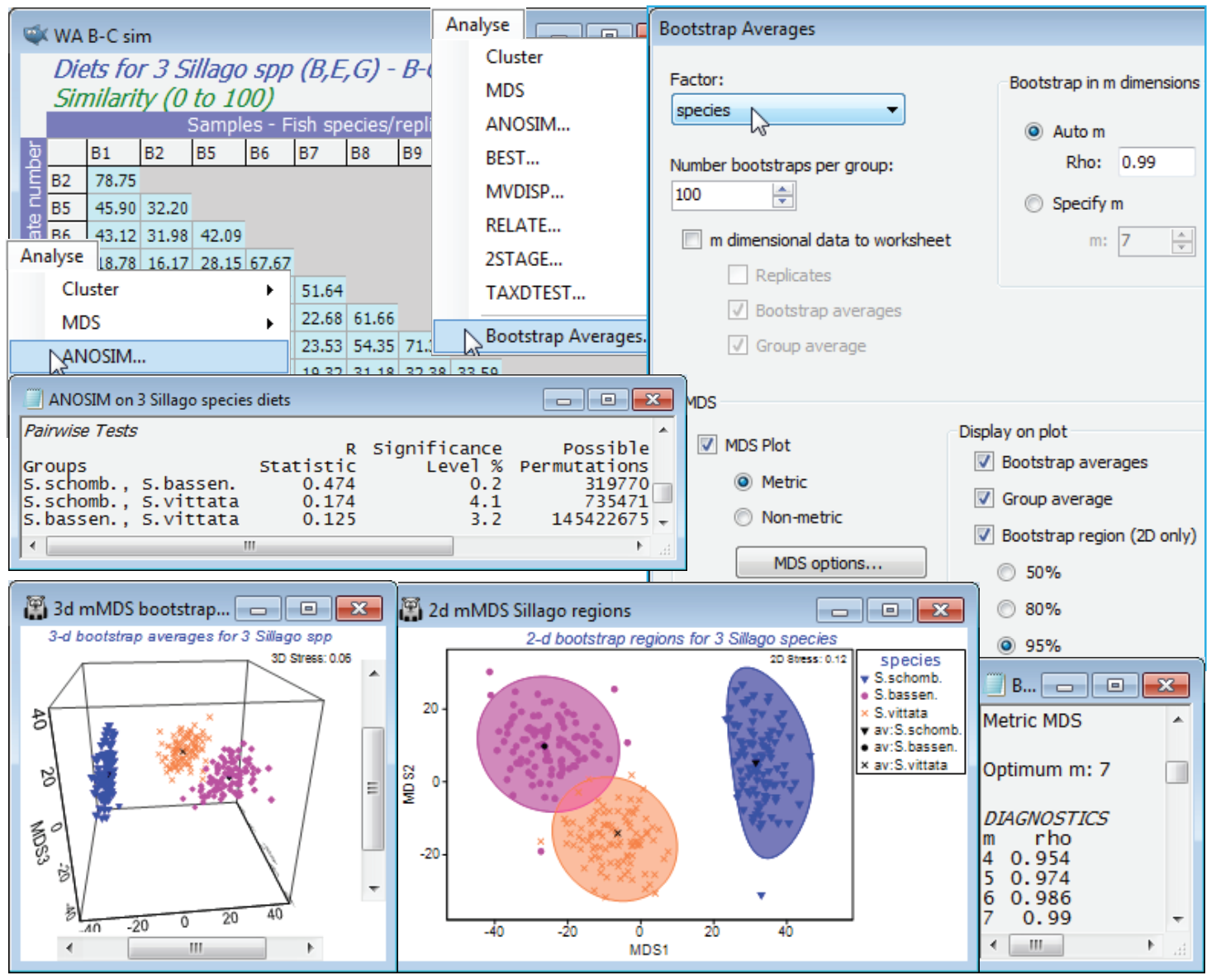
As implied earlier, bootstrap averages are therefore calculated in m = 7 dimensional mMDS space, since the $\rho$ value has reached 0.99 at that point ($\rho$ is more or less guaranteed to increase as m gets larger, and could only not do so if a rather sub-optimal ordination has been generated for one of the trial values of m). The MDS section of the Bootstrap Averages dialog then determines what is done with the 300 averages (100 for each group) and the (Euclidean) distance matrix from their 7-d co-ordinate space. Clicking the MDS options button leads to the usual mMDS dialog and by default (as here) this will produce both a 2-d and 3-d mMDS ordination plot from these distances, the 2-d plot displaying the smoothed, nominal 95% regions described earlier (there is no option available for smoothed 3-d regions in the 3-d ordination). Note that the stress is much lower for both plots (0.12 for the 2-d and 0.06 for the 3-d) than for the original replicate-level space, even though there are 300 points rather than the original 38, primarily because these are plots of means of between 8 and 16 replicates and therefore have much lower sampling variability. The structure is also now (inevitably) much simpler, with three fairly well-defined groups of points.
There are several relevant points to note from these plots:
a) the smoothed regions, though they have to be convex, are not just ellipses – the back-transform from ellipses fitted in a transformed space gives good flexibility to mould the regions to the shape of the clusters of bootstrap averages;
b) the bias correction applied at this point tends to make the smoothed envelopes just slightly larger than the observed spread of 95 of the 100 bootstrap averages, though the effect is marginal, with the reasonably large n values (8 to 16) for the original replicates;
c) the spread of all three clusters of averages is relatively comparable but this is accidental and does not follow from any assumption of constant dispersion. The original replicate-level mMDS (though it needs to be interpreted cautiously with stress of 0.22) shows the blue triangles of S. schombergkii to have a somewhat less variable diet than the other two species, but it also has half the number of replicates (8, compared with 14 and 16) and therefore the variability will not decrease as much, as a result of the averaging – these two effects tend to cancel each other out;
d) the smoothed regions for S. bassensis and S. vittata marginally overlap, but in the 3-d solution, with its lower stress, the clusters seem disjunct (though abutting). However, you must resist the temptation to turn this into a hypothesis test. It is not even true in the simple univariate case (with full normality and constant variance assumptions), that if 95% confidence intervals overlap then their means are not significantly different – and here we have taken some trouble to point out the approximate nature (in several ways) of these nominal 95% envelopes. The formal tests here are those of ANOSIM – and PERMANOVA, since that works with the measurement scale of the dis-similarities (as mMDS does) rather than the rank values in ANOSIM. Here, as often, the tests give very similar results, with borderline significance for this pairwise difference (p<3% for both tests).
Bootstrap regions for Tikus coral reef study
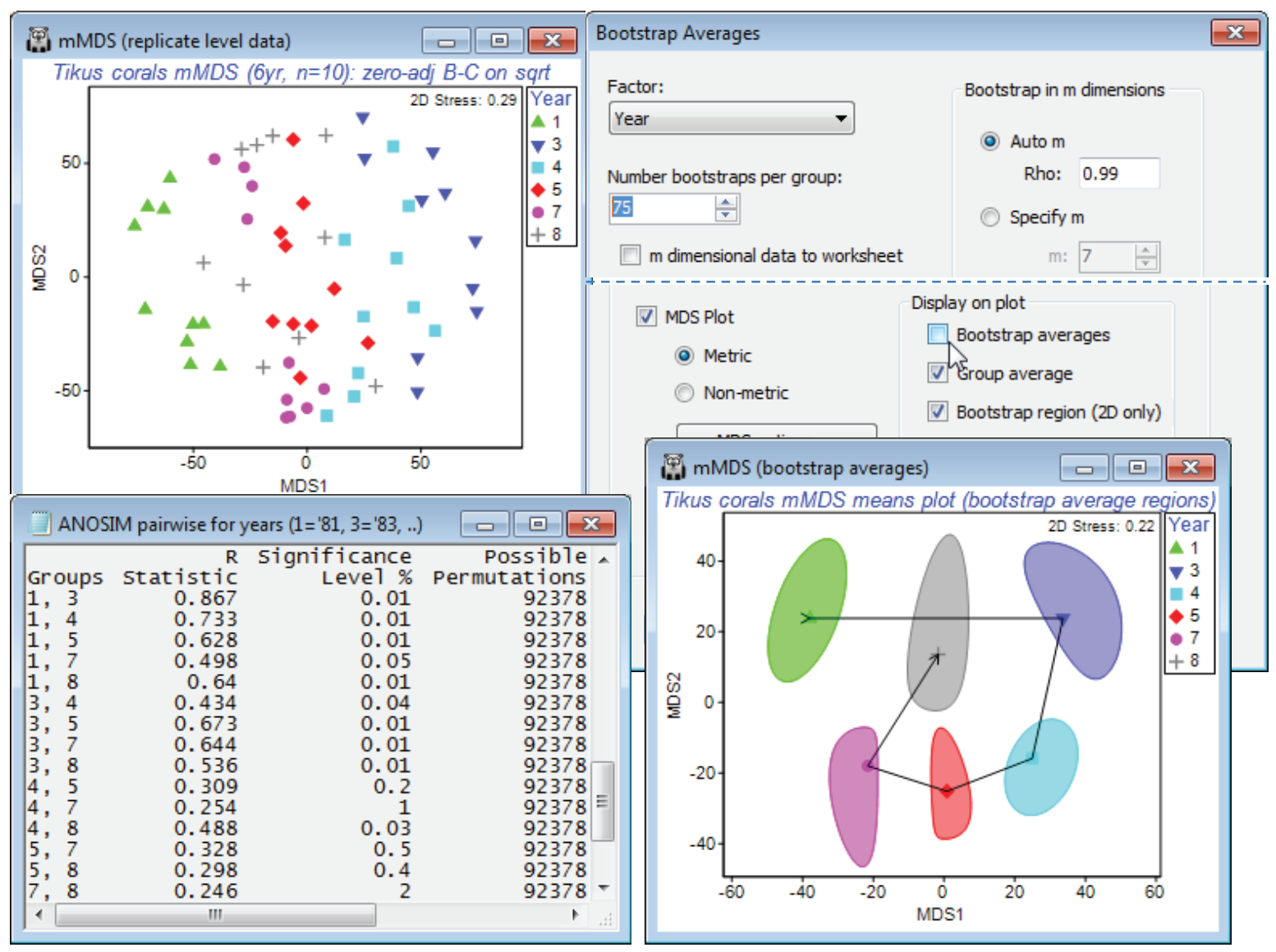
The above study was not an example given in Chapter 18 of CiMC and was therefore discussed in detail, but bootstrap average regions are given and interpreted for three other data sets there, and we shall end just by showing a region plot from one of those, for the 6 years (1981, 83, 84, 85, 87 and 88) of coral assemblage data from 10 replicate transects per year at Tikus Island, Indonesia. The workspace Tikus ws was saved in Section 5, where it was used to illustrate the zero-adjusted Bray-Curtis similarity coefficient (see also the analyses for this data in Chapter 16, CiMC). If not available, open file Tikus coral cover from C:\Examples v7\Tikus corals, square root transform it and Analyse>Resemblance>(Measure•Bray-Curtis similarity)&(✓Add dummy variable>Value:1), calling it B-C adj. An mMDS of the replicate-level data (60 points) has high stress of 0.29 but does seem to show a major change between 81 and 83 (spanning a major coral bleaching event) and a (partial) reversion – the nMDS has a similar pattern but also a high stress (of 0.21). On B-C adj, run Analyse>Bootstrap Averages>(Factor: Year) & (Number bootstraps per group: 75) & (•Auto m> Rho: 0.99) & (✓MDS plot•Metric) & (✓Group average) & (✓Bootstrap region•95%) but uncheck the (✓Bootstrap averages) box. The bootstrap averages will still be calculated of course, and used to structure the 2-d mMDS space for the display of regions (and the computation time will be non-negligible for an MDS of 450 bootstrap average points!) but there may occasionally be merit in showing just the smoothed regions, with group averages joined, as in Fig. 18.2c of CiMC. It is wise though to run again with the bootstraps displayed, to check the shape of the envelopes against the clusters –1987 shows some non-convexity, also suggested by the position of the group average in relation to the smoothed region. To join the group averages in year order, take Graph>Special>Overlays>(✓Overlay trajectory)>(Trajectory numeric factor: Year). Testing by ANOSIM (or by PERMANOVA) does show significant differences between all pairs of years, which permits a clear interpretation of the temporal pattern, in this means plot with bootstrap-derived regions.
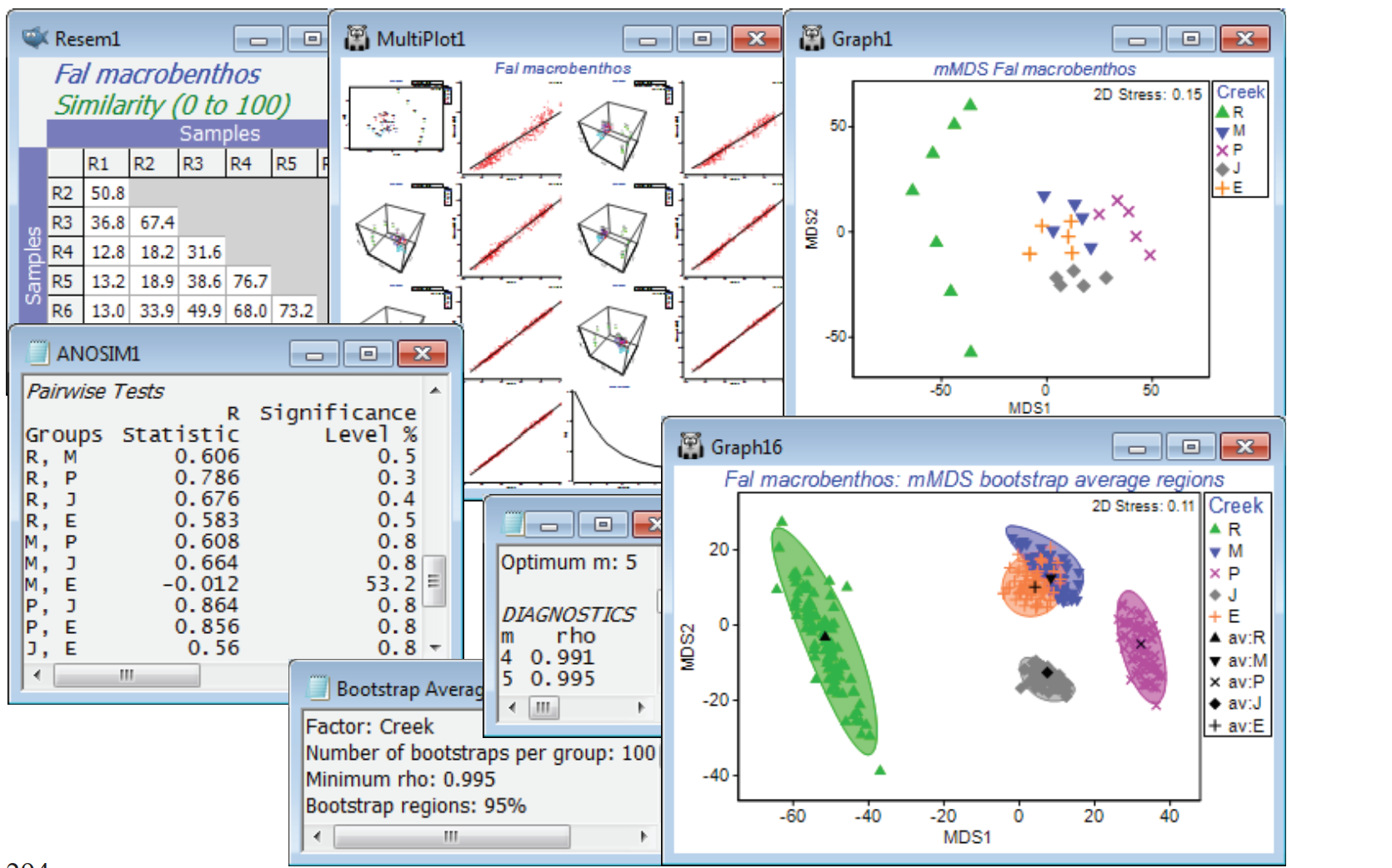
Bootstrap regions for Fal estuary macrofauna
A final example of bootstrap regions which do strongly overlap, and for which the hypothesis tests (such as ANOSIM) give no indication at all that the groups differ, is shown in Fig. 18.7 of CiMC. It can be reproduced here by opening the Fal macrofauna counts data file, in C:\Examples v7\Fal benthic fauna, into either a new workspace or Fal ws saved earlier (in which only the Fal copepod data was examined). The suite of data from these 27 locations from 5 creeks running into the Fal estuary, Cornwall, UK, were introduced in Section 4, and interest is in whether the differing levels of heavy metals in the sediments of these creeks, from historical tin and copper mining in their respective valleys, lead to differing macrofaunal (and meiofaunal) communities in those sediments. Fourth-root transform the Fal macrofauna counts, computing Bray-Curtis similarities and mMDS ordination of the replicate-level data. Running 1-way ANOSIM on the 5 creeks, with 7 replicates in Restronguet (R) and 5 for St Just (J), Pill (P), Mylor (M) and Percuil (E), gives strong differences, both in the global test (R = 0.49, p<0.1%) and in all pairwise tests (R>0.55, p<1%) except that between Mylor and Percuil (R = –0.01). Perusal of a means plot is therefore certainly justified.
The stress of 0.15 for the replicate level ordination is quite low for a metric MDS, and if the default range of dimensions requested is changed from 2-3 up to (for example) 2-8, it is clear from Shepard diagrams that by the time m=4 is reached, the m-dimensional mMDS distances are a very good fit to the full-dimensional resemblance matrix – in fact the later output of the bootstrap routine shows that this already gives a Pearson correlation of 0.991. Now enter the similarity matrix to Analyse>Bootstrap Averages>(Factor: Creek) and increase the number of bootstrap averages from the suggested default of 60 to nearer 100, depending on the speed of your machine. The (•Auto m) choice, with a $\rho$>0.99 threshold, as indicated, does lead to bootstrapping in m = 4 dimensions. You might wish instead to experiment with (•Specify m) at a higher, fixed level of 5 or 6, or increase the threshold in the automatic routine to $\rho$>0.995 or 0.999, but it will make negligible difference to the outcome in relation to the variation from run to run of the same m, resulting from the random differences in the bootstrap samples selected. (It is always a good exercise to repeat the bootstrap routine under the same conditions, and will discourage you from over-interpreting the minutiae of the region shapes!). Though the below did use 100 bootstraps from each creek, a replication level of only n=5 in four of the creeks must be considered absolutely minimal, and the striations in the bootstrap average points, which are just discernible in the plot, result from the fact that there are then only a possible 126 bootstrap averages (not equally likely) and several will have been created more than once. (The n=7 for Restronguet gives 1716 possibilities and thus more of a continuum of average values). So the plots should again be interpreted with caution, but the pattern of differences among creeks is clear, and fully consistent with the hypothesis testing.