6. Clustering methods (CLUSTER, SIMPROF, UNCTREE, kRCLUSTER)
- Clustering methods & choice of linkage
- SIMPROF tests
- SIMPROF on large matrices
- Modifying plots in PRIMER
- (Exe estuary nematodes)
- Cophenetic correlation
- Copying & pasting plots externally
- Sample labels & symbols menu/tab
- Symbol & text sizes
- Editing plot titles & scales
- General menu/tab & Keys tab
- Special menu for slicing & orientation of dendrograms
- Rotating & condensing dendrograms
- Timing bar, Stop Tasks & multi-tasking
- Ordering factor levels in keys; Point & click short-cuts
- Zooming dendrograms
- SIMPROF method
- (Bristol Channel zooplankton)
- CLUSTER results window
- SIMPROF direct run
- SIMPROF Types (1-4)
- SIMPROF on a subset of samples
- Histograms of null distributions
- Linkage by flexible beta method
- Single and complete linkage
- Limiting font size
- Binary divisive clustering
- UNCTREE options
- Text pane in tree plots; A% and B% y-axis scales
- Special menu for divisive trees
- Flat-form clustering
Clustering methods & choice of linkage
PRIMER 7 now carries out a wider range of clustering methods than previously: a) hierarchical agglomerative clustering using one of four linkage methods – single, complete, group average (UPGMA) and flexible beta (a standard WPGMA extension); b) hierarchical (binary) divisive clustering – a new unconstrained form (UNCTREE) of the previously offered constrained binary divisive routine (LINKTREE, covered in Section 13); and c) a new flat-form, i.e. non-hierarchical, method (kRCLUSTER) which is a development of k-means clustering. Both the UNCTREE and kRCLUSTER algorithms are designed to fit with the non-parametric approach which is central to the PRIMER package, e.g. by optimising the ANOSIM R statistic (see Section 9) as a measure of group separation based only on the ranks of the resemblance matrix. These new (and old) clustering methods, all accessed by Analyse>CLUSTER, are described in detail in Chapter 3 of CiMC. For most methods the output is a dendrogram, i.e. tree diagram, displaying a hierarchical grouping of samples (or sometimes of species, see Section 10), with a divisive hierarchy being differentiated visually from an agglomerative one by a slight change in the way the final pairings are displayed. The main output of the non-hierarchical kRCLUSTER method(s) is simply a factor (or indicator) specifying the group to which each of the samples (or species) is allocated. All routines can be applied directly to any of the triangular matrices produced by the Analyse>Resemblance menu.
SIMPROF tests
All of the clustering methods are able to exploit ‘similarity profile’ (SIMPROF) permutation tests, e.g. for stopping rules for divisive methods or choice of number of groups k in a ‘flat’ clustering. SIMPROF test sequences look for statistically significant evidence of structure in samples which are a priori unstructured (e.g. single samples from each of a number of sites). Under this option, tests are performed at every node of a completed dendrogram, whether constructed agglomeratively or divisively, starting from the top of the dendrogram (all points in a single group) and permitting interpretation of divisions below each node only if a SIMPROF test shows evidence of multivariate structure within that group. Test results are displayed by a colour convention on the dendrograms: samples connected by red lines are not significantly differentiated by SIMPROF, so that only the structure shown by black lines in a dendrogram should be interpreted. The test statistics themselves and their significance levels are given in the Results window indicated by the  icon.
icon.
SIMPROF on large matrices
The dendrogram itself is rapidly calculated, at least for the agglomerative methods, since no search procedure is involved, and it can thus be constructed for very large numbers of samples – but the SIMPROF routine is highly compute-intensive, given the typical number of permutations (default 999) and recomputations of the similarities which are necessary for each nodal test (CiMC, Chapter 3), and the potentially large number of nodes. PRIMER 7 now allows the option (the default, which would normally be taken) of dividing these calculations among the multiple processors constituting the core of modern PCs, but it is still unwise to take routinely the SIMPROF option with very large resemblance matrices. A selective form of SIMPROF applied to a single selection of samples, and which provides graphical output of the similarity profile, the spread of alternative profiles obtained under permutations of the data matrix and the null hypothesis distribution for that single test, can be found on the Analyse>SIMPROF menu, when the active sheet is a (selection of a) data matrix. A possible strategy for large arrays, which are clearly not going to complete all the nodal tests in a viable time, may then be to carry out the clustering, having turned off the ✓SIMPROF test box on the Cluster dialog, and then manually choose a series of nodes from the dendrogram, testing them one at a time by selecting their samples and carrying out individual Analyse>SIMPROF tests, thereby getting some idea of how much structure is potentially interpretable from the dendrogram.
Modifying plots in PRIMER
Though PRIMER 7 does not attempt to replicate all the facilities available in graphics presentation software, there are a large number of graphics options available to modify dendrograms, many of them shared in a consistent interface for ordinations and other PRIMER plots. Note that the range of plots available now in PRIMER 7 has expanded greatly, with a new Plots menu and the concept of a multi-plot. This are discussed in Section 7 but examples can be seen scattered throughout this User Manual/Tutorial where they are relevant to a particular analytical technique. Some general features are that plots can be: resized; titles, sub-titles and axis titles edited, and font colours, sizes and types changed; these and the history display removed altogether; sample and variable labels replaced with factor levels and/or symbols, the latter having a choice of symbol size, type and colour; lines thickened (unselectively); axes rescaled to specification or even logged, though this will not usually be appropriate for a dendrogram, etc. New general features in PRIMER 7 include the ability with a single check box to change colour symbols or lines to monochrome and colour shading to mono hatching patterns, and much better control in plot keys of size of symbols and size, font and title font of text. Features specific to dendrograms include: the ability to orient the plot in any of the four directions; to display a slice through the tree at a fixed resemblance level, and create a factor (/indicator) that defines the groups at that threshold; to rotate sub-groups of the tree, in any permissible way; and to collapse the detail of specific sub-groups, so that the overall structure of a large tree can be better displayed. The fine detail is seen by another general facility for all plots in PRIMER: a flexible zoom operation which maintains the position of labelling and axis scaling while zooming in on the content of the plot. Importantly for dendrograms, the aspect ratio of the zoomed box can also be changed, allowing clear presentation of detailed structure (this latter feature does not operate with ordinations, for good reason – see later!).
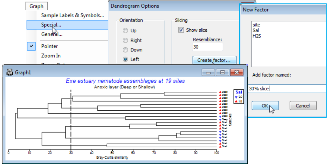
(Exe estuary nematodes)
Assemblage data on 140 species of free-living marine nematodes at 19 sites (labelled 1-19) in the inter-tidal soft sediments of the Exe estuary, UK, is in data file C:\Examples v7\Exe nematodes\ Exe nematode abundance(.pri); the entries are averaged counts over 6 bi-monthly samples in one year. An analysis of the full data, Exe nematodes bi-monthly(.pri) suggests that seasonality must be relatively weak, if present – see CiMC Fig. 6.12 – and this example is mainly used here, and in CiMC, in its time-averaged form. The file Exe environmental(.pri) contains six environmental variables for the sediments at those 19 sites: median particle diameter, depth of the water table, depth of the anoxic layer, height up the shore, % organics and interstitial salinity. The field study is described in Warwick RM 1971, J Mar Biol Assoc UK 51: 439-454 and the original multivariate data analysis in Field JG, Clarke KR, Warwick RM 1982, Mar Ecol Prog Ser 8: 37-52.
Open Exe nematode abundance, pre-treating the samples with a fourth-root transform (Section 4), and calculating Bray-Curtis resemblances between samples (Section 5). With the latter as the active window, enter the clustering routine, taking Analyse>Cluster>CLUSTER>(Cluster mode•Group average) & (✓Plot dendrogram) & (✓Create cophenetic distance matrix), but not the SIMPROF test option for now. (Of course ✓Plot dendrogram would almost always be required).
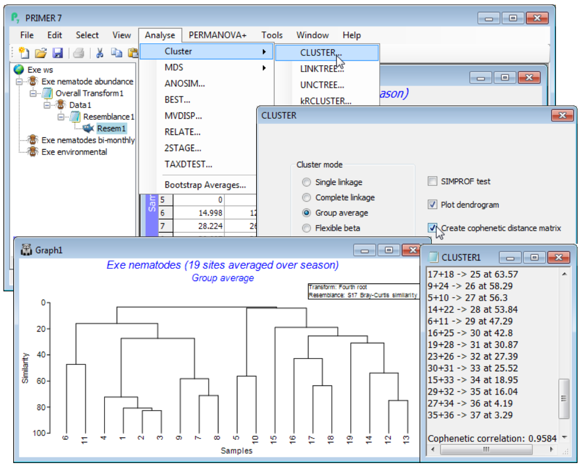
Cophenetic correlation
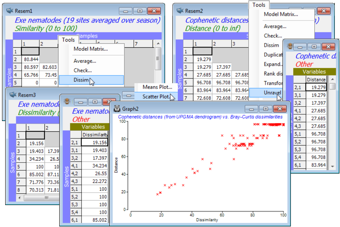
The dendrogram is displayed in a plot window, and a separate Results window gives a detailed list of the precise similarities at which the groups combine, for this agglomerative method. This also now gives the cophenetic correlation (0.958 here), which is a Pearson matrix correlation between the entries of the original dissimilarity matrix and the (vertical) distances through a dendrogram between the corresponding pairs of points (the cophenetic distance matrix). The closer this Pearson correlation is to 1 the more nearly the dendrogram accurately represents the relationships among the samples in the original (dis)similarity matrix. The concept of matrix correlations is central to several of the PRIMER methods, e.g. in Sections 9, 13, 14 & 17, but is usually computed on the ranks of the two matrices, thus becoming a Spearman matrix correlation. The Analyse>RELATE routine in PRIMER 7 now offers Pearson as well as rank-based correlations, so that having taken the option to create the cophenetic distance matrix in the CLUSTER dialog, you could now verify the cophenetic correlation by running RELATE (Section 14) between that distance matrix and the Bray-Curtis dissimilarities. More usefully, you could visualise the relationship by Tools>Unravel on both matrices and Plots>Scatter Plot, as seen under Unravelling resemblances in Section 5.
Copying & pasting plots externally
Returning to the main point of the previous example, the production of the dendrogram, note that printing or saving dendrograms (and other plots) in a variety of formats is seen in Section 7, but one easy thing to do with any PRIMER plot is to Edit>Copy it to the Windows clipboard and then paste it into the slide of presentation graphics software, such as Microsoft Powerpoint. It is then transferred in vector format, so can be ‘ungrouped’ (e.g. converted to an Office drawing object in Powerpoint) into lines and objects, rather than a pixel-based image. This gives much flexibility for putting the final touches to a plot, e.g. to place titles and plot keys exactly where required, but there is also substantial flexibility in the choice of graphic content within PRIMER itself, as is now seen.
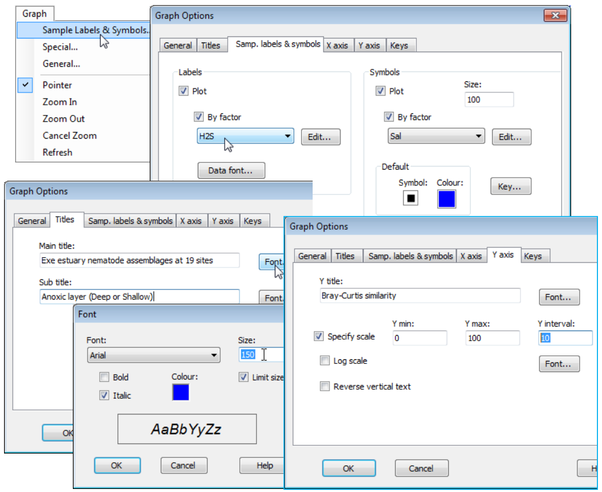
Sample labels & symbols menu/tab
When the active window is a plot, levels of a factor can be displayed in place of sample labels and/or represented by differing symbols, with an accompanying symbol key, using the Graph> Sample Labels & Symbols menu. (Alternatively, the same choices result from right-clicking when the cursor is over the plot). If the relevant (✓By factor) check box is ticked, a list of previously-defined factors can be selected from, independently for labels and symbols, so that checking all of (Labels: ✓Plot > ✓By factor) & (Symbols: ✓Plot > ✓By factor) would give a 2-factor annotation of samples on the plot. Note that if the (Labels>By factor) box is not checked, but (Labels:✓Plot) is, then the displayed labels are the sample labels from the resemblance matrix; if the (Symbols>By factor) box is not checked, but (Symbols:✓Plot) is, then a uniform symbol is displayed – this is not relevant for dendrograms but can be useful for other plots. For example, the default symbol for the above scatter plot has been changed (from a blue square to a red cross) in this way, by clicking on the Symbol: and Colour: icons in the Symbols>Default box of the Samples Labels & Symbols tab of the Graph dialog. The differing shapes, colours etc. for the different levels of the chosen factor for symbols can be redefined by the (Symbols:Key) button, taking you directly to the Key dialog described in Section 2 under the Factor keys heading. A less direct route is via (Symbols:Edit) which takes you back to the Factors dialog (see start of Section 2) which has the same Key button. It is also the way of adding new factors from a plot, which are then back-propagated to prior sheets.
Symbol & text sizes
Label font sizes, typeface, colours etc. can be changed with the (Labels:Data font) button, and sizes of symbols increased or decreased from the default value of 100 by changing (Size: 100), again in the Symbol area of the Sample Labels & Symbols tab – one of the most often used dialog boxes. Note that all such size parameters in PRIMER 7, whether for symbols or text (data labels, main or sub-titles, axes titles and scales etc.), are given relative to a default value (usually 100), rather than expressed in terms of a typeface point size, for example. This allows plots to be perfectly scaleable as their windows are resized or printed/saved, without the need for continual redefinition of sizes.
In datasheet Exe nematode abundance, two of the environmental variables from Exe environmental have also been coded as binary factors: interstitial salinity (Sal) as Lo (<25%) or Hi (>71% of full seawater); and depth of the blackened anoxic layer (H2S) as Shall (<7.5cm) or Deep ($\ge$20cm) – look at these with Edit>Factors. As seen in Section 2, there is often a choice of whether environmental variables associated with each assemblage sample are held as a separate data matrix, or as factors within the biological sheet. Here, it is useful to hold some of the data in both forms. With the dendrogram plot (Graph1) as the active window, take Graph>Sample Labels & Symbols> (Labels:✓Plot>✓By factor>H2S) & (Symbols:✓Plot>✓By factor> Sal).
Editing plot titles & scales
Still in the Graph Options dialog box, take the Titles tab and edit the main and sub-title content as shown below, also altering title font sizes and types: (Main title:Font>Size:150) & (Sub title:Font> Colour:[choose black] & [Italic check box off]). From the Y axis tab, change title: (Y title: Bray-Curtis similarity), also respecifying the y axis scale by (✓Specify scale)>(Y interval:10). On the X axis tab, take (✓Reverse vertical text).
General menu/tab & Keys tab
Finally, on the General tab (also reached directly from Graph>General), thicken up all lines with (Line width: 1.5) , increase the size of all fonts with (Overall font scale: 140), remove the display of the calculation history (transformation, similarity measure etc.) by unchecking (Plot history). On the Keys tab, take Keys title font to make the factor title ✓Bold, and Edit to obtain the Key dialog and reverse the upward and downward triangle symbols for this salinity factor (so Lo points down!).
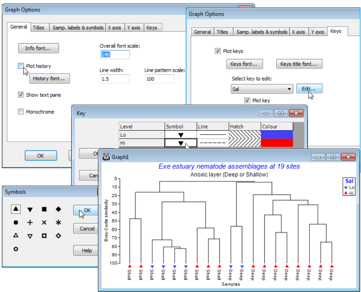
Special menu for slicing & orientation of dendrograms
Unlike Graph>Samples Labels & Symbols or Graph>General, which take you to the Graph Options dialog box, which is displayed in consistent format for these and other appropriate tabs (Titles, X axis, Y axis, Keys), the Graph>Special menu item takes you to a specific dialog box applicable only to that type of plot – here a Dendrogram options dialog. This allows selection of orientation, e.g. Graph>Special>(Orientation•Left), and a slice drawn through the diagram at a specified resemblance, e.g. by Slicing:(✓Show slice)>(Resemblance:30) & (Create factor>Add factor named:30% slice). This creates a factor, levels (a, b, c, ..), of the groups given by that slice.
The newly created factor resulting from the plot will again be back-propagated to any previous data sheet on its direct branch, so whilst it could be utilised to accentuate the clustering structure in this dendrogram, by applying it as the symbols, a more profitable use might be for symbol display on an MDS plot (Section 8), to judge the extent of agreement between clustering and ordination of the same data, under the same resemblance measure. Save the workspace as Exe ws, and close it.
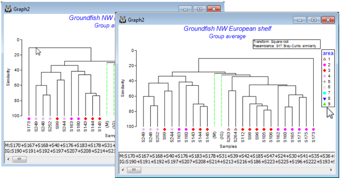
Rotating & condensing dendrograms
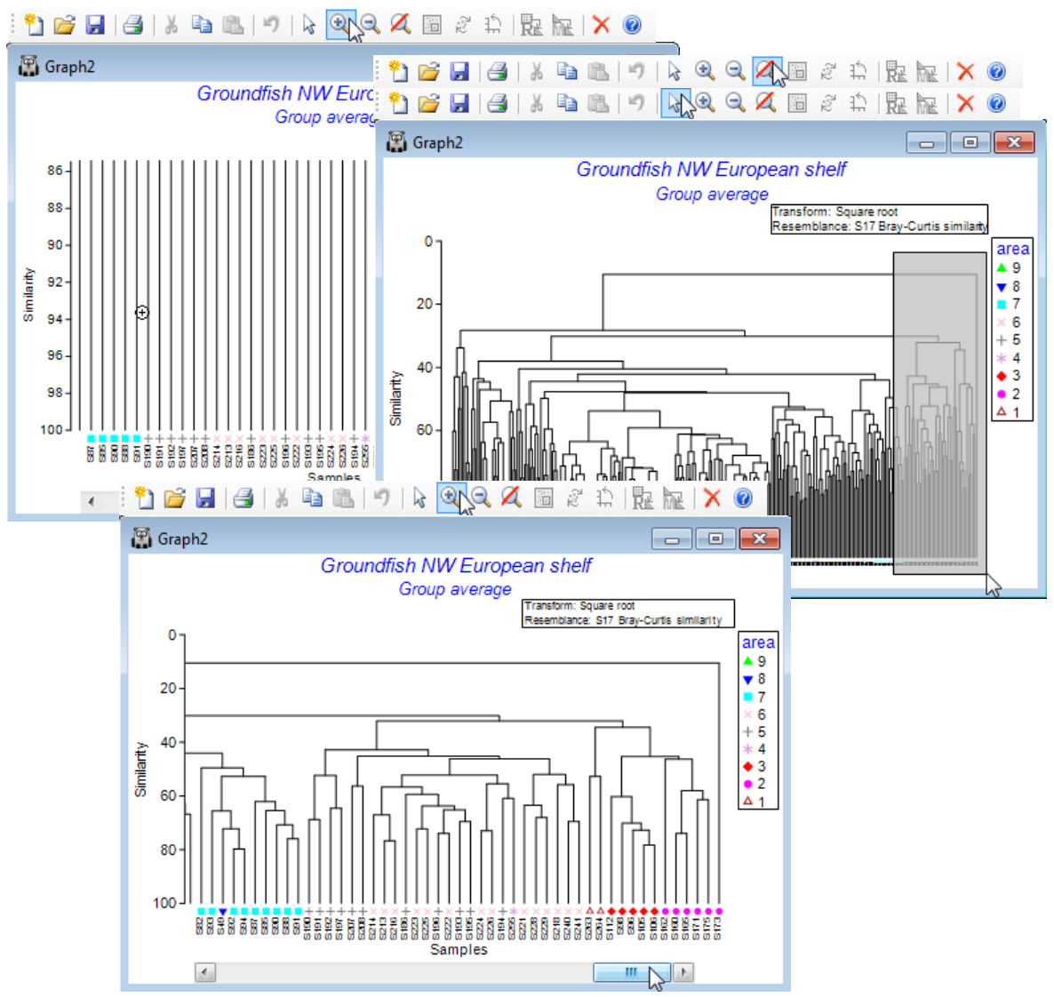
The order of samples on the (by default) x axis of a dendrogram is to a large extent arbitrary, since all arrangements of samples along the axis, which do not lead to vertical and horizontal lines intersecting, are equally satisfactory displays – think of the dendrogram as a ‘mobile’, of horizontal rods and vertical strings, which can be rotated at will. Such rotations can be achieved by clicking on any of the horizontal ‘rods’ and, whilst it is not appropriate to use this feature to re-arrange the samples close to some desired a priori sequence(!), it can be useful in displaying visual agreement between clusters from different analysis choices, or comparing abiotic and biotic groupings for the same set of samples. Clicking on vertical ‘strings’ collapses the clustering under the selected point, replacing it with a single dashed (green) line, to indicate the presence of condensed structure. These lines are labelled with capital letters within a text pane, below the plot, which defines the samples contained in a hidden structure (suppressing the text pane is possible, by Graph>General). For dendrograms with many samples, this feature should make it possible to view the overall (coarse-level) structure, and the fine-level grouping can then be seen by zooming in on areas of the original dendrogram.
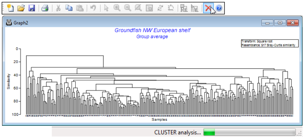
Re-open the workspace Groundfish ws from C:\Examples v7\Europe groundfish, met in Section 5, with datasheet Groundfish density of 277 samples of 93 groundfish species, captured in research trawl surveys of 9 areas of European shelf waters (factor area). Produce a dendrogram based on Bray-Curtis similarities from square root transformed densities, with Pre-treatment>Transform (overall)>(Transformation:Square root), Analyse>Resemblance>(Analyse between• Samples) & (Measure•Bray-Curtis similarity), Analyse>Cluster>CLUSTER>(Cluster mode•Group average). Alternatively, take (Cluster mode•Single linkage) for a clear demonstration of why group average linkage is generally superior to the ‘chaining’ that single linkage produces (see CiMC Chapter 3).
Timing bar, Stop Tasks & multi-tasking
As discussed at the start of this section, if you have set SIMPROF running, with the (✓SIMPROF test) check box, you will find that calculating the dendrogram takes some while – the timing bar on the Status Bar at the bottom of the PRIMER desktop (turning green, as the calculation progresses) scarcely seems to move. An example of this size (277 samples) will complete in a not unreasonable time but if you embark on a calculation which is clearly going nowhere, execution can be stopped cleanly, without damaging the workspace in any way, by clicking on the Stop Tasks icon  , on the Tool Bar (equivalently, take Tools>Stop Tasks). The PRIMER environment is also fully multi-tasking – if a calculation is set to take a long time, you can run other, less intensive, manipulations simultaneously within the same workspace, with no fear that they will interact with each other. However, a Stop Tasks instruction will terminate all routines currently running in parallel in that workspace. Of course, multiple runs of PRIMER 7 can also be launched and will operate quite independently of each other – there is no live linkage to files or workspaces external to the current workspace (files can only be transferred between workspaces by Save from one workspace and Open in the other, and it is always a copy of the file contents which is taken into the workspace).
Using Graph>Sample Labels & Symbols, add symbols for factor area, but the large number of samples makes the symbols too small to see. So, click on (say) two of the vertical lines to collapse the large middle section of the tree. Note the appearance of a text pane, listing the samples in the condensed branches. Also see how the structure may be arbitrarily rotated by clicking on, say, the top horizontal line, to rotate the sample S173 to the other side of the tree.
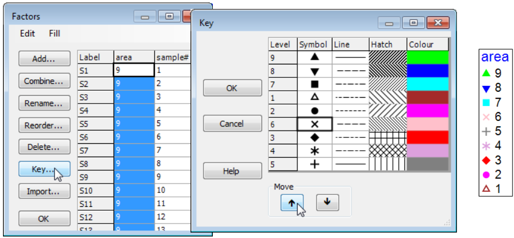
Ordering factor levels in keys; Point & click short-cuts
PRIMER 7 now automatically displays the levels of a numeric factor in increasing order in a plot key, but note that it makes no attempt to order non-numeric levels alphabetically, instead keying them in the order in which they are met in the factor sheet, which is very often the order in which they should naturally be presented (think Spring, Summer, Autumn, Winter!). The key ordering can be manually overwritten in either case. Here, if it was natural to present areas in the reverse order (you will see from the factors sheet that area 9 samples, Bristol Channel, are the first in the matrix) then go to the Key dialog (by the Key button in the Factors dialog or on Graph>Sample Labels & Symbols), and a set of (Move>$\downarrow$) & (Move>$\uparrow$) operations re-arranges levels in any desired order.
There are often several ways of getting to the same dialog in PRIMER and the third, and quickest, way to bring up the Key dialog is simply to click on the key itself, as shown in the plot above. This is a generic new feature in PRIMER 7: click on any peripheral structure of a plot (Key, Titles, X or Y axes, History box) and the appropriate dialog box will appear.
Zooming dendrograms
Zooming is invoked by Graph>Zoom In or Zoom Out from the main menu, or by clicking on the Zoom in  or out
  icons on the Tool Bar. The cursor changes to
  or
or  when over the plot, and left-clicking zooms one step in or out. To leave the plot in its current (possibly zoomed) state and return to default operation, click on the pointer icon
  on the Tool Bar, or take Graph> Pointer (remember that the graph menu can also be obtained at any time by right-clicking when the cursor is over the plot). To restore the plot to its original, unmagnified state, click on the new cancel zoom icon
  on the Tool Bar, or select Graph>Cancel Zoom.
Instead of zooming by incremental steps, you can go straight to the final zoomed area by drawing a box around the area to magnify: with the cursor in the usual pointer mode (click on on the Tool Bar if necessary), draw a box by left-clicking and holding at one corner and dragging over the required rectangle, then releasing, in usual Windows fashion. A single click on the icon on the Tool Bar (or Graph>Zoom In) will take you straight to the zoomed area. (The process is reversed, as above, by taking Cancel Zoom or its icon ). But note that, unlike the incremental zoom, which preserves the aspect ratio (the displayed y:x axis ratio) of the diagram, a rectangular zoom will change the aspect ratio so that all the information within the box is magnified into the current size of window, however long and thin (or short and fat) the drawn rectangle originally was. This is a powerful feature for zooming on dendrograms, since a long, thin rectangle allows you to view a small subset of the samples (x axis) across the whole similarity scale (y axis). Under zooming, note that the axes are always shown, even when the zoomed area is well away from them, and scroll bars are displayed on the axes. By dragging these scroll bars back and forth (or up and down) the whole tree can be viewed, piecemeal, at the current aspect ratio and magnification.
Reverse the condensing of the middle section to reinstate the full tree (rotating and collapsing are toggles, switched on and off by repeated clicking on the same line) and now try to zoom in on the fine detail. Repeated use of the cursor from the Tool Bar icon is not effective. By the time the symbols are visible, the similarity scale is too narrow to see the clustering structure. What is needed is a change in aspect ratio: cancel the zoom, change to the pointer , draw a tall narrow box over part of the dendrogram, and Zoom In again ( ). A viewable dendrogram now results, which can be scrolled across, using the horizontal scroll bar. Save the Groundfish ws workspace and close it.
SIMPROF method
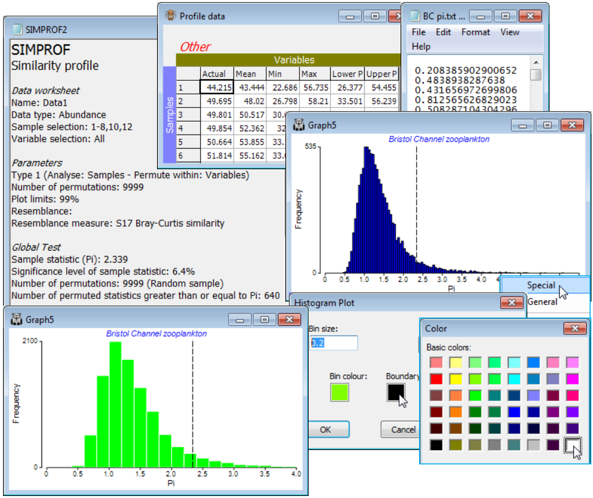
The similarity profile test (SIMPROF), Clarke KR, Somerfield PJ, Gorley RN 2008, J Exp Mar Biol Ecol 366: 56-69, is a permutation test of the null hypothesis that a specified set of samples, which are not a priori divided into groups, contain no multivariate structure to further examine. (Do not confuse this with the ANOSIM test, Section 9, which tests prior group structures of times, sites, treatments etc.). The SIMPROF procedure, usually a sequence of SIMPROF tests, is used extensively in PRIMER to provide stopping rules for all the clustering methods: unconstrained sample clustering in this section (and Chapter 3, CiMC p3-6); species (or more general variable) clustering into coherent response curves in Section 10 (and the start of Chapter 7, CiMC); and biotic sample clustering constrained by thresholds on environmental variables in Section 13 (and Chapter 11, CiMC p11-13). The similarity profile itself is the set of resemblances among all pairs of the specified samples, ranked from smallest to largest, and the ordered resemblances then plotted (y-axis) against their rank (x-axis). The departure of this curve from its ‘expected’ shape under the null hypothesis is the basis of the test. For example, if there is genuine clustering within a set of biotic samples, there will be many more smaller similarities and larger similarities than if all the samples came from the same community (and therefore all had intermediate similarities to each other). The ‘expected’ profile is obtained by permuting the entries for each variable (e.g. species) across that subset of samples, separately for each variable, thus producing a ‘null’ condition in which samples can have no real structure. Such simulations realistically fix the variable values, e.g. to have the same pattern of rare and common species, with the same counts, as the real matrix, and thus require no assumptions about the differing forms the distributions of abundances may take for the differing species. The random rearrangements are repeated a large number of times (under user control), producing many ‘expected’ profiles under the null, for which the average and percentile (say 95% or 99%) values at each rank are plotted along with the real profile. A typical real profile, with mean and 99% limits from the permuted profiles, for all 57 samples of the data below, now follows (on left; see later for the routine which constructs these plots, under SIMPROF direct run).
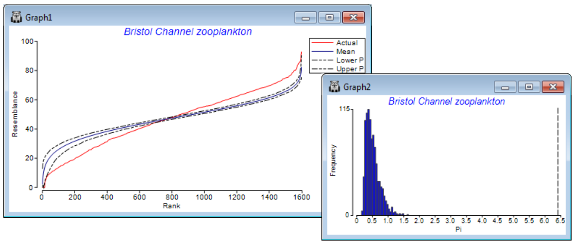
The summed absolute distances ($\pi$) between the real similarity profile and the simulated mean profile is the test statistic. A second set of simulated profiles are then generated and $\pi$ computed between each of these and the mean profile (from the first set). This defines a range of likely values of the test statistic $\pi$ under the null hypothesis (above histogram, right), and the real $\pi$ (dashed line, far right) is compared to this to give a p value, as for any test, given as a percentage (see stages in permutation testing, Chapter 6, CiMC). Here the real $\pi$ is the most extreme of 1000 arrangements of the matrix (999 permuted and one real one), hence $\rho <$ 1 in 1000 (0.1%) and the null is rejected – there is structure. The SIMPROF procedure in CLUSTER separately repeats this test on the two sample clusters at the next level down, and so on until no further significant results are obtained.
(Bristol Channel zooplankton)
Densities from 24 species of zooplankton at 57 sites in the Bristol Channel and Severn Estuary, collected by double-oblique net hauls, are in C:\Examples v7\BC zooplankton\BC zooplankton density(.pri). The sampling sites were defined as a grid (Fig 3.2, CiMC), and samples taken through time over a single year and averaged to give one seasonally-averaged sample per site. There is thus no prior structure of groups and replicates within groups (though there is a natural salinity gradient, described by factor Sal, with 9 numeric levels). The original data is from Collins NR & Williams R 1982, Mar Ecol Prog Ser 9: 1-11, who identify four main clusters of sites.
It is relevant to ask what the statistical evidence is for there being such a division at all, and if so, how much of the group structure can justifiably be interpreted. Open the data file BC zooplankton density and generate the cluster dendrogram from Bray-Curtis similarities on 4th root transformed densities (as in Sections 4 & 5), then Analyse>CLUSTER>(Cluster mode•Group average), but this time taking the option (✓SIMPROF test). Look at the dialog under the SIMPROF tab, though the defaults probably be taken for (nearly) all: the matrix whose species rows will be independently permuted is Data1, the 4th root transformed data; no other choice than Resemblance: S17 Bray-Curtis similarity makes sense on the randomly permuted matrices since that was the choice on the real matrix; the % significance level is conventionally taken as 5 though could be more stringent, given ultimately that 7 tests are performed here, so change it to, say, 1; the 999 permutations will typically be sufficient (for computing the mean, and a further 999 for departures $\pi$ from the mean) bearing in mind the computation needed to recompute and re-order the $n(n-1)/2$ similarities (with $n$ samples) for each permutation, and then repeat this through the dendrogram; and clearly the use of multi-cores in the processor is beneficial to that. The final group structure, from the series of SIMPROF tests, is placed in a factor, generating another dialog, (Add factor named: SprofGps).
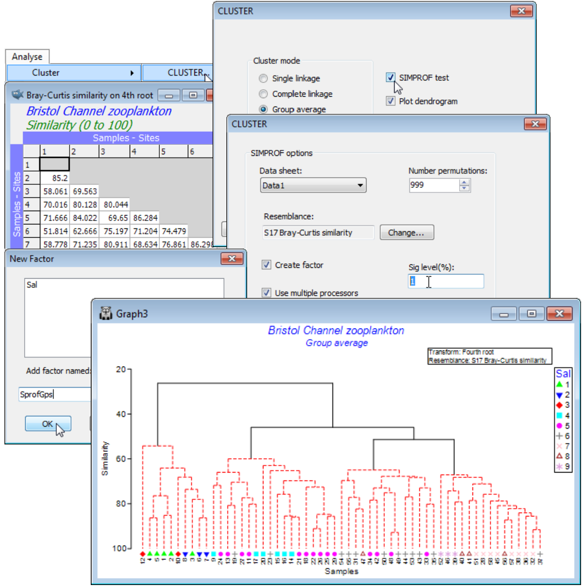
With $n$ only 57 in this case, and with few tests needed, the SIMPROF procedure runs very quickly. The dendrogram shows the four groups of sites identified by Collins & Williams but now with firm statistical support: the black lines indicate groups that are established, with red lines showing a sub-structure from the clustering for which there is no statistical support from SIMPROF to permit interpretation. That the groups bear a strong relation to salinity is seen by displaying the salinity factor as a symbol, with Graph>Sample Labels & Symbols>Symbols:(✓Plot)>(✓By factor:Sal).
CLUSTER results window
In addition to the dendrogram plot itself, Analyse>CLUSTER (like all analysis routines) produces a separate Results window (here CLUSTER1) which firstly lists the conditions under which the analysis was run (e.g. whether on a selection of the matrix, with what linkage option etc.), and then outputs text-format information. For succinctness, the Results windows will often use the sample numbers (1-57) rather than the sample labels (stations 1-29, 31-58, confusingly, since station 30 was not sampled!), so a listing is initially given of the numbers and their corresponding labels (the last label here, of sample 57, thus being station 58). Then the results specify, numerically, how the dendrogram is constructed, just in case the precise numbers are needed for another purpose: sample numbers 47 & 48 (stations 48 & 49) are the first to group, at similarity 92.78, with the new group labelled 58, then 31 & 36 group at 91.59, …, 16 & 64 (i.e. 16 & 14 & 21) at 85.45 etc. Likely to be most useful here, however, are the SIMPROF test results. These are read from the bottom upwards:$\pi$=6.4 (p<0.1%, its most extreme value for 999 permutations) for a test that all samples are from the same assemblage; and $\pi$=3.3 & 2.7 (p<0.1% or 0.2%) for the successive splits, at 46.0% and 51.4% similarity, of the three right-hand groups. Site 12 is borderline for splitting from the rest of the left-hand group, at 54.2% similarity ($\pi$=2.3, p<7%), but there is no evidence for the apparent division of the second group into two at 60.0% similarity ($\pi$=1.0, p<28%), or any of the other groups. Tests of finer-level structure are not carried out, if the differentiation of the coarser level structure is not significant, so only seven tests are needed here. Note that the choice of threshold significance level ($p$<1%) for rejecting the null hypothesis of ‘no structure’ is not at all critical here – $p$<5% or $p$<0.5% would have led to the same set of decisions – and such robustness is common.

SIMPROF direct run
SIMPROF can be run directly using Analyse>SIMPROF, rather than as part of another analysis such as CLUSTER (above), UNCTREE or kRCLUSTER (later this section) or LINKTREE (see Section 13). In that case, the active window must be the data sheet, the rectangular matrix whose variables are permuted randomly and independently across the samples. SIMPROF must always have such an underlying data matrix available – it cannot work solely on a triangular resemblance sheet. Thus when the SIMPROF option is taken in CLUSTER – which is run when the active window is a triangular matrix – PRIMER uses its internal knowledge of how that resemblance matrix was calculated to specify the correct data matrix, as a default for (Data sheet: $\text{\hspace{3mm}}$ ) under SIMPROF options. Change this default at your peril! – its main purpose is simply to remind you that SIMPROF always works on the underlying rectangular array not the triangular matrix.
Direct runs of SIMPROF are used to test for evidence of internal group structure in the full set of samples that are submitted to it, i.e. a single test rather than the (usually large) series of subset tests in the CLUSTER option. The advantage of doing a single test at a time is that more information can be output, as seen in the plot windows shown above under the SIMPROF method heading, for a preliminary test of any structure in the full set of 57 samples for the Bristol Channel zooplankton.
Another output option for Analyse>SIMPROF, selected by checking ✓Stats to worksheet, is of the data used to plot the similarity profile itself. This worksheet will have a number of rows equal to the number of entries in the resemblance matrix, containing as ‘variables’: the real ranked similarities; the mean similarities from the permutations; the lowest and the highest similarities obtained, at each rank, over all permutations (not shown on the plot); and the lower and upper 99% limits (or whatever % specified) of the permuted values at that rank.
SIMPROF Types (1-4)
The first dialog box from running Analyse>SIMPROF, however, is of a new option to PRIMER 7, a choice of 4 types of SIMPROF test, which cover all 2 $\times$ 2 combinations of analysing samples or variables and permuting within samples or variables. The default, described above, is now referred to as a Type 1 test, in which similarities are calculated between all pairs of samples and the profiles recalculated under the null hypothesis by permuting entries of the data matrix separately within variables, across the samples. Type 2 and Type 3 SIMPROF tests concern analysis of variables in which, for example, the profile consists of index of association values calculated among species. Dependent on the hypothesis being tested this can either involve again permuting within variables across samples (Type 2) or within samples across suitably standardised species (Type 3). Chapter 7 of CiMC gives the motivation and examples for both Type 2 and 3 tests, seen again in Section 10, based on Somerfield PJ & Clarke KR 2013, J Exp Mar Biol Ecol 449: 261-273. The final option (Type 4) in this dialog, analysing samples and permuting within samples, has been included purely for completeness but has not been described and seems less likely to be practically useful.
SIMPROF on a subset of samples
From the Bristol Channel zooplankton transformed data matrix Data1, select (say) the samples of the first of the four groups (a) produced by the above series of SIMPROF tests under CLUSTER, by Select>Samples>(•Factor levels)>(Factor name: SprofGps)>Levels>(Include: a), and with this sheet as the active window, take Analyse>SIMPROF>(Type•Type 1). Take defaults on the next dialog except (Number permutations: 9999) & (✓Stats to worksheet). As already seen, $\pi$= 2.3 and p= 7% for this test but the direct run of SIMPROF gives further graphical information, below.
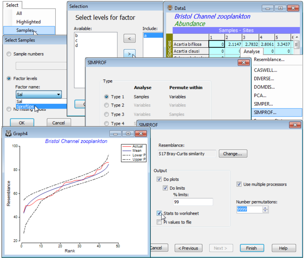
The previous SIMPROF plot, for the full set of 57 samples, showed an excess of both smaller and larger similarities in the real profile than would be expected by chance, if there were no structure in these data. In contrast, the real similarity profile for this subset of sites 1-8, 10, 12 lies almost fully within the envelope of the 99% limits for the permuted similarity profiles at each rank. Of itself, this juxtaposition of curves is not the test of departure from the null hypothesis; since there are 45 similarity ranks from 10 samples, there is a fair probability that a 1 in 100 event (the probability that a point lies outside its 99% limits by chance) occurs at least once in 45 ‘trials’. Hence the use of a test statistic which is the summed absolute distances, $\pi$, between individual profiles and the mean of the profiles under permutation. If the real profile is further from that mean than 95% (say) of the individual permuted profiles are, then this is evidence to reject the hypothesis of no structure.
Histograms of null distributions
As in all permutation tests in PRIMER v7 (e.g. in ANOSIM, RELATE, BEST etc.), a further output from Analyse>SIMPROF is thus a histogram of the values of the test statistic ($\pi$, here) for the null hypothesis conditions, under permutation, with the real value ($\pi$ = 2.3) also indicated. The relevant $p$ value is given in the SIMPROF results window – not ‘significant’ but borderline here, $p \approx$ 6.5%. Minor variations of both $\pi$ and $p$ values, from those in the results window for the earlier CLUSTER run, are to be expected because the permutations are random – each new run gives slightly different answers. Previously, the default of 999 permutations was selected. If greater precision is needed in significance levels, then the number of permutations should be increased, as here to 9999 (there are a vast number of possible permutations for this particular test). Binomial calculations show that tests with a true $p$ of 5% will return a $p$ in the range (3.5%, 6.5%) with 999 permutations, and in (4.6%, 5.4%) for 9999 permutations – this is true for all tests employing random permutations.
As previously seen (Section 4) with direct plotting of histograms, via Plots>Histogram Plot, the Special menu (right click when over the plot) allows changes to bin width, colour, axis scales etc. A final option on the SIMPROF dialog (✓Pi values to file) is to export the $\pi$ values from all the permutations to a text file (*.txt). This is not commonly used but is again an option with most permutation tests in PRIMER; e.g. it would allow the user to redraw the null distribution histogram of $\pi$ with other software, or perhaps examine its parametric form etc.
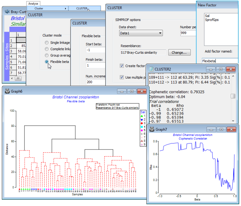
Linkage by flexible beta method
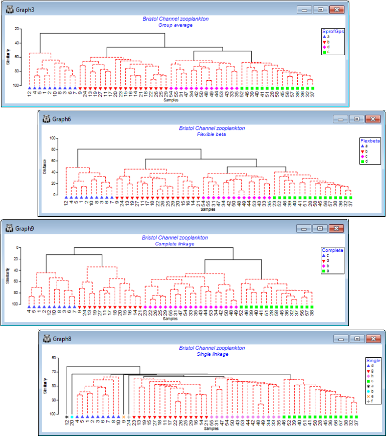
There are four possible Cluster mode choices within the Analyse>Cluster>CLUSTER dialog box, distinguished by the way they redefine the among-group dissimilarities at each proposed step of the agglomerative process. The linkage options are: •Single (/nearest neighbour) linkage, which has a tendency to produce unhelpful ‘chaining’ of groups, with many steps adding just a single sample to an existing group; •Complete (/furthest neighbour) linkage, which tends to have the opposite ‘over-grouped’ effect; •Group average (Unweighted Pair Group Method with Arithmetic mean UPGMA) which is the option shown in all the above plots and is widely used; and •Flexible beta, introduced by Lance GN & Williams WT 1967, Comp J 9: 373-380, a generalisation of a WPGMA method in which a range of options is controlled by choice of a parameter $\beta$. Chapter 3 of CiMC gives precise definitions of all these options, e.g. for flexible beta see the footnote on p3-4. Choice of $\beta$ is made automatically to maximise the cophenetic correlation $\rho$ (rho) between the dissimilarities/distances in the resemblance matrix and distances through the dendrogram between the matching pairs of samples – this idea was met near the beginning of this section – and a plot of $\rho$ vs. $\beta$ displayed.
Remove the selection on the fourth-root transformed data matrix Data1, by Select>All (and Edit> Clear Highlight, though this is not essential) then with the active sheet as the similarity matrix calculated from Data1, take Analyse>Cluster>CLUSTER>(✓SIMPROF test) & (Cluster mode• Flexible beta)>(Start beta: -1) & (Finish beta: 1) & (Num. increments: 200). These are the defaults, meaning that the cophenetic correlation is computed and graphed for $\beta$ in increments of 0.01, with the optimum $\beta$ (maximum $\rho$) given in the Cluster results window, and this value used to calculate the dendrogram. Note that $\beta$ does need to be in the range (–1, 1) but negative values (or zero) make better sense theoretically, as is seen here in the line plot of the cophenetic correlation $\rho$ vs. $\beta$, so there is a case for restricting to (Start beta: -1)&(Finish beta: 0)&(Num. increments: 100). If a fixed value of $\beta$ is preferred (Lance & Williams suggest $\beta$= –0.25), as it might be for repeated clustering, then take, for example (Start beta: -0.25)&(Finish beta: -0.25)&(Num. increments: 1). You will also need to specify a factor for the SIMPROF groups, e.g. Add factor named: Flexbeta, which gives a Multi-plot (see next section) of the dendrogram and the line plot of $\rho$ vs. $\beta$.
Single and complete linkage
Now re-run Analyse>Cluster>CLUSTER>(Cluster mode•Single linkage), creating the SIMPROF factor Single and run again with (Cluster mode•Complete linkage), giving factor Complete. The respective cophenetic correlations $\rho$ for the four linkage methods are: 0.797 (group average), 0.793 (flexible beta with $\beta$= –0.04), 0.722 (complete linkage) and 0.633 (single linkage). Though it can be difficult visually to compare dendrograms, careful rotation of plots and using Graph>Sample Labels & Symbols to put the respective SIMPROF group factors (SprofGps, Flexbeta, Complete and Single) onto the x axis as symbols shows that: Group average and Flexible beta differ only in the allocation of site 23 between the four SIMPROF groups (they are often similar but the flexible beta method is usually slightly inferior to group average); Complete linkage is similar in that four SIMPROF groups are also defined, though with a sub-cluster of 22, 23, 25, 26, 29 moving between two of these groups (to the detriment of the cophenetic correlation); and Single linkage is the only plot to look substantially different, with clear ‘chaining’ of samples and some singleton SIMPROF groups (sites 9, 12, 20, 24), with a clearly poorer fit ($\rho$= 0.63) to the similarity matrix. (It is often easier to visualise such changes in SIMPROF groups from differing cluster options by indicating those groups as symbols on an MDS ordination. For description of the latter see Section 8 – and for an example of the type of comparative MDS plots suggested see Fig. 3.10 of CiMC).
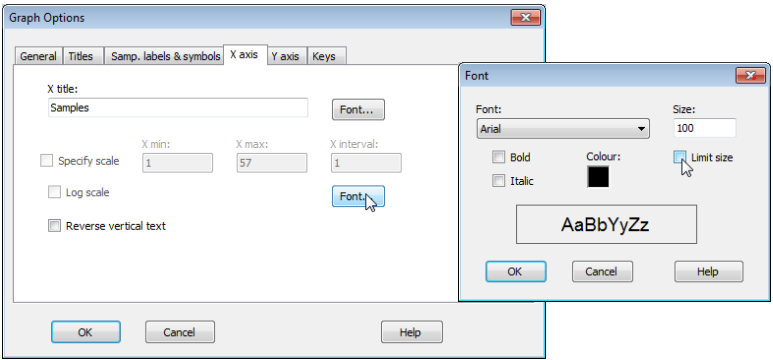
Limiting font size
Note that the plots above required a certain amount of juxtaposition of different font sizes for titles, axis titles, x-axis labels, keys etc., away from the default values (usually 100). Changing Graph> General>(Overall font scale: 100) is sometimes a good place to start, but you will see here that an increase (to 150 for example) does not always result in a font size change because, by default, there are upper size limits on much of the lettering, to avoid labels overwriting each other or parts of the plot. To override such a default, which has been carried out for the x-axis site labels (to increase their size almost to touching), click anywhere on the x-axis labels which throws you automatically into Graph Options on the X axis tab, select the relevant Font and untick the (✓Limit size) box. The other operations needed here were to re-order factor levels in keys and switch colours/symbols for some groups, by clicking on the key, using (Move>$\downarrow$ or $\uparrow$) etc, as seen earlier in this section.
Binary divisive clustering
Two new clustering methods are introduced towards the end of Chapter 3 in CiMC, the first still a hierarchical clustering method leading to a tree diagram, but a divisive rather than agglomerative algorithm in which all samples start off in a single group and are then split into two groups, each of those then further sub-divided into two, and so on until some stopping rule is activated. The sub-groups are not constrained to be of comparable sizes, in fact may sometimes be a split of n samples into a group of size n–1 and a singleton. In keeping with the principles embodied by the PRIMER package, the criterion which is maximised in making each split is the non-parametric ANOSIM R statistic of Section 9, used as a pure measure of group separation for a multivariate set of samples (and not in any way as a test statistic). R is essentially the difference between the averages of rank dissimilarities between two groups and averaged rank dissimilarity within those groups, suitably scaled so that it takes values up to +1 (perfect rank separation, in which all dissimilarities between the groups are larger than any dissimilarities within either group). After each binary division, the dissimilarities among samples within each new group are re-ranked, and used to maximise R in a further binary division. Even for quite modest sample sizes, evaluating R for all possible splits into two groups can be prohibitive, so a search algorithm is required and the number of random restarts of that process needs to be specified (default 10, but increase this if the routine runs quickly). A range of different stopping rules are allowed, which can be used in combination: a) a split which would produce a group of size n or less is never made (n specified); b) groups of size <n are never split (n specified); c) a split is not made if the largest R is less than a specified value; d) a group is never split if a SIMPROF test of its samples cannot reject the hypothesis of ‘no structure’ within that group – this is the least arbitrary and most natural of the stopping rules, a natural counterpart to the stopping rule for interpretation used for the agglomerative clustering described earlier.
A parallel routine Analyse>Cluster>LINKTREE is described in Section 13 (called linkage trees), a constrained divisive clustering in which binary splits of, for example, biotic community samples are made in the same way (by maximising R), but only if an environmental variable can be found that takes a non-overlapping range of values in the two groups produced (a possible ‘explanation’ for that split therefore). In contrast, this new routine to PRIMER 7 is a completely unconstrained tree, accessed by Analyse>Cluster>UNCTREE: each sample is divided to maximise R, based only on the input resemblance matrix, e.g. the community similarities, without external constraints.
UNCTREE options
Using the Bristol Channel zooplankton workspace which should still be open, and with active sheet the Bray-Curtis similarities on fourth-root transformed data, run Analyse>Cluster>UNCTREE> (Min group size: 1)&(Min split size: 4)&(Number of restarts: 50)&(Min split R: 0)&(✓SIMPROF test)&(Vertical positions•A% – equal spaced) and take the defaults on the SIMPROF dialog, which is exactly that described for the CLUSTER routine above. Add factor name: Unctree, which holds the SIMPROF group labels which can then be compared with those for the previous dendrograms. Here, Min group size: 1 imposes no constraint on how small a group can be, and Min split R: 0 effectively takes out this stopping rule (max R will always be > 0), but Min split size: 4 does come into play, so that once a group reduces to three samples it is not further divided. SIMPROF would have the ability to identify a group of three as heterogeneous – though the differences must be stark for it to do so – so there is no strong reason to impose this constraint. (However, SIMPROF cannot ever generate a significant result for a group of two; see CiMC, Chapter 3). The main guide here to interpretation will be the series of SIMPROF tests, with the parts of the tree drawn as red dashed lines again having no statistical support. In the absence of other strong information to the contrary, interpretation should thus be confined to the groups identified by the continuous black lines.
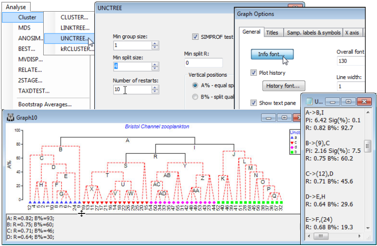
Text pane in tree plots; A% and B% y-axis scales
Note how each node is now lettered so that information about the R value for that split can be displayed in the text pane underneath the tree, and also in the accompanying results window (right). The lettering size in the tree can be increased (as it has been here) by Graph>General>Info font. The lettering order looks a little haphazard but this is only because the tree has been rotated exactly as seen for the earlier dendrograms – by clicking on the horizontal lines – in order to allow a better comparison with the previous agglomerative clustering. (In fact, the SIMPROF tests again result in only four groups, largely similar to those found before). The text pane can be scrolled and dragged down or up to smaller or larger heights but it but does not serve a particularly strong function here and could be turned off altogether by unchecking the (✓Show text pane) box on the General tab. It comes into its own for the companion routine of constrained divisive clustering (LINKTREE) seen in Section 13. There the text pane will list, for example, the inequalities on environmental variables which are capable of ‘explaining’ each lettered division of the biotic communities. Note also that, as for agglomerative clustering, details are given in the text-based results window (UNCTREE1) of the $\pi$ statistic and its significance level from the SIMPROF test at each node for which the test is performed. For example, the initial split A into groups B and I is highly significant (p<0.1%) but that at B, into the group C and the single sample 9, only achieves a non-significant level according to the criterion for continuation set in the SIMPROF dialog (p<5%). Thus no more tests are carried out on the nodes further down this branch (C, D, E, …), as can be seen in the results window.
The choice of A% as the y-axis scale above, evens out the spacing of steps down the binary tree in essentially arbitrary fashion, to give an uncluttered presentation – values of A% in different parts of the tree are not then quantitatively comparable (and a cophenetic correlation coefficient would make no sense). The alternative, originally described for the LINKTREE routine by Clarke KR, Somerfield PJ, Gorley RN 2008, J Exp Mar Biol Ecol 366: 56-69, is to take the (Vertical positions• B% – split quality) option in the UNCTREE dialog, in which average rank dissimilarities between groups on the original ranks (not re-ranked at each stage) are used to define a scale reflecting the magnitude of a division, in relation to the overall scale of variation (e.g. community change) across the full set of samples. The B% values are therefore comparable across different parts of the tree.
Special menu for divisive trees
PRIMER 7 also provides a choice of representations of the tree structure, using either the A% or the B% axis scale. In general, the layout shown above is to be preferred, because the regular spacing of the sample axis allows non-numeric labels and/or symbols to be added, exactly as for a CLUSTER dendrogram. However, the Clarke et al 2008 paper used the tree layout shown below, referred to as classic format, an option from the Special menu, and this may still occasionally be found useful. Re-run the divisive clustering, this time with Analyse>Cluster>UNCTREE>(Min group size:1) & (Min split size: 8) & (Number of restarts: 50) & (Min split R: 0) & (Vertical positions•B% – split quality), unchecking the (✓SIMPROF test) box this time. On the right-click menu, when over the plot, take General and uncheck (✓Show text pane), setting (Overall font scale: 140), then Special> (✓Classic plot type). The other options on this Tree Plot Properties dialog are not relevant here. In the standard plot mode they would allow the tree to be shown on its side or inverted (as seen earlier for the equivalent Special menu for a dendrogram from CLUSTER), and the greyed out option is only applicable to the constrained form of this divisive clustering (LINKTREE), where explanatory variable names (e.g. environmental) are given as inequalities in the text pane, and it is convenient to expand or abbreviate the names using an indicator defined on those variables, see Section 13.
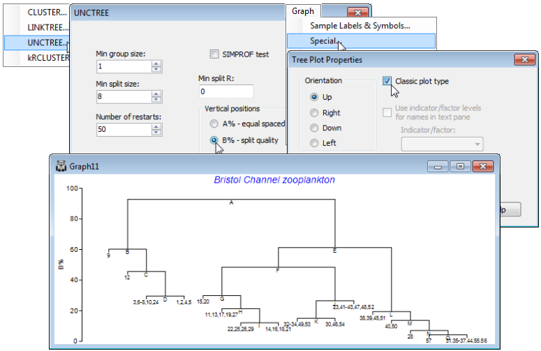
Two features are apparent from this plot. Firstly, the use of B% scaling on either type of plot does show (as a dendrogram would) that the divisions lettered A , E, F are major divisions between the clusters, in relation to the subdivisions of those groups, e.g. at H, J, L etc., at much lower levels on the y-axis scale; this fact is missing with the equi-stepped A% scale. However, there is the potential for reversals when using B% scaling (sub-cluster divisions returning higher values of B than their parent split) especially in the constrained form of this clustering (Section 13). Secondly, note that labels on the ‘classic’ plot have to be sample numbers, exploiting number ranges to keep the plot tolerably neat (text labels would be impossible), which is highly confusing here when the sample sites are actually labelled 1-29, 31-58 (site 30 not sampled), but the sample numbers will be 1-57!
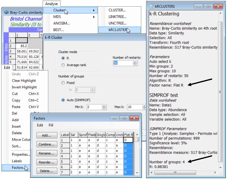
Flat-form clustering
Another new introduction in PRIMER 7 is a form of non-hierarchical (flat) clustering, the analogue of the k-means method in traditional cluster analysis. The latter is a widely-used technique based on Euclidean distances in the variable space of the original data matrix, seeking to form an optimal division of samples into a specified number of groups (k), minimising the within-group sums of squares about the k group ‘centres’ (termed centroids) in that high-dimensional variable space. However, in that form, it is quite inappropriate for typical species matrices, for which Euclidean distances or their squares (whether on normalised variables or not) are a poor measure of dissimilarity among samples, as discussed in Section 5 and in more detail in Chapters 2 and 16 of CiMC. What is required here, to be consistent with the rest of the PRIMER package (and the hierarchical methods previously described) is a technique which applies to any dissimilarity coefficient, and in particular, those suitable for species data (e.g. Bray-Curtis). By analogy with k-means, the concept of k-R clustering is introduced towards the end of Chapter 3 of CiMC, in which the k groups are chosen to maximise the global ANOSIM R statistic (as it would be calculated for an ANOSIM test of the k groups involved). Again, the use of R here has nothing to do with hypothesis testing; it is its usefulness as a completely general measure of separation of defined groups of samples, based only on the ranks of the dissimilarity matrix – the same numbers, however that dissimilarity is defined – which is being exploited. Above, we used the idea of maximising R for a division of the samples into two groups; here the kRCLUSTER routine simply generalises that to maximising R calculated over k groups. It again involves a demanding iterative search, with user choice of the number of random restarts (again the current default is 10 but try more if the process runs quickly).
A perceived drawback of the k-means approach is that k must be specified in advance. There may be situations in which a pre-fixed number of groups is required but, more likely, it would be useful to determine the ‘best k’ from a range of values, in some well-defined sense. SIMPROF tests can be exploited here also, to provide a possible stopping rule. The k-R Cluster dialog asks for min and max k values to try, and starting with (say) the default min k of 2, finds the optimal division into two groups and tests those groups, with SIMPROF, for evidence of within-group structure. So far, these groups and the tests will be exactly those of the unconstrained binary divisive (UNCTREE) routine, above. But these groups are not then further subdivided – this is not a hierarchical process. If at least one SIMPROF test is significant then these groups are thrown away, and the procedure starts again with the full set of samples and attempts to find an optimal k=3 group solution. These groups are again tested with SIMPROF, and if any of the three tests is significant, a k=4 solution is sought on the full set of samples, etc. The procedure stops either when the specified max k (default 10) has been explored or when all SIMPROF tests for the current k are not significant (i.e. there is no statistical evidence of structure at a finer-scale than this k-group partition). kRCLUSTER will request a factor name to define that grouping; note that it is a single factor holding only the solution for the (optimum or maximum) k-value at which the procedure terminates. A tree diagram cannot, of course, be plotted, since there is no hierarchy. In fact, the reason for exploring flat clustering of this type is to avoid the inflexibility, in hierarchical methods, of samples being unable to ‘change their allegiance’ – once in a specific group, a sample remains in a subset or superset of that group.
A final choice on the k-R Cluster dialog is between (Cluster mode•R), which is precisely the rank- based algorithm described above, and (Cluster mode•Average rank), which is a subtle variation bearing some analogy with group average linkage (an idea met in agglomerative clustering but here still used to produce a flat clustering). The last page of Chapter 3 of CiMC explains this variation, which (though not using R as such) is still a function only of the ranks of the original resemblance matrix. In practice, the two flat-clustering modes should produce rather similar solutions.
Again on the Bristol Channel zooplankton data, whose workspace should still be open, with the active sheet as the Bray-Curtis similarity matrix based on fourth-root transformed densities, take Analyse>Cluster>kRCLUSTER>(Cluster mode•R) & ((Number of groups•Auto (SIMPROF))> (Min k: 2) & (Max k: 10)) & (Number of restarts: 50), and with defaults taken on the SIMPROF options dialog, and specifying factor for the optimal grouping of Flat R. The results are inevitably rather minimal in this case: the results window gives the optimal number of groups again as k=4 (with R=0.884), and Edit>Factors will show the Flat R grouping. You may like to run the routine again with (Cluster mode•Average rank), which results in the same k=4 groups here, though the factor sheet shows that the order of assignment of letters A, B, C, D to the 4 groups may differ. This is an inevitable result of the random search procedure, even when the same options are taken.
In fact, much the best way of comparing the results of the differing clustering methods of this section is seen for these data in Fig. 3.10 of CiMC, namely on three copies of the same non-metric MDS ordination of the 57 samples. See Section 8 for running MDS ordinations, so this example will not be pursued further here (but you might like to return to these data after tackling Section 8 and reproduce a larger version of Fig. 3.10, covering all the variations of clustering methods you have generated in this section, so Save Workspace As>File name: Bristol Channel ws). In Fig. 3.10, the differing SIMPROF group factors SprofGps, Unctree and Flat R – for the hierarchical agglomerative (group average), divisive and flat clusters – are plotted as symbols, and relettered consistently, since essentially the same four main groups result from these very different clustering techniques. The minor differences between methods are clear: they just concern allocation of a few sites, which tend to be intermediate between the main groups – the treatment of sites 9, 23 and 24 is all that distinguishes them.
This is exactly what one might wish for in drawing solidly-based inference of clustering structure – a stability to the choice of method. It is relevant here that the same transformation and (especially) similarity matrix was used for all methods. Major differences in groupings would be expected to arise from using different pretreatments or dissimilarity definitions, e.g. comparing SIMPROF groups from agglomerative clusters, using Bray-Curtis on fourth-root transformed densities, with SIMPROF groups from a method closer to traditional k-means clustering (normalised species data, with resemblances calculated using Euclidean distance, and analysed by the Average rank cluster mode of the above k-R clustering). This has rather little to do with choice of clustering method but everything to do with what is understood by similarity of samples in the high-dimensional species space. This is a recurring theme in CiMC: the major differences between ordination methods such as PCA (Section 12) and nMDS (Section 8) usually has much less to do with the different way the methods try to view high-d data in low-d space, but much more to do with how those methods choose to define ‘distances’ in that high-d space at the outset (PCA by Euclidean distance, nMDS often by a species-based community measure from the Bray-Curtis family).