8. Multi-dimensional scaling (Non-metric nMDS, Metric mMDS, Combined MDS)
- Rationale for nMDS & mMDS
- Combined MDS & ‘Fix Collapse’
- Diagnostic tools for MDS plots
- Overlaying factors or other data (bubble plot)
- Running an nMDS (Exe nematodes)
- MDS results window
- Shepard diagrams
- Dissimilarity preservation as a matrix correlation
- Accuracy & fit scheme
- Graph menu: rotating and flipping the 2-d ordination
- Align graphs automatically
- Zoom & MDS subset plots
- Special menu for ordination; Aspect ratio of boundary
- Diagnostics for MDS: join pairs
- Features that carry over to 3-d ordination
- Minimum spanning tree (MST)
- Linking MDS plots to cluster analysis
- Cluster overlays on MDS plots
- Dendrogram & 2-d MDS in a 3-d plot
- 3-d ordination plots & axes selection
- Rotate axes or rotate/flip data
- Drawing verticals for 3-d plots
- (W Australia fish diets)
- Higher-d & scree plots (WA fish diet)
- Spinning a 3-d MDS & capture in a movie file
- (Morlaix macrofauna, Amoco-Cadiz oil spill)
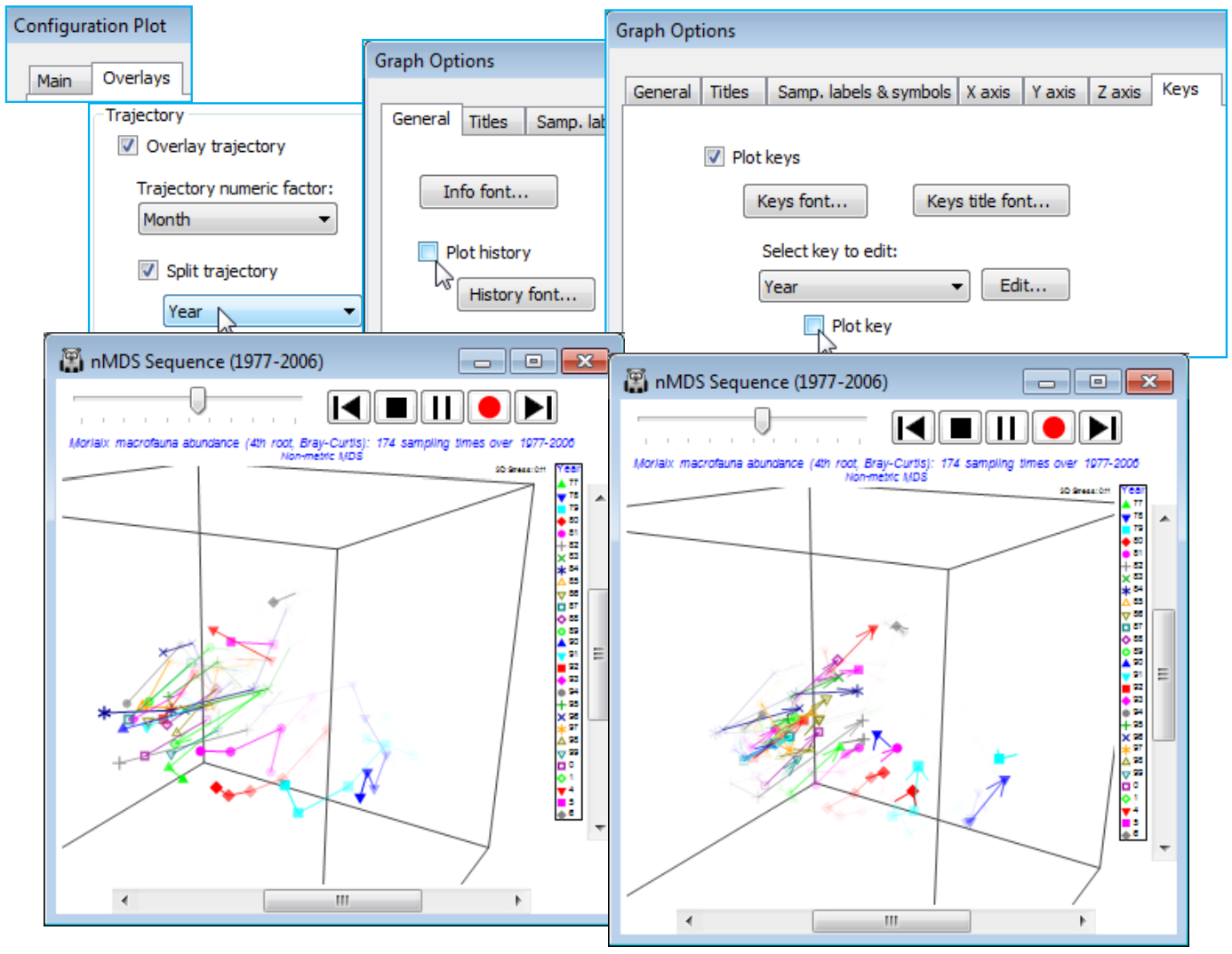
- Overlay trajectories
- Sequence animation, captured in 2- & 3-d
- Trajectories split & then sequence animated
- (Tees Bay macrofauna time series)
- Matching variable sets; (Ekofisk oil-field study)
- Bubble plots of single variables
- Bubble colours
- Bubble key
- Bubble images
- Duplicate graphs
- Vector plots for species
- Environment bubble & vector plots
- Segmented bubble plots
- (Bristol Channel zooplankton)
- Bubble plots in 3-d MDS; (W Australia fish diets)
- Bubble plots on averages
- Bubble data selection error & Refresh
- Metric MDS; (Great-circle distances for world cities)
- Identifying points on the Shepard plot
- Animating the mMDS/nMDS iterations
- (Morlaix macrofauna, Amoco-Cadiz oil spill)
- Threshold metric MDS (tmMDS)
- Metric MDS for ordinating few points
- ‘Fix collapse’ in nMDS; (Ko Phuket transects of coral reefs)
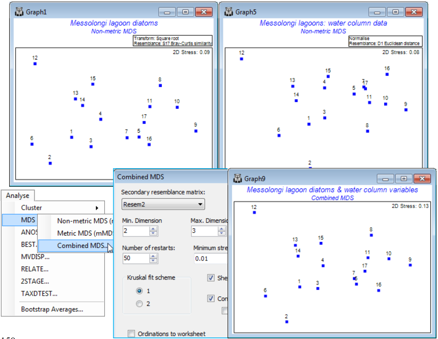
- Combined nMDS; (Messolongi diatoms & abiotic data)
Rationale for nMDS & mMDS
Chapter 5 of the CiMC methods manual describes the operation and rationale of multi-dimensional scaling (MDS) ordination, Analyse>MDS. The aim of MDS is to represent the samples as points in low-d space (often 2-d or 3-d, but PRIMER 7 will now compute MDS solutions for any specified range of dimensions), such that the distances apart of all points are as closely matched as possible to the relative dissimilarities (or distances) among the samples, as measured by the resemblance matrix calculated on the (pre-treated) data sheet. The definition of ‘closely matched’ for the most commonly used form of MDS, Non-metric MDS (nMDS), is that the rank order of dissimilarities among pairs of samples are preserved in ranks of the corresponding pairwise distances in the final ordination plot. The interpretation of a (successful) nMDS is therefore straightforward: the closer points are to each other the more similar is their community composition (or suite of environmental data, biomarker responses, particle size distributions, or whatever the variables represent).
PRIMER 7 also provides the more parametric technique of Metric MDS (mMDS), which seeks to interpret the entries in the resemblance matrix as actual distances, so that samples with distance/ dissimilarity d are placed at distance d in the ordination plot. The key distinction is that the Shepard diagram (a scatter plot of resemblances, x, against ordination distances, y) is fitted by a straight line in mMDS but by a general (non-linear) increasing function in nMDS. The much greater flexibility of nMDS makes it more suitable for displaying typical community data in low dimensional space, but low-d mMDS plots have a useful role to play in ordinations on very few points (as for some means plots) and in region estimates for means (Section 17), or where the resemblance coefficient is, or behaves very like, a genuine distance. Examples might be for normalised Euclidean measures on environmental-type data or community data with low sampling variability from a short baseline of change (i.e. relatively little species turnover). Data with more typical sampling variability, but still over a short baseline, can sometimes be well represented in low-d by threshold metric MDS (tmMDS, Fig. 5.12, CiMC), in which the Shepard plot is fitted by a straight line but not through the origin. Unlike nMDS, (t)mMDS plots thus have a measurement scale interpretable in terms of the resemblances, though all forms of MDS plot are arbitrarily rotatable and reflectable in the axes.
Metric MDS is not Principal Co-ordinate Analysis (PCO), as available in the PERMANOVA+ add-on to PRIMER, though this is a common misconception. PCO is a projection technique from high to low-d, via an eigenvalue decomposition – a generalisation of PCA, see Section 12. The nMDS and mMDS algorithms are iterative searches, not guaranteed to converge to the optimal solution, hence the need to run them for many random restarts. The default in PRIMER 7 is 50 restarts but if the run time for a single one is not an issue, it is always worth doubling that number, to ensure that a solution is found which is, at least, near-optimal. A working criterion for deciding that enough iterations have been performed is that the same (lowest) stress value is obtained from more than a handful of the restarts. Stress measures the scatter in the Shepard plot, i.e. how faithfully the high-d relationships are represented in the low-d ordination – for interpretation of stress values see CiMC.
Combined MDS & ‘Fix Collapse’
A further new feature of nMDS in PRIMER 7 is the ability to minimise a combination of two stress functions, equally mixed – this has potential application, for example, to combining information on a common set of samples from community matrices (typically using a biological resemblance, such as Bray-Curtis) with that from physical variables (usually requiring Euclidean distance) in a single ordination, a Combined MDS plot. A more commonly needed requirement is implemented within the nMDS routine: the ability to mix a small amount of a metric solution with the predominantly non-metric one, preserving the flexibility of nMDS whilst implementing a (✓Fix Collapse) of the non-metric solution which can occur if a sample, or set of samples, has greater dissimilarity to all others than any dissimilarity within either set. Ranks then carry no information about the relative spacing of the two sets and even a very small amount of metric MDS information is enough to fix this indeterminacy. This will often be a better option than using the Graph>MDS Subset routine on a box drawn around the main group of points, excluding the outliers causing the difficulty.
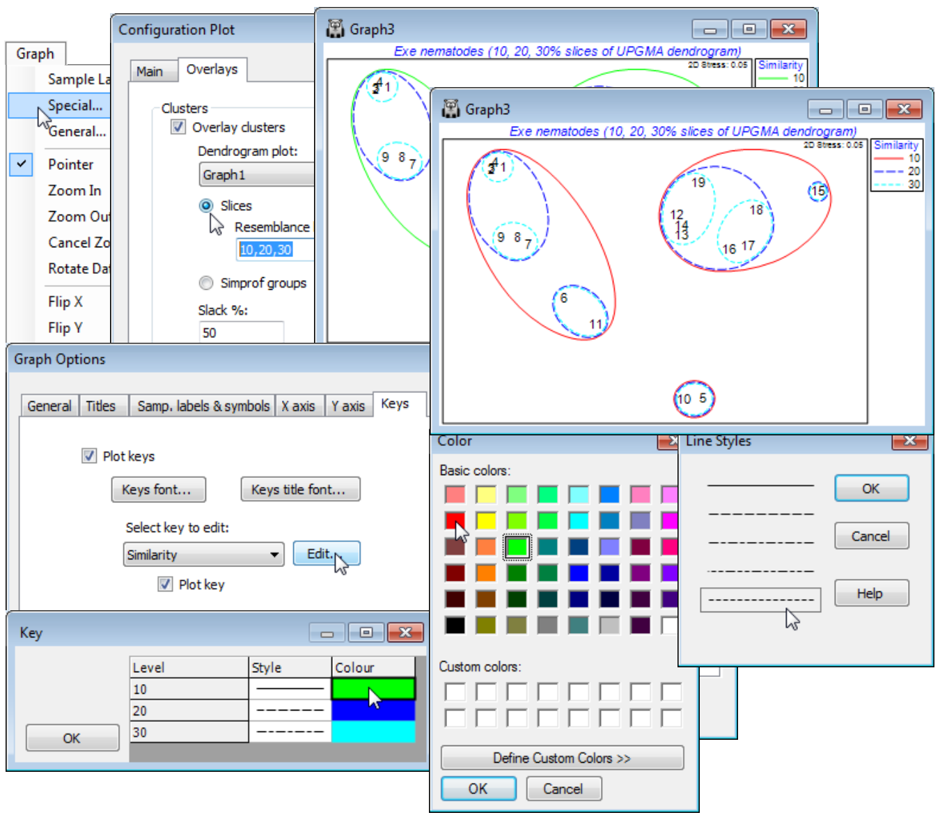
Diagnostic tools for MDS plots
In addition to the ability in a previous PRIMER version to Graph>Special>Overlays>(✓Overlay clusters) from a dendrogram onto a related MDS ordination, in order to judge agreement between these differing low-d displays of high-d data, PRIMER 7 now provides a wide range of diagnostic tools to monitor convergence of the ordination and the adequacy of the low-d representation. The iterative search process can be viewed in real time with (✓Configuration plot)>(✓Animate) and, as with most such animations (including rotating 3-d MDS plots with Graph>Spin), recording this, with standard video controls in an *.mp4 file, is now possible. The behaviour of stress over a range of dimensions is seen in a (✓Scree plot) and Shepard plots for all specified dimensions viewed in conjunction, in a multi-plot (see the previous section) along with the configurations. Points which the ordination is unable to place well are identifiable from the Shepard diagram by clicking on outliers in this scatter plot. An alternative now available to drawing cluster contours for specified similarity thresholds is a juxtaposition of a 2-d ordination with the full dendrogram in the third dimension, taking Special>(Main>Plot type•2D>✓3D project) & (Overlays>✓Overlay clusters). Also in 2- or 3-d, (Overlays>✓Join pairs) simply joins pairs of sample points in the ordination plot which have similarities greater than a specified value, and (✓Overlay minimum spanning tree) will connect ordination points according to the minimum length (branching) path connecting them all, through the dissimilarities in the resemblance matrix (not distances in the low-d ordination). Both methods therefore may allow identification of points in the ordination which do not reflect well the underlying dissimilarities. Another new PRIMER 7 feature here is the ability quickly to match different ordinations of the same set of sample labels (e.g. with different stresses, metric vs non-metric etc.), by optimal rotation, reflection and scaling of two configurations by Procrustes analysis, taking Graph>Align Graph and supplying the configuration plot which it is attempted to match.
Overlaying factors or other data (bubble plot)
The ability to display, on any ordination plot, external structure such as factors (e.g. for sites, times etc.) by Graph>Sample labels & symbols is a fundamental interpretational tool, as is the addition of time (or unidirectional space) trajectories, via Graph>Special>Overlays>✓Overlay trajectory, and supplying a numeric factor which determines the order in which points are joined. This, too, is greatly expanded in PRIMER 7 by allowing multiple trajectories, e.g. a common time course drawn in separate colours or line styles for different sites, using (✓Split trajectory) and then supplying the site factor. Also, there is the capacity to view the evolution of a trajectory (or multiple trajectories) dynamically, in an animation which can be recorded (as noted above) in an *.mp4 file.
Bubble plots (Graph>Special>Main>✓Bubble plot) overlay circles whose sizes reflect values of one of the variables (e.g. species) used in constructing the MDS, or of an external variable such as environmental information. Again, bubble plots have been greatly extended in PRIMER 7, from improvements in flexibility, such as the degree of user control over definition of the bubble key (Key>Key values), to several new features: drawing simple bubble plots with a user-defined image (Key>✓Use image) displayed at different sizes; the automatic availability of ‘3-d effect’ bubbles on 3-d ordinations (justifying the term bubble plot rather than circle plot!); the display of bubbles for single variables in different colours dependent on the levels of a factor, by Key>(✓Use symbol colours) when Sample labels & symbols>(Symbols✓Plot)>(✓By factor) is selected; and, perhaps most significantly, segmented bubble plots are introduced. These display several variables on the same MDS plot as different-sized segments of a circle or sphere, in differing colours and segment positions for the differing variables (under ✓Bubble plot>Change, add more variables to Include).
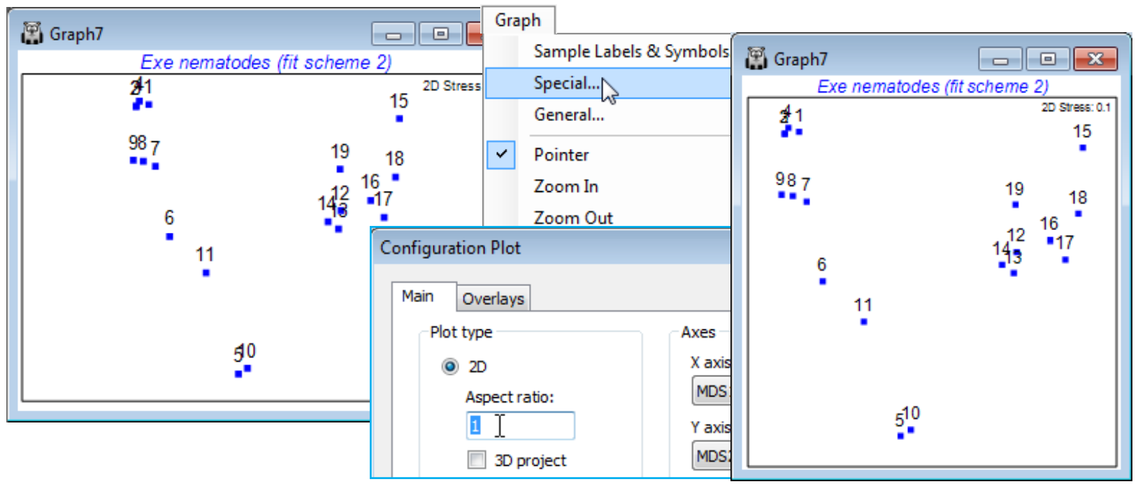
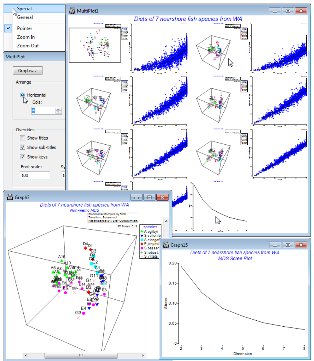
Running an nMDS (Exe nematodes)
From the directory C:\Examples v7\Exe nematodes, File>Open the workspace Exe ws, last seen in Section 6, of the sediment nematode communities at 19 inter-tidal sites in the Exe estuary. If this does not exist, open the data file Exe nematode abundance(.pri) in a clear workspace, and re-run the UPGMA clustering, with Pre-treatment>Transform (overall)>Transformation: Fourth root and Analyse>Resemblance>(Measure•Bray-Curtis similarity)&(Analyse between•Samples), then Analyse>Cluster>CLUSTER>(Cluster mode•Group average), and on the resulting dendrogram, Graph>Special>(Slicing✓Show slice)>(Resemblance: 30)>Create factor>(Add factor named: 30% slice). The Bray-Curtis similarity matrix is in Resem1 and the dendrogram Graph1.
With Resem1 as the active window, take Analyse>MDS>Non-metric MDS (nMDS) and options of (Min. Dimension: 2)&(Max. Dimension: 3)&(Number of restarts: 100)&(Minimum stress: 0.01) &(Kruskal fit scheme•1)&(✓Configuration plot)&(✓Shepard diagrams)&(✓Ordinations to work sheet) leaving the other boxes unticked for now. The outcome is a results window, nMDS1, and a multi-plot MultiPlot1 which, if unrolled in the Explorer tree (either by clicking the ![]() in the tree or by clicking on any of the plot components in the multi-plot), shows four plot windows, probably named Graph3 to Graph6. For the first one, remove the spread of symbols with Graph>Sample labels & symbols, unchecking (Symbols>By factor), to leave just the labelled default symbols.
in the tree or by clicking on any of the plot components in the multi-plot), shows four plot windows, probably named Graph3 to Graph6. For the first one, remove the spread of symbols with Graph>Sample labels & symbols, unchecking (Symbols>By factor), to leave just the labelled default symbols.
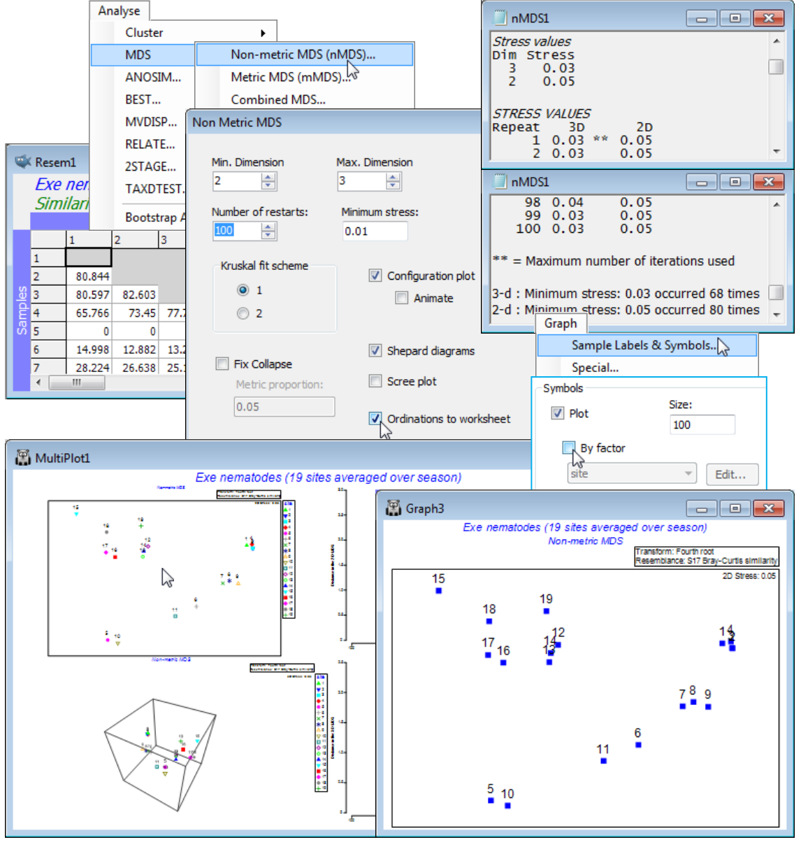
MDS results window
As with all results windows, the MDS1 window first lists the resemblance sheet on which analysis is carried out, and whether it was under any selection on the original sample set (given as ranges of sample numbers) but the main function of this window is to report the stress the iteration converges to, from each of the 100 restarts (independently for each dimensionality, here just 2-d and 3-d). The same lowest stress values of 0.03 for the 3-d solutions, and 0.05 for 2-d (stress must be higher in lower dimensions), are found over 50% of the time, so is very unlikely to be bettered by any further restarts. Note that your run of MDS will not produce exactly this sequence of stress values, because restart layouts are randomly drawn, and the random seed is taken from the computer’s clock. Each restart involves an iterative cycle (alternately fitting monotonic regression to the Shepard diagram and adjusting the configuration points by steepest descent – see Chapter 5 of CiMC). If the process has not converged within 100 cycles then it terminates: this happens here for a few of the restarts with the 3-d solution, indicated by ** after the quoted stress. (It probably suggests that two equally good solutions are available, and the algorithm cycles back and forth between them, which happens often when the structure can fit easily into low-d, so that stress is very low).
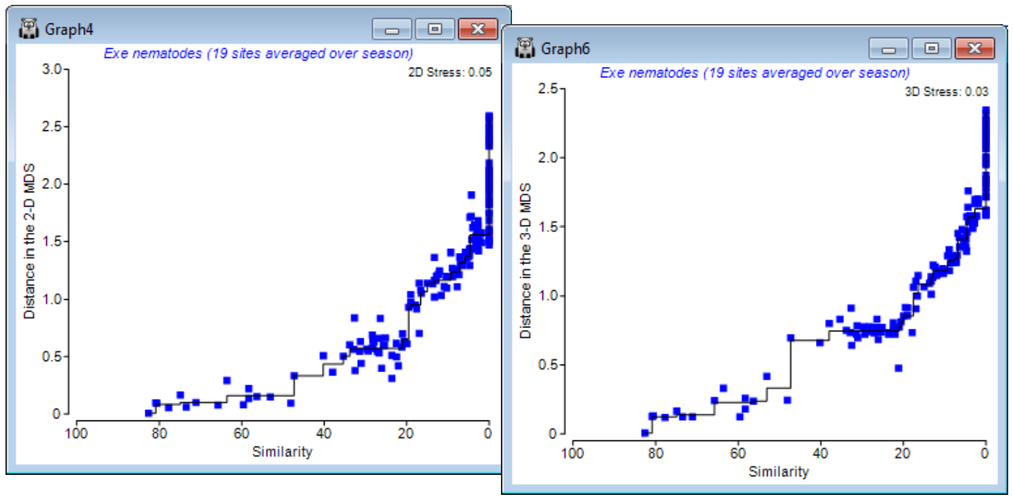
Shepard diagrams
That the stress is low here is also evident from the Shepard diagrams for the 2-d and 3-d solutions (possibly Graph4 & Graph6). They are scatter plots of distances between samples in the ordination against original (dis)similarities, in which the deviations of the points (blue) from the from the best-fitting monotonic increasing regression line (black) are seen to be very low. When all points lie on the line, all statements of the following form are true: ‘site 5 is closer to site 10 in the ordination than site 14 is to site 6 because the dissimilarity between sites 5 and 10 is smaller than that between 14 and 6’, i.e. rank order relationships are exactly preserved and stress is zero. Note the regression does not need to be linear (through the origin) as in mMDS, and it is certainly not so here: sites 14 and 6 are twice as dissimilar (~ 90%) as sites 5 and 10 are (~45%) but they are not placed twice as far apart in the plot (as mMDS would try to force). This capacity to shrink/stretch the dissimilarity scale in conversion to a distance is what gives nMDS its flexibility.
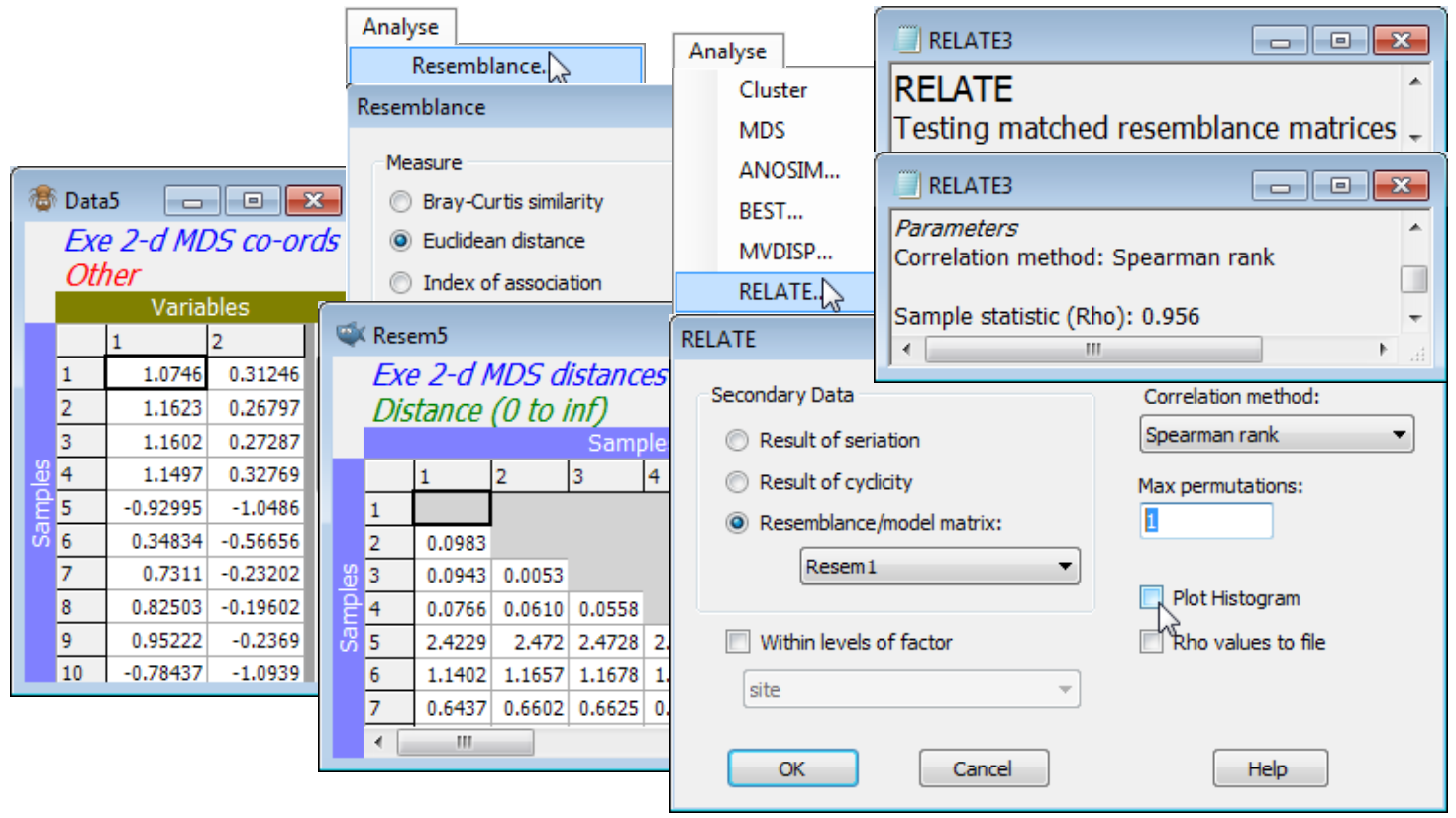
Dissimilarity preservation as a matrix correlation
One can also ask how well the (Euclidean) distances among points in the nMDS plot correlate with the dissimilarities in the resemblance matrix. The former are calculated by running the ordination co-ordinates (output to Data4 and Data5 by the ✓Ordinations to worksheet instruction in the above example) through Analyse>Resemblance>(•Euclidean distance). Then, just as for the Cophenetic correlation heading in the Section 6 cluster analyses, which was carried out on the same Exe data, a matrix correlation between these two triangular matrices requires a run of the Analyse>RELATE routine (Section 14), e.g. with the distance matrix as the active sheet and the dissimilarities Resem1 as the secondary data (or vice-versa). The only difference this time is that the option to compute a rank correlation such as Spearman should be taken (a rank Mantel-type correlation), since this is nMDS and the Shepard plot is not linear. (It is often overlooked that Pearson correlation measures only linearity of a relationship – a stress of zero corresponds to Spearman $\rho_S$= 1 but Pearson $\rho$< 1, when the increasing relationship is perfect but not linear). The permutation test in RELATE is not required since $\rho$= 0 is not a sensible null hypothesis, so set Max permutations: 1 and uncheck the Plot Histogram box, giving $\rho_S$= 0.956 for the 2-d nMDS and 0.965 for the 3-d configuration.
Accuracy & fit scheme
For the MDS run above, two of the defaults taken for options in the MDS dialog were (Minimum stress: 0.01) and (Kruskal fit scheme•1). Changing the former from 0.01 to 0.001 would decrease the lower threshold of stress at which the iteration decides that it has effectively reached a perfect solution but, more usefully, also increases the accuracy with which stress values are reported in the results window. Reporting stress to a third decimal place can be useful in deciding whether a batch of restarts with the same stress, to two decimal places, are really the same solution. However, it is unwise to take small differences in stress too seriously: solutions with nearly the same stress will usually lead to the same interpretation. A low-dimensional ordination is only an approximation to the real high-dimensional pattern, in any case, and not necessarily a very good one. (This is the reason that most of the substantive analysis, like hypothesis testing, takes place on the resemblance matrix and not in a low-d ordination space. It therefore misses the point to worry unduly about whether a low-d plot is the optimum placement of the points or one that is very nearly optimal – both are only approximations to the truth). In fact, it can be quite revealing to look at repeat MDS runs with only one restart, which much of the time will therefore converge to an inferior solution, and observe which points differ from their placement in the optimal solution.
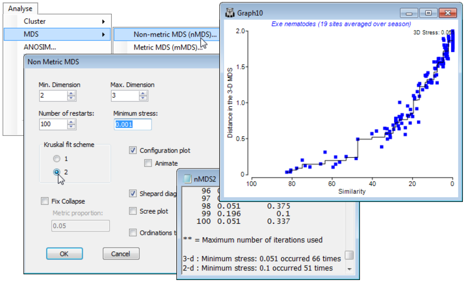
The (Kruskal fit scheme•1) option is by far the commonest choice for practical nMDS. Essentially, it allows dissimilarities which are equal (tied ranks) to be represented in the final ordination by distances which are not equal, whereas (Kruskal fit scheme•2) constrains those plot distances to be equal. The latter can be an unhelpful constraint in any situation in which there is a complete turn-over of species across some samples. For example, along a strong environmental gradient, such as water depth say, there could already be complete species turnover in benthic organisms between sedimentary sites at 5m and 100m (dissimilarity = 100%), but two sites at 2m and 200m, or at 1m and 500m, cannot give a larger dissimilarity than this. If 100% dissimilarity is to be represented by exactly the same distance in the ordination of samples widely spread along this depth gradient, it is inevitable that an arched (or to be more precise, staple-shaped) solution will result from what is actually a strong linear gradient. This is one of several explanations for the arch effect seen in other ordination techniques (such as PCO), to which nMDS is less prone because of the flexibility under (Kruskal fit scheme•1) to represent the set of 100% dissimilarities by different plot distances.
The above Shepard plots for the Exe nematode data – which is an example of large-scale species turnover – show this flexibility, in representing the many similarities of zero (dissimilarities of 100) by distances from about 1.6 to 2.4 in the 3-d plot, with stress of 0.033 (when run to 0.001 accuracy). Re-running for (Kruskal fit scheme•2) is seen below to force these distances closer to equality (1.8 to 2) and slightly degrades the solution (stress = 0.051 for the 3-d plot). The extra d.p. in quoting stress has not here demonstrated much of a spread of near-optimal solutions at a finer scale: the lowest stress of 0.051 is obtained at only a little lower frequency than before (66 of 100).
Graph menu: rotating and flipping the 2-d ordination
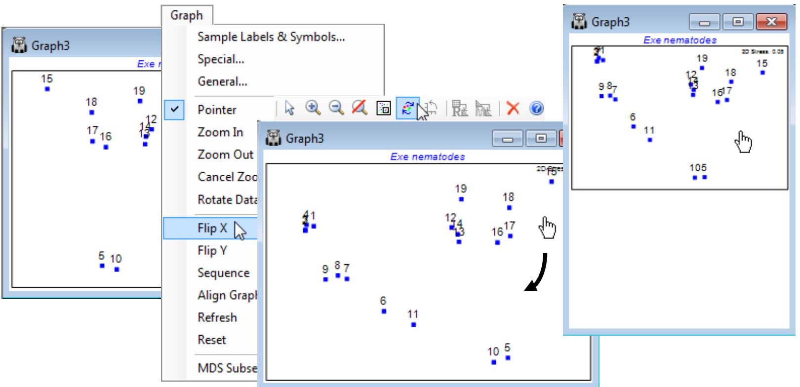
nMDS ordinations (unlike mMDS) have no meaningful axis scales for the configuration, since they use only ranks rather than original dissimilarities. There are also no defined directions for plot axes (unlike PCA, Section 12, or PCO, PERMANOVA+ add-on), so MDS plots (of any type) can be arbitrarily rotated, with Graph>Rotate Data, or by clicking on the Rotate data icon  on the tool bar. The cursor changes to a hand
  and by clicking, holding and dragging, the plot can be rotated continuously within its current rectangular frame. Purely for reasons of presentation, wide, fat plots are usually preferred to high, thin ones, so the MDS algorithm defaults to orienting the plot with its major axis across the page (which it does by inputting the final MDS co-ordinate positions into a PCA, and the internal axes scales are then determined by the major axis being normalised to mean zero and variance one – do not confuse this purely presentation feature with running a PCA on the original data!). However, any orientation is equally meaningful so if a specific orientation is needed for external reasons (e.g. to attempt to match a community ordination to the geographic location of the samples), once the desired rotation is achieved the cursor can be changed back to
  by Graph> Pointer. A new addition in PRIMER 7 is the Graph>Reset option, which allows you to reset the plot to the default orientation of the original MDS run, when the co-ordinate positions of the points on the plot will match those in the worksheet which may have been requested by (✓Ordinations to worksheet). It was noted in connection with cluster dendrogram rotations that the current ordination co-ordinates, after rotation, can always be retrieved by File>Save Graph Values As, to obtain an external text file (which could always be read back into PRIMER on the odd occasion when this might be required – though because of the arbitrariness of MDS axes it is generally not desirable to use single axis co-ordinates in subsequent regression/correlations, e.g. linking to abiotic variables).
In a similar way, MDS plots can be reflected on axes by Graph>Flip X or Flip Y, and the default configuration returned to by Graph>Reset. Though it is clear that much information about the axes (scaling, orientation, reflection) is arbitrary with nMDS, what is not arbitrary of course – in fact central to the method – is relative distances apart of points. Changing the aspect ratio of the points in an MDS plot (shrinking or expanding it along one axis only) destroys the key inferences, of the form ‘samples 15 and 16 are closer together than 5 and 6 therefore they are more compositionally similar’ (even though the direction of 15 to 16 is perpendicular to that of 5 to 6). Within PRIMER, this is not a concern. For the MDS plot, Graph3, in the Exe workspace, try flipping and re-orienting the plot and reshaping the window and you will see that the plot preserves the original relationships among the points rather than, for example, taking up the shape of the new window (as it would do with a cluster dendrogram). You should, however, be careful not to reshape the plot later, having saved or copied it via the clipboard to Powerpoint or other graphics presentation package.
Align graphs automatically
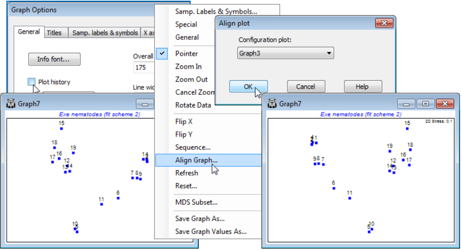
A new feature in PRIMER 7 is the ability to automatically reflect in the axes and rotate an MDS configuration (and rescale it, if necessary) such that it best matches the pattern of another supplied configuration. This can make it quicker and simpler to compare patterns from several different ordinations of the same sample labels, trying out the effect of different pre-treatments, resemblance measures or simply re-runs with more restarts etc. This is accomplished by Procrustes analysis (see the CiMC reference list for the Gower 1971 reference) and operates only on two graphs at a time. In the current Exe nematodes workspace Exe ws you should already have at least two 2-d nMDS plots for the 19 sites (e.g. Graph3 and Graph7 under Kruskal fit schemes 1 and 2). Automatically rotate and flip the active window (say Graph7) to match that of Graph3 by right-clicking over the plot (or taking Graph) to get Align Graph>(Configuration plot: Graph3). Note that the examples above and below have used the General and Title tabs on the Graph Options dialog to remove the history box (uncheck Plot History), amend main title, remove subtitle, change overall font scales etc. All these features and the Samp. labels & symbols tab are exactly as covered in Section 6.
Zoom & MDS subset plots
It is scarcely necessary here, with only 19 samples, to zoom in on part of the plot in order to see the detailed structure, though this is possible using the Zoom In, Zoom Out and Cancel Zoom options on the Graph menu (also accessible from the  ,
,  and
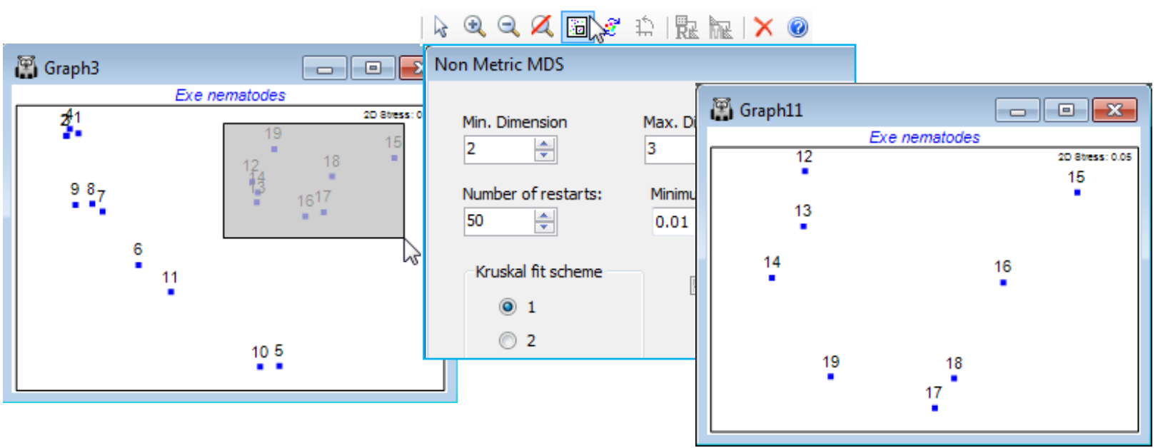
and  icons on the Tool Bar), as described for zooming in on dendrograms in Section 6, and this may be useful for very cluttered MDS plots, with rather too many points. However, it is not the only, or even the best, possibility. If attention is to be focussed on only a subset of points, then it is desirable for the 2-d ordination to display those points in the best possible relationship to each other, matching their (smaller set of) dissimilarities. This can be accomplished more accurately, since it is no longer necessary to display their relations with all the omitted points. In other words, the MDS should be repeated from scratch on the subset, and one way of carrying this out is to draw a box on the MDS (with cursor as pointer ), clicking and dragging a rectangle around the required subset of points, then taking Graph>MDS Subset (or its icon
  ). This automatically selects the surrounded points from the resemblance matrix and displays the MDS dialog box (normally obtained by Analyse>MDS>…). For the Exe nematode data, even though the 2-d stress for the full set of samples in Graph3 is low (at 0.05), a re-run on sites 12-19 gives a more accurate display of the site 12-14 relationships (a SIMPROF test, as seen in Section 6, actually divides site 14 from 12 & 13, not something that would be expected from the original Graph3 display, in which 14 appears to sit between 12 and 13).
Special menu for ordination; Aspect ratio of boundary
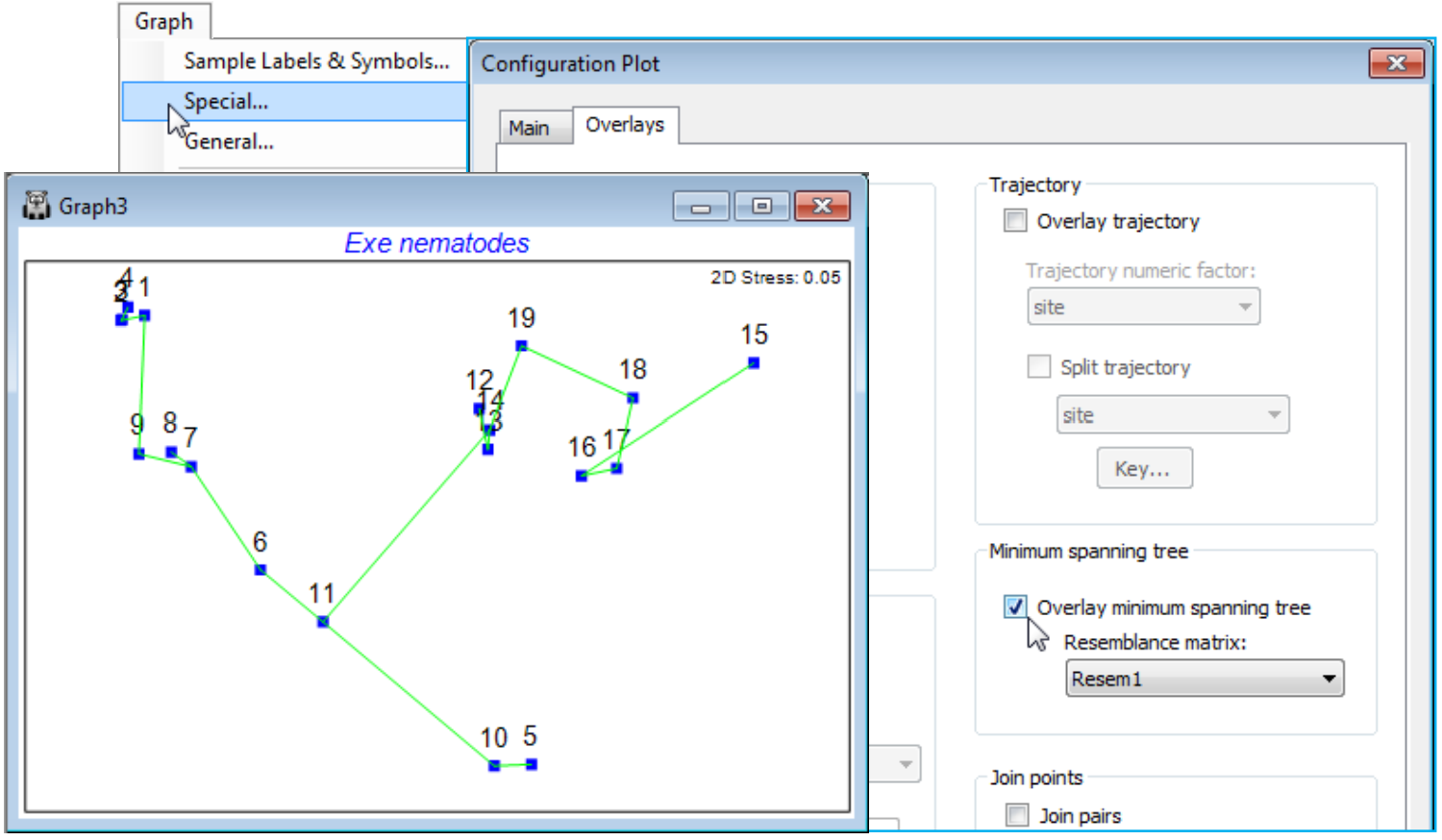
We have seen before that, whilst the Graph>Sample Labels & Symbols and General menus are universal, having dialog boxes of the same form for all the graphics routines, the Graph>Special dialogs are specific to each routine, and this option is at its most extensive for ordination plots from nMDS, mMDS, PCA (and PCO in the PERMANOVA+ add-on). On the Main tab, options include specification of plot types, which axes to plot, setting up of a range of bubble plots, and animated displays of ordination points in time (or other) sequence. On an Overlays tab, there are options to overlay temporal or spatial trajectories through the points and vector plots, and various diagnostic aids, such as superimposing cluster results, minimum spanning tree and joining similar samples.
Before moving on to diagnostics it is natural here – having discussed zooming of rectangular boxes within an ordination – to cover the first option on Graph>Special>Main, the ability to change the aspect ratio of the boundary of an MDS plot. It was noted above that the aspect ratio of the points in an MDS must never change because this destroys their relative distances apart (in any direction), the key information that a (scale-less) nMDS carries. By default, the MDS points are placed within a rectangular border with an aspect ratio of 1.5:1, width to height. This is purely because the default configuration has been rotated to principal axes, as noted earlier, for presentational reasons: most plots are conveniently displayed in landscape rather than portrait format. However, if a different aspect ratio for the border is required (and of course there is no possibility of obtaining this by re-sizing the window displaying the plot!) then, for example, Main>Plot type•2D>(Aspect ratio: 1) will produce a square boundary. (Indeed, some practitioners prefer a square boundary for all MDS plots, since axis direction is arbitrary, and early versions of PRIMER did have this constraint.)
Diagnostics for MDS: join pairs
There are a number of new diagnostic tools available in PRIMER 7 for assessing how well a low-d ordination represents the structure in the resemblance matrix. One of the simplest is to join pairs of points on the ordination which have similarity greater than some supplied threshold value. Choice of which value(s) to use requires a certain degree of experimentation, perhaps guided by a cluster dendrogram – too large a threshold and there are not enough joined pairs for an informative plot, too small and the plot is over-cluttered. For the Exe ws data, and the 2-d MDS plot Graph3, take the Overlays tab on the Special menu, i.e. Graph>Special>Overlays>(Join points✓Join pairs)> (Resemblance matrix: Resem1) & (Threshold: 30), which joins all pairs with similarity >30%. Whilst there is little conflict with the representation of such dissimilarities (<70%) by distances in the MDS plot, a small amount of inaccuracy (i.e. stress – low, at 0.05, but not entirely negligible) is evident in the way site 15 is connected with 16 but not sites 17 or 18, to which it appears closer in the 2-d plot. Note that if the same Join pairs operation is taken on the subset MDS of the last page, for sites 12-19 alone, this inaccuracy is resolved, as is the slight conflict noted previously for sites 12-14 – the reason site 19 is joined to 14 but not 12 in the full plot is evident from the subset MDS.
Features that carry over to 3-d ordination
It is worth saying, as we start to explore the wide range of tools which can be applied to an MDS or other ordination that, although demonstrated for 2-d plots, most of the techniques are also available for 3-d configurations. This includes all joining operations, such as join pairs and the minimum spanning tree, trajectory and vector overlays, and the new sequence animations. Also bubble plots are extended to 3-d in PRIMER 7. In fact the only Special menu feature which is not so extended is the drawing of cluster contours, but plotting symbols for cluster groups can often be more effective.
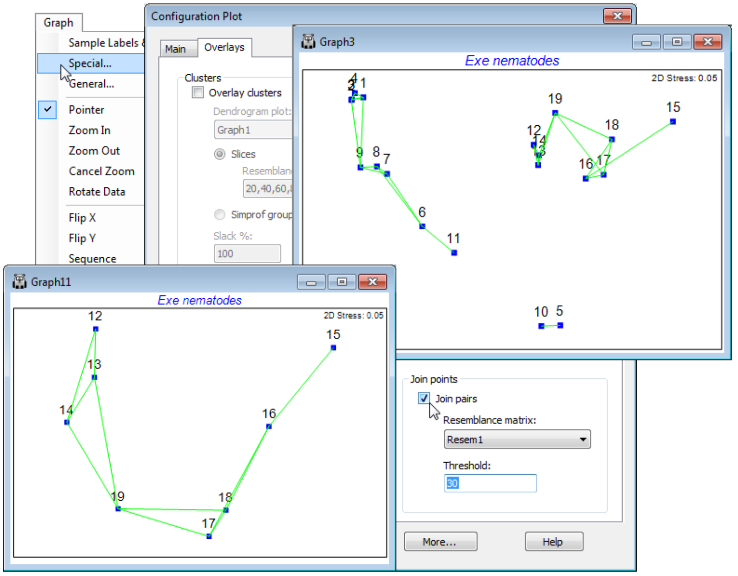
Minimum spanning tree (MST)
The minimum spanning tree (MST, see CiMC for the Gower and Ross, 1969 reference) is used in the same way, to identify parts of the configuration which do not fully represent the underlying (dis)similarity matrix. All samples are connected on the ordination by a single line, which may branch but never forms a closed loop, chosen to be of minimum ‘length’ – not using the distances on the ordination but summing the associated dissimilarities from the resemblance matrix. Again, whilst generally the line coincides with a natural joining up of the points in the 2-d ordination, the occasional unnatural links (15 to 16, 19 to 14) show the minor stress in the low-d approximation. You should avoid, of course, taking both MST and Join pairs options at the same time!
Linking MDS plots to cluster analysis
The 2-d ordination plot shows a clear separation of the nematode assemblages at these 19 sites into 5 groups (which CiMC, Chapter 11, shows can be related to sediment properties such as the median particle size, anoxic layer depth and interstitial salinity). Another useful check on the adequacy of the 2-d approximations represented by both MDS and cluster analyses, to the real high-d structure (there are 140 species variables in the Exe nematode abundance data sheet!), to examine the MDS and dendrogram results in combination, and there are at least two ways of doing this.
Firstly, the clusters that are defined for a fixed similarity slice through the dendrogram can be put into a factor, with levels defining the different groups, as seen in Section 6. This factor can then be displayed as differing symbols on the MDS, and the agreement noted. A variation of this which may often be preferable is to use the factor (or factors) created by the series of SIMPROF tests which accompany the particular clustering method (or methods), defining group structures for which there is some statistical support. For the current Exe ws workspace, a similarity slice should already exist as the factor 30% slice from the dendrogram Graph1. (If not, recreate it, with Graph1 as the active window, by Graph>Special>Slicing:(✓Show slice)>(Resemblance: 30) & (Create factor>Add factor named: 30% slice). From the MDS (Graph3), take Graph>Sample Labels & Symbols>(Symbols✓Plot)>(✓By factor: 30% slice) & (Labels✓Plot)>(✓By factor: site). (When plotting both labels and symbols, note that the symbol is centred on the point, with the label above. On its own, either is correctly centred). You might also like to re-run the Analyse>Cluster routine on Resem1, for one of the clustering methods discussed in Section 6, defining SIMPROF groups by a factor which is again used as symbols on the MDS. (Use Tools>Duplicate>(•On existing branch) on Graph3 to create a copy of the MDS so you can juxtapose the differing factor selections. You may also want to re-order the key by clicking on it and using  and
and  repeatedly in the resulting Key dialog). You will see that a finer distinction of sites into clusters is obtained with SIMPROF, implying there is statistical evidence for interpreting such fine-scale groups – but the ability to slice the dendrogram at some arbitrary coarser similarity (or to define fewer groups with the flat-form clustering, kRCluster) may still be a justifiable approach for a practical application of site grouping.
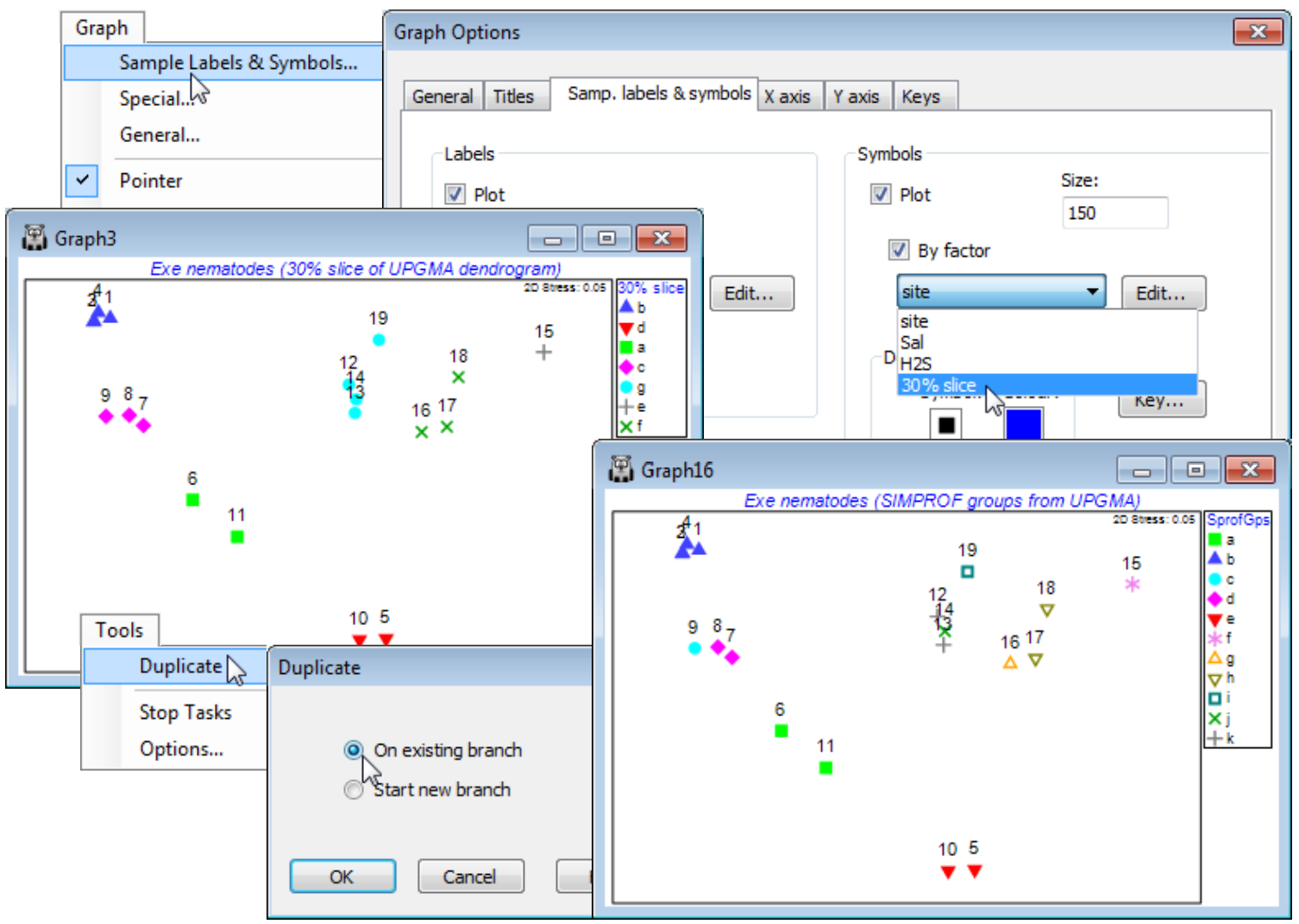
A good example of the comparison of different clustering methods and the SIMPROF groups they generate is seen in CiMC, Fig. 3.10, for the zooplankton data in the Bristol Channel ws workspace. Section 6 produced a range of SIMPROF factors: SprofGps, Flexbeta, Single & Complete linkage (agglomerative hierarchical), Unctree (divisive hierarchical) and Flat R (flat-form) clusters, which you may wish to represent as symbols on duplicated MDS plots, in a similar way to the above.
Cluster overlays on MDS plots
The second way in which a cluster analysis can be displayed on a 2-d MDS plot, to aid assessment of the level of agreement, is to draw smoothed envelopes around each of the cluster groups, either for one or more slices at arbitrarily chosen similarity levels (drawn with different line colours and line types) or, as a new option in PRIMER 7, with a previously-defined SIMPROF grouping from a hierarchical dendrogram. The envelopes are smoothed convex hulls of the points they enclose and a slackness parameter determines the smoothness of the enclosing line (how loosely it is drawn round the points in that group). The default of (Slack %: 100) results in a high degree of smoothing, and thus larger envelopes, with (Slack %: 0) giving the tightest enclosing polygon (the convex hull).
For the Exe nematode MDS (Graph3), remove the symbols that are displayed with the 30% slice by Graph>Sample Labels & Symbols, unchecking the (Symbols: ✓Plot box) to leave only the site labels. Take Graph>Special>Overlays>(Clusters✓Overlay clusters)>(Dendrogram plot: Graph1) & (•Slices>Resemblance levels: 10, 20, 30) & (Slack %: 50). Experiment with the slack parameter and change the colours and line types with the Keys tab in the Graph Options dialog, i.e. Sample Labels & Symbols>Keys>(Select key to edit: Similarity)>Edit and double-click on a colour or line style box to get the same options as for factor Keys, seen previously. You might also like to add envelopes for the SIMPROF groups created by the cluster run you chose on the previous page – by taking (Clusters•Simprof groups) rather than (Clusters•Slices) on the Overlays tab.
Attractive though such envelopes are, in guiding the eye to cluster groupings, there can be a lack of clarity as to which points fall in which envelopes when boundaries overlap, sometimes exacerbated by too high a slack parameter (chosen in the interests of producing very smoothed curves). This is also the reason why the envelope overlay operation is not offered for a general a priori factor, defining a one-way layout of samples, for which there is quite likely to be substantial overlap of some groups. At least with SIMPROF groups or dendrogram slices, if the MDS and cluster analysis are substantially in agreement, the likelihood is that most cluster groups will occupy a discrete region of the MDS space and lightly smoothed convex hulls will tend not to overlap too often. And a priori factors can always be simply and unambiguously displayed using different symbols.
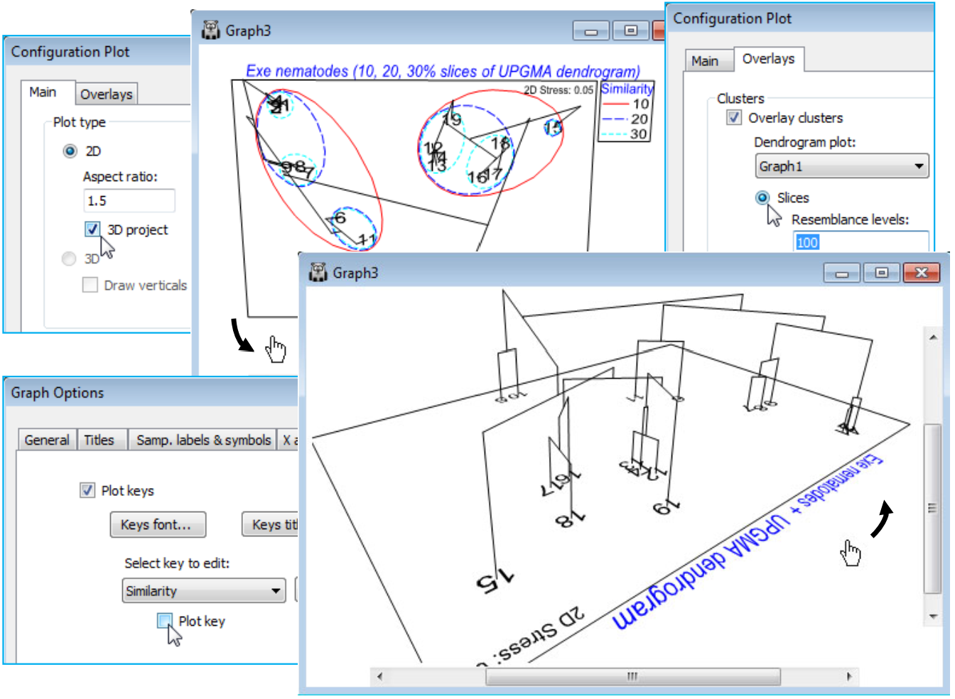
Dendrogram & 2-d MDS in a 3-d plot
Rather than creating a small number of (arbitrary) slices through a dendrogram, superimposed on a 2-d MDS, a further new feature in PRIMER 7 is the ability to draw the dendrogram as the third dimension in a 3-d plot of the 2-d MDS (or any ordination). As with all 3-d plots (see shortly), the graph is then rotatable, to allow good visualisation of the 2-d MDS in juxtaposition with the full dendrogram. This is again accessed from the Graph>Special dialog. With the current 2-d MDS for the Exe nematode data (Graph3), under the Main tab take (Plot type•2D)>(✓3D project). Under the Overlays tab, it is also necessary that you select (Clusters>✓Overlay clusters) and take either (•Slices) or (•Simprof groups), with the correct plot dendrogram specified, e.g. (Dendrogram plot: Graph1) for the former. From the previous page, the option (Resemblance levels: 10, 20, 30) will already be implemented, giving the first plot below, but if it is considered unnecessary to duplicate the envelopes on the 2-d plot as well as adding the full dendrogram, the envelopes can be switched off, effectively, by taking (Resemblance levels: 100). To get precisely the second plot below, there are some further minor steps: the title has been changed from the Titles tab on the standard Graph Options dialog box; the unneeded Similarity key is removed by unchecking the (✓Plot key) box on the Keys tab of Graph Options; the plot has been zoomed with Graph> (or right-click) Zoom In or the icon (this is often a useful step with a 3-d plot – note the scroll bars which allow the figure to be appropriately centred). Finally, the plot is rotated with Graph>Rotate Axes or the  icon, then clicking, holding and dragging with the cursor, which is now a hand.
3-d ordination plots & axes selection
As we have seen for the nMDS run on the Exe nematode data, in the first graphic of this Section, a default MDS run produces both 2-d and 3-d configuration plots, and their associated Shepard diagrams, placed into a multi-plot (Multiplot1). A different plot window is created for the 2-d than the 3-d solution because the operations are entirely separate. This is in contrast with PCA (Section 12) or PCO (in the PERMANOVA+ add-on) where the 2-d solution is just the first two axes of the 3-d solution, and a single plot window is sufficient to capture all the possibilities. There, the Graph >Special>Main>Axes section will allow a choice of which two or three of the (many) PCA axes are selected for plotting, in either the specified (Plot type•2D) or (Plot type•3D) configuration. For MDS plots, which can in PRIMER 7 also be produced for many dimensions, each new dimension requires a different iterative process and, for example, the 2-d solution will not be the first two axes of the 3-d solution. Hence the plot windows for different dimensions are listed separately, though the option to select different combinations of axes from each, for a 2- or 3-d plot, remains the same.
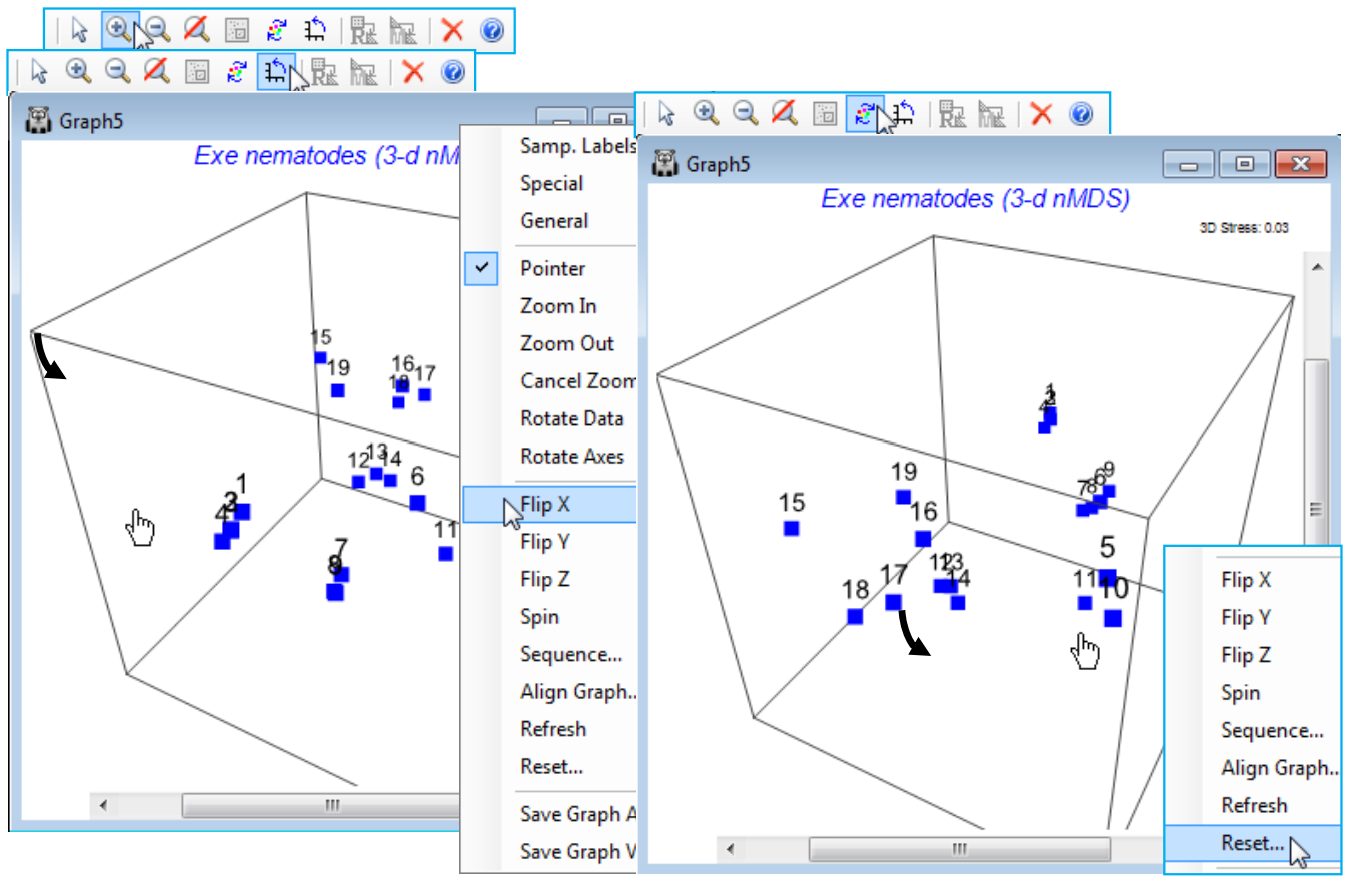
Rotate axes or rotate/flip data
The 3-d Exe nematode nMDS plot should be in the current workspace as Graph5 under Multiplot1 (if necessary create it again, with default options, by Analyse>MDS>Non-metric MDS (nMDS) on the Bray-Curtis resemblance matrix for a square-root transform of the data in Exe nematode abundance). Uncheck the (Symbols✓By factor) box on the (right-click) Samp. Labels & Symbols dialog and again Zoom In and take Rotate Axes, turning the 3-d box to properly see the position of these points in 3-d space. Note the distinction here between Rotate Axes (the icon) and the Rotate Data option (the icon). For a 2-d plot there is no benefit in rotating the axis box to produce a slanting rectangle surrounding the points(!), so this is not implemented. Rotating the points within the rectangular box can occasionally be useful, in order to line them up with a similar ordination for example, and bearing in mind the arbitrary orientation of points – this uses Rotate Data. In 3-d, rotating the box is beneficial because it allows a static plot of the points to be viewed dynamically from a range of angles so that the 3-d structure can be properly appreciated – this uses Rotate Axes and is available for any 3-d plot. Specifically for 3-d MDS plots, where the relation between the axes of the box and the orientation of points is arbitrary, Rotate Data (within a static axis box) is also available, along with reflecting the points in the axes with Flip X, Flip Y, Flip Z. Generally, rotating data will not be as useful as rotating the axes themselves but it can be important where, for example, an MDS plot is being referred to a physical layout of sampling sites in a 3-d medium. Try out the various combinations of rotation/flipping for Graph5, bearing in mind that you can always restore the original relationship of the points to the 3-d box by (right-click) Reset.
Drawing verticals for 3-d plots
Whilst it is relatively easy to visualise a 3-d plot by rotation of the axes – and PRIMER 7 is now able to output digital video of such rotations (as *.mp4, see below) – it is much harder to produce a convincing 3-d plot for static reproduction in 2-d, e.g. for a printed publication. PRIMER 7 tries to aid this in two ways: by giving any text on the plot a pseudo-perspective, e.g. with site or axes labels shrinking with distance into the plot, and providing an option on the Graph>Special>Main tab to (Plot type•3D)>(✓Draw verticals), which drops vertical lines onto the base plane of the box. For a limited number of samples this might help to fix the relative depths into the plot of the points. Alternatively, 3-d MDS axes could be viewed in 2-d, a pair of axes at a time. This uses, e.g. for the 3-d MDS plot of the Exe data (Graph5), Graph>Special>Main>(Plot type•2D) & (Axes>X axis: MDS1 & Y axis: MDS2) then (X axis: MDS1 & Y axis: MDS3) and possibly (X axis: MDS2 & Y axis: MDS3). It might be sensible to duplicate the first of these plots, with Tools>Duplicate>(•On existing branch) so that two (or all three) of these plots can be viewed together in the workspace. The same idea could be used to generate two or more of the four possible 3-d plots obtainable from the axes of a 4-d MDS (or PCA/PCO), e.g. (X axis: MDS2 & Y axis: MDS3 & Z axis: MDS4), etc.
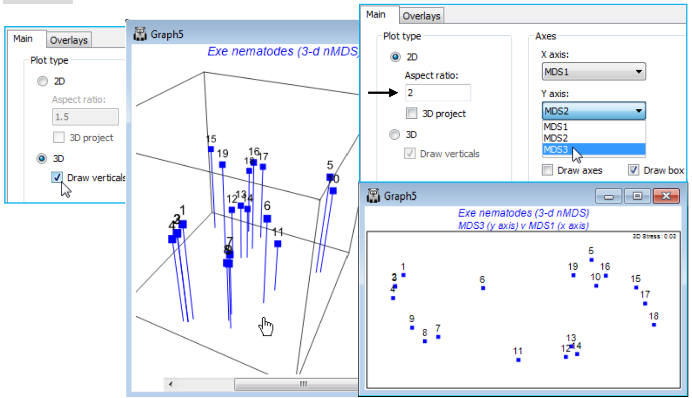
The plot shown above right (of MDS3 against MDS1) also uses the capacity, noted earlier, to alter the box shape for 2-d plots, by setting (Aspect ratio: 2) rather than the default of 1.5. In fact, rather little is to be gained by a 3-d MDS solution in this case since the 2-d stress of 0.05 is already low, the 3-d solution takes it down only slightly (to 0.03), and the 2-d approximation which the MDS solution represents is unlikely to mislead at all. Save and close the Exe ws workspace.
(W Australia fish diets)
Re-open the workspace WA fish ws from C:\Examples v7\WA fish diets, which will provide an example where a 3-d MDS is necessary to get a reliable feel for the multivariate structure. The workspace WA fish ws should contain a data sheet Data2 of the dietary assemblage of (pooled) guts of 7 marine fish species from W Australia, with uneven numbers of replicate pools per species. If not available, open WA fish diets %vol.pri; the Data2 sheet simply excluded three samples, A9, B3, B4, which had much lower total gut content than the remaining 65 pools – see Section 3 on deselecting samples. Take Pre-treatment>Standardise>(Standardise•Samples) & (By•Total) and transform the result with Pre-treatment>Transform(overall)>(Transformation: Square root) and Analyse>Resemblance>(Measure•Bray-Curtis similarity), renaming this WA B-C sim.
Higher-d & scree plots (WA fish diet)
Run nMDS at a wider range of dimensionalities than the default and ask for a scree plot: Analyse> MDS>Non-metric MDS (mMDS)>(Min. dimension: 2) & (Max. dimension: 8) & (✓Scree plot), taking the other defaults (i.e. including Shepard plots). On the resulting multi-plot, Multiplot1, take Graph>Special>(Arrange•Horizontal)>(Cols:4) to make sure the MDS plots and their associated Shepard diagrams are arranged in two pairs across each of the 4 rows, finishing with the scree plot.
Clicking on the 2-d configuration you can see that though there are some clear differences in the dietary assemblages for some fish species, the stress of the plot is high (0.19), reflected in the large scatter in its Shepard diagram. The 3-d (& 4-d) solutions are noticeably better, with the stress falling to 0.13 (and then 0.09); the scree plot shows this initially quite steep decline (stress must always decline as the number of dimensions available, to display the relationships among samples, increases). Of course, solutions in higher than 3-d can only display three co-ordinates at a time, so the configurations in the multiplot all show only axes MDS1, MDS2, MDS3. Whilst sets including some higher axes could be viewed for the $\ge$4-d solutions, e.g. MDS1, MDS2, MDS4, the primary visualisation here should be the 3-d MDS, which has a stress at ‘acceptable’ levels (see discussion on stress levels in CiMC, Chapter 5). Click on the 3-d plot in the multiplot (Graph3) and Zoom In, remove the uninformative labels by unchecking (Labels✓Plot) from the Samp. Labels & Symbols tab, remove the history by unchecking (✓Plot history) on the General tab, edit the title and delete the subtitle by removing its content on the Titles tab. You may also want to change the colour or symbol for some of the species by clicking on the key, which sends you to the Key dialog box, as previously seen. Finally rotate the 3-d axes manually by Graph>Rotate Axes (or the icon), to note how some fish species (e.g. S. vittata) feed widely across the dietary space and others are more specific (e.g. S. robustus). Testing of these dietary differences requires ANOSIM (Section 9).
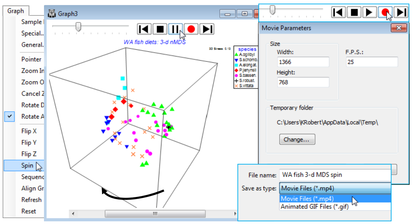
Spinning a 3-d MDS & capture in a movie file
The 3-d MDS plot box can be made to rotate horizontally, automatically (from whatever vertical perspective view it is manually set to), by Graph>Spin. This adds a top line of controls for the animation: to the left is a slider control  which sets the speed of rotation (click and drag to the right for higher speed), followed by a bank of standard video-type controls, the key ones of which are to start the automatic spin with
  , which then changes to a pause button
  and an end to the Spin routine (and removal of the controls) is achieved by the
  button. PRIMER 7 has also introduced the ability to capture three automatic animations of this type (the other two, seen later, are a sequence animation and evolution of an MDS construction) to a digital ‘movie’ file with an *.mp4 or animated *.gif format, so that 3-d plots and the other animations can be embedded in presentations (or perhaps supplementary material for publications) in the same way as static graphs. Recording is launched from the
  button, which gives a Movie Parameters dialog box specifying: pixel sizes for the images, the default being (Width: 1366)&(Height: 768); the number of frames per second, default (F.P.S.: 25); and an option to change the temporary folder used in the recording. The usual Save As dialog box then allows the directory and filename for the movie file, and the file type (*.mp4, animated *.gif) to be specified, and recording starts with and finishes with . Long recordings should be avoided: the movie files will get very large, very quickly!
(Re)save the workspace as WA fish ws for use in later in this section, and close it.
(Morlaix macrofauna, Amoco-Cadiz oil spill)
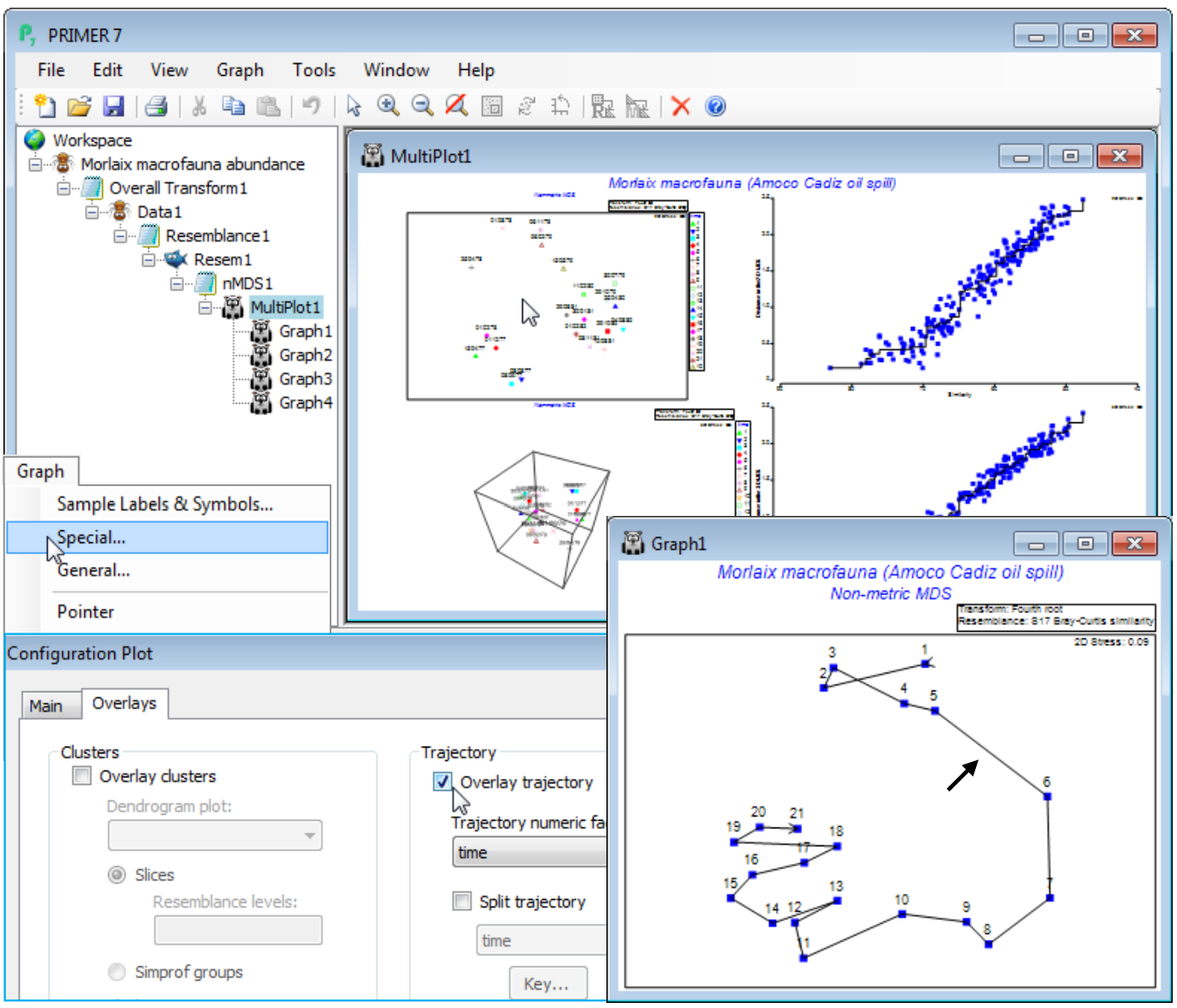
Some data sets have a natural sequence to their samples, usually a time series (though this can be a single spatial gradient), and it is usually a good idea to join the points on an ordination plot in that order – then referred to as trajectory plots. This is illustrated by a ‘classic’ data set of soft-sediment macrofaunal assemblages in the Bay of Morlaix at a single station (Pierre Noire), sampled at about 3-monthly intervals over the period April 1977 to February 1982, covering the event of the Amoco-Cadiz oil tanker wreck in March 1978. The spill occurred some 40 km from the Bay itself but oil slicks reached this area and there is a clear signal of community change in the sampling times after the spill, with a partial recovery over the next 3 years – see the MDS below. There are 21 sampling times (A-U) over the 5 years, with the oil impact occurring between samples E and F. These data are from Dauvin J-C 1984, Ph.D. thesis, Univ Pierre et Marie Curie, Paris, though a dynamic view of the continuation of this time series (Dauvin J-C 1998, Mar Pollut Bull 36; Thiébaut et al 2012, Conference: Time series analysis in marine science, Logonna Daoulas, France) is also seen later.
Overlay trajectories
A trajectory joining points on an ordination is simply added using Graph>Special>Overlays and taking the (✓Overlay trajectory) option and supplying a factor name for the trajectory sequence, which of course needs to have purely numeric entries. These do not need to be the integers 1, 2, 3, etc. – the rank of the numbers will be used to dictate the connection order. Any blank entries in the factor will be ignored – these points will not be part of the trajectory, but neither do they break a connection to give multiple trajectories. In order to produce the latter, a new (and very useful!) feature in PRIMER 7 is to tick a (✓Split trajectory) check box and supply a second factor name. This is now a categorical factor with differing entries determining the separate trajectories to be drawn, in the same sequence order for all such groups, specified by the first (numeric) factor. A typical example would be an MDS plot of a time series of samples taken at a number of sites, the first factor determining the sampling year (or month or day etc.) and the second factor the site name, allowing the time progression to be tracked more clearly on the ordination, in parallel for the sites. A Key button gives access to a standard dialog box which sets the symbol, line type and colour (the same for both symbols and trajectory) for the different groups.
To demonstrate a single time trajectory, open data file Morlaix macrofauna abundance in directory C:\Examples v7\Morlaix macrofauna, and carry out an nMDS in standard fashion, much as for the previous example, except with no sample standardisation and use of a fourth-root transform prior to the Bray-Curtis calculation. Use all the default settings for nMDS to produce the 2-d plot (Graph1), which has low stress of 0.09 (bearing in mind that the original data has 251 species dimensions, many of which enter the similarity computation because of the severe fourth-root transformation!). As above, harmonise the symbols, i.e. on the Samp. labels & symbols tab remove (Symbols✓By factor) and add (Labels✓By factor: time) – also for the below, the General>(Overall font scale) was increased, and you may need to Rotate Data or Flip an axis to obtain the configuration shown. Graph>Special>Overlays>(Trajectory✓Overlay trajectory)>(Trajectory numeric factor:time) then adds the time trajectory and greatly clarifies the interpretation. The first 5 points represent a year’s seasonal cycle prior to the spill (the impact time indicated by the arrow), after which community structure changes strongly over the next year (4 points) before an apparent partial recovery towards the initial community, with the scale of the three seasonal cycles evident for the last three years.
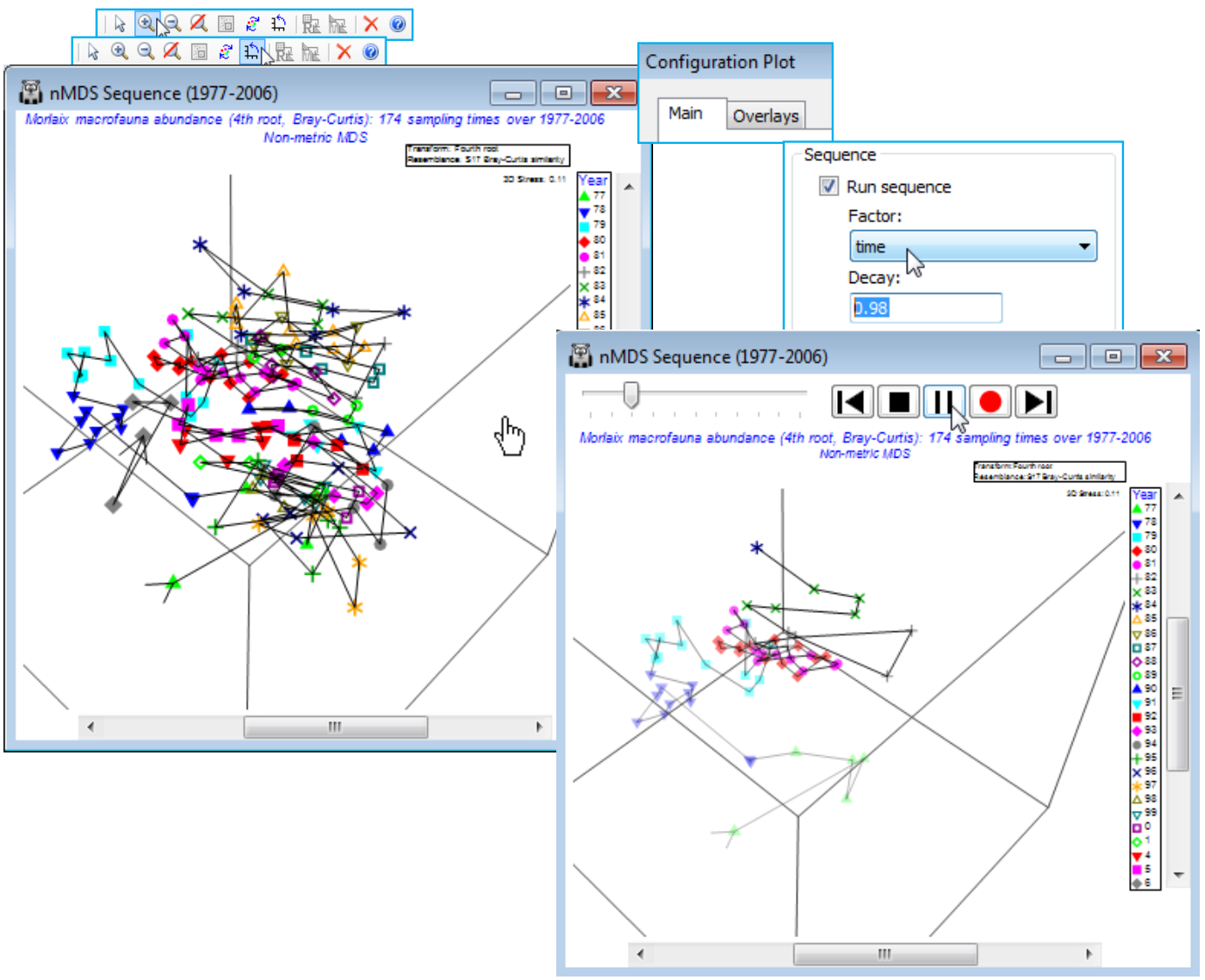
Sequence animation, captured in 2- & 3-d
The time pattern above is evident from simple addition of the trajectory but there are occasions when a confused MDS plot results from a longer sequence of points, especially if the multivariate structure tracks back on itself, repeating earlier states. Viewing the 3-d MDS is often helpful, and a trajectory can be added there, in exactly the same way. However, it can also help to elucidate the sequential pattern dynamically. PRIMER 7 has thus added sequence animation as a further option for 2- or 3-d ordination plots. This adds the samples to the ordination plot in sequential (e.g. time-ordered) fashion, including the joining lines of the trajectory if that is selected (as it usually would be). The earlier points and lines in the sequence gradually fade out as the later ones are plotted, allowing a more uncluttered view of progression of the multivariate structure. This is accessed by Graph>Special>Main>(Sequence✓Run sequence), supplying the numeric factor which gives the temporal (or other sequence) order and specifying a Decay parameter (in the range 0 to 1), which controls how quickly the earlier parts of the sequence fade. The default of 0.9 corresponds to a rather slow fade so that most of the earlier points from a short sequence remain visible throughout. Other contexts may need an even slower (0.98) or faster (0.5) decay, both these being used below.
The sequence animation can be run with or without capturing the dynamic display in digital movie form. From the Main tab, on entering the ordering factor and decay, and pressing OK, the standard video controls are displayed, and these operate just as described two pages ago (for Graph>Spin on a 3-d MDS plot): to start or pause, to stop, with the slider varying the animation speed. A further option available here is to take one sequence step forwards or backwards with  or
or  . If has initially been pressed, recording starts with and REC appears; stop by . If correct entries have already been set in a previous run, repeats need only a selection of Graph>Sequence.
To demonstrate this sequence animation, File>Open the plot file nMDS Sequence (1977-2006).ppl into the current Morlaix workspace. This is a PRIMER binary-format file of a 3-d MDS plot for a much longer run of years of grab sampling for benthic macrofauna at station Pierre Noire in the Bay of Morlaix, see Dauvin and Thiébaut references above. The data matrix is not accessible from this file – it is used here only as a dynamic demonstration of the (static) MDS plot in the Thiébaut et al analysis – but it is worth noting that a PRIMER *.ppl file does carry around with it enough of the background information on the samples (the factor sheet) to allow the ordination configuration to be annotated in different ways, rotated etc. So this could be a flexible format for distributing plot results to others (who have access to PRIMER 7) but where the data itself cannot be released.
Take Zoom In (and centre with the scroll bars) and manually Rotate Axes, but the pattern is still a little confused. Does the benthic community approach its 1977 pre-oil impact state (if that one year is representative of this!), or are more regional or global-scale processes of environmental change at work? A slightly clearer demonstration of the time course is produced by Graph>Special>Main >(Sequence✓Run sequence)>(Factor: time)&(Decay: 0.98) and . You will find that rotating the plot while the sequence unfolds is of some help, and perhaps varying the speed with the slider. The plot captures not just the inter-annual trends but also (if carefully watched) the scale of the seasonal cycle in relation to those trends (there is an average of nearly 6 sampling times across each year).
Trajectories split & then sequence animated
In fact, if the animation is repeated with trajectories running across months, separately drawn for each year, using the option discussed earlier to split the trajectories, then the scale of the seasonal cycle can be made visually apparent in a dynamic way. Firstly, take Graph>Special>Overlays> (Trajectory✓Overlay trajectory)>(Trajectory numeric factor: Month)&(✓Split trajectory>Year), then you might like to remove extraneous information from the plot, such as the History box on the General tab and the line keys on the Keys tab, unchecking (✓Plot key) under the second entry for (Select key to edit: Year). Then the animation Graph>Special>Main>(Sequence✓Run sequence)> (Factor: Month)&(Decay: 0.5) gives a dynamic display of the seasonal cycle running in parallel across the years.
Save the workspace as Morlaix ws and close.
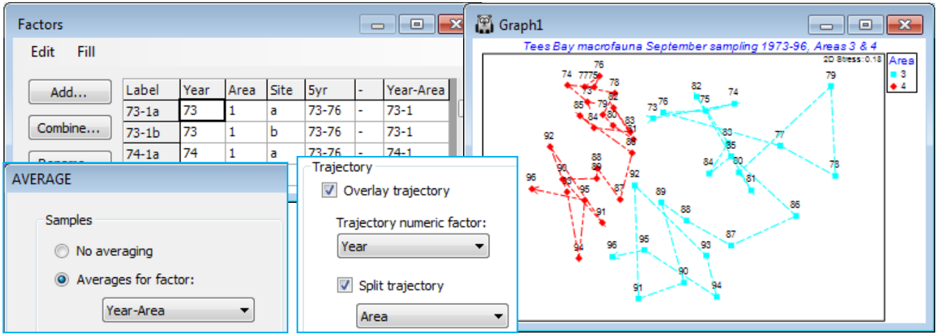
(Tees Bay macrofauna time series)
A clearer, static, example of the benefits of split trajectories on ordination plots is provided by macrofauna data from Tees Bay, collected and analysed by the Brixham Laboratory, SW England, in (amongst other locations) four sub-tidal areas, 1 to 4, spanning approximately 10km of the N Sea coast of the UK, with two sites (a/b, c/d, …) in each area, and these data result from pooled grab samples at each site. The samples in this case were collected in September, annually from 1973 to 1996 (Warwick et al, 2002, Mar Ecol Prog Ser 234: 1-13).
Open Tees macrobenthic abundance.pri in C:\Examples v7\Tees macrobenthos, and the factors by Edit>Factors, and create a combined Year-Area factor. (Do this by Add>(Add factor named: -), put a hyphen in the first cell, highlight the column by clicking on the factor label -, and Fill>Value, then take Combine and move Year, - and Area names to the Include box; this construction of a combined factor was illustrated in Section 2). Now fourth-root transform the data, average over the sites with Tools>Average>(Averages for factor: Year-Area) and compute Bray-Curtis similarities. Select two areas – one within the immediate environment of the Tees estuary (area 2 or 3) and one outside (1 or 4), see Fig.6.17 of CiMC. For example, Select>Samples>(•Factor levels)>(Factor name: Area)>Levels>(Include: 3, 4). Now run nMDS and on Samp. Labels & Symbols set labels as Year and symbols as Area. Finally, on Special>Overlays add trajectories of Year, split by Area. Save the workspace as Tees ws – it is needed for hypothesis tests in Section 9 – and close it.
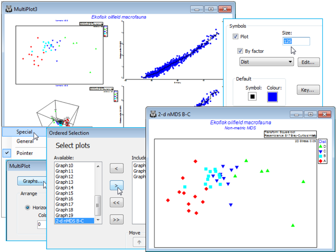
Matching variable sets; (Ekofisk oil-field study)
The final two sections of the Graph>Special dialog concern overlaying vectors and ‘bubbles’ of numeric values, rather than factors, either of the variables (e.g. species) from which the ordination has been created, or taken from an independent worksheet (e.g. of environmental variables) which contains the same sample labels as are found in the ordination. Note the matching principle: for all routines, the selected labels in the active sheet determine which samples are to be analysed, and any secondary data sheet supplied to that routine must include at least that sample label set, with names spelt in exactly the same way. The secondary data sheet can also contain other samples (which are ignored) and, of course, the required samples could be in a totally different order in the two sheets.
The superimposition of bubble plots and vectors on an ordination are illustrated for the benthic macrofauna assemblages sampled for 39 sites at different distances from the Ekofisk oilfield, in the Norwegian sector of the N Sea, sampled at one point in time, some years after operations began. This dataset was introduced at the beginning of the manual (Section 1) and the workspace Ekofisk ws last saved in Section 4. If this workspace is not available, open Ekofisk macrofauna counts and Ekofisk environmental from C:\Examples v7\Ekofisk macrofauna, square root transform the former (rename Square root) and compute Bray-Curtis similarities (B-C on sq rt). Run nMDS on this to obtain the 2-d ordination, 2-d nMDS B-C. (Note that renaming a graph removes it from the multi-plot – to return it, run Graph>Special>Graphs on the multi-plot and take its new name across to the Include list, moving it up to the head of the list in this case. Also, you may need to Rotate Data or Flip X or Y from the right-click menu to obtain the 2-d nMDS plot shown below). Already seen in the 2-d nMDS display are the four different symbols in the factor Dist, which puts the 39 sites into a priori defined groups depending on their distance from the centre of oil drilling activity – D: < 250m; C: 250m to 1km; B: 1km to 3.5km; A: > 3.5km. Use the Samp. labels & symbols tab to unclutter the plot by removing the labels and perhaps increase the symbol size, e.g. Size: 125.
The 2-d stress is quite low (0.09) and the ordination thus reliable (with the 3-d plot little improved, as seen in the Shepard diagram). There is a clear pattern of steady change in the community as the rig is approached (left to right). Note that sites within a few hundred metres of the rig (D), and thus close to each other, have quite variable assemblages, but distant sites (A), which can be 16km or more apart, are more tightly clustered – the opposite of expectation if the communities are not impacted by drilling mud disposal. The clear distinction between B and A (confirmed by ANOSIM, Section 9) is good evidence for an impact extending to more than 3 km from the oilfield centre.
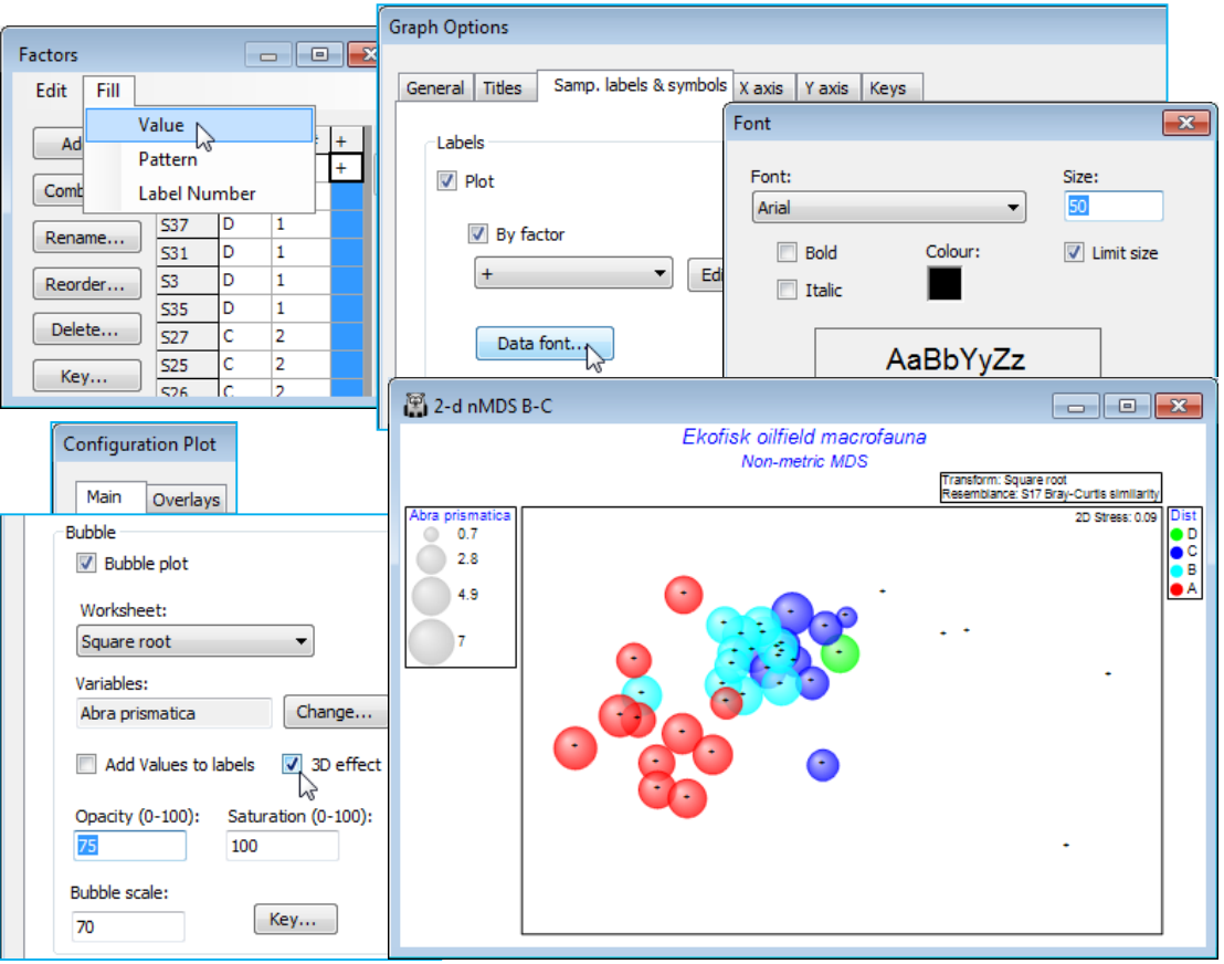
Bubble plots of single variables
The above MDS draws on all 174 species (with more abundant species given greater weight) but only some species will be responsible for creating the observed gradient – others will be largely ‘noise’. The behaviour of a single species over the sites can best be seen by a bubble plot (Graph> Special), in which circles are drawn at each point, of size related to the counts at that site. The secondary data sheet here is therefore the (transformed) data matrix itself, Square root.
On the MDS, 2-d nMDS B-C, take Graph>Special>Main>(Bubble✓Bubble plot)>(Worksheet: Square root) & (Variables: Abra prismatica), which is the default – alphabetically the first species, but well worth plotting! Taking OK now produces a bubble plot for this species, with a scale key (in square root abundance units) which goes down to a vanishingly small bubble for a zero count. Sometimes, for species which are not ubiquitous, it can be helpful to be reminded of where these zero counts are on the plot, by reinstating a label at all points. A useful trick here is to define a new factor which contains just the ‘+’ sign for all samples, plotted at a smaller than default size – with Data font>Size: 50 perhaps, under Labels on the Samp. labels & symbols tab. Alternatively, on this same dialog, leave (Labels✓Plot) turned off, but instead use the Special>Main>Bubble dialog to (✓Add Values to labels). This is not recommended in this case because there are a number of samples falling close to each other, and especially since square root values with several decimal places will then be added to the plot (this option is best reserved for bubble plots on original scales where it is important to pick out the precise variable value at some points of the ordination).
Bubble colours
A new feature in PRIMER 7 is that these bubbles will be plotted in different colours – or in mono hatching patterns if the General>(✓Monochrome) option is selected – according to levels of the Symbol factor, in this case the four distance groups from the oilfield (A to D). At least, this is what will happen provided the Key dialog, accessed from the Bubble section of the Special dialog, has not been changed from the default of (✓Use symbol colours). A further feature is that colours can now be plotted opaquely (default) or with a continuous degree of transparency, and/or with bubbles scaled to a smaller maximum size, both of which may be advantageous here, where many bubbles are plotted in close proximity. These features are again controlled with the Special>Main>Bubble dialog, e.g. (Opacity: 75) & (Bubble scale: 70), leaving the colour saturation at (Saturation: 100). A further new feature is (✓3D effect), which comes into its own for 3-d ordinations (the default then).
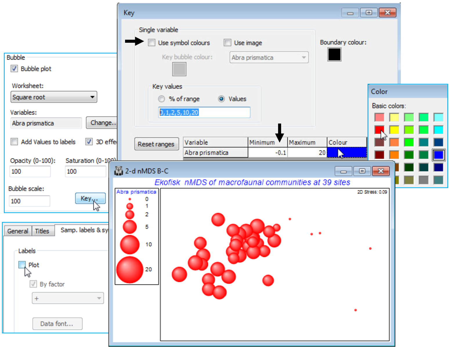
Bubble key
The key to the left of the plot, which gives the root-transformed scale for Abra prismatica counts, has been defined automatically and may not therefore be optimal – the values, and even the number of categories, are now (in PRIMER 7) user-selectable. The smallest non-zero value can only be 1 (the square root of 1) because the original data are integers, so a circle category of size 0.7 in the key is artificial, and not seen in the plot. We shall want to replicate this bubble plot ordination for several species, on a common size scale, to judge respective contributions to the observed nMDS pattern. Given that the maximum value in the transformed sheet, Square root, is somewhat over 20, for Chaetozone setosa – use Analyse>Summary Stats>(For•Variables) to see this – a natural key would have (square root) sizes 1, 2, 5, 10 and 20 (counts 1, 4, 25, 100 and 400). Take Key in the Bubble section of the Graph>Special>Main dialog box, run on the above 2-d nMDS B-C plot, change to (Maximum 20) and, under Key values, (•Values 1,2,5,10,20). The (Key bubble colour:) can be changed from its neutral grey by clicking on the grey box, to give the usual colour choice dialog, but this is not often likely to be advantageous because a less neutral colour would become confused with the colour codes for (symbol) groups A-D, if these are being employed (as above). However, given that the a priori grouping of these sites into distance ranges is a rather arbitrary categorisation of a likely continuous scale of impact and therefore response of the biota, e.g. with steadily increasing dilution of contaminants, it might be preferable to plot bubbles without this categorisation, by unchecking the (✓Use symbol colours) box on this Key dialog. The bubbles default to the standard blue symbol colour, but this can be changed in the (Colour $\text{\hspace{8mm}}$ ) cell – this automatically changes the key to the same single colour. (The boundary colour for circles – only used when the 3D effect is not selected – can similarly be changed, from black, on this dialog).
Note that the plot below also changes back to the defaults of (Opacity: 100) & (Bubble scale: 100), from the Special>Main tab, and edits the title, removes the subtitle and the history box, from the General tab. And it employs a generally neater way of indicating the position of sites on the MDS where this species has a zero value. The ‘+’ labels are removed, using the Samp. labels & symbols tab, and the Minimum cell on the Bubble Key dialog is set to a small negative number (here -0.1) instead of 0, ensuring that a tiny bubble is plotted at all sites. There is no risk of confusion in this case because there are no very low non-zero values, the lowest square-root count being 1, but this could be made doubly clear by adding zero to the Key values, i.e. using (•Values 0,1,2,5,10,20).
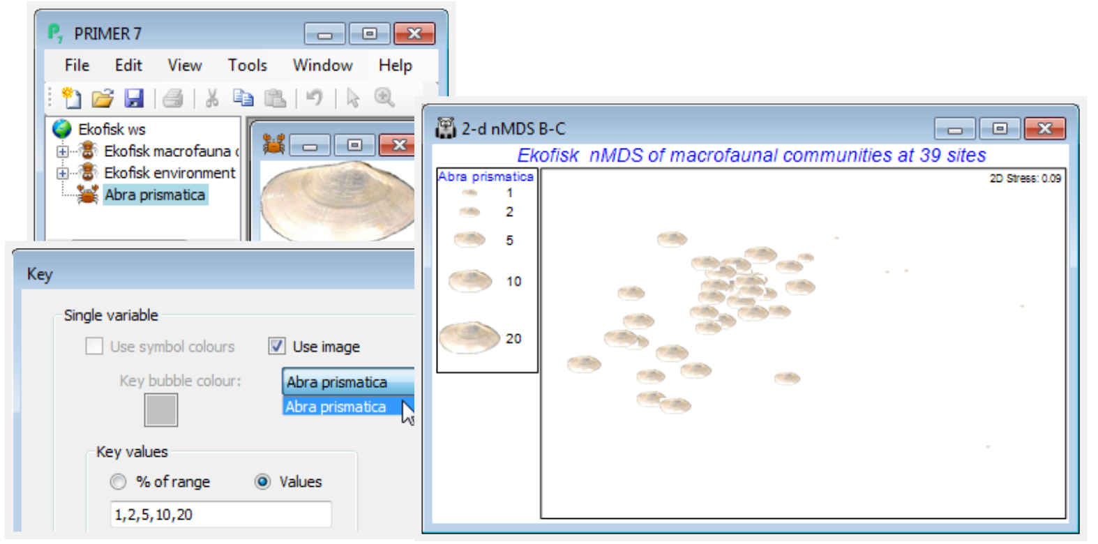
Bubble images
A further new option on this Key dialog is to replace single-coloured circles with a (rectangular) supplied image plotted at different sizes. To illustrate this, within the C:\Examples v7\Ekofisk macrofauna directory there is a photo image of a single valve of Abra prismatica as an *.jpg file (at very low resolution in this case, though it could be much higher – avoid using an image of several Mb for this purpose, however, if you do not want to slow the MDS plotting noticeably). File>Open this, taking the file type as (Image file: *.jpg, *.jpeg, *.png, *.bmp, *.tif, *.gif, *.emf). Take Key in the Special>Main>Bubble section, and (✓Use image>Abra prismatica), which only operates when (✓Use symbol colours) is unchecked. Whether such a graph is successful depends on the image – the plotted shapes are rectangles not circles (and fully opaque, whatever the opacity setting) so it may be most effective for ordinations with relatively few points.
Duplicate graphs
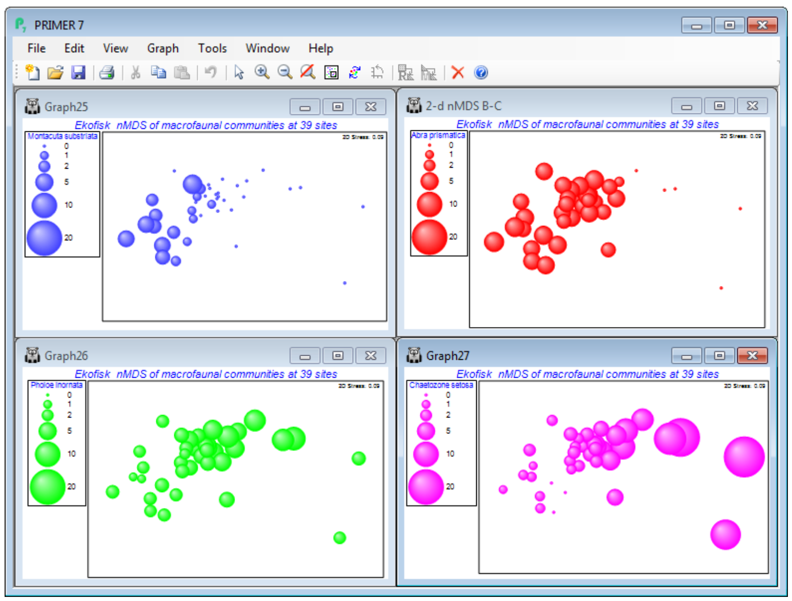
Abra prismatica appears to be a species which can tolerate the contaminant or disturbance effects found relatively close to the oilfield since the plot shows that it is present in consistent numbers from sites 8km distant to those >250m – remember mentally to square up numbers in the bubble key’s square root scale, or replot the ordination using the original matrix as the secondary data, (Bubble>Worksheet: Ekofisk macrofauna counts), rather than the Square root sheet. Either matrix is perfectly valid to use as bubble sizes but the interpretation is different. The above graph places the focus on how the species contributes to the ordination pattern, whereas superimposing raw data is a valid way of seeing how the actual counts vary from site to site. To examine a range of species contributions, firstly revert to the bubble plot at the bottom of the previous page – by unchecking (Use image) on the Key dialog – and take Tools>Duplicate>(•On existing branch) on this plot, three times. Then Window>Close All Windows, re-display the four plots by clicking on them in the Explorer tree, and Window>Tile Vertical – the example below also suppresses the Explorer tree using the View menu. (You could alternatively put all four plots into a new multiplot).
On the first copy, use Special>Main>Bubble>Change, taking Montacuta substriata over to the Include box and Abra prismatica back to Available. On Key, change its colour to blue (if needed), and again its Minimum to -0.1 and Maximum to 20. Note that if you change the variable plotted as bubbles, the routine automatically rescales to a value for the maximum bubble which is relevant for that new variable. We may often need this rescaling when plotting actual counts, since one or two species could be dominant and a universal abundance scale then reduces most species to invisible bubbles (the reason for transforms in multivariate analysis!). Separate scaling would also be needed for abiotic variables superimposed as bubbles on a community ordination, since there is then no common measurement scale – see later. But when the focus is on judging relative contributions different species make to the observed community gradient (as here), a common transformed scale is needed, so the min and max values of -0.1 and 20 need to be set for each copy of the MDS plot. (If you ever need to reset to default ranges for variables, use Reset ranges on the Key dialog). Now Change the second copy of the plot to Pholoe inornata and green bubbles, and the final copy to Chaetozone setosa and purple bubbles, and note the very different patterns across the gradient.
Bubble plots are usually clear and interpretation straightforward – however, there are 174 species here, many of which will show no pattern across the sites or will have such low numbers (seen in negligible-sized bubbles on this common scale) that they can contribute little to the site similarities. (An example is seen for these data in CiMC Fig. 7.13 for Spiophanes bombyx). Having established by hypothesis testing that there are meaningful community patterns (e.g. ANOSIM, Section 9, on the distance groups, or RELATE, Section 14), to justify interpreting species patterns, one can avoid having to plot all 174 bubble plots(!) by examining Shade Plots and SIMPER results (Section 10), to pick out species for which bubble plots will be worthwhile.
Vector plots for species
One tempting alternative, commonly found in the literature, is to plot (species) variables as vectors on the MDS plot (see below). They are directional lines emanating from a common origin, pointing in the directions in which those species numbers increase, and of length reflecting the strength of pattern in those species counts along that direction. Such a vector plot can have its origin anywhere (there is a common misconception that its placement or overall size matters) and PRIMER chooses to locate it the left side of the plot – deliberately non-central to make the point about arbitrariness of its origin. The perceived advantage of a vector plot is that it can display the relationship of many species to the ordination configuration in a single plot. But, in reality, it rarely succeeds. Firstly, a vector assumes the relationship is strictly linear, but the above bubble plots for Abra prismatica and Montacuta substriata show threshold relationships, present at consistent numbers until a (different) point is reached, closer to the oilfield, when numbers drop to zero. Even worse is Pholoe inornata whose relationship to the gradient is not even monotonic, because it is an opportunist increasing in numbers closer to the impact but decreasing again when the impact becomes strong, within 100m. Of the above four bubble plots, only Chaetozone setosa would be well described by a linear fit of (root) counts to (x,y) co-ordinates of the MDS plot. Secondly, vector length measures (Pearson) correlation of transformed counts to these axes (see Chapter 7 of CiMC), not just a purely linear construction but also one that ignores the universal scaling of the bubble plots – if a species has very low numbers throughout and thus could not contribute much to the similarities and ordination, it might still have a large vector if its numbers gently decrease (or increase) closer to the oilfield. In other words, vector plots only make sense in the bubble plot context above, of judging relative contributions to the ordination, where species have been standardised prior to analysis, i.e. where species are given the same weight in similarity calculations, irrespective of their overall abundance. These are compelling reasons for never using a vector plot of species! Nonetheless, a vector plot can be implemented as follows. On the MDS graph 2-d nMDS B-C, under Graph>Special turn off (✓Bubble plot) on the Main tab, and on Overlays take (Vectors✓Overlay vectors)>(•Worksheet variables: Square root)&(Correlation type: Pearson)&(✓Draw circle)&(Select>•From list>Select), and leave only species Abra prismatica, Chaetozone setosa, Montacuta substriata and Pholoe inornata in the Include box. The circle indicates a (multiple) correlation of 1 of that species to the 2-d MDS x, y co-ordinates (see the ‘Vector plots’ heading in Chapter 7 of CiMC for discussion of this and the alternative(s) to Pearson correlation). Clearly, the resulting vector plot carries limited information compared with bubble plots: the different threshold responses of Abra prismatica and Montacuta substriata cannot be captured, likewise the non-monotonic relation for Pholoe inornata.
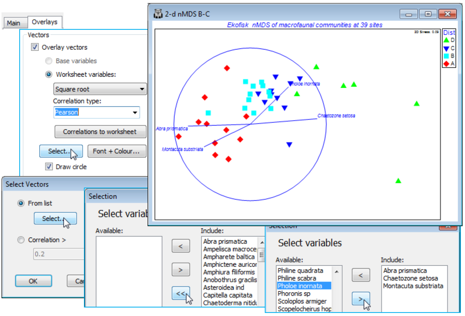
Environment bubble & vector plots
An important use for a bubble plot is in displaying the behaviour of a further measured variable, which has not been used in the multivariate analysis, across the sample positions on an ordination, e.g. in superimposing environmental or contaminant variables one at a time, on a community MDS. Also, in this case, vector plots have a more useful role because there is a better chance of linearity, or at least monotonicity, of the relationships between abiotic gradients and community gradients – also the rescaling of abiotic values implicit in a correlation coefficient is appropriate here, because environmental variables will usually be on different measurement scales.
As an example, File>Open the Ekofisk environment sheet into the current workspace (if it is not already there from the transformation examples of Section 4). On the biotic 2-d nMDS B-C plot, under Special>Overlays, retain (✓Overlay vectors) but change to (•Worksheet variables: Ekofisk environment) & Select>(•Correlation > 0.7) to display only those abiotic variables with a high (multiple) correlation coefficient with the biotic ordination positions. The vector plot below shows these to be THC, %Mud, Sr and Pb. Those multiple correlations can be calculated by clicking the Correlations to worksheet button on the (✓Overlay vectors) dialog, which produces a worksheet of Pearson correlations of each abiotic variable with the ordination co-ordinates (MDS1, MDS2). These are the values obtained by projecting each vector onto the (x, y) ordination axes, which is how the vectors are constructed in this case. The length of the vector (the multiple correlation) is simply obtained by Pythagoras, e.g. for THC, $\sqrt{0.576^2 + (-0.525)^2} = 0.78$. [For the technically minded, that this is equivalent to the multiple correlation coefficient from multiple linear regression of THC on the (MDS1, MDS2) co-ordinates follows from the fact that the MDS solution is rotated to PC’s, making the MDS axes uncorrelated]. In addition, simple bubble plots (e.g. of THC and Ba) can be drawn as before, using Main>(✓Bubble plot>Worksheet: Ekofisk environment).

The vector plot, though not as unsatisfactory as when superimposing species, can again be seen to miss an important relationship here by comparison with the bubble plots. The pattern of Ba is not a linear one and thus does not give a very strong correlation, but it is distinctive and instructive, since barite is a component of the drilling muds dispersing into the marine environment. The bubble plot shows that Ba values are consistently higher around the oilfield but drop to background levels at about 3-4km – another example of a threshold change not optimally captured by correlation. Note that plots here used untransformed abiotic variables, which is visually informative, but there is a good case for instead using the selectively transformed sheet (Data3) deemed appropriate for these variables in Section 4; e.g. this would reduce the dominant effect of the large outlier in THC.
Segmented bubble plots
Given the inadequacies of vector plots for displaying species contributions to ordinations, but the practical need to reduce the number of graphs which can be displayed in publications, PRIMER 7 introduces a segmented bubble plot, which attempts simultaneously to display the bubble sizes for several species (or abiotic variables) on the same ordination plot, technically as circle sectors (or their spherical equivalent in 3-d), with a species always occupying the same sector position but at differing sizes. Careful choice is needed of variables to juxtapose, their colours and positions, and whether common or individual scaling is used, but some of the same flexibility is available as for single-variable bubble plots (options not offered here include user-supplied images and the ability to represent different factor levels by different colours – that would be too confusing by far!)
Returning to the display of individual species counts (square-rooted) on the Ekofisk 2-d nMDS B-C ordination, the four separate bubble plots seen earlier can be combined into a single plot by taking Graph>Special>Main>Bubble plot>(Worksheet: Square root)>Change and moving Chaetozone setosa, Montacuta substriata and Pholoe inornata to join Abra prismatica in the Include box. Key now lists all four species in the Key dialog, with their differing default ranges (e.g. 0 to 7 for Abra prismatica but 0 to 30 for Chaetozone setosa). As before, these need to be harmonised (e.g. set to 0 to 20) so that the relative contributions each of these species is likely to make to defining parts of the community gradient can be properly assessed. Also change the colours to match those for each species used on the single plots (three pages ago) and, since there is a natural progression of species (not alphabetic!) in terms of where on the gradient they are mainly found, use the Move up and down arrows to place them in the order: M. substriata, A. prismatica, P. inornata and C. setosa, which then become the sectors (quadrants in this case) reading clockwise from top right. Again, depending on how many points there are on the ordination (and this one is possibly too cluttered for a really effective segmented bubble plot) you might need to adjust the overall size of bubble plotted for the specified maximum count (square-rooted) of 20. The plot below uses (Bubble scale: 125) and, of course, the bubble size in the key will correctly reflect such a change. Another minor detail is that, for this rather long thin ordination plot, the shape of the boundary has been changed to match that, with Main>Plot type•2D>(Aspect ratio: 1.8) rather than the default of 1.5.
A segmented bubble plot for some of the abiotic variables (THC, Ba, Sr), on this same ordination, is obtained in the same way, substituting (Worksheet: Ekofisk environmental) for Square root, the only change being that default ranges for each variable are used, since measurement scales differ. (Re-)save the Ekofisk workspace as Ekofisk ws, and close it.
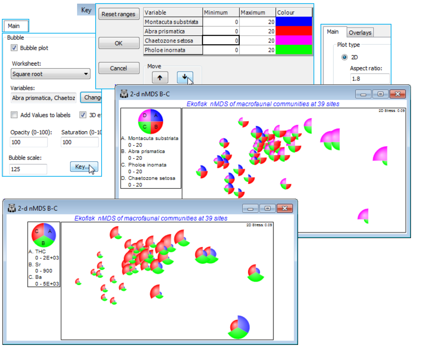
Segmented bubble plots work best either where species values change markedly over the points of the ordination, or there are relatively few points, such as in an ordination means plot. Examples of both these situations are found at the end of Chapter 7 of CiMC, on data sets that we have already met, so you may like to reproduce them, as below.
(Bristol Channel zooplankton)
The BC zooplankton density data sheet in C:\Examples v7\BC zooplankton was used in the last half of Section 6 to illustrate different clustering methods, and the workspace Bristol Channel ws may be available from that. If not, open the data, fourth-root transform it, compute Bray-Curtis similarities and construct an nMDS plot. SIMPROF tests in Section 6 produced 4 groups, broadly similar for all clustering methods, and these look convincing in the nMDS below, and in Fig. 3.10 of CiMC, though it is equally clear that they form part of a continuum of change. A shade plot and SIMPER analysis (Section 10) identify four species which most typify the clusters (Acartia bifilosa, Eurytemora affinis, Paracalanus parvus and Temora longicornis) and are good discriminators between them – these are shown on a segmented bubble plot below. The focus here is simply on observing how the actual densities for these key species vary over the site gradient (this is largely salinity driven). So, whilst the nMDS is computed on heavily transformed scales, the raw densities themselves are plotted as the bubble segment sizes, requiring different scaling, varying over an order of magnitude (or nearly two). This is in contrast to the previous example, where the focus was on identifying species actually contributing to the nMDS pattern, and for which common scaling of the transformed counts was then more appropriate.
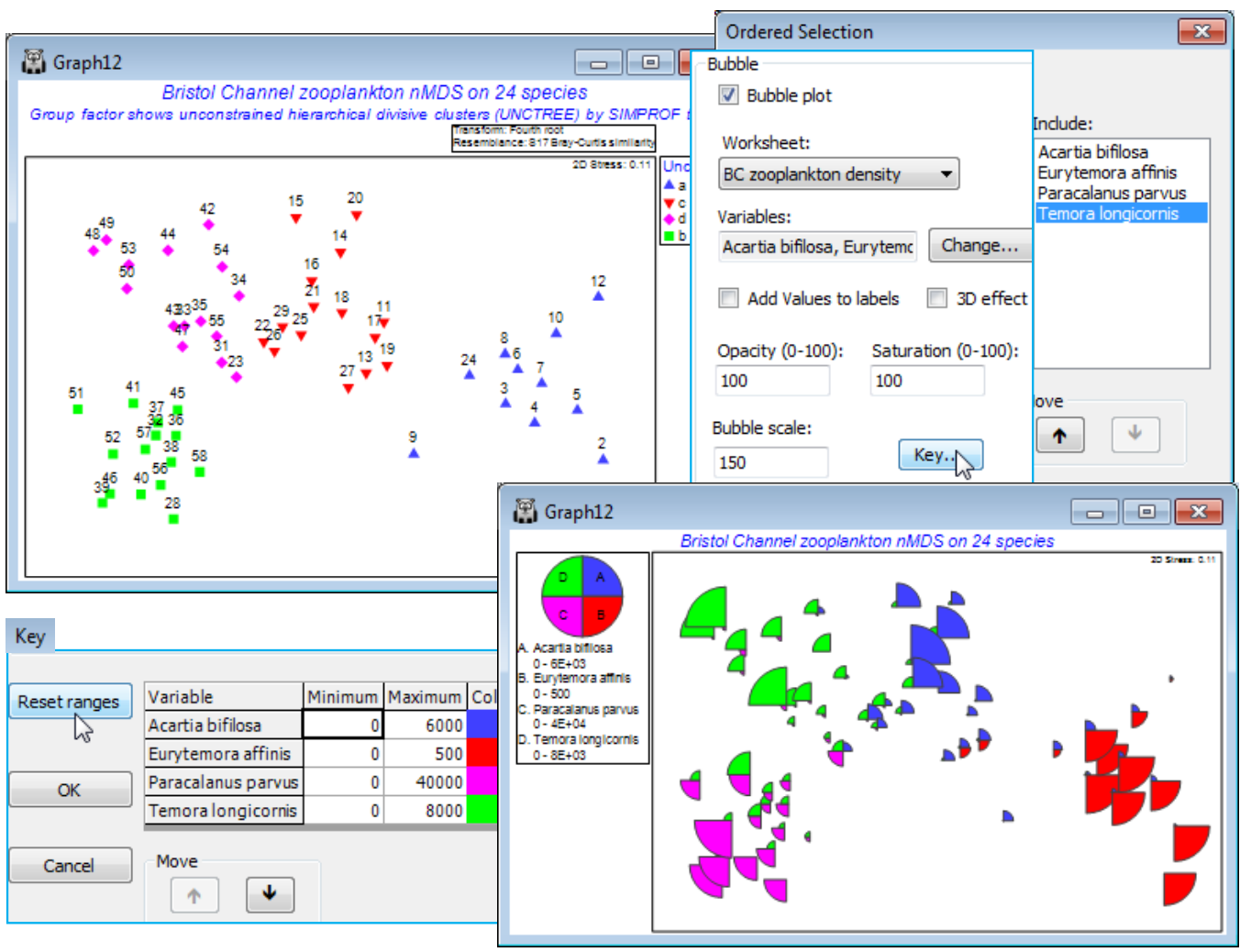
Bubble plots in 3-d MDS; (W Australia fish diets)
Another new feature in PRIMER 7 is the ability to construct bubble plots in 3-d ordinations, where the same ‘3-d effect’ representation of bubbles is employed as was seen earlier in 2-d plots – only now, of course, (✓3D effect) is the default. These are reasonably convincing as whole spheres, when the 3-d plot is rotated (as described earlier in this section), though inevitably less so as segmented bubble plots – though the latter plots are also permitted.
To demonstrate bubble plots in a case where a 3-d ordination was necessary, in order to reduce stress to acceptable levels, re-open the WA fish ws workspace used earlier in this section (to show spinning and digital recording of 3-d solutions). On the 3-d nMDS plot, Graph3, create individual bubble plots for the dietary constituents Calanoid and Polychaetes, using the secondary data for which samples have been standardised and then square root transformed (probably Data6).
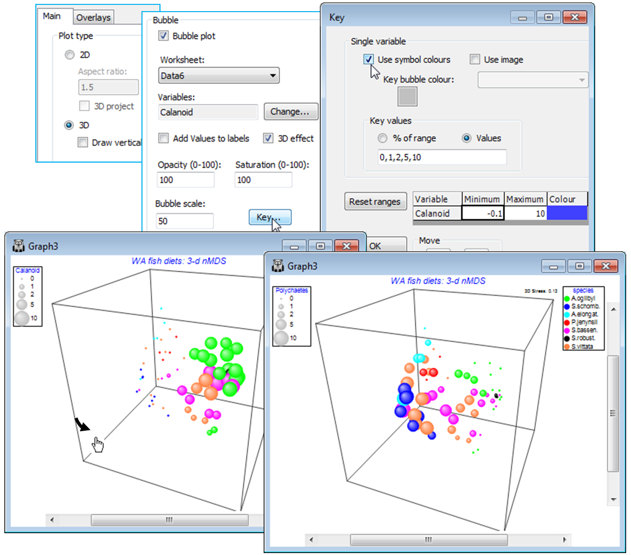
Bubble plots on averages
For these data, a segmented bubble plot on a 2-d ordination provides a succinct summary of the relative balance of the main dietary components for these 7 fish species, when examined on data averaged over all replicate gut samples for each fish species (as in Fig. 7.16 of CiMC). On Data6, the standardised then transformed data sheet, take Tools>Average>(Samples•Averages for factor: species), giving a matrix of 7 samples (the 7 fish species) by 32 dietary categories, Data7. Compute Bray-Curtis similarities on this and produce the 2-d nMDS configuration, which has minimal stress and is therefore an excellent representation of the dietary dissimilarities among the fish species. The means plot below labels by the full species name and harmonises the symbols to a blue square.

Now, uncheck the History box on the General menu, remove the subtitle from the Titles tab and turn this into a segmented bubble plot by Special>Main>✓Bubble plot>(Worksheet: Data7), and Change variables to Calanoid (copepods), Polychaetes, Amphipods, Tanaids, Crabs, Cumaceans, also increasing the Bubble scale. On the Key dialog, set a uniform range of 0-5 (square root scale, so the segment sizes in the key will represent an average 25% of diet by volume), change Boundary colour to white and make any other desired colour changes. (If the names are required displaced from the bubble centres, or the key back-transformed to original units, key/titles moved etc., as in the equivalent Fig. 7.16 of CiMC for example, the plot can be copied and pasted to Powerpoint or other presentation software; this will be in vector not bitmap format so can readily be edited). Resave this fish diets workspace as WA fish ws for use in the next section, and close it.
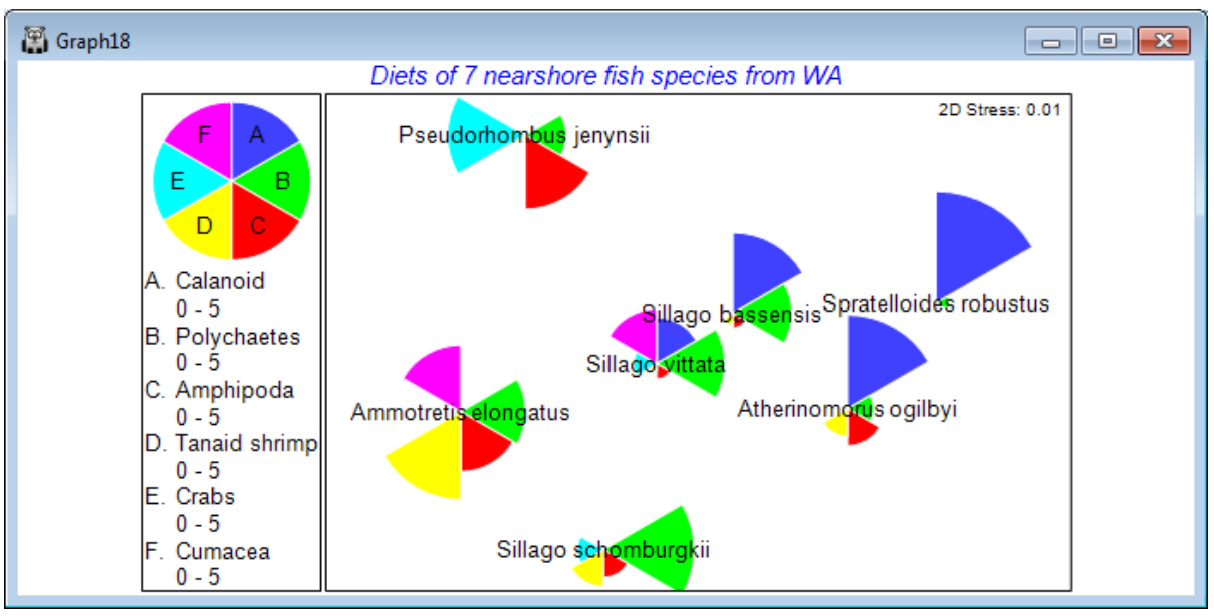
Bubble data selection error & Refresh
It is worth repeating the point made at the start of these examples on bubble plots: if the routine cannot find one or more of the sample labels of the MDS points in the supplied secondary data sheet of bubble values, you will get a blank graph with the message Samples not in Bubble data selection!, or if it cannot find the worksheet at all, Bubble data worksheet is missing! These are quite common error messages. The latter may arise because, while the secondary data sheet was correctly supplied and used to create the bubble plot initially, it was subsequently deleted or, more likely, had a name change. You will not identify this until the bubble plot window is shut down, perhaps as a result of saving and closing the workspace. When it is reopened, the MDS plot will display the error because it can no longer find the linked sheet name it was initially given. More subtly, the Samples not in Bubble data selection can occur because the secondary data sheet has, subsequent to creating the bubble plot, been subjected to a selection of its samples (for some other purpose), and left in that state, so that some of the MDS points cannot be matched in the current selection. If this is the problem, then Select>All on the secondary sheet will solve it, but note that when returning to the MDS plot, the error message is only removed by either shutting the window down (with  ) and reopening it or, more neatly, by Graph>Refresh.
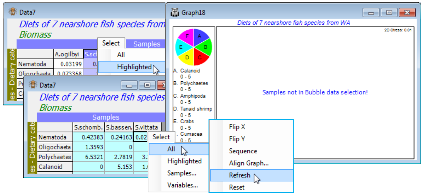
A general point to note is that though all the overlays given above (trajectories, bubble, vector plots etc.) have been applied to nMDS plots, with only minor exceptions they are generic and available in any ordination configuration plot, e.g. PCA (Section 12), PCO and CAP (in the PERMANOVA+ add-on to PRIMER) and metric MDS (mMDS), which we now describe.
Metric MDS; (Great-circle distances for world cities)
A significant new feature in PRIMER 7 is the construction of metric MDS ordinations (mMDS), together with variations such as threshold mMDS (tmMDS) and a specific combination of nMDS and mMDS; the rationale and details are fully covered towards the end of Chapter 5 in CiMC. The mMDS algorithm operates in a very similar way to nMDS, by an iterative search for an optimal configuration of samples in a specified dimension (or, in practice, a range of dimensions). The key difference is in the Shepard diagram, which is constrained to be fitted by a straight line through the origin (i.e. two points should only be represented as coincident if their dissimilarity is 0), as a result of which mMDS has axis measurement scales. Under conditions of low stress and a well-fitting line in the Shepard diagram, the distances in the plot are thus directly interpretable as the dissimilarities/ distances in the original resemblance matrix. This is only likely to happen, however, either for a resemblance matrix that is close to behaving like Euclidean distances in the first place, e.g. from an environmental analysis using normalised Euclidean distance, or where there are only a handful of samples to ordinate, e.g. for some means plots. In such cases, mMDS has significant advantages over nMDS; in normal community analyses nMDS will usually be much superior.
A data set for which the resemblance matrix appears unequivocally suited for mMDS is discussed in CiMC Chapter 5 and given in directory C:\Examples v7\World cities, data World city distances. This is a physical distance matrix in the first place, being a triangular matrix of the (great-circle) distances round the globe between all pairs of 33 world cities (drawn from The Reader’s Digest Great World Atlas, 1962). Run Analyse>MDS>Metric MDS (mMDS) under the defaults, to give both a 2-d and 3-d map of these (3-d) cities, along with their associated Shepard diagrams.
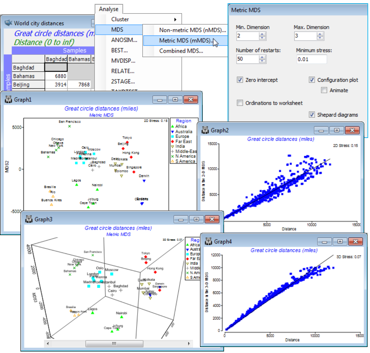
You will probably need to Graph>Flip X or Y and Rotate Data to get the standard 2-d orientation of world maps, and also Rotate Axes for the 3-d plot, though the arbitrariness of compass points (N at the top etc.) is clear! Note how the axis scaling on the mMDS plot subtly changes as the data is rotated within the plot, as it needs to do in fully preserving the meaning of distance. Though the 3-d mMDS does place the cities in roughly the correct relation to each on the surface of a sphere, it may initially be a surprise to see that this 3-d picture of 3-d distances has non-negligible stress (of 0.07). The clue is in the Shepard diagram, which shows that the data is trying to force the relation away from the fitted straight line of the metric solution towards a curve, especially for the larger distances. Remembering that the matrix is of great-circle distances (direct air miles) but the 3-d MDS represents through the Earth distances resolves the issue. The true relationship is not linear and, even for this (apparently simple) physical distance matrix, nMDS is superior, placing the cities perfectly correctly on the globe surface, with stress 0, and marginally reducing the 2-d stress.
Identifying points on the Shepard plot
Show this by running the matching nMDS to the above mMDS, this time setting (Minimum stress: 0.001). For the 2-d nMDS, identify the greatest contributions to the stress by clicking on outlying points in the Shepard diagram, which then lists the pairs of cities involved, straddled across the point. You can increase the font size of this text, if needed, by e.g. General>Info font>(Size: 120), – this is the button that also controls font size for the stress value shown here and on MDS plots. It is clear that several outliers involve distances to San Francisco, with the MDS attempting to move it closer to Sydney and Tokyo, in keeping with the true distances, whilst maintaining its distance from Europe and Africa etc. – an impossible ‘circle to square’ in 2-d, hence the stress of 0.135.
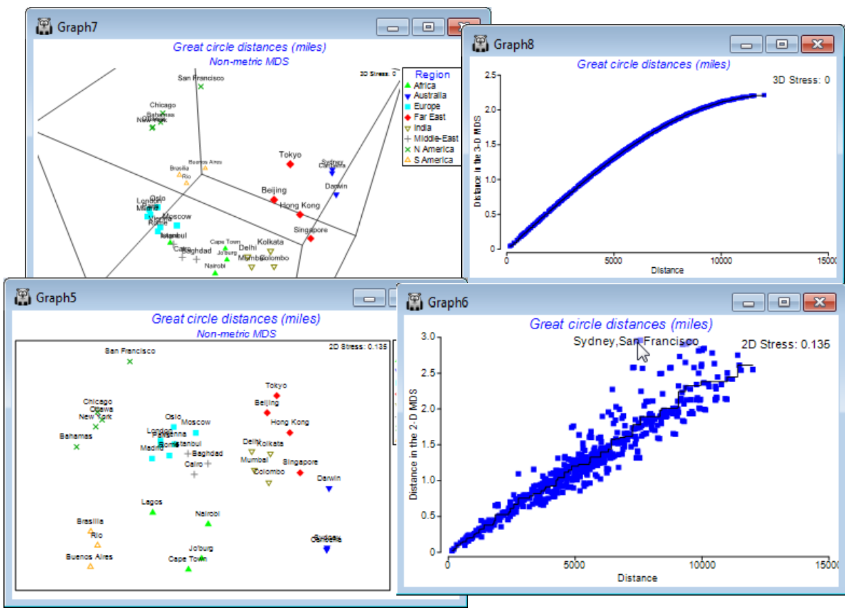
Animating the mMDS/nMDS iterations
Another feature introduced in PRIMER 7 is more of a teaching tool than an analysis method per se, namely the ability to watch the steps of the MDS iterative process (for either nMDS or mMDS) in converging – or failing to converge! – to an optimal 2- or 3-d representation of the relationships in the resemblance matrix. The option is taken by (✓Configuration plot)>(✓Animate) on the usual MDS dialog. It automatically greys out the (Max. dimension) box so that a single dimension needs to be chosen, via the (Min. dimension) box – for observation, 2 or 3 are the only realistic choices. It is wise, purely for this demonstration process, to reduce to (Number of restarts: 5), say, and to set (Minimum stress: 0.001) so that incremental improvements in stress during the iteration can be seen. On taking OK, the usual animation controls are displayed (as seen earlier in this section for spinning 3-d plots and sequence animations), and the first MDS iteration is started with .
A 2-d nMDS or mMDS of the World city distances provides a useful example for demonstrating the MDS iterative process because of the prior understanding of what a good 2-d solution would look like, so that an iteration which is heading into the cul-de-sac of a local minimum (see Chapter 5 of CiMC) will readily be appreciated. To improve the visual cues, a Region factor is defined, dividing the cities into continental areas with differing coloured symbols. A typical local minimum for this data set would, for example, be when the initial random starting configuration and the early iterative steps separate the African cities into two groups, either side of the denser European-Asian band of points. The routine may then have trouble re-uniting these two groups because any attempt to move African cities through the Europe-Asia axis, by small incremental steps, will be rejected because initially a move in that direction will always increase the stress. In this example, at least 50% of the restarts end up trapped in a local minimum, i.e. converging to a higher stress solution than can be found. Observing such local minima imparts a good appreciation of the importance of increasing the number of restarts routinely run, especially for complex MDS plots.
The speed with which the iterative cycle takes place can be controlled by the slider, and the pause button is usually necessary to re-orient or flip the axes to a recognisable layout after a grouping of the continents starts to emerge. Initial random configurations have stress values of around 0.4 and occasionally a restart will fail to get going at all but, more typically, stress falls quickly and then slows nearing convergence. At any point, the process can be paused with and then stepped through incrementally using either of the end controls, or . Use of the stop button, , is a premature cancellation of the whole run, returning no results. As for previous animations, recording can be started at any point by clicking the record button, , which pauses iteration while details of picture resolution, frames per second and output file name (*.mp4 or animated *.gif) are given. The iteration and recording then restart automatically, and are terminated by – in fact recording must always be terminated by this stop control (so ask for more restarts than you plan to record).
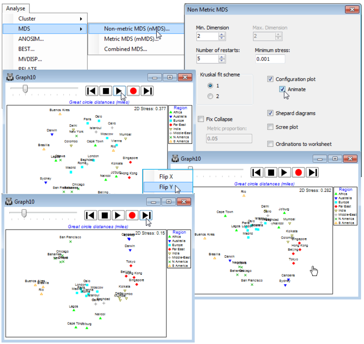
(Morlaix macrofauna, Amoco-Cadiz oil spill)
Close the World cities worksheet (it will not be needed again) and re-open workspace Morlaix ws, from earlier in this section. It contains the data sheet Morlaix macrofauna abundance, fourth-root transformed and with Bray-Curtis similarity matrix, Resem1, on which to carry out 2-d mMDS, with Analyse>MDS>Metric MDS (mMDS), taking all the default options, and making the time factor the labels rather than the symbols, on Samp. labels & symbols – you should also join the points in time order as previously demonstrated, with Special>Overlays>Trajectory. The below also adjusts the scales of the Shepard plot by clicking on them (X axis & Y axis tabs). You might also enjoy repeating this 2-d MDS with, say, (Number of restarts: 5) & (Minimum stress: 0.001) and (✓Animate) switched on. Make sure that you make the above symbol and label changes, and especially the trajectory overlay, before starting the animation, with . Even with the rather small number of points here (21) and the clear pattern, note how often the convergence does get trapped in a sub-optimal solution. This is also clear from the results window, mMDS1, from the initial run with 50 restarts, with only 20-30% of those converging to the (probably) lowest stress of 0.235.
Marginally higher stress is to be expected from an mMDS solution than an nMDS one, even if the Shepard diagram does show a linear fit through the origin to be an excellent description of the relationship of dissimilarities to plot distances – this is because nMDS’s monotonic regression can make fine-scale steps to ‘chase’ the data even when displaying essentially a straight line (especially if there are few samples and therefore not too many points on the Shepard plot to ‘chase’). But a high stress of 0.24 for mMDS, compared with a low one of 0.09 for nMDS, shows a drastically poorer fit for the former, and the reason is clear from the Shepard diagram: the points do form a fairly tight relationship with relatively low scatter (i.e. will fit well into a 2-d representation) but this is not linear through the origin, the assumption for metric MDS. In fact, the mMDS routine appears to be telling us that it can make good sense of these dissimilarities as a 2-d configuration, provided it ignores the model we have specified! It is the lack of fit to the model, rather than innate distortion in the 2-d solution (i.e. high variability in distance at each dissimilarity value), which is largely inflating the stress – this is also seen in the way the mMDS is similar to the earlier nMDS.
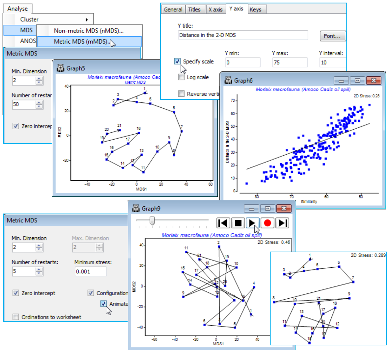
Threshold metric MDS (tmMDS)
The mMDS Shepard diagram above strongly suggests a middle course between simple metric and non-metric MDS, which we shall term threshold metric MDS (tmMDS), in which the Shepard plot is fitted by a straight line but not through the origin. It will almost always (as here) intersect the x axis of the Shepard plot, i.e. dissimilarities below that threshold are expected to be represented by zero distances – coincident points in the configuration. This intersection with the x axis is therefore an interesting parameter, essentially reflecting sampling error – the dissimilarity among replicate samples from the same condition (same site, time etc.). For many data sets, metric MDS is unable adequately to represent both the genuine structure in the samples and the sampling variability amongst replicates in a low-d plot, without distorting linearity of the dissimilarity scale interpreted directly as distances. nMDS solves this by compressing the lower dissimilarities (often replicate error) into a much smaller range of near-zero distances, so that there is ‘room’ in 2-d to display the real structure among groups and along gradients etc. tmMDS solves it more crudely by attempting to truncate all dissimilarities below a fitted threshold to zero, subtracting the sampling error (which is represented by this threshold) from the larger dissimilarities. The advantage of tmMDS is that the ordinations will still have meaningful axis scales, in terms of the original dissimilarities – though it should be remembered that the threshold dissimilarity on the Shepard plot needs to be added back to any distances ‘read off’ from the ordination scales in order to produce a dissimilarity.
Run tmMDS on Resem1, by selecting Metric MDS (mMDS) and unchecking (✓Zero intercept). Refine the axis scales of the tmMDS plot from the X axis tab (reached from e.g. Graph>General).
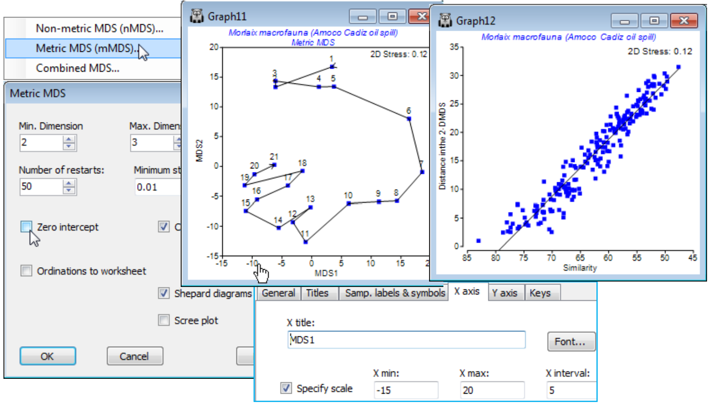
Note how variability around the line in the Shepard plot tightens up even further, now a reasonable model is fitted, and the tmMDS is virtually indistinguishable from the nMDS, seen much earlier in this section (and Fig. 5.8 in CiMC). The 2-d nMDS stress (see earlier Shepard plot or Fig. 5.9) is slightly lower at 0.09 rather than 0.12, a typical difference between a non-metric and metric stress in cases where both fit well (the relationship is genuinely linear). Given the low stress, the scales on the tmMDS can be used to give a ‘feel’ for the actual dissimilarity between different states of this community (rotating the plot may help to read off specific distances). The largest community difference between a sample prior to the spill and one in any subsequent year is about 30 units and the Shepard diagram shows the fitted threshold to be 21% dissimilarity (79% on the x axis scale of similarity). Adding these gives a dissimilarity of about 51%, and examination of the resemblance matrix shows the similarity between times 1 (April ’77) and 11 (July ’79) to be just under 52%. While tmMDS works well in this case it will not always be an appropriate ordination method, of course – any situation in which there is large scale turnover of species across the set of samples will tend to have a Shepard diagram which is strongly curvilinear at the large dissimilarity end of the scale, especially as it approaches 100%, and the ability of nMDS to model that relationship is crucial to an interpretable low-d display: small dissimilarities are compressed, large ones expanded.
Re-save the current workspace as Morlaix ws and close it.
Metric MDS for ordinating few points
Though usually greatly inferior to nMDS for typical ordinations from community similarities (e.g. with coefficients from the Bray-Curtis family), purely metric MDS (mMDS) becomes a valuable tool for ordinations based on only a handful of samples, when the information content of the ranks in a similarity matrix is often insufficient to constrain the problem. E.g. for 4 samples we have only the 6 numbers, 1, 2, 3, 4, 5, 6(!), and an infinity of stress zero solutions may be possible in nMDS. mMDS uses the actual (dis)similarities as the distances between points and solves a perfectly well-defined problem – even as few as 4 points in 2-d is unlikely to have an exactly zero stress solution. Such small-scale ordinations usually arise as means plots: averages are carried out for a number of groups over replicates or other crossed factors (e.g. averaging over times for a number of sites, or vice versa). This is achieved by Tools>Average on the transformed data matrix and calculation of the resemblances among these averaged samples (or, in the context of PERMANOVA+, by taking the menu item Distances among centroids on the original resemblance matrix, see Anderson et al, 2008, the PERMANOVA+ User manual). It is precisely such situations, with very few samples and thus few points on the Shepard diagram, where linearity of the distance vs dissimilarity relationship may be viable. Furthermore, the likelihood of the straight line going through the origin is increased, i.e. two means from exactly the same community structure will tend to have very low dissimilarity, because sampling variability is reduced by the averaging over replicates or other factors.
As an example, re-open the WA fish ws workspace of dietary assemblages of 7 species of Western Australian fish, for which averages over the (transformed) replicate gut samples from each species were calculated a few pages ago (in the presentation of segmented bubble plots). From the Bray-Curtis resemblance matrix computed on those averages, Select>Samples>(•Factor levels)>(Factor name: species)>Levels and Include only the four species with reasonably large numbers of samples – the three congeneric Sillago species (S. schomb., S. bassen., S. vittata) and A. ogilbyi, which all have between 10 and 16 replicate pools (each of 5 fish guts). Run Metric MDS (mMDS) on this 4 sample resemblance matrix. This only has 6 entries and nMDS would have insufficient information to be reliable (although not actually collapsing to a degenerate solution in this case, though it will often do so for 4-sample plots). mMDS, however, is seen to be valid – the 2-d Shepard diagram shows a reasonably convincing low-stress linear relationship, passing through the origin – and the 2-d ordination actually places these 4 points in very similar relationship to each other as seen in the previous nMDS plot for all 7 species (in that case, nMDS had plenty of information to work with, since there were 21 resemblances to rank). Note that the tidying up of this plot used: the General tab to uncheck (✓Plot history), increase (Overall font scale) and increase (Size) on Info font (stress value); Samp. labels & symbols to (Label✓By factor species full name) and to increase (Symbol> Size); both X axis and Y axis tabs to (✓Specify scale); and the Keys tab to uncheck (✓Plot key).
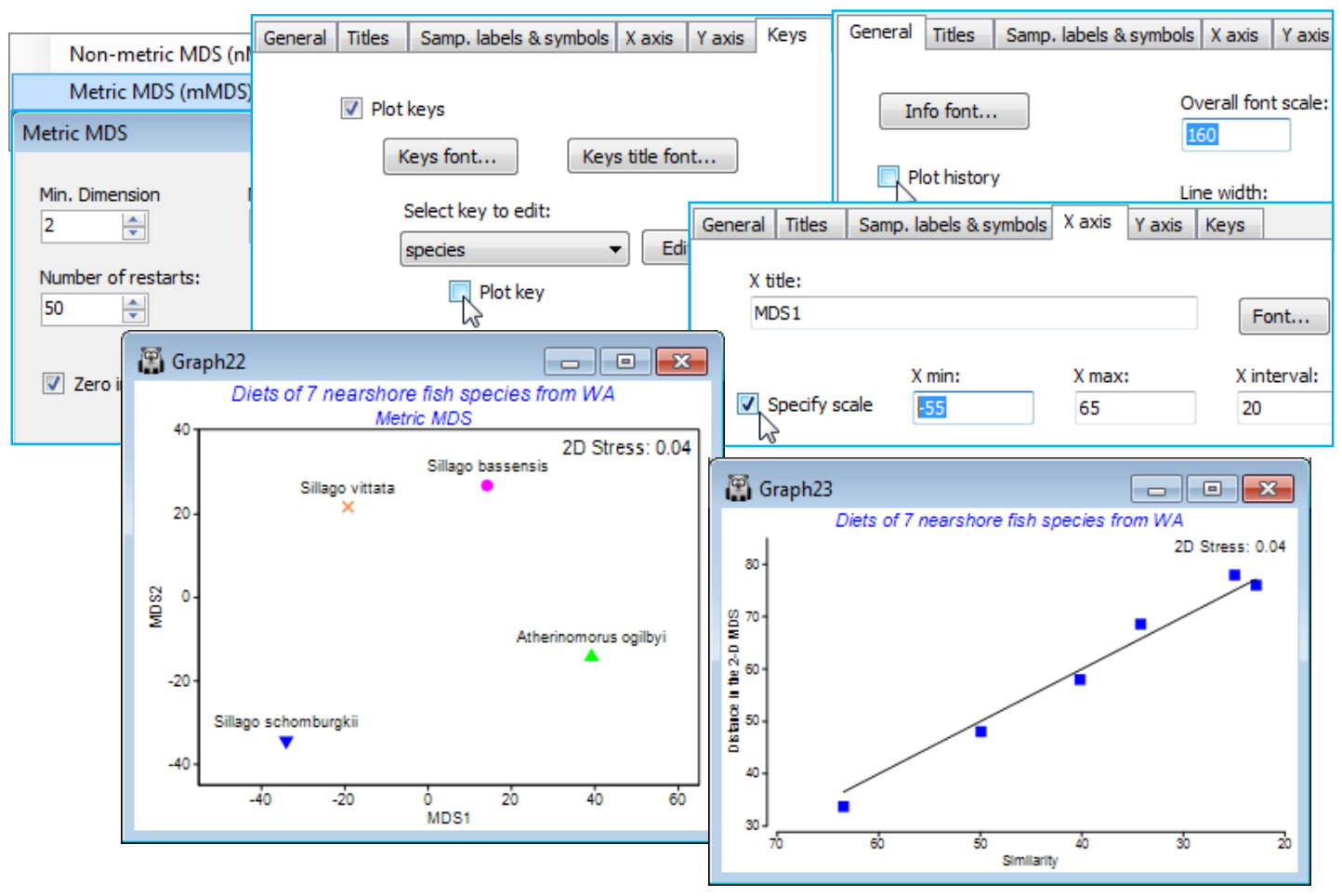
Resave the workspace as WA fish ws for use in the next section, and close it.
‘Fix collapse’ in nMDS; (Ko Phuket transects of coral reefs)
The PRIMER 7 nMDS dialog box includes a new option to (✓Fix Collapse). This addresses the problem of indeterminacy in some nMDS plots, when two (or more) groups of samples have very different communities, such that all dissimilarities between the groups are larger than any of the dissimilarities within groups. There might then not be sufficient constraints in the rank information for nMDS to be able to locate these two groups in relation to each other. The two groups must be placed at least far enough apart to make their nearest neighbours further away from each other than the furthest neighbour distance within groups. But moving the groups further apart still, whilst keeping their internal layouts the same, may satisfy all the rank orders in the resemblance matrix in just the same way. In the successive steps of an nMDS iteration, the groups are gradually placed at ever increasing distance to each other, so the outcome is convergence to a two point solution where each group has collapsed to a point. The groups can be ordinated separately, having drawn a box around each, by Graph>MDS Subset (or sometimes just one box if, as below, the plot splits into a single outlying sample and the remaining points). But a better solution is to recognise that while nMDS has no measurement scale to determine the relative placing of the two groups, mMDS does (e.g. if the average dissimilarity between the two groups is 80% and the maximum within groups is 40%, the nearest neighbours between groups are placed at approximately twice the distance of the furthest neighbours within groups). It is not necessary to throw away all the flexibility of an nMDS, in capturing the within-group structures, by moving entirely to mMDS – the better solution is to use a mixture of the two stress functions. The default, if the (✓Fix Collapse) option is selected in nMDS, is to mix only 5% of metric stress with 95% non-metric stress: (Metric proportion: 0.05). The result does not appear to be at all sensitive to the choice of this proportion; all the nMDS needs is just enough information from the resemblance scale to fix the relative placing of the groups.
Live cover of a coral reef assemblage was recorded from ‘plotless line-samples’ (of 10m length) perpendicular to, and at 10m spacing along an onshore-offshore transect (A) at Cape Panwa, Ko Phuket, Thailand. (Samples taken in 1983-88 are described in Clarke KR, Warwick RM & Brown BE 1993, Mar Ecol Prog Ser 102). We shall meet these data more extensively later, but for now, open Phuket coral cover 83-87.pri in C:\Examples v7\Phuket corals, and select only the first year of sampling, 1983 (Select>Samples, as seen on the previous page, on the Year factor). Transform by square root and take Bray-Curtis resemblances of this 12-point transect (factor Position). An nMDS without the (✓Fix Collapse) option is seen to collapse to a single point (position 1, closest to the shore) and the remaining points – note in the Shepard diagram that a major step or steps like this always indicate a degenerate solution. An MDS Subset could be performed on positions 2-12, as shown below, but repeating all 12 points in an nMDS with the (✓Fix Collapse) option gives a more satisfactory (and low stress) Shepard diagram and a better description. The serial change in coral communities over the positions is best seen by Graph>Special>Overlays>(✓Overlay trajectory).
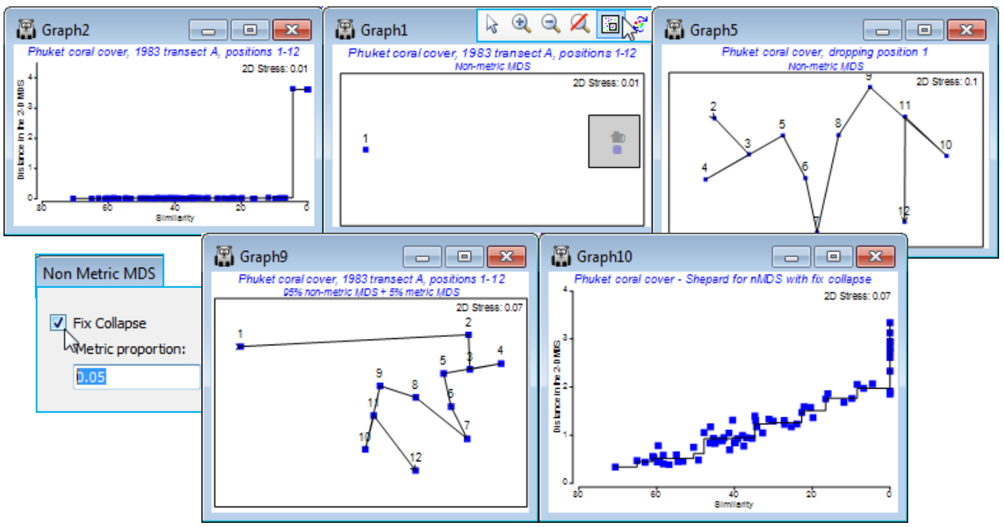
Save the workspace as Phuket ws for use in Section 9, and close it.
Combined nMDS; (Messolongi diatoms & abiotic data)
A variation of the above, and a final new PRIMER 7 feature to discuss in this section, is the option to mix, in equal measure, stress functions from two resemblance matrices, in a single nMDS. There are possible applications to data sets in which a single MDS is required from two different types of data, which may need separate dissimilarity definitions, e.g. perhaps in a ‘biotope’ ordination, data might consist of biotic communities, usually analysed with a Bray-Curtis similarity, and continuous environmental variables which would typically be normalised and input to Euclidean distance. The practical reality is that it would still be better to somehow build those into a common matrix, which could be analysed with the same resemblance measure, because then all the analyses based on a single triangular matrix (clustering, ANOSIM tests etc.) would become available. But if the sole purpose is to produce an ordination which combines two resemblance matrices for the same set of sample labels (same sites, times etc.) then Analyse>MDS>Combined MDS offers this possibility. The dialog is more or less the same as that for nMDS except for specification of the (Secondary resemblance matrix: ) to mix with that for the active sheet. A solution is sought, in the usual range of possible dimensions, by minimising an equal mix of the two stress functions, and the combined MDS is displayed along with the Shepard diagram for resemblances from the active sheet (to get the other Shepard diagram, re-run the routine with the ‘secondary’ resemblance matrix now as the active sheet – the stress value quoted on both plots will be the overall average stress). It is inevitable that the overall stress will be higher than that for the two analyses separately, because the routine is trying to compromise between a configuration of samples which would best suit each matrix separately; the stress only matches those of the individual solutions when they are identical.
A study of water column diatom assemblages (193 species) at 17 sites in the Messolongi lagoons of E Central Greece, and a matching set of 11 water quality variables measured at the same sites (with salinity fluctuating between brackish water and fully marine, and nutrient enrichment within certain lagoons) is looked at in detail in Section 13, on methods for biota-environment linkage. If analyses given there for the biotic data (root transform of diatom densities, followed by Bray-Curtis) and abiotic variables (log transform for all water column chemistry variables, excepting Temperature, Salinity, DO$_2 $ and pH, followed by normalisation and Euclidean distance) are repeated here, they lead to the separate nMDS plots shown below, with respective stress 0.09 and 0.08. There is a remarkable similarity in the patterns of the 17 sites between the two analyses, and running Analyse >MDS>Combined MDS on the Bray-Curtis similarity, supplying the Euclidean distance as the secondary resemblance matrix, leads to the combined nMDS shown, with stress of 0.13.