# Funnels for a range of sublist sizes
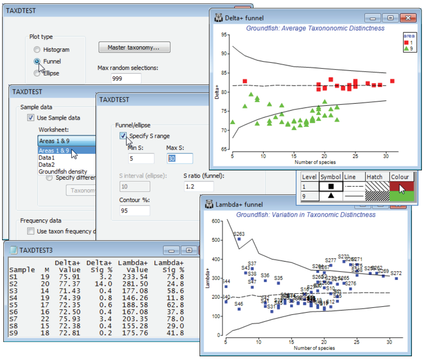
It is impractical to produce detailed histograms, such as those above, for each of the 277 samples, so a preferable option is just to view the 95% lower and upper limits for a range of sample sizes *S*, using a funnel plot so that a set of samples can be plotted on this. So, first select all sea area 9 (E Central N Sea) and sea area 1 (Bristol Channel) samples from Groundfish density, with **Select>Samples**>(•Factor levels)>Factor name: area>**Levels**, leaving only 1 and 9 in the Include box, and **Tools>Duplicate** this, renaming it Areas 1 & 9 (and remove the selection on the original sheet with **Select>All**, for later use). Then run **Analyse>TAXDTEST** again, on Groundfish taxonomy, with (Plot type•Funnel) & (Max. random selections: 999) and **Next**>(✓Use Sample data>Worksheet: Areas 1 & 9). Now, **Next**>(Funnel/ellipse✓Specify S range)>(Min S: 5) & (Max S: 30), to span the spread of *S* values on the display. The (S ratio (funnel): 1.2) option determines how many *S* values are calculated in the range 5 to 30, the S values stepping up by multiples of 1.2 by default (then rounded), thus *S* = 5, then 6 (=5$\times$1.2) etc. The final box on this screen gives 95% intervals if the default is taken (2.5% of simulations fall above the upper limit and 2.5% below the lower limit).
The results and funnel plots for $\Delta^{\scriptscriptstyle +}$ and $\Lambda^{\scriptscriptstyle +}$ are shown below and indicate that, whilst area 1 samples are within expected ranges for average taxonomic distinctness, based on the 93 species master list, area 9 samples have reduced diversity (AvTD is the more easily interpretable of the two indices, since it measures the average breadth of the assemblage). Rogers *et al* 1999 (reference in Section [5](https://learninghub.primer-e.com/books/primer-v7-user-manual-tutorial/chapter/5-resemblance-similarities-dissimilarities-and-distances)) discuss possible reasons for this. Note that these plots have been tidied up, with **Graph>Sample** **Labels & Symbols**, by removing the labels and adding symbols for factor area, changing symbol size/colour etc., as for any other plot. The probability limits could be further smoothed by running with (Max random selections: 9999) but will still show kinks for small *S*, because *S* is discrete.
[](https://learninghub.primer-e.com/uploads/images/gallery/2024-11/screenshotpage276a.png)