# Limiting font size
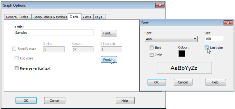
Note that the plots above required a certain amount of juxtaposition of different font sizes for titles, axis titles, *x*-axis labels, keys etc., away from the default values (usually 100). Changing **Graph> General**>(Overall font scale: 100) is sometimes a good place to start, but you will see here that an increase (to 150 for example) does not always result in a font size change because, by default, there are upper size limits on much of the lettering, to avoid labels overwriting each other or parts of the plot. To override such a default, which has been carried out for the *x*-axis site labels (to increase their size almost to touching), click anywhere on the *x*-axis labels which throws you automatically into Graph Options on the X axis tab, select the relevant Font and untick the (✓Limit size) box. The other operations needed here were to re-order factor levels in keys and switch colours/symbols for some groups, by clicking on the key, using (Move>$\downarrow$ or $\uparrow$) etc, as seen earlier in this section.
[](https://learninghub.primer-e.com/uploads/images/gallery/2024-06/screenshotpage98a.png)