# ‘Mondrian’ shade plots, with sample and variable boundaries
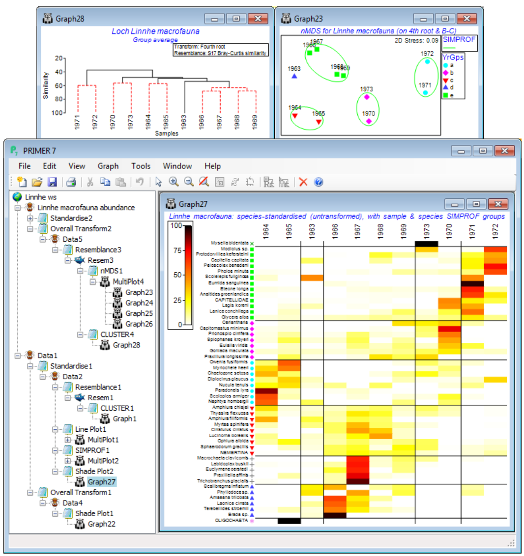
A final possibility for this Loch Linnhe data is to display both horizontal and vertical divisions in a shade plot, from sets of Type 3 and Type 1 SIMPROF tests respectively. Though it might normally be preferable to display the years in their chronological order, it could make good sense to examine which years cluster together in terms of their communities, i.e. whether there is some evidence that the more contaminated conditions of the early 1970’s and the ameliorated discharges by the time of the final year are paralleled by changes in the multivariate community structure, as suggested by sample SIMPROF tests. So, on the Bray-Curtis sample resemblances from fourth-root data on all species – used earlier to produce the *n*MDS plot of the 11 years (sheet Resem3 in the Explorer tree shown below) – run a sample clustering with SIMPROF (Graph28), creating factor YrGps, and on any sheet in the branch of the last shade plot Graph27, e.g. Data2, take **Edit>Factors>Import**>(Worksheet: Graph28)>**Select**>(Include: YrGps), so that this factor is now available to that shade plot. On this plot, run **Graph>Special** and both (✓Draw sample constraint group boundaries) and (✓Draw variable constraint group boundaries) should now be ticked, and the **Reorder** dialog needs Samples>(Order•Seriate>Sample resemblance Resem3) & (Constraint•Factor groups YrGps), with the species selections unchanged at Variables>(Order•Numeric indicator Spp order) & (Constraint• Indicator groups SFGv1). Again increase the seriation restarts for the samples to 999. Returning to the first **Special** dialog box, take (Number of levels: 5) and **Key**>(Colours•Two colours), choosing red and yellow (left and right). Finally, from the shade plot, tidy up the sample labels by **Graph>Sample Labels & Symbols**>(Labels✓Plot>✓By factor Year) and you can remove the key for the species SIMPROF groups species keys, if you wish, by the **Keys** tab on this Graph Options dialog, unchecking (✓Plot key) under (Select key to edit: SFGv1), to give the ‘Mondrian’(!) plot below.
[](https://learninghub.primer-e.com/uploads/images/gallery/2024-08/screenshotpage197a.png)
Further examples of analyses leading to sets of coherent species curves are given in CiMC, Chapter 7 and Somerfield & Clarke (2013) *J Exp Mar Biol Ecol*, with an interesting contrast seen between a (spatial) case with complete species turnover along the samples axis – the Exe nematode study seen above – and a (temporal) case with more subtle seasonal and impact-related changes in abundance – the Morlaix macrofauna over the Amoco-Cadiz oil-spill period, the MDS plots for which were discussed extensively in Section [8](https://learninghub.primer-e.com/books/primer-v7-user-manual-tutorial/chapter/8-multi-dimensional-scaling-non-metric-nmds-metric-mmds-combined-mds). The latter is especially interesting because it does put together coherent groups of species which: define the seasonal cycles; apparently respond to the oil spill by drastic decrease or increase in numbers, at differing time lags; appear to be completely unaffected; or are perhaps responding to more long-term temporal change. This tool therefore helps put the clear changes seen in a multivariate analysis of samples into their proper biological context of temporal/spatial/experimentally-driven patterns in the main species making up that community.