# 15. Other new tools & utilities
# 15.1 New default colour palette
#### Accessibility
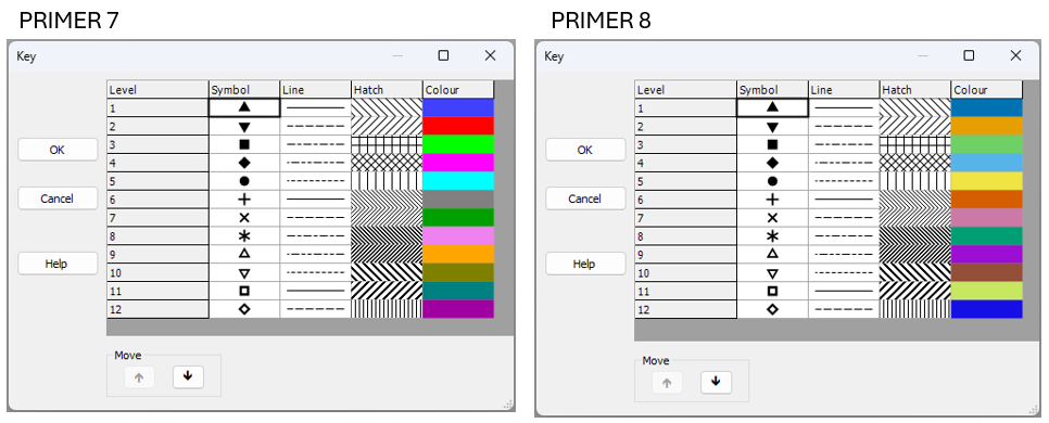
It is important to make graphics accessible to those with color vision deficiencies. We have therefore re-vamped the colour palette for P8 to achieve distinctive colours for plots (by default) that carefully accommodate the most common forms of colour blindness (Fig. 15.1).
[](https://learninghub.primer-e.com/uploads/images/gallery/2025-07/02b-colour-palette-comparison.png)
*Fig. 15.1 New default colour palette in PRIMER 8 (at right) compared to the old default colour palette in PRIMER 7 (at left).*
In developing these new defaults, we used the following resources:
- ["Coloring for Colorblindness" - David Nichols](https://davidmathlogic.com/colorblind/#%23D81B60-%231E88E5-%23FFC107-%23004D40)
- ["Points of view: Color blindness" - Bang Wong](https://www.nature.com/articles/nmeth.1618)
- [Paul Tol's Notes: Colour schemes and templates - Paul Tol](https://sronpersonalpages.nl/~pault/)
We especially appreciated David Nichols' [online tool](https://davidmathlogic.com/colorblind/#%23D81B60-%231E88E5-%23FFC107-%23004D40), which allowed us to play with colour schemes and get a feel for how different schemes would look for people who experience colour differently, due to various forms of alterations to their color vision, including protanopia, deuteranopia, tritanopia or deuteranomaly. We ended up with the following pallette:
- [PRIMER 8 default colours](https://davidmathlogic.com/colorblind/#%230072B2-%23E69F00-%236ED065-%2356B4E9-%23F0E442-%23D55E00-%23CC79A7-%23009E73-%239c0ed3-%23934f38-%23c8e761) - (see the left-hand column labeled 'True' when you follow this link).
To get there, we borrowed the base colour scheme from {{@954#bkmrk-wong2011}}. We then simply re-arranged the order of the colours and extended the scheme to 12 colours which we felt, as much as possible, would still appear well-differentiated from one another, right across the range of different forms of colour vision deficiency.
#### Compatibility with earlier versions of PRIMER
If you have an existing *.pri or *.pwk file that has been opened and saved in PRIMER 7, then it will carry around the default colour palette from PRIMER 7 with it. Thus, when you open up a PRIMER 7 file in PRIMER 8, those old default colours from PRIMER 7 (or whatever other colours you tweaked and saved in your file's graphics) will be used. To get rid of all of the older colours, and hence see the new default colour palette in P8 when you create a new graphic, please save the file as an Excel file and then import the data, fresh, into PRIMER 8.
# 15.2 New selection options
In PRIMER 8, the options available for ***selecting samples*** or ***selecting variables*** have been expanded considerably from what they were in PRIMER 7.
#### Selecting Samples
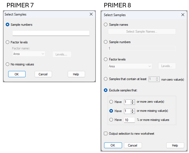
When you click **Select** > **Samples...** in P8, you will see the new dialog shown at right in Fig. 15.2.
[](https://learninghub.primer-e.com/uploads/images/gallery/2025-07/03c-select-samples-compare.png)
*Fig. 15.2 Comparison of the **Select** > **Samples...** dialog window in PRIMER 7 (at left) vs PRIMER 8 (at right).*
Note that in PRIMER 8, you can select samples:
- using **sample names** (this option includes a filter to help find names in long lists);
- using **sample numbers**;
- belonging to certain **level(s) of a factor**; or
- that contain some minimum number ($x$) of **non-zero values**.
You can also ***exclude*** samples that:
- have ($x$) or more zero values;
- have ($x$) or more missing values; or
- have ($x$)% or more missing values.
Note also that there is the option to:
'$\checkmark$Output selection to new worksheet'.
This latter option means you don't have to take any extra steps (post-selection) simply to duplicate the selected data into a new worksheet (if desired) for subsequent analyses. As an added bonus, a small output file is produced when you tick this option which identifies precisely what choices you made to select the samples. It is very useful to have this information going forward, to keep track of any subset selections made along your analysis pathway.
#### Selecting Variables
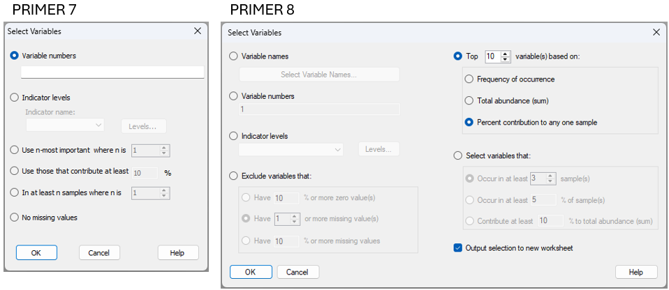
When you click **Select** > **Variables...** in P8, you will see the new dialog shown at right in Fig. 15.3.
[](https://learninghub.primer-e.com/uploads/images/gallery/2025-07/04c-select-vars-compare.png)
*Fig. 15.3 Comparison of the **Select** > **Variables...** dialog window in PRIMER 7 (at left) vs PRIMER 8 (at right).*
Note that in PRIMER 8, you can select variables:
- using **variable names** (this option includes a filter to help find names in long lists);
- using **variable numbers**; or
- belonging to certain **group(s) of an indicator**.
It is also possible to select variables that correspond to the top ($x$) variables in a list based on:
- **frequency of occurrence**;
- **total abundance** (sum); or
- **percent contribution to any one sample** (this option was called 'most important' in PRIMER 7)
Finally, you may choose to select variables that:
- occur in at least ($x$) sample(s);
- occur in at least ($x$)% of sample(s); or
- contribute at least ($x$)% to the total abundance (sum).
Note that the above dialog gives you a lot of freedom with respect to identification of 'important' variables in ecological contexts, not just on the basis of total abundance (in any one sample or overall), but alternatively by reference to their frequency of occurrence. Using the frequency of occurrence may often be more suitable, as a criterion, than pulling out species based on their total abundance values, particularly if there are highly sporadic species that have massive abundance values (e.g., weeds or opportunists), but that may not actually be that important ecologically (e.g., they might have shown up in just a single sample).
As an added bonus (and precisely as we saw in the dialog for the selection of samples, shown above), you can choose to:
'$\checkmark$Output selection to new worksheet'.
This streamlines and clarifies analytical pathways.
#### Filters *(New!)*
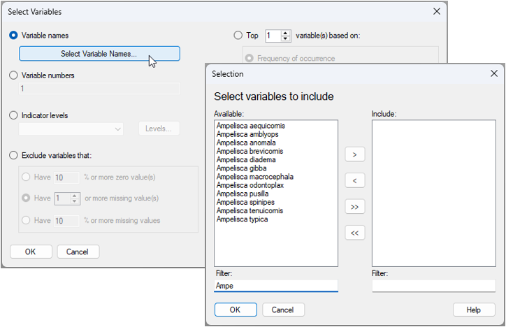
For either the selection of samples or the selection of variables **by name**, PRIMER 8 offers a new tool in the form of a ***filter*** that is very helpful whenever you are dealing with long lists of names in large data sheets. For example, suppose I wish to select all of the variables from a long list of species that belong to the same genus (e.g., *Ampelisca*), I simply choose to select variables by names and click the 'Select Variable Names...' button ([](https://learninghub.primer-e.com/uploads/images/gallery/2025-07/05d-select-var-names-button.png)), then start typing the genus name into the 'Filter:' box, and those species will appear in the 'Available:' list for me to easily select them (see Fig. 15.4 below).
[](https://learninghub.primer-e.com/uploads/images/gallery/2025-07/05c-select-vars-with-filter.png)
*Fig. 15.4 Dialog window for selecting names of variables, using the new 'Filter:' tool in PRIMER 8. In the above example (data in the file named 'Norway_macrofauna.pri', found inside the 'Examples_P8 > Norway_macrofauna' folder), there are 809 taxa in the data sheet, but by typing the letters 'Ampe' in the 'Filter:' box, the available list is reduced to just the 12 variables that have this particular combination of letters in their name. All of these are of the genus 'Ampelisca'.*
Using this new filtering tool in PRIMER 8 means you can quickly and easily find and select specific variables (or samples) that you know are in your data somewhere (e.g., all variables starting wtih the letter "R"), even if you cannot easily remember the entire name in detail.
# 15.3 Re-name levels of a factor (or indicator)
There are many situations where it would be very handy to be able to change the names of levels of a factor (or to change the names of groups for an indicator). We often need to tweak the names of levels of factors. For example,
- The names are too long and you want to shorten/abbreviate them so that they are easy to see as labels on an ordination plot. For example, you have levels of 'Berghan Point' and 'Home Point', and you want to change them to 'B' and 'H'.
- The factor has levels that are quantitative (e.g., such as depth zones), but the names are not strictly numeric (e.g., maybe the levels are named '50-100 m', '100-200 m', '200-300 m', etc.). You might, however, really want numeric factor level names so you can analyse the factor as **ordered** in an ANOSIM, put depth trajectories on ordination plots, etc.
- You have discovered that not all factor levels matter, and so you want to combine 2 or more factor levels into an amalgamated (single) factor level. For example, maybe you originally have levels of 'Low', 'Medimum-Low', 'Medium', and 'High', but later decide that the first two levels are not actually significantly different, so you want to combine those two and change the names so that you just have 'L', 'M' and 'H'.
- You have taken data through time (say, every 2 months) at your sites, and your labels for this temporal factor look like this: 'Jan-2001', 'Mar-2001', 'May-2001', etc., but you want to treat these simply as sequential time-points in your plots, e.g., 'T1', T2', 'T3', etc.
It would be very laborious to have to go through the process of re-naming the factor-level names for every single sample in the full worksheet, and this process would also be highly prone to error.
In PRIMER 8, all you need to do is click **Edit** > **Factors**, click on the factor whose level names you want to change, and then click the 'Rename Levels...' button ([](https://learninghub.primer-e.com/uploads/images/gallery/2025-07/06d-rename-levels-button.png)). The resulting dialog lets you nominate the new names for the factor levels (just type them in), and then you can get on with your work.
For example, for the size-class data for mussels from several sites in the Gulf of Alaska (the data file is 'Gulf_of_Alaska_mussels.pri', located in the folder 'Examples_P8' > 'Gulf_of_Alaska_mussels'), we may wish to abbreviate the names of the ecoregions so that they are shorter, making them easier to see in ordination plots (Fig. 15.5).
[![06c._Factors_rename_levels_mussels_[i].png](https://learninghub.primer-e.com/uploads/images/gallery/2025-12/scaled-1680-/06c-factors-rename-levels-mussels-i.png)](https://learninghub.primer-e.com/uploads/images/gallery/2025-12/06c-factors-rename-levels-mussels-i.png)
*Fig. 15.5 Dialog windows showing the action of changing the names of levels for the factor of 'Ecoregions' for the Gulf of Alaska mussel size-class dataset: from 'Lynn Canal' to 'LC' and from 'Kachemak Bay' to 'KB'.*
The resulting factor information (after changing the level names for 'Ecoregion', as shown above) looks like this:
[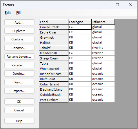](https://learninghub.primer-e.com/uploads/images/gallery/2025-07/06e-after-changing-level-names.png)
As an aside, if you wanted to retain the original level names in your data sheet as well, then you need first to ***duplicate*** the original factor (using the 'Duplicate' button), ***rename*** the factor itself (using the 'Rename...' button; for example, the abbreviated names could be held in a factor called 'Ecoreg'), ***then*** create new level names for that duplicated factor (using the 'Rename Levels...' button) to whatever new names you wish.
You can compare the metric MDS plot of the sites (based on Manhattan distances among cumulative percentages of standardised size-classes of mussels) when Ecoregion factor-level labels have long names *vs* the same plot with short names (see below).
[![06f._mMDS_mussels_full_names_[i].png](https://learninghub.primer-e.com/uploads/images/gallery/2025-12/scaled-1680-/06f-mmds-mussels-full-names-i.png)](https://learninghub.primer-e.com/uploads/images/gallery/2025-12/06f-mmds-mussels-full-names-i.png)
[![06g._MDS_mussels_short_names_[i].png](https://learninghub.primer-e.com/uploads/images/gallery/2025-12/scaled-1680-/06g-mds-mussels-short-names-i.png)](https://learninghub.primer-e.com/uploads/images/gallery/2025-12/06g-mds-mussels-short-names-i.png)
Finally, note that this same re-naming tool is also available under **Edit** > **Indicators...**.
# 15.4 Add customised values/labels to graphical axes
In PRIMER 8, there is a new tool that allows us to ***add customised values and labels*** to coordinate axes in graphics.
Consider the following scatter plot of species richness ($S$) *vs.* structural complexity of the substratum (measured using a chain-and-tape method), obtained from a visual survey of intertidal macrofauna and algae at a site inside the marine reserve at Long Bay, on the north shore of Auckland, New Zealand.¶ Biotic data ('Long_Bay_intertidal_biota') and environmental data ('Long_Bay_intertidal_env.pri') from this study are found in the 'Examples_P8' > 'Long_Bay_intertidal' folder.
[![07a._Long_Bay_Scatter_S_vs._Complex_[i].png](https://learninghub.primer-e.com/uploads/images/gallery/2025-12/scaled-1680-/07a-long-bay-scatter-s-vs-complex-i.png)](https://learninghub.primer-e.com/uploads/images/gallery/2025-12/07a-long-bay-scatter-s-vs-complex-i.png)
In the above scatter plot, the points that correspond to the minimum ('Min') and maximum ('Max') values obtained for the variable of 'Complexity' (on the x-axis), have been labeled individual (using a factor that is empty for all other samples). We might decide it would be useful to annotate the graphic to provide the minimum and maximum values on the x-axis for those two values directly as well. We can do this by clicking on the x-axis (or by clicking **Graph** > **General...** and clicking on the 'X-axis' tab).
In this dialog, we can see an 'Additional Labels' button ([](https://learninghub.primer-e.com/uploads/images/gallery/2025-07/7c-additional-labels-button.png)), which is **new in P8**. We can also see the new option to change the **label orientation** so that it is either '$\bullet$Perpendicular' or '$\bullet$Parallel'. For the present example, let's choose '$\bullet$Parallel' and then go ahead and click the 'Additional Labels' button where we can add both the specific **values** and the desired **labels** for the maximum and minimum complexity, also including a tick-mark for each of them, like so:
[![7e._Additional_Labels_ALL_[i].png](https://learninghub.primer-e.com/uploads/images/gallery/2025-12/scaled-1680-/7e-additional-labels-all-i.png)](https://learninghub.primer-e.com/uploads/images/gallery/2025-12/7e-additional-labels-all-i.png)
The resulting graphic looks like this:
[![07f._Long_Bay_Scatter_with_Additional_[i].png](https://learninghub.primer-e.com/uploads/images/gallery/2025-12/scaled-1680-/07f-long-bay-scatter-with-additional-i.png)](https://learninghub.primer-e.com/uploads/images/gallery/2025-12/07f-long-bay-scatter-with-additional-i.png)
There are clearly many uses for this new feature. It is a great way to provide clarity regarding any specific values (or sets of values) that you may wish to highlight along particular axes in customised graphics.
### Change the axis label orientation
Note that another new feature in PRIMER 8 is the possiblity to change the ***orientation*** of the axis labels. See [section 3.2](https://learninghub.primer-e.com/link/1023#bkmrk-change-the-axis-labe) for an example.
---
¶*These data were collected in 2015 as part of a course in quantitative marine ecology at Massey University, Albany, New Zealand. Taxa that were recorded in the survey as 'dead' (e.g., oyster shells, barnacle tests, etc.) were not included in the tally of richness analysed here.*
# 15.5 Split data sheet by factor/indicator
In PRIMER 8 there is a new tool, accessed by clicking **Tools** > **Split Data...**, which allows you to split a data sheet into several separate data sheets, corresponding to:
- separate groups of ***samples***, based on a ***factor***; or
- separate groups of ***variables***, based on an ***indicator***.
This is a simple tool, but a helpful one. Having this tool saves one from having to select each group individually, then duplicate them into a new sheet, one group at a time.
For example, consider the data set of fish surveys from New Zealand, discussed in [section 10.4](https://learninghub.primer-e.com/link/1049) above. (Data are located in the file 'NE_NZ_fish_counts.pri', found in the 'Example_P8' > 'NE_NZ_fish' folder.) Visual underwater surveys of fish assemblages were done at four different locations along the north-eastern coast of New Zealand: Berghan Point, Home Point, Leigh and Hahei. Suppose now we would like to examine trends in assemblages through time, but do this separately for each of these four different locations.
From the fish dataset, click **Tools** > **Split Data...**, like so:
[![08a._Tools_Split_Data_fish_[i].png](https://learninghub.primer-e.com/uploads/images/gallery/2025-12/scaled-1680-/08a-tools-split-data-fish-i.png)](https://learninghub.primer-e.com/uploads/images/gallery/2025-12/08a-tools-split-data-fish-i.png)
We can then choose to split the data based on the factor of 'Location', as shown in the 'Split' dialog window below, then click '**OK**'.
[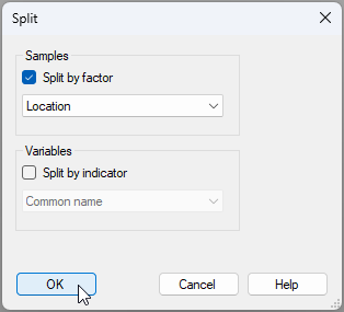](https://learninghub.primer-e.com/uploads/images/gallery/2025-07/8b-split-data-dialog-window-fish.png)
In our Explorer tree, we then see four new data sheets, one for each of the four locations:
[![08c._Post_data_split_fish_[i].png](https://learninghub.primer-e.com/uploads/images/gallery/2025-12/scaled-1680-/08c-post-data-split-fish-i.png)](https://learninghub.primer-e.com/uploads/images/gallery/2025-12/08c-post-data-split-fish-i.png)
Note that the sheets produced by this operation each have a new ***title*** (see also **Edit** > **Properties**) that reflects:
- the factor on which the split was made; and
- the relevant corresponding group for each resulting data sheet.
For example, the title for 'Data4' is given as 'New Zealand Fish Visual Surveys - Location: Home.Point', *viz.:*
[](https://learninghub.primer-e.com/uploads/images/gallery/2025-07/08d-new-title-home-point.png)
Of course, you can also change the name of the data sheets themselves if you wish. For example, you can change the name of the sheet called 'Data4' to 'Home.Point' by clicking **File** > **Rename Data**.
# 15.6 Line plots for samples
There is a new facility in PRIMER 8 to create **Line plots** in two different ways:
- with one line for every ***variable*** (across all samples); or
- with one line for every ***sample*** (across all variables).
This is a considerable improvement on the line plot dialog in PRIMER 7, which only could be implemented to draw lines for variables (Fig. 15.6).
[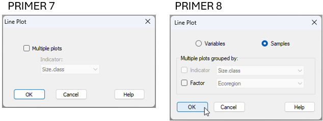](https://learninghub.primer-e.com/uploads/images/gallery/2025-07/09e-line-plot-compare-p7-p8.png)
*Fig. 15.6 Comparison of the **Plots** > **Line Plot...** dialog window in PRIMER 7 (at left) vs PRIMER 8 (at right).*
We saw this tool earlier in [section 13.3](https://learninghub.primer-e.com/link/1063), in the analysis of mussel size-classes at different sites in the Gulf of Alaska (the data file is called 'Gulf_of_Alaska_mussels.pri', located in the folder 'Examples_P8' > 'Gulf_of_Alaska_mussels').
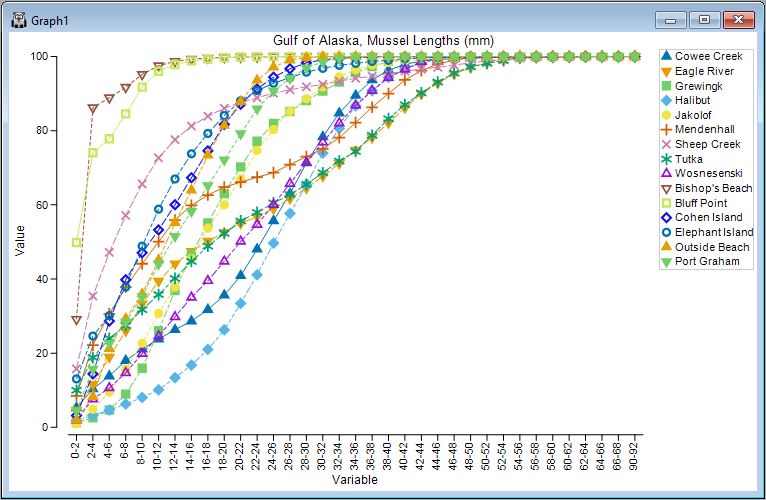
From the mussel data sheet, after standardising the original raw count data to [cumulative percentages](https://learninghub.primer-e.com/link/1063#bkmrk-input-data-and-stand) (the variables are the sizes classes here), resulting in a sheet called 'Data1', we can choose to create a line plot with a line for each sample (the sites here) by clicking **Plots** > **Line Plot...**, like so:
[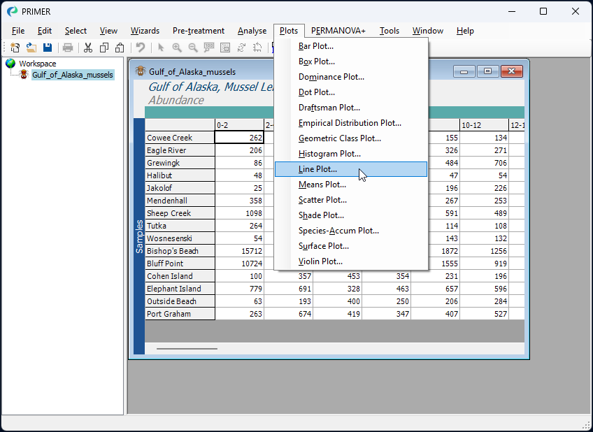](https://learninghub.primer-e.com/uploads/images/gallery/2025-07/09c-line-plot-menu-item.png)
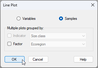
In the 'Line Plot'dialog window, we simply choose to view lines for the ($\bullet$ Samples), and then click '**OK**'.
[](https://learninghub.primer-e.com/uploads/images/gallery/2025-07/09b-line-plot-p8.png)
*Note: change the above dialog if the wording changes*
Note in the above dialog that we also have the option to output ***multiple line plots*** corresponding to groupsof samples identified *via* a factor (or groups of variables identified by an indicator, if we are drawing lines for variables).
The resulting line plot for this example is shown below:
[](https://learninghub.primer-e.com/uploads/images/gallery/2025-07/09d-line-plot-mussel-data-take2.png)
# 15.7 Output group-level stats from dispersion (or variability) weighting
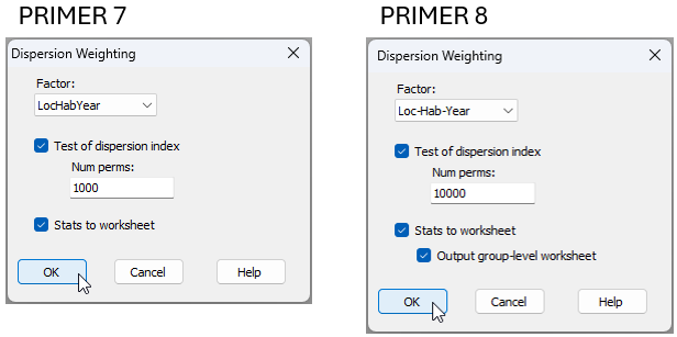
In PRIMER 8, you can now output more detailed statistical information from either dispersion-weighting or variability weighting to a worksheet. You can see this additional option in the comparison of the 'Dispersion Weighting' dialog in PRIMER 8, compared to that in PRIMER 7 (Fig. 15.7).
[](https://learninghub.primer-e.com/uploads/images/gallery/2025-07/10c-dw-comparison-p7-p8.png)
*Fig. 15.7 Comparison of the **Pre-treatment** > **Dispersion Weighting...** dialog window in PRIMER 7 (at left) vs PRIMER 8 (at right).*
In essence, whenever we calculate the average ***index of dispersion*** ($\bar{D}$) for the dispersion weighting pre-treatment, it is drawn from individual indices of dispersion (variance-to-mean ratios, $D_i$) for each of several ($i = 1, \ldots, g$) groups (identified by a factor). It would be helpful, in some situations, to be able to see those original individual indices of dispersion across all of the groups for each variable. The extra tickbox ('$\checkmark$Output group-level worksheet') available in the PRIMER 8 dispersion weighting dialog allows you to produce and examine this underlying statistical information in a worksheet directly.
For example, we can re-visit the data we saw in [section 10.4](https://learninghub.primer-e.com/link/1049) above, located in the file 'NE_NZ_fish_counts.pri', found in the 'Example_P8' > 'NE_NZ_fish' folder. We can begin by following steps 1, 2 and 3 from [section 10.4](https://learninghub.primer-e.com/link/1049) on these data; i.e., get the data into PRIMER 8, then:
- Obtain a subset of the data based on the factor of 'Year', from 2010-2015 inclusive (**Select** > **Samples...**), with the resulting subset being called 'Data1'.
- Create a combined factor consisting of all combinations of the factors: 'Loc', 'Hab' and 'Year' (**Edit** > **Factors...** > **Combine...**)
Next, we can apply the dispersion weighting pre-treatment on the basis of this combined factor by clicking **Pre-treatment** > **Dispersion Weighting...** and in the resulting dialog, choose Factor: Loc-Hab-Year. This time, however, we shall also choose to get ($\checkmark$Stats to worksheet) & ($\checkmark$Output group-level worksheet), then click '**OK**'.
This will produce the following three worksheets (assuming 'Data1' contains the subset-selected data):
- 'Data2' contains the dispersion-weighted data.
- 'Data3' contains the statistics associated with the ***average*** index of dispersion ($\bar{D}$) for each variable.
- 'Data4' contains the ***individual*** indices of dispersion ($D_i$) for each group (columns) and for each variable (rows).
These three data sheets are shown below for the present example.
[![10d._DW_data_[i].png](https://learninghub.primer-e.com/uploads/images/gallery/2025-12/scaled-1680-/10d-dw-data-i.png)](https://learninghub.primer-e.com/uploads/images/gallery/2025-12/10d-dw-data-i.png)
[![10e._D-bar_values_fish_[i].png](https://learninghub.primer-e.com/uploads/images/gallery/2025-12/scaled-1680-/10e-d-bar-values-fish-i.png)](https://learninghub.primer-e.com/uploads/images/gallery/2025-12/10e-d-bar-values-fish-i.png)
[![10f._D_i_values_fish_[i].png](https://learninghub.primer-e.com/uploads/images/gallery/2025-12/scaled-1680-/10f-d-i-values-fish-i.png)](https://learninghub.primer-e.com/uploads/images/gallery/2025-12/10f-d-i-values-fish-i.png)
Note in the above sheet ('Data4', containing individual indices, $D_i$) that there are many missing values. This is simply a consequence of there being zero fish of that species in that particular group of samples; hence, the mean and the variance will both be equal to zero, so no value of $D_i$ can be calculated for that particular cell (or group). Average $\bar{D}$ values for each species are naturally calculated only from those cells (groups of samples) where at least some individuals of that species were recorded (i.e., the non-missing entries).
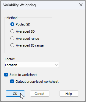
Finally, note that this '$\checkmark$Output group-level worksheet' option is also available for **Pre-treatment** > **Variability Weighting...**, *viz.:*
[](https://learninghub.primer-e.com/uploads/images/gallery/2025-07/10g-variability-weighting-dialog-too.png)
# 15.8 Output diagnostic plots from CAP
In PRIMER 8, it is now possible to output diagnostic plots from the CAP routine (i.e., canonical analysis of principal coordinates, an analysis obtained from a resemblance matrix by clicking **PERMANOVA+** > **CAP**). You simply tick the new option to '$\checkmark$Do diagnostic plots' in the CAP dialog window.
For example, consider a study of the assemblages of small benthic fishes living in rocky subtidal reef habitats in northeastern New Zealand, examined by {{@954#bkmrk-smithanderson2016}}. Data from this study are located in the file called 'NZ_benthic_fish.pri', in the 'Examples_P8' > 'NZ_benthic_fish' folder. Surveys were done of the benthic fish fauna, along with fine-scale habitat features in kelp forests and rocky reefs along the north-eastern coast of New Zealand. There were sites at a range of locations in and around several marine reserves (including Leigh, Tawharanui, Hahei and the Poor Knights Islands), and data were obtained over a period of 3 years (2011-2013). At each site, divers surveyed $n$ = 8 transects, measuring 1 m $\times$ 5 m. Each transect was made up of five contiguous 1 m $\times$ 1 m quadrats. For each quadrat, divers first visually searched and recorded counts for all benthic fishes, then recorded the presence/absence of a set of pre-defined habitat features (see the file named 'NZ_benthic_fish_habitat.pri', located in the same folder).
Here, we shall consider only the potential effects of the marine reserve at Leigh on these fish communities in a fully balanced design. Note that the factor of 'Reserve' has two levels: 0 = outside the reserve, and 1 = inside the reserve. Due to the sparsity of the count data at small spatial scales, we shall analyse data summed to the transect level, then consider densities of each species (averages per transect) at the spatial scale of sites for the ensuing CAP analysis. Mean densities (per 5m2) of each fish species per site are located in the file named 'NZ_benthic_fish_Leigh_av_densities.pri'.
1. Open the file ('NZ_benthic_fish_Leigh_av_densities.pri') in PRIMER 8. It will look like this:
[![12a._Leigh_fish_densities_[i].png](https://learninghub.primer-e.com/uploads/images/gallery/2025-12/scaled-1680-/12a-leigh-fish-densities-i.png)](https://learninghub.primer-e.com/uploads/images/gallery/2025-12/12a-leigh-fish-densities-i.png)
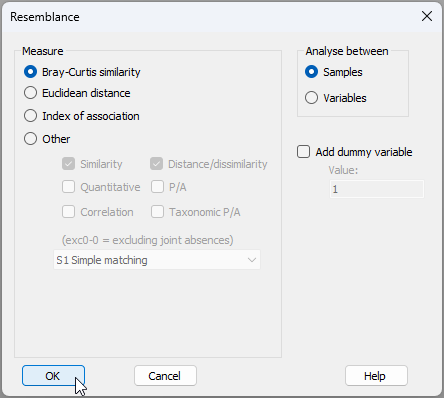
2. From 'NZ_benthic_fish_Leigh_av_densities', click **Analyse** > **Resemblance...** and choose to calculate the Bray-Curtis similarity among samples. This will produce a resemblance matrix called 'Resem1'.
[](https://learninghub.primer-e.com/uploads/images/gallery/2025-07/12b-resem-tfins.png)
[![12bb._Resem_matrix_tfins_[i]_NEW.png](https://learninghub.primer-e.com/uploads/images/gallery/2025-12/scaled-1680-/12bb-resem-matrix-tfins-i-new.png)](https://learninghub.primer-e.com/uploads/images/gallery/2025-12/12bb-resem-matrix-tfins-i-new.png)
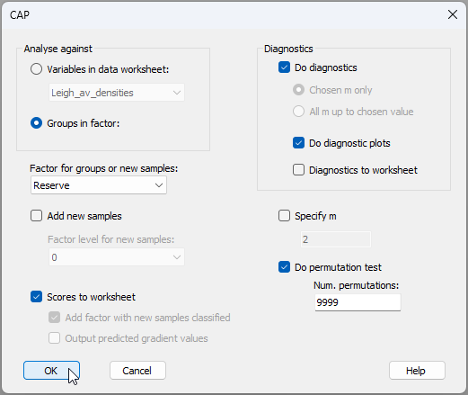
3. From the 'Resem1' matrix, run the CAP routine aiming to distinguish small benthic fish communities inside *vs* outside the marine reserve, by clicking **PERMANOVA+** > **CAP** and choose:
(Analyse against $\bullet$Groups in factor > Factor for groups or new samples: 'Reserve') &
($\checkmark$Scores to worksheet) &
(Diagnostics > $\checkmark$Do diagnostics > $\checkmark$Do diagnostic plots) &
($\checkmark$Do permutation test > Num. permutations: 9999)
then click **OK**, as shown below:
[](https://learninghub.primer-e.com/uploads/images/gallery/2025-07/12c-cap-dialog-tfins-p8.png)
The option to ***do diagnostic plots*** is new to PRIMER 8.
The analysis will run and produce the following:
- 'CAP1' ([![13._CAP1_notepad_[i].png](https://learninghub.primer-e.com/uploads/images/gallery/2025-12/scaled-1680-/13-cap1-notepad-i.png)](https://learninghub.primer-e.com/uploads/images/gallery/2025-12/13-cap1-notepad-i.png)), containing all of the essential results in a rich text format (*.rtf), and
- 'MultiPlot1' ([![14._MultiPlot1_Exp_tree_icon_[i].png](https://learninghub.primer-e.com/uploads/images/gallery/2025-12/scaled-1680-/14-multiplot1-exp-tree-icon-i.png)](https://learninghub.primer-e.com/uploads/images/gallery/2025-12/14-multiplot1-exp-tree-icon-i.png)), containing the CAP plot itself (as 'Graph1') along with plots of the ***diagnostics for choosing $m$***, where $m$ = the number of principal coordinate axes (PCOs) used to produce the canonical (CAP) axis (as 'Graph2' through 'Graph5').
From 'CAP1' and the accompanying CAP plot ('Graph1'), shown below, we can see that the canonical correlation associated with the 'Reserve' effect is reasonably strong ($\delta_1$ = 0.644), and that this is statistically significant ($\delta_1^2$ = 0.415, $P$ = 0.001). This CAP model was achieved with $m$ = 4 PCO axes, which achieved a leave-one-out allocation success of 77.78% under cross-validation.
[![12d._CAP_rtf_tfins_[i].png](https://learninghub.primer-e.com/uploads/images/gallery/2025-12/scaled-1680-/12d-cap-rtf-tfins-i.png)](https://learninghub.primer-e.com/uploads/images/gallery/2025-12/12d-cap-rtf-tfins-i.png)
[![15a._Graph1_tfins_[i].png](https://learninghub.primer-e.com/uploads/images/gallery/2025-12/scaled-1680-/15a-graph1-tfins-i.png)](https://learninghub.primer-e.com/uploads/images/gallery/2025-12/15a-graph1-tfins-i.png)
The four ***diagnostic plots*** are shown below.
[![15b._Graph2_tfins_[i].png](https://learninghub.primer-e.com/uploads/images/gallery/2025-12/scaled-1680-/15b-graph2-tfins-i.png)](https://learninghub.primer-e.com/uploads/images/gallery/2025-12/15b-graph2-tfins-i.png)
[![15c._Graph3_tfins_[i].png](https://learninghub.primer-e.com/uploads/images/gallery/2025-12/scaled-1680-/15c-graph3-tfins-i.png)](https://learninghub.primer-e.com/uploads/images/gallery/2025-12/15c-graph3-tfins-i.png)
[![15d._Graph4_tfins_[i].png](https://learninghub.primer-e.com/uploads/images/gallery/2025-12/scaled-1680-/15d-graph4-tfins-i.png)](https://learninghub.primer-e.com/uploads/images/gallery/2025-12/15d-graph4-tfins-i.png)
[![15e._Graph5_tfins_[i].png](https://learninghub.primer-e.com/uploads/images/gallery/2025-12/scaled-1680-/15e-graph5-tfins-i.png)](https://learninghub.primer-e.com/uploads/images/gallery/2025-12/15e-graph5-tfins-i.png)
It is clear that the choice of $m$ = 4 is a good one here, as this choice achieved the greatest leave-one-out allocation success ('Graph2') and the lowest leave-one-out residual sum-of-squares ('Graph3'). Although this can also (technically) be seen in the '*DIAGNOSTICS*' section of the 'CAP1' output above, it is certainly much clearer to see this information in diagnostic plots, whereby the wisdom of the choice made, overall, by reference to other values of $m$, can be readily assessed.
# 15.9 New diagnostics for PCA/PCO plots
#### Background
Consider a cloud of $N$ points (sampling units) in a $p$-dimensional multivariate space. [Principal components analysis (PCA)](https://learninghub.primer-e.com/link/102) is an ordination method that will find an axis through that cloud of points so as to maximise the total variance of the points, when they are projected at right angles onto that axis. Having found such an axis, a second axis is then built in a similar way, subject to it being perpendicular to (independent of) the first axis, and so on. PCA does this in Euclidean space. [Principal coordinate analysis (abbreviated as PCO or PCoA)](https://learninghub.primer-e.com/books/permanova-for-primer-guide-to-software-and-statistical-methods/chapter/chapter-3-principal-coordinates-analysis-pco) also does this, but in the space of a chosen resemblance measure ({{@954#bkmrk-gower1966}}).
Hence, we may conceptually consider either PCA or PCO as a type of ***projection*** of the points into a smaller number of dimensions that can capture important major stuctures occurring across the data cloud as a whole. Specifically, if there is some redundancy of information (inter-correlation) among the $p$ original variables, then we may anticipate that a subset of (say) two or three principal axes will capture a substantial portion of the total variation in the system. A configuration plot of the positions of the points along the first two (or three) principal axes can therefore be examined in an attempt to visualise patterns among the sampling units along these major axes of variation.
To assess the utility of a 2-d (or 3-d) PCA/PCO plot, one might simply examine the percentage of the total variation that is extracted by the first 2 (or 3) axes. If this is substantial (e.g., 70% or 80%), then we may consider the plot to be useful for interpretation. Another useful tool is a [***scree plot***](https://learninghub.primer-e.com/link/753), which shows the percentage of variation explained by sequentially ordered principal axes.
This does not, however, provide us with a meaningful measure of how well the plot (of reduced dimension) represents the (high-dimensional) inter-point distances (or dissimilarities) in the original multivariate space.
A good way to do that would be to calculate the [***stress***](https://learninghub.primer-e.com/link/107#bkmrk-measure-goodness-of-) associated with the 2-d (or 3-d) configuration. The notion of stress is already quite familiar as a measure of the adequacy of an ordination plot produced using multi-dimensional scaling (MDS, see [section 5.2](https://learninghub.primer-e.com/link/107) and [section 5.8](https://learninghub.primer-e.com/link/114) in *[Change in Marine Communities, 3rd edition](https://learninghub.primer-e.com/books/change-in-marine-communities)*). Indeed, it is the specific goal of the MDS algorithm to create a configuration that minimises stress. Of course, neither PCA nor PCO are specifically designed to minimise stress, so a PCA or PCO configuration will always (necessarily) have higher stress than an MDS configuration for a given data set. Nevertheless, having a measure of stress for a PCA/PCO configuration can help us assess its utility for displaying inter-point relationships faithfully. Here, we would consider that the usual rule-of-thumb of stress < 0.20 indicates a usefully interpretable configuration. Also, a plot of the configuration distances *vs* the original inter-point distances - [a Shepard diagram](https://learninghub.primer-e.com/link/107#bkmrk-specify-the-number-o) - is clearly also a useful diagnostic tool here.
#### Scree Plot, Shepard diagram and Stress
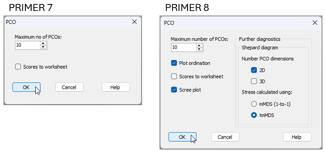
In the PCO routine (accessed from a resemblance matrix by clicking on **PERMANOVA+** > **PCO...**), PRIMER 8 now offers you new options to output these diagnostics tools:
- a Scree plot;
- Shepard diagrams in 2D and/or 3D; and
- Stress calculated using either metric MDS or threshold metric MDS
Fig. 15.8 compares the dialog window for the PCO routine in PRIMER 7 versus PRIMER 8.
[](https://learninghub.primer-e.com/uploads/images/gallery/2025-11/16-new-pco-dialog.png)
*Fig. 15.8 Comparison of the **PERMANOVA+** > **PCO...** dialog window in PRIMER 7 (at left) vs PRIMER 8 (at right).*
These same new diagnostic output options are also available for the PCA routine in PRIMER 8 (obtained from a data matrix by clicking on **Analyse** > **PCA...**).
It is important to recognise that these additional diagnostics do not in any way change anything about the fundamental PCA or PCO analysis itself that is being done. The calculation of principal axes for PCA or PCO ordination still remains exactly the same as ever, and may best be thought of as a *projection*. What is new and different here is simply the opportunity also to view the stress and the Shepard diagrams which attend the resulting PCA or PCO configuration. These diagnostics also help put these methods into perspective vis-à-vis any MDS ordination solutions one might obtain for a given dataset.
#### Example: Messolongi lagoon diatoms
Let's consider a study of diatom assemblages (densities of 193 species) at 17 sites in the lagoons of Messolongi, Aitoliko and Kleissova in Eastern Central Greece ({{@954#bkmrk-danielidis1991}}). Data from this study are contained in the file called 'Messolongi_diatom_density.pri', located in the 'Examples_P8' > 'Messolongi_diatoms' folder.
In what follows, we shall create an ordination of these data on the basis of a Bray-Curtis resemblance matrix calculated from square-root transformed densities, using each of the following methods:
- Non-metric MDS (nMDS)
- Threshold-metric MDS (tmMDS)
- Metric MDS (mMDS); and
- Principal co-ordinates analysis (PCO).
We will compare and contrast not only the ordination diagrams produced, but also the associated diagnostic Shepard diagrams and the values of stress. For PCO, we can produce Shepard diagrams and stress values in two different ways: (i) for comparison with tmMDS; or (ii) for comparison with mMDS.
1. Open up the data matrix (Messolongi_diatom_density.pri) in PRIMER 8.
[![17._Messolongi_data_only_[i].png](https://learninghub.primer-e.com/uploads/images/gallery/2025-12/scaled-1680-/17-messolongi-data-only-i.png)](https://learninghub.primer-e.com/uploads/images/gallery/2025-12/17-messolongi-data-only-i.png)
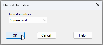
2. From the data matrix (Messolongi_diatom_density), click **Pre-treatment** > **Transform(overall)...** and choose Square-root.
[](https://learninghub.primer-e.com/uploads/images/gallery/2025-11/18-sqrt-transform.png)
3. The square-root transformed data are held in the sheet named 'Data1'. From this, click **Analyse** > **Resemblance...** and choose to calculate Bray-Curtis resemblances among samples, like so:
[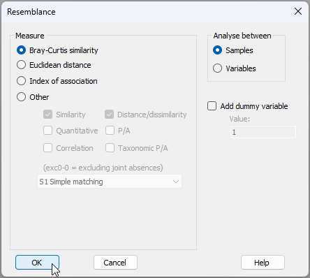](https://learninghub.primer-e.com/uploads/images/gallery/2025-11/19-bc-resem.png)
### Non-metric MDS (nMDS)
4. The Bray-Curtis similarities are held in the sheet called 'Resem1'. From this, click **Analyse** > **MDS** > **Non-metric MDS (nMDS)...**. Change the 'Max. Dimension' from 3 to 2 (for this exercise, we shall focus only on the 2-d solution), then click 'OK', as shown in the dialog below.
[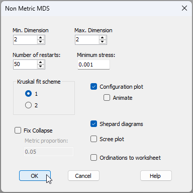](https://learninghub.primer-e.com/uploads/images/gallery/2025-11/20-nmds-dialog.png)
In the results ('MultiPlot1'), we can see the nMDS ordination ('Graph1'), the ***monotonic*** relationship shown in the Shepard diagram ('Graph2'), and that the value of stress is 0.092.
[![21._nMDS_results_[i].png](https://learninghub.primer-e.com/uploads/images/gallery/2025-12/scaled-1680-/21-nmds-results-i.png)](https://learninghub.primer-e.com/uploads/images/gallery/2025-12/21-nmds-results-i.png)
### Threshold metric MDS (tmMDS)
5. From 'Resem1', click **Analyse** > **MDS** > **Metric MDS (mMDS / tmMDS)...**, then choose 'Choice of intercept: $\bullet$Threshold metric MDS (non-zero intercept)', change the 'Max. Dimension' from 3 to 2, then click 'OK' (see below).
[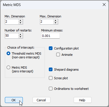](https://learninghub.primer-e.com/uploads/images/gallery/2025-11/22-tmmds-dialog.png)
In the results ('MultiPlot2'), we can see the tmMDS ordination ('Graph3'), the ***linear*** relationship shown in the Shepard diagram ('Graph4'), with a ***non-zero intercept*** of 60.54% similarity, and a stress value of 0.130. This is a bit larger than the stress obtained for the nMDS (0.092), but is still sufficiently low (< 0.20) to permit useful interpretations of the patterns of inter-point relationships seen in the diagram.
[![23._tmMDS_results_[i].png](https://learninghub.primer-e.com/uploads/images/gallery/2025-12/scaled-1680-/23-tmmds-results-i.png)](https://learninghub.primer-e.com/uploads/images/gallery/2025-12/23-tmmds-results-i.png)
Note that the threshold (intercept) value of 60.54% similarity indicates that two points that are 'on top of one another' in the tmMDS configuration are to be interpreted as being *ca*. 39.46% dissimilar, and not 0% dissimilar.
Also, unlike the nMDS plot (which has no labels on its axes and from which only rank-order relationships among the points can be interpreted), the ***axes are labeled*** on the tmMDS plot, with values given in the units of the original (Bray-Curtis) resemblance measure. Thus, two points that are (say) 20 units apart from one another on this plot can be interpreted as being approximately (20% + 39.46%) = 49.46% dissimilar. Thus, although the tmMDS comes at the price of higher stress compared to the nMDS, it also 'gives something back' in the form of added interpretability (i.e., with labels on the axes permitting the estimation of actual inter-point dissimilarities). So, clearly, tmMDS can be a good option, provided the stress still remains low enough to yield a plot that is adequate for interpretation.
### Metric MDS (mMDS)
6. From 'Resem1', click **Analyse** > **MDS** > **Metric MDS (mMDS / tmMDS)...**, then choose 'Choice of intercept: $\bullet$Metric MDS (zero intercept)', change the 'Max. Dimension' from 3 to 2, then click 'OK', viz:
[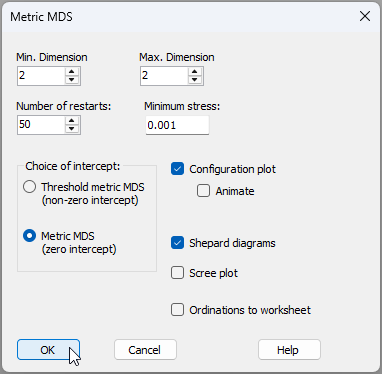](https://learninghub.primer-e.com/uploads/images/gallery/2025-11/24-mmds-dialog.png)
In the results ('MultiPlot3'), we can see the mMDS ordination ('Graph5'), the ***linear*** relationship with a ***zero intercept*** in the Shepard diagram ('Graph6'), and a stress value of 0.252. This is much larger than that of either the nMDS (0.092) or the tmMDS (0.130), and is so high (> 0.25) as to prevent meaningful interpretation of any patterns seen in the resulting diagram.
[![25._mMDS_results_[i].png](https://learninghub.primer-e.com/uploads/images/gallery/2025-12/scaled-1680-/25-mmds-results-i.png)](https://learninghub.primer-e.com/uploads/images/gallery/2025-12/25-mmds-results-i.png)
### Principal Co-ordinate Analysis (PCO)
7. First, we will run the PCO and get diagnostics for a Shepard diagram and associated stress calculation that uses a zero intercept (as in mMDS). From 'Resem1', click **PERMANOVA+** > **PCO**, then choose 'Shepard diagram > Stress calculated using: $\bullet$mMDS (1-to-1)', then click 'OK' (see the dialog below).
[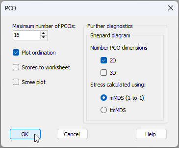](https://learninghub.primer-e.com/uploads/images/gallery/2025-11/26-pco-w-mmds-shepard-dialog.png)
The resulting PCO plot ('Graph7') and associated diagnostic Shepard diagram ('Graph8') are shown in 'MultiPlot4' in the Explorer tree.
[![27._PCO_w_mMDS_Shepard_results_[i].png](https://learninghub.primer-e.com/uploads/images/gallery/2025-12/scaled-1680-/27-pco-w-mmds-shepard-results-i.png)](https://learninghub.primer-e.com/uploads/images/gallery/2025-12/27-pco-w-mmds-shepard-results-i.png)
The first two principal axes explain 44.56% of the total variation (less than half, as seen in the output file called 'PCO1' in the Explorer tree). In addition, the stress is extremely high, at 0.30, indicating that many of the inter-point distances seen in the PCO plot do not reflect their true dissimilarity well at all. This is especially true for the small to middle-sized dissimilarities that range from about 40% to 70% (see the large scatter of points in 'Graph8' for values having ~ 60% to 30% similarity along the x-axis).
8. Next, we will run the PCO again, but this time choose 'Shepard diagram > Stress calculated using: $\bullet$tmMDS' (see the dialog below).
[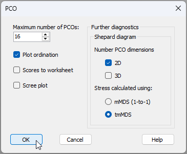](https://learninghub.primer-e.com/uploads/images/gallery/2025-11/28-pco-w-tmmds-shepard-dialog.png)
The results are given in 'MultiPlot5' in the Explorer tree.
[![29._PCO_w_tmMDS_Shepard_results_[i].png](https://learninghub.primer-e.com/uploads/images/gallery/2025-12/scaled-1680-/29-pco-w-tmmds-shepard-results-i.png)](https://learninghub.primer-e.com/uploads/images/gallery/2025-12/29-pco-w-tmmds-shepard-results-i.png)
It is clear that the PCO plot itself remains exactly the same (compare 'Graph9' with 'Graph7'). However, we are now using a different yardstick to measure the stress associated with this plot. Specifically, we are permitting the intercept to float away from the origin, and asserting (as we did with the tmMDS) that there is a ***threshold dissimilarity*** that a pair of samples must exceed before they will occupy two different positions on the configuration plot. Here, the intercept is a similarity of 63.24%, corresponding to a dissimilarity threshold of 36.76%. In other words, any two samples that appear on top of each other on the plot (at a distance of zero) can be estimated to be 63.24% similar, not 100% similar.
By adding this flexibility, we can see that the stress improves dramatically, dropping to 0.201, which borders on becoming acceptably interpretable, at least for the broader structures. Once again, it is the larger dissimilarities that are captured better by the PCO (see the tighter clustering of points around the line-of-best-fit in the upper right area of the Shepard diagram), compared to the smaller ones.
### Observations & recommendations
This example serves to demonstrate a more general point. Namely, for a given dataset, the ordering of methods with respect to the value of stress associated with the final configuration will almost always be: nMDS < tmMDS < mMDS < PCO. This is so because:
* all MDS solutions will, by their very design, achieve lower stress than a projection-type ordination, such as PCO, as they are explicitly geared to minimise stress; and
* within the MDS family of methods (nMDS, tmMDS and mMDS), nMDS has the fewest constraints, requiring only a monotonic relationship, while mMDS has the greatest constraints, requiring not just a linear relationship but also a zero-intercept in the Shepard diagram. This is more difficult to achieve, resulting in a higher stress.
Our general recommendations for ordination are:
* Use nMDS, as starting point, to achieve the lowest-stress solution.
* If the Shepard diagram for the nMDS shows that the relationship between configuration distances and original distances is approximately linear, then tmMDS can be used to achieve an ordination with the added benefit of having axes which (along with the added threshold dissimilarity) can be used to estimate actual inter-point dissimilarities directly from the plot. Only retain the tmMDS, however, if the stress is sufficiently low to permit interpretability ( < 0.20 as a rule-of-thumb).
* Only go one step further to consider using mMDS if the intercept is sufficiently close to zero to warrant this. (This will be evident in the Shepard diagram).
* PCO will typically ***not*** be the best tool to use, in general, to visualise inter-point relationships in an ordination, but ***will*** extract the axis (or axes) of greatest total variation through the data cloud as a whole. This means that large dissimilarities will typically be represented much better than small dissimilarities in a PCO plot.
### Utility of PCO
Although PCO may not be the tool of choice for ordination, it is important to recognise that it is still a very useful tool for other reasons. Specifically, a variety of PERMANOVA+ routines use PCO ('under the hood') in order to calculate correctly (using the ***full*** set of PCO axes, and carefully accounting for negative eigenvalues):
* [Distances among centroids](https://learninghub.primer-e.com/link/1046) (in the space of a chosen resemblance measure);
* [Distances from individual points to their own group centroid (in PERMDISP)](https://learninghub.primer-e.com/link/272); and
* [Monte Carlo p-values (in PERMANOVA)](https://learninghub.primer-e.com/link/242).
PCO axes are also used (obviously!) to perform [canonical analysis of principal co-ordinates (CAP)](https://learninghub.primer-e.com/books/permanova-for-primer-guide-to-software-and-statistical-methods/chapter/chapter-5-canonical-analysis-of-principal-coordinates-cap).
---
¶*It is sometimes stated that PCO and metric MDS are the same thing. This is simply incorrect and the example here clearly demonstrates this. PCO is a projection onto principal axes, whereas metric MDS is distance-preserving and minimises stress for a configuration drawn in a chosen number of dimensions. PCO may sometimes be referred to as 'classical scaling', but it should not be confused with multi-dimensional scaling (MDS), metric or otherwise.*