16. Means plots
- 16.1 A plot of means with error bars
- 16.2 Example: Fal biota (one-way case)
- 16.3 Example: Okura macrofauna (two-way nested case)
- 16.4 Example: Leschenault fish (two-way crossed case)
- 16.5 Example: New Zealand snapper (three-way case)
16.1 A plot of means with error bars
Overview
A plot of the means (or averages) for groups of samples, with error bars capturing some aspect of each group’s variability, is an important tool in univariate data analysis. For example, one may use PERMANOVA to do univariate analysis of variance on a single variable¶, where the null hypothesis is focused on the absence of effects defined by individual factors. This is equivalent to a statement that the population means are equivalent across the groups. The alternative hypothesis is that some (one or more) population means differ from some other (one or more) population means across the groups.
The natural visual accompaniment to such an analysis is a plot of the means for the groups of samples corresponding to levels of the factor. It is natural also to show some measure of the variation around those means; i.e., to achieve some way of assessing the expected variability in those mean values in order to assist in the comparison of their values. Error bars constructed around each of the means can accomplish this. Furthermore, if there is more than one factor in the study design, then a plot of the means (and associated error bars) for groups identified by the levels of one factor, calculated and displayed separately across levels of a second (and/or third) factor, yields a highly desirable visualisation of results.
The purpose of the new Plots > Means Plot... tool in PRIMER 8 with PERMANOVA+ is to make it extremely easy to produce desirable means plots for one or more univariate variables for one-factor or multi-factor study designs. Specifically, using the Means Plot dialog in PRIMER 8, you can display group means (as either coloured symbols or bars) for combinations of levels of factors, and you are given a suite of potential methods for drawing suitable error bars on those means. This is a major expansion and improvement over PRIMER 7, where the Means Plot... routine only allowed a single factor to be specified, only showed points for the means, and only displayed a $95$ % confidence interval based on the $t$-statistic. See Fig. 15.1 below for a comparison of the old vs the new dialog. (Click the image to expand the view).
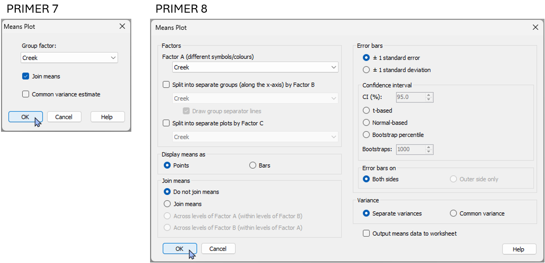
Fig. 15.1. Comparison of the 'Means plot...' dialog in PRIMER 7 compared to the much more extensive new dialog available in PRIMER 8.
Error bar options
In PRIMER 8, you can choose from the following options to draw error bars around each mean on the plot:
- ± 1 standard error (default);
- ± 1 standard deviation; or
- a confidence interval (choose the percentage) based on:
- the $t$-distribution (useful if the variance is unknown);
- the normal ($z$-)distribution (useful if the variance is known); or
- bootstrap percentiles (for a specified number of bootstrap re-samples), done separately within each group.
For all of the methods apart from the bootstrap percentile method, you can choose to estimate a separate variance for each group, or to estimate a common variance (pooled across the groups).
Confidence intervals
Consider a random variable $Y$ of unknown distribution (not necessarily normal) having a mean $\mu$ and variance $\sigma^2$. Let $\lbrace y_1, y_2, ..., y_n \rbrace$ be a random sample of $n$ values from this distribution. Let $\bar{y} = \sum_{i=1}^n y_i$ be the mean of the sample. The central limit theorem states that the distribution of means, $\bar{Y}$, obtained under repeated random sampling in this way, will be normal, with mean $\mu$ and variance $\sigma^2/n$. The standard error, $se$ = $\sqrt{s^2/n}$, where $s^2$ is the sample variance, is an unbiased estimator of the standard deviation of this distribution of means (i.e., $\sigma_{\bar{y}}$). Thus, a plot of $\bar{y} \pm 1 \times se$ is a perfectly natural way to show the variability in the mean calculated from the sample, regardless of that particular variable’s underlying distribution (whether it be normal or not).
If you choose to construct a confidence interval ($\text{CI}$) based on either the $t$-distribution or the normal ($z$)-distribution, then the error bars will be drawn to create a symmetric interval around the mean by multiplying the appropriate quantile from the distribution chosen (e.g., for a $95$ % $\text{CI}$ using the $t$-distribution, the quantile is $1.96$) multiplied by the estimated standard error ($se$) for that group.
Suppose you choose to construct a confidence interval of $\text{CI} = (1-\alpha)\times 100$ % for the mean of a population using the $t$-distribution (e.g., if $\alpha = 0.05$, then the $\text{CI}$ is $95$ %). The interpretation of the interval, under the central limit theorem, is this: under repeated sampling of the population, you would expect $(1-\alpha)\times 100$ % of the confidence intervals constructed in this way to contain the true mean of the population ($\mu$).
Bootstrap percentiles
The bootstrap percentile error bars are drawn for a given group as follows. Let $n_{b}$ be the requested number of bootstrap samples.
- Obtain a bootstrap sample by sampling the data values with replacement from the group.
- Calculate the mean of the bootstrap sample.
- Repeat steps 1 and 2 a total of $n_b$ times to generate an empirical distribution of bootstrap means.
- Obtain the following quantiles from the bootstrap distribution: $\alpha/2$ and $1-\alpha/2$, where $\alpha = (100 - \text{CI}) / 100$. Thus, for $\text{CI} = 95$ %, we would get the $0.025$ and $0.975$ quantiles from the bootstrap distribution of means to draw the error bars.
Note: If the total number of unique sets of values that can be obtained under bootstrap re-sampling is less than the requested number of bootstraps, then the calculation of the percentile values for the error bars will be done using that total number instead of the requested $n_b$. The formula for the total number of unique sets for a given group is $C(2n-1, n)$, where $C()$ is the binomial coefficient function, and $n$ is the number of samples in the group.
Error bars drawn using bootstrap percentiles have the advantage of being constructed empirically from the distribution of the sample values. They are therefore not necessarily going to be symmetric around the mean. Another thing to note is that although a bootstrap percentile interval constructed in this way does give an indication of the variability in the means under repeated sampling, it does not have the same interpretation as a classical confidence interval built on the basis of the central limit theorem. The bootstrap is known to have a negative bias in the estimation of the variance of a sample (see, for example, Anderson et al. (2017) ). Thus, the bootstrap percentile interval will under-estimate the true distance between the upper and lower percentiles in the underlying population distribution of means that would be obtained under reepeated sampling. No bias-correction has been implemented in the construction of the bootstrap percentile error bars in PRIMER 8 for means plots; however, if the sample size ($n$) is reasonably large, then the bias will be relatively small (of order $1/n$)†.
¶ This is achieved by basing the PERMANOVA analysis on a Euclidean distance matrix calculated from a single variable.
†In fact, in Appendix B of Anderson et al. (2017) , it is shown that the exact downward bias in the bootstrap estimate of the variance of the mean of a univariate random variable is $(1−1/n)$.
16.2 Example: Fal biota (one-way case)
Let's look at an example of a means plot for a one-way case using biotic data ($p$ = 131 taxa) from the Fal estuary. The data consist of counts of organisms living in benthic sediments obtained from $n$ = 5-7 sites in each of 5 creeks running into the Fal estuary, Cornwall, UK ( Somerfield et al. (1994a) , Somerfield et al. (1994b) ). These 5 creeks had differing levels of heavy metals in their sediments, due to historical tin and copper mining in their respective valleys. Interest lies in identifying whether the 5 creeks also differed in their diversity of benthic infauna. The full set of biotic data (macrofauna and also the meiofauna - comprised of nematodes and copepods) are contained in the file 'Fal_all_biotic_taxa.pri', found in the 'Fal_benthic_fauna' folder in 'Examples_P8'.
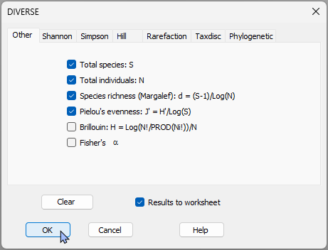
- Start by calculating some univariate diversity measures for each sample. Open the 'Fal_all_biotic_taxa.pri' file in PRIMER 8, then click Analyse > DIVERSE..., take all the defaults and click 'OK'.
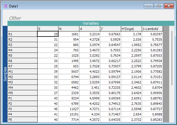
This will produce a sheet, called 'Data1' with values for various diversity indices for each of the sampling units.
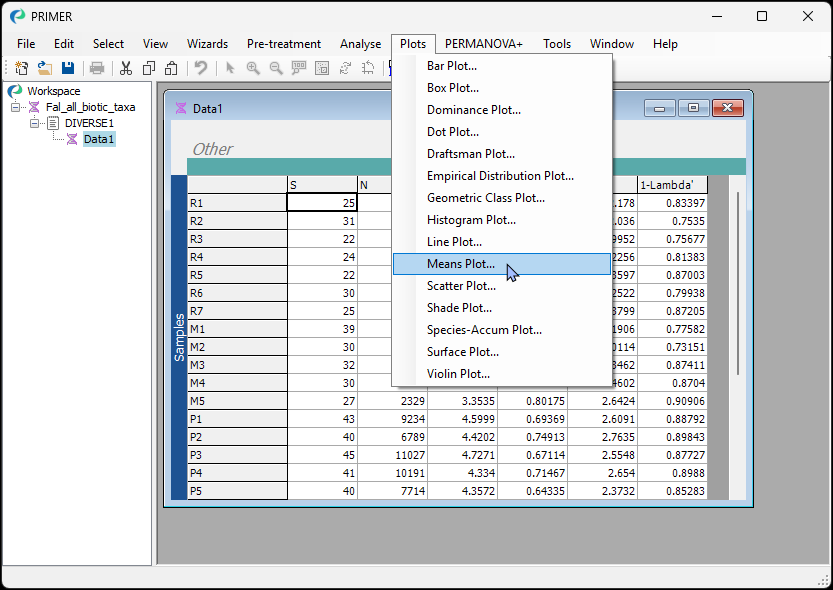
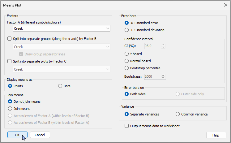
- Calculate a means plot that shows the means $\pm$ 1 standard error for the 5 creeks for each of these diversity measures. From the 'Data1' sheet, click Plots > Means Plot....
Leave all of the defaults and click 'OK'.
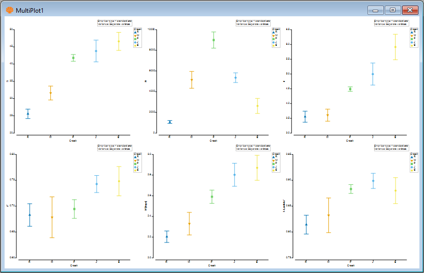
The result will be a 'Multi plot' item, that includes 6 individual plots - one for each of the 6 diversity measure variables in the original 'Data1' sheet.
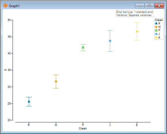
- View an individual plot by clicking on it. For example, you can click on the plot in the top left-hand corner of 'MultiPlot1' to see a means plot for the variable of species richness ('S', the number of different taxa). Alternatively, you can click on 'Graph1' in the Explorer tree.
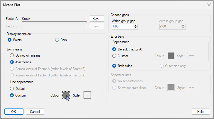
- To change the colours, symbols or line types, you can click Graph > Special..., which shows you a dialog with a plethora of options to modify all of these details of your means plot. For example, you can click the 'Key...' button next to the factor to change the colours/symbols, or choose to $\bullet$ Join means, including the option to choose a custom colour for the joining line, like this:
This will yield the following modified plot:
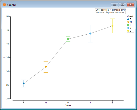
- You can also choose to show the means as bars instead. Click Graph > Special..., then (Display Means as > $\bullet$ Bars) and (Error bars > Appearance > $\bullet$ Custom).
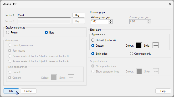
This yields the following plot:
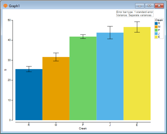
Next, we shall consider some multi-factor plots.
16.3 Example: Okura macrofauna (two-way nested case)
Let's look at a means plot where we have a two-way nested design. We will examine data consisting of counts of benthic macrofauna from intertidal sites in the Okura estuary, located north of Auckland, New Zealand ( Anderson et al. (2004) ). Hydrodynamic models were used to identify different areas within the estuary as having high (H), medium (M) or low (L) probabilities of sediment deposition. There were several areas of each type (H, M, or L) interspersed along the estuary from its mouth to its inner reaches. Interest lies in identifying potential differences in the abundances of infaunal species at sites having different probabilities of sediment deposition. Some organisms are expected to be more tolerant of sediment inputs, while others (particularly filter feeders) may be more vulnerable to fine sediment inputs.
Six (6) sediment cores (13 cm in diameter × 15 cm deep) were obtained from random positions within each of 15 sites along the estuary, with 5 sites from each of the high, medium and low depositional types of environments. Sampling was repeated 6 times (twice in each of three seasons in 2001-2002), yielding a total of 36 cores sampled per site.
These data are contained in the file 'Okura_macrofauna.pri', found in the 'Okura_macrofauna' folder in 'Examples_P8'. We shall ignore, for now, the temporal factors in the study and focus only on the spatial factors in a two-way nested design:
- Deposition (fixed with $a$ = 3 levels: H, M or L); and
- Site (random and nested, $b$ = 5 sites within each Deposition, thus 15 sites in total)
We will create a means plot that shows the mean ± 1 standard error for each site for a single univariate variable: the abundance of cockles, Austrovenus stutchburyi.
- Open the 'Okura_macrofauna.pri' file in PRIMER 8, look for the variable (column) named 'Austrovenus stutchburyi', highlight this species by clicking on its name, then click Select > Highlighted.
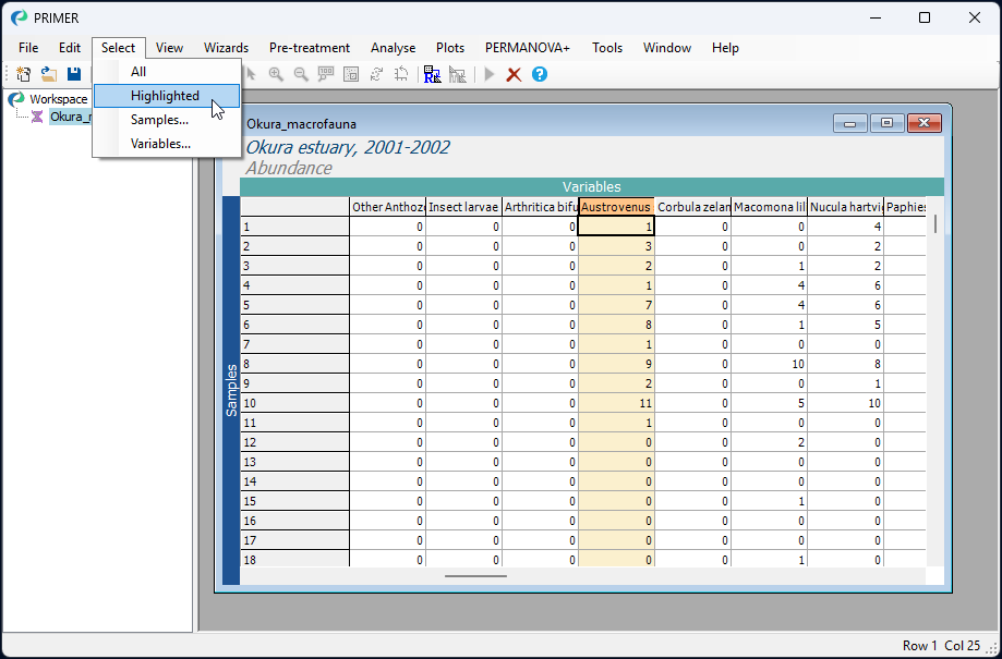
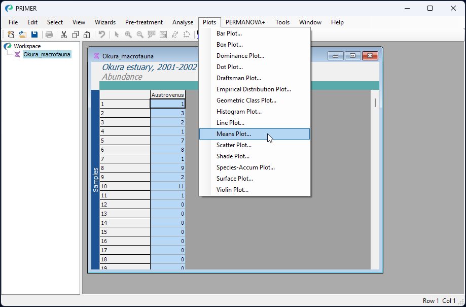
- You will see the selected species as a single column with a blue background. With this single species selected, click Plots > Means Plot..., like so:
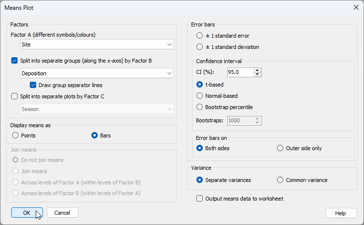
- Given that the design is nested, we would like to calculate a separate mean (and standard error) for each site, and we would like bars corresponding to different sites to be arranged along the x-axis separately within each of the deposition groups (H, M and L). We therefore need to choose the following in the 'Means Plot' dialog:
- Factor A (different symbols/colours) > Site
- $\checkmark$ Split into separate groups (along the x-axis) by Factor B > Deposition
- Display means as > $\bullet$ Bars
as shown below:
Click 'OK'.
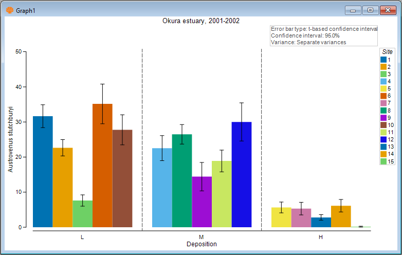
The resulting plot (given in the output file called 'Graph1' initially will simply show a different coloured bar for each of the sites, like this:
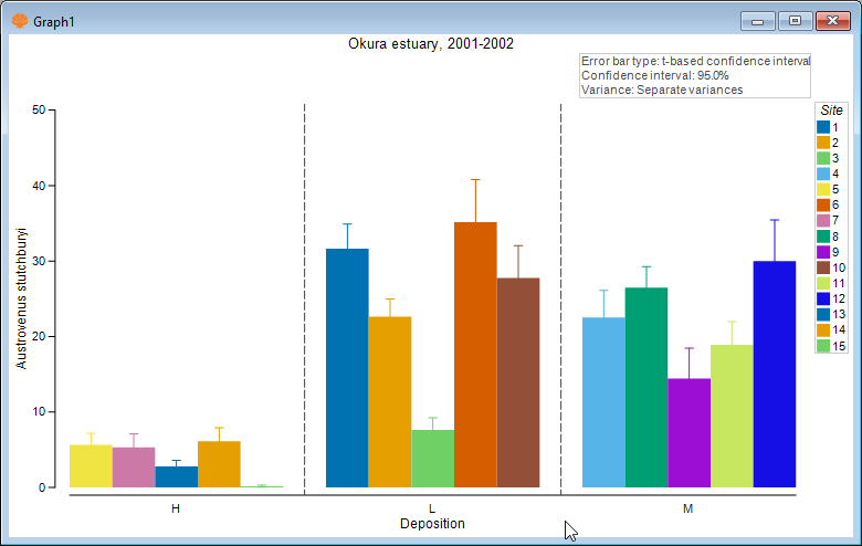
Although this is not too bad, the plot could be improved in a number of ways. First, notice that the 3 levels of 'Deposition' are ordered alphabetically, but we might prefer them to have a more logical order, e.g. L < M < H. Second, we might like to make the error bars black, rather than being the same colour as the bars themselves, so that we can more easily see their extent above and below the mean value. Third, it might be nice if the colours of the bars corresponded to the three different levels of 'Deposition', rather than being a different colour for every site. After all, 'Site' is a random factor.
Special graphical properties of Means Plots
Means plots in PRIMER have a number of special graphical properties that can be altered by you even after the plot has been made. Click Graph > Special... to see them. Specifically, you can choose:
- to change the order of factor levels or the colours/symbols/lines associated with particular factors (via the 'Key' menu)
- to display means as points or bars
- whether and how the means may be joined, and the associated line types for joining
- the sizes of gaps within or between groups of means
- whether to show separator lines between groups and what line colour/type to use for this
- the colour and style of error bar lines, and whether to show both sides or just one side (the outer side).
- To change the colour of the error bars in the plot of Austrovenus ('Graph1'), click Graph > Special... and under 'Error bars', choose 'Appearance > $\bullet$ Custom', and choose a colour of your choice (the default of black will do fine here). Next, to change the order of the deposition groups on the X axis, click the 'Key' button next to 'Factor B: Deposition'.
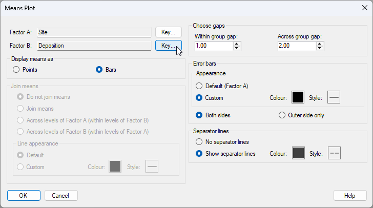
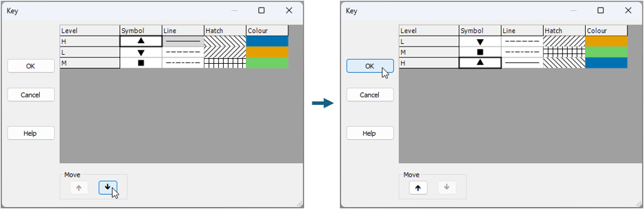
Inside the 'Key' menu, click on the level labeled 'H', and move it progressively to the bottom using the 'Move' arrow button  , so that the order of the Deposition levels (from top to bottom) is changed to 'L', followed by 'M', followed by 'H', respectively, then click 'OK', as shown below:
This yields a plot that is better, viz:
 .
.
- We have improved the colour of the error bars and the ordering of the factor levels along the x axis. Now let's change the colours of the bars to match the factor of Deposition. Click Graph > Sample Labels & Symbols... and choose the
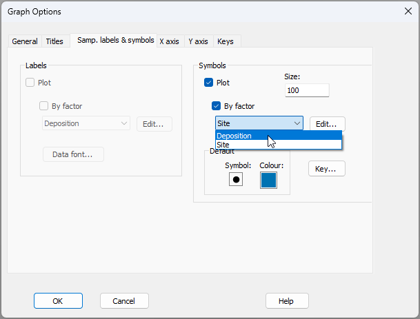
The final plot looks like this:
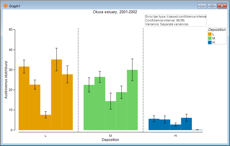
Here, we can clearly see both the substantial variability among sites in the mean abundance of cockles. We can also see that, on average, the mean abundance of cockles is greater at sites having either a low or medium probability of sediment deposition (amber or green bars), compared to sites having a high probability of sediment deposition (blue bars).
16.4 Example: Leschenault fish (two-way crossed case)
An example of a two-way crossed design is provided by a study of trawl samples for fish communities (using a 21.5m seine net) from 4 regions - basal (B), lower (L), upper (U), and apex (A) - occurring between the mouth and upper reaches of the Leschenault estuary, Western Australia ( Veale et al. (2014) ). Samples were taken from each region over 4 seasons - spring (Sp), summer (S), autumn (A), and winter (W), with 6-8 replicate samples from each of these 16 combinations (taken over the years 2008-2010). Data are located in the file 'Leschenault_fish_counts.pri', found in the 'Leschenault_fish' folder in 'Examples_P8'. This is a simplified version of the data described by Veale et al. (2014) . The following two factors are crossed with one another, as all regions were sampled in every season:
- Region, fixed with 4 levels: basal (B), lower (L), upper (U), and apex (A)
- Season, fixed wtih 4 levels: spring (Sp), summer (S), autumn (A), and winter (W)
Compare seasonal means for different regions
We shall focus our attention here on just a few species that have high frequencies of occurrence across the dataset as a whole. We wish to construct means plots to examine and compare potential changes in the average abundance of a given fish species across the seasons (considered separately for each region) and across the regions (considered separately for each season).
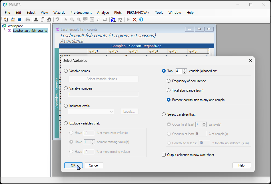
- Begin by selecting the top 4 species, based on their percentage contribution to any one sample. Open the file 'Leschenault_fish_counts.pri', found in the 'Leschenault_fish' folder in 'Examples_P8' in PRIMER. Click Select > Variables... and choose:
$\bullet$ Top 4 variable(s) based on: > $\bullet$ Percent contribution to any one sample, as shown below.
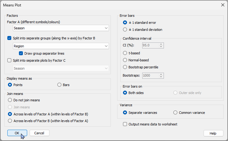
- First we'll make plots that permit easy comparison of the seasonal means, separately within each region. Click Plots > Means Plot..., then choose the following:
- Factor A (different symbols/colours): Season
- $\checkmark$Split into separate groups (along the x-axis) by Factor B > Region > $\checkmark$Draw group separator lines
- Display means as > $\bullet$ Points
- Join means > $\bullet$ Across levels of Factor A (within levels of Factor B)
Leave the rest as defaults and click 'OK'.
This will produce 4 graphics - one for each species - presented in the multiplot object 'MultiPlot1':
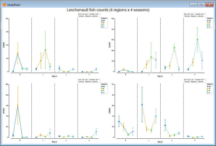
- Let's take a closer look at the fish species '246010' (actual species names were not provided with this particular dataset). Click on 'Graph2' in the Explorer tree (or click on the upper right-hand plot in the multiplot graphic).
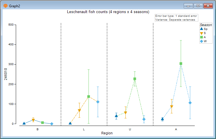
This species generally had greater average abundance in autumn (green symbols), particularly in the upper (U) and apex (A) regions of the estuary.
Compare regional means for different seasons
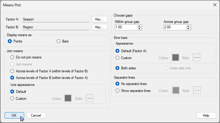
- We can change the colour or line-type of the joining lines. Note that the default colours and line-types for these are based on the colour key for Factor B, which is 'Region' here. We can also change the joining lines so that they occur across the regions, rather than across the seasons. A further option is to change the colour or style (or even remove entirely) the dotted lines separating the different regions along the x-axis. Let's check out the visual effect of these changes on our graphic. Click Graph > Special.... Then, in the 'Means Plot' special dialog, choose the following:
- Join means > $\bullet$ Across levels of Factor B (within levels of Factor A)
- Separator lines > $\bullet$ No separate lines then click 'OK'.
The resulting plot will look like this:
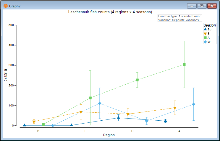
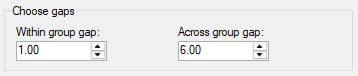
- Another tweak we might like to consider here is to change the relative gap width among the categories (bars or points) that are being plotted within vs between the groups along the x-axis. For example, we could make the seasonal means within a group closer together, with a bigger gap between the different regions. Click Graph > Special.... Then, in the 'Means Plot' special dialog, in the section entitled 'Choose gaps', make the 'Across group gap' six times (say) the 'Within group gap', e.g.:
The resulting gap-adjusted plot is quite a bit clearer, viz.:
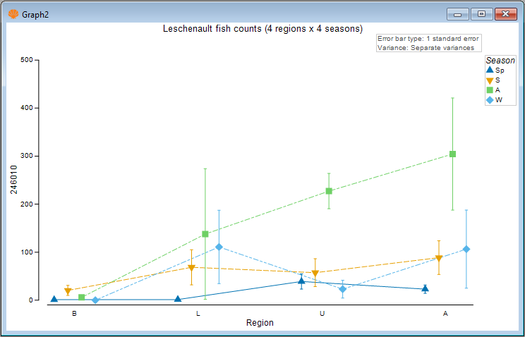
In this graphic, we can now more clearly see there is a gradual increase in the mean abundance of this fish species as you go up the estuary (from the basal to the lower to the upper and finally to the apex region), but this trend is only really apparent in the autumn season (green symbols), and not so apparent in the other seasons.
- Another possibility would be to swap the roles of the factors in this crossed design for the plot itself to begin with. We can examine the regional means separately within each season. To do this, go back to the original data sheet (called 'Leschenault_fish_counts' in the Explorer tree) and click Plots > Means Plot..., then choose 'Region' as Factor A and 'Season' as Factor B, leaving all the rest as before.
A Multiplot will be produced (4 graphics for the 4 species), with the top-right plot ('Graph6') corresponding once again to fish species 246010, like so:
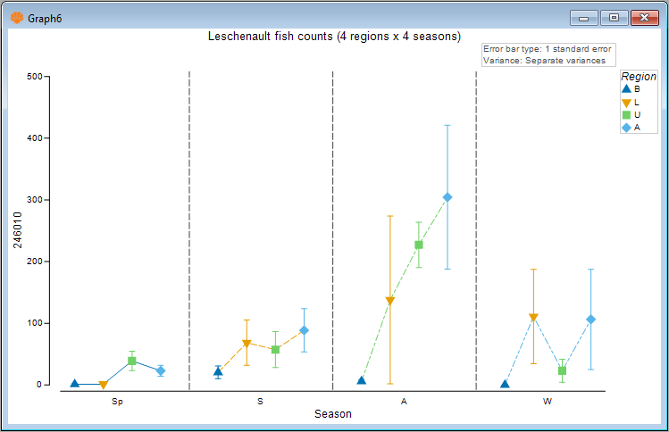
The general trend of increasing mean abundance as you go from the basal to the apex region of the estuary (as previously described) is even more plainly seen here, and is very marked in autumn.
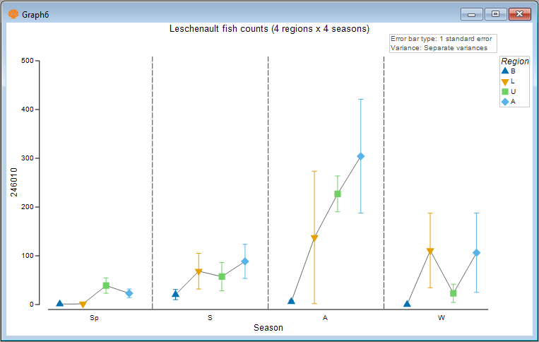
Note also that the joining lines here correspond to the underlying colours/line-types of the regions. If we wish, we can make these joining lines a solid colour of our choice. For example, we shall make them a solid charcoal colour. Click Graph > Special..., then under 'Line appearance' in the dialog, choose '$\bullet$ Custom' and click on the solid box next to the word 'Colour:' and you can choose your colour explicitly, like so:
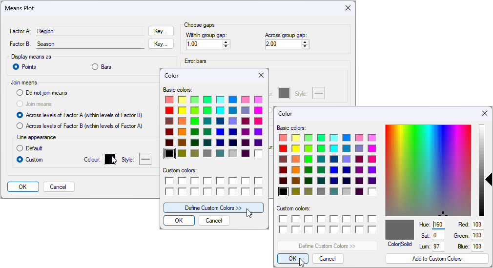
The resulting plot that uses a solid charcoal colour for the joining lines looks like this:
Bars instead of points
- Of course, we can also look at this plot using bars instead of points. Simply click Graph > Special..., then choose:
- Display means as > $\bullet$ Bars
- Error bars > Appearance > $\bullet$ Custom
to get the following plot:
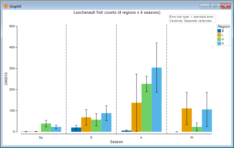
It is clear there are many ways to customise and refine these means plots. For example, the colours associated with the individual factor levels can be changed using the 'Key' button(s) in the Graph > Special... menu dialog. In addition, a great host of other aspects of the plot can also obviously be customised using the Graph > General... menu dialog, including the text and fonts for titles, the legend ('Keys'), the 'History' text pane, the X or Y axes, and so on.
16.5 Example: New Zealand snapper (three-way case)
The Means Plot procedure in PRIMER 8 will operate just as other univariate plots do (such as histograms and dotplots) in that multiple plots will be produced - one for each variable - if there are multiple variables in the original spreadsheet. However, means plots also provide the end-user with the ability to create a multi-plot object by reference to an additional factor. This can be a second or a third factor, depending on the situation. Here, we will show a couple of examples that use this approach advantageously to show patterns across all combinations of three factors in a single multi-plot graphic.
The example dataset here are counts of snapper (Chrysophrys auratus) taken from baited remote underwater video (BRUV) apparatuses deployed at each of three locations: Leigh, Tawharanui and Hahei, in each of two seasons over several years (1997-2007), from sites that were located either inside or outside of a marine reserve (the factor here is 'Status', with levels 'NR' = non-reserve and 'R' = reserve). See Smith et al. (2014) for details.
Status by Year by Location
First, we will visualise patterns in mean relative abundances (total count per BRUV unit) of snapper inside vs outside reserves across the years at the different locations. The data are located in the file named 'NZ_Snapper_counts.pri', located in the folder 'Examples_P8' > NZ_Snapper_counts'.
- Open the file 'NZ_Snapper_counts.pri' in PRIMER and click on the column (variable) name 'tot.snapper' in the sheet to highlight it, then click Select > Highlighted. The selected variable will be highlighted in blue, thusly:
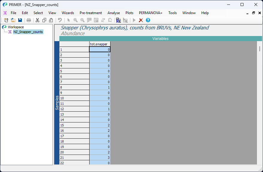
Next, we shall plot the mean count of total snapper observed (per BRUV) with along with the 2.5% and 97.5% percentiles of the distribution of bootstrap means from 1000 bootstrap re-samples.
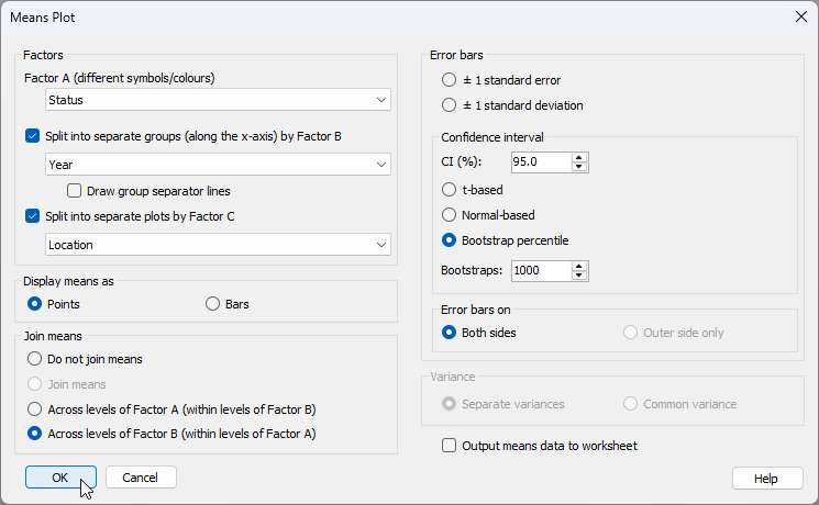
- Click Plots > Means Plot... and choose the following options in the 'Means plot' dialog:
- Factor A (different symbols/colours) > Status
- $\checkmark$Split into separate groups (along the x-axis) by Factor B > Year, and 'untick' the box '$\Box$ Draw group separator lines'
- $\checkmark$Split into separate plots by Factor C > Location
- Display means as > $\bullet$ Points
- Join means > $\bullet$ Across levels of Factor B (within levels of Factor A)
- Error bars > $\bullet$ Bootstrap percentile
as shown below:
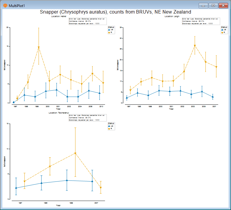
The resulting multi-plot shows the means (and bootstrap percentiles) for snapper counts from reserve and non-reserve sites separately in each year, with different locations being shown as different graphics within the multi-plot object, viz:
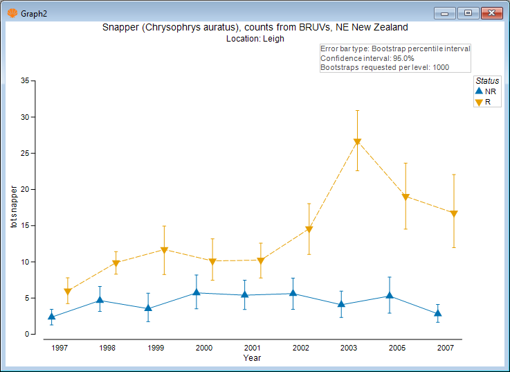
Examining the plot for Leigh only (click on the upper right-hand plot, or click 'Graph2' in the Explorer tree), we see, for example:
You can change or arrange the graphics in a multi-plot (i.e., by specifying the number of columns and rows of graphics that you want, and also their ordering) etc. by first clicking on the multiplot item itself in the Explorer tree (e.g., 'MultiPlot1'), then click Graph > Special....
Season by Status by Location
We might also like to look at differences in the mean relative abundances of snapper inside vs outside these reserves, also split by location. We will do this just for Leigh and Hahei, where we have more years of information.
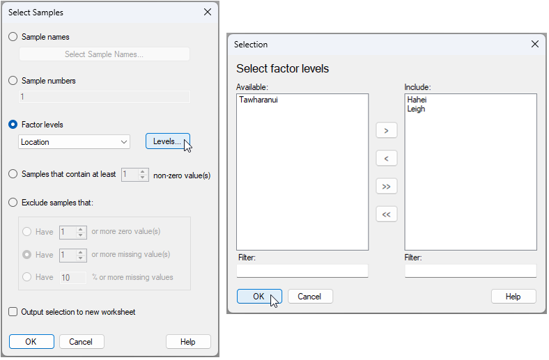
- From the 'NZ_Snapper_counts' data sheet, click Select > Samples..., then choose $\bullet$ Factor levels > Location and click the 'Levels...' button
 . Move the words 'Hahei' and 'Leigh' from the 'Available' box on the left to the 'Include' box on the right (by clicking on them each and then clicking on the right-arrow button
  ), then click 'OK'.


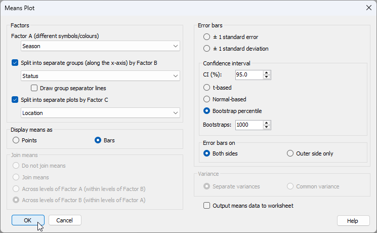
- Click Plots > Means Plot... and choose the following options in the 'Means plot' dialog:
- Factor A (different symbols/colours) > Season
- $\checkmark$Split into separate groups (along the x-axis) by Factor B > Status, and $\checkmark$ Draw group separator lines
- $\checkmark$Split into separate plots by Factor C > Location
- Display means as > $\bullet$ Bars
- Join means > $\bullet$ Across levels of Factor B (within levels of Factor A)
- Error bars > $\bullet$ Bootstrap percentile
as shown below:
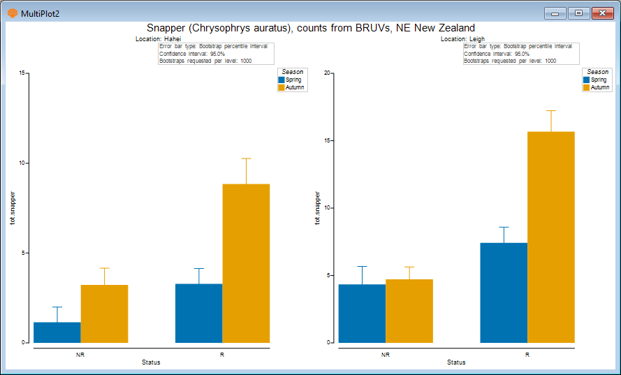
The resulting graphic, by default, looks like this:
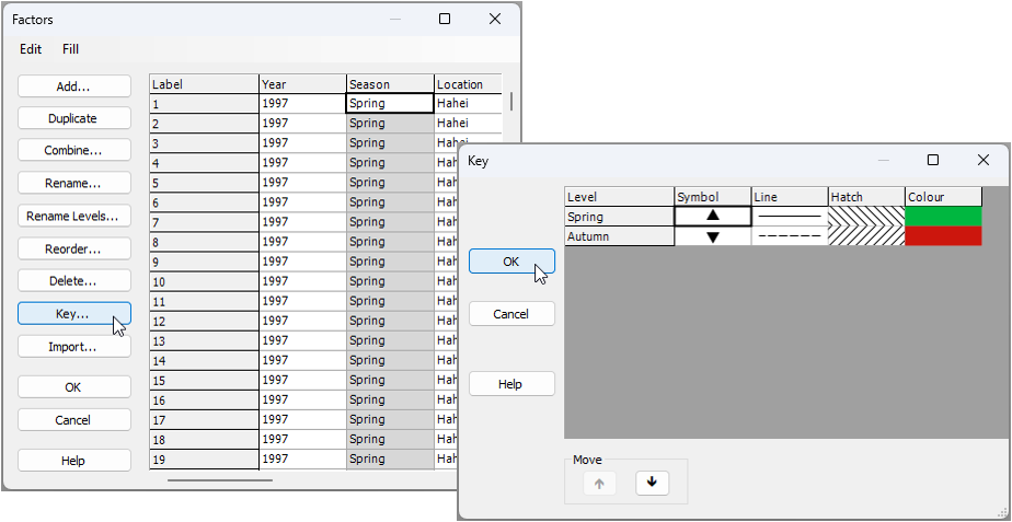
- We might like to change the colours of these bars to something a bit more reflective of spring and autumn. Go back to the original data sheetcalled 'NZ_Snapper_counts' and click Edit > Factors..., then click on the column called 'Season', and click the 'Key' button
 . In the 'Key' dialog, click on the colour box for 'Spring' and choose (say) a green colour, then click on the colour box for 'Autumn' and choose (say) an autumnal colour of brown or orange/red, then click 'OK'.

Re-running the same dialog for the means plot now as we ran before (see step 5 above), we obtain the following ('MultiPlot3'):
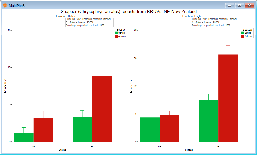
- We might also like to change the error bar colours so that they are black, making it easier to see the lower and upper bootstrap percentile values. For each of 'Graph6' and 'Graph7', in turn (both of these graphics are in 'MultiPlot3'), click Graph > Special..., then choose
Error bars > Appearance > $\bullet$ Custom (and leave the default colour of black here).
The resulting plot looks like this:
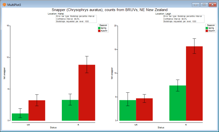
The above plot shows that the mean relative abundance of snapper (sampled using BRUVs) is typically greater in the autumn than in the spring, on average. Also, the largest seasonal difference in mean was observed inside the reserve at Leigh.
Means plots to accompany PERMANOVA formal analysis
Typcially, we would perform a more complete univariate statistical analysis of these data using (say) PERMANOVA in accordance with the full multi-factor sampling design. This could be done easily in PRIMER with PERMANOVA+ by calculating Euclidean distances among the samples based on the single variable of 'tot.snapper' and creating an appropriate Design file corresponding to the full multi-factor experimental design (including the nested factor of 'Areas' as well). Pair-wise comparisons could then be run to follow up any significant interactions that might be discovered among the main factors of interest.
It is useful to show relevant multi-factor means plots to accompany PERMANOVA tests and pair-wise comparisons. For example, a statistically significant threee-way interaction of Season$\times$Status$\times$Location might well be accompanied by not only the relevant pair-wise comparisons, but also the above means plots that permit one to compare the means (and their variability) visually in a useful way.
Output means data to worksheet
There are many ways to customise means plots within PRIMER. It is also possible (in the 'Means Plot' dialog) to tick the box to '$\checkmark$Output means data to worksheet'. This will output the means and standard errors (or the means and the upper and lower bounds of error bars of your choice) which are calculated to produce the plot. If there are customisations that you want to create in a different graphics package, or if you would rather get the values for the means (and their measures of variation) in a tabled format (e.g., for publication in supplementary material, etc.), then this extra tool is very handy, and may well be more efficient than using Tools > Summary Stats..., even though the latter has been expanded considerably from what was available in version 7.