2. Empirical distributions
2.1 What is an empirical distribution?
Overview
What is an empirical distribution? The empirical distribution of a variable is able to be characterised by considering each unique numerical value observed for that variable in a given sample of size $n$. If certain values are repeated, then we simply tally the number of each unique value obtained. These tallies are essentially raw frequencies of the values. We can order the values obtained for the variable from smallest to largest and then look at these frequencies cumulatively, as a percentage of the entire sample. A plot of these cumulative percentages as a function of the ordered values in the sample is known as the empirical cumulative distribution function.
Description
More formally, suppose we have $n$ independent and identically distributed random variables, $Y_1, Y_2, \ldots, Y_n$, with a common (but unknown) probability density function (pdf) of $f(y)$ and cumulative distribution function (cdf) of $F(y) = \text{Pr} \lbrace Y \leq y \rbrace $.
For the discrete case, we have $F(y) = \sum_{t \leq y} f(t)$.
For the continuous case, we have $F(y) = \int_{-\infty}^y f(t) \cdot dt$.
We obtain corresponding observed values $y_1, y_2, \ldots, y_n$ in a sample of size $n$. Now, let $I(y_i \leq t)$ be an indicator that takes the value of $1$ if $y_i \leq t$ is true, and zero otherwise. The empirical cumulative distribution function $\hat{F}_ n(t)$ is defined as the proportion of data points in the sample that are less than or equal to $t$, i.e.,
$$ \hat{F}_ n(t) = \frac{1}{n} \cdot \sum_{i=1}^n I(y_i \leq t) $$
This is therefore a step function, continuous from the right, that jumps up by a quantity of $1/n$ at each of the $n$ data points. Its shape gives us a basic visual understanding of the distributional shape of the data values.
A small example
Suppose we had the following data with a sample size of $n = 10$ for a variable, $Y$:
| Sample | y |
|---|---|
| 1 | 2 |
| 2 | 7 |
| 3 | 10 |
| 4 | 12 |
| 5 | 2 |
| 6 | 5 |
| 7 | 5 |
| 8 | 8 |
| 9 | 10 |
| 10 | 3 |
The raw frequencies are as follows:
| Value of y | Frequency |
|---|---|
| 2 | 2 |
| 3 | 1 |
| 5 | 2 |
| 7 | 1 |
| 8 | 1 |
| 10 | 2 |
| 12 | 1 |
Looking at these values cumulatively, we have:
| Value of y | Cumulative frequency |
|---|---|
| 2 | 2 |
| 3 | 3 |
| 5 | 5 |
| 7 | 6 |
| 8 | 7 |
| 10 | 9 |
| 12 | 10 |
Expressing these frequencies as cumulative proportions of the total sample, we have:
| Value of y | Cumulative proportion |
|---|---|
| 2 | 0.2 |
| 3 | 0.3 |
| 5 | 0.5 |
| 7 | 0.6 |
| 8 | 0.7 |
| 10 | 0.9 |
| 12 | 1.0 |
These cumulative proportions comprise the empirical cdf. A plot of this empirical distribution (a step function) is shown below, with open circles being used to show the discontinuities (i.e., at the point of each step).
![01.A_small_example[i].png](https://learninghub.primer-e.com/uploads/images/gallery/2025-12/01-a-small-example-i.png)
The above plot was obtained by running Plots > Empirical Distribution Plot... in PRIMER 8, and ticking the option to: '$\checkmark$Express as proportions: [0, 1]'. Note that you can alternatively look at an empirical cdf with the values expressed as percentages instead of proportions (i.e., a plot of $100 \times \hat{F}_ n(t)$ versus $t$), which is the default.
As an aside, a related graphical tool for examining distributional shapes of variables is a histogram. A histogram is a plot of the raw frequencies (as bars on the y-axis) vs the empirical values (on the x-axis). For a histogram, we would typically pool together (sum) the raw frequencies into larger 'bin' sizes (instead of having one bin for every unique value in the dataset), which can be very useful if $n$ is large. That's what the Plots > Histogram Plot... function in PRIMER 8 does. Once you get a histogram, you can also change the bin size by clicking Graph > Special.
2.2 Example: Empirical distributions of oyster sizes
To demonstrate the empirical distribution tool in PRIMER, we shall examine a dataset consisting of length measurements (in mm) of the Sydney rock oyster (Saccostrea commercialis) settling on various surfaces in Quibray Bay, New South Wales, Australia ( Anderson (1992) , Anderson & Underwood (1994) ). Settlement panels (measuring 10 cm x 10 cm) of four different substrata commonly introduced by humans into marine environments (concrete, marine plywood, fibreglass and aluminium) were placed in intertidal estuarine habitats (an oyster farm) in the bay. The greatest length (the longest distance from the umbo to the tip of the furthest growing edge) of all oysters settling on these four different types of surfaces were recorded after a period of 4 months (January - May, 1992).
A subset of the data (i.e., from just one of the sticks deployed in field, see Anderson & Underwood (1994) for logistic details of the experiment) are contained in a file called 'Quibray_oyster_sizes_subset.pri' (found in the 'Quibray_oysters' folder in 'Examples_P8'). In this file, the lengths of oysters from the four different substrata are provided as 4 different levels of a factor called 'Substratum'. Note that there were different numbers of oysters on each of these different types of surfaces (hence, different sample sizes for different levels of the factor), but this is not of any concern here. We are comparing only the shape of the distribution of sizes of oysters that have settled among these four different types of surfaces; we are not comparing the total number of individuals that have settled on them.
- Start running PRIMER 8, then click File > Open... and open the data file named 'Quibray_oyster_sizes_subset.pri' (in 'Examples_P8 > Quibray_oysters').
![02.Oyster_data_subset_for_cdf[i].png](https://learninghub.primer-e.com/uploads/images/gallery/2025-12/02-oyster-data-subset-for-cdf-i.png)
- It would be useful to see the empirical distributions for the four different surfaces side by side on a single plot. From the data sheet, click Edit > Factors.. and you can see the factor of 'Substratum' that shows the type of surface on which each individual measured oyster had settled.
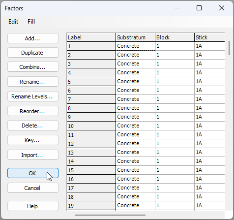
- Now we are ready to create the plot. From the data sheet, click Plots > Empirical Distribution Plot....
![04a.Empirical_distribution_menu_item[i].png](https://learninghub.primer-e.com/uploads/images/gallery/2025-12/04a-empirical-distribution-menu-item-i.png)
In the resulting dialog box, choose to draw the lines for '$\bullet$ Variables' (there is only one variable here, so just one plot will be given in the output) and choose to 'Split into multiple distributions (lines) > $\checkmark$Factor > Substratum. Also, tick the box that says '$\checkmark$Express as proportions: [0, 1]'. The resulting dialog will look like this:
![04.Empirical_distribution_plot_dialog[i].png](https://learninghub.primer-e.com/uploads/images/gallery/2025-12/04-empirical-distribution-plot-dialog-i.png)
The resulting graphic (called 'Graph1' in the Explorer tree) will look like this:
![04.Sizes of Saccostrea commercialis_graphic[i].png](https://learninghub.primer-e.com/uploads/images/gallery/2025-12/04-sizes-of-saccostrea-commercialis-graphic-i.png)
From this graphic, we can see that there were, proportionately, quite a lot more large oysters measured on concrete surfaces (dark blue line) compared to the other substrata. In addition, fibreglass surfaces (green line) had proportionately fewer smaller-sized oysters than the other substrata. We can also consider looking at these distributions using dot plots, violin plots, or histograms. It is also possible to formally test the null hypothesis of 'no difference' in the underlying distributions for any pair of these groups, using the Kolmogorov-Smirnov test.