# 3. Dot plots and Violin plots
# 3.1 Plots of empirical densities
Suppose we have measured a given variable in each of several groups. To visualise the distributional shape of each collective set of sample values, we might consider creating several ***[histograms](https://learninghub.primer-e.com/link/644)*** - one for each group - but it then might be difficult to compare them with one another. We might alternatively consider using a ***[box plot](https://learninghub.primer-e.com/link/919)***. Although a box plot may do a good job of summarising certain features (the median, inter-quartile range and overall range) of the data in each group, it may not necessarily provide insights about the *shape* of the collective set of values obtained within each group. What if, for example, certain groups actually show a pattern of having more than one mode?
There are many ways that one might consider visualising or approximating the underlying ***probability density function*** (pdf)¶ of a random variable, either on its own or separately within groups. PRIMER 8 now offers two empirical non-parametric tools that can help to visualise the density (shape) of points along the number line, also permitting comparisons of those shapes across several groups. If we have a discrete random variable, a simple ***dot plot*** is an appealing approach, while for a continuous random variable, using kernel density estimation to produce a smooth ***violin plot*** might be desirable, although either of these tools can, in practice, be used for either type of variable.
- **Dot plots** - Dot plots are a very simple way to represent data. We place a dot for every data point at its appropriate location on the number line (y axis). Observations that have the same value are simply 'stacked' alongside one another (along the x axis) at that same (y) position. Thus, visually, an empirical distribution of the collective set of points effectively 'builds itself', point by point, along the number line. Dot plots in PRIMER also include a horizontal line to show the median value for each group of observations.
- **Violin plots** - Violin plots show the median and inter-quartile range (like a box plot), but they also provide a smooth empirical non-parametric ***kernel density estimate*** (kde) of the probability density function, which is mirrored horizontally.
#### Kernel density estimation
Violin plots require kernel density estimation of the pdf, so we shall describe kde briefly here as implemented in PRIMER. Core references for this technique are {{@954#bkmrk-rosenblatt1956}} and {{@954#bkmrk-parzen1962}}; see also {{@954#bkmrk-silverman1986}}. Suppose we have $n$ independent and identically distributed random variables, $Y_1, Y_2, \ldots, Y_n$, with a common (but unknown) probability density function (pdf) of $f(y)$, and in our sample we have a set of corresponding observed values $y_1, y_2, \ldots, y_n$. We can estimate the shape of the pdf by the following ***kernel density estimator***:
$$
\hat{f}_ h(y) = \frac{1}{nh} \sum_{j=1}^n K \left\(\frac{y - y_j}{h} \right\)
$$
where $K$ is the kernel (a non-negative function) and $h>0$ is a smoothing parameter called a ***bandwidth***.
There are a range of kernel functions commonly used. PRIMER 8 uses the standard normal kernel, so $K(y) = \phi(y)$, and $\phi$ is the standard normal density function, hence:
$$
\hat{f}_ h(y) = \frac{1}{nh}\cdot\frac{1}{\sqrt{2\pi}} \sum_{j=1}^n \text{exp}
\left\(\frac{ -(y - y_j)^2 }{ 2h^2 } \right\)
$$
#### Choice of bandwidth
The bandwidth controls the degree of smoothing. The greater the bandwidth, the greater the degree of smoothing and, hence, the less important any individual data point will appear to be in producing the resulting kde function (a smooth line on the plot). A simple and widely used choice of bandwidth is obtained using Silverman's rule-of-thumb ({{@954#bkmrk-silverman1986}}). In PRIMER, the default is to apply Silverman's rule to calculate a suitable bandwidth separately for each group.
Suppose we have $i = 1, \ldots, g$ separate groups of observations, and the $i$th group has a sample size of $n_i$ and a within-group sample standard deviation of $s_i$. Silverman's rule to calculate a bandwidth $h_i$ for group $i$ (i.e., for each 'violin' being shown in the plot), is:
$$
h_i = 0.9 \cdot \text{min} \left( s_ i, \frac{\text{IQR}_ i}{1.34} \right) \cdot n_i^{-1/5}
$$
where $\text{IQR}_ i$ is the inter-quartile range of group $i$.
Alternatively, one also has the option in PRIMER to type in manually a custom bandwidth for each group. This manual tool is also handy to use if you want all groups to have the same bandwidth. Note that, if $n_i$ < 2 for any group, then an exception is thrown and a warning is issued stating that there are too few points to calculate Silverman's rule of thumb. In such cases (where there is a single data point), a custom bandwidth must be specified.
#### Re-scaling
PRIMER offers the following options for ***re-scaling the widths*** of the 'violins' (i.e., the relative 'heights' of the pdfs) produced in the plot:
- **None**: No rescaling is applied.
- **Area**: All violins are rescaled according to the ***global*** maximum density (i.e., every point in the violin is divided by the global maximum density obtained in any group).
- **Width**: Each violin is rescaled according to its ***own group's*** maximum density (i.e., every point in each violin is divided by the maximum density of its own group).
- **Count**: Each violin is rescaled in proportion to how many data points it has; specifically, every point in each violin is divided by its own maximum density and then multiplied by $n_i/N$, where $N = \sum_{i=1}^g n_i$†.
By default, PRIMER re-scales the densities in the violin plots by ***area*** (the global maxium density) so that every group has a density (area) that scales to a constant (as all pdfs integrate to 1.0, regardless of the sample size of each group). In contrast, densities that are scaled by ***count*** will have widths that will depend on their sample size.
#### Trimming
One consequence of placing a small normal distribution onto every data point and then summing and smoothing the resulting curves (as is done by any kde) is that the 'tails' of the plot (minimum and maximum values of the violin) will naturally exceed the empirical range of the data itself. This is not inappropriate, in general, because indeed the purpose of the kde is to give us an (albeit entirely empirical) estimate of a smooth probability function from which our observed data may have been drawn. Nevertheless, these 'tails' may appear illogical in practice. For example, if we have a random variable that is strictly non-negative (such as the biomass of a particular species), then it might be disconcerting to see the lowest values of the violin plot descend below zero. Clearly, we would never observe a biomass less than zero.
One of the options in PRIMER, therefore, is to permit ***trimming*** of the violins. One can choose to trim any (or all) of the violins at some set lower and/or upper value(s). It should be noted, however, that doing this kind of 'trimming' rather fundamentally changes the interpretation of the violin plot. The resulting shapes can no longer be considered to represent probability densities (pdfs) *per se*, but rather should be considered purely as visual representations of the general distributional shape of the underlying set of sample points in each group - like a kind of smoothed dot plot.
For data of type 'Abundance' or 'Biomass', PRIMER will, by default, trim the violins at a lower bound of zero, but will not trim by any upper bound. For percentage (e.g., cover) data, one might consider trimming the violins at a lower bound of 0 % and an upper bound of 100 %. For any other data type, the default in PRIMER is not to do any trimming.‡
---
¶*Or, in the case of a discrete random variable, a **probability mass function** (pmf).*
---
†*Note that $n_i/N$ is just:*
*(the number of data points making up the violin)/(the total number of data points across all violins).*
---
‡*Recall that one identifies the 'Data type' for a given dataset upon import as being one of 'Abundance', 'Biomass', 'Environmental', or 'Unknown/other'. For existing data (e.g., any PRIMER 8 example data files), you can always click **Edit** > **Properties** to see and/or alter the data type.'*
# 3.2 Example: Dotplot of oyster sizes
Let's re-visit the data on oyster sizes ({{@954#bkmrk-anderson1992}},{{@954#bkmrk-andersonunderwood1994}}). We have already seen some variation in the ***cumulative distributions*** of sizes of oysters settling on different types of substrata (see section [2.2](https://learninghub.primer-e.com/link/1021)). To compare these different distributions as densities, side-by-side, we'll compare the groups visually now, using a dot plot. The full set of data are contained in the file 'Quibray_oyster_sizes.pri', found in the 'Quibray_oysters' folder in 'Examples_P8'. Each row of the data file contains the length measurement for an individual oyster (in mm), and the factor 'Substratum' identifies the type of surface (concrete, marine plywood, fibreglass or aluminium) to which each measured oyster was attached.
#### Create a dot plot
Open the data in PRIMER and, if you like, you can see the factor of 'Substratum' by clicking on **Edit** > **Factors** (then click '**OK**').
[![01._Quibray_oysters_full_+_factors_[i].png](https://learninghub.primer-e.com/uploads/images/gallery/2025-12/scaled-1680-/01-quibray-oysters-full-factors-i.png)](https://learninghub.primer-e.com/uploads/images/gallery/2025-12/01-quibray-oysters-full-factors-i.png)
To obtain a dot plot, from the 'Quibray_oyster_size' data sheet, click **Plots** > **Dot Plot...**
[![02._Dotplot_dialog_[i].png](https://learninghub.primer-e.com/uploads/images/gallery/2025-12/scaled-1680-/02-dotplot-dialog-i.png)](https://learninghub.primer-e.com/uploads/images/gallery/2025-12/02-dotplot-dialog-i.png)
You will want to nominate the factor of 'Substratum' here for the 4 different groups, then click '**OK**', as shown below.
[![03._Dotplot_dialog2_[new].png](https://learninghub.primer-e.com/uploads/images/gallery/2025-09/scaled-1680-/03-dotplot-dialog2-new.png)](https://learninghub.primer-e.com/uploads/images/gallery/2025-09/03-dotplot-dialog2-new.png)
The resulting graphic is a dot plot showing the sizes of oysters (specifically, their lengths in mm) measured from the four different types of substratum.
[![04._Dotplot_oysters_[i].png](https://learninghub.primer-e.com/uploads/images/gallery/2025-12/scaled-1680-/04-dotplot-oysters-i.png)](https://learninghub.primer-e.com/uploads/images/gallery/2025-12/04-dotplot-oysters-i.png)
From this, we can see that there tended to be more oysters at larger sizes on concrete surfaces compared to the other types of substrata. There were also fewer small-sized oysters on fibreglass surfaces compared to the other types of substrata.
#### Change the axis label orientation
If you like, on this plot (or on any other plot), you can change the orientation of the labels identifying the groups on the x-axis. For this example, we might prefer to see the names of the different substrata displayed horizontally (i.e., parallel to the axis) instead of vertically (perpendicular to the axis). This is a new feature in PRIMER 8.
To do this, just click on the axis itself within the graphic and a context-specific dialog window (corresponding to the 'X axis' tab of the 'Graph Options' dialog) will pop up. This dialog window can also be obtained for this graphic by clicking on **Graph** > **General...** and then clicking on the 'X axis' tab.
In this 'Graph Options > X axis' dialog, inside the box entitled 'Label Orientation', choose $\bullet$Parallel, as shown below:
[![05._Parallel_x-axis_labels_[new].png](https://learninghub.primer-e.com/uploads/images/gallery/2025-09/scaled-1680-/05-parallel-x-axis-labels-new.png)](https://learninghub.primer-e.com/uploads/images/gallery/2025-09/05-parallel-x-axis-labels-new.png)
Click 'OK', and the revised graphic (with the x-axis labels now parallel to the axis) will then appear as follows:
[![06._Dotplot_oysters_parallel_x-axis_labels_[i].png](https://learninghub.primer-e.com/uploads/images/gallery/2025-12/scaled-1680-/06-dotplot-oysters-parallel-x-axis-labels-i.png)](https://learninghub.primer-e.com/uploads/images/gallery/2025-12/06-dotplot-oysters-parallel-x-axis-labels-i.png)
# 3.3 Example: Violin plot of kelp holdfast volumes
{{@954#bkmrk-andersonetal2005}} studied organisms colonising holdfasts of the kelp, *Ecklonia radiata*, sampled from four different locations along the northeastern coast of New Zealand. One would expect that invertebrate communities colonising holdfasts (which include a wide range of taxa such as polychaetes, cnidaria, echinoderms, molluscs, crustaceans, etc.) would change over time, as the alga develops and grows larger and larger. The researchers measured the co-variate of *volume* (in cm3) for each sampled holdfast, using water displacement. Values for this variable, called 'Volume', are contained in the file 'NE_NZ_holdfast_environment.pri', found in the 'NE_NZ_holdfasts' folder in 'Examples_P8'. The factor 'Location' identifies the location along the coast from which each holdfast was collected (with 'B' = Berghan Point, 'H' = Home Point, 'L' = Leigh and 'A' = Hahei).
Our interest here lies in visualising the distributions of sizes of holdfasts from these four different locations.
#### Create a violin plot
1. Bring the 'NE_NZ_holdfast_environment' dataset into PRIMER, click on the column labeled 'Volume', then click **Select** > **Highlighted** to focus on just this one variable. Recall that by '***selecting***' the single variable (or any other subset of a data sheet in PRIMER), all subsequent actions will be applied only to this subset. A datasheet of subsetted data is shown in blue (see below):
[![07._holdfast_volume_[i].png](https://learninghub.primer-e.com/uploads/images/gallery/2025-12/scaled-1680-/07-holdfast-volume-i.png)](https://learninghub.primer-e.com/uploads/images/gallery/2025-12/07-holdfast-volume-i.png)
2. To create the plot, click **Plots** > **Violin Plot...**:
[![08._holdfast_violin_plot_menu_[i].png](https://learninghub.primer-e.com/uploads/images/gallery/2025-12/scaled-1680-/08-holdfast-violin-plot-menu-i.png)](https://learninghub.primer-e.com/uploads/images/gallery/2025-12/08-holdfast-violin-plot-menu-i.png)
3. In the resulting dialog, ensure that the 'Group factor' is 'Location', and take the defaults for the rest (i.e., just click '**OK**').
[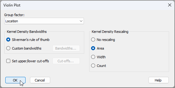](https://learninghub.primer-e.com/uploads/images/gallery/2025-09/09-violin-default-dialog-holdfast.png)
4. The resulting violin plot (where the kde bandwidth for each group is estimated separately, using Silverman's rule-of-thumb) is shown below:
[![10._holdfast_violin_default_plot_[i].png](https://learninghub.primer-e.com/uploads/images/gallery/2025-12/scaled-1680-/10-holdfast-violin-default-plot-i.png)](https://learninghub.primer-e.com/uploads/images/gallery/2025-12/10-holdfast-violin-default-plot-i.png)
Note that, for each group, the median is a horizontal line, and the inter-quartile range is shown by a vertical line with two dots (representing the upper and lower quartiles). In this example, it is clear that the shapes of these estimated densities are very different for the different locations. Home Point, in particular, seems to have the broadest range of holdfast sizes, including some very large holdfasts, and Hahei and Leigh each appear to have a slightly bimodal distribution of sizes.
#### Tweaks available under 'Graph > Special'
By clicking **Graph** > **Special**, you can change the opacity and/or the saturation of the colours used for the violins. You can also change your choice of bandwidth, set upper/lower cutoffs or alter the rescaling (widths) of the violins, as per the original 'Violin Plot' dialog.
### Change the bandwidth
Once you have created a violin plot (e.g., like Graph1 above), you can check out the bandwidths that were used to create it by clicking **Graph** > **Special**, choosing '$\bullet$Custom bandwidths' and clicking the 'Bandwidths...' button, [](https://learninghub.primer-e.com/uploads/images/gallery/2025-09/bandwidths-button.png), like so:
[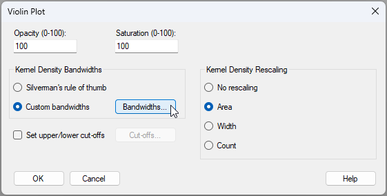](https://learninghub.primer-e.com/uploads/images/gallery/2025-09/11-violin-special-menu.png)
For this example, we can see the following individual bandwidths that were used to create the violin for each group (calculated using Silverman's rule, by default):
[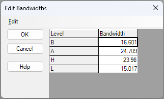](https://learninghub.primer-e.com/uploads/images/gallery/2025-09/11b-violin-silverman-calc.png)
5. We could manually apply a single bandwidth to be used for all of the groups. For example, the average of the above four bandwidth values is 20.07. If we therefore manually type in a common bandwidth of $h = 20$ to be used for all of the violins, the resulting plot (shown below) actually looks, in any case, quite a bit like the default:
[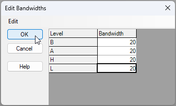](https://learninghub.primer-e.com/uploads/images/gallery/2025-09/12b-bw-is-20.png)
[![12._holdfast_violin_plot[2]_h=20_[i].png](https://learninghub.primer-e.com/uploads/images/gallery/2025-12/scaled-1680-/12-holdfast-violin-plot2-h20-i.png)](https://learninghub.primer-e.com/uploads/images/gallery/2025-12/12-holdfast-violin-plot2-h20-i.png)
6. To more dramatically demonstrate the effect of bandwidth choice on the resulting plot, let's see what happens when we choose a much smaller bandwidth of (say) $h = 5$ for all of the groups (see below):
[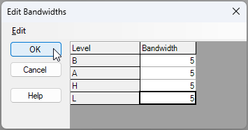](https://learninghub.primer-e.com/uploads/images/gallery/2025-09/13b-bw-is-5.png)
[![13._holdfast_violin_plot_h=5_[i].png](https://learninghub.primer-e.com/uploads/images/gallery/2025-12/scaled-1680-/13-holdfast-violin-plot-h5-i.png)](https://learninghub.primer-e.com/uploads/images/gallery/2025-12/13-holdfast-violin-plot-h5-i.png)
The result is far less smooth (much more bumpy!), and clearly the volume values for individual holdfasts each have a much greater importance in the visual outcome here.
### Trim the violins
7. Volume is a strictly positive continuous quantitative variable, and we might consider that the initial plot we saw was a bit odd, because the y-axis (and some of the violins) delved below zero. Let's set the lower bound to zero and trim the violins accordingly. Go back to the 'NE_NZ_holdfast_environment' dataset where the variable of 'Volume' has already been selected, and click **Plots** > **Violin Plot...**. Use Silverman's rule of thumb for the bandwidths, but choose to '$\checkmark$Set upper/lower cut-offs' and click on the 'Cut-offs...' button, [](https://learninghub.primer-e.com/uploads/images/gallery/2025-09/cutoffs-button.png), then specify a lower cut-off for all groups at 0, like so:
[![14._Choose_New_plot_with_cutoffs_[i].png](https://learninghub.primer-e.com/uploads/images/gallery/2025-12/scaled-1680-/14-choose-new-plot-with-cutoffs-i.png)](https://learninghub.primer-e.com/uploads/images/gallery/2025-12/14-choose-new-plot-with-cutoffs-i.png)
The resulting graphic (after also changing the y-axis minimum to 0, to match the trim) is shown below ('Graph2'):
[![14._violins_with_cutoffs_[i].png](https://learninghub.primer-e.com/uploads/images/gallery/2025-12/scaled-1680-/14-violins-with-cutoffs-i.png)](https://learninghub.primer-e.com/uploads/images/gallery/2025-12/14-violins-with-cutoffs-i.png)
### Rescaling violin widths
8. A number of rescaling options (affecting the relative widths of the violins) are also possible. If we change the 'Kernel Density Rescaling' option in the **Graph** > **Special** menu to '$\bullet$ Count', you will see that the widths of each group now reflect their relative sample sizes, as shown below:
[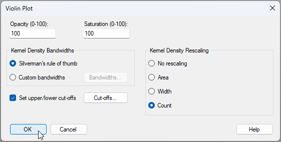](https://learninghub.primer-e.com/uploads/images/gallery/2025-09/15-rescaling-option-change.png)
[![15._violins_with_count_widths_[i].png](https://learninghub.primer-e.com/uploads/images/gallery/2025-12/scaled-1680-/15-violins-with-count-widths-i.png)](https://learninghub.primer-e.com/uploads/images/gallery/2025-12/15-violins-with-count-widths-i.png)
In this particular example, the sample sizes are equal, so the result is a graphic where the widths are effectively one quarter (1/4) of the original (default) area-based widths. This is because there were 80 holdfasts in total and 20 holdfasts in each of the 4 groups. If, however, there had been different sample sizes, then groups having larger sample sizes would look (proportionately) wider.
### Opacity, saturation and colour
You can change the ***opacity*** and/or ***saturation*** of the colour used for the violins in the **Graph** > **Special** menu as well. These options work the same way that they do for a dot plot, or for bubbles super-imposed on an ordination. To change the fundamental ***colours*** of the violins, click **Graph** > **Sample Labels & Symbols...**, then click the 'Key' button, [](https://learninghub.primer-e.com/uploads/images/gallery/2025-09/key-button.png).§
---
§*Other aspects of labels and symbols cannot be changed for dotplots and violin plots. These plots share a common structure to boxplots in that essentially only the colours can be changed in the 'Sample Labels & Symbols' menu. Also, these types of plots (box plots, dot plots and violin plots) do not plot numerical values on the X-axis, instead they plot factor levels. Thus, changing the X-axis scale will not affect the way the axis looks.*