# What's New in PRIMER 8

# Citation

To cite this online reference, please use the following:

- Anderson, M.J. (2026). '**What's New in PRIMER 8**.' *PRIMER-e Learning Hub*. PRIMER-e, Auckland, New Zealand. [https://learninghub.primer-e.com/books/whats-new-in-primer-8](https://learninghub.primer-e.com/books/whats-new-in-primer-8).

To cite the PRIMER 8 software itself, please use the following:

- Anderson, M.J. &amp; Euinton, D.C. 2026. '**PRIMER 8 with PERMANOVA+, version (<ins>X.X</ins>)**.' PRIMER-e (Quest Research Limited): Auckland, New Zealand.

Fill in the value <ins>X.X</ins> in your citation above with the ***version*** of PRIMER 8 that you are using. To see the version you are using, open PRIMER 8 and click **Help** &gt; **About**. The latest (most up-to-date) version of PRIMER 8 that is available can be found at the top of our [Changelog](https://www.primer-e.com/changelog/). To update your software to the latest version, click **Help** &gt; **Check for Updates...**.

# Table of Contents

- [**Citation**](https://learninghub.primer-e.com/link/662)
- [**Summary**](https://learninghub.primer-e.com/books/whats-new-in-primer-8/chapter/summary)
    - [Introduction](https://learninghub.primer-e.com/link/950)
    - [New Statistical Methods in P8](https://learninghub.primer-e.com/link/952)
    - [New Tools &amp; Utilities in P8](https://learninghub.primer-e.com/link/953)
- [**1. Expanded summary statistics**](https://learninghub.primer-e.com/books/whats-new-in-primer-8/chapter/1-expanded-summary-statistics)
    - [1.1 Expansion from P7 to P8](https://learninghub.primer-e.com/link/955)
    - [1.2 Definitions of statistics](https://learninghub.primer-e.com/link/957)
    - [1.3 Biotic data: summary stats](https://learninghub.primer-e.com/link/958)
    - [1.4 Split summary stats results by groups](https://learninghub.primer-e.com/link/959)
    - [1.5 Environmental data: summary stats](https://learninghub.primer-e.com/link/960)
- [**2. Empirical distributions**](https://learninghub.primer-e.com/books/whats-new-in-primer-8/chapter/2-empirical-distributions)
    - [2.1 What is an empirical distribution?](https://learninghub.primer-e.com/link/1020)
    - [2.2 Example: Empirical distributions of oyster sizes](https://learninghub.primer-e.com/link/1021)
- [**3. Dot plots and Violin plots**](https://learninghub.primer-e.com/books/whats-new-in-primer-8/chapter/3-dot-plots-and-violin-plots)
    - [3.1 Plots of empirical densities](https://learninghub.primer-e.com/link/1022)
    - [3.2 Example: Dotplot of oyster sizes](https://learninghub.primer-e.com/link/1023)
    - [3.3 Example: Violin plot of kelp holdfast volumes](https://learninghub.primer-e.com/link/1024)
- [**4. Univariate non-parametric methods**](https://learninghub.primer-e.com/books/whats-new-in-primer-8/chapter/4-univariate-non-parametric-methods)
    - [4.1 Wilcoxon signed-rank test](https://learninghub.primer-e.com/link/961)
    - [4.2 Example: Plankton hauls](https://learninghub.primer-e.com/link/967)
    - [4.3 Mann-Whitney U test](https://learninghub.primer-e.com/link/962)
    - [4.4 Example: Snapper in marine reserves](https://learninghub.primer-e.com/link/968)
    - [4.5 Kruskal-Wallis test](https://learninghub.primer-e.com/link/963)
    - [4.6 Example: A bivalve species from Ekofisk](https://learninghub.primer-e.com/link/969)
    - [4.7 Kolmogorov-Smirnov test](https://learninghub.primer-e.com/link/964)
    - [4.8 Example: Sizes of oysters](https://learninghub.primer-e.com/link/970)
    - [4.9 Test of Association](https://learninghub.primer-e.com/link/965)
    - [4.10 Example: Ekofisk diversity](https://learninghub.primer-e.com/link/1018)
    - [4.11 Example: Associations between species](https://learninghub.primer-e.com/link/1019)
- [**5. New PERMANOVA Design file**](https://learninghub.primer-e.com/books/whats-new-in-primer-8/chapter/5-new-permanova-design-file)
    - [Overview of new 'Design' options and tools](https://learninghub.primer-e.com/link/1025)
- [**6. Allow heterogeneous dispersions in PERMANOVA**](https://learninghub.primer-e.com/books/whats-new-in-primer-8/chapter/6-allow-heterogeneous-dispersions-in-permanova)
    - [6.1 Overview - Allow heterogeneity](https://learninghub.primer-e.com/link/1034)
    - [6.2 ANOVA in a nutshell](https://learninghub.primer-e.com/link/1026)
    - [6.3 The Behrens-Fisher problem (BFP)](https://learninghub.primer-e.com/link/1027)
    - [6.4 Multivariate Behrens-Fisher problem](https://learninghub.primer-e.com/link/1028)
    - [6.5 Solutions to the multivariate BFP](https://learninghub.primer-e.com/link/1032)
    - [6.6 Example: one-way PERMANOVA allowing heterogeneity](https://learninghub.primer-e.com/link/1029)
    - [6.7 Heterogeneity in more complex designs](https://learninghub.primer-e.com/link/1033)
    - [6.8 Example: two-way crossed PERMANOVA allowing heterogeneity](https://learninghub.primer-e.com/link/1030)
- [**7. Finite factors**](https://learninghub.primer-e.com/books/whats-new-in-primer-8/chapter/7-finite-factors)
    - [7.1 Overview - Finite factors](https://learninghub.primer-e.com/link/1036)
    - [7.2 Dichotomy: fixed vs random factors](https://learninghub.primer-e.com/link/1035)
    - [7.3 Not a dichotomy: a progression from fixed to random](https://learninghub.primer-e.com/link/1037)
    - [7.4 Example: environmental impact on molluscs](https://learninghub.primer-e.com/link/1038)
    - [7.5 Broader implications for detecting impact](https://learninghub.primer-e.com/link/1039)
- [**8. Specifying Subject/Whole-plot error in PERMANOVA**](https://learninghub.primer-e.com/books/whats-new-in-primer-8/chapter/8-specify-subjectwhole-plot-error-in-permanova)
    - [8.1 Designs lacking replication](https://learninghub.primer-e.com/link/1040)
    - [8.2 Example: Split-plot - Woodstock vegetation](https://learninghub.primer-e.com/link/1042)
    - [8.3 Example: Repeated measures - Victorian avifauna](https://learninghub.primer-e.com/link/1041)
- [**9. Group covariates**](https://learninghub.primer-e.com/books/whats-new-in-primer-8/chapter/9-group-covariates)
    - [9.1 Why group covariables together?](https://learninghub.primer-e.com/link/1043)
    - [9.2 Periodic and cyclical models](https://learninghub.primer-e.com/link/1044)
    - [9.3 Example: Annual monthly cycles - B.C. macroalgae](https://learninghub.primer-e.com/link/1045)
- [**10. Centroid plots**](https://learninghub.primer-e.com/books/whats-new-in-primer-8/chapter/10-centroid-plots)
    - [10.1 Ordinations for multi-factor designs](https://learninghub.primer-e.com/link/1046)
    - [10.2 Main effects plot](https://learninghub.primer-e.com/link/1047)
    - [10.3 Interaction plot](https://learninghub.primer-e.com/link/1048)
    - [10.4 Example: NZ fish assemblages](https://learninghub.primer-e.com/link/1049)
- [**11. Residual distances**](https://learninghub.primer-e.com/books/whats-new-in-primer-8/chapter/11-residual-distances)
    - [11.1 What are 'residual' distances?](https://learninghub.primer-e.com/link/1050)
    - [11.2 Example: Plankton (revisited)](https://learninghub.primer-e.com/link/1051)
- [**12. Control charts**](https://learninghub.primer-e.com/books/whats-new-in-primer-8/chapter/12-control-charts)
    - [12.1 Overview - Control charts](https://learninghub.primer-e.com/link/1054)
    - [12.2 Classical univariate control chart](https://learninghub.primer-e.com/link/1055)
    - [12.3 Classical multivariate control chart](https://learninghub.primer-e.com/link/1056)
    - [12.4 Bivariate normal example: NZ fish](https://learninghub.primer-e.com/link/1057)
    - [12.5 Dissimilarity-based multivariate control chart](https://learninghub.primer-e.com/link/1058)
    - [12.6 Additional notes on implementing control charts](https://learninghub.primer-e.com/link/1059)
    - [12.7 Example: Birds from Grand Forks](https://learninghub.primer-e.com/link/1060)
- [**13. New standardisation options**](https://learninghub.primer-e.com/books/whats-new-in-primer-8/chapter/13-new-standardisation-options)
    - [13.1 Overview](https://learninghub.primer-e.com/link/1061)
    - [13.2 Analysing cumulative standardised data](https://learninghub.primer-e.com/link/1062)
    - [13.3 Example: Mussel sizes in the Gulf of Alaska](https://learninghub.primer-e.com/link/1063)
    - [13.4 Example: Gulf of Maine invertebrates - functional resemblance](https://learninghub.primer-e.com/link/1064)
- [**14. Create ordered groups**](https://learninghub.primer-e.com/books/whats-new-in-primer-8/chapter/14-create-ordered-groups)
    - [14.1 Overview](https://learninghub.primer-e.com/link/1065)
    - [14.2 Example: NE Pacific groundfish vs depth](https://learninghub.primer-e.com/link/1066)
- [**15. Other new tools &amp; utilities**](https://learninghub.primer-e.com/books/whats-new-in-primer-8/chapter/15-other-new-tools-utilities)
    - [15.1 New default colour palette](https://learninghub.primer-e.com/link/1067)
    - [15.2 New selection options](https://learninghub.primer-e.com/link/1068)
    - [15.3 Re-name levels of a factor (or indicator)](https://learninghub.primer-e.com/link/1069)
    - [15.4 Add customised values/labels to graphical axes](https://learninghub.primer-e.com/link/1070)
    - [15.5 Split data sheet by factor/indicator](https://learninghub.primer-e.com/link/1071)
    - [15.6 Line plots for samples](https://learninghub.primer-e.com/link/1072)
    - [15.7 Output group-level stats from dispersion (or variability) weighting](https://learninghub.primer-e.com/link/1074)
    - [15.8 Output diagnostic plots from CAP](https://learninghub.primer-e.com/link/1075)
    - [15.9 New diagnostics for PCA/PCO plots](https://learninghub.primer-e.com/link/1076)
- [**16. Means plots**](https://learninghub.primer-e.com/books/whats-new-in-primer-8/chapter/16-means-plots)
    - [16.1 A plot of means with error bars](https://learninghub.primer-e.com/link/1135)
    - [16.2 Example: Fal biota (one-way case)](https://learninghub.primer-e.com/link/1136)
    - [16.3 Example: Okura macrofauna (two-way nested case)](https://learninghub.primer-e.com/link/1137)
    - [16.4 Example: Leschenault fish (two-way crossed case)](https://learninghub.primer-e.com/link/1138)
    - [16.5 Example: New Zealand snapper (three-way case)](https://learninghub.primer-e.com/link/1139)
- [**References**](https://learninghub.primer-e.com/books/whats-new-in-primer-8/page/references)

# Summary


# Introduction

**PRIMER 8 with PERMANOVA+** is a substantial upgrade on its predecessor, offering a host of marvelous new tools and statistical methods. These range from simple utilities to make your life easier (such as a tool to easily rename the levels of a factor), through to sophisticated novel analytical methods that are found no-where else (such as dissimilarity-based multivariate control charts, and a valid PERMANOVA test for differences in centroids when dispersions differ). 

This book has been written for those who have some familiarity with prior versions of PRIMER/PERMANOVA+ software. To get started quickly using PRIMER 8 software, first consult the following resource:
- Anderson, M.J. (2026). ["***Get Started with PRIMER 8***."](https://learninghub.primer-e.com/books/get-started-with-primer-8)  *PRIMER-e Learning Hub*. PRIMER-e, Auckland, New Zealand.

For additional details regarding the methods and tools available in the software produced by PRIMER-e, please consult the following ***historical books and manuals***, available in the [PRIMER-e Learning Hub](https://learninghub.primer-e.com):
- Clarke KR, Gorley RN, Somerfield PJ & Warwick RM. (2014). ["***Change in Marine Communities, 3rd edition***."](https://learninghub.primer-e.com/books/change-in-marine-communities) PRIMER-E Ltd: Plymouth, UK.
- Clarke KR & Gorley RN. (2015). ["***PRIMER v7: User Manual / Tutorial***."](https://learninghub.primer-e.com/books/primer-v7-user-manual-tutorial) PRIMER-E Ltd: Plymouth, UK.
- Anderson MJ, Gorley RN & Clarke KR. (2008). ["***PERMANOVA+ for PRIMER: Guide to Software and Statistical Methods***."](https://learninghub.primer-e.com/books/permanova-for-primer-guide-to-software-and-statistical-methods) PRIMER-E Ltd: Plymouth, UK.


In this text, we will refer to the new version (including PERMANOVA+) as '**P8**', and to the previous version as '**P7**'. What follows is a short list of the most important new features in P8. These items have been classified into two major groups: [***New Statistical Methods in P8***](https://learninghub.primer-e.com/link/952) and [***New Tools & Utilities in P8***](https://learninghub.primer-e.com/link/953). Just click on any link from within either of these lists to explore what is new!

# New Statistical Methods in P8

Most of the methods in the list below are unique to PRIMER 8 and are not available in any other software package. Some of the methods are not new (such as the non-parametric univariate Mann-Whitney U test), but are implemented in a novel way in P8. 
- [**Expanded summary statistics**](https://learninghub.primer-e.com/books/whats-new-in-primer-8/chapter/1-expanded-summary-statistics) - Summarise your variables (or samples) with ease, using a host of standard statistics (e.g., average, median, range, min, max, nominated quantiles, skewness, kurtosis, etc.) and/or using several other bespoke diagnostic measures, such as frequencies of occurrence, the number of singletons or doubletons, or the smallest value above a given threshold, etc. You can also calculate summaries on data split by a factor (or indicator).<br><br> 
- [**Empirical distributions**](https://learninghub.primer-e.com/books/whats-new-in-primer-8/chapter/2-empirical-distributions) - Create raw or cumulative empirical distributions and view them graphically.<br><br>
- [**Dot plots and violin plots**](https://learninghub.primer-e.com/books/whats-new-in-primer-8/chapter/3-dot-plots-and-violin-plots) - Dot plots and violin plots offer a great way to visualise the empirical shape of distributions of sample values across multiple groups for any individual variable.<br><br>
- [**Univariate non-parametric methods**](https://learninghub.primer-e.com/books/whats-new-in-primer-8/chapter/4-univariate-non-parametric-methods) - In P8 you can now implement many standard non-parametric univariate statistical tests. PRIMER's implementation of these tests is novel in that all of these rely on robust permutation algorithms and automatically output relevant graphics as well. Available tests include:
  - [***Wilcoxon Signed-Rank test***](https://learninghub.primer-e.com/books/whats-new-in-primer-8/page/41-wilcoxon-signed-rank-test) (paired 2-sample);
  - [***Mann-Whitney U test***](https://learninghub.primer-e.com/books/whats-new-in-primer-8/page/43-mann-whitney-u-test) (unpaired 2-sample);
  - [***Kruskal-Wallis test***](https://learninghub.primer-e.com/books/whats-new-in-primer-8/page/45-kruskal-wallis-test) (compare multiple groups);
  - [***Kolmogorov-Smirnov test***](https://learninghub.primer-e.com/books/whats-new-in-primer-8/page/47-kolmogorov-smirnov-test) (compare empirical distributions); and
  - [***Test of Association***](https://learninghub.primer-e.com/books/whats-new-in-primer-8/page/49-test-of-association) (between 2 variables).<br><br>
- [**New PERMANOVA Design file**](https://learninghub.primer-e.com/books/whats-new-in-primer-8/chapter/5-new-permanova-design-file) - The interface for specifying a given study design and various defaults for PERMANOVA have been re-vamped. In P8 it is now easier to specify or modify the design and to fine-tune the model, to add/remove or pool terms, to include/exclude interactions with or among covariates, or to reset the full list of terms implied by a given study design.<br><br>
- [**Allow heterogeneous dispersions**](https://learninghub.primer-e.com/books/whats-new-in-primer-8/chapter/6-allow-heterogeneous-dispersions-in-permanova) - We have provided some solutions to the multivariate Behrens-Fisher problem for dissimilarity-based analyses ({{@954#bkmrk-andersonetal2017}}). PERMANOVA in P8 now allows you to test for differences in multivariate centroids while allowing for heterogeneity in multivariate dispersions.<br><br>
- [**Finite factors**](https://learninghub.primer-e.com/books/whats-new-in-primer-8/chapter/7-finite-factors) - The notion of a fixed *vs* a random factor need not be seen as a strict dichotomy, but rather as a progression ({{@954#bkmrk-andersonetal2025}}). With PERMANOVA in P8, there is a new factor type called 'Finite', in which the user can specify the number of levels in the population from which sampled levels have been drawn. Doing this can greatly increase the power of inferential tests, and is especially useful for tests in broad-scale environmental impact study designs.<br><br>
- [**Split-plot and repeated measures designs**](https://learninghub.primer-e.com/books/whats-new-in-primer-8/chapter/8-specify-subjectwhole-plot-error-in-permanova) - PERMANOVA in P8 has a new factor type called 'Subject/Whole-plot error', so you can specify sources of error at multiple levels in the study design. This enables repeated measures, split-plot (and split-split-plot, etc.) study designs to be analysed easily and directly.<br><br>
- [**Tests for cyclicity: grouping covariates**](https://learninghub.primer-e.com/books/whats-new-in-primer-8/chapter/9-group-covariates) - PERMANOVA in P8 allows you to group multiple covariates together (using an indicator), which opens the door to new ways of analysing multivariate patterns of periodicity, cyclicity and other spatio-temporal models.<br><br>
- [**Centroid plots**](https://learninghub.primer-e.com/books/whats-new-in-primer-8/chapter/10-centroid-plots) - New centroid plots allow you to visualise the relative importance of main effects from a multi-factorial PERMANOVA model ([**Main Effects Plot**](https://learninghub.primer-e.com/books/whats-new-in-primer-8/page/102-main-effects-plot)) and to explore the patterns among cell centroids from complex PERMANOVA study designs ([**Interaction Plot**](https://learninghub.primer-e.com/books/whats-new-in-primer-8/page/103-interaction-plot)), all constructed in the space of your chosen resemblance measure.<br><br>
- [**Residual distances/dissimilarities**](https://learninghub.primer-e.com/books/whats-new-in-primer-8/chapter/11-residual-distances) - Remove the effects of one or more dominant factors (*via* PERMANOVA) or regressors (*via* DISTLM) and output a residual distance/dissimilarity matrix among the sampling units. Ordination of a residual distance matrix permits visualisation of non-dominant factors.<br><br>
- [**Multivariate control charts**](https://learninghub.primer-e.com/books/whats-new-in-primer-8/chapter/12-control-charts) - Create a multivariate control chart on the basis of a chosen resemblance measure. You can build a chart through time (using progressive, baseline or moving-window criteria) and detect when an individual observation is 'out-of-control', given previous observations. This is a fantastic tool for monitoring applications.<br><br>
- [**New standardisation options**](https://learninghub.primer-e.com/books/whats-new-in-primer-8/chapter/13-new-standardisation-options) - Perform standardisations of samples (or variables) separately within groups (or levels) of indicators (or factors), output values as raw or cumulative percentages or proportions, with ordering specified by you.<br><br>
- [**Create ordered groups from a continuous variable**](https://learninghub.primer-e.com/books/whats-new-in-primer-8/chapter/14-create-ordered-groups) - Generate a new factor which consists of ordered groups, based on any chosen continuous variable, with a plethora of optional criteria for defining suitable group boundaries. For example, you can specify quantiles as 'breaks', or create a given number of groups with equal sample sizes per group, or minimise the within-group sum-of-squares, etc.<br><br>
- [**Multi-factor means plots**](https://learninghub.primer-e.com/books/whats-new-in-primer-8/chapter/16-means-plots) - Create univariate bar plots or point plots of mean values for factors, with error bars corresponding to standard errors/deviations, or your choice of confidence interval, using either bootstrap percentiles or classical methods. Split your data by additional factors, either within a plot or across different plots, and customise the colours, symbols and/or joining lines.

# New Tools & Utilities in P8

- [**New default colour palette**](https://learninghub.primer-e.com/books/whats-new-in-primer-8/page/151-new-default-colour-palette) - The new colour palette for PRIMER graphics ensures distinctive colours by default that carefully accommodate several different forms of colour-blindness.<br><br>
- [**New selection options**](https://learninghub.primer-e.com/books/whats-new-in-primer-8/page/152-new-selection-options) - Select subsets of variables and/or samples by names (using special filters) or numbers, or according to your own rules regarding zero or missing values, frequencies of occurrence, percent contributions to abundances overall or in any one sample, and more.<br><br>
- [**Re-name levels of a factor (or indicator)**](https://learninghub.primer-e.com/books/whats-new-in-primer-8/page/153-re-name-levels-of-a-factor-or-indicator) - Rapidly duplicate factors (or indicators) and re-name the levels (groups) for that factor (or indicator).<br><br>
- [**Add customised values/labels to graphical axes**](https://learninghub.primer-e.com/books/whats-new-in-primer-8/page/154-add-customised-valueslabels-to-graphical-axes) - Customise your graphics with more tools for modifying X and Y axes. You can show bespoke additional values/labels on your axes and/or change the label orientation.<br><br>
- [**Split data sheet by factor/indicator**](https://learninghub.primer-e.com/books/whats-new-in-primer-8/page/155-split-data-sheet-by-factorindicator) - Split a single data sheet into multiple sheets based on a factor or indicator of your choice.<br><br>
- [**New facility in line plots**](https://learninghub.primer-e.com/books/whats-new-in-primer-8/page/156-line-plots-for-samples) - Draw line plots either: (i) of individual samples (across variables); or (ii) of individual variables (across samples).<br><br>
- [**Output group-level stats from dispersion (or variability) weighting**](https://learninghub.primer-e.com/books/whats-new-in-primer-8/page/157-output-group-level-stats-from-dispersion-or-variability-weighting) - Output the individual group-level statistics calculated for the pre-treatment options of dispersion (or variability) weighting.<br><br>
- [**Output diagnostic plots from CAP**](https://learninghub.primer-e.com/books/whats-new-in-primer-8/page/158-output-diagnostic-plots-from-cap) - Models produced using canonical analysis of principal coordinates (CAP) require investigation of leave-one-out diagnostics for different chosen values of $m$ (= the number of PCO axes used for the model). In P8, all of these diagnostics are now produced in plots for direct visual inspection.<br><br>
- [**New diagnostics for PCA/PCO plots**](https://learninghub.primer-e.com/books/whats-new-in-primer-8/page/159-new-diagnostics-for-pcapco-plots) - In P8, you can now assess how well a PCA or PCO plot represents the original inter-sample distances or dissimilarities through a Shepard digram and an associated calculation of stress.

# 1. Expanded summary statistics


# 1.1 Expansion from P7 to P8

Summary statistics provide essential information to help you get to know your variables, their fundamental statistical properties and numerical characteristics. In P8, if you click on **Tools > Summary Stats...** you will see (Fig. 1.1) that we have greatly expanded the list of options on offer, compared to those available in P7 (where it used to be accessed under **Analyse** > **Summary Stats...**). In some cases, you may wish to calculate summary statistics across the values you are getting across a sample, so this is catered to as well (just as in P7). We have also added the possiblity to output summary statistics separately for different levels of a *factor* (or different groups of an *indicator*, in the event that you are summarising samples instead of variables).

[![1._Summary_Stats_dialog_P7_&_P8.png](https://learninghub.primer-e.com/uploads/images/gallery/2024-11/scaled-1680-/1-summary-stats-dialog-p7-p8.png)](https://learninghub.primer-e.com/uploads/images/gallery/2024-11/1-summary-stats-dialog-p7-p8.png)

*Fig. 1.1. Comparison of the 'Summary Stats...' dialog options in PRIMER 7 vs PRIMER 8.*

In what follows, we shall begin by providing a brief description of each of the summary statistics, then demonstrate the use of this new tool by implementing it to summarise information about *variables* (i.e., across samples). Note that you can also use this tool to summarise information about *samples* (i.e., across variables).

# 1.2 Definitions of statistics

Given a set of values $\\{ y_1, y_2, ..., y_n \\}$ for any individual variable $Y$, the following summary statistics can be calculated by clicking on **Tools** > **Summary Stats...** in PRIMER 8:

- **Average**: $\hspace{1mm}$ $\bar{y} = \sum_{i=1}^n{y_i} / n $, the average (or mean)
- **Median**: $\hspace{1mm}$ $m$, the median value
- **Sum**: $\hspace{1mm}$ $\sum_{i=1}^n{y_i}$, the sum of the values
- **Minimum**: $\hspace{1mm}$ $\min(y_i)$, the minimum value
- **Maximum**: $\hspace{1mm}$ $\max(y_i)$, the maximum value
- **Quantiles**: $\hspace{1mm}$  $q_\alpha$, the value corresponding to a given ($\alpha$-)quantile in the empirical distribution of values. Quantiles must be chosen by the end-user and must be in the range (0, 1).
- **Range**: $\hspace{1mm}$ the range; i.e., $(\max(y_i) - \min(y_i))$, the difference between the maximum and minimum values
- **IQR**: $\hspace{1mm}$ the inter-quartile range; i.e., $(q_{0.75} - q_{0.25})$, the difference between the upper and lower quartile.
- **Standard deviation**: $\hspace{1mm}$ $s$, the standard deviation; i.e., the square root of the variance.
- **Variance**: $\hspace{1mm}$ $s^2=\sum_{i=1}^n{(y_i - \bar{y})^2} / (n-1)$, an unbiased estimate of the variance.
- **Sample size**: $\hspace{1mm}$ $n$, the number of values
- **Standard error**: $\hspace{1mm}$ $\sqrt{s^2/n}$, the standard error of the mean
- **Symmetry**: $\hspace{1mm}$ $\alpha$-symmetry statistic, with $\alpha$ chosen by the end-user (default $\alpha$ = 0.05). For symmetric data, the median ($m$) is equidistant from the $\alpha$-quantile and the $(1-\alpha)$-quantile. The $\alpha$-symmetry statistic is defined as $(m-q_{\alpha}) / (q_{1-\alpha} - q_{\alpha})$ for a given quantile ($\alpha$). A value close to 0.5 indicates symmetry, a value < 0.5 indicates right-skewness, and a value > 0.5 indicates left-skewness.
- **Skewness**: $\hspace{1mm}$ $k_3$, the skewness coefficient; i.e., $$  k_3 =  \frac{ n \sum_{i=1}^n (y_i - \bar{y})^3 } { (n-1)(n-2) \cdot s^3 }  $$A value close to zero indicate symmetry. A positive value indicates right-skewness; a negative value indicates left-skewness. See {{@954#bkmrk-sheskin2011}}.
- **Kurtosis**: $\hspace{1mm}$ $k_4$, the kurtosis coefficient; i.e., $$ k_4 = \frac{ \left[ \left[ \sum_{i=1}^n (y_i - \bar{y})^4 (n)(n+1) \right] / (n-1) \right]  - 3 \left[ \sum_{i=1}^n (y_i - \bar{y})^2 \right]^2 } { (n-2)(n-3) \cdot s^4 } $$ A value close to zero indicates a mesokurtic distribution. A positive value indicates a leptokurtic distribution (pointy, with broad tails). A negative value indicates a platykurtic distribution (flat-topped, with short tails). See {{@954#bkmrk-sheskin2011}}.
- **Number of zeros**: $\hspace{1mm}$ the number of zeros.
- **Singletons**: $\hspace{1mm}$ the number of ones (useful for count data).
- **Doubletons**: $\hspace{1mm}$ the number of twos (useful for count data).
- **Number of nonzeros (frequency)**: $\hspace{1mm}$ the number of non-zero values; e.g., if the variable consisted of counts of an organism, this would be the frequency of occurrences of that organism across the set of values (samples).
- **Smallest number above threshold**: $\hspace{1mm}$ the smallest value in the set that occurs above a specified threshold value ($y_t$), chosen by the end-user. For example, to obtain the smallest non-zero value in a set of non-negative values, specify $y_t=0$. Here is another example: suppose a variable consists of lead (Pb) concentrations measured from sediment. It may be useful to identify the smallest concentration value recorded above the detection limit of the instrument. Knowing the smallest non-zero (or detected) value can be handy for choosing an appropriate constant ($c$) to add for a transformation such as $log(y+c)$, when the variable contains zero values.
- **Largest number below threshold**: $\hspace{1mm}$ the largest value in the set that occurs below a specified threshold value ($y_t$), chosen by the end-user. This option has similar uses to the previous one, but for non-positive data.

# 1.3 Biotic data: summary stats

To show the utility of this tool, we will calculate some summary statistics from a study examining changes in macrofaunal communities inhabiting sediments near an oil platform (Ekofisk) in the North Sea, provided by {{@954#bkmrk-grayetal1990}}. These data consist of counts of the abundances of $p$ = 174 taxa (mostly identified to species level) sampled by 3 day grabs taken at each of $N$ = 39 stations, situated in an approximately 5-spoke radial design leading out from the oil platform. The stations were classified into the following four groups according to their relative distance from the centre of drilling activity at the Ekofisk oil platform:  D = less than 250m, C = 250m - 1km, B = 1 - 3.5km, and A = more than 3.5km away.

Start running **PRIMER 8**, then click **File** > **Open...** to open the data file named '<ins>Ekofisk_macrofauna_counts.pri</ins>' (found inside the '<ins>Examples_P8 > Ekofisk_macrofauna</ins>' folder).

From the '<ins>Ekofisk_macrofauna_counts</ins>' data sheet inside PRIMER, click on **Tools** > **Summary Stats...**, as shown below:

[![2._Summary_Stat_menu_item_[i].png](https://learninghub.primer-e.com/uploads/images/gallery/2025-12/scaled-1680-/2-summary-stat-menu-item-i.png)](https://learninghub.primer-e.com/uploads/images/gallery/2025-12/2-summary-stat-menu-item-i.png)

Choose from the dialog all of the summary statistics you would like to calculate on the dataset. For example, we might choose to calculate the average, median, minimum, maximum, range, standard deviation, number of zeros, singletons, and the number of non-zeros (i.e., frequency of occurrence), like this:

[![3._Summary_Stat_dialog_(all_data,_biota)_[new].png](https://learninghub.primer-e.com/uploads/images/gallery/2025-09/scaled-1680-/3-summary-stat-dialog-all-data-biota-new.png)](https://learninghub.primer-e.com/uploads/images/gallery/2025-09/3-summary-stat-dialog-all-data-biota-new.png)

Click 'OK', and you will see a '<ins>Summary Statistics 1</ins>' file, in which you are shown the choices you made for running that routine, *viz*:

[![4a._Summary_Stat_output_notepad_(all_data,_biota)_[i].png](https://learninghub.primer-e.com/uploads/images/gallery/2025-12/scaled-1680-/4a-summary-stat-output-notepad-all-data-biota-i.png)](https://learninghub.primer-e.com/uploads/images/gallery/2025-12/4a-summary-stat-output-notepad-all-data-biota-i.png)

as well as a resulting output file '<ins>Data1</ins>', which provides all of these summary statistics for each of the individual variables (taxa), as shown below:

[![4b._Summary_Stat_results_(all_data,_biota)_[i].png](https://learninghub.primer-e.com/uploads/images/gallery/2025-12/scaled-1680-/4b-summary-stat-results-all-data-biota-i.png)](https://learninghub.primer-e.com/uploads/images/gallery/2025-12/4b-summary-stat-results-all-data-biota-i.png)

# 1.4 Split summary stats results by groups

To run summary statistics on your variables separately for multiple groups of data, just choose a factor by which you would like to split the data in the dialog. For example, for the Ekofisk dataset, suppose we wished to obtain summary statistics (means and standard errors) separately for each of the 'Distance' groups. We can achieve this by choosing **Tools** > **Summary Stats...** > (Summarise > $\bullet$Variables) & (Split by > $\checkmark$Factor > <ins>Dist</ins>) & (Statistics > $\checkmark$Average & $\checkmark$Standard Error), as shown in the dialog below:

[![5._Dialog_(split_data_biota)_[new].png](https://learninghub.primer-e.com/uploads/images/gallery/2025-09/scaled-1680-/5-dialog-split-data-biota-new.png)](https://learninghub.primer-e.com/uploads/images/gallery/2025-09/5-dialog-split-data-biota-new.png)

By default, PRIMER will provide the output for *each* summary statistic you have asked for as a *separate data sheet*, and the groups (corresponding to levels of the factor by which you have chosen to do the splitting), will be the 'Samples'. In the present example, you will see that the averages for each variable for the four distance groups (A, B, C, D) have been provided in '<ins>Data2</ins>' and the standard errors are given in '<ins>Data3</ins>'. There will be as many new data sheets generated as there are summary statistics asked for in the dialog. Note that the name of the summary statistic provided in each sheet is given in the title at the top of the sheet, e.g., '*Ekofisk oilfield macrofauna -Summary Statistics, Average*'.

[![6._Results_(split_data_biota)_[i].png](https://learninghub.primer-e.com/uploads/images/gallery/2025-12/scaled-1680-/6-results-split-data-biota-i.png)](https://learninghub.primer-e.com/uploads/images/gallery/2025-12/6-results-split-data-biota-i.png)

An alternative output format can be requested here, with results for different groups given on different sheets. To do this, choose **Tools** > **Summary Stats...** > (Summarise > $\bullet$Variables) & (Split by > ($\checkmark$Factor > <ins>Dist</ins>) & (Output > $\checkmark$Levels/groups as separate sheets)) in the dialog, like so:

[![7._Alt_dialog_take2_(split_data,_biota)_[new].png](https://learninghub.primer-e.com/uploads/images/gallery/2025-09/scaled-1680-/7-alt-dialog-take2-split-data-biota-new.png)](https://learninghub.primer-e.com/uploads/images/gallery/2025-09/7-alt-dialog-take2-split-data-biota-new.png)

Doing this yields a separate sheet of summary statistics for each of the *groups* (e.g., '<ins>Data4</ins>' has all of the summary statistics you requested calculated for group D only, '<ins>Data5</ins>' has the results for group C, and so on (see below). Note that, for this alternative type of output, the name of the factor on which the split was done and the specific group (factor level) is given in the title at the top of each new data sheet of results; for example, '*Ekofisk oilfield macrofauna -Summary Statistics, Dist: A*'.

[![8._Alt_results_(split_data_biota)_[i].png](https://learninghub.primer-e.com/uploads/images/gallery/2025-12/scaled-1680-/8-alt-results-split-data-biota-i.png)](https://learninghub.primer-e.com/uploads/images/gallery/2025-12/8-alt-results-split-data-biota-i.png)

# 1.5 Environmental data: summary stats

For environmental data, we might choose to calculate different sorts of summary statistics than the kinds of things we would want to know about biotic data consisting of counts. For count data, quantities like the numbers of zeros, singletons, doubletons and frequencies of occurrence might well be of interest. However, these are not typically meaningful for variables that have been recorded as (effectively) continuous values, such as temperature, dissolved oxygen, etc. Instead, when we deal with environmental data (or, more generally, continuous quantitative variables), it may be helpful to know what the smallest non-zero value is, or to know the degree of skewness. These can aid in determining an appropriate transformation (e.g., to obtain approximate symmetry).

Let's look at some environmental data from a study of benthic soft-sediment assemblages in the Firth of Clyde, SW Scotland ({{@954#bkmrk-pearsonblackstock1984}}). The abundance and biomass of 84 macrofaunal species as well as contaminant data (organic enrichment and concentrations of heavy metals in the sediment) were sampled at a series of 12 sites along a transect that passed through the sewage-sludge disposal ground at Garroch Head. Open the data file named '<ins>Clyde_environment.pri</ins>' in PRIMER (found inside the '<ins>Examples_P8 > Clyde_macrofauna</ins>' folder).

[![9._Env_Clyde_[i].png](https://learninghub.primer-e.com/uploads/images/gallery/2025-12/scaled-1680-/9-env-clyde-i.png)](https://learninghub.primer-e.com/uploads/images/gallery/2025-12/9-env-clyde-i.png)

Of course, tools such as histograms and draftsman plots (found under the **Plots** menu) are very useful for visualising the distributions of values for the individual variables. Summary statistics complement these visual tools, yielding some important additional detailed information. Click **Tools** > **Summary Stats...**, then choose to output the following statistics (shown in the dialog below): average, minimum, maximum, standard deviation, symmetry (0.05), skewness, kurtosis, and smallest number above a threshold of 0.

[![10._Env_Summary_Stats_dialog_[new].png](https://learninghub.primer-e.com/uploads/images/gallery/2025-09/scaled-1680-/10-env-summary-stats-dialog-new.png)](https://learninghub.primer-e.com/uploads/images/gallery/2025-09/10-env-summary-stats-dialog-new.png)

The resulting output file (called '<ins>Data1</ins>' and shown below) indicates that many of the variables are right-skewed, with positive values for skewness, and values less than 0.5 for the symmetry statistic, while others (Co, Ni) are apparently left-skewed (negative skewness and symmetry > 0.5). Depth, however (Dep) is a fairly flat (platykurtic) variable (with negative excess kurtosis). Also evident is the fact that values of cadmium concentration (Cd) reach a minimum value of zero, and that the smallest value recorded above zero is 0.1. Thus, if we were inclined to transform the values for Cd (e.g., to make its distribution more symmetric), we might consider a log transformation such as $log(y_i+c)$, where $c$ = 0.1.

[![11._Summary_Stats_Clyde_results_[i].png](https://learninghub.primer-e.com/uploads/images/gallery/2025-12/scaled-1680-/11-summary-stats-clyde-results-i.png)](https://learninghub.primer-e.com/uploads/images/gallery/2025-12/11-summary-stats-clyde-results-i.png)

*(Note: the variable 'Cd' has been **highlighted** in the above image of '<ins>Data1</ins>' by clicking on the heading for that column. Highlighting variables (or samples), can be very useful for selecting subsets of data, or for applying a transformation to a subset of variables.)*

# 2. Empirical distributions


# 2.1 What is an empirical distribution?

#### Overview
What is an empirical distribution? The empirical distribution of a variable is able to be characterised by considering each unique numerical value observed for that variable in a given sample of size $n$. If certain values are repeated, then we simply tally the number of each unique value obtained. These tallies are essentially ***raw frequencies*** of the values. We can order the values obtained for the variable from smallest to largest and then look at these frequencies cumulatively, as a percentage of the entire sample. A plot of these ***cumulative percentages*** as a function of the ordered values in the sample is known as the ***empirical cumulative distribution function***.

#### Description
More formally, suppose we have $n$ independent and identically distributed random variables, $Y_1, Y_2, \ldots, Y_n$, with a  common (but unknown) probability density function (pdf) of $f(y)$ and cumulative distribution function (cdf) of $F(y) = \text{Pr} \lbrace Y \leq y \rbrace $.

For the discrete case, we have $F(y) = \sum_{t \leq y} f(t)$.

For the continuous case, we have $F(y) = \int_{-\infty}^y f(t) \cdot dt$.


We obtain corresponding observed values $y_1, y_2, \ldots, y_n$ in a sample of size $n$.  Now, let $I(y_i \leq t)$ be an indicator that takes the value of $1$ if $y_i \leq t$ is true, and zero otherwise. The empirical cumulative distribution function $\hat{F}_ n(t)$ is defined as the proportion of data points in the sample that are less than or equal to $t$, i.e.,

$$
\hat{F}_ n(t) = \frac{1}{n} \cdot \sum_{i=1}^n I(y_i \leq t)
$$ 
 
This is therefore a step function, continuous from the right, that jumps up by a quantity of $1/n$ at each of the $n$ data points. Its shape gives us a basic visual understanding of the distributional shape of the data values.

#### A small example
Suppose we had the following data with a sample size of $n = 10$ for a variable, $Y$:
| Sample | *y* |
| :----- | :-: |
|1|2|
|2|7|
|3|10|
|4|12|
|5|2|
|6|5|
|7|5|
|8|8|
|9|10|
|10|3|

The raw frequencies are as follows:
| Value of *y* | Frequency |
| :----- | :-: |
|2|2|
|3|1|
|5|2|
|7|1|
|8|1|
|10|2|
|12|1|

Looking at these values cumulatively, we have:
| Value of *y* | Cumulative frequency |
| :----- | :-: |
|2|2|
|3|3|
|5|5|
|7|6|
|8|7|
|10|9|
|12|10|

Expressing these frequencies as ***cumulative proportions*** of the total sample, we have:
| Value of *y* | Cumulative proportion |
| :----- | :-: |
|2|0.2|
|3|0.3|
|5|0.5|
|7|0.6|
|8|0.7|
|10|0.9|
|12|1.0|

These cumulative proportions comprise the **empirical cdf**. A plot of this empirical distribution (a step function) is shown below, with open circles being used to show the discontinuities (i.e., at the point of each step).

[![01._A_small_example_[i].png](https://learninghub.primer-e.com/uploads/images/gallery/2025-12/scaled-1680-/01-a-small-example-i.png)](https://learninghub.primer-e.com/uploads/images/gallery/2025-12/01-a-small-example-i.png)

The above plot was obtained by running **Plots** > **Empirical Distribution Plot...** in PRIMER 8, and ticking the option to: '$\checkmark$Express as proportions: [0, 1]'. Note that you can alternatively look at an empirical cdf with the values expressed as percentages instead of proportions (i.e., a plot of $100 \times \hat{F}_ n(t)$ *versus* $t$), which is the default.

As an aside, a related graphical tool for examining distributional shapes of variables is a **histogram**. A histogram is a plot of the raw frequencies (as bars on the y-axis) *vs* the empirical values (on the x-axis). For a histogram, we would typically pool together (sum) the raw frequencies into larger 'bin' sizes (instead of having one bin for every unique value in the dataset), which can be very useful if $n$ is large. That's what the **Plots** > **Histogram Plot...** function in PRIMER 8 does. Once you get a histogram, you can also change the bin size by clicking **Graph** > **Special**.

# 2.2 Example: Empirical distributions of oyster sizes

To demonstrate the empirical distribution tool in PRIMER, we shall examine a dataset consisting of length measurements (in mm) of the Sydney rock oyster (*Saccostrea commercialis*) settling on various surfaces in Quibray Bay, New South Wales, Australia ({{@954#bkmrk-anderson1992}},{{@954#bkmrk-andersonunderwood1994}}). Settlement panels (measuring 10 cm x 10 cm) of four different substrata commonly introduced by humans into marine environments (concrete, marine plywood, fibreglass and aluminium) were placed in intertidal estuarine habitats (an oyster farm) in the bay. The greatest length (the longest distance from the umbo to the tip of the furthest growing edge) of all oysters settling on these four different types of surfaces were recorded after a period of 4 months (January - May, 1992).

A subset of the data (i.e., from just one of the sticks deployed in field, see {{@954#bkmrk-andersonunderwood1994}} for logistic details of the experiment) are contained in a file called '<ins>Quibray_oyster_sizes_subset.pri</ins>' (found in the '<ins>Quibray_oysters</ins>' folder in '<ins>Examples_P8</ins>'). In this file, the lengths of oysters from the four different substrata are provided as 4 different levels of a factor called '<ins>Substratum</ins>'. Note that there were different numbers of oysters on each of these different types of surfaces (hence, different sample sizes for different levels of the factor), but this is not of any concern here. We are comparing only the ***shape*** of the ***distribution of sizes*** of oysters that have settled among these four different types of surfaces; we are not comparing the total number of individuals that have settled on them.

1. Start running **PRIMER 8**, then click **File** > **Open...** and open the data file named '<ins>Quibray_oyster_sizes_subset.pri</ins>' (in '<ins>Examples_P8</ins> > <ins>Quibray_oysters</ins>').

[![02._Oyster_data_subset_for_cdf_[i].png](https://learninghub.primer-e.com/uploads/images/gallery/2025-12/scaled-1680-/02-oyster-data-subset-for-cdf-i.png)](https://learninghub.primer-e.com/uploads/images/gallery/2025-12/02-oyster-data-subset-for-cdf-i.png)

2. It would be useful to see the empirical distributions for the four different surfaces side by side on a single plot. From the data sheet, click **Edit** > **Factors..** and you can see the factor of '<ins>Substratum</ins>' that shows the type of surface on which each individual measured oyster had settled.

[![03._Edit_factors_Oysters.png](https://learninghub.primer-e.com/uploads/images/gallery/2025-06/scaled-1680-/03-edit-factors-oysters.png)](https://learninghub.primer-e.com/uploads/images/gallery/2025-06/03-edit-factors-oysters.png)

3. Now we are ready to create the plot. From the data sheet, click **Plots** > **Empirical Distribution Plot...**.

[![04a._Empirical_distribution_menu_item_[i].png](https://learninghub.primer-e.com/uploads/images/gallery/2025-12/scaled-1680-/04a-empirical-distribution-menu-item-i.png)](https://learninghub.primer-e.com/uploads/images/gallery/2025-12/04a-empirical-distribution-menu-item-i.png)

In the resulting dialog box, choose to draw the lines for '$\bullet$ Variables' (there is only one variable here, so just one plot will be given in the output) and choose to 'Split into multiple distributions (lines) > $\checkmark$Factor > <ins>Substratum</ins>. Also, tick the box that says '$\checkmark$Express as proportions: [0, 1]'. The resulting dialog will look like this:

[![04._Empirical_distribution_plot_dialog_[i].png](https://learninghub.primer-e.com/uploads/images/gallery/2025-12/scaled-1680-/04-empirical-distribution-plot-dialog-i.png)](https://learninghub.primer-e.com/uploads/images/gallery/2025-12/04-empirical-distribution-plot-dialog-i.png)

The resulting graphic (called '<ins>Graph1</ins>' in the Explorer tree) will look like this:

[![04._Sizes of Saccostrea commercialis_graphic_[i].png](https://learninghub.primer-e.com/uploads/images/gallery/2025-12/scaled-1680-/04-sizes-of-saccostrea-commercialis-graphic-i.png)](https://learninghub.primer-e.com/uploads/images/gallery/2025-12/04-sizes-of-saccostrea-commercialis-graphic-i.png)

From this graphic, we can see that there were, proportionately, quite a lot more large oysters measured on concrete surfaces (dark blue line) compared to the other substrata. In addition, fibreglass surfaces (green line) had proportionately fewer smaller-sized oysters than the other substrata. We can also consider looking at these distributions using [dot plots, violin plots](https://learninghub.primer-e.com/books/whats-new-in-primer-8/chapter/3-dot-plots-and-violin-plots), or [histograms](https://learninghub.primer-e.com/link/644#bkmrk-page-title). It is also possible to formally test the null hypothesis of 'no difference' in the underlying distributions for any pair of these groups, using the [Kolmogorov-Smirnov test](https://learninghub.primer-e.com/link/964#bkmrk-page-title).

# 3. Dot plots and Violin plots


# 3.1 Plots of empirical densities

Suppose we have measured a given variable in each of several groups. To visualise the distributional shape of each collective set of sample values, we might consider creating several ***[histograms](https://learninghub.primer-e.com/link/644)*** - one for each group - but it then might be difficult to compare them with one another. We might alternatively consider using a ***[box plot](https://learninghub.primer-e.com/link/919)***. Although a box plot may do a good job of summarising certain features (the median, inter-quartile range and overall range) of the data in each group, it may not necessarily provide insights about the *shape* of the collective set of values obtained within each group. What if, for example, certain groups actually show a pattern of having more than one mode? 

There are many ways that one might consider visualising or approximating the underlying ***probability density function*** (pdf)<sup>¶</sup> of a random variable, either on its own or separately within groups. PRIMER 8 now offers two empirical non-parametric tools that can help to visualise the density (shape) of points along the number line, also permitting comparisons of those shapes across several groups. If we have a discrete random variable, a simple ***dot plot*** is an appealing approach, while for a continuous random variable, using kernel density estimation to produce a smooth ***violin plot*** might be desirable, although either of these tools can, in practice, be used for either type of variable.

 - **Dot plots** - Dot plots are a very simple way to represent data. We place a dot for every data point at its appropriate location on the number line (y axis). Observations that have the same value are simply 'stacked' alongside one another (along the x axis) at that same (y) position. Thus, visually, an empirical distribution of the collective set of points effectively 'builds itself', point by point, along the number line. Dot plots in PRIMER also include a horizontal line to show the median value for each group of observations.

 - **Violin plots** - Violin plots show the median and inter-quartile range (like a box plot), but they also provide a smooth empirical non-parametric ***kernel density estimate*** (kde) of the probability density function, which is mirrored horizontally.

#### Kernel density estimation
Violin plots require kernel density estimation of the pdf, so we shall describe kde briefly here as implemented in PRIMER. Core references for this technique are {{@954#bkmrk-rosenblatt1956}} and {{@954#bkmrk-parzen1962}}; see also {{@954#bkmrk-silverman1986}}. Suppose we have $n$ independent and identically distributed random variables, $Y_1, Y_2, \ldots, Y_n$, with a common (but unknown) probability density function (pdf) of $f(y)$, and in our sample we have a set of corresponding observed values $y_1, y_2, \ldots, y_n$. We can estimate the shape of the pdf by the following ***kernel density estimator***:

$$
\hat{f}_ h(y) = \frac{1}{nh} \sum_{j=1}^n K \left\(\frac{y - y_j}{h} \right\)
$$

where $K$ is the kernel (a non-negative function) and $h>0$ is a smoothing parameter called a ***bandwidth***.

There are a range of kernel functions commonly used. PRIMER 8 uses the standard normal kernel, so $K(y) = \phi(y)$, and $\phi$ is the standard normal density function, hence:

$$
\hat{f}_ h(y) = \frac{1}{nh}\cdot\frac{1}{\sqrt{2\pi}} \sum_{j=1}^n \text{exp} 
                \left\(\frac{ -(y - y_j)^2 }{ 2h^2 } \right\)
$$


#### Choice of bandwidth
The bandwidth controls the degree of smoothing. The greater the bandwidth, the greater the degree of smoothing and, hence, the less important any individual data point will appear to be in producing the resulting kde function (a smooth line on the plot). A simple and widely used choice of bandwidth is obtained using Silverman's rule-of-thumb ({{@954#bkmrk-silverman1986}}). In PRIMER, the default is to apply Silverman's rule to calculate a suitable bandwidth separately for each group.

Suppose we have $i = 1, \ldots, g$ separate groups of observations, and the $i$<sup>th</sup> group has a sample size of $n_i$ and a within-group sample standard deviation of $s_i$. Silverman's rule to calculate a bandwidth $h_i$ for group $i$ (i.e., for each 'violin' being shown in the plot), is:

$$
h_i = 0.9 \cdot \text{min} \left( s_ i, \frac{\text{IQR}_ i}{1.34}  \right) \cdot n_i^{-1/5} 
$$

where $\text{IQR}_ i$ is the inter-quartile range of group $i$.

Alternatively, one also has the option in PRIMER to type in manually a custom bandwidth for each group. This manual tool is also handy to use if you want all groups to have the same bandwidth. Note that, if $n_i$ < 2 for any group, then an exception is thrown and a warning is issued stating that there are too few points to calculate Silverman's rule of thumb. In such cases (where there is a single data point), a custom bandwidth must be specified.

#### Re-scaling

PRIMER offers the following options for ***re-scaling the widths*** of the 'violins' (i.e., the relative 'heights' of the pdfs) produced in the plot:
- **None**: No rescaling is applied.
- **Area**: All violins are rescaled according to the ***global*** maximum density (i.e., every point in the violin is divided by the global maximum density obtained in any group).
- **Width**: Each violin is rescaled according to its ***own group's*** maximum density (i.e., every point in each violin is divided by the maximum density of its own group).
- **Count**: Each violin is rescaled in proportion to how many data points it has; specifically, every point in each violin is divided by its own maximum density and then multiplied by $n_i/N$, where $N = \sum_{i=1}^g n_i$<sup>†</sup>.

By default, PRIMER re-scales the densities in the violin plots by ***area*** (the global maxium density) so that every group has a density (area) that scales to a constant (as all pdfs integrate to 1.0, regardless of the sample size of each group). In contrast, densities that are scaled by ***count*** will have widths that will depend on their sample size.

#### Trimming
One consequence of placing a small normal distribution onto every data point and then summing and smoothing the resulting curves (as is done by any kde) is that the 'tails' of the plot (minimum and maximum values of the violin) will naturally exceed the empirical range of the data itself. This is not inappropriate, in general, because indeed the purpose of the kde is to give us an (albeit entirely empirical) estimate of a smooth probability function from which our observed data may have been drawn. Nevertheless, these 'tails' may appear illogical in practice. For example, if we have a random variable that is strictly non-negative (such as the biomass of a particular species), then it might be disconcerting to see the lowest values of the violin plot descend below zero. Clearly, we would never observe a biomass less than zero.

One of the options in PRIMER, therefore, is to permit ***trimming*** of the violins. One can choose to trim any (or all) of the violins at some set lower and/or upper value(s). It should be noted, however, that doing this kind of 'trimming' rather fundamentally changes the interpretation of the violin plot. The resulting shapes can no longer be considered to represent probability densities (pdfs) *per se*, but rather should be considered purely as visual representations of the general distributional shape of the underlying set of sample points in each group - like a kind of smoothed dot plot.

For data of type 'Abundance' or 'Biomass', PRIMER will, by default, trim the violins at a lower bound of zero, but will not trim by any upper bound. For percentage (e.g., cover) data, one might consider trimming the violins at a lower bound of 0 % and an upper bound of 100 %. For any other data type, the default in PRIMER is not to do any trimming.<sup>‡</sup>
 
---
<sup>¶</sup>*Or, in the case of a discrete random variable, a **probability mass function** (pmf).*

---
<sup>†</sup>*Note that $n_i/N$ is just:*

*(the number of data points making up the violin)/(the total number of data points across all violins).*

---
<sup>‡</sup>*Recall that one identifies the 'Data type' for a given dataset upon import as being one of 'Abundance', 'Biomass', 'Environmental', or 'Unknown/other'. For existing data (e.g., any PRIMER 8 example data files), you can always click **Edit** > **Properties** to see and/or alter the data type.'*

# 3.2 Example: Dotplot of oyster sizes

Let's re-visit the data on oyster sizes ({{@954#bkmrk-anderson1992}},{{@954#bkmrk-andersonunderwood1994}}). We have already seen some variation in the ***cumulative distributions*** of sizes of oysters settling on different types of substrata (see section [2.2](https://learninghub.primer-e.com/link/1021)). To compare these different distributions as densities, side-by-side, we'll compare the groups visually now, using a dot plot. The full set of data are contained in the file '<ins>Quibray_oyster_sizes.pri</ins>', found in the <ins>'Quibray_oysters</ins>' folder in '<ins>Examples_P8</ins>'. Each row of the data file contains the length measurement for an individual oyster (in mm), and the factor '<ins>Substratum</ins>' identifies the type of surface (concrete, marine plywood, fibreglass or aluminium) to which each measured oyster was attached.

#### Create a dot plot

Open the data in PRIMER and, if you like, you can see the factor of '<ins>Substratum</ins>' by clicking on **Edit** > **Factors** (then click '**OK**').

[![01._Quibray_oysters_full_+_factors_[i].png](https://learninghub.primer-e.com/uploads/images/gallery/2025-12/scaled-1680-/01-quibray-oysters-full-factors-i.png)](https://learninghub.primer-e.com/uploads/images/gallery/2025-12/01-quibray-oysters-full-factors-i.png)

To obtain a dot plot, from the '<ins>Quibray_oyster_size</ins>' data sheet, click **Plots** > **Dot Plot...**

[![02._Dotplot_dialog_[i].png](https://learninghub.primer-e.com/uploads/images/gallery/2025-12/scaled-1680-/02-dotplot-dialog-i.png)](https://learninghub.primer-e.com/uploads/images/gallery/2025-12/02-dotplot-dialog-i.png)

You will want to nominate the factor of '<ins>Substratum</ins>' here for the 4 different groups, then click '**OK**', as shown below.

[![03._Dotplot_dialog2_[new].png](https://learninghub.primer-e.com/uploads/images/gallery/2025-09/scaled-1680-/03-dotplot-dialog2-new.png)](https://learninghub.primer-e.com/uploads/images/gallery/2025-09/03-dotplot-dialog2-new.png)

The resulting graphic is a dot plot showing the sizes of oysters (specifically, their lengths in mm) measured from the four different types of substratum.

[![04._Dotplot_oysters_[i].png](https://learninghub.primer-e.com/uploads/images/gallery/2025-12/scaled-1680-/04-dotplot-oysters-i.png)](https://learninghub.primer-e.com/uploads/images/gallery/2025-12/04-dotplot-oysters-i.png)

From this, we can see that there tended to be more oysters at larger sizes on concrete surfaces compared to the other types of substrata. There were also fewer small-sized oysters on fibreglass surfaces compared to the other types of substrata. 

#### Change the axis label orientation

If you like, on this plot (or on any other plot), you can change the orientation of the labels identifying the groups on the x-axis. For this example, we might prefer to see the names of the different substrata displayed horizontally (i.e., parallel to the axis) instead of vertically (perpendicular to the axis). This is a new feature in PRIMER 8.

To do this, just click on the axis itself within the graphic and a context-specific dialog window (corresponding to the 'X axis' tab of the 'Graph Options' dialog) will pop up. This dialog window can also be obtained for this graphic by clicking on **Graph** > **General...** and then clicking on the 'X axis' tab.

In this 'Graph Options > X axis' dialog, inside the box entitled 'Label Orientation', choose $\bullet$Parallel, as shown below:

[![05._Parallel_x-axis_labels_[new].png](https://learninghub.primer-e.com/uploads/images/gallery/2025-09/scaled-1680-/05-parallel-x-axis-labels-new.png)](https://learninghub.primer-e.com/uploads/images/gallery/2025-09/05-parallel-x-axis-labels-new.png)

Click 'OK', and the revised graphic (with the x-axis labels now parallel to the axis) will then appear as follows:

[![06._Dotplot_oysters_parallel_x-axis_labels_[i].png](https://learninghub.primer-e.com/uploads/images/gallery/2025-12/scaled-1680-/06-dotplot-oysters-parallel-x-axis-labels-i.png)](https://learninghub.primer-e.com/uploads/images/gallery/2025-12/06-dotplot-oysters-parallel-x-axis-labels-i.png)

# 3.3 Example: Violin plot of kelp holdfast volumes

{{@954#bkmrk-andersonetal2005}} studied organisms colonising holdfasts of the kelp, *Ecklonia radiata*, sampled from four different locations along the northeastern coast of New Zealand. One would expect that invertebrate communities colonising holdfasts (which include a wide range of taxa such as polychaetes, cnidaria, echinoderms, molluscs, crustaceans, etc.) would change over time, as the alga develops and grows larger and larger. The researchers measured the co-variate of *volume* (in cm<sup>3</sup>) for each sampled holdfast, using water displacement. Values for this variable, called 'Volume', are contained in the file '<ins>NE_NZ_holdfast_environment.pri</ins>', found in the <ins>'NE_NZ_holdfasts</ins>' folder in '<ins>Examples_P8</ins>'. The factor '<ins>Location</ins>' identifies the location along the coast from which each holdfast was collected (with 'B' = Berghan Point, 'H' = Home Point, 'L' = Leigh and 'A' = Hahei).

Our interest here lies in visualising the distributions of sizes of holdfasts from these four different locations.

#### Create a violin plot
1. Bring the '<ins>NE_NZ_holdfast_environment</ins>' dataset into PRIMER, click on the column labeled 'Volume', then click **Select** > **Highlighted** to focus on just this one variable. Recall that by '***selecting***' the single variable (or any other subset of a data sheet in PRIMER), all subsequent actions will be applied only to this subset. A datasheet of subsetted data is shown in blue (see below):

[![07._holdfast_volume_[i].png](https://learninghub.primer-e.com/uploads/images/gallery/2025-12/scaled-1680-/07-holdfast-volume-i.png)](https://learninghub.primer-e.com/uploads/images/gallery/2025-12/07-holdfast-volume-i.png)

2. To create the plot, click **Plots** > **Violin Plot...**:

[![08._holdfast_violin_plot_menu_[i].png](https://learninghub.primer-e.com/uploads/images/gallery/2025-12/scaled-1680-/08-holdfast-violin-plot-menu-i.png)](https://learninghub.primer-e.com/uploads/images/gallery/2025-12/08-holdfast-violin-plot-menu-i.png)

3. In the resulting dialog, ensure that the 'Group factor' is '<ins>Location</ins>', and take the defaults for the rest (i.e., just click '**OK**').

[![09._violin_default_dialog_holdfast.png](https://learninghub.primer-e.com/uploads/images/gallery/2025-09/scaled-1680-/09-violin-default-dialog-holdfast.png)](https://learninghub.primer-e.com/uploads/images/gallery/2025-09/09-violin-default-dialog-holdfast.png) 

4. The resulting violin plot (where the kde bandwidth for each group is estimated separately, using Silverman's rule-of-thumb) is shown below:

[![10._holdfast_violin_default_plot_[i].png](https://learninghub.primer-e.com/uploads/images/gallery/2025-12/scaled-1680-/10-holdfast-violin-default-plot-i.png)](https://learninghub.primer-e.com/uploads/images/gallery/2025-12/10-holdfast-violin-default-plot-i.png)

Note that, for each group, the median is a horizontal line, and the inter-quartile range is shown by a vertical line with two dots (representing the upper and lower quartiles). In this example, it is clear that the shapes of these estimated densities are very different for the different locations. Home Point, in particular, seems to have the broadest range of holdfast sizes, including some very large holdfasts, and Hahei and Leigh each appear to have a slightly bimodal distribution of sizes. 

#### Tweaks available under 'Graph > Special'
By clicking **Graph** > **Special**, you can change the opacity and/or the saturation of the colours used for the violins. You can also change your choice of bandwidth, set upper/lower cutoffs or alter the rescaling (widths) of the violins, as per the original 'Violin Plot' dialog.

### Change the bandwidth
Once you have created a violin plot (e.g., like <ins>Graph1</ins> above), you can check out the bandwidths that were used to create it by clicking **Graph** > **Special**, choosing '$\bullet$Custom bandwidths' and clicking the 'Bandwidths...' button, [![Bandwidths_button.png](https://learninghub.primer-e.com/uploads/images/gallery/2025-09/scaled-1680-/bandwidths-button.png)](https://learninghub.primer-e.com/uploads/images/gallery/2025-09/bandwidths-button.png), like so:

[![11._violin_special_menu.png](https://learninghub.primer-e.com/uploads/images/gallery/2025-09/scaled-1680-/11-violin-special-menu.png)](https://learninghub.primer-e.com/uploads/images/gallery/2025-09/11-violin-special-menu.png)

For this example, we can see the following individual bandwidths that were used to create the violin for each group (calculated using Silverman's rule, by default):

[![11b,_violin_silverman_calc.png](https://learninghub.primer-e.com/uploads/images/gallery/2025-09/scaled-1680-/11b-violin-silverman-calc.png)](https://learninghub.primer-e.com/uploads/images/gallery/2025-09/11b-violin-silverman-calc.png)

5. We could manually apply a single bandwidth to be used for all of the groups. For example, the average of the above four bandwidth values is 20.07. If we therefore manually type in a common bandwidth of $h = 20$ to be used for all of the violins, the resulting plot (shown below) actually looks, in any case, quite a bit like the default:

[![12b._bw_is_20.png](https://learninghub.primer-e.com/uploads/images/gallery/2025-09/scaled-1680-/12b-bw-is-20.png)](https://learninghub.primer-e.com/uploads/images/gallery/2025-09/12b-bw-is-20.png)

[![12._holdfast_violin_plot[2]_h=20_[i].png](https://learninghub.primer-e.com/uploads/images/gallery/2025-12/scaled-1680-/12-holdfast-violin-plot2-h20-i.png)](https://learninghub.primer-e.com/uploads/images/gallery/2025-12/12-holdfast-violin-plot2-h20-i.png)

6. To more dramatically demonstrate the effect of bandwidth choice on the resulting plot, let's see what happens when we choose a much smaller bandwidth of (say) $h = 5$ for all of the groups (see below):

[![13b._bw_is_5.png](https://learninghub.primer-e.com/uploads/images/gallery/2025-09/scaled-1680-/13b-bw-is-5.png)](https://learninghub.primer-e.com/uploads/images/gallery/2025-09/13b-bw-is-5.png)

[![13._holdfast_violin_plot_h=5_[i].png](https://learninghub.primer-e.com/uploads/images/gallery/2025-12/scaled-1680-/13-holdfast-violin-plot-h5-i.png)](https://learninghub.primer-e.com/uploads/images/gallery/2025-12/13-holdfast-violin-plot-h5-i.png)

The result is far less smooth (much more bumpy!), and clearly the volume values for individual holdfasts each have a much greater importance in the visual outcome here.

### Trim the violins
7. Volume is a strictly positive continuous quantitative variable, and we might consider that the initial plot we saw was a bit odd, because the y-axis (and some of the violins) delved below zero. Let's set the lower bound to zero and trim the violins accordingly. Go back to the '<ins>NE_NZ_holdfast_environment</ins>' dataset where the variable of 'Volume' has already been selected, and click **Plots** > **Violin Plot...**. Use Silverman's rule of thumb for the bandwidths, but choose to '$\checkmark$Set upper/lower cut-offs' and click on the 'Cut-offs...' button, [![Cutoffs_button.png](https://learninghub.primer-e.com/uploads/images/gallery/2025-09/scaled-1680-/cutoffs-button.png)](https://learninghub.primer-e.com/uploads/images/gallery/2025-09/cutoffs-button.png), then specify a lower cut-off for all groups at 0, like so:

[![14._Choose_New_plot_with_cutoffs_[i].png](https://learninghub.primer-e.com/uploads/images/gallery/2025-12/scaled-1680-/14-choose-new-plot-with-cutoffs-i.png)](https://learninghub.primer-e.com/uploads/images/gallery/2025-12/14-choose-new-plot-with-cutoffs-i.png)

The resulting graphic (after also changing the y-axis minimum to 0, to match the trim) is shown below ('<ins>Graph2</ins>'):

[![14._violins_with_cutoffs_[i].png](https://learninghub.primer-e.com/uploads/images/gallery/2025-12/scaled-1680-/14-violins-with-cutoffs-i.png)](https://learninghub.primer-e.com/uploads/images/gallery/2025-12/14-violins-with-cutoffs-i.png)

### Rescaling violin widths
8. A number of rescaling options (affecting the relative widths of the violins) are also possible. If we change the 'Kernel Density Rescaling' option in the **Graph** > **Special** menu to '$\bullet$ Count', you will see that the widths of each group now reflect their relative sample sizes, as shown below:

[![15._Rescaling_option_change.png](https://learninghub.primer-e.com/uploads/images/gallery/2025-09/scaled-1680-/15-rescaling-option-change.png)](https://learninghub.primer-e.com/uploads/images/gallery/2025-09/15-rescaling-option-change.png)

[![15._violins_with_count_widths_[i].png](https://learninghub.primer-e.com/uploads/images/gallery/2025-12/scaled-1680-/15-violins-with-count-widths-i.png)](https://learninghub.primer-e.com/uploads/images/gallery/2025-12/15-violins-with-count-widths-i.png)

In this particular example, the sample sizes are equal, so the result is a graphic where the widths are effectively one quarter (1/4) of the original (default) area-based widths. This is because there were 80 holdfasts in total and 20 holdfasts in each of the 4 groups. If, however, there had been different sample sizes, then groups having larger sample sizes would look (proportionately) wider.

### Opacity, saturation and colour
You can change the ***opacity*** and/or ***saturation*** of the colour used for the violins in the **Graph** > **Special** menu as well. These options work the same way that they do for a dot plot, or for bubbles super-imposed on an ordination. To change the fundamental ***colours*** of the violins, click **Graph** > **Sample Labels & Symbols...**, then click the 'Key' button, [![Key_Button.png](https://learninghub.primer-e.com/uploads/images/gallery/2025-09/scaled-1680-/key-button.png)](https://learninghub.primer-e.com/uploads/images/gallery/2025-09/key-button.png).<sup>§</sup>

---
<sup>§</sup>*Other aspects of labels and symbols cannot be changed for dotplots and violin plots. These plots share a common structure to boxplots in that essentially only the colours can be changed in the 'Sample Labels & Symbols' menu. Also, these types of plots (box plots, dot plots and violin plots) do not plot numerical values on the X-axis, instead they plot factor levels. Thus, changing the X-axis scale will not affect the way the axis looks.*

# 4. Univariate non-parametric methods


# 4.1 Wilcoxon signed-rank test

#### Overview
The Wilcoxon signed-rank test was described by {{@954#bkmrk-wilcoxon1945}}. It is designed for the situation where there are **two groups** of values, and any individual value in one group is **paired** with a specific value in the other group. For example, you might have a treatment and a control value for a given response variable across each of a number of different trials. Interest lies in making a formal comparison of treatment *vs* control values, acknowledging the inherent non-independence of the paired values within each trial. This test is a non-parametric analogue to a classical paired *t*-test, and may be implemented in PRIMER under either a directional (one-tailed) or non-directional (two-tailed) alternative hypothesis.

#### The null hypothesis
The essential null hypothesis tested here is H<sub>0</sub>: ***the distribution of paired differences is stochastically symmetric about zero***. In other words, the rank order of the values within each pair is arbitrary, so the two observations within any pair are exchangeable with one another. We might consider writing this as H<sub>0</sub>: the median of the distribution of paired differences is equal to zero.

Our alternative hypothesis may be *non-directional* and simply assert that the paired differences are stochastically symmetric about some other value that is ***not zero***. This might be phrased as H<sub>A</sub>: the median of the distribution of paired differences is not equal to zero. In that case, we have a two-tailed test.

We may, however, assert a *directional* alternative hypothesis, yielding a one-tailed test. For example:
- H<sub>A</sub>: The distribution of paired differences is symmetric about some value **greater** than zero (e.g., the median of the distribution of paired differences is positive); or
- H<sub>A</sub>: The distribution of paired differences is symmetric about some value **less** than zero (e.g., the median of the distribution of paired differences is negative).

#### Description of the test
Consider a set of $N$ sampling units. For each sampling unit $i = 1, \ldots N$, two paired (or matched) observation values have been recorded: $(x_i,y_i)$. For any pair $i$, let the difference in these paired values be $d_i = (x_i - y_i)$. Next, let $r_i$ be the rank of the absolute value of the differences $|d_i|$, with the smallest absolute difference being given a rank of $1$ and the largest absolute difference being given a rank of $N$. Let $\text{sgn}(\cdot)$ be a function to attribute an indicative sign such that $\text{sgn}(d_i) = 1$ if $d_i>0$ and $\text{sgn}(d_i) = -1$ if $d_i<0$. We can obtain the ***signed ranks*** as: $r_i^{\text{sgn}} = \text{sgn}(d_i) \cdot r_i$.

We define the test statistic, $W$, as the sum of all the signed ranks, i.e.:
$$
W = \sum_{i = 1}^N \text{sgn}(d_i) \cdot r_i
$$

Having obtained an observed value of the test statistic from the data, $W_\text{obs}$, then (as in many other PRIMER routines), we can obtain a *p*-value empirically using an appropriate permutation algorithm. Specifically, under the assumption of exchangeability, we can generate a plausible value of the test-statistic $W$ under a true null hypothesis by randomizing the ordering of the paired values $(x_i,y_i)$ separately, within each pair, for each and every sampling unit $i = 1,...,n$. Once this randomization has been done, we can re-calculate the differences, $d_i^\pi$ ,and their associated (unsigned) ranks, $r_i^\pi$, under permutation, to yield:

$$
W^\pi = \sum_{i = 1}^N \text{sgn}(d_i^\pi) \cdot r_i^\pi
$$

We repeat the above randomization and re-calculation procedure a large number of times (e.g., say $n_\text{perm}$ = 9999) to obtain a large number of values of $W^\pi$ under a true null hypothesis. The probability (*p*-value) associated with the null hypothesis (and two-tailed alternative hypothesis) is then estimated empirically as the proportion of values of $W^\pi$ that are equal to or more extreme (in absolute value) than the observed value of the test-statistic, $W_\text{obs}$. Thus, letting $W_k^\pi$ be the value of $W^\pi$ obtained for the $k$th permutation ($k = 1, \ldots, n_\text{perm}$), the *p-*-value is:

$$
P = \frac{ \sum_{k=1}^{n_\text{perm} } (\text{I}(|W_k^\pi| \geq |W_\text{obs}| ) + 1 )}{(n_\text{perm} + 1)}
$$

with $\text{I}(\textit{expression} ) = 1$ if $\textit{expression}$ is true and zero otherwise. Note that the '$+1$' in the numerator and denominator of this fraction is there to acknowledge the inclusion of the observed value as a member of the distribution of $W$ under a true null hypothesis.

#### One-tailed alternative hypotheses
As noted above, we may postulate a more specific alternative hypothesis. In such cases, the test-statistic and randomization procedure are all done the same way as described above, but the *p*-value is calculated differently. For example, if our alternative hypothesis is that the median of the distribution of paired differences is ***greater than zero***, then the *p*-value is calculated as:

$$
P = \frac{ \sum_{k=1}^{n_\text{perm}} (\text{I}(W_k^\pi \geq W_\text{obs} ) + 1 )}{(n_\text{perm} + 1)}
$$
which tallies only the values of $W_k^\pi$ that equal or positively exceed $W_\text{obs}$, in the right-hand tail of the permutation distribution.

If, on the other hand, our alternative hypothesis is that the median of the distribution of paired differences is ***less than zero***, the *p*-value is calculated as: 

$$
P = \frac{ \sum_{k=1}^{n_\text{perm}} (\text{I}(W_k^\pi \leq W_\text{obs} ) + 1 )}{(n_\text{perm} + 1)}
$$
which tallies only the values of $W_k^\pi$ that equal or negatively exceed $W_\text{obs}$, in the left-hand tail of the permutation distribution.

#### Treatment of tied ranks
What happens to the rank-order values, $r_i$, in the event of a ***tie***? Let's suppose $|d_1|$ is the smallest absolute difference (so is given a rank of $r_1 = 1$), that $|d_2|$ is the second-smallest absolute difference (hence $r_2 = 2$), but then we find that a third value for the difference $|d_3|$ is precisely (within double precision) equal to $|d_2|$? In other words, suppose $|d_2|$ and $|d_3|$ are tied for second place in the ranking of values from smallest to largest.

In this case PRIMER takes a fairly standard approach and ***averages*** the ranks of tied values. We simply order the values from smallest to largest and give them 'raw' ranks that correspond to the set of ordered integers, i.e., from $1$ to $n$). Then, we replace the ordered integers for any tied values with the average of those integers. Thus, in this case, the ordered integers are $\\{1, 2, 3, \ldots \\}$. We have $r_1 = 1$, but then both $r_2$ and $r_3$ would be given the average of the ordered integers in their place, i.e., $r_2 = r_3 = (2+3)/2 = 2.5$. So, the set of ranks used for the analysis will be $\\{1, 2.5, 2.5, \ldots \\}$. The next largest absolute difference would be given the (unsigned) rank value of $4$ (presuming it is not tied), and so on. Any other tied values are treated in the same way, by averaging their corresponding ordered integer values, and all subsequent calculations to calculate the test statistic, etc., simply carry on from there precisely as described above.

An important point here about the PRIMER implementation of the Wilcoxon signed-rank test is that, given that *p*-values are calculated using an appropriate randomization algorithm under a true null hypothesis of exchangeability, these non-parametric tests are indeed exact tests, even in the event of there being ties in the ranks. This contrasts with other available software implementations of the Wilcoxon test (e.g., such as 'wilcox.test()' in R), which do not compute exact *p*-values if there are tied ranks.

#### Treatment of tied pairs (difference = 0)
It is possible to obtain paired values that are identical to one another; i.e., $x_i = y_i$, so $d_i = 0$. This is problematic for the test, not because of the ranking procedure (it would clearly be of very low rank, given its small absolute value), but because, for this sampling unit, there is therefore ***no sign to attribute to it***. The simplest solution is to omit differences equal to zero from the calculation ({{@954#bkmrk-wilcoxon1949}}). This is the approach that is implemented in PRIMER.

It might be argued, however, that this withdraws certain evidence in favour of the null hypothesis. An alternative approach, suggested by {{@954#bkmrk-pratt1959}}, would be to include the zeros when ranking the absolute differences, but subsequently to exclude them from the calculation of the test-statistic; i.e., to thereafter assert that $\text{sgn}(0) = 0$.

From a practical point of view, neither the {{@954#bkmrk-pratt1959}}, nor the {{@954#bkmrk-wilcoxon1949}} method was found to be universally most efficient ({{@954#bkmrk-conover1972}}). Also, as PRIMER does not rely on any formal derivation of the distribution of the $W$ test statistic, but rather uses permutation algorithms to estimate a *p*-value empirically, it would seem that the choice between these two options would have little or no substantive effect on the outcome of PRIMER's implementation of the Wilcoxon test, although this has not been investigated in detail.

#### Original test-statistic
We note here, in passing, that the original Wilcoxon test-statistic was defined somewhat differently from the above description, which uses $W$. First, let $R^+$ be the sum of the positively signed ranks, i.e.
$$
R^+ = \sum_{i=1}^N r_i^{\text{sgn}} \cdot \text{I}(d_i>0)
$$
and let $R^-$ be the sum of the negatively signed ranks, i.e.,
$$
R^- = \sum_{i=1}^N r_i^{\text{sgn}} \cdot \text{I}(d_i<0).
$$
Wilcoxon's original test-statistic is then given as the minimum of the absolute values of these two quantities; that is,
$$
T = \text{min}(|R^+|, |R^-|).
$$

The PRIMER implementation provides both $W$ and $T$ in the output file for this test. Note that the calculation of a *p*-value using an appropriate permutation algorithm under a true null hypothesis of exchangeability ensures that PRIMER achieves an exact test, no matter which test statistic you prefer to report from the output provided.

# 4.2 Example: Plankton hauls

An example of a paired design with two groups is provided by {{@954#bkmrk-snedecor1946}}, who described a study by {{@954#bkmrk-winsorclarke1940}} to investigate the total catch of five different groups of plankton (hence, five variables, named using Roman numerals I, II, III, IV and V) by 2 nets hauled horizontally behind a boat. One net was 2 metres below the other one. More specifically, ten hauls were made with the pair of nets situated at depths of 29 m and 31 m. The factors associated with these data are:
- Position (either the upper (U) or the lower (L) net); and
- Haul (10 hauls, labeled 1-10).

Clearly, the two nets (upper and lower) being hauled at the same time are ‘paired’ with one another, so the ‘Haul’ factor is the factor identifying the different pairs of samples here. These data are located in the file ‘<ins>Woods_Hole_zooplankton.pri</ins>’, found inside the '<ins>Examples_P8</ins> > <ins>Woods_Hole_zooplankton</ins>' folder. Here, we are going to analyse a single variable – the **sum** of the log abundances of all plankton types. Specifically, we are going to test the null hypothesis that the paired differences between the upper and lower nets are stochastically symmetric about zero (i.e., there is no effect of ‘Position’).

#### Running the Wilcoxon signed-rank test
1. Open up the file (‘<ins>Woods_Hole_zooplankton.pri</ins>’) in PRIMER and note that the abundances are already expressed as log abundance values, so there is no need to apply any transformation.

[![01a_plankton data.png](https://learninghub.primer-e.com/uploads/images/gallery/2025-12/scaled-1680-/01a-plankton-data.png)](https://learninghub.primer-e.com/uploads/images/gallery/2025-12/01a-plankton-data.png)

2. Click **Tools** > **Summary Stats…** then (Summarise $\bullet$Samples) & (Statistics $\checkmark$Sum), and click ‘**OK**’.  {*Note:* Be sure to *untick* the default tickbox, ($\square$ Average), as here we only want to get the **sum** across the five variables in order to analyse the sum of log abundances across the 5 variables for each sample, as a univariate variable}.

[![01._Get_the_Sum_(total_abund)_v2.png](https://learninghub.primer-e.com/uploads/images/gallery/2025-12/scaled-1680-/01-get-the-sum-total-abund-v2.png)](https://learninghub.primer-e.com/uploads/images/gallery/2025-12/01-get-the-sum-total-abund-v2.png)

3. The resulting data sheet will be called '<ins>Data1</ins>'. From this data sheet, keep things tidy by re-naming the variable from '<ins>Sum</ins>' to '<ins>Sum.log.abund</ins>'. Click **Edit** > **Labels** > **Variables…** and make this change, as shown below:

[![02._Change_var_name_[i].png](https://learninghub.primer-e.com/uploads/images/gallery/2025-12/scaled-1680-/02-change-var-name-i.png)](https://learninghub.primer-e.com/uploads/images/gallery/2025-12/02-change-var-name-i.png)

4. Let’s now do the test. From ‘<ins>Data1</ins>’, click **Analyse** > **Univariate** > **Wilcoxon Signed-Rank…**

[![03._Wilcoxon_menu_item_[i].png](https://learninghub.primer-e.com/uploads/images/gallery/2025-12/scaled-1680-/03-wilcoxon-menu-item-i.png)](https://learninghub.primer-e.com/uploads/images/gallery/2025-12/03-wilcoxon-menu-item-i.png)

5. Choose the following in the Wilcoxon Signed Rank Test dialog: <br>
<style>
.text-box {
  width: 630px; /* Adjust the width as needed */
  border: 2px solid #333; /* Adds a 2px solid border in dark gray */
  padding: 15px; /* Adds space between the text and the border */
  margin: 20px; /* Adds space around the entire box */
  background-color: #ffffff; /* Sets a light gray background color */
  border-radius: 8px; /* Rounds the corners of the box */
}
</style>
<div class="text-box">
Variable: <ins>Sum.log.abund</ins> <br>
Factor: <ins>Position</ins> <br>
&nbsp;&nbsp;&nbsp;&nbsp;&nbsp;&nbsp;&nbsp;&nbsp;&nbsp;&nbsp;Level 1: <ins>U</ins> <br>
&nbsp;&nbsp;&nbsp;&nbsp;&nbsp;&nbsp;&nbsp;&nbsp;&nbsp;&nbsp;Level 2: <ins>L</ins> <br>
Factor identifying pairs: <ins>Haul</ins> <br>
Alternative hypothesis: Paired differences (level1 - level2) are symmetric around D <br>
&nbsp;&nbsp;&nbsp;&nbsp;&nbsp;&nbsp;&nbsp;&nbsp;&nbsp;&nbsp;$\bullet$D ≠ 0 (two-tailed test) <br>
Max permutations: <ins>9999</ins> <br>
Output: <br>
$\checkmark$Output boxplot of paired differences (D) <br>
Output values of the test-statistic under permutation: <br>
&nbsp;&nbsp;&nbsp;&nbsp;&nbsp;&nbsp;&nbsp;&nbsp;&nbsp;&nbsp;$\checkmark$to graph (histogram) <br>
</div>

then click ‘**OK**’, as shown below.

[![04._Wilcoxon_dialog_[i].png](https://learninghub.primer-e.com/uploads/images/gallery/2025-12/scaled-1680-/04-wilcoxon-dialog-i.png)](https://learninghub.primer-e.com/uploads/images/gallery/2025-12/04-wilcoxon-dialog-i.png)

#### Results of the Wilcoxon test
The resulting notepad [![Notepad_[i].png](https://learninghub.primer-e.com/uploads/images/gallery/2025-12/scaled-1680-/notepad-i.png)](https://learninghub.primer-e.com/uploads/images/gallery/2025-12/notepad-i.png), \*.rtf) file named '<ins>Wilcoxon Signed-Rank Test1</ins>' contains all of the essential elements of this analysis and its results. First are shown the choices that were made by the user ('*Parameters*'):

[![05a._Wilcoxon_parameters_[i].png](https://learninghub.primer-e.com/uploads/images/gallery/2025-12/scaled-1680-/05a-wilcoxon-parameters-i.png)](https://learninghub.primer-e.com/uploads/images/gallery/2025-12/05a-wilcoxon-parameters-i.png)

This is followed by the full suite of results, including all of the relevant supporting calculations ('*Results*'), *viz.*:

[![05b._Wilcoxon_results_[i].png](https://learninghub.primer-e.com/uploads/images/gallery/2025-12/scaled-1680-/05b-wilcoxon-results-i.png)](https://learninghub.primer-e.com/uploads/images/gallery/2025-12/05b-wilcoxon-results-i.png)

There was a statistically significant difference between these two nets (upper *vs* lower) in the sum of log abundances of plankton captured ($W$ = 39, $P$ = 0.0488). Furthermore, the positive value of $W$ indicates that 'Level 1' (which in our case was '<ins>U</ins>', the upper net, towed at a shallower depth) typically had larger values than 'Level 2' ('<ins>L</ins>', the lower net, towed at a slightly deeper depth). 

The two graphical outputs from this analysis are:
- '<ins>Graph1</ins> - a histogram of the distribution of values of $W^\pi$ obtained under permutation, showing also the observed value $W_\text{obs}$ (dotted lines):

[![06._Histogram_of_W.perm_[i].png](https://learninghub.primer-e.com/uploads/images/gallery/2025-12/scaled-1680-/06-histogram-of-w-perm-i.png)](https://learninghub.primer-e.com/uploads/images/gallery/2025-12/06-histogram-of-w-perm-i.png)

and
- '<ins>Graph2</ins> - a boxplot of the differences (upper minus lower) in the sum of the log abundance values of these five taxa per haul

[![07._Boxplot_of_D_[i].png](https://learninghub.primer-e.com/uploads/images/gallery/2025-12/scaled-1680-/07-boxplot-of-d-i.png)](https://learninghub.primer-e.com/uploads/images/gallery/2025-12/07-boxplot-of-d-i.png)

The boxplot shows that the median (and indeed the entire inter-quartile range) of the differences in total log abundance is clearly well above zero, consistent with the positive value of $W_\text{obs}$. 

Note that this is a two-tailed test. If we wish to postulate a more specific alternative hypothesis, corresponding with the expectation that there will typically be a ***greater*** sum of log abundance values of plankton captured in the upper net, we can re-run the analysis precisely as above but with the option: <br>

Alternative hypothesis: Paired differences (level1 - level2) are symmetric around D <br>
&nbsp;&nbsp;&nbsp;&nbsp;&nbsp;&nbsp;&nbsp;&nbsp;&nbsp;&nbsp;$\bullet$D > 0 (one-tailed test) <br>

That will produce a one-tailed test, which will have greater power. The one-tailed test yields the same value of the Wilcoxon test-statistic as the two-tailed test ($W$ = 39 in this example), but naturally yields a *p*-value that is half the size of the corresponding two-tailed test (i.e., $P$ = 0.0244 for the one-tailed test in this example).

# 4.3 Mann-Whitney U test

#### Overview
The Mann-Whitney U test was described by {{@954#bkmrk-wilcoxon1945}} and {{@954#bkmrk-mannwhitney1947}}. Here, interest lies in comparing two groups of independent samples. This is a non-parametric analogue to a classical two-sample (unpaired) *t*-test. 

#### The null hypothesis
Suppose we have independent response values for a quantity of interest measured from each of two groups. We consider these values in the two groups to be representative observations from each of two random variables, $Y_1$ and $Y_2$, respectively. The general null hypothesis tested by the Mann-Whitney U test is:
- H<sub>01</sub>: the distribution of $Y_1$ is equivalent to that of $Y_2$.

Thus, $Y_1$ and $Y_2$ are *exchangeable* with one another if H<sub>01</sub> is true. If we want to assume that the distributions of $Y_1$ and $Y_2$ have the same scale, shape, etc., and can only differ in the value of their central location, then we can have a more specific null hypothesis:
- H<sub>02</sub>: the distribution of $Y_1$ is ***stochastically no larger or smaller than*** that of $Y_2;$ or (even more strictly)
- H<sub>03</sub>: the median of $Y_1$ = the median of $Y_2$.

The corresponding (two-sided) alternative hypotheses, in each case, would be phrased as:
- H<sub>A1</sub>: the distributions of $Y_1$ and $Y_2$ differ from one another.
- H<sub>A2</sub>: the distribution of $Y_1$ is ***stochastically either larger or smaller than*** that of $Y_2;$ or (even more strictly)
- H<sub>A3</sub>: the median of $Y_1$ $\neq$ the median of $Y_2$,

respectively.

One may also choose to do a **one-tailed test**, e.g., to assert a more specific alternative hypothesis; namely that $Y_1$ is stochastically larger than $Y_2$ (or, the median of $Y_1$ > the median of $Y_2$).

#### Description of the test statistic
Let $\left[ y_{1},\ldots,y_{n_1} \right] $ be an independent and identically distributed (i.i.d.) sample of $n_1$ units from $Y_1$ ('group 1'), and let $\left[ y_{(n_1+1)},\ldots,y_{(n_1+n_2)} \right] $ be an i.i.d. sample of $n_2$ units from $Y_2$ ('group 2'). The combined set of sampling units from both groups is therefore given by vector $\mathbf{y} = \left[ y_{1},\ldots,y_{(n_1+n_2)} \right]. $ Let vector $\mathbf{r} =  \left[ r_1,\ldots,r_{n_1+n_2} \right]$ be the corresponding ranks of all the sample values in $\mathbf{y}$ from both groups combined, such that the smallest value obtains rank = 1 and the largest value obtains rank = $(n_1+n_2)$. Next, define $R_1$ and $R_2$ as the sum of the ranks for group 1 and group 2, respectively; i.e.

$$
R_1 = \sum_{i=1}^{n_1} r_i \hspace{1cm} \text{and} \hspace{1cm} R_2 = \sum_{i=(n_1+1)}^{(n_1+n_2)} r_i
$$

then calculate $U_1$ and $U_2$ as follows:

$$
U_1 = n_1n_2+\frac{n_1(n_1+1)}{2} - R_1 \hspace{1cm} \text{and} \hspace{1cm} U_2 = n_1n_2+\frac{n_2(n_2+1)}{2} - R_2
$$

Now, for any given dataset, the calculated values of $U_1$ and $U_2$ are not independent of one another. More specifically, $U_1+U_2 = n_1n_2$, so either $U_1$ or $U_2$ can be used as a suitable test statistic here.

PRIMER uses $U_2$ as the test-statistic, but will calculate and provide values for both $U_1$ and $U_2$ in the output file for this test.

#### Treatment of ties
If any values of $y_i$ are equal to one another, then they are tied with one another in terms of rank. Then, if we order the data from smallest to largest and generate corresponding integers in order from $1$ to $(n_1+n_2)$ , PRIMER will simply ***average*** the corresponding ordered integers for any tied values to obtain an average and equivalent rank value for them. Thus, for example, suppose we have two groups with $n_1 = n_2 = 3$ having the following values: $\mathbf{y} = \\{ 2, 4, 5, 5, 10, 15 \\}$, then the ordered integers are $\\{ 1, 2, 3, 4, 5, 6 \\}$ and the ranks would be $\mathbf{r} = \\{ 1, 2, 3.5, 3.5, 5, 6 \\}$, because the 3rd and 4th-ranked values are tied.

Importantly, the presence of ties poses no problem for calculating *p*-values in PRIMER, as the permutation algorithm simply proceeds in the usual way, and an exact test is achieved directly. This contrasts with other available software implementations of the Mann-Whitney U test (e.g., 'wilcox.test' in R), which do not compute an exact *p*-value if there are ties.

#### Calculation of the *P*-value
Assuming only *exchangeability* of the observations across the two groups, we shall generate the distribution of $U_2$ under a true null hypothesis by permuting the observations freely across the two groups (always retaining the original sample sizes of $n_1$ and $n_2$), which permits a direct empirical calculation of an appropriate *p*-value. 

If there are no tied values, then the distributions of $U_1$ and $U_2$ under a true null hypothesis are: (i) symmetric; and (ii) identical to one another. However, if there are any ***ties***, then these two permutation distributions are neither symmetric nor identical. They will, nevertheless, be ***mirror images*** of one another. Specifically, the right-hand tail of $U_2$ will mirror the left-hand tail of $U_1$, and the right-hand tail of $U_1$ will mirror the left-hand tail of $U_2$. Because of this mirroring, even in the presence of ties, we still only need one or other of $U_1$ or $U_2$ to calculate a correct *p*-value under permutation to achieve an exact test.

### One-tailed test 
First, we shall consider a one-tailed test. Suppose we have the alternative hypothesis:
- H<sub>A</sub>: the distribution of $Y_1$ is stochastically ***larger*** than that of $Y_2.$

In this case, we would expect that the observed ranks, $r_i$, associated with group 1 would typically be larger numbers than those associated with group 2, and therefore (given the above equations), that the value of $U_2$ would tend to be greater than that of $U_1$.

Having obtained an observed value of the test-statistic, $U_2$, for a given dataset, we can then obtain a *p*-value empirically using a permutation algorithm. Specifically, under the simple null hypothesis that the two groups are exchangeable, we can randomly re-order (shuffle) all of the values of $y_i$ in the combined vector $\mathbf{y}$ to yield a vector of permuted data, $\mathbf{y}^\pi$ of same length as the original, $(n_1+n_2)$. The concomitantly re-ordered ranks associated with this permuted vector, $\mathbf{r}^\pi$, are then used to calculate a value of the test-statistic under permutation $U_2^\pi$. Repeating this permutation procedure a large number of times (e.g., say $n_{\text{perm}}$ = 9999) yields a distribution of values of $U_{2,k}^\pi$ $k = 1,\ldots,n_{\text{perm}}$ under a true null hypothesis.

The *p*-value is then calculated as:

$$
P = \frac{ \sum_{k=1}^{n_\text{perm}} (\text{I}(U_{2,k}^\pi \geq U_2 ) + 1 )}{(n_\text{perm} + 1)}
$$
with $\text{I}(\textit{expression} ) = 1$ if $\textit{expression}$ is true and zero otherwise. The '$+1$' in the numerator and denominator of this fraction is there to acknowledge the inclusion of the observed value as a member of the permutation distribution. The above expression tallies only the values of $U_{2,k}^\pi$ that equal or positively exceed $U_2$ in the right-hand tail of the permutation distribution. 

Note that the arbitrary ordering of the names of the two groups being compared (i.e., as 'group 1' and 'group 2') can simply be swapped if we wish to perform the test with the alternative hypothesis that $Y_1$ is stochastically ***smaller*** than $Y_2$ (focused on the other tail).


### Two-tailed test
For an exact two-tailed test that accommodates ties (hence asymmetry in the permutation distributions), we could examine the permutation distributions for both $U_1$ and $U_2$. Specifically, for example, if $U_1 < U_2$, we can calculate the two-tailed *p*-value as the sum of the two relevant individual tail probabilities (i.e., the lower tail of $U_1^\pi$ and the upper-tail of $U_2^\pi$), thusly:
$$
P = \text{Pr} (U_1^\pi \leq U_1) + \text{Pr} (U_2^\pi \geq U_2)
$$

However, taking advantage of the fact that $U_1$ and $U_2$ are not independent of one another, and that the permutation distributions of $U_1$ and $U_2$ will be precise mirror images of one another (even if some values are tied and they are not therefore symmetric), we can always calculate the correct two-tailed *p*-value using only the permutation distribution of $U_2$ as follows:

- If $U_1 < U_2$, then
$$
P = 2 \times \frac{ \sum_{k=1}^{n_\text{perm}} (\text{I}(U_{2,k}^\pi \geq U_2 ) + 1 )}{(n_\text{perm} + 1)}
$$

- If $U_2 < U_1$, then
$$
P = 2 \times \frac{ \sum_{k=1}^{n_\text{perm}} (\text{I}(U_{2,k}^\pi \leq U_2 ) + 1 )}{(n_\text{perm} + 1)}
$$

# 4.4 Example: Snapper in marine reserves

As an example of the Mann-Whitney U test, we will look at a dataset consisting of counts of the snapper (*Chrysophrys auratus*) sampled using baited remote underwater videos (BRUVs) from multiple areas inside *vs* outside several marine reserves along the north-eastern coast of New Zealand ({{@954#bkmrk-smithetal2014}}). These data are located in the file ‘<ins>NZ_Snapper_counts.pri</ins>’, found inside the '<ins>Examples_P8 > NZ_snapper_counts</ins>' folder and include the following three variables:
- *tot.snapper*: Total count of snapper regardless of size (MaxN)
- *small.snapper*: Count of small snapper $\lt$ 27 cm (MaxN)
- *large.snapper*: Count of snapper $\ge$ 27 cm (MaxN)

The counts were obtained from video footage as 'MaxN', which is the maximum number of individuals observed in a single frame (during a 60-min period of video, beginning 5 min after the gear makes contact with the sea floor). It is used as an index of relative density. Note also that the minimum legal size for snapper (i.e., the minimum size of fish which may be taken legally by fishers) at the time these data were collected was 27 cm.

There are a number of factors associated with these data. (Click **Edit** > **Factors** to see them). Each sampling unit (MaxN value from a given piece of 60-min BRUV footage) is identified by the factor of 'Status' as having been taken from either inside the marine reserve (reserve = 'R') or outside the marine reserve (non-reserve = 'NR'). These are the two groups we wish to compare using the Mann-Whitney U test. Here, we shall focus on comparing reserve *vs* non-reserve counts of all snapper (*tot.snapper*) that were obtained only in 2003 and only from the locations of Leigh and Hahei.

Note that, in PRIMER, it is possible to run the Mann-Whitney U test (or any of the univariate non-parametric tests) separately within levels of another factor. In this example, we shall run the test to compare the 2 levels of 'Status' (R *vs* NR) separately for each 'Location' (Leigh and Hahei). Furthermore, for this example, we shall also (quite naturally) turn to a ***one-tailed*** Mann-Whitney U test, as we would expect, *a priori*, that there would be greater MaxN values recorded from BRUVs deployed inside *vs* outside any particular reserve at any particular time. 

#### Running the Mann-Whitney U test
1. Open the file ‘<ins>NZ_Snapper_counts.pri</ins>’ in PRIMER.

[![00._Snapper_data_[i].png](https://learninghub.primer-e.com/uploads/images/gallery/2025-12/scaled-1680-/00-snapper-data-i.png)](https://learninghub.primer-e.com/uploads/images/gallery/2025-12/00-snapper-data-i.png)

2. We may begin by making some simple histogram plots of these count variables. From the '<ins>NZ_Snapper_counts</ins>' data sheet inside PRIMER, click **Plots** > **Histogram Plot...**. Clearly, the distributions of counts have a very large preponderance of zeros, so the distributions of errors from a classical ANOVA model would not be at all 'normal'. For example, consider the histogram for *tot.snapper* (shown below):

[![01._Histogram_tot.snapper_[i].png](https://learninghub.primer-e.com/uploads/images/gallery/2025-12/scaled-1680-/01-histogram-tot-snapper-i.png)](https://learninghub.primer-e.com/uploads/images/gallery/2025-12/01-histogram-tot-snapper-i.png)

3. Select the 2003 data only. From the data sheet, click **Select** > **Samples...** > ($\bullet$ Factor levels: <ins>Year</ins> > **Levels** > Include: <ins>2003</ins>, 'OK') & ($\checkmark$Output selection to new worksheet).

[![02_Select_2003_v2.png](https://learninghub.primer-e.com/uploads/images/gallery/2025-10/scaled-1680-/02-select-2003-v2.png)](https://learninghub.primer-e.com/uploads/images/gallery/2025-10/02-select-2003-v2.png)

4. To keep things tidy, you can re-name the resulting sheet (called 'Data1' by default) to '<ins>2003_only</ins>'. (This is easily done inside the Explorer tree window area, for example):

$\hspace{2cm}$ [![03._Rename_datasheet_[i].png](https://learninghub.primer-e.com/uploads/images/gallery/2025-12/scaled-1680-/03-rename-datasheet-i.png)](https://learninghub.primer-e.com/uploads/images/gallery/2025-12/03-rename-datasheet-i.png)


5. Let’s now do the test. From ‘<ins>2003_only</ins>’, click **Analyse** > **Univariate** > **Mann-Whitney…**

[![04._Run_Mann_Whitney_a_[i].png](https://learninghub.primer-e.com/uploads/images/gallery/2025-12/scaled-1680-/04-run-mann-whitney-a-i.png)](https://learninghub.primer-e.com/uploads/images/gallery/2025-12/04-run-mann-whitney-a-i.png)

6. In the resulting Mann-Whitney U Test dialog, choose the following:
    - Variable: <ins>tot.snapper</ins>
    - Factor: <ins>Status</ins>
      - Level 1: <ins>R</ins>
      - Level 2: <ins>NR</ins>
    - $\checkmark$Within levels of another factor: <ins>Location</ins>
    - Alternative hypothesis: $\bullet$Level 1 $\gt$ Level 2 (one-tailed)
    - Max permutations: <ins>9999</ins>
    - $\checkmark$Output box plot
    - Output values of the test-statistic under permutation: $\checkmark$to graph (histogram) 

then click '**OK**', as shown below.

[![04._Run_Mann_Whitney_b_[i].png](https://learninghub.primer-e.com/uploads/images/gallery/2025-12/scaled-1680-/04-run-mann-whitney-b-i.png)](https://learninghub.primer-e.com/uploads/images/gallery/2025-12/04-run-mann-whitney-b-i.png)

#### Results of the Mann-Whitney U test
The resulting notepad [![Notepad_[i].png](https://learninghub.primer-e.com/uploads/images/gallery/2025-12/scaled-1680-/notepad-i.png)](https://learninghub.primer-e.com/uploads/images/gallery/2025-12/notepad-i.png), \*.rtf) file named '<ins>Mann-Whitney U test1</ins>' contains all of the essential elements of this analysis and its results. First are shown the choices that were made by the user ('*Parameters*'):

[![05a._Mann_Whitney_Parameters_[i].png](https://learninghub.primer-e.com/uploads/images/gallery/2025-12/scaled-1680-/05a-mann-whitney-parameters-i.png)](https://learninghub.primer-e.com/uploads/images/gallery/2025-12/05a-mann-whitney-parameters-i.png)

This is followed, in the same output file, by the full suite of results, including all of the relevant supporting calculations ('*Results*'), *viz.*:

[![05b._Mann_Whitney_Results_[i].png](https://learninghub.primer-e.com/uploads/images/gallery/2025-12/scaled-1680-/05b-mann-whitney-results-i.png)](https://learninghub.primer-e.com/uploads/images/gallery/2025-12/05b-mann-whitney-results-i.png)

We can reject the null hypothesis that there are no differences in the total count of snapper inside *vs* outside the marine reserve at Hahei ($U$ = 175.5, $P$ = 0.0029) and also, even more resoundingly, at Leigh ($U$ = 546.5, $P$ = 0.0001).

Looking next at the graphical output (shown under '<ins>MultiPlot2</ins>'), the individual boxplots ('<ins>Graph4</ins>' and '<ins>Graph6</ins>') show these effects and the direction of the differences very clearly: specifically, there was a greater median count of snapper recorded inside the reserve ('R') compared to outside the reserve ('NR') at each of these two locations, *viz*:

[![06_Boxplots_[i].png](https://learninghub.primer-e.com/uploads/images/gallery/2025-12/scaled-1680-/06-boxplots-i.png)](https://learninghub.primer-e.com/uploads/images/gallery/2025-12/06-boxplots-i.png)

The graphical output also shows histograms of the empirical distributions of the $U^{\pi}$ values (i.e., the values of the test-statistic under permutation) for each of Hahei and Leigh ('<ins>Graph5</ins>' and '<ins>Graph7</ins>', shown below). For this example, we asked for one-tailed tests, so in these distributions, we can see the observed value of $U$ as a dotted vertical line in the upper tail only.

[![07._Histograms_[i].png](https://learninghub.primer-e.com/uploads/images/gallery/2025-12/scaled-1680-/07-histograms-i.png)](https://learninghub.primer-e.com/uploads/images/gallery/2025-12/07-histograms-i.png)

Thus, these marine reserves clearly affected the total counts of snapper obtained from the BRUVs in 2003. Similar comparative tests may be done for different years and/or reserves.

For this example, we might also be interested to compare counts of just the large-sized snapper or just the small snapper, as perhaps the marine reserves only affect distributions of counts for fish that are large enough to be caught (legally) by fishers. We shall leave these ideas for end-users to explore on their own.

# 4.5 Kruskal-Wallis test

#### Overview
The Kruskal-Wallis test was described by {{@954#bkmrk-kruskal1952}} and {{@954#bkmrk-kruskalwallis1952}}. Its purpose is to compare two or more independent groups of samples and it is an extenstion of the Mann-Whitney U test. It operates on ranked values and will indeed yield an equivalent result to the Mann-Whitney U test in the case of two groups. It is a nonparametric statistical test whose classical counterpart is a one-way analysis of variance (ANOVA).  

#### The null hypothesis
Like the Mann-Whitney U test, the Kruskal-Wallis test operates on ranks. Suppose we have a factor 'A' with $i=1,...,a$ distinct levels (groups or populations), and that there are $n_i$ values of a given random response variable $Y$, sampled from each of these groups; so, $y_{ij}$ indicates the $j$th sample value ($j = 1,...,n_i$) drawn from the $i$th group, and there are a total of $N = \sum_{i=1}^{a}n_i$ values being evaluated in the test. The general null hypothesis being tested here is:
* H<sub>0</sub>: ***There are no differences*** in the distribution of values in the underlying populations represented by the groups.

The alternative hypothesis is:
* H<sub>A</sub>: ***At least two of the groups differ from one another*** in the distribution of values in the underlying populations represented by the groups.

The Kruskal-Wallis test generally assumes that: (i) the sampled values are independent of one another, (ii) the sampled values in each group are drawn at random from each of their respective populations, and (iii) the response variable is continuous. We avoid any assumption that the underlying population values for each group are normally distributed. The null hypothesis just asserts that the values from different groups come from the same underlying population distribution, with identical shape and scale, whatever that distribution may be.

In practice, the test also can be applied to random variables that are discrete (so not necessarily continuous) and the ranks of any tied values can be replaced with their average rank value. Our use of a permutation algorithm to perform the test means an exact test (where the type I error of the test is equal to the *a priori* chosen significance level) is achieved.
If we restrict the alternative hypothesis to a shift in location only, we may assert the null and alternative hypotheses for the Kruskal-Wallis test as follows:
* H<sub>0</sub>: ***There are no differences in the median values*** of the underlying populations represented by the groups.
* H<sub>A</sub>: ***At least two groups differ in the median values*** of the underlying populations represented by the groups.

#### Description of the test-statistic
The first step is to rank all of the values in the full set of data, combined, regardless of their group membership. Let the combined set of sampling units from all groups be denoted by a vector
$\mathbf{y} = \left[ y_{11}, y_{12}, \ldots,y_{ij},\ldots,y_{a,n_a} \right]$, of length $N$.
Then, let vector $\mathbf{r} =  \left[ r_{11}, r_{12}, \ldots,r_{ij},\ldots,r_{a,n_a} \right]$ be the corresponding ranks of all the sample values in $\mathbf{y},$ such that the smallest value obtains rank = 1 and the largest value obtains rank = $N$.


Next, let $R_i$ be the sum of the ranks for any group $i$, i.e.

$$
R_i = \sum_{j=1}^{n_i} r_{ij}
$$

The Kruskal-Wallis test statistic is then defined as:

$$
H = \frac { 12 } { N(N+1) }
        \sum_{i=1}^a  \frac { R_i^2 } { n_i } - 3(N+1)
$$

#### Treatment of ties
The distribution of $H$ under a true null hypothesis is affected by the existence of ties. Thus, in the event of ties, average ranks are calculated, and the $H$ test-statistic is adjusted as described by {{@954#bkmrk-kruskalwallis1952}} and outlined below.

### Calculating average ranks
If any values of $y_{ij}$ are equal, then they are tied with one another in terms of their rank. For any tied values, PRIMER calculates an average rank for them, just as described for the [Mann-Whitney U test](https://learninghub.primer-e.com/link/962#bkmrk-treatment-of-ties). So, for example, if we have the following set of values:
$$
\mathbf{y} = \\{9, 12, 12, 14, 14, 14, 30\\}, 
$$

the set of ordered integers for these 7 sample values would look like this:
$$
\\{1, 2, 3, 4, 5, 6, 7\\}
$$

and the rank values $\mathbf{r}$ that we would actually use for the analysis (obtained by replacing the ordered integers with their averages, calculated separately for each set of tied values) would look like this:
$$
\mathbf{r} = \\{1, 2.5, 2.5, 5, 5, 5, 7\\}
$$

As previously noted, the presence of ties poses no problem for calculating *p*-values in PRIMER, as the permutation algorithm simply proceeds in the usual way, and an exact test is achieved directly. Note that, for cases where there is a small number of unique values of the test statistic under permutation, although the *p*-value is *accurate* (there is no bias), its *precision* and hence its utility will depend on the number of unique values of the test-statistic that can be computed for a given problem.

### Adjustment to the test-statistic
In the event of tied values, let the number of sets of tied values be $g$. Within each set $\ell = 1, \ldots, g$, there are $t_\ell$ tied values. For every set $\ell$, we also calculate $T_\ell = (t_\ell - 1)t_\ell(t_\ell + 1)$. Then the $H$ test-statistic is adjusted by dividing it by quantity $D$:

$$
H_{\text{adj}} = H/D
$$

where $D$ is defined as
$$
D = 1 - \frac{ \sum_\ell^g T_\ell }{ N^3 - N}
$$

We note in passing that this adjustment is not necessary in our case, as the *p*-value is calculated using a permutation approach (see the following section), rather than relying on tabled values. However, PRIMER does calculate $H_{\text{adj}}$ in the event of ties, essentially to maintain consistency with results that would be obtained using other packages and to remain true to the description of the test-statistic as described by {{@954#bkmrk-kruskalwallis1952}}.

#### Calculating a *p*-value
Having obtained an observed value of the test-statistic, $H_{\text{obs}}$, for a given dataset, we can then obtain a *p*-value empirically using a permutation algorithm. Specifically, under the null hypothesis that all groups are exchangeable, we can randomly re-order (shuffle) all of the values of $y_{ij}$ in the combined vector $\mathbf{y}$ to yield a vector of permuted data, $\mathbf{y}^\pi$ of same length ($N$) as the original. The concomitantly re-ordered ranks associated with this permuted vector, $\mathbf{r}^\pi$, are then used to calculate a value of the test-statistic under permutation $H^\pi$. Repeating this permutation procedure a large number of times (e.g., say $n_{perm}$ = 9999) yields a large number of values of $H^\pi$ realised under a true null hypothesis. The probability (*p*-value) associated with the null hypothesis is then estimated empirically as the proportion of values of $H^\pi$ that are equal to or larger than the observed value of the test-statistic, $H_\text{obs}$. Specifically, if we let $H_k^\pi$ be the value of $H^\pi$ obtained for the $k$th permutation ($k = 1, \ldots, n_\text{perm}$), the *p*-value is calculated as the proportion of $H_k^\pi$ values that equal or exceed $H_\text{obs}$; i.e.,
$$
p = \frac{ \sum_{k=1}^{n_\text{perm}} (\text{I}(H_k^\pi \geq H_\text{obs} ) + 1 )}{(n_\text{perm} + 1)}
$$

with $\text{I}(\textit{expression} ) = 1$ if $\textit{expression}$ is true and zero otherwise. Note that the '$+1$' in the numerator and denominator of this fraction is there to acknowledge the inclusion of the observed value as a member of the distribution of $H^\pi$ under a true null hypothesis.

# 4.6 Example: A bivalve species from Ekofisk

We will use the Kruskal-Wallis test to compare counts of a bivalve species, *Abra prismatica*, occurring at sites classified into groups according to their proximity to the Ekofisk oilfield in the North Sea ({{@954#bkmrk-grayetal1990}}). Macrofauna were sampled from each of 29 sites that were laid out roughly along five transects that radiated out from the centre of the oil platform. The sites were classified into 4 strata, based on their relative distance from the oil platform. These 4 strata (groups) of sites were defined and labeled as: A (> 3.5 km), B (1 km - 3.5 km), C (250 m - 1 km) and D (< 250 m). There were three day-grab sampling units taken from each site; data from these three units were combined to yield abundance values for each of *p* = 173 soft-sediment macrofaunal taxa at every site.

#### Running the Kruskal-Wallis test
1. Open up the example data file in PRIMER. These data are located in the file named ‘<ins>Ekofisk_macrofauna_counts.pri</ins>’, found inside the '<ins>Examples_P8</ins> > <ins>Ekofisk_macrofauna</ins>' folder.

[![01._Ekofisk_data_[i].png](https://learninghub.primer-e.com/uploads/images/gallery/2025-12/scaled-1680-/01-ekofisk-data-i.png)](https://learninghub.primer-e.com/uploads/images/gallery/2025-12/01-ekofisk-data-i.png)

Note that there is no need to do any transformations on these data, as there would be no effect of a monotonic transformation on this univariate non-parametric test. This is simply because the ranks of values, upon which the test depends, are naturally not in any way changed by such a transformation.

2. Now run the analysis. From the <ins>'Ekofisk macrofauna counts'</ins> data sheet, click **Analyse** > **Univariate** > **Kruskal-Wallis...**

[![02._Ekofisk_data+Kruskal-Wallis_menu_item_[i].png](https://learninghub.primer-e.com/uploads/images/gallery/2025-12/scaled-1680-/02-ekofisk-datakruskal-wallis-menu-item-i.png)](https://learninghub.primer-e.com/uploads/images/gallery/2025-12/02-ekofisk-datakruskal-wallis-menu-item-i.png)

3. Choose the following options in the 'Kruskal-Wallis Test' dialog window:

    - Variable: <ins>Abra prismatica</ins>
    - Factor: <ins>Dist</ins>
    - $\checkmark$Pairwise comparisons
    - Max permutations: <ins>9999</ins>
    - $\checkmark$Output box plot
    - Output values of test-statistic under permutation: $\checkmark$to graph,
then click '**OK**'.

[![03._Kruskal-Wallis_dialog_v2.png](https://learninghub.primer-e.com/uploads/images/gallery/2025-12/scaled-1680-/03-kruskal-wallis-dialog-v2.png)](https://learninghub.primer-e.com/uploads/images/gallery/2025-12/03-kruskal-wallis-dialog-v2.png)

You may note in passing that it is also possible *via* this dialog to run the Kruskal-Wallis test separately within levels of another factor, in cases where there may be greater complexity in the design (e.g., crossed factors).

#### Results of the Kruskal-Wallis test
The resulting notepad ([![Notepad_[i].png](https://learninghub.primer-e.com/uploads/images/gallery/2025-12/scaled-1680-/notepad-i.png)](https://learninghub.primer-e.com/uploads/images/gallery/2025-12/notepad-i.png), \*.rtf) file named '<ins>Kruskal-Wallis Test1</ins>' contains all of the essential elements of this analysis and its results. First the choices that were made by the user ('*Parameters*') are shown:

[![04a._Kruskal-Wallis_Results_file_[i].png](https://learninghub.primer-e.com/uploads/images/gallery/2025-12/scaled-1680-/04a-kruskal-wallis-results-file-i.png)](https://learninghub.primer-e.com/uploads/images/gallery/2025-12/04a-kruskal-wallis-results-file-i.png)

This information is followed by the full suite of results, including all of the relevant supporting calculations ('*Results*'), *viz.*:

[![04b._Kruskal-Wallis_Results_file_[i].png](https://learninghub.primer-e.com/uploads/images/gallery/2025-12/scaled-1680-/04b-kruskal-wallis-results-file-i.png)](https://learninghub.primer-e.com/uploads/images/gallery/2025-12/04b-kruskal-wallis-results-file-i.png)

We can reject the null hypothesis that the four groups of sites are equal with respect to counts of *Abra prismatica* ($H$ = 12.77, $P$ = 0.0024) and conclude that some of these groups differ from one another. The pairwise comparisons show statistically significant differences between group D (the sites closest to the oil platform) and all other groups ($P$ < 0.015 for all of those tests). Groups A and B do not differ significantly from one another ($P$ > 0.68), nor do groups B and C ($P$ > 0.10), while the comparison between groups A and C approaches significance at the 0.05-level ($P$ = 0.06). The median of *Abra prismatica* abundance values in each group are also given directly in this output file. 

The results are clarified by the graphical outputs (shown under '<ins>MultiPlot1</ins>'). The boxplot ('<ins>Graph1</ins>') shows how the distributions change across the sites, with greater median abundances per site being observed far away fom the oil platform (groups A and B); almost no individuals of this species were observed near the platform (group D).

[![05._Abra_boxplot_[i].png](https://learninghub.primer-e.com/uploads/images/gallery/2025-12/scaled-1680-/05-abra-boxplot-i.png)](https://learninghub.primer-e.com/uploads/images/gallery/2025-12/05-abra-boxplot-i.png)

We also see a histogram of the empirical distribution of the $H^{\pi}$ values under permutation ('<ins>Graph2</ins>', shown below). Clearly the observed value ($H_\text{obs}$, the veritcal dotted line) is quite unusual (far out in the right-hand tail) by comparison with this empirical distribution for our test-statistic that was generated under a true null hypothesis.

[![06._Abra_K-W_histogram_[i].png](https://learninghub.primer-e.com/uploads/images/gallery/2025-12/scaled-1680-/06-abra-k-w-histogram-i.png)](https://learninghub.primer-e.com/uploads/images/gallery/2025-12/06-abra-k-w-histogram-i.png)

Taken all together, these results indicate that the bivalve, *Abra prismatica*, is strongly and negatively affected by oil drilling at sites occurring within 250 m (in any direction) of the Ekofisk oil platform (group D), where their median abundance was effectively reduced to zero. Median abundance was also reduced (compared to background levels) at sites occurring between 250 m and 1 km away from the oil platform (group C). At distances greater than 1 km, however, no further effects of the Ekofisk oil platform on median abundances were detected (groups A and B).

One may wish to apply the test on some other individual species of interest from the Ekofisk dataset (e.g., *Montacuta substriata*, *Eteona longa*, *Goniada maculata*, etc.) or perhaps on some univariate metric of diversity or abundance (such as richness, even-ness or total abundance), derived from the multivariate data. Note that you can use PRIMER's **Analyse** > **DIVERSE...** routine to obtain a wide variety of diversity metrics from multivariate data for subsequent analysis.

# 4.7 Kolmogorov-Smirnov test

#### Overview
The Kolmogorov-Smirnov test is a non-parametric test for comparing two distributions of a continuous variable. Rejection of the null hypothesis indicates that the two distributions differ from one another in some way (location, dispersion, skewness, etc.). The evolution of the test can be traced in the work of {{@954#bkmrk-kolmogorov1933}}, {{@954#bkmrk-kolmogorov1941}}, {{@954#bkmrk-smirnov1939a}} and {{@954#bkmrk-smirnov1939b}}. See also {{@954#bkmrk-darling1957}} for a detailed synopsis. 


#### The null hypothesis
There are essentially two versions of the test in common usage: one is a goodness-of-fit test, designed to compare the distribution of a sampled random variable with some known distribution. The other is to compare the distributions of two sampled random variables ('the two-sample problem' *sensu* {{@954#bkmrk-darling1957}}). The Kolmogorov-Smirnov test in PRIMER implements this latter (two-sample) test.

- Let $X_1, X_2, \ldots, X_{n_1}$ be a set of $n_1$ observations of independent random variables ('sample 1' or 'group 1') that each have the same continuous distribution function, $U(x)= \text{Pr} \lbrace{ X_i < x \rbrace}$. 
- Similarly, we let $Y_1, Y_2, \ldots, Y_{n_2}$ be a set of $n_2$ observations of independent random variables ('sample 2' or 'group 2') that each have the same continuous distribution function, $V(x)= \text{Pr} \lbrace{ Y_i < x \rbrace}$.

The null hypothesis for the Kolmogorov-Smirnov test is that these two groups of samples come from the same distribution, i.e.
$$
\text{H}_ 0 \text{:} \hspace{0.2cm} U(x) = V(x) 
$$

#### Description of the test statistic
Let $\hat{F}_ {n_1}(x)$ be the empirical distribution function for group 1. Specifically, $\hat{F}_ {n_1}(x)$ is the proportion of the $X_i$, $i = 1, \ldots, n_1$, that are less than $x$. Thus, if $X_i$ = 20, then $\hat{F}_ {n_1}(X_i)$ is the proportion of the $n_1$ values in group 1 that are less than 20. This will be equal to one minus the proportion of $n_1$ values in group 1 that are greater than or equal to 20.
Similarly, we can let $\hat{G}_ {n_2}(x)$ be the empirical distribution function for group 2, defined in the same way but for that group.

Once these two empirical distributions have been calculated, the Kolmogorov-Smirnov test-statistic is defined as

$$
D = \sup_{-\infty < x < \infty} |\hat{F}_ {n_1}(x) - \hat{G}_ {n_2}(x)|
$$

Thus, $D$ is the supremum of the absolute values of differences calculated between the two empirical distribution functions. In essence, the test-statistic here captures the largest possible difference that is observable between the two empirical distributions for any value of $x$.

#### Calculating a *p*-value
There are tabled values for $D$ that can be calculated under certain conditions, but in PRIMER we simply generate a distribution for $D$ under the null hypothesis directly and empirically by assuming only *exchangeability* between the two groups. For the permutation test, the $(n_1 + n_2)$ values are permuted randomly across the two groups (preserving each of the individual group's original sample sizes, $n_1$ and $n_2$, respectively), and the test statistic is calculated for the permuted data as $D^\pi$. We can repeat this randomisation procedure a large number of times (e.g., $n_\text{perm}$ = 9999), to obtain a permutation distribution of $D^\pi$ under a true null hypothesis.

By comparing our observed value (obtained with the original ordering of the data, $D_\text{obs}$) with the distribution of $D^\pi$, we obtain a direct empirical estimate of the probability associated with the null hypothesis. Specifically, if we let $D_k^\pi$ be the value of $D^\pi$ obtained for the $k$th permutation ($k = 1, \ldots, n_\text{perm}$), the *p*-value is calculated as the proportion of $D_k^\pi$ values that equal or exceed $D_\text{obs}$:

$$
p = \frac{ \sum_{k=1}^{n_\text{perm}} (\text{I}(D_k^\pi \geq D_\text{obs} ) + 1 )}{(n_\text{perm} + 1)}
$$

with $\text{I}(\textit{expression} ) = 1$ if $\textit{expression}$ is true and zero otherwise.(Note that the "+1" in the numerator and denominator here acknowledge and include $D_\text{obs}$ as a member of the permutation distribution; the original order is one possible ordering of the data, after all!)

# 4.8 Example: Sizes of oysters

To demonstrate the Kolmogorov-Smirnov test in PRIMER, we shall return to the dataset consisting of length measurements (in mm) of the Sydney rock oyster (*Saccostrea commercialis*) settling on four different types of surfaces in intertidal estuarine environments (deployed as 10 cm x 10 cm settlement panels at an oyster farm) in Quibray Bay, New South Wales, Australia ({{@954#bkmrk-anderson1992}},{{@954#bkmrk-andersonunderwood1994}}). Rock oysters comprised one of the dominant species colonising the settlement panels in this study (in terms of area), and interest lies in examining the distributions of sizes of these oysters on different types of surfaces.

The data are contained in the file '<ins>Quibray_oyster_sizes.pri</ins>', found in the <ins>'Quibray_oysters</ins>' folder in '<ins>Examples_P8</ins>'. These data were also examined in sections [2.2](https://learninghub.primer-e.com/link/1021) and [3.2](https://learninghub.primer-e.com/link/1023) above. Each row of the data file contains the length measurement for an individual oyster (in mm), and the factor '<ins>Substratum</ins>' identifies the type of surface (concrete, marine plywood, fibreglass or aluminium) to which each measured oyster was attached.

Here, we shall test the null hypothesis of no difference in the distribution of sizes of oysters colonising the concrete surfaces *vs* those colonising marine plywood surfaces.

1. Open the file named '<ins>Quibray_oyster_sizes.pri</ins>' in PRIMER 8. Run the Kolmogorov-Smirnov test by clicking **Analyse** > **Univariate** > **Kolmogorov-Smirnov...**, as shown below.

[![01._Kolmogorov-Smirnov_menu_item_[ii].png](https://learninghub.primer-e.com/uploads/images/gallery/2025-12/scaled-1680-/6bk01-kolmogorov-smirnov-menu-item-ii.png)](https://learninghub.primer-e.com/uploads/images/gallery/2025-12/6bk01-kolmogorov-smirnov-menu-item-ii.png)

2. In the resulting Kolmogorov-Smirnov Test dialog, choose the following:
    - Variable: <ins>Length (mm)</ins>
    - Factor: <ins>Substratum</ins>
      - Level 1: <ins>Concrete</ins>
      - Level 2: <ins>Plywood</ins>
    - Max permutations: <ins>9999</ins>
    - Output values of the test-statistic under permutation: $\checkmark$to graph (histogram) 
    - Output cumulative empirical distribution: $\checkmark$to graph

then click '**OK**', as shown below.

[![02._Kolmogorov-Smirnov_dialog.png](https://learninghub.primer-e.com/uploads/images/gallery/2025-10/scaled-1680-/02-kolmogorov-smirnov-dialog.png)](https://learninghub.primer-e.com/uploads/images/gallery/2025-10/02-kolmogorov-smirnov-dialog.png)

3. Running the test yields a file that shows all of the choices made by the end-user ('*Parameters*'), as well as the results of the test ('*Results*'), viz:

[![03._Kolmogorov-Smirnov_results_[ii].png](https://learninghub.primer-e.com/uploads/images/gallery/2025-12/scaled-1680-/03-kolmogorov-smirnov-results-ii.png)](https://learninghub.primer-e.com/uploads/images/gallery/2025-12/03-kolmogorov-smirnov-results-ii.png)

A histogram of the distribution of the test-statistic (*D*) is also provided, as shown below ('<ins>Graph1</ins>'):

[![04._Kolmogorov-Smirnov_histogram_[i].png](https://learninghub.primer-e.com/uploads/images/gallery/2025-12/scaled-1680-/04-kolmogorov-smirnov-histogram-i.png)](https://learninghub.primer-e.com/uploads/images/gallery/2025-12/04-kolmogorov-smirnov-histogram-i.png)

A natural graphic to look at here, to accompany the test and to help characterise the two distributions of oyster sizes, is an [Empirical Distribution plot](https://learninghub.primer-e.com/link/1020) (provided as '<ins>Graph2</ins>' in the Explorer tree, and shown below).

[![05._Empirical_Distributions_Concrete_&_Plywood_[i].png](https://learninghub.primer-e.com/uploads/images/gallery/2025-12/scaled-1680-/05-empirical-distributions-concrete-plywood-i.png)](https://learninghub.primer-e.com/uploads/images/gallery/2025-12/05-empirical-distributions-concrete-plywood-i.png)

There was a significant difference between concrete and marine plywood surfaces with respect to the distribution of sizes of oysters on them ($D$ = 0.184, $P$ = 0.0001). Clearly, there were proportionately many more oysters of larger sizes on concrete surfaces, compared to marine plywood. This is highly likely to have been caused by more rapid initial colonisation of oysters on the alkaline surfaces of concrete in the early stages of deployment, and faster growth of oysters on concrete over time ({{@954#bkmrk-anderson1996}}).

# 4.9 Test of Association

#### Overview
PRIMER 8 offers several options to achieve a non-parametric bivariate test of association. Here, there are two variables sampled from the same set of sampling units and interest lies in examining the extent to which they co-vary. Do values of the two variables tend to go up and down in a similar way across the sampling units (i.e., are they positively associated)? Do we see, instead, that one variable tends to increase while the other one decreases (i.e., are they negatively associated)? Perhaps neither of these patterns occurs and the values of the two variables are essentially unassociated, going up and down independently of one another across the samples.

#### The null hypothesis
The essential null hypothesis tested here is H<sub>0</sub>: ***there is no association between the two variables***. PRIMER allows the end-user to choose the particular measure of association they would like to utilise for the test, and a *p*-value is then generated empirically using permutations (i.e., random re-orderings of one of the variables, leaving the other fixed) to obtain an exact test under a null hypothesis of 'no relationship' (i.e., the pairing of any specific value of one variable with any specific value of the other variable within each sampling unit is arbitrary across all the pairs).

#### Description of the test statistics
Let $x_i$, be the values of a random variable, $X$, that have been sampled from each of $i = 1, \ldots, N$ sampling units, and let $y_i$ be the values of a different random variable, $Y$, that have also been sampled from the *same set* of $N$ sampling units. 
There are four different measures of association that can be implemented in PRIMER to examine the potential association between the two variables. These are each described in detail below.

### Pearson correlation
Let the mean of the values of $x_i$ be $\bar{x} = \sum_{i = 1}^N x_i / N $ and the 
mean of the values of $y_i$ be $\bar{y} = \sum_{i = 1}^N y_i / N $, then the *Pearson correlation* is:
$$
\rho_{\tiny{P}} = \frac { \sum_{i=1}^N (x_i - \bar{x})(y_i - \bar{y}) }
               {\sqrt{ \sum_{i=1}^N (x_i - \bar{x})^2 \sum_{i=1}^N (y_i - \bar{y})^2  } }
$$
Pearson correlation ranges from $-1$ to $+1$, with the two endpoints corresponding to the cases where there is a perfect linear relationship between the two variables that is either negative or positive, respectively.
$$
$$

### Spearman rank correlation
The *Spearman rank correlation* is equivalent to the Pearson correlation calculated on ranks. Thus, let the ranks of $x_i$ values be denoted by $r_{xi}$, and the ranks of $y_i$ values be denoted by $r_{yi}$. Furthermore, let the mean of the ranks $r_{xi}$ be $\bar{r}_ x = \sum_{i = 1}^N r_{xi} / N $ and the 
mean of the ranks $r_{yi}$ be $\bar{r} _ y = \sum_{i = 1}^N r_{yi} / N $, and the Spearman rank correlation is:

$$
\rho_{\tiny{S}} = \frac { \sum_{i=1}^N (r_{xi} - \bar{r}_ {x} )(r_{yi} - \bar{r}_ {y} ) }
               {\sqrt{ \sum_{i=1}^N (r_{xi} - \bar{r}_ {x})^2 \sum_{i=1}^N (r_{yi} - \bar{r}_ {y})^2  } }
$$

In the presence of ***ties***, PRIMER first calculates the average of the ordered integers as the rank for any tied values (as described for the [Mann-Whitney](https://learninghub.primer-e.com/link/962#bkmrk-treatment-of-ties) or [Kruskal-Wallis](https://learninghub.primer-e.com/link/963#bkmrk-treatment-of-ties) tests), then proceeds to calculate the above equation. 

In the absence of any ties, the above equation reduces to:

$$
\rho_{\tiny{S}} = 1 - \frac{6}{N(N^2-1)} \sum_{i=1}^N (r_{xi} - r_{yi})^2
$$


### Weighted Spearman rank correlation
The weighted Spearman correlation was described by {{@954#bkmrk-clarkeainsworth1993}} and was designed primarily for cases where the intention is to obtain an index of association between two whole resemblance matrices (i.e., a ***matrix correlation***; see [page 11.4 of *Change in Marine Communities*](https://learninghub.primer-e.com/link/171#bkmrk-page-title)). In that case, supposing we have a triangular matrix comprised of ranks of similarities, and that the highest similarity has a rank of 1, the next-highest similarity has a rank of 2, etc., then the calculation of a matrix correlation between this matrix and another of similar size that uses $\rho_{\tiny{S}}$ may not give sufficient weight to pairs of samples that are more highly similar. To give greater weight to the smaller rank values (i.e., samples having high similarity), then a weighted version is preferable. The following equation (in the absence of ties) achieves such a weighting, yet retains the appropriate scaling from $-1$ to $+1$. (See {{@954#bkmrk-clarkeainsworth1993}} for further details).   

$$
\rho_{\tiny{W}} = 1 - \frac{6}{N(N-1)} \sum_{i=1}^N \frac { (r_{xi} - r_{yi})^2 } { (r_{xi} + r_{yi}) }
$$

Note that, importantly, we do *not* consider this to be a desirable measure of association between two *variables*, which is our focus here, but it is provided nevertheless, for completeness.<sup>‡</sup>

### Kendall's tau
This statistic was described by {{@954#bkmrk-kendall1938}}. Consider a pair of values $(x_i,y_i)$ corresponding to the observed values of variables $X$ and $Y$ for sample $i$, and another  pair of values $(x_j,y_j)$ corresponding to those observed for sample $j$. The two observation pairs (corresponding to two points on a bivariate plot of $X$ and $Y$) are said to be **concordant** if either one of the following two statements is true:
  - $x_i < x_j$ and $y_i < y_j$; or
  - $x_i > x_j$ and $y_i > y_j$.

otherwise they are said to be **discordant**. We then define the following:
  - $n_{\text{con}}$ is the number of concordant pairs,
  - $n_{\text{dis}}$ is the number of discordant pairs; and
  - $n_{\text{pairs}}$ is the total number of pairs, i.e., $n_{\text{pairs}} = N(N-1)/2$

and Kendall's tau ($\tau$) is calculated as:

$$
\tau = \frac{(n_{\text{con}} - n_{\text{dis}})}{n_{\text{pairs}}}
$$

In the case of ties, PRIMER calculates a modification of the $\tau$ statistic suggested by {{@954#bkmrk-kendall1945}}. Specifically, let $t_{k}$ be the number of tied values for each of $k = 1, \ldots, g_{\tiny{X}}$ groups of ties in the empirical distribution of observed values for $X$. Similarly, we can let $u_{\ell}$ be the number of tied values for each of $\ell = 1, \ldots, g_{\tiny{Y}}$ groups of ties in the empirical distribution of observed values for $Y$. Kendall's tau that has been modified for tied values is then calculated as:

$$
\tau_{\tiny{W}} = \frac{ ( n_{\text{con}} - n_{\text{dis}} ) }
                       { \sqrt{ ( n_{\text{pairs}} - T_{\tiny{X}} ) ( n_{\text{pairs}} - U_{\tiny{Y}} ) } }
$$
where
$$
  T_{\tiny{X}} = \sum_k t_k(t_k-1)/2 \hspace{1cm} \text{and} \hspace{1cm} U_{\tiny{Y}} = \sum_{\ell} u_{\ell}(u_{\ell}-1)/2
$$  

Note that the Pearson, Spearman and Kendall coefficients are all scaled to yield values that range from $-1$ to $+1$, with values close to zero signifying a lack of any association.

### Index of Association
The index of association ($I_{\tiny{A}}$) was first described by {{@954#bkmrk-whittaker1952}}, and was subsequently used by {{@954#bkmrk-somerfieldclarke2013}} to identify species that covary in their occurrence and relative abundances across samples. It is equivalent to a Bray-Curtis similarity index calculated between a pair of *variables* (not samples), after values have been standardised by species' totals. Notably, it is a very useful measure of the relationship between two variables that are non-negative, such as *count*, *biomass* or *percentage cover* data. For example, consider cases where $x_i$ and $y_i$ contain counts of the abundances for each of two species, $X$ and $Y$, respectively, in each of $i = 1, \ldots, N$ sampling units. It is calculated as:

$$
I_{\tiny{A}} = 100 \times {\Bigg \lbrace} 1 - \frac{1}{2} \left| { \frac{x_i}{ \sum_i x_i } - \frac{y_i}{ \sum_i y_i }  } \right|  {\Bigg \rbrace}
$$

This index ranges from $0$ (implying full 'negative' association) to $1$ (implying full 'positive' association). For our purpose here in a test of association, we shall re-scale the index so that its values range usefully between $-1$ and $+1$ . Specifically, we simply transform the raw value of $I_{\tiny{A}}$ to the following, which we shall refer to as the ***adjusted index of association***:

$$
I_{\tiny{A}}^\star = (2I_{\tiny{A}}/100 ) - 1
$$

PRIMER runs the test of association on this adjusted index, yielding a more natural interpretation of the extent to which the abundances of two species (each expressed as a proportion of the total number of individuals of that species across all samples, thus accounting for species that have differing ranges, life-history strategies, etc.) either ***co-occur*** (+1) or are completely ***disassociated*** with one another (-1) across the set of samples. Making this adjustment permits a natural interpretation for $I_{\tiny{A}}^\star$ regarding the *direction* (positive or negative) of any potential relationship between the two species or count variables.<sup>§</sup> The output file also shows the value of the unadjusted index of association (scaled from 0 to 100), which can be interpreted in the usual way.<sup>†</sup>

Please note a couple of practical aspects of using and interpreting this index:
- First, this index ignores the information provided by joint absences. In other words, if a given sample does not house at least one individual of one of the two species being compared, then it is not considered informative, hence does not contribute towards the index measuring those two species' co-occurrence or (dis)association.

- Second, in practice, we can really only measure the association between variables that have a sufficient number of non-zero values to permit an assessment of a potential relationship. For example, if you have a species that only occurs in one sampling unit, then it cannot be sensible to talk about (let alone try to measure) whether it is associated with some other species or not. It occurs too infrequently in our dataset, so there is simply not enough information about its occurrence and abundance values to form a reasonable view.

- Third, it is not possible to construct a two-tailed test for association using this index. The reason is because the distribution of the test-statistic is not necessarily symmetric, so there is no sense in looking at 'the other tail' for any given value obtained. This means the end-user must choose *a priori* the specific alternative hypothesis desired for any particular test of association using the adjusted index - either one expects a positive association or a negative association if the null is false, but one cannot test the null hypothesis against an alternative that 'either' direction could occur.


---

<sup>‡</sup> *In passing, we note that the 'Test of Association' tool in PRIMER (i.e., the function **Analyse** > **Univariate** > **Association...**) is **not** to be used as a method of relating two resemblance matrices derived from multivariate data (even if they have each been 'unraveled' into a single long line of numbers, e.g., using **Tools** > **Unravel**, so that they **look** univariate). The p-value will be **wrong** if used in this way, simply because similarities (or dissimilarities) in a triangular matrix are not independent of one another, so permuting these values as if they are randomly exchangeable is incorrect. In PRIMER, if you need to do a permutation test of the degree of association between two triangular resemblance matrices, then you must use **Analyse** > **RELATE** . See [Chapter 14 in the PRIMER 7 Manual](https://learninghub.primer-e.com/link/877#bkmrk-page-title) for further details.*

---
<sup>§</sup> *An important additional point here is that the adjusted Index of Association, despite being scaled between -1 and +1, is not necessarily expected to have a distribution under permutation (under a true null hypothesis of 'no association') that is actually centred on zero. In fact, its permutation distribution will often be centred on some positive value. It is therefore possible to have a significant negative association between two variables (i.e., to have their occurrences be disassociated, and for the observed value to be well beyond the left-hand tail of the permutation distribution), even though the value of the index itself (the test statistic) is greater than zero (positive). This need not pose any practical or logical problem for the end-user. Viewing the permutation distribution, and the position of the observed value relative to it, is the essential point and will be extremely informative regarding the appropriate alternative hypothesis for any given pair of variables.*

---
<sup>†</sup> *In the PRIMER software, when running the test of association using the Index of Association as the measure, the test-statistic examined under permutation is the adjusted index, referred to as 'I.adj' in the output file, while the original index of association (also provided in the output, for reference) is referred to as 'IoA'.*

# 4.10 Example: Ekofisk diversity

To demonstrate the test of association, we shall re-visit a dataset of macrofauna assemblages collected from sites near an oilfield in the North Sea. In this study by {{@954#bkmrk-grayetal1990}}, macrofauna were sampled from 39 sites in an approximately 5-spoke radial design, at increasing distances from undersea drilling activities at the Ekofisk oilfield. There were three day-grab samples taken from each site; information from these were combined to yield abundance values for each of $p$ = 173 soft-sediment macrofaunal taxa at every site. The macrofauna data are given in the file '<ins>Ekofisk_macrofauna_counts.pri</ins>', found in the '<ins>Examples_P8 > Ekofisk_macrofauna</ins>' folder. Environmental variables were also obtained at each site, and these, along with the actual distance from the oilfield centre, are given in the file '<ins>Ekofisk_environment.pri</ins>'. Open up both of these files in PRIMER, as shown below:

[![01._Ekofisk_Test_of_Assoc_start_[i].png](https://learninghub.primer-e.com/uploads/images/gallery/2025-12/scaled-1680-/01-ekofisk-test-of-assoc-start-i.png)](https://learninghub.primer-e.com/uploads/images/gallery/2025-12/01-ekofisk-test-of-assoc-start-i.png)

Does species richness increase or decrease with increasing distance from the oil platform? Let's start by calculating some simple univariate diversity metrics, such as $S$ = total richness (the number of taxa), along with some others. From the <ins>Ekofisk_macrofauna_counts</ins> data sheet inside PRIMER, click **Analyse** > **DIVERSE...**.

[![02._Ekofisk_Diverse_a_[i].png](https://learninghub.primer-e.com/uploads/images/gallery/2025-12/scaled-1680-/02-ekofisk-diverse-a-i.png)](https://learninghub.primer-e.com/uploads/images/gallery/2025-12/02-ekofisk-diverse-a-i.png)

We can take all of the default options here, but also tick the option to output ($\checkmark$Results to worksheet), then click '**OK**'.

[![02._Ekofisk_Diverse_b_v2.png](https://learninghub.primer-e.com/uploads/images/gallery/2025-10/scaled-1680-/02-ekofisk-diverse-b-v2.png)](https://learninghub.primer-e.com/uploads/images/gallery/2025-10/02-ekofisk-diverse-b-v2.png)

You can (optionally) re-name the resulting data sheet of diversity metrics (called '<ins>Data1</ins>') by clicking on that sheet, then click **File** > **Rename Data** and type a new name '<ins>Diversity</ins>', then click '**OK**'. The suite of univariate diversity metrics, calculated on each sampling unit, are now evident in this renamed data sheet, as follows:

[![03._Diversity_default_Ekofisk_[i].png](https://learninghub.primer-e.com/uploads/images/gallery/2025-12/scaled-1680-/03-diversity-default-ekofisk-i.png)](https://learninghub.primer-e.com/uploads/images/gallery/2025-12/03-diversity-default-ekofisk-i.png)

#### Run the test of association

Now, let's run the test of association. We wish to test the null hypothesis of 'no association' between species richness (the variable called '<ins>S</ins>' in the '<ins>Diversity</ins>' data sheet) and distance from the oil platform's drilling activity (the variable called '<ins>Distance</ins>' in the '<ins>Ekofisk_environment</ins>' data sheet). From the '<ins>Ekofisk_environment</ins>' data sheet, click **Analyse** > **Univariate** > **Association...**.

[![04._Association_Dist.&.S_Ekofisk_[i].png](https://learninghub.primer-e.com/uploads/images/gallery/2025-12/scaled-1680-/04-association-dist-s-ekofisk-i.png)](https://learninghub.primer-e.com/uploads/images/gallery/2025-12/04-association-dist-s-ekofisk-i.png)

Complete the relevant information required for this test into the resulting dialog window, as shown below, then click '**OK**'.

[![05._Association_Dist.&.S_dialog_v2.png](https://learninghub.primer-e.com/uploads/images/gallery/2025-12/scaled-1680-/05-association-dist-s-dialog-v2.png)](https://learninghub.primer-e.com/uploads/images/gallery/2025-12/05-association-dist-s-dialog-v2.png)

#### Results of the test of association
You will see the following output (called '<ins>Test of association1</ins>' in the Explorer tree window).

[![06._Association_Dist.&.S_results_[i].png](https://learninghub.primer-e.com/uploads/images/gallery/2025-12/scaled-1680-/06-association-dist-s-results-i.png)](https://learninghub.primer-e.com/uploads/images/gallery/2025-12/06-association-dist-s-results-i.png)

Additional output for this example includes two graphics. First, there is a histogram of the values of the test statistic (here, Spearman's rank correlation, *rho* $= \rho_{\tiny{S}}$ ) obtained under permutation ('<ins>Graph1</ins>'), *viz*:

[![07._Histogram_of_rho_[i].png](https://learninghub.primer-e.com/uploads/images/gallery/2025-12/scaled-1680-/07-histogram-of-rho-i.png)](https://learninghub.primer-e.com/uploads/images/gallery/2025-12/07-histogram-of-rho-i.png)

Second, there is a scatterplot of the two variables ('<ins>Graph2</ins>'), where whatever variable was provided as 'Variable 1' in the dialog will be the x-axis, and the variable named as 'Variable 2' will be the y-axis, as shown here:

[![08._Scatterplot_Dist.&.S_[i].png](https://learninghub.primer-e.com/uploads/images/gallery/2025-12/scaled-1680-/08-scatterplot-dist-s-i.png)](https://learninghub.primer-e.com/uploads/images/gallery/2025-12/08-scatterplot-dist-s-i.png)

Interestingly, although some samples close to the platform (i.e., S37, S30 and S29) had quite low values for species richness compared to most other sites, there is nevertheless a negative rank correlation measured between species richness and distance from the oil platform ($ \rho_{\tiny{S}}$ = -0.2762); however, this was not statistically significant overall ($P$ > 0.08) according to the test. Indeed, in many practical ecological applications, univariate diversity measures may or may not show a very strong directional pattern of response to environmental impact. In contrast, multivariate analyses of community structure, holistically, will tend to pick up significant effects that can then be characterised in terms of simultaneous changes in relative occurrences and/or abundances across a suite of component species.

# 4.11 Example: Associations between species

It is instructive to consider some additional examples of the test of association where the variables are not evenly distributed. Specifically, we wish to cater for situations where the variables of interest are occurrences, densities or counts of species' abundances, as commonly encountered in community ecology.

In such cases, we should consider using the ***index of association*** ($I_{\tiny{A}}$ or $I_{\tiny{A}}^\star$) as our measure, because, in the majority of cases, there can be no sense in including joint absences (i.e., where both species take a value of zero, corresponding to sites where neither species occurs) in the consideration of whether the individuals of the two species are likely to be found together or not. Sites that contain neither species at all are simply non-informative in this regard.

#### Abra prismatica & Goniada maculata
From the '<ins>Ekofisk macrofauna counts</ins>' dataset (see the previous page for how to access this data set), choose **Analyse** > **Univariate** > **Association...** and choose the bivalve, *<ins>Abra prismatica</ins>*, as 'Variable 1' and the polychaete *<ins>Goniada maculata</ins>* as 'Variable 2' (leaving defaults for the rest), then click '**OK**'.

[![09._Abra_Goniada_dialog_[i].png](https://learninghub.primer-e.com/uploads/images/gallery/2025-12/scaled-1680-/09-abra-goniada-dialog-i.png)](https://learninghub.primer-e.com/uploads/images/gallery/2025-12/09-abra-goniada-dialog-i.png)

The output file shows a statistically significant positive association between these two variables; the index of association is $I_{\tiny{A}}$ = 80.3 and $P$ < 0.01.

[![09b._Abra_Goniada_result_[i].png](https://learninghub.primer-e.com/uploads/images/gallery/2025-12/scaled-1680-/09b-abra-goniada-result-i.png)](https://learninghub.primer-e.com/uploads/images/gallery/2025-12/09b-abra-goniada-result-i.png)

This association is also evident visually in the scatter plot:

[![09c._Abra_Goniada_graphic_[i].png](https://learninghub.primer-e.com/uploads/images/gallery/2025-12/scaled-1680-/09c-abra-goniada-graphic-i.png)](https://learninghub.primer-e.com/uploads/images/gallery/2025-12/09c-abra-goniada-graphic-i.png)

Note that ***standardising*** the variables first (e.g., by their totals), as would be desirable here, is not necessary to do as a separate step, and would actually have no effect, as that operation is done automatically as part of the calculation of the index itself (see {{@954#bkmrk-somerfieldclarke2013}}).

#### Amphictene auricoma & Trichobranchus roseus
Another example demonstrates how joint absences (double zeros) across the samples can occasionally yield counter-intuitive results when examining scatter plots. Let's run the test of association on the following two species of polychaete worms: *<ins>Amphictene auricoma</ins>* \& *<ins>Trichobranchus roseus</ins>*.

The output file and graphics (based on the index of association) are shown below:

[![10b._Amph_Tricho_result_[i].png](https://learninghub.primer-e.com/uploads/images/gallery/2025-12/scaled-1680-/10b-amph-tricho-result-i.png)](https://learninghub.primer-e.com/uploads/images/gallery/2025-12/10b-amph-tricho-result-i.png)

[![10c._Amph_Tricho_graphic_[i].png](https://learninghub.primer-e.com/uploads/images/gallery/2025-12/scaled-1680-/10c-amph-tricho-graphic-i.png)](https://learninghub.primer-e.com/uploads/images/gallery/2025-12/10c-amph-tricho-graphic-i.png)

Despite having detected a significant positive association between these two species ($I_{\tiny{A}}$ = 59.3 and $P$ < 0.01), a classic pattern of positive correlation is not particularly obvious in the scatter plot. For these two species, more than a quarter of the data values are equal to zero.<sup>¶</sup> We can, however, trust the outcome of the test, but this example serves to show how a raw scatter plot of all joint values (including the joint absences) may not assist us in ascertaining the nature of species' co-occurrence relationships. Other types of plots may be helpful in clarifying similarity in the patterns of species across multiple samples (e.g., boxplots, means plots, line plots, coherence plots, etc.).

#### Abra prismatica & Chaetozone setosa
Another example demonstrates how the test of association works in the case of a negative association. Consider the following two species: *<ins>Abra prismatica</ins>* \& *<ins>Chaetozone setosa</ins>*. *A. prismatica* is a bivalve mollusc that can be negatively affected by contaminants in the field, while *C. setosa* is an opportunistic species that can flourish in polluted areas.

Running the test of association on this pair of species is done under the alternative hypothesis of there being a ***negative association*** between them, like so:

[![11._Abra_Chaetozone_dialog_[i].png](https://learninghub.primer-e.com/uploads/images/gallery/2025-12/scaled-1680-/11-abra-chaetozone-dialog-i.png)](https://learninghub.primer-e.com/uploads/images/gallery/2025-12/11-abra-chaetozone-dialog-i.png)

The results are shown below:

[![11b._Abra_Chaetozone_results_[i].png](https://learninghub.primer-e.com/uploads/images/gallery/2025-12/scaled-1680-/11b-abra-chaetozone-results-i.png)](https://learninghub.primer-e.com/uploads/images/gallery/2025-12/11b-abra-chaetozone-results-i.png)

[![11c._Abra_Chaetozone_results_[i].png](https://learninghub.primer-e.com/uploads/images/gallery/2025-12/scaled-1680-/11c-abra-chaetozone-results-i.png)](https://learninghub.primer-e.com/uploads/images/gallery/2025-12/11c-abra-chaetozone-results-i.png)

In the past, we would have looked at the (quite low) value for the index of association ($I_{\tiny{A}}$ = 16.7), but there would be no obvious way of asserting any particular statistical significance to this, one way or the other. Now, with the new tool for testing associations in PRIMER 8, we can use our adjusted index of association value as the test-statistic ($I_{\tiny{A}}^\star$ = -0.67) and, under permutation, it is clear that this negative association is highly statistically signifciant ($P$ = 0.0001). In other words, for this dataset, where you find one of these species, you do not tend to find the other one, and *vice versa*.

Note that, in all three of the above tests, the distribution of the index of association under permutation is not centred on zero, nor is it necessarily symmetric; yet, in all three cases, it is easy to examine the output provided (consisting of the empirical permutation distribution and the observed value of the test statistic relative to it) in order to ascertain the appropriate alternative hypothesis for any given test.

---
<sup>¶</sup> *We can very quickly calculate the number of zeros (and the number of non-zeros) for any variable(s) in any dataset by running the new '**Tools** > **Summary Stats...**' in PRIMER 8.*

# 5. New PERMANOVA Design file


# Overview of new 'Design' options and tools

#### Re-vamped interface
To run a PERMANOVA in PRIMER 8, there are two essential steps. From a resemblance matrix of your choice (with associated factors) you:
1. specify the design (click **PERMANOVA+** > **Create PERMANOVA Design...**); then
2. run the PERMANOVA analysis (click **PERMANOVA+** > **PERMANOVA...**).

In PRIMER 8, however, the interface for specifying the design and the specific model you wish to analyse has been substantially re-vamped, with a full re-design of the **Design file** itself (Fig. 5.1).

[![01._Compare_P7_&_P8_Design_file_[i].png](https://learninghub.primer-e.com/uploads/images/gallery/2025-12/scaled-1680-/01-compare-p7-p8-design-file-i.png)](https://learninghub.primer-e.com/uploads/images/gallery/2025-12/01-compare-p7-p8-design-file-i.png)

*Fig. 5.1. Comparison of the details of the PERMANOVA Design file in PRIMER 7 (left) versus PRIMER 8 (right).*

In PRIMER 7, you used to specify the number of factors first in a separate little 'pre-amble' window. The design file itself then consisted solely of a matrix specifying the names of the factors, their relationships (nested or crossed) with one another, whether each was fixed or random, and details of any specific contrasts desired (see the left-hand side of Fig. 5.1).

In PRIMER 8, ***virtually all*** of the relevant details of the PERMANOVA model you wish to fit are now part of the design file itself (see the right-hand side of Fig. 5.1). PRIMER 8 also implements a number of exciting new methodological developments that have evolved from research over the intervening years since the release of PRIMER 7.

[![02._P8_Design_file_enumerated_[i].png](https://learninghub.primer-e.com/uploads/images/gallery/2025-12/scaled-1680-/02-p8-design-file-enumerated-i.png)](https://learninghub.primer-e.com/uploads/images/gallery/2025-12/02-p8-design-file-enumerated-i.png)

*Fig. 5.2. Enumerated items to note in the re-vamped PERMANOVA **Design file** available in PRIMER 8.*

We enumerate below the fundamental ways that the new **Design file** in P8 differs from P7. Numbers below correspond to the numbers shown in Fig. 5.2 above. Each more substantial development will further be treated in greater detail (and implemented with examples), in subsequent chapters.

#### 1. Add/Remove rows
Rather than specifying the number of factors at the outset, one can use the [![03._Add_row_design_file_[i].png](https://learninghub.primer-e.com/uploads/images/gallery/2025-12/scaled-1680-/03-add-row-design-file-i.png)](https://learninghub.primer-e.com/uploads/images/gallery/2025-12/03-add-row-design-file-i.png) and [![04._Remove_row_design_file_[i].png](https://learninghub.primer-e.com/uploads/images/gallery/2025-12/scaled-1680-/04-remove-row-design-file-i.png)](https://learninghub.primer-e.com/uploads/images/gallery/2025-12/04-remove-row-design-file-i.png) buttons at the top of the Design file to increase/decrease the number of factors in the design, respectively. This is both quicker and more intuitive than having a separate step at the outset for specifying the total number of factors.

#### 2. New types of factors
In addition to the possibility of specifying a factor as either 'Fixed' or 'Random', the new PERMANOVA Design file offers you the option of specifying two new types of factors as well. Clicking inside any cell in the column 'Type' in the Design file will bring up the following dialog:

[![05._New_Factor_Types_Design_file_[i].png](https://learninghub.primer-e.com/uploads/images/gallery/2025-12/scaled-1680-/05-new-factor-types-design-file-i.png)](https://learninghub.primer-e.com/uploads/images/gallery/2025-12/05-new-factor-types-design-file-i.png)

- **Finite factors** - {{@954#bkmrk-andersonetal2025}} have recently articulated how the classical binary dichotomy between fixed and random factors may, instead, be viewed as a series of incremental steps from fixed to random, depending on the number of levels of a factor that are sampled from a potentially finite population of possible levels. There are many situations where the number of levels of a factor included in a study is a substantial fraction of all possible levels in the population. By articulating explicitly the ***finiteness*** of certain factors in a design, one can greatly increase the power for the tests of greatest interest (e.g., in environmental impact studies).
- **Subject/Whole-plot error** - There are situations where a nested factor contributes a source of variation to the model at a spatial or temporal scale that is larger than the residual, but there is a lack of replication at that level in the study design. In such cases, any interactions with that factor are impossible to estimate and should simply be omitted - that nested factor should be viewed simply as an additional 'error' term. Classic examples include ***repeated-measures designs*** (e.g., in medical studies where multiple 'Subjects' are being repeatedly measured over time) or ***split-plot designs*** (e.g., in agricultural studies where some experimental factors occur at a broad spatial scale and others occur at a small spatial scale).

#### 3. Remove, re-order or pool terms in the PERMANOVA model
In complex PERMANOVA models, one may wish to remove individual terms in a model, re-order them, or pool some terms that are deemed to have a variance component equal to zero. You can now click on either the 'Terms...' button (see the image below) or the 'Pool...' button directly in the design file itself, making it much easier to specify the model you want to fit, given the factors in the design.

[![06._Ordered_selection_of_terms_[i].png](https://learninghub.primer-e.com/uploads/images/gallery/2025-12/scaled-1680-/06-ordered-selection-of-terms-i.png)](https://learninghub.primer-e.com/uploads/images/gallery/2025-12/06-ordered-selection-of-terms-i.png)

This window is also now scaleable (just by clicking and tugging on one of its corners), making it a breeze to see all of the terms, including those that have very long names. There is also now a new 'Reset' button if you decide you would like to go back to the full list of all terms implied by the original factors and their specified relationships.

#### 4. New default Type of SS
The Type of Sums of Squares (SS) is fundamental to the fitting of any PERMANOVA model that has any kind of unbalance, so the 'Type of SS' options are now included as part of the design file. In PRIMER 8 we have also changed the default from Type III to **Type I SS**. We have seen over many years that Type III SS is highly conservative to the point of often being counter-productive. More specifically, when fitting unbalanced designs, studies having incomplete cell structure (i.e., where some combinations of levels of crossed factors are completely missing, with $n = 0$, yielding ragged arrays with severe imbalance) will often give 'No test' for quite a few terms in the PERMANOVA model. This is unhelpful and arises through non-independence (overlap) among terms. Imbalance (no matter the severity) is much more sensibly handled, in our view, by running PERMANOVA using Type I SS. One can always re-run the analysis again after changing the order of the terms in the model to investigate rigorously and quantitatively any effects of overlap in explained SS.

#### 5. Inclusion of covariables and their interactions
The design file now includes the specification of any covariable(s) in your model. New in PRIMER 8 is the ability to fit one or more ***groups*** of covariables (identified by an indicator) as a single line in a PERMANOVA model. This opens the door for users to specify models in PERMANOVA that involve periodicity (e.g., using the sin and cos of radians around the circumference of a circle), or sets of covariables that collectively encapsulate spatial relationships (such as latitude, longitude or functions of them). Another new tool available here is the ability to include/exclude interactions either: (i) between covariables and other factors in the model or (ii) among covariables. Rapid specification of models for complex designs has never been so easy.

#### 6. Allow for heterogeneity of dispersions
{{@954#bkmrk-andersonetal2017}} provided some solutions to the multivariate Behrens-Fisher problem for dissimilarity-based analyses. PERMANOVA in P8 now allows you the unprecedented ability to test for differences in multivariate centroids while allowing for heterogeneity in multivariate dispersions - at the click of a button. You need only to specify the Term in your model that identifies the groups (cells) having different dispersions. Specifically, by clicking on the 'Groups...' button in the Design file's dialog (shown in Fig. 5.2 above), you will see the dialog window below, where you can specify these groups (or cells):

[![07._Term_identifying_groups_with_dif_disp_[i].png](https://learninghub.primer-e.com/uploads/images/gallery/2025-12/scaled-1680-/07-term-identifying-groups-with-dif-disp-i.png)](https://learninghub.primer-e.com/uploads/images/gallery/2025-12/07-term-identifying-groups-with-dif-disp-i.png)

# 6. Allow heterogeneous dispersions in PERMANOVA


# 6.1 Overview - Allow heterogeneity

An important assumption of classical analysis of variance (ANOVA) is that the errors come from a distribution with a common variance. By this we assume, in essence, that the variability of the sampling units within each group is constant and equivalent across all of the groups. Similarly, for mulivariate dissimilarity-based tests, such as PERMANOVA ({{@954#bkmrk-anderson2001}}), we generally wish to assume that the dispersion (spread) of the sampling units in the space of the chosen resemblance measure is consistent across the groups. A PERMDISP test may be used to ascertain homogeneity of multivariate dispersions formally ({{@954#bkmrk-anderson2006}}). In the absence of heterogeneous dispersions, any significant result that may arise from our PERMANOVA test can be attributed to a shift in centroid. The effects of heterogeneity of multivariate dispersions on inferences in PERMANOVA tests were found only to be of some consequence in the case of unbalanced designs, and these effects were nowhere near as dramatic for PERMANOVA as they were for ANOSIM or Mantel tests ({{@954#bkmrk-andersonwalsh2013}}).

{{@954#bkmrk-andersonetal2017}} have provided a modification to the original PERMANOVA pseudo $F$ test statistic that ***allows heterogeneity of dispersions***. The new PERMANOVA routine in PRIMER 8 can be used to implement this technique, permitting the end-user to make direct inferences regarding differences in centroids, while taking into account known heterogeneity in dispersions, where present.

This chapter begins with a short description of ANOVA and the Behrens-Fisher problem (BFP) for univariate cases, then describes the BFP for multivariate situations. The solution to the multivariate BFP provided by {{@954#bkmrk-andersonetal2017}} is then given, and we step through a one-way example. Complications that arise when we move to consider more than one factor in multi-way ANOVA designs are then discussed. We then step logically through a two-way example to clarify these ideas, outlining appropriate tests and associated graphics in a case study.

# 6.2 ANOVA in a nutshell

#### The one-way ANOVA model
In one-way univariate analysis of variance (ANOVA), interest lies in comparing the means among several groups. More formally, ANOVA tests the null hypothesis of no differences in the population means among groups.

Let $y_{ij}$ be the $j$th observation for variable $Y$ in the $i$th group, with $i = 1, \ldots, a$ groups and $j = 1, \ldots n_i$ observations per group. The ANOVA linear model is:
$$
y_{ij} = \mu + \alpha_i + \varepsilon_{ij}
$$
where $\mu$ is the overall population mean parameter, $\alpha_i$ is the population group effect parameter for a particular group $i$ and $\varepsilon_{ij}$ is the error parameter associated with $y_{ij}$, the $j$th observation in group $i$. The population means for each group $i$ can be defined as:
$$
\mu_i = \mu + \alpha_i
$$

and our null hypothesis in ANOVA is that all of the population group means are equal to one another, written formally as:
$$
\text{H}_ 0 : \mu_1 = \mu_2 = \ldots = \mu_a
$$
or, equivalently, that all of the population group effect parameters are equal to zero:
$$
\text{H}_ 0: \alpha_1 = \alpha_2 = \ldots = \alpha_a = 0.
$$

Although interest lies in the comparison of ***means***, it is possible that the groups differ from one another in other ways as well. For example, the groups may have different ***variances***; that is, the *spread* or *dispersion* of the observations occurring within each group may differ from one another, with some groups being more spread out/dispersed than others. We may denote the population variances associated with the errors belonging to any particular group $i$ as $\sigma^2_i$.

#### The F ratio
The test statistic used in ANOVA is a ratio of two mean squares. Specifically the classical univariate $F$ ratio for the one-way ANOVA case may be defined as:
$$
F = \frac{ \sum_{i=1}^a n_i(\bar{y}_ {i\cdot} - \bar{y}_ {\cdot\cdot})^2 / (a - 1)  }
         { \sum_{i=1}^a (n_i - 1) s_i^2 / (N - a) }
$$
where <br>
 $ \hspace{1cm} N = \sum_{i=1}^a n_i \hspace{0.05 cm}$, the sum of all observations; <br>
 $ \hspace{1cm} \bar{y}_ {i\cdot} = \sum_{j=1}^{n_i} y_{ij}/n_i \hspace{0.05 cm}$, the sample mean of group $i$; <br>
 $ \hspace{1cm} \bar{y}_ {i\cdot\cdot} = \sum_{i=1}^a \sum_{j=1}^{n_i} y_{ij} / N \hspace{0.05 cm}$, the sample mean of all observations; and <br>
 $ \hspace{1cm} s_i^2 = \sum_{j=1}^{n_i} (\bar{y}_ {ij} - \bar{y}_ {i\cdot})^2 / (n_i - 1) \hspace{0.05 cm}$, the sample standard deviation of group $i$.<br>

For the one-way case, we can think of $F$ as a ratio of two measures of variation: the among-group mean square in the numerator measures the variation among the groups; the within-group mean square in the denominator measures the variation within the groups.

#### Assumptions of classical ANOVA
In addition to the linear model itself (articulated above), classical ANOVA asserts the following (three-part) assumption to maintain the validity of the $F$ test:
- The errors, $\varepsilon_{ij}$, are ***independent*** and identically distributed random variables, drawn from a ***normal*** distribution with a mean of $0$ and a ***common variance*** of $\sigma^2_\varepsilon$.

We may write the 'common variance' (or 'homogeneity of variances') aspect of this assumption as a statement that all of the within-group variances are equal to one another:
$$
\sigma^2_1 = \sigma^2_2 = \ldots = \sigma^2_a
$$

#### Calculating a p-value
If the null hypothesis is true, and all of the assumptions above are fulfilled, then $F$ is a random variable distributed as $F_0$, a ratio of two chi-square random variables, having degrees of freedom $(a - 1)$ and $(N - a)$ in the numerator and denominator, respectively; i.e.,
$$
  F \sim F_0 = \frac{X_\text{num}}{X_\text{denom}}
$$
where
$$
  X_\text{num} \sim \chi^2_{(a-1)} \hspace{1cm} \text{and} 
  \hspace{1cm} X_\text{denom} \sim \chi^2_{(N - a)}
$$

By knowing this distribution, the *p*-value for the test can then be calculated directly for any observed value $F_{\text{obs}}$ calculated from data, as follows:
$$
P = \text{Pr}(F_0 \ge F_{\text{obs}})
$$

#### Test by permutation
We can rather easily dispense with the assumption of normality altogether, however, by using a ***permutation test***. For example, if we ran a PERMANOVA on univariate data (based on Euclidean distances), then we would obtain a classical ANOVA partitioning and associated $F$-ratio test-statistic, but with the *p*-value calculated empirically using *permutations*. In that case, we do not assume normality (or any other distribution), but only ***exchangeability*** of the observations among the groups under a true null hypothesis.

Specifically, we calculate the observed value of $F$ for the original data, $F_\text{obs}$, then we randomly shuffle (permute) and re-allocate all of the $N$ observations across all of the groups, maintaining the original sample size $n_i$ for every group $i$. After the re-allocation, we get a value of $F$ under permutation, $F^{\pi}$. We repeat this random re-allocation and re-calculation of $F$ under permutation many times to get an entire permutation distribution of values of $F^{\pi}$ under the null hypothesis of no differences among the groups, i.e., all observations $y_{ij}$ are exchangeable. The *p*-value under permutation is then calculated empirically by tallying the number of $F^{\pi} \ge F_{\text{obs}}$ and looking at this as a proportion of the total number of permutations done, $n_\text{perm}$:
$$
P = \frac{( \text{no. of } F^{\pi} \ge F_{\text{obs}} ) + 1}{ (n_\text{perm} + 1) }
$$

Note that '$+1$' in the numerator and denominator acknowledge the observed value $F_{\text{obs}}$ as a member of this distribution (being one possible realised allocation).
If we systematically do *all* possible re-allocations (in which case the '$+1$' in the numerator and denominator of the above equation would not be needed), then the resulting empirical permutation *p*-value is exact.<sup>†</sup> If we do a random sub-set of all possible permutations, then we get an estimate of the *p*-value that is nevertheless accurate (unbiased), and it gets more and more precise, the larger the value of $n_\text{perm}$ we are able to achieve.

#### Violations of assumptions
***Independence*** of the errors is typically not difficult to achieve in practice, simply by taking care with the study design itself and the way observations are sampled (e.g., using random representative sampling). A thoughtful discussion of the consequences of non-independence (positively or negatively, either within or among groups) is provided by {{@954#bkmrk-underwood1997}}.

***Normality*** of the errors is typically much more difficult to fulfill; however violation of this assumption does not typically have a strong impact on the validity of the test. Even if errors are not normally distributed, the ***central limit theorem*** ensures that the distribution of *means* will be approximately normal, and the ANOVA $F$ test remains quite robust. Also, the use of a permutation test to calculate the *p*-value avoids having to make this particular assumption.

The assumption of ***homogeneity of variances*** across all groups is also rather easy to violate in practice. For example, count data (such as the abundances of a species) typically show intrinsic mean-variance relationships, so any differences in means among groups will almost surely be accompanied by differences in variances as well ({{@954#bkmrk-mcardleanderson2004}}). The assumption of ***homogeneity of variances*** across all groups, if violated, will not affect the validity of the test appreciably provided the design is ***balanced***; i.e., if there are equal sample sizes across the groups. However, if the design is ***unbalanced***, then heterogeneity of variances ***will*** potentially affect either the Type I error rate or the Type II error rate of the test, depending on the nature of the heterogeneity.<sup>¶</sup> 

#### Effects of heterogeneity (univariate)
In classical univariate ANOVA, in cases where there is heterogeneity of variances and the design is unbalanced, then:
- if there is ***greater dispersion*** in one or more groups that have a ***small sample size***, then the tendency will be to ***inflate the Type I error*** of the ANOVA test;
- if there is ***greater dispersion*** in one or more groups that have a ***large sample size***, then the tendency will be to ***inflate the Type II error*** of the ANOVA test.

For more details of these effects, see {{@954#bkmrk-welch1938}}, {{@954#bkmrk-horsnell1953}}, {{@954#bkmrk-box1954}} and {{@954#bkmrk-glassetal1972}}.

Permutation tests do not provide a solution to this issue. They, too, are sensitive to differences in dispersion; groups with different dispersions cannot strictly be considered to be 'exchangeable' under a true null hypothesis of no differences in means (e.g., see {{@954#bkmrk-boik1987}} and {{@954#bkmrk-hayes1996}}).

What is needed is ***a method for testing differences in means when variances differ***.

---

<sup>¶</sup>*Recall that:*
- *the probability of a ***Type I error*** is the probability of rejecting H<sub>0</sub> when it is true; and*
- *the probability of a ***Type II error*** is the probability of failing to reject H<sub>0</sub> when it is false.*

<sup>†</sup> *By an **exact** test, we mean that the Type I error of the test is exactly equal to the a priori chosen significance level of the test. For an exact test, if you choose a significance level of (say) 0.05, and you reject the null hypothesis any time you get a p-value less than or equal to 0.05, then the probability that you will reject a true null hypothesis is indeed precisely 0.05; that is, you will be wrong 5% of the time.*

# 6.3 The Behrens-Fisher problem (BFP)

#### Overview
The Behrens-Fisher problem (BFP) is one of the oldest puzzles in statistics ({{@954#bkmrk-behrens1929}}; {{@954#bkmrk-fisher1935}}; {{@954#bkmrk-welch1938}}). The essence of this problem is how validly to compare the means of two or more populations (groups) when their variances differ. It is clear how the assumption of common variance is built right in to the ANOVA $F$ statistic itself. For example, consider the one-way case, where the $F$ ratio is built using a single common estimate of the error variance (i.e., the residual mean square) as its denominator.

There are quite a few solutions to the Behrens-Fisher problem for univariate data (e.g., see {{@954#bkmrk-wang1971}}, {{@954#bkmrk-brownforsythe1974}}, {{@954#bkmrk-clinchkeselman1982}}, {{@954#bkmrk-weerhandi1993}} and {{@954#bkmrk-ghoshkim2001}} ), yet all generally assume normality of errors.

Below we shall outline a solution to the univariate BFP proposed by {{@954#bkmrk-brownforsythe1974}}, as it points the way towards a more generalised solution to the BFP for multivariate data in dissimilarity-based analyses, using PERMANOVA.

#### The Brown & Forsythe (1974) solution to the BFP
{{@954#bkmrk-brownforsythe1974}} proposed a modification of the [classical univariate $F$ ratio](https://learninghub.primer-e.com/link/1026#bkmrk-the-f-ratio) such that the means are weighted by $n_i / s_i^2$ (rather than being weighted only by $n_i$) and the denominator is chosen in order to ensure that numerator and denominator have the same expectation under a true null hypothesis, after this adjustment in the weights.

The resulting modified test-statistic is given by them as:
$$
F_{\tiny{BF}} = \frac{ \sum_{i=1}^a n_i (\bar{y}_ {i \cdot} - \bar{y}_ {\cdot\cdot})^2 }
               { \sum_{i=1}^a (1 - n_i / N) s_i^2 }
$$
Under the usual [classical ANOVA assumptions](https://learninghub.primer-e.com/link/1026#bkmrk-assumptions-of-class), a *p* value can be obtained by comparing this modified test-statistic to an $F_0$ distribution having $(a-1)$ and $f$ degrees of freedom (defined implicitly by the {{@954#bkmrk-satterthwaite1941}} approximation), where:
$$
f = \frac{1} { \sum_{i=1}^a c_i^2 / (n_i - 1)}
$$
and
$$
c_i = \frac { (1-n_i/N)s_i^2 } { \sum_{i = 1}^a (1 - n_i/N)s_i^2 }
$$

Next, we shall see how a similar modification to the PERMANOVA pseudo *F* statistic can be constructed to allow heterogeneous dispersions in dissimilarity-based settings as well.

# 6.4 Multivariate Behrens-Fisher problem

#### Overview
In a multivariate context, there are many ways that groups of sampling units can differ from one another. For example, let's consider conceptually just three important ways that groups (i.e., sets of sampling units in a multivariate space) can differ from one another (see Fig. 6.1). (There are more ways, of course)! They can differ in the position of their central location (***centroids***), in the overall variability of their sampling units (***dispersion*** or ***spread***), and/or in their degree of correlation among pairs of variables (***shape***).

[![01._Ways_mult_grps_can_differ_BFP.png](https://learninghub.primer-e.com/uploads/images/gallery/2025-04/scaled-1680-/01-ways-mult-grps-can-differ-bfp.png)](https://learninghub.primer-e.com/uploads/images/gallery/2025-04/01-ways-mult-grps-can-differ-bfp.png)

*Fig. 6.1. Schematic diagram of bivariate data in each of two groups (triangles vs circles) where the groups have: (a) similar centroids, spread and shape; (b) different **centroids** (a shift in the central location of the points); (c) different **spread** (triangles are more dispersed); (d) different **shapes** (triangles show a pattern of negative correlation, while circles show a pattern of positive correlation); and (e) different centroids, different overall spread and different shapes.*

The ***multivariate Behrens-Fisher problem*** in classical statistics is typically stated as the problem of testing for the equality of mean vectors (centroids) from two or more multivariate normal distributions (groups or populations), when their covariance matrices (describing the shape and dispersion of the samples within each group) are possibly not equal.

The majority of solutions to the multivariate BFP (e.g., see 
{{@954#bkmrk-johnsonweerhandi1988}},{{@954#bkmrk-coombsalgina1996}}, {{@954#bkmrk-christensenrencher1997}}, {{@954#bkmrk-gamageetal2004}}, {{@954#bkmrk-bellonididier2008}}, {{@954#bkmrk-krishnamoorthylu2010}} ) assume variables are multivariate normal and also do not handle high-dimensional data, where the number of variables can exceed the sample sizes (but see {{@954#bkmrk-ahmadetal2012}} and {{@954#bkmrk-ahmad2014}} for some proposed non-parametric solutions to the multivariate BFP based on *U* statistics).

However, we would really like a solution to the multivariate BFP for ***dissimilarity-based approaches*** (such as ANOSIM or PERMANOVA). In this context, the somewhat more general multivariate BFP would be stated as:
- **How can we test for differences in central location (in the multivariate space defined by a given resemblance measure) when there are differences in dispersion (spread) among the groups?**

We may begin by doing a test for homogeneity of multivariate dispersions using the PERMDISP routine in PRIMER (see {{@954#bkmrk-anderson2006}} and {{@954#bkmrk-andersonetal2006}}). If we find significant differences in spread among the groups, then we may consider how this might affect any test we may wish to perform using either ANOSIM or PERMANOVA.

#### Effects of heterogeneous dispersions on dissimilarity-based tests
### ANOSIM
{{@954#bkmrk-andersonwalsh2013}} did a simulation study to investigate how ANOSIM and PERMANOVA would be affected by variation in multivariate dispersions. They found that ANOSIM was very strongly affected by heterogeneity. Specifically, the ANOSIM test is sensitive to:
- differences in **location** (centroids);
- differences in **dispersion**; and/or
- differences in **shape**.

ANOSIM's null hypothesis may be put simply as *'there are no differences among the groups'*, so *any* of these types of differences (individually or collectively), might trigger a significant result in an ANOSIM test. Although ANOSIM is more likely to reject the null hypothesis for changes in location (centroid), it does not set out to be a test for differences in location only - it is a test of any differences between groups that might render them 'distinctive'. Indeed, the *R* statistic in ANOSIM might best be regarded as a measure of the ***distinctiveness*** of the groups (see {{@954#bkmrk-clarke1993}} and {{@954#bkmrk-warwickclarke1993}}).

### PERMANOVA
In contrast, PERMANOVA is much more akin to classical ANOVA. It performs a partitioning of the variability in the space of the resemblance measure, and therefore is focused much more strongly on detecting shifts in location. PERMANOVA tests the more specific null hypothesis: *'there are no differences among the group centroids'* in that space. The behaviour of PERMANOVA in the face of heterogeneous dispersions also mirrors what has been found for the classical univariate $F$ test. Specifically, {{@954#bkmrk-andersonwalsh2013}} found that PERMANOVA was ***not*** affected by heterogeneous dispersions if the design was ***balanced*** (equal sample sizes per group). However, if the design was ***unbalanced*** (unequal sample sizes per group), then, [precisely as in a univariate $F$ test](https://learninghub.primer-e.com/link/1026#bkmrk-effects-of-heterogen), PERMANOVA was:
- **conservative** (yielding an inflated Type II error rate) if a group (or groups) with a large sample size also had large variation relative to other groups; and
- **liberal** (yielding an inflated Type I error rate) if a group (or groups) with a small sample size also had large variation relative to other groups.

In other words, if a group with a large sample size is greatly dispersed, then it wil be very difficult to detect a true shift in the centroids; the large within-group dispersion of that group will dominate the analysis (Fig. 6.2a). On the other hand, if a small sample-sized group has large dispersion, then even small differences in the sample centroids entirely due to random sampling might look relatively large (and be detected as significant) relative to the small within-group dispersion seen in other groups (Fig. 6.2b).

[![02._Effects_of_het_disp_PERMANOVA.png](https://learninghub.primer-e.com/uploads/images/gallery/2025-04/scaled-1680-/02-effects-of-het-disp-permanova.png)](https://learninghub.primer-e.com/uploads/images/gallery/2025-04/02-effects-of-het-disp-permanova.png)

*Fig. 6.2. Schematic diagram showing how imbalance can affect tests for differences in centroid in PERMANOVA: (a) large dispersion in a group with a large sample size will increase Type II error, hence decrease the power of the test; (b) large dispersion in a group with a small sample size will increase Type I error.*

# 6.5 Solution to the multivariate BFP

#### Overview
{{@954#bkmrk-andersonetal2017}} described a general dissimilarity-based solution to the multivariate Behrens-Fisher problem. Their solution uses a statistic (called '$F_2$' therein) that is a modification of the original PERMANOVA pseudo *F* statistic (called '$F_1$' therein). This modification is a direct dissimilarity-based multivariate analogue to a [solution to the univariate BFP](https://learninghub.primer-e.com/link/1027#bkmrk-the-brown-%26-forsythe) proposed by {{@954#bkmrk-brownforsythe1974}}. The PERMANOVA routine in PRIMER is the only known software implementation of this method that correctly accounts for heterogeneity in multivariate dispersions *not only* in the construction of the test-statistic itself, *but also* in the algorithm used for permutations to estimate the *p*-value.

What is described below are the details of the one-way case, but for more complex ANOVA designs with multiple factors, the end-user must specify wherein the heterogeneity lies that needs to be accounted for, and the construction of the correct $F$ statistic and associated permutation algorithm required to achieve rigorous inference in the context of the full study design is not trivial. We re-iterate: the PERMANOVA routine in PRIMER is the only software we know of that will do all of this correctly.

#### PERMANOVA in a nutshell
For a description of PERMANOVA, please see the original articles ({{@954#bkmrk-anderson2001}}, {{@954#bkmrk-mcardleanderson2001}}) and also the rather more recent and more thorough encyclopedia entry provided by {{@954#bkmrk-anderson2017}}. We shall describe the original PERMANOVA test-statistic here, in brief, following {{@954#bkmrk-andersonetal2017}}, with notation that facilitates the description of the modified test.

Suppose $\bf Y$ is an $N \times p$ matrix of multivariate row vectors ${\bf y}_ {ij}$ corresponding to sampling units, each of length $p$ and each belonging to one of $i = 1, \ldots, a$ groups, with $j = 1, \ldots, n_{i}$ sampling units (rows) in the $i$th group and $N = \sum_{i=1}^a n_i$. Let $\bf D$ be an $N \times N$ symmetric matrix of dissimilarities $\lbrace d_{ij,i'j'} \rbrace$ calculated between every pair of sampling units.

Next, as in {{@954#bkmrk-gower1966}}, let matrix $\bf A$ be comprised of elements
$\lbrace a_{ij,i'j'}\rbrace$ = $\lbrace -0.5 \times d_{ij,i'j'}^2 \rbrace$, then define matrix $\bf G$ (a centred version of matrix $\bf A$) as:
$$
{\bf G} = ( {\bf I} - (1/N) {\bf J}_ {\scriptscriptstyle N} ) {\bf A} ( {\bf I} - (1/N) {\bf J}_ {\scriptscriptstyle N} )
$$
where ${\bf J}_ {\scriptscriptstyle N}$ denotes an $N \times N$ matrix of $1$s and $\bf I$ denotes an $N \times N$ identity matrix.

For the one-way case, let $\bf X$ be a $N \times r$ matrix of full rank $r = (a-1)$ containing orthogonal contrasts among the groups. We can construct a linear projection matrix for the design as:
$$
{\bf H} = {\bf X} \[ {\bf X}'{\bf X} \]^{-1} {\bf X}'
$$
Then, the PERMANOVA pseudo $F$ statistic for comparing the centroids among the $a$ groups is:
$$
F_1 = \frac { \text{tr} ({\bf HG})/(a-1) } { \text{tr} \[ {\bf (I-H) G} \] /(N-a)  }
$$

where '$ \text{tr}(\cdot)$' denotes the trace (sum of diagonal elements) of a matrix. Note that if $p = 1$ and $\bf D$ is calculated using Euclidean distances, then $F_1 = F_0$, the classical univariate $F$ ratio.

#### Test by permutation
We may calculate a *p*-value to test the null hypothesis of equality of centroids in the space of the chosen dissimilarity measure under the sole assumption that the sampling units (rows) are exchangeable among the $a$ groups. First, we calculate an observed value of the test statistic, $F_1$, with the rows of the data (sampling units) in their original order. Then, we randomly permute (re-order) the $1,\ldots,N$ rows of matix $\bf Y$ to obtain a matrix of permuted data ${\bf Y}^\pi$, yet leaving the grouping structure fixed (i.e., the original ordering is retained in matrix $\bf X$ and hence also in the projection matrix $\bf H$). In other words, under a true null hypothesis, any ordering of the sampling units across the groups is equally likely *via* exchangeability. Indeed, exchangeability is the only assumption of the PERMANOVA test, which is distribution-free.

Re-calculation of $F_1$ replacing $\bf Y$ with ${\bf Y}^\pi$ yields $F_1^\pi$, a value of the test-statistic under permutation. Repeating this random permutation and re-calculation a large number of times (say, $n_\text{perm} = 9999$), yields a distribution of values of $F_1^\pi$ from which we can empirically calculate a p-value as $P = \text{Pr}(F_1^\pi \ge F_1)$. Specifically, the *p*-value is calculated directly as:

$$
P = \frac{( \text{no. of } F_1^{\pi} \ge F_1 ) + 1}{ (n_\text{perm} + 1) }
$$

This mirrors what we saw for the test by permutation for univariate ANOVA (and so many other permutation tests offered in PRIMER); namely, that the $+1$ in each of the numerator and denominator are there simply to acknowledge the inclusion of the original (genuine) ordering of the data as one of the possible 'random' outcomes we could have obtained - they would not be needed in the equation if *all* possible orderings were to be done systematically and exhaustively.

#### Modified PERMANOVA to account for heterogeneity
{{@954#bkmrk-andersonetal2017}} suggested a modification to the PERMANOVA pseudo $F$ statistic to account for heterogeneity, following directly from the univariate solution to the BFP proposed by {{@954#bkmrk-brownforsythe1974}}. Specifically, instead of $F_1$, we can use:

$$
F_2 = \frac { \text{tr} ({\bf HG}) } { \sum_{i=1}^a (1-n_i/N) \cdot V_i  }
$$

where $V_i$ is the within-group dispersion for group $i$, defined as:

$$
V_i = \sum_{j=1}^{(n-1)} \sum_{j'=(j+1)}^n d_{ij,i'j'}^2 / \[ n_i(n_i-1) \]
$$

Some important things to note about this modified test-statistic are:
- The null hypothesis for $F_2$ is equality of centroids in the space of the chosen dissimilarity measure *given* potential differences in dispersions among the groups.
- The potential for heterogeneity is explicitly acknowledged in the modified test-statistic, $F_2$ by the calculation of separate individual dispersions ($V_i$) for each group.
- $F_2$ is equivalent to $F_1$ if sample sizes are equal across all groups. This is sensible, as PERMANOVA (like ANOVA) is very robust to heterogeneity of dispersions when the design is balanced.
- $F_2$, like $F_1$, is carefully constructed so that the numerator and denominator *have the same expectation* when the null hypothesis is true.
- If we are dealing with univariate data, so $p = 1$ response variable, and the entries in ${\bf D}$ are Euclidean distances, then $V_i$ is the usual classical univariate unbiased measure of the sample variance ($s^2$) for group $i$.
- If PERMANOVA is run using $F_2$, then the ***degrees of freedom*** are also modified to reflect the Satterthwaite approximation given by {{@954#bkmrk-brownforsythe1974}}. This is to ensure compatibility between the PERMANOVA implementation and the solution provided by {{@954#bkmrk-brownforsythe1974}} for univariate cases, but in practice the *p*-value itself is always calculated in PERMANOVA using permutation algorithms (see below), so there is no direct consequence of this change in the degrees of freedom (which will remain constant under permutation) for the level of significance in the outcome.

#### Obtaining a *p*-value for the modified test
On the face of it, we would not expect to be able to do a permutation test for $F_2$, because how can we view the sampling units as *exchangeable* among the groups if we know already that the groups have different dispersions? Some alternative method, such as a separate-sample bootstrap, either with or without some kind of bias-adjustment (e.g., {{@954#bkmrk-efrontibshirani1993}}, {{@954#bkmrk-manly2006}}), would seem to be more appropriate to use here, at least conceptually. Simulation work by {{@954#bkmrk-andersonetal2017}} demonstrated, however, that the modified test based on $F_2$ had better statistical behaviour when permutations were done to obtain the *p*-value, rather than bootstraps. To be specific, the Type I error was closer to the nominated significance level and the distribution of *p*-values under a true null hypothesis was more uniform (as is desirable) when tests were done using permutations. In contrast, the results obtained using bootstrapping methods were always much more conservative, and the degree of conservatism increased with increasing dimensionality, increasing degree of heterogeneity and increasing differences in sample sizes among groups. In addition, under all simulation scenarios, tests by permutation using $F_2$ had the greatest power, matching or exceeding that of $F_1$, compared to bootstrap alternatives.

Thus, PERMANOVA in PRIMER that is done using $F_2$ to account for heterogeneity calculates *p*-values using permutation algorithms rather than using bootstrapping methods.

# 6.6 Example: one-way PERMANOVA allowing heterogeneity

Let's look now at an example where there is a single factor in the study design, the number of replicates per group is unequal and there is clear heterogeneity in multivariate dispersions among the groups. {{@954#bkmrk-ellingsengray2002}} studied the biodiversity of soft-sediment macrobenthic organisms and its relationship with environmental variation over large spatial scales in the North Sea. Samples of soft-sediment macrobenthic organisms were obtained from $N$ = 101 sites occurring in five large delineated areas along a transect spanning 15 degrees of latitude (Fig. 6.4). The sample sizes in the five areas were: $n_1$ = 16, $n_2$ = 21, $n_3$ = 25, $n_4$ = 19 and $n_5$ = 20. A total of $p$ = 809 taxa were recorded overall, and samples consisted of abundances pooled across five benthic grabs obtained at each site.

Interest lies in comparing the multivariate assemblages of organisms occurring in these five areas. More specifically, we wish to use PERMANOVA to test the null hypothesis:
- H<sub>0</sub>: there are no differences in the centroids of these 5 areas in the space of the Jaccard resemblance measure, allowing for any potential heterogeneity in the within-group dispersions among these areas.

In ecology, the Jaccard measure is directly interpretable as the ***percentage of shared species*** between every pair of sampling units. When expressed as a dissimilarity, it is often used as a pure measure of ***turnover*** in studies of ***beta diversity*** ({{@954#bkmrk-andersonetal2006}}).

[![04._Map_Ellingsen_&_Gray.png](https://learninghub.primer-e.com/uploads/images/gallery/2025-04/scaled-1680-/04-map-ellingsen-gray.png)](https://learninghub.primer-e.com/uploads/images/gallery/2025-04/04-map-ellingsen-gray.png)

*Fig. 6.4. Map showing locations of sites in each of 5 areas in the North Sea from which macrobenthic fauna were sampled (after {{@954#bkmrk-ellingsengray2002}}).*

#### Open the data in PRIMER and examine patterns
1. Start running **PRIMER 8**, then click **File** > **Open...** to open the data file named '<ins>Norway_macrofauna.pri</ins>' (found inside the '<ins>Examples_P8 > Norway_macrofauna</ins>' folder).

[![05._Norway_data_in_PRIMER_[i].png](https://learninghub.primer-e.com/uploads/images/gallery/2025-12/scaled-1680-/05-norway-data-in-primer-i.png)](https://learninghub.primer-e.com/uploads/images/gallery/2025-12/05-norway-data-in-primer-i.png)

2. Get the resemblance matrix among the sampling units based on the Jaccard measure. Click **Analyse** > **Resemblance...** > (Measure > $\bullet$ Other) and from the drop-down list choose '<ins>S7 Jaccard</ins>'.  

[![05b._Jaccard_resem.png](https://learninghub.primer-e.com/uploads/images/gallery/2025-04/scaled-1680-/05b-jaccard-resem.png)](https://learninghub.primer-e.com/uploads/images/gallery/2025-04/05b-jaccard-resem.png)

The resulting resemblance matrix will be called '<ins>Resem1</ins>'.

3. To visualise the inter-sample relationships based on the identities of the fauna they contain, obtain a non-metric multi-dimensional scaling (nMDS) ordination plot based on the Jaccard resemblances. From the '<ins>Resem1</ins>' similarity matrix, click **Analyse** > **MDS** > **Non-metric MDS (nMDS)...**, take the default options and click '**OK**'. This will generate the following 2D ordination plot (called '<ins>Graph1</ins>'), or a highly similar solution<sup>¶</sup>:

[![06._nMDS_normac_E&G_[i].png](https://learninghub.primer-e.com/uploads/images/gallery/2025-12/scaled-1680-/06-nmds-normac-eg-i.png)](https://learninghub.primer-e.com/uploads/images/gallery/2025-12/06-nmds-normac-eg-i.png)

Perhaps the most striking pattern here is the tight clustering of samples from Area 1 (low dispersion) and the very large spread of the samples from Area 3 (high dispersion), compared to Areas 2, 4 and 5.

#### Test for homogeneity of multivariate dispersions
4. Although it is fairly obvious from the graphic, let's test the null hypothesis of no differences in the within-group dispersions among the five areas using PERMDISP. From the '<ins>Resem1</ins>' similarity matrix, click  **PERMANOVA+** > **PERMDISP...** > Group factor: <ins>Area</ins> (leaving the rest as their defaults) and click '**OK**', as shown below:

[![07._PERMDISP_normac.png](https://learninghub.primer-e.com/uploads/images/gallery/2025-04/scaled-1680-/07-permdisp-normac.png)](https://learninghub.primer-e.com/uploads/images/gallery/2025-04/07-permdisp-normac.png)

The results are given in the file '<ins>PERMDISP1</ins>' of the Explorer tree (see below).

[![08._PERMDISP_results_normac_[i].png](https://learninghub.primer-e.com/uploads/images/gallery/2025-12/scaled-1680-/08-permdisp-results-normac-i.png)](https://learninghub.primer-e.com/uploads/images/gallery/2025-12/08-permdisp-results-normac-i.png)

There are clearly highly significant differences in the dispersions among the groups ($F$ = 49.778, $P$ = 0.0001 with 9999 permutations). The pairwise tests, furthermore, reveal how Area 1 and Area 3 differ significantly from one another and from the other three groups (2, 4 and 5) with respect to their dispersions, reflecting rather directly the patterns of differences in spread we observed in the nMDS plot. 

#### Test for differences in centroids, allowing for heterogeneity
Having observed these dispersion differences among the areas - quite interesting differences in themselves - we now aim to test for diferences in centroids, allowing for that heterogeneity. Running a PERMANOVA requries two steps: (i) setting up a design file; and (ii) running the PERMANOVA analysis on a given data set in response to a specified design.

5. From the '<ins>Resem1</ins>' similarity matrix, create the design file by clicking **PERMANOVA+** > **Create PERMANOVA Design...**. You will see a new item named '<ins>Design1</ins>' (symbolised by [![09._Design_file_icon_[i].png](https://learninghub.primer-e.com/uploads/images/gallery/2025-12/scaled-1680-/09-design-file-icon-i.png)](https://learninghub.primer-e.com/uploads/images/gallery/2025-12/09-design-file-icon-i.png) )
in the Explorer tree.
You will need to do the following:
- Click the white cell in the first column under the word 'Factor' and choose: '<ins>Area</ins>' as the sole factor of interest for this design. (Note in passing that the default is to treat this factor as 'Fixed', as shown under the word 'Type' in the third column of the design file, which is fine here).
- Under 'Dispersions', tick the box $\checkmark$ 'Allow for heterogeneity', then click the [![09b._Groups_button.png](https://learninghub.primer-e.com/uploads/images/gallery/2025-04/scaled-1680-/09b-groups-button.png)](https://learninghub.primer-e.com/uploads/images/gallery/2025-04/09b-groups-button.png) button.
- In the resulting dialog box entitled 'Select the term identifying groups with different dispersions' choose '<ins>Area</ins>'.

[![09c._Groups_dialog_normac_[ii].png](https://learninghub.primer-e.com/uploads/images/gallery/2025-12/scaled-1680-/09c-groups-dialog-normac-ii.png)](https://learninghub.primer-e.com/uploads/images/gallery/2025-12/09c-groups-dialog-normac-ii.png)

Your resulting design file should look like this:

[![10._Design_file_for_normac_[ii].png](https://learninghub.primer-e.com/uploads/images/gallery/2025-12/scaled-1680-/10-design-file-for-normac-ii.png)](https://learninghub.primer-e.com/uploads/images/gallery/2025-12/10-design-file-for-normac-ii.png)

Note that by ticking the box $\checkmark$ 'Allow for heterogeneity', we ensure that the PERMANOVA tests will be done using $F_2$ rather than $F_1$ for all tests of relevant terms affected by the heterogeneity we have identified using the 'Groups' button.

6. Now that you have created the design file, you are ready to run the analysis itself. We're going to test the null hypothesis of no differences in the centroids among the five areas using PERMANOVA and allowing for heterogeneity in dispersions. Go back to the '<ins>Resem1</ins>' similarity matrix and, from there, click  **PERMANOVA+** > **PERMANOVA...**. In the PERMANOVA dialog window:
- Under the words 'Design worksheet:' make sure you choose the name of the correct design file, i.e. '<ins>Design1</ins>'.
- Under the word 'Action', choose $\bullet$ Main test.
- Under the word 'Permute' choose $\bullet$ Raw data (because there is only one factor here).
- Optionally, you can choose to tick the box to $\checkmark$ 'Plot (pseudo-)F values under permutation'. The rest of the items in the dialog can remain as the defaults (see below), then click '**OK**'.

[![11._PERMANOVA_dialog_normac_[i].png](https://learninghub.primer-e.com/uploads/images/gallery/2025-12/scaled-1680-/11-permanova-dialog-normac-i.png)](https://learninghub.primer-e.com/uploads/images/gallery/2025-12/11-permanova-dialog-normac-i.png)

The resulting PERMANOVA output file ('<ins>PERMANOVA1</ins>', shown below) indicates strong evidence against the null hypothesis of no differences in the centroids among these five areas ($F_2$ = 13.51, $P$ = 0.0001 with 9999 permutations). So, not only are there differences in the variability of the assemblages (evidenced by the PERMDISP analysis), there are also clear shifts in centroid evidencing overall turnover in the identities of species across these five areas (also apparent in the nMDS plot above).

[![12._PERMANOVA_Main_output_[i].png](https://learninghub.primer-e.com/uploads/images/gallery/2025-12/scaled-1680-/12-permanova-main-output-i.png)](https://learninghub.primer-e.com/uploads/images/gallery/2025-12/12-permanova-main-output-i.png)

It is worth noticing a couple of things about the PERMANOVA output file that makes it different from what would be obtained if we did not allow for heterogeneity. Specifically:
- The expectation of the mean square for 'Area' includes linear combinations involving ***separate individual measures of residual variation*** for each of the five areas. In other words, we do not have a single pooled estimate of error variance at work here, but an explicit recognition of the different within-group dispersions.
- The ***denominator degrees of freedom*** for the test of 'Area', therefore, is not a whole number, but instead this value is drawn directly from the theory for this arising from [the univariate solution to the Behrens-Fisher problem](https://learninghub.primer-e.com/link/1027#bkmrk-the-brown-%26-forsythe) described by {{@954#bkmrk-brownforsythe1974}}. [As previously discussed](https://learninghub.primer-e.com/link/1032#bkmrk-modified-permanova-t), this has no direct consequence on the test by permutation using $F_2$ for the multivariate setting, but it does point to the fact that the power of the test using $F_2$ may well differ from that using $F_1$ (which perfectly stands to reason, as they are actually testing different hypotheses).

7. Having found a significant result for the main test in PERMANOVA, it is now desirable to run pair-wise comparisons that also will account for heterogeneity. We simply re-run the PERMANOVA routine from the same resemblance matrix, pointing to the same design file ('<ins>Design1</ins>'), but this time, under the word 'Action', we choose $\bullet$ Pair-wise test > For term: '<ins>Area</ins>' > For pairs of levels of factor: '<ins>Area</ins>', like this:

[![11._PERMANOVA_dialog_normac_pairwise_[i].png](https://learninghub.primer-e.com/uploads/images/gallery/2025-12/scaled-1680-/11-permanova-dialog-normac-pairwise-i.png)](https://learninghub.primer-e.com/uploads/images/gallery/2025-12/11-permanova-dialog-normac-pairwise-i.png)

Our results file for the pair-wise tests ('<ins>PERMANOVA2</ins>') will then appear as follows:

[![13._PERMANOVA_Pairwise_output_normac_[i].png](https://learninghub.primer-e.com/uploads/images/gallery/2025-12/scaled-1680-/13-permanova-pairwise-output-normac-i.png)](https://learninghub.primer-e.com/uploads/images/gallery/2025-12/13-permanova-pairwise-output-normac-i.png)

In passing, we can see how using $F_2$ on the pairwise tests creates differences from what we would see for a PERMANOVA using $F_1$ on these data. These differences essentially mirror what we saw for the main test; namely, there are separate individual measures of residual variation for each area, and there are also non-integer denominator degrees of freedom for each test.

Overall, from this study, we can conclude that there are highly significant differences in the identities of species obtained from each of these five different areas - they clearly contain different sorts of soft-sediment benthic assemblages. This is so despite the very large variation in the assemblages inhabiting different sites sampled from Area 3. Our tests accounted for that.

It is obviously very satisfying to be empowered by the new PERMANOVA routine in PRIMER 8. We can now make statistically rigorous inferences about differences in centroids in the space of a chosen resemblance measure that allows for heterogeneity. 

---
<sup>¶</sup>*If your plot looks different, it is probably because of an arbitrary rotation or perhaps a 'flipping' of the X axis and/or the Y axis. Any nMDS results shown in an ordination diagram are invariant to changes in the signs of the axes and hold equivalent information for interpretation (preserving as they do the rank-order inter-relationships among the points). You can 'flip' either axis by right-clicking anywhere on the plot (to bring up the 'Graph' menu) and then click 'Flip X' and/or 'Flip Y'.*

# 6.7 Heterogeneity in more complex designs

#### Handling heterogeneity with multiple factors
The most important question to answer when you are dealing with a multi-factor study design and you decide you want to account for heterogeneity in dispersions (if present) is to answer the following question: ***Wherein does heterogeneity lie?*** Once you know which factor groupings (or which cells corresponding to combinations of factors) in the study design actually define the groups of sampling units that have heterogeneous dispersions (if any), then you can articulate this precisely in the PERMANOVA dialog and you are good to go.

The modification from $F_1$ to $F_2$ is readily extended to accommodate tests of individual terms in more complex (PERM)ANOVA designs. This is so because the PERMANOVA routine in PRIMER always constructs the pseudo $F$ statistic in such a way that the numerator and denominator have the same expectation under a true null hypothesis. Both $F_1$ and $F_2$ share this property, with the latter accounting for heterogeneity.

PERMANOVA, as implemented in PRIMER, will construct the correct test for every individual term in any given study design, by [careful reference to the expectations of mean squares](https://learninghub.primer-e.com/link/573#bkmrk-page-title). To get the right test in every case, expectations of mean squares are used not only to construct the ***correct*** $F$ ***ratio***, but also to discern the ***correct reduced-model residuals*** and the ***appropriate permutable units*** to permute. Every term will require its own denominator and its own permutation algorithm, which depends on whether terms are fixed or random or finite, whether there are nested terms, covariates, interactions, etc.

Futhermore, for unbalanced cases (which are of special interest to us here, of course), the 'Type' of sum of squares is also very important for the partitioning, the expectations of mean squares and subsequent tests. All of this is true whether you use $F_1$ or $F_2$, and it is very reassuring to know that PERMANOVA will do the right thing, precisely in accordance with your choices and your specific study design. No other software that we know of accomplishes all of this.<sup>¶</sup>

#### Wherein does heterogeneity lie?
In a multi-factor study design, it will be important to identify precisely *where* in the model heterogeneity (if any) might lie.<sup>†</sup> The most natural starting point will be to consider the ***cells*** that correspond to all combinations of the factors as your 'groups' (i.e., as if 'cells' were identified as a single factor in a one-way model). You can run a PERMDISP to compare dispersions among these cells, thus examining the null hypothesis of homogeneity in the dispersions of residuals, then go from there.

### Nested design
Suppose you had two factors in a nested design (say, factor A = Locations and factor B = Sites nested within Locations), then the sources of variation in the model would be:
- A
- B(A)
- Residual

In this case, it is possible that the dispersion of replicates within each site differ among the sites. But it is also possible that the dispersion of the site centroids within each location might differ among locations. To examine each of these possiblities, in turn, you would need to do the following:
- (1) Test H<sub>01</sub>: ***dispersions of replicates within sites are equal across all sites***.
  - Do a **PERMDISP** test to compare dispersions among '<ins>Sites</ins>' (ensuring that each site is labeled uniquely across the entire study design);
- (2) Test H<sub>02</sub>: ***dispersions of site centroids within locations are equal across all locations***.
  - Create a matrix of dissimilarities among the site centroids (using **PERMANOVA+** > **Distance Among Centroids...** in PRIMER for this task), then
  - From the resulting resemblance matrix among all sites, do a **PERMDISP** test to compare dispersions among '<ins>Locations</ins>'.

Depending on the outcome from these tests, you could then decide whether you needed to use $F_2$ and, if so, which term in the model identifies the groups that have different dispersions. If (1) is significant, then 'Sites(Locations)' identifies heterogeneous groups, but if (2) is significant, then 'Locations' identifies heterogeneous groups. It is possible that neither of these PERMDISP tests come out as significant, in which case you can just use $F_1$. However, if *both* PERMDISP tests come out as significant, then you will need to consider running PERMANOVA twice (using $F_2$), first accounting for heterogeneity among the sites (to test B(A) correctly), then accounting for heterogeneity among the locations (to test A correctly). This will permit you to test each term in the model in a way that accounts for the heterogeneity present at each of these two different levels (i.e., two different scales of spatial variability) inherent in your study design.<sup>†</sup>

### Crossed design
Suppose that you had two factors in a crossed design (say, factor A = Treatments and factor B = Locations, crossed with Treatments), then the sources of variation in the model would be:
- A
- B
- A $\times$ B
- Residual

Just as before, we will want to begin by discovering wherein heterogeneity (if any) might lie. First, we need to test the null hypothesis of homogeneity among the cells. We would proceed as follows:
- Create a factor corresponding to all combinations of factors A and B (e.g., using **Edit** > **Factors...** > **Combine...** in PRIMER). We might call this new factor 'AB'.
- (1) Test H<sub>01</sub>: ***dispersions of replicates within AB cells are equal across all the cells***.
  - Do a **PERMDISP** test to compare dispersions among levels of the newly created factor '<ins>AB</ins>'. 

If the test in (1) above is statistically significant, we may then proceed to perform a PERMANOVA using $F_2$ and identify the interaction term 'A $\times$ B' as being the one that identifies the groups ('cells') with heterogeneous dispersions.

If the test in (1) above is ***not*** statistically significant, then before considering heterogeneity among groups associated with either of the main effects, we need to first do a PERMANOVA to investigate the possibility that the two factors interact with one another. Our next step is therefore:
- (2) Test H<sub>02</sub>: ***there is no interaction between factors A and B in their effects on the centroids***.
  - Do a two-way crossed **PERMANOVA** with factors '<ins>A</ins>' and '<ins>B</ins>' and specifically examine the test of the term '<ins>A $\times$ B</ins>'.

Why do we need to do this test (2) above? Well, it is because...

***Interactions can generate patterns of heterogeneity in main effects***<br>
It is useful at this juncture to point out why a PERMDISP test done on either of the main effects alone, ignoring the other factor, might be misleading. In essence, if two factors interact with one another (in a PERMANOVA), then this could (unhelpfully) be detected as 'heterogeneity' in one or other of the main effects.

To see how this can happen, suppose there are $a = 2$ treatments and $b = 2$ locations, and suppose also that these two factors interact. More specifically, suppose the interaction is caused by there being significant effects of factor A ('Treatments') on the centroids at one of the locations ('B1'), but not at the other ('B2'), as shown in Fig. 6.3. 

[![03._Dispersion_interaction3.png](https://learninghub.primer-e.com/uploads/images/gallery/2025-04/scaled-1680-/03-dispersion-interaction3.png)](https://learninghub.primer-e.com/uploads/images/gallery/2025-04/03-dispersion-interaction3.png)

*Fig. 6.3. Schematic diagram of a two-way crossed design where there is an interaction between factor A (with levels: A1 = blue and A2 = orange) and factor B (with levels: B1 = circles and B2 = triangles), demonstrating how interpreting the results of a test for differences in 'dispersion' of a main effect (e.g., factor B here) can be confounded by interactive effects of another factor (factor A here) on the centroids.*

Clearly, if we did a PERMDISP test to compare the dispersions of the 2 groups corresponding to factor B (i.e., circles *vs* triangles), the result would be statistically significant. The graphic (Fig. 6.3) clearly shows that *if you ignore factor A* (i.e., if you ignore the colour of the symbols), then the circles are more spread out (dispersed) than the triangles. However, this actually has nothing to do with differences in 'dispersion' at all (all 4 of the A $\times$ B cells have roughly equal spread), but rather is due to the significant interaction in centroid effects. Specifically, at location B1 (circles) we see a shift in centroid due to factor A (A1 $\ne$ A2), but at location B2 (triangles), we do not see a shift in centroid due to factor A (A1 $\approx$ A2).  

***Continuing onwards now with our logical flow...***
If the test of (2) above is significant, then we effectively proceed with interpreting all of the results given in the PERMANOVA, including possibly doing relevant pairwise comparisons and associated ordination plots, etc.

If the test in (2) above is not significant, then we might consider doing the following two tests:
- (3) Test H<sub>03</sub>: ***dispersions of replicates within groups defined by factor A (ignoring factor B) are equal***.
  - Do a **PERMDISP** test to compare dispersions among levels of factor '<ins>A</ins>'. 
- (4) Test H<sub>04</sub>: ***dispersions of replicates within groups defined by factor B (ignoring factor A) are equal***.
  - Do a **PERMDISP** test to compare dispersions among levels of factor '<ins>B</ins>'. 

Depending on the outcomes of these tests (3) and (4), you could then do the two-factor PERMANOVA and account for heterogeneous dispersions in either of these factors, if needed.<sup>†</sup>

#### A few take-home messages
Handling potential heterogeneity of dispersions in multi-factor (PERM)ANOVA designs can potentially become very complex, as we have seen even in the two-way cases outlined above. However, it is important not to get too de-railed from the main game of your study, and there is no need to feel overwhelmed by this topic. Let's summarise a few take-home messages about all of this:
- ***PERMANOVA is very robust to heterogeneity if your design is balanced.*** If sample sizes are equal, you can use $F_1$ in the usual way for PERMANOVA and rest assured that the tests for centroid differences, interactions, etc. for all terms in the model generally will be quite robust and interpretable, regardless of any heterogeneity.
- ***If your design is unbalanced, test for heterogeneity in the highest-order cells and accommodate it.*** A useful standard approach for an unbalanced multi-factor design will always be to start by performing a PERMDISP on the highest-order cells in your study design. In other words, if you have 3 factors (A, B, and C), then create a factor that corresponds to all combinations of levels of those factors (A $\times$ B $\times$ C) and do a PERMDISP on that new 'combined' factor. If heterogeneity is present (among those cells), you can then easily accommodate it in your PERMANOVA by ticking the box to use $F_2$ ('Allow for heterogeneity') and nominating the highest order interaction term (e.g., A $\times$ B $\times$ C) in the PERMANOVA design file as the 'Term identifying groups with different dispersions'. 
- ***Take one step at a time and think logically about each step in your testing procedure.*** If there is no heterogeneity in the dispersions of replicates among the highest-order cells in your study design, then you can proceed to examine a suite of logical hypotheses regarding differences in centroids and/or dispersions associated with other terms in your model. Usually, you would start with the higher-order terms in the model (towards the bottom of a PERMANOVA table of results) and gradually 'work your way up' towards considering the main effects. This might take some time and care, depending on the design and the number of simultaneous factors you are dealing with. Often, a helpful thing to think about is how the sum of squares (SS) for each term itself is constructed. This will point you to thinking about the right way to construct a test for homogeneity for any given factor or term in the model.<sup>‡</sup> You will also have to consider how potential interactions (in centroid effects) among factors might alter your perception of dispersion differences across the main effects.
- ***If you have a (modestly) unbalanced design with (modest) heterogeneity, PERMANOVA is still quite a robust test.*** PERMANOVA is definitely focused on the null hypothesis of no differences in centroids. It is unlikely that modest differences in dispersion here or there are going to adversely affect your inferences drawn broadly from PERMANOVA tests much at all, especially if the degree of imbalance in your sample sizes is not dramatic (e.g., if you just have the odd replicate missing here or there in a few cells). Sometimes, the added complexity of dealing with heterogeneity (particularly if it occurs at multiple different levels and/or for more than one factor in your study design) can outweigh the benefits of attempting to accommodate it.
- ***Bear in mind that it takes quite a few replicates even to measure and compare dispersions in the first place.*** If you have very small sample sizes per cell (e.g., less than 4 or 5), then formal statistical comparisons of cell dispersions using PERMDISP are probably not worth much (i.e., they can be somewhat unreliable). Even in univariate analysis, you need far more replicates to get a decent estimate of the *variance* of a population than you would need to have in order to get a good estimate of the population *mean*. This is true also for multivariate dissimliarity-based analyses. So, if you have small sample sizes per cell, proceeding with the 'vanilla-flavoured' PERMANOVA (using $F_1$) to compare centroids (as you do not have much information even to estimate the dispersions for the cells) is quite a reasonable course of action.<sup>§</sup>
- ***Be cautious if you wish.*** If the design is unbalanced and the replication per cell is low, you can alternatively choose to take a more conservative stance: simply assume that there ***is*** heterogeneity among the cells, and do a PERMANOVA using $F_2$ accordingly. Taking that approach would be defensible, but perhaps would lack power.


---
<sup>¶</sup> *Note that adonis2 in the vegan package in R will not do any of this. Please see [our recent exposé on this topic](https://learninghub.primer-e.com/books/should-i-use-primer-or-r/chapter/3-permanova-vs-adonis2-in-r). In addition, no other software package that we know of (in R or otherwise) will implement PERMANOVA using $F_2$ or in any other way that accounts correctly for heterogeneity.*

---

<sup>†</sup> *In PRIMER 8 you can currently only specify one source of heterogeneity at a time in any given PERMANOVA model, although theoretically the general approach we use with $F_2$ need not be restricted necessarily in this way. It is only a matter of working out how to logistically accommodate multiple sources of heterogeneity simultaneously. Although this problem is not trivial, it is solvable. If you do have multiple sources of heterogeneity, then you will need potentially to consider running PERMANOVA more than once to account for this in the right way for tests of different terms in the model.*

---

<sup>‡</sup> *For example, the SS for 'Locations' in the Nested design discussed on this page is constructed as the sum of squared deviations of 'Site' centroids around the 'Location' centroids. So that points us to: (i) first get the dissimilarities among the Site centroids, then (ii) do a PERMDISP for the location factor using those Site centroids as the 'replicates'.*

---

<sup>§</sup> *Small sample sizes in cells may well have other consequences for your inferences, of course, such as limitations on the numbers of possible permutations for pairwise comparisons, thus limiting the precision of resulting p-values and, hence, low power.*

# 6.8 Example: two-way crossed PERMANOVA allowing heterogeneity

We shall look at the diets of $N$ = 346 juvenile steelhead / rainbow trout (*Oncorhynchus mykiss*) obtained from 3 different rivers draining into Hood Canal, in the state of Washington, USA.<sup>¶</sup> Some of the fish caught had been reared in a hatchery (identifiable by a clipped fin), and some were wild, of natural origin. Scientists studying these fish wanted to understand more about how the location (i.e., the river system) and the rearing of the fish (hatchery or wild-type) might affect the diets of these juvenile salmonid fish, both in terms of *what* they were eating on average (i.e., centroids) and *how variable* their diets were (i.e., dispersion).

The data file (named '<ins>Hood_Canal_juv_salmonid_diets.pri</ins>', found inside the '<ins>Examples_P8</ins> > <ins>Hood_Canal_fish</ins>' folder) contains abundances of $p$ = 44 taxa found in the stomachs of individual fish (obtained by flushing). Note that each row of the file is an individual juvenile fish, and each column is a variable corresponding to items found in the stomachs of these fish (insects of various types, molluscs, etc.). The factor 'Hatchery' indicates whether the fish was hatchery-reared ('H') or wild type ('W'). The factor 'River' indicates which river system each fish was sampled from ('Dewatto', 'Duckabush', or 'Skokomish'). These data are unbalanced, as there is natural uncertainty regarding how many of the fish caught would end up being of hatchery origin. The number of replicates in each cell of the 2-factor crossed design is shown in Table 6.1 below.

*Table. 6.1. Sample sizes ($n_{ij}$) in each of the 3 $\times$ 2 = 6 cells of the 2-factor crossed study design examining salmonid diets from Hood canal.* 

||Dewatto|Duckabush|Skokomish|Total|
| :- | -: | -: | -: | -: |
|**Wild**|61|114|103|278|
|**Hatchery-reared**|35|22|11|68|
|**Total**|96|136|114|346|

#### Pre-treat data, then calculate resemblances
1. **Open data in PRIMER** - Start by opening the file in PRIMER by clicking **File** > **Open...** and navigating to the file named '<ins>Hood_Canal_juv_salmonid_diets.pri</ins>'.

[![14._Data_salmon_diets_[i].png](https://learninghub.primer-e.com/uploads/images/gallery/2025-12/scaled-1680-/14-data-salmon-diets-i.png)](https://learninghub.primer-e.com/uploads/images/gallery/2025-12/14-data-salmon-diets-i.png)

2. **Standardise data** - We first need to standardise the data by total sample abundances (rows) to account for the fact that individual fish are different sizes and naturally would have had a different volume of prey in their stomachs at the time each one was caught. Click **Pre-treatment > Standardise...** > (Standardise: $\bullet$Samples) & (By: $\bullet$Total) & (Output: $\bullet$Percentages), then click '**OK**'. The resulting sheet of standardised data will be called '<ins>Data1</ins>'.

[![15._Standardise_diet_data.png](https://learninghub.primer-e.com/uploads/images/gallery/2025-04/scaled-1680-/15-standardise-diet-data.png)](https://learninghub.primer-e.com/uploads/images/gallery/2025-04/15-standardise-diet-data.png)

3. **Transform data** - From the standardised data ('<ins>Data1</ins>' in the Explorer tree), apply a square-root transformation by clicking **Pre-treatment** > **Transform(overall)...**. Choose Transformation: <ins>Square root</ins>, then click '**OK**'. This will create a data sheet of standardised and transformed data called '<ins>Data2</ins>'.

[![16._Sqrt-transf_stand_diets.png](https://learninghub.primer-e.com/uploads/images/gallery/2025-04/scaled-1680-/16-sqrt-transf-stand-diets.png)](https://learninghub.primer-e.com/uploads/images/gallery/2025-04/16-sqrt-transf-stand-diets.png)

4. **Calculate resemblances** - From the standardised and transformed data ('<ins>Data2</ins>' in the Explorer tree), calculate Bray-Curtis resemblances among all pairs of individual fish by clicking  **Analyse** > **Resemblance...**, then choose (Measure $\bullet$Bray-Curtis similarity) & (Analyse between $\bullet$Samples), and click '**OK**'.

[![17._Resem_dialog_diets.png](https://learninghub.primer-e.com/uploads/images/gallery/2025-04/scaled-1680-/17-resem-dialog-diets.png)](https://learninghub.primer-e.com/uploads/images/gallery/2025-04/17-resem-dialog-diets.png)

The resulting Bray-Curtis resemblances will be shown in the item named '<ins>Resem1</ins>' in the Explorer tree, as shown below:

[![18._Resem_matrix_salmonid_diets_[i].png](https://learninghub.primer-e.com/uploads/images/gallery/2025-12/scaled-1680-/18-resem-matrix-salmonid-diets-i.png)](https://learninghub.primer-e.com/uploads/images/gallery/2025-12/18-resem-matrix-salmonid-diets-i.png)

#### Test for homogeneity of dispersions across the cells of the 2-way design
Let's test for heterogeneity of dispersions among the cells in this 2-way crossed design.

5. **Create a combined factor** - First, create a combined factor consisting of all combinations of 'River' and 'Hatchery'. Click **Edit** > **Factors**, click on the button labeled **Combine...**, then click on the '**Factors...**' button. Next, click on each of the factors of '<ins>River</ins>' and '<ins>Hatchery</ins>' in turn (shown in the 'Available:' column on the left), then click on '>' to move them over to the 'Include:' column on the right.

[![19._combine_factors_all_salmon.png](https://learninghub.primer-e.com/uploads/images/gallery/2025-04/scaled-1680-/19-combine-factors-all-salmon.png)](https://learninghub.primer-e.com/uploads/images/gallery/2025-04/19-combine-factors-all-salmon.png)

You will need to click '**OK**' in both the 'Ordered Selection' dialog box, and also the 'Combine Factors' dialog box (as shown above), which will return you to the 'Factors' dialog box, where, if you scroll to the right, you should now see your newly created combined factor, called '<ins>River-Hatchery</ins>' (see below):

[![20._River-Hatchery_combined_factor.png](https://learninghub.primer-e.com/uploads/images/gallery/2025-04/scaled-1680-/20-river-hatchery-combined-factor.png)](https://learninghub.primer-e.com/uploads/images/gallery/2025-04/20-river-hatchery-combined-factor.png)

Click '**OK**' and you are ready for the next step.

6. **Do a PERMDISP test** - Let's do the test for homogeneity of multivariate dispersions across the cells corresponding to this combined factor. From the '<ins>Resem1</ins>' matrix, click **PERMANOVA+** > **PERMDISP** > (Group factor: <ins>River-Hatchery</ins>) & (P-values are from $\bullet$Permutation) & ($\checkmark$Do pairwise tests) & ($\checkmark$Output individual deviation values to worksheet).

[![21._PERMDISP_dialog_salmonids.png](https://learninghub.primer-e.com/uploads/images/gallery/2025-04/scaled-1680-/21-permdisp-dialog-salmonids.png)](https://learninghub.primer-e.com/uploads/images/gallery/2025-04/21-permdisp-dialog-salmonids.png)

The output shows a highly significant result ($F_{5,340}$ = 16.535, $P$ = 0.0001), indicating there are highly significant differences in dispersion (variability in the diets) across these 6 cells.

[![22._PERMDISP_output_salmonids_[i].png](https://learninghub.primer-e.com/uploads/images/gallery/2025-12/scaled-1680-/22-permdisp-output-salmonids-i.png)](https://learninghub.primer-e.com/uploads/images/gallery/2025-12/22-permdisp-output-salmonids-i.png)

The mean distance-to-centroid values also show that for each river system, there is apparently greater dispersion (variability in diets) for the fish that were hatchery-reared, compared to the wild-type fish, on average; however, not all pairwise comparisons were statistically significant in this regard (e.g., for the Dewatto comparison of '<ins>H</ins>' vs '<ins>W</ins>', $t$ = 0.547 and $P$ > 0.50). Also provided in the output are the individual deviation values; that is, the distance to the cell centroid for each salmonid in the Bray-Curtis space. These are provided in the item named '<ins>Data3</ins>' of the Explorer tree.

7. **Examine dispersion differences among cells** - Let's create a ***means plot*** of the deviations from cell centroids as a useful way to visualise differences in dispersions (on average) across the cells. From the data sheet '<ins>Data3</ins>', click **Plots** > **Means Plot...** > (Group factor: <ins>River-Hatchery</ins>) and untick the box in front of the words '$\square$Join means', then click '**OK**'.

[![23._Means_plot_salmonids_dialog_[i].png](https://learninghub.primer-e.com/uploads/images/gallery/2025-12/scaled-1680-/23-means-plot-salmonids-dialog-i.png)](https://learninghub.primer-e.com/uploads/images/gallery/2025-12/23-means-plot-salmonids-dialog-i.png)

You should see the following plot ('<ins>Graph1</ins>'):

[![24._Means_plot_deviates_salmonids_[i].png](https://learninghub.primer-e.com/uploads/images/gallery/2025-12/scaled-1680-/24-means-plot-deviates-salmonids-i.png)](https://learninghub.primer-e.com/uploads/images/gallery/2025-12/24-means-plot-deviates-salmonids-i.png)

This plot suggests that the differences in the dispersions between the hatchery-reared and wild-type fish (with hatchery-reared fish being, on average, more variable in their diets) was greatest in the Skokomish river. 

#### Test for equality of centroids, allowing for heterogeneous dispersions among cells.
Heterogeneity in dispersions among the cells of the study design is very clear and significant, and the number of replicates per cell is quite unbalanced; thus, we should run a two-way PERMANOVA examining the potential effects of river and hatchery-rearing on salmonid diets *allowing for these differences in dispersions*. We shall create an appropriate design file, then run the PERMANOVA analysis.

8. **Create a design file** - From the '<ins>Resem1</ins>' matrix, click **PERMANOVA+** > **Create PERMANOVA Design...** to create an appropriate design file, as follows:
- Add a row by clicking on the button that says 'Add row' ([![Add_row_[i].png](https://learninghub.primer-e.com/uploads/images/gallery/2025-12/scaled-1680-/add-row-i.png)](https://learninghub.primer-e.com/uploads/images/gallery/2025-12/add-row-i.png) ), so there will be two rows in the design file, one for each factor in the design.
- In the first row, click in the blank cell in the first column and choose the factor of '<ins>River</ins>', then in the second row, choose the factor of '<ins>Hatchery</ins>'. These are both fixed and are crossed with one another, so no further changes to the design file are needed.
- Under the word 'Dispersions', tick the box that says '$\checkmark$Allow for heterogeneity' and click on the 'Groups' button. In the resulting pop-up box that says '*Select the term identifying groups with different dispersions*' choose '<ins>RiverxHatchery</ins>', then click '**OK**'.

[![25b._RiverxHatchery_Groups_dialog.png](https://learninghub.primer-e.com/uploads/images/gallery/2025-10/scaled-1680-/25b-riverxhatchery-groups-dialog.png)](https://learninghub.primer-e.com/uploads/images/gallery/2025-10/25b-riverxhatchery-groups-dialog.png)

The resulting design file (called '<ins>Design1</ins>') will look like this:

[![25._PERMANOVA_2-way_design_Allow_het.disp_salmonids_[i].png](https://learninghub.primer-e.com/uploads/images/gallery/2025-12/scaled-1680-/25-permanova-2-way-design-allow-het-disp-salmonids-i.png)](https://learninghub.primer-e.com/uploads/images/gallery/2025-12/25-permanova-2-way-design-allow-het-disp-salmonids-i.png)

9. **Run a 2-way PERMANOVA (main test)** - Now that we have the design file, we can run the PERMANOVA analysis. From the '<ins>Resem1</ins>' matrix, click **PERMANOVA+** > **PERMANOVA...**. Choose (Design worksheet: <ins>Design1</ins>) & (Action: $\bullet$Main test), with everything else in the dialog being left as the defaults, then click '**OK**'.

[![26._PERMANOVA_2-way_dialog_run_[i].png](https://learninghub.primer-e.com/uploads/images/gallery/2025-12/scaled-1680-/ysC26-permanova-2-way-dialog-run-i.png)](https://learninghub.primer-e.com/uploads/images/gallery/2025-12/ysC26-permanova-2-way-dialog-run-i.png)

The results of the analysis (in the item called '<ins>PERMANOVA1</ins>' in the Explorer tree), show that there is a statistically significant interaction between the two factors of River and Hatchery in their effects on salmonid diets ($F_{2,44.21}$ = 4.20, $P$ = 0.0001).

[![27._PERMANOVA_main_salmon_[i].png](https://learninghub.primer-e.com/uploads/images/gallery/2025-12/scaled-1680-/27-permanova-main-salmon-i.png)](https://learninghub.primer-e.com/uploads/images/gallery/2025-12/27-permanova-main-salmon-i.png)

A casual glance at the expectations of the means squares and the construction of the $F$ statistics for each term in the model shows the complexity underlying these tests performed by the PERMANOVA routine.

[![27b._PERMANOVA_main_salmon_EMS.etc_[i].png](https://learninghub.primer-e.com/uploads/images/gallery/2025-12/scaled-1680-/27b-permanova-main-salmon-ems-etc-i.png)](https://learninghub.primer-e.com/uploads/images/gallery/2025-12/27b-permanova-main-salmon-ems-etc-i.png)

It should also be noted, in passing, that we have used Type I SS here (sequential tests) and, as our sample sizes are unbalanced, the order in which we have chosen to fit these terms *will matter* to the results. We leave it up to the reader to consider re-running the analysis after changing the order of the factors (if desired) and/or to fit the PERMANOVA model using a different choice of sums of squares for the partitioning.

10. **Pair-wise tests** - A natural next step, having observed a significant interaction, is to do pair-wise comparisons. We can consider two different sets of pair-wise comparisons that would each be of interest:
   - (i) compare the diets for hatchery-reared fish *vs* wild-type fish *separately* within each river; and/or
   - (ii) compare the diets for fish caught in different rivers (there will be three tests here: one for every pair of rivers) *separately* for each of the hatchery-reared fish and the wild-type fish.

The pair-wise tests can be done in a way that also allows for heterogeneity in dispersions. To pursue (i), from the resemblance matrix ('<ins>Resem1</ins>'), click **PERMANOVA+** > **PERMANOVA...**. Choose (Design worksheet: <ins>Design1</ins>) & (Action: $\bullet$Pair-wise test > For term: <ins>RiverxHatchery</ins> > For pairs of levels of factor: <ins>Hatchery</ins>), with everything else being left as the defaults, then click '**OK**'.

[![28._PERMANOVA_pair-wise_salmon.png](https://learninghub.primer-e.com/uploads/images/gallery/2025-04/scaled-1680-/28-permanova-pair-wise-salmon.png)](https://learninghub.primer-e.com/uploads/images/gallery/2025-04/28-permanova-pair-wise-salmon.png)

The results of these tests (i) are shown below in the output file '<ins>PERMANOVA2</ins>'.

[![30._Pairwise_results1_[i].png](https://learninghub.primer-e.com/uploads/images/gallery/2025-12/scaled-1680-/30-pairwise-results1-i.png)](https://learninghub.primer-e.com/uploads/images/gallery/2025-12/30-pairwise-results1-i.png)

They show that, although there were no significant differences in the diets of hatchery-reared *vs* wild-type fish for the Dewatto river ($t_{68.67}$ = 1.107, $P$ > 0.25), there were differences between them detected in both the Duckabush ($t_{27.04}$ = 1.655, $P$ < 0.02) and Skokomish ($t_{11.24}$ = 2.67, $P$ < 0.001) river systems.

We can also do a set of tests comparing diets of fish in different rivers (ii) by repeating this procedure in precisely the same way, but choosing '(Action: $\bullet$Pair-wise test > For term: <ins>RiverxHatchery</ins> > For pairs of levels of factor: <ins>River</ins>)' in the PERMANOVA dialog instead (all else remaining the same). The results of those analyses are shown below ('<ins>PERMANOVA3</ins>'):

[![30._Pairwise_results2_[i].png](https://learninghub.primer-e.com/uploads/images/gallery/2025-12/scaled-1680-/30-pairwise-results2-i.png)](https://learninghub.primer-e.com/uploads/images/gallery/2025-12/30-pairwise-results2-i.png)

From this, we see that the diets of fish caught in each of the three rivers systems differed significantly from one another, whether they were hatchery-reared or wild-type fish (all pairwise tests had $P$ < 0.015).

#### Visualise centroid and dispersion differences
We may consider using a ***bootstrap average plot*** for a holistic view, along with ***ordinations of subsets*** of the data (e.g., corresponding to pair-wise tests), to elucidate differences in centroids and/or dispersions that may have been detected among cells in our study design. We shall demonstrate each of these with the salmonid dataset next.

11. **Holistic view: bootstrap averages** - One useful way to visualise differences in centroids and in dispersions among cells simultaneously in a two-way (or multi-way) design such as this is to create a ***bootstrap average*** plot on the combined factor. Although the process of averaging bootstrapped data loses the details regarding inter-sample relationships among the original individual replicate sampling units, this type of plot does have the advantage of permitting a holistic view of the overall study and relationships among the cells in a single plot.

For the salmonid data set, begin at the resemblance matrix ('<ins>Resem1</ins>') and click **Analyse** > **Bootstrap Averages...** and choose (Factor: <ins>River-Hatchery</ins>), then in the 'MDS' section of the dialog, click on the 'MDS options...' button [![31b._MDS_options_button.png](https://learninghub.primer-e.com/uploads/images/gallery/2025-04/scaled-1680-/31b-mds-options-button.png)](https://learninghub.primer-e.com/uploads/images/gallery/2025-04/31b-mds-options-button.png). This will bring up a separate dialog box, and under 'Choice of intercept:' choose ($\bullet$ Threshold metric MDS (non-zero intercept)), then click '**OK**' (you can leave the defaults for all the rest).<sup>†</sup>

[![31._Bootstrap_average_salmonids_dialog_total_[i].png](https://learninghub.primer-e.com/uploads/images/gallery/2025-12/scaled-1680-/31-bootstrap-average-salmonids-dialog-total-i.png)](https://learninghub.primer-e.com/uploads/images/gallery/2025-12/31-bootstrap-average-salmonids-dialog-total-i.png)

The resulting bootstrap-average plot ('<ins>Graph2</ins>' in the Explorer tree), after a few alterations to symbols and colours<sup>‡</sup>, looks like this:

[![32._Boot.av._plot_salmonids_[i].png](https://learninghub.primer-e.com/uploads/images/gallery/2025-12/scaled-1680-/32-boot-av-plot-salmonids-i.png)](https://learninghub.primer-e.com/uploads/images/gallery/2025-12/32-boot-av-plot-salmonids-i.png)

From this plot, we can see the following patterns, further supporting results of the statistical tests we have done:
- There is generally greater dispersion (variability) in the diets of hatchery-reared fish (light colours) compared to wild-type fish (dark colours).
- A difference between the diets of hatchery-reared fish *vs* wild-type fish (a shift in centroid) was detected for the Duckabush river (light red *vs* dark red) and the Skokomish river (light green *vs* dark green), but not for the Dewatto river (light blue *vs* dark blue).
- There were differences in the diets of fish caught from different river systems when we considered (separately) either the hatchery-reared fish (light green, light red and light blue are all distinct from one another), or the wild-type fish (dark green, dark red and dark blue are also all quite distinct from one another).
- The interaction between the factors is explained largely by the difference in the diets between hatchery-reared *vs* wild-type fish being much larger for fish caught in the Skokomish river than for those caught in the other river systems. For the Dewatto river, neither centroid nor dispersion effects were detected.

There are two important additional things to note about the above bootstrap average plot:
- ***First***, the default colours and symbols in this bootstrap average plot produced by PRIMER 8 have been altered in the image above to make it easier to see changes in centroid and/or dispersion for the factors of interest.<sup>‡</sup>
- ***Second***, we must not forget that every symbol on this plot is an ***average***, and the dispersion of averages is therefore going to reflect not just the dispersion of the original data, but also the ***sample size***. More specifically, we already should expect that the larger the sample size, the smaller the group's dispersion is expected to appear, due simply to the central limit theorem.<sup>§</sup> For this reason, we must take observed differences in dispersion seen in a bootstrap average plot with a certain grain of salt when sample sizes differ among the groups (as here). Examining individual plots of dispersions of replicate sampling units (for subsets of the data, if necessary, as in step 12 below) will help to clarify the extent of genuine underlying dispersion differences among groups.

12. **Detailed view: ordinations of subsets** - Another way to visualise various aspects of these results is to 'zoom in' and examine ***ordination plots of sub-sets*** of the full dataset, such as those corresponding to pair-wise tests. This is a bit more direct than the bootstrap average approach, permitting investigation of the original inter-sample relationships among replicates, but of course each plot is restricted in its focus to a particular sub-set of the data, so the 'big-picture' information about relationships among *all* of the cells in the study design (as seen in the bootstrap average plot) is not able to be seen.

For example, let's consider aiming to visualise the pair-wise results from tests done according to point 10(i) above. We need to split the data into three groups according to the three river sytems and run nMDS on each one, removing the labels and showing symbols for the factor 'Hatchery' on the resulting plots. You could start from the standardised and transformed data sheet (called '<ins>Data2</ins>' in the Explorer tree) and click on **Tools** > **Split Data...** > (Samples > $\checkmark$Split by factor: <ins>River</ins>). Rename the resulting 3 datasheets according to the appropriate 3 river names, and proceed from there to calculate Bray-Curtis, then nMDS in each case. Doing this yields the following graphics:

[![35._Three_nMDS_plots_salmonids.png](https://learninghub.primer-e.com/uploads/images/gallery/2025-04/scaled-1680-/35-three-nmds-plots-salmonids.png)](https://learninghub.primer-e.com/uploads/images/gallery/2025-04/35-three-nmds-plots-salmonids.png)

Relevant things to note about the above plots are:
- For the Duckabush river, there is no apparent difference between the diets of hatchery-reared *vs* wild-type fish in terms of either their centroids or their relative dispersions; this is in line with the non-significant test results for PERMDISP and PERMANOVA that were found (above) for this river.
- For the other two rivers (Duckabush and Skokomish), a shift in centroid and a change in dispersion is apparent in both nMDS plots, although the stress in both of these final 2D configurations is quite large (approaching 0.2). We should therefore refrain from making any further interpretations of fine-scale patterns.

A similar set of ordinations on sub-sets of data may also be constructed to help visualise pair-wise results from tests done according to point 10(ii) above. We shall leave it to the reader to consider examining those on their own, if desired.

---
<sup>¶</sup>*Data courtesy of Katie Doctor-Shelby, formerly based at the Northwest Fisheries Science Centre, National Oceanic and Atmospheric Administration (NOAA), Seattle, WA, USA.*

---
<sup>†</sup>*Note: the default here is to calculate 50 bootstrap averages per group. This can take a long time to execute! You may wish to speed up the process by choosing to do just 25 or 30 bootstraps instead.*

---
<sup>‡</sup> *If you click on the legend itself inside the bootstrap average plot, you will see a complete **legend key**, as shown below. To the left is the default legend in PRIMER 8, and to the right are the customised symbols and colours I chose for the example. I find that when I do a bootstrap average plot (or a plot of distances among centroids) where the 'averages' are actually 'cells' in a factorial design (as here, where we have 3 $\times$ 2 = 6 cells in a two-way crossed design), it is useful to create a colour and symbol scheme that will make it easy to compare levels of factors of interest. For example, in the present case, I used blue, red and green for the three different rivers, then chose a lighter tint for the hatchery-reared fish and a darker shade for the wild-type fish (see the 'customised' key on the right in the image below). I also used a common symbol for each river system as well (although one could use, say open vs closed symbols as another option here). However, if you wish to cater carefully for any type of colour-blindness, then you will find that the default colours now used in PRIMER 8 are designed especially to do this. You might also find that maintaining the use of different readily distinguishable symbols for **all** of the cells in the design is a good idea. For this example, see the default legend shown at left below, and the associated default bootstrap average plot below that.*

[![33._Key_comparison_salmonids_both_[i].png](https://learninghub.primer-e.com/uploads/images/gallery/2025-12/scaled-1680-/33-key-comparison-salmonids-both-i.png)](https://learninghub.primer-e.com/uploads/images/gallery/2025-12/33-key-comparison-salmonids-both-i.png)

[![34._Boot.av._plot_salmonids_default_colours_[i].png](https://learninghub.primer-e.com/uploads/images/gallery/2025-12/scaled-1680-/34-boot-av-plot-salmonids-default-colours-i.png)](https://learninghub.primer-e.com/uploads/images/gallery/2025-12/34-boot-av-plot-salmonids-default-colours-i.png)

---
<sup>§</sup>*Recall the central limit theorem from classical univariate statistics. Let $Y$ be a random variable with an unknown distribution that has a mean of $\mu_Y$ and a variance of $\sigma_Y^2$. Now suppose you take a random sample of size $n$ with realised values $\lbrace y_1, y_2, \ldots, y_n \rbrace$ and calculate the average of that sample as: $\bar{y} = \sum_{i=1}^n y_i$. This average is then a random representative of variable $\bar{Y}$, which has a distribution that converges to a normal distribution, with a mean of $\mu_Y = \mu_{\bar{Y}}$ and a variance of $\sigma_{\bar{Y}}^2 = \sigma_Y^2/n$. Thus, it is clear that the distribution of the **averages** has a variance that gets smaller and smaller, the greater the sample size. Similarly, we expect the dispersion of averages (whether bootstrapped or otherwise) for a group of multivariate sampling units will get smaller and smaller (all else being equal) the larger the sample size of that group.*

# 7. Finite factors


# 7.1 Overview - Finite factors

ANOVA is one of the most widely used statistical techniques, providing a partitioning of the measured variation of a random variable in response to one or more factors in complex experimental designs and sampling programmes. A ***factor*** is a categorical variable that identifies several groups or ***levels*** that are of special interest to the researcher (e.g., treatment *vs* controls), or that are contributing a potentially important source of variation in the study design (e.g., sites). To make rigorous inferences in multi-factorial ANOVA settings, we need to ascertain, for each and every factor in a given experiment or sampling protocol, whether that factor is ***fixed or random***. Classically, the levels of a fixed factor are viewed as being finite, while those of a random factor are viewed as being drawn randomly from an infinite (or, at least, an uncountably large) population of possible levels. The choice of whether any given factor is fixed or random is viewed as a dichotomy. The need to make appropriate decisions about this for every factor in the design before embarking on any statistical analysis is essential for dissimilarity-based PERMANOVA, just as it is for univariate ANOVA. There are important consequences of these choices on the results and the inferences that can be drawn from them.

What would happen if we have a factor that would typically be thought of and treated as random, but the population of possible levels is ***finite*** ? Well, if we can sample *all* of the levels, we might then just treat the random factor as fixed. However, what if we can't sample all of them, but we *can* sample a ***substantial fraction*** of them? {{@954-#bkmrk-andersonetal2025}} describe how the dichotomy of fixed *vs* random can, instead, be viewed as a ***progression***, which depends on how much of the population of possible levels of a given factor has actually been sampled (i.e., the sampling fraction).

Finite factors tend to occur at large spatial scales. For example, suppose there is a cluster of 20 islands in a given region, and suppose 10 of these have undergone some intensive restoration of habitat. We may not be able to sample all of the islands, but perhaps we can sample 4 restored and 4 unrestored islands (in each case, out of a possible 10). By treating the factor of 'Islands' as 'finite', and specifying the size of the population and hence identifying the sampling fraction (the sampling fraction here is 4/10), we are able to get much stronger and more powerful inferences regarding the effectiveness of the restoration than we would otherwise obtain if we were to treat the factor of 'Islands' as random.

# 7.2 Dichotomy: fixed vs random factors

Consider the classical one-way linear ANOVA model, as described in [section 6.2 above](https://learninghub.primer-e.com/link/1026#bkmrk-the-one-way-anova-mo). Specifically, we have a random variable $Y$, and we have taken a sample of size $n_i$ from each of $i = 1,\ldots, a$ groups to obtain observed values $y_{ij}$. Thus, factor A has  $a$ groups or levels. We can visualise the ANOVA model graphically as shown in Fig. 7.1.

[![01._Schematic_diagram_of_ANOVA_model.png](https://learninghub.primer-e.com/uploads/images/gallery/2025-04/scaled-1680-/01-schematic-diagram-of-anova-model.png)](https://learninghub.primer-e.com/uploads/images/gallery/2025-04/01-schematic-diagram-of-anova-model.png)

*Fig. 7.1.  A schematic diagram of the ANOVA linear model.*

Specifically, we can imagine (in the univariate case) that $Y$ is represented on a number line going from left to right. To arrive at any particular value $y_{ij}$, we begin at the ***overall mean***, $\mu$. To this we add the ***effect*** of being in a particular group, $\alpha_i$. If the effect is non-zero it will shift us (up or down) along the number line a distance of $\alpha_i$ away from the overall mean, $\mu$, to arrive at the position $\mu_i$, which is the mean for group $i$. To arrive at the value equal to our particular observation $y_{ij}$, we must then also add the ***error***, $\varepsilon_{ij}$ associated with that individual observation.

What do we assume about the overall mean, the effects and the errors?
- For the overall mean, we (classically) assume that it is a fixed unknown constant.
- For the errors, we assume that they are each drawn randomly and independently from an (effectively) infinite population distribution that has a mean of zero and a variance of $\sigma_\varepsilon^2$.
- What we assume about the effects depends on whether factor A is fixed or random.
   - If factor A is ***fixed***, then the effects, $\alpha_i$, are considered to be fixed unknown constants (like $\mu$).
   - If factor A is ***random***, then the effects, $\alpha_i$, are considered each to have been drawn randomly and independently from an (effectively) infinite population distribution that has a mean of zero and a variance of $\sigma_\alpha^2$.

The criteria that are typically used in order to decide whether an individual factor is fixed or random are given in the Table below.

*Table 7.1. Criteria for identifying a given factor as either fixed or random.*
|**Fixed factor**|**Random factor**|
| :- | :- |
| The effects, $\alpha_i$, are fixed unknown constants. There is a finite number of levels, and all of them (or all of them of interest) occur in the study. | The effects, $\alpha_i$, are a subset of levels drawn from an infinite (or uncountably large) population of possible levels.|
|If we were to repeat the study, the same levels would be chosen.|If we were to repeat the study, the same levels might not be chosen.|
|Interest lies in the individual effects, $\alpha_i$.| Interest lies in the variance component, $\sigma_\alpha^2$.|
|We will want to do pair-wise comparisons for this factor, if the factor is significant.|We are typically not interested in pair-wise comparisons for this factor.|
|H<sub>0</sub>: $\alpha_1 = \alpha_2 = \ldots = \alpha_a = 0$ | H<sub>0</sub>: $\sigma_\alpha^2 = 0$|
|Inferences are about only the specific levels of the factor included in our study.|Inferences are about the whole population of possible levels for that factor that we could have sampled.|

Examples of ***fixed factors*** could be:
- Habitat: {seagrass, kelp forest, rocky reef} 
- Maturity: {adult, juvenile}
- Treatments: {high-dose, low-dose, placebo, control}
- Status: {pristine, restored, disturbed}

In each of the above examples, we can see that the names of the levels have a particular meaning in the context of the experiment or sampling design. These levels are not a random sample of possible levels. In each case, they correspond to something specific that we have chosen *a priori* to investigate. We would definitely like to know, for example, what the effect is of (say) the low-dose treatment compared to that of the high-dose treatment, if any. If the levels of the factor have specific names or labels like this, then this is a direct indication that the factor is fixed; the researcher cares about the levels themselves, and has set up the sampling design or experiment to measure and understand these particular effects. We would (almost certainly) be keen to follow-up any significant $F$-ratio with subsequent pair-wise comparison tests to examine how the individual levels might differ from one another.

Even if the levels included in the study do not correspond to 'all possible levels' of a given factor, there is still a clear sense that the levels of a fixed factor that are included in the study correspond to all those that are of interest. For example, suppose we design an experiment to investigate the effect of temperature on the growth of an organism, and have set up a series of (replicated) microcosms at each of three different levels: {20$^{\circ}$C, 23$^{\circ}$C, and 26$^{\circ}$C}. Clearly, we have not sampled all possible temperatures. Nevertheless, these are the only temperatures about which we intend to make inferences, and we would therefore treat 'Temperature' as a fixed effect.

Examples of ***random factors*** could be:
- Batches: {B<sub>1</sub>, B<sub>2</sub>, B<sub>3</sub>, ...}
- Transects: {T<sub>1</sub>, T<sub>2</sub>, T<sub>3</sub>, ...}
- Sites: {S<sub>1</sub>, S<sub>2</sub>, S<sub>3</sub>, ...}
- Years: {Y<sub>1</sub>, Y<sub>2</sub>, Y<sub>3</sub>, ...}

For random factors, typically the levels are not, individually, of any particular interest. A random factor might be included in a study purely for logistic reasons. For example, suppose you are studying the behavioural response of soldier crabs to human by-standers. It may not be feasible to get sufficient replication of your experimental protocols in the field all at once, simultaneously, so you might have to run your study in batches over a period of days. Thus, 'Batch' (and/or 'Day') then becomes a random factor that contributes a potential source of variation to your results.

In other cases, random factors occur because interest lies precisely in measuring variability at one or more spatial or temporal scales. For example, we might expect variation in the abundance of settlers for organisms that are brooders to be higher than that of broadcast spawners in marine environments at large spatial scales. Settlers of each type of organism (brooders and spawners) can be monitored at a series of sites (separated by, say, hundreds of metres), and the factor of 'Sites' would be a random factor. There may be a very large number of sites that we could have sampled, but we will likely be able to sample only a very tiny fraction of these as a subset (suppose we sample 10 sites). Measuring the abundance of settlers in replicate quadrats at each of the $a$ = 10 sites, we care not at all how the mean may differ between (say) site 3 and site 8; pair-wise comparisons are of no interest. We *do* wish to examine if site-to-site variation is detectable over-and-above residual variation (hence, to test H<sub>0</sub>: $\sigma_\alpha^2 = 0$), and, if so, to estimate the size of $\sigma_\alpha^2$ separately for brooders and spawners.

Importantly, whenever we set up an experimental/sampling design (e.g., in a'Design' file in PERMANOVA for PRIMER), the choices that are made in this regard (for each factor) will have very important consequences for:
- the assumptions underlying the PERM(ANOVA) model;
- the expected values of mean squares (EMS) for each term in the model;
- the construction of an appropriate $F$ ratio for individual terms in the model;
- the construction of an appropriate permutation algorithm (under exchangeability);
- the hypothesis being tested by the $F$ ratio; and
- the extent and the nature of the statistical inferences.

# 7.3 Not a dichotomy: a progression from fixed to random

#### What is meant by a 'finite' factor?
Suppose, for any factor, there are a total of $A$ levels in the population. In some cases, $A$ is absolutely enormous and it may be effectively infinite in the sense of being uncountable (e.g., blades of seagrass in a large seagrass meadow). In other cases, $A$ might well be ***finite*** (e.g., there might only be a total of $A$ = 10 restored areas).

In any given study, the researcher may sample (i.e., randomly and representatively draw, without replacement) $a$ levels out of the $A$ total possible levels for any given factor. The ***sampling fraction*** is therefore $a/A$. The larger the sampling fraction, the more the researcher will know about the system, hence, the greater the potential power in drawing inferences from the study about that factor.

Now, a fixed factor occurs where all possible levels are drawn, so $a=A$ and the sampling fraction is $a/A = 1$. The finiteness of fixed factors is quite clear. For example, the levels 'treatment' and 'control' do not come from a wider population: together they comprise a 'population' of only 2 levels. These are naturally the only two levels of interest in the study and $a = A$ = 2.

On the other hand, a random factor occurs where $A$ is extremely large (effectively infinite), and hence our sampling fraction $a/A$ is very tiny (approaching zero in the limit).

#### A progression of steps from fixed to random
It is quite easy to conceive, however, of a finite population of levels where $A$ is known, but we cannot sample all possible levels, and $A > a$. For example, suppose I am able to sample $a$ = 4 restored habitats (islands) out of a total of $A$ = 10 restored habitats that occur in a given region of interest. In this case, the sampling fraction is $a/A$ = 4/10 = 2/5. This fraction is neither trivially small (random), yet nor is it precisely equal to 1 (fixed). In this way, more generally, we can see that there is an incremental progression of steps, from fixed to random, that depends on the sampling fraction (Fig. 7.2).

[![03._Finite_factors_sampling_fraction.pptx - PowerPoint.png](https://learninghub.primer-e.com/uploads/images/gallery/2025-04/scaled-1680-/03-finite-factors-sampling-fraction-pptx-powerpoint.png)](https://learninghub.primer-e.com/uploads/images/gallery/2025-04/03-finite-factors-sampling-fraction-pptx-powerpoint.png)

*Fig. 7.2. A series of steps in the progression from fixed to random factors.*

The finiteness of the population of possible levels will tend to become more apparent (and more important) as the spatial or temporal scale of the factor gets larger. For example, suppose I repeat an experiment on the effects of fish predators at each of three separate bays along a coastline. I may well wish to include the factor of 'Embayment' in my study design. What are these three embayments intended to represent? Are there many such embayments, or only a handful? Have I sampled all of them or a substantial fraction of them? These are important questions to answer so as to ensure we achieve maximum power to test relevant hypotheses in our study.

#### Statistical derivations of EMS
{{@954-#bkmrk-cornfieldtukey1956}} articulated the concept of the experimenter sampling levels of factors from finite *vs* infinite populations, and they showed the resulting outcomes for expectations of mean squares (EMS), and therefore how to construct correct $F$ tests, in two-way and three-way crossed balanced designs for univariate ANOVA cases.

{{@954-#bkmrk-andersonetal2025}} combined these results with the landmark work by {{@954-#bkmrk-hartley1967}}, {{@954-#bkmrk-rao1968}} and {{@954-#bkmrk-hartleyetal1978}} for balanced and unbalanced cases, thereby incorporating the sampling fraction from finite populations into the derivation of EMS by 'synthesis' for any general complex ANOVA design. {{@954-#bkmrk-andersonetal2025}} further extended these results to multivariate dissimilarity-based tests using PERMANOVA. The new PERMANOVA routine in PRIMER 8 fully implements the methodology described by {{@954-#bkmrk-andersonetal2025}}, with correct tests constructed by reference to the EMS *via* 'synthesis'. Specifically, the new PERMANOVA routine in PRIMER 8 permits:
- any individual factor to be specified as 'fixed', 'random' or 'finite' (a new factor type);
- the size(s) of any finite populations (i.e., the total number of levels) to be specified for each finite factor;
- finite factors in asymmetrical designs (e.g., where there may be different numbers of levels in different parts of the study design, such as 1 impact location and multiple controls).

#### Motivation
Motivation for the development of an option to fit finite factors in PERMANOVA arises especially in the context of ecological studies of environmental impact. We wish generally to permit flexibility in the definitions of factors where the sampling fraction is neither equal to 1, nor infinitely small. Studies of environmental impact will often contrast responses of organisms measured at a purportedly impacted location *vs* one or more 'control' (reference or unimpacted) locations ({{@954-#bkmrk-underwood1991}}, {{@954-#bkmrk-underwood1992}}). In such a design, one views the control locations as being a random sample from some larger population of control locations that are (apart from the impact itself) environmentally similar to the impacted location ({{@954-#bkmrk-underwood1994}}, {{@954-#bkmrk-glasby1997}}). It is desirable to sample as many control locations as logistics/time/funding will permit, so as to increase both the power of the test and the scope of the inferences ({{@954-#bkmrk-glasby1997}}, {{@954-#bkmrk-glasbyunderwood1998}}). In practice, however, the population of possible control locations is likely to be both finite and limiting, particularly at large spatial scales. In such cases, we might consider the (single) impacted location as being 'fixed' (e.g., a single oil spill, a single sewage outfall, a single storm, etc.), while the reference locations can be treated as either random or drawn from a finite population of a specified size.

Next, we shall provide an example of a PERMANOVA analysis involving a finite factor in the context of a study of the potential environmental impact of a sewage outfall on mollusc assemblages inhabiting rocky subtidal habitats on the coast of Italy (Mediterranean Sea).

# 7.4 Example: environmental impact on molluscs

#### The study design
We consider here a study examining effects of a sewage outfall for $p$ = 151 mollusc species from subtidal habitats (3-4 m depth) in the Mediterranean Sea along the southwestern coast of Apulia, Italy ({{@954#bkmrk-terlizzietal2005}}). Abundances of each species were obtained from each of $n$ = 9 replicate 20 cm x 20 cm quadrats in each of three random sites (separated by 80-100 m) at the outfall location ('I', putatively impacted), and at each of two control locations ('C1' and'C2'). Overall, there was therefore a total of $N$ = 81 sampling units: 9 replicates within each of 3 sites within each of 3 locations (Fig.7.3).

***Important:*** the two control locations were chosen randomly from a set of 8 possible such locations along that particular coastline, which were separated by at least 2.5 km and which provided comparable environmental conditions (in terms of slope, wave exposure, type of substratum) to those occurring at the outfall.

[![04._Exp_des_schema_molluscs.png](https://learninghub.primer-e.com/uploads/images/gallery/2025-04/scaled-1680-/04-exp-des-schema-molluscs.png)](https://learninghub.primer-e.com/uploads/images/gallery/2025-04/04-exp-des-schema-molluscs.png)

*Fig. 7.3  Schematic diagram of the hierarchical design used by {{@954#bkmrk-terlizzietal2005}} to examine effects of a sewage outfall on subtidal molluscan assemblages.*

The ANOVA model for this design has three factors:
- Impact *vs* Controls ('IvC', fixed with $a$ = 2 levels)
- Locations ('L', nested in IvC, with $b_1$ = 2 controls and $b_2$ = 1 impact location)
- Sites ('S', random and nested in L with $c_{j(i)}$ = 3 for all $j = 1,\ldots,b_i$ and all $i=1,\ldots, a$.

Is the factor of 'Locations' fixed or random? Well, the $b_1$ = 2 control locations were chosen randomly from a ***finite population***, having a total size of $B_1$ = 8 possible control locations. This yields a sampling fraction of $b_1/B_1$ = 1/4 for the controls, whereas there was only one (fixed) impact location, hence $B_2$ = 1 and $b_2/B_2$ = 1. When we set up the design file to run this model to assess the response of the whole assemblage (based on the Bray-Curtis resemblance measure), using the PERMANOVA routine in PRIMER 8, we will be able to specify precisely this design, *including* details of the finite nature of the population of control locations from which we have sampled.

Note that the onus is on us, as researchers, to specify the size(s) of any finite population(s) of levels for each factor as precisely as we can, as part of our design. This means we have to consider carefully just what the population of levels actually is that we are drawing from for any random factor, and, therefore, the genuine spatial extent of the inferences we intend, and will be able to make, from the analysis. In some cases, particularly at large spatial scales, as in this case, a random factor may be ***finite***. This shifts it, along the sampling-fraction progression, towards being considered more like (though not entirely as) a fixed factor (see [Fig. 7.2](https://learninghub.primer-e.com/link/1037#bkmrk-a-progression-of-ste)). Conceptually, it makes sense that if we know more about the population (because we have sampled a greater fraction of its possible levels), then we will accordingly (generally) have more power to draw specific inferences about that population.

#### Examine patterns in the multivariate data
1. Start running **PRIMER 8**, then click **File** > **Open...** to open the data file named '<ins>Med_molluscs_counts.pri</ins>' (found inside the '<ins>Examples_P8 > Med_molluscs</ins>' folder).

[![05._medmoll_data_[i].png](https://learninghub.primer-e.com/uploads/images/gallery/2025-12/scaled-1680-/05-medmoll-data-i.png)](https://learninghub.primer-e.com/uploads/images/gallery/2025-12/05-medmoll-data-i.png)

2. Get the resemblance matrix among the sampling units based on the Bray-Curtis measure. Click **Analyse** > **Resemblance...** > (Measure > $\bullet$ Bray-Curtis similarity) & (Analyse between > $\bullet$ Samples). The resulting resemblance matrix will be called '<ins>Resem1</ins>'. 

[![05b._medmoll_resem_[i].png](https://learninghub.primer-e.com/uploads/images/gallery/2025-12/scaled-1680-/05b-medmoll-resem-i.png)](https://learninghub.primer-e.com/uploads/images/gallery/2025-12/05b-medmoll-resem-i.png)

Interest lies in examining variation among sites and locations in this hierarchical design. It would therefore be useful to observe an ordination of resemblances among the *averages* of the 9 sites (based on the identities and relative abundances of mollusc species they contain), and to get a visual sense of the *variability* in those averages across the locations, rather than viewing a (noisy and high-stress) ordination of relationships among all of the replicate quadrats.<sup>†</sup>

We will therefore examine an ordination of ***bootstrap averages*** at the scale of Sites for this example. Specifically, within each site, we will bootstrap re-sample (with replacement, in a suitable number<sup>‡</sup> of dimensions, $m$) the $n$ = 9 quadrats a total of $n_{\text{boot}}$ = 50 times. We then calculate fifty corresponding bootstrap averages (1 from each bootstrap re-sample) for each site, and plot these all together in a threshold-metric multi-dimensional scaling ordination based on the Bray-Curtis resemblances among them. We will also choose to output the $m$-dimensional bootstrap averages themselves, just to give us more flexibility for plotting.

3. From the '<ins>Resem1</ins>' similarity matrix, click **Analyse** > **Bootstrap Averages...** and choose the following options (leaving the rest as defaults):

   $\hspace{0.5 cm}$> Factor: <ins>Site</ins> <br>
   $\hspace{0.5 cm}$> Number bootstraps per group: <ins>50</ins> <br>
   $\hspace{0.5 cm}$> $\checkmark$ m dimensional data to worksheet <br>
      $\hspace{1.0 cm}$ $\checkmark$ Bootstrap averages <br>
      $\hspace{1.0 cm}$ $\checkmark$ Group average <br>
   $\hspace{0.5 cm}$> $\checkmark$ MDS Plot > $\bullet$ Metric, then click the button that says 'MDS options...' and pick <br>
      $\hspace{1.0 cm}$ Choice of intercept: $\bullet$ Threshold metric MDS (non-zero intercept) <br>

all as shown in the dialog windows below:

[![06._Medmoll_Boot_av_dialog_all.png](https://learninghub.primer-e.com/uploads/images/gallery/2025-04/scaled-1680-/06-medmoll-boot-av-dialog-all.png)](https://learninghub.primer-e.com/uploads/images/gallery/2025-04/06-medmoll-boot-av-dialog-all.png)

The default bootstrap average ordination plot (called '<ins>Graph1</ins>' in the Explorer tree after you run the bootstrap averaging) can be tweaked by changing the colours, labels, symbols, etc. (just click **Graph** > **Sample Labels & Symbols...** and click on the 'Key' button). If you want even finer control, you can work from the $m$-dimensional bootstrap averages themselves, output as '<ins>Data1</ins>' here. Specifically, from '<ins>Data1</ins>':
- (i) calculate the Euclidean distances among all of these samples (they are the full set of bootstrap averages) by clicking **Analyse** > **Resemblance...** > (Measure > $\bullet$ Euclidean distance) & (Analyse between > $\bullet$ Samples).; and
- (ii) create a threshold metric MDS of this Euclidean distance matrix by clicking **Analyse** > **MDS** > **Metric MDS (mMDS / tmMDS...**).

Changing the symbols/labels of the output graphic (which would be output in an item labeled '<ins>Graph3</ins>' in the Explorer tree, based on the above steps) essentially gives Fig. 7.4, shown below.

[![07._MDS_bootstrap_centroids_molluscs.png](https://learninghub.primer-e.com/uploads/images/gallery/2025-05/scaled-1680-/07-mds-bootstrap-centroids-molluscs.png)](https://learninghub.primer-e.com/uploads/images/gallery/2025-05/07-mds-bootstrap-centroids-molluscs.png)

*Fig. 7.4 Threshold-metric MDS plot of the averages of three sites from each of three locations in the study design ("C1", "C2" and "I", labeled inside white squares), along with 50 bootstrap averages (coloured symbols specific to each site) for subtidal molluscan assemblages in the Mediterranean, based on Bray-Curtis resemblances.*

Average assemblages in sites at the impact location ("I", shown using symbols coloured with orange hues) appear to be quite separate and distinguishable from those occurring at either of the control locations ("C1" in blue hues and "C2" in green hues) (Fig. 7.4). It is not clear, on the face of it, however, whether this difference would be sufficient to be detected as statistically significant, because there is quite a lot of variability among control sites and potentially a difference between the two control locations as well.

#### Create the design file
To run a PERMANOVA on these data, we first need to create a design file that matches the study design.

4. **Make as many rows as there are factors** - From the original resemblance matrix ('<ins>Resem1</ins>'), click **PERMANOVA+** > **Create PERMANOVA Design...**, then click twice on the button to add a row ([![Add_row_[i].png](https://learninghub.primer-e.com/uploads/images/gallery/2025-12/scaled-1680-/add-row-i.png)](https://learninghub.primer-e.com/uploads/images/gallery/2025-12/add-row-i.png)) so that there are three rows in total.

[![08._Molluscs_Design_file_a_[i].png](https://learninghub.primer-e.com/uploads/images/gallery/2025-12/scaled-1680-/meS08-molluscs-design-file-a-i.png)](https://learninghub.primer-e.com/uploads/images/gallery/2025-12/meS08-molluscs-design-file-a-i.png)

5. **Choose the name of the factor you want in each row** - In this design file (called <ins>'Design1'</ins>), double-click inside each cell of the first column (headed 'Factor') in order to choose the following factors so that they occur sequentially in rows 1, 2, and 3, respectively: row 1 = '<ins>IvC</ins>', row 2 = '<ins>Loc</ins>' and row 3 = '<ins>Site</ins>', like so:

[![08._Molluscs_Design_file_b_[i].png](https://learninghub.primer-e.com/uploads/images/gallery/2025-12/scaled-1680-/08-molluscs-design-file-b-i.png)](https://learninghub.primer-e.com/uploads/images/gallery/2025-12/08-molluscs-design-file-b-i.png)

6. **Specify the nested structure** - Next, in column 2, specify the nested relationships among the factors in this hierarchical design. Specifically, the factor '<ins>Loc</ins>' in row 2 should be nested in '<ins>IvC</ins>' and the factor '<ins>Site</ins>' in row 3 should be nested in '<ins>Loc</ins>', like so:

[![08._Molluscs_Design_file_c_[i].png](https://learninghub.primer-e.com/uploads/images/gallery/2025-12/scaled-1680-/08-molluscs-design-file-c-i.png)](https://learninghub.primer-e.com/uploads/images/gallery/2025-12/08-molluscs-design-file-c-i.png)

You will notice, after specifying the nested structure of the design, that the 'Type' of factor (column 3) has automatically been changed from 'Fixed' to 'Random' in rows 2 and 3, corresponding to the two nested terms in the model, by default. In our case, we are indeed happy to treat 'Sites' as a random factor, because there is a very large (perhaps uncountable) number of sites that we could have chosen from within each of the locations. We are also (naturally) happy for the factor 'IvC' to remain fixed. There are only two levels of this factor (impact and control), and we are only interested in sampling and comparing these two specific levels (there are no other levels to consider), so the sampling fraction is 1. When it comes to the 'Location' factor, however, we know that it is finite and should be treated as such.

7. **Specify any finite factor(s) and provide relevant population-level details** - To specify that the 'Location' factor is finite and give further details, first click inside the cell in row 2, column 3 of the design file (shown below).

[![08._Molluscs_Design_file_d1_[i].png](https://learninghub.primer-e.com/uploads/images/gallery/2025-12/scaled-1680-/08-molluscs-design-file-d1-i.png)](https://learninghub.primer-e.com/uploads/images/gallery/2025-12/08-molluscs-design-file-d1-i.png)

In the 'Factor Type' dialog window, choose Type > $\bullet$ Finite, and click the button to 'Specify number(s) of levels', like so: 

[![08._Molluscs_Design_file_d2.png](https://learninghub.primer-e.com/uploads/images/gallery/2025-05/scaled-1680-/08-molluscs-design-file-d2.png)](https://learninghub.primer-e.com/uploads/images/gallery/2025-05/08-molluscs-design-file-d2.png)

In the resulting dialog window, you will need to articulate ***the size of the population of levels from which sampled levels have been drawn***. PRIMER will already assert (in column 1 below) the number of levels of the finite factor have been sampled, given the name of the factor you have provided. But the number of levels in the population (from which sampled levels have been drawn) cannot be gleaned directly from the data and its associated factor information. So, the researcher has to provide it.

Note also that, in this particular case, the factor of 'Location' is nested in 'IvC'. So we will need to specify the size of the population of levels for each of:
- (i) the control locations (shown in row 1 below); and
- (ii) the impact locations (shown in row 2 below).

We drew $b_1$ = 2 control locations out of $B_1$ = 8, so we should enter '8' for the 'No. levels in the population' for the control state ('C'). There is, however, only one impact location in total ($B_2$ = 1), so we enter '1' for the 'No. levels in the population' for the impact state ('I'), as shown below:

[![08._Molluscs_Design_file_d3.png](https://learninghub.primer-e.com/uploads/images/gallery/2025-05/scaled-1680-/08-molluscs-design-file-d3.png)](https://learninghub.primer-e.com/uploads/images/gallery/2025-05/08-molluscs-design-file-d3.png)

The final completed design file will look like this:

[![08._Molluscs_Design_file_e_complete_[i].png](https://learninghub.primer-e.com/uploads/images/gallery/2025-12/scaled-1680-/08-molluscs-design-file-e-complete-i.png)](https://learninghub.primer-e.com/uploads/images/gallery/2025-12/08-molluscs-design-file-e-complete-i.png)

#### Run the PERMANOVA
When some identifiable fraction of a finite population of possible levels are drawn, the factor can be thought of as somewhere in between fixed and random, and can be analysed explicitly as finite directly within the ANOVA framework. {{@954#bkmrk-andersonetal2025}} have provided (and PERMANOVA+ in PRIMER 8 implements directly) the important methodology to derive expectations of mean squares (EMS) for any ANOVA design having any types of factors along the entire graded progression from fixed to random, inclusive. Furthermore, just as for any PERMANOVA model, tests of hypotheses are carefully achieved here under minimal assumptions of exchangeability, using appropriate permutation algorithms for each term in the model. Inclusion of finite factors merely requires, in each case, the explicit specification of the population size from which observed levels are drawn.

Having specified the full such design for the present case-study, we are now ready to embark on the PERMANOVA analysis itself.

8. **Run the analysis** - From the '<ins>Resem1</ins>' matrix, click **PERMANOVA+** > **PERMANOVA**. Ensuring that the design worksheet is '<ins>Design1</ins>', we can take the defaults for the rest and click '**OK**'.

[![09._run_PERMANOVA_dialog_medmoll.png](https://learninghub.primer-e.com/uploads/images/gallery/2025-05/scaled-1680-/09-run-permanova-dialog-medmoll.png)](https://learninghub.primer-e.com/uploads/images/gallery/2025-05/09-run-permanova-dialog-medmoll.png)

The resulting output file, '<ins>PERMANOVA1</ins>', is shown below.

[![10._PERMANOVA_output_medmoll_[i].png](https://learninghub.primer-e.com/uploads/images/gallery/2025-12/scaled-1680-/10-permanova-output-medmoll-i.png)](https://learninghub.primer-e.com/uploads/images/gallery/2025-12/10-permanova-output-medmoll-i.png)

These results show a statistically significant impact of the sewage outfall on assemblages of molluscs along this coastline in the Mediterranean (i.e., for the 'IvC' term, we have $F_{1,5.46}$ = 3.79 and $P$ = 0.021). Also, although there is relatively high site-level variation ($F_{6,72}$ = 4.10, $P$ = 0.0001), there is no evidence for significant location-level variation, over and above this, among the control locations ($F_{1,6}$ = 1.47, $P$ = 0.1972). Note that our inferences here extend to the finite population of 8 locations along the Italian Mediterranean coast from which we have sampled, but not beyond that.

---
<sup>¶</sup>*There are some rather large abundance values here and, given the relatively large number of replicates per site, these data would be a great candidate for the application of dispersion weighting, as a pre-treatment option. Alternatively, we might think it sensible to apply a fourth-root transformation as a pre-treatment, to downweight the influence of the more abundant species. Here, we have chosen to analyse the data without any transformation or pre-treatment, simply to maintain consistency with the approach taken by {{@954#bkmrk-terlizzietal2005}}.*

---
<sup>†</sup>*One could also look at (say) a non-metric MDS ordination among all of the original $N$ = 81 replicates. The lowest stress achieved for the 2-dimensional solution is 0.196, which makes it difficult to interpret finer details with much confidence (due to high variation among replicates). Another alternative is to calculate and then plot distances among the site centroids, without doing any bootstrapping; however, on its own, this won't show the variability in those site centroids. We acknowledge that bootstrap routines to examine variation in centroids in the dissimilarity space (rather than averages of the original variables) would be a desirable addition.*

---
<sup>‡</sup>*Note that, for this example, the 'appropriate number of dimensions' in which to do the bootstrapping (by default) turns out to be $m$ = 10 metric MDS axes, which achieves a matrix correlation with the original resemblance matrix of $\rho$ = 0.960. This can be seen in the 'Diagnostics' section of the output file called 'Bootstrap Average1', produced by the Bootstrap Average routine when run with these parameters on this dataset.* 

---

# 7.5 Broader implications for detecting impact

#### Comparison of results treating 'Locations' as random
Historical wisdom for such a design would have treated 'Locations' as a random factor ({{@954#bkmrk-underwood1992}}, {{@954#bkmrk-glasby1997}}). It is quite instructive to consider what the results of this analysis might have been had we done this, instead of treating the 'Locations' factor as finite. Below are the two output files:
- treating 'Loc' as a ***finite factor*** with a sampling fraction of 2/8 (= 1/4) for the controls ('<ins>PERMANOVA1</ins>')

[![11a._P+_output_again_[i].png](https://learninghub.primer-e.com/uploads/images/gallery/2025-12/scaled-1680-/11a-p-output-again-i.png)](https://learninghub.primer-e.com/uploads/images/gallery/2025-12/11a-p-output-again-i.png)

- treating 'Loc' as a ***random factor*** ('<ins>PERMANOVA2</ins>').

[![11b._P+_output_Loc_random_[ii].png](https://learninghub.primer-e.com/uploads/images/gallery/2025-12/scaled-1680-/11b-p-output-loc-random-ii.png)](https://learninghub.primer-e.com/uploads/images/gallery/2025-12/11b-p-output-loc-random-ii.png)

There are a number of things that are different between these two outputs (Table 7.2). Look specifically at the EMS for the 'IvC' term and, hence, the construction of the pseudo $F$ ratio from mean squares and associated degrees of freedom for that test. These, in turn, obviously affect the observed value of the pseudo $F$ statistic for the test of 'IvC' and its associated $P$ value as well.

*Table 7.2.  Key essential differences in the PERMANOVA output when we treat 'Locations' as a finite population with 8 levels versus treating it as a random factor.*
| Point of difference | Treat 'Loc' as finite (8 levels) | Treat 'Loc' as random |
| :- | :-: | :-: |
| Number of levels in the population for the factor of 'Location' (among Controls) |  $B_1 = 8$ | $B_1 = \infty$ |
| Coefficient, $K$, on the 'Loc' variance component (Loc(IvC)) in the EMS for 'IvC'  | $K = 6.75$ | $K = 27$ |
| Denominator in the construction of the pseudo F test statistic to test 'IvC' | $0.75 \cdot \text{MS}_ {\text{Sites}} + 0.25 \cdot \text{MS}_ {\text{Loc}}$ | $\text{MS}_ {\text{Loc}}$ |
| Denominator degrees of freedom for the test of 'IvC' | $\text{df}_ {\text{denom}} = 5.46$ | $\text{df}_ {\text{denom}} = 1$ |
| pseudo $F$ test-statistic for 'IvC' | $F = 3.7936$ | $F = 2.8886$ |
| $P$ value for the test of 'IvC' | $P = 0.021$ | $P = 0.331$<sup>¶</sup> |

An interesting thing to note is that the denominator that needs to be used for the construction of the pseudo $F$ test-statistic for the test of 'IvC' when we treat 'Loc' as finite has to be constructed as a ***linear combination of mean squares***. This is also the essential reason that the denominator degrees of freedom for the test of 'IvC' in the finite-factor case is a non-integer value (i.e., df<sub>denom</sub> = 5.46).

The implications of all of this are far-reaching, because the test of the 'IvC' term is definitely the most important test for the researcher in this particular study design. The specification of the 'Loc' factor as 'finite' has clearly provided ***more power*** for this key test of environmental impact in the present case. In general, we can expect that the power will increase whenever there is an increase in the denominator degrees of freedom (all else being equal).

#### Changes in the size of the inference space

To demonstrate the effect of changing the ***size of the inference space*** on the analysis, we can posit what the results for this study would look like - specifically for the test of the 'IvC' term in the model - if the number of 'Control' locations in the ***population*** (i.e., $B_1$), were larger (Table 7.3).  We have already seen what would happen if we consider that this population is infinite (i.e., if we treat 'Locations' as a random factor). The table below looks at a progression of values for $B_1$, corresponding to a gradation in the sampling fraction ($f = b_1/B_1$) from fixed ($f=1$) to random (where $B_1 = \infty$ so $f$ is effectively zero), showing the concomitant change in the results.

*Table 7.3. Effect of a change in the size of the inference space (sampling fraction) on construction of the F statistic and associated denominator degrees of freedom in a PERMANOVA test for the factor 'IvC'.*
| $B_1$ | Sampling fraction ($f$) | Denominator for the test of 'IvC' | $\text{df}_ {\text{denom}}$ | $F_{\text{IvC}}$ |
| :-: | :-: | :- | :-: | :-: |
| $\infty$ (random) | $\underset{B_1 \to \infty}{\lim} f = 0$ |  $\text{MS}_ {\text{Loc}}$ | $1$ | $2.889$ |
| $100$ | $1/50$ | $0.67 \cdot \text{MS}_ {\text{Sites}} + 0.33 \cdot \text{MS}_ {\text{Loc}}$ | $4.35$ | $3.676$ |
| $30$ | $1/15$ | $0.69 \cdot \text{MS}_ {\text{Sites}} + 0.31 \cdot \text{MS}_ {\text{Loc}}$ | $4.57$ | $3.699$ |
| $20$ | $1/10$ | $0.70 \cdot \text{MS}_ {\text{Sites}} + 0.30 \cdot \text{MS}_ {\text{Loc}}$ | $4.72$ | $3.716$ |
| $10$ | $1/5$ | $0.73 \cdot \text{MS}_ {\text{Sites}} + 0.27 \cdot \text{MS}_ {\text{Loc}}$ | $5.21$ | $3.767$ |
| $8$ | $1/4$ | $0.75 \cdot \text{MS}_ {\text{Sites}} + 0.25 \cdot \text{MS}_ {\text{Loc}}$ | $5.46$ | $3.794$ |
| $4$ | $1/2$ | $0.83 \cdot \text{MS}_ {\text{Sites}} + 0.17 \cdot \text{MS}_ {\text{Loc}}$ | $6.62$ | $3.930$ |
| $2$ | $1$ | $\text{MS}_ {\text{Sites}}$ | $6$ | $4.235$ |

Note that we are not changing anything about the number of levels ***actually sampled***, here: i.e., for all of the lines in Table 7.3 above, we have the same $b_1$ = 2 sampled control locations.

#### A word of caution
We are not typically at liberty simply to choose whatever inference space we want. Ethical as well as scientific considerations may well come in to play here. It has to be recognised that the specific pseudo $F$ ratio in every line of Table 7.3 actually corresponds to a test of a different null hypothesis. Each line presents a test with a different breadth of inference: the top line has the broadest scope, while the bottom line has the narrowest. Indeed, treating the control locations as fixed (bottom line in Table 7.3) might well give us more power, but it also severely limits our statistical inferences to just those particular locations in our study and to no others. It is clear that the inferences from the true study design, where we sampled 2 out of 8 control locations, apply to the whole of the Italian Mediterranean coastline that is spanned by those 8 potential locations, no less and no further. Hence, this excellent new tool permitting specification of finite factors, although it affords us greater flexibility and (potentially) power to test the terms of greatest interest, also comes with a special dose of responsibility. We need, as researchers, to articulate carefully the broader population, hence the scale and extent of the inferences that we shall draw from any study.

---
<sup>¶</sup>*Note that the p-value here is being limited by the fact that there are only 3 possible permutations of the 3 locations across the 2 groups 'I' and 'C'. We do have the option to obtain a Monte Carlo approximation to the p-value when we run the PERMANOVA, by ticking the box in the PERMANOVA run dialog: ($\checkmark$Do Monte Carlo tests). Assuming that each of the principal coordinate (PCO) axes representing the sample points in the chosen resemblance space (Bray-Curtis in this example) are asymptotically normal, then the PERMANOVA pseudo-F statistic is distributed as a ratio of two linear forms in chi-square under a true null hypothesis, from which we can take a random Monte Carlo draw (the linear forms are supplied by the eigenvalues of the PCO). The Monte Carlo approximate p-value for the test of the 'IvC' term for this example, treating 'Locations' as a random and not a finite factor, is $P$ ~ 0.03.*

# 8. Specify Subject/Whole-plot error in PERMANOVA


# 8.1 Designs lacking replication

In some cases, experiments are done in a way that lacks replication, often at the smallest spatial or temporal scale in the experimental design, but sometimes at larger scales as well. Examples of designs that lack replication include (but are not limited to):
- randomised blocks
- repeated measures
- split-plots (and split-split-plots, etc.)


#### Randomised blocks
For clarity on what follows regarding 'lack of replication', let's start by considering a simple ***randomised block design***. For example, there might be $a$ = 4 blocks, and within each block, there might be $b$ = 3 treatments randomly allocated to replicates within each block (Fig. 8.1).  

[![01._Randomised blocks_[i].png](https://learninghub.primer-e.com/uploads/images/gallery/2025-12/scaled-1680-/01-randomised-blocks-i.png)](https://learninghub.primer-e.com/uploads/images/gallery/2025-12/01-randomised-blocks-i.png)

*Fig. 8.1. Schematic diagram of a randomised block design, with $a$ = 4 blocks and $b$ = 3 treatments randomly allocated to the three replicates within each block.*

The number of replicates in each block is equal to the number of different treatments. Thus, there is no replication of the treatments within any of the blocks; i.e., there is only one sampling unit per treatment per block ($n$ = 1). This means that we cannot estimate any component of variation that might be due to a potential 'Treatment x Block' interaction, as it is inextricably confounded with the residual variation (from one sampling unit to the next). In PRIMER, the PERMANOVA routine will recognise this situation automatically. It will issue a warning to highlight this lack of replication, but then it *will* permit you to proceed with the analysis anyway and simply exclude the 'Treatment x Block' interaction term from the model.

#### Repeated measures
A similar thing (lack of replication) often happens with study designs that involve ***repeated measures***. Suppose we want to follow the health outcomes for a set of (say) 4 individuals who have taken a drug and another set of 4 individuals that have taken a placebo. We have the factor of 'Treatment' with $a$ = 2 levels (Drug, Placebo), and we monitor the health of our subjects by measuring one or more variables on each individual at a series of time points (time 1, time 2, time 3, ..., time 5). In terms of factors, we therefore also have $b$ = 4 individuals per treatment ('Subject', random and nested in 'Treatment') and $c$ = 5 time-points, ***but*** we only have one measurement per person per time point (Fig. 8.2). 

[![02._Repeated_measures_design.png](https://learninghub.primer-e.com/uploads/images/gallery/2025-05/scaled-1680-/02-repeated-measures-design.png)](https://learninghub.primer-e.com/uploads/images/gallery/2025-05/02-repeated-measures-design.png)

*Fig. 8.2. Schematic diagram of a repeated measures design, with $a$ = 2 treatments (Drug and Placebo), administered to each of $b$ = 4 individuals (Subjects) per treatment, who were then each sampled repeatedly through time ($t$ = 1, ..., 5).*

We can see there is a similar problem here. The variation due to the potential 'Subject(Treatment) x Time' interaction (if any) is of course inextricably confounded with the residual variation among the sampling units themselves. Once again, just as in the randomised block case, the PERMANOVA routine will recognise this lack of replication and will automatically exclude the 'Subject(Treatment) x Time' term from the model output, after issuing a suitable warning.

#### Split plots
In some cases, there may be lack of replication not only at the smallest scale, but also at a larger spatial (or temporal) scale in the design. ***Split-plot designs*** are classically used in agricultural experiments, where the researcher is interested in investigating more than one factor, but perhaps one of these factors occurs at (or must be manipulated or administered at) a larger scale than others. A typical example might be a study of the effects of irrigation and nutrients on the growth of corn (maize). Different irrigation levels might need to be applied to large areas (fields) due to the equipment and logistics involved, while fertilizers providing different nutrient levels can be applied to smaller areas (plots) within the fields having differing levels of irrigation.

[![03._Split_plot_design.png](https://learninghub.primer-e.com/uploads/images/gallery/2025-05/scaled-1680-/03-split-plot-design.png)](https://learninghub.primer-e.com/uploads/images/gallery/2025-05/03-split-plot-design.png)

*Fig. 8.3. Schematic diagram of a split-plot design, where irrigation levels are administered at a large scale (i.e., to whole-plots), and nutrient levels are administered at a small scale (i.e., to sub-plots).*

In such cases, we may think of the design as having two different 'error' terms to consider: one at the level of 'whole-plots' (the fields in this example) and one at the level of sub-plots. If we look just at the 'irrigation' factor in this example, it appears precisely like a randomised block design at a large scale: there are 3 blocks and the two irrigation treatments are applied to two large-scale whole-plots in each block. Thus, when we test the effects of irrigation, the variability from one whole-plot to another is the appropriate 'error' term to consider. In turn, when we investigate the effects of nutrients, we clearly need to consider the variability from one sub-plot to another as our 'error' for that test.

A proposed rationale for using a split-plot design is that factors may occur naturally at different scales (e.g., {{@954-#bkmrk-mead1988}}). Another proposed rationale is that one may already know that factor A (at a large scale) has important effects, and one may be willing to sacrifice information on factor A to get more precise results for factor B and the interaction A $\times$ B. For more information regarding the assumptions and potential disadvantages of split-plot designs, see {{@954-#bkmrk-mead1988}} and {{@954-#bkmrk-underwood1997}}.

#### New factor type: Subject/Whole-plot
The new PERMANOVA routine in PRIMER 8 caters well to repeated measures and split-plot designs directly. Specifically, there is a new 'Factor Type' called 'Subject/Whole-plot error', as shown below: 

[![00._New_factor_type_subjet.WP.png](https://learninghub.primer-e.com/uploads/images/gallery/2025-05/scaled-1680-/00-new-factor-type-subjet-wp.png)](https://learninghub.primer-e.com/uploads/images/gallery/2025-05/00-new-factor-type-subjet-wp.png)

This is ideal for situations where entities (plots, individuals, subjects) are sampled multiple times (as in repeated measures), or cases where different treatments are administered at different spatial scales (e.g., to whole-plots and sub-plots in split-plot designs) in a way that lacks replication (at whatever scale). These types of study designs represent special cases where there may be insufficient replication to estimate all of the potential interactions among factors genuinely implied by the full set of factors in the study.

Previous versions of PERMANOVA for PRIMER would handle cases lacking replication within the highest-order cells by issuing a warning and excluding/removing the highest-order interaction (as indicated above for the randomised block and repeated measures cases). This strategy, however, does *not* handle situations where the confounding occurs somewhere else in the study design (e.g., at larger spatial scales), as it typically does for a classical split-plot design. In such cases, historically, when using PERMANOVA (in version 6 or version 7 of PRIMER), the end-user had to figure out which terms (if any) should be excluded from the model, and then would have had to exclude them manually (using the 'Terms' button). Failure to do this could result in certain terms in the model appearing with the words 'No test' in the output.

Basically, PERMANOVA in PRIMER 7 does not directly cater to the situation where you have (effectively) a ***nested term that also lacks replication*** and that occurs ***at a different level*** in the design (e.g., at the level of 'whole plots'). The specification of a whole-plot (or subject) type of factor can be thought of like the specification of an additional error term that occurs at a larger spatial scale than the scale of individual replicates.

Thankfully, the new PERMANOVA routine in PRIMER 8 handles these types of factors and designs easily, directly and correctly.

# 8.2 Example: Split-plot - Woodstock vegetation

#### The study design
An example of a split-plot design is provided by a study of the effect of fire disturbance and grazers (excluded using fences) on the composition of plant assemblages on the central western slopes of New South Wales in south-eastern Australia ({{@954-#bkmrk-proberetal2007}}). The design (shown schematically in Fig. 8.4) included the following:
- Blocks (random with $r$ = 4 levels).
- Factor A: Fire frequency (fixed with $a$ = 4 levels: 0 yrs, 2 yrs, 4 yrs, or 8 yrs).
- Whole plots (random and nested within Blocks and Fire frequency, unreplicated).
- Factor B: Fencing (fixed with $b$ = 2 levels: fenced or unfenced).
- Sub-plots (random and nested within all of the above, unreplicated).

The two fencing treatments were randomly allocated to two sub-plots (measuring 5 m $\times$ 5 m) within each fire treatment (whole plots) and there is one of each fire treatment (4 whole plots) randomised within each block. Relative abundances (cover) of higher plant species within each sub-plot were estimated using a point-intercept technique (an 8 mm dowel placed vertically at each of 50 points on a grid across each plot). Although the design was set up at each of two locations (Woodstock and Monteagle) and data were obtained over a number of years (see {{@954-#bkmrk-proberetal2007}} for more details), we consider here only data from the Woodstock location collected in 2003.

[![04._Split_plot_design_Woodstock2.png](https://learninghub.primer-e.com/uploads/images/gallery/2025-06/scaled-1680-/04-split-plot-design-woodstock2.png)](https://learninghub.primer-e.com/uploads/images/gallery/2025-06/04-split-plot-design-woodstock2.png)

*Fig. 8.4. Schematic diagram of the Woodstock split-plot design examining the potential effects of fire frequency and grazers (excluded using fences) on plant assemblages.*

For the multivariate analysis, we also will exclude two species from the plant assemblage: *Poa sieberiana* (grey tussock grass) and *Themeda australis* (kangaroo grass), both dominant grasses, from the analysis. These were analysed separately in detail by {{@954-#bkmrk-proberetal2007}}; our focus here instead will be on the more subtle potential responses of subsidiary forbs and exotic species.

#### Input data and select variables
1. Start running **PRIMER 8**, then click **File** > **Open...** to open the data file named '<ins>Woodstock_grassland.pri</ins>' (found inside the '<ins>Examples_P8 > Woodstock_grassland</ins>' folder).

[![05._Woodstock_data_[i].png](https://learninghub.primer-e.com/uploads/images/gallery/2025-12/scaled-1680-/05-woodstock-data-i.png)](https://learninghub.primer-e.com/uploads/images/gallery/2025-12/05-woodstock-data-i.png)

We want to select all variables ***except*** the two dominant grasses. We will first find these two variables in the data file, highlight them and then *invert* that highlighting in order to select the *remaining* species. The two dominant grasses *Poa sieberiana* and *Themeda australis* are named '<ins>Poa sieb</ins>' and '<ins>Themaus</ins>' in the data file, respectively.

2. Click **Select** > **Variables...** > ($\bullet$ Variable names), then click on the button 'Select Variable Names...'. In the resulting dialog, start typing '<ins>Poa</ins>' in the 'Filter:' box under the 'Available' box on the left. When you find '<ins>Poa sieb</ins>', you can click on its name, then click the right arrow [![06._right_arrow.png](https://learninghub.primer-e.com/uploads/images/gallery/2025-05/scaled-1680-/06-right-arrow.png)](https://learninghub.primer-e.com/uploads/images/gallery/2025-05/06-right-arrow.png) to move this over to the 'Include' box on the right. Repeat the same operation to find and include '<ins>Themaus</ins>'. Once both variables you want to select are in the 'Include' box, click '**OK**', then click '**OK**' in the 'Select Variables' dialog window.
   
[![06._Select_var_names_wsk_all_v2.png](https://learninghub.primer-e.com/uploads/images/gallery/2025-10/scaled-1680-/06-select-var-names-wsk-all-v2.png)](https://learninghub.primer-e.com/uploads/images/gallery/2025-10/06-select-var-names-wsk-all-v2.png)

The data sheet with only these 2 species selected will look blue in colour, like this:

[![07._Selected_2_species_wsk_[i].png](https://learninghub.primer-e.com/uploads/images/gallery/2025-12/scaled-1680-/07-selected-2-species-wsk-i.png)](https://learninghub.primer-e.com/uploads/images/gallery/2025-12/07-selected-2-species-wsk-i.png)

3. From the data sheet having only these 2 species selected, perform the following steps:
   - click **Select** > **All**. This will show the full spreadsheet of all species once again, but now those two species will just be ***highlighted*** (appearing in orange / pale yellow) within the sheet.
   - click **Edit** > **Invert Highlight**. Now all of the species *except* '<ins>Poa</ins>' and '<ins>Themaus</ins>' (and all of the rows) will be highlighted.
   - click **Select** > **Highlighted**. Now all of the species *except* '<ins>Poa</ins>' and '<ins>Themaus</ins>' will be selected (hence blue).
   - click **Tools** > **Duplicate**, to produce a new separate data sheet (which now omits those two grass species) called '<ins>Data1</ins>'.

#### Calculate the resemblance matrix
For analysis of composition of the assemblage, we will apply a square-root transformation, followed by the Bray-Curtis resemblance measure.

4. From the '<ins>Data1</ins>' data sheet, click **Pre-treatment** > **Transform(overall)...** and choose 'Square root' from the drop-down menu, then click **OK**. This will generate a new data sheet item containing the transformed data, called '<ins>Data2</ins>'.

5. From the square-root transformed data ('<ins>Data2</ins>'), click **Analyse** > **Resemblance...** and in the 'Resemblance' dialog window, choose (Measure: $\bullet$Bray-Curtis similarity) and (Analyse between: $\bullet$Samples), then click '**OK**'. This will yield a resemblance matrix item in the explorer tree, called '<ins>Resem1</ins>'. 

[![08._Resemblance matrix_wsk_[i].png](https://learninghub.primer-e.com/uploads/images/gallery/2025-12/scaled-1680-/08-resemblance-matrix-wsk-i.png)](https://learninghub.primer-e.com/uploads/images/gallery/2025-12/08-resemblance-matrix-wsk-i.png)

#### Create the design file
Recall that running a PERMANOVA will require us first to set up a design file in accordance with our study's experimental/sampling design.

6. From the '<ins>Resem1</ins>' matrix, click **PERMANOVA+** > **Create PERMANOVA Design...**, then, in the resulting design file (called '<ins>Design1</ins>'), click three times on the button to add a row ([![Add_row_[i].png](https://learninghub.primer-e.com/uploads/images/gallery/2025-12/scaled-1680-/add-row-i.png)](https://learninghub.primer-e.com/uploads/images/gallery/2025-12/add-row-i.png)) so that there are four rows in total, as shown below.

[![09._Add_row_Design_file_wsk_[i].png](https://learninghub.primer-e.com/uploads/images/gallery/2025-12/scaled-1680-/09-add-row-design-file-wsk-i.png)](https://learninghub.primer-e.com/uploads/images/gallery/2025-12/09-add-row-design-file-wsk-i.png)

7. **Choose the name of the factor you want in each row** - In this design file (called <ins>'Design1'</ins>), double-click inside each cell of the first column (headed 'Factor') in order to choose the following factors so that they occur sequentially in rows 1, 2, 3 and 4, respectively: row 1 = '<ins>Block</ins>', row 2 = '<ins>Fire frequency</ins>', row 3 = '<ins>WholePlot</ins>', and row 4 = '<ins>Fencing</ins>', as shown below:

[![10._Choose_fac_names_wsk_[i].png](https://learninghub.primer-e.com/uploads/images/gallery/2025-12/scaled-1680-/10-choose-fac-names-wsk-i.png)](https://learninghub.primer-e.com/uploads/images/gallery/2025-12/10-choose-fac-names-wsk-i.png)

8. **Input the factor types** - Next, in column 3, we need to specify the 'Type' of each factor. By default, everything begins by being listed as 'Fixed'. To change this for any given factor, we double-click on the word 'Fixed' in its respective row and the 'Factor Type' dialog will pop up. For the present design, we are happy to treat the factors of '<ins>Fire frequency</ins>' and '<ins>Fencing</ins>' as 'Fixed', but we need to specify carefully that:
   - '<ins>Block</ins>' is of Type '$\bullet$ Random', and
   - '<ins>WholePlot</ins>' is of Type '$\bullet$ Subject/Whole-plot error', like so:

[![11._Factor_Type_dialog_wsk.png](https://learninghub.primer-e.com/uploads/images/gallery/2025-05/scaled-1680-/11-factor-type-dialog-wsk.png)](https://learninghub.primer-e.com/uploads/images/gallery/2025-05/11-factor-type-dialog-wsk.png)

Having done that, the final correct design file (called '<ins>Design1</ins>') for this split-plot study will look like this:

[![12._Design_file_final_wsk_[i].png](https://learninghub.primer-e.com/uploads/images/gallery/2025-12/scaled-1680-/12-design-file-final-wsk-i.png)](https://learninghub.primer-e.com/uploads/images/gallery/2025-12/12-design-file-final-wsk-i.png)

#### Further design considerations
Before we run the analysis, it is worth pointing out a couple of things about this design file.

***First***, you will notice that there is a dash ('-') in the 'Nested in' column for the factor of '<ins>WholePlot</ins>'. This is because whole-plots, having been identified as such, are deemed effectively to contribute an 'error' into the study design, which means they are necessarily nested within all of the broad-scale factors (in the present case, the broad-scale factors are '<ins>Block</ins>' and '<ins>Fire frequency</ins>'). Having specified that '<ins>WholePlots</ins>' are of Type 'Subject/Whole-plot error', it is not necessary to also articulate this nested structure as well. The dash ('-') merely indicates this column has been 'taken care of' internally, so-to-speak, for the whole-plot factor. 

***Second***, if you click on the 'Terms...' button ([![13._Terms_button.png](https://learninghub.primer-e.com/uploads/images/gallery/2025-05/scaled-1680-/13-terms-button.png)](https://learninghub.primer-e.com/uploads/images/gallery/2025-05/13-terms-button.png)), you will see (on the right-hand side, in a box under the word 'Include:') a list of all of the terms included (by default) in the full PERMANOVA model implied by the design that you have specified.<sup>¶</sup> In the present case, it looks like this:

[![14._Terms_all_wsk.png](https://learninghub.primer-e.com/uploads/images/gallery/2025-05/scaled-1680-/14-terms-all-wsk.png)](https://learninghub.primer-e.com/uploads/images/gallery/2025-05/14-terms-all-wsk.png)

What do we know about this design already?
- (i). The '<ins>Block$\times$Fire frequency</ins>' interaction term is not actually estimable, because there is no replication of the Fire-frequency treatments in each block.
- (ii). The '<ins>Block$\times$Fire frequency$\times$Fencing</ins>' interaction term is also inestimable, because there is no replication of the two fencing treatments in each whole-plot.
- (iii). The '<ins>Block$\times$Fencing</ins>' interaction term would not typically be included in a classical analysis of a split-plot design like this. This is primarily because blocks are set up at large scales and the fencing treatment is applied at small scales.

It turns out that, classically, ***none*** of the interactions involving the factor of '<ins>Block</ins>' would be included in the ANOVA partitioning for this split-plot design. The sources of variation and degrees of freedom for this example, according to a traditional split-plot ANOVA partitioning, are shown in Table 8.1

*Table 8.1. Sources of variation and degrees of freedom ($\textit{df}$) for a classical split-plot design, where factor A = 'Fire frequency' and factor B = 'Fencing', as per the Woodstock example. Note that 'Whole-plot total' is not an additional source of variation, but rather corresponds to the total variation at the broad scale, i.e., among all of the whole plots, which may be relevant for terms in the top half of the table only. (The line corresponding to 'Whole-plot total' can simply be omitted).*
| Source | $\textit{df}$ |
| :- | :-: |
| Block | $(r-1) = 3$ |
| Fire frequency | $(a-1)=3$ |
| Whole-plot error | $(r-1)(a-1) = 9$ |
| Whole-plot total | $(ra-1) = 15$ |
| ---------------------------------------- | ------------------------------------ |
| Fencing | $(b-1) = 1$ |
| Fire frequency$\times$Fencing | $(a-1)(b-1) = 3$ |
| Sub-plot error | $a(b-1)(r-1) =  12$ |
| Total | $abr - 1 = 31$ |

If we run the PERMANOVA directly, without manually removing any of the interactions involving the factor of '<ins>Block</ins>', then both (i) '<ins>Block$\times$Fire frequency</ins>' and (ii) '<ins>Block$\times$Fire frequency$\times$Fencing</ins>' interaction terms will be removed automatically in the PERMANOVA run anyway, as these two terms are inestimable. However (in this example), the (iii) '<ins>Block$\times$Fencing</ins>' interaction term will remain in the model, simply because it is (technically) estimable.

9. **Remove unwanted interaction terms *(optional)*** - If you desire the classical split-plot design, you may wish to manually remove all of the interaction terms involving the factor of '<ins>Block</ins>'.<sup>‡</sup> To do this, click on the 'Terms' button in the design file and (sequentially) click on each of the terms that you wish to omit from the model, then click on the left arrow ([![14b._Left arrow.png](https://learninghub.primer-e.com/uploads/images/gallery/2025-05/scaled-1680-/14b-left-arrow.png)](https://learninghub.primer-e.com/uploads/images/gallery/2025-05/14b-left-arrow.png)) to move it over to the 'Available' column. The result (if you do choose to remove all of the interactions involving the factor of '<ins>Block</ins>') will look like this:

[![15._Design file_removing_Block_interactions.png](https://learninghub.primer-e.com/uploads/images/gallery/2025-05/scaled-1680-/15-design-file-removing-block-interactions.png)](https://learninghub.primer-e.com/uploads/images/gallery/2025-05/15-design-file-removing-block-interactions.png)

Click '**OK**' and now the design file is all ready for the split-plot analysis.

#### Run the PERMANOVA

10. From the original resemblance matrix '<ins>Resem1</ins>', click **PERMANOVA+** > **PERMANOVA...**. Ensure that the design worksheet is '<ins>Design1</ins>', leave all other defaults, and click '**OK**'.

[![16._PERMANOVA_dialog_wsk.png](https://learninghub.primer-e.com/uploads/images/gallery/2025-05/scaled-1680-/16-permanova-dialog-wsk.png)](https://learninghub.primer-e.com/uploads/images/gallery/2025-05/16-permanova-dialog-wsk.png)

The resulting output file (called '<ins>PERMANOVA1</ins>') looks like this:

[![17._PERMANOVA_output_wsk_[i].png](https://learninghub.primer-e.com/uploads/images/gallery/2025-12/scaled-1680-/17-permanova-output-wsk-i.png)](https://learninghub.primer-e.com/uploads/images/gallery/2025-12/17-permanova-output-wsk-i.png)

There is a significant effect of fire frequency on the composition of these plant assemblages ($F_{3,9}$ = 2.08, $P$ < 0.01). There was not, however, a significant effect of fencing to exclude grazers ($F_{1,12}$ = 1.45, $P$ > 0.10), nor did fencing treatments change the overall effect of fire frequency (the Fire frequency$\times$Fencing interaction term was not significant; $F_{3,12}$ = 1.29, $P$ > 0.10).

#### Run pair-wise comparisons

A natural next step might be to examine pairwise comparisons among the whole-plots having different fire frequencies.

11. To run pairwise tests, start from the original resemblance matrix ('<ins>Resem1</ins>') and click **PERMANOVA+** > **PERMANOVA...**. Ensuring, once again, that the design worksheet is '<ins>Design1</ins>', under 'Action', choose: ($\bullet$Pair-wise test > (For term: <ins>Fire frequency</ins> > (For pairs of levels of factor: <ins>Fire frequency</ins>) ) ). You might also (optionally) tick the option to '$\checkmark$Do Monte Carlo tests', simply because there are not very many whole plots to permute at the large spatial scale. Leaving everything else as the defaults, click '**OK**', *viz*:

[![18._Pairwise_wsk.png](https://learninghub.primer-e.com/uploads/images/gallery/2025-05/scaled-1680-/18-pairwise-wsk.png)](https://learninghub.primer-e.com/uploads/images/gallery/2025-05/18-pairwise-wsk.png)

Results of the pairwise comparisons are shown below ('<ins>PERMANOVA2</ins>'):

[![19._Pairwise_results_wsk_[i].png](https://learninghub.primer-e.com/uploads/images/gallery/2025-12/scaled-1680-/19-pairwise-results-wsk-i.png)](https://learninghub.primer-e.com/uploads/images/gallery/2025-12/19-pairwise-results-wsk-i.png)

Despite the significant overall test, individual treatment levels are not detected as being significantly different from one another (at the 0.05 significance level) in the pair-wise tests.<sup>†</sup> This sort of thing can happen, as the overall (omnibus) $F$-test can have greater power, given its larger denominator degrees of freedom, compared to the individual pair-wise tests.

#### Ordination of whole-plot centroids

Given that fire frequency is assessed at the spatial scale of entire whole-plots (and fencing had no detectable effects), we might consider creating an ordination plot of (say) the whole-plot centroids, as a way to visualise the results.

12. From the original resemblance matrix ('<ins>Resem1</ins>'), we can calculate distances among whole-plot centroids by clicking **PERMANOVA+** > **Distance Among Centroids...**, and choosing the 'Grouping factor' as '<ins>WholePlot</ins>', as shown below:

[![20._Dist_Centroids_whole-plot_wsk.png](https://learninghub.primer-e.com/uploads/images/gallery/2025-05/scaled-1680-/20-dist-centroids-whole-plot-wsk.png)](https://learninghub.primer-e.com/uploads/images/gallery/2025-05/20-dist-centroids-whole-plot-wsk.png)

This will produce a new resemblance matrix of Bray-Curtis resemblances among the centroids for the 16 whole-plots, caled '<ins>Resem2</ins>':

[![21._Resem_2_dist.among.centroids_wsk_[i].png](https://learninghub.primer-e.com/uploads/images/gallery/2025-12/scaled-1680-/21-resem-2-dist-among-centroids-wsk-i.png)](https://learninghub.primer-e.com/uploads/images/gallery/2025-12/21-resem-2-dist-among-centroids-wsk-i.png)

13. From the '<ins>Resem2</ins>' matrix, produce a non-metric MDS plot by clicking **Analyse** > **MDS** > **Non-metric MDS (nMDS)...**. Take all the defaults in the 'Non Metric MDS' dialog and click '**OK**'. The resulting 2-dimensional nMDS plot (an item called '<ins>Graph1</ins>' in the Explorer tree) is shown below.

[![22._nMDS_wp_centroids_wsk_[i].png](https://learninghub.primer-e.com/uploads/images/gallery/2025-12/scaled-1680-/22-nmds-wp-centroids-wsk-i.png)](https://learninghub.primer-e.com/uploads/images/gallery/2025-12/22-nmds-wp-centroids-wsk-i.png)

As indicated by the pair-wise tests, we do see that most of the assemblages corresponding to unburned whole-plots (light blue diamond-shaped symbols) tend to occur towards the left-hand side of the ordination plot, whereas most of the assemblages corresponding to whole-plots burned at the highest frequency of every 2 years (the dark blue triangle-shaped symbols) tend to occur towards the right-hand side. However, this is not a super clear split, and there is rather high variation among whole plots within any of these treatments. The patterns on this ordination are quite consistent with the rather marginal pairwise test results that we obtained using PERMANOVA. In other words, from a practical point of view (omitting the two dominant grasses) there may only be somewhat minor differences in these plant assemblages caused by fire frequency, if any, at least for the time-scales examined in this study.

---

<sup>¶</sup>*Interaction terms are **implied** between any factors that are crossed with one another. By 'implied', we mean that they are conceivable, although they may not be estimable in all cases. That will depend on there being adequate replication. An interaction is not implied, however, between a given factor and another factor within which it is nested. For example, If we have Factor A and Factor B nested wtihin Factor A, then the only two terms in this model are A and B(A). Factor B clearly cannot interact with Factor A; therefore no A$\times$B interaction term is implied.*

---

<sup>†</sup>*The closest we come to statistical significance at the 0.05 level is for the comparison of unburned plots (0 years) with plots burned most frequently, i.e., every 2 years. In that case, we have $t$ = 1.78 and the Monte Carlo p-value is 0.038, although the permutation p-value is 0.063, so this is a pretty marginal result.*

---

<sup>‡</sup>*An alternative method to achieve the same result here would be to specify the '<ins>Block</ins>' factor also as being of Type 'Subject/Whole-plot error'. This will automatically remove all interactions of the '<ins>Block</ins>' factor with any other term(s) in the model.*

# 8.3 Example: Repeated measures - Victorian avifauna

#### The study design
An example of a repeated-measures sampling design (Fig. 8.5) is provided in a study of Victorian avifauna by {{@954#bkmrk-macnallytimewell2005}}. The data consist of counts of $p$ = 27 nectarivorous bird species at each of eight sites having different levels of flowering intensity within the Rushworth State Forest in Victoria, Australia. One pair of sites (S1, S2) had heavy flowering ('good' sites), another pair (S3, S4) had intermediate flowering ('medium' sites), and a third pair (S5, S6) had relatively little flowering ('poor' sites). Two sites (S7, S8) were near the good sites (called 'adjacent' sites) and these were also sampled to explore the potential for 'spill-over' effects. Sampling of the bird assemblages was done using a strip transect method and each of the 8 sites was sampled repeatedly at four different time points.

[![23._Schematic_design_vic.png](https://learninghub.primer-e.com/uploads/images/gallery/2025-05/scaled-1680-/23-schematic-design-vic.png)](https://learninghub.primer-e.com/uploads/images/gallery/2025-05/23-schematic-design-vic.png)

*Fig. 8.5 Schematic diagram of the repeated-measures sampling design to study bird assemblages in response to flowering intensity by {{@954#bkmrk-macnallytimewell2005}}.*

#### Input data and select a pre-treatment option

1. Start running PRIMER 8, then click **File** > **Open...** to open the data file named '<ins>Victoria_avifauna_survey.pri</ins>' (found inside the '<ins>Examples_P8 > Victoria_avifauna</ins>' folder).

[![24._Vic_surv_data_[i].png](https://learninghub.primer-e.com/uploads/images/gallery/2025-12/scaled-1680-/24-vic-surv-data-i.png)](https://learninghub.primer-e.com/uploads/images/gallery/2025-12/24-vic-surv-data-i.png)

2. From the '<ins>Victoria_avifauna_survey</ins>' data sheet in the Explorer tree inside PRIMER, click **Plots** > **Shade Plot**. It is evident from the resulting shade plot ('<ins>Graph1</ins>) that there is a lot of 'white space', and the range of abundance values is from 0 to 70. Thus a mild (e.g., square-root) transformation would be a sensible choice here as a pre-treatment option, to balance the relative importance of abundant *vs* rare taxa in the calculation of the resemblance measure.

[![25._Shade_Vic_surv_data2_[i].png](https://learninghub.primer-e.com/uploads/images/gallery/2025-12/scaled-1680-/25-shade-vic-surv-data2-i.png)](https://learninghub.primer-e.com/uploads/images/gallery/2025-12/25-shade-vic-surv-data2-i.png)

3. From the '<ins>Victoria_avifauna_survey</ins>' data sheet, click **Pre-treatment** > **Transform(overall)...**, and in the 'Overall Transform' dialog window, choose 'Transformation: <ins>Square root</ins> from the drop-down menu, then click '**OK**'.

[![26._Transform_sqrt_vic.png](https://learninghub.primer-e.com/uploads/images/gallery/2025-05/scaled-1680-/26-transform-sqrt-vic.png)](https://learninghub.primer-e.com/uploads/images/gallery/2025-05/26-transform-sqrt-vic.png)

The square-root transformed data are now provided in a data sheet called '<ins>Data1</ins>':

[![26b._Vic_surv_data-sqrt_[i].png](https://learninghub.primer-e.com/uploads/images/gallery/2025-12/scaled-1680-/26b-vic-surv-data-sqrt-i.png)](https://learninghub.primer-e.com/uploads/images/gallery/2025-12/26b-vic-surv-data-sqrt-i.png)

4. From the square-root transformed data ('<ins>Data1</ins>'), click **Plots** > **Shade Plot**, and you will see in the resulting shade plot graphic (called '<ins>Graph2</ins>' in the Explorer tree) a more even distribution of abundance information across all bird taxa (less white space), with transformed abundance values now ranging from 0-8.

[![27._Shade_Vic_surv_sqrt_[i].png](https://learninghub.primer-e.com/uploads/images/gallery/2025-12/scaled-1680-/27-shade-vic-surv-sqrt-i.png)](https://learninghub.primer-e.com/uploads/images/gallery/2025-12/27-shade-vic-surv-sqrt-i.png)

#### Calculate dissimilarities and visualise patterns
Now we are ready to calculate dissimilarities (or similarities) based on the transformed data and use this to visualise patterns of relationships among the sampling units, based on the fauna they contain, using ordination methods.

5. From the square-root transformed data ('<ins>Data1</ins>'), click **Analyse** > **Resemblance...** and in the 'Resemblance' dialog window, choose (Measure: $\bullet$Bray-Curtis similarity) and (Analyse between: $\bullet$Samples), then click **OK**. This will yield a resemblance matrix item in the Explorer tree, called '<ins>Resem1</ins>'.

[![28._Resem_Vic_[i].png](https://learninghub.primer-e.com/uploads/images/gallery/2025-12/scaled-1680-/28-resem-vic-i.png)](https://learninghub.primer-e.com/uploads/images/gallery/2025-12/28-resem-vic-i.png)

6. From the Bray-Curtis resemblance matrix ('<ins>Resem1</ins>'), click **Analyse** > **MDS** > **Non-metric MDS (nMDS)...**. Leaving all of the defaults in the 'Non Metric MDS' dialog window, click '**OK**'.

[![29._nMDS_dialog_vic.png](https://learninghub.primer-e.com/uploads/images/gallery/2025-05/scaled-1680-/29-nmds-dialog-vic.png)](https://learninghub.primer-e.com/uploads/images/gallery/2025-05/29-nmds-dialog-vic.png)

You will see a new item called '<ins>MultiPlot1</ins>' in the Explorer tree, which contains 4 different graphics. Click on the '+' symbol next to the word '<ins>MultiPlot1</ins>' in the Explorer tree, like so:

[![29c._multiplot_unfurl_2_[i].png](https://learninghub.primer-e.com/uploads/images/gallery/2025-12/scaled-1680-/29c-multiplot-unfurl-2-i.png)](https://learninghub.primer-e.com/uploads/images/gallery/2025-12/29c-multiplot-unfurl-2-i.png)

and this will "unfurl" (in the Explorer tree) to show all of the graphics in the MultiPlot:
- <ins>'Graph3'</ins> (the 2D MDS plot),
- <ins>'Graph4'</ins> (the Shepard diagram for the 2D MDS plot),
- <ins>'Graph5'</ins> (the 3D MDS plot), and
- <ins>'Graph6'</ins> (the Shepard diagram for the 3D MDS plot).

You can also simply click any of the individual graphics within the '<ins>MultiPlot1</ins>' graphic itself to see it on its own.

7. Click on '<ins>Graph3</ins>' to see the 2D MDS plot. The default plot in the output here looks a bit messy at first:

[![29_extra_Messy_default_MDS_[i].png](https://learninghub.primer-e.com/uploads/images/gallery/2025-12/scaled-1680-/29-extra-messy-default-mds-i.png)](https://learninghub.primer-e.com/uploads/images/gallery/2025-12/29-extra-messy-default-mds-i.png)

We will do two things (visually) to this graphic to make it easier to see the potential effects of important factors in this study.

First, we will *change the labels and symbols* so that they correspond to spatial factors of interest. Click **Graph** > **Sample Labels & Symbols...** and change the **Labels** to reflect the factor of '<ins>Site</ins>', and change the **Symbols** to reflect the factor of **Treatment**, as shown below, then click **OK**.

[![30._samp_label_dialog_vic.png](https://learninghub.primer-e.com/uploads/images/gallery/2025-05/scaled-1680-/30-samp-label-dialog-vic.png)](https://learninghub.primer-e.com/uploads/images/gallery/2025-05/30-samp-label-dialog-vic.png)

Second, we will *superimpose a trajectory to connect observations from the same site through time*. Click **Graph** > **Special**, then click on the 'Overlays' tab in the 'Configuration Plot' dialog, and under the word 'Trajectory', tick the box to $\checkmark$Overlay trajectory > Trajectory numeric factor: <ins>Time</ins> and $\checkmark$Split trajectory by <ins>Site</ins>, as shown below. Note that you can (optionally) click on the 'Key' button ([![32._key_button.png](https://learninghub.primer-e.com/uploads/images/gallery/2025-05/scaled-1680-/32-key-button.png)](https://learninghub.primer-e.com/uploads/images/gallery/2025-05/32-key-button.png)) here to make the colours of individual Site trajectory lines match their Treatment colour, then click **OK**.

[![31b._Trajectory_vic.png](https://learninghub.primer-e.com/uploads/images/gallery/2025-05/scaled-1680-/31b-trajectory-vic.png)](https://learninghub.primer-e.com/uploads/images/gallery/2025-05/31b-trajectory-vic.png)

The resulting 2D nMDS graphic will look like this:

[![33._2D_MDS_vic_[i].png](https://learninghub.primer-e.com/uploads/images/gallery/2025-12/scaled-1680-/33-2d-mds-vic-i.png)](https://learninghub.primer-e.com/uploads/images/gallery/2025-12/33-2d-mds-vic-i.png)

We can see here that there is a general pattern of gradual change in bird assemblages as you go from the 'good' (high flowering intensity) sites (in green) through the 'adjacent' (light blue) and 'medium' (orange) sites, towards the 'poor' sites (in dark blue); i.e., a sort of gradient from the lower left of the nMDS plot to the upper right. However, there is also quite a substantial difference in the bird assemblages seen at the two 'poor' sites (S1 *vs* S2), with S2 not really sitting in the appropriate place along the observed gradient. The variation through time (the overall length of each trajectory) also seems to differ somewhat across the sites.

An important thing to note here also is the relatively high stress of 0.216. This suggests that we should not read too much into any of the patterns we see on this 2D plot. Indeed, as the stress is higher than the usual 'rule-of-thumb' cut-off for interpretability of nMDS plots generally (stress = 0.20), we should really consider looking at the 3-dimensional nMDS ordination here instead. 

8. To look at the 3D MDS plot, click on '<ins>Graph5</ins>' and start by doing the same two operations we did on the 2D plot, i.e., change the labels and symbols to correspond to '<ins>Site</ins>' and '<ins>Treatment</ins>', respectively, then superimpose trajectories through time for each site (and adjust the Key for the 'Site' factor so that the colour of the line for each site corresponds to the colour of the treatment to which it belongs).

It is difficult to get a real sense of the patterns being shown in a 3D plot unless you see it in motion. From '<ins>Graph5</ins>', click **Graph** > **Spin**, and you will see a series of buttons at the top of the graphic that look like this:

[![34._spin_3d_MDS_vic.png](https://learninghub.primer-e.com/uploads/images/gallery/2025-05/scaled-1680-/34-spin-3d-mds-vic.png)](https://learninghub.primer-e.com/uploads/images/gallery/2025-05/34-spin-3d-mds-vic.png)

Hit the 'play' button ([![34b._spin_3d_MDS_vic_play_button.png](https://learninghub.primer-e.com/uploads/images/gallery/2025-05/scaled-1680-/34b-spin-3d-mds-vic-play-button.png)](https://learninghub.primer-e.com/uploads/images/gallery/2025-05/34b-spin-3d-mds-vic-play-button.png)) and the graphic will start to spin. The blue slider permits you to increase or decrease the speed of the spin and you can change the angle of your view of the 3D image by clicking and dragging your mouse on it. You can also hit the red dot to record the spinning action, as shown in the animated $\*$.gif image below (click on the image below to enlarge your view and see this as it would appear within PRIMER). 

[![Vict_Avi.gif](https://learninghub.primer-e.com/uploads/images/gallery/2025-05/vict-avi.gif)](https://learninghub.primer-e.com/uploads/images/gallery/2025-05/vict-avi.gif)

The patterns we see here are similar to what we saw in the 2D plot. There is a suggestion of a gradual shift in the bird assemblages with changes in flowering intensity, but there are also apparently substantial differences between sites of a similar flowering intensity, particularly between the two 'poor' sites.

#### Run the PERMANOVA
We need to create a design file, then run the PERMANOVA model on these data to formally test hypotheses regarding the potential effects of these factors.

10. From the Bray-Curtis resemblance matrix ('<ins>Resem1</ins>'), click **PERMANOVA+** > **Create PERMANOVA Design...**. Click the 'Add row' button ([![Add_row_[i].png](https://learninghub.primer-e.com/uploads/images/gallery/2025-12/scaled-1680-/add-row-i.png)](https://learninghub.primer-e.com/uploads/images/gallery/2025-12/add-row-i.png)) until there are (in this case) three rows (one for each factor): '<ins>Treatment</ins>', '<ins>Site</ins>' and then '<ins>Time</ins>'. Next, we shall nominate 'Treatment' as a 'Fixed' factor, and 'Time' as a 'Random' factor. Note that individual ***sites*** are the specific items that are ***repeatedly sampled***. Therefore, we need to specify '<ins>Site</ins>' as a factor of type 'Subject/whole plot error'. The resulting Design file (called '<ins>Design1</ins>') will look like this:

[![35._Design_repeated-measures_vic_2[i].png](https://learninghub.primer-e.com/uploads/images/gallery/2025-12/scaled-1680-/35-design-repeated-measures-vic-2i.png)](https://learninghub.primer-e.com/uploads/images/gallery/2025-12/35-design-repeated-measures-vic-2i.png)

Now we are ready to run the analysis.

11. From the Bray-Curtis resemblance matrix ('<ins>Resem1</ins>'), click **PERMANOVA+** > **PERMANOVA**, take all of the defaults in the dialog and click '**OK**'.

[![36._PERMANOVA-dialog-vic.png](https://learninghub.primer-e.com/uploads/images/gallery/2025-05/scaled-1680-/36-permanova-dialog-vic.png)](https://learninghub.primer-e.com/uploads/images/gallery/2025-05/36-permanova-dialog-vic.png)

The resulting PERMANOVA output file ('<ins>PERMANOVA1</ins>') will look like this:

[![37._PERMANOVA-output-vic_2_[i].png](https://learninghub.primer-e.com/uploads/images/gallery/2025-12/scaled-1680-/37-permanova-output-vic-2-i.png)](https://learninghub.primer-e.com/uploads/images/gallery/2025-12/37-permanova-output-vic-2-i.png)

There is significant variability from site to site *within* each of the different flowering intensity treatments ($F_{(4,12)}$ = 2.37, $P$ = 0.0071). Over and above this site-to-site variation, however, there was only weak evidence of any treatment effects ($F_{(3,4)}$ = 2.02, $P$ = 0.068).

These results make perfect sense by reference to the patterns seen in the nMDS plot(s), where we could discern a pattern of change in bird community structure with differences in flowering intensity, but also saw substantial site-to-site variation. 

We might consider analysing the data again but without any pre-treatment transformation, in order to emphasise changes in the more abundant birds rather more (*try it!*). Another idea would be to analyse some other aspect or variable associated with these bird assemblages in response to the study design, such as species richness, or the univariate abundances of one or more dominant species (such as the *Red wattlebird*).

Ultimately, we might consider sampling a larger number of sites to increase the power of the test for Treatment effects (4 degrees of freedom in our denominator was not really very many). Choosing sites to be as similar as possible to one another in other respects (environmentally) in order to reduce site-to-site variation would also be wise.

# 9. Group covariates


# 9.1  Why group covariables together?

There are situations where it may be useful or important to include one or more quantitative co-variables in a PERMANOVA model. For example, in our study of invertebrates inhabiting holdfasts of the kelp, *Ecklonia radiata*, it was not possible to standardise the sizes of the individual holdfasts that were sampled, but roughly, because every individual kelp that we sampled was naturally unique in size. Thus, we measured the volume of each collected holdfast using water displacement. This continous quantitative variable (*volume*) could then be used as a ***covariable*** in subsequent PERMANOVA analyses that compared the sizes of variance components at several hierarchical spatial scales ({{@954#bkmrk-andersonetal2005}}).  

PERMANOVA in PRIMER has, historically, always permitted the inclusion of more than one covariable at a time, ***but*** these were always treated as individual variables singly in PERMANOVA models. Specifically, each covariable is fitted linearly in the space of the resemblance measure and contributes 1 extra degree of freedom to the fitted model. An important limitation here, however, was that multiple covariables could not be 'kept together' and treated as a combined group in the analysis; so tests of their combined effect were not available. Of course, one could use the facility in DISTLM to fit a linear model on a combined set of quantitative (or other) variables, but in DISTLM, there is unfortunately no way to specify a complex ANOVA-style design with (say) random factors and/or nested/hierarchical terms.

In P8, it is now possible to ***group multiple covariables together*** using an indicator, so that a ***set*** of covariables are treated in a combined fashion in any PERMANOVA model. One or more sets of covariables can be specified in any given PERMANOVA model in the design file (along with one or more other factors that are identified in the usual way). Each ***set*** of covariables will then be included as a ***single line*** in the PERMANOVA output table, potentially contributing multiple degrees of freedom to the fitted model. In addition, one can choose either to include or exclude interactions of covariables (or sets of covariables) with either: (i) other factors, and/or (ii) other covariables (or sets of covariables).

This facility opens the door to a veritable plethora of new ways of formally analysing multivariate patterns and structures in the space of the chosen resemblance measure. It permits more complex conceptual spatio-temporal models to be examined formally with ease, such as spatial models with both latitude and longitude (that might also include multiple polynomials) or, notably, ***periodic or cyclical models*** (e.g., as would be used to capture seasonal patterns) and any other multi-dimensional model structures that might require multiple covariables (degrees of freedom) to model adequately within an ANOVA framework.

# 9.2 Periodic and cyclical models

#### Natural cycles in biology and ecology
Important situations where the treatment of multiple covariables as a single set would be desirable in PERMANOVA are cases of periodic or cyclical phenomena in biology or ecology. Examples might include:
- seasonal patterns (e.g., monthly or quarterly sampling at temperate latitudes, migrations)
- cyclical reproduction (e.g., spawning aggregations, flowering and fruiting cycles)
- lunar patterns (e.g., tidal cycles, hormonal cycles) 
- global climate cycles (e.g., El Niño *vs* La Niña, North Atlantic Oscillations)
- circadian rhythms (e.g., 24-hr sleep cycles)

All such cyclical phenomena may generate cyclical patterns in multivariate data, and it would be very useful to be able to model these in the space of a resemblance measure, using PERMANOVA. However, as cyclical patterns are not linear, we (generally) need more than one dimension to model them appropriately.

#### Modeling cyclical phenomena using ANOVA/Regression
A straightforward way to model cyclical phenomena using ANOVA/regression is to use two variables, corresponding to the periodic sine and cosine functions (e.g., {{@954#bkmrk-bliss1958}}). Let's consider modeling a seasonal cycle. There are 12 months of the calendar year, and suppose we have sampled monthly and we label these months from 1 to 12 in our data set.  However, we expect that samples taken in month 1 (January) will be more similar to samples taken in month 12 (December) than they will be to those taken, say, in month 6 (June).

Let $k$ be the number of samples we have taken at equal intervals in our cycle.<sup>¶</sup> Here, $k$ = 12. For our model, let's imagine that our $k$ = 12 months occupy 12 equally spaced positions along the circumference of a circle with a radius of $r = 1$.<sup>†</sup> The circumference of a circle can be described as going from 0 all the way around to 2$\pi$ (360 degrees) in radians. With each passing month, we will travel a distance 1/12<sup>th</sup> of the way around this circle's circumference. So, the distance between each pair of consecutive months, in radians, is $c = 2\pi / k$. Thus, the model position of any given month, $t = 1 ,..., k$, along the circumference of the circle is easily found as $c \times t$.  

We might consider using something like a sine (or a cosine) function to model periodic phenomena, as either one of these, on its own, will yield a wave-like pattern over the range from 0 to 360 degrees (that is, from 0 to 2$\pi$ in radians; Fig. 9.1).

[![01._sin_and_cos_functions.png](https://learninghub.primer-e.com/uploads/images/gallery/2025-06/scaled-1680-/01-sin-and-cos-functions.png)](https://learninghub.primer-e.com/uploads/images/gallery/2025-06/01-sin-and-cos-functions.png)

*Fig. 9.1 Sine and cosine functions of $ct = 2\pi t / k$ versus twelve equally-spaced positions (i.e., months from $t = 1, ..., 12$) along the circumference of a circle of radius $r = 1$.*

However, it is readily seen that using just one of these functions alone will not suffice for our purposes. For example, the value of the sine function is equal to zero at month 6 and also at month 12 (Fig. 9.1), but we obviously do not want the model to consider these as equivalent. Similarly, the value of the cosine function equates (for example) month 3 and month 9, which is also undesirable for us. Thus, any single wave function does not fully capture the full nature of cyclical phenomena.

If we were to take both functions simultaneously, however, we would indeed capture the full circle (Fig. 9.2).

[![02._2D_scatter_sin_cos.png](https://learninghub.primer-e.com/uploads/images/gallery/2025-06/scaled-1680-/02-2d-scatter-sin-cos.png)](https://learninghub.primer-e.com/uploads/images/gallery/2025-06/02-2d-scatter-sin-cos.png)

*Fig. 9.2  Two-dimensional scatter plot of $\sin(ct)$ versus $\cos(ct)$, showing the 12 months (points) along the unit circle.*

In Figure 9.2, we can see that: (i) the 12th month apparently occurs at "3 o'clock" and (ii) the numbers run counter-clockwise, rather than clockwise around the circle. Clearly, neither of these things actually matters in the least for our purposes. We have just created a model of a cycle with 12 equally spaced positions. There is in fact no natural starting or finishing point - the value of 1 follows the value of 12 in the same way that the value of 12 follows the value of 11. Furthermore, and most importantly, the distance between any pair of points in this 2-D space directly reflects, monotonically, the distance in time that would occur between those two months for any 12-month period (cycle) we care to choose. 

The most important point here is that we require ***both*** of these variables ***together*** to create this cyclical picture: namely, $\sin(ct)$ and $\cos(ct)$. This means that if we want to test a model of cyclicity using PERMANOVA, then we will need to include both of these variables as covariables ***simultaneously***. We would treat them together as a single set (with 2 degrees of freedom) and we would want for them to appear as a ***single line*** in the PERMANOVA table of results (e.g., with a name like "Seasonal Cycle" or something similar), to permit a test for monthly seasonal cycles. Testing either of these as individual covariables, alone, would clearly not achieve our aim.

We shall demonstrate this analytical approach using the new tool for grouping covariates available in the PERMANOVA routine for PRIMER 8. Our example is a data set with monthly sampling of intertidal macroalgae from Vancouver in British Columbia, Canada.

----

<sup>¶</sup>*The intervals do not need to be equally spaced. Any intervals can be modeled in this way (i.e., along the circumference of a circle) at whatever spacings are required.*

---

<sup>†</sup>*The radius is irrelevant here; choosing $r$ = 1 is merely convenient.*

# 9.3 Example: Annual monthly cycles - B.C. macroalgae

Consider the study described by {{@954#bkmrk-schenketal2025}} consisting of regular surveys of macroalgal cover from a rocky intertidal area at Stanley Park, Vancouver in British Columbia, Canada. Macroalgal communities have been sampled monthly (since September 2021) along each of 3 permanent transects that run from a seawall towards the water, perpendicular to the shore (i.e., from high to low tidal heights). Individual 1 m<sup>2</sup> quadrats were placed at 5 m intervals along each transect (from 0 to 90 m) and the percentage cover for each of $p$ = 74 macroalgal taxa was recorded.<sup>¶</sup>

The full dataset, updated regularly, is available from [Borealis](https://borealisdata.ca/dataset.xhtml?persistentId=doi:10.5683/SP3/IKGB6E). Monthly macroalgal cover data from September 2021 through to April 2025, inclusive, are provided in the file named '<ins>BC_Macroalgal_cover.pri</ins>', found inside the '<ins>Examples_P8 > BC_macroalgae</ins>' folder. See the file '<ins>BC_Covariables.pri</ins>' for associated covariables.

We expect spatial changes in macroalgal assemblages with changes in tidal height, but also cyclically, from month to month, through the calendar year at this temperate latitude (49.3027 $\degree$N). There may also, of course, be changes from year to year. In this example, we shall focus on the temporal factors (year and month) affecting the macroalgal communities at this site. Towards this aim, we will examine a subset of the data, made up of the monthly averages from January 2022 - December 2024 (hence, over three complete years) from quadrats at mid-tidal levels only (specifically, the distance classes from 30 m to 50 m from the seawall, inclusive) and from transects 3 and 4 only, as these have highly similar tidal height profiles. The subsetted and averaged data<sup>§</sup> are held in the file '<ins>Macroalgae_subset.pri</ins>' in the '<ins>Examples_P8 > BC_macroalgae</ins>' folder.

#### Set up covariables to code for cyclicity

To test for annual monthly cycles of change in the macroalgal assemblages through these years, we will first need to set up two covariables that code for this cyclicity model, as outlined on the previous page in [section 9.2](https://learninghub.primer-e.com/link/1044). Steps in the calculation are as follows:
- Let $k$ be the total number of time-points (steps) in the cycle.
- If the time-points, $t = 1, ..., k$, are to be equally spaced, then calculate $c = 2\pi / k$.
- For samples occuring at each time-point $t$ in the cycle, the corresponding values for the two covariables, $x_1$ and $x_2$, are given by:
   - $x_1 = \cos(ct)$; and
   - $x_2 = \sin(ct)$. 

The calculations for this example are shown in Table 9.1. The two covariables of '<ins>sin(ct)</ins>' and '<ins>cos(ct)</ins>', which together code for an annual monthly cycle of change in these macroalgal assemblages are provided in the '<ins>Covariables_subset.pri</ins>' data file for this example.

*Table. 9.1. Construction of covariables that code for an annual monthly cycle over $k$ = 12 months. For each month ($t$), we have: 'Prop. Dist.' - the proportional/fractional distance around the circumference of the circle (in twelfths) with each succeeding month; 'Dist. Rad' - the distance around the circumference of the circle in radians; and the two covariables that together code for the pattern of cyclicity in 2 dimensions: '$\sin(ct)$' and '$\cos(ct)$', where $c = 2\pi / k$.* 

| Month ($t$) | Prop. Dist. $(t/k)$ | Dist. Rad. $(ct)$ | $\cos(ct)$ | $\sin(ct)$ |
| :-: | :-: | :-: | :-: | :-: |
|1| 0.08333 | 0.52360 | 0.86603 | 0.5 |
|2|	0.16667 | 1.04720 |	0.5 | 0.86603 |
|3|	0.25 | 1.57080 | 0 | 1 |
|4|	0.33333 | 2.09440 | - 0.5 | 0.86603 |
|5|	0.41667 | 2.61799 |	- 0.86603 | 0.5 |
|6|	0.5 | 3.14159 |	- 1 |	0 |
|7|	0.58333 | 3.66519 |	- 0.86603 | - 0.5 |
|8|	0.66667 | 4.18879 | - 0.5 | - 0.86603 |
|9|	0.75 | 4.71239 | 0 | - 1 |
|10| 0.83333 | 5.23599 | 0.5 | - 0.86603 |
|11| 0.91667 | 5.75959 | 0.86603 | - 0.5 |
|12| 1 | 6.28319 | 1 | 0 |

Note that if some other, possibly unequal, positions along the circumference of the circle are required, each of these can be easily calculated directly from the ***fractional distances*** they take along the circumference of the circle. Thus:
- Let $f_t$ be the fractional distance along the circumference of the circle for any given time-point $t$.
- The corresponding values for the two covariables, $x_1$ and $x_2$, at time-point $t$ are then given by:
   - $x_1 = \cos(2\pi f_t)$; and
   - $x_2 = \sin(2\pi f_t)$.

#### Open the file, transform the data and calculate resemblances
1. Open up PRIMER 8 and click **File** > **Open...** to open the data file named '<ins>Macroalgae_subset.pri</ins>' (found inside the '<ins>Examples_P8 > BC_macroalgae</ins>' folder).

[![03._Data_macroalgae_[i].png](https://learninghub.primer-e.com/uploads/images/gallery/2025-12/scaled-1680-/03-data-macroalgae-i.png)](https://learninghub.primer-e.com/uploads/images/gallery/2025-12/03-data-macroalgae-i.png)

2. From the '<ins>Macroalgae_subset</ins>' data sheet, click **Pre-treatment** > **Transform(overall)...**, choose '**Square root**' from the drop-down menu, then click '**OK**'.<sup>†</sup> 

[![04._Overall_Transform_macroalgae.png](https://learninghub.primer-e.com/uploads/images/gallery/2025-06/scaled-1680-/04-overall-transform-macroalgae.png)](https://learninghub.primer-e.com/uploads/images/gallery/2025-06/04-overall-transform-macroalgae.png)

3. This will yield a data sheet of square-root transformed values called '<ins>Data1</ins>'. From this, calculate Bray-Curtis similarities among the samples by clicking **Analyse** > **Resemblance...** and going ahead with the defaults in the resemblance dialog (as shown below) by clicking '**OK**'.

[![05._Resem_dialog_macroalgae.png](https://learninghub.primer-e.com/uploads/images/gallery/2025-06/scaled-1680-/3FF05-resem-dialog-macroalgae.png)](https://learninghub.primer-e.com/uploads/images/gallery/2025-06/3FF05-resem-dialog-macroalgae.png)

The result will be a resemblance matrix among the samples, called '<ins>Resem1</ins>', as shown below:

[![06._Resem_matrix_macroalgae_[i].png](https://learninghub.primer-e.com/uploads/images/gallery/2025-12/scaled-1680-/06-resem-matrix-macroalgae-i.png)](https://learninghub.primer-e.com/uploads/images/gallery/2025-12/06-resem-matrix-macroalgae-i.png)

#### Create an ordination with temporal trajectories
We wish to visualise these relationships among the sampling units, which may be achieved using ordination *via* non-metric MDS. More specifically, we hope to visualise how macroalgal assemblages may change from month to month and/or from year to year. We wish, in particular, to discern whether a cyclical pattern of change in macroalgal assemblage structure is evident through each calendar year on our ordination plot, so a trajectory that connects the sequentially ordered months through each year would be helpful here.

4. From the '<ins>Resem1</ins>' matrix, click **Analyse** > **MDS** > **Non-metric MDS (nMDS)...**, go with the defaults in the 'Non Metric MDS' dialog, but choose 'Number of restarts: <ins>100</ins>' (as shown below), then click '**OK**'.

[![07aa._Non-metric MDS_dialog_Macroalgae.png](https://learninghub.primer-e.com/uploads/images/gallery/2025-06/scaled-1680-/07aa-non-metric-mds-dialog-macroalgae.png)](https://learninghub.primer-e.com/uploads/images/gallery/2025-06/07aa-non-metric-mds-dialog-macroalgae.png)

5. The lowest stress 2D nMDS that could be achieved by the algorithm will be provided in an item called '<ins>Graph1</ins>' in the Explorer tree (as part of the '<ins>MultiPlot1</ins>' output). It should look like this:<sup>‡</sup>

[![07b._Raw_nMDS_output_Macroalgae2_[i].png](https://learninghub.primer-e.com/uploads/images/gallery/2025-12/scaled-1680-/07b-raw-nmds-output-macroalgae2-i.png)](https://learninghub.primer-e.com/uploads/images/gallery/2025-12/07b-raw-nmds-output-macroalgae2-i.png)

Let's now take two simple steps to make this graphic easier to interpret by reference to our temporal factors of interest.

6. First, let's change the labels on the points to show the months. From '<ins>Graph1</ins>', click **Graph** > **Sample Labels & Symbols...**, then choose to plot the 'Labels' $\checkmark$**By factor** <ins>Month</ins>, (and leave it so that the Symbols are plotted $\checkmark$**By factor** <ins>Year</ins>), precisely as shown in the dialog below, then click **OK**.

[![08._Graph_dialog1_macroalgae.png](https://learninghub.primer-e.com/uploads/images/gallery/2025-06/scaled-1680-/08-graph-dialog1-macroalgae.png)](https://learninghub.primer-e.com/uploads/images/gallery/2025-06/08-graph-dialog1-macroalgae.png)

7. Second, let's overlay a trajectory through the consecutive months within each calendar year. From '<ins>Graph1</ins>', click **Graph** > **Special...**. Click on the '**Overlays**' tab, then choose to $\checkmark$**Overlay trajectory** by the numeric factor of <ins>Month</ins>. Choose also to $\checkmark$**Split trajectory** by <ins>Year</ins>, and untick the box in front of the words '$\Box$**Add arrow heads and tails**', as shown in the dialog below:

[![08a._Graph_dialog2_macroalgae_[i].png](https://learninghub.primer-e.com/uploads/images/gallery/2025-12/scaled-1680-/08a-graph-dialog2-macroalgae-i.png)](https://learninghub.primer-e.com/uploads/images/gallery/2025-12/08a-graph-dialog2-macroalgae-i.png)

The resulting nMDS plot will now look like the image below, which is much easier to interpret.

[![09a._nMDS_output_Macroalgae2_[i].png](https://learninghub.primer-e.com/uploads/images/gallery/2025-12/scaled-1680-/09a-nmds-output-macroalgae2-i.png)](https://learninghub.primer-e.com/uploads/images/gallery/2025-12/09a-nmds-output-macroalgae2-i.png)

In each year, we can see a clear pattern of cyclical change in these macroalgal assemblages, from months 1 through 12. The greatest changes in assemblages appeared to occur in the early months of 2022 (months 1-4 for the amber symbols, from left to right in the plot), but the annual cycles of monthly change that occured in subsequent years (2023 and 2024, in green and blue) were broadly similar in both size and direction.

#### Create the PERMANOVA design file

Having seen these patterns, we are naturally keen now to perform a ***formal test of cyclicity***. To do this, we need to bring in the covariables for these data and create an appropriate design file to run the PERMANOVA. This is where we will implement the new feature in PERMANOVA to ***group covariables*** together, as our cyclical model requires the simultaneous action of two covariables in order to adequately capture this two-dimensional pattern in the multivariate response.

8. Bring in the file containing the relevant temporal covariables that are associated with the subsetted and averaged dataset. Click **File** > **Open...** and open the data file named '<ins>Covariables_subset.pri</ins>' (found inside the '<ins>Examples_P8 > BC_macroalgae</ins>' folder).

[![10._Covariables_subset_macroalgae_[i].png](https://learninghub.primer-e.com/uploads/images/gallery/2025-12/scaled-1680-/10-covariables-subset-macroalgae-i.png)](https://learninghub.primer-e.com/uploads/images/gallery/2025-12/10-covariables-subset-macroalgae-i.png)

From the '<ins>Covariables_subset</ins>' sheet now in the Explorer tree, click **Edit** > **Indicators...** and you will see that there is an indicator called '<ins>Cov.group</ins>' for this dataset, showing that both of the variables '<ins>sin(ct)</ins>' and '<ins>cos(ct)</ins>' belong to a single group called '<ins>Annual.monthly.cycle</ins>'.

[![10b._Covariables_indicators_macroalgae_[i].png](https://learninghub.primer-e.com/uploads/images/gallery/2025-12/scaled-1680-/10b-covariables-indicators-macroalgae-i.png)](https://learninghub.primer-e.com/uploads/images/gallery/2025-12/10b-covariables-indicators-macroalgae-i.png)

9. From the '<ins>Resem1</ins>' resemblance matrix, click **PERMANOVA+** > **Create PERMANOVA design...**, then do the following:
  - Double-click the first blank cell (under the word 'Factor'), and choose the factor of '<ins>Year</ins>' from the drop-down menu so that it shows in the first cell (row 1, column 1) of the design file. Also, specify that the 'Type' of this factor is '<ins>Random</ins>' (double-click the cell in row 1 column 3 to bring up that dialog).

[![11a._Design_dialog_1_[i].png](https://learninghub.primer-e.com/uploads/images/gallery/2025-12/scaled-1680-/11a-design-dialog-1-i.png)](https://learninghub.primer-e.com/uploads/images/gallery/2025-12/11a-design-dialog-1-i.png)

  - Next, in the section of the dialog entitled '**Covariables**', use the drop-down menu to choose the '**Worksheet:**' as '<ins>Covariables_subset</ins>', then tick the box to $\checkmark$**Group covariables (indicator)** and choose the indicator '<ins>Cov.group</ins>' for this, as shown below:
  
[![11b._Design_dialog_2_[i].png](https://learninghub.primer-e.com/uploads/images/gallery/2025-12/scaled-1680-/11b-design-dialog-2-i.png)](https://learninghub.primer-e.com/uploads/images/gallery/2025-12/11b-design-dialog-2-i.png)

If you now click on the 'Terms' button ([![11c_Terms_button_macroalgae.png](https://learninghub.primer-e.com/uploads/images/gallery/2025-06/scaled-1680-/11c-terms-button-macroalgae.png)](https://learninghub.primer-e.com/uploads/images/gallery/2025-06/11c-terms-button-macroalgae.png)) under the words '**Sources of variation**' in this design file, you will see that the terms in the model include '<ins>Year</ins>', '<ins>Annual.monthly.cycle</ins>', and their interaction. Notice that the default in PERMANOVA is to put the covariable(s) first. For this analysis, however, it might seem somewhat more natural to fit '<ins>Year</ins>' first, as the largest temporal scale. To order the terms in this way, click on the word '<ins>Year</ins>' inside the '**Include:**' box and then on the upwards arrow [![11g._Move_arrow.png](https://learninghub.primer-e.com/uploads/images/gallery/2025-06/scaled-1680-/11g-move-arrow.png)](https://learninghub.primer-e.com/uploads/images/gallery/2025-06/11g-move-arrow.png) under the word '**Move**' in the dialog, then click '**OK**', as shown below.

[![11f._Move_Year_factor_all.png](https://learninghub.primer-e.com/uploads/images/gallery/2025-06/scaled-1680-/11f-move-year-factor-all.png)](https://learninghub.primer-e.com/uploads/images/gallery/2025-06/11f-move-year-factor-all.png)

Now we are ready to run the PERMANOVA model on the basis of this finalised design file.

#### Run the PERMANOVA analysis

10. From the '<ins>Resem1</ins>' matrix, click **PERMANOVA+** > **PERMANOVA...**. Ensure that the correct design worksheet file is nominated here ('<ins>Design1</ins>'), keep all of the other defaults, as shown below, then click '**OK**'.

[![12._Run_PERMANOVA_dialog_macroalgae.png](https://learninghub.primer-e.com/uploads/images/gallery/2025-06/scaled-1680-/12-run-permanova-dialog-macroalgae.png)](https://learninghub.primer-e.com/uploads/images/gallery/2025-06/12-run-permanova-dialog-macroalgae.png)

The PERMANOVA output file and table of results are very clear. The annual monthly cycle is a term with 2 degrees of freedom, and this is highly statistically significant ($F_{2,25}$ = 14.491, $P$ = 0.0001). There are also significant differences among the three years ($F_{2,25}$ = 3.8407, $P$ = 0.0001), but the sizes of yearly effects are not as large as the effects of monthly seasonal changes within each year (*cf.* the sizes of their respective estimated components of variation). Interestingly, there is also a significant interaction term ($F_{4,25}$ = 1.5997, $P$ = 0.0465), indicating that the nature of the monthly cycles differs somewhat among the years. These results align well with the earlier patterns seen in the nMDS ordination; specifically, clear cyclical patterns and also some deviations in the size of the cyclical pattern for 2022 compared to the other two years.

[![13._PERMANOVA_results_Macroalgae_[i].png](https://learninghub.primer-e.com/uploads/images/gallery/2025-12/scaled-1680-/13-permanova-results-macroalgae-i.png)](https://learninghub.primer-e.com/uploads/images/gallery/2025-12/13-permanova-results-macroalgae-i.png)

---

<sup>§</sup>*There were no data available from transects 3 and 4 at these mid-tidal levels (30 m - 50 m distances) in September 2022 and in October 2023, due to the tide not being sufficiently low on the dates of sampling, so these two data points are missing from this example.*

---

<sup>¶</sup> *If the estimated percentage cover was between 0% and 5%, then a percentage cover value was estimated to the nearest 1%. If the estimated percent cover was over 5%, then percentage cover was estimated to the nearest 5%. Therefore, the cover values were: 0, 1, 2, 3, 4, 5, 10, 15, 20, ..., 95, 100. Note also that the total percentage cover measured within a single quadrat could exceed 100%, due to there being multiple layers of different species of macroalgae.*

---

<sup>†</sup> *The square-root transformation is typically a good one to use when dealing with percentage cover data, as the raw values tend to range from 0 to ~100 percent, hence the square-root values will tend to range from 0 to 10. This places different taxa on a fairly even footing, yet retains information regarding differences in relative percentage cover values.*

---

<sup>‡</sup>*You may find that your particular nMDS solution has the same stress, but is 'reflected' across the X and/or Y axes. From '<ins>Graph1</ins>, you can click **Graph** > **Flip X** and/or **Graph** > **Flip Y** in order to check this and (optionally) change it.*

# 10. Centroid plots


# 10.1 Ordinations for multi-factor designs

#### Rationale

When considering the response of a whole set of variables (such as the abundances of species or taxa) simultaneously to a suite of several factors (e.g., arising from a multi-factor experiment or sampling design), it can be difficult to visualise salient structures and patterns in the data. One common problem is that multi-factor designs, when appropriately replicated, can yield a large total number of sampling units. A non-metric (or metric) multi-dimensional scaling (MDS) ordination done on a large number of samples can be very difficult to interpret. First, the 2D (and even 3D) stress might be quite high (> 0.20), precluding interpretability. Second, the residual variation (i.e., variation among the sampling units within each cell of the study design) is often quite large, and can mask essential patterns happening across the main factors of interest.

In univariate analyses of groups of samples (e.g., as in an ANOVA), one would commonly examine plots of means, rather than plots of raw sample values, to visualise patterns. In a similar way, for multivariate analyses, it is very useful to be able to visualise ***distances among the centroids*** in the space of a chosen resemblance measure. We can usefully construct ordinations from distance matrices among centroids that have been constructed from:
- levels of factors that are the main effects (***main effects plots***);
- combinations of levels of factors that are crossed with one another (***interaction plots***).

Ordination plots of distances among centroids were described by {{@954#bkmrk-anderson2017}}. In PRIMER 7 , it was possible to calculate distances among centroids, based on any given grouping factor (using **PERMANOVA+** > **Distance Among Centroids...**). One can use this tool to generate interaction plots of interest by first creating factors that consist of combinations of levels of some chosen factors (e.g., using **Edit** > **Factors...** > **Combine...**).

In PRIMER 8, one can generate resemblance matrices and ordination plots of either (i) main-effect centroids or (ii) interaction centroids, automatically, by reference to a specific Design file. We shall outline briefly here (below) how resemblance matrices among centroids are constructed. We will then demonstrate these new practical tools and their utility for visualising and interpreting salient patterns in a multi-factor design by way of an example.

#### Distances among centroids
Let ${\bf Y}$ be a matrix of $N$ rows (sampling units) by $p$ columns (variables). Let ${\bf D} = \lbrace d_{ij} \rbrace$, $i = 1, ..., N$; $j = 1, ..., N$ be the distances or dissimilarities between every pair $(i,j)$ of sampling units. If ${\bf D}$ contains Euclidean distances, then the distances among centroids are equivalent to Euclidean distances among the arithmetic averages calculated separately for each variable. This equivalence does not hold, however, for non-Euclidean dissimilarities. Distances among centroids based on some other chosen dissimilarity measure (such as Bray-Curtis) are calculated as follows:

**Step 1 - Calculate Gower's ${\bf G}$ matrix from ${\bf D}$** <br> 
As in {{@954#bkmrk-gower1966}}, obtain $(N \times N)$ matrix $\bf G$ by first defining matrix ${\bf A} = \lbrace a_{ij} \rbrace = \lbrace - 0.5 \cdot d_{ij}^2 \rbrace$, then centring the elements of this matrix by its row-means, $\bar{a}_ {i\cdot}$, its column-means, $\bar{a}_ {\cdot j}$, and its overall mean, $\bar{a}_ {\cdot \cdot}$, to yield ${\bf G}$, i.e.,

${\bf G} = \lbrace g_{ij} \rbrace = \lbrace a_{ij} - \bar{a}_ {i\cdot} - \bar{a}_ {\cdot j} + \bar{a}_ {\cdot \cdot} \rbrace$ 

**Step 2 - Obtain the full set of principal coordinate (PCO) axes from matrix ${\bf G}$** <br>
This is done by performing an eigenvalue decomposition of matrix ${\bf G}$. The resulting eigenvectors are each standardised by the absolute value of their respective eigenvalue. At this step, it is important to keep track of those eigenvectors that are associated with ***positive*** eigenvalues, and those that are associated with ***negative*** eigenvalues (if any), as two separate sets.

**Step 3 - Calculate centroids as averages along PCO axes** <br>
Suppose there are $\ell = 1, ..., c$ cells (or specified groups of sampling units), and we require a centroid for each of these. The centroids are obtained as the arithmetic averages of the sampling units belonging to each cell (or group), calculated separately along each PCO axis.

**Step 4 - Calculate distances among centroids** <br>
For every pair of centroids $(\ell, \ell')$, $\ell = 1, ..., c$ and $\ell' = 1, ..., c$, calculate Euclidean distances separately in each of two sets: one based on PCO axes corresponding to non-negative eigenvalues $(d_{\ell \ell'}^+)$ and one based on those corresponding to negative eigenvalues $(d_{\ell \ell'}^-)$, if any. Next, the $(c \times c)$ matrix of distances among centroids in the space of the chosen dissimilarity measure is then:

${\bf D}^{\left[ C \right]} = \lbrace d_{\ell \ell'}^{\left[ C \right]} \rbrace$, where 
$d_{\ell \ell'}^{\left[ C \right]} = \sqrt{ | (d_{\ell \ell'}^+)^2 - (d_{\ell \ell'}^-)^2 } | $

It is worth noting here that the distances among centroids can also be calculated directly from matrix ${\bf G}$, without using PCO axes. See section 5.1 in {{@954#bkmrk-anderson2017}} for details.

# 10.2 Main effects plot

#### What is a 'main effects plot'?
In a main effects plot, we calculate and then show in an ordination diagram ***a centroid for each of the levels of each factor listed in the design file***.<sup>¶</sup> We may also (optionally) show the overall centroid as well. The centroids, and distances/dissimilarities among them, are calculated in the full high-dimensional space of a chosen resemblance measure.

#### A two-way crossed example
Let's consider a study by {{@954#bkmrk-glasby1999}} on the development of subtidal epibiotic assemblages. It was proposed that differences in two factors: (i) shading and (ii) proximity to the seafloor, could explain previously observed differences between assemblages of sessile organisms on rocky reefs *vs* pier pilings in sheltered embayments of Sydney Harbour, Australia. Four replicate sandstone settlement plates (15 cm $\times$ 15 cm) were placed in an embayment in Middle Harbour (a branch of Sydney Harbour) in each of 3 shading treatments: 'Shade' (shaded surfaces with an opaque Perspex roof), 'Control' (a procedural control with a clear Perspex roof), and 'Open' (surfaces without a roof) in each of 2 positions relative to the seafloor ('Near' to and 'Far' from the seafloor); see Fig. 10.1. The percentage cover values of $p$ = 46 taxa colonising the settlement plates were recorded after 33 weeks of deployment.

[![01._Study_design_Glasby.png](https://learninghub.primer-e.com/uploads/images/gallery/2025-06/scaled-1680-/01-study-design-glasby.png)](https://learninghub.primer-e.com/uploads/images/gallery/2025-06/01-study-design-glasby.png)<br>
*Fig. 10.1. Schematic diagram of the two-factor crossed study design described by {{@954#bkmrk-glasby1999}}.*

The data for this example can be found in the file '<ins>Sydney_subtidal_epibiota.pri</ins>' in the '<ins>Examples_P8</ins>' > '<ins>Subtidal_epibiota</ins>' folder. A non-metric MDS ordination of the individual sampling units on the basis of the Bray-Curtis resemblance measure, calculated after applying a square-root transformation, is shown in Fig. 10.2 below.

[![02._nMDS_samples_Glasby.png](https://learninghub.primer-e.com/uploads/images/gallery/2025-06/scaled-1680-/02-nmds-samples-glasby.png)](https://learninghub.primer-e.com/uploads/images/gallery/2025-06/02-nmds-samples-glasby.png)<br>
*Fig. 10.2. Non-metric MDS of the individual sampling units from the two-factor crossed study design described by {{@954#bkmrk-glasby1999}}. Symbols correspond to the factor of 'Shade' ('S' = Shade, 'C' = Procedural Control, 'O' = Open surfaces), and labels correspond to the factor of 'Position' ('N' = Near, 'F' = Far).*

It is useful to think about where the main effect centroids would be in this diagram, even though we know that there is some stress, and so their true positions by reference to the full high-dimensional system are not able to be represented perfectly here. Let's suppose, just for the moment, that all of the variation is captured in these two nMDS axes. In that case, we can calculate the arithmetic averages along each of the nMDS axes to get the positions of the overall centroid and the centroids for the levels of each of the main effects. If we plot these 'main effect' centroids in the diagram, along with the replicates, we have Fig. 10.3.

[![03._nMDS_samples_plus_centroids_Glasby_2.png](https://learninghub.primer-e.com/uploads/images/gallery/2025-06/scaled-1680-/03-nmds-samples-plus-centroids-glasby-2.png)](https://learninghub.primer-e.com/uploads/images/gallery/2025-06/03-nmds-samples-plus-centroids-glasby-2.png)<br>
*Fig. 10.3.  Non-metric MDS of the individual sampling units (grey circles) from the two-factor crossed study design described by {{@954#bkmrk-glasby1999}}, along with the overall centroid (in green), the centroids for the position treatments (N and F, in blue), and the centroids for the shade treatments (S, C and O, shown in amber). All of these centroids were calculated 'post hoc', simply as the arithmetic averages in this 2D nMDS space.*

This plot is somewhat useful, but what we really want, in fact, is to calculate these centroids in the original space of the resemblance measure (and not on the basis of the 2D Euclidean space of nMDS axes). This can be done using the method described in section 10.1. We can construct the distances among these main effect centroids, then perform an ordination to create a 'main effects plot' (Fig. 10.4).

[![04._tmMDS_main_effects_Glasby.png](https://learninghub.primer-e.com/uploads/images/gallery/2025-06/scaled-1680-/04-tmmds-main-effects-glasby.png)](https://learninghub.primer-e.com/uploads/images/gallery/2025-06/04-tmmds-main-effects-glasby.png) <br>
*Fig. 10.4. Threshold metric MDS plot of the centroids for the main effects in the two-factor crossed study design described by {{@954#bkmrk-glasby1999}}.*

As there are (typically) far fewer points in an ordination plot of distances among centroids, we tend to be able to get an interpretable diagram with tolerably low stress (< 0.2) using metric or threshold metric MDS; we typically do not need to use a (more forgiving) non-metric MDS to visualise these relationships. This is clearly advantageous, as our resulting ordination plot will therefore have labels on its axes, hence the relative sizes of effects (in the units of the original chosen resemblance measure) can be visualised, quantified and compared with one another. In the present example, the effects of 'Position' (correlated somewhat with the first tmMDS axis) are somewhat larger in size than the effects of 'Shade' (correlated somewhat with the second tmMDS axis).

#### Multivariate dissimilarity-based effects
Recall that an 'effect', in a univariate ANOVA context, can be described as the deviation of a group mean from the overall mean. As the axes for main effect plots are in units of the chosen dissimilarity measure (Bray-Curtis, in this case) we are able to get a real sense of the multivariate effect sizes as 'deviations of group centroids from the overall centroid', just as PERMANOVA would measure such effects in its partitioning of the full resemblance space (Fig. 10.5).

[![04._tmMDS_main_effects_Glasby_showing_effects.png](https://learninghub.primer-e.com/uploads/images/gallery/2025-06/scaled-1680-/04-tmmds-main-effects-glasby-showing-effects.png)](https://learninghub.primer-e.com/uploads/images/gallery/2025-06/04-tmmds-main-effects-glasby-showing-effects.png)

*Fig. 10.5. Threshold metric MDS plot of the centroids for the main effects in the two-factor crossed study design, as shown in Fig. 10.4, including lines that estimate the sizes of effects as PERMANOVA would measure them. These correspond to 'deviations of centroids from the overall mean' for each factor. Position effects are shown in blue; Shade effects are shown in amber.*

Note that the intercept from the threshold metric MDS is shown in the subtitle of Fig. 10.5. The intercept from the tmMDS Shepard diagram is interpretable as the minimum dissimilarity in the original multivariate space between any two points that occupy the same position in the tmMDS plot (i.e., that have a distance between them on the plot of zero). Therefore, this intercept value should be ***added on*** to any inter-point distances measured or estimated from the tmMDS ordination plot.<sup>‡</sup> 

In the present example, the effects of 'Position' (correlated somewhat with the first tmMDS axis) are somewhat larger in size than the effects of 'Shade' (correlated somewhat with the second tmMDS axis). Also, we see that the effect of being an assemblage colonising a panel 'Near' the seafloor generates a deviation from the overall centroid of about 15-20 units (in Bray-Curtis space), in a direction towards the bottom left of the diagram. The effect of being 'Far' from the seafloor is a deviation that is equal in size to this, but in the opposite direction.<sup>†</sup> We can also see that the effect of being in a 'Shade' treatment shifts assemblages a rather similar magnitude away from the overall centroid (i.e., a distance of approximately 15-20 units in Bray-Curtis space), but in a completely different direction (i.e., towards the top of the diagram in this particular case). Also, it is clear that assemblages colonising surfaces in 'Open' and 'Control' treatments are not too dissimilar from one another, with their centroids differing by something that is likely to be less than 10 units in the full Bray-Curtis space.

#### Consider alongside output from a PERMANOVA partitioning
If we next do a PERMANOVA paritioning on the basis of the Bray-Curtis resemblance measure, after a square-root transformation, we see the following results:

[![05._PERMANOVA_results_Glasby_[i].png](https://learninghub.primer-e.com/uploads/images/gallery/2025-12/scaled-1680-/05-permanova-results-glasby-i.png)](https://learninghub.primer-e.com/uploads/images/gallery/2025-12/05-permanova-results-glasby-i.png)

This output provides not only the PERMANOVA table of results, but also direct estimates of the sizes of effects for each term in the model in the section entitled '*Estimates of components of variation*'. The column labeled '*Estimate*' is interpretable as the sum of squared fixed effects (divided by degrees of freedom) in the full Bray-Curtis space (in the case of fixed factors, as in this example). The square root of this value (in the column labeled '*Sq.root*') is therefore interpretable as a type of 'standard deviation' attributable to that factor in that space. Thus, these '*Sq.root*' values should correspond well with the mean deviations from the overall centroid for a given factor.

The key point here is that the main effects plot can be examined alongside the '*Estimates of components of variation*' section of the PERMANOVA output file in order to guage the size and the relative importance of the factors in explaining overall variation. The plot, furthermore, shows the positions of the groups in the high-dimensional space relative to one another, which can also be quite useful. Such positions may not be discernable in ordinations of individual replicates from multi-factor designs where residual variation is high.

#### A few cautionary notes regarding interpretation
1. **Each centroid should really be accompanied by some sort of measure of its variability.** Measures of variation for these centroids are *not* included in these main effects plots. The main effects plots offered here are designed to permit clarity in interpreting effect sizes and the relative positions of centroids due to different factors in high-dimensional multi-factor designs. <br> <br> If we had a distribution of sampling units (in a $p$-dimensional Bray-Curtis space, say), that could be treated as multivariate normal (MVN), having a mean parameter vector ${\bf \mu}$ and a variance-covariance parameter matrix ${\bf \Sigma}$, then under the multivariate central limit theorem, the distribution of a centroid calculated from a sample of size $N$ from that distribution will converge to a MVN distribution with a mean parameter vector ${\bf \mu}$ and a variance-covariance parameter matrix of ${\bf \Sigma}/N$. The multivariate central limit theorem also holds for non-multivariate-normal distributions. Thus, we should expect (all else being equal) that the variability of a centroid that was calculated from a larger number of replicates will be less than the variability of a centroid that was calculated from a smaller number of replicates. <br><br> It would be nice to show these differential measures of variability on a main effects plot somehow. However, we are still stuck with the fact that the dimensionality of the system is likely to be too high (with $p$ often being close to or even greater then $N$) for us to feel comfortable estimating all of the parameters in matrix ${\bf \Sigma}/N$. Some type of bootstrap or jacknife approach might be used to advantage here, but this has not yet been implemented for these plot types in PRIMER (yet).<br><br>

2. **The greater the number of samples used to calculate a given centroid, the less variable we expect those centroids to be.** This practical point should not be glossed over. There are actually two things going on here. One is driven by the multivariate central limit theorem. Clearly the variation in centroids (${\bf \Sigma}/N$) will decrease with increases in $N$.<br><br>
In addition to this, however, we need to remember that the species-area relationship operates almost ubiquitously in the majority of ecological systems. In other words, the more samples we take, the more species (or taxa) we shall see, overall. This means that centroids calculated from a large number of sampling units will tend to have a greater total richness than centroids calculated from a small number of sampling units. Also, recall that sparser sampling units (or centroids) will tend to look more 'spread out' in an ordination diagram based on the Bray-Curtis (or Jaccard or Sorensen) measure. <br><br>The take-home message from this is that we might expect, *a priori* (all else being equal), that centroids constructed from factors that have many groups (hence where the centroid for each group is calculated using fewer samples) will look more spread out from one another (i.e., may appear to have larger effects in the Bray-Curtis space) relative to factors that have few groups (where the centroid for each group is calculated using a larger number of samples).<br><br>
This latter phenomenon is the reason that, should the user choose to include replicates along with the main effect centroids, these will tend to appear all spread out around the edges of the resulting ordination plot. Each replicate will (typically) have fewer species (or taxa) than the centroids will do, so they generally therefore have fewer species in common with one another, yielding lower similarities and greater spread among them.

----
<sup>¶</sup>*As described in [section 10.1](https://learninghub.primer-e.com/link/1046#bkmrk-distances-among-cent), we can calculate these centroids in the space of a chosen resemblance measure by calculating averages along each of the full set of principal coordinate (PCO) axes derived from the dissimilarities, keeping careful track of those axes that correspond to positive vs negative eigenvalues.*

---
<sup>†</sup>*For any factor that has two groups with equal sample sizes, their effects will be equivalent and in opposite directions in the full multivariate space.*

---
<sup>‡</sup>*We could alternatively use metric MDS here instead, in which case the intercept is forced to be zero, so no such 'added distance' (threshold) would be necessary. The trade-off here, however, is that metric MDS will always have higher stress than threshold metric MDS. This is why threshold metric MDS is the default method used to create centroid plots in PRIMER, but the user can always choose which MDS flavour they wish in the dialog. If there are a great many centroids to plot, then it is possible that non-metric MDS would be needed (to keep the stress low), but this will, in turn, sacrifice the interpretability of the resulting plot, which will have no axis labels, hence will have no direct quantitative interpretability regarding the sizes of effects - only some indication of their relative sizes.*

# 10.3 Interaction plot

#### What is an 'interaction plot'?
Although main effects plots can help us to visualise the main effects of factors and permit us to guage their relative importance in explaining overall variation, centroids based on individual main effects ***ignore*** all other factors in the study design. However, many systems are ***interactive***, and if two (or more) factors do interact with one another, then what we generally want is to visualise how differences in the positions of centroids for a given factor ***vary*** across levels of one or more other factors. Thus, it is the centroids based on the ***cells*** in the (crossed) study design that are of interest here.

In an interaction plot, we calculate and then show in an ordination diagram ***a centroid for each combination of levels of factors listed in the design file***. The centroids of the combinations of factor levels, and distances/dissimilarities among them, are calculated in the full high-dimensional space of a chosen resemblance measure.

In PRIMER 8, an interaction plot can be obtained directly from the resemblance matrix among replicates for any design up to three factors. Alternatively, an interaction plot can manually be produced for any number of factors *via* the following three steps:
1. From a resemblance matrix, choose **Edit** > **Factors...** > **Combine...** and obtain a factor that consists of the combined levels of two or more factors of your choice.
2. From the resemblance matrix, choose **PERMANOVA+** > **Distances Among Centroids...** and calculate these on the basis of the combined factor you created in step 1.
3. From the resemblance matrix produced at step 2, choose **Analyse** > **MDS** and create an ordination  of these combined-factor centroids (using whatever flavour of MDS you wish: mMDS, tmMDS or nMDS).

#### A two-way example
{{@954#bkmrk-vealeetal2014}} described a study of nearshore fish assemblages in the Leschenault estuary in Western Australia. For the set of data from this study that we will examine here (found in the file named '<ins>Leschenault_fish_counts.pri</ins>, located in the '<ins>Examples_P8</ins> > <ins>Leschenault_fish</ins>' folder), fish assemblages were sampled using 21.5m seine nets on $n$ = 6 to 8 occasions in each of 4 seasons ('Sp' - Spring, 'S' - Summer, 'A' - Autumn and 'W' - Winter) at each of 4 regions ('B' - Basal, 'L' - Lower, 'U' - Upper and 'A' - Apex) of the estuary (Fig. 10.6).

[![06._Study_design_Leschenault.png](https://learninghub.primer-e.com/uploads/images/gallery/2025-06/scaled-1680-/06-study-design-leschenault.png)](https://learninghub.primer-e.com/uploads/images/gallery/2025-06/06-study-design-leschenault.png)

*Fig. 10.6. Schematic diagram of a two-factor design, a subset of data from the study decribed by {{@954#bkmrk-vealeetal2014}}.*

Given that many fish species tend to school (aggregate), a useful pre-treatment option here is to apply ***dispersion weighting*** (see {{@954#bkmrk-clarkeetal2006a}}). After applying dispersion weighting (using groups corresponding to the combined factor of Season-by-Region), followed by a square-root transformation, we can calculate Bray-Curtis resemblances and create a non-metric MDS plot among the replicate samples, as shown in Fig. 10.7.

[![07._nMDS_samples_Leschenault.png](https://learninghub.primer-e.com/uploads/images/gallery/2025-06/scaled-1680-/07-nmds-samples-leschenault.png)](https://learninghub.primer-e.com/uploads/images/gallery/2025-06/07-nmds-samples-leschenault.png)

*Fig. 10.7. Non-metric MDS of the individual sampling units from a two-way crossed study design of fish assemblages ({{@954#bkmrk-vealeetal2014}}). Symbols correspond to the factor of 'Region' ('B' = Basal, 'L' = Lower, 'U' = Upper, 'A' = Apex), and labels correspond to the factor of 'Season' ('Sp' = Spring, 'S' = Summer, 'A' = Autumn, 'W' = Winter).*

This nMDS plot is pretty messy. It is difficult to see any clear seasonal or regional patterns in this plot, and the stress is also too high to permit useful interpretation. High stress and a rather messy "dog's breakfast" sort of display is unfortunately a rather typical thing to encounter when we try to create an ordination of a large number of individual samples (here there are 119).

#### PERMANOVA detects a significant interaction
When we run a PERMANOVA partitioning on this two-factor design (both factors are treated as fixed here) for these data (once again, on dispersion-weighted data that have been square-root transformed and on the basis of the Bray-Curtis resemblance measure), we see the following:

[![08._PERMANOVA_results_Leschenault_[i].png](https://learninghub.primer-e.com/uploads/images/gallery/2025-12/scaled-1680-/08-permanova-results-leschenault-i.png)](https://learninghub.primer-e.com/uploads/images/gallery/2025-12/08-permanova-results-leschenault-i.png)

There is clearly a highly significant interaction between Season and Region in their effects on these fish assemblages ($F_{9,103}$ = 1.83, $P$ = 0.0001). An interaction plot (i.e., an ordination plot of the centroids for all 16 Season$\times$Region combinations of factor levels, calculated in the full high-dimensional space of the chosen resemblance measure) is shown in Fig. 10.8.

[![09._nMDS_centroids_Leschenault.png](https://learninghub.primer-e.com/uploads/images/gallery/2025-06/scaled-1680-/09-nmds-centroids-leschenault.png)](https://learninghub.primer-e.com/uploads/images/gallery/2025-06/09-nmds-centroids-leschenault.png)

*Fig. 10.8. Non-metric MDS of the Season$\times$Region centroids. Symbols correspond to the factor of 'Region' ('B' = Basal, 'L' = Lower, 'U' = Upper, 'A' = Apex), and labels correspond to the factor of 'Season' ('Sp' = Spring, 'S' = Summer, 'A' = Autumn, 'W' = Winter). A trajectory connects the centroids sequentially through the seasons, separately within each region.*

The interaction plot helpfully provides a much clearer picture of the patterns in these data by reference to the two factors. First, we can see, overall, that there is a spatial gradient of change in fish assemblages, from the Apex through to the Basal region (i.e., from left to right across the ordination plot). Second, there is a cyclical pattern of change in fish assemblages through the seasons that occurs within each of these regions (i.e., from spring, to summer, to autumn to winter).<sup>¶</sup>

Importantly, we can also see patterns that signal the potential reasons for detection of a significant two-way interaction here; the seasonal patterns do appear to differ for different regions of the estuary. For example, the shift from Autumn to Winter is much larger for Apex and Upper regions, compared to that observed for the Lower and Basal regions. Pair-wise comparisons confirm this observed pattern in the plot; specifically, the pair-wise test of Autumn *vs* Winter is not statistically significant for either the Basal or the Lower region ($P$ > 0.25 in both cases), but the shift is strongly significant for the Upper and Apex regions ($P$ < 0.001 in both cases).

#### Cautionary notes
1. **Measures of variability.** Just as was previously articulated for main effects plots, interaction plots of centroids should really show some measure of variability associated with each of the centroids, if possible. Some type of bootstrap or jacknife approach might be used to advantage here, but this has not yet been implemented for these plot types in PRIMER (yet). Centroids calculated from fewer samples will tend to look more variable/spread out on the plot for the reasons already discussed at the end of [section 10.2](https://learninghub.primer-e.com/link/1047#bkmrk-a-few-cautionary-not). However, the sample sizes (per cell) generally do not differ much from one another for centroids shown in interaction plots, so this issue will not typically pose concerns for interpretation.

2. **Stress and interactions.** Each dataset is different, and in some cases we may not be able to easily discern the reasons behind a significant (or non-significant) interaction between two (or more) factors detected by PERMANOVA, simply by examining an interaction plot as we have done above. Although we can expect that the interaction plot will help clarify genuine patterns, our success in being able to infer finer aspects of interactions from an interaction plot will depend critically on the stress of that plot. We should always give preferential credence to the PERMANOVA results (for the main test and also for any subsequent pair-wise tests), because it operates in the space of the full dissimilarity matrix (hence has no stress).

---
<sup>¶</sup>*To do a formal test examining this pattern of cyclicity, see [section 9.2](https://learninghub.primer-e.com/link/1044#bkmrk-modeling-cyclical-ph) regarding tests for groups of covariates in PERMANOVA, and its application for testing cyclical models.*

# 10.4 Example: NZ fish assemblages

To further demonstrate the utility of main effects plots and interactions for multi-way study designs, we shall look at data from visual surveys of fish assemblages along the north-eastern coast of New Zealand completed annually (during the austral summer) over a period of 15 years, from 2001 - 2015, inclusive. In this study, divers did visual surveys at each of 4 locations ('BP' - Berghan Point, 'HP' - Home Point, 'Le' - Leigh, 'Ha' - Hahei), separated by hundreds of kilometres along the coast (Fig. 10.9). At each location, 4 sites (identified by GPS and revisited in each year) were sampled from each of two habitats: kelp forests ('k') and urchin-grazed barrens ('b') on near-shore rocky reefs. At each site, divers recorded the abundances of individual fish species observed in each of ten transects, with each transect measuring 25 m x 5 m. Over the 15-year period, a total of $p$ = 68 different fish species were recorded during the surveys. A subset of these data (from the initial 2 years of sampling) have been analysed and discussed previously by {{@954#bkmrk-andersonmillar2004}}.

[![10._Map_NZ_Fish_locations2.png](https://learninghub.primer-e.com/uploads/images/gallery/2025-06/scaled-1680-/10-map-nz-fish-locations2.png)](https://learninghub.primer-e.com/uploads/images/gallery/2025-06/10-map-nz-fish-locations2.png)

*Fig. 10.9. Map of New Zealand and its north-eastern coast, showing the 4 locations where fish assemblages were surveyed annually from 2001-2015. Satellite images: Google Earth.*

These data are located in the file '<ins>NE_NZ_fish_counts.pri</ins>', found in the '<ins>Example_P8</ins>' > '<ins>NE_NZ_fish</ins>' folder. Note that data have been summed across the 10 transects to obtain a single measure of the multivariate fish assemblage at each site in every year.

#### Input data, apply pre-treatments, and calculate resemblances
1. Open up PRIMER and click **File** > **Open...** to bring in the data ('<ins>NE_NZ_fish_counts</ins>', found in the '<ins>Example_P8</ins>' > '<ins>NE_NZ_fish</ins>' folder).

[![11._Fish_data_sheet_[i].png](https://learninghub.primer-e.com/uploads/images/gallery/2025-12/scaled-1680-/11-fish-data-sheet-i.png)](https://learninghub.primer-e.com/uploads/images/gallery/2025-12/11-fish-data-sheet-i.png)

2. To simplify matters a little, we will analyse a subset of the data here. Select only years 2010 - 2015 inclusive. From the '<ins>NE_NZ_fish_counts</ins>' sheet in PRIMER, click **Select** > **Samples...**, tick the box to '$\checkmark$ Output selection to new worksheet', then choose $\bullet$ Factor levels '<ins>Year</ins>', and click the 'Levels' button ([![12e._Levels_button_fish.png](https://learninghub.primer-e.com/uploads/images/gallery/2025-06/scaled-1680-/12e-levels-button-fish.png)](https://learninghub.primer-e.com/uploads/images/gallery/2025-06/12e-levels-button-fish.png)). In the 'Selection' dialog, click on each of the years from 2010 - 2015, then click on the right arrow ([![12d._rt_arrow_fish.png](https://learninghub.primer-e.com/uploads/images/gallery/2025-06/scaled-1680-/12d-rt-arrow-fish.png)](https://learninghub.primer-e.com/uploads/images/gallery/2025-06/12d-rt-arrow-fish.png)) to move them over into the 'Include' box on the right, then click '**OK**'. These steps are shown below:

[![12c._Select_Samples...Fish_all3.png](https://learninghub.primer-e.com/uploads/images/gallery/2025-06/scaled-1680-/12c-select-samples-fish-all3.png)](https://learninghub.primer-e.com/uploads/images/gallery/2025-06/12c-select-samples-fish-all3.png)

The subsetted data will now be found in the sheet named '<ins>Data1</ins>' in the Explorer tree. We shall use dispersion weighting (as many fish species naturally occur in aggregations/schools; see {{@954#bkmrk-clarkeetal2006a}}), followed by a square-root transformation, to pre-treat the raw data prior to analysis. For the dispersion weighting, we need to provide several groups of replicates. A natural grouping factor to use here is the one we can create as a combination of the 3 main factors in this study design: Location, Habitat and Year. We first have to create this combined factor.

3. From the '<ins>Data1</ins>' sheet, click **Edit** > **Factors...**, then click on the 'Combine' button ([![13._Combine_button_fish.png](https://learninghub.primer-e.com/uploads/images/gallery/2025-06/scaled-1680-/13-combine-button-fish.png)](https://learninghub.primer-e.com/uploads/images/gallery/2025-06/13-combine-button-fish.png)), followed by the 'Factors...' button ([![13.-Factors_button_fish.png](https://learninghub.primer-e.com/uploads/images/gallery/2025-06/scaled-1680-/13-factors-button-fish.png)](https://learninghub.primer-e.com/uploads/images/gallery/2025-06/13-factors-button-fish.png)). In the 'Ordered Selection' dialog, click on each of the factors: '<ins>Loc</ins>', '<ins>Hab</ins>' and '<ins>Year</ins>', in turn, then click on the right arrow ([![12d._rt_arrow_fish.png](https://learninghub.primer-e.com/uploads/images/gallery/2025-06/scaled-1680-/12d-rt-arrow-fish.png)](https://learninghub.primer-e.com/uploads/images/gallery/2025-06/12d-rt-arrow-fish.png)) to move them over into the 'Include' box on the right, then click '**OK**'(see below):

[![13._Combine_Factors_fish_all2_[i].png](https://learninghub.primer-e.com/uploads/images/gallery/2025-12/scaled-1680-/13-combine-factors-fish-all2-i.png)](https://learninghub.primer-e.com/uploads/images/gallery/2025-12/13-combine-factors-fish-all2-i.png)

The resulting combined factor is called '<ins>Loc-Hab-Year</ins>' and can be seen associated with the '<ins>Data1</ins>' sheet  when we click **Edit** > **Factors...** (it is in the last column).

4. Now we can apply dispersion weighting on the basis of this combined factor. From the '<ins>Data1</ins>' data sheet, click **Pre-treatment** > **Dispersion Weighting...** and in the resulting dialog, choose Factor: <ins>Loc-Hab-Year</ins>, then click '**OK**'.

[![14._DW_fish.png](https://learninghub.primer-e.com/uploads/images/gallery/2025-06/scaled-1680-/14-dw-fish.png)](https://learninghub.primer-e.com/uploads/images/gallery/2025-06/14-dw-fish.png)

The dispersion-weighted data are provided in the sheet named '<ins>Data2</ins>' in the Explorer tree.<sup>¶</sup>

5. Next, apply a square-root transformation. From the '<ins>Data2</ins>' sheet, click **Pre-treatment** > **Transform(overall)...** and choose Transformation: <ins>Square root</ins>, then click '**OK**'.

[![15._sqrt_Transform_fish.png](https://learninghub.primer-e.com/uploads/images/gallery/2025-06/scaled-1680-/15-sqrt-transform-fish.png)](https://learninghub.primer-e.com/uploads/images/gallery/2025-06/15-sqrt-transform-fish.png)

The pre-treated data (square-root transformed dispersion-weighted values) are provided in the sheet named '<ins>Data3</ins>' in the Explorer tree. We are ready now to calculate resemblances and proceed with analyses from there.

6. Calculate Bray-Curtis resemblances among all sampling units using the Bray-Curtis measure. From the '<ins>Data3</ins>' sheet, click **Analyse** > **Resemblance...**, take all of the defaults, and click '**OK**'.

[![16._Resemblance_dialog_fish.png](https://learninghub.primer-e.com/uploads/images/gallery/2025-06/scaled-1680-/16-resemblance-dialog-fish.png)](https://learninghub.primer-e.com/uploads/images/gallery/2025-06/16-resemblance-dialog-fish.png)

The resulting resemblance matrix is in the item called '<ins>Resem1</ins>' in the Explorer tree. 

#### PERMANOVA
We shall begin by analysing these data using PERMANOVA on the basis of the Bray-Curtis resemblance matrix calculated from square-root transformed dispersion-weighted data ('<ins>Resem1</ins>'). Doing PERMANOVA first, in cases where there is a multi-factorial design, ***before*** we embark on ordinations, is often a good idea. The PERMANOVA partitioning will give us a quantitative comparative analysis of the relative importance of the factors (and their interactions) in our study design. Knowing which factors 'matter' (and which ones matter 'most') will help point us towards useful ordinations, to focus on the primary structuring factors of interest. Specifically, seeing the PERMANOVA output can help us decide which factors are worth looking at in more detail with main effects and interaction plots.

### Create the PERMANOVA design file
There are four factors in this PERMANOVA design, as follows:
- **Location** (random with 4 levels: Berghan Point, Home Point, Leigh and Hahei)
- **Habitat** (fixed with 2 levels: kelp forest and urchin-grazed barrens)
- **Year** (random with 15 levels, a subset of 6 levels are examined here: 2010 - 2015 inclusive)
- **Site** (random and nested in Location and Habitat)

7. From the '<ins>Resem1</ins>' matrix, click **PERMANOVA+** > **Create PERMANOVA Design...**. In the resulting design file (called '<ins>Design1</ins>'), click the 'Add row' button ([![Add_row_[i].png](https://learninghub.primer-e.com/uploads/images/gallery/2025-12/scaled-1680-/add-row-i.png)](https://learninghub.primer-e.com/uploads/images/gallery/2025-12/add-row-i.png)) three times, so there will be four rows in total here, then double-click inside each cell in the first column and choose the following factors in the study design ('<ins>Location</ins>', '<ins>Habitat</ins>', '<ins>Year</ins>', and '<ins>Site</ins>'), in turn. Specify the 'Type' and 'Nested in' structure, as per the above 4-factor design by double-clicking inside the relevant cell in those columns for each factor in turn. The resulting design file, which mirrors the above articulated design, should look like this:

[![23._PERMANOVA_Design_file_FULL_fish_[i].png](https://learninghub.primer-e.com/uploads/images/gallery/2025-12/scaled-1680-/23-permanova-design-file-full-fish-i.png)](https://learninghub.primer-e.com/uploads/images/gallery/2025-12/23-permanova-design-file-full-fish-i.png)

### Run the PERMANOVA model
8. From the '<ins>Resem1</ins>' matrix, click **PERMANOVA+** > **PERMANOVA...**, make sure the 'Design worksheet:' is '<ins>Design1</ins>', go with all of the default options for the rest, and click '**OK**'.<sup>‡</sup> 

[![23b._PERMANOVA_dialog_fish.png](https://learninghub.primer-e.com/uploads/images/gallery/2025-06/scaled-1680-/23b-permanova-dialog-fish.png)](https://learninghub.primer-e.com/uploads/images/gallery/2025-06/23b-permanova-dialog-fish.png)

The resulting PERMANOVA output file ('<ins>PERMANOVA1</ins>') will look like this:

[![23c._PERMANOVA_output_fish_[i].png](https://learninghub.primer-e.com/uploads/images/gallery/2025-12/scaled-1680-/23c-permanova-output-fish-i.png)](https://learninghub.primer-e.com/uploads/images/gallery/2025-12/23c-permanova-output-fish-i.png)

In a nutshell, we see here that all of the factors are statistically significant in this model. There is a significant three-way 'Location$\times$Habitat$\times$Year' interaction ($F_{15,119}$ = 1.32, $P$ < 0.01). This suggests that an interaction plot involving those three factors would be useful to examine. 

Note that the 'Sq.root' column in the section labelled '*Estimates of components of variation*' of the PERMANOVA output file gives us sizes of effects (in Bray-Curtis units) for each term in the model. For the main effects, this can be interpreted as a measure of the average (or 'standard') deviation of any given group centroid for that factor from the overall centroid.

Over and above the large variation among Sites (having a square-root estimated component of variation > 14 Bray-Curtis units), the main effects of Location and Habitat are also particularly strong (with square-root components of 16.5 and 15.7 Bray-Curtis units, respectively), while the main effects of Year were quite a lot smaller in size (7.5 Bray-Curtis units). This suggests that it would also be useful to examine a main effects plot involving those three factors (Location, Habitat and Year) for additional insights.

#### Ordinations
To help us visualise relationships among the sampling units, and potential structuring due to the spatial and temporal factors in the study design, we might consider plotting:
- an ordination of ***all sampling units*** from the full resemblance matrix;
- an ordination of centroids for the main factors: Location, Habitat and Year (a ***main effects plot***);
- an ordination of centroids corresponding to combinations of factor levels for Location-by-Habitat-by-Year (an ***interaction plot***).

### Ordination of all sampling units
9. From the '<ins>Resem1</ins>' matrix, click **Analyse** > **MDS** > **Non-metric MDS (nMDS)...**, take all of the default options and click '**OK**'.

[![17._nMDS_overall_dialog_fish.png](https://learninghub.primer-e.com/uploads/images/gallery/2025-12/scaled-1680-/17-nmds-overall-dialog-fish.png)](https://learninghub.primer-e.com/uploads/images/gallery/2025-12/17-nmds-overall-dialog-fish.png)

The resulting 2D nMDS ordination (provided in '<ins>Graph1</ins>') looks like this (by default):

[![17._nMDS_overall_fish_[i].png](https://learninghub.primer-e.com/uploads/images/gallery/2025-12/scaled-1680-/17-nmds-overall-fish-i.png)](https://learninghub.primer-e.com/uploads/images/gallery/2025-12/17-nmds-overall-fish-i.png)

This is exceptionally messy and uninterpretable. Even if we remove the labels, no useful information can be taken from this ordination; for a start, the stress is just way too high (> 0.26). Even the best 3D nMDS solution has quite high stress (0.197) and looks like little more than a 'ball of fuzz'.

### Main effects plot
10. To obtain a main effects plot, we first have to ammend our design file to remove the 'Site' factor, so as to focus our attention on the three main effects of interest here: 'Location', 'Habitat' and 'Year'. For this, simply click once on row 4 to highlight it, then click the 'Remove row' button ([![Remove_row_[i].png](https://learninghub.primer-e.com/uploads/images/gallery/2025-12/scaled-1680-/remove-row-i.png)](https://learninghub.primer-e.com/uploads/images/gallery/2025-12/remove-row-i.png)) to remove the fourth (and final) row. The resulting 3-row design file (still called '<ins>Design1</ins>') should look like this:<sup>§</sup>

[![18._Design1_file_main_effects_fish_[i].png](https://learninghub.primer-e.com/uploads/images/gallery/2025-12/scaled-1680-/18-design1-file-main-effects-fish-i.png)](https://learninghub.primer-e.com/uploads/images/gallery/2025-12/18-design1-file-main-effects-fish-i.png)

As an aside, note that the 'Type' of each factor has no particular relevance or impact on a main effects plot.

11. From the '<ins>Resem1</ins>' matrix, click **PERMANOVA+** > **Centroid Plots** > **Main Effects Plot...**.

[![19._Main_effects_plot_dialog_fish_[i].png](https://learninghub.primer-e.com/uploads/images/gallery/2025-12/scaled-1680-/19-main-effects-plot-dialog-fish-i.png)](https://learninghub.primer-e.com/uploads/images/gallery/2025-12/19-main-effects-plot-dialog-fish-i.png)

Choose (Groups from $\bullet$Design worksheet: <ins>Design1</ins>) and (MDS plot $\bullet$Metric). Also choose to $\checkmark$Plot the overall centroid, then click '**OK**', like so:

[![19b._Main_effects_plot_dialog_choices_fish.png](https://learninghub.primer-e.com/uploads/images/gallery/2025-06/scaled-1680-/19b-main-effects-plot-dialog-choices-fish.png)](https://learninghub.primer-e.com/uploads/images/gallery/2025-06/19b-main-effects-plot-dialog-choices-fish.png)

The resulting main effects plot for these three factors is a threshold-metric MDS (called '<ins>Graph5</ins>' in the Explorer tree), as shown below.

[![20._Main_effects_plot_fish_[i].png](https://learninghub.primer-e.com/uploads/images/gallery/2025-12/scaled-1680-/20-main-effects-plot-fish-i.png)](https://learninghub.primer-e.com/uploads/images/gallery/2025-12/20-main-effects-plot-fish-i.png)

Outlined below are a number of observations we can draw from this ordination of main-effect centroids.
- First, the effects due to different locations are rather large, compared to the other factors. Fish assemblages from Leigh appear to be quite different from those at other locations, while fish assemblages from Berghan Point and Home Point (the two northern locations) are more similar to one another.
- Second, there is also quite a strong effect of Habitat. The effects of habitat on these fish assemblages (i.e., the distances from each of the habitat centroids to the overall centroid) appear to be similar in size to the location effects, on average, although they occur in a different direction in the multivariate space.
- Third, the inter-annual (temporal) effects are less important (smaller in size) than the spatial effects due to either the location or the habitat factors.
- Finally, and more generally, the lengths of the deviations of individual centroids for different levels of a given factor from the overall centroid, as may be estimated in this tmMDS ordination, are similar in size (and match the rank order of relative sizes) for these three main effects, as given in the PERMANOVA output file. That is, Location (~15-17 units) > Habitat (~13-15 units) > Year (~6-10 units). (Don't forget to add on the intercept value from the tmMDS to these in order to get the full picture regarding these distances). Of course, we mustn't forget that there is ***stress*** in this ordination diagram, so mean distances to the overall centroid won't match the effect sizes given by PERMANOVA precisely (we trust the quantitative information given by PERMANOVA more, where there is no stress involved), but for purposes of visualising the relative importance of these factors, this is really, nevertheless, a very helpful plot. 

### Interaction plot
12. To obtain a 3-way interaction plot, go to the '<ins>Resem1</ins>' resemblance matrix in the Explorer tree, and click **PERMANOVA+** > **Centroid Plots** > **Interaction Plot...**.

[![21._Interaction_plot_menu_fish_[i].png](https://learninghub.primer-e.com/uploads/images/gallery/2025-12/scaled-1680-/21-interaction-plot-menu-fish-i.png)](https://learninghub.primer-e.com/uploads/images/gallery/2025-12/21-interaction-plot-menu-fish-i.png)

In the resulting dialog, choose (Design worksheet: '<ins>Design1</ins>') and (MDS plot $\bullet$Metric), then click '**OK**'.

[![21b._Interaction_plot_dialog_fish.png](https://learninghub.primer-e.com/uploads/images/gallery/2025-06/scaled-1680-/21b-interaction-plot-dialog-fish.png)](https://learninghub.primer-e.com/uploads/images/gallery/2025-06/21b-interaction-plot-dialog-fish.png)

This will produce a three-way interaction plot ('<ins>Graph9</ins>') that looks like this:

[![22._Interaction_plot_as_output_fish_[i].png](https://learninghub.primer-e.com/uploads/images/gallery/2025-12/scaled-1680-/22-interaction-plot-as-output-fish-i.png)](https://learninghub.primer-e.com/uploads/images/gallery/2025-12/22-interaction-plot-as-output-fish-i.png)

Note that what we see in this plot will depend on the order of the factors in the Design file. The default actions implemented by the Interaction plot routine are as follows:
- The **first** factor listed in the design file will be used to specify the **colours** of symbols.
- The **second** factor listed in the design file will be used to specify the **shapes** of symbols (i.e., varying across each colour).
- Thus, **symbols** are created as a ***combination*** of the first 2 listed factors in the design file.
- The **third** factor listed in the design file will be used to specify the **labels**.

In this particular example, the 'Habitat' factor is a little difficult to discern *via* the default chosen symbol shapes (i.e., upward triangle *vs* downward triangle). As there are only 2 levels of the 'Habitat' factor, we could, instead, modify the default output by make the symbols corresponding to 'kelp' habitat open symbols instead of closed symbols (leaving the 'barren' habitat symbols as they are). This is easily done by clicking on the legend inside the graphic, and using the resulting dialog to modify the relevant symbols, like so:

[![25c._Key_Interaction_plot_fish_all.png](https://learninghub.primer-e.com/uploads/images/gallery/2025-06/scaled-1680-/25c-key-interaction-plot-fish-all.png)](https://learninghub.primer-e.com/uploads/images/gallery/2025-06/25c-key-interaction-plot-fish-all.png)

Another improvement to this graphic would be to superimpose a set of trajectories that link consecutive years for each Location-by-Habitat combination. Click **Graph** > **Special..**, and under the '**Overlays**' tab, tick the box to $\checkmark$Overlay trajectory, with Trajectory numeric factor: <ins>Year</ins> and $\checkmark$Split trajectory by <ins>Location-Habitat</ins>, then click **OK**, as shown below:

[![22a._Config_dialog_Interaction_fish.png](https://learninghub.primer-e.com/uploads/images/gallery/2025-06/scaled-1680-/22a-config-dialog-interaction-fish.png)](https://learninghub.primer-e.com/uploads/images/gallery/2025-06/22a-config-dialog-interaction-fish.png)

The improved version of the interaction plot now looks like this:

[![22b._Interaction_plot_modified_fish_[i].png](https://learninghub.primer-e.com/uploads/images/gallery/2025-12/scaled-1680-/22b-interaction-plot-modified-fish-i.png)](https://learninghub.primer-e.com/uploads/images/gallery/2025-12/22b-interaction-plot-modified-fish-i.png)

This ordination is clearly far more useful than the nMDS ordination of all sampling units. The patterns we can see here include (but may not be limited to) the following:
- Fish assemblages at Leigh (dark blue) are quite distinct from those found at the other locations sampled along the coast, while the fish assemblages at the two northern locations (Berghan Point in light blue, and Home Point in green) are more similar to one another.
- There are clear differences in fish assemblages found in kelp forests *vs* those in barrens habitats (open symbols *vs* closed symbols, respectively), and these appear to be broadly similar effects across all 4 of the locations.
- Variation among years (e.g., look at the lengths of the trajectories) appears to differ for different locations and habitats. For example, temporal variation among years appears to be somewhat larger (years are more dispersed) in kelp habitats *vs* in urchin-grazed barrens habitats, and this difference is more marked for Leigh and Hahei, compared to Home Point and Berghan Point. Such patterns may easily explain the significant three-way interaction detected by PERMANOVA.

---
<sup>¶</sup>*A quick glance at the results file from this operation (called '<ins>Dispersion weighting1</ins>' in the Explorer tree), shows how useful this pre-treatment operation was. A large number of these fish species have divisors that are a lot larger than 1, indicating they are highly aggregated. Many of these fish are indeed schooling fish, and some have numbers of individuals that are typically in the hundreds or even thousands within a single school. Recall that dispersion weighting downweights large abundance values for variables that have high variance-mean ratios, i.e., that are more erratic in their statistical behaviour. See {{@954#bkmrk-clarkeetal2006a}} for more details.*

---
<sup>†</sup>*It is not strictly necessary to perform any kind of statistical analysis (whether it be PERMANOVA or ANOSIM, etc.) prior to creating ordination plots, of course. It is just sometimes helpful when there are a lot of factors. We can use the results from the PERMANOVA analysis to inform us of the most salient structuring factors in the study design and whether they interact, thus, pointing us towards what might be some of the most appropriate and useful ordinations to look at.*

---
<sup>‡</sup> *For this design, you will see a warning sign pop up, to highlight the fact the there is no replication at the lowest level. We know that there were, in fact, 10 replicate transects per site, but recall that we have summed these up to the site level for the analysis of fish communities.*

[![23b._PERMANOVA_warning_fish.png](https://learninghub.primer-e.com/uploads/images/gallery/2025-06/scaled-1680-/23b-permanova-warning-fish.png)](https://learninghub.primer-e.com/uploads/images/gallery/2025-06/23b-permanova-warning-fish.png)

*The pop-up warning means we cannot estimate the 'Year$\times$Site(Location$\times$Habitat)' interaction term because it is indistinguishable from the residual variation. You can click '**OK**' in response to this warning, and PERMANOVA will continue with the analysis, automatically removing this inestimable high-order interaction from the design. It is worth bearing in mind that what is **called** 'Residual' in the resulting PERMANOVA output file is actually a mixture of the 'Residual' variation (from one site to another within a given year) and the potential variation due to the 'Year$\times$Site(Location$\times$Habitat)' interaction. This mixture is actually perfectly fine for generating all of the relevant tests we need for other terms of interest in our study design, so it is not something that will cause us to lose any sleep. All terms in our model are tested with perfect statistical rigour. As a further aside, note that 'Site' could optionally have been set up as a factor of type 'Subject/Whole-plot error', because we repeatedly went back to sample the same sites through time (every year), just as in a repeated-measures design (see [section 8.3](https://learninghub.primer-e.com/link/1041#bkmrk-an-example-of-a-repe)). If we had indeed chosen for 'Site' the 'Type' of 'Subject/Whole-plot error' in our design file, then no such warning would appear. However, we preferred here to include 'Site' as a nested factor, for transparency in the assumptions attending our model.*

---
<sup>§</sup>*By the way, it is ok to keep all four factors in the design when you run the main effects plot, if you like. If you do that, there will be a centroid for every unique site in the resulting plot as well, so the ordination will just be a bit more busy to look at and make sense of. Keep in mind, if you do that, however, that the 'Site' centroids deviate around the 'Location-by-Habitat' centroids in the PERMANOVA model, and without the latter being plotted explicitly, site-level effects will be more difficult to read directly from the plot.*

# 11. Residual  distances


# 11.1 What are 'residual' distances?

#### Rationale
It is sometimes desirable to ***remove the effects*** of a factor or covariable, and examine 'what is left', i.e., to look at variation in residuals. For example, a factor of primary interest may be statistically significant in a PERMANOVA partitioning of the full model, but its effects may be totally obscured by some other dominant factor(s) or covariate(s) when we look at an ordination of the data.

As seen in [Chapter 10](https://learninghub.primer-e.com/link/1046), we can construct plots of distances among centroids for main effects and interactions, and these kinds of plots may shed some light on the nature of some minor effects in any given model. Another tool that can help us see effects occurring along minor axes that may not be apparent in unconstrained plots is canonical analysis of principal coordinates ([CAP](https://learninghub.primer-e.com/link/307)). Nevertheless, a dissimilarity-based multivariate analogue to a ***residual plot***, from which the variation due to dominant (but perhaps nuisance) factors or covariates has been removed, is desirable ({{@954#bkmrk-anderson2017}}). 

#### Construction of residual dissimilarities
Our description here paraphrases {{@954#bkmrk-anderson2017}}. Suppose we have a symmetric matrix, ${\bf D}$, of dissimilarities among sampling units, having elements $\lbrace d_{ij} \rbrace$, $i = 1, \ldots, N$ and $j = 1, \ldots, N$. We have [seen earlier](https://learninghub.primer-e.com/link/1032#bkmrk-permanova-in-a-nutsh) how to derive Gower's matrix, ${\bf G}$ from this (see {{@954#bkmrk-gower1966}}), which is also of size $(N \times N)$ and is comprised of elements $\lbrace g_{ij} \rbrace$. The trace (sum of diagonal elements) of matrix ${\bf G}$ is equal to the total sum of squares (total variation) in the space of the chosen dissimilarity measure.<sup>¶</sup>

Let's now suppose that ${\bf X}_ r$ is a linear model matrix which contains one or more covariables and/or orthogonal contrasts for one or more factors that we wish to 'remove'. By 'remove', we mean 'on which to condition'. For example, suppose we have a two-factor study design, with factors A and B, and we wish to 'remove' the effects of factor A (e.g., to investigate and hopefully visualise in ordination plots, etc., the effects, if any, of factor B). This amounts to 'taking factor A into account' in our examination of factor B. In such a case, matrix ${\bf X}_ r$ will be a full-rank matrix of orthogonal contrasts among the groups in factor A. Now, for any model matrix ${\bf X}_ r$, we can construct the usual linear projection ("hat") matrix as: 

$$
{\bf H}_ r = {\bf X}_ r \[ {\bf X}_ r'{\bf X}_ r \]^{-1} {\bf X}_ r'
$$

We then obtain a 'residualised' Gower matrix directly as

$$
{\bf G}^{[R]} = ({\bf I} - {\bf H}_ r) {\bf G} ({\bf I} - {\bf H}_ r)
$$

where ${\bf G}^{[R]}$ is an $(N \times N)$ matrix with elements $\lbrace g_{ij}^{[R]} \rbrace$.
We note, in passing that $\text{tr}({\bf G}^{[R]})$ is the residual sum of squares after fitting the full model contained in matrix ${\bf X}_ r$. Once we have this residualised Gower matrix, it is a straightforward back-transformation to arrive at an $(N \times N)$ matrix of ***residual distances***, ${\bf D}^{[R]}$, with elements:

$$
\lbrace d_{ij}^{[R]} \rbrace = \sqrt{ g_{ii}^{[R]} - 2g_{ij}^{[R]} + g_{jj}^{[R]}  }
$$

This residualised distance matrix, ${\bf D}^{[R]}$, can then be examined in the usual way *via* ordination methods, such as mMDS, tmMDS or nMDS. The effects of any factors included in ${\bf X}_ r$ (and/or, the linear relationships in the resemblance space with any covariables in ${\bf X}_ r$) will be 'removed' from the picture.

#### The concept of removing a factor
In essence, the removal of a factor is equivalent, conceptually, to superimposing the group centroids onto a common (overall) centroid. For example, let's re-visit the [2-factor crossed study design](https://learninghub.primer-e.com/link/1047#bkmrk-a-two-way-crossed-ex) by {{@954#bkmrk-glasby1999}}. In this study, the cover of subtidal epifauna was quantified on subtidal settlement plates in response to two crossed factors: Position ('N' = near the seafloor, 'F' = far from the seafloor) and Shade ('S' = shaded, 'C' = procedural control, 'O' = open).

A non-metric MDS plot of these assemblages on the basis of the Bray-Curtis resemblance measure, after a square-root transformation of the raw cover values, is shown in Fig. 11.1 below (this plot is a replica of [Fig. 10.2](https://learninghub.primer-e.com/link/1047#bkmrk-fig.-10.2.-non-metri) above).

[![02._nMDS_samples_Glasby.png](https://learninghub.primer-e.com/uploads/images/gallery/2025-06/scaled-1680-/02-nmds-samples-glasby.png)](https://learninghub.primer-e.com/uploads/images/gallery/2025-06/02-nmds-samples-glasby.png)

*Fig. 11.1. Non-metric MDS of the individual sampling units from the two-factor crossed study design described by {{@954#bkmrk-glasby1999}}. Symbols correspond to the factor of 'Shade' ('S' = Shade, 'C' = Procedural Control, 'O' = Open surfaces), and labels correspond to the factor of 'Position' ('N' = Near, 'F' = Far).*

The most obvious structuring factor here is Position; there is a large gap between samples that are near ('N') *vs* far ('F') from the seafloor. Let's suppose that we want to see more clearly the effects of Shade, and so we want to get residual distances after removing<sup>†</sup> the (larger) effect of Position.

Let's use the 2D Euclidean distances in the nMDS plot as a proxy for the full Bray-Curtis space here, just to help visualise what happens when we 'remove' effects. The effects of the Position factor (as represented in the 2D nMDS plot) are shown in Fig. 11.2 below. These are simply the deviations of the individual group centroids ('N' and 'F') from the overall centroid.

[![01._Effects_of_Position_Glasby.png](https://learninghub.primer-e.com/uploads/images/gallery/2025-06/scaled-1680-/01-effects-of-position-glasby.png)](https://learninghub.primer-e.com/uploads/images/gallery/2025-06/01-effects-of-position-glasby.png)

*Fig. 11.2. Non-metric MDS precisely as in Fig. 11.1, but here showing only the labels correspond to the factor of 'Position' ('N' = Near, 'F' = Far), along with the centroids for each group (in blue), the overall centroid (in green) and the effects (arrows in a plum colour).*

Now, to remove these effects, the steps are as follows:
- (i) Estimate the centroids for each 'Position' group (near and far); these will be calculated as the average of all of the samples along each of nMDS axis 1 and nMDS axis 2, done separately for each group.
- (ii) For each sample within a given group, subtract off the average for that group from its value (score) along nMDS axis 1, and do the same along nMDS axis 2; this operation removes the effect of 'Position' so that both the near and far samples are centered on a common (overall) centroid.
- (iii) Replot the samples anew after this centering operation.

This action of centering the groups onto a common centroid (i.e., of removing the effects of Position), done in the 2d nMDS space, is shown in Fig. 11.3 below.

[![02._Removing_Effects_of_Position_Glasby_(a).png](https://learninghub.primer-e.com/uploads/images/gallery/2025-06/scaled-1680-/02-removing-effects-of-position-glasby-a.png)](https://learninghub.primer-e.com/uploads/images/gallery/2025-06/02-removing-effects-of-position-glasby-a.png)
[![02._Removing_Effects_of_Position_Glasby_(b)_3.png](https://learninghub.primer-e.com/uploads/images/gallery/2025-06/scaled-1680-/02-removing-effects-of-position-glasby-b-3.png)](https://learninghub.primer-e.com/uploads/images/gallery/2025-06/02-removing-effects-of-position-glasby-b-3.png)

*Fig. 11.3. (a) Non-metric MDS precisely as in Fig. 11.2, but here showing also the action of removing the Position effects from each sample unit (arrows in a light plum colour); and (b) the 'residual' plot of all the samples after removing the Position effect in this 2d nMDS space.*

If we now put symbols corresponding to the factor of 'Shade', we can see the separation of assemblages in the Shade treatment from those in the Open and Control assemblages very clearly, and without any 'interference' from the effects of 'Position' in our plot (Fig. 11.4).

[![02._Removing_Effects_of_Position_Glasby_(c).png](https://learninghub.primer-e.com/uploads/images/gallery/2025-06/scaled-1680-/02-removing-effects-of-position-glasby-c.png)](https://learninghub.primer-e.com/uploads/images/gallery/2025-06/02-removing-effects-of-position-glasby-c.png)

*Fig. 11.4. The 'residual' plot of all the samples after removing the Position effect in this 2d nMDS space, precisely as in Fig. 11.3(b), but here showing symbols for the factor of Shade.*

The above is a useful exercise to see how the effects of a factor can be removed in a 2D Euclidean nMDS space (Figs. 11.2 - 11.4). However, what we really want here is to perform this 'removing' operation in the full high-dimensional space of the chosen resemblance measure, hence to obtain a ***residual distance matrix***, which *then* can be plotted *via* ordination.

#### Obtain a residual distance matrix and residual ordination plot
A residual distance matrix can be obtained after removing the effects of factors (and/or covariates) that have been specified in a given PERMANOVA design file by running the **PERMANOVA+** > **PERMANOVA...** routine in PRIMER 8 and choosing (under the word 'Action' in the dialog) '$\bullet$Output residual distance matrix', as shown below.

[![03._PERMANOVA_output_residual_dialog_[i].png](https://learninghub.primer-e.com/uploads/images/gallery/2025-12/scaled-1680-/03-permanova-output-residual-dialog-i.png)](https://learninghub.primer-e.com/uploads/images/gallery/2025-12/03-permanova-output-residual-dialog-i.png)

The samples in that residual distance matrix, once created, can then be plotted *via* an ordination method of choice (typically nMDS) in the usual way.

Thus, for the data from {{@954#bkmrk-glasby1999}}, if we obtain a residual distance matrix in this way from a PERMANOVA design file with one factor ('Position'), then run nMDS on those residual distances, the resulting ***residual ordination plot*** looks like this (Fig. 11.5):

[![03._Residual_plot_Glasby.png](https://learninghub.primer-e.com/uploads/images/gallery/2025-06/scaled-1680-/03-residual-plot-glasby.png)](https://learninghub.primer-e.com/uploads/images/gallery/2025-06/03-residual-plot-glasby.png)

*Fig. 11.5. Non-metric MDS plot of a residual distance matrix obtained after removing the effects of the factor 'Position' in the full-dimensional Bray-Curtis space. Symbols correspond to the factor of 'Shade' ('S' = Shade, 'C' = Procedural Control, 'O' = Open surfaces).*

This plot shows (with a tolerable level of stress) the inter-sample relationships among multivariate residuals, after removing 'Position' effects in the high-dimensional Bray-Curtis space. The effects of shading on these subtidal epibiotic assemblages are very clearly seen now, indeed.

#### Removing quantitative (co)variables
It is possible to 'residualise' a distance matrix for a model that contains one or more quantitative covariables, even in the absence of any factors. This is done by fitting specified predictor variables (that is, the covariables you want to ***remove***) in **PERMANOVA+** > **DistLM...**, and ticking the box '$\checkmark$Output residual distance matrix' in the DISTLM dialog (e.g., see below).

[![12._DISTLM_Residual_dist_dialog_[i].png](https://learninghub.primer-e.com/uploads/images/gallery/2025-12/scaled-1680-/12-distlm-residual-dist-dialog-i.png)](https://learninghub.primer-e.com/uploads/images/gallery/2025-12/12-distlm-residual-dist-dialog-i.png)

In this case, it is the ***linear relationships*** between the covariable(s) and the distribution of samples in the high-dimensional resemblance space that are 'removed';  of course, non-linear relationships (if any) may remain. The samples in that residual distance matrix can then of course be plotted *via* an ordination method of choice (typically nMDS) in the usual way.

#### Stress in residual ordination plots
In the example above, we see that the stress of the residual nMDS plot (Fig. 11.5, stress = 0.133) is a bit larger than the stress of the original nMDS configuration (Fig. 11.1, stress = 0.093). This is somewhat to be expected. If there are major structuring forces creating patterns in a multivariate data cloud, like strong effects of a particular factor that 'pulls' sets of samples (e.g., from different groups) away from each other, then the stress will tend to be relatively low, compared to an unstructured (but otherwise similar) multivariate data cloud (i.e., that looks like a 'ball of fuzz'). Consider: it is rather easy to show a clear difference between (say) two groups of samples in 2 dimensions when the rank order relationships among samples are the main (only) thing we are trying to maintain (as in an nMDS).<sup>‡</sup> In contrast, a lack of structuring forces effectively makes it harder to push high-dimensional information into small (2D or 3D) spaces. Thus, when we 'remove' some (one or more) primary factors that do create structure in any particular study and look at 'what is left' in a residual ordination plot, we may well be met with relatively high stress. This is a generalisation, and may not always be the case. It may well depend on how much additional structure (e.g., due to other, more minor factors), still remains. In the example above the difference in stress is fairly modest and poses no difficulties for interpretation.

#### A note of caution regarding tests of significance
In most cases, a residual distance matrix should ***not*** be used as input into secondary routines in order to test hypotheses regarding the significance of a factor (or variable) after 'removing' some other terms specified in ${\bf X}_ r$. The reason for this is that the testing procedures in PRIMER/PERMANOVA+ use permutation methods to obtain *p*-values. Interestingly, even though you think you have 'removed' the effects of a nuisance factor (say), and so it seems you have already correctly 'conditioned' upon it, it turns out that this 'conditioning' is ***not*** maintained once you then go and ***permute*** the data. Essentially, when you have a residual distance matrix, its behaviour under permutation is no longer guaranteed to be independent of the thing(s) you thought you had removed.

Fortunately, when you do a multi-factor PERMANOVA with all terms in the model (including nuisance factors, or anything else you'd like to 'remove'or 'account for'), the conditioning on terms that are ***not*** being tested is perfectly maintained for every individual test that is done (i.e., for each line of the PERMANOVA output table). The nature of the conditioning done does depend on the [Type of sum of squares](https://learninghub.primer-e.com/link/264), but this choice is fully under the control of the end-user and, once chosen, is perfectly maintained throughout all of the tests. Similarly, when you do sequential tests in DISTLM, the conditioning (on all previously fitted terms) is maintained perfectly, including under permutation. The essential trick here is to ***re-residualise*** for the terms you are trying to condition upon ***after every permutation***. For more details, see {{@954#bkmrk-andersonlegendre1999}} and {{@954#bkmrk-andersonrobinson2001}}.

Suffice it to say that, generally, it is not wise to run tests on residual distance matrices, but they can be very useful tools for visualising patterns that might be difficult to see in typical ('unconditioned' and 'unconstrained') ordination plots.  

---
<sup>¶</sup>*The value of $\text{tr}({\bf G})$ is also equal to the total sum of squared inter-point dissimilarities in ${\bf D}$ divided by the number of sampling units, $N$.*

---
<sup>†</sup>*When we say 'removing' the effects, we could also say 'conditioning on' or 'accounting for' those effects.*

---
<sup>‡</sup>*The most extreme example of this situation is reflected by the zero stress that is obtained as a 'degenerate solution', and a 'collapsed' nMDS occurs. For example, see [section 5.2 in Change in Marine Communities](https://learninghub.primer-e.com/link/107#bkmrk-degenerate-solutions).*

# 11.2 Example: Plankton (revisited)

We shall show the utility of being able to construct a residual distance matrix and, from this, a residual ordination plot, by reference to a study of differential catches in plankton nets by {{@954#bkmrk-winsorclarke1940}}, provided by {{@954#bkmrk-snedecor1946}}. We met this dataset earlier, as an [example of the use of the Wilcoxon signed-rank test](https://learninghub.primer-e.com/link/967). Recall that these data consist of the total log abundance values for each of five different types of plankton (hence, five variables, named using Roman numerals I, II, III, IV and V) that were caught in each of 2 nets towed simultaneously at 2 different depths: one at 29 m and the other at 31 m. There were ten hauls done in this way. The factors associated with these data are:
- Position (either the upper (U) or the lower (L) net: a fixed factor); and
- Haul (10 hauls labeled 1-10: a random factor).

Earlier (in the context of the Wilcoxon signed-rank test) we considered only a single variable - the total sum of the log abundances across all plankton types. Here, however, we are interested in examining the full multivariate dataset with all original $p$ = 5 variables. These data are located in the file ‘<ins>Woods_Hole_zooplankton.pri</ins>’, found inside the '<ins>Examples_P8</ins> > <ins>Woods_Hole_zooplankton</ins>' folder.

#### Visualise the main patterns using ordination
1. Open up the file (‘<ins>Woods_Hole_zooplankton.pri</ins>’) in PRIMER. The data values provided here are already expressed as log abundance values, so there is no need to apply any transformation.

[![04._Plankton_net_data_v2_[i].png](https://learninghub.primer-e.com/uploads/images/gallery/2025-12/scaled-1680-/04-plankton-net-data-v2-i.png)](https://learninghub.primer-e.com/uploads/images/gallery/2025-12/04-plankton-net-data-v2-i.png)

2. From the '<ins>Woods_Hole_zooplankton</ins>' data sheet, calculate a Bray-Curtis resemblance matrix by clicking **Analyse** > **Resemblance** and taking all the defaults (click '**OK**'). The result will be '<ins>Resem1</ins>', as shown below:

[![05._Plankton_net_resem_v2_[i].png](https://learninghub.primer-e.com/uploads/images/gallery/2025-12/scaled-1680-/05-plankton-net-resem-v2-i.png)](https://learninghub.primer-e.com/uploads/images/gallery/2025-12/05-plankton-net-resem-v2-i.png)

3. Next, create a non-metric MDS plot to visualise the patterns of inter-sample relationships among the plankton communities caught in these nets, based on the Bray-Curtis resemblances. From '<ins>Resem1</ins>', click **Analyse** > **MDS** > **Nonmetric MDS (nMDS)...**. Accept all of the defaults in the 'Non Metric MDS' dialog and just click '**OK**'.

[![06._nMDS_dialog_Plankton.png](https://learninghub.primer-e.com/uploads/images/gallery/2025-06/scaled-1680-/06-nmds-dialog-plankton.png)](https://learninghub.primer-e.com/uploads/images/gallery/2025-06/06-nmds-dialog-plankton.png)

4. When you get the multi-plot output, you will see that '<ins>Graph1</ins>' in the Explorer tree has the lowest-stress 2D nMDS plot achieved by the routine. From '<ins>Graph1</ins>', click **Graph** > **Sample Labels & Symbols...** and choose the Labels to be plotted according to the factor of '<ins>Haul</ins>', and the Symbols to be plotted according to the factor of '<ins>Position</ins>', like so:

[![06._Graphics_dialog_Plankton_nMDS.png](https://learninghub.primer-e.com/uploads/images/gallery/2025-06/scaled-1680-/06-graphics-dialog-plankton-nmds.png)](https://learninghub.primer-e.com/uploads/images/gallery/2025-06/06-graphics-dialog-plankton-nmds.png)

The resulting nMDS plot looks like this:

[![06._nMDS_Plankton_v2_[i].png](https://learninghub.primer-e.com/uploads/images/gallery/2025-12/scaled-1680-/06-nmds-plankton-v2-i.png)](https://learninghub.primer-e.com/uploads/images/gallery/2025-12/06-nmds-plankton-v2-i.png)

In the above ordination, there do not appear to be any obvious effects on these plankton communities attributable to the factor of '<ins>Position</ins>'. Specifically, the symbols corresponding to assemblages caught in Upper ('U') *vs* Lower ('L') nets are scattered throughout the plot and look to be well mixed throughout this 2D MDS space. If anything, individual '<ins>Hauls</ins>' seem to be more important in explaining variation here; we can see assemblages associatd with specific hauls (i.e., the two matching numbers, such as the two 7's, the two 3's, the two 8's, etc.) are often fairly close to one another in this nMDS plot.

However, it is possible that differences between the assemblages from one haul to the next are masking genuine differences due to Position, which may be smaller in size and/or may occur in a different direction than is captured by the nMDS ordination plot of reduced dimension. Of course, we should rely upon a two-way PERMANOVA (or ANOSIM)<sup>‡</sup> to formally test for significant effects in either of these factors.<sup>¶</sup>

#### Run a two-way PERMANOVA analysis
5. Create a design file in accordance with the desired two-factor PERMANOVA model. From '<ins>Resem1</ins>', click **PERMANOVA+** > **Create PERMANOVA Design...**. In the resulting design file, called '<ins>Design1</ins>', add a row (so there are 2 rows in total), then click inside the appropriate cells in the first column to choose the two factors: '<ins>Haul</ins>' and '<ins>Position</ins>' in rows 1 and 2, respectively. Also specify the factor of '<ins>Haul</ins>' as 'Random' (under 'Type' in column 3), while '<ins>Position</ins>' will remain as 'Fixed'. The resulting design file should look like this:

[![07._PERMANOVA_design_file_Plankton_v2_[i].png](https://learninghub.primer-e.com/uploads/images/gallery/2025-12/scaled-1680-/07-permanova-design-file-plankton-v2-i.png)](https://learninghub.primer-e.com/uploads/images/gallery/2025-12/07-permanova-design-file-plankton-v2-i.png)

6. Now run the PERMANOVA analysis on the basis of this design. From '<ins>Resem1</ins>', click **PERMANOVA+** > **PERMANOVA**, then click '**OK**' to take all the defaults here (the 'Design worksheet' should default to '<ins>Design1</ins>' and all else is fine).

[![07._PERMANOVA_dialog_Plankton.png](https://learninghub.primer-e.com/uploads/images/gallery/2025-06/scaled-1680-/07-permanova-dialog-plankton.png)](https://learninghub.primer-e.com/uploads/images/gallery/2025-06/07-permanova-dialog-plankton.png)

The key results in the output file (called '<ins>PERMANOVA1</ins>' in the Explorer tree) look like this:

[![07._PERMANOVA_output_file_Plankton_[i].png](https://learninghub.primer-e.com/uploads/images/gallery/2025-12/scaled-1680-/07-permanova-output-file-plankton-i.png)](https://learninghub.primer-e.com/uploads/images/gallery/2025-12/07-permanova-output-file-plankton-i.png)

There is significant variation in these plankton assemblages from haul to haul ($F_{9,9}$ = 6.6, $P$ < 0.001). There is also a significant effect caused by the position (relative depth) of the nets ($F_{1,9}$ = 5.9, $P$ < 0.05). The effect size for the factor of '<ins>Position</ins>' was much smaller than that for '<ins>Haul</ins>' (see the relative sizes of these in the table labeled '*Estimates of components of variation*' in the above output). We can therefore conclude that, in the initial nMDS plot, the significant effects due to the position of the nets are effectively being masked by substantial variation among hauls. 

It would be good to ***remove the effects of different hauls*** so we can visualise effects due to Position. To do this, we need to:
- Fit a PERMANOVA model with one factor only: '<ins>Haul</ins>', and choose the option to output a ***residual distance matrix***.
- Do a non-metric MDS of the residual distance matrix (with the same symbols as above) to examine patterns with respect to variation in the remaining factor: '<ins>Position</ins>'.

Note that, if the PERMANOVA analysis had been done and no significant effect of '<ins>Position</ins>' had been detected, then there would be no particular reason to pursue the idea of 'digging deeper' in an attempt to visualise its effects. 

#### Obtain residual distances and a residual ordination plot
7. To 'remove' the haul effects, we need to fit a one-way PERMANOVA model with the factor of '<ins>Haul</ins>' alone. You could just modify the existing design file, but let's make a new design file, for clarity. From '<ins>Resem1</ins>', click **PERMANOVA+** > **Create PERMANOVA Design...**, and make the resulting design file (called '<ins>Design2</ins>') have just one factor (i.e., '<ins>Haul</ins>', the thing we are trying to remove), so that it looks like this:<sup>†</sup>  

[![08._Design_file_Hauls_only_v2_[i].png](https://learninghub.primer-e.com/uploads/images/gallery/2025-12/scaled-1680-/08-design-file-hauls-only-v2-i.png)](https://learninghub.primer-e.com/uploads/images/gallery/2025-12/08-design-file-hauls-only-v2-i.png)

8.  Let's get the ***residual distance matrix***. From '<ins>Resem1</ins>', click **PERMANOVA+** > **PERMANOVA**, choose the 'Design worksheet' as '<ins>Design2</ins>', then choose to '$\bullet$Output residual distance matrix', like so:

[![09._PERMANOVA_dialog_to_get_residuals_plankton_v2.png](https://learninghub.primer-e.com/uploads/images/gallery/2025-10/scaled-1680-/09-permanova-dialog-to-get-residuals-plankton-v2.png)](https://learninghub.primer-e.com/uploads/images/gallery/2025-10/09-permanova-dialog-to-get-residuals-plankton-v2.png)

Notice here, in passing, that the right-hand side of the dialog is 'greyed out' when we choose the option to output a residual distance matrix, as no permutations or tests need to be done in that case. Click '**OK**'.

The residual distance matrix is output as '<ins>Resem2</ins>' in the Explorer tree, as shown below:

[![10._Residual_distance_matrix_plankton_v2_[i].png](https://learninghub.primer-e.com/uploads/images/gallery/2025-12/scaled-1680-/10-residual-distance-matrix-plankton-v2-i.png)](https://learninghub.primer-e.com/uploads/images/gallery/2025-12/10-residual-distance-matrix-plankton-v2-i.png)

9. Finally, we are ready to take a look at our multivariate residuals in an ordination diagram. From '<ins>Resem2</ins>', click **Analyse** > **MDS** > **Nonmetric MDS (nMDS)...**. Accept all of the defaults in the 'Non Metric MDS' dialog and just click '**OK**'. Once the default plot has been produced, click **Graph** > **Sample Labels & Symbols...** and choose the Labels to be plotted according to the factor of '<ins>Haul</ins>', and the Symbols to be plotted according to the factor of '<ins>Position</ins>', just as we had done before.

The resulting lowest-stress 2D nMDS solution for our ***residual ordination plot*** (having removed effects due to '<ins>Haul</ins>') looks like this:

[![11._Residual_ordination_nMDS_Plankton_v2_[i].png](https://learninghub.primer-e.com/uploads/images/gallery/2025-12/scaled-1680-/11-residual-ordination-nmds-plankton-v2-i.png)](https://learninghub.primer-e.com/uploads/images/gallery/2025-12/11-residual-ordination-nmds-plankton-v2-i.png)

This is very different from the plot we saw before! Now the effects due to the 'Position' are abundantly clear! This might seem like a spot of magic, but if you sneak a peek back at the original nMDS plot (above), you might notice that, for most of the pairs of observations within a given haul, the 'U' (blue) symbol occurs to the left of the 'L' (amber) symbol. Thus, when we center all of the haul pairs (1 through 10) onto a common centroid, the blue symbols appear to the left and the amber symbols appear to the right. Of course, don't forget that the centering (i.e., the calculation of residual distances) is done in the full-dimensional space, and not in the 2d nMDS space. Being able to carefully work out the patterns we see in a residual plot for a given factor by reference to the original plot in this way is not always possible, however. In fact, it will rarely be the case, as typically the effects of factors are happening across a lot more than 2 dimensions. Nevertheless, this example definitely shows us this fantastic tool for visualising minor effects after removing the effects of some other factor(s) or nuisance variable(s).

---
<sup>‡</sup>*In this particular example, however, ANOSIM cannot be used for the test of Position for the two-way crossed design, because there is no replication within the cells of the design (i.e., within the Position-by-Haul combinations) and the Position factor has fewer than 3 groups.*

---
<sup>¶</sup>*This is a case of a two-way unreplicated ANOVA design. The lack of replicate nets at the same depth for each haul means that we will be unable to partition out and estimate any potential Position$\times$Haul interactive effects from the estimated Residual variation, with which it is confounded. Despite this inability to separately test for an interaction, it is still important, nevertheless, to fit a two-way design here that includes the '<ins>Haul</ins>' factor, and **not** to fit a one-way model with only the '<ins>Position</ins>' factor alone. Specifically, if we ignore the paired nature of the nets in the sampling protocol, we risk being unable to detect '<ins>Position</ins>' effects at all. See the section on [unreplicated designs](https://learninghub.primer-e.com/link/260) in the original PERMANOVA+ manual for details.*

---
<sup>†</sup>*In this particular case (i.e., a one-way PERMANOVA), it does not matter whether we specify '<ins>Haul</ins>' as being fixed or random; the residuals will be the same either way. We specify it as random here for clarity and consistency in the specification of our reduced (one-factor) model.*

# 12. Control charts


# 12.1 Overview - Control charts

#### Rationale
Suppose you have multivariate data (e.g., abundances of multiple species) sampled repeatedly through time. For example, annual surveys at a site would yield multiple time-points: year 1, year 2, year 3, ..., year $t$, and so on. With each new time point, one might ask - is the community (multivariate observation) at time $t$ ***unusual*** (significantly different) from what has been observed prior to that time? By using the **Control chart** routine in PRIMER 8, we are able to discern if a new sample point is 'in-control' or 'out-of-control', by comparison with a reference set of previous ('in-control') observations.

This is clearly a very useful tool in an environmental monitoring context. The control chart tool can also be used in virtually any cases where we want to ***identify outliers*** in multivariate space. We may wish to do this in a Euclidean space, or in the space of some other resemblance measure, such as Bray-Curtis.

This chapter begins with a brief description of a classical univariate control chart, as used historically in statistical process control-type settings ({{@954#bkmrk-shewhart1931}}, {{@954#bkmrk-shewhart1939}}, {{@954#bkmrk-montgomery2020}}). We then move to consider a classical multivariate control chart, which relies on the assumption of multivariate normality for the in-control set of samples (the 'reference' set). Building on this, we outline a ***dissimilarity-based multivariate control chart method***, described in {{@954#bkmrk-adegoke2019}}, which is further generalised and extended *via* its implementation in PRIMER 8. This approach improves on the earlier work of {{@954#bkmrk-andersonthompson2004}}, because it accommodates anisotropy (non-spherical shapes / correlation structure) in the reference (in-control) set of multivariate samples. We provide details of how to set control-chart limits using either a parametric or a non-parametric criterion.

Finally, we demonstrate the use of the control-chart tool in PRIMER 8 by way of an example, analysing $N$ = 38 years of data on the abundances of $p$ = 156 species of birds observed at Grand Forks, British Columbia, Canada, from the North American Breeding Bird Survey ([BBS](https://www.pwrc.usgs.gov/bbs/)).

#### 'Flavours' of control chart
The **Control chart** routine in PRIMER 8 offers three different types (or 'flavours') of control chart that can be built for a given dataset. These types depend on the scale and size of the reference set of 'in-control' samples that is desired by the end-user. More specifically, the reference set can be comprised of:
- all samples taken prior to the test sample ('**progressive**' control chart);
- a specified number of initial samples ('**baseline**' control chart); or
- a specified number of samples taken immediately prior to the test sample ('**moving window**' control chart).

Essentially, a ***progressive*** control-chart will be good at highlighting when there is a sudden change (a 'jump') in the multivariate time series. However, one should beware of interpreting results in the time series (e.g., at times $(t+1)$, $(t+2)$, ...) once an 'out-of-control' point has been identified at time $t$.

A ***baseline*** control chart will be good at tracking variation through time away from an original set of (reference) samples, and can detect either a sudden jump, or (eventually) a more gradual change, e.g., if samples drift over time and move away from the original (reference) set. 

In contrast, the ***moving window*** option is designed to accommodate a certain amount of 'drift', under the rationale that we may expect a certain amount of natural change over time. A new sample point is only compared to a subset of recent samples (inside a chosen time-frame/window), so the moving-window control chart will be sensitive to sudden changes, but overall random drift at a broad scale will not necessarily be detected as significant.

# 12.2 Classical univariate control chart

A classical univariate control chart arises in the context of process control for industrial and other systems. A control chart tracks the value for a particular process variable of interest by plotting a suitable statistical charting criterion versus time, and provides a rigorous test of the null hypothesis that the process remains 'in control' at each individual time-point ({{@954#bkmrk-montgomery2020}}).

For example, suppose we have a factory that produces spools of thread, and we have a specific machine that churns out individual spools of thread, one after the next. We have a known expected (target) value for the mean diameter of the spool that we wish to produce, by design, which is $\mu$. There is also some level of variation in diameters, $\sigma$, due to some vagaries of the process, that is also known by us *a priori*.

With the system to produce the spools of thread all set up, we then monitor each consecutive spool being produced by measuring its diameter. Here, our variable is $Y$ = the diameter of the spool of thread, and $\text{E}(Y) = \mu$ and we have $\text{Var}(Y) = \sigma^2$. We measure consecutive values (one for each spool being produced) as $y_1, y_2, y_3, \ldots$. Thus, at any particular time-point $t$, we have observation $y_t$, which is the measured diameter for the spool of thread produced at that time.

#### Shewhart control chart
A classical Shewhart control chart ({{@954#bkmrk-shewhart1931}}, {{@954#bkmrk-shewhart1939}}, Fig. 12.1) plots the values $y_t$ through time, and also includes a horizontal line on the plot to show the expected value $\mu$, as well as two additional horizontal lines corresponding to:
- an upper control-chart limit: UCL = $\mu + 3\sigma$ and
- a lower control-chart limit: LCL = $\mu - 3\sigma$.

[![01._Univar_CC.png](https://learninghub.primer-e.com/uploads/images/gallery/2025-07/scaled-1680-/01-univar-cc.png)](https://learninghub.primer-e.com/uploads/images/gallery/2025-07/01-univar-cc.png)

*Fig. 12.1 Univariate control chart for the hypothetical example, plotting the measured diameter of spools of thread vs time, with $\mu$ = 30 (green horizontal line) and $\sigma$ = 1. Upper and lower control chart bounds (UCL and LCL, respectively) are shown as orange horizontal lines. Samples that fall beyond the control-chart limits (circled in red) are deemd to be 'out of control'.*

The essential idea here is that we want to have proper control over the quality of the spools of thread we produce. We want to identify any cases where the system is, in some way, going 'out of control'. Specifically, any spools of thread that have a diameter falling outside of the acceptable control-chart limits should trigger an alarm of some kind so that some remedial course of action can be taken. For example, in Fig. 12.1, the 8th sample (circled in red) is 'out of control' (falling below the LCL), so that particular spool of thread might be thrown out, as it does not conform to the standard of control we require. The production of an out-of-control sample might also trigger us to stop the system entirely to check for errors in production or machinery that may need to be fixed.

#### Setting the control-chart limits
The classical UCL and LCL ($\mu \pm 3\sigma$) are set such that values within 3 standard deviations of the expected value are deemed to be 'in control'. In practice, however, assuming the variable is aproximately normally distributed, we can set the 'level-to-reject' ($\alpha$) to whatever we consider appropriate in a given context. Using a multiplier of 3 corresponds to the limits being set at the 0.001 and 0.999 quantiles of a normal distribution, which amounts to $\alpha$ = 0.002 (i.e., 0.1% in either tail). A multiplier of 1.96 would correspond to the limits being set at the 0.025 and 0.975 quantiles (hence $\alpha$ = 0.05 overall, with 2.5% in either tail).

#### Other univariate control-chart methods
The above is a description of the earliest and most fundamental example of a control chart. There have been a large number of further developments in the general field of statistical process control (SPC) since the early work of Shewhart in the 1930's. For more on this topic, see {{@954#bkmrk-barnard1959}}, {{@954#bkmrk-quesenberry2007}} and {{@954#bkmrk-montgomery2020}}.

# 12.3 Classical multivariate control chart

A suitable criterion for a control chart designed to detect shifts in the population mean vector for multivariate normal data is Hotelling's $T^2$, the (normalised) deviation of a sample vector (or a sample mean vector) measured at time $t$ from some known (or hypothesised) target population mean vector ({{@954#bkmrk-hotelling1947}}, {{@954#bkmrk-seber1984}}, {{@954#bkmrk-quesenberry2007}}). Usually, an upper bound is set as a limit on the acceptable values for the proposed charting criterion, and any value of the criterion that exceeds this limit indicates that the process is 'out of control' at that time point. Multivariate control charts can be used not only to detect shifts in the mean vector of a process, but also to detect multivariate observations (individual samples) that are outliers ('out of control').

In industrial or manufacturing settings, the desired target mean and variance of the process is often known *a priori*, or else there is a substantial set of sample values measured from the process when it is known to be 'in control' (called 'Phase I') from which target values can be estimated ({{@954#bkmrk-jensenetal2006}}), and against which values obtained from subsequent samples (in 'Phase II') can be measured. This information, and the types of variables that are often being monitored (quantitative, continuous and normally distributed) all provide a straightforward basis for constructing a suitable control chart using classical statistical techniques (e.g., {{@954#bkmrk-seber1984}}, {{@954#bkmrk-quesenberry2007}}, {{@954#bkmrk-montgomery2020}}). The upper bound is typically derived from statistical results and may be articulated rather easily, e.g., the 0.95-quantile of a known probability distribution for the chosen charting criterion under classical assumptions. Rapid successful detection of an 'out-of-control' situation (if present) is the primary goal.

#### Control chart using Hotelling's $T^2$
Let matrix ${\bm Y}= \lbrace y_{ij} \rbrace$ consist of simultaneous measurements on each of $j = 1, \ldots, p$ variables (columns) obtained at each of $i = 1, \ldots, N$ sequential time points (rows). Also, let the $p$-length vector of measurements at any particular time-point $t$ be denoted by ${\bm y}_ t$. Furthermore, let the $p$-length vector of arithmetic averages calculated from the observed values for each of the variables for a designated subset of the $i = 1, \ldots, n_c$ sampling points (where $n_c < N$), which are all deemed to have been sampled when the system is 'in control', be denoted by $\bar{{\bm y}}_ c$, with elements:

$$
\lbrace \bar{y}_ {cj} \rbrace = {\Bigg \lbrace} \frac{1}{n_c} \sum_{i=1}^{n_c} y_{ij}  {\Bigg \rbrace}
$$

Now, consider the null hypothesis (H<sub>0</sub>) that the system remains in control at time $t$. If we assume that, when the system is in control, the variables arise jointly from a multivariate normal distribution with population mean vector ${\bm \mu}_ c$ and population covariance matrix ${\bm \Sigma }_ c$, then under H<sub>0</sub> we have ${\bm y}_ t \sim N_p({\bm \mu}_ c, {\bm \Sigma }_ c)$. A suitable control-chart test-statistic ({{@954#bkmrk-hotelling1947}}, {{@954#bkmrk-seber1984}}) is given by:

$$
T^2 = ({\bm y}_ t - \bar{{\bm y}}_ c)^{\text T} {\bm S}_ c^{-1} ({\bm y}_ t - \bar{{\bm y}}_ c)
$$

where superscript '$\text{T}$' indicates the transpose, superscript '$-1$' indicates the matrix inverse, and ${\bm S}_ c$ is the unbiased $(p \times p)$ sample variance-covariance matrix calculated on the set of in-control data points, with elements:

$$
\lbrace s_{jj'} \rbrace = \frac{1}{(n_c - 1)} \sum_{i=1}^{n_c}
                          (y_{ij} - \bar{y}_ {cj})(y_{ij'} - \bar{y}_ {cj'})
$$
for every pair of variables $j = 1, \ldots, p$ and $j' = 1, \ldots, p$.

If H<sub>0</sub> is true, then the control-chart test-statistic is distributed as a scalar multiple of a classical $F$-distribution (e.g., {{@954#bkmrk-seber1984}}), namely:

$$
T^2 \sim \frac{p(n_c + 1)(n_c - 1)}{n_c(n_c-p)}F_{p,(n_c-p)}
$$

The upper control-chart limit at a chosen significance level, $\alpha$, is therefore given by

$$
U_{CL} = \frac{p(n_c + 1)(n_c - 1)}{n_c(n_c-p)}Q_{(1-\alpha)}[F_{p,(n_c-p)}]
$$

where $Q_{(1-\alpha)}[f]$ is the $(1-\alpha)$-quantile of probability density (or mass) function, $f$. If the true values of the parameters in matrix ${\bm \Sigma }_ c$ are known, then $T^2 \sim \chi^2_p$, a chi-square distribution ({{@954#bkmrk-seber1984}}), and we may use, more simply, $U_{CL} = Q_{(1-\alpha)}[\chi^2_p]$.

Note that, if the $n_c$ sampling units in the reference (in-control) set remain the same (e.g., there is a baseline, or 'Phase I' set of sampling units) and as $p$ remains constant, then the classical upper control-chart limit $U_{CL}$ (whether it relies on $F$ or $\chi^2$) remains constant over time.

#### Progressive change-point control chart
At any particular time-point $t$, we may wish to assess the extent to which the multivariate observation vector $y_t$ is ***unusual***, given what has been observed up to and including time $(t-1)$. Thus, at time $t$, there are $n_c = (t-1)$ in-control sampling units, and the classical control-chart test-statistic is distributed as
$$
T^2_t \sim \frac{pt(t - 2)}{(t-1)(t-p-1)}F_{p,(t-p-1)}
$$

In this case, information about the characteristics of the system when it is “in control” increases incrementally over time. Thus, the value of the test-statistic, $T_t^2$, its distribution and hence the upper limit of the control chart, all change progressively over time with changes in the value of $t$. Note that the commencement of the progressive chart relying on the above classical result may not occur until such time as $t$ exceeds (at least) $p+2$.

#### High-dimensionality and shrinkage
Problems can arise using the proposed progressive control chart in a high-dimensional system, where $p$ exceeds $n_c$. For example, values of $n_c$ will inevitably be relatively small in the early stages of monitoring, when there are yet few in-control time points available. In such cases, the empirical estimate of the covariance matrix (${\bm S}_ c$) will be unsuitable; specifically, it loses full rank, is no longer positive definite, becomes singular and can no longer be inverted (e.g., {{@954#bkmrk-schaferstrimmer2005}}).

To improve the control-chart performance for high-dimensional data and allow commencement of the monitoring scheme even for relatively small numbers of in-control samples, a shrinkage estimate of the covariance matrix can be obtained from a given set of in-control multivariate data, as follows:

$$
{\bm W}_ c = \lambda{\bm T} + (1 - \lambda){\bm S}_ c
$$

where ${\bm T}$ is a so-called 'target' matrix and $\lambda \in [0,1]$ denotes the shrinkage intensity. Thus, ${\bm W}_ c$ is a weighted average of ${\bm S}_ c$ and ${\bm T}$, where $\lambda = 0$ gives ${\bm W}_ c = {\bm S}_ c$ and $\lambda = 1$ gives ${\bm W}_ c = {\bm T}$.

Two important questions immediately arise: (i) how shall ${\bm T}$ be constructed? and (ii) what value shall be chosen for $\lambda$? Here, we suggest using a target matrix that shrinks the diagonal elements (i.e., the sample variances) of the empirical estimate of the covariance matrix towards their median and shrinks the off-diagonal entries to zero ({{@954#bkmrk-opgenrheinstrimmer2007}}, {{@954#bkmrk-ullahetal2017}}). This has the effect of reducing larger eigenvalues and increasing smaller ones, thereby counteracting known biases inherent in sample-based estimation ({{@954#bkmrk-friedman1989}}, {{@954#bkmrk-opgenrheinstrimmer2007}}). To estimate an optimal value for $\lambda$, we also use here the direct analytical approach of {{@954#bkmrk-opgenrheinstrimmer2007}} and {{@954#bkmrk-schaferstrimmer2005}}, which is easy, fast and has good empirical and statistical properties.

The shrinkage estimate ${\bm W}_ c$ of the covariance matrix has been shown to be well-conditioned for small samples and does not make any distributional assumptions, so is not restricted to being used only with multivariate normal data ({{@954#bkmrk-ullahetal2017}}). For further details regarding shrinkage estimators, including a variety of choices for target matrices and intensity parameters, see {{@954#bkmrk-friedman1989}}, {{@954#bkmrk-ledoitwolf2003}}, {{@954#bkmrk-ledoitwolf2004}}, {{@954#bkmrk-schaferstrimmer2005}}, {{@954#bkmrk-ullahetal2017}}, {{@954#bkmrk-adegokeetal2018}} and references therein.

# 12.4 Bivariate normal example: NZ fish

To demonstrate the use of Hotelling's $T^2$ in a multivariate control-chart setting, it is useful to examine the method in 2 dimensions in Euclidean space (a bivariate system), which can be easily drawn and visualised. We shall examine bivariate patterns for two variables: richness and log-abundance, drawn from 15 years of annual underwater surveys of near-shore fish assemblages in northeastern New Zealand. This study was described earlier in [section 10.4](https://learninghub.primer-e.com/link/1049); see also {{@954#bkmrk-andersonmillar2004}}.<sup>¶</sup>

#### Visualise bivariate patterns through time
The two variables we shall consider for this example are: the mean number of species (i.e., richness, 'S') and the mean of the total log abundance ('Log(N)'), calculated across the four sites sampled from urchin-grazed 'barrens' habitats only, and at the location of Home Point only.<sup>†</sup> It is quite reasonable to expect that these two variables will be approximately normally distributed, due to the central limit theorem. Let's start by considering a scatter plot of these two variables (Fig. 12.2). There is one sample point for each of the 15 years of sampling (so there are $n_c$ = 15 points in our baseline or reference set of samples). We can see that these two variables are positively correlated with one another; indeed, the Pearson correlation coefficient here is $r$ = 0.8128.

[![02._Bivariate_data_fish.png](https://learninghub.primer-e.com/uploads/images/gallery/2025-07/scaled-1680-/02-bivariate-data-fish.png)](https://learninghub.primer-e.com/uploads/images/gallery/2025-07/02-bivariate-data-fish.png)

*Fig. 12.2 Bivariate scatterplot of the average log total abundance per site ('Log(N)') and average richness per site ('S') for fish assemblages sampled in barrens habitats from Home Point, New Zealand. Numbers indicate 15 sequential years of sampling, from 2001-2015, inclusive.*

#### Calculate the control-chart criterion
To this plot, we can add a trajectory of lines that connects the points corresponding to consecutive years through time. We can also calculate a ***multivariate control-chart criterion***, Hotelling's $T^2$, at (say) the level of $\alpha$ = 0.05. This will circumscribe an ellipsoidal area in the 2D Euclidean space (Fig. 12.3). Any point falling inside the area would be considered 'in control', by reference to the 15-yr baseline set. In contrast, any point falling outside of that area would be considered 'out of control' - i.e., significantly different (at the level of $\alpha$ = 0.05) from the reference distribution.

[![03._Bivariate_data_fish+Ellipse.png](https://learninghub.primer-e.com/uploads/images/gallery/2025-07/scaled-1680-/03-bivariate-data-fishellipse.png)](https://learninghub.primer-e.com/uploads/images/gallery/2025-07/03-bivariate-data-fishellipse.png)

*Fig. 12.3 Bivariate scatterplot as in Fig. 12.2, including a trajectory through time (grey lines) and an ellipsoidal region corresponding to the appropriate cut-off, $U_{CL}$ for a control-chart based on Hotelling's $T^2$ criterion (in blue).*

Now let's suppose surveys are done in the 16th year, and we have a new value for each of S and Log(N) for that year. We can add this point to the plot. We will consider here two hypothetical outcomes: labeled as '**16a**' and '**16b**' in Fig. 12.4 and Table 12.1, below.

[![04._Bivariate_data_fish+3points.png](https://learninghub.primer-e.com/uploads/images/gallery/2025-07/scaled-1680-/04-bivariate-data-fish3points.png)](https://learninghub.primer-e.com/uploads/images/gallery/2025-07/04-bivariate-data-fish3points.png)

*Fig. 12.4 Bivariate scatterplot as in Fig. 12.3, including the centroid from the first 15 years of sampling (in blue) and 2 hypothetical points that might be observed in year 16: labeled **16a** (in control) and **16b** (out of control).*

Clearly, if **16a** were the outcome, we would not consider this point to be 'unusual', given what we have observed over the prior 15 years. However, if **16b** were the outcome, we would consider this to be very different indeed. Specifically, for **16b** we can see that the log-abundance is much lower than what we would expect, given the level of richness observed. Now, the cut-off value for Hotelling's $T^2$ criterion in this bivariate example is $U_{CL}$ = 8.74 (at the level of $\alpha$ = 0.05). We have an observed value of $T^2 < U_{CL}$ for point **16a** (in control), but, quite correctly, an observed value of $T^2 > U_{CL}$ for point **16b** (out of control) (Table 12.1).

*Table 12.1 Values of S, log(N), Euclidean distance to the baseline centroid, Hotelling's $T^2$ and the control chart outcome for two hypothetical points (**16a** and **16b**), as shown in Fig. 12.4, that might occur in year 16.*
| Sample | S | Log(N) | Euc. dist. to centroid | Hotelling's $T^2$ | Outcome | 
| :----- | :-: | :-: | :-: | :-: | :-: |
|**16a** | 18 | 6.700 | 2.712 | 2.51 | in control |
|**16b** | 18 | 5.401 | 2.712 | 23.93 | out of control |

There are (at least) two important things to note about these two hypothetical outcomes.
- First, although they have the **same** Euclidean distance to the centroid of the baseline (reference) set of points, they have very **different** values for Hotelling's $T^2$ (Table 12.1). It is clear that taking a 'distance-to-centroid' approach completely ignores the ***shape*** of the data cloud, which is undesirable.<sup>‡</sup> In other words, our approach here (using Hotelling's $T^2$) ensures that:
   -  the ***direction of the distance-to-centroid matters***, not just its value; and
   -  the ***correlation structure is taken into account*** when we construct our criterion.
- Second, if we were to construct a ***univariate control chart*** for either of these individual variables alone, the values of 'S' and 'Log(N)' for 16b, when considered independently, are not particularly unusual at all, and the 16<sup>th</sup> year would not be identified as an outlier for either of these univariate variables. This example serves to show how it is not necessarily useful to think about multivariate data consisting of simply a 'stack' of individual univariate variables. How the variables covary with one another (hence affecting the shape of the data cloud) does matter.

#### Control chart for the bivariate example
We shall now show a control chart for a series of hypothetical data points for this example - projecting forward from the original 15 years of sampling for a further 10 years. We shall assert that the first 15 years provide a ***baseline*** set of samples. Hypothetical values for samples taken in 11 subsequent years (16 through 26) are to be compared with this baseline set, and are shown below (Fig. 12.5).

[![05._Bivariate_data_fish_+10yrs.png](https://learninghub.primer-e.com/uploads/images/gallery/2025-07/scaled-1680-/05-bivariate-data-fish-10yrs.png)](https://learninghub.primer-e.com/uploads/images/gallery/2025-07/05-bivariate-data-fish-10yrs.png)

*Fig. 12.5  Bivariate scatterplot of S and Log(N) for 15 baseline years (in grey), ellipsoidal region demarcating 'in-control' samples, based on Hotelling's $T^2$ criterion (in blue), and hypothetical samples for 11 subsequent years, 16 through 26 (in black).*

The plot shows clearly that point 24 falls just outside the control-chart limit. Of course, if the system had more than just 2 dimensions, it would not be so easy to see outliers. A multivariate control chart of the data, including the upper control-chart limit, is the appropriate tool here (Fig. 12.6).

[![06._Bivariate_Control-chart.png](https://learninghub.primer-e.com/uploads/images/gallery/2025-07/scaled-1680-/06-bivariate-control-chart.png)](https://learninghub.primer-e.com/uploads/images/gallery/2025-07/06-bivariate-control-chart.png)

*Fig. 12.6 Control chart showing the values of Hotelling's $T^2$ for each of 11 hypothetical samples obtained in years 16 through 26 (as shown in Fig. 12.5), by comparison with the 15-yr baseline set of samples, with the upper control-chart limit $U_{CL}$ (orange line). An out-of-control sample is detected in year 24 (red circle).*

Although we have been looking here only at a bivariate example, a multivariate control chart of Hotelling $T^2$ values vs time will provide clear identification of 'out-of-control' samples, even for systems having a much larger number of dimensions. Note also that shrinkage can be used to estimate variance-covariance structure if the dimensionality of the system is large relative to sample size. However, thus far we have been operating only in Euclidean space, and we would clearly like now to extend these ideas to create control charts on the basis of a chosen dissimilarity measure, so as to accommodate species abundances (and other types of non-normal variables).


---
<sup>¶</sup>*The data used for this example are in the file called '<ins>NE_NZ_fish_counts.pri</ins>', found in the '<ins>Example_P8</ins>' > '<ins>NE_NZ_fish</ins>' folder.*

---
<sup>†</sup>*It is sensible for us to restrict our attention to a subset of the data like this, as the fish assemblages in different habitats and locations differed from one another.*

---
<sup>‡</sup>*The work by {{@954#bkmrk-andersonthompson2004}} introduced a control-chart criterion of distance-to-centroid in the space of a chosen dissimilarity measure. This works fine for situations where the cloud of 'in control' samples are approximately (hyper-)spherical in the multivariate space (isotropic), but it is really not ideal for situations where there are anisotropies (non-spherical shapes), as in the simple example shown here.*

# 12.5 Dissimilarity-based multivariate control chart

#### Essential steps
Suppose we have an $(N \times p)$ data matrix, $\bm{Y}$, and we can capture the important relationships among the $N$ sampling units in this matrix by calculating some chosen dissimilarity measure (e.g., Bray-Curtis) to yield an $(N \times N)$ dissimilarity matrix, $\bm{D}$. How can we create a control-chart from this? We may consider doing the following:
1. From matrix $\bm{D}$, obtain a set of ***ordination axes***, held in an $(N \times m)$ matrix $\bm{Q}$, which adequately represent the inter-point relationships given in $\bm{D}$, but in a Euclidean space of dimension $m$.
2. Assume the 'in-control' samples arise from a multivariate distribution $\mathscr{D}$. Calculate a modification of Hotelling's $T^2$ criterion directly, using $\bm{Q}$ instead of $\bm{Y}$ (see the description of the modified test-criterion below).
3. Determine the upper control-chart limit ($U_{CL}$) in one of two ways:
   - Parametrically (assuming $\mathscr{D}$ is approximately multivariate normal); or
   - Non-parametrically (using a permutation procedure, hence distribution-free).

Taking the above steps will yield a dissimilarity-based control chart, yet which retains a useful desired property of classical multivariate control charts; namely, not only the *distance* from the 'in-control' centroid, but also the *direction* of a new point’s position relative to that centroid will matter.

#### Description of test criterion
Consider the comparison of a multivariate sample obtained at a given time-point, $t$, by reference to a set of $n_c$ in-control samples. Let $\bm{D} = \lbrace d_{ii'} \rbrace$ consist of the dissimilarities between every pair $(i,i')$ of multivariate samples $(i = 1,\ldots, n_c, t)$  and $(i' = 1, \ldots, n_c, t)$, and so $\bm{D}$ is a matrix of dimension $((n_c+1) \times (n_c + 1))$.

From $\bm{D}$, we do an ordination on the full set of $(n_c+1)$ sampled time-points to generate $\bm{Q}$, a set of $m$ ordination axes. Let the sample under test for time-point $t$, be an $m$-length vector in matrix $\bm{Q}$ denoted by $\bm{q}_ t$. Furthermore, let $\bm{Q}_ c$ denote the ordination positions for only the remaining $n_c$ in-control (reference) samples (omitting $\bm{q}_ t$). Also, let the $m$-vector of mean values calculated using all of the reference samples be denoted by $\bar{\bm{q}}_ c$. We shall assume the in-control samples $\bm{q}_ i$ for $(i = 1,\ldots, n_c)$ arise from a common multivariate distribution $\mathscr{D}$, with mean $\text{E}(\bm{q}_ i) = \bm{\mu}_ c$ and variance-covariance $\text{Var}(\bm{q}_ i) = \bm{\Sigma}_ c$.

To obtain our test criterion, we begin by calculating:

$$
\bm{z}_ t = \sqrt{ \frac{n_c}{(n_c+1)} }  ( \bm{q}_ t - \bar{\bm{q}}_ c) 
$$

This standardisation, including the multiplier, ensures that, if the null hypothesis is true and $\bm{q}_ t$ also arises from $\mathscr{D}$, then $\text{E}(\bm{z}_ t) = \bm{0}$ and $\text{Var}(\bm{z}_ t) = \bm{\Sigma}_ c$. 

We then define our new control-chart test-criterion as:

$$
T^2_t = \frac{1}{m}{\bm z}_ t^{\text T} {\bm S}_ {Q_c}^{-1} {\bm z}_ t
$$

where ${\bm S}_ {Q_c}^{-1}$ is the classical unbiased estimator of the variance-covariance matrix calculated using only the in-control samples of matrix $\bm{Q}_ c$. If desired, [shrinkage](https://learninghub.primer-e.com/link/1056#bkmrk-high-dimensionality-) can also be applied here, in which case ${\bm S}_ {Q_c}^{-1}$ will be replaced by ${\bm W}_ {Q_c}^{-1}$

There are several ways that this charting criterion differs from Hotelling’s criterion used in classical multivariate control charts. First, the ordination will be done afresh for each successive time-point under test. Thus, both the observed value of $T_t^2$ and also its distribution will rather naturally depend on $t$. Furthermore, we expect that the value of $m$ (i.e., the number of dimensions required by the ordination method to accommodate an increasing number of sampling points) will also increase over time. Hence, to make the control chart easier to read, our criterion includes, for plotting purposes, the multiplier ${1 \over m}$, so that values are expressed as a standardised $T^2$ distance per number of dimensions. However, importantly, the value of $m$, once chosen, does not change *within* a given time-point, so inclusion of the multiplier will not affect comparisons of the observed value of $T_t^2$ with its null distribution in any material way.

### Ordination methods and choice of $m$
There are several potentially suitable ordination methods that may be used to produce $\bm{Q}$, including principal coordinate analysis (PCO; {{@954#bkmrk-gower1966}}), or a multi-dimensional scaling method that is metric (mMDS; {{@954#bkmrk-sammon1969}}, {{@954#bkmrk-borggroenen2005}}), threshold metric (tmMDS; {{@954#bkmrk-clarkeetal2014}}) or non-metric (nMDS; {{@954#bkmrk-kruskalwish1978}}). 

What we are after is a set of $m$ coordinate axes, represented here by an $((n_c+1) \times m)$ matrix $\bm{Q}$, whose Euclidean inter-point distances $\lbrace e_{ii'} \rbrace$ match the original dissimilarities $\lbrace d_{ii'} \rbrace$ (or their ranks) extremely well. A natural question is: how closely should ordination distances match original distances? In other words: how many ordination axes shall we use to represent dissimilarities in Euclidean space (i.e., what value shall we choose for $m$)? It is important to retain as much original information, natural variation and complexity inherent in the original system as possible, but without including redundancies or distortions.

If **PCO** is used, it would be useful to exclude: (i) any PCO axes corresponding to positive eigenvalues that occur as an artefact to inflate the total variance of the system; and (ii) any PCO axes corresponding to negative eigenvalues, if any ({{@954#bkmrk-mcardleanderson2001}}). Thus, we could choose to use a maximum value of $m$ that will still maintain the relationship:

$$
\sum_{i \ne i'} e_{ii'}^2 \leq \sum_{i \ne i'} d_{ii'}^2
$$

That is, we could choose to maximise $m$ such that

$$
100 \times \sum_{i \ne i'} e_{ii'}^2 / \sum_{i \ne i'} d_{ii'}^2 \leq b
$$

where $b$ = 100 percent. However, we may alternatively choose $b$ = 90 percent or 80 percent, etc., in an effort to reduce noise. A threshold value of $b$ = 80 percent would seem reasonable, but the choice here rests with the end-user.

For **metric MDS** (mMDS), one might choose $m$ so that the Pearson matrix correlation ($r_{e,d}$) between the Euclidean distances in the $m$-dimensional MDS space $\lbrace e_{ii'} \rbrace$ and the original dissimilarities $\lbrace d_{ii'} \rbrace$ exceeds some threshold value (e.g., $r_{e,d}$ ≥ 0.99). The latter criterion was suggested by {{@954#bkmrk-clarkeetal2014}} in the context of performing bootstrap averaging in an $m$-dimensional metric MDS space (see [chapter 18](https://learninghub.primer-e.com/books/change-in-marine-communities/chapter/chapter-18-bootstrapped-averages-for-region-estimates-in-multivariate-means-plots) therein). A similar rationale and agenda is desirable here – we wish to have a set of Euclidean axes that avoids inappropriate noise and redundancies (it is sensible to avoid the nonsensical conclusion that every single replicate might be considered an outlier), but nevertheless retains core information captured by the inter-point dissimilarities. A threshold value for this matrix correlation of $r_{e,d}$ ≥ 0.95 would also seem reasonable, but the choice here is, once again, left to the end-user.

It is also possible to use **non-metric MDS** (nMDS) here. In this case, the matrix correlation is constructed using the Spearman rank correlation coefficient ($\rho_{e,d}$), rather than the Pearson correlation coefficient, but all else is the same. In practice, however, the use of either threshold metric or metric MDS would seem a better option here than to use non-metric MDS. First of all, the latter retains only rank-order relationships of dissimliarites. However, a control chart, by its very nature, is designed to quantify the distance from a new point to a distribution of prior points. In this context, the preservation of rank dissimilarities only (*via* nMDS) would not be expected to provide consistent results. Furthermore, nMDS has the potential to yield [degenerate solutions](https://learninghub.primer-e.com/link/107#bkmrk-degenerate-solutions) (of low stress) specifically when there is one (or more) outliers (or genuine splits in the data), which further suggests it would not be the best choice to use here.

[**Threshold metric MDS**](https://learninghub.primer-e.com/link/777) (tmMDS) differs only from metric MDS in permitting a non-zero intercept in the construction of the Shepard diagram, which in practice means that two samples that occupy the same position in the tmMDS may be interpreted as yet to differ by some threshold amount (i.e., the value of the non-zero intercept). This does not pose any obvious problem in the context of constructing a control chart, and as tmMDS also tends to achieve lower stress for an equal choice of $m$ by comparison with metric MDS, we consider it to be a good (default) choice for creating ordination axes that can be used routinely to build control charts.

### Parametric upper control-chart limit
It may be very reasonable to assume that the distribution of samples $\mathscr{D}$ under a true null hypothesis H<sub>0</sub> in the ordination space $\bm{Q}$ is approximately multivariate normal. Even if the original variables in $\bm{Y}$ are not the least bit normally distributed (e.g., they may be zero-inflated, overdispersed, aggregated and/or have strong mean-variance relationships, etc.), the distribution of samples in the space of the resemblance measure, whose inter-point patterns are captured by $\bm{D}$, will likely be quite even, with few outliers, if H<sub>0</sub> is indeed true.  

Thus, noting that our modified criterion $T^2_t$ (above) differs from the classical Hotelling $T^2$ statistic only by a factor of ${1 \over m} \times {n_c \over (n_c+1)}$, its distribution under a true null hypothesis is:

$$
T^2_t \sim \frac{(n_c - 1)}{(n_c - m)}F_{m,(n_c-m)}
$$

Accordingly, the upper control-chart limit at a chosen significance level, $\alpha$, is therefore given by

$$
U_{CL} = \frac{(n_c - 1)}{(n_c-m)}Q_{(1-\alpha)}[F_{m,(n_c-m)}]
$$
This limit will likely be different for different values of $t$, because the value of $m$ for the ordination (created anew for each value of $t$) may differ. If a constant value for $m$ is chosen for the entire control chart, and the value of $n_c$ also does not change with $t$ (this is true for the baseline and moving-window types of control charts), then the value of the parametric $U_{CL}$ will remain constant as well.

### Non-parametric upper control-chart limit
We may, alternatively, consider a non-parametric approach. Here, we shall assert only that the multivariate data points follow a stochastic process over time. We propose using a permutation procedure to obtain the upper control chart limit at any particular time-point $t$.

Under a true null hypothesis, all $\bm{q}_ {i}$, $i = 1, \ldots, n_c$, arise from a common distribution $\mathscr{D}$. We add to this the notion of exchangeability through time; specifically, all of the 'in-control' points in the reference set, i.e., the $\bm{q}_ {i}$, could appear in any order relative to one another, up to and including time $n_c$. Under this assumption, we can permute the (sample) rows of $\bm{Q}_ c$ to obtain $\bm{Q}^\*_ c$and consider the last observation (in the $n_c$<sup>th</sup> row of $\bm{Q}^\*_ c$) to be a 'new point' for the test, but where we know that H<sub>0</sub> is actually true. We calculate $T^{2\*}_ {n_c}$, which is the value of the proposed control-chart test-statistic that compares this last observation to the distribution of the other $(n_c-1)$ in-control points.

We repeat this permutation procedure many times to get an empirical distribution of values for $T^{2\*}_ {n_c}$. Note that the number of unique values we can get under permutation here is actually severely limited by $n_c$. Each sample in the original reference set can only take on the role of being the 'tested' point once, so there are only $n_c$ unique values of $T^{2\*}_ {n_c}$ possible under permutation. Nevertheless, we can calculate a permutation-based upper control-chart limit as the $(1-\alpha)$ percentile on that empirical distribution, specifically:
$$
U_{CL} = Q_{(1-\alpha)}[T^{2\*}_ {n_c}]
$$
Note that this non-parametric upper control-chart limit will be different for every value of $t$.

# 12.6 Additional notes on implementing control charts

We offer here a few additional notes regarding the implementation of control charts in real applications. The control-chart dialog in PRIMER 8 offers many options. It is especially important to pay close attention to all of the choices that can affect the null hypothesis and/or the decision criterion, i.e., the upper control-chart limit ($U_{CL}$). We offer below some comments on these topics.

### Start with a decent sample size
Control charts have historically arisen from industrial settings, where sample sizes, particularly for establishing baseline information, are typically very large. It is important to recognise that we are trying here to characterise the entire distribution's shape (for the in-control samples), and not just to estimate a centroid. Therefore, we should always apply the control-chart tool with a view to including as many 'in-control' (reference) samples as we possibly can. Mathematically, there are lower limits on the number of in-control points we need in order to run the analysis (i.e., $n_c$ = 4 points), but as a general rule, we should typically aim to run the control-chart routine on no fewer than $n_c$ = 10 sample points, and having more ($n_c$ = 20 or 30) would certainly be preferable.

If your total sample size is $N \ge$ 11, then the default for the **Control Chart** routine in P8 for the minimum number of in-control samples is $n_c$ = 10. If $N \lt$ 11, then the default is $n_c = N-1$, but with a strict lower bound of $n_c$ = 4.

A further practical point is that the **Control Chart** routine in P8 cannot handle missing values, so these will need to be removed prior to running the routine.

### Be aware of H<sub>0</sub> for different types of control chart
The null hypothesis (H<sub>0</sub>) for the specific test done at each time point in a given control chart depends critically on the **type of control chart** you are running: ***progressive***, ***fixed baseline*** or ***moving window***. You need to carefully consider which type of control chart is appropriate for your particular application (there may be more than one).

The default in PRIMER 8 is to run the control-chart by reference to a fixed baseline set of $n_c$ = 10 samples. However, the number of 'in-control' samples clearly needs to be thought about carefully and set to something appropriate for each specific dataset, driven by the null hypothesis of interest.

It is also important to consider how each type of control chart plays out in the specific tests it performs through time. For example, the 'progressive' type of control-chart may not produce output that 'makes sense' after an 'out-of-control' sample has been identified. For example, suppose you are looking at a progressive control-chart and an 'out-of-control' point has been identified at time-point $t$. The progressive chart will subsequently include that point at time $t$ as part of the 'in control' distribution of samples when it goes on to test subsequent time-points $(t+1)$, $(t+2)$, etc. This might not be appropriate. One might consider removing the out-of-control sample before proceding with the subsequent tests. These sorts of decisions will depend on the specific hypotheses to be examined for any particular dataset.

### Be aware of important settings affecting $U_{CL}$
The upper control chart limit $U_{CL}$ and hence the assessment of whether a point is in control or out of control will clearly be critically affected by the following choices:
  - choice of parametric *vs* non-parametric approach
  - choice of $\alpha$-level (e.g., 0.05)
  - choice to apply shrinkage (or not) in estimating the variance-covariance matrix
  - choice of ordination method (PCO, mMDS or tmMDS)
  - choice of $m$, the dimensionality of the ordination

The ***defaults*** for the **Control chart** routine in PRIMER 8 will be quite sensible for a pretty wide variety of cases. These defaults are:
  - non-parametric
  - $\alpha$ = 0.05
  - apply shrinkage
  - use threshold metric MDS (tmMDS)
  - choose $m$ so that the matrix correlation is $r_{e,d}$ = 0.99.

However, thinking carefully about each of these choices is almost always warranted. For example, it is useful to observe that the default choice of 'non-parametric' may not be particularly sensible if the sample size $n_c$ is quite small (less than 10).

# 12.7 Example: Birds from Grand Forks

We shall implement a control chart on data from the [North American Breeding Bird Survey (BBS)](https://www.pwrc.usgs.gov/BBS/RawData) ({{@954#bkmrk-saueretal2019}}). We will specifically look at abundances of $p$ = 156 breeding birds from a single route in Grand Forks, British Columbia, Canada in a time series that includes 38 years of observation (annual surveys done between 1973 and 2016, but with a few years missing). Data are in the file '<ins>Grand_Forks_BBS.pri</ins>' found in the '<ins>Examples_P8</ins>' > '<ins>Grand_Forks_birds</ins>' folder.

#### Input data, transform and calculate resemblances
1. Bring the data in to a PRIMER 8 workspace (click **File** > **Open...**). It will look like this:

[![07._BBS_dataset_[i].png](https://learninghub.primer-e.com/uploads/images/gallery/2025-12/scaled-1680-/07-bbs-dataset-i.png)](https://learninghub.primer-e.com/uploads/images/gallery/2025-12/07-bbs-dataset-i.png)

2. Transform the data to fourth-roots. From the '<ins>Grand_Forks_BBS</ins>' sheet, click **Pre-treatment** > **Transform(overall)...** and in the 'Overall Transform' dialog choose '<ins>Fourth root</ins>', then click '**OK**'.

[![08._Overall_transform_4th.root_BBS.png](https://learninghub.primer-e.com/uploads/images/gallery/2025-07/scaled-1680-/08-overall-transform-4th-root-bbs.png)](https://learninghub.primer-e.com/uploads/images/gallery/2025-07/08-overall-transform-4th-root-bbs.png)

The resulting data sheet will be called '<ins>Data1</ins>' in the Explorer tree.

3. Calculate Bray-Curtis resemblances. From the transformed data sheet, called '<ins>Data1</ins>', click **Analyse** > **Resemblance...** and in the 'Resemblance' dialog window, choose (Measure: $\bullet$Bray-Curtis similarity) & (Analyse between: $\bullet$Samples), then click '**OK**'.

The resulting resemblance matrix will be called '<ins>Resem1</ins>', and will look like this:

[![09._Resem_matrix_BBS_[i].png](https://learninghub.primer-e.com/uploads/images/gallery/2025-12/scaled-1680-/09-resem-matrix-bbs-i.png)](https://learninghub.primer-e.com/uploads/images/gallery/2025-12/09-resem-matrix-bbs-i.png)

#### Visualise the trajectory over time *via* ordination
We will create a non-metric MDS ordination of the samples through time, to visualise how the bird assemblages may have changed at Grand Forks over this 38-year period.

4. From the '<ins>Resem1</ins>' matrix, click **Analyse** > **MDS** > **Non-metric MDS (nMDS)...**, take all of the defaults in the 'Non Metric MDS' dialog and click **OK**.

The best 2D nMDS solution will be shown in the item called '<ins>Graph1</ins>' (under '<ins>MultiPlot1</ins>' in the Explorer tree. To clarify the patterns over time, we will make a few adjustments to the default output.

5. Put the years on the plot as labels, and put a common symbol onto all of the sample points. From '<ins>Graph1</ins>', click **Graph** > **Sample Labels & Symbols...**, and in the resulting dialog, choose (Labels > $\checkmark$Plot > ($\checkmark$By factor: <ins>Year</ins>) & (Data font... > Size: <ins>75</ins>)) & (Symbols > $\checkmark$Plot) & untick the box in front of ($\Box$ By factor)). With these choices, the dialog will look like this:

[![10._Graph_font_dialog_all_[i].png](https://learninghub.primer-e.com/uploads/images/gallery/2025-12/scaled-1680-/10-graph-font-dialog-all-i.png)](https://learninghub.primer-e.com/uploads/images/gallery/2025-12/10-graph-font-dialog-all-i.png)

6. Add a trajectory through time to connect consecutive years. From '<ins>Graph1</ins>', click **Graph** > **Special...**, click the '**Overlays**' tab, and under the word 'Trajectory', choose $\checkmark$Overlay trajectory > Trajectory numeric factor: <ins>Year</ins>, then click '**OK**'. The dialog looks like this:

[![11._Trajectory_overlay_BBS.png](https://learninghub.primer-e.com/uploads/images/gallery/2025-07/scaled-1680-/11-trajectory-overlay-bbs.png)](https://learninghub.primer-e.com/uploads/images/gallery/2025-07/11-trajectory-overlay-bbs.png)

After these modifications, the resulting MDS plot, showing changes in bird assemblages through time, looks like this:

[![12._nMDS_BBS_75_[i].png](https://learninghub.primer-e.com/uploads/images/gallery/2025-12/scaled-1680-/12-nmds-bbs-75-i.png)](https://learninghub.primer-e.com/uploads/images/gallery/2025-12/12-nmds-bbs-75-i.png)

#### Create a 'fixed baseline' control chart
We will start by running a 'fixed baseline' type of control chart. In this case, we are comparing any individual time point at time $t$ with the centroid obtained using a fixed set of initial points. For this example, we will consider the first 17 points (through the 70's and 80's, up until 1989) as being 'in control'. For this type of plot, the number of initial 'in-control' points never changes, and all subsequent individual points are looked at by reference to those initial ones (ignoring the rest).

7. From the '<ins>Resem1</ins>' matrix, click **PERMANOVA+** > **Control Chart...**, and choose:
  - Type: ($\bullet$ Fixed Baseline) & (Num. initial control samples: <ins>17</ins>).
  - Control Limit: ($\bullet$ Non-parametric) & (Alpha-level: <ins>0.05</ins>) & ($\checkmark$Apply shrinkage)
  - Order Samples: $\bullet$ By factor: <ins>Year</ins>
  - Ordination type: $\bullet$ Metric MDS and click 'MDS Settings...' and choose: Choice of intercept > $\bullet$ Threshold metric MDS (non-zero intercept) and click '**OK**'
  - Limit Ordination Dimension: $\bullet$ Matrix correlation at least: <ins>0.99</ins>
  - Output: ($\checkmark$Plot control chart) & ($\checkmark$Results to worksheet) & ($\checkmark$Add factor to original data: <ins>Fixed baseline</ins>).

The Control Chart dialog with these choices will look like this:

[![13._Control_chart_Fixed_baseline_BBS.png](https://learninghub.primer-e.com/uploads/images/gallery/2025-07/scaled-1680-/13-control-chart-fixed-baseline-bbs.png)](https://learninghub.primer-e.com/uploads/images/gallery/2025-07/13-control-chart-fixed-baseline-bbs.png)

The resulting control chart looks like this:

[![14._Control_Chart_graphic_BBS_Fixed_baseline_[i].png](https://learninghub.primer-e.com/uploads/images/gallery/2025-12/scaled-1680-/51U14-control-chart-graphic-bbs-fixed-baseline-i.png)](https://learninghub.primer-e.com/uploads/images/gallery/2025-12/51U14-control-chart-graphic-bbs-fixed-baseline-i.png)

From this graphic, we can see that the bird assemblages initially (through the 1990s) stayed effectively 'in control' (i.e., did not differ significantly from the baseline set of 17 years); however, from 2001 onwards, the bird assemblages shifted away from this baseline significantly in every year and did not 'return' to their former state. This accords well with the pattern of ongoing change we could see through time in the original MDS plot above.

Detailed results, including the choices made by the end-user, the value of the test-statistic ($T^2_{n_c}$) at each time-point, the value of the upper control-chart limit $U_{CL}$, identification of each time-point as being either 'in control' (where $T^2_{n_c} < U_{CL}$) or 'out of control' (where $T^2_{n_c} > U_{CL}$), the matrix correlation achieved ($r_{e,d}$) and the ordination dimension ($m$), are all given in the Control Chart output file (named '<ins>Control Chart1</ins>' in the Explorer tree).

Results for each time-point are also given in a worksheet (if requested). In the present case, this worksheet is called '<ins>Data2</ins>', which looks like this:

[![14._Results_worksheet_BBS_Fixed_baseline_[i].png](https://learninghub.primer-e.com/uploads/images/gallery/2025-12/scaled-1680-/14-results-worksheet-bbs-fixed-baseline-i.png)](https://learninghub.primer-e.com/uploads/images/gallery/2025-12/14-results-worksheet-bbs-fixed-baseline-i.png)

#### Show control-chart results on the original ordination 
Note that the in-control/out-of-control factor (which we called '<ins>Fixed baseline</ins>' for this example) can be accessed now in association with the original resemblance matrix ('<ins>Resem1</ins>') by clicking **Edit** > **Factors**. Thus, in addition to the control chart itself, we can also show the control-chart results on the original nMDS plot by choosing symbols according to the control-chart factor we just created.

8. From the 2D nMDS plot ('<ins>Graph1</ins>'), click **Graph** > **Sample Labels & Symbols...**, and in the resulting dialog, choose (Symbols > $\checkmark$Plot > ($\checkmark$By factor: <ins>Fixed baseline</ins>). The nMDS plot now looks like this:

[![15._CC_symbols_on_nMDS_Fixed_baseline_[i].png](https://learninghub.primer-e.com/uploads/images/gallery/2025-12/scaled-1680-/15-cc-symbols-on-nmds-fixed-baseline-i.png)](https://learninghub.primer-e.com/uploads/images/gallery/2025-12/15-cc-symbols-on-nmds-fixed-baseline-i.png)

This provides a nice perspective on the analysis. We can see the baseline set of points (no symbols, but the trajectory is there), then the symbols corresponding to the 'in control' samples (through the 90's), followed by the suite of 'out of control' samples from 2001 onwards.

#### Create a 'moving window' control chart
Now let's run the control chart routine on these data again, but now we will choose to implement a 'moving window' type of control chart. In this type of chart, we compare each time point $t$ with a set 'window' frame containing the $n_c$ points that occur immediately prior to time $t$. So, for example, if the window size is chosen to be $n_c$ = 17, then point number 25 will be compared with the 17 points from 8 through 24. The purpose of the moving window option is to permit a certain amount of natural drift over time, but places a stronger focus on the detection of big significant 'jumps' in the time series.

9. From the 'Resem1' matrix, click **PERMANOVA+** > **Control Chart...** and keep all of the same choices you had before (at step 7 above), except for the following:
  - Type: ($\bullet$ Moving window) & (Num. initial control samples: <ins>17</ins>).
  - Output: ($\checkmark$Plot control chart) & ($\checkmark$Results to worksheet) & ($\checkmark$Add factor to original data: <ins>Moving window</ins>).

The resulting control chart looks like this:

[![16._Control_chart_Moving_window_BBS_[i].png](https://learninghub.primer-e.com/uploads/images/gallery/2025-12/scaled-1680-/16-control-chart-moving-window-bbs-i.png)](https://learninghub.primer-e.com/uploads/images/gallery/2025-12/16-control-chart-moving-window-bbs-i.png)

This shows that there have been significant 'jumps' of change in the bird assemblages over time, and that those shifts have occured more often in more recent years. Specifically, we have identified (based on the 17-year moving window) that a significant shift occured in 2001, 2008, 2011 and again in 2015. 

Super-imposed on the original nMDS ordination, we can see these significant shifts as well. It is perhaps easiest to see them, however, in a 3D plot, and drawn without the initial 17 time-points, thus:

[![18._Animated_gif_3D-nMDS_subset_BBS_[i].gif](https://learninghub.primer-e.com/uploads/images/gallery/2025-12/18-animated-gif-3d-nmds-subset-bbs-i.gif)](https://learninghub.primer-e.com/uploads/images/gallery/2025-12/18-animated-gif-3d-nmds-subset-bbs-i.gif)

The above results may well change if we alter our choice of window size. Note also that another tool we might consider using here is the SIMPROF tool in a CLUSTER analysis, which can also be used to find significant 'breaks' in a time-series of samples.

# 13. New standardisation options


# 13.1 Overview

PRIMER 8 offers a host of new options for standardising data (either samples or variables), *via* the menu item: **Pre-treatment** > **Standardise**. The new 'Standardise' dialog window in PRIMER 8, by comparison with that in PRIMER 7, is shown below (Fig. 13.1). 

[![01._Standardisation_compare_P7_P8.png](https://learninghub.primer-e.com/uploads/images/gallery/2025-07/scaled-1680-/01-standardisation-compare-p7-p8.png)](https://learninghub.primer-e.com/uploads/images/gallery/2025-07/01-standardisation-compare-p7-p8.png)

*Fig. 13.1 Dialog for standardising samples or variables in PRIMER 8 by comparison with that available in PRIMER 7.*

The two essential expansions to this tool in PRIMER 8 are:

1. You can output the standardised data either ***directly*** (as calculated) or ***cumulatively*** (ordered as in the data sheet, or optionally ordered by a factor/indicator) as either percentages or proportions; and
2. You can perform standardisations:
   - across **samples**, but done ***separately for different sets of variables*** identified by an Indicator; or
   - across **variables**, but done ***separately for different sets of samples*** identified by a Factor.

Option (1) above enhances the ability of PRIMER 8 to handle datasets where ***the variables themselves are ordered*** in some fashion. For example, perhaps the multivariate variables are:
- size-class fractions in sediment samples;
- abundances of organisms in different size classes (i.e., size-frequency data);
- growth curves where individuals are monitored over time and their sizes recorded at different time points. So, individual time points are different variables, and these have a natural order.

Option (2) above enhances the ability of PRIMER 8 to handle various situations much more easily. For example, suppose you have multiple species, and in every sampling unit there are tallies for each of several size classes for each of the species. For this case, we might want to do the standardisation cumulatively across the size classes, but it makes sense to do so separately within each set of variables that belong to a particular species. In such a case, the species (to which each size-class variable belongs) can be given as an indicator. Another example could be sets of variables that consist of tallies across multiple categories, within each of several traits. In this case, we would want the standardisation to be done separately for each trait. In either of these examples, the standardisation task would be quite laborious were it not for the new PRIMER 8 standardisation tool.

# 13.2 Analysing cumulative standardised data

#### Rationale
Suppose we have data where the variables consist of different size classes of mussels (as we shall shortly see in a real example). In such cases, where the ***variables have a natural order***, we may, of course, simply treat the variables multivariately just as they are, ignoring their intrinsic quantitative inter-relationships and natural ordering. However, note that Bray-Curtis (or Manhattan, or whatever measure we apply) will take no notice of the ordering of the variables. In other words, we could shuffle the order of the variables and it would make no difference at all to the calculated resemblance matrix among samples. However, we may want to permit the natural ordering of the variables to play a useful and meaningful role in the analysis itself.

If we use ***cumulative percentage values*** across each sample, then we can really see the sample as a 'profile' of size classes, from smallest to largest. This is different from viewing the sample as a set of individual size-class variables that bear no relationships to one another (i.e., where distances between those size classes would be of no importance). By standardising each sample to a ***cumulative profile across the size classes***, we acknowledge that the variables are, themselves, structured, from smallest to largest; i.e., they are ordered. Of course, the variables will not be independent of one another following a standardisation like this, but we do not, typically, expect the variables to be independent of one another in multivariate analyses to begin with. It is the simultaneous action of all variables (in this case, the overall ***shape of the profile***) that is relevant to us for comparative analysis among the samples.

#### Size-class data: a 'toy' example
To make this more concrete, consider the following 'toy' example dataset, where we have 5 samples (columns), and each of these have the following ***raw percentages*** of individuals of a given species belonging to each of 8 size classes (rows, which are the variables here) and these are ordered.

[![02._Toy_example_data_raw_[i].png](https://learninghub.primer-e.com/uploads/images/gallery/2025-12/scaled-1680-/02-toy-example-data-raw-i.png)](https://learninghub.primer-e.com/uploads/images/gallery/2025-12/02-toy-example-data-raw-i.png)

The sample labelled '3.Even' has a perfectly even distribution, with 12.5% of the individuals in every size class. The sample labelled '1.More.small' has 50% of its individuals in the smallest size-class (2-4 mm), and 50% in the 6-8 mm size-class. The sample labelled '2.Some.small' has 50% of its individuals in the 4-6 mm size-class, and 50% in the 8-10 mm size-class, and so on.

Now, the Manhattan distances between all pairs of samples here looks like this:

[![02._Toy_Raw_resem_[i].png](https://learninghub.primer-e.com/uploads/images/gallery/2025-12/scaled-1680-/02-toy-raw-resem-i.png)](https://learninghub.primer-e.com/uploads/images/gallery/2025-12/02-toy-raw-resem-i.png)

Note that all of the samples are an equal distance away from the '3.Even' sample (150 units), and all other pairs of samples are considered to be 200 units away from each other, which is the maximum possible distance we could get using the Manhattan measure on these data. This is despite the fact that, biologically, we would rather prefer '2.Some.small' to be closer to '1.More.small' than it is to (say) '4.Some.large' or '5.More.large'. You can see that the above analysis completely ignores the fact that the variables themselves are ordered.

Now, let’s standardise the above raw percentages to a cumulative profile of percentages. Here, we cumulatively add the percentages in each size class across the sample so that, by the end of the list, we arrive at 100%. The cumulative percentages for this toy example look like this:

[![03._Toy_example_data_cumulative_[i].png](https://learninghub.primer-e.com/uploads/images/gallery/2025-12/scaled-1680-/03-toy-example-data-cumulative-i.png)](https://learninghub.primer-e.com/uploads/images/gallery/2025-12/03-toy-example-data-cumulative-i.png)

Let's think about what this transformation to cumulative percentages has done. Consider the '3.Even' column first. We start with 12.5% of the individuals in the 2-4 mm size class, then we add another 12.5% at the next step in the profile, 4-6 mm, which gets us to 25%, then we add another 12.5% at the next step in the profile for the 6-8 mm size class, which gets us to 37.5%, and so on.

Visually, we have gone from a series of unrelated (unordered) numbers to a profile of numbers which increases from left to right along the size classes, from 0% to 100% of the sample. This is perhaps best visualised using a line plot<sup>¶</sup>, where the size classes are along the x-axis and the y-axis has the cumulative percentage values (see below). Of course, by the time we get to the final size class, we end up at 100% (and, for any given sample, we may well end up at 100% far before we reach the final size class, which is fine).

[![03._Toy-cumulative-graphic_[i].png](https://learninghub.primer-e.com/uploads/images/gallery/2025-12/scaled-1680-/03-toy-cumulative-graphic-i.png)](https://learninghub.primer-e.com/uploads/images/gallery/2025-12/03-toy-cumulative-graphic-i.png)

Now, in the above plot, we can see that the evenly distributed sample (in green) just marches along at equal step lengths from left to right, while the two samples that contain a large percentage of small individuals (in dark blue and light blue) reach 100% rather quickly, whereas the samples that contain larger individuals (in yellow and orange) do not increase towards 100% until the larger size classes are reached. This contrasts sharply with what the image looks like if we just plot the raw percentages:

[![02._Toy-raw-graphic_[i].png](https://learninghub.primer-e.com/uploads/images/gallery/2025-12/scaled-1680-/02-toy-raw-graphic-i.png)](https://learninghub.primer-e.com/uploads/images/gallery/2025-12/02-toy-raw-graphic-i.png)

The plot above is a bit more of a mess, and it ignores the important additional information we have about the size-class variables themselves; namely, that these variables are ordered!

Next, if you calculate the Manhattan distances among each pair of samples using the ***cumulative*** percentages, it makes a lot more sense (see below). 

[![03._Toy_Cumulative_resem_[i].png](https://learninghub.primer-e.com/uploads/images/gallery/2025-12/scaled-1680-/03-toy-cumulative-resem-i.png)](https://learninghub.primer-e.com/uploads/images/gallery/2025-12/03-toy-cumulative-resem-i.png)

For example, the largest distance (500 Manhattan units) is between the profile of '1.More.small' and '5.More.large'. Also, the distance between '1.More.small' and '2.Some.small' is less than that between '1.More.small' and either of '4.Some.large' or '5.More.large', and so on.

For even greater clarity, we can examine the metric MDS plot that we obtain based on the Manhattan distances calculated from raw percentages versus the one obtained from cumulative percentages (shown below).

[![02._Toy-Raw_mMDS_[i].png](https://learninghub.primer-e.com/uploads/images/gallery/2025-12/scaled-1680-/02-toy-raw-mmds-i.png)](https://learninghub.primer-e.com/uploads/images/gallery/2025-12/02-toy-raw-mmds-i.png)

[![03._Toy-Cumulative_mMDS_[i].png](https://learninghub.primer-e.com/uploads/images/gallery/2025-12/scaled-1680-/03-toy-cumulative-mmds-i.png)](https://learninghub.primer-e.com/uploads/images/gallery/2025-12/03-toy-cumulative-mmds-i.png)

Of course, the one using raw percentages really makes no sense at all, whereas the one based on cumulative percentages makes perfect sense!

#### Summary
Generally, if we are dealing with variables that are ordered, it make sense to treat them in a cumulative fashion and to analyse profiles, as demonstrated above. Another possibility would be to incorporate distances among variables in the calculation of the resemblances among samples. An example of this is [taxonomic dissimilarity](https://learninghub.primer-e.com/books/change-in-marine-communities/page/1711-taxonomic-dissimilarity) ({{@954#bkmrk-clarkeetal2006b}}), which includes the taxonomic or phylogenetic relationships among species in the calculation of resemblances among samples. One can, however, use any distance/dissimilarity matrix among the variables (whether they be species or not) within such a calculation. For example, {{@954#bkmrk-myersetal2021}} used this approach to calculate functional dissimilarities among fish assemblages along depth and latitude gradients. 

---
<sup>¶</sup>*In PRIMER 8, one has the flexibility to draw line plots either: (i) of samples (across variables, as done above) or (ii) of variables (across samples).*

# 13.3 Example: Mussel sizes in the Gulf of Alaska

To implement the new standardisation routine in PRIMER 8 and (simultaneously) demonstrate the utility of analysing cumulative percentages, we shall examine a study by {{@954#bkmrk-dowling2021}}, who measured the lengths of mussels (*Mytilus trossulus*) at two glacially influenced estuaries in the Gulf of Alaska, USA. Data were counts of mussels falling into each of 35 size classes (0-2 mm, 2-4 mm, etc. up to 90-92 mm) at each of 15 inter-tidal sites that were classified as being influenced predominantly by glacial, riverine or oceanographic hydrological conditions (Fig. 13.2). Each size class is a variable and these variables, themselves, have a natural quantitative ordering. We are interested in the shape of the distribution of size classes, and not in the total number of mussels at any given site. Are mussel size frequency distributions affected by the environmental conditions at these sites? What we want here is to standardise the data by sample totals (hence, transforming them to percentages), but – in addition – it makes sense to consider them as cumulative percentages (from the smallest to the largest mussels), as opposed to treating these variables as if they were unordered.

[![04._Gulf_of_Alaska_map_final.png](https://learninghub.primer-e.com/uploads/images/gallery/2025-07/scaled-1680-/04-gulf-of-alaska-map-final.png)](https://learninghub.primer-e.com/uploads/images/gallery/2025-07/04-gulf-of-alaska-map-final.png)

*Fig. 13.2 (adapted from Fig. 1 in {{@954#bkmrk-dowling2021}}). Maps of the sites at which size-distributions of mussels were measured in each of two ecoregions: Kachemak Bay (left) and Lynn Canal (right). The top map shows the locations of these two ecoregions in Alaska. White squares represent ocean-influenced sites; solid black triangles represent glacially-influenced sites, and upside-down grey triangles represent freshwater-influenced sites. Satellite images: Google Earth.*

#### Input data and standardise
1. Open up the data file '<ins>Gulf_of_Alaska_mussels.pri</ins>' (located in the folder '<ins>Examples_P8</ins>' > '<ins>Gulf_of_Alaska_mussels</ins>'), and notice that the names of the variables here are the (numerical) size classes, listed in order. The values in the data sheet are the raw abundances (counts) of the numbers of mussels in each size class at each of the above sites (Fig. 13.2).

[![05._Mussel_data_[i].png](https://learninghub.primer-e.com/uploads/images/gallery/2025-12/scaled-1680-/05-mussel-data-i.png)](https://learninghub.primer-e.com/uploads/images/gallery/2025-12/05-mussel-data-i.png)

2. From the '<ins>Gulf_of_Alaska_mussels</ins>' data sheet, click **Pre-treatment** > **Standardise...**. Choose to standardise samples by total and output cumulative percentages, as shown in the dialog below.

[![05._Standardise_mussels.png](https://learninghub.primer-e.com/uploads/images/gallery/2025-07/scaled-1680-/05-standardise-mussels.png)](https://learninghub.primer-e.com/uploads/images/gallery/2025-07/05-standardise-mussels.png)

The resulting datasheet of cumulative percentages (called '<ins>Data1</ins>') will look like this:

[![06._Cumul_Perc_mussels_[i].png](https://learninghub.primer-e.com/uploads/images/gallery/2025-12/scaled-1680-/06-cumul-perc-mussels-i.png)](https://learninghub.primer-e.com/uploads/images/gallery/2025-12/06-cumul-perc-mussels-i.png)

#### View size-distribution profiles
3. We can use a line plot to view the size-distribution profiles across the sites. From '<ins>Data1</ins>' click **Plots...** > **Line Plot...** and choose to plot ($\bullet$Samples), then click '**OK**', as shown below.<sup>†</sup>

[![06._Line_plot_mussels_[i].png](https://learninghub.primer-e.com/uploads/images/gallery/2025-12/scaled-1680-/06-line-plot-mussels-i.png)](https://learninghub.primer-e.com/uploads/images/gallery/2025-12/06-line-plot-mussels-i.png)

The resulting plot of cumulative size-distribution profiles for each site looks like this:

[![07._Line_plot_results_mussels_[i].png](https://learninghub.primer-e.com/uploads/images/gallery/2025-12/scaled-1680-/07-line-plot-results-mussels-i.png)](https://learninghub.primer-e.com/uploads/images/gallery/2025-12/07-line-plot-results-mussels-i.png)

Some sites, such as Bishop's Beach and Bluff Point, are dominated by small-sized mussels (new recruits), whereas other sites (such as Halibut) tend to have a greater percentage of larger mussels.

4. It would be helpful to see these lines in different colours corresponding to the different influences (glacial, riverine or oceanic). From the plot produced at step 3 (called '<ins>Graph1</ins>'), click **Graph** > **Sample Labels & Symbols...** and choose to plot Symbols: $\checkmark$ By factor <ins>Influence</ins>, then click '**OK**'.

Our plot of cumulative size-distribution profiles, now showing the different influences, looks like this:

[![08._Line_plot_results_mussels+influence_[i].png](https://learninghub.primer-e.com/uploads/images/gallery/2025-12/scaled-1680-/08-line-plot-results-musselsinfluence-i.png)](https://learninghub.primer-e.com/uploads/images/gallery/2025-12/08-line-plot-results-musselsinfluence-i.png)

#### Ordination and analysis of size-frequency distributions
Let's look at an MDS plot of Manhattan distances between all pairs of cumulative curves here to get a multivariate representation of the relationships among these size frequency distributions. We consider the Manhattan distances here to be a really useful and straightforward way of calculating relationships among these cumulative profile curves. Specifically, to get the Manhattan distance between two cumulative profiles, we calculate the absolute difference between the two curves at each size class, then sum these absolute differences up across all of the size classes. So, the larger the 'gaps' are between any two profiles, the bigger the Manhattan distance.

5. Calculate Manhattan distances among the profiles. From the standardised cumulative data in '<ins>Data1</ins>', click **Analyse** > **Resemblance…** > (Measure $\bullet$Other > D7 Manhattan distance). 

[![09._Manhattan_dist_mussels.png](https://learninghub.primer-e.com/uploads/images/gallery/2025-07/scaled-1680-/09-manhattan-dist-mussels.png)](https://learninghub.primer-e.com/uploads/images/gallery/2025-07/09-manhattan-dist-mussels.png)

The resulting matrix will be called '<ins>Resem1</ins>'.

[![08b._Resem_Mussels_[i].png](https://learninghub.primer-e.com/uploads/images/gallery/2025-12/scaled-1680-/08b-resem-mussels-i.png)](https://learninghub.primer-e.com/uploads/images/gallery/2025-12/08b-resem-mussels-i.png)

6. Create a metric MDS plot. Note that, for this example, a metric MDS can be done quite successfully.<sup>¶</sup>  From the '<ins>Resem1</ins>' matrix, click **Analyse** > **MDS** > **Metric MDS (mMDS / tmMDS)…** > (Choice of intercept: $\bullet$Metric MDS (zero intercept) ), **OK**. Put symbols on the resulting MDS plot (called '<ins>Graph2</ins>' in the Explorer tree) corresponding to the factor '<ins>Influence</ins>' by clicking **Graph** > **Sample Labels & Symbols...**, and the resulting ordination graphic will look like the one shown below.

[![11._mMDS plot_mussels_[i].png](https://learninghub.primer-e.com/uploads/images/gallery/2025-12/scaled-1680-/11-mmds-plot-mussels-i.png)](https://learninghub.primer-e.com/uploads/images/gallery/2025-12/11-mmds-plot-mussels-i.png)

This plot shows fairly clear differences in the size-class distributions for mussels growing under the influence of glacial, riverine and oceanic conditions. There is clearly a gradient across the plot in the size-class distributions of mussels, from sites on the left (typically under oceanic influences) having proportionately more small-sized mussels (e.g., Bishop's Beach and Bluff Point), through to those on the right (typically experiencing more glacial influences) which have a greater proportion of large-sized mussels (e.g., Cowee Creek and Halibut). We can formally test the effects of influence on size-class distributions of mussels at these sites formally using ANOSIM, also taking into account potential differences in the two ecoregions (Kachemak Bay and Lynn Canal).

7. Do a two-way crossed ANOSIM for the factors of 'Ecoregion' and 'Influence' on mussel size-class distributions. From the '<ins>Resem1</ins>' matrix, click **Analyse** > **ANOSIM...**, then choose Design > Model: Two-way Crossed - AxB, with the two factors being A: <ins>Ecoregion</ins> (unordered) and B: <ins>Influence</ins> (also unordered), leave all other options as the defaults and click **OK**, like so:

[![12._ANOSIM_mussels_dialog.png](https://learninghub.primer-e.com/uploads/images/gallery/2025-07/scaled-1680-/12-anosim-mussels-dialog.png)](https://learninghub.primer-e.com/uploads/images/gallery/2025-07/12-anosim-mussels-dialog.png)

The ANOSIM results are shown below.

[![12._ANOSIM_mussels_results_[i].png](https://learninghub.primer-e.com/uploads/images/gallery/2025-12/scaled-1680-/12-anosim-mussels-results-i.png)](https://learninghub.primer-e.com/uploads/images/gallery/2025-12/12-anosim-mussels-results-i.png)

These results are quite clear. There is no effect of Ecoregion (ANOSIM $R$ = -0.286, $P$ > 0.80), but Influence has a statistically significant effect on the size-class distributions of these mussels (ANOSIM $R$ = 0.483, $P$ < 0.01). Moreover, the pair-wise tests show significantly different size-class distributions for mussels at sites under glacial *vs* oceanic influences (ANOSIM $R$ = 0.679, $P$ < 0.005), but distributions of mussels at sites under riverine influences (amber symbols in the mMDS plot) apparently lie somewhere in-between these two and they do not differ significantly from either of them ($P$ > 0.40 for both tests).

#### Plot mean size-distribution profiles
8. We can show the mean size-distribution profiles for each of these three 'Influence' groups, as follows. From the full set of cumulative profiles for all of the sites held in '<ins>Data1</ins>', click **Tools** > **Average...** and choose (Samples $\bullet$Averages for factor: <ins>Influence</ins>), then click '**OK**', like so:

[![13._Tools_Average_mussels.png](https://learninghub.primer-e.com/uploads/images/gallery/2025-07/scaled-1680-/13-tools-average-mussels.png)](https://learninghub.primer-e.com/uploads/images/gallery/2025-07/13-tools-average-mussels.png)

This will produce a data file with just three profiles in it, called '<ins>Data2</ins>':

[![13._Average_profiles_mussels_[i].png](https://learninghub.primer-e.com/uploads/images/gallery/2025-12/scaled-1680-/13-average-profiles-mussels-i.png)](https://learninghub.primer-e.com/uploads/images/gallery/2025-12/13-average-profiles-mussels-i.png)

From '<ins>Data2</ins>', click **Plots** > **Line Plot...**, choose to plot ($\bullet$Samples), then click '**OK**', and we have the following graphical output ('<ins>Graph8</ins>').

[![14._Mean_profiles_mussels_[i].png](https://learninghub.primer-e.com/uploads/images/gallery/2025-12/scaled-1680-/14-mean-profiles-mussels-i.png)](https://learninghub.primer-e.com/uploads/images/gallery/2025-12/14-mean-profiles-mussels-i.png)

---
<sup>†</sup> *It is a new feature in PRIMER 8 to be able to create a line plot of **samples** (across variables). PRIMER 7 only permitted line plots to be drawn of variables (across samples).*

---
<sup>¶</sup> *We would typically use non-metric MDS for most cases, but in situations where the Shepard diagram shows an approximately linear relationship between the Euclidean distances in the MDS plot and the original dissimilarities, we can move towards using a metric MDS. Although threshold metric MDS is often then our next 'go-to' tool, we can actually go for a fully metric MDS in cases where a zero intercept is also feasible yet without incurring too much stress, as in the present case. We accumulate advantages for interpretation (i.e., distances on the MDS plot = original dissimlarities) the further we can get down the path from nMDS <span>&rarr; <span> tmMDS <span>&rarr;<span> mMDS. The Shepard diagram for the present case ('<ins>Graph3</ins>'), demonstrating both linearity and the perfect suitability of a zero intercept, is shown below.*
  
[![10._Shepard_plot_mussels_mMDS_[i].png](https://learninghub.primer-e.com/uploads/images/gallery/2025-12/scaled-1680-/10-shepard-plot-mussels-mmds-i.png)](https://learninghub.primer-e.com/uploads/images/gallery/2025-12/10-shepard-plot-mussels-mmds-i.png)

# 13.4 Example: Gulf of Maine invertebrates - functional resemblance

There are many situations where the standardisation of samples is required as a pre-treatment prior to analysis, but which needs to be done ***separately within groups*** of variables that may be identified by an indicator.<sup>¶</sup> Here, we shall consider a dataset comprised of occurrences of $p$ = 91 macroinvertebrate species recorded from intertidal areas at each of $N$ = 12 exposed rocky headlands (surveyed in 2012) in the Gulf of Maine (Fig. 13.3, {{@954#bkmrk-trott2022}}<sup>†</sup>). For each species, we have additional information in the form of trait data. The trait data for each species consists of presence/absence information for a series of $q$ = 93 individual trait variables. The trait variables are organised into 14 groups. These groups of traits are: Form, Position, Lifestyle, Trophic Relation, Body Shape, Body Support, Flexibility, Ecoengineer, Fertilization, Development, Size, Body Plan, Asexual Reproduction and Regeneration. The number of categories (trait variables) within each trait group varies, and any given species can be recorded as a '1' (indicating that they belong) to one or more of these categories within each trait group.

[![15b._Gulf_of_Maine_Google_map_mark-up.png](https://learninghub.primer-e.com/uploads/images/gallery/2025-07/scaled-1680-/15b-gulf-of-maine-google-map-mark-up.png)](https://learninghub.primer-e.com/uploads/images/gallery/2025-07/15b-gulf-of-maine-google-map-mark-up.png)
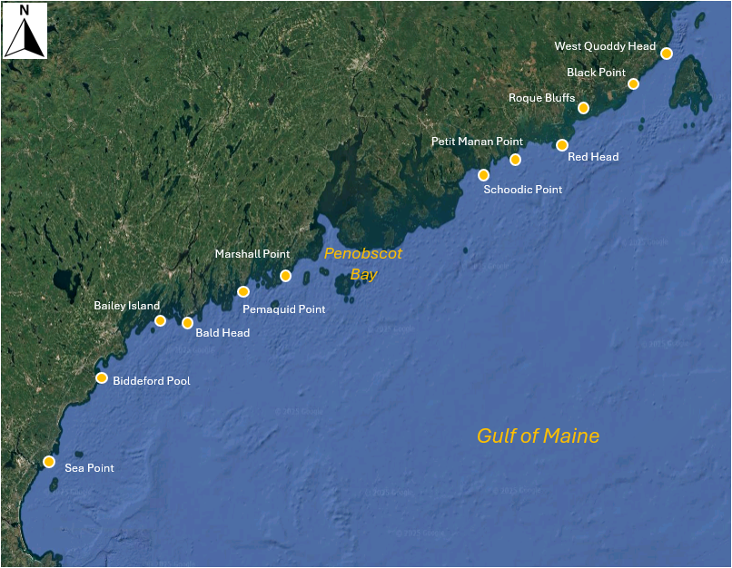

*Fig. 13.3 Map of the Gulf of Maine showing 12 sites where macroinvertebrates were sampled by {{@954#bkmrk-trott2022}}. Satellite image: Google Earth.*

Our initial agenda here may be to consider the relationships among the sites based on the species they contain in the usual way, e.g., using the Bray-Curtis (or Sørensen) resemblance measure directly on the species $\times$ site matrix. However, we may wish to nuance this calculation further by incorporating relationships among the species, based on their traits. In other words, if two sites do not share any species in common, they might nevertheless share two species that have similar traits. We can exploit the method of calculating taxonomic resemblance ('**Gamma+**', {{@954#bkmrk-clarkeetal2006b}}) in order to calculate, instead, a ***functional resemblance***, using a ***matrix of inter-species relationships built from the trait data*** (e.g., {{@954#bkmrk-myersetal2021}}).

Further to this aim, we shall consider our trait data matrix such that the classical role of 'samples' is given to the species (among which we shall calculate the resemblances), while traits are given the role of 'variables'. However, we want each trait ***group*** to be weighted equally in the calculation. To make sure the sum of values for each species within each trait group sums to 100 (so gets equal weight), we will want to apply a pre-treatment to standardise across the trait variables for each species ('sample'), but separately within each trait grouping. This standardisation would not be necessary if every species only had one trait within a group, but that is not the case here. For example, the mollusc species, *Adalaria proxima* (abbreviated ADP) is in two trophic categories: it grazes on algal fronds and blades (Tr-P-GF), and also grazes macro prey on the substratum (Tr-P-GSM). 

Our analysis pathway looks like this:
- Open the trait data matrix in PRIMER 8.
- Standardise the 'samples' (species here) across the trait variables, separately within each trait grouping, using our new tool in P8, **Pre-treatment** > **Standardise...**.
- Calculate functional resemblances among species using Bray-Curtis, based on the standardised trait data.
- Examine the inter-species functional relationships in an ordination (nMDS).
- Calculate functional resemblances among the 12 sites, by incorporating these species inter-relationships.
- Examine the functional relationships among the sites in an ordination (nMDS).

#### Open the trait data matrix
1. In PRIMER 8, click **File** > **Open...** and open up the file named '<ins>Gulf_of_Maine_invert_traits.pri</ins>' (found in the '<ins>Gulf_of_Maine_inverts</ins>' folder inside the '<ins>Examples_P8</ins>' folder), as shown below.

[![16._GoM_Traits_data_[i].png](https://learninghub.primer-e.com/uploads/images/gallery/2025-12/scaled-1680-/16-gom-traits-data-i.png)](https://learninghub.primer-e.com/uploads/images/gallery/2025-12/16-gom-traits-data-i.png)

Note here that the 'Samples' are actually the species (the names are abbreviated). More information about the species can be seen by clicking **Edit** > **Factors...**. Note also that the traits are variables. More information about the traits (also abbreviated) can be seen by clicking **Edit** > **Indicators...**.

The first trait group is actually the name of the Phylum for each species. These are not actually traits, so let's start by selecting all of the traits that do not belong to the 'Phylum' group.

2. From the '<ins>Gulf_of_Maine_invert_traits</ins>' matrix, click **Select** > **Variables...**, then choose
($\bullet$Indicator levels <ins>Trait category</ins>) and click the 'Levels...' button ([![17e._Levels_button.png](https://learninghub.primer-e.com/uploads/images/gallery/2025-07/scaled-1680-/17e-levels-button.png)](https://learninghub.primer-e.com/uploads/images/gallery/2025-07/17e-levels-button.png)). In the Selection dialog, first click the double right arrows button ([![17d._double_right_arrow.png](https://learninghub.primer-e.com/uploads/images/gallery/2025-07/scaled-1680-/17d-double-right-arrow.png)](https://learninghub.primer-e.com/uploads/images/gallery/2025-07/17d-double-right-arrow.png)) to move all of the groups to the 'Include' column on the right. Then click on '<ins>Phylum</ins>' and the left arrow button ([![17c._left_arrow.png](https://learninghub.primer-e.com/uploads/images/gallery/2025-07/scaled-1680-/17c-left-arrow.png)](https://learninghub.primer-e.com/uploads/images/gallery/2025-07/17c-left-arrow.png)), so that it appears back in the 'Available' column on the left (as shown below), then click '**OK**' (in both dialog windows).

[![17._Select_Variables_GoM.png](https://learninghub.primer-e.com/uploads/images/gallery/2025-12/scaled-1680-/17-select-variables-gom.png)](https://learninghub.primer-e.com/uploads/images/gallery/2025-12/17-select-variables-gom.png)
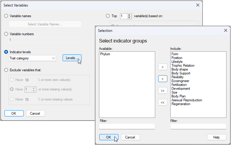

This will create a dataset that is re-coloured with a blue background, showing only the selected subset of traits (excluding 'Phylum'), like this:

[![18._Subsetted_traits_GoM_[i].png](https://learninghub.primer-e.com/uploads/images/gallery/2025-12/scaled-1680-/18-subsetted-traits-gom-i.png)](https://learninghub.primer-e.com/uploads/images/gallery/2025-12/18-subsetted-traits-gom-i.png)

Any analyses from this matrix will now only be done on the sub-setted data. To keep things tidy, click **Tools** > **Duplicate** and the subsetted data will now be provided in the Explorer tree as a new matrix called '<ins>Data1</ins>'. We can re-name this to '<ins>Traits</ins>' by clicking **File** > **Rename Data** and typing in this desired new name, then clicking '**OK**', as shown below.

[![19._Rename_dialog.png](https://learninghub.primer-e.com/uploads/images/gallery/2025-07/scaled-1680-/19-rename-dialog.png)](https://learninghub.primer-e.com/uploads/images/gallery/2025-07/19-rename-dialog.png)

#### Standardise the trait data
3. From the '<ins>Traits</ins>' data sheet, click **Pre-treatment** > **Standardise...** and choose (Standardise $\bullet$Samples) & (By $\bullet$Total) & (Standardise within groups/levels of $\checkmark$Indicator <ins>Trait category</ins>) & (Output $\bullet$Percentages), then click '**OK**', as shown below.

[![20._Standardise_within_groups_dialog.png](https://learninghub.primer-e.com/uploads/images/gallery/2025-07/scaled-1680-/20-standardise-within-groups-dialog.png)](https://learninghub.primer-e.com/uploads/images/gallery/2025-07/20-standardise-within-groups-dialog.png)
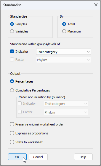

The resulting data sheet (called '<ins>Data1</ins>') can be renamed (using **File** > **Rename Data**, as we have done before) to (say) '<ins>Standardised Data</ins>', for clarity. The standardised trait data sheet will look like this:

[![21._Standardised_trait_[i].png](https://learninghub.primer-e.com/uploads/images/gallery/2025-12/scaled-1680-/21-standardised-trait-i.png)](https://learninghub.primer-e.com/uploads/images/gallery/2025-12/21-standardised-trait-i.png)

Note how the distribution of traits within a species for any particular trait group (in this example, the trait groups are identifiable by reference to the letters appearing before the dash '-' in the variable names, e.g., 'Po', 'Li', 'Tr', etc.) will sum to 100.

#### Calculate relationships among species based on traits
4. From the '<ins>Standardised Data</ins>' sheet, click **Analyse** > **Resemblance...** > (Measure $\bullet$Bray-Curtis similarity) & (Analyse between $\bullet$Samples), as shown below.

[![22._Resemblance_dialog.png](https://learninghub.primer-e.com/uploads/images/gallery/2025-07/scaled-1680-/22-resemblance-dialog.png)](https://learninghub.primer-e.com/uploads/images/gallery/2025-07/22-resemblance-dialog.png)

The resulting resemblances among the species, based on their traits is shown below.

[![23._Resem_among_species_'samples'_[i].png](https://learninghub.primer-e.com/uploads/images/gallery/2025-12/scaled-1680-/23-resem-among-species-samples-i.png)](https://learninghub.primer-e.com/uploads/images/gallery/2025-12/23-resem-among-species-samples-i.png)

We mustn't forget that the role of 'samples' is being taken by the species here! (The traits were the variables that created this matrix). However, in subsequent analyses to follow, the species will be variables, and sites will be samples. So let's go ahead and change the properties of this resemblance matrix now.

From '<ins>Resem1</ins>', click **Edit** > **Properties...** and change the following:
- Title '<ins>Gulf of Maine invertebrates</ins>'; and
- Between $\bullet$Variables
then click '**OK**' (as shown below).

[![23b._Resem_among_species_'variables'.png](https://learninghub.primer-e.com/uploads/images/gallery/2025-12/scaled-1680-/23b-resem-among-species-variables.png)](https://learninghub.primer-e.com/uploads/images/gallery/2025-12/23b-resem-among-species-variables.png)
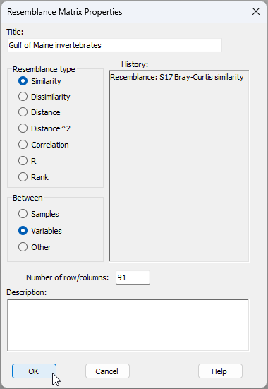

We now have a resemblance matrix among the species which are clearly identified as variables, hence that is ready for ensuing analyses (see below).

[![23c._Resem_among_species_'variables'_[i].png](https://learninghub.primer-e.com/uploads/images/gallery/2025-12/scaled-1680-/23c-resem-among-species-variables-i.png)](https://learninghub.primer-e.com/uploads/images/gallery/2025-12/23c-resem-among-species-variables-i.png)

As a next step, let's aim to visualise similarities among species, based on their traits, using a non-metric MDS ordination.

#### Visualise inter-species trait-based relationships
5. From '<ins>Resem1</ins>', click **Analyse** > **MDS** > **Non-metric MDS (nMDS)...**, and go with all of the default options in the dialog (just click '**OK**'). The resulting 2D ordination ('<ins>Graph1</ins>' in the Explorer tree) is shown below. Different symbols/colours show the different phyla in which individual species (labeled by their abbreviations) belong. 

[![24._Trait-space_nMDS_[i].png](https://learninghub.primer-e.com/uploads/images/gallery/2025-12/scaled-1680-/24-trait-space-nmds-i.png)](https://learninghub.primer-e.com/uploads/images/gallery/2025-12/24-trait-space-nmds-i.png)

This ordination has rather high stress (0.214), so we might opt to examine the 3D graphic ('<ins>Graph1</ins>' in the Explorer tree), which has a lower stress (0.138), as shown below.  In essence, this ordination shows us the relationships among these invertebrate species in multi-dimensional trait space.

[![25._3D_nMDS_traits.gif](https://learninghub.primer-e.com/uploads/images/gallery/2025-07/25-3d-nmds-traits.gif)](https://learninghub.primer-e.com/uploads/images/gallery/2025-07/25-3d-nmds-traits.gif)
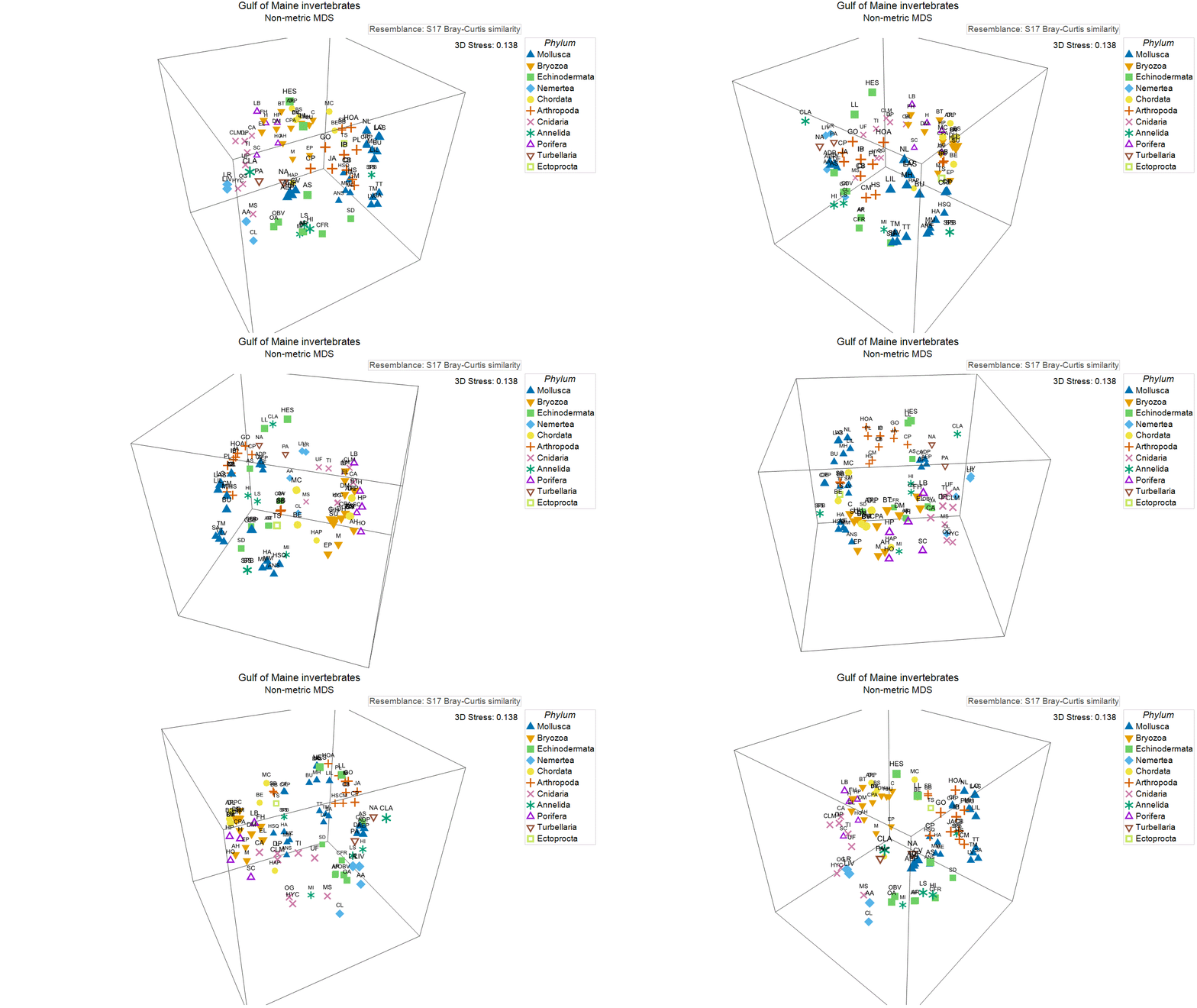

Next, we shall use these trait-based relationships among the species to inform the analysis of functional turnover among the sites, based on the species they contain.

#### Calculate functional resemblances (Gamma+) among sites
6. First, we need to open up the species $\times$ site matrix of presence/absence (occurrence) data in the same workspace (click **File** > **Open...**). This file is called '<ins>Gulf_of_Maine_invert_occurrences.pri</ins>' (also found in the '<ins>Gulf_of_Maine_inverts</ins>' folder inside the '<ins>Examples_P8</ins>' folder).

[![25._Species_by_Site_GoM_[i].png](https://learninghub.primer-e.com/uploads/images/gallery/2025-12/scaled-1680-/25-species-by-site-gom-i.png)](https://learninghub.primer-e.com/uploads/images/gallery/2025-12/25-species-by-site-gom-i.png)

The sites have abbreviated names. Full names (as shown in the map in Fig. 13.3 above) can be seen by clicking on **Edit** > **Factors...**. You will also see that the sites have been given a rank ordered value for their position along the Maine coastline ('West to East'), and have also been classified as occurring either north or south of Penobscot Bay, viz:

[![26._Factors_GoM.png](https://learninghub.primer-e.com/uploads/images/gallery/2025-07/scaled-1680-/26-factors-gom.png)](https://learninghub.primer-e.com/uploads/images/gallery/2025-07/26-factors-gom.png)
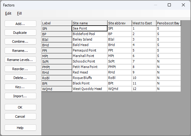

7. Now we shall calculate functional (trait-based) resemblances (Gamma+) among the sites. From the '<ins>Gulf_of_Maine_invert_occurrences</ins>' worksheet, click **Analyse** > **Resemblance...**, and in the 'Resemblance' dialog window:
   - Choose (Analyse between $\bullet$Samples) & (Measure $\bullet$Other > $\checkmark$ Taxonomic P/A > <ins>Gamma+</ins>), and click the 'Taxonomy...' button ([![27b._Taxonomy_button.png](https://learninghub.primer-e.com/uploads/images/gallery/2025-07/scaled-1680-/27b-taxonomy-button.png)](https://learninghub.primer-e.com/uploads/images/gallery/2025-07/27b-taxonomy-button.png)).
   - In the 'Variable Relationship' dialog window, choose (Type $\bullet$Resemblance), and click the 'Details...' button ([![27d._Details_button.png](https://learninghub.primer-e.com/uploads/images/gallery/2025-07/scaled-1680-/27d-details-button.png)](https://learninghub.primer-e.com/uploads/images/gallery/2025-07/27d-details-button.png)).
   - In the 'Resemblance (Data)' dialog, choose (Variable resemblance worksheet: <ins>Resem1</ins>).
   - Click '**OK**' (3 times, once for each successive dialog window) to complete the operation.
The dialog windows involved in this operation (i.e., to calculate Gamma+ on the basis of a resemblance matrix, which in our case is a trait-based resemblance matrix) are shown below:

[![27._Functional_Resemblance_operation.png](https://learninghub.primer-e.com/uploads/images/gallery/2025-07/scaled-1680-/27-functional-resemblance-operation.png)](https://learninghub.primer-e.com/uploads/images/gallery/2025-07/27-functional-resemblance-operation.png)
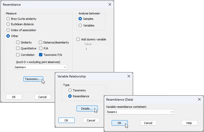

The resulting resemblance matrix of Gamma+ values among the sites (called '<ins>Resem2</ins>') is shown below.

[![28._Gamma+_trait_resem_among_sites_[i].png](https://learninghub.primer-e.com/uploads/images/gallery/2025-12/scaled-1680-/28-gamma-trait-resem-among-sites-i.png)](https://learninghub.primer-e.com/uploads/images/gallery/2025-12/28-gamma-trait-resem-among-sites-i.png)

#### Visualise functional turnover among sites
8. We can now easily do an ordination (or indeed a cluster analysis or any other resemblance-based analysis) of the trait-based turnover among the sites. From '<ins>Resem2</ins>', click **Analyse** > **MDS** > **Non-metric MDS (nMDS)**, just keep all of the defaults and click '**OK**'.

9. From the resulting 2D nMDS ordination graphic (called '<ins>Graph5</ins>' in the Explorer tree), click **Graph** > **Sample Labels & Symbols...** and choose to display labels by the factor of 'Site name', and symbols by the factor of 'Penobscot Bay', as shown in the dialog below, then click '**OK**'.

[![29._labels_&_Symbols_dialog_GoM.png](https://learninghub.primer-e.com/uploads/images/gallery/2025-07/scaled-1680-/29-labels-symbols-dialog-gom.png)](https://learninghub.primer-e.com/uploads/images/gallery/2025-07/29-labels-symbols-dialog-gom.png)
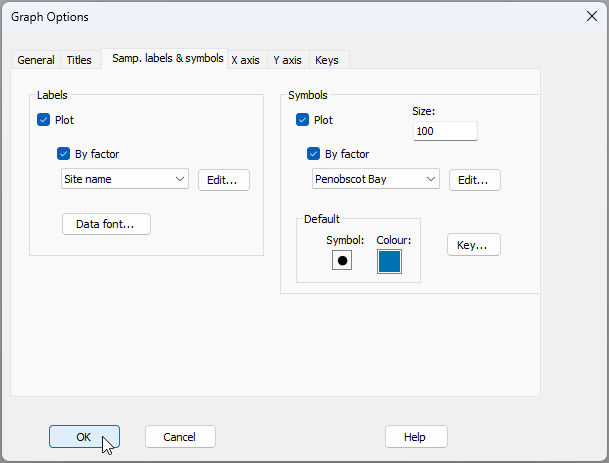

The resulting nMDS graphic looks like this:

[![30._nMDS_functional_turnover_nMDS_[i].png](https://learninghub.primer-e.com/uploads/images/gallery/2025-12/scaled-1680-/30-nmds-functional-turnover-nmds-i.png)](https://learninghub.primer-e.com/uploads/images/gallery/2025-12/30-nmds-functional-turnover-nmds-i.png)

This plot shows there is a clear shift in functional traits of intertidal assemblages from sites located to the south (blue symbols) *vs* those located to the north (amber symbols) of Penobscot Bay. We can do statistical tests of relevant hypotheses about this using ANOSIM (from '<ins>Resem2</ins>', click **Analyse** > **ANOSIM...**). Doing this shows that:
   - This shift is statistically significant (one-way unordered ANOSIM of the factor '<ins>Penobscot Bay</ins>', $R$ = 0.546, $P$ = 0.0022); and
   - There is a significant sequential change in trait-based relationships among these communities along the coastline (one-way ordered ANOSIM of the factor '<ins>West to East</ins>', $R^O$ = 0.422, $P$ = 0.0026).  

---
<sup>¶</sup>*Equally, and in a directly analogous fashion, there are situations where the standardisation of **variables** is required as a pre-treatment prior to analysis, but which needs to be done separately within groups of **samples** that may be identified by a **factor**.*

---
<sup>†</sup>*See also the following abstract by Thomas J. Trott, highlighted in the 4th World Conference on Marine Biodiversity: ['Traits matter: when rarity means more than abundance to functional diversity'](https://peerj.com/preprints/26840v1/).*

# 14. Create ordered groups


# 14.1 Overview

There is a new tool in PRIMER 8 that permits the end-user to ***create a set of ordered groups***, based on the numerical values of a given variable. 

#### Rationale ####
Below we provide a few examples of this tool's potential utility. There are many more!

### Binning and consolidating information ###
A case where we might want 'categories', but where there may be (initially) continuous values, occurs when we have a broad-scale dataset  with a *lot of replicates* that span a very *large area* or domain (in terms of latitude and longitude). For example, consider the [Continuous Plankton Recorder (CPR Survey](https://www.cprsurvey.org/). Many other ocenographic, landscape-level and environmental datasets have these characteristics. We might want to ***consolidate*** that information in some way, perhaps in order to make comparisons with more discrete (less continuous) datasets or variables (e.g., dis-continuous biotic samples at particular sites or regions). We could consider making a 'grid' over the sampling extent (i.e., by creating 1-degree sized bins for each of latitude and longitude) and then get the average values of the variable(s) within those grid cells. Indeed, to understand spatial relationships and patterns, it may be essential to bin samples into latitude (and/or longitude) groupings, so that structural changes through space can be more easily summarised, tested, visualised in plots, etc.

### Classification based on an ordination axis ###
Let's consider another scenario. Perhaps you have just done a principal component analysis (PCA) on a set of morphometric variables (e.g., for a set of individuals belonging to a given species). Suppose the first PC axis explains a lot of the multivariate variation and the position of any individual on that PC axis can essentially be interpreted as a measure of its overall relative size. The values of the individuals on the PC axis are continuous, but maybe you want to classify the individuals into (say) five roughly equal-sized groups along that axis (from small to large). In the past, this task could have taken some considerable time, sorting and data wrangling to get your groups based on the PC axis. Our new tool in PRIMER 8 will create equal sample-sized groups along your chosen continuous variable (e.g., a PC axis, or any other meaningful ordination axis of choice) in a flash.

### Setting known break points in the data
Yet another use-case for this tool is the situation where you want to identify a set of samples that fall within a certain range of values for a continuous variable; for example, suppose you want to separate out samples occuring at sites that are below a certain temperature (e.g., 20°C). You can use the tool to specify the value of <ins>20</ins> as a 'break point', and get a factor that groups samples either side of that break point. Multiple such breaks points can also, optionally, be constructed all at once. For example, suppose you have the continuous variable of depth (in metres); you might want to 'bin' samples into several categories according to their depths, using break points of <ins>10, 20, 30, 40</ins>, etc. (We shall see an example of this in the next section.)

### Finding natural peaks or gaps to define groupings
You may have a continuous variable that is not evenly distributed across its full range. For example, a histogram may show a multimodal distribution pattern. You may want to define groups that coincide in some natural way with that uneven distribution, such that each group will capture an individual 'mode' or 'peak'. You may not be certain about where the break-points in-between those modes should be placed. In this case, you would want the tool to find suitable break points for you by (say) minimising the within-group sum of squares for the variable, given the number of groups (peaks). If the modes are asymmetric, then sums of distances-to-median (rather than the within-group sum of squares) might be more appropriate to use here. Or you could go even more non-parametric in your criterion and choose groups so as to minimise only the rank inter-point Euclidean distances within each group.

### Specifying groups of replicates for dispersion weighting
Many species abundance variables (e.g., counts) display intrinsic mean-variance relationships. In other words, the variance increases with the mean. This relationship is particularly strong and important to consider in the context of species that tend to aggregate, e.g., such as fish that school, birds that flock, mammals that travel in herds, insects that cluster together in swarms, etc. We may wish to accommodate this by applying a pre-treatment to our data called ***dispersion weighting*** (see {{@954#bkmrk-clarkeetal2006a}} for details). This pre-treatment option effectively transforms our data to consider the abundances (counts) of ***clusters*** of organisms (for those species that do indeed demonstrate significant clustering of individuals), rather than analysing the raw abundance values. Of course, the dispersion weights that may be needed here will vary according to the individual species' distribution of counts across the sampling units.

To characterise mean-variance relationships, hence to apply dispersion-weighting, we need ***groups*** (levels of some factor) across which we can calculate and measure means and variances. In cases where we do not have any groups to begin with (e.g., whenever our sampling units occur along a continuous gradient, in a simple spatial array or regular samples through time, etc.), then there will be no way to use dispersion weighting at all. Usnig this new tool, we can create groups along one (or more) continuous variables which can then form the basis of a dispersion-weighting pre-treatment option.

### Plotting symbols and colours ###
It can be extremely useful to create groups from a continuous variable for rather simple practical or logistic reasons. For example, suppose we want to use different colours or symbols for different levels of a continuous variable, such as temperature. We may not want to have a different colour for every single temperature, but rather we might prefer to have a colour (and/or symbol) for all cases where temperature values occur within some specified range, for each of a set of specified temperature groups (eg., low, medium and high). The use of well-defined symbols and colours like this can make interpretations of patterns in ordinations, especially along gradients, much easier to visualise and communicate to others.  

#### Implementation
This tool is accessed by clicking **Tools** > **Create Ordered Groups...**. The dialog window is shown below.

[![01._Ordered_groups_dialog.png](https://learninghub.primer-e.com/uploads/images/gallery/2025-07/scaled-1680-/01-ordered-groups-dialog.png)](https://learninghub.primer-e.com/uploads/images/gallery/2025-07/01-ordered-groups-dialog.png)
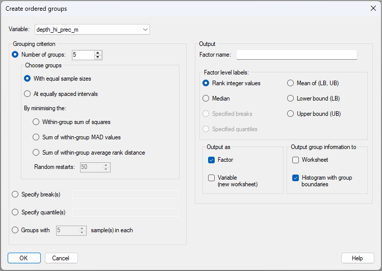

There is clearly a large diversity of options to choose from to create ordered groups based on a chosen continuous variable, as shown in the dialog above. The various methods that can be used to create groups are itemised and outlined, correspondingly, in more detail below.

#### Methods for creating groups
Consider an individual variable $Y$, which has a set of observed sample values $y$ and which our algorithm is going to split into $g$ ordered groups using some criterion. Let the number of sample values in each group be denoted by $n_i$ for $i = 1, \ldots, g$ and the total number of sample values is $\sum_i^g n_i = N$. Also, let $y_{ij}$ denote the $j$<sup>th</sup> observed value of $Y$ in the $i$<sup>th</sup> group for $j = 1, \ldots, n_i$ and $i = 1, \ldots, g$. In what follows, we shall let $\bar{y}_ i = \sum_{j=1}^{n_i} {y_{ij}} / {n_i} $ be the sample average of the variable for group $i$, and $m_i$ be the median value for the set of samples in group $i$.

The methods for choosing ordered groups based on the variable $Y$ include: <br><br>
- (1). Specify the ***number of groups***, $g$, and, given that number, generate groups: <br><br>
   - (a). with ***equal sample sizes*** ($n_1 = n_2 = \cdots = n_g$); or <br><br>
   - (b). at ***equally spaced intervals***, so as to ***minimise***: <br><br>
       - (i). ***the within-group sum of squares***, i.e., $\sum_{i=1}^{g}\sum_{j=1}^{n_i} (y_{ij} - \bar{y}_ i)^2$; or <br><br>
       - (ii). ***the sum of within-group mean absolute deviations (MAD) from the median***, i.e., $\sum_{i=1}^{g}\sum_{j=1}^{n_i} |y_{ij} - m_i|$; or <br><br>
       - (iii). ***the sum of within-group average rank inter-point Euclidean distances***. <br><br>
- (2). Specify ***break(s)*** manually, i.e., a list of specific values of the variable that will serve as break-points between consecutive ordered groups (e.g., <ins>10, 20, 50, 100</ins>); or <br><br>
- (3). Specify the ***quantile(s)*** of the variable's empirical distribution where you want break-points to be (e.g., <ins>0.25, 0.5, 0.75</ins>); or <br><br>
- (4). Specify groups by nominating a certain value for the ***number of samples in each group***, i.e. $n_i = n$ for all $i$.<sup>¶</sup>

---
<sup>†</sup>*Dispersion weighting ({{@954#bkmrk-clarkeetal2006a}}) is achieved easily and directly in PRIMER 8 by clicking **Pre-treatment** > **Dispersion Weighting...**.*

---
<sup>¶</sup>*Note that if there are any 'remainders', given the total sample size, these will be placed in a final group, corresponding to the largest values of the variable, but with reduced $n$. For example, if you have 10 samples and you ask for groups having a sample size of $n$ = 3, the tool will create 3 ordered groups {1,2,3}, {4,5,6}, {7,8,9}, and one remainder sample will spill into a fourth group on its own {10}.*

# 14.2 Example: NE Pacific groundfish vs depth

To demonstrate the creation and use of ordered groups from a continuous variable, we will look at data comprised of an excerpt from the West Coast Groundfish Bottom Trawl (Slope and Shelf Combination) Survey, conducted annually by the National Oceanic and Atmospheric Association (NOAA)'s Northwest Fisheries Science Center<sup>¶</sup> and available online ([https://www.nwfsc.noaa.gov/data/map](https://www.nwfsc.noaa.gov/data/map)). This specific excerpt was created and used by {{@954#bkmrk-andersonetal2022}} and is also available on [Dryad](https://datadryad.org/dataset/doi:10.5061/dryad.c59zw3rbp). Data are provided from trawl surveys for the years from 1999-2018 inclusive. There are two data sheets referred to here (both are found in the <ins>Examples_P8</ins> > <ins>NE_Pacific_groundfish</ins> folder), namely: (1) counts of abundances of $p$ = 310 species of groundfish obtained in each trawl (in the file called '<ins>NE_Pacific_groundfish.pri</ins>') and (2) values for latitude, longitude, depth (in m) and the area swept per trawl (in the file called '<ins>NE_Pacific_env.pri</ins>').

In this example, there are $N$ = 6002 (!) rows of data (sample trawls), with depth values from 24 m - 1,428 m, and latitudes from 32°N to 48°N. Constructing a nMDS ordination plot of these fish assemblages for all 6002 samples is unlikely to be helpful here! To make some sense of these data that span such large latitudinal and depth ranges, it would be helpful to create some groups of samples occuring at similar depths (and also groups of samples occurring at similar latitudes, e.g., see {{@954#bkmrk-andersonetal2013}}). Here, we shall focus purely on creating ordered groups of samples from the variable of ***depth***. More specifically, our interest lies in uncovering potential changes in the structure of fish assemblages along the depth gradient. 

#### Open file and create ordered depth groupings
1. Open up the file called '<ins>NE_Pacific_env.pri</ins>' in PRIMER 8. It will look like this:

[![02._Groundfish_Env_data_[i].png](https://learninghub.primer-e.com/uploads/images/gallery/2025-12/scaled-1680-/02-groundfish-env-data-i.png)](https://learninghub.primer-e.com/uploads/images/gallery/2025-12/02-groundfish-env-data-i.png)

2. From the <ins>NE_Pacific_env</ins> data sheet, click **Tools** > **Create Ordered Groups...**, like so:

[![02b._Groundfish_Env_data_click_Tools_[i].png](https://learninghub.primer-e.com/uploads/images/gallery/2025-12/scaled-1680-/02b-groundfish-env-data-click-tools-i.png)](https://learninghub.primer-e.com/uploads/images/gallery/2025-12/02b-groundfish-env-data-click-tools-i.png)

3. In the resulting dialog, choose:
- Variable: <ins>Depth (m)</ins>
- Grouping criterion > $\bullet$Specify break(s) <ins>50, 100, 200, 400, 600, 800, 1000, 1200</ins>
- Output >
   - Factor name: <ins>Depth bin output</ins>
   - Factor level labels: $\bullet$Lower bound (LB)
   - Output as $\checkmark$Factor
   - Output group information to ($\checkmark$Worksheet) & ($\checkmark$Histogram with group boundaries)

The dialog with these choices will look like this:

[![03._Dialog_create_groups.png](https://learninghub.primer-e.com/uploads/images/gallery/2025-07/scaled-1680-/03-dialog-create-groups.png)](https://learninghub.primer-e.com/uploads/images/gallery/2025-07/03-dialog-create-groups.png)
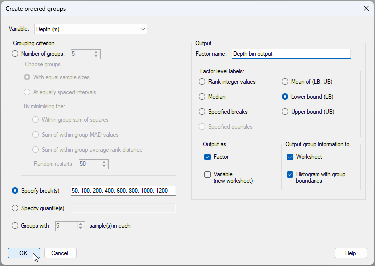

#### Output from the 'Create Ordered Groups...' tool
The output file ([![04a._Notepad_icon_[i].png](https://learninghub.primer-e.com/uploads/images/gallery/2025-12/scaled-1680-/04a-notepad-icon-i.png)](https://learninghub.primer-e.com/uploads/images/gallery/2025-12/04a-notepad-icon-i.png)) called '<ins>Ordered Groups1</ins>' in the Explorer tree, has some useful information about how the groups were created. For each group we can see: the minimum, median, maximum, lower bound (LB) upper bound (UB), the mean of (LB) and (UB), and the number of samples that fell into each group. This output file is shown below:

[![04._Output_rtf_create_groups_[i].png](https://learninghub.primer-e.com/uploads/images/gallery/2025-12/scaled-1680-/04-output-rtf-create-groups-i.png)](https://learninghub.primer-e.com/uploads/images/gallery/2025-12/04-output-rtf-create-groups-i.png)

(As an aside, note that we opted in this example also to output this information to a separate data sheet as well, which is called '<ins>Data1</ins>' in the Explorer tree.)

Another important part of our output (called '<ins>Graph1</ins>' in the Explorer tree) is a ***histogram*** of the '<ins>Depth (m)</ins>' variable, with the values for the breaks separating the groups shown as vertical dotted lines (as shown below). This is a really helpful way to see the groupings we obtained by reference to the full distribution of sample values for the variable of interest.

[![05._Depth_groupings_hist_[i].png](https://learninghub.primer-e.com/uploads/images/gallery/2025-12/scaled-1680-/05-depth-groupings-hist-i.png)](https://learninghub.primer-e.com/uploads/images/gallery/2025-12/05-depth-groupings-hist-i.png)

Another thing we get (and perhaps the most useful 'handle' for subsequent analyses we may want to do) is a new ***factor*** that is now associated with our original data file. To see this factor, click on the <ins>NE_Pacific_env</ins> data sheet in the Explorer tree, then click **Edit** > **Factors...**. In the 'Factors' window, you will now see this new factor, called '<ins>Depth bin output</ins>', provided as the last column (on the right), like this:

[![06._Factors_sheet_(a).png](https://learninghub.primer-e.com/uploads/images/gallery/2025-07/scaled-1680-/06-factors-sheet-a.png)](https://learninghub.primer-e.com/uploads/images/gallery/2025-07/06-factors-sheet-a.png)
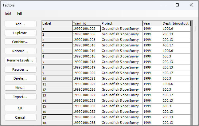

#### Tweak the factor level names (optional)
We asked for the lower bound value of each group to be made the factor level names of our groups, but we can see that these are not necessarily whole numbers. It might be nice to round these to the appropriate whole number, in each case.

4. First, let's duplicate the newly created factor. From the <ins>NE_Pacific_env</ins> data sheet, click **Edit** > **Factors...**. In the 'Factors' window, click anywhere in the column named '<ins>Depth bin output</ins>', then click the 'Duplicate' button ([![07a._Duplicate_button.png](https://learninghub.primer-e.com/uploads/images/gallery/2025-07/scaled-1680-/07a-duplicate-button.png)](https://learninghub.primer-e.com/uploads/images/gallery/2025-07/07a-duplicate-button.png)).

5. You will get a new column with a duplicate factor called '<ins>Depth bin output1</ins>'. Click anywhere in this new column, then click the 'Rename...' button ([![07b._Rename_button.png](https://learninghub.primer-e.com/uploads/images/gallery/2025-07/scaled-1680-/07b-rename-button.png)](https://learninghub.primer-e.com/uploads/images/gallery/2025-07/07b-rename-button.png)). Rename this factor simply as '<ins>Depth</ins>', then click '**OK**'.


[![07c._Rename_factor_dialog.png](https://learninghub.primer-e.com/uploads/images/gallery/2025-07/scaled-1680-/07c-rename-factor-dialog.png)](https://learninghub.primer-e.com/uploads/images/gallery/2025-07/07c-rename-factor-dialog.png)

6. Now we are going to rename the levels of this factor called 'Depth' to whole numbers. Click the 'Rename Levels...' button ([![07d._Rename_levels_button.png](https://learninghub.primer-e.com/uploads/images/gallery/2025-07/scaled-1680-/07d-rename-levels-button.png)](https://learninghub.primer-e.com/uploads/images/gallery/2025-07/07d-rename-levels-button.png)).


In the 'Rename Factor Levels' dialog (new to PRIMER8!), you will see two columns: the 'Existing Level Name' on the left and the 'New Level Name' on the right. Change the values in the 'New Level Name' to the desired values , and click'**OK**', as shown below.

[![07e._Rename_levels_sheet_[i].png](https://learninghub.primer-e.com/uploads/images/gallery/2025-12/scaled-1680-/07e-rename-levels-sheet-i.png)](https://learninghub.primer-e.com/uploads/images/gallery/2025-12/07e-rename-levels-sheet-i.png)

In our case, we have specified new factor level names that are still ***numeric*** and consist of whole numbers that will make sense for us in this example for plots/symbols, etc. But note that this tool can be used to re-define the factor level names to anything we wish (not necessarily numbers). Note also, for this example, that we have to be careful not to do too much 'rounding'. We need to stay true to what we know about the data and the bounds of the groups we have created. Bear in mind that we could have changed the names of these factor levels to ranges of depths (e.g., such as 50-100m), which may be better (or more accurate). However, if we change these names to ranges in this way, then we no longer have a strictly numeric factor. Factor levels that are numeric can be really useful in PRIMER, because they allow us to do things like treat the factor as ***ordered*** in an ANOSIM, or superimpose ***trajectories*** to connect consecutive depths on an ordination plot, etc. In this example, given the new names we have chosen, whenever we describe this factor we will have to be clear what the labels mean; specifically, that the group that we have named '50' here corresponds to samples that occurred between 50 m and 100 m in depth, and so on.

#### Create a factor for Latitude
We can repeat the above steps for another important spatial factor here: namely, latitude.

7. From the '<ins>NE_Pacific_env</ins>' data sheet in the Explorer tree, click **Tools** > **Create Ordered Groups...**, then choose to create ordered groups from the variable of '<ins>Latitude (dd)</ins>', and specify the breaks to occur in 2-degree increments: {<ins>34, 36, 38, 40, 42, 44, 46, 48</ins>}, as shown below.

[![11._Latitude_dialog_to_create.png](https://learninghub.primer-e.com/uploads/images/gallery/2025-07/scaled-1680-/11-latitude-dialog-to-create.png)](https://learninghub.primer-e.com/uploads/images/gallery/2025-07/11-latitude-dialog-to-create.png)

A histogram showing the break-points for latitude that we have chosen is shown below ('<ins>Graph2</ins>' in the Explorer tree).

[![07g._Lat_groupings_hist_[i].png](https://learninghub.primer-e.com/uploads/images/gallery/2025-12/scaled-1680-/07g-lat-groupings-hist-i.png)](https://learninghub.primer-e.com/uploads/images/gallery/2025-12/07g-lat-groupings-hist-i.png)

8. You will want to tweak this new factor for Latitude (just as we did for the Depth factor before). From the <ins>NE_Pacific_env</ins> data sheet, click **Edit** > **Factors...**, then proceed to do the following:
   - ***Duplicate the factor*** of '<ins>Latitude bin ouput</ins>' to get '<ins>Latitude bin ouput1</ins>' ([![07a._Duplicate_button.png](https://learninghub.primer-e.com/uploads/images/gallery/2025-07/scaled-1680-/07a-duplicate-button.png)](https://learninghub.primer-e.com/uploads/images/gallery/2025-07/07a-duplicate-button.png)).
   - ***Rename the factor*** '<ins>Latitude bin ouput1</ins>' to call it '<ins>Latitude</ins>' ([![07b._Rename_button.png](https://learninghub.primer-e.com/uploads/images/gallery/2025-07/scaled-1680-/07b-rename-button.png)](https://learninghub.primer-e.com/uploads/images/gallery/2025-07/07b-rename-button.png)).
   - ***Rename the levels of the factor*** '<ins>Latitude</ins>' to whole numbers ([![07d._Rename_levels_button.png](https://learninghub.primer-e.com/uploads/images/gallery/2025-07/scaled-1680-/07d-rename-levels-button.png)](https://learninghub.primer-e.com/uploads/images/gallery/2025-07/07d-rename-levels-button.png)). An image of this last operation is shown below.

[![07f._Rename_Latitude_factor_[i].png](https://learninghub.primer-e.com/uploads/images/gallery/2025-12/scaled-1680-/07f-rename-latitude-factor-i.png)](https://learninghub.primer-e.com/uploads/images/gallery/2025-12/07f-rename-latitude-factor-i.png)

#### Open the groundfish data and import the new factors
Now that we have the factors we want, it would be great to use this to our advantage in analyses of the groundfish data. First we will get the fish data into the workspace, then we will import the new factors (currently associated wtih the environmental data sheet) over to the groundfish data sheet.

9. In the same PRIMER workspace, click **File** > **Open...** and open the file called '<ins>NE_Pacific_groundfish.pri</ins>'. It will look like this:

[![08._Groundfish_data_[i].png](https://learninghub.primer-e.com/uploads/images/gallery/2025-12/scaled-1680-/08-groundfish-data-i.png)](https://learninghub.primer-e.com/uploads/images/gallery/2025-12/08-groundfish-data-i.png)

10. From the '<ins>NE_Pacific_groundfish</ins>' data sheet in the Explorer tree, click **Edit** > **Factors...** and click the 'Import' button ([![09a.Import_button.png](https://learninghub.primer-e.com/uploads/images/gallery/2025-07/scaled-1680-/09a-import-button.png)](https://learninghub.primer-e.com/uploads/images/gallery/2025-07/09a-import-button.png)). Choose to import from the '<ins>NE_Pacific_env</ins>' worksheet, then click the 'Select' button ([![10f._Select_button.png](https://learninghub.primer-e.com/uploads/images/gallery/2025-07/scaled-1680-/10f-select-button.png)](https://learninghub.primer-e.com/uploads/images/gallery/2025-07/10f-select-button.png)). In the selection dialog, pick only the two factors named '<ins>Depth</ins>' and '<ins>Latitude</ins>' to include in the import, then click '**OK**', like so:


[![10e._Import_operations_all_new.png](https://learninghub.primer-e.com/uploads/images/gallery/2025-07/scaled-1680-/10e-import-operations-all-new.png)](https://learninghub.primer-e.com/uploads/images/gallery/2025-07/10e-import-operations-all-new.png)
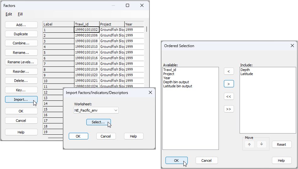

You can confirm that the groundfish sheet now has the '<ins>Depth</ins>' and '<ins>Latitude</ins>' factors, imported from the environmental data sheet.

#### Create a combined factor of depth-by-latitude
11. For our analysis and plots, we will want now to create a factor that corresponds to the ***combination*** of all depth-by-latitude bins. From the '<ins>NE_Pacific_groundfish</ins>', click **Edit** > **Factors...**, then click the 'Combine' button ([![11b._Combine_button.png](https://learninghub.primer-e.com/uploads/images/gallery/2025-07/scaled-1680-/11b-combine-button.png)](https://learninghub.primer-e.com/uploads/images/gallery/2025-07/11b-combine-button.png)). In the 'Combine Factors' dialog, click on the 'Factors...' button ([![12c._Factors_button.png](https://learninghub.primer-e.com/uploads/images/gallery/2025-07/scaled-1680-/12c-factors-button.png)](https://learninghub.primer-e.com/uploads/images/gallery/2025-07/12c-factors-button.png)), then in the 'Ordered Selection' dialog, choose to include just Latitude and Depth, as shown below, then click '**OK**' (3 separate times for the three windows).


[![12d._Combine_factors_all.png](https://learninghub.primer-e.com/uploads/images/gallery/2025-07/scaled-1680-/12d-combine-factors-all.png)](https://learninghub.primer-e.com/uploads/images/gallery/2025-07/12d-combine-factors-all.png)
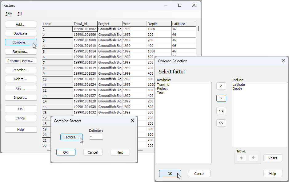

We now have a factor that identifies groups of samples with similar latitude and depth. This new combined factor of '<ins>Latitude-Depth</ins>' effectively corresponds to spatial 'cells' of practical interest in our study design, and it will serve us very well for subsequent analyses. (It is the final column on the right in the image below):

[![12e._Finished_all_factor_operations.png](https://learninghub.primer-e.com/uploads/images/gallery/2025-07/scaled-1680-/12e-finished-all-factor-operations.png)](https://learninghub.primer-e.com/uploads/images/gallery/2025-07/12e-finished-all-factor-operations.png)
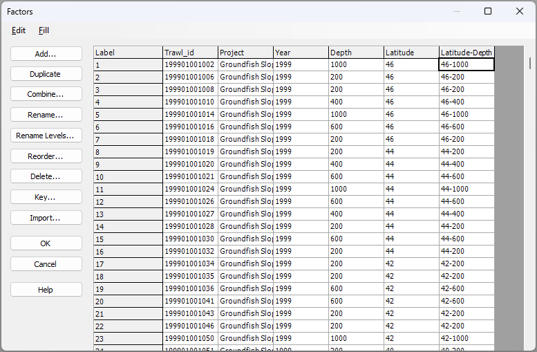

#### Analyse changes in groundfish assemblages *vs* depth and latitude
We now wish to analyse potential changes in groundfish assemblages with shifts in depth and latitude. Our plan will be to apply a suitable pre-treatment to the data, calculate averages wtihin each latitude-by-depth cell, proceed with calculating a square-root transformation of the data and Bray-Curtis resemblances among these cells, followed by an ordination (nMDS) and tests of hypotheses (ANOSIM) on that resemblance matrix. Note that the averaging step is really important here. We would have no hope of seeing any sensible patterns if we were to 'throw' the full dataset of over 6000 replicates into a single nMDS plot!

### Pre-treatment
To analyse the groundfish data, it is appropriate to consider that many fish species occur in clusters or aggregations of individuals. Hence, a pre-treatment option such as ***dispersion weighting*** ({{2954#bkmrk-clarkeetal2006a}}) would likely be a really appropriate option here. We shall consider the replicate trawls within each latitude-by-depth cell as fairly natural groupings to use in order to apply this pre-treatment option. We noted that there were only 8 replicate trawls from depths less than 50 m, so we will omit those replicates in what follows.

12. From the '<ins>NE_Pacific_groundfish</ins>' data sheet, click **Select** > **Samples...** > ($\bullet$Factor levels > <ins>Depth</ins>), click the 'Levels' button ([![13d._Levels_button.png](https://learninghub.primer-e.com/uploads/images/gallery/2025-07/scaled-1680-/13d-levels-button.png)](https://learninghub.primer-e.com/uploads/images/gallery/2025-07/13d-levels-button.png)), then choose to retain all depth groups except '<ins>24</ins>', and click '**OK**', as shown below:

[![13c._Select_samples_gt_50m_all.png](https://learninghub.primer-e.com/uploads/images/gallery/2025-07/scaled-1680-/13c-select-samples-gt-50m-all.png)](https://learninghub.primer-e.com/uploads/images/gallery/2025-07/13c-select-samples-gt-50m-all.png)
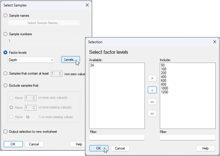

This will turn the worksheet cells blue, and this indicates that a subset of the data has been selected.

[![13e._Subset_selected_groundfish_[i].png](https://learninghub.primer-e.com/uploads/images/gallery/2025-12/scaled-1680-/13e-subset-selected-groundfish-i.png)](https://learninghub.primer-e.com/uploads/images/gallery/2025-12/13e-subset-selected-groundfish-i.png)

13. From this subset-selected groundfish data sheet, click **Pre-treatment** > **Dispersion Weighting...** and choose to do this on the basis of the factor '<ins>Latitude-Depth</ins>', then click '**OK**', like so: 

[![14._Disp_weighting_dialog.png](https://learninghub.primer-e.com/uploads/images/gallery/2025-07/scaled-1680-/14-disp-weighting-dialog.png)](https://learninghub.primer-e.com/uploads/images/gallery/2025-07/14-disp-weighting-dialog.png)

This operation will take some considerable time, simply because of the sheer size of the dataset. The randomization test (for which the individuals of each species are randomly re-assigned to replicates wtihin each of the latitude-depth cells), which is done indpendently for every species, is computationally demanding. However, the results file from the dispersion-weighting pre-treatment (called '<ins>Dispersion weighting1</ins>') demonstrates very clearly that ***many*** of these fish species show significant clustering (i.e., wherever the value in the 'Divisor' column is greater than 1), hence should sensibly be pre-treated in this way. The dispersion-weighted data is called '<ins>Data3</ins>' in the Explorer tree and will look like this:

[![13_add-on_Dispersion-weighted_data_[i].png](https://learninghub.primer-e.com/uploads/images/gallery/2025-12/scaled-1680-/13-add-on-dispersion-weighted-data-i.png)](https://learninghub.primer-e.com/uploads/images/gallery/2025-12/13-add-on-dispersion-weighted-data-i.png)

### Averaging
14. From the dispersion-weighted data ('<ins>Data3</ins>'), click **Tools** > **Average...** and choose to average the samples by the factor of '<ins>Latitude-Depth</ins>', like so:

[![15._Average_dialog.png](https://learninghub.primer-e.com/uploads/images/gallery/2025-07/scaled-1680-/15-average-dialog.png)](https://learninghub.primer-e.com/uploads/images/gallery/2025-07/15-average-dialog.png)

In the resulting data sheet (called '<ins>Data4</ins>'), we now have average values for each species in each latitude-by-depth cell (rows), as shown below:

[![15b._Averaged_data_sheet_[i].png](https://learninghub.primer-e.com/uploads/images/gallery/2025-12/scaled-1680-/15b-averaged-data-sheet-i.png)](https://learninghub.primer-e.com/uploads/images/gallery/2025-12/15b-averaged-data-sheet-i.png)

Note that the names of the samples in the averaged data now correspond to the latitude-by-depth bin combinations. If you click **Edit** > **Properties...**, you will see that this sheet now has 71 rows. We have consolidated these data in a very useful way across our study design, while maintaining the integrity of the underlying information.

### Transformation & resemblance
If we look at a shade plot of the averaged data (you can do this by clicking on **Plots** > **Shade Plot...** from '<ins>Data4</ins>'), we can see that, even after dispersion-weighting and averaging, these data still look pretty sparse. We will therefore do a (mild) overall transformation to square roots, then calculate the Bray-Curtis resemblance measure.

15. From '<ins>Data4</ins>', click **Pre-treatment** > **Transform(overall)...** > Transformation: <ins>Square root</ins>, **OK**.

[![15c._Sqrt_transformation.png](https://learninghub.primer-e.com/uploads/images/gallery/2025-07/scaled-1680-/15c-sqrt-transformation.png)](https://learninghub.primer-e.com/uploads/images/gallery/2025-07/15c-sqrt-transformation.png)

The resulting square-root transformed data matrx will be called '<ins>Data5</ins>'.

16. From '<ins>Data5</ins>', click **Analyse** > **Resemblance...** > (Measure $\bullet$ Bray-Curtis similarity) & (Analyse between $\bullet$Samples), '**OK**'.

[![15d._BC_resem.png](https://learninghub.primer-e.com/uploads/images/gallery/2025-07/scaled-1680-/15d-bc-resem.png)](https://learninghub.primer-e.com/uploads/images/gallery/2025-07/15d-bc-resem.png)
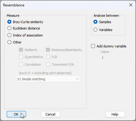

The resulting resemblance matrix will be called '<ins>Resem1</ins>', and will look like this: 

[![15e._Resem_groundfish_[i].png](https://learninghub.primer-e.com/uploads/images/gallery/2025-12/scaled-1680-/15e-resem-groundfish-i.png)](https://learninghub.primer-e.com/uploads/images/gallery/2025-12/15e-resem-groundfish-i.png)

### Ordination *via* nMDS
17. From the '<ins>Resem1</ins>' matrix, click **Analyse** > **MDS** > **Non-metric MDS (nMDS)...**, retain all of the defaults and click '**OK**'. The resulting best 2d solution for the nMDS ordination plot is called '<ins>Graph3</ins>' in the Explorer tree, and it has a nice low stress of 0.06.

We can consider looking at two different 'views' of this ordination:
   - **(a)** With symbols corresponding to '<ins>Depth</ins>' and Labels correspond to '<ins>Latitude</ins>' (optionally with trajectories for '<ins>Latitude</ins>', split by '<ins>Depth</ins>' groups); or
   - **(b)** With symbols corresponding to '<ins>Latitude</ins>' and Labels correspond to '<ins>Depth</ins>' (optionally with trajectories for '<ins>Depth</ins>', split by '<ins>Latitude</ins>' groups).

**To obtain (a):**
From '<ins>Graph3</ins>', click **Graph** > **Sample Labels & Symbols...** (Labels > $\checkmark$Plot > $\checkmark$By factor <ins>Latitude</ins>) & (Symbols > $\checkmark$Plot > $\checkmark$By factor <ins>Depth</ins>). Get the trajectories by clicking **Graph** > **Special**, click the 'Overlays' tab then choose: Trajectory > $\checkmark$Overlay trajectory > Trajectory numeric factor: <ins>Latitude</ins> > $\checkmark$Split trajectory <ins>Depth</ins>.

The result looks like this:

[![16a._nMDS_Depth_as_symbols_[i].png](https://learninghub.primer-e.com/uploads/images/gallery/2025-12/scaled-1680-/16a-nmds-depth-as-symbols-i.png)](https://learninghub.primer-e.com/uploads/images/gallery/2025-12/16a-nmds-depth-as-symbols-i.png)

**To obtain (b):**
Simply swap the role of '<ins>Latitude</ins>' and '<ins>Depth</ins>' factors in the above instructions for (a). The result looks like this:

[![16b._nMDS_Lat_as_symbols_[i].png](https://learninghub.primer-e.com/uploads/images/gallery/2025-12/scaled-1680-/16b-nmds-lat-as-symbols-i.png)](https://learninghub.primer-e.com/uploads/images/gallery/2025-12/16b-nmds-lat-as-symbols-i.png)

These ordinations show a very highly spatially structured ecological system, with marked gradual changes in fish assemblages with both latitude and depth. It is clear that latitudinal turnover in fish asesmblages is more marked at shallower depths than at deeper depths. In addition, turnover in fish assemblages with depth becomes less marked after about 600 m, particularly at higher latitudes.

### Testing ordered factors *via* ANOSIM
We can treat each of these factors as ***ordered factors*** in a ***two-way ANOSIM*** (see {{@954#bkmrk-somerfieldetal2021a}} and {{@954#bkmrk-somerfieldetal2021b}}) to test and quantify these effects in a non-parametric (rank-resemblance) framework.

18. From the '<ins>Resem1</ins>' matrix, click **Analyse** > **ANOSIM...**, and specify the two factors of '<ins>Depth</ins>' and '<ins>Latitude</ins>' as ordered factors in a two-way crossed design, as shown in the dialog below:

[![17._ANOSIM_dialog_groundfish.png](https://learninghub.primer-e.com/uploads/images/gallery/2025-07/scaled-1680-/17-anosim-dialog-groundfish.png)](https://learninghub.primer-e.com/uploads/images/gallery/2025-07/17-anosim-dialog-groundfish.png)
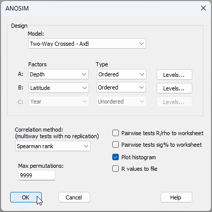

The results (not suprisingly) are uber clear (see the output file '<ins>ANOSIM1</ins>' in the Explorer tree). There is a highly significant ordered effect of depth generating sequential turnover in groundfish assemblages from 50 m to 1200 m on the NE Pacific coast (ANOSIM, $R^O$ = 0.934, $P$ = 0.0001). There are also significant sequential changes (i.e., turnover) in groundfish assemblages along the latitudinal gradient, from 32°N to 48°N (ANOSIM, $R^O$ = 0.768, $P$ = 0.0001).

[![17b._ANOSIM_output_groundfish_[i].png](https://learninghub.primer-e.com/uploads/images/gallery/2025-12/scaled-1680-/17b-anosim-output-groundfish-i.png)](https://learninghub.primer-e.com/uploads/images/gallery/2025-12/17b-anosim-output-groundfish-i.png)

[![17c._ANOSIM_Rperm_Depth_[i].png](https://learninghub.primer-e.com/uploads/images/gallery/2025-12/scaled-1680-/17c-anosim-rperm-depth-i.png)](https://learninghub.primer-e.com/uploads/images/gallery/2025-12/17c-anosim-rperm-depth-i.png)

[![17d._ANOSIM_Rperm_Latitude_[i].png](https://learninghub.primer-e.com/uploads/images/gallery/2025-12/scaled-1680-/17d-anosim-rperm-latitude-i.png)](https://learninghub.primer-e.com/uploads/images/gallery/2025-12/17d-anosim-rperm-latitude-i.png)

---
<sup>¶</sup>*NOAA Fisheries, NWFSC/FRAM, 2725 Montlake Blvd. East, Seattle, WA 98112, USA*

# 15. Other new tools & utilities


# 15.1 New default colour palette

#### Accessibility
It is important to make graphics accessible to those with color vision deficiencies. We have therefore re-vamped the colour palette for P8 to achieve distinctive colours for plots (by default) that carefully accommodate the most common forms of colour blindness (Fig. 15.1).

[![02b._Colour_palette_comparison.png](https://learninghub.primer-e.com/uploads/images/gallery/2025-07/scaled-1680-/02b-colour-palette-comparison.png)](https://learninghub.primer-e.com/uploads/images/gallery/2025-07/02b-colour-palette-comparison.png)
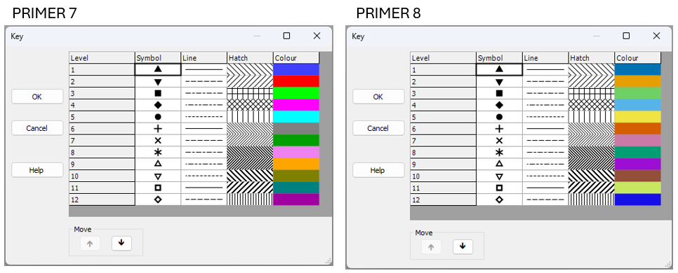

*Fig. 15.1 New default colour palette in PRIMER 8 (at right) compared to the old default colour palette in PRIMER 7 (at left).*

In developing these new defaults, we used the following resources:
- ["Coloring for Colorblindness" - David Nichols](https://davidmathlogic.com/colorblind/#%23D81B60-%231E88E5-%23FFC107-%23004D40)
- ["Points of view: Color blindness" - Bang Wong](https://www.nature.com/articles/nmeth.1618)
- [Paul Tol's Notes: Colour schemes and templates - Paul Tol](https://sronpersonalpages.nl/~pault/)

We especially appreciated David Nichols' [online tool](https://davidmathlogic.com/colorblind/#%23D81B60-%231E88E5-%23FFC107-%23004D40), which allowed us to play with colour schemes and get a feel for how different schemes would look for people who experience colour differently, due to various forms of alterations to their color vision, including protanopia, deuteranopia, tritanopia or deuteranomaly. We ended up with the following pallette:
- [PRIMER 8 default colours](https://davidmathlogic.com/colorblind/#%230072B2-%23E69F00-%236ED065-%2356B4E9-%23F0E442-%23D55E00-%23CC79A7-%23009E73-%239c0ed3-%23934f38-%23c8e761) - (see the left-hand column labeled 'True' when you follow this link).

To get there, we borrowed the base colour scheme from {{@954#bkmrk-wong2011}}. We then simply re-arranged the order of the colours and extended the scheme to 12 colours which we felt, as much as possible, would still appear well-differentiated from one another, right across the range of different forms of colour vision deficiency.

#### Compatibility with earlier versions of PRIMER
If you have an existing *.pri or *.pwk file that has been opened and saved in PRIMER 7, then it will carry around the default colour palette from PRIMER 7 with it. Thus, when you open up a PRIMER 7 file in PRIMER 8, those old default colours from PRIMER 7 (or whatever other colours you tweaked and saved in your file's graphics) will be used. To get rid of all of the older colours, and hence see the new default colour palette in P8 when you create a new graphic, please save the file as an Excel file and then import the data, fresh, into PRIMER 8.

# 15.2 New selection options

In PRIMER 8, the options available for ***selecting samples*** or ***selecting variables*** have been expanded considerably from what they were in PRIMER 7.

#### Selecting Samples
When you click **Select** > **Samples...** in P8, you will see the new dialog shown at right in Fig. 15.2.

[![03c._Select_Samples_compare.png](https://learninghub.primer-e.com/uploads/images/gallery/2025-07/scaled-1680-/03c-select-samples-compare.png)](https://learninghub.primer-e.com/uploads/images/gallery/2025-07/03c-select-samples-compare.png)
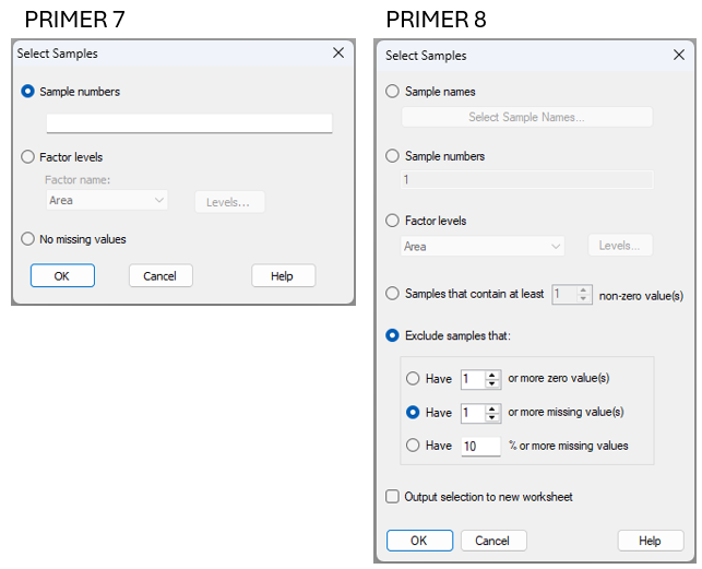

*Fig. 15.2 Comparison of the **Select** > **Samples...** dialog window in PRIMER 7 (at left) vs PRIMER 8 (at right).*

Note that in PRIMER 8, you can select samples:
- using **sample names** (this option includes a filter to help find names in long lists);
- using **sample numbers**;
- belonging to certain **level(s) of a factor**; or
- that contain some minimum number ($x$) of **non-zero values**.

You can also ***exclude*** samples that:
- have ($x$) or more zero values;
- have ($x$) or more missing values; or
- have ($x$)% or more missing values.

Note also that there is the option to:
'$\checkmark$Output selection to new worksheet'.

This latter option means you don't have to take any extra steps (post-selection) simply to duplicate the selected data into a new worksheet (if desired) for subsequent analyses. As an added bonus, a small output file is produced when you tick this option which identifies precisely what choices you made to select the samples. It is very useful to have this information going forward, to keep track of any subset selections made along your analysis pathway.

#### Selecting Variables
When you click **Select** > **Variables...** in P8, you will see the new dialog shown at right in Fig. 15.3.

[![04c._Select_Vars_compare.png](https://learninghub.primer-e.com/uploads/images/gallery/2025-07/scaled-1680-/04c-select-vars-compare.png)](https://learninghub.primer-e.com/uploads/images/gallery/2025-07/04c-select-vars-compare.png)
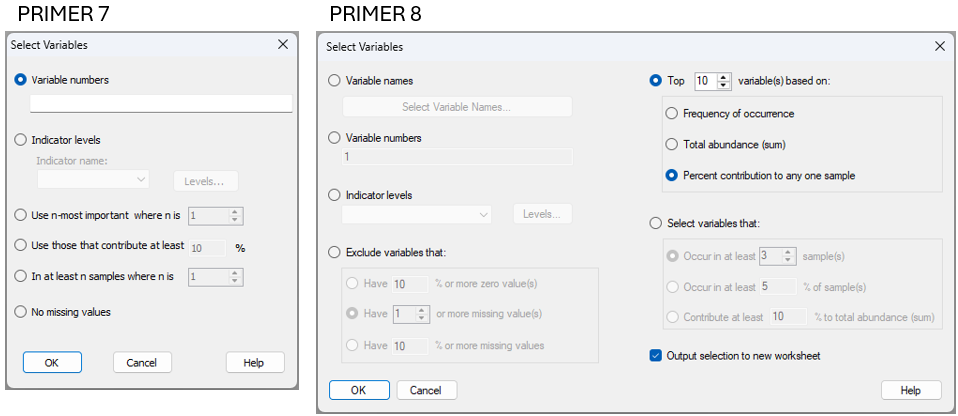

*Fig. 15.3 Comparison of the **Select** > **Variables...** dialog window in PRIMER 7 (at left) vs PRIMER 8 (at right).*

Note that in PRIMER 8, you can select variables:
- using **variable names** (this option includes a filter to help find names in long lists);
- using **variable numbers**; or
- belonging to certain **group(s) of an indicator**.

It is also possible to select variables that correspond to the top ($x$) variables in a list based on:
- **frequency of occurrence**;
- **total abundance** (sum); or
- **percent contribution to any one sample** (this option was called 'most important' in PRIMER 7)

Finally, you may choose to select variables that:
- occur in at least ($x$) sample(s);
- occur in at least ($x$)% of sample(s); or
- contribute at least ($x$)% to the total abundance (sum).

Note that the above dialog gives you a lot of freedom with respect to identification of 'important' variables in ecological contexts, not just on the basis of total abundance (in any one sample or overall), but alternatively by reference to their frequency of occurrence. Using the frequency of occurrence may often be more suitable, as a criterion, than pulling out species based on their total abundance values, particularly if there are highly sporadic species that have massive abundance values (e.g., weeds or opportunists), but that may not actually be that important ecologically (e.g., they might have shown up in just a single sample).

As an added bonus (and precisely as we saw in the dialog for the selection of samples, shown above), you can choose to:
'$\checkmark$Output selection to new worksheet'.
This streamlines and clarifies analytical pathways.

#### Filters *(New!)*
For either the selection of samples or the selection of variables **by name**, PRIMER 8 offers a new tool in the form of a ***filter*** that is very helpful whenever you are dealing with long lists of names in large data sheets. For example, suppose I wish to select all of the variables from a long list of species that belong to the same genus (e.g., *Ampelisca*), I simply choose to select variables by names and click the 'Select Variable Names...' button ([![05d._Select_Var_names_button.png](https://learninghub.primer-e.com/uploads/images/gallery/2025-07/scaled-1680-/05d-select-var-names-button.png)](https://learninghub.primer-e.com/uploads/images/gallery/2025-07/05d-select-var-names-button.png)), then start typing the genus name into the 'Filter:' box, and those species will appear in the 'Available:' list for me to easily select them (see Fig. 15.4 below).


[![05c._Select_Vars_with_Filter.png](https://learninghub.primer-e.com/uploads/images/gallery/2025-07/scaled-1680-/05c-select-vars-with-filter.png)](https://learninghub.primer-e.com/uploads/images/gallery/2025-07/05c-select-vars-with-filter.png)
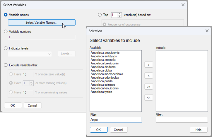

*Fig. 15.4 Dialog window for selecting names of variables, using the new 'Filter:' tool in PRIMER 8. In the above example (data in the file named '<ins>Norway_macrofauna.pri</ins>', found inside the '<ins>Examples_P8</ins> > <ins>Norway_macrofauna</ins>' folder), there are 809 taxa in the data sheet, but by typing the letters 'Ampe' in the 'Filter:' box, the available list is reduced to just the 12 variables that have this particular combination of letters in their name. All of these are of the genus 'Ampelisca'.*

Using this new filtering tool in PRIMER 8 means you can quickly and easily find and select specific variables (or samples) that you know are in your data somewhere (e.g., all variables starting wtih the letter "R"), even if you cannot easily remember the entire name in detail.

# 15.3 Re-name levels of a factor (or indicator)

There are many situations where it would be very handy to be able to change the names of levels of a factor (or to change the names of groups for an indicator). We often need to tweak the names of levels of factors. For example,

- The names are too long and you want to shorten/abbreviate them so that they are easy to see as labels on an ordination plot. For example, you have levels of 'Berghan Point' and 'Home Point', and you want to change them to 'B' and 'H'.
- The factor has levels that are quantitative (e.g., such as depth zones), but the names are not strictly numeric (e.g., maybe the levels are named '50-100 m', '100-200 m', '200-300 m', etc.). You might, however, really want numeric factor level names so you can analyse the factor as **ordered** in an ANOSIM, put depth trajectories on ordination plots, etc.
- You have discovered that not all factor levels matter, and so you want to combine 2 or more factor levels into an amalgamated (single) factor level. For example, maybe you originally have levels of 'Low', 'Medimum-Low', 'Medium', and 'High', but later decide that the first two levels are not actually significantly different, so you want to combine those two and change the names so that you just have 'L', 'M' and 'H'.
- You have taken data through time (say, every 2 months) at your sites, and your labels for this temporal factor look like this: 'Jan-2001', 'Mar-2001', 'May-2001', etc., but you want to treat these simply as sequential time-points in your plots, e.g., 'T1', T2', 'T3', etc.

It would be very laborious to have to go through the process of re-naming the factor-level names for every single sample in the full worksheet, and this process would also be highly prone to error.

In PRIMER 8, all you need to do is click **Edit** > **Factors**, click on the factor whose level names you want to change, and then click the 'Rename Levels...' button ([![06d._Rename_levels_button.png](https://learninghub.primer-e.com/uploads/images/gallery/2025-07/scaled-1680-/06d-rename-levels-button.png)](https://learninghub.primer-e.com/uploads/images/gallery/2025-07/06d-rename-levels-button.png)). The resulting dialog lets you nominate the new names for the factor levels (just type them in), and then you can get on with your work.


For example, for the size-class data for mussels from several sites in the Gulf of Alaska (the data file is '<ins>Gulf_of_Alaska_mussels.pri</ins>', located in the folder '<ins>Examples_P8</ins>' > '<ins>Gulf_of_Alaska_mussels</ins>'), we may wish to abbreviate the names of the ecoregions so that they are shorter, making them easier to see in ordination plots (Fig. 15.5).

[![06c._Factors_rename_levels_mussels_[i].png](https://learninghub.primer-e.com/uploads/images/gallery/2025-12/scaled-1680-/06c-factors-rename-levels-mussels-i.png)](https://learninghub.primer-e.com/uploads/images/gallery/2025-12/06c-factors-rename-levels-mussels-i.png)

*Fig. 15.5 Dialog windows showing the action of changing the names of levels for the factor of 'Ecoregions' for the Gulf of Alaska mussel size-class dataset: from 'Lynn Canal' to 'LC' and from 'Kachemak Bay' to 'KB'.*

The resulting factor information (after changing the level names for 'Ecoregion', as shown above) looks like this:

[![06e._After_changing_level_names.png](https://learninghub.primer-e.com/uploads/images/gallery/2025-07/scaled-1680-/06e-after-changing-level-names.png)](https://learninghub.primer-e.com/uploads/images/gallery/2025-07/06e-after-changing-level-names.png)
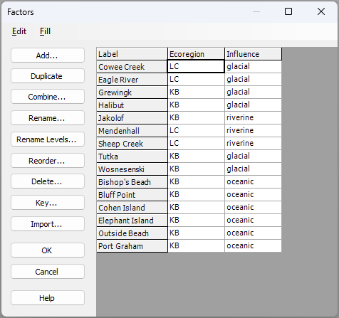

As an aside, if you wanted to retain the original level names in your data sheet as well, then you need first to ***duplicate*** the original factor (using the 'Duplicate' button), ***rename*** the factor itself (using the 'Rename...' button; for example, the abbreviated names could be held in a factor called 'Ecoreg'), ***then*** create new level names for that duplicated factor (using the 'Rename Levels...' button) to whatever new names you wish.

You can compare the metric MDS plot of the sites (based on Manhattan distances among cumulative percentages of standardised size-classes of mussels) when Ecoregion factor-level labels have long names *vs* the same plot with short names (see below).

[![06f._mMDS_mussels_full_names_[i].png](https://learninghub.primer-e.com/uploads/images/gallery/2025-12/scaled-1680-/06f-mmds-mussels-full-names-i.png)](https://learninghub.primer-e.com/uploads/images/gallery/2025-12/06f-mmds-mussels-full-names-i.png)

[![06g._MDS_mussels_short_names_[i].png](https://learninghub.primer-e.com/uploads/images/gallery/2025-12/scaled-1680-/06g-mds-mussels-short-names-i.png)](https://learninghub.primer-e.com/uploads/images/gallery/2025-12/06g-mds-mussels-short-names-i.png)

Finally, note that this same re-naming tool is also available under **Edit** > **Indicators...**.

# 15.4 Add customised values/labels to graphical axes

In PRIMER 8, there is a new tool that allows us to ***add customised values and labels*** to coordinate axes in graphics.

Consider the following scatter plot of species richness ($S$) *vs.* structural complexity of the substratum (measured using a chain-and-tape method), obtained from a visual survey of intertidal macrofauna and algae at a site inside the marine reserve at Long Bay, on the north shore of Auckland, New Zealand.<sup>¶</sup> Biotic data ('<ins>Long_Bay_intertidal_biota</ins>') and environmental data ('<ins>Long_Bay_intertidal_env.pri</ins>') from this study are found in the '<ins>Examples_P8</ins>' > '<ins>Long_Bay_intertidal</ins>' folder.

[![07a._Long_Bay_Scatter_S_vs._Complex_[i].png](https://learninghub.primer-e.com/uploads/images/gallery/2025-12/scaled-1680-/07a-long-bay-scatter-s-vs-complex-i.png)](https://learninghub.primer-e.com/uploads/images/gallery/2025-12/07a-long-bay-scatter-s-vs-complex-i.png)

In the above scatter plot, the points that correspond to the minimum ('Min') and maximum ('Max') values obtained for the variable of 'Complexity' (on the x-axis), have been labeled individual (using a factor that is empty for all other samples). We might decide it would be useful to annotate the graphic to provide the minimum and maximum values on the x-axis for those two values directly as well. We can do this by clicking on the x-axis (or by clicking **Graph** > **General...** and clicking on the 'X-axis' tab).

In this dialog, we can see an 'Additional Labels' button ([![7c._Additional_Labels_button.png](https://learninghub.primer-e.com/uploads/images/gallery/2025-07/scaled-1680-/7c-additional-labels-button.png)](https://learninghub.primer-e.com/uploads/images/gallery/2025-07/7c-additional-labels-button.png)), which is **new in P8**. We can also see the new option to change the **label orientation** so that it is either '$\bullet$Perpendicular' or '$\bullet$Parallel'. For the present example, let's choose '$\bullet$Parallel' and then go ahead and click the 'Additional Labels' button where we can add both the specific **values** and the desired **labels** for the maximum and minimum complexity, also including a tick-mark for each of them, like so:

[![7e._Additional_Labels_ALL_[i].png](https://learninghub.primer-e.com/uploads/images/gallery/2025-12/scaled-1680-/7e-additional-labels-all-i.png)](https://learninghub.primer-e.com/uploads/images/gallery/2025-12/7e-additional-labels-all-i.png)

The resulting graphic looks like this:

[![07f._Long_Bay_Scatter_with_Additional_[i].png](https://learninghub.primer-e.com/uploads/images/gallery/2025-12/scaled-1680-/07f-long-bay-scatter-with-additional-i.png)](https://learninghub.primer-e.com/uploads/images/gallery/2025-12/07f-long-bay-scatter-with-additional-i.png)

There are clearly many uses for this new feature. It is a great way to provide clarity regarding any specific values (or sets of values) that you may wish to highlight along particular axes in customised graphics.

### Change the axis label orientation
Note that another new feature in PRIMER 8 is the possiblity to change the ***orientation*** of the axis labels. See [section 3.2](https://learninghub.primer-e.com/link/1023#bkmrk-change-the-axis-labe) for an example. 

---
<sup>¶</sup>*These data were collected in 2015 as part of a course in quantitative marine ecology at Massey University, Albany, New Zealand. Taxa that were recorded in the survey as 'dead' (e.g., oyster shells, barnacle tests, etc.) were not included in the tally of richness analysed here.*

# 15.5 Split data sheet by factor/indicator

In PRIMER 8 there is a new tool, accessed by clicking **Tools** > **Split Data...**, which allows you to split a data sheet into several separate data sheets, corresponding to:
- separate groups of ***samples***, based on a ***factor***; or
- separate groups of ***variables***, based on an ***indicator***.

This is a simple tool, but a helpful one. Having this tool saves one from having to select each group individually, then duplicate them into a new sheet, one group at a time.

For example, consider the data set of fish surveys from New Zealand, discussed in [section 10.4](https://learninghub.primer-e.com/link/1049) above. (Data are located in the file '<ins>NE_NZ_fish_counts.pri</ins>', found in the '<ins>Example_P8</ins>' > '<ins>NE_NZ_fish</ins>' folder.) Visual underwater surveys of fish assemblages were done at four different locations along the north-eastern coast of New Zealand: Berghan Point, Home Point, Leigh and Hahei. Suppose now we would like to examine trends in assemblages through time, but do this separately for each of these four different locations.

From the fish dataset, click **Tools** > **Split Data...**, like so:

[![08a._Tools_Split_Data_fish_[i].png](https://learninghub.primer-e.com/uploads/images/gallery/2025-12/scaled-1680-/08a-tools-split-data-fish-i.png)](https://learninghub.primer-e.com/uploads/images/gallery/2025-12/08a-tools-split-data-fish-i.png)

We can then choose to split the data based on the factor of '<ins>Location</ins>', as shown in the 'Split' dialog window below, then click '**OK**'.

[![8b._Split_Data_dialog_window_fish.png](https://learninghub.primer-e.com/uploads/images/gallery/2025-07/scaled-1680-/8b-split-data-dialog-window-fish.png)](https://learninghub.primer-e.com/uploads/images/gallery/2025-07/8b-split-data-dialog-window-fish.png)
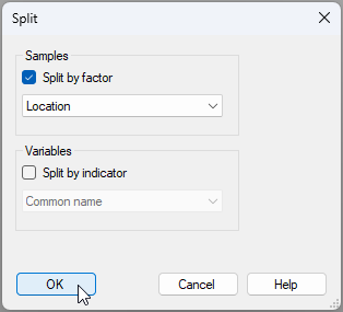

In our Explorer tree, we then see four new data sheets, one for each of the four locations: 

[![08c._Post_data_split_fish_[i].png](https://learninghub.primer-e.com/uploads/images/gallery/2025-12/scaled-1680-/08c-post-data-split-fish-i.png)](https://learninghub.primer-e.com/uploads/images/gallery/2025-12/08c-post-data-split-fish-i.png)

Note that the sheets produced by this operation each have a new ***title*** (see also **Edit** > **Properties**) that reflects:
- the factor on which the split was made; and
- the relevant corresponding group for each resulting data sheet.

For example, the title for '<ins>Data4</ins>' is given as 'New Zealand Fish Visual Surveys - Location: Home.Point', *viz.:*

[![08d_new_title_home.point.png](https://learninghub.primer-e.com/uploads/images/gallery/2025-07/scaled-1680-/08d-new-title-home-point.png)](https://learninghub.primer-e.com/uploads/images/gallery/2025-07/08d-new-title-home-point.png)


Of course, you can also change the name of the data sheets themselves if you wish. For example, you can change the name of the sheet called '<ins>Data4</ins>' to '<ins>Home.Point</ins>' by clicking **File** > **Rename Data**.

# 15.6 Line plots for samples

There is a new facility in PRIMER 8 to create **Line plots** in two different ways:
- with one line for every ***variable*** (across all samples); or
- with one line for every ***sample*** (across all variables).

This is a considerable improvement on the line plot dialog in PRIMER 7, which only could be implemented to draw lines for variables (Fig. 15.6).

[![09e._Line_Plot_compare_P7_P8.png](https://learninghub.primer-e.com/uploads/images/gallery/2025-07/scaled-1680-/09e-line-plot-compare-p7-p8.png)](https://learninghub.primer-e.com/uploads/images/gallery/2025-07/09e-line-plot-compare-p7-p8.png)
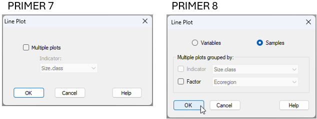

*Fig. 15.6 Comparison of the **Plots** > **Line Plot...** dialog window in PRIMER 7 (at left) vs PRIMER 8 (at right).*

We saw this tool earlier in [section 13.3](https://learninghub.primer-e.com/link/1063), in the analysis of mussel size-classes at different sites in the Gulf of Alaska (the data file is called '<ins>Gulf_of_Alaska_mussels.pri</ins>', located in the folder '<ins>Examples_P8</ins>' > '<ins>Gulf_of_Alaska_mussels</ins>').

From the mussel data sheet, after standardising the original raw count data to [cumulative percentages](https://learninghub.primer-e.com/link/1063#bkmrk-input-data-and-stand) (the variables are the sizes classes here), resulting in a sheet called '<ins>Data1</ins>', we can choose to create a line plot with a line for each sample (the sites here) by clicking **Plots** > **Line Plot...**, like so:

[![09c._Line_plot_menu_item.png](https://learninghub.primer-e.com/uploads/images/gallery/2025-07/scaled-1680-/09c-line-plot-menu-item.png)](https://learninghub.primer-e.com/uploads/images/gallery/2025-07/09c-line-plot-menu-item.png)
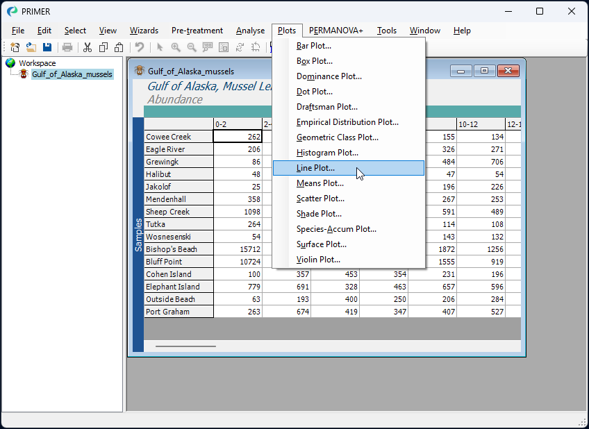

In the 'Line Plot'dialog window, we simply choose to view lines for the ($\bullet$ Samples), and then click '**OK**'.  

[![09b._Line_plot_P8.png](https://learninghub.primer-e.com/uploads/images/gallery/2025-07/scaled-1680-/09b-line-plot-p8.png)](https://learninghub.primer-e.com/uploads/images/gallery/2025-07/09b-line-plot-p8.png)
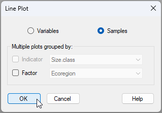

<mark>*Note: change the above dialog if the wording changes</mark>*
Note in the above dialog that we also have the option to output ***multiple line plots*** corresponding to groupsof samples identified *via* a factor (or groups of variables identified by an indicator, if we are drawing lines for variables).

The resulting line plot for this example is shown below:

[![09d._Line_Plot_mussel_data_take2.png](https://learninghub.primer-e.com/uploads/images/gallery/2025-07/scaled-1680-/09d-line-plot-mussel-data-take2.png)](https://learninghub.primer-e.com/uploads/images/gallery/2025-07/09d-line-plot-mussel-data-take2.png)
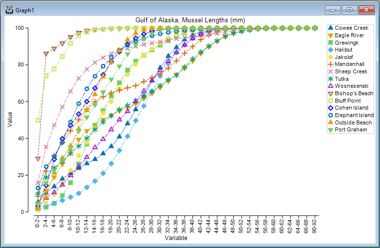
# 15.7 Output group-level stats from dispersion (or variability) weighting

In PRIMER 8, you can now output more detailed statistical information from either dispersion-weighting or variability weighting to a worksheet. You can see this additional option in the comparison of the 'Dispersion Weighting' dialog in PRIMER 8, compared to that in PRIMER 7 (Fig. 15.7).

[![10c._DW_comparison_P7_P8.png](https://learninghub.primer-e.com/uploads/images/gallery/2025-07/scaled-1680-/10c-dw-comparison-p7-p8.png)](https://learninghub.primer-e.com/uploads/images/gallery/2025-07/10c-dw-comparison-p7-p8.png)
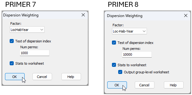

*Fig. 15.7 Comparison of the **Pre-treatment** > **Dispersion Weighting...** dialog window in PRIMER 7 (at left) vs PRIMER 8 (at right).*

In essence, whenever we calculate the average ***index of dispersion*** ($\bar{D}$) for the dispersion weighting pre-treatment, it is drawn from individual indices of dispersion (variance-to-mean ratios, $D_i$) for each of several ($i = 1, \ldots, g$) groups (identified by a factor). It would be helpful, in some situations, to be able to see those original individual indices of dispersion across all of the groups for each variable. The extra tickbox ('$\checkmark$Output group-level worksheet') available in the PRIMER 8 dispersion weighting dialog allows you to produce and examine this underlying statistical information in a worksheet directly.

For example, we can re-visit the data we saw in [section 10.4](https://learninghub.primer-e.com/link/1049) above, located in the file '<ins>NE_NZ_fish_counts.pri</ins>', found in the '<ins>Example_P8</ins>' > '<ins>NE_NZ_fish</ins>' folder. We can begin by following steps 1, 2 and 3 from [section 10.4](https://learninghub.primer-e.com/link/1049) on these data; i.e., get the data into PRIMER 8, then:
- Obtain a subset of the data based on the factor of '<ins>Year</ins>', from 2010-2015 inclusive (**Select** > **Samples...**), with the resulting subset being called '<ins>Data1</ins>'.
- Create a combined factor consisting of all combinations of the factors: '<ins>Loc</ins>', '<ins>Hab</ins>' and '<ins>Year</ins>' (**Edit** > **Factors...** > **Combine...**)

Next, we can apply the dispersion weighting pre-treatment on the basis of this combined factor by clicking **Pre-treatment** > **Dispersion Weighting...** and in the resulting dialog, choose Factor: <ins>Loc-Hab-Year</ins>. This time, however, we shall also choose to get ($\checkmark$Stats to worksheet) & ($\checkmark$Output group-level worksheet), then click '**OK**'.

This will produce the following three worksheets (assuming '<ins>Data1</ins>' contains the subset-selected data):
- '<ins>Data2</ins>' contains the dispersion-weighted data.
- '<ins>Data3</ins>' contains the statistics associated with the ***average*** index of dispersion ($\bar{D}$) for each variable.
- '<ins>Data4</ins>' contains the ***individual*** indices of dispersion ($D_i$) for each group (columns) and for each variable (rows).

These three data sheets are shown below for the present example.

[![10d._DW_data_[i].png](https://learninghub.primer-e.com/uploads/images/gallery/2025-12/scaled-1680-/10d-dw-data-i.png)](https://learninghub.primer-e.com/uploads/images/gallery/2025-12/10d-dw-data-i.png)

[![10e._D-bar_values_fish_[i].png](https://learninghub.primer-e.com/uploads/images/gallery/2025-12/scaled-1680-/10e-d-bar-values-fish-i.png)](https://learninghub.primer-e.com/uploads/images/gallery/2025-12/10e-d-bar-values-fish-i.png)

[![10f._D_i_values_fish_[i].png](https://learninghub.primer-e.com/uploads/images/gallery/2025-12/scaled-1680-/10f-d-i-values-fish-i.png)](https://learninghub.primer-e.com/uploads/images/gallery/2025-12/10f-d-i-values-fish-i.png)

Note in the above sheet ('<ins>Data4</ins>', containing individual indices, $D_i$) that there are many missing values. This is simply a consequence of there being zero fish of that species in that particular group of samples; hence, the mean and the variance will both be equal to zero, so no value of $D_i$ can be calculated for that particular cell (or group). Average $\bar{D}$ values for each species are naturally calculated only from those cells (groups of samples) where at least some individuals of that species were recorded (i.e., the non-missing entries).

Finally, note that this '$\checkmark$Output group-level worksheet' option is also available for **Pre-treatment** > **Variability Weighting...**, *viz.:*

[![10g._Variability_Weighting_dialog_too.png](https://learninghub.primer-e.com/uploads/images/gallery/2025-07/scaled-1680-/10g-variability-weighting-dialog-too.png)](https://learninghub.primer-e.com/uploads/images/gallery/2025-07/10g-variability-weighting-dialog-too.png)
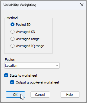
# 15.8 Output diagnostic plots from CAP

In PRIMER 8, it is now possible to output diagnostic plots from the CAP routine (i.e., canonical analysis of principal coordinates, an analysis obtained from a resemblance matrix by clicking **PERMANOVA+** > **CAP**). You simply tick the new option to '$\checkmark$Do diagnostic plots' in the CAP dialog window.

For example, consider a study of the assemblages of small benthic fishes living in rocky subtidal reef habitats in northeastern New Zealand, examined by {{@954#bkmrk-smithanderson2016}}. Data from this study are located in the file called '<ins>NZ_benthic_fish.pri</ins>', in the '<ins>Examples_P8</ins>' > '<ins>NZ_benthic_fish</ins>' folder. Surveys were done of the benthic fish fauna, along with fine-scale habitat features in kelp forests and rocky reefs along the north-eastern coast of New Zealand. There were sites at a range of locations in and around several marine reserves (including Leigh, Tawharanui, Hahei and the Poor Knights Islands), and data were obtained over a period of 3 years (2011-2013). At each site, divers surveyed $n$ = 8 transects, measuring 1 m $\times$ 5 m. Each transect was made up of five contiguous 1 m $\times$ 1 m quadrats. For each quadrat, divers first visually searched and recorded counts for all benthic fishes, then recorded the presence/absence of a set of pre-defined habitat features (see the file named '<ins>NZ_benthic_fish_habitat.pri</ins>', located in the same folder).

Here, we shall consider only the potential effects of the marine reserve at Leigh on these fish communities in a fully balanced design. Note that the factor of 'Reserve' has two levels: 0 = outside the reserve, and 1 = inside the reserve. Due to the sparsity of the count data at small spatial scales, we shall analyse data summed to the transect level, then consider densities of each species (averages per transect) at the spatial scale of sites for the ensuing CAP analysis. Mean densities (per 5m<sup>2</sup>) of each fish species per site are located in the file named '<ins>NZ_benthic_fish_Leigh_av_densities.pri</ins>'.

1. Open the file ('<ins>NZ_benthic_fish_Leigh_av_densities.pri</ins>') in PRIMER 8. It will look like this:

[![12a._Leigh_fish_densities_[i].png](https://learninghub.primer-e.com/uploads/images/gallery/2025-12/scaled-1680-/12a-leigh-fish-densities-i.png)](https://learninghub.primer-e.com/uploads/images/gallery/2025-12/12a-leigh-fish-densities-i.png)

2. From '<ins>NZ_benthic_fish_Leigh_av_densities</ins>', click **Analyse** > **Resemblance...** and choose to calculate the Bray-Curtis similarity among samples. This will produce a resemblance matrix called '<ins>Resem1</ins>'.

[![12b._Resem_tfins.png](https://learninghub.primer-e.com/uploads/images/gallery/2025-07/scaled-1680-/12b-resem-tfins.png)](https://learninghub.primer-e.com/uploads/images/gallery/2025-07/12b-resem-tfins.png)

[![12bb._Resem_matrix_tfins_[i]_NEW.png](https://learninghub.primer-e.com/uploads/images/gallery/2025-12/scaled-1680-/12bb-resem-matrix-tfins-i-new.png)](https://learninghub.primer-e.com/uploads/images/gallery/2025-12/12bb-resem-matrix-tfins-i-new.png)

3. From the '<ins>Resem1</ins>' matrix, run the CAP routine aiming to distinguish small benthic fish communities inside *vs* outside the marine reserve, by clicking **PERMANOVA+** > **CAP** and choose:<br>
(Analyse against $\bullet$Groups in factor > Factor for groups or new samples: '<ins>Reserve</ins>') &<br>
($\checkmark$Scores to worksheet) &<br>
(Diagnostics > $\checkmark$Do diagnostics > $\checkmark$Do diagnostic plots) &<br>
($\checkmark$Do permutation test > Num. permutations: <ins>9999</ins>)<br>

then click **OK**, as shown below:

[![12c._CAP_dialog_tfins_P8.png](https://learninghub.primer-e.com/uploads/images/gallery/2025-07/scaled-1680-/12c-cap-dialog-tfins-p8.png)](https://learninghub.primer-e.com/uploads/images/gallery/2025-07/12c-cap-dialog-tfins-p8.png)

The option to ***do diagnostic plots*** is new to PRIMER 8.

The analysis will run and produce the following:
- '<ins>CAP1</ins>' ([![13._CAP1_notepad_[i].png](https://learninghub.primer-e.com/uploads/images/gallery/2025-12/scaled-1680-/13-cap1-notepad-i.png)](https://learninghub.primer-e.com/uploads/images/gallery/2025-12/13-cap1-notepad-i.png)), containing all of the essential results in a rich text format (*.rtf), and
- '<ins>MultiPlot1</ins>' ([![14._MultiPlot1_Exp_tree_icon_[i].png](https://learninghub.primer-e.com/uploads/images/gallery/2025-12/scaled-1680-/14-multiplot1-exp-tree-icon-i.png)](https://learninghub.primer-e.com/uploads/images/gallery/2025-12/14-multiplot1-exp-tree-icon-i.png)), containing the CAP plot itself (as '<ins>Graph1</ins>') along with plots  of the ***diagnostics for choosing $m$***, where $m$ = the number of principal coordinate axes (PCOs) used to produce the canonical (CAP) axis (as '<ins>Graph2</ins>' through '<ins>Graph5</ins>').

From '<ins>CAP1</ins>' and the accompanying CAP plot ('<ins>Graph1</ins>'), shown below, we can see that the canonical correlation associated with the 'Reserve' effect is reasonably strong ($\delta_1$ = 0.644), and that this is statistically significant ($\delta_1^2$ = 0.415, $P$ = 0.001). This CAP model was achieved with $m$ = 4 PCO axes, which achieved a leave-one-out allocation success of 77.78% under cross-validation.

[![12d._CAP_rtf_tfins_[i].png](https://learninghub.primer-e.com/uploads/images/gallery/2025-12/scaled-1680-/12d-cap-rtf-tfins-i.png)](https://learninghub.primer-e.com/uploads/images/gallery/2025-12/12d-cap-rtf-tfins-i.png)

[![15a._Graph1_tfins_[i].png](https://learninghub.primer-e.com/uploads/images/gallery/2025-12/scaled-1680-/15a-graph1-tfins-i.png)](https://learninghub.primer-e.com/uploads/images/gallery/2025-12/15a-graph1-tfins-i.png)

The four ***diagnostic plots*** are shown below.

[![15b._Graph2_tfins_[i].png](https://learninghub.primer-e.com/uploads/images/gallery/2025-12/scaled-1680-/15b-graph2-tfins-i.png)](https://learninghub.primer-e.com/uploads/images/gallery/2025-12/15b-graph2-tfins-i.png)

[![15c._Graph3_tfins_[i].png](https://learninghub.primer-e.com/uploads/images/gallery/2025-12/scaled-1680-/15c-graph3-tfins-i.png)](https://learninghub.primer-e.com/uploads/images/gallery/2025-12/15c-graph3-tfins-i.png)

[![15d._Graph4_tfins_[i].png](https://learninghub.primer-e.com/uploads/images/gallery/2025-12/scaled-1680-/15d-graph4-tfins-i.png)](https://learninghub.primer-e.com/uploads/images/gallery/2025-12/15d-graph4-tfins-i.png)

[![15e._Graph5_tfins_[i].png](https://learninghub.primer-e.com/uploads/images/gallery/2025-12/scaled-1680-/15e-graph5-tfins-i.png)](https://learninghub.primer-e.com/uploads/images/gallery/2025-12/15e-graph5-tfins-i.png)

It is clear that the choice of $m$ = 4 is a good one here, as this choice achieved the greatest leave-one-out allocation success ('<ins>Graph2</ins>') and the lowest leave-one-out residual sum-of-squares ('<ins>Graph3</ins>'). Although this can also (technically) be seen in the '*DIAGNOSTICS*' section of the '<ins>CAP1</ins>' output above, it is certainly much clearer to see this information in diagnostic plots, whereby the wisdom of the choice made, overall, by reference to other values of $m$, can be readily assessed.

# 15.9 New diagnostics for PCA/PCO plots

#### Background
Consider a cloud of $N$ points (sampling units) in a $p$-dimensional multivariate space. [Principal components analysis (PCA)](https://learninghub.primer-e.com/link/102) is an ordination method that will find an axis through that cloud of points so as to maximise the total variance of the points, when they are projected at right angles onto that axis. Having found such an axis, a second axis is then built in a similar way, subject to it being perpendicular to (independent of) the first axis, and so on. PCA does this in Euclidean space. [Principal coordinate analysis (abbreviated as PCO or PCoA)](https://learninghub.primer-e.com/books/permanova-for-primer-guide-to-software-and-statistical-methods/chapter/chapter-3-principal-coordinates-analysis-pco) also does this, but in the space of a chosen resemblance measure ({{@954#bkmrk-gower1966}}). 

Hence, we may conceptually consider either PCA or PCO as a type of ***projection*** of the points into a smaller number of dimensions that can capture important major stuctures occurring across the data cloud as a whole. Specifically, if there is some redundancy of information (inter-correlation) among the $p$ original variables, then we may anticipate that a subset of (say) two or three principal axes will capture a substantial portion of the total variation in the system. A configuration plot of the positions of the points along the first two (or three) principal axes can therefore be examined in an attempt to visualise patterns among the sampling units along these major axes of variation.

To assess the utility of a 2-d (or 3-d) PCA/PCO plot, one might simply examine the percentage of the total variation that is extracted by the first 2 (or 3) axes. If this is substantial (e.g., 70% or 80%), then we may consider the plot to be useful for interpretation. Another useful tool is a [***scree plot***](https://learninghub.primer-e.com/link/753), which shows the percentage of variation explained by sequentially ordered principal axes.

This does not, however, provide us with a meaningful measure of how well the plot (of reduced dimension) represents the (high-dimensional) inter-point distances (or dissimilarities) in the original multivariate space.

A good way to do that would be to calculate the [***stress***](https://learninghub.primer-e.com/link/107#bkmrk-measure-goodness-of-) associated with the 2-d (or 3-d) configuration. The notion of stress is already quite familiar as a measure of the adequacy of an ordination plot produced using multi-dimensional scaling (MDS, see [section 5.2](https://learninghub.primer-e.com/link/107) and [section 5.8](https://learninghub.primer-e.com/link/114) in *[Change in Marine Communities, 3rd edition](https://learninghub.primer-e.com/books/change-in-marine-communities)*). Indeed, it is the specific goal of the MDS algorithm to create a configuration that minimises stress. Of course, neither PCA nor PCO are specifically designed to minimise stress, so a PCA or PCO configuration will always (necessarily) have higher stress than an MDS configuration for a given data set. Nevertheless, having a measure of stress for a PCA/PCO configuration can help us assess its utility for displaying inter-point relationships faithfully. Here, we would consider that the usual rule-of-thumb of stress < 0.20 indicates a usefully interpretable configuration. Also, a plot of the configuration distances *vs* the original inter-point distances - [a Shepard diagram](https://learninghub.primer-e.com/link/107#bkmrk-specify-the-number-o) - is clearly also a useful diagnostic tool here.

#### Scree Plot, Shepard diagram and Stress
In the PCO routine (accessed from a resemblance matrix by clicking on **PERMANOVA+** > **PCO...**), PRIMER 8 now offers you new options to output these diagnostics tools:
   - a Scree plot;
   - Shepard diagrams in 2D and/or 3D; and
   - Stress calculated using either metric MDS or threshold metric MDS
 
Fig. 15.8 compares the dialog window for the PCO routine in PRIMER 7 versus PRIMER 8.

[![16._New_PCO_dialog.png](https://learninghub.primer-e.com/uploads/images/gallery/2025-11/scaled-1680-/16-new-pco-dialog.png)](https://learninghub.primer-e.com/uploads/images/gallery/2025-11/16-new-pco-dialog.png)
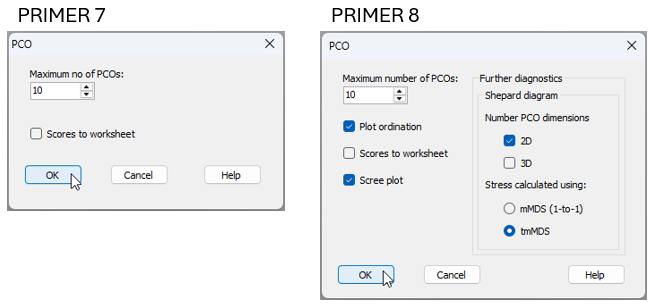

*Fig. 15.8 Comparison of the **PERMANOVA+** > **PCO...** dialog window in PRIMER 7 (at left) vs PRIMER 8 (at right).*

These same new diagnostic output options are also available for the PCA routine in PRIMER 8 (obtained from a data matrix by clicking on **Analyse** > **PCA...**).

It is important to recognise that these additional diagnostics do not in any way change anything about the fundamental PCA or PCO analysis itself that is being done. The calculation of principal axes for PCA or PCO ordination still remains exactly the same as ever, and may best be thought of as a *projection*. What is new and different here is simply the opportunity also to view the stress and the Shepard diagrams which attend the resulting PCA or PCO configuration. These diagnostics also help put these methods into perspective vis-à-vis any MDS ordination solutions one might obtain for a given dataset.

#### Example: Messolongi lagoon diatoms
Let's consider a study of diatom assemblages (densities of 193 species) at 17 sites in the lagoons of Messolongi, Aitoliko and Kleissova in Eastern Central Greece ({{@954#bkmrk-danielidis1991}}). Data from this study are contained in the file called '<ins>Messolongi_diatom_density.pri</ins>', located in the '<ins>Examples_P8</ins>' > '<ins>Messolongi_diatoms</ins>' folder.

In what follows, we shall create an ordination of these data on the basis of a Bray-Curtis resemblance matrix calculated from square-root transformed densities, using each of the following methods:
- Non-metric MDS (nMDS)
- Threshold-metric MDS (tmMDS)
- Metric MDS (mMDS); and
- Principal co-ordinates analysis (PCO).

We will compare and contrast not only the ordination diagrams produced, but also the associated diagnostic Shepard diagrams and the values of stress. For PCO, we can produce Shepard diagrams and stress values in two different ways: (i) for comparison with tmMDS; or (ii) for comparison with mMDS.<sup>¶</sup>

1. Open up the data matrix (<ins>Messolongi_diatom_density.pri</ins>) in PRIMER 8.

[![17._Messolongi_data_only_[i].png](https://learninghub.primer-e.com/uploads/images/gallery/2025-12/scaled-1680-/17-messolongi-data-only-i.png)](https://learninghub.primer-e.com/uploads/images/gallery/2025-12/17-messolongi-data-only-i.png)

2. From the data matrix (<ins>Messolongi_diatom_density</ins>), click **Pre-treatment** > **Transform(overall)...** and choose <ins>Square-root</ins>.

[![18._sqrt_transform.png](https://learninghub.primer-e.com/uploads/images/gallery/2025-11/scaled-1680-/18-sqrt-transform.png)](https://learninghub.primer-e.com/uploads/images/gallery/2025-11/18-sqrt-transform.png)

3. The square-root transformed data are held in the sheet named '<ins>Data1</ins>'. From this,  click **Analyse** > **Resemblance...** and choose to calculate Bray-Curtis resemblances among samples, like so:

[![19._BC_resem.png](https://learninghub.primer-e.com/uploads/images/gallery/2025-11/scaled-1680-/19-bc-resem.png)](https://learninghub.primer-e.com/uploads/images/gallery/2025-11/19-bc-resem.png)

### Non-metric MDS (nMDS)

4. The Bray-Curtis similarities are held in the sheet called '<ins>Resem1</ins>'. From this, click **Analyse** > **MDS** > **Non-metric MDS (nMDS)...**. Change the 'Max. Dimension' from <ins>3</ins> to <ins>2</ins> (for this exercise, we shall focus only on the 2-d solution), then click 'OK', as shown in the dialog below.

[![20._nMDS_dialog.png](https://learninghub.primer-e.com/uploads/images/gallery/2025-11/scaled-1680-/20-nmds-dialog.png)](https://learninghub.primer-e.com/uploads/images/gallery/2025-11/20-nmds-dialog.png)
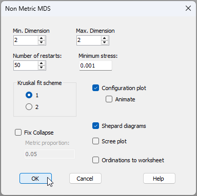

In the results ('<ins>MultiPlot1</ins>'), we can see the nMDS ordination ('<ins>Graph1</ins>'), the ***monotonic*** relationship shown in the Shepard diagram ('<ins>Graph2</ins>'), and that the value of stress is 0.092.

[![21._nMDS_results_[i].png](https://learninghub.primer-e.com/uploads/images/gallery/2025-12/scaled-1680-/21-nmds-results-i.png)](https://learninghub.primer-e.com/uploads/images/gallery/2025-12/21-nmds-results-i.png)

### Threshold metric MDS (tmMDS)

5. From '<ins>Resem1</ins>', click **Analyse** > **MDS** > **Metric MDS (mMDS / tmMDS)...**, then choose 'Choice of intercept: $\bullet$Threshold metric MDS (non-zero intercept)', change the 'Max. Dimension' from <ins>3</ins> to <ins>2</ins>, then click 'OK' (see below).

[![22._tmMDS_dialog.png](https://learninghub.primer-e.com/uploads/images/gallery/2025-11/scaled-1680-/22-tmmds-dialog.png)](https://learninghub.primer-e.com/uploads/images/gallery/2025-11/22-tmmds-dialog.png)

In the results ('<ins>MultiPlot2</ins>'), we can see the tmMDS ordination ('<ins>Graph3</ins>'), the ***linear*** relationship shown in the Shepard diagram ('<ins>Graph4</ins>'), with a ***non-zero intercept*** of 60.54% similarity, and a stress value of 0.130. This is a bit larger than the stress obtained for the nMDS (0.092), but is still sufficiently low (< 0.20) to permit useful interpretations of the patterns of inter-point relationships seen in the diagram. 

[![23._tmMDS_results_[i].png](https://learninghub.primer-e.com/uploads/images/gallery/2025-12/scaled-1680-/23-tmmds-results-i.png)](https://learninghub.primer-e.com/uploads/images/gallery/2025-12/23-tmmds-results-i.png)

Note that the threshold (intercept) value of 60.54% similarity indicates that two points that are 'on top of one another' in the tmMDS configuration are to be interpreted as being *ca*. 39.46% dissimilar, and not 0% dissimilar.

Also, unlike the nMDS plot (which has no labels on its axes and from which only rank-order relationships among the points can be interpreted), the ***axes are labeled*** on the tmMDS plot, with values given in the units of the original (Bray-Curtis) resemblance measure. Thus, two points that are (say) 20 units apart from one another on this plot can be interpreted as being approximately (20% + 39.46%) = 49.46% dissimilar. Thus, although the tmMDS comes at the price of higher stress compared to the nMDS, it also 'gives something back' in the form of added interpretability (i.e., with labels on the axes permitting the estimation of actual inter-point dissimilarities). So, clearly, tmMDS can be a good option, provided the stress still remains low enough to yield a plot that is adequate for interpretation.

### Metric MDS (mMDS)

6. From '<ins>Resem1</ins>', click **Analyse** > **MDS** > **Metric MDS (mMDS / tmMDS)...**, then choose 'Choice of intercept: $\bullet$Metric MDS (zero intercept)', change the 'Max. Dimension' from <ins>3</ins> to <ins>2</ins>, then click 'OK', viz:

[![24._mMDS_dialog.png](https://learninghub.primer-e.com/uploads/images/gallery/2025-11/scaled-1680-/24-mmds-dialog.png)](https://learninghub.primer-e.com/uploads/images/gallery/2025-11/24-mmds-dialog.png)

In the results ('<ins>MultiPlot3</ins>'), we can see the mMDS ordination ('<ins>Graph5</ins>'), the ***linear*** relationship with a ***zero intercept*** in the Shepard diagram ('<ins>Graph6</ins>'), and a stress value of 0.252. This is much larger than that of either the nMDS (0.092) or the tmMDS (0.130), and is so high (> 0.25) as to prevent meaningful interpretation of any patterns seen in the resulting diagram.

[![25._mMDS_results_[i].png](https://learninghub.primer-e.com/uploads/images/gallery/2025-12/scaled-1680-/25-mmds-results-i.png)](https://learninghub.primer-e.com/uploads/images/gallery/2025-12/25-mmds-results-i.png)

### Principal Co-ordinate Analysis (PCO)

7. First, we will run the PCO and get diagnostics for a Shepard diagram and associated stress calculation that uses a zero intercept (as in mMDS). From '<ins>Resem1</ins>', click **PERMANOVA+** > **PCO**, then choose 'Shepard diagram > Stress calculated using: $\bullet$mMDS (1-to-1)', then click 'OK' (see the dialog below).

[![26._PCO_w_mMDS_Shepard_dialog.png](https://learninghub.primer-e.com/uploads/images/gallery/2025-11/scaled-1680-/26-pco-w-mmds-shepard-dialog.png)](https://learninghub.primer-e.com/uploads/images/gallery/2025-11/26-pco-w-mmds-shepard-dialog.png)
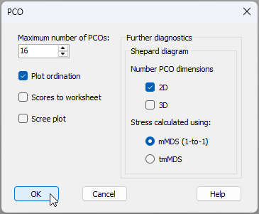

The resulting PCO plot ('<ins>Graph7</ins>') and associated diagnostic Shepard diagram ('<ins>Graph8</ins>') are shown in '<ins>MultiPlot4</ins>' in the Explorer tree.

[![27._PCO_w_mMDS_Shepard_results_[i].png](https://learninghub.primer-e.com/uploads/images/gallery/2025-12/scaled-1680-/27-pco-w-mmds-shepard-results-i.png)](https://learninghub.primer-e.com/uploads/images/gallery/2025-12/27-pco-w-mmds-shepard-results-i.png)

The first two principal axes explain 44.56% of the total variation (less than half, as seen in the output file called '<ins>PCO1</ins>' in the Explorer tree). In addition, the stress is extremely high, at 0.30, indicating that many of the inter-point distances seen in the PCO plot do not reflect their true dissimilarity well at all. This is especially true for the small to middle-sized dissimilarities that range from about 40% to 70% (see the large scatter of points in '<ins>Graph8</ins>' for values having ~ 60% to 30% similarity along the x-axis).

8. Next, we will run the PCO again, but this time choose 'Shepard diagram > Stress calculated using: $\bullet$tmMDS' (see the dialog below).

[![28._PCO_w_tmMDS_Shepard_dialog.png](https://learninghub.primer-e.com/uploads/images/gallery/2025-11/scaled-1680-/28-pco-w-tmmds-shepard-dialog.png)](https://learninghub.primer-e.com/uploads/images/gallery/2025-11/28-pco-w-tmmds-shepard-dialog.png)
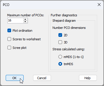

The results are given in '<ins>MultiPlot5</ins>' in the Explorer tree.

[![29._PCO_w_tmMDS_Shepard_results_[i].png](https://learninghub.primer-e.com/uploads/images/gallery/2025-12/scaled-1680-/29-pco-w-tmmds-shepard-results-i.png)](https://learninghub.primer-e.com/uploads/images/gallery/2025-12/29-pco-w-tmmds-shepard-results-i.png)

It is clear that the PCO plot itself remains exactly the same (compare '<ins>Graph9</ins>' with '<ins>Graph7</ins>'). However, we are now using a different yardstick to measure the stress associated with this plot. Specifically, we are permitting the intercept to float away from the origin, and asserting (as we did with the tmMDS) that there is a ***threshold dissimilarity*** that a pair of samples must exceed before they will occupy two different positions on the configuration plot. Here, the intercept is a similarity of 63.24%, corresponding to a dissimilarity threshold of 36.76%. In other words, any two samples that appear on top of each other on the plot (at a distance of zero) can be estimated to be 63.24% similar, not 100% similar.

By adding this flexibility, we can see that the stress improves dramatically, dropping to 0.201, which borders on becoming acceptably interpretable, at least for the broader structures. Once again, it is the larger dissimilarities that are captured better by the PCO (see the tighter clustering of points around the line-of-best-fit in the upper right area of the Shepard diagram), compared to the smaller ones.

### Observations & recommendations
This example serves to demonstrate a more general point. Namely, for a given dataset, the ordering of methods with respect to the value of stress associated with the final configuration will almost always be: nMDS < tmMDS < mMDS < PCO. This is so because:
  * all MDS solutions will, by their very design, achieve lower stress than a projection-type ordination, such as PCO, as they are explicitly geared to minimise stress; and
  * within the MDS family of methods (nMDS, tmMDS and mMDS), nMDS has the fewest constraints, requiring only a monotonic relationship, while mMDS has the greatest constraints, requiring not just a linear relationship but also a zero-intercept in the Shepard diagram. This is more difficult to achieve, resulting in a higher stress.

Our general recommendations for ordination are:
* Use nMDS, as starting point, to achieve the lowest-stress solution.
* If the Shepard diagram for the nMDS shows that the relationship between configuration distances and original distances is approximately linear, then tmMDS can be used to achieve an ordination with the added benefit of having axes which (along with the added threshold dissimilarity) can be used to estimate actual inter-point dissimilarities directly from the plot. Only retain the tmMDS, however, if the stress is sufficiently low to permit interpretability ( < 0.20 as a rule-of-thumb).
* Only go one step further to consider using mMDS if the intercept is sufficiently close to zero to warrant this. (This will be evident in the Shepard diagram).
* PCO will typically ***not*** be the best tool to use, in general, to visualise inter-point relationships in an ordination, but ***will*** extract the axis (or axes) of greatest total variation through the data cloud as a whole. This means that large dissimilarities will typically be represented much better than small dissimilarities in a PCO plot.

### Utility of PCO
Although PCO may not be the tool of choice for ordination, it is important to recognise that it is still a very useful tool for other reasons. Specifically, a variety of PERMANOVA+ routines use PCO ('under the hood') in order to calculate correctly (using the ***full*** set of PCO axes, and carefully accounting for negative eigenvalues):
  * [Distances among centroids](https://learninghub.primer-e.com/link/1046) (in the space of a chosen resemblance measure);
  * [Distances from individual points to their own group centroid (in PERMDISP)](https://learninghub.primer-e.com/link/272); and
  * [Monte Carlo p-values (in PERMANOVA)](https://learninghub.primer-e.com/link/242).

PCO axes are also used (obviously!) to perform [canonical analysis of principal co-ordinates (CAP)](https://learninghub.primer-e.com/books/permanova-for-primer-guide-to-software-and-statistical-methods/chapter/chapter-5-canonical-analysis-of-principal-coordinates-cap).

---
<sup>¶</sup>*It is sometimes stated that PCO and metric MDS are the same thing. This is simply incorrect and the example here clearly demonstrates this. PCO is a projection onto principal axes, whereas metric MDS is distance-preserving and minimises stress for a configuration drawn in a chosen number of dimensions. PCO may sometimes be referred to as 'classical scaling', but it should not be confused with multi-dimensional scaling (MDS), metric or otherwise.*

# 16. Means plots


# 16.1 A plot of means with error bars

#### Overview

A plot of the means (or averages) for groups of samples, with error bars capturing some aspect of each group’s variability, is an important tool in univariate data analysis. For example, one may use PERMANOVA to do univariate analysis of variance on a single variable<sup>¶</sup>, where the [null hypothesis](https://learninghub.primer-e.com/link/1026#bkmrk-and-our-null-hypothe) is focused on the absence of effects defined by individual factors. This is equivalent to a statement that the population means are equivalent across the groups. The alternative hypothesis is that some (one or more) population means differ from some other (one or more) population means across the groups.

The natural visual accompaniment to such an analysis is a plot of the means for the groups of samples corresponding to levels of the factor. It is natural also to show some measure of the variation around those means; i.e., to achieve some way of assessing the expected variability in those mean values in order to assist in the comparison of their values. Error bars constructed around each of the means can accomplish this. Furthermore, if there is more than one factor in the study design, then a plot of the means (and associated error bars) for groups identified by the levels of one factor, calculated and displayed separately across levels of a second (and/or third) factor, yields a highly desirable visualisation of results.

The purpose of the new **Plots** > **Means Plot...** tool in PRIMER 8 with PERMANOVA+ is to make it extremely easy to produce desirable means plots for one or more univariate variables for one-factor or multi-factor study designs. Specifically, using the **Means Plot** dialog in PRIMER 8, you can display group means (as either coloured symbols or bars) for combinations of levels of factors, and you are given a suite of potential methods for drawing suitable error bars on those means. This is a major expansion and improvement over PRIMER 7, where the **Means Plot...** routine only allowed a single factor to be specified, only showed points for the means, and only displayed a $95$ % confidence interval based on the $t$-statistic. See Fig. 15.1 below for a comparison of the old *vs* the new dialog. (Click the image to expand the view).

[![01._Fig._01_P7.vs.P8_Means_plot.png](https://learninghub.primer-e.com/uploads/images/gallery/2026-07/scaled-1680-/01-fig-01-p7-vs-p8-means-plot.png)](https://learninghub.primer-e.com/uploads/images/gallery/2026-07/01-fig-01-p7-vs-p8-means-plot.png)
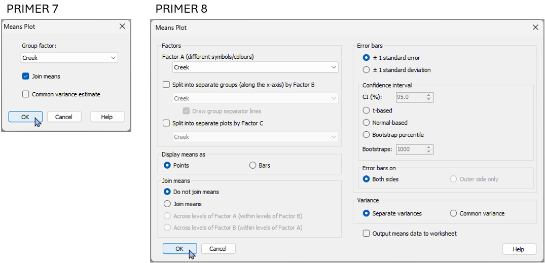

*Fig. 15.1. Comparison of the 'Means plot...' dialog in PRIMER 7 compared to the much more extensive new dialog available in PRIMER 8.*

#### Error bar options
In PRIMER 8, you can choose from the following options to draw error bars around each mean on the plot:
- ± 1 standard error (default);
- ± 1 standard deviation; or
- a confidence interval (choose the percentage) based on:
   - the $t$-distribution (useful if the variance is unknown);
   - the normal ($z$-)distribution (useful if the variance is known); or
   - bootstrap percentiles (for a specified number of bootstrap re-samples), done separately within each group.

For all of the methods apart from the bootstrap percentile method, you can choose to estimate a separate variance for each group, or to estimate a common variance (pooled across the groups).

### Confidence intervals
Consider a random variable $Y$ of unknown distribution (not necessarily normal) having a mean $\mu$ and variance $\sigma^2$. Let $\lbrace y_1, y_2, ..., y_n \rbrace$ be a random sample of $n$ values from this distribution. Let $\bar{y} = \sum_{i=1}^n y_i$ be the mean of the sample. The ***central limit theorem*** states that the distribution of means, $\bar{Y}$, obtained under repeated random sampling in this way, will be normal, with mean $\mu$ and variance $\sigma^2/n$. The standard error, $se$ = $\sqrt{s^2/n}$, where $s^2$ is the [sample variance](https://learninghub.primer-e.com/link/957#bkmrk-average%3A-%24%5Chspace%7B1m), is an unbiased estimator of the ***standard deviation of this distribution of means*** (i.e., $\sigma_{\bar{y}}$). Thus, a plot of $\bar{y} \pm 1 \times se$ is a perfectly natural way to show the variability in the mean calculated from the sample, regardless of that particular variable’s underlying distribution (whether it be normal or not).

If you choose to construct a confidence interval ($\text{CI}$) based on either the $t$-distribution or the normal ($z$)-distribution, then the error bars will be drawn to create a symmetric interval around the mean by multiplying the appropriate quantile from the distribution chosen (e.g., for a $95$ % $\text{CI}$ using the $t$-distribution, the quantile is $1.96$) multiplied by the estimated standard error ($se$) for that group.

Suppose you choose to construct a confidence interval of $\text{CI} = (1-\alpha)\times 100$ % for the mean of a population using the $t$-distribution (e.g., if $\alpha = 0.05$, then the $\text{CI}$ is $95$ %). The interpretation of the interval, under the central limit theorem, is this: under repeated sampling of the population, you would expect $(1-\alpha)\times 100$ % of the confidence intervals constructed in this way to contain the true mean of the population ($\mu$).

### Bootstrap percentiles

The bootstrap percentile error bars are drawn for a given group as follows. Let $n_{b}$ be the requested number of bootstrap samples.
1.	Obtain a bootstrap sample by sampling the data values with replacement from the group.
2.	Calculate the mean of the bootstrap sample.
3.	Repeat steps 1 and 2 a total of $n_b$ times to generate an empirical distribution of bootstrap means.
4.	Obtain the following quantiles from the bootstrap distribution: $\alpha/2$ and $1-\alpha/2$, where $\alpha = (100 - \text{CI}) / 100$. Thus, for $\text{CI} = 95$ %, we would get the $0.025$ and $0.975$ quantiles from the bootstrap distribution of means to draw the error bars.

*Note:* If the total number of unique sets of values that can be obtained under bootstrap re-sampling is less than the requested number of bootstraps, then the calculation of the percentile values for the error bars will be done using that total number instead of the requested $n_b$. The formula for the total number of unique sets for a given group is $C(2n-1, n)$, where $C()$ is the binomial coefficient function, and $n$ is the number of samples in the group.

Error bars drawn using bootstrap percentiles have the advantage of being constructed empirically from the distribution of the sample values. They are therefore not necessarily going to be symmetric around the mean. Another thing to note is that although a bootstrap percentile interval constructed in this way *does* give an indication of the variability in the means under repeated sampling, it does *not* have the same interpretation as a classical confidence interval built on the basis of the central limit theorem. The bootstrap is known to have a negative bias in the estimation of the variance of a sample (see, for example, {{@954#bkmrk-andersonetal2017}}). Thus, the bootstrap percentile interval will under-estimate the true distance between the upper and lower percentiles in the underlying population distribution of means that would be obtained under reepeated sampling. No bias-correction has been implemented in the construction of the bootstrap percentile error bars in PRIMER 8 for means plots; however, if the sample size ($n$) is reasonably large, then the bias will be relatively small (of order $1/n$)<sup>†</sup>.


---
<sup>¶</sup> *This is achieved by basing the PERMANOVA analysis on a Euclidean distance matrix calculated from a single variable.*

<sup>†</sup>*In fact, in Appendix B of {{@954#bkmrk-andersonetal2017}}, it is shown that the exact downward bias in the bootstrap estimate of the variance of the mean of a univariate random variable is $(1−1/n)$.*

# 16.2 Example: Fal biota (one-way case)

Let's look at an example of a means plot for a one-way case using biotic data ($p$ = 131 taxa) from the Fal estuary. The data consist of counts of organisms living in benthic sediments obtained from $n$ = 5-7 sites in each of 5 creeks running into the Fal estuary, Cornwall, UK ({{@954#bkmrk-somerfieldetal1994a}}, {{@954#bkmrk-somerfieldetal1994b}}). These 5 creeks had differing levels of heavy metals in their sediments, due to historical tin and copper mining in their respective valleys. Interest lies in identifying whether the 5 creeks also differed in their diversity of benthic infauna. The full set of biotic data (macrofauna and also the meiofauna - comprised of nematodes and copepods) are contained in the file '<ins>Fal_all_biotic_taxa.pri</ins>', found in the <ins>'Fal_benthic_fauna</ins>' folder in '<ins>Examples_P8</ins>'.

1. Start by calculating some univariate diversity measures for each sample. Open the '<ins>Fal_all_biotic_taxa.pri</ins>' file in PRIMER 8, then click **Analyse** > **DIVERSE...**, take all the defaults and click '**OK**'.

[![02._Diverse_Fal_estuary.png](https://learninghub.primer-e.com/uploads/images/gallery/2026-07/scaled-1680-/02-diverse-fal-estuary.png)](https://learninghub.primer-e.com/uploads/images/gallery/2026-07/02-diverse-fal-estuary.png)
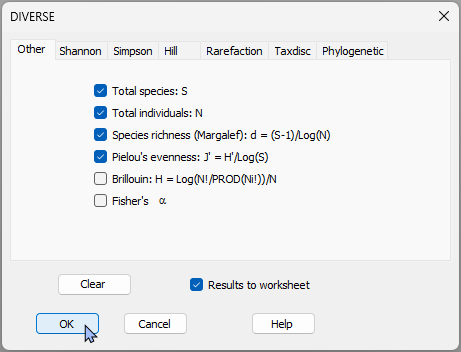

This will produce a sheet, called '<ins>Data1</ins>' with values for various diversity indices for each of the sampling units.

[![03._Diversity_data_Fal.png](https://learninghub.primer-e.com/uploads/images/gallery/2026-07/scaled-1680-/03-diversity-data-fal.png)](https://learninghub.primer-e.com/uploads/images/gallery/2026-07/03-diversity-data-fal.png)
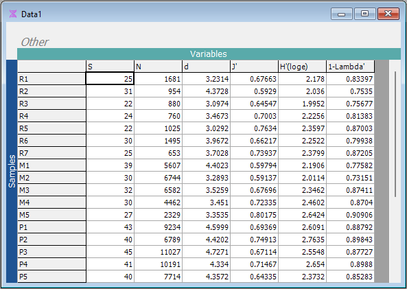

2. Calculate a means plot that shows the means $\pm$ 1 standard error for the 5 creeks for each of these diversity measures. From the '<ins>Data1</ins>' sheet, click **Plots** > **Means Plot...**.

[![04._Diverse_Fal_Means_plot_menu.png](https://learninghub.primer-e.com/uploads/images/gallery/2026-07/scaled-1680-/04-diverse-fal-means-plot-menu.png)](https://learninghub.primer-e.com/uploads/images/gallery/2026-07/04-diverse-fal-means-plot-menu.png)
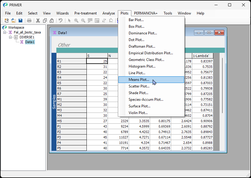

Leave all of the defaults and click '**OK**'.

[![05._Diverse_Fal_Means_plot_dialog_b.png](https://learninghub.primer-e.com/uploads/images/gallery/2026-07/scaled-1680-/05-diverse-fal-means-plot-dialog-b.png)](https://learninghub.primer-e.com/uploads/images/gallery/2026-07/05-diverse-fal-means-plot-dialog-b.png)
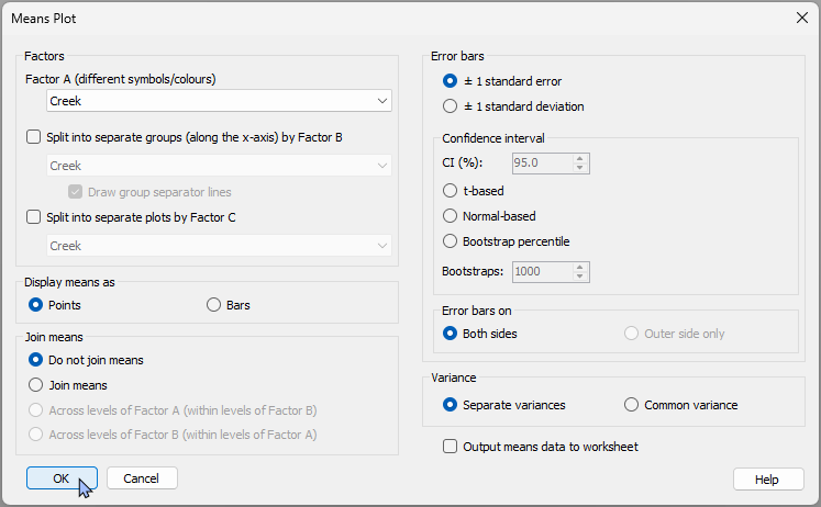

The result will be a 'Multi plot' item, that includes 6 individual plots - one for each of the 6 diversity measure variables in the original '<ins>Data1</ins>' sheet.

[![06._Diverse_Fal_Multi-plot.png](https://learninghub.primer-e.com/uploads/images/gallery/2026-07/scaled-1680-/06-diverse-fal-multi-plot.png)](https://learninghub.primer-e.com/uploads/images/gallery/2026-07/06-diverse-fal-multi-plot.png)

3. View an individual plot by clicking on it. For example, you can click on the plot in the top left-hand corner of '<ins>MultiPlot1</ins>' to see a means plot for the variable of species richness ('S', the number of different taxa). Alternatively, you can click on '<ins>Graph1</ins>' in the Explorer tree.

[![07._Diverse_Fal_Species_richness.png](https://learninghub.primer-e.com/uploads/images/gallery/2026-07/scaled-1680-/07-diverse-fal-species-richness.png)](https://learninghub.primer-e.com/uploads/images/gallery/2026-07/07-diverse-fal-species-richness.png)

4. To change the colours, symbols or line types, you can click **Graph** > **Special...**, which shows you a dialog with a plethora of options to modify all of these details of your means plot. For example, you can click the 'Key...' button next to the factor to change the colours/symbols, or choose to $\bullet$ **Join means**, including the option to choose a custom colour for the joining line, like this:

[![08._Diverse_Fal_S_join_means.png](https://learninghub.primer-e.com/uploads/images/gallery/2026-07/scaled-1680-/08-diverse-fal-s-join-means.png)](https://learninghub.primer-e.com/uploads/images/gallery/2026-07/08-diverse-fal-s-join-means.png)
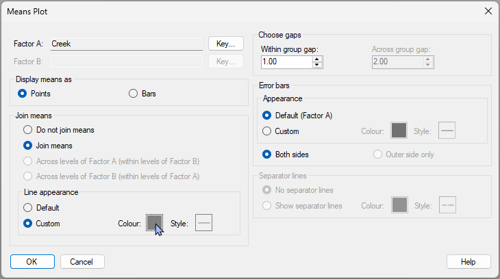

This will yield the following modified plot:

[![09._Diverse_Fal_S_plot_with_line.png](https://learninghub.primer-e.com/uploads/images/gallery/2026-07/scaled-1680-/09-diverse-fal-s-plot-with-line.png)](https://learninghub.primer-e.com/uploads/images/gallery/2026-07/09-diverse-fal-s-plot-with-line.png)
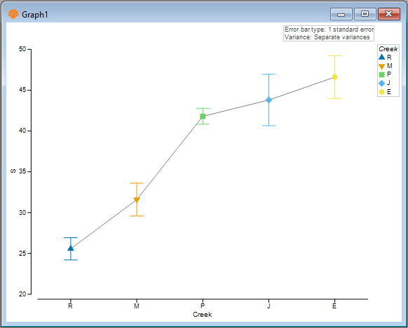

5. You can also choose to show the means as bars instead. Click **Graph** > **Special...**, then (Display Means as > $\bullet$ Bars) and (Error bars > Appearance > $\bullet$ Custom).

[![10a._Diverse_Fal_S_bars+custom_dialog.png](https://learninghub.primer-e.com/uploads/images/gallery/2026-07/scaled-1680-/10a-diverse-fal-s-barscustom-dialog.png)](https://learninghub.primer-e.com/uploads/images/gallery/2026-07/10a-diverse-fal-s-barscustom-dialog.png)
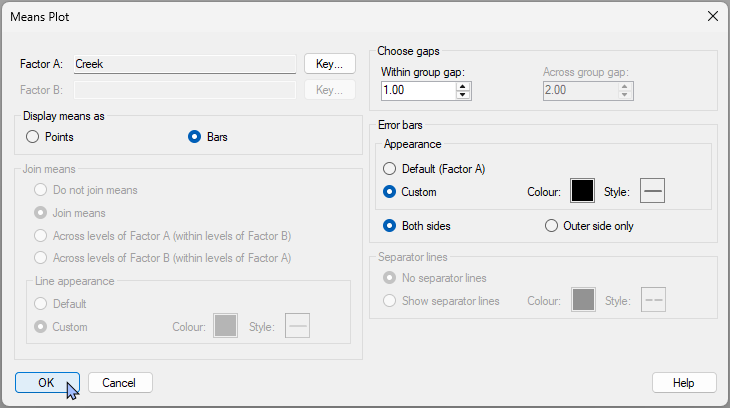

This yields the following plot: 

[![10._Diverse_Fal_S_bars.png](https://learninghub.primer-e.com/uploads/images/gallery/2026-07/scaled-1680-/10-diverse-fal-s-bars.png)](https://learninghub.primer-e.com/uploads/images/gallery/2026-07/10-diverse-fal-s-bars.png)
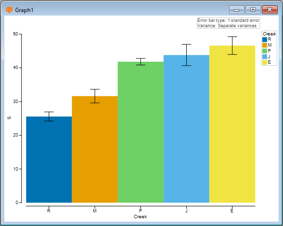

Next, we shall consider some multi-factor plots.

# 16.3 Example: Okura macrofauna (two-way nested case)

Let's look at a means plot where we have a two-way nested design. We will examine data consisting of counts of benthic macrofauna from intertidal sites in the Okura estuary, located north of Auckland, New Zealand ({{@954#bkmrk-andersonetal2004}}).  Hydrodynamic models were used to identify different areas within the estuary as having high (H), medium (M) or low (L) probabilities of sediment deposition. There were several areas of each type (H, M, or L) interspersed along the estuary from its mouth to its inner reaches. Interest lies in identifying potential differences in the abundances of infaunal species at sites having different probabilities of sediment deposition. Some organisms are expected to be more tolerant of sediment inputs, while others (particularly filter feeders) may be more vulnerable to fine sediment inputs.

Six (6) sediment cores (13 cm in diameter × 15 cm deep) were obtained from random positions within each of 15 sites along the estuary, with 5 sites from each of the high, medium and low depositional types of environments. Sampling was repeated 6 times (twice in each of three seasons in 2001-2002), yielding a total of 36 cores sampled per site.

These data are contained in the file '<ins>Okura_macrofauna.pri</ins>', found in the <ins>'Okura_macrofauna</ins>' folder in '<ins>Examples_P8</ins>'. We shall ignore, for now, the temporal factors in the study and focus only on the spatial factors in a two-way nested design:
- Deposition (fixed with $a$ = 3 levels: H, M or L); and
- Site (random and nested, $b$ = 5 sites within each Deposition, thus 15 sites in total)

We will create a means plot that shows the mean ± 1 standard error for each site for a single univariate variable: the abundance of cockles, *Austrovenus stutchburyi*.

1. Open the '<ins>Okura_macrofauna.pri</ins>' file in PRIMER 8, look for the variable (column) named '<ins>Austrovenus stutchburyi</ins>', highlight this species by clicking on its name, then click **Select** > **Highlighted**.

[![11._Okura_Select_Austrovenus.png](https://learninghub.primer-e.com/uploads/images/gallery/2026-07/scaled-1680-/11-okura-select-austrovenus.png)](https://learninghub.primer-e.com/uploads/images/gallery/2026-07/11-okura-select-austrovenus.png)
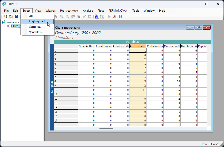

2. You will see the selected species as a single column with a blue background. With this single species selected, click **Plots** > **Means Plot...**, like so:

[![12._Okura_Means_plot_menu.png](https://learninghub.primer-e.com/uploads/images/gallery/2026-07/scaled-1680-/12-okura-means-plot-menu.png)](https://learninghub.primer-e.com/uploads/images/gallery/2026-07/12-okura-means-plot-menu.png)
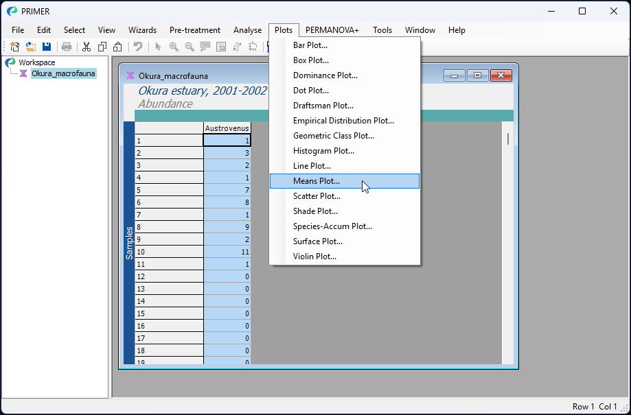

3. Given that the design is nested, we would like to calculate a separate mean (and standard error) for each site, and we would like bars corresponding to different sites to be arranged along the x-axis separately within each of the deposition groups (H, M and L). We therefore need to choose the following in the 'Means Plot' dialog:
- Factor A (different symbols/colours) > <ins>Site</ins>
- $\checkmark$ Split into separate groups (along the x-axis) by Factor B > <ins>Deposition</ins>
- Display means as > $\bullet$ Bars

as shown below:

[![13._Okura_Means_plot_dialog.png](https://learninghub.primer-e.com/uploads/images/gallery/2026-07/scaled-1680-/13-okura-means-plot-dialog.png)](https://learninghub.primer-e.com/uploads/images/gallery/2026-07/13-okura-means-plot-dialog.png)
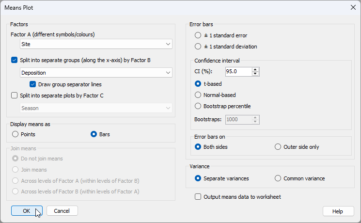


Click '**OK**'.

The resulting plot (given in the output file called '<ins>Graph1</ins>' initially will simply show a different coloured bar for each of the sites, like this:

[![14._Okura_initial_plot.png](https://learninghub.primer-e.com/uploads/images/gallery/2026-07/scaled-1680-/14-okura-initial-plot.png)](https://learninghub.primer-e.com/uploads/images/gallery/2026-07/14-okura-initial-plot.png)
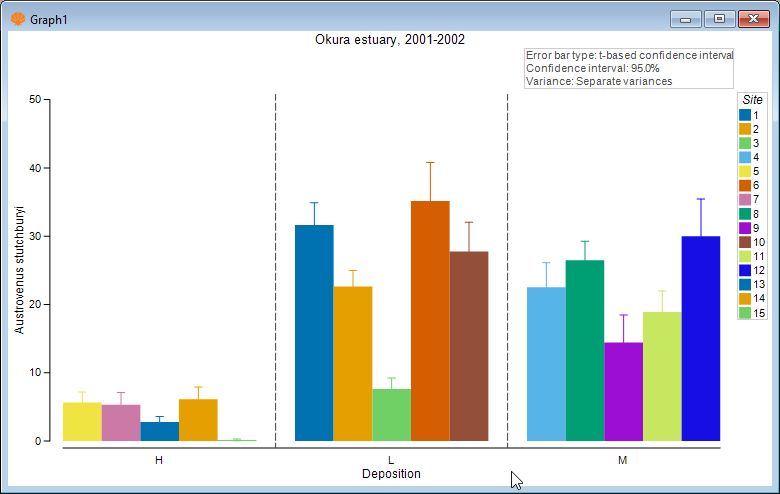

Although this is not too bad, the plot could be improved in a number of ways. First, notice that the 3 levels of 'Deposition' are ordered alphabetically, but we might prefer them to have a more logical order, e.g. L < M < H. Second, we might like to make the error bars black, rather than being the same colour as the bars themselves, so that we can more easily see their extent above and below the mean value. Third, it might be nice if the colours of the bars corresponded to the three different levels of 'Deposition', rather than being a different colour for every site. After all, 'Site' is a random factor. 

#### Special graphical properties of Means Plots

Means plots in PRIMER have a number of special graphical properties that can be altered by you even after the plot has been made. Click **Graph** > **Special...** to see them. Specifically, you can choose:
- to change the order of factor levels or the colours/symbols/lines associated with particular factors (*via* the 'Key' menu)
- to display means as points or bars
- whether and how the means may be joined, and the associated line types for joining
- the sizes of gaps within or between groups of means
- whether to show separator lines between groups and what line colour/type to use for this
- the colour and style of error bar lines, and whether to show both sides or just one side (the outer side).

4. To change the colour of the error bars in the plot of *Austrovenus* ('<ins>Graph1</ins>'), click **Graph** > **Special...** and under 'Error bars', choose 'Appearance > $\bullet$ Custom', and choose a colour of your choice (the default of black will do fine here). Next, to change the order of the deposition groups on the X axis, click the '**Key**' button next to 'Factor B: <ins>Deposition</ins>'.

[![15._Means_Plot_Special_dialog.png](https://learninghub.primer-e.com/uploads/images/gallery/2026-07/scaled-1680-/15-means-plot-special-dialog.png)](https://learninghub.primer-e.com/uploads/images/gallery/2026-07/15-means-plot-special-dialog.png)

Inside the 'Key' menu, click on the level labeled 'H', and move it progressively to the bottom using the 'Move' arrow button [![](https://learninghub.primer-e.com/uploads/images/gallery/2026-07/scaled-1680-/image-1784168270813.png)](https://learninghub.primer-e.com/uploads/images/gallery/2026-07/image-1784168270813.png), so that the order of the Deposition levels (from top to bottom) is changed to 'L', followed by 'M', followed by 'H', respectively, then click '**OK**', as shown below:

[![15c._Key_final.png](https://learninghub.primer-e.com/uploads/images/gallery/2026-07/scaled-1680-/15c-key-final.png)](https://learninghub.primer-e.com/uploads/images/gallery/2026-07/15c-key-final.png)
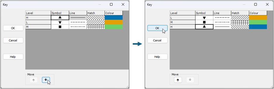

This yields a plot that is better, viz:

[![16._Okura_modified_plot.png](https://learninghub.primer-e.com/uploads/images/gallery/2026-07/scaled-1680-/16-okura-modified-plot.png)](https://learninghub.primer-e.com/uploads/images/gallery/2026-07/16-okura-modified-plot.png).
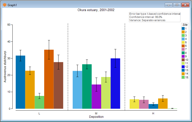

5. We have improved the colour of the error bars and the ordering of the factor levels along the x axis. Now let's change the colours of the bars to match the factor of Deposition. Click **Graph** > **Sample Labels & Symbols...** and choose the 

[![17._Graph_Options_dialog.png](https://learninghub.primer-e.com/uploads/images/gallery/2026-07/scaled-1680-/17-graph-options-dialog.png)](https://learninghub.primer-e.com/uploads/images/gallery/2026-07/17-graph-options-dialog.png)
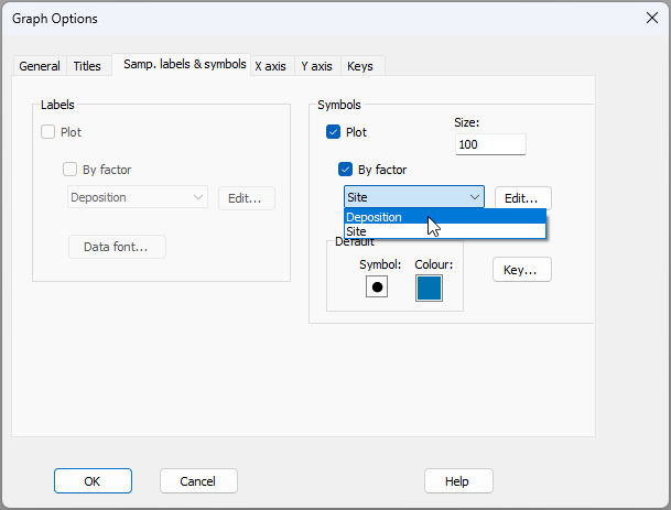

The final plot looks like this:

[![18._Okura_final_plot.png](https://learninghub.primer-e.com/uploads/images/gallery/2026-07/scaled-1680-/18-okura-final-plot.png)](https://learninghub.primer-e.com/uploads/images/gallery/2026-07/18-okura-final-plot.png)
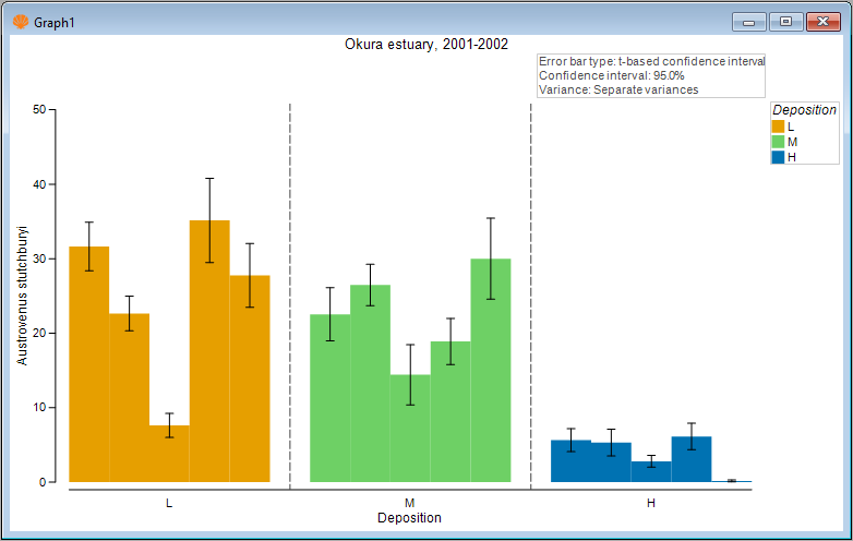

Here, we can clearly see both the substantial variability among sites in the mean abundance of cockles. We can also see that, on average, the mean abundance of cockles is greater at sites having either a low or medium probability of sediment deposition (amber or green bars), compared to sites having a high probability of sediment deposition (blue bars).

# 16.4 Example: Leschenault fish (two-way crossed case)

An example of a two-way crossed design is provided by a study of trawl samples for fish communities (using a 21.5m seine net) from 4 regions - basal (B), lower (L), upper (U), and apex (A) - occurring between the mouth and upper reaches of the Leschenault estuary, Western Australia ({{@954#bkmrk-vealeetal2014}}). Samples were taken from each region over 4 seasons - spring (Sp), summer (S), autumn (A), and winter (W), with 6-8 replicate samples from each of these 16 combinations (taken over the years 2008-2010). Data are located in the file '<ins>Leschenault_fish_counts.pri</ins>', found in the <ins>'Leschenault_fish</ins>' folder in '<ins>Examples_P8</ins>'. This is a simplified version of the data described by {{@954#bkmrk-vealeetal2014}}. The following two factors are crossed with one another, as all regions were sampled in every season:
- **Region**, fixed with 4 levels: basal (B), lower (L), upper (U), and apex (A)
- **Season**, fixed wtih 4 levels: spring (Sp), summer (S), autumn (A), and winter (W)


#### Compare seasonal means for different regions
We shall focus our attention here on just a few species that have high frequencies of occurrence across the dataset as a whole. We wish to construct means plots to examine and compare potential changes in the average abundance of a given fish species across the seasons (considered separately for each region) and across the regions (considered separately for each season).

1. Begin by selecting the top 4 species, based on their percentage contribution to any one sample. Open the file '<ins>Leschenault_fish_counts.pri</ins>', found in the <ins>'Leschenault_fish</ins>' folder in '<ins>Examples_P8</ins>' in PRIMER. Click **Select** > **Variables...** and choose:

$\bullet$ Top <ins>4</ins> variable(s) based on: > $\bullet$ Percent contribution to any one sample, as shown below.

[![19._Lesch_data_Select_top4.png](https://learninghub.primer-e.com/uploads/images/gallery/2026-07/scaled-1680-/19-lesch-data-select-top4.png)](https://learninghub.primer-e.com/uploads/images/gallery/2026-07/19-lesch-data-select-top4.png)
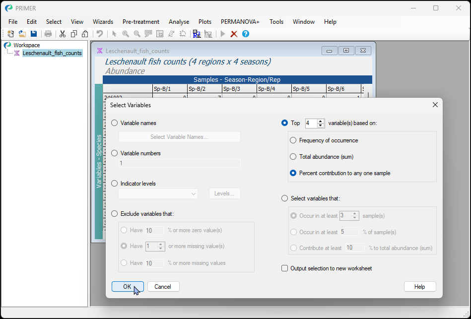

2. First we'll make plots that permit easy comparison of the seasonal means, separately within each region. Click **Plots** > **Means Plot...**, then choose the following:
- Factor A (different symbols/colours): <ins>Season</ins>
- $\checkmark$Split into separate groups (along the x-axis) by Factor B > <ins>Region</ins> > $\checkmark$Draw group separator lines
- Display means as > $\bullet$ Points
- Join means > $\bullet$ Across levels of Factor A (within levels of Factor B)

Leave the rest as defaults and click '**OK**'.

[![20._Lesch_Means_plot_Season_dialog.png](https://learninghub.primer-e.com/uploads/images/gallery/2026-07/scaled-1680-/20-lesch-means-plot-season-dialog.png)](https://learninghub.primer-e.com/uploads/images/gallery/2026-07/20-lesch-means-plot-season-dialog.png)
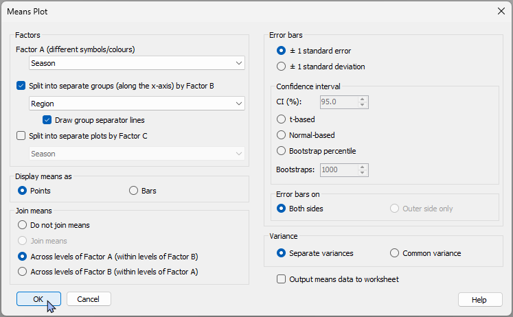

This will produce 4 graphics - one for each species - presented in the multiplot object '<ins>MultiPlot1</ins>':

[![21._Leschenault_Multiplot.png](https://learninghub.primer-e.com/uploads/images/gallery/2026-07/scaled-1680-/21-leschenault-multiplot.png)](https://learninghub.primer-e.com/uploads/images/gallery/2026-07/21-leschenault-multiplot.png)

3. Let's take a closer look at the fish species '246010' (actual species names were not provided with this particular dataset). Click on '<ins>Graph2</ins>' in the Explorer tree (or click on the upper right-hand plot in the multiplot graphic).

[![22._Lesch_Species_246010.png](https://learninghub.primer-e.com/uploads/images/gallery/2026-07/scaled-1680-/22-lesch-species-246010.png)](https://learninghub.primer-e.com/uploads/images/gallery/2026-07/22-lesch-species-246010.png)
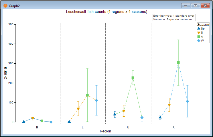

This species generally had greater average abundance in autumn (green symbols), particularly in the upper (U) and apex (A) regions of the estuary.

#### Compare regional means for different seasons
4. We can change the colour or line-type of the joining lines. Note that the default colours and line-types for these are based on the colour key for Factor B, which is 'Region' here. We can also change the joining lines so that they occur across the regions, rather than across the seasons. A further option is to change the colour or style (or even remove entirely) the dotted lines separating the different regions along the x-axis. Let's check out the visual effect of these changes on our graphic. Click **Graph** > **Special...**. Then, in the 'Means Plot' special dialog, choose the following:
- Join means > $\bullet$ Across levels of Factor B (within levels of Factor A)
- Separator lines > $\bullet$ No separate lines
then click '**OK**'.

[![23._Lesch_change_joining_lines.png](https://learninghub.primer-e.com/uploads/images/gallery/2026-07/scaled-1680-/23-lesch-change-joining-lines.png)](https://learninghub.primer-e.com/uploads/images/gallery/2026-07/23-lesch-change-joining-lines.png)
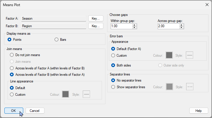

The resulting plot will look like this:

[![23._Lesch_first_revised_plot.png](https://learninghub.primer-e.com/uploads/images/gallery/2026-07/scaled-1680-/23-lesch-first-revised-plot.png)](https://learninghub.primer-e.com/uploads/images/gallery/2026-07/23-lesch-first-revised-plot.png)
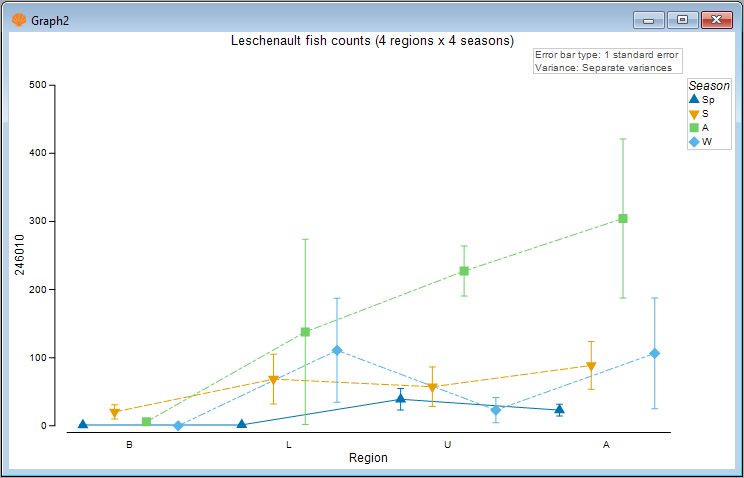

5. Another tweak we might like to consider here is to change the relative gap width among the categories (bars or points) that are being plotted within *vs* between the groups along the x-axis. For example, we could make the seasonal means within a group closer together, with a bigger gap between the different regions. Click **Graph** > **Special...**. Then, in the 'Means Plot' special dialog, in the section entitled 'Choose gaps', make the 'Across group gap' six times (say) the 'Within group gap', e.g.:

[![24._Choose_Gap_width.png](https://learninghub.primer-e.com/uploads/images/gallery/2026-07/scaled-1680-/24-choose-gap-width.png)](https://learninghub.primer-e.com/uploads/images/gallery/2026-07/24-choose-gap-width.png)
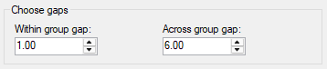

The resulting gap-adjusted plot is quite a bit clearer, *viz.*:

[![25._Lesch_2nd_revised_plot.png](https://learninghub.primer-e.com/uploads/images/gallery/2026-07/scaled-1680-/25-lesch-2nd-revised-plot.png)](https://learninghub.primer-e.com/uploads/images/gallery/2026-07/25-lesch-2nd-revised-plot.png)
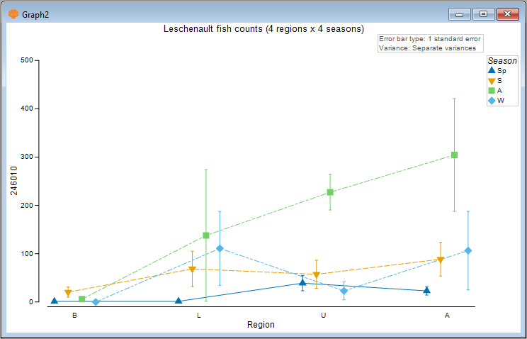

In this graphic, we can now more clearly see there is a gradual increase in the mean abundance of this fish species as you go up the estuary (from the basal to the lower to the upper and finally to the apex region), but this trend is only really apparent in the autumn season (green symbols), and not so apparent in the other seasons.

6. Another possibility would be to ***swap the roles*** of the factors in this crossed design for the plot itself to begin with. We can examine the regional means separately within each season. To do this, go back to the original data sheet (called '<ins>Leschenault_fish_counts</ins>' in the Explorer tree) and click **Plots** > **Means Plot...**, then choose '<ins>Region</ins>' as Factor A and '<ins>Season</ins>' as Factor B, leaving all the rest as before.

A Multiplot will be produced (4 graphics for the 4 species), with the top-right plot ('<ins>Graph6</ins>') corresponding once again to fish species 246010, like so:

[![26._Lesch_3rd_revised_plot.png](https://learninghub.primer-e.com/uploads/images/gallery/2026-07/scaled-1680-/26-lesch-3rd-revised-plot.png)](https://learninghub.primer-e.com/uploads/images/gallery/2026-07/26-lesch-3rd-revised-plot.png)
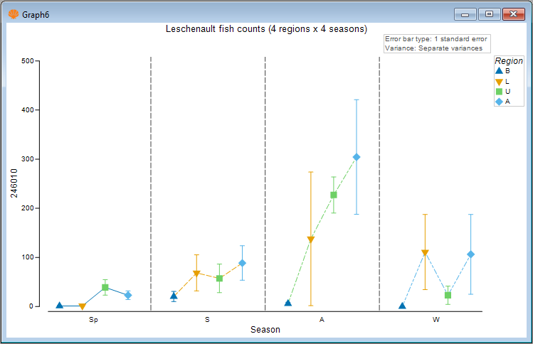

The general trend of increasing mean abundance as you go from the basal to the apex region of the estuary (as previously described) is even more plainly seen here, and is very marked in autumn.

Note also that the joining lines here correspond to the underlying colours/line-types of the regions. If we wish, we can make these joining lines a solid colour of our choice. For example, we shall make them a solid charcoal colour. Click **Graph** > **Special...**, then under 'Line appearance' in the dialog, choose '$\bullet$ Custom' and click on the solid box next to the word 'Colour:' and you can choose your colour explicitly, like so:

[![27._line_colour_all.png](https://learninghub.primer-e.com/uploads/images/gallery/2026-07/scaled-1680-/27-line-colour-all.png)](https://learninghub.primer-e.com/uploads/images/gallery/2026-07/27-line-colour-all.png)
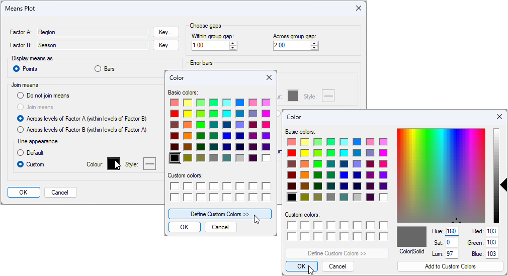

The resulting plot that uses a solid charcoal colour for the joining lines looks like this:

[![28_Lesch_fourth_revised_plot.png](https://learninghub.primer-e.com/uploads/images/gallery/2026-07/scaled-1680-/28-lesch-fourth-revised-plot.png)](https://learninghub.primer-e.com/uploads/images/gallery/2026-07/28-lesch-fourth-revised-plot.png)
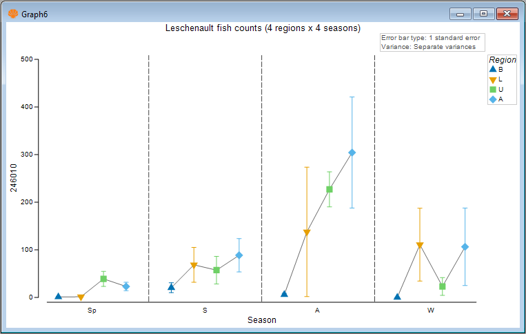

#### Bars instead of points
8. Of course, we can also look at this plot using bars instead of points. Simply click **Graph** > **Special...**, then choose:
- Display means as > $\bullet$ Bars
- Error bars > Appearance > $\bullet$ Custom

to get the following plot:

[![29._Lesch_as_Bar_plot.png](https://learninghub.primer-e.com/uploads/images/gallery/2026-07/scaled-1680-/29-lesch-as-bar-plot.png)](https://learninghub.primer-e.com/uploads/images/gallery/2026-07/29-lesch-as-bar-plot.png)
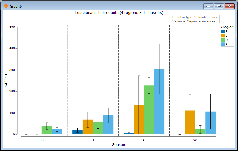

It is clear there are many ways to customise and refine these means plots. For example, the colours associated with the individual factor levels can be changed using the 'Key' button(s) in the **Graph** > **Special...** menu dialog. In addition, a great host of other aspects of the plot can also obviously be customised using the **Graph** > **General...** menu dialog, including the text and fonts for titles, the legend ('Keys'), the 'History' text pane, the X or Y axes, and so on.

# 16.5 Example: New Zealand snapper (three-way case)

The **Means Plot** procedure in PRIMER 8 will operate just as other univariate plots do (such as histograms and dotplots) in that multiple plots will be produced - one for each variable - if there are multiple variables in the original spreadsheet. However, means plots also provide the end-user with the ability to create a multi-plot object by reference to an additional factor. This can be a second or a third factor, depending on the situation. Here, we will show a couple of examples that use this approach advantageously to show patterns across all combinations of three factors in a single multi-plot graphic.

The example dataset here are counts of snapper (*Chrysophrys auratus*) taken from baited remote underwater video (BRUV) apparatuses deployed at each of three locations: Leigh, Tawharanui and Hahei, in each of two seasons over several years (1997-2007), from sites that were located either inside or outside of a marine reserve (the factor here is 'Status', with levels 'NR' = non-reserve and 'R' = reserve). See {{@954#bkmrk-smithetal2014}} for details.

#### Status by Year by Location
First, we will visualise patterns in mean relative abundances (total count per BRUV unit) of snapper inside *vs* outside reserves across the years at the different locations. The data are located in the file named '<ins>NZ_Snapper_counts.pri</ins>', located in the folder '<ins>Examples_P8</ins>' > <ins>NZ_Snapper_counts</ins>'.

1. Open the file '<ins>NZ_Snapper_counts.pri</ins>' in PRIMER and click on the column (variable) name '<ins>tot.snapper</ins>' in the sheet to highlight it, then click **Select** > **Highlighted**. The selected variable will be highlighted in blue, thusly:

[![30._Snapper_counts.png](https://learninghub.primer-e.com/uploads/images/gallery/2026-07/scaled-1680-/30-snapper-counts.png)](https://learninghub.primer-e.com/uploads/images/gallery/2026-07/30-snapper-counts.png)
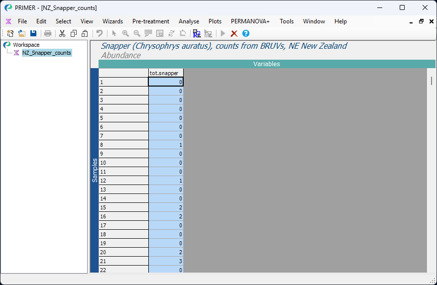

Next, we shall plot the mean count of total snapper observed (per BRUV) with along with the 2.5% and 97.5% percentiles of the distribution of bootstrap means from 1000 bootstrap re-samples.

2. Click **Plots** > **Means Plot...** and choose the following options in the 'Means plot' dialog:
- Factor A (different symbols/colours) > <ins>Status</ins>
- $\checkmark$Split into separate groups (along the x-axis) by Factor B > <ins>Year</ins>, and 'untick' the box '$\Box$ Draw group separator lines'
- $\checkmark$Split into separate plots by Factor C > <ins>Location</ins>
- Display means as > $\bullet$ Points
- Join means > $\bullet$ Across levels of Factor B (within levels of Factor A)
- Error bars > $\bullet$ Bootstrap percentile

as shown below:

[![31._Snapper_means_plot_dialog_1.png](https://learninghub.primer-e.com/uploads/images/gallery/2026-07/scaled-1680-/31-snapper-means-plot-dialog-1.png)](https://learninghub.primer-e.com/uploads/images/gallery/2026-07/31-snapper-means-plot-dialog-1.png)
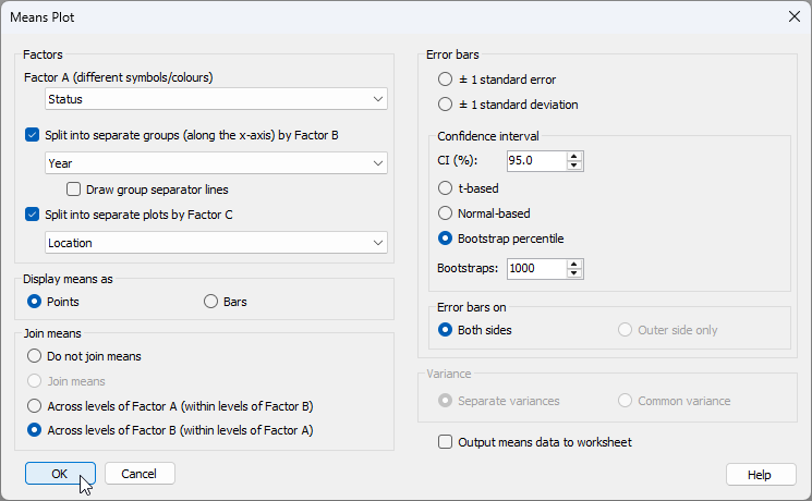

The resulting multi-plot shows the means (and bootstrap percentiles) for snapper counts from reserve and non-reserve sites separately in each year, with different locations being shown as different graphics within the multi-plot object, *viz*:

[![32._Snapper_MultiPlot.png](https://learninghub.primer-e.com/uploads/images/gallery/2026-07/scaled-1680-/32-snapper-multiplot.png)](https://learninghub.primer-e.com/uploads/images/gallery/2026-07/32-snapper-multiplot.png)
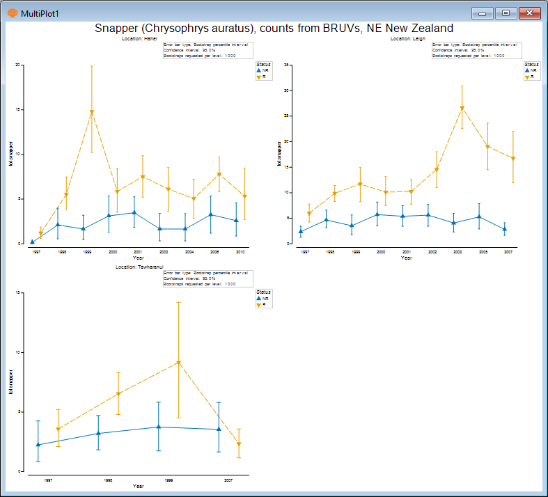

Examining the plot for Leigh only (click on the upper right-hand plot, or click '<ins>Graph2</ins>' in the Explorer tree), we see, for example:

[![33._Snapper_Leigh_only.png](https://learninghub.primer-e.com/uploads/images/gallery/2026-07/scaled-1680-/33-snapper-leigh-only.png)](https://learninghub.primer-e.com/uploads/images/gallery/2026-07/33-snapper-leigh-only.png)
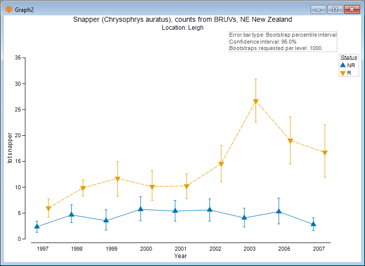

You can change or arrange the graphics in a multi-plot (i.e., by specifying the number of columns and rows of graphics that you want, and also their ordering) etc. by first clicking on the multiplot item itself in the Explorer tree (e.g., '<ins>MultiPlot1</ins>'), then click **Graph** > **Special...**.

#### Season by Status by Location

We might also like to look at differences in the mean relative abundances of snapper inside *vs* outside these reserves, also split by location. We will do this just for Leigh and Hahei, where we have more years of information.

4. From the '<ins>NZ_Snapper_counts</ins>' data sheet, click **Select** > **Samples...**, then choose $\bullet$ Factor levels > <ins>Location</ins> and click the 'Levels...' button [![Levels_button.png](https://learninghub.primer-e.com/uploads/images/gallery/2026-07/scaled-1680-/levels-button.png)](https://learninghub.primer-e.com/uploads/images/gallery/2026-07/levels-button.png). Move the words '<ins>Hahei</ins>' and '<ins>Leigh</ins>' from the 'Available' box on the left to the 'Include' box on the right (by clicking on them each and then clicking on the right-arrow button [![right-arrow.png](https://learninghub.primer-e.com/uploads/images/gallery/2026-07/scaled-1680-/right-arrow.png)](https://learninghub.primer-e.com/uploads/images/gallery/2026-07/right-arrow.png)), then click '**OK**'.

[![35._Select_Locations.png](https://learninghub.primer-e.com/uploads/images/gallery/2026-07/scaled-1680-/35-select-locations.png)](https://learninghub.primer-e.com/uploads/images/gallery/2026-07/35-select-locations.png)
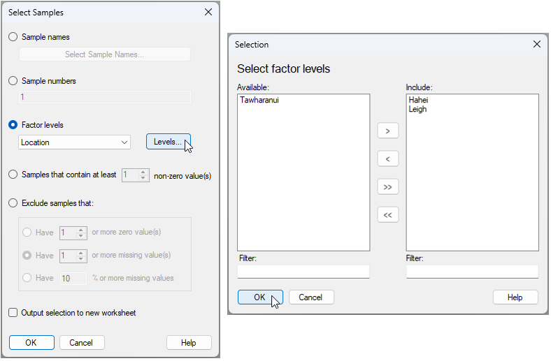

5. Click **Plots** > **Means Plot...** and choose the following options in the 'Means plot' dialog:
- Factor A (different symbols/colours) > <ins>Season</ins>
- $\checkmark$Split into separate groups (along the x-axis) by Factor B > <ins>Status</ins>, and $\checkmark$ Draw group separator lines
- $\checkmark$Split into separate plots by Factor C > <ins>Location</ins>
- Display means as > $\bullet$ Bars
- Join means > $\bullet$ Across levels of Factor B (within levels of Factor A)
- Error bars > $\bullet$ Bootstrap percentile

as shown below:

[![34._Snapper_Seasons_by_Status.png](https://learninghub.primer-e.com/uploads/images/gallery/2026-07/scaled-1680-/34-snapper-seasons-by-status.png)](https://learninghub.primer-e.com/uploads/images/gallery/2026-07/34-snapper-seasons-by-status.png)
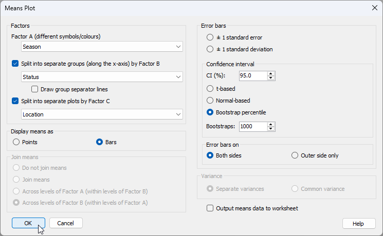

The resulting graphic, by default, looks like this:

[![36._Snapper_Season_graphic.png](https://learninghub.primer-e.com/uploads/images/gallery/2026-07/scaled-1680-/36-snapper-season-graphic.png)](https://learninghub.primer-e.com/uploads/images/gallery/2026-07/36-snapper-season-graphic.png)
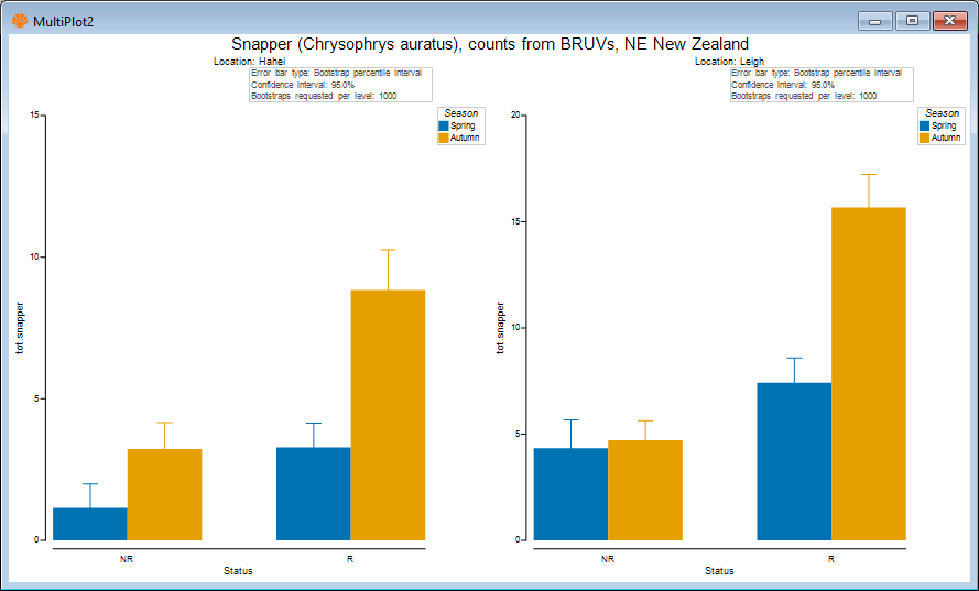

6. We might like to change the colours of these bars to something a bit more reflective of spring and autumn. Go back to the original data sheetcalled '<ins>NZ_Snapper_counts</ins>' and click **Edit** > **Factors...**, then click on the column called 'Season', and click the 'Key' button [![Key_button.png](https://learninghub.primer-e.com/uploads/images/gallery/2026-07/scaled-1680-/key-button.png)](https://learninghub.primer-e.com/uploads/images/gallery/2026-07/key-button.png). In the 'Key' dialog, click on the colour box for 'Spring' and choose (say) a green colour, then click on the colour box for 'Autumn' and choose (say) an autumnal colour of brown or orange/red, then click '**OK**'.



[![37._Edit_Key.png](https://learninghub.primer-e.com/uploads/images/gallery/2026-07/scaled-1680-/37-edit-key.png)](https://learninghub.primer-e.com/uploads/images/gallery/2026-07/37-edit-key.png)
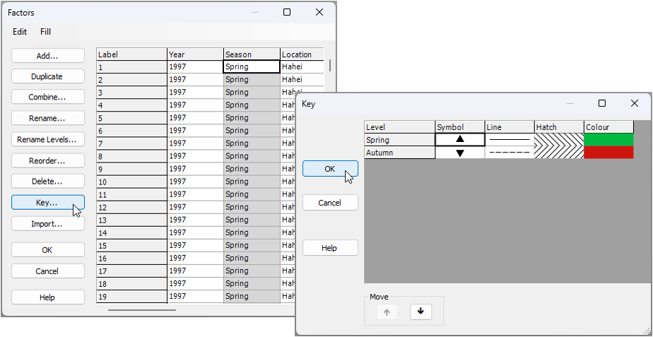

Re-running the same dialog for the means plot now as we ran before (see step 5 above), we obtain the following ('<ins>MultiPlot3</ins>'):

[![38._Snapper_Season_graphic_revised.png](https://learninghub.primer-e.com/uploads/images/gallery/2026-07/scaled-1680-/38-snapper-season-graphic-revised.png)](https://learninghub.primer-e.com/uploads/images/gallery/2026-07/38-snapper-season-graphic-revised.png)

7. We might also like to change the error bar colours so that they are black, making it easier to see the lower and upper bootstrap percentile values. For each of '<ins>Graph6</ins>' and '<ins>Graph7</ins>', in turn (both of these graphics are in '<ins>MultiPlot3</ins>'), click **Graph** > **Special...**, then choose

Error bars > Appearance > $\bullet$ Custom (and leave the default colour of black here).

The resulting plot looks like this:

[![39._Snapper_Season_graphic_revised2.png](https://learninghub.primer-e.com/uploads/images/gallery/2026-07/scaled-1680-/39-snapper-season-graphic-revised2.png)](https://learninghub.primer-e.com/uploads/images/gallery/2026-07/39-snapper-season-graphic-revised2.png)
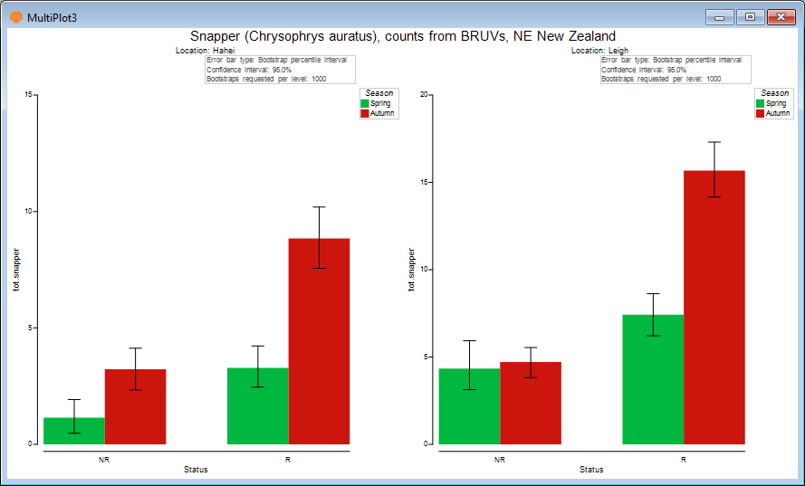

The above plot shows that the mean relative abundance of snapper (sampled using BRUVs) is typically greater in the autumn than in the spring, on average. Also, the largest seasonal difference in mean was observed inside the reserve at Leigh.

#### Means plots to accompany PERMANOVA formal analysis

Typcially, we would perform a more complete univariate statistical analysis of these data using (say) PERMANOVA in accordance with the full multi-factor sampling design. This could be done easily in PRIMER with PERMANOVA+ by calculating Euclidean distances among the samples based on the single variable of '<ins>tot.snapper</ins>' and creating an appropriate Design file corresponding to the full multi-factor experimental design (including the nested factor of 'Areas' as well). Pair-wise comparisons could then be run to follow up any significant interactions that might be discovered among the main factors of interest.

It is useful to show relevant multi-factor means plots to accompany PERMANOVA tests and pair-wise comparisons. For example, a statistically significant threee-way interaction of Season$\times$Status$\times$Location might well be accompanied by not only the relevant pair-wise comparisons, but also the above means plots that permit one to compare the means (and their variability) visually in a useful way.

#### Output means data to worksheet

There are many ways to customise means plots within PRIMER. It is also possible (in the 'Means Plot' dialog) to tick the box to '$\checkmark$Output means data to worksheet'. This will output the means and standard errors (or the means and the upper and lower bounds of error bars of your choice) which are calculated to produce the plot. If there are customisations that you want to create in a different graphics package, or if you would rather get the values for the means (and their measures of variation) in a tabled format (e.g., for publication in supplementary material, etc.), then this extra tool is very handy, and may well be more efficient than using **Tools** > **Summary Stats...**, even though the latter has been [expanded considerably](https://learninghub.primer-e.com/books/whats-new-in-primer-8/chapter/1-expanded-summary-statistics) from what was available in version 7.

# References

---

<div id="bkmrk-adegoke2019"> [ Adegoke (2019) ](https://learninghub.primer-e.com/link/954#bkmrk-adegoke2019)</div><div class="csl-entry" id="bkmrk-adegoke%2C-n.-%282019%29-c" style="margin-bottom: 1em;">Adegoke, N. (2019) *Contributions to improve power, efficiency and scope of control-chart methods* . PhD thesis, School of Natural and Computational Sciences (SNCS), Massey University, New Zealand, 284 pp.</div>[link to source](https://mro.massey.ac.nz/server/api/core/bitstreams/5ae914c9-bdc1-4d11-982d-fc299245e2e0/content)

---

<div id="bkmrk-adegokeetal2018"> [ Adegoke *et al.* (2018) ](https://learninghub.primer-e.com/link/954#bkmrk-adegokeetal2018)</div><div class="csl-entry" id="bkmrk-adegoke%2C-n.a.%2C-smith" style="margin-bottom: 1em;">Adegoke, N.A., Smith, A.N.H., Anderson, M.J., Abbasi, S.A. &amp; Pawley, M.D.M. (2012) Shrinkage estimates of covariance matrices to improve the performance of multivariate cumulative sum control charts. *Computers &amp; Industrial Engineering*, **117**, 207-216.</div>---

<div id="bkmrk-ahmad2014"> [ Ahmad (2014) ](https://learninghub.primer-e.com/link/954#bkmrk-ahmad2014)</div><div class="csl-entry" id="bkmrk-ahmad%2C-m.r.-%282014%29-a" style="margin-bottom: 1em;">Ahmad, M.R. (2014) A *U*-statistic approach for a high-dimensional two-sample mean testing problem under non-normality and Behrens–Fisher setting. *Annals of the Institute of Statistical Mathematics*, **66**, 33-61.</div>---

<div id="bkmrk-ahmadetal2012"> [ Ahmad *et al.* (2012) ](https://learninghub.primer-e.com/link/954#bkmrk-ahmadetal2012)</div><div class="csl-entry" id="bkmrk-ahmad%2C-m.r.%2C-vonrose" style="margin-bottom: 1em;">Ahmad, M.R., vonRosen, D. &amp; Singull, M. (2012) A note on mean testing for high dimensional multivariate data under non-normality. *Statistica Neerlandica*, **67**, 88-99.</div>---

<div id="bkmrk-anderson1992"> [ Anderson (1992) ](https://learninghub.primer-e.com/link/954#bkmrk-anderson1992)</div><div class="csl-entry" id="bkmrk-anderson%2C-m.j.-%281992" style="margin-bottom: 1em;">Anderson, M.J. (1992) *Settlement and succession of oysters and fouling organisms in Quibray Bay, New South Wales*. Graduate Diploma of Science (Honours) thesis, School of Biological Sciences, University of Sydney, NSW, Australia, 51 pp.</div>---

<div id="bkmrk-anderson1996"> [ Anderson (1996) ](https://learninghub.primer-e.com/link/954#bkmrk-anderson1996)</div><div class="csl-entry" id="bkmrk-anderson%2C-m.j.-%281996" style="margin-bottom: 1em;">Anderson, M.J. (1996) A chemical cue induces settlement of Sydney Rock oysters, *Saccostrea commercialis*, in the laboratory and in the field. *Biological Bulletin*, **190**, 350-358.</div>---

<div id="bkmrk-anderson2001"> [ Anderson (2001) ](https://learninghub.primer-e.com/link/954#bkmrk-anderson2001)</div><div class="csl-entry" id="bkmrk-anderson%2C-m.j.-%282001" style="margin-bottom: 1em;">Anderson, M.J. (2001) A new method for non-parametric multivariate analysis of variance. *Austral Ecology*, **26**, 32-46.</div>---

<div id="bkmrk-anderson2006"> [ Anderson (2006) ](https://learninghub.primer-e.com/link/954#bkmrk-anderson2006)</div><div class="csl-entry" id="bkmrk-anderson%2C-m.j.-%282006" style="margin-bottom: 1em;">Anderson, M.J. (2006) Distance-based tests for homogeneity of multivariate dispersions. *Biometrics*, **62**, 245-253.</div>---

<div id="bkmrk-anderson2017"> [ Anderson (2017) ](https://learninghub.primer-e.com/link/954#bkmrk-anderson2017)</div><div class="csl-entry" id="bkmrk-anderson%2C-m.j.-%282017" style="margin-bottom: 1em;">Anderson, M.J. (2017) Permutational multivariate analysis of variance (PERMANOVA). *Wiley StatsRef: Statistics Reference Online*, **stat07841**, 15 pp.</div>[link to source](https://onlinelibrary.wiley.com/doi/full/10.1002/9781118445112.stat07841)

---

<div id="bkmrk-andersonetal2005"> [ Anderson *et al.* (2005) ](https://learninghub.primer-e.com/link/954#bkmrk-andersonetal2005)</div><div class="csl-entry" id="bkmrk-anderson%2C-m.j.%2C-dieb" style="margin-bottom: 1em;">Anderson, M.J., Diebel, C.E., Blom, W.M. &amp; Landers, T.J. (2005) Consistency and variation in kelp holdfast assemblages: spatial patterns of biodiversity for the major phyla at different taxonomic resolutions. *Journal of Experimental Marine Biology and Ecology*, **320**, 35-56.</div>---

<div id="bkmrk-andersonetal2006"> [ Anderson *et al.* (2006) ](https://learninghub.primer-e.com/link/954#bkmrk-andersonetal2006)</div><div class="csl-entry" id="bkmrk-anderson%2C-m.j.%2C-elli" style="margin-bottom: 1em;">Anderson, M.J., Ellingsen, K.E. &amp; McArdle, B.H. (2006) Multivariate dispersion as a measure of beta diversity. *Ecology Letters*, **9**, 683-693.</div>---

<div id="bkmrk-andersonetal2004"> [ Anderson *et al.* (2004) ](https://learninghub.primer-e.com/link/954#bkmrk-andersonetal2004)</div><div class="csl-entry" id="bkmrk-anderson%2C-m.j.%2C-ford" style="margin-bottom: 1em;">Anderson, M.J., Ford, R.B., Feary, D.A. &amp; Honeywill, C. (2004) Quantitative measures of sedimentation in an estuarine system and its relationship with intertidal soft-sediment infauna. *Marine Ecology Progress Series*, **272**, 33-48.</div>---

<div id="bkmrk-andersonetal2025"> [ Anderson *et al.* (2025) ](https://learninghub.primer-e.com/link/954#bkmrk-andersonetal2025)</div><div class="csl-entry" id="bkmrk-anderson%2C-m.j.%2C-gorl" style="margin-bottom: 1em;">Anderson, M.J., Gorley, R.N. &amp; Terlizzi, A. (2025) The incremental progression from fixed to random factors in the analysis of variance: a new synthesis. *Australian &amp; New Zealand Journal of Statistics*, **67**, 3-30.</div>---

<div id="bkmrk-andersonlegendre1999"> [ Anderson &amp; Legendre (1999) ](https://learninghub.primer-e.com/link/954#bkmrk-andersonlegendre1999)</div><div class="csl-entry" id="bkmrk-anderson%2C-m.j.-%26-leg" style="margin-bottom: 1em;">Anderson, M.J. &amp; Legendre, P. (1999) An empirical comparison of permutation methods for tests of partial regression coefficients in a linear model. *Journal of Statistical Computation and Simulation*, **62**, 271-303.</div>---

<div id="bkmrk-andersonmillar2004"> [ Anderson &amp; Millar (2004) ](https://learninghub.primer-e.com/link/954#bkmrk-andersonmillar2004)</div><div class="csl-entry" id="bkmrk-anderson%2C-m.j.-%26-mil" style="margin-bottom: 1em;">Anderson, M.J. &amp; Millar, R.B. (2004) Spatial variation and effects of habitat on temperate reef fish assemblages in northeastern New Zealand. *Journal of Experimental Marine Biology and Ecology*, **305**, 191-221.</div>---

<div id="bkmrk-andersonrobinson2001"> [ Anderson &amp; Robinson (2001) ](https://learninghub.primer-e.com/link/954#bkmrk-andersonrobinson2001)</div><div class="csl-entry" id="bkmrk-anderson%2C-m.j.-%26-rob" style="margin-bottom: 1em;">Anderson, M.J. &amp; Robinson, J. (2001) Permutation tests for linear models. *Australian &amp; New Zealand Journal of Statistics*, **43**, 75-88.</div>---

<div id="bkmrk-andersonthompson2004"> [ Anderson &amp; Thompson (2004) ](https://learninghub.primer-e.com/link/954#bkmrk-andersonthompson2004)</div><div class="csl-entry" id="bkmrk-anderson%2C-m.j.-%26-tho" style="margin-bottom: 1em;">Anderson, M.J. &amp; Thompson, A.A. (2004) Multivariate control charts for ecological and environmental monitoring. *Ecological Applications*, **14**, 1921-1935.</div>---

<div id="bkmrk-andersonetal2013"> [ Anderson *et al.* (2013) ](https://learninghub.primer-e.com/link/954#bkmrk-andersonetal2013)</div><div class="csl-entry" id="bkmrk-anderson%2C-m.j.%2C-toli" style="margin-bottom: 1em;">Anderson, M.J., Tolimieri, N. &amp; Millar, R.B. (2013) Beta diversity of demersal fish assemblages in the north-eastern Pacific: interactions of latitude and depth. *PLoS ONE*, **8(3)**, e57918.</div>[link to source](https://journals.plos.org/plosone/article?id=10.1371/journal.pone.0057918)

---

<div id="bkmrk-andersonunderwood1994"> [ Anderson &amp; Underwood (1994) ](https://learninghub.primer-e.com/link/954#bkmrk-andersonunderwood1994)</div><div class="csl-entry" id="bkmrk-anderson%2C-m.j.-%26-und" style="margin-bottom: 1em;">Anderson, M.J. &amp; Underwood, A.J. (1994) Effects of substratum on the recruitment and development of an intertidal estuarine fouling assemblage. *Journal of Experimental Marine Biology and Ecology*, **184**, 217-236.</div>---

<div id="bkmrk-andersonwalsh2013"> [ Anderson &amp; Walsh (2013) ](https://learninghub.primer-e.com/link/954#bkmrk-andersonwalsh2013)</div><div class="csl-entry" id="bkmrk-anderson%2C-m.j.-%26-wal" style="margin-bottom: 1em;">Anderson, M.J. &amp; Walsh, D.C.I. (2013) PERMANOVA, ANOSIM, and the Mantel test in the face of heterogeneous dispersions: what null hypothesis are you testing? *Ecological Monographs*, **83**, 557-574.</div>---

<div id="bkmrk-andersonetal2017"> [ Anderson *et al.* (2017) ](https://learninghub.primer-e.com/link/954#bkmrk-andersonetal2017)</div><div class="csl-entry" id="bkmrk-anderson%2C-m.j.%2C-wals" style="margin-bottom: 1em;">Anderson, M.J., Walsh, D.C.I., Clarke, K.R., Gorley, R.N. &amp; Guerra-Castro, E. (2017) Some solutions to the multivariate Behrens-Fisher problem for dissimilarity-based analyses. *Australian &amp; New Zealand Journal of Statistics*, **59**, 57-79.</div>---

<div id="bkmrk-andersonetal2022"> [ Anderson *et al.* (2022) ](https://learninghub.primer-e.com/link/954#bkmrk-andersonetal2022)</div><div class="csl-entry" id="bkmrk-anderson%2C-m.j.%2C-wals-0" style="margin-bottom: 1em;">Anderson, M.J., Walsh, D.C.I., Sweatman, W.L. &amp; Punnett, A.J. (2022) Non-linear models of species' responses to environmental and spatial gradients. *Ecology Letters*, **25**, 2739-2752.</div>[link to source](https://onlinelibrary.wiley.com/doi/10.1111/ele.14121)

---

<div id="bkmrk-barnard1959"> [ Barnard (1959) ](https://learninghub.primer-e.com/link/954#bkmrk-barnard1959)</div><div class="csl-entry" id="bkmrk-barnard%2C-g.a.-%281959%29" style="margin-bottom: 1em;">Barnard, G.A. (1959) Control charts and stochastic processes. *Journal of the Royal Statistical Society, Series B*, **21**, 239-271.</div>---

<div id="bkmrk-behrens1929"> [ Behrens (1929) ](https://learninghub.primer-e.com/link/954#bkmrk-behrens1929)</div><div class="csl-entry" id="bkmrk-behrens%2C-w.v.-%281929%29" style="margin-bottom: 1em;">Behrens, W.V. (1929) Ein Beitrag zur Fehlerberechnung bei wenigen Beobachtungen. *Landwirtschaftliches Jaresbch*, **68**, 807–837.</div>---

<div id="bkmrk-bellonididier2008"> [ Belloni &amp; Didier (2008) ](https://learninghub.primer-e.com/link/954#bkmrk-bellonididier2008)</div><div class="csl-entry" id="bkmrk-belloni%2C-a.-%26-didier" style="margin-bottom: 1em;">Belloni, A. &amp; Didier, G. (2008) On the Behrens-Fisher problem: a globally convergent algorithm and a finite sample study of the Wald, LR and LM tests. *The Annals of Statistics*, **36**, 2377-2408.</div>---

<div id="bkmrk-bliss1958"> [ Bliss (1958) ](https://learninghub.primer-e.com/link/954#bkmrk-bliss1958)</div><div class="csl-entry" id="bkmrk-bliss%2C-c.i.-%281958%29-p" style="margin-bottom: 1em;">Bliss, C.I. (1958) Periodic regression in biology and climatology. *The Connecticut Agricultural Experiment Station*, Bulletin **615**, 1-55.</div>---

<div id="bkmrk-boik1987"> [ Boik (1987) ](https://learninghub.primer-e.com/link/954#bkmrk-boik1987)</div><div class="csl-entry" id="bkmrk-boik%2C-r.j.-%281987%29-th" style="margin-bottom: 1em;">Boik, R.J. (1987) The Fisher-Pitman permutation test: anon-robut alternative to the normal theory F test when variances are heterogeneous. *British Journal of Mathematical and Statistical Psychology*, **40**, 26-42.</div>---

<div id="bkmrk-borggroenen2005"> [ Borg &amp; Groenen (2005) ](https://learninghub.primer-e.com/link/954#bkmrk-borggroenen2005)</div><div class="csl-entry" id="bkmrk-borg%2C-i.-%26-groenen%2C-" style="margin-bottom: 1em;">Borg, I. &amp; Groenen, P.J.F. (2005) *Modern multidimensional scaling, 2nd edition*. New York, NY, USA: Springer.</div>---

<div id="bkmrk-box1954"> [ Box (1954) ](https://learninghub.primer-e.com/link/954#bkmrk-box1954)</div><div class="csl-entry" id="bkmrk-box%2C-g.e.p.-%281954%29-s" style="margin-bottom: 1em;">Box, G.E.P. (1954) Some theorems on quadratic forms applied in the study of analysis of variance problems, I: effect of inequality of variance in the one-way classification. *The Annals of Mathematical Statistics*, **25**, 290-302.</div>---

<div id="bkmrk-brownforsythe1974"> [ Brown &amp; Forsythe (1974) ](https://learninghub.primer-e.com/link/954#bkmrk-brownforsythe1974) </div><div class="csl-entry" id="bkmrk-brown%2C-m.b.-%26-forsyt" style="margin-bottom: 1em;">Brown, M.B. &amp; Forsythe, A.B. (1974) The small sample behaviour of some statistics which test the equality of several means. *Technometrics*, **16**, 129-132.</div>---

<div id="bkmrk-christensenrencher1997"> [ Christensen &amp; Rencher (1997) ](https://learninghub.primer-e.com/link/954#bkmrk-christensenrencher1997)</div><div class="csl-entry" id="bkmrk-christensen%2C-w.f.-%26-" style="margin-bottom: 1em;">Christensen, W.F. &amp; Rencher, A.C. (1997) A comparison of type I error rates and power levels for seven solutions to the multivariate Behrens-Fisher problem. *Communications in Statistics - Simulation and Computation*, **26**, 1251-1273.</div>---

<div id="bkmrk-clarke1993"> [ Clarke (1993) ](https://learninghub.primer-e.com/link/954#bkmrk-clarke1993)</div><div class="csl-entry" id="bkmrk-clarke%2C-k.r.-%281993%29-" style="margin-bottom: 1em;">Clarke, K.R. (1993) Nonparametric multivariate analyses of changes in community structure. *Australian Journal of Ecology*, **18**, 117-143.</div>---

<div id="bkmrk-clarkeainsworth1993"> [ Clarke &amp; Ainsworth (1993) ](https://learninghub.primer-e.com/link/954#bkmrk-clarkeainsworth1993)</div><div class="csl-entry" id="bkmrk-clarke%2C-k.r.-%26-ainsw" style="margin-bottom: 1em;">Clarke, K.R. &amp; Ainsworth, M. (1993) A method of linking multivariate community structure to environmental variables. *Marine Ecology Progress Series*, **92**, 205-219.</div>---

<div id="bkmrk-clarkeetal2006a"> [ Clarke *et al.* (2006a) ](https://learninghub.primer-e.com/link/954#bkmrk-clarkeetal2006a)</div><div class="csl-entry" id="bkmrk-clarke%2C-k.r.%2C-chapma" style="margin-bottom: 1em;">Clarke, K.R., Chapman, M.G., Somerfield, P.J. &amp; Needham, H.R. (2006a) Dispersion-based weighting of species counts in assemblage analyses. *Marine Ecology Progress Series*, **320**, 11-27.</div>---

<div id="bkmrk-clarkeetal2006b"> [ Clarke *et al.* (2006b) ](https://learninghub.primer-e.com/link/954#bkmrk-clarkeetal2006b)</div><div class="csl-entry" id="bkmrk-clarke%2C-k.r.%2C-somerf" style="margin-bottom: 1em;">Clarke, K.R., Somerfield, P.J. &amp; Chapman, M.G. (2006b) On resemblance measures for ecological studies, including taxonomic dissimilarities and a zero-adjusted Bray-Curtis coefficient for denuded assemblages. *Journal of Experimental Marine Biology and Ecology*, **330**, 55-80.</div>---

<div id="bkmrk-clarkeetal2014"> [ Clarke *et al.* (2014) ](https://learninghub.primer-e.com/link/954#bkmrk-clarkeetal2014)</div><div class="csl-entry" id="bkmrk-clarke%2C-k.r.%2C-gorley" style="margin-bottom: 1em;">Clarke, K.R., Gorley, R.N., Somerfield, P.J. &amp; Warwick, R.M. (2014) *Change in marine communities: an approach to statistical analysis and interpretation, 3rd edition*. Plymouth, UK: PRIMER-E.</div>[link to source](https://learninghub.primer-e.com/books/change-in-marine-communities)

---

<div id="bkmrk-clinchkeselman1982"> [ Clinch &amp; Keselman (1982) ](https://learninghub.primer-e.com/link/954#bkmrk-clinchkeselman1982)</div><div class="csl-entry" id="bkmrk-clinch%2C-j.j.-%26-kesel" style="margin-bottom: 1em;">Clinch, J.J. &amp; Keselman, H.T. (1982) Parametric alternatives to the analysis of variance. *Journal of Educational Statistics*, **7**, 207-214.</div>---

<div id="bkmrk-conover1972"> [ Conover (1972) ](https://learninghub.primer-e.com/link/954#bkmrk-conover1972)</div><div class="csl-entry" id="bkmrk-conover%2C-w.j.-%281972%29" style="margin-bottom: 1em;">Conover, W.J. (1972) On methods of handling ties in the Wilcoxon signed-rank test. *Journal of the American Statistical Association*, **68**, 985-988.</div>---

<div id="bkmrk-coombsalgina1996"> [ Coombs &amp; Algina (1996) ](https://learninghub.primer-e.com/link/954#bkmrk-coombsalgina1996)</div><div class="csl-entry" id="bkmrk-coombs%2C-w.t.-%26-algin" style="margin-bottom: 1em;">Coombs, W.T. &amp; Algina, J. (1996) New test statistics for MANOVA/descriptive discriminant analysis. *Educational and Psychological Measurement*, **56**, 382-402.</div>---

<div id="bkmrk-cornfieldtukey1956"> [ Cornfield &amp; Tukey (1956) ](https://learninghub.primer-e.com/link/954#bkmrk-cornfieldtukey1956)</div><div class="csl-entry" id="bkmrk-cornfield%2C-j.-%26-tuke" style="margin-bottom: 1em;">Cornfield, J. &amp; Tukey, J.W. (1956) Average values of mean squares in factorials. *The Annals of Mathematical Statistics*, **27**, 907-949.</div>---

<div id="bkmrk-danielidis1991"> [ Danielidis (1991) ](https://learninghub.primer-e.com/link/954#bkmrk-danielidis1991)</div><div class="csl-entry" id="bkmrk-danielidis%2C-d.b.-%2819" style="margin-bottom: 1em;">Danielidis, D.B. (1991) *A systematic and ecological study of diatoms of the lagoons of Messolongi, Aitoliko and Kleissova (Greece).* PhD thesis, University of Athens, Greece.</div>---

<div id="bkmrk-darling1957"> [ Darling (1957) ](https://learninghub.primer-e.com/link/954#bkmrk-darling1957)</div><div class="csl-entry" id="bkmrk-darling%2C-d.a.-%281957%29" style="margin-bottom: 1em;">Darling, D.A. (1957) The Kolmogorov-Smirnov, Crámer-von Mises tests. *The Annals of Mathematical Statistics*, **28**, 823-838.</div>---

<div id="bkmrk-dowling2021"> [ Dowling (2021) ](https://learninghub.primer-e.com/link/954#bkmrk-dowling2021)</div><div class="csl-entry" id="bkmrk-dowling%2C-a.-%282021%29-e" style="margin-bottom: 1em;">Dowling, A. (2021) *Environmental influence on size frequency distributions of the Pacific blue mussel (Mytilus trossulus) in two glacially influenced estuaries.* MSc thesis, University of Alaska, Fairbanks, AK, USA.</div>---

<div id="bkmrk-ellingsengray2002"> [ Ellingsen &amp; Gray (2002) ](https://learninghub.primer-e.com/link/954#bkmrk-ellingsengray2002)</div><div class="csl-entry" id="bkmrk-ellingsen%2C-k.e.-%26-gr" style="margin-bottom: 1em;">Ellingsen, K.E. &amp; Gray, J.S. (2002) Spatial patterns of benthic diversity: is there a latitudinal gradient along the Norwegian continental shelf? *Journal of Animal Ecology*, **71**, 373-389.</div>---

<div id="bkmrk-efrontibshirani1993"> [ Efron &amp; Tibshirani (1993) ](https://learninghub.primer-e.com/link/954#bkmrk-efrontibshirani1993)</div><div class="csl-entry" id="bkmrk-efron%2C-b.-%26-tibshira" style="margin-bottom: 1em;">Efron, B. &amp; Tibshirani, R.J. (1993) *An introduction to the bootstrap*. New York, NY, USA: Chapman and Hall.</div>---

<div id="bkmrk-fisher1935"> [ Fisher (1935) ](https://learninghub.primer-e.com/link/954#bkmrk-fisher1935)</div><div class="csl-entry" id="bkmrk-fisher%2C-r.a.-%281935%29-" style="margin-bottom: 1em;">Fisher, R.A. (1935) The fiducial argument in statistical inference. *Annals of Eugenics*, **6**, 391-398.</div>---

<div id="bkmrk-friedman1989"> [ Friedman (1989) ](https://learninghub.primer-e.com/link/954#bkmrk-friedman1989)</div><div class="csl-entry" id="bkmrk-friedman%2C-j.-%281989%29-" style="margin-bottom: 1em;">Friedman, J. (1989) Regularized discriminant analysis. *Journal of the American Statistical Association*, **84**, 165-175.</div>---

<div id="bkmrk-gamageetal2004"> [ Gamage *et al.* (2004) ](https://learninghub.primer-e.com/link/954#bkmrk-gamageetal2004)</div><div class="csl-entry" id="bkmrk-gamage%2C-j.%2C-mathew%2C-" style="margin-bottom: 1em;">Gamage, J., Mathew, T. &amp; Weerhandi, S. (2004) Generalized p-values and generalized confidence regions for the multivariate Behrens-Fisher problem and MANOVA. *Journal of Multivariate Analysis*, **8**, 177-189.</div>---

<div id="bkmrk-ghoshkim2001"> [ Ghosh &amp; Kim (2001) ](https://learninghub.primer-e.com/link/954#bkmrk-ghoshkim2001)</div><div class="csl-entry" id="bkmrk-ghosh%2C-m.-%26-kim%2C-y.-" style="margin-bottom: 1em;">Ghosh, M. &amp; Kim, Y.-Y. (2001) The Behrens-Fisher problem revisited: a Bayes-frequentist synthesis. *Canadian Journal of Statistics*, **29**, 5-17.</div>---

<div id="bkmrk-glasby1997"> [ Glasby (1997) ](https://learninghub.primer-e.com/link/954#bkmrk-glasby1997)</div><div class="csl-entry" id="bkmrk-glasby%2C-t.m.-%281997%29-" style="margin-bottom: 1em;">Glasby, T.M. (1997) Analysing data from post-impact studies using asymmetrical analyses of variance: a case study of epibiota on marinas. *Australian Journal of Ecology*, **22**, 448-459.</div>---

<div id="bkmrk-glasby1999"> [ Glasby (1999) ](https://learninghub.primer-e.com/link/954#bkmrk-glasby1999)</div><div class="csl-entry" id="bkmrk-glasby%2C-t.m.-%281999%29-" style="margin-bottom: 1em;">Glasby, T.M. (1999) Interactive effects of shading and proximity to the seafloor on the development of subtidal epibiotic assemblages. *Marine Ecology Progress Series*, **190**, 113-124.</div>---

<div id="bkmrk-glasbyunderwood1998"> [ Glasby &amp; Underwood (1998) ](https://learninghub.primer-e.com/link/954#bkmrk-glasbyunderwood1998)</div><div class="csl-entry" id="bkmrk-glasby%2C-t.m.-%26-under" style="margin-bottom: 1em;">Glasby, T.M. &amp; Underwood, A.J. (1998) Determining positions for control locations in environmental studies of estuarine marinas. *Marine Ecology Progress Series*, **171**, 1-14.</div>---

<div id="bkmrk-gower1966"> [ Gower (1966) ](https://learninghub.primer-e.com/link/954#bkmrk-gower1966)</div><div class="csl-entry" id="bkmrk-gower%2C-j.c.-%281966%29-s" style="margin-bottom: 1em;">Gower, J.C. (1966) Some distance properties of latent root and vector methods used in multivariate analysis. *Biometrika*, **53**, 325-338.</div>---

<div id="bkmrk-glassetal1972"> [ Glass *et al.* (1972) ](https://learninghub.primer-e.com/link/954#bkmrk-glassetal1972)</div><div class="csl-entry" id="bkmrk-glass%2C-g.v.%2C-peckham" style="margin-bottom: 1em;">Glass, G.V., Peckham, P.D. &amp; Sanders, J.R. (1972) Consequences of failure to meet assumptions underlying fixed effects analyses of variance and covariance. *Review of Educational Research*, **42**, 237-288.</div>---

<div id="bkmrk-grayetal1990"> [ Gray *et al.* (1990) ](https://learninghub.primer-e.com/link/954#bkmrk-grayetal1990)</div><div class="csl-entry" id="bkmrk-gray%2C-j.s.%2C-clarke%2C-" style="margin-bottom: 1em;">Gray, J.S., Clarke, K.R., Warwick, R.M. &amp; Hobbs, G. (1990) Detection of initial effects of pollution on marine benthos: an example from the Ekofisk and Eldfisk oilfields, North Sea. *Marine Ecology Progress Series*, **66**, 285-299.</div>---

<div id="bkmrk-hartley1967"> [ Hartley (1967) ](https://learninghub.primer-e.com/link/954#bkmrk-hartley1967)</div><div class="csl-entry" id="bkmrk-hartley%2C-h.o.-%281967%29" style="margin-bottom: 1em;">Hartley, H.O. (1967) Expectations, variances and covariances of ANOVA mean squares by 'synthesis'. *Biometrics*, **23**, 105-114.</div>---

<div id="bkmrk-hartleyetal1978"> [ Hartley *et al.* (1978) ](https://learninghub.primer-e.com/link/954#bkmrk-hartleyetal1978)</div><div class="csl-entry" id="bkmrk-hartley%2C-h.o.%2C-rao%2C-" style="margin-bottom: 1em;">Hartley, H.O., Rao, J.N.K. &amp; Lamotte, L.R. (1978) A simple 'synthesis'-based method of variance component estimation. *Biometrics*, **34**, 233-242.</div>---

<div id="bkmrk-hayes1996"> [ Hayes (1996) ](https://learninghub.primer-e.com/link/954#bkmrk-hayes1996)</div><div class="csl-entry" id="bkmrk-hayes%2C-a.f.-%281997%29-p" style="margin-bottom: 1em;">Hayes, A.F. (1997) Permutation test is not distribution free. *Psychological Methods*, **1**, 184-198.</div>---

<div id="bkmrk-horsnell1953"> [ Horsnell (1953) ](https://learninghub.primer-e.com/link/954#bkmrk-horsnell1953)</div><div class="csl-entry" id="bkmrk-horsnell%2C-g.-%281953%29-" style="margin-bottom: 1em;">Horsnell, G. (1953) The effect of unequal group variances on the *F*-test for the homogeneity of group means. *Biometrika*, **40**, 128-136.</div>---

<div id="bkmrk-hotelling1947"> [ Hotelling (1947) ](https://learninghub.primer-e.com/link/954#bkmrk-hotelling1947)</div><div class="csl-entry" id="bkmrk-hotelling%2C-h.-%281947%29" style="margin-bottom: 1em;">Hotelling, H. (1947) Multivariate quality control illustrated by air testing of sample bombsights. pp. 111-184 In: *Techniques of statistical analysis* (eds Eisenhart, C., Hastay, M.W. &amp; Wallis, W.A.). New York, NY, USA: McGraw Hill.</div>---

<div id="bkmrk-jensenetal2006"> [ Jensen *et al.* (2006) ](https://learninghub.primer-e.com/link/954#bkmrk-jensenetal2006)</div><div class="csl-entry" id="bkmrk-jensen%2C-w.a.%2C-jones-" style="margin-bottom: 1em;">Jensen, W.A., Jones-Farmer, L.A., Champ, C.W. &amp; Woodall, W.H. (2006) Effects of parameter estimation on control chart properties: a literature review. *Journal of Quality Technology*, **38**, 349-364.</div>---

<div id="bkmrk-johnsonweerhandi1988"> [ Johnson &amp; Weerhandi (1988) ](https://learninghub.primer-e.com/link/954#bkmrk-johnsonweerhandi1988)</div><div class="csl-entry" id="bkmrk-johnson%2C-r.a.-%26-weer" style="margin-bottom: 1em;">Johnson, R.A. &amp; Weerhandi, S. (1988) A Bayesian solution to the multivariate Behrens-Fisher problem. *Journal of the American Statistical Association*, **83**, 145-149.</div>---

<div id="bkmrk-kendall1938"> [ Kendall (1938) ](https://learninghub.primer-e.com/link/954#bkmrk-kendall1938)</div><div class="csl-entry" id="bkmrk-kendall%2C-m.g.-%281938%29" style="margin-bottom: 1em;">Kendall, M.G. (1938) A new measure of rank correlation. *Biometrika*, **30**, 81-93.</div>---

<div id="bkmrk-kendall1945"> [ Kendall (1945) ](https://learninghub.primer-e.com/link/954#bkmrk-kendall1945)</div><div class="csl-entry" id="bkmrk-kendall%2C-m.-g.-%281945" style="margin-bottom: 1em;">Kendall, M. G. (1945) The treatment of ties in ranking problems. *Biometrika*, **33**, 239-251.</div>---

<div id="bkmrk-kolmogorov1933"> [ Kolmogorov (1933) ](https://learninghub.primer-e.com/link/954#bkmrk-kolmogorov1933)</div><div class="csl-entry" id="bkmrk-kolmogorv%2C-a.-%281933%29" style="margin-bottom: 1em;">Kolmogorv, A. (1933) Sulla determinazione empirica di una legge di distribuzione. *Giornale dell'Instituto Italiano degli Attuari*, **4**, 83-91.</div>---

<div id="bkmrk-kolmogorov1941"> [ Kolmogorov (1941) ](https://learninghub.primer-e.com/link/954#bkmrk-kolmogorov1941)</div><div class="csl-entry" id="bkmrk-kolmogorv%2C-a.-%281941%29" style="margin-bottom: 1em;">Kolmogorv, A. (1941) Confidence limits for an unknown distribution function. *The Annals of Mathematical Statistics*, **12**, 461-463.</div>---

<div id="bkmrk-krishnamoorthylu2010"> [ Krishnamoorthy &amp; Lu (2010) ](https://learninghub.primer-e.com/link/954#bkmrk-krishnamoorthylu2010)</div><div class="csl-entry" id="bkmrk-krishnamoorthy%2C-k.-%26" style="margin-bottom: 1em;">Krishnamoorthy, K. &amp; Lu, F. (2010) A parametric bootstrap solution to the MANOVA under heteroscedasticity. *Journal of Statistical Computation and Simulation*, **80**, 873-997.</div>---

<div id="bkmrk-kruskal1952"> [ Kruskal (1952) ](https://learninghub.primer-e.com/link/954#bkmrk-kruskal1952)</div><div class="csl-entry" id="bkmrk-kruskal%2C-w.h.-%281952%29" style="margin-bottom: 1em;">Kruskal, W.H. (1952) A nonparametric test for the several sample problem. *The Annals of Mathematical Statistics*, **23**, 525-540.</div>---

<div id="bkmrk-kruskalwallis1952"> [ Kruskal &amp; Wallis (1952) ](https://learninghub.primer-e.com/link/954#bkmrk-kruskalwallis1952)</div><div class="csl-entry" id="bkmrk-kruskal%2C-w.h.-%26-wall" style="margin-bottom: 1em;">Kruskal, W.H. &amp; Wallis, W.A. (1952) Use of ranks in one-criterion variance analysis. *Journal of the American Statistical Association*, **47**, 583-621.</div>---

<div id="bkmrk-kruskalwish1978"> [ Kruskal &amp; Wish (1978) ](https://learninghub.primer-e.com/link/954#bkmrk-kruskalwish1978)</div><div class="csl-entry" id="bkmrk-kruskal%2C-j.b.-%26-wish" style="margin-bottom: 1em;">Kruskal, J.B. &amp; Wish, M. (1978) *Multidimensional scaling*. Beverly Hills, CA, USA: Sage Publications.</div>---

<div id="bkmrk-ledoitwolf2003"> [ Ledoit &amp; Wolf (2003) ](https://learninghub.primer-e.com/link/954#bkmrk-ledoitwolf2003)</div><div class="csl-entry" id="bkmrk-ledoit%2C-o.-%26-wolf%2C-m" style="margin-bottom: 1em;">Ledoit, O. &amp; Wolf, M. (2003) Improved estimation of the covariance matrix of stock returns with an application to portfolio selection. *Journal of Empirical Finance*, **10**, 603-621.</div>---

<div id="bkmrk-ledoitwolf2004"> [ Ledoit &amp; Wolf (2004) ](https://learninghub.primer-e.com/link/954#bkmrk-ledoitwolf2004)</div><div class="csl-entry" id="bkmrk-ledoit%2C-o.-%26-wolf%2C-m-0" style="margin-bottom: 1em;">Ledoit, O. &amp; Wolf, M. (2004) A well-conditioned estimator for large-dimensional covariance matrices. *Journal of Multivariate Analysis*, **88**, 365-411.</div>---

<div id="bkmrk-macnallytimewell2005"> [ Mac Nally &amp; Timewell (2005) ](https://learninghub.primer-e.com/link/954#bkmrk-macnallytimewell2005)</div><div class="csl-entry" id="bkmrk-mac-nally%2C-r.-%26-time" style="margin-bottom: 1em;">Mac Nally, R. &amp; Timewell, C.A.R. (2005) Resource availability controls bird-assemblage composition through interspecific agression. *Auk*, **122**, 1097-1111.</div>---

<div id="bkmrk-manly2006"> [ Manly (2006) ](https://learninghub.primer-e.com/link/954#bkmrk-manly2006)</div><div class="csl-entry" id="bkmrk-manly%2C-b.f.j.-%282006%29" style="margin-bottom: 1em;">Manly, B.F.J. (2006) *Randomization, bootstrap and Monte Carlo methods in biology, 3rd edition*. London, UK: Chapman and Hall.</div>---

<div id="bkmrk-mannwhitney1947"> [ Mann &amp; Whitney (1947) ](https://learninghub.primer-e.com/link/954#bkmrk-mannwhitney1947)</div><div class="csl-entry" id="bkmrk-mann%2C-h.b.-%26-whitney" style="margin-bottom: 1em;">Mann, H.B. &amp; Whitney, D.R. (1947) On a test of whether one of two random variables is stochastically larger than the other. *The Annals of Mathematical Statistics*, **18(1)**, 50-60.</div>---

<div id="bkmrk-mcardleanderson2001"> [ McArdle &amp; Anderson (2001) ](https://learninghub.primer-e.com/link/954#bkmrk-mcardleanderson2001)</div><div class="csl-entry" id="bkmrk-mcardle-b.h.-%26-ander" style="margin-bottom: 1em;">McArdle B.H. &amp; Anderson, M.J. (2001) Fitting multivariate models to community data: a comment on distance-based redundancy analysis. *Ecology*, **82**, 290-297.</div>---

<div id="bkmrk-mcardleanderson2004"> [ McArdle &amp; Anderson (2004) ](https://learninghub.primer-e.com/link/954#bkmrk-mcardleanderson2004)</div><div class="csl-entry" id="bkmrk-mcardle-b.h.-%26-ander-0" style="margin-bottom: 1em;">McArdle B.H. &amp; Anderson, M.J. (2004) Variance heterogeneity, transformations, and models of species abundance: a cautionary tale. *Canadian Journal of Fisheries and Aquatic Sciences*, **61**, 1294-1302.</div>---

<div id="bkmrk-mead1988"> [ Mead (1988) ](https://learninghub.primer-e.com/link/954#bkmrk-mead1988)</div><div class="csl-entry" id="bkmrk-mead%2C-r.-%281988%29-the-" style="margin-bottom: 1em;">Mead, R. (1988) *The design of experiments: statistical principles for practical application*. Cambridge, UK: Cambridge University Press.</div>---

<div id="bkmrk-montgomery2020"> [ Montgomery (2020) ](https://learninghub.primer-e.com/link/954#bkmrk-montgomery2020)</div><div class="csl-entry" id="bkmrk-montgomery%2C-d.c.-%2820" style="margin-bottom: 1em;">Montgomery, D.C. (2020) *Introduction to statistical quality control, 8th edition*. New York, NY, USA: John Wiley &amp; Sons.</div>---

<div id="bkmrk-myersetal2021"> [ Myers *et al.* (2021) ](https://learninghub.primer-e.com/link/954#bkmrk-myersetal2021)</div><div class="csl-entry" id="bkmrk-myers%2C-e.m.v.%2C-eme%2C-" style="margin-bottom: 1em;">Myers, E.M.V., Eme, D., Liggins, L., Harvey, E.S., Roberts, C.D. &amp; Anderson, M.J. (2021) Functional beta diversity of New Zealand fishes: characterising morphological turnover along depth and latitude gradients, with derivation of functional bioregions. *Austral Ecology*, **46**, 965-981.</div>[link to source](https://onlinelibrary.wiley.com/doi/10.1111/aec.13078)

---

<div id="bkmrk-opgenrheinstrimmer2007"> [ Opgen-Rhein &amp; Strimmer (2007) ](https://learninghub.primer-e.com/link/954#bkmrk-opgenrheinstrimmer2007)</div><div class="csl-entry" id="bkmrk-opgen-rhein%2C-r.-%26-st" style="margin-bottom: 1em;">Opgen-Rhein, R. &amp; Strimmer, K. (2007) Accurate ranking of differentially expressed genes by a distribution-free shrinkage approach. *Statistical Applications in Genetics and Molecular Biology*, **6(1)**, article 9.</div>---

<div id="bkmrk-parzen1962"> [ Parzen (1962) ](https://learninghub.primer-e.com/link/954#bkmrk-parzen1962)</div><div class="csl-entry" id="bkmrk-parzen%2C-e.-%281962%29-on" style="margin-bottom: 1em;">Parzen, E. (1962) On estimation of a probability density function and mode. *The Annals of Mathematical Statistics*, **33**, 1065-1076.</div>---

<div id="bkmrk-pearsonblackstock1984"> [ Pearson &amp; Blackstock (1984) ](https://learninghub.primer-e.com/link/954#bkmrk-pearsonblackstock1984)</div><div class="csl-entry" id="bkmrk-pearson%2C-t.h.-%26-blac" style="margin-bottom: 1em;">Pearson, T.H. &amp; Blackstock, J. (1984) *Garroch Head sludge dumping ground survey, final report*. Dunstaffnage Marine Research Laboratory, UK (unpublished).</div>---

<div id="bkmrk-pratt1959"> [ Pratt (1959) ](https://learninghub.primer-e.com/link/954#bkmrk-pratt1959)</div><div class="csl-entry" id="bkmrk-pratt%2C-j.w.-%281959%29-r" style="margin-bottom: 1em;">Pratt, J.W. (1959) Remarks on zeros and ties in the Wilcoxon signed rank procedures. *Journal of the American Statistical Association*, **54**, 655-667.</div>---

<div id="bkmrk-proberetal2007"> [ Prober *et al.* (2007) ](https://learninghub.primer-e.com/link/954#bkmrk-proberetal2007)</div><div class="csl-entry" id="bkmrk-prober%2C-s.m.%2C-thiele" style="margin-bottom: 1em;">Prober, S.M., Thiele, K.R. &amp; Lunt, I.D. (2007) Fire frequency regulates tussock grass composition, structure and resilience in endangered temperate woodlands. *Austral Ecology*, **32**, 808-824.</div>---

<div id="bkmrk-quesenberry2007"> [ Quesenberry (2007) ](https://learninghub.primer-e.com/link/954#bkmrk-quesenberry2007)</div><div class="csl-entry" id="bkmrk-quesenberry%2C-c.p.-%282" style="margin-bottom: 1em;">Quesenberry, C.P. (2007) *SPC methods for quality improvement*. New York, NY, USA: John Wiley &amp; Sons.</div>---

<div id="bkmrk-rao1968"> [ Rao (1968) ](https://learninghub.primer-e.com/link/954#bkmrk-rao1968)</div><div class="csl-entry" id="bkmrk-rao%2C-j.n.k.-%281968%29-o" style="margin-bottom: 1em;">Rao, J.N.K. (1968) On expectations, variances, and covariances of ANOVA mean squares by 'synthesis'. *Biometrics*, **24**, 963-978.</div>---

<div id="bkmrk-rosenblatt1956"> [ Rosenblatt (1956) ](https://learninghub.primer-e.com/link/954#bkmrk-rosenblatt1956)</div><div class="csl-entry" id="bkmrk-rosenblatt%2C-m.-%281956" style="margin-bottom: 1em;">Rosenblatt, M. (1956) Remarks on some nonparametric estimates of a density function. *The Annals of Mathematical Statistics*, **27**, 832-837.</div>---

<div id="bkmrk-sammon1969"> [ Sammon (1969) ](https://learninghub.primer-e.com/link/954#bkmrk-sammon1969)</div><div class="csl-entry" id="bkmrk-sammon%2C-j.w.-%281969%29-" style="margin-bottom: 1em;">Sammon, J.W. (1969) A nonlinear mapping for data structure analysis. *IEEE Transactions on Computers*, **18**, 401-409.</div>---

<div id="bkmrk-satterthwaite1941"> [ Satterthwaite (1941) ](https://learninghub.primer-e.com/link/954#bkmrk-satterthwaite1941)</div><div class="csl-entry" id="bkmrk-satterthwaite%2C-f.e.-" style="margin-bottom: 1em;">Satterthwaite, F.E. (1941) Synthesis of variance. *Psychometrika*, **6**, 309-316.</div>---

<div id="bkmrk-saueretal2019"> [ Sauer *et al.* (2019) ](https://learninghub.primer-e.com/link/954#bkmrk-saueretal2019)</div><div class="csl-entry" id="bkmrk-sauer%2C-j.r.%2C-niven%2C-" style="margin-bottom: 1em;">Sauer, J.R., Niven, D.K., Hines, J.E., Ziolkowski, D.J., Jr., Pardieck, K.L., Fallon, J.E. &amp; Link, W.A. (2019) *The North American Breeding Bird Survey, Results and Analysis 1966 - 2019 (Version 2.07.2019)*. USGS Patuxent Wildlife Research Center, Laurel, MD, USA.</div>---

<div id="bkmrk-schaferstrimmer2005"> [ Schäfer &amp; Strimmer (2005) ](https://learninghub.primer-e.com/link/954#bkmrk-schaferstrimmer2005)</div><div class="csl-entry" id="bkmrk-sch%C3%A4fer%2C-j.-%26-strimm" style="margin-bottom: 1em;">Schäfer, J. &amp; Strimmer, K. (2005) A shrinkage approach to large-scale covariance matrix estimation and implications for functional genomics. *Statistical Applications in Genetics and Molecular Biology*, **4(1)**, article 32.</div>---

<div id="bkmrk-schenketal2025"> [ Schenk *et al.* (2025) ](https://learninghub.primer-e.com/link/954#bkmrk-schenketal2025)</div><div class="csl-entry" id="bkmrk-schenk%2C-s.%2C-supratya" style="margin-bottom: 1em;">Schenk, S., Supratya, V.P., Martone, P.T. &amp; Parfrey, L.W. (2025) Monthly macroalgal surveys reveal a diverse and dynamic community in an urban intertidal zone. *Botany*, **103**, 1-12.</div>---

<div id="bkmrk-seber1984"> [ Seber (1984) ](https://learninghub.primer-e.com/link/954#bkmrk-seber1984)</div><div class="csl-entry" id="bkmrk-seber%2C-g.a.f.-%281984%29" style="margin-bottom: 1em;">Seber, G.A.F. (1984) *Multivariate observations*. New York, NY, USA: John Wiley &amp; Sons.</div>---

<div id="bkmrk-sheskin2011"> [ Sheskin (2011) ](https://learninghub.primer-e.com/link/954#bkmrk-sheskin2011)</div><div class="csl-entry" id="bkmrk-sheskin%2C-d.j.-%282011%29" style="margin-bottom: 1em;">Sheskin, D.J. (2011) *Handbook of parametric and nonparametric statistical procedures, 5th edition*. Boca Raton, FL, USA: Chapman &amp; Hall/CRC Press, Taylor &amp; Francis Group.</div>---

<div id="bkmrk-shewhart1931"> [ Shewhart (1931) ](https://learninghub.primer-e.com/link/954#bkmrk-shewhart1931)</div><div class="csl-entry" id="bkmrk-shewhart%2C-w.a.-%281931" style="margin-bottom: 1em;">Shewhart, W.A. (1931) *Economic control of quality of manufactured product*. New York, NY, USA: Van Nostrand.</div>---

<div id="bkmrk-shewhart1939"> [ Shewhart (1939) ](https://learninghub.primer-e.com/link/954#bkmrk-shewhart1939)</div><div class="csl-entry" id="bkmrk-shewhart%2C-w.a.-%281939" style="margin-bottom: 1em;">Shewhart, W.A. (1939) *Statistical method from the viewpoint of quality control*. Graduate School of the Department of Agriculture, Washington, D.C., USA.</div>---

<div id="bkmrk-silverman1986"> [ Silverman (1986) ](https://learninghub.primer-e.com/link/954#bkmrk-silverman1986)</div><div class="csl-entry" id="bkmrk-silverman%2C-b.w.-%28198" style="margin-bottom: 1em;">Silverman, B.W. (1986) *Density estimation for statistics and data analysis*. London, UK: Chapman &amp; Hall.</div>---

<div id="bkmrk-smirnov1939a"> [ Smirnov (1939a) ](https://learninghub.primer-e.com/link/954#bkmrk-smirnov1939a)</div><div class="csl-entry" id="bkmrk-smirnov%2C-n.v.-%281939a" style="margin-bottom: 1em;">Smirnov, N.V. (1939a) On the estimation of the discrepancy between empirical curves of distribution for two independent samples. *Bulletin de l'Université de Moscou, Série internationale (Mathématiques)*, **2(2)**, 16 pp.</div>---

<div id="bkmrk-smirnov1939b"> [ Smirnov (1939b) ](https://learninghub.primer-e.com/link/954#bkmrk-smirnov1939b)</div><div class="csl-entry" id="bkmrk-smirnov%2C-n.v.-%281939b" style="margin-bottom: 1em;">Smirnov, N.V. (1939b) Sur les écarts de la courbe de distribution empirique. *Recueil Mathématiques de Moscou (Matematicheskii Sbornik)*, **6(48)**, 3-26.</div>---

<div id="bkmrk-smithanderson2016"> [ Smith &amp; Anderson (2016) ](https://learninghub.primer-e.com/link/954#bkmrk-smithanderson2016)</div><div class="csl-entry" id="bkmrk-smith%2C-a.n.h.-%26-ande" style="margin-bottom: 1em;">Smith, A.N.H. &amp; Anderson, M.J. (2016) Marine reserves indirectly affect fine-scale habitat associations, but not overall densities, of small benthic fishes. *Ecology and Evolution*, **6**, 6648-6661.</div>---

<div id="bkmrk-smithetal2014"> [ Smith *et al.* (2014) ](https://learninghub.primer-e.com/link/954#bkmrk-smithetal2014)</div><div class="csl-entry" id="bkmrk-smith%2C-a.n.h.%2C-ander" style="margin-bottom: 1em;">Smith, A.N.H., Anderson, M.J., Millar, R.B. &amp; Willis, T.J. (2014) Effects of marine reserves in the context of spatial and temporal variation: an analysis using Bayesian zero-inflated mixed models. *Marine Ecology Progress Series*, **499**, 203-216.</div>---

<div id="bkmrk-snedecor1946"> [ Snedecor (1946) ](https://learninghub.primer-e.com/link/954#bkmrk-snedecor1946)</div><div class="csl-entry" id="bkmrk-snedecor%2C-g.w.-%281946" style="margin-bottom: 1em;">Snedecor, G.W. (1946) *Statistical methods, 4th edition*. Ames, Iowa, USA: Iowa State College Press.</div>---

<div id="bkmrk-somerfieldetal1994a"> [ Somerfield  *et al.* (1994a) ](https://learninghub.primer-e.com/link/954#bkmrk-somerfieldetal1994a)</div><div class="csl-entry" id="bkmrk-somerfield%2C-p.j.%2C-ge" style="margin-bottom: 1em;">Somerfield, P.J., Gee, J.M. &amp; Warwick, R.M. (1994a) Benthic community structure in relation to an instantaneous discharge of waste water from a tin mine. *Marine Pollution Bulletin*, **28**, 363-369.</div>---

<div id="bkmrk-somerfieldetal1994b"> [ Somerfield  *et al.* (1994b) ](https://learninghub.primer-e.com/link/954#bkmrk-somerfieldetal1994b)</div><div class="csl-entry" id="bkmrk-somerfield%2C-p.j.%2C-ge-0" style="margin-bottom: 1em;">Somerfield, P.J., Gee, J.M. &amp; Warwick, R.M. (1994b) Soft sediment meiofaunal community structure in relation to a long-term heavy metal gradient in the Fal estuary system. *Marine Ecology Progress Series*,  **105**, 79-88.</div>---

<div id="bkmrk-somerfieldclarke2013"> [ Somerfield &amp; Clarke (2013) ](https://learninghub.primer-e.com/link/954#bkmrk-somerfieldclarke2013)</div><div class="csl-entry" id="bkmrk-somerfield%2C-p.j.-%26-c" style="margin-bottom: 1em;">Somerfield, P.J. &amp; Clarke, K.R. (2013) Inverse analysis in non-parametric multivariate analyses: distinguishing groups of associated species which covary coherently across samples. *Journal of Experimental Marine Ecology and Biology*, **449**, 261-273.</div>---

<div id="bkmrk-somerfieldetal2021a"> [ Somerfield *et al.* (2021a) ](https://learninghub.primer-e.com/link/954#bkmrk-somerfieldetal2021a)</div><div class="csl-entry" id="bkmrk-somerfield%2C-p.j.%2C-cl" style="margin-bottom: 1em;">Somerfield, P.J., Clarke, K.R. &amp; Gorley, R.N. (2021a) A generalised analysis of similarities (ANOSM) statistic for designs with ordered factors. *Austral Ecology*, **46**, 901-910.</div>---

<div id="bkmrk-somerfieldetal2021b"> [ Somerfield *et al.* (2021b) ](https://learninghub.primer-e.com/link/954#bkmrk-somerfieldetal2021b)</div><div class="csl-entry" id="bkmrk-somerfield%2C-p.j.%2C-cl-0" style="margin-bottom: 1em;">Somerfield, P.J., Clarke, K.R. &amp; Gorley, R.N. (2021a) Analysis of similarities (ANOSM) for 2-way layouts using a generalised ANOSIM statistic, with comparative notes on Permutational Multivariate Analysis of Variance (PERMANOVA). *Austral Ecology*, **46**, 911-926.</div>---

<div id="bkmrk-trott2022"> [ Trott (2022) ](https://learninghub.primer-e.com/link/954#bkmrk-trott2022)</div><div class="csl-entry" id="bkmrk-trott%2C-t.j.-%282022%29-m" style="margin-bottom: 1em;">Trott, T.J. (2022) Mesoscale spatial patterns of Gulf of Maine rocky intertidal communities. *Diversity*, **14**, 557.</div>[link to source](https://doi.org/10.3390/d14070557)

---

<div id="bkmrk-terlizzietal2005"> [ Terlizzi *et al.* (2005) ](https://learninghub.primer-e.com/link/954#bkmrk-terlizzietal2005)</div><div class="csl-entry" id="bkmrk-terlizzi%2C-a.%2C-scuder" style="margin-bottom: 1em;">Terlizzi, A., Scuderi, D., Fraschetti, S. &amp; Anderson, M.J. (2005) Quantifying effects of pollution on biodiversity: a case study of highly diverse molluscan assemblages in the Mediterranean. *Marine Biology*, **148**, 293-305.</div>---

<div id="bkmrk-ullahetal2017"> [ Ullah *et al.* (2017) ](https://learninghub.primer-e.com/link/954#bkmrk-ullahetal2017)</div><div class="csl-entry" id="bkmrk-ullah%2C-i.%2C-pawley%2C-m" style="margin-bottom: 1em;">Ullah, I., Pawley, M.D.P., Smith, A.N.H. &amp; Jones, B. (2017) Improving the detection of unusual observations in high-dimensional settings. *Australian &amp; New Zealand Journal of Statistics*, **59**, 449-462.</div>---

<div id="bkmrk-underwood1991"> [ Underwood (1991) ](https://learninghub.primer-e.com/link/954#bkmrk-underwood1991)</div><div class="csl-entry" id="bkmrk-underwood%2C-a.j.-%28199" style="margin-bottom: 1em;">Underwood, A.J. (1991) Beyond BACI: experimental designs for detecting human environmental impacts on temporal variations in natural populations. *Australian Journal of Marine and Freshwater Research*, **42**, 569-587.</div>---

<div id="bkmrk-underwood1992"> [ Underwood (1992) ](https://learninghub.primer-e.com/link/954#bkmrk-underwood1992)</div><div class="csl-entry" id="bkmrk-underwood%2C-a.j.-%28199-0" style="margin-bottom: 1em;">Underwood, A.J. (1992) Beyond BACI: the detection of environmental impcts on populations in the real, but variable, world. *Journal of Experimental Marine Biology and Ecology*, **161**, 145-178.</div>---

<div id="bkmrk-underwood1994"> [ Underwood (1994) ](https://learninghub.primer-e.com/link/954#bkmrk-underwood1994)</div><div class="csl-entry" id="bkmrk-underwood%2C-a.j.-%28199-1" style="margin-bottom: 1em;">Underwood, A.J. (1994) On beyond BACI: sampling designs that might reliably detect environmental disturbances. *Ecological Applications*, **4**, 3-15.</div>---

<div id="bkmrk-underwood1997"> [ Underwood (1997) ](https://learninghub.primer-e.com/link/954#bkmrk-underwood1997)</div><div class="csl-entry" id="bkmrk-underwood%2C-a.j.-%28199-2" style="margin-bottom: 1em;">Underwood, A.J. (1997) *Experiments in ecology: their logical design and interpretation using analysis of variance*. Cambridge, UK: Cambridge University Press.</div>---

<div id="bkmrk-vealeetal2014"> [ Veale *et al.* (2014) ](https://learninghub.primer-e.com/link/954#bkmrk-vealeetal2014) </div><div class="csl-entry" id="bkmrk-veale%2C-l.%2C-tweedley%2C" style="margin-bottom: 1em;">Veale, L., Tweedley, J.R., Clarke, K.R., Hallett, C.S. &amp; Potter, I.C. (2014) Characteristics of the ichthyofauna of a temperate microtidal estuary with a reverse salinity gradient, including inter-decadal comparisons. *Journal of Fish Biology*, **85**, 1320-1354.</div>---

<div id="bkmrk-wang1971"> [ Wang (1971) ](https://learninghub.primer-e.com/link/954#bkmrk-wang1971) </div><div class="csl-entry" id="bkmrk-wang%2C-y.y.-%281971%29-pr" style="margin-bottom: 1em;">Wang, Y.Y. (1971) Probabilities of the type I errors of the Welch tests for the Behrens–Fisher problem. *Journal of the American Statistical Association*, **66**, 605-608.</div>---

<div id="bkmrk-warwickclarke1993"> [ Warwick &amp; Clarke (1993) ](https://learninghub.primer-e.com/link/954#bkmrk-warwickclarke1993)</div><div class="csl-entry" id="bkmrk-warwick%2C-r.m.-%26-clar" style="margin-bottom: 1em;">Warwick, R.M. &amp; Clarke, K.R. (1993) Increased variability as a symptom of stress in marine communities. *Journal of Experimental Marine Biology and Ecology*, **172**, 215-226.</div>---

<div id="bkmrk-weerhandi1993"> [ Weerhandi (1993) ](https://learninghub.primer-e.com/link/954#bkmrk-weerhandi1993) </div><div class="csl-entry" id="bkmrk-weerhandi%2C-s.-%281993%29" style="margin-bottom: 1em;">Weerhandi, S. (1993) Generalized confidence intervals. *Journal of the American Statistical Association*, **88**, 899-905.</div>---

<div id="bkmrk-welch1938"> [ Welch (1938) ](https://learninghub.primer-e.com/link/954#bkmrk-welch1938)</div><div class="csl-entry" id="bkmrk-welch%2C-b.l.-%281938%29-t" style="margin-bottom: 1em;">Welch, B.L. (1938) The significance of the difference between two means when population variances are unequal. *Biometrika*, **29**, 350-362.</div>---

<div id="bkmrk-whittaker1952"> [ Whittaker (1952) ](https://learninghub.primer-e.com/link/954#bkmrk-whittaker1952)</div><div class="csl-entry" id="bkmrk-whittaker%2C-r.h.-%28195" style="margin-bottom: 1em;">Whittaker, R.H. (1952) A study of summer foliage insect communities in the Great Smoky Mountains. *Ecological Monographs*, **22**, 1-44.</div>---

<div id="bkmrk-wilcoxon1945"> [ Wilcoxon (1945) ](https://learninghub.primer-e.com/link/954#bkmrk-wilcoxon1945)</div><div class="csl-entry" id="bkmrk-wilcoxon%2C-f.-%281945%29-" style="margin-bottom: 1em;">Wilcoxon, F. (1945) Individual comparisons by ranking methods. *Biometrics Bulletin*, **1(6)**, 80-83.</div>---

<div id="bkmrk-wilcoxon1949"> [ Wilcoxon (1949) ](https://learninghub.primer-e.com/link/954#bkmrk-wilcoxon1949)</div><div class="csl-entry" id="bkmrk-wilcoxon%2C-f.-%281949%29-" style="margin-bottom: 1em;">Wilcoxon, F. (1949) *Some rapid approximate statistical procedures*. New York, NY, USA: American Cyanamid Corporation.</div>---

<div id="bkmrk-winsorclarke1940"> [ Winsor &amp; Clarke (1940) ](https://learninghub.primer-e.com/link/954#bkmrk-winsorclarke1940) </div><div class="csl-entry" id="bkmrk-winsor%2C-c.p.-%26-clark" style="margin-bottom: 1em;">Winsor, C.P. &amp; Clarke, G.L. (1940) A statistical study of variation in the catch of plankton nets. *Journal of Marine Research*, **3**, 1–34.</div>---

<div id="bkmrk-wong2011"> [ Wong (2011) ](https://learninghub.primer-e.com/link/954#bkmrk-wong2011) </div><div class="csl-entry" id="bkmrk-wong%2C-b.-%282011%29-poin" style="margin-bottom: 1em;">Wong, B. (2011) Points of view: colorblindness. *Nature Methods*, **8**, 441.</div>---