# 16.2 Example: Fal biota (one-way case)
Let's look at an example of a means plot for a one-way case using biotic data ($p$ = 131 taxa) from the Fal estuary. The data consist of counts of organisms living in benthic sediments obtained from $n$ = 5-7 sites in each of 5 creeks running into the Fal estuary, Cornwall, UK ({{@954#bkmrk-somerfieldetal1994a}}, {{@954#bkmrk-somerfieldetal1994b}}). These 5 creeks had differing levels of heavy metals in their sediments, due to historical tin and copper mining in their respective valleys. Interest lies in identifying whether the 5 creeks also differed in their diversity of benthic infauna. The full set of biotic data (macrofauna and also the meiofauna - comprised of nematodes and copepods) are contained in the file 'Fal_all_biotic_taxa.pri', found in the 'Fal_benthic_fauna' folder in 'Examples_P8'.
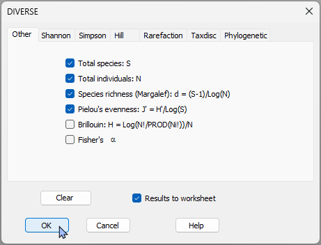
1. Start by calculating some univariate diversity measures for each sample. Open the 'Fal_all_biotic_taxa.pri' file in PRIMER 8, then click **Analyse** > **DIVERSE...**, take all the defaults and click '**OK**'.
[](https://learninghub.primer-e.com/uploads/images/gallery/2026-07/02-diverse-fal-estuary.png)
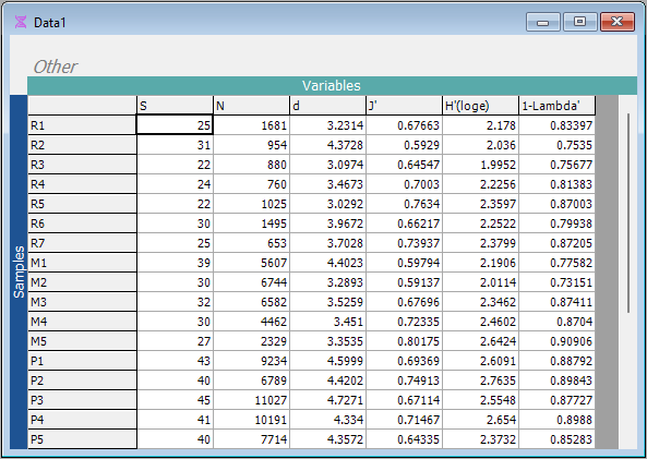
This will produce a sheet, called 'Data1' with values for various diversity indices for each of the sampling units.
[](https://learninghub.primer-e.com/uploads/images/gallery/2026-07/03-diversity-data-fal.png)
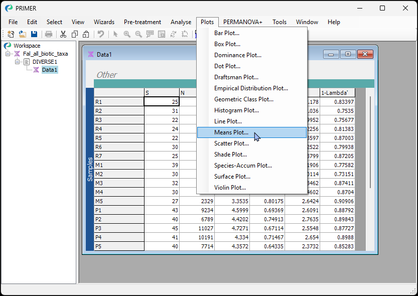
2. Calculate a means plot that shows the means $\pm$ 1 standard error for the 5 creeks for each of these diversity measures. From the 'Data1' sheet, click **Plots** > **Means Plot...**.
[](https://learninghub.primer-e.com/uploads/images/gallery/2026-07/04-diverse-fal-means-plot-menu.png)
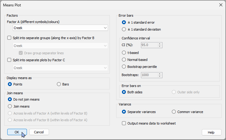
Leave all of the defaults and click '**OK**'.
[](https://learninghub.primer-e.com/uploads/images/gallery/2026-07/05-diverse-fal-means-plot-dialog-b.png)
The result will be a 'Multi plot' item, that includes 6 individual plots - one for each of the 6 diversity measure variables in the original 'Data1' sheet.
[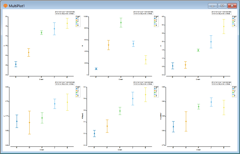](https://learninghub.primer-e.com/uploads/images/gallery/2026-07/06-diverse-fal-multi-plot.png)
3. View an individual plot by clicking on it. For example, you can click on the plot in the top left-hand corner of 'MultiPlot1' to see a means plot for the variable of species richness ('S', the number of different taxa). Alternatively, you can click on 'Graph1' in the Explorer tree.
[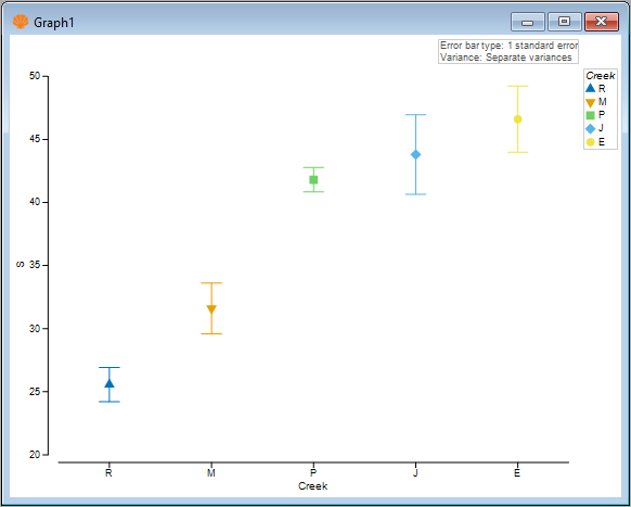](https://learninghub.primer-e.com/uploads/images/gallery/2026-07/07-diverse-fal-species-richness.png)
4. To change the colours, symbols or line types, you can click **Graph** > **Special...**, which shows you a dialog with a plethora of options to modify all of these details of your means plot. For example, you can click the 'Key...' button next to the factor to change the colours/symbols, or choose to $\bullet$ **Join means**, including the option to choose a custom colour for the joining line, like this:
[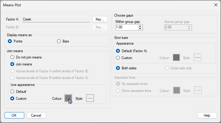](https://learninghub.primer-e.com/uploads/images/gallery/2026-07/08-diverse-fal-s-join-means.png)
This will yield the following modified plot:
[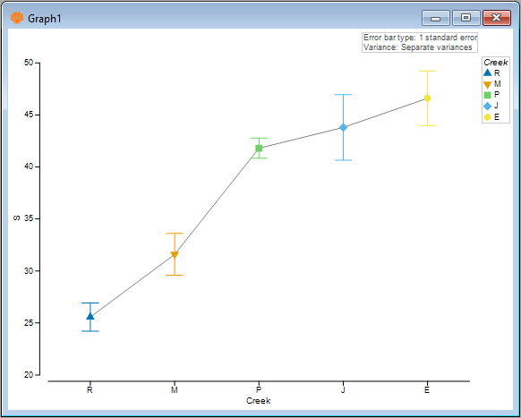](https://learninghub.primer-e.com/uploads/images/gallery/2026-07/09-diverse-fal-s-plot-with-line.png)
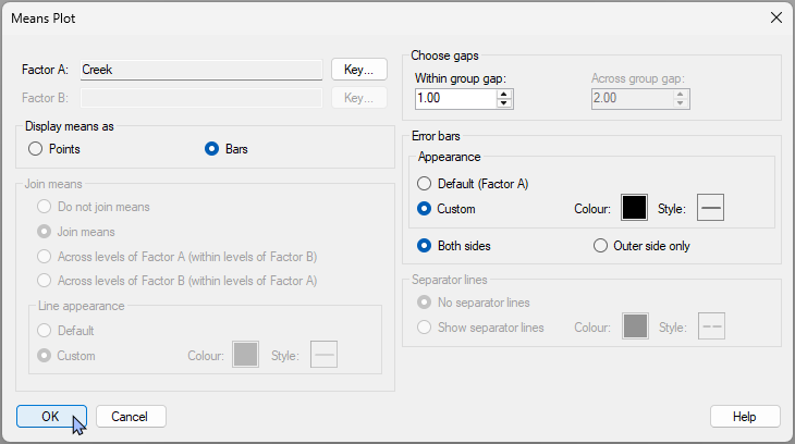
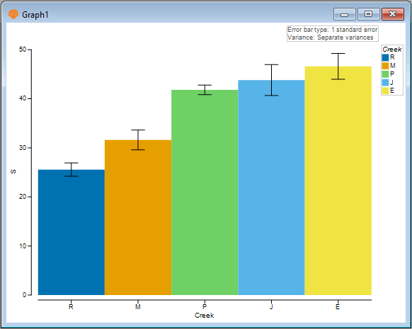
5. You can also choose to show the means as bars instead. Click **Graph** > **Special...**, then (Display Means as > $\bullet$ Bars) and (Error bars > Appearance > $\bullet$ Custom).
[](https://learninghub.primer-e.com/uploads/images/gallery/2026-07/10a-diverse-fal-s-barscustom-dialog.png)
This yields the following plot:
[](https://learninghub.primer-e.com/uploads/images/gallery/2026-07/10-diverse-fal-s-bars.png)
Next, we shall consider some multi-factor plots.