12. Control charts
- 12.1 Overview - Control charts
- 12.2 Classical univariate control chart
- 12.3 Classical multivariate control chart
- 12.4 Bivariate normal example: NZ fish
- 12.5 Dissimilarity-based multivariate control chart
- 12.6 Additional notes on implementing control charts
- 12.7 Example: Birds from Grand Forks
12.1 Overview - Control charts
Rationale
Suppose you have multivariate data (e.g., abundances of multiple species) sampled repeatedly through time. For example, annual surveys at a site would yield multiple time-points: year 1, year 2, year 3, ..., year $t$, and so on. With each new time point, one might ask - is the community (multivariate observation) at time $t$ unusual (significantly different) from what has been observed prior to that time? By using the Control chart routine in PRIMER 8, we are able to discern if a new sample point is 'in-control' or 'out-of-control', by comparison with a reference set of previous ('in-control') observations.
This is clearly a very useful tool in an environmental monitoring context. The control chart tool can also be used in virtually any cases where we want to identify outliers in multivariate space. We may wish to do this in a Euclidean space, or in the space of some other resemblance measure, such as Bray-Curtis.
This chapter begins with a brief description of a classical univariate control chart, as used historically in statistical process control-type settings ( Shewhart (1931) , Shewhart (1939) , Montgomery (2020) ). We then move to consider a classical multivariate control chart, which relies on the assumption of multivariate normality for the in-control set of samples (the 'reference' set). Building on this, we outline a dissimilarity-based multivariate control chart method, described in Adegoke (2019) , which is further generalised and extended via its implementation in PRIMER 8. This approach improves on the earlier work of Anderson & Thompson (2004) , because it accommodates anisotropy (non-spherical shapes / correlation structure) in the reference (in-control) set of multivariate samples. We provide details of how to set control-chart limits using either a parametric or a non-parametric criterion.
Finally, we demonstrate the use of the control-chart tool in PRIMER 8 by way of an example, analysing $N$ = 38 years of data on the abundances of $p$ = 156 species of birds observed at Grand Forks, British Columbia, Canada, from the North American Breeding Bird Survey (BBS).
'Flavours' of control chart
The Control chart routine in PRIMER 8 offers three different types (or 'flavours') of control chart that can be built for a given dataset. These types depend on the scale and size of the reference set of 'in-control' samples that is desired by the end-user. More specifically, the reference set can be comprised of:
- all samples taken prior to the test sample ('progressive' control chart);
- a specified number of initial samples ('baseline' control chart); or
- a specified number of samples taken immediately prior to the test sample ('moving window' control chart).
Essentially, a progressive control-chart will be good at highlighting when there is a sudden change (a 'jump') in the multivariate time series. However, one should beware of interpreting results in the time series (e.g., at times $(t+1)$, $(t+2)$, ...) once an 'out-of-control' point has been identified at time $t$.
A baseline control chart will be good at tracking variation through time away from an original set of (reference) samples, and can detect either a sudden jump, or (eventually) a more gradual change, e.g., if samples drift over time and move away from the original (reference) set.
In contrast, the moving window option is designed to accommodate a certain amount of 'drift', under the rationale that we may expect a certain amount of natural change over time. A new sample point is only compared to a subset of recent samples (inside a chosen time-frame/window), so the moving-window control chart will be sensitive to sudden changes, but overall random drift at a broad scale will not necessarily be detected as significant.
12.2 Classical univariate control chart
A classical univariate control chart arises in the context of process control for industrial and other systems. A control chart tracks the value for a particular process variable of interest by plotting a suitable statistical charting criterion versus time, and provides a rigorous test of the null hypothesis that the process remains 'in control' at each individual time-point ( Montgomery (2020) ).
For example, suppose we have a factory that produces spools of thread, and we have a specific machine that churns out individual spools of thread, one after the next. We have a known expected (target) value for the mean diameter of the spool that we wish to produce, by design, which is $\mu$. There is also some level of variation in diameters, $\sigma$, due to some vagaries of the process, that is also known by us a priori.
With the system to produce the spools of thread all set up, we then monitor each consecutive spool being produced by measuring its diameter. Here, our variable is $Y$ = the diameter of the spool of thread, and $\text{E}(Y) = \mu$ and we have $\text{Var}(Y) = \sigma^2$. We measure consecutive values (one for each spool being produced) as $y_1, y_2, y_3, \ldots$. Thus, at any particular time-point $t$, we have observation $y_t$, which is the measured diameter for the spool of thread produced at that time.
Shewhart control chart
A classical Shewhart control chart ( Shewhart (1931) , Shewhart (1939) , Fig. 12.1) plots the values $y_t$ through time, and also includes a horizontal line on the plot to show the expected value $\mu$, as well as two additional horizontal lines corresponding to:
- an upper control-chart limit: UCL = $\mu + 3\sigma$ and
- a lower control-chart limit: LCL = $\mu - 3\sigma$.
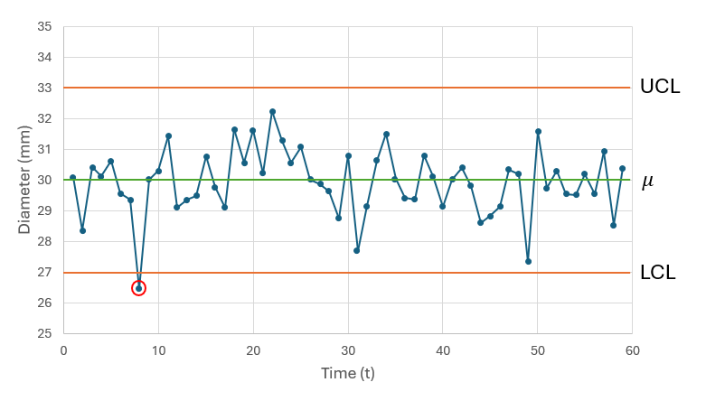
Fig. 12.1 Univariate control chart for the hypothetical example, plotting the measured diameter of spools of thread vs time, with $\mu$ = 30 (green horizontal line) and $\sigma$ = 1. Upper and lower control chart bounds (UCL and LCL, respectively) are shown as orange horizontal lines. Samples that fall beyond the control-chart limits (circled in red) are deemd to be 'out of control'.
The essential idea here is that we want to have proper control over the quality of the spools of thread we produce. We want to identify any cases where the system is, in some way, going 'out of control'. Specifically, any spools of thread that have a diameter falling outside of the acceptable control-chart limits should trigger an alarm of some kind so that some remedial course of action can be taken. For example, in Fig. 12.1, the 8th sample (circled in red) is 'out of control' (falling below the LCL), so that particular spool of thread might be thrown out, as it does not conform to the standard of control we require. The production of an out-of-control sample might also trigger us to stop the system entirely to check for errors in production or machinery that may need to be fixed.
Setting the control-chart limits
The classical UCL and LCL ($\mu \pm 3\sigma$) are set such that values within 3 standard deviations of the expected value are deemed to be 'in control'. In practice, however, assuming the variable is aproximately normally distributed, we can set the 'level-to-reject' ($\alpha$) to whatever we consider appropriate in a given context. Using a multiplier of 3 corresponds to the limits being set at the 0.001 and 0.999 quantiles of a normal distribution, which amounts to $\alpha$ = 0.002 (i.e., 0.1% in either tail). A multiplier of 1.96 would correspond to the limits being set at the 0.025 and 0.975 quantiles (hence $\alpha$ = 0.05 overall, with 2.5% in either tail).
Other univariate control-chart methods
The above is a description of the earliest and most fundamental example of a control chart. There have been a large number of further developments in the general field of statistical process control (SPC) since the early work of Shewhart in the 1930's. For more on this topic, see Barnard (1959) , Quesenberry (2007) and Montgomery (2020) .
12.3 Classical multivariate control chart
A suitable criterion for a control chart designed to detect shifts in the population mean vector for multivariate normal data is Hotelling's $T^2$, the (normalised) deviation of a sample vector (or a sample mean vector) measured at time $t$ from some known (or hypothesised) target population mean vector ( Hotelling (1947) , Seber (1984) , Quesenberry (2007) ). Usually, an upper bound is set as a limit on the acceptable values for the proposed charting criterion, and any value of the criterion that exceeds this limit indicates that the process is 'out of control' at that time point. Multivariate control charts can be used not only to detect shifts in the mean vector of a process, but also to detect multivariate observations (individual samples) that are outliers ('out of control').
In industrial or manufacturing settings, the desired target mean and variance of the process is often known a priori, or else there is a substantial set of sample values measured from the process when it is known to be 'in control' (called 'Phase I') from which target values can be estimated ( Jensen et al. (2006) ), and against which values obtained from subsequent samples (in 'Phase II') can be measured. This information, and the types of variables that are often being monitored (quantitative, continuous and normally distributed) all provide a straightforward basis for constructing a suitable control chart using classical statistical techniques (e.g., Seber (1984) , Quesenberry (2007) , Montgomery (2020) ). The upper bound is typically derived from statistical results and may be articulated rather easily, e.g., the 0.95-quantile of a known probability distribution for the chosen charting criterion under classical assumptions. Rapid successful detection of an 'out-of-control' situation (if present) is the primary goal.
Control chart using Hotelling's $T^2$
Let matrix ${\bm Y}= \lbrace y_{ij} \rbrace$ consist of simultaneous measurements on each of $j = 1, \ldots, p$ variables (columns) obtained at each of $i = 1, \ldots, N$ sequential time points (rows). Also, let the $p$-length vector of measurements at any particular time-point $t$ be denoted by ${\bm y}_ t$. Furthermore, let the $p$-length vector of arithmetic averages calculated from the observed values for each of the variables for a designated subset of the $i = 1, \ldots, n_c$ sampling points (where $n_c < N$), which are all deemed to have been sampled when the system is 'in control', be denoted by $\bar{{\bm y}}_ c$, with elements:
$$ \lbrace \bar{y}_ {cj} \rbrace = {\Bigg \lbrace} \frac{1}{n_c} \sum_{i=1}^{n_c} y_{ij} {\Bigg \rbrace} $$
Now, consider the null hypothesis (H0) that the system remains in control at time $t$. If we assume that, when the system is in control, the variables arise jointly from a multivariate normal distribution with population mean vector ${\bm \mu}_ c$ and population covariance matrix ${\bm \Sigma }_ c$, then under H0 we have ${\bm y}_ t \sim N_p({\bm \mu}_ c, {\bm \Sigma }_ c)$. A suitable control-chart test-statistic ( Hotelling (1947) , Seber (1984) ) is given by:
$$ T^2 = ({\bm y}_ t - \bar{{\bm y}}_ c)^{\text T} {\bm S}_ c^{-1} ({\bm y}_ t - \bar{{\bm y}}_ c) $$
where superscript '$\text{T}$' indicates the transpose, superscript '$-1$' indicates the matrix inverse, and ${\bm S}_ c$ is the unbiased $(p \times p)$ sample variance-covariance matrix calculated on the set of in-control data points, with elements:
$$ \lbrace s_{jj'} \rbrace = \frac{1}{(n_c - 1)} \sum_{i=1}^{n_c} (y_{ij} - \bar{y}_ {cj})(y_{ij'} - \bar{y}_ {cj'}) $$ for every pair of variables $j = 1, \ldots, p$ and $j' = 1, \ldots, p$.
If H0 is true, then the control-chart test-statistic is distributed as a scalar multiple of a classical $F$-distribution (e.g., Seber (1984) ), namely:
$$ T^2 \sim \frac{p(n_c + 1)(n_c - 1)}{n_c(n_c-p)}F_{p,(n_c-p)} $$
The upper control-chart limit at a chosen significance level, $\alpha$, is therefore given by
$$ U_{CL} = \frac{p(n_c + 1)(n_c - 1)}{n_c(n_c-p)}Q_{(1-\alpha)}[F_{p,(n_c-p)}] $$
where $Q_{(1-\alpha)}[f]$ is the $(1-\alpha)$-quantile of probability density (or mass) function, $f$. If the true values of the parameters in matrix ${\bm \Sigma }_ c$ are known, then $T^2 \sim \chi^2_p$, a chi-square distribution ( Seber (1984) ), and we may use, more simply, $U_{CL} = Q_{(1-\alpha)}[\chi^2_p]$.
Note that, if the $n_c$ sampling units in the reference (in-control) set remain the same (e.g., there is a baseline, or 'Phase I' set of sampling units) and as $p$ remains constant, then the classical upper control-chart limit $U_{CL}$ (whether it relies on $F$ or $\chi^2$) remains constant over time.
Progressive change-point control chart
At any particular time-point $t$, we may wish to assess the extent to which the multivariate observation vector $y_t$ is unusual, given what has been observed up to and including time $(t-1)$. Thus, at time $t$, there are $n_c = (t-1)$ in-control sampling units, and the classical control-chart test-statistic is distributed as $$ T^2_t \sim \frac{pt(t - 2)}{(t-1)(t-p-1)}F_{p,(t-p-1)} $$
In this case, information about the characteristics of the system when it is “in control” increases incrementally over time. Thus, the value of the test-statistic, $T_t^2$, its distribution and hence the upper limit of the control chart, all change progressively over time with changes in the value of $t$. Note that the commencement of the progressive chart relying on the above classical result may not occur until such time as $t$ exceeds (at least) $p+2$.
High-dimensionality and shrinkage
Problems can arise using the proposed progressive control chart in a high-dimensional system, where $p$ exceeds $n_c$. For example, values of $n_c$ will inevitably be relatively small in the early stages of monitoring, when there are yet few in-control time points available. In such cases, the empirical estimate of the covariance matrix (${\bm S}_ c$) will be unsuitable; specifically, it loses full rank, is no longer positive definite, becomes singular and can no longer be inverted (e.g., Schäfer & Strimmer (2005) ).
To improve the control-chart performance for high-dimensional data and allow commencement of the monitoring scheme even for relatively small numbers of in-control samples, a shrinkage estimate of the covariance matrix can be obtained from a given set of in-control multivariate data, as follows:
$$ {\bm W}_ c = \lambda{\bm T} + (1 - \lambda){\bm S}_ c $$
where ${\bm T}$ is a so-called 'target' matrix and $\lambda \in [0,1]$ denotes the shrinkage intensity. Thus, ${\bm W}_ c$ is a weighted average of ${\bm S}_ c$ and ${\bm T}$, where $\lambda = 0$ gives ${\bm W}_ c = {\bm S}_ c$ and $\lambda = 1$ gives ${\bm W}_ c = {\bm T}$.
Two important questions immediately arise: (i) how shall ${\bm T}$ be constructed? and (ii) what value shall be chosen for $\lambda$? Here, we suggest using a target matrix that shrinks the diagonal elements (i.e., the sample variances) of the empirical estimate of the covariance matrix towards their median and shrinks the off-diagonal entries to zero ( Opgen-Rhein & Strimmer (2007) , Ullah et al. (2017) ). This has the effect of reducing larger eigenvalues and increasing smaller ones, thereby counteracting known biases inherent in sample-based estimation ( Friedman (1989) , Opgen-Rhein & Strimmer (2007) ). To estimate an optimal value for $\lambda$, we also use here the direct analytical approach of Opgen-Rhein & Strimmer (2007) and Schäfer & Strimmer (2005) , which is easy, fast and has good empirical and statistical properties.
The shrinkage estimate ${\bm W}_ c$ of the covariance matrix has been shown to be well-conditioned for small samples and does not make any distributional assumptions, so is not restricted to being used only with multivariate normal data ( Ullah et al. (2017) ). For further details regarding shrinkage estimators, including a variety of choices for target matrices and intensity parameters, see Friedman (1989) , Ledoit & Wolf (2003) , Ledoit & Wolf (2004) , Schäfer & Strimmer (2005) , Ullah et al. (2017) , Adegoke et al. (2018) and references therein.
12.4 Bivariate normal example: NZ fish
To demonstrate the use of Hotelling's $T^2$ in a multivariate control-chart setting, it is useful to examine the method in 2 dimensions in Euclidean space (a bivariate system), which can be easily drawn and visualised. We shall examine bivariate patterns for two variables: richness and log-abundance, drawn from 15 years of annual underwater surveys of near-shore fish assemblages in northeastern New Zealand. This study was described earlier in section 10.4; see also Anderson & Millar (2004) .¶
Visualise bivariate patterns through time
The two variables we shall consider for this example are: the mean number of species (i.e., richness, 'S') and the mean of the total log abundance ('Log(N)'), calculated across the four sites sampled from urchin-grazed 'barrens' habitats only, and at the location of Home Point only.† It is quite reasonable to expect that these two variables will be approximately normally distributed, due to the central limit theorem. Let's start by considering a scatter plot of these two variables (Fig. 12.2). There is one sample point for each of the 15 years of sampling (so there are $n_c$ = 15 points in our baseline or reference set of samples). We can see that these two variables are positively correlated with one another; indeed, the Pearson correlation coefficient here is $r$ = 0.8128.
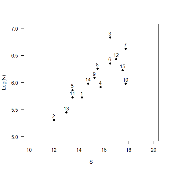
Fig. 12.2 Bivariate scatterplot of the average log total abundance per site ('Log(N)') and average richness per site ('S') for fish assemblages sampled in barrens habitats from Home Point, New Zealand. Numbers indicate 15 sequential years of sampling, from 2001-2015, inclusive.
Calculate the control-chart criterion
To this plot, we can add a trajectory of lines that connects the points corresponding to consecutive years through time. We can also calculate a multivariate control-chart criterion, Hotelling's $T^2$, at (say) the level of $\alpha$ = 0.05. This will circumscribe an ellipsoidal area in the 2D Euclidean space (Fig. 12.3). Any point falling inside the area would be considered 'in control', by reference to the 15-yr baseline set. In contrast, any point falling outside of that area would be considered 'out of control' - i.e., significantly different (at the level of $\alpha$ = 0.05) from the reference distribution.
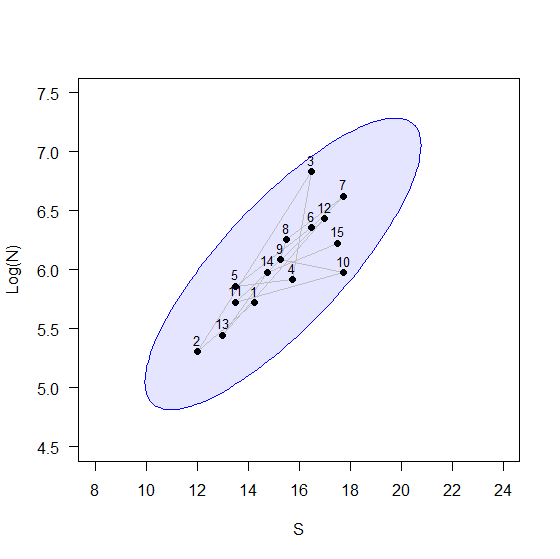
Fig. 12.3 Bivariate scatterplot as in Fig. 12.2, including a trajectory through time (grey lines) and an ellipsoidal region corresponding to the appropriate cut-off, $U_{CL}$ for a control-chart based on Hotelling's $T^2$ criterion (in blue).
Now let's suppose surveys are done in the 16th year, and we have a new value for each of S and Log(N) for that year. We can add this point to the plot. We will consider here two hypothetical outcomes: labeled as '16a' and '16b' in Fig. 12.4 and Table 12.1, below.
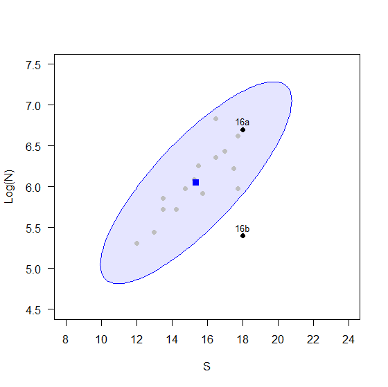
Fig. 12.4 Bivariate scatterplot as in Fig. 12.3, including the centroid from the first 15 years of sampling (in blue) and 2 hypothetical points that might be observed in year 16: labeled 16a (in control) and 16b (out of control).
Clearly, if 16a were the outcome, we would not consider this point to be 'unusual', given what we have observed over the prior 15 years. However, if 16b were the outcome, we would consider this to be very different indeed. Specifically, for 16b we can see that the log-abundance is much lower than what we would expect, given the level of richness observed. Now, the cut-off value for Hotelling's $T^2$ criterion in this bivariate example is $U_{CL}$ = 8.74 (at the level of $\alpha$ = 0.05). We have an observed value of $T^2 < U_{CL}$ for point 16a (in control), but, quite correctly, an observed value of $T^2 > U_{CL}$ for point 16b (out of control) (Table 12.1).
Table 12.1 Values of S, log(N), Euclidean distance to the baseline centroid, Hotelling's $T^2$ and the control chart outcome for two hypothetical points (16a and 16b), as shown in Fig. 12.4, that might occur in year 16.
| Sample | S | Log(N) | Euc. dist. to centroid | Hotelling's $T^2$ | Outcome |
|---|---|---|---|---|---|
| 16a | 18 | 6.700 | 2.712 | 2.51 | in control |
| 16b | 18 | 5.401 | 2.712 | 23.93 | out of control |
There are (at least) two important things to note about these two hypothetical outcomes.
- First, although they have the same Euclidean distance to the centroid of the baseline (reference) set of points, they have very different values for Hotelling's $T^2$ (Table 12.1). It is clear that taking a 'distance-to-centroid' approach completely ignores the shape of the data cloud, which is undesirable.‡ In other words, our approach here (using Hotelling's $T^2$) ensures that:
- the direction of the distance-to-centroid matters, not just its value; and
- the correlation structure is taken into account when we construct our criterion.
- Second, if we were to construct a univariate control chart for either of these individual variables alone, the values of 'S' and 'Log(N)' for 16b, when considered independently, are not particularly unusual at all, and the 16th year would not be identified as an outlier for either of these univariate variables. This example serves to show how it is not necessarily useful to think about multivariate data consisting of simply a 'stack' of individual univariate variables. How the variables covary with one another (hence affecting the shape of the data cloud) does matter.
Control chart for the bivariate example
We shall now show a control chart for a series of hypothetical data points for this example - projecting forward from the original 15 years of sampling for a further 10 years. We shall assert that the first 15 years provide a baseline set of samples. Hypothetical values for samples taken in 11 subsequent years (16 through 26) are to be compared with this baseline set, and are shown below (Fig. 12.5).
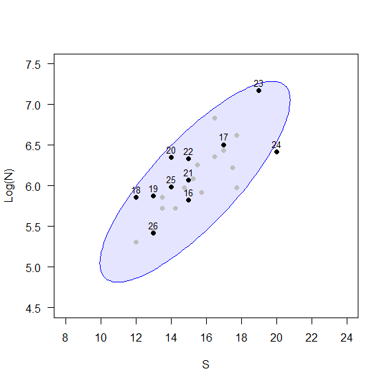
Fig. 12.5 Bivariate scatterplot of S and Log(N) for 15 baseline years (in grey), ellipsoidal region demarcating 'in-control' samples, based on Hotelling's $T^2$ criterion (in blue), and hypothetical samples for 11 subsequent years, 16 through 26 (in black).
The plot shows clearly that point 24 falls just outside the control-chart limit. Of course, if the system had more than just 2 dimensions, it would not be so easy to see outliers. A multivariate control chart of the data, including the upper control-chart limit, is the appropriate tool here (Fig. 12.6).
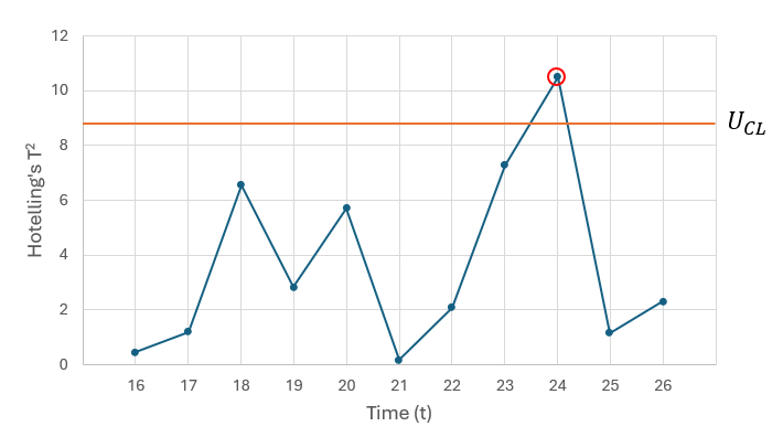
Fig. 12.6 Control chart showing the values of Hotelling's $T^2$ for each of 11 hypothetical samples obtained in years 16 through 26 (as shown in Fig. 12.5), by comparison with the 15-yr baseline set of samples, with the upper control-chart limit $U_{CL}$ (orange line). An out-of-control sample is detected in year 24 (red circle).
Although we have been looking here only at a bivariate example, a multivariate control chart of Hotelling $T^2$ values vs time will provide clear identification of 'out-of-control' samples, even for systems having a much larger number of dimensions. Note also that shrinkage can be used to estimate variance-covariance structure if the dimensionality of the system is large relative to sample size. However, thus far we have been operating only in Euclidean space, and we would clearly like now to extend these ideas to create control charts on the basis of a chosen dissimilarity measure, so as to accommodate species abundances (and other types of non-normal variables).
¶The data used for this example are in the file called 'NE_NZ_fish_counts.pri', found in the 'Example_P8' > 'NE_NZ_fish' folder.
†It is sensible for us to restrict our attention to a subset of the data like this, as the fish assemblages in different habitats and locations differed from one another.
‡The work by Anderson & Thompson (2004) introduced a control-chart criterion of distance-to-centroid in the space of a chosen dissimilarity measure. This works fine for situations where the cloud of 'in control' samples are approximately (hyper-)spherical in the multivariate space (isotropic), but it is really not ideal for situations where there are anisotropies (non-spherical shapes), as in the simple example shown here.
12.5 Dissimilarity-based multivariate control chart
Essential steps
Suppose we have an $(N \times p)$ data matrix, $\bm{Y}$, and we can capture the important relationships among the $N$ sampling units in this matrix by calculating some chosen dissimilarity measure (e.g., Bray-Curtis) to yield an $(N \times N)$ dissimilarity matrix, $\bm{D}$. How can we create a control-chart from this? We may consider doing the following:
- From matrix $\bm{D}$, obtain a set of ordination axes, held in an $(N \times m)$ matrix $\bm{Q}$, which adequately represent the inter-point relationships given in $\bm{D}$, but in a Euclidean space of dimension $m$.
- Assume the 'in-control' samples arise from a multivariate distribution $\mathscr{D}$. Calculate a modification of Hotelling's $T^2$ criterion directly, using $\bm{Q}$ instead of $\bm{Y}$ (see the description of the modified test-criterion below).
- Determine the upper control-chart limit ($U_{CL}$) in one of two ways:
- Parametrically (assuming $\mathscr{D}$ is approximately multivariate normal); or
- Non-parametrically (using a permutation procedure, hence distribution-free).
Taking the above steps will yield a dissimilarity-based control chart, yet which retains a useful desired property of classical multivariate control charts; namely, not only the distance from the 'in-control' centroid, but also the direction of a new point’s position relative to that centroid will matter.
Description of test criterion
Consider the comparison of a multivariate sample obtained at a given time-point, $t$, by reference to a set of $n_c$ in-control samples. Let $\bm{D} = \lbrace d_{ii'} \rbrace$ consist of the dissimilarities between every pair $(i,i')$ of multivariate samples $(i = 1,\ldots, n_c, t)$ and $(i' = 1, \ldots, n_c, t)$, and so $\bm{D}$ is a matrix of dimension $((n_c+1) \times (n_c + 1))$.
From $\bm{D}$, we do an ordination on the full set of $(n_c+1)$ sampled time-points to generate $\bm{Q}$, a set of $m$ ordination axes. Let the sample under test for time-point $t$, be an $m$-length vector in matrix $\bm{Q}$ denoted by $\bm{q}_ t$. Furthermore, let $\bm{Q}_ c$ denote the ordination positions for only the remaining $n_c$ in-control (reference) samples (omitting $\bm{q}_ t$). Also, let the $m$-vector of mean values calculated using all of the reference samples be denoted by $\bar{\bm{q}}_ c$. We shall assume the in-control samples $\bm{q}_ i$ for $(i = 1,\ldots, n_c)$ arise from a common multivariate distribution $\mathscr{D}$, with mean $\text{E}(\bm{q}_ i) = \bm{\mu}_ c$ and variance-covariance $\text{Var}(\bm{q}_ i) = \bm{\Sigma}_ c$.
To obtain our test criterion, we begin by calculating:
$$ \bm{z}_ t = \sqrt{ \frac{n_c}{(n_c+1)} } ( \bm{q}_ t - \bar{\bm{q}}_ c) $$
This standardisation, including the multiplier, ensures that, if the null hypothesis is true and $\bm{q}_ t$ also arises from $\mathscr{D}$, then $\text{E}(\bm{z}_ t) = \bm{0}$ and $\text{Var}(\bm{z}_ t) = \bm{\Sigma}_ c$.
We then define our new control-chart test-criterion as:
$$ T^2_t = \frac{1}{m}{\bm z}_ t^{\text T} {\bm S}_ {Q_c}^{-1} {\bm z}_ t $$
where ${\bm S}_ {Q_c}^{-1}$ is the classical unbiased estimator of the variance-covariance matrix calculated using only the in-control samples of matrix $\bm{Q}_ c$. If desired, shrinkage can also be applied here, in which case ${\bm S}_ {Q_c}^{-1}$ will be replaced by ${\bm W}_ {Q_c}^{-1}$
There are several ways that this charting criterion differs from Hotelling’s criterion used in classical multivariate control charts. First, the ordination will be done afresh for each successive time-point under test. Thus, both the observed value of $T_t^2$ and also its distribution will rather naturally depend on $t$. Furthermore, we expect that the value of $m$ (i.e., the number of dimensions required by the ordination method to accommodate an increasing number of sampling points) will also increase over time. Hence, to make the control chart easier to read, our criterion includes, for plotting purposes, the multiplier ${1 \over m}$, so that values are expressed as a standardised $T^2$ distance per number of dimensions. However, importantly, the value of $m$, once chosen, does not change within a given time-point, so inclusion of the multiplier will not affect comparisons of the observed value of $T_t^2$ with its null distribution in any material way.
Ordination methods and choice of $m$
There are several potentially suitable ordination methods that may be used to produce $\bm{Q}$, including principal coordinate analysis (PCO; Gower (1966) ), or a multi-dimensional scaling method that is metric (mMDS; Sammon (1969) , Borg & Groenen (2005) ), threshold metric (tmMDS; Clarke et al. (2014) ) or non-metric (nMDS; Kruskal & Wish (1978) ).
What we are after is a set of $m$ coordinate axes, represented here by an $((n_c+1) \times m)$ matrix $\bm{Q}$, whose Euclidean inter-point distances $\lbrace e_{ii'} \rbrace$ match the original dissimilarities $\lbrace d_{ii'} \rbrace$ (or their ranks) extremely well. A natural question is: how closely should ordination distances match original distances? In other words: how many ordination axes shall we use to represent dissimilarities in Euclidean space (i.e., what value shall we choose for $m$)? It is important to retain as much original information, natural variation and complexity inherent in the original system as possible, but without including redundancies or distortions.
If PCO is used, it would be useful to exclude: (i) any PCO axes corresponding to positive eigenvalues that occur as an artefact to inflate the total variance of the system; and (ii) any PCO axes corresponding to negative eigenvalues, if any ( McArdle & Anderson (2001) ). Thus, we could choose to use a maximum value of $m$ that will still maintain the relationship:
$$ \sum_{i \ne i'} e_{ii'}^2 \leq \sum_{i \ne i'} d_{ii'}^2 $$
That is, we could choose to maximise $m$ such that
$$ 100 \times \sum_{i \ne i'} e_{ii'}^2 / \sum_{i \ne i'} d_{ii'}^2 \leq b $$
where $b$ = 100 percent. However, we may alternatively choose $b$ = 90 percent or 80 percent, etc., in an effort to reduce noise. A threshold value of $b$ = 80 percent would seem reasonable, but the choice here rests with the end-user.
For metric MDS (mMDS), one might choose $m$ so that the Pearson matrix correlation ($r_{e,d}$) between the Euclidean distances in the $m$-dimensional MDS space $\lbrace e_{ii'} \rbrace$ and the original dissimilarities $\lbrace d_{ii'} \rbrace$ exceeds some threshold value (e.g., $r_{e,d}$ ≥ 0.99). The latter criterion was suggested by Clarke et al. (2014) in the context of performing bootstrap averaging in an $m$-dimensional metric MDS space (see chapter 18 therein). A similar rationale and agenda is desirable here – we wish to have a set of Euclidean axes that avoids inappropriate noise and redundancies (it is sensible to avoid the nonsensical conclusion that every single replicate might be considered an outlier), but nevertheless retains core information captured by the inter-point dissimilarities. A threshold value for this matrix correlation of $r_{e,d}$ ≥ 0.95 would also seem reasonable, but the choice here is, once again, left to the end-user.
It is also possible to use non-metric MDS (nMDS) here. In this case, the matrix correlation is constructed using the Spearman rank correlation coefficient ($\rho_{e,d}$), rather than the Pearson correlation coefficient, but all else is the same. In practice, however, the use of either threshold metric or metric MDS would seem a better option here than to use non-metric MDS. First of all, the latter retains only rank-order relationships of dissimliarites. However, a control chart, by its very nature, is designed to quantify the distance from a new point to a distribution of prior points. In this context, the preservation of rank dissimilarities only (via nMDS) would not be expected to provide consistent results. Furthermore, nMDS has the potential to yield degenerate solutions (of low stress) specifically when there is one (or more) outliers (or genuine splits in the data), which further suggests it would not be the best choice to use here.
Threshold metric MDS (tmMDS) differs only from metric MDS in permitting a non-zero intercept in the construction of the Shepard diagram, which in practice means that two samples that occupy the same position in the tmMDS may be interpreted as yet to differ by some threshold amount (i.e., the value of the non-zero intercept). This does not pose any obvious problem in the context of constructing a control chart, and as tmMDS also tends to achieve lower stress for an equal choice of $m$ by comparison with metric MDS, we consider it to be a good (default) choice for creating ordination axes that can be used routinely to build control charts.
Parametric upper control-chart limit
It may be very reasonable to assume that the distribution of samples $\mathscr{D}$ under a true null hypothesis H0 in the ordination space $\bm{Q}$ is approximately multivariate normal. Even if the original variables in $\bm{Y}$ are not the least bit normally distributed (e.g., they may be zero-inflated, overdispersed, aggregated and/or have strong mean-variance relationships, etc.), the distribution of samples in the space of the resemblance measure, whose inter-point patterns are captured by $\bm{D}$, will likely be quite even, with few outliers, if H0 is indeed true.
Thus, noting that our modified criterion $T^2_t$ (above) differs from the classical Hotelling $T^2$ statistic only by a factor of ${1 \over m} \times {n_c \over (n_c+1)}$, its distribution under a true null hypothesis is:
$$ T^2_t \sim \frac{(n_c - 1)}{(n_c - m)}F_{m,(n_c-m)} $$
Accordingly, the upper control-chart limit at a chosen significance level, $\alpha$, is therefore given by
$$ U_{CL} = \frac{(n_c - 1)}{(n_c-m)}Q_{(1-\alpha)}[F_{m,(n_c-m)}] $$ This limit will likely be different for different values of $t$, because the value of $m$ for the ordination (created anew for each value of $t$) may differ. If a constant value for $m$ is chosen for the entire control chart, and the value of $n_c$ also does not change with $t$ (this is true for the baseline and moving-window types of control charts), then the value of the parametric $U_{CL}$ will remain constant as well.
Non-parametric upper control-chart limit
We may, alternatively, consider a non-parametric approach. Here, we shall assert only that the multivariate data points follow a stochastic process over time. We propose using a permutation procedure to obtain the upper control chart limit at any particular time-point $t$.
Under a true null hypothesis, all $\bm{q}_ {i}$, $i = 1, \ldots, n_c$, arise from a common distribution $\mathscr{D}$. We add to this the notion of exchangeability through time; specifically, all of the 'in-control' points in the reference set, i.e., the $\bm{q}_ {i}$, could appear in any order relative to one another, up to and including time $n_c$. Under this assumption, we can permute the (sample) rows of $\bm{Q}_ c$ to obtain $\bm{Q}^*_ c$and consider the last observation (in the $n_c$th row of $\bm{Q}^*_ c$) to be a 'new point' for the test, but where we know that H0 is actually true. We calculate $T^{2*}_ {n_c}$, which is the value of the proposed control-chart test-statistic that compares this last observation to the distribution of the other $(n_c-1)$ in-control points.
We repeat this permutation procedure many times to get an empirical distribution of values for $T^{2*}_ {n_c}$. Note that the number of unique values we can get under permutation here is actually severely limited by $n_c$. Each sample in the original reference set can only take on the role of being the 'tested' point once, so there are only $n_c$ unique values of $T^{2*}_ {n_c}$ possible under permutation. Nevertheless, we can calculate a permutation-based upper control-chart limit as the $(1-\alpha)$ percentile on that empirical distribution, specifically: $$ U_{CL} = Q_{(1-\alpha)}[T^{2*}_ {n_c}] $$ Note that this non-parametric upper control-chart limit will be different for every value of $t$.
12.6 Additional notes on implementing control charts
We offer here a few additional notes regarding the implementation of control charts in real applications. The control-chart dialog in PRIMER 8 offers many options. It is especially important to pay close attention to all of the choices that can affect the null hypothesis and/or the decision criterion, i.e., the upper control-chart limit ($U_{CL}$). We offer below some comments on these topics.
Start with a decent sample size
Control charts have historically arisen from industrial settings, where sample sizes, particularly for establishing baseline information, are typically very large. It is important to recognise that we are trying here to characterise the entire distribution's shape (for the in-control samples), and not just to estimate a centroid. Therefore, we should always apply the control-chart tool with a view to including as many 'in-control' (reference) samples as we possibly can. Mathematically, there are lower limits on the number of in-control points we need in order to run the analysis (i.e., $n_c$ = 4 points), but as a general rule, we should typically aim to run the control-chart routine on no fewer than $n_c$ = 10 sample points, and having more ($n_c$ = 20 or 30) would certainly be preferable.
If your total sample size is $N \ge$ 11, then the default for the Control Chart routine in P8 for the minimum number of in-control samples is $n_c$ = 10. If $N \lt$ 11, then the default is $n_c = N-1$, but with a strict lower bound of $n_c$ = 4.
A further practical point is that the Control Chart routine in P8 cannot handle missing values, so these will need to be removed prior to running the routine.
Be aware of H0 for different types of control chart
The null hypothesis (H0) for the specific test done at each time point in a given control chart depends critically on the type of control chart you are running: progressive, fixed baseline or moving window. You need to carefully consider which type of control chart is appropriate for your particular application (there may be more than one).
The default in PRIMER 8 is to run the control-chart by reference to a fixed baseline set of $n_c$ = 10 samples. However, the number of 'in-control' samples clearly needs to be thought about carefully and set to something appropriate for each specific dataset, driven by the null hypothesis of interest.
It is also important to consider how each type of control chart plays out in the specific tests it performs through time. For example, the 'progressive' type of control-chart may not produce output that 'makes sense' after an 'out-of-control' sample has been identified. For example, suppose you are looking at a progressive control-chart and an 'out-of-control' point has been identified at time-point $t$. The progressive chart will subsequently include that point at time $t$ as part of the 'in control' distribution of samples when it goes on to test subsequent time-points $(t+1)$, $(t+2)$, etc. This might not be appropriate. One might consider removing the out-of-control sample before proceding with the subsequent tests. These sorts of decisions will depend on the specific hypotheses to be examined for any particular dataset.
Be aware of important settings affecting $U_{CL}$
The upper control chart limit $U_{CL}$ and hence the assessment of whether a point is in control or out of control will clearly be critically affected by the following choices:
- choice of parametric vs non-parametric approach
- choice of $\alpha$-level (e.g., 0.05)
- choice to apply shrinkage (or not) in estimating the variance-covariance matrix
- choice of ordination method (PCO, mMDS or tmMDS)
- choice of $m$, the dimensionality of the ordination
The defaults for the Control chart routine in PRIMER 8 will be quite sensible for a pretty wide variety of cases. These defaults are:
- non-parametric
- $\alpha$ = 0.05
- apply shrinkage
- use threshold metric MDS (tmMDS)
- choose $m$ so that the matrix correlation is $r_{e,d}$ = 0.99.
However, thinking carefully about each of these choices is almost always warranted. For example, it is useful to observe that the default choice of 'non-parametric' may not be particularly sensible if the sample size $n_c$ is quite small (less than 10).
12.7 Example: Birds from Grand Forks
We shall implement a control chart on data from the North American Breeding Bird Survey (BBS) ( Sauer et al. (2019) ). We will specifically look at abundances of $p$ = 156 breeding birds from a single route in Grand Forks, British Columbia, Canada in a time series that includes 38 years of observation (annual surveys done between 1973 and 2016, but with a few years missing). Data are in the file 'Grand_Forks_BBS.pri' found in the 'Examples_P8' > 'Grand_Forks_birds' folder.
Input data, transform and calculate resemblances
- Bring the data in to a PRIMER 8 workspace (click File > Open...). It will look like this:
![07.BBS_dataset[i].png](https://learninghub.primer-e.com/uploads/images/gallery/2025-12/07-bbs-dataset-i.png)
- Transform the data to fourth-roots. From the 'Grand_Forks_BBS' sheet, click Pre-treatment > Transform(overall)... and in the 'Overall Transform' dialog choose 'Fourth root', then click 'OK'.
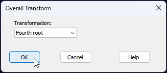
The resulting data sheet will be called 'Data1' in the Explorer tree.
- Calculate Bray-Curtis resemblances. From the transformed data sheet, called 'Data1', click Analyse > Resemblance... and in the 'Resemblance' dialog window, choose (Measure: $\bullet$Bray-Curtis similarity) & (Analyse between: $\bullet$Samples), then click 'OK'.
The resulting resemblance matrix will be called 'Resem1', and will look like this:
![09.Resem_matrix_BBS[i].png](https://learninghub.primer-e.com/uploads/images/gallery/2025-12/09-resem-matrix-bbs-i.png)
Visualise the trajectory over time via ordination
We will create a non-metric MDS ordination of the samples through time, to visualise how the bird assemblages may have changed at Grand Forks over this 38-year period.
- From the 'Resem1' matrix, click Analyse > MDS > Non-metric MDS (nMDS)..., take all of the defaults in the 'Non Metric MDS' dialog and click OK.
The best 2D nMDS solution will be shown in the item called 'Graph1' (under 'MultiPlot1' in the Explorer tree. To clarify the patterns over time, we will make a few adjustments to the default output.
- Put the years on the plot as labels, and put a common symbol onto all of the sample points. From 'Graph1', click Graph > Sample Labels & Symbols..., and in the resulting dialog, choose (Labels > $\checkmark$Plot > ($\checkmark$By factor: Year) & (Data font... > Size: 75)) & (Symbols > $\checkmark$Plot) & untick the box in front of ($\Box$ By factor)). With these choices, the dialog will look like this:
![10.Graph_font_dialog_all[i].png](https://learninghub.primer-e.com/uploads/images/gallery/2025-12/10-graph-font-dialog-all-i.png)
- Add a trajectory through time to connect consecutive years. From 'Graph1', click Graph > Special..., click the 'Overlays' tab, and under the word 'Trajectory', choose $\checkmark$Overlay trajectory > Trajectory numeric factor: Year, then click 'OK'. The dialog looks like this:
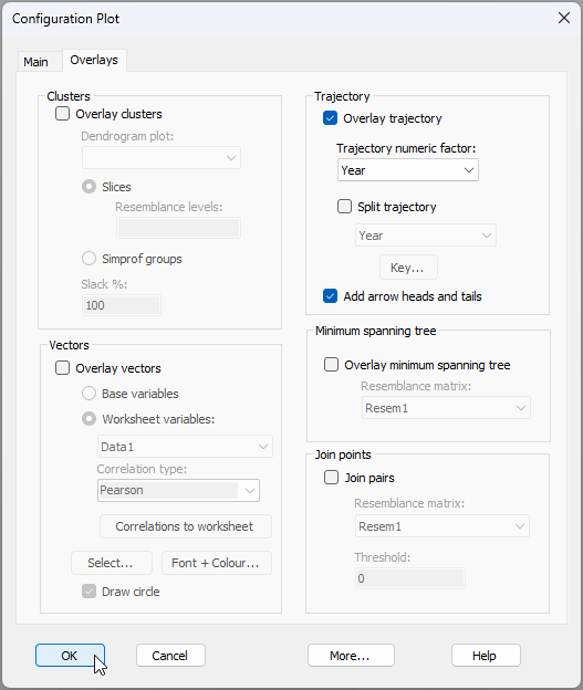
After these modifications, the resulting MDS plot, showing changes in bird assemblages through time, looks like this:
![12.nMDS_BBS_75[i].png](https://learninghub.primer-e.com/uploads/images/gallery/2025-12/12-nmds-bbs-75-i.png)
Create a 'fixed baseline' control chart
We will start by running a 'fixed baseline' type of control chart. In this case, we are comparing any individual time point at time $t$ with the centroid obtained using a fixed set of initial points. For this example, we will consider the first 17 points (through the 70's and 80's, up until 1989) as being 'in control'. For this type of plot, the number of initial 'in-control' points never changes, and all subsequent individual points are looked at by reference to those initial ones (ignoring the rest).
- From the 'Resem1' matrix, click PERMANOVA+ > Control Chart..., and choose:
- Type: ($\bullet$ Fixed Baseline) & (Num. initial control samples: 17).
- Control Limit: ($\bullet$ Non-parametric) & (Alpha-level: 0.05) & ($\checkmark$Apply shrinkage)
- Order Samples: $\bullet$ By factor: Year
- Ordination type: $\bullet$ Metric MDS and click 'MDS Settings...' and choose: Choice of intercept > $\bullet$ Threshold metric MDS (non-zero intercept) and click 'OK'
- Limit Ordination Dimension: $\bullet$ Matrix correlation at least: 0.99
- Output: ($\checkmark$Plot control chart) & ($\checkmark$Results to worksheet) & ($\checkmark$Add factor to original data: Fixed baseline).
The Control Chart dialog with these choices will look like this:
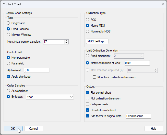
The resulting control chart looks like this:
![14.Control_Chart_graphic_BBS_Fixed_baseline[i].png](https://learninghub.primer-e.com/uploads/images/gallery/2025-12/51U14-control-chart-graphic-bbs-fixed-baseline-i.png)
From this graphic, we can see that the bird assemblages initially (through the 1990s) stayed effectively 'in control' (i.e., did not differ significantly from the baseline set of 17 years); however, from 2001 onwards, the bird assemblages shifted away from this baseline significantly in every year and did not 'return' to their former state. This accords well with the pattern of ongoing change we could see through time in the original MDS plot above.
Detailed results, including the choices made by the end-user, the value of the test-statistic ($T^2_{n_c}$) at each time-point, the value of the upper control-chart limit $U_{CL}$, identification of each time-point as being either 'in control' (where $T^2_{n_c} < U_{CL}$) or 'out of control' (where $T^2_{n_c} > U_{CL}$), the matrix correlation achieved ($r_{e,d}$) and the ordination dimension ($m$), are all given in the Control Chart output file (named 'Control Chart1' in the Explorer tree).
Results for each time-point are also given in a worksheet (if requested). In the present case, this worksheet is called 'Data2', which looks like this:
![14.Results_worksheet_BBS_Fixed_baseline[i].png](https://learninghub.primer-e.com/uploads/images/gallery/2025-12/14-results-worksheet-bbs-fixed-baseline-i.png)
Show control-chart results on the original ordination
Note that the in-control/out-of-control factor (which we called 'Fixed baseline' for this example) can be accessed now in association with the original resemblance matrix ('Resem1') by clicking Edit > Factors. Thus, in addition to the control chart itself, we can also show the control-chart results on the original nMDS plot by choosing symbols according to the control-chart factor we just created.
- From the 2D nMDS plot ('Graph1'), click Graph > Sample Labels & Symbols..., and in the resulting dialog, choose (Symbols > $\checkmark$Plot > ($\checkmark$By factor: Fixed baseline). The nMDS plot now looks like this:
![15.CC_symbols_on_nMDS_Fixed_baseline[i].png](https://learninghub.primer-e.com/uploads/images/gallery/2025-12/15-cc-symbols-on-nmds-fixed-baseline-i.png)
This provides a nice perspective on the analysis. We can see the baseline set of points (no symbols, but the trajectory is there), then the symbols corresponding to the 'in control' samples (through the 90's), followed by the suite of 'out of control' samples from 2001 onwards.
Create a 'moving window' control chart
Now let's run the control chart routine on these data again, but now we will choose to implement a 'moving window' type of control chart. In this type of chart, we compare each time point $t$ with a set 'window' frame containing the $n_c$ points that occur immediately prior to time $t$. So, for example, if the window size is chosen to be $n_c$ = 17, then point number 25 will be compared with the 17 points from 8 through 24. The purpose of the moving window option is to permit a certain amount of natural drift over time, but places a stronger focus on the detection of big significant 'jumps' in the time series.
- From the 'Resem1' matrix, click PERMANOVA+ > Control Chart... and keep all of the same choices you had before (at step 7 above), except for the following:
- Type: ($\bullet$ Moving window) & (Num. initial control samples: 17).
- Output: ($\checkmark$Plot control chart) & ($\checkmark$Results to worksheet) & ($\checkmark$Add factor to original data: Moving window).
The resulting control chart looks like this:
![16.Control_chart_Moving_window_BBS[i].png](https://learninghub.primer-e.com/uploads/images/gallery/2025-12/16-control-chart-moving-window-bbs-i.png)
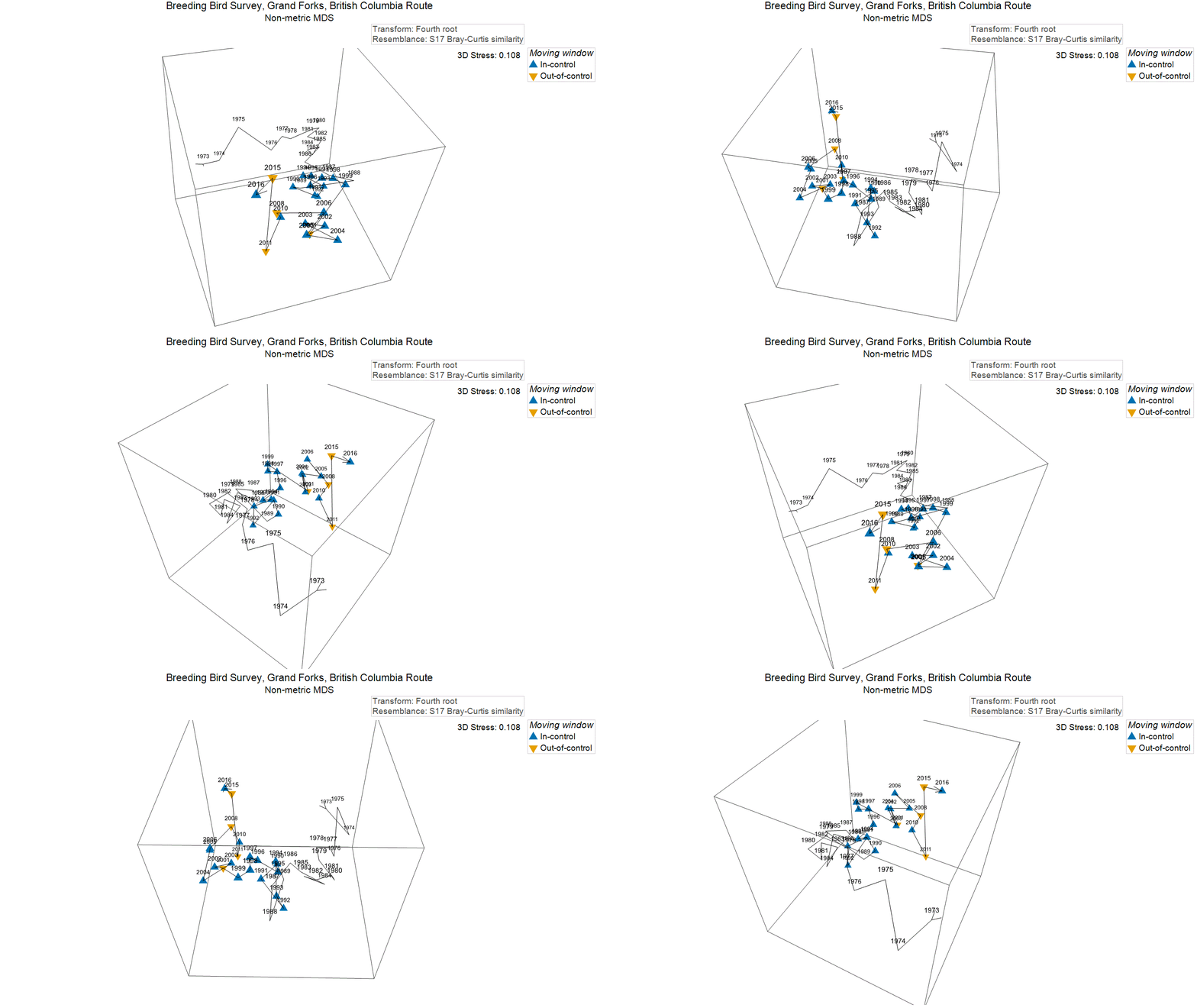
This shows that there have been significant 'jumps' of change in the bird assemblages over time, and that those shifts have occured more often in more recent years. Specifically, we have identified (based on the 17-year moving window) that a significant shift occured in 2001, 2008, 2011 and again in 2015.
Super-imposed on the original nMDS ordination, we can see these significant shifts as well. It is perhaps easiest to see them, however, in a 3D plot, and drawn without the initial 17 time-points, thus: