13. New standardisation options
- 13.1 Overview
- 13.2 Analysing cumulative standardised data
- 13.3 Example: Mussel sizes in the Gulf of Alaska
- 13.4 Example: Gulf of Maine invertebrates - functional resemblance
13.1 Overview
PRIMER 8 offers a host of new options for standardising data (either samples or variables), via the menu item: Pre-treatment > Standardise. The new 'Standardise' dialog window in PRIMER 8, by comparison with that in PRIMER 7, is shown below (Fig. 13.1).
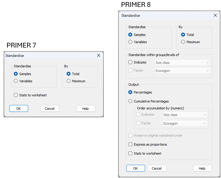
Fig. 13.1 Dialog for standardising samples or variables in PRIMER 8 by comparison with that available in PRIMER 7.
The two essential expansions to this tool in PRIMER 8 are:
- You can output the standardised data either directly (as calculated) or cumulatively (ordered as in the data sheet, or optionally ordered by a factor/indicator) as either percentages or proportions; and
- You can perform standardisations:
- across samples, but done separately for different sets of variables identified by an Indicator; or
- across variables, but done separately for different sets of samples identified by a Factor.
Option (1) above enhances the ability of PRIMER 8 to handle datasets where the variables themselves are ordered in some fashion. For example, perhaps the multivariate variables are:
- size-class fractions in sediment samples;
- abundances of organisms in different size classes (i.e., size-frequency data);
- growth curves where individuals are monitored over time and their sizes recorded at different time points. So, individual time points are different variables, and these have a natural order.
Option (2) above enhances the ability of PRIMER 8 to handle various situations much more easily. For example, suppose you have multiple species, and in every sampling unit there are tallies for each of several size classes for each of the species. For this case, we might want to do the standardisation cumulatively across the size classes, but it makes sense to do so separately within each set of variables that belong to a particular species. In such a case, the species (to which each size-class variable belongs) can be given as an indicator. Another example could be sets of variables that consist of tallies across multiple categories, within each of several traits. In this case, we would want the standardisation to be done separately for each trait. In either of these examples, the standardisation task would be quite laborious were it not for the new PRIMER 8 standardisation tool.
13.2 Analysing cumulative standardised data
Rationale
Suppose we have data where the variables consist of different size classes of mussels (as we shall shortly see in a real example). In such cases, where the variables have a natural order, we may, of course, simply treat the variables multivariately just as they are, ignoring their intrinsic quantitative inter-relationships and natural ordering. However, note that Bray-Curtis (or Manhattan, or whatever measure we apply) will take no notice of the ordering of the variables. In other words, we could shuffle the order of the variables and it would make no difference at all to the calculated resemblance matrix among samples. However, we may want to permit the natural ordering of the variables to play a useful and meaningful role in the analysis itself.
If we use cumulative percentage values across each sample, then we can really see the sample as a 'profile' of size classes, from smallest to largest. This is different from viewing the sample as a set of individual size-class variables that bear no relationships to one another (i.e., where distances between those size classes would be of no importance). By standardising each sample to a cumulative profile across the size classes, we acknowledge that the variables are, themselves, structured, from smallest to largest; i.e., they are ordered. Of course, the variables will not be independent of one another following a standardisation like this, but we do not, typically, expect the variables to be independent of one another in multivariate analyses to begin with. It is the simultaneous action of all variables (in this case, the overall shape of the profile) that is relevant to us for comparative analysis among the samples.
Size-class data: a 'toy' example
To make this more concrete, consider the following 'toy' example dataset, where we have 5 samples (columns), and each of these have the following raw percentages of individuals of a given species belonging to each of 8 size classes (rows, which are the variables here) and these are ordered.
![02.Toy_example_data_raw[i].png](https://learninghub.primer-e.com/uploads/images/gallery/2025-12/02-toy-example-data-raw-i.png)
The sample labelled '3.Even' has a perfectly even distribution, with 12.5% of the individuals in every size class. The sample labelled '1.More.small' has 50% of its individuals in the smallest size-class (2-4 mm), and 50% in the 6-8 mm size-class. The sample labelled '2.Some.small' has 50% of its individuals in the 4-6 mm size-class, and 50% in the 8-10 mm size-class, and so on.
Now, the Manhattan distances between all pairs of samples here looks like this:
![02.Toy_Raw_resem[i].png](https://learninghub.primer-e.com/uploads/images/gallery/2025-12/02-toy-raw-resem-i.png)
Note that all of the samples are an equal distance away from the '3.Even' sample (150 units), and all other pairs of samples are considered to be 200 units away from each other, which is the maximum possible distance we could get using the Manhattan measure on these data. This is despite the fact that, biologically, we would rather prefer '2.Some.small' to be closer to '1.More.small' than it is to (say) '4.Some.large' or '5.More.large'. You can see that the above analysis completely ignores the fact that the variables themselves are ordered.
Now, let’s standardise the above raw percentages to a cumulative profile of percentages. Here, we cumulatively add the percentages in each size class across the sample so that, by the end of the list, we arrive at 100%. The cumulative percentages for this toy example look like this:
![03.Toy_example_data_cumulative[i].png](https://learninghub.primer-e.com/uploads/images/gallery/2025-12/03-toy-example-data-cumulative-i.png)
Let's think about what this transformation to cumulative percentages has done. Consider the '3.Even' column first. We start with 12.5% of the individuals in the 2-4 mm size class, then we add another 12.5% at the next step in the profile, 4-6 mm, which gets us to 25%, then we add another 12.5% at the next step in the profile for the 6-8 mm size class, which gets us to 37.5%, and so on.
Visually, we have gone from a series of unrelated (unordered) numbers to a profile of numbers which increases from left to right along the size classes, from 0% to 100% of the sample. This is perhaps best visualised using a line plot¶, where the size classes are along the x-axis and the y-axis has the cumulative percentage values (see below). Of course, by the time we get to the final size class, we end up at 100% (and, for any given sample, we may well end up at 100% far before we reach the final size class, which is fine).
![03.Toy-cumulative-graphic[i].png](https://learninghub.primer-e.com/uploads/images/gallery/2025-12/03-toy-cumulative-graphic-i.png)
Now, in the above plot, we can see that the evenly distributed sample (in green) just marches along at equal step lengths from left to right, while the two samples that contain a large percentage of small individuals (in dark blue and light blue) reach 100% rather quickly, whereas the samples that contain larger individuals (in yellow and orange) do not increase towards 100% until the larger size classes are reached. This contrasts sharply with what the image looks like if we just plot the raw percentages:
![02.Toy-raw-graphic[i].png](https://learninghub.primer-e.com/uploads/images/gallery/2025-12/02-toy-raw-graphic-i.png)
The plot above is a bit more of a mess, and it ignores the important additional information we have about the size-class variables themselves; namely, that these variables are ordered!
Next, if you calculate the Manhattan distances among each pair of samples using the cumulative percentages, it makes a lot more sense (see below).
![03.Toy_Cumulative_resem[i].png](https://learninghub.primer-e.com/uploads/images/gallery/2025-12/03-toy-cumulative-resem-i.png)
For example, the largest distance (500 Manhattan units) is between the profile of '1.More.small' and '5.More.large'. Also, the distance between '1.More.small' and '2.Some.small' is less than that between '1.More.small' and either of '4.Some.large' or '5.More.large', and so on.
For even greater clarity, we can examine the metric MDS plot that we obtain based on the Manhattan distances calculated from raw percentages versus the one obtained from cumulative percentages (shown below).
![02.Toy-Raw_mMDS[i].png](https://learninghub.primer-e.com/uploads/images/gallery/2025-12/02-toy-raw-mmds-i.png)
![03.Toy-Cumulative_mMDS[i].png](https://learninghub.primer-e.com/uploads/images/gallery/2025-12/03-toy-cumulative-mmds-i.png)
Of course, the one using raw percentages really makes no sense at all, whereas the one based on cumulative percentages makes perfect sense!
Summary
Generally, if we are dealing with variables that are ordered, it make sense to treat them in a cumulative fashion and to analyse profiles, as demonstrated above. Another possibility would be to incorporate distances among variables in the calculation of the resemblances among samples. An example of this is taxonomic dissimilarity ( Clarke et al. (2006b) ), which includes the taxonomic or phylogenetic relationships among species in the calculation of resemblances among samples. One can, however, use any distance/dissimilarity matrix among the variables (whether they be species or not) within such a calculation. For example, Myers et al. (2021) used this approach to calculate functional dissimilarities among fish assemblages along depth and latitude gradients.
¶In PRIMER 8, one has the flexibility to draw line plots either: (i) of samples (across variables, as done above) or (ii) of variables (across samples).
13.3 Example: Mussel sizes in the Gulf of Alaska
To implement the new standardisation routine in PRIMER 8 and (simultaneously) demonstrate the utility of analysing cumulative percentages, we shall examine a study by Dowling (2021) , who measured the lengths of mussels (Mytilus trossulus) at two glacially influenced estuaries in the Gulf of Alaska, USA. Data were counts of mussels falling into each of 35 size classes (0-2 mm, 2-4 mm, etc. up to 90-92 mm) at each of 15 inter-tidal sites that were classified as being influenced predominantly by glacial, riverine or oceanographic hydrological conditions (Fig. 13.2). Each size class is a variable and these variables, themselves, have a natural quantitative ordering. We are interested in the shape of the distribution of size classes, and not in the total number of mussels at any given site. Are mussel size frequency distributions affected by the environmental conditions at these sites? What we want here is to standardise the data by sample totals (hence, transforming them to percentages), but – in addition – it makes sense to consider them as cumulative percentages (from the smallest to the largest mussels), as opposed to treating these variables as if they were unordered.
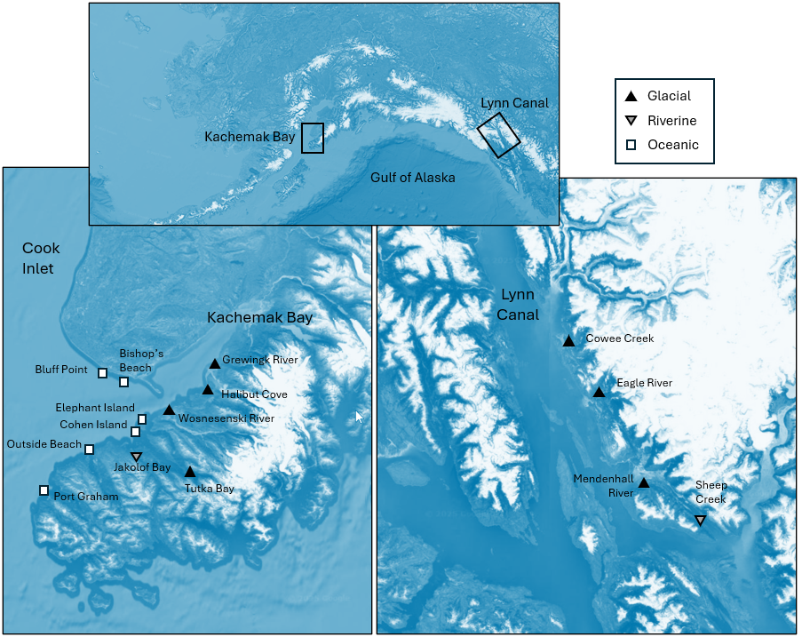
Fig. 13.2 (adapted from Fig. 1 in Dowling (2021) ). Maps of the sites at which size-distributions of mussels were measured in each of two ecoregions: Kachemak Bay (left) and Lynn Canal (right). The top map shows the locations of these two ecoregions in Alaska. White squares represent ocean-influenced sites; solid black triangles represent glacially-influenced sites, and upside-down grey triangles represent freshwater-influenced sites. Satellite images: Google Earth.
Input data and standardise
- Open up the data file 'Gulf_of_Alaska_mussels.pri' (located in the folder 'Examples_P8' > 'Gulf_of_Alaska_mussels'), and notice that the names of the variables here are the (numerical) size classes, listed in order. The values in the data sheet are the raw abundances (counts) of the numbers of mussels in each size class at each of the above sites (Fig. 13.2).
![05.Mussel_data[i].png](https://learninghub.primer-e.com/uploads/images/gallery/2025-12/05-mussel-data-i.png)
- From the 'Gulf_of_Alaska_mussels' data sheet, click Pre-treatment > Standardise.... Choose to standardise samples by total and output cumulative percentages, as shown in the dialog below.
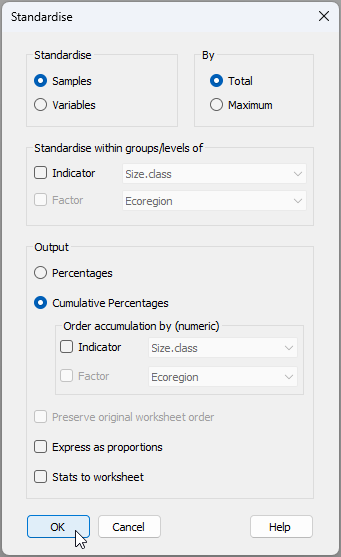
The resulting datasheet of cumulative percentages (called 'Data1') will look like this:
![06.Cumul_Perc_mussels[i].png](https://learninghub.primer-e.com/uploads/images/gallery/2025-12/06-cumul-perc-mussels-i.png)
View size-distribution profiles
- We can use a line plot to view the size-distribution profiles across the sites. From 'Data1' click Plots... > Line Plot... and choose to plot ($\bullet$Samples), then click 'OK', as shown below.†
![06.Line_plot_mussels[i].png](https://learninghub.primer-e.com/uploads/images/gallery/2025-12/06-line-plot-mussels-i.png)
The resulting plot of cumulative size-distribution profiles for each site looks like this:
![07.Line_plot_results_mussels[i].png](https://learninghub.primer-e.com/uploads/images/gallery/2025-12/07-line-plot-results-mussels-i.png)
Some sites, such as Bishop's Beach and Bluff Point, are dominated by small-sized mussels (new recruits), whereas other sites (such as Halibut) tend to have a greater percentage of larger mussels.
- It would be helpful to see these lines in different colours corresponding to the different influences (glacial, riverine or oceanic). From the plot produced at step 3 (called 'Graph1'), click Graph > Sample Labels & Symbols... and choose to plot Symbols: $\checkmark$ By factor Influence, then click 'OK'.
Our plot of cumulative size-distribution profiles, now showing the different influences, looks like this:
![08.Line_plot_results_mussels+influence[i].png](https://learninghub.primer-e.com/uploads/images/gallery/2025-12/08-line-plot-results-musselsinfluence-i.png)
Ordination and analysis of size-frequency distributions
Let's look at an MDS plot of Manhattan distances between all pairs of cumulative curves here to get a multivariate representation of the relationships among these size frequency distributions. We consider the Manhattan distances here to be a really useful and straightforward way of calculating relationships among these cumulative profile curves. Specifically, to get the Manhattan distance between two cumulative profiles, we calculate the absolute difference between the two curves at each size class, then sum these absolute differences up across all of the size classes. So, the larger the 'gaps' are between any two profiles, the bigger the Manhattan distance.
- Calculate Manhattan distances among the profiles. From the standardised cumulative data in 'Data1', click Analyse > Resemblance… > (Measure $\bullet$Other > D7 Manhattan distance).
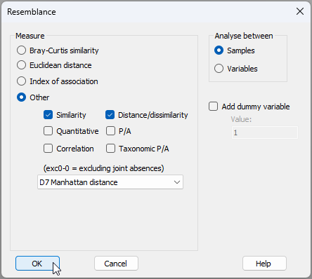
The resulting matrix will be called 'Resem1'.
![08b.Resem_Mussels[i].png](https://learninghub.primer-e.com/uploads/images/gallery/2025-12/08b-resem-mussels-i.png)
- Create a metric MDS plot. Note that, for this example, a metric MDS can be done quite successfully.¶ From the 'Resem1' matrix, click Analyse > MDS > Metric MDS (mMDS / tmMDS)… > (Choice of intercept: $\bullet$Metric MDS (zero intercept) ), OK. Put symbols on the resulting MDS plot (called 'Graph2' in the Explorer tree) corresponding to the factor 'Influence' by clicking Graph > Sample Labels & Symbols..., and the resulting ordination graphic will look like the one shown below.
![11.mMDS plot_mussels[i].png](https://learninghub.primer-e.com/uploads/images/gallery/2025-12/11-mmds-plot-mussels-i.png)
This plot shows fairly clear differences in the size-class distributions for mussels growing under the influence of glacial, riverine and oceanic conditions. There is clearly a gradient across the plot in the size-class distributions of mussels, from sites on the left (typically under oceanic influences) having proportionately more small-sized mussels (e.g., Bishop's Beach and Bluff Point), through to those on the right (typically experiencing more glacial influences) which have a greater proportion of large-sized mussels (e.g., Cowee Creek and Halibut). We can formally test the effects of influence on size-class distributions of mussels at these sites formally using ANOSIM, also taking into account potential differences in the two ecoregions (Kachemak Bay and Lynn Canal).
- Do a two-way crossed ANOSIM for the factors of 'Ecoregion' and 'Influence' on mussel size-class distributions. From the 'Resem1' matrix, click Analyse > ANOSIM..., then choose Design > Model: Two-way Crossed - AxB, with the two factors being A: Ecoregion (unordered) and B: Influence (also unordered), leave all other options as the defaults and click OK, like so:
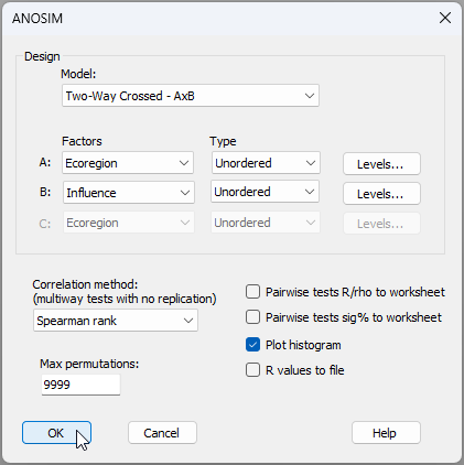
The ANOSIM results are shown below.
![12.ANOSIM_mussels_results[i].png](https://learninghub.primer-e.com/uploads/images/gallery/2025-12/12-anosim-mussels-results-i.png)
These results are quite clear. There is no effect of Ecoregion (ANOSIM $R$ = -0.286, $P$ > 0.80), but Influence has a statistically significant effect on the size-class distributions of these mussels (ANOSIM $R$ = 0.483, $P$ < 0.01). Moreover, the pair-wise tests show significantly different size-class distributions for mussels at sites under glacial vs oceanic influences (ANOSIM $R$ = 0.679, $P$ < 0.005), but distributions of mussels at sites under riverine influences (amber symbols in the mMDS plot) apparently lie somewhere in-between these two and they do not differ significantly from either of them ($P$ > 0.40 for both tests).
Plot mean size-distribution profiles
- We can show the mean size-distribution profiles for each of these three 'Influence' groups, as follows. From the full set of cumulative profiles for all of the sites held in 'Data1', click Tools > Average... and choose (Samples $\bullet$Averages for factor: Influence), then click 'OK', like so:
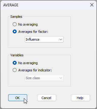
This will produce a data file with just three profiles in it, called 'Data2':
![13.Average_profiles_mussels[i].png](https://learninghub.primer-e.com/uploads/images/gallery/2025-12/13-average-profiles-mussels-i.png)
From 'Data2', click Plots > Line Plot..., choose to plot ($\bullet$Samples), then click 'OK', and we have the following graphical output ('Graph8').
![14.Mean_profiles_mussels[i].png](https://learninghub.primer-e.com/uploads/images/gallery/2025-12/14-mean-profiles-mussels-i.png)
† It is a new feature in PRIMER 8 to be able to create a line plot of samples (across variables). PRIMER 7 only permitted line plots to be drawn of variables (across samples).
¶ We would typically use non-metric MDS for most cases, but in situations where the Shepard diagram shows an approximately linear relationship between the Euclidean distances in the MDS plot and the original dissimilarities, we can move towards using a metric MDS. Although threshold metric MDS is often then our next 'go-to' tool, we can actually go for a fully metric MDS in cases where a zero intercept is also feasible yet without incurring too much stress, as in the present case. We accumulate advantages for interpretation (i.e., distances on the MDS plot = original dissimlarities) the further we can get down the path from nMDS → tmMDS → mMDS. The Shepard diagram for the present case ('Graph3'), demonstrating both linearity and the perfect suitability of a zero intercept, is shown below.
![10.Shepard_plot_mussels_mMDS[i].png](https://learninghub.primer-e.com/uploads/images/gallery/2025-12/10-shepard-plot-mussels-mmds-i.png)
13.4 Example: Gulf of Maine invertebrates - functional resemblance
There are many situations where the standardisation of samples is required as a pre-treatment prior to analysis, but which needs to be done separately within groups of variables that may be identified by an indicator.¶ Here, we shall consider a dataset comprised of occurrences of $p$ = 91 macroinvertebrate species recorded from intertidal areas at each of $N$ = 12 exposed rocky headlands (surveyed in 2012) in the Gulf of Maine (Fig. 13.3, Trott (2022) †). For each species, we have additional information in the form of trait data. The trait data for each species consists of presence/absence information for a series of $q$ = 93 individual trait variables. The trait variables are organised into 14 groups. These groups of traits are: Form, Position, Lifestyle, Trophic Relation, Body Shape, Body Support, Flexibility, Ecoengineer, Fertilization, Development, Size, Body Plan, Asexual Reproduction and Regeneration. The number of categories (trait variables) within each trait group varies, and any given species can be recorded as a '1' (indicating that they belong) to one or more of these categories within each trait group.
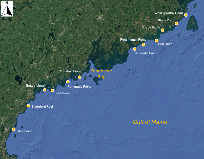
Fig. 13.3 Map of the Gulf of Maine showing 12 sites where macroinvertebrates were sampled by Trott (2022) . Satellite image: Google Earth.
Our initial agenda here may be to consider the relationships among the sites based on the species they contain in the usual way, e.g., using the Bray-Curtis (or Sørensen) resemblance measure directly on the species $\times$ site matrix. However, we may wish to nuance this calculation further by incorporating relationships among the species, based on their traits. In other words, if two sites do not share any species in common, they might nevertheless share two species that have similar traits. We can exploit the method of calculating taxonomic resemblance ('Gamma+', Clarke et al. (2006b) ) in order to calculate, instead, a functional resemblance, using a matrix of inter-species relationships built from the trait data (e.g., Myers et al. (2021) ).
Further to this aim, we shall consider our trait data matrix such that the classical role of 'samples' is given to the species (among which we shall calculate the resemblances), while traits are given the role of 'variables'. However, we want each trait group to be weighted equally in the calculation. To make sure the sum of values for each species within each trait group sums to 100 (so gets equal weight), we will want to apply a pre-treatment to standardise across the trait variables for each species ('sample'), but separately within each trait grouping. This standardisation would not be necessary if every species only had one trait within a group, but that is not the case here. For example, the mollusc species, Adalaria proxima (abbreviated ADP) is in two trophic categories: it grazes on algal fronds and blades (Tr-P-GF), and also grazes macro prey on the substratum (Tr-P-GSM).
Our analysis pathway looks like this:
- Open the trait data matrix in PRIMER 8.
- Standardise the 'samples' (species here) across the trait variables, separately within each trait grouping, using our new tool in P8, Pre-treatment > Standardise....
- Calculate functional resemblances among species using Bray-Curtis, based on the standardised trait data.
- Examine the inter-species functional relationships in an ordination (nMDS).
- Calculate functional resemblances among the 12 sites, by incorporating these species inter-relationships.
- Examine the functional relationships among the sites in an ordination (nMDS).
Open the trait data matrix
- In PRIMER 8, click File > Open... and open up the file named 'Gulf_of_Maine_invert_traits.pri' (found in the 'Gulf_of_Maine_inverts' folder inside the 'Examples_P8' folder), as shown below.
![16.GoM_Traits_data[i].png](https://learninghub.primer-e.com/uploads/images/gallery/2025-12/16-gom-traits-data-i.png)
Note here that the 'Samples' are actually the species (the names are abbreviated). More information about the species can be seen by clicking Edit > Factors.... Note also that the traits are variables. More information about the traits (also abbreviated) can be seen by clicking Edit > Indicators....
The first trait group is actually the name of the Phylum for each species. These are not actually traits, so let's start by selecting all of the traits that do not belong to the 'Phylum' group.
- From the 'Gulf_of_Maine_invert_traits' matrix, click Select > Variables..., then choose
($\bullet$Indicator levels Trait category) and click the 'Levels...' button (
 ). In the Selection dialog, first click the double right arrows button (
 ) to move all of the groups to the 'Include' column on the right. Then click on 'Phylum' and the left arrow button (
 ), so that it appears back in the 'Available' column on the left (as shown below), then click 'OK' (in both dialog windows).


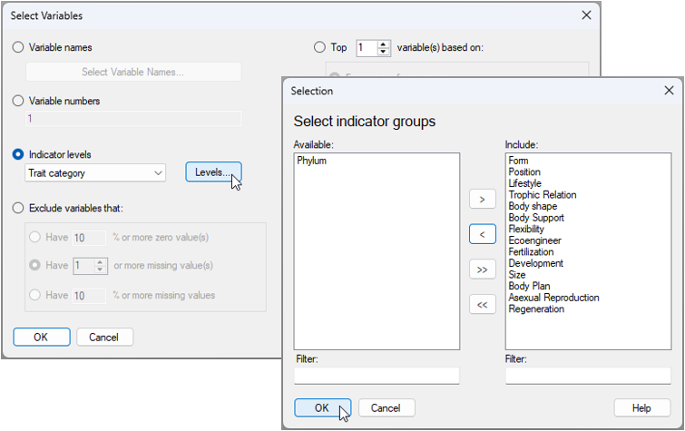
This will create a dataset that is re-coloured with a blue background, showing only the selected subset of traits (excluding 'Phylum'), like this:
![18.Subsetted_traits_GoM[i].png](https://learninghub.primer-e.com/uploads/images/gallery/2025-12/18-subsetted-traits-gom-i.png)
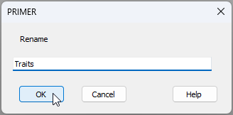
Any analyses from this matrix will now only be done on the sub-setted data. To keep things tidy, click Tools > Duplicate and the subsetted data will now be provided in the Explorer tree as a new matrix called 'Data1'. We can re-name this to 'Traits' by clicking File > Rename Data and typing in this desired new name, then clicking 'OK', as shown below.
Standardise the trait data
- From the 'Traits' data sheet, click Pre-treatment > Standardise... and choose (Standardise $\bullet$Samples) & (By $\bullet$Total) & (Standardise within groups/levels of $\checkmark$Indicator Trait category) & (Output $\bullet$Percentages), then click 'OK', as shown below.
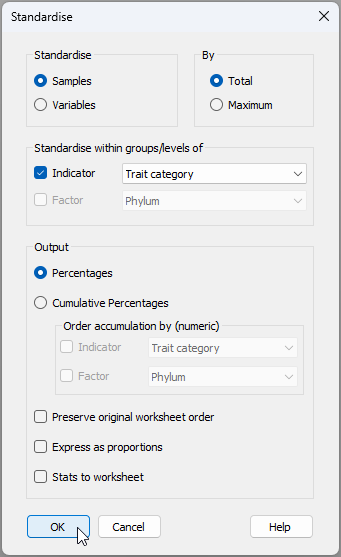
The resulting data sheet (called 'Data1') can be renamed (using File > Rename Data, as we have done before) to (say) 'Standardised Data', for clarity. The standardised trait data sheet will look like this:
![21.Standardised_trait[i].png](https://learninghub.primer-e.com/uploads/images/gallery/2025-12/21-standardised-trait-i.png)
Note how the distribution of traits within a species for any particular trait group (in this example, the trait groups are identifiable by reference to the letters appearing before the dash '-' in the variable names, e.g., 'Po', 'Li', 'Tr', etc.) will sum to 100.
Calculate relationships among species based on traits
- From the 'Standardised Data' sheet, click Analyse > Resemblance... > (Measure $\bullet$Bray-Curtis similarity) & (Analyse between $\bullet$Samples), as shown below.
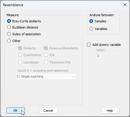
The resulting resemblances among the species, based on their traits is shown below.
![23.Resem_among_species'samples'_[i].png](https://learninghub.primer-e.com/uploads/images/gallery/2025-12/23-resem-among-species-samples-i.png)
We mustn't forget that the role of 'samples' is being taken by the species here! (The traits were the variables that created this matrix). However, in subsequent analyses to follow, the species will be variables, and sites will be samples. So let's go ahead and change the properties of this resemblance matrix now.
From 'Resem1', click Edit > Properties... and change the following:
- Title 'Gulf of Maine invertebrates'; and
- Between $\bullet$Variables then click 'OK' (as shown below).
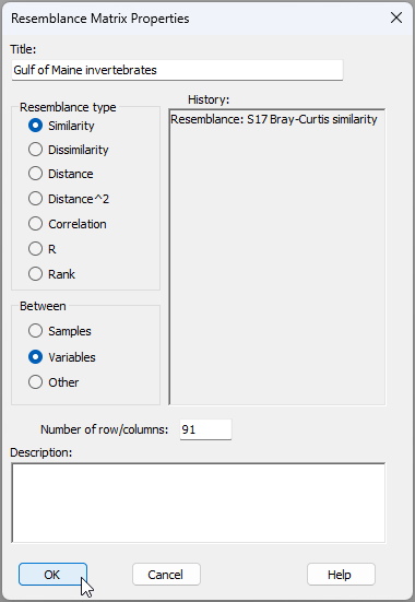
We now have a resemblance matrix among the species which are clearly identified as variables, hence that is ready for ensuing analyses (see below).
![23c.Resem_among_species'variables'_[i].png](https://learninghub.primer-e.com/uploads/images/gallery/2025-12/23c-resem-among-species-variables-i.png)
As a next step, let's aim to visualise similarities among species, based on their traits, using a non-metric MDS ordination.
Visualise inter-species trait-based relationships
- From 'Resem1', click Analyse > MDS > Non-metric MDS (nMDS)..., and go with all of the default options in the dialog (just click 'OK'). The resulting 2D ordination ('Graph1' in the Explorer tree) is shown below. Different symbols/colours show the different phyla in which individual species (labeled by their abbreviations) belong.
![24.Trait-space_nMDS[i].png](https://learninghub.primer-e.com/uploads/images/gallery/2025-12/24-trait-space-nmds-i.png)
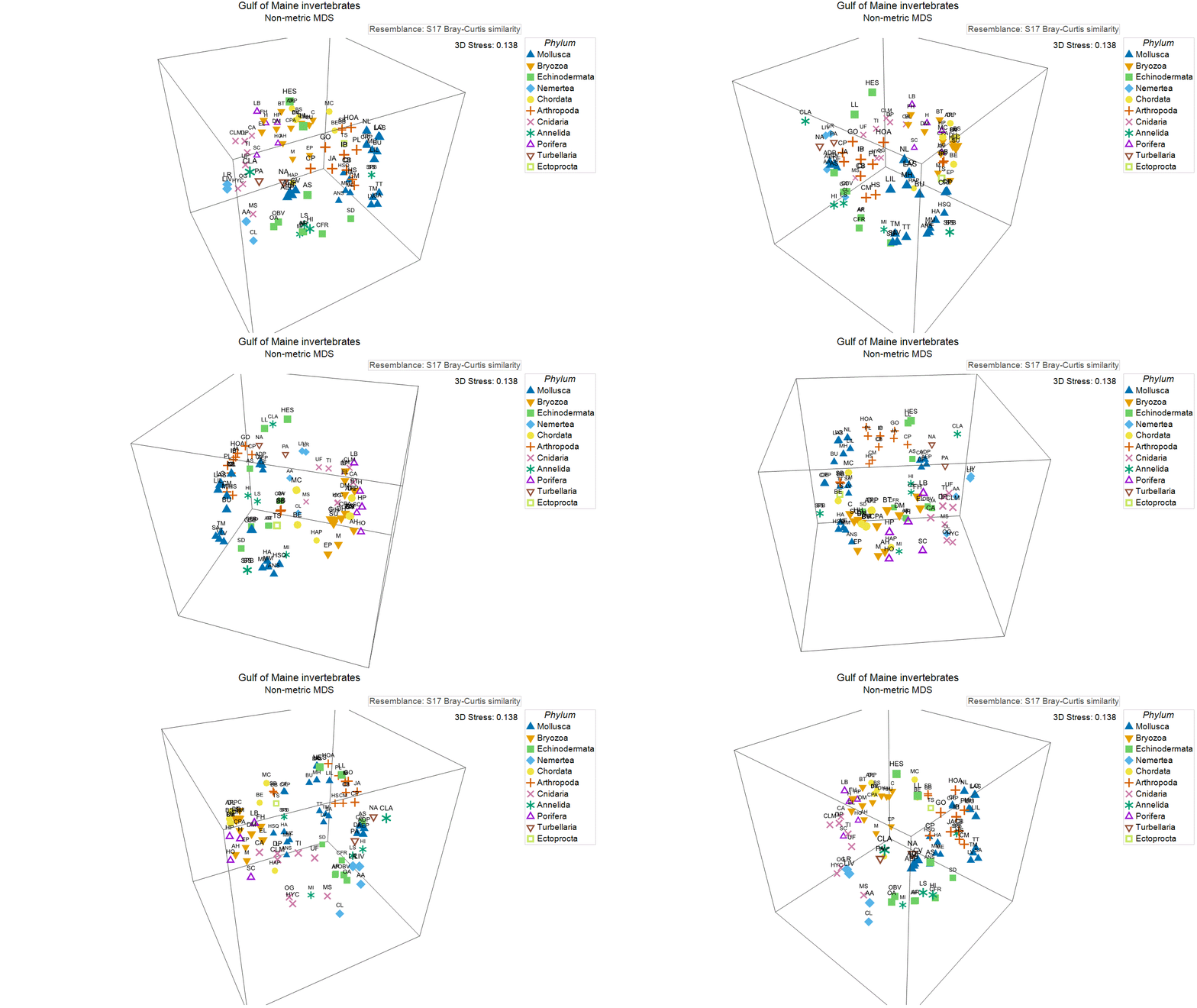
This ordination has rather high stress (0.214), so we might opt to examine the 3D graphic ('Graph1' in the Explorer tree), which has a lower stress (0.138), as shown below. In essence, this ordination shows us the relationships among these invertebrate species in multi-dimensional trait space.