Step 3: Cluster
Now that we have a resemblance matrix, we can proceed with a cluster analysis of the data. The purpose of a cluster analysis is to join together samples that are similar to one another, and also to clarify separations of groups (or clusters) of samples that may be dissimilar ( Clarke (1993) , Legendre & Legendre (2012) ). For descriptions of the clustering methods in PRIMER, see Chapter 3 in 'Change in Marine Communities'. The starting point for cluster analyses in PRIMER is always the resemblance matrix that quantifies inter-sample (or inter-variable) (dis)similarites.
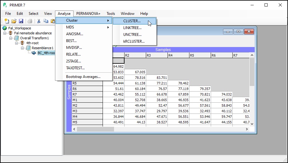
Perform the cluster analysis
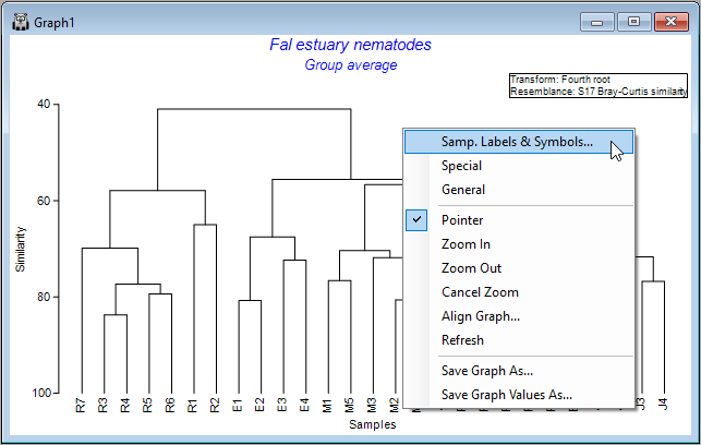
- In the PRIMER workspace file containing the Fal nematode data, click on the resemblance matrix of Bray-Curtis similarities calculated from fourth-root transformed data (called 'Resem1', or re-named to 'BC_4th-root' in the Explorer tree) to make it the active window, then click on Analyse > Cluster > CLUSTER....
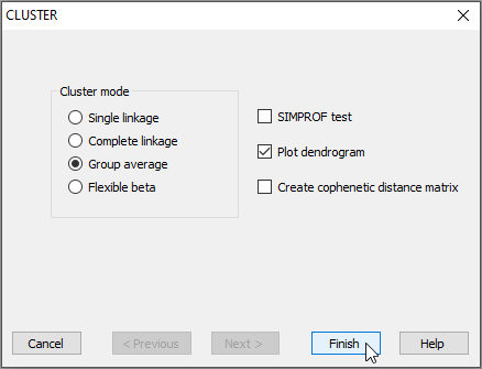
- To perform hierarchical agglomerative clustering with group-average linkage (also sometimes referred to as 'unweighted pair group method with arithmetic mean' or UPGMA), retain all of the defaults in the 'CLUSTER' dialog and click Finish.
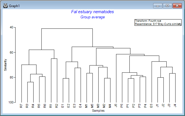
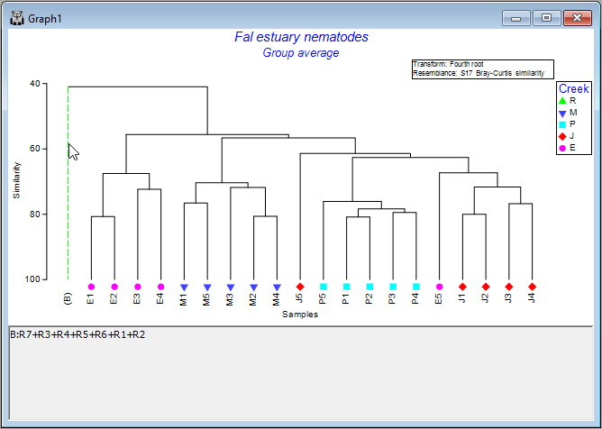
You will see an output file that provides all of the details of the clustering algorithm's pathway (shown as 'CLUSTER1' in the Explorer tree). A dendrogram will also appear as output in a new graphics window (shown as 'Graph1' in the Explorer tree), viz:
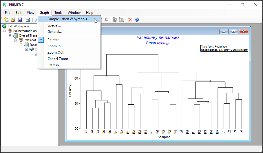
Customize the dendrogram graphic
You can do a number of customizations to the dendrogram graphic.
- With the dendrogram as the active window, click on Graph and you will see a range of options.
Alternatively, you can right-click anywhere inside the dendrogram's graphic window itself and a similar list pops up, along with additional options for saving the graphic (or graph values) as a separate file, etc. Note that you can also save any graph by clicking on File > Save Graph As... with the graphic you want as the active window.
The choices of Graph > Sample Labels & Symbols... and also Graph > General... will show you a set of options for changing elements that are common to all (or most) graph types in PRIMER (i.e., things like scales and labels to use for the x and y axes, titles and sub-titles, fonts, symbols, colours, etc.) In contrast, the choice of Graph > Special.. will provide a special menu of graphical options specific to that particular type of graph - in this case, a dendrogram.
Change labels and/or symbols
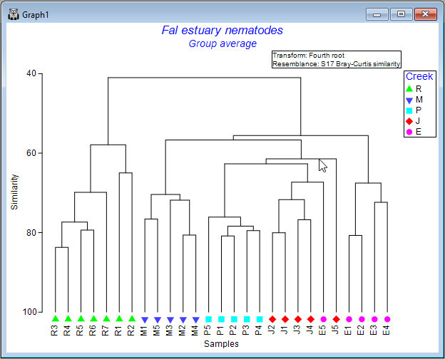
- Let's add some symbols to the plot, with the 4 creeks being represented by different symbols. Click Graph > Sample Labels & Symbols.... In the resulting 'Graph Options' dialog, under the 'Samp. labels & symbols' tab, choose (Labels $\checkmark$ Plot) & (Symbols $\checkmark$Plot & $\checkmark$By factor Creek), then click OK.
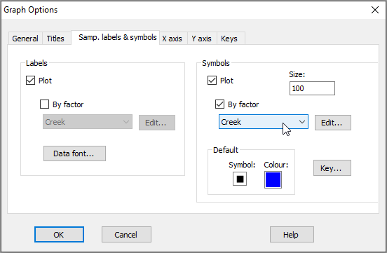
Note that the 'Samp. labels & symbols' dialog will automatically offer you the option to choose labels or symbols corresponding to any factors that are associated with your resemblance matrix. Tip: For graphing purposes, it is a good idea to use short names for samples (if you can) and (more importantly) for levels of factors, so they will be easy to display on plots.
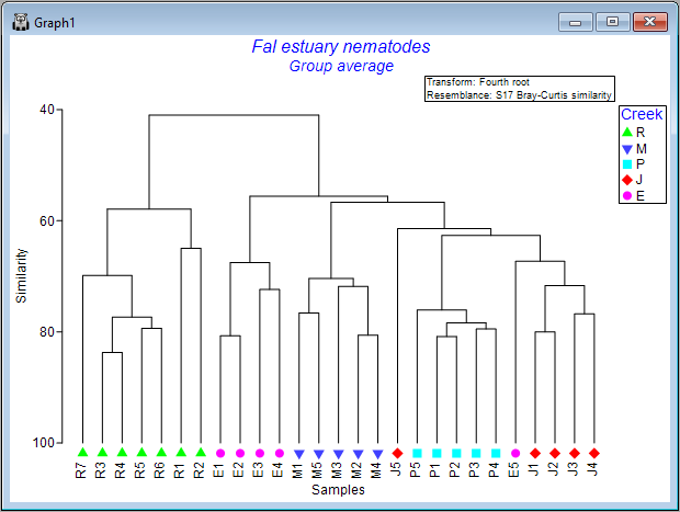
The result is a more colourful and informative dendrogram, which clearly shows a pattern of (generally) high similarity among assemblages within each of the four creeks, (similar symbols tend to be clustered together), and some clear distinctions between assemblages in different creeks, with Restronguet Creek ('R') appearing most different from the others (only about ~40% similar to other creeks, on average).
Zoom in and out
If you have a very large dendrogram with a lot of samples, it is helpful to be able to zoom in and out in order to see details present in different portions of the dendrogram.
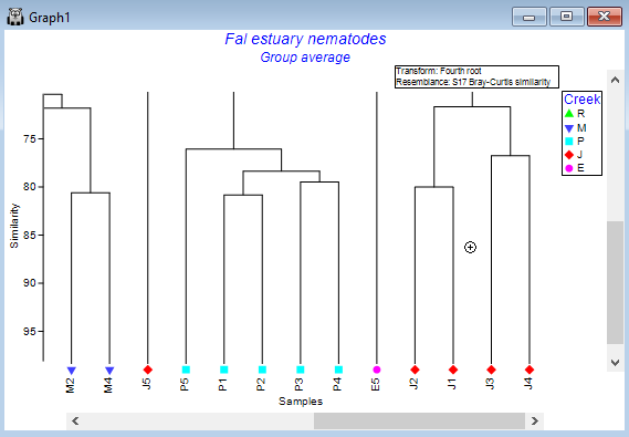
To Zoom in, click Graph > Zoom in (or click on the 'zoom-in' icon  in the ribbon of tools shown under the main menu items). In zoom-in mode, your cursor will change into a little 'plus' symbol
  when poised over your graphic, and with this you simply click on the dendrogram to zoom in on that area. Click multiple times to continue zooming in.
To Zoom out, click Graph > Zoom out (or click on the little icon with a minus symbol inside a magnifying glass  ). Now the cursor changes into a little 'minus' symbol
  , and clicking on the graphic zooms you back out again.
To cancel the zoom entirely (to see the entire dendrogram again), click on Graph > Cancel Zoom (or click on the cancel-zoom icon  ).
).
Collapse nodes to simplify
Another option, if you have a very large dendrogram, is to simplify the view by clicking on any one of the vertical branches. This will collapse all of the samples under that branch into a single entity, making it easier to see patterns in what remains. For example, click on the vertical branch that leads to all of the samples from Restronguet Creek ('R'), and the dendrogram will look like this:
Simply click on that same vertical branch again to toggle that 'collapse' option off, and you will see all of the individual samples within that node again in the full dendrogram, as before.
Rotate leaves around the nodes
It is important to remember that the dendrogram should be thought of like a 'mobile', dangling from a ceiling. In this way, the leaves dangling from each node can be rotated around the node. Thus, the specific ordering of the samples you see in the dendrogram, while being constrained by it in some way, has a bit of flexibility: sample units can be rotated around the nodes.
To explore this flexibility visually, click on any horizontal line of the dendrogram, and you will see its leaves will 'flip', accordingly. Clearly, quite a lot of re-arrangements of the sample ordering provided in the initial output are possible, so it is often useful to experiment with this a bit to achieve an ordering that may be most useful for interpretation of relationships/clusters.
For example, one possible re-ordering looks like this:
Change the orientation
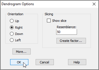
The default output orientation for a dendrogram in PRIMER is to have the hierarchical agglomeration going 'Up' (i.e., individual sampling units hang downwards); however, you can customise its orientation. For example, for the Fal estuary nematodes, click on Graph > Special..., then in the 'Dendrogram Options' dialog box, under 'Orientation', choose $\bullet$Right, and click OK.
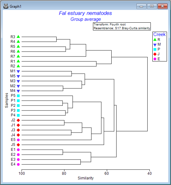
This yields the following:
 .
.