10.2 Main effects plot
What is a 'main effects plot'?
In a main effects plot, we calculate and then show in an ordination diagram a centroid for each of the levels of each factor listed in the design file.¶ We may also (optionally) show the overall centroid as well. The centroids, and distances/dissimilarities among them, are calculated in the full high-dimensional space of a chosen resemblance measure.
A two-way crossed example
Let's consider a study by Glasby (1999) on the development of subtidal epibiotic assemblages. It was proposed that differences in two factors: (i) shading and (ii) proximity to the seafloor, could explain previously observed differences between assemblages of sessile organisms on rocky reefs vs pier pilings in sheltered embayments of Sydney Harbour, Australia. Four replicate sandstone settlement plates (15 cm $\times$ 15 cm) were placed in an embayment in Middle Harbour (a branch of Sydney Harbour) in each of 3 shading treatments: 'Shade' (shaded surfaces with an opaque Perspex roof), 'Control' (a procedural control with a clear Perspex roof), and 'Open' (surfaces without a roof) in each of 2 positions relative to the seafloor ('Near' to and 'Far' from the seafloor); see Fig. 10.1. The percentage cover values of $p$ = 46 taxa colonising the settlement plates were recorded after 33 weeks of deployment.
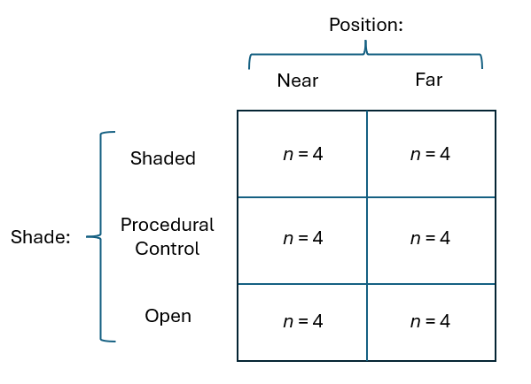
Fig. 10.1. Schematic diagram of the two-factor crossed study design described by
Glasby (1999)
.
The data for this example can be found in the file 'Sydney_subtidal_epibiota.pri' in the 'Examples_P8' > 'Subtidal_epibiota' folder. A non-metric MDS ordination of the individual sampling units on the basis of the Bray-Curtis resemblance measure, calculated after applying a square-root transformation, is shown in Fig. 10.2 below.
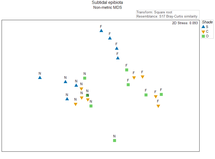
Fig. 10.2. Non-metric MDS of the individual sampling units from the two-factor crossed study design described by
Glasby (1999)
. Symbols correspond to the factor of 'Shade' ('S' = Shade, 'C' = Procedural Control, 'O' = Open surfaces), and labels correspond to the factor of 'Position' ('N' = Near, 'F' = Far).
It is useful to think about where the main effect centroids would be in this diagram, even though we know that there is some stress, and so their true positions by reference to the full high-dimensional system are not able to be represented perfectly here. Let's suppose, just for the moment, that all of the variation is captured in these two nMDS axes. In that case, we can calculate the arithmetic averages along each of the nMDS axes to get the positions of the overall centroid and the centroids for the levels of each of the main effects. If we plot these 'main effect' centroids in the diagram, along with the replicates, we have Fig. 10.3.
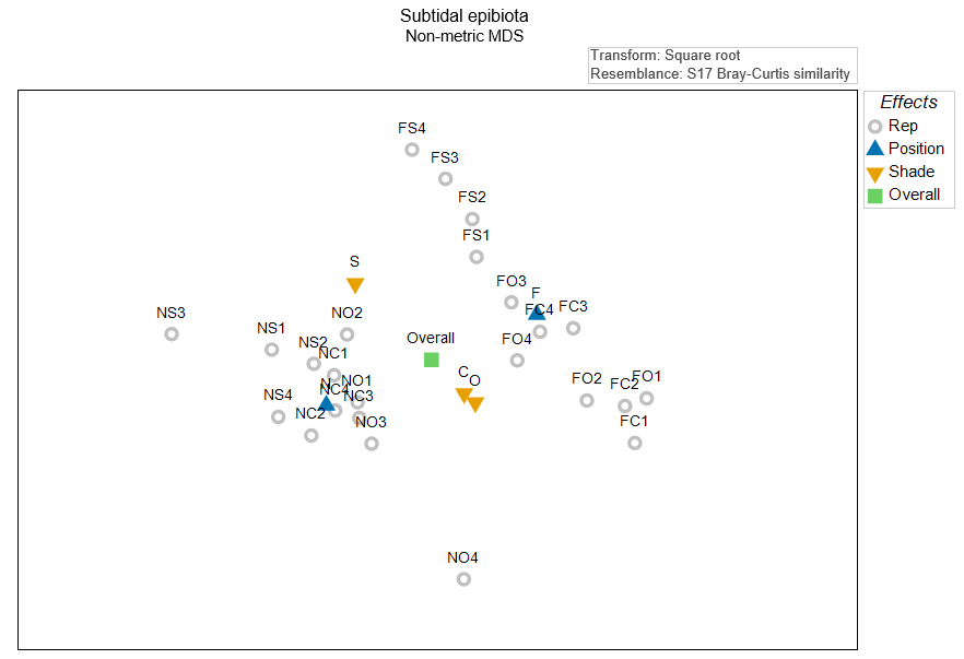
Fig. 10.3. Non-metric MDS of the individual sampling units (grey circles) from the two-factor crossed study design described by
Glasby (1999)
, along with the overall centroid (in green), the centroids for the position treatments (N and F, in blue), and the centroids for the shade treatments (S, C and O, shown in amber). All of these centroids were calculated 'post hoc', simply as the arithmetic averages in this 2D nMDS space.
This plot is somewhat useful, but what we really want, in fact, is to calculate these centroids in the original space of the resemblance measure (and not on the basis of the 2D Euclidean space of nMDS axes). This can be done using the method described in section 10.1. We can construct the distances among these main effect centroids, then perform an ordination to create a 'main effects plot' (Fig. 10.4).
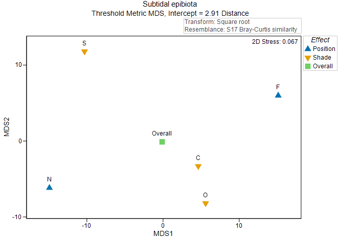
Fig. 10.4. Threshold metric MDS plot of the centroids for the main effects in the two-factor crossed study design described by
Glasby (1999)
.
As there are (typically) far fewer points in an ordination plot of distances among centroids, we tend to be able to get an interpretable diagram with tolerably low stress (< 0.2) using metric or threshold metric MDS; we typically do not need to use a (more forgiving) non-metric MDS to visualise these relationships. This is clearly advantageous, as our resulting ordination plot will therefore have labels on its axes, hence the relative sizes of effects (in the units of the original chosen resemblance measure) can be visualised, quantified and compared with one another. In the present example, the effects of 'Position' (correlated somewhat with the first tmMDS axis) are somewhat larger in size than the effects of 'Shade' (correlated somewhat with the second tmMDS axis).
Multivariate dissimilarity-based effects
Recall that an 'effect', in a univariate ANOVA context, can be described as the deviation of a group mean from the overall mean. As the axes for main effect plots are in units of the chosen dissimilarity measure (Bray-Curtis, in this case) we are able to get a real sense of the multivariate effect sizes as 'deviations of group centroids from the overall centroid', just as PERMANOVA would measure such effects in its partitioning of the full resemblance space (Fig. 10.5).
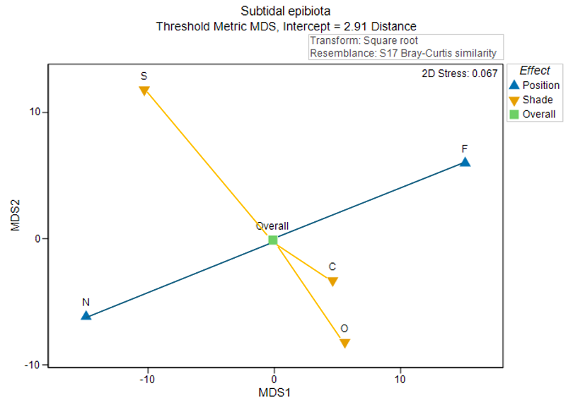
Fig. 10.5. Threshold metric MDS plot of the centroids for the main effects in the two-factor crossed study design, as shown in Fig. 10.4, including lines that estimate the sizes of effects as PERMANOVA would measure them. These correspond to 'deviations of centroids from the overall mean' for each factor. Position effects are shown in blue; Shade effects are shown in amber.
Note that the intercept from the threshold metric MDS is shown in the subtitle of Fig. 10.5. The intercept from the tmMDS Shepard diagram is interpretable as the minimum dissimilarity in the original multivariate space between any two points that occupy the same position in the tmMDS plot (i.e., that have a distance between them on the plot of zero). Therefore, this intercept value should be added on to any inter-point distances measured or estimated from the tmMDS ordination plot.‡
In the present example, the effects of 'Position' (correlated somewhat with the first tmMDS axis) are somewhat larger in size than the effects of 'Shade' (correlated somewhat with the second tmMDS axis). Also, we see that the effect of being an assemblage colonising a panel 'Near' the seafloor generates a deviation from the overall centroid of about 15-20 units (in Bray-Curtis space), in a direction towards the bottom left of the diagram. The effect of being 'Far' from the seafloor is a deviation that is equal in size to this, but in the opposite direction.† We can also see that the effect of being in a 'Shade' treatment shifts assemblages a rather similar magnitude away from the overall centroid (i.e., a distance of approximately 15-20 units in Bray-Curtis space), but in a completely different direction (i.e., towards the top of the diagram in this particular case). Also, it is clear that assemblages colonising surfaces in 'Open' and 'Control' treatments are not too dissimilar from one another, with their centroids differing by something that is likely to be less than 10 units in the full Bray-Curtis space.
Consider alongside output from a PERMANOVA partitioning
If we next do a PERMANOVA paritioning on the basis of the Bray-Curtis resemblance measure, after a square-root transformation, we see the following results:
![05.PERMANOVA_results_Glasby[i].png](https://learninghub.primer-e.com/uploads/images/gallery/2025-12/05-permanova-results-glasby-i.png)
This output provides not only the PERMANOVA table of results, but also direct estimates of the sizes of effects for each term in the model in the section entitled 'Estimates of components of variation'. The column labeled 'Estimate' is interpretable as the sum of squared fixed effects (divided by degrees of freedom) in the full Bray-Curtis space (in the case of fixed factors, as in this example). The square root of this value (in the column labeled 'Sq.root') is therefore interpretable as a type of 'standard deviation' attributable to that factor in that space. Thus, these 'Sq.root' values should correspond well with the mean deviations from the overall centroid for a given factor.
The key point here is that the main effects plot can be examined alongside the 'Estimates of components of variation' section of the PERMANOVA output file in order to guage the size and the relative importance of the factors in explaining overall variation. The plot, furthermore, shows the positions of the groups in the high-dimensional space relative to one another, which can also be quite useful. Such positions may not be discernable in ordinations of individual replicates from multi-factor designs where residual variation is high.
A few cautionary notes regarding interpretation
-
Each centroid should really be accompanied by some sort of measure of its variability. Measures of variation for these centroids are not included in these main effects plots. The main effects plots offered here are designed to permit clarity in interpreting effect sizes and the relative positions of centroids due to different factors in high-dimensional multi-factor designs.
If we had a distribution of sampling units (in a $p$-dimensional Bray-Curtis space, say), that could be treated as multivariate normal (MVN), having a mean parameter vector ${\bf \mu}$ and a variance-covariance parameter matrix ${\bf \Sigma}$, then under the multivariate central limit theorem, the distribution of a centroid calculated from a sample of size $N$ from that distribution will converge to a MVN distribution with a mean parameter vector ${\bf \mu}$ and a variance-covariance parameter matrix of ${\bf \Sigma}/N$. The multivariate central limit theorem also holds for non-multivariate-normal distributions. Thus, we should expect (all else being equal) that the variability of a centroid that was calculated from a larger number of replicates will be less than the variability of a centroid that was calculated from a smaller number of replicates.
It would be nice to show these differential measures of variability on a main effects plot somehow. However, we are still stuck with the fact that the dimensionality of the system is likely to be too high (with $p$ often being close to or even greater then $N$) for us to feel comfortable estimating all of the parameters in matrix ${\bf \Sigma}/N$. Some type of bootstrap or jacknife approach might be used to advantage here, but this has not yet been implemented for these plot types in PRIMER (yet). -
The greater the number of samples used to calculate a given centroid, the less variable we expect those centroids to be. This practical point should not be glossed over. There are actually two things going on here. One is driven by the multivariate central limit theorem. Clearly the variation in centroids (${\bf \Sigma}/N$) will decrease with increases in $N$.
In addition to this, however, we need to remember that the species-area relationship operates almost ubiquitously in the majority of ecological systems. In other words, the more samples we take, the more species (or taxa) we shall see, overall. This means that centroids calculated from a large number of sampling units will tend to have a greater total richness than centroids calculated from a small number of sampling units. Also, recall that sparser sampling units (or centroids) will tend to look more 'spread out' in an ordination diagram based on the Bray-Curtis (or Jaccard or Sorensen) measure.
The take-home message from this is that we might expect, a priori (all else being equal), that centroids constructed from factors that have many groups (hence where the centroid for each group is calculated using fewer samples) will look more spread out from one another (i.e., may appear to have larger effects in the Bray-Curtis space) relative to factors that have few groups (where the centroid for each group is calculated using a larger number of samples).
This latter phenomenon is the reason that, should the user choose to include replicates along with the main effect centroids, these will tend to appear all spread out around the edges of the resulting ordination plot. Each replicate will (typically) have fewer species (or taxa) than the centroids will do, so they generally therefore have fewer species in common with one another, yielding lower similarities and greater spread among them.
¶As described in section 10.1, we can calculate these centroids in the space of a chosen resemblance measure by calculating averages along each of the full set of principal coordinate (PCO) axes derived from the dissimilarities, keeping careful track of those axes that correspond to positive vs negative eigenvalues.
†For any factor that has two groups with equal sample sizes, their effects will be equivalent and in opposite directions in the full multivariate space.
‡We could alternatively use metric MDS here instead, in which case the intercept is forced to be zero, so no such 'added distance' (threshold) would be necessary. The trade-off here, however, is that metric MDS will always have higher stress than threshold metric MDS. This is why threshold metric MDS is the default method used to create centroid plots in PRIMER, but the user can always choose which MDS flavour they wish in the dialog. If there are a great many centroids to plot, then it is possible that non-metric MDS would be needed (to keep the stress low), but this will, in turn, sacrifice the interpretability of the resulting plot, which will have no axis labels, hence will have no direct quantitative interpretability regarding the sizes of effects - only some indication of their relative sizes.