15.1 New default colour palette
Accessibility
It is important to make graphics accessible to those with color vision deficiencies. We have therefore re-vamped the colour palette for P8 to achieve distinctive colours for plots (by default) that carefully accommodate the most common forms of colour blindness (Fig. 15.1).
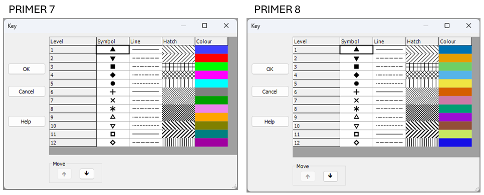
Fig. 15.1 New default colour palette in PRIMER 8 (at right) compared to the old default colour palette in PRIMER 7 (at left).
In developing these new defaults, we used the following resources:
- "Coloring for Colorblindness" - David Nichols
- "Points of view: Color blindness" - Bang Wong
- Paul Tol's Notes: Colour schemes and templates - Paul Tol
We especially appreciated David Nichols' online tool, which allowed us to play with colour schemes and get a feel for how different schemes would look for people who experience colour differently, due to various forms of alterations to their color vision, including protanopia, deuteranopia, tritanopia or deuteranomaly. We ended up with the following pallette:
- PRIMER 8 default colours - (see the left-hand column labeled 'True' when you follow this link).
To get there, we borrowed the base colour scheme from Wong (2011) . We then simply re-arranged the order of the colours and extended the scheme to 12 colours which we felt, as much as possible, would still appear well-differentiated from one another, right across the range of different forms of colour vision deficiency.
Compatibility with earlier versions of PRIMER
If you have an existing *.pri or *.pwk file that has been opened and saved in PRIMER 7, then it will carry around the default colour palette from PRIMER 7 with it. Thus, when you open up a PRIMER 7 file in PRIMER 8, those old default colours from PRIMER 7 (or whatever other colours you tweaked and saved in your file's graphics) will be used. To get rid of all of the older colours, and hence see the new default colour palette in P8 when you create a new graphic, please save the file as an Excel file and then import the data, fresh, into PRIMER 8.