13.3 Example: Mussel sizes in the Gulf of Alaska
To implement the new standardisation routine in PRIMER 8 and (simultaneously) demonstrate the utility of analysing cumulative percentages, we shall examine a study by Dowling (2021) , who measured the lengths of mussels (Mytilus trossulus) at two glacially influenced estuaries in the Gulf of Alaska, USA. Data were counts of mussels falling into each of 35 size classes (0-2 mm, 2-4 mm, etc. up to 90-92 mm) at each of 15 inter-tidal sites that were classified as being influenced predominantly by glacial, riverine or oceanographic hydrological conditions (Fig. 13.2). Each size class is a variable and these variables, themselves, have a natural quantitative ordering. We are interested in the shape of the distribution of size classes, and not in the total number of mussels at any given site. Are mussel size frequency distributions affected by the environmental conditions at these sites? What we want here is to standardise the data by sample totals (hence, transforming them to percentages), but – in addition – it makes sense to consider them as cumulative percentages (from the smallest to the largest mussels), as opposed to treating these variables as if they were unordered.
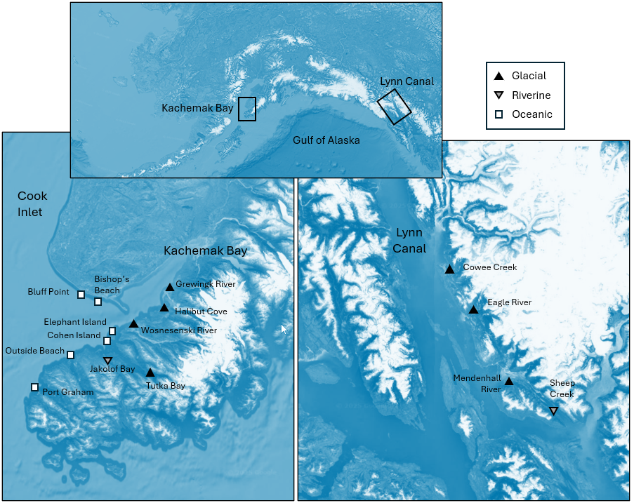
Fig. 13.2 (adapted from Fig. 1 in Dowling (2021) ). Maps of the sites at which size-distributions of mussels were measured in each of two ecoregions: Kachemak Bay (left) and Lynn Canal (right). The top map shows the locations of these two ecoregions in Alaska. White squares represent ocean-influenced sites; solid black triangles represent glacially-influenced sites, and upside-down grey triangles represent freshwater-influenced sites. Satellite images: Google Earth.
Input data and standardise
- Open up the data file 'Gulf_of_Alaska_mussels.pri' (located in the folder 'Examples_P8' > 'Gulf_of_Alaska_mussels'), and notice that the names of the variables here are the (numerical) size classes, listed in order. The values in the data sheet are the raw abundances (counts) of the numbers of mussels in each size class at each of the above sites (Fig. 13.2).
![05.Mussel_data[i].png](https://learninghub.primer-e.com/uploads/images/gallery/2025-12/05-mussel-data-i.png)
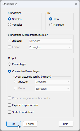
- From the 'Gulf_of_Alaska_mussels' data sheet, click Pre-treatment > Standardise.... Choose to standardise samples by total and output cumulative percentages, as shown in the dialog below.
The resulting datasheet of cumulative percentages (called 'Data1') will look like this:
![06.Cumul_Perc_mussels[i].png](https://learninghub.primer-e.com/uploads/images/gallery/2025-12/06-cumul-perc-mussels-i.png)
View size-distribution profiles
- We can use a line plot to view the size-distribution profiles across the sites. From 'Data1' click Plots... > Line Plot... and choose to plot ($\bullet$Samples), then click 'OK', as shown below.†
![06.Line_plot_mussels[i].png](https://learninghub.primer-e.com/uploads/images/gallery/2025-12/06-line-plot-mussels-i.png)
The resulting plot of cumulative size-distribution profiles for each site looks like this:
![07.Line_plot_results_mussels[i].png](https://learninghub.primer-e.com/uploads/images/gallery/2025-12/07-line-plot-results-mussels-i.png)
Some sites, such as Bishop's Beach and Bluff Point, are dominated by small-sized mussels (new recruits), whereas other sites (such as Halibut) tend to have a greater percentage of larger mussels.
- It would be helpful to see these lines in different colours corresponding to the different influences (glacial, riverine or oceanic). From the plot produced at step 3 (called 'Graph1'), click Graph > Sample Labels & Symbols... and choose to plot Symbols: $\checkmark$ By factor Influence, then click 'OK'.
Our plot of cumulative size-distribution profiles, now showing the different influences, looks like this:
![08.Line_plot_results_mussels+influence[i].png](https://learninghub.primer-e.com/uploads/images/gallery/2025-12/08-line-plot-results-musselsinfluence-i.png)
Ordination and analysis of size-frequency distributions
Let's look at an MDS plot of Manhattan distances between all pairs of cumulative curves here to get a multivariate representation of the relationships among these size frequency distributions. We consider the Manhattan distances here to be a really useful and straightforward way of calculating relationships among these cumulative profile curves. Specifically, to get the Manhattan distance between two cumulative profiles, we calculate the absolute difference between the two curves at each size class, then sum these absolute differences up across all of the size classes. So, the larger the 'gaps' are between any two profiles, the bigger the Manhattan distance.
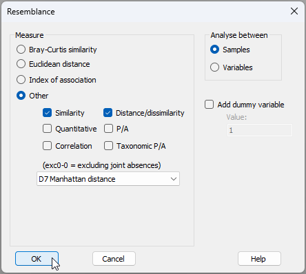
- Calculate Manhattan distances among the profiles. From the standardised cumulative data in 'Data1', click Analyse > Resemblance… > (Measure $\bullet$Other > D7 Manhattan distance).
The resulting matrix will be called 'Resem1'.
![08b.Resem_Mussels[i].png](https://learninghub.primer-e.com/uploads/images/gallery/2025-12/08b-resem-mussels-i.png)
- Create a metric MDS plot. Note that, for this example, a metric MDS can be done quite successfully.¶ From the 'Resem1' matrix, click Analyse > MDS > Metric MDS (mMDS / tmMDS)… > (Choice of intercept: $\bullet$Metric MDS (zero intercept) ), OK. Put symbols on the resulting MDS plot (called 'Graph2' in the Explorer tree) corresponding to the factor 'Influence' by clicking Graph > Sample Labels & Symbols..., and the resulting ordination graphic will look like the one shown below.
![11.mMDS plot_mussels[i].png](https://learninghub.primer-e.com/uploads/images/gallery/2025-12/11-mmds-plot-mussels-i.png)
This plot shows fairly clear differences in the size-class distributions for mussels growing under the influence of glacial, riverine and oceanic conditions. There is clearly a gradient across the plot in the size-class distributions of mussels, from sites on the left (typically under oceanic influences) having proportionately more small-sized mussels (e.g., Bishop's Beach and Bluff Point), through to those on the right (typically experiencing more glacial influences) which have a greater proportion of large-sized mussels (e.g., Cowee Creek and Halibut). We can formally test the effects of influence on size-class distributions of mussels at these sites formally using ANOSIM, also taking into account potential differences in the two ecoregions (Kachemak Bay and Lynn Canal).
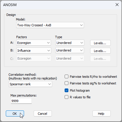
- Do a two-way crossed ANOSIM for the factors of 'Ecoregion' and 'Influence' on mussel size-class distributions. From the 'Resem1' matrix, click Analyse > ANOSIM..., then choose Design > Model: Two-way Crossed - AxB, with the two factors being A: Ecoregion (unordered) and B: Influence (also unordered), leave all other options as the defaults and click OK, like so:
The ANOSIM results are shown below.
![12.ANOSIM_mussels_results[i].png](https://learninghub.primer-e.com/uploads/images/gallery/2025-12/12-anosim-mussels-results-i.png)
These results are quite clear. There is no effect of Ecoregion (ANOSIM $R$ = -0.286, $P$ > 0.80), but Influence has a statistically significant effect on the size-class distributions of these mussels (ANOSIM $R$ = 0.483, $P$ < 0.01). Moreover, the pair-wise tests show significantly different size-class distributions for mussels at sites under glacial vs oceanic influences (ANOSIM $R$ = 0.679, $P$ < 0.005), but distributions of mussels at sites under riverine influences (amber symbols in the mMDS plot) apparently lie somewhere in-between these two and they do not differ significantly from either of them ($P$ > 0.40 for both tests).
Plot mean size-distribution profiles
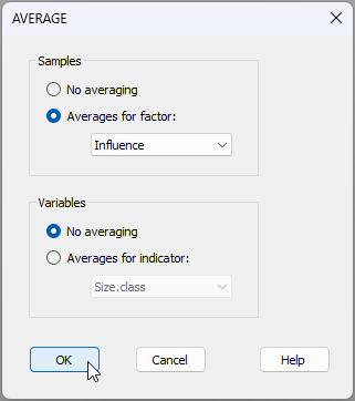
- We can show the mean size-distribution profiles for each of these three 'Influence' groups, as follows. From the full set of cumulative profiles for all of the sites held in 'Data1', click Tools > Average... and choose (Samples $\bullet$Averages for factor: Influence), then click 'OK', like so:
This will produce a data file with just three profiles in it, called 'Data2':
![13.Average_profiles_mussels[i].png](https://learninghub.primer-e.com/uploads/images/gallery/2025-12/13-average-profiles-mussels-i.png)
From 'Data2', click Plots > Line Plot..., choose to plot ($\bullet$Samples), then click 'OK', and we have the following graphical output ('Graph8').
![14.Mean_profiles_mussels[i].png](https://learninghub.primer-e.com/uploads/images/gallery/2025-12/14-mean-profiles-mussels-i.png)
† It is a new feature in PRIMER 8 to be able to create a line plot of samples (across variables). PRIMER 7 only permitted line plots to be drawn of variables (across samples).
¶ We would typically use non-metric MDS for most cases, but in situations where the Shepard diagram shows an approximately linear relationship between the Euclidean distances in the MDS plot and the original dissimilarities, we can move towards using a metric MDS. Although threshold metric MDS is often then our next 'go-to' tool, we can actually go for a fully metric MDS in cases where a zero intercept is also feasible yet without incurring too much stress, as in the present case. We accumulate advantages for interpretation (i.e., distances on the MDS plot = original dissimlarities) the further we can get down the path from nMDS → tmMDS → mMDS. The Shepard diagram for the present case ('Graph3'), demonstrating both linearity and the perfect suitability of a zero intercept, is shown below.
![10.Shepard_plot_mussels_mMDS[i].png](https://learninghub.primer-e.com/uploads/images/gallery/2025-12/10-shepard-plot-mussels-mmds-i.png)