8.3 Example: Repeated measures - Victorian avifauna
The study design
An example of a repeated-measures sampling design (Fig. 8.5) is provided in a study of Victorian avifauna by Mac Nally & Timewell (2005) . The data consist of counts of $p$ = 27 nectarivorous bird species at each of eight sites having different levels of flowering intensity within the Rushworth State Forest in Victoria, Australia. One pair of sites (S1, S2) had heavy flowering ('good' sites), another pair (S3, S4) had intermediate flowering ('medium' sites), and a third pair (S5, S6) had relatively little flowering ('poor' sites). Two sites (S7, S8) were near the good sites (called 'adjacent' sites) and these were also sampled to explore the potential for 'spill-over' effects. Sampling of the bird assemblages was done using a strip transect method and each of the 8 sites was sampled repeatedly at four different time points.
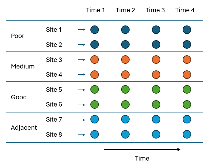
Fig. 8.5 Schematic diagram of the repeated-measures sampling design to study bird assemblages in response to flowering intensity by Mac Nally & Timewell (2005) .
Input data and select a pre-treatment option
- Start running PRIMER 8, then click File > Open... to open the data file named 'Victoria_avifauna_survey.pri' (found inside the 'Examples_P8 > Victoria_avifauna' folder).
![24.Vic_surv_data[i].png](https://learninghub.primer-e.com/uploads/images/gallery/2025-12/24-vic-surv-data-i.png)
- From the 'Victoria_avifauna_survey' data sheet in the Explorer tree inside PRIMER, click Plots > Shade Plot. It is evident from the resulting shade plot ('Graph1) that there is a lot of 'white space', and the range of abundance values is from 0 to 70. Thus a mild (e.g., square-root) transformation would be a sensible choice here as a pre-treatment option, to balance the relative importance of abundant vs rare taxa in the calculation of the resemblance measure.
![25.Shade_Vic_surv_data2[i].png](https://learninghub.primer-e.com/uploads/images/gallery/2025-12/25-shade-vic-surv-data2-i.png)
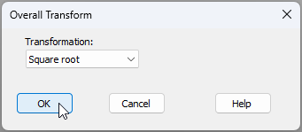
- From the 'Victoria_avifauna_survey' data sheet, click Pre-treatment > Transform(overall)..., and in the 'Overall Transform' dialog window, choose 'Transformation: Square root from the drop-down menu, then click 'OK'.
The square-root transformed data are now provided in a data sheet called 'Data1':
![26b.Vic_surv_data-sqrt[i].png](https://learninghub.primer-e.com/uploads/images/gallery/2025-12/26b-vic-surv-data-sqrt-i.png)
- From the square-root transformed data ('Data1'), click Plots > Shade Plot, and you will see in the resulting shade plot graphic (called 'Graph2' in the Explorer tree) a more even distribution of abundance information across all bird taxa (less white space), with transformed abundance values now ranging from 0-8.
![27.Shade_Vic_surv_sqrt[i].png](https://learninghub.primer-e.com/uploads/images/gallery/2025-12/27-shade-vic-surv-sqrt-i.png)
Calculate dissimilarities and visualise patterns
Now we are ready to calculate dissimilarities (or similarities) based on the transformed data and use this to visualise patterns of relationships among the sampling units, based on the fauna they contain, using ordination methods.
- From the square-root transformed data ('Data1'), click Analyse > Resemblance... and in the 'Resemblance' dialog window, choose (Measure: $\bullet$Bray-Curtis similarity) and (Analyse between: $\bullet$Samples), then click OK. This will yield a resemblance matrix item in the Explorer tree, called 'Resem1'.
![28.Resem_Vic[i].png](https://learninghub.primer-e.com/uploads/images/gallery/2025-12/28-resem-vic-i.png)
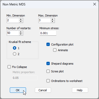
- From the Bray-Curtis resemblance matrix ('Resem1'), click Analyse > MDS > Non-metric MDS (nMDS).... Leaving all of the defaults in the 'Non Metric MDS' dialog window, click 'OK'.
You will see a new item called 'MultiPlot1' in the Explorer tree, which contains 4 different graphics. Click on the '+' symbol next to the word 'MultiPlot1' in the Explorer tree, like so:
![29c.multiplot_unfurl_2[i].png](https://learninghub.primer-e.com/uploads/images/gallery/2025-12/29c-multiplot-unfurl-2-i.png)
and this will "unfurl" (in the Explorer tree) to show all of the graphics in the MultiPlot:
- 'Graph3' (the 2D MDS plot),
- 'Graph4' (the Shepard diagram for the 2D MDS plot),
- 'Graph5' (the 3D MDS plot), and
- 'Graph6' (the Shepard diagram for the 3D MDS plot).
You can also simply click any of the individual graphics within the 'MultiPlot1' graphic itself to see it on its own.
- Click on 'Graph3' to see the 2D MDS plot. The default plot in the output here looks a bit messy at first:
![29_extra_Messy_default_MDS_[i].png](https://learninghub.primer-e.com/uploads/images/gallery/2025-12/29-extra-messy-default-mds-i.png)
We will do two things (visually) to this graphic to make it easier to see the potential effects of important factors in this study.
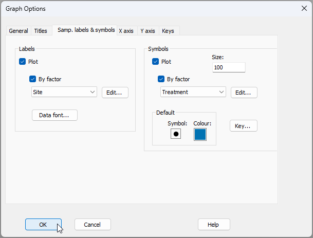
First, we will change the labels and symbols so that they correspond to spatial factors of interest. Click Graph > Sample Labels & Symbols... and change the Labels to reflect the factor of 'Site', and change the Symbols to reflect the factor of Treatment, as shown below, then click OK.
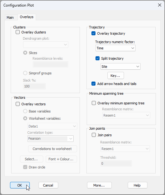
Second, we will superimpose a trajectory to connect observations from the same site through time. Click Graph > Special, then click on the 'Overlays' tab in the 'Configuration Plot' dialog, and under the word 'Trajectory', tick the box to $\checkmark$Overlay trajectory > Trajectory numeric factor: Time and $\checkmark$Split trajectory by Site, as shown below. Note that you can (optionally) click on the 'Key' button ( ) here to make the colours of individual Site trajectory lines match their Treatment colour, then click OK.
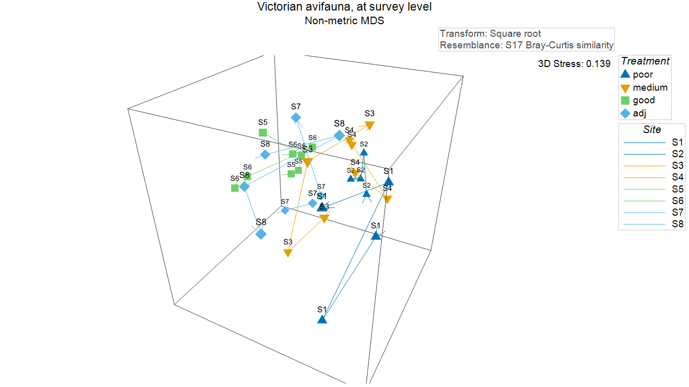
The resulting 2D nMDS graphic will look like this:
![33.2D_MDS_vic[i].png](https://learninghub.primer-e.com/uploads/images/gallery/2025-12/33-2d-mds-vic-i.png)
We can see here that there is a general pattern of gradual change in bird assemblages as you go from the 'good' (high flowering intensity) sites (in green) through the 'adjacent' (light blue) and 'medium' (orange) sites, towards the 'poor' sites (in dark blue); i.e., a sort of gradient from the lower left of the nMDS plot to the upper right. However, there is also quite a substantial difference in the bird assemblages seen at the two 'poor' sites (S1 vs S2), with S2 not really sitting in the appropriate place along the observed gradient. The variation through time (the overall length of each trajectory) also seems to differ somewhat across the sites.
An important thing to note here also is the relatively high stress of 0.216. This suggests that we should not read too much into any of the patterns we see on this 2D plot. Indeed, as the stress is higher than the usual 'rule-of-thumb' cut-off for interpretability of nMDS plots generally (stress = 0.20), we should really consider looking at the 3-dimensional nMDS ordination here instead.
- To look at the 3D MDS plot, click on 'Graph5' and start by doing the same two operations we did on the 2D plot, i.e., change the labels and symbols to correspond to 'Site' and 'Treatment', respectively, then superimpose trajectories through time for each site (and adjust the Key for the 'Site' factor so that the colour of the line for each site corresponds to the colour of the treatment to which it belongs).
It is difficult to get a real sense of the patterns being shown in a 3D plot unless you see it in motion. From 'Graph5', click Graph > Spin, and you will see a series of buttons at the top of the graphic that look like this:

Hit the 'play' button ( ) and the graphic will start to spin. The blue slider permits you to increase or decrease the speed of the spin and you can change the angle of your view of the 3D image by clicking and dragging your mouse on it. You can also hit the red dot to record the spinning action, as shown in the animated $*$.gif image below (click on the image below to enlarge your view and see this as it would appear within PRIMER).
The patterns we see here are similar to what we saw in the 2D plot. There is a suggestion of a gradual shift in the bird assemblages with changes in flowering intensity, but there are also apparently substantial differences between sites of a similar flowering intensity, particularly between the two 'poor' sites.
Run the PERMANOVA
We need to create a design file, then run the PERMANOVA model on these data to formally test hypotheses regarding the potential effects of these factors.
- From the Bray-Curtis resemblance matrix ('Resem1'), click PERMANOVA+ > Create PERMANOVA Design.... Click the 'Add row' button (
![Add_row_[i].png](https://learninghub.primer-e.com/uploads/images/gallery/2025-12/scaled-1680-/add-row-i.png) ) until there are (in this case) three rows (one for each factor): 'Treatment', 'Site' and then 'Time'. Next, we shall nominate 'Treatment' as a 'Fixed' factor, and 'Time' as a 'Random' factor. Note that individual sites are the specific items that are repeatedly sampled. Therefore, we need to specify 'Site' as a factor of type 'Subject/whole plot error'. The resulting Design file (called 'Design1') will look like this:
) until there are (in this case) three rows (one for each factor): 'Treatment', 'Site' and then 'Time'. Next, we shall nominate 'Treatment' as a 'Fixed' factor, and 'Time' as a 'Random' factor. Note that individual sites are the specific items that are repeatedly sampled. Therefore, we need to specify 'Site' as a factor of type 'Subject/whole plot error'. The resulting Design file (called 'Design1') will look like this:
![Add_row_[i].png](https://learninghub.primer-e.com/uploads/images/gallery/2025-12/add-row-i.png)
![35._Design_repeated-measures_vic_2[i].png](https://learninghub.primer-e.com/uploads/images/gallery/2025-12/35-design-repeated-measures-vic-2i.png)
Now we are ready to run the analysis.
- From the Bray-Curtis resemblance matrix ('Resem1'), click PERMANOVA+ > PERMANOVA, take all of the defaults in the dialog and click 'OK'.
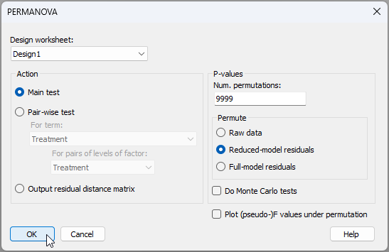
The resulting PERMANOVA output file ('PERMANOVA1') will look like this:
![37.PERMANOVA-output-vic_2[i].png](https://learninghub.primer-e.com/uploads/images/gallery/2025-12/37-permanova-output-vic-2-i.png)
There is significant variability from site to site within each of the different flowering intensity treatments ($F_{(4,12)}$ = 2.37, $P$ = 0.0071). Over and above this site-to-site variation, however, there was only weak evidence of any treatment effects ($F_{(3,4)}$ = 2.02, $P$ = 0.068).
These results make perfect sense by reference to the patterns seen in the nMDS plot(s), where we could discern a pattern of change in bird community structure with differences in flowering intensity, but also saw substantial site-to-site variation.
We might consider analysing the data again but without any pre-treatment transformation, in order to emphasise changes in the more abundant birds rather more (try it!). Another idea would be to analyse some other aspect or variable associated with these bird assemblages in response to the study design, such as species richness, or the univariate abundances of one or more dominant species (such as the Red wattlebird).
Ultimately, we might consider sampling a larger number of sites to increase the power of the test for Treatment effects (4 degrees of freedom in our denominator was not really very many). Choosing sites to be as similar as possible to one another in other respects (environmentally) in order to reduce site-to-site variation would also be wise.