10.3 Interaction plot
What is an 'interaction plot'?
Although main effects plots can help us to visualise the main effects of factors and permit us to guage their relative importance in explaining overall variation, centroids based on individual main effects ignore all other factors in the study design. However, many systems are interactive, and if two (or more) factors do interact with one another, then what we generally want is to visualise how differences in the positions of centroids for a given factor vary across levels of one or more other factors. Thus, it is the centroids based on the cells in the (crossed) study design that are of interest here.
In an interaction plot, we calculate and then show in an ordination diagram a centroid for each combination of levels of factors listed in the design file. The centroids of the combinations of factor levels, and distances/dissimilarities among them, are calculated in the full high-dimensional space of a chosen resemblance measure.
In PRIMER 8, an interaction plot can be obtained directly from the resemblance matrix among replicates for any design up to three factors. Alternatively, an interaction plot can manually be produced for any number of factors via the following three steps:
- From a resemblance matrix, choose Edit > Factors... > Combine... and obtain a factor that consists of the combined levels of two or more factors of your choice.
- From the resemblance matrix, choose PERMANOVA+ > Distances Among Centroids... and calculate these on the basis of the combined factor you created in step 1.
- From the resemblance matrix produced at step 2, choose Analyse > MDS and create an ordination of these combined-factor centroids (using whatever flavour of MDS you wish: mMDS, tmMDS or nMDS).
A two-way example
Veale et al. (2014) described a study of nearshore fish assemblages in the Leschenault estuary in Western Australia. For the set of data from this study that we will examine here (found in the file named 'Leschenault_fish_counts.pri, located in the 'Examples_P8 > Leschenault_fish' folder), fish assemblages were sampled using 21.5m seine nets on $n$ = 6 to 8 occasions in each of 4 seasons ('Sp' - Spring, 'S' - Summer, 'A' - Autumn and 'W' - Winter) at each of 4 regions ('B' - Basal, 'L' - Lower, 'U' - Upper and 'A' - Apex) of the estuary (Fig. 10.6).
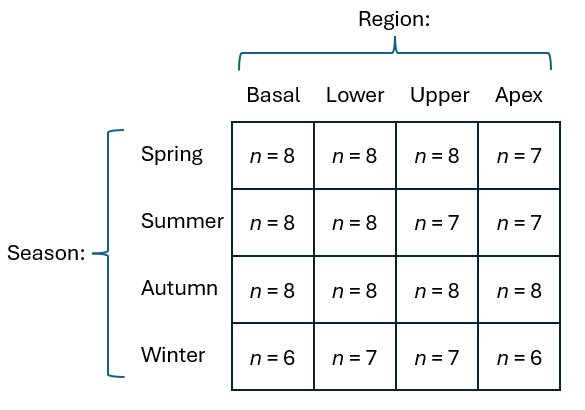
Fig. 10.6. Schematic diagram of a two-factor design, a subset of data from the study decribed by Veale et al. (2014) .
Given that many fish species tend to school (aggregate), a useful pre-treatment option here is to apply dispersion weighting (see Clarke et al. (2006a) ). After applying dispersion weighting (using groups corresponding to the combined factor of Season-by-Region), followed by a square-root transformation, we can calculate Bray-Curtis resemblances and create a non-metric MDS plot among the replicate samples, as shown in Fig. 10.7.
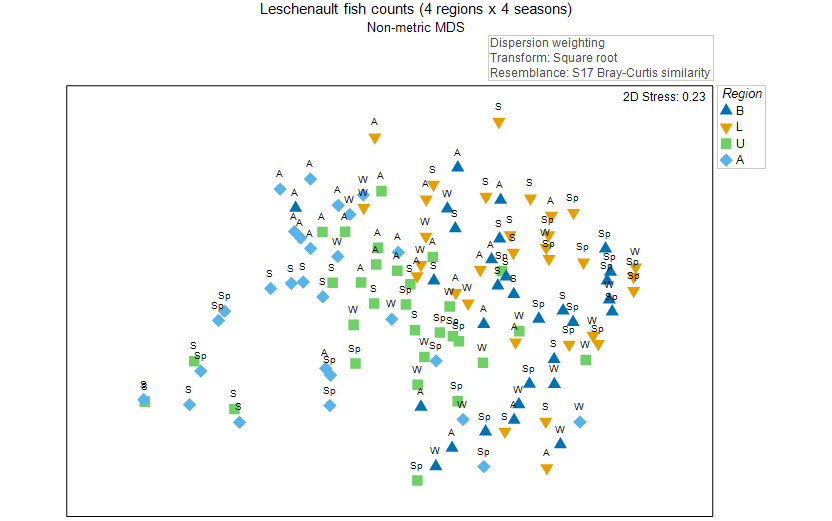
Fig. 10.7. Non-metric MDS of the individual sampling units from a two-way crossed study design of fish assemblages ( Veale et al. (2014) ). Symbols correspond to the factor of 'Region' ('B' = Basal, 'L' = Lower, 'U' = Upper, 'A' = Apex), and labels correspond to the factor of 'Season' ('Sp' = Spring, 'S' = Summer, 'A' = Autumn, 'W' = Winter).
This nMDS plot is pretty messy. It is difficult to see any clear seasonal or regional patterns in this plot, and the stress is also too high to permit useful interpretation. High stress and a rather messy "dog's breakfast" sort of display is unfortunately a rather typical thing to encounter when we try to create an ordination of a large number of individual samples (here there are 119).
PERMANOVA detects a significant interaction
When we run a PERMANOVA partitioning on this two-factor design (both factors are treated as fixed here) for these data (once again, on dispersion-weighted data that have been square-root transformed and on the basis of the Bray-Curtis resemblance measure), we see the following:
![08.PERMANOVA_results_Leschenault[i].png](https://learninghub.primer-e.com/uploads/images/gallery/2025-12/08-permanova-results-leschenault-i.png)
There is clearly a highly significant interaction between Season and Region in their effects on these fish assemblages ($F_{9,103}$ = 1.83, $P$ = 0.0001). An interaction plot (i.e., an ordination plot of the centroids for all 16 Season$\times$Region combinations of factor levels, calculated in the full high-dimensional space of the chosen resemblance measure) is shown in Fig. 10.8.
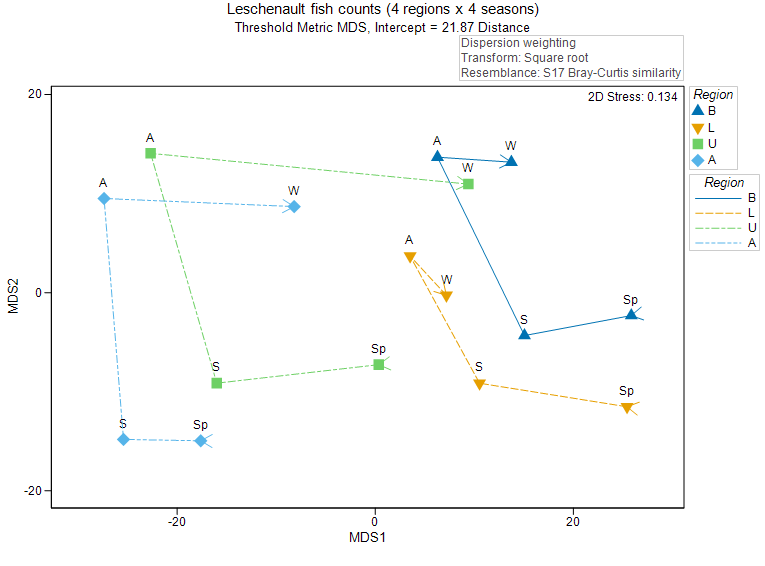
Fig. 10.8. Non-metric MDS of the Season$\times$Region centroids. Symbols correspond to the factor of 'Region' ('B' = Basal, 'L' = Lower, 'U' = Upper, 'A' = Apex), and labels correspond to the factor of 'Season' ('Sp' = Spring, 'S' = Summer, 'A' = Autumn, 'W' = Winter). A trajectory connects the centroids sequentially through the seasons, separately within each region.
The interaction plot helpfully provides a much clearer picture of the patterns in these data by reference to the two factors. First, we can see, overall, that there is a spatial gradient of change in fish assemblages, from the Apex through to the Basal region (i.e., from left to right across the ordination plot). Second, there is a cyclical pattern of change in fish assemblages through the seasons that occurs within each of these regions (i.e., from spring, to summer, to autumn to winter).
Importantly, we can also see patterns that signal the potential reasons for detection of a significant two-way interaction here; the seasonal patterns do appear to differ for different regions of the estuary. For example, the shift from Autumn to Winter is much larger for Apex and Upper regions, compared to that observed for the Lower and Basal regions. Pair-wise comparisons confirm this observed pattern in the plot; specifically, the pair-wise test of Autumn vs Winter is not statistically significant for either the Basal or the Lower region ($P$ > 0.25 in both cases), but the shift is strongly significant for the Upper and Apex regions ($P$ < 0.001 in both cases).
Cautionary notes
-
Measures of variability. Just as was previously articulated for main effects plots, interaction plots of centroids should really show some measure of variability associated with each of the centroids, if possible. Some type of bootstrap or jacknife approach might be used to advantage here, but this has not yet been implemented for these plot types in PRIMER (yet). Centroids calculated from fewer samples will tend to look more variable/spread out on the plot for the reasons already discussed at the end of section 10.2. However, the sample sizes (per cell) generally do not differ much from one another for centroids shown in interaction plots, so this issue will not typically pose concerns for interpretation.
-
Stress and interactions. Each dataset is different, and in some cases we may not be able to easily discern the reasons behind a significant (or non-significant) interaction between two (or more) factors detected by PERMANOVA, simply by examining an interaction plot as we have done above. Although we can expect that the interaction plot will help clarify genuine patterns, our success in being able to infer finer aspects of interactions from an interaction plot will depend critically on the stress of that plot. We should always give preferential credence to the PERMANOVA results (for the main test and also for any subsequent pair-wise tests), because it operates in the space of the full dissimilarity matrix (hence has no stress).
¶To do a formal test examining this pattern of cyclicity, see section 9.2 regarding tests for groups of covariates in PERMANOVA, and its application for testing cyclical models.