6.8 Example: two-way crossed PERMANOVA allowing heterogeneity
We shall look at the diets of $N$ = 346 juvenile steelhead / rainbow trout (Oncorhynchus mykiss) obtained from 3 different rivers draining into Hood Canal, in the state of Washington, USA.¶ Some of the fish caught had been reared in a hatchery (identifiable by a clipped fin), and some were wild, of natural origin. Scientists studying these fish wanted to understand more about how the location (i.e., the river system) and the rearing of the fish (hatchery or wild-type) might affect the diets of these juvenile salmonid fish, both in terms of what they were eating on average (i.e., centroids) and how variable their diets were (i.e., dispersion).
The data file (named 'Hood_Canal_juv_salmonid_diets.pri', found inside the 'Examples_P8 > Hood_Canal_fish' folder) contains abundances of $p$ = 44 taxa found in the stomachs of individual fish (obtained by flushing). Note that each row of the file is an individual juvenile fish, and each column is a variable corresponding to items found in the stomachs of these fish (insects of various types, molluscs, etc.). The factor 'Hatchery' indicates whether the fish was hatchery-reared ('H') or wild type ('W'). The factor 'River' indicates which river system each fish was sampled from ('Dewatto', 'Duckabush', or 'Skokomish'). These data are unbalanced, as there is natural uncertainty regarding how many of the fish caught would end up being of hatchery origin. The number of replicates in each cell of the 2-factor crossed design is shown in Table 6.1 below.
Table. 6.1. Sample sizes ($n_{ij}$) in each of the 3 $\times$ 2 = 6 cells of the 2-factor crossed study design examining salmonid diets from Hood canal.
| Dewatto | Duckabush | Skokomish | Total | |
|---|---|---|---|---|
| Wild | 61 | 114 | 103 | 278 |
| Hatchery-reared | 35 | 22 | 11 | 68 |
| Total | 96 | 136 | 114 | 346 |
Pre-treat data, then calculate resemblances
- Open data in PRIMER - Start by opening the file in PRIMER by clicking File > Open... and navigating to the file named 'Hood_Canal_juv_salmonid_diets.pri'.
![14.Data_salmon_diets[i].png](https://learninghub.primer-e.com/uploads/images/gallery/2025-12/14-data-salmon-diets-i.png)
- Standardise data - We first need to standardise the data by total sample abundances (rows) to account for the fact that individual fish are different sizes and naturally would have had a different volume of prey in their stomachs at the time each one was caught. Click Pre-treatment > Standardise... > (Standardise: $\bullet$Samples) & (By: $\bullet$Total) & (Output: $\bullet$Percentages), then click 'OK'. The resulting sheet of standardised data will be called 'Data1'.
- Transform data - From the standardised data ('Data1' in the Explorer tree), apply a square-root transformation by clicking Pre-treatment > Transform(overall).... Choose Transformation: Square root, then click 'OK'. This will create a data sheet of standardised and transformed data called 'Data2'.
- Calculate resemblances - From the standardised and transformed data ('Data2' in the Explorer tree), calculate Bray-Curtis resemblances among all pairs of individual fish by clicking Analyse > Resemblance..., then choose (Measure $\bullet$Bray-Curtis similarity) & (Analyse between $\bullet$Samples), and click 'OK'.
The resulting Bray-Curtis resemblances will be shown in the item named 'Resem1' in the Explorer tree, as shown below:
![18.Resem_matrix_salmonid_diets[i].png](https://learninghub.primer-e.com/uploads/images/gallery/2025-12/18-resem-matrix-salmonid-diets-i.png)
Test for homogeneity of dispersions across the cells of the 2-way design
Let's test for heterogeneity of dispersions among the cells in this 2-way crossed design.
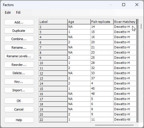
- Create a combined factor - First, create a combined factor consisting of all combinations of 'River' and 'Hatchery'. Click Edit > Factors, click on the button labeled Combine..., then click on the 'Factors...' button. Next, click on each of the factors of 'River' and 'Hatchery' in turn (shown in the 'Available:' column on the left), then click on '>' to move them over to the 'Include:' column on the right.
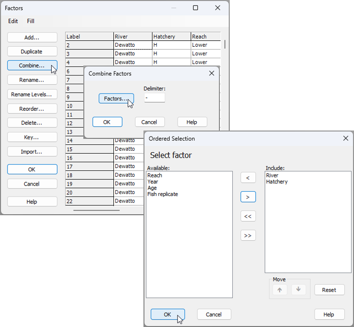
You will need to click 'OK' in both the 'Ordered Selection' dialog box, and also the 'Combine Factors' dialog box (as shown above), which will return you to the 'Factors' dialog box, where, if you scroll to the right, you should now see your newly created combined factor, called 'River-Hatchery' (see below):
Click 'OK' and you are ready for the next step.
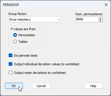
- Do a PERMDISP test - Let's do the test for homogeneity of multivariate dispersions across the cells corresponding to this combined factor. From the 'Resem1' matrix, click PERMANOVA+ > PERMDISP > (Group factor: River-Hatchery) & (P-values are from $\bullet$Permutation) & ($\checkmark$Do pairwise tests) & ($\checkmark$Output individual deviation values to worksheet).
The output shows a highly significant result ($F_{5,340}$ = 16.535, $P$ = 0.0001), indicating there are highly significant differences in dispersion (variability in the diets) across these 6 cells.
![22.PERMDISP_output_salmonids[i].png](https://learninghub.primer-e.com/uploads/images/gallery/2025-12/22-permdisp-output-salmonids-i.png)
The mean distance-to-centroid values also show that for each river system, there is apparently greater dispersion (variability in diets) for the fish that were hatchery-reared, compared to the wild-type fish, on average; however, not all pairwise comparisons were statistically significant in this regard (e.g., for the Dewatto comparison of 'H' vs 'W', $t$ = 0.547 and $P$ > 0.50). Also provided in the output are the individual deviation values; that is, the distance to the cell centroid for each salmonid in the Bray-Curtis space. These are provided in the item named 'Data3' of the Explorer tree.
- Examine dispersion differences among cells - Let's create a means plot of the deviations from cell centroids as a useful way to visualise differences in dispersions (on average) across the cells. From the data sheet 'Data3', click Plots > Means Plot... > (Group factor: River-Hatchery) and untick the box in front of the words '$\square$Join means', then click 'OK'.
![23.Means_plot_salmonids_dialog[i].png](https://learninghub.primer-e.com/uploads/images/gallery/2025-12/23-means-plot-salmonids-dialog-i.png)
You should see the following plot ('Graph1'):
![24.Means_plot_deviates_salmonids[i].png](https://learninghub.primer-e.com/uploads/images/gallery/2025-12/24-means-plot-deviates-salmonids-i.png)
This plot suggests that the differences in the dispersions between the hatchery-reared and wild-type fish (with hatchery-reared fish being, on average, more variable in their diets) was greatest in the Skokomish river.
Test for equality of centroids, allowing for heterogeneous dispersions among cells.
Heterogeneity in dispersions among the cells of the study design is very clear and significant, and the number of replicates per cell is quite unbalanced; thus, we should run a two-way PERMANOVA examining the potential effects of river and hatchery-rearing on salmonid diets allowing for these differences in dispersions. We shall create an appropriate design file, then run the PERMANOVA analysis.
- Create a design file - From the 'Resem1' matrix, click PERMANOVA+ > Create PERMANOVA Design... to create an appropriate design file, as follows:
- Add a row by clicking on the button that says 'Add row' (
![Add_row_[i].png](https://learninghub.primer-e.com/uploads/images/gallery/2025-12/scaled-1680-/add-row-i.png) ), so there will be two rows in the design file, one for each factor in the design.
), so there will be two rows in the design file, one for each factor in the design. - In the first row, click in the blank cell in the first column and choose the factor of 'River', then in the second row, choose the factor of 'Hatchery'. These are both fixed and are crossed with one another, so no further changes to the design file are needed.
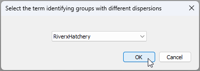
- Under the word 'Dispersions', tick the box that says '$\checkmark$Allow for heterogeneity' and click on the 'Groups' button. In the resulting pop-up box that says 'Select the term identifying groups with different dispersions' choose 'RiverxHatchery', then click 'OK'.
![Add_row_[i].png](https://learninghub.primer-e.com/uploads/images/gallery/2025-12/add-row-i.png)
The resulting design file (called 'Design1') will look like this:
![25.PERMANOVA_2-way_design_Allow_het.disp_salmonids[i].png](https://learninghub.primer-e.com/uploads/images/gallery/2025-12/25-permanova-2-way-design-allow-het-disp-salmonids-i.png)
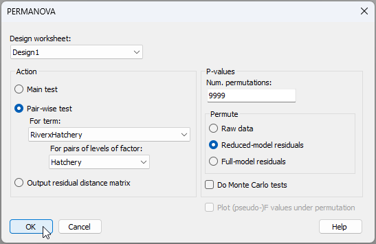
- Run a 2-way PERMANOVA (main test) - Now that we have the design file, we can run the PERMANOVA analysis. From the 'Resem1' matrix, click PERMANOVA+ > PERMANOVA.... Choose (Design worksheet: Design1) & (Action: $\bullet$Main test), with everything else in the dialog being left as the defaults, then click 'OK'.
![26.PERMANOVA_2-way_dialog_run[i].png](https://learninghub.primer-e.com/uploads/images/gallery/2025-12/ysC26-permanova-2-way-dialog-run-i.png)
The results of the analysis (in the item called 'PERMANOVA1' in the Explorer tree), show that there is a statistically significant interaction between the two factors of River and Hatchery in their effects on salmonid diets ($F_{2,44.21}$ = 4.20, $P$ = 0.0001).
![27.PERMANOVA_main_salmon[i].png](https://learninghub.primer-e.com/uploads/images/gallery/2025-12/27-permanova-main-salmon-i.png)
A casual glance at the expectations of the means squares and the construction of the $F$ statistics for each term in the model shows the complexity underlying these tests performed by the PERMANOVA routine.
![27b.PERMANOVA_main_salmon_EMS.etc[i].png](https://learninghub.primer-e.com/uploads/images/gallery/2025-12/27b-permanova-main-salmon-ems-etc-i.png)
It should also be noted, in passing, that we have used Type I SS here (sequential tests) and, as our sample sizes are unbalanced, the order in which we have chosen to fit these terms will matter to the results. We leave it up to the reader to consider re-running the analysis after changing the order of the factors (if desired) and/or to fit the PERMANOVA model using a different choice of sums of squares for the partitioning.
- Pair-wise tests - A natural next step, having observed a significant interaction, is to do pair-wise comparisons. We can consider two different sets of pair-wise comparisons that would each be of interest:
- (i) compare the diets for hatchery-reared fish vs wild-type fish separately within each river; and/or
- (ii) compare the diets for fish caught in different rivers (there will be three tests here: one for every pair of rivers) separately for each of the hatchery-reared fish and the wild-type fish.
The pair-wise tests can be done in a way that also allows for heterogeneity in dispersions. To pursue (i), from the resemblance matrix ('Resem1'), click PERMANOVA+ > PERMANOVA.... Choose (Design worksheet: Design1) & (Action: $\bullet$Pair-wise test > For term: RiverxHatchery > For pairs of levels of factor: Hatchery), with everything else being left as the defaults, then click 'OK'.
The results of these tests (i) are shown below in the output file 'PERMANOVA2'.
![30.Pairwise_results1[i].png](https://learninghub.primer-e.com/uploads/images/gallery/2025-12/30-pairwise-results1-i.png)
They show that, although there were no significant differences in the diets of hatchery-reared vs wild-type fish for the Dewatto river ($t_{68.67}$ = 1.107, $P$ > 0.25), there were differences between them detected in both the Duckabush ($t_{27.04}$ = 1.655, $P$ < 0.02) and Skokomish ($t_{11.24}$ = 2.67, $P$ < 0.001) river systems.
We can also do a set of tests comparing diets of fish in different rivers (ii) by repeating this procedure in precisely the same way, but choosing '(Action: $\bullet$Pair-wise test > For term: RiverxHatchery > For pairs of levels of factor: River)' in the PERMANOVA dialog instead (all else remaining the same). The results of those analyses are shown below ('PERMANOVA3'):
![30.Pairwise_results2[i].png](https://learninghub.primer-e.com/uploads/images/gallery/2025-12/30-pairwise-results2-i.png)
From this, we see that the diets of fish caught in each of the three rivers systems differed significantly from one another, whether they were hatchery-reared or wild-type fish (all pairwise tests had $P$ < 0.015).
Visualise centroid and dispersion differences
We may consider using a bootstrap average plot for a holistic view, along with ordinations of subsets of the data (e.g., corresponding to pair-wise tests), to elucidate differences in centroids and/or dispersions that may have been detected among cells in our study design. We shall demonstrate each of these with the salmonid dataset next.
- Holistic view: bootstrap averages - One useful way to visualise differences in centroids and in dispersions among cells simultaneously in a two-way (or multi-way) design such as this is to create a bootstrap average plot on the combined factor. Although the process of averaging bootstrapped data loses the details regarding inter-sample relationships among the original individual replicate sampling units, this type of plot does have the advantage of permitting a holistic view of the overall study and relationships among the cells in a single plot.
For the salmonid data set, begin at the resemblance matrix ('Resem1') and click Analyse > Bootstrap Averages... and choose (Factor: River-Hatchery), then in the 'MDS' section of the dialog, click on the 'MDS options...' button  . This will bring up a separate dialog box, and under 'Choice of intercept:' choose ($\bullet$ Threshold metric MDS (non-zero intercept)), then click 'OK' (you can leave the defaults for all the rest).†
![31.Bootstrap_average_salmonids_dialog_total[i].png](https://learninghub.primer-e.com/uploads/images/gallery/2025-12/31-bootstrap-average-salmonids-dialog-total-i.png)
The resulting bootstrap-average plot ('Graph2' in the Explorer tree), after a few alterations to symbols and colours‡, looks like this:
![32._Boot.av.plot_salmonids[i].png](https://learninghub.primer-e.com/uploads/images/gallery/2025-12/32-boot-av-plot-salmonids-i.png)
From this plot, we can see the following patterns, further supporting results of the statistical tests we have done:
- There is generally greater dispersion (variability) in the diets of hatchery-reared fish (light colours) compared to wild-type fish (dark colours).
- A difference between the diets of hatchery-reared fish vs wild-type fish (a shift in centroid) was detected for the Duckabush river (light red vs dark red) and the Skokomish river (light green vs dark green), but not for the Dewatto river (light blue vs dark blue).
- There were differences in the diets of fish caught from different river systems when we considered (separately) either the hatchery-reared fish (light green, light red and light blue are all distinct from one another), or the wild-type fish (dark green, dark red and dark blue are also all quite distinct from one another).
- The interaction between the factors is explained largely by the difference in the diets between hatchery-reared vs wild-type fish being much larger for fish caught in the Skokomish river than for those caught in the other river systems. For the Dewatto river, neither centroid nor dispersion effects were detected.
There are two important additional things to note about the above bootstrap average plot:
- First, the default colours and symbols in this bootstrap average plot produced by PRIMER 8 have been altered in the image above to make it easier to see changes in centroid and/or dispersion for the factors of interest.‡
- Second, we must not forget that every symbol on this plot is an average, and the dispersion of averages is therefore going to reflect not just the dispersion of the original data, but also the sample size. More specifically, we already should expect that the larger the sample size, the smaller the group's dispersion is expected to appear, due simply to the central limit theorem.§ For this reason, we must take observed differences in dispersion seen in a bootstrap average plot with a certain grain of salt when sample sizes differ among the groups (as here). Examining individual plots of dispersions of replicate sampling units (for subsets of the data, if necessary, as in step 12 below) will help to clarify the extent of genuine underlying dispersion differences among groups.
- Detailed view: ordinations of subsets - Another way to visualise various aspects of these results is to 'zoom in' and examine ordination plots of sub-sets of the full dataset, such as those corresponding to pair-wise tests. This is a bit more direct than the bootstrap average approach, permitting investigation of the original inter-sample relationships among replicates, but of course each plot is restricted in its focus to a particular sub-set of the data, so the 'big-picture' information about relationships among all of the cells in the study design (as seen in the bootstrap average plot) is not able to be seen.
For example, let's consider aiming to visualise the pair-wise results from tests done according to point 10(i) above. We need to split the data into three groups according to the three river sytems and run nMDS on each one, removing the labels and showing symbols for the factor 'Hatchery' on the resulting plots. You could start from the standardised and transformed data sheet (called 'Data2' in the Explorer tree) and click on Tools > Split Data... > (Samples > $\checkmark$Split by factor: River). Rename the resulting 3 datasheets according to the appropriate 3 river names, and proceed from there to calculate Bray-Curtis, then nMDS in each case. Doing this yields the following graphics:
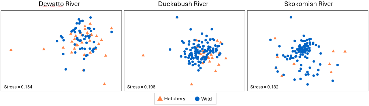
Relevant things to note about the above plots are:
- For the Duckabush river, there is no apparent difference between the diets of hatchery-reared vs wild-type fish in terms of either their centroids or their relative dispersions; this is in line with the non-significant test results for PERMDISP and PERMANOVA that were found (above) for this river.
- For the other two rivers (Duckabush and Skokomish), a shift in centroid and a change in dispersion is apparent in both nMDS plots, although the stress in both of these final 2D configurations is quite large (approaching 0.2). We should therefore refrain from making any further interpretations of fine-scale patterns.
A similar set of ordinations on sub-sets of data may also be constructed to help visualise pair-wise results from tests done according to point 10(ii) above. We shall leave it to the reader to consider examining those on their own, if desired.
¶Data courtesy of Katie Doctor-Shelby, formerly based at the Northwest Fisheries Science Centre, National Oceanic and Atmospheric Administration (NOAA), Seattle, WA, USA.
†Note: the default here is to calculate 50 bootstrap averages per group. This can take a long time to execute! You may wish to speed up the process by choosing to do just 25 or 30 bootstraps instead.
‡ If you click on the legend itself inside the bootstrap average plot, you will see a complete legend key, as shown below. To the left is the default legend in PRIMER 8, and to the right are the customised symbols and colours I chose for the example. I find that when I do a bootstrap average plot (or a plot of distances among centroids) where the 'averages' are actually 'cells' in a factorial design (as here, where we have 3 $\times$ 2 = 6 cells in a two-way crossed design), it is useful to create a colour and symbol scheme that will make it easy to compare levels of factors of interest. For example, in the present case, I used blue, red and green for the three different rivers, then chose a lighter tint for the hatchery-reared fish and a darker shade for the wild-type fish (see the 'customised' key on the right in the image below). I also used a common symbol for each river system as well (although one could use, say open vs closed symbols as another option here). However, if you wish to cater carefully for any type of colour-blindness, then you will find that the default colours now used in PRIMER 8 are designed especially to do this. You might also find that maintaining the use of different readily distinguishable symbols for all of the cells in the design is a good idea. For this example, see the default legend shown at left below, and the associated default bootstrap average plot below that.
![33.Key_comparison_salmonids_both[i].png](https://learninghub.primer-e.com/uploads/images/gallery/2025-12/33-key-comparison-salmonids-both-i.png)
![34._Boot.av.plot_salmonids_default_colours[i].png](https://learninghub.primer-e.com/uploads/images/gallery/2025-12/34-boot-av-plot-salmonids-default-colours-i.png)
§Recall the central limit theorem from classical univariate statistics. Let $Y$ be a random variable with an unknown distribution that has a mean of $\mu_Y$ and a variance of $\sigma_Y^2$. Now suppose you take a random sample of size $n$ with realised values $\lbrace y_1, y_2, \ldots, y_n \rbrace$ and calculate the average of that sample as: $\bar{y} = \sum_{i=1}^n y_i$. This average is then a random representative of variable $\bar{Y}$, which has a distribution that converges to a normal distribution, with a mean of $\mu_Y = \mu_{\bar{Y}}$ and a variance of $\sigma_{\bar{Y}}^2 = \sigma_Y^2/n$. Thus, it is clear that the distribution of the averages has a variance that gets smaller and smaller, the greater the sample size. Similarly, we expect the dispersion of averages (whether bootstrapped or otherwise) for a group of multivariate sampling units will get smaller and smaller (all else being equal) the larger the sample size of that group.