12.7 Example: Birds from Grand Forks
We shall implement a control chart on data from the North American Breeding Bird Survey (BBS) ( Sauer et al. (2019) ). We will specifically look at abundances of $p$ = 156 breeding birds from a single route in Grand Forks, British Columbia, Canada in a time series that includes 38 years of observation (annual surveys done between 1973 and 2016, but with a few years missing). Data are in the file 'Grand_Forks_BBS.pri' found in the 'Examples_P8' > 'Grand_Forks_birds' folder.
Input data, transform and calculate resemblances
- Bring the data in to a PRIMER 8 workspace (click File > Open...). It will look like this:
![07.BBS_dataset[i].png](https://learninghub.primer-e.com/uploads/images/gallery/2025-12/07-bbs-dataset-i.png)
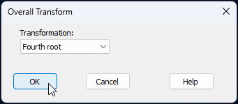
- Transform the data to fourth-roots. From the 'Grand_Forks_BBS' sheet, click Pre-treatment > Transform(overall)... and in the 'Overall Transform' dialog choose 'Fourth root', then click 'OK'.
The resulting data sheet will be called 'Data1' in the Explorer tree.
- Calculate Bray-Curtis resemblances. From the transformed data sheet, called 'Data1', click Analyse > Resemblance... and in the 'Resemblance' dialog window, choose (Measure: $\bullet$Bray-Curtis similarity) & (Analyse between: $\bullet$Samples), then click 'OK'.
The resulting resemblance matrix will be called 'Resem1', and will look like this:
![09.Resem_matrix_BBS[i].png](https://learninghub.primer-e.com/uploads/images/gallery/2025-12/09-resem-matrix-bbs-i.png)
Visualise the trajectory over time via ordination
We will create a non-metric MDS ordination of the samples through time, to visualise how the bird assemblages may have changed at Grand Forks over this 38-year period.
- From the 'Resem1' matrix, click Analyse > MDS > Non-metric MDS (nMDS)..., take all of the defaults in the 'Non Metric MDS' dialog and click OK.
The best 2D nMDS solution will be shown in the item called 'Graph1' (under 'MultiPlot1' in the Explorer tree. To clarify the patterns over time, we will make a few adjustments to the default output.
- Put the years on the plot as labels, and put a common symbol onto all of the sample points. From 'Graph1', click Graph > Sample Labels & Symbols..., and in the resulting dialog, choose (Labels > $\checkmark$Plot > ($\checkmark$By factor: Year) & (Data font... > Size: 75)) & (Symbols > $\checkmark$Plot) & untick the box in front of ($\Box$ By factor)). With these choices, the dialog will look like this:
![10.Graph_font_dialog_all[i].png](https://learninghub.primer-e.com/uploads/images/gallery/2025-12/10-graph-font-dialog-all-i.png)
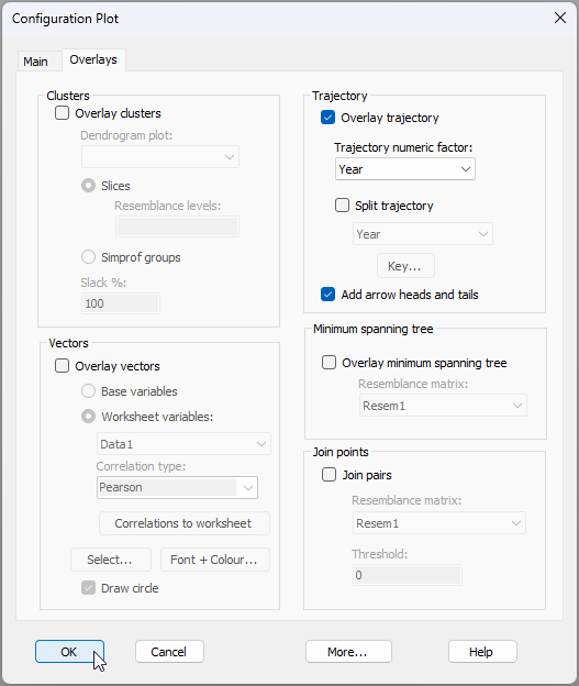
- Add a trajectory through time to connect consecutive years. From 'Graph1', click Graph > Special..., click the 'Overlays' tab, and under the word 'Trajectory', choose $\checkmark$Overlay trajectory > Trajectory numeric factor: Year, then click 'OK'. The dialog looks like this:
After these modifications, the resulting MDS plot, showing changes in bird assemblages through time, looks like this:
![12.nMDS_BBS_75[i].png](https://learninghub.primer-e.com/uploads/images/gallery/2025-12/12-nmds-bbs-75-i.png)
Create a 'fixed baseline' control chart
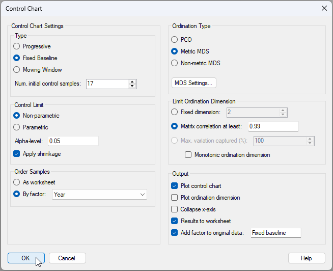
We will start by running a 'fixed baseline' type of control chart. In this case, we are comparing any individual time point at time $t$ with the centroid obtained using a fixed set of initial points. For this example, we will consider the first 17 points (through the 70's and 80's, up until 1989) as being 'in control'. For this type of plot, the number of initial 'in-control' points never changes, and all subsequent individual points are looked at by reference to those initial ones (ignoring the rest).
- From the 'Resem1' matrix, click PERMANOVA+ > Control Chart..., and choose:
- Type: ($\bullet$ Fixed Baseline) & (Num. initial control samples: 17).
- Control Limit: ($\bullet$ Non-parametric) & (Alpha-level: 0.05) & ($\checkmark$Apply shrinkage)
- Order Samples: $\bullet$ By factor: Year
- Ordination type: $\bullet$ Metric MDS and click 'MDS Settings...' and choose: Choice of intercept > $\bullet$ Threshold metric MDS (non-zero intercept) and click 'OK'
- Limit Ordination Dimension: $\bullet$ Matrix correlation at least: 0.99
- Output: ($\checkmark$Plot control chart) & ($\checkmark$Results to worksheet) & ($\checkmark$Add factor to original data: Fixed baseline).
The Control Chart dialog with these choices will look like this:
The resulting control chart looks like this:
![14.Control_Chart_graphic_BBS_Fixed_baseline[i].png](https://learninghub.primer-e.com/uploads/images/gallery/2025-12/51U14-control-chart-graphic-bbs-fixed-baseline-i.png)
From this graphic, we can see that the bird assemblages initially (through the 1990s) stayed effectively 'in control' (i.e., did not differ significantly from the baseline set of 17 years); however, from 2001 onwards, the bird assemblages shifted away from this baseline significantly in every year and did not 'return' to their former state. This accords well with the pattern of ongoing change we could see through time in the original MDS plot above.
Detailed results, including the choices made by the end-user, the value of the test-statistic ($T^2_{n_c}$) at each time-point, the value of the upper control-chart limit $U_{CL}$, identification of each time-point as being either 'in control' (where $T^2_{n_c} < U_{CL}$) or 'out of control' (where $T^2_{n_c} > U_{CL}$), the matrix correlation achieved ($r_{e,d}$) and the ordination dimension ($m$), are all given in the Control Chart output file (named 'Control Chart1' in the Explorer tree).
Results for each time-point are also given in a worksheet (if requested). In the present case, this worksheet is called 'Data2', which looks like this:
![14.Results_worksheet_BBS_Fixed_baseline[i].png](https://learninghub.primer-e.com/uploads/images/gallery/2025-12/14-results-worksheet-bbs-fixed-baseline-i.png)
Show control-chart results on the original ordination
Note that the in-control/out-of-control factor (which we called 'Fixed baseline' for this example) can be accessed now in association with the original resemblance matrix ('Resem1') by clicking Edit > Factors. Thus, in addition to the control chart itself, we can also show the control-chart results on the original nMDS plot by choosing symbols according to the control-chart factor we just created.
- From the 2D nMDS plot ('Graph1'), click Graph > Sample Labels & Symbols..., and in the resulting dialog, choose (Symbols > $\checkmark$Plot > ($\checkmark$By factor: Fixed baseline). The nMDS plot now looks like this:
![15.CC_symbols_on_nMDS_Fixed_baseline[i].png](https://learninghub.primer-e.com/uploads/images/gallery/2025-12/15-cc-symbols-on-nmds-fixed-baseline-i.png)
This provides a nice perspective on the analysis. We can see the baseline set of points (no symbols, but the trajectory is there), then the symbols corresponding to the 'in control' samples (through the 90's), followed by the suite of 'out of control' samples from 2001 onwards.
Create a 'moving window' control chart
Now let's run the control chart routine on these data again, but now we will choose to implement a 'moving window' type of control chart. In this type of chart, we compare each time point $t$ with a set 'window' frame containing the $n_c$ points that occur immediately prior to time $t$. So, for example, if the window size is chosen to be $n_c$ = 17, then point number 25 will be compared with the 17 points from 8 through 24. The purpose of the moving window option is to permit a certain amount of natural drift over time, but places a stronger focus on the detection of big significant 'jumps' in the time series.
- From the 'Resem1' matrix, click PERMANOVA+ > Control Chart... and keep all of the same choices you had before (at step 7 above), except for the following:
- Type: ($\bullet$ Moving window) & (Num. initial control samples: 17).
- Output: ($\checkmark$Plot control chart) & ($\checkmark$Results to worksheet) & ($\checkmark$Add factor to original data: Moving window).
The resulting control chart looks like this:
![16.Control_chart_Moving_window_BBS[i].png](https://learninghub.primer-e.com/uploads/images/gallery/2025-12/16-control-chart-moving-window-bbs-i.png)
This shows that there have been significant 'jumps' of change in the bird assemblages over time, and that those shifts have occured more often in more recent years. Specifically, we have identified (based on the 17-year moving window) that a significant shift occured in 2001, 2008, 2011 and again in 2015.
Super-imposed on the original nMDS ordination, we can see these significant shifts as well. It is perhaps easiest to see them, however, in a 3D plot, and drawn without the initial 17 time-points, thus:
![18.Animated_gif_3D-nMDS_subset_BBS[i].gif](https://learninghub.primer-e.com/uploads/images/gallery/2025-12/18-animated-gif-3d-nmds-subset-bbs-i.gif)
The above results may well change if we alter our choice of window size. Note also that another tool we might consider using here is the SIMPROF tool in a CLUSTER analysis, which can also be used to find significant 'breaks' in a time-series of samples.