
16.1 A plot of means with error bars
Overview
A plot of the means (or averages) for groups of samples, with error bars capturing some aspect of each group’s variability, is an important tool in univariate data analysis. For example, one may use PERMANOVA to do univariate analysis of variance on a single variable¶, where the null hypothesis is focused on the absence of effects defined by individual factors. This is equivalent to a statement that the population means are equivalent across the groups. The alternative hypothesis is that some (one or more) population means differ from some other (one or more) population means across the groups.
The natural visual accompaniment to such an analysis is a plot of the means for the groups of samples corresponding to levels of the factor. It is natural also to show some measure of the variation around those means; i.e., to achieve some way of assessing the expected variability in those mean values in order to assist in the comparison of their values. Error bars constructed around each of the means can accomplish this. Furthermore, if there is more than one factor in the study design, then a plot of the means (and associated error bars) for groups identified by the levels of one factor, calculated and displayed separately across levels of a second (and/or third) factor, yields a highly desirable visualisation of results.
The purpose of the new Plots > Means Plot... tool in PRIMER 8 with PERMANOVA+ is to make it extremely easy to produce desirable means plots for one or more univariate variables for one-factor or multi-factor study designs. Specifically, using the Means Plot dialog in PRIMER 8, you can display group means (as either coloured symbols or bars) for combinations of levels of factors, and you are given a suite of potential methods for drawing suitable error bars on those means. This is a major expansion and improvement over PRIMER 7, where the Means Plot... routine only allowed a single factor to be specified, only showed points for the means, and only displayed a $95$ % confidence interval based on the $t$-statistic. See Fig. 15.1 below for a comparison of the old vs the new dialog. (Click the image to expand the view).
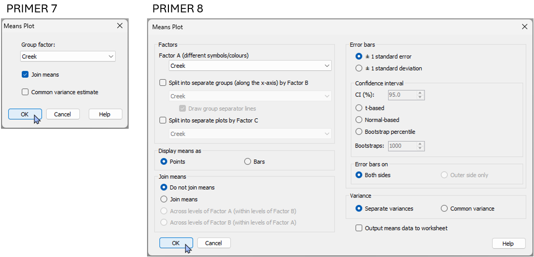
Fig. 15.1. Comparison of the 'Means plot...' dialog in PRIMER 7 compared to the much more extensive new dialog available in PRIMER 8.
Error bar options
In PRIMER 8, you can choose from the following options to draw error bars around each mean on the plot:
- ± 1 standard error (default);
- ± 1 standard deviation; or
- a confidence interval (choose the percentage) based on:
- the $t$-distribution (useful if the variance is unknown);
- the normal ($z$-)distribution (useful if the variance is known); or
- bootstrap percentiles (for a specified number of bootstrap re-samples), done separately within each group.
For all of the methods apart from the bootstrap percentile method, you can choose to estimate a separate variance for each group, or to estimate a common variance (pooled across the groups).
Confidence intervals
Consider a random variable $Y$ of unknown distribution (not necessarily normal) having a mean $\mu$ and variance $\sigma^2$. Let $\lbrace y_1, y_2, ..., y_n \rbrace$ be a random sample of $n$ values from this distribution. Let $\bar{y} = \sum_{i=1}^n y_i$ be the mean of the sample. The central limit theorem states that the distribution of means, $\bar{Y}$, obtained under repeated random sampling in this way, will be normal, with mean $\mu$ and variance $\sigma^2/n$. The standard error, $se$ = $\sqrt{s^2/n}$, where $s^2$ is the sample variance, is an unbiased estimator of the standard deviation of this distribution of means (i.e., $\sigma_{\bar{y}}$). Thus, a plot of $\bar{y} \pm 1 \times se$ is a perfectly natural way to show the variability in the mean calculated from the sample, regardless of that particular variable’s underlying distribution (whether it be normal or not).
If you choose to construct a confidence interval ($\text{CI}$) based on either the $t$-distribution or the normal ($z$)-distribution, then the error bars will be drawn to create a symmetric interval around the mean by multiplying the appropriate quantile from the distribution chosen (e.g., for a $95$ % $\text{CI}$ using the $t$-distribution, the quantile is $1.96$) multiplied by the estimated standard error ($se$) for that group.
Suppose you choose to construct a confidence interval of $\text{CI} = (1-\alpha)\times 100$ % for the mean of a population using the $t$-distribution (e.g., if $\alpha = 0.05$, then the $\text{CI}$ is $95$ %). The interpretation of the interval, under the central limit theorem, is this: under repeated sampling of the population, you would expect $(1-\alpha)\times 100$ % of the confidence intervals constructed in this way to contain the true mean of the population ($\mu$).
Bootstrap percentiles
The bootstrap percentile error bars are drawn for a given group as follows. Let $n_{b}$ be the requested number of bootstrap samples.
- Obtain a bootstrap sample by sampling the data values with replacement from the group.
- Calculate the mean of the bootstrap sample.
- Repeat steps 1 and 2 a total of $n_b$ times to generate an empirical distribution of bootstrap means.
- Obtain the following quantiles from the bootstrap distribution: $\alpha/2$ and $1-\alpha/2$, where $\alpha = (100 - \text{CI}) / 100$. Thus, for $\text{CI} = 95$ %, we would get the $0.025$ and $0.975$ quantiles from the bootstrap distribution of means to draw the error bars.
Note: If the total number of unique sets of values that can be obtained under bootstrap re-sampling is less than the requested number of bootstraps, then the calculation of the percentile values for the error bars will be done using that total number instead of the requested $n_b$. The formula for the total number of unique sets for a given group is $C(2n-1, n)$, where $C()$ is the binomial coefficient function, and $n$ is the number of samples in the group.
Error bars drawn using bootstrap percentiles have the advantage of being constructed empirically from the distribution of the sample values. They are therefore not necessarily going to be symmetric around the mean. Another thing to note is that although a bootstrap percentile interval constructed in this way does give an indication of the variability in the means under repeated sampling, it does not have the same interpretation as a classical confidence interval built on the basis of the central limit theorem. The bootstrap is known to have a negative bias in the estimation of the variance of a sample (see, for example, Anderson et al. (2017) ). Thus, the bootstrap percentile interval will under-estimate the true distance between the upper and lower percentiles in the underlying population distribution of means that would be obtained under reepeated sampling. No bias-correction has been implemented in the construction of the bootstrap percentile error bars in PRIMER 8 for means plots; however, if the sample size ($n$) is reasonably large, then the bias will be relatively small (of order $1/n$)†.
¶ This is achieved by basing the PERMANOVA analysis on a Euclidean distance matrix calculated from a single variable.
†In fact, in Appendix B of Anderson et al. (2017) , it is shown that the exact downward bias in the bootstrap estimate of the variance of the mean of a univariate random variable is $(1−1/n)$.