
16.4 Example: Leschenault fish (two-way crossed case)
An example of a two-way crossed design is provided by a study of trawl samples for fish communities (using a 21.5m seine net) from 4 regions - basal (B), lower (L), upper (U), and apex (A) - occurring between the mouth and upper reaches of the Leschenault estuary, Western Australia ( Veale et al. (2014) ). Samples were taken from each region over 4 seasons - spring (Sp), summer (S), autumn (A), and winter (W), with 6-8 replicate samples from each of these 16 combinations (taken over the years 2008-2010). Data are located in the file 'Leschenault_fish_counts.pri', found in the 'Leschenault_fish' folder in 'Examples_P8'. This is a simplified version of the data described by Veale et al. (2014) . The following two factors are crossed with one another, as all regions were sampled in every season:
- Region, fixed with 4 levels: basal (B), lower (L), upper (U), and apex (A)
- Season, fixed wtih 4 levels: spring (Sp), summer (S), autumn (A), and winter (W)
Compare seasonal means for different regions
We shall focus our attention here on just a few species that have high frequencies of occurrence across the dataset as a whole. We wish to construct means plots to examine and compare potential changes in the average abundance of a given fish species across the seasons (considered separately for each region) and across the regions (considered separately for each season).
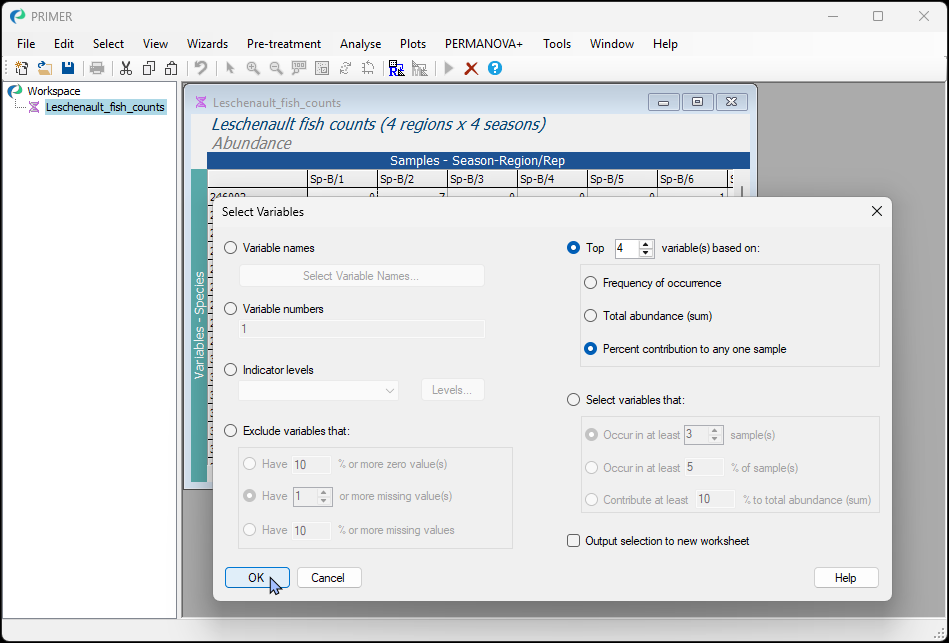
- Begin by selecting the top 4 species, based on their percentage contribution to any one sample. Open the file 'Leschenault_fish_counts.pri', found in the 'Leschenault_fish' folder in 'Examples_P8' in PRIMER. Click Select > Variables... and choose:
$\bullet$ Top 4 variable(s) based on: > $\bullet$ Percent contribution to any one sample, as shown below.
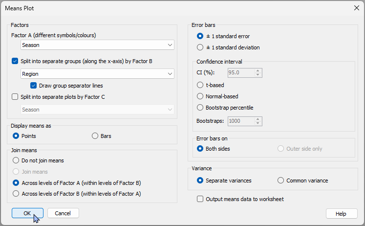
- First we'll make plots that permit easy comparison of the seasonal means, separately within each region. Click Plots > Means Plot..., then choose the following:
- Factor A (different symbols/colours): Season
- $\checkmark$Split into separate groups (along the x-axis) by Factor B > Region > $\checkmark$Draw group separator lines
- Display means as > $\bullet$ Points
- Join means > $\bullet$ Across levels of Factor A (within levels of Factor B)
Leave the rest as defaults and click 'OK'.
This will produce 4 graphics - one for each species - presented in the multiplot object 'MultiPlot1':
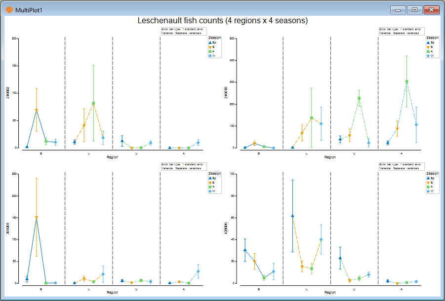
- Let's take a closer look at the fish species '246010' (actual species names were not provided with this particular dataset). Click on 'Graph2' in the Explorer tree (or click on the upper right-hand plot in the multiplot graphic).
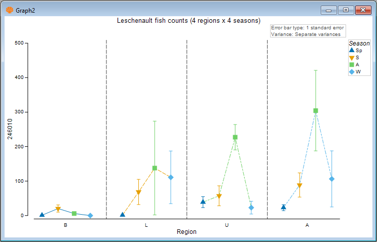
This species generally had greater average abundance in autumn (green symbols), particularly in the upper (U) and apex (A) regions of the estuary.
Compare regional means for different seasons
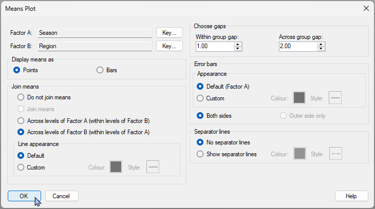
- We can change the colour or line-type of the joining lines. Note that the default colours and line-types for these are based on the colour key for Factor B, which is 'Region' here. We can also change the joining lines so that they occur across the regions, rather than across the seasons. A further option is to change the colour or style (or even remove entirely) the dotted lines separating the different regions along the x-axis. Let's check out the visual effect of these changes on our graphic. Click Graph > Special.... Then, in the 'Means Plot' special dialog, choose the following:
- Join means > $\bullet$ Across levels of Factor B (within levels of Factor A)
- Separator lines > $\bullet$ No separate lines then click 'OK'.
The resulting plot will look like this:
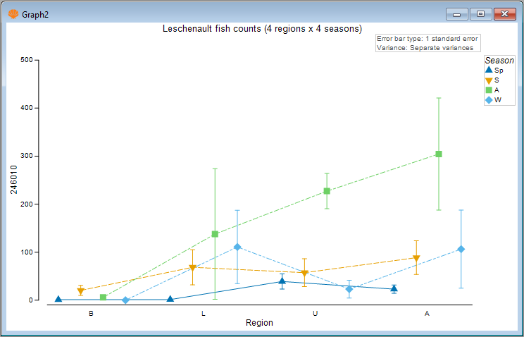
- Another tweak we might like to consider here is to change the relative gap width among the categories (bars or points) that are being plotted within vs between the groups along the x-axis. For example, we could make the seasonal means within a group closer together, with a bigger gap between the different regions. Click Graph > Special.... Then, in the 'Means Plot' special dialog, in the section entitled 'Choose gaps', make the 'Across group gap' six times (say) the 'Within group gap', e.g.:
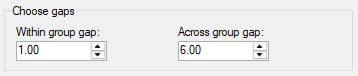
The resulting gap-adjusted plot is quite a bit clearer, viz.:
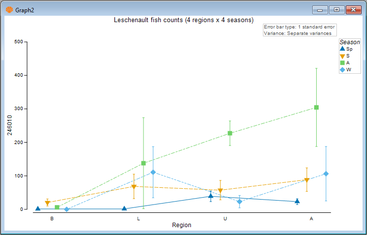
In this graphic, we can now more clearly see there is a gradual increase in the mean abundance of this fish species as you go up the estuary (from the basal to the lower to the upper and finally to the apex region), but this trend is only really apparent in the autumn season (green symbols), and not so apparent in the other seasons.
- Another possibility would be to swap the roles of the factors in this crossed design for the plot itself to begin with. We can examine the regional means separately within each season. To do this, go back to the original data sheet (called 'Leschenault_fish_counts' in the Explorer tree) and click Plots > Means Plot..., then choose 'Region' as Factor A and 'Season' as Factor B, leaving all the rest as before.
A Multiplot will be produced (4 graphics for the 4 species), with the top-right plot ('Graph6') corresponding once again to fish species 246010, like so:
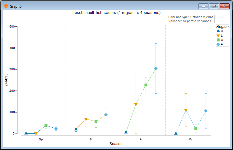
The general trend of increasing mean abundance as you go from the basal to the apex region of the estuary (as previously described) is even more plainly seen here, and is very marked in autumn.
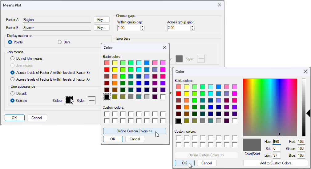
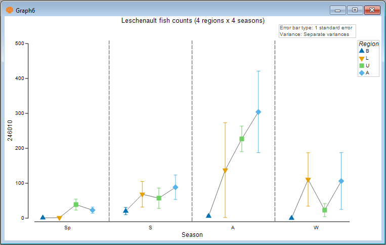
Note also that the joining lines here correspond to the underlying colours/line-types of the regions. If we wish, we can make these joining lines a solid colour of our choice. For example, we shall make them a solid charcoal colour. Click Graph > Special..., then under 'Line appearance' in the dialog, choose '$\bullet$ Custom' and click on the solid box next to the word 'Colour:' and you can choose your colour explicitly, like so:
The resulting plot that uses a solid charcoal colour for the joining lines looks like this:
Bars instead of points
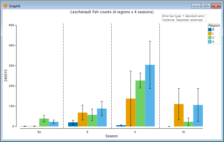
- Of course, we can also look at this plot using bars instead of points. Simply click Graph > Special..., then choose:
- Display means as > $\bullet$ Bars
- Error bars > Appearance > $\bullet$ Custom
to get the following plot:
It is clear there are many ways to customise and refine these means plots. For example, the colours associated with the individual factor levels can be changed using the 'Key' button(s) in the Graph > Special... menu dialog. In addition, a great host of other aspects of the plot can also obviously be customised using the Graph > General... menu dialog, including the text and fonts for titles, the legend ('Keys'), the 'History' text pane, the X or Y axes, and so on.