
16.3 Example: Okura macrofauna (two-way nested case)
Let's look at a means plot where we have a two-way nested design. We will examine data consisting of counts of benthic macrofauna from intertidal sites in the Okura estuary, located north of Auckland, New Zealand ( Anderson et al. (2004) ). Hydrodynamic models were used to identify different areas within the estuary as having high (H), medium (M) or low (L) probabilities of sediment deposition. There were several areas of each type (H, M, or L) interspersed along the estuary from its mouth to its inner reaches. Interest lies in identifying potential differences in the abundances of infaunal species at sites having different probabilities of sediment deposition. Some organisms are expected to be more tolerant of sediment inputs, while others (particularly filter feeders) may be more vulnerable to fine sediment inputs.
Six (6) sediment cores (13 cm in diameter × 15 cm deep) were obtained from random positions within each of 15 sites along the estuary, with 5 sites from each of the high, medium and low depositional types of environments. Sampling was repeated 6 times (twice in each of three seasons in 2001-2002), yielding a total of 36 cores sampled per site.
These data are contained in the file 'Okura_macrofauna.pri', found in the 'Okura_macrofauna' folder in 'Examples_P8'. We shall ignore, for now, the temporal factors in the study and focus only on the spatial factors in a two-way nested design:
- Deposition (fixed with $a$ = 3 levels: H, M or L); and
- Site (random and nested, $b$ = 5 sites within each Deposition, thus 15 sites in total)
We will create a means plot that shows the mean ± 1 standard error for each site for a single univariate variable: the abundance of cockles, Austrovenus stutchburyi.
- Open the 'Okura_macrofauna.pri' file in PRIMER 8, look for the variable (column) named 'Austrovenus stutchburyi', highlight this species by clicking on its name, then click Select > Highlighted.
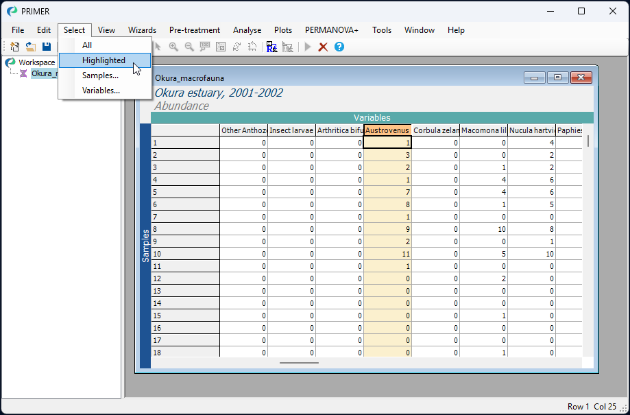
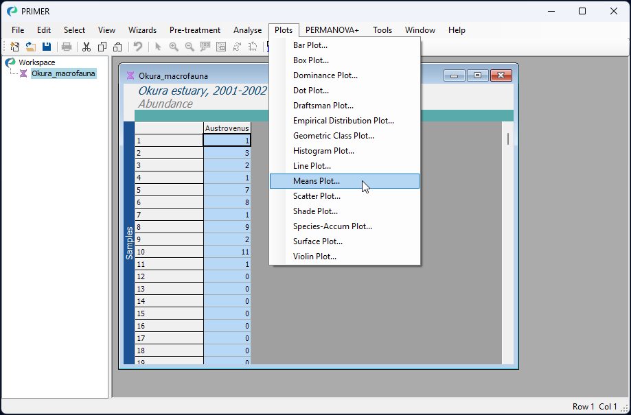
- You will see the selected species as a single column with a blue background. With this single species selected, click Plots > Means Plot..., like so:
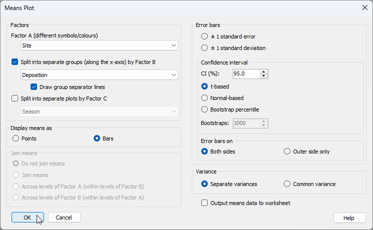
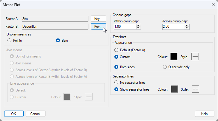
- Given that the design is nested, we would like to calculate a separate mean (and standard error) for each site, and we would like bars corresponding to different sites to be arranged along the x-axis separately within each of the deposition groups (H, M and L). We therefore need to choose the following in the 'Means Plot' dialog:
- Factor A (different symbols/colours) > Site
- $\checkmark$ Split into separate groups (along the x-axis) by Factor B > Deposition
- Display means as > $\bullet$ Bars
as shown below:
Click 'OK'.
The resulting plot (given in the output file called 'Graph1' initially will simply show a different coloured bar for each of the sites, like this:
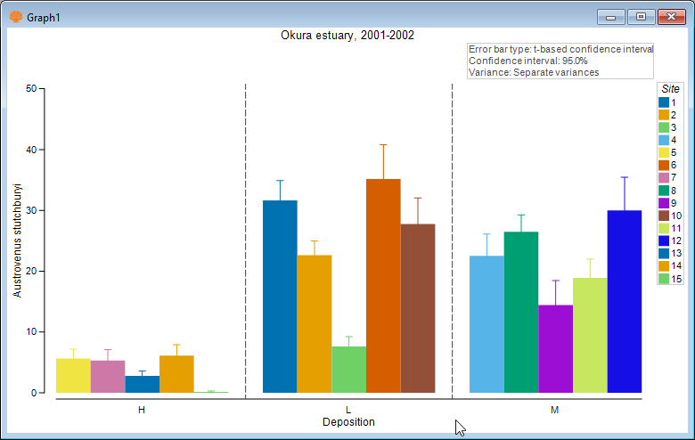
Although this is not too bad, the plot could be improved in a number of ways. First, notice that the 3 levels of 'Deposition' are ordered alphabetically, but we might prefer them to have a more logical order, e.g. L < M < H. Second, we might like to make the error bars black, rather than being the same colour as the bars themselves, so that we can more easily see their extent above and below the mean value. Third, it might be nice if the colours of the bars corresponded to the three different levels of 'Deposition', rather than being a different colour for every site. After all, 'Site' is a random factor.
Special graphical properties of Means Plots
Means plots in PRIMER have a number of special graphical properties that can be altered by you even after the plot has been made. Click Graph > Special... to see them. Specifically, you can choose:
- to change the order of factor levels or the colours/symbols/lines associated with particular factors (via the 'Key' menu)
- to display means as points or bars
- whether and how the means may be joined, and the associated line types for joining
- the sizes of gaps within or between groups of means
- whether to show separator lines between groups and what line colour/type to use for this
- the colour and style of error bar lines, and whether to show both sides or just one side (the outer side).
- To change the colour of the error bars in the plot of Austrovenus ('Graph1'), click Graph > Special... and under 'Error bars', choose 'Appearance > $\bullet$ Custom', and choose a colour of your choice (the default of black will do fine here). Next, to change the order of the deposition groups on the X axis, click the 'Key' button next to 'Factor B: Deposition'.
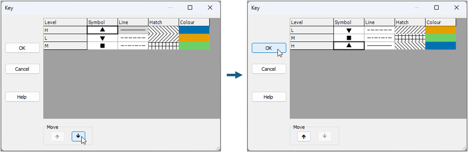
Inside the 'Key' menu, click on the level labeled 'H', and move it progressively to the bottom using the 'Move' arrow button  , so that the order of the Deposition levels (from top to bottom) is changed to 'L', followed by 'M', followed by 'H', respectively, then click 'OK', as shown below:
This yields a plot that is better, viz:
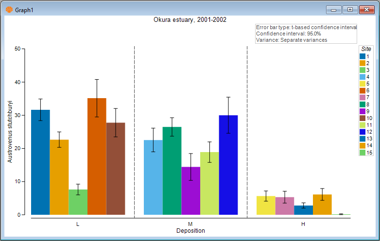 .
.
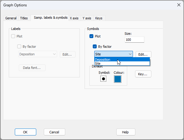
- We have improved the colour of the error bars and the ordering of the factor levels along the x axis. Now let's change the colours of the bars to match the factor of Deposition. Click Graph > Sample Labels & Symbols... and choose the
The final plot looks like this:
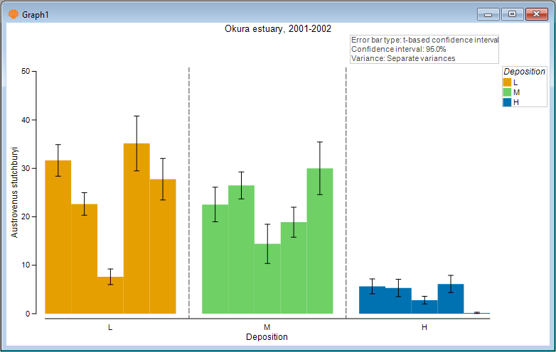
Here, we can clearly see both the substantial variability among sites in the mean abundance of cockles. We can also see that, on average, the mean abundance of cockles is greater at sites having either a low or medium probability of sediment deposition (amber or green bars), compared to sites having a high probability of sediment deposition (blue bars).