
16.5 Example: New Zealand snapper (three-way case)
The Means Plot procedure in PRIMER 8 will operate just as other univariate plots do (such as histograms and dotplots) in that multiple plots will be produced - one for each variable - if there are multiple variables in the original spreadsheet. However, means plots also provide the end-user with the ability to create a multi-plot object by reference to an additional factor. This can be a second or a third factor, depending on the situation. Here, we will show a couple of examples that use this approach advantageously to show patterns across all combinations of three factors in a single multi-plot graphic.
The example dataset here are counts of snapper (Chrysophrys auratus) taken from baited remote underwater video (BRUV) apparatuses deployed at each of three locations: Leigh, Tawharanui and Hahei, in each of two seasons over several years (1997-2007), from sites that were located either inside or outside of a marine reserve (the factor here is 'Status', with levels 'NR' = non-reserve and 'R' = reserve). See Smith et al. (2014) for details.
Status by Year by Location
First, we will visualise patterns in mean relative abundances (total count per BRUV unit) of snapper inside vs outside reserves across the years at the different locations. The data are located in the file named 'NZ_Snapper_counts.pri', located in the folder 'Examples_P8' > NZ_Snapper_counts'.
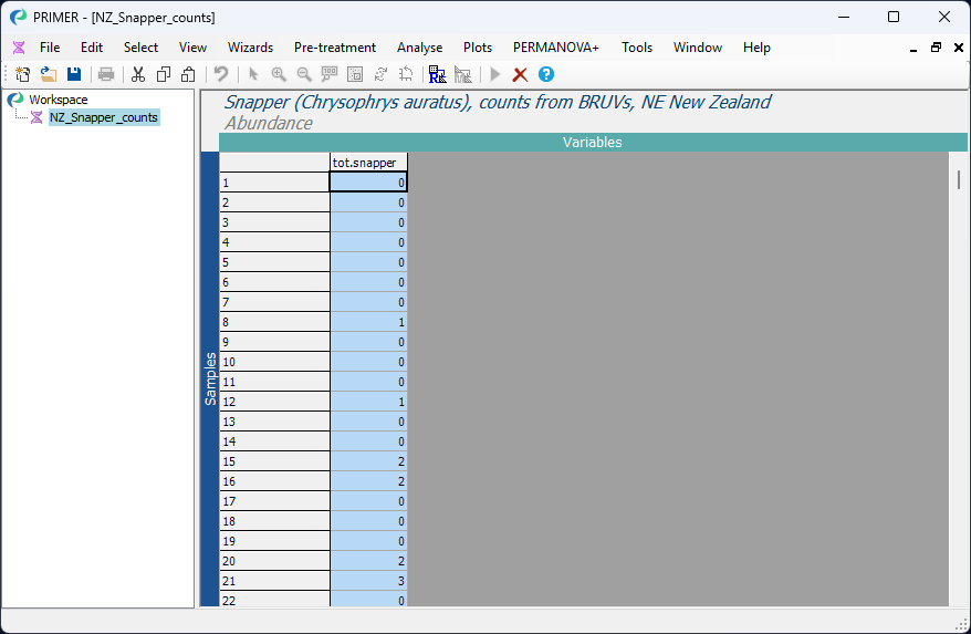
- Open the file 'NZ_Snapper_counts.pri' in PRIMER and click on the column (variable) name 'tot.snapper' in the sheet to highlight it, then click Select > Highlighted. The selected variable will be highlighted in blue, thusly:
Next, we shall plot the mean count of total snapper observed (per BRUV) with along with the 2.5% and 97.5% percentiles of the distribution of bootstrap means from 1000 bootstrap re-samples.
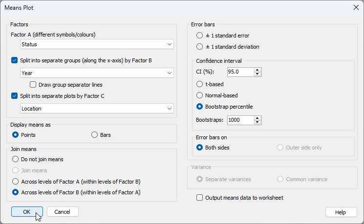
- Click Plots > Means Plot... and choose the following options in the 'Means plot' dialog:
- Factor A (different symbols/colours) > Status
- $\checkmark$Split into separate groups (along the x-axis) by Factor B > Year, and 'untick' the box '$\Box$ Draw group separator lines'
- $\checkmark$Split into separate plots by Factor C > Location
- Display means as > $\bullet$ Points
- Join means > $\bullet$ Across levels of Factor B (within levels of Factor A)
- Error bars > $\bullet$ Bootstrap percentile
as shown below:
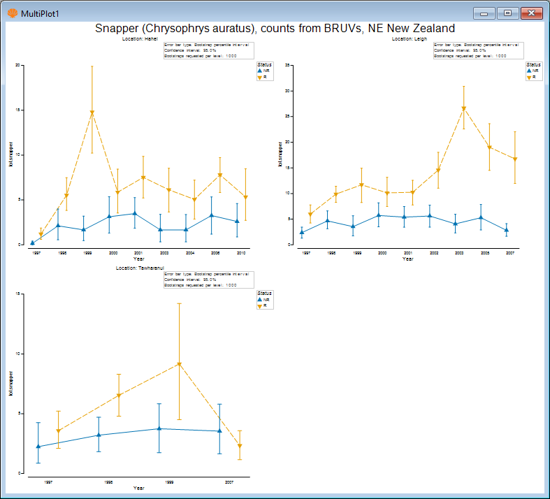
The resulting multi-plot shows the means (and bootstrap percentiles) for snapper counts from reserve and non-reserve sites separately in each year, with different locations being shown as different graphics within the multi-plot object, viz:
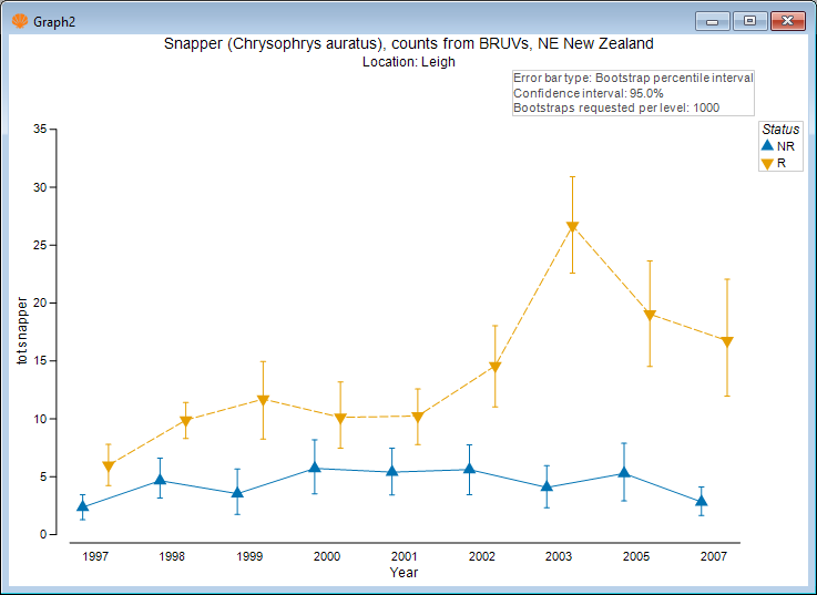
Examining the plot for Leigh only (click on the upper right-hand plot, or click 'Graph2' in the Explorer tree), we see, for example:
You can change or arrange the graphics in a multi-plot (i.e., by specifying the number of columns and rows of graphics that you want, and also their ordering) etc. by first clicking on the multiplot item itself in the Explorer tree (e.g., 'MultiPlot1'), then click Graph > Special....
Season by Status by Location
We might also like to look at differences in the mean relative abundances of snapper inside vs outside these reserves, also split by location. We will do this just for Leigh and Hahei, where we have more years of information.
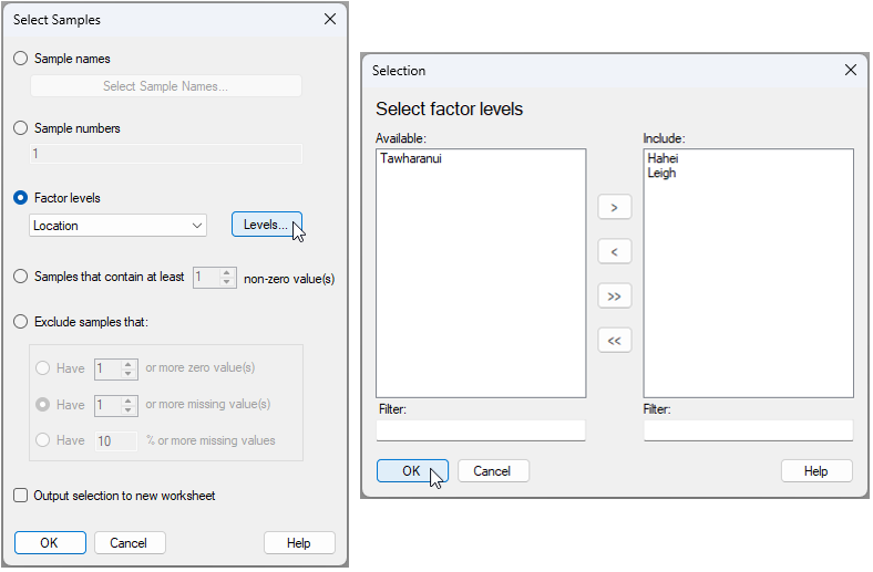
- From the 'NZ_Snapper_counts' data sheet, click Select > Samples..., then choose $\bullet$ Factor levels > Location and click the 'Levels...' button
 . Move the words 'Hahei' and 'Leigh' from the 'Available' box on the left to the 'Include' box on the right (by clicking on them each and then clicking on the right-arrow button
  ), then click 'OK'.


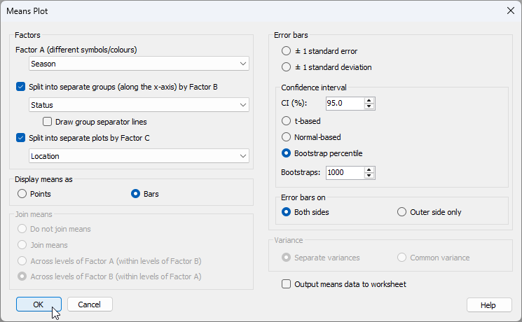
- Click Plots > Means Plot... and choose the following options in the 'Means plot' dialog:
- Factor A (different symbols/colours) > Season
- $\checkmark$Split into separate groups (along the x-axis) by Factor B > Status, and $\checkmark$ Draw group separator lines
- $\checkmark$Split into separate plots by Factor C > Location
- Display means as > $\bullet$ Bars
- Join means > $\bullet$ Across levels of Factor B (within levels of Factor A)
- Error bars > $\bullet$ Bootstrap percentile
as shown below:
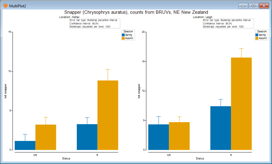
The resulting graphic, by default, looks like this:
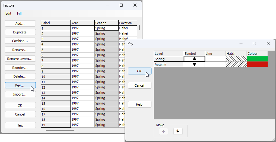
- We might like to change the colours of these bars to something a bit more reflective of spring and autumn. Go back to the original data sheetcalled 'NZ_Snapper_counts' and click Edit > Factors..., then click on the column called 'Season', and click the 'Key' button
 . In the 'Key' dialog, click on the colour box for 'Spring' and choose (say) a green colour, then click on the colour box for 'Autumn' and choose (say) an autumnal colour of brown or orange/red, then click 'OK'.

Re-running the same dialog for the means plot now as we ran before (see step 5 above), we obtain the following ('MultiPlot3'):
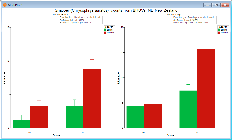
- We might also like to change the error bar colours so that they are black, making it easier to see the lower and upper bootstrap percentile values. For each of 'Graph6' and 'Graph7', in turn (both of these graphics are in 'MultiPlot3'), click Graph > Special..., then choose
Error bars > Appearance > $\bullet$ Custom (and leave the default colour of black here).
The resulting plot looks like this:
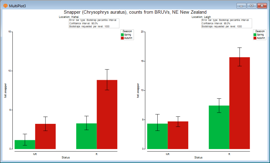
The above plot shows that the mean relative abundance of snapper (sampled using BRUVs) is typically greater in the autumn than in the spring, on average. Also, the largest seasonal difference in mean was observed inside the reserve at Leigh.
Means plots to accompany PERMANOVA formal analysis
Typcially, we would perform a more complete univariate statistical analysis of these data using (say) PERMANOVA in accordance with the full multi-factor sampling design. This could be done easily in PRIMER with PERMANOVA+ by calculating Euclidean distances among the samples based on the single variable of 'tot.snapper' and creating an appropriate Design file corresponding to the full multi-factor experimental design (including the nested factor of 'Areas' as well). Pair-wise comparisons could then be run to follow up any significant interactions that might be discovered among the main factors of interest.
It is useful to show relevant multi-factor means plots to accompany PERMANOVA tests and pair-wise comparisons. For example, a statistically significant threee-way interaction of Season$\times$Status$\times$Location might well be accompanied by not only the relevant pair-wise comparisons, but also the above means plots that permit one to compare the means (and their variability) visually in a useful way.
Output means data to worksheet
There are many ways to customise means plots within PRIMER. It is also possible (in the 'Means Plot' dialog) to tick the box to '$\checkmark$Output means data to worksheet'. This will output the means and standard errors (or the means and the upper and lower bounds of error bars of your choice) which are calculated to produce the plot. If there are customisations that you want to create in a different graphics package, or if you would rather get the values for the means (and their measures of variation) in a tabled format (e.g., for publication in supplementary material, etc.), then this extra tool is very handy, and may well be more efficient than using Tools > Summary Stats..., even though the latter has been expanded considerably from what was available in version 7.