Geometric class plots
These are essentially multiple frequency polygons, plotted on a single graph, for each sample in the active sheet, which needs to be a taxon (species) by samples array of genuine counts. If you wish to plot a single curve for each of a number of groups of samples then you should first pool replicates in each group with Tools>Sum – or, to pool all the samples in an array into a single sample, you can use Analyse>Summary Stats>(For•Variables)>(✓Sum). Then Plots>Geometric Class Plot gives several line plots (or just one) on a single (x,y) graph in which the y axis is the number of species that fall into a set of geometric ($\times$ 2) abundance classes (x axis). That is, each line on the plot gives the number (or %) of species represented in the sample by a single individual (class 1), 2-3 individuals (class 2), 4-7 individuals (class 3), 8-15 individuals etc. Statistical ecologists call these SAD curves (Species Abundance Distribution), and there is much early literature on fitting by distributions such as the truncated log-normal, proposed on (unconvincing) theoretical grounds. Fisher RA et al 1943, J Anim Ecol 12 was the first (as in so much else, statistically!) to model such data, fitting it to the single-parameter log series distribution – this parameter ($\alpha$) is the Fisher index calculated by Analyse>DIVERSE, see the previous section. It has been suggested that impact on assemblages changes the characteristic form of the SAD curve, lengthening the right tail because some species become very abundant and other, rarer, species (singletons) disappear.
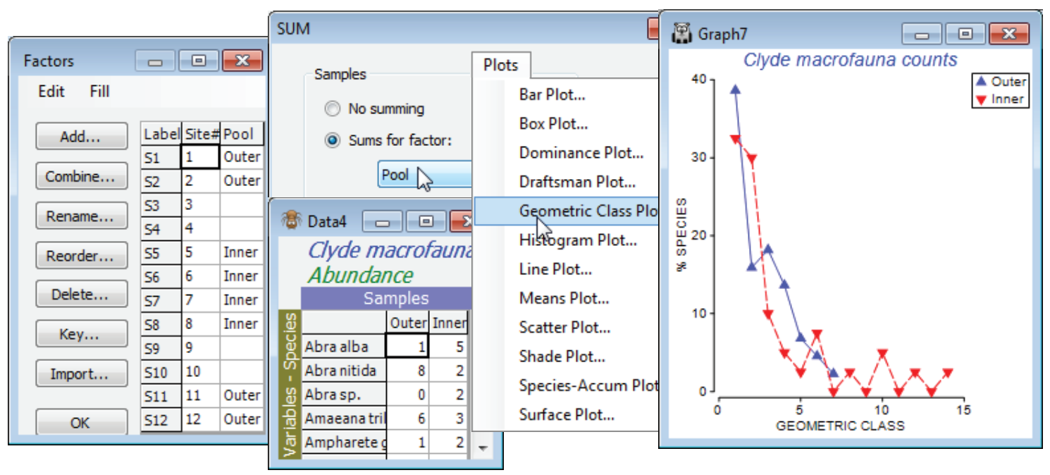
Close the existing workspace (it is not needed again), and re-open the Clyde dumpground study, workspace Clyde ws2 analysed at the start of the last section, or just open the abundance matrix Clyde macrofauna counts from C:\Examples v7\ Clyde macrofauna. The plot would be cluttered with all 12 transect samples displayed, so contrast just two sets of pooled samples – the outer (1, 2, 11, 12) and inner (5, 6, 7, 8) sites – the pools need to be the same size for unbiased comparison. For Clyde macrofauna counts create a factor Pool, with two levels corresponding to these groups, using Edit>Factors>Add (leaving entries for other sites blank), and run Tools>Sum on the counts sheet, giving factor Pool. On the resulting matrix, Plots>Geometric Class Plot clearly shows the right shift in the abundance distribution at the inner sites. Close the workspace; it is not needed again.

