PCA of data on biomarkers
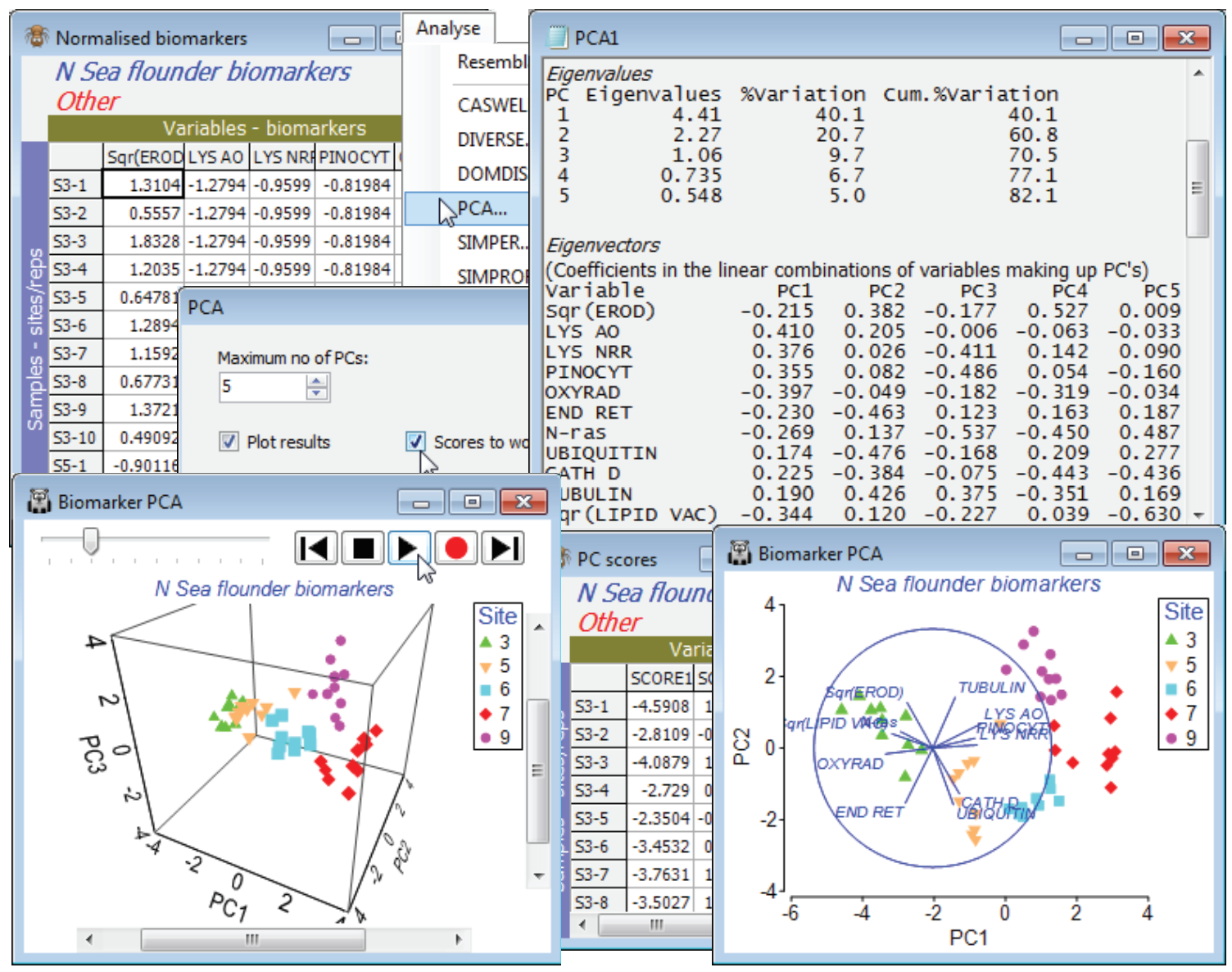
An example where a 3-d plot is marginally more necessary is given by the biomarker data last seen for a 1-way ANOSIM test in Section 9. Re-open the N Sea ws workspace, or if not available, open N Sea flounder biomarkers from C:\ Examples v7\N Sea biomarkers. Work with all the variables, not just the 6 continuous ones used in earlier sections – the remaining 5 are all ordered categorical so it is entirely legitimate to include them in a PCA (or the Euclidean distance used for ANOSIM). Previously, EROD and LIPID VAC were square-rooted with Pre-treatment>Transformation (individual)>(Expression: SQR(V)), but there is not much need for transforming others since there are no strong outliers (it would be pointless for N-ras which is purely binary! – though that still makes it ordered categorical). The resulting data sheet must be normalised, with Pre-treatment>Normalise Variables. It is rather easy to overlook the normalisation step when running PCA, but the analysis here would be disastrous without it, since the PCs are simply hijacked by the variables with highest numbers. In cases where there is a common measurement scale, normalisation may not be needed, as in the particle sizes for Danish sediments (Sections 4, 9) and Plymouth water (5).
On the normalised sheet take Analyse>PCA, and on the plot use the Samp. Labels & Symbols tab to turn off the labels, increase the symbol size and maybe change the Site key colours to avoid blue (the default colour for the vector plot). The 2-d PCA shows the separation of biomarker responses in the 5 areas, with (from the plot and the eigenvectors) sites 3 and 5 separating from 6, 7 and 9, largely on PC1, in the direction of decreasing lysosomal stability and pinocytosis, and increasing levels of oxyradicals, size of lipid vacuoles etc. – indicating stress on the organisms at sites 3 and 5. What tends to separate site 7 and 9 from site 6, largely along PC2, are increased levels of EROD and Tubulin, and decreased Ubiquitin, Cathepsin D and Endoplasmic reticulum. (Remember that the vectors on the plot are read only as indicating size and direction of increase, their location being irrelevant). The eigenvectors also show that N-ras only tends to come out in the higher PC’s. The eigenvalues show that 3 PCs is enough to capture over 70% of the total variability (a good target figure), so it is worth a look at the 3-d plot with Graph>Special>(Plot type•3D) & (Axes✓Draw box). Turn off vectors from the Overlays tab, by unchecking (✓Overlay vectors) and Zoom In, Rotate Axes and Spin from the right-click or Graph menu. The 3-d plot certainly separates the sites clearly but the extra 10% of explained variation in comparison with the 2-d plot does not alter the interpretation to any extent. Resave the workspace as N Sea ws and close it.

