Shade plots to aid choice of transform
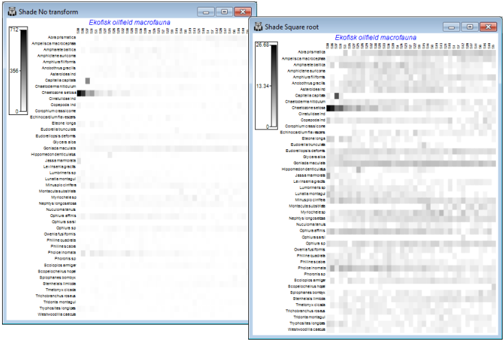
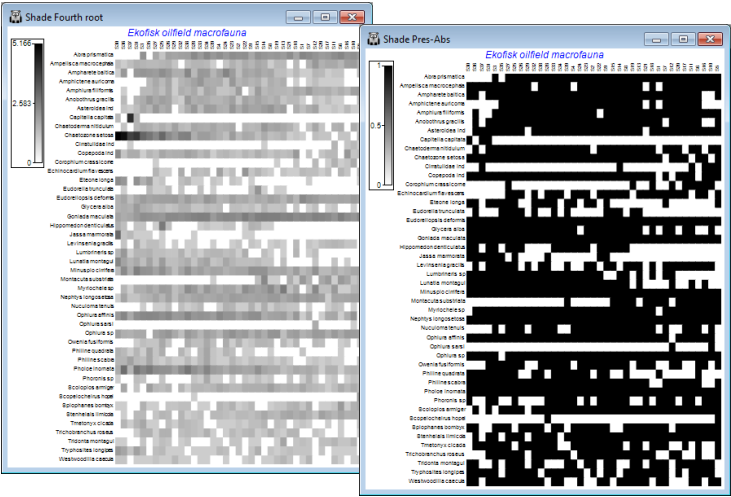
A major new feature in PRIMER 7 is the large number of additional plotting routines, one of the conceptually simplest but most powerful being Shade Plots, which are simple visualisations of the data matrix, with darker (or different colour) shades in each cell of the array representing higher abundances. White space denotes the absence of that species (row) in that sample (column) and full black the maximum abundance (or biomass etc.) in the array. Grey (or one/two colour) shades are linearly proportional to the intermediate abundances, as shown in a shade/colour key. Clarke KR, Tweedley JR, Valesini FJ 2014, J Mar Biol Assoc UK 94: 1-16 demonstrate the usefulness of shade plots in getting a ‘feel’ for a sensible choice of transformation for the context, e.g. if an assemblage analysis needs to take account of a wide range of common and less abundant species but the current shade plot is largely a sea of white space – because at the current transformation most abundances are still dwarfed by those for the dominant species – then the need for a heavier transformation is immediately seen. At the opposite extreme, if most of the cells from species which are present are displayed at about the same (dark) intensity then the data is likely to have been overtransformed into, effectively, presence or absence, and this may not be the required quantitative analysis.
On both the original and transformed Ekofisk macrofauna sheets take Plots>Shade Plot, to give:
The choice looks to be between square root and fourth root, but note how the fourth-root matrix largely reflects the P/A structure, with the quantitative information little used. And after restoration of the 125 species (<2% of the composition anywhere and temporarily eliminated, purely for clarity of the plots here), they are also likely to add a great deal of random ‘noise’ on this scale. At the other extreme, the previous page shows that a failure to transform at all would leave a multivariate analysis (based on a measure such as Bray-Curtis) dependent only on a small handful of dominant species. Be aware of the dangers of ‘choosing the transformation which gives you the answer you want!’ but these plots suggest that the (relatively mild) square root transform might be relevant for data of this type (macrobenthic studies around N Sea oil-fields) – allowing the abundant species to play a greater role, but also taking into account contributions from a wide range of less-dominant species. Whether a multivariate analysis can discern any pattern of change with distance from the oil-field is more open to question, on the basis of this plot! The sites (x axis) are ordered from left to right in increasing distance from the oil-field but a matching trend in assemblage pattern is quite hard to discern (but is clearly present – see Section 8). We shall see later that astute re-ordering of the y axis (species) is visually helpful here (though a multivariate analysis ignores the ordering of variables!), and can be accessed from the Graph>Special>Re-order menu. Discussion of the wide range of possibilities on this dialog is deferred until Section 10, under Wizard>Matrix display.


