3.4 Example: Victorian avifauna
As an example, consider the data on Victorian avifauna at the level of individual surveys, in the file vicsurv.pri of the ‘VictAvi’ folder in the ‘Examples add-on’ directory. For simplicity, we shall focus only on a subset of the samples: Select > Samples > •Factor levels > Factor name: Treatment > Levels… and select only those samples taken from either ‘good’ or ‘poor’ sites. Duplicate this sheet containing only the subset of data and rename it vic.good.poor. Next, choose Analyse > Resemblance > (Analyse between•Samples) & (Measure•Bray-Curtis similarity) & ($\checkmark$Add dummy variable > Value: 1). From this resemblance matrix (calculated using the adjusted Bray-Curtis measure), choose PERMANOVA+ > PCO > (Maximum no of PCOs: 15) & ($\checkmark$Plot results). The default maximum number of PCOs corresponds to N – 1.
The output provided from the analysis includes two parts. First, a text file (Fig. 3.2) with information concerning the eigenvector decomposition of the G matrix, including the percentage of the variation explained by each successive PCO axis. Values taken by individual samples along each PCO axis (called “scores”) are also provided. Like any other text file in PRIMER, one can cut and paste this information into a spreadsheet outside of PRIMER, if desired. Note there is also the option ($\checkmark$Scores to worksheet) in the PCO dialog box (Fig. 3.2), which allows further analyses of one or more of these axes from within PRIMER.
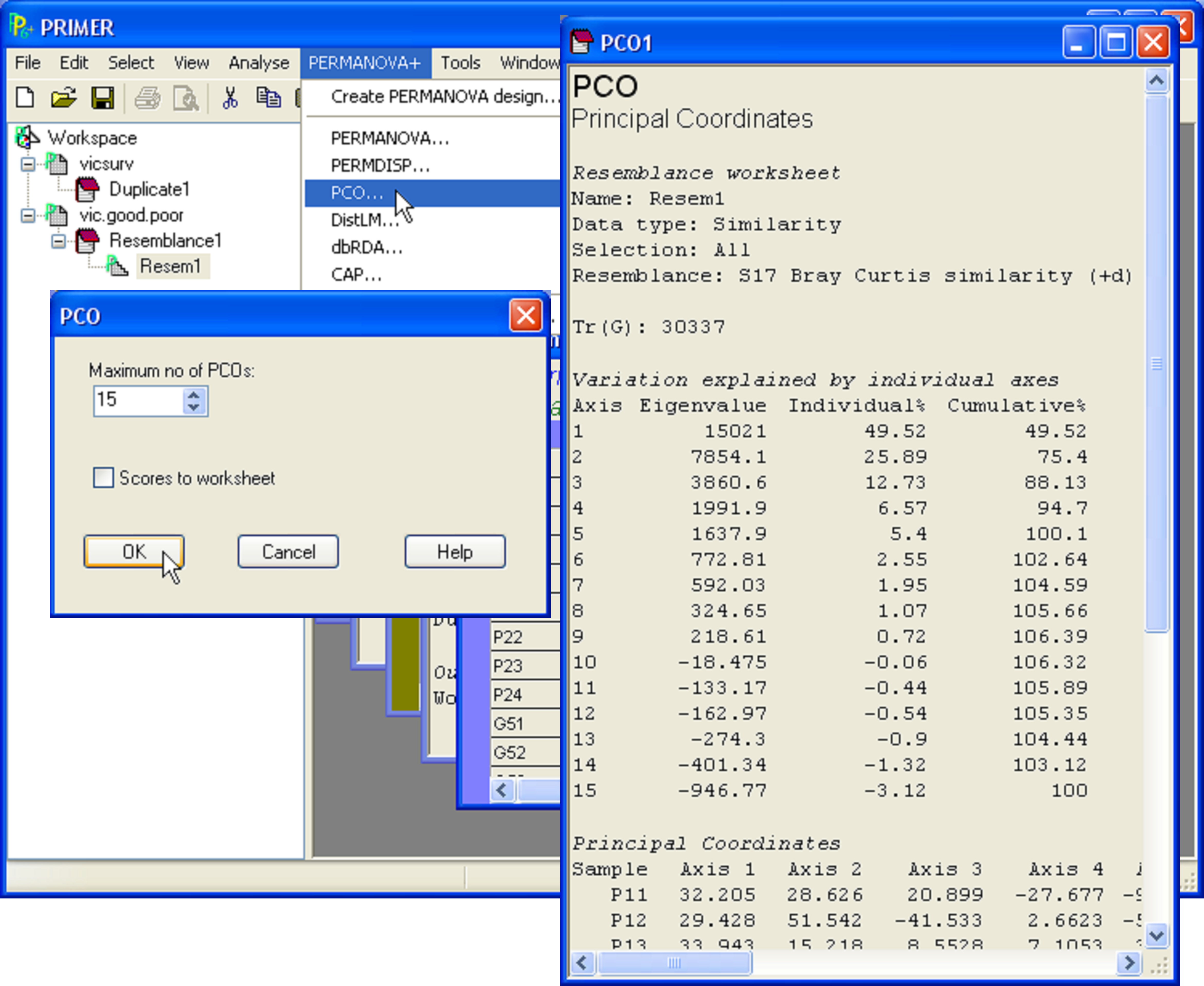
Fig. 3.2. PCO on a subset of the Victorian avifauna survey data.
The other part of the output is a graphical object consisting of the ordination itself (Fig. 3.3). By default, this is produced for the first two PCO axes in two dimensions, but by choosing Graph > Special, the full range of options already in PRIMER for graphical representation is made available for PCO plots, including 3-d scatterplots, bubble plots, the ability to overlay trajectories or cluster solutions, and a choice regarding which axes to plot. One might choose, for example, to also view the third and fourth PCO axes or the second, third and fourth in 3-d, etc., if the percentage of the variation explained by the first two axes is not large. In addition, a new feature provided as part of the PERMANOVA+ add-on is the ability to superimpose vectors onto the plot that correspond to the raw correlations of individual variables with the ordination axes (see the section Vector overlays).
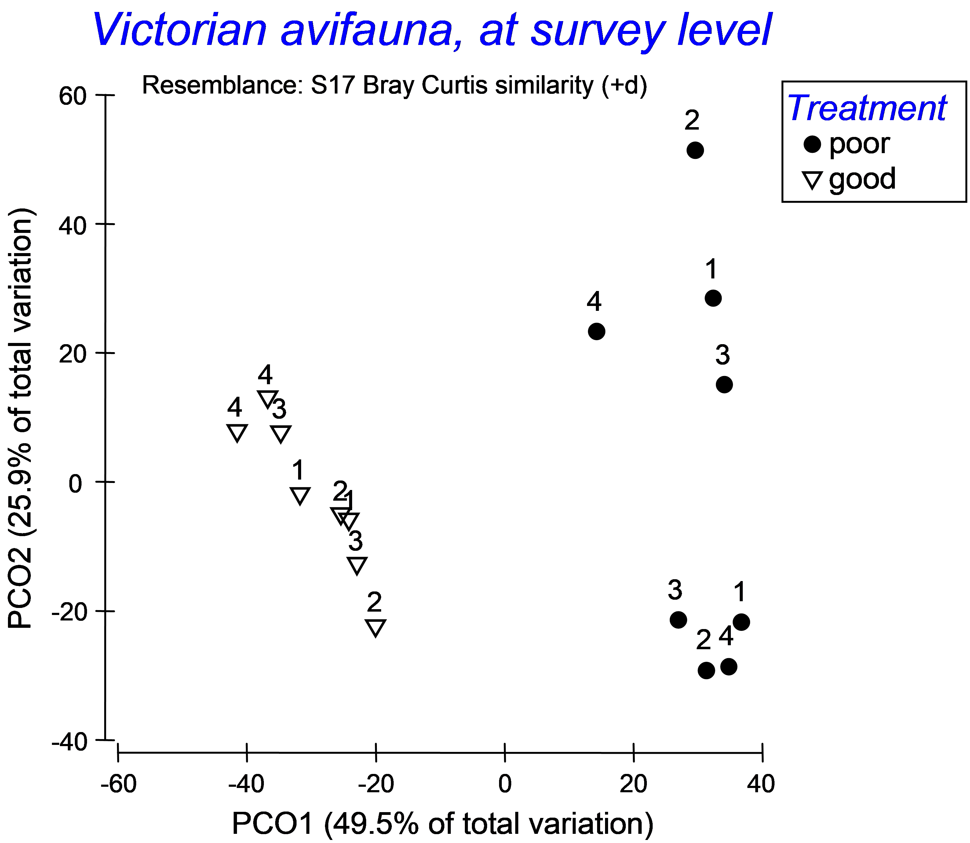 Fig. 3.3. PCO ordination provided by PRIMER for a subset of the Victorian avifauna.
In the case of the Victorian avifauna, we see the percentage of the total variation inherent in the resemblance matrix that is explained by these first two axes is 75.4% (Fig. 3.2), so the two-dimensional projection is likely to capture the salient patterns in the full data cloud. Also, the two-dimensional plot shows a clear separation of samples from ‘poor’ vs ‘good’ sites on the basis of the (adjusted) Bray-Curtis measure (Fig. 3.3). Although not labeled explicitly, the two ‘poor’ sites are also clearly distinguishable from one another on the plot – the labels 1-4 in the lower-right cluster of points correspond to the four surveys at one of these sites, while the 4 surveys for the other ‘poor’ site are all located in the upper right of the diagram. This contrasts with the avifauna measured from the ‘good’ sites, which are well mixed and not easily distinguishable from one another through time (towards the left of the diagram).