3.6 Vector overlays
A new feature of the PERMANOVA+ add-on package is the ability to add vector overlays onto graphical outputs. This is offered as purely an exploratory tool to visualise potential linear or monotonic relationships between a given set of variables and ordination axes. For example, returning to the Victorian avifauna data, we may wish to know which of the original species variables are either increasing or decreasing in value from left to right across the PCO diagram. These would be bird species whose abundances correlate with the differences seen between the ‘good’ and the ‘poor’ sites, which are clearly split along PCO axis 1 (Fig. 3.3). From the PCO plot, choose Graph > Special to obtain the ‘Configuration Plot’ dialog box (Fig. 3.6), then, under ‘Vectors’ choose (•Worksheet variables: vic.good.poor) & (Correlation type: Spearman), click on the ‘Select…’ button and choose (Select Vectors •Correlation > 0.5), OK.
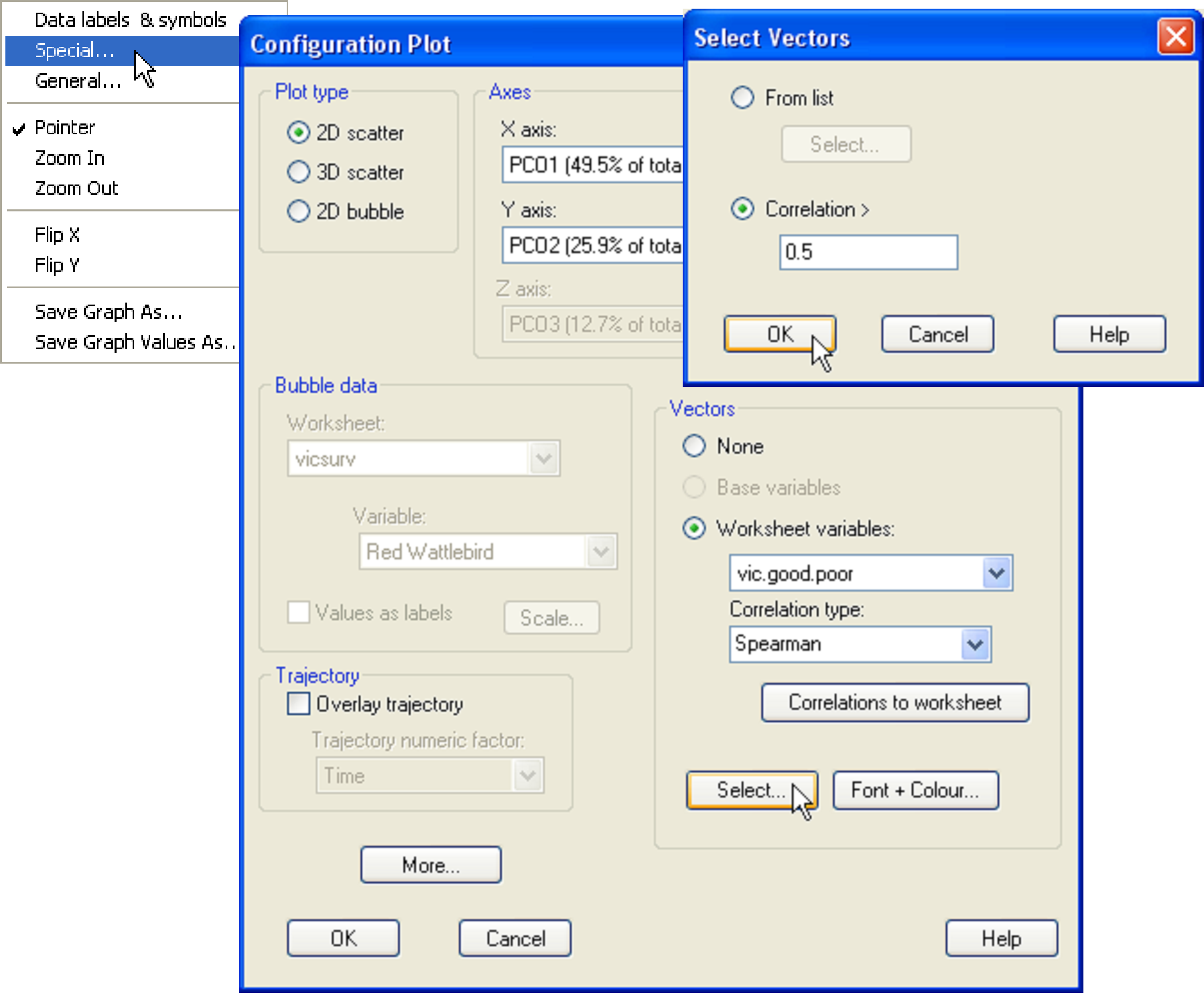
Fig. 3.6. Adding a vector overlay to the PCO of the Victorian avifauna data.
This produces a vector overlay onto the PCO plot as shown in Fig. 3.7. In this case, we have restricted the overlay to include only those variables from the worksheet that have a vector length that is greater than 0.5. Alternatively, Pearson correlations may be used instead. These will specifically highlight linear relationships, whereas Spearman correlations are a bit more flexible, being based on ranks, and so will highlight more simply the overall increasing or decreasing relationships of individual variables across the plot. The primary features of the vector overlay are:
-
The circle is a unit circle (radius = 1.0), whose relative size and position of origin (centre) is arbitrary with respect to the underlying plot.
-
Each vector begins at the centre of the circle (the origin) and ends at the coordinates (x, y) consisting of the correlations between that variable and each of PCO axis 1 and 2, respectively,
-
The length and direction of each vector indicates the strength and sign, respectively, of the relationship between that variable and the PCO axes.
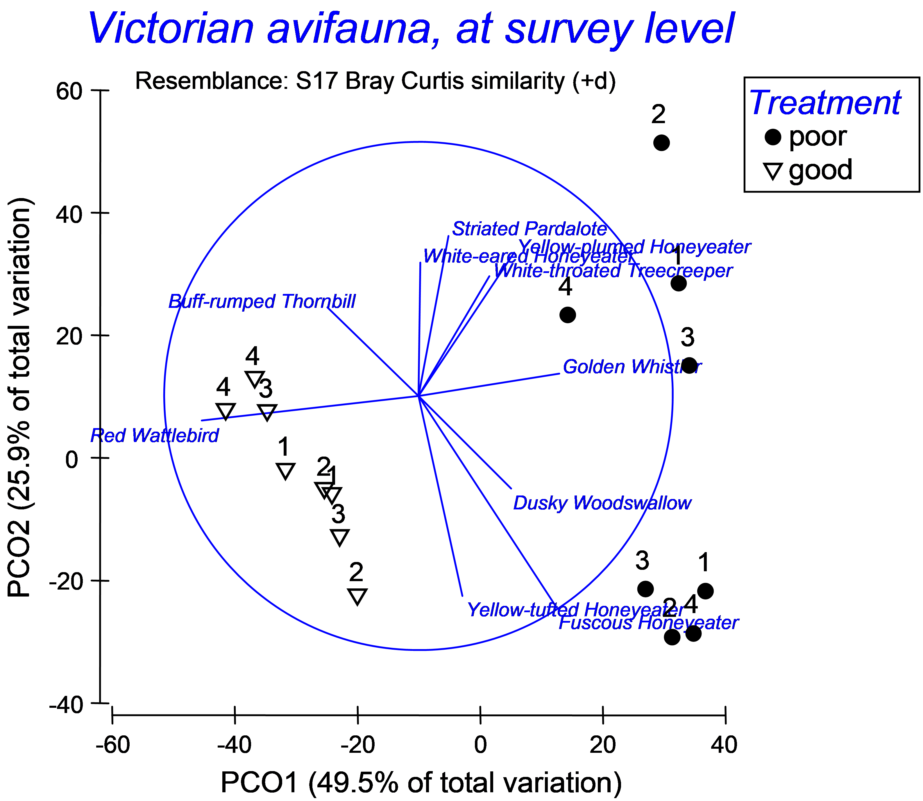 Fig. 3.7. Vector overlay on the PCO of the Victorian avifauna, showing birds with vectors longer than 0.5.
For the Victorian avifauna, we can see that the abundance of Red Wattlebird has a strong negative relationship with PCO 1 (indicative of ‘good’ sites), while the abundance of Golden Whistler has a fairly strong positive relationship with this axis (indicative of ‘poor’ sites). These two species have very weak relationships with PCO 2. There are other species that are correlated with PCO 2, (either positively or negatively), which largely separates the two ‘poor’ sites from one another (Fig. 3.7).
By clicking on the ‘Correlations to worksheet’ button in the ‘Configuration Plot’ dialog box (Fig. 3.6), individual correlations between each variable in the selected worksheet and the PCO axes are output to a new worksheet where they can be considered individually, exported to other programs, or analysed in other ways within PRIMER69. Examining the Spearman correlations given in a worksheet for the Victorian avifauna data helps to clarify how the axes were drawn (Fig. 3.8). For example, the Yellow-plumed Honeyeater has a correlation of $\rho _ 1 = 0.376$ with PCO axis 1 and $\rho _2 = 0.564$ with PCO axis 2. The length of the vector for that species is therefore $l = \sqrt{\rho _1 ^2 + \rho _2 ^ 2} = 0.678$ and it occurs in the upper-right quadrant of the circle, as both correlations are positive (Fig. 3.8). The correlations and associated vectors are also shown for the Yellow-tufted Honeyeater and the Buff-rumped Thornbill (Fig. 3.8).
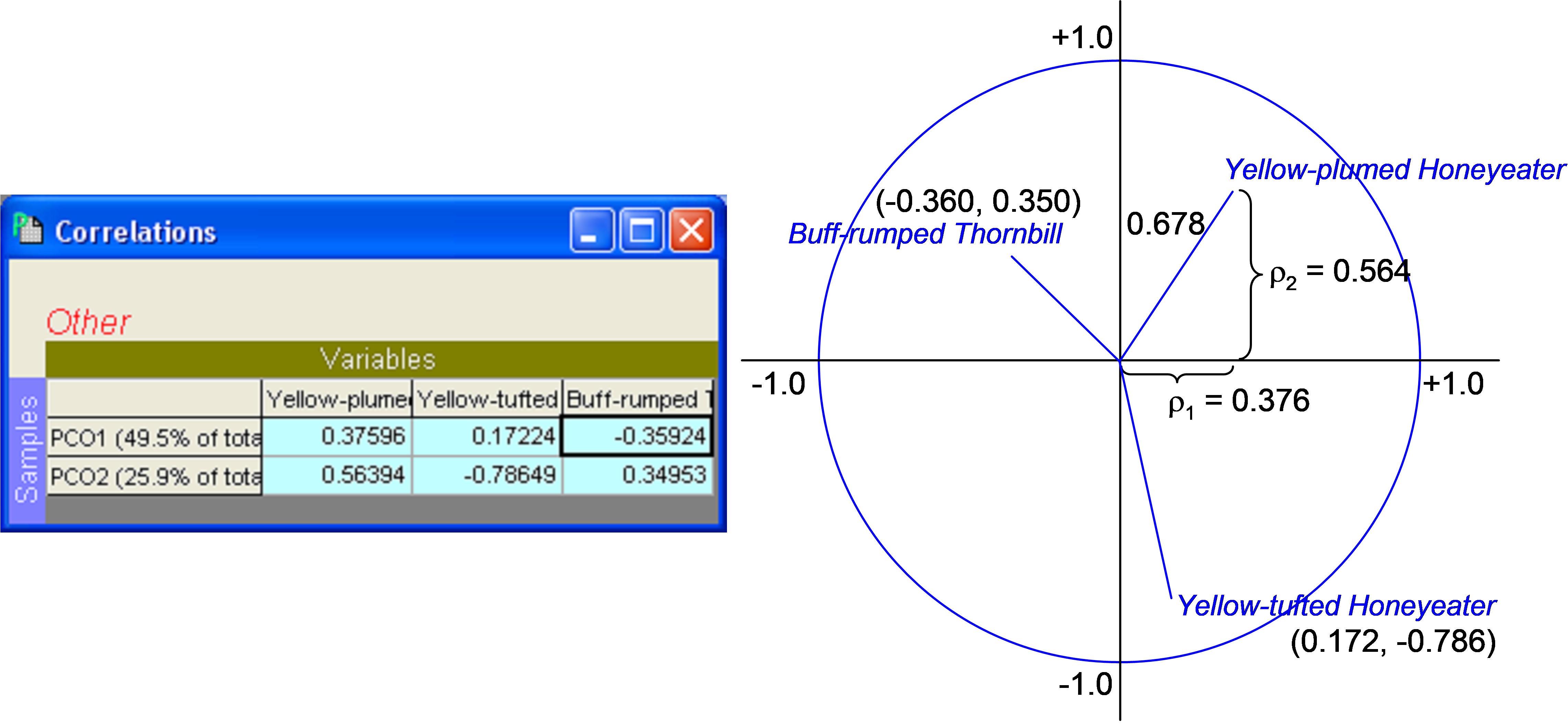 Fig. 3.8. Spearman correlations in datasheet and schematic diagram of calculations used to produce vector overlays on the PCO of the Victorian avifauna data.
There are several important caveats on the use and interpretation of these vector overlays. First, just because a variable has a long vector when drawn on an ordination in this way does not confirm that this variable is necessarily responsible for differences among samples or groups in that direction. These are correlations only and therefore they cannot be construed to indicate causation of either the effects of factors or of dissimilarities between individual sample points. Second, just because a given variable has a short vector when drawn on an ordination in this way does not mean that this variable is unimportant with respect to patterns that might be apparent in the diagram. Pearson correlations will show linear relationships with axes, Spearman rank correlations will show monotonic increasing or decreasing relationships with axes, but neither will show Gaussian, unimodal or multi-modal relationships well at all. Yet these kinds of relationships are very common indeed for ecological species abundance data, especially for a series of sites along one or more environmental gradients ( ter Braak (1985) , Zhu, Hastie & Walter (2005) , Yee (2006) ). Bubble plots, which are also available within PRIMER, can be used to explore these more complex relationships (see chapter 7 in Clarke & Gorley (2006) ).
It is best to view these vector overlays as simply an exploratory tool. They do not mean that the variables do or do not have linear relationships with the axes (except in special cases, see the section PCO vs PCA). For the above example, the split in the data between ‘good’ and ‘poor’ indicates a clear role for PCO axis 1, so seeking variables with increasing or decreasing relationships with this axis (via Spearman raw correlations) is fairly reasonable here. For ordinations that have more complex patterns and gradients, however, the vector overlays may do a poor job of uncovering the variables that are relevant in structuring multivariate variation.
69 Beware of the fact that if you choose to reflect positions of points along axes by changing their sign (i.e., if you choose Graph > Flip X or Flip Y), the signs of the correlations given in the worksheet will no longer correspond to those shown in the diagram!