5.11 Canonical correlation: single gradient (Fal estuary biota)
So far, the focus has been on hypotheses concerning groups and the use of CAP for discriminant analysis. CAP can also be used to analyse how well multivariate data can predict the positions of samples along a continuous or quantitative gradient. As an example, we shall consider a study of the meiofauna and macrofauna in soft-sediment habitats from five creeks in the Fal estuary along a pollution gradient ( Somerfield, Gee & Warwick (1994) ). These creeks have different levels of metal contamination from long-term historical inputs. Original data are in file Fa.xls in the ‘Fal’ folder of the ‘Examples v6’ directory. This file splits the biotic data into separate groups (nematodes, copepods and macrofauna), but here we will analyse all biotic data together as a whole. A single file containing all of the biotic data (with an indicator to identify the variables corresponding to nematodes, copepods and macrofauna) is located in falbio.pri in the ‘FalEst’ folder of the ‘Examples add-on’ directory. Also available in this folder are the environmental variables in file falenv.pri, which includes concentrations for 10 different metals, % silt/clay and % organic matter.
Previous study (e.g., Somerfield, Gee & Warwick (1994) ) indicated a high degree of correlation among the different metals in the field. Based on this high correlation structure, we might well consolidate this information in order to obtain a single gradient in heavy metal pollution among these samples, using principal components analysis (PCA). A draftsman plot also suggests that log-transformed metal variables will produce more symmetric (less-skewed) distributions for analysis. Select only the metals, highlight them and choose Tools > Transform (individual) > (Expression: log(V) )& ($\checkmark$Rename variables (if unique)) in order to obtain log-transformed metal data. Rename the data sheet log.metals for reference. Next choose Analyse > Pre-treatment > Normalise variables and re-name the resultant sheet norm.log.metals. A draftsman plot of these data demonstrates reasonably even scatter and high correlation structure. Choose Analyse > PCA > (Maximum no of PCs: 5) & ($\checkmark$Plot results) & ($\checkmark$Scores to worksheet). The first 2 PC axes explain 93% of the variation in the normalised log metal data. The first PC axis alone explains 77% of the variability, and with approximately equal weighting on almost all of the metals (apart from Ni and Cr). This first PC axis can clearly serve as a useful proxy variable for the overall gradient in the level of metal contamination across these samples. In the worksheet of PC scores, select the single variable with the scores for samples along PC1, duplicate this so it occurs alone in its own data sheet, rename this single variable PC1 and rename the data sheet containing this variable poll.grad.
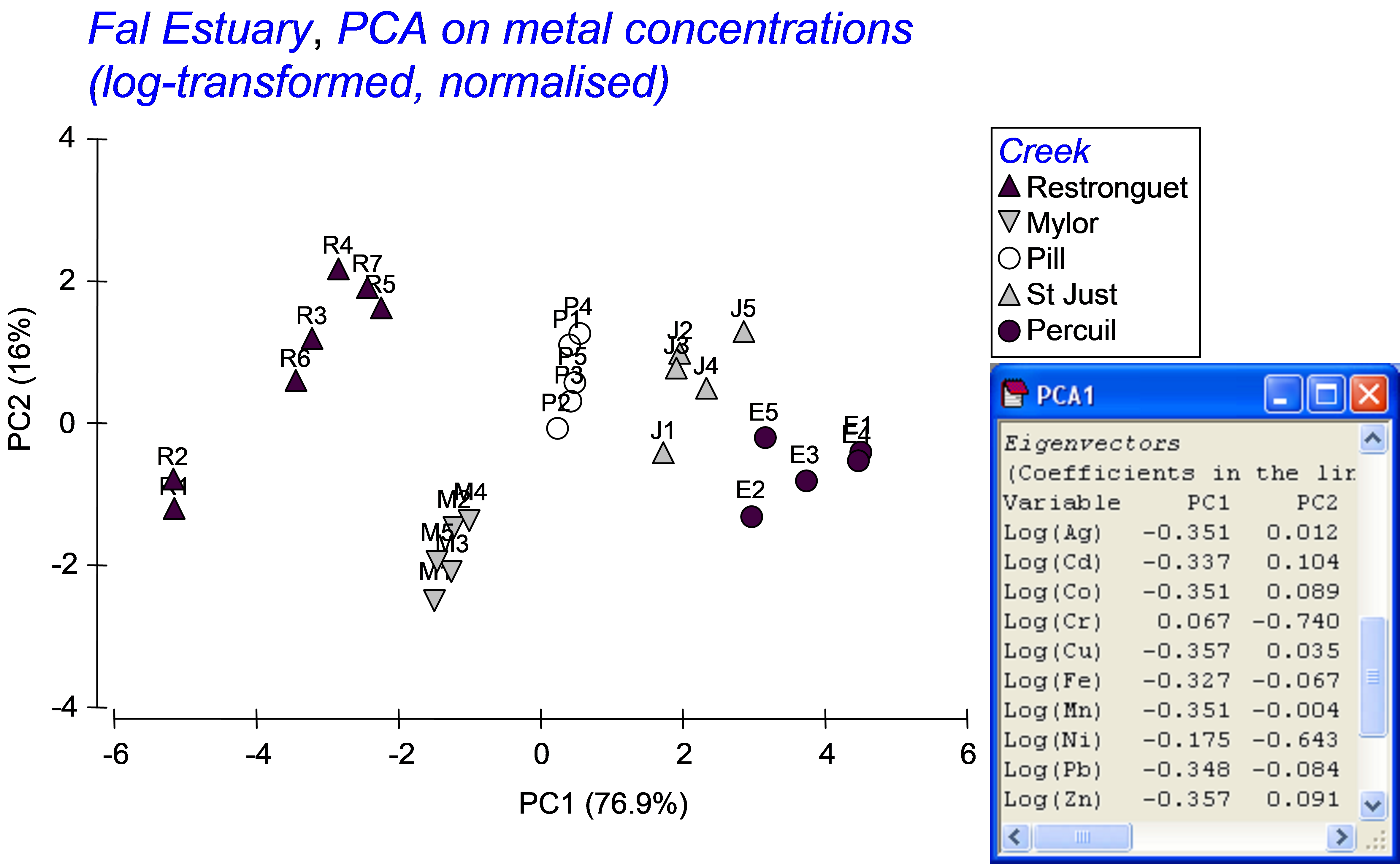 Fig. 5.17. PCA of metal concentrations from soft-sediment habitats in creeks of the Fal estuary.
Our interest lies in seeing how well the biotic data differentiate the samples along this pollution gradient. Also, suppose a new sample were to be obtained from one of these creeks at a later date, could the biota from that sample alone be used to place it along this gradient and therefore to indicate its relative degree of contamination, from low to high concentrations of metals? Although the analysis could be done using only a subset of the data (e.g., just the nematodes, for example), we shall use all of the available biotic information to construct the CAP model. Open the file falbio.pri in the same workspace. As indicated in Clarke & Gorley (2006) (see pp. 40-41 therein), we shall apply dispersion weighting ( Clarke, Chapman, Somerfield et al. (2006) ) to these variables before proceeding. Choose Analyse > Pre-treatment > Dispersion weighting > (Factor: Creek) & (Num perms: 1000). Next transform the data using square-roots and calculate a Bray-Curtis resemblance matrix from the transformed data. We are ready now to run the CAP routine to relate the pollution gradient to the biotic resemblance matrix. Choose PERMANOVA+ > CAP > (Analyse against •Variables in data worksheet: poll.grad) & (Diagnostics $\checkmark$Do diagnostics) (Fig. 5.18).
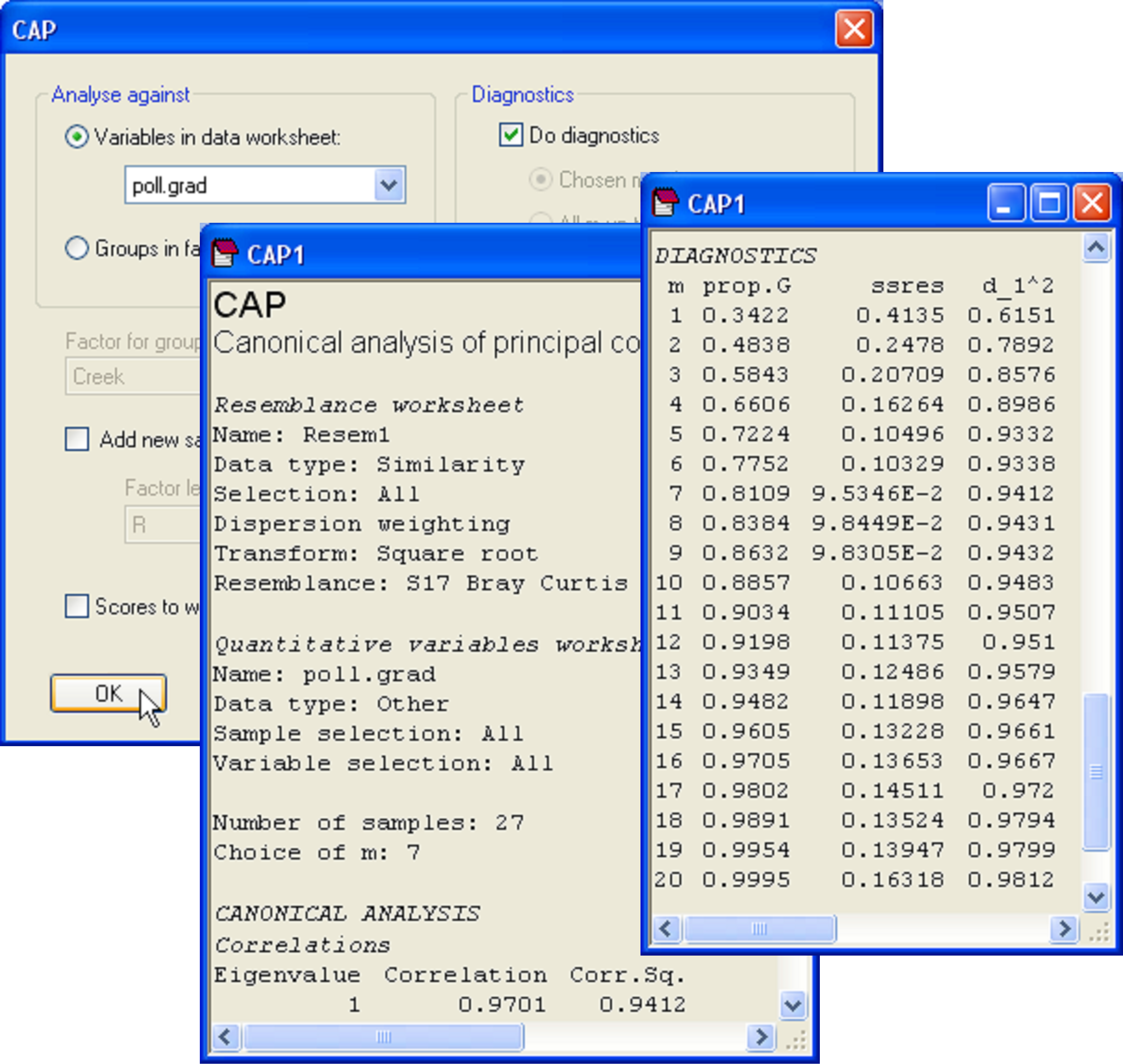 Fig. 5.18. Dialog and excerpts from the output file of a CAP analysis relating biota from sites in the Fal estuary to the pollution gradient (as represented by PC1 from Fig. 5.17).
In the results file, we should first examine the diagnostics. This is not a discriminant analysis, so there are no groups and thus no cross-validation. Instead, the leave-one-out residual sum of squares is the criterion that was used to decide upon an appropriate value for m here. The CAP routine has chosen to use m = 7 PCO axes for the analysis, which encapsulates 81.1% of the variability in the resemblance matrix, and which indeed minimises ‘ssres’. We can see from the diagnostics that no further substantial increases in the canonical correlation occurs if more PCO axes are included, and the model actually gets worse (the leave-one-out residual SS increases) if we were to include more PCO axes (Fig. 5.18). The choice of m = 7 therefore appears reasonable.
As there is only one variable in the data file (PC1), there is only one canonical axis. The squared canonical correlation is very high ($\delta ^2 _ 1$ = 0.94), suggesting we have a very good model here (Fig. 5.19). When there is only 1 canonical axis, CAP will plot this axis with the original variable in a two-dimensional scatter-plot. It is appropriate that the variable (PC1 in this case, which is a proxy for overall metal contamination) be positioned on the y-axis, with the canonical scores on the x-axis, as the purpose of CAP is to find an axis through the cloud of multivariate data that is best at predicting this variable. Given a new sample, we can re-run CAP to place that new sample into the canonical space, yielding a position for it along this x-axis, which in turn (via the CAP model) allows a prediction for the position of that point onto the y-axis (the pollution gradient).
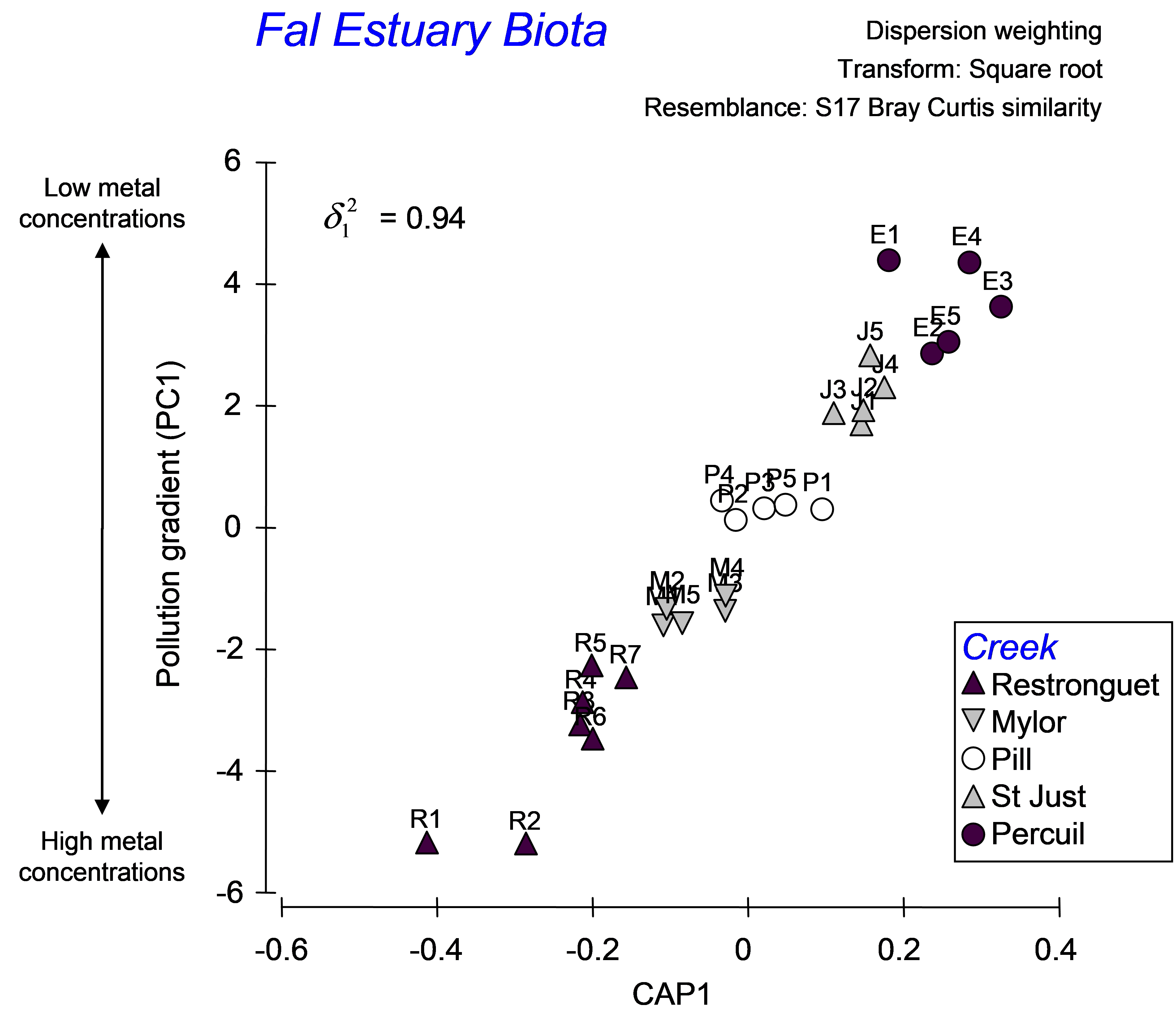 Fig. 5.19. CAP analysis relating biota from sites in the Fal estuary to the pollution gradient.
To see how this works, let us suppose that the samples labeled R2, P2 and E2 had unknown metal concentrations. Accordingly, the environmental data for them would be empty or missing. To place these as ‘new samples’ into the model and predict their position along the pollution gradient, we first need to have a factor that identifies them as new samples. Go to the falbio.pri data sheet and create a new factor called ‘Model’, which has ‘model’ for all of the samples except R2, P2 and E2, which will be identified instead as ‘new’ (Fig. 5.20). Next, go to the poll.grad data sheet and select all of the samples except for R2, P2 and E2 (which we are presuming for the moment to have no value for this variable). Now, from the resemblance matrix (which includes all of the samples) choose PERMANOVA+ > CAP > (Analyse against •Variables in data worksheet: poll.grad) & ($\checkmark$Add new samples > Factor for groups or new samples: Model > Factor level for new samples: new) & ($\checkmark$Specify m 7) & (Diagnostics $\checkmark$Do diagnostics > •Chosen m only). Clearly, there is no need to re-do all of the diagnostics here, and we can specify an appropriate value for m (= 7 in this case) directly (Fig. 5.20).
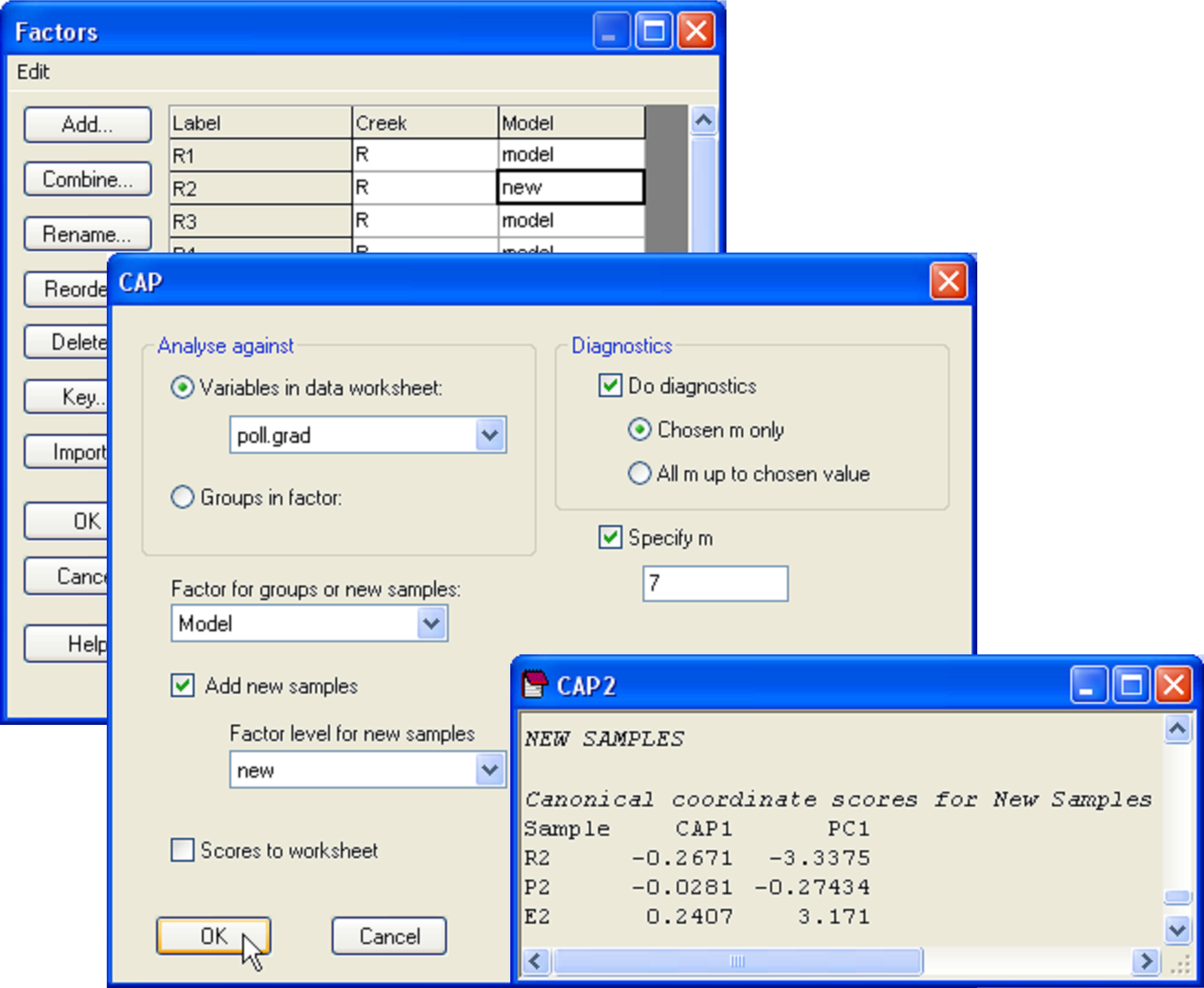 Fig. 5.20. Dialog and portion of the output for the placement of new points into the canonical analysis.
The CAP model for the reduced data set (i.e. minus the three samples that are considered ‘new’) is not identical, but is very similar to the model obtained using all of the data, having the same high canonical correlation of 0.94 for the choice of m = 7. In the CAP output, we are given values for the positions of the new samples along the canonical axis and also, as predicted, along the PC1 gradient (Fig. 5.20). By glancing back at the original plot, we can see that the model, based on the biotic resemblances among samples only, has done a decent job of placing the new samples along the pollution gradient in positions that are pretty close to their actual positions along PC1 (compare Fig. 5.21 with Fig. 5.19).
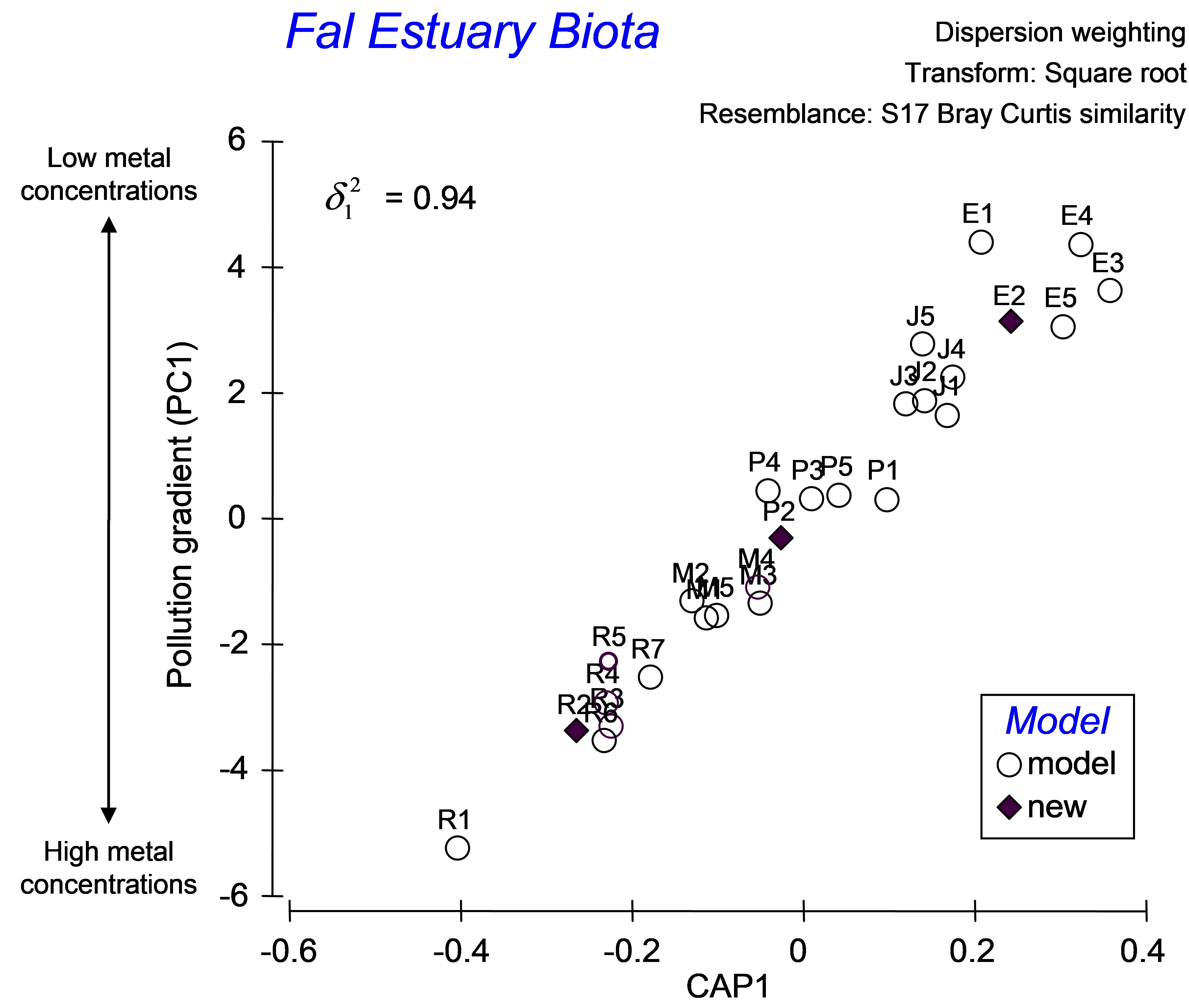 Fig. 5.21. CAP ordination, showing the placement of new points into a gradient analysis.
As highlighted in the section on discriminant analysis, it is instructive also to view the unconstrained data cloud, which helps to place the CAP model into a broader perspective. An unconstrained MDS plot of the biotic data shows that communities from these 5 creeks in the Fal estuary are quite distinct from one another (Fig. 5.22). The differences between assemblages in Restronguet Creek and those in the other creeks are particularly strong. This is not terribly surprising, as this creek has the highest metal concentrations and is directly downstream of the Carnon River, which is the source of most of the heavy metals to the Fal estuary system (
Somerfield, Gee & Warwick (1994)
). Distinctions among the other creeks might include other factors, such as grain size characteristics or %organics. The MDS plot shows differences among these other creeks occur in a direction that is orthogonal (perpendicular) to their differences from Restronguet Creek, which is an indication of this. Therefore, although it is likely that the strongest gradient in the system is caused by large changes in metal concentrations (seen in both the MDS and the CAP plot), there are clearly other pertinent drivers of variation across this system as well. Although an important strength of the CAP method is its ability to identify and “pull out” and assess useful relationships, even in the presence of significant variation in other directions, this is also something to be wary of, in the sense that one can be inclined to forget about the other potential contributors to variation in the system. A look at the unconstrained ordination is, therefore, always a wise idea.
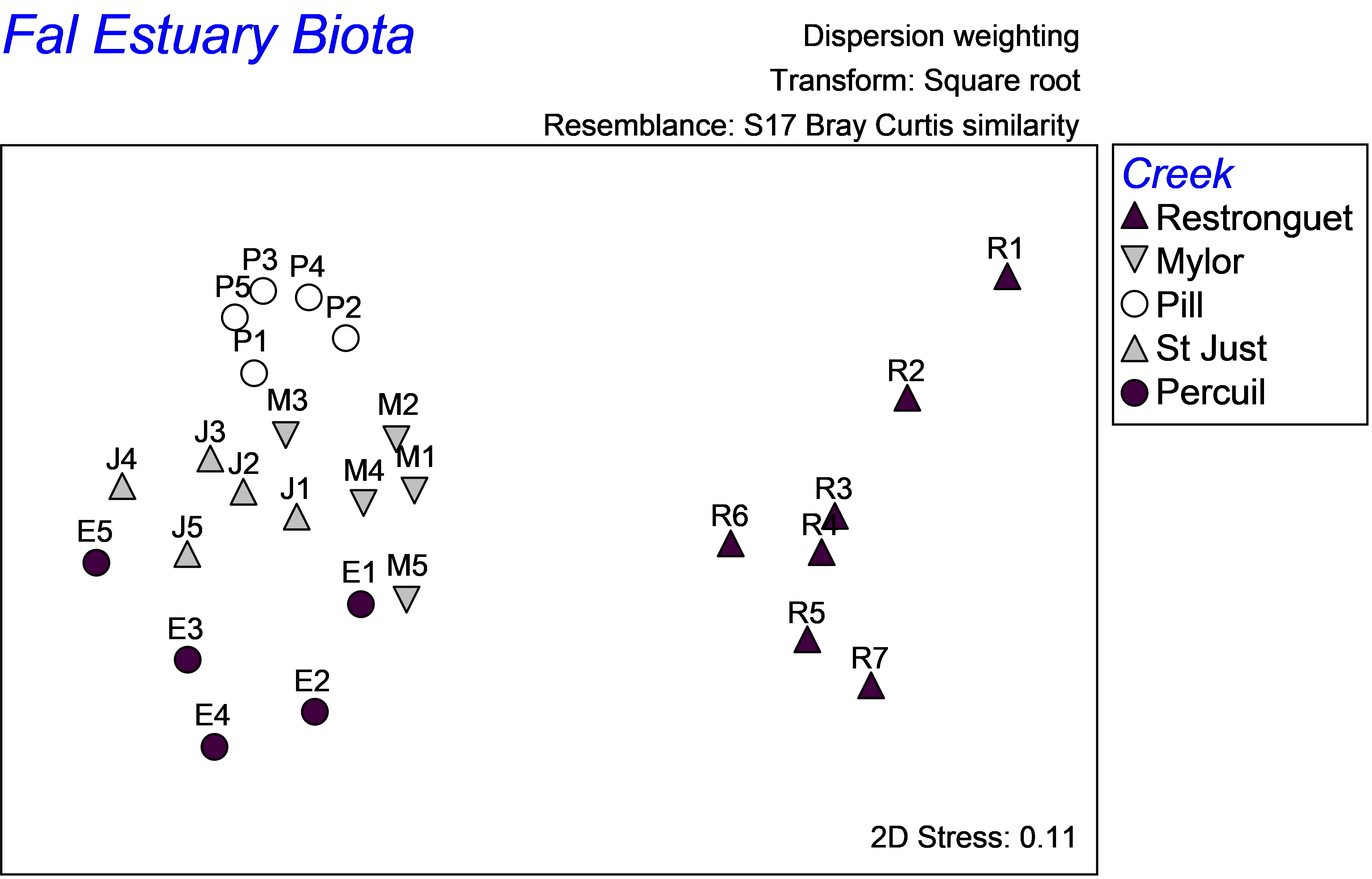 Fig. 5.22. Unconstrained MDS ordination of all biota from the Fal estuary.