11.3 Linking biota to univariate environmental measures (and examples)
Univariate community measures
If the biotic data are best summarised by one, or a few, simple univariate measures (such as diversity indices), one possibility is to attempt to correlate these with a similarly small number of environmental variables, taken one at a time. The summary provided by a principal component from a PCA of environmental variables can be exploited in this way. In the case of the Garroch Head dump ground, Fig. 11.2 shows the relation between Shannon diversity of the macrofauna samples at the 12 sites and the overall contaminant load, as reflected in the first PC of the environmental data (Fig. 11.1). Here the relationship appears to be a simple linear decrease in diversity with increasing load, and the fitted linear regression line clearly has a significantly negative slope ($\beta$ = – 0.29, p < 0.1%).
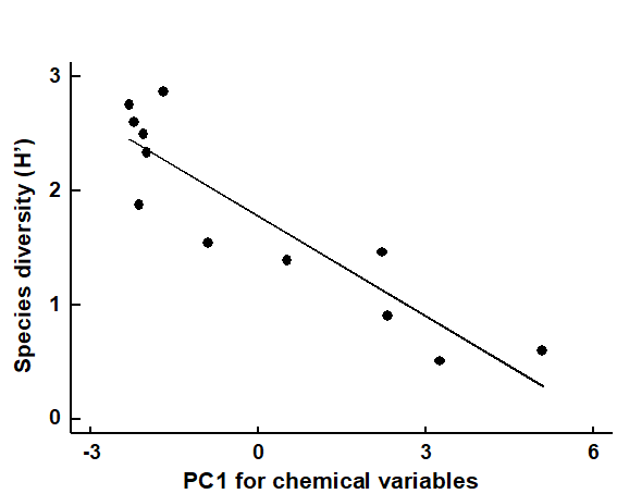
Fig. 11.2. Garroch Head macrofauna {G}. Linear regression of Shannon diversity ($H ^ \prime$), at the 12 sampling stations, against the first PC axis score from the environmental PCA of Fig. 11.1, which broadly represents an axis of increasing contaminant load (first part of equation 11.1).
Multivariate community measures
In most cases however, the biotic data is best described by a multivariate summary, such as an MDS ordination. Its relation to a univariate environmental measure can then be visualized in bubble plots¶, by representing the values of this variable as bubbles of different sizes centred on the biotic ordination points (see page 7.10). This, or the alternative plotting of coded values for the environmental variable, can be a useful means of noting consistent differences in an abiotic variable between biotic clusters, or of observing a smooth relationship with ordination gradients (
Field, Clarke & Warwick (1982)
).
Example: Bristol Channel zooplankton
A cluster analyses of zooplankton samples at 57 sites in the Bristol Channel {B} was seen in Chapter 3, and a SIMPROF analyses determined divisions into four main clusters (Fig. 3.7). The associated MDS plot of Fig. 3.10a, whilst not in conflict with those groups, shows a continuity of change. Whether this gradient in community bears some relation (causal or not) to the salinity gradient at these sites is seen by plotting salinity classes as codes or bubble sizes on the MDS.
If an arbitrary coding is used (or a continuous salinity scale for bubble size), biological considerations might suggest that simple linear coding/scaling is less than optimal here. The species turnover would be expected to be larger with a salinity differential of 1 ppt from full salinity water than for a similar change at (say) 25 ppt. This motivates application of a reverse logarithmic transformation, log (36 – s), or more precisely:
$$ s ^ \star = a - b \log _ e (36 -s ) \tag{11.2} $$
where a = 8.33, b = 3 are simple constants chosen for this data to constrain the transformed variable $ s ^ \star$ to lie, when rounded to the nearest integer, in the range 1 (low) to 9 (high salinity).† The resulting MDS plots, Figs. 11.3 and 11.4, show the strong relation to the salinity gradient§ and might also help to direct attention to sites which appear slightly anomalous in respect of this gradient, and raise questions of whether there are secondary environmental variables which could explain the biological differentiation of samples at similar salinities.
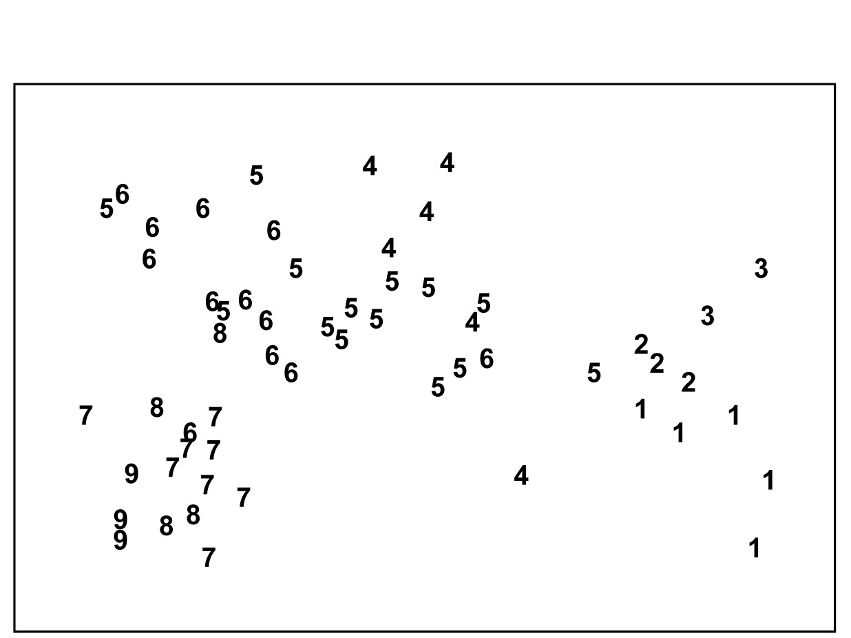
Fig. 11.3. Bristol Channel zooplankton {B}. Biotic MDS for the 57 sampling sites, as in Fig. 3.10 (based on Bray-Curtis similarities on $\sqrt{}\sqrt{}$-transformed abundances), stress = 0.11. Numbers are the 9 salinity codes for sites, 1: <26.3, 2: (26.3, 29.0), 3: (29.0, 31.0), ..., 8: (34.7, 35.1), 9: >35.1 ppt..
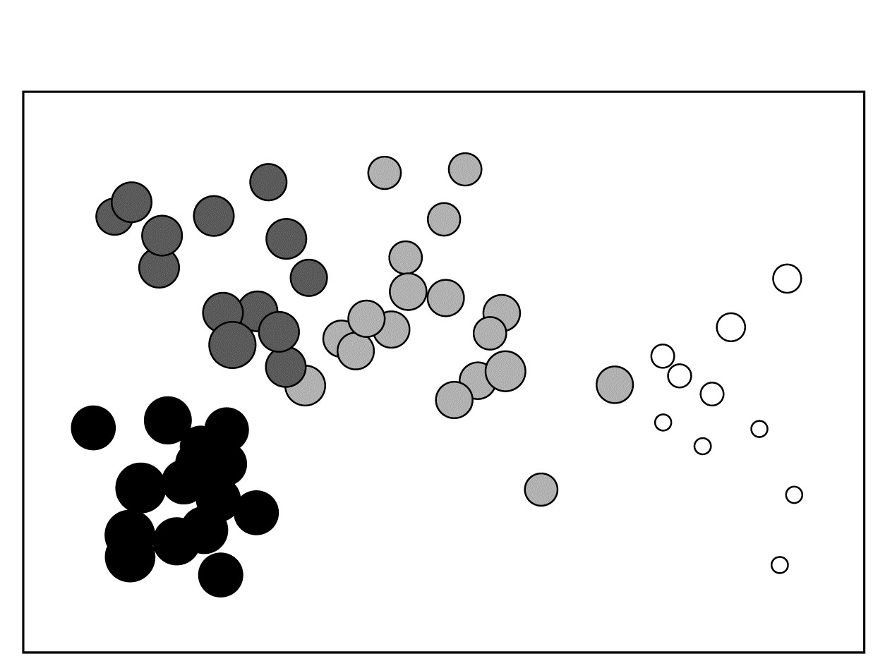
Fig. 11.4. Bristol Channel zooplankton {B}. Biotic MDS as in Fig. 11.3, with superimposed ‘bubbles’ whose sizes represent the same salinity scale as above, i.e. the transformed values given by equation (11.2). The four community groups identified from agglomerative clustering and SIMPROF tests (as in Fig. 3.10a) are shown by different shading.
Example: Garroch Head macrofauna
The macrofauna samples from the 12 stations on the Garroch Head transect {G} lead to the MDS plot of Fig. 11.5a. For a change, this is based not on abundance but biomass values (root-transformed).‡ Earlier in the chapter, it was seen that the contaminant gradient induced a marked response in species diversity (Fig. 11.2), and there is an even more graphic representation of steady community change in the multivariate plot as the dump centre is approached (stations 1 through to 6), with gradual reversion to the original community structure on moving away from the centre (stations 6 through to 12).⸙
The correlation of the biotic pattern with some of the contaminant variables is well illustrated by the bubble plots of Figs. 11.5b-d. In fact, the inter-correlation of many of the contaminants is clear from the later Fig. 11.9, so several other bubble plots will look similar to that for %C and Pb, which are virtually identical. It is clear that, when two environmental variables are so strongly related (collinear), separate putative effects on the biotic structure could never be disentangled (effects are said to be confounded).
A decision needs to be made about whether the scale for the contaminant circles (genuine ‘bubbles’ if a 3-d MDS plot is used) is that for the original data or its transformed form. Either may be useful in particular contexts but, whichever is chosen, the plots are likely to need rescaling ȹ such that minimum and maximum values are represented by vanishingly small circles up to a fixed maximum circle size, respectively, as is the case in Fig. 11.5, based on the log-transformed data. Note the distinction here with the previous use (Figs. 7.13-7.16) of bubble size to represent species counts, usually on a common scale over species (though also often transformed); the natural interpretation there of absence as a vanishingly small bubble rarely has a counterpart with bubble plots of abiotic variables.
As with the earlier Fig. 11.1, a selection of vectors is shown in Fig. 11.5a but these are no longer the coefficients in the definition of the axis; the environmental variables are an independent data set from the biotic variables producing these axes. Instead, they reflect the (individual) multiple correlations of each abiotic variable to the ordination axes, derived from multiple linear regression (Pearson option, page 7.10). There is no longer any guarantee that the relationship of an environmental variable to the biotic ordination axes is now linear, and vectors only represent linear relationships (see the strictures on this point on page 7.10). Here the full set of bubble plots gives no undue cause for concern that the vector plot is misleading, but this will not always be the case (see Fig. 11.6c below) and it is wise to check bubble plots before summarising the relationships solely by vectors.
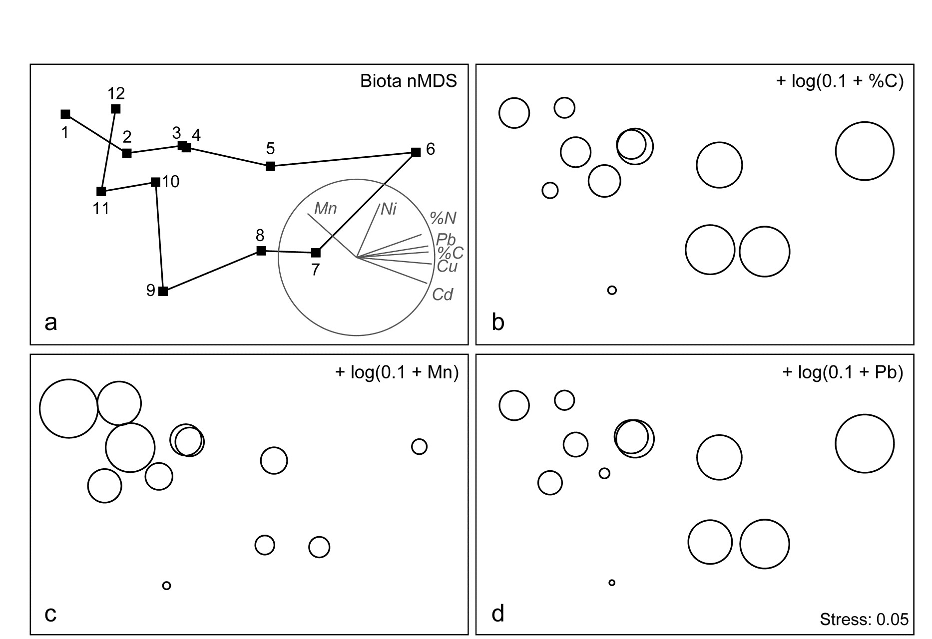
Fig. 11.5. Garroch Head macrofauna {G}. a) nMDS of Bray-Curtis similarities from $\sqrt{}$-transformed species biomass data at the 12 sites (Fig. 8.3) on the E-W transect, stress=0.05. Vector plot (right) shows the direction of linear increase of sediment concentrations for selected contaminants, and the multiple correlation of each (transformed) variable on the 2-d ordination points (circle is correlation of 1). b)-d) bubble plots, i.e. same MDS plot but with circles of increasing size representing sediment concentrations at those sites, of %C, Mn and Pb, from $\log _ e (0.1+x)$ transformation of Table 11.1 data.
Example: Exe estuary nematodes
The Garroch Head data is an example of a smooth gradation in faunal structure reflected in a matching gradation in several contaminant variables. In contrast, the Exe estuary nematode communities {X}, discussed in Chapter 5, separate into five well-defined clusters of samples (Fig. 11.6a). For each of the 19 intertidal sites, six environmental variables were also recorded: the median particle diameter of the sediment (MPD), its percentage organic content (% Org), the depth of the water table (WT) and of the blackened hydrogen sulphide layer (H$_ 2$S), the interstitial salinity (Sal) and the height of the sample on the shore, in relation to the inter-tidal range (Ht).
When each of these is superimposed in turn on the biotic ordination, as bubble plots, some instructive patterns emerge. MPD (Fig. 11.6b) appears to increase monotonically along the main MDS axis but cannot be responsible for the division, for example, between sites 1-4 and 7-9. On the other hand, the relation of salinity to the MDS configuration is non-monotonic (Fig. 11.6c), with larger values for the ‘middle’ groups, but now providing a contrast between the 1-4 and 7-9 clusters. Some other variables, such as the height up the shore (Fig. 11.6d), appear to bear little relation to the overall biotic structure, in that samples within the same faunal groups are frequently at opposite extremes of the intertidal range.
These patterns have some important implications for vector plots. Previously, in the Garroch Head data of Fig. 11.5, it was suggested that viewing the relations between environmental variables and the ordination via a vector plot was unlikely to mislead, because perusal of bubble plots for each variable in that case suggested that changes were, if not truly linear, at least monotonically increasing or decreasing across the plot. However, that this will not always be true and, here, the salinity bubble plot clearly shows the difficulty. In which direction does salinity increase? A linear regression of, say, a quadratic function may well have a zero slope (small vector, in no particular direction) thus making it impossible to distinguish between a vector for an obvious, but non-monotonic relationship and that for a situation in which there is apparently little relationship at all, such as for the Ht variable in Fig. 11.6d.
These plots, however, make clear the limitations in relating the community structure to a single environmental variable at a time: there is no basis for answering questions such as “how well does the full set of abiotic data jointly explain the observed biotic pattern?” and “is there a subset of the environmental variables that explains the pattern equally well, or better?” These questions are answered in classical multivariate statistics by techniques such as canonical correlation (e.g. Mardia, Kent & Bibby (1979) ) but, as discussed in earlier chapters, this requires assumptions which are unrealistic for species abundance or biomass data (correlation and Euclidean distance as measures of similarity for biotic data, linear relationships between abundance and environmental gradients etc).
Instead, the need is to relate community structure to multivariate descriptions of the abiotic variables, using the type of non-parametric, similarity-based methods of previous chapters.
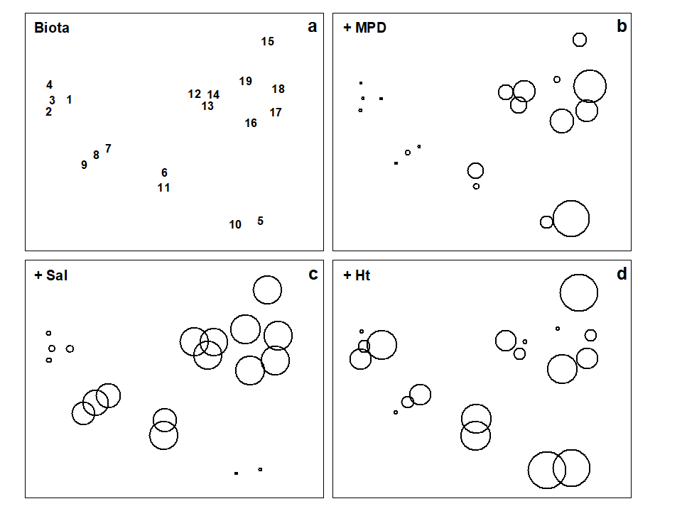
Fig. 11.6. Exe estuary nematodes {X}. a) MDS of species abundances at the 19 sites, as in Fig. 5.1; b)-d) the same MDS but with superimposed circles representing, respectively, median particle diameter of the sediment, its interstitial salinity and height up the shore of the sampling locations. (Stress = 0.05).
¶ Bubble plots can also be useful in a wider context: Field, Clarke & Warwick (1982) superimpose morphological characteristics of each species onto a species MDS, and Chapter 7 gives a number of examples of how single and segmented bubble plots can show relationships between ordinations and some of the biotic variables used in their construction. Segmented bubble plots can similarly be used with abiotic variables, if carefully enough scaled ( Purcell, Rushworth, Clarke et al. (2014) ).
† In the PRIMER ‘Transform (individual)’ routine the expression for the salinity variable is thus: INT(0.5 + 8.33 – 3*log(36–V)), and these bubble values can then be used to label the MDS plot.
§ Note the horseshoe effect (more properly termed the arch effect), which is a common feature of the ordination from single, strong environmental gradients. Both theoretically and empirically, non-metric MDS would seem to be less susceptible to this than metric ordination methods. But without the drastic (and somewhat arbitrary) intervention in the plot that a technique like detrended correspondence analysis uses (specifically to ‘cut and paste’ such ordinations to a straight line), some degree of curvature is unavoidable and natural. Where samples towards opposite ends of the environmental gradient have few species in common (thus giving dissimilarities near 100%), samples which are even further apart on the gradient have little scope to increase their dissimilarity further. To some extent, non-metric MDS can compensate for this by the flexibility of its monotonic regression of distance on dissimilarity (Chapter 5), but arching of the tails of the plot is clearly likely when dissimilarities near 100% are reached.
‡ Chapter 14 argues that, where it is available, biomass can sometimes be more biologically relevant than abundance, though in practice MDS plots from both will be broadly similar, especially under heavy transformation, as the data tends towards presence/ absence (Chapter 9).
⸙ This can be seen also in the MDS plots of Figs. 7.9c & d, though the known ordering of sites was not used for the purposes of that example. The minor difference in the MDS configuration from Fig. 11.5 is not due to any difference in transformation or similarity but the fact that the analysis here uses all 65 species with recorded biomass whereas, for illustrative purposes, the previous shade plot used only the 35 accounting for at least 1% of the biomass in one or more samples.
ȹ This is best accomplished within PRIMER by using output from the Summary Stats routine (for variables) on the Analyse menu.