7.4 Shade plots
An alternative to line plots, and a technique that can often be even more useful, in terms of the range and quality of information it can present, is that of shade plots. These are visual displays in the form of the data matrix itself, with rows being species and columns the samples, and the entries rectangles whose grey-shading deepens with increasing species counts (or biomass, area cover etc). White denotes absence of that species in that sample and full black represents the maximum abundance in the matrix. Many choices are possible for the column and row orderings.
Whilst the coherent species plots can do a striking job of visually displaying common patterns of change in relative abundance across the samples for groups of species (i.e. species standardised data), they do not represent the patterns of dominant and less abundant species over the samples, which is key to understanding the contributions of particular species to sample multivariate analyses. Of course, coherent species curves could be graphed using absolute, not relative, counts but this is generally ineffective, the coherence becoming lost, visually, in the major differences in mean abundance across species. In contrast, one of the strengths of shade plots is the way they (typically) can be used to display the abundances on exactly the measurement scale which is being entered to a multivariate analysis: this may be sample standardised and/ or transformed (or dispersion weighted, Chapter 9), or any other potential pre-treatment step, including species standardisation (though this is generally not recommended for input to sample resemblances).
The visual impact of grey-scale intensities¶ in a shade plot can give a strong idea of which species are likely primarily to be influencing the multivariate results, and
Clarke, Tweedley & Valesini (2014)
show how these plots can therefore be utilised to aid sound long-term choice of transformation and/or other pre-treatment for specific faunal groups and study types. Choice of transform is often something that perplexes the novice user but a simple shade plot will often make it abundantly clear which transforms are likely to capture the required ‘depth of view’ of the community (from solely the dominant to the entire species set), and thus avoid under- or over-transforming the matrix to achieve that desired view (see Chapter 9 for some examples).
Shade plot for Exe estuary nematodes
Fig. 7.7 provides a good initial example of the range of information that can be captured by a shade plot, since we have seen the sample dendrogram and MDS plots in Figs. 5.4 and 5.5, the species clustering in Fig. 7.1 and the Type 3 SIMPROF tests producing the coherent species groups of Fig. 7.4. Here the sites are in the same order as in Fig. 7.4 and the 4 to 5 major clusters from Fig. 5.4 are separated by vertical lines.
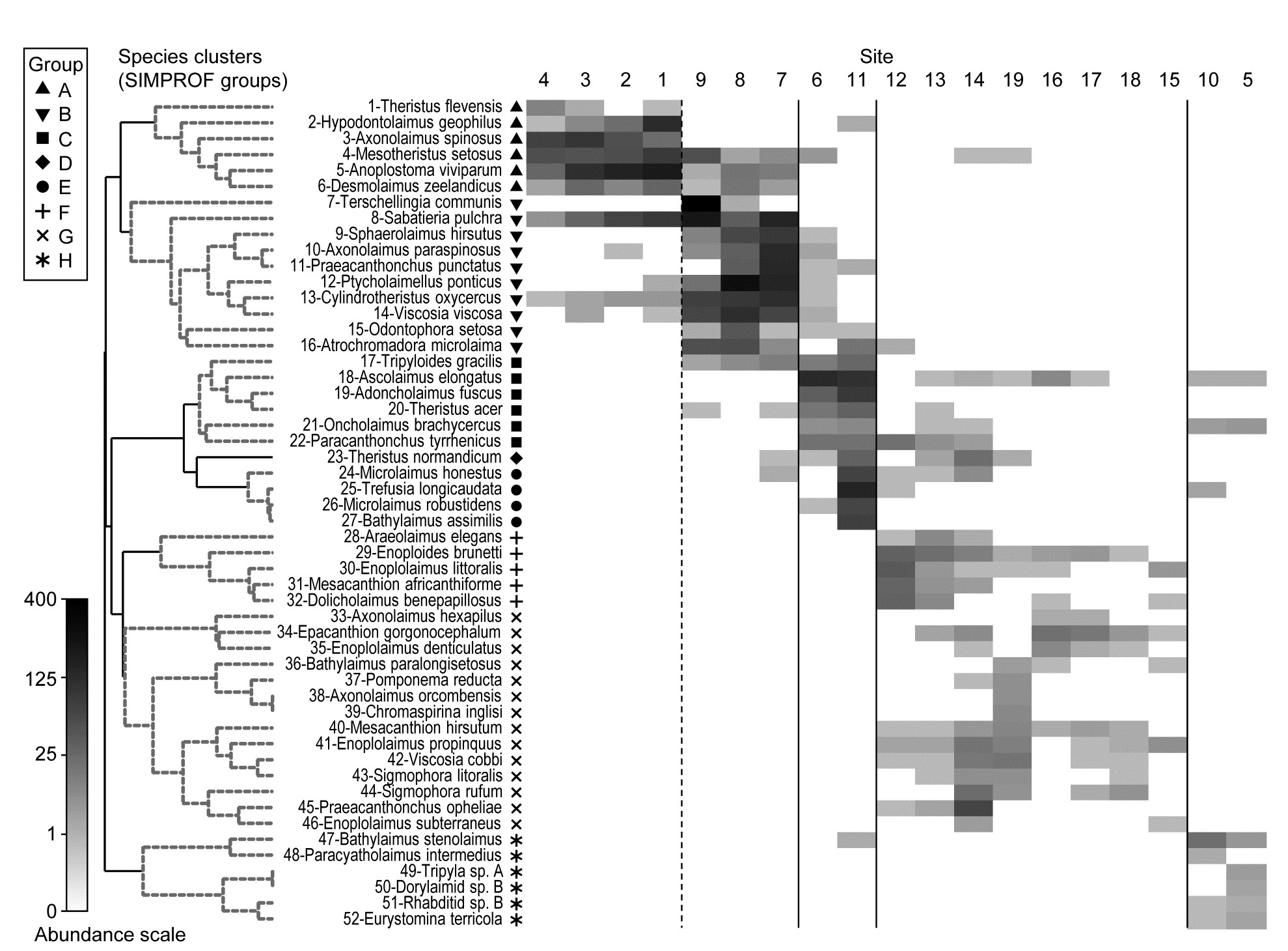
Fig. 7.7. Exe estuary nematodes {X). Shade plot, a visual representation of the data matrix of (in the columns) the 19 sites and (in the rows) the most dominant species, those accounting for ≥ 5% of the total abundance at one or more of the sites. White space denotes absence of that species at that site; depth of grey scale is then linearly proportional to a fourth-root transformation of abundance (see key), the same transform as used for the sample clustering and ordination of Figs. 5.4 and 5.5. Sites are divided by vertical lines into the 4 to 5 groups initially identified by
Field, Clarke & Warwick (1982)
from essentially those figures, and then ordered in the same way as in the ‘coherent species’ line plots (Fig. 7.4). Species are shown in the numbered dendrogram order of Fig. 7.1, with the Type 3 SIMPROF groups (A-H, Fig. 7.4) identified by grey dashed lines and a range of symbols in the redisplay of that dendrogram here. The high turnover of species between site groups (matching that seen in Fig. 7.4) is self-evident, resulting in the clear clustering seen in the ordination of Fig. 5.5, and strongly curvilinear shape of the Shepard plot of Fig. 5.2, with many dissimilarities of 100%. Note the important distinction with Fig. 7.4 that the shade plot uses the fourth-root transformed data for its grey scale, whereas the line plots are of species-standardised untransformed data. Either technique could be used with either data form but the particular strengths of each display lend themselves to the combination shown.
The rows present the same subset of species as used for the coherent curves, with the species dendrogram given in the same species order (numbers in Fig. 7.1 are now identifiable to species names), and showing the species groups from the Type 3 SIMPROF tests. The grey-shade scale is the fourth-root transformed one appropriate to the samples multivariate analysis, but the linearly increasing grey intensity in the scale bar has been back-transformed to original counts for the displayed scale values, allowing an excellent ‘feel’ for the abundances of each of these 52 species. Note that, since the lowest number in the matrix is a count of 1, the fourth-root transform ensures that even this is visible, so the presence-absence structure of the data is immediately apparent. An important implication is that, under this transformation, all the species will have a not entirely negligible role in determining the sample resemblances, though some still clearly have a more dominant contribution (e.g. by comparison with a P/A analysis in which all the shaded rectangles will, of course, be black). But the dominant impression from Fig. 7.7 is of overlapping but highly characteristic assemblages for each of the main five sample groups, with the more diffuse clustering of samples 12-19 in relation to the tightness of the other 4 groups (seen in Fig. 5.5) readily apparent.
¶ Shade plots can be graphed effectively in colour also, and are then often referred to as heat maps, though since the genesis of a heat map is a temperature scale in which black denotes absence (extreme cold), increasing through blue, orange and red to white (‘white hot’) as the largest value, this seems a less helpful nomenclature than shade plot for our use, where the large numbers of zeros are much more effectively represented as white space. And it is necessary that the scale transparently represents the linearity of increasing (transformed) abundances by linear-scale shading or colour changes. Too richly colourful a plot might not aid this.