8.4 Examples: Loch Linnhe and Garroch Head macrofauna
ABC curves for the macrobenthos at site 34 in Loch Linnhe, Scotland {L} between 1963 and 1973 are given in Fig. 8.7. The time course of organic pollution from a pulp-mill, and changes in species diversity ($H ^ \prime$), are shown top left. Moderate pollution started in 1966, and by 1968 species diversity was reduced. Prior to 1968 the ABC curves had the unpolluted configuration. From 1968 to 1970 the ABC plots indicated moderate pollution. In 1970 there was an increase in pollutant loadings and a further reduction in species diversity, reaching a minimum in 1972, and the ABC plots for 1971 and 1972 show the grossly polluted configuration. In 1972 pollution was decreased and by 1973 diversity had increased and the ABC plots again indicated the unpolluted condition. Thus, the ABC plots provide a good ‘snapshot’ of the pollution status of the benthic community in any one year, without reference to the historical comparative data which would be necessary if a single species diversity measure based on the abundance distribution was used as the only criterion.
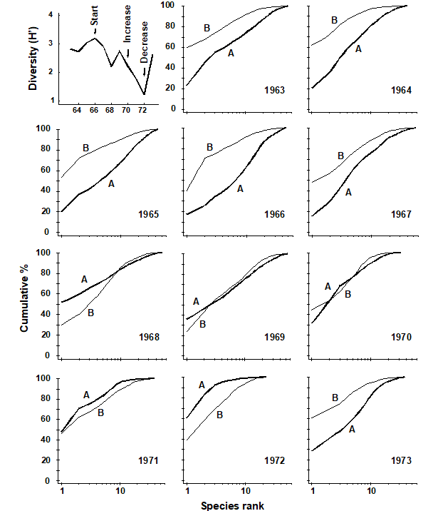
Fig. 8.7. Loch Linnhe macrofauna {L}. Shannon diversity ($ H ^ \prime$) and ABC plots over the 11 years, 1963 to 1973. Abundance = thick line, biomass = thin line.
ABC plots for the macrobenthos along a transect of stations across the accumulating sewage-sludge dump-ground at Garroch Head, Scotland {G} (Fig 8.3) are given in Fig. 8.8. Note how the ABC curves behave along the transect, with the peripheral stations 1 and 12 having unpolluted configurations, those near the dump-centre at station 6 with grossly polluted configurations and intermediate stations showing moderate pollution. Of course, at the dump-centre itself there are only three species present, so that any method of data analysis would have indicated gross pollution. However, the biomass and abundance curves start to become transposed at some distance from the dump-centre, when species richness is still high.
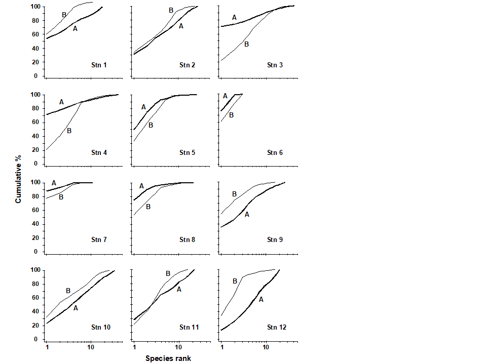
Fig. 8.8. Garroch Head macrofauna {G}. ABC curves for macrobenthos in 1983. Abundance = thick line, biomass = thin line.
Transformations of k-dominance curves
Very often k-dominance curves approach a cumulative frequency of 100% for a large part of their length, and in highly dominated communities this may be after the first two or three top-ranked species. Thus, it may be difficult to distinguish between the forms of these curves. One solution to this problem is to transform the y-axis so that the cumulative values are closer to linearity. Clarke (1990) suggests the modified logistic transformation:
$$ y _ i ^ \prime = \log [(1 + y _ i)/(101 – y _ i)] \tag{8.9} $$
An example of the effect of this transformation on ABC curves is given in Fig. 8.9 for the macrofauna at two stations in Frierfjord, Norway {F}, A being an unimpacted reference site and C a potentially impacted site. At site C there is an indication that the biomass and abundance curves cross at about the tenth species, but since both curves are close to 100% at this point, the crossover is unclear. The logistic transformation enables this crossover to be better visualised, and illustrates more clearly the differences in the ABC configurations between these two sites.
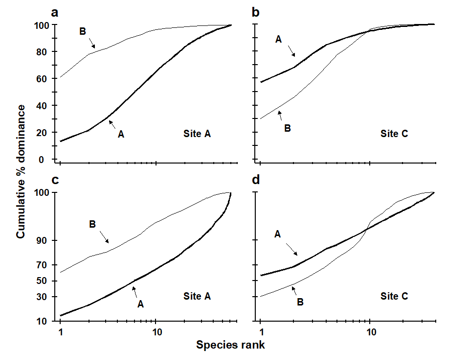
Fig. 8.9. Frierfjord macrofauna {F}. a), b) Standard ABC plots for sites A (reference) and C (potentially impacted). c), d) ABC plots for sites A and C with the y-axis subjected to modified logistic transformation. Abundance = thick line, biomass = thin line.
Partial dominance curves
A second problem with the cumulative nature of k-dominance (and ABC) curves is that the visual information presented is over-dependent on the single most dominant species. The unpredictable presence of large numbers of a species with small biomass, perhaps an influx of the juveniles of one species, may give a false impression of disturbance. With genuine disturbance, one might expect patterns of ABC curves to be unaffected by successive removal of the one or two most dominant species in terms of abundance or biomass, and so Clarke (1990) recommended the use of partial dominance curves, which compute the dominance of the second ranked species over the remainder (ignoring the first ranked species), the same with the third most dominant etc. Thus if $a _ i$ is the absolute (or percentage) abundance of the ith species, when ranked in decreasing abundance order, the partial dominance curve is a plot of $p _ i$ against log i (i = 1, 2, ..., S–1), where
$$ p _ 1 = 100 a _1 \big/ \sum _ {j=1} ^ S a _ j, \hspace{5mm} p _ 2 = 100 a _2 / \sum _ {j=2} ^ S a _ j, \hspace{2.5mm} \ldots \hspace{2.5mm} p _ {S-1} = 100 a _ {S-1} / ( a _ {S-1} + a _ {S} ) \tag{8.10} $$
Earlier values can therefore never affect later points on the curve. The partial dominance curves (ABC) for undisturbed macrobenthic communities typically look like Fig. 8.10, with the biomass curve (thin line) above the abundance curve (thick line) throughout its length. The abundance curve is much smoother than the biomass curve, showing a slight and steady decline before the inevitable final rise. Under polluted conditions there is still a change in position of partial dominance curves for abundance and biomass, with the abundance curve now above the biomass curve in places, and the abundance curve becoming much more variable. This implies that pollution effects are not just seen in changes to a few dominant species but are a phenomenon which pervades the complete suite of species in the community. For example, the time series of macrobenthos data from Loch Linnhe (see Fig. 8.11) shows that in the most polluted years 1971 and 1972 the abundance curve is above the biomass curve for most of its length (and the abundance curve is very atypically erratic), the curves cross over in the moderately polluted years 1968 and 1970 and have an unpolluted configuration prior to the pollution impact in 1966. In 1967, there is perhaps the suggestion of incipient change in the initial rise in the abundance curve. Although these curves are not so smooth (and therefore not so visually appealing!) as the original ABC curves, they may provide a useful alternative aid to interpretation and are certainly more robust to random fluctuations in the abundance of a small-sized, numerically dominant species.

Fig. 8.10. Frierfjord macrofauna {F}. Partial dominance curves (abundance/biomass comparison) for reference site A (c.f. Figs 8.9a,c for corresponding standard and transformed ABC plots).
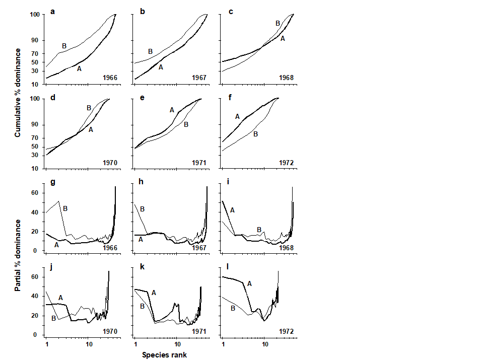
Fig. 8.11. Loch Linnhe macrofauna {L}. Selected years 1966–68 and 1970–72. a–f) ABC curves (logistic transform). g)–l) Partial dominance curves for abundance (thick line) and biomass (thin line) for the same years.
Phyletic role in ABC method
Warwick & Clarke (1994)
have shown that the ABC response in macrobenthos results from (i) a shift in the proportions of different phyla present in communities, some phyla having larger-bodied species than others, and (ii) a shift in the relative distributions of abundance and biomass among species within the Polychaeta but not within any of the other major phyla (Mollusca, Crustacea, Echinodermata). The shift within polychaetes reflects the substitution of larger-bodied by smaller-bodied species, and not a change in the average size of individuals within a species. In most instances the phyletic changes reinforce the trend in species substitutions within the polychaetes, to produce the overall ABC response, but in some cases they may work against each other. In cases where the ABC method has not succeeded as a measure of the pollution status of marine macrobenthic communities, it is because small non-polychaete species have been dominant. Prior to the Amoco Cadiz oil-spill, small ampeliscid amphipods (Crustacea) were present at the Pierre Noire sampling station in relatively high abundance (
Dauvin (1984)
), and their disappearance after the spill confounded the ABC plots (
Ibanez & Dauvin (1988)
). It was the erratic presence of large numbers of small amphipods (Corophium) or molluscs (Hydrobia) which confounded these plots in the Wadden Sea (
Beukema (1988)
). These small non-polychaetous species are not an indication of polluted conditions, as Beukema points out. Indications of pollution or disturbance detected by this method for marine macrobenthos should therefore be viewed with caution if the species responsible for the polluted configurations are not polychaetes.
W statistics
When the number of sites, times or replicates is large, presenting ABC plots for every sample can be cumbersome, and it would be convenient to reduce each plot to a single summary statistic. Clearly, some information must be lost in such a condensation: cumulative dominance curves are plotted, rather than quoting a diversity index, precisely because of a reluctance to reduce the diversity information to a single statistic. Nonetheless, Warwick (1986) ’s contention that the biomass and abundance curves increasingly overlap with moderate disturbance, and transpose altogether for the grossly disturbed condition, is a unidirectional hypothesis and very amenable to quantification by a single summary statistic.
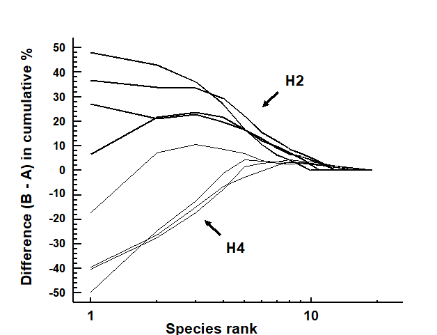
Fig. 8.12. Hamilton Harbour macrobenthos {H}. Difference (B–A) between cumulative dominance curves for biomass and abundance for four replicate samples at stations H2 (thick line) and H4 (thin line).
Fig. 8.12 displays the difference curves B–A for each of four replicate macrofauna samples from two stations (H2 and H4) in Hamilton Harbour, Bermuda; these are simply the result of subtracting the abundance ($A _ i$) from the biomass ($B _ i$) value for each species rank (i) in an ABC curve.¶ For all four replicates from H2, the biomass curve is above the abundance curve throughout its length, so the sum of the $B _ i – A _ i$ values across the ranks i will be strongly positive. In contrast, this sum will be strongly negative for the replicates at H4, for which abundance and biomass curves are largely transposed. Intermediate cases in which A and B curves are intertwined will tend to give $ \sum (B _ i – A _ i)$ values near zero. The summation requires some form of standardisation to a common scale, so that comparisons can be made between samples with differing numbers of species, and Clarke (1990) proposes the W (for Warwick) statistic:
$$ W = \sum _ {i =1} ^ S (B _ i – A _ i) / [ 50 ( S - 1)] \tag{8.11} $$
It can be shown algebraically that W takes values in the range (–1, 1), with $W \rightarrow +1$ for even abundance across species but biomass dominated by a single species, and $W \rightarrow –1$ in the converse case (though neither limit is likely to be attained in practice).
An example is given by the changing macrofauna communities along the transect across the sludge dump-ground at Garroch Head {G}. Fig. 8.13 plots the W values for each of the 12 stations against the station number. These summarise the 12 component ABC plots of Fig. 8.8 and clearly delineate a similar pattern of gradual change from unpolluted to disturbed conditions, as the centre of the dumpsite is approached.
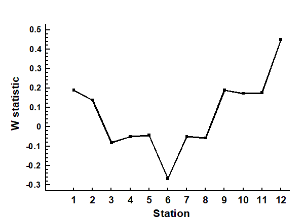
Fig. 8.13. Garroch Head macrofauna {G}. W values corresponding to the 12 ABC curves of Fig. 8.8, plotted against station number; station 6 is the centre of the dump ground (Fig. 8.3).
Hypothesis testing for dominance curves
There are no replicates in the Garroch Head data to allow testing for statistical significance of observed changes in ABC patterns but, for studies involving replication, the W statistic provides an obvious route to hypothesis testing. For the Bermuda samples of Fig. 8.12, W takes values 0.431, 0.253, 0.250 and 0.349 for the four replicates at H2 and -0.082, 0.053, -0.081 and -0.068 for the four H4 samples. These data can be input into a standard univariate ANOVA (equivalent in the case of two groups to a standard 2-sample t-test), showing that there is indeed a clearly established difference in abundance-biomass patterns between these two sites (F = 45.3, p<0.1%).
More general forms of hypothesis testing are possible, likely to be particularly relevant to the comparison of k-dominance curves calculated for replicates at a number of sites, times or conditions (or in some two-way layout, as discussed in Chapter 6). A measure of ‘dissimilarity’ could be constructed between any pair of k-dominance (or B-A) curves, for example based on their absolute distance apart, summed across the species ranks. When computed for all pairs of samples in a study this provides a (ranked) triangular dissimilarity matrix, essentially similar in structure to that from a multivariate analysis; thus the 1-way and 2-way ANOSIM tests (Chapter 6) can be used in exactly the same way to test hypotheses about differences between a priori specified groups of samples. Clarke (1990) discusses some appropriate definitions of dissimilarity for use with dominance curves in such tests, as now described and illustrated.
¶ Note that, as always with an ABC curve, $B _ i$ and $A _ i$ do not necessarily refer to values for the same species; the ranking is performed separately for abundance and biomass.